プレビュー準備中デザインリファレンスを見る
DESIGN REFERENCE
0から考えよう。|小学館100周年特設サイト
紫とピンクの粒状グラデーションに、大きな数字と余白を組み合わせた小学館の100周年特設サイト。数字の導入演出、白いゼロの造形、7つのインタビューへの導線が特徴。
Shogakukan — Think from Zero — Style Reference
A publishing anniversary expressed through shifting color, oversized numerals, and generous space.
Website: Shogakukan — Think from Zero Original URL: https://www.shogakukan.co.jp/zero/ Final URL: https://www.shogakukan.co.jp/zero/ Theme: luminous violet and pink atmospheric color, dark typography, and isolated numeral artwork Inspected: October 2, 2026, 06:13 JST; supplied retrieval timestamp: October 1, 2026, 21:13:15.435 UTC Viewports: 1440 × 1000 desktop and 390 × 844 mobile, in CSS pixels Scope: three desktop introduction captures, a mobile opening view, a mobile footer view, and supplied rendered DOM/computed-style evidence. The DOM establishes the manifesto, seven interview sections, navigation, and footer destinations. Intermediate interview artwork, an opened menu, destination pages, and completed interaction sequences were not visually inspected.
Shogakukan presents its hundredth anniversary as a starting point for the next hundred years. The interface expresses that idea with a changing numeral motif and the repeated invitation to think from zero. It is an anniversary editorial experience with seven interview destinations, an introductory statement, and links to related anniversary material.
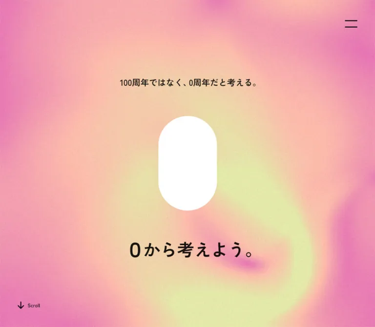
The strongest visual relationship is between a soft, grainy color field and very sparse, crisp foreground elements. Violet, pink, and pale cream form broad blurred eddies across the entire viewport. Dark Japanese copy, a two-line menu symbol, a small scrolling cue, and large numeral artwork sit directly on that atmosphere. The captured mobile hero uses a solid white capsule as its zero motif; the desktop introduction shows both a sketch-like purple numeral and a red zero with changing apparent depth.
The background continues behind the mobile footer. Even the final navigation remains transparent: thin rectangular outlines, centered labels, and a small publisher link provide structure without introducing a separate card system.
閉じる
Shogakukan — Think from Zero — Style Reference
A publishing anniversary expressed through shifting color, oversized numerals, and generous space.
Website: Shogakukan — Think from Zero Original URL: https://www.shogakukan.co.jp/zero/ Final URL: https://www.shogakukan.co.jp/zero/ Theme: luminous violet and pink atmospheric color, dark typography, and isolated numeral artwork Inspected: October 2, 2026, 06:13 JST; supplied retrieval timestamp: October 1, 2026, 21:13:15.435 UTC Viewports: 1440 × 1000 desktop and 390 × 844 mobile, in CSS pixels Scope: three desktop introduction captures, a mobile opening view, a mobile footer view, and supplied rendered DOM/computed-style evidence. The DOM establishes the manifesto, seven interview sections, navigation, and footer destinations. Intermediate interview artwork, an opened menu, destination pages, and completed interaction sequences were not visually inspected.
Shogakukan presents its hundredth anniversary as a starting point for the next hundred years. The interface expresses that idea with a changing numeral motif and the repeated invitation to think from zero. It is an anniversary editorial experience with seven interview destinations, an introductory statement, and links to related anniversary material.
The strongest visual relationship is between a soft, grainy color field and very sparse, crisp foreground elements. Violet, pink, and pale cream form broad blurred eddies across the entire viewport. Dark Japanese copy, a two-line menu symbol, a small scrolling cue, and large numeral artwork sit directly on that atmosphere. The captured mobile hero uses a solid white capsule as its zero motif; the desktop introduction shows both a sketch-like purple numeral and a red zero with changing apparent depth.
The background continues behind the mobile footer. Even the final navigation remains transparent: thin rectangular outlines, centered labels, and a small publisher link provide structure without introducing a separate card system.
How to Read This Reference
- Measured values come from the supplied computed styles and element rectangles. They describe the captured state, including elements outside the viewport.
- Visual estimates come from the five original-page screenshots. Estimated colors are implementation approximations, not sampled or verified source colors.
- Calculated values are arithmetic derived from measured rectangles, such as the 10px gap between the two footer links.
- Recommendations describe a reusable implementation. Proposed breakpoints, accessible target sizes, background rendering techniques, and unspecified typography are not claims about the original code.
- Token names are descriptive aliases introduced here. The evidence does not expose a site-specific design-token system.
- DOM presence does not establish visibility. Navigation entries and repeated text occur in the extraction even when they are absent from the screenshots. Do not render every extracted copy simultaneously.
- Wrapper typography is not necessarily visible typography. Many anchors and headings report browser-serif defaults, while visible Japanese text appears Gothic and specific utility elements explicitly declare a Gothic family.
Tokens — Colors
Default Palette
| Name | Value | Suggested token | Evidence and role |
|---|---|---|---|
| Foundation Violet | #983fef |
--zero-violet |
Measured HTML background: rgb(152, 63, 239) at both viewports. A foundation beneath the more complex visible field. |
| Main Ink | rgba(0, 0, 0, 0.9) |
--zero-ink |
Measured text color on the root and most sampled anchors. Its final appearance depends on the background underneath. |
| Quiet Ink | rgba(0, 0, 0, 0.7) |
--zero-quiet |
Measured mobile policy-link color. |
| White | #ffffff |
--zero-white |
Measured BODY background and navigation Top-link color. Also a visual approximation for the mobile hero's white capsule. |
| Cloud Pink | approximately #e5a5de |
--zero-pink |
Visual estimate for the broad pink areas in the original captures. |
| Pale Light | approximately #ebe8be |
--zero-light |
Visual estimate for the pale cream-yellow highlights within the background. |
| Numeral Red | approximately #ff0000 |
--zero-red |
Visual estimate for the front-facing red zero in the desktop introduction. Lighting produces additional reds in the dimensional state. |
Preserve the distinction between source color and rendered appearance. The HTML background is a single measured violet, but the screenshots contain an atmospheric composition above it. The computed white BODY background does not make the visible page a white surface.
Main Ink and Quiet Ink are translucent black values. Replacing them with a single sampled gray would change how they behave across the violet, pink, and pale regions.
Color Behavior
The background changes shape and local color distribution between the supplied desktop frames. This supports a changing visual scene, but does not establish its rendering technology or full palette range. The root declares a three-second background-color transition; that declaration does not explain every visible deformation.
There is no evidence of user-selectable color themes. Treat red as a numeral-artwork accent, white as the captured mobile hero symbol, and violet/pink as the surrounding atmosphere. Do not automatically turn red into the site's general action color.
Tokens — Typography
Verified Gothic Family
- Computed family:
"Zen Kaku Gothic New", sans-serif. - Verified locations: the three text-size controls and the mobile policy links.
- Verified weights:
700for text-size controls;400for policy links. - Recommended reuse: use this family for a coherent Japanese interface when the font is available. Applying it to all hero and editorial text is an implementation choice, because those descendants were not individually measured.
Browser-Default Wrapper Values
The desktop root and many anchors report Times; corresponding mobile elements report "Times New Roman". Most sampled wrappers report 16px, weight 400, and a 16px line height.
These values should not be copied as the visual heading system. The screenshots show bold Gothic-looking Japanese copy, while the extracted headings contain multiple child text layers. A wrapper's font declaration does not establish the typeface or size of those children.
Numerals as Artwork
The large introduction numerals are visually distinct objects. The purple 1 has irregular, hatched edges; the red 0 has a smooth, heavy shape and visible extrusion in one capture. The mobile white motif is a filled capsule without a visible counter.
No font name, asset format, or rendering engine is established for these objects. Preserve their geometry as artwork instead of choosing an arbitrary display font and assuming it is equivalent.
Type Scale
| Role | Value | Status | Implementation guidance |
|---|---|---|---|
| Desktop text-size controls | 14 / 18 / 24px, weight 700 |
Measured | Three distinct sizes; intended adjustment behavior was not exercised. |
| Mobile text-size controls | 11 / 14 / 18px, weight 700 |
Measured | A smaller responsive scale than desktop. |
| Text-size control leading | 1.83 |
Calculated from measured values | For example, 18px type has 32.94px line height. |
| Mobile policy links | 10px / 27.6px, weight 400 |
Measured | Small text with a generous vertical rhythm. |
| Mobile opening statement | approximately 18px, bold |
Visual estimate | The single line above the white motif. |
| Mobile main statement | approximately 36px, bold |
Visual estimate | The lower, much larger line reading 0から考えよう。. |
| Primary anniversary link | approximately 18px, bold |
Visual estimate | Two centered lines inside a thin rectangle. |
| Secondary anniversary link | approximately 14px, regular |
Visual estimate | Lower emphasis than the movie link. |
| Desktop year label | approximately 20–22px |
Visual estimate | Small dark year beneath the sketched numeral. |
| Skip label | approximately 13–14px |
Visual estimate | Compact utility text near the lower-right corner. |
| Mobile Scroll label | approximately 10px |
Visual estimate | Paired with a downward arrow. |
The hierarchy comes from a few large changes in scale and broad empty space. It does not depend on many colored labels, badges, or text containers.
Tokens — Spacing & Shapes
Density: sparse in the opening views; compact in the legal footer. Primary geometry: full-screen atmosphere, centered numeral forms, square outlined links, and a two-line menu icon. Unit system: no source spacing formula is established. Use the measured pixel values as reference points rather than inventing a universal source grid.
Spacing Scale
| Use | Value | Status |
|---|---|---|
| Mobile menu inset from top and right | 30px |
Measured |
| Desktop menu inset from top and right | 50px |
Measured |
| Mobile footer-link side margins | 30px |
Measured |
| Mobile navigation-row horizontal padding | 30px |
Measured |
| Detail-link padding | 20px 30px |
Measured |
| Primary anniversary-link padding | 35px 50px |
Measured on its wrapper |
| Secondary anniversary-link padding | 30px 35px |
Measured on its wrapper |
| Gap between anniversary links | 10px |
Calculated from mobile rectangles |
| Gap between interview sections | 100px |
Calculated from mobile section rectangles |
| Final interview to anniversary-link group | 150px |
Calculated from mobile rectangles |
| Secondary anniversary link to publisher link | 200px |
Calculated between their outer rectangles |
| Policy-link padding | 3px |
Measured |
Border Radius
| Element | Value | Status |
|---|---|---|
| Anniversary-link wrappers | 0 |
Measured; visible square corners |
| Detail-link wrappers | 0 |
Measured |
| Publisher-link wrapper | 0 |
Measured; visible rectangular outline |
| Policy links | 3px |
Measured; a minor utility detail |
| White hero motif | Approximately half its width | Visual estimate; capsule ends |
| Menu strokes | Slightly rounded ends | Visual estimate |
The capsule is an identity-bearing graphic, not a general button radius. Keep the distinction between rounded numeral geometry and square navigation frames.
Layout Measurements
| Element | Desktop at 1440 × 1000 | Mobile at 390 × 844 | Evidence |
|---|---|---|---|
| Menu anchor | 35 × 35px, at (1355, 50) |
25 × 25px, at (335, 30) |
Measured |
| Skip anchor | Approximately 87.47 × 56px, at (1322.53, 914) |
Not present in the supplied mobile link extraction | Measured state difference |
| White hero motif | Settled desktop hero not captured | Approximately 110 × 177px, at (140, 333) |
Visual estimate |
| Red intro zero | Approximately 224 × 360–364px, centered near (720, 500) |
Not captured | Visual estimate |
| Sketched intro numeral | Approximately 135 × 255px |
Not captured | Visual estimate |
| Interview visual-link wrapper | Reliable settled geometry unavailable | 200 × 323.59px, centered at x = 95 |
Measured; visual content unknown |
| Interview detail link | Intro-state rectangles are not reliable settled references | 115 × 56px, centered at x = 137.5 |
Measured |
| Primary anniversary link | Not visually established | 330 × 119.94px |
Measured |
| Secondary anniversary link | Not visually established | 330 × 101.45px |
Measured |
| Publisher link | Not visually established | 51 × 28.13px |
Measured |
| Document height | 1000px during the captured introduction state |
Approximately 9018px |
Measured; not a direct responsive comparison |
Components
Atmospheric Background
Role: provide continuity and most of the page's visual character.
The background fills the viewport edge to edge. It contains broad violet and pink regions, pale illuminated patches, and blurred curved bands resembling eddies. Fine grain is visible across the color field. There are no hard gradient stops or clean boundaries around the shapes.
Keep foreground text and controls crisp. The blur belongs to the background, not to a translucent panel placed over the content. The mobile footer retains the same atmospheric treatment behind links and legal text.
A layered gradient or shader could approximate this treatment in a new implementation, but neither is established as the original technique. The evidence does not identify a background image, video, canvas, or shader asset.
Menu Trigger and Navigation
Role: access the Top destination, seven interview destinations, and text-size controls.
The visible trigger consists of two short dark horizontal strokes at the upper right. It has no visible surrounding box, label, or solid header strip. Its measured anchor reduces from 35 × 35px on desktop to 25 × 25px on mobile, while its corner inset reduces from 50px to 30px.
The trigger appears in the same mobile screen position in both the hero and footer captures, which is consistent with viewport anchoring. Its actual positioning declaration was not supplied.
The navigation's DOM geometry changes substantially by viewport:
- Desktop: the Top wrapper is
270 × 486.92pxatx = 150. Interview wrappers have the same dimensions, beginning atx = 520, followed by790,1060, and further positions beyond the viewport. This establishes horizontal arrangement in the measured state, but not the mechanism used to reach offscreen entries. - Mobile: wrappers use
display: flex, span the390pxviewport, and have30pxhorizontal padding. The Top row is approximately128.23pxhigh; subsequent interview rows are approximately95.91pxhigh. - Text-size controls: three links marked
Ause the verified Gothic family and the responsive type scales recorded above.
No opened-menu screenshot or activation result was supplied. Its background, entrance motion, close state, scrolling behavior, and focus management remain unverified. Do not turn these DOM rectangles into a claim about a fully inspected overlay.
Desktop Introduction
Role: introduce the anniversary through numeral and year imagery.
The three desktop frames share an edge-to-edge atmospheric background, a centered numeral, the menu trigger, and a small Skip control near the lower-right corner.
One frame shows a purple, hand-rendered 1 with 1923 beneath it. Two other frames show a red 0: one has visible side faces and depth, while the other is more front-facing. The extraction also contains 1922, 100, and 2022, connecting the introduction to the anniversary timeline.
These observations support a changing numeral sequence. They do not establish the complete order, playback duration, increment speed, rendering method, or replay behavior.
The Skip anchor has 20px 30px padding around a small visible label. Its outer box ends 30px from the right and bottom of the desktop viewport. Preserve that difference between visual text size and the larger interaction region. The result of activating Skip was not observed.
Mobile Opening Composition
Role: state the anniversary's central idea before the editorial content.
The captured mobile opening has five parts:
- The two-line menu trigger at the upper right.
- The centered statement
100周年ではなく、0周年だと考える。, visually aroundy = 245px. - A solid white capsule, approximately
110 × 177px, centered near(195, 421.5). - The large statement
0から考えよう。, visually aroundy = 588px. - A downward arrow and
Scrolllabel near the lower-left corner.
The capsule is filled. It does not show the hollow counter of the red desktop numeral. Preserve the observed difference between these states instead of forcing one zero treatment everywhere.
The space between statement, symbol, and title is part of the composition. Avoid compressing them into a conventional heading-and-button block. There is no prominent filled action button in this opening screenshot.
Manifesto
Role: explain why a hundredth anniversary is also a new beginning.
The source text describes support from readers and collaborators, thinking beyond established habits, and preparing the next hundred years. It appears before the first interview section in the extracted reading order.
The first interview begins at document y = 1713.53px on mobile. The evidence does not provide a separate manifesto rectangle or screenshot, so its exact column width, alignment, font size, and internal spacing are unverified.
Recommended adaptation: use a narrow readable Japanese text column, deliberate paragraph breaks, and substantial space before the first interview. Keep the content as selectable text. Do not infer a two-column layout or image treatment from the extracted wording.
Interview Section
Role: connect one question about publishing and society to a dedicated interview.
The DOM establishes a repeated anatomy: numbered heading, linked visual region, short editorial teaser, and a 詳細をみる link. There are seven sections.
| Number | Actual source topic | Editorial focus established by the text | Destination |
|---|---|---|---|
| 01 | 「好奇心の育て方」 |
Extending the ideas within books beyond the book format | /zero/interview/01/ |
| 02 | 「文化との接点」 |
Considering what culture should pass to the next generation | /zero/interview/02/ |
| 03 | 「高齢化社会」 |
Thinking about health together with readers | /zero/interview/03/ |
| 04 | 「地方創生」 |
Working together on regional challenges | /zero/interview/04/ |
| 05 | 「本の読み方」 |
Enabling more people to enjoy books | /zero/interview/05/ |
| 06 | 「街の歩き方」 |
Pursuing publishing challenges beyond precedent | /zero/interview/06/ |
| 07 | 「本のつくり方」 |
Continuing work for society and the future | /zero/interview/07/ |
On mobile, sections 01–04 and 07 measure approximately 820.58px high. Sections 05–06 measure approximately 871.83px. The latter also contain longer teasers in the extraction. All consecutive section rectangles are separated by 100px.
Each heading wrapper measures approximately 390 × 267.73px. The linked visual wrapper is 200 × 323.59px, centered horizontally. Its top lies approximately 20px above the heading wrapper's bottom; this is an overlap between measured rectangles, not proof of a particular negative-margin rule or visible overlap effect.
The visual contents of those links were not captured. Do not invent portrait photography, illustration subjects, chapter colors, image crops, or hover transformations. The long mobile layout and repeated anatomy are supported; the artwork is not.
Detail Link
Role: open the corresponding interview.
The mobile anchor measures 115 × 56px with 20px 30px padding and a transparent background. It sits on the section centerline. The measured wrapper radius is zero.
The label is 詳細をみる. Duplicate copies appear in the extracted text, but the evidence does not establish their visual effect. A new implementation should expose one understandable accessible name even if decorative duplicate layers are used.
The source declares 0.3s ease-out transitions for color, background color, and opacity. The final hover colors and any movement of child labels were not supplied.
Anniversary Exit Links
Role: continue to related anniversary content after the interviews.
Two outlined rectangles appear in a centered mobile column with 30px side margins and a 10px gap:
- Primary:
100周年SPECIAL MOVIEはこちら, linking tohttps://www.shogakukan.co.jp/pr/100th-movie/. The captured label occupies two centered lines. The outer box is approximately330 × 119.94px. - Secondary:
小学館創立100周年記念企画一覧はこちら, linking tohttps://www.shogakukan.co.jp/pr/100th/. It also occupies two centered lines, with smaller and lighter-looking text. The outer box is approximately330 × 101.45px.
Both have transparent interiors, square corners, and visually thin dark outlines, approximately 1px. Their hierarchy comes from label size and box height rather than different fill colors.
The DOM establishes ordinary destination links. It does not establish an inline video player or a movie modal.
Publisher and Legal Footer
Role: provide publisher identity and policy navigation.
A small outlined 小学館 link sits approximately 200px below the second anniversary-link rectangle. Its measured box is 51 × 28.13px and links to the publisher's homepage.
Below it, four centered policy destinations form a compact vertical list. Their verified typography is Zen Kaku Gothic New, 10px, regular weight, 27.6px line height, and rgba(0, 0, 0, 0.7). The labels are プライバシーポリシー・ソーシャルメディアポリシー, 画像使用・著作権, インフォマティブデータガイドライン, and 推奨環境.
The footer ends with the Shogakukan copyright and reproduction notice. Its text remains directly on the atmospheric background. There is no separate white footer slab in the captured view.
Tokens — Motion & Interaction
| Treatment | Evidence | What can be reused confidently | Limitation |
|---|---|---|---|
| Root background-color transition | 3s cubic-bezier(0.3, 0, 0, 1) |
A long, gently settling color transition | Does not establish the timing of the moving background forms |
| General anchor feedback | Color, background color, and opacity: 0.3s ease-out |
Restrained 300ms feedback for links | End-state colors and actual hovered appearance are unknown |
| Linked document opacity | opacity 0.3s ease-out |
Short opacity feedback where appropriate | Activation and destination content were not inspected |
| Numeral changes | Different numeral shapes, year text, and zero depth across captures | Artwork can change between introduction states | Complete sequence, timing, and implementation are unknown |
| Atmospheric variation | Different blurred arrangements across desktop captures | A changing color field is supported | No verified loop duration, pointer response, or scroll coupling |
| Skip | Visible desktop control and DOM link | Provide a clear route past an introduction | Actual behavior was not exercised |
| Menu and text-size controls | Visible trigger plus navigation/control DOM | Their presence and intended roles | Open/close behavior, adjustment effects, and persistence are unverified |
| Scroll cue | Visible arrow and Scroll text on mobile |
A small indication of more content | Click behavior and scroll animation are unverified |
Several sampled elements report animation: none. This does not prove that the entire page is static: scripts, nested elements, graphical layers, and state transitions are outside those limited samples.
For a new implementation, keep decorative motion subordinate to text readability. An optional slow background drift is a reasonable adaptation, but label its timing as a new choice. Do not advertise a particular animation library or WebGL implementation as a source finding.
Surfaces
| Layer | Appearance | Function |
|---|---|---|
| Atmospheric canvas | Blurred violet/pink forms with pale highlights and fine grain | Creates continuity and visual energy |
| Introduction artwork | Sketch-like purple numeral or smooth red zero | Concentrates attention on the anniversary concept |
| Mobile hero symbol | Solid white capsule | Provides a quiet, high-contrast central mark |
| Foreground copy | Dark, crisp text directly on the atmosphere | Carries the central statement and navigation |
| Anniversary links | Transparent rectangles with thin dark outlines | Defines clickable areas without opaque panels |
| Publisher link | Small outlined rectangle | Separates identity from the larger editorial actions |
| Legal text | Small, quieter dark type | Reduces emphasis while preserving access to policies |
No general elevation or card-shadow system is established. The red numeral's apparent depth belongs to the artwork; it is not evidence for applying shadows to every interface component.
Imagery
The inspected opening relies on abstract color and typographic objects rather than conventional photographs. Its grain gives the otherwise smooth atmospheric field a tactile surface. The blurred forms are large enough to read as an environment, not a repeated small texture tile.
The desktop numeral treatments deliberately differ: the 1 looks drawn and hatched, while the red 0 looks smooth and dimensional. The mobile white motif simplifies the form further into a filled capsule. Preserve that variation when using authorized original assets; do not homogenize all three into one ordinary font glyph.
Keep numeral objects uncropped and centered within generous space. Keep grain subtle enough that it does not obscure the small Skip, Scroll, or legal labels. Do not apply background blur or noise directly to foreground text.
Observed Asset References
No original image filenames, video URLs, font files, model files, or shader resources were supplied. The following are visual references, not asset-path claims:
| Visual object | Evidence | Reuse limitation |
|---|---|---|
| Grainy violet/pink atmosphere | All five original-page captures | Rendering method and source resource are unknown |
Hatched purple 1 |
First desktop capture | Preserve as artwork; no font identification is supported |
| Red zero with apparent depth | Second and third desktop captures | No 3D engine or model format is established |
| Filled white capsule | Mobile opening capture | Can be approximated geometrically in CSS for a new implementation |
| Interview visual regions | Mobile DOM rectangles | Their actual imagery was not supplied |
Do not fabricate asset paths. The CSS below provides an approximation of the background and the white capsule, not replacements for unidentified original artwork.
Layout & Responsive Behavior
The mobile experience is a long document: approximately 9018px at a 390 × 844 viewport. Its content order is opening composition, manifesto, seven interview sections, two anniversary links, publisher identity, and legal information.
The desktop evidence captures an introduction state with a reported document height of 1000px. Its DOM also contains content at coordinates far below that height. This is a state-dependent discrepancy, not proof that desktop content is absent or that the complete site is a one-screen application. Do not copy narrow offscreen desktop link rectangles as settled component dimensions.
The strongest confirmed responsive changes are the menu symbol, corner insets, text-size control scale, and navigation geometry. Desktop navigation wrappers are arranged horizontally; mobile wrappers become full-width vertical rows. The breakpoint itself was not supplied.
The mobile hero centers its main content while placing utilities at opposite corners: menu at the upper right, scrolling cue at the lower left. The final anniversary links use a simple width relationship: 390 − 30 − 30 = 330px. Their labels wrap into two centered lines without becoming pill buttons.
The white hero motif measures approximately 110 × 177px, while interview visual-link wrappers measure 200 × 323.59px. Their similar tall proportions are observable, but the unseen interview assets must not be assumed to be white capsules or zero shapes.
Recommended responsive strategy: use normal document flow for editorial content, viewport-aware opening height, and a separately controlled introduction. Use content-driven section heights rather than hardcoding the measured 820.58px and 871.83px. A 48rem breakpoint is used in the starter CSS solely as a practical adaptation; it is not a recovered source breakpoint.
Do’s and Don’ts
Do
- Preserve the broad violet/pink atmosphere and fine grain.
- Keep text, outlines, and menu strokes crisp above the blurred background.
- Let the numeral or capsule carry the opening's visual weight.
- Retain the large vertical spaces around the mobile hero's three central elements.
- Distinguish the red introduction zero from the white filled mobile motif.
- Use thin square outlines for the anniversary links.
- Preserve the seven-topic editorial sequence and its clear interview destinations.
- Treat desktop introduction measurements and mobile content measurements as different captured states.
- Use the verified Gothic family where appropriate, while labeling unmeasured typography as an adaptation.
- Keep one accessible text copy when building visual duplicate layers.
Don’t
- Do not flatten the atmosphere into a simple two-stop diagonal gradient.
- Do not add opaque cards behind every paragraph or action.
- Do not turn the red numeral color into a universal button fill.
- Do not replace the white capsule with a hollow glyph in the captured mobile composition.
- Do not impose browser-serif wrapper defaults on the visible Japanese headings.
- Do not invent portraits, interview artwork, production credits, or asset filenames.
- Do not claim a specific animation framework, shader, or 3D renderer.
- Do not infer tested menu behavior from the presence of navigation links in the DOM.
- Do not assume repeated extracted text means the user should see duplicated labels.
- Do not lock all content to viewport height merely because the desktop intro reports a one-viewport document.
Recommended Implementation Additions
These are improvements for a new implementation, not verified features of the original page:
- Give the menu an accessible button name, expanded state, controlled navigation region, and keyboard-operable close behavior.
- Increase the menu's interaction target to at least
44 × 44pxwhile preserving its smaller visible symbol and measured corner alignment. - Make Skip immediately available during an introduction. Remove any scroll lock when the introduction completes or is skipped.
- Provide a static opening state for reduced-motion users. If ambient motion runs continuously, provide an appropriate pause mechanism.
- Keep editorial text readable if graphical assets or animation initialization fail.
- Test dark text against every animated background state, especially the small footer links. Increasing legal text from the observed
10pxto12pxis a reasonable accessibility adaptation. - Ensure a mobile navigation region can scroll; the extracted rows extend beyond one
844pxviewport. - Use semantic headings and real destination links. Hide decorative text duplicates and artwork from assistive technology when equivalent meaningful text already exists.
- Reserve the measured visual-region proportions to reduce layout movement, while allowing captions and headings to grow with text-size changes.
Agent Prompt Guide
Quick Color Reference
- Foundation violet: measured
#983fef. - Main text and controls: measured
rgba(0, 0, 0, 0.9). - Quiet policy text: measured
rgba(0, 0, 0, 0.7). - Atmospheric pink: approximate
#e5a5de. - Pale background highlights: approximate
#ebe8be. - Mobile central motif: white.
- Desktop introduction accent: approximately
#ff0000, confined to numeral artwork. - Navigation surfaces: transparent, with thin dark outlines where shown.
Overall Prompt
“Create an anniversary editorial website inspired by Shogakukan's Think from Zero experience. Use an edge-to-edge violet and pink atmospheric background with broad blurred eddies, pale cream highlights, and subtle fine grain. Keep foreground Japanese typography and controls crisp and dark. Build a spacious mobile opening with a small centered statement, a solid white capsule approximately 110 by 177 pixels, and a larger bold statement below it. Place a two-line menu symbol in the upper-right corner and a small arrow with Scroll in the lower-left. Continue into an editorial manifesto and seven numbered interview sections. Finish with two transparent square-cornered outlined links and a compact centered publisher footer. Keep any unspecified imagery and animation behavior explicit as new implementation choices.”
Example Component Prompts
- Mobile opening: “At 390 by 844, place a 25px two-line menu symbol 30px from the top and right. Center the statement
100周年ではなく、0周年だと考える。above a filled white capsule. Place0から考えよう。below it in approximately 36px bold Gothic text. Use generous vertical spacing and a small lower-left scrolling cue. These type sizes are visual approximations.” - Atmospheric field: “Create broad, softly blurred violet and pink regions with pale cream highlights and subtle monochrome grain. Suggest curved eddies instead of a straight linear gradient. Keep the foreground sharp. If adding movement, make its timing configurable and provide a static reduced-motion state.”
- Introduction: “Design a full-viewport numeral stage with centered artwork, a small year label, an upper-right menu, and a padded lower-right Skip control. Support distinct numeral assets such as a drawn glyph and a dimensional red zero. Treat playback order and timing as configurable because the reference does not establish the complete sequence.”
- Interview section: “Use a numbered topic heading, centered visual region, short teaser, and
詳細をみるlink. At 390px width, reserve a visual-link region approximately 200 by 323.6px and a detail-link target approximately 115 by 56px. Let text determine the final section height. Do not invent original interview artwork.” - Footer links: “Build two transparent outlined rectangles with 30px mobile side margins and a 10px gap. The first is approximately 120px high with a bold two-line movie label; the second is approximately 101px high with a smaller anniversary-index label. Leave about 200px before a small outlined publisher link, then stack quiet legal links.”
Quick Start
CSS Custom Properties
This is a visual starter for the observed atmosphere, menu symbol, mobile hero, editorial wrappers, and footer. It uses measured colors and outer dimensions where available, estimated display typography, and a recommended 48rem breakpoint. The background is a CSS approximation; its optional 18-second drift is a new implementation choice.
Use .zero-atmosphere as a decorative child of .zero-page. The menu button contains .menu-symbol. The hero contains .hero-content, with .hero-kicker, .hero-zero, and .hero-title in that order. Place .scroll-cue separately inside the hero. Implement menu state and introduction playback independently; this CSS does not claim to reproduce those unobserved behaviors.
:root {
  /* Measured source colors */
  --zero-violet: #983fef;
  --zero-ink: rgb(0 0 0 / 0.9);
  --zero-quiet: rgb(0 0 0 / 0.7);
  --zero-white: #fff;

  /* Visual approximations */
  --zero-pink: #e5a5de;
  --zero-light: #ebe8be;
  --zero-red: #f00;

  /* Verified on utility controls and policy links */
  --zero-font: 'Zen Kaku Gothic New', sans-serif;

  /* Mobile measurements */
  --zero-edge: 30px;
  --zero-menu-size: 25px;
  --zero-gutter: 30px;
  --zero-section-gap: 100px;
  --zero-link-gap: 10px;
  --zero-policy-size: 10px;

  /* Measured transition declarations */
  --zero-feedback: 300ms ease-out;
  --zero-color-change: 3s cubic-bezier(0.3, 0, 0, 1);

  /* Recommended enlarged interaction target */
  --zero-hit-size: 44px;

  color: var(--zero-ink);
  background: var(--zero-violet);
  transition: background-color var(--zero-color-change);
}

* {
  box-sizing: border-box;
}

body {
  margin: 0;
  font-family: var(--zero-font);
}

button,
a {
  -webkit-tap-highlight-color: transparent;
}

button {
  font: inherit;
}

[hidden] {
  display: none !important;
}

.zero-page {
  position: relative;
  isolation: isolate;
  min-block-size: 100vh;
  color: var(--zero-ink);
}

/* Approximation of the observed field, not recovered source CSS. */
.zero-atmosphere {
  position: fixed;
  inset: 0;
  z-index: -1;
  overflow: hidden;
  pointer-events: none;
  background: var(--zero-violet);
}

.zero-atmosphere::before {
  content: '';
  position: absolute;
  inset: -14%;
  background:
    radial-gradient(
      ellipse at 24% 39%,
      var(--zero-light) 0%,
      var(--zero-pink) 14%,
      transparent 30%
    ),
    radial-gradient(
      ellipse at 32% 43%,
      transparent 10%,
      rgb(152 63 239 / 0.95) 19%,
      var(--zero-pink) 31%,
      transparent 49%
    ),
    radial-gradient(
      ellipse at 72% 68%,
      var(--zero-light) 0%,
      var(--zero-pink) 16%,
      transparent 36%
    ),
    radial-gradient(
      ellipse at 80% 20%,
      var(--zero-pink),
      transparent 48%
    ),
    var(--zero-violet);
  filter: blur(24px);
}

/* Generated grain approximation; no original asset path is implied. */
.zero-atmosphere::after {
  content: '';
  position: absolute;
  inset: 0;
  opacity: 0.12;
  mix-blend-mode: soft-light;
  background-image: url("data:image/svg+xml,%3Csvg xmlns='http://www.w3.org/2000/svg' width='180' height='180'%3E%3Cfilter id='n'%3E%3CfeTurbulence type='fractalNoise' baseFrequency='.85' numOctaves='3' stitchTiles='stitch'/%3E%3C/filter%3E%3Crect width='100%25' height='100%25' filter='url(%23n)'/%3E%3C/svg%3E");
}

/* Optional motion: this duration is a recommendation. */
.zero-page[data-ambient-motion='on'] .zero-atmosphere::before {
  animation: zero-field-drift 18s ease-in-out infinite alternate;
}

@keyframes zero-field-drift {
  from { transform: translate(-2%, 1%) scale(1.02); }
  to { transform: translate(3%, -2%) scale(1.08); }
}

.menu-toggle {
  position: fixed;
  z-index: 30;
  inset-block-start:
    calc(var(--zero-edge) - (var(--zero-hit-size) - var(--zero-menu-size)) / 2);
  inset-inline-end:
    calc(var(--zero-edge) - (var(--zero-hit-size) - var(--zero-menu-size)) / 2);
  inline-size: var(--zero-hit-size);
  block-size: var(--zero-hit-size);
  padding: 0;
  border: 0;
  color: inherit;
  background: transparent;
  cursor: pointer;
}

.menu-symbol {
  position: absolute;
  inset: 50% auto auto 50%;
  inline-size: var(--zero-menu-size);
  block-size: var(--zero-menu-size);
  transform: translate(-50%, -50%);
}

.menu-symbol::before,
.menu-symbol::after {
  content: '';
  position: absolute;
  inset-inline: 0;
  block-size: 2px;
  border-radius: 2px;
  background: currentColor;
}

.menu-symbol::before { inset-block-start: 25%; }
.menu-symbol::after { inset-block-start: 75%; }

.zero-hero {
  position: relative;
  min-block-size: 100vh;
  min-block-size: 100svh;
}

.hero-content {
  display: flex;
  flex-direction: column;
  align-items: center;
  padding: clamp(130px, 28.8svh, 280px) var(--zero-gutter) 150px;
  text-align: center;
}

.hero-kicker {
  margin: 0 0 64px;
  font-size: 18px;
  font-weight: 700;
  line-height: 1.5;
  text-wrap: balance;
}

.hero-zero {
  flex: none;
  inline-size: 110px;
  block-size: 177px;
  margin-block-end: 68px;
  border-radius: 999px;
  background: var(--zero-white);
}

.hero-title {
  margin: 0;
  font-size: clamp(30px, 9.23vw, 36px);
  font-weight: 700;
  line-height: 1.4;
  letter-spacing: 0.04em;
  text-wrap: balance;
}

.scroll-cue {
  position: absolute;
  inset-inline-start: var(--zero-gutter);
  inset-block-end: calc(30px + env(safe-area-inset-bottom, 0px));
  display: inline-flex;
  align-items: end;
  gap: 8px;
  color: inherit;
  font-size: 10px;
  line-height: 1;
  text-decoration: none;
}

.scroll-cue svg {
  inline-size: 14px;
  block-size: 20px;
  fill: none;
  stroke: currentColor;
  stroke-width: 2;
}

/* Content-flow recommendations; intermediate visuals were not captured. */
.manifesto {
  max-inline-size: 42rem;
  margin-inline: auto;
  padding: 80px var(--zero-gutter) 100px;
  font-size: 16px;
  line-height: 2;
}

.chapter {
  margin: 0 auto var(--zero-section-gap);
  padding-inline: var(--zero-gutter);
  text-align: center;
}

.chapter-visual {
  display: block;
  inline-size: min(200px, 100%);
  aspect-ratio: 200 / 323.594;
  margin-inline: auto;
}

.chapter-visual img {
  display: block;
  inline-size: 100%;
  block-size: 100%;
  object-fit: contain;
}

.detail-link {
  display: inline-block;
  padding: 20px 30px;
  color: inherit;
  background: transparent;
  font-size: 14px;
  line-height: 16px;
  text-decoration: none;
}

.anniversary-links {
  display: grid;
  gap: var(--zero-link-gap);
  inline-size: calc(100% - 2 * var(--zero-gutter));
  max-inline-size: 720px;
  margin-inline: auto;
}

/* Padding is adapted because inner source typography was not measured. */
.anniversary-link {
  display: grid;
  place-content: center;
  min-block-size: 120px;
  padding: 24px 30px;
  border: 1px solid currentColor;
  border-radius: 0;
  color: inherit;
  background: transparent;
  font-size: 18px;
  font-weight: 700;
  line-height: 1.83;
  text-align: center;
  text-decoration: none;
}

.anniversary-link--secondary {
  min-block-size: 102px;
  padding: 20px 30px;
  font-size: 14px;
  font-weight: 400;
}

.site-footer {
  padding: 200px 8px 44px;
  text-align: center;
}

.publisher-link {
  display: inline-block;
  padding: 4px 8px;
  border: 1px solid currentColor;
  color: inherit;
  font-size: 12px;
  font-weight: 700;
  line-height: 18px;
  text-decoration: none;
}

.policy-links {
  margin: 23px 0 20px;
  padding: 0;
  list-style: none;
  font-size: var(--zero-policy-size);
  line-height: 2.76;
}

.policy-links a {
  padding: 3px;
  border-radius: 3px;
  color: var(--zero-quiet);
  text-decoration: none;
}

.copyright {
  margin: 0;
  color: var(--zero-quiet);
  font-size: 10px;
  line-height: 1.8;
  overflow-wrap: anywhere;
}

.detail-link,
.anniversary-link,
.publisher-link,
.policy-links a {
  transition:
    color var(--zero-feedback),
    background-color var(--zero-feedback),
    opacity var(--zero-feedback);
}

/* Recommended feedback; original hover endpoints are unknown. */
@media (hover: hover) {
  .anniversary-link:hover,
  .publisher-link:hover {
    background-color: rgb(255 255 255 / 0.12);
  }
  .detail-link:hover,
  .policy-links a:hover {
    text-decoration: underline;
    text-underline-offset: 0.2em;
  }
}

.zero-page :focus-visible {
  outline: 2px solid currentColor;
  outline-offset: 5px;
}

/* Recommended breakpoint; desktop menu dimensions are measured. */
@media (min-width: 48rem) {
  :root {
    --zero-edge: 50px;
    --zero-menu-size: 35px;
  }
}

@media (prefers-reduced-motion: reduce) {
  :root {
    transition: none;
  }
  .zero-page[data-ambient-motion='on'] .zero-atmosphere::before {
    animation: none;
  }
  .zero-page a {
    transition: none;
  }
}
The Gothic family must be available through the implementing project's font setup; the snippet does not invent a font-file URL. Add real menu semantics and behavior before shipping. Keep decorative background layers and the white capsule hidden from assistive technology when adjacent text supplies their meaning.
The footer retains the observed 10px policy size for visual correspondence. To adopt the readability recommendation, set --zero-policy-size: 12px and allow the footer to grow. The 720px desktop link cap and manifesto column width are implementation recommendations, not measured desktop values.
Tailwind v4 Token Mapping
Optional aliases for a project already using Tailwind v4. Define the custom properties above first. This does not imply that the original site uses Tailwind.
@theme inline {
  --color-zero-violet: var(--zero-violet);
  --color-zero-pink: var(--zero-pink);
  --color-zero-light: var(--zero-light);
  --color-zero-ink: var(--zero-ink);
  --color-zero-quiet: var(--zero-quiet);
  --color-zero-white: var(--zero-white);
  --color-zero-red: var(--zero-red);

  --font-zero: var(--zero-font);

  --spacing-zero-gutter: var(--zero-gutter);
  --spacing-zero-section: var(--zero-section-gap);
  --spacing-zero-link-gap: var(--zero-link-gap);

  --text-zero-policy: var(--zero-policy-size);
  --text-zero-kicker: 18px;
  --text-zero-title: 36px;

  --radius-zero-frame: 0px;
  --radius-zero-capsule: 999px;
}
Sources & Evidence
- Original and final website: https://www.shogakukan.co.jp/zero/. The supplied observation reports HTTP
200and no URL change. - Capture time:
2026-10-01T21:13:15.435Z, corresponding to October 2, 2026, 06:13:15.435 JST. - Desktop evidence: three supplied original-page captures at
1440 × 1000, showing numeral-introduction states, background variation, menu trigger, and Skip control. - Mobile evidence: supplied original-page opening and footer captures at
390 × 844, plus rendered DOM geometry for the approximately9018pxdocument. - Computed-style evidence: root/background colors, text colors, utility font declarations, anchor padding, rectangles, display modes, radii, and transition declarations. Full stylesheets and all descendant typography were not supplied.
- Content and link evidence: the original-page DOM identifies the manifesto, seven interview destinations, anniversary movie and index destinations, publisher link, and policy links. Destination pages were not inspected.
- Observation limits: the supplied capture procedure includes load and stability checks with bounded waits. Such checks do not prove completion of delayed content or every animation. There is no supplied record of activating Skip, opening the menu, changing text size, hovering links, or visiting an interview. No additional browsing or command execution was performed for this reference.
This document describes the currently supplied page evidence. Exact measurements, visual estimates, and implementation recommendations are distinguished throughout; unobserved artwork and interactions remain unspecified.
# Shogakukan — Think from Zero — Style Reference

> A publishing anniversary expressed through shifting color, oversized numerals, and generous space.

**Website:** [Shogakukan — Think from Zero](https://www.shogakukan.co.jp/zero/)
**Original URL:** https://www.shogakukan.co.jp/zero/
**Final URL:** https://www.shogakukan.co.jp/zero/
**Theme:** luminous violet and pink atmospheric color, dark typography, and isolated numeral artwork
**Inspected:** October 2, 2026, 06:13 JST; supplied retrieval timestamp: October 1, 2026, 21:13:15.435 UTC
**Viewports:** 1440 × 1000 desktop and 390 × 844 mobile, in CSS pixels
**Scope:** three desktop introduction captures, a mobile opening view, a mobile footer view, and supplied rendered DOM/computed-style evidence. The DOM establishes the manifesto, seven interview sections, navigation, and footer destinations. Intermediate interview artwork, an opened menu, destination pages, and completed interaction sequences were not visually inspected.

Shogakukan presents its hundredth anniversary as a starting point for the next hundred years. The interface expresses that idea with a changing numeral motif and the repeated invitation to think from zero. It is an anniversary editorial experience with seven interview destinations, an introductory statement, and links to related anniversary material.

The strongest visual relationship is between a soft, grainy color field and very sparse, crisp foreground elements. Violet, pink, and pale cream form broad blurred eddies across the entire viewport. Dark Japanese copy, a two-line menu symbol, a small scrolling cue, and large numeral artwork sit directly on that atmosphere. The captured mobile hero uses a solid white capsule as its zero motif; the desktop introduction shows both a sketch-like purple numeral and a red zero with changing apparent depth.

The background continues behind the mobile footer. Even the final navigation remains transparent: thin rectangular outlines, centered labels, and a small publisher link provide structure without introducing a separate card system.
閉じる
# Shogakukan — Think from Zero — Style Reference

> A publishing anniversary expressed through shifting color, oversized numerals, and generous space.

**Website:** [Shogakukan — Think from Zero](https://www.shogakukan.co.jp/zero/)
**Original URL:** https://www.shogakukan.co.jp/zero/
**Final URL:** https://www.shogakukan.co.jp/zero/
**Theme:** luminous violet and pink atmospheric color, dark typography, and isolated numeral artwork
**Inspected:** October 2, 2026, 06:13 JST; supplied retrieval timestamp: October 1, 2026, 21:13:15.435 UTC
**Viewports:** 1440 × 1000 desktop and 390 × 844 mobile, in CSS pixels
**Scope:** three desktop introduction captures, a mobile opening view, a mobile footer view, and supplied rendered DOM/computed-style evidence. The DOM establishes the manifesto, seven interview sections, navigation, and footer destinations. Intermediate interview artwork, an opened menu, destination pages, and completed interaction sequences were not visually inspected.

Shogakukan presents its hundredth anniversary as a starting point for the next hundred years. The interface expresses that idea with a changing numeral motif and the repeated invitation to think from zero. It is an anniversary editorial experience with seven interview destinations, an introductory statement, and links to related anniversary material.

The strongest visual relationship is between a soft, grainy color field and very sparse, crisp foreground elements. Violet, pink, and pale cream form broad blurred eddies across the entire viewport. Dark Japanese copy, a two-line menu symbol, a small scrolling cue, and large numeral artwork sit directly on that atmosphere. The captured mobile hero uses a solid white capsule as its zero motif; the desktop introduction shows both a sketch-like purple numeral and a red zero with changing apparent depth.

The background continues behind the mobile footer. Even the final navigation remains transparent: thin rectangular outlines, centered labels, and a small publisher link provide structure without introducing a separate card system.

## How to Read This Reference

- **Measured** values come from the supplied computed styles and element rectangles. They describe the captured state, including elements outside the viewport.
- **Visual estimates** come from the five original-page screenshots. Estimated colors are implementation approximations, not sampled or verified source colors.
- **Calculated** values are arithmetic derived from measured rectangles, such as the 10px gap between the two footer links.
- **Recommendations** describe a reusable implementation. Proposed breakpoints, accessible target sizes, background rendering techniques, and unspecified typography are not claims about the original code.
- **Token names** are descriptive aliases introduced here. The evidence does not expose a site-specific design-token system.
- **DOM presence does not establish visibility.** Navigation entries and repeated text occur in the extraction even when they are absent from the screenshots. Do not render every extracted copy simultaneously.
- **Wrapper typography is not necessarily visible typography.** Many anchors and headings report browser-serif defaults, while visible Japanese text appears Gothic and specific utility elements explicitly declare a Gothic family.

## Tokens — Colors

### Default Palette

| Name | Value | Suggested token | Evidence and role |
| --- | --- | --- | --- |
| Foundation Violet | `#983fef` | `--zero-violet` | Measured HTML background: `rgb(152, 63, 239)` at both viewports. A foundation beneath the more complex visible field. |
| Main Ink | `rgba(0, 0, 0, 0.9)` | `--zero-ink` | Measured text color on the root and most sampled anchors. Its final appearance depends on the background underneath. |
| Quiet Ink | `rgba(0, 0, 0, 0.7)` | `--zero-quiet` | Measured mobile policy-link color. |
| White | `#ffffff` | `--zero-white` | Measured BODY background and navigation Top-link color. Also a visual approximation for the mobile hero's white capsule. |
| Cloud Pink | approximately `#e5a5de` | `--zero-pink` | Visual estimate for the broad pink areas in the original captures. |
| Pale Light | approximately `#ebe8be` | `--zero-light` | Visual estimate for the pale cream-yellow highlights within the background. |
| Numeral Red | approximately `#ff0000` | `--zero-red` | Visual estimate for the front-facing red zero in the desktop introduction. Lighting produces additional reds in the dimensional state. |

**Preserve the distinction between source color and rendered appearance.** The HTML background is a single measured violet, but the screenshots contain an atmospheric composition above it. The computed white BODY background does not make the visible page a white surface.

Main Ink and Quiet Ink are translucent black values. Replacing them with a single sampled gray would change how they behave across the violet, pink, and pale regions.

### Color Behavior

The background changes shape and local color distribution between the supplied desktop frames. This supports a changing visual scene, but does not establish its rendering technology or full palette range. The root declares a three-second background-color transition; that declaration does not explain every visible deformation.

There is no evidence of user-selectable color themes. Treat red as a numeral-artwork accent, white as the captured mobile hero symbol, and violet/pink as the surrounding atmosphere. Do not automatically turn red into the site's general action color.

## Tokens — Typography

### Verified Gothic Family

- **Computed family:** `"Zen Kaku Gothic New", sans-serif`.
- **Verified locations:** the three text-size controls and the mobile policy links.
- **Verified weights:** `700` for text-size controls; `400` for policy links.
- **Recommended reuse:** use this family for a coherent Japanese interface when the font is available. Applying it to all hero and editorial text is an implementation choice, because those descendants were not individually measured.

### Browser-Default Wrapper Values

The desktop root and many anchors report `Times`; corresponding mobile elements report `"Times New Roman"`. Most sampled wrappers report `16px`, weight `400`, and a `16px` line height.

These values should not be copied as the visual heading system. The screenshots show bold Gothic-looking Japanese copy, while the extracted headings contain multiple child text layers. A wrapper's font declaration does not establish the typeface or size of those children.

### Numerals as Artwork

The large introduction numerals are visually distinct objects. The purple `1` has irregular, hatched edges; the red `0` has a smooth, heavy shape and visible extrusion in one capture. The mobile white motif is a filled capsule without a visible counter.

No font name, asset format, or rendering engine is established for these objects. Preserve their geometry as artwork instead of choosing an arbitrary display font and assuming it is equivalent.

### Type Scale

| Role | Value | Status | Implementation guidance |
| --- | --- | --- | --- |
| Desktop text-size controls | `14 / 18 / 24px`, weight `700` | Measured | Three distinct sizes; intended adjustment behavior was not exercised. |
| Mobile text-size controls | `11 / 14 / 18px`, weight `700` | Measured | A smaller responsive scale than desktop. |
| Text-size control leading | `1.83` | Calculated from measured values | For example, `18px` type has `32.94px` line height. |
| Mobile policy links | `10px / 27.6px`, weight `400` | Measured | Small text with a generous vertical rhythm. |
| Mobile opening statement | approximately `18px`, bold | Visual estimate | The single line above the white motif. |
| Mobile main statement | approximately `36px`, bold | Visual estimate | The lower, much larger line reading `0から考えよう。`. |
| Primary anniversary link | approximately `18px`, bold | Visual estimate | Two centered lines inside a thin rectangle. |
| Secondary anniversary link | approximately `14px`, regular | Visual estimate | Lower emphasis than the movie link. |
| Desktop year label | approximately `20–22px` | Visual estimate | Small dark year beneath the sketched numeral. |
| Skip label | approximately `13–14px` | Visual estimate | Compact utility text near the lower-right corner. |
| Mobile Scroll label | approximately `10px` | Visual estimate | Paired with a downward arrow. |

The hierarchy comes from a few large changes in scale and broad empty space. It does not depend on many colored labels, badges, or text containers.

## Tokens — Spacing & Shapes

**Density:** sparse in the opening views; compact in the legal footer.
**Primary geometry:** full-screen atmosphere, centered numeral forms, square outlined links, and a two-line menu icon.
**Unit system:** no source spacing formula is established. Use the measured pixel values as reference points rather than inventing a universal source grid.

### Spacing Scale

| Use | Value | Status |
| --- | --- | --- |
| Mobile menu inset from top and right | `30px` | Measured |
| Desktop menu inset from top and right | `50px` | Measured |
| Mobile footer-link side margins | `30px` | Measured |
| Mobile navigation-row horizontal padding | `30px` | Measured |
| Detail-link padding | `20px 30px` | Measured |
| Primary anniversary-link padding | `35px 50px` | Measured on its wrapper |
| Secondary anniversary-link padding | `30px 35px` | Measured on its wrapper |
| Gap between anniversary links | `10px` | Calculated from mobile rectangles |
| Gap between interview sections | `100px` | Calculated from mobile section rectangles |
| Final interview to anniversary-link group | `150px` | Calculated from mobile rectangles |
| Secondary anniversary link to publisher link | `200px` | Calculated between their outer rectangles |
| Policy-link padding | `3px` | Measured |

### Border Radius

| Element | Value | Status |
| --- | --- | --- |
| Anniversary-link wrappers | `0` | Measured; visible square corners |
| Detail-link wrappers | `0` | Measured |
| Publisher-link wrapper | `0` | Measured; visible rectangular outline |
| Policy links | `3px` | Measured; a minor utility detail |
| White hero motif | Approximately half its width | Visual estimate; capsule ends |
| Menu strokes | Slightly rounded ends | Visual estimate |

The capsule is an identity-bearing graphic, not a general button radius. Keep the distinction between rounded numeral geometry and square navigation frames.

### Layout Measurements

| Element | Desktop at 1440 × 1000 | Mobile at 390 × 844 | Evidence |
| --- | --- | --- | --- |
| Menu anchor | `35 × 35px`, at `(1355, 50)` | `25 × 25px`, at `(335, 30)` | Measured |
| Skip anchor | Approximately `87.47 × 56px`, at `(1322.53, 914)` | Not present in the supplied mobile link extraction | Measured state difference |
| White hero motif | Settled desktop hero not captured | Approximately `110 × 177px`, at `(140, 333)` | Visual estimate |
| Red intro zero | Approximately `224 × 360–364px`, centered near `(720, 500)` | Not captured | Visual estimate |
| Sketched intro numeral | Approximately `135 × 255px` | Not captured | Visual estimate |
| Interview visual-link wrapper | Reliable settled geometry unavailable | `200 × 323.59px`, centered at `x = 95` | Measured; visual content unknown |
| Interview detail link | Intro-state rectangles are not reliable settled references | `115 × 56px`, centered at `x = 137.5` | Measured |
| Primary anniversary link | Not visually established | `330 × 119.94px` | Measured |
| Secondary anniversary link | Not visually established | `330 × 101.45px` | Measured |
| Publisher link | Not visually established | `51 × 28.13px` | Measured |
| Document height | `1000px` during the captured introduction state | Approximately `9018px` | Measured; not a direct responsive comparison |

## Components

### Atmospheric Background

**Role:** provide continuity and most of the page's visual character.

The background fills the viewport edge to edge. It contains broad violet and pink regions, pale illuminated patches, and blurred curved bands resembling eddies. Fine grain is visible across the color field. There are no hard gradient stops or clean boundaries around the shapes.

Keep foreground text and controls crisp. The blur belongs to the background, not to a translucent panel placed over the content. The mobile footer retains the same atmospheric treatment behind links and legal text.

A layered gradient or shader could approximate this treatment in a new implementation, but neither is established as the original technique. The evidence does not identify a background image, video, canvas, or shader asset.

### Menu Trigger and Navigation

**Role:** access the Top destination, seven interview destinations, and text-size controls.

The visible trigger consists of two short dark horizontal strokes at the upper right. It has no visible surrounding box, label, or solid header strip. Its measured anchor reduces from `35 × 35px` on desktop to `25 × 25px` on mobile, while its corner inset reduces from `50px` to `30px`.

The trigger appears in the same mobile screen position in both the hero and footer captures, which is consistent with viewport anchoring. Its actual positioning declaration was not supplied.

The navigation's DOM geometry changes substantially by viewport:

- **Desktop:** the Top wrapper is `270 × 486.92px` at `x = 150`. Interview wrappers have the same dimensions, beginning at `x = 520`, followed by `790`, `1060`, and further positions beyond the viewport. This establishes horizontal arrangement in the measured state, but not the mechanism used to reach offscreen entries.
- **Mobile:** wrappers use `display: flex`, span the `390px` viewport, and have `30px` horizontal padding. The Top row is approximately `128.23px` high; subsequent interview rows are approximately `95.91px` high.
- **Text-size controls:** three links marked `A` use the verified Gothic family and the responsive type scales recorded above.

No opened-menu screenshot or activation result was supplied. Its background, entrance motion, close state, scrolling behavior, and focus management remain unverified. Do not turn these DOM rectangles into a claim about a fully inspected overlay.

### Desktop Introduction

**Role:** introduce the anniversary through numeral and year imagery.

The three desktop frames share an edge-to-edge atmospheric background, a centered numeral, the menu trigger, and a small Skip control near the lower-right corner.

One frame shows a purple, hand-rendered `1` with `1923` beneath it. Two other frames show a red `0`: one has visible side faces and depth, while the other is more front-facing. The extraction also contains `1922`, `100`, and `2022`, connecting the introduction to the anniversary timeline.

These observations support a changing numeral sequence. They do not establish the complete order, playback duration, increment speed, rendering method, or replay behavior.

The Skip anchor has `20px 30px` padding around a small visible label. Its outer box ends `30px` from the right and bottom of the desktop viewport. Preserve that difference between visual text size and the larger interaction region. The result of activating Skip was not observed.

### Mobile Opening Composition

**Role:** state the anniversary's central idea before the editorial content.

The captured mobile opening has five parts:

1. The two-line menu trigger at the upper right.
2. The centered statement `100周年ではなく、0周年だと考える。`, visually around `y = 245px`.
3. A solid white capsule, approximately `110 × 177px`, centered near `(195, 421.5)`.
4. The large statement `0から考えよう。`, visually around `y = 588px`.
5. A downward arrow and `Scroll` label near the lower-left corner.

The capsule is filled. It does not show the hollow counter of the red desktop numeral. Preserve the observed difference between these states instead of forcing one zero treatment everywhere.

The space between statement, symbol, and title is part of the composition. Avoid compressing them into a conventional heading-and-button block. There is no prominent filled action button in this opening screenshot.

### Manifesto

**Role:** explain why a hundredth anniversary is also a new beginning.

The source text describes support from readers and collaborators, thinking beyond established habits, and preparing the next hundred years. It appears before the first interview section in the extracted reading order.

The first interview begins at document `y = 1713.53px` on mobile. The evidence does not provide a separate manifesto rectangle or screenshot, so its exact column width, alignment, font size, and internal spacing are unverified.

**Recommended adaptation:** use a narrow readable Japanese text column, deliberate paragraph breaks, and substantial space before the first interview. Keep the content as selectable text. Do not infer a two-column layout or image treatment from the extracted wording.

### Interview Section

**Role:** connect one question about publishing and society to a dedicated interview.

The DOM establishes a repeated anatomy: numbered heading, linked visual region, short editorial teaser, and a `詳細をみる` link. There are seven sections.

| Number | Actual source topic | Editorial focus established by the text | Destination |
| --- | --- | --- | --- |
| 01 | `「好奇心の育て方」` | Extending the ideas within books beyond the book format | `/zero/interview/01/` |
| 02 | `「文化との接点」` | Considering what culture should pass to the next generation | `/zero/interview/02/` |
| 03 | `「高齢化社会」` | Thinking about health together with readers | `/zero/interview/03/` |
| 04 | `「地方創生」` | Working together on regional challenges | `/zero/interview/04/` |
| 05 | `「本の読み方」` | Enabling more people to enjoy books | `/zero/interview/05/` |
| 06 | `「街の歩き方」` | Pursuing publishing challenges beyond precedent | `/zero/interview/06/` |
| 07 | `「本のつくり方」` | Continuing work for society and the future | `/zero/interview/07/` |

On mobile, sections 01–04 and 07 measure approximately `820.58px` high. Sections 05–06 measure approximately `871.83px`. The latter also contain longer teasers in the extraction. All consecutive section rectangles are separated by `100px`.

Each heading wrapper measures approximately `390 × 267.73px`. The linked visual wrapper is `200 × 323.59px`, centered horizontally. Its top lies approximately `20px` above the heading wrapper's bottom; this is an overlap between measured rectangles, not proof of a particular negative-margin rule or visible overlap effect.

The visual contents of those links were not captured. Do not invent portrait photography, illustration subjects, chapter colors, image crops, or hover transformations. The long mobile layout and repeated anatomy are supported; the artwork is not.

### Detail Link

**Role:** open the corresponding interview.

The mobile anchor measures `115 × 56px` with `20px 30px` padding and a transparent background. It sits on the section centerline. The measured wrapper radius is zero.

The label is `詳細をみる`. Duplicate copies appear in the extracted text, but the evidence does not establish their visual effect. A new implementation should expose one understandable accessible name even if decorative duplicate layers are used.

The source declares `0.3s ease-out` transitions for color, background color, and opacity. The final hover colors and any movement of child labels were not supplied.

### Anniversary Exit Links

**Role:** continue to related anniversary content after the interviews.

Two outlined rectangles appear in a centered mobile column with `30px` side margins and a `10px` gap:

- **Primary:** `100周年SPECIAL MOVIEはこちら`, linking to `https://www.shogakukan.co.jp/pr/100th-movie/`. The captured label occupies two centered lines. The outer box is approximately `330 × 119.94px`.
- **Secondary:** `小学館創立100周年記念企画一覧はこちら`, linking to `https://www.shogakukan.co.jp/pr/100th/`. It also occupies two centered lines, with smaller and lighter-looking text. The outer box is approximately `330 × 101.45px`.

Both have transparent interiors, square corners, and visually thin dark outlines, approximately `1px`. Their hierarchy comes from label size and box height rather than different fill colors.

The DOM establishes ordinary destination links. It does not establish an inline video player or a movie modal.

### Publisher and Legal Footer

**Role:** provide publisher identity and policy navigation.

A small outlined `小学館` link sits approximately `200px` below the second anniversary-link rectangle. Its measured box is `51 × 28.13px` and links to the publisher's homepage.

Below it, four centered policy destinations form a compact vertical list. Their verified typography is `Zen Kaku Gothic New`, `10px`, regular weight, `27.6px` line height, and `rgba(0, 0, 0, 0.7)`. The labels are `プライバシーポリシー・ソーシャルメディアポリシー`, `画像使用・著作権`, `インフォマティブデータガイドライン`, and `推奨環境`.

The footer ends with the Shogakukan copyright and reproduction notice. Its text remains directly on the atmospheric background. There is no separate white footer slab in the captured view.

## Tokens — Motion & Interaction

| Treatment | Evidence | What can be reused confidently | Limitation |
| --- | --- | --- | --- |
| Root background-color transition | `3s cubic-bezier(0.3, 0, 0, 1)` | A long, gently settling color transition | Does not establish the timing of the moving background forms |
| General anchor feedback | Color, background color, and opacity: `0.3s ease-out` | Restrained 300ms feedback for links | End-state colors and actual hovered appearance are unknown |
| Linked document opacity | `opacity 0.3s ease-out` | Short opacity feedback where appropriate | Activation and destination content were not inspected |
| Numeral changes | Different numeral shapes, year text, and zero depth across captures | Artwork can change between introduction states | Complete sequence, timing, and implementation are unknown |
| Atmospheric variation | Different blurred arrangements across desktop captures | A changing color field is supported | No verified loop duration, pointer response, or scroll coupling |
| Skip | Visible desktop control and DOM link | Provide a clear route past an introduction | Actual behavior was not exercised |
| Menu and text-size controls | Visible trigger plus navigation/control DOM | Their presence and intended roles | Open/close behavior, adjustment effects, and persistence are unverified |
| Scroll cue | Visible arrow and `Scroll` text on mobile | A small indication of more content | Click behavior and scroll animation are unverified |

Several sampled elements report `animation: none`. This does not prove that the entire page is static: scripts, nested elements, graphical layers, and state transitions are outside those limited samples.

For a new implementation, keep decorative motion subordinate to text readability. An optional slow background drift is a reasonable adaptation, but label its timing as a new choice. Do not advertise a particular animation library or WebGL implementation as a source finding.

## Surfaces

| Layer | Appearance | Function |
| --- | --- | --- |
| Atmospheric canvas | Blurred violet/pink forms with pale highlights and fine grain | Creates continuity and visual energy |
| Introduction artwork | Sketch-like purple numeral or smooth red zero | Concentrates attention on the anniversary concept |
| Mobile hero symbol | Solid white capsule | Provides a quiet, high-contrast central mark |
| Foreground copy | Dark, crisp text directly on the atmosphere | Carries the central statement and navigation |
| Anniversary links | Transparent rectangles with thin dark outlines | Defines clickable areas without opaque panels |
| Publisher link | Small outlined rectangle | Separates identity from the larger editorial actions |
| Legal text | Small, quieter dark type | Reduces emphasis while preserving access to policies |

No general elevation or card-shadow system is established. The red numeral's apparent depth belongs to the artwork; it is not evidence for applying shadows to every interface component.

## Imagery

The inspected opening relies on abstract color and typographic objects rather than conventional photographs. Its grain gives the otherwise smooth atmospheric field a tactile surface. The blurred forms are large enough to read as an environment, not a repeated small texture tile.

The desktop numeral treatments deliberately differ: the `1` looks drawn and hatched, while the red `0` looks smooth and dimensional. The mobile white motif simplifies the form further into a filled capsule. Preserve that variation when using authorized original assets; do not homogenize all three into one ordinary font glyph.

Keep numeral objects uncropped and centered within generous space. Keep grain subtle enough that it does not obscure the small Skip, Scroll, or legal labels. Do not apply background blur or noise directly to foreground text.

### Observed Asset References

No original image filenames, video URLs, font files, model files, or shader resources were supplied. The following are visual references, not asset-path claims:

| Visual object | Evidence | Reuse limitation |
| --- | --- | --- |
| Grainy violet/pink atmosphere | All five original-page captures | Rendering method and source resource are unknown |
| Hatched purple `1` | First desktop capture | Preserve as artwork; no font identification is supported |
| Red zero with apparent depth | Second and third desktop captures | No 3D engine or model format is established |
| Filled white capsule | Mobile opening capture | Can be approximated geometrically in CSS for a new implementation |
| Interview visual regions | Mobile DOM rectangles | Their actual imagery was not supplied |

Do not fabricate asset paths. The CSS below provides an approximation of the background and the white capsule, not replacements for unidentified original artwork.

## Layout & Responsive Behavior

The mobile experience is a long document: approximately `9018px` at a `390 × 844` viewport. Its content order is opening composition, manifesto, seven interview sections, two anniversary links, publisher identity, and legal information.

The desktop evidence captures an introduction state with a reported document height of `1000px`. Its DOM also contains content at coordinates far below that height. This is a state-dependent discrepancy, not proof that desktop content is absent or that the complete site is a one-screen application. Do not copy narrow offscreen desktop link rectangles as settled component dimensions.

The strongest confirmed responsive changes are the menu symbol, corner insets, text-size control scale, and navigation geometry. Desktop navigation wrappers are arranged horizontally; mobile wrappers become full-width vertical rows. The breakpoint itself was not supplied.

The mobile hero centers its main content while placing utilities at opposite corners: menu at the upper right, scrolling cue at the lower left. The final anniversary links use a simple width relationship: `390 − 30 − 30 = 330px`. Their labels wrap into two centered lines without becoming pill buttons.

The white hero motif measures approximately `110 × 177px`, while interview visual-link wrappers measure `200 × 323.59px`. Their similar tall proportions are observable, but the unseen interview assets must not be assumed to be white capsules or zero shapes.

**Recommended responsive strategy:** use normal document flow for editorial content, viewport-aware opening height, and a separately controlled introduction. Use content-driven section heights rather than hardcoding the measured `820.58px` and `871.83px`. A `48rem` breakpoint is used in the starter CSS solely as a practical adaptation; it is not a recovered source breakpoint.

## Do’s and Don’ts

### Do

- Preserve the broad violet/pink atmosphere and fine grain.
- Keep text, outlines, and menu strokes crisp above the blurred background.
- Let the numeral or capsule carry the opening's visual weight.
- Retain the large vertical spaces around the mobile hero's three central elements.
- Distinguish the red introduction zero from the white filled mobile motif.
- Use thin square outlines for the anniversary links.
- Preserve the seven-topic editorial sequence and its clear interview destinations.
- Treat desktop introduction measurements and mobile content measurements as different captured states.
- Use the verified Gothic family where appropriate, while labeling unmeasured typography as an adaptation.
- Keep one accessible text copy when building visual duplicate layers.

### Don’t

- Do not flatten the atmosphere into a simple two-stop diagonal gradient.
- Do not add opaque cards behind every paragraph or action.
- Do not turn the red numeral color into a universal button fill.
- Do not replace the white capsule with a hollow glyph in the captured mobile composition.
- Do not impose browser-serif wrapper defaults on the visible Japanese headings.
- Do not invent portraits, interview artwork, production credits, or asset filenames.
- Do not claim a specific animation framework, shader, or 3D renderer.
- Do not infer tested menu behavior from the presence of navigation links in the DOM.
- Do not assume repeated extracted text means the user should see duplicated labels.
- Do not lock all content to viewport height merely because the desktop intro reports a one-viewport document.

## Recommended Implementation Additions

These are improvements for a new implementation, not verified features of the original page:

- Give the menu an accessible button name, expanded state, controlled navigation region, and keyboard-operable close behavior.
- Increase the menu's interaction target to at least `44 × 44px` while preserving its smaller visible symbol and measured corner alignment.
- Make Skip immediately available during an introduction. Remove any scroll lock when the introduction completes or is skipped.
- Provide a static opening state for reduced-motion users. If ambient motion runs continuously, provide an appropriate pause mechanism.
- Keep editorial text readable if graphical assets or animation initialization fail.
- Test dark text against every animated background state, especially the small footer links. Increasing legal text from the observed `10px` to `12px` is a reasonable accessibility adaptation.
- Ensure a mobile navigation region can scroll; the extracted rows extend beyond one `844px` viewport.
- Use semantic headings and real destination links. Hide decorative text duplicates and artwork from assistive technology when equivalent meaningful text already exists.
- Reserve the measured visual-region proportions to reduce layout movement, while allowing captions and headings to grow with text-size changes.

## Agent Prompt Guide

### Quick Color Reference

- Foundation violet: measured `#983fef`.
- Main text and controls: measured `rgba(0, 0, 0, 0.9)`.
- Quiet policy text: measured `rgba(0, 0, 0, 0.7)`.
- Atmospheric pink: approximate `#e5a5de`.
- Pale background highlights: approximate `#ebe8be`.
- Mobile central motif: white.
- Desktop introduction accent: approximately `#ff0000`, confined to numeral artwork.
- Navigation surfaces: transparent, with thin dark outlines where shown.

### Overall Prompt

“Create an anniversary editorial website inspired by Shogakukan's Think from Zero experience. Use an edge-to-edge violet and pink atmospheric background with broad blurred eddies, pale cream highlights, and subtle fine grain. Keep foreground Japanese typography and controls crisp and dark. Build a spacious mobile opening with a small centered statement, a solid white capsule approximately 110 by 177 pixels, and a larger bold statement below it. Place a two-line menu symbol in the upper-right corner and a small arrow with Scroll in the lower-left. Continue into an editorial manifesto and seven numbered interview sections. Finish with two transparent square-cornered outlined links and a compact centered publisher footer. Keep any unspecified imagery and animation behavior explicit as new implementation choices.”

### Example Component Prompts

1. **Mobile opening:** “At 390 by 844, place a 25px two-line menu symbol 30px from the top and right. Center the statement `100周年ではなく、0周年だと考える。` above a filled white capsule. Place `0から考えよう。` below it in approximately 36px bold Gothic text. Use generous vertical spacing and a small lower-left scrolling cue. These type sizes are visual approximations.”
2. **Atmospheric field:** “Create broad, softly blurred violet and pink regions with pale cream highlights and subtle monochrome grain. Suggest curved eddies instead of a straight linear gradient. Keep the foreground sharp. If adding movement, make its timing configurable and provide a static reduced-motion state.”
3. **Introduction:** “Design a full-viewport numeral stage with centered artwork, a small year label, an upper-right menu, and a padded lower-right Skip control. Support distinct numeral assets such as a drawn glyph and a dimensional red zero. Treat playback order and timing as configurable because the reference does not establish the complete sequence.”
4. **Interview section:** “Use a numbered topic heading, centered visual region, short teaser, and `詳細をみる` link. At 390px width, reserve a visual-link region approximately 200 by 323.6px and a detail-link target approximately 115 by 56px. Let text determine the final section height. Do not invent original interview artwork.”
5. **Footer links:** “Build two transparent outlined rectangles with 30px mobile side margins and a 10px gap. The first is approximately 120px high with a bold two-line movie label; the second is approximately 101px high with a smaller anniversary-index label. Leave about 200px before a small outlined publisher link, then stack quiet legal links.”

## Quick Start

### CSS Custom Properties

This is a visual starter for the observed atmosphere, menu symbol, mobile hero, editorial wrappers, and footer. It uses measured colors and outer dimensions where available, estimated display typography, and a recommended `48rem` breakpoint. The background is a CSS approximation; its optional 18-second drift is a new implementation choice.

Use `.zero-atmosphere` as a decorative child of `.zero-page`. The menu button contains `.menu-symbol`. The hero contains `.hero-content`, with `.hero-kicker`, `.hero-zero`, and `.hero-title` in that order. Place `.scroll-cue` separately inside the hero. Implement menu state and introduction playback independently; this CSS does not claim to reproduce those unobserved behaviors.

```css
:root {
  /* Measured source colors */
  --zero-violet: #983fef;
  --zero-ink: rgb(0 0 0 / 0.9);
  --zero-quiet: rgb(0 0 0 / 0.7);
  --zero-white: #fff;

  /* Visual approximations */
  --zero-pink: #e5a5de;
  --zero-light: #ebe8be;
  --zero-red: #f00;

  /* Verified on utility controls and policy links */
  --zero-font: 'Zen Kaku Gothic New', sans-serif;

  /* Mobile measurements */
  --zero-edge: 30px;
  --zero-menu-size: 25px;
  --zero-gutter: 30px;
  --zero-section-gap: 100px;
  --zero-link-gap: 10px;
  --zero-policy-size: 10px;

  /* Measured transition declarations */
  --zero-feedback: 300ms ease-out;
  --zero-color-change: 3s cubic-bezier(0.3, 0, 0, 1);

  /* Recommended enlarged interaction target */
  --zero-hit-size: 44px;

  color: var(--zero-ink);
  background: var(--zero-violet);
  transition: background-color var(--zero-color-change);
}

* {
  box-sizing: border-box;
}

body {
  margin: 0;
  font-family: var(--zero-font);
}

button,
a {
  -webkit-tap-highlight-color: transparent;
}

button {
  font: inherit;
}

[hidden] {
  display: none !important;
}

.zero-page {
  position: relative;
  isolation: isolate;
  min-block-size: 100vh;
  color: var(--zero-ink);
}

/* Approximation of the observed field, not recovered source CSS. */
.zero-atmosphere {
  position: fixed;
  inset: 0;
  z-index: -1;
  overflow: hidden;
  pointer-events: none;
  background: var(--zero-violet);
}

.zero-atmosphere::before {
  content: '';
  position: absolute;
  inset: -14%;
  background:
    radial-gradient(
      ellipse at 24% 39%,
      var(--zero-light) 0%,
      var(--zero-pink) 14%,
      transparent 30%
    ),
    radial-gradient(
      ellipse at 32% 43%,
      transparent 10%,
      rgb(152 63 239 / 0.95) 19%,
      var(--zero-pink) 31%,
      transparent 49%
    ),
    radial-gradient(
      ellipse at 72% 68%,
      var(--zero-light) 0%,
      var(--zero-pink) 16%,
      transparent 36%
    ),
    radial-gradient(
      ellipse at 80% 20%,
      var(--zero-pink),
      transparent 48%
    ),
    var(--zero-violet);
  filter: blur(24px);
}

/* Generated grain approximation; no original asset path is implied. */
.zero-atmosphere::after {
  content: '';
  position: absolute;
  inset: 0;
  opacity: 0.12;
  mix-blend-mode: soft-light;
  background-image: url("data:image/svg+xml,%3Csvg xmlns='http://www.w3.org/2000/svg' width='180' height='180'%3E%3Cfilter id='n'%3E%3CfeTurbulence type='fractalNoise' baseFrequency='.85' numOctaves='3' stitchTiles='stitch'/%3E%3C/filter%3E%3Crect width='100%25' height='100%25' filter='url(%23n)'/%3E%3C/svg%3E");
}

/* Optional motion: this duration is a recommendation. */
.zero-page[data-ambient-motion='on'] .zero-atmosphere::before {
  animation: zero-field-drift 18s ease-in-out infinite alternate;
}

@keyframes zero-field-drift {
  from { transform: translate(-2%, 1%) scale(1.02); }
  to { transform: translate(3%, -2%) scale(1.08); }
}

.menu-toggle {
  position: fixed;
  z-index: 30;
  inset-block-start:
    calc(var(--zero-edge) - (var(--zero-hit-size) - var(--zero-menu-size)) / 2);
  inset-inline-end:
    calc(var(--zero-edge) - (var(--zero-hit-size) - var(--zero-menu-size)) / 2);
  inline-size: var(--zero-hit-size);
  block-size: var(--zero-hit-size);
  padding: 0;
  border: 0;
  color: inherit;
  background: transparent;
  cursor: pointer;
}

.menu-symbol {
  position: absolute;
  inset: 50% auto auto 50%;
  inline-size: var(--zero-menu-size);
  block-size: var(--zero-menu-size);
  transform: translate(-50%, -50%);
}

.menu-symbol::before,
.menu-symbol::after {
  content: '';
  position: absolute;
  inset-inline: 0;
  block-size: 2px;
  border-radius: 2px;
  background: currentColor;
}

.menu-symbol::before { inset-block-start: 25%; }
.menu-symbol::after { inset-block-start: 75%; }

.zero-hero {
  position: relative;
  min-block-size: 100vh;
  min-block-size: 100svh;
}

.hero-content {
  display: flex;
  flex-direction: column;
  align-items: center;
  padding: clamp(130px, 28.8svh, 280px) var(--zero-gutter) 150px;
  text-align: center;
}

.hero-kicker {
  margin: 0 0 64px;
  font-size: 18px;
  font-weight: 700;
  line-height: 1.5;
  text-wrap: balance;
}

.hero-zero {
  flex: none;
  inline-size: 110px;
  block-size: 177px;
  margin-block-end: 68px;
  border-radius: 999px;
  background: var(--zero-white);
}

.hero-title {
  margin: 0;
  font-size: clamp(30px, 9.23vw, 36px);
  font-weight: 700;
  line-height: 1.4;
  letter-spacing: 0.04em;
  text-wrap: balance;
}

.scroll-cue {
  position: absolute;
  inset-inline-start: var(--zero-gutter);
  inset-block-end: calc(30px + env(safe-area-inset-bottom, 0px));
  display: inline-flex;
  align-items: end;
  gap: 8px;
  color: inherit;
  font-size: 10px;
  line-height: 1;
  text-decoration: none;
}

.scroll-cue svg {
  inline-size: 14px;
  block-size: 20px;
  fill: none;
  stroke: currentColor;
  stroke-width: 2;
}

/* Content-flow recommendations; intermediate visuals were not captured. */
.manifesto {
  max-inline-size: 42rem;
  margin-inline: auto;
  padding: 80px var(--zero-gutter) 100px;
  font-size: 16px;
  line-height: 2;
}

.chapter {
  margin: 0 auto var(--zero-section-gap);
  padding-inline: var(--zero-gutter);
  text-align: center;
}

.chapter-visual {
  display: block;
  inline-size: min(200px, 100%);
  aspect-ratio: 200 / 323.594;
  margin-inline: auto;
}

.chapter-visual img {
  display: block;
  inline-size: 100%;
  block-size: 100%;
  object-fit: contain;
}

.detail-link {
  display: inline-block;
  padding: 20px 30px;
  color: inherit;
  background: transparent;
  font-size: 14px;
  line-height: 16px;
  text-decoration: none;
}

.anniversary-links {
  display: grid;
  gap: var(--zero-link-gap);
  inline-size: calc(100% - 2 * var(--zero-gutter));
  max-inline-size: 720px;
  margin-inline: auto;
}

/* Padding is adapted because inner source typography was not measured. */
.anniversary-link {
  display: grid;
  place-content: center;
  min-block-size: 120px;
  padding: 24px 30px;
  border: 1px solid currentColor;
  border-radius: 0;
  color: inherit;
  background: transparent;
  font-size: 18px;
  font-weight: 700;
  line-height: 1.83;
  text-align: center;
  text-decoration: none;
}

.anniversary-link--secondary {
  min-block-size: 102px;
  padding: 20px 30px;
  font-size: 14px;
  font-weight: 400;
}

.site-footer {
  padding: 200px 8px 44px;
  text-align: center;
}

.publisher-link {
  display: inline-block;
  padding: 4px 8px;
  border: 1px solid currentColor;
  color: inherit;
  font-size: 12px;
  font-weight: 700;
  line-height: 18px;
  text-decoration: none;
}

.policy-links {
  margin: 23px 0 20px;
  padding: 0;
  list-style: none;
  font-size: var(--zero-policy-size);
  line-height: 2.76;
}

.policy-links a {
  padding: 3px;
  border-radius: 3px;
  color: var(--zero-quiet);
  text-decoration: none;
}

.copyright {
  margin: 0;
  color: var(--zero-quiet);
  font-size: 10px;
  line-height: 1.8;
  overflow-wrap: anywhere;
}

.detail-link,
.anniversary-link,
.publisher-link,
.policy-links a {
  transition:
    color var(--zero-feedback),
    background-color var(--zero-feedback),
    opacity var(--zero-feedback);
}

/* Recommended feedback; original hover endpoints are unknown. */
@media (hover: hover) {
  .anniversary-link:hover,
  .publisher-link:hover {
    background-color: rgb(255 255 255 / 0.12);
  }
  .detail-link:hover,
  .policy-links a:hover {
    text-decoration: underline;
    text-underline-offset: 0.2em;
  }
}

.zero-page :focus-visible {
  outline: 2px solid currentColor;
  outline-offset: 5px;
}

/* Recommended breakpoint; desktop menu dimensions are measured. */
@media (min-width: 48rem) {
  :root {
    --zero-edge: 50px;
    --zero-menu-size: 35px;
  }
}

@media (prefers-reduced-motion: reduce) {
  :root {
    transition: none;
  }
  .zero-page[data-ambient-motion='on'] .zero-atmosphere::before {
    animation: none;
  }
  .zero-page a {
    transition: none;
  }
}
```

The Gothic family must be available through the implementing project's font setup; the snippet does not invent a font-file URL. Add real menu semantics and behavior before shipping. Keep decorative background layers and the white capsule hidden from assistive technology when adjacent text supplies their meaning.

The footer retains the observed `10px` policy size for visual correspondence. To adopt the readability recommendation, set `--zero-policy-size: 12px` and allow the footer to grow. The `720px` desktop link cap and manifesto column width are implementation recommendations, not measured desktop values.

### Tailwind v4 Token Mapping

Optional aliases for a project already using Tailwind v4. Define the custom properties above first. This does not imply that the original site uses Tailwind.

```css
@theme inline {
  --color-zero-violet: var(--zero-violet);
  --color-zero-pink: var(--zero-pink);
  --color-zero-light: var(--zero-light);
  --color-zero-ink: var(--zero-ink);
  --color-zero-quiet: var(--zero-quiet);
  --color-zero-white: var(--zero-white);
  --color-zero-red: var(--zero-red);

  --font-zero: var(--zero-font);

  --spacing-zero-gutter: var(--zero-gutter);
  --spacing-zero-section: var(--zero-section-gap);
  --spacing-zero-link-gap: var(--zero-link-gap);

  --text-zero-policy: var(--zero-policy-size);
  --text-zero-kicker: 18px;
  --text-zero-title: 36px;

  --radius-zero-frame: 0px;
  --radius-zero-capsule: 999px;
}
```

## Sources & Evidence

- **Original and final website:** [https://www.shogakukan.co.jp/zero/](https://www.shogakukan.co.jp/zero/). The supplied observation reports HTTP `200` and no URL change.
- **Capture time:** `2026-10-01T21:13:15.435Z`, corresponding to October 2, 2026, 06:13:15.435 JST.
- **Desktop evidence:** three supplied original-page captures at `1440 × 1000`, showing numeral-introduction states, background variation, menu trigger, and Skip control.
- **Mobile evidence:** supplied original-page opening and footer captures at `390 × 844`, plus rendered DOM geometry for the approximately `9018px` document.
- **Computed-style evidence:** root/background colors, text colors, utility font declarations, anchor padding, rectangles, display modes, radii, and transition declarations. Full stylesheets and all descendant typography were not supplied.
- **Content and link evidence:** the original-page DOM identifies the manifesto, seven interview destinations, anniversary movie and index destinations, publisher link, and policy links. Destination pages were not inspected.
- **Observation limits:** the supplied capture procedure includes load and stability checks with bounded waits. Such checks do not prove completion of delayed content or every animation. There is no supplied record of activating Skip, opening the menu, changing text size, hovering links, or visiting an interview. No additional browsing or command execution was performed for this reference.

This document describes the currently supplied page evidence. Exact measurements, visual estimates, and implementation recommendations are distinguished throughout; unobserved artwork and interactions remain unspecified.関連するデザイン
スタイルやページの種類、ジャンルが近いデザインを集めました。