プレビュー準備中デザインリファレンスを見る
DESIGN REFERENCE
筑紫AMゴシック|Monotype 特設サイト
赤と白の大胆な文字表現から、書体見本・使用事例・デザイナーインタビューへ展開する特設サイト。淡いグレーの余白と大小のタイポグラフィで、書体の造形を際立たせています。
Tsukushi AM Gothic / Monotype — Style Reference
A type specimen that moves between an oversized red poster and a spacious editorial page.
Original URL: fontworks.co.jp/special/tsuku-am-gothic/
Final URL: fontworks.co.jp/special/tsuku-am-gothic/ — unchanged, HTTP 200.
Theme: a light editorial canvas, vivid red display sections, and a darker red closing footer.
Inspected: supplied browser evidence retrieved October 2, 2026, at 05:36 JST; exact batch timestamp: 2026-10-01T20:36:16.267Z.
Viewports: desktop 1440 × 1000 and mobile 390 × 844 CSS pixels.
Scope: the current typeface feature page: opening visual, service links, display typography, application imagery, media surfaces, character specimens, design explanations, typeface facts, usage example, designer interview, availability notice, production credits, and brand footer. Analysis uses three desktop captures, two mobile captures, and the supplied rendered DOM/computed-style samples. No additional browsing or interaction testing was performed.
The page introduces 筑紫AMゴシック through the shapes of its letters. Huge white strokes fill the opening red field; later statements use red display text across the page width. These expressive passages give way to pale-gray reading surfaces, carefully spaced Japanese prose, and technical information about the typeface. The result combines a product showcase, a specimen, and a substantial editorial interview.
Its strongest organizing contrast is scale. A modest black Monotype identity remains near the upper-left corner while letterforms become almost architectural. In the reading sections, a centered 1,000px desktop container brings the composition back under control. Red identifies the featured typeface and service links; black carries the explanation. Rounded interface cards and decorative shadows are not part of the observed system.
閉じる
Tsukushi AM Gothic / Monotype — Style Reference
A type specimen that moves between an oversized red poster and a spacious editorial page.
Original URL: fontworks.co.jp/special/tsuku-am-gothic/
Final URL: fontworks.co.jp/special/tsuku-am-gothic/ — unchanged, HTTP 200.
Theme: a light editorial canvas, vivid red display sections, and a darker red closing footer.
Inspected: supplied browser evidence retrieved October 2, 2026, at 05:36 JST; exact batch timestamp: 2026-10-01T20:36:16.267Z.
Viewports: desktop 1440 × 1000 and mobile 390 × 844 CSS pixels.
Scope: the current typeface feature page: opening visual, service links, display typography, application imagery, media surfaces, character specimens, design explanations, typeface facts, usage example, designer interview, availability notice, production credits, and brand footer. Analysis uses three desktop captures, two mobile captures, and the supplied rendered DOM/computed-style samples. No additional browsing or interaction testing was performed.
The page introduces 筑紫AMゴシック through the shapes of its letters. Huge white strokes fill the opening red field; later statements use red display text across the page width. These expressive passages give way to pale-gray reading surfaces, carefully spaced Japanese prose, and technical information about the typeface. The result combines a product showcase, a specimen, and a substantial editorial interview.
Its strongest organizing contrast is scale. A modest black Monotype identity remains near the upper-left corner while letterforms become almost architectural. In the reading sections, a centered 1,000px desktop container brings the composition back under control. Red identifies the featured typeface and service links; black carries the explanation. Rounded interface cards and decorative shadows are not part of the observed system.
How to Read This Reference
- Measured means a value appears in the supplied computed styles or element bounds. Measurements refer to the two inspected viewports.
- Source token means a custom property was supplied. Its presence does not establish that every component uses it.
- Calculated means arithmetic from measured values, such as an aspect ratio or viewport-relative equivalent.
- Estimated means a visual approximation from the current-page captures. These values are not pixel samples or recovered CSS declarations.
- Recommended means implementation guidance for a new page. The CSS Quick Start is an adaptation, not recovered source code.
- The screenshots and DOM describe sampled states of a page containing animated material. They are not necessarily synchronized frames. Unknown keyframes, media implementations, and click outcomes remain unverified.
Tokens — Colors
Core Palette
| Name | Value | Source / reusable token | Evidence and role |
|---|---|---|---|
| Typeface Red | #d70d19 |
Source --color-main, --color-link |
Measured on display headings and ordinary red links; principal brand accent |
| Reading Gray | #efefef |
Source --color-body-bg |
Measured body, specimen, and interview background |
| Footer Red | #b1000f |
Source --color-main-contrast |
Measured final footer background; visibly deeper than the main red |
| Text Ink | #0a0a0a |
Source --color-base |
Measured body copy, interview questions, and product header text |
| White | #ffffff |
Source --color-white |
Measured usage-example background and service-link text; also visible in opening artwork and footer marks |
| Notice Gray | #e0e0e0 |
Source --color-gray-300; adaptation --color-notice |
Declared source value that visually corresponds to the closing availability band; that band's own computed background was not included |
| Black | #000000 |
Source --color-black |
Declared source value; black identity artwork and icons are visible, but their internal asset colors were not extracted |
The source also declares a gray scale from #fafafa through #212121. Do not turn every declared gray into a visible design layer. The captures are dominated by one pale reading canvas, a slightly darker notice band, red, white, and near-black.
Artwork Colors
A pale blue field appears in the ribbon artwork at the bottom of the desktop gallery capture. Approximately #a0cbd5 is a visual estimate suitable for an initial mockup, not an exact source token. Keep this blue local to the artwork.
The digital-signage mockup contains brighter reds, a red light bloom, and dark charcoal hardware. These belong to the depicted scene. They do not establish a gradient-button or shadow-elevation system for the interface. Likewise, reds inside opening media need not equal the CSS accent in every frame.
Color Roles
- Use red for large specimen headings, service surfaces, and inline service links.
- Use gray for sustained reading and generous negative space.
- Reserve white surfaces for a distinct content chapter, as in the usage example.
- Reverse production credits and closing logos to white on red.
- Keep the persistent identity and sound icon visually spare and dark.
No alternate theme or user-selectable palette is evidenced.
Tokens — Typography
Featured Typeface — Display and Identity
Observed family: Tsukushi AM Gothic S.
Source stack:
'Tsukushi AM Gothic S', 'Helvetica Neue', Arial,
'Hiragino Kaku Gothic ProN', 'Hiragino Sans', meiryo, sans-serif
The family is explicitly declared on the product name in the header, oversized statements, and red explanatory headings. These elements use computed weight 600. The page's facts separately list the typeface's product weight as B; that product label should not be confused with the CSS numeric weight.
The design commentary describes an antique, handwritten underlying structure combined with restrained geometric elements. The interface demonstrates this through actual specimens and enlarged text. Preserve the distinctive font when a licensed implementation is available. A geometric Latin substitute alone cannot reproduce the Japanese forms.
Reading Typeface — Prose and Utilities
Observed family: UD Kakugo Small.
Source stack:
'UD Kakugo Small', 'Helvetica Neue', Arial,
'Hiragino Kaku Gothic ProN', 'Hiragino Sans', meiryo, sans-serif
Body copy uses weight 300; service links, chapter headings, and selected metadata links use 600. Normal tracking is zero. Long prose uses a generous 2.25 line height even though the body's default line height is 1.4.
These are declared/computed family names. Font file URLs, loading behavior, and the actual rendered fallback status were not supplied. The Monotype wordmark is visible identity artwork; its lettering should not be inferred from the surrounding CSS family.
Futura and Helvetica are discussed in the interview. That discussion is not evidence that Futura is the page's interface font.
Measured Type Scale
| Role | Desktop size / line height | Mobile size / line height | Weight / tracking |
|---|---|---|---|
| Default body | 16 / 22.4px |
14 / 19.6px |
300, normal |
| Long prose | 16 / 36px |
14 / 31.5px |
300, normal |
| Header product name | 18 / 25.2px |
14 / 19.6px |
600, normal; display family |
| Service-strip link | 20 / 28px |
14 / 19.6px |
600; mobile child text may have additional styling |
| Typeface introduction heading | 60 / 84px |
37.44 / 52.416px |
600, normal; display family |
| Antique / Modern explanation heading | 60 / 72px |
37.44 / 44.928px |
600, -0.05em |
| Usage and interview chapter heading | 32 / 44.8px |
17.5 / 24.5px |
600, 0.1em |
| Usage-example title | 22 / 39.6px |
19.25 / 34.65px |
600, normal |
| Interview question | 24 / 43.2px |
21 / 37.8px |
300, normal |
| Designer / detail link | 16px |
14px |
600; line height varies by context |
The smaller mobile chapter heading is a contextual override. The source's generic mobile --h2-font-size would resolve to 28px, but the inspected usage and interview headings actually compute to 17.5px. Reuse component measurements rather than applying one global heading formula everywhere.
Oversized Statement Scale
These are computed paragraph sizes in the display sequence. All use the featured family, weight 600, and line height 1.
| Source text | Desktop | Mobile | Calculated viewport equivalent |
|---|---|---|---|
Geometricな欧文に筑紫らしさを |
110.16px |
29.835px |
7.65vw at both inspected widths |
組み合わせた書体 |
181.44px |
49.14px |
12.6vw |
“Antique”な骨格 |
216px |
58.5px |
15vw |
“Modern”なエレメント |
165.6px |
42.9px |
Desktop 11.5vw; mobile 11vw |
筑紫AMゴシック |
208.8px |
56.55px |
14.5vw |
The viewport equivalents are calculations, not quoted source declarations. These lines are composition-specific. Their enormous sizes should not be reused for ordinary article headings.
The white product title inside the captured mobile red panel appears approximately 28–32px high. That particular visible title was not represented by a matching computed-style sample, so its size remains an estimate.
Tokens — Spacing & Shapes
Container and Grid
The desktop source declares:
--width-column: 220px;
--width-gutter: 40px;
--width-container: calc(220px * 4 + 40px * 3);
This produces a 1,000px container, centered with 220px side margins at 1440px. A two-column content layout combines the underlying units into 480px 480px, with a 40px gap.
The mobile source declares:
--width-column: 39.46667vw;
--width-gutter: 5.06667vw;
--width-container: 84vw;
At 390px, the container measures approximately 327.594px, with 31.203px side margins. The introduction actually renders as one column. The continued existence of mobile column tokens does not mean every section remains a two-column layout.
Spacing Measurements
| Use | Desktop | Mobile | Status |
|---|---|---|---|
| Main section vertical padding | 80px |
31.2px |
Measured; mobile equals 8vw |
| Interview bottom padding | 160px |
62.4px |
Measured; twice the section spacing |
| Generic source gutter | 40px |
About 19.76px |
Declared; mobile calculated from 5.06667vw |
| Introduction grid gap | 0 40px |
20.8px |
Measured; mobile equals about 5.33333vw |
| Introduction heading-to-copy gap | 20px |
About 20.8px |
Calculated from element bounds |
| Feature heading-to-copy gap | 16px |
14px |
Calculated from element bounds |
| Common interview entry separation | 40px |
About 20.8px |
Calculated for adjacent text entries; illustrated passages vary |
| Footer vertical padding | 40px |
31.2px |
Measured |
The mobile introduction gap is slightly larger than the declared mobile gutter. Keep those two values distinct when reproducing the measured layout.
Layout Measurements
| Element | Desktop | Mobile | Evidence |
|---|---|---|---|
| Opening section | 1440 × 1000px |
390 × 390px |
Measured; desktop viewport-sized, mobile square |
| Service strip | 128px high |
About 98.77px high |
Calculated between opening end and next section start |
| Display-sequence section | 7478px high |
About 2595.34px high |
Measured sampled layout; not a recommended fixed height |
| Full-width media button | 1440 × 810px |
390 × 219.375px |
Measured 16:9 |
| Introduction columns | 480px + 40px + 480px |
One 327.594px column |
Measured grid |
| Usage-example media button | 480 × 270px |
About 327.594 × 184.266px |
Measured 16:9 |
| Header brand link box | 168 × 48px |
124 × 36px |
Measured link box, not painted logo bounds |
| Sound button | 24 × 24px |
20 × 20px |
Measured |
| Final footer | About 138.8px high |
About 81.08px high |
Measured |
Shape Language
Sampled sections, links, buttons, and the footer have 0px border radius. The page is built from rectangular media, continuous background fields, text, and open space. No general interface shadow system is visible.
The rounded digital-signage hardware and its cast shadow are inside the mockup image. They should not become container radii or CSS shadows around every component.
Components
Persistent Identity Header
Anatomy: linked Monotype wordmark, a small slash separator, and the linked product label 筑紫AMゴシック.
The header is a compact transparent flex group rather than a full-width navigation bar. Its measured desktop origin is (60, 35), with a total box about 331.56 × 48px. On mobile it starts near (16.56, 16) and measures about 244.20 × 36px.
The brand links to the site's root; the product label links to the current feature URL. Black identity and text remain visible over both visual and editorial sections. The header stays near the top in the supplied scrolled captures, establishing persistent overlay behavior; the actual position declaration was not included.
At the bottom of the page, article text can pass behind this transparent identity. A new implementation should preserve its light visual footprint while improving clearance where needed.
Sound Control and Scroll Cue
An unboxed dark speaker icon with a mute mark sits independently at the upper right. The desktop button is at (1356, 52) with a 24px square box. The mobile button is at approximately (345.63, 26) with a 20px square box.
The icon suggests sound control, but no click result, audio state transition, or persistence behavior was supplied. The extraction does not contain an accessibility-tree inspection, so an empty text field should not be treated as proof of a missing accessible name.
A thin downward arrow appears near the lower-right corner of the desktop opening. Its clickability was not established. Treat it as a visible navigation cue without assuming a particular scroll handler.
Opening Visual
The desktop capture shows an enormous white Japanese letterform cropped by a red field. Strokes are so large that the glyph becomes a graphic shape. The white area continues across the lower portion of the frame, giving the opening a changing balance of positive and negative space.
The mobile opening is a square containing diagonal, elongated typography on red. Japanese and Latin lettering form the artwork. This is not a scaled-down rendering of the desktop screenshot's exact frame.
Use a dedicated art-directed media area. Cropping is appropriate for this expressive opening; it is inappropriate for the later readable specimen inventory. The underlying asset format, playback duration, and relationship between desktop/mobile media were not supplied.
Three-Service Availability Strip
Immediately after the opening, a red band presents three white links:
Monotype Fontsで利用するLETSで利用するFONTPLUSで利用する
On desktop the labels stay on one line, using 20px bold body-family text. On mobile the provider name appears above で利用する, while all three providers remain in a single horizontal row. The strip is about 128px high on desktop and 99px on mobile.
These are plain typographic links on a shared surface. There are no separate pill fills, large rounded outlines, or card containers. The link destinations are provider searches for the featured font; the later closing notice instead links to provider homepages.
Display Typography Sequence
The rendered DOM contains five oversized statements describing the typeface's geometric, antique, and modern characteristics. The statements span the viewport and use individually fitted sizes. Their measured boxes can slightly overlap vertically, reinforcing their role as a composed typographic sequence.
The mobile screenshot also shows a red panel with a centered white 筑紫AMゴシック title and a thin white vertical stroke after it. This resembles a caret visually, but editing and typing behavior were not tested.
The sampled DOM gives the surrounding section a gray background while the screenshot presents a red foreground state. Preserve this distinction: one capture and one set of element bounds cannot establish a complete animation timeline or all visible layers. Do not stack every sampled state into a single static block and claim that it reproduces the original sequence.
Application Image Gallery
The desktop gallery capture uses a centered, approximately 1000 × 562px digital-signage mockup. A charcoal standing display carries a red-and-white specimen poster, surrounded by a red studio-like background and cast shadow.
The image itself is rectangular and unframed. An earlier photographic image is partially visible at the top of the same capture. The visible gap before the signage image is about 80px; roughly 160px of gray separates its bottom from the next full-width patterned artwork. These are screenshot estimates for this captured position.
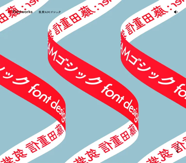
A pale-blue field with diagonal white bands and red text begins below the gallery. Let artwork transitions cross the entire viewport while keeping ordinary gallery images aligned with the reading container.
Full-Width Media Surface
A separate section contains a button measuring 1440 × 810px on desktop and 390 × 219.375px on mobile. Both are exactly 16:9. Its surrounding section uses the standard 80px desktop or 31.2px mobile vertical spacing.
The button semantics and ratio support describing this as a media affordance. The supplied evidence does not establish whether activation opens an overlay, starts inline playback, or navigates elsewhere. Its observed transition is an opacity transition lasting 250ms.
Typeface Introduction and Character Inventory
The introductory specimen section pairs a red display heading and explanatory paragraph with a large character inventory. The desktop grid is 480px 480px with a 40px gutter. On mobile it becomes a single column with a 20.8px gap.
The text describes antique structure and modern elements. The DOM inventory includes hiragana, katakana, full-width numbers, Latin capitals and lowercase letters, punctuation, and selected kanji. These are substantive specimen content rather than decorative filler.
The complete inner character-cell layout was not sampled. Do not invent a fixed column count, character-hover response, or editable type tester. In a new implementation, keep the inventory legible and grouped by script, with a clear reading order.
Antique and Modern Explanations
Two large red headings explain the A and M in the product name. Each combines an explicit line break with a 60px desktop or 37.44px mobile display face. Tight -0.05em tracking and 1.2 line height make the two-line headings dense and expressive.
The desktop Antique section reserves a 520px left region and puts its 480px text block on the right. The heading sits well below the section's start. The Modern explanation places its paragraph on the left; its heading box spans the full container. This creates an asymmetric editorial rhythm rather than two identical cards.
On mobile, the Antique left reservation disappears and both explanations use the 84vw content width. Labels for comparison typefaces, including 筑紫ゴシック and 筑紫アンティークLゴ, appear in the DOM. Exact diagram geometry and any comparison interactions were not supplied.
Typeface Facts
The facts identify the font name, pronunciation, designer, March 2022 release, and weight B. The designer name is a red semibold link; an adjacent social link is also present. A red 詳しい情報はこちら link leads to the detailed font page.
The detail link is aligned near the right edge of the desktop container and centered on mobile. Preserve concise label/value information without introducing a heavy table frame. The March 2022 date belongs to the product facts and is not the inspection date.
Usage Example
A full-width white section interrupts the gray canvas. Its heading is 使用事例, followed on desktop by a 480px-wide media button on the left and a 480px information block on the right.
The example concerns the 『はじめての』 collaboration involving four Naoki Prize authors and YOASOBI. Supporting fields identify genre, fonts, usage location, rights, and design. The title uses 22px/39.6px bold text on desktop.
On mobile, the media appears first at the full 327.594px container width. The title and metadata follow below; the title becomes 19.25px/34.65px. Keep attribution for this example scoped to the example rather than treating it as a separate credit for the website.
Designer Interview
The interview is a long editorial chapter on gray. Its section title has 0.1em tracking. Questions use the regular reading family at 24px desktop or 21px mobile, with a long dash-like lead-in visible in the captures. Answers use 16px/36px or 14px/31.5px text.
The desktop text spans the full 1,000px container. On mobile it narrows to 84vw, causing long questions to wrap naturally. The closing question wraps into two lines in the supplied mobile capture. Answers remain comfortably spaced instead of being compressed to compensate for the narrow measure.
The measured interview section is approximately 2,714px high on desktop and 3,793px on mobile. That increase is consistent with the longer vertical reading flow, although unsampled illustrations also occupy space within the chapter.
Closing Availability Notice
A slightly darker gray band summarizes availability through Monotype Fonts, LETS, and FONTPLUS. Service names are red and semibold within ordinary prose.
On desktop, the notice is centered and occupies two 36px lines in the 1,000px container. On mobile it is left-aligned and wraps into four 31.5px lines. The surrounding band is approximately 172px high on desktop and 188px on mobile, based on the supplied captures and text bounds.
This repeats the service destinations in a calm editorial form rather than repeating the large opening red strip.
Production Credits and Brand Footer
The production-credit panel uses a vivid red background with white label/value pairs. The desktop label-to-value offset is visually about 130px; on mobile it is about 83px. Long names wrap in the value column while labels remain aligned.
The inspected page directly names:
- Planning: Monotype株式会社.
- Film: MORYARTI inc. / 7M(モリ ケント).
- Design: MORYARTI inc.(シマブクロ ユウキ / サカイ マサトシ).
- Sound: Nasuno(7M / USAGiLab).
- Voice: 安齋 由香里(スワロウ).
The final footer darkens to measured #b1000f and presents four white linked marks: Monotype, LETS, mojimo, and FONTPLUS. All four remain in a single row on mobile. Their link boxes are scaled individually, preserving differences in brand proportions.
Desktop footer padding is 40px vertically; mobile padding is 31.2px. The mobile marks are small, with measured link widths around 62.4px, except LETS at about 72.8px. Use proper logo assets rather than retyping the names in an approximate font.
Tokens — Motion & Interaction
| Treatment | Supplied evidence | What can be concluded |
|---|---|---|
| Header, logo, sound, and media-button transitions | opacity 0.25s cubic-bezier(0.86, 0, 0.07, 1) |
A short opacity transition is defined; the triggering state and final opacity were not captured |
| General link token | all 0.25s cubic-bezier(0.860, 0.000, 0.070, 1.000) |
Declared as --transition-link; do not assume every anchor uses it unchanged |
| Mobile display statements | Animation name stage_animation-243eb7f2, duration 0.75s, fill mode both |
The five statements have an active animation declaration in the supplied mobile sample |
| Statement delays | 0.5s, 0.625s, 0.75s, 0.875s, 1s |
A calculated 125ms stagger; final statement would finish at 1.75s after the animation's start if uninterrupted |
| Desktop statement sample | animation: none |
The desktop elements were sampled without an active animation declaration; this does not prove an entirely static experience |
| Opening and red title panel | Distinct captured artwork states and a visible caret-like stroke | The visual states are observable; exact playback, typing, looping, and scroll synchronization are unverified |
The source declares many easing variables, including Quart, Expo, Sine, Circ, and Back families. Only the observed 250ms transition curve should be treated as an established component treatment here. A catalog of available easing variables is not a catalog of confirmed animations.
Most sampled wrappers report animation: none. Media playback, descendant animation, and JavaScript-driven transforms can still exist inside those wrappers. The source of the opening motion cannot be established from those fields alone.
Inspection limitations: no sound toggle, media activation, keyboard flow, hover state, pause control, or link destination was exercised in the supplied interaction record. Readiness checks waited for finite animation and temporarily paused perpetual animation, but did not establish the meaning or complete timeline of every motion sequence.
Recommended adaptation: retain the measured short opacity transition. Use the 750ms/125ms stagger only if designing a new text reveal, clearly treating its keyframes and trigger as new implementation decisions. Keep a complete static reading state available.
Surfaces
| Layer | Appearance | Purpose |
|---|---|---|
| Opening artwork | Red and white, aggressive cropping | Immediate expression of the typeface |
| Service strip | Red field, white typographic links | Access to three distribution services |
| Main reading canvas | #efefef, dark text |
Specimens, explanations, facts, and interview |
| Usage-example chapter | White | Separates a practical application from the specimen narrative |
| Availability notice | Visually darker gray | Quiet closing service reminder |
| Production credits | Red with white text | Compact named attribution |
| Brand footer | #b1000f, white marks |
Final institutional and service links |
Hierarchy comes from background changes, size, alignment, and open space. The observed interface does not need layered cards, floating glass panels, or soft shadows to separate content.
Imagery
Typography is both subject and image. The opening crops oversized letterforms; the mobile artwork stretches and tilts lettering; the gallery shows the font applied to an environmental display. A separate band introduces pale blue and diagonal red-on-white text.
The digital-signage image includes realistic object shading, a red lighting gradient, and charcoal hardware. That material realism is local to the mockup. Surrounding UI stays flat and restrained.
Observed Asset References
Asset URLs and filenames were not included in the evidence. The references below identify visible material without inventing paths or file formats.
| Material | Evidence | Implementation guidance |
|---|---|---|
| Giant white glyph on red | Desktop opening capture | Use authorized display artwork or media; deliberate crop is central |
| Diagonal and elongated lettering | Mobile opening capture | Provide a composition suited to the square mobile stage |
| Partial architectural photograph | Top of desktop gallery capture | Preserve its image role; the full composition was not visible |
| Digital-signage specimen mockup | Desktop gallery capture | Center at the reading-container width; retain the image's own lighting and shadow |
| Pale-blue patterned transition | Bottom of desktop gallery capture | Keep blue confined to the artwork and allow a full-width transition |
| Character inventory and comparisons | Rendered text and section structure | Recreate using licensed fonts or suitable supplied specimen assets; cell layout remains unverified |
| Monotype and service marks | Header and closing footer captures | Preserve individual logo proportions and white/black variants |
CSS can reproduce the editorial shell and much of the live typography. It cannot reproduce the exact opening footage, transformed lettering, mockups, or sound merely by applying the listed tokens.
Layout & Responsive Behavior
The desktop page alternates full-width display/media passages with centered 1,000px content. The mobile page uses a consistent 84vw reading width while allowing the opening and selected media to reach the screen edges.
The most important responsive change is the opening: it occupies the entire inspected desktop viewport but only a square 390px area on the phone. This exposes the service strip and the next red title state within the first mobile screen. Applying 100vh indiscriminately to mobile would change the observed pacing substantially.
The introduction and usage example move from two columns to one. The asymmetrical Antique explanation loses its desktop left reservation. Service links remain three across, and footer marks remain four across. The mobile layout therefore combines stacked editorial content with deliberately retained compact horizontal utility rows.
Body text changes from 16px to a source formula of max(12px, min(3.73333vw, 14px)), which resolves to 14px at 390px. The HTML root remains 16px in both samples. Mobile body sizing should not be implemented by assuming that every rem on the page has become 14px.
The measured document heights are approximately 16,650.38px desktop and 11,062.23px mobile. Mobile is shorter overall even though the interview is taller. The much smaller opening and display sequence explain why document length should not be extrapolated from prose wrapping alone.
The exact responsive breakpoint was not supplied. The Quick Start uses 48rem as a recommended implementation breakpoint, with measured endpoint values. Intermediate widths, landscape phones, browser zoom, safe areas, and very large displays were not inspected.
Do’s and Don’ts
Do
- Make the featured letterforms the central visual material.
- Pair the declared display family with the quieter reading family.
- Preserve
#d70d19,#efefef, and#b1000fas distinct interface roles. - Alternate full-width visual passages with a centered editorial container.
- Keep the mobile opening square and the desktop opening viewport-sized at comparable dimensions.
- Preserve 2.25 line spacing for long Japanese prose.
- Use square media frames and plain typographic service links.
- Keep character specimens readable even when opening artwork is heavily cropped.
- Retain the single-row mobile service strip and brand footer where space permits.
- Separate verified animation timing from unverified animation mechanics.
Don’t
- Do not replace the typographic narrative with a grid of generic feature cards.
- Do not use Futura for the interface merely because the interview discusses it.
- Do not approximate the Monotype wordmark by choosing a bold sans-serif.
- Do not apply the display sequence's 15vw type size to ordinary article headings.
- Do not treat the mockup's shadow or rounded hardware as an interface token.
- Do not turn the pale-blue artwork accent into a second global action color.
- Do not hardcode the sampled 7,478px display-section height into a static implementation.
- Do not claim a type tester, autoplay policy, scroll-scrubbed sequence, or modal player without additional evidence.
- Do not assume screenshot and DOM states represent the same animation frame.
Recommended Implementation Additions
These recommendations are not verified features of the original page:
- Expand icon hit areas to at least 44px while retaining the observed 20–24px visual icon size. Give sound and media controls explicit accessible names and state information.
- Provide a static opening poster and a way to pause sustained motion. Respect reduced-motion preferences in both CSS and media logic.
- Start audible playback only through a clear user action and keep mute state understandable.
- Add visible keyboard focus to the service links, brand marks, media surfaces, and detail links.
- Prevent the persistent transparent header from obscuring focused controls or anchored headings. Apply suitable scroll margins and consider a restrained backing surface where text overlaps.
- Preserve complete heading and paragraph content when decorative text is transformed or clipped. If duplicate display layers exist, keep them out of the reading order.
- Provide an efficient way to bypass a long character inventory for readers who want the explanatory article.
- Load fonts through authorized sources. Test fallback wrapping, long credit names, and small-screen service labels before relying on exact specimen line breaks.
Agent Prompt Guide
Quick Color Reference
- Main display and links:
#d70d19. - Reading canvas:
#efefef. - Main text:
#0a0a0a. - Usage-example surface:
#ffffff. - Closing notice: approximately
#e0e0e0, supported by the source gray token and visual appearance. - Final footer:
#b1000f, with white brand marks. - Pale blue: artwork only; an estimated
#a0cbd5is a starting approximation.
Overall Prompt
“Create a Japanese typeface feature page with a dramatic red-and-white opening and a spacious editorial reading flow. Let oversized, cropped letterforms carry the opening. Use Tsukushi AM Gothic S for featured specimen headings when licensed, and UD Kakugo Small for body copy when available, with the documented Japanese sans-serif fallbacks. Set the main accent to #d70d19, the reading canvas to #efefef, and text to #0a0a0a. Use a centered 1,000px desktop container, 480px paired columns with a 40px gap, and an 84vw single reading column on mobile. Follow the opening with three plain white service links on red, then large typographic statements, application images, specimens, a practical usage example, and a long interview. Close with a gray availability notice, white credits on red, and four white brand marks on #b1000f. Keep the mobile opening square, controls small in appearance, and media corners square.”
Example Component Prompts
- Identity header: “Place a compact black wordmark, slash, and featured-font label over the page near the upper-left corner. Use an 18px display-family product label on desktop and 14px on mobile. Keep a separate unboxed speaker icon near the upper-right corner. Preserve the transparent appearance while providing adequate accessible hit areas.”
- Service strip: “Create a red full-width band containing Monotype Fonts, LETS, and FONTPLUS as plain white semibold links. Keep all three in one row. On mobile, put
で利用するbelow each provider name and use approximately 31px vertical padding.” - Specimen explanation: “Use a red two-line 60px heading with 1.2 line height and -0.05em tracking beside a 480px prose block. Set body copy to 16px with 36px line height. On a 390px phone, use an 84vw column, approximately 37.44px display headings, and 14px body text with 31.5px line height.”
- Usage example: “Introduce one application example on a white full-width chapter. Inside a 1,000px container, place a 16:9 media surface in the left 480px column and the title plus concise label/value information in the right column. Stack the media above the text on mobile. Keep the frame square and shadow-free.”
- Interview and credits: “Build a gray Japanese interview with lightly weighted 24px questions and 16px answers at 2.25 line spacing. End with an availability paragraph, then a red definition-list credit panel and a darker red strip of four white logos. Let long mobile credit values wrap without shifting their labels.”
Quick Start
CSS Custom Properties
Apply tsuku-page to the page body and use the component classes below. The colors, fonts, desktop container, and endpoint typography are source-derived. The 48rem breakpoint, hover opacity application, header positioning method, and some credit geometry are recommended adaptations. Notice Gray uses the visually corresponding source token.
The CSS deliberately does not invent the opening animation or text-sequence keyframes. Supply authorized media and fonts separately; sound and playback require application logic.
:root {
  /* Source-derived palette */
  --color-main: #d70d19;
  --color-main-contrast: #b1000f;
  --color-canvas: #efefef;
  --color-notice: #e0e0e0;
  --color-ink: #0a0a0a;
  --color-white: #fff;

  /* Declared font stacks; font files are not bundled */
  --font-default: 'UD Kakugo Small', 'Helvetica Neue', Arial,
    'Hiragino Kaku Gothic ProN', 'Hiragino Sans', meiryo, sans-serif;
  --font-emphasis: 'Tsukushi AM Gothic S', 'Helvetica Neue', Arial,
    'Hiragino Kaku Gothic ProN', 'Hiragino Sans', meiryo, sans-serif;
  --weight-normal: 300;
  --weight-bold: 600;
  --text-body: 16px;
  --leading-body: 1.4;
  --leading-prose: 2.25;

  /* Measured desktop geometry */
  --content-width: 1000px;
  --grid-gap: 40px;
  --stack-gap: 40px;
  --section-space: 80px;
  --text-feature: 60px;
  --text-chapter: 32px;
  --text-question: 24px;
  --text-case: 22px;

  /* Measured transition; hover endpoint is an adaptation */
  --motion-link: 250ms cubic-bezier(0.86, 0, 0.07, 1);
  --hover-opacity: 0.6;
}

.tsuku-page,
.tsuku-page *,
.tsuku-page *::before,
.tsuku-page *::after {
  box-sizing: border-box;
}

.tsuku-page {
  margin: 0;
  background: var(--color-canvas);
  color: var(--color-ink);
  font-family: var(--font-default);
  font-size: var(--text-body);
  font-weight: var(--weight-normal);
  line-height: var(--leading-body);
}

.tsuku-page :is(h1, h2, h3, p, figure, dl, dd) {
  margin: 0;
}

.tsuku-page a {
  color: var(--color-main);
}

.tsuku-container {
  width: min(var(--content-width), calc(100% - 48px));
  margin-inline: auto;
}

.tsuku-section {
  padding-block: var(--section-space);
}

/* Fixed positioning reproduces the observed persistent overlay. */
.tsuku-header {
  position: fixed;
  z-index: 20;
  inset-block-start: 35px;
  inset-inline-start: 60px;
  display: flex;
  align-items: center;
}

.tsuku-brand {
  display: flex;
  align-items: center;
  width: 168px;
  height: 48px;
}

.tsuku-brand img {
  display: block;
  max-width: 100%;
  max-height: 100%;
}

.tsuku-page .tsuku-product-link {
  color: var(--color-ink);
  font-family: var(--font-emphasis);
  font-size: 18px;
  font-weight: var(--weight-bold);
  line-height: 1.4;
  text-decoration: none;
  white-space: nowrap;
}

.tsuku-product-link::before {
  content: '/';
  margin-inline: 8px 20px;
  opacity: 0.35;
}

.tsuku-sound {
  position: fixed;
  z-index: 21;
  top: 52px;
  right: 60px;
  width: 24px;
  height: 24px;
  padding: 0;
  border: 0;
  border-radius: 0;
  background: transparent;
  color: var(--color-ink);
  cursor: pointer;
}

/* Recommended larger hit area without enlarging the artwork. */
.tsuku-sound::after {
  content: '';
  position: absolute;
  inset: -12px;
}

.tsuku-sound svg {
  display: block;
  width: 100%;
  height: 100%;
}

.tsuku-hero {
  position: relative;
  height: 100svh;
  overflow: hidden;
  background: var(--color-main);
}

.tsuku-hero > :is(img, video) {
  display: block;
  width: 100%;
  height: 100%;
  object-fit: cover;
}

.tsuku-service-band {
  background: var(--color-main);
  color: var(--color-white);
}

.tsuku-services {
  display: flex;
  align-items: center;
  justify-content: space-around;
  gap: 20px;
  padding-block: 50px;
}

.tsuku-page .tsuku-service-link {
  color: inherit;
  font-size: 20px;
  font-weight: var(--weight-bold);
  line-height: 1.4;
  text-align: center;
  text-decoration: none;
}

.tsuku-service-suffix {
  font-size: inherit;
}

/* Static display composition; motion keyframes remain unspecified. */
.tsuku-manifesto {
  overflow: clip;
  background: var(--color-canvas);
}

.tsuku-type-line {
  color: var(--color-main);
  font-family: var(--font-emphasis);
  font-weight: var(--weight-bold);
  line-height: 1;
}

.tsuku-line-geometric { font-size: 7.65vw; }
.tsuku-line-combination { font-size: 12.6vw; }
.tsuku-line-antique { font-size: 15vw; }
.tsuku-line-modern { font-size: 11.5vw; }
.tsuku-line-name { font-size: 14.5vw; }

.tsuku-intro,
.tsuku-case-grid {
  display: grid;
  grid-template-columns: repeat(2, minmax(0, 1fr));
  gap: var(--grid-gap);
  align-items: start;
}

.tsuku-type-title,
.tsuku-feature-title {
  color: var(--color-main);
  font-family: var(--font-emphasis);
  font-size: var(--text-feature);
  font-weight: var(--weight-bold);
}

.tsuku-page .tsuku-type-title {
  margin-bottom: 20px;
  line-height: 1.4;
}

.tsuku-page .tsuku-feature-title {
  margin-bottom: 1rem;
  line-height: 1.2;
  letter-spacing: -0.05em;
}

.tsuku-prose {
  line-height: var(--leading-prose);
}

.tsuku-page .tsuku-chapter-title {
  margin-bottom: var(--section-space);
  font-size: var(--text-chapter);
  font-weight: var(--weight-bold);
  line-height: 1.4;
  letter-spacing: 0.1em;
}

.tsuku-case {
  background: var(--color-white);
}

.tsuku-case-title {
  font-size: var(--text-case);
  font-weight: var(--weight-bold);
  line-height: 1.8;
}

.tsuku-media-button {
  display: block;
  width: 100%;
  aspect-ratio: 16 / 9;
  overflow: hidden;
  padding: 0;
  border: 0;
  border-radius: 0;
  background: transparent;
  color: inherit;
  cursor: pointer;
}

.tsuku-media-button > img {
  display: block;
  width: 100%;
  height: 100%;
  object-fit: cover;
}

.tsuku-gallery-image {
  display: block;
  width: 100%;
  height: auto;
}

.tsuku-interview {
  padding-bottom: calc(2 * var(--section-space));
}

.tsuku-qa + .tsuku-qa {
  margin-top: var(--stack-gap);
}

.tsuku-page .tsuku-question {
  margin-bottom: 13.33px;
  font-size: var(--text-question);
  font-weight: var(--weight-normal);
  line-height: 1.8;
}

.tsuku-question::before {
  content: '——';
}

.tsuku-answer {
  line-height: var(--leading-prose);
}

.tsuku-availability {
  padding-block: 50px;
  background: var(--color-notice);
  text-align: center;
}

.tsuku-availability p {
  line-height: var(--leading-prose);
}

.tsuku-availability a {
  font-weight: var(--weight-bold);
  text-decoration: none;
}

/* Credit columns approximate the visible label/value alignment. */
.tsuku-credits {
  padding-block: 40px;
  background: var(--color-main);
  color: var(--color-white);
}

.tsuku-credits dl {
  display: grid;
  grid-template-columns: 130px minmax(0, 1fr);
  grid-auto-rows: minmax(40px, auto);
  line-height: 1.8;
}

.tsuku-credits dt {
  font-weight: var(--weight-bold);
}

.tsuku-credits dd {
  min-width: 0;
  overflow-wrap: anywhere;
}

.tsuku-footer {
  padding-block: 40px;
  background: var(--color-main-contrast);
  color: var(--color-white);
}

.tsuku-footer-logos {
  display: flex;
  align-items: center;
  justify-content: space-between;
  gap: 20px;
}

.tsuku-footer-logos a {
  display: flex;
  align-items: center;
  min-width: 0;
}

.tsuku-footer-logos a:nth-child(1) { width: 196px; }
.tsuku-footer-logos a:nth-child(2) { width: 203px; }
.tsuku-footer-logos a:nth-child(3) { width: 160px; }
.tsuku-footer-logos a:nth-child(4) { width: 202px; }

.tsuku-footer-logos img {
  display: block;
  max-width: 100%;
  max-height: 58.8px;
  object-fit: contain;
}

.tsuku-soft-control {
  transition: opacity var(--motion-link);
}

@media (hover: hover) {
  .tsuku-soft-control:hover {
    opacity: var(--hover-opacity);
  }
}

.tsuku-page :focus-visible {
  outline: 2px solid currentColor;
  outline-offset: 4px;
}

.tsuku-page [id] {
  scroll-margin-top: 100px;
}

/* Recommended breakpoint; endpoint values follow the mobile evidence. */
@media (max-width: 48rem) {
  :root {
    --text-body: clamp(12px, 3.73333vw, 14px);
    --content-width: 84vw;
    --grid-gap: 5.33333vw;
    --stack-gap: 5.33333vw;
    --section-space: 8vw;
    --text-feature: min(9.6vw, 60px);
    --text-chapter: calc(var(--text-body) * 1.25);
    --text-question: calc(var(--text-body) * 1.5);
    --text-case: calc(var(--text-body) * 1.375);
  }

  .tsuku-container {
    width: var(--content-width);
  }

  .tsuku-header {
    top: 16px;
    left: 4.25vw;
  }

  .tsuku-brand {
    width: 124px;
    height: 36px;
  }

  .tsuku-page .tsuku-product-link {
    font-size: 14px;
  }

  .tsuku-product-link::before {
    margin-inline: 2px 10px;
  }

  .tsuku-sound {
    top: 26px;
    right: 6.25vw;
    width: 20px;
    height: 20px;
  }

  .tsuku-hero {
    height: auto;
    aspect-ratio: 1;
  }

  .tsuku-services {
    gap: 10px;
    padding-block: 8vw;
  }

  .tsuku-page .tsuku-service-link {
    display: flex;
    flex-direction: column;
    align-items: center;
    font-size: var(--text-body);
  }

  /* The smaller suffix is a visual approximation of the capture. */
  .tsuku-service-suffix {
    font-size: 12px;
    line-height: 1.4;
  }

  .tsuku-line-modern {
    font-size: 11vw;
  }

  .tsuku-intro,
  .tsuku-case-grid {
    grid-template-columns: minmax(0, 1fr);
  }

  .tsuku-page .tsuku-type-title {
    margin-bottom: 5.33333vw;
  }

  .tsuku-page .tsuku-feature-title {
    margin-bottom: var(--text-body);
  }

  .tsuku-page .tsuku-chapter-title {
    margin-bottom: 5.33333vw;
    padding-block: 2.66667vw;
  }

  .tsuku-page .tsuku-question {
    margin-bottom: 6.58px;
  }

  .tsuku-availability {
    padding-block: 8vw;
    text-align: left;
  }

  .tsuku-credits,
  .tsuku-footer {
    padding-block: 8vw;
  }

  .tsuku-credits dl {
    grid-template-columns: 83px minmax(0, 1fr);
    grid-auto-rows: auto;
    row-gap: 8px;
  }

  .tsuku-footer-logos {
    gap: 12px;
  }

  .tsuku-footer-logos a:nth-child(n) {
    width: 16vw;
  }

  .tsuku-footer-logos a:nth-child(2) {
    width: 18.66667vw;
  }

  .tsuku-footer-logos img {
    max-height: 4.8vw;
  }
}

@media (prefers-reduced-motion: reduce) {
  .tsuku-soft-control {
    transition: none;
  }
  /* Also provide a static poster through the media implementation. */
}
Component Markup Example
This small fragment demonstrates the service strip and interview classes. The copy is quoted source UI or sample Japanese editorial content; the implementation comments remain English. Service URLs below are present in the supplied original-page evidence.
<nav class='tsuku-service-band' aria-label='Font services'>
  <div class='tsuku-container tsuku-services'>
    <a class='tsuku-service-link'
       href='https://www.monotypefonts.com/pages/search?query=Tsukushi%20old%20gothic&utm_source=fontworks_LPreferralLP_tsuku-am-gothic'>
      <span>Monotype Fonts</span>
      <span class='tsuku-service-suffix'>で利用する</span>
    </a>
    <a class='tsuku-service-link'
       href='https://lets.fontworks.co.jp/fonts?orderBy=1&fontName=562R57SrQU3jgrTjgrfjg4Pjgq8&utm_source=fontworks_LPreferralLP_tsuku-am-gothic'>
      <span>LETS</span>
      <span class='tsuku-service-suffix'>で利用する</span>
    </a>
    <a class='tsuku-service-link'
       href='https://fontplus.jp/font-list?fontName=%E7%AD%91%E7%B4%ABAM%E3%82%B4%E3%82%B7%E3%83%83%E3%82%AF&orderBy=name&utm_source=fontworks_LPreferralLP_tsuku-am-gothic'>
      <span>FONTPLUS</span>
      <span class='tsuku-service-suffix'>で利用する</span>
    </a>
  </div>
</nav>

<section class='tsuku-section tsuku-interview' lang='ja'>
  <div class='tsuku-container'>
    <h2 class='tsuku-chapter-title'>書体デザイナーインタビュー</h2>
    <div class='tsuku-qa'>
      <h3 class='tsuku-question'>筑紫AMゴシックの魅力とはなんでしょうか?</h3>
      <p class='tsuku-answer'>
        骨格は手書き的・アンティークな雰囲気を持つが、
        エレメントは抑揚を抑え幾何学的でモダン。
      </p>
    </div>
  </div>
</section>
Tailwind v4 Token Mapping
Optional aliases for projects already using Tailwind v4. This is not evidence that the original page uses Tailwind. Define the properties above first.
@theme inline {
  --color-typeface: var(--color-main);
  --color-footer: var(--color-main-contrast);
  --color-reading: var(--color-canvas);
  --color-notice-band: var(--color-notice);
  --color-text-ink: var(--color-ink);

  --font-reading: var(--font-default);
  --font-specimen: var(--font-emphasis);

  --text-reading: var(--text-body);
  --text-feature: var(--text-feature);
  --text-editorial-question: var(--text-question);
  --text-editorial-chapter: var(--text-chapter);

  --spacing-editorial-gap: var(--grid-gap);
  --spacing-section: var(--section-space);
  --container-editorial: var(--content-width);
}
For an actual Tailwind integration, rename the feature-size alias to avoid a self-reference, for example --text-specimen-heading: var(--text-feature). The plain CSS classes above do not depend on Tailwind.
Sources & Evidence
- Original and final page: 筑紫AMゴシック | Monotype. The supplied inspection reports HTTP 200 with no URL change. Current header identity, product content, service links, and visible production credits come from this page.
- Inspection time: batch retrieval timestamp
2026-10-01T20:36:16.267Z, equivalent to October 2, 2026, 05:36:16.267 JST. Individual screenshot timestamps were not supplied. - Desktop evidence: three current-page captures at
1440 × 1000, plus rendered text, links, custom properties, and element bounds. Measured document height:16650.375px. - Mobile evidence: two current-page captures at
390 × 844, plus the corresponding rendered DOM/style sample. Measured document height:11062.234375px. - Style authority: the supplied computed styles establish family declarations, sizes, weights, line heights, colors, grid columns, selected padding, transition values, and the mobile statement animation timing. Where a source token exists without a matching component measurement, this document labels the association separately.
- Observed behavior: captures cover opening, gallery, and closing positions; persistent identity is visible across scrolled views. Mobile statement animation declarations are supplied. No control activation results were included.
- Limitations: image and media URLs, font files, animation keyframes, complete child-element geometry, accessibility trees, and exact breakpoint rules were not supplied. The inspection process waited for document/layout readiness and finite animation, but does not prove semantic completeness or the absence of delayed content. SharedWorkers and service workers were disabled during inspection.
This reference describes the current supplied page evidence. CSS geometry and prompts are reusable adaptations; exact artwork, media timing, audio behavior, and unsampled interactions require their own implementation evidence.
# Tsukushi AM Gothic / Monotype — Style Reference

> A type specimen that moves between an oversized red poster and a spacious editorial page.

**Original URL:** [fontworks.co.jp/special/tsuku-am-gothic/](https://fontworks.co.jp/special/tsuku-am-gothic/)
**Final URL:** [fontworks.co.jp/special/tsuku-am-gothic/](https://fontworks.co.jp/special/tsuku-am-gothic/) — unchanged, HTTP 200.
**Theme:** a light editorial canvas, vivid red display sections, and a darker red closing footer.
**Inspected:** supplied browser evidence retrieved October 2, 2026, at 05:36 JST; exact batch timestamp: `2026-10-01T20:36:16.267Z`.
**Viewports:** desktop `1440 × 1000` and mobile `390 × 844` CSS pixels.
**Scope:** the current typeface feature page: opening visual, service links, display typography, application imagery, media surfaces, character specimens, design explanations, typeface facts, usage example, designer interview, availability notice, production credits, and brand footer. Analysis uses three desktop captures, two mobile captures, and the supplied rendered DOM/computed-style samples. No additional browsing or interaction testing was performed.

The page introduces 筑紫AMゴシック through the shapes of its letters. Huge white strokes fill the opening red field; later statements use red display text across the page width. These expressive passages give way to pale-gray reading surfaces, carefully spaced Japanese prose, and technical information about the typeface. The result combines a product showcase, a specimen, and a substantial editorial interview.

Its strongest organizing contrast is scale. A modest black Monotype identity remains near the upper-left corner while letterforms become almost architectural. In the reading sections, a centered 1,000px desktop container brings the composition back under control. Red identifies the featured typeface and service links; black carries the explanation. Rounded interface cards and decorative shadows are not part of the observed system.
閉じる
# Tsukushi AM Gothic / Monotype — Style Reference

> A type specimen that moves between an oversized red poster and a spacious editorial page.

**Original URL:** [fontworks.co.jp/special/tsuku-am-gothic/](https://fontworks.co.jp/special/tsuku-am-gothic/)
**Final URL:** [fontworks.co.jp/special/tsuku-am-gothic/](https://fontworks.co.jp/special/tsuku-am-gothic/) — unchanged, HTTP 200.
**Theme:** a light editorial canvas, vivid red display sections, and a darker red closing footer.
**Inspected:** supplied browser evidence retrieved October 2, 2026, at 05:36 JST; exact batch timestamp: `2026-10-01T20:36:16.267Z`.
**Viewports:** desktop `1440 × 1000` and mobile `390 × 844` CSS pixels.
**Scope:** the current typeface feature page: opening visual, service links, display typography, application imagery, media surfaces, character specimens, design explanations, typeface facts, usage example, designer interview, availability notice, production credits, and brand footer. Analysis uses three desktop captures, two mobile captures, and the supplied rendered DOM/computed-style samples. No additional browsing or interaction testing was performed.

The page introduces 筑紫AMゴシック through the shapes of its letters. Huge white strokes fill the opening red field; later statements use red display text across the page width. These expressive passages give way to pale-gray reading surfaces, carefully spaced Japanese prose, and technical information about the typeface. The result combines a product showcase, a specimen, and a substantial editorial interview.

Its strongest organizing contrast is scale. A modest black Monotype identity remains near the upper-left corner while letterforms become almost architectural. In the reading sections, a centered 1,000px desktop container brings the composition back under control. Red identifies the featured typeface and service links; black carries the explanation. Rounded interface cards and decorative shadows are not part of the observed system.

## How to Read This Reference

- **Measured** means a value appears in the supplied computed styles or element bounds. Measurements refer to the two inspected viewports.
- **Source token** means a custom property was supplied. Its presence does not establish that every component uses it.
- **Calculated** means arithmetic from measured values, such as an aspect ratio or viewport-relative equivalent.
- **Estimated** means a visual approximation from the current-page captures. These values are not pixel samples or recovered CSS declarations.
- **Recommended** means implementation guidance for a new page. The CSS Quick Start is an adaptation, not recovered source code.
- The screenshots and DOM describe sampled states of a page containing animated material. They are not necessarily synchronized frames. Unknown keyframes, media implementations, and click outcomes remain unverified.

## Tokens — Colors

### Core Palette

| Name | Value | Source / reusable token | Evidence and role |
| --- | --- | --- | --- |
| Typeface Red | `#d70d19` | Source `--color-main`, `--color-link` | Measured on display headings and ordinary red links; principal brand accent |
| Reading Gray | `#efefef` | Source `--color-body-bg` | Measured body, specimen, and interview background |
| Footer Red | `#b1000f` | Source `--color-main-contrast` | Measured final footer background; visibly deeper than the main red |
| Text Ink | `#0a0a0a` | Source `--color-base` | Measured body copy, interview questions, and product header text |
| White | `#ffffff` | Source `--color-white` | Measured usage-example background and service-link text; also visible in opening artwork and footer marks |
| Notice Gray | `#e0e0e0` | Source `--color-gray-300`; adaptation `--color-notice` | Declared source value that visually corresponds to the closing availability band; that band's own computed background was not included |
| Black | `#000000` | Source `--color-black` | Declared source value; black identity artwork and icons are visible, but their internal asset colors were not extracted |

The source also declares a gray scale from `#fafafa` through `#212121`. Do not turn every declared gray into a visible design layer. The captures are dominated by one pale reading canvas, a slightly darker notice band, red, white, and near-black.

### Artwork Colors

A pale blue field appears in the ribbon artwork at the bottom of the desktop gallery capture. Approximately `#a0cbd5` is a **visual estimate** suitable for an initial mockup, not an exact source token. Keep this blue local to the artwork.

The digital-signage mockup contains brighter reds, a red light bloom, and dark charcoal hardware. These belong to the depicted scene. They do not establish a gradient-button or shadow-elevation system for the interface. Likewise, reds inside opening media need not equal the CSS accent in every frame.

### Color Roles

- Use red for large specimen headings, service surfaces, and inline service links.
- Use gray for sustained reading and generous negative space.
- Reserve white surfaces for a distinct content chapter, as in the usage example.
- Reverse production credits and closing logos to white on red.
- Keep the persistent identity and sound icon visually spare and dark.

No alternate theme or user-selectable palette is evidenced.

## Tokens — Typography

### Featured Typeface — Display and Identity

**Observed family:** `Tsukushi AM Gothic S`.

**Source stack:**

```css
'Tsukushi AM Gothic S', 'Helvetica Neue', Arial,
'Hiragino Kaku Gothic ProN', 'Hiragino Sans', meiryo, sans-serif
```

The family is explicitly declared on the product name in the header, oversized statements, and red explanatory headings. These elements use computed weight `600`. The page's facts separately list the typeface's product weight as `B`; that product label should not be confused with the CSS numeric weight.

The design commentary describes an antique, handwritten underlying structure combined with restrained geometric elements. The interface demonstrates this through actual specimens and enlarged text. Preserve the distinctive font when a licensed implementation is available. A geometric Latin substitute alone cannot reproduce the Japanese forms.

### Reading Typeface — Prose and Utilities

**Observed family:** `UD Kakugo Small`.

**Source stack:**

```css
'UD Kakugo Small', 'Helvetica Neue', Arial,
'Hiragino Kaku Gothic ProN', 'Hiragino Sans', meiryo, sans-serif
```

Body copy uses weight `300`; service links, chapter headings, and selected metadata links use `600`. Normal tracking is zero. Long prose uses a generous `2.25` line height even though the body's default line height is `1.4`.

These are declared/computed family names. Font file URLs, loading behavior, and the actual rendered fallback status were not supplied. The Monotype wordmark is visible identity artwork; its lettering should not be inferred from the surrounding CSS family.

Futura and Helvetica are discussed in the interview. That discussion is not evidence that Futura is the page's interface font.

### Measured Type Scale

| Role | Desktop size / line height | Mobile size / line height | Weight / tracking |
| --- | --- | --- | --- |
| Default body | `16 / 22.4px` | `14 / 19.6px` | `300`, normal |
| Long prose | `16 / 36px` | `14 / 31.5px` | `300`, normal |
| Header product name | `18 / 25.2px` | `14 / 19.6px` | `600`, normal; display family |
| Service-strip link | `20 / 28px` | `14 / 19.6px` | `600`; mobile child text may have additional styling |
| Typeface introduction heading | `60 / 84px` | `37.44 / 52.416px` | `600`, normal; display family |
| Antique / Modern explanation heading | `60 / 72px` | `37.44 / 44.928px` | `600`, `-0.05em` |
| Usage and interview chapter heading | `32 / 44.8px` | `17.5 / 24.5px` | `600`, `0.1em` |
| Usage-example title | `22 / 39.6px` | `19.25 / 34.65px` | `600`, normal |
| Interview question | `24 / 43.2px` | `21 / 37.8px` | `300`, normal |
| Designer / detail link | `16px` | `14px` | `600`; line height varies by context |

The smaller mobile chapter heading is a contextual override. The source's generic mobile `--h2-font-size` would resolve to 28px, but the inspected usage and interview headings actually compute to 17.5px. Reuse component measurements rather than applying one global heading formula everywhere.

### Oversized Statement Scale

These are computed paragraph sizes in the display sequence. All use the featured family, weight `600`, and line height `1`.

| Source text | Desktop | Mobile | Calculated viewport equivalent |
| --- | --- | --- | --- |
| `Geometricな欧文に筑紫らしさを` | `110.16px` | `29.835px` | `7.65vw` at both inspected widths |
| `組み合わせた書体` | `181.44px` | `49.14px` | `12.6vw` |
| `“Antique”な骨格` | `216px` | `58.5px` | `15vw` |
| `“Modern”なエレメント` | `165.6px` | `42.9px` | Desktop `11.5vw`; mobile `11vw` |
| `筑紫AMゴシック` | `208.8px` | `56.55px` | `14.5vw` |

The viewport equivalents are calculations, not quoted source declarations. These lines are composition-specific. Their enormous sizes should not be reused for ordinary article headings.

The white product title inside the captured mobile red panel appears approximately 28–32px high. That particular visible title was not represented by a matching computed-style sample, so its size remains an estimate.

## Tokens — Spacing & Shapes

### Container and Grid

The desktop source declares:

```css
--width-column: 220px;
--width-gutter: 40px;
--width-container: calc(220px * 4 + 40px * 3);
```

This produces a **1,000px container**, centered with **220px side margins** at 1440px. A two-column content layout combines the underlying units into `480px 480px`, with a 40px gap.

The mobile source declares:

```css
--width-column: 39.46667vw;
--width-gutter: 5.06667vw;
--width-container: 84vw;
```

At 390px, the container measures approximately **327.594px**, with **31.203px side margins**. The introduction actually renders as one column. The continued existence of mobile column tokens does not mean every section remains a two-column layout.

### Spacing Measurements

| Use | Desktop | Mobile | Status |
| --- | --- | --- | --- |
| Main section vertical padding | `80px` | `31.2px` | Measured; mobile equals `8vw` |
| Interview bottom padding | `160px` | `62.4px` | Measured; twice the section spacing |
| Generic source gutter | `40px` | About `19.76px` | Declared; mobile calculated from `5.06667vw` |
| Introduction grid gap | `0 40px` | `20.8px` | Measured; mobile equals about `5.33333vw` |
| Introduction heading-to-copy gap | `20px` | About `20.8px` | Calculated from element bounds |
| Feature heading-to-copy gap | `16px` | `14px` | Calculated from element bounds |
| Common interview entry separation | `40px` | About `20.8px` | Calculated for adjacent text entries; illustrated passages vary |
| Footer vertical padding | `40px` | `31.2px` | Measured |

The mobile introduction gap is slightly larger than the declared mobile gutter. Keep those two values distinct when reproducing the measured layout.

### Layout Measurements

| Element | Desktop | Mobile | Evidence |
| --- | --- | --- | --- |
| Opening section | `1440 × 1000px` | `390 × 390px` | Measured; desktop viewport-sized, mobile square |
| Service strip | `128px` high | About `98.77px` high | Calculated between opening end and next section start |
| Display-sequence section | `7478px` high | About `2595.34px` high | Measured sampled layout; not a recommended fixed height |
| Full-width media button | `1440 × 810px` | `390 × 219.375px` | Measured `16:9` |
| Introduction columns | `480px + 40px + 480px` | One `327.594px` column | Measured grid |
| Usage-example media button | `480 × 270px` | About `327.594 × 184.266px` | Measured `16:9` |
| Header brand link box | `168 × 48px` | `124 × 36px` | Measured link box, not painted logo bounds |
| Sound button | `24 × 24px` | `20 × 20px` | Measured |
| Final footer | About `138.8px` high | About `81.08px` high | Measured |

### Shape Language

Sampled sections, links, buttons, and the footer have `0px` border radius. The page is built from rectangular media, continuous background fields, text, and open space. No general interface shadow system is visible.

The rounded digital-signage hardware and its cast shadow are inside the mockup image. They should not become container radii or CSS shadows around every component.

## Components

### Persistent Identity Header

**Anatomy:** linked Monotype wordmark, a small slash separator, and the linked product label `筑紫AMゴシック`.

The header is a compact transparent flex group rather than a full-width navigation bar. Its measured desktop origin is `(60, 35)`, with a total box about `331.56 × 48px`. On mobile it starts near `(16.56, 16)` and measures about `244.20 × 36px`.

The brand links to the site's root; the product label links to the current feature URL. Black identity and text remain visible over both visual and editorial sections. The header stays near the top in the supplied scrolled captures, establishing persistent overlay behavior; the actual `position` declaration was not included.

At the bottom of the page, article text can pass behind this transparent identity. A new implementation should preserve its light visual footprint while improving clearance where needed.

### Sound Control and Scroll Cue

An unboxed dark speaker icon with a mute mark sits independently at the upper right. The desktop button is at `(1356, 52)` with a 24px square box. The mobile button is at approximately `(345.63, 26)` with a 20px square box.

The icon suggests sound control, but no click result, audio state transition, or persistence behavior was supplied. The extraction does not contain an accessibility-tree inspection, so an empty text field should not be treated as proof of a missing accessible name.

A thin downward arrow appears near the lower-right corner of the desktop opening. Its clickability was not established. Treat it as a visible navigation cue without assuming a particular scroll handler.

### Opening Visual

The desktop capture shows an enormous white Japanese letterform cropped by a red field. Strokes are so large that the glyph becomes a graphic shape. The white area continues across the lower portion of the frame, giving the opening a changing balance of positive and negative space.

The mobile opening is a square containing diagonal, elongated typography on red. Japanese and Latin lettering form the artwork. This is not a scaled-down rendering of the desktop screenshot's exact frame.

Use a dedicated art-directed media area. Cropping is appropriate for this expressive opening; it is inappropriate for the later readable specimen inventory. The underlying asset format, playback duration, and relationship between desktop/mobile media were not supplied.

### Three-Service Availability Strip

Immediately after the opening, a red band presents three white links:

- `Monotype Fontsで利用する`
- `LETSで利用する`
- `FONTPLUSで利用する`

On desktop the labels stay on one line, using 20px bold body-family text. On mobile the provider name appears above `で利用する`, while all three providers remain in a single horizontal row. The strip is about 128px high on desktop and 99px on mobile.

These are plain typographic links on a shared surface. There are no separate pill fills, large rounded outlines, or card containers. The link destinations are provider searches for the featured font; the later closing notice instead links to provider homepages.

### Display Typography Sequence

The rendered DOM contains five oversized statements describing the typeface's geometric, antique, and modern characteristics. The statements span the viewport and use individually fitted sizes. Their measured boxes can slightly overlap vertically, reinforcing their role as a composed typographic sequence.

The mobile screenshot also shows a red panel with a centered white `筑紫AMゴシック` title and a thin white vertical stroke after it. This resembles a caret visually, but editing and typing behavior were not tested.

The sampled DOM gives the surrounding section a gray background while the screenshot presents a red foreground state. Preserve this distinction: one capture and one set of element bounds cannot establish a complete animation timeline or all visible layers. Do not stack every sampled state into a single static block and claim that it reproduces the original sequence.

### Application Image Gallery

The desktop gallery capture uses a centered, approximately `1000 × 562px` digital-signage mockup. A charcoal standing display carries a red-and-white specimen poster, surrounded by a red studio-like background and cast shadow.

The image itself is rectangular and unframed. An earlier photographic image is partially visible at the top of the same capture. The visible gap before the signage image is about 80px; roughly 160px of gray separates its bottom from the next full-width patterned artwork. These are screenshot estimates for this captured position.

A pale-blue field with diagonal white bands and red text begins below the gallery. Let artwork transitions cross the entire viewport while keeping ordinary gallery images aligned with the reading container.

### Full-Width Media Surface

A separate section contains a button measuring `1440 × 810px` on desktop and `390 × 219.375px` on mobile. Both are exactly `16:9`. Its surrounding section uses the standard 80px desktop or 31.2px mobile vertical spacing.

The button semantics and ratio support describing this as a media affordance. The supplied evidence does not establish whether activation opens an overlay, starts inline playback, or navigates elsewhere. Its observed transition is an opacity transition lasting 250ms.

### Typeface Introduction and Character Inventory

The introductory specimen section pairs a red display heading and explanatory paragraph with a large character inventory. The desktop grid is `480px 480px` with a 40px gutter. On mobile it becomes a single column with a 20.8px gap.

The text describes antique structure and modern elements. The DOM inventory includes hiragana, katakana, full-width numbers, Latin capitals and lowercase letters, punctuation, and selected kanji. These are substantive specimen content rather than decorative filler.

The complete inner character-cell layout was not sampled. Do not invent a fixed column count, character-hover response, or editable type tester. In a new implementation, keep the inventory legible and grouped by script, with a clear reading order.

### Antique and Modern Explanations

Two large red headings explain the `A` and `M` in the product name. Each combines an explicit line break with a 60px desktop or 37.44px mobile display face. Tight `-0.05em` tracking and `1.2` line height make the two-line headings dense and expressive.

The desktop Antique section reserves a 520px left region and puts its 480px text block on the right. The heading sits well below the section's start. The Modern explanation places its paragraph on the left; its heading box spans the full container. This creates an asymmetric editorial rhythm rather than two identical cards.

On mobile, the Antique left reservation disappears and both explanations use the 84vw content width. Labels for comparison typefaces, including `筑紫ゴシック` and `筑紫アンティークLゴ`, appear in the DOM. Exact diagram geometry and any comparison interactions were not supplied.

### Typeface Facts

The facts identify the font name, pronunciation, designer, March 2022 release, and weight `B`. The designer name is a red semibold link; an adjacent social link is also present. A red `詳しい情報はこちら` link leads to the detailed font page.

The detail link is aligned near the right edge of the desktop container and centered on mobile. Preserve concise label/value information without introducing a heavy table frame. The March 2022 date belongs to the product facts and is not the inspection date.

### Usage Example

A full-width white section interrupts the gray canvas. Its heading is `使用事例`, followed on desktop by a 480px-wide media button on the left and a 480px information block on the right.

The example concerns the `『はじめての』` collaboration involving four Naoki Prize authors and YOASOBI. Supporting fields identify genre, fonts, usage location, rights, and design. The title uses 22px/39.6px bold text on desktop.

On mobile, the media appears first at the full 327.594px container width. The title and metadata follow below; the title becomes 19.25px/34.65px. Keep attribution for this example scoped to the example rather than treating it as a separate credit for the website.

### Designer Interview

The interview is a long editorial chapter on gray. Its section title has `0.1em` tracking. Questions use the regular reading family at 24px desktop or 21px mobile, with a long dash-like lead-in visible in the captures. Answers use 16px/36px or 14px/31.5px text.

The desktop text spans the full 1,000px container. On mobile it narrows to 84vw, causing long questions to wrap naturally. The closing question wraps into two lines in the supplied mobile capture. Answers remain comfortably spaced instead of being compressed to compensate for the narrow measure.

The measured interview section is approximately 2,714px high on desktop and 3,793px on mobile. That increase is consistent with the longer vertical reading flow, although unsampled illustrations also occupy space within the chapter.

### Closing Availability Notice

A slightly darker gray band summarizes availability through Monotype Fonts, LETS, and FONTPLUS. Service names are red and semibold within ordinary prose.

On desktop, the notice is centered and occupies two 36px lines in the 1,000px container. On mobile it is left-aligned and wraps into four 31.5px lines. The surrounding band is approximately 172px high on desktop and 188px on mobile, based on the supplied captures and text bounds.

This repeats the service destinations in a calm editorial form rather than repeating the large opening red strip.

### Production Credits and Brand Footer

The production-credit panel uses a vivid red background with white label/value pairs. The desktop label-to-value offset is visually about 130px; on mobile it is about 83px. Long names wrap in the value column while labels remain aligned.

The inspected page directly names:

- Planning: Monotype株式会社.
- Film: MORYARTI inc. / 7M(モリ ケント).
- Design: MORYARTI inc.(シマブクロ ユウキ / サカイ マサトシ).
- Sound: Nasuno(7M / USAGiLab).
- Voice: 安齋 由香里(スワロウ).

The final footer darkens to measured `#b1000f` and presents four white linked marks: Monotype, LETS, mojimo, and FONTPLUS. All four remain in a single row on mobile. Their link boxes are scaled individually, preserving differences in brand proportions.

Desktop footer padding is 40px vertically; mobile padding is 31.2px. The mobile marks are small, with measured link widths around 62.4px, except LETS at about 72.8px. Use proper logo assets rather than retyping the names in an approximate font.

## Tokens — Motion & Interaction

| Treatment | Supplied evidence | What can be concluded |
| --- | --- | --- |
| Header, logo, sound, and media-button transitions | `opacity 0.25s cubic-bezier(0.86, 0, 0.07, 1)` | A short opacity transition is defined; the triggering state and final opacity were not captured |
| General link token | `all 0.25s cubic-bezier(0.860, 0.000, 0.070, 1.000)` | Declared as `--transition-link`; do not assume every anchor uses it unchanged |
| Mobile display statements | Animation name `stage_animation-243eb7f2`, duration `0.75s`, fill mode `both` | The five statements have an active animation declaration in the supplied mobile sample |
| Statement delays | `0.5s`, `0.625s`, `0.75s`, `0.875s`, `1s` | A calculated 125ms stagger; final statement would finish at 1.75s after the animation's start if uninterrupted |
| Desktop statement sample | `animation: none` | The desktop elements were sampled without an active animation declaration; this does not prove an entirely static experience |
| Opening and red title panel | Distinct captured artwork states and a visible caret-like stroke | The visual states are observable; exact playback, typing, looping, and scroll synchronization are unverified |

The source declares many easing variables, including Quart, Expo, Sine, Circ, and Back families. Only the observed 250ms transition curve should be treated as an established component treatment here. A catalog of available easing variables is not a catalog of confirmed animations.

Most sampled wrappers report `animation: none`. Media playback, descendant animation, and JavaScript-driven transforms can still exist inside those wrappers. The source of the opening motion cannot be established from those fields alone.

**Inspection limitations:** no sound toggle, media activation, keyboard flow, hover state, pause control, or link destination was exercised in the supplied interaction record. Readiness checks waited for finite animation and temporarily paused perpetual animation, but did not establish the meaning or complete timeline of every motion sequence.

**Recommended adaptation:** retain the measured short opacity transition. Use the 750ms/125ms stagger only if designing a new text reveal, clearly treating its keyframes and trigger as new implementation decisions. Keep a complete static reading state available.

## Surfaces

| Layer | Appearance | Purpose |
| --- | --- | --- |
| Opening artwork | Red and white, aggressive cropping | Immediate expression of the typeface |
| Service strip | Red field, white typographic links | Access to three distribution services |
| Main reading canvas | `#efefef`, dark text | Specimens, explanations, facts, and interview |
| Usage-example chapter | White | Separates a practical application from the specimen narrative |
| Availability notice | Visually darker gray | Quiet closing service reminder |
| Production credits | Red with white text | Compact named attribution |
| Brand footer | `#b1000f`, white marks | Final institutional and service links |

Hierarchy comes from background changes, size, alignment, and open space. The observed interface does not need layered cards, floating glass panels, or soft shadows to separate content.

## Imagery

Typography is both subject and image. The opening crops oversized letterforms; the mobile artwork stretches and tilts lettering; the gallery shows the font applied to an environmental display. A separate band introduces pale blue and diagonal red-on-white text.

The digital-signage image includes realistic object shading, a red lighting gradient, and charcoal hardware. That material realism is local to the mockup. Surrounding UI stays flat and restrained.

### Observed Asset References

Asset URLs and filenames were not included in the evidence. The references below identify visible material without inventing paths or file formats.

| Material | Evidence | Implementation guidance |
| --- | --- | --- |
| Giant white glyph on red | Desktop opening capture | Use authorized display artwork or media; deliberate crop is central |
| Diagonal and elongated lettering | Mobile opening capture | Provide a composition suited to the square mobile stage |
| Partial architectural photograph | Top of desktop gallery capture | Preserve its image role; the full composition was not visible |
| Digital-signage specimen mockup | Desktop gallery capture | Center at the reading-container width; retain the image's own lighting and shadow |
| Pale-blue patterned transition | Bottom of desktop gallery capture | Keep blue confined to the artwork and allow a full-width transition |
| Character inventory and comparisons | Rendered text and section structure | Recreate using licensed fonts or suitable supplied specimen assets; cell layout remains unverified |
| Monotype and service marks | Header and closing footer captures | Preserve individual logo proportions and white/black variants |

CSS can reproduce the editorial shell and much of the live typography. It cannot reproduce the exact opening footage, transformed lettering, mockups, or sound merely by applying the listed tokens.

## Layout & Responsive Behavior

The desktop page alternates full-width display/media passages with centered 1,000px content. The mobile page uses a consistent 84vw reading width while allowing the opening and selected media to reach the screen edges.

The most important responsive change is the opening: it occupies the entire inspected desktop viewport but only a square 390px area on the phone. This exposes the service strip and the next red title state within the first mobile screen. Applying `100vh` indiscriminately to mobile would change the observed pacing substantially.

The introduction and usage example move from two columns to one. The asymmetrical Antique explanation loses its desktop left reservation. Service links remain three across, and footer marks remain four across. The mobile layout therefore combines stacked editorial content with deliberately retained compact horizontal utility rows.

Body text changes from 16px to a source formula of `max(12px, min(3.73333vw, 14px))`, which resolves to 14px at 390px. The HTML root remains 16px in both samples. Mobile body sizing should not be implemented by assuming that every `rem` on the page has become 14px.

The measured document heights are approximately **16,650.38px desktop** and **11,062.23px mobile**. Mobile is shorter overall even though the interview is taller. The much smaller opening and display sequence explain why document length should not be extrapolated from prose wrapping alone.

The exact responsive breakpoint was not supplied. The Quick Start uses 48rem as a **recommended implementation breakpoint**, with measured endpoint values. Intermediate widths, landscape phones, browser zoom, safe areas, and very large displays were not inspected.

## Do’s and Don’ts

### Do

- Make the featured letterforms the central visual material.
- Pair the declared display family with the quieter reading family.
- Preserve `#d70d19`, `#efefef`, and `#b1000f` as distinct interface roles.
- Alternate full-width visual passages with a centered editorial container.
- Keep the mobile opening square and the desktop opening viewport-sized at comparable dimensions.
- Preserve 2.25 line spacing for long Japanese prose.
- Use square media frames and plain typographic service links.
- Keep character specimens readable even when opening artwork is heavily cropped.
- Retain the single-row mobile service strip and brand footer where space permits.
- Separate verified animation timing from unverified animation mechanics.

### Don’t

- Do not replace the typographic narrative with a grid of generic feature cards.
- Do not use Futura for the interface merely because the interview discusses it.
- Do not approximate the Monotype wordmark by choosing a bold sans-serif.
- Do not apply the display sequence's 15vw type size to ordinary article headings.
- Do not treat the mockup's shadow or rounded hardware as an interface token.
- Do not turn the pale-blue artwork accent into a second global action color.
- Do not hardcode the sampled 7,478px display-section height into a static implementation.
- Do not claim a type tester, autoplay policy, scroll-scrubbed sequence, or modal player without additional evidence.
- Do not assume screenshot and DOM states represent the same animation frame.

## Recommended Implementation Additions

These recommendations are not verified features of the original page:

- Expand icon hit areas to at least 44px while retaining the observed 20–24px visual icon size. Give sound and media controls explicit accessible names and state information.
- Provide a static opening poster and a way to pause sustained motion. Respect reduced-motion preferences in both CSS and media logic.
- Start audible playback only through a clear user action and keep mute state understandable.
- Add visible keyboard focus to the service links, brand marks, media surfaces, and detail links.
- Prevent the persistent transparent header from obscuring focused controls or anchored headings. Apply suitable scroll margins and consider a restrained backing surface where text overlaps.
- Preserve complete heading and paragraph content when decorative text is transformed or clipped. If duplicate display layers exist, keep them out of the reading order.
- Provide an efficient way to bypass a long character inventory for readers who want the explanatory article.
- Load fonts through authorized sources. Test fallback wrapping, long credit names, and small-screen service labels before relying on exact specimen line breaks.

## Agent Prompt Guide

### Quick Color Reference

- Main display and links: `#d70d19`.
- Reading canvas: `#efefef`.
- Main text: `#0a0a0a`.
- Usage-example surface: `#ffffff`.
- Closing notice: approximately `#e0e0e0`, supported by the source gray token and visual appearance.
- Final footer: `#b1000f`, with white brand marks.
- Pale blue: artwork only; an estimated `#a0cbd5` is a starting approximation.

### Overall Prompt

“Create a Japanese typeface feature page with a dramatic red-and-white opening and a spacious editorial reading flow. Let oversized, cropped letterforms carry the opening. Use Tsukushi AM Gothic S for featured specimen headings when licensed, and UD Kakugo Small for body copy when available, with the documented Japanese sans-serif fallbacks. Set the main accent to #d70d19, the reading canvas to #efefef, and text to #0a0a0a. Use a centered 1,000px desktop container, 480px paired columns with a 40px gap, and an 84vw single reading column on mobile. Follow the opening with three plain white service links on red, then large typographic statements, application images, specimens, a practical usage example, and a long interview. Close with a gray availability notice, white credits on red, and four white brand marks on #b1000f. Keep the mobile opening square, controls small in appearance, and media corners square.”

### Example Component Prompts

1. **Identity header:** “Place a compact black wordmark, slash, and featured-font label over the page near the upper-left corner. Use an 18px display-family product label on desktop and 14px on mobile. Keep a separate unboxed speaker icon near the upper-right corner. Preserve the transparent appearance while providing adequate accessible hit areas.”
2. **Service strip:** “Create a red full-width band containing Monotype Fonts, LETS, and FONTPLUS as plain white semibold links. Keep all three in one row. On mobile, put `で利用する` below each provider name and use approximately 31px vertical padding.”
3. **Specimen explanation:** “Use a red two-line 60px heading with 1.2 line height and -0.05em tracking beside a 480px prose block. Set body copy to 16px with 36px line height. On a 390px phone, use an 84vw column, approximately 37.44px display headings, and 14px body text with 31.5px line height.”
4. **Usage example:** “Introduce one application example on a white full-width chapter. Inside a 1,000px container, place a 16:9 media surface in the left 480px column and the title plus concise label/value information in the right column. Stack the media above the text on mobile. Keep the frame square and shadow-free.”
5. **Interview and credits:** “Build a gray Japanese interview with lightly weighted 24px questions and 16px answers at 2.25 line spacing. End with an availability paragraph, then a red definition-list credit panel and a darker red strip of four white logos. Let long mobile credit values wrap without shifting their labels.”

## Quick Start

### CSS Custom Properties

Apply `tsuku-page` to the page body and use the component classes below. The colors, fonts, desktop container, and endpoint typography are source-derived. The 48rem breakpoint, hover opacity application, header positioning method, and some credit geometry are recommended adaptations. Notice Gray uses the visually corresponding source token.

The CSS deliberately does not invent the opening animation or text-sequence keyframes. Supply authorized media and fonts separately; sound and playback require application logic.

```css
:root {
  /* Source-derived palette */
  --color-main: #d70d19;
  --color-main-contrast: #b1000f;
  --color-canvas: #efefef;
  --color-notice: #e0e0e0;
  --color-ink: #0a0a0a;
  --color-white: #fff;

  /* Declared font stacks; font files are not bundled */
  --font-default: 'UD Kakugo Small', 'Helvetica Neue', Arial,
    'Hiragino Kaku Gothic ProN', 'Hiragino Sans', meiryo, sans-serif;
  --font-emphasis: 'Tsukushi AM Gothic S', 'Helvetica Neue', Arial,
    'Hiragino Kaku Gothic ProN', 'Hiragino Sans', meiryo, sans-serif;
  --weight-normal: 300;
  --weight-bold: 600;
  --text-body: 16px;
  --leading-body: 1.4;
  --leading-prose: 2.25;

  /* Measured desktop geometry */
  --content-width: 1000px;
  --grid-gap: 40px;
  --stack-gap: 40px;
  --section-space: 80px;
  --text-feature: 60px;
  --text-chapter: 32px;
  --text-question: 24px;
  --text-case: 22px;

  /* Measured transition; hover endpoint is an adaptation */
  --motion-link: 250ms cubic-bezier(0.86, 0, 0.07, 1);
  --hover-opacity: 0.6;
}

.tsuku-page,
.tsuku-page *,
.tsuku-page *::before,
.tsuku-page *::after {
  box-sizing: border-box;
}

.tsuku-page {
  margin: 0;
  background: var(--color-canvas);
  color: var(--color-ink);
  font-family: var(--font-default);
  font-size: var(--text-body);
  font-weight: var(--weight-normal);
  line-height: var(--leading-body);
}

.tsuku-page :is(h1, h2, h3, p, figure, dl, dd) {
  margin: 0;
}

.tsuku-page a {
  color: var(--color-main);
}

.tsuku-container {
  width: min(var(--content-width), calc(100% - 48px));
  margin-inline: auto;
}

.tsuku-section {
  padding-block: var(--section-space);
}

/* Fixed positioning reproduces the observed persistent overlay. */
.tsuku-header {
  position: fixed;
  z-index: 20;
  inset-block-start: 35px;
  inset-inline-start: 60px;
  display: flex;
  align-items: center;
}

.tsuku-brand {
  display: flex;
  align-items: center;
  width: 168px;
  height: 48px;
}

.tsuku-brand img {
  display: block;
  max-width: 100%;
  max-height: 100%;
}

.tsuku-page .tsuku-product-link {
  color: var(--color-ink);
  font-family: var(--font-emphasis);
  font-size: 18px;
  font-weight: var(--weight-bold);
  line-height: 1.4;
  text-decoration: none;
  white-space: nowrap;
}

.tsuku-product-link::before {
  content: '/';
  margin-inline: 8px 20px;
  opacity: 0.35;
}

.tsuku-sound {
  position: fixed;
  z-index: 21;
  top: 52px;
  right: 60px;
  width: 24px;
  height: 24px;
  padding: 0;
  border: 0;
  border-radius: 0;
  background: transparent;
  color: var(--color-ink);
  cursor: pointer;
}

/* Recommended larger hit area without enlarging the artwork. */
.tsuku-sound::after {
  content: '';
  position: absolute;
  inset: -12px;
}

.tsuku-sound svg {
  display: block;
  width: 100%;
  height: 100%;
}

.tsuku-hero {
  position: relative;
  height: 100svh;
  overflow: hidden;
  background: var(--color-main);
}

.tsuku-hero > :is(img, video) {
  display: block;
  width: 100%;
  height: 100%;
  object-fit: cover;
}

.tsuku-service-band {
  background: var(--color-main);
  color: var(--color-white);
}

.tsuku-services {
  display: flex;
  align-items: center;
  justify-content: space-around;
  gap: 20px;
  padding-block: 50px;
}

.tsuku-page .tsuku-service-link {
  color: inherit;
  font-size: 20px;
  font-weight: var(--weight-bold);
  line-height: 1.4;
  text-align: center;
  text-decoration: none;
}

.tsuku-service-suffix {
  font-size: inherit;
}

/* Static display composition; motion keyframes remain unspecified. */
.tsuku-manifesto {
  overflow: clip;
  background: var(--color-canvas);
}

.tsuku-type-line {
  color: var(--color-main);
  font-family: var(--font-emphasis);
  font-weight: var(--weight-bold);
  line-height: 1;
}

.tsuku-line-geometric { font-size: 7.65vw; }
.tsuku-line-combination { font-size: 12.6vw; }
.tsuku-line-antique { font-size: 15vw; }
.tsuku-line-modern { font-size: 11.5vw; }
.tsuku-line-name { font-size: 14.5vw; }

.tsuku-intro,
.tsuku-case-grid {
  display: grid;
  grid-template-columns: repeat(2, minmax(0, 1fr));
  gap: var(--grid-gap);
  align-items: start;
}

.tsuku-type-title,
.tsuku-feature-title {
  color: var(--color-main);
  font-family: var(--font-emphasis);
  font-size: var(--text-feature);
  font-weight: var(--weight-bold);
}

.tsuku-page .tsuku-type-title {
  margin-bottom: 20px;
  line-height: 1.4;
}

.tsuku-page .tsuku-feature-title {
  margin-bottom: 1rem;
  line-height: 1.2;
  letter-spacing: -0.05em;
}

.tsuku-prose {
  line-height: var(--leading-prose);
}

.tsuku-page .tsuku-chapter-title {
  margin-bottom: var(--section-space);
  font-size: var(--text-chapter);
  font-weight: var(--weight-bold);
  line-height: 1.4;
  letter-spacing: 0.1em;
}

.tsuku-case {
  background: var(--color-white);
}

.tsuku-case-title {
  font-size: var(--text-case);
  font-weight: var(--weight-bold);
  line-height: 1.8;
}

.tsuku-media-button {
  display: block;
  width: 100%;
  aspect-ratio: 16 / 9;
  overflow: hidden;
  padding: 0;
  border: 0;
  border-radius: 0;
  background: transparent;
  color: inherit;
  cursor: pointer;
}

.tsuku-media-button > img {
  display: block;
  width: 100%;
  height: 100%;
  object-fit: cover;
}

.tsuku-gallery-image {
  display: block;
  width: 100%;
  height: auto;
}

.tsuku-interview {
  padding-bottom: calc(2 * var(--section-space));
}

.tsuku-qa + .tsuku-qa {
  margin-top: var(--stack-gap);
}

.tsuku-page .tsuku-question {
  margin-bottom: 13.33px;
  font-size: var(--text-question);
  font-weight: var(--weight-normal);
  line-height: 1.8;
}

.tsuku-question::before {
  content: '——';
}

.tsuku-answer {
  line-height: var(--leading-prose);
}

.tsuku-availability {
  padding-block: 50px;
  background: var(--color-notice);
  text-align: center;
}

.tsuku-availability p {
  line-height: var(--leading-prose);
}

.tsuku-availability a {
  font-weight: var(--weight-bold);
  text-decoration: none;
}

/* Credit columns approximate the visible label/value alignment. */
.tsuku-credits {
  padding-block: 40px;
  background: var(--color-main);
  color: var(--color-white);
}

.tsuku-credits dl {
  display: grid;
  grid-template-columns: 130px minmax(0, 1fr);
  grid-auto-rows: minmax(40px, auto);
  line-height: 1.8;
}

.tsuku-credits dt {
  font-weight: var(--weight-bold);
}

.tsuku-credits dd {
  min-width: 0;
  overflow-wrap: anywhere;
}

.tsuku-footer {
  padding-block: 40px;
  background: var(--color-main-contrast);
  color: var(--color-white);
}

.tsuku-footer-logos {
  display: flex;
  align-items: center;
  justify-content: space-between;
  gap: 20px;
}

.tsuku-footer-logos a {
  display: flex;
  align-items: center;
  min-width: 0;
}

.tsuku-footer-logos a:nth-child(1) { width: 196px; }
.tsuku-footer-logos a:nth-child(2) { width: 203px; }
.tsuku-footer-logos a:nth-child(3) { width: 160px; }
.tsuku-footer-logos a:nth-child(4) { width: 202px; }

.tsuku-footer-logos img {
  display: block;
  max-width: 100%;
  max-height: 58.8px;
  object-fit: contain;
}

.tsuku-soft-control {
  transition: opacity var(--motion-link);
}

@media (hover: hover) {
  .tsuku-soft-control:hover {
    opacity: var(--hover-opacity);
  }
}

.tsuku-page :focus-visible {
  outline: 2px solid currentColor;
  outline-offset: 4px;
}

.tsuku-page [id] {
  scroll-margin-top: 100px;
}

/* Recommended breakpoint; endpoint values follow the mobile evidence. */
@media (max-width: 48rem) {
  :root {
    --text-body: clamp(12px, 3.73333vw, 14px);
    --content-width: 84vw;
    --grid-gap: 5.33333vw;
    --stack-gap: 5.33333vw;
    --section-space: 8vw;
    --text-feature: min(9.6vw, 60px);
    --text-chapter: calc(var(--text-body) * 1.25);
    --text-question: calc(var(--text-body) * 1.5);
    --text-case: calc(var(--text-body) * 1.375);
  }

  .tsuku-container {
    width: var(--content-width);
  }

  .tsuku-header {
    top: 16px;
    left: 4.25vw;
  }

  .tsuku-brand {
    width: 124px;
    height: 36px;
  }

  .tsuku-page .tsuku-product-link {
    font-size: 14px;
  }

  .tsuku-product-link::before {
    margin-inline: 2px 10px;
  }

  .tsuku-sound {
    top: 26px;
    right: 6.25vw;
    width: 20px;
    height: 20px;
  }

  .tsuku-hero {
    height: auto;
    aspect-ratio: 1;
  }

  .tsuku-services {
    gap: 10px;
    padding-block: 8vw;
  }

  .tsuku-page .tsuku-service-link {
    display: flex;
    flex-direction: column;
    align-items: center;
    font-size: var(--text-body);
  }

  /* The smaller suffix is a visual approximation of the capture. */
  .tsuku-service-suffix {
    font-size: 12px;
    line-height: 1.4;
  }

  .tsuku-line-modern {
    font-size: 11vw;
  }

  .tsuku-intro,
  .tsuku-case-grid {
    grid-template-columns: minmax(0, 1fr);
  }

  .tsuku-page .tsuku-type-title {
    margin-bottom: 5.33333vw;
  }

  .tsuku-page .tsuku-feature-title {
    margin-bottom: var(--text-body);
  }

  .tsuku-page .tsuku-chapter-title {
    margin-bottom: 5.33333vw;
    padding-block: 2.66667vw;
  }

  .tsuku-page .tsuku-question {
    margin-bottom: 6.58px;
  }

  .tsuku-availability {
    padding-block: 8vw;
    text-align: left;
  }

  .tsuku-credits,
  .tsuku-footer {
    padding-block: 8vw;
  }

  .tsuku-credits dl {
    grid-template-columns: 83px minmax(0, 1fr);
    grid-auto-rows: auto;
    row-gap: 8px;
  }

  .tsuku-footer-logos {
    gap: 12px;
  }

  .tsuku-footer-logos a:nth-child(n) {
    width: 16vw;
  }

  .tsuku-footer-logos a:nth-child(2) {
    width: 18.66667vw;
  }

  .tsuku-footer-logos img {
    max-height: 4.8vw;
  }
}

@media (prefers-reduced-motion: reduce) {
  .tsuku-soft-control {
    transition: none;
  }
  /* Also provide a static poster through the media implementation. */
}
```

### Component Markup Example

This small fragment demonstrates the service strip and interview classes. The copy is quoted source UI or sample Japanese editorial content; the implementation comments remain English. Service URLs below are present in the supplied original-page evidence.

```html
<nav class='tsuku-service-band' aria-label='Font services'>
  <div class='tsuku-container tsuku-services'>
    <a class='tsuku-service-link'
       href='https://www.monotypefonts.com/pages/search?query=Tsukushi%20old%20gothic&utm_source=fontworks_LPreferralLP_tsuku-am-gothic'>
      <span>Monotype Fonts</span>
      <span class='tsuku-service-suffix'>で利用する</span>
    </a>
    <a class='tsuku-service-link'
       href='https://lets.fontworks.co.jp/fonts?orderBy=1&fontName=562R57SrQU3jgrTjgrfjg4Pjgq8&utm_source=fontworks_LPreferralLP_tsuku-am-gothic'>
      <span>LETS</span>
      <span class='tsuku-service-suffix'>で利用する</span>
    </a>
    <a class='tsuku-service-link'
       href='https://fontplus.jp/font-list?fontName=%E7%AD%91%E7%B4%ABAM%E3%82%B4%E3%82%B7%E3%83%83%E3%82%AF&orderBy=name&utm_source=fontworks_LPreferralLP_tsuku-am-gothic'>
      <span>FONTPLUS</span>
      <span class='tsuku-service-suffix'>で利用する</span>
    </a>
  </div>
</nav>

<section class='tsuku-section tsuku-interview' lang='ja'>
  <div class='tsuku-container'>
    <h2 class='tsuku-chapter-title'>書体デザイナーインタビュー</h2>
    <div class='tsuku-qa'>
      <h3 class='tsuku-question'>筑紫AMゴシックの魅力とはなんでしょうか?</h3>
      <p class='tsuku-answer'>
        骨格は手書き的・アンティークな雰囲気を持つが、
        エレメントは抑揚を抑え幾何学的でモダン。
      </p>
    </div>
  </div>
</section>
```

### Tailwind v4 Token Mapping

Optional aliases for projects already using Tailwind v4. This is not evidence that the original page uses Tailwind. Define the properties above first.

```css
@theme inline {
  --color-typeface: var(--color-main);
  --color-footer: var(--color-main-contrast);
  --color-reading: var(--color-canvas);
  --color-notice-band: var(--color-notice);
  --color-text-ink: var(--color-ink);

  --font-reading: var(--font-default);
  --font-specimen: var(--font-emphasis);

  --text-reading: var(--text-body);
  --text-feature: var(--text-feature);
  --text-editorial-question: var(--text-question);
  --text-editorial-chapter: var(--text-chapter);

  --spacing-editorial-gap: var(--grid-gap);
  --spacing-section: var(--section-space);
  --container-editorial: var(--content-width);
}
```

For an actual Tailwind integration, rename the feature-size alias to avoid a self-reference, for example `--text-specimen-heading: var(--text-feature)`. The plain CSS classes above do not depend on Tailwind.

## Sources & Evidence

- **Original and final page:** [筑紫AMゴシック | Monotype](https://fontworks.co.jp/special/tsuku-am-gothic/). The supplied inspection reports HTTP 200 with no URL change. Current header identity, product content, service links, and visible production credits come from this page.
- **Inspection time:** batch retrieval timestamp `2026-10-01T20:36:16.267Z`, equivalent to October 2, 2026, 05:36:16.267 JST. Individual screenshot timestamps were not supplied.
- **Desktop evidence:** three current-page captures at `1440 × 1000`, plus rendered text, links, custom properties, and element bounds. Measured document height: `16650.375px`.
- **Mobile evidence:** two current-page captures at `390 × 844`, plus the corresponding rendered DOM/style sample. Measured document height: `11062.234375px`.
- **Style authority:** the supplied computed styles establish family declarations, sizes, weights, line heights, colors, grid columns, selected padding, transition values, and the mobile statement animation timing. Where a source token exists without a matching component measurement, this document labels the association separately.
- **Observed behavior:** captures cover opening, gallery, and closing positions; persistent identity is visible across scrolled views. Mobile statement animation declarations are supplied. No control activation results were included.
- **Limitations:** image and media URLs, font files, animation keyframes, complete child-element geometry, accessibility trees, and exact breakpoint rules were not supplied. The inspection process waited for document/layout readiness and finite animation, but does not prove semantic completeness or the absence of delayed content. SharedWorkers and service workers were disabled during inspection.

This reference describes the current supplied page evidence. CSS geometry and prompts are reusable adaptations; exact artwork, media timing, audio behavior, and unsampled interactions require their own implementation evidence.関連するデザイン
スタイルやページの種類、ジャンルが近いデザインを集めました。