プレビュー準備中デザインリファレンスを見る
DESIGN REFERENCE
ShiobaLove|源泉遺産 塩原温泉郷公式サイト
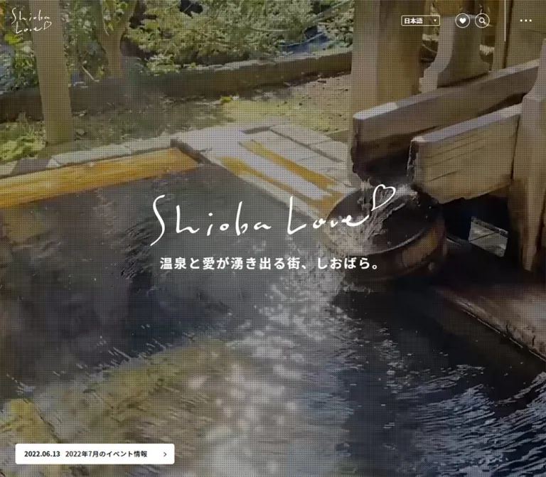
自然や温泉の大きなビジュアルに、手書きロゴと端正なセリフ体を重ねた観光公式サイト。白黒を基調に、豊富な余白、観光マップ、記事一覧、スマートフォンの固定ナビゲーションを組み合わせています。
ShiobaLove / Shiobara Onsen — Style Reference
Expansive hot-spring scenery framed by handwritten warmth, classical serif headings, and a precise monochrome interface.
Website / Original URL: www.siobara.or.jp Final URL: https://www.siobara.or.jp/ Theme: predominantly white content surfaces, a black footer, and reversed white graphics over scenic media; no selectable color theme was verified. Inspected: October 2, 2026, 04:40 JST, corresponding to the supplied retrieval timestamp of October 1, 2026, 19:40:32.200 UTC. Viewports: desktop 1440 × 1000 and mobile 390 × 844 CSS pixels. Scope: the current tourism homepage. Visual evidence covers the desktop opening, Article-to-onsen transition, desktop footer, mobile opening, and mobile footer. Rendered DOM and computed styles additionally document the introduction, destination map, Information carousel, navigation structures, and lower-page content. Linked destination pages and expanded controls were not inspected.
ShiobaLove is a substantial tourism portal with multiple browsing routes: local attractions, bathing, accommodation, food, activities, practical access information, and dated news. Its opening establishes a sense of place through full-screen scenery rather than a large transactional button. A loose handwritten wordmark ending in a heart floats over a fine dotted darkening treatment. The compact announcement at the bottom provides a practical next step without dominating the scene.
The rest of the homepage alternates spacious white editorial sections with photographic passages. Marcellus headings give English section names a classical, travel-editorial character; medium-weight Noto Sans JP keeps the Japanese information organized and readable. Rules, black-and-white controls, and square image boundaries provide structure. The broad black footer closes the page with navigation, two clearly separated contact responsibilities, social links, and another large expression of the wordmark.
閉じる
ShiobaLove / Shiobara Onsen — Style Reference
Expansive hot-spring scenery framed by handwritten warmth, classical serif headings, and a precise monochrome interface.
Website / Original URL: www.siobara.or.jp Final URL: https://www.siobara.or.jp/ Theme: predominantly white content surfaces, a black footer, and reversed white graphics over scenic media; no selectable color theme was verified. Inspected: October 2, 2026, 04:40 JST, corresponding to the supplied retrieval timestamp of October 1, 2026, 19:40:32.200 UTC. Viewports: desktop 1440 × 1000 and mobile 390 × 844 CSS pixels. Scope: the current tourism homepage. Visual evidence covers the desktop opening, Article-to-onsen transition, desktop footer, mobile opening, and mobile footer. Rendered DOM and computed styles additionally document the introduction, destination map, Information carousel, navigation structures, and lower-page content. Linked destination pages and expanded controls were not inspected.
ShiobaLove is a substantial tourism portal with multiple browsing routes: local attractions, bathing, accommodation, food, activities, practical access information, and dated news. Its opening establishes a sense of place through full-screen scenery rather than a large transactional button. A loose handwritten wordmark ending in a heart floats over a fine dotted darkening treatment. The compact announcement at the bottom provides a practical next step without dominating the scene.
The rest of the homepage alternates spacious white editorial sections with photographic passages. Marcellus headings give English section names a classical, travel-editorial character; medium-weight Noto Sans JP keeps the Japanese information organized and readable. Rules, black-and-white controls, and square image boundaries provide structure. The broad black footer closes the page with navigation, two clearly separated contact responsibilities, social links, and another large expression of the wordmark.
How to Read This Reference
- Measured values come from the supplied rendered DOM, computed styles, or element rectangles. Decimal values are rounded for readability.
- Visual estimates come from the five current-page screenshots. These describe visible proportions and approximate colors, not recovered stylesheet declarations.
- Calculated values are arithmetic derived from supplied measurements, such as the width remaining between two gutters.
- Recommendations describe a reusable implementation. Suggested breakpoints, missing asset treatments, accessibility improvements, and the CSS scaffold are not claims about the original source.
- Token names beginning with
--sl-are reference aliases. They were not observed as source custom properties. - The DOM includes offscreen navigation panels and repeated carousel entries. A measured rectangle does not prove that an element was visible or that its interaction was exercised.
Tokens — Colors
Default Palette
| Name | Value | Reference token | Role and evidence |
|---|---|---|---|
| Ink | #000000 |
--sl-ink |
Measured body text and selected map-category fill; also visually matches the footer and mobile Menu cell |
| White | #ffffff |
--sl-white |
Measured content sections, inactive map buttons, mobile dock cells, and reversed hero text |
| Soft Gray | #f4f4f4 |
--sl-soft |
Measured mobile Information section background; a similar light surface appears around the partner controls |
| Caption Gray | #a7a7a7 |
--sl-caption |
Measured Japanese subtitles beneath English section headings |
| Date Gray | #a0a0a0 |
--sl-date |
Measured dates within the Information carousel |
| Light Rule | approximately #dddddd |
--sl-rule |
Visual estimate for Article cell boundaries and mobile dock separators |
| Dark Rule | approximately #444444 |
--sl-dark-rule |
Visual estimate for contact-panel outlines on black |
| Contact Heading | approximately #302d2a |
--sl-contact-head |
Visual estimate for the warm charcoal title strips inside footer contact panels |
The main interface has no dominant chromatic action color. Forest green, water blue, warm timber, and sunset coral belong to the imagery. Keep those colors in photographs rather than turning them into unrelated button and category palettes.
Color Behavior
The desktop header appears transparent with white navigation over the opening scenery. In the scrolled screenshots, it becomes a near-white, slightly translucent strip with black graphics. Background content remains faintly visible through that strip; its exact alpha and compositing method are unavailable.
The mobile opening likewise uses white circular utilities over scenery. The scrolled mobile capture shows black utilities and a black wordmark over the light content behind them. This is evidence of context-dependent header presentation, not proof of a general dark-mode system.
The source exposes many standard WordPress palette, gradient, and shadow variables. Their presence does not make them part of this page's visible design. In particular, the supplied captures do not establish a colorful gradient system or a reusable drop-shadow system.
Tokens — Typography
Japanese Body and Navigation
Measured family stack: "Noto Sans JP", "ヒラギノ角ゴ Pro W3", "Hiragino Kaku Gothic Pro", メイリオ, Meiryo, "MS Pゴシック", sans-serif.
Body text uses weight 500; article titles, the hero tagline, section subtitles, and many navigational labels use 700. Typical Japanese text tracking is approximately 0.02em. The hero tagline increases this to 0.1em, making a short statement feel deliberate against a large image.
The computed family identifies the declared stack. It does not independently confirm which fallback supplied every glyph.
English Editorial Headings
Measured family: Marcellus, serif, weight 400.
This is verified for Shiobara Spot, Information, and the DOM-resident Pickup heading. Broad letterforms and restrained stroke contrast create an editorial voice without needing bold weight or decorative boxes.
The visible ENJOYING ONSEN display follows the same classical serif language, but its own computed font declaration was not included. Using Marcellus there is a reasonable implementation recommendation, not an independently measured assignment.
Handwritten Identity
The wordmark is a graphic treatment: irregular fine strokes, generous internal space, and a heart extending from the final flourish. Treat it as supplied artwork rather than selecting an approximate handwriting font.
At desktop, the header uses a compact stacked mark while the hero and footer use a wide signature. Mobile rearranges these roles: the scrolled header uses a wide mark and the footer uses a compact stacked mark. The mobile opening does not visibly show the small header wordmark even though a corresponding DOM box exists.
Type Scale
Sizes and line heights below are measured unless explicitly labeled as estimates.
| Role | Desktop size / line height | Mobile size / line height | Weight | Tracking |
|---|---|---|---|---|
| Body copy | 16.617 / 28.814px |
13.522 / 22.892px |
500 |
0.02em |
| Desktop primary navigation | 14.401 / 24.972px |
Replaced by mobile navigation | 500 |
0.02em |
| Hero tagline | 27.695 / 40.988px |
17.682 / 25.109px |
700 |
0.1em |
| English section heading | 58.713 / 74.272px |
41.605 / 52.007px |
400 |
Normal |
| Japanese section subtitle | 17.725 / 26.587px |
14.562 / 20.823px |
700 |
0.02em |
| Information card title | 16.617 / 24.377px |
15.602 / 21.843px |
700 |
Inherited, approximately 0.02em |
| Information date | 13.294 / 19.940px |
12.482 / 18.722px |
500 |
0.02em |
| Hero announcement | 14.401 / 21.055px |
12.482 / 18.722px |
Date 700, title 500 |
Date normal; title slightly tracked |
| Map-category caption | 12 / 12px |
10 / 10px |
700 |
Normal |
| Bottom-dock caption | Not displayed | 10.401 / 14.562px |
700 |
0.02em |
| Pickup heading, DOM only | 44.312 / 55.390px |
36.405 / 45.870px |
400 |
Normal |
| Onsen display, visual estimate | Approximately 96–104px |
Not visually documented | Appears regular | Not measured |
Native button and map internals also report Arial and Roboto. These are component-level declarations, not evidence that either is the site's principal editorial family. The Times family on the root HTML element likewise does not describe the body or display headings.
Tokens — Spacing & Shapes
Responsive Unit
The measured root font size is 11.0779px on desktop and 10.4013px on mobile. Several dimensions align with simple multiples of those roots:
| Dimension | Calculated desktop ratio | Calculated mobile ratio |
|---|---|---|
| Header height | Approximately 8rem |
Approximately 6rem |
| Body font size | 1.5rem |
1.3rem |
| English section heading | 5.3rem |
4rem |
| Hero tagline | 2.5rem |
1.7rem |
| Main editorial gutter | Approximately 12rem |
Approximately 2.5rem |
These ratios are calculated, not recovered source rules. Two viewports are insufficient to determine the original fluid formula or breakpoint thresholds. The Quick Start keeps a conventional root size and expresses the observed dimensions directly.
The source variables --ww, --vh, and --oh contain the inspected viewport dimensions. Their complete use in sizing or scroll behavior was not supplied.
Spacing Scale
| Use | Desktop | Mobile | Evidence |
|---|---|---|---|
| Main section left inset | 132.86px |
26px |
Measured heading positions |
| Header wordmark left inset | 24.36px |
13.52px |
Measured rectangles |
| Primary navigation gaps | Approximately 26.58px |
Not applicable | Calculated between adjacent links |
| Map filter gap | Approximately 11.06px vertically |
7px horizontally |
Calculated button positions |
| Information track gap | Approximately 66.47px between representative adjacent cards |
52px |
Calculated track geometry |
| Spot section top padding | 191.648px |
83.210px |
Computed style |
| Information top padding | 210.480px |
83.210px |
Computed style |
| Information bottom padding | Not established by the excerpt | 52.007px |
Computed style |
| Contact-panel inner inset | Approximately 21–22px |
Approximately 20px |
Visual estimate |
| Article-to-onsen blank interval | Approximately 210px in the supplied crop |
Not pictured | Visual estimate |
Large spacing is structural. Dense navigation and compact metadata sit within sections that have substantial breathing room. Avoid converting all gaps into a uniform small card-grid rhythm.
Border Radius
| Element | Radius | Evidence |
|---|---|---|
| Main images and Article cells | Square | Visible screenshots |
| Heart and search utilities | 50% |
Computed style |
| Map zoom controls | 50% |
Computed style |
| Map-category tiles | 10px |
Computed style at both viewports |
| Hero announcement | Approximately 4–5px |
Visual estimate |
| Footer contact group | Square | Visible screenshots |
| Guide Close control | 104.013px on a roughly 109 × 29px box |
Computed mobile DOM; expanded state not pictured |
Circles are reserved for compact utilities. Rounded map tiles are a real exception to the otherwise rectangular layout; do not eliminate them in pursuit of an entirely square system.
Layout Measurements
| Element | Desktop | Mobile | Status |
|---|---|---|---|
| Header | 1440 × 88.609px |
390 × 62.406px |
Measured |
| Header wordmark box | 86.406 × 55.375px |
145.609 × 36.391px |
Measured; mobile box does not prove initial visibility |
| Heart/search circles | 31.016px diameter |
31.203px diameter |
Measured |
| Menu button | 88.609px square at upper right |
79.031 × 52px at lower right |
Measured |
| Mobile dock | Absent | 52px high, starting at viewport y = 792 |
Measured |
| Standard dock link | Absent | 78 × 52px |
Measured |
| Hero announcement | Approximately 334 × 44px |
Approximately 338 × 40px |
Visual estimate |
| Hero signature width | Approximately 526px |
Approximately 338px |
Visual estimate |
| Introduction paragraph width | 343.453px |
338px |
Measured |
| Information card width | 254.766px |
239.234px |
Measured |
| Map-category tile | 90 × 90px |
63 × 63px |
Measured |
| Map zoom control | 33 × 33px |
33 × 33px |
Measured |
| Footer contact group width | Approximately 404px |
Approximately 338px |
Visual estimate |
| Document height | 14226.563px |
12263.391px |
Measured |
Components
Persistent Header
Role: identity, site-wide navigation, and compact utilities.
The desktop header is approximately 89px high. From left to right it contains a compact wordmark, eight Japanese category links, a small language selector, two outlined circular utilities, and a square Menu area separated by a vertical rule. The category row begins around x = 223px, leaving considerably more space after the logo than between ordinary links.
The visible categories are インフォメーション, 塩原の魅力, 温泉とお宿, 滝と吊り橋, 飲食と御土産, アクティビティ, アクセス, and お問い合わせ. The menu is represented by three horizontally arranged dots rather than a hamburger.
At the opening, white graphics sit directly over the scenery. The scrolled captures retain the header at the top with black graphics on a near-white surface. Preserve this contrast change as a coordinated header state.
The language control shows 日本語; the rendered text also contains English, Korean, Simplified Chinese, and Traditional Chinese options. Language switching was not exercised. The heart is an actual link to /love/; its underlying storage or saving behavior is unverified. Search has a # destination in the supplied link evidence, so its expanded interface cannot be reconstructed from the link alone.
Scenic Hero
Role: establish the destination's atmosphere and identity.
The desktop opening fills the 1440 × 1000 capture with a waterfall and dense greenery. The mobile opening shows bathing water and architectural details in a tall crop. A regular fine-dot pattern and darkened image treatment make the white signature and tagline stand out.
The content stack is deliberately short: a wide handwritten wordmark followed by 温泉と愛が湧き出る街、しおばら。. The desktop tagline remains on one line. Mobile breaks it after 街、, forming two centered lines.
The desktop tagline rectangle is at approximately (476, 532) with a width of 487px. Mobile places it around (88, 403) with a width of 214px. The whole identity group sits slightly above the visual center of the available scenic area.
Keep scenery behind the text edge to edge. The imagery is cropped to fit the viewport, while the wordmark retains its own proportions. Do not stretch the signature as if it were background media.
The media scenes differ between the current captures, but no video element, media URL, playback sequence, or slide timing was supplied. The evidence supports scenic media presentation; it does not establish whether the change comes from video, a slideshow, responsive asset selection, or capture timing.
Latest Announcement Strip
Role: provide a timely entry point without replacing the scenic opening with a conventional action panel.
A small white rectangle sits near the lower-left desktop corner, approximately 33px from the left and 28px from the bottom. Its anatomy is a bold date, a medium-weight article title, and a small right chevron.
Mobile expands the strip to the standard 338px content width, leaving 26px side gutters. It sits roughly 26px above the fixed bottom dock. The visible example pairs 2026.10.01 with 2026年秋のイベント情報.
The date and article title share one baseline. Use a modest corner radius and no conspicuous shadow. The rendered DOM repeats the article title within the link, but the screenshot presents one visible title; do not render both copies side by side.
Destination Introduction
Role: connect the scenic impression to the area's history and visitor appeal.
The introduction is a white section with a narrow Japanese prose measure. On desktop, the measured paragraph is about 343px wide and begins at x = 244px. An adjacent heading box at x = 133px is unusually tall and narrow, approximately 38 × 630px. Its text was not exposed, so neither its wording nor its artwork should be invented.
On mobile, the heading box becomes approximately 267 × 62px, and the prose uses the full 338px inner width. This is evidence of recomposition, not merely smaller desktop columns.
Two measured text links follow: 塩原の魅力 and 恋人の聖地. They use bold Japanese type and restrained bottom spacing. The section's remaining imagery and complete composition are outside the supplied visual crops.
Bilingual Section Heading
Role: establish a repeatable editorial hierarchy.
Use a regular Marcellus heading above a smaller bold Japanese subtitle in #a7a7a7. Examples include Shiobara Spot with しおばらスポット, and Information with インフォメーション.
Desktop headings begin at approximately 133px from the left. In the Spot section, a short Japanese explanatory sentence sits separately to the right, starting around x = 698px. Mobile stacks that explanation below the heading pair, aligned to the 26px gutter.
The English heading supplies scale; the Japanese subtitle supplies immediate meaning. Avoid giving both equal size or enclosing them in a decorative badge.
Shiobara Spot Map and Category Controls
Role: browse destination locations by visitor need.
The map section exposes five categories: 日帰り温泉, お宿, 滝・吊り橋, 飲食・御土産, and アクティビティ.
Desktop category buttons form a vertical rail near the left edge. Each is 90px square with a 10px radius; adjacent buttons are separated by approximately 11px. The first category is black with white text in the captured state, while the others are white with black text.
Mobile changes the rail into five 63px squares in a horizontal row. Their left positions are 23.5, 93.5, 163.5, 233.5, and 303.5px, giving exact 7px gaps. The row is positioned near the bottom of the map region. White circular zoom controls remain at the right.
Mobile rendered text includes location names, clustered counts, and map attribution. This establishes that map content rendered in that snapshot. Desktop map detail is less complete in the excerpt. Category switching, marker activation, and map gestures were not tested.
Information Feature Carousel
Role: give selected stories and resources an image-led browsing format.
The DOM describes a horizontal track with repeated article entries, a substantial media region above each title, and a compact metadata line below. Cards are approximately 255px wide on desktop and 239px wide on mobile. Titles use bold Noto Sans JP and can span several lines; dates are lighter gray.
The desktop section background is measured white. Mobile changes this section to #f4f4f4, with approximately 83px top padding and 52px bottom padding. This surface change is a meaningful responsive detail.
Repeated entries and offscreen coordinates are consistent with a looping carousel implementation. They should not be interpreted as a long sequence of different editorial stories. Exact autoplay, dragging, hover behavior, and image crop ratios remain unverified.
Article Index Grid
Role: expose the latest practical updates with category navigation.
The rendered content includes an Article label, category links, and six dated entries. Category links have real archive URLs, including the general information archive and category-specific destinations. Their presence does not prove an in-place filtering interaction.
The supplied desktop middle crop shows three adjacent article cells across the rightmost approximately 1080px of the screen. Vertical boundaries occur around x = 359, 719, and 1079px. Each cell is approximately 360px wide, with a thumbnail and text region inset by about 52px.
The left quarter is blank in this particular crop. It is compatible with an editorial index column, but the crop does not reveal that column's complete contents. Use the visible geometry without inventing a sidebar arrangement beyond the evidence.
Each visible card combines an image, a bold multi-line title, then a gray date alongside plain black category text. Categories are not colorful pills. Thin rules separate the cells; there is no elevated card surface or large rounded wrapper. The mobile Article grid geometry was not captured, so any proposed stacking pattern must be labeled as a recommendation.
Onsen Editorial Feature
Role: transition from news into an immersive explanation of bathing and accommodation.
After a broad white pause, the supplied desktop crop enters a full-width warm sunset scene. An enlarged, softly blurred scenic layer fills the background. A crisp rectangular photograph appears on the right, beginning around x = 742px, with a width of approximately 565px and a right margin near the editorial gutter.
At left, oversized white serif text breaks into ENJOYING and ONSEN. The photographed view contains timber, a screened roof, distant landscape, and pink-orange sky. This section gains richness from photographic layering rather than a synthetic gradient or decorative card shadow.
Rendered text confirms a Japanese introduction and three onward routes: 日帰り温泉一覧, お宿一覧, and 宿泊プラン一覧, each with descriptive copy. Their full visual layout and mobile treatment are not included in the screenshots.
Numbered Destination Features
Role: broaden the visitor's itinerary beyond bathing.
The rendered sequence contains three CHARM features, numbered 1–3. Their themes cover landscape, food, and activities connected to nature, history, and literature. The labels include NATURE, FOOD, and another NATURE entry; preserve observed copy rather than silently normalizing the third label.
Each feature has a Japanese heading, a paragraph, and an onward destination link. Exact image placement, alternation, and motion were not visually documented. A new implementation can extend the established editorial typography and photographic hierarchy, but should not present a guessed alternating layout as measured fact.
Partner Carousel and Social Region
Role: connect visitors to related organizations and ongoing updates.
Above the footer, the current captures show rectangular partner banners, a fraction-style index, outlined circular previous/next arrows, and a thin horizontal progress line. The desktop screenshot shows 2 / 7; the mobile screenshot shows 4 / 7. The rendered text contains other current index values, confirming that the snapshots represent different states without revealing the cause or interval.
The mobile controls align to the 26px gutter. The progress line is visually subordinate to the banners and arrow controls. Retain this thin, editorial control language rather than adding oversized pagination dots.
The rendered page also contains Twitter, Facebook, and Instagram follow sections. A Twitter text fallback is present; this does not prove that a complete social feed rendered successfully.
Desktop Footer
Role: provide comprehensive wayfinding and separate accommodation enquiries from tourism enquiries.
The footer is a full-width black field. Two navigation columns occupy the left and middle, while the right contains PAGE TOP, language and utility links, and a bordered two-part contact group. Nested navigation uses thin vertical rules rather than bullets.
The contact group has two stacked panels. Each begins with a warm charcoal strip and bold white responsibility label, followed by an organization name, address, and telephone/fax information. The visible organizations are 塩原温泉旅館協同組合 for accommodation and 塩原温泉観光協会 for tourism and events. The original footer also names both in its copyright line.
A wide white wordmark anchors the lower left. Social icons and small copyright text sit to the lower right. The screenshot uses the familiar bird-shaped Twitter icon; do not replace observed icon artwork simply because a platform's current branding differs.
The footer spans approximately 800.44px from the measured end of the main content to the document end. Its spaciousness comes from column separation and vertical padding, not oversized contact text.
Mobile Footer and Bottom Dock
Role: retain essential visitor actions while simplifying the page ending.
Mobile removes the visible footer navigation columns and utility row. The black footer starts with a centered stacked wordmark, followed by a 338px-wide contact group. Social icons sit below on the left; PAGE TOP is arranged vertically near the right edge. Copyright wraps into two lines.
The five-cell bottom dock remains visible over both the hero and footer. Its labels are トップ, インフォ, ガイド, アクセス, and メニュー. The first four cells are white with black outline icons and compact bold captions. The final Menu cell is black with white dots and text. Thin vertical rules divide the cells.
At 390px width, ordinary cells measure 78 × 52px. The Menu button is slightly wider in the source rectangle, overlapping the nominal fifth-cell boundary by about 1px. A new implementation can use an even five-column grid.
Reserve space for this persistent navigation and any device safe area. The screenshot's 52px strip should not become a reason to hide the last lines of content beneath it.
Menu, Guide, and Pickup Structures — DOM Evidence Only
The mobile DOM includes navigation links positioned just beyond the right viewport edge, a separate Guide structure, and a ガイドを閉じる control. These establish that additional navigation structures exist, but no supplied screenshot shows them open. Do not infer their complete overlay appearance, focus handling, or opening sequence.
The Pickup structure contains seven distinct resource topics plus repeated track entries. Its measured central card is approximately 632px wide on desktop and 338px on mobile, with a white Marcellus heading above. The enclosing element has viewport-sized geometry and opacity/visibility transitions, yet it is absent from the visible opening screenshots. Its trigger and relationship to scrolling remain unverified.
Tokens — Motion & Interaction
The supplied evidence includes transition declarations and captures after scrolling, but no direct click, hover, or drag test results.
| Treatment | Measured declaration or observation | Supported interpretation |
|---|---|---|
| General links | Border, background, and color: 0.6s cubic-bezier(0.215, 0.61, 0.355, 1) |
Shared smooth transition vocabulary; final hover colors were not supplied |
| Heart/search controls | Background: 0.6s with the same easing |
Circular utilities have a defined background transition |
| Hero tagline | Opacity: 0.6s, delay 0.9s, same easing |
Supports delayed appearance after an unspecified state change |
| Mobile header wordmark | Opacity and visibility: 0.6s |
Consistent with its different visible opening/scrolled states |
| Mobile Menu button | Right, bottom, background, width, and height: 0.6s |
Geometry transitions are declared; the complete transition was not captured |
| Mobile section heading | Opacity: 0.6s, delay 0.3s |
Declared staggered reveal treatment |
| Mobile subtitle and selected supporting text | Opacity: 0.6s, delay 0.6s |
Supporting content has a later declared reveal |
| Map-category controls | Color and background: 0.6s |
Selected/unselected contrast can transition smoothly |
| Pickup wrapper | Opacity and visibility: 0.9s |
A slower layer transition exists; its trigger is unknown |
| Header while scrolling | White-on-image at the top; black-on-light later | A context-dependent header state is visible |
| Partner pagination | Different fraction values across captures | Different carousel states exist; timing and user control are unverified |
The recurring easing is a restrained ease-out curve. Use it for small fades and color changes when adapting the design. Avoid introducing springs, large rotations, or decorative bouncing without a separate design reason.
Many sampled elements report animation: none. That does not prove the absence of JavaScript animation, media playback, parent transforms, or motion elsewhere in the page. Likewise, a static scenic frame cannot establish video duration or autoplay behavior.
PAGE TOP links to #wrapper. The destination is verified; smooth scrolling and its duration are not. Search, Guide, Menu, language switching, map filtering, and the Love feature require separate behavioral specification before implementation.
Surfaces
| Layer | Appearance | Purpose |
|---|---|---|
| Opening scenery | Edge-to-edge image with darkening and fine dots | Emotional introduction and white-text contrast |
| Header over scenery | Transparent with white graphics | Keep navigation integrated with the scene |
| Header after scrolling | Near-white surface with black graphics | Maintain readable persistent navigation |
| Editorial canvas | White with broad empty intervals | Separate dense tourism information into clear sections |
| Mobile Information region | Measured #f4f4f4 |
Give the feature track a distinct section surface |
| Article cells | White with thin gray boundaries | Organize articles without elevation |
| Onsen feature | Soft scenic backdrop plus a crisp inset image | Add photographic depth and a change of pace |
| Footer | Black with white text and dark outlined contact panels | Strong closing structure and practical contact information |
| Mobile dock | Four white cells and one black cell | Persistent route access |
There is no visible general-purpose glass-panel or shadow-elevation system. The onsen backdrop is visibly soft, but its exact blur implementation is unknown and should not be generalized to every surface.
Imagery
The current visual evidence emphasizes water, vegetation, timber, and open-air bathing environments. The desktop waterfall is dark and saturated with greenery; the mobile bath scene is quieter and more architectural. The onsen feature introduces warm evening light. This range makes the destination feel varied while the interface remains consistent.
The hero's fine dot pattern is a key texture. It regularizes busy scenic detail and helps the white lettering read. Apply the texture to the media layer only. Text, logos, controls, and the white announcement should remain crisp.
The onsen composition uses two visual scales: a large soft background and a smaller sharp image. Preserve that difference in focus and framing. A single sharp cover image with text placed anywhere on it would lose the observed relationship.
Article thumbnails include event artwork and promotional material as well as photographs. Retain their content-specific character rather than forcing every article into an identical scenic-photo treatment.
Observed Asset References
The supplied evidence does not expose image src values, logo asset paths, poster URLs, or video source URLs. The following inventory identifies required visual roles without inventing filenames.
| Asset role | Observed treatment | Availability limitation |
|---|---|---|
| Wide wordmark | Fine handwritten signature with terminal heart | Visible in current hero and desktop footer; source file unknown |
| Compact wordmark | Stacked handwriting | Visible in desktop header and mobile footer; source file unknown |
| Opening scenery | Waterfall/greenery and bathing-water scenes | Current frames visible; media type and URLs unknown |
| Hero texture | Dense regular dark dot pattern | Visually evident; source texture or CSS unknown |
| Onsen photograph | Warm evening landscape through timber architecture | Sharp foreground and soft background visible; source file unknown |
| Article media | Event graphics and destination imagery | Visible in cropped Article cells; complete asset dimensions unknown |
| Partner banners | Rectangular organization graphics | Partially visible above footer; source files unknown |
| Utility icons | Heart, search, arrows, map/navigation symbols | Shapes visible; icon library or file format unverified |
Use authorized assets when available. The CSS scaffold can reproduce the layout and approximate texture, but it cannot recreate the identity carried by the original wordmark and photography.
Layout & Responsive Behavior
This is a long scrolling homepage, not a fixed application shell. The header persists across the supplied scroll positions, while mobile adds persistent bottom navigation.
| Relationship | Desktop observation | Mobile observation |
|---|---|---|
| Primary navigation | Eight links in the top header | Links replaced by a five-cell bottom dock |
| Header identity | Compact stacked mark visible at opening | Small mark absent visually at opening; wide mark visible later |
| Hero tagline | One line | Two centered lines |
| Main editorial inset | Approximately 133px |
26px |
| Introduction | Narrow prose alongside a tall heading box | Horizontal heading box above full inner-width prose |
| Spot explanation | Positioned beside heading group | Stacked below heading group |
| Map categories | Five vertically stacked 90px buttons |
Five horizontally aligned 63px buttons |
| Information surface | White | #f4f4f4 |
| Information cards | Approximately 255px wide |
Approximately 239px wide; not stretched to full width |
| Footer | Navigation columns, utilities, contact group, wide lower wordmark | Centered stacked wordmark, contacts, social links, vertical Page Top |
The introduction begins at document y = 2000px on desktop and y = 1688px on mobile, exactly twice the corresponding viewport heights. This is a measured document relationship, not proof of a two-screen pinned animation or a particular scroll sequence.
The Spot section begins at approximately 3772px on desktop and 3219px on mobile. Information follows at approximately 4807px and 4039px. These coordinates describe the inspected content and state; do not hardcode them as page offsets.
Only two viewport sizes were supplied. Tablet behavior, orientation changes, font-loading shifts, and exact media queries are unknown. The Quick Start recommends collapsing the full link row below 1280px and using the mobile dock below 768px. Those thresholds are practical starting points, not recovered source breakpoints.
Do’s and Don’ts
Do
- Keep the interface predominantly black, white, and neutral gray; let photographs carry seasonal color.
- Preserve the handwritten signature and heart as artwork with distinct wide and compact variants.
- Pair regular Marcellus English headings with medium or bold Noto Sans JP Japanese text.
- Keep the hero message short and the latest announcement compact.
- Place the dot texture behind the hero identity, not over the text itself.
- Preserve broad section spacing alongside compact navigation and metadata.
- Use thin rules and square imagery for Article cells.
- Retain the map's rounded category tiles and the black selected state.
- Recompose navigation, map controls, and footer content for mobile.
- Keep accommodation and tourism contact responsibilities clearly separated.
- Distinguish the Information feature track from the more structured Article index.
Don’t
- Don't reduce the tourism portal to a single booking funnel or one oversized call to action.
- Don't treat photographic green or sunset orange as verified UI brand colors.
- Don't replace the wordmark with a generic script font.
- Don't apply the hero's dark dot treatment to every photograph and content section.
- Don't add rounded, shadowed cards throughout the page.
- Don't interpret WordPress preset variables as proof of visible gradients or shadows.
- Don't copy duplicate carousel entries into the editorial data model.
- Don't display offscreen Menu, Guide, or Pickup content merely because it appears in the DOM excerpt.
- Don't describe a video loop, autoplay interval, parallax effect, or map interaction as tested behavior.
- Don't claim an exact mobile Article layout or tablet breakpoint from the supplied evidence.
- Don't let the persistent mobile dock cover contact information or focused controls.
Recommended Implementation Additions
These recommendations extend the observed design; they are not verified original features.
- Give icon-only controls accessible names and provide a larger interactive target around the approximately 31px utility circles where layout allows.
- Make navigation panels keyboard operable, manage focus on opening and closing, and keep hidden panels out of the tab order.
- Use buttons for Search, Guide, and Menu actions when they open interfaces; use links for actual destinations.
- Provide meaningful names and selected states for map categories, plus a usable location list when the map cannot load.
- Offer pause controls for any automatically moving carousel or background media implemented in the adaptation.
- Respect reduced-motion preferences and ensure content remains visible when reveal animation is disabled.
- Review the small gray text for contrast. Preserve the measured gray values in a visual reference, but consider darker semantic metadata colors for an accessible production adaptation.
- Increase mobile reading text where audience needs justify it;
13.522pxis an observation, not a required accessibility target. - Load appropriately sized hero and article imagery, and reserve dimensions to prevent layout shifts.
- Keep contact telephone numbers as callable links and allow addresses to wrap without horizontal overflow.
- Include safe-area spacing in the mobile dock and in the final content clearance.
Agent Prompt Guide
Quick Color Reference
- Primary text and selected controls:
#000000. - Main editorial surface and reversed text:
#ffffff. - Mobile Information surface:
#f4f4f4. - Measured section subtitles:
#a7a7a7. - Measured carousel dates:
#a0a0a0. - Approximate Article rules:
#dddddd. - Approximate footer contact strips:
#302d2a. - Photographic colors remain inside the imagery rather than becoming a general button palette.
Overall Prompt
“Create a Japanese tourism homepage inspired by ShiobaLove's current visual system. Use an edge-to-edge scenic opening with a subtle dark dot texture, an authorized handwritten heart wordmark, and a short white Japanese tagline. Build a monochrome editorial interface with Noto Sans JP body text, regular Marcellus English section headings, smaller gray Japanese subtitles, generous section spacing, thin rules, and square photographs. Include destination browsing, a map with five category controls, an image-led Information track, a structured Article index, and an immersive onsen feature. Use a broad black footer with separate accommodation and tourism contact panels. On mobile, replace the desktop category row with a five-cell bottom dock and move the map filters into a horizontal row. Treat unverified media and panel behaviors as separate implementation decisions.”
Example Component Prompts
- Hero: “Design a full-height destination opening using forest or bathing scenery. Place a fine dark dot pattern over the image, then a wide white handwritten signature and a short centered Japanese tagline. Add a small white dated announcement near the lower-left edge. On a 390px screen, use a two-line tagline and a 338px announcement above a 52px bottom dock.”
- Section heading: “Create a left-aligned Marcellus heading reading Information at approximately 59px on desktop and 42px on mobile. Place a bold gray Japanese subtitle below. Use roughly 133px desktop and 26px mobile side insets, with substantial space before the next content group.”
- Map controls: “Build five monochrome map-category buttons with 10px corners. Desktop uses a left rail of 90px squares. Mobile uses a horizontal row of 63px squares with 7px gaps. Show the selected category in black with white details and the others in white with black details.”
- Article grid: “Create three square-cornered article cells across the right three quarters of a desktop layout. Use thin gray dividers, generous internal padding, a thumbnail, a bold Japanese title, and a gray date with plain text categories. Avoid shadows and colored category pills. Choose the mobile arrangement separately because it is not established by the reference.”
- Onsen feature: “Use a large soft sunset photograph as a full-width background, oversized white classical serif text at left, and a sharp rectangular view of a timber-framed bathing landscape at right. Keep the image colors warm and the surrounding interface monochrome.”
- Footer: “Create a black tourism footer with white typography. Desktop uses two navigation columns and a right contact group. Each contact panel has a warm charcoal responsibility strip, organization name, address, and telephone details. Mobile begins with a centered compact wordmark, then stacks the contact panels, social icons, and copyright above the fixed dock.”
Quick Start
CSS Custom Properties
This scaffold reproduces the principal visual relationships using a normal root font size. Desktop and mobile endpoint values come from measurements where available. Texture parameters, intermediate sizing, breakpoints, and unmeasured article/feature layouts are recommendations.
Supply actual wordmark and photographic assets in the HTML. Use .hero-media on an image or video element and place .hero-content above it. Set the header's data-surface attribute to hero over the opening and to light over scrolled content. That state change requires application logic. The scaffold does not implement media playback, carousel looping, map services, or navigation dialogs.
:root {
  /* Measured palette */
  --sl-ink: #000000;
  --sl-white: #ffffff;
  --sl-soft: #f4f4f4;
  --sl-caption: #a7a7a7;
  --sl-date: #a0a0a0;

  /* Screenshot estimates */
  --sl-rule: #dddddd;
  --sl-dark-rule: #444444;
  --sl-contact-head: #302d2a;

  /* Measured families; load authorized font files separately */
  --sl-body-font: 'Noto Sans JP', 'Hiragino Kaku Gothic Pro',
    Meiryo, sans-serif;
  --sl-display-font: 'Marcellus', serif;
  --sl-body-size: 16.617px;
  --sl-body-leading: 1.734;
  --sl-heading-size: 58.713px;
  --sl-heading-leading: 1.265;
  --sl-subtitle-size: 17.725px;
  --sl-hero-size: 27.695px;
  --sl-nav-size: 14.401px;
  --sl-date-size: 13.294px;

  /* Observed desktop proportions with recommended fluid gutters */
  --sl-gutter: clamp(26px, 9.2264vw, 132.86px);
  --sl-footer-gutter: clamp(26px, 7.693vw, 110.78px);
  --sl-header-height: 88.609px;
  --sl-section-space: 210.48px;
  --sl-card-width: 254.766px;
  --sl-track-gap: 66.469px;
  --sl-dock-height: 0px;
  --sl-safe-bottom: env(safe-area-inset-bottom, 0px);

  /* Source transition vocabulary */
  --sl-ease: cubic-bezier(0.215, 0.61, 0.355, 1);
  --sl-transition: 600ms var(--sl-ease);
}

* { box-sizing: border-box; }
html { scroll-padding-top: var(--sl-header-height); }
body {
  margin: 0;
  color: var(--sl-ink);
  background: var(--sl-white);
  font-family: var(--sl-body-font);
  font-size: var(--sl-body-size);
  font-weight: 500;
  line-height: var(--sl-body-leading);
  letter-spacing: 0.02em;
}
img { display: block; max-width: 100%; }
button, select { font: inherit; }
a { color: inherit; }
button { cursor: pointer; }

.site-header {
  position: fixed;
  inset: 0 0 auto;
  z-index: 30;
  display: grid;
  grid-template-columns: 86.406px minmax(0, 1fr) auto 88.609px;
  align-items: center;
  gap: 33.23px;
  height: var(--sl-header-height);
  padding-inline-start: 24.36px;
  color: var(--sl-ink);
  background: rgb(255 255 255 / 96%);
  transition: color var(--sl-transition),
    background-color var(--sl-transition);
}
.site-header[data-surface='hero'] {
  color: var(--sl-white);
  background: transparent;
}
.brand-compact { width: 86.406px; }
.brand-wide { display: none; }
.header-nav {
  display: flex;
  justify-content: flex-end;
  align-items: center;
  gap: 26.58px;
  white-space: nowrap;
  font-size: var(--sl-nav-size);
}
.header-nav a { text-decoration: none; }
.header-utilities {
  display: flex;
  align-items: center;
  gap: 11.08px;
}
.language-select {
  width: 82px;
  margin-inline-end: 22px;
  border: 1px solid currentColor;
  border-radius: 2px;
  color: inherit;
  background: transparent;
  font-size: 12px;
}
.icon-control {
  display: grid;
  place-items: center;
  width: 31.2px;
  height: 31.2px;
  padding: 0;
  border: 1px solid currentColor;
  border-radius: 50%;
  color: inherit;
  background: transparent;
  text-decoration: none;
  transition: background-color var(--sl-transition);
}
.header-menu {
  align-self: stretch;
  border: 0;
  border-inline-start: 1px solid currentColor;
  color: inherit;
  background: transparent;
}

.hero {
  position: relative;
  isolation: isolate;
  min-height: 100vh;
  min-height: 100svh;
  overflow: hidden;
  color: var(--sl-white);
  background: var(--sl-ink);
}
.hero-media {
  position: absolute;
  inset: 0;
  width: 100%;
  height: 100%;
  object-fit: cover;
  object-position: center;
  z-index: 0;
}
.hero::after {
  /* Recommended approximation; tune against the chosen image */
  content: '';
  position: absolute;
  inset: 0;
  z-index: 1;
  pointer-events: none;
  background-image:
    linear-gradient(rgb(0 0 0 / 24%), rgb(0 0 0 / 24%)),
    radial-gradient(circle, rgb(0 0 0 / 55%) 0.7px,
      transparent 0.9px);
  background-size: auto, 3px 3px;
}
.hero-content {
  position: absolute;
  z-index: 2;
  top: calc(50% - 20px);
  left: 50%;
  transform: translate(-50%, -50%);
  display: grid;
  justify-items: center;
  gap: 21px;
  width: min(90%, 700px);
  text-align: center;
}
.hero-logo { width: 526px; height: auto; }
.hero-tagline {
  margin: 0;
  font-size: var(--sl-hero-size);
  font-weight: 700;
  line-height: 1.48;
  letter-spacing: 0.1em;
}
.mobile-break { display: none; }
.hero-news {
  position: absolute;
  z-index: 2;
  inset-inline-start: 33px;
  bottom: 28px;
  display: flex;
  align-items: center;
  gap: 11px;
  min-height: 44px;
  max-width: calc(100% - 66px);
  padding: 10px 19px;
  border-radius: 5px;
  color: var(--sl-ink);
  background: var(--sl-white);
  font-size: 14.401px;
  line-height: 1.46;
  text-decoration: none;
}
.hero-news time { flex: none; font-weight: 700; }
.hero-news-title {
  min-width: 0;
  overflow: hidden;
  text-overflow: ellipsis;
  white-space: nowrap;
}
.hero-news-arrow { flex: none; margin-inline-start: auto; }

.editorial-section {
  padding: var(--sl-section-space) var(--sl-gutter);
}
.section-title {
  margin: 0;
  font-family: var(--sl-display-font);
  font-size: var(--sl-heading-size);
  font-weight: 400;
  line-height: var(--sl-heading-leading);
  letter-spacing: normal;
}
.section-subtitle {
  margin: 0;
  color: var(--sl-caption);
  font-size: var(--sl-subtitle-size);
  font-weight: 700;
  line-height: 1.5;
}
.featured-track {
  display: flex;
  gap: var(--sl-track-gap);
  overflow-x: auto;
  padding-block: 64px 24px;
  scroll-snap-type: x proximity;
}
.featured-card {
  flex: 0 0 var(--sl-card-width);
  min-width: 0;
  color: inherit;
  text-decoration: none;
  scroll-snap-align: start;
}
.featured-card img { width: 100%; height: auto; }
.card-title {
  margin: 18px 0 14px;
  font-size: 16.617px;
  font-weight: 700;
  line-height: 1.467;
}
.card-meta {
  display: flex;
  flex-wrap: wrap;
  gap: 6px 14px;
  font-size: var(--sl-date-size);
  line-height: 1.5;
}
.card-meta time { color: var(--sl-date); }

.spot-map {
  position: relative;
  min-height: 650px; /* Recommended host size, not a recovered rule */
}
.spot-filters {
  position: absolute;
  top: 30px;
  left: 30px;
  display: flex;
  flex-direction: column;
  gap: 11.06px;
  z-index: 2;
}
.spot-filter {
  display: flex;
  flex-direction: column;
  align-items: center;
  justify-content: center;
  gap: 8px;
  width: 90px;
  height: 90px;
  border: 0;
  border-radius: 10px;
  color: var(--sl-ink);
  background: var(--sl-white);
  font-size: 12px;
  font-weight: 700;
  line-height: 1;
  transition: color var(--sl-transition),
    background-color var(--sl-transition);
}
.spot-filter[aria-pressed='true'] {
  color: var(--sl-white);
  background: var(--sl-ink);
}

/* Recommended structure based on the visible desktop Article crop */
.article-section {
  display: grid;
  grid-template-columns: 1fr 3fr;
  padding-block-end: var(--sl-section-space);
}
.article-grid {
  display: grid;
  grid-template-columns: repeat(3, minmax(0, 1fr));
}
.article-card {
  padding: clamp(24px, 3.61vw, 52px);
  border-inline-start: 1px solid var(--sl-rule);
  border-bottom: 1px solid var(--sl-rule);
  color: inherit;
  text-decoration: none;
}
.article-card img { width: 100%; height: auto; }

.onsen-feature {
  position: relative;
  isolation: isolate;
  overflow: hidden;
  color: var(--sl-white);
  background: var(--sl-ink);
}
.onsen-backdrop {
  position: absolute;
  inset: 0;
  z-index: -1;
  width: 100%;
  height: 100%;
  object-fit: cover;
  filter: blur(18px); /* Visual approximation */
  transform: scale(1.06);
}
.onsen-inner {
  display: grid;
  grid-template-columns: 1fr 1fr;
  align-items: center;
  gap: 44px;
  padding: 210px var(--sl-gutter);
}
.onsen-title {
  margin: 0;
  font-family: var(--sl-display-font);
  font-size: clamp(52px, 7vw, 101px);
  font-weight: 400;
  line-height: 1.06;
  letter-spacing: normal;
}
.onsen-photo { width: 100%; height: auto; }

.site-footer {
  padding: 100px var(--sl-footer-gutter) 110px;
  color: var(--sl-white);
  background: var(--sl-ink);
}
.footer-grid {
  display: grid;
  grid-template-columns: 1fr 1fr 404px;
  grid-template-areas:
    'nav nav utility'
    'nav nav contacts'
    'brand meta meta';
  gap: 44px 40px;
}
.footer-nav {
  grid-area: nav;
  display: grid;
  grid-template-columns: 1fr 1fr;
  gap: 40px;
}
.footer-utilities { grid-area: utility; }
.footer-brand { grid-area: brand; width: 404px; max-width: 100%; }
.footer-meta { grid-area: meta; align-self: end; text-align: right; }
.contact-group {
  grid-area: contacts;
  border: 1px solid var(--sl-dark-rule);
}
.contact-panel { padding: 21px; }
.contact-panel + .contact-panel {
  border-top: 1px solid var(--sl-dark-rule);
}
.contact-heading {
  margin: 0 0 12px;
  padding: 7px 11px;
  background: var(--sl-contact-head);
  font-size: 14px;
  font-weight: 700;
  line-height: 1.5;
}
.contact-panel address {
  font-style: normal;
  font-size: 14px;
  line-height: 1.55;
  overflow-wrap: anywhere;
}
.contact-panel a { text-decoration: none; }
.mobile-dock { display: none; }

/* Recommended intermediate breakpoint; tablet behavior was not inspected */
@media (max-width: 79.99rem) {
  .site-header {
    grid-template-columns: 86.406px 1fr 88.609px;
  }
  .header-nav { display: none; }
  .header-utilities { justify-self: end; }
  .footer-grid { grid-template-columns: 1fr 1fr minmax(300px, 36%); }
}

/* Recommended mobile breakpoint; values target the inspected 390px view */
@media (max-width: 47.99rem) {
  :root {
    --sl-body-size: 13.522px;
    --sl-body-leading: 1.693;
    --sl-heading-size: 41.605px;
    --sl-heading-leading: 1.25;
    --sl-subtitle-size: 14.562px;
    --sl-hero-size: 17.682px;
    --sl-date-size: 12.482px;
    --sl-gutter: 6.6667vw;
    --sl-footer-gutter: 6.6667vw;
    --sl-header-height: 62.406px;
    --sl-section-space: 83.21px;
    --sl-card-width: 239.234px;
    --sl-track-gap: 52px;
    --sl-dock-height: 52px;
  }
  html {
    scroll-padding-bottom: calc(var(--sl-dock-height) + var(--sl-safe-bottom));
  }
  .site-header {
    grid-template-columns: minmax(0, 1fr) auto;
    gap: 16px;
    padding-inline: 13.52px 16.64px;
  }
  .brand-compact, .header-menu, .language-select { display: none; }
  .brand-wide { display: block; width: 145.609px; }
  .site-header[data-surface='hero'] .header-brand { visibility: hidden; }
  .hero {
    min-height: calc(100vh - var(--sl-dock-height) - var(--sl-safe-bottom));
    min-height: calc(100svh - var(--sl-dock-height) - var(--sl-safe-bottom));
  }
  .hero-content {
    top: calc(50% - 10px);
    width: calc(100% - 2 * var(--sl-gutter));
    gap: 6px;
  }
  .hero-logo { width: 338px; }
  .hero-tagline { line-height: 1.42; }
  .mobile-break { display: block; }
  .hero-news {
    inset-inline: var(--sl-gutter);
    bottom: 26px;
    max-width: none;
    min-height: 40px;
    gap: 7px;
    padding: 9px 14.56px;
    font-size: 12.482px;
    line-height: 1.5;
  }
  .information-section { background: var(--sl-soft); }
  .featured-track { padding-block: 52px 24px; }
  .card-title { font-size: 15.602px; line-height: 1.4; }
  .spot-map { min-height: 520px; }
  .spot-filters {
    top: auto;
    bottom: 27px;
    left: 50%;
    transform: translateX(-50%);
    flex-direction: row;
    gap: 7px;
  }
  .spot-filter {
    width: min(63px, calc((100vw - 47px - 28px) / 5));
    height: 63px;
    gap: 5px;
    font-size: 10px;
  }
  /* Mobile Article stacking is a recommendation */
  .article-section, .article-grid { grid-template-columns: 1fr; }
  .article-index { padding: 40px var(--sl-gutter); }
  .article-card {
    padding: 26px var(--sl-gutter);
    border-inline-start: 0;
  }
  .onsen-inner {
    grid-template-columns: 1fr;
    gap: 40px;
    padding: 83px var(--sl-gutter);
  }
  .site-footer {
    padding: 74px var(--sl-footer-gutter)
      calc(64px + var(--sl-dock-height) + var(--sl-safe-bottom));
  }
  .footer-grid {
    grid-template-columns: minmax(0, 1fr);
    grid-template-areas: 'brand' 'contacts' 'meta';
    gap: 40px;
  }
  .footer-nav, .footer-utilities { display: none; }
  .footer-brand { justify-self: center; width: 130px; }
  .footer-meta { text-align: left; }
  .contact-panel { padding: 20px; }
  .contact-panel address, .contact-heading { font-size: 13.522px; }
  .mobile-dock {
    position: fixed;
    inset: auto 0 0;
    z-index: 40;
    display: grid;
    grid-template-columns: repeat(5, minmax(0, 1fr));
    min-height: calc(var(--sl-dock-height) + var(--sl-safe-bottom));
    padding-bottom: var(--sl-safe-bottom);
    background: var(--sl-white);
  }
  .mobile-dock > :is(a, button) {
    display: flex;
    flex-direction: column;
    align-items: center;
    justify-content: center;
    gap: 3px;
    min-width: 0;
    min-height: 52px;
    padding: 5px 0;
    border: 0;
    border-inline-end: 1px solid var(--sl-rule);
    color: var(--sl-ink);
    background: var(--sl-white);
    font-family: var(--sl-body-font);
    font-size: 10.401px;
    font-weight: 700;
    line-height: 1.4;
    text-decoration: none;
  }
  .mobile-dock .dock-menu {
    border: 0;
    color: var(--sl-white);
    background: var(--sl-ink);
  }
  .dock-icon { width: 20px; height: 20px; }
}

/* Recommended keyboard and motion accommodations */
:where(a, button, select):focus-visible {
  outline: 2px solid currentColor;
  outline-offset: 4px;
}
@media (prefers-reduced-motion: reduce) {
  .site-header, .icon-control, .spot-filter { transition: none; }
  .featured-track { scroll-behavior: auto; }
  [data-reveal] { opacity: 1; transform: none; transition: none; }
}
Use an appropriate wide or compact logo asset for each context rather than changing a single image's aspect ratio. The reduced-motion CSS does not stop video or JavaScript-driven tracks; those need corresponding application logic.
Tailwind v4 Token Mapping
Optional mapping for projects already using Tailwind v4. Define the custom properties above first. This is an adaptation aid, not a claim that the original site uses Tailwind.
@theme inline {
  --color-ink: var(--sl-ink);
  --color-paper: var(--sl-white);
  --color-soft: var(--sl-soft);
  --color-caption: var(--sl-caption);
  --color-date: var(--sl-date);
  --color-rule: var(--sl-rule);
  --color-contact-heading: var(--sl-contact-head);

  --font-body: var(--sl-body-font);
  --font-editorial: var(--sl-display-font);
  --text-body: var(--sl-body-size);
  --text-editorial: var(--sl-heading-size);
  --text-hero: var(--sl-hero-size);
  --text-metadata: var(--sl-date-size);

  --spacing-page-gutter: var(--sl-gutter);
  --spacing-section: var(--sl-section-space);
  --spacing-feature-card: var(--sl-card-width);
  --radius-map-control: 10px;
  --ease-site: var(--sl-ease);
}
Sources & Evidence
- Original and final page: ShiobaLove — official Shiobara Onsen homepage. The supplied observation reports HTTP 200 and identical original/final URLs.
- Capture timestamp: October 1, 2026,
19:40:32.200 UTC, or October 2, 2026,04:40:32.200 JST. - Desktop evidence: 1440 × 1000 CSS-pixel viewport; current opening, Article-to-onsen transition, and footer screenshots; supplied page text, link destinations, custom properties, computed typography, transitions, and element rectangles.
- Mobile evidence: 390 × 844 CSS-pixel viewport; current opening and footer screenshots; supplied rendered DOM with bottom-dock geometry, map-category controls, typography, and section measurements.
- Observed activity: initial loading and scrolling through the page. The capture process waited for document load, image decoding, sampled layout stability, and finite animation readiness within stated time limits. Persistent animation could resume before capture.
- Inspection limits: no additional browsing or commands were used for this reference. Expanded Menu, Guide, Search, Pickup behavior, hover states, language changes, carousel controls, Love behavior, and map interactions were not exercised. No original image or media source URLs were provided. Intermediate responsive widths and complete lower-section screenshots were unavailable.
The measurements describe the supplied current-page state. The CSS and prompts are practical adaptations, with unmeasured values and unverified behavior identified explicitly.
# ShiobaLove / Shiobara Onsen — Style Reference

> Expansive hot-spring scenery framed by handwritten warmth, classical serif headings, and a precise monochrome interface.

**Website / Original URL:** [www.siobara.or.jp](https://www.siobara.or.jp/)
**Final URL:** [https://www.siobara.or.jp/](https://www.siobara.or.jp/)
**Theme:** predominantly white content surfaces, a black footer, and reversed white graphics over scenic media; no selectable color theme was verified.
**Inspected:** October 2, 2026, 04:40 JST, corresponding to the supplied retrieval timestamp of October 1, 2026, 19:40:32.200 UTC.
**Viewports:** desktop 1440 × 1000 and mobile 390 × 844 CSS pixels.
**Scope:** the current tourism homepage. Visual evidence covers the desktop opening, Article-to-onsen transition, desktop footer, mobile opening, and mobile footer. Rendered DOM and computed styles additionally document the introduction, destination map, Information carousel, navigation structures, and lower-page content. Linked destination pages and expanded controls were not inspected.

ShiobaLove is a substantial tourism portal with multiple browsing routes: local attractions, bathing, accommodation, food, activities, practical access information, and dated news. Its opening establishes a sense of place through full-screen scenery rather than a large transactional button. A loose handwritten wordmark ending in a heart floats over a fine dotted darkening treatment. The compact announcement at the bottom provides a practical next step without dominating the scene.

The rest of the homepage alternates spacious white editorial sections with photographic passages. Marcellus headings give English section names a classical, travel-editorial character; medium-weight Noto Sans JP keeps the Japanese information organized and readable. Rules, black-and-white controls, and square image boundaries provide structure. The broad black footer closes the page with navigation, two clearly separated contact responsibilities, social links, and another large expression of the wordmark.
閉じる
# ShiobaLove / Shiobara Onsen — Style Reference

> Expansive hot-spring scenery framed by handwritten warmth, classical serif headings, and a precise monochrome interface.

**Website / Original URL:** [www.siobara.or.jp](https://www.siobara.or.jp/)
**Final URL:** [https://www.siobara.or.jp/](https://www.siobara.or.jp/)
**Theme:** predominantly white content surfaces, a black footer, and reversed white graphics over scenic media; no selectable color theme was verified.
**Inspected:** October 2, 2026, 04:40 JST, corresponding to the supplied retrieval timestamp of October 1, 2026, 19:40:32.200 UTC.
**Viewports:** desktop 1440 × 1000 and mobile 390 × 844 CSS pixels.
**Scope:** the current tourism homepage. Visual evidence covers the desktop opening, Article-to-onsen transition, desktop footer, mobile opening, and mobile footer. Rendered DOM and computed styles additionally document the introduction, destination map, Information carousel, navigation structures, and lower-page content. Linked destination pages and expanded controls were not inspected.

ShiobaLove is a substantial tourism portal with multiple browsing routes: local attractions, bathing, accommodation, food, activities, practical access information, and dated news. Its opening establishes a sense of place through full-screen scenery rather than a large transactional button. A loose handwritten wordmark ending in a heart floats over a fine dotted darkening treatment. The compact announcement at the bottom provides a practical next step without dominating the scene.

The rest of the homepage alternates spacious white editorial sections with photographic passages. Marcellus headings give English section names a classical, travel-editorial character; medium-weight Noto Sans JP keeps the Japanese information organized and readable. Rules, black-and-white controls, and square image boundaries provide structure. The broad black footer closes the page with navigation, two clearly separated contact responsibilities, social links, and another large expression of the wordmark.

## How to Read This Reference

- **Measured** values come from the supplied rendered DOM, computed styles, or element rectangles. Decimal values are rounded for readability.
- **Visual estimates** come from the five current-page screenshots. These describe visible proportions and approximate colors, not recovered stylesheet declarations.
- **Calculated** values are arithmetic derived from supplied measurements, such as the width remaining between two gutters.
- **Recommendations** describe a reusable implementation. Suggested breakpoints, missing asset treatments, accessibility improvements, and the CSS scaffold are not claims about the original source.
- Token names beginning with `--sl-` are reference aliases. They were not observed as source custom properties.
- The DOM includes offscreen navigation panels and repeated carousel entries. A measured rectangle does not prove that an element was visible or that its interaction was exercised.

## Tokens — Colors

### Default Palette

| Name | Value | Reference token | Role and evidence |
| --- | --- | --- | --- |
| Ink | `#000000` | `--sl-ink` | Measured body text and selected map-category fill; also visually matches the footer and mobile Menu cell |
| White | `#ffffff` | `--sl-white` | Measured content sections, inactive map buttons, mobile dock cells, and reversed hero text |
| Soft Gray | `#f4f4f4` | `--sl-soft` | Measured mobile Information section background; a similar light surface appears around the partner controls |
| Caption Gray | `#a7a7a7` | `--sl-caption` | Measured Japanese subtitles beneath English section headings |
| Date Gray | `#a0a0a0` | `--sl-date` | Measured dates within the Information carousel |
| Light Rule | approximately `#dddddd` | `--sl-rule` | Visual estimate for Article cell boundaries and mobile dock separators |
| Dark Rule | approximately `#444444` | `--sl-dark-rule` | Visual estimate for contact-panel outlines on black |
| Contact Heading | approximately `#302d2a` | `--sl-contact-head` | Visual estimate for the warm charcoal title strips inside footer contact panels |

The main interface has no dominant chromatic action color. Forest green, water blue, warm timber, and sunset coral belong to the imagery. Keep those colors in photographs rather than turning them into unrelated button and category palettes.

### Color Behavior

The desktop header appears transparent with white navigation over the opening scenery. In the scrolled screenshots, it becomes a near-white, slightly translucent strip with black graphics. Background content remains faintly visible through that strip; its exact alpha and compositing method are unavailable.

The mobile opening likewise uses white circular utilities over scenery. The scrolled mobile capture shows black utilities and a black wordmark over the light content behind them. This is evidence of context-dependent header presentation, not proof of a general dark-mode system.

The source exposes many standard WordPress palette, gradient, and shadow variables. Their presence does not make them part of this page's visible design. In particular, the supplied captures do not establish a colorful gradient system or a reusable drop-shadow system.

## Tokens — Typography

### Japanese Body and Navigation

**Measured family stack:** `"Noto Sans JP", "ヒラギノ角ゴ Pro W3", "Hiragino Kaku Gothic Pro", メイリオ, Meiryo, "MS Pゴシック", sans-serif`.

Body text uses weight `500`; article titles, the hero tagline, section subtitles, and many navigational labels use `700`. Typical Japanese text tracking is approximately `0.02em`. The hero tagline increases this to `0.1em`, making a short statement feel deliberate against a large image.

The computed family identifies the declared stack. It does not independently confirm which fallback supplied every glyph.

### English Editorial Headings

**Measured family:** `Marcellus, serif`, weight `400`.

This is verified for `Shiobara Spot`, `Information`, and the DOM-resident `Pickup` heading. Broad letterforms and restrained stroke contrast create an editorial voice without needing bold weight or decorative boxes.

The visible `ENJOYING ONSEN` display follows the same classical serif language, but its own computed font declaration was not included. Using Marcellus there is a reasonable implementation recommendation, not an independently measured assignment.

### Handwritten Identity

The wordmark is a graphic treatment: irregular fine strokes, generous internal space, and a heart extending from the final flourish. Treat it as supplied artwork rather than selecting an approximate handwriting font.

At desktop, the header uses a compact stacked mark while the hero and footer use a wide signature. Mobile rearranges these roles: the scrolled header uses a wide mark and the footer uses a compact stacked mark. The mobile opening does not visibly show the small header wordmark even though a corresponding DOM box exists.

### Type Scale

Sizes and line heights below are measured unless explicitly labeled as estimates.

| Role | Desktop size / line height | Mobile size / line height | Weight | Tracking |
| --- | --- | --- | --- | --- |
| Body copy | `16.617 / 28.814px` | `13.522 / 22.892px` | `500` | `0.02em` |
| Desktop primary navigation | `14.401 / 24.972px` | Replaced by mobile navigation | `500` | `0.02em` |
| Hero tagline | `27.695 / 40.988px` | `17.682 / 25.109px` | `700` | `0.1em` |
| English section heading | `58.713 / 74.272px` | `41.605 / 52.007px` | `400` | Normal |
| Japanese section subtitle | `17.725 / 26.587px` | `14.562 / 20.823px` | `700` | `0.02em` |
| Information card title | `16.617 / 24.377px` | `15.602 / 21.843px` | `700` | Inherited, approximately `0.02em` |
| Information date | `13.294 / 19.940px` | `12.482 / 18.722px` | `500` | `0.02em` |
| Hero announcement | `14.401 / 21.055px` | `12.482 / 18.722px` | Date `700`, title `500` | Date normal; title slightly tracked |
| Map-category caption | `12 / 12px` | `10 / 10px` | `700` | Normal |
| Bottom-dock caption | Not displayed | `10.401 / 14.562px` | `700` | `0.02em` |
| Pickup heading, DOM only | `44.312 / 55.390px` | `36.405 / 45.870px` | `400` | Normal |
| Onsen display, visual estimate | Approximately `96–104px` | Not visually documented | Appears regular | Not measured |

Native button and map internals also report Arial and Roboto. These are component-level declarations, not evidence that either is the site's principal editorial family. The `Times` family on the root HTML element likewise does not describe the body or display headings.

## Tokens — Spacing & Shapes

### Responsive Unit

The measured root font size is `11.0779px` on desktop and `10.4013px` on mobile. Several dimensions align with simple multiples of those roots:

| Dimension | Calculated desktop ratio | Calculated mobile ratio |
| --- | --- | --- |
| Header height | Approximately `8rem` | Approximately `6rem` |
| Body font size | `1.5rem` | `1.3rem` |
| English section heading | `5.3rem` | `4rem` |
| Hero tagline | `2.5rem` | `1.7rem` |
| Main editorial gutter | Approximately `12rem` | Approximately `2.5rem` |

These ratios are calculated, not recovered source rules. Two viewports are insufficient to determine the original fluid formula or breakpoint thresholds. The Quick Start keeps a conventional root size and expresses the observed dimensions directly.

The source variables `--ww`, `--vh`, and `--oh` contain the inspected viewport dimensions. Their complete use in sizing or scroll behavior was not supplied.

### Spacing Scale

| Use | Desktop | Mobile | Evidence |
| --- | --- | --- | --- |
| Main section left inset | `132.86px` | `26px` | Measured heading positions |
| Header wordmark left inset | `24.36px` | `13.52px` | Measured rectangles |
| Primary navigation gaps | Approximately `26.58px` | Not applicable | Calculated between adjacent links |
| Map filter gap | Approximately `11.06px` vertically | `7px` horizontally | Calculated button positions |
| Information track gap | Approximately `66.47px` between representative adjacent cards | `52px` | Calculated track geometry |
| Spot section top padding | `191.648px` | `83.210px` | Computed style |
| Information top padding | `210.480px` | `83.210px` | Computed style |
| Information bottom padding | Not established by the excerpt | `52.007px` | Computed style |
| Contact-panel inner inset | Approximately `21–22px` | Approximately `20px` | Visual estimate |
| Article-to-onsen blank interval | Approximately `210px` in the supplied crop | Not pictured | Visual estimate |

Large spacing is structural. Dense navigation and compact metadata sit within sections that have substantial breathing room. Avoid converting all gaps into a uniform small card-grid rhythm.

### Border Radius

| Element | Radius | Evidence |
| --- | --- | --- |
| Main images and Article cells | Square | Visible screenshots |
| Heart and search utilities | `50%` | Computed style |
| Map zoom controls | `50%` | Computed style |
| Map-category tiles | `10px` | Computed style at both viewports |
| Hero announcement | Approximately `4–5px` | Visual estimate |
| Footer contact group | Square | Visible screenshots |
| Guide Close control | `104.013px` on a roughly `109 × 29px` box | Computed mobile DOM; expanded state not pictured |

Circles are reserved for compact utilities. Rounded map tiles are a real exception to the otherwise rectangular layout; do not eliminate them in pursuit of an entirely square system.

### Layout Measurements

| Element | Desktop | Mobile | Status |
| --- | --- | --- | --- |
| Header | `1440 × 88.609px` | `390 × 62.406px` | Measured |
| Header wordmark box | `86.406 × 55.375px` | `145.609 × 36.391px` | Measured; mobile box does not prove initial visibility |
| Heart/search circles | `31.016px` diameter | `31.203px` diameter | Measured |
| Menu button | `88.609px` square at upper right | `79.031 × 52px` at lower right | Measured |
| Mobile dock | Absent | `52px` high, starting at viewport `y = 792` | Measured |
| Standard dock link | Absent | `78 × 52px` | Measured |
| Hero announcement | Approximately `334 × 44px` | Approximately `338 × 40px` | Visual estimate |
| Hero signature width | Approximately `526px` | Approximately `338px` | Visual estimate |
| Introduction paragraph width | `343.453px` | `338px` | Measured |
| Information card width | `254.766px` | `239.234px` | Measured |
| Map-category tile | `90 × 90px` | `63 × 63px` | Measured |
| Map zoom control | `33 × 33px` | `33 × 33px` | Measured |
| Footer contact group width | Approximately `404px` | Approximately `338px` | Visual estimate |
| Document height | `14226.563px` | `12263.391px` | Measured |

## Components

### Persistent Header

**Role:** identity, site-wide navigation, and compact utilities.

The desktop header is approximately 89px high. From left to right it contains a compact wordmark, eight Japanese category links, a small language selector, two outlined circular utilities, and a square Menu area separated by a vertical rule. The category row begins around `x = 223px`, leaving considerably more space after the logo than between ordinary links.

The visible categories are `インフォメーション`, `塩原の魅力`, `温泉とお宿`, `滝と吊り橋`, `飲食と御土産`, `アクティビティ`, `アクセス`, and `お問い合わせ`. The menu is represented by three horizontally arranged dots rather than a hamburger.

At the opening, white graphics sit directly over the scenery. The scrolled captures retain the header at the top with black graphics on a near-white surface. Preserve this contrast change as a coordinated header state.

The language control shows `日本語`; the rendered text also contains English, Korean, Simplified Chinese, and Traditional Chinese options. Language switching was not exercised. The heart is an actual link to `/love/`; its underlying storage or saving behavior is unverified. Search has a `#` destination in the supplied link evidence, so its expanded interface cannot be reconstructed from the link alone.

### Scenic Hero

**Role:** establish the destination's atmosphere and identity.

The desktop opening fills the 1440 × 1000 capture with a waterfall and dense greenery. The mobile opening shows bathing water and architectural details in a tall crop. A regular fine-dot pattern and darkened image treatment make the white signature and tagline stand out.

The content stack is deliberately short: a wide handwritten wordmark followed by `温泉と愛が湧き出る街、しおばら。`. The desktop tagline remains on one line. Mobile breaks it after `街、`, forming two centered lines.

The desktop tagline rectangle is at approximately `(476, 532)` with a width of `487px`. Mobile places it around `(88, 403)` with a width of `214px`. The whole identity group sits slightly above the visual center of the available scenic area.

Keep scenery behind the text edge to edge. The imagery is cropped to fit the viewport, while the wordmark retains its own proportions. Do not stretch the signature as if it were background media.

The media scenes differ between the current captures, but no video element, media URL, playback sequence, or slide timing was supplied. The evidence supports scenic media presentation; it does not establish whether the change comes from video, a slideshow, responsive asset selection, or capture timing.

### Latest Announcement Strip

**Role:** provide a timely entry point without replacing the scenic opening with a conventional action panel.

A small white rectangle sits near the lower-left desktop corner, approximately `33px` from the left and `28px` from the bottom. Its anatomy is a bold date, a medium-weight article title, and a small right chevron.

Mobile expands the strip to the standard `338px` content width, leaving `26px` side gutters. It sits roughly `26px` above the fixed bottom dock. The visible example pairs `2026.10.01` with `2026年秋のイベント情報`.

The date and article title share one baseline. Use a modest corner radius and no conspicuous shadow. The rendered DOM repeats the article title within the link, but the screenshot presents one visible title; do not render both copies side by side.

### Destination Introduction

**Role:** connect the scenic impression to the area's history and visitor appeal.

The introduction is a white section with a narrow Japanese prose measure. On desktop, the measured paragraph is about `343px` wide and begins at `x = 244px`. An adjacent heading box at `x = 133px` is unusually tall and narrow, approximately `38 × 630px`. Its text was not exposed, so neither its wording nor its artwork should be invented.

On mobile, the heading box becomes approximately `267 × 62px`, and the prose uses the full `338px` inner width. This is evidence of recomposition, not merely smaller desktop columns.

Two measured text links follow: `塩原の魅力` and `恋人の聖地`. They use bold Japanese type and restrained bottom spacing. The section's remaining imagery and complete composition are outside the supplied visual crops.

### Bilingual Section Heading

**Role:** establish a repeatable editorial hierarchy.

Use a regular Marcellus heading above a smaller bold Japanese subtitle in `#a7a7a7`. Examples include `Shiobara Spot` with `しおばらスポット`, and `Information` with `インフォメーション`.

Desktop headings begin at approximately `133px` from the left. In the Spot section, a short Japanese explanatory sentence sits separately to the right, starting around `x = 698px`. Mobile stacks that explanation below the heading pair, aligned to the `26px` gutter.

The English heading supplies scale; the Japanese subtitle supplies immediate meaning. Avoid giving both equal size or enclosing them in a decorative badge.

### Shiobara Spot Map and Category Controls

**Role:** browse destination locations by visitor need.

The map section exposes five categories: `日帰り温泉`, `お宿`, `滝・吊り橋`, `飲食・御土産`, and `アクティビティ`.

Desktop category buttons form a vertical rail near the left edge. Each is `90px` square with a `10px` radius; adjacent buttons are separated by approximately `11px`. The first category is black with white text in the captured state, while the others are white with black text.

Mobile changes the rail into five `63px` squares in a horizontal row. Their left positions are `23.5`, `93.5`, `163.5`, `233.5`, and `303.5px`, giving exact `7px` gaps. The row is positioned near the bottom of the map region. White circular zoom controls remain at the right.

Mobile rendered text includes location names, clustered counts, and map attribution. This establishes that map content rendered in that snapshot. Desktop map detail is less complete in the excerpt. Category switching, marker activation, and map gestures were not tested.

### Information Feature Carousel

**Role:** give selected stories and resources an image-led browsing format.

The DOM describes a horizontal track with repeated article entries, a substantial media region above each title, and a compact metadata line below. Cards are approximately `255px` wide on desktop and `239px` wide on mobile. Titles use bold Noto Sans JP and can span several lines; dates are lighter gray.

The desktop section background is measured white. Mobile changes this section to `#f4f4f4`, with approximately `83px` top padding and `52px` bottom padding. This surface change is a meaningful responsive detail.

Repeated entries and offscreen coordinates are consistent with a looping carousel implementation. They should not be interpreted as a long sequence of different editorial stories. Exact autoplay, dragging, hover behavior, and image crop ratios remain unverified.

### Article Index Grid

**Role:** expose the latest practical updates with category navigation.

The rendered content includes an `Article` label, category links, and six dated entries. Category links have real archive URLs, including the general information archive and category-specific destinations. Their presence does not prove an in-place filtering interaction.

The supplied desktop middle crop shows three adjacent article cells across the rightmost approximately `1080px` of the screen. Vertical boundaries occur around `x = 359`, `719`, and `1079px`. Each cell is approximately `360px` wide, with a thumbnail and text region inset by about `52px`.

The left quarter is blank in this particular crop. It is compatible with an editorial index column, but the crop does not reveal that column's complete contents. Use the visible geometry without inventing a sidebar arrangement beyond the evidence.

Each visible card combines an image, a bold multi-line title, then a gray date alongside plain black category text. Categories are not colorful pills. Thin rules separate the cells; there is no elevated card surface or large rounded wrapper. The mobile Article grid geometry was not captured, so any proposed stacking pattern must be labeled as a recommendation.

### Onsen Editorial Feature

**Role:** transition from news into an immersive explanation of bathing and accommodation.

After a broad white pause, the supplied desktop crop enters a full-width warm sunset scene. An enlarged, softly blurred scenic layer fills the background. A crisp rectangular photograph appears on the right, beginning around `x = 742px`, with a width of approximately `565px` and a right margin near the editorial gutter.

At left, oversized white serif text breaks into `ENJOYING` and `ONSEN`. The photographed view contains timber, a screened roof, distant landscape, and pink-orange sky. This section gains richness from photographic layering rather than a synthetic gradient or decorative card shadow.

Rendered text confirms a Japanese introduction and three onward routes: `日帰り温泉一覧`, `お宿一覧`, and `宿泊プラン一覧`, each with descriptive copy. Their full visual layout and mobile treatment are not included in the screenshots.

### Numbered Destination Features

**Role:** broaden the visitor's itinerary beyond bathing.

The rendered sequence contains three `CHARM` features, numbered 1–3. Their themes cover landscape, food, and activities connected to nature, history, and literature. The labels include `NATURE`, `FOOD`, and another `NATURE` entry; preserve observed copy rather than silently normalizing the third label.

Each feature has a Japanese heading, a paragraph, and an onward destination link. Exact image placement, alternation, and motion were not visually documented. A new implementation can extend the established editorial typography and photographic hierarchy, but should not present a guessed alternating layout as measured fact.

### Partner Carousel and Social Region

**Role:** connect visitors to related organizations and ongoing updates.

Above the footer, the current captures show rectangular partner banners, a fraction-style index, outlined circular previous/next arrows, and a thin horizontal progress line. The desktop screenshot shows `2 / 7`; the mobile screenshot shows `4 / 7`. The rendered text contains other current index values, confirming that the snapshots represent different states without revealing the cause or interval.

The mobile controls align to the `26px` gutter. The progress line is visually subordinate to the banners and arrow controls. Retain this thin, editorial control language rather than adding oversized pagination dots.

The rendered page also contains Twitter, Facebook, and Instagram follow sections. A Twitter text fallback is present; this does not prove that a complete social feed rendered successfully.

### Desktop Footer

**Role:** provide comprehensive wayfinding and separate accommodation enquiries from tourism enquiries.

The footer is a full-width black field. Two navigation columns occupy the left and middle, while the right contains `PAGE TOP`, language and utility links, and a bordered two-part contact group. Nested navigation uses thin vertical rules rather than bullets.

The contact group has two stacked panels. Each begins with a warm charcoal strip and bold white responsibility label, followed by an organization name, address, and telephone/fax information. The visible organizations are `塩原温泉旅館協同組合` for accommodation and `塩原温泉観光協会` for tourism and events. The original footer also names both in its copyright line.

A wide white wordmark anchors the lower left. Social icons and small copyright text sit to the lower right. The screenshot uses the familiar bird-shaped Twitter icon; do not replace observed icon artwork simply because a platform's current branding differs.

The footer spans approximately `800.44px` from the measured end of the main content to the document end. Its spaciousness comes from column separation and vertical padding, not oversized contact text.

### Mobile Footer and Bottom Dock

**Role:** retain essential visitor actions while simplifying the page ending.

Mobile removes the visible footer navigation columns and utility row. The black footer starts with a centered stacked wordmark, followed by a `338px`-wide contact group. Social icons sit below on the left; `PAGE TOP` is arranged vertically near the right edge. Copyright wraps into two lines.

The five-cell bottom dock remains visible over both the hero and footer. Its labels are `トップ`, `インフォ`, `ガイド`, `アクセス`, and `メニュー`. The first four cells are white with black outline icons and compact bold captions. The final Menu cell is black with white dots and text. Thin vertical rules divide the cells.

At 390px width, ordinary cells measure `78 × 52px`. The Menu button is slightly wider in the source rectangle, overlapping the nominal fifth-cell boundary by about 1px. A new implementation can use an even five-column grid.

Reserve space for this persistent navigation and any device safe area. The screenshot's `52px` strip should not become a reason to hide the last lines of content beneath it.

### Menu, Guide, and Pickup Structures — DOM Evidence Only

The mobile DOM includes navigation links positioned just beyond the right viewport edge, a separate Guide structure, and a `ガイドを閉じる` control. These establish that additional navigation structures exist, but no supplied screenshot shows them open. Do not infer their complete overlay appearance, focus handling, or opening sequence.

The `Pickup` structure contains seven distinct resource topics plus repeated track entries. Its measured central card is approximately `632px` wide on desktop and `338px` on mobile, with a white Marcellus heading above. The enclosing element has viewport-sized geometry and opacity/visibility transitions, yet it is absent from the visible opening screenshots. Its trigger and relationship to scrolling remain unverified.

## Tokens — Motion & Interaction

The supplied evidence includes transition declarations and captures after scrolling, but no direct click, hover, or drag test results.

| Treatment | Measured declaration or observation | Supported interpretation |
| --- | --- | --- |
| General links | Border, background, and color: `0.6s cubic-bezier(0.215, 0.61, 0.355, 1)` | Shared smooth transition vocabulary; final hover colors were not supplied |
| Heart/search controls | Background: `0.6s` with the same easing | Circular utilities have a defined background transition |
| Hero tagline | Opacity: `0.6s`, delay `0.9s`, same easing | Supports delayed appearance after an unspecified state change |
| Mobile header wordmark | Opacity and visibility: `0.6s` | Consistent with its different visible opening/scrolled states |
| Mobile Menu button | Right, bottom, background, width, and height: `0.6s` | Geometry transitions are declared; the complete transition was not captured |
| Mobile section heading | Opacity: `0.6s`, delay `0.3s` | Declared staggered reveal treatment |
| Mobile subtitle and selected supporting text | Opacity: `0.6s`, delay `0.6s` | Supporting content has a later declared reveal |
| Map-category controls | Color and background: `0.6s` | Selected/unselected contrast can transition smoothly |
| Pickup wrapper | Opacity and visibility: `0.9s` | A slower layer transition exists; its trigger is unknown |
| Header while scrolling | White-on-image at the top; black-on-light later | A context-dependent header state is visible |
| Partner pagination | Different fraction values across captures | Different carousel states exist; timing and user control are unverified |

The recurring easing is a restrained ease-out curve. Use it for small fades and color changes when adapting the design. Avoid introducing springs, large rotations, or decorative bouncing without a separate design reason.

Many sampled elements report `animation: none`. That does not prove the absence of JavaScript animation, media playback, parent transforms, or motion elsewhere in the page. Likewise, a static scenic frame cannot establish video duration or autoplay behavior.

`PAGE TOP` links to `#wrapper`. The destination is verified; smooth scrolling and its duration are not. Search, Guide, Menu, language switching, map filtering, and the Love feature require separate behavioral specification before implementation.

## Surfaces

| Layer | Appearance | Purpose |
| --- | --- | --- |
| Opening scenery | Edge-to-edge image with darkening and fine dots | Emotional introduction and white-text contrast |
| Header over scenery | Transparent with white graphics | Keep navigation integrated with the scene |
| Header after scrolling | Near-white surface with black graphics | Maintain readable persistent navigation |
| Editorial canvas | White with broad empty intervals | Separate dense tourism information into clear sections |
| Mobile Information region | Measured `#f4f4f4` | Give the feature track a distinct section surface |
| Article cells | White with thin gray boundaries | Organize articles without elevation |
| Onsen feature | Soft scenic backdrop plus a crisp inset image | Add photographic depth and a change of pace |
| Footer | Black with white text and dark outlined contact panels | Strong closing structure and practical contact information |
| Mobile dock | Four white cells and one black cell | Persistent route access |

There is no visible general-purpose glass-panel or shadow-elevation system. The onsen backdrop is visibly soft, but its exact blur implementation is unknown and should not be generalized to every surface.

## Imagery

The current visual evidence emphasizes water, vegetation, timber, and open-air bathing environments. The desktop waterfall is dark and saturated with greenery; the mobile bath scene is quieter and more architectural. The onsen feature introduces warm evening light. This range makes the destination feel varied while the interface remains consistent.

The hero's fine dot pattern is a key texture. It regularizes busy scenic detail and helps the white lettering read. Apply the texture to the media layer only. Text, logos, controls, and the white announcement should remain crisp.

The onsen composition uses two visual scales: a large soft background and a smaller sharp image. Preserve that difference in focus and framing. A single sharp cover image with text placed anywhere on it would lose the observed relationship.

Article thumbnails include event artwork and promotional material as well as photographs. Retain their content-specific character rather than forcing every article into an identical scenic-photo treatment.

### Observed Asset References

The supplied evidence does not expose image `src` values, logo asset paths, poster URLs, or video source URLs. The following inventory identifies required visual roles without inventing filenames.

| Asset role | Observed treatment | Availability limitation |
| --- | --- | --- |
| Wide wordmark | Fine handwritten signature with terminal heart | Visible in current hero and desktop footer; source file unknown |
| Compact wordmark | Stacked handwriting | Visible in desktop header and mobile footer; source file unknown |
| Opening scenery | Waterfall/greenery and bathing-water scenes | Current frames visible; media type and URLs unknown |
| Hero texture | Dense regular dark dot pattern | Visually evident; source texture or CSS unknown |
| Onsen photograph | Warm evening landscape through timber architecture | Sharp foreground and soft background visible; source file unknown |
| Article media | Event graphics and destination imagery | Visible in cropped Article cells; complete asset dimensions unknown |
| Partner banners | Rectangular organization graphics | Partially visible above footer; source files unknown |
| Utility icons | Heart, search, arrows, map/navigation symbols | Shapes visible; icon library or file format unverified |

Use authorized assets when available. The CSS scaffold can reproduce the layout and approximate texture, but it cannot recreate the identity carried by the original wordmark and photography.

## Layout & Responsive Behavior

This is a long scrolling homepage, not a fixed application shell. The header persists across the supplied scroll positions, while mobile adds persistent bottom navigation.

| Relationship | Desktop observation | Mobile observation |
| --- | --- | --- |
| Primary navigation | Eight links in the top header | Links replaced by a five-cell bottom dock |
| Header identity | Compact stacked mark visible at opening | Small mark absent visually at opening; wide mark visible later |
| Hero tagline | One line | Two centered lines |
| Main editorial inset | Approximately `133px` | `26px` |
| Introduction | Narrow prose alongside a tall heading box | Horizontal heading box above full inner-width prose |
| Spot explanation | Positioned beside heading group | Stacked below heading group |
| Map categories | Five vertically stacked `90px` buttons | Five horizontally aligned `63px` buttons |
| Information surface | White | `#f4f4f4` |
| Information cards | Approximately `255px` wide | Approximately `239px` wide; not stretched to full width |
| Footer | Navigation columns, utilities, contact group, wide lower wordmark | Centered stacked wordmark, contacts, social links, vertical Page Top |

The introduction begins at document `y = 2000px` on desktop and `y = 1688px` on mobile, exactly twice the corresponding viewport heights. This is a measured document relationship, not proof of a two-screen pinned animation or a particular scroll sequence.

The Spot section begins at approximately `3772px` on desktop and `3219px` on mobile. Information follows at approximately `4807px` and `4039px`. These coordinates describe the inspected content and state; do not hardcode them as page offsets.

Only two viewport sizes were supplied. Tablet behavior, orientation changes, font-loading shifts, and exact media queries are unknown. The Quick Start recommends collapsing the full link row below 1280px and using the mobile dock below 768px. Those thresholds are practical starting points, not recovered source breakpoints.

## Do’s and Don’ts

### Do

- Keep the interface predominantly black, white, and neutral gray; let photographs carry seasonal color.
- Preserve the handwritten signature and heart as artwork with distinct wide and compact variants.
- Pair regular Marcellus English headings with medium or bold Noto Sans JP Japanese text.
- Keep the hero message short and the latest announcement compact.
- Place the dot texture behind the hero identity, not over the text itself.
- Preserve broad section spacing alongside compact navigation and metadata.
- Use thin rules and square imagery for Article cells.
- Retain the map's rounded category tiles and the black selected state.
- Recompose navigation, map controls, and footer content for mobile.
- Keep accommodation and tourism contact responsibilities clearly separated.
- Distinguish the Information feature track from the more structured Article index.

### Don’t

- Don't reduce the tourism portal to a single booking funnel or one oversized call to action.
- Don't treat photographic green or sunset orange as verified UI brand colors.
- Don't replace the wordmark with a generic script font.
- Don't apply the hero's dark dot treatment to every photograph and content section.
- Don't add rounded, shadowed cards throughout the page.
- Don't interpret WordPress preset variables as proof of visible gradients or shadows.
- Don't copy duplicate carousel entries into the editorial data model.
- Don't display offscreen Menu, Guide, or Pickup content merely because it appears in the DOM excerpt.
- Don't describe a video loop, autoplay interval, parallax effect, or map interaction as tested behavior.
- Don't claim an exact mobile Article layout or tablet breakpoint from the supplied evidence.
- Don't let the persistent mobile dock cover contact information or focused controls.

## Recommended Implementation Additions

These recommendations extend the observed design; they are not verified original features.

- Give icon-only controls accessible names and provide a larger interactive target around the approximately 31px utility circles where layout allows.
- Make navigation panels keyboard operable, manage focus on opening and closing, and keep hidden panels out of the tab order.
- Use buttons for Search, Guide, and Menu actions when they open interfaces; use links for actual destinations.
- Provide meaningful names and selected states for map categories, plus a usable location list when the map cannot load.
- Offer pause controls for any automatically moving carousel or background media implemented in the adaptation.
- Respect reduced-motion preferences and ensure content remains visible when reveal animation is disabled.
- Review the small gray text for contrast. Preserve the measured gray values in a visual reference, but consider darker semantic metadata colors for an accessible production adaptation.
- Increase mobile reading text where audience needs justify it; `13.522px` is an observation, not a required accessibility target.
- Load appropriately sized hero and article imagery, and reserve dimensions to prevent layout shifts.
- Keep contact telephone numbers as callable links and allow addresses to wrap without horizontal overflow.
- Include safe-area spacing in the mobile dock and in the final content clearance.

## Agent Prompt Guide

### Quick Color Reference

- Primary text and selected controls: `#000000`.
- Main editorial surface and reversed text: `#ffffff`.
- Mobile Information surface: `#f4f4f4`.
- Measured section subtitles: `#a7a7a7`.
- Measured carousel dates: `#a0a0a0`.
- Approximate Article rules: `#dddddd`.
- Approximate footer contact strips: `#302d2a`.
- Photographic colors remain inside the imagery rather than becoming a general button palette.

### Overall Prompt

“Create a Japanese tourism homepage inspired by ShiobaLove's current visual system. Use an edge-to-edge scenic opening with a subtle dark dot texture, an authorized handwritten heart wordmark, and a short white Japanese tagline. Build a monochrome editorial interface with Noto Sans JP body text, regular Marcellus English section headings, smaller gray Japanese subtitles, generous section spacing, thin rules, and square photographs. Include destination browsing, a map with five category controls, an image-led Information track, a structured Article index, and an immersive onsen feature. Use a broad black footer with separate accommodation and tourism contact panels. On mobile, replace the desktop category row with a five-cell bottom dock and move the map filters into a horizontal row. Treat unverified media and panel behaviors as separate implementation decisions.”

### Example Component Prompts

1. **Hero:** “Design a full-height destination opening using forest or bathing scenery. Place a fine dark dot pattern over the image, then a wide white handwritten signature and a short centered Japanese tagline. Add a small white dated announcement near the lower-left edge. On a 390px screen, use a two-line tagline and a 338px announcement above a 52px bottom dock.”
2. **Section heading:** “Create a left-aligned Marcellus heading reading Information at approximately 59px on desktop and 42px on mobile. Place a bold gray Japanese subtitle below. Use roughly 133px desktop and 26px mobile side insets, with substantial space before the next content group.”
3. **Map controls:** “Build five monochrome map-category buttons with 10px corners. Desktop uses a left rail of 90px squares. Mobile uses a horizontal row of 63px squares with 7px gaps. Show the selected category in black with white details and the others in white with black details.”
4. **Article grid:** “Create three square-cornered article cells across the right three quarters of a desktop layout. Use thin gray dividers, generous internal padding, a thumbnail, a bold Japanese title, and a gray date with plain text categories. Avoid shadows and colored category pills. Choose the mobile arrangement separately because it is not established by the reference.”
5. **Onsen feature:** “Use a large soft sunset photograph as a full-width background, oversized white classical serif text at left, and a sharp rectangular view of a timber-framed bathing landscape at right. Keep the image colors warm and the surrounding interface monochrome.”
6. **Footer:** “Create a black tourism footer with white typography. Desktop uses two navigation columns and a right contact group. Each contact panel has a warm charcoal responsibility strip, organization name, address, and telephone details. Mobile begins with a centered compact wordmark, then stacks the contact panels, social icons, and copyright above the fixed dock.”

## Quick Start

### CSS Custom Properties

This scaffold reproduces the principal visual relationships using a normal root font size. Desktop and mobile endpoint values come from measurements where available. Texture parameters, intermediate sizing, breakpoints, and unmeasured article/feature layouts are recommendations.

Supply actual wordmark and photographic assets in the HTML. Use `.hero-media` on an image or video element and place `.hero-content` above it. Set the header's `data-surface` attribute to `hero` over the opening and to `light` over scrolled content. That state change requires application logic. The scaffold does not implement media playback, carousel looping, map services, or navigation dialogs.

```css
:root {
  /* Measured palette */
  --sl-ink: #000000;
  --sl-white: #ffffff;
  --sl-soft: #f4f4f4;
  --sl-caption: #a7a7a7;
  --sl-date: #a0a0a0;

  /* Screenshot estimates */
  --sl-rule: #dddddd;
  --sl-dark-rule: #444444;
  --sl-contact-head: #302d2a;

  /* Measured families; load authorized font files separately */
  --sl-body-font: 'Noto Sans JP', 'Hiragino Kaku Gothic Pro',
    Meiryo, sans-serif;
  --sl-display-font: 'Marcellus', serif;
  --sl-body-size: 16.617px;
  --sl-body-leading: 1.734;
  --sl-heading-size: 58.713px;
  --sl-heading-leading: 1.265;
  --sl-subtitle-size: 17.725px;
  --sl-hero-size: 27.695px;
  --sl-nav-size: 14.401px;
  --sl-date-size: 13.294px;

  /* Observed desktop proportions with recommended fluid gutters */
  --sl-gutter: clamp(26px, 9.2264vw, 132.86px);
  --sl-footer-gutter: clamp(26px, 7.693vw, 110.78px);
  --sl-header-height: 88.609px;
  --sl-section-space: 210.48px;
  --sl-card-width: 254.766px;
  --sl-track-gap: 66.469px;
  --sl-dock-height: 0px;
  --sl-safe-bottom: env(safe-area-inset-bottom, 0px);

  /* Source transition vocabulary */
  --sl-ease: cubic-bezier(0.215, 0.61, 0.355, 1);
  --sl-transition: 600ms var(--sl-ease);
}

* { box-sizing: border-box; }
html { scroll-padding-top: var(--sl-header-height); }
body {
  margin: 0;
  color: var(--sl-ink);
  background: var(--sl-white);
  font-family: var(--sl-body-font);
  font-size: var(--sl-body-size);
  font-weight: 500;
  line-height: var(--sl-body-leading);
  letter-spacing: 0.02em;
}
img { display: block; max-width: 100%; }
button, select { font: inherit; }
a { color: inherit; }
button { cursor: pointer; }

.site-header {
  position: fixed;
  inset: 0 0 auto;
  z-index: 30;
  display: grid;
  grid-template-columns: 86.406px minmax(0, 1fr) auto 88.609px;
  align-items: center;
  gap: 33.23px;
  height: var(--sl-header-height);
  padding-inline-start: 24.36px;
  color: var(--sl-ink);
  background: rgb(255 255 255 / 96%);
  transition: color var(--sl-transition),
    background-color var(--sl-transition);
}
.site-header[data-surface='hero'] {
  color: var(--sl-white);
  background: transparent;
}
.brand-compact { width: 86.406px; }
.brand-wide { display: none; }
.header-nav {
  display: flex;
  justify-content: flex-end;
  align-items: center;
  gap: 26.58px;
  white-space: nowrap;
  font-size: var(--sl-nav-size);
}
.header-nav a { text-decoration: none; }
.header-utilities {
  display: flex;
  align-items: center;
  gap: 11.08px;
}
.language-select {
  width: 82px;
  margin-inline-end: 22px;
  border: 1px solid currentColor;
  border-radius: 2px;
  color: inherit;
  background: transparent;
  font-size: 12px;
}
.icon-control {
  display: grid;
  place-items: center;
  width: 31.2px;
  height: 31.2px;
  padding: 0;
  border: 1px solid currentColor;
  border-radius: 50%;
  color: inherit;
  background: transparent;
  text-decoration: none;
  transition: background-color var(--sl-transition);
}
.header-menu {
  align-self: stretch;
  border: 0;
  border-inline-start: 1px solid currentColor;
  color: inherit;
  background: transparent;
}

.hero {
  position: relative;
  isolation: isolate;
  min-height: 100vh;
  min-height: 100svh;
  overflow: hidden;
  color: var(--sl-white);
  background: var(--sl-ink);
}
.hero-media {
  position: absolute;
  inset: 0;
  width: 100%;
  height: 100%;
  object-fit: cover;
  object-position: center;
  z-index: 0;
}
.hero::after {
  /* Recommended approximation; tune against the chosen image */
  content: '';
  position: absolute;
  inset: 0;
  z-index: 1;
  pointer-events: none;
  background-image:
    linear-gradient(rgb(0 0 0 / 24%), rgb(0 0 0 / 24%)),
    radial-gradient(circle, rgb(0 0 0 / 55%) 0.7px,
      transparent 0.9px);
  background-size: auto, 3px 3px;
}
.hero-content {
  position: absolute;
  z-index: 2;
  top: calc(50% - 20px);
  left: 50%;
  transform: translate(-50%, -50%);
  display: grid;
  justify-items: center;
  gap: 21px;
  width: min(90%, 700px);
  text-align: center;
}
.hero-logo { width: 526px; height: auto; }
.hero-tagline {
  margin: 0;
  font-size: var(--sl-hero-size);
  font-weight: 700;
  line-height: 1.48;
  letter-spacing: 0.1em;
}
.mobile-break { display: none; }
.hero-news {
  position: absolute;
  z-index: 2;
  inset-inline-start: 33px;
  bottom: 28px;
  display: flex;
  align-items: center;
  gap: 11px;
  min-height: 44px;
  max-width: calc(100% - 66px);
  padding: 10px 19px;
  border-radius: 5px;
  color: var(--sl-ink);
  background: var(--sl-white);
  font-size: 14.401px;
  line-height: 1.46;
  text-decoration: none;
}
.hero-news time { flex: none; font-weight: 700; }
.hero-news-title {
  min-width: 0;
  overflow: hidden;
  text-overflow: ellipsis;
  white-space: nowrap;
}
.hero-news-arrow { flex: none; margin-inline-start: auto; }

.editorial-section {
  padding: var(--sl-section-space) var(--sl-gutter);
}
.section-title {
  margin: 0;
  font-family: var(--sl-display-font);
  font-size: var(--sl-heading-size);
  font-weight: 400;
  line-height: var(--sl-heading-leading);
  letter-spacing: normal;
}
.section-subtitle {
  margin: 0;
  color: var(--sl-caption);
  font-size: var(--sl-subtitle-size);
  font-weight: 700;
  line-height: 1.5;
}
.featured-track {
  display: flex;
  gap: var(--sl-track-gap);
  overflow-x: auto;
  padding-block: 64px 24px;
  scroll-snap-type: x proximity;
}
.featured-card {
  flex: 0 0 var(--sl-card-width);
  min-width: 0;
  color: inherit;
  text-decoration: none;
  scroll-snap-align: start;
}
.featured-card img { width: 100%; height: auto; }
.card-title {
  margin: 18px 0 14px;
  font-size: 16.617px;
  font-weight: 700;
  line-height: 1.467;
}
.card-meta {
  display: flex;
  flex-wrap: wrap;
  gap: 6px 14px;
  font-size: var(--sl-date-size);
  line-height: 1.5;
}
.card-meta time { color: var(--sl-date); }

.spot-map {
  position: relative;
  min-height: 650px; /* Recommended host size, not a recovered rule */
}
.spot-filters {
  position: absolute;
  top: 30px;
  left: 30px;
  display: flex;
  flex-direction: column;
  gap: 11.06px;
  z-index: 2;
}
.spot-filter {
  display: flex;
  flex-direction: column;
  align-items: center;
  justify-content: center;
  gap: 8px;
  width: 90px;
  height: 90px;
  border: 0;
  border-radius: 10px;
  color: var(--sl-ink);
  background: var(--sl-white);
  font-size: 12px;
  font-weight: 700;
  line-height: 1;
  transition: color var(--sl-transition),
    background-color var(--sl-transition);
}
.spot-filter[aria-pressed='true'] {
  color: var(--sl-white);
  background: var(--sl-ink);
}

/* Recommended structure based on the visible desktop Article crop */
.article-section {
  display: grid;
  grid-template-columns: 1fr 3fr;
  padding-block-end: var(--sl-section-space);
}
.article-grid {
  display: grid;
  grid-template-columns: repeat(3, minmax(0, 1fr));
}
.article-card {
  padding: clamp(24px, 3.61vw, 52px);
  border-inline-start: 1px solid var(--sl-rule);
  border-bottom: 1px solid var(--sl-rule);
  color: inherit;
  text-decoration: none;
}
.article-card img { width: 100%; height: auto; }

.onsen-feature {
  position: relative;
  isolation: isolate;
  overflow: hidden;
  color: var(--sl-white);
  background: var(--sl-ink);
}
.onsen-backdrop {
  position: absolute;
  inset: 0;
  z-index: -1;
  width: 100%;
  height: 100%;
  object-fit: cover;
  filter: blur(18px); /* Visual approximation */
  transform: scale(1.06);
}
.onsen-inner {
  display: grid;
  grid-template-columns: 1fr 1fr;
  align-items: center;
  gap: 44px;
  padding: 210px var(--sl-gutter);
}
.onsen-title {
  margin: 0;
  font-family: var(--sl-display-font);
  font-size: clamp(52px, 7vw, 101px);
  font-weight: 400;
  line-height: 1.06;
  letter-spacing: normal;
}
.onsen-photo { width: 100%; height: auto; }

.site-footer {
  padding: 100px var(--sl-footer-gutter) 110px;
  color: var(--sl-white);
  background: var(--sl-ink);
}
.footer-grid {
  display: grid;
  grid-template-columns: 1fr 1fr 404px;
  grid-template-areas:
    'nav nav utility'
    'nav nav contacts'
    'brand meta meta';
  gap: 44px 40px;
}
.footer-nav {
  grid-area: nav;
  display: grid;
  grid-template-columns: 1fr 1fr;
  gap: 40px;
}
.footer-utilities { grid-area: utility; }
.footer-brand { grid-area: brand; width: 404px; max-width: 100%; }
.footer-meta { grid-area: meta; align-self: end; text-align: right; }
.contact-group {
  grid-area: contacts;
  border: 1px solid var(--sl-dark-rule);
}
.contact-panel { padding: 21px; }
.contact-panel + .contact-panel {
  border-top: 1px solid var(--sl-dark-rule);
}
.contact-heading {
  margin: 0 0 12px;
  padding: 7px 11px;
  background: var(--sl-contact-head);
  font-size: 14px;
  font-weight: 700;
  line-height: 1.5;
}
.contact-panel address {
  font-style: normal;
  font-size: 14px;
  line-height: 1.55;
  overflow-wrap: anywhere;
}
.contact-panel a { text-decoration: none; }
.mobile-dock { display: none; }

/* Recommended intermediate breakpoint; tablet behavior was not inspected */
@media (max-width: 79.99rem) {
  .site-header {
    grid-template-columns: 86.406px 1fr 88.609px;
  }
  .header-nav { display: none; }
  .header-utilities { justify-self: end; }
  .footer-grid { grid-template-columns: 1fr 1fr minmax(300px, 36%); }
}

/* Recommended mobile breakpoint; values target the inspected 390px view */
@media (max-width: 47.99rem) {
  :root {
    --sl-body-size: 13.522px;
    --sl-body-leading: 1.693;
    --sl-heading-size: 41.605px;
    --sl-heading-leading: 1.25;
    --sl-subtitle-size: 14.562px;
    --sl-hero-size: 17.682px;
    --sl-date-size: 12.482px;
    --sl-gutter: 6.6667vw;
    --sl-footer-gutter: 6.6667vw;
    --sl-header-height: 62.406px;
    --sl-section-space: 83.21px;
    --sl-card-width: 239.234px;
    --sl-track-gap: 52px;
    --sl-dock-height: 52px;
  }
  html {
    scroll-padding-bottom: calc(var(--sl-dock-height) + var(--sl-safe-bottom));
  }
  .site-header {
    grid-template-columns: minmax(0, 1fr) auto;
    gap: 16px;
    padding-inline: 13.52px 16.64px;
  }
  .brand-compact, .header-menu, .language-select { display: none; }
  .brand-wide { display: block; width: 145.609px; }
  .site-header[data-surface='hero'] .header-brand { visibility: hidden; }
  .hero {
    min-height: calc(100vh - var(--sl-dock-height) - var(--sl-safe-bottom));
    min-height: calc(100svh - var(--sl-dock-height) - var(--sl-safe-bottom));
  }
  .hero-content {
    top: calc(50% - 10px);
    width: calc(100% - 2 * var(--sl-gutter));
    gap: 6px;
  }
  .hero-logo { width: 338px; }
  .hero-tagline { line-height: 1.42; }
  .mobile-break { display: block; }
  .hero-news {
    inset-inline: var(--sl-gutter);
    bottom: 26px;
    max-width: none;
    min-height: 40px;
    gap: 7px;
    padding: 9px 14.56px;
    font-size: 12.482px;
    line-height: 1.5;
  }
  .information-section { background: var(--sl-soft); }
  .featured-track { padding-block: 52px 24px; }
  .card-title { font-size: 15.602px; line-height: 1.4; }
  .spot-map { min-height: 520px; }
  .spot-filters {
    top: auto;
    bottom: 27px;
    left: 50%;
    transform: translateX(-50%);
    flex-direction: row;
    gap: 7px;
  }
  .spot-filter {
    width: min(63px, calc((100vw - 47px - 28px) / 5));
    height: 63px;
    gap: 5px;
    font-size: 10px;
  }
  /* Mobile Article stacking is a recommendation */
  .article-section, .article-grid { grid-template-columns: 1fr; }
  .article-index { padding: 40px var(--sl-gutter); }
  .article-card {
    padding: 26px var(--sl-gutter);
    border-inline-start: 0;
  }
  .onsen-inner {
    grid-template-columns: 1fr;
    gap: 40px;
    padding: 83px var(--sl-gutter);
  }
  .site-footer {
    padding: 74px var(--sl-footer-gutter)
      calc(64px + var(--sl-dock-height) + var(--sl-safe-bottom));
  }
  .footer-grid {
    grid-template-columns: minmax(0, 1fr);
    grid-template-areas: 'brand' 'contacts' 'meta';
    gap: 40px;
  }
  .footer-nav, .footer-utilities { display: none; }
  .footer-brand { justify-self: center; width: 130px; }
  .footer-meta { text-align: left; }
  .contact-panel { padding: 20px; }
  .contact-panel address, .contact-heading { font-size: 13.522px; }
  .mobile-dock {
    position: fixed;
    inset: auto 0 0;
    z-index: 40;
    display: grid;
    grid-template-columns: repeat(5, minmax(0, 1fr));
    min-height: calc(var(--sl-dock-height) + var(--sl-safe-bottom));
    padding-bottom: var(--sl-safe-bottom);
    background: var(--sl-white);
  }
  .mobile-dock > :is(a, button) {
    display: flex;
    flex-direction: column;
    align-items: center;
    justify-content: center;
    gap: 3px;
    min-width: 0;
    min-height: 52px;
    padding: 5px 0;
    border: 0;
    border-inline-end: 1px solid var(--sl-rule);
    color: var(--sl-ink);
    background: var(--sl-white);
    font-family: var(--sl-body-font);
    font-size: 10.401px;
    font-weight: 700;
    line-height: 1.4;
    text-decoration: none;
  }
  .mobile-dock .dock-menu {
    border: 0;
    color: var(--sl-white);
    background: var(--sl-ink);
  }
  .dock-icon { width: 20px; height: 20px; }
}

/* Recommended keyboard and motion accommodations */
:where(a, button, select):focus-visible {
  outline: 2px solid currentColor;
  outline-offset: 4px;
}
@media (prefers-reduced-motion: reduce) {
  .site-header, .icon-control, .spot-filter { transition: none; }
  .featured-track { scroll-behavior: auto; }
  [data-reveal] { opacity: 1; transform: none; transition: none; }
}
```

Use an appropriate wide or compact logo asset for each context rather than changing a single image's aspect ratio. The reduced-motion CSS does not stop video or JavaScript-driven tracks; those need corresponding application logic.

### Tailwind v4 Token Mapping

Optional mapping for projects already using Tailwind v4. Define the custom properties above first. This is an adaptation aid, not a claim that the original site uses Tailwind.

```css
@theme inline {
  --color-ink: var(--sl-ink);
  --color-paper: var(--sl-white);
  --color-soft: var(--sl-soft);
  --color-caption: var(--sl-caption);
  --color-date: var(--sl-date);
  --color-rule: var(--sl-rule);
  --color-contact-heading: var(--sl-contact-head);

  --font-body: var(--sl-body-font);
  --font-editorial: var(--sl-display-font);
  --text-body: var(--sl-body-size);
  --text-editorial: var(--sl-heading-size);
  --text-hero: var(--sl-hero-size);
  --text-metadata: var(--sl-date-size);

  --spacing-page-gutter: var(--sl-gutter);
  --spacing-section: var(--sl-section-space);
  --spacing-feature-card: var(--sl-card-width);
  --radius-map-control: 10px;
  --ease-site: var(--sl-ease);
}
```

## Sources & Evidence

- **Original and final page:** [ShiobaLove — official Shiobara Onsen homepage](https://www.siobara.or.jp/). The supplied observation reports HTTP 200 and identical original/final URLs.
- **Capture timestamp:** October 1, 2026, `19:40:32.200 UTC`, or October 2, 2026, `04:40:32.200 JST`.
- **Desktop evidence:** 1440 × 1000 CSS-pixel viewport; current opening, Article-to-onsen transition, and footer screenshots; supplied page text, link destinations, custom properties, computed typography, transitions, and element rectangles.
- **Mobile evidence:** 390 × 844 CSS-pixel viewport; current opening and footer screenshots; supplied rendered DOM with bottom-dock geometry, map-category controls, typography, and section measurements.
- **Observed activity:** initial loading and scrolling through the page. The capture process waited for document load, image decoding, sampled layout stability, and finite animation readiness within stated time limits. Persistent animation could resume before capture.
- **Inspection limits:** no additional browsing or commands were used for this reference. Expanded Menu, Guide, Search, Pickup behavior, hover states, language changes, carousel controls, Love behavior, and map interactions were not exercised. No original image or media source URLs were provided. Intermediate responsive widths and complete lower-section screenshots were unavailable.

The measurements describe the supplied current-page state. The CSS and prompts are practical adaptations, with unmeasured values and unverified behavior identified explicitly.関連するデザイン
スタイルやページの種類、ジャンルが近いデザインを集めました。