プレビュー準備中デザインリファレンスを見る
日本のWebデザインを、AIの制作リファレンスに。
DESIGN REFERENCE
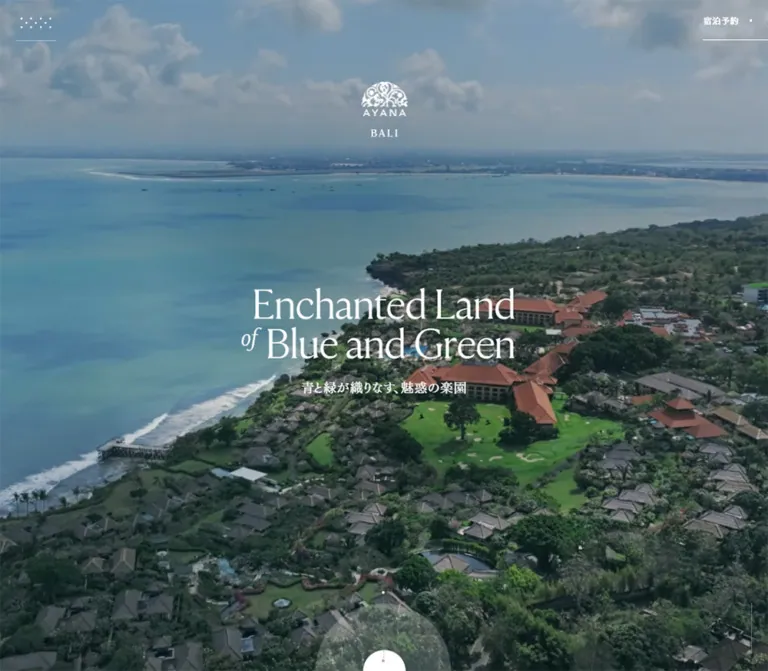
大きなセリフ体と全面写真、クリーム色の余白、非対称の画像配置で滞在体験を紹介。モバイルでは導線を縦に整理し、濃色のフッターに施設情報を集約しています。
オリジナルサイトを見るAn expansive resort journey told through cinematic scenery, delicate serif typography, and quiet editorial space.
Original URL: ayana.com/ja/bali Final URL: ayana.com/bali Response: HTTP 200 after a same-brand locale redirect. Theme: warm cream content surfaces, white typography over photography, and a charcoal navigation footer. Inspected: supplied evidence timestamp September 16, 2026, at 19:28:37 UTC; September 17, 2026, at 04:28:37 JST. Viewports: desktop 1440 × 1000 CSS pixels; mobile 390 × 844 CSS pixels. Scope: the current Bali destination homepage: opening media composition, introductory resort narrative, five highlight categories, four hotel presentations, experience galleries, category links, journey promotion, reservation entry points, and footer. Visual captures cover the desktop opening, a pools-to-dining transition, the desktop footer, and the mobile opening and footer. Supplied DOM measurements cover additional sections.
AYANA BALI presents a substantial hospitality website through a long editorial sequence. Its identity comes from the relationship between lush photographic scenes and deliberately sparse interface elements: an ornate white logo, a fine serif headline, tiny navigation marks, understated reservation links, and generous cream margins. Natural blue, green, stone, and terracotta enter through the imagery. Interface colors remain restrained.
The page moves between immersive scenery and an almost magazine-like arrangement of photographs and captions. Five numbered chapters organize the offering: Hotels, Pools & Beaches, Dining, Spa, and Experiences. Each category leads into practical links, while the final charcoal footer provides a dense directory of the wider resort website. Preserve this combination of atmosphere and navigational depth when adapting the design.
The requested Japanese URL resolved to an English page during the supplied inspection. The current captures and measured typography therefore describe that English rendering. Japanese body typography and a separately rendered Japanese layout were not verified.
An expansive resort journey told through cinematic scenery, delicate serif typography, and quiet editorial space.
Original URL: ayana.com/ja/bali Final URL: ayana.com/bali Response: HTTP 200 after a same-brand locale redirect. Theme: warm cream content surfaces, white typography over photography, and a charcoal navigation footer. Inspected: supplied evidence timestamp September 16, 2026, at 19:28:37 UTC; September 17, 2026, at 04:28:37 JST. Viewports: desktop 1440 × 1000 CSS pixels; mobile 390 × 844 CSS pixels. Scope: the current Bali destination homepage: opening media composition, introductory resort narrative, five highlight categories, four hotel presentations, experience galleries, category links, journey promotion, reservation entry points, and footer. Visual captures cover the desktop opening, a pools-to-dining transition, the desktop footer, and the mobile opening and footer. Supplied DOM measurements cover additional sections.
AYANA BALI presents a substantial hospitality website through a long editorial sequence. Its identity comes from the relationship between lush photographic scenes and deliberately sparse interface elements: an ornate white logo, a fine serif headline, tiny navigation marks, understated reservation links, and generous cream margins. Natural blue, green, stone, and terracotta enter through the imagery. Interface colors remain restrained.
The page moves between immersive scenery and an almost magazine-like arrangement of photographs and captions. Five numbered chapters organize the offering: Hotels, Pools & Beaches, Dining, Spa, and Experiences. Each category leads into practical links, while the final charcoal footer provides a dense directory of the wider resort website. Preserve this combination of atmosphere and navigational depth when adapting the design.
The requested Japanese URL resolved to an English page during the supplied inspection. The current captures and measured typography therefore describe that English rendering. Japanese body typography and a separately rendered Japanese layout were not verified.
| Name | Value | Evidence | Suggested token | Role |
|---|---|---|---|---|
| Warm Cream | #f6f3e7 |
Measured HTML, body, and outer footer background | --color-cream |
Base canvas and editorial sections |
| Charcoal Ink | #333333 |
Measured foreground | --color-ink |
Main text and dark interface marks on light surfaces |
| Soft Cream | #eeead9 |
Measured journey promotion background | --color-cream-deep |
A slightly stronger inset surface |
| White | #ffffff |
Measured hero and navigation text | --color-white |
Reversed type, logo, and controls |
| Secondary Gray | #666666 |
Measured hotel index and breadcrumb text | --color-muted |
Secondary identification on light backgrounds |
| Utility Gray | #999999 |
Measured social and language links | --color-utility |
Subdued footer utilities |
| Footer Charcoal | Approximately #34332f |
Visual estimate from footer captures | --color-footer |
Large dark directory surface |
| Widget Taupe | Approximately #665c50 |
Visual estimate | --color-widget |
Floating three-dot utility control |
The exact measured cream is the base document color. The visible pool-section surface appears slightly grayer in the capture; its own background or compositing layer was not sampled. Do not replace a measured declaration with an asserted screenshot color.
The outer FOOTER element also computes to cream, although the visible directory is charcoal. This indicates that the dark treatment belongs to a nested surface or another composited layer. Applying the outer footer's computed color to the entire visible directory would produce the wrong result.
White lettering sits directly over darkened photographic scenes. The desktop opening shows a close resort scene with a guest in the foreground; the mobile opening shows the coastline and grounds. Both retain the same white identity and headline treatment. The exact overlay opacity is unmeasured.
The reservation control is mostly typographic over the hero. In the content and footer captures, it gains a modest rectangular backing. This is a surface-dependent treatment; it is not evidence of a hovered state.
Fine rules separate navigation rows. Recommended starting values are rgba(51, 51, 51, 0.22) on cream and rgba(255, 255, 255, 0.22) on charcoal. These alpha values are adaptations, not measured source tokens.
There is no observed user-selectable theme system. Light content and the dark footer are parts of the same page.
Observed source property:
--font-aime: Aime-5114c8700c073043,
  'Aime-5114c8700c073043 fallback: Times New Roman',
  serif;
The generated Aime family appears in computed styles for the hero headline, category headings, closing statements, and some local navigation. The main display weight is 300. A light serif with fine strokes, generous capitals, and a restrained italic creates the editorial tone.
The headline reads “Enchanted Land / of Blue and Green.” The word “of” is visually smaller and italic, offset to the left of the second line. Its own font size was not sampled. Keep it subordinate rather than giving every word equal weight.
The family name is supported by computed styles; font file URLs, licensing, and actual fallback selection were not supplied. Do not invent an @font-face source.
Observed stack: helvetica-neue-lt-pro, 'Helvetica Now Text', sans-serif.
This stack appears on sampled top navigation, reservation, hotel-index, language, and destination links. Weight is 400. Common tracking is 0.03em; the short BALI location label uses 0.12em.
Many structural wrappers compute to generic sans-serif at 18px / 18px. Their visible descendants can use different styling, SVG lettering, or transforms. The wrapper value is not a reliable universal size for every footer label or caption.
The ornate AYANA mark is an image or graphic treatment, not a typographic wordmark that should be recreated by choosing a similar font. The initial semantic H1 contains the brand identity; the large poetic headline is an H2 in the supplied DOM.
Repeated headings and character-level spans suggest layered text presentation. Preserve one readable semantic copy in an adaptation, even if decorative duplicates are used for effects.
| Role | Desktop measured | Mobile measured | Weight / tracking | Notes |
|---|---|---|---|---|
| Hero headline | 80px / 74px |
42.64px / 41.6px |
300; normal tracking |
Two main lines with a smaller italic connector |
| Chapter heading | 51px / 56px |
27.04px / 33.28px |
300 |
Longer mobile headings wrap into more lines |
| Category closing statement | 19px / 28px |
14.56px / 16.64px |
300; 0.04em |
Centered above the category title and links |
| Prose-adjacent inline sample | 17px / 32px |
16.64px / 29.12px |
300; 0.04em |
Measured on the inline family link; not every paragraph |
| Primary desktop navigation | 16px / 32px |
Not visibly shown as a full row | 400; 0.03em |
Links exist in DOM even when absent from the opening capture |
| Secondary desktop navigation | 14px / 24px |
Not sampled as visible top navigation | 400; 0.03em |
Resort Map, Curated Journeys, Access |
| Reserve label | 16px / 24px |
13.52px / 16.64px |
400; 0.03em |
Persistent upper-right utility |
| BALI utility label | 16px / 24px |
13.52px / 20.8px |
400; 0.12em |
Computed link style, not the full logo |
| Hotel index label | 16px / 24px |
11.44px / 16.64px |
400; 0.03em |
AYANA BALI HOTELS |
| Local Hotels breadcrumb | 17px / 24px |
12.48px / 12.48px |
400; 0.04em |
Aime family |
| Language links | 12px / 20px |
11.44px / 20.8px |
400; 0.03em |
Compact footer utilities |
Visual estimates: the desktop pool captions use approximately 16px italic serif descriptions over approximately 13px sans-serif place names. The closing uppercase POOLS & BEACHES title is approximately 32px. Their inner text nodes were not independently measured.
The defining hierarchy is contrast in scale and family, with little reliance on bold weight. Keep utility typography modest while allowing display text and scenery to carry the composition.
The source exposes these values at the inspected sizes:
| Source property | 1440 × 1000 | 390 × 844 | Interpretation |
|---|---|---|---|
--vw |
14.4px |
3.9px |
One percent of the captured viewport width |
--vh |
10px |
8.44px |
One percent of the captured viewport height |
--vh-max |
10px |
8.44px |
Same sampled value; update behavior unverified |
--a-s |
1px |
1.04px |
Source scale value; complete formula unavailable |
--c-s |
1px |
1.04px |
Source scale value; complete formula unavailable |
--o-s |
1px |
1.04px |
Source scale value; complete formula unavailable |
--safe-vh, --visual-vh, --full-vh |
Not supplied | 844px |
Mobile viewport-related values |
--keyboard-height |
Not supplied | 0px |
Keyboard was not present in the sample |
The mobile factor 1.04 equals 390 / 375, but that arithmetic alone does not prove the source uses a 375px design-width formula. Do not infer all responsive behavior from these two samples.
| Use | Desktop measured | Mobile measured | Reuse guidance |
|---|---|---|---|
| Small local-link icon gap | 8px |
Often 7.28px or 8.32px |
Keep arrows close to their labels |
| Gallery caption row gap | 12px |
10.4px |
Separate descriptive and place-name lines |
| Gallery caption left inset | 16px |
14.56px |
Leaves room for a small leading mark |
| Gallery caption top inset | 32px |
29.12px |
Gives images a quiet caption boundary |
| Main mobile side inset | — | Approximately 20.8px |
Measured on hotel sections and footer content |
| Category link vertical padding | 32px above and below |
14.56px above, 13.52px below |
Desktop links are deliberately taller |
| Journey panel vertical padding | 48px |
43.68px |
A substantial text-focused inset |
| Footer column gap | 60px, calculated |
Approximately 21.83px, calculated |
Derived from column rectangles |
| Gap between desktop hotel sections | 112px, calculated |
Approximately 72.8px, calculated |
Between measured section boxes |
These values describe distinct components. They do not establish a universal eight-point spacing system.
| Element | Evidence | Shape |
|---|---|---|
| Hotel sections, gallery links, journey panel | Measured 0px on sampled wrappers |
Square |
| Reservation panels | Visually square | Restrained rectangular treatment |
| Circled arrow icons | Visible in captures | Fine circular outline around a small arrow |
| Bottom-center white hero form | Visual estimate | Approximately 112px circle, clipped by the viewport edge |
| Floating utility widget | Visual estimate | Approximately 64px square, with three rounded corners and a square lower-right corner |
Do not generalize the floating widget's shape into a rounded-card system. Most content remains unboxed or square-edged.
| Element | Desktop | Mobile |
|---|---|---|
| Document height | 27,904.78px |
26,335.64px |
| Initial media interaction rectangle | 1440 × 1000px |
390 × 844px |
| White hero headline rectangle | 497.09 × 148px, at approximately x 471.45, y 437.61 |
265.13 × 83.19px, at approximately x 62.44, y 276.39 |
| Hotel presentation outer width | 1200px, starting at x 120 |
348.41px, starting at x 20.80 |
| Highlight item width | Approximately 288px |
Approximately 278.72px |
| Category closing group | 720px, starting at x 360 |
278.72px, starting at x 55.64 |
| Category link row | Two 335 × 80px links, separated by 50px |
Two stacked 278.72 × 41.53px links |
| Journey text panel | 480 × 295.22px |
312 × 287.22px |
| Footer reservation panel | 1080 × 160px |
348.41 × 101.91px |
| Footer main columns | 380px / 380px / 200px |
Two columns of approximately 163.29px |
The hero brand wrapper's measured position does not exactly match the visible logo artwork's position. Use the screenshots for optical alignment and the DOM for wrapper geometry.
Anatomy: a dotted or diamond-like navigation mark at upper left, a reservation link with a small trailing dot at upper right, and fine horizontal rules associated with the desktop controls.
The desktop menu button measures 76 × 76.98px at x 30, with 33px 9px 24px padding. Its visual symbol is smaller than the button. On mobile, the sampled button is approximately 23.91 × 66.55px at x 20.80 with no padding reported.
The reservation label remains visible across the supplied opening, content, and footer views. The header itself has a measured height of zero, consistent with controls positioned outside normal flow. Exact positioning rules were not provided.
The DOM contains a full global navigation, but the opening screenshots show the minimal corner treatment. Do not render all recorded header links across the opening image simply because they have measured rectangles. Menu opening, search behavior, and expanded navigation were not exercised.
Anatomy: full-viewport scenic media, a white AYANA logo and BALI label near the upper center, a two-line serif headline, a full-area Play Movie button in the DOM, and a white circle partially entering from the bottom edge.
At desktop size, the headline begins around 44% of viewport height. On mobile it begins around 33%, leaving a much larger stretch of visible scenery beneath it. The logo remains above the headline with ample separation.
The images use a cover-like crop. Desktop and mobile show different scenes in the supplied captures, so they cannot establish a single shared object-position. A darkening layer appears to support the white text; its exact implementation is unverified.
The Play Movie button measures the entire initial viewport. No opened player was captured. Its playback sequence, audio behavior, close controls, autoplay policy, and relation to the cropped white circle remain unverified.
The opening narrative introduces the estate, its natural setting, and the displayed 90-hectare scale. A numbered highlight index then organizes the five categories. The supplied content gives each category a descriptive phrase and a compact offer summary: four hotels, 14 pools and beaches, 30 restaurants and bars, 40+ spa treatments, and 50+ activities.
These are source-page claims used to understand content hierarchy, not independently verified inventory counts.
Desktop highlight rectangles form three items across the first row and two centered beneath. Items are approximately 288px wide with a 48px horizontal gap. Mobile places the five items in one centered column approximately 278.72px wide, with more multiline text.
Keep the index visually lightweight. Its purpose is to orient visitors within a large resort narrative and provide category anchors.
Anatomy: scenic media, an N° chapter number, a compact category label, and a large light-weight serif statement in white.
The category titles alternate their alignment. The sampled pools and spa headings sit toward the right on desktop, while dining and experiences begin farther left. The Hotels title is centered. These changes create rhythm across the long page.
Headings use 51px / 56px on desktop and 27.04px / 33.28px on mobile. The source keeps intentional line breaks but allows the mobile statements to occupy additional lines. Preserve the relationship between headline width and photographic subject rather than applying identical centered text to every chapter.
The Hotels chapter introduces VILLAS, SEGARA, RESORT, and RIMBA. A compact hotel index appears before four separate presentation sections.
Each presentation includes an editorial phrase, AYANA BALI identification, the property name, photography, explanatory copy, and local navigation. The desktop outer sections measure 1200px wide. Their measured heights are approximately 1144.75px, with 112px between consecutive sections. Mobile sections measure approximately 348.41px wide and 940–965px tall.
The hotel index is horizontal on desktop and becomes a two-by-two arrangement on mobile. Local navigation also changes: desktop puts property context at left and Overview plus Rooms or Villas toward the right; mobile places the overview and accommodation links in separate rows beneath the property identification.
Inner property artwork and every image crop were not visually captured. Their content and grouping are supported by the DOM, while exact internal art direction should remain provisional.
Anatomy: unframed scenic photographs placed at varying widths and horizontal offsets, followed by a small leading mark, an italic descriptive caption, and a subdued sans-serif location name.
The desktop pool capture shows a photograph beginning around x 180 and ending around x 540, approximately 360px wide. Another caption begins around x 720. Large areas of cream separate items rather than completing a regular card grid.
Measured pool caption positions include x 120, 900, 180, 720, and 180 across the five items. On mobile, their left edges vary around 38, 160, 21, 90, and 56px. The staggered composition therefore survives the smaller viewport; it is not simply five identical full-width cards.
The caption link uses a measured top inset of 32px on desktop and 29.12px on mobile. The descriptive line and place name have distinct typographic voices. Caption links lead to specific pool, restaurant, spa, or activity pages. The evidence does not establish that every photograph shares the same clickable area.
Anatomy: a centered serif statement, a larger uppercase category title, a tiny decorative mark, and two understated destination links with fine rules and circled arrows.
In the desktop capture, “Find the perfect spot for every moment” leads into POOLS & BEACHES. The closing group measures 720px wide. Its two links are each 335px wide and 80px high, separated by 50px.
Mobile retains the centered heading group but stacks the links within approximately 278.72px. Each link measures about 41.53px tall. A minimum 44px interactive height is a recommended adaptation.
This is a useful reusable pattern: allow the visual story to conclude, then provide a clear choice between the category overview and its detailed list.
The desktop pools-to-dining capture includes an edge-to-edge band of adjacent dining images. The visible band is approximately 240px tall, with central panels around 360px wide and partially cropped images at both edges.
The strip bridges the quiet cream closing section and the next darker chapter opening. Keep the imagery flush and rectangular. No visible gutter, card border, or rounded frame is needed.
A single still does not establish whether the strip scrolls horizontally, animates automatically, or responds to dragging. Those behaviors must not be invented as observations.
Desktop DOM measurements show five category anchor marks near the right edge: one approximately 6px and the others approximately 4px. The content screenshot also shows a vertical AYANA BALI label at the left edge and a vertical sequence of small marks at the right.
Mobile measurements instead show named category links in a horizontal row positioned at y 844, just below the opening viewport. The final link extends beyond the viewport's right edge in the recorded geometry. This suggests a wider navigation track, but swiping, overflow scrolling, and sticky behavior were not tested.
Treat tiny dots as visual markers inside larger accessible targets in a new implementation. Their active-state update rules were not established.
The supplied DOM describes a scenic journey promotion containing a centered text panel. The panel has a measured #eeead9 background, square corners, and vertical padding of 48px on desktop or 43.68px on mobile.
Its width changes from 480px to 312px. Text introduces Curated Journeys and ends with an itinerary link. The source references a large background image for this area.
This component is supported by DOM and asset references rather than a dedicated visual capture. Preserve the distinction between the measured text-panel geometry and any unverified background composition.
A broad reservation link precedes the main directory. It measures 1080 × 160px on desktop and approximately 348.41 × 101.91px on mobile.
The visible desktop portion has a muted gray surface, a centered Reserve label, and a right-pointing arrow separated by a fine vertical detail. AYANA Rewards and My reservation links follow nearby.
The reservation href points to AYANA's room-booking route. The booking interface itself was not opened or inspected. Use a genuine navigation link for this entry point; do not infer a modal booking form.
The charcoal directory uses a centered 1080px content width and three columns: 380px, 380px, and 200px, with calculated 60px gaps.
The first column groups Hotels and Dining. Hotel rows distinguish the AYANA BALI prefix, property name, and accommodation link. The second column groups Spa, Experiences, Weddings, and Meetings. The narrower third column collects Offers, Resort Map, Curated Journeys, Access, Support, and Residences.
Main category rows measure approximately 75–80px high. Nested destination rows measure about 46px. Thin rules, indenting, and small circular arrows establish hierarchy without cards.
A lower utility row places social destinations toward the left and languages toward the right. Beneath it, the large white AYANA mark is centered, with regional destinations on one side and policy, careers, and press links on the other. The visible copyright label reads © AYANA.
The mobile footer reorganizes the directory rather than shrinking its three desktop columns.
Hotels occupies a full-width row, with VILLAS, SEGARA, RESORT, and RIMBA arranged compactly beside it. The main categories then form two columns: Dining and Spa, Experiences and Weddings, Meetings and Offers. Dining, Spa, Experiences, and Meetings show plus controls. Direct destinations use circled arrows.
Resort Map, Curated Journeys, Access, and Support use smaller paired rows. Residences spans the full width. Social labels give way to icons beside a short invitation line. Languages occupy another ruled row. The AYANA mark, destination links, legal links, and copyright stack centrally at the bottom.
The screenshot shows closed disclosure groups. Descendant links still appear in the supplied DOM measurements, including overlapping rectangles, so their presence does not prove that submenus were visibly expanded. Disclosure operation and expanded layouts remain unverified.
A taupe utility control appears at the lower right in the mobile captures and later desktop captures. It is approximately 64 × 64px, with three rounded corners and a square lower-right corner. Three small pale dots sit at its center.
Approximate offsets are 20px from the right and 40px from the bottom on mobile; 48px from the right and 52px from the bottom on desktop. These are visual estimates.
Its action was not established. Do not label it as a particular chat product or invent an opened conversation interface.
| Target | Supplied computed declaration | What it establishes |
|---|---|---|
| HTML and body background | background-color 0.5s ease-in-out |
A defined background-color transition |
| Desktop menu button | opacity 0.4s cubic-bezier(0.77, 0, 0.175, 1), transform 0.3s cubic-bezier(0.165, 0.84, 0.44, 1) |
Defined opacity and transform timing; trigger unverified |
| Mobile menu button | transform 0.3s cubic-bezier(0.77, 0, 0.175, 1) |
A defined mobile transform transition |
| Many navigation and caption links | opacity 0.9s cubic-bezier(0.19, 1, 0.22, 1) |
A shared slow-settling opacity treatment |
| Reserve utility | translate 0.5s cubic-bezier(0.165, 0.84, 0.44, 1) plus the shared opacity transition |
Translation and opacity can change |
| Hero brand wrapper | opacity 0.5s ease-in-out |
Brand fade timing |
| Mobile Play Movie button | opacity 0.9s ease-in-out 0.5s |
A delayed opacity transition |
| Hotel index anchors | opacity 0.2s |
Faster local-navigation feedback |
| Category closing links | border-color 0.9s cubic-bezier(0.19, 1, 0.22, 1) |
Rule-color transition timing |
| Footer reservation link | color 0.9s cubic-bezier(0.19, 1, 0.22, 1) |
Text-color transition timing |
The supplied stills contain different hero scenes, and the DOM contains a movie action, layered headings, and individual-letter text structures. These support a media-rich presentation, but do not establish the exact hero sequence, reveal order, parallax distance, looping interval, or scroll-animation implementation.
The opening section measures 4700px tall on desktop, while the next section begins at 3700px. On mobile, the corresponding values are approximately 4404.80px and 3560.80px. The differences equal one captured viewport height. Similar section overlaps occur farther down the document. This geometry is consistent with staged, overlapping presentation, but it is insufficient to identify a particular pinning or scroll library.
Many sampled nodes report animation: none. That does not rule out video, JavaScript-driven motion, child animations, or effects on unsampled elements. Likewise, a bare transition: all does not provide evidence of a meaningful animation duration.
Verified interaction scope: the supplied process loaded the page and traversed scroll positions to collect settled captures. Link destinations and control labels were extracted. No opened menu, movie player, reservation flow, footer disclosure, widget panel, or hovered state was supplied.
For an adaptation, use the measured transition timings as optional references, keep navigation responsive to input, and make the page fully readable without reveal effects.
| Layer | Appearance | Purpose |
|---|---|---|
| Scenic opening | Edge-to-edge imagery with white identity and type | Establishes place and atmosphere |
| Chapter media | Large scenic fields, numbered labels, serif statements | Gives each resort category a distinct entrance |
| Editorial canvas | Warm cream, extensive whitespace, unframed images | Supports slower exploration and readable captions |
| Journey panel | Slightly deeper cream, square edges | Separates a focused itinerary invitation |
| Directory footer | Charcoal, white headings, subdued utilities, fine rules | Organizes the large site hierarchy |
| Persistent reservation utility | White label, dot, optional subdued backing | Maintains an obvious booking entry point |
| Floating utility | Taupe shape with three dots | Secondary persistent control of unverified function |
The visual system relies on image boundaries, whitespace, rules, and tonal changes. There is no observed general-purpose shadow or elevated-card system. Any subtle shading around the floating widget should remain specific to that control.
The photographic language is specific to the resort's setting: coastal aerial views, extensive tropical planting, pools, thatched structures, open-air dining, ocean-facing terraces, and Balinese architectural details. The desktop opening includes a guest viewed from behind, with shallow focus and scenery beyond. The mobile opening uses a broad aerial view with the shoreline running diagonally through the frame.
Gallery images mix wider environmental scenes with more intimate experiences. The supplied pool capture shows guests, carved stone details, saturated planting, and turquoise water. The dining transition emphasizes tables, food, greenery, warm architectural materials, and views beyond the seating areas.
Use natural photographic color and deliberate crops. Scenic blue and green are image content, not a requirement for blue buttons or green badges. Keep images sharp where the source is sharp; the soft foreground of one hero frame is a photographic property, not a reason to blur the whole interface.
The visible dining strip uses landscape crops. Other gallery items vary in width and placement; no universal aspect ratio can be established from the supplied evidence. Preserve per-image composition rather than forcing every asset into one card ratio.
These paths were present in the supplied original-page DOM. They were not separately downloaded or inspected for intrinsic dimensions. Relative paths resolve against https://www.ayana.com.
| Asset | Observed path or URL | Evidence-supported role |
|---|---|---|
| White AYANA logo | /img/bali/logo_white_x2_00091.png |
Opening brand graphic |
| Aerial image | /img/bali/aerial-start.jpg |
Opening media-related image reference |
| Logo sprite stylesheet | /data/sprite_logo.css |
Brand presentation resource |
| Hotels scenic image | https://files-r2.ayana.com/media/3082b801-3c26-4f08-8156-d991bacc9334/original.webp |
Alt text describes resort buildings, gardens, pools, and ocean |
| Villas image | https://files-r2.ayana.com/r/01-hotels-villas-01_81-QWQ.webp |
Villas presentation |
| Segara image | https://files-r2.ayana.com/r/01-hotels-segara-01_UxQl5Q.webp |
Segara presentation |
| Resort image | https://files-r2.ayana.com/r/01-hotels-resort-01_7LEboA.webp |
Resort presentation |
| Rimba image | https://files-r2.ayana.com/r/01-hotels-rimba-01_Tk0oKw.webp |
Rimba presentation |
| Pools collage | https://files-r2.ayana.com/media/c15ab174-82e0-4214-8ddb-4ebed5666ff3/original.webp |
Pool chapter image reference |
| Dining collage | https://files-r2.ayana.com/media/5546f3f9-afb1-4e57-a4ce-bfcf070bc592/original.webp |
Dining chapter image reference |
| Spa collage | https://files-r2.ayana.com/media/93c2e385-1515-498f-a3e6-22aaae90bc08/original.webp |
Spa chapter image reference |
| Activities collage | https://files-r2.ayana.com/media/4c3e16a1-af6c-4066-b061-98985513ba35/original.webp |
Experiences chapter image reference |
| Journey background | /img/coursebanner_full_bg.jpg |
Curated Journeys promotion |
The asset names identify resources, not proof of their complete animation or display behavior. Use original brand assets only where authorized; otherwise preserve the compositional principles with appropriate replacement imagery.
At 1440px wide, the page uses several nested widths instead of one universal container. Hotel presentations span 1200px, the footer directory spans 1080px, and category closings span 720px. These equal approximately 83.33%, 75%, and 50% of the inspected viewport respectively.
Scenic sections and transition strips extend to the viewport edges. Gallery items shift across a wider editorial field, with substantial vertical and horizontal gaps. Utility controls sit outside the main reading columns.
The large document height is part of an extended destination narrative. Section rectangles overlap, so their heights should not simply be added or recreated as empty spacer blocks.
At 390px wide, the main hotel and footer inset is approximately 20.8px. Narrow reading and link groups occupy approximately 278.72px, centered with about 55.64px on each side. The journey panel is wider at 312px.
The hero headline reduces from 80px to 42.64px and moves higher within the visible scene. Category headings reduce to 27.04px. Introductory copy uses more deliberate short lines. These are different compositions, not a scaled desktop screenshot.
The five highlights become one column. The hotel index becomes two columns. Hotel detail links and category closing links stack. Gallery captions keep varied horizontal positions. The footer becomes a compact two-column directory with disclosure affordances and a centered lower brand area.
The mobile extracted text omits some intermediate chapter text that remains represented by links and measured elements. Do not interpret that extraction difference as proof that the corresponding categories were removed from the mobile design.
Only two viewport sizes were supplied. The actual breakpoint, tablet layout, landscape behavior, browser-toolbar changes, and keyboard response were not established. A 48rem breakpoint is a practical starting recommendation, not an observed source rule.
Use normal document scrolling as the baseline. If adding staged transitions, ensure anchor navigation, keyboard focus, and deep links remain usable. Reserve enough space for the persistent corner and lower-right controls so they do not obscure focused content.
18px wrapper style as the actual size of every child label.These are recommendations for a new implementation, not verified features of the inspected page:
aria-expanded and aria-controls, or native details elements, for mobile footer groups.#f6f3e7.#333333.#eeead9.#ffffff.#666666.#999999.#34332f; verify against the chosen implementation.#665c50; keep it secondary.“Create a resort destination homepage inspired by the observed AYANA BALI design. Use full-viewport scenic media, a centered white brand graphic, an 80px light serif headline on desktop and approximately 43px on a 390px phone, and minimal menu and reservation controls at the upper corners. Follow the opening with a long editorial journey through five numbered categories. Alternate immersive photographic chapter openings with cream #f6f3e7 sections containing staggered images, italic descriptions, and small sans-serif place names. Use fine rules and circled arrows for category links. End with a broad reservation band and a charcoal directory footer. On mobile, stack category links, retain varied gallery offsets, and reorganize the footer into two columns with accessible disclosure groups. Keep motion optional and preserve a complete static reading experience.”
cubic-bezier(0.19, 1, 0.22, 1). Keep the interface responsive, do not hide required content behind animation, and provide a static version when reduced motion is requested. Do not invent unobserved carousel or movie-player behavior.”This is an implementation adaptation, not extracted source CSS. It preserves the measured desktop and mobile type sizes, nested widths, square surfaces, and footer proportions. The 48rem breakpoint, gallery grid, overlay strength, focus styling, and hover endpoints are recommendations.
The source font family names are retained as optional candidates. Without correctly licensed font files and matching @font-face declarations, the browser uses the listed fallbacks. No font download URL was supplied.
:root {
  /* Measured colors */
  --color-cream: #f6f3e7;
  --color-cream-deep: #eeead9;
  --color-ink: #333333;
  --color-muted: #666666;
  --color-utility: #999999;
  --color-white: #ffffff;

  /* Visual estimates and recommended compositing */
  --color-footer: #34332f;
  --color-widget: #665c50;
  --rule-light: rgb(51 51 51 / 22%);
  --rule-dark: rgb(255 255 255 / 22%);
  --hero-shade: rgb(0 0 0 / 28%);

  /* Source family candidates; font files are not included */
  --font-editorial: 'Aime-5114c8700c073043', 'Times New Roman', serif;
  --font-utility: helvetica-neue-lt-pro, 'Helvetica Now Text', Arial, sans-serif;
  --weight-editorial: 300;
  --weight-utility: 400;
  --tracking-utility: 0.03em;
  --tracking-editorial: 0.04em;

  /* Measured desktop sizes */
  --text-hero: 80px;
  --leading-hero: 74px;
  --text-chapter: 51px;
  --leading-chapter: 56px;
  --text-closing: 19px;
  --leading-closing: 28px;
  --text-reserve: 16px;
  --leading-reserve: 24px;

  /* Recommended formulas matching the inspected desktop */
  --content-wide: min(1200px, 83.333333vw);
  --content-directory: min(1080px, 75vw);
  --content-narrow: min(720px, 50vw);
  --corner-inset: 30px;
  --safe-bottom: env(safe-area-inset-bottom, 0px);

  /* Measured transition references */
  --ease-settle: cubic-bezier(0.19, 1, 0.22, 1);
  --ease-move: cubic-bezier(0.165, 0.84, 0.44, 1);
  --motion-link: 900ms var(--ease-settle);
  --motion-local: 200ms ease;
}

* {
  box-sizing: border-box;
}

body {
  margin: 0;
  color: var(--color-ink);
  background: var(--color-cream);
  font-family: var(--font-utility);
  font-weight: var(--weight-utility);
  line-height: 1.5;
}

img {
  display: block;
  max-width: 100%;
}

a {
  color: inherit;
}

button {
  font: inherit;
}

.content-wide,
.directory-inner,
.category-close {
  margin-inline: auto;
}

.content-wide {
  width: var(--content-wide);
}

.directory-inner {
  width: var(--content-directory);
}

/* A static baseline; staged scroll behavior is separate. */
.resort-hero {
  position: relative;
  min-height: 100vh;
  min-height: 100svh;
  overflow: hidden;
  isolation: isolate;
  color: var(--color-white);
}

.hero-media,
.resort-hero::before {
  position: absolute;
  inset: 0;
  width: 100%;
  height: 100%;
}

.hero-media {
  z-index: -2;
  object-fit: cover;
  object-position: center;
}

.resort-hero::before {
  content: '';
  z-index: -1;
  background: var(--hero-shade);
}

.hero-brand {
  position: absolute;
  top: 11.5svh;
  left: 50%;
  width: 98px;
  transform: translateX(-50%);
  text-align: center;
}

.hero-brand img {
  width: 100%;
  height: auto;
}

.hero-location {
  margin: 18px 0 0;
  font-family: var(--font-editorial);
  font-size: 20px;
  letter-spacing: 0.18em;
}

.hero-title {
  position: absolute;
  top: 43.76svh;
  left: 50%;
  width: max-content;
  max-width: calc(100% - 32px);
  margin: 0;
  transform: translateX(-50%);
  font-family: var(--font-editorial);
  font-size: var(--text-hero);
  font-weight: var(--weight-editorial);
  line-height: var(--leading-hero);
  text-align: center;
}

.hero-title > span {
  display: block;
}

.hero-title em {
  font-size: 0.55em;
  font-weight: inherit;
}

.corner-control {
  position: fixed;
  top: 0;
  z-index: 20;
  display: inline-flex;
  align-items: center;
  justify-content: center;
  min-height: 76px;
  color: var(--color-white);
  border: 0;
  border-bottom: 1px solid rgb(255 255 255 / 35%);
  background: transparent;
  text-decoration: none;
}

.corner-menu {
  left: var(--corner-inset);
  width: 76px;
  padding: 0 9px;
  cursor: pointer;
}

.corner-reserve {
  right: var(--corner-inset);
  gap: 20px;
  min-width: 89px;
  font-size: var(--text-reserve);
  line-height: var(--leading-reserve);
  letter-spacing: var(--tracking-utility);
}

.corner-reserve::after {
  content: '';
  width: 4px;
  height: 4px;
  border-radius: 50%;
  background: currentColor;
}

/* Set this state explicitly when the controls cross light content. */
.corner-control.on-light {
  color: var(--color-ink);
  border-color: var(--rule-light);
}

.chapter-heading {
  margin: 0;
  font-family: var(--font-editorial);
  font-size: var(--text-chapter);
  font-weight: var(--weight-editorial);
  line-height: var(--leading-chapter);
}

.editorial-copy {
  max-width: 38ch;
  margin-inline: auto;
  font-family: var(--font-editorial);
  font-size: 17px;
  font-weight: 300;
  line-height: 32px;
  letter-spacing: var(--tracking-editorial);
}

/* Recommended grid preserving the observed staggered principle. */
.experience-gallery {
  display: grid;
  grid-template-columns: repeat(12, minmax(0, 1fr));
  gap: 120px 0;
  padding-block: 112px;
}

.experience {
  margin: 0;
  grid-column: 1 / span 5;
}

.experience:nth-child(5n + 2) {
  grid-column: 9 / span 4;
  margin-top: 160px;
}

.experience:nth-child(5n + 3) {
  grid-column: 2 / span 4;
}

.experience:nth-child(5n + 4) {
  grid-column: 7 / span 5;
  margin-top: 160px;
}

.experience:nth-child(5n + 5) {
  grid-column: 2 / span 4;
}

.experience img {
  width: 100%;
  height: auto;
  border-radius: 0;
}

.experience-caption {
  position: relative;
  display: grid;
  gap: 12px;
  padding: 32px 0 0 16px;
  text-decoration: none;
  transition: opacity var(--motion-link);
}

.experience-caption::before {
  content: '·';
  position: absolute;
  top: 8px;
  left: 0;
}

.experience-caption em {
  font-family: var(--font-editorial);
  font-size: 16px;
  font-weight: 400;
  line-height: 1.4;
}

.experience-caption small {
  color: var(--color-muted);
  font-size: 13px;
  line-height: 1.4;
}

.category-close {
  width: var(--content-narrow);
  padding-block: 96px 64px;
  text-align: center;
}

.category-close h3 {
  margin: 0 0 32px;
  font-family: var(--font-editorial);
  font-size: var(--text-closing);
  font-weight: 300;
  line-height: var(--leading-closing);
  letter-spacing: var(--tracking-editorial);
}

.category-title {
  margin: 0 0 56px;
  font-family: var(--font-editorial);
  font-size: 32px;
  font-weight: 300;
  line-height: 1.2;
}

.category-links {
  display: grid;
  grid-template-columns: repeat(2, minmax(0, 1fr));
  gap: 50px;
  text-align: left;
}

.rule-link {
  display: grid;
  grid-template-columns: minmax(0, 1fr) 15px;
  align-items: center;
  gap: 16px;
  min-height: 80px;
  padding-block: 24px;
  border-top: 1px dotted var(--rule-light);
  text-decoration: none;
  transition: border-color var(--motion-link);
}

.circle-arrow {
  display: grid;
  place-items: center;
  width: 15px;
  height: 15px;
  border: 1px solid currentColor;
  border-radius: 50%;
  font-size: 10px;
  line-height: 1;
}

.photo-strip {
  display: flex;
  overflow: hidden;
}

.photo-strip img {
  flex: 0 0 25vw;
  width: 25vw;
  height: auto;
  aspect-ratio: 3 / 2;
  object-fit: cover;
}

.journey-panel {
  display: grid;
  gap: 24px;
  width: min(480px, 80vw);
  margin-inline: auto;
  padding: 48px 32px;
  background: var(--color-cream-deep);
  text-align: center;
  text-decoration: none;
}

.directory {
  padding-block: 64px 48px;
  color: var(--color-white);
  background: var(--color-footer);
}

.reserve-band {
  display: flex;
  align-items: center;
  justify-content: center;
  min-height: 160px;
  margin-bottom: 80px;
  border: 1px solid var(--rule-dark);
  background: rgb(255 255 255 / 10%);
  text-decoration: none;
}

.directory-columns {
  display: grid;
  grid-template-columns: 380fr 380fr 200fr;
  gap: 60px;
}

.directory-group {
  border-top: 1px solid var(--rule-dark);
}

.directory-row {
  display: flex;
  align-items: center;
  justify-content: space-between;
  gap: 16px;
  min-height: 76px;
  text-decoration: none;
}

.directory-subrow {
  display: flex;
  align-items: center;
  justify-content: space-between;
  gap: 12px;
  min-height: 46px;
  margin-left: 30px;
  border-top: 1px solid rgb(255 255 255 / 10%);
  font-size: 14px;
  text-decoration: none;
}

.directory-utilities {
  display: flex;
  justify-content: space-between;
  flex-wrap: wrap;
  gap: 24px;
  margin-top: 48px;
  color: var(--color-utility);
  font-size: 12px;
}

.footer-brand {
  width: 110px;
  margin: 72px auto 24px;
}

.utility-widget {
  position: fixed;
  right: 48px;
  bottom: calc(52px + var(--safe-bottom));
  z-index: 20;
  width: 64px;
  height: 64px;
  border: 0;
  border-radius: 16px 16px 0 16px;
  color: var(--color-white);
  background: var(--color-widget);
}

/* Recommended feedback endpoints, not observed source states. */
@media (hover: hover) {
  .experience-caption:hover {
    opacity: 0.7;
  }

  .rule-link:hover {
    border-color: currentColor;
  }
}

:where(a, button, summary):focus-visible {
  outline: 2px solid currentColor;
  outline-offset: 5px;
}

@media (max-width: 48rem) {
  :root {
    --text-hero: clamp(35px, 10.933333vw, 42.64px);
    --leading-hero: 0.9756;
    --text-chapter: 27.04px;
    --leading-chapter: 33.28px;
    --text-closing: 14.56px;
    --leading-closing: 16.64px;
    --text-reserve: 13.52px;
    --leading-reserve: 16.64px;
    --corner-inset: 20.8px;
    --content-wide: calc(100% - 41.6px);
    --content-directory: calc(100% - 41.6px);
    --content-narrow: calc((100% - 41.6px) * 0.8);
  }

  .hero-brand {
    top: 14.6svh;
    width: 79px;
  }

  .hero-location {
    font-size: 17px;
  }

  .hero-title {
    top: 32.75svh;
  }

  .corner-control {
    min-height: 66.55px;
    border-bottom: 0;
  }

  .corner-menu {
    width: 44px;
    justify-content: flex-start;
    padding: 0;
  }

  .corner-reserve {
    min-width: 79px;
    gap: 18px;
  }

  .editorial-copy {
    font-size: 16.64px;
    line-height: 29.12px;
  }

  .experience-gallery {
    grid-template-columns: repeat(10, minmax(0, 1fr));
    gap: 72px 0;
    padding-block: 72px;
  }

  .experience:nth-child(5n + 1) {
    grid-column: 1 / span 8;
  }

  .experience:nth-child(5n + 2) {
    grid-column: 5 / -1;
    margin-top: 0;
  }

  .experience:nth-child(5n + 3) {
    grid-column: 1 / span 8;
  }

  .experience:nth-child(5n + 4) {
    grid-column: 3 / -1;
    margin-top: 0;
  }

  .experience:nth-child(5n + 5) {
    grid-column: 2 / span 6;
  }

  .experience-caption {
    gap: 10.4px;
    padding: 29.12px 0 0 14.56px;
  }

  .category-close {
    padding-block: 72px 48px;
  }

  .category-links {
    grid-template-columns: 1fr;
    gap: 0;
  }

  .rule-link {
    min-height: 44px;
    padding-block: 14px;
    font-size: 13.52px;
  }

  .photo-strip img {
    flex-basis: 70vw;
    width: 70vw;
  }

  .journey-panel {
    padding: 43.68px 24px;
  }

  .reserve-band {
    min-height: 101.91px;
    margin-bottom: 40px;
  }

  /* Arrange individual directory groups in the mobile reading order. */
  .directory-columns {
    grid-template-columns: repeat(2, minmax(0, 1fr));
    gap: 0 21.83px;
  }

  .directory-group.full-width {
    grid-column: 1 / -1;
  }

  .directory-row {
    min-height: 71.75px;
    font-size: 18px;
  }

  .directory-subrow {
    min-height: 44px;
    margin-left: 20px;
    font-size: 12px;
  }

  .directory-utilities {
    display: grid;
    gap: 20px;
    font-size: 11.44px;
  }

  .footer-brand {
    width: 94.63px;
    margin-top: 48px;
  }

  .utility-widget {
    right: 20px;
    bottom: calc(40px + var(--safe-bottom));
  }
}

@media (prefers-reduced-motion: reduce) {
  .experience-caption,
  .rule-link,
  .corner-control {
    transition: none;
  }

  html {
    scroll-behavior: auto;
  }
}
The CSS intentionally leaves the document in normal flow. It does not reproduce the source's overlapping section geometry, movie behavior, logo animation, or unknown widget function. If decorative video is added, its pause/static behavior needs separate implementation; a CSS media query alone does not stop playback.
The following category closer uses observed copy and destinations. The arrow is an approximation of the source graphic. The CSS above provides its desktop and mobile structure.
<section class='category-close' aria-labelledby='pools-title'>
<h3>Find the perfect spot for every moment</h3>
<h2 class='category-title' id='pools-title'>POOLS & BEACHES</h2>
<nav class='category-links' aria-label='Pools and beaches'>
<a class='rule-link' href='https://www.ayana.com/bali/experiences/'>
<span>Overview</span>
<span class='circle-arrow' aria-hidden='true'>→</span>
</a>
<a class='rule-link' href='https://www.ayana.com/bali/experiences/list/'>
<span>Pools & Beaches</span>
<span class='circle-arrow' aria-hidden='true'>→</span>
</a>
</nav>
</section>
For the mobile directory, native details and summary can provide an accessible disclosure baseline. Keep direct category navigation separate from its expansion control where both actions are needed. The exact source disclosure behavior was not observed.
Optional aliases for an implementation that already uses Tailwind v4. This is not evidence that the original website uses Tailwind. Define the custom properties above first.
@theme inline {
  --color-resort-cream: var(--color-cream);
  --color-resort-cream-deep: var(--color-cream-deep);
  --color-resort-ink: var(--color-ink);
  --color-resort-muted: var(--color-muted);
  --color-resort-footer: var(--color-footer);
  --color-resort-widget: var(--color-widget);

  --font-resort-display: var(--font-editorial);
  --font-resort-ui: var(--font-utility);

  --text-resort-hero: var(--text-hero);
  --text-resort-hero--line-height: var(--leading-hero);
  --text-resort-chapter: var(--text-chapter);
  --text-resort-chapter--line-height: var(--leading-chapter);
  --text-resort-closing: var(--text-closing);
  --text-resort-closing--line-height: var(--leading-closing);

  --spacing-resort-wide: var(--content-wide);
  --spacing-resort-directory: var(--content-directory);
  --spacing-resort-narrow: var(--content-narrow);
  --spacing-resort-corner: var(--corner-inset);
}
2026-09-16T19:28:37.459Z, equivalent to September 17, 2026, at 04:28:37.459 JST. Separate timestamps for individual screenshots were not provided.This reference documents the currently supplied English rendering at the final Bali URL. It distinguishes measured geometry and styles from visual estimates and proposed implementation choices.
# AYANA BALI — Style Reference

> An expansive resort journey told through cinematic scenery, delicate serif typography, and quiet editorial space.

**Original URL:** [ayana.com/ja/bali](https://www.ayana.com/ja/bali/)
**Final URL:** [ayana.com/bali](https://www.ayana.com/bali/)
**Response:** HTTP 200 after a same-brand locale redirect.
**Theme:** warm cream content surfaces, white typography over photography, and a charcoal navigation footer.
**Inspected:** supplied evidence timestamp September 16, 2026, at 19:28:37 UTC; September 17, 2026, at 04:28:37 JST.
**Viewports:** desktop 1440 × 1000 CSS pixels; mobile 390 × 844 CSS pixels.
**Scope:** the current Bali destination homepage: opening media composition, introductory resort narrative, five highlight categories, four hotel presentations, experience galleries, category links, journey promotion, reservation entry points, and footer. Visual captures cover the desktop opening, a pools-to-dining transition, the desktop footer, and the mobile opening and footer. Supplied DOM measurements cover additional sections.

AYANA BALI presents a substantial hospitality website through a long editorial sequence. Its identity comes from the relationship between lush photographic scenes and deliberately sparse interface elements: an ornate white logo, a fine serif headline, tiny navigation marks, understated reservation links, and generous cream margins. Natural blue, green, stone, and terracotta enter through the imagery. Interface colors remain restrained.

The page moves between immersive scenery and an almost magazine-like arrangement of photographs and captions. Five numbered chapters organize the offering: Hotels, Pools & Beaches, Dining, Spa, and Experiences. Each category leads into practical links, while the final charcoal footer provides a dense directory of the wider resort website. Preserve this combination of atmosphere and navigational depth when adapting the design.

The requested Japanese URL resolved to an English page during the supplied inspection. The current captures and measured typography therefore describe that English rendering. Japanese body typography and a separately rendered Japanese layout were not verified.
# AYANA BALI — Style Reference
> An expansive resort journey told through cinematic scenery, delicate serif typography, and quiet editorial space.
**Original URL:** [ayana.com/ja/bali](https://www.ayana.com/ja/bali/)
**Final URL:** [ayana.com/bali](https://www.ayana.com/bali/)
**Response:** HTTP 200 after a same-brand locale redirect.
**Theme:** warm cream content surfaces, white typography over photography, and a charcoal navigation footer.
**Inspected:** supplied evidence timestamp September 16, 2026, at 19:28:37 UTC; September 17, 2026, at 04:28:37 JST.
**Viewports:** desktop 1440 × 1000 CSS pixels; mobile 390 × 844 CSS pixels.
**Scope:** the current Bali destination homepage: opening media composition, introductory resort narrative, five highlight categories, four hotel presentations, experience galleries, category links, journey promotion, reservation entry points, and footer. Visual captures cover the desktop opening, a pools-to-dining transition, the desktop footer, and the mobile opening and footer. Supplied DOM measurements cover additional sections.
AYANA BALI presents a substantial hospitality website through a long editorial sequence. Its identity comes from the relationship between lush photographic scenes and deliberately sparse interface elements: an ornate white logo, a fine serif headline, tiny navigation marks, understated reservation links, and generous cream margins. Natural blue, green, stone, and terracotta enter through the imagery. Interface colors remain restrained.
The page moves between immersive scenery and an almost magazine-like arrangement of photographs and captions. Five numbered chapters organize the offering: Hotels, Pools & Beaches, Dining, Spa, and Experiences. Each category leads into practical links, while the final charcoal footer provides a dense directory of the wider resort website. Preserve this combination of atmosphere and navigational depth when adapting the design.
The requested Japanese URL resolved to an English page during the supplied inspection. The current captures and measured typography therefore describe that English rendering. Japanese body typography and a separately rendered Japanese layout were not verified.
## How to Read This Reference
- **Measured** values come from the supplied rendered DOM, computed styles, custom properties, and element rectangles. They are CSS pixels unless stated otherwise.
- **Visual estimates** describe visible features whose exact styles were not supplied, including the footer background, floating widget color, and some image dimensions.
- **Calculated** values are arithmetic derived from measured rectangles. They do not establish the original CSS formula.
- **Recommendations** and the Quick Start are implementation guidance. Proposed breakpoints, focus treatments, media fallbacks, and layout formulas are not claims about the source.
- **Named tokens** are descriptive aliases unless explicitly identified as source custom properties.
- Element rectangles can include wrappers, transformed content, clipped descendants, or animation layers. A nonzero rectangle does not prove that an element was visible in the corresponding screenshot.
- Duplicated words and individually separated letters occur in the extracted text. Treat these as rendering-layer evidence, not copy that should appear multiple times in a new implementation.
## Tokens — Colors
### Default Palette
| Name | Value | Evidence | Suggested token | Role |
| --- | --- | --- | --- | --- |
| Warm Cream | `#f6f3e7` | Measured HTML, body, and outer footer background | `--color-cream` | Base canvas and editorial sections |
| Charcoal Ink | `#333333` | Measured foreground | `--color-ink` | Main text and dark interface marks on light surfaces |
| Soft Cream | `#eeead9` | Measured journey promotion background | `--color-cream-deep` | A slightly stronger inset surface |
| White | `#ffffff` | Measured hero and navigation text | `--color-white` | Reversed type, logo, and controls |
| Secondary Gray | `#666666` | Measured hotel index and breadcrumb text | `--color-muted` | Secondary identification on light backgrounds |
| Utility Gray | `#999999` | Measured social and language links | `--color-utility` | Subdued footer utilities |
| Footer Charcoal | Approximately `#34332f` | Visual estimate from footer captures | `--color-footer` | Large dark directory surface |
| Widget Taupe | Approximately `#665c50` | Visual estimate | `--color-widget` | Floating three-dot utility control |
The exact measured cream is the base document color. The visible pool-section surface appears slightly grayer in the capture; its own background or compositing layer was not sampled. Do not replace a measured declaration with an asserted screenshot color.
The outer `FOOTER` element also computes to cream, although the visible directory is charcoal. This indicates that the dark treatment belongs to a nested surface or another composited layer. Applying the outer footer's computed color to the entire visible directory would produce the wrong result.
### Surface and Contrast Behavior
White lettering sits directly over darkened photographic scenes. The desktop opening shows a close resort scene with a guest in the foreground; the mobile opening shows the coastline and grounds. Both retain the same white identity and headline treatment. The exact overlay opacity is unmeasured.
The reservation control is mostly typographic over the hero. In the content and footer captures, it gains a modest rectangular backing. This is a surface-dependent treatment; it is not evidence of a hovered state.
Fine rules separate navigation rows. Recommended starting values are `rgba(51, 51, 51, 0.22)` on cream and `rgba(255, 255, 255, 0.22)` on charcoal. These alpha values are adaptations, not measured source tokens.
There is no observed user-selectable theme system. Light content and the dark footer are parts of the same page.
## Tokens — Typography
### Aime — Editorial Display
**Observed source property:**
```css
--font-aime: Aime-5114c8700c073043,
'Aime-5114c8700c073043 fallback: Times New Roman',
serif;
```
The generated Aime family appears in computed styles for the hero headline, category headings, closing statements, and some local navigation. The main display weight is `300`. A light serif with fine strokes, generous capitals, and a restrained italic creates the editorial tone.
The headline reads “Enchanted Land / of Blue and Green.” The word “of” is visually smaller and italic, offset to the left of the second line. Its own font size was not sampled. Keep it subordinate rather than giving every word equal weight.
The family name is supported by computed styles; font file URLs, licensing, and actual fallback selection were not supplied. Do not invent an `@font-face` source.
### Sans Serif — Navigation and Utilities
**Observed stack:** `helvetica-neue-lt-pro, 'Helvetica Now Text', sans-serif`.
This stack appears on sampled top navigation, reservation, hotel-index, language, and destination links. Weight is `400`. Common tracking is `0.03em`; the short BALI location label uses `0.12em`.
Many structural wrappers compute to generic `sans-serif` at `18px / 18px`. Their visible descendants can use different styling, SVG lettering, or transforms. The wrapper value is not a reliable universal size for every footer label or caption.
### Logo and Decorative Lettering
The ornate AYANA mark is an image or graphic treatment, not a typographic wordmark that should be recreated by choosing a similar font. The initial semantic `H1` contains the brand identity; the large poetic headline is an `H2` in the supplied DOM.
Repeated headings and character-level spans suggest layered text presentation. Preserve one readable semantic copy in an adaptation, even if decorative duplicates are used for effects.
### Type Scale
| Role | Desktop measured | Mobile measured | Weight / tracking | Notes |
| --- | --- | --- | --- | --- |
| Hero headline | `80px / 74px` | `42.64px / 41.6px` | `300`; normal tracking | Two main lines with a smaller italic connector |
| Chapter heading | `51px / 56px` | `27.04px / 33.28px` | `300` | Longer mobile headings wrap into more lines |
| Category closing statement | `19px / 28px` | `14.56px / 16.64px` | `300`; `0.04em` | Centered above the category title and links |
| Prose-adjacent inline sample | `17px / 32px` | `16.64px / 29.12px` | `300`; `0.04em` | Measured on the inline family link; not every paragraph |
| Primary desktop navigation | `16px / 32px` | Not visibly shown as a full row | `400`; `0.03em` | Links exist in DOM even when absent from the opening capture |
| Secondary desktop navigation | `14px / 24px` | Not sampled as visible top navigation | `400`; `0.03em` | Resort Map, Curated Journeys, Access |
| Reserve label | `16px / 24px` | `13.52px / 16.64px` | `400`; `0.03em` | Persistent upper-right utility |
| BALI utility label | `16px / 24px` | `13.52px / 20.8px` | `400`; `0.12em` | Computed link style, not the full logo |
| Hotel index label | `16px / 24px` | `11.44px / 16.64px` | `400`; `0.03em` | AYANA BALI HOTELS |
| Local Hotels breadcrumb | `17px / 24px` | `12.48px / 12.48px` | `400`; `0.04em` | Aime family |
| Language links | `12px / 20px` | `11.44px / 20.8px` | `400`; `0.03em` | Compact footer utilities |
**Visual estimates:** the desktop pool captions use approximately 16px italic serif descriptions over approximately 13px sans-serif place names. The closing uppercase POOLS & BEACHES title is approximately 32px. Their inner text nodes were not independently measured.
The defining hierarchy is contrast in scale and family, with little reliance on bold weight. Keep utility typography modest while allowing display text and scenery to carry the composition.
## Tokens — Spacing & Shapes
### Responsive Unit
The source exposes these values at the inspected sizes:
| Source property | 1440 × 1000 | 390 × 844 | Interpretation |
| --- | --- | --- | --- |
| `--vw` | `14.4px` | `3.9px` | One percent of the captured viewport width |
| `--vh` | `10px` | `8.44px` | One percent of the captured viewport height |
| `--vh-max` | `10px` | `8.44px` | Same sampled value; update behavior unverified |
| `--a-s` | `1px` | `1.04px` | Source scale value; complete formula unavailable |
| `--c-s` | `1px` | `1.04px` | Source scale value; complete formula unavailable |
| `--o-s` | `1px` | `1.04px` | Source scale value; complete formula unavailable |
| `--safe-vh`, `--visual-vh`, `--full-vh` | Not supplied | `844px` | Mobile viewport-related values |
| `--keyboard-height` | Not supplied | `0px` | Keyboard was not present in the sample |
The mobile factor `1.04` equals `390 / 375`, but that arithmetic alone does not prove the source uses a 375px design-width formula. Do not infer all responsive behavior from these two samples.
### Spacing Scale
| Use | Desktop measured | Mobile measured | Reuse guidance |
| --- | --- | --- | --- |
| Small local-link icon gap | `8px` | Often `7.28px` or `8.32px` | Keep arrows close to their labels |
| Gallery caption row gap | `12px` | `10.4px` | Separate descriptive and place-name lines |
| Gallery caption left inset | `16px` | `14.56px` | Leaves room for a small leading mark |
| Gallery caption top inset | `32px` | `29.12px` | Gives images a quiet caption boundary |
| Main mobile side inset | — | Approximately `20.8px` | Measured on hotel sections and footer content |
| Category link vertical padding | `32px` above and below | `14.56px` above, `13.52px` below | Desktop links are deliberately taller |
| Journey panel vertical padding | `48px` | `43.68px` | A substantial text-focused inset |
| Footer column gap | `60px`, calculated | Approximately `21.83px`, calculated | Derived from column rectangles |
| Gap between desktop hotel sections | `112px`, calculated | Approximately `72.8px`, calculated | Between measured section boxes |
These values describe distinct components. They do not establish a universal eight-point spacing system.
### Border Radius
| Element | Evidence | Shape |
| --- | --- | --- |
| Hotel sections, gallery links, journey panel | Measured `0px` on sampled wrappers | Square |
| Reservation panels | Visually square | Restrained rectangular treatment |
| Circled arrow icons | Visible in captures | Fine circular outline around a small arrow |
| Bottom-center white hero form | Visual estimate | Approximately 112px circle, clipped by the viewport edge |
| Floating utility widget | Visual estimate | Approximately 64px square, with three rounded corners and a square lower-right corner |
Do not generalize the floating widget's shape into a rounded-card system. Most content remains unboxed or square-edged.
### Layout Measurements
| Element | Desktop | Mobile |
| --- | --- | --- |
| Document height | `27,904.78px` | `26,335.64px` |
| Initial media interaction rectangle | `1440 × 1000px` | `390 × 844px` |
| White hero headline rectangle | `497.09 × 148px`, at approximately `x 471.45`, `y 437.61` | `265.13 × 83.19px`, at approximately `x 62.44`, `y 276.39` |
| Hotel presentation outer width | `1200px`, starting at `x 120` | `348.41px`, starting at `x 20.80` |
| Highlight item width | Approximately `288px` | Approximately `278.72px` |
| Category closing group | `720px`, starting at `x 360` | `278.72px`, starting at `x 55.64` |
| Category link row | Two `335 × 80px` links, separated by `50px` | Two stacked `278.72 × 41.53px` links |
| Journey text panel | `480 × 295.22px` | `312 × 287.22px` |
| Footer reservation panel | `1080 × 160px` | `348.41 × 101.91px` |
| Footer main columns | `380px / 380px / 200px` | Two columns of approximately `163.29px` |
The hero brand wrapper's measured position does not exactly match the visible logo artwork's position. Use the screenshots for optical alignment and the DOM for wrapper geometry.
## Components
### Persistent Corner Controls
**Anatomy:** a dotted or diamond-like navigation mark at upper left, a reservation link with a small trailing dot at upper right, and fine horizontal rules associated with the desktop controls.
The desktop menu button measures `76 × 76.98px` at `x 30`, with `33px 9px 24px` padding. Its visual symbol is smaller than the button. On mobile, the sampled button is approximately `23.91 × 66.55px` at `x 20.80` with no padding reported.
The reservation label remains visible across the supplied opening, content, and footer views. The header itself has a measured height of zero, consistent with controls positioned outside normal flow. Exact positioning rules were not provided.
The DOM contains a full global navigation, but the opening screenshots show the minimal corner treatment. Do not render all recorded header links across the opening image simply because they have measured rectangles. Menu opening, search behavior, and expanded navigation were not exercised.
### Opening Media Composition
**Anatomy:** full-viewport scenic media, a white AYANA logo and BALI label near the upper center, a two-line serif headline, a full-area Play Movie button in the DOM, and a white circle partially entering from the bottom edge.
At desktop size, the headline begins around 44% of viewport height. On mobile it begins around 33%, leaving a much larger stretch of visible scenery beneath it. The logo remains above the headline with ample separation.
The images use a cover-like crop. Desktop and mobile show different scenes in the supplied captures, so they cannot establish a single shared `object-position`. A darkening layer appears to support the white text; its exact implementation is unverified.
The Play Movie button measures the entire initial viewport. No opened player was captured. Its playback sequence, audio behavior, close controls, autoplay policy, and relation to the cropped white circle remain unverified.
### Resort Introduction and Five Highlights
The opening narrative introduces the estate, its natural setting, and the displayed 90-hectare scale. A numbered highlight index then organizes the five categories. The supplied content gives each category a descriptive phrase and a compact offer summary: four hotels, 14 pools and beaches, 30 restaurants and bars, 40+ spa treatments, and 50+ activities.
These are source-page claims used to understand content hierarchy, not independently verified inventory counts.
Desktop highlight rectangles form three items across the first row and two centered beneath. Items are approximately 288px wide with a 48px horizontal gap. Mobile places the five items in one centered column approximately 278.72px wide, with more multiline text.
Keep the index visually lightweight. Its purpose is to orient visitors within a large resort narrative and provide category anchors.
### Numbered Chapter Opening
**Anatomy:** scenic media, an `N°` chapter number, a compact category label, and a large light-weight serif statement in white.
The category titles alternate their alignment. The sampled pools and spa headings sit toward the right on desktop, while dining and experiences begin farther left. The Hotels title is centered. These changes create rhythm across the long page.
Headings use `51px / 56px` on desktop and `27.04px / 33.28px` on mobile. The source keeps intentional line breaks but allows the mobile statements to occupy additional lines. Preserve the relationship between headline width and photographic subject rather than applying identical centered text to every chapter.
### Hotel Index and Four Hotel Presentations
The Hotels chapter introduces VILLAS, SEGARA, RESORT, and RIMBA. A compact hotel index appears before four separate presentation sections.
Each presentation includes an editorial phrase, AYANA BALI identification, the property name, photography, explanatory copy, and local navigation. The desktop outer sections measure 1200px wide. Their measured heights are approximately 1144.75px, with 112px between consecutive sections. Mobile sections measure approximately 348.41px wide and 940–965px tall.
The hotel index is horizontal on desktop and becomes a two-by-two arrangement on mobile. Local navigation also changes: desktop puts property context at left and Overview plus Rooms or Villas toward the right; mobile places the overview and accommodation links in separate rows beneath the property identification.
Inner property artwork and every image crop were not visually captured. Their content and grouping are supported by the DOM, while exact internal art direction should remain provisional.
### Staggered Experience Gallery
**Anatomy:** unframed scenic photographs placed at varying widths and horizontal offsets, followed by a small leading mark, an italic descriptive caption, and a subdued sans-serif location name.
The desktop pool capture shows a photograph beginning around `x 180` and ending around `x 540`, approximately 360px wide. Another caption begins around `x 720`. Large areas of cream separate items rather than completing a regular card grid.
Measured pool caption positions include `x 120`, `900`, `180`, `720`, and `180` across the five items. On mobile, their left edges vary around `38`, `160`, `21`, `90`, and `56px`. The staggered composition therefore survives the smaller viewport; it is not simply five identical full-width cards.
The caption link uses a measured top inset of 32px on desktop and 29.12px on mobile. The descriptive line and place name have distinct typographic voices. Caption links lead to specific pool, restaurant, spa, or activity pages. The evidence does not establish that every photograph shares the same clickable area.
### Category Closing Links
**Anatomy:** a centered serif statement, a larger uppercase category title, a tiny decorative mark, and two understated destination links with fine rules and circled arrows.
In the desktop capture, “Find the perfect spot for every moment” leads into POOLS & BEACHES. The closing group measures 720px wide. Its two links are each 335px wide and 80px high, separated by 50px.
Mobile retains the centered heading group but stacks the links within approximately 278.72px. Each link measures about 41.53px tall. A minimum 44px interactive height is a recommended adaptation.
This is a useful reusable pattern: allow the visual story to conclude, then provide a clear choice between the category overview and its detailed list.
### Photographic Transition Strip
The desktop pools-to-dining capture includes an edge-to-edge band of adjacent dining images. The visible band is approximately 240px tall, with central panels around 360px wide and partially cropped images at both edges.
The strip bridges the quiet cream closing section and the next darker chapter opening. Keep the imagery flush and rectangular. No visible gutter, card border, or rounded frame is needed.
A single still does not establish whether the strip scrolls horizontally, animates automatically, or responds to dragging. Those behaviors must not be invented as observations.
### Page Navigation and Edge Marks
Desktop DOM measurements show five category anchor marks near the right edge: one approximately 6px and the others approximately 4px. The content screenshot also shows a vertical AYANA BALI label at the left edge and a vertical sequence of small marks at the right.
Mobile measurements instead show named category links in a horizontal row positioned at `y 844`, just below the opening viewport. The final link extends beyond the viewport's right edge in the recorded geometry. This suggests a wider navigation track, but swiping, overflow scrolling, and sticky behavior were not tested.
Treat tiny dots as visual markers inside larger accessible targets in a new implementation. Their active-state update rules were not established.
### Curated Journeys Promotion
The supplied DOM describes a scenic journey promotion containing a centered text panel. The panel has a measured `#eeead9` background, square corners, and vertical padding of 48px on desktop or 43.68px on mobile.
Its width changes from 480px to 312px. Text introduces Curated Journeys and ends with an itinerary link. The source references a large background image for this area.
This component is supported by DOM and asset references rather than a dedicated visual capture. Preserve the distinction between the measured text-panel geometry and any unverified background composition.
### Reservation Band
A broad reservation link precedes the main directory. It measures 1080 × 160px on desktop and approximately 348.41 × 101.91px on mobile.
The visible desktop portion has a muted gray surface, a centered Reserve label, and a right-pointing arrow separated by a fine vertical detail. AYANA Rewards and My reservation links follow nearby.
The reservation href points to AYANA's room-booking route. The booking interface itself was not opened or inspected. Use a genuine navigation link for this entry point; do not infer a modal booking form.
### Desktop Directory Footer
The charcoal directory uses a centered 1080px content width and three columns: 380px, 380px, and 200px, with calculated 60px gaps.
The first column groups Hotels and Dining. Hotel rows distinguish the AYANA BALI prefix, property name, and accommodation link. The second column groups Spa, Experiences, Weddings, and Meetings. The narrower third column collects Offers, Resort Map, Curated Journeys, Access, Support, and Residences.
Main category rows measure approximately 75–80px high. Nested destination rows measure about 46px. Thin rules, indenting, and small circular arrows establish hierarchy without cards.
A lower utility row places social destinations toward the left and languages toward the right. Beneath it, the large white AYANA mark is centered, with regional destinations on one side and policy, careers, and press links on the other. The visible copyright label reads © AYANA.
### Mobile Directory Footer
The mobile footer reorganizes the directory rather than shrinking its three desktop columns.
Hotels occupies a full-width row, with VILLAS, SEGARA, RESORT, and RIMBA arranged compactly beside it. The main categories then form two columns: Dining and Spa, Experiences and Weddings, Meetings and Offers. Dining, Spa, Experiences, and Meetings show plus controls. Direct destinations use circled arrows.
Resort Map, Curated Journeys, Access, and Support use smaller paired rows. Residences spans the full width. Social labels give way to icons beside a short invitation line. Languages occupy another ruled row. The AYANA mark, destination links, legal links, and copyright stack centrally at the bottom.
The screenshot shows closed disclosure groups. Descendant links still appear in the supplied DOM measurements, including overlapping rectangles, so their presence does not prove that submenus were visibly expanded. Disclosure operation and expanded layouts remain unverified.
### Floating Three-Dot Utility
A taupe utility control appears at the lower right in the mobile captures and later desktop captures. It is approximately 64 × 64px, with three rounded corners and a square lower-right corner. Three small pale dots sit at its center.
Approximate offsets are 20px from the right and 40px from the bottom on mobile; 48px from the right and 52px from the bottom on desktop. These are visual estimates.
Its action was not established. Do not label it as a particular chat product or invent an opened conversation interface.
## Tokens — Motion & Interaction
### Measured Transition Declarations
| Target | Supplied computed declaration | What it establishes |
| --- | --- | --- |
| HTML and body background | `background-color 0.5s ease-in-out` | A defined background-color transition |
| Desktop menu button | `opacity 0.4s cubic-bezier(0.77, 0, 0.175, 1), transform 0.3s cubic-bezier(0.165, 0.84, 0.44, 1)` | Defined opacity and transform timing; trigger unverified |
| Mobile menu button | `transform 0.3s cubic-bezier(0.77, 0, 0.175, 1)` | A defined mobile transform transition |
| Many navigation and caption links | `opacity 0.9s cubic-bezier(0.19, 1, 0.22, 1)` | A shared slow-settling opacity treatment |
| Reserve utility | `translate 0.5s cubic-bezier(0.165, 0.84, 0.44, 1)` plus the shared opacity transition | Translation and opacity can change |
| Hero brand wrapper | `opacity 0.5s ease-in-out` | Brand fade timing |
| Mobile Play Movie button | `opacity 0.9s ease-in-out 0.5s` | A delayed opacity transition |
| Hotel index anchors | `opacity 0.2s` | Faster local-navigation feedback |
| Category closing links | `border-color 0.9s cubic-bezier(0.19, 1, 0.22, 1)` | Rule-color transition timing |
| Footer reservation link | `color 0.9s cubic-bezier(0.19, 1, 0.22, 1)` | Text-color transition timing |
The supplied stills contain different hero scenes, and the DOM contains a movie action, layered headings, and individual-letter text structures. These support a media-rich presentation, but do not establish the exact hero sequence, reveal order, parallax distance, looping interval, or scroll-animation implementation.
The opening section measures 4700px tall on desktop, while the next section begins at 3700px. On mobile, the corresponding values are approximately 4404.80px and 3560.80px. The differences equal one captured viewport height. Similar section overlaps occur farther down the document. This geometry is consistent with staged, overlapping presentation, but it is insufficient to identify a particular pinning or scroll library.
Many sampled nodes report `animation: none`. That does not rule out video, JavaScript-driven motion, child animations, or effects on unsampled elements. Likewise, a bare `transition: all` does not provide evidence of a meaningful animation duration.
**Verified interaction scope:** the supplied process loaded the page and traversed scroll positions to collect settled captures. Link destinations and control labels were extracted. No opened menu, movie player, reservation flow, footer disclosure, widget panel, or hovered state was supplied.
For an adaptation, use the measured transition timings as optional references, keep navigation responsive to input, and make the page fully readable without reveal effects.
## Surfaces
| Layer | Appearance | Purpose |
| --- | --- | --- |
| Scenic opening | Edge-to-edge imagery with white identity and type | Establishes place and atmosphere |
| Chapter media | Large scenic fields, numbered labels, serif statements | Gives each resort category a distinct entrance |
| Editorial canvas | Warm cream, extensive whitespace, unframed images | Supports slower exploration and readable captions |
| Journey panel | Slightly deeper cream, square edges | Separates a focused itinerary invitation |
| Directory footer | Charcoal, white headings, subdued utilities, fine rules | Organizes the large site hierarchy |
| Persistent reservation utility | White label, dot, optional subdued backing | Maintains an obvious booking entry point |
| Floating utility | Taupe shape with three dots | Secondary persistent control of unverified function |
The visual system relies on image boundaries, whitespace, rules, and tonal changes. There is no observed general-purpose shadow or elevated-card system. Any subtle shading around the floating widget should remain specific to that control.
## Imagery
The photographic language is specific to the resort's setting: coastal aerial views, extensive tropical planting, pools, thatched structures, open-air dining, ocean-facing terraces, and Balinese architectural details. The desktop opening includes a guest viewed from behind, with shallow focus and scenery beyond. The mobile opening uses a broad aerial view with the shoreline running diagonally through the frame.
Gallery images mix wider environmental scenes with more intimate experiences. The supplied pool capture shows guests, carved stone details, saturated planting, and turquoise water. The dining transition emphasizes tables, food, greenery, warm architectural materials, and views beyond the seating areas.
Use natural photographic color and deliberate crops. Scenic blue and green are image content, not a requirement for blue buttons or green badges. Keep images sharp where the source is sharp; the soft foreground of one hero frame is a photographic property, not a reason to blur the whole interface.
The visible dining strip uses landscape crops. Other gallery items vary in width and placement; no universal aspect ratio can be established from the supplied evidence. Preserve per-image composition rather than forcing every asset into one card ratio.
### Observed Asset References
These paths were present in the supplied original-page DOM. They were not separately downloaded or inspected for intrinsic dimensions. Relative paths resolve against `https://www.ayana.com`.
| Asset | Observed path or URL | Evidence-supported role |
| --- | --- | --- |
| White AYANA logo | `/img/bali/logo_white_x2_00091.png` | Opening brand graphic |
| Aerial image | `/img/bali/aerial-start.jpg` | Opening media-related image reference |
| Logo sprite stylesheet | `/data/sprite_logo.css` | Brand presentation resource |
| Hotels scenic image | `https://files-r2.ayana.com/media/3082b801-3c26-4f08-8156-d991bacc9334/original.webp` | Alt text describes resort buildings, gardens, pools, and ocean |
| Villas image | `https://files-r2.ayana.com/r/01-hotels-villas-01_81-QWQ.webp` | Villas presentation |
| Segara image | `https://files-r2.ayana.com/r/01-hotels-segara-01_UxQl5Q.webp` | Segara presentation |
| Resort image | `https://files-r2.ayana.com/r/01-hotels-resort-01_7LEboA.webp` | Resort presentation |
| Rimba image | `https://files-r2.ayana.com/r/01-hotels-rimba-01_Tk0oKw.webp` | Rimba presentation |
| Pools collage | `https://files-r2.ayana.com/media/c15ab174-82e0-4214-8ddb-4ebed5666ff3/original.webp` | Pool chapter image reference |
| Dining collage | `https://files-r2.ayana.com/media/5546f3f9-afb1-4e57-a4ce-bfcf070bc592/original.webp` | Dining chapter image reference |
| Spa collage | `https://files-r2.ayana.com/media/93c2e385-1515-498f-a3e6-22aaae90bc08/original.webp` | Spa chapter image reference |
| Activities collage | `https://files-r2.ayana.com/media/4c3e16a1-af6c-4066-b061-98985513ba35/original.webp` | Experiences chapter image reference |
| Journey background | `/img/coursebanner_full_bg.jpg` | Curated Journeys promotion |
The asset names identify resources, not proof of their complete animation or display behavior. Use original brand assets only where authorized; otherwise preserve the compositional principles with appropriate replacement imagery.
## Layout & Responsive Behavior
### Desktop Structure
At 1440px wide, the page uses several nested widths instead of one universal container. Hotel presentations span 1200px, the footer directory spans 1080px, and category closings span 720px. These equal approximately 83.33%, 75%, and 50% of the inspected viewport respectively.
Scenic sections and transition strips extend to the viewport edges. Gallery items shift across a wider editorial field, with substantial vertical and horizontal gaps. Utility controls sit outside the main reading columns.
The large document height is part of an extended destination narrative. Section rectangles overlap, so their heights should not simply be added or recreated as empty spacer blocks.
### Mobile Structure
At 390px wide, the main hotel and footer inset is approximately 20.8px. Narrow reading and link groups occupy approximately 278.72px, centered with about 55.64px on each side. The journey panel is wider at 312px.
The hero headline reduces from 80px to 42.64px and moves higher within the visible scene. Category headings reduce to 27.04px. Introductory copy uses more deliberate short lines. These are different compositions, not a scaled desktop screenshot.
The five highlights become one column. The hotel index becomes two columns. Hotel detail links and category closing links stack. Gallery captions keep varied horizontal positions. The footer becomes a compact two-column directory with disclosure affordances and a centered lower brand area.
The mobile extracted text omits some intermediate chapter text that remains represented by links and measured elements. Do not interpret that extraction difference as proof that the corresponding categories were removed from the mobile design.
### Adaptation Boundaries
Only two viewport sizes were supplied. The actual breakpoint, tablet layout, landscape behavior, browser-toolbar changes, and keyboard response were not established. A 48rem breakpoint is a practical starting recommendation, not an observed source rule.
Use normal document scrolling as the baseline. If adding staged transitions, ensure anchor navigation, keyboard focus, and deep links remain usable. Reserve enough space for the persistent corner and lower-right controls so they do not obscure focused content.
## Do’s and Don’ts
### Do
- Pair the measured cream canvas with charcoal text and white-on-image display typography.
- Use Aime where available and licensed; retain a light serif hierarchy when using a fallback.
- Keep the ornate brand graphic distinct from ordinary text.
- Build a long category narrative with explicit links into the wider resort website.
- Preserve the alternating alignment of chapter headings and gallery items.
- Give images room to stand alone, with small captions beneath them.
- Keep reservation access visible but visually restrained.
- Use fine rules and small circular arrows to organize practical navigation.
- Reorganize the footer into mobile groups instead of compressing the desktop directory.
- Treat measured declarations, visible screenshot states, and proposed behavior as separate evidence levels.
### Don’t
- Do not turn every experience into an identical rounded card.
- Do not replace the photographic color palette with bright interface accents.
- Do not make every heading bold or use sans serif for the entire editorial layer.
- Do not recreate the logo with ordinary text or a guessed font.
- Do not show every DOM-recorded header link over the hero when the capture shows only corner controls.
- Do not copy duplicate headings or individual-letter extraction artifacts into visible copy.
- Do not treat an inherited `18px` wrapper style as the actual size of every child label.
- Do not infer autoplay, audio, carousel behavior, or a chat product from still images.
- Do not flatten the staggered mobile galleries into a generic uniform feed without a deliberate design decision.
- Do not reproduce the measured 26,000–28,000px document height using arbitrary blank space.
## Recommended Implementation Additions
These are recommendations for a new implementation, not verified features of the inspected page:
- Give the dotted menu, movie action, category markers, disclosure controls, and floating utility explicit accessible names.
- Use at least 44px targets for small markers and icon controls while retaining their delicate visual size.
- Provide visible focus indicators on both cream and charcoal surfaces. Keep focus clear of persistent controls.
- Use semantic disclosure buttons with `aria-expanded` and `aria-controls`, or native `details` elements, for mobile footer groups.
- Hide decorative text duplicates from assistive technology and retain a single coherent reading order.
- Check white text against the brightest media frames, not only the captured frame. Tune an overlay or art-directed crop accordingly.
- Provide a static poster and reduced-motion mode for decorative media. Make any audible playback user initiated.
- Keep essential prose and navigation available if animation scripts fail or reduced motion is enabled.
- Define responsive image sizes and intrinsic dimensions. Load the opening image promptly and defer distant gallery assets.
- Test locale routing and actual Japanese typesetting independently. The supplied evidence establishes an English rendering after redirect, not Japanese line breaking or font coverage.
## Agent Prompt Guide
### Quick Color Reference
- Base canvas: measured `#f6f3e7`.
- Main text and dark marks: measured `#333333`.
- Journey inset panel: measured `#eeead9`.
- Hero text and reversed identity: measured `#ffffff`.
- Secondary light-surface text: measured `#666666`.
- Subdued footer utilities: measured `#999999`.
- Footer surface: approximate `#34332f`; verify against the chosen implementation.
- Floating utility: approximate `#665c50`; keep it secondary.
- Scenic blue, green, and terracotta should come primarily from photography.
### Overall Prompt
“Create a resort destination homepage inspired by the observed AYANA BALI design. Use full-viewport scenic media, a centered white brand graphic, an 80px light serif headline on desktop and approximately 43px on a 390px phone, and minimal menu and reservation controls at the upper corners. Follow the opening with a long editorial journey through five numbered categories. Alternate immersive photographic chapter openings with cream `#f6f3e7` sections containing staggered images, italic descriptions, and small sans-serif place names. Use fine rules and circled arrows for category links. End with a broad reservation band and a charcoal directory footer. On mobile, stack category links, retain varied gallery offsets, and reorganize the footer into two columns with accessible disclosure groups. Keep motion optional and preserve a complete static reading experience.”
### Example Component Prompts
1. **Opening composition:** “Create a full-height coastal resort image with a white ornamental logo near the upper center. Below it, set a light serif headline on two lines with a smaller italic connector at the left of line two. Add a tiny dotted menu mark at top left and Reserve with a small trailing dot at top right. Keep the media visible around the text and avoid an opaque central card.”
2. **Experience gallery:** “Arrange five resort photographs at different widths and horizontal positions on a warm cream canvas. Place an italic scenic sentence and a small gray location name beneath each. Use generous gaps, square image edges, and no shadow. Preserve varied offsets on mobile while keeping every image inside the viewport.”
3. **Category closing:** “Build a centered 720px desktop group with a 19px light serif statement, an uppercase category title, and two fine-rule navigation rows with small circled arrows. At 390px, use a centered group around 279px wide and stack the links with at least 44px interactive height.”
4. **Desktop footer:** “Build a charcoal resort directory within 1080px. Use columns of 380px, 380px, and 200px with 60px gaps. Group facilities with larger white labels, indented sublinks, hairline separators, and small circled arrows. Place subdued social and language utilities below, followed by a centered white logo and regional links.”
5. **Mobile footer:** “Reorganize a hospitality footer into two columns within approximately 21px page insets. Give Hotels a full-width row with four compact property links. Use accessible plus disclosures for grouped categories, direct arrows for destination links, and centered brand and legal rows below.”
6. **Motion adaptation:** “Use restrained opacity and rule-color feedback with `cubic-bezier(0.19, 1, 0.22, 1)`. Keep the interface responsive, do not hide required content behind animation, and provide a static version when reduced motion is requested. Do not invent unobserved carousel or movie-player behavior.”
## Quick Start
### CSS Custom Properties
This is an implementation adaptation, not extracted source CSS. It preserves the measured desktop and mobile type sizes, nested widths, square surfaces, and footer proportions. The 48rem breakpoint, gallery grid, overlay strength, focus styling, and hover endpoints are recommendations.
The source font family names are retained as optional candidates. Without correctly licensed font files and matching `@font-face` declarations, the browser uses the listed fallbacks. No font download URL was supplied.
```css
:root {
/* Measured colors */
--color-cream: #f6f3e7;
--color-cream-deep: #eeead9;
--color-ink: #333333;
--color-muted: #666666;
--color-utility: #999999;
--color-white: #ffffff;
/* Visual estimates and recommended compositing */
--color-footer: #34332f;
--color-widget: #665c50;
--rule-light: rgb(51 51 51 / 22%);
--rule-dark: rgb(255 255 255 / 22%);
--hero-shade: rgb(0 0 0 / 28%);
/* Source family candidates; font files are not included */
--font-editorial: 'Aime-5114c8700c073043', 'Times New Roman', serif;
--font-utility: helvetica-neue-lt-pro, 'Helvetica Now Text', Arial, sans-serif;
--weight-editorial: 300;
--weight-utility: 400;
--tracking-utility: 0.03em;
--tracking-editorial: 0.04em;
/* Measured desktop sizes */
--text-hero: 80px;
--leading-hero: 74px;
--text-chapter: 51px;
--leading-chapter: 56px;
--text-closing: 19px;
--leading-closing: 28px;
--text-reserve: 16px;
--leading-reserve: 24px;
/* Recommended formulas matching the inspected desktop */
--content-wide: min(1200px, 83.333333vw);
--content-directory: min(1080px, 75vw);
--content-narrow: min(720px, 50vw);
--corner-inset: 30px;
--safe-bottom: env(safe-area-inset-bottom, 0px);
/* Measured transition references */
--ease-settle: cubic-bezier(0.19, 1, 0.22, 1);
--ease-move: cubic-bezier(0.165, 0.84, 0.44, 1);
--motion-link: 900ms var(--ease-settle);
--motion-local: 200ms ease;
}
* {
box-sizing: border-box;
}
body {
margin: 0;
color: var(--color-ink);
background: var(--color-cream);
font-family: var(--font-utility);
font-weight: var(--weight-utility);
line-height: 1.5;
}
img {
display: block;
max-width: 100%;
}
a {
color: inherit;
}
button {
font: inherit;
}
.content-wide,
.directory-inner,
.category-close {
margin-inline: auto;
}
.content-wide {
width: var(--content-wide);
}
.directory-inner {
width: var(--content-directory);
}
/* A static baseline; staged scroll behavior is separate. */
.resort-hero {
position: relative;
min-height: 100vh;
min-height: 100svh;
overflow: hidden;
isolation: isolate;
color: var(--color-white);
}
.hero-media,
.resort-hero::before {
position: absolute;
inset: 0;
width: 100%;
height: 100%;
}
.hero-media {
z-index: -2;
object-fit: cover;
object-position: center;
}
.resort-hero::before {
content: '';
z-index: -1;
background: var(--hero-shade);
}
.hero-brand {
position: absolute;
top: 11.5svh;
left: 50%;
width: 98px;
transform: translateX(-50%);
text-align: center;
}
.hero-brand img {
width: 100%;
height: auto;
}
.hero-location {
margin: 18px 0 0;
font-family: var(--font-editorial);
font-size: 20px;
letter-spacing: 0.18em;
}
.hero-title {
position: absolute;
top: 43.76svh;
left: 50%;
width: max-content;
max-width: calc(100% - 32px);
margin: 0;
transform: translateX(-50%);
font-family: var(--font-editorial);
font-size: var(--text-hero);
font-weight: var(--weight-editorial);
line-height: var(--leading-hero);
text-align: center;
}
.hero-title > span {
display: block;
}
.hero-title em {
font-size: 0.55em;
font-weight: inherit;
}
.corner-control {
position: fixed;
top: 0;
z-index: 20;
display: inline-flex;
align-items: center;
justify-content: center;
min-height: 76px;
color: var(--color-white);
border: 0;
border-bottom: 1px solid rgb(255 255 255 / 35%);
background: transparent;
text-decoration: none;
}
.corner-menu {
left: var(--corner-inset);
width: 76px;
padding: 0 9px;
cursor: pointer;
}
.corner-reserve {
right: var(--corner-inset);
gap: 20px;
min-width: 89px;
font-size: var(--text-reserve);
line-height: var(--leading-reserve);
letter-spacing: var(--tracking-utility);
}
.corner-reserve::after {
content: '';
width: 4px;
height: 4px;
border-radius: 50%;
background: currentColor;
}
/* Set this state explicitly when the controls cross light content. */
.corner-control.on-light {
color: var(--color-ink);
border-color: var(--rule-light);
}
.chapter-heading {
margin: 0;
font-family: var(--font-editorial);
font-size: var(--text-chapter);
font-weight: var(--weight-editorial);
line-height: var(--leading-chapter);
}
.editorial-copy {
max-width: 38ch;
margin-inline: auto;
font-family: var(--font-editorial);
font-size: 17px;
font-weight: 300;
line-height: 32px;
letter-spacing: var(--tracking-editorial);
}
/* Recommended grid preserving the observed staggered principle. */
.experience-gallery {
display: grid;
grid-template-columns: repeat(12, minmax(0, 1fr));
gap: 120px 0;
padding-block: 112px;
}
.experience {
margin: 0;
grid-column: 1 / span 5;
}
.experience:nth-child(5n + 2) {
grid-column: 9 / span 4;
margin-top: 160px;
}
.experience:nth-child(5n + 3) {
grid-column: 2 / span 4;
}
.experience:nth-child(5n + 4) {
grid-column: 7 / span 5;
margin-top: 160px;
}
.experience:nth-child(5n + 5) {
grid-column: 2 / span 4;
}
.experience img {
width: 100%;
height: auto;
border-radius: 0;
}
.experience-caption {
position: relative;
display: grid;
gap: 12px;
padding: 32px 0 0 16px;
text-decoration: none;
transition: opacity var(--motion-link);
}
.experience-caption::before {
content: '·';
position: absolute;
top: 8px;
left: 0;
}
.experience-caption em {
font-family: var(--font-editorial);
font-size: 16px;
font-weight: 400;
line-height: 1.4;
}
.experience-caption small {
color: var(--color-muted);
font-size: 13px;
line-height: 1.4;
}
.category-close {
width: var(--content-narrow);
padding-block: 96px 64px;
text-align: center;
}
.category-close h3 {
margin: 0 0 32px;
font-family: var(--font-editorial);
font-size: var(--text-closing);
font-weight: 300;
line-height: var(--leading-closing);
letter-spacing: var(--tracking-editorial);
}
.category-title {
margin: 0 0 56px;
font-family: var(--font-editorial);
font-size: 32px;
font-weight: 300;
line-height: 1.2;
}
.category-links {
display: grid;
grid-template-columns: repeat(2, minmax(0, 1fr));
gap: 50px;
text-align: left;
}
.rule-link {
display: grid;
grid-template-columns: minmax(0, 1fr) 15px;
align-items: center;
gap: 16px;
min-height: 80px;
padding-block: 24px;
border-top: 1px dotted var(--rule-light);
text-decoration: none;
transition: border-color var(--motion-link);
}
.circle-arrow {
display: grid;
place-items: center;
width: 15px;
height: 15px;
border: 1px solid currentColor;
border-radius: 50%;
font-size: 10px;
line-height: 1;
}
.photo-strip {
display: flex;
overflow: hidden;
}
.photo-strip img {
flex: 0 0 25vw;
width: 25vw;
height: auto;
aspect-ratio: 3 / 2;
object-fit: cover;
}
.journey-panel {
display: grid;
gap: 24px;
width: min(480px, 80vw);
margin-inline: auto;
padding: 48px 32px;
background: var(--color-cream-deep);
text-align: center;
text-decoration: none;
}
.directory {
padding-block: 64px 48px;
color: var(--color-white);
background: var(--color-footer);
}
.reserve-band {
display: flex;
align-items: center;
justify-content: center;
min-height: 160px;
margin-bottom: 80px;
border: 1px solid var(--rule-dark);
background: rgb(255 255 255 / 10%);
text-decoration: none;
}
.directory-columns {
display: grid;
grid-template-columns: 380fr 380fr 200fr;
gap: 60px;
}
.directory-group {
border-top: 1px solid var(--rule-dark);
}
.directory-row {
display: flex;
align-items: center;
justify-content: space-between;
gap: 16px;
min-height: 76px;
text-decoration: none;
}
.directory-subrow {
display: flex;
align-items: center;
justify-content: space-between;
gap: 12px;
min-height: 46px;
margin-left: 30px;
border-top: 1px solid rgb(255 255 255 / 10%);
font-size: 14px;
text-decoration: none;
}
.directory-utilities {
display: flex;
justify-content: space-between;
flex-wrap: wrap;
gap: 24px;
margin-top: 48px;
color: var(--color-utility);
font-size: 12px;
}
.footer-brand {
width: 110px;
margin: 72px auto 24px;
}
.utility-widget {
position: fixed;
right: 48px;
bottom: calc(52px + var(--safe-bottom));
z-index: 20;
width: 64px;
height: 64px;
border: 0;
border-radius: 16px 16px 0 16px;
color: var(--color-white);
background: var(--color-widget);
}
/* Recommended feedback endpoints, not observed source states. */
@media (hover: hover) {
.experience-caption:hover {
opacity: 0.7;
}
.rule-link:hover {
border-color: currentColor;
}
}
:where(a, button, summary):focus-visible {
outline: 2px solid currentColor;
outline-offset: 5px;
}
@media (max-width: 48rem) {
:root {
--text-hero: clamp(35px, 10.933333vw, 42.64px);
--leading-hero: 0.9756;
--text-chapter: 27.04px;
--leading-chapter: 33.28px;
--text-closing: 14.56px;
--leading-closing: 16.64px;
--text-reserve: 13.52px;
--leading-reserve: 16.64px;
--corner-inset: 20.8px;
--content-wide: calc(100% - 41.6px);
--content-directory: calc(100% - 41.6px);
--content-narrow: calc((100% - 41.6px) * 0.8);
}
.hero-brand {
top: 14.6svh;
width: 79px;
}
.hero-location {
font-size: 17px;
}
.hero-title {
top: 32.75svh;
}
.corner-control {
min-height: 66.55px;
border-bottom: 0;
}
.corner-menu {
width: 44px;
justify-content: flex-start;
padding: 0;
}
.corner-reserve {
min-width: 79px;
gap: 18px;
}
.editorial-copy {
font-size: 16.64px;
line-height: 29.12px;
}
.experience-gallery {
grid-template-columns: repeat(10, minmax(0, 1fr));
gap: 72px 0;
padding-block: 72px;
}
.experience:nth-child(5n + 1) {
grid-column: 1 / span 8;
}
.experience:nth-child(5n + 2) {
grid-column: 5 / -1;
margin-top: 0;
}
.experience:nth-child(5n + 3) {
grid-column: 1 / span 8;
}
.experience:nth-child(5n + 4) {
grid-column: 3 / -1;
margin-top: 0;
}
.experience:nth-child(5n + 5) {
grid-column: 2 / span 6;
}
.experience-caption {
gap: 10.4px;
padding: 29.12px 0 0 14.56px;
}
.category-close {
padding-block: 72px 48px;
}
.category-links {
grid-template-columns: 1fr;
gap: 0;
}
.rule-link {
min-height: 44px;
padding-block: 14px;
font-size: 13.52px;
}
.photo-strip img {
flex-basis: 70vw;
width: 70vw;
}
.journey-panel {
padding: 43.68px 24px;
}
.reserve-band {
min-height: 101.91px;
margin-bottom: 40px;
}
/* Arrange individual directory groups in the mobile reading order. */
.directory-columns {
grid-template-columns: repeat(2, minmax(0, 1fr));
gap: 0 21.83px;
}
.directory-group.full-width {
grid-column: 1 / -1;
}
.directory-row {
min-height: 71.75px;
font-size: 18px;
}
.directory-subrow {
min-height: 44px;
margin-left: 20px;
font-size: 12px;
}
.directory-utilities {
display: grid;
gap: 20px;
font-size: 11.44px;
}
.footer-brand {
width: 94.63px;
margin-top: 48px;
}
.utility-widget {
right: 20px;
bottom: calc(40px + var(--safe-bottom));
}
}
@media (prefers-reduced-motion: reduce) {
.experience-caption,
.rule-link,
.corner-control {
transition: none;
}
html {
scroll-behavior: auto;
}
}
```
The CSS intentionally leaves the document in normal flow. It does not reproduce the source's overlapping section geometry, movie behavior, logo animation, or unknown widget function. If decorative video is added, its pause/static behavior needs separate implementation; a CSS media query alone does not stop playback.
### Example Component Markup
The following category closer uses observed copy and destinations. The arrow is an approximation of the source graphic. The CSS above provides its desktop and mobile structure.
```html
<section class='category-close' aria-labelledby='pools-title'>
<h3>Find the perfect spot for every moment</h3>
<h2 class='category-title' id='pools-title'>POOLS & BEACHES</h2>
<nav class='category-links' aria-label='Pools and beaches'>
<a class='rule-link' href='https://www.ayana.com/bali/experiences/'>
<span>Overview</span>
<span class='circle-arrow' aria-hidden='true'>→</span>
</a>
<a class='rule-link' href='https://www.ayana.com/bali/experiences/list/'>
<span>Pools & Beaches</span>
<span class='circle-arrow' aria-hidden='true'>→</span>
</a>
</nav>
</section>
```
For the mobile directory, native `details` and `summary` can provide an accessible disclosure baseline. Keep direct category navigation separate from its expansion control where both actions are needed. The exact source disclosure behavior was not observed.
### Tailwind v4 Token Mapping
Optional aliases for an implementation that already uses Tailwind v4. This is not evidence that the original website uses Tailwind. Define the custom properties above first.
```css
@theme inline {
--color-resort-cream: var(--color-cream);
--color-resort-cream-deep: var(--color-cream-deep);
--color-resort-ink: var(--color-ink);
--color-resort-muted: var(--color-muted);
--color-resort-footer: var(--color-footer);
--color-resort-widget: var(--color-widget);
--font-resort-display: var(--font-editorial);
--font-resort-ui: var(--font-utility);
--text-resort-hero: var(--text-hero);
--text-resort-hero--line-height: var(--leading-hero);
--text-resort-chapter: var(--text-chapter);
--text-resort-chapter--line-height: var(--leading-chapter);
--text-resort-closing: var(--text-closing);
--text-resort-closing--line-height: var(--leading-closing);
--spacing-resort-wide: var(--content-wide);
--spacing-resort-directory: var(--content-directory);
--spacing-resort-narrow: var(--content-narrow);
--spacing-resort-corner: var(--corner-inset);
}
```
## Sources & Evidence
- **Requested original page:** [https://www.ayana.com/ja/bali/](https://www.ayana.com/ja/bali/).
- **Inspected final page:** [https://www.ayana.com/bali/](https://www.ayana.com/bali/), HTTP 200. The supplied browser title was “5-Star Bali Resort — 4 Hotels, 14 Pools, Rock Bar & Spa | AYANA.” The identity and destination content remain AYANA BALI after the locale redirect.
- **Evidence timestamp:** `2026-09-16T19:28:37.459Z`, equivalent to September 17, 2026, at 04:28:37.459 JST. Separate timestamps for individual screenshots were not provided.
- **Desktop evidence:** 1440 × 1000 CSS-pixel captures of the opening, a pools-to-dining transition, and the footer; rendered text, link destinations, computed element styles, custom properties, and document geometry.
- **Mobile evidence:** 390 × 844 CSS-pixel captures of the opening and footer, with corresponding rendered DOM and computed measurements. Device pixel ratio was not supplied.
- **Collection conditions:** the supplied process waited at least five seconds initially and used bounded checks for document loading, finite animations, layout/text stability, and image decoding. Perpetual animations were paused during readiness checks and resumed afterward. Intermediate scroll positions were traversed. SharedWorkers and service workers were disabled.
- **Interaction limits:** no opened global menu, movie player, booking flow, footer disclosure, floating utility panel, or hover comparison was supplied. Keyboard navigation, reduced-motion support, tablet layouts, and Japanese rendering were not tested in this evidence.
- **Analysis limits:** this reference uses the supplied captures and rendered evidence only. No additional browsing, asset downloads, command execution, or file inspection was performed. Asset paths are transcribed from the supplied original-page evidence.
This reference documents the currently supplied English rendering at the final Bali URL. It distinguishes measured geometry and styles from visual estimates and proposed implementation choices.スタイルやページの種類、ジャンルが近いデザインを集めました。