プレビュー準備中デザインリファレンスを見る
DESIGN REFERENCE
SOLANI|イラストレーションポートフォリオ
繊細なセリフ体の三段タイトルと、モノクロの作品を横一列に配置したポートフォリオ。大きな余白と小さな操作ラベルが作品の密度を引き立てる。
SOLANI Illustration Portfolio — Style Reference
A quiet serif wordmark suspended above a dense horizontal strip of monochrome illustration.
Website: solani-illustration.xyz Original URL: https://solani-illustration.xyz/ Final URL: https://solani-illustration.xyz/ Theme: light in the supplied initial captures; a DARK option is visible but its resulting appearance was not inspected. Inspected: October 2, 2026, at 01:44:18.870 JST / October 1, 2026, at 16:44:18.870 UTC. Viewports: 1440 × 1000 desktop and 390 × 844 mobile, in CSS pixels. Scope: the current homepage in its resting light state, including the wordmark, project rail, introductory caption, theme button, and closed menu trigger. Project destinations and menu-related text were recorded in the rendered DOM; project pages, an open menu, and the dark state were not inspected.
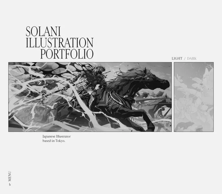
SOLANI presents its portfolio as a single viewport composition. A narrow, high-contrast serif title sits above a horizontal band of illustrations. Small serif utilities and a two-line introduction surround the artwork without creating a conventional navigation bar or promotional content stack. The page background is pale neutral gray, the text is nearly black, and the captured artwork appears monochrome.
The defining contrast is between dense images and almost empty interface space. At desktop size, two landscape works nearly fill the visible rail. On mobile, the first work remains wider than the viewing window, so the composition shows a clipped portion of the same horizontal sequence. The artwork does not become a vertical list of smaller cards.
閉じる
SOLANI Illustration Portfolio — Style Reference
A quiet serif wordmark suspended above a dense horizontal strip of monochrome illustration.
Website: solani-illustration.xyz Original URL: https://solani-illustration.xyz/ Final URL: https://solani-illustration.xyz/ Theme: light in the supplied initial captures; a DARK option is visible but its resulting appearance was not inspected. Inspected: October 2, 2026, at 01:44:18.870 JST / October 1, 2026, at 16:44:18.870 UTC. Viewports: 1440 × 1000 desktop and 390 × 844 mobile, in CSS pixels. Scope: the current homepage in its resting light state, including the wordmark, project rail, introductory caption, theme button, and closed menu trigger. Project destinations and menu-related text were recorded in the rendered DOM; project pages, an open menu, and the dark state were not inspected.
SOLANI presents its portfolio as a single viewport composition. A narrow, high-contrast serif title sits above a horizontal band of illustrations. Small serif utilities and a two-line introduction surround the artwork without creating a conventional navigation bar or promotional content stack. The page background is pale neutral gray, the text is nearly black, and the captured artwork appears monochrome.
The defining contrast is between dense images and almost empty interface space. At desktop size, two landscape works nearly fill the visible rail. On mobile, the first work remains wider than the viewing window, so the composition shows a clipped portion of the same horizontal sequence. The artwork does not become a vertical list of smaller cards.
How to Read This Reference
- Measured values come from the supplied rendered DOM, computed styles, custom properties, and element rectangles. Values are CSS pixels unless stated otherwise.
- Visually observed descriptions come from the five current-page captures: three desktop images and two mobile images.
- Derived rules explain relationships that fit both measured viewports. They are not recovered stylesheet declarations.
- Estimated values describe screenshot appearance where a corresponding computed property was not supplied.
- Recommended behavior, accessibility improvements, and starter code are adaptations for a new implementation.
- Unverified states include menu opening, dark mode, project-page navigation results, hover endpoints, gallery input mechanics, and entrance animations.
The font family names below are present in computed styles. Font-file URLs, loading diagnostics, and licensing information were not supplied. All implementation token aliases are descriptive unless explicitly identified as source properties.
Tokens — Colors
Default Palette
| Name | Value | Evidence / token | Role |
|---|---|---|---|
| Pale Canvas | hsl(0, 0%, 95%); computed rgb(242, 242, 242) |
Measured source --c-bg; implementation --paper: #f2f2f2 |
Entire page background and open space around the rail |
| Near-Black Ink | hsl(0, 0%, 5%); computed rgb(13, 13, 13) |
Measured source --c-text; implementation --ink: #0d0d0d |
Wordmark, introduction, menu label, active theme label |
| Muted Utility Gray | Approximately #808080 |
Screenshot estimate; exact text color or opacity not supplied | Inactive DARK label in the captured light state |
| Transparent Control Surface | rgba(0, 0, 0, 0) |
Measured button and project-anchor backgrounds | Keeps controls and links visually integrated with the page |
| Artwork Grays | Image-dependent | Visually observed, not a fixed UI palette | Illustration detail, dark masses, highlights, and embedded lettering |
The source also exposes --c-bg-param: 0, 0%, 95%, --c-text-param: 0, 0%, 5%, and --bg-opacity: 0.5. The first two correspond to the theme colors. The supplied evidence does not establish which layer consumes --bg-opacity; do not apply 50% opacity to every image or control on that basis.
The hexadecimal canvas and ink values represent the reported integer RGB colors. They are practical direct-color equivalents of the source HSL values.
Theme Presets
| State | Canvas | Text | Verification |
|---|---|---|---|
| LIGHT | #f2f2f2 |
#0d0d0d |
Visible and measured at both viewports |
| DARK | Not recorded | Not recorded | Label is visible; selection and resulting palette were not tested |
Do not assume dark mode is an exact inversion, changes the artwork, follows system preferences, or persists between visits. None of those behaviors is established by the supplied evidence.
Tokens — Typography
Display Wordmark — Cardinal Fruit
- Computed family:
'Cardinal Fruit'. - Weight:
400. - Desktop:
60px,54pxline height,-1.2pxletter spacing. - Mobile:
36px,32.4pxline height,-0.72pxletter spacing. - Reusable relationship: line height
0.9; letter spacing-0.02em. - Character: tall, narrow, high-contrast serif letters with fine hairlines and a compact three-line rhythm.
The visible title is live H1 text: SOLANI, ILLUSTRATION, and PORTFOLIO. The first two lines start at the same left edge. The final line is inset and visually aligned with the right edge of the longest line. This staggered arrangement is part of the identity; a centered three-line heading would change the composition.
The H1 measures approximately 325.33 × 162px on desktop and 195.20 × 97.17px on mobile. These are rendered text-box measurements, not evidence of explicitly fixed widths.
Interface and Introduction — Cardinal
- Computed stack:
Cardinal, serif. - Weight:
500for the sampled body, buttons, anchors, and introduction. - Desktop utility size:
14pxwith14pxline height. - Mobile utility size:
12pxwith12pxline height. - Introduction line height:
1.5, producing21pxdesktop and18pxmobile lines. - Tracking: normal in the sampled elements.
The interface remains serif throughout the inspected view. The introduction is modest and sentence case; utilities use short uppercase labels. Avoid replacing these details with a sans-serif navigation system.
Type Scale
| Role | Desktop | Mobile | Line height / tracking | Evidence |
|---|---|---|---|---|
| Main wordmark | 60px / 400 |
36px / 400 |
0.9, -0.02em |
H1 computed styles; source --fs-title |
| Theme labels | 14px / 500 |
12px / 500 |
1, normal tracking |
BUTTON computed styles |
| MENU label | 14px / 500 |
12px / 500 |
1, normal tracking |
BUTTON computed styles |
| Introduction | 14px / 500 |
12px / 500 |
1.5, normal tracking |
P computed styles |
| Additional heading token | 36px |
18px |
Not established | Source --fs-heading; no visible application identified |
The root HTML element reports Times at 16px, but the visible body overrides that family and size. The root declaration is not the visual specification for this page.
Tokens — Spacing & Shapes
Density: sparse interface around a dense, uninterrupted image band. Shape language: square artwork, unboxed text controls, no visible rounded-card or elevated-surface system.
Responsive Unit
The page exposes viewport-related custom properties:
| Source property | Desktop | Mobile | Interpretation |
|---|---|---|---|
--vw |
14.4px |
3.9px |
One percent of viewport width |
--vh |
10px |
8.44px |
One percent of viewport height |
--vmin |
10px |
3.9px |
One percent of the smaller viewport dimension |
--vmax |
14.4px |
8.44px |
One percent of the larger viewport dimension |
--margin |
80px |
10px |
Main horizontal outside margin |
--vmargin |
40px |
40px |
Matches the menu trigger's bottom clearance |
--column |
106.6667px |
30.8333px |
Matches one twelfth of the width inside the horizontal margins |
The following relationships are derived from both snapshots, not copied from source CSS:
/* Derived layout relationships, not recovered declarations. */
--column: calc((100vw - 2 * var(--margin)) / 12);
--art-height: 36vh;
--art-top: 32vh;
At desktop size, 36vh = 360px and 32vh = 320px. At mobile size, they give 303.84px and 270.08px, closely matching the measured 303.828px and 270.078px. The artwork band is therefore consistent with vertical centering around the viewport midpoint.
Spacing Scale
| Use | Desktop | Mobile | Status |
|---|---|---|---|
| Rail outside margin | 80px |
10px |
Source property and screenshot geometry |
| Gap between project boxes | 10px |
10px |
Measured from adjacent anchor rectangles |
| Wordmark bottom to artwork top | 10px |
10px |
Measured |
| Theme button bottom to artwork top | 10px |
10px |
Measured |
| Artwork bottom to introduction box | 12px |
Approximately 12px |
Measured |
| Theme label spacing | 8px |
8px |
Computed button column gap |
| Menu bottom clearance | 40px |
40px |
Measured |
| Wordmark inset from rail left | One column | 0px |
Derived alignment |
| Introduction inset from rail left | Two columns | One column | Derived alignment |
| Theme control inset from rail right | One column | 0px |
Derived alignment |
These measurements form a composition-specific system. They do not support inventing a general 8px spacing scale for unseen pages.
Border Radius
| Element | Measured radius | Appearance |
|---|---|---|
| Project anchors | 0px |
Rectangular image tiles |
| Theme button | 0px |
Unboxed text |
| Menu button | 0px |
Unboxed vertical label |
| H1 and introduction | 0px |
Plain typography on the canvas |
No pronounced card border or drop shadow is visible. Image edges and the narrow background gaps provide separation.
Layout Measurements
Coordinates refer to each viewport's top-left corner. Measurements are rounded here for readability.
| Element | Desktop: 1440 × 1000 | Mobile: 390 × 844 |
|---|---|---|
| Main stage | 1440 × 1000px |
390 × 844px |
| Reported document height | 1000px |
844px |
| H1 position | x 186.66, y 148.00 |
x 10.00, y 162.91 |
| H1 size | 325.33 × 162.00px |
195.20 × 97.17px |
| Theme button position | x 1134.48, y 296.00 |
x 275.84, y 248.08 |
| Theme button size | 118.86 × 14.00px |
104.16 × 12.00px |
| Visible rail opening | Approximately x 80–1360, width 1280px |
Approximately x 10–380, width 370px |
| First project anchor | x 80, y 320; 638.56 × 360px |
x 10, y 270.08; 538.69 × 303.83px |
| Second project anchor | x 728.56, y 320; 639.13 × 360px |
x 558.69, y 270.08; 539.16 × 303.83px |
| Introduction box | x 293.33, y 692; 140.97 × 42px |
x 40.83, y 585.92; 120.83 × 36px |
| MENU button | x 80, y 890.19; 14 × 69.81px |
x 12, y 741.30; 12 × 62.70px |
The rail opening is estimated from the screenshot edges and supported by the margin token; no rail-container rectangle was supplied. Project-anchor dimensions are directly measured. In particular, the first mobile anchor is about 539px wide even though only a 370px opening is visible.
Components
Stacked Wordmark
Role: primary identity and the upper anchor of the composition.
Use one visible H1 with three explicit lines. The first two lines align left; the last aligns toward the right edge of the text block. Preserve the narrow serif proportions, tight leading, and negative tracking. There is no accompanying subtitle inside the wordmark.
On desktop, the title starts one grid column inside the image band's left edge. On mobile, it moves to the rail's left edge. Its lower edge remains 10px above the artwork in both captures.
The DOM contains repeated identity text beyond the visible H1. Its purpose and visibility rules were not supplied. Do not reproduce multiple visible wordmarks merely because repeated text appears in the aggregate DOM extraction.
Horizontal Project Rail
Role: the homepage's principal content and route into individual works.
Eleven project anchors occupy a single horizontal sequence. Every measured desktop anchor is 360px high, with varying widths and 10px gaps. On mobile, every measured anchor is about 303.83px high. The sequence extends far beyond the visible page opening.
This is not a two-column grid. The desktop happens to reveal nearly two landscape works at the recorded starting position. The second anchor extends approximately 7.7px beyond the estimated right clip edge. On mobile, the second anchor begins at x 558.69 and is entirely outside the captured opening.
The horizontal presentation is verified. Whether the original uses native scrolling, dragging, wheel translation, a transformed track, or another navigation mechanism is unverified.
Project Tile
Role: image-led link to a project detail route.
The sampled tile is an unboxed anchor with no extracted text label. Artwork occupies the visible rectangle, with square corners and no separate metadata panel. The images' width-to-height relationships vary across the rail; landscape, near-square, and portrait-shaped link boxes all occur.
The first visible artwork depicts an illustrated character and urban scenery within a phone composition. The second shows a dark-haired illustrated figure amid sharp, energetic light shapes. Both appear grayscale in the captures. Their embedded details and marks remain part of the artwork rather than separate interface elements.
The computed anchor transition is filter 0.6s cubic-bezier(0.3, 0.1, 0.1, 1). Neither the filter value nor its interactive endpoint was supplied. A color reveal on hover is therefore a possibility to investigate, not an observed feature.
Empty extracted anchor text does not establish whether accessible names exist elsewhere in the markup; image alt text and ARIA attributes were not included in the evidence.
LIGHT / DARK Button
Role: compact theme affordance.
The DOM records one button containing the combined LIGHT / DARK label, not two independently verified buttons. It uses a horizontal flex arrangement with an 8px column gap. LIGHT appears in the darker ink color and DARK in a subdued gray in the captured state.
The button's lower edge aligns with the wordmark's lower edge. On desktop, it sits one grid column inside the rail's right boundary. On mobile, it reaches the rail's right boundary. Keep it typographic: no pill background, toggle track, sun icon, or large filled button is visible.
Its action, persistence, focus styling, and dark appearance remain unverified.
Introductory Caption
Role: brief professional context without competing with the work.
The visible copy is:
Freelance Illustrator
based in Japan.
Use two lines, the Cardinal serif stack, weight 500, and 1.5 line height. Place the text box 12px below the artwork. Its left edge is two columns inside the rail on desktop and one column inside on mobile.
The caption describes the portfolio generally. It is not a title or description for the first artwork.
Vertical MENU Trigger
Role: secondary navigation access at the bottom-left of the stage.
The visible label runs vertically, with the Latin word rotated as a unit rather than stacked letter by letter. A small linear mark accompanies it. The entire control remains visually unboxed.
Its measured bottom clearance is 40px at both viewports. Desktop x-position is 80px; mobile x-position is 12px, a 2px offset from the mobile rail margin. Preserve this small difference when matching the supplied phone capture.
The geometry is consistent with a viewport-anchored composition, but these resting captures do not establish whether the source uses fixed positioning or absolute positioning inside a stage.
Navigation Content — DOM Only
The aggregate DOM includes A Top, B Project Index, C Artworks, D Info, a reproduction notice, and Close. These strings support the presence of additional navigation content.
No open-menu screenshot, menu-item rectangle, destination mapping, or menu-specific computed styling was provided. The menu's surface, layout, animation, and keyboard behavior cannot be reconstructed from these strings alone.
Tokens — Motion & Interaction
| Element / behavior | Evidence | What can be specified |
|---|---|---|
| Project filter transition | Computed filter 0.6s cubic-bezier(0.3, 0.1, 0.1, 1) on all sampled project anchors |
Exact duration, property, and easing; trigger and endpoints unknown |
| Horizontal project sequence | Offscreen anchor coordinates continue across the x-axis | Rail structure is established; input mechanism is not |
| Project activation | Eleven destination hrefs | Links target project routes; resulting pages were not visited |
| Theme change | Visible LIGHT / DARK button | Affordance exists; transition, palette, and persistence unknown |
| Menu opening | MENU button and additional DOM text | Affordance and content labels exist; open state unknown |
| Entrance or continuous animation | Sampled elements report animation: none |
No named CSS animation on those sampled elements; nested, pseudo-element, or scripted motion remains possible |
| Other sampled transitions | Several nodes report transition: all without a demonstrated state change |
Insufficient evidence for a useful duration or interaction specification |
The capture process waited at least five seconds initially and performed layout, text, and image-readiness checks. Perpetual animations were temporarily paused during readiness checks and then resumed. This procedure does not prove the absence of motion, delayed content, or transitions between untested states.
For a new implementation, preserve the exact recorded filter timing only where a deliberate filter change is implemented. Do not invent autoplay, inertial dragging, parallax, or a grayscale-to-color hover claim from the still images.
Surfaces
| Layer | Appearance | Structural role |
|---|---|---|
| Page canvas | Flat pale gray, #f2f2f2 |
Creates generous negative space |
| Identity and utilities | Near-black serif text directly on the canvas | Establishes hierarchy without boxes |
| Artwork band | Dense grayscale rectangular images | Supplies almost all visual complexity |
| Inter-image gaps | 10px strips of the page background | Separates projects without card chrome |
| Inactive theme label | Subdued gray text | Distinguishes the non-emphasized option |
| Menu or dark-mode surfaces | Not captured | No specification supported |
There is no visible elevation hierarchy. Avoid translating the composition into floating cards, blurred panels, or containers with decorative shadows.
Imagery
The first two current works combine elaborate character illustration, sharp highlights, dark silhouettes, and densely layered compositions. The first also includes the framing of a phone and city structures. These are specific portfolio works, not generic decorative hero backgrounds.
The page's restraint depends on retaining the complexity inside the artwork while keeping the surrounding interface almost empty. Do not simplify the illustrations into icons or add competing decorative graphics around them.
All visible artwork appears monochrome. The evidence does not establish whether grayscale is baked into the assets, applied with CSS filters, or produced by another rendering layer. The starter below uses grayscale(1) as an explicit approximation for the captured appearance.
Preserve each work's proportions. The mobile crop is primarily explained by the rail window exposing only part of a wider link box. It should not be recreated by permanently exporting a narrow crop or forcing every source image into a portrait card. No pixelated rendering treatment is evident.
Observed Asset References
Image source URLs, filenames, intrinsic dimensions, and formats were not supplied. The following are project destinations, not image-asset URLs. Paths are relative to https://solani-illustration.xyz/; their slugs are not verified display titles.
| Project destination | Measured desktop anchor | Visual scope |
|---|---|---|
/projects/recolor/ |
638.56 × 360px |
First visible work |
/projects/face/ |
639.13 × 360px |
Second visible desktop work |
/projects/awaking-sora/ |
409.78 × 360px |
Offscreen; rectangle recorded |
/projects/lapis-lazuli/ |
632.41 × 360px |
Offscreen; rectangle recorded |
/projects/futurefall/ |
351.05 × 360px |
Offscreen; rectangle recorded |
/projects/to-the-2018322nd-star/ |
255.39 × 360px |
Offscreen; rectangle recorded |
/projects/ngumi-kali-ya-ujasiri/ |
254.27 × 360px |
Offscreen; rectangle recorded |
/projects/liberty./ |
632.41 × 360px |
Offscreen; rectangle recorded |
/projects/realize/ |
360 × 360px |
Offscreen; rectangle recorded |
/projects/azusagawa-kv-01/ |
638.56 × 360px |
Offscreen; rectangle recorded |
/projects/departure-220522/ |
674.36 × 360px |
Offscreen; rectangle recorded |
Use authorized artwork files with appropriate image descriptions. CSS can recreate the presentation shell; it cannot replace the identity carried by the illustrations.
Layout & Responsive Behavior
The design reorganizes alignment and typography while retaining the same horizontal rail. Its main responsive changes are the outside margin, title size, utility size, and column offsets.
| Relationship | Desktop | Mobile |
|---|---|---|
| Outside margin | 80px | 10px |
| Wordmark size | 60px | 36px |
| Utility size | 14px | 12px |
| Rail height | 360px | About 303.83px |
| Rail vertical center | y 500px | y 422px |
| Wordmark left | Margin + one column | Margin |
| Caption left | Margin + two columns | Margin + one column |
| Theme right | Margin + one column | Margin |
| Visible work count at initial position | Almost two landscape images | Part of the first landscape image |
| Menu bottom clearance | 40px | 40px |
At 390px width, the opening is 370px wide and the first link is approximately 538.69px wide. About 69% of that link's width is visible initially; roughly 168.69px extends beyond the right clip edge. This is the strongest mobile-specific observation: artwork scale takes priority over fitting the entire first image onscreen.
The title does not move to the very top of the phone. Its top is around y 163px, leaving a broad blank region above it. The artwork begins around y 270px and ends around y 574px. The caption follows immediately, while the menu remains near the bottom. The empty regions are intentional parts of the composition.
The recorded document height equals the viewport height in both snapshots. HTML and BODY report zero-height rectangles while MAIN occupies the full viewport, suggesting positioned content; the exact layout implementation is not available. There is no evidence here of a long vertical homepage or a conventional footer.
Only two viewport sizes were supplied. The breakpoint, tablet behavior, orientation handling, safe-area treatment, browser-chrome response, and text-zoom behavior remain unverified. The starter's 700px breakpoint and short-screen fallback are recommendations rather than recovered source rules.
Do’s and Don’ts
Do
- Use the measured pale canvas and near-black ink as the interface's primary colors.
- Preserve the three-line Cardinal Fruit wordmark, tight leading, and inset final line.
- Keep utilities small, serif, and directly on the canvas.
- Build one horizontal project sequence with a common image height and varied widths.
- Retain the 10px project gap and 10px clearance above the artwork.
- Keep the image band centered vertically at the two recorded viewport sizes.
- Preserve the mobile rail's clipped view of a wider image.
- Position the introductory caption on the column rhythm rather than directly against the rail's left edge.
- Keep MENU vertical and approximately 40px above the stage bottom.
- Separate measured filter timing from unverified hover behavior.
Don’t
- Do not turn the portfolio into a marketing page with feature sections and a large conversion button.
- Do not mistake the desktop view for a two-column grid.
- Do not stack all projects vertically on mobile when matching the supplied design.
- Do not force every artwork into the same aspect ratio.
- Do not replace the tall display serif with a heavy generic heading.
- Do not introduce rounded image cards, glossy gradients, or elevation shadows.
- Do not add project titles over the images as if they were observed UI.
- Do not treat the introduction as a caption for the first project.
- Do not invent the dark palette, menu overlay, entrance sequence, or gallery gestures.
- Do not infer image filenames or font-file paths from project route names.
Recommended Implementation Additions
These are recommendations for a new implementation, not verified original-site features:
- Make every project link meaningfully named. Verify image alt text and accessible link names rather than relying on the empty text extraction.
- Ensure the horizontal rail works with keyboard input and that focusing an offscreen project reveals it. Native horizontal overflow is a practical baseline.
- Provide a discoverable way to advance through the rail on devices where horizontal scrolling is not obvious.
- Expand the effective hit regions of the tiny theme and menu controls without enlarging their visible lettering. Aim for approximately 44 × 44px interactive targets where practical.
- Give the theme control an explicit accessible name and state. Connect menu expansion state to an actual navigation region when that region is implemented.
- Add an ink-colored focus indicator. Keep it inside clipped project links so it remains visible.
- Check the inactive theme label's contrast. The starter uses
#666666as a darker recommended alternative to the visually estimated gray. - Respect reduced-motion preferences for filter effects and any future scripted motion.
- Allow vertical document scrolling on short screens or at high text zoom instead of clipping the title or controls.
- Reserve artwork space before loading and prioritize the initially visible works. Optimize later images without changing their proportions.
Agent Prompt Guide
Quick Color Reference
- Canvas:
#f2f2f2, measured. - Main typography:
#0d0d0d, measured. - Inactive DARK label: approximately
#808080, screenshot estimate. - Recommended accessible muted text alternative:
#666666. - Artwork: grayscale appearance in the supplied state; underlying rendering mechanism unknown.
- Accent color: none visible in the inspected interface.
Overall Prompt
“Create a restrained illustrator portfolio based on the current SOLANI homepage composition. Use a pale gray canvas #f2f2f2, near-black text #0d0d0d, a narrow high-contrast serif wordmark in three lines, and small serif utilities. When authorized font files are available, use Cardinal Fruit for the title and Cardinal for body text. At 1440 × 1000, use an 80px outside margin, a 60px title with 0.9 leading and -0.02em tracking, and a horizontal artwork band 360px high centered vertically. Keep varied project widths and 10px gaps. Place LIGHT / DARK above the rail at right, a two-line introduction below it, and a vertical MENU control near the lower-left corner. At 390 × 844, use 10px rail margins, a 36px title, 12px utilities, and a roughly 304px-high rail whose first landscape image remains wider than its 370px viewing window. Preserve the empty space. Treat gallery input behavior, dark mode, and menu content presentation as separate implementation decisions.”
Example Component Prompts
- Wordmark: “Set SOLANI, ILLUSTRATION, and PORTFOLIO on three tightly spaced serif lines. Align the first two left and the third toward the right edge of the longest line. Use 60px / 54px on desktop and 36px / 32.4px on mobile, with -0.02em tracking.”
- Project rail: “Create a horizontally overflowing strip of square-cornered illustration links with a shared height near 36vh and 10px gaps. Retain each artwork's aspect ratio. At phone width, reveal only the left portion of the first wider landscape work; do not shrink it to fit or stack the sequence.”
- Theme utility: “Use one unboxed serif button reading LIGHT / DARK with 8px gaps. Emphasize LIGHT in near-black and render DARK in muted gray for the initial light state. Align its bottom with the wordmark, 10px above the artwork. Do not assume an unverified dark palette.”
- Caption and menu: “Place a small two-line serif introduction 12px below the image band, inset by two layout columns on desktop and one on mobile. Anchor a rotated MENU label with a tiny linear mark at the lower left, keeping 40px of bottom clearance.”
Quick Start
CSS Custom Properties
This is an implementation adaptation, not extracted source code. It recreates the observed light-state geometry using a conventional root font size. The 700px breakpoint, a 640px minimum stage height, native horizontal scrolling, accessible muted text, and focus treatments are recommendations.
The display fonts must be supplied separately if licensed and available. A generic serif fallback will change the wordmark's width and fine proportions. No font or artwork URLs are inferred here.
:root {
  /* Measured light-state colors. */
  --paper: #f2f2f2;
  --ink: #0d0d0d;

  /* Recommended darker alternative to the estimated inactive gray. */
  --muted: #666666;

  /* Computed family names; font files are not included. */
  --type-display: 'Cardinal Fruit', serif;
  --type-editorial: Cardinal, serif;
  --title-size: 60px;
  --text-size: 14px;
  --title-leading: 0.9;
  --title-tracking: -0.02em;
  --body-leading: 1.5;

  --page-gutter: 80px;
  --column: calc((100vw - 2 * var(--page-gutter)) / 12);
  --gallery-gap: 10px;
  --above-art-gap: 10px;
  --caption-gap: 12px;
  --theme-gap: 8px;
  --bottom-clearance: 40px;

  --title-inset: var(--column);
  --theme-inset: var(--column);
  --caption-inset: calc(2 * var(--column));
  --menu-left: var(--page-gutter);
  --menu-length: 69.8125px;

  /* Derived proportions with a recommended short-screen fallback. */
  --stage-height: max(100vh, 640px);
  --art-height: calc(var(--stage-height) * 0.36);

  /* Measured project-anchor transition. End states were not supplied. */
  --project-filter-motion: 600ms cubic-bezier(0.3, 0.1, 0.1, 1);
}

@supports (height: 100dvh) {
  :root {
    /* Recommended handling of changing browser chrome. */
    --stage-height: max(100dvh, 640px);
  }
}

@media (max-width: 700px) {
  :root {
    /* Values match the mobile capture; breakpoint is recommended. */
    --page-gutter: 10px;
    --title-size: 36px;
    --text-size: 12px;
    --title-inset: 0px;
    --theme-inset: 0px;
    --caption-inset: var(--column);
    --menu-left: 12px;
    --menu-length: 62.703125px;
  }
}

* {
  box-sizing: border-box;
}

body {
  margin: 0;
  background: var(--paper);
}

.portfolio-scene {
  position: relative;
  width: 100%;
  height: var(--stage-height);
  overflow: hidden;
  color: var(--ink);
  background: var(--paper);
  font-family: var(--type-editorial);
  font-size: var(--text-size);
  font-weight: 500;
  line-height: 1;
}

.portfolio-scene button {
  margin: 0;
  padding: 0;
  border: 0;
  border-radius: 0;
  color: inherit;
  background: transparent;
  font: inherit;
  cursor: pointer;
}

.portfolio-masthead {
  position: absolute;
  top: calc(50% - var(--art-height) / 2 - var(--above-art-gap));
  left: calc(var(--page-gutter) + var(--title-inset));
  right: calc(var(--page-gutter) + var(--theme-inset));
  display: flex;
  align-items: flex-end;
  justify-content: space-between;
  transform: translateY(-100%);
}

.portfolio-wordmark {
  display: grid;
  width: max-content;
  margin: 0;
  font-family: var(--type-display);
  font-size: var(--title-size);
  font-weight: 400;
  line-height: var(--title-leading);
  letter-spacing: var(--title-tracking);
}

.portfolio-wordmark span {
  display: block;
  white-space: nowrap;
}

.portfolio-wordmark span:last-child {
  text-align: right;
}

.theme-toggle {
  position: relative;
  display: flex;
  align-items: center;
  column-gap: var(--theme-gap);
  white-space: nowrap;
}

.theme-toggle .is-muted {
  color: var(--muted);
}

/* Expand the hit region without moving the visible labels. */
.theme-toggle::before {
  content: '';
  position: absolute;
  top: 50%;
  left: 0;
  width: 100%;
  height: 44px;
  transform: translateY(-50%);
}

.project-rail {
  position: absolute;
  top: calc(50% - var(--art-height) / 2);
  left: var(--page-gutter);
  right: var(--page-gutter);
  display: flex;
  gap: var(--gallery-gap);
  height: var(--art-height);
  overflow-x: auto;
  overflow-y: hidden;
  overscroll-behavior-x: contain;
  scrollbar-width: none;
}

.project-rail::-webkit-scrollbar {
  display: none;
}

.project-link {
  /* Set this from each actual artwork's width / height. */
  --ratio: 1;
  display: block;
  flex: 0 0 auto;
  width: calc(var(--art-height) * var(--ratio));
  height: var(--art-height);
  border-radius: 0;
  color: inherit;
  text-decoration: none;

  /* Approximation of the captured grayscale appearance. */
  filter: grayscale(1);
  transition: filter var(--project-filter-motion);
}

.project-link img {
  display: block;
  width: 100%;
  height: 100%;
  object-fit: contain;
}

/* No unverified hover filter endpoint is added. */

.portfolio-intro {
  position: absolute;
  top: calc(50% + var(--art-height) / 2 + var(--caption-gap));
  left: calc(var(--page-gutter) + var(--caption-inset));
  margin: 0;
  line-height: var(--body-leading);
}

.menu-toggle {
  position: absolute;
  left: var(--menu-left);
  bottom: var(--bottom-clearance);
  display: inline-flex;
  align-items: center;
  justify-content: space-between;
  inline-size: var(--menu-length);
  block-size: var(--text-size);
  writing-mode: vertical-rl;
  transform: rotate(180deg);
}

/* Recommended larger hit region around the narrow visual control. */
.menu-toggle::before {
  content: '';
  position: absolute;
  inset-block: -16px;
  inset-inline: 0;
}

.portfolio-scene :focus-visible {
  outline: 2px solid currentColor;
  outline-offset: 3px;
}

.project-link:focus-visible,
.project-rail:focus-visible {
  outline-offset: -3px;
}

@media (prefers-reduced-motion: reduce) {
  .project-link {
    transition: none;
  }
}
Minimal Markup
The two ratios below approximate the measured desktop boxes. Replace them with actual asset ratios when available, and replace both placeholder image URLs. Add the remaining projects using their own proportions.
This markup supplies the initial light state. Theme and menu buttons require separate handlers and verified destination UI. Native rail scrolling is a recommended baseline, not a claim about the original mechanism.
<main class='portfolio-scene'>
  <header class='portfolio-masthead'>
    <h1 class='portfolio-wordmark'>
      <span>SOLANI</span>
      <span>ILLUSTRATION</span>
      <span>PORTFOLIO</span>
    </h1>

    <button class='theme-toggle' type='button'
      aria-label='Toggle dark mode' aria-pressed='false'>
      <span>LIGHT</span>
      <span aria-hidden='true'>/</span>
      <span class='is-muted'>DARK</span>
    </button>
  </header>

  <section class='project-rail' tabindex='0'
    aria-label='Illustration projects'>
    <a class='project-link' style='--ratio: 1.774'
      href='https://solani-illustration.xyz/projects/recolor/'
      aria-label='Open project: recolor'>
      <img src='YOUR_FIRST_ARTWORK_URL'
        alt='Illustrated character and city scenery in a phone composition'>
    </a>
    <a class='project-link' style='--ratio: 1.775'
      href='https://solani-illustration.xyz/projects/face/'
      aria-label='Open project: face'>
      <img src='YOUR_SECOND_ARTWORK_URL'
        alt='Dark-haired illustrated figure surrounded by angular light effects'>
    </a>
  </section>

  <p class='portfolio-intro'>
    Freelance Illustrator<br>based in Japan.
  </p>

  <button class='menu-toggle' type='button'
    aria-label='Open navigation'>
    <span aria-hidden='true'>=</span>
    <span>MENU</span>
  </button>
</main>
The small equals mark is a starter approximation of the visible menu detail, not an identified source icon asset. Keep a discoverable keyboard or button-based alternative if hiding the rail scrollbar in a production implementation.
Tailwind v4 Token Mapping
Optional aliases for a project already using Tailwind v4. These do not imply that the original uses Tailwind. Define the custom properties above first.
@theme inline {
  --color-paper: var(--paper);
  --color-ink: var(--ink);
  --color-muted: var(--muted);

  --font-display: var(--type-display);
  --font-editorial: var(--type-editorial);

  --text-brand: var(--title-size);
  --text-utility: var(--text-size);

  --spacing-page-gutter: var(--page-gutter);
  --spacing-column: var(--column);
  --spacing-gallery-gap: var(--gallery-gap);
  --spacing-caption-gap: var(--caption-gap);

  --radius-project: 0px;
}
Sources & Evidence
- SOLANI Portfolio: original and final URL supplied by the browser inspection; HTTP status 200.
- Capture timestamp: October 1, 2026, 16:44:18.870 UTC, equivalent to October 2, 2026, 01:44:18.870 JST.
- Current-page visual evidence: three 1440 × 1000 desktop captures and two 390 × 844 mobile captures. They show a consistent resting light-state composition.
- Rendered evidence: document title, visible text, eleven project hrefs, viewport/document dimensions, source custom properties, and computed element rectangles, fonts, colors, spacing, transitions, and animation fields at both viewports.
- Interaction evidence: button and anchor affordances are recorded. No theme activation, open-menu state, project-page visit, hover result, or gallery-input result was supplied.
- Inspection limitations: analysis is limited to the supplied captures and rendered evidence. No additional browsing, command execution, linked-resource retrieval, or local-file inspection was performed. Font files, image source URLs, full stylesheets, accessibility attributes, and JavaScript behavior were not available. Readiness checks do not establish semantic completeness; delayed and unexercised content remains unverified.
This reference describes the current homepage shown in the supplied original-page evidence. Derived layout formulas and recommended starter behavior are explicitly distinguished from measured source values.
# SOLANI Illustration Portfolio — Style Reference

> A quiet serif wordmark suspended above a dense horizontal strip of monochrome illustration.

**Website:** [solani-illustration.xyz](https://solani-illustration.xyz/)
**Original URL:** https://solani-illustration.xyz/
**Final URL:** https://solani-illustration.xyz/
**Theme:** light in the supplied initial captures; a DARK option is visible but its resulting appearance was not inspected.
**Inspected:** October 2, 2026, at 01:44:18.870 JST / October 1, 2026, at 16:44:18.870 UTC.
**Viewports:** 1440 × 1000 desktop and 390 × 844 mobile, in CSS pixels.
**Scope:** the current homepage in its resting light state, including the wordmark, project rail, introductory caption, theme button, and closed menu trigger. Project destinations and menu-related text were recorded in the rendered DOM; project pages, an open menu, and the dark state were not inspected.

SOLANI presents its portfolio as a single viewport composition. A narrow, high-contrast serif title sits above a horizontal band of illustrations. Small serif utilities and a two-line introduction surround the artwork without creating a conventional navigation bar or promotional content stack. The page background is pale neutral gray, the text is nearly black, and the captured artwork appears monochrome.

The defining contrast is between dense images and almost empty interface space. At desktop size, two landscape works nearly fill the visible rail. On mobile, the first work remains wider than the viewing window, so the composition shows a clipped portion of the same horizontal sequence. The artwork does not become a vertical list of smaller cards.
閉じる
# SOLANI Illustration Portfolio — Style Reference

> A quiet serif wordmark suspended above a dense horizontal strip of monochrome illustration.

**Website:** [solani-illustration.xyz](https://solani-illustration.xyz/)
**Original URL:** https://solani-illustration.xyz/
**Final URL:** https://solani-illustration.xyz/
**Theme:** light in the supplied initial captures; a DARK option is visible but its resulting appearance was not inspected.
**Inspected:** October 2, 2026, at 01:44:18.870 JST / October 1, 2026, at 16:44:18.870 UTC.
**Viewports:** 1440 × 1000 desktop and 390 × 844 mobile, in CSS pixels.
**Scope:** the current homepage in its resting light state, including the wordmark, project rail, introductory caption, theme button, and closed menu trigger. Project destinations and menu-related text were recorded in the rendered DOM; project pages, an open menu, and the dark state were not inspected.

SOLANI presents its portfolio as a single viewport composition. A narrow, high-contrast serif title sits above a horizontal band of illustrations. Small serif utilities and a two-line introduction surround the artwork without creating a conventional navigation bar or promotional content stack. The page background is pale neutral gray, the text is nearly black, and the captured artwork appears monochrome.

The defining contrast is between dense images and almost empty interface space. At desktop size, two landscape works nearly fill the visible rail. On mobile, the first work remains wider than the viewing window, so the composition shows a clipped portion of the same horizontal sequence. The artwork does not become a vertical list of smaller cards.

## How to Read This Reference

- **Measured** values come from the supplied rendered DOM, computed styles, custom properties, and element rectangles. Values are CSS pixels unless stated otherwise.
- **Visually observed** descriptions come from the five current-page captures: three desktop images and two mobile images.
- **Derived** rules explain relationships that fit both measured viewports. They are not recovered stylesheet declarations.
- **Estimated** values describe screenshot appearance where a corresponding computed property was not supplied.
- **Recommended** behavior, accessibility improvements, and starter code are adaptations for a new implementation.
- **Unverified** states include menu opening, dark mode, project-page navigation results, hover endpoints, gallery input mechanics, and entrance animations.

The font family names below are present in computed styles. Font-file URLs, loading diagnostics, and licensing information were not supplied. All implementation token aliases are descriptive unless explicitly identified as source properties.

## Tokens — Colors

### Default Palette

| Name | Value | Evidence / token | Role |
| --- | --- | --- | --- |
| Pale Canvas | `hsl(0, 0%, 95%)`; computed `rgb(242, 242, 242)` | Measured source `--c-bg`; implementation `--paper: #f2f2f2` | Entire page background and open space around the rail |
| Near-Black Ink | `hsl(0, 0%, 5%)`; computed `rgb(13, 13, 13)` | Measured source `--c-text`; implementation `--ink: #0d0d0d` | Wordmark, introduction, menu label, active theme label |
| Muted Utility Gray | Approximately `#808080` | Screenshot estimate; exact text color or opacity not supplied | Inactive DARK label in the captured light state |
| Transparent Control Surface | `rgba(0, 0, 0, 0)` | Measured button and project-anchor backgrounds | Keeps controls and links visually integrated with the page |
| Artwork Grays | Image-dependent | Visually observed, not a fixed UI palette | Illustration detail, dark masses, highlights, and embedded lettering |

The source also exposes `--c-bg-param: 0, 0%, 95%`, `--c-text-param: 0, 0%, 5%`, and `--bg-opacity: 0.5`. The first two correspond to the theme colors. The supplied evidence does not establish which layer consumes `--bg-opacity`; do not apply 50% opacity to every image or control on that basis.

The hexadecimal canvas and ink values represent the reported integer RGB colors. They are practical direct-color equivalents of the source HSL values.

### Theme Presets

| State | Canvas | Text | Verification |
| --- | --- | --- | --- |
| LIGHT | `#f2f2f2` | `#0d0d0d` | Visible and measured at both viewports |
| DARK | Not recorded | Not recorded | Label is visible; selection and resulting palette were not tested |

Do not assume dark mode is an exact inversion, changes the artwork, follows system preferences, or persists between visits. None of those behaviors is established by the supplied evidence.

## Tokens — Typography

### Display Wordmark — Cardinal Fruit

- **Computed family:** `'Cardinal Fruit'`.
- **Weight:** `400`.
- **Desktop:** `60px`, `54px` line height, `-1.2px` letter spacing.
- **Mobile:** `36px`, `32.4px` line height, `-0.72px` letter spacing.
- **Reusable relationship:** line height `0.9`; letter spacing `-0.02em`.
- **Character:** tall, narrow, high-contrast serif letters with fine hairlines and a compact three-line rhythm.

The visible title is live H1 text: `SOLANI`, `ILLUSTRATION`, and `PORTFOLIO`. The first two lines start at the same left edge. The final line is inset and visually aligned with the right edge of the longest line. This staggered arrangement is part of the identity; a centered three-line heading would change the composition.

The H1 measures approximately `325.33 × 162px` on desktop and `195.20 × 97.17px` on mobile. These are rendered text-box measurements, not evidence of explicitly fixed widths.

### Interface and Introduction — Cardinal

- **Computed stack:** `Cardinal, serif`.
- **Weight:** `500` for the sampled body, buttons, anchors, and introduction.
- **Desktop utility size:** `14px` with `14px` line height.
- **Mobile utility size:** `12px` with `12px` line height.
- **Introduction line height:** `1.5`, producing `21px` desktop and `18px` mobile lines.
- **Tracking:** normal in the sampled elements.

The interface remains serif throughout the inspected view. The introduction is modest and sentence case; utilities use short uppercase labels. Avoid replacing these details with a sans-serif navigation system.

### Type Scale

| Role | Desktop | Mobile | Line height / tracking | Evidence |
| --- | --- | --- | --- | --- |
| Main wordmark | `60px / 400` | `36px / 400` | `0.9`, `-0.02em` | H1 computed styles; source `--fs-title` |
| Theme labels | `14px / 500` | `12px / 500` | `1`, normal tracking | BUTTON computed styles |
| MENU label | `14px / 500` | `12px / 500` | `1`, normal tracking | BUTTON computed styles |
| Introduction | `14px / 500` | `12px / 500` | `1.5`, normal tracking | P computed styles |
| Additional heading token | `36px` | `18px` | Not established | Source `--fs-heading`; no visible application identified |

The root HTML element reports Times at 16px, but the visible body overrides that family and size. The root declaration is not the visual specification for this page.

## Tokens — Spacing & Shapes

**Density:** sparse interface around a dense, uninterrupted image band.
**Shape language:** square artwork, unboxed text controls, no visible rounded-card or elevated-surface system.

### Responsive Unit

The page exposes viewport-related custom properties:

| Source property | Desktop | Mobile | Interpretation |
| --- | --- | --- | --- |
| `--vw` | `14.4px` | `3.9px` | One percent of viewport width |
| `--vh` | `10px` | `8.44px` | One percent of viewport height |
| `--vmin` | `10px` | `3.9px` | One percent of the smaller viewport dimension |
| `--vmax` | `14.4px` | `8.44px` | One percent of the larger viewport dimension |
| `--margin` | `80px` | `10px` | Main horizontal outside margin |
| `--vmargin` | `40px` | `40px` | Matches the menu trigger's bottom clearance |
| `--column` | `106.6667px` | `30.8333px` | Matches one twelfth of the width inside the horizontal margins |

The following relationships are **derived from both snapshots**, not copied from source CSS:

```css
/* Derived layout relationships, not recovered declarations. */
--column: calc((100vw - 2 * var(--margin)) / 12);
--art-height: 36vh;
--art-top: 32vh;
```

At desktop size, `36vh = 360px` and `32vh = 320px`. At mobile size, they give `303.84px` and `270.08px`, closely matching the measured `303.828px` and `270.078px`. The artwork band is therefore consistent with vertical centering around the viewport midpoint.

### Spacing Scale

| Use | Desktop | Mobile | Status |
| --- | --- | --- | --- |
| Rail outside margin | `80px` | `10px` | Source property and screenshot geometry |
| Gap between project boxes | `10px` | `10px` | Measured from adjacent anchor rectangles |
| Wordmark bottom to artwork top | `10px` | `10px` | Measured |
| Theme button bottom to artwork top | `10px` | `10px` | Measured |
| Artwork bottom to introduction box | `12px` | Approximately `12px` | Measured |
| Theme label spacing | `8px` | `8px` | Computed button column gap |
| Menu bottom clearance | `40px` | `40px` | Measured |
| Wordmark inset from rail left | One column | `0px` | Derived alignment |
| Introduction inset from rail left | Two columns | One column | Derived alignment |
| Theme control inset from rail right | One column | `0px` | Derived alignment |

These measurements form a composition-specific system. They do not support inventing a general 8px spacing scale for unseen pages.

### Border Radius

| Element | Measured radius | Appearance |
| --- | --- | --- |
| Project anchors | `0px` | Rectangular image tiles |
| Theme button | `0px` | Unboxed text |
| Menu button | `0px` | Unboxed vertical label |
| H1 and introduction | `0px` | Plain typography on the canvas |

No pronounced card border or drop shadow is visible. Image edges and the narrow background gaps provide separation.

### Layout Measurements

Coordinates refer to each viewport's top-left corner. Measurements are rounded here for readability.

| Element | Desktop: 1440 × 1000 | Mobile: 390 × 844 |
| --- | --- | --- |
| Main stage | `1440 × 1000px` | `390 × 844px` |
| Reported document height | `1000px` | `844px` |
| H1 position | `x 186.66, y 148.00` | `x 10.00, y 162.91` |
| H1 size | `325.33 × 162.00px` | `195.20 × 97.17px` |
| Theme button position | `x 1134.48, y 296.00` | `x 275.84, y 248.08` |
| Theme button size | `118.86 × 14.00px` | `104.16 × 12.00px` |
| Visible rail opening | Approximately `x 80–1360`, width `1280px` | Approximately `x 10–380`, width `370px` |
| First project anchor | `x 80, y 320`; `638.56 × 360px` | `x 10, y 270.08`; `538.69 × 303.83px` |
| Second project anchor | `x 728.56, y 320`; `639.13 × 360px` | `x 558.69, y 270.08`; `539.16 × 303.83px` |
| Introduction box | `x 293.33, y 692`; `140.97 × 42px` | `x 40.83, y 585.92`; `120.83 × 36px` |
| MENU button | `x 80, y 890.19`; `14 × 69.81px` | `x 12, y 741.30`; `12 × 62.70px` |

The rail opening is estimated from the screenshot edges and supported by the margin token; no rail-container rectangle was supplied. Project-anchor dimensions are directly measured. In particular, the first mobile anchor is about 539px wide even though only a 370px opening is visible.

## Components

### Stacked Wordmark

**Role:** primary identity and the upper anchor of the composition.

Use one visible H1 with three explicit lines. The first two lines align left; the last aligns toward the right edge of the text block. Preserve the narrow serif proportions, tight leading, and negative tracking. There is no accompanying subtitle inside the wordmark.

On desktop, the title starts one grid column inside the image band's left edge. On mobile, it moves to the rail's left edge. Its lower edge remains 10px above the artwork in both captures.

The DOM contains repeated identity text beyond the visible H1. Its purpose and visibility rules were not supplied. Do not reproduce multiple visible wordmarks merely because repeated text appears in the aggregate DOM extraction.

### Horizontal Project Rail

**Role:** the homepage's principal content and route into individual works.

Eleven project anchors occupy a single horizontal sequence. Every measured desktop anchor is 360px high, with varying widths and 10px gaps. On mobile, every measured anchor is about 303.83px high. The sequence extends far beyond the visible page opening.

This is not a two-column grid. The desktop happens to reveal nearly two landscape works at the recorded starting position. The second anchor extends approximately 7.7px beyond the estimated right clip edge. On mobile, the second anchor begins at x 558.69 and is entirely outside the captured opening.

The horizontal presentation is verified. Whether the original uses native scrolling, dragging, wheel translation, a transformed track, or another navigation mechanism is unverified.

### Project Tile

**Role:** image-led link to a project detail route.

The sampled tile is an unboxed anchor with no extracted text label. Artwork occupies the visible rectangle, with square corners and no separate metadata panel. The images' width-to-height relationships vary across the rail; landscape, near-square, and portrait-shaped link boxes all occur.

The first visible artwork depicts an illustrated character and urban scenery within a phone composition. The second shows a dark-haired illustrated figure amid sharp, energetic light shapes. Both appear grayscale in the captures. Their embedded details and marks remain part of the artwork rather than separate interface elements.

The computed anchor transition is `filter 0.6s cubic-bezier(0.3, 0.1, 0.1, 1)`. Neither the filter value nor its interactive endpoint was supplied. A color reveal on hover is therefore a possibility to investigate, not an observed feature.

Empty extracted anchor text does not establish whether accessible names exist elsewhere in the markup; image alt text and ARIA attributes were not included in the evidence.

### LIGHT / DARK Button

**Role:** compact theme affordance.

The DOM records one button containing the combined `LIGHT / DARK` label, not two independently verified buttons. It uses a horizontal flex arrangement with an 8px column gap. LIGHT appears in the darker ink color and DARK in a subdued gray in the captured state.

The button's lower edge aligns with the wordmark's lower edge. On desktop, it sits one grid column inside the rail's right boundary. On mobile, it reaches the rail's right boundary. Keep it typographic: no pill background, toggle track, sun icon, or large filled button is visible.

Its action, persistence, focus styling, and dark appearance remain unverified.

### Introductory Caption

**Role:** brief professional context without competing with the work.

The visible copy is:

> Freelance Illustrator
> based in Japan.

Use two lines, the Cardinal serif stack, weight 500, and 1.5 line height. Place the text box 12px below the artwork. Its left edge is two columns inside the rail on desktop and one column inside on mobile.

The caption describes the portfolio generally. It is not a title or description for the first artwork.

### Vertical MENU Trigger

**Role:** secondary navigation access at the bottom-left of the stage.

The visible label runs vertically, with the Latin word rotated as a unit rather than stacked letter by letter. A small linear mark accompanies it. The entire control remains visually unboxed.

Its measured bottom clearance is 40px at both viewports. Desktop x-position is 80px; mobile x-position is 12px, a 2px offset from the mobile rail margin. Preserve this small difference when matching the supplied phone capture.

The geometry is consistent with a viewport-anchored composition, but these resting captures do not establish whether the source uses fixed positioning or absolute positioning inside a stage.

### Navigation Content — DOM Only

The aggregate DOM includes `A Top`, `B Project Index`, `C Artworks`, `D Info`, a reproduction notice, and `Close`. These strings support the presence of additional navigation content.

No open-menu screenshot, menu-item rectangle, destination mapping, or menu-specific computed styling was provided. The menu's surface, layout, animation, and keyboard behavior cannot be reconstructed from these strings alone.

## Tokens — Motion & Interaction

| Element / behavior | Evidence | What can be specified |
| --- | --- | --- |
| Project filter transition | Computed `filter 0.6s cubic-bezier(0.3, 0.1, 0.1, 1)` on all sampled project anchors | Exact duration, property, and easing; trigger and endpoints unknown |
| Horizontal project sequence | Offscreen anchor coordinates continue across the x-axis | Rail structure is established; input mechanism is not |
| Project activation | Eleven destination hrefs | Links target project routes; resulting pages were not visited |
| Theme change | Visible LIGHT / DARK button | Affordance exists; transition, palette, and persistence unknown |
| Menu opening | MENU button and additional DOM text | Affordance and content labels exist; open state unknown |
| Entrance or continuous animation | Sampled elements report `animation: none` | No named CSS animation on those sampled elements; nested, pseudo-element, or scripted motion remains possible |
| Other sampled transitions | Several nodes report `transition: all` without a demonstrated state change | Insufficient evidence for a useful duration or interaction specification |

The capture process waited at least five seconds initially and performed layout, text, and image-readiness checks. Perpetual animations were temporarily paused during readiness checks and then resumed. This procedure does not prove the absence of motion, delayed content, or transitions between untested states.

For a new implementation, preserve the exact recorded filter timing only where a deliberate filter change is implemented. Do not invent autoplay, inertial dragging, parallax, or a grayscale-to-color hover claim from the still images.

## Surfaces

| Layer | Appearance | Structural role |
| --- | --- | --- |
| Page canvas | Flat pale gray, `#f2f2f2` | Creates generous negative space |
| Identity and utilities | Near-black serif text directly on the canvas | Establishes hierarchy without boxes |
| Artwork band | Dense grayscale rectangular images | Supplies almost all visual complexity |
| Inter-image gaps | 10px strips of the page background | Separates projects without card chrome |
| Inactive theme label | Subdued gray text | Distinguishes the non-emphasized option |
| Menu or dark-mode surfaces | Not captured | No specification supported |

There is no visible elevation hierarchy. Avoid translating the composition into floating cards, blurred panels, or containers with decorative shadows.

## Imagery

The first two current works combine elaborate character illustration, sharp highlights, dark silhouettes, and densely layered compositions. The first also includes the framing of a phone and city structures. These are specific portfolio works, not generic decorative hero backgrounds.

The page's restraint depends on retaining the complexity inside the artwork while keeping the surrounding interface almost empty. Do not simplify the illustrations into icons or add competing decorative graphics around them.

All visible artwork appears monochrome. The evidence does not establish whether grayscale is baked into the assets, applied with CSS filters, or produced by another rendering layer. The starter below uses `grayscale(1)` as an explicit approximation for the captured appearance.

Preserve each work's proportions. The mobile crop is primarily explained by the rail window exposing only part of a wider link box. It should not be recreated by permanently exporting a narrow crop or forcing every source image into a portrait card. No pixelated rendering treatment is evident.

### Observed Asset References

Image source URLs, filenames, intrinsic dimensions, and formats were not supplied. The following are **project destinations**, not image-asset URLs. Paths are relative to `https://solani-illustration.xyz/`; their slugs are not verified display titles.

| Project destination | Measured desktop anchor | Visual scope |
| --- | --- | --- |
| `/projects/recolor/` | `638.56 × 360px` | First visible work |
| `/projects/face/` | `639.13 × 360px` | Second visible desktop work |
| `/projects/awaking-sora/` | `409.78 × 360px` | Offscreen; rectangle recorded |
| `/projects/lapis-lazuli/` | `632.41 × 360px` | Offscreen; rectangle recorded |
| `/projects/futurefall/` | `351.05 × 360px` | Offscreen; rectangle recorded |
| `/projects/to-the-2018322nd-star/` | `255.39 × 360px` | Offscreen; rectangle recorded |
| `/projects/ngumi-kali-ya-ujasiri/` | `254.27 × 360px` | Offscreen; rectangle recorded |
| `/projects/liberty./` | `632.41 × 360px` | Offscreen; rectangle recorded |
| `/projects/realize/` | `360 × 360px` | Offscreen; rectangle recorded |
| `/projects/azusagawa-kv-01/` | `638.56 × 360px` | Offscreen; rectangle recorded |
| `/projects/departure-220522/` | `674.36 × 360px` | Offscreen; rectangle recorded |

Use authorized artwork files with appropriate image descriptions. CSS can recreate the presentation shell; it cannot replace the identity carried by the illustrations.

## Layout & Responsive Behavior

The design reorganizes alignment and typography while retaining the same horizontal rail. Its main responsive changes are the outside margin, title size, utility size, and column offsets.

| Relationship | Desktop | Mobile |
| --- | --- | --- |
| Outside margin | 80px | 10px |
| Wordmark size | 60px | 36px |
| Utility size | 14px | 12px |
| Rail height | 360px | About 303.83px |
| Rail vertical center | y 500px | y 422px |
| Wordmark left | Margin + one column | Margin |
| Caption left | Margin + two columns | Margin + one column |
| Theme right | Margin + one column | Margin |
| Visible work count at initial position | Almost two landscape images | Part of the first landscape image |
| Menu bottom clearance | 40px | 40px |

At 390px width, the opening is 370px wide and the first link is approximately 538.69px wide. About 69% of that link's width is visible initially; roughly 168.69px extends beyond the right clip edge. This is the strongest mobile-specific observation: artwork scale takes priority over fitting the entire first image onscreen.

The title does not move to the very top of the phone. Its top is around y 163px, leaving a broad blank region above it. The artwork begins around y 270px and ends around y 574px. The caption follows immediately, while the menu remains near the bottom. The empty regions are intentional parts of the composition.

The recorded document height equals the viewport height in both snapshots. HTML and BODY report zero-height rectangles while MAIN occupies the full viewport, suggesting positioned content; the exact layout implementation is not available. There is no evidence here of a long vertical homepage or a conventional footer.

Only two viewport sizes were supplied. The breakpoint, tablet behavior, orientation handling, safe-area treatment, browser-chrome response, and text-zoom behavior remain unverified. The starter's 700px breakpoint and short-screen fallback are recommendations rather than recovered source rules.

## Do’s and Don’ts

### Do

- Use the measured pale canvas and near-black ink as the interface's primary colors.
- Preserve the three-line Cardinal Fruit wordmark, tight leading, and inset final line.
- Keep utilities small, serif, and directly on the canvas.
- Build one horizontal project sequence with a common image height and varied widths.
- Retain the 10px project gap and 10px clearance above the artwork.
- Keep the image band centered vertically at the two recorded viewport sizes.
- Preserve the mobile rail's clipped view of a wider image.
- Position the introductory caption on the column rhythm rather than directly against the rail's left edge.
- Keep MENU vertical and approximately 40px above the stage bottom.
- Separate measured filter timing from unverified hover behavior.

### Don’t

- Do not turn the portfolio into a marketing page with feature sections and a large conversion button.
- Do not mistake the desktop view for a two-column grid.
- Do not stack all projects vertically on mobile when matching the supplied design.
- Do not force every artwork into the same aspect ratio.
- Do not replace the tall display serif with a heavy generic heading.
- Do not introduce rounded image cards, glossy gradients, or elevation shadows.
- Do not add project titles over the images as if they were observed UI.
- Do not treat the introduction as a caption for the first project.
- Do not invent the dark palette, menu overlay, entrance sequence, or gallery gestures.
- Do not infer image filenames or font-file paths from project route names.

## Recommended Implementation Additions

These are recommendations for a new implementation, not verified original-site features:

- Make every project link meaningfully named. Verify image alt text and accessible link names rather than relying on the empty text extraction.
- Ensure the horizontal rail works with keyboard input and that focusing an offscreen project reveals it. Native horizontal overflow is a practical baseline.
- Provide a discoverable way to advance through the rail on devices where horizontal scrolling is not obvious.
- Expand the effective hit regions of the tiny theme and menu controls without enlarging their visible lettering. Aim for approximately 44 × 44px interactive targets where practical.
- Give the theme control an explicit accessible name and state. Connect menu expansion state to an actual navigation region when that region is implemented.
- Add an ink-colored focus indicator. Keep it inside clipped project links so it remains visible.
- Check the inactive theme label's contrast. The starter uses `#666666` as a darker recommended alternative to the visually estimated gray.
- Respect reduced-motion preferences for filter effects and any future scripted motion.
- Allow vertical document scrolling on short screens or at high text zoom instead of clipping the title or controls.
- Reserve artwork space before loading and prioritize the initially visible works. Optimize later images without changing their proportions.

## Agent Prompt Guide

### Quick Color Reference

- Canvas: `#f2f2f2`, measured.
- Main typography: `#0d0d0d`, measured.
- Inactive DARK label: approximately `#808080`, screenshot estimate.
- Recommended accessible muted text alternative: `#666666`.
- Artwork: grayscale appearance in the supplied state; underlying rendering mechanism unknown.
- Accent color: none visible in the inspected interface.

### Overall Prompt

“Create a restrained illustrator portfolio based on the current SOLANI homepage composition. Use a pale gray canvas `#f2f2f2`, near-black text `#0d0d0d`, a narrow high-contrast serif wordmark in three lines, and small serif utilities. When authorized font files are available, use Cardinal Fruit for the title and Cardinal for body text. At 1440 × 1000, use an 80px outside margin, a 60px title with 0.9 leading and -0.02em tracking, and a horizontal artwork band 360px high centered vertically. Keep varied project widths and 10px gaps. Place LIGHT / DARK above the rail at right, a two-line introduction below it, and a vertical MENU control near the lower-left corner. At 390 × 844, use 10px rail margins, a 36px title, 12px utilities, and a roughly 304px-high rail whose first landscape image remains wider than its 370px viewing window. Preserve the empty space. Treat gallery input behavior, dark mode, and menu content presentation as separate implementation decisions.”

### Example Component Prompts

1. **Wordmark:** “Set SOLANI, ILLUSTRATION, and PORTFOLIO on three tightly spaced serif lines. Align the first two left and the third toward the right edge of the longest line. Use 60px / 54px on desktop and 36px / 32.4px on mobile, with -0.02em tracking.”
2. **Project rail:** “Create a horizontally overflowing strip of square-cornered illustration links with a shared height near 36vh and 10px gaps. Retain each artwork's aspect ratio. At phone width, reveal only the left portion of the first wider landscape work; do not shrink it to fit or stack the sequence.”
3. **Theme utility:** “Use one unboxed serif button reading LIGHT / DARK with 8px gaps. Emphasize LIGHT in near-black and render DARK in muted gray for the initial light state. Align its bottom with the wordmark, 10px above the artwork. Do not assume an unverified dark palette.”
4. **Caption and menu:** “Place a small two-line serif introduction 12px below the image band, inset by two layout columns on desktop and one on mobile. Anchor a rotated MENU label with a tiny linear mark at the lower left, keeping 40px of bottom clearance.”

## Quick Start

### CSS Custom Properties

This is an implementation adaptation, not extracted source code. It recreates the observed light-state geometry using a conventional root font size. The 700px breakpoint, a 640px minimum stage height, native horizontal scrolling, accessible muted text, and focus treatments are recommendations.

The display fonts must be supplied separately if licensed and available. A generic serif fallback will change the wordmark's width and fine proportions. No font or artwork URLs are inferred here.

```css
:root {
  /* Measured light-state colors. */
  --paper: #f2f2f2;
  --ink: #0d0d0d;

  /* Recommended darker alternative to the estimated inactive gray. */
  --muted: #666666;

  /* Computed family names; font files are not included. */
  --type-display: 'Cardinal Fruit', serif;
  --type-editorial: Cardinal, serif;
  --title-size: 60px;
  --text-size: 14px;
  --title-leading: 0.9;
  --title-tracking: -0.02em;
  --body-leading: 1.5;

  --page-gutter: 80px;
  --column: calc((100vw - 2 * var(--page-gutter)) / 12);
  --gallery-gap: 10px;
  --above-art-gap: 10px;
  --caption-gap: 12px;
  --theme-gap: 8px;
  --bottom-clearance: 40px;

  --title-inset: var(--column);
  --theme-inset: var(--column);
  --caption-inset: calc(2 * var(--column));
  --menu-left: var(--page-gutter);
  --menu-length: 69.8125px;

  /* Derived proportions with a recommended short-screen fallback. */
  --stage-height: max(100vh, 640px);
  --art-height: calc(var(--stage-height) * 0.36);

  /* Measured project-anchor transition. End states were not supplied. */
  --project-filter-motion: 600ms cubic-bezier(0.3, 0.1, 0.1, 1);
}

@supports (height: 100dvh) {
  :root {
    /* Recommended handling of changing browser chrome. */
    --stage-height: max(100dvh, 640px);
  }
}

@media (max-width: 700px) {
  :root {
    /* Values match the mobile capture; breakpoint is recommended. */
    --page-gutter: 10px;
    --title-size: 36px;
    --text-size: 12px;
    --title-inset: 0px;
    --theme-inset: 0px;
    --caption-inset: var(--column);
    --menu-left: 12px;
    --menu-length: 62.703125px;
  }
}

* {
  box-sizing: border-box;
}

body {
  margin: 0;
  background: var(--paper);
}

.portfolio-scene {
  position: relative;
  width: 100%;
  height: var(--stage-height);
  overflow: hidden;
  color: var(--ink);
  background: var(--paper);
  font-family: var(--type-editorial);
  font-size: var(--text-size);
  font-weight: 500;
  line-height: 1;
}

.portfolio-scene button {
  margin: 0;
  padding: 0;
  border: 0;
  border-radius: 0;
  color: inherit;
  background: transparent;
  font: inherit;
  cursor: pointer;
}

.portfolio-masthead {
  position: absolute;
  top: calc(50% - var(--art-height) / 2 - var(--above-art-gap));
  left: calc(var(--page-gutter) + var(--title-inset));
  right: calc(var(--page-gutter) + var(--theme-inset));
  display: flex;
  align-items: flex-end;
  justify-content: space-between;
  transform: translateY(-100%);
}

.portfolio-wordmark {
  display: grid;
  width: max-content;
  margin: 0;
  font-family: var(--type-display);
  font-size: var(--title-size);
  font-weight: 400;
  line-height: var(--title-leading);
  letter-spacing: var(--title-tracking);
}

.portfolio-wordmark span {
  display: block;
  white-space: nowrap;
}

.portfolio-wordmark span:last-child {
  text-align: right;
}

.theme-toggle {
  position: relative;
  display: flex;
  align-items: center;
  column-gap: var(--theme-gap);
  white-space: nowrap;
}

.theme-toggle .is-muted {
  color: var(--muted);
}

/* Expand the hit region without moving the visible labels. */
.theme-toggle::before {
  content: '';
  position: absolute;
  top: 50%;
  left: 0;
  width: 100%;
  height: 44px;
  transform: translateY(-50%);
}

.project-rail {
  position: absolute;
  top: calc(50% - var(--art-height) / 2);
  left: var(--page-gutter);
  right: var(--page-gutter);
  display: flex;
  gap: var(--gallery-gap);
  height: var(--art-height);
  overflow-x: auto;
  overflow-y: hidden;
  overscroll-behavior-x: contain;
  scrollbar-width: none;
}

.project-rail::-webkit-scrollbar {
  display: none;
}

.project-link {
  /* Set this from each actual artwork's width / height. */
  --ratio: 1;
  display: block;
  flex: 0 0 auto;
  width: calc(var(--art-height) * var(--ratio));
  height: var(--art-height);
  border-radius: 0;
  color: inherit;
  text-decoration: none;

  /* Approximation of the captured grayscale appearance. */
  filter: grayscale(1);
  transition: filter var(--project-filter-motion);
}

.project-link img {
  display: block;
  width: 100%;
  height: 100%;
  object-fit: contain;
}

/* No unverified hover filter endpoint is added. */

.portfolio-intro {
  position: absolute;
  top: calc(50% + var(--art-height) / 2 + var(--caption-gap));
  left: calc(var(--page-gutter) + var(--caption-inset));
  margin: 0;
  line-height: var(--body-leading);
}

.menu-toggle {
  position: absolute;
  left: var(--menu-left);
  bottom: var(--bottom-clearance);
  display: inline-flex;
  align-items: center;
  justify-content: space-between;
  inline-size: var(--menu-length);
  block-size: var(--text-size);
  writing-mode: vertical-rl;
  transform: rotate(180deg);
}

/* Recommended larger hit region around the narrow visual control. */
.menu-toggle::before {
  content: '';
  position: absolute;
  inset-block: -16px;
  inset-inline: 0;
}

.portfolio-scene :focus-visible {
  outline: 2px solid currentColor;
  outline-offset: 3px;
}

.project-link:focus-visible,
.project-rail:focus-visible {
  outline-offset: -3px;
}

@media (prefers-reduced-motion: reduce) {
  .project-link {
    transition: none;
  }
}
```

### Minimal Markup

The two ratios below approximate the measured desktop boxes. Replace them with actual asset ratios when available, and replace both placeholder image URLs. Add the remaining projects using their own proportions.

This markup supplies the initial light state. Theme and menu buttons require separate handlers and verified destination UI. Native rail scrolling is a recommended baseline, not a claim about the original mechanism.

```html
<main class='portfolio-scene'>
  <header class='portfolio-masthead'>
    <h1 class='portfolio-wordmark'>
      <span>SOLANI</span>
      <span>ILLUSTRATION</span>
      <span>PORTFOLIO</span>
    </h1>

    <button class='theme-toggle' type='button'
      aria-label='Toggle dark mode' aria-pressed='false'>
      <span>LIGHT</span>
      <span aria-hidden='true'>/</span>
      <span class='is-muted'>DARK</span>
    </button>
  </header>

  <section class='project-rail' tabindex='0'
    aria-label='Illustration projects'>
    <a class='project-link' style='--ratio: 1.774'
      href='https://solani-illustration.xyz/projects/recolor/'
      aria-label='Open project: recolor'>
      <img src='YOUR_FIRST_ARTWORK_URL'
        alt='Illustrated character and city scenery in a phone composition'>
    </a>
    <a class='project-link' style='--ratio: 1.775'
      href='https://solani-illustration.xyz/projects/face/'
      aria-label='Open project: face'>
      <img src='YOUR_SECOND_ARTWORK_URL'
        alt='Dark-haired illustrated figure surrounded by angular light effects'>
    </a>
  </section>

  <p class='portfolio-intro'>
    Freelance Illustrator<br>based in Japan.
  </p>

  <button class='menu-toggle' type='button'
    aria-label='Open navigation'>
    <span aria-hidden='true'>=</span>
    <span>MENU</span>
  </button>
</main>
```

The small equals mark is a starter approximation of the visible menu detail, not an identified source icon asset. Keep a discoverable keyboard or button-based alternative if hiding the rail scrollbar in a production implementation.

### Tailwind v4 Token Mapping

Optional aliases for a project already using Tailwind v4. These do not imply that the original uses Tailwind. Define the custom properties above first.

```css
@theme inline {
  --color-paper: var(--paper);
  --color-ink: var(--ink);
  --color-muted: var(--muted);

  --font-display: var(--type-display);
  --font-editorial: var(--type-editorial);

  --text-brand: var(--title-size);
  --text-utility: var(--text-size);

  --spacing-page-gutter: var(--page-gutter);
  --spacing-column: var(--column);
  --spacing-gallery-gap: var(--gallery-gap);
  --spacing-caption-gap: var(--caption-gap);

  --radius-project: 0px;
}
```

## Sources & Evidence

- [SOLANI Portfolio](https://solani-illustration.xyz/): original and final URL supplied by the browser inspection; HTTP status 200.
- **Capture timestamp:** October 1, 2026, 16:44:18.870 UTC, equivalent to October 2, 2026, 01:44:18.870 JST.
- **Current-page visual evidence:** three 1440 × 1000 desktop captures and two 390 × 844 mobile captures. They show a consistent resting light-state composition.
- **Rendered evidence:** document title, visible text, eleven project hrefs, viewport/document dimensions, source custom properties, and computed element rectangles, fonts, colors, spacing, transitions, and animation fields at both viewports.
- **Interaction evidence:** button and anchor affordances are recorded. No theme activation, open-menu state, project-page visit, hover result, or gallery-input result was supplied.
- **Inspection limitations:** analysis is limited to the supplied captures and rendered evidence. No additional browsing, command execution, linked-resource retrieval, or local-file inspection was performed. Font files, image source URLs, full stylesheets, accessibility attributes, and JavaScript behavior were not available. Readiness checks do not establish semantic completeness; delayed and unexercised content remains unverified.

This reference describes the current homepage shown in the supplied original-page evidence. Derived layout formulas and recommended starter behavior are explicitly distinguished from measured source values.関連するデザイン
スタイルやページの種類、ジャンルが近いデザインを集めました。