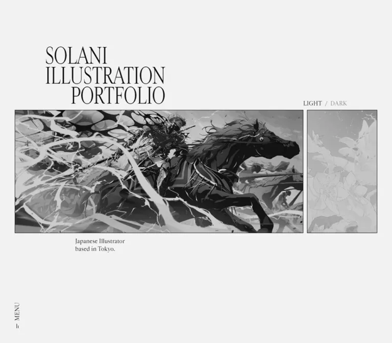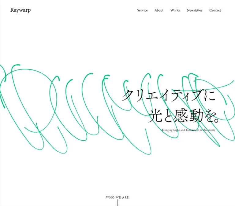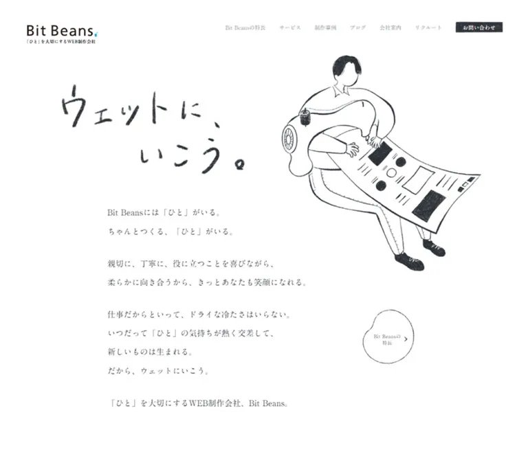
プレビュー準備中デザインリファレンスを見る
DESIGN REFERENCE
神杉 遥介のポートフォリオ
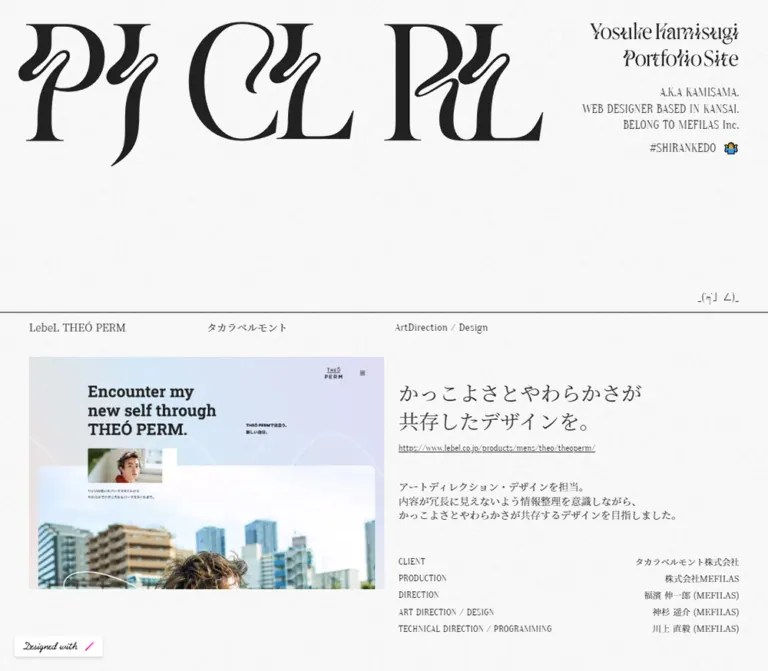
大胆な装飾文字、繊細な明朝体、紙のような微細な質感を組み合わせたポートフォリオ。細罫線で区切った実績一覧を、PCでは画像と解説の2カラム、スマートフォンでは縦積みで展開します。
Yosuke Kamisugi Portfolio — Style Reference
Expressive black letterforms above a quiet, finely ruled catalogue of web design work.
Website: kmsm-srnkd.studio.site Original URL: https://kmsm-srnkd.studio.site/ Final URL: https://kmsm-srnkd.studio.site/ Theme: light, with a near-white textured canvas and charcoal text Inspected: September 29, 2026, through supplied browser evidence retrieved at 12:29:32 UTC / 21:29:32 JST Viewports: desktop 1440 × 1000; mobile 390 × 844 CSS pixels Scope: the current single-page portfolio: introductory identity, fifteen project entries, project links and credit lists, and the concluding social ribbon. Visual evidence comprises three desktop captures and two mobile captures. Linked project websites were not inspected.
The page pairs extravagant lettering with restrained editorial organization. A huge abstract letterform graphic fills the upper left of the desktop introduction. A smaller, two-line name graphic and a compact biography sit against the right margin. Fine grain runs across the pale background. Beneath this open introduction, full-width horizontal rules divide a long sequence of projects.
Each desktop entry presents a landscape website preview on the left and a Japanese design statement, small underlined URL, short explanation, and aligned credit list on the right. The portfolio supplies a consistent monochrome frame while each project image retains its own colors. On mobile, the large decorative graphic disappears and the complete project anatomy becomes a vertical reading sequence. The personality remains in the lettering, serif typography, emoji, and unusually small utility text.
閉じる
Yosuke Kamisugi Portfolio — Style Reference
Expressive black letterforms above a quiet, finely ruled catalogue of web design work.
Website: kmsm-srnkd.studio.site Original URL: https://kmsm-srnkd.studio.site/ Final URL: https://kmsm-srnkd.studio.site/ Theme: light, with a near-white textured canvas and charcoal text Inspected: September 29, 2026, through supplied browser evidence retrieved at 12:29:32 UTC / 21:29:32 JST Viewports: desktop 1440 × 1000; mobile 390 × 844 CSS pixels Scope: the current single-page portfolio: introductory identity, fifteen project entries, project links and credit lists, and the concluding social ribbon. Visual evidence comprises three desktop captures and two mobile captures. Linked project websites were not inspected.
The page pairs extravagant lettering with restrained editorial organization. A huge abstract letterform graphic fills the upper left of the desktop introduction. A smaller, two-line name graphic and a compact biography sit against the right margin. Fine grain runs across the pale background. Beneath this open introduction, full-width horizontal rules divide a long sequence of projects.
Each desktop entry presents a landscape website preview on the left and a Japanese design statement, small underlined URL, short explanation, and aligned credit list on the right. The portfolio supplies a consistent monochrome frame while each project image retains its own colors. On mobile, the large decorative graphic disappears and the complete project anatomy becomes a vertical reading sequence. The personality remains in the lettering, serif typography, emoji, and unusually small utility text.
How to Read This Reference
- Measured values come from the supplied rendered DOM and computed styles. Positions describe the inspected viewport, not necessarily the original CSS layout formula.
- Calculated values are arithmetic relationships between measured boxes, such as available width and distances between text blocks.
- Estimated values come from visual inspection of the current-page screenshots. Image bounds, graphic colors, and fine-rule thickness are estimates where corresponding computed properties were not supplied.
- Recommended values and code are implementation guidance. They do not establish unobserved source behavior.
- Named
--folio-*tokens are reusable aliases introduced here. Original custom-property names are identified separately. - Project screenshots contain their own menus, controls, typography, and effects. Those belong to the work being presented and are not automatically components or interactions of the portfolio.
Tokens — Colors
Default Palette
| Name | Value | Suggested token | Evidence and role |
|---|---|---|---|
| Paper | #fafafa |
--folio-paper |
Measured body background at both viewports; the base beneath visible grain |
| Text ink | #333333 |
--folio-ink |
Measured biography, project text, URLs, and credit text |
| Display ink | approximately #222222 |
--folio-display-ink |
Estimated appearance of large lettering and the dark social ribbon; their own computed colors were not supplied |
| Reversed lettering | approximately #ffffff |
--folio-reverse |
Estimated light lettering in the social ribbon |
| Divider ink | approximately #333333 |
--folio-rule-color |
Recommended approximation of the thin, dark horizontal rules |
| Transparent surface | rgba(0, 0, 0, 0) |
— | Measured on sampled header, section, and text elements; content shares the underlying canvas |
The shell has no established chromatic action color. Small blue and yellow emoji details provide incidental color. Mint, orange, cyan, brown, and other prominent colors occur inside project previews and should remain attached to those images.
Calculated contrast: #333333 against solid #fafafa is approximately 12.1:1 before texture and antialiasing. Preserve the dark text even though its small size and fine serif strokes make the overall page feel delicate.
Theme Presets
Only the light presentation is evidenced. No theme selector or alternate palette is established. The source exposes transparent gradient-related custom properties, but those declarations do not demonstrate a visible gradient system.
The recorded loading variables are --rebranding-loading-bar: #222 and --rebranding-loading-bg: #e5e5e5. These are platform loading values, not evidence for additional content-surface colors or a visible loading sequence.
Tokens — Typography
Japanese Editorial Text — Noto Serif JP
- Computed family:
"Noto Serif JP". - Source registration:
--s-font-38ace09e: 'Noto Serif JP'. - Measured weight:
400. - Roles: project names, client names, Japanese design statements, explanatory paragraphs, and credit values.
- Measured tracking: normal.
- Measured line-height ratio: approximately
1.4throughout these sampled roles.
The type stays light and controlled. Hierarchy comes primarily from size, whitespace, and placement. Desktop project names are small index labels; the larger Japanese statement provides the main textual emphasis.
English Utility Text — Oranienbaum
- Computed family:
Oranienbaum. - Source registration:
--s-font-0bbfc2d8: Oranienbaum. - Measured weight:
400. - Roles: biography, social handle, project discipline, project URLs, credit-role labels, and the small emoticon link.
- Character: narrow proportions and fine serifs give functional text a compact, printed quality.
Keep uppercase labels such as CLIENT, PRODUCTION, and ART DIRECTION / DESIGN visually quieter than the project statement. The source does not establish wide tracking for these labels.
Identity and Display Lettering
The large desktop graphic, two-line name treatment, and social-ribbon lettering have exaggerated high-contrast strokes and curling, distorted forms. Their underlying font or asset format is not identified by the supplied evidence.
The sampled h1 has no extracted text and reports a wrapper style of sans-serif, 32px, weight 700. That wrapper declaration does not identify the visible decorative lettering. Treat the identity as artwork requiring an approved asset, or use a clearly acknowledged approximation in a new design.
Other font registrations exist in the DOM, but the sampled core text establishes Noto Serif JP and Oranienbaum as the useful pairing for this reference.
Type Scale
All text values below are measured computed styles. Graphic dimensions are measured boxes, not font sizes.
| Role | Desktop size / line height | Mobile size / line height | Family | Weight |
|---|---|---|---|---|
| Biography | 16 / 22.4px |
16 / 22.4px |
Oranienbaum | 400 |
| Social handle | 16 / 22.4px |
16 / 22.4px |
Oranienbaum | 400 |
| Project name | 14 / 19.6px |
18 / 25.2px |
Noto Serif JP | 400 |
| Client in project index | 14 / 19.6px |
12 / 16.8px |
Noto Serif JP | 400 |
| Discipline | 15 / 21px |
12 / 16.8px |
Oranienbaum | 400 |
| Japanese statement | 28 / 39.2px |
18 / 25.2px |
Noto Serif JP | 400 |
| Project URL | 12 / 16.8px |
10 / 14px |
Oranienbaum | 400 |
| Explanatory paragraph | 14 / 19.6px |
12 / 16.8px |
Noto Serif JP | 400 |
| Credit role | 13 / 18.2px |
12 / 16.8px |
Oranienbaum | 400 |
| Credit value | 12 / 16.8px |
12 / 16.8px |
Noto Serif JP | 400 |
| Emoticon link | 15 / 21px |
12 / 16.8px |
Oranienbaum | 400 |
| Name-graphic container | 284.63 × 85.92px |
315 × 95.09px |
Artwork; unidentified | — |
Important responsive detail: the project name becomes larger on mobile, even while the statement and utility text become smaller. Preserve this change in hierarchy instead of proportionally shrinking every desktop element.
Tokens — Spacing & Shapes
Spacing character: close label relationships, broad blank areas, and a repeated image-and-description rhythm.
A 5px increment is a useful implementation vocabulary for the observed distances. It is an inferred organizing device, not a discovered source variable.
Spacing Scale
| Relationship | Desktop | Mobile | Evidence |
|---|---|---|---|
| Main project side inset | 40px |
20px |
Measured text positions; supported by image edges |
| Introduction padding | 30px 40px 0 25px |
80px 20px 0 |
Measured header padding |
| Name graphic to biography | 25px |
25px |
Calculated from measured boxes |
| Biography to social handle | 10px |
10px |
Calculated |
| Project rule to first index line | about 11px |
11px |
Measured position relationship, including rule |
| Mobile name to client | — | 5px |
Calculated |
| Mobile client to discipline | — | 20px |
Calculated |
| Index line to preview | about 30px |
about 20px after discipline |
Screenshot and text-box relationship |
| Preview-to-description column gap | about 20px |
— | Screenshot estimate |
| Description top inset relative to preview | about 30px |
about 20px below preview |
Screenshot and DOM relationship |
| Statement to URL | 10px |
5px |
Calculated |
| URL to paragraph | 35px |
20px |
Calculated |
| Paragraph to credits | varies with content and alignment | commonly 30px; 40px in the second entry |
Calculated; not one universal gap |
| Space between desktop credit rows | 5px |
— | Calculated from label boxes |
| Space between mobile credit pairs | — | 15px |
Calculated |
| Content bottom to next project rule | about 45px |
about 45px |
Derived from repeated row positions |
Border Radius
| Element | Appearance | Implementation guidance |
|---|---|---|
| Project preview | Square corners | border-radius: 0 |
| Project section | Open rectangular region | No enclosing card |
| Credit list | Unboxed text | No cells, pills, or alternating fills |
| Social ribbon | Full-width rectangle | No rounded ends |
| Platform badge | Small dark label | Platform chrome; not a general shape token |
Layout Measurements
| Element | Desktop 1440 × 1000 | Mobile 390 × 844 | Status |
|---|---|---|---|
| Document height | 8824.70px, reported as 8825 |
13201.02px, reported as 13201 |
Measured |
| Header element height | 305.66px |
299.66px |
Measured; excludes subsequent open area |
| Project section begins | y = 431px |
y = 396.80px |
Measured |
| Main content width | 1360px |
350px |
Calculated from side insets |
| First preview | approximately 680 × 446px |
approximately 350 × 229px |
Estimated from screenshots |
| First preview position | approximately x = 40, y = 493 |
approximately x = 20, y = 512 |
Estimated |
| Description starts horizontally | x = 740px |
x = 20px |
Measured |
| Available description width | approximately 660px |
350px |
Calculated |
| First statement top | y = 523px |
y = 760.83px |
Measured |
| First statement box | 418.05 × 78.38px |
268.75 × 50.38px |
Measured |
| First project vertical interval | approximately 553.08px |
approximately 855.36px |
Calculated from successive index positions |
| Closing ribbon height | approximately 49–50px |
approximately 49–50px |
Screenshot estimate; remaining document extent is 49.19px |
The introduction occupies about 43% of the desktop capture height and 47% of the mobile capture height. These are calculated proportions at the two inspected sizes, not verified viewport-height CSS rules.
Components
Introductory Masthead
Role: establish the designer's identity and personality before the work list.
The desktop composition has two strongly unequal parts. An approximately 1000px-wide abstract letterform graphic starts near x = 25, y = 30. The identity group is aligned to the right edge at x = 1400. Its name-graphic box starts at x = 1115.38, y = 30 and measures 284.63 × 85.92px.
Below the name graphic, a three-line biography uses Oranienbaum 16px / 22.4px. Its box begins at y = 140.92. The social handle follows at y = 218.09. Keep all these lines right aligned, including the source label #SHIRANKEDO 🤷♂️.
The name graphic remains prominent on mobile: it measures 315 × 95.09px, begins at x = 55, y = 80, and ends at the 20px right inset. The large left-hand decorative graphic is absent from the mobile capture. The biography retains its desktop type size and follows at y = 200.09.
The title and masthead identify Yosuke Kamisugi. The biography includes BELONG TO MEFILAS Inc. as an affiliation statement. This does not establish a production credit for the portfolio itself.
Open Introductory Space and Emoticon Link
Role: separate the identity block from the catalogue while retaining a small personal detail.
A large area of textured paper remains below the desktop graphics. A tiny emoticon link sits at the far right just above the first divider. Its measured box begins at x = 1343.25, y = 400 on desktop and x = 324.61, y = 360 on mobile.
The recorded destination is an external back-pain prevention page. This establishes that the emoticon is a link; it is not evidence of a scroll-down action. Its destination was not opened during this analysis.
Project Index Line
Role: identify the work, client, and contribution before the visual preview.
Each entry begins with a fine, full-viewport rule. The desktop index places the project name at x = 40, client at x = 380, and discipline at approximately x = 740.39. The first two fields use Noto Serif JP 14px; the discipline uses Oranienbaum 15px.
For the first entry, both project and client read ENJIN TOKYO. They represent separate metadata fields and should remain separate even when the strings happen to match.
On mobile, the fields form a stack: project name at 18px, client below at 12px, then discipline after a larger 20px gap. All start at x = 20. The discipline is plain metadata, not an evidenced filter or button.
Project Preview
Role: show the character of the completed website.
The preview is a plain landscape rectangle with square corners. It has no external browser frame, card fill, shadow, or rounded container. Observed examples are approximately 1.53:1, including ENJIN TOKYO, témamori, and BIJOUPIKO GROUP. Use the actual asset ratio when available rather than replacing this with a standard 16:9 crop.
At desktop, the preview occupies about 680px of the 1360px content width. The 20px space beside it leaves approximately 660px for the written explanation. On mobile, the preview occupies the available 350px width.
The evidence establishes explicit URL links in the description. It does not establish that every image or entire project row is clickable.
Design Statement and Project URL
Role: express the central design intention and provide an external destination where available.
The desktop statement begins about 30px below the preview's upper edge. It uses regular Noto Serif JP 28px / 39.2px, commonly across two carefully composed lines. The first entry reads:
ロゴや企業名の印象の強さが
そのまま体現されたデザインを。
A small underlined URL sits 10px below the statement. It uses Oranienbaum 12px / 16.8px in the same charcoal as surrounding text. There is no filled project CTA in the supplied captures.
On mobile, the statement follows the image after approximately 20px and uses 18px / 25.2px. Its URL follows after 5px and drops to 10px / 14px.
Twelve project URLs are present for fifteen entries. Some projects therefore proceed directly from statement to explanation. Preserve this optional field; do not invent a destination or an unavailable-button state.
Explanatory Paragraph
Role: provide a short account of the designer's contribution and visual decisions.
The paragraph follows the URL by 35px on desktop and 20px on mobile. Desktop text uses Noto Serif JP 14px / 19.6px; mobile uses 12px / 16.8px.
Measured desktop paragraph boxes are often around 335–405px wide even though the description region extends farther right. Line composition leaves considerable blank space. Preserve concise paragraphs and purposeful wrapping; avoid stretching every paragraph across the full 660px region.
These paragraphs describe the showcased projects. References to dancing objects, 3D architecture, curtain movement, or logo assembly do not prove that the portfolio itself implements those effects.
Project Credit List
Role: document the team for each individual project.
On desktop, every credit forms one horizontal label/value pair. Roles align to the left edge of the description at x = 740; values align to the right content edge at x = 1400. Labels use Oranienbaum 13px / 18.2px; values use Noto Serif JP 12px / 16.8px. Successive label boxes begin approximately 23.19px apart, producing about 5px of inter-row space.
In ordinary entries, the credit block visually finishes near the bottom of the preview. The blank area above it expands according to the amount of explanatory text and the number of credits. Entries with longer teams can grow taller; the ZAKONE entry has eleven credit roles.
On mobile, every role sits immediately above its value. Both use 12px / 16.8px, with 15px between complete pairs. All text is left aligned. The first six-pair credit block consequently occupies about 276.56px vertically, compared with approximately 134.13px in its desktop arrangement.
Recommended anatomy: use a dl, with each role/value pair grouped together. These credits belong to their associated project. They do not independently identify who produced the portfolio shell.
Repeating Project Section
Role: maintain a consistent browsing rhythm across varied work.
The same structure repeats through fifteen entries, beginning with ENJIN TOKYO and ending with BIJOUPIKO GROUP. It supports corporate, product, recruitment, and editorial projects without changing the outer presentation.
The standard desktop interval is approximately 553px for several early entries. Mobile intervals vary substantially with content and credit count. Use natural content height and a consistent bottom clearance of approximately 45px, rather than assigning one fixed height to every project.
Closing Social Ribbon
Role: conclude the catalogue with a strong invitation to the designer's social profile.
A dark strip spans the full viewport after the final project. Light decorative lettering repeats WELCOME TO MY SNS, interrupted by the shrug emoji. The repeated content extends beyond the viewport and is clipped at both edges in the captures. Its overall height is approximately 49–50px at both inspected sizes.
The recorded footer link leads to the same Twitter profile as the header handle. The composition resembles a marquee, but no animation duration, direction, or movement sequence was supplied. Document its repetition and clipping without asserting a verified continuous animation.
For reuse, provide one meaningful accessible link name. Decorative repeated copies should not become repeated screen-reader announcements or redundant keyboard stops.
Platform Badge
A small black Created in badge appears near the lower-left viewport corner in both desktop and mobile captures, approximately 20px from the left and bottom. A platform link and fixed-position banner-related CSS are present in the evidence.
This is platform chrome rather than a primary portfolio action. In the first mobile capture it overlaps the area containing the project URL, which is useful to consider when placing any persistent badge in an adaptation.
Tokens — Motion & Interaction
| Treatment | Evidence | What can be concluded |
|---|---|---|
| General element transitions | Computed 0.3s cubic-bezier(0.4, 0.4, 0, 1) on sampled elements |
Timing is declared; the triggering state and visible property changes were not exercised |
| Body background transition | Computed background 0.5s cubic-bezier(0.4, 0.4, 0, 1) |
A background transition exists; no theme-changing interaction was demonstrated |
| Sampled element animation | animation: none |
Those sampled elements had no reported CSS animation; this is not proof that the whole page is static |
| Works-section background | A .gif URL is referenced by a pseudo-element rule |
A GIF background asset exists; frame count and playback behavior are unknown |
| Social ribbon | Repeated lettering and emoji visible in still captures | Marquee-like composition; speed, direction, and actual movement remain unverified |
| Project destinations | Twelve explicit external project anchors in rendered evidence | Outgoing links exist; tab behavior and destination results were not tested |
| Social profile | Header and footer anchors share a destination | Two entry points to the same social profile |
| Scrolling | Captures cover the beginning, middle, and end of the document | A long vertical browsing experience is supported |
| Hover, focus, and image clicks | No exercised states supplied | Do not claim fades, zooms, cursor changes, or whole-row navigation |
The capture process waited for readiness, temporarily paused perpetual animations during its checks, and then resumed them. Static screenshots therefore cannot establish the motion character of the ribbon or texture. The safest implementation baseline is a complete, readable static catalogue, with optional motion added only when specified and verified.
Surfaces
| Layer | Appearance | Purpose |
|---|---|---|
| Page canvas | Near-white with fine gray grain | Unifies the entire long document |
| Introduction | Same canvas, large dark graphic and small right-aligned text | Identity and visual contrast |
| Project region | Transparent surface with a thin horizontal divider | Separates works without enclosing cards |
| Preview image | Full-color rectangular website capture | Carries each project's individual visual language |
| Description and credits | Charcoal serif text directly on the canvas | Editorial explanation and attribution |
| Social ribbon | Dark band with reversed lettering | Strong closing social link |
| Platform badge | Compact black label | Persistent platform branding |
There is no evidenced general elevation system. The primary boundaries are rules, image edges, and changes in typographic scale. Keep the grain low contrast so that it reads as material rather than as an illustration competing with the work.
Imagery
The page's identity graphics are monochrome and typographic. Their extreme stroke contrast, large curls, and unusual letter shapes create the main expressive gesture. The portfolio images then supply variety within a consistent rectangular format.
Observed Project Imagery
| Preview visible in current captures | Visual content | Implication for the portfolio frame |
|---|---|---|
| ENJIN TOKYO | Oversized Japanese logo forms, black-and-white fields, and dense text rows | The unboxed preview preserves the project's strong typography |
| FELISSIMO recruitment | Circular disc-like compositions, portraits, and a row of colorful image cards | Internal circles and cards remain part of the preview, while the outer portfolio stays rectangular |
| témamori | Mint background, a small bottle, illustrated hands, and soft organic shapes | Product color remains localized within the image |
| HUMAN STAGE | Outdoor portrait, orange accent, and a visible search interface | Photography and functional UI are presented together as one project image |
| BIJOUPIKO GROUP | Stacked rings on a dark brown surface, with pale blue-white bokeh above | A dark photographic preview provides contrast against the pale portfolio background |
The same landscape compositions remain visible on mobile. There is no evidence that the portfolio substitutes mobile-site mockups for the desktop previews at the narrow viewport.
Observed Asset References
Only the following background asset URL is exposed in the supplied rendered evidence:
| Asset | Recorded URL | Evidence limitation |
|---|---|---|
| Works-section pseudo-element background | https://storage.googleapis.com/studio-design-asset-files/projects/xPORzJrzOr/s-500x500_b72f1183-1ab1-4d3d-98ee-7685fa414035.gif |
The URL appears in a rendered background rule. Its exact opacity, tiling, frame sequence, and contribution to all visible grain were not supplied |
Original asset URLs for the large decorative graphic, name graphic, social lettering, and project previews were not included. No filenames or font identities should be inferred for those assets. Use authorized artwork and actual image dimensions when implementing this visual system.
Layout & Responsive Behavior
Desktop — 1440 × 1000
The page uses the full browser width, with project content inset 40px on each side. The measured content positions imply the following reusable geometry:
- Available project width:
1440 - 80 = 1360px. - Preview width: approximately half that region,
680px. - Gap: approximately
20px. - Description remainder: approximately
660px. - Index field starts:
40px,380px, and approximately740px.
This is slightly different from splitting the post-gap width into two equal columns, which would produce 670px each. A useful adaptation is grid-template-columns: 50% minmax(0, 1fr) with a 20px gap. This reproduces the inspected geometry; it is not a claim that the original uses CSS Grid. Sampled source containers report flex layout.
Credit values extend to the right margin while paragraphs remain comparatively narrow. That difference in line length is central to the airy composition.
Mobile — 390 × 844
The introduction begins with 80px of top padding. Its right alignment survives the change in layout. The large decorative graphic is absent, while the name graphic becomes slightly wider in absolute pixels than on desktop.
Projects use 20px side insets and follow this reading order:
- Project name.
- Client name.
- Contribution label.
- Landscape preview.
- Japanese statement.
- External URL, when present.
- Explanatory paragraph.
- Stacked role/value credit pairs.
The final-project capture confirms that this stacking continues to the bottom of the page. Credits remain fully expanded. The social ribbon stays full width.
The document grows from approximately 8825px on desktop to 13201px on mobile, about 1.50 times as tall. Much of this increase comes from sequential image/text placement and vertically stacked credits.
Breakpoint and Intermediate-Width Limits
A max-width: 768px rule is visible for responsive line-break handling. This does not establish that every layout change occurs at exactly 768px. Only the two supplied viewport sizes were visually inspected.
Recommended starting point: use 768px for the stacked adaptation, then check intermediate widths for long project names, the large introductory graphic, and long credit values. Keep project heights flexible and allow long URLs to wrap. Do not introduce horizontal scrolling into the project content.
Do’s and Don’ts
Do
- Build the shell around measured
#fafafapaper and#333333text. - Pair Noto Serif JP with Oranienbaum for the roles established by computed styles.
- Preserve the contrast between expressive identity artwork and quiet project metadata.
- Keep the biography right aligned at both inspected layouts.
- Use full-width hairline dividers and square landscape previews.
- Retain approximately 40px desktop and 20px mobile content insets.
- Keep the desktop preview slightly wider than the description region after the gutter is accounted for.
- Make project names more prominent in the mobile index.
- Stack each mobile credit role immediately above its value.
- Let project colors remain inside the project imagery.
- Preserve optional URLs and variable credit-list lengths.
- Treat the closing social ribbon as part of the page's typographic identity.
Don’t
- Don't replace the project sequence with a rounded-card thumbnail grid.
- Don't apply one global accent color to the diverse project screenshots.
- Don't turn small underlined URLs into dominant filled buttons throughout the catalogue.
- Don't identify the decorative masthead font from its wrapper's computed font family.
- Don't crop landscape previews into portrait cards or standardized 16:9 images without checking the assets.
- Don't impose a fixed project height that truncates a longer team list.
- Don't shrink every mobile text role by the same ratio.
- Don't add shadows, glass panels, or conspicuous surface gradients to the outer shell.
- Don't reproduce the health-information emoticon link as a scroll cue.
- Don't infer portfolio animation from descriptions of effects in the showcased work.
- Don't transfer a project's production credits to the portfolio itself.
Recommended Implementation Additions
These are recommendations for a new implementation, not verified features of the original:
- Give the graphic masthead a reliable accessible heading. Hide purely decorative letterforms from assistive technology.
- Use semantic project headings and definition lists while preserving the observed lightweight typography.
- Provide a visible charcoal focus outline for links. Identify the social destination with a meaningful accessible name.
- Consider increasing mobile URLs from the observed 10px to at least 12px and explanatory text from 12px to 14px for improved readability. Recheck spacing rather than silently treating these larger sizes as source measurements.
- Enlarge the interactive area around small links without changing their visual emphasis.
- Give project previews descriptive alternative text, such as the project name and the kind of website shown.
- Supply actual image dimensions, responsive image sources, and lazy loading for lower projects to stabilize the long page.
- If a moving ribbon is added, provide pause behavior and a static reduced-motion version. Ensure duplicate visual phrases remain decorative.
- Prefer a static grain texture when movement is unnecessary, and keep texture layers from intercepting pointer events.
- Prevent persistent badges from obscuring URLs or credit text at narrow widths and browser zoom levels.
Agent Prompt Guide
Quick Color Reference
- Page base:
#fafafa, measured. - Core text and links:
#333333, measured. - Large identity graphics and dark footer: approximately
#222222, visual estimate. - Footer lettering: approximately white, visual estimate.
- Rules: thin dark lines;
1px solid #333333is a recommended approximation. - Texture: subtle gray grain over the paper.
- Project imagery: retain each project's full color palette.
Overall Prompt
“Create an editorial personal portfolio inspired by the current Yosuke Kamisugi page. Use near-white #fafafa paper with subtle grain, charcoal #333333 text, regular Noto Serif JP for Japanese project content, and Oranienbaum for English utility labels. On desktop, place an oversized expressive letterform graphic at upper left and a compact two-line name graphic, biography, and social handle at upper right. Leave generous blank space before a long project catalogue. Separate projects with full-width hairline rules. Each entry has a small project/client/discipline index, a square-cornered landscape website preview on the left, and a Japanese statement, tiny underlined URL, short paragraph, and aligned credit list on the right. At mobile widths, remove the large decorative graphic, retain the right-aligned identity, use 20px side insets, and stack the entire project anatomy. Finish with a dark ribbon of repeated decorative social lettering and shrug emoji. Keep animation optional until its behavior is specified.”
Example Component Prompts
- Masthead: “Design an open portfolio introduction on lightly grained white paper. Use a very large black graphic of curling, high-contrast letterforms on desktop. Place a smaller two-line name graphic at the right, followed by three narrow serif biography lines and a social handle. On a 390px viewport, show only the right-aligned identity group with 80px top padding and 20px right clearance.”
- Project entry: “At 1440px, inset the entry 40px from each side. Add a full-width top rule and a small three-part index. Below, use an approximately 680px-wide landscape preview, a 20px gutter, and a 660px description region. Set a two-line Japanese statement in regular Noto Serif JP at 28px/1.4, followed by a 12px underlined Oranienbaum URL and a short 14px paragraph.”
- Credit list: “Create an unboxed project credit list with 13px Oranienbaum uppercase roles on the left and 12px Noto Serif JP values aligned to the far right. Use about 5px between rows. On mobile, place every role above its value, left align both, and leave 15px between pairs.”
- Mobile project: “Create a 350px-wide project composition within a 390px viewport. Stack an 18px project name, a 12px client label, a separated 12px discipline, a landscape preview, an 18px Japanese statement, a small underlined URL, concise body copy, and expanded credits. Preserve square image corners and generous section-bottom clearance.”
- Social ribbon: “Create a roughly 50px-high charcoal footer strip with oversized white decorative lettering reading WELCOME TO MY SNS and interspersed shrug emoji. Repeat and clip the visual phrase horizontally. Provide one accessible social link and a complete static presentation. Continuous motion is an optional enhancement, not a source-verified requirement.”
Quick Start
CSS Custom Properties
This is an adaptation of the measured proportions, not extracted source CSS. It uses a conventional 16px root, combines the header and following open space into one masthead container, and starts the stacked layout at a recommended 768px breakpoint. Load Noto Serif JP and Oranienbaum separately. The decorative lettering requires appropriate artwork; a generic serif fallback cannot reproduce its exact shapes.
The preview ratio is an estimate used to reserve space. Actual intrinsic image dimensions should take precedence. Set --folio-paper-texture to an authorized static texture if available; it defaults to no texture.
:root {
  /* Measured core colors; display colors are approximations. */
  --folio-paper: #fafafa;
  --folio-ink: #333333;
  --folio-display-ink: #222222;
  --folio-reverse: #ffffff;
  --folio-rule: 1px solid #333333;

  /* Computed source families with recommended fallbacks. */
  --folio-font-jp: 'Noto Serif JP', serif;
  --folio-font-latin: 'Oranienbaum', serif;
  --folio-weight: 400;
  --folio-leading: 1.4;

  --folio-text-project: 0.875rem;
  --folio-text-client: 0.875rem;
  --folio-text-role: 0.9375rem;
  --folio-text-statement: 1.75rem;
  --folio-text-body: 0.875rem;
  --folio-text-url: 0.75rem;
  --folio-text-credit-label: 0.8125rem;
  --folio-text-credit-value: 0.75rem;

  --folio-gutter: 40px;
  --folio-column-gap: 20px;
  --folio-row-bottom: 45px;
  --folio-credit-gap: 5px;
  --folio-paper-texture: none;
  --folio-grain-opacity: 0.04;

  /* Declared source timing; no source hover state is assumed. */
  --folio-feedback-duration: 300ms;
  --folio-feedback-ease: cubic-bezier(0.4, 0.4, 0, 1);
}

* {
  box-sizing: border-box;
}

html {
  font-size: 100%;
}

body {
  margin: 0;
  background: var(--folio-paper);
}

.folio {
  position: relative;
  isolation: isolate;
  color: var(--folio-ink);
  background: var(--folio-paper);
  font-family: var(--folio-font-jp);
  font-weight: var(--folio-weight);
  line-height: var(--folio-leading);
}

/* Recommended static texture layer behind the content. */
.folio::before {
  content: '';
  position: absolute;
  inset: 0;
  z-index: -1;
  background-image: var(--folio-paper-texture);
  background-repeat: repeat;
  opacity: var(--folio-grain-opacity);
  pointer-events: none;
}

.folio p,
.folio h1,
.folio h2,
.folio figure,
.folio dd {
  margin: 0;
}

.folio a {
  color: inherit;
  text-underline-offset: 2px;
}

.masthead {
  position: relative;
  display: flex;
  justify-content: space-between;
  align-items: flex-start;
  gap: 40px;
  min-height: 431px;
  padding: 30px 40px 60px 25px;
}

.hero-mark {
  display: block;
  width: min(1005px, calc(100% - 325px));
  min-width: 0;
  height: auto;
}

.identity {
  flex: 0 0 284.625px;
  text-align: right;
}

.identity h1 img {
  display: block;
  width: 100%;
  height: auto;
}

.identity .bio {
  margin-top: 25px;
  font: 400 1rem / 1.4 var(--folio-font-latin);
}

.identity .social-handle {
  display: inline-block;
  margin-top: 10px;
  font: 400 1rem / 1.4 var(--folio-font-latin);
  text-decoration: none;
}

.intro-aside {
  position: absolute;
  right: 40px;
  bottom: 10px;
  font: 400 0.9375rem / 1.4 var(--folio-font-latin);
  text-decoration: none;
}

.project {
  border-top: var(--folio-rule);
}

.project-index {
  display: grid;
  grid-template-columns:
    25% calc(25% + var(--folio-column-gap)) minmax(0, 1fr);
  align-items: center;
  padding: 10px var(--folio-gutter) 30px;
}

.project-index > * {
  min-width: 0;
}

.project-name {
  font-size: var(--folio-text-project);
  font-weight: 400;
}

.project-client {
  font-size: var(--folio-text-client);
}

.project-role {
  font-family: var(--folio-font-latin);
  font-size: var(--folio-text-role);
}

.project-body {
  display: grid;
  grid-template-columns: minmax(0, 50%) minmax(0, 1fr);
  gap: var(--folio-column-gap);
  padding: 0 var(--folio-gutter) var(--folio-row-bottom);
}

.project-media {
  align-self: start;
}

.project-media img {
  display: block;
  width: 100%;
  height: auto;
  aspect-ratio: auto 1.525;
  object-fit: contain;
  border-radius: 0;
}

.project-info {
  display: flex;
  flex-direction: column;
  min-width: 0;
  padding-top: 30px;
}

.project-statement {
  max-width: 100%;
  font-size: var(--folio-text-statement);
  font-weight: 400;
}

.project-url {
  align-self: flex-start;
  max-width: 100%;
  margin-top: 10px;
  font-family: var(--folio-font-latin);
  font-size: var(--folio-text-url);
  overflow-wrap: anywhere;
  text-decoration: underline;
}

.project-info .project-description {
  max-width: 30em;
  margin-top: 35px;
  font-size: var(--folio-text-body);
}

.credits {
  display: grid;
  gap: var(--folio-credit-gap);
  margin: auto 0 0;
  padding-top: 35px;
}

.credit-pair {
  display: grid;
  grid-template-columns: minmax(0, 1fr) minmax(0, 1.65fr);
  align-items: start;
  gap: 24px;
}

.credit-pair dt {
  font-family: var(--folio-font-latin);
  font-size: var(--folio-text-credit-label);
}

.credit-pair dd {
  font-size: var(--folio-text-credit-value);
  text-align: right;
  overflow-wrap: anywhere;
}

.social-ribbon {
  overflow: hidden;
  color: var(--folio-reverse);
  background: var(--folio-display-ink);
}

.social-ribbon a {
  display: flex;
  align-items: center;
  gap: 24px;
  width: max-content;
  min-width: 100%;
  min-height: 49.2px;
  color: inherit;
  font: 400 42px / 1 serif;
  white-space: nowrap;
  text-decoration: none;
}

/* Optional lettering assets preserve the distinctive graphic shape. */
.social-ribbon .ribbon-art {
  display: block;
  width: auto;
  height: 34px;
}

/* Recommended accessibility additions. */
.folio a:focus-visible {
  outline: 2px solid currentColor;
  outline-offset: 4px;
}

.social-ribbon a:focus-visible {
  outline-offset: -4px;
}

.sr-only {
  position: absolute;
  width: 1px;
  height: 1px;
  padding: 0;
  margin: -1px;
  overflow: hidden;
  clip-path: inset(50%);
  white-space: nowrap;
  border: 0;
}

/* Recommended breakpoint; only the two endpoint layouts were inspected. */
@media (max-width: 768px) {
  :root {
    --folio-gutter: 20px;
    --folio-text-project: 1.125rem;
    --folio-text-client: 0.75rem;
    --folio-text-role: 0.75rem;
    --folio-text-statement: 1.125rem;
    --folio-text-body: 0.75rem;
    --folio-text-url: 0.625rem;
    --folio-text-credit-label: 0.75rem;
    --folio-credit-gap: 15px;
  }

  .masthead {
    display: block;
    min-height: 396.8px;
    padding: 80px 20px 80px;
  }

  .hero-mark {
    display: none;
  }

  .identity {
    width: min(315px, 100%);
    margin-left: auto;
  }

  .intro-aside {
    right: 20px;
    bottom: 20px;
    font-size: 0.75rem;
  }

  .project-index {
    display: block;
    padding-bottom: 20px;
  }

  .project-index .project-client {
    margin-top: 5px;
  }

  .project-index .project-role {
    margin-top: 20px;
  }

  .project-body {
    display: block;
  }

  .project-info {
    padding-top: 20px;
  }

  .project-url {
    margin-top: 5px;
  }

  .project-info .project-description {
    max-width: 100%;
    margin-top: 20px;
  }

  .credits {
    margin-top: var(--folio-mobile-credit-space, 30px);
    padding-top: 0;
  }

  .credit-pair {
    display: block;
  }

  .credit-pair dd {
    text-align: left;
  }

  .social-ribbon a {
    font-size: 28px;
  }

  .social-ribbon .ribbon-art {
    height: 24px;
  }
}

/* Apply this safeguard if optional motion is introduced later. */
@media (prefers-reduced-motion: reduce) {
  .folio *,
  .folio *::before,
  .folio *::after {
    animation: none !important;
    transition: none !important;
  }
}
Minimal Component Markup
The local image filenames below are implementation placeholders, not discovered original asset paths. Replace them with authorized files. The example credit list is deliberately generic; populate it only with verified project-specific information.
<div class='folio'>
<header class='masthead'>
<img class='hero-mark' src='display-mark.svg' alt=''>
<div class='identity'>
<h1>
<span class='sr-only'>Yosuke Kamisugi Portfolio</span>
<img src='name-graphic.svg' alt=''>
</h1>
<p class='bio'>
A.K.A KAMISAMA.<br>
WEB DESIGNER BASED IN KANSAI.<br>
BELONG TO MEFILAS Inc.
</p>
<a class='social-handle'
href='https://twitter.com/kamisama1220'>
#SHIRANKEDO 🤷♂️
</a>
</div>
</header>
<main aria-label='Selected projects'>
<article class='project' aria-labelledby='project-enjin'>
<div class='project-index'>
<h2 class='project-name' id='project-enjin'>ENJIN TOKYO</h2>
<p class='project-client'>ENJIN TOKYO</p>
<p class='project-role'>ArtDirection / Design</p>
</div>
<div class='project-body'>
<figure class='project-media'>
<img src='project-preview.jpg'
alt='ENJIN TOKYO website with large monochrome typography'>
</figure>
<div class='project-info'>
<p class='project-statement' lang='ja'>
ロゴや企業名の印象の強さが<br>
そのまま体現されたデザインを。
</p>
<a class='project-url' href='https://enjintokyo.com/'>
https://enjintokyo.com/
</a>
<p class='project-description'>
Add a concise, verified account of the contribution
and the visual decisions behind the project.
</p>
<dl class='credits'>
<div class='credit-pair'>
<dt>CLIENT</dt>
<dd>Verified client name</dd>
</div>
<div class='credit-pair'>
<dt>DESIGN</dt>
<dd>Verified project contributor</dd>
</div>
</dl>
</div>
</div>
</article>
</main>
<footer class='social-ribbon'>
<a href='https://twitter.com/kamisama1220'
aria-label='Visit Yosuke Kamisugi on Twitter'>
<span aria-hidden='true'>WELCOME TO MY SNS 🤷♂️</span>
<span aria-hidden='true'>WELCOME TO MY SNS 🤷♂️</span>
<span aria-hidden='true'>WELCOME TO MY SNS 🤷♂️</span>
</a>
</footer>
</div>
The footer example uses ordinary serif text as a functional fallback. Supply appropriate lettering artwork for visual fidelity. It intentionally has no automatic animation because the original motion sequence is unverified.
Tailwind v4 Token Mapping
Optional aliases for a project already using Tailwind v4. Define the custom properties above first. This does not imply that the inspected site uses Tailwind.
@theme inline {
  --color-paper: var(--folio-paper);
  --color-ink: var(--folio-ink);
  --color-display-ink: var(--folio-display-ink);
  --color-reverse: var(--folio-reverse);

  --font-editorial: var(--folio-font-jp);
  --font-utility: var(--folio-font-latin);

  --text-project: var(--folio-text-project);
  --text-statement: var(--folio-text-statement);
  --text-body: var(--folio-text-body);
  --text-project-url: var(--folio-text-url);
  --text-credit-label: var(--folio-text-credit-label);
  --text-credit-value: var(--folio-text-credit-value);

  --spacing-page: var(--folio-gutter);
  --spacing-column: var(--folio-column-gap);
  --spacing-project-bottom: var(--folio-row-bottom);
}
Sources & Evidence
- Inspected original and final page: Yosuke Kamisugi Portfolio. The supplied browser record reports HTTP 200 and an unchanged final URL.
- Capture date: September 29, 2026. Recorded retrieval timestamp:
2026-09-29T12:29:32.053Z, equivalent to 21:29:32.053 JST. - Desktop evidence: 1440 × 1000 CSS-pixel viewport; current-page captures at the introduction, middle projects, and final projects/social ribbon. Recorded document height: approximately 8825px.
- Mobile evidence: 390 × 844 CSS-pixel viewport; current-page captures at the introduction/first project and final project/social ribbon. Recorded document height: approximately 13201px.
- Rendered evidence: full project text, link destinations, custom properties, and sampled element geometry and computed styles at both widths. Detailed element records cover the introduction and early-to-middle projects; they do not expose every graphic, image, pseudo-element, or footer style.
- Observed behavior: vertical traversal of the document and settled rendered layouts. No supplied click, hover, keyboard-focus, or timed animation sequence establishes additional interactions.
- Readiness conditions: the browser's initial observation lasted at least five seconds. Capture readiness included document loading, finite animation checks, layout/text stability, and visible image decoding, within stated time limits. Perpetual animations were paused during readiness checks and resumed afterward. SharedWorkers and service workers were disabled.
- Limitations: exact decorative-font identities, most image URLs, texture compositing, ribbon animation, link target behavior, intermediate responsive layouts, and accessibility-tree details remain unverified. Only the supplied page evidence was used; linked websites and additional files were not accessed.
This reference describes the page served at the inspected URL on the recorded date. Estimates, calculated relationships, and recommended implementation choices are identified separately from measured source values.
# Yosuke Kamisugi Portfolio — Style Reference

> Expressive black letterforms above a quiet, finely ruled catalogue of web design work.

**Website:** [kmsm-srnkd.studio.site](https://kmsm-srnkd.studio.site/)
**Original URL:** https://kmsm-srnkd.studio.site/
**Final URL:** https://kmsm-srnkd.studio.site/
**Theme:** light, with a near-white textured canvas and charcoal text
**Inspected:** September 29, 2026, through supplied browser evidence retrieved at 12:29:32 UTC / 21:29:32 JST
**Viewports:** desktop 1440 × 1000; mobile 390 × 844 CSS pixels
**Scope:** the current single-page portfolio: introductory identity, fifteen project entries, project links and credit lists, and the concluding social ribbon. Visual evidence comprises three desktop captures and two mobile captures. Linked project websites were not inspected.

The page pairs extravagant lettering with restrained editorial organization. A huge abstract letterform graphic fills the upper left of the desktop introduction. A smaller, two-line name graphic and a compact biography sit against the right margin. Fine grain runs across the pale background. Beneath this open introduction, full-width horizontal rules divide a long sequence of projects.

Each desktop entry presents a landscape website preview on the left and a Japanese design statement, small underlined URL, short explanation, and aligned credit list on the right. The portfolio supplies a consistent monochrome frame while each project image retains its own colors. On mobile, the large decorative graphic disappears and the complete project anatomy becomes a vertical reading sequence. The personality remains in the lettering, serif typography, emoji, and unusually small utility text.
閉じる
# Yosuke Kamisugi Portfolio — Style Reference
> Expressive black letterforms above a quiet, finely ruled catalogue of web design work.
**Website:** [kmsm-srnkd.studio.site](https://kmsm-srnkd.studio.site/)
**Original URL:** https://kmsm-srnkd.studio.site/
**Final URL:** https://kmsm-srnkd.studio.site/
**Theme:** light, with a near-white textured canvas and charcoal text
**Inspected:** September 29, 2026, through supplied browser evidence retrieved at 12:29:32 UTC / 21:29:32 JST
**Viewports:** desktop 1440 × 1000; mobile 390 × 844 CSS pixels
**Scope:** the current single-page portfolio: introductory identity, fifteen project entries, project links and credit lists, and the concluding social ribbon. Visual evidence comprises three desktop captures and two mobile captures. Linked project websites were not inspected.
The page pairs extravagant lettering with restrained editorial organization. A huge abstract letterform graphic fills the upper left of the desktop introduction. A smaller, two-line name graphic and a compact biography sit against the right margin. Fine grain runs across the pale background. Beneath this open introduction, full-width horizontal rules divide a long sequence of projects.
Each desktop entry presents a landscape website preview on the left and a Japanese design statement, small underlined URL, short explanation, and aligned credit list on the right. The portfolio supplies a consistent monochrome frame while each project image retains its own colors. On mobile, the large decorative graphic disappears and the complete project anatomy becomes a vertical reading sequence. The personality remains in the lettering, serif typography, emoji, and unusually small utility text.
## How to Read This Reference
- **Measured** values come from the supplied rendered DOM and computed styles. Positions describe the inspected viewport, not necessarily the original CSS layout formula.
- **Calculated** values are arithmetic relationships between measured boxes, such as available width and distances between text blocks.
- **Estimated** values come from visual inspection of the current-page screenshots. Image bounds, graphic colors, and fine-rule thickness are estimates where corresponding computed properties were not supplied.
- **Recommended** values and code are implementation guidance. They do not establish unobserved source behavior.
- Named `--folio-*` tokens are reusable aliases introduced here. Original custom-property names are identified separately.
- Project screenshots contain their own menus, controls, typography, and effects. Those belong to the work being presented and are not automatically components or interactions of the portfolio.
## Tokens — Colors
### Default Palette
| Name | Value | Suggested token | Evidence and role |
| --- | --- | --- | --- |
| Paper | `#fafafa` | `--folio-paper` | Measured body background at both viewports; the base beneath visible grain |
| Text ink | `#333333` | `--folio-ink` | Measured biography, project text, URLs, and credit text |
| Display ink | approximately `#222222` | `--folio-display-ink` | Estimated appearance of large lettering and the dark social ribbon; their own computed colors were not supplied |
| Reversed lettering | approximately `#ffffff` | `--folio-reverse` | Estimated light lettering in the social ribbon |
| Divider ink | approximately `#333333` | `--folio-rule-color` | Recommended approximation of the thin, dark horizontal rules |
| Transparent surface | `rgba(0, 0, 0, 0)` | — | Measured on sampled header, section, and text elements; content shares the underlying canvas |
The shell has no established chromatic action color. Small blue and yellow emoji details provide incidental color. Mint, orange, cyan, brown, and other prominent colors occur inside project previews and should remain attached to those images.
**Calculated contrast:** `#333333` against solid `#fafafa` is approximately 12.1:1 before texture and antialiasing. Preserve the dark text even though its small size and fine serif strokes make the overall page feel delicate.
### Theme Presets
Only the light presentation is evidenced. No theme selector or alternate palette is established. The source exposes transparent gradient-related custom properties, but those declarations do not demonstrate a visible gradient system.
The recorded loading variables are `--rebranding-loading-bar: #222` and `--rebranding-loading-bg: #e5e5e5`. These are platform loading values, not evidence for additional content-surface colors or a visible loading sequence.
## Tokens — Typography
### Japanese Editorial Text — Noto Serif JP
- **Computed family:** `"Noto Serif JP"`.
- **Source registration:** `--s-font-38ace09e: 'Noto Serif JP'`.
- **Measured weight:** `400`.
- **Roles:** project names, client names, Japanese design statements, explanatory paragraphs, and credit values.
- **Measured tracking:** normal.
- **Measured line-height ratio:** approximately `1.4` throughout these sampled roles.
The type stays light and controlled. Hierarchy comes primarily from size, whitespace, and placement. Desktop project names are small index labels; the larger Japanese statement provides the main textual emphasis.
### English Utility Text — Oranienbaum
- **Computed family:** `Oranienbaum`.
- **Source registration:** `--s-font-0bbfc2d8: Oranienbaum`.
- **Measured weight:** `400`.
- **Roles:** biography, social handle, project discipline, project URLs, credit-role labels, and the small emoticon link.
- **Character:** narrow proportions and fine serifs give functional text a compact, printed quality.
Keep uppercase labels such as `CLIENT`, `PRODUCTION`, and `ART DIRECTION / DESIGN` visually quieter than the project statement. The source does not establish wide tracking for these labels.
### Identity and Display Lettering
The large desktop graphic, two-line name treatment, and social-ribbon lettering have exaggerated high-contrast strokes and curling, distorted forms. Their underlying font or asset format is not identified by the supplied evidence.
The sampled `h1` has no extracted text and reports a wrapper style of `sans-serif`, `32px`, weight `700`. That wrapper declaration does not identify the visible decorative lettering. Treat the identity as artwork requiring an approved asset, or use a clearly acknowledged approximation in a new design.
Other font registrations exist in the DOM, but the sampled core text establishes Noto Serif JP and Oranienbaum as the useful pairing for this reference.
### Type Scale
All text values below are measured computed styles. Graphic dimensions are measured boxes, not font sizes.
| Role | Desktop size / line height | Mobile size / line height | Family | Weight |
| --- | --- | --- | --- | --- |
| Biography | `16 / 22.4px` | `16 / 22.4px` | Oranienbaum | 400 |
| Social handle | `16 / 22.4px` | `16 / 22.4px` | Oranienbaum | 400 |
| Project name | `14 / 19.6px` | `18 / 25.2px` | Noto Serif JP | 400 |
| Client in project index | `14 / 19.6px` | `12 / 16.8px` | Noto Serif JP | 400 |
| Discipline | `15 / 21px` | `12 / 16.8px` | Oranienbaum | 400 |
| Japanese statement | `28 / 39.2px` | `18 / 25.2px` | Noto Serif JP | 400 |
| Project URL | `12 / 16.8px` | `10 / 14px` | Oranienbaum | 400 |
| Explanatory paragraph | `14 / 19.6px` | `12 / 16.8px` | Noto Serif JP | 400 |
| Credit role | `13 / 18.2px` | `12 / 16.8px` | Oranienbaum | 400 |
| Credit value | `12 / 16.8px` | `12 / 16.8px` | Noto Serif JP | 400 |
| Emoticon link | `15 / 21px` | `12 / 16.8px` | Oranienbaum | 400 |
| Name-graphic container | `284.63 × 85.92px` | `315 × 95.09px` | Artwork; unidentified | — |
**Important responsive detail:** the project name becomes larger on mobile, even while the statement and utility text become smaller. Preserve this change in hierarchy instead of proportionally shrinking every desktop element.
## Tokens — Spacing & Shapes
**Spacing character:** close label relationships, broad blank areas, and a repeated image-and-description rhythm.
A 5px increment is a useful implementation vocabulary for the observed distances. It is an inferred organizing device, not a discovered source variable.
### Spacing Scale
| Relationship | Desktop | Mobile | Evidence |
| --- | --- | --- | --- |
| Main project side inset | `40px` | `20px` | Measured text positions; supported by image edges |
| Introduction padding | `30px 40px 0 25px` | `80px 20px 0` | Measured header padding |
| Name graphic to biography | `25px` | `25px` | Calculated from measured boxes |
| Biography to social handle | `10px` | `10px` | Calculated |
| Project rule to first index line | about `11px` | `11px` | Measured position relationship, including rule |
| Mobile name to client | — | `5px` | Calculated |
| Mobile client to discipline | — | `20px` | Calculated |
| Index line to preview | about `30px` | about `20px` after discipline | Screenshot and text-box relationship |
| Preview-to-description column gap | about `20px` | — | Screenshot estimate |
| Description top inset relative to preview | about `30px` | about `20px` below preview | Screenshot and DOM relationship |
| Statement to URL | `10px` | `5px` | Calculated |
| URL to paragraph | `35px` | `20px` | Calculated |
| Paragraph to credits | varies with content and alignment | commonly `30px`; `40px` in the second entry | Calculated; not one universal gap |
| Space between desktop credit rows | `5px` | — | Calculated from label boxes |
| Space between mobile credit pairs | — | `15px` | Calculated |
| Content bottom to next project rule | about `45px` | about `45px` | Derived from repeated row positions |
### Border Radius
| Element | Appearance | Implementation guidance |
| --- | --- | --- |
| Project preview | Square corners | `border-radius: 0` |
| Project section | Open rectangular region | No enclosing card |
| Credit list | Unboxed text | No cells, pills, or alternating fills |
| Social ribbon | Full-width rectangle | No rounded ends |
| Platform badge | Small dark label | Platform chrome; not a general shape token |
### Layout Measurements
| Element | Desktop 1440 × 1000 | Mobile 390 × 844 | Status |
| --- | --- | --- | --- |
| Document height | `8824.70px`, reported as 8825 | `13201.02px`, reported as 13201 | Measured |
| Header element height | `305.66px` | `299.66px` | Measured; excludes subsequent open area |
| Project section begins | `y = 431px` | `y = 396.80px` | Measured |
| Main content width | `1360px` | `350px` | Calculated from side insets |
| First preview | approximately `680 × 446px` | approximately `350 × 229px` | Estimated from screenshots |
| First preview position | approximately `x = 40, y = 493` | approximately `x = 20, y = 512` | Estimated |
| Description starts horizontally | `x = 740px` | `x = 20px` | Measured |
| Available description width | approximately `660px` | `350px` | Calculated |
| First statement top | `y = 523px` | `y = 760.83px` | Measured |
| First statement box | `418.05 × 78.38px` | `268.75 × 50.38px` | Measured |
| First project vertical interval | approximately `553.08px` | approximately `855.36px` | Calculated from successive index positions |
| Closing ribbon height | approximately `49–50px` | approximately `49–50px` | Screenshot estimate; remaining document extent is 49.19px |
The introduction occupies about 43% of the desktop capture height and 47% of the mobile capture height. These are calculated proportions at the two inspected sizes, not verified viewport-height CSS rules.
## Components
### Introductory Masthead
**Role:** establish the designer's identity and personality before the work list.
The desktop composition has two strongly unequal parts. An approximately 1000px-wide abstract letterform graphic starts near `x = 25, y = 30`. The identity group is aligned to the right edge at `x = 1400`. Its name-graphic box starts at `x = 1115.38, y = 30` and measures `284.63 × 85.92px`.
Below the name graphic, a three-line biography uses Oranienbaum `16px / 22.4px`. Its box begins at `y = 140.92`. The social handle follows at `y = 218.09`. Keep all these lines right aligned, including the source label `#SHIRANKEDO 🤷♂️`.
The name graphic remains prominent on mobile: it measures `315 × 95.09px`, begins at `x = 55, y = 80`, and ends at the 20px right inset. The large left-hand decorative graphic is absent from the mobile capture. The biography retains its desktop type size and follows at `y = 200.09`.
The title and masthead identify Yosuke Kamisugi. The biography includes `BELONG TO MEFILAS Inc.` as an affiliation statement. This does not establish a production credit for the portfolio itself.
### Open Introductory Space and Emoticon Link
**Role:** separate the identity block from the catalogue while retaining a small personal detail.
A large area of textured paper remains below the desktop graphics. A tiny emoticon link sits at the far right just above the first divider. Its measured box begins at `x = 1343.25, y = 400` on desktop and `x = 324.61, y = 360` on mobile.
The recorded destination is an external back-pain prevention page. This establishes that the emoticon is a link; it is not evidence of a scroll-down action. Its destination was not opened during this analysis.
### Project Index Line
**Role:** identify the work, client, and contribution before the visual preview.
Each entry begins with a fine, full-viewport rule. The desktop index places the project name at `x = 40`, client at `x = 380`, and discipline at approximately `x = 740.39`. The first two fields use Noto Serif JP `14px`; the discipline uses Oranienbaum `15px`.
For the first entry, both project and client read `ENJIN TOKYO`. They represent separate metadata fields and should remain separate even when the strings happen to match.
On mobile, the fields form a stack: project name at `18px`, client below at `12px`, then discipline after a larger 20px gap. All start at `x = 20`. The discipline is plain metadata, not an evidenced filter or button.
### Project Preview
**Role:** show the character of the completed website.
The preview is a plain landscape rectangle with square corners. It has no external browser frame, card fill, shadow, or rounded container. Observed examples are approximately 1.53:1, including ENJIN TOKYO, témamori, and BIJOUPIKO GROUP. Use the actual asset ratio when available rather than replacing this with a standard 16:9 crop.
At desktop, the preview occupies about 680px of the 1360px content width. The 20px space beside it leaves approximately 660px for the written explanation. On mobile, the preview occupies the available 350px width.
The evidence establishes explicit URL links in the description. It does not establish that every image or entire project row is clickable.
### Design Statement and Project URL
**Role:** express the central design intention and provide an external destination where available.
The desktop statement begins about 30px below the preview's upper edge. It uses regular Noto Serif JP `28px / 39.2px`, commonly across two carefully composed lines. The first entry reads:
> ロゴや企業名の印象の強さが
> そのまま体現されたデザインを。
A small underlined URL sits 10px below the statement. It uses Oranienbaum `12px / 16.8px` in the same charcoal as surrounding text. There is no filled project CTA in the supplied captures.
On mobile, the statement follows the image after approximately 20px and uses `18px / 25.2px`. Its URL follows after 5px and drops to `10px / 14px`.
Twelve project URLs are present for fifteen entries. Some projects therefore proceed directly from statement to explanation. Preserve this optional field; do not invent a destination or an unavailable-button state.
### Explanatory Paragraph
**Role:** provide a short account of the designer's contribution and visual decisions.
The paragraph follows the URL by 35px on desktop and 20px on mobile. Desktop text uses Noto Serif JP `14px / 19.6px`; mobile uses `12px / 16.8px`.
Measured desktop paragraph boxes are often around 335–405px wide even though the description region extends farther right. Line composition leaves considerable blank space. Preserve concise paragraphs and purposeful wrapping; avoid stretching every paragraph across the full 660px region.
These paragraphs describe the showcased projects. References to dancing objects, 3D architecture, curtain movement, or logo assembly do not prove that the portfolio itself implements those effects.
### Project Credit List
**Role:** document the team for each individual project.
On desktop, every credit forms one horizontal label/value pair. Roles align to the left edge of the description at `x = 740`; values align to the right content edge at `x = 1400`. Labels use Oranienbaum `13px / 18.2px`; values use Noto Serif JP `12px / 16.8px`. Successive label boxes begin approximately 23.19px apart, producing about 5px of inter-row space.
In ordinary entries, the credit block visually finishes near the bottom of the preview. The blank area above it expands according to the amount of explanatory text and the number of credits. Entries with longer teams can grow taller; the ZAKONE entry has eleven credit roles.
On mobile, every role sits immediately above its value. Both use `12px / 16.8px`, with 15px between complete pairs. All text is left aligned. The first six-pair credit block consequently occupies about 276.56px vertically, compared with approximately 134.13px in its desktop arrangement.
**Recommended anatomy:** use a `dl`, with each role/value pair grouped together. These credits belong to their associated project. They do not independently identify who produced the portfolio shell.
### Repeating Project Section
**Role:** maintain a consistent browsing rhythm across varied work.
The same structure repeats through fifteen entries, beginning with ENJIN TOKYO and ending with BIJOUPIKO GROUP. It supports corporate, product, recruitment, and editorial projects without changing the outer presentation.
The standard desktop interval is approximately 553px for several early entries. Mobile intervals vary substantially with content and credit count. Use natural content height and a consistent bottom clearance of approximately 45px, rather than assigning one fixed height to every project.
### Closing Social Ribbon
**Role:** conclude the catalogue with a strong invitation to the designer's social profile.
A dark strip spans the full viewport after the final project. Light decorative lettering repeats `WELCOME TO MY SNS`, interrupted by the shrug emoji. The repeated content extends beyond the viewport and is clipped at both edges in the captures. Its overall height is approximately 49–50px at both inspected sizes.
The recorded footer link leads to the same Twitter profile as the header handle. The composition resembles a marquee, but no animation duration, direction, or movement sequence was supplied. Document its repetition and clipping without asserting a verified continuous animation.
For reuse, provide one meaningful accessible link name. Decorative repeated copies should not become repeated screen-reader announcements or redundant keyboard stops.
### Platform Badge
A small black `Created in` badge appears near the lower-left viewport corner in both desktop and mobile captures, approximately 20px from the left and bottom. A platform link and fixed-position banner-related CSS are present in the evidence.
This is platform chrome rather than a primary portfolio action. In the first mobile capture it overlaps the area containing the project URL, which is useful to consider when placing any persistent badge in an adaptation.
## Tokens — Motion & Interaction
| Treatment | Evidence | What can be concluded |
| --- | --- | --- |
| General element transitions | Computed `0.3s cubic-bezier(0.4, 0.4, 0, 1)` on sampled elements | Timing is declared; the triggering state and visible property changes were not exercised |
| Body background transition | Computed `background 0.5s cubic-bezier(0.4, 0.4, 0, 1)` | A background transition exists; no theme-changing interaction was demonstrated |
| Sampled element animation | `animation: none` | Those sampled elements had no reported CSS animation; this is not proof that the whole page is static |
| Works-section background | A `.gif` URL is referenced by a pseudo-element rule | A GIF background asset exists; frame count and playback behavior are unknown |
| Social ribbon | Repeated lettering and emoji visible in still captures | Marquee-like composition; speed, direction, and actual movement remain unverified |
| Project destinations | Twelve explicit external project anchors in rendered evidence | Outgoing links exist; tab behavior and destination results were not tested |
| Social profile | Header and footer anchors share a destination | Two entry points to the same social profile |
| Scrolling | Captures cover the beginning, middle, and end of the document | A long vertical browsing experience is supported |
| Hover, focus, and image clicks | No exercised states supplied | Do not claim fades, zooms, cursor changes, or whole-row navigation |
The capture process waited for readiness, temporarily paused perpetual animations during its checks, and then resumed them. Static screenshots therefore cannot establish the motion character of the ribbon or texture. The safest implementation baseline is a complete, readable static catalogue, with optional motion added only when specified and verified.
## Surfaces
| Layer | Appearance | Purpose |
| --- | --- | --- |
| Page canvas | Near-white with fine gray grain | Unifies the entire long document |
| Introduction | Same canvas, large dark graphic and small right-aligned text | Identity and visual contrast |
| Project region | Transparent surface with a thin horizontal divider | Separates works without enclosing cards |
| Preview image | Full-color rectangular website capture | Carries each project's individual visual language |
| Description and credits | Charcoal serif text directly on the canvas | Editorial explanation and attribution |
| Social ribbon | Dark band with reversed lettering | Strong closing social link |
| Platform badge | Compact black label | Persistent platform branding |
There is no evidenced general elevation system. The primary boundaries are rules, image edges, and changes in typographic scale. Keep the grain low contrast so that it reads as material rather than as an illustration competing with the work.
## Imagery
The page's identity graphics are monochrome and typographic. Their extreme stroke contrast, large curls, and unusual letter shapes create the main expressive gesture. The portfolio images then supply variety within a consistent rectangular format.
### Observed Project Imagery
| Preview visible in current captures | Visual content | Implication for the portfolio frame |
| --- | --- | --- |
| ENJIN TOKYO | Oversized Japanese logo forms, black-and-white fields, and dense text rows | The unboxed preview preserves the project's strong typography |
| FELISSIMO recruitment | Circular disc-like compositions, portraits, and a row of colorful image cards | Internal circles and cards remain part of the preview, while the outer portfolio stays rectangular |
| témamori | Mint background, a small bottle, illustrated hands, and soft organic shapes | Product color remains localized within the image |
| HUMAN STAGE | Outdoor portrait, orange accent, and a visible search interface | Photography and functional UI are presented together as one project image |
| BIJOUPIKO GROUP | Stacked rings on a dark brown surface, with pale blue-white bokeh above | A dark photographic preview provides contrast against the pale portfolio background |
The same landscape compositions remain visible on mobile. There is no evidence that the portfolio substitutes mobile-site mockups for the desktop previews at the narrow viewport.
### Observed Asset References
Only the following background asset URL is exposed in the supplied rendered evidence:
| Asset | Recorded URL | Evidence limitation |
| --- | --- | --- |
| Works-section pseudo-element background | `https://storage.googleapis.com/studio-design-asset-files/projects/xPORzJrzOr/s-500x500_b72f1183-1ab1-4d3d-98ee-7685fa414035.gif` | The URL appears in a rendered background rule. Its exact opacity, tiling, frame sequence, and contribution to all visible grain were not supplied |
Original asset URLs for the large decorative graphic, name graphic, social lettering, and project previews were not included. No filenames or font identities should be inferred for those assets. Use authorized artwork and actual image dimensions when implementing this visual system.
## Layout & Responsive Behavior
### Desktop — 1440 × 1000
The page uses the full browser width, with project content inset 40px on each side. The measured content positions imply the following reusable geometry:
- Available project width: `1440 - 80 = 1360px`.
- Preview width: approximately half that region, `680px`.
- Gap: approximately `20px`.
- Description remainder: approximately `660px`.
- Index field starts: `40px`, `380px`, and approximately `740px`.
This is slightly different from splitting the post-gap width into two equal columns, which would produce 670px each. A useful adaptation is `grid-template-columns: 50% minmax(0, 1fr)` with a 20px gap. This reproduces the inspected geometry; it is not a claim that the original uses CSS Grid. Sampled source containers report flex layout.
Credit values extend to the right margin while paragraphs remain comparatively narrow. That difference in line length is central to the airy composition.
### Mobile — 390 × 844
The introduction begins with 80px of top padding. Its right alignment survives the change in layout. The large decorative graphic is absent, while the name graphic becomes slightly wider in absolute pixels than on desktop.
Projects use 20px side insets and follow this reading order:
1. Project name.
2. Client name.
3. Contribution label.
4. Landscape preview.
5. Japanese statement.
6. External URL, when present.
7. Explanatory paragraph.
8. Stacked role/value credit pairs.
The final-project capture confirms that this stacking continues to the bottom of the page. Credits remain fully expanded. The social ribbon stays full width.
The document grows from approximately 8825px on desktop to 13201px on mobile, about 1.50 times as tall. Much of this increase comes from sequential image/text placement and vertically stacked credits.
### Breakpoint and Intermediate-Width Limits
A `max-width: 768px` rule is visible for responsive line-break handling. This does not establish that every layout change occurs at exactly 768px. Only the two supplied viewport sizes were visually inspected.
**Recommended starting point:** use 768px for the stacked adaptation, then check intermediate widths for long project names, the large introductory graphic, and long credit values. Keep project heights flexible and allow long URLs to wrap. Do not introduce horizontal scrolling into the project content.
## Do’s and Don’ts
### Do
- Build the shell around measured `#fafafa` paper and `#333333` text.
- Pair Noto Serif JP with Oranienbaum for the roles established by computed styles.
- Preserve the contrast between expressive identity artwork and quiet project metadata.
- Keep the biography right aligned at both inspected layouts.
- Use full-width hairline dividers and square landscape previews.
- Retain approximately 40px desktop and 20px mobile content insets.
- Keep the desktop preview slightly wider than the description region after the gutter is accounted for.
- Make project names more prominent in the mobile index.
- Stack each mobile credit role immediately above its value.
- Let project colors remain inside the project imagery.
- Preserve optional URLs and variable credit-list lengths.
- Treat the closing social ribbon as part of the page's typographic identity.
### Don’t
- Don't replace the project sequence with a rounded-card thumbnail grid.
- Don't apply one global accent color to the diverse project screenshots.
- Don't turn small underlined URLs into dominant filled buttons throughout the catalogue.
- Don't identify the decorative masthead font from its wrapper's computed font family.
- Don't crop landscape previews into portrait cards or standardized 16:9 images without checking the assets.
- Don't impose a fixed project height that truncates a longer team list.
- Don't shrink every mobile text role by the same ratio.
- Don't add shadows, glass panels, or conspicuous surface gradients to the outer shell.
- Don't reproduce the health-information emoticon link as a scroll cue.
- Don't infer portfolio animation from descriptions of effects in the showcased work.
- Don't transfer a project's production credits to the portfolio itself.
## Recommended Implementation Additions
These are recommendations for a new implementation, not verified features of the original:
- Give the graphic masthead a reliable accessible heading. Hide purely decorative letterforms from assistive technology.
- Use semantic project headings and definition lists while preserving the observed lightweight typography.
- Provide a visible charcoal focus outline for links. Identify the social destination with a meaningful accessible name.
- Consider increasing mobile URLs from the observed 10px to at least 12px and explanatory text from 12px to 14px for improved readability. Recheck spacing rather than silently treating these larger sizes as source measurements.
- Enlarge the interactive area around small links without changing their visual emphasis.
- Give project previews descriptive alternative text, such as the project name and the kind of website shown.
- Supply actual image dimensions, responsive image sources, and lazy loading for lower projects to stabilize the long page.
- If a moving ribbon is added, provide pause behavior and a static reduced-motion version. Ensure duplicate visual phrases remain decorative.
- Prefer a static grain texture when movement is unnecessary, and keep texture layers from intercepting pointer events.
- Prevent persistent badges from obscuring URLs or credit text at narrow widths and browser zoom levels.
## Agent Prompt Guide
### Quick Color Reference
- Page base: `#fafafa`, measured.
- Core text and links: `#333333`, measured.
- Large identity graphics and dark footer: approximately `#222222`, visual estimate.
- Footer lettering: approximately white, visual estimate.
- Rules: thin dark lines; `1px solid #333333` is a recommended approximation.
- Texture: subtle gray grain over the paper.
- Project imagery: retain each project's full color palette.
### Overall Prompt
“Create an editorial personal portfolio inspired by the current Yosuke Kamisugi page. Use near-white `#fafafa` paper with subtle grain, charcoal `#333333` text, regular Noto Serif JP for Japanese project content, and Oranienbaum for English utility labels. On desktop, place an oversized expressive letterform graphic at upper left and a compact two-line name graphic, biography, and social handle at upper right. Leave generous blank space before a long project catalogue. Separate projects with full-width hairline rules. Each entry has a small project/client/discipline index, a square-cornered landscape website preview on the left, and a Japanese statement, tiny underlined URL, short paragraph, and aligned credit list on the right. At mobile widths, remove the large decorative graphic, retain the right-aligned identity, use 20px side insets, and stack the entire project anatomy. Finish with a dark ribbon of repeated decorative social lettering and shrug emoji. Keep animation optional until its behavior is specified.”
### Example Component Prompts
1. **Masthead:** “Design an open portfolio introduction on lightly grained white paper. Use a very large black graphic of curling, high-contrast letterforms on desktop. Place a smaller two-line name graphic at the right, followed by three narrow serif biography lines and a social handle. On a 390px viewport, show only the right-aligned identity group with 80px top padding and 20px right clearance.”
2. **Project entry:** “At 1440px, inset the entry 40px from each side. Add a full-width top rule and a small three-part index. Below, use an approximately 680px-wide landscape preview, a 20px gutter, and a 660px description region. Set a two-line Japanese statement in regular Noto Serif JP at 28px/1.4, followed by a 12px underlined Oranienbaum URL and a short 14px paragraph.”
3. **Credit list:** “Create an unboxed project credit list with 13px Oranienbaum uppercase roles on the left and 12px Noto Serif JP values aligned to the far right. Use about 5px between rows. On mobile, place every role above its value, left align both, and leave 15px between pairs.”
4. **Mobile project:** “Create a 350px-wide project composition within a 390px viewport. Stack an 18px project name, a 12px client label, a separated 12px discipline, a landscape preview, an 18px Japanese statement, a small underlined URL, concise body copy, and expanded credits. Preserve square image corners and generous section-bottom clearance.”
5. **Social ribbon:** “Create a roughly 50px-high charcoal footer strip with oversized white decorative lettering reading WELCOME TO MY SNS and interspersed shrug emoji. Repeat and clip the visual phrase horizontally. Provide one accessible social link and a complete static presentation. Continuous motion is an optional enhancement, not a source-verified requirement.”
## Quick Start
### CSS Custom Properties
This is an adaptation of the measured proportions, not extracted source CSS. It uses a conventional 16px root, combines the header and following open space into one masthead container, and starts the stacked layout at a recommended 768px breakpoint. Load Noto Serif JP and Oranienbaum separately. The decorative lettering requires appropriate artwork; a generic serif fallback cannot reproduce its exact shapes.
The preview ratio is an estimate used to reserve space. Actual intrinsic image dimensions should take precedence. Set `--folio-paper-texture` to an authorized static texture if available; it defaults to no texture.
```css
:root {
/* Measured core colors; display colors are approximations. */
--folio-paper: #fafafa;
--folio-ink: #333333;
--folio-display-ink: #222222;
--folio-reverse: #ffffff;
--folio-rule: 1px solid #333333;
/* Computed source families with recommended fallbacks. */
--folio-font-jp: 'Noto Serif JP', serif;
--folio-font-latin: 'Oranienbaum', serif;
--folio-weight: 400;
--folio-leading: 1.4;
--folio-text-project: 0.875rem;
--folio-text-client: 0.875rem;
--folio-text-role: 0.9375rem;
--folio-text-statement: 1.75rem;
--folio-text-body: 0.875rem;
--folio-text-url: 0.75rem;
--folio-text-credit-label: 0.8125rem;
--folio-text-credit-value: 0.75rem;
--folio-gutter: 40px;
--folio-column-gap: 20px;
--folio-row-bottom: 45px;
--folio-credit-gap: 5px;
--folio-paper-texture: none;
--folio-grain-opacity: 0.04;
/* Declared source timing; no source hover state is assumed. */
--folio-feedback-duration: 300ms;
--folio-feedback-ease: cubic-bezier(0.4, 0.4, 0, 1);
}
* {
box-sizing: border-box;
}
html {
font-size: 100%;
}
body {
margin: 0;
background: var(--folio-paper);
}
.folio {
position: relative;
isolation: isolate;
color: var(--folio-ink);
background: var(--folio-paper);
font-family: var(--folio-font-jp);
font-weight: var(--folio-weight);
line-height: var(--folio-leading);
}
/* Recommended static texture layer behind the content. */
.folio::before {
content: '';
position: absolute;
inset: 0;
z-index: -1;
background-image: var(--folio-paper-texture);
background-repeat: repeat;
opacity: var(--folio-grain-opacity);
pointer-events: none;
}
.folio p,
.folio h1,
.folio h2,
.folio figure,
.folio dd {
margin: 0;
}
.folio a {
color: inherit;
text-underline-offset: 2px;
}
.masthead {
position: relative;
display: flex;
justify-content: space-between;
align-items: flex-start;
gap: 40px;
min-height: 431px;
padding: 30px 40px 60px 25px;
}
.hero-mark {
display: block;
width: min(1005px, calc(100% - 325px));
min-width: 0;
height: auto;
}
.identity {
flex: 0 0 284.625px;
text-align: right;
}
.identity h1 img {
display: block;
width: 100%;
height: auto;
}
.identity .bio {
margin-top: 25px;
font: 400 1rem / 1.4 var(--folio-font-latin);
}
.identity .social-handle {
display: inline-block;
margin-top: 10px;
font: 400 1rem / 1.4 var(--folio-font-latin);
text-decoration: none;
}
.intro-aside {
position: absolute;
right: 40px;
bottom: 10px;
font: 400 0.9375rem / 1.4 var(--folio-font-latin);
text-decoration: none;
}
.project {
border-top: var(--folio-rule);
}
.project-index {
display: grid;
grid-template-columns:
25% calc(25% + var(--folio-column-gap)) minmax(0, 1fr);
align-items: center;
padding: 10px var(--folio-gutter) 30px;
}
.project-index > * {
min-width: 0;
}
.project-name {
font-size: var(--folio-text-project);
font-weight: 400;
}
.project-client {
font-size: var(--folio-text-client);
}
.project-role {
font-family: var(--folio-font-latin);
font-size: var(--folio-text-role);
}
.project-body {
display: grid;
grid-template-columns: minmax(0, 50%) minmax(0, 1fr);
gap: var(--folio-column-gap);
padding: 0 var(--folio-gutter) var(--folio-row-bottom);
}
.project-media {
align-self: start;
}
.project-media img {
display: block;
width: 100%;
height: auto;
aspect-ratio: auto 1.525;
object-fit: contain;
border-radius: 0;
}
.project-info {
display: flex;
flex-direction: column;
min-width: 0;
padding-top: 30px;
}
.project-statement {
max-width: 100%;
font-size: var(--folio-text-statement);
font-weight: 400;
}
.project-url {
align-self: flex-start;
max-width: 100%;
margin-top: 10px;
font-family: var(--folio-font-latin);
font-size: var(--folio-text-url);
overflow-wrap: anywhere;
text-decoration: underline;
}
.project-info .project-description {
max-width: 30em;
margin-top: 35px;
font-size: var(--folio-text-body);
}
.credits {
display: grid;
gap: var(--folio-credit-gap);
margin: auto 0 0;
padding-top: 35px;
}
.credit-pair {
display: grid;
grid-template-columns: minmax(0, 1fr) minmax(0, 1.65fr);
align-items: start;
gap: 24px;
}
.credit-pair dt {
font-family: var(--folio-font-latin);
font-size: var(--folio-text-credit-label);
}
.credit-pair dd {
font-size: var(--folio-text-credit-value);
text-align: right;
overflow-wrap: anywhere;
}
.social-ribbon {
overflow: hidden;
color: var(--folio-reverse);
background: var(--folio-display-ink);
}
.social-ribbon a {
display: flex;
align-items: center;
gap: 24px;
width: max-content;
min-width: 100%;
min-height: 49.2px;
color: inherit;
font: 400 42px / 1 serif;
white-space: nowrap;
text-decoration: none;
}
/* Optional lettering assets preserve the distinctive graphic shape. */
.social-ribbon .ribbon-art {
display: block;
width: auto;
height: 34px;
}
/* Recommended accessibility additions. */
.folio a:focus-visible {
outline: 2px solid currentColor;
outline-offset: 4px;
}
.social-ribbon a:focus-visible {
outline-offset: -4px;
}
.sr-only {
position: absolute;
width: 1px;
height: 1px;
padding: 0;
margin: -1px;
overflow: hidden;
clip-path: inset(50%);
white-space: nowrap;
border: 0;
}
/* Recommended breakpoint; only the two endpoint layouts were inspected. */
@media (max-width: 768px) {
:root {
--folio-gutter: 20px;
--folio-text-project: 1.125rem;
--folio-text-client: 0.75rem;
--folio-text-role: 0.75rem;
--folio-text-statement: 1.125rem;
--folio-text-body: 0.75rem;
--folio-text-url: 0.625rem;
--folio-text-credit-label: 0.75rem;
--folio-credit-gap: 15px;
}
.masthead {
display: block;
min-height: 396.8px;
padding: 80px 20px 80px;
}
.hero-mark {
display: none;
}
.identity {
width: min(315px, 100%);
margin-left: auto;
}
.intro-aside {
right: 20px;
bottom: 20px;
font-size: 0.75rem;
}
.project-index {
display: block;
padding-bottom: 20px;
}
.project-index .project-client {
margin-top: 5px;
}
.project-index .project-role {
margin-top: 20px;
}
.project-body {
display: block;
}
.project-info {
padding-top: 20px;
}
.project-url {
margin-top: 5px;
}
.project-info .project-description {
max-width: 100%;
margin-top: 20px;
}
.credits {
margin-top: var(--folio-mobile-credit-space, 30px);
padding-top: 0;
}
.credit-pair {
display: block;
}
.credit-pair dd {
text-align: left;
}
.social-ribbon a {
font-size: 28px;
}
.social-ribbon .ribbon-art {
height: 24px;
}
}
/* Apply this safeguard if optional motion is introduced later. */
@media (prefers-reduced-motion: reduce) {
.folio *,
.folio *::before,
.folio *::after {
animation: none !important;
transition: none !important;
}
}
```
### Minimal Component Markup
The local image filenames below are implementation placeholders, not discovered original asset paths. Replace them with authorized files. The example credit list is deliberately generic; populate it only with verified project-specific information.
```html
<div class='folio'>
<header class='masthead'>
<img class='hero-mark' src='display-mark.svg' alt=''>
<div class='identity'>
<h1>
<span class='sr-only'>Yosuke Kamisugi Portfolio</span>
<img src='name-graphic.svg' alt=''>
</h1>
<p class='bio'>
A.K.A KAMISAMA.<br>
WEB DESIGNER BASED IN KANSAI.<br>
BELONG TO MEFILAS Inc.
</p>
<a class='social-handle'
href='https://twitter.com/kamisama1220'>
#SHIRANKEDO 🤷♂️
</a>
</div>
</header>
<main aria-label='Selected projects'>
<article class='project' aria-labelledby='project-enjin'>
<div class='project-index'>
<h2 class='project-name' id='project-enjin'>ENJIN TOKYO</h2>
<p class='project-client'>ENJIN TOKYO</p>
<p class='project-role'>ArtDirection / Design</p>
</div>
<div class='project-body'>
<figure class='project-media'>
<img src='project-preview.jpg'
alt='ENJIN TOKYO website with large monochrome typography'>
</figure>
<div class='project-info'>
<p class='project-statement' lang='ja'>
ロゴや企業名の印象の強さが<br>
そのまま体現されたデザインを。
</p>
<a class='project-url' href='https://enjintokyo.com/'>
https://enjintokyo.com/
</a>
<p class='project-description'>
Add a concise, verified account of the contribution
and the visual decisions behind the project.
</p>
<dl class='credits'>
<div class='credit-pair'>
<dt>CLIENT</dt>
<dd>Verified client name</dd>
</div>
<div class='credit-pair'>
<dt>DESIGN</dt>
<dd>Verified project contributor</dd>
</div>
</dl>
</div>
</div>
</article>
</main>
<footer class='social-ribbon'>
<a href='https://twitter.com/kamisama1220'
aria-label='Visit Yosuke Kamisugi on Twitter'>
<span aria-hidden='true'>WELCOME TO MY SNS 🤷♂️</span>
<span aria-hidden='true'>WELCOME TO MY SNS 🤷♂️</span>
<span aria-hidden='true'>WELCOME TO MY SNS 🤷♂️</span>
</a>
</footer>
</div>
```
The footer example uses ordinary serif text as a functional fallback. Supply appropriate lettering artwork for visual fidelity. It intentionally has no automatic animation because the original motion sequence is unverified.
### Tailwind v4 Token Mapping
Optional aliases for a project already using Tailwind v4. Define the custom properties above first. This does not imply that the inspected site uses Tailwind.
```css
@theme inline {
--color-paper: var(--folio-paper);
--color-ink: var(--folio-ink);
--color-display-ink: var(--folio-display-ink);
--color-reverse: var(--folio-reverse);
--font-editorial: var(--folio-font-jp);
--font-utility: var(--folio-font-latin);
--text-project: var(--folio-text-project);
--text-statement: var(--folio-text-statement);
--text-body: var(--folio-text-body);
--text-project-url: var(--folio-text-url);
--text-credit-label: var(--folio-text-credit-label);
--text-credit-value: var(--folio-text-credit-value);
--spacing-page: var(--folio-gutter);
--spacing-column: var(--folio-column-gap);
--spacing-project-bottom: var(--folio-row-bottom);
}
```
## Sources & Evidence
- **Inspected original and final page:** [Yosuke Kamisugi Portfolio](https://kmsm-srnkd.studio.site/). The supplied browser record reports HTTP 200 and an unchanged final URL.
- **Capture date:** September 29, 2026. Recorded retrieval timestamp: `2026-09-29T12:29:32.053Z`, equivalent to 21:29:32.053 JST.
- **Desktop evidence:** 1440 × 1000 CSS-pixel viewport; current-page captures at the introduction, middle projects, and final projects/social ribbon. Recorded document height: approximately 8825px.
- **Mobile evidence:** 390 × 844 CSS-pixel viewport; current-page captures at the introduction/first project and final project/social ribbon. Recorded document height: approximately 13201px.
- **Rendered evidence:** full project text, link destinations, custom properties, and sampled element geometry and computed styles at both widths. Detailed element records cover the introduction and early-to-middle projects; they do not expose every graphic, image, pseudo-element, or footer style.
- **Observed behavior:** vertical traversal of the document and settled rendered layouts. No supplied click, hover, keyboard-focus, or timed animation sequence establishes additional interactions.
- **Readiness conditions:** the browser's initial observation lasted at least five seconds. Capture readiness included document loading, finite animation checks, layout/text stability, and visible image decoding, within stated time limits. Perpetual animations were paused during readiness checks and resumed afterward. SharedWorkers and service workers were disabled.
- **Limitations:** exact decorative-font identities, most image URLs, texture compositing, ribbon animation, link target behavior, intermediate responsive layouts, and accessibility-tree details remain unverified. Only the supplied page evidence was used; linked websites and additional files were not accessed.
This reference describes the page served at the inspected URL on the recorded date. Estimates, calculated relationships, and recommended implementation choices are identified separately from measured source values.関連するデザイン
スタイルやページの種類、ジャンルが近いデザインを集めました。