プレビュー準備中デザインリファレンスを見る
DESIGN REFERENCE
つぐも — あか牛と草原の循環を継ぐプロジェクト
あか牛の大きな写真と地域の循環を描くイラストに、縦書きの和文、生成り・深緑・朱赤を組み合わせた地域プロジェクトサイト。非対称の構図と常設ニュース帯が特徴。
TSUGUMO — Style Reference
An editorial portrait of regional continuity, expressed through cattle photography, vertical Japanese text, and looping linework.
Website: tsugumo.jp
Original URL: https://tsugumo.jp/
Final URL: https://tsugumo.jp/
Theme: warm paper, forest green, and vermilion; white illustration sections
Inspected: October 5, 2026, 06:54:54 JST; supplied retrieval timestamp 2026-10-04T21:54:54.754Z
Viewports: desktop 1440 × 1000; mobile 390 × 844 CSS pixels
Scope: the current homepage, including its opening composition, project introduction, regional-cycle section, history and archive content, funding feature, persistent news strip, and footer. Menu links and transition declarations are documented from supplied DOM evidence; an opened menu was not visually inspected.
TSUGUMO presents a regional project connecting local cattle, food, tourism, and the grasslands around Minamioguni. Its homepage works as an editorial introduction and route into several content areas. It is not organized around a single purchase or signup action.
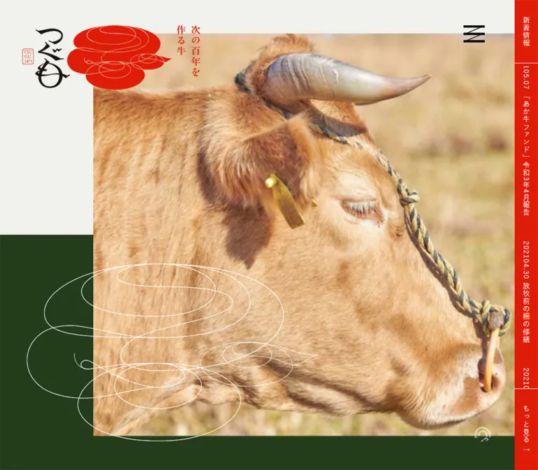
The opening composition combines a close photograph of an auburn cow with a warm off-white canvas and a deep green lower field. A calligraphic wordmark and red looping emblem occupy the upper left. Thin white contours repeat the emblem at a much larger scale across the photograph and green background. A narrow red news rail occupies the desktop right edge.
Further down, vertical headings sit toward the right while illustrations, photographs, and horizontal reading blocks occupy the left and center. The mixture of Mincho prose and Gothic navigation is deliberate. Generous empty areas give these different reading directions room to coexist. Mobile retains the vertical typography and asymmetry while relocating the news rail to the bottom and rebuilding the funding feature as a green section.
閉じる
TSUGUMO — Style Reference
An editorial portrait of regional continuity, expressed through cattle photography, vertical Japanese text, and looping linework.
Website: tsugumo.jp
Original URL: https://tsugumo.jp/
Final URL: https://tsugumo.jp/
Theme: warm paper, forest green, and vermilion; white illustration sections
Inspected: October 5, 2026, 06:54:54 JST; supplied retrieval timestamp 2026-10-04T21:54:54.754Z
Viewports: desktop 1440 × 1000; mobile 390 × 844 CSS pixels
Scope: the current homepage, including its opening composition, project introduction, regional-cycle section, history and archive content, funding feature, persistent news strip, and footer. Menu links and transition declarations are documented from supplied DOM evidence; an opened menu was not visually inspected.
TSUGUMO presents a regional project connecting local cattle, food, tourism, and the grasslands around Minamioguni. Its homepage works as an editorial introduction and route into several content areas. It is not organized around a single purchase or signup action.
The opening composition combines a close photograph of an auburn cow with a warm off-white canvas and a deep green lower field. A calligraphic wordmark and red looping emblem occupy the upper left. Thin white contours repeat the emblem at a much larger scale across the photograph and green background. A narrow red news rail occupies the desktop right edge.
Further down, vertical headings sit toward the right while illustrations, photographs, and horizontal reading blocks occupy the left and center. The mixture of Mincho prose and Gothic navigation is deliberate. Generous empty areas give these different reading directions room to coexist. Mobile retains the vertical typography and asymmetry while relocating the news rail to the bottom and rebuilding the funding feature as a green section.
How to Read This Reference
- Measured means a value supplied in rendered DOM rectangles or computed styles. Measurements describe the recorded states, not a complete stylesheet.
- Visual estimate means an approximate dimension or relationship read from the five original-page screenshots. Image bounds and decorative artwork positions are mostly in this category.
- Calculated means arithmetic derived from measured values, such as grid gaps or relative widths.
- Recommended means guidance for a new implementation. The CSS aliases, breakpoint, accessibility additions, and example class names are recommendations.
- Font families below are declared computed stacks. The evidence does not establish which font file actually supplied each glyph.
- DOM extraction includes navigation content that is not visible in the closed-menu captures. A recorded rectangle does not establish that an element was visibly exposed.
- Only the homepage was inspected. Linked destinations, forms, menu opening, hover states, and keyboard behavior were not exercised.
Tokens — Colors
Default Palette
The token names are implementation aliases, not recovered source variables.
| Name | Value | Suggested token | Evidence and role |
|---|---|---|---|
| Warm Paper | #f1f1eb |
--paper |
Measured rgb(241, 241, 235) on the root, introduction, history, and footer; primary canvas |
| Vermilion | #df1c07 |
--red |
Measured rgb(223, 28, 7) on the news rail and red headings; major orientation accent |
| Forest Green | #243c1b |
--forest |
Measured rgb(36, 60, 27) on the mobile funding section; visually consistent with the opening green field and desktop funding panel |
| White | #ffffff |
--white |
Measured cycle-section background and reversed funding/news text; also visible in decorative contours |
| Link Ink | #070304 |
--ink |
Measured anchor color; near-black text and navigation |
| Text Black | #000000 |
--text |
Measured body and editorial text color |
The photograph contributes ochre, straw, tan, and soft gray. These are image colors rather than additional interface tokens. The red artwork is visually related to the interface accent, but its exact internal asset colors were not extracted.
Palette Behavior
Paper and white are distinct surfaces. The illustrated cycle section uses clean white, while the introduction, history, and footer use the warmer paper tone. Preserve this difference; making the entire page white removes a visible part of the section rhythm.
Green changes scale across breakpoints. On desktop, the funding feature is a green rectangle inside a paper section. On mobile, green fills the entire section and the inner feature gains a thin white frame. Its vertical title changes from red on desktop to white on mobile.
The provided custom properties contain generic WordPress color, gradient, spacing, and shadow presets. Their presence does not demonstrate visible use. The palette above comes from the inspected elements and screenshots, not those preset lists.
Tokens — Typography
Editorial Mincho
Declared stack: HonMinKok-Book, 游明朝, 'Noto Serif JP', 'Yu Mincho', YuMincho, 'Hiragino Mincho ProN', 'Hiragino Mincho Pro', HGS明朝E, serif.
Use this family category for narrative paragraphs, the large introductory statement, history subheadings, contact details, and the news-strip heading. It gives the content a literary, regional-publication quality.
The body declares weight 300, but most sampled content elements resolve to 400. The introductory statement resolves to 700. Do not make all text thin merely because the body declaration is light.
Gothic Navigation and Section Labels
Declared stack: 'Yu Gothic', 游ゴシック, YuGothic, 游ゴシック体, 'ヒラギノ角ゴ Pro W3', メイリオ, sans-serif.
This stack is used for the large vertical section labels, news items, funding explanation, footer navigation, and selected action text. Most samples use weight 400; the project teaser and archive action use 700.
The result is a controlled contrast: Mincho supplies narrative texture, while Gothic labels organize movement through the site.
Wordmark and Decorative Lettering
The calligraphic つぐも identity is artwork. Its irregular curves should not be approximated by choosing a generic Japanese display font. The small red seal and looping cattle emblem are also image assets or vector artwork, not ordinary text treatments.
Type Scale
All values below are computed measurements unless marked otherwise. Where line height is normal, a precise numerical line height was not supplied.
| Role | Desktop size / line height | Mobile size / line height | Weight | Tracking |
|---|---|---|---|---|
| Base body | 14px / normal |
14.56px / normal |
300; commonly reset to 400 |
1.12px / 1.1648px |
| Introductory vertical statement | 32px / 55px |
33.28px / 57.2px |
700 |
1.12px / 1.1648px |
| Introductory vertical paragraph | 16px / 32px |
16.64px / 33.28px |
400 |
1.12px / 1.1648px |
| Major vertical section label | 36px / normal |
20.8px / normal |
400 |
5.4px / 3.12px, both 0.15em |
| Cycle explanation | 14px / 30px |
12.48px / 24.96px |
400 |
1.12px / 1.1648px |
| History subheading | 32px / normal |
20.8px / normal |
400 |
1.12px / 1.1648px |
| History paragraph | 14px / 26px |
14.56px / 29.12px |
400 |
1.12px / 0.728px |
| Project teaser statement | 24px / 38.4px |
14.56px / 23.296px |
700 |
2.1px / 2.184px |
| Funding explanation | 22px / 44px |
12.48px / 24.96px |
400 |
3.3px / 1.872px, both 0.15em |
| News text | 14px; title line box 46px |
10.4px / 32px |
400 |
1.12px / 1.1648px |
| Footer navigation | 14px / normal |
14.56px / normal |
400 |
1.12px / 1.1648px |
| Contact website link | 14px / 22.4px |
10.4px / 16.64px |
400 |
1.12px / 1.1648px |
| Menu links, DOM evidence only | 24px / 60px |
16.64px / 41.6px |
400 |
4.8px / 3.328px, both 0.2em |
The mobile introduction remains slightly larger than its desktop equivalent. This is an important exception to ordinary proportional shrinking: the statement continues to behave like a vertical editorial feature.
Vertical Writing
Vertical text appears in the introductory statement, cycle explanation, major section headings, desktop news rail, and footer navigation. Footer navigation remains vertical on mobile.
Recommended implementation: use writing-mode: vertical-rl and text-orientation: mixed for Japanese columns. Keep text in logical reading order and use layout to position columns. Do not insert a line break between every character or rotate an entire Japanese sentence as an image.
The inspected root font size is 10px on desktop and 10.4px on mobile. The underlying responsive formula was not supplied. Do not infer a universal scaling formula from these two samples.
Tokens — Spacing & Shapes
There is no demonstrated universal spacing unit. The page combines fixed dimensions, responsive typography, large editorial gaps, and artwork-specific positioning.
Spacing Scale
| Use | Desktop measurement | Mobile measurement | Interpretation |
|---|---|---|---|
| Standard major-section vertical padding | 150px |
64.48px |
Measured on introduction and history |
| Cycle-section padding | 150px 0 50px |
228.8px 0 45.76px |
Mobile placement is substantially recomposed |
| Archive column gap | 30px |
30px |
Calculated from card rectangles |
| Project teaser inset | 31px 33px |
18.72px |
Measured anchor padding |
| Desktop outer alignment | 46px |
— | Header mark position, rail width, and visible footer-rule inset |
| Mobile content side margin | — | Approximately 14.55px |
Measured history and archive alignment |
| Gap from main end to footer start | 117px |
Approximately 121.67px |
Calculated from section rectangles |
| Footer navigation column pitch | 35px |
Approximately 36.55px |
Calculated from link positions |
Border Radius and Rules
- Sampled content elements use
border-radius: 0. - Photography and content panels have square corners.
- The footer divider and mobile funding frame appear approximately
1pxthick; this is a visual estimate. - Arrows are long, thin strokes with open heads, rather than filled chevrons inside rounded buttons.
- No visible shadow-based elevation system is established by the captures.
- The logo's loops are artwork geometry, not a reusable rounded-card style.
Layout Measurements
| Element | Desktop 1440 × 1000 |
Mobile 390 × 844 |
Evidence |
|---|---|---|---|
| Opening section | 1440 × 1000px |
390 × 844px |
Measured; one captured viewport tall |
| News strip | 46 × 1000px, starting at x = 1394 |
390 × 32px, starting at y = 812 |
Measured |
| Opening photograph | Approximately 1155 × 868px, starting at (239, 66) |
Approximately 374 × 418px, starting at (0, 213) |
Visual estimate |
| Green opening field starts | Approximately y = 500 |
Approximately y = 338 |
Visual estimate |
| Compact header emblem | 172 × 105.59px, at (46, 50) |
60.97 × 37.44px, at (22.22, 18.72) |
Measured H1 wrapper; not the entire opening lockup |
| Archive content span | Approximately 1091.33px |
Approximately 360.91px |
Calculated from measured cards |
| Archive card width | 343.77px |
165.45px |
Measured |
| History paragraph width | 491.08px |
360.91px |
Measured |
| Funding text width | 421.33px |
253.47px |
Measured |
| Document height | 6092.30px |
5265.19px |
Measured |
An inline image link can have a very short line box even when its image is large. In particular, the cycle image link's 20px desktop height is not the illustration height.
Components
Opening Brand Composition
Role: establish the project through an animal, a landscape palette, and a distinctive identity.
The full opening identity combines the black calligraphic wordmark, a small red seal, the larger red looping emblem, and the red vertical phrase 次の百年を 作る牛. It sits in the upper-left paper area and overlaps the photograph's territory on desktop.
Lower-page captures show the simpler red emblem at the upper left. The two branding presentations are visible evidence; the exact scroll threshold or transition between them is not available.
On mobile, the opening lockup occupies the upper-left region while the photograph starts much lower, around 213px from the viewport top. This empty upper band is part of the composition, not a missing headline or an unloaded card.
Opening Photograph and Contour Overlay
Role: make the cattle project immediate and tactile.
The image is a close side portrait of a brown cow facing right. Fur, horn, rope, and warm out-of-focus surroundings supply most of the visual detail. Desktop framing leaves a broad paper strip on the left; the photo reaches the news rail on the right.
The white contour drawing crosses the lower-left photo boundary into the green field. Its approximate desktop extent is 620 × 375px. On mobile it is roughly 330 × 205px, crossing the photograph's lower edge and extending farther into green.
Keep the image, background fields, and contour as separate layers. The transparent outline should not be flattened into a photograph if it needs to preserve its cross-boundary placement responsively.
A small white circular emblem is visible near the lower-right area. Its function is unverified; do not label it as a scroll control or assume it animates.
Compact Header and Menu Trigger
Role: maintain identity and navigation access while reading.
The compact red emblem appears at the upper left in lower-page captures. A black menu glyph remains near the upper right. The glyph uses horizontal and diagonal strokes; it is more distinctive than a generic three-bar menu icon.
The sampled HEADER box is 50px high, but the visible interface is not an opaque, full-width navigation bar. Elements float over the page composition. Do not turn the header's DOM height into a solid toolbar.
The menu glyph is visually about 42 × 34px on desktop and 24 × 20px on mobile. These are graphic-size estimates, not measured clickable areas.
Menu Link Set — DOM Evidence Only
Seven routes are present: home, project information, regional cycles, history/archive, funding, news, and contact. The DOM pairs Japanese labels with English supplements such as about, cycles, and organize & contact.
Computed link styles use white Mincho text and staggered transform transitions. The desktop links occupy successive vertical columns with 60px line-height spacing. Mobile uses 16.64px text and 41.6px line height.
No opened-menu screenshot was supplied. The panel background, backdrop, close state, entrance direction, focus handling, and keyboard controls cannot be specified as observed behavior.
Persistent News Strip
Role: expose recent reports without inserting a conventional horizontal navigation row.
Desktop anatomy:
- A red
46pxstrip at the right edge. - A top heading cell labeled
新着情報, approximately125.48pxhigh. - A clipped middle region containing dated report links in vertical text.
- A bottom
もっと見るlink, approximately161.52pxhigh, with an arrow. - Fine white separators between the major cells.
Mobile anatomy changes to a 32px bottom strip. The heading cell measures 83.19px wide and the right action 93.59px; the calculated middle slot is about 213.22px. Text becomes horizontal and measures 10.4px.
The news strip remains visible in both opening and lower-page captures, supporting a persistent-edge treatment. Report items are clipped or absent from the visible middle area at some captured moments, despite being present in the DOM. Do not invent a permanently empty center or a specific ticker speed from those stills.
Project Introduction and Teaser
Role: explain the meaning of continuity before presenting the site's content areas.
The introduction is a large paper section. Red vertical Mincho text gives the phrase 次の百年を作る牛 prominence, with a narrower vertical paragraph beside it. The paragraph describes Minamioguni and the regional cycles associated with local cattle.
The measured statement occupies a 110px-wide, 445.13px-high box on desktop. On mobile, its box is about 114.41 × 462.94px. The paragraph remains vertically arranged rather than becoming a conventional full-width horizontal introduction.
A linked teaser for このプロジェクトについて uses a bold Gothic statement and internal padding. Its desktop box is 561.66 × 232.81px, positioned toward the right. The mobile box is 288.72 × 183.16px, starts at x = 86.72px, and remains intentionally offset. Its exact complete visual treatment is not shown in the supplied screenshots, so border and hover claims are omitted.
Regional-Cycle Illustration Section
Role: explain a network of relationships through an illustrated place.
The section has a white background. A large hand-drawn landscape occupies the left: rolling pasture, cattle, a farmer, cultivated vegetables, controlled grassland burning, a traditional building, food, and a hot-spring pool. Black outlines and uneven washes give the scene the character of an illustrated regional guide.
On the right, the red vertical heading この地域にある循環 sits beside a smaller vertical explanation. A long, thin arrow extends the heading's navigational gesture downward and then right. Both the heading link and an image link point to /cycle.
The desktop image-link width is 1035px. On mobile, its recorded inline box is 496.56px wide at x = 14.55px, exceeding the 390px viewport. No mobile screenshot of this section is supplied. This establishes oversized geometry, but not whether the complete experience clips, translates, or permits panning.
Do not turn this illustration into separate uniform feature icons. Its value lies in showing the relationships inside one continuous landscape.
History and Archive Section
Role: connect the landscape's long history with recent project activity.
The section returns to paper. A red vertical 歴史と歩み label sits toward the right, while the horizontal Mincho subheading 1000年以上続く、阿蘇の景観 introduces the historical account. Desktop body copy occupies roughly 491px at 14px / 26px. Mobile copy spans about 361px at 14.56px / 29.12px; the subheading wraps into two lines.
Three archive links are present, with dates and Japanese titles. Their outer rectangles form three columns on desktop and two columns on mobile. The third mobile item begins a new row at the left. Card height varies with content rather than being equalized.
The desktop archive action is a small right-aligned もっと見る link above the entries. Mobile places a full-content-width action after the entries. The captured evidence measures outer link boxes but does not expose enough of this section's imagery to specify thumbnail crop, aspect ratio, or image subject.
A routing detail matters when rebuilding: the main 歴史と歩み heading link points to the homepage in the supplied DOM, while the archive action and footer link point to /archive. Preserve this as an observed discrepancy and verify intended routing before implementation.
Funding Feature
Role: explain how dining in Kurokawa Onsen contributes to protecting cattle and grassland.
Desktop uses a wide, square green panel within a paper section. A calf photograph sits on the left, with white Gothic copy and a fine arrow action on the right. The visible copy reads 黒川温泉での食事で、あか牛と草原を守る活動の輪に参加することができます。
The panel is visually about 1092px wide. Its left image is approximately 509 × 364px; the text width is measured at 421.33px. Image-to-text separation is approximately 64px. Horizontal panel padding appears close to 48px. Panel padding and image dimensions are visual estimates.
The action 詳しく知る is positioned near the lower right of the text area. It uses text and a long open arrow rather than a filled button.
On mobile, green fills the whole section. The title becomes white. The inner panel is approximately 289px wide, aligned near the left content margin, and gains a white outline. Image and copy stack vertically. The measured text width is 253.47px, with 12.48px / 24.96px Gothic text.
The feature link points to /fund, while navigation and footer funding links point to /funding. Neither destination was opened, so equivalence or redirect behavior is unverified.
Footer
Role: close the editorial sequence with navigation and a concrete contact identity.
A thin black rule spans the paper surface with generous space above it. Desktop places the calligraphic wordmark at the right, seven vertical navigation columns immediately to its left, and a small horizontal contact block at the lower left.
Mobile keeps the vertical navigation. The wordmark moves above the link columns near the right edge; the contact block sits beneath them at the left. This is a deliberate rearrangement, not a conversion to stacked horizontal links.
The footer identifies 黒川温泉観光旅館協同組合 as the contact organization and includes its telephone number and a link to https://www.kurokawaonsen.or.jp/. No production credit is established by the inspected homepage evidence.
Tokens — Motion & Interaction
| Treatment | Evidence | What can be stated |
|---|---|---|
| Menu-link transforms | Computed transform 0.3s transitions |
A 300ms transform transition is declared for each sampled menu link |
| Menu stagger | Delays of 0.09s, 0.18s, 0.27s, 0.36s, 0.45s, 0.54s, 0.63s |
Successive links have 90ms delay increments; the last transition would finish at 930ms if triggered together |
| News sequence | Different item ordering and clipped positions across captures | Consistent with a changing track, but loop mechanism, speed, and direction were not established |
| Header identity | Full opening lockup and compact lower-page emblem appear in different captures | Multiple visible presentations exist; transition trigger and duration remain unknown |
| Persistent edge controls | News strip and menu glyph recur in lower-page screenshots | An anchored implementation is appropriate; exact source positioning declarations were not provided |
| Link navigation | Supplied anchor destinations | Routes are known; destination rendering and click outcomes are not |
| General animation | Sampled elements mostly report animation: none; many report transition: all without timing detail |
Neither proves the page is globally static nor supplies a usable duration |
The capture process waited for page and layout readiness, conservatively awaited finite motion, and temporarily paused perpetual animations during readiness checks before resuming them. Static captures cannot establish the complete animation system.
Do not add parallax, automatic image zoom, spinning emblems, scroll snapping, or an animated logo as if these were verified features. For a new implementation, modest focus and hover feedback is sufficient until motion requirements are explicitly defined.
Surfaces
| Surface | Appearance | Purpose |
|---|---|---|
| Main canvas | Flat warm paper | Carries the introduction, history, and footer |
| Cycle field | Flat white | Separates the illustrated explanation from editorial sections |
| Opening lower field | Flat deep green | Grounds the animal photograph and receives the white contour |
| Desktop funding panel | Deep green rectangle on paper | Creates a focused participation feature |
| Mobile funding section | Full-width deep green with a thin white inner frame | Rebuilds the feature for a narrow viewport |
| News strip | Vermilion with white labels and fine separators | Persistent information channel |
| Footer boundary | Thin near-black rule | Defines closure without a raised container |
Depth comes from overlap, crop, scale, and large fields of color. There is no visible need for glass effects, gradients, rounded cards, or soft shadows.
Imagery
Photography is close, warm, and specific to the project. The hero emphasizes the physical presence of an adult cow, while the funding image shows a younger animal among straw. Retain natural fur detail and the subdued background; do not replace these images with generic pastoral scenery if the goal is to preserve this design's emphasis.
The cycle illustration uses thin irregular outlines, translucent color washes, and a broad landscape composition. It explains cattle, farming, food, grassland management, and tourism together. Its visual density contrasts with the surrounding empty white area.
The red emblem and white contour repeat a flowing, circular language. They connect the idea of circulation to the animal's shape without requiring a conventional infographic loop or a set of circular badges.
Observed Asset References
Asset URLs were not included in the supplied evidence. The following inventory describes visible roles, not invented file paths.
| Asset role | Observed appearance | Implementation guidance |
|---|---|---|
| Opening cattle photograph | Adult brown cow facing right; close crop | Use a high-resolution asset and responsive cropping that preserves the horn, eye, and muzzle |
| Funding photograph | Calf among straw | Retain its softer, intimate framing; avoid forcing the hero crop onto this image |
| Regional-cycle illustration | Continuous green landscape with people, cattle, farming, fire, food, and bathing | Preserve the complete artwork relationship; provide a text explanation |
| Calligraphic wordmark | Black vertical lettering with a red seal | Use an authorized identity asset rather than substituting a font |
| Red looping emblem | Broad red forms with fine internal contour lines | Preserve its transparent surroundings and internal line detail |
| White contour emblem | Large fine-line drawing crossing image and background | Use a transparent vector or raster asset with independent positioning |
| Small circular emblem | White mark near the opening's lower-right region | Treat as decorative unless its interaction is independently established |
| Menu and arrows | Black menu strokes; fine open arrowheads | Keep stroke weight and proportions restrained |
Use smooth photographic rendering. Pixelated image rendering would conflict with the observed fur, watercolor textures, and fine linework.
Layout & Responsive Behavior
Document Sequence
The table records section positions in document coordinates. These values are evidence of the captured composition, not recommended fixed heights for translated or changing content.
| Region | Desktop top / height | Mobile top / height |
|---|---|---|
| Opening | 0 / 1000px |
0 / 844px |
| Project introduction | 1000 / 1196.13px |
844 / 1141.53px |
| Regional cycles | 2196.13 / 1078.61px |
1985.53 / 563.66px |
| History and archive | 3274.73 / 1601.02px |
2549.19 / 1678.61px |
| Funding | 4875.75 / 801.19px |
4227.80 / 452.77px |
| Footer | 5793.94 / 298.36px |
4802.23 / 462.95px |
Desktop Composition
The hero photo is inset about 16.6% of the viewport width from the left, begins about 66px below the top, and ends at the 46px news rail. The green field begins halfway down the opening viewport. These are visual relationships, not recovered CSS formulas.
The archive and funding content share a roughly 1091px central span. Section titles occupy a separate right-side zone. The page does not use one universal left alignment: branding, imagery, narrative copy, feature panels, and section labels deliberately follow different axes.
Mobile Recomposition
- The news rail moves from the right edge to a full-width bottom strip.
- The opening photograph moves below a large paper band and begins flush left, with roughly
16pxof clearance on the right. - The green field starts higher relative to the viewport, near
40%of its height. - The white contour extends below the photograph into green.
- The introductory vertical statement remains large, while other section labels reduce from
36pxto20.8px. - Archive entries change from three columns to two, retaining a
30pxgap. - The archive action moves below the entries and expands to the content width.
- Funding changes from an inset green panel to a full green section with a framed, stacked inner composition.
- Footer branding, navigation, and contact information form a taller arrangement, while navigation remains vertical.
Only two viewport sizes were inspected. The original breakpoint, landscape behavior, tablet composition, and browser safe-area handling are unknown. The CSS below uses a recommended 1024px breakpoint to avoid compressing the wide funding layout; it is not a recovered source value.
Do’s and Don’ts
Do
- Preserve the measured paper, vermilion, and forest-green colors.
- Use cattle photography as the opening subject, with enough scale to reveal fur and facial detail.
- Maintain the distinction between Mincho narrative text and Gothic orientation labels.
- Keep the opening lockup and compact header emblem as separate presentations.
- Preserve vertical text on mobile where the source retains it.
- Let white contour artwork cross the photo boundary.
- Use large, unevenly distributed empty areas to support the editorial composition.
- Retain the white cycle section between paper sections.
- Recompose the news strip and funding feature for mobile.
- Keep archive entries in three desktop columns and two mobile columns at the inspected sizes.
- Use square imagery, fine rules, and long open arrows.
Don’t
- Don't recast the homepage as a generic sales funnel with a central headline and repeated filled buttons.
- Don't flatten the entire page into centered, equally padded sections.
- Don't replace the calligraphic identity with ordinary typed text.
- Don't treat every Japanese label as Mincho; major section labels are Gothic.
- Don't shrink the introductory vertical statement simply because the viewport is narrow.
- Don't turn the landscape illustration into unrelated icon cards.
- Don't use decorative gradients or shadows to separate surfaces that are flat in the captures.
- Don't infer animation timing from clipped ticker text.
- Don't assume the DOM's menu links prove an opened-menu appearance.
- Don't copy the measured document heights as rigid layout requirements.
- Don't assume
/fundand/fundingare interchangeable without checking their intended destinations.
Recommended Implementation Additions
These are recommendations for a new implementation, not verified features of the inspected site.
- Give the menu button a meaningful accessible name,
aria-expanded, and a relationship to its controlled navigation. Support keyboard opening, closing, and appropriate focus handling. - Preserve logical reading order when arranging vertical columns. Test Japanese vertical text with screen readers and browser zoom.
- Enlarge the compact mobile news and contact text where practical. The observed
10.4pxcaptions and32pxstrip are small; approximately12–14pxutility text and larger interactive targets improve usability. - Reserve space for the bottom news strip and device safe-area inset so the last contact link remains reachable.
- Provide a static, manually browsable news list or a pause mechanism if an automatic ticker is implemented. Avoid continuously announcing moving items to assistive technology.
- Supply meaningful alternative text for cattle photography and a structured text explanation for the illustrated regional cycle. Mark purely decorative contours as hidden from assistive technology.
- Keep the original artwork proportions while providing responsive image sources. Prioritize the opening photograph and defer lower-page images as appropriate.
- Keep focus indicators visible on paper, red, and green surfaces. Do not rely only on color changes for link focus.
- Check intermediate widths, text enlargement, and the oversized cycle illustration before adopting clipping. Unexplained horizontal document overflow should not be treated as a required feature.
- Resolve the observed history and funding route differences before wiring a production navigation system.
- Honor reduced-motion preferences for any menu or news animation added to the implementation.
Agent Prompt Guide
Quick Color Reference
- Main paper:
#f1f1eb. - Cycle-section white:
#ffffff. - News strip and red section labels:
#df1c07. - Green fields and funding surface:
#243c1b. - Main text:
#000000; links:#070304. - Reversed text and contour artwork: white.
- Separation: flat surface changes and approximately
1pxrules, without shadows.
Overall Prompt
“Create an editorial homepage for a Japanese regional project connecting cattle, food, tourism, and grassland conservation. Use warm paper #f1f1eb, vermilion #df1c07, deep forest green #243c1b, and black text. Lead with a large close photograph of a brown cow facing right, offset toward the right on desktop. Place an authorized calligraphic identity and red looping emblem at the upper left, and overlay thin white contour artwork across the photograph and green lower field. Combine vertical Mincho narrative copy with Gothic section labels. Use a large continuous illustrated landscape for the regional-cycle section, three desktop archive columns, and a green funding panel. On mobile, move the news rail to the bottom, retain vertical headings, use two archive columns, and turn funding into a full green section with a thin white inner frame. Keep square corners, fine open arrows, and generous asymmetrical whitespace.”
Example Component Prompts
- Opening: “At a 1440 × 1000 reference viewport, create a paper-and-green opening with a cow photograph approximately 1155 × 868px, starting near x239 and y66. Reserve a 46px red news rail at the right. Let a large transparent white contour overlap the photograph's lower-left edge. Treat these dimensions as reference proportions, not fixed sizes for every screen.”
- Vertical introduction: “Set
次の百年を作る牛in bold red Mincho at about 32px with 55px column spacing. Pair it with smaller red vertical prose. Retain the large vertical statement on mobile instead of converting the section to a centered horizontal headline.” - Cycle section: “Use a white section containing one broad, hand-drawn landscape of cattle, farming, grassland burning, food, and hot springs. Place a red vertical Gothic heading and smaller vertical explanation at the right, with a long fine open arrow. Preserve the landscape as one connected scene.”
- Archive: “Create unboxed editorial entries with dates and Japanese titles. Use three roughly 344px columns with 30px gaps at the desktop reference width, and two roughly 165px columns at 390px. Let text determine entry height. Place the archive action above the desktop entries and below the mobile entries.”
- Funding: “Place a calf photograph beside white Gothic copy in a square forest-green panel. Put
詳しく知るand a thin open arrow at the lower right. On mobile, stack image and text inside a thin white frame, use the full section as a green field, and change the vertical section title to white.” - Footer: “Create a warm-paper footer with a thin black top rule, a calligraphic wordmark at the right, seven vertical navigation columns, and a small horizontal contact block at the left. On mobile, move the wordmark above the columns and contact information below them while retaining vertical link text.”
Quick Start
CSS Custom Properties
This is a reusable adaptation, not extracted source CSS. It uses a conventional root size and explicit tokens because the original responsive root formula is unknown. Color and text tokens use measured values; hero geometry, some panel insets, and the breakpoint are approximations or recommendations.
The class structure assumes a .hero containing separate brand, photo, and contour assets; an independent .news-rail with label, items, and action; section content wrappers; and a funding panel containing an image and copy. Supply authorized assets. This CSS does not implement an unverified menu opening state or ticker animation.
:root {
  /* Measured colors; new semantic aliases. */
  --paper: #f1f1eb;
  --red: #df1c07;
  --forest: #243c1b;
  --white: #ffffff;
  --ink: #070304;
  --text: #000000;

  /* Declared source stacks; font files are not bundled here. */
  --serif: 'HonMinKok-Book', '游明朝', 'Noto Serif JP',
    'Yu Mincho', YuMincho, 'Hiragino Mincho ProN',
    'Hiragino Mincho Pro', 'HGS明朝E', serif;
  --sans: 'Yu Gothic', '游ゴシック', YuGothic, '游ゴシック体',
    'ヒラギノ角ゴ Pro W3', 'メイリオ', sans-serif;

  --body-size: 14px;
  --body-leading: 26px;
  --body-tracking: 1.12px;
  --section-title-size: 36px;
  --fund-size: 22px;
  --fund-leading: 44px;
  --news-size: 14px;
  --contact-size: 14px;

  --section-space: 150px;
  --page-gutter: 46px;
  --archive-gap: 30px;
  --rail-width: 46px;
  --news-height: 0px;
  --safe-bottom: env(safe-area-inset-bottom, 0px);
  --rule: 1px;
}

* { box-sizing: border-box; }

html {
  font-size: 100%;
  background: var(--paper);
}

body {
  margin: 0;
  color: var(--text);
  background: var(--paper);
  font: 400 var(--body-size) / var(--body-leading) var(--serif);
  letter-spacing: var(--body-tracking);
}

img {
  display: block;
  max-width: 100%;
  height: auto;
}

a { color: var(--ink); }
button { font: inherit; }

:where(a, button):focus-visible {
  outline: 2px solid currentColor;
  outline-offset: 4px;
}

.vertical-text {
  writing-mode: vertical-rl;
  text-orientation: mixed;
}

/* Approximate the measured 1091px span at 1440px. */
.content {
  width: 75.79%;
  margin-inline: auto;
}

.editorial-section {
  position: relative;
  padding-block: var(--section-space);
  background: var(--paper);
}

.section-title {
  position: absolute;
  top: var(--section-space);
  right: 62px;
  margin: 0;
  color: var(--red);
  font: 400 var(--section-title-size) / 1.5 var(--sans);
  letter-spacing: 0.15em;
  writing-mode: vertical-rl;
  text-orientation: mixed;
}

/* Hard color boundary; no decorative gradient fade. */
.hero {
  position: relative;
  min-height: 680px;
  height: 100vh;
  height: 100svh;
  isolation: isolate;
  background: linear-gradient(
    to bottom,
    var(--paper) 0 50%,
    var(--forest) 50% 100%
  );
}

.hero-photo {
  position: absolute;
  inset: 6.6% var(--rail-width) 6.6% 16.6%;
  width: calc(83.4% - var(--rail-width));
  height: 86.8%;
  object-fit: cover;
  object-position: center;
}

.hero-brand {
  position: absolute;
  z-index: 3;
  top: 50px;
  left: 46px;
  width: 350px;
}

.hero-contour {
  position: absolute;
  z-index: 2;
  left: 5%;
  bottom: 6.4%;
  width: 43%;
  pointer-events: none;
}

.menu-trigger {
  position: fixed;
  z-index: 50;
  top: 40px;
  right: 96px;
  display: grid;
  place-items: center;
  width: 52px;
  height: 52px;
  padding: 5px;
  border: 0;
  color: var(--ink);
  background: transparent;
  cursor: pointer;
}

/* Static, manually browsable adaptation of the news region. */
.news-rail {
  position: fixed;
  z-index: 40;
  inset: 0 0 0 auto;
  display: grid;
  grid-template-rows: 125.48px minmax(0, 1fr) 161.52px;
  width: var(--rail-width);
  color: var(--white);
  background: var(--red);
  font: 400 var(--news-size) / 1.5 var(--sans);
}

.news-rail a {
  color: inherit;
  text-decoration: none;
}

.news-label,
.news-more {
  display: flex;
  align-items: center;
  justify-content: center;
  margin: 0;
  padding: 32px 0;
  writing-mode: vertical-rl;
  font-size: inherit;
  font-weight: 400;
}

.news-label {
  border-bottom: var(--rule) solid currentColor;
  font-family: var(--serif);
}

.news-more { border-top: var(--rule) solid currentColor; }

.news-items {
  display: flex;
  gap: 48px;
  min-width: 0;
  min-height: 0;
  overflow: auto;
  padding-block: 16px;
  writing-mode: vertical-rl;
  white-space: nowrap;
}

.news-items a { flex: 0 0 auto; }

.intro-columns {
  display: flex;
  flex-direction: row-reverse;
  justify-content: center;
  gap: 20px;
  height: 445.13px;
  color: var(--red);
}

.intro-columns h2,
.intro-columns p {
  margin: 0;
  writing-mode: vertical-rl;
  text-orientation: mixed;
}

.intro-columns h2 {
  font: 700 32px / 55px var(--serif);
}

.intro-columns p {
  font: 400 16px / 32px var(--serif);
}

.cycle-section { background: var(--white); }

.history-copy { max-width: 491.08px; }

.history-copy h3 {
  margin: 0 0 30px;
  font: 400 32px / 1.45 var(--serif);
}

.archive-grid {
  display: grid;
  grid-template-columns: repeat(3, minmax(0, 1fr));
  align-items: start;
  column-gap: var(--archive-gap);
  row-gap: 30px;
}

.archive-entry {
  min-width: 0;
  text-decoration: none;
  overflow-wrap: anywhere;
}

.funding-section {
  position: relative;
  padding-block: 100px var(--section-space);
  background: var(--paper);
}

.funding-section .section-title { top: 0; }

/* Panel insets and column ratio approximate the screenshot. */
.fund-card {
  display: grid;
  grid-template-columns: minmax(0, 1.21fr) minmax(0, 1fr);
  gap: 64px;
  padding: 44px 48px;
  color: var(--white);
  background: var(--forest);
}

.fund-photo {
  width: 100%;
  aspect-ratio: 1.395;
  object-fit: cover;
}

.fund-copy {
  display: flex;
  flex-direction: column;
  min-width: 0;
  color: inherit;
  text-decoration: none;
}

.fund-copy p {
  margin: 0;
  font: 400 var(--fund-size) / var(--fund-leading) var(--sans);
  letter-spacing: 0.15em;
}

.text-action {
  display: inline-flex;
  align-items: center;
  justify-content: flex-end;
  gap: 12px;
  margin-top: auto;
  padding-top: 20px;
  font-family: var(--sans);
}

.open-arrow {
  position: relative;
  display: inline-block;
  flex: 0 0 52px;
  height: 1px;
  background: currentColor;
}

.open-arrow::after {
  position: absolute;
  top: 50%;
  right: 0;
  width: 21px;
  height: 21px;
  border-top: 1px solid currentColor;
  border-right: 1px solid currentColor;
  content: '';
  transform: translateY(-50%) rotate(45deg);
}

.site-footer {
  margin: 117px var(--page-gutter) 0;
  padding-block: 50px;
  border-top: var(--rule) solid var(--ink);
}

.footer-inner {
  display: grid;
  grid-template-columns: minmax(0, 1fr) auto 76px;
  gap: 35px;
}

.footer-contact {
  align-self: end;
  margin: 0;
  font-size: var(--contact-size);
  line-height: 1.6;
  font-style: normal;
  overflow-wrap: anywhere;
}

.footer-nav {
  display: flex;
  flex-direction: row-reverse;
  align-items: flex-start;
  gap: 21px;
}

.footer-nav a {
  writing-mode: vertical-rl;
  text-orientation: mixed;
  text-decoration: none;
  font-family: var(--sans);
  line-height: 1;
}

.footer-brand { width: 76px; }

/* Recommended breakpoint; the source breakpoint is unknown. */
@media (max-width: 64rem) {
  :root {
    --body-size: 14.56px;
    --body-leading: 29.12px;
    --body-tracking: 1.1648px;
    --section-title-size: 20.8px;
    --fund-size: 12.48px;
    --fund-leading: 24.96px;
    --news-size: 10.4px;
    --contact-size: 10.4px;
    --section-space: 64.48px;
    --page-gutter: 14.55px;
    --rail-width: 0px;
    --news-height: 32px;
  }

  body {
    padding-bottom: calc(var(--news-height) + var(--safe-bottom));
  }

  .content { width: calc(100% - 2 * var(--page-gutter)); }

  .hero {
    min-height: 650px;
    background: linear-gradient(
      to bottom,
      var(--paper) 0 40%,
      var(--forest) 40% 100%
    );
  }

  .hero-photo {
    inset: 25.24% 16px auto 0;
    width: calc(100% - 16px);
    height: 49.53%;
  }

  .hero-brand {
    top: 23px;
    left: 16px;
    width: 224px;
  }

  .hero-contour {
    left: 9%;
    bottom: 12.9%;
    width: 85%;
  }

  .menu-trigger {
    top: 15px;
    right: 53px;
    width: 44px;
    height: 44px;
    padding: 10px;
  }

  .news-rail {
    inset: auto 0 0;
    grid-template-columns: 83.19px minmax(0, 1fr) 93.59px;
    grid-template-rows: var(--news-height);
    width: 100%;
    height: calc(var(--news-height) + var(--safe-bottom));
    padding-bottom: var(--safe-bottom);
  }

  .news-label,
  .news-more,
  .news-items {
    writing-mode: horizontal-tb;
    padding: 0 7px;
  }

  .news-label {
    border-bottom: 0;
    border-right: var(--rule) solid currentColor;
  }

  .news-more {
    border-top: 0;
    border-left: var(--rule) solid currentColor;
  }

  .news-items {
    align-items: center;
    gap: 30px;
  }

  .section-title {
    top: 45.76px;
    right: 26px;
  }

  .intro-columns { height: 462.94px; }
  .intro-columns h2 { font-size: 33.28px; line-height: 57.2px; }
  .intro-columns p { font-size: 16.64px; line-height: 33.28px; }

  .history-copy { max-width: none; letter-spacing: 0.728px; }
  .history-copy h3 { font-size: 20.8px; margin-bottom: 16.64px; }

  .archive-grid { grid-template-columns: repeat(2, minmax(0, 1fr)); }

  .funding-section {
    padding-top: 45.76px;
    background: var(--forest);
  }

  .funding-section .section-title {
    top: 45.76px;
    color: var(--white);
  }

  .fund-card {
    width: 80%;
    grid-template-columns: minmax(0, 1fr);
    gap: 16.64px;
    padding: 16.64px;
    border: var(--rule) solid var(--white);
  }

  .site-footer {
    margin-top: 121.67px;
    padding-block: 24px;
  }

  .footer-inner {
    grid-template-columns: minmax(0, 1fr) 56px;
    gap: 24px;
  }

  .footer-brand {
    grid-column: 2;
    grid-row: 1;
    width: 56px;
  }

  .footer-nav {
    grid-column: 1 / -1;
    grid-row: 2;
    justify-content: flex-start;
    gap: 21.99px;
  }

  .footer-contact {
    grid-column: 1 / -1;
    grid-row: 3;
  }
}

/* Apply to any optional motion added during implementation. */
@media (prefers-reduced-motion: reduce) {
  .menu-link,
  .news-items,
  .hero-contour {
    animation: none !important;
    transition: none !important;
  }
}
The illustrative cycle placement and complete introduction artwork require their own asset-aware layout. Avoid assigning the cycle image link's measured line-box height to the image itself. Archive image proportions are intentionally unspecified because they were not established by the evidence.
The example preserves measured small utility text for visual comparison. For production, apply the readability and target-size recommendations above. Enlarging the bottom strip also requires updating --news-height and its reserved page space.
Tailwind v4 Token Mapping
Optional mapping for a project already using Tailwind v4. These aliases do not imply that the original site uses Tailwind. Define the custom properties above first.
@theme inline {
  --color-paper: var(--paper);
  --color-vermilion: var(--red);
  --color-forest: var(--forest);
  --color-ink: var(--ink);

  --font-editorial: var(--serif);
  --font-navigation: var(--sans);

  --text-editorial-body: var(--body-size);
  --text-section-label: var(--section-title-size);
  --text-funding: var(--fund-size);
  --text-news: var(--news-size);

  --spacing-section: var(--section-space);
  --spacing-page-gutter: var(--page-gutter);
  --spacing-archive-gap: var(--archive-gap);
  --spacing-news-rail: var(--rail-width);

  --radius-flat: 0px;
}
Sources & Evidence
- Original and final homepage: https://tsugumo.jp/. The supplied browser record reports HTTP
200and the titleつぐも - TSUGUMO -, with no URL change. - Capture record: retrieved at
2026-10-04T21:54:54.754Z, equivalent to October 5, 2026, 06:54:54 JST. Separate timestamps for individual screenshots were not supplied. - Desktop evidence:
1440 × 1000viewport; approximately6092.30pxdocument height. Supplied screenshots show the opening, part of the cycle section and transition to history, and the lower funding/footer area. - Mobile evidence:
390 × 844viewport; approximately5265.19pxdocument height. Supplied screenshots show the opening and the lower funding/footer area. - Rendered DOM and computed styles: element rectangles, colors, font stacks, sizes, weights, tracking, line heights, padding, link destinations, and menu-link transition declarations supplied with both viewport records.
- Inspection method: initial observation lasted at least five seconds; readiness checks considered document loading, visible image decoding, finite animation, layout stability, and viewport text stability. Scrolling traversed intermediate positions. SharedWorkers and service workers were disabled.
- Limits: no independent browsing or command execution was performed for this reference. Open-menu appearance, hover and focus states, ticker timing, font-file resolution, image URLs, destination-page behavior, intermediate breakpoints, and delayed content remain unverified. Some sections are supported by DOM measurements without complete visual captures.
This reference describes the current homepage represented by the supplied original-page evidence. Measurements, screenshot estimates, and recommended implementation choices are identified separately throughout.
# TSUGUMO — Style Reference

> An editorial portrait of regional continuity, expressed through cattle photography, vertical Japanese text, and looping linework.

**Website:** [tsugumo.jp](https://tsugumo.jp/)
**Original URL:** https://tsugumo.jp/
**Final URL:** https://tsugumo.jp/
**Theme:** warm paper, forest green, and vermilion; white illustration sections
**Inspected:** October 5, 2026, 06:54:54 JST; supplied retrieval timestamp `2026-10-04T21:54:54.754Z`
**Viewports:** desktop `1440 × 1000`; mobile `390 × 844` CSS pixels
**Scope:** the current homepage, including its opening composition, project introduction, regional-cycle section, history and archive content, funding feature, persistent news strip, and footer. Menu links and transition declarations are documented from supplied DOM evidence; an opened menu was not visually inspected.

TSUGUMO presents a regional project connecting local cattle, food, tourism, and the grasslands around Minamioguni. Its homepage works as an editorial introduction and route into several content areas. It is not organized around a single purchase or signup action.

The opening composition combines a close photograph of an auburn cow with a warm off-white canvas and a deep green lower field. A calligraphic wordmark and red looping emblem occupy the upper left. Thin white contours repeat the emblem at a much larger scale across the photograph and green background. A narrow red news rail occupies the desktop right edge.

Further down, vertical headings sit toward the right while illustrations, photographs, and horizontal reading blocks occupy the left and center. The mixture of Mincho prose and Gothic navigation is deliberate. Generous empty areas give these different reading directions room to coexist. Mobile retains the vertical typography and asymmetry while relocating the news rail to the bottom and rebuilding the funding feature as a green section.
閉じる
# TSUGUMO — Style Reference

> An editorial portrait of regional continuity, expressed through cattle photography, vertical Japanese text, and looping linework.

**Website:** [tsugumo.jp](https://tsugumo.jp/)
**Original URL:** https://tsugumo.jp/
**Final URL:** https://tsugumo.jp/
**Theme:** warm paper, forest green, and vermilion; white illustration sections
**Inspected:** October 5, 2026, 06:54:54 JST; supplied retrieval timestamp `2026-10-04T21:54:54.754Z`
**Viewports:** desktop `1440 × 1000`; mobile `390 × 844` CSS pixels
**Scope:** the current homepage, including its opening composition, project introduction, regional-cycle section, history and archive content, funding feature, persistent news strip, and footer. Menu links and transition declarations are documented from supplied DOM evidence; an opened menu was not visually inspected.

TSUGUMO presents a regional project connecting local cattle, food, tourism, and the grasslands around Minamioguni. Its homepage works as an editorial introduction and route into several content areas. It is not organized around a single purchase or signup action.

The opening composition combines a close photograph of an auburn cow with a warm off-white canvas and a deep green lower field. A calligraphic wordmark and red looping emblem occupy the upper left. Thin white contours repeat the emblem at a much larger scale across the photograph and green background. A narrow red news rail occupies the desktop right edge.

Further down, vertical headings sit toward the right while illustrations, photographs, and horizontal reading blocks occupy the left and center. The mixture of Mincho prose and Gothic navigation is deliberate. Generous empty areas give these different reading directions room to coexist. Mobile retains the vertical typography and asymmetry while relocating the news rail to the bottom and rebuilding the funding feature as a green section.

## How to Read This Reference

- **Measured** means a value supplied in rendered DOM rectangles or computed styles. Measurements describe the recorded states, not a complete stylesheet.
- **Visual estimate** means an approximate dimension or relationship read from the five original-page screenshots. Image bounds and decorative artwork positions are mostly in this category.
- **Calculated** means arithmetic derived from measured values, such as grid gaps or relative widths.
- **Recommended** means guidance for a new implementation. The CSS aliases, breakpoint, accessibility additions, and example class names are recommendations.
- Font families below are **declared computed stacks**. The evidence does not establish which font file actually supplied each glyph.
- DOM extraction includes navigation content that is not visible in the closed-menu captures. A recorded rectangle does not establish that an element was visibly exposed.
- Only the homepage was inspected. Linked destinations, forms, menu opening, hover states, and keyboard behavior were not exercised.

## Tokens — Colors

### Default Palette

The token names are implementation aliases, not recovered source variables.

| Name | Value | Suggested token | Evidence and role |
| --- | --- | --- | --- |
| Warm Paper | `#f1f1eb` | `--paper` | Measured `rgb(241, 241, 235)` on the root, introduction, history, and footer; primary canvas |
| Vermilion | `#df1c07` | `--red` | Measured `rgb(223, 28, 7)` on the news rail and red headings; major orientation accent |
| Forest Green | `#243c1b` | `--forest` | Measured `rgb(36, 60, 27)` on the mobile funding section; visually consistent with the opening green field and desktop funding panel |
| White | `#ffffff` | `--white` | Measured cycle-section background and reversed funding/news text; also visible in decorative contours |
| Link Ink | `#070304` | `--ink` | Measured anchor color; near-black text and navigation |
| Text Black | `#000000` | `--text` | Measured body and editorial text color |

The photograph contributes ochre, straw, tan, and soft gray. These are image colors rather than additional interface tokens. The red artwork is visually related to the interface accent, but its exact internal asset colors were not extracted.

### Palette Behavior

Paper and white are distinct surfaces. The illustrated cycle section uses clean white, while the introduction, history, and footer use the warmer paper tone. Preserve this difference; making the entire page white removes a visible part of the section rhythm.

Green changes scale across breakpoints. On desktop, the funding feature is a green rectangle inside a paper section. On mobile, green fills the entire section and the inner feature gains a thin white frame. Its vertical title changes from red on desktop to white on mobile.

The provided custom properties contain generic WordPress color, gradient, spacing, and shadow presets. Their presence does not demonstrate visible use. The palette above comes from the inspected elements and screenshots, not those preset lists.

## Tokens — Typography

### Editorial Mincho

**Declared stack:** `HonMinKok-Book, 游明朝, 'Noto Serif JP', 'Yu Mincho', YuMincho, 'Hiragino Mincho ProN', 'Hiragino Mincho Pro', HGS明朝E, serif`.

Use this family category for narrative paragraphs, the large introductory statement, history subheadings, contact details, and the news-strip heading. It gives the content a literary, regional-publication quality.

The body declares weight `300`, but most sampled content elements resolve to `400`. The introductory statement resolves to `700`. Do not make all text thin merely because the body declaration is light.

### Gothic Navigation and Section Labels

**Declared stack:** `'Yu Gothic', 游ゴシック, YuGothic, 游ゴシック体, 'ヒラギノ角ゴ Pro W3', メイリオ, sans-serif`.

This stack is used for the large vertical section labels, news items, funding explanation, footer navigation, and selected action text. Most samples use weight `400`; the project teaser and archive action use `700`.

The result is a controlled contrast: Mincho supplies narrative texture, while Gothic labels organize movement through the site.

### Wordmark and Decorative Lettering

The calligraphic `つぐも` identity is artwork. Its irregular curves should not be approximated by choosing a generic Japanese display font. The small red seal and looping cattle emblem are also image assets or vector artwork, not ordinary text treatments.

### Type Scale

All values below are computed measurements unless marked otherwise. Where line height is `normal`, a precise numerical line height was not supplied.

| Role | Desktop size / line height | Mobile size / line height | Weight | Tracking |
| --- | --- | --- | --- | --- |
| Base body | `14px / normal` | `14.56px / normal` | `300`; commonly reset to `400` | `1.12px` / `1.1648px` |
| Introductory vertical statement | `32px / 55px` | `33.28px / 57.2px` | `700` | `1.12px` / `1.1648px` |
| Introductory vertical paragraph | `16px / 32px` | `16.64px / 33.28px` | `400` | `1.12px` / `1.1648px` |
| Major vertical section label | `36px / normal` | `20.8px / normal` | `400` | `5.4px` / `3.12px`, both `0.15em` |
| Cycle explanation | `14px / 30px` | `12.48px / 24.96px` | `400` | `1.12px` / `1.1648px` |
| History subheading | `32px / normal` | `20.8px / normal` | `400` | `1.12px` / `1.1648px` |
| History paragraph | `14px / 26px` | `14.56px / 29.12px` | `400` | `1.12px` / `0.728px` |
| Project teaser statement | `24px / 38.4px` | `14.56px / 23.296px` | `700` | `2.1px` / `2.184px` |
| Funding explanation | `22px / 44px` | `12.48px / 24.96px` | `400` | `3.3px` / `1.872px`, both `0.15em` |
| News text | `14px`; title line box `46px` | `10.4px / 32px` | `400` | `1.12px` / `1.1648px` |
| Footer navigation | `14px / normal` | `14.56px / normal` | `400` | `1.12px` / `1.1648px` |
| Contact website link | `14px / 22.4px` | `10.4px / 16.64px` | `400` | `1.12px` / `1.1648px` |
| Menu links, DOM evidence only | `24px / 60px` | `16.64px / 41.6px` | `400` | `4.8px` / `3.328px`, both `0.2em` |

The mobile introduction remains slightly larger than its desktop equivalent. This is an important exception to ordinary proportional shrinking: the statement continues to behave like a vertical editorial feature.

### Vertical Writing

Vertical text appears in the introductory statement, cycle explanation, major section headings, desktop news rail, and footer navigation. Footer navigation remains vertical on mobile.

**Recommended implementation:** use `writing-mode: vertical-rl` and `text-orientation: mixed` for Japanese columns. Keep text in logical reading order and use layout to position columns. Do not insert a line break between every character or rotate an entire Japanese sentence as an image.

The inspected root font size is `10px` on desktop and `10.4px` on mobile. The underlying responsive formula was not supplied. Do not infer a universal scaling formula from these two samples.

## Tokens — Spacing & Shapes

There is no demonstrated universal spacing unit. The page combines fixed dimensions, responsive typography, large editorial gaps, and artwork-specific positioning.

### Spacing Scale

| Use | Desktop measurement | Mobile measurement | Interpretation |
| --- | --- | --- | --- |
| Standard major-section vertical padding | `150px` | `64.48px` | Measured on introduction and history |
| Cycle-section padding | `150px 0 50px` | `228.8px 0 45.76px` | Mobile placement is substantially recomposed |
| Archive column gap | `30px` | `30px` | Calculated from card rectangles |
| Project teaser inset | `31px 33px` | `18.72px` | Measured anchor padding |
| Desktop outer alignment | `46px` | — | Header mark position, rail width, and visible footer-rule inset |
| Mobile content side margin | — | Approximately `14.55px` | Measured history and archive alignment |
| Gap from main end to footer start | `117px` | Approximately `121.67px` | Calculated from section rectangles |
| Footer navigation column pitch | `35px` | Approximately `36.55px` | Calculated from link positions |

### Border Radius and Rules

- Sampled content elements use `border-radius: 0`.
- Photography and content panels have square corners.
- The footer divider and mobile funding frame appear approximately `1px` thick; this is a visual estimate.
- Arrows are long, thin strokes with open heads, rather than filled chevrons inside rounded buttons.
- No visible shadow-based elevation system is established by the captures.
- The logo's loops are artwork geometry, not a reusable rounded-card style.

### Layout Measurements

| Element | Desktop `1440 × 1000` | Mobile `390 × 844` | Evidence |
| --- | --- | --- | --- |
| Opening section | `1440 × 1000px` | `390 × 844px` | Measured; one captured viewport tall |
| News strip | `46 × 1000px`, starting at `x = 1394` | `390 × 32px`, starting at `y = 812` | Measured |
| Opening photograph | Approximately `1155 × 868px`, starting at `(239, 66)` | Approximately `374 × 418px`, starting at `(0, 213)` | Visual estimate |
| Green opening field starts | Approximately `y = 500` | Approximately `y = 338` | Visual estimate |
| Compact header emblem | `172 × 105.59px`, at `(46, 50)` | `60.97 × 37.44px`, at `(22.22, 18.72)` | Measured H1 wrapper; not the entire opening lockup |
| Archive content span | Approximately `1091.33px` | Approximately `360.91px` | Calculated from measured cards |
| Archive card width | `343.77px` | `165.45px` | Measured |
| History paragraph width | `491.08px` | `360.91px` | Measured |
| Funding text width | `421.33px` | `253.47px` | Measured |
| Document height | `6092.30px` | `5265.19px` | Measured |

An inline image link can have a very short line box even when its image is large. In particular, the cycle image link's `20px` desktop height is not the illustration height.

## Components

### Opening Brand Composition

**Role:** establish the project through an animal, a landscape palette, and a distinctive identity.

The full opening identity combines the black calligraphic wordmark, a small red seal, the larger red looping emblem, and the red vertical phrase `次の百年を 作る牛`. It sits in the upper-left paper area and overlaps the photograph's territory on desktop.

Lower-page captures show the simpler red emblem at the upper left. The two branding presentations are visible evidence; the exact scroll threshold or transition between them is not available.

On mobile, the opening lockup occupies the upper-left region while the photograph starts much lower, around `213px` from the viewport top. This empty upper band is part of the composition, not a missing headline or an unloaded card.

### Opening Photograph and Contour Overlay

**Role:** make the cattle project immediate and tactile.

The image is a close side portrait of a brown cow facing right. Fur, horn, rope, and warm out-of-focus surroundings supply most of the visual detail. Desktop framing leaves a broad paper strip on the left; the photo reaches the news rail on the right.

The white contour drawing crosses the lower-left photo boundary into the green field. Its approximate desktop extent is `620 × 375px`. On mobile it is roughly `330 × 205px`, crossing the photograph's lower edge and extending farther into green.

Keep the image, background fields, and contour as separate layers. The transparent outline should not be flattened into a photograph if it needs to preserve its cross-boundary placement responsively.

A small white circular emblem is visible near the lower-right area. Its function is unverified; do not label it as a scroll control or assume it animates.

### Compact Header and Menu Trigger

**Role:** maintain identity and navigation access while reading.

The compact red emblem appears at the upper left in lower-page captures. A black menu glyph remains near the upper right. The glyph uses horizontal and diagonal strokes; it is more distinctive than a generic three-bar menu icon.

The sampled `HEADER` box is `50px` high, but the visible interface is not an opaque, full-width navigation bar. Elements float over the page composition. Do not turn the header's DOM height into a solid toolbar.

The menu glyph is visually about `42 × 34px` on desktop and `24 × 20px` on mobile. These are graphic-size estimates, not measured clickable areas.

### Menu Link Set — DOM Evidence Only

Seven routes are present: home, project information, regional cycles, history/archive, funding, news, and contact. The DOM pairs Japanese labels with English supplements such as `about`, `cycles`, and `organize & contact`.

Computed link styles use white Mincho text and staggered transform transitions. The desktop links occupy successive vertical columns with `60px` line-height spacing. Mobile uses `16.64px` text and `41.6px` line height.

No opened-menu screenshot was supplied. The panel background, backdrop, close state, entrance direction, focus handling, and keyboard controls cannot be specified as observed behavior.

### Persistent News Strip

**Role:** expose recent reports without inserting a conventional horizontal navigation row.

Desktop anatomy:

1. A red `46px` strip at the right edge.
2. A top heading cell labeled `新着情報`, approximately `125.48px` high.
3. A clipped middle region containing dated report links in vertical text.
4. A bottom `もっと見る` link, approximately `161.52px` high, with an arrow.
5. Fine white separators between the major cells.

Mobile anatomy changes to a `32px` bottom strip. The heading cell measures `83.19px` wide and the right action `93.59px`; the calculated middle slot is about `213.22px`. Text becomes horizontal and measures `10.4px`.

The news strip remains visible in both opening and lower-page captures, supporting a persistent-edge treatment. Report items are clipped or absent from the visible middle area at some captured moments, despite being present in the DOM. Do not invent a permanently empty center or a specific ticker speed from those stills.

### Project Introduction and Teaser

**Role:** explain the meaning of continuity before presenting the site's content areas.

The introduction is a large paper section. Red vertical Mincho text gives the phrase `次の百年を作る牛` prominence, with a narrower vertical paragraph beside it. The paragraph describes Minamioguni and the regional cycles associated with local cattle.

The measured statement occupies a `110px`-wide, `445.13px`-high box on desktop. On mobile, its box is about `114.41 × 462.94px`. The paragraph remains vertically arranged rather than becoming a conventional full-width horizontal introduction.

A linked teaser for `このプロジェクトについて` uses a bold Gothic statement and internal padding. Its desktop box is `561.66 × 232.81px`, positioned toward the right. The mobile box is `288.72 × 183.16px`, starts at `x = 86.72px`, and remains intentionally offset. Its exact complete visual treatment is not shown in the supplied screenshots, so border and hover claims are omitted.

### Regional-Cycle Illustration Section

**Role:** explain a network of relationships through an illustrated place.

The section has a white background. A large hand-drawn landscape occupies the left: rolling pasture, cattle, a farmer, cultivated vegetables, controlled grassland burning, a traditional building, food, and a hot-spring pool. Black outlines and uneven washes give the scene the character of an illustrated regional guide.

On the right, the red vertical heading `この地域にある循環` sits beside a smaller vertical explanation. A long, thin arrow extends the heading's navigational gesture downward and then right. Both the heading link and an image link point to `/cycle`.

The desktop image-link width is `1035px`. On mobile, its recorded inline box is `496.56px` wide at `x = 14.55px`, exceeding the `390px` viewport. No mobile screenshot of this section is supplied. This establishes oversized geometry, but not whether the complete experience clips, translates, or permits panning.

Do not turn this illustration into separate uniform feature icons. Its value lies in showing the relationships inside one continuous landscape.

### History and Archive Section

**Role:** connect the landscape's long history with recent project activity.

The section returns to paper. A red vertical `歴史と歩み` label sits toward the right, while the horizontal Mincho subheading `1000年以上続く、阿蘇の景観` introduces the historical account. Desktop body copy occupies roughly `491px` at `14px / 26px`. Mobile copy spans about `361px` at `14.56px / 29.12px`; the subheading wraps into two lines.

Three archive links are present, with dates and Japanese titles. Their outer rectangles form three columns on desktop and two columns on mobile. The third mobile item begins a new row at the left. Card height varies with content rather than being equalized.

The desktop archive action is a small right-aligned `もっと見る` link above the entries. Mobile places a full-content-width action after the entries. The captured evidence measures outer link boxes but does not expose enough of this section's imagery to specify thumbnail crop, aspect ratio, or image subject.

A routing detail matters when rebuilding: the main `歴史と歩み` heading link points to the homepage in the supplied DOM, while the archive action and footer link point to `/archive`. Preserve this as an observed discrepancy and verify intended routing before implementation.

### Funding Feature

**Role:** explain how dining in Kurokawa Onsen contributes to protecting cattle and grassland.

Desktop uses a wide, square green panel within a paper section. A calf photograph sits on the left, with white Gothic copy and a fine arrow action on the right. The visible copy reads `黒川温泉での食事で、あか牛と草原を守る活動の輪に参加することができます。`

The panel is visually about `1092px` wide. Its left image is approximately `509 × 364px`; the text width is measured at `421.33px`. Image-to-text separation is approximately `64px`. Horizontal panel padding appears close to `48px`. Panel padding and image dimensions are visual estimates.

The action `詳しく知る` is positioned near the lower right of the text area. It uses text and a long open arrow rather than a filled button.

On mobile, green fills the whole section. The title becomes white. The inner panel is approximately `289px` wide, aligned near the left content margin, and gains a white outline. Image and copy stack vertically. The measured text width is `253.47px`, with `12.48px / 24.96px` Gothic text.

The feature link points to `/fund`, while navigation and footer funding links point to `/funding`. Neither destination was opened, so equivalence or redirect behavior is unverified.

### Footer

**Role:** close the editorial sequence with navigation and a concrete contact identity.

A thin black rule spans the paper surface with generous space above it. Desktop places the calligraphic wordmark at the right, seven vertical navigation columns immediately to its left, and a small horizontal contact block at the lower left.

Mobile keeps the vertical navigation. The wordmark moves above the link columns near the right edge; the contact block sits beneath them at the left. This is a deliberate rearrangement, not a conversion to stacked horizontal links.

The footer identifies `黒川温泉観光旅館協同組合` as the contact organization and includes its telephone number and a link to `https://www.kurokawaonsen.or.jp/`. No production credit is established by the inspected homepage evidence.

## Tokens — Motion & Interaction

| Treatment | Evidence | What can be stated |
| --- | --- | --- |
| Menu-link transforms | Computed `transform 0.3s` transitions | A `300ms` transform transition is declared for each sampled menu link |
| Menu stagger | Delays of `0.09s`, `0.18s`, `0.27s`, `0.36s`, `0.45s`, `0.54s`, `0.63s` | Successive links have `90ms` delay increments; the last transition would finish at `930ms` if triggered together |
| News sequence | Different item ordering and clipped positions across captures | Consistent with a changing track, but loop mechanism, speed, and direction were not established |
| Header identity | Full opening lockup and compact lower-page emblem appear in different captures | Multiple visible presentations exist; transition trigger and duration remain unknown |
| Persistent edge controls | News strip and menu glyph recur in lower-page screenshots | An anchored implementation is appropriate; exact source positioning declarations were not provided |
| Link navigation | Supplied anchor destinations | Routes are known; destination rendering and click outcomes are not |
| General animation | Sampled elements mostly report `animation: none`; many report `transition: all` without timing detail | Neither proves the page is globally static nor supplies a usable duration |

The capture process waited for page and layout readiness, conservatively awaited finite motion, and temporarily paused perpetual animations during readiness checks before resuming them. Static captures cannot establish the complete animation system.

Do not add parallax, automatic image zoom, spinning emblems, scroll snapping, or an animated logo as if these were verified features. For a new implementation, modest focus and hover feedback is sufficient until motion requirements are explicitly defined.

## Surfaces

| Surface | Appearance | Purpose |
| --- | --- | --- |
| Main canvas | Flat warm paper | Carries the introduction, history, and footer |
| Cycle field | Flat white | Separates the illustrated explanation from editorial sections |
| Opening lower field | Flat deep green | Grounds the animal photograph and receives the white contour |
| Desktop funding panel | Deep green rectangle on paper | Creates a focused participation feature |
| Mobile funding section | Full-width deep green with a thin white inner frame | Rebuilds the feature for a narrow viewport |
| News strip | Vermilion with white labels and fine separators | Persistent information channel |
| Footer boundary | Thin near-black rule | Defines closure without a raised container |

Depth comes from overlap, crop, scale, and large fields of color. There is no visible need for glass effects, gradients, rounded cards, or soft shadows.

## Imagery

Photography is close, warm, and specific to the project. The hero emphasizes the physical presence of an adult cow, while the funding image shows a younger animal among straw. Retain natural fur detail and the subdued background; do not replace these images with generic pastoral scenery if the goal is to preserve this design's emphasis.

The cycle illustration uses thin irregular outlines, translucent color washes, and a broad landscape composition. It explains cattle, farming, food, grassland management, and tourism together. Its visual density contrasts with the surrounding empty white area.

The red emblem and white contour repeat a flowing, circular language. They connect the idea of circulation to the animal's shape without requiring a conventional infographic loop or a set of circular badges.

### Observed Asset References

Asset URLs were not included in the supplied evidence. The following inventory describes visible roles, not invented file paths.

| Asset role | Observed appearance | Implementation guidance |
| --- | --- | --- |
| Opening cattle photograph | Adult brown cow facing right; close crop | Use a high-resolution asset and responsive cropping that preserves the horn, eye, and muzzle |
| Funding photograph | Calf among straw | Retain its softer, intimate framing; avoid forcing the hero crop onto this image |
| Regional-cycle illustration | Continuous green landscape with people, cattle, farming, fire, food, and bathing | Preserve the complete artwork relationship; provide a text explanation |
| Calligraphic wordmark | Black vertical lettering with a red seal | Use an authorized identity asset rather than substituting a font |
| Red looping emblem | Broad red forms with fine internal contour lines | Preserve its transparent surroundings and internal line detail |
| White contour emblem | Large fine-line drawing crossing image and background | Use a transparent vector or raster asset with independent positioning |
| Small circular emblem | White mark near the opening's lower-right region | Treat as decorative unless its interaction is independently established |
| Menu and arrows | Black menu strokes; fine open arrowheads | Keep stroke weight and proportions restrained |

Use smooth photographic rendering. Pixelated image rendering would conflict with the observed fur, watercolor textures, and fine linework.

## Layout & Responsive Behavior

### Document Sequence

The table records section positions in document coordinates. These values are evidence of the captured composition, not recommended fixed heights for translated or changing content.

| Region | Desktop top / height | Mobile top / height |
| --- | --- | --- |
| Opening | `0 / 1000px` | `0 / 844px` |
| Project introduction | `1000 / 1196.13px` | `844 / 1141.53px` |
| Regional cycles | `2196.13 / 1078.61px` | `1985.53 / 563.66px` |
| History and archive | `3274.73 / 1601.02px` | `2549.19 / 1678.61px` |
| Funding | `4875.75 / 801.19px` | `4227.80 / 452.77px` |
| Footer | `5793.94 / 298.36px` | `4802.23 / 462.95px` |

### Desktop Composition

The hero photo is inset about `16.6%` of the viewport width from the left, begins about `66px` below the top, and ends at the `46px` news rail. The green field begins halfway down the opening viewport. These are visual relationships, not recovered CSS formulas.

The archive and funding content share a roughly `1091px` central span. Section titles occupy a separate right-side zone. The page does not use one universal left alignment: branding, imagery, narrative copy, feature panels, and section labels deliberately follow different axes.

### Mobile Recomposition

- The news rail moves from the right edge to a full-width bottom strip.
- The opening photograph moves below a large paper band and begins flush left, with roughly `16px` of clearance on the right.
- The green field starts higher relative to the viewport, near `40%` of its height.
- The white contour extends below the photograph into green.
- The introductory vertical statement remains large, while other section labels reduce from `36px` to `20.8px`.
- Archive entries change from three columns to two, retaining a `30px` gap.
- The archive action moves below the entries and expands to the content width.
- Funding changes from an inset green panel to a full green section with a framed, stacked inner composition.
- Footer branding, navigation, and contact information form a taller arrangement, while navigation remains vertical.

Only two viewport sizes were inspected. The original breakpoint, landscape behavior, tablet composition, and browser safe-area handling are unknown. The CSS below uses a recommended `1024px` breakpoint to avoid compressing the wide funding layout; it is not a recovered source value.

## Do’s and Don’ts

### Do

- Preserve the measured paper, vermilion, and forest-green colors.
- Use cattle photography as the opening subject, with enough scale to reveal fur and facial detail.
- Maintain the distinction between Mincho narrative text and Gothic orientation labels.
- Keep the opening lockup and compact header emblem as separate presentations.
- Preserve vertical text on mobile where the source retains it.
- Let white contour artwork cross the photo boundary.
- Use large, unevenly distributed empty areas to support the editorial composition.
- Retain the white cycle section between paper sections.
- Recompose the news strip and funding feature for mobile.
- Keep archive entries in three desktop columns and two mobile columns at the inspected sizes.
- Use square imagery, fine rules, and long open arrows.

### Don’t

- Don't recast the homepage as a generic sales funnel with a central headline and repeated filled buttons.
- Don't flatten the entire page into centered, equally padded sections.
- Don't replace the calligraphic identity with ordinary typed text.
- Don't treat every Japanese label as Mincho; major section labels are Gothic.
- Don't shrink the introductory vertical statement simply because the viewport is narrow.
- Don't turn the landscape illustration into unrelated icon cards.
- Don't use decorative gradients or shadows to separate surfaces that are flat in the captures.
- Don't infer animation timing from clipped ticker text.
- Don't assume the DOM's menu links prove an opened-menu appearance.
- Don't copy the measured document heights as rigid layout requirements.
- Don't assume `/fund` and `/funding` are interchangeable without checking their intended destinations.

## Recommended Implementation Additions

These are recommendations for a new implementation, not verified features of the inspected site.

- Give the menu button a meaningful accessible name, `aria-expanded`, and a relationship to its controlled navigation. Support keyboard opening, closing, and appropriate focus handling.
- Preserve logical reading order when arranging vertical columns. Test Japanese vertical text with screen readers and browser zoom.
- Enlarge the compact mobile news and contact text where practical. The observed `10.4px` captions and `32px` strip are small; approximately `12–14px` utility text and larger interactive targets improve usability.
- Reserve space for the bottom news strip and device safe-area inset so the last contact link remains reachable.
- Provide a static, manually browsable news list or a pause mechanism if an automatic ticker is implemented. Avoid continuously announcing moving items to assistive technology.
- Supply meaningful alternative text for cattle photography and a structured text explanation for the illustrated regional cycle. Mark purely decorative contours as hidden from assistive technology.
- Keep the original artwork proportions while providing responsive image sources. Prioritize the opening photograph and defer lower-page images as appropriate.
- Keep focus indicators visible on paper, red, and green surfaces. Do not rely only on color changes for link focus.
- Check intermediate widths, text enlargement, and the oversized cycle illustration before adopting clipping. Unexplained horizontal document overflow should not be treated as a required feature.
- Resolve the observed history and funding route differences before wiring a production navigation system.
- Honor reduced-motion preferences for any menu or news animation added to the implementation.

## Agent Prompt Guide

### Quick Color Reference

- Main paper: `#f1f1eb`.
- Cycle-section white: `#ffffff`.
- News strip and red section labels: `#df1c07`.
- Green fields and funding surface: `#243c1b`.
- Main text: `#000000`; links: `#070304`.
- Reversed text and contour artwork: white.
- Separation: flat surface changes and approximately `1px` rules, without shadows.

### Overall Prompt

“Create an editorial homepage for a Japanese regional project connecting cattle, food, tourism, and grassland conservation. Use warm paper `#f1f1eb`, vermilion `#df1c07`, deep forest green `#243c1b`, and black text. Lead with a large close photograph of a brown cow facing right, offset toward the right on desktop. Place an authorized calligraphic identity and red looping emblem at the upper left, and overlay thin white contour artwork across the photograph and green lower field. Combine vertical Mincho narrative copy with Gothic section labels. Use a large continuous illustrated landscape for the regional-cycle section, three desktop archive columns, and a green funding panel. On mobile, move the news rail to the bottom, retain vertical headings, use two archive columns, and turn funding into a full green section with a thin white inner frame. Keep square corners, fine open arrows, and generous asymmetrical whitespace.”

### Example Component Prompts

1. **Opening:** “At a 1440 × 1000 reference viewport, create a paper-and-green opening with a cow photograph approximately 1155 × 868px, starting near x239 and y66. Reserve a 46px red news rail at the right. Let a large transparent white contour overlap the photograph's lower-left edge. Treat these dimensions as reference proportions, not fixed sizes for every screen.”
2. **Vertical introduction:** “Set `次の百年を作る牛` in bold red Mincho at about 32px with 55px column spacing. Pair it with smaller red vertical prose. Retain the large vertical statement on mobile instead of converting the section to a centered horizontal headline.”
3. **Cycle section:** “Use a white section containing one broad, hand-drawn landscape of cattle, farming, grassland burning, food, and hot springs. Place a red vertical Gothic heading and smaller vertical explanation at the right, with a long fine open arrow. Preserve the landscape as one connected scene.”
4. **Archive:** “Create unboxed editorial entries with dates and Japanese titles. Use three roughly 344px columns with 30px gaps at the desktop reference width, and two roughly 165px columns at 390px. Let text determine entry height. Place the archive action above the desktop entries and below the mobile entries.”
5. **Funding:** “Place a calf photograph beside white Gothic copy in a square forest-green panel. Put `詳しく知る` and a thin open arrow at the lower right. On mobile, stack image and text inside a thin white frame, use the full section as a green field, and change the vertical section title to white.”
6. **Footer:** “Create a warm-paper footer with a thin black top rule, a calligraphic wordmark at the right, seven vertical navigation columns, and a small horizontal contact block at the left. On mobile, move the wordmark above the columns and contact information below them while retaining vertical link text.”

## Quick Start

### CSS Custom Properties

This is a reusable adaptation, not extracted source CSS. It uses a conventional root size and explicit tokens because the original responsive root formula is unknown. Color and text tokens use measured values; hero geometry, some panel insets, and the breakpoint are approximations or recommendations.

The class structure assumes a `.hero` containing separate brand, photo, and contour assets; an independent `.news-rail` with label, items, and action; section content wrappers; and a funding panel containing an image and copy. Supply authorized assets. This CSS does not implement an unverified menu opening state or ticker animation.

```css
:root {
  /* Measured colors; new semantic aliases. */
  --paper: #f1f1eb;
  --red: #df1c07;
  --forest: #243c1b;
  --white: #ffffff;
  --ink: #070304;
  --text: #000000;

  /* Declared source stacks; font files are not bundled here. */
  --serif: 'HonMinKok-Book', '游明朝', 'Noto Serif JP',
    'Yu Mincho', YuMincho, 'Hiragino Mincho ProN',
    'Hiragino Mincho Pro', 'HGS明朝E', serif;
  --sans: 'Yu Gothic', '游ゴシック', YuGothic, '游ゴシック体',
    'ヒラギノ角ゴ Pro W3', 'メイリオ', sans-serif;

  --body-size: 14px;
  --body-leading: 26px;
  --body-tracking: 1.12px;
  --section-title-size: 36px;
  --fund-size: 22px;
  --fund-leading: 44px;
  --news-size: 14px;
  --contact-size: 14px;

  --section-space: 150px;
  --page-gutter: 46px;
  --archive-gap: 30px;
  --rail-width: 46px;
  --news-height: 0px;
  --safe-bottom: env(safe-area-inset-bottom, 0px);
  --rule: 1px;
}

* { box-sizing: border-box; }

html {
  font-size: 100%;
  background: var(--paper);
}

body {
  margin: 0;
  color: var(--text);
  background: var(--paper);
  font: 400 var(--body-size) / var(--body-leading) var(--serif);
  letter-spacing: var(--body-tracking);
}

img {
  display: block;
  max-width: 100%;
  height: auto;
}

a { color: var(--ink); }
button { font: inherit; }

:where(a, button):focus-visible {
  outline: 2px solid currentColor;
  outline-offset: 4px;
}

.vertical-text {
  writing-mode: vertical-rl;
  text-orientation: mixed;
}

/* Approximate the measured 1091px span at 1440px. */
.content {
  width: 75.79%;
  margin-inline: auto;
}

.editorial-section {
  position: relative;
  padding-block: var(--section-space);
  background: var(--paper);
}

.section-title {
  position: absolute;
  top: var(--section-space);
  right: 62px;
  margin: 0;
  color: var(--red);
  font: 400 var(--section-title-size) / 1.5 var(--sans);
  letter-spacing: 0.15em;
  writing-mode: vertical-rl;
  text-orientation: mixed;
}

/* Hard color boundary; no decorative gradient fade. */
.hero {
  position: relative;
  min-height: 680px;
  height: 100vh;
  height: 100svh;
  isolation: isolate;
  background: linear-gradient(
    to bottom,
    var(--paper) 0 50%,
    var(--forest) 50% 100%
  );
}

.hero-photo {
  position: absolute;
  inset: 6.6% var(--rail-width) 6.6% 16.6%;
  width: calc(83.4% - var(--rail-width));
  height: 86.8%;
  object-fit: cover;
  object-position: center;
}

.hero-brand {
  position: absolute;
  z-index: 3;
  top: 50px;
  left: 46px;
  width: 350px;
}

.hero-contour {
  position: absolute;
  z-index: 2;
  left: 5%;
  bottom: 6.4%;
  width: 43%;
  pointer-events: none;
}

.menu-trigger {
  position: fixed;
  z-index: 50;
  top: 40px;
  right: 96px;
  display: grid;
  place-items: center;
  width: 52px;
  height: 52px;
  padding: 5px;
  border: 0;
  color: var(--ink);
  background: transparent;
  cursor: pointer;
}

/* Static, manually browsable adaptation of the news region. */
.news-rail {
  position: fixed;
  z-index: 40;
  inset: 0 0 0 auto;
  display: grid;
  grid-template-rows: 125.48px minmax(0, 1fr) 161.52px;
  width: var(--rail-width);
  color: var(--white);
  background: var(--red);
  font: 400 var(--news-size) / 1.5 var(--sans);
}

.news-rail a {
  color: inherit;
  text-decoration: none;
}

.news-label,
.news-more {
  display: flex;
  align-items: center;
  justify-content: center;
  margin: 0;
  padding: 32px 0;
  writing-mode: vertical-rl;
  font-size: inherit;
  font-weight: 400;
}

.news-label {
  border-bottom: var(--rule) solid currentColor;
  font-family: var(--serif);
}

.news-more { border-top: var(--rule) solid currentColor; }

.news-items {
  display: flex;
  gap: 48px;
  min-width: 0;
  min-height: 0;
  overflow: auto;
  padding-block: 16px;
  writing-mode: vertical-rl;
  white-space: nowrap;
}

.news-items a { flex: 0 0 auto; }

.intro-columns {
  display: flex;
  flex-direction: row-reverse;
  justify-content: center;
  gap: 20px;
  height: 445.13px;
  color: var(--red);
}

.intro-columns h2,
.intro-columns p {
  margin: 0;
  writing-mode: vertical-rl;
  text-orientation: mixed;
}

.intro-columns h2 {
  font: 700 32px / 55px var(--serif);
}

.intro-columns p {
  font: 400 16px / 32px var(--serif);
}

.cycle-section { background: var(--white); }

.history-copy { max-width: 491.08px; }

.history-copy h3 {
  margin: 0 0 30px;
  font: 400 32px / 1.45 var(--serif);
}

.archive-grid {
  display: grid;
  grid-template-columns: repeat(3, minmax(0, 1fr));
  align-items: start;
  column-gap: var(--archive-gap);
  row-gap: 30px;
}

.archive-entry {
  min-width: 0;
  text-decoration: none;
  overflow-wrap: anywhere;
}

.funding-section {
  position: relative;
  padding-block: 100px var(--section-space);
  background: var(--paper);
}

.funding-section .section-title { top: 0; }

/* Panel insets and column ratio approximate the screenshot. */
.fund-card {
  display: grid;
  grid-template-columns: minmax(0, 1.21fr) minmax(0, 1fr);
  gap: 64px;
  padding: 44px 48px;
  color: var(--white);
  background: var(--forest);
}

.fund-photo {
  width: 100%;
  aspect-ratio: 1.395;
  object-fit: cover;
}

.fund-copy {
  display: flex;
  flex-direction: column;
  min-width: 0;
  color: inherit;
  text-decoration: none;
}

.fund-copy p {
  margin: 0;
  font: 400 var(--fund-size) / var(--fund-leading) var(--sans);
  letter-spacing: 0.15em;
}

.text-action {
  display: inline-flex;
  align-items: center;
  justify-content: flex-end;
  gap: 12px;
  margin-top: auto;
  padding-top: 20px;
  font-family: var(--sans);
}

.open-arrow {
  position: relative;
  display: inline-block;
  flex: 0 0 52px;
  height: 1px;
  background: currentColor;
}

.open-arrow::after {
  position: absolute;
  top: 50%;
  right: 0;
  width: 21px;
  height: 21px;
  border-top: 1px solid currentColor;
  border-right: 1px solid currentColor;
  content: '';
  transform: translateY(-50%) rotate(45deg);
}

.site-footer {
  margin: 117px var(--page-gutter) 0;
  padding-block: 50px;
  border-top: var(--rule) solid var(--ink);
}

.footer-inner {
  display: grid;
  grid-template-columns: minmax(0, 1fr) auto 76px;
  gap: 35px;
}

.footer-contact {
  align-self: end;
  margin: 0;
  font-size: var(--contact-size);
  line-height: 1.6;
  font-style: normal;
  overflow-wrap: anywhere;
}

.footer-nav {
  display: flex;
  flex-direction: row-reverse;
  align-items: flex-start;
  gap: 21px;
}

.footer-nav a {
  writing-mode: vertical-rl;
  text-orientation: mixed;
  text-decoration: none;
  font-family: var(--sans);
  line-height: 1;
}

.footer-brand { width: 76px; }

/* Recommended breakpoint; the source breakpoint is unknown. */
@media (max-width: 64rem) {
  :root {
    --body-size: 14.56px;
    --body-leading: 29.12px;
    --body-tracking: 1.1648px;
    --section-title-size: 20.8px;
    --fund-size: 12.48px;
    --fund-leading: 24.96px;
    --news-size: 10.4px;
    --contact-size: 10.4px;
    --section-space: 64.48px;
    --page-gutter: 14.55px;
    --rail-width: 0px;
    --news-height: 32px;
  }

  body {
    padding-bottom: calc(var(--news-height) + var(--safe-bottom));
  }

  .content { width: calc(100% - 2 * var(--page-gutter)); }

  .hero {
    min-height: 650px;
    background: linear-gradient(
      to bottom,
      var(--paper) 0 40%,
      var(--forest) 40% 100%
    );
  }

  .hero-photo {
    inset: 25.24% 16px auto 0;
    width: calc(100% - 16px);
    height: 49.53%;
  }

  .hero-brand {
    top: 23px;
    left: 16px;
    width: 224px;
  }

  .hero-contour {
    left: 9%;
    bottom: 12.9%;
    width: 85%;
  }

  .menu-trigger {
    top: 15px;
    right: 53px;
    width: 44px;
    height: 44px;
    padding: 10px;
  }

  .news-rail {
    inset: auto 0 0;
    grid-template-columns: 83.19px minmax(0, 1fr) 93.59px;
    grid-template-rows: var(--news-height);
    width: 100%;
    height: calc(var(--news-height) + var(--safe-bottom));
    padding-bottom: var(--safe-bottom);
  }

  .news-label,
  .news-more,
  .news-items {
    writing-mode: horizontal-tb;
    padding: 0 7px;
  }

  .news-label {
    border-bottom: 0;
    border-right: var(--rule) solid currentColor;
  }

  .news-more {
    border-top: 0;
    border-left: var(--rule) solid currentColor;
  }

  .news-items {
    align-items: center;
    gap: 30px;
  }

  .section-title {
    top: 45.76px;
    right: 26px;
  }

  .intro-columns { height: 462.94px; }
  .intro-columns h2 { font-size: 33.28px; line-height: 57.2px; }
  .intro-columns p { font-size: 16.64px; line-height: 33.28px; }

  .history-copy { max-width: none; letter-spacing: 0.728px; }
  .history-copy h3 { font-size: 20.8px; margin-bottom: 16.64px; }

  .archive-grid { grid-template-columns: repeat(2, minmax(0, 1fr)); }

  .funding-section {
    padding-top: 45.76px;
    background: var(--forest);
  }

  .funding-section .section-title {
    top: 45.76px;
    color: var(--white);
  }

  .fund-card {
    width: 80%;
    grid-template-columns: minmax(0, 1fr);
    gap: 16.64px;
    padding: 16.64px;
    border: var(--rule) solid var(--white);
  }

  .site-footer {
    margin-top: 121.67px;
    padding-block: 24px;
  }

  .footer-inner {
    grid-template-columns: minmax(0, 1fr) 56px;
    gap: 24px;
  }

  .footer-brand {
    grid-column: 2;
    grid-row: 1;
    width: 56px;
  }

  .footer-nav {
    grid-column: 1 / -1;
    grid-row: 2;
    justify-content: flex-start;
    gap: 21.99px;
  }

  .footer-contact {
    grid-column: 1 / -1;
    grid-row: 3;
  }
}

/* Apply to any optional motion added during implementation. */
@media (prefers-reduced-motion: reduce) {
  .menu-link,
  .news-items,
  .hero-contour {
    animation: none !important;
    transition: none !important;
  }
}
```

The illustrative cycle placement and complete introduction artwork require their own asset-aware layout. Avoid assigning the cycle image link's measured line-box height to the image itself. Archive image proportions are intentionally unspecified because they were not established by the evidence.

The example preserves measured small utility text for visual comparison. For production, apply the readability and target-size recommendations above. Enlarging the bottom strip also requires updating `--news-height` and its reserved page space.

### Tailwind v4 Token Mapping

Optional mapping for a project already using Tailwind v4. These aliases do not imply that the original site uses Tailwind. Define the custom properties above first.

```css
@theme inline {
  --color-paper: var(--paper);
  --color-vermilion: var(--red);
  --color-forest: var(--forest);
  --color-ink: var(--ink);

  --font-editorial: var(--serif);
  --font-navigation: var(--sans);

  --text-editorial-body: var(--body-size);
  --text-section-label: var(--section-title-size);
  --text-funding: var(--fund-size);
  --text-news: var(--news-size);

  --spacing-section: var(--section-space);
  --spacing-page-gutter: var(--page-gutter);
  --spacing-archive-gap: var(--archive-gap);
  --spacing-news-rail: var(--rail-width);

  --radius-flat: 0px;
}
```

## Sources & Evidence

- **Original and final homepage:** [https://tsugumo.jp/](https://tsugumo.jp/). The supplied browser record reports HTTP `200` and the title `つぐも - TSUGUMO -`, with no URL change.
- **Capture record:** retrieved at `2026-10-04T21:54:54.754Z`, equivalent to October 5, 2026, 06:54:54 JST. Separate timestamps for individual screenshots were not supplied.
- **Desktop evidence:** `1440 × 1000` viewport; approximately `6092.30px` document height. Supplied screenshots show the opening, part of the cycle section and transition to history, and the lower funding/footer area.
- **Mobile evidence:** `390 × 844` viewport; approximately `5265.19px` document height. Supplied screenshots show the opening and the lower funding/footer area.
- **Rendered DOM and computed styles:** element rectangles, colors, font stacks, sizes, weights, tracking, line heights, padding, link destinations, and menu-link transition declarations supplied with both viewport records.
- **Inspection method:** initial observation lasted at least five seconds; readiness checks considered document loading, visible image decoding, finite animation, layout stability, and viewport text stability. Scrolling traversed intermediate positions. SharedWorkers and service workers were disabled.
- **Limits:** no independent browsing or command execution was performed for this reference. Open-menu appearance, hover and focus states, ticker timing, font-file resolution, image URLs, destination-page behavior, intermediate breakpoints, and delayed content remain unverified. Some sections are supported by DOM measurements without complete visual captures.

This reference describes the current homepage represented by the supplied original-page evidence. Measurements, screenshot estimates, and recommended implementation choices are identified separately throughout.関連するデザイン
スタイルやページの種類、ジャンルが近いデザインを集めました。