プレビュー準備中デザインリファレンスを見る
DESIGN REFERENCE
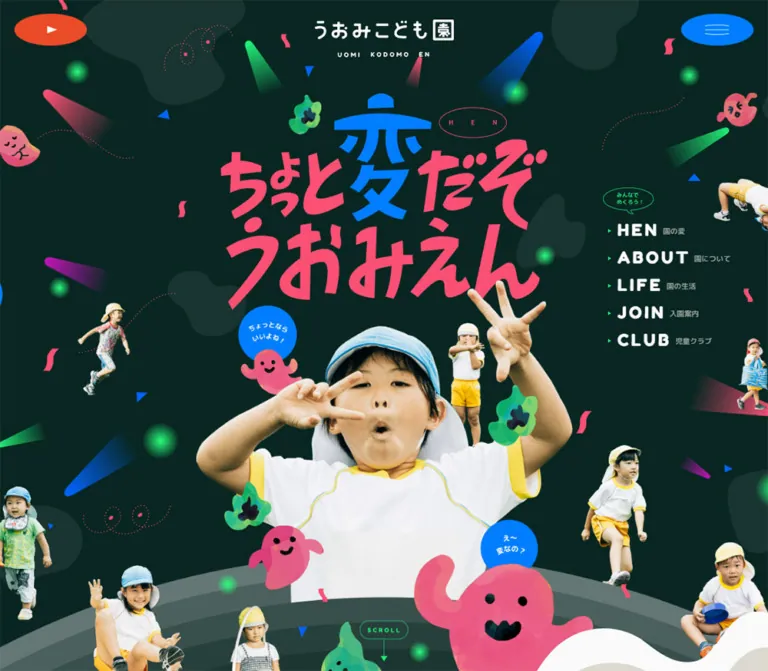
うおみこども園|切り抜き写真とお化けが彩る遊び心ある公式サイト
深緑の背景に鮮やかなピンクと青の文字、園児の切り抜き写真、お化けのイラストを重ねた公式サイト。楕円の操作部や立体的な装飾、スマートフォンで組み替わる大胆な構図が園の個性を伝える。
Uomi Kodomoen — Style Reference
A dark green playground filled with expressive children, mischievous ghosts, and electric-colored lettering.
Website: uomi.jp Original URL: https://uomi.jp/ Final URL: https://uomi.jp/ Theme: dark green foundation with vivid accents and a contrasting light story section; no theme selector was evidenced. Inspected: supplied browser capture dated September 24, 2026, 06:23:39 JST — September 23, 2026, 21:23:39.861 UTC. Viewports: 1440 × 1000 desktop and 390 × 844 mobile, in CSS pixels. Scope: the current school homepage. Visual evidence covers the opening composition, desktop dance-video feature, and desktop/mobile closing artwork. Rendered DOM evidence additionally covers the introduction, special-content teaser, news strip, content gateways, contact information, and navigation. Linked pages and activated menu/video states were not inspected.
Uomi Kodomoen presents an early-childhood education and care institution through a deliberately eccentric visual world. The opening statement, “ちょっと変だぞ うおみえん,” becomes enormous graphic lettering above a child making an expressive face. Smaller photographic figures float around the main portrait alongside patchwork ghosts, green flame-like characters, dotted curls, confetti, colored light cones, and luminous spots.
The dark canvas gives the saturated pink, blue, and green room to stand out. White-and-yellow school clothing connects the photographic cast, while rounded interface typography keeps practical information friendly. Ellipses recur as menu controls, navigation links, speech bubbles, and the large video window. At the bottom, the same slogan returns with a dimensional pink character above a parade of children standing on colored cylinders.
This is a complete institutional homepage. Its personality supports routes to school information, daily life, admissions, an after-school club, news, recruitment, access, and contact. Preserve that useful information structure when adapting the visual language.
閉じる
Uomi Kodomoen — Style Reference
A dark green playground filled with expressive children, mischievous ghosts, and electric-colored lettering.
Website: uomi.jp Original URL: https://uomi.jp/ Final URL: https://uomi.jp/ Theme: dark green foundation with vivid accents and a contrasting light story section; no theme selector was evidenced. Inspected: supplied browser capture dated September 24, 2026, 06:23:39 JST — September 23, 2026, 21:23:39.861 UTC. Viewports: 1440 × 1000 desktop and 390 × 844 mobile, in CSS pixels. Scope: the current school homepage. Visual evidence covers the opening composition, desktop dance-video feature, and desktop/mobile closing artwork. Rendered DOM evidence additionally covers the introduction, special-content teaser, news strip, content gateways, contact information, and navigation. Linked pages and activated menu/video states were not inspected.
Uomi Kodomoen presents an early-childhood education and care institution through a deliberately eccentric visual world. The opening statement, “ちょっと変だぞ うおみえん,” becomes enormous graphic lettering above a child making an expressive face. Smaller photographic figures float around the main portrait alongside patchwork ghosts, green flame-like characters, dotted curls, confetti, colored light cones, and luminous spots.
The dark canvas gives the saturated pink, blue, and green room to stand out. White-and-yellow school clothing connects the photographic cast, while rounded interface typography keeps practical information friendly. Ellipses recur as menu controls, navigation links, speech bubbles, and the large video window. At the bottom, the same slogan returns with a dimensional pink character above a parade of children standing on colored cylinders.
This is a complete institutional homepage. Its personality supports routes to school information, daily life, admissions, an after-school club, news, recruitment, access, and contact. Preserve that useful information structure when adapting the visual language.
How to Read This Reference
- Measured means reported by the supplied rendered DOM, computed styles, or custom properties. Measurements are rounded where subpixel precision would not help implementation.
- Calculated means arithmetic derived from those measurements, such as gaps, aspect ratios, or resolved viewport formulas.
- Estimated means visually judged from the five current-page screenshots. These values are not pixel samples or recovered source declarations.
- Recommended means implementation guidance for a new project. It does not establish an existing feature of the original site.
- All custom-property names introduced with an
--uomi-prefix are implementation aliases. Original variable names are identified separately. - The source root font size is 10px at both inspected widths. Parent elements frequently inherit a 10px font size while nested labels or artwork appear much larger; do not use parent styles to infer the size of image lettering.
- Offscreen navigation and repeated news elements appear in the DOM evidence. Their presence does not prove that an overlay was opened or a carousel was operated.
Tokens — Colors
Default Palette
| Name | Value | Evidence / source token | Role |
|---|---|---|---|
| Forest canvas | #082622 |
Measured body background; --color-bg |
Dominant page background |
| Soft white | #fafafa |
Measured text color; --color-txt |
Copy, navigation, logo treatment, and reversed details |
| Electric blue | #007dff |
--color-blue; measured English section labels |
Navigation accent, graphic lettering, and blue decorative elements |
| Punch pink | #fa5073 |
Measured news-date color, converted from rgb(250, 80, 115) |
Reusable pink matching the visual family of the slogan and ghosts; exact artwork pixels were not sampled |
| Bright green | #23f078 |
--color-green; measured special-content text |
Tiny arrows, outlines, utility accents, and selected decorative details |
| Movie orange | #eb4b28 |
--color-movie; measured video badge background |
Video identity and orange play-control family |
| Aqua | #2adcdc |
--color-cyan; measured dance introduction text |
Dance-section accent |
| Feature green | #00b478 |
--color-green4; measured special-feature text |
Card-feature introduction and some news dates |
| Golden yellow | #fab400 |
--color-orange; measured news-date color |
Supporting accent; photographic and illustrated yellows vary independently |
| Purple | #bd15b4 |
Measured news-date color | Secondary member of the repeating news accent sequence |
The palette is broad but organized. Forest green carries the page, soft white carries ordinary information, and saturated colors identify artwork, section character, and compact controls. Avoid giving every paragraph or link an unrelated color.
Supporting Surfaces and Lines
| Name | Value | Status | Use |
|---|---|---|---|
| Secondary forest | #223d3a |
Declared as --color-bg2 and --color-txt3 |
Available secondary dark tone; individual background-blob fills were not measured |
| Story ink | #39514d |
Measured introduction text; --color-txt6 |
Dark copy on the light introduction surface |
| Gray-green lines | #6b7875, #6c7e7c, #647774 |
Declared line tokens | Supporting separators and tonal structure; exact assignments are not fully exposed |
| Dark overlay | rgba(8, 38, 34, .95) |
Declared --color-overlay |
Overlay color configuration; activated overlay appearance was not captured |
| Light story ground | Approximately #dedbd2 |
Visual estimate from the mobile section boundary | Provisional adaptation color for the warm gray surface |
| Pure white | #ffffff |
Declared --color-bg7 |
Available light surface; do not assume every pale graphic uses this exact value |
The mobile opening shows a thick pale wavy edge around the light section. Several gray-green arcs sit above it. These overlapping bands create a landscape-like boundary instead of a straight section divider.
The source also declares #00c83c and #fa9500. Their precise component assignments are not established by the supplied sample, so they are supporting palette options rather than essential reproduction targets.
Tokens — Typography
Japanese Copy — M PLUS Rounded 1c
- Measured family:
'M PLUS Rounded 1c', sans-serif. - Measured weight: predominantly
700in the supplied elements. - Character: rounded, friendly, sturdy, and readable against busy artwork.
- Roles: Japanese paragraphs, section introductions, news titles, navigation descriptions, and contact information.
- Implementation alias:
--uomi-font-body.
Long paragraphs use generous leading. The desktop introduction is 18px with a 36px line height; the mobile version is 13px with a 26px line height. The smaller mobile size is an observation, not a universal readability recommendation.
English Labels — Fredoka One
- Measured family:
'Fredoka One', sans-serif. - Measured weight:
400. - Roles: English section labels, special-content labels, and video captions.
- Tracking: commonly
0.1em,0.2em, or0.3em, depending on hierarchy. - Implementation alias:
--uomi-font-display.
The rounded Latin forms complement the Japanese body font. Their visual weight comes from the font design; replacing the measured 400 weight with an arbitrary heavy weight can distort the result.
Graphic Lettering and Identity
The main slogan is custom-looking artwork with irregular character sizes, angles, and spacing. In the opening, the central “変” is blue while surrounding lettering is pink. In the closing composition, the central character is pink and visibly dimensional, surrounded by blue lettering.
Treat these compositions as art assets with text equivalents. Their exact font, asset format, and rendering technique are not exposed. A normal text heading set in M PLUS Rounded 1c will not reproduce them.
The centered school mark is also visibly graphic. Its measured H1 has empty extracted text and a nominal 20px computed font size; that number does not describe the lettering inside the mark. The HTML element's default Times family likewise does not establish a visible serif style.
Type Scale
All values below are measured unless identified otherwise.
| Role | Desktop size / leading | Mobile size / leading | Tracking / notes |
|---|---|---|---|
| Introduction paragraphs | 18px / 36px |
13px / 26px |
Rounded Japanese, weight 700 |
| Introduction concluding statements | 53px / 53px |
31px / 31px |
Separate paragraph boxes include additional vertical space |
| Introduction English label | 16px / 16px |
12px / 12px |
0.2em |
| Special-feature Japanese introduction | 30px / 54.45px |
20px / 36px |
Green, three-line treatment in extracted content |
| Dance Japanese introduction | 30px / 30px |
20px / 29px |
0.06em; mobile explicitly wraps to two lines |
| Feature English captions | 18px / 18px |
14px / 14px |
0.1em |
| Feature and dance body copy | 16px / 34px |
12px / 24px |
Weight 700 |
| News Japanese heading | 20px / 20px |
14px / 14px |
White |
| NEWS label | 30px / 30px |
21px / 21px |
Blue, 0.2em |
| News article titles | 18px / 32px |
13px / 23px |
Height expands with wrapping |
| Video micro-labels | 12px / 12px |
10px / 10px |
Fredoka One |
| Offscreen sitemap category links | 14px / 14px |
12px / 12px |
Open-state appearance not inspected |
| Offscreen SPECIAL CONTENTS label | 18px / 18px |
13px / 13px |
0.3em |
| Offscreen HEN label | 49px / 49px |
35px / 35px |
0.3em |
The desktop hero navigation's large English labels appear approximately 27–29px in the screenshot. This is a visual estimate: the supplied anchor styles expose the parent size, not the nested label's actual font size.
Tokens — Spacing & Shapes
Primary geometry: ellipses, circles, irregular organic silhouettes, broad arcs, and vertical cylinders. Density: detailed illustration fields around comparatively narrow, calm text blocks. Scaling: component-specific. The phone composition is not a uniformly reduced desktop canvas.
Measured Geometry
| Element | Desktop | Mobile | Notes |
|---|---|---|---|
| Centered school mark | 192 × 52px, top 32px |
117 × 31.7px, top 16px |
Approximately 3.69:1 aspect ratio |
| Corner utility buttons | 100 × 44px |
51 × 23px |
Measured border-radius: 50% |
| Utility horizontal inset | 24px |
13px |
Symmetrical left and right |
| Utility top position | 19px |
15px |
Visual button bounds |
| Large oval destination link | 253 × 112px |
182 × 80px |
ABOUT and HEN examples |
| Desktop news archive link | 153 × 68px |
Not measured | Elliptical anchor |
| Scroll-cue box | 80 × 66.6px |
48 × 39.9px |
Includes more than the small outlined label |
| Video window/button | 1283 × 570px |
441 × 195.9px |
Approximately 2.25:1 at both sizes |
| Video badge | 158 × 44px |
94 × 22px |
Lower corner radii 13px / 7px |
| News item width | 324px |
233px |
Item heights vary with title length |
| News item pitch | 370px |
265px |
Calculated from adjacent item coordinates |
| News item gap | 46px |
32px |
Calculated pitch minus width |
The recurring ellipse proportion is close to 2.25:1. This relationship ties together the small controls, destination links, and enormous movie window. Use a percentage radius on a deliberately wide rectangle; a conventional capsule with long straight edges produces a different silhouette.
Content Widths
| Region | Desktop measurement | Mobile measurement |
|---|---|---|
| Introduction copy | 508px, beginning near x 802px |
312px, beginning at x 39px |
| Special-feature content container | 1180px, x 130px |
312px, x 39px |
| Dance description | 580px, centered |
312px, centered |
| Dance/video outer width | 1283px, x 78.5px |
Video extends about 25.5px beyond each viewport edge |
| News heading container | 990px, x 225px |
Approximately 332.8px, x 28.6px |
Different sections use different widths. Do not force the entire homepage into one universal 1200px container.
Source Spacing Formulas
The mobile custom properties explicitly use a 375-unit design reference. At the inspected 390px width:
| Source property | Supplied formula | Calculated value |
|---|---|---|
--contents-md |
300 / 375 × 390px |
312px |
--contents-sm |
280 / 375 × 390px |
291.2px |
--outside-xs |
17.5 / 375 × 390px |
18.2px |
--outside-xl |
50.5 / 375 × 390px |
52.52px |
At desktop, the supplied content-width properties are 92%, while outside properties are 4%. Actual measured regions are often narrower, indicating additional component constraints. Those complete constraints were not supplied.
Shape and Layer Rules
- Use true ellipses for important controls and media framing.
- Use circles for small speech bubbles, with short white Japanese remarks.
- Keep decorative organic shapes oversized, low contrast, and partly cropped by the page edge.
- Reserve shading and gradients for illustrative depth: light cones, glows, the dimensional slogan, and footer cylinders.
- Avoid adding a general card-shadow system. No such system is demonstrated in the captured compositions.
- The source declares very high header and sitemap z-index values. Preserve the priority of utilities above artwork; a new implementation can use a smaller, isolated layer scale.
Components
Header and Corner Utilities
Role: establish school identity and retain access to global actions.
The school mark is centered independently of the left and right controls. On desktop it occupies a 192px-wide box; on mobile it narrows to 117px. This is a three-point arrangement, with broad empty space between the identity and controls.
The left oval is orange with a small white play triangle. The right oval is blue with three fine, slightly curved white strokes. Their visual treatment is deliberately lighter than the large slogan below.
Both corner controls remain in the same screen corners in the supplied scrolled screenshots. A fixed implementation is consistent with that evidence, although the supplied element records do not include the CSS position property. The center logo is not visible at the top of the scrolled captures.
The play affordance and menu affordance are clear; their activated behavior was not captured. Do not invent a menu animation sequence, video destination, or modal layout from the icons alone.
Opening Collage
Role: express the school's personality before the explanatory content begins.
The main visual consists of several independently composed layers:
- A forest background with larger, slightly lighter organic patches.
- Small confetti, dotted curls, colored cones, and glowing points.
- An oversized Japanese slogan.
- A dominant photographic child cutout overlapping the slogan's lower area.
- Smaller child cutouts distributed around the outer field.
- Pink ghosts, green characters, and blue speech bubbles placed across foreground and background.
- Curved ground bands and the transition into the next section.
In the desktop screenshot, the slogan occupies approximately x 450–995 and y 150–505. The main child spans roughly x 410–1030 in the visible lower composition. These are visual estimates, not element measurements.
On mobile, the slogan spans nearly the entire useful width, and the main child reaches almost from edge to edge. Peripheral figures are selectively reduced or omitted. The most important overlaps remain: hand against headline, ghost against lower portrait, and foreground character against the section boundary.
Keep the dominant face readable. Decorative density is concentrated around the edges and between meaningful shapes rather than laid evenly over everything.
Desktop Quick Navigation
Role: provide direct routes without obscuring the hero.
A right-side stack contains five links: HEN, ABOUT, LIFE, JOIN, and CLUB, each paired with a smaller Japanese label. A small outlined green speech bubble sits above the stack, and green triangular markers precede the links.
Measured anchors begin at approximately x 1087px, with a width of 201.7px. Each row is 21px high, and starts are 45px apart, producing about 24px of separation between row boxes.
The desktop group is absent from the mobile hero screenshot and mobile visible-text sequence. The corner menu affordance remains. Do not compress this five-row group over the child's face on a phone.
Scroll Cue and Section Boundary
Role: indicate continuation while maintaining the illustrated world.
The mobile screenshot clearly shows a small green outlined SCROLL oval above a fine downward indicator, centered among the curved ground bands. Its measured containing box is 48 × 39.9px at y approximately 607px. The desktop counterpart begins around y 1001px, just below the first 1000px capture.
This element has verified floating animation in its computed style. Its exact travel distance is unknown. The shape, green outline, and restrained size matter more than exaggerating its movement.
The next section starts at document y 1108px on desktop and 672px on mobile. Illustrations and waves overlap those layout boundaries, so the visual transition is not a single horizontal line.
Introduction and Manifesto
Role: explain the school's philosophy in a slower reading rhythm.
The introduction uses dark gray-green text on a contrasting light area. On desktop, the measured copy occupies a 508px column on the right. On mobile, it becomes a 312px column centered with 39px side margins and follows a substantial visual region.
An English label, CHOTTO HEN / UOMI EN, precedes several Japanese paragraphs. The concluding statements “ちょっと変。” and “それは、愛だ。” grow to 53px desktop and 31px mobile. A large oval ABOUT link follows.
The page uses deliberate line breaks and roughly double leading. Preserve the reading pauses. Avoid turning this text into tightly packed marketing bullets or placing it in a floating card.
Only the upper light-section boundary is visible in the supplied mobile image. The paragraph geometry and colors come from the DOM rather than a complete screenshot of this section.
Special-Content Teaser
Role: introduce the school's ten illustrated mysteries and link to /hen/.
The content sequence is a green Japanese introduction, a large graphic heading, the English caption LET’S TURN ON THE CARD!, descriptive copy, and an oval HEN link. The original copy explicitly describes ten cards illustrated with ghost motifs.
The graphic heading's measured box is approximately 424 × 244px on desktop and 294 × 169px on mobile. Its extracted heading text is empty, so the nominal 15px computed font size must not be mistaken for the visual heading scale.
The mobile HEN link is centered and appears substantially below the descriptive paragraph, leaving room for the visual feature. Its measured size is 182 × 80px.
The existence of the ten-card concept is supported by page text. A card-flip interaction, its trigger, and its behavior were not tested. The homepage link does not by itself prove that the complete card interaction occurs on this page.
Dance Video Feature
Role: turn the school's original dance into a prominent media destination.
The section begins with a cyan Japanese question, graphic title, English caption, and a narrow paragraph. Beneath it is a very large elliptical video preview. The captured poster shows a costumed dog character against turquoise, yellow, orange, and white scenery, with large Japanese lettering across the image.
The media control has four clear parts:
- An elliptical poster, measured at 1283 × 570px on desktop.
- An orange top-center badge labeled
UOMI EN TV. - A large orange central play ellipse with a white triangle.
- Small white
HEN NA DANCEandLET’S DANCElabels above and below the central control.
The central orange play ellipse appears approximately 237 × 105px in the desktop screenshot; its complete box was not separately measured. Nearby caption boxes are 237px wide.
Ghosts with blue speech bubbles overlap the media composition. Gray-green arcs frame its lower edge, and a photographic child on a swing descends below the window. These elements connect the media section to the same collage system used in the hero.
On mobile, the button measures approximately 441 × 196px in a 390px viewport. Its centered overflow is intentional in the measured composition. Keep essential controls near the center and clip decorative overflow locally so the document does not acquire horizontal scrolling.
The DOM identifies this feature as a button. Playback, provider, sound policy, modal behavior, and fullscreen behavior remain unverified.
News Strip
Role: expose current school activity within the expressive homepage.
The news heading combines a small Japanese label with a larger blue NEWS label. A desktop oval archive link sits at the other end of the 990px-wide header region.
Each measured news anchor contains a top visual region followed by a date block, article title, and category. Items are 324px wide on desktop and 233px on mobile. Horizontal gaps calculate to 46px and 32px respectively. The title uses rounded Japanese text and expands from one to multiple lines without a fixed single-line height.
Date colors repeat through pink, purple, yellow, blue, and green. Measured vertical offsets also vary between items. Preserve this loose rhythm instead of aligning every element to a rigid card grid.
The supplied DOM repeats the same ten article links three times and places many copies far offscreen. This supports a repeated horizontal-strip structure; it does not establish autoplay speed, swipe behavior, or the exact carousel implementation. Treat the data as ten articles, not thirty unique posts.
The mobile extracted reading order places the archive link after the news items, while desktop places it before them. The precise responsive implementation was not exposed. Image crops, image masks, and visible slider controls were not included in the supplied screenshots.
Content Gateways and Contact
Role: make the school usable as an information resource.
The rendered content includes ABOUT, LIFE, JOIN, and an after-school club feature, each with Japanese explanatory copy and a destination link. The club area also links to its news category.
Contact information includes a telephone link, weekday reception hours, and a MAIL FORM link to /contact/. The original-page text names the institution as “社会福祉法人遊星福祉会うおみこども園” and provides its Ibusuki address.
These regions are confirmed by rendered content and links, but their complete visual layouts were not captured. A new implementation should preserve clear route hierarchy and legible contact information; it should not claim that an invented card grid reproduces these unseen regions.
Global Sitemap
Role: offer comprehensive access beyond the five hero shortcuts.
The DOM includes routes for home, school information, daily life, admissions, club, recruitment, access, contact, and news, together with six news categories and a special-content promotion.
Measured desktop positions indicate several navigation groups alongside the special feature. The mobile offscreen arrangement uses two principal columns, followed by the special feature and institution details.
All of these sampled menu elements have negative vertical coordinates in the initial state. They describe a prepared offscreen structure, not an inspected open overlay. A source sitemap-transition token exists, but focus behavior, close controls, scroll locking, and open-state composition remain unverified.
Closing Illustration and Page Top
Role: end the long homepage with a memorable reprise of the opening identity.
The closing screen returns to the forest background, dotted pink curls, small triangles, blue confetti, and glowing pink points. The slogan now has a dimensional pink “変” surrounded by blue lettering.
Below it, cutout children and an adult figure appear above tall colored cylinders. The cylinders use visible side shading and elliptical tops, creating a toy-like stage. Figures overlap their supports freely: some stand, some crouch or jump, and one holds a pole.
A white geographic emblem labeled KAGOSHIMA / IBUSUKI, the copyright ©UOMIKODOMOEN., and a green-arrow PAGE TOP link form a centered stack among the columns. The recorded link target is https://uomi.jp/#document-top; smooth-scrolling behavior was not demonstrated.
The mobile slogan is recomposed into a much narrower vertical arrangement. Fewer columns fit across the crop, but the centered geographic mark and copyright remain prominent. Estimated pillar widths are roughly 54–58px on desktop and 24–28px on mobile.
The dimensional lettering and shaded columns are visual observations. Their appearance does not prove WebGL, live 3D rendering, or any particular animation library.
Tokens — Motion & Interaction
Element-Level Evidence
| Treatment | Measured value | What is established |
|---|---|---|
| Scroll-cue floating | 3.6s cubic-bezier(0.77, 0, 0.175, 1) infinite floating |
A continuous CSS animation is assigned to the cue |
| Scroll-cue entrance | Opacity and transform, 800ms, 1200ms delay, cubic-bezier(0.165, 0.84, 0.44, 1) |
Delayed reveal configuration exists |
| Many links and buttons | 0.3s transition |
Transition duration is measured; end-state styling is not fully supplied |
| News article title | color 0.3s |
Color can transition; actual hovered color was not captured |
Declared Motion Configuration
These are source custom properties. They are not proof that each named effect was activated during capture.
| Source token | Value | Evidence limit |
|---|---|---|
--animation-floating |
3600ms cubic-bezier(0.77, 0, 0.175, 1) |
Also confirmed on the scroll cue |
--transition-sitemap |
660ms cubic-bezier(0.86, 0, 0.07, 1) |
Menu open/close sequence untested |
--transition-modal |
300ms ease |
Modal state untested |
--transition-mask |
1500ms cubic-bezier(0.77, 0, 0.175, 1) |
Mask target and geometry unverified |
--transition-curtain |
1050ms cubic-bezier(0.77, 0, 0.175, 1) |
Curtain sequence unverified |
--transition-slideup |
1100ms cubic-bezier(0.86, 0, 0.07, 1) |
Element assignment not established |
--transition-fadedown |
800ms cubic-bezier(0.165, 0.84, 0.44, 1) |
Related timing appears on the scroll cue |
--transition-trapeze |
2800ms cubic-bezier(0.68, -0.55, 0.265, 1.55) |
Suggests an overshooting configuration; exact swing behavior unverified |
--transition-hover-loop |
1800ms linear |
Hover loop not exercised |
--hover-scale2 / --hover-opacity |
1.1 / 0.8 |
Available interaction values; component assignments unverified |
The motion vocabulary includes both slow floating and elastic easing. Keep essential navigation stable while decorative elements move around it. Do not add identical bouncing to every photograph or infer parallax from a single frame.
The capture procedure temporarily paused perpetual animations during readiness checks and resumed them afterward. Static screenshots cannot establish complete paths, synchronization, scroll linkage, or reduced-motion support.
Surfaces
| Layer | Appearance | Purpose |
|---|---|---|
| Main canvas | Solid deep forest green | Continuous world across large parts of the homepage |
| Background decoration | Low-contrast organic patches | Depth without competing with text |
| Introductory reading area | Warm light ground with dark gray-green copy | A quieter philosophical reading passage |
| Interactive accents | Blue, orange, or outlined green ellipses | Compact, recognizable action shapes |
| Media surface | Large elliptical photograph/poster | Prominent dance feature |
| Section boundaries | Layered arcs and a pale irregular wave | Connect scenes without rectangular cards |
| Illustrative depth | Shaded cylinders, extruded lettering, translucent cones, glows | Playful physicality within artwork |
| Overlay configuration | Near-opaque forest green | Declared separation treatment; activated view unverified |
There is no demonstrated requirement for glass blur, elevated white cards, or a general drop-shadow hierarchy. Most depth comes from overlap, scale, color, and asset-specific shading.
Imagery
Photography and illustration have different textures but share one composition. The children remain photographic, with natural skin, clothing, and expressive poses. Ghosts are irregular, patchy, and brightly colored. Their simple dark faces are legible at very small sizes.
The dominant portrait has a clean cutout edge and a clear face. Smaller portraits show movement, play, hoops, and unusual poses. They are not arranged as staff avatars or uniform circular crops. Some extend outside the visible frame, creating the impression of a larger world.
The decorative inventory is specific: pink ghost silhouettes, green flame-like faces, blue circular remarks, tiny triangles, short curved confetti strips, dotted spirals, soft light spots, and tapering spotlight shapes. Keep a limited vocabulary and vary scale, placement, and orientation.
Use normal high-quality image rendering for photography. Pixelated scaling would conflict with the observed cutouts. Keep transparent assets uncropped where hands, hats, or feet are part of the gesture.
Observed Asset References
No original image URLs or asset filenames were supplied. The following are descriptive production slots, not recovered file paths.
| Asset slot | Current visual evidence | Implementation guidance |
|---|---|---|
| School mark | Desktop/mobile opening | Preserve proportions and a meaningful home-link name |
| Opening slogan | Desktop/mobile opening | Use artwork with a text alternative; preserve the blue central character |
| Main portrait | Desktop/mobile opening | Transparent cutout; protect the face and expressive hands |
| Supporting figures | Opening and closing captures | Keep varied scale and silhouette; omit peripheral figures selectively on phones |
| Ghost and green-character set | Opening, video, and closing | Reuse related silhouettes and patchwork fills |
| Video poster | Desktop dance capture | Separate poster crop from overlaid labels and play control |
| Swinging-child composition | Below desktop video | Maintain rope/chain continuity and sufficient overflow space |
| Closing slogan | Desktop/mobile closing | Separate responsive composition; dimensional pink central character |
| Cylinders and geographic emblem | Desktop/mobile closing | Retain shaded cylindrical form and centered location identity |
| Background ornaments | All captured scenes | Place behind content and remove from the accessibility tree |
CSS can reproduce the shell, spacing, ellipses, and simple stage geometry. It cannot replace the expressive poses, custom lettering, or character artwork that carry the identity.
Layout & Responsive Behavior
Page Structure
The measured document is approximately 9780px tall on desktop and 8783px on mobile. The shorter mobile document reflects substantial changes in image scale, spacing, and typography; it is not evidence of missing content.
| Section | Desktop document position / height | Mobile document position / height |
|---|---|---|
| Introduction | y 1108px, height 1450px |
y 672px, height 1488px |
| Special-content teaser | y 2558px, height 1167px |
y 2160px, height 1214px |
| Dance feature | y 3917px, height 1363px |
y 3585px, height 809px |
| News | y 5453px, height 806px |
y 4525px, height 631px |
These are snapshots of layout geometry, not recommended fixed heights for text-bearing sections. Artwork overflow and inter-section gaps mean that visual scene boundaries do not always match section boxes.
Observed Mobile Changes
- The school mark and corner controls shrink by different factors.
- The five-link desktop hero navigation disappears from the visible mobile opening.
- The central portrait becomes nearly full width while peripheral artwork is selectively reduced.
- The first story section begins within the initial 844px mobile viewport, with a pronounced wavy boundary.
- Introduction copy moves from a right-side desktop column to a centered 312px mobile column.
- Japanese copy and English captions use smaller explicit sizes while retaining generous line height.
- The dance question wraps to two lines.
- The video retains its approximately 2.25:1 ratio and becomes wider than the phone viewport.
- News items remain in a horizontal strip, with smaller item widths and gaps.
- The closing slogan changes composition into a vertical stack rather than merely scaling down.
Breakpoint Evidence
The supplied variables include the paired --mqDown-md: 767 and --mqUp-md: 768, plus thresholds such as 561, 1023, 1281, and 1441. These are declared breakpoint values. The exact media-query assignment for each component was not supplied.
A 767px breakpoint is therefore a sensible adaptation choice, but behavior at 560px, 768px, tablets, and intermediate desktop widths must be tested in a new implementation. Only 390px and 1440px were visually evidenced.
Practical Layout Rules
Use normal document flow for text and information. Place decorative scenes in their own positioned containers with reserved space. Clip horizontal overflow around illustration and media fields, not around the entire page in a way that can hide focused controls.
Keep header utilities above the collage. Preserve meaningful images and labels in the reading order even when their visual position is absolute. Let longer news titles and contact copy expand instead of forcing all elements into the captured heights.
Do’s and Don’ts
Do
- Anchor the design in the measured forest background
#082622. - Preserve the strong pink-and-blue slogan relationship and green utility accents.
- Use photographic cutouts with expressive, varied poses.
- Keep ghost illustrations irregular, colorful, and visually related across sections.
- Repeat the approximately 2.25:1 ellipse proportion across controls and media.
- Use M PLUS Rounded 1c for Japanese copy and Fredoka One for measured English-label roles.
- Preserve generous line height and calm paragraph columns.
- Recompose important artwork for mobile instead of scaling every layer uniformly.
- Maintain clear links to admissions, daily life, school information, club, news, and contact.
- Treat the closing illustration as a substantial scene with its own responsive composition.
- Distinguish source motion declarations from interactions that have actually been verified.
Don’t
- Don’t replace the expressive collage with a generic school-photo slideshow.
- Don’t approximate the custom slogan by enlarging the body font.
- Don’t cover the main face or key controls with decorative characters.
- Don’t turn every content block into a rounded, shadowed card.
- Don’t force one content width across introduction, video, and news.
- Don’t make mobile a cropped desktop screenshot.
- Don’t remove the light reading passage and make all sections equally intense.
- Don’t assume repeated news copies represent distinct articles.
- Don’t claim card flipping, autoplay, parallax, menu focus behavior, or live 3D rendering without evidence.
- Don’t copy the source's 10px root-dependent rem values into a project with a 16px root without conversion.
Recommended Implementation Additions
These are recommendations for a new implementation, not verified original-site features:
- Preserve the small mobile oval appearance inside a hit area at least 44px high. The measured original visual buttons are only 23px high on mobile.
- Give the menu and play controls explicit accessible names. If the menu is a dialog, implement focus management, Escape closing, and focus restoration.
- Give the slogan a meaningful text equivalent. Use empty alternatives and
aria-hiddenfor purely decorative duplicate figures and ornaments. - Consider increasing mobile explanatory copy from the observed 12–13px to 15–16px, with content sections allowed to grow.
- Keep an obvious focus indicator above busy imagery, using a light outline against the dark canvas.
- Offer reduced-motion behavior for floating, swinging, and any repeated horizontal movement. Keep the static composition complete.
- If the news strip moves automatically, provide a pause control and a keyboard-operable way to reach each unique article. Hide nonessential cloned copies from assistive technology.
- Load the hero portrait and slogan promptly; reserve image dimensions and defer lower-page decorative assets to avoid layout shifts.
- Use a poster and explicit play action for media. Add captions or a transcript where the video contains meaningful spoken or sung content.
- Preserve the design under text zoom, intermediate widths, and longer real content; do not use captured section heights as hard text constraints.
Agent Prompt Guide
Quick Color Reference
- Main canvas:
#082622. - Main text:
#fafafa. - Blue identity accent:
#007dff. - Pink accent:
#fa5073, measured on news dates and suitable as a related graphic color. - Bright outline/arrow accent:
#23f078. - Video accent:
#eb4b28. - Dance caption accent:
#2adcdc. - Special-feature text:
#00b478. - Introduction ink:
#39514d. - Light story ground: approximately
#dedbd2, an estimated adaptation value.
Overall Prompt
“Design a complete early-childhood school's homepage inspired by Uomi Kodomoen. Use a deep forest canvas #082622, vivid pink and electric-blue custom slogan artwork, natural photographic child cutouts, playful patchwork ghosts, and sparse neon-green utility details. Center a small school mark between orange play and blue menu ellipses. Build the opening as a layered scene with one dominant expressive portrait and smaller peripheral figures. Follow it with a quieter light-background philosophy section, a special-content teaser, a large elliptical dance-video preview, a horizontal news strip, practical school-information routes, and contact details. End with a recomposed slogan above children on shaded colored cylinders. Use rounded Japanese copy, Fredoka One English labels, generous leading, and deliberate mobile art direction. Preserve readable information and accessible controls.”
Example Component Prompts
- Opening scene: “Create a dark green illustration field with a large pink-and-blue Japanese slogan above an expressive transparent portrait. Add a restrained set of pink ghosts, green characters, blue speech bubbles, dotted curls, and colored cones. Leave the face clear. Put five English/Japanese navigation links at the right on desktop and omit this group from the phone hero.”
- Oval utilities: “Create an orange video control and blue menu control in opposite upper corners. Use true ellipses at a roughly 2.25:1 ratio, white minimal symbols, and no elevation shadow. On mobile, retain a 51 × 23px visual inside a 44px-high accessible target.”
- Video feature: “Build an approximately 2.25:1 elliptical poster window with an orange top-center badge, a large central orange play ellipse, and small white English captions. Add two related ghost characters outside the poster and layered gray-green arcs beneath it. Allow controlled horizontal overflow on phones.”
- News strip: “Create a transparent horizontal news list on forest green. Use 324px items with 46px gaps on desktop and 233px items with 32px gaps on mobile. Stack media, colored date, rounded Japanese title, and category. Cycle the date accent through pink, purple, yellow, blue, and green. Keep long titles readable and expose unique articles only once to assistive technology.”
- Closing scene: “Place a dimensional pink central Japanese character within a blue slogan above a row of photographic figures on shaded colored cylinders. Center a small white location emblem, copyright, and green-arrow page-top link among the columns. Recompose the slogan vertically and crop peripheral columns on mobile.”
Quick Start
CSS Custom Properties
This is an implementation scaffold, not recovered source CSS. It uses ordinary pixel and rem units without changing the document root. Measured colors, font stacks, and key dimensions are retained; illustrative positions, focus behavior, simplified cylinder shading, and reduced-motion handling are recommendations.
Load the two evidenced fonts separately. Supply the school mark, slogan, transparent portraits, poster, and character artwork through your own asset pipeline; no original asset URLs were available in the evidence.
Suggested structure: .school-site contains a .hero, ordinary content sections, a .movie-stage, a .news-track, and a closing section. Place meaningful slogan imagery in a heading, keep decorative layers separate, and use real links and buttons for controls.
:root {
  /* Measured source colors and direct implementation aliases. */
  --uomi-bg: #082622;
  --uomi-bg-secondary: #223d3a;
  --uomi-text: #fafafa;
  --uomi-blue: #007dff;
  --uomi-pink: #fa5073;
  --uomi-green: #23f078;
  --uomi-feature-green: #00b478;
  --uomi-movie: #eb4b28;
  --uomi-cyan: #2adcdc;
  --uomi-yellow: #fab400;
  --uomi-purple: #bd15b4;
  --uomi-story-ink: #39514d;

  /* Estimated from the visible light section, not a source token. */
  --uomi-paper: #dedbd2;

  --uomi-font-body: 'M PLUS Rounded 1c', sans-serif;
  --uomi-font-display: 'Fredoka One', sans-serif;
  --uomi-content: 1180px;
  --uomi-copy: 580px;
  --uomi-news-width: 324px;
  --uomi-news-gap: 46px;
  --uomi-control-width: 100px;
  --uomi-control-height: 44px;
  --uomi-control-inset: 24px;
  --uomi-ellipse: 50%;
  --uomi-ease-float: cubic-bezier(.77, 0, .175, 1);
  --uomi-ease-panel: cubic-bezier(.86, 0, .07, 1);
  --uomi-motion-control: 300ms;
}

.school-site,
.school-site * {
  box-sizing: border-box;
}

.school-site {
  color: var(--uomi-text);
  background: var(--uomi-bg);
  font-family: var(--uomi-font-body);
  font-size: 16px;
  font-weight: 700;
  line-height: 2;
}

.school-site img {
  display: block;
  max-width: 100%;
}

.school-site button,
.school-site a {
  -webkit-tap-highlight-color: transparent;
}

.school-site button {
  font: inherit;
  cursor: pointer;
}

.school-site :focus-visible {
  outline: 3px solid var(--uomi-text);
  outline-offset: 5px;
}

.content-width {
  width: min(92%, var(--uomi-content));
  margin-inline: auto;
}

.section-copy {
  max-width: var(--uomi-copy);
  margin-inline: auto;
  font-size: 16px;
  line-height: 2.125;
}

.english-label {
  font-family: var(--uomi-font-display);
  font-size: 18px;
  font-weight: 400;
  line-height: 1;
  letter-spacing: .1em;
}

/* Recommended interpolation between captured artwork layouts. */
.hero {
  position: relative;
  min-height: clamp(900px, 77vw, 1108px);
  isolation: isolate;
}

.hero__art {
  position: absolute;
  inset: 0;
  overflow: hidden;
  pointer-events: none;
  z-index: 0;
}

.brand {
  position: absolute;
  top: 32px;
  left: 50%;
  width: 192px;
  transform: translateX(-50%);
  z-index: 3;
}

.hero__slogan,
.hero__portrait {
  position: absolute;
  left: 50%;
  margin: 0;
  transform: translateX(-50%);
}

.hero__slogan {
  top: 152px;
  width: min(545px, 44vw);
  z-index: 1;
}

.hero__portrait {
  top: 458px;
  width: min(620px, 48vw);
  z-index: 2;
}

.hero__slogan img,
.hero__portrait img {
  width: 100%;
  height: auto;
}

/* Decorations need individual positions, scales, and layer choices. */
.decoration {
  position: absolute;
  pointer-events: none;
  user-select: none;
}

.utility {
  position: fixed;
  top: 19px;
  z-index: 50;
  display: grid;
  place-items: center;
  width: var(--uomi-control-width);
  height: 44px;
  padding: 0;
  border: 0;
  color: var(--uomi-text);
  background: transparent;
}

.utility::before {
  content: '';
  position: absolute;
  top: 50%;
  left: 0;
  width: 100%;
  height: var(--uomi-control-height);
  border-radius: var(--uomi-ellipse);
  background: var(--utility-color);
  transform: translateY(-50%);
}

.utility > * {
  position: relative;
  z-index: 1;
}

.utility--video {
  left: var(--uomi-control-inset);
  --utility-color: var(--uomi-movie);
}

.utility--menu {
  right: var(--uomi-control-inset);
  --utility-color: var(--uomi-blue);
}

.hero__nav {
  position: absolute;
  top: 369px;
  left: calc(50% + 367px);
  z-index: 4;
  display: grid;
  gap: 24px;
}

.hero__nav a {
  display: flex;
  align-items: center;
  gap: 10px;
  min-height: 21px;
  color: inherit;
  text-decoration: none;
}

.hero__nav a::before {
  content: '';
  width: 5px;
  height: 7px;
  background: var(--uomi-green);
  clip-path: polygon(0 0, 100% 50%, 0 100%);
}

.hero__nav strong {
  font-family: var(--uomi-font-display);
  font-size: 28px; /* Visual estimate, not a measured label size. */
  font-weight: 400;
  line-height: 1;
  letter-spacing: .12em;
}

.hero__nav small {
  font-size: 12px;
  line-height: 1.4;
}

.oval-link {
  display: inline-flex;
  flex-direction: column;
  align-items: center;
  justify-content: center;
  width: 253px;
  min-height: 112px;
  padding: 16px 30px;
  border-radius: var(--uomi-ellipse);
  color: var(--uomi-text);
  background: var(--uomi-blue);
  text-align: center;
  text-decoration: none;
  transition: opacity var(--uomi-motion-control);
}

.story {
  position: relative;
  padding-block: 100px;
  color: var(--uomi-story-ink);
  background: var(--uomi-paper);
}

.story__copy {
  width: min(100%, 508px);
  margin-left: auto;
  font-size: 18px;
  line-height: 2;
}

.story__statement {
  font-size: 53px;
  line-height: 1.3;
}

/* Apply supplied wave artwork at the section boundary separately. */
.movie-stage {
  overflow: hidden;
  padding-block: 40px;
}

.movie {
  position: relative;
  left: 50%;
  display: block;
  width: min(89.1vw, 1283px);
  aspect-ratio: 1283 / 570;
  padding: 0;
  border: 0;
  color: var(--uomi-text);
  background: transparent;
  transform: translateX(-50%);
}

.movie__poster {
  width: 100%;
  height: 100%;
  object-fit: cover;
  border-radius: var(--uomi-ellipse);
}

.movie__badge {
  position: absolute;
  top: 0;
  left: 50%;
  display: grid;
  place-items: center;
  width: 158px;
  height: 44px;
  border-radius: 0 0 13px 13px;
  background: var(--uomi-movie);
  font-size: 12px;
  line-height: 1;
  transform: translateX(-50%);
}

.movie__play {
  position: absolute;
  top: 50%;
  left: 50%;
  display: grid;
  place-items: center;
  width: min(18.5%, 237px);
  aspect-ratio: 237 / 105;
  border-radius: var(--uomi-ellipse);
  background: var(--uomi-movie);
  transform: translate(-50%, -50%);
}

.movie__play::after {
  content: '';
  width: 18px;
  height: 14px;
  background: var(--uomi-text);
  clip-path: polygon(0 0, 100% 50%, 0 100%);
}

/* Native scrolling is a recommended fallback, not verified behavior. */
.news-track {
  display: flex;
  align-items: flex-start;
  gap: var(--uomi-news-gap);
  overflow-x: auto;
  padding: 24px;
  scroll-snap-type: x proximity;
}

.news-item {
  flex: 0 0 var(--uomi-news-width);
  min-width: 0;
  color: inherit;
  text-decoration: none;
  scroll-snap-align: center;
  --news-accent: var(--uomi-pink);
}

.news-item:nth-child(5n + 2) { --news-accent: var(--uomi-purple); }
.news-item:nth-child(5n + 3) { --news-accent: var(--uomi-yellow); }
.news-item:nth-child(5n + 4) { --news-accent: var(--uomi-blue); }
.news-item:nth-child(5n + 5) { --news-accent: var(--uomi-feature-green); }

.news-item__date {
  color: var(--news-accent);
}

.news-item__title {
  font-size: 18px;
  line-height: 32px;
  transition: color 300ms;
}

/* Simplified illustrative cylinder; use art assets for closer fidelity. */
.pillar {
  position: relative;
  width: var(--pillar-width, 56px);
  height: var(--pillar-height, 320px);
  background: linear-gradient(90deg,
    color-mix(in srgb, var(--pillar-color, #007dff) 65%, black),
    var(--pillar-color, #007dff) 55%,
    color-mix(in srgb, var(--pillar-color, #007dff) 80%, black));
}

.pillar::before {
  content: '';
  position: absolute;
  inset: -7px 0 auto;
  height: 14px;
  border-radius: 50%;
  background: var(--pillar-color, #007dff);
}

/* Source duration/easing; 6px amplitude is a recommendation. */
.floating-cue {
  animation: uomi-float 3600ms var(--uomi-ease-float) infinite;
}

@keyframes uomi-float {
  0%, 100% { transform: translateY(0); }
  50% { transform: translateY(6px); }
}

@media (hover: hover) {
  .oval-link:hover { opacity: .8; }
  .news-item:hover .news-item__title { color: var(--news-accent); }
}

/* Intermediate-width adaptation; original assignment is unverified. */
@media (min-width: 768px) and (max-width: 1279px) {
  .hero__nav { left: auto; right: 4%; }
  .hero__nav small { display: none; }
}

@media (max-width: 767px) {
  .school-site {
    --uomi-news-width: 233px;
    --uomi-news-gap: 32px;
    --uomi-control-width: 51px;
    --uomi-control-height: 23px;
    --uomi-control-inset: 13px;
  }

  .content-width { width: 80%; }
  .hero { min-height: clamp(620px, 172.31vw, 760px); }
  .brand { top: 16px; width: 117px; }
  .utility { top: 4.5px; }
  .hero__nav { display: none; }

  .hero__slogan {
    top: 90px;
    width: calc(100% - 60px);
  }

  .hero__portrait {
    top: 274px;
    width: calc(100% - 16px);
  }

  .english-label { font-size: 14px; }
  .oval-link { width: 182px; min-height: 80px; }
  .story { padding-block: 70px; }

  .story__copy,
  .section-copy {
    /* Recommended readability increase from observed 12–13px. */
    font-size: 15px;
    line-height: 2;
  }

  .story__statement { font-size: 31px; }
  .movie { width: 113.07vw; }
  .movie__play { width: 102px; }

  .movie__badge {
    width: 94px;
    height: 22px;
    border-radius: 0 0 7px 7px;
    font-size: 10px;
  }

  .news-item__title { font-size: 13px; line-height: 23px; }
  .pillar { --pillar-width: 26px; }
}

@media (prefers-reduced-motion: reduce) {
  .school-site *,
  .school-site *::before,
  .school-site *::after {
    animation: none !important;
    transition: none !important;
    scroll-behavior: auto !important;
  }
}
The artwork coordinates are starting points. Adjust them to the transparent bounds of the actual assets, and test the result at both evidenced widths. The scaffold deliberately leaves text sections in normal flow. Menu state, media playback, looping news behavior, and detailed responsive footer art require separate implementation.
Tailwind v4 Token Mapping
Optional aliases for an existing Tailwind v4 project. This does not imply that the original site uses Tailwind. Define the custom properties above first.
@theme inline {
  --color-forest: var(--uomi-bg);
  --color-forest-secondary: var(--uomi-bg-secondary);
  --color-school-white: var(--uomi-text);
  --color-school-blue: var(--uomi-blue);
  --color-school-pink: var(--uomi-pink);
  --color-school-green: var(--uomi-green);
  --color-movie-orange: var(--uomi-movie);
  --color-story-paper: var(--uomi-paper);
  --color-story-ink: var(--uomi-story-ink);
  --font-school-body: var(--uomi-font-body);
  --font-school-display: var(--uomi-font-display);
  --spacing-news-gap: var(--uomi-news-gap);
  --spacing-news-card: var(--uomi-news-width);
  --radius-ellipse: 50%;
}
Sources & Evidence
- Uomi Kodomoen homepage: original and final URL are identical; supplied response status is HTTP 200.
- Capture timestamp: September 23, 2026, 21:23:39.861 UTC, equivalent to September 24, 2026, 06:23:39.861 JST. This reference analyzes that supplied capture; it does not claim a separate live visit.
- Desktop evidence: 1440 × 1000 CSS pixels; screenshots of the opening, dance-video area, and closing illustration. Reported document height: approximately 9780px.
- Mobile evidence: 390 × 844 CSS pixels; screenshots of the opening and closing illustration. Reported document height: approximately 8783px.
- Rendered evidence: text, anchor destinations, bounding rectangles, font families and sizes, line heights, colors, border radii, transitions, one assigned floating animation, and sampled CSS custom properties.
- Navigation evidence: homepage anchors identify destination routes including
/about/,/life/,/join/,/club/,/hen/,/news/,/recruit/,/access/,/contact/, and/#document-top. Their destination-page designs were not inspected. - Interaction coverage: page loading and scroll-based capture are documented. No supplied record demonstrates menu activation, video playback, card flipping, carousel manipulation, hover testing, keyboard navigation, or page-top activation.
- Capture limitations: the collection waited for initial rendering, visible image decoding, finite animation readiness, and sampled layout/text stability within bounded time limits. Perpetual animations were paused during readiness checks and resumed. SharedWorkers and service workers were disabled. These conditions do not establish complete delayed content, every animation state, or normal persistent browser behavior.
- Asset limitations: no asset URL inventory, complete stylesheet, full accessibility tree, or motion recording was provided. Visual estimates, inferred structure, and recommended implementation choices are labeled accordingly.
This reference describes the current homepage represented by the supplied original-site evidence. Values observed at two widths should be validated across intermediate layouts before reuse.
# Uomi Kodomoen — Style Reference

> A dark green playground filled with expressive children, mischievous ghosts, and electric-colored lettering.

**Website:** [uomi.jp](https://uomi.jp/)
**Original URL:** https://uomi.jp/
**Final URL:** https://uomi.jp/
**Theme:** dark green foundation with vivid accents and a contrasting light story section; no theme selector was evidenced.
**Inspected:** supplied browser capture dated September 24, 2026, 06:23:39 JST — September 23, 2026, 21:23:39.861 UTC.
**Viewports:** 1440 × 1000 desktop and 390 × 844 mobile, in CSS pixels.
**Scope:** the current school homepage. Visual evidence covers the opening composition, desktop dance-video feature, and desktop/mobile closing artwork. Rendered DOM evidence additionally covers the introduction, special-content teaser, news strip, content gateways, contact information, and navigation. Linked pages and activated menu/video states were not inspected.

Uomi Kodomoen presents an early-childhood education and care institution through a deliberately eccentric visual world. The opening statement, “ちょっと変だぞ うおみえん,” becomes enormous graphic lettering above a child making an expressive face. Smaller photographic figures float around the main portrait alongside patchwork ghosts, green flame-like characters, dotted curls, confetti, colored light cones, and luminous spots.

The dark canvas gives the saturated pink, blue, and green room to stand out. White-and-yellow school clothing connects the photographic cast, while rounded interface typography keeps practical information friendly. Ellipses recur as menu controls, navigation links, speech bubbles, and the large video window. At the bottom, the same slogan returns with a dimensional pink character above a parade of children standing on colored cylinders.

This is a complete institutional homepage. Its personality supports routes to school information, daily life, admissions, an after-school club, news, recruitment, access, and contact. Preserve that useful information structure when adapting the visual language.
閉じる
# Uomi Kodomoen — Style Reference

> A dark green playground filled with expressive children, mischievous ghosts, and electric-colored lettering.

**Website:** [uomi.jp](https://uomi.jp/)
**Original URL:** https://uomi.jp/
**Final URL:** https://uomi.jp/
**Theme:** dark green foundation with vivid accents and a contrasting light story section; no theme selector was evidenced.
**Inspected:** supplied browser capture dated September 24, 2026, 06:23:39 JST — September 23, 2026, 21:23:39.861 UTC.
**Viewports:** 1440 × 1000 desktop and 390 × 844 mobile, in CSS pixels.
**Scope:** the current school homepage. Visual evidence covers the opening composition, desktop dance-video feature, and desktop/mobile closing artwork. Rendered DOM evidence additionally covers the introduction, special-content teaser, news strip, content gateways, contact information, and navigation. Linked pages and activated menu/video states were not inspected.

Uomi Kodomoen presents an early-childhood education and care institution through a deliberately eccentric visual world. The opening statement, “ちょっと変だぞ うおみえん,” becomes enormous graphic lettering above a child making an expressive face. Smaller photographic figures float around the main portrait alongside patchwork ghosts, green flame-like characters, dotted curls, confetti, colored light cones, and luminous spots.

The dark canvas gives the saturated pink, blue, and green room to stand out. White-and-yellow school clothing connects the photographic cast, while rounded interface typography keeps practical information friendly. Ellipses recur as menu controls, navigation links, speech bubbles, and the large video window. At the bottom, the same slogan returns with a dimensional pink character above a parade of children standing on colored cylinders.

This is a complete institutional homepage. Its personality supports routes to school information, daily life, admissions, an after-school club, news, recruitment, access, and contact. Preserve that useful information structure when adapting the visual language.

## How to Read This Reference

- **Measured** means reported by the supplied rendered DOM, computed styles, or custom properties. Measurements are rounded where subpixel precision would not help implementation.
- **Calculated** means arithmetic derived from those measurements, such as gaps, aspect ratios, or resolved viewport formulas.
- **Estimated** means visually judged from the five current-page screenshots. These values are not pixel samples or recovered source declarations.
- **Recommended** means implementation guidance for a new project. It does not establish an existing feature of the original site.
- All custom-property names introduced with an `--uomi-` prefix are implementation aliases. Original variable names are identified separately.
- The source root font size is **10px at both inspected widths**. Parent elements frequently inherit a 10px font size while nested labels or artwork appear much larger; do not use parent styles to infer the size of image lettering.
- Offscreen navigation and repeated news elements appear in the DOM evidence. Their presence does not prove that an overlay was opened or a carousel was operated.

## Tokens — Colors

### Default Palette

| Name | Value | Evidence / source token | Role |
| --- | --- | --- | --- |
| Forest canvas | `#082622` | Measured body background; `--color-bg` | Dominant page background |
| Soft white | `#fafafa` | Measured text color; `--color-txt` | Copy, navigation, logo treatment, and reversed details |
| Electric blue | `#007dff` | `--color-blue`; measured English section labels | Navigation accent, graphic lettering, and blue decorative elements |
| Punch pink | `#fa5073` | Measured news-date color, converted from `rgb(250, 80, 115)` | Reusable pink matching the visual family of the slogan and ghosts; exact artwork pixels were not sampled |
| Bright green | `#23f078` | `--color-green`; measured special-content text | Tiny arrows, outlines, utility accents, and selected decorative details |
| Movie orange | `#eb4b28` | `--color-movie`; measured video badge background | Video identity and orange play-control family |
| Aqua | `#2adcdc` | `--color-cyan`; measured dance introduction text | Dance-section accent |
| Feature green | `#00b478` | `--color-green4`; measured special-feature text | Card-feature introduction and some news dates |
| Golden yellow | `#fab400` | `--color-orange`; measured news-date color | Supporting accent; photographic and illustrated yellows vary independently |
| Purple | `#bd15b4` | Measured news-date color | Secondary member of the repeating news accent sequence |

The palette is broad but organized. Forest green carries the page, soft white carries ordinary information, and saturated colors identify artwork, section character, and compact controls. Avoid giving every paragraph or link an unrelated color.

### Supporting Surfaces and Lines

| Name | Value | Status | Use |
| --- | --- | --- | --- |
| Secondary forest | `#223d3a` | Declared as `--color-bg2` and `--color-txt3` | Available secondary dark tone; individual background-blob fills were not measured |
| Story ink | `#39514d` | Measured introduction text; `--color-txt6` | Dark copy on the light introduction surface |
| Gray-green lines | `#6b7875`, `#6c7e7c`, `#647774` | Declared line tokens | Supporting separators and tonal structure; exact assignments are not fully exposed |
| Dark overlay | `rgba(8, 38, 34, .95)` | Declared `--color-overlay` | Overlay color configuration; activated overlay appearance was not captured |
| Light story ground | Approximately `#dedbd2` | Visual estimate from the mobile section boundary | Provisional adaptation color for the warm gray surface |
| Pure white | `#ffffff` | Declared `--color-bg7` | Available light surface; do not assume every pale graphic uses this exact value |

The mobile opening shows a thick pale wavy edge around the light section. Several gray-green arcs sit above it. These overlapping bands create a landscape-like boundary instead of a straight section divider.

The source also declares `#00c83c` and `#fa9500`. Their precise component assignments are not established by the supplied sample, so they are supporting palette options rather than essential reproduction targets.

## Tokens — Typography

### Japanese Copy — M PLUS Rounded 1c

- **Measured family:** `'M PLUS Rounded 1c', sans-serif`.
- **Measured weight:** predominantly `700` in the supplied elements.
- **Character:** rounded, friendly, sturdy, and readable against busy artwork.
- **Roles:** Japanese paragraphs, section introductions, news titles, navigation descriptions, and contact information.
- **Implementation alias:** `--uomi-font-body`.

Long paragraphs use generous leading. The desktop introduction is 18px with a 36px line height; the mobile version is 13px with a 26px line height. The smaller mobile size is an observation, not a universal readability recommendation.

### English Labels — Fredoka One

- **Measured family:** `'Fredoka One', sans-serif`.
- **Measured weight:** `400`.
- **Roles:** English section labels, special-content labels, and video captions.
- **Tracking:** commonly `0.1em`, `0.2em`, or `0.3em`, depending on hierarchy.
- **Implementation alias:** `--uomi-font-display`.

The rounded Latin forms complement the Japanese body font. Their visual weight comes from the font design; replacing the measured 400 weight with an arbitrary heavy weight can distort the result.

### Graphic Lettering and Identity

The main slogan is custom-looking artwork with irregular character sizes, angles, and spacing. In the opening, the central “変” is blue while surrounding lettering is pink. In the closing composition, the central character is pink and visibly dimensional, surrounded by blue lettering.

Treat these compositions as art assets with text equivalents. Their exact font, asset format, and rendering technique are not exposed. A normal text heading set in M PLUS Rounded 1c will not reproduce them.

The centered school mark is also visibly graphic. Its measured H1 has empty extracted text and a nominal 20px computed font size; that number does not describe the lettering inside the mark. The HTML element's default Times family likewise does not establish a visible serif style.

### Type Scale

All values below are measured unless identified otherwise.

| Role | Desktop size / leading | Mobile size / leading | Tracking / notes |
| --- | --- | --- | --- |
| Introduction paragraphs | `18px / 36px` | `13px / 26px` | Rounded Japanese, weight 700 |
| Introduction concluding statements | `53px / 53px` | `31px / 31px` | Separate paragraph boxes include additional vertical space |
| Introduction English label | `16px / 16px` | `12px / 12px` | `0.2em` |
| Special-feature Japanese introduction | `30px / 54.45px` | `20px / 36px` | Green, three-line treatment in extracted content |
| Dance Japanese introduction | `30px / 30px` | `20px / 29px` | `0.06em`; mobile explicitly wraps to two lines |
| Feature English captions | `18px / 18px` | `14px / 14px` | `0.1em` |
| Feature and dance body copy | `16px / 34px` | `12px / 24px` | Weight 700 |
| News Japanese heading | `20px / 20px` | `14px / 14px` | White |
| NEWS label | `30px / 30px` | `21px / 21px` | Blue, `0.2em` |
| News article titles | `18px / 32px` | `13px / 23px` | Height expands with wrapping |
| Video micro-labels | `12px / 12px` | `10px / 10px` | Fredoka One |
| Offscreen sitemap category links | `14px / 14px` | `12px / 12px` | Open-state appearance not inspected |
| Offscreen SPECIAL CONTENTS label | `18px / 18px` | `13px / 13px` | `0.3em` |
| Offscreen HEN label | `49px / 49px` | `35px / 35px` | `0.3em` |

The desktop hero navigation's large English labels appear approximately 27–29px in the screenshot. This is a visual estimate: the supplied anchor styles expose the parent size, not the nested label's actual font size.

## Tokens — Spacing & Shapes

**Primary geometry:** ellipses, circles, irregular organic silhouettes, broad arcs, and vertical cylinders.
**Density:** detailed illustration fields around comparatively narrow, calm text blocks.
**Scaling:** component-specific. The phone composition is not a uniformly reduced desktop canvas.

### Measured Geometry

| Element | Desktop | Mobile | Notes |
| --- | --- | --- | --- |
| Centered school mark | `192 × 52px`, top `32px` | `117 × 31.7px`, top `16px` | Approximately 3.69:1 aspect ratio |
| Corner utility buttons | `100 × 44px` | `51 × 23px` | Measured `border-radius: 50%` |
| Utility horizontal inset | `24px` | `13px` | Symmetrical left and right |
| Utility top position | `19px` | `15px` | Visual button bounds |
| Large oval destination link | `253 × 112px` | `182 × 80px` | ABOUT and HEN examples |
| Desktop news archive link | `153 × 68px` | Not measured | Elliptical anchor |
| Scroll-cue box | `80 × 66.6px` | `48 × 39.9px` | Includes more than the small outlined label |
| Video window/button | `1283 × 570px` | `441 × 195.9px` | Approximately 2.25:1 at both sizes |
| Video badge | `158 × 44px` | `94 × 22px` | Lower corner radii `13px` / `7px` |
| News item width | `324px` | `233px` | Item heights vary with title length |
| News item pitch | `370px` | `265px` | Calculated from adjacent item coordinates |
| News item gap | `46px` | `32px` | Calculated pitch minus width |

The recurring ellipse proportion is close to **2.25:1**. This relationship ties together the small controls, destination links, and enormous movie window. Use a percentage radius on a deliberately wide rectangle; a conventional capsule with long straight edges produces a different silhouette.

### Content Widths

| Region | Desktop measurement | Mobile measurement |
| --- | --- | --- |
| Introduction copy | `508px`, beginning near x `802px` | `312px`, beginning at x `39px` |
| Special-feature content container | `1180px`, x `130px` | `312px`, x `39px` |
| Dance description | `580px`, centered | `312px`, centered |
| Dance/video outer width | `1283px`, x `78.5px` | Video extends about `25.5px` beyond each viewport edge |
| News heading container | `990px`, x `225px` | Approximately `332.8px`, x `28.6px` |

Different sections use different widths. Do not force the entire homepage into one universal 1200px container.

### Source Spacing Formulas

The mobile custom properties explicitly use a 375-unit design reference. At the inspected 390px width:

| Source property | Supplied formula | Calculated value |
| --- | --- | --- |
| `--contents-md` | `300 / 375 × 390px` | `312px` |
| `--contents-sm` | `280 / 375 × 390px` | `291.2px` |
| `--outside-xs` | `17.5 / 375 × 390px` | `18.2px` |
| `--outside-xl` | `50.5 / 375 × 390px` | `52.52px` |

At desktop, the supplied content-width properties are `92%`, while outside properties are `4%`. Actual measured regions are often narrower, indicating additional component constraints. Those complete constraints were not supplied.

### Shape and Layer Rules

- Use true ellipses for important controls and media framing.
- Use circles for small speech bubbles, with short white Japanese remarks.
- Keep decorative organic shapes oversized, low contrast, and partly cropped by the page edge.
- Reserve shading and gradients for illustrative depth: light cones, glows, the dimensional slogan, and footer cylinders.
- Avoid adding a general card-shadow system. No such system is demonstrated in the captured compositions.
- The source declares very high header and sitemap z-index values. Preserve the priority of utilities above artwork; a new implementation can use a smaller, isolated layer scale.

## Components

### Header and Corner Utilities

**Role:** establish school identity and retain access to global actions.

The school mark is centered independently of the left and right controls. On desktop it occupies a 192px-wide box; on mobile it narrows to 117px. This is a three-point arrangement, with broad empty space between the identity and controls.

The left oval is orange with a small white play triangle. The right oval is blue with three fine, slightly curved white strokes. Their visual treatment is deliberately lighter than the large slogan below.

Both corner controls remain in the same screen corners in the supplied scrolled screenshots. A fixed implementation is consistent with that evidence, although the supplied element records do not include the CSS `position` property. The center logo is not visible at the top of the scrolled captures.

The play affordance and menu affordance are clear; their activated behavior was not captured. Do not invent a menu animation sequence, video destination, or modal layout from the icons alone.

### Opening Collage

**Role:** express the school's personality before the explanatory content begins.

The main visual consists of several independently composed layers:

1. A forest background with larger, slightly lighter organic patches.
2. Small confetti, dotted curls, colored cones, and glowing points.
3. An oversized Japanese slogan.
4. A dominant photographic child cutout overlapping the slogan's lower area.
5. Smaller child cutouts distributed around the outer field.
6. Pink ghosts, green characters, and blue speech bubbles placed across foreground and background.
7. Curved ground bands and the transition into the next section.

In the desktop screenshot, the slogan occupies approximately x 450–995 and y 150–505. The main child spans roughly x 410–1030 in the visible lower composition. These are visual estimates, not element measurements.

On mobile, the slogan spans nearly the entire useful width, and the main child reaches almost from edge to edge. Peripheral figures are selectively reduced or omitted. The most important overlaps remain: hand against headline, ghost against lower portrait, and foreground character against the section boundary.

Keep the dominant face readable. Decorative density is concentrated around the edges and between meaningful shapes rather than laid evenly over everything.

### Desktop Quick Navigation

**Role:** provide direct routes without obscuring the hero.

A right-side stack contains five links: `HEN`, `ABOUT`, `LIFE`, `JOIN`, and `CLUB`, each paired with a smaller Japanese label. A small outlined green speech bubble sits above the stack, and green triangular markers precede the links.

Measured anchors begin at approximately x 1087px, with a width of 201.7px. Each row is 21px high, and starts are 45px apart, producing about 24px of separation between row boxes.

The desktop group is absent from the mobile hero screenshot and mobile visible-text sequence. The corner menu affordance remains. Do not compress this five-row group over the child's face on a phone.

### Scroll Cue and Section Boundary

**Role:** indicate continuation while maintaining the illustrated world.

The mobile screenshot clearly shows a small green outlined `SCROLL` oval above a fine downward indicator, centered among the curved ground bands. Its measured containing box is 48 × 39.9px at y approximately 607px. The desktop counterpart begins around y 1001px, just below the first 1000px capture.

This element has verified floating animation in its computed style. Its exact travel distance is unknown. The shape, green outline, and restrained size matter more than exaggerating its movement.

The next section starts at document y 1108px on desktop and 672px on mobile. Illustrations and waves overlap those layout boundaries, so the visual transition is not a single horizontal line.

### Introduction and Manifesto

**Role:** explain the school's philosophy in a slower reading rhythm.

The introduction uses dark gray-green text on a contrasting light area. On desktop, the measured copy occupies a 508px column on the right. On mobile, it becomes a 312px column centered with 39px side margins and follows a substantial visual region.

An English label, `CHOTTO HEN / UOMI EN`, precedes several Japanese paragraphs. The concluding statements “ちょっと変。” and “それは、愛だ。” grow to 53px desktop and 31px mobile. A large oval ABOUT link follows.

The page uses deliberate line breaks and roughly double leading. Preserve the reading pauses. Avoid turning this text into tightly packed marketing bullets or placing it in a floating card.

Only the upper light-section boundary is visible in the supplied mobile image. The paragraph geometry and colors come from the DOM rather than a complete screenshot of this section.

### Special-Content Teaser

**Role:** introduce the school's ten illustrated mysteries and link to `/hen/`.

The content sequence is a green Japanese introduction, a large graphic heading, the English caption `LET’S TURN ON THE CARD!`, descriptive copy, and an oval HEN link. The original copy explicitly describes ten cards illustrated with ghost motifs.

The graphic heading's measured box is approximately 424 × 244px on desktop and 294 × 169px on mobile. Its extracted heading text is empty, so the nominal 15px computed font size must not be mistaken for the visual heading scale.

The mobile HEN link is centered and appears substantially below the descriptive paragraph, leaving room for the visual feature. Its measured size is 182 × 80px.

The existence of the ten-card concept is supported by page text. A card-flip interaction, its trigger, and its behavior were not tested. The homepage link does not by itself prove that the complete card interaction occurs on this page.

### Dance Video Feature

**Role:** turn the school's original dance into a prominent media destination.

The section begins with a cyan Japanese question, graphic title, English caption, and a narrow paragraph. Beneath it is a very large elliptical video preview. The captured poster shows a costumed dog character against turquoise, yellow, orange, and white scenery, with large Japanese lettering across the image.

The media control has four clear parts:

- An elliptical poster, measured at 1283 × 570px on desktop.
- An orange top-center badge labeled `UOMI EN TV`.
- A large orange central play ellipse with a white triangle.
- Small white `HEN NA DANCE` and `LET’S DANCE` labels above and below the central control.

The central orange play ellipse appears approximately 237 × 105px in the desktop screenshot; its complete box was not separately measured. Nearby caption boxes are 237px wide.

Ghosts with blue speech bubbles overlap the media composition. Gray-green arcs frame its lower edge, and a photographic child on a swing descends below the window. These elements connect the media section to the same collage system used in the hero.

On mobile, the button measures approximately 441 × 196px in a 390px viewport. Its centered overflow is intentional in the measured composition. Keep essential controls near the center and clip decorative overflow locally so the document does not acquire horizontal scrolling.

The DOM identifies this feature as a button. Playback, provider, sound policy, modal behavior, and fullscreen behavior remain unverified.

### News Strip

**Role:** expose current school activity within the expressive homepage.

The news heading combines a small Japanese label with a larger blue `NEWS` label. A desktop oval archive link sits at the other end of the 990px-wide header region.

Each measured news anchor contains a top visual region followed by a date block, article title, and category. Items are 324px wide on desktop and 233px on mobile. Horizontal gaps calculate to 46px and 32px respectively. The title uses rounded Japanese text and expands from one to multiple lines without a fixed single-line height.

Date colors repeat through pink, purple, yellow, blue, and green. Measured vertical offsets also vary between items. Preserve this loose rhythm instead of aligning every element to a rigid card grid.

The supplied DOM repeats the same ten article links three times and places many copies far offscreen. This supports a repeated horizontal-strip structure; it does not establish autoplay speed, swipe behavior, or the exact carousel implementation. Treat the data as ten articles, not thirty unique posts.

The mobile extracted reading order places the archive link after the news items, while desktop places it before them. The precise responsive implementation was not exposed. Image crops, image masks, and visible slider controls were not included in the supplied screenshots.

### Content Gateways and Contact

**Role:** make the school usable as an information resource.

The rendered content includes ABOUT, LIFE, JOIN, and an after-school club feature, each with Japanese explanatory copy and a destination link. The club area also links to its news category.

Contact information includes a telephone link, weekday reception hours, and a `MAIL FORM` link to `/contact/`. The original-page text names the institution as “社会福祉法人遊星福祉会うおみこども園” and provides its Ibusuki address.

These regions are confirmed by rendered content and links, but their complete visual layouts were not captured. A new implementation should preserve clear route hierarchy and legible contact information; it should not claim that an invented card grid reproduces these unseen regions.

### Global Sitemap

**Role:** offer comprehensive access beyond the five hero shortcuts.

The DOM includes routes for home, school information, daily life, admissions, club, recruitment, access, contact, and news, together with six news categories and a special-content promotion.

Measured desktop positions indicate several navigation groups alongside the special feature. The mobile offscreen arrangement uses two principal columns, followed by the special feature and institution details.

All of these sampled menu elements have negative vertical coordinates in the initial state. They describe a prepared offscreen structure, not an inspected open overlay. A source sitemap-transition token exists, but focus behavior, close controls, scroll locking, and open-state composition remain unverified.

### Closing Illustration and Page Top

**Role:** end the long homepage with a memorable reprise of the opening identity.

The closing screen returns to the forest background, dotted pink curls, small triangles, blue confetti, and glowing pink points. The slogan now has a dimensional pink “変” surrounded by blue lettering.

Below it, cutout children and an adult figure appear above tall colored cylinders. The cylinders use visible side shading and elliptical tops, creating a toy-like stage. Figures overlap their supports freely: some stand, some crouch or jump, and one holds a pole.

A white geographic emblem labeled `KAGOSHIMA / IBUSUKI`, the copyright `©UOMIKODOMOEN.`, and a green-arrow `PAGE TOP` link form a centered stack among the columns. The recorded link target is `https://uomi.jp/#document-top`; smooth-scrolling behavior was not demonstrated.

The mobile slogan is recomposed into a much narrower vertical arrangement. Fewer columns fit across the crop, but the centered geographic mark and copyright remain prominent. Estimated pillar widths are roughly 54–58px on desktop and 24–28px on mobile.

The dimensional lettering and shaded columns are visual observations. Their appearance does not prove WebGL, live 3D rendering, or any particular animation library.

## Tokens — Motion & Interaction

### Element-Level Evidence

| Treatment | Measured value | What is established |
| --- | --- | --- |
| Scroll-cue floating | `3.6s cubic-bezier(0.77, 0, 0.175, 1) infinite floating` | A continuous CSS animation is assigned to the cue |
| Scroll-cue entrance | Opacity and transform, `800ms`, `1200ms` delay, `cubic-bezier(0.165, 0.84, 0.44, 1)` | Delayed reveal configuration exists |
| Many links and buttons | `0.3s` transition | Transition duration is measured; end-state styling is not fully supplied |
| News article title | `color 0.3s` | Color can transition; actual hovered color was not captured |

### Declared Motion Configuration

These are source custom properties. They are not proof that each named effect was activated during capture.

| Source token | Value | Evidence limit |
| --- | --- | --- |
| `--animation-floating` | `3600ms cubic-bezier(0.77, 0, 0.175, 1)` | Also confirmed on the scroll cue |
| `--transition-sitemap` | `660ms cubic-bezier(0.86, 0, 0.07, 1)` | Menu open/close sequence untested |
| `--transition-modal` | `300ms ease` | Modal state untested |
| `--transition-mask` | `1500ms cubic-bezier(0.77, 0, 0.175, 1)` | Mask target and geometry unverified |
| `--transition-curtain` | `1050ms cubic-bezier(0.77, 0, 0.175, 1)` | Curtain sequence unverified |
| `--transition-slideup` | `1100ms cubic-bezier(0.86, 0, 0.07, 1)` | Element assignment not established |
| `--transition-fadedown` | `800ms cubic-bezier(0.165, 0.84, 0.44, 1)` | Related timing appears on the scroll cue |
| `--transition-trapeze` | `2800ms cubic-bezier(0.68, -0.55, 0.265, 1.55)` | Suggests an overshooting configuration; exact swing behavior unverified |
| `--transition-hover-loop` | `1800ms linear` | Hover loop not exercised |
| `--hover-scale2` / `--hover-opacity` | `1.1` / `0.8` | Available interaction values; component assignments unverified |

The motion vocabulary includes both slow floating and elastic easing. Keep essential navigation stable while decorative elements move around it. Do not add identical bouncing to every photograph or infer parallax from a single frame.

The capture procedure temporarily paused perpetual animations during readiness checks and resumed them afterward. Static screenshots cannot establish complete paths, synchronization, scroll linkage, or reduced-motion support.

## Surfaces

| Layer | Appearance | Purpose |
| --- | --- | --- |
| Main canvas | Solid deep forest green | Continuous world across large parts of the homepage |
| Background decoration | Low-contrast organic patches | Depth without competing with text |
| Introductory reading area | Warm light ground with dark gray-green copy | A quieter philosophical reading passage |
| Interactive accents | Blue, orange, or outlined green ellipses | Compact, recognizable action shapes |
| Media surface | Large elliptical photograph/poster | Prominent dance feature |
| Section boundaries | Layered arcs and a pale irregular wave | Connect scenes without rectangular cards |
| Illustrative depth | Shaded cylinders, extruded lettering, translucent cones, glows | Playful physicality within artwork |
| Overlay configuration | Near-opaque forest green | Declared separation treatment; activated view unverified |

There is no demonstrated requirement for glass blur, elevated white cards, or a general drop-shadow hierarchy. Most depth comes from overlap, scale, color, and asset-specific shading.

## Imagery

Photography and illustration have different textures but share one composition. The children remain photographic, with natural skin, clothing, and expressive poses. Ghosts are irregular, patchy, and brightly colored. Their simple dark faces are legible at very small sizes.

The dominant portrait has a clean cutout edge and a clear face. Smaller portraits show movement, play, hoops, and unusual poses. They are not arranged as staff avatars or uniform circular crops. Some extend outside the visible frame, creating the impression of a larger world.

The decorative inventory is specific: pink ghost silhouettes, green flame-like faces, blue circular remarks, tiny triangles, short curved confetti strips, dotted spirals, soft light spots, and tapering spotlight shapes. Keep a limited vocabulary and vary scale, placement, and orientation.

Use normal high-quality image rendering for photography. Pixelated scaling would conflict with the observed cutouts. Keep transparent assets uncropped where hands, hats, or feet are part of the gesture.

### Observed Asset References

No original image URLs or asset filenames were supplied. The following are descriptive production slots, not recovered file paths.

| Asset slot | Current visual evidence | Implementation guidance |
| --- | --- | --- |
| School mark | Desktop/mobile opening | Preserve proportions and a meaningful home-link name |
| Opening slogan | Desktop/mobile opening | Use artwork with a text alternative; preserve the blue central character |
| Main portrait | Desktop/mobile opening | Transparent cutout; protect the face and expressive hands |
| Supporting figures | Opening and closing captures | Keep varied scale and silhouette; omit peripheral figures selectively on phones |
| Ghost and green-character set | Opening, video, and closing | Reuse related silhouettes and patchwork fills |
| Video poster | Desktop dance capture | Separate poster crop from overlaid labels and play control |
| Swinging-child composition | Below desktop video | Maintain rope/chain continuity and sufficient overflow space |
| Closing slogan | Desktop/mobile closing | Separate responsive composition; dimensional pink central character |
| Cylinders and geographic emblem | Desktop/mobile closing | Retain shaded cylindrical form and centered location identity |
| Background ornaments | All captured scenes | Place behind content and remove from the accessibility tree |

CSS can reproduce the shell, spacing, ellipses, and simple stage geometry. It cannot replace the expressive poses, custom lettering, or character artwork that carry the identity.

## Layout & Responsive Behavior

### Page Structure

The measured document is approximately **9780px tall on desktop** and **8783px on mobile**. The shorter mobile document reflects substantial changes in image scale, spacing, and typography; it is not evidence of missing content.

| Section | Desktop document position / height | Mobile document position / height |
| --- | --- | --- |
| Introduction | y `1108px`, height `1450px` | y `672px`, height `1488px` |
| Special-content teaser | y `2558px`, height `1167px` | y `2160px`, height `1214px` |
| Dance feature | y `3917px`, height `1363px` | y `3585px`, height `809px` |
| News | y `5453px`, height `806px` | y `4525px`, height `631px` |

These are snapshots of layout geometry, not recommended fixed heights for text-bearing sections. Artwork overflow and inter-section gaps mean that visual scene boundaries do not always match section boxes.

### Observed Mobile Changes

- The school mark and corner controls shrink by different factors.
- The five-link desktop hero navigation disappears from the visible mobile opening.
- The central portrait becomes nearly full width while peripheral artwork is selectively reduced.
- The first story section begins within the initial 844px mobile viewport, with a pronounced wavy boundary.
- Introduction copy moves from a right-side desktop column to a centered 312px mobile column.
- Japanese copy and English captions use smaller explicit sizes while retaining generous line height.
- The dance question wraps to two lines.
- The video retains its approximately 2.25:1 ratio and becomes wider than the phone viewport.
- News items remain in a horizontal strip, with smaller item widths and gaps.
- The closing slogan changes composition into a vertical stack rather than merely scaling down.

### Breakpoint Evidence

The supplied variables include the paired `--mqDown-md: 767` and `--mqUp-md: 768`, plus thresholds such as 561, 1023, 1281, and 1441. These are declared breakpoint values. The exact media-query assignment for each component was not supplied.

A 767px breakpoint is therefore a sensible adaptation choice, but behavior at 560px, 768px, tablets, and intermediate desktop widths must be tested in a new implementation. Only 390px and 1440px were visually evidenced.

### Practical Layout Rules

Use normal document flow for text and information. Place decorative scenes in their own positioned containers with reserved space. Clip horizontal overflow around illustration and media fields, not around the entire page in a way that can hide focused controls.

Keep header utilities above the collage. Preserve meaningful images and labels in the reading order even when their visual position is absolute. Let longer news titles and contact copy expand instead of forcing all elements into the captured heights.

## Do’s and Don’ts

### Do

- Anchor the design in the measured forest background `#082622`.
- Preserve the strong pink-and-blue slogan relationship and green utility accents.
- Use photographic cutouts with expressive, varied poses.
- Keep ghost illustrations irregular, colorful, and visually related across sections.
- Repeat the approximately 2.25:1 ellipse proportion across controls and media.
- Use M PLUS Rounded 1c for Japanese copy and Fredoka One for measured English-label roles.
- Preserve generous line height and calm paragraph columns.
- Recompose important artwork for mobile instead of scaling every layer uniformly.
- Maintain clear links to admissions, daily life, school information, club, news, and contact.
- Treat the closing illustration as a substantial scene with its own responsive composition.
- Distinguish source motion declarations from interactions that have actually been verified.

### Don’t

- Don’t replace the expressive collage with a generic school-photo slideshow.
- Don’t approximate the custom slogan by enlarging the body font.
- Don’t cover the main face or key controls with decorative characters.
- Don’t turn every content block into a rounded, shadowed card.
- Don’t force one content width across introduction, video, and news.
- Don’t make mobile a cropped desktop screenshot.
- Don’t remove the light reading passage and make all sections equally intense.
- Don’t assume repeated news copies represent distinct articles.
- Don’t claim card flipping, autoplay, parallax, menu focus behavior, or live 3D rendering without evidence.
- Don’t copy the source's 10px root-dependent rem values into a project with a 16px root without conversion.

## Recommended Implementation Additions

These are recommendations for a new implementation, not verified original-site features:

- Preserve the small mobile oval appearance inside a hit area at least 44px high. The measured original visual buttons are only 23px high on mobile.
- Give the menu and play controls explicit accessible names. If the menu is a dialog, implement focus management, Escape closing, and focus restoration.
- Give the slogan a meaningful text equivalent. Use empty alternatives and `aria-hidden` for purely decorative duplicate figures and ornaments.
- Consider increasing mobile explanatory copy from the observed 12–13px to 15–16px, with content sections allowed to grow.
- Keep an obvious focus indicator above busy imagery, using a light outline against the dark canvas.
- Offer reduced-motion behavior for floating, swinging, and any repeated horizontal movement. Keep the static composition complete.
- If the news strip moves automatically, provide a pause control and a keyboard-operable way to reach each unique article. Hide nonessential cloned copies from assistive technology.
- Load the hero portrait and slogan promptly; reserve image dimensions and defer lower-page decorative assets to avoid layout shifts.
- Use a poster and explicit play action for media. Add captions or a transcript where the video contains meaningful spoken or sung content.
- Preserve the design under text zoom, intermediate widths, and longer real content; do not use captured section heights as hard text constraints.

## Agent Prompt Guide

### Quick Color Reference

- Main canvas: `#082622`.
- Main text: `#fafafa`.
- Blue identity accent: `#007dff`.
- Pink accent: `#fa5073`, measured on news dates and suitable as a related graphic color.
- Bright outline/arrow accent: `#23f078`.
- Video accent: `#eb4b28`.
- Dance caption accent: `#2adcdc`.
- Special-feature text: `#00b478`.
- Introduction ink: `#39514d`.
- Light story ground: approximately `#dedbd2`, an estimated adaptation value.

### Overall Prompt

“Design a complete early-childhood school's homepage inspired by Uomi Kodomoen. Use a deep forest canvas `#082622`, vivid pink and electric-blue custom slogan artwork, natural photographic child cutouts, playful patchwork ghosts, and sparse neon-green utility details. Center a small school mark between orange play and blue menu ellipses. Build the opening as a layered scene with one dominant expressive portrait and smaller peripheral figures. Follow it with a quieter light-background philosophy section, a special-content teaser, a large elliptical dance-video preview, a horizontal news strip, practical school-information routes, and contact details. End with a recomposed slogan above children on shaded colored cylinders. Use rounded Japanese copy, Fredoka One English labels, generous leading, and deliberate mobile art direction. Preserve readable information and accessible controls.”

### Example Component Prompts

1. **Opening scene:** “Create a dark green illustration field with a large pink-and-blue Japanese slogan above an expressive transparent portrait. Add a restrained set of pink ghosts, green characters, blue speech bubbles, dotted curls, and colored cones. Leave the face clear. Put five English/Japanese navigation links at the right on desktop and omit this group from the phone hero.”
2. **Oval utilities:** “Create an orange video control and blue menu control in opposite upper corners. Use true ellipses at a roughly 2.25:1 ratio, white minimal symbols, and no elevation shadow. On mobile, retain a 51 × 23px visual inside a 44px-high accessible target.”
3. **Video feature:** “Build an approximately 2.25:1 elliptical poster window with an orange top-center badge, a large central orange play ellipse, and small white English captions. Add two related ghost characters outside the poster and layered gray-green arcs beneath it. Allow controlled horizontal overflow on phones.”
4. **News strip:** “Create a transparent horizontal news list on forest green. Use 324px items with 46px gaps on desktop and 233px items with 32px gaps on mobile. Stack media, colored date, rounded Japanese title, and category. Cycle the date accent through pink, purple, yellow, blue, and green. Keep long titles readable and expose unique articles only once to assistive technology.”
5. **Closing scene:** “Place a dimensional pink central Japanese character within a blue slogan above a row of photographic figures on shaded colored cylinders. Center a small white location emblem, copyright, and green-arrow page-top link among the columns. Recompose the slogan vertically and crop peripheral columns on mobile.”

## Quick Start

### CSS Custom Properties

This is an implementation scaffold, not recovered source CSS. It uses ordinary pixel and rem units without changing the document root. Measured colors, font stacks, and key dimensions are retained; illustrative positions, focus behavior, simplified cylinder shading, and reduced-motion handling are recommendations.

Load the two evidenced fonts separately. Supply the school mark, slogan, transparent portraits, poster, and character artwork through your own asset pipeline; no original asset URLs were available in the evidence.

Suggested structure: `.school-site` contains a `.hero`, ordinary content sections, a `.movie-stage`, a `.news-track`, and a closing section. Place meaningful slogan imagery in a heading, keep decorative layers separate, and use real links and buttons for controls.

```css
:root {
  /* Measured source colors and direct implementation aliases. */
  --uomi-bg: #082622;
  --uomi-bg-secondary: #223d3a;
  --uomi-text: #fafafa;
  --uomi-blue: #007dff;
  --uomi-pink: #fa5073;
  --uomi-green: #23f078;
  --uomi-feature-green: #00b478;
  --uomi-movie: #eb4b28;
  --uomi-cyan: #2adcdc;
  --uomi-yellow: #fab400;
  --uomi-purple: #bd15b4;
  --uomi-story-ink: #39514d;

  /* Estimated from the visible light section, not a source token. */
  --uomi-paper: #dedbd2;

  --uomi-font-body: 'M PLUS Rounded 1c', sans-serif;
  --uomi-font-display: 'Fredoka One', sans-serif;
  --uomi-content: 1180px;
  --uomi-copy: 580px;
  --uomi-news-width: 324px;
  --uomi-news-gap: 46px;
  --uomi-control-width: 100px;
  --uomi-control-height: 44px;
  --uomi-control-inset: 24px;
  --uomi-ellipse: 50%;
  --uomi-ease-float: cubic-bezier(.77, 0, .175, 1);
  --uomi-ease-panel: cubic-bezier(.86, 0, .07, 1);
  --uomi-motion-control: 300ms;
}

.school-site,
.school-site * {
  box-sizing: border-box;
}

.school-site {
  color: var(--uomi-text);
  background: var(--uomi-bg);
  font-family: var(--uomi-font-body);
  font-size: 16px;
  font-weight: 700;
  line-height: 2;
}

.school-site img {
  display: block;
  max-width: 100%;
}

.school-site button,
.school-site a {
  -webkit-tap-highlight-color: transparent;
}

.school-site button {
  font: inherit;
  cursor: pointer;
}

.school-site :focus-visible {
  outline: 3px solid var(--uomi-text);
  outline-offset: 5px;
}

.content-width {
  width: min(92%, var(--uomi-content));
  margin-inline: auto;
}

.section-copy {
  max-width: var(--uomi-copy);
  margin-inline: auto;
  font-size: 16px;
  line-height: 2.125;
}

.english-label {
  font-family: var(--uomi-font-display);
  font-size: 18px;
  font-weight: 400;
  line-height: 1;
  letter-spacing: .1em;
}

/* Recommended interpolation between captured artwork layouts. */
.hero {
  position: relative;
  min-height: clamp(900px, 77vw, 1108px);
  isolation: isolate;
}

.hero__art {
  position: absolute;
  inset: 0;
  overflow: hidden;
  pointer-events: none;
  z-index: 0;
}

.brand {
  position: absolute;
  top: 32px;
  left: 50%;
  width: 192px;
  transform: translateX(-50%);
  z-index: 3;
}

.hero__slogan,
.hero__portrait {
  position: absolute;
  left: 50%;
  margin: 0;
  transform: translateX(-50%);
}

.hero__slogan {
  top: 152px;
  width: min(545px, 44vw);
  z-index: 1;
}

.hero__portrait {
  top: 458px;
  width: min(620px, 48vw);
  z-index: 2;
}

.hero__slogan img,
.hero__portrait img {
  width: 100%;
  height: auto;
}

/* Decorations need individual positions, scales, and layer choices. */
.decoration {
  position: absolute;
  pointer-events: none;
  user-select: none;
}

.utility {
  position: fixed;
  top: 19px;
  z-index: 50;
  display: grid;
  place-items: center;
  width: var(--uomi-control-width);
  height: 44px;
  padding: 0;
  border: 0;
  color: var(--uomi-text);
  background: transparent;
}

.utility::before {
  content: '';
  position: absolute;
  top: 50%;
  left: 0;
  width: 100%;
  height: var(--uomi-control-height);
  border-radius: var(--uomi-ellipse);
  background: var(--utility-color);
  transform: translateY(-50%);
}

.utility > * {
  position: relative;
  z-index: 1;
}

.utility--video {
  left: var(--uomi-control-inset);
  --utility-color: var(--uomi-movie);
}

.utility--menu {
  right: var(--uomi-control-inset);
  --utility-color: var(--uomi-blue);
}

.hero__nav {
  position: absolute;
  top: 369px;
  left: calc(50% + 367px);
  z-index: 4;
  display: grid;
  gap: 24px;
}

.hero__nav a {
  display: flex;
  align-items: center;
  gap: 10px;
  min-height: 21px;
  color: inherit;
  text-decoration: none;
}

.hero__nav a::before {
  content: '';
  width: 5px;
  height: 7px;
  background: var(--uomi-green);
  clip-path: polygon(0 0, 100% 50%, 0 100%);
}

.hero__nav strong {
  font-family: var(--uomi-font-display);
  font-size: 28px; /* Visual estimate, not a measured label size. */
  font-weight: 400;
  line-height: 1;
  letter-spacing: .12em;
}

.hero__nav small {
  font-size: 12px;
  line-height: 1.4;
}

.oval-link {
  display: inline-flex;
  flex-direction: column;
  align-items: center;
  justify-content: center;
  width: 253px;
  min-height: 112px;
  padding: 16px 30px;
  border-radius: var(--uomi-ellipse);
  color: var(--uomi-text);
  background: var(--uomi-blue);
  text-align: center;
  text-decoration: none;
  transition: opacity var(--uomi-motion-control);
}

.story {
  position: relative;
  padding-block: 100px;
  color: var(--uomi-story-ink);
  background: var(--uomi-paper);
}

.story__copy {
  width: min(100%, 508px);
  margin-left: auto;
  font-size: 18px;
  line-height: 2;
}

.story__statement {
  font-size: 53px;
  line-height: 1.3;
}

/* Apply supplied wave artwork at the section boundary separately. */
.movie-stage {
  overflow: hidden;
  padding-block: 40px;
}

.movie {
  position: relative;
  left: 50%;
  display: block;
  width: min(89.1vw, 1283px);
  aspect-ratio: 1283 / 570;
  padding: 0;
  border: 0;
  color: var(--uomi-text);
  background: transparent;
  transform: translateX(-50%);
}

.movie__poster {
  width: 100%;
  height: 100%;
  object-fit: cover;
  border-radius: var(--uomi-ellipse);
}

.movie__badge {
  position: absolute;
  top: 0;
  left: 50%;
  display: grid;
  place-items: center;
  width: 158px;
  height: 44px;
  border-radius: 0 0 13px 13px;
  background: var(--uomi-movie);
  font-size: 12px;
  line-height: 1;
  transform: translateX(-50%);
}

.movie__play {
  position: absolute;
  top: 50%;
  left: 50%;
  display: grid;
  place-items: center;
  width: min(18.5%, 237px);
  aspect-ratio: 237 / 105;
  border-radius: var(--uomi-ellipse);
  background: var(--uomi-movie);
  transform: translate(-50%, -50%);
}

.movie__play::after {
  content: '';
  width: 18px;
  height: 14px;
  background: var(--uomi-text);
  clip-path: polygon(0 0, 100% 50%, 0 100%);
}

/* Native scrolling is a recommended fallback, not verified behavior. */
.news-track {
  display: flex;
  align-items: flex-start;
  gap: var(--uomi-news-gap);
  overflow-x: auto;
  padding: 24px;
  scroll-snap-type: x proximity;
}

.news-item {
  flex: 0 0 var(--uomi-news-width);
  min-width: 0;
  color: inherit;
  text-decoration: none;
  scroll-snap-align: center;
  --news-accent: var(--uomi-pink);
}

.news-item:nth-child(5n + 2) { --news-accent: var(--uomi-purple); }
.news-item:nth-child(5n + 3) { --news-accent: var(--uomi-yellow); }
.news-item:nth-child(5n + 4) { --news-accent: var(--uomi-blue); }
.news-item:nth-child(5n + 5) { --news-accent: var(--uomi-feature-green); }

.news-item__date {
  color: var(--news-accent);
}

.news-item__title {
  font-size: 18px;
  line-height: 32px;
  transition: color 300ms;
}

/* Simplified illustrative cylinder; use art assets for closer fidelity. */
.pillar {
  position: relative;
  width: var(--pillar-width, 56px);
  height: var(--pillar-height, 320px);
  background: linear-gradient(90deg,
    color-mix(in srgb, var(--pillar-color, #007dff) 65%, black),
    var(--pillar-color, #007dff) 55%,
    color-mix(in srgb, var(--pillar-color, #007dff) 80%, black));
}

.pillar::before {
  content: '';
  position: absolute;
  inset: -7px 0 auto;
  height: 14px;
  border-radius: 50%;
  background: var(--pillar-color, #007dff);
}

/* Source duration/easing; 6px amplitude is a recommendation. */
.floating-cue {
  animation: uomi-float 3600ms var(--uomi-ease-float) infinite;
}

@keyframes uomi-float {
  0%, 100% { transform: translateY(0); }
  50% { transform: translateY(6px); }
}

@media (hover: hover) {
  .oval-link:hover { opacity: .8; }
  .news-item:hover .news-item__title { color: var(--news-accent); }
}

/* Intermediate-width adaptation; original assignment is unverified. */
@media (min-width: 768px) and (max-width: 1279px) {
  .hero__nav { left: auto; right: 4%; }
  .hero__nav small { display: none; }
}

@media (max-width: 767px) {
  .school-site {
    --uomi-news-width: 233px;
    --uomi-news-gap: 32px;
    --uomi-control-width: 51px;
    --uomi-control-height: 23px;
    --uomi-control-inset: 13px;
  }

  .content-width { width: 80%; }
  .hero { min-height: clamp(620px, 172.31vw, 760px); }
  .brand { top: 16px; width: 117px; }
  .utility { top: 4.5px; }
  .hero__nav { display: none; }

  .hero__slogan {
    top: 90px;
    width: calc(100% - 60px);
  }

  .hero__portrait {
    top: 274px;
    width: calc(100% - 16px);
  }

  .english-label { font-size: 14px; }
  .oval-link { width: 182px; min-height: 80px; }
  .story { padding-block: 70px; }

  .story__copy,
  .section-copy {
    /* Recommended readability increase from observed 12–13px. */
    font-size: 15px;
    line-height: 2;
  }

  .story__statement { font-size: 31px; }
  .movie { width: 113.07vw; }
  .movie__play { width: 102px; }

  .movie__badge {
    width: 94px;
    height: 22px;
    border-radius: 0 0 7px 7px;
    font-size: 10px;
  }

  .news-item__title { font-size: 13px; line-height: 23px; }
  .pillar { --pillar-width: 26px; }
}

@media (prefers-reduced-motion: reduce) {
  .school-site *,
  .school-site *::before,
  .school-site *::after {
    animation: none !important;
    transition: none !important;
    scroll-behavior: auto !important;
  }
}
```

The artwork coordinates are starting points. Adjust them to the transparent bounds of the actual assets, and test the result at both evidenced widths. The scaffold deliberately leaves text sections in normal flow. Menu state, media playback, looping news behavior, and detailed responsive footer art require separate implementation.

### Tailwind v4 Token Mapping

Optional aliases for an existing Tailwind v4 project. This does not imply that the original site uses Tailwind. Define the custom properties above first.

```css
@theme inline {
  --color-forest: var(--uomi-bg);
  --color-forest-secondary: var(--uomi-bg-secondary);
  --color-school-white: var(--uomi-text);
  --color-school-blue: var(--uomi-blue);
  --color-school-pink: var(--uomi-pink);
  --color-school-green: var(--uomi-green);
  --color-movie-orange: var(--uomi-movie);
  --color-story-paper: var(--uomi-paper);
  --color-story-ink: var(--uomi-story-ink);
  --font-school-body: var(--uomi-font-body);
  --font-school-display: var(--uomi-font-display);
  --spacing-news-gap: var(--uomi-news-gap);
  --spacing-news-card: var(--uomi-news-width);
  --radius-ellipse: 50%;
}
```

## Sources & Evidence

- [Uomi Kodomoen homepage](https://uomi.jp/): original and final URL are identical; supplied response status is HTTP 200.
- **Capture timestamp:** September 23, 2026, 21:23:39.861 UTC, equivalent to September 24, 2026, 06:23:39.861 JST. This reference analyzes that supplied capture; it does not claim a separate live visit.
- **Desktop evidence:** 1440 × 1000 CSS pixels; screenshots of the opening, dance-video area, and closing illustration. Reported document height: approximately 9780px.
- **Mobile evidence:** 390 × 844 CSS pixels; screenshots of the opening and closing illustration. Reported document height: approximately 8783px.
- **Rendered evidence:** text, anchor destinations, bounding rectangles, font families and sizes, line heights, colors, border radii, transitions, one assigned floating animation, and sampled CSS custom properties.
- **Navigation evidence:** homepage anchors identify destination routes including `/about/`, `/life/`, `/join/`, `/club/`, `/hen/`, `/news/`, `/recruit/`, `/access/`, `/contact/`, and `/#document-top`. Their destination-page designs were not inspected.
- **Interaction coverage:** page loading and scroll-based capture are documented. No supplied record demonstrates menu activation, video playback, card flipping, carousel manipulation, hover testing, keyboard navigation, or page-top activation.
- **Capture limitations:** the collection waited for initial rendering, visible image decoding, finite animation readiness, and sampled layout/text stability within bounded time limits. Perpetual animations were paused during readiness checks and resumed. SharedWorkers and service workers were disabled. These conditions do not establish complete delayed content, every animation state, or normal persistent browser behavior.
- **Asset limitations:** no asset URL inventory, complete stylesheet, full accessibility tree, or motion recording was provided. Visual estimates, inferred structure, and recommended implementation choices are labeled accordingly.

This reference describes the current homepage represented by the supplied original-site evidence. Values observed at two widths should be validated across intermediate layouts before reuse.
関連するデザイン
スタイルやページの種類、ジャンルが近いデザインを集めました。