プレビュー準備中デザインリファレンスを見る
DESIGN REFERENCE
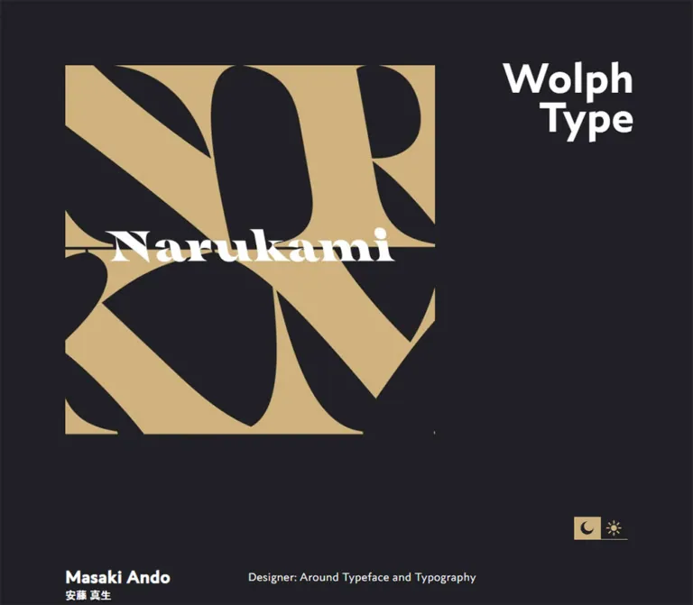
Wolph Type — 安藤真生の書体デザイン・ポートフォリオ
チャコールとサンドカラーを基調に、右上の固定ロゴ、大きな書体見本、ゆったりした余白で構成された書体デザイナーのポートフォリオ。
Wolph Type — Style Reference
An open type specimen book in white and sand on charcoal.
Website: wolphtype.com
Original URL: https://wolphtype.com/
Final URL: https://wolphtype.com/ — HTTP 200, unchanged destination.
Theme: dark in both supplied viewport records; light-theme controls and color variables are present, but switching was not tested.
Inspected: October 5, 2026, 05:24 JST. The supplied capture record is timestamped 2026-10-04T20:24:06.157Z.
Viewports: desktop 1440 × 1000 and mobile 390 × 844, in CSS pixels.
Scope: the current homepage, including the opening poster, profile and chronology, typeface project list, visible specimen controls, other-work and goods links, journal index, and footer. Visual coverage consists of desktop opening, specimen, and footer captures, plus mobile opening and footer captures. Supplied rendered DOM and computed styles provide additional measurements throughout the page. Linked pages and documents were not opened.
Wolph Type is a personal type-design portfolio with an extended specimen catalog and journal. Its composition is deliberately sparse: a square typographic poster occupies the upper left, a large two-line wordmark anchors the upper right, and the designer’s introduction begins well below the poster. Further down, compact project metadata sits beside much larger type samples. The page ends with a full-width sand-colored footer.
The main contrast is between restrained interface typography and expressive typeface specimens. White text, narrow gold control tracks, and enormous empty charcoal areas keep the work prominent. The fixed-looking identity and theme controls remain in consistent screen positions across the supplied scroll captures. There is no visible card-elevation system; hierarchy comes from type size, alignment, spacing, and the final change of background color.
閉じる
Wolph Type — Style Reference
An open type specimen book in white and sand on charcoal.
Website: wolphtype.com
Original URL: https://wolphtype.com/
Final URL: https://wolphtype.com/ — HTTP 200, unchanged destination.
Theme: dark in both supplied viewport records; light-theme controls and color variables are present, but switching was not tested.
Inspected: October 5, 2026, 05:24 JST. The supplied capture record is timestamped 2026-10-04T20:24:06.157Z.
Viewports: desktop 1440 × 1000 and mobile 390 × 844, in CSS pixels.
Scope: the current homepage, including the opening poster, profile and chronology, typeface project list, visible specimen controls, other-work and goods links, journal index, and footer. Visual coverage consists of desktop opening, specimen, and footer captures, plus mobile opening and footer captures. Supplied rendered DOM and computed styles provide additional measurements throughout the page. Linked pages and documents were not opened.
Wolph Type is a personal type-design portfolio with an extended specimen catalog and journal. Its composition is deliberately sparse: a square typographic poster occupies the upper left, a large two-line wordmark anchors the upper right, and the designer’s introduction begins well below the poster. Further down, compact project metadata sits beside much larger type samples. The page ends with a full-width sand-colored footer.
The main contrast is between restrained interface typography and expressive typeface specimens. White text, narrow gold control tracks, and enormous empty charcoal areas keep the work prominent. The fixed-looking identity and theme controls remain in consistent screen positions across the supplied scroll captures. There is no visible card-elevation system; hierarchy comes from type size, alignment, spacing, and the final change of background color.
How to Read This Reference
- Measured means a value appears in the supplied computed styles or element rectangles. Decimal measurements are retained where useful.
- Derived means arithmetic based on measured values, such as a section gap expressed in line-height units.
- Estimated means a visual reading of the supplied screenshots. Poster dimensions, specimen display sizes, icon bounds, and some column positions fall into this category.
- Recommended means an implementation choice for a new project. Proposed breakpoints, accessibility improvements, and unverified control behavior are not descriptions of the original implementation.
- Source variables retain their recorded names. Other token names are descriptive aliases.
- The computed font stack identifies declared families, not the exact font file used for every glyph. Font assets and specimen font declarations were not included.
- Only two viewport sizes were supplied. Intermediate breakpoints, hover states, keyboard behavior, theme persistence, and tester responses remain unverified.
Tokens — Colors
Default Palette
“Default” here refers to the captured dark appearance, not a verified first-visit preference.
| Name | Value | Source variable | Role and evidence |
|---|---|---|---|
| Charcoal | #202025 |
--backgroundColor; also --textColorLight |
Measured root background; measured dark footer-link text |
| White | #ffffff |
--textColor |
Measured body text and wordmark color; visually used throughout the specimens |
| Sand | #ccb280 |
--accentColor |
Measured footer background; visually corresponding accent in sliders, feature labels, and theme controls |
| Light Canvas | #fcfcfc |
--backgroundColorLight |
Declared alternative canvas; no switched light-state capture supplied |
| Light Accent | #bc9e65 |
--accentColorLight |
Declared alternative accent; its applied appearance was not verified |
The opening poster uses a visually similar sand field. Its image pixels were not separately sampled, so the exact footer color should not be presented as a measured fill inside the artwork.
The unpublished journal entries appear muted gray in the footer-adjacent screenshot. Their sampled paragraph color is still white, suggesting that another rendering property may affect the final appearance. The relevant opacity or compositing value was not supplied. Treat the muted appearance as observed and its implementation as unknown.
Theme Presets
| State | Canvas | Main text | Accent | Verification |
|---|---|---|---|---|
| Captured dark state | #202025 |
#ffffff |
#ccb280 |
Supported by both viewport records and screenshots |
| Declared light palette | #fcfcfc |
#202025 |
#bc9e65 |
Variables exist; complete theme mapping and switching behavior are untested |
The gold footer is a section surface within the captured dark page. It does not establish that the page switched to light mode.
Calculated contrast: the supplied hex values give approximately 16.2:1 for white on charcoal and 7.9:1 for charcoal on sand. White on sand is only about 2.0:1; use the observed dark footer text for readable content. The small white footer emblem functions as a graphic mark.
Tokens — Typography
Interface Sans Serif
- Measured body stack:
"Koga Sans Modern", TazuganeGothicStdN-Book, sans-serif. - Measured weight:
400. - Desktop:
18px,31.5pxline height,0.45pxletter spacing. - Mobile:
15px,26.25pxline height,0.375pxletter spacing. - Derived tracking:
0.025emat both sizes. - Role: biography, chronology, project labels, general links, and supporting text.
The original footer independently identifies Koga Sans Modern and Tazugane Gothic as the page’s typefaces. This supports the family names recorded in the computed styles. The root element’s Times declaration is overridden by the body stack and is not evidence that ordinary interface text uses Times.
Persistent Wordmark
The H1 uses "Koga Sans Modern", sans-serif, with a computed weight of 400, normal tracking, and a line height equal to its font size. It looks visually heavy, but forcing font-weight: 700 would contradict the available computed value.
“Wolph” and “Type” occupy two right-aligned lines. Desktop type is 80px / 80px; mobile type is 36px / 36px. Both recorded boxes include 20px of bottom padding.
Journal Headings
The journal links use "Koga Sans Modern", TazuganeGothicStdN-Bold, sans-serif, again with computed weight 400. The separately named Japanese Bold face carries part of the hierarchy. Preserve the distinction between family selection and the CSS weight property.
Headings measure 27px on desktop and 22.5px on mobile. Their line heights remain the page pitch, producing relatively tight multiline headings. Dates are much smaller and more widely tracked relative to their own size.
Specimen Typography
The specimen area is the expressive part of the page. The desktop capture shows:
- Narukami: broad, strongly contrasted display lettering with sharp wedge-like details.
- Haitham V1: a large roman serif line, followed by a Greek-and-Latin sample and a smaller descriptive line.
- Haitham Italic V1: an italic counterpart using the same three-level arrangement.
The project metadata states “Latin, Greek and Arabic” for Haitham. Latin and Greek are visible in the supplied sample capture; Arabic rendering was not shown.
These labels identify the displayed work. Their exact CSS family identifiers, font sizes, axis values, and font files were not provided. Do not substitute the interface family for all specimens or invent an exact @font-face declaration from a project name.
Type Scale
| Role | Desktop | Mobile | Line height / tracking | Evidence |
|---|---|---|---|---|
| Wordmark | 80px |
36px |
1; normal tracking |
Measured |
| Body and project names | 18px |
15px |
31.5px / 26.25px; 0.025em |
Measured |
| Project status notes | 13.5px |
11.25px |
Often retain 31.5px / 26.25px; 0.025em |
Measured |
| Project outbound links | 13.5px |
11.25px |
23.625px / 19.6875px; 0.025em |
Measured |
| Journal headings | 27px |
22.5px |
31.5px / 26.25px; 0.025em |
Measured |
| Journal dates | 13.5px |
11.25px |
31.5px / 26.25px; 0.05em |
Measured |
| Footer social links | 21.6px |
18px |
31.5px / 26.25px; 0.025em |
Measured |
| Profile name | About 27px |
About 22.5px |
Visually stronger than surrounding body | Estimated; name element not separately sampled |
| Large specimen line | About 80px |
Not visually established | Typeface-dependent | Desktop screenshot estimate |
| Medium specimen line | About 40px |
Not visually established | Typeface-dependent | Desktop screenshot estimate |
| Small specimen line | About 20px |
Not visually established | Typeface-dependent | Desktop screenshot estimate |
The small status notes do not all use 1.75 times their own font size. Some inherit the larger page pitch. This creates the unusually open spacing around very small project metadata.
Tokens — Spacing & Shapes
Base system: the source exposes --fz, --lh, and --pitch.
/* Recorded source relationships */
/* Desktop: --fz: 18px; mobile: --fz: 15px; */
--lh: 1.75;
--pitch: calc(var(--fz) * var(--lh));
The resulting pitch is 31.5px on desktop and 26.25px on mobile. Several large spaces are exact multiples of it.
Spacing Scale
| Use | Relationship | Desktop | Mobile | Evidence |
|---|---|---|---|---|
| Body pitch | 1 × pitch |
31.5px |
26.25px |
Measured |
| Major section top padding | 7 × pitch |
220.5px |
183.75px |
Measured in profile, project, and journal sections |
| Goods section top padding | 4 × pitch |
126px |
105px |
Measured |
| Footer vertical padding | 3 × pitch |
94.5px |
78.75px |
Measured |
| Journal end to footer start | 10 × pitch |
315px |
262.5px |
Derived from section rectangles |
| Single-line journal entry interval | 4 × pitch |
126px |
105px |
Derived; wrapped mobile titles add height |
| Main side inset | — | 100px |
20px |
Measured content positions |
| Project metadata-to-preview gap | About 1.5 × desktop base |
About 27px |
Stacked arrangement | Derived from desktop positions |
| Opening section top padding | Independent value | 100px |
150px |
Measured |
| Wordmark bottom padding | Independent value | 20px |
20px |
Measured |
The large gaps are structural. Compressing them into a conventional compact portfolio would change the pacing substantially.
Border Radius
| Element | Appearance | Evidence |
|---|---|---|
| Main content sections | Square, unboxed | Screenshots and sampled 0px radii |
| Opening artwork | Square corners | Screenshot |
| Footer | Full-width rectangular field | Screenshot and measured bounds |
| Theme tiles | Small square-cornered rectangles | Screenshot estimate |
| Slider handles | Outlined circles | Screenshot |
| Feature controls | Underlined text | Screenshot |
There is no visible rounded-card vocabulary. Circular geometry is reserved for slider handles and icon details.
Layout Measurements
| Element | Desktop 1440 × 1000 |
Mobile 390 × 844 |
Evidence |
|---|---|---|---|
| Main content width | 1240px |
350px |
Measured section content rectangles |
| Content left edge | 100px |
20px |
Measured |
| Wordmark rectangle | x 1080.95, y 90, 269.05 × 180px |
x 248.92, y 20, 121.08 × 92px |
Measured |
| Opening square | About 607 × 607px, at 100,100 |
About 350 × 350px, at 20,150 |
Screenshot estimate; mobile top padding measured |
| Profile content start | About document y 936.5 |
About document y 692 |
Derived from section top and padding |
| Project metadata width | 184.16px |
350px |
Measured |
| Project preview left edge | About 311px |
Full-width stacked region inferred | Desktop screenshot; mobile metadata measurements |
| Theme-control group | About 82 × 35px, right/bottom 100px |
About 82 × 35px, right/bottom 20px |
Screenshot estimate |
| Footer height | 576.5px |
713.25px |
Measured |
| Footer document start | 8235.25px |
11307.11px |
Measured |
| Document height | 8811.75px |
12020.36px |
Measured body rectangles |
The poster’s desktop width is consistent with half the content area minus half a 27px gutter: (1240 − 27) / 2 = 606.5px. This is a useful reconstruction calculation, not a recovered source width rule.
Components
Persistent Wordmark
Role: maintains identity while the portfolio scrolls.
Use a two-line, right-aligned wordmark without surrounding navigation chrome. At the desktop viewport, its box sits 90px from the top and right edges. At the mobile viewport, those offsets are 20px.
Its screen position remains consistent across the opening, specimen, and footer captures. That supports a screen-anchored implementation, although the supplied computed-property list does not include position. The Quick Start uses position: fixed as the practical interpretation.
The wordmark is an H1 in the supplied DOM. No wordmark link appears in the supplied link list, so a home-link action is not established.
Opening Poster
Role: introduces the portfolio through type artwork.
The current captures show a sand square with large dark “WolphType Typefaces” lettering centered across two lines. A fine white triangular outline stretches almost to the square’s edges. Smaller white typeface names follow the triangle’s angled sides, producing a layered composition behind the dark title.
On desktop, the poster occupies approximately the left half of the main content width. On mobile it fills the 350px content column below the wordmark. It remains square and visibly uncropped.
Treat the title, rotated names, and triangle as one artwork composition unless the actual source asset or construction is available. The capture does not establish whether this is a raster image, vector asset, canvas, or a group of HTML elements. No asset URL was exposed.
Only a single settled poster state is supplied at each viewport. Autoplay, rotation, slide controls, and hover effects are unverified.
Profile and Chronology
Role: introduces the designer and records professional background.
The desktop introduction places “Masaki Ando” at the left and “Typeface Designer: with Graphic, Typography and Web Experiences.” farther right, beginning near x 415px. The Japanese name “安藤 真生” appears beneath the English name in the desktop capture.
The chronology continues with dates on the left and descriptions on the right. Contact and social-link rows use the same text-led organization. It is an editorial information structure without card boundaries or decorative timeline nodes.
At mobile width, the English name and description stack. The chronology’s dates and descriptions also appear as successive blocks. The Japanese name is not visible in the mobile opening capture or its rendered text transcript, although it remains present in the section’s sampled text content. The mechanism behind this difference was not supplied.
The large interval between poster and profile is retained on mobile. The first screen therefore contains the poster, substantial empty space, and only the beginning of the biography.
Typeface Project Row
Role: pairs concise project information with large type demonstrations.
The desktop row has two primary regions:
- A narrow metadata column beginning at
x 100px, measured at approximately184pxwide. - A much larger specimen region beginning near
x 311px.
Metadata contains the typeface name, date or work-in-progress status, relevant language coverage, and small outbound links. Link labels include “View Specimens↗︎”, “Watch Vlog↗︎”, and “on Booth↗︎”. Preserve the small diagonal arrow as part of the link’s visible treatment.
The project list includes RC Swow Serif, Koga Sans, Roume, Biela, Koga Sans Modern, Narukami, Haitham, Haitham Italic, and Doppo. Rows vary in metadata length and available controls. Do not force every project into an identical content count.
In the supplied desktop specimen view, the samples occupy three descending scales: display line, medium sample sentence, and smaller descriptive line. Long samples terminate near x 1128px, leaving a substantial region at the right for the wordmark. The visual clipping is clear; the exact overflow mechanism is not recorded.
Specimen Controls
Role: provides compact typography-related controls adjacent to each work.
The desktop screenshot shows thin sand-colored horizontal tracks with circular handles. A typical track spans nearly the 184px metadata width. Handles are approximately 18–20px across, with a sand outline and charcoal center.
Haitham and Haitham Italic also show six small underlined labels in two rows: onum, dlig, ss01, ss02, ss03, and ss04. Their placement and naming suggest OpenType feature controls, but toggling behavior and active styling were not tested.
The rendered text also contains weight/style option labels for Koga Sans and Roume. This supports the presence of style choices without establishing their exact native control type or the visible state of an opened menu.
Do not assign the sliders to font size, weight, optical size, or another axis without further evidence. For a new implementation, bind each control only to a known parameter and expose that parameter in an accessible label.
Theme Controls
Role: exposes dark and light appearance options.
A compact pair of crescent and sun symbols occupies the lower-right corner across the captures. The supplied text includes darktheme and lighttheme; the visible interface uses icons.
The crescent appears dark on a sand tile, while the sun appears sand-colored against a dark tile. Over the charcoal page, the moon tile is more prominent. Over the sand footer, the sun tile becomes more prominent because its dark background contrasts with the section. These appearances can be explained by the same two opposing tiles; they do not establish a changed selected state.
The group is approximately 82px wide and 35px high, with a fine sand-colored baseline. Its apparent dimensions remain similar on desktop and mobile, while its edge offsets shrink from about 100px to 20px.
No click result, persistence behavior, operating-system preference handling, or transition sequence was supplied.
Other Works and Goods
Role: extends the portfolio beyond the main typeface list.
The rendered evidence includes an “Other Typefaces” group, an external link to work associated with Nippon Design Center, and a “Goods” section with two merchandise links plus “More Goods”. Prices and product names are plain linked text rather than prominent purchase buttons.
Desktop goods-link positions begin near x 311px, 663px, and 1015px, beside the section label at x 100px. On mobile, all recorded links occupy the 350px content column at x 20px.
No supplied screenshot shows the goods section itself. The desktop section is notably shallow in the recorded geometry, while the mobile section is much taller. The evidence does not establish the exact product imagery, media loading state, or reason for that difference. Do not invent product-photo styling from the destination labels alone.
Journal Index
Role: lists essays, updates, and planned writing.
The section starts with the linked label “日記と雑記” and the small supporting line “Now Going On”. Each published entry contains a prominent linked title and a smaller date beneath it. The supplied order progresses from older entries toward newer ones.
Desktop titles use 27px type and generous vertical separation. Mobile titles use 22.5px and wrap into two or three lines when needed. There are no visible card backgrounds, thumbnail requirements, or category badges in the supplied evidence.
The final planned entries are visibly subdued. Their supporting line reads “I’ll probably write this article in 2026.” They do not appear as links in the supplied link list. Preserve a readable distinction between published and planned content in an adaptation; the original muted styling may be too faint for essential information.
Footer
Role: closes the long page with social access, identity, and implementation credits.
The footer is a full-bleed #ccb280 field with dark text. A small angular white emblem sits near its upper-left content edge. The emblem is approximately 65px wide on desktop and 55px on mobile; its source asset and exact dimensions were not supplied.
On desktop, the content forms two broad groups. Social links, “Back Top↑”, and copyright text occupy the left. Site identification, typeface information, framework attribution, and the design/development credit start near x 522px. This differs from the profile’s x 415px detail column and the specimens’ x 311px start; one universal two-column grid would not reproduce all three sections.
On mobile, the social/copyright group comes first, followed by a substantial gap and then the credits. Text wraps naturally within the 350px content width.
The inspected footer explicitly states:
- “Typeface: Koga Sans Modern (Wolph Type), Tazugane Gothic (Monotype)”
- “CSS Framework: Bulma”
- “Design & Develop: Masaki Ando”
These are direct original-page credits. The visible copyright year is 2021; it is not the capture date.
“Back Top↑” links to https://wolphtype.com/#. Smooth scrolling, focus movement, and animation behavior were not tested.
Tokens — Motion & Interaction
| Treatment | Available evidence | What can be concluded |
|---|---|---|
| Root appearance transition | Computed transition string 0.2s |
A short transition is declared; trigger and animated properties were not captured |
| Wordmark transition | Computed transition string 0.2s |
Duration is recorded; no animated wordmark sequence was supplied |
| Many project, journal, and footer links | Computed transition string 0.2s |
Short transition support exists; hover colors and easing are unverified |
| Other sampled elements | Transition reported as all |
This alone does not demonstrate a nonzero-duration effect |
| Sampled CSS animations | animation: none |
No animation was declared on those sampled elements; this is not a site-wide animation audit |
| Wordmark and theme-control placement | Stable screen positions across scroll captures | Screen-anchored behavior is strongly supported visually |
| Sliders and feature labels | Visible in the desktop specimen capture | Control anatomy is observed; response, bounds, and selected states are untested |
| Theme selection | Two visible icon options and light-palette variables | Availability is observed; switching and persistence are unverified |
| Opening artwork | One settled image per supplied viewport | No evidence for a carousel or timed poster change |
| Back-to-top link | Recorded /# destination |
Anchor intent is established; scrolling animation is not |
Use 200ms as a source-supported duration reference, not as permission to invent entrances or continuous animation. The Quick Start confines transitions to explicit color properties and includes recommended reduced-motion behavior.
The capture process waited for document loading, visible image decoding, and sampled layout stability. Finite animations were awaited within bounded time limits; perpetual animations were temporarily paused during readiness checks and then resumed. This procedure does not establish the absence of delayed, offscreen, or interaction-triggered motion.
Surfaces
| Layer | Appearance | Purpose |
|---|---|---|
| Main canvas | Solid charcoal | Continuous background for the long portfolio |
| Interface text | White directly on the canvas | Biography, project information, journal navigation |
| Opening artwork | Sand square with dark and white lettering | A concentrated visual introduction |
| Specimen region | Same charcoal as the page | Lets the typefaces carry the hierarchy |
| Control accents | Fine sand lines, outlines, and underlines | Distinguishes adjustment controls without large containers |
| Planned journal entries | Muted text on charcoal | Separates unfinished writing from published links |
| Footer | Full-width sand with dark text | Strong visual ending and a change in reading tone |
| Persistent controls | Opposing sand and charcoal tiles | Maintains recognizable icons over both major surfaces |
No visible gradients, glass effects, card shadows, or layered elevation are needed to reproduce the supplied appearance.
Imagery
Typography is the principal visual material. The opening composition combines a square field, a thin triangular outline, rotated white labels, and large dark lettering. The specimen section then presents letterforms at progressively smaller sizes, allowing the visitor to inspect their construction and reading texture.
The footer emblem is a compact angular white silhouette. Keep its crisp shape and generous surrounding space. Do not replace it with an unrelated generic icon when the original mark is available for authorized use.
The supplied original-page screenshots do not establish a photographic art direction. Merchandise exists in the DOM, but its imagery was not visually supplied. Likewise, no image URL, sprite sheet, or font-file URL can be recovered from the provided evidence.
Observed Asset References
The following paths are linked resources recorded on the original page. They were not opened, and they do not establish the artwork inside those documents.
| Resource | Recorded path | Observed role |
|---|---|---|
| Koga Sans specimen | /img/kogasans_specimen.pdf |
“View Specimens↗︎” destination |
| Roume specimen | /img/roume_specimen.pdf |
“View Specimens↗︎” destination |
| Biela specimen | /img/biela_specimen.pdf |
“View Specimens↗︎” destination |
| Koga Sans Modern specimen | /img/kogasansmodern_specimen.pdf |
“View Specimens↗︎” destination |
| Haitham specimen | /img/Haitham_Specimen.pdf |
Shared destination for Haitham and Haitham Italic |
The opening poster and footer emblem are visually documented but have no exposed source paths. Preserve their aspect ratios and avoid fabricating asset filenames.
Layout & Responsive Behavior
The site is a long scrolling document. Only the identity and utility controls appear screen-anchored. The overall page should not be implemented as a fixed-height application with a separate internal reader.
Desktop Composition
At 1440px wide, the primary content area is 1240px with 100px side margins. The opening poster occupies approximately half that width. The wordmark occupies a separate upper-right position and remains prominent as the document moves behind or beside it.
The page uses several related but distinct column relationships: roughly a quarter-width lead region for the profile, a much narrower project metadata region, and a roughly one-third lead region in the footer. These proportions describe the observed geometry; the source grid declarations were not included.
The specimen text is intentionally much wider and larger than its metadata. Its visible right boundary falls before the full content edge. Preserve that relationship when adapting the layout, while ensuring editable content remains reachable.
Mobile Composition
At 390px wide, the content column is 350px, leaving 20px on either side. The wordmark shrinks to 36px and sits at the top-right 20px inset. The opening poster begins at 150px, leaving clearance below the identity.
The body base decreases from 18px to 15px. Many dimensions follow that change through the pitch system, but the poster’s top padding increases and the theme-control graphics remain approximately the same size. This is a combination of scaling and restructuring, not a uniformly reduced desktop page.
The profile, chronology, project metadata, goods links, and footer become vertically arranged. The mobile screenshots do not show the specimen section, so exact mobile specimen sizes and overflow behavior remain unknown.
Observed Changes
| Feature | Desktop | Mobile |
|---|---|---|
| Side inset | 100px |
20px |
| Body base | 18px |
15px |
| Wordmark | 80px, top/right 90px |
36px, top/right 20px |
| Poster | About 607px square |
About 350px square |
| Poster top | 100px |
150px |
| Biography | Date/name and detail columns | Stacked labels and details |
| Project metadata | About 184px wide |
350px wide |
| Journal titles | Generally one line at 27px |
Frequently wrap at 22.5px |
| Footer | Two broad content groups | Groups stacked with a large gap |
| Document height | About 8812px |
About 12020px |
The footer begins near screen y 424px in the desktop ending capture and near y 131px in the mobile ending capture. Those positions follow from the footer’s different height when the document is scrolled to the bottom. They are not fixed footer offsets or header-height measurements.
Recommended breakpoint strategy: start with a single-column layout and introduce desktop columns when enough width exists for metadata, specimens, and the identity region. The Quick Start uses 900px as an adaptation breakpoint. The original breakpoint cannot be recovered from the two supplied viewport records.
Do’s and Don’ts
Do
- Preserve the measured charcoal, white, and sand palette.
- Keep the wordmark split over two right-aligned lines.
- Maintain the square opening artwork and its uncropped composition.
- Use the
1.75body rhythm and large pitch-based section spacing. - Let project specimens be substantially larger than their metadata.
- Keep controls thin, compact, and integrated with the text column.
- Preserve the distinction between interface fonts and showcased typefaces.
- Use dark text on the sand footer.
- Stack content on mobile while retaining generous breathing room.
- Keep journal entries as a typographic list with clearly separated dates.
Don’t
- Don’t turn the portfolio into a grid of rounded feature cards.
- Don’t add a conversion banner or dominant purchase CTA absent from the evidence.
- Don’t apply one column width to the biography, specimens, and footer.
- Don’t change all computed
400weights to bold because the screenshot looks heavy. - Don’t guess font files or variable-font axes from project names.
- Don’t claim the visible sliders or feature labels were tested.
- Don’t interpret the gold footer as proof of a theme change.
- Don’t invent a slideshow or entrance animation for the opening artwork.
- Don’t stretch or crop the poster to fill the desktop width.
- Don’t use faint planned-entry styling for essential instructions or controls.
Recommended Implementation Additions
These are recommendations for a new implementation, not verified features of the original page:
- Give the moon and sun controls explicit accessible names, expose the selected mode programmatically, and keep that state synchronized with the applied theme.
- Provide at least
44 × 44pxtouch targets around small control graphics. The observed theme tiles are approximately41 × 35pxeach. - Label each slider with its actual parameter and value. Use keyboard-operable feature buttons with
aria-pressedwhere toggling is appropriate. - Consider increasing mobile metadata above the observed
11.25pxwhen it contains important actions. - Keep focus indicators visible over both charcoal and sand. Ensure focused content can scroll clear of the persistent wordmark and controls.
- If specimens are editable, support horizontal navigation or scrolling within the sample without causing page-wide horizontal overflow.
- Provide meaningful alternative text for the opening artwork and mark purely decorative graphics appropriately.
- Offer reduced-motion behavior for any added transitions. Do not add automatic specimen animation without a clear purpose and a way to stop it.
- Use a readable planned-content label instead of relying entirely on low opacity.
- Verify font loading and wrapping at intermediate widths before treating the two captured layouts as a complete responsive specification.
Agent Prompt Guide
Quick Color Reference
- Main canvas:
#202025. - Primary text and identity:
#ffffff. - Accent and footer surface:
#ccb280. - Footer text and dark control graphics:
#202025. - Declared but untested light canvas:
#fcfcfc. - Declared but untested light accent:
#bc9e65. - No measured gray token exists for planned entries; choose an accessible adaptation explicitly.
Overall Prompt
“Create a long-scrolling type designer portfolio using charcoal #202025, white text, and sand #ccb280. Place a large two-line, right-aligned identity in the upper-right corner and a square typographic poster at the upper left. Keep unusually generous vertical space before the biography. Use an editorial chronology, followed by typeface rows with narrow metadata columns and large three-scale specimens. Style controls as thin sand tracks, outlined circular handles, and small underlined feature labels. Finish with a full-width sand footer containing an angular emblem, social links, copyright, and credits. At a 390px mobile width, use 20px side insets, a 350px square poster, a 36px wordmark, stacked content, and a 15px body base with 1.75 line height. Treat unverified tester behavior and light-mode details as implementation decisions requiring explicit specification.”
Example Component Prompts
- Opening composition: “Build a charcoal opening section with an approximately 607px square poster at x100/y100 in a 1440px viewport. Place the white identity at the upper right on two lines, using an 80px line-height-matched display scale. Preserve a broad empty region between artwork and biography. On a 390px screen, make the poster 350px square at x20/y150 and reduce the wordmark to 36px.”
- Typeface row: “Create a flat specimen row with an approximately 184px metadata column, a 27px gap, and a wide sample area. Stack the project name, small status notes, outbound specimen link, thin gold slider, and optional OpenType labels on the left. Show three descending type scales on the right. Use a supplied, verified specimen font rather than assigning every sample the interface font.”
- Feature controls: “Design two rows of small sand-colored underlined feature buttons, three per row, using labels such as onum, dlig, and ss01. Keep the appearance unboxed. Add accessible pressed states and visible keyboard focus; only connect features that the loaded font supports.”
- Journal list: “Create a charcoal journal index with white linked titles, small tracked dates, and approximately four body pitches between single-line entries. Use 27px titles on desktop and 22.5px on mobile. Let long Japanese titles wrap naturally. Represent planned entries with a readable status treatment.”
- Footer: “Create a full-width sand footer with dark text, a small angular white emblem, and spacious vertical padding. On desktop, place social links and copyright at the left, with site and production information beginning around one third of the content width. Stack those groups on mobile and preserve a substantial gap between them.”
Quick Start
CSS Custom Properties
This is an adaptation, not recovered source CSS. It preserves measured colors, type scales, and pitch relationships while using a conventional document root. The 900px breakpoint, intermediate gutter interpolation, specimen scaling, focus treatments, and coarse-pointer target enlargement are recommendations.
The observed font names are included without invented font URLs. Supply authorized font files separately. Without them, generic fallbacks will change the letterforms and some wrapping.
Expected structure: .page-wrap contains each major section; .project-row contains .project-meta and .specimen; .footer-columns contains the social/copyright group and the credits group. .wordmark contains two block-level spans. The opening poster should contain the supplied artwork rather than generated substitute lettering.
:root {
  /* Measured colors, exposed through implementation aliases. */
  --wt-charcoal: #202025;
  --wt-white: #ffffff;
  --wt-sand: #ccb280;
  --wt-light-canvas: #fcfcfc;
  --wt-light-accent: #bc9e65;
  --wt-canvas: var(--wt-charcoal);
  --wt-ink: var(--wt-white);
  --wt-accent: var(--wt-sand);

  /* Declared source families; font assets are not bundled. */
  --wt-font-ui: 'Koga Sans Modern', TazuganeGothicStdN-Book,
    sans-serif;
  --wt-font-heading: 'Koga Sans Modern', TazuganeGothicStdN-Bold,
    sans-serif;
  --wt-font-brand: 'Koga Sans Modern', sans-serif;

  /* Measured mobile scale. */
  --wt-base: 15px;
  --wt-leading: 1.75;
  --wt-pitch: calc(var(--wt-base) * var(--wt-leading));
  --wt-meta: calc(var(--wt-base) * 0.75);
  --wt-heading: calc(var(--wt-base) * 1.5);
  --wt-footer-text: calc(var(--wt-base) * 1.2);
  --wt-tracking: 0.025em;
  --wt-date-tracking: 0.05em;

  --wt-gutter: 20px;
  --wt-column-gap: 27px;
  --wt-section-space: calc(var(--wt-pitch) * 7);
  --wt-secondary-space: calc(var(--wt-pitch) * 4);
  --wt-footer-padding: calc(var(--wt-pitch) * 3);
  --wt-brand-size: 36px;
  --wt-brand-top: 20px;
  --wt-brand-right: 20px;
  --wt-control-inset: 20px;
  --wt-opening-top: 150px;
  --wt-transition: 200ms;
}

/* Recommended mapping from declared light-palette variables.
   The applied light appearance was not captured. */
:root[data-theme='light'] {
  --wt-canvas: var(--wt-light-canvas);
  --wt-ink: var(--wt-charcoal);
  --wt-accent: var(--wt-light-accent);
}

* {
  box-sizing: border-box;
}

html {
  background: var(--wt-canvas);
}

body {
  margin: 0;
  color: var(--wt-ink);
  background: var(--wt-canvas);
  font-family: var(--wt-font-ui);
  font-size: var(--wt-base);
  font-weight: 400;
  line-height: var(--wt-pitch);
  letter-spacing: var(--wt-tracking);
  transition:
    color var(--wt-transition) ease,
    background-color var(--wt-transition) ease;
}

button,
input,
select,
textarea {
  font: inherit;
}

button,
a,
input {
  -webkit-tap-highlight-color: transparent;
}

a {
  color: inherit;
  text-decoration: none;
}

/* Recommended link feedback; the original hover state is unknown. */
a:hover {
  text-decoration: underline;
  text-underline-offset: 0.2em;
}

:focus-visible {
  outline: 2px solid currentColor;
  outline-offset: 4px;
}

.page-wrap {
  width: min(1240px, calc(100% - 2 * var(--wt-gutter)));
  margin-inline: auto;
}

.wordmark {
  position: fixed;
  z-index: 20;
  top: var(--wt-brand-top);
  right: var(--wt-brand-right);
  margin: 0;
  padding-bottom: 20px;
  color: var(--wt-ink);
  font-family: var(--wt-font-brand);
  font-size: var(--wt-brand-size);
  font-weight: 400;
  line-height: 1;
  letter-spacing: normal;
  text-align: right;
}

.wordmark > span {
  display: block;
}

.opening {
  padding-top: var(--wt-opening-top);
}

.opening-poster {
  width: 100%;
  aspect-ratio: 1;
  margin: 0;
  background: var(--wt-sand);
}

.opening-poster > img {
  display: block;
  width: 100%;
  height: 100%;
  object-fit: contain;
}

.profile {
  padding-top: calc(var(--wt-section-space) + var(--wt-base) * 0.5);
}

.profile-row {
  display: grid;
  grid-template-columns: minmax(0, 1fr);
  margin: 0 0 calc(var(--wt-pitch) * 0.5);
}

.profile-row > * {
  min-width: 0;
  margin: 0;
}

.profile-name {
  font-family: var(--wt-font-heading);
  font-size: var(--wt-heading);
  font-weight: 400;
}

.project-list,
.journal {
  padding-top: var(--wt-section-space);
}

.project-row {
  display: grid;
  grid-template-columns: minmax(0, 1fr);
  gap: var(--wt-pitch);
  margin-bottom: var(--wt-secondary-space);
}

.project-meta h3 {
  margin: 0;
  font-size: var(--wt-base);
  font-weight: 400;
  line-height: var(--wt-pitch);
}

.project-note {
  margin: 0;
  font-size: var(--wt-meta);
  line-height: var(--wt-pitch);
}

.project-link {
  display: block;
  font-size: var(--wt-meta);
  line-height: 1.75;
}

.specimen {
  display: grid;
  align-content: start;
  gap: calc(var(--wt-pitch) * 0.5);
  min-width: 0;
}

/* Supply a verified family per project through --specimen-font.
   The generic serif fallback is an adaptation, not a source finding. */
.specimen-line {
  display: block;
  width: 100%;
  min-width: 0;
  margin: 0;
  padding: 0;
  border: 0;
  border-radius: 0;
  background: transparent;
  color: inherit;
  font-family: var(--specimen-font, serif);
  font-weight: 400;
  line-height: 1.25;
  letter-spacing: normal;
  white-space: nowrap;
  overflow-x: auto;
}

/* Desktop endpoints estimate the visible specimen scale.
   Mobile endpoints are recommended, not measured. */
.specimen-line--large {
  font-size: clamp(48px, 6vw, 80px);
}

.specimen-line--medium {
  font-size: clamp(24px, 3vw, 40px);
}

.specimen-line--small {
  font-size: clamp(16px, 1.4vw, 20px);
}

.axis-range {
  display: block;
  appearance: none;
  width: 100%;
  height: 44px;
  margin: 0;
  background: transparent;
  cursor: pointer;
}

.axis-range::-webkit-slider-runnable-track {
  height: 2px;
  background: var(--wt-accent);
}

.axis-range::-webkit-slider-thumb {
  appearance: none;
  width: 20px;
  height: 20px;
  margin-top: -9px;
  border: 2px solid var(--wt-accent);
  border-radius: 50%;
  background: var(--wt-canvas);
}

.axis-range::-moz-range-track {
  height: 2px;
  background: var(--wt-accent);
}

.axis-range::-moz-range-thumb {
  width: 16px;
  height: 16px;
  border: 2px solid var(--wt-accent);
  border-radius: 50%;
  background: var(--wt-canvas);
}

.feature-controls {
  display: grid;
  grid-template-columns: repeat(3, max-content);
  gap: 8px 12px;
  margin-top: var(--wt-meta);
}

.feature-button {
  padding: 0 4px;
  border: 0;
  border-bottom: 1px solid currentColor;
  border-radius: 0;
  color: var(--wt-accent);
  background: transparent;
  font-size: var(--wt-meta);
  line-height: 1.5;
  cursor: pointer;
}

/* Recommended visible toggle state. */
.feature-button[aria-pressed='true'] {
  color: var(--wt-canvas);
  background: var(--wt-accent);
}

.journal-entry {
  margin-bottom: calc(var(--wt-pitch) * 2);
}

.journal-title {
  margin: 0 0 calc(var(--wt-pitch) * 0.5);
  font-family: var(--wt-font-heading);
  font-size: var(--wt-heading);
  font-weight: 400;
  line-height: var(--wt-pitch);
  overflow-wrap: anywhere;
}

.journal-date {
  margin: 0;
  font-size: var(--wt-meta);
  line-height: var(--wt-pitch);
  letter-spacing: var(--wt-date-tracking);
}

/* A readable adaptation rather than the unmeasured source opacity. */
.journal-entry--planned {
  color: color-mix(in srgb, var(--wt-ink) 65%, var(--wt-canvas));
}

.site-footer {
  margin-top: calc(var(--wt-pitch) * 10);
  padding-block: var(--wt-footer-padding);
  color: var(--wt-charcoal);
  background: var(--wt-accent);
  font-size: var(--wt-footer-text);
  line-height: var(--wt-pitch);
}

.footer-emblem {
  display: block;
  width: calc(var(--wt-base) * 3.65);
  height: auto;
  margin-bottom: calc(var(--wt-pitch) * 2.5);
}

.footer-columns {
  display: grid;
  grid-template-columns: minmax(0, 1fr);
  gap: calc(var(--wt-pitch) * 3);
}

.footer-block {
  margin: 0;
}

.footer-block + .footer-block {
  margin-top: var(--wt-pitch);
}

.footer-social a {
  display: block;
}

.theme-controls {
  position: fixed;
  z-index: 30;
  right: max(var(--wt-control-inset), env(safe-area-inset-right));
  bottom: max(var(--wt-control-inset), env(safe-area-inset-bottom));
  display: flex;
  border-bottom: 1px solid var(--wt-sand);
}

.theme-button {
  display: grid;
  place-items: center;
  width: 41px;
  height: 35px;
  padding: 0;
  border: 0;
  border-radius: 0;
  cursor: pointer;
}

.theme-button[data-mode='dark'] {
  color: var(--wt-charcoal);
  background: var(--wt-sand);
}

.theme-button[data-mode='light'] {
  color: var(--wt-sand);
  background: var(--wt-charcoal);
}

.theme-button svg {
  display: block;
  width: 24px;
  height: 24px;
}

/* Adaptation breakpoint; the original breakpoint was not recorded. */
@media (min-width: 900px) {
  :root {
    --wt-base: 18px;
    --wt-gutter: clamp(40px, 6.9444vw, 100px);
    --wt-brand-size: 80px;
    --wt-brand-top: 90px;
    --wt-brand-right: calc(var(--wt-gutter) - 10px);
    --wt-control-inset: var(--wt-gutter);
    --wt-opening-top: 100px;
  }

  .opening-poster {
    width: calc((100% - var(--wt-column-gap)) / 2);
  }

  .profile-row {
    grid-template-columns: 288px minmax(0, 1fr);
    column-gap: var(--wt-column-gap);
    margin-bottom: 0;
  }

  .project-row {
    grid-template-columns: 184.156px minmax(0, 1fr);
    column-gap: var(--wt-column-gap);
  }

  /* Approximate the desktop specimen's right-side clearance. */
  .specimen {
    max-width: calc(100% - 211px);
  }

  .footer-columns {
    grid-template-columns:
      calc((100% - 2 * var(--wt-column-gap)) / 3)
      minmax(0, 1fr);
    column-gap: var(--wt-column-gap);
  }
}

/* Recommended touch targets; larger than the captured graphics. */
@media (pointer: coarse) {
  .theme-button {
    width: 44px;
    height: 44px;
  }

  .feature-button {
    min-height: 44px;
  }
}

@media (prefers-reduced-motion: reduce) {
  html {
    scroll-behavior: auto;
  }

  body,
  .wordmark,
  a,
  button {
    transition: none;
  }
}
Theme buttons still require application logic to set data-theme and synchronize their accessible state. Sliders and feature buttons require verified font parameters and event handlers. CSS alone does not implement a working type tester.
The specimen rules above allow local horizontal scrolling as an accessibility-oriented adaptation. The captured desktop preview appears clipped; its actual editing and overflow behavior is unknown.
Tailwind v4 Token Mapping
Optional aliases for a project already using Tailwind v4. The inspected footer names Bulma; this mapping is an adaptation and does not describe the original framework.
@theme inline {
  --color-canvas: var(--wt-canvas);
  --color-ink: var(--wt-ink);
  --color-accent: var(--wt-accent);
  --color-charcoal: var(--wt-charcoal);
  --color-sand: var(--wt-sand);

  --font-ui: var(--wt-font-ui);
  --font-heading: var(--wt-font-heading);
  --font-brand: var(--wt-font-brand);

  --text-body: var(--wt-base);
  --text-meta: var(--wt-meta);
  --text-heading: var(--wt-heading);
  --text-footer: var(--wt-footer-text);
  --text-brand: var(--wt-brand-size);

  --spacing-pitch: var(--wt-pitch);
  --spacing-gutter: var(--wt-gutter);
  --spacing-column: var(--wt-column-gap);
  --spacing-section: var(--wt-section-space);

  --radius-flat: 0px;
}
Sources & Evidence
- Wolph Type homepage: original and final URL in the supplied browser record, returning HTTP 200. This is the source for the page identity, content, and directly stated footer credits.
- Capture record:
2026-10-04T20:24:06.157Z, equivalent to October 5, 2026, 05:24 JST. The supplied viewports are1440 × 1000and390 × 844CSS pixels. - Original-page visual evidence: five supplied captures covering desktop opening, desktop specimens, desktop ending/footer, mobile opening, and mobile ending/footer.
- Rendered measurements: supplied custom properties, computed font stacks, colors, type sizes, line heights, letter spacing, element rectangles, section padding, link destinations, and transition/animation strings.
- Attribution on the inspected page: the visible footer names Masaki Ando for design and development, identifies the two interface typefaces, and states Bulma as the CSS framework.
- Inspection limits: no additional navigation, file access, asset retrieval, or interaction testing was performed for this reference. Linked specimens, articles, shops, and social destinations were not opened. Complete stylesheet rules, original breakpoints, font-file URLs, control implementation, hover states, theme switching, and delayed behavior remain unverified.
This reference describes the current homepage represented by the supplied capture session. Measurements, screenshot estimates, derived relationships, and recommended implementation choices are identified separately throughout.
# Wolph Type — Style Reference

> An open type specimen book in white and sand on charcoal.

**Website:** [wolphtype.com](https://wolphtype.com/)
**Original URL:** https://wolphtype.com/
**Final URL:** https://wolphtype.com/ — HTTP 200, unchanged destination.
**Theme:** dark in both supplied viewport records; light-theme controls and color variables are present, but switching was not tested.
**Inspected:** October 5, 2026, 05:24 JST. The supplied capture record is timestamped `2026-10-04T20:24:06.157Z`.
**Viewports:** desktop `1440 × 1000` and mobile `390 × 844`, in CSS pixels.
**Scope:** the current homepage, including the opening poster, profile and chronology, typeface project list, visible specimen controls, other-work and goods links, journal index, and footer. Visual coverage consists of desktop opening, specimen, and footer captures, plus mobile opening and footer captures. Supplied rendered DOM and computed styles provide additional measurements throughout the page. Linked pages and documents were not opened.

Wolph Type is a personal type-design portfolio with an extended specimen catalog and journal. Its composition is deliberately sparse: a square typographic poster occupies the upper left, a large two-line wordmark anchors the upper right, and the designer’s introduction begins well below the poster. Further down, compact project metadata sits beside much larger type samples. The page ends with a full-width sand-colored footer.

The main contrast is between restrained interface typography and expressive typeface specimens. White text, narrow gold control tracks, and enormous empty charcoal areas keep the work prominent. The fixed-looking identity and theme controls remain in consistent screen positions across the supplied scroll captures. There is no visible card-elevation system; hierarchy comes from type size, alignment, spacing, and the final change of background color.
閉じる
# Wolph Type — Style Reference

> An open type specimen book in white and sand on charcoal.

**Website:** [wolphtype.com](https://wolphtype.com/)
**Original URL:** https://wolphtype.com/
**Final URL:** https://wolphtype.com/ — HTTP 200, unchanged destination.
**Theme:** dark in both supplied viewport records; light-theme controls and color variables are present, but switching was not tested.
**Inspected:** October 5, 2026, 05:24 JST. The supplied capture record is timestamped `2026-10-04T20:24:06.157Z`.
**Viewports:** desktop `1440 × 1000` and mobile `390 × 844`, in CSS pixels.
**Scope:** the current homepage, including the opening poster, profile and chronology, typeface project list, visible specimen controls, other-work and goods links, journal index, and footer. Visual coverage consists of desktop opening, specimen, and footer captures, plus mobile opening and footer captures. Supplied rendered DOM and computed styles provide additional measurements throughout the page. Linked pages and documents were not opened.

Wolph Type is a personal type-design portfolio with an extended specimen catalog and journal. Its composition is deliberately sparse: a square typographic poster occupies the upper left, a large two-line wordmark anchors the upper right, and the designer’s introduction begins well below the poster. Further down, compact project metadata sits beside much larger type samples. The page ends with a full-width sand-colored footer.

The main contrast is between restrained interface typography and expressive typeface specimens. White text, narrow gold control tracks, and enormous empty charcoal areas keep the work prominent. The fixed-looking identity and theme controls remain in consistent screen positions across the supplied scroll captures. There is no visible card-elevation system; hierarchy comes from type size, alignment, spacing, and the final change of background color.

## How to Read This Reference

- **Measured** means a value appears in the supplied computed styles or element rectangles. Decimal measurements are retained where useful.
- **Derived** means arithmetic based on measured values, such as a section gap expressed in line-height units.
- **Estimated** means a visual reading of the supplied screenshots. Poster dimensions, specimen display sizes, icon bounds, and some column positions fall into this category.
- **Recommended** means an implementation choice for a new project. Proposed breakpoints, accessibility improvements, and unverified control behavior are not descriptions of the original implementation.
- **Source variables** retain their recorded names. Other token names are descriptive aliases.
- The computed font stack identifies declared families, not the exact font file used for every glyph. Font assets and specimen font declarations were not included.
- Only two viewport sizes were supplied. Intermediate breakpoints, hover states, keyboard behavior, theme persistence, and tester responses remain unverified.

## Tokens — Colors

### Default Palette

“Default” here refers to the captured dark appearance, not a verified first-visit preference.

| Name | Value | Source variable | Role and evidence |
| --- | --- | --- | --- |
| Charcoal | `#202025` | `--backgroundColor`; also `--textColorLight` | Measured root background; measured dark footer-link text |
| White | `#ffffff` | `--textColor` | Measured body text and wordmark color; visually used throughout the specimens |
| Sand | `#ccb280` | `--accentColor` | Measured footer background; visually corresponding accent in sliders, feature labels, and theme controls |
| Light Canvas | `#fcfcfc` | `--backgroundColorLight` | Declared alternative canvas; no switched light-state capture supplied |
| Light Accent | `#bc9e65` | `--accentColorLight` | Declared alternative accent; its applied appearance was not verified |

The opening poster uses a visually similar sand field. Its image pixels were not separately sampled, so the exact footer color should not be presented as a measured fill inside the artwork.

The unpublished journal entries appear muted gray in the footer-adjacent screenshot. Their sampled paragraph color is still white, suggesting that another rendering property may affect the final appearance. The relevant opacity or compositing value was not supplied. Treat the muted appearance as observed and its implementation as unknown.

### Theme Presets

| State | Canvas | Main text | Accent | Verification |
| --- | --- | --- | --- | --- |
| Captured dark state | `#202025` | `#ffffff` | `#ccb280` | Supported by both viewport records and screenshots |
| Declared light palette | `#fcfcfc` | `#202025` | `#bc9e65` | Variables exist; complete theme mapping and switching behavior are untested |

The gold footer is a section surface within the captured dark page. It does not establish that the page switched to light mode.

**Calculated contrast:** the supplied hex values give approximately `16.2:1` for white on charcoal and `7.9:1` for charcoal on sand. White on sand is only about `2.0:1`; use the observed dark footer text for readable content. The small white footer emblem functions as a graphic mark.

## Tokens — Typography

### Interface Sans Serif

- **Measured body stack:** `"Koga Sans Modern", TazuganeGothicStdN-Book, sans-serif`.
- **Measured weight:** `400`.
- **Desktop:** `18px`, `31.5px` line height, `0.45px` letter spacing.
- **Mobile:** `15px`, `26.25px` line height, `0.375px` letter spacing.
- **Derived tracking:** `0.025em` at both sizes.
- **Role:** biography, chronology, project labels, general links, and supporting text.

The original footer independently identifies Koga Sans Modern and Tazugane Gothic as the page’s typefaces. This supports the family names recorded in the computed styles. The root element’s `Times` declaration is overridden by the body stack and is not evidence that ordinary interface text uses Times.

### Persistent Wordmark

The `H1` uses `"Koga Sans Modern", sans-serif`, with a computed weight of `400`, normal tracking, and a line height equal to its font size. It looks visually heavy, but forcing `font-weight: 700` would contradict the available computed value.

“Wolph” and “Type” occupy two right-aligned lines. Desktop type is `80px / 80px`; mobile type is `36px / 36px`. Both recorded boxes include `20px` of bottom padding.

### Journal Headings

The journal links use `"Koga Sans Modern", TazuganeGothicStdN-Bold, sans-serif`, again with computed weight `400`. The separately named Japanese Bold face carries part of the hierarchy. Preserve the distinction between family selection and the CSS weight property.

Headings measure `27px` on desktop and `22.5px` on mobile. Their line heights remain the page pitch, producing relatively tight multiline headings. Dates are much smaller and more widely tracked relative to their own size.

### Specimen Typography

The specimen area is the expressive part of the page. The desktop capture shows:

- **Narukami:** broad, strongly contrasted display lettering with sharp wedge-like details.
- **Haitham V1:** a large roman serif line, followed by a Greek-and-Latin sample and a smaller descriptive line.
- **Haitham Italic V1:** an italic counterpart using the same three-level arrangement.

The project metadata states “Latin, Greek and Arabic” for Haitham. Latin and Greek are visible in the supplied sample capture; Arabic rendering was not shown.

These labels identify the displayed work. Their exact CSS family identifiers, font sizes, axis values, and font files were not provided. Do not substitute the interface family for all specimens or invent an exact `@font-face` declaration from a project name.

### Type Scale

| Role | Desktop | Mobile | Line height / tracking | Evidence |
| --- | --- | --- | --- | --- |
| Wordmark | `80px` | `36px` | `1`; normal tracking | Measured |
| Body and project names | `18px` | `15px` | `31.5px` / `26.25px`; `0.025em` | Measured |
| Project status notes | `13.5px` | `11.25px` | Often retain `31.5px` / `26.25px`; `0.025em` | Measured |
| Project outbound links | `13.5px` | `11.25px` | `23.625px` / `19.6875px`; `0.025em` | Measured |
| Journal headings | `27px` | `22.5px` | `31.5px` / `26.25px`; `0.025em` | Measured |
| Journal dates | `13.5px` | `11.25px` | `31.5px` / `26.25px`; `0.05em` | Measured |
| Footer social links | `21.6px` | `18px` | `31.5px` / `26.25px`; `0.025em` | Measured |
| Profile name | About `27px` | About `22.5px` | Visually stronger than surrounding body | Estimated; name element not separately sampled |
| Large specimen line | About `80px` | Not visually established | Typeface-dependent | Desktop screenshot estimate |
| Medium specimen line | About `40px` | Not visually established | Typeface-dependent | Desktop screenshot estimate |
| Small specimen line | About `20px` | Not visually established | Typeface-dependent | Desktop screenshot estimate |

The small status notes do not all use `1.75` times their own font size. Some inherit the larger page pitch. This creates the unusually open spacing around very small project metadata.

## Tokens — Spacing & Shapes

**Base system:** the source exposes `--fz`, `--lh`, and `--pitch`.

```css
/* Recorded source relationships */
/* Desktop: --fz: 18px; mobile: --fz: 15px; */
--lh: 1.75;
--pitch: calc(var(--fz) * var(--lh));
```

The resulting pitch is `31.5px` on desktop and `26.25px` on mobile. Several large spaces are exact multiples of it.

### Spacing Scale

| Use | Relationship | Desktop | Mobile | Evidence |
| --- | --- | --- | --- | --- |
| Body pitch | `1 × pitch` | `31.5px` | `26.25px` | Measured |
| Major section top padding | `7 × pitch` | `220.5px` | `183.75px` | Measured in profile, project, and journal sections |
| Goods section top padding | `4 × pitch` | `126px` | `105px` | Measured |
| Footer vertical padding | `3 × pitch` | `94.5px` | `78.75px` | Measured |
| Journal end to footer start | `10 × pitch` | `315px` | `262.5px` | Derived from section rectangles |
| Single-line journal entry interval | `4 × pitch` | `126px` | `105px` | Derived; wrapped mobile titles add height |
| Main side inset | — | `100px` | `20px` | Measured content positions |
| Project metadata-to-preview gap | About `1.5 × desktop base` | About `27px` | Stacked arrangement | Derived from desktop positions |
| Opening section top padding | Independent value | `100px` | `150px` | Measured |
| Wordmark bottom padding | Independent value | `20px` | `20px` | Measured |

The large gaps are structural. Compressing them into a conventional compact portfolio would change the pacing substantially.

### Border Radius

| Element | Appearance | Evidence |
| --- | --- | --- |
| Main content sections | Square, unboxed | Screenshots and sampled `0px` radii |
| Opening artwork | Square corners | Screenshot |
| Footer | Full-width rectangular field | Screenshot and measured bounds |
| Theme tiles | Small square-cornered rectangles | Screenshot estimate |
| Slider handles | Outlined circles | Screenshot |
| Feature controls | Underlined text | Screenshot |

There is no visible rounded-card vocabulary. Circular geometry is reserved for slider handles and icon details.

### Layout Measurements

| Element | Desktop `1440 × 1000` | Mobile `390 × 844` | Evidence |
| --- | --- | --- | --- |
| Main content width | `1240px` | `350px` | Measured section content rectangles |
| Content left edge | `100px` | `20px` | Measured |
| Wordmark rectangle | `x 1080.95`, `y 90`, `269.05 × 180px` | `x 248.92`, `y 20`, `121.08 × 92px` | Measured |
| Opening square | About `607 × 607px`, at `100,100` | About `350 × 350px`, at `20,150` | Screenshot estimate; mobile top padding measured |
| Profile content start | About document `y 936.5` | About document `y 692` | Derived from section top and padding |
| Project metadata width | `184.16px` | `350px` | Measured |
| Project preview left edge | About `311px` | Full-width stacked region inferred | Desktop screenshot; mobile metadata measurements |
| Theme-control group | About `82 × 35px`, right/bottom `100px` | About `82 × 35px`, right/bottom `20px` | Screenshot estimate |
| Footer height | `576.5px` | `713.25px` | Measured |
| Footer document start | `8235.25px` | `11307.11px` | Measured |
| Document height | `8811.75px` | `12020.36px` | Measured body rectangles |

The poster’s desktop width is consistent with half the content area minus half a `27px` gutter: `(1240 − 27) / 2 = 606.5px`. This is a useful reconstruction calculation, not a recovered source width rule.

## Components

### Persistent Wordmark

**Role:** maintains identity while the portfolio scrolls.

Use a two-line, right-aligned wordmark without surrounding navigation chrome. At the desktop viewport, its box sits `90px` from the top and right edges. At the mobile viewport, those offsets are `20px`.

Its screen position remains consistent across the opening, specimen, and footer captures. That supports a screen-anchored implementation, although the supplied computed-property list does not include `position`. The Quick Start uses `position: fixed` as the practical interpretation.

The wordmark is an `H1` in the supplied DOM. No wordmark link appears in the supplied link list, so a home-link action is not established.

### Opening Poster

**Role:** introduces the portfolio through type artwork.

The current captures show a sand square with large dark “WolphType Typefaces” lettering centered across two lines. A fine white triangular outline stretches almost to the square’s edges. Smaller white typeface names follow the triangle’s angled sides, producing a layered composition behind the dark title.

On desktop, the poster occupies approximately the left half of the main content width. On mobile it fills the `350px` content column below the wordmark. It remains square and visibly uncropped.

Treat the title, rotated names, and triangle as one artwork composition unless the actual source asset or construction is available. The capture does not establish whether this is a raster image, vector asset, canvas, or a group of HTML elements. No asset URL was exposed.

Only a single settled poster state is supplied at each viewport. Autoplay, rotation, slide controls, and hover effects are unverified.

### Profile and Chronology

**Role:** introduces the designer and records professional background.

The desktop introduction places “Masaki Ando” at the left and “Typeface Designer: with Graphic, Typography and Web Experiences.” farther right, beginning near `x 415px`. The Japanese name “安藤 真生” appears beneath the English name in the desktop capture.

The chronology continues with dates on the left and descriptions on the right. Contact and social-link rows use the same text-led organization. It is an editorial information structure without card boundaries or decorative timeline nodes.

At mobile width, the English name and description stack. The chronology’s dates and descriptions also appear as successive blocks. The Japanese name is not visible in the mobile opening capture or its rendered text transcript, although it remains present in the section’s sampled text content. The mechanism behind this difference was not supplied.

The large interval between poster and profile is retained on mobile. The first screen therefore contains the poster, substantial empty space, and only the beginning of the biography.

### Typeface Project Row

**Role:** pairs concise project information with large type demonstrations.

The desktop row has two primary regions:

1. A narrow metadata column beginning at `x 100px`, measured at approximately `184px` wide.
2. A much larger specimen region beginning near `x 311px`.

Metadata contains the typeface name, date or work-in-progress status, relevant language coverage, and small outbound links. Link labels include “View Specimens↗︎”, “Watch Vlog↗︎”, and “on Booth↗︎”. Preserve the small diagonal arrow as part of the link’s visible treatment.

The project list includes RC Swow Serif, Koga Sans, Roume, Biela, Koga Sans Modern, Narukami, Haitham, Haitham Italic, and Doppo. Rows vary in metadata length and available controls. Do not force every project into an identical content count.

In the supplied desktop specimen view, the samples occupy three descending scales: display line, medium sample sentence, and smaller descriptive line. Long samples terminate near `x 1128px`, leaving a substantial region at the right for the wordmark. The visual clipping is clear; the exact overflow mechanism is not recorded.

### Specimen Controls

**Role:** provides compact typography-related controls adjacent to each work.

The desktop screenshot shows thin sand-colored horizontal tracks with circular handles. A typical track spans nearly the `184px` metadata width. Handles are approximately `18–20px` across, with a sand outline and charcoal center.

Haitham and Haitham Italic also show six small underlined labels in two rows: `onum`, `dlig`, `ss01`, `ss02`, `ss03`, and `ss04`. Their placement and naming suggest OpenType feature controls, but toggling behavior and active styling were not tested.

The rendered text also contains weight/style option labels for Koga Sans and Roume. This supports the presence of style choices without establishing their exact native control type or the visible state of an opened menu.

Do not assign the sliders to font size, weight, optical size, or another axis without further evidence. For a new implementation, bind each control only to a known parameter and expose that parameter in an accessible label.

### Theme Controls

**Role:** exposes dark and light appearance options.

A compact pair of crescent and sun symbols occupies the lower-right corner across the captures. The supplied text includes `darktheme` and `lighttheme`; the visible interface uses icons.

The crescent appears dark on a sand tile, while the sun appears sand-colored against a dark tile. Over the charcoal page, the moon tile is more prominent. Over the sand footer, the sun tile becomes more prominent because its dark background contrasts with the section. These appearances can be explained by the same two opposing tiles; they do not establish a changed selected state.

The group is approximately `82px` wide and `35px` high, with a fine sand-colored baseline. Its apparent dimensions remain similar on desktop and mobile, while its edge offsets shrink from about `100px` to `20px`.

No click result, persistence behavior, operating-system preference handling, or transition sequence was supplied.

### Other Works and Goods

**Role:** extends the portfolio beyond the main typeface list.

The rendered evidence includes an “Other Typefaces” group, an external link to work associated with Nippon Design Center, and a “Goods” section with two merchandise links plus “More Goods”. Prices and product names are plain linked text rather than prominent purchase buttons.

Desktop goods-link positions begin near `x 311px`, `663px`, and `1015px`, beside the section label at `x 100px`. On mobile, all recorded links occupy the `350px` content column at `x 20px`.

No supplied screenshot shows the goods section itself. The desktop section is notably shallow in the recorded geometry, while the mobile section is much taller. The evidence does not establish the exact product imagery, media loading state, or reason for that difference. Do not invent product-photo styling from the destination labels alone.

### Journal Index

**Role:** lists essays, updates, and planned writing.

The section starts with the linked label “日記と雑記” and the small supporting line “Now Going On”. Each published entry contains a prominent linked title and a smaller date beneath it. The supplied order progresses from older entries toward newer ones.

Desktop titles use `27px` type and generous vertical separation. Mobile titles use `22.5px` and wrap into two or three lines when needed. There are no visible card backgrounds, thumbnail requirements, or category badges in the supplied evidence.

The final planned entries are visibly subdued. Their supporting line reads “I’ll probably write this article in 2026.” They do not appear as links in the supplied link list. Preserve a readable distinction between published and planned content in an adaptation; the original muted styling may be too faint for essential information.

### Footer

**Role:** closes the long page with social access, identity, and implementation credits.

The footer is a full-bleed `#ccb280` field with dark text. A small angular white emblem sits near its upper-left content edge. The emblem is approximately `65px` wide on desktop and `55px` on mobile; its source asset and exact dimensions were not supplied.

On desktop, the content forms two broad groups. Social links, “Back Top↑”, and copyright text occupy the left. Site identification, typeface information, framework attribution, and the design/development credit start near `x 522px`. This differs from the profile’s `x 415px` detail column and the specimens’ `x 311px` start; one universal two-column grid would not reproduce all three sections.

On mobile, the social/copyright group comes first, followed by a substantial gap and then the credits. Text wraps naturally within the `350px` content width.

The inspected footer explicitly states:

- “Typeface: Koga Sans Modern (Wolph Type), Tazugane Gothic (Monotype)”
- “CSS Framework: Bulma”
- “Design & Develop: Masaki Ando”

These are direct original-page credits. The visible copyright year is 2021; it is not the capture date.

“Back Top↑” links to `https://wolphtype.com/#`. Smooth scrolling, focus movement, and animation behavior were not tested.

## Tokens — Motion & Interaction

| Treatment | Available evidence | What can be concluded |
| --- | --- | --- |
| Root appearance transition | Computed transition string `0.2s` | A short transition is declared; trigger and animated properties were not captured |
| Wordmark transition | Computed transition string `0.2s` | Duration is recorded; no animated wordmark sequence was supplied |
| Many project, journal, and footer links | Computed transition string `0.2s` | Short transition support exists; hover colors and easing are unverified |
| Other sampled elements | Transition reported as `all` | This alone does not demonstrate a nonzero-duration effect |
| Sampled CSS animations | `animation: none` | No animation was declared on those sampled elements; this is not a site-wide animation audit |
| Wordmark and theme-control placement | Stable screen positions across scroll captures | Screen-anchored behavior is strongly supported visually |
| Sliders and feature labels | Visible in the desktop specimen capture | Control anatomy is observed; response, bounds, and selected states are untested |
| Theme selection | Two visible icon options and light-palette variables | Availability is observed; switching and persistence are unverified |
| Opening artwork | One settled image per supplied viewport | No evidence for a carousel or timed poster change |
| Back-to-top link | Recorded `/#` destination | Anchor intent is established; scrolling animation is not |

Use `200ms` as a source-supported duration reference, not as permission to invent entrances or continuous animation. The Quick Start confines transitions to explicit color properties and includes recommended reduced-motion behavior.

The capture process waited for document loading, visible image decoding, and sampled layout stability. Finite animations were awaited within bounded time limits; perpetual animations were temporarily paused during readiness checks and then resumed. This procedure does not establish the absence of delayed, offscreen, or interaction-triggered motion.

## Surfaces

| Layer | Appearance | Purpose |
| --- | --- | --- |
| Main canvas | Solid charcoal | Continuous background for the long portfolio |
| Interface text | White directly on the canvas | Biography, project information, journal navigation |
| Opening artwork | Sand square with dark and white lettering | A concentrated visual introduction |
| Specimen region | Same charcoal as the page | Lets the typefaces carry the hierarchy |
| Control accents | Fine sand lines, outlines, and underlines | Distinguishes adjustment controls without large containers |
| Planned journal entries | Muted text on charcoal | Separates unfinished writing from published links |
| Footer | Full-width sand with dark text | Strong visual ending and a change in reading tone |
| Persistent controls | Opposing sand and charcoal tiles | Maintains recognizable icons over both major surfaces |

No visible gradients, glass effects, card shadows, or layered elevation are needed to reproduce the supplied appearance.

## Imagery

Typography is the principal visual material. The opening composition combines a square field, a thin triangular outline, rotated white labels, and large dark lettering. The specimen section then presents letterforms at progressively smaller sizes, allowing the visitor to inspect their construction and reading texture.

The footer emblem is a compact angular white silhouette. Keep its crisp shape and generous surrounding space. Do not replace it with an unrelated generic icon when the original mark is available for authorized use.

The supplied original-page screenshots do not establish a photographic art direction. Merchandise exists in the DOM, but its imagery was not visually supplied. Likewise, no image URL, sprite sheet, or font-file URL can be recovered from the provided evidence.

### Observed Asset References

The following paths are linked resources recorded on the original page. They were not opened, and they do not establish the artwork inside those documents.

| Resource | Recorded path | Observed role |
| --- | --- | --- |
| Koga Sans specimen | `/img/kogasans_specimen.pdf` | “View Specimens↗︎” destination |
| Roume specimen | `/img/roume_specimen.pdf` | “View Specimens↗︎” destination |
| Biela specimen | `/img/biela_specimen.pdf` | “View Specimens↗︎” destination |
| Koga Sans Modern specimen | `/img/kogasansmodern_specimen.pdf` | “View Specimens↗︎” destination |
| Haitham specimen | `/img/Haitham_Specimen.pdf` | Shared destination for Haitham and Haitham Italic |

The opening poster and footer emblem are visually documented but have no exposed source paths. Preserve their aspect ratios and avoid fabricating asset filenames.

## Layout & Responsive Behavior

The site is a long scrolling document. Only the identity and utility controls appear screen-anchored. The overall page should not be implemented as a fixed-height application with a separate internal reader.

### Desktop Composition

At `1440px` wide, the primary content area is `1240px` with `100px` side margins. The opening poster occupies approximately half that width. The wordmark occupies a separate upper-right position and remains prominent as the document moves behind or beside it.

The page uses several related but distinct column relationships: roughly a quarter-width lead region for the profile, a much narrower project metadata region, and a roughly one-third lead region in the footer. These proportions describe the observed geometry; the source grid declarations were not included.

The specimen text is intentionally much wider and larger than its metadata. Its visible right boundary falls before the full content edge. Preserve that relationship when adapting the layout, while ensuring editable content remains reachable.

### Mobile Composition

At `390px` wide, the content column is `350px`, leaving `20px` on either side. The wordmark shrinks to `36px` and sits at the top-right `20px` inset. The opening poster begins at `150px`, leaving clearance below the identity.

The body base decreases from `18px` to `15px`. Many dimensions follow that change through the pitch system, but the poster’s top padding increases and the theme-control graphics remain approximately the same size. This is a combination of scaling and restructuring, not a uniformly reduced desktop page.

The profile, chronology, project metadata, goods links, and footer become vertically arranged. The mobile screenshots do not show the specimen section, so exact mobile specimen sizes and overflow behavior remain unknown.

### Observed Changes

| Feature | Desktop | Mobile |
| --- | --- | --- |
| Side inset | `100px` | `20px` |
| Body base | `18px` | `15px` |
| Wordmark | `80px`, top/right `90px` | `36px`, top/right `20px` |
| Poster | About `607px` square | About `350px` square |
| Poster top | `100px` | `150px` |
| Biography | Date/name and detail columns | Stacked labels and details |
| Project metadata | About `184px` wide | `350px` wide |
| Journal titles | Generally one line at `27px` | Frequently wrap at `22.5px` |
| Footer | Two broad content groups | Groups stacked with a large gap |
| Document height | About `8812px` | About `12020px` |

The footer begins near screen `y 424px` in the desktop ending capture and near `y 131px` in the mobile ending capture. Those positions follow from the footer’s different height when the document is scrolled to the bottom. They are not fixed footer offsets or header-height measurements.

**Recommended breakpoint strategy:** start with a single-column layout and introduce desktop columns when enough width exists for metadata, specimens, and the identity region. The Quick Start uses `900px` as an adaptation breakpoint. The original breakpoint cannot be recovered from the two supplied viewport records.

## Do’s and Don’ts

### Do

- Preserve the measured charcoal, white, and sand palette.
- Keep the wordmark split over two right-aligned lines.
- Maintain the square opening artwork and its uncropped composition.
- Use the `1.75` body rhythm and large pitch-based section spacing.
- Let project specimens be substantially larger than their metadata.
- Keep controls thin, compact, and integrated with the text column.
- Preserve the distinction between interface fonts and showcased typefaces.
- Use dark text on the sand footer.
- Stack content on mobile while retaining generous breathing room.
- Keep journal entries as a typographic list with clearly separated dates.

### Don’t

- Don’t turn the portfolio into a grid of rounded feature cards.
- Don’t add a conversion banner or dominant purchase CTA absent from the evidence.
- Don’t apply one column width to the biography, specimens, and footer.
- Don’t change all computed `400` weights to bold because the screenshot looks heavy.
- Don’t guess font files or variable-font axes from project names.
- Don’t claim the visible sliders or feature labels were tested.
- Don’t interpret the gold footer as proof of a theme change.
- Don’t invent a slideshow or entrance animation for the opening artwork.
- Don’t stretch or crop the poster to fill the desktop width.
- Don’t use faint planned-entry styling for essential instructions or controls.

## Recommended Implementation Additions

These are recommendations for a new implementation, not verified features of the original page:

- Give the moon and sun controls explicit accessible names, expose the selected mode programmatically, and keep that state synchronized with the applied theme.
- Provide at least `44 × 44px` touch targets around small control graphics. The observed theme tiles are approximately `41 × 35px` each.
- Label each slider with its actual parameter and value. Use keyboard-operable feature buttons with `aria-pressed` where toggling is appropriate.
- Consider increasing mobile metadata above the observed `11.25px` when it contains important actions.
- Keep focus indicators visible over both charcoal and sand. Ensure focused content can scroll clear of the persistent wordmark and controls.
- If specimens are editable, support horizontal navigation or scrolling within the sample without causing page-wide horizontal overflow.
- Provide meaningful alternative text for the opening artwork and mark purely decorative graphics appropriately.
- Offer reduced-motion behavior for any added transitions. Do not add automatic specimen animation without a clear purpose and a way to stop it.
- Use a readable planned-content label instead of relying entirely on low opacity.
- Verify font loading and wrapping at intermediate widths before treating the two captured layouts as a complete responsive specification.

## Agent Prompt Guide

### Quick Color Reference

- Main canvas: `#202025`.
- Primary text and identity: `#ffffff`.
- Accent and footer surface: `#ccb280`.
- Footer text and dark control graphics: `#202025`.
- Declared but untested light canvas: `#fcfcfc`.
- Declared but untested light accent: `#bc9e65`.
- No measured gray token exists for planned entries; choose an accessible adaptation explicitly.

### Overall Prompt

“Create a long-scrolling type designer portfolio using charcoal `#202025`, white text, and sand `#ccb280`. Place a large two-line, right-aligned identity in the upper-right corner and a square typographic poster at the upper left. Keep unusually generous vertical space before the biography. Use an editorial chronology, followed by typeface rows with narrow metadata columns and large three-scale specimens. Style controls as thin sand tracks, outlined circular handles, and small underlined feature labels. Finish with a full-width sand footer containing an angular emblem, social links, copyright, and credits. At a 390px mobile width, use 20px side insets, a 350px square poster, a 36px wordmark, stacked content, and a 15px body base with 1.75 line height. Treat unverified tester behavior and light-mode details as implementation decisions requiring explicit specification.”

### Example Component Prompts

1. **Opening composition:** “Build a charcoal opening section with an approximately 607px square poster at x100/y100 in a 1440px viewport. Place the white identity at the upper right on two lines, using an 80px line-height-matched display scale. Preserve a broad empty region between artwork and biography. On a 390px screen, make the poster 350px square at x20/y150 and reduce the wordmark to 36px.”
2. **Typeface row:** “Create a flat specimen row with an approximately 184px metadata column, a 27px gap, and a wide sample area. Stack the project name, small status notes, outbound specimen link, thin gold slider, and optional OpenType labels on the left. Show three descending type scales on the right. Use a supplied, verified specimen font rather than assigning every sample the interface font.”
3. **Feature controls:** “Design two rows of small sand-colored underlined feature buttons, three per row, using labels such as onum, dlig, and ss01. Keep the appearance unboxed. Add accessible pressed states and visible keyboard focus; only connect features that the loaded font supports.”
4. **Journal list:** “Create a charcoal journal index with white linked titles, small tracked dates, and approximately four body pitches between single-line entries. Use 27px titles on desktop and 22.5px on mobile. Let long Japanese titles wrap naturally. Represent planned entries with a readable status treatment.”
5. **Footer:** “Create a full-width sand footer with dark text, a small angular white emblem, and spacious vertical padding. On desktop, place social links and copyright at the left, with site and production information beginning around one third of the content width. Stack those groups on mobile and preserve a substantial gap between them.”

## Quick Start

### CSS Custom Properties

This is an adaptation, not recovered source CSS. It preserves measured colors, type scales, and pitch relationships while using a conventional document root. The `900px` breakpoint, intermediate gutter interpolation, specimen scaling, focus treatments, and coarse-pointer target enlargement are recommendations.

The observed font names are included without invented font URLs. Supply authorized font files separately. Without them, generic fallbacks will change the letterforms and some wrapping.

Expected structure: `.page-wrap` contains each major section; `.project-row` contains `.project-meta` and `.specimen`; `.footer-columns` contains the social/copyright group and the credits group. `.wordmark` contains two block-level spans. The opening poster should contain the supplied artwork rather than generated substitute lettering.

```css
:root {
  /* Measured colors, exposed through implementation aliases. */
  --wt-charcoal: #202025;
  --wt-white: #ffffff;
  --wt-sand: #ccb280;
  --wt-light-canvas: #fcfcfc;
  --wt-light-accent: #bc9e65;
  --wt-canvas: var(--wt-charcoal);
  --wt-ink: var(--wt-white);
  --wt-accent: var(--wt-sand);

  /* Declared source families; font assets are not bundled. */
  --wt-font-ui: 'Koga Sans Modern', TazuganeGothicStdN-Book,
    sans-serif;
  --wt-font-heading: 'Koga Sans Modern', TazuganeGothicStdN-Bold,
    sans-serif;
  --wt-font-brand: 'Koga Sans Modern', sans-serif;

  /* Measured mobile scale. */
  --wt-base: 15px;
  --wt-leading: 1.75;
  --wt-pitch: calc(var(--wt-base) * var(--wt-leading));
  --wt-meta: calc(var(--wt-base) * 0.75);
  --wt-heading: calc(var(--wt-base) * 1.5);
  --wt-footer-text: calc(var(--wt-base) * 1.2);
  --wt-tracking: 0.025em;
  --wt-date-tracking: 0.05em;

  --wt-gutter: 20px;
  --wt-column-gap: 27px;
  --wt-section-space: calc(var(--wt-pitch) * 7);
  --wt-secondary-space: calc(var(--wt-pitch) * 4);
  --wt-footer-padding: calc(var(--wt-pitch) * 3);
  --wt-brand-size: 36px;
  --wt-brand-top: 20px;
  --wt-brand-right: 20px;
  --wt-control-inset: 20px;
  --wt-opening-top: 150px;
  --wt-transition: 200ms;
}

/* Recommended mapping from declared light-palette variables.
   The applied light appearance was not captured. */
:root[data-theme='light'] {
  --wt-canvas: var(--wt-light-canvas);
  --wt-ink: var(--wt-charcoal);
  --wt-accent: var(--wt-light-accent);
}

* {
  box-sizing: border-box;
}

html {
  background: var(--wt-canvas);
}

body {
  margin: 0;
  color: var(--wt-ink);
  background: var(--wt-canvas);
  font-family: var(--wt-font-ui);
  font-size: var(--wt-base);
  font-weight: 400;
  line-height: var(--wt-pitch);
  letter-spacing: var(--wt-tracking);
  transition:
    color var(--wt-transition) ease,
    background-color var(--wt-transition) ease;
}

button,
input,
select,
textarea {
  font: inherit;
}

button,
a,
input {
  -webkit-tap-highlight-color: transparent;
}

a {
  color: inherit;
  text-decoration: none;
}

/* Recommended link feedback; the original hover state is unknown. */
a:hover {
  text-decoration: underline;
  text-underline-offset: 0.2em;
}

:focus-visible {
  outline: 2px solid currentColor;
  outline-offset: 4px;
}

.page-wrap {
  width: min(1240px, calc(100% - 2 * var(--wt-gutter)));
  margin-inline: auto;
}

.wordmark {
  position: fixed;
  z-index: 20;
  top: var(--wt-brand-top);
  right: var(--wt-brand-right);
  margin: 0;
  padding-bottom: 20px;
  color: var(--wt-ink);
  font-family: var(--wt-font-brand);
  font-size: var(--wt-brand-size);
  font-weight: 400;
  line-height: 1;
  letter-spacing: normal;
  text-align: right;
}

.wordmark > span {
  display: block;
}

.opening {
  padding-top: var(--wt-opening-top);
}

.opening-poster {
  width: 100%;
  aspect-ratio: 1;
  margin: 0;
  background: var(--wt-sand);
}

.opening-poster > img {
  display: block;
  width: 100%;
  height: 100%;
  object-fit: contain;
}

.profile {
  padding-top: calc(var(--wt-section-space) + var(--wt-base) * 0.5);
}

.profile-row {
  display: grid;
  grid-template-columns: minmax(0, 1fr);
  margin: 0 0 calc(var(--wt-pitch) * 0.5);
}

.profile-row > * {
  min-width: 0;
  margin: 0;
}

.profile-name {
  font-family: var(--wt-font-heading);
  font-size: var(--wt-heading);
  font-weight: 400;
}

.project-list,
.journal {
  padding-top: var(--wt-section-space);
}

.project-row {
  display: grid;
  grid-template-columns: minmax(0, 1fr);
  gap: var(--wt-pitch);
  margin-bottom: var(--wt-secondary-space);
}

.project-meta h3 {
  margin: 0;
  font-size: var(--wt-base);
  font-weight: 400;
  line-height: var(--wt-pitch);
}

.project-note {
  margin: 0;
  font-size: var(--wt-meta);
  line-height: var(--wt-pitch);
}

.project-link {
  display: block;
  font-size: var(--wt-meta);
  line-height: 1.75;
}

.specimen {
  display: grid;
  align-content: start;
  gap: calc(var(--wt-pitch) * 0.5);
  min-width: 0;
}

/* Supply a verified family per project through --specimen-font.
   The generic serif fallback is an adaptation, not a source finding. */
.specimen-line {
  display: block;
  width: 100%;
  min-width: 0;
  margin: 0;
  padding: 0;
  border: 0;
  border-radius: 0;
  background: transparent;
  color: inherit;
  font-family: var(--specimen-font, serif);
  font-weight: 400;
  line-height: 1.25;
  letter-spacing: normal;
  white-space: nowrap;
  overflow-x: auto;
}

/* Desktop endpoints estimate the visible specimen scale.
   Mobile endpoints are recommended, not measured. */
.specimen-line--large {
  font-size: clamp(48px, 6vw, 80px);
}

.specimen-line--medium {
  font-size: clamp(24px, 3vw, 40px);
}

.specimen-line--small {
  font-size: clamp(16px, 1.4vw, 20px);
}

.axis-range {
  display: block;
  appearance: none;
  width: 100%;
  height: 44px;
  margin: 0;
  background: transparent;
  cursor: pointer;
}

.axis-range::-webkit-slider-runnable-track {
  height: 2px;
  background: var(--wt-accent);
}

.axis-range::-webkit-slider-thumb {
  appearance: none;
  width: 20px;
  height: 20px;
  margin-top: -9px;
  border: 2px solid var(--wt-accent);
  border-radius: 50%;
  background: var(--wt-canvas);
}

.axis-range::-moz-range-track {
  height: 2px;
  background: var(--wt-accent);
}

.axis-range::-moz-range-thumb {
  width: 16px;
  height: 16px;
  border: 2px solid var(--wt-accent);
  border-radius: 50%;
  background: var(--wt-canvas);
}

.feature-controls {
  display: grid;
  grid-template-columns: repeat(3, max-content);
  gap: 8px 12px;
  margin-top: var(--wt-meta);
}

.feature-button {
  padding: 0 4px;
  border: 0;
  border-bottom: 1px solid currentColor;
  border-radius: 0;
  color: var(--wt-accent);
  background: transparent;
  font-size: var(--wt-meta);
  line-height: 1.5;
  cursor: pointer;
}

/* Recommended visible toggle state. */
.feature-button[aria-pressed='true'] {
  color: var(--wt-canvas);
  background: var(--wt-accent);
}

.journal-entry {
  margin-bottom: calc(var(--wt-pitch) * 2);
}

.journal-title {
  margin: 0 0 calc(var(--wt-pitch) * 0.5);
  font-family: var(--wt-font-heading);
  font-size: var(--wt-heading);
  font-weight: 400;
  line-height: var(--wt-pitch);
  overflow-wrap: anywhere;
}

.journal-date {
  margin: 0;
  font-size: var(--wt-meta);
  line-height: var(--wt-pitch);
  letter-spacing: var(--wt-date-tracking);
}

/* A readable adaptation rather than the unmeasured source opacity. */
.journal-entry--planned {
  color: color-mix(in srgb, var(--wt-ink) 65%, var(--wt-canvas));
}

.site-footer {
  margin-top: calc(var(--wt-pitch) * 10);
  padding-block: var(--wt-footer-padding);
  color: var(--wt-charcoal);
  background: var(--wt-accent);
  font-size: var(--wt-footer-text);
  line-height: var(--wt-pitch);
}

.footer-emblem {
  display: block;
  width: calc(var(--wt-base) * 3.65);
  height: auto;
  margin-bottom: calc(var(--wt-pitch) * 2.5);
}

.footer-columns {
  display: grid;
  grid-template-columns: minmax(0, 1fr);
  gap: calc(var(--wt-pitch) * 3);
}

.footer-block {
  margin: 0;
}

.footer-block + .footer-block {
  margin-top: var(--wt-pitch);
}

.footer-social a {
  display: block;
}

.theme-controls {
  position: fixed;
  z-index: 30;
  right: max(var(--wt-control-inset), env(safe-area-inset-right));
  bottom: max(var(--wt-control-inset), env(safe-area-inset-bottom));
  display: flex;
  border-bottom: 1px solid var(--wt-sand);
}

.theme-button {
  display: grid;
  place-items: center;
  width: 41px;
  height: 35px;
  padding: 0;
  border: 0;
  border-radius: 0;
  cursor: pointer;
}

.theme-button[data-mode='dark'] {
  color: var(--wt-charcoal);
  background: var(--wt-sand);
}

.theme-button[data-mode='light'] {
  color: var(--wt-sand);
  background: var(--wt-charcoal);
}

.theme-button svg {
  display: block;
  width: 24px;
  height: 24px;
}

/* Adaptation breakpoint; the original breakpoint was not recorded. */
@media (min-width: 900px) {
  :root {
    --wt-base: 18px;
    --wt-gutter: clamp(40px, 6.9444vw, 100px);
    --wt-brand-size: 80px;
    --wt-brand-top: 90px;
    --wt-brand-right: calc(var(--wt-gutter) - 10px);
    --wt-control-inset: var(--wt-gutter);
    --wt-opening-top: 100px;
  }

  .opening-poster {
    width: calc((100% - var(--wt-column-gap)) / 2);
  }

  .profile-row {
    grid-template-columns: 288px minmax(0, 1fr);
    column-gap: var(--wt-column-gap);
    margin-bottom: 0;
  }

  .project-row {
    grid-template-columns: 184.156px minmax(0, 1fr);
    column-gap: var(--wt-column-gap);
  }

  /* Approximate the desktop specimen's right-side clearance. */
  .specimen {
    max-width: calc(100% - 211px);
  }

  .footer-columns {
    grid-template-columns:
      calc((100% - 2 * var(--wt-column-gap)) / 3)
      minmax(0, 1fr);
    column-gap: var(--wt-column-gap);
  }
}

/* Recommended touch targets; larger than the captured graphics. */
@media (pointer: coarse) {
  .theme-button {
    width: 44px;
    height: 44px;
  }

  .feature-button {
    min-height: 44px;
  }
}

@media (prefers-reduced-motion: reduce) {
  html {
    scroll-behavior: auto;
  }

  body,
  .wordmark,
  a,
  button {
    transition: none;
  }
}
```

Theme buttons still require application logic to set `data-theme` and synchronize their accessible state. Sliders and feature buttons require verified font parameters and event handlers. CSS alone does not implement a working type tester.

The specimen rules above allow local horizontal scrolling as an accessibility-oriented adaptation. The captured desktop preview appears clipped; its actual editing and overflow behavior is unknown.

### Tailwind v4 Token Mapping

Optional aliases for a project already using Tailwind v4. The inspected footer names Bulma; this mapping is an adaptation and does not describe the original framework.

```css
@theme inline {
  --color-canvas: var(--wt-canvas);
  --color-ink: var(--wt-ink);
  --color-accent: var(--wt-accent);
  --color-charcoal: var(--wt-charcoal);
  --color-sand: var(--wt-sand);

  --font-ui: var(--wt-font-ui);
  --font-heading: var(--wt-font-heading);
  --font-brand: var(--wt-font-brand);

  --text-body: var(--wt-base);
  --text-meta: var(--wt-meta);
  --text-heading: var(--wt-heading);
  --text-footer: var(--wt-footer-text);
  --text-brand: var(--wt-brand-size);

  --spacing-pitch: var(--wt-pitch);
  --spacing-gutter: var(--wt-gutter);
  --spacing-column: var(--wt-column-gap);
  --spacing-section: var(--wt-section-space);

  --radius-flat: 0px;
}
```

## Sources & Evidence

- [Wolph Type homepage](https://wolphtype.com/): original and final URL in the supplied browser record, returning HTTP 200. This is the source for the page identity, content, and directly stated footer credits.
- **Capture record:** `2026-10-04T20:24:06.157Z`, equivalent to October 5, 2026, 05:24 JST. The supplied viewports are `1440 × 1000` and `390 × 844` CSS pixels.
- **Original-page visual evidence:** five supplied captures covering desktop opening, desktop specimens, desktop ending/footer, mobile opening, and mobile ending/footer.
- **Rendered measurements:** supplied custom properties, computed font stacks, colors, type sizes, line heights, letter spacing, element rectangles, section padding, link destinations, and transition/animation strings.
- **Attribution on the inspected page:** the visible footer names Masaki Ando for design and development, identifies the two interface typefaces, and states Bulma as the CSS framework.
- **Inspection limits:** no additional navigation, file access, asset retrieval, or interaction testing was performed for this reference. Linked specimens, articles, shops, and social destinations were not opened. Complete stylesheet rules, original breakpoints, font-file URLs, control implementation, hover states, theme switching, and delayed behavior remain unverified.

This reference describes the current homepage represented by the supplied capture session. Measurements, screenshot estimates, derived relationships, and recommended implementation choices are identified separately throughout.関連するデザイン
スタイルやページの種類、ジャンルが近いデザインを集めました。