プレビュー準備中デザインリファレンスを見る
DESIGN REFERENCE
ICS・MDX・DYU 合同卒業制作展
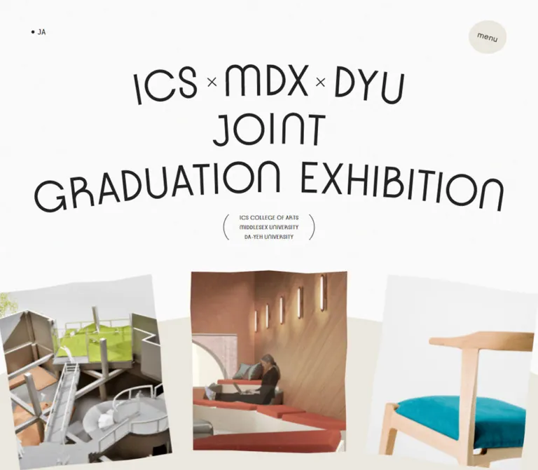
白と淡いベージュを基調に、弧を描くタイトル、扇状に並ぶ作品写真、二段の横長ギャラリーで構成された3校合同のオンライン卒業制作展。
ICS × MDX × DYU — Joint Graduation Exhibition Style Reference
A quiet online exhibition with bowed lettering, photographs arranged along an arc, and the generous space of an architectural presentation board.
Original URL: ics.ac.jp/jointexhibition2021
Final URL: ics.ac.jp/jointexhibition2021
Theme: observed light presentation
Inspected: October 5, 2026, at 05:48:39 JST; supplied retrieval timestamp: October 4, 2026, 20:48:39.924 UTC.
Viewports: desktop 1440 × 1000 and mobile 390 × 844 CSS pixels.
Scope: the currently served Japanese exhibition page. Supplied screenshots show the desktop opening, two gallery states, mobile opening, and mobile footer. Rendered DOM and computed styles additionally cover the director’s message, collaboration section, school profiles, contact information, and navigation. Open navigation and project-detail dialogs were not visually inspected.
This is an online graduation exhibition with supporting school information. Its identity comes from the relationship between unusually shaped lettering, pale architectural imagery, and broad areas of near-white space. The large title curves gently across the opening, while project photographs sit like loose prints around a shallow arc. A warm beige field connects those photographs to the page’s softer geometric shapes.
The exhibition balances expressive display typography with small, restrained Japanese text. Project cards remain square-edged and largely free of interface decoration. Institution labels run vertically beside the photographs, and the gallery extends horizontally across two staggered rows. Rounded forms are reserved for the menu control, arrow backplates, image silhouettes, and large background curves. School context and the information-request link support the exhibition rather than dominating its opening.
閉じる
ICS × MDX × DYU — Joint Graduation Exhibition Style Reference
A quiet online exhibition with bowed lettering, photographs arranged along an arc, and the generous space of an architectural presentation board.
Original URL: ics.ac.jp/jointexhibition2021
Final URL: ics.ac.jp/jointexhibition2021
Theme: observed light presentation
Inspected: October 5, 2026, at 05:48:39 JST; supplied retrieval timestamp: October 4, 2026, 20:48:39.924 UTC.
Viewports: desktop 1440 × 1000 and mobile 390 × 844 CSS pixels.
Scope: the currently served Japanese exhibition page. Supplied screenshots show the desktop opening, two gallery states, mobile opening, and mobile footer. Rendered DOM and computed styles additionally cover the director’s message, collaboration section, school profiles, contact information, and navigation. Open navigation and project-detail dialogs were not visually inspected.
This is an online graduation exhibition with supporting school information. Its identity comes from the relationship between unusually shaped lettering, pale architectural imagery, and broad areas of near-white space. The large title curves gently across the opening, while project photographs sit like loose prints around a shallow arc. A warm beige field connects those photographs to the page’s softer geometric shapes.
The exhibition balances expressive display typography with small, restrained Japanese text. Project cards remain square-edged and largely free of interface decoration. Institution labels run vertically beside the photographs, and the gallery extends horizontally across two staggered rows. Rounded forms are reserved for the menu control, arrow backplates, image silhouettes, and large background curves. School context and the information-request link support the exhibition rather than dominating its opening.
How to Read This Reference
- Measured means a value appears in the supplied rendered DOM, computed styles, or element rectangles. Measurements are rounded where appropriate.
- Estimated means a visual approximation from the supplied original-page screenshots. Estimated colors were not sampled programmatically.
- Recommended means an implementation choice for a new project, not a verified feature of the original.
- All named custom properties in this reference are implementation aliases. The supplied custom-property collections were empty.
- Computed font-family stacks identify declared families; they do not independently establish which font supplied every rendered glyph.
- Transformed element rectangles describe a captured state. Large negative coordinates and positions around one million pixels belong to offscreen items and should not become layout tokens.
- Static captures and declared handlers do not establish animation timing, input behavior, or successful dialog operation.
- The displayed
2021–2022exhibition year is content. This reference describes the page served on the inspection date, without reconstructing an earlier version.
Tokens — Colors
Default Palette
| Name | Value | Suggested token | Evidence and role |
|---|---|---|---|
| Gallery White | #fafafa |
--canvas |
Measured: HTML background at both viewports; the main page canvas |
| Charcoal Ink | #232323 |
--ink |
Measured: body text, sampled headings and links; also present in the inline title SVG fill |
| Warm Sand | Approximately #ece8df |
--sand |
Estimated: menu shape, curved field behind the opening photographs, and mobile institutional footer panel |
| Utility Slate | #4c5356 |
--muted |
Measured: desktop footer language-link text; useful as a restrained secondary-text alias |
| Quiet Gray | Approximately #c7c4bf |
--quiet |
Estimated: subdued institutional marks and footer details; not a verified universal source color |
The main contrast is charcoal against a nearly white canvas. Beige supplies structural warmth without becoming a strong action color. Greens, timber browns, concrete grays, and amber lighting come primarily from the student work and campus photography.
One desktop gallery capture contains pale gray, cream, and blue-gray rectangles without resolved photographs. Their cause is uncertain. Do not promote those transient-looking rectangles into a permanent brand palette or assume a documented skeleton-loading system.
Tokens — Typography
Latin Display — Kobe
Measured source family: Kobe, sans-serif.
Kobe is declared for the director’s statement, school names, navigation links, footer exhibition name, and school website links. Most display text uses weight 400. School website links and sampled desktop footer language links use 700.
The visible character is geometric and open, with thin strokes, rounded arches, and distinctive letter construction. Large headings feel architectural rather than heavy. Preserve the contrast between these expansive headings and the modest Japanese body copy.
The font files and their URLs were not supplied. A new implementation needs an available font resource to reproduce the measured family; a generic sans-serif fallback will change line breaks and proportions.
Japanese Body Copy
Measured primary family: a-otf-gothic-bbb-pr6n.
The supplied stack continues through Yu Gothic and Hiragino Gothic variants to sans-serif. Body text uses weight 400. Japanese paragraphs have substantially more leading than the body element’s inherited one-line default.
The director’s paragraphs measure 14px / 27.5px on desktop and 14.56px / 32.76px on mobile. The mobile setting therefore increases both text size slightly and line spacing substantially.
SVG Exhibition Lettering
The opening heading contains inline SVG artwork. Its inherited 14px desktop font size is not the visible title size, and the hero lettering should not be recreated by applying that value to ordinary text.
The composition changes between viewports:
- Desktop:
ICS × MDX × DYU, thenJOINT, then one broadGRADUATION EXHIBITIONline. - Mobile: the final phrase becomes separate
GRADUATIONandEXHIBITIONlines.
The letters follow curved baselines and include individual rotations. Preserve this as responsive vector composition when the original artwork is available. Simply scaling one desktop title image cannot reproduce the mobile arrangement.
Type Scale
All values are measured unless explicitly marked as estimates. Size and line height are shown together.
| Role | Desktop | Mobile | Weight and tracking |
|---|---|---|---|
| Director’s statement | 136px / 119.68px |
56.16px / 54.48px |
400; -0.02em |
| School name | 66px / 66px |
37.44px / 41.18px |
400; 0.03em desktop, 0.04em mobile |
| Navigation link | 36px / 52.2px |
24.96px / 37.44px |
400; 0.03em |
| Graduation Works heading | Approximately 96–100px visually |
44.34px / 48.77px |
Mobile value measured on an offscreen heading; desktop size estimated |
| Footer exhibition name | 38px / 41.8px |
31.2px / 34.32px |
400; normal tracking |
| School website link | 16px / 16px |
16.64px / 16.64px |
700; 0.04em |
| Information-request link | 16px / 16px |
14.56px / 14.56px |
400; 0.04em |
| Director’s paragraph | 14px / 27.5px |
14.56px / 32.76px |
400; normal tracking |
| Footer resource link | 13px / 24.69px |
13.52px / 25.68px |
400; normal tracking |
| Contact detail | 11px / 19px |
11.44px / 19.76px |
400; normal tracking |
| School signature under hero | Approximately 10–11px |
Approximately 10–11px |
Visual estimate; exact family and weight unmeasured |
| Vertical gallery institution label | Approximately 10px |
Not visually inspected | Visual estimate |
Do not use the HTML element’s reported Times family as the site’s display font. The visible sampled text has more specific family declarations, and the main title is vector artwork.
Tokens — Spacing & Shapes
Density: very open at section level, precise and compact at caption level. Geometry: square photographic rectangles, irregular round controls, and large shallow curves.
Spacing Scale
| Use | Desktop | Mobile | Evidence |
|---|---|---|---|
| Main lower-page frame margin | 100px per side |
0px |
Measured collaboration, school, and contact section bounds |
| Inner desktop section inset | 60px |
Section-dependent | Measured section padding |
| Hero section top padding | 127px |
114.4px |
Measured |
| Hero section horizontal padding | 102.84px inside its centered wrapper |
29.12px |
Measured; title artwork has its own bounds |
| Director’s paragraph width | 480px |
327.59px |
Measured |
| Director’s paragraph separation | Approximately 27.5px |
Approximately 32.77px |
Calculated from paragraph rectangles |
| Gallery horizontal card gap | Approximately 33px |
Approximately 27.03px |
Calculated from neighboring card bounds |
| Gallery vertical card gap | 30px |
Approximately 91.52px |
Calculated for the supplied states; not a universal source formula |
| Space between school profiles | 140px |
104px |
Calculated from profile section bounds |
| Mobile school text inset | — | 52px |
Measured heading and website-link alignment |
| Mobile footer resource inset | — | 30.16px |
Measured |
Shapes
| Element | Treatment | Evidence |
|---|---|---|
| Project photographs | Square corners, no visible card shadow | Screenshot observation; sampled anchors report zero border radius |
| Menu control | Soft, slightly irregular oval | Screenshot observation; exact radius or vector path unavailable |
| School website arrow | Thin arrow over a pale oval backplate | Visible in the supplied desktop school/gallery capture |
| Hero background | Large beige convex arc behind the photographs | Screenshot observation |
| Campus image | Organic curved silhouette | Visible portion of the Da-Yeh image; exact masking method unverified |
| Mobile institutional footer | Beige field ending in a shallow downward curve | Screenshot observation |
| Resource links | Plain underlined text | Mobile screenshot observation |
Rounded geometry belongs to the surrounding composition. It is not a general radius applied to every photograph or content container.
Layout Measurements
| Element | Desktop 1440 × 1000 |
Mobile 390 × 844 |
|---|---|---|
| Document height | 13,540.56px |
11,620.36px |
| Hero title bounds | 976.98 × 308.78px at 231.5, 127 |
280.80 × 234.16px at 54.59, 114.39 |
| Center hero project bounds | 310 × 361.41px at 565, 549.34 |
187.19 × 218.23px at 101.39, 529.08 |
| Gallery card | 220 × 330px |
166.39 × 249.59px |
| Gallery image aspect ratio | 2:3 |
2:3 |
| Gallery row top coordinates | 155px, 515px in the sampled state |
100.64px, 441.75px in the sampled state |
| Lower-page frame width | 1240px |
390px |
| School profile section | 1120 × 591px |
390px wide; approximately 799–856px tall |
| Global collaboration title artwork | 295 × 126.23px |
251.67 × 108.41px |
| Menu shape | Approximately 76 × 67px |
Approximately 62 × 54px |
Document height and viewport-relative gallery positions are observations, not dimensions to hardcode. The two hero title rectangles also demonstrate a composition change: their aspect ratios differ significantly.
Components
Persistent Utility Controls
Role: navigation access and language orientation without a conventional header bar.
The opening shows a small bullet followed by JA near the upper-left corner. The menu label sits inside a beige irregular oval near the upper-right corner. The menu label has a slight clockwise tilt, estimated at roughly ten degrees.
The menu shape sits approximately 60px from the desktop right edge and 31px from the mobile right edge. Its top offset is approximately 40px desktop and 31px mobile. It remains in the same corner across the supplied scrolled captures, supporting a persistent-control treatment. The exact CSS positioning declaration was not included.
Rendered navigation contains five destinations: Message, Graduation Works, Global Collaboration, School Info, and Contact. Each points to a corresponding fragment on the same exhibition page. Labels for menu and close are present, but the open panel’s background, reveal animation, and dismissal behavior were not observed.
The navigation links have measured typography even though the closed screenshots do not show them. Do not interpret their DOM rectangles as proof that the menu was open.
Exhibition Masthead
Role: establishes the three-school collaboration as a distinctive exhibition identity.
The anatomy is a large responsive vector heading, a small three-line school signature, and thin parenthesis-like curves flanking that signature. There is no large conversion button inside this opening title block.
On desktop, the title spans approximately 977px and sits centrally above the image arc. On mobile, it occupies approximately 281px, or 72% of the viewport width, while gaining a fourth line. The school signature remains much closer to its desktop physical size than the main heading does.
Keep the individual letter shapes and curved line rhythm. A generic centered all-caps heading loses the defining relationship between the lettering and the curved photographic arrangement below it.
Arced Project Ribbon
Role: introduces the work through large, immediately visible project images.
The central project is upright. Neighboring photographs rotate outward and sit slightly lower, producing a fan-like arrangement. Approximate rotations of ±7° for immediate neighbors and ±14° for the next pair are consistent with the screenshots and transformed rectangles; these are estimates, not supplied transform declarations.
At the inspected desktop size, the center project measures 310 × 361.41px. The immediately adjacent transformed wrappers are approximately 352 × 396px. On mobile, the center remains a substantial 187 × 218px, with only parts of its neighbors visible at either edge.
The photographs overlap a broad beige arc. They have no visible frames, caption panels, or shadows. Their natural photographic backgrounds remain part of the image.
The hero’s image proportions differ from the 2:3 work-gallery cards. Preserve that distinction. Offscreen items also have temporary or inactive bounds, so only visible resolved items are reliable references for hero geometry.
Director’s Message
Role: supplies the exhibition’s educational and curatorial context.
The DOM contains the small introduction message from Director, followed by the large three-line statement Harmony of / people, objects, / and space. Japanese explanatory paragraphs and the designation Director, ICS College of Arts follow.
Desktop anatomy uses a broad heading and a narrow text column aligned to the right. The heading starts around x=232px; the paragraphs start at x=720px and measure 480px wide. The first paragraph begins approximately 70px below the heading rectangle.
Mobile changes to one reading column. Paragraphs begin around x=31px and occupy approximately 328px. The measured heading is 56.16px, and paragraph leading grows to 32.76px. Preserve the deliberate pause between the expressive heading and the denser explanation.
The mobile heading rectangle extends about 8px beyond the viewport’s right edge. Its actual clipping was not visually inspected. A new implementation should verify this at narrow widths and with fallback fonts.
Graduation Works Gallery
Role: the main project-browsing surface.
A large two-line GRADUATION WORKS heading is paired with the smaller 2021–2022 year. A separate compact count block lists 24 works for ICS, 6 works for Middlesex, and 6 works for Da-Yeh: 36 works in total.
The resolved desktop screenshot shows two horizontal rows of portrait photographs. Each measured card is 220 × 330px. Their horizontal stride is approximately 253px, leaving a 33px gap. The second row is offset relative to the first; its initial item coordinates are 365px earlier in the sampled desktop geometry.
Each card combines a photograph, a narrow vertical institution label just outside its right edge, and an interactive wrapper. There is no persistent title-and-description box beneath the photograph in the supplied resolved view.
The gallery has viewport-relative positions and extensive offscreen horizontal content. This is consistent with a translated or scroll-managed presentation. The supplied evidence does not establish whether wheel scrolling, dragging, automatic movement, or a combination drives it.
One resolved capture also shows the tail of a school profile behind or above the gallery composition. Preserve this as evidence of that captured layering state; do not infer a new document order from the overlap.
Project Entry Points
Role: connect both the opening ribbon and gallery to individual work details.
Hero and gallery anchors reference a work-specific modal handler with an ID. The same project can therefore be entered from more than one visual location. Images carry project-name alternatives such as FIND YOUR FLAVOR, Table for Brother and Sister, and SHISEIDO BABY SPA HOUSE.
The handler is evidence of intended modal entry, not proof of a tested dialog. No open dialog, internal image sequence, close control, keyboard handling, or project-detail typography was supplied. Those components need a separate specification before implementation.
Unresolved Gallery Capture
Role: documents an inspection limitation.
A second desktop state shows two rows of pale rectangles with the menu still visible. The supplied evidence does not identify whether these are loading placeholders, reveal masks, a transition state, or incomplete rendering.
Use the resolved photographs to define the intended gallery appearance. Do not reproduce the blank state as the gallery’s default, assign it a timing curve, or assume that image readiness checks guaranteed every visual layer had resolved.
Global Collaboration
Role: explains the international school relationships supporting the exhibition.
The DOM identifies a title image with the alternative ICS GLOBAL Collaboration, a map image, and Japanese explanatory text. The title artwork is centered, measuring approximately 295px wide on desktop and 252px on mobile.
The desktop section uses a 1240px outer frame with 60px horizontal padding. The mobile section occupies the full viewport width. No complete screenshot of the map composition was supplied, so its colors, markers, and detailed arrangement should not be invented from the asset name.
School Profile
Role: introduces each participating institution and provides an external website link.
Each profile contains an institutional photograph, a two-line Kobe heading, Japanese body copy, and a website link with an arrow treatment. Desktop profiles alternate the relationship between image and text. The measured school headings appear on the right for ICS and Da-Yeh and on the left for Middlesex.
Desktop profile sections measure 1120 × 591px, separated by approximately 140px. On mobile they become taller stacked compositions, with all measured headings and website links aligned at x=52px. The heading width is 286px.
The visible Da-Yeh campus photograph has an organic curved lower silhouette. Its website link combines bold compact lettering with a thin arrow over a beige oval. The exact masking technique and arrow asset were not supplied.
Contact and Information Request
Role: provides institutional contact information and a secondary next step.
The page contains the school name, address, telephone link, email link, and ICSの資料を請求する. The request link points to an external form. The form itself was not inspected.
The request control is an unboxed text-and-arrow composition, not a saturated rectangular button. Its measured desktop box is approximately 237 × 72px; the mobile box is approximately 204 × 72.78px. Much of the target height comes from generous vertical padding rather than large type.
Institutional Footer
Role: closes the exhibition with resource links, participating institutions, and social accounts.
The mobile capture shows a warm beige panel containing a two-line exhibition name, four underlined resource links, and three subdued institutional marks. The panel ends in a shallow curved edge. A separate near-white area below holds follow us, four social symbols, and a faint copyright line.
The footer name uses Kobe at 31.2px / 34.32px on mobile. Resource links use 13.52px / 25.68px with 6.24px vertical padding. The measured mobile logo widths remain approximately 87px, 88px, and 107px; they are not reduced to tiny badges.
The visible social symbols represent Facebook, Twitter, Instagram, and YouTube. Preserve the supplied icon appearance when matching the inspected page rather than automatically substituting a different brand-symbol generation.
Desktop DOM includes footer language links for JA, ZH-TW, and EN. Those links are absent from the supplied mobile footer link inventory and screenshot; their alternate mobile access was not exercised.
Tokens — Motion & Interaction
| Treatment | Evidence | What can be concluded |
|---|---|---|
| Navigation link color transition | Measured: 0.8s cubic-bezier(0.19, 1, 0.22, 1) |
A color transition is declared; trigger and endpoint were not tested |
| Hero project opacity transition | Measured: 0.8s cubic-bezier(0.19, 1, 0.22, 1) |
Opacity feedback is declared; its endpoint was not supplied |
| Desktop footer language opacity | Measured: 0.3s cubic-bezier(0.25, 0.46, 0.45, 0.94) |
A shorter opacity transition is declared |
| Arced opening arrangement | Observed: rotated and displaced image rectangles | Establishes geometry, not autoplay, direction, or speed |
| Horizontal gallery presentation | Observed: staggered rows and offscreen translated positions | Establishes a horizontal composition; exact input-to-motion mapping remains unverified |
| Work details | DOM evidence: project-specific modal handlers | Intended detail entry; resulting dialog was not inspected |
| Section navigation | DOM evidence: five fragment destinations | Same-page destinations exist; smooth scrolling was not verified |
| Menu open/close | DOM evidence: menu and close labels | A toggle is suggested; reveal choreography was not observed |
| Language selection | DOM evidence: Japanese, Traditional Chinese, and English destinations | Alternate URLs exist; translated pages were not inspected |
Repeated animation: none values on sampled elements do not rule out JavaScript-driven motion, transformed ancestors, or pseudo-element effects. Likewise, a bare transition: all entry without a useful duration does not justify assigning a transition duration.
For a new implementation, keep feedback quiet and limited to color or opacity unless additional evidence specifies movement. Any autoplay, gallery pinning, scroll conversion, or modal transition requires its own explicit design decision.
Surfaces
| Layer | Appearance | Purpose |
|---|---|---|
| Page canvas | Near-white with faint visible grain | Provides continuous exhibition space |
| Hero ground | Broad warm beige arc | Connects the photographic fan to the page geometry |
| Project card | Photograph directly on the canvas | Lets student work provide visual density |
| Menu backplate | Small irregular beige oval | Makes a persistent utility recognizable without a header bar |
| Arrow backplate | Beige oval behind a thin arrow | Signals an external or supporting action |
| Institutional footer | Large beige region with a curved lower edge | Groups resources and school identities |
| Social footer | Near-white, subdued symbols and text | Creates a quiet ending |
No general shadow-based elevation system is visible. Separation comes from whitespace, image boundaries, background color, and curvature. The grain is visible in the captures, but its asset, opacity, and rendering method are not identified.
Imagery
The current captures emphasize architectural models, interior proposals, furniture, and campus photography. White model walls, pale wood, concrete, small figures, greenery, and carefully lit miniature spaces create a restrained material palette. Some work images introduce stronger amber or timber tones without changing the interface colors.
Preserve natural photographic detail and subtle light. The white margins and pale model surfaces are part of the composition, so aggressive contrast or saturation would reduce the calm exhibition quality.
Opening images behave like loose photographic prints, with natural proportions and rotation. Gallery images use a consistent 2:3 portrait window. Campus imagery has a larger contextual role and includes at least one curved silhouette. These three image treatments should remain distinct.
Observed Asset References
Paths are relative to the inspected exhibition URL. They are references found in the supplied DOM, not files bundled with this document.
| Asset | Observed path | Use |
|---|---|---|
| Central opening model | assets/images/main/mv/26.png |
Hiregasaki project in the opening ribbon |
| Opening interior photograph | assets/images/main/mv/30.png |
FIND YOUR FLAVOR |
| Opening furniture photograph | assets/images/main/mv/33.png |
Table for Brother and Sister |
| Gallery model | assets/images/works/36/1.jpg |
SHISEIDO BABY SPA HOUSE |
| Gallery model | assets/images/works/26/1.jpg |
Hiregasaki project |
| Gallery interior | assets/images/works/31/1.jpg |
tem place |
| Collaboration title | assets/images/global/title.svg |
Vector section identity |
| Collaboration map | assets/images/global/map.png |
International collaboration illustration |
| School photographs | assets/images/schoolinfo/ics.png, assets/images/schoolinfo/mdx.png, assets/images/schoolinfo/dyu.png |
Institution profiles |
| Contact-region image | assets/images/footinfo/bg.png |
Image referenced within the contact/footer information section |
The opening heading is inline vector artwork; a standalone file path was not exposed. No texture-file path, font-file URL, or menu-shape asset path was supplied.
Layout & Responsive Behavior
The desktop page alternates centered exhibition artwork, asymmetrical editorial text, horizontal project rows, and alternating school profiles. A 1240px lower-page frame contains a 1120px inner content area at the inspected width. The opening title and photographic ribbon use their own geometry instead of adhering to that frame throughout.
Mobile is deliberately recomposed. The title adds a line, the central opening photograph still occupies approximately 48% of the viewport width, and neighboring photographs remain cropped at the edges. The mobile title width is approximately 72% of the viewport. This preserves the opening’s identity while keeping individual work images legible.
The director’s message changes from a right-aligned paragraph column to a single reading column. School profiles stack, and their text receives a deeper 52px inset than the approximately 30px used for the general mobile content and footer links. Footer identity and resource links stack above a centered social area.
Gallery card dimensions remain 2:3 at both measured widths. Mobile DOM still describes two horizontally extending rows, not a verified single-column gallery. However, no mobile gallery screenshot was supplied, so its visible scrolling experience and labels remain unconfirmed.
Many mobile values equal familiar design values multiplied by 390 / 375 = 1.04: 14 → 14.56px, 36 → 37.44px, and 160 → 166.4px. This is consistent with viewport-based scaling around a 375px design width. The actual source formula, breakpoint, and scaling limits were not supplied.
The CSS below uses that relationship as a labeled adaptation. It does not claim to recover the original responsive stylesheet or scroll controller.
Do’s and Don’ts
Do
- Keep the near-white canvas and charcoal text exact where measured.
- Use beige for large curved fields and small utility backplates.
- Preserve separate desktop and mobile title compositions.
- Keep the opening photographs rotated along an arc, with a prominent upright center image.
- Distinguish natural hero-image proportions from the gallery’s
2:3crops. - Retain thin, expansive display typography and generous Japanese paragraph leading.
- Place institution labels beside gallery photographs rather than in bulky caption panels.
- Preserve the alternating desktop school profiles and stacked mobile reading order.
- Give the exhibition work more visual emphasis than the supporting information-request link.
Don’t
- Don’t replace the custom title artwork with a generic bold all-caps headline.
- Don’t infer the hero’s visible type size from its inherited
14pxfont declaration. - Don’t round every photograph or add a general card-shadow system.
- Don’t introduce a bright action color unsupported by the page.
- Don’t flatten the gallery into an ordinary uniform desktop card grid when matching this composition.
- Don’t reproduce the unresolved pale rectangles as finished gallery content.
- Don’t treat offscreen DOM coordinates as page widths or spacing requirements.
- Don’t invent modal layouts, autoplay timing, dragging, or menu animation from static captures.
- Don’t scale desktop text, logos, and margins uniformly to obtain the mobile design.
Recommended Implementation Additions
These are recommendations for a new implementation, not verified original features.
- Give the vector masthead an accessible exhibition name and use a coherent heading hierarchy for subsequent sections.
- Make the menu a real button with an expanded state and a controlled navigation region. Specify focus movement, Escape handling, and focus restoration if it behaves as an overlay.
- Use real project URLs as a fallback, or semantic buttons for dialogs. Keep every project reachable without depending on a JavaScript URL.
- Ensure focused gallery items scroll into view. Provide a readable, keyboard-accessible alternative if a custom scroll-driven gallery is introduced.
- Reserve image dimensions and provide a useful failure state so an unresolved reveal cannot leave the gallery indefinitely blank.
- Add reduced-motion behavior to any scripted gallery travel or automatic movement, including a pause control if movement is continuous.
- Keep essential footer links sufficiently contrasted. The pale marks are part of the observed appearance, but their contrast was not quantitatively audited.
- Verify the large mobile statement with font loading delayed, at narrower widths, and under text enlargement.
- Give social and institution-logo links accessible names and comfortable touch targets.
Agent Prompt Guide
Quick Color Reference
- Canvas: measured
#fafafa. - Text and title ink: measured
#232323. - Curved background and utility backplates: approximately
#ece8df. - Secondary utility text: measured
#4c5356in desktop footer language links. - Subdued institutional marks: approximately
#c7c4bf. - Stronger color should come from the photographs rather than extra interface accents.
Overall Prompt
“Create an online graduation exhibition for three design schools. Use a near-white #fafafa canvas, charcoal #232323 lettering, and pale warm beige curved backgrounds. Build the opening around a custom vector title with bowed baselines: three lines on desktop and four on mobile. Place large square-edged project photographs along an arc, with an upright central image and rotated neighbors partially cropped by the viewport. Use Kobe where the font is available for large editorial headings, paired with restrained Japanese Gothic body text. Present the work in two staggered horizontal rows of portrait photographs with small vertical institution labels. Add a spacious director’s message, international collaboration information, alternating school profiles that stack on mobile, and a beige institutional footer with underlined resource links. Keep the menu as a small persistent organic oval. Specify interaction behavior separately where the evidence does not establish it.”
Example Component Prompts
- Opening masthead: “Compose a centered charcoal vector exhibition title with gently arced baselines. At desktop size, keep GRADUATION EXHIBITION on one wide line; on a 390px phone, split it into two lines. Add a small three-line school signature between thin curved parentheses. Preserve wide empty space around the lettering.”
- Project ribbon: “Arrange photographic project prints around a shallow arc over a beige curved ground. Use a 310px-wide upright center image on a 1440px desktop and approximately 187px on a 390px phone. Rotate adjacent prints outward by approximately seven degrees. Keep square corners and natural image backgrounds.”
- Works gallery: “Create two staggered horizontal rows of 2:3 project images, 220 × 330px on desktop, with approximately 33px horizontal gaps and a 30px vertical gap. Put a small vertical school label just outside each image’s right edge. Include a large two-line section heading, a small exhibition year, and the three school counts.”
- School profile: “Pair a campus photograph with a two-line geometric school name, airy Japanese body copy, and a thin arrow over a beige oval. Alternate image and text sides on desktop; stack them on mobile with a 52px text inset at a 390px viewport.”
- Footer: “Build a warm beige institutional panel with a two-line exhibition name, four understated underlined links, and a horizontal row of pale school marks. End the panel with a shallow curved edge. Place a centered follow-us label, four social symbols, and a small copyright line on the white area below.”
Quick Start
CSS Custom Properties
This is a usable visual foundation, not recovered source CSS. Exact measured colors and typography are mixed with explicitly estimated geometry. The 48rem breakpoint, clamped mobile unit, hover endpoints, and native horizontal gallery scrolling are recommended adaptations.
Supply the real font resources separately. Place desktop and mobile vector title compositions inside .hero-title__desktop and .hero-title__mobile; their source file paths are unknown. The ribbon example expects five .hero-work elements, with the central image third. Gallery rails sit inside .works-scroller. This CSS does not implement a project dialog or the original gallery motion system.
:root {
  /* Measured colors */
  --canvas: #fafafa;
  --ink: #232323;
  --muted: #4c5356;

  /* Screenshot estimates */
  --sand: #ece8df;
  --quiet: #c7c4bf;

  /* Observed family names; font files must be supplied separately */
  --font-display: 'Kobe', sans-serif;
  --font-body: 'a-otf-gothic-bbb-pr6n', 'Yu Gothic', YuGothic,
    'Hiragino Kaku Gothic ProN', 'Hiragino Kaku Gothic Pro', sans-serif;

  --u: 1px;
  --body-size: 14px;
  --body-leading: 27.5px;
  --message-size: 136px;
  --message-leading: 0.88;
  --school-size: 66px;
  --school-leading: 1;
  --school-tracking: 0.03em;
  --nav-size: 36px;
  --nav-leading: 1.45;
  --footer-size: 38px;
  --action-size: 16px;

  --frame-gutter: clamp(32px, 6.944vw, 100px);
  --inner-gutter: 60px;
  --work-width: 220px;
  --work-gap: 33px;
  --row-gap: 30px;
  --rail-offset: 365px;
  --hero-width: 310px;

  /* Approximate fan geometry */
  --fan-step: 364px;
  --near-drop: 22px;
  --far-drop: 88px;

  /* Measured transition durations and easing functions */
  --ease-exhibition: cubic-bezier(0.19, 1, 0.22, 1);
  --ease-utility: cubic-bezier(0.25, 0.46, 0.45, 0.94);
  --motion-image: 800ms var(--ease-exhibition);
  --motion-utility: 300ms var(--ease-utility);
}

* { box-sizing: border-box; }

html { background: var(--canvas); }

body {
  margin: 0;
  color: var(--ink);
  background: var(--canvas);
  font-family: var(--font-body);
  font-size: var(--body-size);
  font-weight: 400;
}

button, a { -webkit-tap-highlight-color: transparent; }
button { font: inherit; }
a { color: inherit; }
img { display: block; max-width: 100%; }

.page-frame {
  width: calc(100% - 2 * var(--frame-gutter));
  max-width: 1240px;
  margin-inline: auto;
  padding-inline: var(--inner-gutter);
}

.language-marker {
  position: absolute;
  top: 52px;
  left: 60px;
  z-index: 10;
  font-size: 14px;
  text-decoration: none;
}

.language-marker::before {
  content: '';
  display: inline-block;
  width: 5px;
  height: 5px;
  margin-right: 7px;
  border-radius: 50%;
  background: currentColor;
  vertical-align: middle;
}

.menu-toggle {
  position: fixed;
  top: 40px;
  right: 60px;
  z-index: 30;
  display: grid;
  place-items: center;
  width: 76px;
  height: 67px;
  padding: 0;
  border: 0;
  color: var(--ink);
  background: var(--sand);
  border-radius: 48% 52% 49% 51% / 51% 48% 52% 49%;
  cursor: pointer;
}

.menu-toggle > span { transform: rotate(10deg); }

.nav-link {
  display: inline-block;
  padding: 0 10px;
  font-family: var(--font-display);
  font-size: var(--nav-size);
  line-height: var(--nav-leading);
  letter-spacing: 0.03em;
  text-decoration: none;
  transition: color var(--motion-image);
}

.hero { padding-top: 127px; }

.hero-title {
  width: min(72vw, 976.98px);
  margin: 0 auto;
}

.hero-title svg { display: block; width: 100%; height: auto; }
.hero-title__mobile { display: none; }

.school-signature {
  position: relative;
  width: 180px;
  margin: 4px auto 0;
  text-align: center;
  font-size: 10px;
  line-height: 19px;
}

.school-signature::before,
.school-signature::after {
  position: absolute;
  top: 0;
  width: 22px;
  height: 52px;
  border: 1px solid var(--ink);
  border-radius: 50%;
  content: '';
}

.school-signature::before {
  left: 0;
  border-color: transparent transparent transparent var(--ink);
}

.school-signature::after {
  right: 0;
  border-color: transparent var(--ink) transparent transparent;
}

.hero-ribbon {
  position: relative;
  isolation: isolate;
  height: 450px;
  margin-top: 52px;
  overflow: hidden;
}

.hero-ribbon::before {
  position: absolute;
  z-index: -1;
  top: 84px;
  left: 50%;
  width: max(120vw, 900px);
  height: 1000px;
  border-radius: 50% 50% 0 0 / 35% 35% 0 0;
  background: var(--sand);
  transform: translateX(-50%);
  content: '';
}

.hero-work {
  position: absolute;
  top: var(--drop, 0px);
  left: calc(50% + var(--shift, 0px));
  display: block;
  width: var(--hero-width);
  transform: translateX(-50%) rotate(var(--turn, 0deg));
  transition: opacity var(--motion-image);
}

.hero-work img { width: 100%; height: auto; }
.hero-work:nth-child(1) {
  --shift: calc(-2 * var(--fan-step));
  --drop: var(--far-drop);
  --turn: -14deg;
}
.hero-work:nth-child(2) {
  --shift: calc(-1 * var(--fan-step));
  --drop: var(--near-drop);
  --turn: -7deg;
}
.hero-work:nth-child(4) {
  --shift: var(--fan-step);
  --drop: var(--near-drop);
  --turn: 7deg;
}
.hero-work:nth-child(5) {
  --shift: calc(2 * var(--fan-step));
  --drop: var(--far-drop);
  --turn: 14deg;
}

.message {
  width: min(968px, calc(100% - 60px));
  margin: 180px auto 140px;
}

.message-title {
  margin: 0;
  font-family: var(--font-display);
  font-size: var(--message-size);
  font-weight: 400;
  line-height: var(--message-leading);
  letter-spacing: -0.02em;
}

.message-copy {
  width: min(480px, 100%);
  margin: 70px 0 0 auto;
}

.copy { line-height: var(--body-leading); }
.copy p { margin: 0; }
.copy p + p { margin-top: var(--body-leading); }

/* Native scrolling is an accessible fallback, not the original controller. */
.works-scroller {
  max-width: 100%;
  overflow-x: auto;
  padding: 12px 30px 28px;
  scroll-padding-inline: 30px;
}

.works-rail {
  display: flex;
  gap: var(--work-gap);
  width: max-content;
  padding-right: 24px;
}

.works-rail:first-child { padding-left: var(--rail-offset); }
.works-rail + .works-rail { margin-top: var(--row-gap); }

.work-card {
  position: relative;
  display: block;
  flex: 0 0 var(--work-width);
  width: var(--work-width);
  padding: 0;
  border: 0;
  border-radius: 0;
  background: transparent;
  text-decoration: none;
  cursor: pointer;
}

.work-card img {
  width: 100%;
  aspect-ratio: 2 / 3;
  object-fit: cover;
}

.work-card__school {
  position: absolute;
  top: 0;
  left: calc(100% + 6px);
  color: var(--muted);
  font-size: 10px;
  line-height: 1;
  white-space: nowrap;
  writing-mode: vertical-rl;
}

.school {
  display: grid;
  grid-template-columns: minmax(0, 1fr) minmax(0, 1fr);
  align-items: center;
  gap: 90px;
  margin-block: 140px;
}

.school:nth-child(even) .school-visual { order: 2; }

.school-title {
  margin: 0 0 32px;
  font-family: var(--font-display);
  font-size: var(--school-size);
  font-weight: 400;
  line-height: var(--school-leading);
  letter-spacing: var(--school-tracking);
}

.arrow-link {
  display: inline-flex;
  align-items: center;
  gap: 20px;
  min-height: 74px;
  font-family: var(--font-display);
  font-size: var(--action-size);
  font-weight: 700;
  letter-spacing: 0.04em;
  text-decoration: none;
}

.arrow-link__mark {
  display: grid;
  place-items: center;
  width: 84px;
  height: 66px;
  border-radius: 48% 52% 50% 50%;
  background: var(--sand);
  font-weight: 400;
}

.footer-panel {
  padding: 80px var(--inner-gutter) 90px;
  background: var(--sand);
  border-radius: 0 0 50% 50% / 0 0 4% 4%;
}

.footer-title {
  margin: 0 0 40px;
  font-family: var(--font-display);
  font-size: var(--footer-size);
  font-weight: 400;
  line-height: 1.1;
}

.footer-links {
  display: grid;
  justify-items: start;
  gap: 2px;
}

.footer-links a {
  padding-block: 6px;
  font-size: 13px;
  line-height: 1.9;
  text-underline-offset: 2px;
}

.footer-bottom { padding: 56px 30px 40px; text-align: center; }

/* Recommended hover endpoints; the source endpoints were not supplied. */
@media (hover: hover) {
  .hero-work:hover { opacity: 0.8; }
  .nav-link:hover { color: var(--muted); }
}

/* Recommended breakpoint and clamped mobile scale. */
@media (max-width: 48rem) {
  :root {
    --u: clamp(1px, calc(100vw / 375), 1.15px);
    --body-size: calc(14 * var(--u));
    --body-leading: calc(31.5 * var(--u));
    --message-size: calc(54 * var(--u));
    --message-leading: 0.97;
    --school-size: calc(36 * var(--u));
    --school-leading: 1.1;
    --school-tracking: 0.04em;
    --nav-size: calc(24 * var(--u));
    --nav-leading: 1.5;
    --footer-size: calc(30 * var(--u));
    --action-size: calc(16 * var(--u));
    --frame-gutter: 0px;
    --inner-gutter: calc(28 * var(--u));
    --work-width: calc(160 * var(--u));
    --work-gap: calc(26 * var(--u));
    --row-gap: 91.52px;
    --rail-offset: 244.4px;
    --hero-width: calc(180 * var(--u));
    --fan-step: calc(214 * var(--u));
    --near-drop: 14px;
    --far-drop: 54px;
  }

  .language-marker { top: 48px; left: calc(30 * var(--u)); }
  .menu-toggle {
    top: calc(30 * var(--u));
    right: calc(30 * var(--u));
    width: calc(60 * var(--u));
    height: calc(52 * var(--u));
  }
  .nav-link { padding: calc(4 * var(--u)) calc(10 * var(--u)); }
  .hero { padding-top: calc(110 * var(--u)); }
  .hero-title { width: 72vw; }
  .hero-title__desktop { display: none; }
  .hero-title__mobile { display: block; }
  .school-signature { width: 187px; margin-top: 32px; }
  .hero-ribbon { height: 315px; margin-top: 91.5px; }
  .message {
    width: calc(100% - 60 * var(--u));
    margin-top: calc(150 * var(--u));
  }
  .message-copy { width: 100%; margin-top: calc(40 * var(--u)); }
  .school { display: block; margin-block: calc(100 * var(--u)); }
  .school:nth-child(even) .school-visual { order: initial; }
  .school-copy { padding-inline: calc(50 * var(--u)); }
  .school-profiles.page-frame { padding-inline: 0; }
  .footer-links a {
    padding-block: calc(6 * var(--u));
    font-size: calc(13 * var(--u));
  }
}

/* Recommended keyboard and reduced-motion treatment. */
.exhibition :focus-visible {
  outline: 2px solid var(--ink);
  outline-offset: 5px;
}

@media (prefers-reduced-motion: reduce) {
  .exhibition *,
  .exhibition *::before,
  .exhibition *::after {
    animation: none !important;
    transition: none !important;
    scroll-behavior: auto !important;
  }
}
The CSS intentionally leaves texture optional because no source texture asset was identified. School-photo masks, the exact title artwork, and the arrow drawing need their own supplied assets or explicitly designed approximations. Scripted movement must also respond to reduced-motion preferences; CSS alone cannot stop an independent JavaScript animation loop.
Tailwind v4 Token Mapping
Optional aliases for a project already using Tailwind v4. This is not evidence that the original page uses Tailwind. Define the custom properties above first.
@theme inline {
  --color-gallery: var(--canvas);
  --color-charcoal: var(--ink);
  --color-warm-sand: var(--sand);
  --color-utility-slate: var(--muted);
  --color-quiet-gray: var(--quiet);

  --font-exhibition: var(--font-display);
  --font-copy: var(--font-body);

  --text-statement: var(--message-size);
  --text-institution: var(--school-size);
  --text-navigation: var(--nav-size);
  --text-exhibition-footer: var(--footer-size);
  --text-copy: var(--body-size);

  --spacing-work: var(--work-width);
  --spacing-work-gap: var(--work-gap);
  --spacing-section-inset: var(--inner-gutter);

  --ease-exhibition: cubic-bezier(0.19, 1, 0.22, 1);
  --ease-utility: cubic-bezier(0.25, 0.46, 0.45, 0.94);
}
Sources & Evidence
- Current Japanese Joint Graduation Exhibition page: original and final URL are identical; supplied HTTP status is
200. - Supplied original-page captures: three desktop images at
1440 × 1000and two mobile images at390 × 844. Visual coverage includes the opening, gallery states, part of a school profile, and the mobile footer. - Supplied rendered DOM and computed styles, retrieved at
2026-10-04T20:48:39.924Z: font-family declarations, type sizes, line heights, colors, element rectangles, asset references, link destinations, and selected transition declarations. - The capture process waited for document load, selected finite animations, sampled layout stability, and visible image decoding within stated limits. Those checks do not establish semantic completeness, as the unresolved gallery capture demonstrates.
- No additional browsing, command execution, external asset retrieval, or independent interaction testing was performed for this reference. Menu opening, project dialogs, hover endpoints, gallery input behavior, translated pages, and the external request form remain unverified.
Measured declarations, screenshot estimates, and recommended implementation choices are identified separately throughout this document.
# ICS × MDX × DYU — Joint Graduation Exhibition Style Reference

> A quiet online exhibition with bowed lettering, photographs arranged along an arc, and the generous space of an architectural presentation board.

**Original URL:** [ics.ac.jp/jointexhibition2021](https://www.ics.ac.jp/jointexhibition2021/)
**Final URL:** [ics.ac.jp/jointexhibition2021](https://www.ics.ac.jp/jointexhibition2021/)
**Theme:** observed light presentation
**Inspected:** October 5, 2026, at 05:48:39 JST; supplied retrieval timestamp: October 4, 2026, `20:48:39.924 UTC`.
**Viewports:** desktop `1440 × 1000` and mobile `390 × 844` CSS pixels.
**Scope:** the currently served Japanese exhibition page. Supplied screenshots show the desktop opening, two gallery states, mobile opening, and mobile footer. Rendered DOM and computed styles additionally cover the director’s message, collaboration section, school profiles, contact information, and navigation. Open navigation and project-detail dialogs were not visually inspected.

This is an online graduation exhibition with supporting school information. Its identity comes from the relationship between unusually shaped lettering, pale architectural imagery, and broad areas of near-white space. The large title curves gently across the opening, while project photographs sit like loose prints around a shallow arc. A warm beige field connects those photographs to the page’s softer geometric shapes.

The exhibition balances expressive display typography with small, restrained Japanese text. Project cards remain square-edged and largely free of interface decoration. Institution labels run vertically beside the photographs, and the gallery extends horizontally across two staggered rows. Rounded forms are reserved for the menu control, arrow backplates, image silhouettes, and large background curves. School context and the information-request link support the exhibition rather than dominating its opening.
閉じる
# ICS × MDX × DYU — Joint Graduation Exhibition Style Reference

> A quiet online exhibition with bowed lettering, photographs arranged along an arc, and the generous space of an architectural presentation board.

**Original URL:** [ics.ac.jp/jointexhibition2021](https://www.ics.ac.jp/jointexhibition2021/)
**Final URL:** [ics.ac.jp/jointexhibition2021](https://www.ics.ac.jp/jointexhibition2021/)
**Theme:** observed light presentation
**Inspected:** October 5, 2026, at 05:48:39 JST; supplied retrieval timestamp: October 4, 2026, `20:48:39.924 UTC`.
**Viewports:** desktop `1440 × 1000` and mobile `390 × 844` CSS pixels.
**Scope:** the currently served Japanese exhibition page. Supplied screenshots show the desktop opening, two gallery states, mobile opening, and mobile footer. Rendered DOM and computed styles additionally cover the director’s message, collaboration section, school profiles, contact information, and navigation. Open navigation and project-detail dialogs were not visually inspected.

This is an online graduation exhibition with supporting school information. Its identity comes from the relationship between unusually shaped lettering, pale architectural imagery, and broad areas of near-white space. The large title curves gently across the opening, while project photographs sit like loose prints around a shallow arc. A warm beige field connects those photographs to the page’s softer geometric shapes.

The exhibition balances expressive display typography with small, restrained Japanese text. Project cards remain square-edged and largely free of interface decoration. Institution labels run vertically beside the photographs, and the gallery extends horizontally across two staggered rows. Rounded forms are reserved for the menu control, arrow backplates, image silhouettes, and large background curves. School context and the information-request link support the exhibition rather than dominating its opening.

## How to Read This Reference

- **Measured** means a value appears in the supplied rendered DOM, computed styles, or element rectangles. Measurements are rounded where appropriate.
- **Estimated** means a visual approximation from the supplied original-page screenshots. Estimated colors were not sampled programmatically.
- **Recommended** means an implementation choice for a new project, not a verified feature of the original.
- All named custom properties in this reference are implementation aliases. The supplied custom-property collections were empty.
- Computed font-family stacks identify declared families; they do not independently establish which font supplied every rendered glyph.
- Transformed element rectangles describe a captured state. Large negative coordinates and positions around one million pixels belong to offscreen items and should not become layout tokens.
- Static captures and declared handlers do not establish animation timing, input behavior, or successful dialog operation.
- The displayed `2021–2022` exhibition year is content. This reference describes the page served on the inspection date, without reconstructing an earlier version.

## Tokens — Colors

### Default Palette

| Name | Value | Suggested token | Evidence and role |
| --- | --- | --- | --- |
| Gallery White | `#fafafa` | `--canvas` | **Measured:** HTML background at both viewports; the main page canvas |
| Charcoal Ink | `#232323` | `--ink` | **Measured:** body text, sampled headings and links; also present in the inline title SVG fill |
| Warm Sand | Approximately `#ece8df` | `--sand` | **Estimated:** menu shape, curved field behind the opening photographs, and mobile institutional footer panel |
| Utility Slate | `#4c5356` | `--muted` | **Measured:** desktop footer language-link text; useful as a restrained secondary-text alias |
| Quiet Gray | Approximately `#c7c4bf` | `--quiet` | **Estimated:** subdued institutional marks and footer details; not a verified universal source color |

The main contrast is charcoal against a nearly white canvas. Beige supplies structural warmth without becoming a strong action color. Greens, timber browns, concrete grays, and amber lighting come primarily from the student work and campus photography.

One desktop gallery capture contains pale gray, cream, and blue-gray rectangles without resolved photographs. Their cause is uncertain. Do not promote those transient-looking rectangles into a permanent brand palette or assume a documented skeleton-loading system.

## Tokens — Typography

### Latin Display — Kobe

**Measured source family:** `Kobe, sans-serif`.

Kobe is declared for the director’s statement, school names, navigation links, footer exhibition name, and school website links. Most display text uses weight `400`. School website links and sampled desktop footer language links use `700`.

The visible character is geometric and open, with thin strokes, rounded arches, and distinctive letter construction. Large headings feel architectural rather than heavy. Preserve the contrast between these expansive headings and the modest Japanese body copy.

The font files and their URLs were not supplied. A new implementation needs an available font resource to reproduce the measured family; a generic sans-serif fallback will change line breaks and proportions.

### Japanese Body Copy

**Measured primary family:** `a-otf-gothic-bbb-pr6n`.

The supplied stack continues through Yu Gothic and Hiragino Gothic variants to `sans-serif`. Body text uses weight `400`. Japanese paragraphs have substantially more leading than the body element’s inherited one-line default.

The director’s paragraphs measure `14px / 27.5px` on desktop and `14.56px / 32.76px` on mobile. The mobile setting therefore increases both text size slightly and line spacing substantially.

### SVG Exhibition Lettering

The opening heading contains inline SVG artwork. Its inherited `14px` desktop font size is not the visible title size, and the hero lettering should not be recreated by applying that value to ordinary text.

The composition changes between viewports:

- Desktop: `ICS × MDX × DYU`, then `JOINT`, then one broad `GRADUATION EXHIBITION` line.
- Mobile: the final phrase becomes separate `GRADUATION` and `EXHIBITION` lines.

The letters follow curved baselines and include individual rotations. Preserve this as responsive vector composition when the original artwork is available. Simply scaling one desktop title image cannot reproduce the mobile arrangement.

### Type Scale

All values are measured unless explicitly marked as estimates. Size and line height are shown together.

| Role | Desktop | Mobile | Weight and tracking |
| --- | --- | --- | --- |
| Director’s statement | `136px / 119.68px` | `56.16px / 54.48px` | `400`; `-0.02em` |
| School name | `66px / 66px` | `37.44px / 41.18px` | `400`; `0.03em` desktop, `0.04em` mobile |
| Navigation link | `36px / 52.2px` | `24.96px / 37.44px` | `400`; `0.03em` |
| Graduation Works heading | Approximately `96–100px` visually | `44.34px / 48.77px` | Mobile value measured on an offscreen heading; desktop size estimated |
| Footer exhibition name | `38px / 41.8px` | `31.2px / 34.32px` | `400`; normal tracking |
| School website link | `16px / 16px` | `16.64px / 16.64px` | `700`; `0.04em` |
| Information-request link | `16px / 16px` | `14.56px / 14.56px` | `400`; `0.04em` |
| Director’s paragraph | `14px / 27.5px` | `14.56px / 32.76px` | `400`; normal tracking |
| Footer resource link | `13px / 24.69px` | `13.52px / 25.68px` | `400`; normal tracking |
| Contact detail | `11px / 19px` | `11.44px / 19.76px` | `400`; normal tracking |
| School signature under hero | Approximately `10–11px` | Approximately `10–11px` | Visual estimate; exact family and weight unmeasured |
| Vertical gallery institution label | Approximately `10px` | Not visually inspected | Visual estimate |

Do not use the HTML element’s reported `Times` family as the site’s display font. The visible sampled text has more specific family declarations, and the main title is vector artwork.

## Tokens — Spacing & Shapes

**Density:** very open at section level, precise and compact at caption level.
**Geometry:** square photographic rectangles, irregular round controls, and large shallow curves.

### Spacing Scale

| Use | Desktop | Mobile | Evidence |
| --- | --- | --- | --- |
| Main lower-page frame margin | `100px` per side | `0px` | Measured collaboration, school, and contact section bounds |
| Inner desktop section inset | `60px` | Section-dependent | Measured section padding |
| Hero section top padding | `127px` | `114.4px` | Measured |
| Hero section horizontal padding | `102.84px` inside its centered wrapper | `29.12px` | Measured; title artwork has its own bounds |
| Director’s paragraph width | `480px` | `327.59px` | Measured |
| Director’s paragraph separation | Approximately `27.5px` | Approximately `32.77px` | Calculated from paragraph rectangles |
| Gallery horizontal card gap | Approximately `33px` | Approximately `27.03px` | Calculated from neighboring card bounds |
| Gallery vertical card gap | `30px` | Approximately `91.52px` | Calculated for the supplied states; not a universal source formula |
| Space between school profiles | `140px` | `104px` | Calculated from profile section bounds |
| Mobile school text inset | — | `52px` | Measured heading and website-link alignment |
| Mobile footer resource inset | — | `30.16px` | Measured |

### Shapes

| Element | Treatment | Evidence |
| --- | --- | --- |
| Project photographs | Square corners, no visible card shadow | Screenshot observation; sampled anchors report zero border radius |
| Menu control | Soft, slightly irregular oval | Screenshot observation; exact radius or vector path unavailable |
| School website arrow | Thin arrow over a pale oval backplate | Visible in the supplied desktop school/gallery capture |
| Hero background | Large beige convex arc behind the photographs | Screenshot observation |
| Campus image | Organic curved silhouette | Visible portion of the Da-Yeh image; exact masking method unverified |
| Mobile institutional footer | Beige field ending in a shallow downward curve | Screenshot observation |
| Resource links | Plain underlined text | Mobile screenshot observation |

Rounded geometry belongs to the surrounding composition. It is not a general radius applied to every photograph or content container.

### Layout Measurements

| Element | Desktop `1440 × 1000` | Mobile `390 × 844` |
| --- | --- | --- |
| Document height | `13,540.56px` | `11,620.36px` |
| Hero title bounds | `976.98 × 308.78px` at `231.5, 127` | `280.80 × 234.16px` at `54.59, 114.39` |
| Center hero project bounds | `310 × 361.41px` at `565, 549.34` | `187.19 × 218.23px` at `101.39, 529.08` |
| Gallery card | `220 × 330px` | `166.39 × 249.59px` |
| Gallery image aspect ratio | `2:3` | `2:3` |
| Gallery row top coordinates | `155px`, `515px` in the sampled state | `100.64px`, `441.75px` in the sampled state |
| Lower-page frame width | `1240px` | `390px` |
| School profile section | `1120 × 591px` | `390px` wide; approximately `799–856px` tall |
| Global collaboration title artwork | `295 × 126.23px` | `251.67 × 108.41px` |
| Menu shape | Approximately `76 × 67px` | Approximately `62 × 54px` |

Document height and viewport-relative gallery positions are observations, not dimensions to hardcode. The two hero title rectangles also demonstrate a composition change: their aspect ratios differ significantly.

## Components

### Persistent Utility Controls

**Role:** navigation access and language orientation without a conventional header bar.

The opening shows a small bullet followed by `JA` near the upper-left corner. The `menu` label sits inside a beige irregular oval near the upper-right corner. The menu label has a slight clockwise tilt, estimated at roughly ten degrees.

The menu shape sits approximately `60px` from the desktop right edge and `31px` from the mobile right edge. Its top offset is approximately `40px` desktop and `31px` mobile. It remains in the same corner across the supplied scrolled captures, supporting a persistent-control treatment. The exact CSS positioning declaration was not included.

Rendered navigation contains five destinations: `Message`, `Graduation Works`, `Global Collaboration`, `School Info`, and `Contact`. Each points to a corresponding fragment on the same exhibition page. Labels for `menu` and `close` are present, but the open panel’s background, reveal animation, and dismissal behavior were not observed.

The navigation links have measured typography even though the closed screenshots do not show them. Do not interpret their DOM rectangles as proof that the menu was open.

### Exhibition Masthead

**Role:** establishes the three-school collaboration as a distinctive exhibition identity.

The anatomy is a large responsive vector heading, a small three-line school signature, and thin parenthesis-like curves flanking that signature. There is no large conversion button inside this opening title block.

On desktop, the title spans approximately `977px` and sits centrally above the image arc. On mobile, it occupies approximately `281px`, or `72%` of the viewport width, while gaining a fourth line. The school signature remains much closer to its desktop physical size than the main heading does.

Keep the individual letter shapes and curved line rhythm. A generic centered all-caps heading loses the defining relationship between the lettering and the curved photographic arrangement below it.

### Arced Project Ribbon

**Role:** introduces the work through large, immediately visible project images.

The central project is upright. Neighboring photographs rotate outward and sit slightly lower, producing a fan-like arrangement. Approximate rotations of `±7°` for immediate neighbors and `±14°` for the next pair are consistent with the screenshots and transformed rectangles; these are estimates, not supplied transform declarations.

At the inspected desktop size, the center project measures `310 × 361.41px`. The immediately adjacent transformed wrappers are approximately `352 × 396px`. On mobile, the center remains a substantial `187 × 218px`, with only parts of its neighbors visible at either edge.

The photographs overlap a broad beige arc. They have no visible frames, caption panels, or shadows. Their natural photographic backgrounds remain part of the image.

The hero’s image proportions differ from the `2:3` work-gallery cards. Preserve that distinction. Offscreen items also have temporary or inactive bounds, so only visible resolved items are reliable references for hero geometry.

### Director’s Message

**Role:** supplies the exhibition’s educational and curatorial context.

The DOM contains the small introduction `message from Director`, followed by the large three-line statement `Harmony of / people, objects, / and space`. Japanese explanatory paragraphs and the designation `Director, ICS College of Arts` follow.

Desktop anatomy uses a broad heading and a narrow text column aligned to the right. The heading starts around `x=232px`; the paragraphs start at `x=720px` and measure `480px` wide. The first paragraph begins approximately `70px` below the heading rectangle.

Mobile changes to one reading column. Paragraphs begin around `x=31px` and occupy approximately `328px`. The measured heading is `56.16px`, and paragraph leading grows to `32.76px`. Preserve the deliberate pause between the expressive heading and the denser explanation.

The mobile heading rectangle extends about `8px` beyond the viewport’s right edge. Its actual clipping was not visually inspected. A new implementation should verify this at narrow widths and with fallback fonts.

### Graduation Works Gallery

**Role:** the main project-browsing surface.

A large two-line `GRADUATION WORKS` heading is paired with the smaller `2021–2022` year. A separate compact count block lists `24 works` for ICS, `6 works` for Middlesex, and `6 works` for Da-Yeh: `36` works in total.

The resolved desktop screenshot shows two horizontal rows of portrait photographs. Each measured card is `220 × 330px`. Their horizontal stride is approximately `253px`, leaving a `33px` gap. The second row is offset relative to the first; its initial item coordinates are `365px` earlier in the sampled desktop geometry.

Each card combines a photograph, a narrow vertical institution label just outside its right edge, and an interactive wrapper. There is no persistent title-and-description box beneath the photograph in the supplied resolved view.

The gallery has viewport-relative positions and extensive offscreen horizontal content. This is consistent with a translated or scroll-managed presentation. The supplied evidence does not establish whether wheel scrolling, dragging, automatic movement, or a combination drives it.

One resolved capture also shows the tail of a school profile behind or above the gallery composition. Preserve this as evidence of that captured layering state; do not infer a new document order from the overlap.

### Project Entry Points

**Role:** connect both the opening ribbon and gallery to individual work details.

Hero and gallery anchors reference a work-specific modal handler with an ID. The same project can therefore be entered from more than one visual location. Images carry project-name alternatives such as `FIND YOUR FLAVOR`, `Table for Brother and Sister`, and `SHISEIDO BABY SPA HOUSE`.

The handler is evidence of intended modal entry, not proof of a tested dialog. No open dialog, internal image sequence, close control, keyboard handling, or project-detail typography was supplied. Those components need a separate specification before implementation.

### Unresolved Gallery Capture

**Role:** documents an inspection limitation.

A second desktop state shows two rows of pale rectangles with the menu still visible. The supplied evidence does not identify whether these are loading placeholders, reveal masks, a transition state, or incomplete rendering.

Use the resolved photographs to define the intended gallery appearance. Do not reproduce the blank state as the gallery’s default, assign it a timing curve, or assume that image readiness checks guaranteed every visual layer had resolved.

### Global Collaboration

**Role:** explains the international school relationships supporting the exhibition.

The DOM identifies a title image with the alternative `ICS GLOBAL Collaboration`, a map image, and Japanese explanatory text. The title artwork is centered, measuring approximately `295px` wide on desktop and `252px` on mobile.

The desktop section uses a `1240px` outer frame with `60px` horizontal padding. The mobile section occupies the full viewport width. No complete screenshot of the map composition was supplied, so its colors, markers, and detailed arrangement should not be invented from the asset name.

### School Profile

**Role:** introduces each participating institution and provides an external website link.

Each profile contains an institutional photograph, a two-line Kobe heading, Japanese body copy, and a website link with an arrow treatment. Desktop profiles alternate the relationship between image and text. The measured school headings appear on the right for ICS and Da-Yeh and on the left for Middlesex.

Desktop profile sections measure `1120 × 591px`, separated by approximately `140px`. On mobile they become taller stacked compositions, with all measured headings and website links aligned at `x=52px`. The heading width is `286px`.

The visible Da-Yeh campus photograph has an organic curved lower silhouette. Its website link combines bold compact lettering with a thin arrow over a beige oval. The exact masking technique and arrow asset were not supplied.

### Contact and Information Request

**Role:** provides institutional contact information and a secondary next step.

The page contains the school name, address, telephone link, email link, and `ICSの資料を請求する`. The request link points to an external form. The form itself was not inspected.

The request control is an unboxed text-and-arrow composition, not a saturated rectangular button. Its measured desktop box is approximately `237 × 72px`; the mobile box is approximately `204 × 72.78px`. Much of the target height comes from generous vertical padding rather than large type.

### Institutional Footer

**Role:** closes the exhibition with resource links, participating institutions, and social accounts.

The mobile capture shows a warm beige panel containing a two-line exhibition name, four underlined resource links, and three subdued institutional marks. The panel ends in a shallow curved edge. A separate near-white area below holds `follow us`, four social symbols, and a faint copyright line.

The footer name uses Kobe at `31.2px / 34.32px` on mobile. Resource links use `13.52px / 25.68px` with `6.24px` vertical padding. The measured mobile logo widths remain approximately `87px`, `88px`, and `107px`; they are not reduced to tiny badges.

The visible social symbols represent Facebook, Twitter, Instagram, and YouTube. Preserve the supplied icon appearance when matching the inspected page rather than automatically substituting a different brand-symbol generation.

Desktop DOM includes footer language links for `JA`, `ZH-TW`, and `EN`. Those links are absent from the supplied mobile footer link inventory and screenshot; their alternate mobile access was not exercised.

## Tokens — Motion & Interaction

| Treatment | Evidence | What can be concluded |
| --- | --- | --- |
| Navigation link color transition | **Measured:** `0.8s cubic-bezier(0.19, 1, 0.22, 1)` | A color transition is declared; trigger and endpoint were not tested |
| Hero project opacity transition | **Measured:** `0.8s cubic-bezier(0.19, 1, 0.22, 1)` | Opacity feedback is declared; its endpoint was not supplied |
| Desktop footer language opacity | **Measured:** `0.3s cubic-bezier(0.25, 0.46, 0.45, 0.94)` | A shorter opacity transition is declared |
| Arced opening arrangement | **Observed:** rotated and displaced image rectangles | Establishes geometry, not autoplay, direction, or speed |
| Horizontal gallery presentation | **Observed:** staggered rows and offscreen translated positions | Establishes a horizontal composition; exact input-to-motion mapping remains unverified |
| Work details | **DOM evidence:** project-specific modal handlers | Intended detail entry; resulting dialog was not inspected |
| Section navigation | **DOM evidence:** five fragment destinations | Same-page destinations exist; smooth scrolling was not verified |
| Menu open/close | **DOM evidence:** menu and close labels | A toggle is suggested; reveal choreography was not observed |
| Language selection | **DOM evidence:** Japanese, Traditional Chinese, and English destinations | Alternate URLs exist; translated pages were not inspected |

Repeated `animation: none` values on sampled elements do not rule out JavaScript-driven motion, transformed ancestors, or pseudo-element effects. Likewise, a bare `transition: all` entry without a useful duration does not justify assigning a transition duration.

For a new implementation, keep feedback quiet and limited to color or opacity unless additional evidence specifies movement. Any autoplay, gallery pinning, scroll conversion, or modal transition requires its own explicit design decision.

## Surfaces

| Layer | Appearance | Purpose |
| --- | --- | --- |
| Page canvas | Near-white with faint visible grain | Provides continuous exhibition space |
| Hero ground | Broad warm beige arc | Connects the photographic fan to the page geometry |
| Project card | Photograph directly on the canvas | Lets student work provide visual density |
| Menu backplate | Small irregular beige oval | Makes a persistent utility recognizable without a header bar |
| Arrow backplate | Beige oval behind a thin arrow | Signals an external or supporting action |
| Institutional footer | Large beige region with a curved lower edge | Groups resources and school identities |
| Social footer | Near-white, subdued symbols and text | Creates a quiet ending |

No general shadow-based elevation system is visible. Separation comes from whitespace, image boundaries, background color, and curvature. The grain is visible in the captures, but its asset, opacity, and rendering method are not identified.

## Imagery

The current captures emphasize architectural models, interior proposals, furniture, and campus photography. White model walls, pale wood, concrete, small figures, greenery, and carefully lit miniature spaces create a restrained material palette. Some work images introduce stronger amber or timber tones without changing the interface colors.

Preserve natural photographic detail and subtle light. The white margins and pale model surfaces are part of the composition, so aggressive contrast or saturation would reduce the calm exhibition quality.

Opening images behave like loose photographic prints, with natural proportions and rotation. Gallery images use a consistent `2:3` portrait window. Campus imagery has a larger contextual role and includes at least one curved silhouette. These three image treatments should remain distinct.

### Observed Asset References

Paths are relative to the inspected exhibition URL. They are references found in the supplied DOM, not files bundled with this document.

| Asset | Observed path | Use |
| --- | --- | --- |
| Central opening model | `assets/images/main/mv/26.png` | Hiregasaki project in the opening ribbon |
| Opening interior photograph | `assets/images/main/mv/30.png` | FIND YOUR FLAVOR |
| Opening furniture photograph | `assets/images/main/mv/33.png` | Table for Brother and Sister |
| Gallery model | `assets/images/works/36/1.jpg` | SHISEIDO BABY SPA HOUSE |
| Gallery model | `assets/images/works/26/1.jpg` | Hiregasaki project |
| Gallery interior | `assets/images/works/31/1.jpg` | tem place |
| Collaboration title | `assets/images/global/title.svg` | Vector section identity |
| Collaboration map | `assets/images/global/map.png` | International collaboration illustration |
| School photographs | `assets/images/schoolinfo/ics.png`, `assets/images/schoolinfo/mdx.png`, `assets/images/schoolinfo/dyu.png` | Institution profiles |
| Contact-region image | `assets/images/footinfo/bg.png` | Image referenced within the contact/footer information section |

The opening heading is inline vector artwork; a standalone file path was not exposed. No texture-file path, font-file URL, or menu-shape asset path was supplied.

## Layout & Responsive Behavior

The desktop page alternates centered exhibition artwork, asymmetrical editorial text, horizontal project rows, and alternating school profiles. A `1240px` lower-page frame contains a `1120px` inner content area at the inspected width. The opening title and photographic ribbon use their own geometry instead of adhering to that frame throughout.

Mobile is deliberately recomposed. The title adds a line, the central opening photograph still occupies approximately `48%` of the viewport width, and neighboring photographs remain cropped at the edges. The mobile title width is approximately `72%` of the viewport. This preserves the opening’s identity while keeping individual work images legible.

The director’s message changes from a right-aligned paragraph column to a single reading column. School profiles stack, and their text receives a deeper `52px` inset than the approximately `30px` used for the general mobile content and footer links. Footer identity and resource links stack above a centered social area.

Gallery card dimensions remain `2:3` at both measured widths. Mobile DOM still describes two horizontally extending rows, not a verified single-column gallery. However, no mobile gallery screenshot was supplied, so its visible scrolling experience and labels remain unconfirmed.

Many mobile values equal familiar design values multiplied by `390 / 375 = 1.04`: `14 → 14.56px`, `36 → 37.44px`, and `160 → 166.4px`. This is consistent with viewport-based scaling around a `375px` design width. The actual source formula, breakpoint, and scaling limits were not supplied.

The CSS below uses that relationship as a labeled adaptation. It does not claim to recover the original responsive stylesheet or scroll controller.

## Do’s and Don’ts

### Do

- Keep the near-white canvas and charcoal text exact where measured.
- Use beige for large curved fields and small utility backplates.
- Preserve separate desktop and mobile title compositions.
- Keep the opening photographs rotated along an arc, with a prominent upright center image.
- Distinguish natural hero-image proportions from the gallery’s `2:3` crops.
- Retain thin, expansive display typography and generous Japanese paragraph leading.
- Place institution labels beside gallery photographs rather than in bulky caption panels.
- Preserve the alternating desktop school profiles and stacked mobile reading order.
- Give the exhibition work more visual emphasis than the supporting information-request link.

### Don’t

- Don’t replace the custom title artwork with a generic bold all-caps headline.
- Don’t infer the hero’s visible type size from its inherited `14px` font declaration.
- Don’t round every photograph or add a general card-shadow system.
- Don’t introduce a bright action color unsupported by the page.
- Don’t flatten the gallery into an ordinary uniform desktop card grid when matching this composition.
- Don’t reproduce the unresolved pale rectangles as finished gallery content.
- Don’t treat offscreen DOM coordinates as page widths or spacing requirements.
- Don’t invent modal layouts, autoplay timing, dragging, or menu animation from static captures.
- Don’t scale desktop text, logos, and margins uniformly to obtain the mobile design.

## Recommended Implementation Additions

These are recommendations for a new implementation, not verified original features.

- Give the vector masthead an accessible exhibition name and use a coherent heading hierarchy for subsequent sections.
- Make the menu a real button with an expanded state and a controlled navigation region. Specify focus movement, Escape handling, and focus restoration if it behaves as an overlay.
- Use real project URLs as a fallback, or semantic buttons for dialogs. Keep every project reachable without depending on a JavaScript URL.
- Ensure focused gallery items scroll into view. Provide a readable, keyboard-accessible alternative if a custom scroll-driven gallery is introduced.
- Reserve image dimensions and provide a useful failure state so an unresolved reveal cannot leave the gallery indefinitely blank.
- Add reduced-motion behavior to any scripted gallery travel or automatic movement, including a pause control if movement is continuous.
- Keep essential footer links sufficiently contrasted. The pale marks are part of the observed appearance, but their contrast was not quantitatively audited.
- Verify the large mobile statement with font loading delayed, at narrower widths, and under text enlargement.
- Give social and institution-logo links accessible names and comfortable touch targets.

## Agent Prompt Guide

### Quick Color Reference

- Canvas: measured `#fafafa`.
- Text and title ink: measured `#232323`.
- Curved background and utility backplates: approximately `#ece8df`.
- Secondary utility text: measured `#4c5356` in desktop footer language links.
- Subdued institutional marks: approximately `#c7c4bf`.
- Stronger color should come from the photographs rather than extra interface accents.

### Overall Prompt

“Create an online graduation exhibition for three design schools. Use a near-white `#fafafa` canvas, charcoal `#232323` lettering, and pale warm beige curved backgrounds. Build the opening around a custom vector title with bowed baselines: three lines on desktop and four on mobile. Place large square-edged project photographs along an arc, with an upright central image and rotated neighbors partially cropped by the viewport. Use Kobe where the font is available for large editorial headings, paired with restrained Japanese Gothic body text. Present the work in two staggered horizontal rows of portrait photographs with small vertical institution labels. Add a spacious director’s message, international collaboration information, alternating school profiles that stack on mobile, and a beige institutional footer with underlined resource links. Keep the menu as a small persistent organic oval. Specify interaction behavior separately where the evidence does not establish it.”

### Example Component Prompts

1. **Opening masthead:** “Compose a centered charcoal vector exhibition title with gently arced baselines. At desktop size, keep GRADUATION EXHIBITION on one wide line; on a 390px phone, split it into two lines. Add a small three-line school signature between thin curved parentheses. Preserve wide empty space around the lettering.”
2. **Project ribbon:** “Arrange photographic project prints around a shallow arc over a beige curved ground. Use a 310px-wide upright center image on a 1440px desktop and approximately 187px on a 390px phone. Rotate adjacent prints outward by approximately seven degrees. Keep square corners and natural image backgrounds.”
3. **Works gallery:** “Create two staggered horizontal rows of 2:3 project images, 220 × 330px on desktop, with approximately 33px horizontal gaps and a 30px vertical gap. Put a small vertical school label just outside each image’s right edge. Include a large two-line section heading, a small exhibition year, and the three school counts.”
4. **School profile:** “Pair a campus photograph with a two-line geometric school name, airy Japanese body copy, and a thin arrow over a beige oval. Alternate image and text sides on desktop; stack them on mobile with a 52px text inset at a 390px viewport.”
5. **Footer:** “Build a warm beige institutional panel with a two-line exhibition name, four understated underlined links, and a horizontal row of pale school marks. End the panel with a shallow curved edge. Place a centered follow-us label, four social symbols, and a small copyright line on the white area below.”

## Quick Start

### CSS Custom Properties

This is a usable visual foundation, not recovered source CSS. Exact measured colors and typography are mixed with explicitly estimated geometry. The `48rem` breakpoint, clamped mobile unit, hover endpoints, and native horizontal gallery scrolling are recommended adaptations.

Supply the real font resources separately. Place desktop and mobile vector title compositions inside `.hero-title__desktop` and `.hero-title__mobile`; their source file paths are unknown. The ribbon example expects five `.hero-work` elements, with the central image third. Gallery rails sit inside `.works-scroller`. This CSS does not implement a project dialog or the original gallery motion system.

```css
:root {
  /* Measured colors */
  --canvas: #fafafa;
  --ink: #232323;
  --muted: #4c5356;

  /* Screenshot estimates */
  --sand: #ece8df;
  --quiet: #c7c4bf;

  /* Observed family names; font files must be supplied separately */
  --font-display: 'Kobe', sans-serif;
  --font-body: 'a-otf-gothic-bbb-pr6n', 'Yu Gothic', YuGothic,
    'Hiragino Kaku Gothic ProN', 'Hiragino Kaku Gothic Pro', sans-serif;

  --u: 1px;
  --body-size: 14px;
  --body-leading: 27.5px;
  --message-size: 136px;
  --message-leading: 0.88;
  --school-size: 66px;
  --school-leading: 1;
  --school-tracking: 0.03em;
  --nav-size: 36px;
  --nav-leading: 1.45;
  --footer-size: 38px;
  --action-size: 16px;

  --frame-gutter: clamp(32px, 6.944vw, 100px);
  --inner-gutter: 60px;
  --work-width: 220px;
  --work-gap: 33px;
  --row-gap: 30px;
  --rail-offset: 365px;
  --hero-width: 310px;

  /* Approximate fan geometry */
  --fan-step: 364px;
  --near-drop: 22px;
  --far-drop: 88px;

  /* Measured transition durations and easing functions */
  --ease-exhibition: cubic-bezier(0.19, 1, 0.22, 1);
  --ease-utility: cubic-bezier(0.25, 0.46, 0.45, 0.94);
  --motion-image: 800ms var(--ease-exhibition);
  --motion-utility: 300ms var(--ease-utility);
}

* { box-sizing: border-box; }

html { background: var(--canvas); }

body {
  margin: 0;
  color: var(--ink);
  background: var(--canvas);
  font-family: var(--font-body);
  font-size: var(--body-size);
  font-weight: 400;
}

button, a { -webkit-tap-highlight-color: transparent; }
button { font: inherit; }
a { color: inherit; }
img { display: block; max-width: 100%; }

.page-frame {
  width: calc(100% - 2 * var(--frame-gutter));
  max-width: 1240px;
  margin-inline: auto;
  padding-inline: var(--inner-gutter);
}

.language-marker {
  position: absolute;
  top: 52px;
  left: 60px;
  z-index: 10;
  font-size: 14px;
  text-decoration: none;
}

.language-marker::before {
  content: '';
  display: inline-block;
  width: 5px;
  height: 5px;
  margin-right: 7px;
  border-radius: 50%;
  background: currentColor;
  vertical-align: middle;
}

.menu-toggle {
  position: fixed;
  top: 40px;
  right: 60px;
  z-index: 30;
  display: grid;
  place-items: center;
  width: 76px;
  height: 67px;
  padding: 0;
  border: 0;
  color: var(--ink);
  background: var(--sand);
  border-radius: 48% 52% 49% 51% / 51% 48% 52% 49%;
  cursor: pointer;
}

.menu-toggle > span { transform: rotate(10deg); }

.nav-link {
  display: inline-block;
  padding: 0 10px;
  font-family: var(--font-display);
  font-size: var(--nav-size);
  line-height: var(--nav-leading);
  letter-spacing: 0.03em;
  text-decoration: none;
  transition: color var(--motion-image);
}

.hero { padding-top: 127px; }

.hero-title {
  width: min(72vw, 976.98px);
  margin: 0 auto;
}

.hero-title svg { display: block; width: 100%; height: auto; }
.hero-title__mobile { display: none; }

.school-signature {
  position: relative;
  width: 180px;
  margin: 4px auto 0;
  text-align: center;
  font-size: 10px;
  line-height: 19px;
}

.school-signature::before,
.school-signature::after {
  position: absolute;
  top: 0;
  width: 22px;
  height: 52px;
  border: 1px solid var(--ink);
  border-radius: 50%;
  content: '';
}

.school-signature::before {
  left: 0;
  border-color: transparent transparent transparent var(--ink);
}

.school-signature::after {
  right: 0;
  border-color: transparent var(--ink) transparent transparent;
}

.hero-ribbon {
  position: relative;
  isolation: isolate;
  height: 450px;
  margin-top: 52px;
  overflow: hidden;
}

.hero-ribbon::before {
  position: absolute;
  z-index: -1;
  top: 84px;
  left: 50%;
  width: max(120vw, 900px);
  height: 1000px;
  border-radius: 50% 50% 0 0 / 35% 35% 0 0;
  background: var(--sand);
  transform: translateX(-50%);
  content: '';
}

.hero-work {
  position: absolute;
  top: var(--drop, 0px);
  left: calc(50% + var(--shift, 0px));
  display: block;
  width: var(--hero-width);
  transform: translateX(-50%) rotate(var(--turn, 0deg));
  transition: opacity var(--motion-image);
}

.hero-work img { width: 100%; height: auto; }
.hero-work:nth-child(1) {
  --shift: calc(-2 * var(--fan-step));
  --drop: var(--far-drop);
  --turn: -14deg;
}
.hero-work:nth-child(2) {
  --shift: calc(-1 * var(--fan-step));
  --drop: var(--near-drop);
  --turn: -7deg;
}
.hero-work:nth-child(4) {
  --shift: var(--fan-step);
  --drop: var(--near-drop);
  --turn: 7deg;
}
.hero-work:nth-child(5) {
  --shift: calc(2 * var(--fan-step));
  --drop: var(--far-drop);
  --turn: 14deg;
}

.message {
  width: min(968px, calc(100% - 60px));
  margin: 180px auto 140px;
}

.message-title {
  margin: 0;
  font-family: var(--font-display);
  font-size: var(--message-size);
  font-weight: 400;
  line-height: var(--message-leading);
  letter-spacing: -0.02em;
}

.message-copy {
  width: min(480px, 100%);
  margin: 70px 0 0 auto;
}

.copy { line-height: var(--body-leading); }
.copy p { margin: 0; }
.copy p + p { margin-top: var(--body-leading); }

/* Native scrolling is an accessible fallback, not the original controller. */
.works-scroller {
  max-width: 100%;
  overflow-x: auto;
  padding: 12px 30px 28px;
  scroll-padding-inline: 30px;
}

.works-rail {
  display: flex;
  gap: var(--work-gap);
  width: max-content;
  padding-right: 24px;
}

.works-rail:first-child { padding-left: var(--rail-offset); }
.works-rail + .works-rail { margin-top: var(--row-gap); }

.work-card {
  position: relative;
  display: block;
  flex: 0 0 var(--work-width);
  width: var(--work-width);
  padding: 0;
  border: 0;
  border-radius: 0;
  background: transparent;
  text-decoration: none;
  cursor: pointer;
}

.work-card img {
  width: 100%;
  aspect-ratio: 2 / 3;
  object-fit: cover;
}

.work-card__school {
  position: absolute;
  top: 0;
  left: calc(100% + 6px);
  color: var(--muted);
  font-size: 10px;
  line-height: 1;
  white-space: nowrap;
  writing-mode: vertical-rl;
}

.school {
  display: grid;
  grid-template-columns: minmax(0, 1fr) minmax(0, 1fr);
  align-items: center;
  gap: 90px;
  margin-block: 140px;
}

.school:nth-child(even) .school-visual { order: 2; }

.school-title {
  margin: 0 0 32px;
  font-family: var(--font-display);
  font-size: var(--school-size);
  font-weight: 400;
  line-height: var(--school-leading);
  letter-spacing: var(--school-tracking);
}

.arrow-link {
  display: inline-flex;
  align-items: center;
  gap: 20px;
  min-height: 74px;
  font-family: var(--font-display);
  font-size: var(--action-size);
  font-weight: 700;
  letter-spacing: 0.04em;
  text-decoration: none;
}

.arrow-link__mark {
  display: grid;
  place-items: center;
  width: 84px;
  height: 66px;
  border-radius: 48% 52% 50% 50%;
  background: var(--sand);
  font-weight: 400;
}

.footer-panel {
  padding: 80px var(--inner-gutter) 90px;
  background: var(--sand);
  border-radius: 0 0 50% 50% / 0 0 4% 4%;
}

.footer-title {
  margin: 0 0 40px;
  font-family: var(--font-display);
  font-size: var(--footer-size);
  font-weight: 400;
  line-height: 1.1;
}

.footer-links {
  display: grid;
  justify-items: start;
  gap: 2px;
}

.footer-links a {
  padding-block: 6px;
  font-size: 13px;
  line-height: 1.9;
  text-underline-offset: 2px;
}

.footer-bottom { padding: 56px 30px 40px; text-align: center; }

/* Recommended hover endpoints; the source endpoints were not supplied. */
@media (hover: hover) {
  .hero-work:hover { opacity: 0.8; }
  .nav-link:hover { color: var(--muted); }
}

/* Recommended breakpoint and clamped mobile scale. */
@media (max-width: 48rem) {
  :root {
    --u: clamp(1px, calc(100vw / 375), 1.15px);
    --body-size: calc(14 * var(--u));
    --body-leading: calc(31.5 * var(--u));
    --message-size: calc(54 * var(--u));
    --message-leading: 0.97;
    --school-size: calc(36 * var(--u));
    --school-leading: 1.1;
    --school-tracking: 0.04em;
    --nav-size: calc(24 * var(--u));
    --nav-leading: 1.5;
    --footer-size: calc(30 * var(--u));
    --action-size: calc(16 * var(--u));
    --frame-gutter: 0px;
    --inner-gutter: calc(28 * var(--u));
    --work-width: calc(160 * var(--u));
    --work-gap: calc(26 * var(--u));
    --row-gap: 91.52px;
    --rail-offset: 244.4px;
    --hero-width: calc(180 * var(--u));
    --fan-step: calc(214 * var(--u));
    --near-drop: 14px;
    --far-drop: 54px;
  }

  .language-marker { top: 48px; left: calc(30 * var(--u)); }
  .menu-toggle {
    top: calc(30 * var(--u));
    right: calc(30 * var(--u));
    width: calc(60 * var(--u));
    height: calc(52 * var(--u));
  }
  .nav-link { padding: calc(4 * var(--u)) calc(10 * var(--u)); }
  .hero { padding-top: calc(110 * var(--u)); }
  .hero-title { width: 72vw; }
  .hero-title__desktop { display: none; }
  .hero-title__mobile { display: block; }
  .school-signature { width: 187px; margin-top: 32px; }
  .hero-ribbon { height: 315px; margin-top: 91.5px; }
  .message {
    width: calc(100% - 60 * var(--u));
    margin-top: calc(150 * var(--u));
  }
  .message-copy { width: 100%; margin-top: calc(40 * var(--u)); }
  .school { display: block; margin-block: calc(100 * var(--u)); }
  .school:nth-child(even) .school-visual { order: initial; }
  .school-copy { padding-inline: calc(50 * var(--u)); }
  .school-profiles.page-frame { padding-inline: 0; }
  .footer-links a {
    padding-block: calc(6 * var(--u));
    font-size: calc(13 * var(--u));
  }
}

/* Recommended keyboard and reduced-motion treatment. */
.exhibition :focus-visible {
  outline: 2px solid var(--ink);
  outline-offset: 5px;
}

@media (prefers-reduced-motion: reduce) {
  .exhibition *,
  .exhibition *::before,
  .exhibition *::after {
    animation: none !important;
    transition: none !important;
    scroll-behavior: auto !important;
  }
}
```

The CSS intentionally leaves texture optional because no source texture asset was identified. School-photo masks, the exact title artwork, and the arrow drawing need their own supplied assets or explicitly designed approximations. Scripted movement must also respond to reduced-motion preferences; CSS alone cannot stop an independent JavaScript animation loop.

### Tailwind v4 Token Mapping

Optional aliases for a project already using Tailwind v4. This is not evidence that the original page uses Tailwind. Define the custom properties above first.

```css
@theme inline {
  --color-gallery: var(--canvas);
  --color-charcoal: var(--ink);
  --color-warm-sand: var(--sand);
  --color-utility-slate: var(--muted);
  --color-quiet-gray: var(--quiet);

  --font-exhibition: var(--font-display);
  --font-copy: var(--font-body);

  --text-statement: var(--message-size);
  --text-institution: var(--school-size);
  --text-navigation: var(--nav-size);
  --text-exhibition-footer: var(--footer-size);
  --text-copy: var(--body-size);

  --spacing-work: var(--work-width);
  --spacing-work-gap: var(--work-gap);
  --spacing-section-inset: var(--inner-gutter);

  --ease-exhibition: cubic-bezier(0.19, 1, 0.22, 1);
  --ease-utility: cubic-bezier(0.25, 0.46, 0.45, 0.94);
}
```

## Sources & Evidence

- [Current Japanese Joint Graduation Exhibition page](https://www.ics.ac.jp/jointexhibition2021/): original and final URL are identical; supplied HTTP status is `200`.
- Supplied original-page captures: three desktop images at `1440 × 1000` and two mobile images at `390 × 844`. Visual coverage includes the opening, gallery states, part of a school profile, and the mobile footer.
- Supplied rendered DOM and computed styles, retrieved at `2026-10-04T20:48:39.924Z`: font-family declarations, type sizes, line heights, colors, element rectangles, asset references, link destinations, and selected transition declarations.
- The capture process waited for document load, selected finite animations, sampled layout stability, and visible image decoding within stated limits. Those checks do not establish semantic completeness, as the unresolved gallery capture demonstrates.
- No additional browsing, command execution, external asset retrieval, or independent interaction testing was performed for this reference. Menu opening, project dialogs, hover endpoints, gallery input behavior, translated pages, and the external request form remain unverified.

Measured declarations, screenshot estimates, and recommended implementation choices are identified separately throughout this document.関連するデザイン
スタイルやページの種類、ジャンルが近いデザインを集めました。