プレビュー準備中デザインリファレンスを見る
日本のWebデザインを、AIの制作リファレンスに。
DESIGN REFERENCE
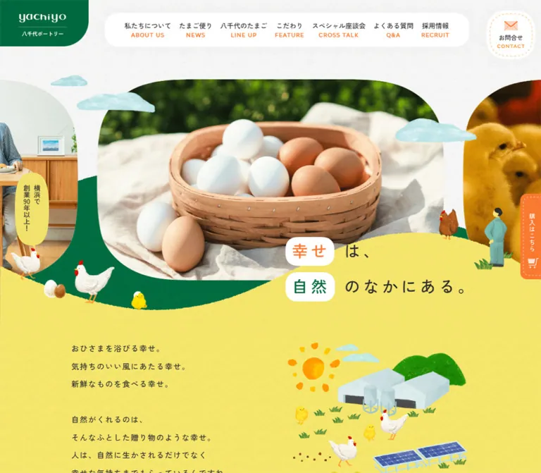
黄色と深緑の風景に、卵や農場の写真、手描きの鶏や雲を重ねた企業サイト。紙の質感、有機的な曲線、点線入りの丸いボタンが親しみを生み出します。
オリジナルサイトを見るA sunny agricultural landscape built from textured paper, painted chickens, and generous food photography.
Website: yachiyo-egg.com Original URL: https://www.yachiyo-egg.com/ Final URL: https://www.yachiyo-egg.com/ Theme: a light opening and yellow story canvas, followed by green editorial landscapes and a white footer panel. Inspected: September 22, 2026. Supplied browser evidence retrieved at 13:53:33.023 UTC / 22:53:33.023 JST. Viewports: desktop 1440 × 1000 and mobile 390 × 844 CSS pixels. Scope: the current corporate homepage, including its opening, company introduction, news, products, farming practices, interviews, FAQ, recruitment, contact, access, and footer. Three desktop captures and two mobile captures provide visual evidence; rendered DOM measurements cover additional sections. Linked pages and the separate shop were not inspected.
Yachiyo Poultry presents its business through the everyday pleasure of food and the landscape around farming. A basket of eggs, chicks, people, and an aerial farm photograph establish the real subject. Painted clouds, chickens, grass, and a sun connect these photographs to a more playful illustrated world. Yellow fields and two depths of green carry the page through broad, irregular curves.
The structure is a substantial corporate homepage with several equally important destinations. Its fixed identity plaque, bilingual navigation, contact control, and purchase tab support movement between company information, products, editorial content, recruitment, and shopping. The opening statement is deliberately spacious; lower sections become more practical without abandoning the illustrated landscape.
The most reusable qualities are the relationship between photographs and painting, the asymmetric placement of content, the generous Japanese line spacing, and small orange navigation details. The distinctive result depends on the artwork as much as the CSS.
A sunny agricultural landscape built from textured paper, painted chickens, and generous food photography.
Website: yachiyo-egg.com Original URL: https://www.yachiyo-egg.com/ Final URL: https://www.yachiyo-egg.com/ Theme: a light opening and yellow story canvas, followed by green editorial landscapes and a white footer panel. Inspected: September 22, 2026. Supplied browser evidence retrieved at 13:53:33.023 UTC / 22:53:33.023 JST. Viewports: desktop 1440 × 1000 and mobile 390 × 844 CSS pixels. Scope: the current corporate homepage, including its opening, company introduction, news, products, farming practices, interviews, FAQ, recruitment, contact, access, and footer. Three desktop captures and two mobile captures provide visual evidence; rendered DOM measurements cover additional sections. Linked pages and the separate shop were not inspected.
Yachiyo Poultry presents its business through the everyday pleasure of food and the landscape around farming. A basket of eggs, chicks, people, and an aerial farm photograph establish the real subject. Painted clouds, chickens, grass, and a sun connect these photographs to a more playful illustrated world. Yellow fields and two depths of green carry the page through broad, irregular curves.
The structure is a substantial corporate homepage with several equally important destinations. Its fixed identity plaque, bilingual navigation, contact control, and purchase tab support movement between company information, products, editorial content, recruitment, and shopping. The opening statement is deliberately spacious; lower sections become more practical without abandoning the illustrated landscape.
The most reusable qualities are the relationship between photographs and painting, the asymmetric placement of content, the generous Japanese line spacing, and small orange navigation details. The distinctive result depends on the artwork as much as the CSS.
| Name | Value | Evidence | Suggested token | Role |
|---|---|---|---|---|
| Text Ink | #2C2C2C |
Measured: rgb(44, 44, 44) |
--egg-ink |
Body copy, headings, navigation, white-button labels |
| Brand Green | #00693E |
Measured on news organization labels | --egg-green |
Exact text accent; useful base for the visually similar identity plaque |
| Action Orange | #F97930 |
Measured: rgb(249, 121, 48) |
--egg-orange |
Filled CTAs, category text, address label, telephone number |
| Surface White | #FFFFFF |
Measured on body and white CTAs; visible in navigation and footer | --egg-white |
Navigation capsule, buttons, headline chips, footer panel |
| Badge Cream | #FFFDF2 |
Measured on news category badges | --egg-cream |
Warm backing for orange category text |
| Sunshine Yellow | Approximately #F8EB78 |
Visual estimate | --egg-yellow |
Large textured introduction and footer surroundings |
| Field Green | Approximately #007B4B |
Visual estimate | --egg-field |
Main green farming-practices landscape |
| Forest Green | Approximately #005432 |
Visual estimate | --egg-forest |
Deeper landscape behind the interview introduction |
| Paper Neutral | Approximately #F5F5F2 |
Visual estimate | --egg-paper |
Textured opening sky/background |
| Cloud Blue | Approximately #B1DEDF |
Visual estimate | --egg-cloud |
Painted clouds; primarily an artwork color |
| Stitch Peach | Approximately #FFD1AD |
Visual estimate | --egg-stitch |
Fine inset dashed outline on white controls |
Surface interpretation: the body computes to white, and many section elements compute to transparent. Their visible yellow and green fields therefore cannot be reconstructed from those element background values alone. Artwork, descendants, and decorative layers contribute to the final surface.
The yellow and green areas contain grain and tonal variation. Treat the estimated hex values as base fills beneath texture, not exact descriptions of every visible pixel. The exact measured green belongs to text; applying it to every landscape layer would remove the observed depth.
Orange is a repeated wayfinding color. It appears in English navigation subtitles, small arrow circles, dotted dividers, category labels, and shopping details. It should remain subordinate to the much larger yellow and green areas.
The extracted WordPress palette presets and default blue slider variables are infrastructure values. They do not establish the visible brand palette. No selectable color theme or dark-mode control was evidenced.
The computed body stack begins with "Zen Kaku Gothic New", zen-kaku-gothic-new, "Noto Sans", "Yu Gothic", followed by Hiragino, Meiryo, Osaka, and other Japanese sans-serif fallbacks.
altivo is explicitly present as the first computed family for the telephone number, ADDRESS, and copyright.
Small uppercase English subtitles are visible throughout the navigation and section headings. Their individual child styles were not supplied, so Altivo should not be asserted for every English caption.
The white header wordmark and green footer identity are artwork-based treatments. The header H1 and its link contain no extracted text, while the captures clearly show the logo. Do not recreate this wordmark by setting ordinary text in the body font. Alternative-text and accessible-name attributes were not included in the evidence.
Desktop and mobile values below are measured unless explicitly marked as estimates.
| Role | Desktop | Mobile | Weight | Line height / tracking |
|---|---|---|---|---|
| Body default | 16px | 16px | 500 | 32px; individual sections override it |
| Opening statement | 42px | 26px | 500 | 92.4px / 57.2px; 0.18em |
| Introductory story | 18px | 14.547px | 500 | 41.4px / 32.0034px; 0.1em |
| Navigation anchor wrapper | 16px | Hidden in the closed mobile header | 500 | 32px inherited; inner labels may override |
| Visible navigation subtitles | Approximately 11px | Not shown in the closed header | Unverified | Visual estimate only |
| Visible Japanese section title | Approximately 24–26px in the green capture | Not visually established | Appears bold | Child measurements unavailable |
| Standard pill CTA | 15px | 13px | 700 | 22.5px / 19.5px; 0.1em |
| Mobile contact-form CTA | — | 15px | 700 | 22.5px; 1.5px tracking |
| News category | 14px | 13px | 500 | 21px / 19.5px |
| News organization | 14px | 12px | 500 | 21px / 18px |
| News title | 16px | 14px | 500 | 27.2px / 23.8px |
| Product title | 22px | 20px | 700 | 39.6px / 36px; 0.1em |
| Product description | 15px | 14px | 500 | 25.5px / 23.8px |
| Farming-practices statement | 25.92px | 20px | 500 | 51.84px / 40px; 0.1em |
| Interview introduction | 14px | 14px | 500 | 28px; 1.4px tracking |
| Interview article statement | 20.736px | 18px | 500 | 41.472px / 36px |
| Typical FAQ answer | 16px | 14px | 500 | 27.2px / 23.8px |
| Recruitment statement | 26px | 14px | 700 | 49.4px / 26.6px; 0.1em |
| Telephone link | 46px | 33px | 400 | 69px / 49.5px; Altivo stack |
| Footer primary link | 16px | 13px | 700 | 24px / 19.5px |
| Footer child link | 14px | 12px | 400 | 28px / 27.6px |
| Copyright | 11px | 11px | 400 | 16.5px; 1.1px tracking |
The opening statement is large through spacing as much as font size. Its 2.2 line-height leaves room for separate white word chips around 幸せ and 自然. Preserve that rhythm instead of tightening the headline into a conventional compact display block.
Spacing character: broad landscape intervals, compact navigation details, and repeated generous button dimensions. The evidence does not establish a universal source spacing grid.
| Use | Desktop | Mobile | Evidence |
|---|---|---|---|
| Gap between primary navigation anchor boxes | 35px | — | Calculated from consecutive rectangles |
| Menu-to-contact gap | — | 12px | Calculated from two 52px controls at y=21 and y=85 |
| Narrative horizontal inset | About 189.6px | 25px | Measured paragraph x-position |
| Standard CTA size | 336 × 78px | 269 × 63px | Measured |
| Secondary link icon/text gap | 17px | 11px in About/Feature links | Measured |
| About secondary link row height | 53px | 53px | Measured |
| Feature secondary link row height | 53px | 44px | Measured |
| News-card horizontal gap | 56px | 56px | Calculated from card positions |
| Product text-column pitch on mobile | — | 275px | Calculated: 257px text width + 18px gap |
| Interview item gap | 56px | 21px | Calculated from item rectangles |
| Footer pickup-card gap | 15px | 15px | Calculated |
| Social-link gap | 17px | 17px | Calculated |
| Element | Value or treatment | Evidence |
|---|---|---|
| Standard CTA | 100px | Measured source radius |
| News category badge | 100px | Measured source radius |
| Header navigation capsule | Approximately 35–40px | Visual estimate |
| Header identity plaque | Square upper/left edges; large lower-right corner | Visual observation; about 50px desktop and 28px mobile |
| Opening photograph | Large rounded corners, with crop adapted to viewport | Visual observation; exact mask/radius unavailable |
| Feature photograph | Uneven oval or egg-like silhouette | Visual observation; not an ordinary circle |
| Footer white panel | Approximately 35px desktop, 15–18px mobile | Visual estimate |
| Pickup promotional artwork | Approximately 10px visible corners | Visual estimate; may be baked into artwork |
| Section boundaries | Broad, irregular painted waves | Visual observation; cannot be reduced to one radius token |
| Element | Desktop 1440 × 1000 | Mobile 390 × 844 | Evidence |
|---|---|---|---|
| Document height | 8613.59px | 9500.11px | Measured snapshot state |
| Header logo link | x=48, y=38; 133 × 56px | x=24, y=21; 90 × 42.22px | Measured |
| Green logo plaque | Approximately 229 × 123px | Approximately 142 × 76px | Visual estimate |
| Desktop navigation surface | Approximately x=285, y=25; 918 × 88px | Replaced by menu control | Visual estimate |
| Contact control | x=1334, y=20; 95 × 95px | x=318, y=85; 52 × 52px | Measured |
| Mobile menu control | — | x=318, y=21; 52 × 52px | Measured |
| Opening section top padding | 154px | 141.414px | Measured |
| Main visible opening photo | Approximately x=257, y=154; 925 × 537px | Approximately x=33, y=141; 324 × 283px | Visual estimate |
| Opening statement box | x=840.97, y=567.95; 430.70 × 184.78px | x=42, y=469.28; 267.33 × 114.38px | Measured; white chips extend beyond the text box |
| Story paragraph box | x=189.58, y=851.17; width 1060.84px | x=25, y=629.81; width 340px | Measured; not the length of every text line |
| Purchase link | x=1391, y=392; 58 × 216px | x=341, y=323.5; 58 × 197px | Measured |
| Pickup promotion | 163 × 202px each | 163 × 202px each | Measured |
| Instagram/Facebook link boxes | 28 × 28px | 28 × 28px | Measured |
| LINE link box | 135 × 28px | 135 × 28px | Measured |
The first visual section ends at y=691.36 on desktop, while the introduction begins at y=566.52: a calculated overlap of about 124.84px. On mobile those positions are 424.41 and 411.41, producing only 13px of overlap. The headline is then positioned farther down within the mobile introduction. This is a compositional change, not uniform scaling.
The purchase link extends 9px beyond the right viewport boundary in both measured states. Its vertical center matches the viewport center. This is strong evidence for the captured edge-tab geometry; visibility throughout every desktop scroll position is not established.
Role: keep the company recognizable while exposing seven major site destinations.
The upper-left logo sits in a solid green plaque that touches the top and left viewport edges. Only the lower-right corner is strongly rounded. The white wordmark, thin horizontal line, and Japanese company label remain compact within this relatively substantial block.
A separate white capsule floats near the top center. Seven links use Japanese labels above small orange English subtitles: About Us, News, Line Up, Feature, Cross Talk, Q&A, and Recruit. The links are open text groups without individual boxes. A separate contact control occupies the far upper right.
The header elements remain in the same screen positions across the supplied desktop scroll captures. The header wrapper itself measures zero height, consistent with an overlaid composition. Preserve the separation between identity plaque, navigation capsule, and contact control.
Role: retain identity and utilities in a narrow viewport.
The desktop navigation capsule disappears. At the upper right, a 52px menu button sits above a 52px contact link with a 12px gap. Both have white rounded artwork; orange dashed details connect them to the rest of the interface. The menu includes the visible English label MENU; the contact control uses an envelope.
The logo plaque reduces to approximately 142 × 76px. These elements remain present in both the opening and footer mobile captures. The mobile menu was captured closed. Its expanded layout, animation, keyboard behavior, and dismissal mechanism are unverified.
Role: introduce food, farming, and people through a large photographic scene.
The desktop capture centers a wide basket-of-eggs photograph with very large rounded corners. Neighboring images remain partially visible at both viewport edges. The mobile capture centers an aerial farm photograph in a much squarer crop, again with neighboring imagery peeking in.
These observations support a horizontal sequence of photographic panels. They do not establish an autoplay interval, transition direction, swipe behavior, or a different image set selected specifically by a breakpoint. The captures may show different sequence states.
Clouds cross the photo edges. Chickens, eggs, a chick, and a standing worker occupy the foreground around the green and yellow boundaries. Their overlap makes the photos feel embedded in a landscape. Keep the photographic track, painted setting, foreground figures, and headline as separate compositional layers.
Role: communicate the company's relationship with nature before presenting practical destinations.
The two-line statement 幸せは、自然のなかにある。 sits toward the lower right of the desktop opening. 幸せ is orange inside a white rounded chip; 自然 is green inside a second chip. The remaining characters use dark ink directly on yellow.
On mobile, this statement moves below the main photograph and aligns near the left edge. The text box begins at x=42, while the chips extend farther left, approximately to x=30.
The story begins well below the statement and uses short, deliberate Japanese lines with large line spacing. Desktop text starts around x=190; mobile text uses 25px side insets. The observed text changes line breaks between viewports. A white About CTA and related company links follow the narrative.
Do not use the measured 1061px desktop paragraph box as a target line length. The rendered prose occupies much shorter lines within that region.
Role: provide a consistent destination link at the end of a section.
The recurring large link is 336 × 78px on desktop and 269 × 63px on mobile, with a measured 100px radius. Labels are bold, centered, and tracked at 0.1em. Most mobile labels are 13px, while the contact-form button retains 15px.
White variants appear on yellow and green sections. Orange variants with white text appear for news, the complete product range, FAQ, recruitment, and the contact form. The visible white Feature button includes a fine inset peach dashed outline, approximately 8px from the outside edge.
Keep the outer pill silhouette simple. The stitch is a small internal detail rather than a heavy external border. Exact border styling for every orange variant is not supplied.
Role: expose secondary destinations with less visual weight than the pill CTAs.
A small orange circle with a white directional arrow precedes a bold text label. A fine orange dotted or dashed horizontal rule separates rows. In the desktop Feature capture, these links form a 217px-wide vertical list beneath the main CTA.
On mobile, About links occupy two 158px columns with a 24px gap. Feature links similarly form two columns of approximately 154.92px, with shorter 44px rows. Measured icon-to-text gaps reduce from 17px to 11px in these groups.
Use this treatment for related pages and section anchors. The rule, circular arrow, and label should remain one coherent link target.
Role: surface current company and farm updates.
The DOM contains six news entries in a horizontal sequence. Desktop cards measure 323px wide, with 56px gaps; mobile cards measure 231px wide with the same gap. In the mobile snapshot, the second entry is centered at x=79.5, while adjacent entries extend offscreen.
The component anatomy is an image region, cream rounded category badge, date and green organization metadata, followed by a dark title. A measured desktop category badge uses 14px text and 10px 19px padding; mobile uses 13px text and 9px 19px padding. The card anchor itself has a transparent background and no measured outer corner radius.
A centered orange pill links to the full news archive. Card image treatment and rail controls are not directly shown in the supplied captures, so their exact appearance should remain unspecified. Horizontal layout is measured; drag, autoplay, and control behavior are unverified.
Role: introduce three product families and provide detail and purchase routes.
The desktop measurements describe an asymmetric composition rather than three equal cards. The first product's text sits at x=229 with a 314px width. The other two text blocks sit around x=887 with a 324px width and different vertical positions. Product titles are bold, tracked, and inset 36px from their text-block edge.
On mobile, the three product text blocks share a 257px width and begin at x=66.5, 341.5, and 616.5. Their aligned title positions and 275px pitch establish a horizontal presentation. The long soup title retains multiple lines, making its content taller.
Each product provides 商品詳細; the soup also has a separate 購入する link to the shop. A full-range pill follows the showcase. Do not assign unobserved product-image shapes or packaging treatments from the text measurements alone.
Role: connect product quality with production and environmental practices.
The desktop composition has three distinct regions: white introductory text at left, a large egg-like photograph near the center, and a white CTA with secondary links at right. The visible photograph shows a chick held in hands. Three small dots follow the photograph's lower-right contour.
The background is textured green, with painted chickens and eggs placed near the transition into the next section. The paragraph uses 25.92px type, 51.84px line-height, and 2.592px tracking. Its four lines remain airy and easy to scan.
Mobile measurements place the heading and 20px statement above the later CTA, with a substantial intervening region. The three-column desktop arrangement is therefore reflowed vertically. The exact mobile image silhouette was not visually captured.
Role: introduce conversations with farms, customers, and related businesses.
A deeper green wave rises beneath the Feature section. In the supplied desktop capture, the Cross Talk introduction is centered: a white Japanese title, an orange English subtitle, and three short lines of white supporting copy. Painted chickens and eggs sit on the wave boundary.
The DOM establishes a horizontal article sequence below this introduction. Desktop article links are about 883 × 404px with a 20px internal gap; the measured text column is 246px wide. Mobile article links are 303px wide, and their 255px text blocks begin much lower within each item, supporting a stacked arrangement.
A white pill leads to the complete interview archive. The capture does not show the main article imagery closely enough to specify every mask or decoration.
Role: answer practical questions about eggs and handling terminology.
The supplied DOM includes eight questions and answer text. Typical answer copy is 16px / 27.2px on desktop and 14px / 23.8px on mobile. One answer retains a 16px / 32px paragraph, so the extraction does not support a perfectly uniform answer style.
The desktop heading occupies a left-hand region, while answer text is measured farther right. Mobile answer text has a 256px width beginning at x=92. Several answer rectangles overlap subsequent rows or extend beyond the section's apparent flow. This is compatible with clipped disclosure content and must not be interpreted as every answer visibly expanded.
No FAQ click sequence was supplied. Expansion controls, default-open items, transition timing, and exact visible row decoration remain unverified. A complete-FAQ pill is confirmed by its link and measurements.
Role: move from company storytelling to practical action.
Recruitment uses a centered bilingual section heading, a bold statement, and an orange pill. Its statement changes substantially from 26px desktop type to 14px mobile type. Measured vertical padding is 110px above and 111px below on desktop, increasing to 160px and 183px on mobile. This spacing is part of a larger composition, not evidence of empty filler that should automatically be removed.
Contact has two desktop columns, each 425px wide: mail form and telephone. On mobile, they stack into 312px-wide groups at x=39. The phone number is the strongest typographic element, in orange Altivo at 46px desktop and 33px mobile. Reception hours and a separate factory-tour inquiry link provide supporting information.
Only the homepage's contact routes were inspected. Form fields, validation, submission behavior, and destination-page layouts are outside scope.
Role: provide a recognizable location illustration and a conventional map destination.
The desktop footer starts with a narrow vertical アクセス / ACCESS heading beside a wide illustrated map. The map uses dark and light green roads, simplified trees and parks, a pale ground, and a light blue coastal shape. A small brand marker identifies the location.
Below the map, the address is paired with an orange ADDRESS label, while an arrow and Google Map link sit to the right. The map's visible desktop rectangle is approximately 845 × 328px. This is a visual estimate, not an extracted image measurement.
On mobile, the access heading occupies a horizontal region above the map. The address wraps into the available width, and the map link sits on a separate lower line toward the right. The evidence identifies a link to Google Maps, not an interactive map embedded in the page.
Role: consolidate location, selected destinations, navigation, and social links.
A large white rounded panel sits within the yellow textured surroundings. Desktop side margins are approximately 30px; mobile margins reduce to approximately 6px. The white surface has little visible elevation and is defined mainly by contrast and its rounded outline.
Two pickup promotions sit side by side beneath a small Pick Up label flanked by orange dashed rules. Each promotion measures 163 × 202px on both viewports. The orange interview promotion combines title artwork, a group photograph, and a small arrow. The pale yellow recruitment promotion combines its title with cropped portraits and speech-bubble forms.
Desktop navigation occupies three columns beside the pickup region. The footer logo sits farther left. On mobile, the pickup pair moves above the logo and navigation; the logo occupies the lower-left region and the primary navigation becomes a single right-hand column.
The mobile capture shows plus signs beside three parent groups and does not display their child links. The DOM still contains those children. Treat this as a visually collapsed state; its expansion behavior was not exercised.
Instagram, Facebook, and LINE retain their recognizable platform colors. Their row aligns toward the right on mobile. Copyright sits outside the white panel on yellow.
Role: keep shopping and long-page navigation available without occupying the main content column.
The purchase tab is orange with white vertical copy, a cart icon, an inset dashed line, and a rounded lower-left corner. A pale yellow JFS 受賞! burst overlaps its upper edge. Its measured link box is 58px wide, partly outside the viewport. The link points to the separate shop.
The tab is visible in the desktop opening and both supplied mobile captures. It is not visible in the other supplied desktop crops, so its full scroll-visibility rules are uncertain.
The lower desktop captures show a green vertical speech bubble labeled TOPへ! above a painted chick near the bottom right. The measured link box is approximately 72 × 176px. It points to the homepage URL; smooth scrolling or interception by JavaScript was not verified. This control is not evidenced in the mobile capture.
| Treatment | Evidence | What can safely be reused |
|---|---|---|
| Primary navigation text | Measured color 0.1s cubic-bezier(0.33, 1, 0.68, 1) |
A short color transition; actual hover color was not captured |
| Secondary arrow links | Same measured 100ms color transition | Consistent quick feedback |
| Contact artwork | Measured transform 0.1s cubic-bezier(0.33, 1, 0.68, 1) |
Transform-capable feedback; displacement and scale are unknown |
| Pickup promotions | Same measured 100ms transform transition | Small tactile feedback, with magnitude chosen as a recommendation |
| Footer child links | Measured color 0.26s cubic-bezier(0.33, 1, 0.68, 1) |
Slightly slower 260ms text feedback |
| Opening photo sequence | Neighboring frames and different captured central subjects | Sequence layout is supported; timing, autoplay, and gestures are unverified |
| Feature image indicators | Three visible dots | State indicators are visible; clickability and sequence behavior are unverified |
| News, products, interviews | Measured horizontally displaced items | Rail structure is supported; controls and animation are unverified |
| Mobile navigation/footer groups | Closed menu and plus-marked footer groups | Closed-state appearance only |
| FAQ and return-to-top | DOM/link evidence without an exercised interaction | Do not invent disclosure or scroll timings |
Many sampled elements report animation: none and a transition serialization of all without a positive duration. Neither value proves that the entire site is static, and the latter is not evidence for a visible animation.
The supplied inspection waited for document load, visible-image decoding, and sampled layout/text stability. Perpetual animations were temporarily paused during readiness checks and resumed. These procedures do not provide a motion recording or establish the site's full keyframes, delays, or interaction states.
Recommended motion approach: keep link feedback short and gentle. If a new implementation adds carousel movement, provide clear manual controls and reduced-motion behavior. Decorative chickens, clouds, and landscape layers do not require continuous motion to preserve the observed identity.
| Layer | Appearance | Purpose |
|---|---|---|
| Opening sky | Warm neutral paper with fine grain | Quiet background around the photo sequence |
| Introduction | Broad yellow textured field | Warm narrative surface and headline support |
| Feature | Saturated green with visible texture | Farming and production context |
| Interview landscape | Deeper green with an irregular wave edge | Section distinction within the same visual world |
| Navigation and contact | Clean white rounded surfaces | Keep utility controls legible over changing backgrounds |
| Main CTAs | White or orange pills | Consistent destination links |
| News category | Small cream pill with orange text | Lightweight metadata grouping |
| Footer | Large white rounded panel within yellow | Practical information and navigation |
| Headline word chips | White rounded rectangles | Highlight individual words without enclosing the entire statement |
The current captures do not establish a general shadow-based elevation system. Large color areas, texture, overlap, and changing silhouettes do most of the structural work. Keep grain subtle enough that text remains clear.
Photography supplies specificity: eggs in a shallow wooden basket on fabric, chicks, a farm seen from above, a chick supported by hands, and people in promotional portraits. The illustrated layer supplies warmth and continuity: painted chickens and chicks, eggs, clouds, grass, a standing worker, and an irregular sun.
The illustrations have uneven pigment and soft, imperfect edges. Chickens are recognizable but simplified; clouds look brushed onto paper. Avoid converting this into uniformly outlined vector clip art. Also avoid pixelated rendering: these images rely on paint texture and photographic detail rather than a low-resolution bitmap aesthetic.
Photo silhouettes vary with their role. The opening uses large rounded rectangles; the Feature image uses an egg-like oval; pickup promotions contain smaller portrait and group-image crops. Use subject-specific crop positions so faces, chicks, and the egg basket remain the focal points.
Exact image URLs, filenames, native dimensions, and license information were not included in the supplied evidence. The following inventory identifies visible artwork without inventing paths.
| Asset group | Current-page evidence | Use |
|---|---|---|
| White wordmark and green plaque | Desktop and mobile headers | Persistent brand identity |
| Egg basket photograph | Desktop opening capture | Main photographed subject |
| Aerial farm photograph | Mobile opening capture | Alternate photographed subject in the sequence |
| Chick and hands photograph | Desktop Feature capture | Production and care narrative |
| Chickens, chicks, eggs, worker, clouds | Opening and green-section captures | Foreground figures and scene continuity |
| Painted sun | Mobile introduction and desktop footer area | Warmth and visual punctuation |
| Illustrated access map | Desktop footer and partial mobile footer | Location explanation |
| Interview and recruitment promotions | Desktop and mobile footer | Selected destination links |
| Green footer logo | Desktop and mobile footer | Secondary brand signature |
| Social-platform artwork | Desktop and mobile footer | External social destinations |
Use original assets when authorized and available, or commission a coherent replacement set. A CSS ellipse can approximate a crop; it cannot reproduce the visual identity of the painted scenery.
The homepage retains the same broad content sequence across both viewports: opening and company story, news, products, farming practices, interviews, FAQ, recruitment, contact, and access/footer. Its structure changes locally according to each section's purpose.
| Area | Desktop observation | Mobile observation |
|---|---|---|
| Header | Large left plaque, central seven-link capsule, separate contact control | Smaller plaque; stacked menu and contact controls |
| Opening photograph | Wide central image with neighboring panels visible | Squarer central image with neighboring panels visible |
| Statement | Overlaps the lower-right opening landscape | Sits below the photo, aligned left |
| Narrative | Broad container with short authored lines | 340px paragraph region with additional line breaks |
| Main CTAs | 336 × 78px | 269 × 63px |
| Company links | Two compact columns at the left of a wide page | Two 158px columns within 25px side insets |
| News | 323px horizontal items with 56px gaps | 231px horizontal items with the same gap |
| Products | Asymmetric desktop placement | Horizontal sequence of 257px text regions |
| Feature | Text, image, and actions spread across the width | Content reflowed vertically; secondary links use two columns |
| Interviews | Wide horizontal items | Narrower stacked item content in a horizontal sequence |
| Contact | Two 425px columns | Two vertically stacked 312px groups |
| Footer promotions | Two 163 × 202px tiles beside navigation | The same-sized pair above navigation |
| Footer navigation | Three columns with child links visible | One column of primary rows with plus-marked groups |
| Access heading | Narrow vertical composition beside the map | Horizontal region above the map |
The footer promotions are an especially useful responsive detail: they retain their dimensions while the surrounding arrangement changes. Mobile adaptation is not equivalent to reducing all dimensions by the viewport ratio.
The only directly observed viewport widths are 390px and 1440px. Exact media-query breakpoints and interpolation formulas are unavailable. --viewport-width changes between those widths; --headertop-height remains 100px in both snapshots. That variable is not the measured height of the visible logo plaque.
Recommended breakpoint strategy: switch the desktop capsule to compact controls when its seven labels can no longer fit comfortably between the logo and contact control. The Quick Start uses 1200px as an implementation breakpoint, not a recovered source value. Test intermediate widths, landscape phones, text zoom, and longer labels separately.
Fixed controls require particular attention on mobile. The purchase tab overlaps the right edge of both supplied mobile views. Preserve its character while ensuring it does not cover essential links or expanded footer content in a new implementation.
transition: all alone.These are recommendations for a new implementation, not verified features of the original page.
#F97930 has a calculated contrast of approximately 2.69:1, below the usual thresholds for CTA text. Keep orange for the brand while using dark ink on orange or a darker accessible action fill where appropriate.#2C2C2C.#00693E.#F97930.#FFFDF2.#FFFFFF.#F8EB78.#007B4B and #005432.#F5F5F2.“Create a Japanese agricultural company homepage inspired by Yachiyo Poultry's current composition. Use a textured yellow landscape, saturated and deep green sections, natural egg and farm photography, and painted chickens, chicks, clouds, grass, and a sun. Place a green identity plaque at the upper left, a separate white rounded navigation capsule on desktop, and a white contact control at the upper right. Use Zen Kaku Gothic New with generous line spacing. Build the opening around a large rounded photograph, partial neighboring frames, and a two-line statement with individual white word chips. Continue through company information, news, products, farming practices, interviews, FAQ, recruitment, contact, and an illustrated access map. Reuse orange circular-arrow links and large stitched pill CTAs. On mobile, replace the navigation capsule with stacked menu/contact controls, move the statement below the photo, and recompose the footer. Treat carousel timing and expanded states as implementation decisions requiring explicit specification.”
幸せは、自然のなかにある。 in two loose lines, with white rounded chips around 幸せ and 自然.”This is an implementation adaptation, not copied source CSS. Exact colors, type sizes, CTA dimensions, and selected gaps come from the measurements above. Landscape colors, photo ratios, plaque radii, section-title sizes, and the 1200px breakpoint are estimates or recommendations.
The CSS supplies a usable component foundation. Authorized logo, photograph, texture, map, and illustration assets must be provided separately. The smooth introduction curve is a fallback for the painted boundary. Menu logic, disclosure state, carousel controls, and any autoplay require separate implementation.
Use .egg-site around the page. The header expects .brand-plaque, .desktop-nav, and .header-tools; the opening track expects .photo-frame children. Set --egg-grain to a cleared texture URL if one is available. Without it, surfaces remain solid.
:root {
  /* Exact measured interface colors */
  --egg-ink: #2c2c2c;
  --egg-green: #00693e;
  --egg-orange: #f97930;
  --egg-white: #ffffff;
  --egg-cream: #fffdf2;

  /* Estimated artwork base colors */
  --egg-yellow: #f8eb78;
  --egg-field: #007b4b;
  --egg-forest: #005432;
  --egg-paper: #f5f5f2;
  --egg-stitch: #ffd1ad;
  --egg-grain: none;

  /* Abbreviated observed font stacks; load fonts separately */
  --egg-font-ui: 'Zen Kaku Gothic New', zen-kaku-gothic-new,
    'Noto Sans', 'Yu Gothic', 'Hiragino Kaku Gothic ProN',
    Meiryo, sans-serif;
  --egg-font-latin: altivo, 'Noto Sans', 'Yu Gothic', sans-serif;

  /* Measured component values */
  --egg-cta-width: 336px;
  --egg-cta-height: 78px;
  --egg-cta-size: 15px;
  --egg-pill-radius: 100px;
  --egg-news-width: 323px;
  --egg-news-gap: 56px;
  --egg-story-width: 1061px;
  --egg-fast: 100ms cubic-bezier(0.33, 1, 0.68, 1);
  --egg-link: 260ms cubic-bezier(0.33, 1, 0.68, 1);
}

.egg-site,
.egg-site * {
  box-sizing: border-box;
}

.egg-site {
  margin: 0;
  color: var(--egg-ink);
  background: var(--egg-white);
  font-family: var(--egg-font-ui);
  font-size: 16px;
  font-weight: 500;
  line-height: 2;
}

.egg-site img {
  display: block;
  max-width: 100%;
}

.egg-site a {
  color: inherit;
  text-decoration: none;
}

.brand-plaque {
  position: fixed;
  z-index: 50;
  inset: 0 auto auto 0;
  width: 229px;
  height: 123px;
  padding: 38px 48px 29px;
  border-radius: 0 0 54px 0;
  background: var(--egg-green);
}

.brand-plaque img {
  width: 133px;
  height: 56px;
  object-fit: contain;
}

.desktop-nav {
  position: fixed;
  z-index: 50;
  top: 25px;
  left: calc(50% + 24px);
  transform: translateX(-50%);
  display: flex;
  align-items: center;
  justify-content: center;
  gap: 35px;
  width: min(918px, calc(100vw - 480px));
  min-height: 88px;
  padding: 18px 32px;
  border-radius: 38px;
  background: var(--egg-white);
}

.desktop-nav a {
  display: grid;
  text-align: center;
  white-space: nowrap;
  transition: color var(--egg-fast);
}

.nav-label {
  font-size: 14px; /* Visual estimate of the child label */
  line-height: 1.6;
}

.nav-en {
  color: var(--egg-orange);
  font-size: 11px; /* Visual estimate */
  line-height: 1.5;
  letter-spacing: 0.1em;
}

.header-tools {
  position: fixed;
  z-index: 60;
  top: 20px;
  right: 11px;
  display: grid;
  gap: 12px;
}

.utility-control {
  display: grid;
  place-items: center;
  width: 95px;
  height: 95px;
  padding: 0;
  border: 0;
  border-radius: 32%;
  background: var(--egg-white);
  cursor: pointer;
  transition: transform var(--egg-fast);
}

.menu-control {
  display: none;
}

.egg-hero {
  position: relative;
  overflow: clip;
  padding-top: 154px;
  background-color: var(--egg-paper);
  background-image: var(--egg-grain);
}

.photo-track {
  display: flex;
  justify-content: center;
  gap: 42px;
}

.photo-frame {
  flex: 0 0 64.3vw;
  margin: 0;
  overflow: hidden;
  aspect-ratio: 1.723;
  border-radius: 160px;
}

.photo-frame img {
  width: 100%;
  height: 100%;
  object-fit: cover;
}

.scene-decoration {
  position: absolute;
  pointer-events: none;
  user-select: none;
}

.egg-intro {
  position: relative;
  margin-top: -125px;
  padding-bottom: 120px;
  background-color: var(--egg-yellow);
  background-image: var(--egg-grain);
  /* Smooth fallback; replace with an authorized painted boundary. */
  border-radius: 55% 35% 0 0 / 140px 95px 0 0;
}

.hero-statement {
  position: relative;
  width: max-content;
  max-width: 90%;
  margin: 0 0 0 58.4%;
  font-size: 42px;
  font-weight: 500;
  line-height: 2.2;
  letter-spacing: 0.18em;
}

.hero-statement .line {
  display: block;
}

.word-chip {
  display: inline-block;
  padding-inline: 0.38em;
  border-radius: 30px;
  background: var(--egg-white);
  line-height: 1.8;
}

.word-chip--orange { color: var(--egg-orange); }
.word-chip--green { color: var(--egg-green); }

.story-copy {
  width: min(var(--egg-story-width), calc(100% - 50px));
  margin: 98px auto 0;
  font-size: 18px;
  line-height: 2.3;
  letter-spacing: 0.1em;
}

.egg-site .pill {
  position: relative;
  display: inline-flex;
  align-items: center;
  justify-content: center;
  width: min(var(--egg-cta-width), 100%);
  min-height: var(--egg-cta-height);
  padding: 14px 24px;
  border-radius: var(--egg-pill-radius);
  background: var(--egg-white);
  color: var(--egg-ink);
  font-size: var(--egg-cta-size);
  font-weight: 700;
  line-height: 1.5;
  letter-spacing: 0.1em;
  text-align: center;
}

.pill::before {
  content: '';
  position: absolute;
  inset: 8px;
  border: 1px dashed var(--egg-stitch);
  border-radius: inherit;
  pointer-events: none;
}

.egg-site .pill--orange {
  color: var(--egg-white);
  background: var(--egg-orange);
}

/* Recommended contrast alternative; the observed version uses white. */
.egg-site .pill--orange.pill--accessible {
  color: var(--egg-ink);
}

.egg-site .sub-link {
  display: flex;
  align-items: center;
  gap: 17px;
  width: 217px;
  max-width: 100%;
  min-height: 53px;
  border-bottom: 1px dashed var(--egg-orange);
  font-size: 15px;
  font-weight: 700;
  line-height: 2;
  letter-spacing: 0.06em;
  transition: color var(--egg-fast);
}

.sub-link::before {
  content: '→';
  display: grid;
  flex: 0 0 20px;
  place-items: center;
  width: 20px;
  height: 20px;
  border-radius: 50%;
  color: var(--egg-white);
  background: var(--egg-orange);
  font-size: 12px;
  line-height: 1;
}

.section-heading {
  margin: 0;
  text-align: center;
}

.section-heading .ja {
  display: block;
  font-size: 26px; /* Estimated child size */
  font-weight: 700;
  line-height: 1.6;
}

.section-heading .en {
  display: block;
  color: var(--egg-orange);
  font-size: 14px; /* Recommended approximation */
  line-height: 2;
  letter-spacing: 0.1em;
}

.news-rail {
  display: flex;
  gap: var(--egg-news-gap);
  overflow-x: auto;
  padding: 8px max(25px, calc((100vw - 1081px) / 2)) 20px;
  /* Scroll snap is a recommended implementation choice. */
  scroll-snap-type: x proximity;
}

.news-card {
  flex: 0 0 var(--egg-news-width);
  min-width: 0;
  scroll-snap-align: center;
}

.news-category {
  display: inline-block;
  margin: 0;
  padding: 10px 19px;
  border-radius: var(--egg-pill-radius);
  color: var(--egg-orange);
  background: var(--egg-cream);
  font-size: 14px;
  line-height: 1.5;
}

.news-organization {
  color: var(--egg-green);
  font-size: 14px;
  line-height: 1.5;
}

.news-title {
  font-size: 16px;
  font-weight: 500;
  line-height: 1.7;
}

.egg-feature {
  padding: 150px 0;
  color: var(--egg-white);
  background-color: var(--egg-field);
  background-image: var(--egg-grain);
}

.feature-grid {
  display: grid;
  grid-template-columns: 300px minmax(0, 1fr) 336px;
  align-items: center;
  gap: 6.6vw;
  width: min(1267px, 88%);
  margin-inline: auto;
}

.feature-copy {
  font-size: 25.92px;
  line-height: 2;
  letter-spacing: 0.1em;
}

.feature-photo {
  margin: 0;
  overflow: hidden;
  /* Estimated fallback for the observed egg-like mask. */
  border-radius: 58% 42% 55% 45% / 52% 40% 60% 48%;
}

.feature-photo img {
  width: 100%;
  aspect-ratio: 1.05;
  object-fit: cover;
}

.egg-crosstalk {
  padding-block: 140px;
  color: var(--egg-white);
  background-color: var(--egg-forest);
  background-image: var(--egg-grain);
}

.section-intro {
  margin: 20px auto 0;
  padding-inline: 25px;
  font-size: 14px;
  line-height: 2;
  letter-spacing: 0.1em;
  text-align: center;
}

.contact-grid {
  display: grid;
  grid-template-columns: repeat(2, minmax(0, 425px));
  justify-content: center;
  gap: 24px;
  text-align: center;
}

.egg-site .telephone {
  color: var(--egg-orange);
  font-family: var(--egg-font-latin);
  font-size: 46px;
  font-weight: 400;
  line-height: 1.5;
}

.egg-footer {
  padding: 30px 30px 20px;
  background-color: var(--egg-yellow);
  background-image: var(--egg-grain);
}

.footer-panel {
  padding: 40px 38px 28px;
  border-radius: 36px;
  background: var(--egg-white);
}

.footer-lower {
  display: grid;
  grid-template-columns: 110px 341px minmax(0, 1fr);
  gap: 52px;
  align-items: start;
}

.pickup-pair {
  display: flex;
  gap: 15px;
  width: 341px;
  max-width: 100%;
}

.pickup-card {
  flex: 0 1 163px;
  min-width: 0;
  aspect-ratio: 163 / 202;
  transition: transform var(--egg-fast);
}

.footer-nav {
  display: grid;
  grid-template-columns: repeat(3, minmax(0, 1fr));
  gap: 40px;
}

.footer-primary {
  display: block;
  padding: 9px 0 9px 12px;
  border-bottom: 1px dashed var(--egg-orange);
  font-size: 16px;
  font-weight: 700;
  line-height: 1.5;
  transition: color var(--egg-fast);
}

.footer-child {
  display: block;
  font-size: 14px;
  font-weight: 400;
  line-height: 2;
  transition: color var(--egg-link);
}

.footer-social {
  display: flex;
  justify-content: flex-end;
  align-items: center;
  gap: 17px;
  margin-top: 28px;
}

.footer-social img {
  width: 28px;
  height: 28px;
}

.footer-social .line-art {
  width: 135px;
}

.copyright {
  margin: 24px 0 0;
  font-family: var(--egg-font-latin);
  font-size: 11px;
  font-weight: 400;
  line-height: 1.5;
  letter-spacing: 0.1em;
  text-align: center;
}

.egg-site .shop-tab {
  position: fixed;
  z-index: 40;
  top: 50%;
  right: -9px;
  transform: translateY(-50%);
  display: grid;
  place-items: center;
  width: 58px;
  min-height: 216px;
  padding: 28px 12px 18px 4px;
  border-radius: 20px 0 0 20px;
  color: var(--egg-white);
  background: var(--egg-orange);
}

.shop-tab .vertical-label {
  writing-mode: vertical-rl;
  font-size: 14px;
  line-height: 1.5;
}

/* Recommended visible keyboard focus. */
.egg-site :focus-visible {
  outline: 3px solid currentColor;
  outline-offset: 4px;
}

@media (hover: hover) {
  .desktop-nav a:hover,
  .sub-link:hover,
  .footer-primary:hover,
  .footer-child:hover {
    color: var(--egg-orange);
  }

  /* Recommended magnitude; only the transition timing was measured. */
  .utility-control:hover,
  .pickup-card:hover {
    transform: translateY(-2px);
  }
}

/* Recommended breakpoint; the source breakpoint was not supplied. */
@media (max-width: 1200px) {
  .desktop-nav { display: none; }
  .menu-control { display: grid; }

  .header-tools {
    top: 21px;
    right: max(20px, env(safe-area-inset-right));
  }

  .utility-control {
    width: 52px;
    height: 52px;
  }

  .feature-grid {
    grid-template-columns: 1fr;
    gap: 32px;
    width: min(640px, calc(100% - 56px));
  }

  .feature-photo {
    width: min(100%, 360px);
    margin-inline: auto;
  }

  .feature-actions { text-align: center; }

  .feature-actions .sub-links {
    display: grid;
    grid-template-columns: repeat(2, minmax(0, 1fr));
    gap: 0 24px;
    margin-top: 32px;
    text-align: left;
  }

  .footer-lower {
    grid-template-columns: 110px minmax(0, 1fr);
  }

  .pickup-region {
    grid-column: 1 / -1;
    justify-self: center;
  }
}

/* Phone adaptation based on the measured 390px state. */
@media (max-width: 600px) {
  :root {
    --egg-cta-width: 269px;
    --egg-cta-height: 63px;
    --egg-cta-size: 13px;
    --egg-news-width: 231px;
  }

  .brand-plaque {
    width: 142px;
    height: 76px;
    padding: 21px 24px 13px;
    border-bottom-right-radius: 28px;
  }

  .brand-plaque img {
    width: 90px;
    height: 42.22px;
  }

  .egg-hero { padding-top: 141.414px; }
  .photo-track { gap: 20px; }

  .photo-frame {
    flex-basis: 83.1vw;
    aspect-ratio: 1.145;
    border-radius: 64px;
  }

  .egg-intro {
    margin-top: -13px;
    padding-top: 58px;
    border-radius: 50% 35% 0 0 / 40px 25px 0 0;
  }

  .hero-statement {
    max-width: calc(100% - 67px);
    margin-left: 42px;
    font-size: 26px;
  }

  .word-chip { border-radius: 22px; }

  .story-copy {
    margin-top: 46px;
    font-size: 14.547px;
    line-height: 2.2;
  }

  .section-heading .ja {
    font-size: 21px; /* Recommended approximation */
  }

  .news-rail {
    padding-inline: max(25px, calc((100vw - 231px) / 2));
  }

  .news-category {
    padding-block: 9px;
    font-size: 13px;
  }

  .news-organization { font-size: 12px; }
  .news-title { font-size: 14px; }

  .feature-copy {
    font-size: 20px;
    line-height: 2;
  }

  .egg-site .sub-link {
    width: 100%;
    gap: 11px;
    font-size: 13px;
    line-height: 1.5;
  }

  .feature-actions .sub-link { min-height: 44px; }

  .contact-grid {
    grid-template-columns: minmax(0, 312px);
    gap: 80px;
    padding-inline: 25px;
  }

  .egg-site .telephone { font-size: 33px; }
  .egg-site .contact-form-pill { font-size: 15px; }

  .egg-footer { padding-inline: 6px; }

  .footer-panel {
    padding: 24px 19px;
    border-radius: 16px;
  }

  .footer-lower {
    grid-template-columns: 123px minmax(0, 1fr);
    gap: 60px 26px;
  }

  .footer-nav {
    display: block;
    padding-right: 27px;
  }

  .footer-primary {
    padding-block: 13px;
    font-size: 13px;
  }

  .footer-child {
    font-size: 12px;
    line-height: 2.3;
  }

  /* Disclosure state must be managed with accessible controls. */
  .footer-children[hidden] { display: none; }

  .egg-site .shop-tab { min-height: 197px; }
}

@media (prefers-reduced-motion: reduce) {
  .egg-site a,
  .egg-site button,
  .pickup-card {
    transition: none;
  }

  .news-rail { scroll-behavior: auto; }
}
The code deliberately leaves decorative asset positioning to each section. Use real image proportions and test the overlap at both reference viewports before tuning intermediate widths. The orange/white button variant preserves the observed appearance; the optional accessible modifier changes that pair for better text contrast.
Optional mapping for a project that already uses Tailwind v4. This does not imply the original site uses Tailwind. Define the custom properties above first.
@theme inline {
  --color-ink: var(--egg-ink);
  --color-brand-green: var(--egg-green);
  --color-field: var(--egg-field);
  --color-forest: var(--egg-forest);
  --color-sunshine: var(--egg-yellow);
  --color-action: var(--egg-orange);
  --color-paper: var(--egg-paper);
  --color-cream: var(--egg-cream);
  --color-stitch: var(--egg-stitch);

  --font-japanese: var(--egg-font-ui);
  --font-latin: var(--egg-font-latin);

  --spacing-cta-width: var(--egg-cta-width);
  --spacing-cta-height: var(--egg-cta-height);
  --spacing-news-card: var(--egg-news-width);
  --spacing-news-gap: var(--egg-news-gap);

  --radius-pill: var(--egg-pill-radius);
  --text-cta: var(--egg-cta-size);
}
2026-09-22T13:53:33.023Z. This is the supplied inspection timestamp; separate timestamps for each individual image were not provided.This reference describes the current homepage evidenced by those captures and measurements. Estimated artwork colors, fallback geometry, responsive breakpoints, accessibility improvements, and reusable code are explicitly presented as adaptations.
# Yachiyo Poultry — Style Reference

> A sunny agricultural landscape built from textured paper, painted chickens, and generous food photography.

**Website:** [yachiyo-egg.com](https://www.yachiyo-egg.com/)
**Original URL:** https://www.yachiyo-egg.com/
**Final URL:** https://www.yachiyo-egg.com/
**Theme:** a light opening and yellow story canvas, followed by green editorial landscapes and a white footer panel.
**Inspected:** September 22, 2026. Supplied browser evidence retrieved at 13:53:33.023 UTC / 22:53:33.023 JST.
**Viewports:** desktop 1440 × 1000 and mobile 390 × 844 CSS pixels.
**Scope:** the current corporate homepage, including its opening, company introduction, news, products, farming practices, interviews, FAQ, recruitment, contact, access, and footer. Three desktop captures and two mobile captures provide visual evidence; rendered DOM measurements cover additional sections. Linked pages and the separate shop were not inspected.

Yachiyo Poultry presents its business through the everyday pleasure of food and the landscape around farming. A basket of eggs, chicks, people, and an aerial farm photograph establish the real subject. Painted clouds, chickens, grass, and a sun connect these photographs to a more playful illustrated world. Yellow fields and two depths of green carry the page through broad, irregular curves.

The structure is a substantial corporate homepage with several equally important destinations. Its fixed identity plaque, bilingual navigation, contact control, and purchase tab support movement between company information, products, editorial content, recruitment, and shopping. The opening statement is deliberately spacious; lower sections become more practical without abandoning the illustrated landscape.

The most reusable qualities are the relationship between photographs and painting, the asymmetric placement of content, the generous Japanese line spacing, and small orange navigation details. The distinctive result depends on the artwork as much as the CSS.
# Yachiyo Poultry — Style Reference

> A sunny agricultural landscape built from textured paper, painted chickens, and generous food photography.

**Website:** [yachiyo-egg.com](https://www.yachiyo-egg.com/)
**Original URL:** https://www.yachiyo-egg.com/
**Final URL:** https://www.yachiyo-egg.com/
**Theme:** a light opening and yellow story canvas, followed by green editorial landscapes and a white footer panel.
**Inspected:** September 22, 2026. Supplied browser evidence retrieved at 13:53:33.023 UTC / 22:53:33.023 JST.
**Viewports:** desktop 1440 × 1000 and mobile 390 × 844 CSS pixels.
**Scope:** the current corporate homepage, including its opening, company introduction, news, products, farming practices, interviews, FAQ, recruitment, contact, access, and footer. Three desktop captures and two mobile captures provide visual evidence; rendered DOM measurements cover additional sections. Linked pages and the separate shop were not inspected.

Yachiyo Poultry presents its business through the everyday pleasure of food and the landscape around farming. A basket of eggs, chicks, people, and an aerial farm photograph establish the real subject. Painted clouds, chickens, grass, and a sun connect these photographs to a more playful illustrated world. Yellow fields and two depths of green carry the page through broad, irregular curves.

The structure is a substantial corporate homepage with several equally important destinations. Its fixed identity plaque, bilingual navigation, contact control, and purchase tab support movement between company information, products, editorial content, recruitment, and shopping. The opening statement is deliberately spacious; lower sections become more practical without abandoning the illustrated landscape.

The most reusable qualities are the relationship between photographs and painting, the asymmetric placement of content, the generous Japanese line spacing, and small orange navigation details. The distinctive result depends on the artwork as much as the CSS.

## How to Read This Reference

- **Measured** means a value appears in the supplied rendered DOM or computed-style evidence. Values are CSS pixels unless stated otherwise.
- **Calculated** means simple arithmetic from measured rectangles, such as a gap or section overlap.
- **Estimated** means a visual approximation from the current-page captures. Estimated colors were not obtained through pixel sampling.
- **Recommended** means an implementation choice for a new site. Breakpoints, fallback shapes, accessibility additions, and unverified interaction behavior are labeled accordingly.
- Token names and component class names in this document are implementation aliases, not recovered source identifiers.
- A computed font-family stack establishes the declared family order; it does not independently prove which font file rendered every glyph.
- Parent-element styles do not necessarily describe nested text or artwork. Several section-title wrappers report 16px even though their visible Japanese titles are larger.
- Offscreen or clipped descendants can still have measurable rectangles. In particular, FAQ answer text and mobile footer children must not be assumed visible simply because they appear in the extraction.

## Tokens — Colors

### Default Palette

| Name | Value | Evidence | Suggested token | Role |
| --- | --- | --- | --- | --- |
| Text Ink | `#2C2C2C` | Measured: `rgb(44, 44, 44)` | `--egg-ink` | Body copy, headings, navigation, white-button labels |
| Brand Green | `#00693E` | Measured on news organization labels | `--egg-green` | Exact text accent; useful base for the visually similar identity plaque |
| Action Orange | `#F97930` | Measured: `rgb(249, 121, 48)` | `--egg-orange` | Filled CTAs, category text, address label, telephone number |
| Surface White | `#FFFFFF` | Measured on body and white CTAs; visible in navigation and footer | `--egg-white` | Navigation capsule, buttons, headline chips, footer panel |
| Badge Cream | `#FFFDF2` | Measured on news category badges | `--egg-cream` | Warm backing for orange category text |
| Sunshine Yellow | Approximately `#F8EB78` | Visual estimate | `--egg-yellow` | Large textured introduction and footer surroundings |
| Field Green | Approximately `#007B4B` | Visual estimate | `--egg-field` | Main green farming-practices landscape |
| Forest Green | Approximately `#005432` | Visual estimate | `--egg-forest` | Deeper landscape behind the interview introduction |
| Paper Neutral | Approximately `#F5F5F2` | Visual estimate | `--egg-paper` | Textured opening sky/background |
| Cloud Blue | Approximately `#B1DEDF` | Visual estimate | `--egg-cloud` | Painted clouds; primarily an artwork color |
| Stitch Peach | Approximately `#FFD1AD` | Visual estimate | `--egg-stitch` | Fine inset dashed outline on white controls |

**Surface interpretation:** the body computes to white, and many section elements compute to transparent. Their visible yellow and green fields therefore cannot be reconstructed from those element background values alone. Artwork, descendants, and decorative layers contribute to the final surface.

The yellow and green areas contain grain and tonal variation. Treat the estimated hex values as base fills beneath texture, not exact descriptions of every visible pixel. The exact measured green belongs to text; applying it to every landscape layer would remove the observed depth.

Orange is a repeated wayfinding color. It appears in English navigation subtitles, small arrow circles, dotted dividers, category labels, and shopping details. It should remain subordinate to the much larger yellow and green areas.

The extracted WordPress palette presets and default blue slider variables are infrastructure values. They do not establish the visible brand palette. No selectable color theme or dark-mode control was evidenced.

## Tokens — Typography

### Japanese Text — Zen Kaku Gothic New Stack

The computed body stack begins with `"Zen Kaku Gothic New", zen-kaku-gothic-new, "Noto Sans", "Yu Gothic"`, followed by Hiragino, Meiryo, Osaka, and other Japanese sans-serif fallbacks.

- **Measured body default:** 16px, weight 500, line-height 32px.
- **Character:** open, calm Japanese sans-serif lettering with generous breathing room.
- **Weight hierarchy:** 500 for narrative copy and many article titles; 700 for product titles, buttons, and primary footer links; 400 for footer child links.
- **Tracking:** particularly important in the opening statement and narrative text. The headline uses 0.18em; much of the story copy uses 0.1em.
- **Implementation:** load an authorized font source separately. A CSS family declaration alone will fall back when the font is unavailable.

### Latin Utility Text — Altivo Where Measured

`altivo` is explicitly present as the first computed family for the telephone number, `ADDRESS`, and copyright.

- Telephone: regular weight, large orange numerals.
- Address label: 15px, regular weight, 1.5px tracking.
- Copyright: 11px, regular weight, 1.1px tracking.

Small uppercase English subtitles are visible throughout the navigation and section headings. Their individual child styles were not supplied, so Altivo should not be asserted for every English caption.

### Wordmarks and Illustrated Lettering

The white header wordmark and green footer identity are artwork-based treatments. The header H1 and its link contain no extracted text, while the captures clearly show the logo. Do not recreate this wordmark by setting ordinary text in the body font. Alternative-text and accessible-name attributes were not included in the evidence.

### Type Scale

Desktop and mobile values below are measured unless explicitly marked as estimates.

| Role | Desktop | Mobile | Weight | Line height / tracking |
| --- | --- | --- | --- | --- |
| Body default | 16px | 16px | 500 | 32px; individual sections override it |
| Opening statement | 42px | 26px | 500 | 92.4px / 57.2px; 0.18em |
| Introductory story | 18px | 14.547px | 500 | 41.4px / 32.0034px; 0.1em |
| Navigation anchor wrapper | 16px | Hidden in the closed mobile header | 500 | 32px inherited; inner labels may override |
| Visible navigation subtitles | Approximately 11px | Not shown in the closed header | Unverified | Visual estimate only |
| Visible Japanese section title | Approximately 24–26px in the green capture | Not visually established | Appears bold | Child measurements unavailable |
| Standard pill CTA | 15px | 13px | 700 | 22.5px / 19.5px; 0.1em |
| Mobile contact-form CTA | — | 15px | 700 | 22.5px; 1.5px tracking |
| News category | 14px | 13px | 500 | 21px / 19.5px |
| News organization | 14px | 12px | 500 | 21px / 18px |
| News title | 16px | 14px | 500 | 27.2px / 23.8px |
| Product title | 22px | 20px | 700 | 39.6px / 36px; 0.1em |
| Product description | 15px | 14px | 500 | 25.5px / 23.8px |
| Farming-practices statement | 25.92px | 20px | 500 | 51.84px / 40px; 0.1em |
| Interview introduction | 14px | 14px | 500 | 28px; 1.4px tracking |
| Interview article statement | 20.736px | 18px | 500 | 41.472px / 36px |
| Typical FAQ answer | 16px | 14px | 500 | 27.2px / 23.8px |
| Recruitment statement | 26px | 14px | 700 | 49.4px / 26.6px; 0.1em |
| Telephone link | 46px | 33px | 400 | 69px / 49.5px; Altivo stack |
| Footer primary link | 16px | 13px | 700 | 24px / 19.5px |
| Footer child link | 14px | 12px | 400 | 28px / 27.6px |
| Copyright | 11px | 11px | 400 | 16.5px; 1.1px tracking |

The opening statement is large through spacing as much as font size. Its 2.2 line-height leaves room for separate white word chips around `幸せ` and `自然`. Preserve that rhythm instead of tightening the headline into a conventional compact display block.

## Tokens — Spacing & Shapes

**Spacing character:** broad landscape intervals, compact navigation details, and repeated generous button dimensions. The evidence does not establish a universal source spacing grid.

### Spacing Scale

| Use | Desktop | Mobile | Evidence |
| --- | --- | --- | --- |
| Gap between primary navigation anchor boxes | 35px | — | Calculated from consecutive rectangles |
| Menu-to-contact gap | — | 12px | Calculated from two 52px controls at y=21 and y=85 |
| Narrative horizontal inset | About 189.6px | 25px | Measured paragraph x-position |
| Standard CTA size | 336 × 78px | 269 × 63px | Measured |
| Secondary link icon/text gap | 17px | 11px in About/Feature links | Measured |
| About secondary link row height | 53px | 53px | Measured |
| Feature secondary link row height | 53px | 44px | Measured |
| News-card horizontal gap | 56px | 56px | Calculated from card positions |
| Product text-column pitch on mobile | — | 275px | Calculated: 257px text width + 18px gap |
| Interview item gap | 56px | 21px | Calculated from item rectangles |
| Footer pickup-card gap | 15px | 15px | Calculated |
| Social-link gap | 17px | 17px | Calculated |

### Border Radius

| Element | Value or treatment | Evidence |
| --- | --- | --- |
| Standard CTA | 100px | Measured source radius |
| News category badge | 100px | Measured source radius |
| Header navigation capsule | Approximately 35–40px | Visual estimate |
| Header identity plaque | Square upper/left edges; large lower-right corner | Visual observation; about 50px desktop and 28px mobile |
| Opening photograph | Large rounded corners, with crop adapted to viewport | Visual observation; exact mask/radius unavailable |
| Feature photograph | Uneven oval or egg-like silhouette | Visual observation; not an ordinary circle |
| Footer white panel | Approximately 35px desktop, 15–18px mobile | Visual estimate |
| Pickup promotional artwork | Approximately 10px visible corners | Visual estimate; may be baked into artwork |
| Section boundaries | Broad, irregular painted waves | Visual observation; cannot be reduced to one radius token |

### Layout Measurements

| Element | Desktop 1440 × 1000 | Mobile 390 × 844 | Evidence |
| --- | --- | --- | --- |
| Document height | 8613.59px | 9500.11px | Measured snapshot state |
| Header logo link | x=48, y=38; 133 × 56px | x=24, y=21; 90 × 42.22px | Measured |
| Green logo plaque | Approximately 229 × 123px | Approximately 142 × 76px | Visual estimate |
| Desktop navigation surface | Approximately x=285, y=25; 918 × 88px | Replaced by menu control | Visual estimate |
| Contact control | x=1334, y=20; 95 × 95px | x=318, y=85; 52 × 52px | Measured |
| Mobile menu control | — | x=318, y=21; 52 × 52px | Measured |
| Opening section top padding | 154px | 141.414px | Measured |
| Main visible opening photo | Approximately x=257, y=154; 925 × 537px | Approximately x=33, y=141; 324 × 283px | Visual estimate |
| Opening statement box | x=840.97, y=567.95; 430.70 × 184.78px | x=42, y=469.28; 267.33 × 114.38px | Measured; white chips extend beyond the text box |
| Story paragraph box | x=189.58, y=851.17; width 1060.84px | x=25, y=629.81; width 340px | Measured; not the length of every text line |
| Purchase link | x=1391, y=392; 58 × 216px | x=341, y=323.5; 58 × 197px | Measured |
| Pickup promotion | 163 × 202px each | 163 × 202px each | Measured |
| Instagram/Facebook link boxes | 28 × 28px | 28 × 28px | Measured |
| LINE link box | 135 × 28px | 135 × 28px | Measured |

The first visual section ends at y=691.36 on desktop, while the introduction begins at y=566.52: a calculated overlap of about 124.84px. On mobile those positions are 424.41 and 411.41, producing only 13px of overlap. The headline is then positioned farther down within the mobile introduction. This is a compositional change, not uniform scaling.

The purchase link extends 9px beyond the right viewport boundary in both measured states. Its vertical center matches the viewport center. This is strong evidence for the captured edge-tab geometry; visibility throughout every desktop scroll position is not established.

## Components

### Persistent Identity and Desktop Navigation

**Role:** keep the company recognizable while exposing seven major site destinations.

The upper-left logo sits in a solid green plaque that touches the top and left viewport edges. Only the lower-right corner is strongly rounded. The white wordmark, thin horizontal line, and Japanese company label remain compact within this relatively substantial block.

A separate white capsule floats near the top center. Seven links use Japanese labels above small orange English subtitles: About Us, News, Line Up, Feature, Cross Talk, Q&A, and Recruit. The links are open text groups without individual boxes. A separate contact control occupies the far upper right.

The header elements remain in the same screen positions across the supplied desktop scroll captures. The header wrapper itself measures zero height, consistent with an overlaid composition. Preserve the separation between identity plaque, navigation capsule, and contact control.

### Mobile Header Controls

**Role:** retain identity and utilities in a narrow viewport.

The desktop navigation capsule disappears. At the upper right, a 52px menu button sits above a 52px contact link with a 12px gap. Both have white rounded artwork; orange dashed details connect them to the rest of the interface. The menu includes the visible English label `MENU`; the contact control uses an envelope.

The logo plaque reduces to approximately 142 × 76px. These elements remain present in both the opening and footer mobile captures. The mobile menu was captured closed. Its expanded layout, animation, keyboard behavior, and dismissal mechanism are unverified.

### Opening Photo Sequence

**Role:** introduce food, farming, and people through a large photographic scene.

The desktop capture centers a wide basket-of-eggs photograph with very large rounded corners. Neighboring images remain partially visible at both viewport edges. The mobile capture centers an aerial farm photograph in a much squarer crop, again with neighboring imagery peeking in.

These observations support a horizontal sequence of photographic panels. They do not establish an autoplay interval, transition direction, swipe behavior, or a different image set selected specifically by a breakpoint. The captures may show different sequence states.

Clouds cross the photo edges. Chickens, eggs, a chick, and a standing worker occupy the foreground around the green and yellow boundaries. Their overlap makes the photos feel embedded in a landscape. Keep the photographic track, painted setting, foreground figures, and headline as separate compositional layers.

### Opening Statement and Company Story

**Role:** communicate the company's relationship with nature before presenting practical destinations.

The two-line statement `幸せは、自然のなかにある。` sits toward the lower right of the desktop opening. `幸せ` is orange inside a white rounded chip; `自然` is green inside a second chip. The remaining characters use dark ink directly on yellow.

On mobile, this statement moves below the main photograph and aligns near the left edge. The text box begins at x=42, while the chips extend farther left, approximately to x=30.

The story begins well below the statement and uses short, deliberate Japanese lines with large line spacing. Desktop text starts around x=190; mobile text uses 25px side insets. The observed text changes line breaks between viewports. A white About CTA and related company links follow the narrative.

Do not use the measured 1061px desktop paragraph box as a target line length. The rendered prose occupies much shorter lines within that region.

### Stitched Pill CTA

**Role:** provide a consistent destination link at the end of a section.

The recurring large link is 336 × 78px on desktop and 269 × 63px on mobile, with a measured 100px radius. Labels are bold, centered, and tracked at 0.1em. Most mobile labels are 13px, while the contact-form button retains 15px.

White variants appear on yellow and green sections. Orange variants with white text appear for news, the complete product range, FAQ, recruitment, and the contact form. The visible white Feature button includes a fine inset peach dashed outline, approximately 8px from the outside edge.

Keep the outer pill silhouette simple. The stitch is a small internal detail rather than a heavy external border. Exact border styling for every orange variant is not supplied.

### Arrow Links and Dotted Rules

**Role:** expose secondary destinations with less visual weight than the pill CTAs.

A small orange circle with a white directional arrow precedes a bold text label. A fine orange dotted or dashed horizontal rule separates rows. In the desktop Feature capture, these links form a 217px-wide vertical list beneath the main CTA.

On mobile, About links occupy two 158px columns with a 24px gap. Feature links similarly form two columns of approximately 154.92px, with shorter 44px rows. Measured icon-to-text gaps reduce from 17px to 11px in these groups.

Use this treatment for related pages and section anchors. The rule, circular arrow, and label should remain one coherent link target.

### News Rail

**Role:** surface current company and farm updates.

The DOM contains six news entries in a horizontal sequence. Desktop cards measure 323px wide, with 56px gaps; mobile cards measure 231px wide with the same gap. In the mobile snapshot, the second entry is centered at x=79.5, while adjacent entries extend offscreen.

The component anatomy is an image region, cream rounded category badge, date and green organization metadata, followed by a dark title. A measured desktop category badge uses 14px text and 10px 19px padding; mobile uses 13px text and 9px 19px padding. The card anchor itself has a transparent background and no measured outer corner radius.

A centered orange pill links to the full news archive. Card image treatment and rail controls are not directly shown in the supplied captures, so their exact appearance should remain unspecified. Horizontal layout is measured; drag, autoplay, and control behavior are unverified.

### Product Showcase

**Role:** introduce three product families and provide detail and purchase routes.

The desktop measurements describe an asymmetric composition rather than three equal cards. The first product's text sits at x=229 with a 314px width. The other two text blocks sit around x=887 with a 324px width and different vertical positions. Product titles are bold, tracked, and inset 36px from their text-block edge.

On mobile, the three product text blocks share a 257px width and begin at x=66.5, 341.5, and 616.5. Their aligned title positions and 275px pitch establish a horizontal presentation. The long soup title retains multiple lines, making its content taller.

Each product provides `商品詳細`; the soup also has a separate `購入する` link to the shop. A full-range pill follows the showcase. Do not assign unobserved product-image shapes or packaging treatments from the text measurements alone.

### Farming-Practices Feature

**Role:** connect product quality with production and environmental practices.

The desktop composition has three distinct regions: white introductory text at left, a large egg-like photograph near the center, and a white CTA with secondary links at right. The visible photograph shows a chick held in hands. Three small dots follow the photograph's lower-right contour.

The background is textured green, with painted chickens and eggs placed near the transition into the next section. The paragraph uses 25.92px type, 51.84px line-height, and 2.592px tracking. Its four lines remain airy and easy to scan.

Mobile measurements place the heading and 20px statement above the later CTA, with a substantial intervening region. The three-column desktop arrangement is therefore reflowed vertically. The exact mobile image silhouette was not visually captured.

### Cross Talk Editorial Section

**Role:** introduce conversations with farms, customers, and related businesses.

A deeper green wave rises beneath the Feature section. In the supplied desktop capture, the Cross Talk introduction is centered: a white Japanese title, an orange English subtitle, and three short lines of white supporting copy. Painted chickens and eggs sit on the wave boundary.

The DOM establishes a horizontal article sequence below this introduction. Desktop article links are about 883 × 404px with a 20px internal gap; the measured text column is 246px wide. Mobile article links are 303px wide, and their 255px text blocks begin much lower within each item, supporting a stacked arrangement.

A white pill leads to the complete interview archive. The capture does not show the main article imagery closely enough to specify every mask or decoration.

### FAQ

**Role:** answer practical questions about eggs and handling terminology.

The supplied DOM includes eight questions and answer text. Typical answer copy is 16px / 27.2px on desktop and 14px / 23.8px on mobile. One answer retains a 16px / 32px paragraph, so the extraction does not support a perfectly uniform answer style.

The desktop heading occupies a left-hand region, while answer text is measured farther right. Mobile answer text has a 256px width beginning at x=92. Several answer rectangles overlap subsequent rows or extend beyond the section's apparent flow. This is compatible with clipped disclosure content and must not be interpreted as every answer visibly expanded.

No FAQ click sequence was supplied. Expansion controls, default-open items, transition timing, and exact visible row decoration remain unverified. A complete-FAQ pill is confirmed by its link and measurements.

### Recruitment and Contact

**Role:** move from company storytelling to practical action.

Recruitment uses a centered bilingual section heading, a bold statement, and an orange pill. Its statement changes substantially from 26px desktop type to 14px mobile type. Measured vertical padding is 110px above and 111px below on desktop, increasing to 160px and 183px on mobile. This spacing is part of a larger composition, not evidence of empty filler that should automatically be removed.

Contact has two desktop columns, each 425px wide: mail form and telephone. On mobile, they stack into 312px-wide groups at x=39. The phone number is the strongest typographic element, in orange Altivo at 46px desktop and 33px mobile. Reception hours and a separate factory-tour inquiry link provide supporting information.

Only the homepage's contact routes were inspected. Form fields, validation, submission behavior, and destination-page layouts are outside scope.

### Access Map

**Role:** provide a recognizable location illustration and a conventional map destination.

The desktop footer starts with a narrow vertical `アクセス` / `ACCESS` heading beside a wide illustrated map. The map uses dark and light green roads, simplified trees and parks, a pale ground, and a light blue coastal shape. A small brand marker identifies the location.

Below the map, the address is paired with an orange `ADDRESS` label, while an arrow and `Google Map` link sit to the right. The map's visible desktop rectangle is approximately 845 × 328px. This is a visual estimate, not an extracted image measurement.

On mobile, the access heading occupies a horizontal region above the map. The address wraps into the available width, and the map link sits on a separate lower line toward the right. The evidence identifies a link to Google Maps, not an interactive map embedded in the page.

### Footer Panel and Pickup Promotions

**Role:** consolidate location, selected destinations, navigation, and social links.

A large white rounded panel sits within the yellow textured surroundings. Desktop side margins are approximately 30px; mobile margins reduce to approximately 6px. The white surface has little visible elevation and is defined mainly by contrast and its rounded outline.

Two pickup promotions sit side by side beneath a small `Pick Up` label flanked by orange dashed rules. Each promotion measures 163 × 202px on both viewports. The orange interview promotion combines title artwork, a group photograph, and a small arrow. The pale yellow recruitment promotion combines its title with cropped portraits and speech-bubble forms.

Desktop navigation occupies three columns beside the pickup region. The footer logo sits farther left. On mobile, the pickup pair moves above the logo and navigation; the logo occupies the lower-left region and the primary navigation becomes a single right-hand column.

The mobile capture shows plus signs beside three parent groups and does not display their child links. The DOM still contains those children. Treat this as a visually collapsed state; its expansion behavior was not exercised.

Instagram, Facebook, and LINE retain their recognizable platform colors. Their row aligns toward the right on mobile. Copyright sits outside the white panel on yellow.

### Purchase Tab and Return-to-Top Artwork

**Role:** keep shopping and long-page navigation available without occupying the main content column.

The purchase tab is orange with white vertical copy, a cart icon, an inset dashed line, and a rounded lower-left corner. A pale yellow `JFS 受賞!` burst overlaps its upper edge. Its measured link box is 58px wide, partly outside the viewport. The link points to the separate shop.

The tab is visible in the desktop opening and both supplied mobile captures. It is not visible in the other supplied desktop crops, so its full scroll-visibility rules are uncertain.

The lower desktop captures show a green vertical speech bubble labeled `TOPへ!` above a painted chick near the bottom right. The measured link box is approximately 72 × 176px. It points to the homepage URL; smooth scrolling or interception by JavaScript was not verified. This control is not evidenced in the mobile capture.

## Tokens — Motion & Interaction

| Treatment | Evidence | What can safely be reused |
| --- | --- | --- |
| Primary navigation text | Measured `color 0.1s cubic-bezier(0.33, 1, 0.68, 1)` | A short color transition; actual hover color was not captured |
| Secondary arrow links | Same measured 100ms color transition | Consistent quick feedback |
| Contact artwork | Measured `transform 0.1s cubic-bezier(0.33, 1, 0.68, 1)` | Transform-capable feedback; displacement and scale are unknown |
| Pickup promotions | Same measured 100ms transform transition | Small tactile feedback, with magnitude chosen as a recommendation |
| Footer child links | Measured `color 0.26s cubic-bezier(0.33, 1, 0.68, 1)` | Slightly slower 260ms text feedback |
| Opening photo sequence | Neighboring frames and different captured central subjects | Sequence layout is supported; timing, autoplay, and gestures are unverified |
| Feature image indicators | Three visible dots | State indicators are visible; clickability and sequence behavior are unverified |
| News, products, interviews | Measured horizontally displaced items | Rail structure is supported; controls and animation are unverified |
| Mobile navigation/footer groups | Closed menu and plus-marked footer groups | Closed-state appearance only |
| FAQ and return-to-top | DOM/link evidence without an exercised interaction | Do not invent disclosure or scroll timings |

Many sampled elements report `animation: none` and a transition serialization of `all` without a positive duration. Neither value proves that the entire site is static, and the latter is not evidence for a visible animation.

The supplied inspection waited for document load, visible-image decoding, and sampled layout/text stability. Perpetual animations were temporarily paused during readiness checks and resumed. These procedures do not provide a motion recording or establish the site's full keyframes, delays, or interaction states.

**Recommended motion approach:** keep link feedback short and gentle. If a new implementation adds carousel movement, provide clear manual controls and reduced-motion behavior. Decorative chickens, clouds, and landscape layers do not require continuous motion to preserve the observed identity.

## Surfaces

| Layer | Appearance | Purpose |
| --- | --- | --- |
| Opening sky | Warm neutral paper with fine grain | Quiet background around the photo sequence |
| Introduction | Broad yellow textured field | Warm narrative surface and headline support |
| Feature | Saturated green with visible texture | Farming and production context |
| Interview landscape | Deeper green with an irregular wave edge | Section distinction within the same visual world |
| Navigation and contact | Clean white rounded surfaces | Keep utility controls legible over changing backgrounds |
| Main CTAs | White or orange pills | Consistent destination links |
| News category | Small cream pill with orange text | Lightweight metadata grouping |
| Footer | Large white rounded panel within yellow | Practical information and navigation |
| Headline word chips | White rounded rectangles | Highlight individual words without enclosing the entire statement |

The current captures do not establish a general shadow-based elevation system. Large color areas, texture, overlap, and changing silhouettes do most of the structural work. Keep grain subtle enough that text remains clear.

## Imagery

Photography supplies specificity: eggs in a shallow wooden basket on fabric, chicks, a farm seen from above, a chick supported by hands, and people in promotional portraits. The illustrated layer supplies warmth and continuity: painted chickens and chicks, eggs, clouds, grass, a standing worker, and an irregular sun.

The illustrations have uneven pigment and soft, imperfect edges. Chickens are recognizable but simplified; clouds look brushed onto paper. Avoid converting this into uniformly outlined vector clip art. Also avoid pixelated rendering: these images rely on paint texture and photographic detail rather than a low-resolution bitmap aesthetic.

Photo silhouettes vary with their role. The opening uses large rounded rectangles; the Feature image uses an egg-like oval; pickup promotions contain smaller portrait and group-image crops. Use subject-specific crop positions so faces, chicks, and the egg basket remain the focal points.

### Observed Asset References

Exact image URLs, filenames, native dimensions, and license information were not included in the supplied evidence. The following inventory identifies visible artwork without inventing paths.

| Asset group | Current-page evidence | Use |
| --- | --- | --- |
| White wordmark and green plaque | Desktop and mobile headers | Persistent brand identity |
| Egg basket photograph | Desktop opening capture | Main photographed subject |
| Aerial farm photograph | Mobile opening capture | Alternate photographed subject in the sequence |
| Chick and hands photograph | Desktop Feature capture | Production and care narrative |
| Chickens, chicks, eggs, worker, clouds | Opening and green-section captures | Foreground figures and scene continuity |
| Painted sun | Mobile introduction and desktop footer area | Warmth and visual punctuation |
| Illustrated access map | Desktop footer and partial mobile footer | Location explanation |
| Interview and recruitment promotions | Desktop and mobile footer | Selected destination links |
| Green footer logo | Desktop and mobile footer | Secondary brand signature |
| Social-platform artwork | Desktop and mobile footer | External social destinations |

Use original assets when authorized and available, or commission a coherent replacement set. A CSS ellipse can approximate a crop; it cannot reproduce the visual identity of the painted scenery.

## Layout & Responsive Behavior

The homepage retains the same broad content sequence across both viewports: opening and company story, news, products, farming practices, interviews, FAQ, recruitment, contact, and access/footer. Its structure changes locally according to each section's purpose.

| Area | Desktop observation | Mobile observation |
| --- | --- | --- |
| Header | Large left plaque, central seven-link capsule, separate contact control | Smaller plaque; stacked menu and contact controls |
| Opening photograph | Wide central image with neighboring panels visible | Squarer central image with neighboring panels visible |
| Statement | Overlaps the lower-right opening landscape | Sits below the photo, aligned left |
| Narrative | Broad container with short authored lines | 340px paragraph region with additional line breaks |
| Main CTAs | 336 × 78px | 269 × 63px |
| Company links | Two compact columns at the left of a wide page | Two 158px columns within 25px side insets |
| News | 323px horizontal items with 56px gaps | 231px horizontal items with the same gap |
| Products | Asymmetric desktop placement | Horizontal sequence of 257px text regions |
| Feature | Text, image, and actions spread across the width | Content reflowed vertically; secondary links use two columns |
| Interviews | Wide horizontal items | Narrower stacked item content in a horizontal sequence |
| Contact | Two 425px columns | Two vertically stacked 312px groups |
| Footer promotions | Two 163 × 202px tiles beside navigation | The same-sized pair above navigation |
| Footer navigation | Three columns with child links visible | One column of primary rows with plus-marked groups |
| Access heading | Narrow vertical composition beside the map | Horizontal region above the map |

The footer promotions are an especially useful responsive detail: they retain their dimensions while the surrounding arrangement changes. Mobile adaptation is not equivalent to reducing all dimensions by the viewport ratio.

The only directly observed viewport widths are 390px and 1440px. Exact media-query breakpoints and interpolation formulas are unavailable. `--viewport-width` changes between those widths; `--headertop-height` remains 100px in both snapshots. That variable is not the measured height of the visible logo plaque.

**Recommended breakpoint strategy:** switch the desktop capsule to compact controls when its seven labels can no longer fit comfortably between the logo and contact control. The Quick Start uses 1200px as an implementation breakpoint, not a recovered source value. Test intermediate widths, landscape phones, text zoom, and longer labels separately.

Fixed controls require particular attention on mobile. The purchase tab overlaps the right edge of both supplied mobile views. Preserve its character while ensuring it does not cover essential links or expanded footer content in a new implementation.

## Do’s and Don’ts

### Do

- Build the page as a connected agricultural landscape, with deliberate changes between yellow, green, and white regions.
- Preserve the distinction between realistic photography and painted foreground illustrations.
- Use the measured ink, orange, and cream values for interface details; treat landscape colors as textured approximations.
- Keep the logo plaque, navigation capsule, and contact control visually separate.
- Give Japanese narrative copy ample line spacing and deliberate line breaks.
- Highlight individual opening words with white chips and different accent colors.
- Reuse the large pill CTA and small circular-arrow link as distinct navigation levels.
- Retain horizontal sequences where the measurements demonstrate them.
- Recompose the mobile footer while preserving the two prominent pickup tiles.
- Use broad irregular section boundaries and occasional decorative overlaps to connect content.

### Don’t

- Don't reduce the corporate homepage to a single purchase funnel; its informational destinations are central to the structure.
- Don't replace the landscape with a uniform grid of identical cards.
- Don't treat the white body background or generic platform presets as the complete visible palette.
- Don't invent animation timings from still captures or from `transition: all` alone.
- Don't infer that every extracted FAQ answer or footer child link is visible.
- Don't use a single ellipse or identical corner radius for every photograph.
- Don't recreate the wordmark with a guessed typeface.
- Don't add glossy gradients, glass blur, or heavy card shadows.
- Don't apply pixelated image rendering to photography or painted illustrations.
- Don't scale the desktop page uniformly to obtain the mobile layout.

## Recommended Implementation Additions

These are recommendations for a new implementation, not verified features of the original page.

- Give the logo, menu, envelope, shopping tab, social links, and image-based promotions explicit accessible names. Empty extracted text does not establish whether the original already provides these names.
- Implement menu and disclosure controls as buttons with clear expanded state and keyboard operation. Preserve a separate destination link when a footer parent also navigates to a page.
- Check text contrast for the measured palette. Solid white on `#F97930` has a calculated contrast of approximately 2.69:1, below the usual thresholds for CTA text. Keep orange for the brand while using dark ink on orange or a darker accessible action fill where appropriate.
- Provide visible focus indicators that remain clear over white, yellow, and green. Expand the 28px social artwork into larger hit areas without enlarging the artwork itself.
- If carousels advance automatically, provide pause and manual navigation. Ensure offscreen slides do not create confusing keyboard stops.
- Make decorative illustrations non-interactive and hide them from assistive technology. Provide useful alternative text for photographs and an address equivalent for the illustrated map.
- Reserve space for fixed utilities, safe-area insets, and expanded navigation. Test the right-edge purchase tab at narrow widths and increased text size.
- Preserve image aspect ratios during loading. Prioritize the opening photograph and defer lower-page photography without leaving large unexplained blank regions.
- Keep essential content visible when animation is reduced or scripting fails. Disclosure content should remain accessible through a deliberate fallback.

## Agent Prompt Guide

### Quick Color Reference

- Exact text ink: `#2C2C2C`.
- Exact measured green accent: `#00693E`.
- Exact orange accent: `#F97930`.
- Exact cream badge surface: `#FFFDF2`.
- White panels and word chips: `#FFFFFF`.
- Estimated yellow landscape base: `#F8EB78`.
- Estimated green landscape bases: `#007B4B` and `#005432`.
- Estimated opening paper: `#F5F5F2`.
- Main visual separation: painted curves, texture, whitespace, and overlap.

### Overall Prompt

“Create a Japanese agricultural company homepage inspired by Yachiyo Poultry's current composition. Use a textured yellow landscape, saturated and deep green sections, natural egg and farm photography, and painted chickens, chicks, clouds, grass, and a sun. Place a green identity plaque at the upper left, a separate white rounded navigation capsule on desktop, and a white contact control at the upper right. Use Zen Kaku Gothic New with generous line spacing. Build the opening around a large rounded photograph, partial neighboring frames, and a two-line statement with individual white word chips. Continue through company information, news, products, farming practices, interviews, FAQ, recruitment, contact, and an illustrated access map. Reuse orange circular-arrow links and large stitched pill CTAs. On mobile, replace the navigation capsule with stacked menu/contact controls, move the statement below the photo, and recompose the footer. Treat carousel timing and expanded states as implementation decisions requiring explicit specification.”

### Example Component Prompts

1. **Header:** “Create a green logo plaque attached to the top-left corner with a large lower-right radius. At desktop width, place seven bilingual navigation groups in a separate white capsule. Put small orange English subtitles under dark Japanese labels. Use a separate rounded envelope contact control. At phone width, replace the capsule with a 52px menu control above a 52px contact control.”
2. **Opening scene:** “Place a natural photograph of eggs or a farm inside a generously rounded frame, with neighboring photo panels partially visible. Layer painted clouds and small farm characters around the frame. Bring a yellow curved landscape across the lower part of the composition. Set `幸せは、自然のなかにある。` in two loose lines, with white rounded chips around `幸せ` and `自然`.”
3. **Feature section:** “Build a textured green section with a four-line white Japanese statement on the left, an egg-shaped photograph of a chick in hands near the center, and a white 336 × 78px pill on the right. Add three orange-arrow links with fine dotted rules beneath the pill. Use painted chickens and eggs along the transition to a darker green section.”
4. **CTA:** “Create a shadow-free capsule link with a 100px radius, bold centered Japanese text, and 0.1em tracking. Use 336 × 78px on desktop and 269 × 63px on mobile. For the white version, add a delicate peach dashed outline inset about 8px. Treat accessible text contrast as a separate implementation requirement.”
5. **Footer:** “Create a large white rounded panel on textured yellow. Include an illustrated green access map, an address and map link, two 163 × 202px promotional tiles, a green brand mark, grouped navigation, and recognizable social artwork. At 390px width, keep the promotion pair side by side above a logo-left/navigation-right arrangement; show clear disclosure controls for grouped links.”

## Quick Start

### CSS Custom Properties

This is an implementation adaptation, not copied source CSS. Exact colors, type sizes, CTA dimensions, and selected gaps come from the measurements above. Landscape colors, photo ratios, plaque radii, section-title sizes, and the 1200px breakpoint are estimates or recommendations.

The CSS supplies a usable component foundation. Authorized logo, photograph, texture, map, and illustration assets must be provided separately. The smooth introduction curve is a fallback for the painted boundary. Menu logic, disclosure state, carousel controls, and any autoplay require separate implementation.

Use `.egg-site` around the page. The header expects `.brand-plaque`, `.desktop-nav`, and `.header-tools`; the opening track expects `.photo-frame` children. Set `--egg-grain` to a cleared texture URL if one is available. Without it, surfaces remain solid.

```css
:root {
  /* Exact measured interface colors */
  --egg-ink: #2c2c2c;
  --egg-green: #00693e;
  --egg-orange: #f97930;
  --egg-white: #ffffff;
  --egg-cream: #fffdf2;

  /* Estimated artwork base colors */
  --egg-yellow: #f8eb78;
  --egg-field: #007b4b;
  --egg-forest: #005432;
  --egg-paper: #f5f5f2;
  --egg-stitch: #ffd1ad;
  --egg-grain: none;

  /* Abbreviated observed font stacks; load fonts separately */
  --egg-font-ui: 'Zen Kaku Gothic New', zen-kaku-gothic-new,
    'Noto Sans', 'Yu Gothic', 'Hiragino Kaku Gothic ProN',
    Meiryo, sans-serif;
  --egg-font-latin: altivo, 'Noto Sans', 'Yu Gothic', sans-serif;

  /* Measured component values */
  --egg-cta-width: 336px;
  --egg-cta-height: 78px;
  --egg-cta-size: 15px;
  --egg-pill-radius: 100px;
  --egg-news-width: 323px;
  --egg-news-gap: 56px;
  --egg-story-width: 1061px;
  --egg-fast: 100ms cubic-bezier(0.33, 1, 0.68, 1);
  --egg-link: 260ms cubic-bezier(0.33, 1, 0.68, 1);
}

.egg-site,
.egg-site * {
  box-sizing: border-box;
}

.egg-site {
  margin: 0;
  color: var(--egg-ink);
  background: var(--egg-white);
  font-family: var(--egg-font-ui);
  font-size: 16px;
  font-weight: 500;
  line-height: 2;
}

.egg-site img {
  display: block;
  max-width: 100%;
}

.egg-site a {
  color: inherit;
  text-decoration: none;
}

.brand-plaque {
  position: fixed;
  z-index: 50;
  inset: 0 auto auto 0;
  width: 229px;
  height: 123px;
  padding: 38px 48px 29px;
  border-radius: 0 0 54px 0;
  background: var(--egg-green);
}

.brand-plaque img {
  width: 133px;
  height: 56px;
  object-fit: contain;
}

.desktop-nav {
  position: fixed;
  z-index: 50;
  top: 25px;
  left: calc(50% + 24px);
  transform: translateX(-50%);
  display: flex;
  align-items: center;
  justify-content: center;
  gap: 35px;
  width: min(918px, calc(100vw - 480px));
  min-height: 88px;
  padding: 18px 32px;
  border-radius: 38px;
  background: var(--egg-white);
}

.desktop-nav a {
  display: grid;
  text-align: center;
  white-space: nowrap;
  transition: color var(--egg-fast);
}

.nav-label {
  font-size: 14px; /* Visual estimate of the child label */
  line-height: 1.6;
}

.nav-en {
  color: var(--egg-orange);
  font-size: 11px; /* Visual estimate */
  line-height: 1.5;
  letter-spacing: 0.1em;
}

.header-tools {
  position: fixed;
  z-index: 60;
  top: 20px;
  right: 11px;
  display: grid;
  gap: 12px;
}

.utility-control {
  display: grid;
  place-items: center;
  width: 95px;
  height: 95px;
  padding: 0;
  border: 0;
  border-radius: 32%;
  background: var(--egg-white);
  cursor: pointer;
  transition: transform var(--egg-fast);
}

.menu-control {
  display: none;
}

.egg-hero {
  position: relative;
  overflow: clip;
  padding-top: 154px;
  background-color: var(--egg-paper);
  background-image: var(--egg-grain);
}

.photo-track {
  display: flex;
  justify-content: center;
  gap: 42px;
}

.photo-frame {
  flex: 0 0 64.3vw;
  margin: 0;
  overflow: hidden;
  aspect-ratio: 1.723;
  border-radius: 160px;
}

.photo-frame img {
  width: 100%;
  height: 100%;
  object-fit: cover;
}

.scene-decoration {
  position: absolute;
  pointer-events: none;
  user-select: none;
}

.egg-intro {
  position: relative;
  margin-top: -125px;
  padding-bottom: 120px;
  background-color: var(--egg-yellow);
  background-image: var(--egg-grain);
  /* Smooth fallback; replace with an authorized painted boundary. */
  border-radius: 55% 35% 0 0 / 140px 95px 0 0;
}

.hero-statement {
  position: relative;
  width: max-content;
  max-width: 90%;
  margin: 0 0 0 58.4%;
  font-size: 42px;
  font-weight: 500;
  line-height: 2.2;
  letter-spacing: 0.18em;
}

.hero-statement .line {
  display: block;
}

.word-chip {
  display: inline-block;
  padding-inline: 0.38em;
  border-radius: 30px;
  background: var(--egg-white);
  line-height: 1.8;
}

.word-chip--orange { color: var(--egg-orange); }
.word-chip--green { color: var(--egg-green); }

.story-copy {
  width: min(var(--egg-story-width), calc(100% - 50px));
  margin: 98px auto 0;
  font-size: 18px;
  line-height: 2.3;
  letter-spacing: 0.1em;
}

.egg-site .pill {
  position: relative;
  display: inline-flex;
  align-items: center;
  justify-content: center;
  width: min(var(--egg-cta-width), 100%);
  min-height: var(--egg-cta-height);
  padding: 14px 24px;
  border-radius: var(--egg-pill-radius);
  background: var(--egg-white);
  color: var(--egg-ink);
  font-size: var(--egg-cta-size);
  font-weight: 700;
  line-height: 1.5;
  letter-spacing: 0.1em;
  text-align: center;
}

.pill::before {
  content: '';
  position: absolute;
  inset: 8px;
  border: 1px dashed var(--egg-stitch);
  border-radius: inherit;
  pointer-events: none;
}

.egg-site .pill--orange {
  color: var(--egg-white);
  background: var(--egg-orange);
}

/* Recommended contrast alternative; the observed version uses white. */
.egg-site .pill--orange.pill--accessible {
  color: var(--egg-ink);
}

.egg-site .sub-link {
  display: flex;
  align-items: center;
  gap: 17px;
  width: 217px;
  max-width: 100%;
  min-height: 53px;
  border-bottom: 1px dashed var(--egg-orange);
  font-size: 15px;
  font-weight: 700;
  line-height: 2;
  letter-spacing: 0.06em;
  transition: color var(--egg-fast);
}

.sub-link::before {
  content: '→';
  display: grid;
  flex: 0 0 20px;
  place-items: center;
  width: 20px;
  height: 20px;
  border-radius: 50%;
  color: var(--egg-white);
  background: var(--egg-orange);
  font-size: 12px;
  line-height: 1;
}

.section-heading {
  margin: 0;
  text-align: center;
}

.section-heading .ja {
  display: block;
  font-size: 26px; /* Estimated child size */
  font-weight: 700;
  line-height: 1.6;
}

.section-heading .en {
  display: block;
  color: var(--egg-orange);
  font-size: 14px; /* Recommended approximation */
  line-height: 2;
  letter-spacing: 0.1em;
}

.news-rail {
  display: flex;
  gap: var(--egg-news-gap);
  overflow-x: auto;
  padding: 8px max(25px, calc((100vw - 1081px) / 2)) 20px;
  /* Scroll snap is a recommended implementation choice. */
  scroll-snap-type: x proximity;
}

.news-card {
  flex: 0 0 var(--egg-news-width);
  min-width: 0;
  scroll-snap-align: center;
}

.news-category {
  display: inline-block;
  margin: 0;
  padding: 10px 19px;
  border-radius: var(--egg-pill-radius);
  color: var(--egg-orange);
  background: var(--egg-cream);
  font-size: 14px;
  line-height: 1.5;
}

.news-organization {
  color: var(--egg-green);
  font-size: 14px;
  line-height: 1.5;
}

.news-title {
  font-size: 16px;
  font-weight: 500;
  line-height: 1.7;
}

.egg-feature {
  padding: 150px 0;
  color: var(--egg-white);
  background-color: var(--egg-field);
  background-image: var(--egg-grain);
}

.feature-grid {
  display: grid;
  grid-template-columns: 300px minmax(0, 1fr) 336px;
  align-items: center;
  gap: 6.6vw;
  width: min(1267px, 88%);
  margin-inline: auto;
}

.feature-copy {
  font-size: 25.92px;
  line-height: 2;
  letter-spacing: 0.1em;
}

.feature-photo {
  margin: 0;
  overflow: hidden;
  /* Estimated fallback for the observed egg-like mask. */
  border-radius: 58% 42% 55% 45% / 52% 40% 60% 48%;
}

.feature-photo img {
  width: 100%;
  aspect-ratio: 1.05;
  object-fit: cover;
}

.egg-crosstalk {
  padding-block: 140px;
  color: var(--egg-white);
  background-color: var(--egg-forest);
  background-image: var(--egg-grain);
}

.section-intro {
  margin: 20px auto 0;
  padding-inline: 25px;
  font-size: 14px;
  line-height: 2;
  letter-spacing: 0.1em;
  text-align: center;
}

.contact-grid {
  display: grid;
  grid-template-columns: repeat(2, minmax(0, 425px));
  justify-content: center;
  gap: 24px;
  text-align: center;
}

.egg-site .telephone {
  color: var(--egg-orange);
  font-family: var(--egg-font-latin);
  font-size: 46px;
  font-weight: 400;
  line-height: 1.5;
}

.egg-footer {
  padding: 30px 30px 20px;
  background-color: var(--egg-yellow);
  background-image: var(--egg-grain);
}

.footer-panel {
  padding: 40px 38px 28px;
  border-radius: 36px;
  background: var(--egg-white);
}

.footer-lower {
  display: grid;
  grid-template-columns: 110px 341px minmax(0, 1fr);
  gap: 52px;
  align-items: start;
}

.pickup-pair {
  display: flex;
  gap: 15px;
  width: 341px;
  max-width: 100%;
}

.pickup-card {
  flex: 0 1 163px;
  min-width: 0;
  aspect-ratio: 163 / 202;
  transition: transform var(--egg-fast);
}

.footer-nav {
  display: grid;
  grid-template-columns: repeat(3, minmax(0, 1fr));
  gap: 40px;
}

.footer-primary {
  display: block;
  padding: 9px 0 9px 12px;
  border-bottom: 1px dashed var(--egg-orange);
  font-size: 16px;
  font-weight: 700;
  line-height: 1.5;
  transition: color var(--egg-fast);
}

.footer-child {
  display: block;
  font-size: 14px;
  font-weight: 400;
  line-height: 2;
  transition: color var(--egg-link);
}

.footer-social {
  display: flex;
  justify-content: flex-end;
  align-items: center;
  gap: 17px;
  margin-top: 28px;
}

.footer-social img {
  width: 28px;
  height: 28px;
}

.footer-social .line-art {
  width: 135px;
}

.copyright {
  margin: 24px 0 0;
  font-family: var(--egg-font-latin);
  font-size: 11px;
  font-weight: 400;
  line-height: 1.5;
  letter-spacing: 0.1em;
  text-align: center;
}

.egg-site .shop-tab {
  position: fixed;
  z-index: 40;
  top: 50%;
  right: -9px;
  transform: translateY(-50%);
  display: grid;
  place-items: center;
  width: 58px;
  min-height: 216px;
  padding: 28px 12px 18px 4px;
  border-radius: 20px 0 0 20px;
  color: var(--egg-white);
  background: var(--egg-orange);
}

.shop-tab .vertical-label {
  writing-mode: vertical-rl;
  font-size: 14px;
  line-height: 1.5;
}

/* Recommended visible keyboard focus. */
.egg-site :focus-visible {
  outline: 3px solid currentColor;
  outline-offset: 4px;
}

@media (hover: hover) {
  .desktop-nav a:hover,
  .sub-link:hover,
  .footer-primary:hover,
  .footer-child:hover {
    color: var(--egg-orange);
  }

  /* Recommended magnitude; only the transition timing was measured. */
  .utility-control:hover,
  .pickup-card:hover {
    transform: translateY(-2px);
  }
}

/* Recommended breakpoint; the source breakpoint was not supplied. */
@media (max-width: 1200px) {
  .desktop-nav { display: none; }
  .menu-control { display: grid; }

  .header-tools {
    top: 21px;
    right: max(20px, env(safe-area-inset-right));
  }

  .utility-control {
    width: 52px;
    height: 52px;
  }

  .feature-grid {
    grid-template-columns: 1fr;
    gap: 32px;
    width: min(640px, calc(100% - 56px));
  }

  .feature-photo {
    width: min(100%, 360px);
    margin-inline: auto;
  }

  .feature-actions { text-align: center; }

  .feature-actions .sub-links {
    display: grid;
    grid-template-columns: repeat(2, minmax(0, 1fr));
    gap: 0 24px;
    margin-top: 32px;
    text-align: left;
  }

  .footer-lower {
    grid-template-columns: 110px minmax(0, 1fr);
  }

  .pickup-region {
    grid-column: 1 / -1;
    justify-self: center;
  }
}

/* Phone adaptation based on the measured 390px state. */
@media (max-width: 600px) {
  :root {
    --egg-cta-width: 269px;
    --egg-cta-height: 63px;
    --egg-cta-size: 13px;
    --egg-news-width: 231px;
  }

  .brand-plaque {
    width: 142px;
    height: 76px;
    padding: 21px 24px 13px;
    border-bottom-right-radius: 28px;
  }

  .brand-plaque img {
    width: 90px;
    height: 42.22px;
  }

  .egg-hero { padding-top: 141.414px; }
  .photo-track { gap: 20px; }

  .photo-frame {
    flex-basis: 83.1vw;
    aspect-ratio: 1.145;
    border-radius: 64px;
  }

  .egg-intro {
    margin-top: -13px;
    padding-top: 58px;
    border-radius: 50% 35% 0 0 / 40px 25px 0 0;
  }

  .hero-statement {
    max-width: calc(100% - 67px);
    margin-left: 42px;
    font-size: 26px;
  }

  .word-chip { border-radius: 22px; }

  .story-copy {
    margin-top: 46px;
    font-size: 14.547px;
    line-height: 2.2;
  }

  .section-heading .ja {
    font-size: 21px; /* Recommended approximation */
  }

  .news-rail {
    padding-inline: max(25px, calc((100vw - 231px) / 2));
  }

  .news-category {
    padding-block: 9px;
    font-size: 13px;
  }

  .news-organization { font-size: 12px; }
  .news-title { font-size: 14px; }

  .feature-copy {
    font-size: 20px;
    line-height: 2;
  }

  .egg-site .sub-link {
    width: 100%;
    gap: 11px;
    font-size: 13px;
    line-height: 1.5;
  }

  .feature-actions .sub-link { min-height: 44px; }

  .contact-grid {
    grid-template-columns: minmax(0, 312px);
    gap: 80px;
    padding-inline: 25px;
  }

  .egg-site .telephone { font-size: 33px; }
  .egg-site .contact-form-pill { font-size: 15px; }

  .egg-footer { padding-inline: 6px; }

  .footer-panel {
    padding: 24px 19px;
    border-radius: 16px;
  }

  .footer-lower {
    grid-template-columns: 123px minmax(0, 1fr);
    gap: 60px 26px;
  }

  .footer-nav {
    display: block;
    padding-right: 27px;
  }

  .footer-primary {
    padding-block: 13px;
    font-size: 13px;
  }

  .footer-child {
    font-size: 12px;
    line-height: 2.3;
  }

  /* Disclosure state must be managed with accessible controls. */
  .footer-children[hidden] { display: none; }

  .egg-site .shop-tab { min-height: 197px; }
}

@media (prefers-reduced-motion: reduce) {
  .egg-site a,
  .egg-site button,
  .pickup-card {
    transition: none;
  }

  .news-rail { scroll-behavior: auto; }
}
```

The code deliberately leaves decorative asset positioning to each section. Use real image proportions and test the overlap at both reference viewports before tuning intermediate widths. The orange/white button variant preserves the observed appearance; the optional accessible modifier changes that pair for better text contrast.

### Tailwind v4 Token Mapping

Optional mapping for a project that already uses Tailwind v4. This does not imply the original site uses Tailwind. Define the custom properties above first.

```css
@theme inline {
  --color-ink: var(--egg-ink);
  --color-brand-green: var(--egg-green);
  --color-field: var(--egg-field);
  --color-forest: var(--egg-forest);
  --color-sunshine: var(--egg-yellow);
  --color-action: var(--egg-orange);
  --color-paper: var(--egg-paper);
  --color-cream: var(--egg-cream);
  --color-stitch: var(--egg-stitch);

  --font-japanese: var(--egg-font-ui);
  --font-latin: var(--egg-font-latin);

  --spacing-cta-width: var(--egg-cta-width);
  --spacing-cta-height: var(--egg-cta-height);
  --spacing-news-card: var(--egg-news-width);
  --spacing-news-gap: var(--egg-news-gap);

  --radius-pill: var(--egg-pill-radius);
  --text-cta: var(--egg-cta-size);
}
```

## Sources & Evidence

- **Inspected original and final page:** [Yachiyo Poultry official homepage](https://www.yachiyo-egg.com/). Both supplied URLs are identical; the reported response status is HTTP 200.
- **Capture record:** September 22, 2026, retrieved at `2026-09-22T13:53:33.023Z`. This is the supplied inspection timestamp; separate timestamps for each individual image were not provided.
- **Desktop visual evidence:** three 1440 × 1000 captures showing the opening, the Feature-to-Cross-Talk transition, and the access/footer area.
- **Mobile visual evidence:** two 390 × 844 captures showing the opening and lower footer. The opening shows a different central photograph from the desktop capture.
- **Rendered DOM and computed styles:** both viewports include text, destination links, element rectangles, font stacks, selected colors, sizes, spacing, radii, transitions, and custom properties. Reported document heights are approximately 8614px and 9500px.
- **Interaction scope:** supplied evidence includes initial observation and scrolling through intermediate positions. No menu opening, disclosure activation, deliberate carousel navigation, hover recording, form submission, or destination-page inspection was supplied.
- **Inspection limitations:** screenshots represent settled captured states rather than a complete animation record. Image asset URLs, complete selectors, pseudo-element styling, media-query rules, loaded font files, and accessibility attributes were not included. SharedWorkers and service workers were disabled during the supplied inspection.

This reference describes the current homepage evidenced by those captures and measurements. Estimated artwork colors, fallback geometry, responsive breakpoints, accessibility improvements, and reusable code are explicitly presented as adaptations.スタイルやページの種類、ジャンルが近いデザインを集めました。