プレビュー準備中デザインリファレンスを見る
DESIGN REFERENCE
キツネとレモン|絵本のような洋菓子ブランドサイト
手描きの森とキツネ、レモン色、繊細なセリフ体で世界観を伝えるモロゾフのブランドサイト。有機的なイラストの販売終了告知と、端末に応じて配置を変える商品一覧が特徴。
KITSUNE TO LEMON — Style Reference
A lemon-colored storybook world, framed by delicate serif lettering and an illustrated seasonal notice.
Website: キツネとレモン — KITSUNE TO LEMON Original URL: https://www.morozoff.co.jp/brand/kitsunetolemon/ Final URL: https://www.morozoff.co.jp/brand/kitsunetolemon/ Theme: light, with illustrated yellow and green scenes, a blue notice panel, and a green footer. Inspected: October 2, 2026. Supplied evidence was retrieved at 09:55:51.698 UTC / 18:55:51.698 JST; individual captures have no separate timestamps. Viewports: desktop 1440 × 1000 CSS px; mobile 390 × 844 CSS px. Scope: the current brand homepage, its visible seasonal notice, persistent identity and social controls, and the underlying concept, product directory, shop link, and footer documented by rendered DOM measurements. Product detail pages, the external shop, Instagram, and the linked movie were not opened.
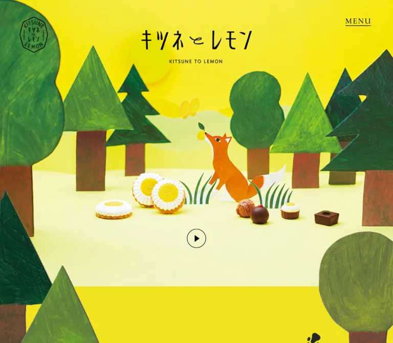
KITSUNE TO LEMON presents confectionery through a small illustrated world. Trees have irregular silhouettes and visible pencil-like texture. The notice artwork places an orange fox beneath a pale blue sky, surrounded by windblown-looking leaves and a green slope. Product photography visible behind the notice brings lemon peel, leaves, and white flower-shaped sweets into the same bright palette. Thin serif lettering gives this playful imagery a quiet, editorial frame.
The underlying page is a long brand presentation with a concept story, nine product links, an external shopping destination, and company information. It is not an on-page checkout. Its current first impression is dominated by a seasonal sales notice: an irregular illustrated panel floats over a visibly lightened page. The notice says that sales have ended for the displayed December 2025–March 2026 range and directs visitors to the official Instagram account for updates. This is a seasonal availability message, not evidence that the website has closed.
閉じる
KITSUNE TO LEMON — Style Reference
A lemon-colored storybook world, framed by delicate serif lettering and an illustrated seasonal notice.
Website: キツネとレモン — KITSUNE TO LEMON Original URL: https://www.morozoff.co.jp/brand/kitsunetolemon/ Final URL: https://www.morozoff.co.jp/brand/kitsunetolemon/ Theme: light, with illustrated yellow and green scenes, a blue notice panel, and a green footer. Inspected: October 2, 2026. Supplied evidence was retrieved at 09:55:51.698 UTC / 18:55:51.698 JST; individual captures have no separate timestamps. Viewports: desktop 1440 × 1000 CSS px; mobile 390 × 844 CSS px. Scope: the current brand homepage, its visible seasonal notice, persistent identity and social controls, and the underlying concept, product directory, shop link, and footer documented by rendered DOM measurements. Product detail pages, the external shop, Instagram, and the linked movie were not opened.
KITSUNE TO LEMON presents confectionery through a small illustrated world. Trees have irregular silhouettes and visible pencil-like texture. The notice artwork places an orange fox beneath a pale blue sky, surrounded by windblown-looking leaves and a green slope. Product photography visible behind the notice brings lemon peel, leaves, and white flower-shaped sweets into the same bright palette. Thin serif lettering gives this playful imagery a quiet, editorial frame.
The underlying page is a long brand presentation with a concept story, nine product links, an external shopping destination, and company information. It is not an on-page checkout. Its current first impression is dominated by a seasonal sales notice: an irregular illustrated panel floats over a visibly lightened page. The notice says that sales have ended for the displayed December 2025–March 2026 range and directs visitors to the official Instagram account for updates. This is a seasonal availability message, not evidence that the website has closed.
How to Read This Reference
- Measured means a value supplied by the rendered DOM or computed styles. Measurements belong to the two inspected viewport sizes; they do not establish the original responsive formulas.
- Visual estimate means an approximate dimension or color inferred from the attached current-page captures. No programmatic pixel sampling was performed.
- Recommended means guidance for a new implementation, including the CSS adaptation below. Recommended behavior must not be mistaken for a tested feature of the original.
- The notice remains visible throughout the supplied captures. Much of the underlying page is obscured, so product geometry can be documented more confidently than product image treatment.
- One mobile capture lacks the notice illustration and surrounding imagery while retaining notice text and controls. Other captures show the illustration. The cause is unverified; this does not establish an intentionally image-free mobile design.
- All custom-property names below are implementation aliases. The supplied custom-property collection was empty.
Tokens — Colors
Default Palette
| Name | Value | Suggested token | Evidence and role |
|---|---|---|---|
| Charcoal Ink | #242424 |
--color-ink |
Measured rgb(36, 36, 36) on body text, links, product headings, and notice copy. |
| Lemon Lettering | #f1e31f |
--color-lemon |
Measured rgb(241, 227, 31) on footer text and navigation. Do not assume this is the exact underlying hero background. |
| Woodland Green | #648b37 |
--color-forest |
Measured rgb(100, 139, 55) footer background. |
| White | approximately #ffffff |
--color-white |
Visually white empty regions and circular close-control surface. No corresponding opaque body background declaration was supplied. |
| Notice Sky | approximately #a5e6f3 |
--color-sky-estimate |
Visual estimate of the blue illustration field. The artwork contains white grain and many blue variations. |
| Fox Orange | approximately #f58a08 |
--color-fox-estimate |
Visual estimate of the fox illustration, not a measured UI accent. |
| Painted Grass | approximately #67af2d |
--color-grass-estimate |
Visual estimate of the sloping foreground; texture prevents a single exact fill. |
Use the measured footer colors when reconstructing its base surface. In the mobile capture showing the footer behind the notice, the green appears much lighter and its yellow lettering looks pale. This is consistent with the visible lightening layer over the underlying page. Those washed-out colors are not separate theme tokens.
Color Treatment
The notice illustration stays saturated relative to the page behind it. The separation comes from a pale veil, rather than a dark cinematic backdrop. Its exact color, opacity, and implementation were not supplied. A white backdrop at approximately 50% opacity is a recommended starting approximation, not a measured source value.
Orange and blue belong primarily to the notice artwork. Avoid promoting them into unrelated navigation fills, commerce buttons, or category badges. The visual hierarchy is carried by imagery, contrast, and scale rather than a large collection of interface colors.
Tokens — Typography
Main Serif Stack
Measured computed family: "Cormorant Infant", "Shippori Mincho B1", serif.
This stack appears on the body, notice copy, concept text, navigation, product heading wrappers, and footer links. Cormorant Infant supplies the intended Latin serif character; Shippori Mincho B1 is the named Japanese serif in the stack. The evidence identifies the computed family declaration, not the font file actually used for every glyph.
The common weight is 500. Section headings use 400. Keep the overall tone delicate and spacious rather than bold and promotional.
Company Information Stack
Measured computed family: "Zen Kaku Gothic New", sans-serif.
The company address and availability disclaimers use this separate sans-serif stack at weight 400. It creates a practical information layer below the more expressive brand typography.
Lettering and Artwork
The emblem and central Japanese brand title are visually distinctive lettering. The emblem's H1 wrapper reports 28px, weight 700, but its appearance must not be reconstructed as ordinary 28px heading text.
The notice's poetic heading is visible in the artwork region but absent from the supplied extracted page text. Whether it is embedded in imagery or omitted by the extraction is unverified. Its visual size is approximately 24px on desktop and 14px on mobile. These are estimates, not computed font measurements.
The desktop MENU mark also appears larger than its paragraph's reported 14px font size. Its measured wrapper width changes from 83px to 41.56px on mobile. Preserve the visible mark or verify its internal rendering before treating the wrapper font size as the final lettering size.
Type Scale
Values below describe the measured element, including wrapper elements where specified.
| Role | Desktop | Mobile | Weight | Tracking / notes |
|---|---|---|---|---|
| Root | 10px |
10px |
400 |
Computed root family is Times; body overrides it. |
| Body default | 14px / 14px |
14px / 14px |
500 |
Do not reuse this tight line height for all prose. |
| Notice information | 14px / 25.2px |
10px / 18px |
500 |
0.7px / 0.5px, both equivalent to 0.05em. |
| Concept paragraph | 22px / 44px |
14px / 28px |
500 |
1.1px / 0.7px, both 0.05em. |
LINE UP heading |
46px / 46px |
26px / 26px |
400 |
4.6px / 2.6px, both 0.1em. |
| Product H3 wrapper | 20px / 20px |
15px / 15px |
500 |
Nested Japanese and English text styling was not supplied. |
| Companion-range heading | 24px / 24px |
20px / 20px |
400 |
0.24px / 0.2px, both 0.01em. |
| Main menu links | 29px / 29px |
26px / 26px |
500 |
0.05em; measured in DOM, not an opened menu capture. |
| Menu movie link | 18px / 18px |
18px / 18px |
500 |
0.05em. |
| Footer primary links | 29px / 29px |
20px / 20px |
500 |
0.05em. |
| Footer movie link | 18px / 18px |
14px / 14px |
500 |
0.05em. |
| Company and address | 13px / 20.8px |
13px / 20.8px |
400 |
Sans serif; 0.26px tracking. |
| Availability disclaimer | 10px / 18px |
10px / 18px |
400 |
Sans serif; 0.2px tracking. |
The hierarchy depends on wide tracking in short English headings and generous leading in Japanese prose. It does not depend on very heavy weights or oversized sales copy.
Tokens — Spacing & Shapes
There is no verified universal spacing unit. Desktop measurements include fixed-looking dimensions, while several mobile values are fractional. Do not infer an entire design system from a single viewport ratio.
Layout Measurements
| Element | Desktop 1440 × 1000 | Mobile 390 × 844 | Evidence |
|---|---|---|---|
| Brand emblem | 92 × 117px, at (64, 55) |
51.98 × 70.19px, at (25.97, 28.47) |
Measured H1/link bounds. |
MENU wrapper |
83 × 14px, at (1285, 60) |
41.56 × 14px, at (322.47, 28.47) |
Measured wrapper, not necessarily the complete visible mark. |
| Notice illustration | Approximately 845 × 625px, around (297.5, 188) |
Approximately 346 × 458px, around (22, 192) |
Visual bounds; notice text width independently matches these widths. |
| Notice information box | 845 × 50.38px, at (297.5, 423) |
346.31 × 72px, at (21.84, 371.30) |
Measured. |
| Notice Instagram link | 22 × 22px, at (709, 507) |
17.94 × 17.94px, at (186.03, 464.91) |
Measured. |
| Notice close circle | Approximately 75px diameter |
Approximately 54px diameter |
Visual estimate. |
| Persistent Instagram icon | 22 × 22px, at (1345, 918) |
16.77 × 16.77px, at (342.05, 795.89) |
Measured. |
| Concept paragraph box | 600px wide; 200px top padding |
390px wide; 305.76px top padding |
Measured; box includes large staging space. |
| Lineup section padding | 88px 0 130px |
64.74px 0 62.4px |
Measured. |
| Repeated mobile product gap | Not a uniform desktop sequence | Approximately 54.59px between the first seven link boxes |
Calculated from consecutive measured bounds. |
| Footer padding | 70px 0 60px |
Approximately 51.99px 0 44.19px |
Measured. |
At 390px width, the notice occupies approximately 88.8% of the viewport width. Its desktop width is approximately 58.7% of the viewport. These are calculated ratios, not recovered CSS formulas.
Shape Language
- Notice: a broad, irregular landscape silhouette on desktop and a taller organic silhouette on mobile. Its uneven perimeter is part of the illustration composition, not a conventional rounded rectangle.
- Close control: a white circle containing two thin crossing diagonals. It overlaps the panel's upper-right edge more noticeably on mobile.
- Brand emblem: a narrow, irregular outlined seal with lettering inside.
- Navigation: spare text and fine linework; the visible
MENUmark has an underline. - Product entries: measured links and headings do not establish a card surface. No visible card elevation system is evidenced by the captures.
The desktop and mobile notice compositions should be treated as separately art-directed proportions. Simply narrowing the desktop illustration would not reproduce the mobile fox placement and taller text arrangement.
Components
Persistent Brand Emblem
Anatomy: H1 → link to #first → visible emblem lettering/artwork.
Place this identity mark near the upper-left corner with substantial surrounding space. Its desktop bounds are 92 × 117px; mobile bounds are about 52 × 70px. The measured header itself has zero height, so this is not a conventional content-flow navigation bar.
The emblem remains in the same screen region across the supplied captures. A viewport-anchored implementation is consistent with this evidence, although the source positioning declaration was not included.
MENU and Navigation
Visible anatomy: upper-right MENU mark with a thin underline and no enclosing button rectangle.
The DOM contains HOME, CONCEPT, LINE UP, and CONCEPT MOVIE. The first three link to sections on the current page. The movie link points to YouTube. The measured desktop primary link boxes form a vertical group beginning near x = 553.5px; the movie link begins farther right near x = 731.7px. Mobile links share a centered 154.78px-wide block and stack vertically.
These are useful layout measurements, but no open-menu screenshot or click result was supplied. Background, opening direction, focus behavior, closing behavior, and animation remain unverified. Do not infer visible menu state merely because hidden or obscured links have DOM rectangles.
Opening Scene
Anatomy: viewport-height opening section, central brand lettering, illustrated woodland background, and persistent corner controls.
The section measures exactly 1440 × 1000px on desktop and 390 × 844px on mobile. That supports a viewport-height visual composition at both samples without proving which viewport unit the source uses.
The first desktop capture shows a bright yellow scene, a broad rounded tree at the left, pointed evergreen silhouettes at the right, and central Japanese brand lettering above the notice. The middle of the scene is obscured. Do not invent hidden foreground objects or playback controls.
Seasonal Notice
Role: communicates the end of the displayed sales season and provides the immediate path to updates.
Visible anatomy:
- A pale page-wide veil.
- A centered organic illustration containing sky, white texture, scattered leaves, a green slope, and an orange fox.
- A poetic heading above the operational message.
- A centered sales-period paragraph.
- A small Instagram icon beneath the paragraph.
- A circular close affordance near the upper-right edge.
The visual heading reads:
前へと進むキツネをやさしい風が撫でていきます。
しっぽと気持ちが向く方へ。次はどこへ行こうかな。
On desktop this forms two broad lines. On mobile it becomes four shorter centered lines. Its implementation as live text or image lettering is unverified.
The operational message is confirmed DOM text:
今年度の販売は終了いたしました。掲載中の商品は2025年12月〜2026年3月販売分です。
POP UP SHOP等の新情報は公式インスタグラムなどでご案内いたします。
Desktop presents this at 14px with two lines. Mobile uses 10px with four lines. The notice icon links to the same official Instagram destination as the persistent social control.
The desktop panel remains around the viewport center while the background changes between captures. The fully illustrated mobile panel is also approximately centered vertically. This supports the appearance of a viewport-anchored overlay. Dismissal, persistence after closing, scroll locking, keyboard handling, and backdrop-click behavior were not tested.
Persistent Instagram Rail
Anatomy: a narrow vertical Japanese invitation above an outlined Instagram icon near the lower-right edge.
The visible caption is キツネの暮らし公開中. It makes the social link feel like a small marginal annotation rather than a promotional banner. The icon measures 22px on desktop and about 16.77px on mobile.
Keep the glyph visually small if reproducing the composition, but enlarge its interaction area in a new implementation. The supplied icon bounds do not establish an accessible touch target.
Concept Story
Anatomy: a large scenic section with a centered Japanese paragraph and generous staging space before the text.
The text introduces the fox and lemon-flavored sweets. Desktop uses a 600px-wide paragraph, 22px type, 44px leading, and 0.05em tracking. Mobile uses 14px type, 28px leading, and deliberate shorter lines.
The section is unusually tall: 2905px on desktop and approximately 2170.94px on mobile. Its paragraph includes 200px of desktop top padding and approximately 305.76px on mobile. This is evidence of space reserved around the storytelling composition, not a reason to make all ordinary text sections extremely tall.
Lemon photography is visible behind the notice in one desktop capture. Exact image sequence, section association of every image, and any scroll-triggered effects cannot be established from the supplied views.
Product Directory
Anatomy: LINE UP H2 → linked product entries → Japanese and English naming inside H3 wrappers → companion-range heading and two additional product links.
Seven fox-and-lemon products precede two wolf-and-strawberry products. The directory links to individual product pages. Prices, selectors, and add-to-cart controls are not present in the supplied homepage text.
Desktop geometry alternates entries between left and right positions with varying widths and overlapping vertical ranges. Most fox product centers fall near x = 525px or x = 908px. This creates a staged, illustrated-catalog rhythm rather than a uniform tile grid.
Mobile centers each entry around x = 195px and restores a sequential reading order. Each product retains its own width instead of stretching every item to the same card width.
| Product | Desktop x / width | Mobile x / width | Desktop / mobile link height |
|---|---|---|---|
| Dreaming Kitsune’s Lemon Flower | 691 / 424px |
90 / 210px |
318.73 / 400.48px |
| Sleeping Kitsune’s Lemon Cake | 325 / 384px |
105 / 180px |
312.84 / 351.56px |
| Storybook | 815 / 190px |
127.41 / 135.17px |
379.73 / 277.05px |
| Secret Pottery | 449 / 152px |
142.5 / 105px |
302.77 / 259.11px |
| Wander of Port Town | 798 / 220px |
117.53 / 154.94px |
254.66 / 221.44px |
| Kitsune’s Nostalgic Memory | 375 / 310px |
82.5 / 225px |
246.31 / 182.38px |
| Collection Box | 795 / 226px |
118.31 / 153.38px |
319.89 / 226.63px |
| Wolf’s Cherished Ichigo Flower | 375 / 296px |
90 / 210px |
329.05 / 236.38px |
| Wolf’s Nostalgic Memory | 739 / 326px |
75 / 240px |
360.41 / 181.44px |
These are complete link boxes, not measured image sizes. In particular, the first two products become taller on mobile despite becoming narrower. A simple uniform scaling rule cannot explain their complete layouts. Image switching, stacked media, and internal spacing were not separately exposed, so verify the actual assets before implementing those proportions.
The English name WANDER OF PORT TOWN is the supplied UI wording. Preserve the site's wording rather than silently normalizing it to the spelling in its URL.
Companion Range
The heading オオカミとイチゴ introduces the final two products. It uses a smaller, more restrained heading than LINE UP: 24px desktop and 20px mobile, weight 400, with 0.01em tracking.
The two desktop links occupy left and right positions at different vertical starts. Mobile places them one after the other. Keep this semantic grouping rather than treating all nine products as an undifferentiated list.
Full-Width Shop Link
A linked section follows the product directory and points to the Morozoff online shop. Its measured bounds are 1440 × 635px on desktop and 390 × 390px on mobile.
The link has no extracted text. This does not prove it lacks an accessible name, because child image alternatives and all accessibility attributes were not supplied. A new implementation should provide a clear accessible destination label.
The lower mobile capture shows lemon, leaf, and flower-shaped confectionery imagery above the footer. Exact asset URLs and image cropping rules are unavailable. Preserve responsive art direction rather than forcing a single wide image into a square with arbitrary cropping.
Footer
Anatomy: brand identity, repeated section navigation, movie link, company and address, availability disclaimers, and copyright.
Its measured base is Woodland Green #648b37 with Lemon Lettering #f1e31f. Desktop navigation and company information occupy the right-hand portion of the footer; the company block is 350px wide at x = 855px. Mobile places the navigation and company information in a centered vertical sequence.
The footer identifies モロゾフ株式会社. Company information uses 13px sans-serif text, and the disclaimer uses 10px sans-serif text with 18px leading. The copyright is visibly small and tracked, but its computed typography was not supplied.
The footer height is 600px on desktop and approximately 567.30px on mobile. Do not reproduce the pale green visible through the notice veil as its underlying background color.
Tokens — Motion & Interaction
| Feature | Evidence | What can be implemented with confidence |
|---|---|---|
| Link transitions | Many anchor elements report transition: 0.4s. |
Preserve a restrained 400ms transition duration if desired. The changing property and actual hover result are unverified. |
| Sampled element animation | Listed elements report animation: none. |
No keyframe animation is established for those elements. This does not rule out child, pseudo-element, image, video, or script-driven motion. |
| Persistent notice position | Panel position stays similar while background content differs between captures. | A viewport-anchored overlay matches the captured appearance. Scroll-lock behavior is unknown. |
| Close affordance | Circular X is visible on both sizes. | Provide a close control in a recreation; no successful dismissal was recorded. |
| Section navigation | #first, #about, and #lineup destinations exist in rendered links. |
Use real section anchors. Smooth scrolling, active states, and offsets are unverified. |
| Product navigation | Nine product-detail URLs are present. | Implement entries as links; detail-page behavior was not inspected. |
| Movie access | Navigation links to YouTube. | Preserve external movie access without inventing an inline player or autoplay. |
| Image appearance across captures | Some captures show artwork; one mobile view does not. | Treat image readiness as an inspection limitation, not evidence of a particular reveal animation. |
The readiness process waited for visible finite motion and layout/text stability within a bounded period. Perpetual animations were temporarily paused during checks and then resumed. This process is not an interaction recording and does not establish animation duration, easing, sequencing, or the cause of blank artwork.
Recommended adaptation: use the observed 400ms duration for a modest opacity change on links, with a reduced-motion override. Avoid adding parallax, drifting leaves, bouncing animals, or a looping background merely because the imagery suggests movement.
Surfaces
| Layer | Appearance | Role and certainty |
|---|---|---|
| Opening scene | Yellow field with textured green woodland | Visible in the first desktop capture; exact un-veiled background color is unknown. |
| Photographic region | Lemon photography with yellow tones | Visible behind the notice in another desktop capture. |
| White regions | Flat white with extensive empty space | Visible, but some may reflect incomplete image presentation rather than intentional final composition. |
| Notice veil | Pale, translucent-looking wash | Visually separates the notice; opacity unmeasured. |
| Notice panel | Blue textured illustration with irregular perimeter | Dominant visible surface; no obvious border or shadow. |
| Close control | White circle with thin dark X | Small, crisp utility shape over the illustration. |
| Footer | #648b37 green with #f1e31f text |
Measured base colors, lightened in the overlaid capture. |
There is no evidenced system of raised cards, glass panels, broad drop shadows, or gradient buttons. Texture belongs chiefly to the illustrations and photographs.
Imagery
The current artwork combines flat, expressive silhouettes with grain and visible hand-worked marks. Trees vary in shape and texture. The fox is a warm orange silhouette with a white tail tip and white chest, a small dark eye, and a black nose. Its body crosses the lower part of the notice while the green ground rises diagonally toward the right.
The notice sky contains soft white passages and scattered leaves. Preserve these tonal variations. A flat cyan shape and a generic fox icon would retain the subject but lose the design's character.
Photography provides a different material register: lemon skin, green leaves, and white flower-shaped sweets are visible in the supplied current-page captures. Keep product texture and controlled color relationships. The evidence does not support claims about the exact lighting setup, asset format, or production technique.
Do not use pixelated image rendering. These textures should remain naturally detailed, with smooth scaling and adequate image resolution.
Observed Asset References
No image URLs, filenames, dimensions of source files, or font-file URLs were supplied. The following inventory identifies visible roles without inventing asset paths.
| Asset role | Evidence | Implementation implication |
|---|---|---|
| Narrow brand emblem | Upper-left identity on desktop and mobile | Preserve its lettering and irregular outline as approved artwork. |
| Central brand wordmark | Visible above the notice in the first desktop capture | Do not substitute an ordinary heading font for the lettering. |
| Woodland scene | Trees and yellow field in the first desktop capture | Use a composition that respects the central overlay and corner controls. |
| Notice illustration | Fully visible in desktop captures and the lower mobile capture | Supply landscape and portrait compositions or an equivalent art-directed solution. |
| Notice poetic heading | Visible in illustrated captures, absent from supplied extracted text | Determine whether lettering is embedded before adding duplicate live text. |
| Lemon and confectionery photography | Visible behind the notice in desktop and mobile | Preserve texture and choose responsive crops deliberately. |
| Instagram and close symbols | Visible in both viewport sizes | Simple linework can be recreated accessibly without adding visual weight. |
| Product media | Product link geometry is supplied; most imagery is obscured | Verify actual media before choosing aspect ratios or crop behavior. |
Use authorized original artwork when available. CSS can reproduce placement and hierarchy, but it cannot reproduce the painted character by itself.
Layout & Responsive Behavior
Document Structure
The following section positions are measured from the document origin, not from the current screenshot's scroll offset.
| Section | Desktop start / height | Mobile start / height |
|---|---|---|
| Opening | 0 / 1000px |
0 / 844px |
| Concept | 1000 / 2905px |
844 / 2170.94px |
| Lineup | 3905 / 2595.98px |
3014.94 / 3168.59px |
| Shop link | 6500.98 / 635px |
6183.53 / 390px |
| Footer | 7135.98 / 600px |
6573.53 / 567.30px |
| Total document | 7735.98px |
7140.83px |
The mobile document is shorter overall, but its product directory is taller because desktop's staggered arrangement becomes sequential. The concept section contracts substantially, while the shop banner changes from a wide rectangle to a square.
Notice Adaptation
Desktop uses a broad panel approximately 845px wide. Mobile uses approximately 346px of the 390px viewport, leaving about 22px on each side. The artwork changes proportions rather than simply shrinking uniformly.
The message remains centered, but line count doubles from two to four. The poetic heading also changes from two lines to four. The fox occupies the lower mobile panel without displacing the operational copy from its central region.
The close circle changes from approximately 75px to 54px and moves partly above the mobile illustration's top edge. Keep it outside any clipping region applied to the art.
Directory Adaptation
Desktop is an irregular arrangement of individually sized entries. Mobile is a single centered sequence, with measured widths from 105px to 240px. The first seven mobile entries have approximately 54.59px of clear space between link boxes.
Do not apply one scale factor to all desktop product sizes. For example, Dreaming Kitsune’s Lemon Flower changes from 424px to 210px wide, while Kitsune’s Nostalgic Memory changes from 310px to 225px. These are different reductions.
Responsive Limits
Only two viewport sizes were supplied. No tablet, landscape-phone, enlarged-text, or unusually short-screen behavior was verified. The source breakpoint is unknown. The 760px breakpoint used below is a recommendation for a new implementation.
For short screens, allow the notice to scroll without losing its close control or message. Safe-area handling and keyboard focus behavior should be added deliberately; they are not established by the original evidence.
Do’s and Don’ts
Do
- Preserve the relationship between painted illustration, lemon photography, and restrained serif UI.
- Use the exact measured footer pair: green
#648b37and yellow#f1e31f. - Keep the distinction between base colors and colors lightened by the notice veil.
- Use the measured serif stack and its 0.05em prose/navigation tracking where appropriate.
- Give
LINE UPits light weight and wider 0.1em tracking. - Maintain the organic notice perimeter and separate desktop/mobile proportions.
- Keep operational sales information readable independently of decorative artwork.
- Preserve product-specific widths and the change from staggered desktop placement to centered mobile order.
- Keep the small emblem, underlined menu mark, and vertical social annotation visually quiet.
- Treat the current seasonal notice as part of the current experience.
Don’t
- Don't treat seasonal sales completion as website discontinuation.
- Don't turn the directory into a uniform grid of rounded commerce cards.
- Don't infer hidden product artwork, opening-scene controls, or menu behavior from obscured captures.
- Don't use the pale overlaid footer green as the base color token.
- Don't replace the organic illustration with a generic rounded blue rectangle.
- Don't crop the portrait notice from the desktop composition without checking the fox, text, and close control.
- Don't assume the blank mobile capture is the intended mobile design.
- Don't style every text run from the H1, H3, or MENU wrapper's computed font size.
- Don't invent animation, autoplay, hover transforms, or scroll effects.
- Don't substitute generic vector animals or pixelated rendering for the textured artwork.
Recommended Implementation Additions
These are recommendations for a new implementation, not verified features of the original:
- Use a semantic modal dialog for the seasonal notice, with an accessible name, reliable dismissal, focus containment, and focus restoration.
- Keep the message and Instagram destination usable if decorative imagery fails to load. Provide a legible fallback surface.
- Increase mobile operational copy above the observed 10px where practical; allow the panel to grow or scroll rather than overlapping the fox or clipping text.
- Provide at least 44 × 44px interaction areas around the small Instagram glyphs while retaining their visual scale.
- Expose the menu as a keyboard-operable button with an expanded state and an associated navigation region.
- Give the image-led shop link a destination-specific accessible name.
- Render notice poetry as accessible text when possible. If it already exists in an approved image, avoid visual duplication and provide an appropriate text equivalent.
- Keep product reading order meaningful independently of desktop positioning.
- Load responsive art deliberately and reserve its dimensions to reduce layout changes.
- Respect reduced-motion preferences and retain visible keyboard focus.
- Verify contrast in the footer and all notice states, including any backdrop treatment and image fallback.
Agent Prompt Guide
Quick Color Reference
- Body and notice text: measured
#242424. - Footer background: measured
#648b37. - Footer text and links: measured
#f1e31f. - Notice sky: approximately
#a5e6f3, with white painted texture. - Fox: approximately
#f58a08, with white and dark details. - Close circle: visually white.
- Overlay separation: a pale white veil; exact opacity is unknown.
Overall Prompt
“Create a confectionery brand homepage inspired by the current KITSUNE TO LEMON composition. Use a textured illustrated woodland, lemon photography, delicate Cormorant Infant and Shippori Mincho B1 serif typography, a small outlined emblem at upper left, an underlined MENU mark at upper right, and a narrow vertical Instagram annotation near the lower-right edge. Present a centered seasonal notice in an irregular blue-sky illustration with an orange fox on a green slope. Give the notice distinct landscape and portrait compositions, centered Japanese copy, a small Instagram icon, and a white circular close control. Below it, organize concept storytelling and individually sized product links in a staggered desktop arrangement that becomes a centered mobile sequence. End with a #648b37 footer and #f1e31f lettering. Do not invent interactions or hidden artwork beyond the supplied evidence.”
Example Component Prompts
- Seasonal notice: “A broad organic illustration panel, approximately 845 × 625px on desktop, with pale blue textured sky, white cloud-like strokes, scattered leaves, an orange fox, and a diagonal green foreground. Center a two-line poetic heading above a smaller two-line sales-period message. Add an Instagram glyph and a white circular close control. On a 390px phone, use an approximately 346 × 458px portrait composition with four-line text groups.”
- Brand controls: “A sparse page frame with a narrow irregular brand seal in the upper-left corner, a serif MENU label with a fine underline in the upper-right corner, and a small vertical social invitation at lower right. No solid navigation bar, pill buttons, or heavy icon treatment.”
- Product directory: “A serif LINE UP heading with 0.1em tracking, followed by seven individually sized product links arranged alternately left and right on desktop. Preserve differing widths and generous space. At mobile width, center each item in a single sequence with roughly 55px between entries. Add a separate two-product companion range.”
- Footer: “A flat woodland-green #648b37 footer with lemon-yellow #f1e31f navigation. Use serif links and smaller Zen Kaku Gothic New company details. Arrange information toward the right on desktop and in a centered vertical stack on mobile. Do not bake the notice overlay's washed-out colors into this component.”
Quick Start
CSS Custom Properties
This is a recommended adaptation, not recovered source CSS. It keeps a conventional root font size and uses explicit pixel values for measured typography. The breakpoint, fallback shape, overlay opacity, and hover property are implementation choices. Supply the named fonts separately; declaring their family names does not load them.
:root {
  /* Measured interface colors */
  --color-ink: #242424;
  --color-lemon: #f1e31f;
  --color-forest: #648b37;
  --color-white: #fff;

  /* Visual approximations for artwork fallback only */
  --color-sky-estimate: #a5e6f3;
  --color-fox-estimate: #f58a08;

  /* Measured family declarations */
  --font-brand: 'Cormorant Infant', 'Shippori Mincho B1', serif;
  --font-information: 'Zen Kaku Gothic New', sans-serif;

  --text-notice: 14px;
  --text-concept: 22px;
  --text-section: 46px;
  --text-product: 20px;
  --tracking-copy: 0.05em;
  --tracking-section: 0.1em;

  --notice-width: 845px;
  --notice-close: 75px;
  --product-area: 790px;
  --link-duration: 400ms;
}

* {
  box-sizing: border-box;
}

body {
  margin: 0;
  color: var(--color-ink);
  background: var(--color-white);
  font-family: var(--font-brand);
  font-size: 14px;
  font-weight: 500;
}

button,
input {
  font: inherit;
}

a {
  color: inherit;
}

img {
  display: block;
  max-width: 100%;
}

/* Recommended viewport-height approximation */
.brand-opening {
  min-height: 100svh;
}

.brand-emblem {
  position: fixed;
  z-index: 10;
  top: 55px;
  left: 64px;
  width: 92px;
  height: 117px;
}

.brand-emblem img {
  width: 100%;
  height: 100%;
  object-fit: contain;
}

/* Text replacement for the visible mark, not its measured wrapper */
.brand-menu {
  position: fixed;
  z-index: 10;
  top: 55px;
  right: 72px;
  padding: 0;
  border: 0;
  color: inherit;
  background: transparent;
  font-size: 24px;
  font-weight: 400;
  letter-spacing: 0.08em;
  text-decoration: underline;
  text-underline-offset: 5px;
  cursor: pointer;
}

/* Native dialog behavior is a recommended implementation addition */
.season-dialog {
  position: fixed;
  inset: 0;
  width: 100%;
  height: 100dvh;
  max-width: none;
  max-height: none;
  margin: 0;
  padding: 16px;
  overflow: auto;
  border: 0;
  color: var(--color-ink);
  background: transparent;
}

.season-dialog[open] {
  display: flex;
}

.season-dialog::backdrop {
  /* Estimated visual approximation; opacity was not measured */
  background: rgb(255 255 255 / 50%);
}

.notice-panel {
  position: relative;
  flex: none;
  width: min(var(--notice-width), 88.8vw);
  aspect-ratio: 845 / 625;
  margin: auto;
  isolation: isolate;
}

.notice-panel::before {
  /* Fallback only: approved artwork should supply the true silhouette */
  position: absolute;
  inset: 0;
  z-index: -2;
  border-radius: 45% 38% 35% 40% / 45% 47% 38% 43%;
  background: var(--color-sky-estimate);
  content: '';
}

.notice-art {
  position: absolute;
  inset: 0;
  z-index: -1;
  width: 100%;
  height: 100%;
  object-fit: contain;
  pointer-events: none;
}

.notice-poem {
  position: absolute;
  top: 19.2%;
  left: 8%;
  width: 84%;
  margin: 0;
  text-align: center;
  font-size: 24px;
  font-weight: 500;
  line-height: 1.8;
  letter-spacing: 0.05em;
}

.notice-copy {
  position: absolute;
  top: 37.68%;
  left: 0;
  width: 100%;
  margin: 0;
  text-align: center;
  font-size: var(--text-notice);
  line-height: 1.8;
  letter-spacing: var(--tracking-copy);
}

.notice-social {
  position: absolute;
  top: 51.12%;
  left: 50%;
  display: grid;
  width: 44px;
  height: 44px;
  margin-top: -11px;
  place-items: center;
  transform: translateX(-50%);
}

.notice-social svg {
  width: 22px;
  height: 22px;
}

.notice-close {
  position: absolute;
  top: 5.5%;
  right: 5.25%;
  width: var(--notice-close);
  height: var(--notice-close);
  padding: 0;
  border: 0;
  border-radius: 50%;
  color: var(--color-ink);
  background: var(--color-white);
  cursor: pointer;
}

.notice-close::before,
.notice-close::after {
  position: absolute;
  top: 50%;
  left: 22%;
  width: 56%;
  height: 1.5px;
  background: currentColor;
  content: '';
}

.notice-close::before {
  transform: rotate(45deg);
}

.notice-close::after {
  transform: rotate(-45deg);
}

.mobile-break {
  display: none;
}

.concept-copy {
  max-width: 600px;
  margin-inline: auto;
  text-align: center;
  font-size: var(--text-concept);
  line-height: 2;
  letter-spacing: var(--tracking-copy);
}

.lineup {
  padding-block: 88px 130px;
}

.lineup-title {
  margin: 0 0 114px;
  text-align: center;
  font-size: var(--text-section);
  font-weight: 400;
  line-height: 1;
  letter-spacing: var(--tracking-section);
}

/* Approximate the staggered composition with per-item values */
.product-list {
  display: flex;
  flex-direction: column;
  width: min(var(--product-area), calc(100% - 48px));
  margin-inline: auto;
  padding: 0;
  list-style: none;
}

.product {
  width: min(var(--product-width, 310px), 100%);
  margin-inline-start: var(--product-x, 0px);
}

.product + .product {
  margin-top: var(--product-overlap, 0px);
}

.product-link {
  display: block;
  text-decoration: none;
  /* Duration measured; opacity as the animated property is recommended */
  transition: opacity var(--link-duration);
}

.product-media {
  width: 100%;
  height: auto;
  object-fit: contain;
}

.product-name {
  margin: 20px 0 0;
  text-align: center;
  font-size: var(--text-product);
  font-weight: 500;
  line-height: 1.4;
}

/* Apply measured widths and offsets to the first two entries */
.product:nth-child(1) {
  --product-width: 424px;
  --product-mobile-width: 210px;
  --product-x: 366px;
}

.product:nth-child(2) {
  --product-width: 384px;
  --product-mobile-width: 180px;
  --product-x: 0px;
  --product-overlap: -10px;
}

.brand-footer {
  padding: 70px 24px 60px;
  color: var(--color-lemon);
  background: var(--color-forest);
}

.footer-information {
  font-family: var(--font-information);
  font-size: 13px;
  font-weight: 400;
  line-height: 1.6;
  letter-spacing: 0.02em;
}

.footer-disclaimer {
  font-family: var(--font-information);
  font-size: 10px;
  font-weight: 400;
  line-height: 1.8;
  letter-spacing: 0.02em;
}

:where(a, button):focus-visible {
  outline: 2px solid currentColor;
  outline-offset: 4px;
}

@media (hover: hover) {
  .product-link:hover {
    opacity: 0.75;
  }
}

/* Recommended breakpoint; original breakpoint was not supplied */
@media (max-width: 760px) {
  :root {
    --text-notice: 10px;
    --text-concept: 14px;
    --text-section: 26px;
    --text-product: 15px;
    --notice-close: 54px;
  }

  .brand-emblem {
    top: 28.47px;
    left: 6.66vw;
    width: 51.98px;
    height: 70.19px;
  }

  .brand-menu {
    top: 28.47px;
    right: 6.66vw;
    font-size: 14px;
  }

  .notice-panel {
    aspect-ratio: 346.3125 / 458;
  }

  .notice-poem {
    top: 12%;
    font-size: 14px;
    line-height: 1.86;
  }

  .notice-copy {
    top: 39.15%;
  }

  .notice-social {
    top: 59.6%;
    margin-top: -13px;
  }

  .notice-social svg {
    width: 18px;
    height: 18px;
  }

  .notice-close {
    top: -8px;
    right: 7.8%;
  }

  .mobile-break {
    display: initial;
  }

  .concept-copy {
    padding-inline: 24px;
  }

  .lineup {
    padding-block: 64.74px 62.4px;
  }

  .lineup-title {
    margin-bottom: 78px;
  }

  .product-list {
    gap: 54.6px;
  }

  .product {
    width: min(var(--product-mobile-width, 225px), 100%);
    margin-inline: auto;
  }

  .product + .product {
    margin-top: 0;
  }

  .brand-footer {
    padding-block: 52px 44px;
    text-align: center;
  }
}

@media (prefers-reduced-motion: reduce) {
  .product-link {
    transition: none;
  }
}
The product selectors above demonstrate the first two entries only. Extend their per-item properties using the measured directory table, then check the composition against the actual media. Do not force link heights to match the table by stretching images. The snippet also uses more forgiving product-heading leading than the measured wrapper; internal source text spans were unavailable.
Notice Markup Example
This is an accessible implementation example, not the original DOM. Insert approved, preferably text-free, responsive artwork as an image with the notice-art class. The fallback remains visible without it. If the artwork contains the poetic heading, reconcile it with the live heading below to avoid duplication.
<dialog
  id='season-notice'
  class='season-dialog'
  aria-labelledby='season-title'
  aria-describedby='season-copy'
>
  <section class='notice-panel'>
    <!-- Insert approved responsive artwork here; use alt='' if decorative. -->

    <h2 id='season-title' class='notice-poem'>
      前へと進むキツネを<br class='mobile-break'>やさしい風が撫でていきます。<br>
      しっぽと気持ちが向く方へ。<br class='mobile-break'>次はどこへ行こうかな。
    </h2>

    <p id='season-copy' class='notice-copy'>
      今年度の販売は終了いたしました。<br class='mobile-break'>掲載中の商品は2025年12月〜2026年3月販売分です。<br>
      POP UP SHOP等の新情報は<br class='mobile-break'>公式インスタグラムなどでご案内いたします。
    </p>

    <a
      class='notice-social'
      href='https://www.instagram.com/kitsunetolemon.official/?utm_medium=copy_link'
      aria-label='Official KITSUNE TO LEMON Instagram'
    >
      <svg viewBox='0 0 24 24' fill='none' stroke='currentColor'
        stroke-width='1.5' aria-hidden='true'>
        <rect x='3' y='3' width='18' height='18' rx='5'></rect>
        <circle cx='12' cy='12' r='4'></circle>
        <circle cx='17.5' cy='6.5' r='0.7' fill='currentColor'></circle>
      </svg>
    </a>

    <form method='dialog'>
      <button class='notice-close' aria-label='Close seasonal notice' autofocus></button>
    </form>
  </section>
</dialog>
Open this example using document.querySelector('#season-notice').showModal() when the application intends to display it. Native dialog semantics and the form's dismissal are recommended behavior; no equivalent original implementation was verified. Before production use, test enlarged text and short screens, and replace the tightly positioned copy layout if longer content needs more space.
Tailwind v4 Token Mapping
Optional aliases for a project already using Tailwind v4. This is not evidence that the original site uses Tailwind.
@theme inline {
  --color-ink: #242424;
  --color-lemon: #f1e31f;
  --color-forest: #648b37;
  --color-sky-estimate: #a5e6f3;

  --font-brand: 'Cormorant Infant', 'Shippori Mincho B1', serif;
  --font-information: 'Zen Kaku Gothic New', sans-serif;

  --text-notice: 14px;
  --text-concept: 22px;
  --text-section: 46px;
  --text-product: 20px;

  --spacing-notice-width: 845px;
  --spacing-control-touch: 44px;
}
Sources & Evidence
- Current KITSUNE TO LEMON homepage: original and final URL are identical; supplied HTTP status is 200.
- Evidence retrieval: October 2, 2026, 09:55:51.698 UTC / 18:55:51.698 JST.
- Current-page visual evidence: three desktop captures at 1440 × 1000 and two mobile captures at 390 × 844. The notice remains present; underlying scene and image visibility vary.
- Rendered DOM evidence: document text, link destinations, element rectangles, computed font families, font sizes, weights, line heights, tracking, selected colors, padding, and reported transitions at both viewports.
- Confirmed underlying structure: opening section, concept section, seven principal product links, a two-product companion range, external shop link, and company footer.
- Visual and behavioral limits: the notice obscures much of the page; one mobile capture lacks artwork; asset URLs and full stylesheets were not supplied; menu opening, notice dismissal, hover results, movie playback, external destinations, and detailed motion were not tested.
- Capture readiness used bounded waits for loading, finite motion, image decoding, and layout/text stability. These checks cannot guarantee complete delayed content or explain every blank region.
This reference describes the current supplied page evidence. Measured values, visual approximations, and recommended implementation choices are identified separately throughout.
# KITSUNE TO LEMON — Style Reference

> A lemon-colored storybook world, framed by delicate serif lettering and an illustrated seasonal notice.

**Website:** [キツネとレモン — KITSUNE TO LEMON](https://www.morozoff.co.jp/brand/kitsunetolemon/)
**Original URL:** https://www.morozoff.co.jp/brand/kitsunetolemon/
**Final URL:** https://www.morozoff.co.jp/brand/kitsunetolemon/
**Theme:** light, with illustrated yellow and green scenes, a blue notice panel, and a green footer.
**Inspected:** October 2, 2026. Supplied evidence was retrieved at 09:55:51.698 UTC / 18:55:51.698 JST; individual captures have no separate timestamps.
**Viewports:** desktop 1440 × 1000 CSS px; mobile 390 × 844 CSS px.
**Scope:** the current brand homepage, its visible seasonal notice, persistent identity and social controls, and the underlying concept, product directory, shop link, and footer documented by rendered DOM measurements. Product detail pages, the external shop, Instagram, and the linked movie were not opened.

KITSUNE TO LEMON presents confectionery through a small illustrated world. Trees have irregular silhouettes and visible pencil-like texture. The notice artwork places an orange fox beneath a pale blue sky, surrounded by windblown-looking leaves and a green slope. Product photography visible behind the notice brings lemon peel, leaves, and white flower-shaped sweets into the same bright palette. Thin serif lettering gives this playful imagery a quiet, editorial frame.

The underlying page is a long brand presentation with a concept story, nine product links, an external shopping destination, and company information. It is not an on-page checkout. Its current first impression is dominated by a seasonal sales notice: an irregular illustrated panel floats over a visibly lightened page. The notice says that sales have ended for the displayed December 2025–March 2026 range and directs visitors to the official Instagram account for updates. This is a seasonal availability message, not evidence that the website has closed.
閉じる
# KITSUNE TO LEMON — Style Reference

> A lemon-colored storybook world, framed by delicate serif lettering and an illustrated seasonal notice.

**Website:** [キツネとレモン — KITSUNE TO LEMON](https://www.morozoff.co.jp/brand/kitsunetolemon/)
**Original URL:** https://www.morozoff.co.jp/brand/kitsunetolemon/
**Final URL:** https://www.morozoff.co.jp/brand/kitsunetolemon/
**Theme:** light, with illustrated yellow and green scenes, a blue notice panel, and a green footer.
**Inspected:** October 2, 2026. Supplied evidence was retrieved at 09:55:51.698 UTC / 18:55:51.698 JST; individual captures have no separate timestamps.
**Viewports:** desktop 1440 × 1000 CSS px; mobile 390 × 844 CSS px.
**Scope:** the current brand homepage, its visible seasonal notice, persistent identity and social controls, and the underlying concept, product directory, shop link, and footer documented by rendered DOM measurements. Product detail pages, the external shop, Instagram, and the linked movie were not opened.

KITSUNE TO LEMON presents confectionery through a small illustrated world. Trees have irregular silhouettes and visible pencil-like texture. The notice artwork places an orange fox beneath a pale blue sky, surrounded by windblown-looking leaves and a green slope. Product photography visible behind the notice brings lemon peel, leaves, and white flower-shaped sweets into the same bright palette. Thin serif lettering gives this playful imagery a quiet, editorial frame.

The underlying page is a long brand presentation with a concept story, nine product links, an external shopping destination, and company information. It is not an on-page checkout. Its current first impression is dominated by a seasonal sales notice: an irregular illustrated panel floats over a visibly lightened page. The notice says that sales have ended for the displayed December 2025–March 2026 range and directs visitors to the official Instagram account for updates. This is a seasonal availability message, not evidence that the website has closed.

## How to Read This Reference

- **Measured** means a value supplied by the rendered DOM or computed styles. Measurements belong to the two inspected viewport sizes; they do not establish the original responsive formulas.
- **Visual estimate** means an approximate dimension or color inferred from the attached current-page captures. No programmatic pixel sampling was performed.
- **Recommended** means guidance for a new implementation, including the CSS adaptation below. Recommended behavior must not be mistaken for a tested feature of the original.
- The notice remains visible throughout the supplied captures. Much of the underlying page is obscured, so product geometry can be documented more confidently than product image treatment.
- One mobile capture lacks the notice illustration and surrounding imagery while retaining notice text and controls. Other captures show the illustration. The cause is unverified; this does not establish an intentionally image-free mobile design.
- All custom-property names below are implementation aliases. The supplied custom-property collection was empty.

## Tokens — Colors

### Default Palette

| Name | Value | Suggested token | Evidence and role |
| --- | --- | --- | --- |
| Charcoal Ink | `#242424` | `--color-ink` | Measured `rgb(36, 36, 36)` on body text, links, product headings, and notice copy. |
| Lemon Lettering | `#f1e31f` | `--color-lemon` | Measured `rgb(241, 227, 31)` on footer text and navigation. Do not assume this is the exact underlying hero background. |
| Woodland Green | `#648b37` | `--color-forest` | Measured `rgb(100, 139, 55)` footer background. |
| White | approximately `#ffffff` | `--color-white` | Visually white empty regions and circular close-control surface. No corresponding opaque body background declaration was supplied. |
| Notice Sky | approximately `#a5e6f3` | `--color-sky-estimate` | Visual estimate of the blue illustration field. The artwork contains white grain and many blue variations. |
| Fox Orange | approximately `#f58a08` | `--color-fox-estimate` | Visual estimate of the fox illustration, not a measured UI accent. |
| Painted Grass | approximately `#67af2d` | `--color-grass-estimate` | Visual estimate of the sloping foreground; texture prevents a single exact fill. |

Use the measured footer colors when reconstructing its base surface. In the mobile capture showing the footer behind the notice, the green appears much lighter and its yellow lettering looks pale. This is consistent with the visible lightening layer over the underlying page. Those washed-out colors are not separate theme tokens.

### Color Treatment

The notice illustration stays saturated relative to the page behind it. The separation comes from a pale veil, rather than a dark cinematic backdrop. Its exact color, opacity, and implementation were not supplied. A white backdrop at approximately 50% opacity is a **recommended starting approximation**, not a measured source value.

Orange and blue belong primarily to the notice artwork. Avoid promoting them into unrelated navigation fills, commerce buttons, or category badges. The visual hierarchy is carried by imagery, contrast, and scale rather than a large collection of interface colors.

## Tokens — Typography

### Main Serif Stack

**Measured computed family:** `"Cormorant Infant", "Shippori Mincho B1", serif`.

This stack appears on the body, notice copy, concept text, navigation, product heading wrappers, and footer links. Cormorant Infant supplies the intended Latin serif character; Shippori Mincho B1 is the named Japanese serif in the stack. The evidence identifies the computed family declaration, not the font file actually used for every glyph.

The common weight is `500`. Section headings use `400`. Keep the overall tone delicate and spacious rather than bold and promotional.

### Company Information Stack

**Measured computed family:** `"Zen Kaku Gothic New", sans-serif`.

The company address and availability disclaimers use this separate sans-serif stack at weight `400`. It creates a practical information layer below the more expressive brand typography.

### Lettering and Artwork

The emblem and central Japanese brand title are visually distinctive lettering. The emblem's H1 wrapper reports `28px`, weight `700`, but its appearance must not be reconstructed as ordinary 28px heading text.

The notice's poetic heading is visible in the artwork region but absent from the supplied extracted page text. Whether it is embedded in imagery or omitted by the extraction is unverified. Its visual size is approximately 24px on desktop and 14px on mobile. These are estimates, not computed font measurements.

The desktop `MENU` mark also appears larger than its paragraph's reported 14px font size. Its measured wrapper width changes from 83px to 41.56px on mobile. Preserve the visible mark or verify its internal rendering before treating the wrapper font size as the final lettering size.

### Type Scale

Values below describe the measured element, including wrapper elements where specified.

| Role | Desktop | Mobile | Weight | Tracking / notes |
| --- | --- | --- | --- | --- |
| Root | `10px` | `10px` | `400` | Computed root family is Times; body overrides it. |
| Body default | `14px / 14px` | `14px / 14px` | `500` | Do not reuse this tight line height for all prose. |
| Notice information | `14px / 25.2px` | `10px / 18px` | `500` | `0.7px` / `0.5px`, both equivalent to `0.05em`. |
| Concept paragraph | `22px / 44px` | `14px / 28px` | `500` | `1.1px` / `0.7px`, both `0.05em`. |
| `LINE UP` heading | `46px / 46px` | `26px / 26px` | `400` | `4.6px` / `2.6px`, both `0.1em`. |
| Product H3 wrapper | `20px / 20px` | `15px / 15px` | `500` | Nested Japanese and English text styling was not supplied. |
| Companion-range heading | `24px / 24px` | `20px / 20px` | `400` | `0.24px` / `0.2px`, both `0.01em`. |
| Main menu links | `29px / 29px` | `26px / 26px` | `500` | `0.05em`; measured in DOM, not an opened menu capture. |
| Menu movie link | `18px / 18px` | `18px / 18px` | `500` | `0.05em`. |
| Footer primary links | `29px / 29px` | `20px / 20px` | `500` | `0.05em`. |
| Footer movie link | `18px / 18px` | `14px / 14px` | `500` | `0.05em`. |
| Company and address | `13px / 20.8px` | `13px / 20.8px` | `400` | Sans serif; `0.26px` tracking. |
| Availability disclaimer | `10px / 18px` | `10px / 18px` | `400` | Sans serif; `0.2px` tracking. |

The hierarchy depends on wide tracking in short English headings and generous leading in Japanese prose. It does not depend on very heavy weights or oversized sales copy.

## Tokens — Spacing & Shapes

There is no verified universal spacing unit. Desktop measurements include fixed-looking dimensions, while several mobile values are fractional. Do not infer an entire design system from a single viewport ratio.

### Layout Measurements

| Element | Desktop 1440 × 1000 | Mobile 390 × 844 | Evidence |
| --- | --- | --- | --- |
| Brand emblem | `92 × 117px`, at `(64, 55)` | `51.98 × 70.19px`, at `(25.97, 28.47)` | Measured H1/link bounds. |
| `MENU` wrapper | `83 × 14px`, at `(1285, 60)` | `41.56 × 14px`, at `(322.47, 28.47)` | Measured wrapper, not necessarily the complete visible mark. |
| Notice illustration | Approximately `845 × 625px`, around `(297.5, 188)` | Approximately `346 × 458px`, around `(22, 192)` | Visual bounds; notice text width independently matches these widths. |
| Notice information box | `845 × 50.38px`, at `(297.5, 423)` | `346.31 × 72px`, at `(21.84, 371.30)` | Measured. |
| Notice Instagram link | `22 × 22px`, at `(709, 507)` | `17.94 × 17.94px`, at `(186.03, 464.91)` | Measured. |
| Notice close circle | Approximately `75px` diameter | Approximately `54px` diameter | Visual estimate. |
| Persistent Instagram icon | `22 × 22px`, at `(1345, 918)` | `16.77 × 16.77px`, at `(342.05, 795.89)` | Measured. |
| Concept paragraph box | `600px` wide; `200px` top padding | `390px` wide; `305.76px` top padding | Measured; box includes large staging space. |
| Lineup section padding | `88px 0 130px` | `64.74px 0 62.4px` | Measured. |
| Repeated mobile product gap | Not a uniform desktop sequence | Approximately `54.59px` between the first seven link boxes | Calculated from consecutive measured bounds. |
| Footer padding | `70px 0 60px` | Approximately `51.99px 0 44.19px` | Measured. |

At 390px width, the notice occupies approximately **88.8% of the viewport width**. Its desktop width is approximately **58.7% of the viewport**. These are calculated ratios, not recovered CSS formulas.

### Shape Language

- **Notice:** a broad, irregular landscape silhouette on desktop and a taller organic silhouette on mobile. Its uneven perimeter is part of the illustration composition, not a conventional rounded rectangle.
- **Close control:** a white circle containing two thin crossing diagonals. It overlaps the panel's upper-right edge more noticeably on mobile.
- **Brand emblem:** a narrow, irregular outlined seal with lettering inside.
- **Navigation:** spare text and fine linework; the visible `MENU` mark has an underline.
- **Product entries:** measured links and headings do not establish a card surface. No visible card elevation system is evidenced by the captures.

The desktop and mobile notice compositions should be treated as separately art-directed proportions. Simply narrowing the desktop illustration would not reproduce the mobile fox placement and taller text arrangement.

## Components

### Persistent Brand Emblem

**Anatomy:** H1 → link to `#first` → visible emblem lettering/artwork.

Place this identity mark near the upper-left corner with substantial surrounding space. Its desktop bounds are 92 × 117px; mobile bounds are about 52 × 70px. The measured header itself has zero height, so this is not a conventional content-flow navigation bar.

The emblem remains in the same screen region across the supplied captures. A viewport-anchored implementation is consistent with this evidence, although the source positioning declaration was not included.

### MENU and Navigation

**Visible anatomy:** upper-right `MENU` mark with a thin underline and no enclosing button rectangle.

The DOM contains `HOME`, `CONCEPT`, `LINE UP`, and `CONCEPT MOVIE`. The first three link to sections on the current page. The movie link points to YouTube. The measured desktop primary link boxes form a vertical group beginning near x = 553.5px; the movie link begins farther right near x = 731.7px. Mobile links share a centered 154.78px-wide block and stack vertically.

These are useful layout measurements, but no open-menu screenshot or click result was supplied. Background, opening direction, focus behavior, closing behavior, and animation remain unverified. Do not infer visible menu state merely because hidden or obscured links have DOM rectangles.

### Opening Scene

**Anatomy:** viewport-height opening section, central brand lettering, illustrated woodland background, and persistent corner controls.

The section measures exactly 1440 × 1000px on desktop and 390 × 844px on mobile. That supports a viewport-height visual composition at both samples without proving which viewport unit the source uses.

The first desktop capture shows a bright yellow scene, a broad rounded tree at the left, pointed evergreen silhouettes at the right, and central Japanese brand lettering above the notice. The middle of the scene is obscured. Do not invent hidden foreground objects or playback controls.

### Seasonal Notice

**Role:** communicates the end of the displayed sales season and provides the immediate path to updates.

**Visible anatomy:**

1. A pale page-wide veil.
2. A centered organic illustration containing sky, white texture, scattered leaves, a green slope, and an orange fox.
3. A poetic heading above the operational message.
4. A centered sales-period paragraph.
5. A small Instagram icon beneath the paragraph.
6. A circular close affordance near the upper-right edge.

The visual heading reads:

> 前へと進むキツネをやさしい風が撫でていきます。
> しっぽと気持ちが向く方へ。次はどこへ行こうかな。

On desktop this forms two broad lines. On mobile it becomes four shorter centered lines. Its implementation as live text or image lettering is unverified.

The operational message is confirmed DOM text:

> 今年度の販売は終了いたしました。掲載中の商品は2025年12月〜2026年3月販売分です。
> POP UP SHOP等の新情報は公式インスタグラムなどでご案内いたします。

Desktop presents this at 14px with two lines. Mobile uses 10px with four lines. The notice icon links to the same official Instagram destination as the persistent social control.

The desktop panel remains around the viewport center while the background changes between captures. The fully illustrated mobile panel is also approximately centered vertically. This supports the appearance of a viewport-anchored overlay. Dismissal, persistence after closing, scroll locking, keyboard handling, and backdrop-click behavior were not tested.

### Persistent Instagram Rail

**Anatomy:** a narrow vertical Japanese invitation above an outlined Instagram icon near the lower-right edge.

The visible caption is `キツネの暮らし公開中`. It makes the social link feel like a small marginal annotation rather than a promotional banner. The icon measures 22px on desktop and about 16.77px on mobile.

Keep the glyph visually small if reproducing the composition, but enlarge its interaction area in a new implementation. The supplied icon bounds do not establish an accessible touch target.

### Concept Story

**Anatomy:** a large scenic section with a centered Japanese paragraph and generous staging space before the text.

The text introduces the fox and lemon-flavored sweets. Desktop uses a 600px-wide paragraph, 22px type, 44px leading, and 0.05em tracking. Mobile uses 14px type, 28px leading, and deliberate shorter lines.

The section is unusually tall: 2905px on desktop and approximately 2170.94px on mobile. Its paragraph includes 200px of desktop top padding and approximately 305.76px on mobile. This is evidence of space reserved around the storytelling composition, not a reason to make all ordinary text sections extremely tall.

Lemon photography is visible behind the notice in one desktop capture. Exact image sequence, section association of every image, and any scroll-triggered effects cannot be established from the supplied views.

### Product Directory

**Anatomy:** `LINE UP` H2 → linked product entries → Japanese and English naming inside H3 wrappers → companion-range heading and two additional product links.

Seven fox-and-lemon products precede two wolf-and-strawberry products. The directory links to individual product pages. Prices, selectors, and add-to-cart controls are not present in the supplied homepage text.

Desktop geometry alternates entries between left and right positions with varying widths and overlapping vertical ranges. Most fox product centers fall near x = 525px or x = 908px. This creates a staged, illustrated-catalog rhythm rather than a uniform tile grid.

Mobile centers each entry around x = 195px and restores a sequential reading order. Each product retains its own width instead of stretching every item to the same card width.

| Product | Desktop x / width | Mobile x / width | Desktop / mobile link height |
| --- | --- | --- | --- |
| Dreaming Kitsune’s Lemon Flower | `691 / 424px` | `90 / 210px` | `318.73 / 400.48px` |
| Sleeping Kitsune’s Lemon Cake | `325 / 384px` | `105 / 180px` | `312.84 / 351.56px` |
| Storybook | `815 / 190px` | `127.41 / 135.17px` | `379.73 / 277.05px` |
| Secret Pottery | `449 / 152px` | `142.5 / 105px` | `302.77 / 259.11px` |
| Wander of Port Town | `798 / 220px` | `117.53 / 154.94px` | `254.66 / 221.44px` |
| Kitsune’s Nostalgic Memory | `375 / 310px` | `82.5 / 225px` | `246.31 / 182.38px` |
| Collection Box | `795 / 226px` | `118.31 / 153.38px` | `319.89 / 226.63px` |
| Wolf’s Cherished Ichigo Flower | `375 / 296px` | `90 / 210px` | `329.05 / 236.38px` |
| Wolf’s Nostalgic Memory | `739 / 326px` | `75 / 240px` | `360.41 / 181.44px` |

These are complete link boxes, not measured image sizes. In particular, the first two products become taller on mobile despite becoming narrower. A simple uniform scaling rule cannot explain their complete layouts. Image switching, stacked media, and internal spacing were not separately exposed, so verify the actual assets before implementing those proportions.

The English name `WANDER OF PORT TOWN` is the supplied UI wording. Preserve the site's wording rather than silently normalizing it to the spelling in its URL.

### Companion Range

The heading `オオカミとイチゴ` introduces the final two products. It uses a smaller, more restrained heading than `LINE UP`: 24px desktop and 20px mobile, weight 400, with 0.01em tracking.

The two desktop links occupy left and right positions at different vertical starts. Mobile places them one after the other. Keep this semantic grouping rather than treating all nine products as an undifferentiated list.

### Full-Width Shop Link

A linked section follows the product directory and points to the Morozoff online shop. Its measured bounds are 1440 × 635px on desktop and 390 × 390px on mobile.

The link has no extracted text. This does not prove it lacks an accessible name, because child image alternatives and all accessibility attributes were not supplied. A new implementation should provide a clear accessible destination label.

The lower mobile capture shows lemon, leaf, and flower-shaped confectionery imagery above the footer. Exact asset URLs and image cropping rules are unavailable. Preserve responsive art direction rather than forcing a single wide image into a square with arbitrary cropping.

### Footer

**Anatomy:** brand identity, repeated section navigation, movie link, company and address, availability disclaimers, and copyright.

Its measured base is Woodland Green `#648b37` with Lemon Lettering `#f1e31f`. Desktop navigation and company information occupy the right-hand portion of the footer; the company block is 350px wide at x = 855px. Mobile places the navigation and company information in a centered vertical sequence.

The footer identifies `モロゾフ株式会社`. Company information uses 13px sans-serif text, and the disclaimer uses 10px sans-serif text with 18px leading. The copyright is visibly small and tracked, but its computed typography was not supplied.

The footer height is 600px on desktop and approximately 567.30px on mobile. Do not reproduce the pale green visible through the notice veil as its underlying background color.

## Tokens — Motion & Interaction

| Feature | Evidence | What can be implemented with confidence |
| --- | --- | --- |
| Link transitions | Many anchor elements report `transition: 0.4s`. | Preserve a restrained 400ms transition duration if desired. The changing property and actual hover result are unverified. |
| Sampled element animation | Listed elements report `animation: none`. | No keyframe animation is established for those elements. This does not rule out child, pseudo-element, image, video, or script-driven motion. |
| Persistent notice position | Panel position stays similar while background content differs between captures. | A viewport-anchored overlay matches the captured appearance. Scroll-lock behavior is unknown. |
| Close affordance | Circular X is visible on both sizes. | Provide a close control in a recreation; no successful dismissal was recorded. |
| Section navigation | `#first`, `#about`, and `#lineup` destinations exist in rendered links. | Use real section anchors. Smooth scrolling, active states, and offsets are unverified. |
| Product navigation | Nine product-detail URLs are present. | Implement entries as links; detail-page behavior was not inspected. |
| Movie access | Navigation links to YouTube. | Preserve external movie access without inventing an inline player or autoplay. |
| Image appearance across captures | Some captures show artwork; one mobile view does not. | Treat image readiness as an inspection limitation, not evidence of a particular reveal animation. |

The readiness process waited for visible finite motion and layout/text stability within a bounded period. Perpetual animations were temporarily paused during checks and then resumed. This process is not an interaction recording and does not establish animation duration, easing, sequencing, or the cause of blank artwork.

**Recommended adaptation:** use the observed 400ms duration for a modest opacity change on links, with a reduced-motion override. Avoid adding parallax, drifting leaves, bouncing animals, or a looping background merely because the imagery suggests movement.

## Surfaces

| Layer | Appearance | Role and certainty |
| --- | --- | --- |
| Opening scene | Yellow field with textured green woodland | Visible in the first desktop capture; exact un-veiled background color is unknown. |
| Photographic region | Lemon photography with yellow tones | Visible behind the notice in another desktop capture. |
| White regions | Flat white with extensive empty space | Visible, but some may reflect incomplete image presentation rather than intentional final composition. |
| Notice veil | Pale, translucent-looking wash | Visually separates the notice; opacity unmeasured. |
| Notice panel | Blue textured illustration with irregular perimeter | Dominant visible surface; no obvious border or shadow. |
| Close control | White circle with thin dark X | Small, crisp utility shape over the illustration. |
| Footer | `#648b37` green with `#f1e31f` text | Measured base colors, lightened in the overlaid capture. |

There is no evidenced system of raised cards, glass panels, broad drop shadows, or gradient buttons. Texture belongs chiefly to the illustrations and photographs.

## Imagery

The current artwork combines flat, expressive silhouettes with grain and visible hand-worked marks. Trees vary in shape and texture. The fox is a warm orange silhouette with a white tail tip and white chest, a small dark eye, and a black nose. Its body crosses the lower part of the notice while the green ground rises diagonally toward the right.

The notice sky contains soft white passages and scattered leaves. Preserve these tonal variations. A flat cyan shape and a generic fox icon would retain the subject but lose the design's character.

Photography provides a different material register: lemon skin, green leaves, and white flower-shaped sweets are visible in the supplied current-page captures. Keep product texture and controlled color relationships. The evidence does not support claims about the exact lighting setup, asset format, or production technique.

Do not use pixelated image rendering. These textures should remain naturally detailed, with smooth scaling and adequate image resolution.

### Observed Asset References

No image URLs, filenames, dimensions of source files, or font-file URLs were supplied. The following inventory identifies visible roles without inventing asset paths.

| Asset role | Evidence | Implementation implication |
| --- | --- | --- |
| Narrow brand emblem | Upper-left identity on desktop and mobile | Preserve its lettering and irregular outline as approved artwork. |
| Central brand wordmark | Visible above the notice in the first desktop capture | Do not substitute an ordinary heading font for the lettering. |
| Woodland scene | Trees and yellow field in the first desktop capture | Use a composition that respects the central overlay and corner controls. |
| Notice illustration | Fully visible in desktop captures and the lower mobile capture | Supply landscape and portrait compositions or an equivalent art-directed solution. |
| Notice poetic heading | Visible in illustrated captures, absent from supplied extracted text | Determine whether lettering is embedded before adding duplicate live text. |
| Lemon and confectionery photography | Visible behind the notice in desktop and mobile | Preserve texture and choose responsive crops deliberately. |
| Instagram and close symbols | Visible in both viewport sizes | Simple linework can be recreated accessibly without adding visual weight. |
| Product media | Product link geometry is supplied; most imagery is obscured | Verify actual media before choosing aspect ratios or crop behavior. |

Use authorized original artwork when available. CSS can reproduce placement and hierarchy, but it cannot reproduce the painted character by itself.

## Layout & Responsive Behavior

### Document Structure

The following section positions are measured from the document origin, not from the current screenshot's scroll offset.

| Section | Desktop start / height | Mobile start / height |
| --- | --- | --- |
| Opening | `0 / 1000px` | `0 / 844px` |
| Concept | `1000 / 2905px` | `844 / 2170.94px` |
| Lineup | `3905 / 2595.98px` | `3014.94 / 3168.59px` |
| Shop link | `6500.98 / 635px` | `6183.53 / 390px` |
| Footer | `7135.98 / 600px` | `6573.53 / 567.30px` |
| Total document | `7735.98px` | `7140.83px` |

The mobile document is shorter overall, but its product directory is taller because desktop's staggered arrangement becomes sequential. The concept section contracts substantially, while the shop banner changes from a wide rectangle to a square.

### Notice Adaptation

Desktop uses a broad panel approximately 845px wide. Mobile uses approximately 346px of the 390px viewport, leaving about 22px on each side. The artwork changes proportions rather than simply shrinking uniformly.

The message remains centered, but line count doubles from two to four. The poetic heading also changes from two lines to four. The fox occupies the lower mobile panel without displacing the operational copy from its central region.

The close circle changes from approximately 75px to 54px and moves partly above the mobile illustration's top edge. Keep it outside any clipping region applied to the art.

### Directory Adaptation

Desktop is an irregular arrangement of individually sized entries. Mobile is a single centered sequence, with measured widths from 105px to 240px. The first seven mobile entries have approximately 54.59px of clear space between link boxes.

Do not apply one scale factor to all desktop product sizes. For example, Dreaming Kitsune’s Lemon Flower changes from 424px to 210px wide, while Kitsune’s Nostalgic Memory changes from 310px to 225px. These are different reductions.

### Responsive Limits

Only two viewport sizes were supplied. No tablet, landscape-phone, enlarged-text, or unusually short-screen behavior was verified. The source breakpoint is unknown. The 760px breakpoint used below is a recommendation for a new implementation.

For short screens, allow the notice to scroll without losing its close control or message. Safe-area handling and keyboard focus behavior should be added deliberately; they are not established by the original evidence.

## Do’s and Don’ts

### Do

- Preserve the relationship between painted illustration, lemon photography, and restrained serif UI.
- Use the exact measured footer pair: green `#648b37` and yellow `#f1e31f`.
- Keep the distinction between base colors and colors lightened by the notice veil.
- Use the measured serif stack and its 0.05em prose/navigation tracking where appropriate.
- Give `LINE UP` its light weight and wider 0.1em tracking.
- Maintain the organic notice perimeter and separate desktop/mobile proportions.
- Keep operational sales information readable independently of decorative artwork.
- Preserve product-specific widths and the change from staggered desktop placement to centered mobile order.
- Keep the small emblem, underlined menu mark, and vertical social annotation visually quiet.
- Treat the current seasonal notice as part of the current experience.

### Don’t

- Don't treat seasonal sales completion as website discontinuation.
- Don't turn the directory into a uniform grid of rounded commerce cards.
- Don't infer hidden product artwork, opening-scene controls, or menu behavior from obscured captures.
- Don't use the pale overlaid footer green as the base color token.
- Don't replace the organic illustration with a generic rounded blue rectangle.
- Don't crop the portrait notice from the desktop composition without checking the fox, text, and close control.
- Don't assume the blank mobile capture is the intended mobile design.
- Don't style every text run from the H1, H3, or MENU wrapper's computed font size.
- Don't invent animation, autoplay, hover transforms, or scroll effects.
- Don't substitute generic vector animals or pixelated rendering for the textured artwork.

## Recommended Implementation Additions

These are recommendations for a new implementation, not verified features of the original:

- Use a semantic modal dialog for the seasonal notice, with an accessible name, reliable dismissal, focus containment, and focus restoration.
- Keep the message and Instagram destination usable if decorative imagery fails to load. Provide a legible fallback surface.
- Increase mobile operational copy above the observed 10px where practical; allow the panel to grow or scroll rather than overlapping the fox or clipping text.
- Provide at least 44 × 44px interaction areas around the small Instagram glyphs while retaining their visual scale.
- Expose the menu as a keyboard-operable button with an expanded state and an associated navigation region.
- Give the image-led shop link a destination-specific accessible name.
- Render notice poetry as accessible text when possible. If it already exists in an approved image, avoid visual duplication and provide an appropriate text equivalent.
- Keep product reading order meaningful independently of desktop positioning.
- Load responsive art deliberately and reserve its dimensions to reduce layout changes.
- Respect reduced-motion preferences and retain visible keyboard focus.
- Verify contrast in the footer and all notice states, including any backdrop treatment and image fallback.

## Agent Prompt Guide

### Quick Color Reference

- Body and notice text: measured `#242424`.
- Footer background: measured `#648b37`.
- Footer text and links: measured `#f1e31f`.
- Notice sky: approximately `#a5e6f3`, with white painted texture.
- Fox: approximately `#f58a08`, with white and dark details.
- Close circle: visually white.
- Overlay separation: a pale white veil; exact opacity is unknown.

### Overall Prompt

“Create a confectionery brand homepage inspired by the current KITSUNE TO LEMON composition. Use a textured illustrated woodland, lemon photography, delicate Cormorant Infant and Shippori Mincho B1 serif typography, a small outlined emblem at upper left, an underlined MENU mark at upper right, and a narrow vertical Instagram annotation near the lower-right edge. Present a centered seasonal notice in an irregular blue-sky illustration with an orange fox on a green slope. Give the notice distinct landscape and portrait compositions, centered Japanese copy, a small Instagram icon, and a white circular close control. Below it, organize concept storytelling and individually sized product links in a staggered desktop arrangement that becomes a centered mobile sequence. End with a #648b37 footer and #f1e31f lettering. Do not invent interactions or hidden artwork beyond the supplied evidence.”

### Example Component Prompts

1. **Seasonal notice:** “A broad organic illustration panel, approximately 845 × 625px on desktop, with pale blue textured sky, white cloud-like strokes, scattered leaves, an orange fox, and a diagonal green foreground. Center a two-line poetic heading above a smaller two-line sales-period message. Add an Instagram glyph and a white circular close control. On a 390px phone, use an approximately 346 × 458px portrait composition with four-line text groups.”
2. **Brand controls:** “A sparse page frame with a narrow irregular brand seal in the upper-left corner, a serif MENU label with a fine underline in the upper-right corner, and a small vertical social invitation at lower right. No solid navigation bar, pill buttons, or heavy icon treatment.”
3. **Product directory:** “A serif LINE UP heading with 0.1em tracking, followed by seven individually sized product links arranged alternately left and right on desktop. Preserve differing widths and generous space. At mobile width, center each item in a single sequence with roughly 55px between entries. Add a separate two-product companion range.”
4. **Footer:** “A flat woodland-green #648b37 footer with lemon-yellow #f1e31f navigation. Use serif links and smaller Zen Kaku Gothic New company details. Arrange information toward the right on desktop and in a centered vertical stack on mobile. Do not bake the notice overlay's washed-out colors into this component.”

## Quick Start

### CSS Custom Properties

This is a recommended adaptation, not recovered source CSS. It keeps a conventional root font size and uses explicit pixel values for measured typography. The breakpoint, fallback shape, overlay opacity, and hover property are implementation choices. Supply the named fonts separately; declaring their family names does not load them.

```css
:root {
  /* Measured interface colors */
  --color-ink: #242424;
  --color-lemon: #f1e31f;
  --color-forest: #648b37;
  --color-white: #fff;

  /* Visual approximations for artwork fallback only */
  --color-sky-estimate: #a5e6f3;
  --color-fox-estimate: #f58a08;

  /* Measured family declarations */
  --font-brand: 'Cormorant Infant', 'Shippori Mincho B1', serif;
  --font-information: 'Zen Kaku Gothic New', sans-serif;

  --text-notice: 14px;
  --text-concept: 22px;
  --text-section: 46px;
  --text-product: 20px;
  --tracking-copy: 0.05em;
  --tracking-section: 0.1em;

  --notice-width: 845px;
  --notice-close: 75px;
  --product-area: 790px;
  --link-duration: 400ms;
}

* {
  box-sizing: border-box;
}

body {
  margin: 0;
  color: var(--color-ink);
  background: var(--color-white);
  font-family: var(--font-brand);
  font-size: 14px;
  font-weight: 500;
}

button,
input {
  font: inherit;
}

a {
  color: inherit;
}

img {
  display: block;
  max-width: 100%;
}

/* Recommended viewport-height approximation */
.brand-opening {
  min-height: 100svh;
}

.brand-emblem {
  position: fixed;
  z-index: 10;
  top: 55px;
  left: 64px;
  width: 92px;
  height: 117px;
}

.brand-emblem img {
  width: 100%;
  height: 100%;
  object-fit: contain;
}

/* Text replacement for the visible mark, not its measured wrapper */
.brand-menu {
  position: fixed;
  z-index: 10;
  top: 55px;
  right: 72px;
  padding: 0;
  border: 0;
  color: inherit;
  background: transparent;
  font-size: 24px;
  font-weight: 400;
  letter-spacing: 0.08em;
  text-decoration: underline;
  text-underline-offset: 5px;
  cursor: pointer;
}

/* Native dialog behavior is a recommended implementation addition */
.season-dialog {
  position: fixed;
  inset: 0;
  width: 100%;
  height: 100dvh;
  max-width: none;
  max-height: none;
  margin: 0;
  padding: 16px;
  overflow: auto;
  border: 0;
  color: var(--color-ink);
  background: transparent;
}

.season-dialog[open] {
  display: flex;
}

.season-dialog::backdrop {
  /* Estimated visual approximation; opacity was not measured */
  background: rgb(255 255 255 / 50%);
}

.notice-panel {
  position: relative;
  flex: none;
  width: min(var(--notice-width), 88.8vw);
  aspect-ratio: 845 / 625;
  margin: auto;
  isolation: isolate;
}

.notice-panel::before {
  /* Fallback only: approved artwork should supply the true silhouette */
  position: absolute;
  inset: 0;
  z-index: -2;
  border-radius: 45% 38% 35% 40% / 45% 47% 38% 43%;
  background: var(--color-sky-estimate);
  content: '';
}

.notice-art {
  position: absolute;
  inset: 0;
  z-index: -1;
  width: 100%;
  height: 100%;
  object-fit: contain;
  pointer-events: none;
}

.notice-poem {
  position: absolute;
  top: 19.2%;
  left: 8%;
  width: 84%;
  margin: 0;
  text-align: center;
  font-size: 24px;
  font-weight: 500;
  line-height: 1.8;
  letter-spacing: 0.05em;
}

.notice-copy {
  position: absolute;
  top: 37.68%;
  left: 0;
  width: 100%;
  margin: 0;
  text-align: center;
  font-size: var(--text-notice);
  line-height: 1.8;
  letter-spacing: var(--tracking-copy);
}

.notice-social {
  position: absolute;
  top: 51.12%;
  left: 50%;
  display: grid;
  width: 44px;
  height: 44px;
  margin-top: -11px;
  place-items: center;
  transform: translateX(-50%);
}

.notice-social svg {
  width: 22px;
  height: 22px;
}

.notice-close {
  position: absolute;
  top: 5.5%;
  right: 5.25%;
  width: var(--notice-close);
  height: var(--notice-close);
  padding: 0;
  border: 0;
  border-radius: 50%;
  color: var(--color-ink);
  background: var(--color-white);
  cursor: pointer;
}

.notice-close::before,
.notice-close::after {
  position: absolute;
  top: 50%;
  left: 22%;
  width: 56%;
  height: 1.5px;
  background: currentColor;
  content: '';
}

.notice-close::before {
  transform: rotate(45deg);
}

.notice-close::after {
  transform: rotate(-45deg);
}

.mobile-break {
  display: none;
}

.concept-copy {
  max-width: 600px;
  margin-inline: auto;
  text-align: center;
  font-size: var(--text-concept);
  line-height: 2;
  letter-spacing: var(--tracking-copy);
}

.lineup {
  padding-block: 88px 130px;
}

.lineup-title {
  margin: 0 0 114px;
  text-align: center;
  font-size: var(--text-section);
  font-weight: 400;
  line-height: 1;
  letter-spacing: var(--tracking-section);
}

/* Approximate the staggered composition with per-item values */
.product-list {
  display: flex;
  flex-direction: column;
  width: min(var(--product-area), calc(100% - 48px));
  margin-inline: auto;
  padding: 0;
  list-style: none;
}

.product {
  width: min(var(--product-width, 310px), 100%);
  margin-inline-start: var(--product-x, 0px);
}

.product + .product {
  margin-top: var(--product-overlap, 0px);
}

.product-link {
  display: block;
  text-decoration: none;
  /* Duration measured; opacity as the animated property is recommended */
  transition: opacity var(--link-duration);
}

.product-media {
  width: 100%;
  height: auto;
  object-fit: contain;
}

.product-name {
  margin: 20px 0 0;
  text-align: center;
  font-size: var(--text-product);
  font-weight: 500;
  line-height: 1.4;
}

/* Apply measured widths and offsets to the first two entries */
.product:nth-child(1) {
  --product-width: 424px;
  --product-mobile-width: 210px;
  --product-x: 366px;
}

.product:nth-child(2) {
  --product-width: 384px;
  --product-mobile-width: 180px;
  --product-x: 0px;
  --product-overlap: -10px;
}

.brand-footer {
  padding: 70px 24px 60px;
  color: var(--color-lemon);
  background: var(--color-forest);
}

.footer-information {
  font-family: var(--font-information);
  font-size: 13px;
  font-weight: 400;
  line-height: 1.6;
  letter-spacing: 0.02em;
}

.footer-disclaimer {
  font-family: var(--font-information);
  font-size: 10px;
  font-weight: 400;
  line-height: 1.8;
  letter-spacing: 0.02em;
}

:where(a, button):focus-visible {
  outline: 2px solid currentColor;
  outline-offset: 4px;
}

@media (hover: hover) {
  .product-link:hover {
    opacity: 0.75;
  }
}

/* Recommended breakpoint; original breakpoint was not supplied */
@media (max-width: 760px) {
  :root {
    --text-notice: 10px;
    --text-concept: 14px;
    --text-section: 26px;
    --text-product: 15px;
    --notice-close: 54px;
  }

  .brand-emblem {
    top: 28.47px;
    left: 6.66vw;
    width: 51.98px;
    height: 70.19px;
  }

  .brand-menu {
    top: 28.47px;
    right: 6.66vw;
    font-size: 14px;
  }

  .notice-panel {
    aspect-ratio: 346.3125 / 458;
  }

  .notice-poem {
    top: 12%;
    font-size: 14px;
    line-height: 1.86;
  }

  .notice-copy {
    top: 39.15%;
  }

  .notice-social {
    top: 59.6%;
    margin-top: -13px;
  }

  .notice-social svg {
    width: 18px;
    height: 18px;
  }

  .notice-close {
    top: -8px;
    right: 7.8%;
  }

  .mobile-break {
    display: initial;
  }

  .concept-copy {
    padding-inline: 24px;
  }

  .lineup {
    padding-block: 64.74px 62.4px;
  }

  .lineup-title {
    margin-bottom: 78px;
  }

  .product-list {
    gap: 54.6px;
  }

  .product {
    width: min(var(--product-mobile-width, 225px), 100%);
    margin-inline: auto;
  }

  .product + .product {
    margin-top: 0;
  }

  .brand-footer {
    padding-block: 52px 44px;
    text-align: center;
  }
}

@media (prefers-reduced-motion: reduce) {
  .product-link {
    transition: none;
  }
}
```

The product selectors above demonstrate the first two entries only. Extend their per-item properties using the measured directory table, then check the composition against the actual media. Do not force link heights to match the table by stretching images. The snippet also uses more forgiving product-heading leading than the measured wrapper; internal source text spans were unavailable.

### Notice Markup Example

This is an accessible implementation example, not the original DOM. Insert approved, preferably text-free, responsive artwork as an image with the `notice-art` class. The fallback remains visible without it. If the artwork contains the poetic heading, reconcile it with the live heading below to avoid duplication.

```html
<dialog
  id='season-notice'
  class='season-dialog'
  aria-labelledby='season-title'
  aria-describedby='season-copy'
>
  <section class='notice-panel'>
    <!-- Insert approved responsive artwork here; use alt='' if decorative. -->

    <h2 id='season-title' class='notice-poem'>
      前へと進むキツネを<br class='mobile-break'>やさしい風が撫でていきます。<br>
      しっぽと気持ちが向く方へ。<br class='mobile-break'>次はどこへ行こうかな。
    </h2>

    <p id='season-copy' class='notice-copy'>
      今年度の販売は終了いたしました。<br class='mobile-break'>掲載中の商品は2025年12月〜2026年3月販売分です。<br>
      POP UP SHOP等の新情報は<br class='mobile-break'>公式インスタグラムなどでご案内いたします。
    </p>

    <a
      class='notice-social'
      href='https://www.instagram.com/kitsunetolemon.official/?utm_medium=copy_link'
      aria-label='Official KITSUNE TO LEMON Instagram'
    >
      <svg viewBox='0 0 24 24' fill='none' stroke='currentColor'
        stroke-width='1.5' aria-hidden='true'>
        <rect x='3' y='3' width='18' height='18' rx='5'></rect>
        <circle cx='12' cy='12' r='4'></circle>
        <circle cx='17.5' cy='6.5' r='0.7' fill='currentColor'></circle>
      </svg>
    </a>

    <form method='dialog'>
      <button class='notice-close' aria-label='Close seasonal notice' autofocus></button>
    </form>
  </section>
</dialog>
```

Open this example using `document.querySelector('#season-notice').showModal()` when the application intends to display it. Native dialog semantics and the form's dismissal are recommended behavior; no equivalent original implementation was verified. Before production use, test enlarged text and short screens, and replace the tightly positioned copy layout if longer content needs more space.

### Tailwind v4 Token Mapping

Optional aliases for a project already using Tailwind v4. This is not evidence that the original site uses Tailwind.

```css
@theme inline {
  --color-ink: #242424;
  --color-lemon: #f1e31f;
  --color-forest: #648b37;
  --color-sky-estimate: #a5e6f3;

  --font-brand: 'Cormorant Infant', 'Shippori Mincho B1', serif;
  --font-information: 'Zen Kaku Gothic New', sans-serif;

  --text-notice: 14px;
  --text-concept: 22px;
  --text-section: 46px;
  --text-product: 20px;

  --spacing-notice-width: 845px;
  --spacing-control-touch: 44px;
}
```

## Sources & Evidence

- [Current KITSUNE TO LEMON homepage](https://www.morozoff.co.jp/brand/kitsunetolemon/): original and final URL are identical; supplied HTTP status is 200.
- Evidence retrieval: October 2, 2026, 09:55:51.698 UTC / 18:55:51.698 JST.
- Current-page visual evidence: three desktop captures at 1440 × 1000 and two mobile captures at 390 × 844. The notice remains present; underlying scene and image visibility vary.
- Rendered DOM evidence: document text, link destinations, element rectangles, computed font families, font sizes, weights, line heights, tracking, selected colors, padding, and reported transitions at both viewports.
- Confirmed underlying structure: opening section, concept section, seven principal product links, a two-product companion range, external shop link, and company footer.
- Visual and behavioral limits: the notice obscures much of the page; one mobile capture lacks artwork; asset URLs and full stylesheets were not supplied; menu opening, notice dismissal, hover results, movie playback, external destinations, and detailed motion were not tested.
- Capture readiness used bounded waits for loading, finite motion, image decoding, and layout/text stability. These checks cannot guarantee complete delayed content or explain every blank region.

This reference describes the current supplied page evidence. Measured values, visual approximations, and recommended implementation choices are identified separately throughout.関連するデザイン
スタイルやページの種類、ジャンルが近いデザインを集めました。