プレビュー準備中デザインリファレンスを見る
DESIGN REFERENCE
yansu KIM|写真家ポートフォリオ
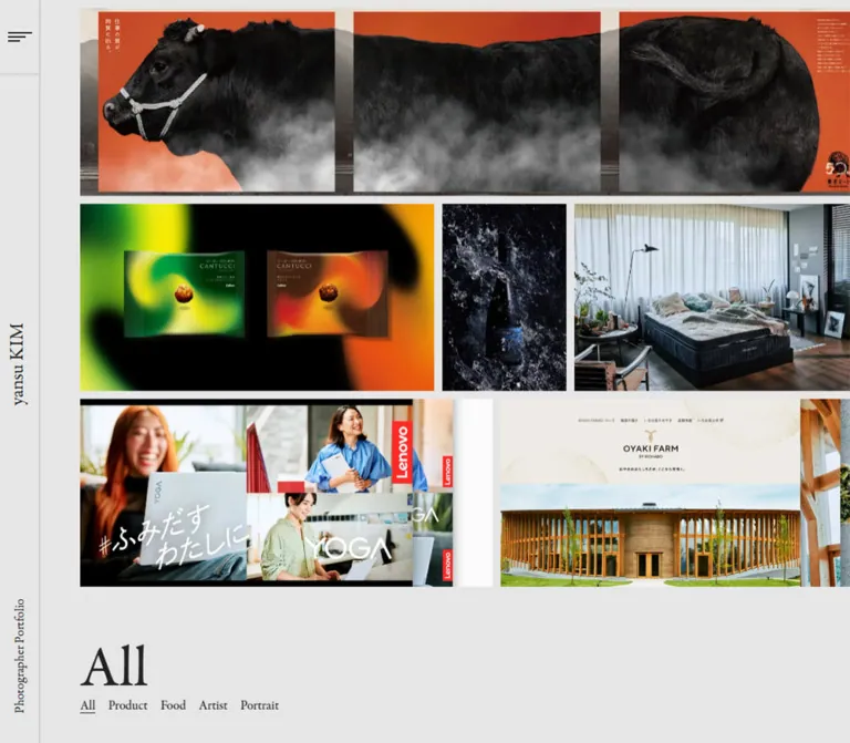
ライトグレーの画面に三段の写真帯を広げ、セリフ体と細い罫線で構成したポートフォリオ。PCの縦型サイドバーが、モバイルでは上部ヘッダーに切り替わります。
yansu KIM — Style Reference
A restrained gray frame around three expansive strips of commercial photography.
Website: yansukim.com
Original URL: https://yansukim.com/
Final URL: https://yansukim.com/
Theme: light gray canvas, dark serif typography, full-color imagery
Inspected: September 29, 2026, from supplied browser evidence retrieved at 13:38:18.884 UTC / 22:38:18.884 JST
Viewports: desktop 1440 × 1000 CSS pixels; mobile 390 × 844 CSS pixels
Scope: the current homepage with the menu closed and the All category selected. Evidence includes desktop and mobile captures, rendered text, selected element rectangles, computed styles, and CSS custom properties. Open navigation, other categories, project details, and gesture behavior were not inspected.
This is a photographer’s portfolio organized around viewing work. Three tightly spaced horizontal image strips dominate the opening screen. Their photographs, campaign compositions, and website presentation images supply nearly all the color and visual complexity. The surrounding interface stays quiet: a neutral gray background, Garamond Premier Pro in the computed font stack, thin rules, and unboxed category labels.
On desktop, identity occupies a narrow vertical rail at the left. The gallery begins farther inward, while its right edge continues beyond the viewport. On mobile, the rail becomes a shallow top header, but the three-strip composition remains. The images do not become a conventional stack of full-width cards. An oversized All heading and a small category row sit below the photographs, creating an editorial index rather than a marketing hero.
閉じる
yansu KIM — Style Reference
A restrained gray frame around three expansive strips of commercial photography.
Website: yansukim.com
Original URL: https://yansukim.com/
Final URL: https://yansukim.com/
Theme: light gray canvas, dark serif typography, full-color imagery
Inspected: September 29, 2026, from supplied browser evidence retrieved at 13:38:18.884 UTC / 22:38:18.884 JST
Viewports: desktop 1440 × 1000 CSS pixels; mobile 390 × 844 CSS pixels
Scope: the current homepage with the menu closed and the All category selected. Evidence includes desktop and mobile captures, rendered text, selected element rectangles, computed styles, and CSS custom properties. Open navigation, other categories, project details, and gesture behavior were not inspected.
This is a photographer’s portfolio organized around viewing work. Three tightly spaced horizontal image strips dominate the opening screen. Their photographs, campaign compositions, and website presentation images supply nearly all the color and visual complexity. The surrounding interface stays quiet: a neutral gray background, Garamond Premier Pro in the computed font stack, thin rules, and unboxed category labels.
On desktop, identity occupies a narrow vertical rail at the left. The gallery begins farther inward, while its right edge continues beyond the viewport. On mobile, the rail becomes a shallow top header, but the three-strip composition remains. The images do not become a conventional stack of full-width cards. An oversized All heading and a small category row sit below the photographs, creating an editorial index rather than a marketing hero.
How to Read This Reference
- Measured means a value supplied in the rendered DOM or computed-style evidence. Element coordinates are viewport coordinates at capture time.
- Estimated means a visual measurement from the supplied current-page screenshots. Image boundaries and glyph edges can vary by a pixel or two.
- Derived means arithmetic based on measured values, such as a translucent border composited over the canvas.
- Recommended means an implementation choice for a new build. Breakpoints, native horizontal scrolling, focus behavior, and larger hit areas below are recommendations unless explicitly identified as observed.
- Source custom properties retain their original names when quoted. Other token names and CSS classes are implementation aliases.
- The evidence is a supplied inspection record, not an additional browsing session. Repeated still captures do not establish animation timing or interaction behavior.
Tokens — Colors
Interface Palette
| Name | Value | Source token | Role and evidence |
|---|---|---|---|
| Gallery Gray | hsl(0deg, 0%, 90%), rendered as rgb(230, 230, 230) / #e6e6e6 |
--c-bg |
Measured body and header background; also visually fills image gutters and the category area |
| Editorial Ink | #222222 |
--c-black |
Measured body, wordmark, and heading color; visually used for the menu strokes and category labels |
| Quiet Rule | rgba(34, 34, 34, 0.25) |
--c-border |
Measured source token; visually corresponds to the subtle header and rail dividers |
| Composite Rule | approximately #b5b5b5 |
Derived alias | Result of Quiet Rule over Gallery Gray; useful for a flat-color approximation |
| Hover Gray | hsl(0deg, 0%, 85%), approximately #d9d9d9 |
--c-bg-hover |
Measured source token; its actual application was not confirmed through a hover test |
The interface has no observed brand accent color. Blue, green, yellow, red, and pink belong to individual project images. Do not extract one of those colors and promote it into a global action token.
Use the alpha border when reproducing the shell. The flat #b5b5b5 approximation is valid only over the measured gray background. Text links do not introduce a separate blue link color in the visible interface.
Tokens — Typography
Editorial Serif
- Computed family:
garamond-premier-pro, serifon the body, header, wordmark, and category heading. - Computed weight:
500on those visible text elements. - Tracking:
normalin the supplied measurements. - Character: narrow, literary serif forms with a light visual footprint despite the large category heading.
- Loading limitation: the computed family declaration is confirmed; the evidence does not independently identify the exact downloaded font file or audit which font rendered every glyph.
Retain the capitalization yansu KIM. The identity is ordinary serif text rather than a separate illustrated logo in the inspected view.
Type Scale
| Role | Desktop | Mobile | Line height | Evidence |
|---|---|---|---|---|
| Body base | 16px |
16px |
16px |
Measured; source --fs-text: 16px |
| Wordmark | 24px |
24px |
24px |
Measured H1; matches source --fs-text-lg |
| Current category heading | 72px |
36px |
72px / 36px |
Measured H2 |
| Category labels | approximately 16px |
approximately 16px |
Approximately compact single-line leading | Screenshot estimate consistent with the body token; category nodes were not individually measured |
| Rail descriptor | approximately 16px |
Not visible | Compact | Screenshot estimate for Photographer Portfolio |
| Japanese text token | 13px |
13px |
Not established | Source --fs-text-jp; no visible shell text was identified as using it |
The heading halves in size on mobile, while the wordmark remains 24px. This preserves identity without letting All consume the lower part of the phone screen.
The category row is regular serif text with a small underline under the selected All. Avoid bold tabs, filled pills, or uppercase sans-serif navigation. Japanese lettering within campaign artwork is part of the imagery and should not be treated as the website’s interface typography.
Tokens — Spacing & Shapes
Spacing character: approximately 10px between image strips and between adjacent project regions, combined with a much larger pause before the category heading.
Geometry: square images, straight rules, unboxed text controls, and no visible card shadows.
Spacing Scale
| Use | Desktop | Mobile | Status |
|---|---|---|---|
| Source page margin | 100px |
10px |
Measured --margin |
| Gallery left edge | approximately 100px |
approximately 10px |
Screenshot estimate; aligns with the source margin |
| Gallery top edge | approximately 10px |
approximately 60px |
Screenshot estimate; mobile includes the 50px header |
| Image-strip gap | approximately 10px |
approximately 10px |
Screenshot estimate |
| Gap between adjacent project regions | commonly approximately 10px |
commonly approximately 10px |
Screenshot estimate; internal artwork divisions are not necessarily separate items |
| Category-label gap | approximately 16px |
approximately 16px |
Screenshot estimate |
| Last image edge to H2 box | approximately 80px |
approximately 57–59px |
Derived from image estimates and measured heading coordinates |
| Category text to viewport bottom | approximately 40px |
approximately 33–38px |
Screenshot estimate; glyph edges differ from line boxes |
Border Radius
| Element | Treatment | Evidence |
|---|---|---|
| Header and menu button | 0 |
Measured border radius |
| Gallery imagery | Square | Visually observed |
| Category selection | Underline | Visually observed; no pill or container |
| Project surface | No visible shadow or frame | Visually observed |
Layout Measurements
| Element | Desktop 1440 × 1000 | Mobile 390 × 844 |
|---|---|---|
| Header rectangle | x: 0, y: 0, width: 50, height: 1000 |
x: 0, y: 0, width: 390, height: 50 |
| Header display | block |
flex, with 0 10px padding |
| Menu button rectangle | 49 × 100px at (0, 0) |
30 × 12px at (350, 18.5) |
| Wordmark H1 rectangle | 24 × 103.36px at approximately (10, 438.64) |
103.36 × 24px at (10, 12.5) |
| Main rectangle | 1440 × 1000px |
390 × 844px |
| Category H2 rectangle | 1240 × 72px at (100, 871) |
370 × 36px at (10, 749.25) |
| Reported document height | 1000px |
844px |
| Gallery strip height | Approximately 253–254px |
Approximately 203–205px |
The desktop wordmark’s transformed rectangle is tall and narrow; the mobile rectangle is horizontal. These measurements support the visible orientation change without establishing the exact source transform or writing-mode rules.
The source also exposes viewport-related custom properties:
| Token | Desktop | Mobile |
|---|---|---|
--vw |
14.4px |
3.9px |
--vh |
10px |
8.44px |
--vmax |
14.4px |
8.44px |
--vmin |
10px |
3.9px |
--column |
77.5px |
23.125px |
At both viewports, --column equals one sixteenth of the viewport width remaining after two source margins: 1240 / 16 and 370 / 16. This is a derived relationship, not confirmation that the photographs use a sixteen-column grid.
Components
Desktop Identity Rail
Role: establishes identity and provides a compact menu entry point without competing with the work.
The rail is 50px wide and spans the captured viewport height. A fine right-hand rule separates it from the content. The menu occupies the top 100px, with a horizontal divider beneath it. The wordmark runs vertically near the middle, and Photographer Portfolio runs vertically near the bottom.
The gallery begins at x = 100px, leaving approximately another 50px of gray space beyond the rail. Preserve this asymmetry: the rail is narrow, the initial content inset is larger, and the imagery continues to the right edge.
Persistence during scrolling was not tested. A fixed rail is a reasonable implementation choice for reproducing the captured composition, but it is not independently confirmed by these stills.
Mobile Identity Header
Role: retains the same identity in a compact horizontal frame.
At 390px wide, the header becomes a 50px-high horizontal band with a fine bottom rule. The 24px wordmark sits 10px from the left edge. The menu mark sits at the right, visually ending 10px before the viewport edge. The rail descriptor is absent from the visible mobile header.
The first gallery strip starts approximately 10px below the header. Do not move the category controls into this band: they remain below the imagery.
Menu Trigger
Role: visible access point to additional navigation.
The mark consists of three thin dark horizontal strokes of decreasing length. Its visual size is approximately 30 × 12px. Reusable stroke estimates are 30px, 22px, and 15px wide, with approximately 2px thickness.
On desktop, the mark is centered inside the measured 49 × 100px button. On mobile, the recorded button rectangle is only 30 × 12px. Additional invisible hit expansion was not included in the supplied evidence.
The source declares a background-color transition of 0.2s cubic-bezier(0.3, 0.1, 0.1, 1). The open menu, icon transformation, focus behavior, and close animation were not inspected. The button has no text content in the supplied sample, but its accessible name cannot be assessed because ARIA attributes were not supplied.
Three-Strip Gallery
Role: presents the range and density of photographic work immediately.
The visible gallery consists of three horizontal strips with approximately equal heights at each viewport. Thin gray gutters separate them. Within a strip, project regions have different widths, producing a sequence of wide, medium, and narrow visual beats.
Desktop estimated strip bounds are:
- First strip: y ≈ 10–263px.
- Second strip: y ≈ 273–527px.
- Third strip: y ≈ 537–791px.
Mobile estimated strip bounds are:
- First strip: y ≈ 60–263px.
- Second strip: y ≈ 273–477px.
- Third strip: y ≈ 486–487px to 691–692px.
The rightmost imagery is clipped by the viewport. This clipping is a defining visible feature. It suggests content wider than the available view, but does not by itself establish native scrolling, dragging, automatic movement, or a carousel implementation.
Project Image Region
Role: carries almost all project-specific information and visual expression.
Images appear edge to edge with square corners. There are no visible separate caption blocks, category badges, outlined cards, or persistent overlays. Some regions contain multiple photographs or an entire campaign or website composition; those internal divisions should remain part of the artwork unless the actual assets prove otherwise.
Preserve subject scale and supplied composites. Do not force every project into the same aspect ratio. A pale product photograph, dark restaurant presentation, portrait, and landscape should retain their different compositional rhythms.
No project destination links were included in the supplied link inventory. Whether an image opens a detail page, a viewer, or another state remains unverified.
Category Dock
Role: identifies the current collection and offers compact category choices below the photographs.
The hierarchy is a large H2, All, followed by a single line of small serif labels:
All · Product · Food · Artist · Portrait · Landscape · CG
The selected All has a thin underline. The other labels have no visible containers. Desktop and mobile both retain all seven labels on one line at the inspected widths.
The heading and labels align with the gallery’s left edge. Desktop provides a broader empty interval above the heading; mobile compresses that interval and reduces the heading to 36px. The category controls remain visually secondary to the photographs.
Selection behavior, URL changes, filtering transitions, and the control elements’ semantics were not tested.
Navigation Content Present Only in the DOM
The body text sample also includes P1, Photo, 46 projects, P2, Movie, 29 projects, P3, Info, and CLOSE. These strings are not visible in the captured closed state.
They support the presence of additional navigation content in the document, but do not establish its layout, reveal animation, destinations, or interaction sequence. Treat those areas as uninspected rather than inventing a full-screen menu design.
Tokens — Motion & Interaction
| Treatment | Evidence | Practical interpretation |
|---|---|---|
| Menu background transition | Measured background-color 0.2s cubic-bezier(0.3, 0.1, 0.1, 1) |
A short, restrained state transition is source-supported |
| Hover surface | Source --c-bg-hover: hsl(0deg, 0%, 85%) |
Available token; exact target application was not verified |
| Selected category | Underline visible beneath All |
Reproduce the static selection marker |
| Wordmark navigation | Recorded anchor to https://yansukim.com/ |
Confirmed home link |
| Gallery movement | No timed sequence, track transform, or gesture result supplied | Do not assign speed, direction, easing, or autoplay behavior |
| Project opening | Not exercised | Destination and transition unknown |
| Menu opening and closing | Not exercised | Overlay geometry and animation unknown |
| Category switching | Not exercised | Filtering behavior and persistence unknown |
The sampled major elements report animation: none. This does not rule out animation on unrecorded descendants, pseudo-elements, or script-driven tracks. Likewise, a generic computed transition: all without a duration does not establish a meaningful animation.
The capture process included an initial observation of at least five seconds and readiness checks for layout, images, and finite motion. It also handled perpetual animations during capture preparation. Those procedural details are not evidence that this particular gallery auto-scrolls.
Recommended adaptation: start with a static, horizontally accessible gallery and the measured menu transition. Introduce automatic movement only when it is an explicit product requirement, with pause and reduced-motion behavior.
Surfaces
| Layer | Appearance | Purpose |
|---|---|---|
| Page canvas | Solid #e6e6e6 |
Unifies the rail, margins, gutters, and lower category area |
| Identity frame | Same gray with a fine dark translucent rule | Separates navigation through geometry rather than elevation |
| Gallery region | Full-color raster imagery | Provides visual hierarchy and project identity |
| Category dock | Unboxed typography on the canvas | Offers selection without competing with the images |
| Active marker | Thin dark underline | Indicates the current category with minimal ink |
| Hover surface | Slightly darker gray token | Available interaction color; visible application unverified |
There is no observed general-purpose elevation system. The composition does not depend on gradients, blur, rounded containers, or soft shadows. A black area inside a restaurant project image belongs to that image, not to a dark-mode panel in the portfolio shell.
Imagery
The current work combines carefully lit products, architectural and landscape photography, portraits, and finished advertising compositions. Some images are quiet and pale; others contain dense typography and saturated color. The neutral shell accommodates that variety without imposing a common tint.
The visual rhythm comes from juxtaposition: reflective white materials beside concrete architecture, soft product tones beside a dark macro image, and portraits or campaign posters beside open landscapes. Keep color grading and embedded lettering within each project intact.
Observed Asset References
No image src values, native file dimensions, or downloadable asset paths were supplied. These are visual references to the current captures, not an asset manifest.
| Position | Visible subject matter | Composition to preserve |
|---|---|---|
| First strip, leading region | A slender transparent product with a red cap against reflective silver surfaces and a red accent | Pale, spacious still life with diagonal geometry |
| First strip, following region | A person in a pool beside concrete architecture and trees | Broad architectural framing and restrained natural color |
| First strip, right side | A shopping-bag composition with bright packaging and saturated blue, yellow, and pink | Dense commercial color that contrasts with the preceding photographs |
| Second strip, leading region | A white quilted product presentation with Japanese copy | Soft blue-gray field and precise product geometry |
| Second strip, middle | A dark restaurant presentation dominated by a blue and orange crustacean close-up | Strong dark-to-light contrast and unusually large subject detail |
| Second strip, right | A portrait among pale blossoms | Soft botanical detail and a close human subject |
| Third strip, leading region | Yellow flowers, a small product bottle, orange blocks, and an adjoining drink composition | Multiple still-life treatments with distinct color fields |
| Third strip, following regions | A green campaign poster, a wooded waterside landscape, and a pale turquoise ensemble poster | Alternation between dense graphic material and open photographic space |
Text, logos, and tiny navigation bars inside project artwork remain image content. Do not recreate them as interactive controls belonging to the portfolio page.
Use authorized project assets at sufficient resolution. The interface can be reproduced with CSS, but generic placeholder photographs will not reproduce the captured balance of subjects, crops, and campaign artwork.
Layout & Responsive Behavior
Desktop Composition
The 50px left rail occupies the full captured height. Image strips begin at x ≈ 100px and y ≈ 10px. Their visible right edges extend to or beyond the viewport boundary rather than stopping at a centered maximum-width container.
The category heading starts at x = 100px and y = 871px. Its measured width is 1240px, equal to the viewport minus two 100px margins. The image strips visually extend farther right than this inset heading box.
The main rectangle and reported document height both match the 1000px viewport. This supports a viewport-fitted opening composition. It does not independently prove a global scroll lock or the absence of additional application states.
Mobile Composition
At 390 × 844, the identity frame becomes a horizontal 50px header. The image strips begin at x ≈ 10px and y ≈ 60px. Each strip remains approximately 204px high, exposing only a portion of the horizontal sequence.
The leading image in each strip remains prominent. The third strip also shows a partial following campaign image at the right edge. This is not a mobile masonry layout and not a sequence of fully fitted desktop rows.
The All heading begins at x = 10px and y = 749.25px, with a 36px line box. The category row fits beneath it without wrapping at this width. The wordmark stays 24px rather than shrinking proportionally with the heading.
Responsive Rules That Are and Are Not Established
- Measured: the page-margin token changes from 100px to 10px; the header changes orientation; the category heading changes from 72px to 36px.
- Observed visually: three image strips remain; the gallery preserves horizontal clipping; the category order stays the same.
- Not established: the breakpoint, interpolation between sizes, tablet layout, landscape-phone layout, safe-area handling, or the formula controlling strip height.
- Recommended: use an explicit layout switch near 768px as a starting point, then validate intermediate widths. Keep horizontal overflow inside gallery bands rather than allowing the whole document to drift sideways.
The supplied HTML and body rectangles have zero reported height while the main and document measurements match the viewport. Do not copy those zero heights as layout requirements; the supplied sample does not explain the positioning system that produces them.
Do’s and Don’ts
Do
- Keep the canvas at the measured light gray and use
#222for interface ink. - Preserve the 50px identity frame and its desktop-to-mobile orientation change.
- Use the observed serif stack, 500 weight, and restrained letter spacing.
- Let three tightly spaced image strips dominate the opening view.
- Retain varied image widths and the sense of horizontal continuation.
- Align the category heading and controls with the gallery’s left edge.
- Use a simple underline for the active category.
- Preserve campaign lettering and multi-image compositions as artwork.
- Distinguish exact DOM measurements from estimated gallery geometry.
Don’t
- Don’t replace the portfolio with a hero headline, feature cards, and a large conversion button.
- Don’t convert mobile into uniform stacked cards or shrink entire strips until every project fits.
- Don’t introduce rounded tiles, drop shadows, colorful category badges, or glass surfaces.
- Don’t recolor all photographs to match the gray interface.
- Don’t treat the visible right-edge crop as proof of autoplay or drag behavior.
- Don’t assign a production font, menu animation, or project destination that the evidence does not establish.
- Don’t rebuild embedded campaign or restaurant controls as portfolio navigation.
- Don’t interpret the hidden navigation strings as a visually inspected menu.
Recommended Implementation Additions
These are recommendations for a new implementation, not verified features of the original page:
- Give the menu button an accessible name,
aria-expanded, and a relationship to the navigation it controls. Provide appropriate focus management once the menu design is defined. - Increase the mobile menu hit area to at least 44 × 44px while retaining the approximately 30 × 12px visual mark. The quick start applies this change.
- Choose category semantics according to actual behavior: links for navigation, or buttons with a selected state for in-place filtering. Preserve the underline and provide visible keyboard focus.
- Make offscreen projects reachable through keyboard and touch. Native horizontal scrolling is a practical starting point; it is not a confirmed description of the original implementation.
- Give project images useful alternative text. Provide text equivalents for essential information contained only in campaign artwork.
- Reserve image dimensions before loading. Keep the first visible projects sharp and prioritize them without eagerly loading every offscreen full-resolution asset.
- Test narrow phones and short landscape viewports. Permit vertical scrolling when the viewport cannot comfortably contain the header, strips, and category controls.
- If movement is introduced, respect reduced-motion preferences and provide a pause mechanism for automatic gallery motion.
Agent Prompt Guide
Quick Color Reference
- Canvas and identity frame:
#e6e6e6. - Text and menu strokes:
#222222. - Dividers:
rgba(34, 34, 34, 0.25). - Flat divider approximation over the canvas:
#b5b5b5. - Available hover gray:
#d9d9d9. - Project color: preserve the original full-color artwork; no global accent is required.
Overall Prompt
“Create a photographer portfolio with a light-gray #e6e6e6 canvas, dark #222 serif typography, and three horizontal image strips separated by approximately 10px gutters. Use Garamond Premier Pro when available, with a serif fallback and 500 weight. On desktop, place a 50px-wide vertical identity rail at the left, with a small descending-line menu mark at the top, a vertical wordmark near the middle, and a vertical portfolio descriptor near the bottom. Start the imagery 100px from the left and let the tracks continue beyond the right edge. Below the photographs, place a 72px current-category heading and a compact line of underlined-active category controls. On mobile, use a 50px top header, 10px content inset, and a 36px category heading while preserving all three horizontally clipped strips. Use square imagery, thin rules, and no card shadows. Implement reachability and keyboard focus explicitly; do not assume unverified autoplay behavior.”
Example Component Prompts
- Identity frame: “Build a 50px gray desktop rail with a fine right border, vertical serif identity, and a small three-stroke menu mark. At mobile widths, turn it into a 50px horizontal header with the wordmark left and menu right. Keep the mobile menu mark small inside a 44px hit area.”
- Gallery strips: “Arrange authorized project imagery in three equal-height horizontal bands with 10px gray gutters. Retain varied project aspect ratios and embedded campaign compositions. Clip the visible tracks at the right viewport edge while making the remaining work reachable. Avoid uniform cards and separate caption panels.”
- Category dock: “Place a large, regular-weight serif
Allheading beneath a broad gray pause. AddAll,Product,Food,Artist,Portrait,Landscape, andCGin a single compact row, with only the active label underlined. Use 72px heading type on desktop and 36px on mobile.” - Project artwork treatment: “Present a mixture of pale product still lifes, architecture, portraits, landscapes, and finished advertising layouts without applying a common tint. Keep square edges and original lettering. Treat any navigation pictured inside project artwork as part of the image.”
Quick Start
CSS Custom Properties
This is an adaptation of the observed closed-menu composition, not recovered source CSS. The 80px desktop and 58px mobile gallery-to-category gaps, 41px and 33px bottom allowances, and 767px breakpoint are reconstruction choices that closely fit the supplied captures. The source’s exact responsive formulas are unknown.
Expected structure: .portfolio-frame contains the brand, menu button, and rail caption. .portfolio-stage contains .project-bands followed by .category-dock. Each of the three .project-band elements contains a .project-track with .project-item wrappers and images. The dock contains an H2 and .category-nav with category buttons.
Use actual project aspect ratios; no image paths are invented here. Make a project wrapper a link only when its destination is known. Font loading, menu logic, and filtering are separate implementation work. Native scrolling below is a recommended way to make the clipped tracks usable.
:root {
  /* Colors from supplied computed styles */
  --portfolio-bg: #e6e6e6;
  --portfolio-ink: #222;
  --portfolio-rule: rgba(34, 34, 34, 0.25);
  --portfolio-hover: #d9d9d9;

  /* Typography from the observed interface */
  --font-editorial: 'garamond-premier-pro', serif;
  --weight-editorial: 500;
  --text-base: 16px;
  --text-brand: 24px;
  --text-index: 72px;

  /* Measured frame and source margin values */
  --frame-size: 50px;
  --page-inset: 100px;

  /* Screenshot-based reconstruction values */
  --band-gap: 10px;
  --category-gap: 16px;
  --gallery-dock-gap: 80px;
  --dock-bottom: 41px;
  --heading-nav-gap: 0px;

  /* Measured menu transition */
  --menu-transition: 200ms cubic-bezier(0.3, 0.1, 0.1, 1);
}

* {
  box-sizing: border-box;
}

html,
body {
  margin: 0;
}

body {
  color: var(--portfolio-ink);
  background: var(--portfolio-bg);
  font-family: var(--font-editorial);
  font-size: var(--text-base);
  font-weight: var(--weight-editorial);
  line-height: 1;
}

button,
a {
  color: inherit;
  font: inherit;
}

.portfolio-frame {
  position: fixed;
  z-index: 10;
  inset: 0 auto auto 0;
  width: var(--frame-size);
  height: 100vh;
  height: 100svh;
  border-right: 1px solid var(--portfolio-rule);
  background: var(--portfolio-bg);
}

.portfolio-brand {
  position: absolute;
  top: 49%;
  left: 10px;
  margin: 0;
  writing-mode: vertical-rl;
  transform: translateY(-50%) rotate(180deg);
  white-space: nowrap;
  font-size: var(--text-brand);
  font-weight: var(--weight-editorial);
  line-height: 1;
}

.portfolio-brand a {
  text-decoration: none;
}

.portfolio-caption {
  position: absolute;
  bottom: 40px;
  left: 15px;
  margin: 0;
  writing-mode: vertical-rl;
  transform: rotate(180deg);
  white-space: nowrap;
  font-size: var(--text-base);
}

.menu-toggle {
  position: absolute;
  top: 0;
  left: 0;
  display: grid;
  place-items: center;
  width: 49px;
  height: 100px;
  padding: 0;
  border: 0;
  border-bottom: 1px solid var(--portfolio-rule);
  border-radius: 0;
  background: transparent;
  cursor: pointer;
  transition: background-color var(--menu-transition);
}

.menu-icon {
  display: flex;
  flex-direction: column;
  gap: 3px;
  width: 30px;
  height: 12px;
}

.menu-icon span {
  display: block;
  flex: none;
  height: 2px;
  background: currentColor;
}

.menu-icon span:nth-child(1) { width: 30px; }
.menu-icon span:nth-child(2) { width: 22px; }
.menu-icon span:nth-child(3) { width: 15px; }

.portfolio-stage {
  display: grid;
  grid-template-rows: minmax(0, 1fr) auto;
  gap: var(--gallery-dock-gap);
  min-width: 0;
  height: 100vh;
  height: 100svh;
  min-height: 640px;
  padding: 10px 0 var(--dock-bottom) var(--page-inset);
}

.project-bands {
  display: grid;
  grid-template-rows: repeat(3, minmax(0, 1fr));
  gap: var(--band-gap);
  min-width: 0;
  min-height: 0;
}

.project-band {
  min-width: 0;
  min-height: 0;
  overflow-x: auto;
  overflow-y: hidden;
  overscroll-behavior-x: contain;
  scrollbar-width: none;
}

.project-band::-webkit-scrollbar {
  display: none;
}

.project-track {
  display: flex;
  gap: var(--band-gap);
  width: max-content;
  height: 100%;
}

.project-item {
  display: block;
  flex: 0 0 auto;
  height: 100%;
  border: 0;
  border-radius: 0;
  text-decoration: none;
}

.project-item img {
  display: block;
  width: auto;
  max-width: none;
  height: 100%;
  border: 0;
  border-radius: 0;
}

.category-dock {
  min-width: 0;
  padding-right: var(--page-inset);
}

.category-dock h2 {
  margin: 0;
  font-size: var(--text-index);
  font-weight: var(--weight-editorial);
  line-height: 1;
}

.category-nav {
  display: flex;
  gap: var(--category-gap);
  margin-top: var(--heading-nav-gap);
  overflow-x: auto;
  white-space: nowrap;
}

.category-button {
  flex: 0 0 auto;
  padding: 0;
  border: 0;
  border-radius: 0;
  background: transparent;
  font-size: var(--text-base);
  line-height: 1;
  cursor: pointer;
}

.category-button[aria-pressed='true'] {
  text-decoration: underline;
  text-decoration-thickness: 1px;
  text-underline-offset: 3px;
}

/* Recommended use of the available hover token */
@media (hover: hover) {
  .menu-toggle:hover {
    background: var(--portfolio-hover);
  }
}

/* Recommended focus treatment, visible inside clipped bands */
:where(a, button, [tabindex]):focus-visible {
  outline: 2px solid var(--portfolio-ink);
  outline-offset: -2px;
}

/* Recommended breakpoint; the source breakpoint was not supplied */
@media (max-width: 767px) {
  :root {
    --page-inset: 10px;
    --text-index: 36px;
    --gallery-dock-gap: 58px;
    --dock-bottom: 33px;
    --heading-nav-gap: 10px;
  }

  .portfolio-frame {
    display: flex;
    align-items: center;
    width: 100%;
    height: var(--frame-size);
    padding-inline: 10px;
    border-right: 0;
    border-bottom: 1px solid var(--portfolio-rule);
  }

  .portfolio-brand {
    position: static;
    writing-mode: horizontal-tb;
    transform: none;
  }

  .portfolio-caption {
    display: none;
  }

  .menu-toggle {
    top: 2.5px;
    right: 3px;
    left: auto;
    width: 44px;
    height: 44px;
    border: 0;
  }

  .portfolio-stage {
    min-height: 700px;
    padding-top: calc(var(--frame-size) + 10px);
  }
}

@media (prefers-reduced-motion: reduce) {
  .menu-toggle {
    transition: none;
  }
}
At the supplied desktop viewport, this grid allocates approximately 253.7px to each strip and places the heading at y = 871px. At the supplied mobile viewport, it allocates approximately 203.7px per strip and places the heading at y = 749px. Those are reconstruction results, not recovered source formulas.
The minimum heights deliberately allow vertical page scrolling on short screens. They are recommendations rather than observed behavior. If scrollbars are hidden as above, give each scrollable band an accessible name and keyboard access, and ensure users can discover and reach the offscreen work. Category target sizing should also be reviewed before shipping; the CSS preserves the compact observed text layout.
Tailwind v4 Token Mapping
Optional aliases for a project already using Tailwind v4. This does not imply that the original website uses Tailwind. Define the custom properties above first.
@theme inline {
  --color-canvas: var(--portfolio-bg);
  --color-ink: var(--portfolio-ink);
  --color-rule: var(--portfolio-rule);
  --color-hover-surface: var(--portfolio-hover);

  --font-portfolio: var(--font-editorial);
  --text-category: var(--text-base);
  --text-brand: 24px;
  --text-collection: var(--text-index);

  --spacing-frame: 50px;
  --spacing-gallery-gap: 10px;
  --spacing-page-inset: var(--page-inset);
  --radius-project: 0px;
}
Sources & Evidence
- Original and final website: https://yansukim.com/. Both URLs are identical in the supplied inspection record, which reports HTTP 200 and the page title
yansuKIM Photographer Portfolio. - Capture record: retrieved September 29, 2026 at 13:38:18.884 UTC. Current-page visual evidence consists of three desktop captures at 1440 × 1000 and two mobile captures at 390 × 844.
- Rendered DOM and computed styles: supplied samples for the body, header, H1, home anchor, menu button, main, and H2; visible text and link inventory; source color, typography, margin, column, and viewport custom properties.
- Observed states: closed navigation and the initial
Allcollection at both viewport sizes. The wordmark’s home destination is recorded; no menu, filter, project-opening, or gallery-gesture result is supplied. - Inspection limitations: no full stylesheet, image URL manifest, font-file audit, open navigation capture, project detail capture, tablet capture, or timed motion sequence. The readiness procedure does not establish completeness of delayed content or unexercised interactions.
This reference describes the current homepage evidenced by those captures. Estimated geometry, reconstruction formulas, and recommended interaction additions are identified separately from measured source values.
# yansu KIM — Style Reference

> A restrained gray frame around three expansive strips of commercial photography.

**Website:** [yansukim.com](https://yansukim.com/)
**Original URL:** https://yansukim.com/
**Final URL:** https://yansukim.com/
**Theme:** light gray canvas, dark serif typography, full-color imagery
**Inspected:** September 29, 2026, from supplied browser evidence retrieved at 13:38:18.884 UTC / 22:38:18.884 JST
**Viewports:** desktop 1440 × 1000 CSS pixels; mobile 390 × 844 CSS pixels
**Scope:** the current homepage with the menu closed and the `All` category selected. Evidence includes desktop and mobile captures, rendered text, selected element rectangles, computed styles, and CSS custom properties. Open navigation, other categories, project details, and gesture behavior were not inspected.

This is a photographer’s portfolio organized around viewing work. Three tightly spaced horizontal image strips dominate the opening screen. Their photographs, campaign compositions, and website presentation images supply nearly all the color and visual complexity. The surrounding interface stays quiet: a neutral gray background, Garamond Premier Pro in the computed font stack, thin rules, and unboxed category labels.

On desktop, identity occupies a narrow vertical rail at the left. The gallery begins farther inward, while its right edge continues beyond the viewport. On mobile, the rail becomes a shallow top header, but the three-strip composition remains. The images do not become a conventional stack of full-width cards. An oversized `All` heading and a small category row sit below the photographs, creating an editorial index rather than a marketing hero.
閉じる
# yansu KIM — Style Reference

> A restrained gray frame around three expansive strips of commercial photography.

**Website:** [yansukim.com](https://yansukim.com/)
**Original URL:** https://yansukim.com/
**Final URL:** https://yansukim.com/
**Theme:** light gray canvas, dark serif typography, full-color imagery
**Inspected:** September 29, 2026, from supplied browser evidence retrieved at 13:38:18.884 UTC / 22:38:18.884 JST
**Viewports:** desktop 1440 × 1000 CSS pixels; mobile 390 × 844 CSS pixels
**Scope:** the current homepage with the menu closed and the `All` category selected. Evidence includes desktop and mobile captures, rendered text, selected element rectangles, computed styles, and CSS custom properties. Open navigation, other categories, project details, and gesture behavior were not inspected.

This is a photographer’s portfolio organized around viewing work. Three tightly spaced horizontal image strips dominate the opening screen. Their photographs, campaign compositions, and website presentation images supply nearly all the color and visual complexity. The surrounding interface stays quiet: a neutral gray background, Garamond Premier Pro in the computed font stack, thin rules, and unboxed category labels.

On desktop, identity occupies a narrow vertical rail at the left. The gallery begins farther inward, while its right edge continues beyond the viewport. On mobile, the rail becomes a shallow top header, but the three-strip composition remains. The images do not become a conventional stack of full-width cards. An oversized `All` heading and a small category row sit below the photographs, creating an editorial index rather than a marketing hero.

## How to Read This Reference

- **Measured** means a value supplied in the rendered DOM or computed-style evidence. Element coordinates are viewport coordinates at capture time.
- **Estimated** means a visual measurement from the supplied current-page screenshots. Image boundaries and glyph edges can vary by a pixel or two.
- **Derived** means arithmetic based on measured values, such as a translucent border composited over the canvas.
- **Recommended** means an implementation choice for a new build. Breakpoints, native horizontal scrolling, focus behavior, and larger hit areas below are recommendations unless explicitly identified as observed.
- Source custom properties retain their original names when quoted. Other token names and CSS classes are implementation aliases.
- The evidence is a supplied inspection record, not an additional browsing session. Repeated still captures do not establish animation timing or interaction behavior.

## Tokens — Colors

### Interface Palette

| Name | Value | Source token | Role and evidence |
| --- | --- | --- | --- |
| Gallery Gray | `hsl(0deg, 0%, 90%)`, rendered as `rgb(230, 230, 230)` / `#e6e6e6` | `--c-bg` | Measured body and header background; also visually fills image gutters and the category area |
| Editorial Ink | `#222222` | `--c-black` | Measured body, wordmark, and heading color; visually used for the menu strokes and category labels |
| Quiet Rule | `rgba(34, 34, 34, 0.25)` | `--c-border` | Measured source token; visually corresponds to the subtle header and rail dividers |
| Composite Rule | approximately `#b5b5b5` | Derived alias | Result of Quiet Rule over Gallery Gray; useful for a flat-color approximation |
| Hover Gray | `hsl(0deg, 0%, 85%)`, approximately `#d9d9d9` | `--c-bg-hover` | Measured source token; its actual application was not confirmed through a hover test |

The interface has no observed brand accent color. Blue, green, yellow, red, and pink belong to individual project images. Do not extract one of those colors and promote it into a global action token.

Use the alpha border when reproducing the shell. The flat `#b5b5b5` approximation is valid only over the measured gray background. Text links do not introduce a separate blue link color in the visible interface.

## Tokens — Typography

### Editorial Serif

- **Computed family:** `garamond-premier-pro, serif` on the body, header, wordmark, and category heading.
- **Computed weight:** `500` on those visible text elements.
- **Tracking:** `normal` in the supplied measurements.
- **Character:** narrow, literary serif forms with a light visual footprint despite the large category heading.
- **Loading limitation:** the computed family declaration is confirmed; the evidence does not independently identify the exact downloaded font file or audit which font rendered every glyph.

Retain the capitalization `yansu KIM`. The identity is ordinary serif text rather than a separate illustrated logo in the inspected view.

### Type Scale

| Role | Desktop | Mobile | Line height | Evidence |
| --- | --- | --- | --- | --- |
| Body base | `16px` | `16px` | `16px` | Measured; source `--fs-text: 16px` |
| Wordmark | `24px` | `24px` | `24px` | Measured H1; matches source `--fs-text-lg` |
| Current category heading | `72px` | `36px` | `72px` / `36px` | Measured H2 |
| Category labels | approximately `16px` | approximately `16px` | Approximately compact single-line leading | Screenshot estimate consistent with the body token; category nodes were not individually measured |
| Rail descriptor | approximately `16px` | Not visible | Compact | Screenshot estimate for `Photographer Portfolio` |
| Japanese text token | `13px` | `13px` | Not established | Source `--fs-text-jp`; no visible shell text was identified as using it |

The heading halves in size on mobile, while the wordmark remains 24px. This preserves identity without letting `All` consume the lower part of the phone screen.

The category row is regular serif text with a small underline under the selected `All`. Avoid bold tabs, filled pills, or uppercase sans-serif navigation. Japanese lettering within campaign artwork is part of the imagery and should not be treated as the website’s interface typography.

## Tokens — Spacing & Shapes

**Spacing character:** approximately 10px between image strips and between adjacent project regions, combined with a much larger pause before the category heading.

**Geometry:** square images, straight rules, unboxed text controls, and no visible card shadows.

### Spacing Scale

| Use | Desktop | Mobile | Status |
| --- | --- | --- | --- |
| Source page margin | `100px` | `10px` | Measured `--margin` |
| Gallery left edge | approximately `100px` | approximately `10px` | Screenshot estimate; aligns with the source margin |
| Gallery top edge | approximately `10px` | approximately `60px` | Screenshot estimate; mobile includes the 50px header |
| Image-strip gap | approximately `10px` | approximately `10px` | Screenshot estimate |
| Gap between adjacent project regions | commonly approximately `10px` | commonly approximately `10px` | Screenshot estimate; internal artwork divisions are not necessarily separate items |
| Category-label gap | approximately `16px` | approximately `16px` | Screenshot estimate |
| Last image edge to H2 box | approximately `80px` | approximately `57–59px` | Derived from image estimates and measured heading coordinates |
| Category text to viewport bottom | approximately `40px` | approximately `33–38px` | Screenshot estimate; glyph edges differ from line boxes |

### Border Radius

| Element | Treatment | Evidence |
| --- | --- | --- |
| Header and menu button | `0` | Measured border radius |
| Gallery imagery | Square | Visually observed |
| Category selection | Underline | Visually observed; no pill or container |
| Project surface | No visible shadow or frame | Visually observed |

### Layout Measurements

| Element | Desktop 1440 × 1000 | Mobile 390 × 844 |
| --- | --- | --- |
| Header rectangle | `x: 0, y: 0, width: 50, height: 1000` | `x: 0, y: 0, width: 390, height: 50` |
| Header display | `block` | `flex`, with `0 10px` padding |
| Menu button rectangle | `49 × 100px` at `(0, 0)` | `30 × 12px` at `(350, 18.5)` |
| Wordmark H1 rectangle | `24 × 103.36px` at approximately `(10, 438.64)` | `103.36 × 24px` at `(10, 12.5)` |
| Main rectangle | `1440 × 1000px` | `390 × 844px` |
| Category H2 rectangle | `1240 × 72px` at `(100, 871)` | `370 × 36px` at `(10, 749.25)` |
| Reported document height | `1000px` | `844px` |
| Gallery strip height | Approximately `253–254px` | Approximately `203–205px` |

The desktop wordmark’s transformed rectangle is tall and narrow; the mobile rectangle is horizontal. These measurements support the visible orientation change without establishing the exact source transform or writing-mode rules.

The source also exposes viewport-related custom properties:

| Token | Desktop | Mobile |
| --- | --- | --- |
| `--vw` | `14.4px` | `3.9px` |
| `--vh` | `10px` | `8.44px` |
| `--vmax` | `14.4px` | `8.44px` |
| `--vmin` | `10px` | `3.9px` |
| `--column` | `77.5px` | `23.125px` |

At both viewports, `--column` equals one sixteenth of the viewport width remaining after two source margins: `1240 / 16` and `370 / 16`. This is a derived relationship, not confirmation that the photographs use a sixteen-column grid.

## Components

### Desktop Identity Rail

**Role:** establishes identity and provides a compact menu entry point without competing with the work.

The rail is 50px wide and spans the captured viewport height. A fine right-hand rule separates it from the content. The menu occupies the top 100px, with a horizontal divider beneath it. The wordmark runs vertically near the middle, and `Photographer Portfolio` runs vertically near the bottom.

The gallery begins at x = 100px, leaving approximately another 50px of gray space beyond the rail. Preserve this asymmetry: the rail is narrow, the initial content inset is larger, and the imagery continues to the right edge.

Persistence during scrolling was not tested. A fixed rail is a reasonable implementation choice for reproducing the captured composition, but it is not independently confirmed by these stills.

### Mobile Identity Header

**Role:** retains the same identity in a compact horizontal frame.

At 390px wide, the header becomes a 50px-high horizontal band with a fine bottom rule. The 24px wordmark sits 10px from the left edge. The menu mark sits at the right, visually ending 10px before the viewport edge. The rail descriptor is absent from the visible mobile header.

The first gallery strip starts approximately 10px below the header. Do not move the category controls into this band: they remain below the imagery.

### Menu Trigger

**Role:** visible access point to additional navigation.

The mark consists of three thin dark horizontal strokes of decreasing length. Its visual size is approximately 30 × 12px. Reusable stroke estimates are 30px, 22px, and 15px wide, with approximately 2px thickness.

On desktop, the mark is centered inside the measured 49 × 100px button. On mobile, the recorded button rectangle is only 30 × 12px. Additional invisible hit expansion was not included in the supplied evidence.

The source declares a background-color transition of `0.2s cubic-bezier(0.3, 0.1, 0.1, 1)`. The open menu, icon transformation, focus behavior, and close animation were not inspected. The button has no text content in the supplied sample, but its accessible name cannot be assessed because ARIA attributes were not supplied.

### Three-Strip Gallery

**Role:** presents the range and density of photographic work immediately.

The visible gallery consists of three horizontal strips with approximately equal heights at each viewport. Thin gray gutters separate them. Within a strip, project regions have different widths, producing a sequence of wide, medium, and narrow visual beats.

Desktop estimated strip bounds are:

- First strip: y ≈ 10–263px.
- Second strip: y ≈ 273–527px.
- Third strip: y ≈ 537–791px.

Mobile estimated strip bounds are:

- First strip: y ≈ 60–263px.
- Second strip: y ≈ 273–477px.
- Third strip: y ≈ 486–487px to 691–692px.

The rightmost imagery is clipped by the viewport. This clipping is a defining visible feature. It suggests content wider than the available view, but does not by itself establish native scrolling, dragging, automatic movement, or a carousel implementation.

### Project Image Region

**Role:** carries almost all project-specific information and visual expression.

Images appear edge to edge with square corners. There are no visible separate caption blocks, category badges, outlined cards, or persistent overlays. Some regions contain multiple photographs or an entire campaign or website composition; those internal divisions should remain part of the artwork unless the actual assets prove otherwise.

Preserve subject scale and supplied composites. Do not force every project into the same aspect ratio. A pale product photograph, dark restaurant presentation, portrait, and landscape should retain their different compositional rhythms.

No project destination links were included in the supplied link inventory. Whether an image opens a detail page, a viewer, or another state remains unverified.

### Category Dock

**Role:** identifies the current collection and offers compact category choices below the photographs.

The hierarchy is a large H2, `All`, followed by a single line of small serif labels:

`All` · `Product` · `Food` · `Artist` · `Portrait` · `Landscape` · `CG`

The selected `All` has a thin underline. The other labels have no visible containers. Desktop and mobile both retain all seven labels on one line at the inspected widths.

The heading and labels align with the gallery’s left edge. Desktop provides a broader empty interval above the heading; mobile compresses that interval and reduces the heading to 36px. The category controls remain visually secondary to the photographs.

Selection behavior, URL changes, filtering transitions, and the control elements’ semantics were not tested.

### Navigation Content Present Only in the DOM

The body text sample also includes `P1`, `Photo`, `46 projects`, `P2`, `Movie`, `29 projects`, `P3`, `Info`, and `CLOSE`. These strings are not visible in the captured closed state.

They support the presence of additional navigation content in the document, but do not establish its layout, reveal animation, destinations, or interaction sequence. Treat those areas as uninspected rather than inventing a full-screen menu design.

## Tokens — Motion & Interaction

| Treatment | Evidence | Practical interpretation |
| --- | --- | --- |
| Menu background transition | Measured `background-color 0.2s cubic-bezier(0.3, 0.1, 0.1, 1)` | A short, restrained state transition is source-supported |
| Hover surface | Source `--c-bg-hover: hsl(0deg, 0%, 85%)` | Available token; exact target application was not verified |
| Selected category | Underline visible beneath `All` | Reproduce the static selection marker |
| Wordmark navigation | Recorded anchor to `https://yansukim.com/` | Confirmed home link |
| Gallery movement | No timed sequence, track transform, or gesture result supplied | Do not assign speed, direction, easing, or autoplay behavior |
| Project opening | Not exercised | Destination and transition unknown |
| Menu opening and closing | Not exercised | Overlay geometry and animation unknown |
| Category switching | Not exercised | Filtering behavior and persistence unknown |

The sampled major elements report `animation: none`. This does not rule out animation on unrecorded descendants, pseudo-elements, or script-driven tracks. Likewise, a generic computed `transition: all` without a duration does not establish a meaningful animation.

The capture process included an initial observation of at least five seconds and readiness checks for layout, images, and finite motion. It also handled perpetual animations during capture preparation. Those procedural details are not evidence that this particular gallery auto-scrolls.

**Recommended adaptation:** start with a static, horizontally accessible gallery and the measured menu transition. Introduce automatic movement only when it is an explicit product requirement, with pause and reduced-motion behavior.

## Surfaces

| Layer | Appearance | Purpose |
| --- | --- | --- |
| Page canvas | Solid `#e6e6e6` | Unifies the rail, margins, gutters, and lower category area |
| Identity frame | Same gray with a fine dark translucent rule | Separates navigation through geometry rather than elevation |
| Gallery region | Full-color raster imagery | Provides visual hierarchy and project identity |
| Category dock | Unboxed typography on the canvas | Offers selection without competing with the images |
| Active marker | Thin dark underline | Indicates the current category with minimal ink |
| Hover surface | Slightly darker gray token | Available interaction color; visible application unverified |

There is no observed general-purpose elevation system. The composition does not depend on gradients, blur, rounded containers, or soft shadows. A black area inside a restaurant project image belongs to that image, not to a dark-mode panel in the portfolio shell.

## Imagery

The current work combines carefully lit products, architectural and landscape photography, portraits, and finished advertising compositions. Some images are quiet and pale; others contain dense typography and saturated color. The neutral shell accommodates that variety without imposing a common tint.

The visual rhythm comes from juxtaposition: reflective white materials beside concrete architecture, soft product tones beside a dark macro image, and portraits or campaign posters beside open landscapes. Keep color grading and embedded lettering within each project intact.

### Observed Asset References

No image `src` values, native file dimensions, or downloadable asset paths were supplied. These are visual references to the current captures, not an asset manifest.

| Position | Visible subject matter | Composition to preserve |
| --- | --- | --- |
| First strip, leading region | A slender transparent product with a red cap against reflective silver surfaces and a red accent | Pale, spacious still life with diagonal geometry |
| First strip, following region | A person in a pool beside concrete architecture and trees | Broad architectural framing and restrained natural color |
| First strip, right side | A shopping-bag composition with bright packaging and saturated blue, yellow, and pink | Dense commercial color that contrasts with the preceding photographs |
| Second strip, leading region | A white quilted product presentation with Japanese copy | Soft blue-gray field and precise product geometry |
| Second strip, middle | A dark restaurant presentation dominated by a blue and orange crustacean close-up | Strong dark-to-light contrast and unusually large subject detail |
| Second strip, right | A portrait among pale blossoms | Soft botanical detail and a close human subject |
| Third strip, leading region | Yellow flowers, a small product bottle, orange blocks, and an adjoining drink composition | Multiple still-life treatments with distinct color fields |
| Third strip, following regions | A green campaign poster, a wooded waterside landscape, and a pale turquoise ensemble poster | Alternation between dense graphic material and open photographic space |

Text, logos, and tiny navigation bars inside project artwork remain image content. Do not recreate them as interactive controls belonging to the portfolio page.

Use authorized project assets at sufficient resolution. The interface can be reproduced with CSS, but generic placeholder photographs will not reproduce the captured balance of subjects, crops, and campaign artwork.

## Layout & Responsive Behavior

### Desktop Composition

The 50px left rail occupies the full captured height. Image strips begin at x ≈ 100px and y ≈ 10px. Their visible right edges extend to or beyond the viewport boundary rather than stopping at a centered maximum-width container.

The category heading starts at x = 100px and y = 871px. Its measured width is 1240px, equal to the viewport minus two 100px margins. The image strips visually extend farther right than this inset heading box.

The main rectangle and reported document height both match the 1000px viewport. This supports a viewport-fitted opening composition. It does not independently prove a global scroll lock or the absence of additional application states.

### Mobile Composition

At 390 × 844, the identity frame becomes a horizontal 50px header. The image strips begin at x ≈ 10px and y ≈ 60px. Each strip remains approximately 204px high, exposing only a portion of the horizontal sequence.

The leading image in each strip remains prominent. The third strip also shows a partial following campaign image at the right edge. This is not a mobile masonry layout and not a sequence of fully fitted desktop rows.

The `All` heading begins at x = 10px and y = 749.25px, with a 36px line box. The category row fits beneath it without wrapping at this width. The wordmark stays 24px rather than shrinking proportionally with the heading.

### Responsive Rules That Are and Are Not Established

- **Measured:** the page-margin token changes from 100px to 10px; the header changes orientation; the category heading changes from 72px to 36px.
- **Observed visually:** three image strips remain; the gallery preserves horizontal clipping; the category order stays the same.
- **Not established:** the breakpoint, interpolation between sizes, tablet layout, landscape-phone layout, safe-area handling, or the formula controlling strip height.
- **Recommended:** use an explicit layout switch near 768px as a starting point, then validate intermediate widths. Keep horizontal overflow inside gallery bands rather than allowing the whole document to drift sideways.

The supplied HTML and body rectangles have zero reported height while the main and document measurements match the viewport. Do not copy those zero heights as layout requirements; the supplied sample does not explain the positioning system that produces them.

## Do’s and Don’ts

### Do

- Keep the canvas at the measured light gray and use `#222` for interface ink.
- Preserve the 50px identity frame and its desktop-to-mobile orientation change.
- Use the observed serif stack, 500 weight, and restrained letter spacing.
- Let three tightly spaced image strips dominate the opening view.
- Retain varied image widths and the sense of horizontal continuation.
- Align the category heading and controls with the gallery’s left edge.
- Use a simple underline for the active category.
- Preserve campaign lettering and multi-image compositions as artwork.
- Distinguish exact DOM measurements from estimated gallery geometry.

### Don’t

- Don’t replace the portfolio with a hero headline, feature cards, and a large conversion button.
- Don’t convert mobile into uniform stacked cards or shrink entire strips until every project fits.
- Don’t introduce rounded tiles, drop shadows, colorful category badges, or glass surfaces.
- Don’t recolor all photographs to match the gray interface.
- Don’t treat the visible right-edge crop as proof of autoplay or drag behavior.
- Don’t assign a production font, menu animation, or project destination that the evidence does not establish.
- Don’t rebuild embedded campaign or restaurant controls as portfolio navigation.
- Don’t interpret the hidden navigation strings as a visually inspected menu.

## Recommended Implementation Additions

These are recommendations for a new implementation, not verified features of the original page:

- Give the menu button an accessible name, `aria-expanded`, and a relationship to the navigation it controls. Provide appropriate focus management once the menu design is defined.
- Increase the mobile menu hit area to at least 44 × 44px while retaining the approximately 30 × 12px visual mark. The quick start applies this change.
- Choose category semantics according to actual behavior: links for navigation, or buttons with a selected state for in-place filtering. Preserve the underline and provide visible keyboard focus.
- Make offscreen projects reachable through keyboard and touch. Native horizontal scrolling is a practical starting point; it is not a confirmed description of the original implementation.
- Give project images useful alternative text. Provide text equivalents for essential information contained only in campaign artwork.
- Reserve image dimensions before loading. Keep the first visible projects sharp and prioritize them without eagerly loading every offscreen full-resolution asset.
- Test narrow phones and short landscape viewports. Permit vertical scrolling when the viewport cannot comfortably contain the header, strips, and category controls.
- If movement is introduced, respect reduced-motion preferences and provide a pause mechanism for automatic gallery motion.

## Agent Prompt Guide

### Quick Color Reference

- Canvas and identity frame: `#e6e6e6`.
- Text and menu strokes: `#222222`.
- Dividers: `rgba(34, 34, 34, 0.25)`.
- Flat divider approximation over the canvas: `#b5b5b5`.
- Available hover gray: `#d9d9d9`.
- Project color: preserve the original full-color artwork; no global accent is required.

### Overall Prompt

“Create a photographer portfolio with a light-gray `#e6e6e6` canvas, dark `#222` serif typography, and three horizontal image strips separated by approximately 10px gutters. Use Garamond Premier Pro when available, with a serif fallback and 500 weight. On desktop, place a 50px-wide vertical identity rail at the left, with a small descending-line menu mark at the top, a vertical wordmark near the middle, and a vertical portfolio descriptor near the bottom. Start the imagery 100px from the left and let the tracks continue beyond the right edge. Below the photographs, place a 72px current-category heading and a compact line of underlined-active category controls. On mobile, use a 50px top header, 10px content inset, and a 36px category heading while preserving all three horizontally clipped strips. Use square imagery, thin rules, and no card shadows. Implement reachability and keyboard focus explicitly; do not assume unverified autoplay behavior.”

### Example Component Prompts

1. **Identity frame:** “Build a 50px gray desktop rail with a fine right border, vertical serif identity, and a small three-stroke menu mark. At mobile widths, turn it into a 50px horizontal header with the wordmark left and menu right. Keep the mobile menu mark small inside a 44px hit area.”
2. **Gallery strips:** “Arrange authorized project imagery in three equal-height horizontal bands with 10px gray gutters. Retain varied project aspect ratios and embedded campaign compositions. Clip the visible tracks at the right viewport edge while making the remaining work reachable. Avoid uniform cards and separate caption panels.”
3. **Category dock:** “Place a large, regular-weight serif `All` heading beneath a broad gray pause. Add `All`, `Product`, `Food`, `Artist`, `Portrait`, `Landscape`, and `CG` in a single compact row, with only the active label underlined. Use 72px heading type on desktop and 36px on mobile.”
4. **Project artwork treatment:** “Present a mixture of pale product still lifes, architecture, portraits, landscapes, and finished advertising layouts without applying a common tint. Keep square edges and original lettering. Treat any navigation pictured inside project artwork as part of the image.”

## Quick Start

### CSS Custom Properties

This is an adaptation of the observed closed-menu composition, not recovered source CSS. The 80px desktop and 58px mobile gallery-to-category gaps, 41px and 33px bottom allowances, and 767px breakpoint are reconstruction choices that closely fit the supplied captures. The source’s exact responsive formulas are unknown.

Expected structure: `.portfolio-frame` contains the brand, menu button, and rail caption. `.portfolio-stage` contains `.project-bands` followed by `.category-dock`. Each of the three `.project-band` elements contains a `.project-track` with `.project-item` wrappers and images. The dock contains an H2 and `.category-nav` with category buttons.

Use actual project aspect ratios; no image paths are invented here. Make a project wrapper a link only when its destination is known. Font loading, menu logic, and filtering are separate implementation work. Native scrolling below is a recommended way to make the clipped tracks usable.

```css
:root {
  /* Colors from supplied computed styles */
  --portfolio-bg: #e6e6e6;
  --portfolio-ink: #222;
  --portfolio-rule: rgba(34, 34, 34, 0.25);
  --portfolio-hover: #d9d9d9;

  /* Typography from the observed interface */
  --font-editorial: 'garamond-premier-pro', serif;
  --weight-editorial: 500;
  --text-base: 16px;
  --text-brand: 24px;
  --text-index: 72px;

  /* Measured frame and source margin values */
  --frame-size: 50px;
  --page-inset: 100px;

  /* Screenshot-based reconstruction values */
  --band-gap: 10px;
  --category-gap: 16px;
  --gallery-dock-gap: 80px;
  --dock-bottom: 41px;
  --heading-nav-gap: 0px;

  /* Measured menu transition */
  --menu-transition: 200ms cubic-bezier(0.3, 0.1, 0.1, 1);
}

* {
  box-sizing: border-box;
}

html,
body {
  margin: 0;
}

body {
  color: var(--portfolio-ink);
  background: var(--portfolio-bg);
  font-family: var(--font-editorial);
  font-size: var(--text-base);
  font-weight: var(--weight-editorial);
  line-height: 1;
}

button,
a {
  color: inherit;
  font: inherit;
}

.portfolio-frame {
  position: fixed;
  z-index: 10;
  inset: 0 auto auto 0;
  width: var(--frame-size);
  height: 100vh;
  height: 100svh;
  border-right: 1px solid var(--portfolio-rule);
  background: var(--portfolio-bg);
}

.portfolio-brand {
  position: absolute;
  top: 49%;
  left: 10px;
  margin: 0;
  writing-mode: vertical-rl;
  transform: translateY(-50%) rotate(180deg);
  white-space: nowrap;
  font-size: var(--text-brand);
  font-weight: var(--weight-editorial);
  line-height: 1;
}

.portfolio-brand a {
  text-decoration: none;
}

.portfolio-caption {
  position: absolute;
  bottom: 40px;
  left: 15px;
  margin: 0;
  writing-mode: vertical-rl;
  transform: rotate(180deg);
  white-space: nowrap;
  font-size: var(--text-base);
}

.menu-toggle {
  position: absolute;
  top: 0;
  left: 0;
  display: grid;
  place-items: center;
  width: 49px;
  height: 100px;
  padding: 0;
  border: 0;
  border-bottom: 1px solid var(--portfolio-rule);
  border-radius: 0;
  background: transparent;
  cursor: pointer;
  transition: background-color var(--menu-transition);
}

.menu-icon {
  display: flex;
  flex-direction: column;
  gap: 3px;
  width: 30px;
  height: 12px;
}

.menu-icon span {
  display: block;
  flex: none;
  height: 2px;
  background: currentColor;
}

.menu-icon span:nth-child(1) { width: 30px; }
.menu-icon span:nth-child(2) { width: 22px; }
.menu-icon span:nth-child(3) { width: 15px; }

.portfolio-stage {
  display: grid;
  grid-template-rows: minmax(0, 1fr) auto;
  gap: var(--gallery-dock-gap);
  min-width: 0;
  height: 100vh;
  height: 100svh;
  min-height: 640px;
  padding: 10px 0 var(--dock-bottom) var(--page-inset);
}

.project-bands {
  display: grid;
  grid-template-rows: repeat(3, minmax(0, 1fr));
  gap: var(--band-gap);
  min-width: 0;
  min-height: 0;
}

.project-band {
  min-width: 0;
  min-height: 0;
  overflow-x: auto;
  overflow-y: hidden;
  overscroll-behavior-x: contain;
  scrollbar-width: none;
}

.project-band::-webkit-scrollbar {
  display: none;
}

.project-track {
  display: flex;
  gap: var(--band-gap);
  width: max-content;
  height: 100%;
}

.project-item {
  display: block;
  flex: 0 0 auto;
  height: 100%;
  border: 0;
  border-radius: 0;
  text-decoration: none;
}

.project-item img {
  display: block;
  width: auto;
  max-width: none;
  height: 100%;
  border: 0;
  border-radius: 0;
}

.category-dock {
  min-width: 0;
  padding-right: var(--page-inset);
}

.category-dock h2 {
  margin: 0;
  font-size: var(--text-index);
  font-weight: var(--weight-editorial);
  line-height: 1;
}

.category-nav {
  display: flex;
  gap: var(--category-gap);
  margin-top: var(--heading-nav-gap);
  overflow-x: auto;
  white-space: nowrap;
}

.category-button {
  flex: 0 0 auto;
  padding: 0;
  border: 0;
  border-radius: 0;
  background: transparent;
  font-size: var(--text-base);
  line-height: 1;
  cursor: pointer;
}

.category-button[aria-pressed='true'] {
  text-decoration: underline;
  text-decoration-thickness: 1px;
  text-underline-offset: 3px;
}

/* Recommended use of the available hover token */
@media (hover: hover) {
  .menu-toggle:hover {
    background: var(--portfolio-hover);
  }
}

/* Recommended focus treatment, visible inside clipped bands */
:where(a, button, [tabindex]):focus-visible {
  outline: 2px solid var(--portfolio-ink);
  outline-offset: -2px;
}

/* Recommended breakpoint; the source breakpoint was not supplied */
@media (max-width: 767px) {
  :root {
    --page-inset: 10px;
    --text-index: 36px;
    --gallery-dock-gap: 58px;
    --dock-bottom: 33px;
    --heading-nav-gap: 10px;
  }

  .portfolio-frame {
    display: flex;
    align-items: center;
    width: 100%;
    height: var(--frame-size);
    padding-inline: 10px;
    border-right: 0;
    border-bottom: 1px solid var(--portfolio-rule);
  }

  .portfolio-brand {
    position: static;
    writing-mode: horizontal-tb;
    transform: none;
  }

  .portfolio-caption {
    display: none;
  }

  .menu-toggle {
    top: 2.5px;
    right: 3px;
    left: auto;
    width: 44px;
    height: 44px;
    border: 0;
  }

  .portfolio-stage {
    min-height: 700px;
    padding-top: calc(var(--frame-size) + 10px);
  }
}

@media (prefers-reduced-motion: reduce) {
  .menu-toggle {
    transition: none;
  }
}
```

At the supplied desktop viewport, this grid allocates approximately 253.7px to each strip and places the heading at y = 871px. At the supplied mobile viewport, it allocates approximately 203.7px per strip and places the heading at y = 749px. Those are reconstruction results, not recovered source formulas.

The minimum heights deliberately allow vertical page scrolling on short screens. They are recommendations rather than observed behavior. If scrollbars are hidden as above, give each scrollable band an accessible name and keyboard access, and ensure users can discover and reach the offscreen work. Category target sizing should also be reviewed before shipping; the CSS preserves the compact observed text layout.

### Tailwind v4 Token Mapping

Optional aliases for a project already using Tailwind v4. This does not imply that the original website uses Tailwind. Define the custom properties above first.

```css
@theme inline {
  --color-canvas: var(--portfolio-bg);
  --color-ink: var(--portfolio-ink);
  --color-rule: var(--portfolio-rule);
  --color-hover-surface: var(--portfolio-hover);

  --font-portfolio: var(--font-editorial);
  --text-category: var(--text-base);
  --text-brand: 24px;
  --text-collection: var(--text-index);

  --spacing-frame: 50px;
  --spacing-gallery-gap: 10px;
  --spacing-page-inset: var(--page-inset);
  --radius-project: 0px;
}
```

## Sources & Evidence

- **Original and final website:** [https://yansukim.com/](https://yansukim.com/). Both URLs are identical in the supplied inspection record, which reports HTTP 200 and the page title `yansuKIM Photographer Portfolio`.
- **Capture record:** retrieved September 29, 2026 at 13:38:18.884 UTC. Current-page visual evidence consists of three desktop captures at 1440 × 1000 and two mobile captures at 390 × 844.
- **Rendered DOM and computed styles:** supplied samples for the body, header, H1, home anchor, menu button, main, and H2; visible text and link inventory; source color, typography, margin, column, and viewport custom properties.
- **Observed states:** closed navigation and the initial `All` collection at both viewport sizes. The wordmark’s home destination is recorded; no menu, filter, project-opening, or gallery-gesture result is supplied.
- **Inspection limitations:** no full stylesheet, image URL manifest, font-file audit, open navigation capture, project detail capture, tablet capture, or timed motion sequence. The readiness procedure does not establish completeness of delayed content or unexercised interactions.

This reference describes the current homepage evidenced by those captures. Estimated geometry, reconstruction formulas, and recommended interaction additions are identified separately from measured source values.関連するデザイン
スタイルやページの種類、ジャンルが近いデザインを集めました。