プレビュー準備中デザインリファレンスを見る
DESIGN REFERENCE
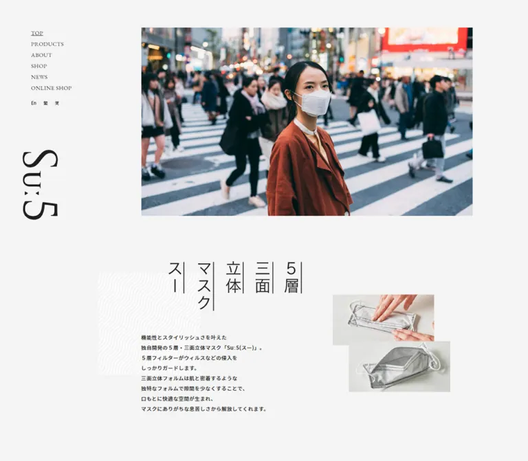
Suː5 / スー|衛生マスクと関連商品のブランドサイト
淡いグレーを基調に、縦向きロゴ、波模様、大きな余白、商品写真を組み合わせたブランドサイト。デスクトップの固定サイドナビゲーションと、モバイルの縦積みレイアウトが特徴です。
Suː5 / YAYA — Style Reference
A quiet product catalog composed from pale gray paper, charcoal lettering, wave patterns, and carefully offset photographs.
Original URL: yayaproducts.com Final URL: yayaproducts.com Theme: light, with a restrained grayscale interface and natural color in photography. Inspected: October 6, 2026, at 01:22 JST; supplied capture timestamp: October 5, 2026, 16:22:00.650 UTC. Viewports: 1440 × 1000 desktop and 390 × 844 mobile, in CSS pixels. Scope: the current brand homepage: navigation, opening photograph, introductory composition, Mask / Mask Spray / Mask Pouch sections, news, and footer. Analysis uses three supplied desktop captures, two mobile captures, and their rendered DOM/computed-style records. Linked pages, downloadable documents, and the external shop were not inspected.
Suː5 presents masks and related products through the visual language of a small fashion or lifestyle publication. A pale gray canvas carries thin, dark typography; generous empty areas separate photographs, product explanations, and links. English serif navigation sits beside Japanese sans-serif copy. The rotated wordmark, vertical headline artwork, and repeated white wave pattern provide the strongest identity cues.
This is a brand and product-catalog homepage within a larger website. It introduces three product families, links to product detail pages, publishes news, and provides a separate online-shop destination. Its hierarchy is editorial: photography and section composition establish interest, while compact outlined links provide onward navigation.
Desktop composition depends on several distinct horizontal anchors. Navigation occupies a persistent left rail, ordinary content begins farther right, and decorative section markers project back toward the rail. Mobile replaces that arrangement with a small persistent header and a long, stacked page while retaining the irregular image placement and substantial breathing room.
閉じる
Suː5 / YAYA — Style Reference
A quiet product catalog composed from pale gray paper, charcoal lettering, wave patterns, and carefully offset photographs.
Original URL: yayaproducts.com Final URL: yayaproducts.com Theme: light, with a restrained grayscale interface and natural color in photography. Inspected: October 6, 2026, at 01:22 JST; supplied capture timestamp: October 5, 2026, 16:22:00.650 UTC. Viewports: 1440 × 1000 desktop and 390 × 844 mobile, in CSS pixels. Scope: the current brand homepage: navigation, opening photograph, introductory composition, Mask / Mask Spray / Mask Pouch sections, news, and footer. Analysis uses three supplied desktop captures, two mobile captures, and their rendered DOM/computed-style records. Linked pages, downloadable documents, and the external shop were not inspected.
Suː5 presents masks and related products through the visual language of a small fashion or lifestyle publication. A pale gray canvas carries thin, dark typography; generous empty areas separate photographs, product explanations, and links. English serif navigation sits beside Japanese sans-serif copy. The rotated wordmark, vertical headline artwork, and repeated white wave pattern provide the strongest identity cues.
This is a brand and product-catalog homepage within a larger website. It introduces three product families, links to product detail pages, publishes news, and provides a separate online-shop destination. Its hierarchy is editorial: photography and section composition establish interest, while compact outlined links provide onward navigation.
Desktop composition depends on several distinct horizontal anchors. Navigation occupies a persistent left rail, ordinary content begins farther right, and decorative section markers project back toward the rail. Mobile replaces that arrangement with a small persistent header and a long, stacked page while retaining the irregular image placement and substantial breathing room.
How to Read This Reference
- Measured means supplied DOM bounds, computed styles, or custom-property values. Bounds describe the recorded state, including fractional pixels.
- Calculated means arithmetic derived from those measurements. Calculations do not establish an unseen CSS implementation.
- Estimated means visual interpretation of the supplied current-page screenshots. This applies especially to decorative patterns, image edges, and lettering whose child styles were not included.
- Recommended means a proposed implementation or improvement, rather than a verified feature of the original website.
- Token names introduced here are reusable aliases. Source custom properties are identified explicitly.
- A declared font stack establishes the requested families, not proof that every named font file loaded or rendered every glyph.
- Some graphic-looking headings have ordinary 13px wrapper styles in the DOM record. Those wrapper values do not describe the visible lettering.
- The middle desktop capture contains large blank regions. Its visible section marker can be analyzed, but the absent imagery cannot be reconstructed from text or assumed to be an intentional loading state.
Tokens — Colors
Default Palette
| Name | Value | Suggested token | Evidence and role |
|---|---|---|---|
| Page Gray | #f4f4f4 |
--color-page |
Measured body background at both viewports; the dominant canvas behind products and introduction |
| Section Gray | #e9e9e9 |
--color-section |
Source --themeGrey; measured news background |
| Charcoal | #202020 |
--color-ink |
Source --fontColor, --linkColor, and --borderColor; measured primary text color |
| Footer White | #ffffff |
--color-white |
Measured footer background; also a visual approximation for the light wave strands |
| Utility Gray | #4b4b4b |
--color-muted |
Measured footer link and copyright color |
The difference between Page Gray and Section Gray is small but structural. The news area becomes a broad, slightly darker band; the white footer then gives the page a distinct ending. Product sections mostly rely on space, imagery, and patterned markers rather than separate card backgrounds.
The hero photograph contains its own soft tonal gradient. That photographic lighting is not evidence of a CSS gradient applied to the interface.
Declared Colors Outside the Visible Palette
| Value | Evidence | Interpretation |
|---|---|---|
#00b2cc |
Source --themeBlueGreen |
Declared, but no use established in the visible homepage controls |
#3296d4 |
Source --themeBlue |
Declared, but no use established in the visible homepage controls |
#331815 |
Computed mobile navigation-link color | Present on navigation elements that are not visible in the closed-menu captures |
Do not promote the blue variables into primary buttons or decorative accents without additional evidence. Generic editor palette variables also do not establish the page's visible design palette.
Tokens — Typography
Japanese Body Copy
Declared source stack: "Noto Sans JP", "ヒラギノ角ゴ ProN W3", "Hiragino Kaku Gothic ProN", "メイリオ", meiryo, "MS Pゴシック", sans-serif.
Body copy uses regular weight. At both inspected widths, its measured size is 13px. Product descriptions use a generous 26px line height, creating small, calm text blocks rather than dense specifications. Desktop tracking is 0.65px; mobile product copy reduces this to 0.13px.
The introductory desktop paragraph occupies an 844px-wide element, but explicit line breaks produce a much narrower visible text shape. Do not interpret the element width as the actual length of each line.
English Navigation
Declared source stack: "EB Garamond", "Times New Roman", "MS 明朝", "MS Mincho", "ヒラギノ明朝 ProN W3", "Hiragino Mincho ProN", "メイリオ", meiryo, serif.
Desktop navigation is regular serif, uppercase, and lightly tracked. Its 15px size and approximately 28px line boxes keep the left rail quiet. The active TOP link is visibly underlined.
The mobile DOM contains larger 19px serif navigation labels. These belong to navigation content absent from the supplied closed-menu screenshots; they are measured implementation evidence, not a visually verified open-menu design.
Wordmark and Graphic Headings
Treat the Suː5 wordmark as artwork. Its characteristic colon-like marks and letter proportions should not be recreated by selecting a loosely similar text font.
The introductory heading visually arranges the source wording into vertical groups: “5層”, “三面”, “立体”, “マスク”, and “スー”. Its H1 has no extracted text in the supplied record, while the screenshot clearly shows large lettering. The exact asset type and glyph font are not supplied.
English section labels such as Mask Spray and News also appear much larger and more serif-like than their H2 wrapper's inherited 13px sans-serif style. Their visible child typography must be distinguished from that wrapper measurement.
Copyright
Measured source stack: "Helvetica Neue", Helvetica, Arial, sans-serif.
The copyright line is 10px on desktop and 9px on mobile, with a 1.6 line-height ratio. Its small size makes it a quiet closing detail; larger legal text would be a reasonable accessibility adjustment in a new implementation.
Type Scale
| Role | Desktop | Mobile | Tracking | Evidence |
|---|---|---|---|---|
| Default body | 13px / 20.8px | 13px / 20.8px | Normal | Measured |
| Introductory paragraph | 13px / 26px | 13px / approximately 24px | 0.65px / 0.13px | Measured |
| Product description | 13px / 26px | 13px / 26px | 0.65px / 0.13px | Measured |
| Product heading | 22px / 35.992px | 20px / 30px | 1.65px / 1.5px | Measured; regular weight |
| Desktop navigation | 15px / 28.005px | Hidden in closed header | 0.375px | Measured |
| Mobile navigation content | — | 19px / 42.997px | 0.95px | Measured, not visually opened |
| Language shortcuts | 11px / approximately 25px | 13px / approximately 27px in menu content | Normal | Measured |
More > |
13px / 20.8px | 13px / 20.8px | 1.3px | Measured |
| News link wrapper | 13px / approximately 21px | 13px / approximately 21px | Normal | Measured; child date styling not supplied |
News一覧 > |
12px / 19.38px | 12px / 19.38px | 1.2px | Measured |
| Copyright | 10px / 16px | 9px / 14.4px | Normal | Measured |
| Visible English section lettering | Approximately 36–40px | Approximately 28–30px | Not established | Screenshot estimate; not the H2 wrapper size |
Most hierarchy comes from placement, scale, and whitespace. Heavy weights are not needed to reproduce the captured appearance.
Tokens — Spacing & Shapes
Structural Tokens
| Source or alias | Value | Meaning |
|---|---|---|
Source --baseWidth |
1280px | Desktop frame width |
Source --headerWidth |
218px | Desktop navigation-rail allocation |
Source --desktopInnerPadding |
0 109px 0 calc(218px + 109px) |
Main content inset within the frame |
Source --desktopHeaderH |
70px | Desktop opening inset |
Source --mobileHeaderH |
60px | Mobile header height and opening inset |
Suggested --column-step |
109px | Reusable alias for the repeated desktop inset |
Suggested --mobile-gutter |
8vw | Calculated approximation of the measured 31.1875px content inset at 390px |
Suggested --section-gap |
150px desktop; 85px mobile | Calculated gaps between the introduction and successive product sections |
The custom property --innerVh is 10px on desktop and 8.44px on mobile, corresponding to one percent of the recorded viewport height. The accompanying --inner-height expression produces 1000px and 844px respectively. Its complete behavioral use is not established by the supplied records.
Spacing Scale
| Use | Desktop | Mobile | Status |
|---|---|---|---|
| Intro section top to headline | 115px | Approximately 50.7px | Measured / calculated from bounds |
| Headline bottom to intro paragraph | 55px | Images intervene before the paragraph | Calculated |
| Product heading to description | Side by side | 15px | Measured / calculated |
Product paragraph to More > |
35px | 22px | Calculated |
| Product-family separation | 150px | 85px | Calculated |
| Last product section to news background | 100px | 100px | Calculated |
| News-row start-to-start distance | Approximately 36px | 69.125px | Calculated |
| News bottom padding | 65px | 65px | Measured |
| Footer vertical padding | 55px top, 65px bottom | 25px top and bottom | Measured |
Border Radius
| Element | Treatment | Evidence |
|---|---|---|
| Product links | Square corners | Measured 0px radius |
| Photographs | Square edges | Visible in captures |
| Pattern panels | Square | Visible in captures |
| Header/menu button | Square, transparent control box | Measured 0px radius |
| Social symbols | Their native icon silhouettes | Circular or rounded shapes belong to the artwork, not a card system |
The outlined product links have an approximately 1px border. Their measured height, line height, and padding are consistent with a 1px border on each side; border width was not separately included in the supplied style fields.
Layout Measurements
| Element | Desktop at 1440 × 1000 | Mobile at 390 × 844 | Evidence |
|---|---|---|---|
| Centered base frame | x = 80, width = 1280px | Full viewport | Measured |
| Main content corridor | x = 407, width = 844px | x ≈ 31.19, width ≈ 327.63px for prose | Measured |
| Navigation section | x = 80, y = 70, width = 218px | Replaced by header | Measured |
| Navigation text start | x = 127px | Not visible in closed state | Measured |
| Wordmark bounds | x ≈ 105.13, y = 382; 89.88 × 178px | x ≈ 19.88, y = 10; 81 × 40.89px | Measured |
| Opening image | x ≈ 407, y ≈ 70; approximately 844 × 480px | x ≈ 0, y ≈ 60; approximately 359 × 417px | Screenshot estimates; section bounds support 481px and 417.02px available height |
| Intro heading artwork | x = 477, y = 666; 339 × 125.77px | x ≈ 68.06, y ≈ 527.70; 253.88 × 94.19px | Measured wrapper bounds |
| Product description split | 327px heading column + 408px paragraph column | One 327.63px-wide column | Measured |
More > box |
192 × 36.80px | 182 × 32.80px | Measured |
| Section pattern square | Approximately 299 × 299px | News square approximately 218 × 218px | Screenshot estimates |
| News band height | 364px | 497.14px | Measured |
| Footer height | 154.80px | 136.19px | Measured |
| Full document height | 6367.88px | 6723.13px | Measured |
At desktop width, the main corridor follows directly from the source tokens:
frame left = (1440 − 1280) / 2 = 80px
content left = 80 + 218 + 109 = 407px
content width = 1280 − 218 − 109 − 109 = 844px
The footer uses a wider rightward reach: its inner region runs from x = 407 to x = 1360, placing the copyright beyond the ordinary content corridor's right edge at x = 1251.
Components
Desktop Navigation Rail
Role: persistent site identity and navigation across the long homepage.
The visible rail contains six compact entries: TOP, PRODUCTS, ABOUT, SHOP, NEWS, and ONLINE SHOP. The first text line begins at x = 127, while its containing section starts at x = 80. Keep this internal offset rather than aligning the menu directly with the frame edge.
Below the main entries, three small language shortcuts form a horizontal row. The visible labels are En, 繁, and 简. Their DOM destinations are translated PDF documents, not confirmed in-page language switches.
A large Suː5 wordmark sits farther down the rail, oriented vertically. The rail and wordmark remain at matching screen positions in the supplied desktop scroll captures, supporting a persistent-position interpretation. The exact positioning rules were not included.
The DOM includes product-family navigation content beneath PRODUCTS, but its expansion trigger, visible submenu state, and keyboard behavior were not exercised.
Mobile Header
Role: preserve brand recognition and navigation access in a compact top region.
The measured header is 60px high. Its horizontal wordmark is approximately 81 × 41px, positioned about 20px from the left and 10px from the top. A 50 × 50px menu button sits near the right edge with 10px internal padding.
The menu glyph is a stack of fine horizontal strokes rather than a large filled icon. Reproduce its delicate density instead of substituting an oversized standard menu symbol.
The header remains visible in the bottom mobile capture. Text can be seen behind the wordmark and menu area, consistent with the measured transparent header surface. An opaque background would be a recommended readability improvement, not a description of the captured state.
Only the closed header was visually captured. The DOM contains a viewport-height navigation region and its links, but nonzero element bounds do not prove that region was visible.
Opening Photograph
Role: introduce the product through a single dominant photographic field.
On desktop, a wide photograph begins at x ≈ 407 and y ≈ 70. It shows a white mask against a softly lit cool-gray background, with ample empty space around the product. The image has no visible rounded frame, overlay copy, caption, or prominent action button.
On mobile, the opening image begins below the 60px header and occupies about 92% of viewport width, leaving an approximately 31px right gutter. The captured photograph shows a masked person in a pale blue jacket against a light architectural corner. Its composition is portrait-oriented.
These captures establish different image content and aspect ratios at the two recorded states. They do not establish whether that difference comes from responsive assets, a timed sequence, or another selection mechanism. Slide count, autoplay, crossfades, controls, and timing remain unverified.
Introductory Composition
Role: connect the product's visual identity to its functional description.
The desktop composition has four layers:
- A large, vertically grouped Japanese heading, inset 70px beyond the normal prose start.
- A pale square wave-pattern field behind the left side of the composition.
- A small paragraph with deliberate line breaks and 26px leading.
- Two overlapping mask-detail photographs to the right.
The heading wrapper is 339 × 125.77px. Its mobile version is approximately 74.9% of that width, preserving the same graphic proportions.
The desktop detail photographs are visually about 258px wide. The upper image shows hands manipulating the mask; the lower image shows its folded interior. The second image shifts right and overlaps the first slightly. These photographs communicate construction through a small editorial collage.
On mobile, the heading appears first, followed by the overlapping detail images and then the paragraph. The first image begins at the left viewport edge; the second starts about 104px farther right. Their visible widths are approximately 208px. The paragraph begins around document y = 998.38, below the supplied opening screenshot.
Do not compress this introduction into a single centered text block. Its identity comes from the separate positions of headline, texture, photographs, and prose.
Patterned Section Marker
Role: identify a product family or editorial section without a conventional horizontal title bar.
A square of fine white waves anchors each visible section marker. On desktop, the marker projects left of the main content corridor: the supplied Mask Spray square starts near x = 298, versus x = 407 for ordinary content. Its English label runs vertically near the square's left side and includes the distinctive paired triangular mark.
The news marker overlaps the background transition. Its desktop top sits approximately 73px above the news band's start; the square continues into the darker gray area.
On mobile, the news square is approximately 56vw wide and begins at the left edge. It overlaps the band's top by about 30px. The News label reads horizontally and is centered around the page's midpoint, extending beyond the square's right edge.
The source texture URL and precise title artwork are not supplied. Reuse authorized artwork where available. Any CSS or SVG replacement should be identified as an approximation.
Product-Family Section
Role: introduce a related group of products and link to its detail page.
The rendered page contains three families:
| Family | Labels present in rendered text | Observed detail destination |
|---|---|---|
| Mask | Regular, Activated Carbon, Small, with Japanese labels |
/products/mask/ |
| Mask Spray | Sun, Moon |
/products/spray/ |
| Mask Pouch | Silver, Black |
/products/pouch/ |
The repeated anatomy is a section marker, product imagery and variant labels, a short Japanese heading, a descriptive paragraph, and an outlined More > link.
Desktop explanation blocks use two adjacent columns. The heading begins at x = 407 and has a 327px allocation; the paragraph begins at x = 734 and is 408px wide. The action aligns to the paragraph's left edge. This creates an intentionally off-center information block within the larger content corridor.
Mobile places the heading, paragraph, and centered action in sequence. The 20px heading retains a two-line shape where the content permits; the description remains 13px with 26px leading.
The bottom desktop capture shows the lower portions of two pouch photographs and their right-aligned Silver and Black labels. The full photographic presentation of all seven variants is not visible in the supplied captures. Product names establish content inventory, not unseen visual details.
Outlined Product Link
Role: provide a restrained route to product details.
The link has a transparent fill, a thin charcoal outline, square corners, centered More > text, and 0.1em letter spacing. Desktop width is 192px; mobile width is 182px.
Measured vertical padding is 7px on desktop and 5px on mobile. Together with 20.8px line height and the inferred border, this produces approximately 36.8px and 32.8px total height.
It is an anchor, not an add-to-cart control. Its visual weight should remain subordinate to the product photographs and heading.
News Band
Role: display a small, current editorial index near the end of the page.
The darker gray band contains an overlapping patterned marker, three dated links, and a right-aligned archive link. The captured dates are 2026.09.22, 2026.01.01, and 2025.03.28.
Desktop entries begin at x = 625. Dates and titles share a line, with titles beginning near the product-description anchor at x = 734. Rows are separated by whitespace rather than rules or cards.
Mobile entries begin at the normal approximately 31px prose inset. Each date sits above its title, and entries have a larger approximately 69px vertical cadence. The first title is visibly abbreviated with an ellipsis. Because the mobile extracted text also contains that ellipsis, the evidence does not establish whether truncation is CSS-based or performed in content generation.
The archive link preserves the source label News一覧 >, an underline, 12px type, and 1.2px tracking.
Footer
Role: close the page with social/contact access and copyright.
A full-width white surface separates the footer from the news band. Desktop uses a horizontal inner layout: social links toward the content start, copyright at the far right. Mobile places a social row above centered copyright.
Recognizable Instagram, Facebook, and email glyphs are visible in the captures. The DOM also contains a Twitter link with a reserved box, but a corresponding glyph is not visibly established. Do not infer four visible icons solely from four anchor records.
Desktop social-link boxes are 20px wide; mobile boxes are 28px wide. The measured footer text is Copyright © YAYA All Rights Reserved. This identifies the visible copyright name without establishing additional company or production-credit details.
Tokens — Motion & Interaction
| Treatment | Supplied evidence | What can be concluded |
|---|---|---|
| Ordinary links and logo links | opacity 0.3s linear |
An opacity transition is declared; trigger and endpoint were not captured |
| Mobile menu button | opacity 0.3s linear |
The button has the same declared transition; its opening sequence is unverified |
| Section H2 wrappers | opacity 0.4s linear |
A heading-opacity transition is declared; reveal conditions are unknown |
| General transition token | Source --transition: all 0.3s linear |
A reusable source value exists; it does not prove all properties animate |
| Sampled animation fields | animation: none |
No named animation is reported on those sampled elements; descendants or scripts may behave differently |
| Desktop rail and mobile header | Consistent screen placement across scroll captures | Persistent positioning is visually supported |
| Active navigation | Underlined TOP in desktop captures |
Current-page indication is visible |
| Product and news links | Explicit anchor destinations | Navigation intent is established; destination pages were not inspected |
| Opening image changes | Different photographs in desktop and mobile captures | Multiple image states exist; carousel behavior and timing are unverified |
The inspection process waited for document load, visible image decoding, sampled layout stability, and relevant finite animations within bounded time limits. Perpetual animations were temporarily paused during readiness checks and resumed afterward. This process does not verify all delayed reveals or interactive states.
No supplied interaction record establishes menu opening, submenu expansion, hover appearance, focus styling, slide controls, or reduced-motion handling. A faithful adaptation should keep essential content visible by default and add only clearly specified motion.
Surfaces
| Layer | Appearance | Purpose |
|---|---|---|
| Main canvas | Flat #f4f4f4 |
Holds the long product narrative |
| News band | Flat #e9e9e9 |
Creates a quiet section-level distinction |
| Footer | Flat white | Gives the page a clean closing region |
| Pattern field | Fine white waves on a pale square | Repeated identity device and section anchor |
| Photographic field | Natural product and lifestyle imagery | Supplies most tonal variation and visual detail |
| Product action | Transparent fill, thin dark outline | Compact onward navigation |
| Mobile header | Visually transparent in the captured scroll state | Keeps identity present, with potential text overlap |
There is no visible card-shadow or elevation system. Edges remain square, and hierarchy comes from coordinates, background changes, image boundaries, and typography.
Imagery
The current opening desktop image uses soft, diffuse product lighting. The white mask floats against a cool gray field, allowing its seams, folds, and loops to define the object. The mobile opening photograph supplies a lifestyle context through pale clothing, an architectural wall, and a restrained portrait composition.
The introductory detail images are more tactile. Hands demonstrate the mask's shape, while an interior view explains its construction. Their overlapping placement suggests a printed product feature rather than a uniform catalog grid.
Keep photographic saturation restrained and allow the images' own lighting to supply depth. Avoid applying a global grayscale filter: the visible blue clothing and skin tones are meaningful parts of the current imagery.
The wave pattern should remain a subtle, localized texture. Its repeated curves relate to the visual softness of the product without covering the whole interface. Fine geometric icons and the wordmark remain sharply defined against that texture.
Observed Asset References
No image src, background-image URL, original image dimensions, or font-file URL was supplied. The following references identify visible roles rather than inventing asset paths.
| Asset role | Current-page evidence | Reuse guidance |
|---|---|---|
| Suː5 wordmark | Vertical desktop mark; horizontal mobile mark | Use the authorized original artwork and preserve its proportions |
| Introductory Japanese headline | Same graphic composition at two measured sizes | Preserve the artwork's layout; provide an accessible text equivalent |
| Desktop opening photograph | White mask on a cool gray field | Preserve empty space and gentle lighting |
| Mobile opening photograph | Masked person in a pale blue jacket | Use a portrait composition appropriate to the recorded mobile frame |
| Mask-detail pair | Hands manipulating the mask; folded interior | Retain their overlapping, offset relationship |
| Wave-pattern square | Intro and section-marker captures | Use the original texture when available; label generated replacements as approximations |
| Product variant photography | Partial pouch imagery visible; variant names available in DOM | Do not invent unseen layouts or crops as source findings |
| Social/contact glyphs | Instagram, Facebook, and envelope visible | Supply working, accessible icons for the destinations actually implemented |
Layout & Responsive Behavior
Desktop: An Offset Editorial Frame
The centered 1280px frame provides a stable reference, but its contents are asymmetrical. Navigation starts in the first 218px allocation. Main photography and prose begin after another 109px inset. Section markers extend backward into that intermediate space.
The result is several related anchors rather than one universal left edge:
- Navigation text: x = 127px.
- Pattern-marker edge: approximately x = 298px.
- Main photograph and product heading: x = 407px.
- Introductory headline: x = 477px.
- News list: x = 625px.
- Product descriptions and news titles: x = 734px.
Keep these relationships deliberate. Centering every component or aligning every item to x = 407 would remove much of the composition's character.
Mobile: Recomposition with Retained Whitespace
The desktop rail gives way to a 60px header. The opening photograph becomes portrait-oriented and reaches the left edge, while its right side retains a gutter. Ordinary prose uses approximately 8vw side insets.
The introduction changes order into heading, image collage, and paragraph. Product explanations become single-column blocks. Product links become narrower and centered. News dates move above titles, and the footer becomes a vertical stack.
The news label changes from vertical to horizontal. Its patterned square stays left-aligned and oversized relative to the label, preserving the original imbalance rather than becoming a small centered icon.
Verified Limits
Only the two stated viewport sizes were inspected. The exact breakpoint, tablet layout, orientation handling, safe-area rules, and intermediate fluid formulas are not supplied. The mobile 8vw prose inset and 92vw opening width are calculated approximations supported by the 390px capture, not confirmed source declarations.
The page remains long at both widths: approximately 6368px on desktop and 6723px on mobile. Individual sections reflow differently; proportional shrinking of the complete desktop page would not reproduce mobile.
The middle desktop screenshot includes a broad empty gray region and a largely empty area around the Mask Spray marker. The supplied evidence does not establish whether this results from intentional spacing, hidden content, delayed rendering, or another state. Preserve verified geometry and avoid turning uncertain absence into a reusable design requirement.
Do’s and Don’ts
Do
- Keep the main canvas
#f4f4f4, the news band#e9e9e9, and primary text#202020. - Build desktop layout around the measured 1280px frame, 218px rail, and 109px inset.
- Preserve separate anchors for navigation, markers, images, descriptions, and news.
- Use regular serif English navigation beside regular Japanese sans-serif copy.
- Treat the wordmark and introductory headline as artwork with their own proportions.
- Keep photographs square-cornered and softly lit.
- Retain the overlapping mask-detail pair and localized wave texture.
- Use small outlined links and understated underlined text navigation.
- Recompose the mobile page into a long, readable sequence.
- Distinguish visible states from hidden DOM content and untested interactions.
Don’t
- Don't replace the product narrative with a generic grid of rounded cards.
- Don't add a strong colored CTA merely because blue variables exist in the source.
- Don't enlarge every heading or use bold type throughout.
- Don't interpret a 13px H1/H2 wrapper as the visible size of graphic lettering.
- Don't turn the translated-document links into a claimed live language switcher.
- Don't invent a slideshow interval, menu animation, or scroll-reveal sequence.
- Don't fill uncertain blank areas with imagery inferred from product names.
- Don't flatten all desktop content onto one centered axis.
- Don't reproduce the mobile page by uniformly scaling the desktop layout.
- Don't substitute arbitrary fonts for the distinctive logo artwork.
Recommended Implementation Additions
These are proposed improvements, not verified original features:
- Give the mobile menu button an accessible name,
aria-expanded, andaria-controls. Ensure closed navigation cannot receive focus. - Keep the mobile header readable over scrolled content, preferably with an opaque Page Gray surface or another tested contrast treatment.
- Provide an accessible text equivalent for the introductory graphic heading. The empty extracted H1 text alone does not establish whether the original already has an adequate alternative.
- Increase action hit areas to at least 44px where practical. The measured mobile
More >link is only approximately 32.8px high. - Give each repeated
More >link a product-specific accessible name. - Preserve the complete news title for assistive technology and on the destination page when visually abbreviating it.
- Give language links clear language names and indicate that they open PDF documents.
- Verify every social destination has a visible glyph and accessible name; resolve the captured Twitter link/glyph discrepancy.
- Provide a visible keyboard-focus outline and honor reduced-motion preferences.
- Keep imagery visible if JavaScript fails. Supply explicit image dimensions or aspect ratios to reduce layout shifts.
- If rotating hero imagery is implemented, define its controls and reduced-motion behavior explicitly rather than deriving them from these static captures.
Agent Prompt Guide
Quick Color Reference
- Main canvas:
#f4f4f4. - News background:
#e9e9e9. - Text and outlines:
#202020. - Footer and light pattern strands:
#ffffff. - Footer symbols and copyright:
#4b4b4b. - Photograph color: natural and restrained; no global monochrome filter.
- Action style: transparent, thin outline, square corners, small tracked text.
Overall Prompt
“Create an editorial homepage for a Japanese mask and lifestyle-product brand inspired by the supplied Suː5 reference. Use a pale gray #f4f4f4 canvas, charcoal #202020 text, a slightly darker #e9e9e9 news band, and a white footer. On desktop, use a centered 1280px frame with a persistent 218px left navigation allocation, regular serif uppercase links, and a vertically oriented brand artwork below them. Begin primary content after an additional 109px inset. Combine a wide opening photograph, graphic Japanese vertical lettering, overlapping detail images, and pale wave-pattern section squares. Product explanations use a 327px heading allocation beside a 408px paragraph allocation, followed by a small outlined link. On mobile, use a 60px header, a portrait opening image, approximately 8vw prose gutters, stacked product explanations, horizontal section labels, and a vertically arranged footer. Keep interaction modest and content visible by default.”
Example Component Prompts
- Navigation rail: “Place a compact regular-serif menu near the upper left of a centered desktop frame. Use 15px text, approximately 28px line boxes, and light tracking. Add three tiny translated-document shortcuts beneath it and a large rotated wordmark lower down. Preserve empty space between the rail and the main photograph.”
- Introductory composition: “Arrange a graphic Japanese headline in vertical groups above small, widely led body copy. Put a faint wave-pattern square behind the left edge and two overlapping mask-detail photographs to the right. On mobile, place the headline first, the offset image pair second, and the paragraph third.”
- Product explanation: “Create a square-edged editorial product section with a regular 22px Japanese heading at left, 13px copy with 26px leading at right, and a 192px-wide outlined ‘More >’ link below the paragraph. Stack these elements on mobile and center the narrower action.”
- News band: “Use a slightly darker gray full-width band with an overlapping white-wave square. Put a vertical serif News label on desktop and a horizontal centered label on mobile. Show three unboxed dated links, then a small underlined archive link aligned right.”
- Mobile header: “Use a compact horizontal wordmark at the left of a 60px header and a 50px menu-button target at the right. Draw the menu glyph as several fine parallel lines. For the new implementation, give the header an opaque pale-gray background and implement an accessible disclosure menu separately.”
Quick Start
CSS Custom Properties
The following CSS is a practical adaptation, not recovered source code. It preserves the measured desktop frame and core typography. The 1024px breakpoint, responsive interpolation, generated wave tile, hover endpoint, and opaque mobile header are recommendations. Graphic headings, logos, photographs, and menu behavior must be supplied separately.
Use .content-frame inside full-width sections. The desktop rail contains a nav, a .language-links row, and a .rail-wordmark wrapper holding horizontal logo artwork. In the news section, place .section-marker directly inside .news, with the list and archive link inside a separate .content-frame. Each news anchor contains a date followed by a .news-title span.
:root {
  /* Measured palette */
  --color-page: #f4f4f4;
  --color-section: #e9e9e9;
  --color-ink: #202020;
  --color-white: #ffffff;
  --color-muted: #4b4b4b;

  /* Shortened versions of the declared source stacks */
  --font-body: 'Noto Sans JP', 'Hiragino Kaku Gothic ProN', meiryo, sans-serif;
  --font-editorial: 'EB Garamond', 'Times New Roman', serif;
  --font-legal: 'Helvetica Neue', Helvetica, Arial, sans-serif;

  /* Measured desktop structure */
  --frame-max: 1280px;
  --rail-width: 218px;
  --column-step: 109px;
  --content-start: calc(var(--rail-width) + var(--column-step));
  --header-desktop: 70px;
  --header-mobile: 60px;
  --section-gap: 150px;
  --text-body: 13px;
  --text-heading: 22px;
  --tracking-copy: 0.05em;
  --motion-link: opacity 300ms linear;

  /* Recommended approximation; replace with authorized texture artwork */
  --wave-tile: url("data:image/svg+xml,%3Csvg xmlns='http://www.w3.org/2000/svg' width='32' height='32' viewBox='0 0 32 32'%3E%3Cg fill='none' stroke='%23fff' stroke-width='3'%3E%3Cpath d='M-8-8C-8 0 8 0 8 8S-8 16-8 24S8 32 8 40M8-8C8 0 24 0 24 8S8 16 8 24S24 32 24 40M24-8C24 0 40 0 40 8S24 16 24 24S40 32 40 40'/%3E%3C/g%3E%3C/svg%3E");
}

* { box-sizing: border-box; }
body {
  margin: 0;
  color: var(--color-ink);
  background: var(--color-page);
  font: 400 var(--text-body)/1.6 var(--font-body);
}
img { display: block; max-width: 100%; height: auto; }
figure { margin: 0; }
a { color: inherit; transition: var(--motion-link); }
button { font: inherit; }

.content-frame {
  width: min(100%, var(--frame-max));
  margin-inline: auto;
  padding-inline: var(--content-start) var(--column-step);
}

.desktop-rail {
  position: fixed;
  z-index: 20;
  top: var(--header-desktop);
  left: max(0px, calc((100vw - var(--frame-max)) / 2));
  width: var(--rail-width);
}
.desktop-rail nav { padding-left: 47px; }
.desktop-rail nav a {
  display: block;
  font: 400 15px/28px var(--font-editorial);
  letter-spacing: 0.025em;
  text-decoration: none;
}
.desktop-rail nav a[aria-current='page'] { text-decoration: underline; }
.language-links {
  display: flex;
  gap: 18px;
  margin: 12px 0 0 47px;
  font-size: 11px;
  line-height: 25px;
}
.rail-wordmark {
  position: absolute;
  top: 312px;
  left: 25px;
  width: 90px;
  height: 178px;
}
.rail-wordmark img {
  position: absolute;
  top: 50%;
  left: 50%;
  width: 178px;
  max-width: none;
  transform: translate(-50%, -50%) rotate(90deg);
}
.mobile-header { display: none; }

.hero { padding-top: var(--header-desktop); }
.hero-media {
  width: 100%;
  aspect-ratio: 844 / 481;
  object-fit: cover;
}
.intro { padding-top: 115px; }
.intro-inner { position: relative; isolation: isolate; }
.intro-inner::before {
  content: '';
  position: absolute;
  z-index: -1;
  top: 29px;
  left: -109px;
  width: 260px;
  aspect-ratio: 1;
  background: var(--wave-tile) repeat;
}
.intro-title {
  width: 339px;
  max-width: 100%;
  margin: 0 0 55px 70px;
}
.intro-title img { width: 100%; }
.intro-copy {
  margin: 0;
  line-height: 2;
  letter-spacing: var(--tracking-copy);
}
/* Use deliberate line breaks or a suitable text measure beside the collage. */
.intro-collage {
  position: absolute;
  top: 84px;
  right: 57px;
  width: 299px;
  height: 249px;
}
.intro-collage img {
  position: absolute;
  width: 86.3%;
  aspect-ratio: 2 / 1;
  object-fit: cover;
}
.intro-collage img:last-child { top: 119px; right: 0; }

.product-section { margin-top: var(--section-gap); }
.section-marker {
  position: relative;
  width: 299px;
  height: 299px;
  margin-left: -109px;
  background: var(--color-page) var(--wave-tile) repeat;
}
.section-marker h2 {
  margin: 0;
  padding: 28px 24px;
  writing-mode: vertical-rl;
  font: 400 36px/1 var(--font-editorial);
  transition: opacity 400ms linear;
}
/* Proposed two-variant layout; unseen source galleries are not reconstructed. */
.variant-grid {
  display: grid;
  grid-template-columns: repeat(2, minmax(0, 1fr));
  gap: 28px;
  max-width: 626px;
}
.variant-grid figcaption {
  margin-top: 10px;
  text-align: right;
  font-size: 12px;
  letter-spacing: 0.05em;
}
.product-detail {
  display: grid;
  grid-template-columns: minmax(0, 327fr) minmax(0, 408fr);
  max-width: 735px;
}
.product-detail h3 {
  margin: 0;
  font-size: var(--text-heading);
  font-weight: 400;
  line-height: 1.636;
  letter-spacing: 0.075em;
}
.product-detail p {
  margin: 0;
  line-height: 2;
  letter-spacing: var(--tracking-copy);
}
.more-link {
  display: block;
  width: 192px;
  margin-top: 35px;
  padding: 7px 0;
  border: 1px solid currentColor;
  border-radius: 0;
  text-align: center;
  line-height: 20.8px;
  letter-spacing: 0.1em;
  text-decoration: none;
}

.news {
  position: relative;
  min-height: 364px;
  margin-top: 100px;
  padding: 75px 0 65px;
  background: var(--color-section);
}
.news > .section-marker {
  position: absolute;
  top: -73px;
  left: calc(max(0px, (100vw - var(--frame-max)) / 2) + 218px);
  margin: 0;
}
.news-list {
  margin: 0;
  padding: 0 0 0 218px;
  list-style: none;
}
.news-list li + li { margin-top: 15px; }
.news-list a {
  display: grid;
  grid-template-columns: 109px minmax(0, 1fr);
  line-height: 21px;
  text-decoration: none;
}
.news-title { min-width: 0; }
.news-archive {
  display: block;
  margin-top: 26px;
  text-align: right;
  font-size: 12px;
  letter-spacing: 0.1em;
  text-decoration: underline;
}

.site-footer {
  padding: 55px 0 65px;
  color: var(--color-muted);
  background: var(--color-white);
}
.footer-frame {
  display: flex;
  align-items: center;
  justify-content: space-between;
  width: min(100%, var(--frame-max));
  margin-inline: auto;
  padding-left: var(--content-start);
}
.social-links { display: flex; align-items: center; gap: 20px; }
.social-links a { display: block; width: 20px; padding-block: 5px; }
.social-links svg { display: block; width: 100%; height: auto; }
.copyright { margin: 0; font: 400 10px/1.6 var(--font-legal); }

/* Recommended focus treatment and hover endpoint. */
:focus-visible { outline: 2px solid currentColor; outline-offset: 4px; }
@media (hover: hover) {
  a:hover, .menu-button:hover { opacity: 0.65; }
}

/* Recommended breakpoint; only 1440px and 390px were inspected. */
@media (max-width: 1023px) {
  :root {
    --section-gap: 85px;
    --text-heading: 20px;
    --tracking-copy: 0.01em;
  }
  .desktop-rail { display: none; }
  .content-frame { width: 100%; padding-inline: 8vw; }
  .mobile-header {
    position: fixed;
    z-index: 30;
    inset: 0 0 auto;
    display: flex;
    align-items: center;
    justify-content: space-between;
    height: var(--header-mobile);
    padding-inline: 5.1vw 3.3vw;
    /* Recommended readability improvement over the captured transparent bar. */
    background: var(--color-page);
  }
  .mobile-wordmark { display: block; width: 81px; }
  .menu-button {
    display: grid;
    place-items: center;
    width: 50px;
    height: 50px;
    padding: 10px;
    border: 0;
    color: inherit;
    background: transparent;
    transition: var(--motion-link);
  }
  .menu-button::before {
    content: '';
    width: 30px;
    height: 21px;
    background: repeating-linear-gradient(
      to bottom, currentColor 0 1px, transparent 1px 4px
    );
  }
  .hero { padding-top: var(--header-mobile); }
  .hero .content-frame { width: 92%; margin-left: 0; padding: 0; }
  .hero-media { aspect-ratio: 359 / 417; }
  .intro { padding-top: 13vw; }
  .intro .content-frame { padding: 0; }
  .intro-inner::before { display: none; }
  .intro-title { width: 65.1%; margin: 0 auto; }
  .intro-collage {
    position: relative;
    inset: auto;
    width: 80%;
    height: 56.3vw;
    margin: 58px 0 99px;
  }
  .intro-collage img { width: 66.667%; aspect-ratio: 1.8; }
  .intro-collage img:last-child { top: 26.667vw; right: 0; }
  .intro-copy { padding-inline: 8vw; line-height: 24px; }
  .section-marker {
    width: 56vw;
    height: 56vw;
    margin-left: -8vw;
  }
  .section-marker h2 {
    position: absolute;
    top: 50%;
    left: 50vw;
    padding: 0;
    transform: translate(-50%, -50%);
    writing-mode: horizontal-tb;
    white-space: nowrap;
    font-size: 29px;
  }
  .variant-grid { grid-template-columns: minmax(0, 1fr); }
  .product-detail { display: block; }
  .product-detail h3 { margin-bottom: 15px; line-height: 1.5; }
  .more-link { width: 182px; margin: 22px auto 0; padding-block: 5px; }
  .news { min-height: 0; padding-top: 56vw; }
  .news > .section-marker { top: -30px; left: 0; }
  .news-list { padding: 0; }
  .news-list li + li { margin-top: 28px; }
  .news-list a { display: block; }
  .news-list time { display: block; font-size: 11px; line-height: 20px; }
  .news-title {
    display: block;
    overflow: hidden;
    white-space: nowrap;
    text-overflow: ellipsis;
  }
  .news-archive { margin-top: 18px; }
  .site-footer { padding-block: 25px; }
  .footer-frame { display: block; padding-inline: 8vw; text-align: center; }
  .social-links { justify-content: center; gap: 30px; }
  .social-links a { width: 28px; min-height: 42px; }
  .copyright { margin-top: 30px; font-size: 9px; }
}

@media (prefers-reduced-motion: reduce) {
  a, .menu-button, .section-marker h2 { transition: none; }
}
The CSS deliberately leaves the precise height and spacing of unseen product-media sequences to the actual supplied assets. Add appropriate spacing between a marker, gallery, and explanation after inspecting those assets. It also leaves menu opening behavior to a separately implemented accessible disclosure.
For responsive opening imagery, a <picture> element can provide art-directed sources. Choosing that mechanism is an implementation recommendation; the current evidence does not identify the original mechanism.
Tailwind v4 Token Mapping
Optional aliases for a project already using Tailwind v4. These do not imply that the original site uses Tailwind. Define the preceding custom properties first.
@theme inline {
  --color-paper: var(--color-page);
  --color-band: var(--color-section);
  --color-charcoal: var(--color-ink);
  --color-utility: var(--color-muted);

  --font-sans: var(--font-body);
  --font-serif: var(--font-editorial);
  --font-copyright: var(--font-legal);

  --text-copy: 13px;
  --text-navigation: 15px;
  --text-product-heading: var(--text-heading);

  --spacing-rail: var(--rail-width);
  --spacing-column: var(--column-step);
  --spacing-section: var(--section-gap);
  --spacing-header-mobile: var(--header-mobile);
}
Sources & Evidence
- Current Suː5 homepage: original and final inspected URL; supplied HTTP status 200. This page is the authority for the design observations in this document.
- Capture timestamp: October 5, 2026, 16:22:00.650 UTC, equivalent to October 6, 2026, 01:22:00.650 JST.
- Desktop evidence: 1440 × 1000 CSS-pixel viewport; supplied opening, intermediate, and bottom captures; measured document height 6367.875px.
- Mobile evidence: 390 × 844 CSS-pixel viewport; supplied opening and bottom captures; measured document height 6723.125px.
- Rendered evidence: visible page text, link destinations, element bounds, font stacks, sizes, line heights, tracking, padding, colors, transition declarations, and source custom properties supplied with the captures.
- Inspection conditions: initial observation lasted at least five seconds. Capture preparation included bounded loading, decoding, animation, and layout-stability checks. Scrolling traversed intermediate positions. SharedWorkers and service workers were disabled during inspection.
- Scope limitations: no additional browsing or file inspection was performed for this reference. Open-menu states, product-submenu behavior, hover/focus states, slideshow behavior, complete image-asset inventory, linked documents, product detail pages, external shop behavior, and exact breakpoints remain unverified.
This reference describes the current homepage as evidenced by the supplied inspection. Estimates, inferred geometry, and implementation recommendations are identified separately from measured source values.
# Suː5 / YAYA — Style Reference

> A quiet product catalog composed from pale gray paper, charcoal lettering, wave patterns, and carefully offset photographs.

**Original URL:** [yayaproducts.com](https://yayaproducts.com/)
**Final URL:** [yayaproducts.com](https://yayaproducts.com/)
**Theme:** light, with a restrained grayscale interface and natural color in photography.
**Inspected:** October 6, 2026, at 01:22 JST; supplied capture timestamp: October 5, 2026, 16:22:00.650 UTC.
**Viewports:** 1440 × 1000 desktop and 390 × 844 mobile, in CSS pixels.
**Scope:** the current brand homepage: navigation, opening photograph, introductory composition, Mask / Mask Spray / Mask Pouch sections, news, and footer. Analysis uses three supplied desktop captures, two mobile captures, and their rendered DOM/computed-style records. Linked pages, downloadable documents, and the external shop were not inspected.

Suː5 presents masks and related products through the visual language of a small fashion or lifestyle publication. A pale gray canvas carries thin, dark typography; generous empty areas separate photographs, product explanations, and links. English serif navigation sits beside Japanese sans-serif copy. The rotated wordmark, vertical headline artwork, and repeated white wave pattern provide the strongest identity cues.

This is a brand and product-catalog homepage within a larger website. It introduces three product families, links to product detail pages, publishes news, and provides a separate online-shop destination. Its hierarchy is editorial: photography and section composition establish interest, while compact outlined links provide onward navigation.

Desktop composition depends on several distinct horizontal anchors. Navigation occupies a persistent left rail, ordinary content begins farther right, and decorative section markers project back toward the rail. Mobile replaces that arrangement with a small persistent header and a long, stacked page while retaining the irregular image placement and substantial breathing room.
閉じる
# Suː5 / YAYA — Style Reference

> A quiet product catalog composed from pale gray paper, charcoal lettering, wave patterns, and carefully offset photographs.

**Original URL:** [yayaproducts.com](https://yayaproducts.com/)
**Final URL:** [yayaproducts.com](https://yayaproducts.com/)
**Theme:** light, with a restrained grayscale interface and natural color in photography.
**Inspected:** October 6, 2026, at 01:22 JST; supplied capture timestamp: October 5, 2026, 16:22:00.650 UTC.
**Viewports:** 1440 × 1000 desktop and 390 × 844 mobile, in CSS pixels.
**Scope:** the current brand homepage: navigation, opening photograph, introductory composition, Mask / Mask Spray / Mask Pouch sections, news, and footer. Analysis uses three supplied desktop captures, two mobile captures, and their rendered DOM/computed-style records. Linked pages, downloadable documents, and the external shop were not inspected.

Suː5 presents masks and related products through the visual language of a small fashion or lifestyle publication. A pale gray canvas carries thin, dark typography; generous empty areas separate photographs, product explanations, and links. English serif navigation sits beside Japanese sans-serif copy. The rotated wordmark, vertical headline artwork, and repeated white wave pattern provide the strongest identity cues.

This is a brand and product-catalog homepage within a larger website. It introduces three product families, links to product detail pages, publishes news, and provides a separate online-shop destination. Its hierarchy is editorial: photography and section composition establish interest, while compact outlined links provide onward navigation.

Desktop composition depends on several distinct horizontal anchors. Navigation occupies a persistent left rail, ordinary content begins farther right, and decorative section markers project back toward the rail. Mobile replaces that arrangement with a small persistent header and a long, stacked page while retaining the irregular image placement and substantial breathing room.

## How to Read This Reference

- **Measured** means supplied DOM bounds, computed styles, or custom-property values. Bounds describe the recorded state, including fractional pixels.
- **Calculated** means arithmetic derived from those measurements. Calculations do not establish an unseen CSS implementation.
- **Estimated** means visual interpretation of the supplied current-page screenshots. This applies especially to decorative patterns, image edges, and lettering whose child styles were not included.
- **Recommended** means a proposed implementation or improvement, rather than a verified feature of the original website.
- Token names introduced here are reusable aliases. Source custom properties are identified explicitly.
- A declared font stack establishes the requested families, not proof that every named font file loaded or rendered every glyph.
- Some graphic-looking headings have ordinary 13px wrapper styles in the DOM record. Those wrapper values do not describe the visible lettering.
- The middle desktop capture contains large blank regions. Its visible section marker can be analyzed, but the absent imagery cannot be reconstructed from text or assumed to be an intentional loading state.

## Tokens — Colors

### Default Palette

| Name | Value | Suggested token | Evidence and role |
| --- | --- | --- | --- |
| Page Gray | `#f4f4f4` | `--color-page` | Measured body background at both viewports; the dominant canvas behind products and introduction |
| Section Gray | `#e9e9e9` | `--color-section` | Source `--themeGrey`; measured news background |
| Charcoal | `#202020` | `--color-ink` | Source `--fontColor`, `--linkColor`, and `--borderColor`; measured primary text color |
| Footer White | `#ffffff` | `--color-white` | Measured footer background; also a visual approximation for the light wave strands |
| Utility Gray | `#4b4b4b` | `--color-muted` | Measured footer link and copyright color |

The difference between Page Gray and Section Gray is small but structural. The news area becomes a broad, slightly darker band; the white footer then gives the page a distinct ending. Product sections mostly rely on space, imagery, and patterned markers rather than separate card backgrounds.

The hero photograph contains its own soft tonal gradient. That photographic lighting is not evidence of a CSS gradient applied to the interface.

### Declared Colors Outside the Visible Palette

| Value | Evidence | Interpretation |
| --- | --- | --- |
| `#00b2cc` | Source `--themeBlueGreen` | Declared, but no use established in the visible homepage controls |
| `#3296d4` | Source `--themeBlue` | Declared, but no use established in the visible homepage controls |
| `#331815` | Computed mobile navigation-link color | Present on navigation elements that are not visible in the closed-menu captures |

Do not promote the blue variables into primary buttons or decorative accents without additional evidence. Generic editor palette variables also do not establish the page's visible design palette.

## Tokens — Typography

### Japanese Body Copy

**Declared source stack:** `"Noto Sans JP", "ヒラギノ角ゴ ProN W3", "Hiragino Kaku Gothic ProN", "メイリオ", meiryo, "MS Pゴシック", sans-serif`.

Body copy uses regular weight. At both inspected widths, its measured size is 13px. Product descriptions use a generous 26px line height, creating small, calm text blocks rather than dense specifications. Desktop tracking is 0.65px; mobile product copy reduces this to 0.13px.

The introductory desktop paragraph occupies an 844px-wide element, but explicit line breaks produce a much narrower visible text shape. Do not interpret the element width as the actual length of each line.

### English Navigation

**Declared source stack:** `"EB Garamond", "Times New Roman", "MS 明朝", "MS Mincho", "ヒラギノ明朝 ProN W3", "Hiragino Mincho ProN", "メイリオ", meiryo, serif`.

Desktop navigation is regular serif, uppercase, and lightly tracked. Its 15px size and approximately 28px line boxes keep the left rail quiet. The active `TOP` link is visibly underlined.

The mobile DOM contains larger 19px serif navigation labels. These belong to navigation content absent from the supplied closed-menu screenshots; they are measured implementation evidence, not a visually verified open-menu design.

### Wordmark and Graphic Headings

Treat the Suː5 wordmark as artwork. Its characteristic colon-like marks and letter proportions should not be recreated by selecting a loosely similar text font.

The introductory heading visually arranges the source wording into vertical groups: “5層”, “三面”, “立体”, “マスク”, and “スー”. Its H1 has no extracted text in the supplied record, while the screenshot clearly shows large lettering. The exact asset type and glyph font are not supplied.

English section labels such as `Mask Spray` and `News` also appear much larger and more serif-like than their H2 wrapper's inherited 13px sans-serif style. Their visible child typography must be distinguished from that wrapper measurement.

### Copyright

**Measured source stack:** `"Helvetica Neue", Helvetica, Arial, sans-serif`.

The copyright line is 10px on desktop and 9px on mobile, with a 1.6 line-height ratio. Its small size makes it a quiet closing detail; larger legal text would be a reasonable accessibility adjustment in a new implementation.

### Type Scale

| Role | Desktop | Mobile | Tracking | Evidence |
| --- | --- | --- | --- | --- |
| Default body | 13px / 20.8px | 13px / 20.8px | Normal | Measured |
| Introductory paragraph | 13px / 26px | 13px / approximately 24px | 0.65px / 0.13px | Measured |
| Product description | 13px / 26px | 13px / 26px | 0.65px / 0.13px | Measured |
| Product heading | 22px / 35.992px | 20px / 30px | 1.65px / 1.5px | Measured; regular weight |
| Desktop navigation | 15px / 28.005px | Hidden in closed header | 0.375px | Measured |
| Mobile navigation content | — | 19px / 42.997px | 0.95px | Measured, not visually opened |
| Language shortcuts | 11px / approximately 25px | 13px / approximately 27px in menu content | Normal | Measured |
| `More >` | 13px / 20.8px | 13px / 20.8px | 1.3px | Measured |
| News link wrapper | 13px / approximately 21px | 13px / approximately 21px | Normal | Measured; child date styling not supplied |
| `News一覧 >` | 12px / 19.38px | 12px / 19.38px | 1.2px | Measured |
| Copyright | 10px / 16px | 9px / 14.4px | Normal | Measured |
| Visible English section lettering | Approximately 36–40px | Approximately 28–30px | Not established | Screenshot estimate; not the H2 wrapper size |

Most hierarchy comes from placement, scale, and whitespace. Heavy weights are not needed to reproduce the captured appearance.

## Tokens — Spacing & Shapes

### Structural Tokens

| Source or alias | Value | Meaning |
| --- | --- | --- |
| Source `--baseWidth` | 1280px | Desktop frame width |
| Source `--headerWidth` | 218px | Desktop navigation-rail allocation |
| Source `--desktopInnerPadding` | `0 109px 0 calc(218px + 109px)` | Main content inset within the frame |
| Source `--desktopHeaderH` | 70px | Desktop opening inset |
| Source `--mobileHeaderH` | 60px | Mobile header height and opening inset |
| Suggested `--column-step` | 109px | Reusable alias for the repeated desktop inset |
| Suggested `--mobile-gutter` | 8vw | Calculated approximation of the measured 31.1875px content inset at 390px |
| Suggested `--section-gap` | 150px desktop; 85px mobile | Calculated gaps between the introduction and successive product sections |

The custom property `--innerVh` is 10px on desktop and 8.44px on mobile, corresponding to one percent of the recorded viewport height. The accompanying `--inner-height` expression produces 1000px and 844px respectively. Its complete behavioral use is not established by the supplied records.

### Spacing Scale

| Use | Desktop | Mobile | Status |
| --- | --- | --- | --- |
| Intro section top to headline | 115px | Approximately 50.7px | Measured / calculated from bounds |
| Headline bottom to intro paragraph | 55px | Images intervene before the paragraph | Calculated |
| Product heading to description | Side by side | 15px | Measured / calculated |
| Product paragraph to `More >` | 35px | 22px | Calculated |
| Product-family separation | 150px | 85px | Calculated |
| Last product section to news background | 100px | 100px | Calculated |
| News-row start-to-start distance | Approximately 36px | 69.125px | Calculated |
| News bottom padding | 65px | 65px | Measured |
| Footer vertical padding | 55px top, 65px bottom | 25px top and bottom | Measured |

### Border Radius

| Element | Treatment | Evidence |
| --- | --- | --- |
| Product links | Square corners | Measured 0px radius |
| Photographs | Square edges | Visible in captures |
| Pattern panels | Square | Visible in captures |
| Header/menu button | Square, transparent control box | Measured 0px radius |
| Social symbols | Their native icon silhouettes | Circular or rounded shapes belong to the artwork, not a card system |

The outlined product links have an approximately 1px border. Their measured height, line height, and padding are consistent with a 1px border on each side; border width was not separately included in the supplied style fields.

### Layout Measurements

| Element | Desktop at 1440 × 1000 | Mobile at 390 × 844 | Evidence |
| --- | --- | --- | --- |
| Centered base frame | x = 80, width = 1280px | Full viewport | Measured |
| Main content corridor | x = 407, width = 844px | x ≈ 31.19, width ≈ 327.63px for prose | Measured |
| Navigation section | x = 80, y = 70, width = 218px | Replaced by header | Measured |
| Navigation text start | x = 127px | Not visible in closed state | Measured |
| Wordmark bounds | x ≈ 105.13, y = 382; 89.88 × 178px | x ≈ 19.88, y = 10; 81 × 40.89px | Measured |
| Opening image | x ≈ 407, y ≈ 70; approximately 844 × 480px | x ≈ 0, y ≈ 60; approximately 359 × 417px | Screenshot estimates; section bounds support 481px and 417.02px available height |
| Intro heading artwork | x = 477, y = 666; 339 × 125.77px | x ≈ 68.06, y ≈ 527.70; 253.88 × 94.19px | Measured wrapper bounds |
| Product description split | 327px heading column + 408px paragraph column | One 327.63px-wide column | Measured |
| `More >` box | 192 × 36.80px | 182 × 32.80px | Measured |
| Section pattern square | Approximately 299 × 299px | News square approximately 218 × 218px | Screenshot estimates |
| News band height | 364px | 497.14px | Measured |
| Footer height | 154.80px | 136.19px | Measured |
| Full document height | 6367.88px | 6723.13px | Measured |

At desktop width, the main corridor follows directly from the source tokens:

`frame left = (1440 − 1280) / 2 = 80px`

`content left = 80 + 218 + 109 = 407px`

`content width = 1280 − 218 − 109 − 109 = 844px`

The footer uses a wider rightward reach: its inner region runs from x = 407 to x = 1360, placing the copyright beyond the ordinary content corridor's right edge at x = 1251.

## Components

### Desktop Navigation Rail

**Role:** persistent site identity and navigation across the long homepage.

The visible rail contains six compact entries: `TOP`, `PRODUCTS`, `ABOUT`, `SHOP`, `NEWS`, and `ONLINE SHOP`. The first text line begins at x = 127, while its containing section starts at x = 80. Keep this internal offset rather than aligning the menu directly with the frame edge.

Below the main entries, three small language shortcuts form a horizontal row. The visible labels are `En`, `繁`, and `简`. Their DOM destinations are translated PDF documents, not confirmed in-page language switches.

A large Suː5 wordmark sits farther down the rail, oriented vertically. The rail and wordmark remain at matching screen positions in the supplied desktop scroll captures, supporting a persistent-position interpretation. The exact positioning rules were not included.

The DOM includes product-family navigation content beneath `PRODUCTS`, but its expansion trigger, visible submenu state, and keyboard behavior were not exercised.

### Mobile Header

**Role:** preserve brand recognition and navigation access in a compact top region.

The measured header is 60px high. Its horizontal wordmark is approximately 81 × 41px, positioned about 20px from the left and 10px from the top. A 50 × 50px menu button sits near the right edge with 10px internal padding.

The menu glyph is a stack of fine horizontal strokes rather than a large filled icon. Reproduce its delicate density instead of substituting an oversized standard menu symbol.

The header remains visible in the bottom mobile capture. Text can be seen behind the wordmark and menu area, consistent with the measured transparent header surface. An opaque background would be a recommended readability improvement, not a description of the captured state.

Only the closed header was visually captured. The DOM contains a viewport-height navigation region and its links, but nonzero element bounds do not prove that region was visible.

### Opening Photograph

**Role:** introduce the product through a single dominant photographic field.

On desktop, a wide photograph begins at x ≈ 407 and y ≈ 70. It shows a white mask against a softly lit cool-gray background, with ample empty space around the product. The image has no visible rounded frame, overlay copy, caption, or prominent action button.

On mobile, the opening image begins below the 60px header and occupies about 92% of viewport width, leaving an approximately 31px right gutter. The captured photograph shows a masked person in a pale blue jacket against a light architectural corner. Its composition is portrait-oriented.

These captures establish different image content and aspect ratios at the two recorded states. They do not establish whether that difference comes from responsive assets, a timed sequence, or another selection mechanism. Slide count, autoplay, crossfades, controls, and timing remain unverified.

### Introductory Composition

**Role:** connect the product's visual identity to its functional description.

The desktop composition has four layers:

1. A large, vertically grouped Japanese heading, inset 70px beyond the normal prose start.
2. A pale square wave-pattern field behind the left side of the composition.
3. A small paragraph with deliberate line breaks and 26px leading.
4. Two overlapping mask-detail photographs to the right.

The heading wrapper is 339 × 125.77px. Its mobile version is approximately 74.9% of that width, preserving the same graphic proportions.

The desktop detail photographs are visually about 258px wide. The upper image shows hands manipulating the mask; the lower image shows its folded interior. The second image shifts right and overlaps the first slightly. These photographs communicate construction through a small editorial collage.

On mobile, the heading appears first, followed by the overlapping detail images and then the paragraph. The first image begins at the left viewport edge; the second starts about 104px farther right. Their visible widths are approximately 208px. The paragraph begins around document y = 998.38, below the supplied opening screenshot.

Do not compress this introduction into a single centered text block. Its identity comes from the separate positions of headline, texture, photographs, and prose.

### Patterned Section Marker

**Role:** identify a product family or editorial section without a conventional horizontal title bar.

A square of fine white waves anchors each visible section marker. On desktop, the marker projects left of the main content corridor: the supplied `Mask Spray` square starts near x = 298, versus x = 407 for ordinary content. Its English label runs vertically near the square's left side and includes the distinctive paired triangular mark.

The news marker overlaps the background transition. Its desktop top sits approximately 73px above the news band's start; the square continues into the darker gray area.

On mobile, the news square is approximately 56vw wide and begins at the left edge. It overlaps the band's top by about 30px. The `News` label reads horizontally and is centered around the page's midpoint, extending beyond the square's right edge.

The source texture URL and precise title artwork are not supplied. Reuse authorized artwork where available. Any CSS or SVG replacement should be identified as an approximation.

### Product-Family Section

**Role:** introduce a related group of products and link to its detail page.

The rendered page contains three families:

| Family | Labels present in rendered text | Observed detail destination |
| --- | --- | --- |
| Mask | `Regular`, `Activated Carbon`, `Small`, with Japanese labels | `/products/mask/` |
| Mask Spray | `Sun`, `Moon` | `/products/spray/` |
| Mask Pouch | `Silver`, `Black` | `/products/pouch/` |

The repeated anatomy is a section marker, product imagery and variant labels, a short Japanese heading, a descriptive paragraph, and an outlined `More >` link.

Desktop explanation blocks use two adjacent columns. The heading begins at x = 407 and has a 327px allocation; the paragraph begins at x = 734 and is 408px wide. The action aligns to the paragraph's left edge. This creates an intentionally off-center information block within the larger content corridor.

Mobile places the heading, paragraph, and centered action in sequence. The 20px heading retains a two-line shape where the content permits; the description remains 13px with 26px leading.

The bottom desktop capture shows the lower portions of two pouch photographs and their right-aligned `Silver` and `Black` labels. The full photographic presentation of all seven variants is not visible in the supplied captures. Product names establish content inventory, not unseen visual details.

### Outlined Product Link

**Role:** provide a restrained route to product details.

The link has a transparent fill, a thin charcoal outline, square corners, centered `More >` text, and 0.1em letter spacing. Desktop width is 192px; mobile width is 182px.

Measured vertical padding is 7px on desktop and 5px on mobile. Together with 20.8px line height and the inferred border, this produces approximately 36.8px and 32.8px total height.

It is an anchor, not an add-to-cart control. Its visual weight should remain subordinate to the product photographs and heading.

### News Band

**Role:** display a small, current editorial index near the end of the page.

The darker gray band contains an overlapping patterned marker, three dated links, and a right-aligned archive link. The captured dates are `2026.09.22`, `2026.01.01`, and `2025.03.28`.

Desktop entries begin at x = 625. Dates and titles share a line, with titles beginning near the product-description anchor at x = 734. Rows are separated by whitespace rather than rules or cards.

Mobile entries begin at the normal approximately 31px prose inset. Each date sits above its title, and entries have a larger approximately 69px vertical cadence. The first title is visibly abbreviated with an ellipsis. Because the mobile extracted text also contains that ellipsis, the evidence does not establish whether truncation is CSS-based or performed in content generation.

The archive link preserves the source label `News一覧 >`, an underline, 12px type, and 1.2px tracking.

### Footer

**Role:** close the page with social/contact access and copyright.

A full-width white surface separates the footer from the news band. Desktop uses a horizontal inner layout: social links toward the content start, copyright at the far right. Mobile places a social row above centered copyright.

Recognizable Instagram, Facebook, and email glyphs are visible in the captures. The DOM also contains a Twitter link with a reserved box, but a corresponding glyph is not visibly established. Do not infer four visible icons solely from four anchor records.

Desktop social-link boxes are 20px wide; mobile boxes are 28px wide. The measured footer text is `Copyright © YAYA All Rights Reserved.` This identifies the visible copyright name without establishing additional company or production-credit details.

## Tokens — Motion & Interaction

| Treatment | Supplied evidence | What can be concluded |
| --- | --- | --- |
| Ordinary links and logo links | `opacity 0.3s linear` | An opacity transition is declared; trigger and endpoint were not captured |
| Mobile menu button | `opacity 0.3s linear` | The button has the same declared transition; its opening sequence is unverified |
| Section H2 wrappers | `opacity 0.4s linear` | A heading-opacity transition is declared; reveal conditions are unknown |
| General transition token | Source `--transition: all 0.3s linear` | A reusable source value exists; it does not prove all properties animate |
| Sampled animation fields | `animation: none` | No named animation is reported on those sampled elements; descendants or scripts may behave differently |
| Desktop rail and mobile header | Consistent screen placement across scroll captures | Persistent positioning is visually supported |
| Active navigation | Underlined `TOP` in desktop captures | Current-page indication is visible |
| Product and news links | Explicit anchor destinations | Navigation intent is established; destination pages were not inspected |
| Opening image changes | Different photographs in desktop and mobile captures | Multiple image states exist; carousel behavior and timing are unverified |

The inspection process waited for document load, visible image decoding, sampled layout stability, and relevant finite animations within bounded time limits. Perpetual animations were temporarily paused during readiness checks and resumed afterward. This process does not verify all delayed reveals or interactive states.

No supplied interaction record establishes menu opening, submenu expansion, hover appearance, focus styling, slide controls, or reduced-motion handling. A faithful adaptation should keep essential content visible by default and add only clearly specified motion.

## Surfaces

| Layer | Appearance | Purpose |
| --- | --- | --- |
| Main canvas | Flat `#f4f4f4` | Holds the long product narrative |
| News band | Flat `#e9e9e9` | Creates a quiet section-level distinction |
| Footer | Flat white | Gives the page a clean closing region |
| Pattern field | Fine white waves on a pale square | Repeated identity device and section anchor |
| Photographic field | Natural product and lifestyle imagery | Supplies most tonal variation and visual detail |
| Product action | Transparent fill, thin dark outline | Compact onward navigation |
| Mobile header | Visually transparent in the captured scroll state | Keeps identity present, with potential text overlap |

There is no visible card-shadow or elevation system. Edges remain square, and hierarchy comes from coordinates, background changes, image boundaries, and typography.

## Imagery

The current opening desktop image uses soft, diffuse product lighting. The white mask floats against a cool gray field, allowing its seams, folds, and loops to define the object. The mobile opening photograph supplies a lifestyle context through pale clothing, an architectural wall, and a restrained portrait composition.

The introductory detail images are more tactile. Hands demonstrate the mask's shape, while an interior view explains its construction. Their overlapping placement suggests a printed product feature rather than a uniform catalog grid.

Keep photographic saturation restrained and allow the images' own lighting to supply depth. Avoid applying a global grayscale filter: the visible blue clothing and skin tones are meaningful parts of the current imagery.

The wave pattern should remain a subtle, localized texture. Its repeated curves relate to the visual softness of the product without covering the whole interface. Fine geometric icons and the wordmark remain sharply defined against that texture.

### Observed Asset References

No image `src`, background-image URL, original image dimensions, or font-file URL was supplied. The following references identify visible roles rather than inventing asset paths.

| Asset role | Current-page evidence | Reuse guidance |
| --- | --- | --- |
| Suː5 wordmark | Vertical desktop mark; horizontal mobile mark | Use the authorized original artwork and preserve its proportions |
| Introductory Japanese headline | Same graphic composition at two measured sizes | Preserve the artwork's layout; provide an accessible text equivalent |
| Desktop opening photograph | White mask on a cool gray field | Preserve empty space and gentle lighting |
| Mobile opening photograph | Masked person in a pale blue jacket | Use a portrait composition appropriate to the recorded mobile frame |
| Mask-detail pair | Hands manipulating the mask; folded interior | Retain their overlapping, offset relationship |
| Wave-pattern square | Intro and section-marker captures | Use the original texture when available; label generated replacements as approximations |
| Product variant photography | Partial pouch imagery visible; variant names available in DOM | Do not invent unseen layouts or crops as source findings |
| Social/contact glyphs | Instagram, Facebook, and envelope visible | Supply working, accessible icons for the destinations actually implemented |

## Layout & Responsive Behavior

### Desktop: An Offset Editorial Frame

The centered 1280px frame provides a stable reference, but its contents are asymmetrical. Navigation starts in the first 218px allocation. Main photography and prose begin after another 109px inset. Section markers extend backward into that intermediate space.

The result is several related anchors rather than one universal left edge:

- Navigation text: x = 127px.
- Pattern-marker edge: approximately x = 298px.
- Main photograph and product heading: x = 407px.
- Introductory headline: x = 477px.
- News list: x = 625px.
- Product descriptions and news titles: x = 734px.

Keep these relationships deliberate. Centering every component or aligning every item to x = 407 would remove much of the composition's character.

### Mobile: Recomposition with Retained Whitespace

The desktop rail gives way to a 60px header. The opening photograph becomes portrait-oriented and reaches the left edge, while its right side retains a gutter. Ordinary prose uses approximately 8vw side insets.

The introduction changes order into heading, image collage, and paragraph. Product explanations become single-column blocks. Product links become narrower and centered. News dates move above titles, and the footer becomes a vertical stack.

The news label changes from vertical to horizontal. Its patterned square stays left-aligned and oversized relative to the label, preserving the original imbalance rather than becoming a small centered icon.

### Verified Limits

Only the two stated viewport sizes were inspected. The exact breakpoint, tablet layout, orientation handling, safe-area rules, and intermediate fluid formulas are not supplied. The mobile 8vw prose inset and 92vw opening width are calculated approximations supported by the 390px capture, not confirmed source declarations.

The page remains long at both widths: approximately 6368px on desktop and 6723px on mobile. Individual sections reflow differently; proportional shrinking of the complete desktop page would not reproduce mobile.

The middle desktop screenshot includes a broad empty gray region and a largely empty area around the `Mask Spray` marker. The supplied evidence does not establish whether this results from intentional spacing, hidden content, delayed rendering, or another state. Preserve verified geometry and avoid turning uncertain absence into a reusable design requirement.

## Do’s and Don’ts

### Do

- Keep the main canvas `#f4f4f4`, the news band `#e9e9e9`, and primary text `#202020`.
- Build desktop layout around the measured 1280px frame, 218px rail, and 109px inset.
- Preserve separate anchors for navigation, markers, images, descriptions, and news.
- Use regular serif English navigation beside regular Japanese sans-serif copy.
- Treat the wordmark and introductory headline as artwork with their own proportions.
- Keep photographs square-cornered and softly lit.
- Retain the overlapping mask-detail pair and localized wave texture.
- Use small outlined links and understated underlined text navigation.
- Recompose the mobile page into a long, readable sequence.
- Distinguish visible states from hidden DOM content and untested interactions.

### Don’t

- Don't replace the product narrative with a generic grid of rounded cards.
- Don't add a strong colored CTA merely because blue variables exist in the source.
- Don't enlarge every heading or use bold type throughout.
- Don't interpret a 13px H1/H2 wrapper as the visible size of graphic lettering.
- Don't turn the translated-document links into a claimed live language switcher.
- Don't invent a slideshow interval, menu animation, or scroll-reveal sequence.
- Don't fill uncertain blank areas with imagery inferred from product names.
- Don't flatten all desktop content onto one centered axis.
- Don't reproduce the mobile page by uniformly scaling the desktop layout.
- Don't substitute arbitrary fonts for the distinctive logo artwork.

## Recommended Implementation Additions

These are proposed improvements, not verified original features:

- Give the mobile menu button an accessible name, `aria-expanded`, and `aria-controls`. Ensure closed navigation cannot receive focus.
- Keep the mobile header readable over scrolled content, preferably with an opaque Page Gray surface or another tested contrast treatment.
- Provide an accessible text equivalent for the introductory graphic heading. The empty extracted H1 text alone does not establish whether the original already has an adequate alternative.
- Increase action hit areas to at least 44px where practical. The measured mobile `More >` link is only approximately 32.8px high.
- Give each repeated `More >` link a product-specific accessible name.
- Preserve the complete news title for assistive technology and on the destination page when visually abbreviating it.
- Give language links clear language names and indicate that they open PDF documents.
- Verify every social destination has a visible glyph and accessible name; resolve the captured Twitter link/glyph discrepancy.
- Provide a visible keyboard-focus outline and honor reduced-motion preferences.
- Keep imagery visible if JavaScript fails. Supply explicit image dimensions or aspect ratios to reduce layout shifts.
- If rotating hero imagery is implemented, define its controls and reduced-motion behavior explicitly rather than deriving them from these static captures.

## Agent Prompt Guide

### Quick Color Reference

- Main canvas: `#f4f4f4`.
- News background: `#e9e9e9`.
- Text and outlines: `#202020`.
- Footer and light pattern strands: `#ffffff`.
- Footer symbols and copyright: `#4b4b4b`.
- Photograph color: natural and restrained; no global monochrome filter.
- Action style: transparent, thin outline, square corners, small tracked text.

### Overall Prompt

“Create an editorial homepage for a Japanese mask and lifestyle-product brand inspired by the supplied Suː5 reference. Use a pale gray `#f4f4f4` canvas, charcoal `#202020` text, a slightly darker `#e9e9e9` news band, and a white footer. On desktop, use a centered 1280px frame with a persistent 218px left navigation allocation, regular serif uppercase links, and a vertically oriented brand artwork below them. Begin primary content after an additional 109px inset. Combine a wide opening photograph, graphic Japanese vertical lettering, overlapping detail images, and pale wave-pattern section squares. Product explanations use a 327px heading allocation beside a 408px paragraph allocation, followed by a small outlined link. On mobile, use a 60px header, a portrait opening image, approximately 8vw prose gutters, stacked product explanations, horizontal section labels, and a vertically arranged footer. Keep interaction modest and content visible by default.”

### Example Component Prompts

1. **Navigation rail:** “Place a compact regular-serif menu near the upper left of a centered desktop frame. Use 15px text, approximately 28px line boxes, and light tracking. Add three tiny translated-document shortcuts beneath it and a large rotated wordmark lower down. Preserve empty space between the rail and the main photograph.”
2. **Introductory composition:** “Arrange a graphic Japanese headline in vertical groups above small, widely led body copy. Put a faint wave-pattern square behind the left edge and two overlapping mask-detail photographs to the right. On mobile, place the headline first, the offset image pair second, and the paragraph third.”
3. **Product explanation:** “Create a square-edged editorial product section with a regular 22px Japanese heading at left, 13px copy with 26px leading at right, and a 192px-wide outlined ‘More >’ link below the paragraph. Stack these elements on mobile and center the narrower action.”
4. **News band:** “Use a slightly darker gray full-width band with an overlapping white-wave square. Put a vertical serif News label on desktop and a horizontal centered label on mobile. Show three unboxed dated links, then a small underlined archive link aligned right.”
5. **Mobile header:** “Use a compact horizontal wordmark at the left of a 60px header and a 50px menu-button target at the right. Draw the menu glyph as several fine parallel lines. For the new implementation, give the header an opaque pale-gray background and implement an accessible disclosure menu separately.”

## Quick Start

### CSS Custom Properties

The following CSS is a practical adaptation, not recovered source code. It preserves the measured desktop frame and core typography. The 1024px breakpoint, responsive interpolation, generated wave tile, hover endpoint, and opaque mobile header are recommendations. Graphic headings, logos, photographs, and menu behavior must be supplied separately.

Use `.content-frame` inside full-width sections. The desktop rail contains a `nav`, a `.language-links` row, and a `.rail-wordmark` wrapper holding horizontal logo artwork. In the news section, place `.section-marker` directly inside `.news`, with the list and archive link inside a separate `.content-frame`. Each news anchor contains a date followed by a `.news-title` span.

```css
:root {
  /* Measured palette */
  --color-page: #f4f4f4;
  --color-section: #e9e9e9;
  --color-ink: #202020;
  --color-white: #ffffff;
  --color-muted: #4b4b4b;

  /* Shortened versions of the declared source stacks */
  --font-body: 'Noto Sans JP', 'Hiragino Kaku Gothic ProN', meiryo, sans-serif;
  --font-editorial: 'EB Garamond', 'Times New Roman', serif;
  --font-legal: 'Helvetica Neue', Helvetica, Arial, sans-serif;

  /* Measured desktop structure */
  --frame-max: 1280px;
  --rail-width: 218px;
  --column-step: 109px;
  --content-start: calc(var(--rail-width) + var(--column-step));
  --header-desktop: 70px;
  --header-mobile: 60px;
  --section-gap: 150px;
  --text-body: 13px;
  --text-heading: 22px;
  --tracking-copy: 0.05em;
  --motion-link: opacity 300ms linear;

  /* Recommended approximation; replace with authorized texture artwork */
  --wave-tile: url("data:image/svg+xml,%3Csvg xmlns='http://www.w3.org/2000/svg' width='32' height='32' viewBox='0 0 32 32'%3E%3Cg fill='none' stroke='%23fff' stroke-width='3'%3E%3Cpath d='M-8-8C-8 0 8 0 8 8S-8 16-8 24S8 32 8 40M8-8C8 0 24 0 24 8S8 16 8 24S24 32 24 40M24-8C24 0 40 0 40 8S24 16 24 24S40 32 40 40'/%3E%3C/g%3E%3C/svg%3E");
}

* { box-sizing: border-box; }
body {
  margin: 0;
  color: var(--color-ink);
  background: var(--color-page);
  font: 400 var(--text-body)/1.6 var(--font-body);
}
img { display: block; max-width: 100%; height: auto; }
figure { margin: 0; }
a { color: inherit; transition: var(--motion-link); }
button { font: inherit; }

.content-frame {
  width: min(100%, var(--frame-max));
  margin-inline: auto;
  padding-inline: var(--content-start) var(--column-step);
}

.desktop-rail {
  position: fixed;
  z-index: 20;
  top: var(--header-desktop);
  left: max(0px, calc((100vw - var(--frame-max)) / 2));
  width: var(--rail-width);
}
.desktop-rail nav { padding-left: 47px; }
.desktop-rail nav a {
  display: block;
  font: 400 15px/28px var(--font-editorial);
  letter-spacing: 0.025em;
  text-decoration: none;
}
.desktop-rail nav a[aria-current='page'] { text-decoration: underline; }
.language-links {
  display: flex;
  gap: 18px;
  margin: 12px 0 0 47px;
  font-size: 11px;
  line-height: 25px;
}
.rail-wordmark {
  position: absolute;
  top: 312px;
  left: 25px;
  width: 90px;
  height: 178px;
}
.rail-wordmark img {
  position: absolute;
  top: 50%;
  left: 50%;
  width: 178px;
  max-width: none;
  transform: translate(-50%, -50%) rotate(90deg);
}
.mobile-header { display: none; }

.hero { padding-top: var(--header-desktop); }
.hero-media {
  width: 100%;
  aspect-ratio: 844 / 481;
  object-fit: cover;
}
.intro { padding-top: 115px; }
.intro-inner { position: relative; isolation: isolate; }
.intro-inner::before {
  content: '';
  position: absolute;
  z-index: -1;
  top: 29px;
  left: -109px;
  width: 260px;
  aspect-ratio: 1;
  background: var(--wave-tile) repeat;
}
.intro-title {
  width: 339px;
  max-width: 100%;
  margin: 0 0 55px 70px;
}
.intro-title img { width: 100%; }
.intro-copy {
  margin: 0;
  line-height: 2;
  letter-spacing: var(--tracking-copy);
}
/* Use deliberate line breaks or a suitable text measure beside the collage. */
.intro-collage {
  position: absolute;
  top: 84px;
  right: 57px;
  width: 299px;
  height: 249px;
}
.intro-collage img {
  position: absolute;
  width: 86.3%;
  aspect-ratio: 2 / 1;
  object-fit: cover;
}
.intro-collage img:last-child { top: 119px; right: 0; }

.product-section { margin-top: var(--section-gap); }
.section-marker {
  position: relative;
  width: 299px;
  height: 299px;
  margin-left: -109px;
  background: var(--color-page) var(--wave-tile) repeat;
}
.section-marker h2 {
  margin: 0;
  padding: 28px 24px;
  writing-mode: vertical-rl;
  font: 400 36px/1 var(--font-editorial);
  transition: opacity 400ms linear;
}
/* Proposed two-variant layout; unseen source galleries are not reconstructed. */
.variant-grid {
  display: grid;
  grid-template-columns: repeat(2, minmax(0, 1fr));
  gap: 28px;
  max-width: 626px;
}
.variant-grid figcaption {
  margin-top: 10px;
  text-align: right;
  font-size: 12px;
  letter-spacing: 0.05em;
}
.product-detail {
  display: grid;
  grid-template-columns: minmax(0, 327fr) minmax(0, 408fr);
  max-width: 735px;
}
.product-detail h3 {
  margin: 0;
  font-size: var(--text-heading);
  font-weight: 400;
  line-height: 1.636;
  letter-spacing: 0.075em;
}
.product-detail p {
  margin: 0;
  line-height: 2;
  letter-spacing: var(--tracking-copy);
}
.more-link {
  display: block;
  width: 192px;
  margin-top: 35px;
  padding: 7px 0;
  border: 1px solid currentColor;
  border-radius: 0;
  text-align: center;
  line-height: 20.8px;
  letter-spacing: 0.1em;
  text-decoration: none;
}

.news {
  position: relative;
  min-height: 364px;
  margin-top: 100px;
  padding: 75px 0 65px;
  background: var(--color-section);
}
.news > .section-marker {
  position: absolute;
  top: -73px;
  left: calc(max(0px, (100vw - var(--frame-max)) / 2) + 218px);
  margin: 0;
}
.news-list {
  margin: 0;
  padding: 0 0 0 218px;
  list-style: none;
}
.news-list li + li { margin-top: 15px; }
.news-list a {
  display: grid;
  grid-template-columns: 109px minmax(0, 1fr);
  line-height: 21px;
  text-decoration: none;
}
.news-title { min-width: 0; }
.news-archive {
  display: block;
  margin-top: 26px;
  text-align: right;
  font-size: 12px;
  letter-spacing: 0.1em;
  text-decoration: underline;
}

.site-footer {
  padding: 55px 0 65px;
  color: var(--color-muted);
  background: var(--color-white);
}
.footer-frame {
  display: flex;
  align-items: center;
  justify-content: space-between;
  width: min(100%, var(--frame-max));
  margin-inline: auto;
  padding-left: var(--content-start);
}
.social-links { display: flex; align-items: center; gap: 20px; }
.social-links a { display: block; width: 20px; padding-block: 5px; }
.social-links svg { display: block; width: 100%; height: auto; }
.copyright { margin: 0; font: 400 10px/1.6 var(--font-legal); }

/* Recommended focus treatment and hover endpoint. */
:focus-visible { outline: 2px solid currentColor; outline-offset: 4px; }
@media (hover: hover) {
  a:hover, .menu-button:hover { opacity: 0.65; }
}

/* Recommended breakpoint; only 1440px and 390px were inspected. */
@media (max-width: 1023px) {
  :root {
    --section-gap: 85px;
    --text-heading: 20px;
    --tracking-copy: 0.01em;
  }
  .desktop-rail { display: none; }
  .content-frame { width: 100%; padding-inline: 8vw; }
  .mobile-header {
    position: fixed;
    z-index: 30;
    inset: 0 0 auto;
    display: flex;
    align-items: center;
    justify-content: space-between;
    height: var(--header-mobile);
    padding-inline: 5.1vw 3.3vw;
    /* Recommended readability improvement over the captured transparent bar. */
    background: var(--color-page);
  }
  .mobile-wordmark { display: block; width: 81px; }
  .menu-button {
    display: grid;
    place-items: center;
    width: 50px;
    height: 50px;
    padding: 10px;
    border: 0;
    color: inherit;
    background: transparent;
    transition: var(--motion-link);
  }
  .menu-button::before {
    content: '';
    width: 30px;
    height: 21px;
    background: repeating-linear-gradient(
      to bottom, currentColor 0 1px, transparent 1px 4px
    );
  }
  .hero { padding-top: var(--header-mobile); }
  .hero .content-frame { width: 92%; margin-left: 0; padding: 0; }
  .hero-media { aspect-ratio: 359 / 417; }
  .intro { padding-top: 13vw; }
  .intro .content-frame { padding: 0; }
  .intro-inner::before { display: none; }
  .intro-title { width: 65.1%; margin: 0 auto; }
  .intro-collage {
    position: relative;
    inset: auto;
    width: 80%;
    height: 56.3vw;
    margin: 58px 0 99px;
  }
  .intro-collage img { width: 66.667%; aspect-ratio: 1.8; }
  .intro-collage img:last-child { top: 26.667vw; right: 0; }
  .intro-copy { padding-inline: 8vw; line-height: 24px; }
  .section-marker {
    width: 56vw;
    height: 56vw;
    margin-left: -8vw;
  }
  .section-marker h2 {
    position: absolute;
    top: 50%;
    left: 50vw;
    padding: 0;
    transform: translate(-50%, -50%);
    writing-mode: horizontal-tb;
    white-space: nowrap;
    font-size: 29px;
  }
  .variant-grid { grid-template-columns: minmax(0, 1fr); }
  .product-detail { display: block; }
  .product-detail h3 { margin-bottom: 15px; line-height: 1.5; }
  .more-link { width: 182px; margin: 22px auto 0; padding-block: 5px; }
  .news { min-height: 0; padding-top: 56vw; }
  .news > .section-marker { top: -30px; left: 0; }
  .news-list { padding: 0; }
  .news-list li + li { margin-top: 28px; }
  .news-list a { display: block; }
  .news-list time { display: block; font-size: 11px; line-height: 20px; }
  .news-title {
    display: block;
    overflow: hidden;
    white-space: nowrap;
    text-overflow: ellipsis;
  }
  .news-archive { margin-top: 18px; }
  .site-footer { padding-block: 25px; }
  .footer-frame { display: block; padding-inline: 8vw; text-align: center; }
  .social-links { justify-content: center; gap: 30px; }
  .social-links a { width: 28px; min-height: 42px; }
  .copyright { margin-top: 30px; font-size: 9px; }
}

@media (prefers-reduced-motion: reduce) {
  a, .menu-button, .section-marker h2 { transition: none; }
}
```

The CSS deliberately leaves the precise height and spacing of unseen product-media sequences to the actual supplied assets. Add appropriate spacing between a marker, gallery, and explanation after inspecting those assets. It also leaves menu opening behavior to a separately implemented accessible disclosure.

For responsive opening imagery, a `<picture>` element can provide art-directed sources. Choosing that mechanism is an implementation recommendation; the current evidence does not identify the original mechanism.

### Tailwind v4 Token Mapping

Optional aliases for a project already using Tailwind v4. These do not imply that the original site uses Tailwind. Define the preceding custom properties first.

```css
@theme inline {
  --color-paper: var(--color-page);
  --color-band: var(--color-section);
  --color-charcoal: var(--color-ink);
  --color-utility: var(--color-muted);

  --font-sans: var(--font-body);
  --font-serif: var(--font-editorial);
  --font-copyright: var(--font-legal);

  --text-copy: 13px;
  --text-navigation: 15px;
  --text-product-heading: var(--text-heading);

  --spacing-rail: var(--rail-width);
  --spacing-column: var(--column-step);
  --spacing-section: var(--section-gap);
  --spacing-header-mobile: var(--header-mobile);
}
```

## Sources & Evidence

- [Current Suː5 homepage](https://yayaproducts.com/): original and final inspected URL; supplied HTTP status 200. This page is the authority for the design observations in this document.
- **Capture timestamp:** October 5, 2026, 16:22:00.650 UTC, equivalent to October 6, 2026, 01:22:00.650 JST.
- **Desktop evidence:** 1440 × 1000 CSS-pixel viewport; supplied opening, intermediate, and bottom captures; measured document height 6367.875px.
- **Mobile evidence:** 390 × 844 CSS-pixel viewport; supplied opening and bottom captures; measured document height 6723.125px.
- **Rendered evidence:** visible page text, link destinations, element bounds, font stacks, sizes, line heights, tracking, padding, colors, transition declarations, and source custom properties supplied with the captures.
- **Inspection conditions:** initial observation lasted at least five seconds. Capture preparation included bounded loading, decoding, animation, and layout-stability checks. Scrolling traversed intermediate positions. SharedWorkers and service workers were disabled during inspection.
- **Scope limitations:** no additional browsing or file inspection was performed for this reference. Open-menu states, product-submenu behavior, hover/focus states, slideshow behavior, complete image-asset inventory, linked documents, product detail pages, external shop behavior, and exact breakpoints remain unverified.

This reference describes the current homepage as evidenced by the supplied inspection. Estimates, inferred geometry, and implementation recommendations are identified separately from measured source values.関連するデザイン
スタイルやページの種類、ジャンルが近いデザインを集めました。