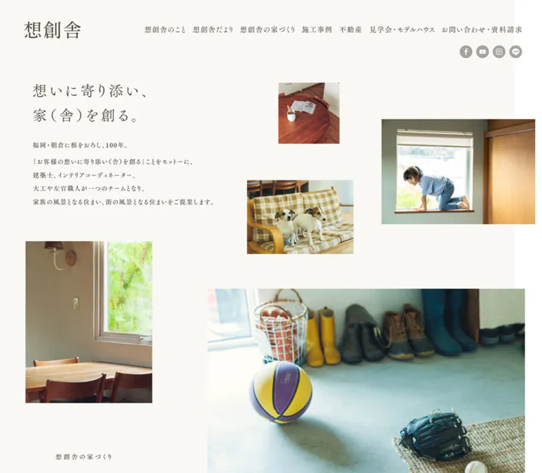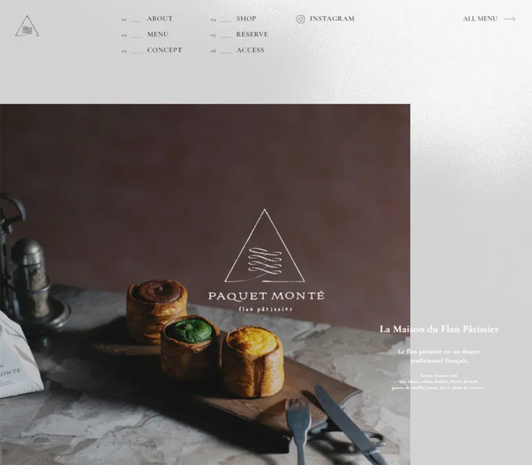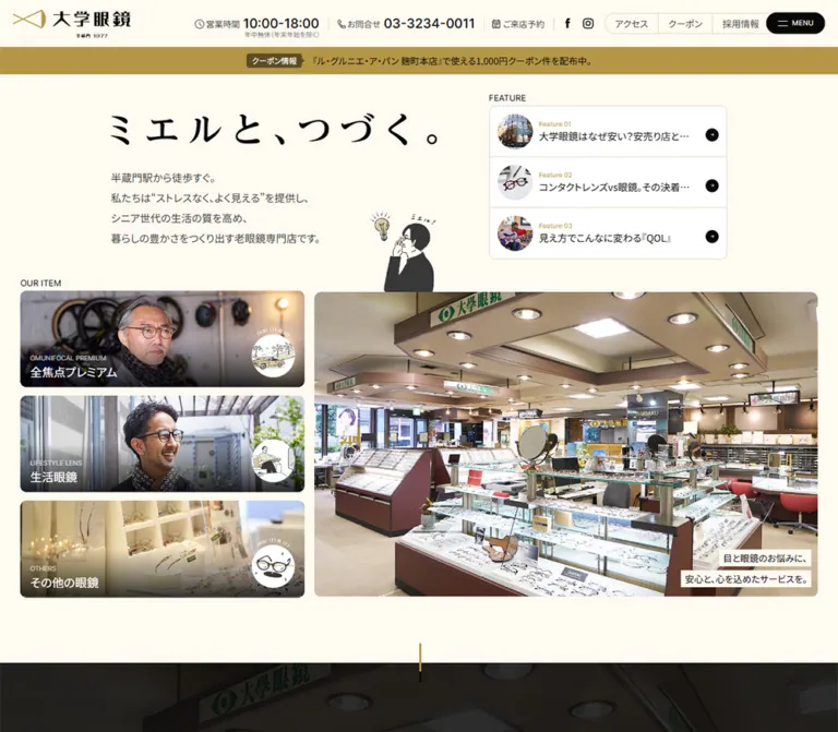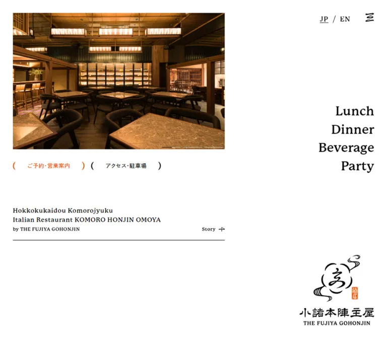
プレビュー準備中デザインリファレンスを見る
日本のWebデザインを、AIの制作リファレンスに。
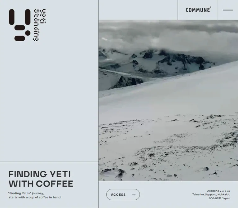
DESIGN REFERENCE
雪山のビジュアル、淡いブルーグレー、細い罫線、非対称の写真配置が印象的なコーヒースタンドの公式サイト。店舗の世界観とメニュー、アクセス情報を一つの長いページで紹介。
オリジナルサイトを見るA coffee stand presented through glacial scenery, architectural rules, and carefully placed empty space.
Original URL: https://yeti-standing.jp/ Final URL: https://yeti-standing.jp/ Theme: light, with a cool opening surface, neutral gray content surfaces, and photographic contrast. Inspected: supplied captures dated September 17, 2026, 04:04:25 JST; retrieval timestamp September 16, 2026, 19:04:25.328 UTC. Viewports: desktop 1440 × 1000 CSS pixels; mobile 390 × 844 CSS pixels. Scope: the current coffee stand and brand website, including the opening composition, section navigation, a photographed portion of STORY, the lower access map, closing image, and footer. Rendered DOM evidence additionally covers story copy, menu descriptions, discovery content, and business information. Open navigation, menu detail states, and outbound destinations were not visually inspected.
YETI STANDING connects a small coffee destination in Sapporo with the idea of searching for an elusive mountain creature. Its design makes that connection through a large snow landscape, a distinctive rounded-symbol logo, restrained English labels, and a pale architectural framework. The opening screen gives almost one third of the desktop width to identity and empty space, while the remaining area contains navigation, scenery, and an access strip.
Further down, a neutral gray canvas supports section tabs, staggered photographs, compact information, and a fine-line location map. White counters, coffee equipment, and sparse interiors continue the snowy palette without removing the natural warmth of wood and skin. The strongest reusable relationship is between large quiet surfaces and small, precisely aligned details.
A coffee stand presented through glacial scenery, architectural rules, and carefully placed empty space.
Original URL: https://yeti-standing.jp/ Final URL: https://yeti-standing.jp/ Theme: light, with a cool opening surface, neutral gray content surfaces, and photographic contrast. Inspected: supplied captures dated September 17, 2026, 04:04:25 JST; retrieval timestamp September 16, 2026, 19:04:25.328 UTC. Viewports: desktop 1440 × 1000 CSS pixels; mobile 390 × 844 CSS pixels. Scope: the current coffee stand and brand website, including the opening composition, section navigation, a photographed portion of STORY, the lower access map, closing image, and footer. Rendered DOM evidence additionally covers story copy, menu descriptions, discovery content, and business information. Open navigation, menu detail states, and outbound destinations were not visually inspected.
YETI STANDING connects a small coffee destination in Sapporo with the idea of searching for an elusive mountain creature. Its design makes that connection through a large snow landscape, a distinctive rounded-symbol logo, restrained English labels, and a pale architectural framework. The opening screen gives almost one third of the desktop width to identity and empty space, while the remaining area contains navigation, scenery, and an access strip.
Further down, a neutral gray canvas supports section tabs, staggered photographs, compact information, and a fine-line location map. White counters, coffee equipment, and sparse interiors continue the snowy palette without removing the natural warmth of wood and skin. The strongest reusable relationship is between large quiet surfaces and small, precisely aligned details.
| Name | Value | Suggested token | Evidence and role |
|---|---|---|---|
| Frost | Approximately #dae3e7 |
--frost |
Visual estimate of the opening identity panel, navigation surface, headline panel, and access strip |
| Gallery Gray | #e8e8e8 |
--paper |
Measured rgb(232, 232, 232) on section heading surfaces and the footer; visually consistent with the gallery canvas |
| Graphic Ink | Approximately #333333 |
--ink |
Visual estimate for prominent graphic lettering and much of the interface linework |
| Text Black | #000000 |
--text |
Measured computed color on ordinary paragraphs and links |
| Logo Brown | Approximately #251914 |
--logo-ink |
Visual estimate of the dark warm logo artwork; preserve the asset rather than recoloring it from this estimate |
| Reverse White | #ffffff |
--reverse |
Measured on Japanese story paragraphs; visually present in the closing image labels |
| Fine Rule | Approximately #4a4a4a |
--rule |
Visual estimate for the thin structural borders |
The distinction between Frost and Gallery Gray is subtle but useful. The opening feels cold and atmospheric; later content feels like a neutral exhibition surface. Do not flatten both into pure white.
The body reports a white background, but many visible regions have their own surfaces or media. The body declaration alone does not describe the rendered page palette.
Numerous WordPress gradient, color, and shadow presets appear in the custom properties. They are not evidence that those colors or shadows appear in this design. Likewise, the exposed Swiper blue variable does not establish a blue brand accent.
A vivid blue ring appears over the map in the mobile capture. Its origin is not established: it could be a map treatment or a capture-related pointer indicator. Exclude it from the reusable brand palette until independently verified.
Measured family: Montserrat, followed by Japanese sans-serif fallbacks.
Montserrat is declared for the opening sentence, address, product titles, small reference URLs, and Instagram text. Most ordinary Latin content uses weight 500. Tracking is deliberate even at small sizes, helping compact information feel ordered rather than dense.
Do not automatically assign Montserrat to every large English label. Several prominent headings and navigation labels have empty extracted text while remaining visible in the screenshots. Their rendered lettering may be supplied as artwork; their actual font is not established by the wrapper styles.
Measured stack: 'Noto Sans JP', '游ゴシック Medium', YuGothic, YuGothicM, 'Hiragino Kaku Gothic ProN', メイリオ, Meiryo, sans-serif.
Menu explanations and discovery paragraphs use weight 500, generous line height, and roughly 0.1em tracking. Although the body inherits weight 300, that is not the weight of these measured content paragraphs.
Measured first family: 'FOT-筑紫ゴシック Pr5 M'.
Story paragraphs use weight 500, white text, and an unusually open 2.9 line-height ratio. Tracking is 0.2em on desktop and 0.15em on mobile. This creates a slow, spacious reading cadence distinct from the practical menu descriptions.
The supplied screenshots do not show these paragraphs closely enough to establish their complete background treatment or reveal sequence.
Measured first family: 'TT Firs Neue' on the READ MORE links associated with Yeti reference content.
This is a limited DOM-supported role, not evidence that TT Firs Neue is the primary display family. The reference panels were not visually opened.
The desktop identity combines a rounded symbol with compact dotted or segmented lettering. Mobile uses a horizontal, two-line wordmark treatment instead of the full desktop symbol composition.
The large FINDING YETI WITH COFFEE lettering and section labels look bold and geometric. Their parent elements report ordinary 12px or 12.48px typography, which does not account for their visible size. Preserve authorized artwork where available. A bold sans-serif substitution is an adaptation, not an exact font identification.
Values are desktop / mobile unless stated otherwise.
| Role | Size | Line height | Weight | Tracking | Status |
|---|---|---|---|---|---|
| Root | 10px / 10.4px |
10px / 10.4px |
300 |
Normal | Measured |
| Body default | 12px / 12.48px |
12px / 12.48px |
300 |
Normal | Measured inheritance, not a body-copy recommendation |
| Opening sentence | 15.4px / 12.48px |
23.1px / 18.72px |
500 |
0.77px / 0.624px |
Measured Montserrat |
| Opening address | 12.54px / 10.4px |
18.81px / 14.56px |
500 |
0.3135px / 0.52px |
Measured Montserrat |
| Japanese story | 20px / 13px |
58px / 37.7px |
500 |
4px / 1.95px |
Measured Tsukushi stack |
| Product title | 15px / 15.6px |
22.5px / 23.4px |
500 |
0.75px / 0.78px |
Measured Montserrat stack |
| Product and discovery copy | 13px / 12.48px |
23.4px / 21.216px |
500 |
1.3px / 1.248px |
Measured Japanese stack |
| Instagram text | 12px / 12.48px |
12px / 12.48px |
500 |
1.2px / 1.248px |
Measured Montserrat |
Supplemental READ MORE |
11px / 11.44px |
11px / 11.44px |
400 |
0.6px / 0.624px |
Measured, visibility unverified |
| Supplemental source URL | 8px / 8.58px |
12px / 12.87px |
300 |
0.4px / 0.429px |
Measured, visibility unverified |
| Opening display lettering | About 42px / 38px |
About 46px / 42px |
Visually bold | Not measured | Screenshot estimate; artwork family unknown |
| Desktop navigation lettering | About 20px |
Not measured | Visually bold | Slightly open | Screenshot estimate |
| Closing display lettering | About 34px / 22px |
Not measured | Visually bold | Compact | Screenshot estimate |
The observed root size changes from 10px to 10.4px between the two inspected viewports. The evidence does not provide the formula or media query that produces this change.
The source property --sp-global-padding: 1.6rem resolves to 16.64px at the mobile viewport. Measured content starts at approximately 16.625px after layout rounding. Preserve that connection when interpreting mobile spacing; do not copy source rem values into a project with a conventional 16px root without conversion.
The Quick Start keeps a conventional root and uses explicit dimensions instead.
| Use | Value | Evidence |
|---|---|---|
| Structural divider | Approximately 1px |
Visual estimate supported by adjacent rectangle offsets |
| Mobile global inset | 16.64px before rounding |
Source variable and measured root |
| Desktop identity inset | 40px |
Measured logo position |
| Desktop access-strip inset | 35px |
Measured button and address positions relative to the right panel |
| Desktop section-tab horizontal padding | 33.81px |
Measured |
| Mobile section-tab horizontal padding | 37.14px |
Measured |
| Gallery image spacing | About 40px |
Screenshot estimate |
| Desktop menu-row padding | 47px 80px |
Measured heading wrappers |
| Mobile menu-heading padding | 31.2px 16.64px 16.64px |
Measured wrappers; complete visible composition unverified |
| Story line interval | 58px / 37.7px |
Measured desktop / mobile |
The spacing system has two distinct scales: compact utility details and very large compositional gaps. The blank area below the desktop logo is intentional. Do not fill it with secondary slogans or decorative widgets.
| Element | Treatment | Evidence |
|---|---|---|
| Photography and structural panels | Square | Visible screenshots |
| Section tabs | Square | Visible screenshots and measured zero radius |
| ACCESS link | Fully rounded capsule | Measured radius 1440px desktop and 844px mobile; these values simply ensure a pill |
| Menu document link | Rounded left end, square right end | DOM reports 1440px 0 0 1440px desktop and 844px 0 0 844px mobile; link is offscreen in the sampled state |
| Logo | Rounded bars and dot | Artwork geometry, not a general component radius |
Use 999px for a reusable pill. There is no reason to retain viewport-sized radius numbers in an adaptation.
| Element | Desktop 1440 × 1000 | Mobile 390 × 844 | Evidence |
|---|---|---|---|
| Document height | 7321px |
7994px |
Reported DOM document height |
| Opening header | 1000 × 90px, starting at x=440 |
390 × 90px |
Measured |
| Desktop left opening column | About 440px, or 30.56% |
Removed as a separate column | Header geometry and screenshot |
| Desktop identity artwork | 163.19 × 143.28px at (40, 40) |
Different wordmark arrangement | Measured heading box |
| Mobile wordmark link | Not applicable | 138.70 × 55.72px at approximately (16.63, 16.64) |
Measured |
| COMMUNE link artwork | 120 × 31.69px |
72.80 × 19.22px |
Measured link bounds |
| Mobile menu cell | Not shown in the desktop capture | 90 × 90px at x=300 |
Measured |
| Snow visual | About 1000 × 790px |
About 390 × 530px |
Screenshot estimate |
| Headline panel | About 440 × 220px |
About 390 × 153px |
Screenshot estimate |
| Opening access strip | About 1000 × 120px |
About 390 × 72px |
Screenshot estimate |
| ACCESS link | 150 × 50px |
156 × 37.52px |
Measured |
| Section-tab height | Source 59px; wrapper 59px |
Source 62px; wrapper approximately 63px |
Measured; mobile includes a rule |
| Footer | 1440 × 81px |
390 × 84.19px |
Measured |
Role: establish identity, atmosphere, and location in one screen.
At desktop, a vertical divider at approximately x=440 separates the identity column from the 1000px-wide media column. The left side contains the logo near the upper-left corner and the two-line display message at the bottom. The empty space between them is a major visual element.
The right side stacks a 90px navigation band, the snow landscape, and an access strip. Its lower media boundary is around y=880, while the left headline panel begins around y=780. This intentionally produces different horizontal divisions on the two sides of the same vertical grid line.
The headline reads FINDING YETI / WITH COFFEE. Beneath it, a small two-line sentence supplies the human scale. Keep the sentence close to the headline rather than floating it in the empty identity area.
Desktop anatomy: four section links, small vertical separators, and a separately bordered COMMUNE cell at the right edge. The measured section destinations are #story, #menu, #find, and #info.
Mobile anatomy: a wordmark cell, a COMMUNE cell, and a 90px square menu control. The visible control uses two thin horizontal strokes rather than a three-line hamburger. The center cell occupies approximately 144.67px at 390px width.
The mobile header remains visible at the top of both supplied mobile captures. Its exact positioning mechanism is not exposed. The lower capture uses a neutral gray surface, while the opening capture uses the cooler surface.
The DOM contains mobile navigation links with roughly 249 × 77px boxes, but the screenshots show the closed header. Do not infer the panel background, entrance direction, open-state geometry, or focus behavior from these boxes alone.
The desktop symbol consists of two upright rounded bars, two shorter horizontal bars, and a circular dot, accompanied by compact segmented lettering. Mobile emphasizes the segmented wordmark in a horizontal arrangement.
This is identity artwork. A generic geometric font, a stock mountain icon, or a CSS approximation of the logo would lose an important part of the reference.
Anatomy: an outlined pill at the left, a fine arrow at its right end, and a right-aligned three-line address at the far right.
The link points to #info. Its background-color transition is measured at 250ms, but the resulting hover color was not captured.
The surrounding strip is rectangular and divided from the landscape by a fine rule. The pill is the main rounded interface element; its softness is effective because most nearby geometry stays square.
At mobile width, the button and address remain side by side. The address becomes smaller instead of moving beneath the button.
Role: expose the four major chapters of the long page.
Desktop tabs are outlined rectangular cells with the labels STORY, MENU, LET'S FIND YETI, and INFO. Source widths are 136px, 130px, 234px, and 118px. Their measured x positions are 0, 135, 264, and 497px, producing a right edge at 615px through shared or overlapping borders.
The gallery capture shows STORY at the upper viewport edge while the remaining tabs sit near the bottom. The closing capture shows all four tabs across the top. This supports a scroll-dependent arrangement of section tabs. It does not establish a particular sticky algorithm, animation curve, or script library.
Mobile heading wrappers instead occur at separate document positions, with widths of 135px, 129px, 222px, and 117px. Do not force the complete desktop rail into a 390px row without additional evidence.
Three measured Japanese text blocks develop the Yeti-search concept. Their desktop widths are approximately 444–560px, centered across the page. On mobile, widths vary from about 273px to 345px.
The defining typographic feature is the large line interval: 20px text on 58px lines at desktop, and 13px text on 37.7px lines on mobile. White text and deliberate line breaks distinguish these passages from ordinary descriptions.
The supplied captures do not establish the complete visual background of these passages. Preserve the measured typographic rhythm without inventing a specific scroll reveal or overlay effect.
Role: translate the abstract snowy identity into a physical coffee space.
The desktop gallery occupies an approximately 1000px-wide cluster centered between x=220 and x=1220. It has two 480px tracks separated by about 40px. Smaller images occupy 320px widths and align toward the inner seam.
The fully visible right-hand interior image is approximately 480 × 320px. The lower-left portrait image is approximately 320 × 480px. The upper two photographs are cropped by the viewport, so their complete displayed heights cannot be established from this capture.
Each track advances independently: the left upper image ends around y=306 and the portrait begins around y=345; the upper-right image ends around y=224 and the wider interior image starts around y=263. This is a staggered composition with consistent local gaps, not a row of matching cards.
There are no visible captions, rounded frames, shadows, or badges in this captured gallery region. The gray canvas and blank areas perform the grouping.
Evidence level: rendered DOM and computed styles; opened details were not visually inspected.
Five desktop category-heading wrappers form rows approximately 115px tall, separated by about 1px. Their measured padding is 47px vertically and 80px horizontally.
Extracted content includes mild blend coffee, cold brew, Japanese tea, seasonal drinks, cookies, soft cream, and affogato variations. Product headings use 15px Montserrat at weight 500. Japanese descriptions use 13px text, 23.4px line height, and 1.3px tracking.
Several desktop descriptions share the same 298px-wide region at x=901, and nearby button boxes measure about 26.16px square. These overlapping rectangles are consistent with alternative detail containers, but they do not prove whether the interface uses dialogs, drawers, hover panels, or another presentation.
The mobile DOM changes text widths and positions, with some regions approximately 357px wide and others 298px wide. Do not treat these extracted coordinates as a complete screenshot of the menu experience.
A separate link points to the menu document at /wp/wp-content/uploads/2024/09/menu.pdf. The file was not opened, and its contents and appearance are outside this reference.
The DOM describes an adjoining lifestyle store, WONDERING, and another block about recommended places to visit.
On desktop, the first text group starts at x=40 and the second at approximately x=880, both around 520px wide. On mobile, both use the same approximately 356.75px content width and 16.625px inset. This supports an alternating desktop arrangement that becomes a shared mobile column.
The destination https://wondering.jp/ is present as a link. Its website was not inspected, and no visual or attribution conclusions are drawn from it.
Role: make the real destination easy to locate after the atmospheric content.
The extracted information includes the address, a time range, a weekday line, parking information, email, phone, and Instagram. Keep these details compact and aligned; they function as practical information rather than promotional cards.
The desktop lower capture shows the information region and map separated by a vertical rule at approximately x=839. Mobile places a full-width GOOGLE MAP link row above the diagram.
The map is a designed illustration: thin roads, dashed railway tracks, small uppercase place labels, mountain chevrons, coast hatching, and directional arrows. It is not visually presented as an embedded interactive map tile interface. The separate map link points to a Google Maps short URL.
On mobile, the map occupies almost 400px of vertical space below its link row. Preserve the diagram's aspect ratio and legibility rather than stretching it into a shallow banner.
A wide snow image returns after the location information, creating a visual connection to the opening. White DID YOU FIND IT? lettering sits above a smaller hashtag.
The desktop image region is approximately 650px tall in the supplied lower capture. The mobile version is approximately 210px tall and shows a much less detailed crop. The evidence does not establish whether that difference comes only from cropping, from a different media frame, or from both.
The visible hashtag uses #yeti_standing, and its anchor points to the corresponding Instagram tag destination. Center the two text lines as one group, with enough separation to preserve their different scales.
A neutral gray strip with a thin top border closes the page. The brand name and Japanese reading sit at the left; the small copyright line sits at the right. Desktop horizontal insets are visually about 40px, while mobile insets are about 20px.
The original page visibly includes © YETI STANDING BY COMMUNE and a header link to COMMUNE. These are supported identity details. The evidence does not identify separate website design or development roles.
| Feature | Evidence | What can be reproduced confidently | Limitations |
|---|---|---|---|
| ACCESS link | Computed background-color 0.25s |
A short color transition on the outlined capsule | Hover endpoint and easing were not supplied |
| Instagram text | Computed opacity 0.25s |
A restrained opacity transition | Actual hover opacity was not captured |
| Closing hashtag wrapper | Computed opacity 0.25s |
The same short opacity treatment | Trigger and endpoint unverified |
| Section navigation | Anchor destinations and different settled scroll captures | Four real section links and a rail that responds to page position | Exact sticky boundaries and motion implementation unknown |
| Mobile navigation | Visible menu control and extracted navigation links | A menu affordance for the same four destinations | Open state, closing behavior, animation, and focus management unverified |
| Snow imagery | Static views of the landscape | Large cover-style imagery with restrained contrast | Video playback, looping, duration, and audio are not established |
| Product details | Content, overlapping boxes, and button nodes | Product hierarchy and typography | Opening mechanism and active-state layout unverified |
| Supplemental Yeti references | Repeated READ MORE links and reference text |
The existence of supporting reference content | Reveal mechanism and visible panel treatment unverified |
Many nodes report animation: none and a transition string of all without a duration in the supplied record. Those values do not demonstrate a page-wide animation system or prove that all media is static.
The capture process waited for finite animation and layout stability and temporarily paused perpetual animations during readiness checks. That procedure is not itself evidence of a particular site animation. Do not invent parallax speeds, reveal delays, autoplay settings, or a JavaScript library.
Recommended adaptation: use 250ms transitions for small color and opacity changes. Keep other movement optional until its purpose is defined. Respect reduced-motion preferences and provide a static alternative if moving scenery is introduced.
| Layer | Appearance | Purpose |
|---|---|---|
| Opening framework | Pale cool gray-blue, thin dark rules | Unifies identity, navigation, headline, and access |
| Section canvas | Solid #e8e8e8 |
Holds photographs, navigation, and practical content |
| Photographs | Square edges, no visible elevation | Supply atmosphere, material detail, and warmth |
| Section tabs | Same gray as the page, outlined rectangular cells | Organize the long page without introducing a separate card system |
| ACCESS control | Transparent outlined pill | Small, clear utility action |
| Location diagram | Fine dark linework on gray | Connects the visual identity to a usable place reference |
| Closing media | Snow imagery with centered white labels | Returns to the search narrative |
| Footer | Flat gray with a top rule | Quiet final identity and copyright |
No general shadow or elevation system is visible. Boundaries come from rules, cropping, whitespace, and changes between image and solid surface.
Use cold, low-saturation mountain scenery with cloud cover, deep rocky detail, and broad areas of snow. The landscape should contain both texture and emptiness: the empty snow gives the composition room to breathe, while the dark mountain structure prevents it from becoming a blank gray rectangle.
The coffee-space photographs are equally controlled. Visible subjects include a person pouring coffee, repeated brewing equipment, a pale branded architectural surface, and a wide view of the service counter. White and gray dominate, with wood flooring and skin tones providing restrained natural color.
Do not infer a CSS grayscale filter or dark overlay from the final appearance. The supplied evidence does not separate image grading from browser-applied effects.
The map belongs to the same graphic system as the borders: thin strokes, abbreviated labels, schematic geometry, and minimal fill. Its usefulness depends on preserving the actual relationships between roads, railways, and the destination.
No image, logo, map, or media asset URLs were included in the supplied evidence. The references below identify visible material without inventing filenames.
| Material | Current-page evidence | Implementation guidance |
|---|---|---|
| Desktop symbol and segmented wordmark | Opening desktop capture and measured identity box | Use authorized artwork and preserve its arrangement |
| Mobile horizontal wordmark | Both mobile captures and measured header link | Provide a separate responsive identity arrangement |
| Snow landscape | Opening and closing captures | Use an appropriate responsive crop; motion remains unverified |
| Coffee preparation photographs | Desktop STORY gallery capture | Preserve soft light, white equipment, and controlled framing |
| Architectural photographs | Desktop STORY gallery capture | Keep portrait and landscape formats distinct |
| Illustrated location map | Lower desktop and mobile captures | Use an accurate, scalable diagram with a text-based location alternative |
Ordinary photography should retain natural image interpolation. Pixelated rendering, distressed halftones, glossy mockups, and decorative gradients are not part of the observed treatment.
The opening fills the captured viewport. Its left column is about 30.56% of the width, while the right column contains the main visual. The logo, headline, and access information occupy different vertical bands, producing a grid with deliberately offset horizontal divisions.
After the opening, the document continues vertically rather than remaining a fixed application shell. The reported document height is 7321px. Section tabs help maintain orientation as the content changes.
The gallery uses two independent image tracks within an approximately 1000px composition. Discovery text groups alternate sides. The lower location region divides text and diagram into separate columns, and the closing landscape spans the page.
The opening order becomes header, landscape, headline and sentence, then access information. The large empty desktop identity column disappears. The landscape still receives roughly 530px of height, so the first screen remains primarily visual.
The 90px header height is preserved. Its navigation links are replaced visually by the menu control, while the logo and COMMUNE mark remain visible.
The display message remains two lines and nearly fills the usable width. Body text and the address scale down; the ACCESS pill and address retain their side-by-side relationship.
The lower map becomes a full-width block beneath its link row. The closing image becomes considerably shallower, and the footer keeps the brand and copyright on opposite sides. The document height increases to approximately 7994px.
Only the two stated viewports were inspected. The source breakpoint, tablet composition, landscape-phone layout, and gallery arrangement on mobile are not established.
The Quick Start uses a recommended 1280px breakpoint to protect the wide opening navigation. It is a practical starting point, not a recovered source media query. Test intermediate widths with the real artwork and copy before choosing the final threshold.
These are recommendations for a new implementation, not verified features of the original site.
aria-expanded and aria-controls. Keep hidden navigation out of the keyboard sequence and implement appropriate closing and focus behavior.#dae3e7; visual estimate.#e8e8e8; measured.#333333; visual estimate.#000000; measured computed value.#4a4a4a, about 1px.“Create a coffee stand website inspired by the current YETI STANDING composition. Use a cool pale gray-blue opening, neutral gray content sections, thin dark rules, square photography, and small tracked utility text. At a wide desktop viewport, reserve about 31% of the opening width for a logo above a large quiet area and a two-line display message at the bottom. Place section navigation, a large snowy mountain visual, and a compact access strip in the remaining column. On mobile, use a 90px three-cell header, then stack the landscape, message, and access strip. Continue with spacious story text, staggered architectural and coffee photographs, understated menu content, a fine-line location map, and a closing snowy image. Use authorized identity artwork. Treat unspecified menu states and media motion as new design decisions rather than recovered source behavior.”
This is a recommended implementation scaffold, not copied source CSS. It uses measured values where available and explicitly estimated palette and display values elsewhere. It retains a conventional root font size.
Expected opening hierarchy: .site-hero contains .hero-brand, .site-header, .hero-media, .hero-copy, and .access-row. The header contains .mobile-brand, .primary-nav, .commune-link, and .menu-toggle. The copy contains a heading and paragraph; the access row contains a link and address.
Supply authorized images and logos as actual image elements. The font declarations below do not download fonts. Use licensed font files or suitable fallbacks. The display heading uses bold Montserrat as an approximation because its original artwork font is unknown.
The mobile header is fixed in this adaptation. Set data-header-tone='paper' on the root element when the neutral content surface should replace its opening color. Menu behavior and the original section-tab choreography require separate implementation. The desktop tab strip below is a simpler sticky navigation alternative; retain semantic headings inside every section.
:root {
  /* Measured colors, plus explicitly estimated visual matches */
  --paper: #e8e8e8;
  --frost: #dae3e7; /* Estimated opening surface */
  --ink: #333333; /* Estimated graphic lettering */
  --text: #000000;
  --reverse: #ffffff;
  --rule: #4a4a4a; /* Estimated border color */

  --font-jp: 'Noto Sans JP', 'Yu Gothic', Meiryo, sans-serif;
  --font-latin: Montserrat, var(--font-jp);
  --font-story: 'FOT-筑紫ゴシック Pr5 M', var(--font-jp);

  --inset: 16.64px;
  --header-height: 90px;
  --tab-height: 59px;
  --rule-width: 1px;
  --radius-pill: 999px;
  --motion-utility: 250ms;
}

* { box-sizing: border-box; }

body {
  margin: 0;
  color: var(--text);
  background: var(--paper);
  font-family: var(--font-jp);
}

img { max-width: 100%; }
button, a { -webkit-tap-highlight-color: transparent; }
button { font: inherit; }
a { color: inherit; }

.site-hero {
  display: grid;
  grid-template-rows: var(--header-height) minmax(360px, 1fr) auto auto;
  height: 100svh;
  min-height: 780px;
  background: var(--frost);
}

.hero-brand { display: none; }

.site-header {
  position: fixed;
  inset: 0 0 auto;
  z-index: 30;
  display: grid;
  grid-template-columns: minmax(0, 1fr) clamp(100px, 37.1vw, 145px) 90px;
  height: var(--header-height);
  background: var(--frost);
  border-bottom: var(--rule-width) solid var(--rule);
}

html[data-header-tone='paper'] .site-header {
  background: var(--paper);
}

.mobile-brand,
.commune-link {
  display: flex;
  align-items: center;
}

.mobile-brand {
  min-width: 0;
  padding-left: var(--inset);
}

.mobile-brand img {
  display: block;
  width: 139px;
  height: auto;
}

.commune-link {
  justify-content: center;
  border-inline: var(--rule-width) solid var(--rule);
}

.commune-link img {
  display: block;
  width: 73px;
  height: auto;
}

.primary-nav { display: none; }

.menu-toggle {
  display: grid;
  place-content: center;
  gap: 6px;
  padding: 0;
  border: 0;
  color: var(--ink);
  background: transparent;
  cursor: pointer;
}

.menu-toggle span {
  width: 44px;
  height: 1px;
  background: currentColor;
}

.hero-media {
  grid-row: 2;
  min-height: 0;
  overflow: hidden;
}

.hero-media > img,
.hero-media > video {
  display: block;
  width: 100%;
  height: 100%;
  object-fit: cover;
  object-position: center;
}

.hero-copy {
  grid-row: 3;
  padding: 12px var(--inset);
  border-top: var(--rule-width) solid var(--rule);
}

.hero-copy h1 {
  margin: 0;
  color: var(--ink);
  font-family: var(--font-latin);
  font-size: clamp(30px, 9.74vw, 38px);
  font-weight: 700;
  line-height: 1.1;
}

.hero-copy p {
  margin: 8px 0 0;
  font-family: var(--font-latin);
  font-size: 12.48px;
  font-weight: 500;
  line-height: 1.5;
  letter-spacing: 0.05em;
}

.access-row {
  grid-row: 4;
  display: flex;
  align-items: center;
  justify-content: space-between;
  gap: 16px;
  padding: 12px var(--inset);
  border-top: var(--rule-width) solid var(--rule);
}

.access-link {
  display: flex;
  flex: 0 0 156px;
  align-items: center;
  justify-content: space-between;
  min-height: 44px; /* Recommended increase from the observed mobile height */
  padding-inline: 16.64px;
  border: var(--rule-width) solid var(--rule);
  border-radius: var(--radius-pill);
  color: var(--ink);
  font: 600 11px / 1 var(--font-latin);
  letter-spacing: 0.06em;
  text-decoration: none;
  transition: background-color var(--motion-utility);
}

.access-row address {
  margin: 0;
  font-family: var(--font-latin);
  font-size: 10.4px;
  font-style: normal;
  font-weight: 500;
  line-height: 1.4;
  letter-spacing: 0.05em;
  text-align: right;
}

.section-tabs { display: none; }

section[id] {
  scroll-margin-top: calc(var(--header-height) + 16px);
}

.story-panel {
  padding: 100px var(--inset);
  color: var(--reverse);
  background: var(--ink); /* Recommended readable fallback, not a recovered background */
}

.story-text {
  max-width: 560px;
  margin: 0 auto 100px;
  font-family: var(--font-story);
  font-size: 13px;
  font-weight: 500;
  line-height: 2.9;
  letter-spacing: 0.15em;
}

.photo-gallery {
  display: grid;
  gap: 24px;
  width: min(1000px, calc(100% - 2 * var(--inset)));
  margin: 80px auto;
}

.gallery-column {
  display: flex;
  flex-direction: column;
  gap: 24px;
  min-width: 0;
}

.photo-gallery img {
  display: block;
  width: 100%;
  height: auto;
  border-radius: 0;
}

.gallery-landscape {
  aspect-ratio: 3 / 2;
  object-fit: cover;
}

.gallery-portrait {
  aspect-ratio: 2 / 3;
  object-fit: cover;
}

.product-title {
  margin: 0 0 6px;
  font: 500 15.6px / 1.5 var(--font-latin);
  letter-spacing: 0.05em;
}

.description {
  margin: 0;
  font: 500 12.48px / 1.7 var(--font-jp);
  letter-spacing: 0.1em;
}

.info-layout { display: grid; }

.info-copy { padding: 32px var(--inset); }

.map-link {
  display: flex;
  align-items: center;
  gap: 10px;
  min-height: 64px;
  font: 600 18px / 1.2 var(--font-latin);
  letter-spacing: 0.03em;
  text-decoration: none;
}

.map-panel {
  padding: var(--inset);
  border-block: var(--rule-width) solid var(--rule);
}

.map-panel img {
  display: block;
  width: 100%;
  height: auto;
}

.closing-banner {
  position: relative;
  isolation: isolate;
  display: grid;
  place-items: center;
  min-height: 210px;
  overflow: hidden;
  color: var(--reverse);
  background: #526166; /* Recommended media-loading fallback */
  text-align: center;
}

.closing-banner > img {
  position: absolute;
  inset: 0;
  z-index: -1;
  width: 100%;
  height: 100%;
  object-fit: cover;
}

.closing-banner h2 {
  margin: 0 0 16px;
  font: 700 22px / 1.2 var(--font-latin);
}

.closing-banner a {
  font: 600 14px / 1.4 var(--font-latin);
  letter-spacing: 0.05em;
  text-decoration: none;
  transition: opacity var(--motion-utility);
}

.site-footer {
  display: flex;
  align-items: center;
  justify-content: space-between;
  gap: 16px;
  min-height: 84px;
  padding: 18px 20px;
  border-top: var(--rule-width) solid var(--rule);
  background: var(--paper);
}

.footer-brand { font: 600 14px / 1.4 var(--font-latin); }
.footer-reading { display: block; font: 400 10px / 1.5 var(--font-jp); }
.footer-copyright { font: 300 9px / 1.5 var(--font-latin); letter-spacing: 0.04em; }

/* Recommended breakpoint; the original threshold was not supplied. */
@media (min-width: 1280px) {
  :root { --inset: 40px; }

  .site-hero {
    grid-template-columns: 30.5556% minmax(0, 1fr);
    grid-template-rows: 90px minmax(0, 1fr) 100px 120px;
    height: max(760px, 100svh);
    min-height: 0;
  }

  .hero-brand {
    display: block;
    grid-area: 1 / 1 / 3 / 2;
    padding: 40px;
    border-right: var(--rule-width) solid var(--rule);
  }

  .hero-brand img { display: block; width: 163.19px; height: auto; }

  .site-header {
    position: static;
    grid-area: 1 / 2 / 2 / 3;
    grid-template-columns: minmax(0, 1fr) 180px;
  }

  .mobile-brand, .menu-toggle { display: none; }
  .commune-link { border-right: 0; }
  .commune-link img { width: 120px; }

  .primary-nav {
    display: flex;
    align-items: center;
    gap: 76px;
    padding-inline: 52px;
  }

  .primary-nav a {
    position: relative;
    flex-shrink: 0;
    color: var(--ink);
    font: 700 20px / 1 var(--font-latin);
    white-space: nowrap;
    text-decoration: none;
  }

  .primary-nav a + a::before {
    content: '';
    position: absolute;
    left: -38px;
    top: 50%;
    height: 14px;
    border-left: var(--rule-width) solid var(--rule);
    transform: translateY(-50%);
  }

  .hero-media { grid-area: 2 / 2 / 4 / 3; }

  .hero-copy {
    grid-area: 3 / 1 / 5 / 2;
    padding: 34px 40px;
    border-right: var(--rule-width) solid var(--rule);
  }

  .hero-copy h1 { font-size: 42px; }
  .hero-copy p { margin-top: 12px; font-size: 15.4px; }

  .access-row {
    grid-area: 4 / 2 / 5 / 3;
    padding: 24px 35px;
  }

  .access-link { flex-basis: 150px; min-height: 50px; padding-inline: 20px; }
  .access-row address { font-size: 12.54px; line-height: 1.5; letter-spacing: 0.025em; }

  .section-tabs {
    position: sticky;
    top: 0;
    z-index: 20;
    display: flex;
    height: var(--tab-height);
    background: var(--paper);
    border-block: var(--rule-width) solid var(--rule);
  }

  .section-tabs a {
    display: grid;
    place-items: center;
    flex-shrink: 0;
    border-right: var(--rule-width) solid var(--rule);
    color: var(--ink);
    font: 700 20px / 1 var(--font-latin);
    text-decoration: none;
  }

  .section-tabs a:nth-child(1) { width: 136px; }
  .section-tabs a:nth-child(2) { width: 129px; }
  .section-tabs a:nth-child(3) { width: 233px; }
  .section-tabs a:nth-child(4) { width: 117px; }

  section[id] { scroll-margin-top: calc(var(--tab-height) + 16px); }
  .story-text { font-size: 20px; letter-spacing: 0.2em; }

  .photo-gallery { grid-template-columns: 1fr 1fr; gap: 40px; margin-block: 120px; }
  .gallery-column { gap: 40px; }
  .gallery-small { width: 66.6667% !important; }
  .gallery-column:first-child .gallery-small { align-self: flex-end; }
  .gallery-column:last-child .gallery-small { align-self: flex-start; }

  .product-title { font-size: 15px; }
  .description { font-size: 13px; line-height: 1.8; }

  .info-layout { grid-template-columns: 7fr 5fr; }
  .map-panel { border-left: var(--rule-width) solid var(--rule); }
  .closing-banner { min-height: 650px; }
  .closing-banner h2 { font-size: 34px; }
  .site-footer { min-height: 81px; padding-inline: 40px; }
}

/* Recommended interaction endpoints; only the durations were observed. */
@media (hover: hover) {
  .access-link:hover { background: rgba(0, 0, 0, 0.06); }
  .closing-banner a:hover { opacity: 0.7; }
}

.yeti-site :focus-visible {
  outline: 2px solid var(--ink);
  outline-offset: 4px;
}

.closing-banner :focus-visible {
  outline-color: var(--reverse);
}

@media (prefers-reduced-motion: reduce) {
  .yeti-site *,
  .yeti-site *::before,
  .yeti-site *::after {
    animation: none !important;
    transition: none !important;
    scroll-behavior: auto !important;
  }
}
The mobile gallery stacking, dark story fallback, header tone attribute, and simplified sticky rail are recommended implementation choices. They are not recovered original behaviors. If the opening visual is implemented as video, the CSS above only defines its geometry; playback and reduced-motion handling still require explicit logic.
Optional aliases for an implementation that already uses Tailwind v4. The original site's framework is not established by this mapping. Define the custom properties above first.
@theme inline {
  --color-yeti-paper: var(--paper);
  --color-yeti-frost: var(--frost);
  --color-yeti-ink: var(--ink);
  --color-yeti-text: var(--text);
  --color-yeti-rule: var(--rule);
  --color-yeti-reverse: var(--reverse);

  --font-yeti-latin: var(--font-latin);
  --font-yeti-jp: var(--font-jp);
  --font-yeti-story: var(--font-story);

  --spacing-yeti-inset: var(--inset);
  --spacing-yeti-header: var(--header-height);
  --spacing-yeti-tab: var(--tab-height);
  --spacing-yeti-gallery-gap: 40px;

  --text-yeti-body: 13px;
  --text-yeti-product: 15px;
  --text-yeti-story: 20px;
  --radius-yeti-pill: 999px;
}
#story, #menu, #find, and #info are present in the original page's link evidence. The menu document and external map, social, reference, and related-store links were identified but not opened.This reference describes the current supplied website evidence. Estimates and implementation recommendations remain separate from measured source values.
# YETI STANDING — Style Reference

> A coffee stand presented through glacial scenery, architectural rules, and carefully placed empty space.

**Original URL:** [https://yeti-standing.jp/](https://yeti-standing.jp/)
**Final URL:** [https://yeti-standing.jp/](https://yeti-standing.jp/)
**Theme:** light, with a cool opening surface, neutral gray content surfaces, and photographic contrast.
**Inspected:** supplied captures dated September 17, 2026, 04:04:25 JST; retrieval timestamp September 16, 2026, 19:04:25.328 UTC.
**Viewports:** desktop 1440 × 1000 CSS pixels; mobile 390 × 844 CSS pixels.
**Scope:** the current coffee stand and brand website, including the opening composition, section navigation, a photographed portion of STORY, the lower access map, closing image, and footer. Rendered DOM evidence additionally covers story copy, menu descriptions, discovery content, and business information. Open navigation, menu detail states, and outbound destinations were not visually inspected.

YETI STANDING connects a small coffee destination in Sapporo with the idea of searching for an elusive mountain creature. Its design makes that connection through a large snow landscape, a distinctive rounded-symbol logo, restrained English labels, and a pale architectural framework. The opening screen gives almost one third of the desktop width to identity and empty space, while the remaining area contains navigation, scenery, and an access strip.

Further down, a neutral gray canvas supports section tabs, staggered photographs, compact information, and a fine-line location map. White counters, coffee equipment, and sparse interiors continue the snowy palette without removing the natural warmth of wood and skin. The strongest reusable relationship is between large quiet surfaces and small, precisely aligned details.
# YETI STANDING — Style Reference

> A coffee stand presented through glacial scenery, architectural rules, and carefully placed empty space.

**Original URL:** [https://yeti-standing.jp/](https://yeti-standing.jp/)
**Final URL:** [https://yeti-standing.jp/](https://yeti-standing.jp/)
**Theme:** light, with a cool opening surface, neutral gray content surfaces, and photographic contrast.
**Inspected:** supplied captures dated September 17, 2026, 04:04:25 JST; retrieval timestamp September 16, 2026, 19:04:25.328 UTC.
**Viewports:** desktop 1440 × 1000 CSS pixels; mobile 390 × 844 CSS pixels.
**Scope:** the current coffee stand and brand website, including the opening composition, section navigation, a photographed portion of STORY, the lower access map, closing image, and footer. Rendered DOM evidence additionally covers story copy, menu descriptions, discovery content, and business information. Open navigation, menu detail states, and outbound destinations were not visually inspected.

YETI STANDING connects a small coffee destination in Sapporo with the idea of searching for an elusive mountain creature. Its design makes that connection through a large snow landscape, a distinctive rounded-symbol logo, restrained English labels, and a pale architectural framework. The opening screen gives almost one third of the desktop width to identity and empty space, while the remaining area contains navigation, scenery, and an access strip.

Further down, a neutral gray canvas supports section tabs, staggered photographs, compact information, and a fine-line location map. White counters, coffee equipment, and sparse interiors continue the snowy palette without removing the natural warmth of wood and skin. The strongest reusable relationship is between large quiet surfaces and small, precisely aligned details.

## How to Read This Reference

- **Measured** values come from the supplied rendered DOM, computed styles, element rectangles, or source custom properties.
- **Visual estimates** come from the supplied current-page screenshots. These include the opening background color, artwork lettering sizes, image crops, and photograph placement where element measurements were not supplied.
- **Recommendations** describe a new implementation. Proposed breakpoints, accessibility additions, CSS class names, and fallback behavior are not claims about the original code.
- **Font evidence** identifies computed family stacks. It does not independently prove which font rendered every glyph.
- **Visibility matters:** some extracted elements overlap or sit outside the viewport. Their presence establishes content and declared styling, not an exercised interaction or a simultaneously visible layout.
- The supplied comparison thumbnail contributes no design measurements or implementation assumptions to this document.

## Tokens — Colors

### Default Palette

| Name | Value | Suggested token | Evidence and role |
| --- | --- | --- | --- |
| Frost | Approximately `#dae3e7` | `--frost` | Visual estimate of the opening identity panel, navigation surface, headline panel, and access strip |
| Gallery Gray | `#e8e8e8` | `--paper` | Measured `rgb(232, 232, 232)` on section heading surfaces and the footer; visually consistent with the gallery canvas |
| Graphic Ink | Approximately `#333333` | `--ink` | Visual estimate for prominent graphic lettering and much of the interface linework |
| Text Black | `#000000` | `--text` | Measured computed color on ordinary paragraphs and links |
| Logo Brown | Approximately `#251914` | `--logo-ink` | Visual estimate of the dark warm logo artwork; preserve the asset rather than recoloring it from this estimate |
| Reverse White | `#ffffff` | `--reverse` | Measured on Japanese story paragraphs; visually present in the closing image labels |
| Fine Rule | Approximately `#4a4a4a` | `--rule` | Visual estimate for the thin structural borders |

The distinction between Frost and Gallery Gray is subtle but useful. The opening feels cold and atmospheric; later content feels like a neutral exhibition surface. Do not flatten both into pure white.

The body reports a white background, but many visible regions have their own surfaces or media. The body declaration alone does not describe the rendered page palette.

Numerous WordPress gradient, color, and shadow presets appear in the custom properties. They are not evidence that those colors or shadows appear in this design. Likewise, the exposed Swiper blue variable does not establish a blue brand accent.

A vivid blue ring appears over the map in the mobile capture. Its origin is not established: it could be a map treatment or a capture-related pointer indicator. Exclude it from the reusable brand palette until independently verified.

## Tokens — Typography

### Latin Text — Montserrat

**Measured family:** `Montserrat`, followed by Japanese sans-serif fallbacks.

Montserrat is declared for the opening sentence, address, product titles, small reference URLs, and Instagram text. Most ordinary Latin content uses weight `500`. Tracking is deliberate even at small sizes, helping compact information feel ordered rather than dense.

Do not automatically assign Montserrat to every large English label. Several prominent headings and navigation labels have empty extracted text while remaining visible in the screenshots. Their rendered lettering may be supplied as artwork; their actual font is not established by the wrapper styles.

### Japanese Body — Noto Sans JP and System Fallbacks

**Measured stack:** `'Noto Sans JP', '游ゴシック Medium', YuGothic, YuGothicM, 'Hiragino Kaku Gothic ProN', メイリオ, Meiryo, sans-serif`.

Menu explanations and discovery paragraphs use weight `500`, generous line height, and roughly `0.1em` tracking. Although the body inherits weight `300`, that is not the weight of these measured content paragraphs.

### Japanese Story — Tsukushi Gothic

**Measured first family:** `'FOT-筑紫ゴシック Pr5 M'`.

Story paragraphs use weight `500`, white text, and an unusually open `2.9` line-height ratio. Tracking is `0.2em` on desktop and `0.15em` on mobile. This creates a slow, spacious reading cadence distinct from the practical menu descriptions.

The supplied screenshots do not show these paragraphs closely enough to establish their complete background treatment or reveal sequence.

### Supplemental Reference Labels — TT Firs Neue

**Measured first family:** `'TT Firs Neue'` on the `READ MORE` links associated with Yeti reference content.

This is a limited DOM-supported role, not evidence that TT Firs Neue is the primary display family. The reference panels were not visually opened.

### Brand and Display Artwork

The desktop identity combines a rounded symbol with compact dotted or segmented lettering. Mobile uses a horizontal, two-line wordmark treatment instead of the full desktop symbol composition.

The large `FINDING YETI WITH COFFEE` lettering and section labels look bold and geometric. Their parent elements report ordinary 12px or 12.48px typography, which does not account for their visible size. Preserve authorized artwork where available. A bold sans-serif substitution is an adaptation, not an exact font identification.

### Type Scale

Values are desktop / mobile unless stated otherwise.

| Role | Size | Line height | Weight | Tracking | Status |
| --- | --- | --- | --- | --- | --- |
| Root | `10px / 10.4px` | `10px / 10.4px` | `300` | Normal | Measured |
| Body default | `12px / 12.48px` | `12px / 12.48px` | `300` | Normal | Measured inheritance, not a body-copy recommendation |
| Opening sentence | `15.4px / 12.48px` | `23.1px / 18.72px` | `500` | `0.77px / 0.624px` | Measured Montserrat |
| Opening address | `12.54px / 10.4px` | `18.81px / 14.56px` | `500` | `0.3135px / 0.52px` | Measured Montserrat |
| Japanese story | `20px / 13px` | `58px / 37.7px` | `500` | `4px / 1.95px` | Measured Tsukushi stack |
| Product title | `15px / 15.6px` | `22.5px / 23.4px` | `500` | `0.75px / 0.78px` | Measured Montserrat stack |
| Product and discovery copy | `13px / 12.48px` | `23.4px / 21.216px` | `500` | `1.3px / 1.248px` | Measured Japanese stack |
| Instagram text | `12px / 12.48px` | `12px / 12.48px` | `500` | `1.2px / 1.248px` | Measured Montserrat |
| Supplemental `READ MORE` | `11px / 11.44px` | `11px / 11.44px` | `400` | `0.6px / 0.624px` | Measured, visibility unverified |
| Supplemental source URL | `8px / 8.58px` | `12px / 12.87px` | `300` | `0.4px / 0.429px` | Measured, visibility unverified |
| Opening display lettering | About `42px / 38px` | About `46px / 42px` | Visually bold | Not measured | Screenshot estimate; artwork family unknown |
| Desktop navigation lettering | About `20px` | Not measured | Visually bold | Slightly open | Screenshot estimate |
| Closing display lettering | About `34px / 22px` | Not measured | Visually bold | Compact | Screenshot estimate |

## Tokens — Spacing & Shapes

### Responsive Unit

The observed root size changes from 10px to 10.4px between the two inspected viewports. The evidence does not provide the formula or media query that produces this change.

The source property `--sp-global-padding: 1.6rem` resolves to 16.64px at the mobile viewport. Measured content starts at approximately 16.625px after layout rounding. Preserve that connection when interpreting mobile spacing; do not copy source rem values into a project with a conventional 16px root without conversion.

The Quick Start keeps a conventional root and uses explicit dimensions instead.

### Spacing Scale

| Use | Value | Evidence |
| --- | --- | --- |
| Structural divider | Approximately `1px` | Visual estimate supported by adjacent rectangle offsets |
| Mobile global inset | `16.64px` before rounding | Source variable and measured root |
| Desktop identity inset | `40px` | Measured logo position |
| Desktop access-strip inset | `35px` | Measured button and address positions relative to the right panel |
| Desktop section-tab horizontal padding | `33.81px` | Measured |
| Mobile section-tab horizontal padding | `37.14px` | Measured |
| Gallery image spacing | About `40px` | Screenshot estimate |
| Desktop menu-row padding | `47px 80px` | Measured heading wrappers |
| Mobile menu-heading padding | `31.2px 16.64px 16.64px` | Measured wrappers; complete visible composition unverified |
| Story line interval | `58px / 37.7px` | Measured desktop / mobile |

The spacing system has two distinct scales: compact utility details and very large compositional gaps. The blank area below the desktop logo is intentional. Do not fill it with secondary slogans or decorative widgets.

### Border Radius

| Element | Treatment | Evidence |
| --- | --- | --- |
| Photography and structural panels | Square | Visible screenshots |
| Section tabs | Square | Visible screenshots and measured zero radius |
| ACCESS link | Fully rounded capsule | Measured radius `1440px` desktop and `844px` mobile; these values simply ensure a pill |
| Menu document link | Rounded left end, square right end | DOM reports `1440px 0 0 1440px` desktop and `844px 0 0 844px` mobile; link is offscreen in the sampled state |
| Logo | Rounded bars and dot | Artwork geometry, not a general component radius |

Use `999px` for a reusable pill. There is no reason to retain viewport-sized radius numbers in an adaptation.

### Layout Measurements

| Element | Desktop 1440 × 1000 | Mobile 390 × 844 | Evidence |
| --- | --- | --- | --- |
| Document height | `7321px` | `7994px` | Reported DOM document height |
| Opening header | `1000 × 90px`, starting at `x=440` | `390 × 90px` | Measured |
| Desktop left opening column | About `440px`, or `30.56%` | Removed as a separate column | Header geometry and screenshot |
| Desktop identity artwork | `163.19 × 143.28px` at `(40, 40)` | Different wordmark arrangement | Measured heading box |
| Mobile wordmark link | Not applicable | `138.70 × 55.72px` at approximately `(16.63, 16.64)` | Measured |
| COMMUNE link artwork | `120 × 31.69px` | `72.80 × 19.22px` | Measured link bounds |
| Mobile menu cell | Not shown in the desktop capture | `90 × 90px` at `x=300` | Measured |
| Snow visual | About `1000 × 790px` | About `390 × 530px` | Screenshot estimate |
| Headline panel | About `440 × 220px` | About `390 × 153px` | Screenshot estimate |
| Opening access strip | About `1000 × 120px` | About `390 × 72px` | Screenshot estimate |
| ACCESS link | `150 × 50px` | `156 × 37.52px` | Measured |
| Section-tab height | Source `59px`; wrapper `59px` | Source `62px`; wrapper approximately `63px` | Measured; mobile includes a rule |
| Footer | `1440 × 81px` | `390 × 84.19px` | Measured |

## Components

### Split Opening Composition

**Role:** establish identity, atmosphere, and location in one screen.

At desktop, a vertical divider at approximately x=440 separates the identity column from the 1000px-wide media column. The left side contains the logo near the upper-left corner and the two-line display message at the bottom. The empty space between them is a major visual element.

The right side stacks a 90px navigation band, the snow landscape, and an access strip. Its lower media boundary is around y=880, while the left headline panel begins around y=780. This intentionally produces different horizontal divisions on the two sides of the same vertical grid line.

The headline reads `FINDING YETI / WITH COFFEE`. Beneath it, a small two-line sentence supplies the human scale. Keep the sentence close to the headline rather than floating it in the empty identity area.

### Primary Header

**Desktop anatomy:** four section links, small vertical separators, and a separately bordered COMMUNE cell at the right edge. The measured section destinations are `#story`, `#menu`, `#find`, and `#info`.

**Mobile anatomy:** a wordmark cell, a COMMUNE cell, and a 90px square menu control. The visible control uses two thin horizontal strokes rather than a three-line hamburger. The center cell occupies approximately 144.67px at 390px width.

The mobile header remains visible at the top of both supplied mobile captures. Its exact positioning mechanism is not exposed. The lower capture uses a neutral gray surface, while the opening capture uses the cooler surface.

The DOM contains mobile navigation links with roughly 249 × 77px boxes, but the screenshots show the closed header. Do not infer the panel background, entrance direction, open-state geometry, or focus behavior from these boxes alone.

### Brand Mark

The desktop symbol consists of two upright rounded bars, two shorter horizontal bars, and a circular dot, accompanied by compact segmented lettering. Mobile emphasizes the segmented wordmark in a horizontal arrangement.

This is identity artwork. A generic geometric font, a stock mountain icon, or a CSS approximation of the logo would lose an important part of the reference.

### ACCESS Strip

**Anatomy:** an outlined pill at the left, a fine arrow at its right end, and a right-aligned three-line address at the far right.

The link points to `#info`. Its background-color transition is measured at 250ms, but the resulting hover color was not captured.

The surrounding strip is rectangular and divided from the landscape by a fine rule. The pill is the main rounded interface element; its softness is effective because most nearby geometry stays square.

At mobile width, the button and address remain side by side. The address becomes smaller instead of moving beneath the button.

### Section Navigation Tabs

**Role:** expose the four major chapters of the long page.

Desktop tabs are outlined rectangular cells with the labels `STORY`, `MENU`, `LET'S FIND YETI`, and `INFO`. Source widths are 136px, 130px, 234px, and 118px. Their measured x positions are 0, 135, 264, and 497px, producing a right edge at 615px through shared or overlapping borders.

The gallery capture shows STORY at the upper viewport edge while the remaining tabs sit near the bottom. The closing capture shows all four tabs across the top. This supports a scroll-dependent arrangement of section tabs. It does not establish a particular sticky algorithm, animation curve, or script library.

Mobile heading wrappers instead occur at separate document positions, with widths of 135px, 129px, 222px, and 117px. Do not force the complete desktop rail into a 390px row without additional evidence.

### Story Text

Three measured Japanese text blocks develop the Yeti-search concept. Their desktop widths are approximately 444–560px, centered across the page. On mobile, widths vary from about 273px to 345px.

The defining typographic feature is the large line interval: 20px text on 58px lines at desktop, and 13px text on 37.7px lines on mobile. White text and deliberate line breaks distinguish these passages from ordinary descriptions.

The supplied captures do not establish the complete visual background of these passages. Preserve the measured typographic rhythm without inventing a specific scroll reveal or overlay effect.

### Staggered Photo Gallery

**Role:** translate the abstract snowy identity into a physical coffee space.

The desktop gallery occupies an approximately 1000px-wide cluster centered between x=220 and x=1220. It has two 480px tracks separated by about 40px. Smaller images occupy 320px widths and align toward the inner seam.

The fully visible right-hand interior image is approximately 480 × 320px. The lower-left portrait image is approximately 320 × 480px. The upper two photographs are cropped by the viewport, so their complete displayed heights cannot be established from this capture.

Each track advances independently: the left upper image ends around y=306 and the portrait begins around y=345; the upper-right image ends around y=224 and the wider interior image starts around y=263. This is a staggered composition with consistent local gaps, not a row of matching cards.

There are no visible captions, rounded frames, shadows, or badges in this captured gallery region. The gray canvas and blank areas perform the grouping.

### Menu Content and Detail Containers

**Evidence level:** rendered DOM and computed styles; opened details were not visually inspected.

Five desktop category-heading wrappers form rows approximately 115px tall, separated by about 1px. Their measured padding is 47px vertically and 80px horizontally.

Extracted content includes mild blend coffee, cold brew, Japanese tea, seasonal drinks, cookies, soft cream, and affogato variations. Product headings use 15px Montserrat at weight 500. Japanese descriptions use 13px text, 23.4px line height, and 1.3px tracking.

Several desktop descriptions share the same 298px-wide region at x=901, and nearby button boxes measure about 26.16px square. These overlapping rectangles are consistent with alternative detail containers, but they do not prove whether the interface uses dialogs, drawers, hover panels, or another presentation.

The mobile DOM changes text widths and positions, with some regions approximately 357px wide and others 298px wide. Do not treat these extracted coordinates as a complete screenshot of the menu experience.

A separate link points to the menu document at `/wp/wp-content/uploads/2024/09/menu.pdf`. The file was not opened, and its contents and appearance are outside this reference.

### LET'S FIND YETI Content

The DOM describes an adjoining lifestyle store, WONDERING, and another block about recommended places to visit.

On desktop, the first text group starts at x=40 and the second at approximately x=880, both around 520px wide. On mobile, both use the same approximately 356.75px content width and 16.625px inset. This supports an alternating desktop arrangement that becomes a shared mobile column.

The destination `https://wondering.jp/` is present as a link. Its website was not inspected, and no visual or attribution conclusions are drawn from it.

### Information and Illustrated Map

**Role:** make the real destination easy to locate after the atmospheric content.

The extracted information includes the address, a time range, a weekday line, parking information, email, phone, and Instagram. Keep these details compact and aligned; they function as practical information rather than promotional cards.

The desktop lower capture shows the information region and map separated by a vertical rule at approximately x=839. Mobile places a full-width `GOOGLE MAP` link row above the diagram.

The map is a designed illustration: thin roads, dashed railway tracks, small uppercase place labels, mountain chevrons, coast hatching, and directional arrows. It is not visually presented as an embedded interactive map tile interface. The separate map link points to a Google Maps short URL.

On mobile, the map occupies almost 400px of vertical space below its link row. Preserve the diagram's aspect ratio and legibility rather than stretching it into a shallow banner.

### Closing Landscape and Hashtag

A wide snow image returns after the location information, creating a visual connection to the opening. White `DID YOU FIND IT?` lettering sits above a smaller hashtag.

The desktop image region is approximately 650px tall in the supplied lower capture. The mobile version is approximately 210px tall and shows a much less detailed crop. The evidence does not establish whether that difference comes only from cropping, from a different media frame, or from both.

The visible hashtag uses `#yeti_standing`, and its anchor points to the corresponding Instagram tag destination. Center the two text lines as one group, with enough separation to preserve their different scales.

### Footer

A neutral gray strip with a thin top border closes the page. The brand name and Japanese reading sit at the left; the small copyright line sits at the right. Desktop horizontal insets are visually about 40px, while mobile insets are about 20px.

The original page visibly includes `© YETI STANDING BY COMMUNE` and a header link to COMMUNE. These are supported identity details. The evidence does not identify separate website design or development roles.

## Tokens — Motion & Interaction

| Feature | Evidence | What can be reproduced confidently | Limitations |
| --- | --- | --- | --- |
| ACCESS link | Computed `background-color 0.25s` | A short color transition on the outlined capsule | Hover endpoint and easing were not supplied |
| Instagram text | Computed `opacity 0.25s` | A restrained opacity transition | Actual hover opacity was not captured |
| Closing hashtag wrapper | Computed `opacity 0.25s` | The same short opacity treatment | Trigger and endpoint unverified |
| Section navigation | Anchor destinations and different settled scroll captures | Four real section links and a rail that responds to page position | Exact sticky boundaries and motion implementation unknown |
| Mobile navigation | Visible menu control and extracted navigation links | A menu affordance for the same four destinations | Open state, closing behavior, animation, and focus management unverified |
| Snow imagery | Static views of the landscape | Large cover-style imagery with restrained contrast | Video playback, looping, duration, and audio are not established |
| Product details | Content, overlapping boxes, and button nodes | Product hierarchy and typography | Opening mechanism and active-state layout unverified |
| Supplemental Yeti references | Repeated `READ MORE` links and reference text | The existence of supporting reference content | Reveal mechanism and visible panel treatment unverified |

Many nodes report `animation: none` and a transition string of `all` without a duration in the supplied record. Those values do not demonstrate a page-wide animation system or prove that all media is static.

The capture process waited for finite animation and layout stability and temporarily paused perpetual animations during readiness checks. That procedure is not itself evidence of a particular site animation. Do not invent parallax speeds, reveal delays, autoplay settings, or a JavaScript library.

**Recommended adaptation:** use 250ms transitions for small color and opacity changes. Keep other movement optional until its purpose is defined. Respect reduced-motion preferences and provide a static alternative if moving scenery is introduced.

## Surfaces

| Layer | Appearance | Purpose |
| --- | --- | --- |
| Opening framework | Pale cool gray-blue, thin dark rules | Unifies identity, navigation, headline, and access |
| Section canvas | Solid `#e8e8e8` | Holds photographs, navigation, and practical content |
| Photographs | Square edges, no visible elevation | Supply atmosphere, material detail, and warmth |
| Section tabs | Same gray as the page, outlined rectangular cells | Organize the long page without introducing a separate card system |
| ACCESS control | Transparent outlined pill | Small, clear utility action |
| Location diagram | Fine dark linework on gray | Connects the visual identity to a usable place reference |
| Closing media | Snow imagery with centered white labels | Returns to the search narrative |
| Footer | Flat gray with a top rule | Quiet final identity and copyright |

No general shadow or elevation system is visible. Boundaries come from rules, cropping, whitespace, and changes between image and solid surface.

## Imagery

Use cold, low-saturation mountain scenery with cloud cover, deep rocky detail, and broad areas of snow. The landscape should contain both texture and emptiness: the empty snow gives the composition room to breathe, while the dark mountain structure prevents it from becoming a blank gray rectangle.

The coffee-space photographs are equally controlled. Visible subjects include a person pouring coffee, repeated brewing equipment, a pale branded architectural surface, and a wide view of the service counter. White and gray dominate, with wood flooring and skin tones providing restrained natural color.

Do not infer a CSS grayscale filter or dark overlay from the final appearance. The supplied evidence does not separate image grading from browser-applied effects.

The map belongs to the same graphic system as the borders: thin strokes, abbreviated labels, schematic geometry, and minimal fill. Its usefulness depends on preserving the actual relationships between roads, railways, and the destination.

### Observed Asset References

No image, logo, map, or media asset URLs were included in the supplied evidence. The references below identify visible material without inventing filenames.

| Material | Current-page evidence | Implementation guidance |
| --- | --- | --- |
| Desktop symbol and segmented wordmark | Opening desktop capture and measured identity box | Use authorized artwork and preserve its arrangement |
| Mobile horizontal wordmark | Both mobile captures and measured header link | Provide a separate responsive identity arrangement |
| Snow landscape | Opening and closing captures | Use an appropriate responsive crop; motion remains unverified |
| Coffee preparation photographs | Desktop STORY gallery capture | Preserve soft light, white equipment, and controlled framing |
| Architectural photographs | Desktop STORY gallery capture | Keep portrait and landscape formats distinct |
| Illustrated location map | Lower desktop and mobile captures | Use an accurate, scalable diagram with a text-based location alternative |

Ordinary photography should retain natural image interpolation. Pixelated rendering, distressed halftones, glossy mockups, and decorative gradients are not part of the observed treatment.

## Layout & Responsive Behavior

### Desktop — 1440 × 1000

The opening fills the captured viewport. Its left column is about 30.56% of the width, while the right column contains the main visual. The logo, headline, and access information occupy different vertical bands, producing a grid with deliberately offset horizontal divisions.

After the opening, the document continues vertically rather than remaining a fixed application shell. The reported document height is 7321px. Section tabs help maintain orientation as the content changes.

The gallery uses two independent image tracks within an approximately 1000px composition. Discovery text groups alternate sides. The lower location region divides text and diagram into separate columns, and the closing landscape spans the page.

### Mobile — 390 × 844

The opening order becomes header, landscape, headline and sentence, then access information. The large empty desktop identity column disappears. The landscape still receives roughly 530px of height, so the first screen remains primarily visual.

The 90px header height is preserved. Its navigation links are replaced visually by the menu control, while the logo and COMMUNE mark remain visible.

The display message remains two lines and nearly fills the usable width. Body text and the address scale down; the ACCESS pill and address retain their side-by-side relationship.

The lower map becomes a full-width block beneath its link row. The closing image becomes considerably shallower, and the footer keeps the brand and copyright on opposite sides. The document height increases to approximately 7994px.

### Unverified Intermediate Layouts

Only the two stated viewports were inspected. The source breakpoint, tablet composition, landscape-phone layout, and gallery arrangement on mobile are not established.

The Quick Start uses a recommended 1280px breakpoint to protect the wide opening navigation. It is a practical starting point, not a recovered source media query. Test intermediate widths with the real artwork and copy before choosing the final threshold.

## Do’s and Don’ts

### Do

- Preserve the relationship between the large snow image and the quiet identity column.
- Keep the cooler opening surface distinct from the measured neutral gray content surface.
- Use thin rules to organize rectangular regions.
- Retain the outlined ACCESS pill as a small utility action.
- Preserve the different desktop and mobile logo arrangements.
- Keep the opening sentence and address compact, tracked, and carefully aligned.
- Use the measured expansive line height for the Japanese story passages.
- Arrange gallery images in staggered tracks with mixed portrait and landscape proportions.
- Keep warm color largely within the photographs.
- Treat the map as useful information with a designed graphic treatment.
- Preserve real anchors to the four page sections.
- Mark untested navigation and menu states as implementation work still requiring decisions.

### Don't

- Don't fill the desktop identity whitespace with extra cards, promotional badges, or large buttons.
- Don't replace the pale surfaces with pure white throughout.
- Don't turn every image into an equally sized rounded card.
- Don't add shadows to compensate for weak spacing or missing rules.
- Don't identify the artwork headings as Noto Sans JP merely because their wrappers inherit that family.
- Don't use WordPress preset colors as evidence of the visible palette.
- Don't adopt the ambiguous blue map ring as the primary action color.
- Don't invent video, parallax, carousel, or modal behavior from static captures and overlapping DOM rectangles.
- Don't use tiny desktop dimensions unchanged for mobile interaction targets.
- Don't copy the source rem values without accounting for the 10px and 10.4px root sizes.
- Don't let an enlarged mobile header or fixed control cover section destinations.

## Recommended Implementation Additions

These are recommendations for a new implementation, not verified features of the original site.

- Give the logo link, graphic navigation labels, map link, and icon-only controls accessible names. Empty extracted text is not proof that an accessible name exists or is missing; inspect the accessibility tree when implementing.
- Preserve a semantic page heading even if the display message uses artwork. Avoid duplicate spoken labels when adding text alternatives.
- Increase the mobile ACCESS hit area from the observed approximately 37.5px to at least 44px without making the pill visually dominant.
- Build the menu control as a button with `aria-expanded` and `aria-controls`. Keep hidden navigation out of the keyboard sequence and implement appropriate closing and focus behavior.
- Provide visible keyboard focus using the existing dark ink color.
- Offset section anchors for persistent headers and test keyboard navigation through any sticky tab behavior.
- Supply an address and meaningful map alternative outside the illustration.
- Check small footer text and white text over every intended image crop for contrast.
- Preserve real image dimensions to limit layout shifts. Load the opening visual promptly and defer lower-page photographs where appropriate.
- If moving landscape media is added, provide a suitable poster, reduced-motion behavior, and a usable pause mechanism when required.

## Agent Prompt Guide

### Quick Color Reference

- Opening surface: approximately `#dae3e7`; visual estimate.
- Content and footer gray: `#e8e8e8`; measured.
- Graphic ink: approximately `#333333`; visual estimate.
- Ordinary text: `#000000`; measured computed value.
- Story and closing reverse text: white.
- Borders: approximately `#4a4a4a`, about 1px.
- Logo: retain supplied artwork; approximate warm dark brown is not a replacement asset specification.
- No general bright accent, gradient, or shadow system is established.

### Overall Prompt

“Create a coffee stand website inspired by the current YETI STANDING composition. Use a cool pale gray-blue opening, neutral gray content sections, thin dark rules, square photography, and small tracked utility text. At a wide desktop viewport, reserve about 31% of the opening width for a logo above a large quiet area and a two-line display message at the bottom. Place section navigation, a large snowy mountain visual, and a compact access strip in the remaining column. On mobile, use a 90px three-cell header, then stack the landscape, message, and access strip. Continue with spacious story text, staggered architectural and coffee photographs, understated menu content, a fine-line location map, and a closing snowy image. Use authorized identity artwork. Treat unspecified menu states and media motion as new design decisions rather than recovered source behavior.”

### Example Component Prompts

1. **Opening composition:** “Build a full-screen desktop composition with a 440px identity column at 1440px width. Place the logo 40px from the top and left. Give the right column a 90px navigation band, a large snow photograph, and a 120px access strip. Start the left headline panel about 100px above the access strip. Use pale cool surfaces and 1px dark dividing rules.”
2. **Mobile header:** “Create a 90px-tall header with a segmented wordmark at the left, a smaller partner wordmark in a bordered middle cell, and a 90px square menu button on the right. Draw two fine horizontal strokes for the menu icon. Preserve a clear accessible name and implement opening behavior separately.”
3. **Gallery:** “On a neutral gray canvas, create a centered 1000px photographic composition using two 480px tracks and a 40px gutter. Mix 480px landscape images with 320px smaller images aligned toward the inner seam. Stagger each track independently. Use square corners, generous lower whitespace, and no card decoration.”
4. **ACCESS strip:** “Place a 150 × 50px outlined capsule at the left of a shallow cool-gray strip, with a small ACCESS label and fine right arrow. Place a compact three-line address at the far right. On mobile, preserve the two-part row and provide at least a 44px interaction target.”
5. **Map and closing section:** “Place a restrained GOOGLE MAP link above a precise monochrome location diagram on mobile. Use fine road lines, dashed railways, tiny uppercase labels, coast hatching, and mountain chevrons. Follow it with a shallow snowy image containing centered white DID YOU FIND IT? lettering and a smaller hashtag.”

## Quick Start

### CSS Custom Properties

This is a recommended implementation scaffold, not copied source CSS. It uses measured values where available and explicitly estimated palette and display values elsewhere. It retains a conventional root font size.

Expected opening hierarchy: `.site-hero` contains `.hero-brand`, `.site-header`, `.hero-media`, `.hero-copy`, and `.access-row`. The header contains `.mobile-brand`, `.primary-nav`, `.commune-link`, and `.menu-toggle`. The copy contains a heading and paragraph; the access row contains a link and address.

Supply authorized images and logos as actual image elements. The font declarations below do not download fonts. Use licensed font files or suitable fallbacks. The display heading uses bold Montserrat as an approximation because its original artwork font is unknown.

The mobile header is fixed in this adaptation. Set `data-header-tone='paper'` on the root element when the neutral content surface should replace its opening color. Menu behavior and the original section-tab choreography require separate implementation. The desktop tab strip below is a simpler sticky navigation alternative; retain semantic headings inside every section.

```css
:root {
  /* Measured colors, plus explicitly estimated visual matches */
  --paper: #e8e8e8;
  --frost: #dae3e7; /* Estimated opening surface */
  --ink: #333333; /* Estimated graphic lettering */
  --text: #000000;
  --reverse: #ffffff;
  --rule: #4a4a4a; /* Estimated border color */

  --font-jp: 'Noto Sans JP', 'Yu Gothic', Meiryo, sans-serif;
  --font-latin: Montserrat, var(--font-jp);
  --font-story: 'FOT-筑紫ゴシック Pr5 M', var(--font-jp);

  --inset: 16.64px;
  --header-height: 90px;
  --tab-height: 59px;
  --rule-width: 1px;
  --radius-pill: 999px;
  --motion-utility: 250ms;
}

* { box-sizing: border-box; }

body {
  margin: 0;
  color: var(--text);
  background: var(--paper);
  font-family: var(--font-jp);
}

img { max-width: 100%; }
button, a { -webkit-tap-highlight-color: transparent; }
button { font: inherit; }
a { color: inherit; }

.site-hero {
  display: grid;
  grid-template-rows: var(--header-height) minmax(360px, 1fr) auto auto;
  height: 100svh;
  min-height: 780px;
  background: var(--frost);
}

.hero-brand { display: none; }

.site-header {
  position: fixed;
  inset: 0 0 auto;
  z-index: 30;
  display: grid;
  grid-template-columns: minmax(0, 1fr) clamp(100px, 37.1vw, 145px) 90px;
  height: var(--header-height);
  background: var(--frost);
  border-bottom: var(--rule-width) solid var(--rule);
}

html[data-header-tone='paper'] .site-header {
  background: var(--paper);
}

.mobile-brand,
.commune-link {
  display: flex;
  align-items: center;
}

.mobile-brand {
  min-width: 0;
  padding-left: var(--inset);
}

.mobile-brand img {
  display: block;
  width: 139px;
  height: auto;
}

.commune-link {
  justify-content: center;
  border-inline: var(--rule-width) solid var(--rule);
}

.commune-link img {
  display: block;
  width: 73px;
  height: auto;
}

.primary-nav { display: none; }

.menu-toggle {
  display: grid;
  place-content: center;
  gap: 6px;
  padding: 0;
  border: 0;
  color: var(--ink);
  background: transparent;
  cursor: pointer;
}

.menu-toggle span {
  width: 44px;
  height: 1px;
  background: currentColor;
}

.hero-media {
  grid-row: 2;
  min-height: 0;
  overflow: hidden;
}

.hero-media > img,
.hero-media > video {
  display: block;
  width: 100%;
  height: 100%;
  object-fit: cover;
  object-position: center;
}

.hero-copy {
  grid-row: 3;
  padding: 12px var(--inset);
  border-top: var(--rule-width) solid var(--rule);
}

.hero-copy h1 {
  margin: 0;
  color: var(--ink);
  font-family: var(--font-latin);
  font-size: clamp(30px, 9.74vw, 38px);
  font-weight: 700;
  line-height: 1.1;
}

.hero-copy p {
  margin: 8px 0 0;
  font-family: var(--font-latin);
  font-size: 12.48px;
  font-weight: 500;
  line-height: 1.5;
  letter-spacing: 0.05em;
}

.access-row {
  grid-row: 4;
  display: flex;
  align-items: center;
  justify-content: space-between;
  gap: 16px;
  padding: 12px var(--inset);
  border-top: var(--rule-width) solid var(--rule);
}

.access-link {
  display: flex;
  flex: 0 0 156px;
  align-items: center;
  justify-content: space-between;
  min-height: 44px; /* Recommended increase from the observed mobile height */
  padding-inline: 16.64px;
  border: var(--rule-width) solid var(--rule);
  border-radius: var(--radius-pill);
  color: var(--ink);
  font: 600 11px / 1 var(--font-latin);
  letter-spacing: 0.06em;
  text-decoration: none;
  transition: background-color var(--motion-utility);
}

.access-row address {
  margin: 0;
  font-family: var(--font-latin);
  font-size: 10.4px;
  font-style: normal;
  font-weight: 500;
  line-height: 1.4;
  letter-spacing: 0.05em;
  text-align: right;
}

.section-tabs { display: none; }

section[id] {
  scroll-margin-top: calc(var(--header-height) + 16px);
}

.story-panel {
  padding: 100px var(--inset);
  color: var(--reverse);
  background: var(--ink); /* Recommended readable fallback, not a recovered background */
}

.story-text {
  max-width: 560px;
  margin: 0 auto 100px;
  font-family: var(--font-story);
  font-size: 13px;
  font-weight: 500;
  line-height: 2.9;
  letter-spacing: 0.15em;
}

.photo-gallery {
  display: grid;
  gap: 24px;
  width: min(1000px, calc(100% - 2 * var(--inset)));
  margin: 80px auto;
}

.gallery-column {
  display: flex;
  flex-direction: column;
  gap: 24px;
  min-width: 0;
}

.photo-gallery img {
  display: block;
  width: 100%;
  height: auto;
  border-radius: 0;
}

.gallery-landscape {
  aspect-ratio: 3 / 2;
  object-fit: cover;
}

.gallery-portrait {
  aspect-ratio: 2 / 3;
  object-fit: cover;
}

.product-title {
  margin: 0 0 6px;
  font: 500 15.6px / 1.5 var(--font-latin);
  letter-spacing: 0.05em;
}

.description {
  margin: 0;
  font: 500 12.48px / 1.7 var(--font-jp);
  letter-spacing: 0.1em;
}

.info-layout { display: grid; }

.info-copy { padding: 32px var(--inset); }

.map-link {
  display: flex;
  align-items: center;
  gap: 10px;
  min-height: 64px;
  font: 600 18px / 1.2 var(--font-latin);
  letter-spacing: 0.03em;
  text-decoration: none;
}

.map-panel {
  padding: var(--inset);
  border-block: var(--rule-width) solid var(--rule);
}

.map-panel img {
  display: block;
  width: 100%;
  height: auto;
}

.closing-banner {
  position: relative;
  isolation: isolate;
  display: grid;
  place-items: center;
  min-height: 210px;
  overflow: hidden;
  color: var(--reverse);
  background: #526166; /* Recommended media-loading fallback */
  text-align: center;
}

.closing-banner > img {
  position: absolute;
  inset: 0;
  z-index: -1;
  width: 100%;
  height: 100%;
  object-fit: cover;
}

.closing-banner h2 {
  margin: 0 0 16px;
  font: 700 22px / 1.2 var(--font-latin);
}

.closing-banner a {
  font: 600 14px / 1.4 var(--font-latin);
  letter-spacing: 0.05em;
  text-decoration: none;
  transition: opacity var(--motion-utility);
}

.site-footer {
  display: flex;
  align-items: center;
  justify-content: space-between;
  gap: 16px;
  min-height: 84px;
  padding: 18px 20px;
  border-top: var(--rule-width) solid var(--rule);
  background: var(--paper);
}

.footer-brand { font: 600 14px / 1.4 var(--font-latin); }
.footer-reading { display: block; font: 400 10px / 1.5 var(--font-jp); }
.footer-copyright { font: 300 9px / 1.5 var(--font-latin); letter-spacing: 0.04em; }

/* Recommended breakpoint; the original threshold was not supplied. */
@media (min-width: 1280px) {
  :root { --inset: 40px; }

  .site-hero {
    grid-template-columns: 30.5556% minmax(0, 1fr);
    grid-template-rows: 90px minmax(0, 1fr) 100px 120px;
    height: max(760px, 100svh);
    min-height: 0;
  }

  .hero-brand {
    display: block;
    grid-area: 1 / 1 / 3 / 2;
    padding: 40px;
    border-right: var(--rule-width) solid var(--rule);
  }

  .hero-brand img { display: block; width: 163.19px; height: auto; }

  .site-header {
    position: static;
    grid-area: 1 / 2 / 2 / 3;
    grid-template-columns: minmax(0, 1fr) 180px;
  }

  .mobile-brand, .menu-toggle { display: none; }
  .commune-link { border-right: 0; }
  .commune-link img { width: 120px; }

  .primary-nav {
    display: flex;
    align-items: center;
    gap: 76px;
    padding-inline: 52px;
  }

  .primary-nav a {
    position: relative;
    flex-shrink: 0;
    color: var(--ink);
    font: 700 20px / 1 var(--font-latin);
    white-space: nowrap;
    text-decoration: none;
  }

  .primary-nav a + a::before {
    content: '';
    position: absolute;
    left: -38px;
    top: 50%;
    height: 14px;
    border-left: var(--rule-width) solid var(--rule);
    transform: translateY(-50%);
  }

  .hero-media { grid-area: 2 / 2 / 4 / 3; }

  .hero-copy {
    grid-area: 3 / 1 / 5 / 2;
    padding: 34px 40px;
    border-right: var(--rule-width) solid var(--rule);
  }

  .hero-copy h1 { font-size: 42px; }
  .hero-copy p { margin-top: 12px; font-size: 15.4px; }

  .access-row {
    grid-area: 4 / 2 / 5 / 3;
    padding: 24px 35px;
  }

  .access-link { flex-basis: 150px; min-height: 50px; padding-inline: 20px; }
  .access-row address { font-size: 12.54px; line-height: 1.5; letter-spacing: 0.025em; }

  .section-tabs {
    position: sticky;
    top: 0;
    z-index: 20;
    display: flex;
    height: var(--tab-height);
    background: var(--paper);
    border-block: var(--rule-width) solid var(--rule);
  }

  .section-tabs a {
    display: grid;
    place-items: center;
    flex-shrink: 0;
    border-right: var(--rule-width) solid var(--rule);
    color: var(--ink);
    font: 700 20px / 1 var(--font-latin);
    text-decoration: none;
  }

  .section-tabs a:nth-child(1) { width: 136px; }
  .section-tabs a:nth-child(2) { width: 129px; }
  .section-tabs a:nth-child(3) { width: 233px; }
  .section-tabs a:nth-child(4) { width: 117px; }

  section[id] { scroll-margin-top: calc(var(--tab-height) + 16px); }
  .story-text { font-size: 20px; letter-spacing: 0.2em; }

  .photo-gallery { grid-template-columns: 1fr 1fr; gap: 40px; margin-block: 120px; }
  .gallery-column { gap: 40px; }
  .gallery-small { width: 66.6667% !important; }
  .gallery-column:first-child .gallery-small { align-self: flex-end; }
  .gallery-column:last-child .gallery-small { align-self: flex-start; }

  .product-title { font-size: 15px; }
  .description { font-size: 13px; line-height: 1.8; }

  .info-layout { grid-template-columns: 7fr 5fr; }
  .map-panel { border-left: var(--rule-width) solid var(--rule); }
  .closing-banner { min-height: 650px; }
  .closing-banner h2 { font-size: 34px; }
  .site-footer { min-height: 81px; padding-inline: 40px; }
}

/* Recommended interaction endpoints; only the durations were observed. */
@media (hover: hover) {
  .access-link:hover { background: rgba(0, 0, 0, 0.06); }
  .closing-banner a:hover { opacity: 0.7; }
}

.yeti-site :focus-visible {
  outline: 2px solid var(--ink);
  outline-offset: 4px;
}

.closing-banner :focus-visible {
  outline-color: var(--reverse);
}

@media (prefers-reduced-motion: reduce) {
  .yeti-site *,
  .yeti-site *::before,
  .yeti-site *::after {
    animation: none !important;
    transition: none !important;
    scroll-behavior: auto !important;
  }
}
```

The mobile gallery stacking, dark story fallback, header tone attribute, and simplified sticky rail are recommended implementation choices. They are not recovered original behaviors. If the opening visual is implemented as video, the CSS above only defines its geometry; playback and reduced-motion handling still require explicit logic.

### Tailwind v4 Token Mapping

Optional aliases for an implementation that already uses Tailwind v4. The original site's framework is not established by this mapping. Define the custom properties above first.

```css
@theme inline {
  --color-yeti-paper: var(--paper);
  --color-yeti-frost: var(--frost);
  --color-yeti-ink: var(--ink);
  --color-yeti-text: var(--text);
  --color-yeti-rule: var(--rule);
  --color-yeti-reverse: var(--reverse);

  --font-yeti-latin: var(--font-latin);
  --font-yeti-jp: var(--font-jp);
  --font-yeti-story: var(--font-story);

  --spacing-yeti-inset: var(--inset);
  --spacing-yeti-header: var(--header-height);
  --spacing-yeti-tab: var(--tab-height);
  --spacing-yeti-gallery-gap: 40px;

  --text-yeti-body: 13px;
  --text-yeti-product: 15px;
  --text-yeti-story: 20px;
  --radius-yeti-pill: 999px;
}
```

## Sources & Evidence

- **Inspected original page:** [https://yeti-standing.jp/](https://yeti-standing.jp/). The supplied final URL is identical, with HTTP status 200.
- **Capture timestamp:** September 16, 2026, 19:04:25.328 UTC, equivalent to September 17, 2026, 04:04:25.328 JST.
- **Desktop evidence:** 1440 × 1000 CSS-pixel viewport; opening screen, STORY gallery position, and lower map/closing/footer position. Reported document height: 7321px.
- **Mobile evidence:** 390 × 844 CSS-pixel viewport; opening screen and lower map/closing/footer position. Reported document height: 7994px.
- **Rendered DOM and computed styles:** supplied element rectangles, typography, colors, custom properties, link destinations, and transition declarations. These support the measured values and the clearly marked DOM-only component descriptions.
- **Page destinations:** `#story`, `#menu`, `#find`, and `#info` are present in the original page's link evidence. The menu document and external map, social, reference, and related-store links were identified but not opened.
- **Inspection limits:** no independent browsing or additional interaction testing was performed for this reference. Full stylesheets, media URLs, hover endpoints, navigation-open screenshots, menu detail screenshots, intermediate responsive widths, and the accessibility tree were not supplied. Static screenshots do not establish media playback or animation timing.

This reference describes the current supplied website evidence. Estimates and implementation recommendations remain separate from measured source values.スタイルやページの種類、ジャンルが近いデザインを集めました。