プレビュー準備中デザインリファレンスを見る
DESIGN REFERENCE
未来をひらく窓 — ガウディと3Dプリンティング
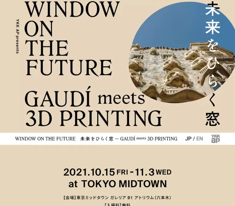
大きなセリフ体と縦書きの和文、多角形に切り抜かれた建築写真が重なる展覧会サイト。コーラル色のヒーローからベージュの情報面へつながる、ポスターのような構成。
Window on the Future — Style Reference
An architectural exhibition poster brought onto the web: monumental lettering, a moving photographic aperture, and quiet sand-colored information panels.
Original URL: ykkap.co.jp/consumer/satellite/sp/window-future/ Final URL: Same exhibition homepage Theme: light; coral hero, sand-colored content, white navigation, and pale-gray closing sections. Inspected: October 5, 2026, 06:28:50 JST — October 4, 2026, 21:28:50 UTC. Viewports: 1440 × 1000 desktop and 390 × 844 mobile, in CSS pixels. Scope: the current Japanese exhibition homepage. Visual evidence covers three desktop hero states, the mobile opening and information section, and a mobile lower-page view containing the Instagram link, sharing area, and footer. Rendered DOM evidence additionally describes the introduction, media links, chapter navigation, exhibition acknowledgments, and visitor notices. Child pages, the English edition, and an opened navigation menu were not inspected.
Window on the Future presents an exhibition about windows inspired by Gaudí and made through contemporary 3D printing. Its identity is closer to a cultural exhibition poster than a product catalog: huge English serif lettering occupies the left, a Japanese title runs vertically down the right, and an irregular photographic opening intersects the typography. Letters become white where the photograph passes beneath them, keeping the title and image visibly interdependent.
The hero is followed by a narrow white identity strip and a long sand-colored information surface. Large graphic headings coexist with compact Japanese explanatory text. The closing Instagram invitation returns to oversized serif lettering, while the sharing area uses recognizable platform colors against pale gray.
The current page explicitly displays [ 展示は終了しました ]. This is a published page for a concluded 2021 exhibition, not evidence that the website itself is discontinued. The title, organizer statement, corporate link, and copyright identify YKK AP. Exhibition acknowledgments do not establish website design or development credits.
閉じる
Window on the Future — Style Reference
An architectural exhibition poster brought onto the web: monumental lettering, a moving photographic aperture, and quiet sand-colored information panels.
Original URL: ykkap.co.jp/consumer/satellite/sp/window-future/ Final URL: Same exhibition homepage Theme: light; coral hero, sand-colored content, white navigation, and pale-gray closing sections. Inspected: October 5, 2026, 06:28:50 JST — October 4, 2026, 21:28:50 UTC. Viewports: 1440 × 1000 desktop and 390 × 844 mobile, in CSS pixels. Scope: the current Japanese exhibition homepage. Visual evidence covers three desktop hero states, the mobile opening and information section, and a mobile lower-page view containing the Instagram link, sharing area, and footer. Rendered DOM evidence additionally describes the introduction, media links, chapter navigation, exhibition acknowledgments, and visitor notices. Child pages, the English edition, and an opened navigation menu were not inspected.
Window on the Future presents an exhibition about windows inspired by Gaudí and made through contemporary 3D printing. Its identity is closer to a cultural exhibition poster than a product catalog: huge English serif lettering occupies the left, a Japanese title runs vertically down the right, and an irregular photographic opening intersects the typography. Letters become white where the photograph passes beneath them, keeping the title and image visibly interdependent.
The hero is followed by a narrow white identity strip and a long sand-colored information surface. Large graphic headings coexist with compact Japanese explanatory text. The closing Instagram invitation returns to oversized serif lettering, while the sharing area uses recognizable platform colors against pale gray.
The current page explicitly displays [ 展示は終了しました ]. This is a published page for a concluded 2021 exhibition, not evidence that the website itself is discontinued. The title, organizer statement, corporate link, and copyright identify YKK AP. Exhibition acknowledgments do not establish website design or development credits.
How to Read This Reference
- Measured means a value supplied by the rendered DOM or computed-style evidence.
- Calculated means arithmetic based on those measurements, such as the hero aspect ratio or the overlap between heading containers.
- Visual estimate means an approximation from the supplied current-page captures. The coral and sand hexadecimal values are implementation estimates, not sampled or extracted source colors.
- Recommended means a proposed implementation choice. This includes the fallback serif family, the sample breakpoint, accessible improvements, and the Quick Start code.
- Many prominent words are graphic lettering. A parent heading reporting
10pxor22pxdoes not establish the size or font of the visible artwork inside it. - Measurements describe the two inspected endpoints. They do not establish every intermediate breakpoint or the full source stylesheet.
Tokens — Colors
Default Palette
| Name | Value | Suggested token | Evidence and role |
|---|---|---|---|
| Hero Coral | approximately #ff6450 |
--color-hero |
Visual estimate of the solid background in all supplied current hero captures |
| Exhibition Sand | approximately #dacbae |
--color-sand |
Visual estimate of the information and lower editorial canvas |
| Display Black | #000000 |
--color-display |
Measured heading color; visually dominant hero and display lettering |
| Artwork Near-Black | #040000 |
--color-artwork |
Fill explicitly present in extracted inline identity SVG styles |
| Reading Ink | #1f1f1f |
--color-ink |
Measured section, navigation, and paragraph color |
| White | #ffffff |
--color-white |
Measured navigation background; visually used for reversed hero lettering and the information label |
| Secondary Gray | #888888 |
--color-muted |
Measured English-language link color; corporate mark appears gray |
| Closure Accent | approximately #ff3547 |
--color-status |
Visual estimate of the exhibition-ended notice |
| Share Surface | #f2f2f2 |
--color-share |
Measured sharing-section background |
| Footer Surface | #f0f0f0 |
--color-footer |
Measured footer background |
| Copyright Gray | #666666 |
--color-copyright |
Measured copyright text color |
| Top-Control Overlay | rgba(0, 0, 0, 0.2) |
--color-top-control |
Measured background of the return-to-top control |
The defining contrast is coral, black, and white above sand. The coral is a large compositional field, not a universal button color. The small closure notice supplies a separate functional accent farther down the page.
The photographic blue sky and pale stone are image colors, not additional interface tokens. Likewise, Instagram, Facebook, Twitter, and LINE retain their recognizable icon colors in the closing row; those colors do not spread into the editorial layout.
Source Variables Versus Visible Design
The supplied custom properties include a broad framework palette: blue, indigo, purple, pink, green, and other generic colors. Their presence does not mean the exhibition interface uses those colors as a design system. In particular, --primary: #007bff is not evidence of a blue primary CTA. The return-to-top anchor computes to that link color, but the visible control is a gray square with a white chevron.
No user-selectable theme or alternate palette control was observed.
Tokens — Typography
Graphic Display Lettering
The hero, navigation identity, information lettering, date display, and Instagram invitation have an editorial serif appearance. The English letters have pronounced stroke contrast and traditional serifs, with a tightly arranged poster composition.
The visible display font cannot be named from this evidence. The main navigation identity contains inline SVG, and several prominent heading containers expose no ordinary text in extraction. Their computed Roboto declarations must not be attributed to the graphic lettering.
Recommended fallback: 'Times New Roman', Times, serif for a live-text approximation. It is not a verified source font. For a faithful implementation, use approved display artwork or verified original type assets.
Japanese Title Artwork
The vertical hero title, 未来をひらく窓, mixes strong, simple kanji forms with more flowing kana. Keep the vertical arrangement and the visual distinction between these forms. A single generic Japanese font is an approximation, not a reconstruction of the lettering.
The narrow vertical YKK AP presents credit occupies the opposite side of the composition. It functions as a small framing detail beside the enormous English title.
Declared Reading and Utility Families
- Main container:
"Noto Sans JP", sans-serif. - Sections and navigation:
Roboto, "Noto Sans JP", sans-serif. - Copyright:
"Noto Sans JP", sans-serif. - Root font size: measured
10pxat both inspected widths. - Paragraph weight: generally
500; event details use700.
These are measured declarations. Successful loading of each named font was not independently verified.
Type Scale
| Role | Desktop measurement | Mobile measurement | Interpretation |
|---|---|---|---|
| General section text | 14px / 28px, weight 400, tracking 1.4px |
12px / 21.6px, weight 400, tracking 1.2px |
Base inherited section style |
| Introductory prose | 16px / 30.4px, weight 500, tracking 1.6px |
12px / 21.6px, weight 500, tracking 1.2px |
Actual extracted paragraph text |
| Event information | 16px / 30.4px, weight 700, tracking 1.6px |
12px / 21.6px, weight 700, tracking 1.2px |
Centered date, venue, and admission copy |
| Venue link | 18px / 34.2px, weight 500 |
14px / 25.2px, weight 500 |
Slightly larger than surrounding event details |
| Language selector | 24px / 36px, weight 500 |
Not visible in the inspected mobile header | Ordinary utility text |
| Information H2 container | 36px / 54px, weight 700 |
28px / 42px, weight 700 |
Container style; does not prove the graphic lettering size |
| Date H3 container | 72px / 108px, weight 700 |
22px / 33px, weight 700 |
Container style; visible date lettering is graphic-looking |
| Instagram H3 container | 72px / 79.2px, weight 600 |
22px / 24.2px, weight 600 |
Not the visible serif artwork's font specification |
| Copyright paragraph | 10px / 15px, weight 400, tracking 0.3px |
Same measured values | Small closing legal line |
Visual Scale Estimates
- The desktop hero's English lettering has approximately 90–100px-tall visible capitals, with a likely live-text equivalent around 130–140px. These are visual estimates, not CSS measurements.
- On mobile, the entire poster scales down with its canvas. The corresponding English capital height is roughly 25–28px.
- The mobile Instagram invitation has roughly 45–50px-tall line spacing in its graphic treatment, despite the parent H3 computing to
22px. - The mobile
SHAREmarker is approximately 160 × 40px, containing a large serif word within a thin capsule outline.
The reusable principle is an extreme contrast between display artwork and small, tracked reading text. Do not flatten both into a single sans-serif type scale.
Tokens — Spacing & Shapes
Geometry: full-width horizontal bands, square section edges, a clipped photographic polygon, and very limited rounded framing.
Spacing character: compact navigation, dense explanatory text, and generous vertical pauses between major sections.
Spacing Scale
| Use | Desktop | Mobile | Evidence |
|---|---|---|---|
| Header vertical padding | 8px |
8px |
Measured |
| Header total height | 56px |
56px |
Measured |
| Gap from header bottom to information label | 120px |
39px |
Calculated from element positions |
| Information-title overlap with label container | 40px |
40px |
Calculated overlap; implementation mechanism unknown |
| Information H2 bottom padding | 50px |
10px |
Measured |
| Date-heading top padding | 30px |
30px |
Measured |
| Common major-section bottom padding | 120px |
78px |
Measured across several sections |
| Introduction bottom padding | 150px |
50px |
Measured |
| Share-section padding | 90px 0 120px |
78px 0 |
Measured |
| Additional share-heading top padding | 30px |
30px |
Measured on its containing paragraph |
| Social-link horizontal padding | 10px per side |
10px per side |
Measured |
The repeated mobile 78px equals 20vw at 390px, but the evidence does not establish that 20vw is the source rule. Treat that relationship as a calculation, not a recovered declaration.
Shapes and Borders
| Element | Appearance | Status |
|---|---|---|
| Hero image | Irregular, oblique polygon with hard edges | Visually observed; exact source mask unknown |
| Main sections | Flat, rectangular bands | Visually observed |
| Visitor-notice box | Thin dark rectangular border, no radius | Visually observed on mobile; border approximately 1–2px |
| Instagram invitation | Underlined display lettering and a right arrow | Visually observed |
| SHARE marker | Thin capsule outline | Visually observed; approximately 20px end radius |
| Social icons | Platform-specific silhouettes, several circular | Visually observed |
| Return to top | 40 × 40px square |
Measured |
There is no visible general-purpose rounded-card or drop-shadow system in the supplied captures.
Layout Measurements
| Element | At 1440 × 1000 | At 390 × 844 |
|---|---|---|
| Hero extent | 1440 × 810px |
390 × 219.375px |
| Hero ratio | Calculated 16:9 |
Calculated 16:9 |
| Header initial top | 810px |
219.375px |
| Header identity link | 993.59 × 34.55px, x=87px |
269.09 × 26.52px, x=10px |
| Standard text column | 1178px wide, x=131px |
344.39px wide, x=22.80px |
| Introduction prose | 574px wide, x=735px |
344.39px wide, x=22.80px |
| Corporate logo link | 40 × 38.72px |
24 × 23.23px |
| Menu link box | 40 × 40px |
35 × 40px |
| Social link box | 70 × 50px |
70 × 50px |
| Footer height | 47px |
55px |
The identity link occupies approximately 69vw at both measured widths, but its internal lettering rearranges on mobile. Width scaling alone does not explain the complete responsive identity treatment.
Components
Poster Hero
Role: establish the exhibition identity through a single integrated composition.
The opening canvas spans the viewport width and retains a 16:9 proportion. It is not a viewport-height splash: at 390px wide, the hero is only about 219px tall, leaving the information section visible in the first mobile screen.
Its visual layers are:
- A solid coral field.
- An oversized black English title at the left:
WINDOW / ON / THE / FUTURE, followed below byGAUDÍ meets / 3D PRINTING. - A central architectural photograph showing curved pale-stone façades, dark iron balconies, sculptural rooftop forms, and blue sky.
- A hard-edged polygonal aperture controlling where that photograph is visible.
- White title lettering inside the photographic region, aligned with the black lettering outside it.
- The vertical Japanese exhibition title on the right and the small vertical presenter credit on the left.
At desktop width, the English title begins around x=150px, or approximately 10.4% of the canvas. The Japanese column sits near the right edge, around 90% of the width. These are visual estimates.
The image and title deliberately overlap. Keeping them in separate columns would remove the central design idea. For reuse, duplicate the visual title into black and white layers and clip the white copy with the same aperture as the photograph. This is an implementation recommendation; the original layer mechanism was not supplied.
Identity and Navigation Strip
Role: carry the project identity into the scrolling page and expose compact navigation controls.
A white, 56px-high strip follows the hero. It contains a project-home identity link, the desktop JP / EN selector, a gray YKK AP mark linking to the corporate website, and a three-line menu control.
On desktop, the project title forms a long horizontal line, followed by the language selector and controls. On mobile, the English identity wraps into two compact lines, with the Japanese title alongside it. The corporate mark shrinks to 24px wide and the menu link retains a 35 × 40px box. The language selector is absent from the visible mobile strip and the extracted mobile link list.
The lower mobile capture shows the white strip at the top of the viewport after scrolling. This demonstrates persistent navigation in that state. Whether the source uses CSS sticky positioning, fixed positioning, or a script-controlled switch was not established.
The menu-open design and behavior remain unverified. Do not invent its layout from the closed icon alone.
Exhibition Information Block
Role: communicate the exhibition premise, dates, venue, admission conditions, and ended status.
A large white INFORMATION graphic sits behind the darker Japanese heading 未来の窓を体験する20日間. The heading containers overlap vertically by a calculated 40px at both inspected widths. This creates a poster-like collision rather than a conventional overline-heading stack.
Centered below are the event dates, the linked Tokyo Midtown venue, and the admission note. The current content identifies the period as October 15–November 3, 2021 and displays the exhibition-ended notice in a bright accent color. A larger serif date-and-location graphic follows below.
On mobile, the text column is approximately 344px wide. Venue information wraps over multiple lines while retaining center alignment. There is no visible booking button in this component. Preserve the ended status when presenting the current archived event information.
Exhibition Introduction
Role: explain the relationship between Gaudí's window designs, nature, and 3D-printed prototypes.
The desktop prose occupies a 574px-wide region starting at x=735px, within the right half of the content area. Its measured style is 16px / 30.4px, weight 500, and 1.6px tracking. Inline links share the reading style rather than becoming filled buttons.
On mobile, prose spans the 344.39px content column and uses 12px / 21.6px with 1.2px tracking. Non-text content precedes it in the supplied geometry. The selected screenshots do not establish the appearance of that preceding material or the desktop left-hand counterpart.
For an adaptation, preserve the desktop asymmetry and the mobile single reading column without inventing unsupported illustrations.
Media Entry Areas
Role: provide access to two video resources.
The DOM contains two YouTube destinations. Their extracted anchor boxes are centered horizontally, reporting 200px width on desktop and 60px on mobile. Their very short inline heights do not reliably describe the dimensions of any nested graphic or full visual target.
Neither a playback interaction nor a video overlay was captured. Do not infer autoplay, an embedded player, a modal, or a particular play-button design from these links.
Chapter Navigation
Role: extend the exhibition into five topic pages.
The inspected homepage links to:
| Destination path | Topic suggested by the URL | Verified scope |
|---|---|---|
gaudi/ |
Gaudí | Link presence only |
3dprint/ |
3D printing | Link presence only |
window/ |
Windows | Link presence only |
process/ |
Process | Link presence only |
interview/ |
Interviews | Link presence only |
The links occur as a full-width vertical sequence. Their top positions are approximately 169.19px apart on desktop and 45.81px apart on mobile. Those pitches scale almost exactly with viewport width, suggesting proportionally scaled graphic rows. The graphic contents themselves are not visible in the supplied screenshot regions.
Extracted anchor heights of 14–16px must not be treated as the complete rendered row or reliable pointer-target height. Do not replace the sequence with an invented card grid and call it observed behavior.
Exhibition Acknowledgments
Role: record the exhibition organizer, supporting institutions, sponsors, and academic contributors.
This is a plain text block within the main content column. It uses the same measured reading style as the introduction, with Japanese role labels and line wrapping rather than visually separate profile cards.
The original page explicitly names YKK AP as organizer and planner. These acknowledgments concern the exhibition; they are not a website production-credit list.
Visitor Notice Box
Role: retain practical visitor guidance for the concluded exhibition.
The lower mobile capture shows the end of a dark-outlined notice box on the sand surface. It aligns with the approximately 344px content column and contains compact, left-aligned Japanese text marked with diamond bullets.
The box is rectangular and visually restrained. Preserve its historical context when reusing the archived content; its health-related instructions are exhibition-era information, not automatically current visitor policy.
Instagram Invitation
Role: direct visitors to the exhibition's Instagram account.
The visible link is an oversized, three-line serif composition:
VIEW
ALL
INSTAGRAM →
The words are underlined, with a simple right-pointing arrow alongside the final line. The mobile composition begins around x=29px, slightly inset from the text column. Its extracted artwork-link box is approximately 288.59 × 131.03px; the full visible arrangement includes the arrow.
This is a typographic link on an open sand field, not a filled social CTA card. The desktop DOM places its heading within the left 574px column.
Share Section
Role: close the page with social destinations and sharing links.
A full-width #f2f2f2 band contains the outlined SHARE marker and one centered row of four icons. The visible platforms are Instagram, Facebook, Twitter, and LINE. Keep the observed bird icon when describing the current design; do not silently substitute a different contemporary mark.
Each anchor measures 70 × 50px with 10px horizontal padding, leaving a 50px-wide icon region. The icons remain in one row at 390px. The mobile section is 306.5px high, including 78px top and bottom padding.
The Instagram destination is an account link. The other three extracted URLs are sharing endpoints. Their behavior is not interchangeable, even though they share one visual row.
The SHARE outline appears to be a section marker; no evidence establishes that the marker itself is a button.
Footer and Return to Top
Role: provide legal attribution and a compact route back to the beginning.
The footer is a slightly darker gray than the sharing band: #f0f0f0, with #666666 copyright text. It measures 47px high on desktop and 55px on mobile.
The return-to-top control is a 40px square with a translucent black background and white chevron. In the lower mobile state it sits at x=330px, y=764px: 20px from the right edge and 40px above the viewport bottom. Its link targets #top and carries the label ページトップへ.
The target is verified; the scrolling duration and easing are not.
Tokens — Motion & Interaction
| Treatment | Evidence | What can be concluded |
|---|---|---|
| Hero aperture changes | Three desktop captures show different polygon boundaries while title and architecture remain similarly aligned | The image-reveal geometry changes between captured states; duration, trigger, and loop structure are unknown |
| Hero text reversal | Letters are white inside the photograph and black outside it | The title's visible treatment follows the photographic aperture; implementation mechanism is unknown |
| General link transition | Sampled anchors report 0.2s |
A transition duration is declared; the changed property and hover appearance were not captured |
| Body transition | Body reports 1s |
A duration is present; no specific body animation can be attributed to it |
| Return-to-top transition | background-color, visibility, and opacity, each 0.2s cubic-bezier(0.215, 0.61, 0.355, 1) |
These transition properties are directly supported by computed styles |
| Persistent mobile navigation | Header is beneath the hero initially and at the viewport top in the lower capture | Persistent navigation is visible after scrolling; exact positioning logic is unverified |
| Menu, language, video, and sharing actions | Relevant links or controls are present | Opened states and destination behavior were not exercised |
The sampled parent elements report animation: none. This does not rule out animation on unreported descendants, SVG geometry, or script-driven properties. Conversely, the capture sequence does not establish a specific CSS keyframe animation.
The architectural features remain similarly positioned while the polygon edges move between desktop captures. This supports describing an animated aperture more strongly than describing a rotating photograph. Avoid claiming parallax, cursor tracking, a slideshow, or a timed color cycle.
Recommended adaptation: use one restrained mask animation, shared by the photo and reversed lettering. Keep the surrounding title and navigation stable. Until timing is measured, a static representative aperture is a more defensible starting point than an invented animation cycle.
Surfaces
| Surface | Appearance | Function |
|---|---|---|
| Hero | Solid coral with black and white lettering | Exhibition identity and visual impact |
| Photographic aperture | Natural-color architecture within a sharp polygon | Connect architecture to the idea of an opening or window |
| Navigation | Opaque white strip | Stable identity and utility controls |
| Editorial canvas | Flat sand-colored field | Information, explanation, acknowledgments, and external invitation |
| Visitor notice | Same sand with a thin dark outline | Separate dense practical information without introducing a card system |
| Sharing band | #f2f2f2 |
Quiet closing area with colorful platform icons |
| Footer | #f0f0f0 |
Low-emphasis legal information |
| Return-to-top control | Translucent dark square | Small persistent utility |
Hierarchy comes from scale, flat color changes, outline geometry, and overlap. Soft elevation and decorative gradients are not part of the observed page shell.
Imagery
The hero photograph shows curved pale-stone architecture, sculptural rooftop forms, dark balcony ironwork, and a clear blue sky. Its natural detail contrasts with the flat coral background and sharp mask boundary. The photograph is not softened, tinted into a monochrome, or given rounded card corners in the current captures.
The aperture is the important image treatment. Keep enough architectural detail visible for the subject to remain legible while allowing the title to cross it. A generic rectangular background photo beneath a headline would lose the relationship between window, image, and typography.
The page also relies on graphic lettering for identity and display sections. Treat those assets as artwork, not as proof of a particular installed text font.
Observed Asset References
No original image filenames or downloadable asset URLs were provided. The following inventory records what is actually supported without inventing paths.
| Asset category | Evidence | Reuse guidance |
|---|---|---|
| Navigation identity | Inline SVG styles appear in the H1/link extraction; lettering is visible in captures | Preserve vector sharpness and the mobile arrangement |
| Hero architecture | Visible in current desktop and mobile captures | Use the original image when available and authorized, or a clearly identified replacement |
| Hero lettering | Visible oversized serif and vertical Japanese composition | Preserve layout; exact source font and asset structure remain unknown |
| Information and date lettering | Visible on mobile; corresponding DOM containers have empty extracted text | Use verified artwork for fidelity; live-text replacements are approximations |
| Instagram invitation | Visible serif graphic link with underlines and arrow | Keep its three-line hierarchy and open background |
| Social icons | Visible Instagram, Facebook, Twitter, and LINE marks | Use appropriate icon artwork without inferring unseen hover variants |
| Chapter and media graphics | Links and geometry appear in DOM, but selected screenshots do not show their appearance | Obtain additional original-page evidence before reproducing these visuals |
Do not use image-rendering: pixelated; these are photographic and vector-like assets, not a low-resolution bitmap aesthetic.
Layout & Responsive Behavior
The opening poster scales proportionally instead of becoming a taller mobile hero. Both inspected widths produce a calculated 16:9 canvas. The large English and vertical Japanese arrangement remains intact on the phone.
The navigation adapts more substantially. Its height stays at 56px, while the identity rearranges, the corporate logo shrinks, and the visible language selector disappears. In the scrolled mobile capture, the strip remains at the top of the viewport.
The main reading width changes from 1178px on desktop to approximately 344px on mobile. The introduction moves from a right-side 574px prose region to the full mobile text column. Event details remain centered, while prose and visitor notices retain reading-oriented alignment.
| Behavior | Desktop | Mobile |
|---|---|---|
| Opening composition | Wide 16:9 poster | Same proportion, scaled to screen width |
| Navigation identity | Long horizontal arrangement | Compact English lines beside Japanese title |
| Language control | JP / EN visible |
Not visible in supplied header state |
| Information opening gap | 120px | 39px |
| Event details | Broad centered block | Centered, wrapped within approximately 344px |
| Introduction copy | Right-side column | Single full text column |
| Major section spacing | Commonly 120px | Commonly 78px |
| Sharing icons | One centered row | One centered row, same measured link-box sizes |
The custom properties list breakpoints at 576, 768, 992, and 1200px. These values alone do not establish which rules control the observed changes. The Quick Start uses 768px as an explicit implementation recommendation.
Document-Height Limitation
The mobile document height is reported as approximately 3963px, consistent with the measured footer ending near 3962.67px. The desktop snapshot reports documentHeight: 1000 even though the main element measures 6948.66px high and the footer extends below it. This inconsistency prevents a reliable conclusion about the desktop scrolling implementation. Do not infer that the page ends at the first viewport or reconstruct a fixed-height shell from that field.
Do’s and Don’ts
Do
- Preserve the hero's 16:9 poster proportion at the inspected desktop and mobile sizes.
- Make the photograph and title overlap, with aligned white lettering inside the photographic aperture.
- Keep the vertical Japanese title and small presenter credit as framing elements.
- Pair monumental serif artwork with compact, tracked Japanese sans-serif reading text.
- Place the white navigation strip immediately after the hero.
- Use broad sand-colored sections and generous vertical spacing.
- Retain the information heading's intentional overlap with its white English label.
- Keep the Instagram invitation as large underlined typography on an open surface.
- Distinguish the current exhibition-ended notice from an active admission or booking action.
- Preserve the difference between Instagram account navigation and actual sharing links.
Don’t
- Don’t infer the hero's display font from a parent element's Roboto declaration.
- Don’t treat framework color variables as the visible exhibition palette.
- Don’t turn the hero into a full-height mobile screen or separate its image and headline into unrelated columns.
- Don’t replace the aperture with a rounded rectangular image card.
- Don’t introduce shadows, glossy gradients, or a general pill-button system.
- Don’t claim a particular animation duration, menu layout, video modal, or hover state without evidence.
- Don’t use extracted inline-anchor heights as complete graphic-row measurements.
- Don’t remove ended-event context or add a booking CTA when describing the current page.
- Don’t attribute website production work to exhibition sponsors or academic contributors.
- Don’t assume uninspected chapter pages share every homepage treatment.
Recommended Implementation Additions
These are recommendations for a new implementation, not verified features of the original site.
- Provide one semantic H1 containing the project name. Mark duplicated visual title layers as decorative so screen readers do not announce the title twice.
- Keep event dates, venue, and ended status available as real text even when display lettering uses SVG or images.
- Offer a reduced-motion state with one stable photographic aperture. Keep essential information independent of animation completion.
- Preserve visible focus indicators on navigation, venue, chapter, and social links.
- Increase menu and corporate-link hit areas to at least 44 × 44px without enlarging their visible artwork unnecessarily. The measured mobile menu box is only 35 × 40px.
- Consider 14–16px mobile prose for a new project. The original measured 12px body treatment is dense and may need adjustment for comfortable reading.
- Make the English edition discoverable on mobile if bilingual access is required. Its location outside the supplied mobile header is unverified.
- Use an actual button with an accessible name and expanded state for a script-driven menu. Add focus management only according to the implemented menu type.
- Give each social destination its own accessible name. Do not label an Instagram profile link as a share action.
- Keep the persistent header from obscuring anchored headings, and retain ordinary document scrolling unless a more complex scrolling model is justified.
Agent Prompt Guide
Quick Color Reference
- Hero coral: approximately
#ff6450. - Editorial sand: approximately
#dacbae. - Display lettering: black, reversed to white inside the photo aperture.
- Reading text: measured
#1f1f1f. - Navigation: measured white.
- Sharing area: measured
#f2f2f2. - Footer: measured
#f0f0f0with#666666text. - Closure notice: visually estimated red-pink; keep it a small status accent.
Overall Prompt
“Create an architectural exhibition microsite with the visual character of a printed cultural poster. Begin with a full-width 16:9 coral canvas, monumental traditional serif English lettering on the left, a vertical Japanese title at the right, and a small vertical presenter credit. Reveal natural-color architectural photography through a sharp, oblique polygon that intersects the title. Align a white copy of the lettering inside the photographic opening with black lettering outside it. Follow the poster with a compact white identity strip and broad sand-colored information sections. Pair large graphic headings with small, tracked Japanese sans-serif copy. Close with a large underlined Instagram invitation and a pale-gray sharing band. Keep surfaces flat, maintain mobile poster proportions, and preserve explicit ended-event status where applicable. Use a static aperture until a motion specification is provided.”
Example Component Prompts
- Poster hero: “Build a 16:9 exhibition poster with giant stacked serif English text, a right-side vertical Japanese title, and a polygonal architectural photograph. The photograph and reversed white title must share the same clipping boundary. Keep a semantic title outside decorative duplicates.”
- Navigation: “Create a 56px white strip beneath the hero. Use a wide vector project identity, desktop language text, a small gray corporate mark, and a simple three-line menu control. Adapt the identity into compact lines on mobile and keep the strip available after scrolling.”
- Information block: “On a flat sand background, overlap a large white INFORMATION graphic with a centered dark Japanese heading. Add compact centered event details, an underlined venue link, a small ended-event notice, and a larger serif date display below.”
- Instagram invitation: “Create a left-aligned three-line serif link reading VIEW / ALL / INSTAGRAM with underlines and a right arrow. Place it directly on the sand canvas with generous space around it and no card, shadow, or filled button.”
- Sharing footer: “Use a pale-gray full-width band, a thin outlined SHARE capsule, and four 50px platform icons in one centered row. Follow it with a subtly darker copyright strip and a small square return-to-top control.”
Quick Start
CSS Custom Properties
This is a recommended adaptation, not recovered source CSS. It uses measured dimensions where available, estimated hero colors, and a named serif fallback. It keeps a conventional browser root size instead of copying the original 10px root.
The 1178px desktop content maximum and 46px total mobile inset reproduce the inspected widths closely. Behavior between those endpoints is a recommendation. Graphic heading styles are approximations; approved artwork is needed for exact lettering.
:root {
  /* Visual estimates from the current captures. */
  --color-hero: #ff6450;
  --color-sand: #dacbae;
  --color-status: #ff3547;

  /* Measured interface colors. */
  --color-display: #000;
  --color-artwork: #040000;
  --color-ink: #1f1f1f;
  --color-white: #fff;
  --color-muted: #888;
  --color-share: #f2f2f2;
  --color-footer: #f0f0f0;
  --color-copyright: #666;
  --color-top-control: rgb(0 0 0 / 20%);

  /* The serif is a recommended fallback, not a source attribution. */
  --font-display: 'Times New Roman', Times, serif;
  --font-copy: Roboto, 'Noto Sans JP', sans-serif;
  --font-japanese: 'Noto Sans JP', sans-serif;

  --content-max: 1178px;
  --nav-max: 1266px;
  --nav-height: 56px;
  --space-section: 120px;
  --space-intro-end: 150px;
  --space-opening: 120px;
  --space-heading-overlap: 40px;
  --text-body: 16px;
  --leading-body: 1.9;
  --tracking-body: 0.1em;
  --transition-link: 200ms;
}

* {
  box-sizing: border-box;
}

body {
  margin: 0;
}

.exhibition {
  color: var(--color-ink);
  background: var(--color-sand);
  font-family: var(--font-copy);
}

.exhibition img,
.exhibition svg {
  max-width: 100%;
}

.content {
  width: min(calc(100% - 46px), var(--content-max));
  margin-inline: auto;
}

.visually-hidden {
  position: absolute;
  width: 1px;
  height: 1px;
  padding: 0;
  margin: -1px;
  overflow: hidden;
  clip-path: inset(50%);
  white-space: nowrap;
  border: 0;
}

.exhibition-hero {
  position: relative;
  aspect-ratio: 16 / 9;
  overflow: hidden;
  background: var(--color-hero);
}

.hero-art {
  display: block;
  width: 100%;
  height: 100%;
}

/* Sizes below use the SVG's 1440 × 810 coordinate system. */
.hero-serif {
  font-family: var(--font-display);
  font-size: 136px;
  font-weight: 400;
  letter-spacing: -3px;
}

.hero-meets {
  font-size: 112px;
}

.hero-japanese {
  font-family: serif;
  font-size: 100px;
  letter-spacing: 10px;
  writing-mode: vertical-rl;
  text-orientation: upright;
}

.hero-presenter {
  font-family: var(--font-copy);
  font-size: 24px;
  font-weight: 700;
  letter-spacing: 1px;
}

.hero-ink {
  color: var(--color-display);
}

.hero-reverse {
  color: var(--color-white);
}

/* Sticky positioning is an adaptation of the observed persistence. */
.site-nav {
  position: sticky;
  top: 0;
  z-index: 20;
  height: var(--nav-height);
  padding-block: 8px;
  background: var(--color-white);
}

.nav-inner {
  display: flex;
  align-items: center;
  justify-content: space-between;
  width: min(calc(100% - 20px), var(--nav-max));
  height: 40px;
  margin-inline: auto;
}

.project-brand {
  display: block;
  flex: 0 1 69vw;
  min-width: 0;
}

.project-brand svg,
.project-brand img {
  display: block;
  width: 100%;
  height: auto;
}

.brand-mobile {
  display: none;
}

.language-selector {
  padding-inline: 12px;
  white-space: nowrap;
  font-size: 24px;
  font-weight: 500;
  line-height: 36px;
}

.language-selector a {
  color: var(--color-muted);
}

.corporate-mark {
  display: block;
  flex: 0 0 40px;
  width: 40px;
}

.menu-toggle {
  display: grid;
  align-content: center;
  justify-items: center;
  gap: 9px;
  flex: 0 0 40px;
  width: 40px;
  height: 40px;
  padding: 0;
  border: 0;
  background: transparent;
  color: var(--color-ink);
  cursor: pointer;
}

.menu-toggle span {
  width: 32px;
  height: 2px;
  background: currentColor;
}

.editorial-section {
  padding-block-end: var(--space-section);
}

.information {
  padding-block-start: var(--space-opening);
  text-align: center;
}

.information-label {
  display: block;
  max-width: calc(100% - 30px);
  height: auto;
  margin-inline: auto;
}

.information-title {
  position: relative;
  margin: calc(-1 * var(--space-heading-overlap)) 0 30px;
  padding-bottom: 50px;
  color: var(--color-display);
  font-size: 36px;
  font-weight: 700;
  line-height: 1.5;
  letter-spacing: 0.05em;
}

.body-copy,
.event-details {
  font-size: var(--text-body);
  font-weight: 500;
  line-height: var(--leading-body);
  letter-spacing: var(--tracking-body);
}

.event-details {
  font-weight: 700;
}

.event-details a {
  color: inherit;
  text-decoration: underline;
  text-underline-offset: 0.12em;
}

.event-ended {
  color: var(--color-status);
}

.date-art {
  display: block;
  max-width: 100%;
  height: auto;
  margin: 30px auto 0;
  padding-top: 30px;
}

.introduction {
  padding-block-end: var(--space-intro-end);
}

.introduction-grid {
  display: grid;
  grid-template-columns: repeat(2, minmax(0, 1fr));
  gap: 30px;
}

.introduction-copy {
  grid-column: 2;
}

.visitor-notice {
  padding: 16px;
  border: 1px solid var(--color-ink);
  font-size: 14px;
  line-height: 2;
  letter-spacing: 0.1em;
}

/* Live-text approximation of the graphic Instagram invitation. */
.instagram-link {
  display: inline-block;
  padding: 0.3em;
  color: var(--color-display);
  font-family: var(--font-display);
  font-size: 72px;
  font-weight: 400;
  line-height: 0.95;
  text-decoration: none;
}

.instagram-link .word {
  text-decoration: underline;
  text-decoration-thickness: 1px;
  text-underline-offset: 0.08em;
}

.share-section {
  padding: 90px 0 120px;
  background: var(--color-share);
  text-align: center;
}

.share-title-wrap {
  padding-top: 30px;
}

.share-title {
  display: grid;
  place-items: center;
  width: 160px;
  min-height: 41px;
  margin: 0 auto 30px;
  border: 1px solid currentColor;
  border-radius: 999px;
  font-family: var(--font-display);
  font-size: 36px;
  font-weight: 400;
  line-height: 1;
}

.social-links {
  display: flex;
  justify-content: center;
  gap: 5.5px;
}

.social-link {
  display: block;
  flex: 0 0 70px;
  width: 70px;
  height: 50px;
  padding-inline: 10px;
}

.social-link img,
.social-link svg {
  display: block;
  width: 50px;
  height: 50px;
}

.site-footer {
  display: grid;
  place-items: center;
  min-height: 47px;
  padding-inline: 20px;
  background: var(--color-footer);
  color: var(--color-copyright);
  text-align: center;
  font-family: var(--font-japanese);
  font-size: 10px;
  line-height: 15px;
  letter-spacing: 0.3px;
}

/* Fixed placement matches the supplied lower mobile state only. */
.back-to-top {
  position: fixed;
  right: 20px;
  bottom: 40px;
  z-index: 15;
  display: grid;
  place-items: center;
  width: 40px;
  height: 40px;
  background: var(--color-top-control);
  color: white;
  transition:
    background-color 200ms cubic-bezier(0.215, 0.61, 0.355, 1),
    visibility 200ms cubic-bezier(0.215, 0.61, 0.355, 1),
    opacity 200ms cubic-bezier(0.215, 0.61, 0.355, 1);
}

.back-to-top::before {
  content: '';
  width: 11px;
  height: 11px;
  border-top: 3px solid currentColor;
  border-left: 3px solid currentColor;
  transform: translateY(3px) rotate(45deg);
}

/* Recommended focus and anchor-offset additions. */
.exhibition :focus-visible {
  outline: 2px solid currentColor;
  outline-offset: 4px;
}

.exhibition [id] {
  scroll-margin-top: calc(var(--nav-height) + 16px);
}

/* Recommended breakpoint; only the endpoints were inspected. */
@media (max-width: 767px) {
  :root {
    --space-section: 78px;
    --space-intro-end: 50px;
    --space-opening: 39px;
    --text-body: 12px;
    --leading-body: 1.8;
  }

  .brand-desktop,
  .language-selector {
    display: none;
  }

  .brand-mobile {
    display: block;
  }

  .corporate-mark {
    flex-basis: 24px;
    width: 24px;
  }

  .menu-toggle {
    flex-basis: 35px;
    width: 35px;
  }

  .menu-toggle span {
    width: 27px;
  }

  .information-title {
    padding-bottom: 10px;
    font-size: 28px;
  }

  .introduction-grid {
    display: block;
  }

  .visitor-notice {
    font-size: 12px;
    line-height: 1.8;
  }

  .instagram-link {
    padding: 5.85px;
    font-size: 48px;
  }

  .share-section {
    padding-block: 78px;
  }

  .social-links {
    gap: 4.2px;
  }

  .site-footer {
    min-height: 55px;
  }
}

@media (prefers-reduced-motion: reduce) {
  .exhibition *,
  .exhibition *::before,
  .exhibition *::after {
    animation: none !important;
    transition: none !important;
  }
}
Minimal Hero Markup
This static SVG demonstrates the shared photo-and-lettering aperture. Its coordinates approximate one current desktop capture; they are not extracted original path data. architecture.jpg is a replacement filename for an image supplied by the implementer, not an observed website asset path.
The live-text lettering is a fallback. Replace it with verified artwork for exact English and Japanese forms. Keep SVG IDs unique if more than one hero exists on a page.
<section class='exhibition-hero' aria-labelledby='project-title'>
  <h1 id='project-title' class='visually-hidden'>
    Window on the Future — Gaudí Meets 3D Printing
  </h1>

  <svg class='hero-art' viewBox='0 0 1440 810'
       aria-hidden='true' focusable='false'>
    <defs>
      <clipPath id='window-aperture' clipPathUnits='userSpaceOnUse'>
        <polygon points='560,70 800,0 920,0 1188,568 444,734' />
      </clipPath>

      <g id='project-lettering' fill='currentColor'>
        <g class='hero-serif'>
          <text x='150' y='100'>WINDOW</text>
          <text x='150' y='220'>ON</text>
          <text x='150' y='340'>THE</text>
          <text x='150' y='460'>FUTURE</text>
          <text x='150' y='648'>GAUDÍ<tspan class='hero-meets'> meets</tspan></text>
          <text x='150' y='770'>3D PRINTING</text>
        </g>

        <text class='hero-japanese' x='1305' y='8'>未来をひらく窓</text>
        <text class='hero-presenter' x='105' y='117'
              transform='rotate(90 105 117)'>YKK AP presents</text>
      </g>
    </defs>

    <use href='#project-lettering' class='hero-ink' />

    <g clip-path='url(#window-aperture)'>
      <image href='architecture.jpg'
             x='330' y='0' width='900' height='810'
             preserveAspectRatio='xMidYMid slice' />
      <use href='#project-lettering' class='hero-reverse' />
    </g>
  </svg>
</section>
Place the navigation after this section, within a parent that continues through the page so sticky positioning has sufficient scroll range. The sample does not implement an unverified menu, playback overlay, or hero animation. Those behaviors need their own evidence or an explicit new specification.
Tailwind v4 Token Mapping
Optional aliases for a project already using Tailwind v4. This does not imply that the original page uses Tailwind.
@theme inline {
  /* Estimated identity colors. */
  --color-coral: #ff6450;
  --color-sand: #dacbae;
  --color-event-status: #ff3547;

  /* Measured surface and text colors. */
  --color-ink: #1f1f1f;
  --color-sharing: #f2f2f2;
  --color-footer: #f0f0f0;

  --font-editorial: 'Times New Roman', Times, serif;
  --font-copy: Roboto, 'Noto Sans JP', sans-serif;

  --spacing-navigation: 56px;
  --spacing-section: 120px;
  --spacing-section-mobile: 78px;
  --spacing-social-icon: 50px;
  --radius-share-marker: 999px;
}
Sources & Evidence
- Current Japanese exhibition homepage: original and final URL, HTTP 200, page title, rendered text, link destinations, element rectangles, computed styles, and custom properties supplied with the inspection.
- Capture time: October 4, 2026, 21:28:50.172 UTC; October 5, 2026, 06:28:50.172 JST.
- Desktop evidence: 1440 × 1000, with three supplied views of the opening composition showing different photographic-aperture geometry.
- Mobile evidence: 390 × 844, with opening/information and lower-page sharing/footer captures.
- Motion evidence: differences between supplied hero frames and the reported transition declarations. No measured animation timeline, pointer response, or opened menu was supplied.
- Inspection limits: the supplied process waited for loading, image decoding, and sampled stability, but those checks do not establish semantic completeness or every delayed state. SharedWorkers and service workers were disabled. Selected middle-page artwork was not visually captured, and linked pages were not inspected here.
- Measurement limits: the desktop document-height field conflicts with descendant geometry; the exact display fonts, image paths, mask implementation, and responsive breakpoint rules remain unverified. Estimated colors and all implementation additions are labeled accordingly.
This reference describes the currently served exhibition homepage and its visible ended-event state. It does not reconstruct a previous design or claim visual coverage of uninspected pages.
# Window on the Future — Style Reference

> An architectural exhibition poster brought onto the web: monumental lettering, a moving photographic aperture, and quiet sand-colored information panels.

**Original URL:** [ykkap.co.jp/consumer/satellite/sp/window-future/](https://www.ykkap.co.jp/consumer/satellite/sp/window-future/)
**Final URL:** [Same exhibition homepage](https://www.ykkap.co.jp/consumer/satellite/sp/window-future/)
**Theme:** light; coral hero, sand-colored content, white navigation, and pale-gray closing sections.
**Inspected:** October 5, 2026, 06:28:50 JST — October 4, 2026, 21:28:50 UTC.
**Viewports:** 1440 × 1000 desktop and 390 × 844 mobile, in CSS pixels.
**Scope:** the current Japanese exhibition homepage. Visual evidence covers three desktop hero states, the mobile opening and information section, and a mobile lower-page view containing the Instagram link, sharing area, and footer. Rendered DOM evidence additionally describes the introduction, media links, chapter navigation, exhibition acknowledgments, and visitor notices. Child pages, the English edition, and an opened navigation menu were not inspected.

Window on the Future presents an exhibition about windows inspired by Gaudí and made through contemporary 3D printing. Its identity is closer to a cultural exhibition poster than a product catalog: huge English serif lettering occupies the left, a Japanese title runs vertically down the right, and an irregular photographic opening intersects the typography. Letters become white where the photograph passes beneath them, keeping the title and image visibly interdependent.

The hero is followed by a narrow white identity strip and a long sand-colored information surface. Large graphic headings coexist with compact Japanese explanatory text. The closing Instagram invitation returns to oversized serif lettering, while the sharing area uses recognizable platform colors against pale gray.

The current page explicitly displays `[ 展示は終了しました ]`. This is a published page for a concluded 2021 exhibition, not evidence that the website itself is discontinued. The title, organizer statement, corporate link, and copyright identify YKK AP. Exhibition acknowledgments do not establish website design or development credits.
閉じる
# Window on the Future — Style Reference

> An architectural exhibition poster brought onto the web: monumental lettering, a moving photographic aperture, and quiet sand-colored information panels.

**Original URL:** [ykkap.co.jp/consumer/satellite/sp/window-future/](https://www.ykkap.co.jp/consumer/satellite/sp/window-future/)
**Final URL:** [Same exhibition homepage](https://www.ykkap.co.jp/consumer/satellite/sp/window-future/)
**Theme:** light; coral hero, sand-colored content, white navigation, and pale-gray closing sections.
**Inspected:** October 5, 2026, 06:28:50 JST — October 4, 2026, 21:28:50 UTC.
**Viewports:** 1440 × 1000 desktop and 390 × 844 mobile, in CSS pixels.
**Scope:** the current Japanese exhibition homepage. Visual evidence covers three desktop hero states, the mobile opening and information section, and a mobile lower-page view containing the Instagram link, sharing area, and footer. Rendered DOM evidence additionally describes the introduction, media links, chapter navigation, exhibition acknowledgments, and visitor notices. Child pages, the English edition, and an opened navigation menu were not inspected.

Window on the Future presents an exhibition about windows inspired by Gaudí and made through contemporary 3D printing. Its identity is closer to a cultural exhibition poster than a product catalog: huge English serif lettering occupies the left, a Japanese title runs vertically down the right, and an irregular photographic opening intersects the typography. Letters become white where the photograph passes beneath them, keeping the title and image visibly interdependent.

The hero is followed by a narrow white identity strip and a long sand-colored information surface. Large graphic headings coexist with compact Japanese explanatory text. The closing Instagram invitation returns to oversized serif lettering, while the sharing area uses recognizable platform colors against pale gray.

The current page explicitly displays `[ 展示は終了しました ]`. This is a published page for a concluded 2021 exhibition, not evidence that the website itself is discontinued. The title, organizer statement, corporate link, and copyright identify YKK AP. Exhibition acknowledgments do not establish website design or development credits.

## How to Read This Reference

- **Measured** means a value supplied by the rendered DOM or computed-style evidence.
- **Calculated** means arithmetic based on those measurements, such as the hero aspect ratio or the overlap between heading containers.
- **Visual estimate** means an approximation from the supplied current-page captures. The coral and sand hexadecimal values are implementation estimates, not sampled or extracted source colors.
- **Recommended** means a proposed implementation choice. This includes the fallback serif family, the sample breakpoint, accessible improvements, and the Quick Start code.
- Many prominent words are graphic lettering. A parent heading reporting `10px` or `22px` does not establish the size or font of the visible artwork inside it.
- Measurements describe the two inspected endpoints. They do not establish every intermediate breakpoint or the full source stylesheet.

## Tokens — Colors

### Default Palette

| Name | Value | Suggested token | Evidence and role |
| --- | --- | --- | --- |
| Hero Coral | approximately `#ff6450` | `--color-hero` | Visual estimate of the solid background in all supplied current hero captures |
| Exhibition Sand | approximately `#dacbae` | `--color-sand` | Visual estimate of the information and lower editorial canvas |
| Display Black | `#000000` | `--color-display` | Measured heading color; visually dominant hero and display lettering |
| Artwork Near-Black | `#040000` | `--color-artwork` | Fill explicitly present in extracted inline identity SVG styles |
| Reading Ink | `#1f1f1f` | `--color-ink` | Measured section, navigation, and paragraph color |
| White | `#ffffff` | `--color-white` | Measured navigation background; visually used for reversed hero lettering and the information label |
| Secondary Gray | `#888888` | `--color-muted` | Measured English-language link color; corporate mark appears gray |
| Closure Accent | approximately `#ff3547` | `--color-status` | Visual estimate of the exhibition-ended notice |
| Share Surface | `#f2f2f2` | `--color-share` | Measured sharing-section background |
| Footer Surface | `#f0f0f0` | `--color-footer` | Measured footer background |
| Copyright Gray | `#666666` | `--color-copyright` | Measured copyright text color |
| Top-Control Overlay | `rgba(0, 0, 0, 0.2)` | `--color-top-control` | Measured background of the return-to-top control |

**The defining contrast is coral, black, and white above sand.** The coral is a large compositional field, not a universal button color. The small closure notice supplies a separate functional accent farther down the page.

The photographic blue sky and pale stone are image colors, not additional interface tokens. Likewise, Instagram, Facebook, Twitter, and LINE retain their recognizable icon colors in the closing row; those colors do not spread into the editorial layout.

### Source Variables Versus Visible Design

The supplied custom properties include a broad framework palette: blue, indigo, purple, pink, green, and other generic colors. Their presence does not mean the exhibition interface uses those colors as a design system. In particular, `--primary: #007bff` is not evidence of a blue primary CTA. The return-to-top anchor computes to that link color, but the visible control is a gray square with a white chevron.

No user-selectable theme or alternate palette control was observed.

## Tokens — Typography

### Graphic Display Lettering

The hero, navigation identity, information lettering, date display, and Instagram invitation have an editorial serif appearance. The English letters have pronounced stroke contrast and traditional serifs, with a tightly arranged poster composition.

The visible display font cannot be named from this evidence. The main navigation identity contains inline SVG, and several prominent heading containers expose no ordinary text in extraction. Their computed Roboto declarations must not be attributed to the graphic lettering.

**Recommended fallback:** `'Times New Roman', Times, serif` for a live-text approximation. It is not a verified source font. For a faithful implementation, use approved display artwork or verified original type assets.

### Japanese Title Artwork

The vertical hero title, `未来をひらく窓`, mixes strong, simple kanji forms with more flowing kana. Keep the vertical arrangement and the visual distinction between these forms. A single generic Japanese font is an approximation, not a reconstruction of the lettering.

The narrow vertical `YKK AP presents` credit occupies the opposite side of the composition. It functions as a small framing detail beside the enormous English title.

### Declared Reading and Utility Families

- **Main container:** `"Noto Sans JP", sans-serif`.
- **Sections and navigation:** `Roboto, "Noto Sans JP", sans-serif`.
- **Copyright:** `"Noto Sans JP", sans-serif`.
- **Root font size:** measured `10px` at both inspected widths.
- **Paragraph weight:** generally `500`; event details use `700`.

These are measured declarations. Successful loading of each named font was not independently verified.

### Type Scale

| Role | Desktop measurement | Mobile measurement | Interpretation |
| --- | --- | --- | --- |
| General section text | `14px / 28px`, weight `400`, tracking `1.4px` | `12px / 21.6px`, weight `400`, tracking `1.2px` | Base inherited section style |
| Introductory prose | `16px / 30.4px`, weight `500`, tracking `1.6px` | `12px / 21.6px`, weight `500`, tracking `1.2px` | Actual extracted paragraph text |
| Event information | `16px / 30.4px`, weight `700`, tracking `1.6px` | `12px / 21.6px`, weight `700`, tracking `1.2px` | Centered date, venue, and admission copy |
| Venue link | `18px / 34.2px`, weight `500` | `14px / 25.2px`, weight `500` | Slightly larger than surrounding event details |
| Language selector | `24px / 36px`, weight `500` | Not visible in the inspected mobile header | Ordinary utility text |
| Information H2 container | `36px / 54px`, weight `700` | `28px / 42px`, weight `700` | Container style; does not prove the graphic lettering size |
| Date H3 container | `72px / 108px`, weight `700` | `22px / 33px`, weight `700` | Container style; visible date lettering is graphic-looking |
| Instagram H3 container | `72px / 79.2px`, weight `600` | `22px / 24.2px`, weight `600` | Not the visible serif artwork's font specification |
| Copyright paragraph | `10px / 15px`, weight `400`, tracking `0.3px` | Same measured values | Small closing legal line |

### Visual Scale Estimates

- The desktop hero's English lettering has approximately 90–100px-tall visible capitals, with a likely live-text equivalent around 130–140px. These are visual estimates, not CSS measurements.
- On mobile, the entire poster scales down with its canvas. The corresponding English capital height is roughly 25–28px.
- The mobile Instagram invitation has roughly 45–50px-tall line spacing in its graphic treatment, despite the parent H3 computing to `22px`.
- The mobile `SHARE` marker is approximately 160 × 40px, containing a large serif word within a thin capsule outline.

The reusable principle is an extreme contrast between display artwork and small, tracked reading text. Do not flatten both into a single sans-serif type scale.

## Tokens — Spacing & Shapes

**Geometry:** full-width horizontal bands, square section edges, a clipped photographic polygon, and very limited rounded framing.

**Spacing character:** compact navigation, dense explanatory text, and generous vertical pauses between major sections.

### Spacing Scale

| Use | Desktop | Mobile | Evidence |
| --- | --- | --- | --- |
| Header vertical padding | `8px` | `8px` | Measured |
| Header total height | `56px` | `56px` | Measured |
| Gap from header bottom to information label | `120px` | `39px` | Calculated from element positions |
| Information-title overlap with label container | `40px` | `40px` | Calculated overlap; implementation mechanism unknown |
| Information H2 bottom padding | `50px` | `10px` | Measured |
| Date-heading top padding | `30px` | `30px` | Measured |
| Common major-section bottom padding | `120px` | `78px` | Measured across several sections |
| Introduction bottom padding | `150px` | `50px` | Measured |
| Share-section padding | `90px 0 120px` | `78px 0` | Measured |
| Additional share-heading top padding | `30px` | `30px` | Measured on its containing paragraph |
| Social-link horizontal padding | `10px` per side | `10px` per side | Measured |

The repeated mobile `78px` equals `20vw` at 390px, but the evidence does not establish that `20vw` is the source rule. Treat that relationship as a calculation, not a recovered declaration.

### Shapes and Borders

| Element | Appearance | Status |
| --- | --- | --- |
| Hero image | Irregular, oblique polygon with hard edges | Visually observed; exact source mask unknown |
| Main sections | Flat, rectangular bands | Visually observed |
| Visitor-notice box | Thin dark rectangular border, no radius | Visually observed on mobile; border approximately 1–2px |
| Instagram invitation | Underlined display lettering and a right arrow | Visually observed |
| SHARE marker | Thin capsule outline | Visually observed; approximately 20px end radius |
| Social icons | Platform-specific silhouettes, several circular | Visually observed |
| Return to top | `40 × 40px` square | Measured |

There is no visible general-purpose rounded-card or drop-shadow system in the supplied captures.

### Layout Measurements

| Element | At 1440 × 1000 | At 390 × 844 |
| --- | --- | --- |
| Hero extent | `1440 × 810px` | `390 × 219.375px` |
| Hero ratio | Calculated `16:9` | Calculated `16:9` |
| Header initial top | `810px` | `219.375px` |
| Header identity link | `993.59 × 34.55px`, x=`87px` | `269.09 × 26.52px`, x=`10px` |
| Standard text column | `1178px` wide, x=`131px` | `344.39px` wide, x=`22.80px` |
| Introduction prose | `574px` wide, x=`735px` | `344.39px` wide, x=`22.80px` |
| Corporate logo link | `40 × 38.72px` | `24 × 23.23px` |
| Menu link box | `40 × 40px` | `35 × 40px` |
| Social link box | `70 × 50px` | `70 × 50px` |
| Footer height | `47px` | `55px` |

The identity link occupies approximately `69vw` at both measured widths, but its internal lettering rearranges on mobile. Width scaling alone does not explain the complete responsive identity treatment.

## Components

### Poster Hero

**Role:** establish the exhibition identity through a single integrated composition.

The opening canvas spans the viewport width and retains a 16:9 proportion. It is not a viewport-height splash: at 390px wide, the hero is only about 219px tall, leaving the information section visible in the first mobile screen.

Its visual layers are:

1. A solid coral field.
2. An oversized black English title at the left: `WINDOW / ON / THE / FUTURE`, followed below by `GAUDÍ meets / 3D PRINTING`.
3. A central architectural photograph showing curved pale-stone façades, dark iron balconies, sculptural rooftop forms, and blue sky.
4. A hard-edged polygonal aperture controlling where that photograph is visible.
5. White title lettering inside the photographic region, aligned with the black lettering outside it.
6. The vertical Japanese exhibition title on the right and the small vertical presenter credit on the left.

At desktop width, the English title begins around x=`150px`, or approximately 10.4% of the canvas. The Japanese column sits near the right edge, around 90% of the width. These are visual estimates.

The image and title deliberately overlap. Keeping them in separate columns would remove the central design idea. For reuse, duplicate the visual title into black and white layers and clip the white copy with the same aperture as the photograph. This is an implementation recommendation; the original layer mechanism was not supplied.

### Identity and Navigation Strip

**Role:** carry the project identity into the scrolling page and expose compact navigation controls.

A white, 56px-high strip follows the hero. It contains a project-home identity link, the desktop `JP / EN` selector, a gray YKK AP mark linking to the corporate website, and a three-line menu control.

On desktop, the project title forms a long horizontal line, followed by the language selector and controls. On mobile, the English identity wraps into two compact lines, with the Japanese title alongside it. The corporate mark shrinks to 24px wide and the menu link retains a 35 × 40px box. The language selector is absent from the visible mobile strip and the extracted mobile link list.

The lower mobile capture shows the white strip at the top of the viewport after scrolling. This demonstrates persistent navigation in that state. Whether the source uses CSS sticky positioning, fixed positioning, or a script-controlled switch was not established.

The menu-open design and behavior remain unverified. Do not invent its layout from the closed icon alone.

### Exhibition Information Block

**Role:** communicate the exhibition premise, dates, venue, admission conditions, and ended status.

A large white `INFORMATION` graphic sits behind the darker Japanese heading `未来の窓を体験する20日間`. The heading containers overlap vertically by a calculated 40px at both inspected widths. This creates a poster-like collision rather than a conventional overline-heading stack.

Centered below are the event dates, the linked Tokyo Midtown venue, and the admission note. The current content identifies the period as October 15–November 3, 2021 and displays the exhibition-ended notice in a bright accent color. A larger serif date-and-location graphic follows below.

On mobile, the text column is approximately 344px wide. Venue information wraps over multiple lines while retaining center alignment. There is no visible booking button in this component. Preserve the ended status when presenting the current archived event information.

### Exhibition Introduction

**Role:** explain the relationship between Gaudí's window designs, nature, and 3D-printed prototypes.

The desktop prose occupies a 574px-wide region starting at x=`735px`, within the right half of the content area. Its measured style is `16px / 30.4px`, weight `500`, and `1.6px` tracking. Inline links share the reading style rather than becoming filled buttons.

On mobile, prose spans the 344.39px content column and uses `12px / 21.6px` with `1.2px` tracking. Non-text content precedes it in the supplied geometry. The selected screenshots do not establish the appearance of that preceding material or the desktop left-hand counterpart.

For an adaptation, preserve the desktop asymmetry and the mobile single reading column without inventing unsupported illustrations.

### Media Entry Areas

**Role:** provide access to two video resources.

The DOM contains two YouTube destinations. Their extracted anchor boxes are centered horizontally, reporting 200px width on desktop and 60px on mobile. Their very short inline heights do not reliably describe the dimensions of any nested graphic or full visual target.

Neither a playback interaction nor a video overlay was captured. Do not infer autoplay, an embedded player, a modal, or a particular play-button design from these links.

### Chapter Navigation

**Role:** extend the exhibition into five topic pages.

The inspected homepage links to:

| Destination path | Topic suggested by the URL | Verified scope |
| --- | --- | --- |
| `gaudi/` | Gaudí | Link presence only |
| `3dprint/` | 3D printing | Link presence only |
| `window/` | Windows | Link presence only |
| `process/` | Process | Link presence only |
| `interview/` | Interviews | Link presence only |

The links occur as a full-width vertical sequence. Their top positions are approximately 169.19px apart on desktop and 45.81px apart on mobile. Those pitches scale almost exactly with viewport width, suggesting proportionally scaled graphic rows. The graphic contents themselves are not visible in the supplied screenshot regions.

Extracted anchor heights of 14–16px must not be treated as the complete rendered row or reliable pointer-target height. Do not replace the sequence with an invented card grid and call it observed behavior.

### Exhibition Acknowledgments

**Role:** record the exhibition organizer, supporting institutions, sponsors, and academic contributors.

This is a plain text block within the main content column. It uses the same measured reading style as the introduction, with Japanese role labels and line wrapping rather than visually separate profile cards.

The original page explicitly names YKK AP as organizer and planner. These acknowledgments concern the exhibition; they are not a website production-credit list.

### Visitor Notice Box

**Role:** retain practical visitor guidance for the concluded exhibition.

The lower mobile capture shows the end of a dark-outlined notice box on the sand surface. It aligns with the approximately 344px content column and contains compact, left-aligned Japanese text marked with diamond bullets.

The box is rectangular and visually restrained. Preserve its historical context when reusing the archived content; its health-related instructions are exhibition-era information, not automatically current visitor policy.

### Instagram Invitation

**Role:** direct visitors to the exhibition's Instagram account.

The visible link is an oversized, three-line serif composition:

`VIEW`

`ALL`

`INSTAGRAM →`

The words are underlined, with a simple right-pointing arrow alongside the final line. The mobile composition begins around x=`29px`, slightly inset from the text column. Its extracted artwork-link box is approximately `288.59 × 131.03px`; the full visible arrangement includes the arrow.

This is a typographic link on an open sand field, not a filled social CTA card. The desktop DOM places its heading within the left 574px column.

### Share Section

**Role:** close the page with social destinations and sharing links.

A full-width `#f2f2f2` band contains the outlined `SHARE` marker and one centered row of four icons. The visible platforms are Instagram, Facebook, Twitter, and LINE. Keep the observed bird icon when describing the current design; do not silently substitute a different contemporary mark.

Each anchor measures 70 × 50px with 10px horizontal padding, leaving a 50px-wide icon region. The icons remain in one row at 390px. The mobile section is 306.5px high, including 78px top and bottom padding.

The Instagram destination is an account link. The other three extracted URLs are sharing endpoints. Their behavior is not interchangeable, even though they share one visual row.

The `SHARE` outline appears to be a section marker; no evidence establishes that the marker itself is a button.

### Footer and Return to Top

**Role:** provide legal attribution and a compact route back to the beginning.

The footer is a slightly darker gray than the sharing band: `#f0f0f0`, with `#666666` copyright text. It measures 47px high on desktop and 55px on mobile.

The return-to-top control is a 40px square with a translucent black background and white chevron. In the lower mobile state it sits at x=`330px`, y=`764px`: 20px from the right edge and 40px above the viewport bottom. Its link targets `#top` and carries the label `ページトップへ`.

The target is verified; the scrolling duration and easing are not.

## Tokens — Motion & Interaction

| Treatment | Evidence | What can be concluded |
| --- | --- | --- |
| Hero aperture changes | Three desktop captures show different polygon boundaries while title and architecture remain similarly aligned | The image-reveal geometry changes between captured states; duration, trigger, and loop structure are unknown |
| Hero text reversal | Letters are white inside the photograph and black outside it | The title's visible treatment follows the photographic aperture; implementation mechanism is unknown |
| General link transition | Sampled anchors report `0.2s` | A transition duration is declared; the changed property and hover appearance were not captured |
| Body transition | Body reports `1s` | A duration is present; no specific body animation can be attributed to it |
| Return-to-top transition | `background-color`, `visibility`, and `opacity`, each `0.2s cubic-bezier(0.215, 0.61, 0.355, 1)` | These transition properties are directly supported by computed styles |
| Persistent mobile navigation | Header is beneath the hero initially and at the viewport top in the lower capture | Persistent navigation is visible after scrolling; exact positioning logic is unverified |
| Menu, language, video, and sharing actions | Relevant links or controls are present | Opened states and destination behavior were not exercised |

The sampled parent elements report `animation: none`. This does not rule out animation on unreported descendants, SVG geometry, or script-driven properties. Conversely, the capture sequence does not establish a specific CSS keyframe animation.

The architectural features remain similarly positioned while the polygon edges move between desktop captures. This supports describing an animated aperture more strongly than describing a rotating photograph. Avoid claiming parallax, cursor tracking, a slideshow, or a timed color cycle.

**Recommended adaptation:** use one restrained mask animation, shared by the photo and reversed lettering. Keep the surrounding title and navigation stable. Until timing is measured, a static representative aperture is a more defensible starting point than an invented animation cycle.

## Surfaces

| Surface | Appearance | Function |
| --- | --- | --- |
| Hero | Solid coral with black and white lettering | Exhibition identity and visual impact |
| Photographic aperture | Natural-color architecture within a sharp polygon | Connect architecture to the idea of an opening or window |
| Navigation | Opaque white strip | Stable identity and utility controls |
| Editorial canvas | Flat sand-colored field | Information, explanation, acknowledgments, and external invitation |
| Visitor notice | Same sand with a thin dark outline | Separate dense practical information without introducing a card system |
| Sharing band | `#f2f2f2` | Quiet closing area with colorful platform icons |
| Footer | `#f0f0f0` | Low-emphasis legal information |
| Return-to-top control | Translucent dark square | Small persistent utility |

Hierarchy comes from scale, flat color changes, outline geometry, and overlap. Soft elevation and decorative gradients are not part of the observed page shell.

## Imagery

The hero photograph shows curved pale-stone architecture, sculptural rooftop forms, dark balcony ironwork, and a clear blue sky. Its natural detail contrasts with the flat coral background and sharp mask boundary. The photograph is not softened, tinted into a monochrome, or given rounded card corners in the current captures.

The aperture is the important image treatment. Keep enough architectural detail visible for the subject to remain legible while allowing the title to cross it. A generic rectangular background photo beneath a headline would lose the relationship between window, image, and typography.

The page also relies on graphic lettering for identity and display sections. Treat those assets as artwork, not as proof of a particular installed text font.

### Observed Asset References

No original image filenames or downloadable asset URLs were provided. The following inventory records what is actually supported without inventing paths.

| Asset category | Evidence | Reuse guidance |
| --- | --- | --- |
| Navigation identity | Inline SVG styles appear in the H1/link extraction; lettering is visible in captures | Preserve vector sharpness and the mobile arrangement |
| Hero architecture | Visible in current desktop and mobile captures | Use the original image when available and authorized, or a clearly identified replacement |
| Hero lettering | Visible oversized serif and vertical Japanese composition | Preserve layout; exact source font and asset structure remain unknown |
| Information and date lettering | Visible on mobile; corresponding DOM containers have empty extracted text | Use verified artwork for fidelity; live-text replacements are approximations |
| Instagram invitation | Visible serif graphic link with underlines and arrow | Keep its three-line hierarchy and open background |
| Social icons | Visible Instagram, Facebook, Twitter, and LINE marks | Use appropriate icon artwork without inferring unseen hover variants |
| Chapter and media graphics | Links and geometry appear in DOM, but selected screenshots do not show their appearance | Obtain additional original-page evidence before reproducing these visuals |

Do not use `image-rendering: pixelated`; these are photographic and vector-like assets, not a low-resolution bitmap aesthetic.

## Layout & Responsive Behavior

The opening poster scales proportionally instead of becoming a taller mobile hero. Both inspected widths produce a calculated 16:9 canvas. The large English and vertical Japanese arrangement remains intact on the phone.

The navigation adapts more substantially. Its height stays at 56px, while the identity rearranges, the corporate logo shrinks, and the visible language selector disappears. In the scrolled mobile capture, the strip remains at the top of the viewport.

The main reading width changes from 1178px on desktop to approximately 344px on mobile. The introduction moves from a right-side 574px prose region to the full mobile text column. Event details remain centered, while prose and visitor notices retain reading-oriented alignment.

| Behavior | Desktop | Mobile |
| --- | --- | --- |
| Opening composition | Wide 16:9 poster | Same proportion, scaled to screen width |
| Navigation identity | Long horizontal arrangement | Compact English lines beside Japanese title |
| Language control | `JP / EN` visible | Not visible in supplied header state |
| Information opening gap | 120px | 39px |
| Event details | Broad centered block | Centered, wrapped within approximately 344px |
| Introduction copy | Right-side column | Single full text column |
| Major section spacing | Commonly 120px | Commonly 78px |
| Sharing icons | One centered row | One centered row, same measured link-box sizes |

The custom properties list breakpoints at 576, 768, 992, and 1200px. These values alone do not establish which rules control the observed changes. The Quick Start uses 768px as an explicit implementation recommendation.

### Document-Height Limitation

The mobile document height is reported as approximately 3963px, consistent with the measured footer ending near 3962.67px. The desktop snapshot reports `documentHeight: 1000` even though the main element measures 6948.66px high and the footer extends below it. This inconsistency prevents a reliable conclusion about the desktop scrolling implementation. Do not infer that the page ends at the first viewport or reconstruct a fixed-height shell from that field.

## Do’s and Don’ts

### Do

- Preserve the hero's 16:9 poster proportion at the inspected desktop and mobile sizes.
- Make the photograph and title overlap, with aligned white lettering inside the photographic aperture.
- Keep the vertical Japanese title and small presenter credit as framing elements.
- Pair monumental serif artwork with compact, tracked Japanese sans-serif reading text.
- Place the white navigation strip immediately after the hero.
- Use broad sand-colored sections and generous vertical spacing.
- Retain the information heading's intentional overlap with its white English label.
- Keep the Instagram invitation as large underlined typography on an open surface.
- Distinguish the current exhibition-ended notice from an active admission or booking action.
- Preserve the difference between Instagram account navigation and actual sharing links.

### Don’t

- Don’t infer the hero's display font from a parent element's Roboto declaration.
- Don’t treat framework color variables as the visible exhibition palette.
- Don’t turn the hero into a full-height mobile screen or separate its image and headline into unrelated columns.
- Don’t replace the aperture with a rounded rectangular image card.
- Don’t introduce shadows, glossy gradients, or a general pill-button system.
- Don’t claim a particular animation duration, menu layout, video modal, or hover state without evidence.
- Don’t use extracted inline-anchor heights as complete graphic-row measurements.
- Don’t remove ended-event context or add a booking CTA when describing the current page.
- Don’t attribute website production work to exhibition sponsors or academic contributors.
- Don’t assume uninspected chapter pages share every homepage treatment.

## Recommended Implementation Additions

These are recommendations for a new implementation, not verified features of the original site.

- Provide one semantic H1 containing the project name. Mark duplicated visual title layers as decorative so screen readers do not announce the title twice.
- Keep event dates, venue, and ended status available as real text even when display lettering uses SVG or images.
- Offer a reduced-motion state with one stable photographic aperture. Keep essential information independent of animation completion.
- Preserve visible focus indicators on navigation, venue, chapter, and social links.
- Increase menu and corporate-link hit areas to at least 44 × 44px without enlarging their visible artwork unnecessarily. The measured mobile menu box is only 35 × 40px.
- Consider 14–16px mobile prose for a new project. The original measured 12px body treatment is dense and may need adjustment for comfortable reading.
- Make the English edition discoverable on mobile if bilingual access is required. Its location outside the supplied mobile header is unverified.
- Use an actual button with an accessible name and expanded state for a script-driven menu. Add focus management only according to the implemented menu type.
- Give each social destination its own accessible name. Do not label an Instagram profile link as a share action.
- Keep the persistent header from obscuring anchored headings, and retain ordinary document scrolling unless a more complex scrolling model is justified.

## Agent Prompt Guide

### Quick Color Reference

- Hero coral: approximately `#ff6450`.
- Editorial sand: approximately `#dacbae`.
- Display lettering: black, reversed to white inside the photo aperture.
- Reading text: measured `#1f1f1f`.
- Navigation: measured white.
- Sharing area: measured `#f2f2f2`.
- Footer: measured `#f0f0f0` with `#666666` text.
- Closure notice: visually estimated red-pink; keep it a small status accent.

### Overall Prompt

“Create an architectural exhibition microsite with the visual character of a printed cultural poster. Begin with a full-width 16:9 coral canvas, monumental traditional serif English lettering on the left, a vertical Japanese title at the right, and a small vertical presenter credit. Reveal natural-color architectural photography through a sharp, oblique polygon that intersects the title. Align a white copy of the lettering inside the photographic opening with black lettering outside it. Follow the poster with a compact white identity strip and broad sand-colored information sections. Pair large graphic headings with small, tracked Japanese sans-serif copy. Close with a large underlined Instagram invitation and a pale-gray sharing band. Keep surfaces flat, maintain mobile poster proportions, and preserve explicit ended-event status where applicable. Use a static aperture until a motion specification is provided.”

### Example Component Prompts

1. **Poster hero:** “Build a 16:9 exhibition poster with giant stacked serif English text, a right-side vertical Japanese title, and a polygonal architectural photograph. The photograph and reversed white title must share the same clipping boundary. Keep a semantic title outside decorative duplicates.”
2. **Navigation:** “Create a 56px white strip beneath the hero. Use a wide vector project identity, desktop language text, a small gray corporate mark, and a simple three-line menu control. Adapt the identity into compact lines on mobile and keep the strip available after scrolling.”
3. **Information block:** “On a flat sand background, overlap a large white INFORMATION graphic with a centered dark Japanese heading. Add compact centered event details, an underlined venue link, a small ended-event notice, and a larger serif date display below.”
4. **Instagram invitation:** “Create a left-aligned three-line serif link reading VIEW / ALL / INSTAGRAM with underlines and a right arrow. Place it directly on the sand canvas with generous space around it and no card, shadow, or filled button.”
5. **Sharing footer:** “Use a pale-gray full-width band, a thin outlined SHARE capsule, and four 50px platform icons in one centered row. Follow it with a subtly darker copyright strip and a small square return-to-top control.”

## Quick Start

### CSS Custom Properties

This is a recommended adaptation, not recovered source CSS. It uses measured dimensions where available, estimated hero colors, and a named serif fallback. It keeps a conventional browser root size instead of copying the original 10px root.

The 1178px desktop content maximum and 46px total mobile inset reproduce the inspected widths closely. Behavior between those endpoints is a recommendation. Graphic heading styles are approximations; approved artwork is needed for exact lettering.

```css
:root {
  /* Visual estimates from the current captures. */
  --color-hero: #ff6450;
  --color-sand: #dacbae;
  --color-status: #ff3547;

  /* Measured interface colors. */
  --color-display: #000;
  --color-artwork: #040000;
  --color-ink: #1f1f1f;
  --color-white: #fff;
  --color-muted: #888;
  --color-share: #f2f2f2;
  --color-footer: #f0f0f0;
  --color-copyright: #666;
  --color-top-control: rgb(0 0 0 / 20%);

  /* The serif is a recommended fallback, not a source attribution. */
  --font-display: 'Times New Roman', Times, serif;
  --font-copy: Roboto, 'Noto Sans JP', sans-serif;
  --font-japanese: 'Noto Sans JP', sans-serif;

  --content-max: 1178px;
  --nav-max: 1266px;
  --nav-height: 56px;
  --space-section: 120px;
  --space-intro-end: 150px;
  --space-opening: 120px;
  --space-heading-overlap: 40px;
  --text-body: 16px;
  --leading-body: 1.9;
  --tracking-body: 0.1em;
  --transition-link: 200ms;
}

* {
  box-sizing: border-box;
}

body {
  margin: 0;
}

.exhibition {
  color: var(--color-ink);
  background: var(--color-sand);
  font-family: var(--font-copy);
}

.exhibition img,
.exhibition svg {
  max-width: 100%;
}

.content {
  width: min(calc(100% - 46px), var(--content-max));
  margin-inline: auto;
}

.visually-hidden {
  position: absolute;
  width: 1px;
  height: 1px;
  padding: 0;
  margin: -1px;
  overflow: hidden;
  clip-path: inset(50%);
  white-space: nowrap;
  border: 0;
}

.exhibition-hero {
  position: relative;
  aspect-ratio: 16 / 9;
  overflow: hidden;
  background: var(--color-hero);
}

.hero-art {
  display: block;
  width: 100%;
  height: 100%;
}

/* Sizes below use the SVG's 1440 × 810 coordinate system. */
.hero-serif {
  font-family: var(--font-display);
  font-size: 136px;
  font-weight: 400;
  letter-spacing: -3px;
}

.hero-meets {
  font-size: 112px;
}

.hero-japanese {
  font-family: serif;
  font-size: 100px;
  letter-spacing: 10px;
  writing-mode: vertical-rl;
  text-orientation: upright;
}

.hero-presenter {
  font-family: var(--font-copy);
  font-size: 24px;
  font-weight: 700;
  letter-spacing: 1px;
}

.hero-ink {
  color: var(--color-display);
}

.hero-reverse {
  color: var(--color-white);
}

/* Sticky positioning is an adaptation of the observed persistence. */
.site-nav {
  position: sticky;
  top: 0;
  z-index: 20;
  height: var(--nav-height);
  padding-block: 8px;
  background: var(--color-white);
}

.nav-inner {
  display: flex;
  align-items: center;
  justify-content: space-between;
  width: min(calc(100% - 20px), var(--nav-max));
  height: 40px;
  margin-inline: auto;
}

.project-brand {
  display: block;
  flex: 0 1 69vw;
  min-width: 0;
}

.project-brand svg,
.project-brand img {
  display: block;
  width: 100%;
  height: auto;
}

.brand-mobile {
  display: none;
}

.language-selector {
  padding-inline: 12px;
  white-space: nowrap;
  font-size: 24px;
  font-weight: 500;
  line-height: 36px;
}

.language-selector a {
  color: var(--color-muted);
}

.corporate-mark {
  display: block;
  flex: 0 0 40px;
  width: 40px;
}

.menu-toggle {
  display: grid;
  align-content: center;
  justify-items: center;
  gap: 9px;
  flex: 0 0 40px;
  width: 40px;
  height: 40px;
  padding: 0;
  border: 0;
  background: transparent;
  color: var(--color-ink);
  cursor: pointer;
}

.menu-toggle span {
  width: 32px;
  height: 2px;
  background: currentColor;
}

.editorial-section {
  padding-block-end: var(--space-section);
}

.information {
  padding-block-start: var(--space-opening);
  text-align: center;
}

.information-label {
  display: block;
  max-width: calc(100% - 30px);
  height: auto;
  margin-inline: auto;
}

.information-title {
  position: relative;
  margin: calc(-1 * var(--space-heading-overlap)) 0 30px;
  padding-bottom: 50px;
  color: var(--color-display);
  font-size: 36px;
  font-weight: 700;
  line-height: 1.5;
  letter-spacing: 0.05em;
}

.body-copy,
.event-details {
  font-size: var(--text-body);
  font-weight: 500;
  line-height: var(--leading-body);
  letter-spacing: var(--tracking-body);
}

.event-details {
  font-weight: 700;
}

.event-details a {
  color: inherit;
  text-decoration: underline;
  text-underline-offset: 0.12em;
}

.event-ended {
  color: var(--color-status);
}

.date-art {
  display: block;
  max-width: 100%;
  height: auto;
  margin: 30px auto 0;
  padding-top: 30px;
}

.introduction {
  padding-block-end: var(--space-intro-end);
}

.introduction-grid {
  display: grid;
  grid-template-columns: repeat(2, minmax(0, 1fr));
  gap: 30px;
}

.introduction-copy {
  grid-column: 2;
}

.visitor-notice {
  padding: 16px;
  border: 1px solid var(--color-ink);
  font-size: 14px;
  line-height: 2;
  letter-spacing: 0.1em;
}

/* Live-text approximation of the graphic Instagram invitation. */
.instagram-link {
  display: inline-block;
  padding: 0.3em;
  color: var(--color-display);
  font-family: var(--font-display);
  font-size: 72px;
  font-weight: 400;
  line-height: 0.95;
  text-decoration: none;
}

.instagram-link .word {
  text-decoration: underline;
  text-decoration-thickness: 1px;
  text-underline-offset: 0.08em;
}

.share-section {
  padding: 90px 0 120px;
  background: var(--color-share);
  text-align: center;
}

.share-title-wrap {
  padding-top: 30px;
}

.share-title {
  display: grid;
  place-items: center;
  width: 160px;
  min-height: 41px;
  margin: 0 auto 30px;
  border: 1px solid currentColor;
  border-radius: 999px;
  font-family: var(--font-display);
  font-size: 36px;
  font-weight: 400;
  line-height: 1;
}

.social-links {
  display: flex;
  justify-content: center;
  gap: 5.5px;
}

.social-link {
  display: block;
  flex: 0 0 70px;
  width: 70px;
  height: 50px;
  padding-inline: 10px;
}

.social-link img,
.social-link svg {
  display: block;
  width: 50px;
  height: 50px;
}

.site-footer {
  display: grid;
  place-items: center;
  min-height: 47px;
  padding-inline: 20px;
  background: var(--color-footer);
  color: var(--color-copyright);
  text-align: center;
  font-family: var(--font-japanese);
  font-size: 10px;
  line-height: 15px;
  letter-spacing: 0.3px;
}

/* Fixed placement matches the supplied lower mobile state only. */
.back-to-top {
  position: fixed;
  right: 20px;
  bottom: 40px;
  z-index: 15;
  display: grid;
  place-items: center;
  width: 40px;
  height: 40px;
  background: var(--color-top-control);
  color: white;
  transition:
    background-color 200ms cubic-bezier(0.215, 0.61, 0.355, 1),
    visibility 200ms cubic-bezier(0.215, 0.61, 0.355, 1),
    opacity 200ms cubic-bezier(0.215, 0.61, 0.355, 1);
}

.back-to-top::before {
  content: '';
  width: 11px;
  height: 11px;
  border-top: 3px solid currentColor;
  border-left: 3px solid currentColor;
  transform: translateY(3px) rotate(45deg);
}

/* Recommended focus and anchor-offset additions. */
.exhibition :focus-visible {
  outline: 2px solid currentColor;
  outline-offset: 4px;
}

.exhibition [id] {
  scroll-margin-top: calc(var(--nav-height) + 16px);
}

/* Recommended breakpoint; only the endpoints were inspected. */
@media (max-width: 767px) {
  :root {
    --space-section: 78px;
    --space-intro-end: 50px;
    --space-opening: 39px;
    --text-body: 12px;
    --leading-body: 1.8;
  }

  .brand-desktop,
  .language-selector {
    display: none;
  }

  .brand-mobile {
    display: block;
  }

  .corporate-mark {
    flex-basis: 24px;
    width: 24px;
  }

  .menu-toggle {
    flex-basis: 35px;
    width: 35px;
  }

  .menu-toggle span {
    width: 27px;
  }

  .information-title {
    padding-bottom: 10px;
    font-size: 28px;
  }

  .introduction-grid {
    display: block;
  }

  .visitor-notice {
    font-size: 12px;
    line-height: 1.8;
  }

  .instagram-link {
    padding: 5.85px;
    font-size: 48px;
  }

  .share-section {
    padding-block: 78px;
  }

  .social-links {
    gap: 4.2px;
  }

  .site-footer {
    min-height: 55px;
  }
}

@media (prefers-reduced-motion: reduce) {
  .exhibition *,
  .exhibition *::before,
  .exhibition *::after {
    animation: none !important;
    transition: none !important;
  }
}
```

### Minimal Hero Markup

This static SVG demonstrates the shared photo-and-lettering aperture. Its coordinates approximate one current desktop capture; they are not extracted original path data. `architecture.jpg` is a replacement filename for an image supplied by the implementer, not an observed website asset path.

The live-text lettering is a fallback. Replace it with verified artwork for exact English and Japanese forms. Keep SVG IDs unique if more than one hero exists on a page.

```html
<section class='exhibition-hero' aria-labelledby='project-title'>
  <h1 id='project-title' class='visually-hidden'>
    Window on the Future — Gaudí Meets 3D Printing
  </h1>

  <svg class='hero-art' viewBox='0 0 1440 810'
       aria-hidden='true' focusable='false'>
    <defs>
      <clipPath id='window-aperture' clipPathUnits='userSpaceOnUse'>
        <polygon points='560,70 800,0 920,0 1188,568 444,734' />
      </clipPath>

      <g id='project-lettering' fill='currentColor'>
        <g class='hero-serif'>
          <text x='150' y='100'>WINDOW</text>
          <text x='150' y='220'>ON</text>
          <text x='150' y='340'>THE</text>
          <text x='150' y='460'>FUTURE</text>
          <text x='150' y='648'>GAUDÍ<tspan class='hero-meets'> meets</tspan></text>
          <text x='150' y='770'>3D PRINTING</text>
        </g>

        <text class='hero-japanese' x='1305' y='8'>未来をひらく窓</text>
        <text class='hero-presenter' x='105' y='117'
              transform='rotate(90 105 117)'>YKK AP presents</text>
      </g>
    </defs>

    <use href='#project-lettering' class='hero-ink' />

    <g clip-path='url(#window-aperture)'>
      <image href='architecture.jpg'
             x='330' y='0' width='900' height='810'
             preserveAspectRatio='xMidYMid slice' />
      <use href='#project-lettering' class='hero-reverse' />
    </g>
  </svg>
</section>
```

Place the navigation after this section, within a parent that continues through the page so sticky positioning has sufficient scroll range. The sample does not implement an unverified menu, playback overlay, or hero animation. Those behaviors need their own evidence or an explicit new specification.

### Tailwind v4 Token Mapping

Optional aliases for a project already using Tailwind v4. This does not imply that the original page uses Tailwind.

```css
@theme inline {
  /* Estimated identity colors. */
  --color-coral: #ff6450;
  --color-sand: #dacbae;
  --color-event-status: #ff3547;

  /* Measured surface and text colors. */
  --color-ink: #1f1f1f;
  --color-sharing: #f2f2f2;
  --color-footer: #f0f0f0;

  --font-editorial: 'Times New Roman', Times, serif;
  --font-copy: Roboto, 'Noto Sans JP', sans-serif;

  --spacing-navigation: 56px;
  --spacing-section: 120px;
  --spacing-section-mobile: 78px;
  --spacing-social-icon: 50px;
  --radius-share-marker: 999px;
}
```

## Sources & Evidence

- [Current Japanese exhibition homepage](https://www.ykkap.co.jp/consumer/satellite/sp/window-future/): original and final URL, HTTP 200, page title, rendered text, link destinations, element rectangles, computed styles, and custom properties supplied with the inspection.
- **Capture time:** October 4, 2026, 21:28:50.172 UTC; October 5, 2026, 06:28:50.172 JST.
- **Desktop evidence:** 1440 × 1000, with three supplied views of the opening composition showing different photographic-aperture geometry.
- **Mobile evidence:** 390 × 844, with opening/information and lower-page sharing/footer captures.
- **Motion evidence:** differences between supplied hero frames and the reported transition declarations. No measured animation timeline, pointer response, or opened menu was supplied.
- **Inspection limits:** the supplied process waited for loading, image decoding, and sampled stability, but those checks do not establish semantic completeness or every delayed state. SharedWorkers and service workers were disabled. Selected middle-page artwork was not visually captured, and linked pages were not inspected here.
- **Measurement limits:** the desktop document-height field conflicts with descendant geometry; the exact display fonts, image paths, mask implementation, and responsive breakpoint rules remain unverified. Estimated colors and all implementation additions are labeled accordingly.

This reference describes the currently served exhibition homepage and its visible ended-event state. It does not reconstruct a previous design or claim visual coverage of uninspected pages.関連するデザイン
スタイルやページの種類、ジャンルが近いデザインを集めました。