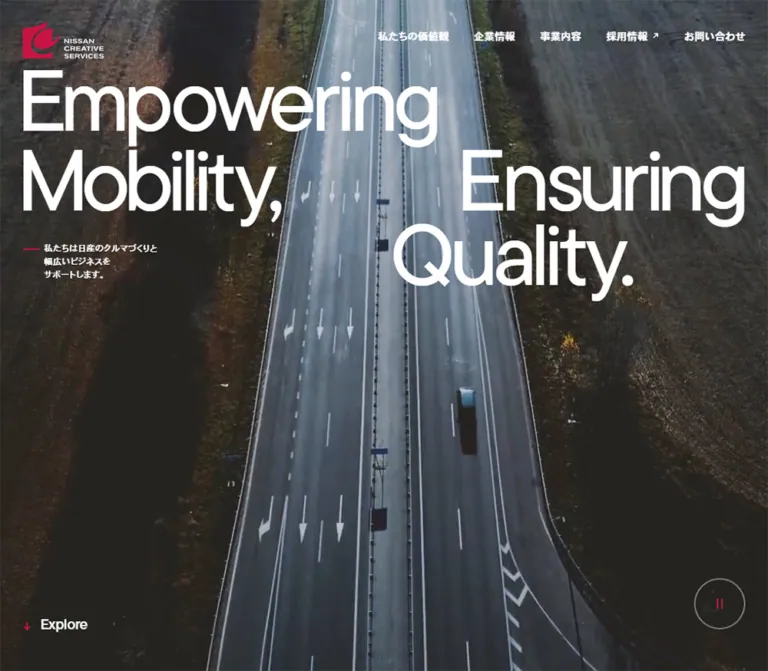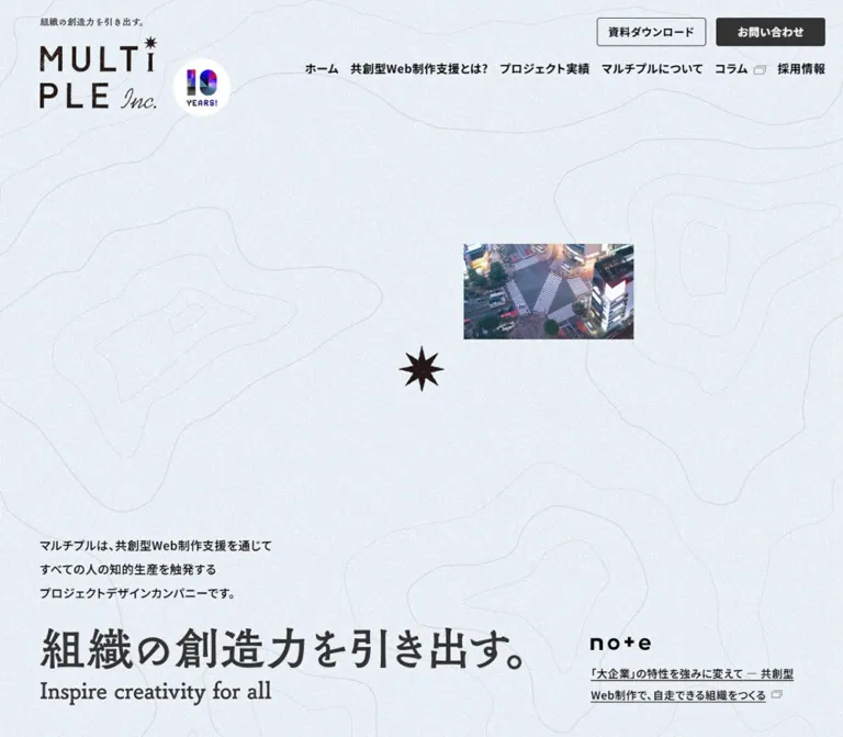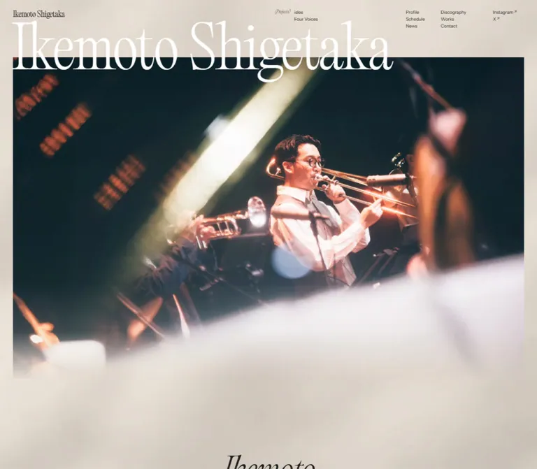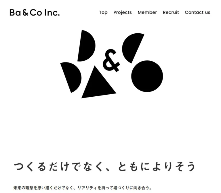
プレビュー準備中デザインリファレンスを見る
日本のWebデザインを、AIの制作リファレンスに。
DESIGN REFERENCE
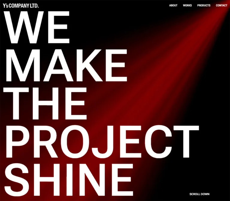
黒地に赤い光と巨大な白文字を重ねた演出照明会社のサイト。段違いの実績配置、細い赤線のリンク、写真に重ねたサービス紹介が特徴。
オリジナルサイトを見るA black stage, a red spotlight, and a headline built to fill the room.
Website: yscompany.tokyo Original URL: https://yscompany.tokyo/ Final URL: https://yscompany.tokyo/ Theme: dark; black canvas with white typography and red accents Inspected: September 23, 2026, at 02:57:41 JST — September 22, 2026, at 17:57:41 UTC Viewports: 1440 × 1000 and 390 × 844 CSS pixels Scope: the current corporate homepage: opening composition, advantages, six project previews, four product previews, two related services, footer, desktop navigation, and the closed mobile menu control. Separate pages, project detail states, the open menu, and the external contact form were not inspected.
Y’s COMPANY presents its lighting and control expertise through the visual language of a dark performance space. A red beam spreads diagonally from the upper-right corner behind an enormous white statement: WE / MAKE / THE / PROJECT / SHINE. The background remains black throughout the homepage. Small Japanese descriptions, thin red link underlines, and unboxed photographs provide detail without competing with the opening typography.
This is a corporate homepage with company information, work examples, product discovery, and contact routes. Its structure alternates between asymmetric editorial sections and centered introductions. Desktop projects occupy two staggered columns beside an introduction; products form a compact four-column strip; related services finish with two photographic panels. Mobile changes these relationships selectively: projects become one column, products retain two columns, and service panels stack vertically.
A black stage, a red spotlight, and a headline built to fill the room.
Website: yscompany.tokyo Original URL: https://yscompany.tokyo/ Final URL: https://yscompany.tokyo/ Theme: dark; black canvas with white typography and red accents Inspected: September 23, 2026, at 02:57:41 JST — September 22, 2026, at 17:57:41 UTC Viewports: 1440 × 1000 and 390 × 844 CSS pixels Scope: the current corporate homepage: opening composition, advantages, six project previews, four product previews, two related services, footer, desktop navigation, and the closed mobile menu control. Separate pages, project detail states, the open menu, and the external contact form were not inspected.
Y’s COMPANY presents its lighting and control expertise through the visual language of a dark performance space. A red beam spreads diagonally from the upper-right corner behind an enormous white statement: WE / MAKE / THE / PROJECT / SHINE. The background remains black throughout the homepage. Small Japanese descriptions, thin red link underlines, and unboxed photographs provide detail without competing with the opening typography.
This is a corporate homepage with company information, work examples, product discovery, and contact routes. Its structure alternates between asymmetric editorial sections and centered introductions. Desktop projects occupy two staggered columns beside an introduction; products form a compact four-column strip; related services finish with two photographic panels. Mobile changes these relationships selectively: projects become one column, products retain two columns, and service panels stack vertically.
rem: 14.4px at desktop and 12.8px at mobile. This document does not establish the source formula between those endpoints.| Name | Value | Suggested token | Evidence and role |
|---|---|---|---|
| Stage Black | #000000 |
--color-stage |
Measured body background; continuous canvas throughout the homepage |
| White Type | #ffffff |
--color-type |
Measured headings, paragraphs, links, and footer text |
| Signal Red | #ff0000 |
--color-signal |
Measured advantage numerals; visually consistent with category labels and link underlines |
| Quiet White | rgb(255 255 255 / 0.75) |
--color-quiet |
Recommended approximation for the softer supporting text visible in screenshots; not a measured source token |
| Photo Scrim | rgb(0 0 0 / 0.8) |
--color-scrim |
Visual estimate for the rectangular overlays on service photographs |
| Beam Maroon | Approximately #320000 |
--color-beam-dark |
Visual estimate for a dark part of the opening light field |
| Beam Red | Approximately #b00000 |
--color-beam-hot |
Visual estimate for brighter beam regions; not a recovered gradient stop |
The interface palette is narrower than the photographs. Red marks the lighting concept, large numerals, categories, and small action rules. Project photography retains blue sky, warm interiors, greenery, and other natural colors.
Computed paragraph colors are white even where the captures look gray. The supplied styles do not resolve all ancestor opacity or compositing. Do not describe Quiet White as an independently confirmed source color or apply it on top of an existing opacity treatment without checking the result.
The red beam is a directional light effect with a soft falloff. Its rendering method and exact color stops are unknown. A CSS approximation should preserve the upper-right origin and dark surrounding space without being mistaken for the original asset.
Only the black presentation is evidenced. No theme selector or alternative palette was observed. Generic utility properties, including a blue ring-color default, do not establish additional visible brand colors.
The declared main stack begins with the generated aliases __Roboto_Flex_9887bd and __Roboto_Flex_Fallback_9887bd. The supplied custom property --font-roboto identifies the same family.
Use Roboto Flex for the large English headline, section headings, navigation, and Latin interface text when the font is available. The sampled hero and section headings use weight 600; ordinary descriptions use 400; smaller content headings use 700.
Tracking is measured as normal. The force of the opening comes from size, short line height, and deliberate line breaks rather than widely spaced letters.
The same declared stack continues with __Noto_Sans_JP_354ede and its generated fallback. The --font-noto property identifies Noto Sans JP. This supports using Roboto Flex followed by Noto Sans JP in a reusable implementation, although per-glyph font selection was not separately inspected.
Japanese section subtitles and explanatory text are compact. Body paragraphs use a generous 1.75 line-height ratio; smaller product and service descriptions use a ratio of 2.
The red 01, 02, and 03 explicitly use Barlow Condensed through __Barlow_Condensed_e35a1f and its fallback. Their measured weight is 100, producing tall, very thin numerals against heavier white headings.
Do not apply this family to every label. Desktop navigation was measured with the main Roboto Flex/Noto stack. The wordmark has a condensed appearance, but its underlying asset format and lettering construction were not established.
| Role | Desktop size / line height | Mobile size / line height | Weight | Evidence |
|---|---|---|---|---|
| Hero statement | 212.352 / 180.499px |
78.24 / 66.504px |
600 |
Measured; line-height ratio 0.85 |
| English section heading | 57.6 / 57.6px |
51.2 / 51.2px |
600 |
Measured; 4u / 1 |
| Japanese section subtitle | Approximately 18 / 27px |
Approximately 16 / 24px |
Visually bold | Derived from heading-group geometry; subtitle child styles were not sampled |
| Advantage numeral | 144 / 100.8px |
102.4 / 71.68px |
100 |
Measured; 10u desktop, 8u mobile |
| Advantage heading | 18 / 27px |
16 / 24px |
700 |
Measured; 1.25u / 1.5 |
| Body paragraph | 14.4 / 25.2px |
12.8 / 22.4px |
400 |
Measured; 1u / 1.75 |
| Work, product, service title | 14.4 / 25.2px |
12.8 / 22.4px |
700 |
Measured |
| Product/service description | 12.6 / 25.2px |
11.2 / 22.4px |
400 |
Measured; 0.875u / 2 |
| Desktop navigation | 14.4 / 25.2px |
Hidden in closed mobile state | 600 |
Measured |
| Scroll cue | 14.4 / 25.2px |
12.8 / 22.4px |
600 |
Measured |
| Section index link | 14.4 / 28.8px |
12.8 / 25.6px |
600 |
Measured; line height 2u |
| Footer copyright | 18 / 18px |
16 / 16px |
600 |
Measured |
| Footer contact | 16.2 / 28.8px |
14.4 / 25.6px |
600 |
Measured |
The heading hierarchy deliberately contains a large jump: the desktop hero is about 3.69 times the section-heading size. On mobile, section headings remain substantial while the opening statement shrinks enough to preserve the five-line composition.
Recommended readability adjustment: for an adaptation with substantial reading content, consider raising small mobile descriptions from 11.2px to at least 14px. Allow panels and product rows to grow rather than retaining the original measured heights.
Base relationship: rem-based spacing at two observed root sizes. Density: very spacious between sections, compact within captions and technical lists. Geometry: square photographs and overlays, minimal rules, no visible card elevation system.
| Source property | Desktop | Mobile |
|---|---|---|
| Root font size | 14.4px |
12.8px |
--gutter |
2rem → 28.8px |
1rem → 12.8px |
--header-height |
6rem → 86.4px |
4rem → 51.2px |
--vh |
1svh |
1svh |
--vmin |
100svmin |
100svmin |
The viewport properties are present, but their complete use in layout formulas was not supplied. In particular, the two hero sizes do not establish a single universal vw formula.
| Relationship | Unit relationship | Desktop | Mobile | Status |
|---|---|---|---|---|
| English heading to subtitle | 1u |
14.4px |
12.8px |
Measured heading-group gap |
| Title to description in product/service copy | 1u |
About 14.4px |
About 12.8px |
Derived from rectangles |
| Heading group to introduction paragraph | 2u |
About 28.8px |
About 25.6px |
Derived |
| Media to work/product title | 1.5u |
About 21.6px |
About 19.2px |
Derived with a 16:9 media slot |
| Service overlay inner padding | 3u |
About 43.2px |
About 38.4px |
Screenshot and text-bound estimate |
| Desktop works grid column gap | 4u |
57.6px |
Not an active mobile grid gap | Measured |
| Product row gap on mobile | 4u |
— | About 51.2px |
Derived |
| Section internal major gap | 5u |
72px |
64px |
Measured on products and services |
| Repeated mobile work-card separation | 5u |
— | 64px |
Derived from card positions |
| Desktop left-column work-card separation | 10u |
144px |
— | Derived for the first two intervals |
| Desktop right work-column offset | 15u |
216px |
Removed | Derived from paired card starts |
| Space between major sections | 20u |
288px |
256px |
Repeated measured separation |
The 20u section spacing is a defining feature. It appears before advantages and between advantages, works, products, and other services. Mobile preserves this large pause instead of compressing every section into a dense feed.
| Element | Treatment | Evidence |
|---|---|---|
| Sampled sections, links, header, footer | 0px radius |
Measured |
| Work photographs | Square corners | Visually observed |
| Service image panels and scrims | Square corners | Visually observed |
| Index-link underline | Approximately 1–2px red rule | Visual estimate |
| Mobile menu strokes | Approximately 1px, two parallel lines | Visual estimate |
| Element | Desktop | Mobile |
|---|---|---|
| Document height | About 6203.25px |
7614px |
| Header height | About 86.39px |
About 51.19px |
| Wordmark link box | 183.89 × 21.59px |
163.39 × 19.19px |
| Hero H1 box | 930.11 × 902.5px at (28.80, 75.05) |
342.70 × 332.42px at (12.80, 47.02) |
| Hero description | 432 × 75.61px, top 1021.52px |
364.41 × 89.56px, top 741.64px |
| Scroll cue position | Approximately (908.50, 938.72) |
Approximately (12.80, 595.78) |
| Main content start | 1125.92px |
844px |
| Works section height | 1808.11px |
2909.89px |
| Work-card width | About 364.80px |
About 338.81px |
| Product-card width | 359.25px |
194.5px |
| Product text width | About 301.66px |
About 168.91px |
| Service image width | 720px each |
390px each |
| Service copy width | About 345.63px |
About 287.63px |
| Footer height | About 86.39px |
About 108.77px |
Document heights describe this content at these viewports. They are not recommended fixed heights.
Role: identity and access to company information, work, products, and contact.
The opening header is transparent over the black/red composition. A white condensed wordmark sits at the left gutter. Four uppercase links sit at the right: ABOUT, WORKS, PRODUCTS, and CONTACT. There is no visible enclosing panel, bottom divider, or filled contact button.
Desktop header padding is 28.8px, with 14.4px horizontal padding measured on individual navigation links. The wordmark link starts at x = 28.80px. On mobile, padding reduces to 12.8px and navigation is replaced by a two-line menu symbol at the right.
The mobile button rectangle is 32 × 19.19px, beginning around (345.20, 16). Its DOM label is Menu; the visible treatment is graphical rather than text. The lower mobile capture still shows the menu strokes at the top right, while the wordmark is absent. This suggests differentiated scroll behavior, but the visibility rules were not tested. Do not assume a permanently visible full header.
Role: establish the company’s connection to performance lighting before presenting detailed services.
Use one semantic H1 with five deliberate lines:
WE
MAKE
THE
PROJECT
SHINE
The headline is left aligned, white, weight 600, and tightly stacked at 0.85 line height. It occupies about 902.5px of vertical space at desktop and 332.4px on mobile. PROJECT is the longest line and determines much of the composition’s width.
Behind it, a red beam originates at the upper-right edge. Desktop spreads the light broadly toward the lower left; mobile presents a steeper, narrower field with a substantial black region on the right. The glow contains multiple soft tonal bands rather than a single flat red triangle.
The Japanese introductory paragraph is a separate small text block. At desktop it begins below the initial 1000px viewport. At mobile it sits near the bottom of the 844px opening, beneath a large interval of mostly empty light and black space. Preserve this breathing room instead of placing the paragraph immediately below the headline.
SCROLL DOWN is a small uppercase paragraph, not an observed link or button. It appears near the lower-right side of the headline region on desktop and at the left gutter around y = 596px on mobile. Click behavior is not established.
Role: provide an English visual landmark with a smaller Japanese explanation.
The English heading uses 4u, weight 600, line height 1. A smaller Japanese subtitle follows with a 1u gap. Examples include WORKS with 実績, and OTHER SERVICES with 関連事業のご紹介.
Advantages and works align to the left. Products and other services have centered desktop introductions. Supporting paragraphs sit about 2u below the heading group.
Mobile preserves the 4u English scale. Long phrases wrap: the measured heading groups for OUR ADVANTAGES and OTHER SERVICES are approximately 139.2px tall, consistent with two English lines plus the subtitle. Do not force these phrases onto one line by shrinking all section headings.
Role: explain three operational strengths with a recognizable numbered sequence.
Each item pairs a very large, thin red numeral with a white Japanese heading and paragraph. Desktop number-to-copy spacing is approximately 21.6px; mobile uses about 12.8px.
The desktop sequence steps downward across the page. Item starts are approximately y = 1570.5, 1714.5, and 1858.5px: a 144px descent per item. Copy widths vary around 275–296px. This is an intentionally staggered composition rather than three uniform boxed cards.
Mobile stacks the items vertically. Numerals share x = 12.80px, while text begins around x = 106.91px and has approximately 270.30px available width. Number size reduces from 144px to 102.4px. ABOUT US follows the sequence as an understated index link.
Some numeral element boxes are taller than the numeral’s line box because of layout stretching. Use the measured font size and line height for typography; do not interpret the entire element rectangle as glyph height.
Role: connect a broad service statement to concrete installations.
Desktop works uses three measured grid tracks of approximately 422.406px, separated by 57.6px. The introduction occupies the left region; project previews occupy the middle and right. Actual project cards are narrower than their nominal tracks, at about 364.8px, producing extra black space between photographs.
The supplied mid-scroll capture keeps the introduction and VIEW ALL WORKS visible beside later projects. This is consistent with a sticky introduction, but the source positioning rule was not included. A sticky implementation is a reasonable adaptation, not a confirmed recovered declaration.
Projects alternate across the two right columns. The right column begins 216px below the left, and the offset repeats for each pair. Card starts include:
| Pair | Left project | Right project | Right-side offset |
|---|---|---|---|
| 1 | LDH Kitchen |
お台場 自由の女神像 |
216px |
| 2 | SIXPAD STUDIO |
東京會舘 バンケットホール |
216px |
| 3 | SHIBUYA FUKURAS |
サンケイプラザ 多目的ホール |
216px |
Mobile presents one project at a time, in that same reading order. Each card begins approximately 25.6px from the viewport edge, an additional 12.8px inset beyond the section gutter. The works index link appears after all six projects in the mobile rendered order.
Role: show an installation and specify the company’s contribution.
An entire preview is an anchor containing a landscape image, a bold project name, a compact bulleted list, and category text. Categories appear vertically in red immediately outside the left edge of the image. In the supplied works capture, these include GYM, STUDIO, and HALL.
The image geometry is consistent with 16:9: approximately 364.8 × 205.2px on desktop and 338.8 × 190.6px on mobile. The title begins about 1.5u beneath that slot. The card has no visible background panel, border, rounded corners, or shadow.
Technical lists identify actual services such as equipment supply, controller supply, system construction, scene programming, design, and maintenance. Keep these as readable list content; their specificity is part of the page’s credibility.
The anchors point to same-page hash identifiers, and their text includes 詳しく見る. No activation result was supplied. A modal, drawer, expanded panel, or ordinary anchor jump must not be asserted from the URL shape alone.
Role: provide a quiet route to a fuller section or contact channel.
ABOUT US, VIEW ALL WORKS, VIEW ALL PRODUCTS, and footer CONTACT use white uppercase text with a fine red underline. Their visual weight comes from the red line, not padding inside a button shape.
Index links use weight 600 and a 2u line box. The desktop works link is approximately 118.91px wide; the products link is approximately 142.86px wide. Product navigation is centered; works navigation belongs to the left editorial region on desktop and follows the project list on mobile.
Some links have a measured background-size transition, which supports an animated rule treatment. The actual hover endpoint was not captured.
Role: introduce four lighting-control products and route to individual product pages.
The homepage presents LS-1, LS-CORE, LS-NODE, and LS-Wing. Desktop geometry establishes four columns across the full viewport: each is 359.25px wide with a 1px interval. Mobile becomes a two-by-two grid with 194.5px columns and the same 1px horizontal interval.
Each linked item has a media region, a bold product name, and a small Japanese description. The spacing before titles is consistent with a 16:9 media slot followed by 1.5u. Text is inset by the page gutter: 28.8px desktop and 12.8px mobile.
Descriptions use 12.6px desktop and 11.2px mobile text with line height equal to twice the font size. The supplied text contains ellipses, but this does not establish CSS line clamping. Mobile descriptions occupy more lines and increase row heights.
No dedicated product screenshot or image URL was supplied. The grid and text anatomy are measured; product image subjects, background treatment, and exact cropping remain unverified. A product adaptation should favor legible equipment imagery without inventing source asset details.
Role: explain training and environmental lighting/sign services through large photographs.
A centered OTHER SERVICES introduction is followed by two edge-to-edge photographs. Desktop divides the viewport into two equal 720px panels. The left image shows people and lighting equipment in a red-lit working environment. The right image combines a high-contrast bicycle/arrow sign with a view of greenery and architecture.
Each image contains a centered, square black translucent rectangle. Inside it, a bold Japanese service title is centered above a left-aligned paragraph. The observed titles are 機材の制御トレーニング・技術研修 and 環境演出照明・サイン計画.
Desktop geometry is consistent with approximately 144px outer horizontal clearance, a 432px overlay width, and 43.2px inner padding. Text width is measured at approximately 345.63px. Both image panels are about 453.6px tall in the footer capture.
Mobile stacks the photographs at full 390px width. The scrim sits about 12.8px from either edge, with about 38.4px inner padding, leaving 287.63px for copy. The training image is approximately 348.8px tall; the second is approximately 304px. Their different heights accommodate different paragraph lengths. Do not impose equal fixed mobile heights that clip the longer description.
Role: close with legal identity, address, and a direct inquiry route.
The footer continues the black canvas. Desktop places the copyright and wordmark at the left, company/address text beside them, and an underlined CONTACT link at the far right. Padding is 28.8px.
Mobile groups the copyright and wordmark on the first line, places the company/address below, and moves contact to a separate left-aligned row. Padding reduces to 12.8px.
The inspected footer identifies the company as ワイズカンパニー株式会社 and shows 東京都世田谷区桜丘4-23-12 1F. The displayed © 2023 is footer content, not evidence that the current design was inspected or released in 2023.
Both contact links point to a Google Forms URL. The form itself, its fields, and its submission behavior were not inspected.
| Element or treatment | Supplied computed evidence | What can be concluded |
|---|---|---|
| Hero description entry | 0.7s linear 1.25s both brighten |
Named entry animation with a 1.25s delay; keyframes were not supplied |
| Scroll cue entry | 0.5s linear 2.25s both brighten |
Cue has a later named entry animation; exact visual interpolation is unknown |
| Hero description and selected section text | 0.5s linear transition |
A transition is configured; triggers and endpoints are unverified |
| Desktop navigation | 0.3s cubic-bezier(0.4, 0, 0.2, 1) across several properties |
Transition timing is measured; hover colors and transformations were not captured |
| Several index links | background-size 0.5s cubic-bezier(0.33, 1, 0.68, 1) 0.3s |
Background-size feedback is configured, consistent with the visible underline |
| Sampled H1 | animation: none |
No animation on that sampled element; children or background effects remain outside this conclusion |
| Works introduction | Remains visible in the supplied later scroll composition | Sticky positioning is suggested, not directly verified |
| Mobile menu | Closed button and two strokes observed | Open state, transition, focus behavior, and dismissal are unknown |
| Project anchors | Same-page hash destinations | Post-click presentation is unknown |
The inspection included an initial observation of at least five seconds and readiness checks for finite animations, image decoding, layout stability, and text stability. Perpetual animations were paused during readiness checks and resumed afterward. These procedures help explain the settled captures but do not reveal the complete motion design.
The beam looks like theatrical light; a still image does not prove that it sweeps, tracks the pointer, pulses, or uses video/WebGL. Do not add these as factual descriptions. Likewise, the generic computed value transition: all without a nonzero duration does not establish visible animation.
Recommended adaptation: keep motion restrained, use short color/rule feedback, and make text immediately available under reduced motion. If adding a beam animation, document it as a new behavior and keep it independent of content visibility.
| Layer | Appearance | Purpose |
|---|---|---|
| Page canvas | Solid black | Continuous stage-like environment |
| Opening light | Soft red directional field | Establishes the lighting theme |
| Header | Transparent over the opening | Keeps branding and navigation integrated with the composition |
| Text sections | Black with unboxed white text | Organizes company information through scale and spacing |
| Project previews | Photographs followed by text directly on black | Lets installations act as evidence |
| Product region | Full-width column geometry; no separate sampled surface color | Compact catalog access |
| Service imagery | Large edge-to-edge photographs | Supplies context for related offerings |
| Service scrims | Flat translucent black rectangles | Supports readable copy over photographs |
| Action decoration | Fine red underline | Identifies a route without a filled CTA surface |
Avoid introducing a general system of elevated cards. Separation here comes from spacing, image edges, typography, and a small number of flat overlays.
The photographs describe installed lighting and its setting. Visible project examples include a red-lit exercise studio, a warmly illuminated banquet hall, and an outdoor monument with the waterfront and evening sky behind it. These are recognizably different places, not a collection processed into one uniform red duotone.
The opening beam is the abstract image. It communicates light without showing a fixture, performer, or product. Keep its origin, direction, and dark falloff coherent with the typography.
Service photographs are backgrounds for text, so cropping matters. Preserve people and lighting apparatus in the training scene, and retain the bicycle/arrow graphic plus some environmental context in the sign scene. Mobile crops should be selected deliberately instead of assuming the desktop composition remains legible when halved.
No image-file URLs, font-file URLs, or downloadable asset paths were included in the supplied evidence. These references identify visible roles, not filenames to fetch.
| Visual | Original-page evidence | Reuse guidance |
|---|---|---|
| White company wordmark | Desktop/mobile opening and footer captures | Use an authorized brand asset; do not substitute generic condensed text and call it exact |
| Red light field | Desktop and mobile opening captures | Preserve the upper-right origin; asset/rendering method remains unknown |
| Studio, monument, banquet photography | Desktop works capture | Retain natural scene color and landscape framing |
| Training photograph | Desktop and mobile service captures | Support a centered black scrim and responsive cropping |
| Sign/environment photograph | Desktop and mobile service captures | Keep the sign graphic and environmental context visible |
| Product media | Space inferred from DOM rectangles | Appearance and source assets were not visually established |
Use authorized supplied photography where available. CSS can reproduce the layout and an approximate light field, but it cannot reproduce the identity of the real installations.
Desktop allocates nearly an entire screen to the headline itself. Its introductory paragraph falls below the first viewport, and main content begins at approximately 1126px. Mobile compresses the headline while retaining a full-height opening: main content begins at exactly 844px in the supplied viewport.
The mobile arrangement is not a proportional reduction of desktop. The scroll cue moves to the left; the paragraph moves into the first screen; the beam becomes steeper; and navigation becomes a compact menu control.
| Region | 1440 × 1000 | 390 × 844 |
|---|---|---|
| Advantages | Three horizontally distributed items, each starting lower than the previous | Vertical sequence with numeral beside copy |
| Works | Introduction plus two staggered project columns | Introduction, six single-column previews, then index link |
| Products | Four columns | Two columns across two rows |
| Other services | Two equal-width photographs side by side | Two full-width photographs stacked |
| Footer | Horizontal identity/address/contact arrangement | Stacked identity and address, then contact |
The mobile works section’s computed display is flex. A retained grid-template-columns value in its computed record does not make it an active three-column grid. Interpret layout properties together rather than treating every recorded declaration as active.
Section padding decreases from 28.8px to 12.8px. Work cards receive an additional mobile inset, while product media and service photographs span to the viewport edges. This mixture of inset text and full-width imagery is intentional.
Section spacing remains large at 256px mobile. The longer mobile document results primarily from stacked advantages, projects, and services, not from uniformly reducing all whitespace.
Only two viewport sizes are evidenced. Exact breakpoints, tablet composition, landscape behavior, text zoom, and browser-chrome changes remain unverified. The Quick Start uses an explicitly recommended breakpoint and an endpoint-fitting scale.
0.85 line height.These are recommendations for a new implementation, not verified features of the inspected homepage:
#000000.#ffffff.#ff0000.rgb(255 255 255 / 0.75); source text itself computes to white.rgb(0 0 0 / 0.8).“Create a corporate homepage for a theatrical lighting and control company using a continuous black canvas, white Roboto Flex headings, Noto Sans JP Japanese copy, and restrained pure-red accents. Open with the five-line statement WE / MAKE / THE / PROJECT / SHINE in weight 600 with 0.85 line height. Place a soft red beam behind it, originating at the upper-right corner. Follow with three staggered advantages using thin red Barlow Condensed numerals, a left-side works introduction beside two staggered project columns, a four-column product strip, and two full-width photographic service panels with rectangular black scrims. Use square images, compact technical lists, broad section spacing, and small red-underlined index links. On mobile, stack advantages and projects, keep a two-column product grid, stack services, and move the works index link after the projects. Treat menu details, project detail presentation, and beam animation as unspecified requirements.”
This is a reusable adaptation, not recovered source CSS. It keeps the browser’s conventional root size and represents the source unit with --u. At a default 16px root, the scale reaches 12.8px at 390px and 14.4px at 1440px. The 50rem breakpoint, hero sizing formulas, beam gradient, scrim opacity, sticky introduction, and hover endpoints are recommendations.
Load authorized Roboto Flex, Noto Sans JP, and Barlow Condensed font files separately. Use a real wordmark asset. Supply service photograph URLs through --service-image; no asset URLs are invented here.
The works markup contract is .works > .works-intro + .works-projects. Inside .works-intro, place .works-copy followed by .works-index. The mobile display: contents rule lets that same index link follow the project grid without duplicating it. A .section-heading contains an English span and a .section-subtitle span.
:root {
  /* Measured interface colors; estimated scrim. */
  --color-stage: #000;
  --color-type: #fff;
  --color-signal: #f00;
  --color-quiet: rgb(255 255 255 / 0.75);
  --color-scrim: rgb(0 0 0 / 0.8);

  --font-body: 'Roboto Flex', 'Noto Sans JP', sans-serif;
  --font-numbers: 'Barlow Condensed', sans-serif;

  /* Recommended interpolation between measured endpoints. */
  --u: clamp(0.8rem, 1vw, 0.9rem);
  --gutter: var(--u);
  --header-h: calc(4 * var(--u));
  --section-space: calc(20 * var(--u));
  --text-body: var(--u);
  --text-small: calc(0.875 * var(--u));
  --text-section: calc(4 * var(--u));
  --text-subtitle: calc(1.25 * var(--u));
  --hero-size: 20.06154vw;

  /* Static beam approximation, not an observed source asset. */
  --beam-peak: 18deg;
  --beam-end: 36deg;
  --motion-link: 500ms cubic-bezier(0.33, 1, 0.68, 1);
}

* { box-sizing: border-box; }

body {
  margin: 0;
  background: var(--color-stage);
  color: var(--color-type);
  font-family: var(--font-body);
  font-size: var(--text-body);
  line-height: 1.75;
}

img { display: block; max-inline-size: 100%; }
a { color: inherit; }
button { font: inherit; }

.site-header {
  position: absolute;
  inset: 0 0 auto;
  z-index: 10;
  min-block-size: var(--header-h);
  display: flex;
  align-items: center;
  justify-content: space-between;
  padding: var(--gutter);
}

.brand img {
  inline-size: calc(12.77 * var(--u));
  block-size: calc(1.5 * var(--u));
  object-fit: contain;
}

.desktop-nav { display: none; }

/* Recommended larger hit area; the visible mark remains 32px. */
.menu-button {
  position: relative;
  inline-size: 44px;
  block-size: 44px;
  margin: -12px -6px;
  padding: 0;
  border: 0;
  color: white;
  background: transparent;
  cursor: pointer;
}

.menu-button::before,
.menu-button::after {
  content: '';
  position: absolute;
  inset-inline: 6px;
  block-size: 1px;
  background: currentColor;
}

.menu-button::before { top: 18px; }
.menu-button::after { top: 25px; }

.hero {
  position: relative;
  isolation: isolate;
  display: flex;
  flex-direction: column;
  min-block-size: 100svh;
  padding: calc(var(--header-h) - 0.0534 * var(--hero-size))
    var(--gutter) var(--gutter);
}

.hero::before {
  content: '';
  position: absolute;
  inset: 0;
  z-index: -1;
  pointer-events: none;
  background: conic-gradient(
    from 180deg at 100% 0%,
    transparent 0deg,
    rgb(210 0 0 / 0.7) var(--beam-peak),
    transparent var(--beam-end)
  );
}

.hero-title {
  margin: 0;
  font-size: var(--hero-size);
  font-weight: 600;
  line-height: 0.85;
  letter-spacing: normal;
  text-transform: uppercase;
}

.hero-title > span { display: block; white-space: nowrap; }

.hero-copy {
  max-inline-size: calc(30 * var(--u));
  margin: auto 0 0;
}

.scroll-cue {
  position: absolute;
  top: 70.59svh;
  inset-inline-start: var(--gutter);
  margin: 0;
  font-weight: 600;
  text-transform: uppercase;
}

.site-main {
  display: grid;
  gap: var(--section-space);
  padding-block-start: var(--section-space);
}

.section-heading {
  display: flex;
  flex-direction: column;
  gap: var(--u);
  margin: 0;
  font-size: var(--text-section);
  font-weight: 600;
  line-height: 1;
}

.section-heading > span:first-child { text-transform: uppercase; }

.section-subtitle {
  font-size: var(--text-subtitle);
  font-weight: 700;
  line-height: 1.5;
}

.section-copy { margin: calc(2 * var(--u)) 0 0; }

.section-intro {
  max-inline-size: calc(44 * var(--u));
  margin-inline: auto;
  padding-inline: var(--gutter);
  text-align: center;
}

.index-link {
  display: inline-block;
  align-self: flex-start;
  width: fit-content;
  padding-inline: 0.0625em;
  font-weight: 600;
  line-height: 2;
  text-transform: uppercase;
  text-decoration: none;
  background-image: linear-gradient(var(--color-signal), var(--color-signal));
  background-position: left bottom;
  background-repeat: no-repeat;
  background-size: 100% 2px;
  transition: background-size var(--motion-link);
}

.advantages { position: relative; padding-inline: var(--gutter); }

.advantages-grid {
  display: grid;
  gap: calc(4 * var(--u));
  margin-block-start: calc(5 * var(--u));
}

.advantage {
  display: grid;
  grid-template-columns: max-content minmax(0, 1fr);
  align-items: start;
  gap: var(--u);
}

.advantage-number {
  margin: 0;
  color: var(--color-signal);
  font-family: var(--font-numbers);
  font-size: calc(8 * var(--u));
  font-weight: 100;
  line-height: 0.7;
}

.advantage h3 {
  margin: 0 0 var(--u);
  font-size: var(--text-subtitle);
  line-height: 1.5;
}

.advantage-copy p { margin: 0; }
.advantages > .index-link { margin-block-start: calc(5 * var(--u)); }

.works {
  display: flex;
  flex-direction: column;
  gap: calc(5 * var(--u));
  padding-inline: var(--gutter);
}

.works-intro { display: contents; }
.works-copy { order: 0; padding-inline-end: calc(4 * var(--u)); }
.works-index { order: 2; }

.works-projects {
  order: 1;
  display: grid;
  gap: calc(5 * var(--u));
  padding-inline: var(--u);
}

.work-card { position: relative; display: block; text-decoration: none; }
.work-media { inline-size: 100%; aspect-ratio: 16 / 9; object-fit: cover; }

.work-card h3,
.product-card h3 {
  margin: calc(1.5 * var(--u)) 0 0;
  font-size: var(--text-body);
  font-weight: 700;
}

/* List type is an adaptation; list-item styles were not sampled. */
.work-card ul {
  margin: calc(0.5 * var(--u)) 0 0;
  padding-inline-start: var(--u);
  font-size: var(--text-small);
  line-height: calc(1.75 * var(--u));
}

.work-category {
  position: absolute;
  top: 0;
  inset-inline-start: calc(-1.4 * var(--u));
  color: var(--color-signal);
  font-size: var(--text-small);
  line-height: 1;
  text-transform: uppercase;
  writing-mode: vertical-rl;
}

.products,
.other-services {
  display: flex;
  flex-direction: column;
  gap: calc(5 * var(--u));
}

.product-grid {
  display: grid;
  grid-template-columns: repeat(2, minmax(0, 1fr));
  gap: calc(4 * var(--u)) 1px;
}

.product-card { display: block; text-decoration: none; }

/* Contain is recommended for equipment; source cropping is unknown. */
.product-media {
  inline-size: 100%;
  aspect-ratio: 16 / 9;
  object-fit: contain;
}

.product-copy { padding-inline: var(--gutter); }

.product-copy p,
.service-panel p {
  margin: var(--u) 0 0;
  font-size: var(--text-small);
  line-height: 2;
}

.products > .index-link { align-self: center; }
.service-grid { display: grid; grid-template-columns: 1fr; }

.service-tile {
  display: flex;
  padding: calc(4 * var(--u)) var(--gutter);
  background-image: var(--service-image, none);
  background-size: cover;
  background-position: center;
}

.service-panel {
  flex: 1;
  min-inline-size: 0;
  padding: calc(3 * var(--u));
  background: var(--color-scrim);
}

.service-panel h3 {
  margin: 0;
  font-size: var(--text-body);
  font-weight: 700;
  text-align: center;
}

.site-footer {
  display: grid;
  gap: var(--gutter);
  padding: var(--gutter);
}

.footer-identity { display: grid; gap: calc(0.5 * var(--u)); }
.footer-identity p { margin: 0; }
.footer-contact { font-size: calc(1.125 * var(--u)); }

@media (min-width: 50rem) {
  :root {
    --gutter: calc(2 * var(--u));
    --header-h: calc(6 * var(--u));
    --hero-size: min(14.746667vw, 21.2352svh);
    --beam-peak: 42deg;
    --beam-end: 75deg;
  }

  .desktop-nav { display: flex; }
  .desktop-nav a {
    padding-inline: var(--u);
    font-weight: 600;
    text-transform: uppercase;
    text-decoration: none;
    transition: color 300ms cubic-bezier(0.4, 0, 0.2, 1);
  }
  .menu-button { display: none; }
  .hero-copy { margin-block-start: calc(3.05 * var(--u)); }
  .scroll-cue { top: 94svh; inset-inline-start: 63.09%; }

  .advantages-grid {
    grid-template-columns: repeat(3, minmax(0, 1fr));
    align-items: start;
    margin-block-start: calc(4 * var(--u));
  }
  .advantage { gap: calc(1.5 * var(--u)); }
  .advantage-number { font-size: calc(10 * var(--u)); }
  .advantage:nth-child(2) { margin-block-start: calc(10 * var(--u)); }
  .advantage:nth-child(3) { margin-block-start: calc(20 * var(--u)); }
  .advantages > .index-link {
    position: absolute;
    bottom: 0;
    inset-inline-start: var(--gutter);
    margin: 0;
  }

  .works {
    display: grid;
    grid-template-columns: repeat(3, minmax(0, 1fr));
    gap: calc(5 * var(--u)) calc(4 * var(--u));
    align-items: start;
  }

  /* Recommended sticky arrangement based on the scroll capture. */
  .works-intro {
    display: flex;
    flex-direction: column;
    position: sticky;
    top: 38svh;
    min-block-size: calc(62svh - 2 * var(--u));
    padding-inline-end: calc(4 * var(--u));
  }
  .works-copy { padding: 0; }
  .works-index { margin-block-start: auto; }
  .works-projects {
    grid-column: 2 / span 2;
    grid-template-columns: repeat(2, minmax(0, 1fr));
    gap: calc(10 * var(--u)) calc(8 * var(--u));
    padding: 0 calc(4 * var(--u)) calc(15 * var(--u)) 0;
  }
  .work-card:nth-child(even) { transform: translateY(calc(15 * var(--u))); }
  .product-grid { grid-template-columns: repeat(4, minmax(0, 1fr)); }
  .service-grid { grid-template-columns: repeat(2, minmax(0, 1fr)); }
  .service-tile { padding: calc(7 * var(--u)) calc(10 * var(--u)); }

  .site-footer {
    display: flex;
    justify-content: space-between;
    align-items: center;
  }
  .footer-identity { display: flex; align-items: center; gap: var(--gutter); }
}

/* Recommended feedback; original hover endpoints were not captured. */
@media (hover: hover) {
  .index-link:hover { background-size: 100% 3px; }
  .desktop-nav a:hover { color: var(--color-signal); }
}

:where(a, button):focus-visible {
  outline: 2px solid white;
  outline-offset: 5px;
}

@media (prefers-reduced-motion: reduce) {
  .index-link,
  .desktop-nav a { transition: none; }
}
This CSS produces the principal composition and responsive relationships. It intentionally leaves menu expansion, project detail behavior, and photographic assets to the implementation. Its beam is static and approximate. Product and service copy remain in normal flow so changing font size or text length does not require fixed-height repairs.
Optional aliases for a project already using Tailwind v4. These do not establish which Tailwind version, if any, produced the original page. Define the custom properties above first.
@theme inline {
  --color-stage: #000000;
  --color-type: #ffffff;
  --color-signal: #ff0000;
  --color-scrim: rgb(0 0 0 / 0.8);

  --font-body: 'Roboto Flex', 'Noto Sans JP', sans-serif;
  --font-numbers: 'Barlow Condensed', sans-serif;

  --text-copy: var(--u);
  --text-detail: calc(0.875 * var(--u));
  --text-subtitle: calc(1.25 * var(--u));
  --text-section: calc(4 * var(--u));
  --text-hero: var(--hero-size);

  --spacing-unit: var(--u);
  --spacing-gutter: var(--gutter);
  --spacing-section: calc(20 * var(--u));
  --radius-flat: 0px;
}
17:57:41.080 UTC, corresponding to September 23, 2026, at 02:57:41.080 JST.This reference describes the current homepage represented by the supplied original-page evidence. Measurements, visual estimates, derived relationships, and recommended implementation choices are labeled separately.
# Y’s COMPANY LTD. — Style Reference

> A black stage, a red spotlight, and a headline built to fill the room.

**Website:** [yscompany.tokyo](https://yscompany.tokyo/)
**Original URL:** https://yscompany.tokyo/
**Final URL:** https://yscompany.tokyo/
**Theme:** dark; black canvas with white typography and red accents
**Inspected:** September 23, 2026, at 02:57:41 JST — September 22, 2026, at 17:57:41 UTC
**Viewports:** 1440 × 1000 and 390 × 844 CSS pixels
**Scope:** the current corporate homepage: opening composition, advantages, six project previews, four product previews, two related services, footer, desktop navigation, and the closed mobile menu control. Separate pages, project detail states, the open menu, and the external contact form were not inspected.

Y’s COMPANY presents its lighting and control expertise through the visual language of a dark performance space. A red beam spreads diagonally from the upper-right corner behind an enormous white statement: `WE / MAKE / THE / PROJECT / SHINE`. The background remains black throughout the homepage. Small Japanese descriptions, thin red link underlines, and unboxed photographs provide detail without competing with the opening typography.

This is a corporate homepage with company information, work examples, product discovery, and contact routes. Its structure alternates between asymmetric editorial sections and centered introductions. Desktop projects occupy two staggered columns beside an introduction; products form a compact four-column strip; related services finish with two photographic panels. Mobile changes these relationships selectively: projects become one column, products retain two columns, and service panels stack vertically.
# Y’s COMPANY LTD. — Style Reference

> A black stage, a red spotlight, and a headline built to fill the room.

**Website:** [yscompany.tokyo](https://yscompany.tokyo/)
**Original URL:** https://yscompany.tokyo/
**Final URL:** https://yscompany.tokyo/
**Theme:** dark; black canvas with white typography and red accents
**Inspected:** September 23, 2026, at 02:57:41 JST — September 22, 2026, at 17:57:41 UTC
**Viewports:** 1440 × 1000 and 390 × 844 CSS pixels
**Scope:** the current corporate homepage: opening composition, advantages, six project previews, four product previews, two related services, footer, desktop navigation, and the closed mobile menu control. Separate pages, project detail states, the open menu, and the external contact form were not inspected.

Y’s COMPANY presents its lighting and control expertise through the visual language of a dark performance space. A red beam spreads diagonally from the upper-right corner behind an enormous white statement: `WE / MAKE / THE / PROJECT / SHINE`. The background remains black throughout the homepage. Small Japanese descriptions, thin red link underlines, and unboxed photographs provide detail without competing with the opening typography.

This is a corporate homepage with company information, work examples, product discovery, and contact routes. Its structure alternates between asymmetric editorial sections and centered introductions. Desktop projects occupy two staggered columns beside an introduction; products form a compact four-column strip; related services finish with two photographic panels. Mobile changes these relationships selectively: projects become one column, products retain two columns, and service panels stack vertically.

## How to Read This Reference

- **Measured** values come from the supplied rendered DOM, computed styles, and element rectangles. Measurements are CSS pixels, with minor browser rounding.
- **Visual estimates** come from the supplied original-page screenshots. These include beam colors, overlay opacity, and fine decorative lines whose computed styles were not included.
- **Derived** values express relationships between measurements, such as an image slot being consistent with a 16:9 ratio. They are not recovered stylesheet declarations.
- **Recommended** values and CSS are implementation guidance. Breakpoints, intermediate scaling, focus states, and unspecified interaction endpoints are not presented as original behavior.
- **1u** below means one source `rem`: 14.4px at desktop and 12.8px at mobile. This document does not establish the source formula between those endpoints.
- Screenshots directly show the opening, part of the desktop works section, and the related-services/footer area. Advantages and products have detailed DOM geometry but no dedicated supplied visual capture.

## Tokens — Colors

### Default Palette

| Name | Value | Suggested token | Evidence and role |
| --- | --- | --- | --- |
| Stage Black | `#000000` | `--color-stage` | Measured body background; continuous canvas throughout the homepage |
| White Type | `#ffffff` | `--color-type` | Measured headings, paragraphs, links, and footer text |
| Signal Red | `#ff0000` | `--color-signal` | Measured advantage numerals; visually consistent with category labels and link underlines |
| Quiet White | `rgb(255 255 255 / 0.75)` | `--color-quiet` | Recommended approximation for the softer supporting text visible in screenshots; not a measured source token |
| Photo Scrim | `rgb(0 0 0 / 0.8)` | `--color-scrim` | Visual estimate for the rectangular overlays on service photographs |
| Beam Maroon | Approximately `#320000` | `--color-beam-dark` | Visual estimate for a dark part of the opening light field |
| Beam Red | Approximately `#b00000` | `--color-beam-hot` | Visual estimate for brighter beam regions; not a recovered gradient stop |

The interface palette is narrower than the photographs. Red marks the lighting concept, large numerals, categories, and small action rules. Project photography retains blue sky, warm interiors, greenery, and other natural colors.

Computed paragraph colors are white even where the captures look gray. The supplied styles do not resolve all ancestor opacity or compositing. Do not describe Quiet White as an independently confirmed source color or apply it on top of an existing opacity treatment without checking the result.

The red beam is a directional light effect with a soft falloff. Its rendering method and exact color stops are unknown. A CSS approximation should preserve the upper-right origin and dark surrounding space without being mistaken for the original asset.

### Theme Presets

Only the black presentation is evidenced. No theme selector or alternative palette was observed. Generic utility properties, including a blue ring-color default, do not establish additional visible brand colors.

## Tokens — Typography

### Roboto Flex — Main Latin Typography

The declared main stack begins with the generated aliases `__Roboto_Flex_9887bd` and `__Roboto_Flex_Fallback_9887bd`. The supplied custom property `--font-roboto` identifies the same family.

Use Roboto Flex for the large English headline, section headings, navigation, and Latin interface text when the font is available. The sampled hero and section headings use weight `600`; ordinary descriptions use `400`; smaller content headings use `700`.

Tracking is measured as `normal`. The force of the opening comes from size, short line height, and deliberate line breaks rather than widely spaced letters.

### Noto Sans JP — Japanese Text in the Main Stack

The same declared stack continues with `__Noto_Sans_JP_354ede` and its generated fallback. The `--font-noto` property identifies Noto Sans JP. This supports using Roboto Flex followed by Noto Sans JP in a reusable implementation, although per-glyph font selection was not separately inspected.

Japanese section subtitles and explanatory text are compact. Body paragraphs use a generous `1.75` line-height ratio; smaller product and service descriptions use a ratio of `2`.

### Barlow Condensed — Advantage Numerals

The red `01`, `02`, and `03` explicitly use Barlow Condensed through `__Barlow_Condensed_e35a1f` and its fallback. Their measured weight is `100`, producing tall, very thin numerals against heavier white headings.

Do not apply this family to every label. Desktop navigation was measured with the main Roboto Flex/Noto stack. The wordmark has a condensed appearance, but its underlying asset format and lettering construction were not established.

### Type Scale

| Role | Desktop size / line height | Mobile size / line height | Weight | Evidence |
| --- | --- | --- | --- | --- |
| Hero statement | `212.352 / 180.499px` | `78.24 / 66.504px` | `600` | Measured; line-height ratio `0.85` |
| English section heading | `57.6 / 57.6px` | `51.2 / 51.2px` | `600` | Measured; `4u / 1` |
| Japanese section subtitle | Approximately `18 / 27px` | Approximately `16 / 24px` | Visually bold | Derived from heading-group geometry; subtitle child styles were not sampled |
| Advantage numeral | `144 / 100.8px` | `102.4 / 71.68px` | `100` | Measured; `10u` desktop, `8u` mobile |
| Advantage heading | `18 / 27px` | `16 / 24px` | `700` | Measured; `1.25u / 1.5` |
| Body paragraph | `14.4 / 25.2px` | `12.8 / 22.4px` | `400` | Measured; `1u / 1.75` |
| Work, product, service title | `14.4 / 25.2px` | `12.8 / 22.4px` | `700` | Measured |
| Product/service description | `12.6 / 25.2px` | `11.2 / 22.4px` | `400` | Measured; `0.875u / 2` |
| Desktop navigation | `14.4 / 25.2px` | Hidden in closed mobile state | `600` | Measured |
| Scroll cue | `14.4 / 25.2px` | `12.8 / 22.4px` | `600` | Measured |
| Section index link | `14.4 / 28.8px` | `12.8 / 25.6px` | `600` | Measured; line height `2u` |
| Footer copyright | `18 / 18px` | `16 / 16px` | `600` | Measured |
| Footer contact | `16.2 / 28.8px` | `14.4 / 25.6px` | `600` | Measured |

The heading hierarchy deliberately contains a large jump: the desktop hero is about 3.69 times the section-heading size. On mobile, section headings remain substantial while the opening statement shrinks enough to preserve the five-line composition.

**Recommended readability adjustment:** for an adaptation with substantial reading content, consider raising small mobile descriptions from 11.2px to at least 14px. Allow panels and product rows to grow rather than retaining the original measured heights.

## Tokens — Spacing & Shapes

**Base relationship:** rem-based spacing at two observed root sizes.
**Density:** very spacious between sections, compact within captions and technical lists.
**Geometry:** square photographs and overlays, minimal rules, no visible card elevation system.

### Responsive Unit

| Source property | Desktop | Mobile |
| --- | --- | --- |
| Root font size | `14.4px` | `12.8px` |
| `--gutter` | `2rem` → `28.8px` | `1rem` → `12.8px` |
| `--header-height` | `6rem` → `86.4px` | `4rem` → `51.2px` |
| `--vh` | `1svh` | `1svh` |
| `--vmin` | `100svmin` | `100svmin` |

The viewport properties are present, but their complete use in layout formulas was not supplied. In particular, the two hero sizes do not establish a single universal `vw` formula.

### Spacing Scale

| Relationship | Unit relationship | Desktop | Mobile | Status |
| --- | --- | --- | --- | --- |
| English heading to subtitle | `1u` | `14.4px` | `12.8px` | Measured heading-group gap |
| Title to description in product/service copy | `1u` | About `14.4px` | About `12.8px` | Derived from rectangles |
| Heading group to introduction paragraph | `2u` | About `28.8px` | About `25.6px` | Derived |
| Media to work/product title | `1.5u` | About `21.6px` | About `19.2px` | Derived with a 16:9 media slot |
| Service overlay inner padding | `3u` | About `43.2px` | About `38.4px` | Screenshot and text-bound estimate |
| Desktop works grid column gap | `4u` | `57.6px` | Not an active mobile grid gap | Measured |
| Product row gap on mobile | `4u` | — | About `51.2px` | Derived |
| Section internal major gap | `5u` | `72px` | `64px` | Measured on products and services |
| Repeated mobile work-card separation | `5u` | — | `64px` | Derived from card positions |
| Desktop left-column work-card separation | `10u` | `144px` | — | Derived for the first two intervals |
| Desktop right work-column offset | `15u` | `216px` | Removed | Derived from paired card starts |
| Space between major sections | `20u` | `288px` | `256px` | Repeated measured separation |

The 20u section spacing is a defining feature. It appears before advantages and between advantages, works, products, and other services. Mobile preserves this large pause instead of compressing every section into a dense feed.

### Border Radius

| Element | Treatment | Evidence |
| --- | --- | --- |
| Sampled sections, links, header, footer | `0px` radius | Measured |
| Work photographs | Square corners | Visually observed |
| Service image panels and scrims | Square corners | Visually observed |
| Index-link underline | Approximately 1–2px red rule | Visual estimate |
| Mobile menu strokes | Approximately 1px, two parallel lines | Visual estimate |

### Layout Measurements

| Element | Desktop | Mobile |
| --- | --- | --- |
| Document height | About `6203.25px` | `7614px` |
| Header height | About `86.39px` | About `51.19px` |
| Wordmark link box | `183.89 × 21.59px` | `163.39 × 19.19px` |
| Hero H1 box | `930.11 × 902.5px` at `(28.80, 75.05)` | `342.70 × 332.42px` at `(12.80, 47.02)` |
| Hero description | `432 × 75.61px`, top `1021.52px` | `364.41 × 89.56px`, top `741.64px` |
| Scroll cue position | Approximately `(908.50, 938.72)` | Approximately `(12.80, 595.78)` |
| Main content start | `1125.92px` | `844px` |
| Works section height | `1808.11px` | `2909.89px` |
| Work-card width | About `364.80px` | About `338.81px` |
| Product-card width | `359.25px` | `194.5px` |
| Product text width | About `301.66px` | About `168.91px` |
| Service image width | `720px` each | `390px` each |
| Service copy width | About `345.63px` | About `287.63px` |
| Footer height | About `86.39px` | About `108.77px` |

Document heights describe this content at these viewports. They are not recommended fixed heights.

## Components

### Site Header

**Role:** identity and access to company information, work, products, and contact.

The opening header is transparent over the black/red composition. A white condensed wordmark sits at the left gutter. Four uppercase links sit at the right: `ABOUT`, `WORKS`, `PRODUCTS`, and `CONTACT`. There is no visible enclosing panel, bottom divider, or filled contact button.

Desktop header padding is 28.8px, with 14.4px horizontal padding measured on individual navigation links. The wordmark link starts at x = 28.80px. On mobile, padding reduces to 12.8px and navigation is replaced by a two-line menu symbol at the right.

The mobile button rectangle is `32 × 19.19px`, beginning around `(345.20, 16)`. Its DOM label is `Menu`; the visible treatment is graphical rather than text. The lower mobile capture still shows the menu strokes at the top right, while the wordmark is absent. This suggests differentiated scroll behavior, but the visibility rules were not tested. Do not assume a permanently visible full header.

### Opening Statement and Light Field

**Role:** establish the company’s connection to performance lighting before presenting detailed services.

Use one semantic H1 with five deliberate lines:

```text
WE
MAKE
THE
PROJECT
SHINE
```

The headline is left aligned, white, weight 600, and tightly stacked at `0.85` line height. It occupies about 902.5px of vertical space at desktop and 332.4px on mobile. `PROJECT` is the longest line and determines much of the composition’s width.

Behind it, a red beam originates at the upper-right edge. Desktop spreads the light broadly toward the lower left; mobile presents a steeper, narrower field with a substantial black region on the right. The glow contains multiple soft tonal bands rather than a single flat red triangle.

The Japanese introductory paragraph is a separate small text block. At desktop it begins below the initial 1000px viewport. At mobile it sits near the bottom of the 844px opening, beneath a large interval of mostly empty light and black space. Preserve this breathing room instead of placing the paragraph immediately below the headline.

`SCROLL DOWN` is a small uppercase paragraph, not an observed link or button. It appears near the lower-right side of the headline region on desktop and at the left gutter around y = 596px on mobile. Click behavior is not established.

### Bilingual Section Heading

**Role:** provide an English visual landmark with a smaller Japanese explanation.

The English heading uses `4u`, weight 600, line height 1. A smaller Japanese subtitle follows with a 1u gap. Examples include `WORKS` with `実績`, and `OTHER SERVICES` with `関連事業のご紹介`.

Advantages and works align to the left. Products and other services have centered desktop introductions. Supporting paragraphs sit about 2u below the heading group.

Mobile preserves the 4u English scale. Long phrases wrap: the measured heading groups for `OUR ADVANTAGES` and `OTHER SERVICES` are approximately 139.2px tall, consistent with two English lines plus the subtitle. Do not force these phrases onto one line by shrinking all section headings.

### Advantage Item

**Role:** explain three operational strengths with a recognizable numbered sequence.

Each item pairs a very large, thin red numeral with a white Japanese heading and paragraph. Desktop number-to-copy spacing is approximately 21.6px; mobile uses about 12.8px.

The desktop sequence steps downward across the page. Item starts are approximately y = 1570.5, 1714.5, and 1858.5px: a 144px descent per item. Copy widths vary around 275–296px. This is an intentionally staggered composition rather than three uniform boxed cards.

Mobile stacks the items vertically. Numerals share x = 12.80px, while text begins around x = 106.91px and has approximately 270.30px available width. Number size reduces from 144px to 102.4px. `ABOUT US` follows the sequence as an understated index link.

Some numeral element boxes are taller than the numeral’s line box because of layout stretching. Use the measured font size and line height for typography; do not interpret the entire element rectangle as glyph height.

### Works Introduction and Project Field

**Role:** connect a broad service statement to concrete installations.

Desktop works uses three measured grid tracks of approximately 422.406px, separated by 57.6px. The introduction occupies the left region; project previews occupy the middle and right. Actual project cards are narrower than their nominal tracks, at about 364.8px, producing extra black space between photographs.

The supplied mid-scroll capture keeps the introduction and `VIEW ALL WORKS` visible beside later projects. This is consistent with a sticky introduction, but the source positioning rule was not included. A sticky implementation is a reasonable adaptation, not a confirmed recovered declaration.

Projects alternate across the two right columns. The right column begins 216px below the left, and the offset repeats for each pair. Card starts include:

| Pair | Left project | Right project | Right-side offset |
| --- | --- | --- | --- |
| 1 | `LDH Kitchen` | `お台場 自由の女神像` | `216px` |
| 2 | `SIXPAD STUDIO` | `東京會舘 バンケットホール` | `216px` |
| 3 | `SHIBUYA FUKURAS` | `サンケイプラザ 多目的ホール` | `216px` |

Mobile presents one project at a time, in that same reading order. Each card begins approximately 25.6px from the viewport edge, an additional 12.8px inset beyond the section gutter. The works index link appears after all six projects in the mobile rendered order.

### Project Preview

**Role:** show an installation and specify the company’s contribution.

An entire preview is an anchor containing a landscape image, a bold project name, a compact bulleted list, and category text. Categories appear vertically in red immediately outside the left edge of the image. In the supplied works capture, these include `GYM`, `STUDIO`, and `HALL`.

The image geometry is consistent with 16:9: approximately `364.8 × 205.2px` on desktop and `338.8 × 190.6px` on mobile. The title begins about 1.5u beneath that slot. The card has no visible background panel, border, rounded corners, or shadow.

Technical lists identify actual services such as equipment supply, controller supply, system construction, scene programming, design, and maintenance. Keep these as readable list content; their specificity is part of the page’s credibility.

The anchors point to same-page hash identifiers, and their text includes `詳しく見る`. No activation result was supplied. A modal, drawer, expanded panel, or ordinary anchor jump must not be asserted from the URL shape alone.

### Underlined Index Link

**Role:** provide a quiet route to a fuller section or contact channel.

`ABOUT US`, `VIEW ALL WORKS`, `VIEW ALL PRODUCTS`, and footer `CONTACT` use white uppercase text with a fine red underline. Their visual weight comes from the red line, not padding inside a button shape.

Index links use weight 600 and a 2u line box. The desktop works link is approximately 118.91px wide; the products link is approximately 142.86px wide. Product navigation is centered; works navigation belongs to the left editorial region on desktop and follows the project list on mobile.

Some links have a measured `background-size` transition, which supports an animated rule treatment. The actual hover endpoint was not captured.

### Product Preview Grid

**Role:** introduce four lighting-control products and route to individual product pages.

The homepage presents `LS-1`, `LS-CORE`, `LS-NODE`, and `LS-Wing`. Desktop geometry establishes four columns across the full viewport: each is 359.25px wide with a 1px interval. Mobile becomes a two-by-two grid with 194.5px columns and the same 1px horizontal interval.

Each linked item has a media region, a bold product name, and a small Japanese description. The spacing before titles is consistent with a 16:9 media slot followed by 1.5u. Text is inset by the page gutter: 28.8px desktop and 12.8px mobile.

Descriptions use 12.6px desktop and 11.2px mobile text with line height equal to twice the font size. The supplied text contains ellipses, but this does not establish CSS line clamping. Mobile descriptions occupy more lines and increase row heights.

No dedicated product screenshot or image URL was supplied. The grid and text anatomy are measured; product image subjects, background treatment, and exact cropping remain unverified. A product adaptation should favor legible equipment imagery without inventing source asset details.

### Related Service Panels

**Role:** explain training and environmental lighting/sign services through large photographs.

A centered `OTHER SERVICES` introduction is followed by two edge-to-edge photographs. Desktop divides the viewport into two equal 720px panels. The left image shows people and lighting equipment in a red-lit working environment. The right image combines a high-contrast bicycle/arrow sign with a view of greenery and architecture.

Each image contains a centered, square black translucent rectangle. Inside it, a bold Japanese service title is centered above a left-aligned paragraph. The observed titles are `機材の制御トレーニング・技術研修` and `環境演出照明・サイン計画`.

Desktop geometry is consistent with approximately 144px outer horizontal clearance, a 432px overlay width, and 43.2px inner padding. Text width is measured at approximately 345.63px. Both image panels are about 453.6px tall in the footer capture.

Mobile stacks the photographs at full 390px width. The scrim sits about 12.8px from either edge, with about 38.4px inner padding, leaving 287.63px for copy. The training image is approximately 348.8px tall; the second is approximately 304px. Their different heights accommodate different paragraph lengths. Do not impose equal fixed mobile heights that clip the longer description.

### Company Footer

**Role:** close with legal identity, address, and a direct inquiry route.

The footer continues the black canvas. Desktop places the copyright and wordmark at the left, company/address text beside them, and an underlined `CONTACT` link at the far right. Padding is 28.8px.

Mobile groups the copyright and wordmark on the first line, places the company/address below, and moves contact to a separate left-aligned row. Padding reduces to 12.8px.

The inspected footer identifies the company as `ワイズカンパニー株式会社` and shows `東京都世田谷区桜丘4-23-12 1F`. The displayed `© 2023` is footer content, not evidence that the current design was inspected or released in 2023.

Both contact links point to a Google Forms URL. The form itself, its fields, and its submission behavior were not inspected.

## Tokens — Motion & Interaction

| Element or treatment | Supplied computed evidence | What can be concluded |
| --- | --- | --- |
| Hero description entry | `0.7s linear 1.25s both brighten` | Named entry animation with a 1.25s delay; keyframes were not supplied |
| Scroll cue entry | `0.5s linear 2.25s both brighten` | Cue has a later named entry animation; exact visual interpolation is unknown |
| Hero description and selected section text | `0.5s linear` transition | A transition is configured; triggers and endpoints are unverified |
| Desktop navigation | `0.3s cubic-bezier(0.4, 0, 0.2, 1)` across several properties | Transition timing is measured; hover colors and transformations were not captured |
| Several index links | `background-size 0.5s cubic-bezier(0.33, 1, 0.68, 1) 0.3s` | Background-size feedback is configured, consistent with the visible underline |
| Sampled H1 | `animation: none` | No animation on that sampled element; children or background effects remain outside this conclusion |
| Works introduction | Remains visible in the supplied later scroll composition | Sticky positioning is suggested, not directly verified |
| Mobile menu | Closed button and two strokes observed | Open state, transition, focus behavior, and dismissal are unknown |
| Project anchors | Same-page hash destinations | Post-click presentation is unknown |

The inspection included an initial observation of at least five seconds and readiness checks for finite animations, image decoding, layout stability, and text stability. Perpetual animations were paused during readiness checks and resumed afterward. These procedures help explain the settled captures but do not reveal the complete motion design.

The beam looks like theatrical light; a still image does not prove that it sweeps, tracks the pointer, pulses, or uses video/WebGL. Do not add these as factual descriptions. Likewise, the generic computed value `transition: all` without a nonzero duration does not establish visible animation.

**Recommended adaptation:** keep motion restrained, use short color/rule feedback, and make text immediately available under reduced motion. If adding a beam animation, document it as a new behavior and keep it independent of content visibility.

## Surfaces

| Layer | Appearance | Purpose |
| --- | --- | --- |
| Page canvas | Solid black | Continuous stage-like environment |
| Opening light | Soft red directional field | Establishes the lighting theme |
| Header | Transparent over the opening | Keeps branding and navigation integrated with the composition |
| Text sections | Black with unboxed white text | Organizes company information through scale and spacing |
| Project previews | Photographs followed by text directly on black | Lets installations act as evidence |
| Product region | Full-width column geometry; no separate sampled surface color | Compact catalog access |
| Service imagery | Large edge-to-edge photographs | Supplies context for related offerings |
| Service scrims | Flat translucent black rectangles | Supports readable copy over photographs |
| Action decoration | Fine red underline | Identifies a route without a filled CTA surface |

Avoid introducing a general system of elevated cards. Separation here comes from spacing, image edges, typography, and a small number of flat overlays.

## Imagery

The photographs describe installed lighting and its setting. Visible project examples include a red-lit exercise studio, a warmly illuminated banquet hall, and an outdoor monument with the waterfront and evening sky behind it. These are recognizably different places, not a collection processed into one uniform red duotone.

The opening beam is the abstract image. It communicates light without showing a fixture, performer, or product. Keep its origin, direction, and dark falloff coherent with the typography.

Service photographs are backgrounds for text, so cropping matters. Preserve people and lighting apparatus in the training scene, and retain the bicycle/arrow graphic plus some environmental context in the sign scene. Mobile crops should be selected deliberately instead of assuming the desktop composition remains legible when halved.

### Observed Asset References

No image-file URLs, font-file URLs, or downloadable asset paths were included in the supplied evidence. These references identify visible roles, not filenames to fetch.

| Visual | Original-page evidence | Reuse guidance |
| --- | --- | --- |
| White company wordmark | Desktop/mobile opening and footer captures | Use an authorized brand asset; do not substitute generic condensed text and call it exact |
| Red light field | Desktop and mobile opening captures | Preserve the upper-right origin; asset/rendering method remains unknown |
| Studio, monument, banquet photography | Desktop works capture | Retain natural scene color and landscape framing |
| Training photograph | Desktop and mobile service captures | Support a centered black scrim and responsive cropping |
| Sign/environment photograph | Desktop and mobile service captures | Keep the sign graphic and environmental context visible |
| Product media | Space inferred from DOM rectangles | Appearance and source assets were not visually established |

Use authorized supplied photography where available. CSS can reproduce the layout and an approximate light field, but it cannot reproduce the identity of the real installations.

## Layout & Responsive Behavior

### Opening Composition

Desktop allocates nearly an entire screen to the headline itself. Its introductory paragraph falls below the first viewport, and main content begins at approximately 1126px. Mobile compresses the headline while retaining a full-height opening: main content begins at exactly 844px in the supplied viewport.

The mobile arrangement is not a proportional reduction of desktop. The scroll cue moves to the left; the paragraph moves into the first screen; the beam becomes steeper; and navigation becomes a compact menu control.

### Main Content

| Region | 1440 × 1000 | 390 × 844 |
| --- | --- | --- |
| Advantages | Three horizontally distributed items, each starting lower than the previous | Vertical sequence with numeral beside copy |
| Works | Introduction plus two staggered project columns | Introduction, six single-column previews, then index link |
| Products | Four columns | Two columns across two rows |
| Other services | Two equal-width photographs side by side | Two full-width photographs stacked |
| Footer | Horizontal identity/address/contact arrangement | Stacked identity and address, then contact |

The mobile works section’s computed `display` is `flex`. A retained `grid-template-columns` value in its computed record does not make it an active three-column grid. Interpret layout properties together rather than treating every recorded declaration as active.

### Width and Rhythm

Section padding decreases from 28.8px to 12.8px. Work cards receive an additional mobile inset, while product media and service photographs span to the viewport edges. This mixture of inset text and full-width imagery is intentional.

Section spacing remains large at 256px mobile. The longer mobile document results primarily from stacked advantages, projects, and services, not from uniformly reducing all whitespace.

Only two viewport sizes are evidenced. Exact breakpoints, tablet composition, landscape behavior, text zoom, and browser-chrome changes remain unverified. The Quick Start uses an explicitly recommended breakpoint and an endpoint-fitting scale.

## Do’s and Don’ts

### Do

- Keep the continuous black canvas and strong white typography.
- Preserve the five-line hero statement and its `0.85` line height.
- Make the light originate at the upper right and leave genuinely dark areas around it.
- Use thin red Barlow Condensed numerals for the advantages sequence.
- Maintain the desktop stagger in advantages and work previews.
- Pair large English section headings with smaller Japanese subtitles.
- Keep project names and technical contribution lists visible beneath the photographs.
- Use small underlined index links instead of turning every route into a large button.
- Preserve two product columns on mobile while stacking projects and services.
- Let mobile service panels grow with their copy.
- Retain scene-specific colors in photography.
- Distinguish original measurements from chosen implementation formulas.

### Don’t

- Don’t reduce the homepage to a hero and contact CTA; company, work, product, and service content are integral.
- Don’t replace the beam with a generic red background gradient that lacks direction.
- Don’t use Barlow Condensed for all text just because the numerals and wordmark look narrow.
- Don’t introduce rounded cards, glossy surfaces, soft elevation shadows, or colorful category pills.
- Don’t make the work grid uniformly aligned if the staggered desktop rhythm is the goal.
- Don’t flatten all photography into red duotone.
- Don’t force long mobile English section headings onto a single line.
- Don’t assume a 16px source root when translating the measured rem spacing.
- Don’t describe the project links as modals or the menu as an overlay without interaction evidence.
- Don’t treat the scroll cue as a verified clickable control.
- Don’t use the footer copyright year as the capture or design-release date.

## Recommended Implementation Additions

These are recommendations for a new implementation, not verified features of the inspected homepage:

- Expand the mobile menu’s hit area to at least 44 × 44px while keeping its visible strokes compact. Provide an accessible name, expanded state, and controlled-region relationship.
- Give keyboard focus a clearly visible white outline. Preserve the red underline as an additional visual cue rather than the only interaction indicator.
- If project activation opens a dialog, implement focus management, Escape dismissal, and focus restoration. Choose this only after defining the actual required behavior.
- Increase the smallest mobile text where reading comfort matters, and allow layout height to respond.
- Provide useful image alternatives for projects. Treat the opening beam as decorative and avoid announcing duplicated service imagery when nearby text already supplies its meaning.
- Implement service scrims so copy remains readable across each responsive crop.
- Preserve the content order when repositioning the works index link. Avoid duplicate focusable links merely to support desktop and mobile layouts.
- Respect reduced motion and keep essential text visible if animation fails or is disabled.
- Use responsive image sizes and explicit media dimensions to reduce layout shifts.
- Test the unusually tight hero line height with the actual loaded fonts, fallback fonts, narrow screens, and text zoom.

## Agent Prompt Guide

### Quick Color Reference

- Canvas: measured `#000000`.
- Main text: measured `#ffffff`.
- Numerals and matching action accents: measured red `#ff0000`.
- Supporting-copy approximation: `rgb(255 255 255 / 0.75)`; source text itself computes to white.
- Service overlay approximation: `rgb(0 0 0 / 0.8)`.
- Beam tones: visually estimated dark maroon through bright red, with soft falloff.
- Photographs: retain natural scene colors.

### Overall Prompt

“Create a corporate homepage for a theatrical lighting and control company using a continuous black canvas, white Roboto Flex headings, Noto Sans JP Japanese copy, and restrained pure-red accents. Open with the five-line statement WE / MAKE / THE / PROJECT / SHINE in weight 600 with 0.85 line height. Place a soft red beam behind it, originating at the upper-right corner. Follow with three staggered advantages using thin red Barlow Condensed numerals, a left-side works introduction beside two staggered project columns, a four-column product strip, and two full-width photographic service panels with rectangular black scrims. Use square images, compact technical lists, broad section spacing, and small red-underlined index links. On mobile, stack advantages and projects, keep a two-column product grid, stack services, and move the works index link after the projects. Treat menu details, project detail presentation, and beam animation as unspecified requirements.”

### Example Component Prompts

1. **Opening:** “Build a black opening screen with a white wordmark at the upper left and understated navigation at the right. Set WE / MAKE / THE / PROJECT / SHINE on five tightly stacked lines. Use a directional red light field from the upper right. Keep the Japanese introductory paragraph visually separate from the headline, near the lower edge on mobile.”
2. **Advantage item:** “Place a thin red Barlow Condensed numeral beside a bold Japanese title and a compact paragraph. Use no enclosing card. On desktop, lower each successive item by about 10 source units; on mobile, align all numerals in one left column.”
3. **Project preview:** “Use a square-cornered 16:9 installation photograph, a small bold title below, and a bulleted technical-service list on black. Position red vertical category text just outside the image’s left edge. Keep the entire preview a semantic link; do not invent its destination behavior.”
4. **Products:** “Create four edge-to-edge product columns on desktop and two columns on mobile, with 1px horizontal intervals. Follow each media slot with inset title and descriptive copy. Use natural content height and a centered red-underlined VIEW ALL PRODUCTS link below.”
5. **Related service:** “Place a rectangular translucent-black text panel over a full-width environment photograph. Center the bold Japanese title and left-align the paragraph. Use approximately 3 source units of inner padding. Stack the service photographs on mobile and let each height follow its copy.”

## Quick Start

### CSS Custom Properties

This is a reusable adaptation, not recovered source CSS. It keeps the browser’s conventional root size and represents the source unit with `--u`. At a default 16px root, the scale reaches 12.8px at 390px and 14.4px at 1440px. The 50rem breakpoint, hero sizing formulas, beam gradient, scrim opacity, sticky introduction, and hover endpoints are recommendations.

Load authorized Roboto Flex, Noto Sans JP, and Barlow Condensed font files separately. Use a real wordmark asset. Supply service photograph URLs through `--service-image`; no asset URLs are invented here.

The works markup contract is `.works > .works-intro + .works-projects`. Inside `.works-intro`, place `.works-copy` followed by `.works-index`. The mobile `display: contents` rule lets that same index link follow the project grid without duplicating it. A `.section-heading` contains an English span and a `.section-subtitle` span.

```css
:root {
  /* Measured interface colors; estimated scrim. */
  --color-stage: #000;
  --color-type: #fff;
  --color-signal: #f00;
  --color-quiet: rgb(255 255 255 / 0.75);
  --color-scrim: rgb(0 0 0 / 0.8);

  --font-body: 'Roboto Flex', 'Noto Sans JP', sans-serif;
  --font-numbers: 'Barlow Condensed', sans-serif;

  /* Recommended interpolation between measured endpoints. */
  --u: clamp(0.8rem, 1vw, 0.9rem);
  --gutter: var(--u);
  --header-h: calc(4 * var(--u));
  --section-space: calc(20 * var(--u));
  --text-body: var(--u);
  --text-small: calc(0.875 * var(--u));
  --text-section: calc(4 * var(--u));
  --text-subtitle: calc(1.25 * var(--u));
  --hero-size: 20.06154vw;

  /* Static beam approximation, not an observed source asset. */
  --beam-peak: 18deg;
  --beam-end: 36deg;
  --motion-link: 500ms cubic-bezier(0.33, 1, 0.68, 1);
}

* { box-sizing: border-box; }

body {
  margin: 0;
  background: var(--color-stage);
  color: var(--color-type);
  font-family: var(--font-body);
  font-size: var(--text-body);
  line-height: 1.75;
}

img { display: block; max-inline-size: 100%; }
a { color: inherit; }
button { font: inherit; }

.site-header {
  position: absolute;
  inset: 0 0 auto;
  z-index: 10;
  min-block-size: var(--header-h);
  display: flex;
  align-items: center;
  justify-content: space-between;
  padding: var(--gutter);
}

.brand img {
  inline-size: calc(12.77 * var(--u));
  block-size: calc(1.5 * var(--u));
  object-fit: contain;
}

.desktop-nav { display: none; }

/* Recommended larger hit area; the visible mark remains 32px. */
.menu-button {
  position: relative;
  inline-size: 44px;
  block-size: 44px;
  margin: -12px -6px;
  padding: 0;
  border: 0;
  color: white;
  background: transparent;
  cursor: pointer;
}

.menu-button::before,
.menu-button::after {
  content: '';
  position: absolute;
  inset-inline: 6px;
  block-size: 1px;
  background: currentColor;
}

.menu-button::before { top: 18px; }
.menu-button::after { top: 25px; }

.hero {
  position: relative;
  isolation: isolate;
  display: flex;
  flex-direction: column;
  min-block-size: 100svh;
  padding: calc(var(--header-h) - 0.0534 * var(--hero-size))
    var(--gutter) var(--gutter);
}

.hero::before {
  content: '';
  position: absolute;
  inset: 0;
  z-index: -1;
  pointer-events: none;
  background: conic-gradient(
    from 180deg at 100% 0%,
    transparent 0deg,
    rgb(210 0 0 / 0.7) var(--beam-peak),
    transparent var(--beam-end)
  );
}

.hero-title {
  margin: 0;
  font-size: var(--hero-size);
  font-weight: 600;
  line-height: 0.85;
  letter-spacing: normal;
  text-transform: uppercase;
}

.hero-title > span { display: block; white-space: nowrap; }

.hero-copy {
  max-inline-size: calc(30 * var(--u));
  margin: auto 0 0;
}

.scroll-cue {
  position: absolute;
  top: 70.59svh;
  inset-inline-start: var(--gutter);
  margin: 0;
  font-weight: 600;
  text-transform: uppercase;
}

.site-main {
  display: grid;
  gap: var(--section-space);
  padding-block-start: var(--section-space);
}

.section-heading {
  display: flex;
  flex-direction: column;
  gap: var(--u);
  margin: 0;
  font-size: var(--text-section);
  font-weight: 600;
  line-height: 1;
}

.section-heading > span:first-child { text-transform: uppercase; }

.section-subtitle {
  font-size: var(--text-subtitle);
  font-weight: 700;
  line-height: 1.5;
}

.section-copy { margin: calc(2 * var(--u)) 0 0; }

.section-intro {
  max-inline-size: calc(44 * var(--u));
  margin-inline: auto;
  padding-inline: var(--gutter);
  text-align: center;
}

.index-link {
  display: inline-block;
  align-self: flex-start;
  width: fit-content;
  padding-inline: 0.0625em;
  font-weight: 600;
  line-height: 2;
  text-transform: uppercase;
  text-decoration: none;
  background-image: linear-gradient(var(--color-signal), var(--color-signal));
  background-position: left bottom;
  background-repeat: no-repeat;
  background-size: 100% 2px;
  transition: background-size var(--motion-link);
}

.advantages { position: relative; padding-inline: var(--gutter); }

.advantages-grid {
  display: grid;
  gap: calc(4 * var(--u));
  margin-block-start: calc(5 * var(--u));
}

.advantage {
  display: grid;
  grid-template-columns: max-content minmax(0, 1fr);
  align-items: start;
  gap: var(--u);
}

.advantage-number {
  margin: 0;
  color: var(--color-signal);
  font-family: var(--font-numbers);
  font-size: calc(8 * var(--u));
  font-weight: 100;
  line-height: 0.7;
}

.advantage h3 {
  margin: 0 0 var(--u);
  font-size: var(--text-subtitle);
  line-height: 1.5;
}

.advantage-copy p { margin: 0; }
.advantages > .index-link { margin-block-start: calc(5 * var(--u)); }

.works {
  display: flex;
  flex-direction: column;
  gap: calc(5 * var(--u));
  padding-inline: var(--gutter);
}

.works-intro { display: contents; }
.works-copy { order: 0; padding-inline-end: calc(4 * var(--u)); }
.works-index { order: 2; }

.works-projects {
  order: 1;
  display: grid;
  gap: calc(5 * var(--u));
  padding-inline: var(--u);
}

.work-card { position: relative; display: block; text-decoration: none; }
.work-media { inline-size: 100%; aspect-ratio: 16 / 9; object-fit: cover; }

.work-card h3,
.product-card h3 {
  margin: calc(1.5 * var(--u)) 0 0;
  font-size: var(--text-body);
  font-weight: 700;
}

/* List type is an adaptation; list-item styles were not sampled. */
.work-card ul {
  margin: calc(0.5 * var(--u)) 0 0;
  padding-inline-start: var(--u);
  font-size: var(--text-small);
  line-height: calc(1.75 * var(--u));
}

.work-category {
  position: absolute;
  top: 0;
  inset-inline-start: calc(-1.4 * var(--u));
  color: var(--color-signal);
  font-size: var(--text-small);
  line-height: 1;
  text-transform: uppercase;
  writing-mode: vertical-rl;
}

.products,
.other-services {
  display: flex;
  flex-direction: column;
  gap: calc(5 * var(--u));
}

.product-grid {
  display: grid;
  grid-template-columns: repeat(2, minmax(0, 1fr));
  gap: calc(4 * var(--u)) 1px;
}

.product-card { display: block; text-decoration: none; }

/* Contain is recommended for equipment; source cropping is unknown. */
.product-media {
  inline-size: 100%;
  aspect-ratio: 16 / 9;
  object-fit: contain;
}

.product-copy { padding-inline: var(--gutter); }

.product-copy p,
.service-panel p {
  margin: var(--u) 0 0;
  font-size: var(--text-small);
  line-height: 2;
}

.products > .index-link { align-self: center; }
.service-grid { display: grid; grid-template-columns: 1fr; }

.service-tile {
  display: flex;
  padding: calc(4 * var(--u)) var(--gutter);
  background-image: var(--service-image, none);
  background-size: cover;
  background-position: center;
}

.service-panel {
  flex: 1;
  min-inline-size: 0;
  padding: calc(3 * var(--u));
  background: var(--color-scrim);
}

.service-panel h3 {
  margin: 0;
  font-size: var(--text-body);
  font-weight: 700;
  text-align: center;
}

.site-footer {
  display: grid;
  gap: var(--gutter);
  padding: var(--gutter);
}

.footer-identity { display: grid; gap: calc(0.5 * var(--u)); }
.footer-identity p { margin: 0; }
.footer-contact { font-size: calc(1.125 * var(--u)); }

@media (min-width: 50rem) {
  :root {
    --gutter: calc(2 * var(--u));
    --header-h: calc(6 * var(--u));
    --hero-size: min(14.746667vw, 21.2352svh);
    --beam-peak: 42deg;
    --beam-end: 75deg;
  }

  .desktop-nav { display: flex; }
  .desktop-nav a {
    padding-inline: var(--u);
    font-weight: 600;
    text-transform: uppercase;
    text-decoration: none;
    transition: color 300ms cubic-bezier(0.4, 0, 0.2, 1);
  }
  .menu-button { display: none; }
  .hero-copy { margin-block-start: calc(3.05 * var(--u)); }
  .scroll-cue { top: 94svh; inset-inline-start: 63.09%; }

  .advantages-grid {
    grid-template-columns: repeat(3, minmax(0, 1fr));
    align-items: start;
    margin-block-start: calc(4 * var(--u));
  }
  .advantage { gap: calc(1.5 * var(--u)); }
  .advantage-number { font-size: calc(10 * var(--u)); }
  .advantage:nth-child(2) { margin-block-start: calc(10 * var(--u)); }
  .advantage:nth-child(3) { margin-block-start: calc(20 * var(--u)); }
  .advantages > .index-link {
    position: absolute;
    bottom: 0;
    inset-inline-start: var(--gutter);
    margin: 0;
  }

  .works {
    display: grid;
    grid-template-columns: repeat(3, minmax(0, 1fr));
    gap: calc(5 * var(--u)) calc(4 * var(--u));
    align-items: start;
  }

  /* Recommended sticky arrangement based on the scroll capture. */
  .works-intro {
    display: flex;
    flex-direction: column;
    position: sticky;
    top: 38svh;
    min-block-size: calc(62svh - 2 * var(--u));
    padding-inline-end: calc(4 * var(--u));
  }
  .works-copy { padding: 0; }
  .works-index { margin-block-start: auto; }
  .works-projects {
    grid-column: 2 / span 2;
    grid-template-columns: repeat(2, minmax(0, 1fr));
    gap: calc(10 * var(--u)) calc(8 * var(--u));
    padding: 0 calc(4 * var(--u)) calc(15 * var(--u)) 0;
  }
  .work-card:nth-child(even) { transform: translateY(calc(15 * var(--u))); }
  .product-grid { grid-template-columns: repeat(4, minmax(0, 1fr)); }
  .service-grid { grid-template-columns: repeat(2, minmax(0, 1fr)); }
  .service-tile { padding: calc(7 * var(--u)) calc(10 * var(--u)); }

  .site-footer {
    display: flex;
    justify-content: space-between;
    align-items: center;
  }
  .footer-identity { display: flex; align-items: center; gap: var(--gutter); }
}

/* Recommended feedback; original hover endpoints were not captured. */
@media (hover: hover) {
  .index-link:hover { background-size: 100% 3px; }
  .desktop-nav a:hover { color: var(--color-signal); }
}

:where(a, button):focus-visible {
  outline: 2px solid white;
  outline-offset: 5px;
}

@media (prefers-reduced-motion: reduce) {
  .index-link,
  .desktop-nav a { transition: none; }
}
```

This CSS produces the principal composition and responsive relationships. It intentionally leaves menu expansion, project detail behavior, and photographic assets to the implementation. Its beam is static and approximate. Product and service copy remain in normal flow so changing font size or text length does not require fixed-height repairs.

### Tailwind v4 Token Mapping

Optional aliases for a project already using Tailwind v4. These do not establish which Tailwind version, if any, produced the original page. Define the custom properties above first.

```css
@theme inline {
  --color-stage: #000000;
  --color-type: #ffffff;
  --color-signal: #ff0000;
  --color-scrim: rgb(0 0 0 / 0.8);

  --font-body: 'Roboto Flex', 'Noto Sans JP', sans-serif;
  --font-numbers: 'Barlow Condensed', sans-serif;

  --text-copy: var(--u);
  --text-detail: calc(0.875 * var(--u));
  --text-subtitle: calc(1.25 * var(--u));
  --text-section: calc(4 * var(--u));
  --text-hero: var(--hero-size);

  --spacing-unit: var(--u);
  --spacing-gutter: var(--gutter);
  --spacing-section: calc(20 * var(--u));
  --radius-flat: 0px;
}
```

## Sources & Evidence

- **Inspected original and final website:** [Y’s COMPANY LTD.](https://yscompany.tokyo/). The supplied response status is HTTP 200, and the original and final URLs are identical.
- **Capture timestamp:** September 22, 2026, at `17:57:41.080 UTC`, corresponding to September 23, 2026, at `02:57:41.080 JST`.
- **Desktop evidence:** 1440 × 1000 CSS-pixel viewport; opening, works, and related-services/footer captures; rendered text, link destinations, custom properties, computed styles, and element rectangles across the homepage. Document height is approximately 6203.25px.
- **Mobile evidence:** 390 × 844 CSS-pixel viewport; opening and related-services/footer captures, with rendered text and computed geometry for the entire homepage. Document height is 7614px.
- **Navigation evidence:** links to the site’s About, Works, Products, individual product pages, same-page project identifiers, and an external contact form were present in the original rendered page. These destinations were not independently inspected here.
- **Interaction coverage:** supplied scroll traversal and settled captures. No menu opening, project activation, hover comparison, keyboard traversal, form submission, or reduced-motion test was provided.
- **Inspection limitations:** readiness checks do not prove completeness of delayed content. Full keyframes, background-rendering code, image URLs, font files, and all ancestor visual effects were not included. SharedWorkers and service workers were disabled during the supplied inspection.

This reference describes the current homepage represented by the supplied original-page evidence. Measurements, visual estimates, derived relationships, and recommended implementation choices are labeled separately.スタイルやページの種類、ジャンルが近いデザインを集めました。