プレビュー準備中デザインリファレンスを見る
DESIGN REFERENCE
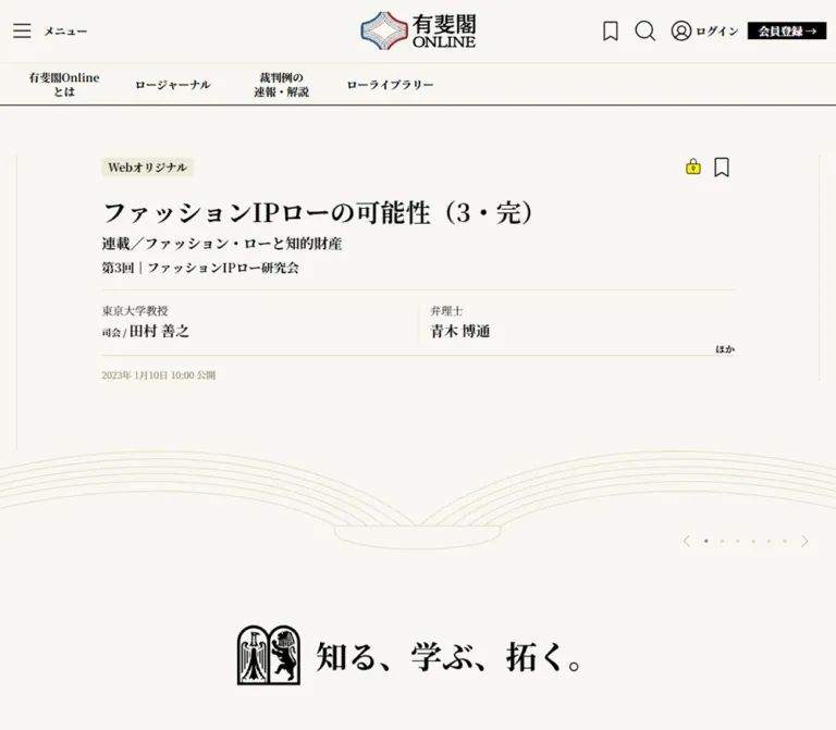
有斐閣Online|書籍の佇まいを活かした法律情報サイト
生成り色の背景、明朝体、開いた本の線画で法律情報を編集的に整理。記事一覧、文献カタログ、人気記事、会員案内を備える現行サイトのデザイン資料。
Yuhikaku Online — Style Reference
A legal publishing portal arranged like an open book on warm ivory paper.
Original URL: https://yuhikaku.com/ Final URL: https://yuhikaku.com/ Theme: light editorial canvas with a black footer; no theme selector was observed. Inspected: September 29, 2026, using supplied browser evidence retrieved at 13:37:47.996 UTC / 22:37:47.996 JST. Viewports: desktop 1440 × 1000 CSS pixels; mobile 390 × 844 CSS pixels. Scope: the current homepage, including its featured-article carousel, Law Journal, discovery links, Law Library, popular articles, news, topic links, membership promotion, footer, consent notice, and support launcher. Visual captures cover desktop top, popular-article, and footer positions, plus mobile top and footer positions. Other section geometry is supported by the rendered DOM.
Yuhikaku Online presents a substantial legal publication catalog through the visual language of printed books. The dominant combination is warm paper, black Japanese serif type, restrained beige rules, and generous whitespace. An outlined open book supports the featured articles; a publisher emblem and the statement “知る、学ぶ、拓く。” reinforce the connection to reading and scholarship.
The homepage has several distinct reading rhythms. Large featured articles sit in a horizontal carousel, recent articles occupy two columns, publication issues form a cover-oriented catalog, and popular articles return to one narrow reading column. Oversized English section names punctuate the Japanese information hierarchy. Small black action rectangles and a blue membership button provide practical navigation without becoming the primary visual subject.
The supplied mobile rendering retains substantial desktop-width content and visibly clips it. That limitation is part of the observed current page. The responsive corrections in this reference are explicitly recommendations, not claims about existing behavior.
閉じる
Yuhikaku Online — Style Reference
A legal publishing portal arranged like an open book on warm ivory paper.
Original URL: https://yuhikaku.com/ Final URL: https://yuhikaku.com/ Theme: light editorial canvas with a black footer; no theme selector was observed. Inspected: September 29, 2026, using supplied browser evidence retrieved at 13:37:47.996 UTC / 22:37:47.996 JST. Viewports: desktop 1440 × 1000 CSS pixels; mobile 390 × 844 CSS pixels. Scope: the current homepage, including its featured-article carousel, Law Journal, discovery links, Law Library, popular articles, news, topic links, membership promotion, footer, consent notice, and support launcher. Visual captures cover desktop top, popular-article, and footer positions, plus mobile top and footer positions. Other section geometry is supported by the rendered DOM.
Yuhikaku Online presents a substantial legal publication catalog through the visual language of printed books. The dominant combination is warm paper, black Japanese serif type, restrained beige rules, and generous whitespace. An outlined open book supports the featured articles; a publisher emblem and the statement “知る、学ぶ、拓く。” reinforce the connection to reading and scholarship.
The homepage has several distinct reading rhythms. Large featured articles sit in a horizontal carousel, recent articles occupy two columns, publication issues form a cover-oriented catalog, and popular articles return to one narrow reading column. Oversized English section names punctuate the Japanese information hierarchy. Small black action rectangles and a blue membership button provide practical navigation without becoming the primary visual subject.
The supplied mobile rendering retains substantial desktop-width content and visibly clips it. That limitation is part of the observed current page. The responsive corrections in this reference are explicitly recommendations, not claims about existing behavior.
How to Read This Reference
- Measured means a value appears in the supplied rendered DOM or computed styles.
- Calculated means arithmetic from measured rectangles, such as column gaps or carousel pitch.
- Estimated means a visual approximation from the current screenshots. Estimated colors were not independently pixel-sampled.
- Recommended means an implementation choice for a new project, including the mobile corrections in Quick Start.
- All custom property names below are reusable aliases. The supplied source custom properties identify Font Awesome families, but do not expose a site-wide color or spacing token system.
- A computed font-family declaration identifies the requested stack; it does not independently verify which font file supplied every rendered glyph.
- Element positions come from the initial DOM snapshots unless explicitly described as screenshot positions. Scrolled screenshot coordinates must not be mistaken for document coordinates.
- No additional browsing, file inspection, or interaction testing was performed for this reference.
Tokens — Colors
Measured Core Palette
| Name | Value | Suggested token | Evidence and role |
|---|---|---|---|
| Ivory Paper | #f8f7f1 |
--paper |
Measured body background at both viewports; the principal page canvas |
| Black Ink | #000000 |
--ink |
Measured article text, headings, navigation text, and filled action backgrounds; also visually matches the footer |
| Reversed White | #ffffff |
--reverse |
Measured text on black registration and view-all links |
| Parchment Selection | #edeada |
--selection |
Measured selected All category backgrounds; a useful approximation for the small cream category labels |
| Brown Secondary | #51463a |
--secondary |
Measured publication-list cross-links beneath Law Journal navigation |
| Book-Spine Brown | #2f251e |
--spine |
Measured backgrounds of the tall topic links near the bottom of the page |
| Link Blue | #2b6cb0 |
--link |
Measured color on several header anchors; their visible icon artwork remains black |
The measured blue anchor color does not mean that the main navigation or article titles should be blue. Those elements are explicitly black in the evidence. Likewise, the footer is a contrasting page region, not evidence of a user-selectable dark theme.
Estimated Supporting Palette
| Name | Approximation | Suggested token | Visible use |
|---|---|---|---|
| Popular-Section Wash | #f0ecdf |
--popular-wash |
Slightly darker cream field behind the popular-article list |
| Fine Beige Rule | #dfd5bd |
--rule |
Open-book linework, metadata separators, and subtle vertical divisions |
| Muted Date | #8e7d62 |
--muted |
Small publication timestamps |
| Membership Blue | #244f8f |
--membership-blue |
Large membership action visible above the footer |
| New-Label Blue Tint | #dce9f0 |
--new-wash |
Pale blue rectangle behind New |
| Footer Secondary | #bfbfbf |
--footer-secondary |
Subdued footer navigation and explanatory text |
Small yellow padlocks, pink support text, a green support mascot, and the logo's red and blue strokes are localized accents. They should not expand into a general multicolor component system. Their exact source colors were not supplied.
Tokens — Typography
Editorial Serif
- Computed source stack:
"Noto Serif JP", serif. - Body:
16px, weight400, line height22.4px. - Article headings:
32px, weight700, line height40px. - Navigation and compact actions: typically
14px, weight700. - Tracking: normally
normal; the topic strips are a deliberate exception. - Character: formal Japanese publishing typography, with strong contrast between large headlines, author names, affiliations, and small dates.
The English section names also declare Noto Serif JP with a serif fallback. There is no evidence for a separate branded Latin display family.
Large Section Typography
Law Journal and Law Library use a remarkably large but regular-weight heading: 113px / 102px on desktop. Their narrow-viewport value becomes 72px / 64.9911px, while the surrounding content remains wider than the mobile viewport.
POPULAR uses 64px / 89.6px, weight 700, at both inspected widths. News uses 113px / 158.2px, weight 500, also unchanged between the supplied viewports. Do not normalize these three heading treatments into one generic display style.
Type Scale
| Role | Desktop size / line height | Weight | Mobile evidence | Status |
|---|---|---|---|---|
| Body and article-link inheritance | 16 / 22.4px |
400 | Same | Measured |
| Main navigation | 14 / 18px |
700 | Same type, taller boxes | Measured |
| Registration and view-all actions | 14 / 22px |
700 | Same | Measured |
| Article title | 32 / 40px |
700 | Same | Measured |
| Law Journal / Law Library | 113 / 102px |
400 | 72 / 64.9911px |
Measured |
| POPULAR | 64 / 89.6px |
700 | Same | Measured |
| Section subtitle | 16 / 22.4px |
700 | Same where sampled | Measured |
| News display heading | 113 / 158.2px |
500 | Same | Measured |
| Publication issue / news item title | 16 / 20px |
700 | Same | Measured |
| Category navigation | 16 / 28.4444px or 16 / 20px |
700 | Some labels use the shorter line height | Measured |
| Vertical topic label | 32 / 40px, 10px tracking |
400 | Same | Measured |
| Author name | Approximately 18–20px |
Visually bold | Similar in the top capture | Estimated |
| Affiliation / timestamp | Approximately 14px / 12px respectively |
Mostly regular | Similar in the top capture | Estimated |
| Consent notice | Approximately 14px, compact leading |
Regular | Similar | Estimated; sans-serif family unverified |
Root Size and Logo Treatment
The source HTML root is 10px / 14px; the body explicitly returns to 16px / 22.4px. Quick Start uses pixel-based tokens with a conventional root size, so source numeric rem values should not be copied into it without conversion.
The visible masthead logo occupies a measured 146 × 48px link rectangle. Its H1 has a computed text size, but the visible wordmark is artwork. Do not rebuild that artwork by treating the H1's 32px value as a logo specification.
Tokens — Spacing & Shapes
Overall density: compact controls and metadata inside widely separated editorial sections.
Geometry: square article regions, flat surfaces, fine rules, and minimal rounding. Small status labels and the consent notice are exceptions; the support launcher is circular.
Layout Measurements
| Element | Desktop measurement | Mobile measurement | Interpretation |
|---|---|---|---|
| Body | 1440px wide |
390px wide |
The body width alone does not reveal overflowing descendants |
| Main section wrapper | 1224px at x 108 |
936px at x 44 |
Both have 12px horizontal padding |
| Main inner content | 1200px |
912px |
Calculated after wrapper padding |
| Masthead logo | 146 × 48px, x 647, y 15 |
Same size, x 327, y 15 |
Mobile wordmark extends beyond the viewport |
| Main navigation item | 138 × 52px |
Approximately 129–130 × 70px |
Six links persist horizontally |
| Featured article text | 803px wide at x 318 |
774px wide at x 125 |
Mobile content remains much wider than the viewport |
| Featured slide pitch | 1018px |
935px |
Calculated from adjacent article origins |
| Journal article column | 548px |
428px |
Two columns remain present |
| Journal column gap | 104px |
56px |
Calculated from article rectangles |
| Library issue card | 287 × 473px |
Approximately 285.33 × 473px |
Four columns become three within an overflowing layout |
| Library horizontal gap | 17px |
28px |
Calculated from card origins |
| Popular article column | 704px at x 368 |
776px at x 124 |
The mobile reading column actually becomes wider |
| News list | 808px at x 316 |
808px at x 108 |
Width remains unchanged |
| Carousel control box | 20 × 20px |
20 × 20px, offscreen |
Visual affordances are much smaller than recommended touch targets |
| Document height | Approximately 10,336px |
11,804px |
Measured browser document heights |
Spacing Details
| Use | Value | Evidence |
|---|---|---|
| Main wrapper inset | 12px per side |
Measured |
| Registration horizontal padding | 13px |
Measured |
| Category navigation inset | 8px |
Measured |
| View-all action padding | 5px 10px 5px 68px |
Measured for Journal and Library; deliberately asymmetric |
| Publication card bottom padding | 48px |
Measured |
| News row bottom padding | 24px |
Measured |
| Topic strip padding | 45px 0 8px |
Measured |
| Topic strip gap | 31px |
Calculated from 40px width and 71px origin pitch |
| Top navigation to featured frame | Approximately 59px on desktop |
Screenshot estimate |
| Consent edge offsets | Approximately 20px left, 32px bottom |
Screenshot estimate at both viewports |
A practical adaptation can use a 4, 8, 12, 16, 24, 32, 48, 64, 96px spacing scale. This is a recommended working scale, not a recovered source variable system.
Corners and Rules
- Article links, navigation links, topic strips, and primary action rectangles have measured
0pxradii. - Category and
Newlabels appear to use a small radius of roughly2–3px. - The consent notice appears to use roughly
8pxcorner rounding. - The support launcher is an approximately
100pxcircle with a fine gray outline. - Fine separators appear approximately
1pxthick. Section boundaries sometimes use closely spaced black rules, while article metadata uses lighter beige rules. - There is no visible general-purpose card shadow system.
Components
Persistent Masthead and Primary Navigation
Role: identity, service navigation, search, account access, and registration.
The desktop header has two horizontal tiers. The upper tier contains a hamburger with “メニュー” on the left, the centered logo, and help, search, login, and registration controls on the right. The visible help icon is a question mark. Search and login use thin black outline symbols. Registration is a small black rectangle with white text and a right arrow.
The upper divider is approximately at y 80px. The lower navigation links occupy y 81–133px, followed by a black bottom rule. Together the visible desktop header is approximately 134px high. The header remains at the top in the scrolled captures, establishing pinned behavior; the supplied properties do not distinguish the exact fixed/sticky implementation.
Six lower-tier links are visible in the current desktop evidence: service introduction, recommendations, Law Journal, Web Original, case updates/commentary, and Law Library. Several use two-line Japanese labels. Their rectangles are 138px wide, with centered bold 14px text.
The outer HEADER element reports zero height because it does not account for the visible positioned descendants in normal flow. Do not use that zero as the visual header height.
Featured-Article Carousel
Role: foreground selected legal articles through a book-like presentation.
A broad article frame sits beneath the header. On desktop, the central text begins at x 318px and spans 803px, while partial neighboring articles remain visible at both sides. Fine vertical lines separate the slide regions. There are no photographic hero panels or raised cards.
The reusable anatomy is:
- A category label such as “Webオリジナル”, with optional
Newstatus. - A small yellow padlock and an outlined bookmark near the upper right.
- A bold
32px / 40pxarticle heading, allowed to occupy multiple lines. - Case citation, series title, and installment information where relevant.
- An author block separated by fine beige rules, with affiliation above the stronger author name.
- A small muted publication date.
The desktop capture shows a three-line headline about a Croatian jurisdiction clause. The mobile capture shows “行政法(後編)”. These are different captured carousel states, not evidence of a responsive content substitution rule.
The DOM contains seven numbered position buttons, Previous and Next buttons, and repeated instances of the same articles at regular horizontal intervals. This supports a carousel structure with duplicated slide content. Do not count those repeated nodes as separate editorial items.
Open-Book Illustration and Publisher Statement
Role: connect the digital catalog to the physical act of reading.
Below the featured text, multiple extremely fine beige curves form the pages of an open book. The desktop illustration spans approximately x 86–1355px, with the central binding at the page midpoint. Its estimated height is about 125px.
The linework is airy and almost diagrammatic: broad arcs, a small curved binding, and no shaded paper texture. Carousel arrows and seven tiny dots sit toward the lower right of this composition rather than directly underneath the article title.
A separate black publisher emblem and “知る、学ぶ、拓く。” statement sit below the book. The combined motif creates a substantial pause before Law Journal begins at document y 966px. Preserve that quiet transition when adapting the design.
Reusable Article Entry
Role: communicate authority and article identity through a consistent information hierarchy.
The same article vocabulary appears in the carousel, Journal grid, and popular list. Keep category, title, legal context, author credentials, publication source, and date distinct. Some entries have multiple authors and a small “ほか” continuation indicator.
Author information is structurally important here. Removing affiliations or compressing everything into one metadata line would weaken the publication's specialist character. Long legal headings need natural Japanese line wrapping rather than ellipsis by default.
The rendered article anchors include headline and descriptive metadata. Bookmark controls appear separately near the top. In a new implementation, keep bookmark buttons outside the article anchor to avoid nested interactive elements.
The meaning of the yellow lock is consistent with restricted access, but clicking it or encountering an access gate was not tested. Bookmark registration is identified in the rendered text; its saved state and authentication behavior are unverified.
Law Journal Section
Role: recent legal reporting and commentary.
A large regular-weight Law Journal heading introduces the section. Supporting Japanese text explains its purpose, while the article total and a black “すべてみる →” action occupy the heading region. The captured total is 4,910 articles; this is live content, not permanent interface copy.
An eight-part category navigation row follows. Desktop items are 150 × 56px; the active All item uses #edeada. The labels mix English and Japanese, including Topics, for Business, for Research, legislation updates, case commentary, journal material, and book information.
These elements are anchors to category URLs. Their appearance resembles tabs, but the evidence does not establish in-place filtering. Preserve link semantics unless an actual filtering behavior is implemented.
Six recent entries occupy two columns. Each measured content column is 548px wide with a 104px gap. Headline rectangles repeatedly measure about 125px high, suggesting reserved headline space; the actual truncation or minimum-height rules were not supplied.
Feature, Series, and Author Discovery
Role: provide alternate ways into the catalog.
Three links labeled “特集”, “連載”, and “著者” follow the Journal entries. Each combines a short heading with a two-line explanation of that browsing mode.
Their desktop text regions measure 322 × 124px at x 143, 559, and 975. At the mobile inspection width, the third item moves to a second row, but the first two still occupy a layout wider than the viewport. The evidence supports the three-option structure and this partial wrapping; it does not provide enough visual detail to reconstruct additional artwork around them.
Law Library Catalog
Role: browse legal publications and access their document collections.
Law Library mirrors the Journal section's oversized heading, Japanese explanation, total, black view-all action, and eight category links. The captured total is 56,986 PDFs. It should be supplied dynamically in a working implementation.
The desktop catalog contains eight issue links in four columns. Each card measures approximately 287 × 473px, including 48px bottom padding. A publication category, cover/media region, issue title, and release date form the content hierarchy. Issue titles use 16px / 20px, weight 700.
The original navigation text explicitly describes browsing magazines and books by their covers. The supplied DOM leaves a substantial region before each issue heading, but does not include original image URLs or intrinsic image dimensions. Do not infer an exact cover ratio or substitute invented publication artwork.
At 390px, the catalog becomes three approximately 285px columns inside a 912px content area. This is a measured change in column count, not a successful phone-sized layout.
Popular Articles
Role: a focused reading list within the larger catalog.
A centered POPULAR heading uses 64px, weight 700, followed by the smaller “よく読まれている記事” subtitle. A large quiet interval separates this introduction from the article list.
The list sits on a slightly darker cream field. Desktop articles occupy a centered 704px reading column, beginning at x 368px. Entries repeat the category, status, lock, bookmark, title, author, and date hierarchy. Thin dark separators distinguish one entry from the next; lighter rules separate internal metadata.
The rendered list contains five articles. There are no visible numbered ranking medals. Its emphasis comes from the section heading, centered measure, and stronger background field.
News List
Role: service announcements and periodic publication summaries.
News uses 113px type at weight 500. Its Japanese explanatory heading sits alongside it near the lower part of the display heading. The list beneath is 808px wide.
Three measured links combine a compact bold 16px / 20px title with a timestamp. Their origins are 96px apart; each anchor is 71px high with 24px bottom padding. A small black view-all action aligns to the right below the list.
This is a compact announcement format, distinct from the larger article component. Avoid giving every news item the 32px article heading style.
Topic Strip Navigation
Role: browse legal subjects through a book-spine-like visual rhythm.
The DOM records narrow dark-brown links for topics such as “民法改正”, “生成AI”, and “コーポレートガバナンス”. The measured links are 40px wide, with white 32px text, 40px line height, 10px letter spacing, and 45px top padding.
Heights vary with label length: examples include 221, 263, 347, 389, and 515px. Adjacent desktop origins are 71px apart, leaving 31px between strips.
These dimensions support a tall, book-spine-like treatment. The original writing-mode property was not included, so the vertical-rl implementation in Quick Start is a reconstruction choice rather than a quoted source rule. The full rail was not shown in the supplied screenshots.
Membership Promotion
Role: explain access benefits and lead to membership courses.
The rendered copy offers access to original articles and archived legal literature, with an explicit note that availability varies by course. The action leads to /list/guide/courses#courses.
The footer capture shows the lower portion of a pale promotional panel. A blue rectangular action, approximately 264 × 58px, sits toward the left. A tilted phone mockup, pale radiating curves, and oversized cropped white lettering occupy the right side. The complete banner height and upper composition are outside that capture.
Keep this action visually larger than the masthead registration link while retaining square corners and serif typography.
Footer
Role: publication taxonomy, account links, service policies, and institutional information.
The desktop footer is a large black field. A stacked logo sits at the left; two publication-navigation columns and one service-navigation column sit to its right. Headings are white, links are subdued gray, and small rules separate headings from their lists.
A lower utility row contains contact, privacy, external transmission, commerce disclosure, rights, and operator links. A fine horizontal rule separates it from the small-print region, which includes an ABJ mark and explanatory text. The rendered footer also contains the copyright line © Yuhikaku Publishing Co., Ltd..
In the mobile bottom capture, the utility links stack vertically at an approximately 24px left inset. The screenshot does not establish that the larger navigation columns were removed; they may be above or outside the captured region.
Consent Notice and Support Launcher
Role: persistent utility overlays with their own visual treatment.
The consent notice is a white, thin-bordered, rounded rectangle at the bottom left. It measures approximately 360 × 188px on desktop and 350 × 188px on mobile, with about 20px left clearance and 32px bottom clearance. Its English copy uses a compact sans-serif style, visibly distinct from the serif site.
A small close glyph appears in its upper-right corner. The bottom action row contains a pale gray Close button and a black Setting button. Their behavior, settings panel, persistence, and consent semantics were not tested.
The support launcher is an approximately 100px outlined circle near the bottom right, with pink Japanese text, a small green mascot, and a separate close affordance. It remains visible over both light content and the black footer.
On mobile, the support circle overlaps the notice's lower-right text and action area. Treat that collision as an observed defect to address in a new implementation.
Tokens — Motion & Interaction
| Element or behavior | Evidence | Practical interpretation |
|---|---|---|
| Link transitions | Measured transition: opacity 0.3s on many anchors |
A 300ms opacity transition is supported; its destination opacity was not supplied |
| Featured carousel | Repeated article nodes, seven position buttons, Previous/Next controls, regular horizontal pitch | Carousel structure is verified; interval, easing, autoplay, swipe, and pause behavior are unverified |
| Different featured content | Desktop and mobile captures show different selected articles | Establishes different captured states, not the cause or timing of a transition |
| Persistent header | Same top-positioned masthead in scrolled captures | Pinned presentation is observed; exact positioning implementation is unverified |
| Category navigation | Real category destinations in anchor hrefs | Treat as navigation links; do not assume client-side tab panels |
| Bookmark | Outline icon and rendered favorite-registration description | Purpose is supported; saved state, feedback, and account requirements were not exercised |
| Menu, search, account links | Visible controls and link destinations | Closed/default appearance only; destination interfaces were not inspected |
| Consent and support controls | Visible overlays and close/action affordances | No opening, closing, submission, or persistence behavior was tested |
| Sampled animations | Most sampled elements report animation: none |
Does not rule out JavaScript animation or unsampled animated descendants |
The inspection process waited for page load, visible image decoding, and sampled layout stability, and conservatively awaited finite motion. It temporarily paused perpetual animations during readiness checks. This improves confidence in the captured composition but does not establish a full motion specification.
Recommended motion: retain understated opacity feedback, use short transitions only where they clarify state, and keep the book outline static unless further evidence establishes animation. If autoplay is added to a new carousel, provide a pause control and reduced-motion behavior. Do not present an invented timing as the original site's timing.
Surfaces
| Layer | Appearance | Purpose |
|---|---|---|
| Page canvas | Solid #f8f7f1 |
Warm, paper-like continuity |
| Editorial entries | Transparent or matching paper; no raised container | Let type and metadata rules define the component |
| Selected category | Flat #edeada rectangle |
Quiet navigation state |
| Popular list region | Slightly darker cream, estimated | Distinguish the focused reading list |
| Primary compact action | Black rectangle, white serif label | View-all and registration navigation |
| Membership action | Blue rectangle, white label | Stronger subscription emphasis |
| Topic strip | Dark brown, white type | Narrow vertical navigation motif |
| Footer | Black with white and gray text | Dense terminal navigation and legal information |
| Consent notice | White, thin gray border, modest rounding | Utility overlay separate from editorial styling |
Elevation is not a defining organizing principle. Most structure comes from type scale, column width, blank space, and rules.
Imagery
The visible identity relies on book-related linework and publication marks rather than stock photography. The open-book outline is particularly important: it creates a large visual gesture while leaving the page almost entirely paper-colored.
The masthead logo combines a folded-page-like emblem, blue and red edge strokes, and a black wordmark. The footer uses a stacked reversed arrangement. The slogan has a separate black publisher emblem. These are distinct assets with different aspect ratios; do not force a single logo file into all three roles.
The membership panel adds a tilted device image showing the service. The Library content is publication-cover-oriented, but its actual cover files and their visual details are not included in the supplied evidence.
Observed Asset References
No original image src paths were supplied. The following inventory identifies roles and evidence without inventing filenames.
| Asset role | Evidence | Reuse guidance |
|---|---|---|
| Horizontal masthead logo | Current top captures; measured 146 × 48px link box |
Preserve proportions and internal red/blue details |
| Stacked footer logo | Current desktop footer capture | Use the appropriate reversed artwork |
| Open-book outline | Current desktop and mobile top captures | Prefer scalable, fine linework; keep the background transparent |
| Publisher emblem and slogan | Current desktop top capture | Preserve the emblem separately from ordinary text |
| Magazine/book covers | Original-page navigation wording and Library structure | Use authorized issue artwork; retain complete covers |
| Tilted phone promotion | Current desktop footer capture, partly visible | Keep the relationship to the membership panel; full bounds are unknown |
| Padlock and bookmark | Current article captures | Keep them small and secondary; provide meaningful accessible names |
| Support mascot | Current top/footer captures | Treat as support-widget artwork, not a general brand illustration system |
| ABJ mark | Current desktop footer capture | Keep within the small-print footer region |
The supplied Font Awesome custom properties establish that Font Awesome 6 family definitions exist on the page. They do not establish that every visible icon comes from that library.
Layout & Responsive Behavior
Desktop Composition
The desktop page is a long document, approximately ten viewport heights at the inspected size. Its sequence is featured articles, the book motif and statement, Law Journal, discovery links, Law Library, popular articles, News, topic navigation, membership promotion, and footer.
Journal and Library share a 1200px inner content width. Other sections deliberately change the reading measure: the feature article is 803px, popular articles are 704px, and News is 808px. Preserve these differences; applying one maximum width to every component would flatten the editorial pacing.
Journal uses two columns, Library four, and the popular list one. The same article typography therefore appears within different contexts rather than inside a uniform card grid.
Observed Mobile Rendering
At 390 × 844, the body remains 390px wide, but several descendants retain much larger dimensions:
- The HEADER wrapper measures
1024pxwide. The logo begins at x327pxand ends at x473px, so only its emblem and a small portion of the whole asset fit in view. - Header utility links begin around x
498px; login and registration are farther right. They remain in the DOM but are outside the captured viewport. - The navigation row remains horizontal and is approximately
70pxtall. Its third link extends slightly past the right edge. - The active feature article begins at x
125pxand is774pxwide. Its heading keeps the desktop32px / 40pxtype. - Carousel controls sit beyond x
1106px, outside the visible phone-width area. - Journal and Library use
936pxouter wrappers. Journal retains two article columns; Library changes from four to three cover columns. - Law Journal and Law Library headings shrink to
72px, while POPULAR remains64pxand News remains113px. - The popular reading column is
776pxwide, and News stays808pxwide. - Footer utility links visibly stack, while the consent notice and support launcher overlap.
This is partial responsive adaptation within a wide layout. The evidence does not identify its cause, exact breakpoints, or behavior under another device/browser configuration. Horizontal scrolling was not tested, so offscreen content should not automatically be described as reachable by swiping.
Recommended Responsive Adaptation
For a new implementation, retain the editorial relationships while fitting the viewport. Below a chosen breakpoint, use one Journal column, two compact Library columns where readable, full-width article text, and a truly centered or deliberately left-aligned masthead logo. Put category navigation in a locally scrollable region instead of allowing the entire document to overflow.
Allow large headings to scale down without shrinking body copy. Reserve separate space for consent and support overlays. The breakpoints and fluid formulas in Quick Start implement these recommendations; they are not reverse-engineered production CSS.
Do’s and Don’ts
Do
- Start with the measured ivory
#f8f7f1, black ink, and Noto Serif JP stack. - Give long Japanese legal titles enough width and natural wrapping.
- Keep author names, affiliations, citations, series information, and dates structurally distinct.
- Preserve the different two-column, four-column, and single-column catalog rhythms.
- Use the open-book outline as a large, quiet identity element.
- Retain oversized regular-weight Journal/Library headings and the separate bold POPULAR treatment.
- Use flat black rectangles for compact actions and reserve blue emphasis for the membership promotion.
- Keep publication covers whole when real artwork is available.
- Treat mobile clipping and overlay collisions as documented limitations when describing the source.
Don’t
- Do not convert the homepage into a generic marketing hero followed by feature cards.
- Do not introduce rounded, shadowed containers around every article.
- Do not replace the editorial serif hierarchy with a uniform sans-serif system.
- Do not turn every category into a brightly colored pill.
- Do not enlarge the yellow lock or support-widget colors into primary brand accents.
- Do not infer exact cover ratios, image filenames, carousel timing, or menu behavior from absent evidence.
- Do not describe category anchors as verified in-place filters.
- Do not count carousel clones as additional articles.
- Do not claim that the current mobile page has a clean single-column layout.
- Do not reproduce offscreen controls or overlapping utility overlays as recommended responsive behavior.
Recommended Implementation Additions
These are improvements for a new implementation, not verified original features:
- Remove page-wide horizontal overflow at common phone widths. Verify navigation, article titles, author metadata, and membership actions at
390pxand narrower. - Give icon-only controls accessible names. Express membership restrictions in text as well as through the yellow padlock.
- Use keyboard-operable carousel controls with visible focus. Increase hit areas to approximately
44 × 44pxwhile keeping the visible dots and arrows delicate. - Prevent duplicated carousel slides from creating duplicate focus stops or repetitive screen-reader content.
- Provide a carousel pause control if automatic advancement is implemented, and respect reduced-motion preferences.
- Keep article links and bookmark buttons as separate interactive elements.
- Check contrast for muted timestamps and pale controls before adopting estimated colors. Darken functional text where needed while retaining the warm palette.
- Arrange consent and support in a shared mobile overlay region so neither obscures the other's actions.
- Preserve complete Japanese titles in the document even if a visual excerpt is introduced for a constrained context.
- Use a logical heading outline, semantic dates, and suitable alternative text for publication covers and meaningful brand imagery.
Agent Prompt Guide
Quick Color Reference
- Main canvas: measured
#f8f7f1. - Editorial text, primary rules, compact filled actions: measured
#000000. - Reversed action text: measured
#ffffff. - Selected category: measured
#edeada. - Secondary publication links: measured
#51463a. - Topic strips: measured
#2f251ewith white text. - Supporting estimates: beige rules
#dfd5bd, popular-list wash#f0ecdf, membership blue#244f8f. - Do not apply the measured header-anchor blue indiscriminately to visible black icons or editorial titles.
Overall Prompt
“Create a Japanese legal publishing homepage inspired by the current Yuhikaku Online interface. Use warm ivory #f8f7f1, black Noto Serif JP typography, fine beige rules, square action rectangles, and generous editorial whitespace. Build a two-tier masthead with a centered logo, compact utilities, and six service-navigation links. Present featured articles in a text-led horizontal carousel above a delicate open-book outline. Follow with large regular-weight English Journal and Library headings, a two-column article layout, a four-column publication catalog, a centered narrow popular-article list, compact News rows, book-spine-like topic links, a membership banner, and a black multi-column footer. Retain legal citations and author affiliations as real hierarchy. Make the new mobile layout fit the viewport; document that this is an improvement over the supplied source rendering.”
Example Component Prompts
- Featured article: “Create an ivory article frame with a small cream category label, optional pale-blue New label, small access and bookmark controls, a bold 32px Japanese serif title, case and series details, ruled author information, and a muted date. Show partial neighboring slides and place delicate pagination near the lower-right edge of a wide open-book illustration. Do not invent autoplay timing.”
- Journal section: “Use a 113px regular serif English section name, a concise Japanese explanation, a dynamic article count, and a small black view-all link. Add eight flat category links and two 548px article columns within a 1200px desktop content area. Keep large gaps and fine metadata rules.”
- Popular list: “Center a bold 64px POPULAR heading above a smaller Japanese subtitle. Place five text-led article entries in a 704px column on a slightly darker cream field. Use restrained separators, author affiliations, and small utility icons; omit ranking medals and raised cards.”
- Library catalog: “Build a flat four-column catalog of legal publication issues. Each item contains a publication label, an uncropped real cover, a bold 16px issue title, and a release date. Keep cover imagery distinct from the text-heavy article component.”
- Footer: “Create a black footer with a reversed stacked logo, two publication-taxonomy columns, one service column, and a smaller legal-link row above a fine divider. Use gray serif links and white headings without card backgrounds.”
- Mobile correction: “Adapt the same ivory-and-serif editorial system to 390px. Keep the whole logo and essential utilities in view, use one article column, locally scrollable category navigation, readable publication covers, and non-overlapping support and consent panels. Preserve desktop typography relationships without reproducing the source's wide overflowing wrappers.”
Quick Start
CSS Custom Properties
This is an implementation starter, not copied production CSS. Measured colors, type sizes, and major desktop widths are retained. Estimated palette values are labeled. Mobile rules intentionally improve on the captured layout. Load Noto Serif JP through the project's font pipeline; the fallback remains serif.
:root {
  /* Measured palette */
  --paper: #f8f7f1;
  --ink: #000;
  --reverse: #fff;
  --selection: #edeada;
  --secondary: #51463a;
  --spine: #2f251e;
  --link: #2b6cb0;

  /* Visual approximations, not recovered source declarations */
  --rule: #dfd5bd;
  --muted: #8e7d62;
  --popular-wash: #f0ecdf;
  --membership-blue: #244f8f;
  --new-wash: #dce9f0;
  --footer-secondary: #bfbfbf;

  --editorial: 'Noto Serif JP', serif;
  --utility: sans-serif;
  --text-body: 16px;
  --text-nav: 14px;
  --text-article: 32px;
  --text-display: 113px;
  --text-popular: 64px;
  --leading-body: 1.4;
  --leading-article: 1.25;

  --wrapper: 1224px;
  --reading-width: 704px;
  --news-width: 808px;
  --rule-width: 1px;
  --radius-label: 3px;
  --motion-link: 300ms;
}

* { box-sizing: border-box; }

html {
  font-size: 100%;
  scroll-padding-top: 150px;
}

body {
  margin: 0;
  color: var(--ink);
  background: var(--paper);
  font-family: var(--editorial);
  font-size: var(--text-body);
  line-height: var(--leading-body);
}

img, svg { max-inline-size: 100%; }
button, input { font: inherit; }
button { cursor: pointer; }
a { color: inherit; }

.site-link {
  text-decoration: none;
  transition: opacity var(--motion-link);
}

.container {
  inline-size: min(var(--wrapper), calc(100% - 48px));
  margin-inline: auto;
  padding-inline: 12px;
}

.site-header {
  position: sticky;
  inset-block-start: 0;
  z-index: 50;
  background: var(--paper);
}

.masthead {
  border-block-end: 1px solid var(--rule);
}

.masthead-inner {
  min-block-size: 80px;
  display: grid;
  grid-template-columns: 1fr auto 1fr;
  align-items: center;
  gap: 16px;
}

.brand {
  display: block;
  inline-size: 146px;
  block-size: 48px;
}

.brand img {
  display: block;
  inline-size: 100%;
  block-size: 100%;
  object-fit: contain;
}

.menu-control { justify-self: start; }

.header-tools {
  display: flex;
  align-items: center;
  justify-content: flex-end;
  gap: 12px;
  font-size: 14px;
  font-weight: 700;
}

.compact-action {
  display: inline-block;
  padding: 0 13px;
  border: 0;
  border-radius: 0;
  color: var(--reverse);
  background: var(--ink);
  font-size: 14px;
  font-weight: 700;
  line-height: 22px;
  text-decoration: none;
  white-space: nowrap;
}

.view-all { padding: 5px 10px 5px 68px; }

.primary-nav {
  border-block-end: 1px solid var(--ink);
}

.primary-nav-inner {
  display: flex;
  overflow-x: auto;
}

.primary-nav a {
  flex: 0 0 138px;
  min-block-size: 52px;
  display: grid;
  place-items: center;
  padding: 8px 13px;
  font-size: 14px;
  font-weight: 700;
  line-height: 18px;
  text-align: center;
  text-decoration: none;
}

.featured {
  padding-block-start: 59px;
}

.featured-frame {
  inline-size: min(1018px, calc(100% - 48px));
  margin-inline: auto;
  padding: 4px clamp(24px, 7.4vw, 107px) 0;
  border-inline: 1px solid var(--rule);
}

.article-meta {
  display: flex;
  align-items: center;
  gap: 16px;
  min-block-size: 24px;
}

.category-label, .new-label {
  display: inline-block;
  padding: 2px 8px;
  border-radius: var(--radius-label);
  font-size: 14px;
  line-height: 20px;
}

.category-label {
  background: var(--selection);
  font-weight: 700;
}

.new-label {
  color: var(--link);
  background: var(--new-wash);
}

.article-actions {
  display: flex;
  align-items: center;
  gap: 12px;
  margin-inline-start: auto;
}

/* Larger targets are a recommended accessibility adaptation. */
.icon-button {
  inline-size: 44px;
  block-size: 44px;
  display: inline-grid;
  place-items: center;
  padding: 0;
  border: 0;
  color: inherit;
  background: transparent;
}

.article-body {
  display: block;
  margin-block-start: 24px;
  text-decoration: none;
}

.article-title {
  margin: 0 0 8px;
  font-size: var(--text-article);
  font-weight: 700;
  line-height: var(--leading-article);
  line-break: strict;
  overflow-wrap: anywhere;
}

.article-context {
  margin-block: 6px;
  font-weight: 700;
}

.article-authors {
  display: grid;
  grid-template-columns: repeat(auto-fit, minmax(180px, 1fr));
  gap: 24px;
  margin-block: 24px 16px;
  padding-block: 16px;
  border-block: 1px solid var(--rule);
}

.author-affiliation { font-size: 14px; }
.author-name { font-size: 18px; font-weight: 700; }
.article-date { color: var(--muted); font-size: 12px; }

/* Supply an actual illustration; this rule does not generate it. */
.book-outline {
  display: block;
  inline-size: min(1270px, 100%);
  block-size: auto;
  margin-inline: auto;
}

.publisher-statement {
  display: flex;
  align-items: center;
  justify-content: center;
  gap: 24px;
  padding-block: 96px;
}

.catalog-section {
  margin-block: 96px;
  padding-block-start: 32px;
  border-block-start: 6px double var(--ink);
}

.section-heading {
  display: flex;
  align-items: flex-end;
  justify-content: space-between;
  gap: 24px;
}

.section-display {
  margin: 0;
  font-size: var(--text-display);
  font-weight: 400;
  line-height: 0.903;
}

.section-description { margin-block: 16px 0; }

.category-nav {
  display: grid;
  grid-template-columns: repeat(8, minmax(0, 1fr));
  margin-block: 40px 24px;
}

.category-nav a {
  display: grid;
  place-items: center;
  min-block-size: 56px;
  padding: 8px;
  font-weight: 700;
  line-height: 1.25;
  text-align: center;
  text-decoration: none;
}

.category-nav [aria-current='page'] {
  background: var(--selection);
}

.journal-grid {
  display: grid;
  grid-template-columns: repeat(2, minmax(0, 1fr));
  column-gap: 104px;
  row-gap: 96px;
  margin-block-start: 80px;
}

.journal-grid .article-title { min-block-size: 125px; }

.discovery-grid {
  display: grid;
  grid-template-columns: repeat(3, minmax(0, 1fr));
  gap: 48px;
  margin-block: 160px;
}

.discovery-item { padding-inline: 23px; }

.library-grid {
  display: grid;
  grid-template-columns: repeat(4, minmax(0, 1fr));
  gap: 0 17px;
  margin-block-start: 60px;
}

.publication-card {
  min-inline-size: 0;
  padding-block-end: 48px;
  text-decoration: none;
}

/* Media height is an adaptation estimate; preserve native cover ratios. */
.publication-media {
  block-size: 340px;
  display: grid;
  place-items: center;
}

.publication-media img {
  max-inline-size: 100%;
  max-block-size: 100%;
  object-fit: contain;
}

.publication-title {
  margin-block: 16px 8px;
  font-size: 16px;
  font-weight: 700;
  line-height: 20px;
}

.popular-heading {
  padding-block: 96px 64px;
  text-align: center;
}

.popular-heading h2 {
  margin: 0;
  font-size: var(--text-popular);
  font-weight: 700;
  line-height: 1.4;
}

.popular-heading p { margin: 0; font-weight: 700; }
.popular-surface { background: var(--popular-wash); }

.popular-list {
  inline-size: min(var(--reading-width), calc(100% - 48px));
  margin-inline: auto;
  padding-block: 144px;
}

.popular-list .article-card {
  padding-block: 28px;
  border-block-end: 1px solid var(--ink);
}

.news {
  inline-size: min(var(--news-width), calc(100% - 48px));
  margin: 160px auto;
}

.news-display {
  margin: 0;
  font-size: 113px;
  font-weight: 500;
  line-height: 1.4;
}

.news-item {
  display: block;
  padding-block: 24px;
  border-block-end: 1px solid var(--rule);
  text-decoration: none;
}

/* Vertical writing is a reconstruction choice, not a recovered rule. */
.topic-rail {
  display: flex;
  align-items: flex-start;
  gap: 31px;
  overflow-x: auto;
  padding: 24px 12px;
}

.topic-spine {
  flex: 0 0 40px;
  inline-size: 40px;
  padding: 45px 0 8px;
  color: var(--reverse);
  background: var(--spine);
  font-size: 32px;
  line-height: 40px;
  letter-spacing: 10px;
  writing-mode: vertical-rl;
  white-space: nowrap;
  text-decoration: none;
}

.membership {
  padding-block: 80px;
  background: var(--selection);
}

.membership-action {
  display: inline-grid;
  place-items: center;
  min-block-size: 58px;
  padding-inline: 48px;
  color: var(--reverse);
  background: var(--membership-blue);
  font-size: 18px;
  font-weight: 700;
  text-decoration: none;
}

.site-footer {
  padding-block: 48px 64px;
  color: var(--footer-secondary);
  background: var(--ink);
}

.footer-grid {
  display: grid;
  grid-template-columns: repeat(4, minmax(0, 1fr));
  gap: 64px;
}

.footer-heading { color: var(--reverse); }
.footer-links { display: grid; gap: 12px; }

.footer-legal {
  display: flex;
  flex-wrap: wrap;
  justify-content: flex-end;
  gap: 24px;
  margin-block-start: 48px;
  padding-block-end: 20px;
  border-block-end: 1px solid #333;
  color: var(--reverse);
  font-size: 12px;
}

.consent {
  position: fixed;
  z-index: 100;
  inset-inline-start: 20px;
  inset-block-end: 32px;
  inline-size: min(360px, calc(100% - 40px));
  padding: 16px;
  border: 1px solid #d8d8de;
  border-radius: 8px;
  color: #000;
  background: #fff;
  font: 14px/1.4 var(--utility);
}

.support-launcher {
  position: fixed;
  z-index: 101;
  inset-inline-end: 30px;
  inset-block-end: 20px;
  inline-size: 100px;
  block-size: 100px;
  border: 1px solid #bfbfbf;
  border-radius: 50%;
}

:focus-visible {
  outline: 2px solid var(--link);
  outline-offset: 4px;
}

/* Hover destination opacity is recommended, not measured. */
@media (hover: hover) {
  .site-link:hover { opacity: 0.72; }
}

/* Recommended breakpoints; these are not the original mobile rules. */
@media (max-width: 1000px) {
  :root { --text-display: 72px; }
  .journal-grid { column-gap: 48px; }
  .library-grid { grid-template-columns: repeat(3, minmax(0, 1fr)); }
  .footer-grid { gap: 32px; }
}

@media (max-width: 700px) {
  :root {
    --text-display: clamp(42px, 10vw, 64px);
    --text-article: 26px;
    --text-popular: 48px;
  }

  .container {
    inline-size: 100%;
    padding-inline: 20px;
  }

  .masthead-inner {
    grid-template-columns: auto minmax(0, 1fr);
    gap: 12px;
    padding-block: 12px;
  }

  .brand { justify-self: end; }
  .header-tools { grid-column: 1 / -1; flex-wrap: wrap; }
  .primary-nav a { flex-basis: 130px; }
  .featured { padding-block-start: 32px; }
  .featured-frame { inline-size: calc(100% - 32px); padding-inline: 16px; }
  .article-meta { gap: 8px; flex-wrap: wrap; }
  .article-authors { grid-template-columns: 1fr; }
  .publisher-statement { padding: 56px 20px; gap: 16px; }
  .section-heading { display: grid; gap: 24px; }
  .view-all { justify-self: start; }

  .category-nav {
    display: flex;
    overflow-x: auto;
  }

  .category-nav a { flex: 0 0 120px; }
  .journal-grid { grid-template-columns: 1fr; row-gap: 48px; }
  .journal-grid .article-title { min-block-size: 0; }
  .discovery-grid { grid-template-columns: 1fr; margin-block: 80px; }
  .discovery-item { padding-inline: 0; }
  .library-grid { grid-template-columns: repeat(2, minmax(0, 1fr)); gap: 20px; }
  .publication-media { block-size: 220px; }
  .popular-list { padding-block: 56px; }
  .news { margin-block: 80px; }
  .news-display { font-size: 64px; }
  .footer-grid { grid-template-columns: 1fr; }
  .footer-legal { flex-direction: column; gap: 16px; }

  /* Put both utility panels inside this shared wrapper. */
  .overlay-dock {
    position: fixed;
    z-index: 100;
    inset-inline: 20px;
    inset-block-end: 20px;
    display: flex;
    flex-direction: column;
    align-items: flex-end;
    gap: 12px;
    pointer-events: none;
  }

  .overlay-dock > * { pointer-events: auto; }
  .overlay-dock .consent { position: relative; inset: auto; inline-size: 100%; order: 2; }
  .overlay-dock .support-launcher { position: relative; inset: auto; order: 1; }
}

@media (max-width: 360px) {
  .library-grid { grid-template-columns: 1fr; }
}

@media (prefers-reduced-motion: reduce) {
  .site-link { transition: none; }
  html { scroll-behavior: auto; }
}
Use semantic header, nav, section, article, and footer elements with these classes. Set lang="ja" on a Japanese implementation. The feature styles describe one visible frame; carousel state, accessible pagination, bookmarking, consent management, and support behavior require separate implementation. Logo, cover, and book-illustration assets must also be supplied separately.
Tailwind v4 Token Mapping
Optional aliases for a project already using Tailwind v4. This does not imply that the original website uses Tailwind. Define the custom properties above first.
@theme inline {
  --color-paper: var(--paper);
  --color-ink: var(--ink);
  --color-selection: var(--selection);
  --color-secondary: var(--secondary);
  --color-spine: var(--spine);
  --color-editorial-rule: var(--rule);
  --color-popular-wash: var(--popular-wash);
  --color-membership: var(--membership-blue);

  --font-editorial: var(--editorial);
  --font-utility: var(--utility);

  --text-editorial-body: var(--text-body);
  --text-editorial-article: var(--text-article);
  --text-editorial-display: var(--text-display);
  --text-editorial-popular: var(--text-popular);

  --spacing-editorial-inset: 12px;
  --radius-editorial-label: var(--radius-label);
}
Sources & Evidence
- Inspected original and final page: Yuhikaku Online. Both supplied URLs are identical, and the supplied browser response status is HTTP 200.
- Capture timestamp: September 29, 2026, 13:37:47.996 UTC. The analysis uses the supplied current-page evidence, not an independently performed later inspection.
- Desktop evidence:
1440 × 1000viewport, approximately10,336pxdocument height; current top, popular-list, and footer screenshots plus rendered text, links, element rectangles, and computed styles. - Mobile evidence:
390 × 844viewport,11,804pxdocument height; current top and footer screenshots plus rendered text, links, element rectangles, and computed styles. - Original-page destinations supporting component purpose: Law Journal, Law Library, membership courses, and service information. These destinations were present in the homepage evidence; their own pages were not inspected.
- Observation limits: no complete stylesheet, image source inventory, font-file verification, responsive breakpoint definitions, or interaction event log was supplied. Menu opening, carousel controls, hover endpoints, bookmark changes, account flows, consent settings, and support interactions remain unverified.
- Capture conditions: the supplied browser process waited for load, image decoding, finite motion, and sampled layout/text stability. SharedWorkers and service workers were disabled. Delayed content and unexercised states may remain outside the evidence.
This reference describes the current homepage as captured. Exact values, visual estimates, and recommended implementation changes are identified separately throughout.
# Yuhikaku Online — Style Reference

> A legal publishing portal arranged like an open book on warm ivory paper.

**Original URL:** [https://yuhikaku.com/](https://yuhikaku.com/)
**Final URL:** [https://yuhikaku.com/](https://yuhikaku.com/)
**Theme:** light editorial canvas with a black footer; no theme selector was observed.
**Inspected:** September 29, 2026, using supplied browser evidence retrieved at 13:37:47.996 UTC / 22:37:47.996 JST.
**Viewports:** desktop 1440 × 1000 CSS pixels; mobile 390 × 844 CSS pixels.
**Scope:** the current homepage, including its featured-article carousel, Law Journal, discovery links, Law Library, popular articles, news, topic links, membership promotion, footer, consent notice, and support launcher. Visual captures cover desktop top, popular-article, and footer positions, plus mobile top and footer positions. Other section geometry is supported by the rendered DOM.

Yuhikaku Online presents a substantial legal publication catalog through the visual language of printed books. The dominant combination is warm paper, black Japanese serif type, restrained beige rules, and generous whitespace. An outlined open book supports the featured articles; a publisher emblem and the statement “知る、学ぶ、拓く。” reinforce the connection to reading and scholarship.

The homepage has several distinct reading rhythms. Large featured articles sit in a horizontal carousel, recent articles occupy two columns, publication issues form a cover-oriented catalog, and popular articles return to one narrow reading column. Oversized English section names punctuate the Japanese information hierarchy. Small black action rectangles and a blue membership button provide practical navigation without becoming the primary visual subject.

The supplied mobile rendering retains substantial desktop-width content and visibly clips it. That limitation is part of the observed current page. The responsive corrections in this reference are explicitly recommendations, not claims about existing behavior.
閉じる
# Yuhikaku Online — Style Reference

> A legal publishing portal arranged like an open book on warm ivory paper.

**Original URL:** [https://yuhikaku.com/](https://yuhikaku.com/)
**Final URL:** [https://yuhikaku.com/](https://yuhikaku.com/)
**Theme:** light editorial canvas with a black footer; no theme selector was observed.
**Inspected:** September 29, 2026, using supplied browser evidence retrieved at 13:37:47.996 UTC / 22:37:47.996 JST.
**Viewports:** desktop 1440 × 1000 CSS pixels; mobile 390 × 844 CSS pixels.
**Scope:** the current homepage, including its featured-article carousel, Law Journal, discovery links, Law Library, popular articles, news, topic links, membership promotion, footer, consent notice, and support launcher. Visual captures cover desktop top, popular-article, and footer positions, plus mobile top and footer positions. Other section geometry is supported by the rendered DOM.

Yuhikaku Online presents a substantial legal publication catalog through the visual language of printed books. The dominant combination is warm paper, black Japanese serif type, restrained beige rules, and generous whitespace. An outlined open book supports the featured articles; a publisher emblem and the statement “知る、学ぶ、拓く。” reinforce the connection to reading and scholarship.

The homepage has several distinct reading rhythms. Large featured articles sit in a horizontal carousel, recent articles occupy two columns, publication issues form a cover-oriented catalog, and popular articles return to one narrow reading column. Oversized English section names punctuate the Japanese information hierarchy. Small black action rectangles and a blue membership button provide practical navigation without becoming the primary visual subject.

The supplied mobile rendering retains substantial desktop-width content and visibly clips it. That limitation is part of the observed current page. The responsive corrections in this reference are explicitly recommendations, not claims about existing behavior.

## How to Read This Reference

- **Measured** means a value appears in the supplied rendered DOM or computed styles.
- **Calculated** means arithmetic from measured rectangles, such as column gaps or carousel pitch.
- **Estimated** means a visual approximation from the current screenshots. Estimated colors were not independently pixel-sampled.
- **Recommended** means an implementation choice for a new project, including the mobile corrections in Quick Start.
- All custom property names below are reusable aliases. The supplied source custom properties identify Font Awesome families, but do not expose a site-wide color or spacing token system.
- A computed font-family declaration identifies the requested stack; it does not independently verify which font file supplied every rendered glyph.
- Element positions come from the initial DOM snapshots unless explicitly described as screenshot positions. Scrolled screenshot coordinates must not be mistaken for document coordinates.
- No additional browsing, file inspection, or interaction testing was performed for this reference.

## Tokens — Colors

### Measured Core Palette

| Name | Value | Suggested token | Evidence and role |
| --- | --- | --- | --- |
| Ivory Paper | `#f8f7f1` | `--paper` | Measured body background at both viewports; the principal page canvas |
| Black Ink | `#000000` | `--ink` | Measured article text, headings, navigation text, and filled action backgrounds; also visually matches the footer |
| Reversed White | `#ffffff` | `--reverse` | Measured text on black registration and view-all links |
| Parchment Selection | `#edeada` | `--selection` | Measured selected `All` category backgrounds; a useful approximation for the small cream category labels |
| Brown Secondary | `#51463a` | `--secondary` | Measured publication-list cross-links beneath Law Journal navigation |
| Book-Spine Brown | `#2f251e` | `--spine` | Measured backgrounds of the tall topic links near the bottom of the page |
| Link Blue | `#2b6cb0` | `--link` | Measured color on several header anchors; their visible icon artwork remains black |

The measured blue anchor color does not mean that the main navigation or article titles should be blue. Those elements are explicitly black in the evidence. Likewise, the footer is a contrasting page region, not evidence of a user-selectable dark theme.

### Estimated Supporting Palette

| Name | Approximation | Suggested token | Visible use |
| --- | --- | --- | --- |
| Popular-Section Wash | `#f0ecdf` | `--popular-wash` | Slightly darker cream field behind the popular-article list |
| Fine Beige Rule | `#dfd5bd` | `--rule` | Open-book linework, metadata separators, and subtle vertical divisions |
| Muted Date | `#8e7d62` | `--muted` | Small publication timestamps |
| Membership Blue | `#244f8f` | `--membership-blue` | Large membership action visible above the footer |
| New-Label Blue Tint | `#dce9f0` | `--new-wash` | Pale blue rectangle behind `New` |
| Footer Secondary | `#bfbfbf` | `--footer-secondary` | Subdued footer navigation and explanatory text |

Small yellow padlocks, pink support text, a green support mascot, and the logo's red and blue strokes are localized accents. They should not expand into a general multicolor component system. Their exact source colors were not supplied.

## Tokens — Typography

### Editorial Serif

- **Computed source stack:** `"Noto Serif JP", serif`.
- **Body:** `16px`, weight `400`, line height `22.4px`.
- **Article headings:** `32px`, weight `700`, line height `40px`.
- **Navigation and compact actions:** typically `14px`, weight `700`.
- **Tracking:** normally `normal`; the topic strips are a deliberate exception.
- **Character:** formal Japanese publishing typography, with strong contrast between large headlines, author names, affiliations, and small dates.

The English section names also declare Noto Serif JP with a serif fallback. There is no evidence for a separate branded Latin display family.

### Large Section Typography

Law Journal and Law Library use a remarkably large but regular-weight heading: `113px / 102px` on desktop. Their narrow-viewport value becomes `72px / 64.9911px`, while the surrounding content remains wider than the mobile viewport.

`POPULAR` uses `64px / 89.6px`, weight `700`, at both inspected widths. `News` uses `113px / 158.2px`, weight `500`, also unchanged between the supplied viewports. Do not normalize these three heading treatments into one generic display style.

### Type Scale

| Role | Desktop size / line height | Weight | Mobile evidence | Status |
| --- | --- | --- | --- | --- |
| Body and article-link inheritance | `16 / 22.4px` | 400 | Same | Measured |
| Main navigation | `14 / 18px` | 700 | Same type, taller boxes | Measured |
| Registration and view-all actions | `14 / 22px` | 700 | Same | Measured |
| Article title | `32 / 40px` | 700 | Same | Measured |
| Law Journal / Law Library | `113 / 102px` | 400 | `72 / 64.9911px` | Measured |
| POPULAR | `64 / 89.6px` | 700 | Same | Measured |
| Section subtitle | `16 / 22.4px` | 700 | Same where sampled | Measured |
| News display heading | `113 / 158.2px` | 500 | Same | Measured |
| Publication issue / news item title | `16 / 20px` | 700 | Same | Measured |
| Category navigation | `16 / 28.4444px` or `16 / 20px` | 700 | Some labels use the shorter line height | Measured |
| Vertical topic label | `32 / 40px`, `10px` tracking | 400 | Same | Measured |
| Author name | Approximately `18–20px` | Visually bold | Similar in the top capture | Estimated |
| Affiliation / timestamp | Approximately `14px / 12px` respectively | Mostly regular | Similar in the top capture | Estimated |
| Consent notice | Approximately `14px`, compact leading | Regular | Similar | Estimated; sans-serif family unverified |

### Root Size and Logo Treatment

The source HTML root is `10px / 14px`; the body explicitly returns to `16px / 22.4px`. Quick Start uses pixel-based tokens with a conventional root size, so source numeric rem values should not be copied into it without conversion.

The visible masthead logo occupies a measured `146 × 48px` link rectangle. Its H1 has a computed text size, but the visible wordmark is artwork. Do not rebuild that artwork by treating the H1's `32px` value as a logo specification.

## Tokens — Spacing & Shapes

**Overall density:** compact controls and metadata inside widely separated editorial sections.

**Geometry:** square article regions, flat surfaces, fine rules, and minimal rounding. Small status labels and the consent notice are exceptions; the support launcher is circular.

### Layout Measurements

| Element | Desktop measurement | Mobile measurement | Interpretation |
| --- | --- | --- | --- |
| Body | `1440px` wide | `390px` wide | The body width alone does not reveal overflowing descendants |
| Main section wrapper | `1224px` at x `108` | `936px` at x `44` | Both have `12px` horizontal padding |
| Main inner content | `1200px` | `912px` | Calculated after wrapper padding |
| Masthead logo | `146 × 48px`, x `647`, y `15` | Same size, x `327`, y `15` | Mobile wordmark extends beyond the viewport |
| Main navigation item | `138 × 52px` | Approximately `129–130 × 70px` | Six links persist horizontally |
| Featured article text | `803px` wide at x `318` | `774px` wide at x `125` | Mobile content remains much wider than the viewport |
| Featured slide pitch | `1018px` | `935px` | Calculated from adjacent article origins |
| Journal article column | `548px` | `428px` | Two columns remain present |
| Journal column gap | `104px` | `56px` | Calculated from article rectangles |
| Library issue card | `287 × 473px` | Approximately `285.33 × 473px` | Four columns become three within an overflowing layout |
| Library horizontal gap | `17px` | `28px` | Calculated from card origins |
| Popular article column | `704px` at x `368` | `776px` at x `124` | The mobile reading column actually becomes wider |
| News list | `808px` at x `316` | `808px` at x `108` | Width remains unchanged |
| Carousel control box | `20 × 20px` | `20 × 20px`, offscreen | Visual affordances are much smaller than recommended touch targets |
| Document height | Approximately `10,336px` | `11,804px` | Measured browser document heights |

### Spacing Details

| Use | Value | Evidence |
| --- | --- | --- |
| Main wrapper inset | `12px` per side | Measured |
| Registration horizontal padding | `13px` | Measured |
| Category navigation inset | `8px` | Measured |
| View-all action padding | `5px 10px 5px 68px` | Measured for Journal and Library; deliberately asymmetric |
| Publication card bottom padding | `48px` | Measured |
| News row bottom padding | `24px` | Measured |
| Topic strip padding | `45px 0 8px` | Measured |
| Topic strip gap | `31px` | Calculated from `40px` width and `71px` origin pitch |
| Top navigation to featured frame | Approximately `59px` on desktop | Screenshot estimate |
| Consent edge offsets | Approximately `20px` left, `32px` bottom | Screenshot estimate at both viewports |

A practical adaptation can use a `4, 8, 12, 16, 24, 32, 48, 64, 96px` spacing scale. This is a recommended working scale, not a recovered source variable system.

### Corners and Rules

- Article links, navigation links, topic strips, and primary action rectangles have measured `0px` radii.
- Category and `New` labels appear to use a small radius of roughly `2–3px`.
- The consent notice appears to use roughly `8px` corner rounding.
- The support launcher is an approximately `100px` circle with a fine gray outline.
- Fine separators appear approximately `1px` thick. Section boundaries sometimes use closely spaced black rules, while article metadata uses lighter beige rules.
- There is no visible general-purpose card shadow system.

## Components

### Persistent Masthead and Primary Navigation

**Role:** identity, service navigation, search, account access, and registration.

The desktop header has two horizontal tiers. The upper tier contains a hamburger with “メニュー” on the left, the centered logo, and help, search, login, and registration controls on the right. The visible help icon is a question mark. Search and login use thin black outline symbols. Registration is a small black rectangle with white text and a right arrow.

The upper divider is approximately at y `80px`. The lower navigation links occupy y `81–133px`, followed by a black bottom rule. Together the visible desktop header is approximately `134px` high. The header remains at the top in the scrolled captures, establishing pinned behavior; the supplied properties do not distinguish the exact fixed/sticky implementation.

Six lower-tier links are visible in the current desktop evidence: service introduction, recommendations, Law Journal, Web Original, case updates/commentary, and Law Library. Several use two-line Japanese labels. Their rectangles are `138px` wide, with centered bold `14px` text.

The outer HEADER element reports zero height because it does not account for the visible positioned descendants in normal flow. Do not use that zero as the visual header height.

### Featured-Article Carousel

**Role:** foreground selected legal articles through a book-like presentation.

A broad article frame sits beneath the header. On desktop, the central text begins at x `318px` and spans `803px`, while partial neighboring articles remain visible at both sides. Fine vertical lines separate the slide regions. There are no photographic hero panels or raised cards.

The reusable anatomy is:

1. A category label such as “Webオリジナル”, with optional `New` status.
2. A small yellow padlock and an outlined bookmark near the upper right.
3. A bold `32px / 40px` article heading, allowed to occupy multiple lines.
4. Case citation, series title, and installment information where relevant.
5. An author block separated by fine beige rules, with affiliation above the stronger author name.
6. A small muted publication date.

The desktop capture shows a three-line headline about a Croatian jurisdiction clause. The mobile capture shows “行政法(後編)”. These are different captured carousel states, not evidence of a responsive content substitution rule.

The DOM contains seven numbered position buttons, Previous and Next buttons, and repeated instances of the same articles at regular horizontal intervals. This supports a carousel structure with duplicated slide content. Do not count those repeated nodes as separate editorial items.

### Open-Book Illustration and Publisher Statement

**Role:** connect the digital catalog to the physical act of reading.

Below the featured text, multiple extremely fine beige curves form the pages of an open book. The desktop illustration spans approximately x `86–1355px`, with the central binding at the page midpoint. Its estimated height is about `125px`.

The linework is airy and almost diagrammatic: broad arcs, a small curved binding, and no shaded paper texture. Carousel arrows and seven tiny dots sit toward the lower right of this composition rather than directly underneath the article title.

A separate black publisher emblem and “知る、学ぶ、拓く。” statement sit below the book. The combined motif creates a substantial pause before Law Journal begins at document y `966px`. Preserve that quiet transition when adapting the design.

### Reusable Article Entry

**Role:** communicate authority and article identity through a consistent information hierarchy.

The same article vocabulary appears in the carousel, Journal grid, and popular list. Keep category, title, legal context, author credentials, publication source, and date distinct. Some entries have multiple authors and a small “ほか” continuation indicator.

Author information is structurally important here. Removing affiliations or compressing everything into one metadata line would weaken the publication's specialist character. Long legal headings need natural Japanese line wrapping rather than ellipsis by default.

The rendered article anchors include headline and descriptive metadata. Bookmark controls appear separately near the top. In a new implementation, keep bookmark buttons outside the article anchor to avoid nested interactive elements.

The meaning of the yellow lock is consistent with restricted access, but clicking it or encountering an access gate was not tested. Bookmark registration is identified in the rendered text; its saved state and authentication behavior are unverified.

### Law Journal Section

**Role:** recent legal reporting and commentary.

A large regular-weight `Law Journal` heading introduces the section. Supporting Japanese text explains its purpose, while the article total and a black “すべてみる →” action occupy the heading region. The captured total is 4,910 articles; this is live content, not permanent interface copy.

An eight-part category navigation row follows. Desktop items are `150 × 56px`; the active `All` item uses `#edeada`. The labels mix English and Japanese, including Topics, for Business, for Research, legislation updates, case commentary, journal material, and book information.

These elements are anchors to category URLs. Their appearance resembles tabs, but the evidence does not establish in-place filtering. Preserve link semantics unless an actual filtering behavior is implemented.

Six recent entries occupy two columns. Each measured content column is `548px` wide with a `104px` gap. Headline rectangles repeatedly measure about `125px` high, suggesting reserved headline space; the actual truncation or minimum-height rules were not supplied.

### Feature, Series, and Author Discovery

**Role:** provide alternate ways into the catalog.

Three links labeled “特集”, “連載”, and “著者” follow the Journal entries. Each combines a short heading with a two-line explanation of that browsing mode.

Their desktop text regions measure `322 × 124px` at x `143`, `559`, and `975`. At the mobile inspection width, the third item moves to a second row, but the first two still occupy a layout wider than the viewport. The evidence supports the three-option structure and this partial wrapping; it does not provide enough visual detail to reconstruct additional artwork around them.

### Law Library Catalog

**Role:** browse legal publications and access their document collections.

Law Library mirrors the Journal section's oversized heading, Japanese explanation, total, black view-all action, and eight category links. The captured total is 56,986 PDFs. It should be supplied dynamically in a working implementation.

The desktop catalog contains eight issue links in four columns. Each card measures approximately `287 × 473px`, including `48px` bottom padding. A publication category, cover/media region, issue title, and release date form the content hierarchy. Issue titles use `16px / 20px`, weight `700`.

The original navigation text explicitly describes browsing magazines and books by their covers. The supplied DOM leaves a substantial region before each issue heading, but does not include original image URLs or intrinsic image dimensions. Do not infer an exact cover ratio or substitute invented publication artwork.

At 390px, the catalog becomes three approximately `285px` columns inside a `912px` content area. This is a measured change in column count, not a successful phone-sized layout.

### Popular Articles

**Role:** a focused reading list within the larger catalog.

A centered `POPULAR` heading uses `64px`, weight `700`, followed by the smaller “よく読まれている記事” subtitle. A large quiet interval separates this introduction from the article list.

The list sits on a slightly darker cream field. Desktop articles occupy a centered `704px` reading column, beginning at x `368px`. Entries repeat the category, status, lock, bookmark, title, author, and date hierarchy. Thin dark separators distinguish one entry from the next; lighter rules separate internal metadata.

The rendered list contains five articles. There are no visible numbered ranking medals. Its emphasis comes from the section heading, centered measure, and stronger background field.

### News List

**Role:** service announcements and periodic publication summaries.

`News` uses `113px` type at weight `500`. Its Japanese explanatory heading sits alongside it near the lower part of the display heading. The list beneath is `808px` wide.

Three measured links combine a compact bold `16px / 20px` title with a timestamp. Their origins are `96px` apart; each anchor is `71px` high with `24px` bottom padding. A small black view-all action aligns to the right below the list.

This is a compact announcement format, distinct from the larger article component. Avoid giving every news item the `32px` article heading style.

### Topic Strip Navigation

**Role:** browse legal subjects through a book-spine-like visual rhythm.

The DOM records narrow dark-brown links for topics such as “民法改正”, “生成AI”, and “コーポレートガバナンス”. The measured links are `40px` wide, with white `32px` text, `40px` line height, `10px` letter spacing, and `45px` top padding.

Heights vary with label length: examples include `221`, `263`, `347`, `389`, and `515px`. Adjacent desktop origins are `71px` apart, leaving `31px` between strips.

These dimensions support a tall, book-spine-like treatment. The original `writing-mode` property was not included, so the `vertical-rl` implementation in Quick Start is a reconstruction choice rather than a quoted source rule. The full rail was not shown in the supplied screenshots.

### Membership Promotion

**Role:** explain access benefits and lead to membership courses.

The rendered copy offers access to original articles and archived legal literature, with an explicit note that availability varies by course. The action leads to `/list/guide/courses#courses`.

The footer capture shows the lower portion of a pale promotional panel. A blue rectangular action, approximately `264 × 58px`, sits toward the left. A tilted phone mockup, pale radiating curves, and oversized cropped white lettering occupy the right side. The complete banner height and upper composition are outside that capture.

Keep this action visually larger than the masthead registration link while retaining square corners and serif typography.

### Footer

**Role:** publication taxonomy, account links, service policies, and institutional information.

The desktop footer is a large black field. A stacked logo sits at the left; two publication-navigation columns and one service-navigation column sit to its right. Headings are white, links are subdued gray, and small rules separate headings from their lists.

A lower utility row contains contact, privacy, external transmission, commerce disclosure, rights, and operator links. A fine horizontal rule separates it from the small-print region, which includes an ABJ mark and explanatory text. The rendered footer also contains the copyright line `© Yuhikaku Publishing Co., Ltd.`.

In the mobile bottom capture, the utility links stack vertically at an approximately `24px` left inset. The screenshot does not establish that the larger navigation columns were removed; they may be above or outside the captured region.

### Consent Notice and Support Launcher

**Role:** persistent utility overlays with their own visual treatment.

The consent notice is a white, thin-bordered, rounded rectangle at the bottom left. It measures approximately `360 × 188px` on desktop and `350 × 188px` on mobile, with about `20px` left clearance and `32px` bottom clearance. Its English copy uses a compact sans-serif style, visibly distinct from the serif site.

A small close glyph appears in its upper-right corner. The bottom action row contains a pale gray `Close` button and a black `Setting` button. Their behavior, settings panel, persistence, and consent semantics were not tested.

The support launcher is an approximately `100px` outlined circle near the bottom right, with pink Japanese text, a small green mascot, and a separate close affordance. It remains visible over both light content and the black footer.

On mobile, the support circle overlaps the notice's lower-right text and action area. Treat that collision as an observed defect to address in a new implementation.

## Tokens — Motion & Interaction

| Element or behavior | Evidence | Practical interpretation |
| --- | --- | --- |
| Link transitions | Measured `transition: opacity 0.3s` on many anchors | A 300ms opacity transition is supported; its destination opacity was not supplied |
| Featured carousel | Repeated article nodes, seven position buttons, Previous/Next controls, regular horizontal pitch | Carousel structure is verified; interval, easing, autoplay, swipe, and pause behavior are unverified |
| Different featured content | Desktop and mobile captures show different selected articles | Establishes different captured states, not the cause or timing of a transition |
| Persistent header | Same top-positioned masthead in scrolled captures | Pinned presentation is observed; exact positioning implementation is unverified |
| Category navigation | Real category destinations in anchor hrefs | Treat as navigation links; do not assume client-side tab panels |
| Bookmark | Outline icon and rendered favorite-registration description | Purpose is supported; saved state, feedback, and account requirements were not exercised |
| Menu, search, account links | Visible controls and link destinations | Closed/default appearance only; destination interfaces were not inspected |
| Consent and support controls | Visible overlays and close/action affordances | No opening, closing, submission, or persistence behavior was tested |
| Sampled animations | Most sampled elements report `animation: none` | Does not rule out JavaScript animation or unsampled animated descendants |

The inspection process waited for page load, visible image decoding, and sampled layout stability, and conservatively awaited finite motion. It temporarily paused perpetual animations during readiness checks. This improves confidence in the captured composition but does not establish a full motion specification.

**Recommended motion:** retain understated opacity feedback, use short transitions only where they clarify state, and keep the book outline static unless further evidence establishes animation. If autoplay is added to a new carousel, provide a pause control and reduced-motion behavior. Do not present an invented timing as the original site's timing.

## Surfaces

| Layer | Appearance | Purpose |
| --- | --- | --- |
| Page canvas | Solid `#f8f7f1` | Warm, paper-like continuity |
| Editorial entries | Transparent or matching paper; no raised container | Let type and metadata rules define the component |
| Selected category | Flat `#edeada` rectangle | Quiet navigation state |
| Popular list region | Slightly darker cream, estimated | Distinguish the focused reading list |
| Primary compact action | Black rectangle, white serif label | View-all and registration navigation |
| Membership action | Blue rectangle, white label | Stronger subscription emphasis |
| Topic strip | Dark brown, white type | Narrow vertical navigation motif |
| Footer | Black with white and gray text | Dense terminal navigation and legal information |
| Consent notice | White, thin gray border, modest rounding | Utility overlay separate from editorial styling |

Elevation is not a defining organizing principle. Most structure comes from type scale, column width, blank space, and rules.

## Imagery

The visible identity relies on book-related linework and publication marks rather than stock photography. The open-book outline is particularly important: it creates a large visual gesture while leaving the page almost entirely paper-colored.

The masthead logo combines a folded-page-like emblem, blue and red edge strokes, and a black wordmark. The footer uses a stacked reversed arrangement. The slogan has a separate black publisher emblem. These are distinct assets with different aspect ratios; do not force a single logo file into all three roles.

The membership panel adds a tilted device image showing the service. The Library content is publication-cover-oriented, but its actual cover files and their visual details are not included in the supplied evidence.

### Observed Asset References

No original image `src` paths were supplied. The following inventory identifies roles and evidence without inventing filenames.

| Asset role | Evidence | Reuse guidance |
| --- | --- | --- |
| Horizontal masthead logo | Current top captures; measured `146 × 48px` link box | Preserve proportions and internal red/blue details |
| Stacked footer logo | Current desktop footer capture | Use the appropriate reversed artwork |
| Open-book outline | Current desktop and mobile top captures | Prefer scalable, fine linework; keep the background transparent |
| Publisher emblem and slogan | Current desktop top capture | Preserve the emblem separately from ordinary text |
| Magazine/book covers | Original-page navigation wording and Library structure | Use authorized issue artwork; retain complete covers |
| Tilted phone promotion | Current desktop footer capture, partly visible | Keep the relationship to the membership panel; full bounds are unknown |
| Padlock and bookmark | Current article captures | Keep them small and secondary; provide meaningful accessible names |
| Support mascot | Current top/footer captures | Treat as support-widget artwork, not a general brand illustration system |
| ABJ mark | Current desktop footer capture | Keep within the small-print footer region |

The supplied Font Awesome custom properties establish that Font Awesome 6 family definitions exist on the page. They do not establish that every visible icon comes from that library.

## Layout & Responsive Behavior

### Desktop Composition

The desktop page is a long document, approximately ten viewport heights at the inspected size. Its sequence is featured articles, the book motif and statement, Law Journal, discovery links, Law Library, popular articles, News, topic navigation, membership promotion, and footer.

Journal and Library share a `1200px` inner content width. Other sections deliberately change the reading measure: the feature article is `803px`, popular articles are `704px`, and News is `808px`. Preserve these differences; applying one maximum width to every component would flatten the editorial pacing.

Journal uses two columns, Library four, and the popular list one. The same article typography therefore appears within different contexts rather than inside a uniform card grid.

### Observed Mobile Rendering

At `390 × 844`, the body remains `390px` wide, but several descendants retain much larger dimensions:

- The HEADER wrapper measures `1024px` wide. The logo begins at x `327px` and ends at x `473px`, so only its emblem and a small portion of the whole asset fit in view.
- Header utility links begin around x `498px`; login and registration are farther right. They remain in the DOM but are outside the captured viewport.
- The navigation row remains horizontal and is approximately `70px` tall. Its third link extends slightly past the right edge.
- The active feature article begins at x `125px` and is `774px` wide. Its heading keeps the desktop `32px / 40px` type.
- Carousel controls sit beyond x `1106px`, outside the visible phone-width area.
- Journal and Library use `936px` outer wrappers. Journal retains two article columns; Library changes from four to three cover columns.
- Law Journal and Law Library headings shrink to `72px`, while POPULAR remains `64px` and News remains `113px`.
- The popular reading column is `776px` wide, and News stays `808px` wide.
- Footer utility links visibly stack, while the consent notice and support launcher overlap.

This is partial responsive adaptation within a wide layout. The evidence does not identify its cause, exact breakpoints, or behavior under another device/browser configuration. Horizontal scrolling was not tested, so offscreen content should not automatically be described as reachable by swiping.

### Recommended Responsive Adaptation

For a new implementation, retain the editorial relationships while fitting the viewport. Below a chosen breakpoint, use one Journal column, two compact Library columns where readable, full-width article text, and a truly centered or deliberately left-aligned masthead logo. Put category navigation in a locally scrollable region instead of allowing the entire document to overflow.

Allow large headings to scale down without shrinking body copy. Reserve separate space for consent and support overlays. The breakpoints and fluid formulas in Quick Start implement these recommendations; they are not reverse-engineered production CSS.

## Do’s and Don’ts

### Do

- Start with the measured ivory `#f8f7f1`, black ink, and Noto Serif JP stack.
- Give long Japanese legal titles enough width and natural wrapping.
- Keep author names, affiliations, citations, series information, and dates structurally distinct.
- Preserve the different two-column, four-column, and single-column catalog rhythms.
- Use the open-book outline as a large, quiet identity element.
- Retain oversized regular-weight Journal/Library headings and the separate bold POPULAR treatment.
- Use flat black rectangles for compact actions and reserve blue emphasis for the membership promotion.
- Keep publication covers whole when real artwork is available.
- Treat mobile clipping and overlay collisions as documented limitations when describing the source.

### Don’t

- Do not convert the homepage into a generic marketing hero followed by feature cards.
- Do not introduce rounded, shadowed containers around every article.
- Do not replace the editorial serif hierarchy with a uniform sans-serif system.
- Do not turn every category into a brightly colored pill.
- Do not enlarge the yellow lock or support-widget colors into primary brand accents.
- Do not infer exact cover ratios, image filenames, carousel timing, or menu behavior from absent evidence.
- Do not describe category anchors as verified in-place filters.
- Do not count carousel clones as additional articles.
- Do not claim that the current mobile page has a clean single-column layout.
- Do not reproduce offscreen controls or overlapping utility overlays as recommended responsive behavior.

## Recommended Implementation Additions

These are improvements for a new implementation, not verified original features:

- Remove page-wide horizontal overflow at common phone widths. Verify navigation, article titles, author metadata, and membership actions at `390px` and narrower.
- Give icon-only controls accessible names. Express membership restrictions in text as well as through the yellow padlock.
- Use keyboard-operable carousel controls with visible focus. Increase hit areas to approximately `44 × 44px` while keeping the visible dots and arrows delicate.
- Prevent duplicated carousel slides from creating duplicate focus stops or repetitive screen-reader content.
- Provide a carousel pause control if automatic advancement is implemented, and respect reduced-motion preferences.
- Keep article links and bookmark buttons as separate interactive elements.
- Check contrast for muted timestamps and pale controls before adopting estimated colors. Darken functional text where needed while retaining the warm palette.
- Arrange consent and support in a shared mobile overlay region so neither obscures the other's actions.
- Preserve complete Japanese titles in the document even if a visual excerpt is introduced for a constrained context.
- Use a logical heading outline, semantic dates, and suitable alternative text for publication covers and meaningful brand imagery.

## Agent Prompt Guide

### Quick Color Reference

- Main canvas: measured `#f8f7f1`.
- Editorial text, primary rules, compact filled actions: measured `#000000`.
- Reversed action text: measured `#ffffff`.
- Selected category: measured `#edeada`.
- Secondary publication links: measured `#51463a`.
- Topic strips: measured `#2f251e` with white text.
- Supporting estimates: beige rules `#dfd5bd`, popular-list wash `#f0ecdf`, membership blue `#244f8f`.
- Do not apply the measured header-anchor blue indiscriminately to visible black icons or editorial titles.

### Overall Prompt

“Create a Japanese legal publishing homepage inspired by the current Yuhikaku Online interface. Use warm ivory `#f8f7f1`, black Noto Serif JP typography, fine beige rules, square action rectangles, and generous editorial whitespace. Build a two-tier masthead with a centered logo, compact utilities, and six service-navigation links. Present featured articles in a text-led horizontal carousel above a delicate open-book outline. Follow with large regular-weight English Journal and Library headings, a two-column article layout, a four-column publication catalog, a centered narrow popular-article list, compact News rows, book-spine-like topic links, a membership banner, and a black multi-column footer. Retain legal citations and author affiliations as real hierarchy. Make the new mobile layout fit the viewport; document that this is an improvement over the supplied source rendering.”

### Example Component Prompts

1. **Featured article:** “Create an ivory article frame with a small cream category label, optional pale-blue New label, small access and bookmark controls, a bold 32px Japanese serif title, case and series details, ruled author information, and a muted date. Show partial neighboring slides and place delicate pagination near the lower-right edge of a wide open-book illustration. Do not invent autoplay timing.”
2. **Journal section:** “Use a 113px regular serif English section name, a concise Japanese explanation, a dynamic article count, and a small black view-all link. Add eight flat category links and two 548px article columns within a 1200px desktop content area. Keep large gaps and fine metadata rules.”
3. **Popular list:** “Center a bold 64px POPULAR heading above a smaller Japanese subtitle. Place five text-led article entries in a 704px column on a slightly darker cream field. Use restrained separators, author affiliations, and small utility icons; omit ranking medals and raised cards.”
4. **Library catalog:** “Build a flat four-column catalog of legal publication issues. Each item contains a publication label, an uncropped real cover, a bold 16px issue title, and a release date. Keep cover imagery distinct from the text-heavy article component.”
5. **Footer:** “Create a black footer with a reversed stacked logo, two publication-taxonomy columns, one service column, and a smaller legal-link row above a fine divider. Use gray serif links and white headings without card backgrounds.”
6. **Mobile correction:** “Adapt the same ivory-and-serif editorial system to 390px. Keep the whole logo and essential utilities in view, use one article column, locally scrollable category navigation, readable publication covers, and non-overlapping support and consent panels. Preserve desktop typography relationships without reproducing the source's wide overflowing wrappers.”

## Quick Start

### CSS Custom Properties

This is an implementation starter, not copied production CSS. Measured colors, type sizes, and major desktop widths are retained. Estimated palette values are labeled. Mobile rules intentionally improve on the captured layout. Load Noto Serif JP through the project's font pipeline; the fallback remains `serif`.

```css
:root {
  /* Measured palette */
  --paper: #f8f7f1;
  --ink: #000;
  --reverse: #fff;
  --selection: #edeada;
  --secondary: #51463a;
  --spine: #2f251e;
  --link: #2b6cb0;

  /* Visual approximations, not recovered source declarations */
  --rule: #dfd5bd;
  --muted: #8e7d62;
  --popular-wash: #f0ecdf;
  --membership-blue: #244f8f;
  --new-wash: #dce9f0;
  --footer-secondary: #bfbfbf;

  --editorial: 'Noto Serif JP', serif;
  --utility: sans-serif;
  --text-body: 16px;
  --text-nav: 14px;
  --text-article: 32px;
  --text-display: 113px;
  --text-popular: 64px;
  --leading-body: 1.4;
  --leading-article: 1.25;

  --wrapper: 1224px;
  --reading-width: 704px;
  --news-width: 808px;
  --rule-width: 1px;
  --radius-label: 3px;
  --motion-link: 300ms;
}

* { box-sizing: border-box; }

html {
  font-size: 100%;
  scroll-padding-top: 150px;
}

body {
  margin: 0;
  color: var(--ink);
  background: var(--paper);
  font-family: var(--editorial);
  font-size: var(--text-body);
  line-height: var(--leading-body);
}

img, svg { max-inline-size: 100%; }
button, input { font: inherit; }
button { cursor: pointer; }
a { color: inherit; }

.site-link {
  text-decoration: none;
  transition: opacity var(--motion-link);
}

.container {
  inline-size: min(var(--wrapper), calc(100% - 48px));
  margin-inline: auto;
  padding-inline: 12px;
}

.site-header {
  position: sticky;
  inset-block-start: 0;
  z-index: 50;
  background: var(--paper);
}

.masthead {
  border-block-end: 1px solid var(--rule);
}

.masthead-inner {
  min-block-size: 80px;
  display: grid;
  grid-template-columns: 1fr auto 1fr;
  align-items: center;
  gap: 16px;
}

.brand {
  display: block;
  inline-size: 146px;
  block-size: 48px;
}

.brand img {
  display: block;
  inline-size: 100%;
  block-size: 100%;
  object-fit: contain;
}

.menu-control { justify-self: start; }

.header-tools {
  display: flex;
  align-items: center;
  justify-content: flex-end;
  gap: 12px;
  font-size: 14px;
  font-weight: 700;
}

.compact-action {
  display: inline-block;
  padding: 0 13px;
  border: 0;
  border-radius: 0;
  color: var(--reverse);
  background: var(--ink);
  font-size: 14px;
  font-weight: 700;
  line-height: 22px;
  text-decoration: none;
  white-space: nowrap;
}

.view-all { padding: 5px 10px 5px 68px; }

.primary-nav {
  border-block-end: 1px solid var(--ink);
}

.primary-nav-inner {
  display: flex;
  overflow-x: auto;
}

.primary-nav a {
  flex: 0 0 138px;
  min-block-size: 52px;
  display: grid;
  place-items: center;
  padding: 8px 13px;
  font-size: 14px;
  font-weight: 700;
  line-height: 18px;
  text-align: center;
  text-decoration: none;
}

.featured {
  padding-block-start: 59px;
}

.featured-frame {
  inline-size: min(1018px, calc(100% - 48px));
  margin-inline: auto;
  padding: 4px clamp(24px, 7.4vw, 107px) 0;
  border-inline: 1px solid var(--rule);
}

.article-meta {
  display: flex;
  align-items: center;
  gap: 16px;
  min-block-size: 24px;
}

.category-label, .new-label {
  display: inline-block;
  padding: 2px 8px;
  border-radius: var(--radius-label);
  font-size: 14px;
  line-height: 20px;
}

.category-label {
  background: var(--selection);
  font-weight: 700;
}

.new-label {
  color: var(--link);
  background: var(--new-wash);
}

.article-actions {
  display: flex;
  align-items: center;
  gap: 12px;
  margin-inline-start: auto;
}

/* Larger targets are a recommended accessibility adaptation. */
.icon-button {
  inline-size: 44px;
  block-size: 44px;
  display: inline-grid;
  place-items: center;
  padding: 0;
  border: 0;
  color: inherit;
  background: transparent;
}

.article-body {
  display: block;
  margin-block-start: 24px;
  text-decoration: none;
}

.article-title {
  margin: 0 0 8px;
  font-size: var(--text-article);
  font-weight: 700;
  line-height: var(--leading-article);
  line-break: strict;
  overflow-wrap: anywhere;
}

.article-context {
  margin-block: 6px;
  font-weight: 700;
}

.article-authors {
  display: grid;
  grid-template-columns: repeat(auto-fit, minmax(180px, 1fr));
  gap: 24px;
  margin-block: 24px 16px;
  padding-block: 16px;
  border-block: 1px solid var(--rule);
}

.author-affiliation { font-size: 14px; }
.author-name { font-size: 18px; font-weight: 700; }
.article-date { color: var(--muted); font-size: 12px; }

/* Supply an actual illustration; this rule does not generate it. */
.book-outline {
  display: block;
  inline-size: min(1270px, 100%);
  block-size: auto;
  margin-inline: auto;
}

.publisher-statement {
  display: flex;
  align-items: center;
  justify-content: center;
  gap: 24px;
  padding-block: 96px;
}

.catalog-section {
  margin-block: 96px;
  padding-block-start: 32px;
  border-block-start: 6px double var(--ink);
}

.section-heading {
  display: flex;
  align-items: flex-end;
  justify-content: space-between;
  gap: 24px;
}

.section-display {
  margin: 0;
  font-size: var(--text-display);
  font-weight: 400;
  line-height: 0.903;
}

.section-description { margin-block: 16px 0; }

.category-nav {
  display: grid;
  grid-template-columns: repeat(8, minmax(0, 1fr));
  margin-block: 40px 24px;
}

.category-nav a {
  display: grid;
  place-items: center;
  min-block-size: 56px;
  padding: 8px;
  font-weight: 700;
  line-height: 1.25;
  text-align: center;
  text-decoration: none;
}

.category-nav [aria-current='page'] {
  background: var(--selection);
}

.journal-grid {
  display: grid;
  grid-template-columns: repeat(2, minmax(0, 1fr));
  column-gap: 104px;
  row-gap: 96px;
  margin-block-start: 80px;
}

.journal-grid .article-title { min-block-size: 125px; }

.discovery-grid {
  display: grid;
  grid-template-columns: repeat(3, minmax(0, 1fr));
  gap: 48px;
  margin-block: 160px;
}

.discovery-item { padding-inline: 23px; }

.library-grid {
  display: grid;
  grid-template-columns: repeat(4, minmax(0, 1fr));
  gap: 0 17px;
  margin-block-start: 60px;
}

.publication-card {
  min-inline-size: 0;
  padding-block-end: 48px;
  text-decoration: none;
}

/* Media height is an adaptation estimate; preserve native cover ratios. */
.publication-media {
  block-size: 340px;
  display: grid;
  place-items: center;
}

.publication-media img {
  max-inline-size: 100%;
  max-block-size: 100%;
  object-fit: contain;
}

.publication-title {
  margin-block: 16px 8px;
  font-size: 16px;
  font-weight: 700;
  line-height: 20px;
}

.popular-heading {
  padding-block: 96px 64px;
  text-align: center;
}

.popular-heading h2 {
  margin: 0;
  font-size: var(--text-popular);
  font-weight: 700;
  line-height: 1.4;
}

.popular-heading p { margin: 0; font-weight: 700; }
.popular-surface { background: var(--popular-wash); }

.popular-list {
  inline-size: min(var(--reading-width), calc(100% - 48px));
  margin-inline: auto;
  padding-block: 144px;
}

.popular-list .article-card {
  padding-block: 28px;
  border-block-end: 1px solid var(--ink);
}

.news {
  inline-size: min(var(--news-width), calc(100% - 48px));
  margin: 160px auto;
}

.news-display {
  margin: 0;
  font-size: 113px;
  font-weight: 500;
  line-height: 1.4;
}

.news-item {
  display: block;
  padding-block: 24px;
  border-block-end: 1px solid var(--rule);
  text-decoration: none;
}

/* Vertical writing is a reconstruction choice, not a recovered rule. */
.topic-rail {
  display: flex;
  align-items: flex-start;
  gap: 31px;
  overflow-x: auto;
  padding: 24px 12px;
}

.topic-spine {
  flex: 0 0 40px;
  inline-size: 40px;
  padding: 45px 0 8px;
  color: var(--reverse);
  background: var(--spine);
  font-size: 32px;
  line-height: 40px;
  letter-spacing: 10px;
  writing-mode: vertical-rl;
  white-space: nowrap;
  text-decoration: none;
}

.membership {
  padding-block: 80px;
  background: var(--selection);
}

.membership-action {
  display: inline-grid;
  place-items: center;
  min-block-size: 58px;
  padding-inline: 48px;
  color: var(--reverse);
  background: var(--membership-blue);
  font-size: 18px;
  font-weight: 700;
  text-decoration: none;
}

.site-footer {
  padding-block: 48px 64px;
  color: var(--footer-secondary);
  background: var(--ink);
}

.footer-grid {
  display: grid;
  grid-template-columns: repeat(4, minmax(0, 1fr));
  gap: 64px;
}

.footer-heading { color: var(--reverse); }
.footer-links { display: grid; gap: 12px; }

.footer-legal {
  display: flex;
  flex-wrap: wrap;
  justify-content: flex-end;
  gap: 24px;
  margin-block-start: 48px;
  padding-block-end: 20px;
  border-block-end: 1px solid #333;
  color: var(--reverse);
  font-size: 12px;
}

.consent {
  position: fixed;
  z-index: 100;
  inset-inline-start: 20px;
  inset-block-end: 32px;
  inline-size: min(360px, calc(100% - 40px));
  padding: 16px;
  border: 1px solid #d8d8de;
  border-radius: 8px;
  color: #000;
  background: #fff;
  font: 14px/1.4 var(--utility);
}

.support-launcher {
  position: fixed;
  z-index: 101;
  inset-inline-end: 30px;
  inset-block-end: 20px;
  inline-size: 100px;
  block-size: 100px;
  border: 1px solid #bfbfbf;
  border-radius: 50%;
}

:focus-visible {
  outline: 2px solid var(--link);
  outline-offset: 4px;
}

/* Hover destination opacity is recommended, not measured. */
@media (hover: hover) {
  .site-link:hover { opacity: 0.72; }
}

/* Recommended breakpoints; these are not the original mobile rules. */
@media (max-width: 1000px) {
  :root { --text-display: 72px; }
  .journal-grid { column-gap: 48px; }
  .library-grid { grid-template-columns: repeat(3, minmax(0, 1fr)); }
  .footer-grid { gap: 32px; }
}

@media (max-width: 700px) {
  :root {
    --text-display: clamp(42px, 10vw, 64px);
    --text-article: 26px;
    --text-popular: 48px;
  }

  .container {
    inline-size: 100%;
    padding-inline: 20px;
  }

  .masthead-inner {
    grid-template-columns: auto minmax(0, 1fr);
    gap: 12px;
    padding-block: 12px;
  }

  .brand { justify-self: end; }
  .header-tools { grid-column: 1 / -1; flex-wrap: wrap; }
  .primary-nav a { flex-basis: 130px; }
  .featured { padding-block-start: 32px; }
  .featured-frame { inline-size: calc(100% - 32px); padding-inline: 16px; }
  .article-meta { gap: 8px; flex-wrap: wrap; }
  .article-authors { grid-template-columns: 1fr; }
  .publisher-statement { padding: 56px 20px; gap: 16px; }
  .section-heading { display: grid; gap: 24px; }
  .view-all { justify-self: start; }

  .category-nav {
    display: flex;
    overflow-x: auto;
  }

  .category-nav a { flex: 0 0 120px; }
  .journal-grid { grid-template-columns: 1fr; row-gap: 48px; }
  .journal-grid .article-title { min-block-size: 0; }
  .discovery-grid { grid-template-columns: 1fr; margin-block: 80px; }
  .discovery-item { padding-inline: 0; }
  .library-grid { grid-template-columns: repeat(2, minmax(0, 1fr)); gap: 20px; }
  .publication-media { block-size: 220px; }
  .popular-list { padding-block: 56px; }
  .news { margin-block: 80px; }
  .news-display { font-size: 64px; }
  .footer-grid { grid-template-columns: 1fr; }
  .footer-legal { flex-direction: column; gap: 16px; }

  /* Put both utility panels inside this shared wrapper. */
  .overlay-dock {
    position: fixed;
    z-index: 100;
    inset-inline: 20px;
    inset-block-end: 20px;
    display: flex;
    flex-direction: column;
    align-items: flex-end;
    gap: 12px;
    pointer-events: none;
  }

  .overlay-dock > * { pointer-events: auto; }
  .overlay-dock .consent { position: relative; inset: auto; inline-size: 100%; order: 2; }
  .overlay-dock .support-launcher { position: relative; inset: auto; order: 1; }
}

@media (max-width: 360px) {
  .library-grid { grid-template-columns: 1fr; }
}

@media (prefers-reduced-motion: reduce) {
  .site-link { transition: none; }
  html { scroll-behavior: auto; }
}
```

Use semantic `header`, `nav`, `section`, `article`, and `footer` elements with these classes. Set `lang="ja"` on a Japanese implementation. The feature styles describe one visible frame; carousel state, accessible pagination, bookmarking, consent management, and support behavior require separate implementation. Logo, cover, and book-illustration assets must also be supplied separately.

### Tailwind v4 Token Mapping

Optional aliases for a project already using Tailwind v4. This does not imply that the original website uses Tailwind. Define the custom properties above first.

```css
@theme inline {
  --color-paper: var(--paper);
  --color-ink: var(--ink);
  --color-selection: var(--selection);
  --color-secondary: var(--secondary);
  --color-spine: var(--spine);
  --color-editorial-rule: var(--rule);
  --color-popular-wash: var(--popular-wash);
  --color-membership: var(--membership-blue);

  --font-editorial: var(--editorial);
  --font-utility: var(--utility);

  --text-editorial-body: var(--text-body);
  --text-editorial-article: var(--text-article);
  --text-editorial-display: var(--text-display);
  --text-editorial-popular: var(--text-popular);

  --spacing-editorial-inset: 12px;
  --radius-editorial-label: var(--radius-label);
}
```

## Sources & Evidence

- **Inspected original and final page:** [Yuhikaku Online](https://yuhikaku.com/). Both supplied URLs are identical, and the supplied browser response status is HTTP 200.
- **Capture timestamp:** September 29, 2026, 13:37:47.996 UTC. The analysis uses the supplied current-page evidence, not an independently performed later inspection.
- **Desktop evidence:** `1440 × 1000` viewport, approximately `10,336px` document height; current top, popular-list, and footer screenshots plus rendered text, links, element rectangles, and computed styles.
- **Mobile evidence:** `390 × 844` viewport, `11,804px` document height; current top and footer screenshots plus rendered text, links, element rectangles, and computed styles.
- **Original-page destinations supporting component purpose:** [Law Journal](https://yuhikaku.com/list/lawjournal), [Law Library](https://yuhikaku.com/list/lawlibrary), [membership courses](https://yuhikaku.com/list/guide/courses#courses), and [service information](https://yuhikaku.com/list/guide/about). These destinations were present in the homepage evidence; their own pages were not inspected.
- **Observation limits:** no complete stylesheet, image source inventory, font-file verification, responsive breakpoint definitions, or interaction event log was supplied. Menu opening, carousel controls, hover endpoints, bookmark changes, account flows, consent settings, and support interactions remain unverified.
- **Capture conditions:** the supplied browser process waited for load, image decoding, finite motion, and sampled layout/text stability. SharedWorkers and service workers were disabled. Delayed content and unexercised states may remain outside the evidence.

This reference describes the current homepage as captured. Exact values, visual estimates, and recommended implementation changes are identified separately throughout.関連するデザイン
スタイルやページの種類、ジャンルが近いデザインを集めました。