プレビュー準備中デザインリファレンスを見る
Miishi / 観石 — Style Reference
A personal mineral notebook composed of fine serif lettering, pale stone photography, and expansive white space.
Website / original URL: miishi-observite.studio.site
Final URL: miishi-observite.studio.site
Inspected evidence: September 29, 2026; supplied browser observation retrieved at 2026-09-29T13:38:54.775Z, or 22:38:54.775 JST.
Viewports: desktop 1440 × 1000 and mobile 390 × 844 CSS pixels.
Theme: near-white canvas with warm dark text; a medium-gray About/footer surface. No selectable theme was demonstrated.
Scope: the current homepage, including its persistent header, opening composition, introductory statement, three-item mineral selection, update history, About text, and footer index. Five original-page screenshots cover desktop opening, intermediate selection, and footer views, plus mobile opening and footer views. Other homepage details are supported by the supplied rendered DOM. Mineral articles, the external shop, and the periodic-table button's resulting interface were not inspected.
Miishi presents a personal collection through the visual language of an editorial cover and a small specimen catalog. The page describes looking at, photographing, and enjoying privately owned minerals as a non-specialist activity. Its primary navigation leads to individual mineral entries; an understated shop link is secondary to this browsing experience.
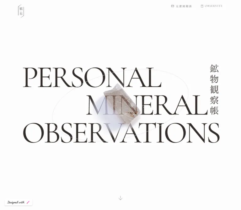
The defining composition combines enormous Cormorant Garamond capitals, a vertical Zen Old Mincho Japanese title, a softly lit mineral photograph, and a fine tilted ellipse. Small utility text and long stretches of empty space make the central specimen feel carefully placed. Lower down, circular specimen presentations introduce the catalog, followed by a broad gray field containing explanatory text and a compact image index.
The desktop layout is spacious and controlled. The supplied mobile rendering retains much of the large typography and deeply nested horizontal spacing, producing broken words and extremely narrow text columns. Those are documented observations; the implementation recommendations below explicitly improve them.
閉じる
Miishi / 観石 — Style Reference
A personal mineral notebook composed of fine serif lettering, pale stone photography, and expansive white space.
Website / original URL: miishi-observite.studio.site
Final URL: miishi-observite.studio.site
Inspected evidence: September 29, 2026; supplied browser observation retrieved at 2026-09-29T13:38:54.775Z, or 22:38:54.775 JST.
Viewports: desktop 1440 × 1000 and mobile 390 × 844 CSS pixels.
Theme: near-white canvas with warm dark text; a medium-gray About/footer surface. No selectable theme was demonstrated.
Scope: the current homepage, including its persistent header, opening composition, introductory statement, three-item mineral selection, update history, About text, and footer index. Five original-page screenshots cover desktop opening, intermediate selection, and footer views, plus mobile opening and footer views. Other homepage details are supported by the supplied rendered DOM. Mineral articles, the external shop, and the periodic-table button's resulting interface were not inspected.
Miishi presents a personal collection through the visual language of an editorial cover and a small specimen catalog. The page describes looking at, photographing, and enjoying privately owned minerals as a non-specialist activity. Its primary navigation leads to individual mineral entries; an understated shop link is secondary to this browsing experience.
The defining composition combines enormous Cormorant Garamond capitals, a vertical Zen Old Mincho Japanese title, a softly lit mineral photograph, and a fine tilted ellipse. Small utility text and long stretches of empty space make the central specimen feel carefully placed. Lower down, circular specimen presentations introduce the catalog, followed by a broad gray field containing explanatory text and a compact image index.
The desktop layout is spacious and controlled. The supplied mobile rendering retains much of the large typography and deeply nested horizontal spacing, producing broken words and extremely narrow text columns. Those are documented observations; the implementation recommendations below explicitly improve them.
How to Read This Reference
- Measured means a value appears in the supplied computed styles or element rectangles. Measurements are CSS pixels unless otherwise stated.
- Calculated means a value is derived from those measurements, such as the gap between two card rectangles.
- Estimated means a visual approximation from an original-page screenshot. Estimated colors were not sampled programmatically.
- Recommended means an implementation choice for a new version, including all proposed breakpoints, accessibility changes, and unverified interaction treatments.
- Token names are descriptive implementation aliases. The two original font variables are identified separately.
- DOM rectangles describe the sampled state. They can include transforms, overflowing children, and offscreen elements; they should not all become fixed layout dimensions.
- The evidence includes declared transitions but no recorded click or hover sequence. A transition declaration establishes timing, not the action that triggers it.
Tokens — Colors
Default Palette
| Name | Value | Suggested token | Evidence and role |
|---|---|---|---|
| Paper | #fdfdfd |
--miishi-paper |
Measured body background and About text color; the principal light surface |
| Warm Ink | #322b29 |
--miishi-ink |
Measured hero, introduction, selection heading, and primary catalog lettering |
| Utility Gray | #848484 |
--miishi-muted |
Measured navigation labels, specimen numbers, and several catalog text layers |
| Faint Caption | #bbbbbb |
--miishi-faint |
Measured English mineral names in one of the overlapping caption layers |
| Footer Lettering | #efefef |
--miishi-footer-text |
Measured footer index, mineral labels, return text, and copyright |
| Mineral Gold | #b2964b |
--miishi-gold |
Measured decorative middle-dot glyphs around catalog captions; visibility and state changes are unverified |
| Gray Panel | Approximately #909090 |
--miishi-panel |
Screenshot estimate for the About/footer field; the background-bearing wrapper was not included in the computed-style sample |
| Orbit Line | Approximately #bdbdbd |
--miishi-rule |
Screenshot estimate for the delicate hero ellipse |
| Specimen Ring | Approximately #e4e4e4 |
--miishi-ring |
Screenshot estimate for the circular catalog boundaries |
The visible interface is primarily Paper, Warm Ink, and gray. Green, blue-white, beige, and yellow come from mineral photographs and thumbnail crops. They are content colors, not a multicolor navigation system.
The sampled body and button wrappers also contain default black or #333333 declarations. Their styled descendants establish the visible serif typography and its actual colors. Do not replace the observed Warm Ink with a wrapper's inherited black.
The many --g-color-* custom properties in the supplied output are transparent in the sampled state. Their presence does not establish a visible gradient. Likewise, the body's background transition does not establish a theme switcher.
Contrast Guidance
The faint captions and white-on-gray footer contribute to the restrained appearance, but small text needs a contrast check before reuse. A recommended readable variant can darken utility text to #666666 and the gray panel to #707070. These are proposed alternatives, not measured source colors.
Tokens — Typography
Cormorant Garamond — English Display and Catalog Details
- Measured family:
Cormorant Garamond. - Original variable:
--s-font-c6a1f10d. - Roles: the three hero words,
with curiosity,Selection,About, specimen numbers, English mineral names, update-history label, and footerINDEX. - Weights: hero and large section titles
400; introductory phrase300; English mineral captions500; update history and footer index600. - Character: high stroke contrast, fine serifs, tall capitals, and an editorial rather than technical voice.
- Recommended stack:
'Cormorant Garamond', serif. The fallback is an implementation addition.
The hero's tight spacing is essential: -0.06em tracking and 0.9 line height make the three rows behave as one composition. The title is live text in the supplied DOM, not lettering baked into the mineral image.
Zen Old Mincho — Japanese Labels and Explanatory Copy
- Measured family:
Zen Old Mincho. - Original variable:
--s-font-95a96cc2. - Roles: navigation, the vertical Japanese hero title, Japanese section labels, descriptions, mineral names, About copy, and legal text.
- Weights: introductory and selection descriptions
300; general navigation and body copy400; small section labels and mineral names often700. - Recommended stack:
'Zen Old Mincho', serif.
Japanese labels use different tracking according to their function. The header label is widely spaced, while long About paragraphs use slightly negative tracking. Preserve these distinctions instead of applying one global letter-spacing rule.
Type Scale
All numeric values in this table are measured computed styles. A repeated value in the mobile column means the source retains that size at the sampled phone viewport.
| Role | Desktop size / line height | Mobile size / line height | Weight | Tracking |
|---|---|---|---|---|
| Hero English words | 136px / 122.4px |
112px / 100.8px |
400 |
-0.06em |
Vertical 鉱物観察帳 |
40px / 40px |
32px / 32px |
400 |
0.16em |
with curiosity |
48px / 48px |
Same | 300 |
-0.05em |
| Introductory paragraph | 12px / 24px |
Same | 300 |
-0.08em |
Vertical 目録 |
16px / 16px |
Same | 700 |
0.2em |
Selection |
110px / 110px |
Same | 400 |
Normal |
| Selection description | 12px / 19.2px |
Same | 300 |
0.08em |
| Specimen numbers | 28px / 28px |
Same | 400 |
Normal |
| Japanese specimen name | 20px / 20px |
Same | 700 |
Normal |
| English specimen name | 13px / 13px |
Same | 500 |
Normal |
Update History |
14px / 14px |
Same | 600 |
Normal |
| History entries | 10px / 20px |
Same | 400 |
0.08em |
About |
97px / 97px |
Same | 400 |
-0.05em |
Vertical 概要 |
16px / 16px |
Same | 400 |
0.3em |
| About subsection headings | 16px / 22.4px or 19.2px |
Same | 700 |
-0.05em |
| About paragraphs | 12px / 24px |
Same | 400 |
-0.05em |
Footer INDEX |
32px / 32px |
Same | 600 |
0.05em |
| Footer mineral labels | 16px / 16px |
Same | 400 |
Normal |
| Copyright | 10px / 16px |
Same | 400 |
0.05em |
Navigation and Small Symbols
| Element | Measured treatment |
|---|---|
元素周期表 |
Zen Old Mincho, 12px, weight 400, 12px line height, 2.4px tracking |
OBSERVITE |
Cormorant Garamond, 13px, weight 400, 13px line height, 1.3px tracking |
| New-tab helper text | Zen Old Mincho, 11px, weight 400, -0.55px tracking; present in DOM but not visibly exposed in the opening screenshots |
| Return-home label | Zen Old Mincho, 12px / 12px, weight 400, 0.6px tracking in the desktop sample |
| Scroll-cue stem | Literal I, Cormorant Garamond, 16px, weight 600 |
| Scroll-cue head | Literal ‹, Cormorant Garamond, 58px, weight 300; visually arranged as part of a downward cue |
A Material Icons font declaration and the arrow_drop_up ligature appear in the evidence. This supports the update-history indicator's implementation context, but does not identify every tiny header icon.
Tokens — Spacing & Shapes
The layout alternates very large section intervals with small, precise relationships inside each component. There is no evidence of a single original spacing-token system; the aliases below organize the measurements for reuse.
Spacing Scale
| Use | Value | Evidence |
|---|---|---|
| Specimen number inset | 6px |
Calculated from card and number top coordinates |
| Footer thumbnail-to-label gap | 12px |
Measured link gap |
| About heading-to-paragraph gap | 16px |
Calculated from the first subsection's rectangles |
| Header top offset | 20px |
Measured logo and control positions at both viewports |
| Desktop specimen gap | 20px |
Calculated: adjacent starts differ by 300px; each card is 280px wide |
| Selection title-to-description gap | 32px |
Calculated from desktop rectangles |
| Opening-to-introduction interval | 40px |
Calculated at both viewports |
| Mobile specimen gap | 60px |
Calculated: adjacent starts differ by 340px; cards remain 280px high |
| Desktop footer link gap | 64px |
Calculated between successive 76px links on a 140px pitch |
| About subsection interval | 80px desktop; 60px mobile |
Calculated after the first paragraph |
| About-to-index interval | 120px |
Calculated from About section bottom and index top |
| Introduction-to-Selection section interval | 200px desktop; 120px mobile |
Calculated from section boxes; individual children can extend outside those boxes |
Geometry
| Element | Appearance | Evidence status |
|---|---|---|
| Hero orbit | Thin, tilted ellipse | Visible in desktop and mobile opening captures |
| Hero orbit desktop extent | Approximately 600 × 320px after rotation |
Screenshot estimate; not an intrinsic CSS box measurement |
| Specimen presentation | Circular image field within a 280 × 280px link |
Circular appearance visible; link rectangle measured |
| Footer thumbnails | Small circular mineral crops, approximately 30–32px |
Screenshot estimate, consistent with link geometry |
| About/footer field | Rectangular gray panel with white outer margins | Visible; exact wrapper styles unavailable |
| Ordinary controls | Transparent, unboxed, square-cornered wrappers | Measured styles and screenshots |
| Platform badge | Black 84 × 20px rectangle, 4px radius |
Measured; separate from the site's editorial components |
The sampled specimen anchors have border-radius: 0. The circular appearance therefore belongs to their visual contents or surrounding treatment; the anchor's bounding box alone does not describe that shape.
Layout Measurements
| Element | Desktop 1440 × 1000 |
Mobile 390 × 844 |
|---|---|---|
| Document height | Approximately 4470.58px |
Approximately 6765.16px |
| Opening section | 1440 × 1000px |
390 × 844px |
| Logo | 20 × 46.25px, at 100, 20 |
Same size, at 80, 20 |
| English hero composition | Common outer row width about 870.08px; middle row 812.08px |
Outer rows 390px; middle row 340px |
| Hero text vertical span | Approximately 316.41–683.58px |
Approximately 119.61–724.39px |
| Introductory section | Starts y=1040; height 1000px |
Starts y=884; height 844px |
| Introductory paragraph | 202 × 168px |
202 × 168px |
| Selection section | Starts y=2240; height 794px |
Starts y=1848; height 1538px |
| Specimen links | 280 × 280px, at x=270, 570, 870 |
280 × 280px, all at x=32 |
| About inner section | 1088px wide, at x=176 |
150px wide, at x=120 |
| About paragraph width | 768px |
70px |
Components
Persistent Header
Role: quiet identity, reference utility, and external shop access.
The logo is a narrow vertical outlined mark containing 観石. On desktop it sits 100px from the left and 20px from the top. Two compact controls occupy the upper right: the 元素周期表 button and the OBSERVITE shop link. Their measured wrappers are each 112 × 28px; the space between them is 36px.
The labels are gray, small, and letter-spaced. Tiny outline-like symbols precede the text. There is no visible filled navigation bar or dividing rule. Header elements remain at the top in the supplied scrolled screenshots, supporting a persistent-header description; the exact CSS positioning rule was not supplied.
At the phone viewport, the logo moves to x=80, the periodic-table button begins at x=100, and the shop link begins at x=248. The controls retain their desktop dimensions. There is no hamburger menu in the observed state.
The shop link's recorded destination is https://suzuri.jp/mokuzu_shohin/omoide/138439. Its DOM includes 別のタブで開く ↗︎, indicating a new-tab message, but the actual activation and helper-text reveal were not tested. The periodic-table button's resulting interface is unknown.
Opening Composition
Role: establish the notebook's identity and make one mineral the visual center.
The opening section occupies the entire inspected viewport. Its English title comprises three paragraph elements in source order: PERSONAL, MINERAL, and OBSERVATIONS. On desktop, the first and third words align visually to the left of the central composition. The middle word shifts right and stops before the vertical Japanese title.
The title uses 136px Cormorant Garamond with 122.4px line height and -8.16px tracking. Its combined text boxes are vertically centered around y=500. The Japanese title is placed at approximately x=1113, y=318, with a measured 40px width and 237px height.
A pale translucent-looking crystal and its soft photographic shadow overlap the middle of the lettering. The mineral's visible body is roughly 160–180px wide and 180–200px high in the desktop image, estimated independently of its unknown image-element bounds. The photograph's pale area softens portions of the letters underneath or around it. The exact opacity, mask, blend mode, and stacking implementation are not established by the supplied styles.
A delicate ellipse crosses the composition diagonally, rising toward the right. A reusable approximation is an unrotated 620 × 280px ellipse rotated about -15deg; those are recommended construction values, not measured source declarations.
The scroll cue sits near the bottom center on desktop. Its two source glyphs are heading elements rather than a recorded link. Treat the captured cue as a visual affordance; a click-to-scroll action was not demonstrated.
Introductory Statement
Role: explain the personal, informal purpose before showing the catalog.
The with curiosity section is another viewport-height region, beginning 40px after the opening section. A very narrow central text group contains the 48px English phrase and a 202px-wide Japanese paragraph. The paragraph is 12px / 24px, so the line spacing remains generous despite its small size.
This creates a substantial pause between the opening image and the specimen selection. Preserve that pacing when adapting the design: the introduction functions as a brief personal note surrounded by space.
One desktop DOM sample reports a 9.6px bounding height for the phrase despite its 48px computed line height; the mobile sample reports 48px. This is a sampled geometry limitation, not evidence for a separate tiny heading size. A complete screenshot of this section was not supplied.
Selection Heading
Role: introduce the mineral collection as an ordered visual index.
The heading stack contains a small vertical 目録, a very large Selection, and two short lines of Japanese explanatory text. The source description says the minerals are selected informally and the numbers follow the order of addition.
On desktop, Selection is 110px / 110px. The description is 400px wide, uses 12px / 19.2px, and sits 32px after the measured title box. The first specimen row begins about 64.6px after the description box ends.
The supplied intermediate screenshot shows the heading and the upper portions of the three specimen circles. It also shows extensive blank space above the heading and a partial curved line near the top. That partial line is visible geometry; its complete ownership and motion are not established by the frame.
Circular Specimen Link
Role: primary entry point into a mineral observation page.
Each item is a 280 × 280px anchor containing a circular presentation, a photograph, a top-centered number, and bilingual naming near the lower edge. There are three observed entries:
| Number | Japanese label | English label | Recorded route |
|---|---|---|---|
01 |
蛍石 |
Fluorite | /posts/Fluorite |
02 |
石英 |
Quartz | /posts/Quartz |
03 |
黄玉 |
Topaz | /posts/Topaz |
Numbers use 28px Cormorant Garamond in Utility Gray and begin 6px below the anchor's top. Japanese names use 20px bold Zen Old Mincho; English names use 13px Cormorant Garamond. Fine circular edges and photographed shadows provide depth without a separate rectangular card surface.
The DOM contains slightly offset duplicate caption layers: gray and darker Japanese text, faint and darker English text, and gold middle-dot ornaments. The evidence does not establish whether these layers exchange on hover, animate on entry, or serve another visual effect. Do not render both names as repeated accessible content in a new implementation.
On desktop, the items share one row with 20px gaps. At 390px, they form one column with 60px gaps while retaining the same 280px size. Their sampled mobile left edge is 32px, which places the group slightly left of the viewport center.
Update History
Role: provide a compact record of changes below the specimen collection.
The source includes a transparent button with the label Update History and an upward-pointing Material Icons indicator. The desktop button is 820 × 64px with 12px padding; the mobile button is 166 × 64px.
Three dated entries appear in the rendered text. The newest is 25-02-01: 全体更新, followed by updates in January 2023 and December 2022. These are page content, not the inspection date.
The entry text uses 10px / 20px Zen Old Mincho and 0.08em tracking. Its sampled width falls from 792px to 138px on mobile. The button and indicator suggest a disclosure control, but collapse/expand behavior and its default state were not exercised. A native details implementation is a recommendation in the Quick Start.
About Section
Role: describe the project and explain the limits of its mineral information.
The About content sits within the large gray footer field. A 97px English title occupies the left side on desktop, accompanied by a small vertical 概要. Japanese subsections sit farther right in a 768px text column.
The first subsection describes the personal project, privately owned minerals, original goods, and an interest in simply looking at stones. It explicitly says the photography equipment is an iPhone. The second subsection explains that the creator is not a specialist and that basic mineral data is quoted and translated from mindat. This is content context, not evidence for a site's production credit or a verified scientific-review process.
Subsection headings use 16px bold Zen Old Mincho; paragraphs use 12px / 24px with -0.05em tracking. The measured first heading-to-paragraph gap is 16px; the next subsection begins 80px after the first paragraph on desktop.
The screenshot's gray field extends approximately from x=96 to x=1344, giving an estimated width of 1248px. The measured inner section is 1088px wide. Together these suggest roughly 80px horizontal panel padding at this viewport, but the wrapper's source declaration is unavailable.
Footer Index and Return Link
Role: offer a second route into each mineral page and close the document.
The footer index pairs a Cormorant Garamond INDEX label with three small circular mineral thumbnails and Japanese names. Its imagery supplies the strongest green, pale blue, and golden-yellow accents in the gray region.
Desktop index links measure 76 × 24px with a 12px internal gap. Their left edges are 488, 628, and 768px. The index heading uses 32px, weight 600, and 0.05em tracking. Mineral labels are 16px Zen Old Mincho in #efefef.
A centered サイト先頭ページへ戻る link follows. Its desktop href points to the homepage root, rather than a recorded fragment. A smooth in-page scroll must not be assumed. The label is visible in the mobile screenshot, but its anchor is absent from the supplied mobile link inventory, so mobile activation remains unverified.
The copyright text sits between fine horizontal rules on desktop. Its measured container is 1088 × 60px, with 10px / 16px text. The original-page footer displays the year 2022. The mobile screenshot shows severe wrapping and collisions in this area, discussed below.
Platform Badge
A small black platform badge is present at the lower left in the current captures. Its measured rectangle is 84 × 20px, positioned 20px from the left and bottom edges, with a 4px radius. It links to the site-building platform.
Treat this as platform chrome. It is not a specimen control, a palette accent to repeat throughout the page, or evidence identifying the designer.
Tokens — Motion & Interaction
Declared Timing
The following values are measured transition declarations. They do not establish a complete observed animation sequence.
| Element or group | Declared timing | What can be concluded |
|---|---|---|
| Common links, text, and sections | 0.3s cubic-bezier(0.4, 0.4, 0, 1) |
A common transition timing exists; changing properties and triggers are not fully supplied |
| Body background | 0.5s cubic-bezier(0.4, 0.4, 0, 1) |
Background changes can transition; no theme control was demonstrated |
| Periodic-table button | 0.4s |
Transition duration is present; resulting interaction is unknown |
| External shop link | 0.4s cubic-bezier(0.4, 0.4, 0, 1) |
Link wrapper has a transition; helper-text reveal was not observed |
OBSERVATIONS |
0.8s cubic-bezier(0.4, 0.4, 0, 1) |
Longer timing than the first two hero word elements |
| Scroll-cue stem | 0.8s, delay 2.4s |
Delayed transition declared |
| Scroll-cue head | 0.8s ease-in, delay 2.8s |
A second, later transition declared |
| Introductory phrase | 0.8s cubic-bezier(0.4, 0.4, 0, 1), delay 1.8s |
Delayed transition declared |
| Introductory paragraph | 1.2s, delay 1.8s |
Delayed transition declared |
| Selection labels and description | 1.2s, delay 0.8s |
Shared delayed timing; some sampled elements explicitly include the common cubic-bezier |
| Specimen numbers | 0.8s cubic-bezier(0.4, 0.4, 0, 1), delay 0.4s |
Delayed transition declared |
These timings are consistent with a deliberate, staged presentation, but the supplied still images do not prove specific fades, travel distances, or reveal triggers. Most sampled elements report animation: none; this does not rule out transitions, JavaScript effects, or motion in unsampled elements.
Interaction Evidence and Limits
| Affordance | Evidence | Limit |
|---|---|---|
| Mineral selection | Real anchors to three article routes | Destination layouts and navigation results were not inspected |
| Footer mineral index | Anchors to the same three routes | Hover, focus, and activated states are unavailable |
| Periodic-table utility | A button with a clear text label | No opened state, dialog anatomy, or dismissal behavior supplied |
| Update history | Button, indicator, and entry text in DOM | Toggle sequence unverified |
| Shop access | External anchor and new-tab helper text | Actual new-tab behavior untested |
| Scroll cue | Visible downward symbol built from text elements | Click behavior unverified |
| Header persistence | Repeated top placement across scroll captures | Exact fixed/sticky implementation unavailable |
Do not infer a continuously rotating orbit, a mineral carousel, cursor-following photography, parallax, or draggable objects from the single opening state. None is demonstrated here.
Recommended motion adaptation: retain the common easing for subtle color or opacity feedback. Keep all essential content visible before JavaScript enhancement, remove entrance delays under reduced motion, and add any reveal choreography only after its intended behavior has been specified.
Surfaces
| Layer | Appearance | Function |
|---|---|---|
| Main canvas | Solid #fdfdfd |
Carries the long, quiet page and broad negative space |
| Hero composition | Transparent text and line layers around a pale photograph | Creates depth through overlap and photography |
| Specimen field | Near-white circular presentation with a faint edge | Separates individual minerals while remaining part of the paper surface |
| About/footer | Estimated medium-gray rectangular field | Creates a clear tonal change for explanatory text and the closing index |
| Footer rules | Fine pale horizontal lines | Frames the legal block without a card or container shadow |
| Platform badge | Black rounded rectangle | External platform chrome |
No general interface elevation system is visible. Shadows belong primarily to the mineral photography. The visual hierarchy comes from type scale, circles, a single ellipse, spacing, and the gray closing field.
Imagery
Use close, softly lit photographs of individual mineral specimens on pale backgrounds. The visible stones retain irregular edges, translucent planes, inclusions, uneven coloration, and soft shadows. The treatment feels like a carefully observed object resting on a light surface.
The opening photograph is pale beige to gray and appears diagonally oriented. The catalog begins with a muted green fluorite specimen, followed by a pale quartz specimen and a light-colored topaz specimen. Footer thumbnails use tighter circular crops and show stronger local color. Do not force every image associated with a mineral to share the same hue or crop.
The visible photograph is more important than a decorative background texture. Keep the overall canvas flat and nearly white, preserve fine detail in the crystal, and allow the surrounding image background to merge gently with the page. The source's exact masking technique is unverified.
Observed Asset References
| Asset evidence | Recorded reference | Scope |
|---|---|---|
| Image source embedded in the hero section's supplied markup | https://storage.googleapis.com/studio-cms-assets/projects/9YWyx6vZaM/s-1000x1000_v-fs_webp_1dba7ea8-0d37-44a7-8445-f813f9ac995f_small.webp |
A square variant is indicated by the URL and the embedded markup includes width=1000; decoded intrinsic dimensions and exact correspondence to the foreground specimen were not supplied |
| Logo, remaining specimen photos, and footer crops | Exact asset URLs unavailable | Their appearances are visible, but filenames and export settings must not be invented |
For a new implementation, use authorized mineral photography with consistent lighting. Use object-fit: contain for whole specimens and circular cropping for the small footer previews. Reserve image dimensions to prevent layout shifts. A decorative hero image can have an empty text alternative when its meaning is fully conveyed elsewhere; linked specimens need a clear accessible name.
Layout & Responsive Behavior
Desktop Structure
The page scrolls as a long document. The opening and introduction each occupy 1000px at the inspected desktop viewport. The opening composition is centered vertically, while the next section concentrates its copy into a 202px column. Selection starts at document y=2240, so the catalog arrives after more than two viewport heights.
The three specimen links occupy an 880px span from x=270 to x=1150. Their combined center is slightly left of the viewport center. The later About content expands to a 1088px inner width within the larger gray panel.
The layout therefore changes scale several times: broad opening lettering, an unusually narrow introduction, a compact specimen row, and a broad closing information region. A single global content width would lose this rhythm.
Observed Mobile Behavior
| Area | Observation at 390 × 844 |
Practical consequence |
|---|---|---|
| Hero type | Drops only from 136px to 112px; each word element occupies two 100.8px lines |
Words break internally, with visible edge clipping and a much taller composition |
| Hero title | English group extends approximately from y=119.61 to 724.39 |
It occupies most of the first screen |
| Japanese title | 32px, vertical, at x=356 |
Remains pressed against the right edge |
| Scroll cue | Glyph bounds near y=685–709 |
Overlaps the final English title row instead of sitting in clear bottom space |
| Header | Original 112 × 28px utility wrappers retained |
No mobile navigation simplification is visible |
| Selection heading | Retains 110px type inside a 238px-wide, 220px-high box |
The English word wraps over two lines according to DOM geometry |
| Specimen links | Same 280 × 280px size, vertically stacked |
The primary catalog adapts more successfully than the typography |
| Gray field | Approximately 230px wide, with 80px outer margins |
The closing region uses only part of the phone width |
| About inner section | 150px wide |
Nested spacing consumes more horizontal room |
| About paragraphs | 70px wide, still 12px / 24px |
Paragraphs become extremely tall: measured heights 840px and 936px |
| Footer index heading | 150px box with 64px right padding |
INDEX visibly breaks into INDE and X |
| Footer mineral names | 26px-wide text boxes at 16px type |
Two-character names wrap into two rows |
| Legal block | 70px width with a reported 60px height |
Text visibly extends beyond its nominal box and crowds nearby content |
The phone's apparent vertical footer labels should not all be interpreted as intentional Japanese vertical typesetting. Several are explained by narrow horizontal text boxes. The explicit vertical hero and section labels are a separate design motif.
The mobile DOM also places the first specimen rectangle slightly before the selection description's measured bottom. Since a screenshot of that exact mobile section was not supplied, the final visual overlap cannot be confirmed from those rectangles alone.
Recommended Responsive Adaptation
Preserve the circle, ellipse, serif pairing, vertical accents, and large differences in scale. Give long-form text substantially more width on phones, use fluid heading sizes, and let the About region become a readable single column.
A practical new implementation can use 24px mobile gutters, three specimen columns only when they fit comfortably, and a single centered column otherwise. Reduce English display text enough to keep each intended hero word on one line, or author deliberate whole-word line arrangements. Keep the return link and copyright in normal flow with automatic height.
The Quick Start uses recommended 960px and 600px breakpoints. These are not recovered source breakpoints, and its mobile output intentionally differs from the supplied rendering.
Do’s and Don’ts
Do
- Use the measured near-white
#fdfdfdand warm dark#322b29as the main pair. - Pair Cormorant Garamond English display text with Zen Old Mincho Japanese copy.
- Preserve the hero's tight
-0.06emtracking and the diagonal mineral-and-ellipse composition. - Treat photography, lettering, and empty space as the primary visual material.
- Keep specimen entries circular, numbered, and bilingual.
- Preserve the numbers as addition order, as described by the page.
- Maintain a quiet header with small, tracked labels.
- Use the gray closing field to distinguish About content and the secondary index.
- Document the actual mobile wrapping before proposing improvements.
- Label interaction proposals and estimated geometry explicitly.
Don't
- Don't turn the personal observation archive into a generic sales funnel with large conversion buttons.
- Don't replace the circular specimens with elevated rectangular product cards.
- Don't introduce vivid UI colors based on the minerals' photographic colors.
- Don't apply heavy interface shadows, glossy gradients, or glass panels.
- Don't substitute a generic sans-serif throughout the page.
- Don't interpret duplicate DOM captions as proof of a particular hover animation.
- Don't invent orbit rotation, image cycling, or periodic-table dialog behavior.
- Don't reproduce
70pxmobile body columns or clipped English words as recommended responsive practice. - Don't infer every vertical-looking label uses a vertical writing mode.
- Don't treat the platform badge as a production credit or a reusable content component.
Recommended Implementation Additions
These are recommendations for a new implementation, not verified features of the original.
- Use one semantic
h1for the opening title and genuine section headings for the catalog and About content. The sampled original uses paragraph elements for many visual headings and heading elements for the scroll-cue glyphs. - Give the logo link an accessible name. Keep one accessible bilingual name per specimen link and hide duplicated decorative caption layers from assistive technology.
- Enlarge small navigation and footer targets toward
44pxwithout enlarging their visible lettering to the same extent. - Ensure a periodic-table control has a specified outcome before shipping it. If implemented as a dialog, provide focus management and keyboard dismissal; a dialog is not an observed source fact.
- Use native disclosure semantics or a button with
aria-expandedandaria-controlsfor update history when collapsible behavior is desired. - Use flexible mobile padding, automatic text heights, and at least a comfortable paragraph measure. Test the observed
390 × 844size plus narrower screens and text zoom. - Check faint captions and gray-panel text for contrast. Offer the darker readable palette where necessary.
- Keep initial content visible, respect reduced motion, and prevent photography or decorative linework from intercepting links.
- Load the actual display fonts before assessing word wrapping. A fallback serif can change this composition substantially.
Agent Prompt Guide
Quick Color Reference
- Canvas:
#fdfdfd, measured. - Main lettering:
#322b29, measured. - Utility labels and specimen numbers:
#848484, measured. - Faint English caption layer:
#bbbbbb, measured. - Footer index text:
#efefef, measured. - Small catalog ornaments:
#b2964b, measured in DOM. - Gray About/footer panel: approximately
#909090, estimated. - Orbit and circular borders: approximately
#bdbdbdand#e4e4e4, estimated. - Readable alternative:
#666666utility text and#707070panel, recommended.
Overall Prompt
“Create a personal mineral observation archive inspired by Miishi. Use a near-white #fdfdfd page, warm dark #322b29 lettering, Cormorant Garamond for English display text, and Zen Old Mincho for Japanese copy. Center a three-row uppercase title in the opening viewport, shift its middle word right, and place a vertical Japanese title at the right edge. Overlap the lettering with a pale mineral photograph and a very fine tilted ellipse. Follow with a narrow personal introduction, a large Selection heading, three numbered circular specimen links, a small update-history disclosure, and a gray About/footer region with circular mineral thumbnails. Preserve generous pauses between sections. On mobile, retain the character while giving paragraphs readable width and avoiding accidental word clipping. Keep motion restrained and implement only specified interactions.”
Example Component Prompts
- Opening composition: “Build an editorial mineral cover using three rows of 136px Cormorant Garamond, weight 400, line height 0.9, and tracking -0.06em at a 1440px desktop viewport. Use warm dark text on near-white. Shift the second word right, add a 40px vertical Japanese label, and overlay a softly lit pale crystal and a hairline tilted ellipse. Treat photo masking and ellipse geometry as visual approximations.”
- Specimen link: “Create a 280px square link whose visible presentation is circular: faint ring, contained mineral photo, 28px serif number at the top, 20px bold Japanese mineral name near the lower edge, and a small English name beneath. Use one accessible link name and no card shadow.”
- Selection heading: “Stack a small vertical Japanese index label, a large 110px English serif heading, and a centered two-line Japanese description. Leave generous space before the circular specimen row. Use a smaller fluid heading on phones.”
- About and footer: “Create a broad gray information field with white outer margins. Place a large serif About title left and small Japanese explanatory paragraphs right. Follow with an INDEX label and three circular mineral crops. On phones, use a readable single column and let the legal block grow naturally.”
- Responsive refinement: “Retain Miishi's white space, serif pairing, circular specimens, and vertical accents. Replace deeply nested fixed phone padding with 24px outer gutters, center the specimen column, prevent English words from breaking arbitrarily, and move the scroll cue below the title. Document these as improvements to the observed mobile layout.”
Quick Start
CSS Custom Properties
This is an adaptation, not extracted source CSS. It preserves measured desktop colors and type proportions, approximates the photographic overlap and circular linework, and supplies recommended responsive corrections. The gray panel and border colors are estimates. Hover feedback, larger mobile targets, semantic disclosures, and focus styles are additions.
Load authorized Cormorant Garamond and Zen Old Mincho font files through the project's font loader. The supplied evidence does not include their font-file URLs. Image filenames in the example markup below are local implementation placeholders.
:root {
  /* Measured source colors */
  --miishi-paper: #fdfdfd;
  --miishi-ink: #322b29;
  --miishi-muted: #848484;
  --miishi-faint: #bbbbbb;
  --miishi-footer-text: #efefef;
  --miishi-gold: #b2964b;

  /* Screenshot estimates */
  --miishi-panel: #909090;
  --miishi-rule: #bdbdbd;
  --miishi-ring: #e4e4e4;

  /* Verified families with recommended fallbacks */
  --font-display: 'Cormorant Garamond', serif;
  --font-japanese: 'Zen Old Mincho', serif;

  /* Fluid sizes are recommendations; desktop caps are measured */
  --text-hero: clamp(44px, 9.444vw, 136px);
  --text-section: clamp(64px, 7.639vw, 110px);
  --text-about: clamp(56px, 6.736vw, 97px);
  --text-body: 12px;
  --text-caption: 13px;
  --text-specimen: 20px;
  --text-number: 28px;

  --hero-width: 870.08px;
  --specimen-size: 280px;
  --panel-width: 1248px;
  --page-gutter: clamp(24px, 6.667vw, 96px);
  --header-gutter: clamp(24px, 6.944vw, 100px);
  --space-small: 12px;
  --space-label: 16px;
  --space-card: 20px;
  --space-copy: 32px;
  --space-section: 80px;

  /* Measured common timing; no source reveal sequence is assumed */
  --ease-editorial: cubic-bezier(0.4, 0.4, 0, 1);
  --motion-ui: 300ms;
}

* {
  box-sizing: border-box;
}

body.miishi {
  margin: 0;
  color: var(--miishi-ink);
  background: var(--miishi-paper);
  font-family: var(--font-japanese);
  font-weight: 400;
}

.miishi img {
  display: block;
  max-inline-size: 100%;
}

.miishi a {
  color: inherit;
}

/* Optional readable palette; these replacements are recommendations. */
.miishi[data-readable='true'] {
  --miishi-muted: #666666;
  --miishi-faint: #666666;
  --miishi-panel: #707070;
}

.site-header {
  position: fixed;
  z-index: 20;
  inset-block-start: 20px;
  inset-inline: var(--header-gutter);
  display: flex;
  align-items: flex-start;
  justify-content: space-between;
  gap: 16px;
  color: var(--miishi-muted);
}

.brand {
  flex: 0 0 20px;
}

.brand img {
  inline-size: 20px;
  block-size: 46.25px;
  object-fit: contain;
}

.site-nav {
  display: flex;
  align-items: flex-start;
  gap: 36px;
}

.nav-control {
  display: inline-flex;
  align-items: center;
  justify-content: center;
  gap: 8px;
  min-block-size: 28px;
  padding: 0 8px;
  border: 0;
  border-radius: 0;
  background: transparent;
  color: inherit;
  font: 400 12px / 1 var(--font-japanese);
  letter-spacing: 0.2em;
  text-decoration: none;
  cursor: pointer;
}

.nav-control--shop {
  font-family: var(--font-display);
  font-size: 13px;
  letter-spacing: 0.1em;
}

.hero {
  position: relative;
  display: grid;
  place-items: center;
  min-block-size: 100vh;
  min-block-size: 100svh;
}

.hero-stage {
  position: relative;
  isolation: isolate;
  inline-size: min(var(--hero-width), calc(100% - 48px));
}

.hero-title {
  position: relative;
  z-index: 1;
  margin: 0;
  font: 400 var(--text-hero) / 0.9 var(--font-display);
  letter-spacing: -0.06em;
}

.hero-title > span {
  display: block;
  white-space: nowrap;
}

.hero-title .hero-middle {
  inline-size: calc(100% - 58px);
  text-align: right;
}

.hero-japanese {
  position: absolute;
  z-index: 4;
  inset-block-start: 2px;
  inset-inline-end: 2px;
  margin: 0;
  writing-mode: vertical-rl;
  text-orientation: upright;
  font-size: clamp(18px, 2.778vw, 40px);
  line-height: 1;
  letter-spacing: 0.16em;
}

.hero-photo {
  position: absolute;
  z-index: 2;
  inset-block-start: 50%;
  inset-inline-start: 50%;
  inline-size: clamp(180px, 21vw, 300px);
  aspect-ratio: 1;
  object-fit: contain;
  transform: translate(-50%, -50%);
  opacity: 0.82;
  pointer-events: none;
  /* Recommended soft edge; the original mask is unverified. */
  mask-image: radial-gradient(circle, #000 40%, transparent 72%);
}

.hero-orbit {
  position: absolute;
  z-index: 3;
  inset-block-start: 50%;
  inset-inline-start: 50%;
  inline-size: min(620px, 90%);
  aspect-ratio: 31 / 14;
  border: 1px solid var(--miishi-rule);
  border-radius: 50%;
  transform: translate(-50%, -50%) rotate(-15deg);
  pointer-events: none;
}

.scroll-cue {
  position: absolute;
  inset-block-end: 32px;
  inset-inline-start: 50%;
  display: grid;
  place-items: center;
  inline-size: 44px;
  block-size: 44px;
  transform: translateX(-50%);
  font: 400 24px / 1 var(--font-display);
  text-decoration: none;
}

.curiosity {
  display: grid;
  place-items: center;
  min-block-size: 100vh;
  min-block-size: 100svh;
  margin-block-start: 40px;
  scroll-margin-block-start: 100px;
}

.curiosity-inner {
  inline-size: min(202px, calc(100% - 48px));
}

.curiosity-title {
  margin: 0 0 40px;
  font: 300 48px / 1 var(--font-display);
  letter-spacing: -0.05em;
  white-space: nowrap;
}

.curiosity-copy {
  margin: 0;
  font-size: var(--text-body);
  font-weight: 300;
  line-height: 2;
  letter-spacing: -0.08em;
}

.selection {
  margin-block-start: 200px;
}

.selection-heading {
  text-align: center;
}

.section-eyebrow {
  inline-size: fit-content;
  margin: 0 auto 48px;
  writing-mode: vertical-rl;
  text-orientation: upright;
  font-size: 16px;
  font-weight: 700;
  line-height: 1;
  letter-spacing: 0.2em;
}

.section-title {
  margin: 0;
  font: 400 var(--text-section) / 1 var(--font-display);
}

.selection-description {
  inline-size: min(400px, calc(100% - 48px));
  margin: 32px auto 0;
  font-size: var(--text-body);
  font-weight: 300;
  line-height: 1.6;
  letter-spacing: 0.08em;
}

.specimen-grid {
  display: grid;
  grid-template-columns: repeat(3, var(--specimen-size));
  justify-content: center;
  gap: var(--space-card);
  margin: 64px 24px 0;
  padding: 0;
  list-style: none;
}

.specimen-link {
  position: relative;
  display: grid;
  place-items: center;
  inline-size: var(--specimen-size);
  max-inline-size: 100%;
  aspect-ratio: 1;
  text-decoration: none;
}

.specimen-link::before {
  position: absolute;
  inset: 0;
  border: 1px solid var(--miishi-ring);
  border-radius: 50%;
  content: '';
  transition: border-color var(--motion-ui) var(--ease-editorial);
}

.specimen-photo {
  inline-size: 84%;
  aspect-ratio: 1;
  object-fit: contain;
}

.specimen-number {
  position: absolute;
  inset-block-start: 6px;
  inset-inline: 0;
  color: var(--miishi-muted);
  font: 400 var(--text-number) / 1 var(--font-display);
  text-align: center;
}

.specimen-names {
  position: absolute;
  inset-block-end: -3px;
  inset-inline: 0;
  display: grid;
  gap: 1px;
  text-align: center;
}

.specimen-name-ja {
  font-size: var(--text-specimen);
  font-weight: 700;
  line-height: 1;
}

.specimen-name-en {
  color: var(--miishi-muted);
  font: 500 var(--text-caption) / 1 var(--font-display);
}

/* Native disclosure is a recommended implementation choice. */
.update-history {
  inline-size: min(820px, calc(100% - 48px));
  margin: 64px auto 0;
}

.update-history summary {
  min-block-size: 64px;
  padding: 24px 12px;
  font: 600 14px / 1 var(--font-display);
  cursor: pointer;
}

.history-entries {
  margin: 0;
  padding: 10px 14px;
  font-size: 10px;
  line-height: 2;
  letter-spacing: 0.08em;
}

.about-panel {
  inline-size: min(var(--panel-width), calc(100% - 2 * var(--page-gutter)));
  margin: 320px auto 80px;
  padding: 80px;
  color: var(--miishi-paper);
  background: var(--miishi-panel);
}

.about-grid {
  display: grid;
  grid-template-columns: 240px minmax(0, 1fr);
  gap: 72px;
}

.about-title {
  margin: 0;
  font: 400 var(--text-about) / 1 var(--font-display);
  letter-spacing: -0.05em;
}

.about-copy {
  min-inline-size: 0;
  padding-block-start: 120px;
}

.about-block + .about-block {
  margin-block-start: 80px;
}

.about-block h3 {
  margin: 0;
  font-size: 16px;
  font-weight: 700;
  line-height: 1.4;
  letter-spacing: -0.05em;
}

.about-block p {
  margin: 16px 0 0;
  font-size: var(--text-body);
  line-height: 2;
  letter-spacing: -0.05em;
  overflow-wrap: break-word;
}

.footer-index {
  display: grid;
  grid-template-columns: 240px minmax(0, 1fr);
  gap: 72px;
  align-items: start;
  margin-block-start: 120px;
  color: var(--miishi-footer-text);
}

.footer-index-title {
  margin: 0;
  font: 600 32px / 1 var(--font-display);
  letter-spacing: 0.05em;
  text-align: right;
}

.footer-index-links {
  display: flex;
  flex-wrap: wrap;
  gap: 24px 64px;
}

.footer-index-link {
  display: inline-flex;
  align-items: center;
  gap: 12px;
  min-block-size: 44px;
  font-size: 16px;
  line-height: 1;
  white-space: nowrap;
  text-decoration: none;
}

.footer-index-link img {
  inline-size: 32px;
  block-size: 32px;
  border-radius: 50%;
  object-fit: cover;
}

.return-home {
  display: grid;
  place-items: center;
  inline-size: fit-content;
  min-block-size: 80px;
  margin: 60px auto;
  color: var(--miishi-footer-text);
  font-size: 12px;
  line-height: 1.5;
  letter-spacing: 0.05em;
  text-align: center;
  text-decoration: none;
}

.copyright {
  min-block-size: 60px;
  margin: 0;
  padding-block: 14px;
  border-block: 1px solid rgb(253 253 253 / 45%);
  color: var(--miishi-footer-text);
  font-size: 10px;
  line-height: 1.6;
  letter-spacing: 0.05em;
  text-align: center;
}

.miishi :focus-visible {
  outline: 2px solid currentColor;
  outline-offset: 5px;
}

/* Recommended feedback; no original hover sequence was supplied. */
@media (hover: hover) {
  .nav-control:hover,
  .footer-index-link:hover,
  .return-home:hover {
    text-decoration: underline;
    text-underline-offset: 0.3em;
  }

  .specimen-link:hover::before {
    border-color: var(--miishi-ink);
  }
}

/* Recommended breakpoints, not recovered source media queries. */
@media (max-width: 960px) {
  .specimen-grid {
    grid-template-columns: minmax(0, var(--specimen-size));
    gap: 60px;
  }

  .about-panel {
    padding: clamp(24px, 5vw, 48px);
  }

  .about-grid,
  .footer-index {
    grid-template-columns: minmax(0, 1fr);
    gap: 40px;
  }

  .about-copy {
    padding-block-start: 0;
  }

  .footer-index-title {
    text-align: left;
  }
}

@media (max-width: 600px) {
  .site-header {
    inset-inline: 24px;
  }

  .site-nav {
    gap: 8px;
  }

  .nav-control {
    min-block-size: 44px;
    padding-inline: 4px;
  }

  .hero-stage {
    inline-size: calc(100% - 32px);
  }

  .hero-title .hero-middle {
    inline-size: calc(100% - 28px);
  }

  .selection {
    margin-block-start: 120px;
  }

  .about-panel {
    inline-size: calc(100% - 48px);
    margin-block-start: 160px;
  }

  .about-block p,
  .curiosity-copy,
  .selection-description {
    font-size: 14px;
  }

  .history-entries,
  .copyright {
    font-size: 12px;
  }

  .footer-index-links {
    gap: 20px 28px;
  }
}

@media (prefers-reduced-motion: reduce) {
  .miishi *,
  .miishi *::before,
  .miishi *::after {
    animation: none !important;
    transition: none !important;
    scroll-behavior: auto !important;
  }
}
Example Component Markup
The following illustrates the expected hero and specimen anatomy. The local image paths are placeholders to replace with authorized assets. The cue's anchor behavior is a recommended addition; provide a later section with id='curiosity'.
<section class='hero' aria-labelledby='page-title'>
  <div class='hero-stage'>
    <h1 class='hero-title' id='page-title'>
      <span>PERSONAL</span>
      <span class='hero-middle'>MINERAL</span>
      <span>OBSERVATIONS</span>
    </h1>
    <p class='hero-japanese' lang='ja'>鉱物観察帳</p>
    <img
      class='hero-photo'
      src='/assets/mineral-hero.webp'
      width='1000'
      height='1000'
      alt=''
    >
    <span class='hero-orbit' aria-hidden='true'></span>
  </div>
  <a class='scroll-cue' href='#curiosity' aria-label='Read the introduction'>
    <span aria-hidden='true'>↓</span>
  </a>
</section>

<ul class='specimen-grid'>
  <li>
    <a class='specimen-link' href='/posts/Fluorite'>
      <img
        class='specimen-photo'
        src='/assets/fluorite.webp'
        width='1000'
        height='1000'
        loading='lazy'
        alt=''
      >
      <span class='specimen-number' aria-hidden='true'>01</span>
      <span class='specimen-names'>
        <span class='specimen-name-ja' lang='ja'>蛍石</span>
        <span class='specimen-name-en' lang='en'>Fluorite</span>
      </span>
    </a>
  </li>
  <!-- Add Quartz and Topaz entries using the same structure. -->
</ul>

<details class='update-history' open>
  <summary>Update History</summary>
  <p class='history-entries'>
    <time datetime='2025-02-01'>25-02-01</time>: Site-wide update<br>
    <time datetime='2023-01-13'>23-01-13</time>: Entry 02 updated; entry 03 added<br>
    <time datetime='2022-12-30'>22-12-30</time>: Entries 01 and 02 added
  </p>
</details>
The history entries above translate the recorded source content for this implementation example. The starter supplies the visual shell; it does not implement the uninspected periodic-table utility or mineral article pages. It has not been executed or browser-tested as part of this evidence-only analysis.
Tailwind v4 Token Mapping
Optional aliases for a project already using Tailwind v4. Define the custom properties above first. This does not imply that the original site uses Tailwind.
@theme inline {
  --color-paper: var(--miishi-paper);
  --color-ink: var(--miishi-ink);
  --color-muted: var(--miishi-muted);
  --color-panel: var(--miishi-panel);
  --color-ring: var(--miishi-ring);
  --color-mineral-gold: var(--miishi-gold);

  --font-editorial: var(--font-display);
  --font-mincho: var(--font-japanese);

  --text-cover: var(--text-hero);
  --text-section-heading: var(--text-section);
  --text-about-heading: var(--text-about);
  --text-specimen-label: var(--text-specimen);

  --spacing-specimen: var(--specimen-size);
  --spacing-editorial-gap: var(--space-section);
  --ease-editorial: cubic-bezier(0.4, 0.4, 0, 1);
}
Sources & Evidence
- Original and final website: Miishi / 観石. The supplied observation reports HTTP
200and the same original and final URL. - Capture date: September 29, 2026. Dataset retrieval timestamp:
2026-09-29T13:38:54.775Z. Separate per-image timestamps and device pixel ratios were not provided. - Desktop evidence: three original-page screenshots at
1440 × 1000, plus rendered text, link destinations, custom properties, computed typography, transition declarations, and element rectangles. Recorded document height is approximately4470.58px. - Mobile evidence: two original-page screenshots at
390 × 844, plus the equivalent rendered DOM evidence. Recorded document height is approximately6765.16px. - Inspection procedure reported with the evidence: the initial observation lasted at least five seconds. Capture readiness considered document load, finite animations, sampled layout and text stability, and visible image decoding within bounded waits. Scrolling traversed intermediate positions. Perpetual animations were paused during readiness checks and resumed afterward; SharedWorkers and service workers were disabled.
- Observed interaction scope: scrolling is represented by the supplied captures. No button activation, hover sequence, keyboard test, article visit, or shop visit was supplied.
- Measurement limits: computed styles cover selected elements rather than the complete stylesheet. The gray background wrapper, complete image geometry, original breakpoints, and many state-dependent properties are unavailable. Some offscreen child rectangles extend beyond their reported parents.
- Analysis scope: this document uses the supplied original-page evidence without additional navigation, command execution, or file inspection. Estimated geometry and recommended CSS are identified separately from measured source values.
This reference describes the current homepage represented by the September 29, 2026 inspection. It does not establish earlier designs, complete interaction behavior, or the layouts of linked destinations.
# Miishi / 観石 — Style Reference

> A personal mineral notebook composed of fine serif lettering, pale stone photography, and expansive white space.

**Website / original URL:** [miishi-observite.studio.site](https://miishi-observite.studio.site/)
**Final URL:** [miishi-observite.studio.site](https://miishi-observite.studio.site/)
**Inspected evidence:** September 29, 2026; supplied browser observation retrieved at `2026-09-29T13:38:54.775Z`, or 22:38:54.775 JST.
**Viewports:** desktop `1440 × 1000` and mobile `390 × 844` CSS pixels.
**Theme:** near-white canvas with warm dark text; a medium-gray About/footer surface. No selectable theme was demonstrated.
**Scope:** the current homepage, including its persistent header, opening composition, introductory statement, three-item mineral selection, update history, About text, and footer index. Five original-page screenshots cover desktop opening, intermediate selection, and footer views, plus mobile opening and footer views. Other homepage details are supported by the supplied rendered DOM. Mineral articles, the external shop, and the periodic-table button's resulting interface were not inspected.

Miishi presents a personal collection through the visual language of an editorial cover and a small specimen catalog. The page describes looking at, photographing, and enjoying privately owned minerals as a non-specialist activity. Its primary navigation leads to individual mineral entries; an understated shop link is secondary to this browsing experience.

The defining composition combines enormous Cormorant Garamond capitals, a vertical Zen Old Mincho Japanese title, a softly lit mineral photograph, and a fine tilted ellipse. Small utility text and long stretches of empty space make the central specimen feel carefully placed. Lower down, circular specimen presentations introduce the catalog, followed by a broad gray field containing explanatory text and a compact image index.

The desktop layout is spacious and controlled. The supplied mobile rendering retains much of the large typography and deeply nested horizontal spacing, producing broken words and extremely narrow text columns. Those are documented observations; the implementation recommendations below explicitly improve them.
閉じる
# Miishi / 観石 — Style Reference

> A personal mineral notebook composed of fine serif lettering, pale stone photography, and expansive white space.

**Website / original URL:** [miishi-observite.studio.site](https://miishi-observite.studio.site/)
**Final URL:** [miishi-observite.studio.site](https://miishi-observite.studio.site/)
**Inspected evidence:** September 29, 2026; supplied browser observation retrieved at `2026-09-29T13:38:54.775Z`, or 22:38:54.775 JST.
**Viewports:** desktop `1440 × 1000` and mobile `390 × 844` CSS pixels.
**Theme:** near-white canvas with warm dark text; a medium-gray About/footer surface. No selectable theme was demonstrated.
**Scope:** the current homepage, including its persistent header, opening composition, introductory statement, three-item mineral selection, update history, About text, and footer index. Five original-page screenshots cover desktop opening, intermediate selection, and footer views, plus mobile opening and footer views. Other homepage details are supported by the supplied rendered DOM. Mineral articles, the external shop, and the periodic-table button's resulting interface were not inspected.

Miishi presents a personal collection through the visual language of an editorial cover and a small specimen catalog. The page describes looking at, photographing, and enjoying privately owned minerals as a non-specialist activity. Its primary navigation leads to individual mineral entries; an understated shop link is secondary to this browsing experience.

The defining composition combines enormous Cormorant Garamond capitals, a vertical Zen Old Mincho Japanese title, a softly lit mineral photograph, and a fine tilted ellipse. Small utility text and long stretches of empty space make the central specimen feel carefully placed. Lower down, circular specimen presentations introduce the catalog, followed by a broad gray field containing explanatory text and a compact image index.

The desktop layout is spacious and controlled. The supplied mobile rendering retains much of the large typography and deeply nested horizontal spacing, producing broken words and extremely narrow text columns. Those are documented observations; the implementation recommendations below explicitly improve them.

## How to Read This Reference

- **Measured** means a value appears in the supplied computed styles or element rectangles. Measurements are CSS pixels unless otherwise stated.
- **Calculated** means a value is derived from those measurements, such as the gap between two card rectangles.
- **Estimated** means a visual approximation from an original-page screenshot. Estimated colors were not sampled programmatically.
- **Recommended** means an implementation choice for a new version, including all proposed breakpoints, accessibility changes, and unverified interaction treatments.
- Token names are descriptive implementation aliases. The two original font variables are identified separately.
- DOM rectangles describe the sampled state. They can include transforms, overflowing children, and offscreen elements; they should not all become fixed layout dimensions.
- The evidence includes declared transitions but no recorded click or hover sequence. A transition declaration establishes timing, not the action that triggers it.

## Tokens — Colors

### Default Palette

| Name | Value | Suggested token | Evidence and role |
| --- | --- | --- | --- |
| Paper | `#fdfdfd` | `--miishi-paper` | Measured body background and About text color; the principal light surface |
| Warm Ink | `#322b29` | `--miishi-ink` | Measured hero, introduction, selection heading, and primary catalog lettering |
| Utility Gray | `#848484` | `--miishi-muted` | Measured navigation labels, specimen numbers, and several catalog text layers |
| Faint Caption | `#bbbbbb` | `--miishi-faint` | Measured English mineral names in one of the overlapping caption layers |
| Footer Lettering | `#efefef` | `--miishi-footer-text` | Measured footer index, mineral labels, return text, and copyright |
| Mineral Gold | `#b2964b` | `--miishi-gold` | Measured decorative middle-dot glyphs around catalog captions; visibility and state changes are unverified |
| Gray Panel | Approximately `#909090` | `--miishi-panel` | Screenshot estimate for the About/footer field; the background-bearing wrapper was not included in the computed-style sample |
| Orbit Line | Approximately `#bdbdbd` | `--miishi-rule` | Screenshot estimate for the delicate hero ellipse |
| Specimen Ring | Approximately `#e4e4e4` | `--miishi-ring` | Screenshot estimate for the circular catalog boundaries |

The visible interface is primarily Paper, Warm Ink, and gray. Green, blue-white, beige, and yellow come from mineral photographs and thumbnail crops. They are content colors, not a multicolor navigation system.

The sampled body and button wrappers also contain default black or `#333333` declarations. Their styled descendants establish the visible serif typography and its actual colors. Do not replace the observed Warm Ink with a wrapper's inherited black.

The many `--g-color-*` custom properties in the supplied output are transparent in the sampled state. Their presence does not establish a visible gradient. Likewise, the body's background transition does not establish a theme switcher.

### Contrast Guidance

The faint captions and white-on-gray footer contribute to the restrained appearance, but small text needs a contrast check before reuse. A recommended readable variant can darken utility text to `#666666` and the gray panel to `#707070`. These are proposed alternatives, not measured source colors.

## Tokens — Typography

### Cormorant Garamond — English Display and Catalog Details

- **Measured family:** `Cormorant Garamond`.
- **Original variable:** `--s-font-c6a1f10d`.
- **Roles:** the three hero words, `with curiosity`, `Selection`, `About`, specimen numbers, English mineral names, update-history label, and footer `INDEX`.
- **Weights:** hero and large section titles `400`; introductory phrase `300`; English mineral captions `500`; update history and footer index `600`.
- **Character:** high stroke contrast, fine serifs, tall capitals, and an editorial rather than technical voice.
- **Recommended stack:** `'Cormorant Garamond', serif`. The fallback is an implementation addition.

The hero's tight spacing is essential: `-0.06em` tracking and `0.9` line height make the three rows behave as one composition. The title is live text in the supplied DOM, not lettering baked into the mineral image.

### Zen Old Mincho — Japanese Labels and Explanatory Copy

- **Measured family:** `Zen Old Mincho`.
- **Original variable:** `--s-font-95a96cc2`.
- **Roles:** navigation, the vertical Japanese hero title, Japanese section labels, descriptions, mineral names, About copy, and legal text.
- **Weights:** introductory and selection descriptions `300`; general navigation and body copy `400`; small section labels and mineral names often `700`.
- **Recommended stack:** `'Zen Old Mincho', serif`.

Japanese labels use different tracking according to their function. The header label is widely spaced, while long About paragraphs use slightly negative tracking. Preserve these distinctions instead of applying one global letter-spacing rule.

### Type Scale

All numeric values in this table are measured computed styles. A repeated value in the mobile column means the source retains that size at the sampled phone viewport.

| Role | Desktop size / line height | Mobile size / line height | Weight | Tracking |
| --- | --- | --- | --- | --- |
| Hero English words | `136px / 122.4px` | `112px / 100.8px` | `400` | `-0.06em` |
| Vertical `鉱物観察帳` | `40px / 40px` | `32px / 32px` | `400` | `0.16em` |
| `with curiosity` | `48px / 48px` | Same | `300` | `-0.05em` |
| Introductory paragraph | `12px / 24px` | Same | `300` | `-0.08em` |
| Vertical `目録` | `16px / 16px` | Same | `700` | `0.2em` |
| `Selection` | `110px / 110px` | Same | `400` | Normal |
| Selection description | `12px / 19.2px` | Same | `300` | `0.08em` |
| Specimen numbers | `28px / 28px` | Same | `400` | Normal |
| Japanese specimen name | `20px / 20px` | Same | `700` | Normal |
| English specimen name | `13px / 13px` | Same | `500` | Normal |
| `Update History` | `14px / 14px` | Same | `600` | Normal |
| History entries | `10px / 20px` | Same | `400` | `0.08em` |
| `About` | `97px / 97px` | Same | `400` | `-0.05em` |
| Vertical `概要` | `16px / 16px` | Same | `400` | `0.3em` |
| About subsection headings | `16px / 22.4px` or `19.2px` | Same | `700` | `-0.05em` |
| About paragraphs | `12px / 24px` | Same | `400` | `-0.05em` |
| Footer `INDEX` | `32px / 32px` | Same | `600` | `0.05em` |
| Footer mineral labels | `16px / 16px` | Same | `400` | Normal |
| Copyright | `10px / 16px` | Same | `400` | `0.05em` |

### Navigation and Small Symbols

| Element | Measured treatment |
| --- | --- |
| `元素周期表` | Zen Old Mincho, `12px`, weight `400`, `12px` line height, `2.4px` tracking |
| `OBSERVITE` | Cormorant Garamond, `13px`, weight `400`, `13px` line height, `1.3px` tracking |
| New-tab helper text | Zen Old Mincho, `11px`, weight `400`, `-0.55px` tracking; present in DOM but not visibly exposed in the opening screenshots |
| Return-home label | Zen Old Mincho, `12px / 12px`, weight `400`, `0.6px` tracking in the desktop sample |
| Scroll-cue stem | Literal `I`, Cormorant Garamond, `16px`, weight `600` |
| Scroll-cue head | Literal `‹`, Cormorant Garamond, `58px`, weight `300`; visually arranged as part of a downward cue |

A Material Icons font declaration and the `arrow_drop_up` ligature appear in the evidence. This supports the update-history indicator's implementation context, but does not identify every tiny header icon.

## Tokens — Spacing & Shapes

The layout alternates very large section intervals with small, precise relationships inside each component. There is no evidence of a single original spacing-token system; the aliases below organize the measurements for reuse.

### Spacing Scale

| Use | Value | Evidence |
| --- | --- | --- |
| Specimen number inset | `6px` | Calculated from card and number top coordinates |
| Footer thumbnail-to-label gap | `12px` | Measured link `gap` |
| About heading-to-paragraph gap | `16px` | Calculated from the first subsection's rectangles |
| Header top offset | `20px` | Measured logo and control positions at both viewports |
| Desktop specimen gap | `20px` | Calculated: adjacent starts differ by `300px`; each card is `280px` wide |
| Selection title-to-description gap | `32px` | Calculated from desktop rectangles |
| Opening-to-introduction interval | `40px` | Calculated at both viewports |
| Mobile specimen gap | `60px` | Calculated: adjacent starts differ by `340px`; cards remain `280px` high |
| Desktop footer link gap | `64px` | Calculated between successive `76px` links on a `140px` pitch |
| About subsection interval | `80px` desktop; `60px` mobile | Calculated after the first paragraph |
| About-to-index interval | `120px` | Calculated from About section bottom and index top |
| Introduction-to-Selection section interval | `200px` desktop; `120px` mobile | Calculated from section boxes; individual children can extend outside those boxes |

### Geometry

| Element | Appearance | Evidence status |
| --- | --- | --- |
| Hero orbit | Thin, tilted ellipse | Visible in desktop and mobile opening captures |
| Hero orbit desktop extent | Approximately `600 × 320px` after rotation | Screenshot estimate; not an intrinsic CSS box measurement |
| Specimen presentation | Circular image field within a `280 × 280px` link | Circular appearance visible; link rectangle measured |
| Footer thumbnails | Small circular mineral crops, approximately `30–32px` | Screenshot estimate, consistent with link geometry |
| About/footer field | Rectangular gray panel with white outer margins | Visible; exact wrapper styles unavailable |
| Ordinary controls | Transparent, unboxed, square-cornered wrappers | Measured styles and screenshots |
| Platform badge | Black `84 × 20px` rectangle, `4px` radius | Measured; separate from the site's editorial components |

The sampled specimen anchors have `border-radius: 0`. The circular appearance therefore belongs to their visual contents or surrounding treatment; the anchor's bounding box alone does not describe that shape.

### Layout Measurements

| Element | Desktop `1440 × 1000` | Mobile `390 × 844` |
| --- | --- | --- |
| Document height | Approximately `4470.58px` | Approximately `6765.16px` |
| Opening section | `1440 × 1000px` | `390 × 844px` |
| Logo | `20 × 46.25px`, at `100, 20` | Same size, at `80, 20` |
| English hero composition | Common outer row width about `870.08px`; middle row `812.08px` | Outer rows `390px`; middle row `340px` |
| Hero text vertical span | Approximately `316.41–683.58px` | Approximately `119.61–724.39px` |
| Introductory section | Starts `y=1040`; height `1000px` | Starts `y=884`; height `844px` |
| Introductory paragraph | `202 × 168px` | `202 × 168px` |
| Selection section | Starts `y=2240`; height `794px` | Starts `y=1848`; height `1538px` |
| Specimen links | `280 × 280px`, at `x=270, 570, 870` | `280 × 280px`, all at `x=32` |
| About inner section | `1088px` wide, at `x=176` | `150px` wide, at `x=120` |
| About paragraph width | `768px` | `70px` |

## Components

### Persistent Header

**Role:** quiet identity, reference utility, and external shop access.

The logo is a narrow vertical outlined mark containing `観石`. On desktop it sits `100px` from the left and `20px` from the top. Two compact controls occupy the upper right: the `元素周期表` button and the `OBSERVITE` shop link. Their measured wrappers are each `112 × 28px`; the space between them is `36px`.

The labels are gray, small, and letter-spaced. Tiny outline-like symbols precede the text. There is no visible filled navigation bar or dividing rule. Header elements remain at the top in the supplied scrolled screenshots, supporting a persistent-header description; the exact CSS positioning rule was not supplied.

At the phone viewport, the logo moves to `x=80`, the periodic-table button begins at `x=100`, and the shop link begins at `x=248`. The controls retain their desktop dimensions. There is no hamburger menu in the observed state.

The shop link's recorded destination is `https://suzuri.jp/mokuzu_shohin/omoide/138439`. Its DOM includes `別のタブで開く ↗︎`, indicating a new-tab message, but the actual activation and helper-text reveal were not tested. The periodic-table button's resulting interface is unknown.

### Opening Composition

**Role:** establish the notebook's identity and make one mineral the visual center.

The opening section occupies the entire inspected viewport. Its English title comprises three paragraph elements in source order: `PERSONAL`, `MINERAL`, and `OBSERVATIONS`. On desktop, the first and third words align visually to the left of the central composition. The middle word shifts right and stops before the vertical Japanese title.

The title uses `136px` Cormorant Garamond with `122.4px` line height and `-8.16px` tracking. Its combined text boxes are vertically centered around `y=500`. The Japanese title is placed at approximately `x=1113`, `y=318`, with a measured `40px` width and `237px` height.

A pale translucent-looking crystal and its soft photographic shadow overlap the middle of the lettering. The mineral's visible body is roughly `160–180px` wide and `180–200px` high in the desktop image, estimated independently of its unknown image-element bounds. The photograph's pale area softens portions of the letters underneath or around it. The exact opacity, mask, blend mode, and stacking implementation are not established by the supplied styles.

A delicate ellipse crosses the composition diagonally, rising toward the right. A reusable approximation is an unrotated `620 × 280px` ellipse rotated about `-15deg`; those are recommended construction values, not measured source declarations.

The scroll cue sits near the bottom center on desktop. Its two source glyphs are heading elements rather than a recorded link. Treat the captured cue as a visual affordance; a click-to-scroll action was not demonstrated.

### Introductory Statement

**Role:** explain the personal, informal purpose before showing the catalog.

The `with curiosity` section is another viewport-height region, beginning `40px` after the opening section. A very narrow central text group contains the `48px` English phrase and a `202px`-wide Japanese paragraph. The paragraph is `12px / 24px`, so the line spacing remains generous despite its small size.

This creates a substantial pause between the opening image and the specimen selection. Preserve that pacing when adapting the design: the introduction functions as a brief personal note surrounded by space.

One desktop DOM sample reports a `9.6px` bounding height for the phrase despite its `48px` computed line height; the mobile sample reports `48px`. This is a sampled geometry limitation, not evidence for a separate tiny heading size. A complete screenshot of this section was not supplied.

### Selection Heading

**Role:** introduce the mineral collection as an ordered visual index.

The heading stack contains a small vertical `目録`, a very large `Selection`, and two short lines of Japanese explanatory text. The source description says the minerals are selected informally and the numbers follow the order of addition.

On desktop, `Selection` is `110px / 110px`. The description is `400px` wide, uses `12px / 19.2px`, and sits `32px` after the measured title box. The first specimen row begins about `64.6px` after the description box ends.

The supplied intermediate screenshot shows the heading and the upper portions of the three specimen circles. It also shows extensive blank space above the heading and a partial curved line near the top. That partial line is visible geometry; its complete ownership and motion are not established by the frame.

### Circular Specimen Link

**Role:** primary entry point into a mineral observation page.

Each item is a `280 × 280px` anchor containing a circular presentation, a photograph, a top-centered number, and bilingual naming near the lower edge. There are three observed entries:

| Number | Japanese label | English label | Recorded route |
| --- | --- | --- | --- |
| `01` | `蛍石` | Fluorite | `/posts/Fluorite` |
| `02` | `石英` | Quartz | `/posts/Quartz` |
| `03` | `黄玉` | Topaz | `/posts/Topaz` |

Numbers use `28px` Cormorant Garamond in Utility Gray and begin `6px` below the anchor's top. Japanese names use `20px` bold Zen Old Mincho; English names use `13px` Cormorant Garamond. Fine circular edges and photographed shadows provide depth without a separate rectangular card surface.

The DOM contains slightly offset duplicate caption layers: gray and darker Japanese text, faint and darker English text, and gold middle-dot ornaments. The evidence does not establish whether these layers exchange on hover, animate on entry, or serve another visual effect. Do not render both names as repeated accessible content in a new implementation.

On desktop, the items share one row with `20px` gaps. At `390px`, they form one column with `60px` gaps while retaining the same `280px` size. Their sampled mobile left edge is `32px`, which places the group slightly left of the viewport center.

### Update History

**Role:** provide a compact record of changes below the specimen collection.

The source includes a transparent button with the label `Update History` and an upward-pointing Material Icons indicator. The desktop button is `820 × 64px` with `12px` padding; the mobile button is `166 × 64px`.

Three dated entries appear in the rendered text. The newest is `25-02-01: 全体更新`, followed by updates in January 2023 and December 2022. These are page content, not the inspection date.

The entry text uses `10px / 20px` Zen Old Mincho and `0.08em` tracking. Its sampled width falls from `792px` to `138px` on mobile. The button and indicator suggest a disclosure control, but collapse/expand behavior and its default state were not exercised. A native `details` implementation is a recommendation in the Quick Start.

### About Section

**Role:** describe the project and explain the limits of its mineral information.

The About content sits within the large gray footer field. A `97px` English title occupies the left side on desktop, accompanied by a small vertical `概要`. Japanese subsections sit farther right in a `768px` text column.

The first subsection describes the personal project, privately owned minerals, original goods, and an interest in simply looking at stones. It explicitly says the photography equipment is an iPhone. The second subsection explains that the creator is not a specialist and that basic mineral data is quoted and translated from mindat. This is content context, not evidence for a site's production credit or a verified scientific-review process.

Subsection headings use `16px` bold Zen Old Mincho; paragraphs use `12px / 24px` with `-0.05em` tracking. The measured first heading-to-paragraph gap is `16px`; the next subsection begins `80px` after the first paragraph on desktop.

The screenshot's gray field extends approximately from `x=96` to `x=1344`, giving an estimated width of `1248px`. The measured inner section is `1088px` wide. Together these suggest roughly `80px` horizontal panel padding at this viewport, but the wrapper's source declaration is unavailable.

### Footer Index and Return Link

**Role:** offer a second route into each mineral page and close the document.

The footer index pairs a Cormorant Garamond `INDEX` label with three small circular mineral thumbnails and Japanese names. Its imagery supplies the strongest green, pale blue, and golden-yellow accents in the gray region.

Desktop index links measure `76 × 24px` with a `12px` internal gap. Their left edges are `488`, `628`, and `768px`. The index heading uses `32px`, weight `600`, and `0.05em` tracking. Mineral labels are `16px` Zen Old Mincho in `#efefef`.

A centered `サイト先頭ページへ戻る` link follows. Its desktop `href` points to the homepage root, rather than a recorded fragment. A smooth in-page scroll must not be assumed. The label is visible in the mobile screenshot, but its anchor is absent from the supplied mobile link inventory, so mobile activation remains unverified.

The copyright text sits between fine horizontal rules on desktop. Its measured container is `1088 × 60px`, with `10px / 16px` text. The original-page footer displays the year 2022. The mobile screenshot shows severe wrapping and collisions in this area, discussed below.

### Platform Badge

A small black platform badge is present at the lower left in the current captures. Its measured rectangle is `84 × 20px`, positioned `20px` from the left and bottom edges, with a `4px` radius. It links to the site-building platform.

Treat this as platform chrome. It is not a specimen control, a palette accent to repeat throughout the page, or evidence identifying the designer.

## Tokens — Motion & Interaction

### Declared Timing

The following values are measured transition declarations. They do not establish a complete observed animation sequence.

| Element or group | Declared timing | What can be concluded |
| --- | --- | --- |
| Common links, text, and sections | `0.3s cubic-bezier(0.4, 0.4, 0, 1)` | A common transition timing exists; changing properties and triggers are not fully supplied |
| Body background | `0.5s cubic-bezier(0.4, 0.4, 0, 1)` | Background changes can transition; no theme control was demonstrated |
| Periodic-table button | `0.4s` | Transition duration is present; resulting interaction is unknown |
| External shop link | `0.4s cubic-bezier(0.4, 0.4, 0, 1)` | Link wrapper has a transition; helper-text reveal was not observed |
| `OBSERVATIONS` | `0.8s cubic-bezier(0.4, 0.4, 0, 1)` | Longer timing than the first two hero word elements |
| Scroll-cue stem | `0.8s`, delay `2.4s` | Delayed transition declared |
| Scroll-cue head | `0.8s ease-in`, delay `2.8s` | A second, later transition declared |
| Introductory phrase | `0.8s cubic-bezier(0.4, 0.4, 0, 1)`, delay `1.8s` | Delayed transition declared |
| Introductory paragraph | `1.2s`, delay `1.8s` | Delayed transition declared |
| Selection labels and description | `1.2s`, delay `0.8s` | Shared delayed timing; some sampled elements explicitly include the common cubic-bezier |
| Specimen numbers | `0.8s cubic-bezier(0.4, 0.4, 0, 1)`, delay `0.4s` | Delayed transition declared |

These timings are consistent with a deliberate, staged presentation, but the supplied still images do not prove specific fades, travel distances, or reveal triggers. Most sampled elements report `animation: none`; this does not rule out transitions, JavaScript effects, or motion in unsampled elements.

### Interaction Evidence and Limits

| Affordance | Evidence | Limit |
| --- | --- | --- |
| Mineral selection | Real anchors to three article routes | Destination layouts and navigation results were not inspected |
| Footer mineral index | Anchors to the same three routes | Hover, focus, and activated states are unavailable |
| Periodic-table utility | A button with a clear text label | No opened state, dialog anatomy, or dismissal behavior supplied |
| Update history | Button, indicator, and entry text in DOM | Toggle sequence unverified |
| Shop access | External anchor and new-tab helper text | Actual new-tab behavior untested |
| Scroll cue | Visible downward symbol built from text elements | Click behavior unverified |
| Header persistence | Repeated top placement across scroll captures | Exact fixed/sticky implementation unavailable |

Do not infer a continuously rotating orbit, a mineral carousel, cursor-following photography, parallax, or draggable objects from the single opening state. None is demonstrated here.

**Recommended motion adaptation:** retain the common easing for subtle color or opacity feedback. Keep all essential content visible before JavaScript enhancement, remove entrance delays under reduced motion, and add any reveal choreography only after its intended behavior has been specified.

## Surfaces

| Layer | Appearance | Function |
| --- | --- | --- |
| Main canvas | Solid `#fdfdfd` | Carries the long, quiet page and broad negative space |
| Hero composition | Transparent text and line layers around a pale photograph | Creates depth through overlap and photography |
| Specimen field | Near-white circular presentation with a faint edge | Separates individual minerals while remaining part of the paper surface |
| About/footer | Estimated medium-gray rectangular field | Creates a clear tonal change for explanatory text and the closing index |
| Footer rules | Fine pale horizontal lines | Frames the legal block without a card or container shadow |
| Platform badge | Black rounded rectangle | External platform chrome |

No general interface elevation system is visible. Shadows belong primarily to the mineral photography. The visual hierarchy comes from type scale, circles, a single ellipse, spacing, and the gray closing field.

## Imagery

Use close, softly lit photographs of individual mineral specimens on pale backgrounds. The visible stones retain irregular edges, translucent planes, inclusions, uneven coloration, and soft shadows. The treatment feels like a carefully observed object resting on a light surface.

The opening photograph is pale beige to gray and appears diagonally oriented. The catalog begins with a muted green fluorite specimen, followed by a pale quartz specimen and a light-colored topaz specimen. Footer thumbnails use tighter circular crops and show stronger local color. Do not force every image associated with a mineral to share the same hue or crop.

The visible photograph is more important than a decorative background texture. Keep the overall canvas flat and nearly white, preserve fine detail in the crystal, and allow the surrounding image background to merge gently with the page. The source's exact masking technique is unverified.

### Observed Asset References

| Asset evidence | Recorded reference | Scope |
| --- | --- | --- |
| Image source embedded in the hero section's supplied markup | `https://storage.googleapis.com/studio-cms-assets/projects/9YWyx6vZaM/s-1000x1000_v-fs_webp_1dba7ea8-0d37-44a7-8445-f813f9ac995f_small.webp` | A square variant is indicated by the URL and the embedded markup includes `width=1000`; decoded intrinsic dimensions and exact correspondence to the foreground specimen were not supplied |
| Logo, remaining specimen photos, and footer crops | Exact asset URLs unavailable | Their appearances are visible, but filenames and export settings must not be invented |

For a new implementation, use authorized mineral photography with consistent lighting. Use `object-fit: contain` for whole specimens and circular cropping for the small footer previews. Reserve image dimensions to prevent layout shifts. A decorative hero image can have an empty text alternative when its meaning is fully conveyed elsewhere; linked specimens need a clear accessible name.

## Layout & Responsive Behavior

### Desktop Structure

The page scrolls as a long document. The opening and introduction each occupy `1000px` at the inspected desktop viewport. The opening composition is centered vertically, while the next section concentrates its copy into a `202px` column. Selection starts at document `y=2240`, so the catalog arrives after more than two viewport heights.

The three specimen links occupy an `880px` span from `x=270` to `x=1150`. Their combined center is slightly left of the viewport center. The later About content expands to a `1088px` inner width within the larger gray panel.

The layout therefore changes scale several times: broad opening lettering, an unusually narrow introduction, a compact specimen row, and a broad closing information region. A single global content width would lose this rhythm.

### Observed Mobile Behavior

| Area | Observation at `390 × 844` | Practical consequence |
| --- | --- | --- |
| Hero type | Drops only from `136px` to `112px`; each word element occupies two `100.8px` lines | Words break internally, with visible edge clipping and a much taller composition |
| Hero title | English group extends approximately from `y=119.61` to `724.39` | It occupies most of the first screen |
| Japanese title | `32px`, vertical, at `x=356` | Remains pressed against the right edge |
| Scroll cue | Glyph bounds near `y=685–709` | Overlaps the final English title row instead of sitting in clear bottom space |
| Header | Original `112 × 28px` utility wrappers retained | No mobile navigation simplification is visible |
| Selection heading | Retains `110px` type inside a `238px`-wide, `220px`-high box | The English word wraps over two lines according to DOM geometry |
| Specimen links | Same `280 × 280px` size, vertically stacked | The primary catalog adapts more successfully than the typography |
| Gray field | Approximately `230px` wide, with `80px` outer margins | The closing region uses only part of the phone width |
| About inner section | `150px` wide | Nested spacing consumes more horizontal room |
| About paragraphs | `70px` wide, still `12px / 24px` | Paragraphs become extremely tall: measured heights `840px` and `936px` |
| Footer index heading | `150px` box with `64px` right padding | `INDEX` visibly breaks into `INDE` and `X` |
| Footer mineral names | `26px`-wide text boxes at `16px` type | Two-character names wrap into two rows |
| Legal block | `70px` width with a reported `60px` height | Text visibly extends beyond its nominal box and crowds nearby content |

The phone's apparent vertical footer labels should not all be interpreted as intentional Japanese vertical typesetting. Several are explained by narrow horizontal text boxes. The explicit vertical hero and section labels are a separate design motif.

The mobile DOM also places the first specimen rectangle slightly before the selection description's measured bottom. Since a screenshot of that exact mobile section was not supplied, the final visual overlap cannot be confirmed from those rectangles alone.

### Recommended Responsive Adaptation

Preserve the circle, ellipse, serif pairing, vertical accents, and large differences in scale. Give long-form text substantially more width on phones, use fluid heading sizes, and let the About region become a readable single column.

A practical new implementation can use `24px` mobile gutters, three specimen columns only when they fit comfortably, and a single centered column otherwise. Reduce English display text enough to keep each intended hero word on one line, or author deliberate whole-word line arrangements. Keep the return link and copyright in normal flow with automatic height.

The Quick Start uses recommended `960px` and `600px` breakpoints. These are not recovered source breakpoints, and its mobile output intentionally differs from the supplied rendering.

## Do’s and Don’ts

### Do

- Use the measured near-white `#fdfdfd` and warm dark `#322b29` as the main pair.
- Pair Cormorant Garamond English display text with Zen Old Mincho Japanese copy.
- Preserve the hero's tight `-0.06em` tracking and the diagonal mineral-and-ellipse composition.
- Treat photography, lettering, and empty space as the primary visual material.
- Keep specimen entries circular, numbered, and bilingual.
- Preserve the numbers as addition order, as described by the page.
- Maintain a quiet header with small, tracked labels.
- Use the gray closing field to distinguish About content and the secondary index.
- Document the actual mobile wrapping before proposing improvements.
- Label interaction proposals and estimated geometry explicitly.

### Don't

- Don't turn the personal observation archive into a generic sales funnel with large conversion buttons.
- Don't replace the circular specimens with elevated rectangular product cards.
- Don't introduce vivid UI colors based on the minerals' photographic colors.
- Don't apply heavy interface shadows, glossy gradients, or glass panels.
- Don't substitute a generic sans-serif throughout the page.
- Don't interpret duplicate DOM captions as proof of a particular hover animation.
- Don't invent orbit rotation, image cycling, or periodic-table dialog behavior.
- Don't reproduce `70px` mobile body columns or clipped English words as recommended responsive practice.
- Don't infer every vertical-looking label uses a vertical writing mode.
- Don't treat the platform badge as a production credit or a reusable content component.

## Recommended Implementation Additions

These are recommendations for a new implementation, not verified features of the original.

- Use one semantic `h1` for the opening title and genuine section headings for the catalog and About content. The sampled original uses paragraph elements for many visual headings and heading elements for the scroll-cue glyphs.
- Give the logo link an accessible name. Keep one accessible bilingual name per specimen link and hide duplicated decorative caption layers from assistive technology.
- Enlarge small navigation and footer targets toward `44px` without enlarging their visible lettering to the same extent.
- Ensure a periodic-table control has a specified outcome before shipping it. If implemented as a dialog, provide focus management and keyboard dismissal; a dialog is not an observed source fact.
- Use native disclosure semantics or a button with `aria-expanded` and `aria-controls` for update history when collapsible behavior is desired.
- Use flexible mobile padding, automatic text heights, and at least a comfortable paragraph measure. Test the observed `390 × 844` size plus narrower screens and text zoom.
- Check faint captions and gray-panel text for contrast. Offer the darker readable palette where necessary.
- Keep initial content visible, respect reduced motion, and prevent photography or decorative linework from intercepting links.
- Load the actual display fonts before assessing word wrapping. A fallback serif can change this composition substantially.

## Agent Prompt Guide

### Quick Color Reference

- Canvas: `#fdfdfd`, measured.
- Main lettering: `#322b29`, measured.
- Utility labels and specimen numbers: `#848484`, measured.
- Faint English caption layer: `#bbbbbb`, measured.
- Footer index text: `#efefef`, measured.
- Small catalog ornaments: `#b2964b`, measured in DOM.
- Gray About/footer panel: approximately `#909090`, estimated.
- Orbit and circular borders: approximately `#bdbdbd` and `#e4e4e4`, estimated.
- Readable alternative: `#666666` utility text and `#707070` panel, recommended.

### Overall Prompt

“Create a personal mineral observation archive inspired by Miishi. Use a near-white `#fdfdfd` page, warm dark `#322b29` lettering, Cormorant Garamond for English display text, and Zen Old Mincho for Japanese copy. Center a three-row uppercase title in the opening viewport, shift its middle word right, and place a vertical Japanese title at the right edge. Overlap the lettering with a pale mineral photograph and a very fine tilted ellipse. Follow with a narrow personal introduction, a large Selection heading, three numbered circular specimen links, a small update-history disclosure, and a gray About/footer region with circular mineral thumbnails. Preserve generous pauses between sections. On mobile, retain the character while giving paragraphs readable width and avoiding accidental word clipping. Keep motion restrained and implement only specified interactions.”

### Example Component Prompts

1. **Opening composition:** “Build an editorial mineral cover using three rows of 136px Cormorant Garamond, weight 400, line height 0.9, and tracking -0.06em at a 1440px desktop viewport. Use warm dark text on near-white. Shift the second word right, add a 40px vertical Japanese label, and overlay a softly lit pale crystal and a hairline tilted ellipse. Treat photo masking and ellipse geometry as visual approximations.”
2. **Specimen link:** “Create a 280px square link whose visible presentation is circular: faint ring, contained mineral photo, 28px serif number at the top, 20px bold Japanese mineral name near the lower edge, and a small English name beneath. Use one accessible link name and no card shadow.”
3. **Selection heading:** “Stack a small vertical Japanese index label, a large 110px English serif heading, and a centered two-line Japanese description. Leave generous space before the circular specimen row. Use a smaller fluid heading on phones.”
4. **About and footer:** “Create a broad gray information field with white outer margins. Place a large serif About title left and small Japanese explanatory paragraphs right. Follow with an INDEX label and three circular mineral crops. On phones, use a readable single column and let the legal block grow naturally.”
5. **Responsive refinement:** “Retain Miishi's white space, serif pairing, circular specimens, and vertical accents. Replace deeply nested fixed phone padding with 24px outer gutters, center the specimen column, prevent English words from breaking arbitrarily, and move the scroll cue below the title. Document these as improvements to the observed mobile layout.”

## Quick Start

### CSS Custom Properties

This is an adaptation, not extracted source CSS. It preserves measured desktop colors and type proportions, approximates the photographic overlap and circular linework, and supplies recommended responsive corrections. The gray panel and border colors are estimates. Hover feedback, larger mobile targets, semantic disclosures, and focus styles are additions.

Load authorized Cormorant Garamond and Zen Old Mincho font files through the project's font loader. The supplied evidence does not include their font-file URLs. Image filenames in the example markup below are local implementation placeholders.

```css
:root {
  /* Measured source colors */
  --miishi-paper: #fdfdfd;
  --miishi-ink: #322b29;
  --miishi-muted: #848484;
  --miishi-faint: #bbbbbb;
  --miishi-footer-text: #efefef;
  --miishi-gold: #b2964b;

  /* Screenshot estimates */
  --miishi-panel: #909090;
  --miishi-rule: #bdbdbd;
  --miishi-ring: #e4e4e4;

  /* Verified families with recommended fallbacks */
  --font-display: 'Cormorant Garamond', serif;
  --font-japanese: 'Zen Old Mincho', serif;

  /* Fluid sizes are recommendations; desktop caps are measured */
  --text-hero: clamp(44px, 9.444vw, 136px);
  --text-section: clamp(64px, 7.639vw, 110px);
  --text-about: clamp(56px, 6.736vw, 97px);
  --text-body: 12px;
  --text-caption: 13px;
  --text-specimen: 20px;
  --text-number: 28px;

  --hero-width: 870.08px;
  --specimen-size: 280px;
  --panel-width: 1248px;
  --page-gutter: clamp(24px, 6.667vw, 96px);
  --header-gutter: clamp(24px, 6.944vw, 100px);
  --space-small: 12px;
  --space-label: 16px;
  --space-card: 20px;
  --space-copy: 32px;
  --space-section: 80px;

  /* Measured common timing; no source reveal sequence is assumed */
  --ease-editorial: cubic-bezier(0.4, 0.4, 0, 1);
  --motion-ui: 300ms;
}

* {
  box-sizing: border-box;
}

body.miishi {
  margin: 0;
  color: var(--miishi-ink);
  background: var(--miishi-paper);
  font-family: var(--font-japanese);
  font-weight: 400;
}

.miishi img {
  display: block;
  max-inline-size: 100%;
}

.miishi a {
  color: inherit;
}

/* Optional readable palette; these replacements are recommendations. */
.miishi[data-readable='true'] {
  --miishi-muted: #666666;
  --miishi-faint: #666666;
  --miishi-panel: #707070;
}

.site-header {
  position: fixed;
  z-index: 20;
  inset-block-start: 20px;
  inset-inline: var(--header-gutter);
  display: flex;
  align-items: flex-start;
  justify-content: space-between;
  gap: 16px;
  color: var(--miishi-muted);
}

.brand {
  flex: 0 0 20px;
}

.brand img {
  inline-size: 20px;
  block-size: 46.25px;
  object-fit: contain;
}

.site-nav {
  display: flex;
  align-items: flex-start;
  gap: 36px;
}

.nav-control {
  display: inline-flex;
  align-items: center;
  justify-content: center;
  gap: 8px;
  min-block-size: 28px;
  padding: 0 8px;
  border: 0;
  border-radius: 0;
  background: transparent;
  color: inherit;
  font: 400 12px / 1 var(--font-japanese);
  letter-spacing: 0.2em;
  text-decoration: none;
  cursor: pointer;
}

.nav-control--shop {
  font-family: var(--font-display);
  font-size: 13px;
  letter-spacing: 0.1em;
}

.hero {
  position: relative;
  display: grid;
  place-items: center;
  min-block-size: 100vh;
  min-block-size: 100svh;
}

.hero-stage {
  position: relative;
  isolation: isolate;
  inline-size: min(var(--hero-width), calc(100% - 48px));
}

.hero-title {
  position: relative;
  z-index: 1;
  margin: 0;
  font: 400 var(--text-hero) / 0.9 var(--font-display);
  letter-spacing: -0.06em;
}

.hero-title > span {
  display: block;
  white-space: nowrap;
}

.hero-title .hero-middle {
  inline-size: calc(100% - 58px);
  text-align: right;
}

.hero-japanese {
  position: absolute;
  z-index: 4;
  inset-block-start: 2px;
  inset-inline-end: 2px;
  margin: 0;
  writing-mode: vertical-rl;
  text-orientation: upright;
  font-size: clamp(18px, 2.778vw, 40px);
  line-height: 1;
  letter-spacing: 0.16em;
}

.hero-photo {
  position: absolute;
  z-index: 2;
  inset-block-start: 50%;
  inset-inline-start: 50%;
  inline-size: clamp(180px, 21vw, 300px);
  aspect-ratio: 1;
  object-fit: contain;
  transform: translate(-50%, -50%);
  opacity: 0.82;
  pointer-events: none;
  /* Recommended soft edge; the original mask is unverified. */
  mask-image: radial-gradient(circle, #000 40%, transparent 72%);
}

.hero-orbit {
  position: absolute;
  z-index: 3;
  inset-block-start: 50%;
  inset-inline-start: 50%;
  inline-size: min(620px, 90%);
  aspect-ratio: 31 / 14;
  border: 1px solid var(--miishi-rule);
  border-radius: 50%;
  transform: translate(-50%, -50%) rotate(-15deg);
  pointer-events: none;
}

.scroll-cue {
  position: absolute;
  inset-block-end: 32px;
  inset-inline-start: 50%;
  display: grid;
  place-items: center;
  inline-size: 44px;
  block-size: 44px;
  transform: translateX(-50%);
  font: 400 24px / 1 var(--font-display);
  text-decoration: none;
}

.curiosity {
  display: grid;
  place-items: center;
  min-block-size: 100vh;
  min-block-size: 100svh;
  margin-block-start: 40px;
  scroll-margin-block-start: 100px;
}

.curiosity-inner {
  inline-size: min(202px, calc(100% - 48px));
}

.curiosity-title {
  margin: 0 0 40px;
  font: 300 48px / 1 var(--font-display);
  letter-spacing: -0.05em;
  white-space: nowrap;
}

.curiosity-copy {
  margin: 0;
  font-size: var(--text-body);
  font-weight: 300;
  line-height: 2;
  letter-spacing: -0.08em;
}

.selection {
  margin-block-start: 200px;
}

.selection-heading {
  text-align: center;
}

.section-eyebrow {
  inline-size: fit-content;
  margin: 0 auto 48px;
  writing-mode: vertical-rl;
  text-orientation: upright;
  font-size: 16px;
  font-weight: 700;
  line-height: 1;
  letter-spacing: 0.2em;
}

.section-title {
  margin: 0;
  font: 400 var(--text-section) / 1 var(--font-display);
}

.selection-description {
  inline-size: min(400px, calc(100% - 48px));
  margin: 32px auto 0;
  font-size: var(--text-body);
  font-weight: 300;
  line-height: 1.6;
  letter-spacing: 0.08em;
}

.specimen-grid {
  display: grid;
  grid-template-columns: repeat(3, var(--specimen-size));
  justify-content: center;
  gap: var(--space-card);
  margin: 64px 24px 0;
  padding: 0;
  list-style: none;
}

.specimen-link {
  position: relative;
  display: grid;
  place-items: center;
  inline-size: var(--specimen-size);
  max-inline-size: 100%;
  aspect-ratio: 1;
  text-decoration: none;
}

.specimen-link::before {
  position: absolute;
  inset: 0;
  border: 1px solid var(--miishi-ring);
  border-radius: 50%;
  content: '';
  transition: border-color var(--motion-ui) var(--ease-editorial);
}

.specimen-photo {
  inline-size: 84%;
  aspect-ratio: 1;
  object-fit: contain;
}

.specimen-number {
  position: absolute;
  inset-block-start: 6px;
  inset-inline: 0;
  color: var(--miishi-muted);
  font: 400 var(--text-number) / 1 var(--font-display);
  text-align: center;
}

.specimen-names {
  position: absolute;
  inset-block-end: -3px;
  inset-inline: 0;
  display: grid;
  gap: 1px;
  text-align: center;
}

.specimen-name-ja {
  font-size: var(--text-specimen);
  font-weight: 700;
  line-height: 1;
}

.specimen-name-en {
  color: var(--miishi-muted);
  font: 500 var(--text-caption) / 1 var(--font-display);
}

/* Native disclosure is a recommended implementation choice. */
.update-history {
  inline-size: min(820px, calc(100% - 48px));
  margin: 64px auto 0;
}

.update-history summary {
  min-block-size: 64px;
  padding: 24px 12px;
  font: 600 14px / 1 var(--font-display);
  cursor: pointer;
}

.history-entries {
  margin: 0;
  padding: 10px 14px;
  font-size: 10px;
  line-height: 2;
  letter-spacing: 0.08em;
}

.about-panel {
  inline-size: min(var(--panel-width), calc(100% - 2 * var(--page-gutter)));
  margin: 320px auto 80px;
  padding: 80px;
  color: var(--miishi-paper);
  background: var(--miishi-panel);
}

.about-grid {
  display: grid;
  grid-template-columns: 240px minmax(0, 1fr);
  gap: 72px;
}

.about-title {
  margin: 0;
  font: 400 var(--text-about) / 1 var(--font-display);
  letter-spacing: -0.05em;
}

.about-copy {
  min-inline-size: 0;
  padding-block-start: 120px;
}

.about-block + .about-block {
  margin-block-start: 80px;
}

.about-block h3 {
  margin: 0;
  font-size: 16px;
  font-weight: 700;
  line-height: 1.4;
  letter-spacing: -0.05em;
}

.about-block p {
  margin: 16px 0 0;
  font-size: var(--text-body);
  line-height: 2;
  letter-spacing: -0.05em;
  overflow-wrap: break-word;
}

.footer-index {
  display: grid;
  grid-template-columns: 240px minmax(0, 1fr);
  gap: 72px;
  align-items: start;
  margin-block-start: 120px;
  color: var(--miishi-footer-text);
}

.footer-index-title {
  margin: 0;
  font: 600 32px / 1 var(--font-display);
  letter-spacing: 0.05em;
  text-align: right;
}

.footer-index-links {
  display: flex;
  flex-wrap: wrap;
  gap: 24px 64px;
}

.footer-index-link {
  display: inline-flex;
  align-items: center;
  gap: 12px;
  min-block-size: 44px;
  font-size: 16px;
  line-height: 1;
  white-space: nowrap;
  text-decoration: none;
}

.footer-index-link img {
  inline-size: 32px;
  block-size: 32px;
  border-radius: 50%;
  object-fit: cover;
}

.return-home {
  display: grid;
  place-items: center;
  inline-size: fit-content;
  min-block-size: 80px;
  margin: 60px auto;
  color: var(--miishi-footer-text);
  font-size: 12px;
  line-height: 1.5;
  letter-spacing: 0.05em;
  text-align: center;
  text-decoration: none;
}

.copyright {
  min-block-size: 60px;
  margin: 0;
  padding-block: 14px;
  border-block: 1px solid rgb(253 253 253 / 45%);
  color: var(--miishi-footer-text);
  font-size: 10px;
  line-height: 1.6;
  letter-spacing: 0.05em;
  text-align: center;
}

.miishi :focus-visible {
  outline: 2px solid currentColor;
  outline-offset: 5px;
}

/* Recommended feedback; no original hover sequence was supplied. */
@media (hover: hover) {
  .nav-control:hover,
  .footer-index-link:hover,
  .return-home:hover {
    text-decoration: underline;
    text-underline-offset: 0.3em;
  }

  .specimen-link:hover::before {
    border-color: var(--miishi-ink);
  }
}

/* Recommended breakpoints, not recovered source media queries. */
@media (max-width: 960px) {
  .specimen-grid {
    grid-template-columns: minmax(0, var(--specimen-size));
    gap: 60px;
  }

  .about-panel {
    padding: clamp(24px, 5vw, 48px);
  }

  .about-grid,
  .footer-index {
    grid-template-columns: minmax(0, 1fr);
    gap: 40px;
  }

  .about-copy {
    padding-block-start: 0;
  }

  .footer-index-title {
    text-align: left;
  }
}

@media (max-width: 600px) {
  .site-header {
    inset-inline: 24px;
  }

  .site-nav {
    gap: 8px;
  }

  .nav-control {
    min-block-size: 44px;
    padding-inline: 4px;
  }

  .hero-stage {
    inline-size: calc(100% - 32px);
  }

  .hero-title .hero-middle {
    inline-size: calc(100% - 28px);
  }

  .selection {
    margin-block-start: 120px;
  }

  .about-panel {
    inline-size: calc(100% - 48px);
    margin-block-start: 160px;
  }

  .about-block p,
  .curiosity-copy,
  .selection-description {
    font-size: 14px;
  }

  .history-entries,
  .copyright {
    font-size: 12px;
  }

  .footer-index-links {
    gap: 20px 28px;
  }
}

@media (prefers-reduced-motion: reduce) {
  .miishi *,
  .miishi *::before,
  .miishi *::after {
    animation: none !important;
    transition: none !important;
    scroll-behavior: auto !important;
  }
}
```

### Example Component Markup

The following illustrates the expected hero and specimen anatomy. The local image paths are placeholders to replace with authorized assets. The cue's anchor behavior is a recommended addition; provide a later section with `id='curiosity'`.

```html
<section class='hero' aria-labelledby='page-title'>
  <div class='hero-stage'>
    <h1 class='hero-title' id='page-title'>
      <span>PERSONAL</span>
      <span class='hero-middle'>MINERAL</span>
      <span>OBSERVATIONS</span>
    </h1>
    <p class='hero-japanese' lang='ja'>鉱物観察帳</p>
    <img
      class='hero-photo'
      src='/assets/mineral-hero.webp'
      width='1000'
      height='1000'
      alt=''
    >
    <span class='hero-orbit' aria-hidden='true'></span>
  </div>
  <a class='scroll-cue' href='#curiosity' aria-label='Read the introduction'>
    <span aria-hidden='true'>↓</span>
  </a>
</section>

<ul class='specimen-grid'>
  <li>
    <a class='specimen-link' href='/posts/Fluorite'>
      <img
        class='specimen-photo'
        src='/assets/fluorite.webp'
        width='1000'
        height='1000'
        loading='lazy'
        alt=''
      >
      <span class='specimen-number' aria-hidden='true'>01</span>
      <span class='specimen-names'>
        <span class='specimen-name-ja' lang='ja'>蛍石</span>
        <span class='specimen-name-en' lang='en'>Fluorite</span>
      </span>
    </a>
  </li>
  <!-- Add Quartz and Topaz entries using the same structure. -->
</ul>

<details class='update-history' open>
  <summary>Update History</summary>
  <p class='history-entries'>
    <time datetime='2025-02-01'>25-02-01</time>: Site-wide update<br>
    <time datetime='2023-01-13'>23-01-13</time>: Entry 02 updated; entry 03 added<br>
    <time datetime='2022-12-30'>22-12-30</time>: Entries 01 and 02 added
  </p>
</details>
```

The history entries above translate the recorded source content for this implementation example. The starter supplies the visual shell; it does not implement the uninspected periodic-table utility or mineral article pages. It has not been executed or browser-tested as part of this evidence-only analysis.

### Tailwind v4 Token Mapping

Optional aliases for a project already using Tailwind v4. Define the custom properties above first. This does not imply that the original site uses Tailwind.

```css
@theme inline {
  --color-paper: var(--miishi-paper);
  --color-ink: var(--miishi-ink);
  --color-muted: var(--miishi-muted);
  --color-panel: var(--miishi-panel);
  --color-ring: var(--miishi-ring);
  --color-mineral-gold: var(--miishi-gold);

  --font-editorial: var(--font-display);
  --font-mincho: var(--font-japanese);

  --text-cover: var(--text-hero);
  --text-section-heading: var(--text-section);
  --text-about-heading: var(--text-about);
  --text-specimen-label: var(--text-specimen);

  --spacing-specimen: var(--specimen-size);
  --spacing-editorial-gap: var(--space-section);
  --ease-editorial: cubic-bezier(0.4, 0.4, 0, 1);
}
```

## Sources & Evidence

- **Original and final website:** [Miishi / 観石](https://miishi-observite.studio.site/). The supplied observation reports HTTP `200` and the same original and final URL.
- **Capture date:** September 29, 2026. Dataset retrieval timestamp: `2026-09-29T13:38:54.775Z`. Separate per-image timestamps and device pixel ratios were not provided.
- **Desktop evidence:** three original-page screenshots at `1440 × 1000`, plus rendered text, link destinations, custom properties, computed typography, transition declarations, and element rectangles. Recorded document height is approximately `4470.58px`.
- **Mobile evidence:** two original-page screenshots at `390 × 844`, plus the equivalent rendered DOM evidence. Recorded document height is approximately `6765.16px`.
- **Inspection procedure reported with the evidence:** the initial observation lasted at least five seconds. Capture readiness considered document load, finite animations, sampled layout and text stability, and visible image decoding within bounded waits. Scrolling traversed intermediate positions. Perpetual animations were paused during readiness checks and resumed afterward; SharedWorkers and service workers were disabled.
- **Observed interaction scope:** scrolling is represented by the supplied captures. No button activation, hover sequence, keyboard test, article visit, or shop visit was supplied.
- **Measurement limits:** computed styles cover selected elements rather than the complete stylesheet. The gray background wrapper, complete image geometry, original breakpoints, and many state-dependent properties are unavailable. Some offscreen child rectangles extend beyond their reported parents.
- **Analysis scope:** this document uses the supplied original-page evidence without additional navigation, command execution, or file inspection. Estimated geometry and recommended CSS are identified separately from measured source values.

This reference describes the current homepage represented by the September 29, 2026 inspection. It does not establish earlier designs, complete interaction behavior, or the layouts of linked destinations.関連するデザイン
スタイルやページの種類、ジャンルが近いデザインを集めました。