プレビュー準備中デザインリファレンスを見る
日本のWebデザインを、AIの制作リファレンスに。
DESIGN REFERENCE
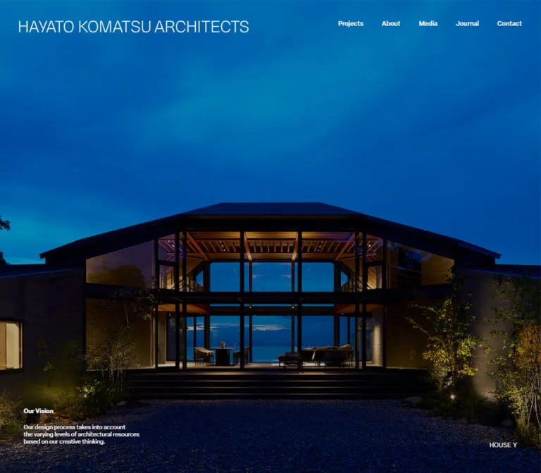
画面いっぱいの建築写真に細身のワードマークを重ね、白とチャコールのセクションを展開する設計事務所サイト。モバイルでも右寄せの実績カードと中央配置の記事カードを使い分け、静かな非対称レイアウトを保っています。
オリジナルサイトを見るArchitecture fills the screen; restrained typography and asymmetric spacing frame the work.
Website: 10per-komatsu.com Original URL: https://10per-komatsu.com/ Final URL: https://10per-komatsu.com/ Theme: photographic opening, off-white editorial sections, and a charcoal project section; no theme selector was evidenced. Inspected: September 23, 2026, at 00:45:45.693 JST, corresponding to September 22, 2026, at 15:45:45.693 UTC. Viewports: 1440 × 1000 desktop and 390 × 844 mobile, in CSS pixels. Scope: the current architectural practice homepage. Visual evidence covers three desktop photographic states and two mobile photographic states. Rendered DOM and computed-style evidence additionally cover the concept section, four featured projects, four journal entries, footer content, and the closed mobile menu's offscreen contents. Linked pages and the open menu were not inspected.
The homepage gives architectural photography almost the entire opening viewport. Timber ceilings, concrete planes, dark window frames, planting, and long interior sightlines provide the visual complexity. A thin uppercase wordmark and a small navigation row sit directly over the image without a visible header panel. The mobile version preserves that relationship, splitting the identity into two lines and replacing the navigation row with the word “Menu.”
The rest of the page, documented through DOM measurements, develops a quieter editorial composition. A large, light-weight concept statement precedes an asymmetric project arrangement on charcoal. Journal entries return to an off-white surface. The mobile layout keeps deliberate differences between content types: project cards form a narrow right-aligned column, while journal cards form a slightly wider centered column. Those alignments are central to the reference.
Architecture fills the screen; restrained typography and asymmetric spacing frame the work.
Website: 10per-komatsu.com Original URL: https://10per-komatsu.com/ Final URL: https://10per-komatsu.com/ Theme: photographic opening, off-white editorial sections, and a charcoal project section; no theme selector was evidenced. Inspected: September 23, 2026, at 00:45:45.693 JST, corresponding to September 22, 2026, at 15:45:45.693 UTC. Viewports: 1440 × 1000 desktop and 390 × 844 mobile, in CSS pixels. Scope: the current architectural practice homepage. Visual evidence covers three desktop photographic states and two mobile photographic states. Rendered DOM and computed-style evidence additionally cover the concept section, four featured projects, four journal entries, footer content, and the closed mobile menu's offscreen contents. Linked pages and the open menu were not inspected.
The homepage gives architectural photography almost the entire opening viewport. Timber ceilings, concrete planes, dark window frames, planting, and long interior sightlines provide the visual complexity. A thin uppercase wordmark and a small navigation row sit directly over the image without a visible header panel. The mobile version preserves that relationship, splitting the identity into two lines and replacing the navigation row with the word “Menu.”
The rest of the page, documented through DOM measurements, develops a quieter editorial composition. A large, light-weight concept statement precedes an asymmetric project arrangement on charcoal. Journal entries return to an off-white surface. The mobile layout keeps deliberate differences between content types: project cards form a narrow right-aligned column, while journal cards form a slightly wider centered column. Those alignments are central to the reference.
| Name | Value | Suggested token | Evidence and role |
|---|---|---|---|
| Off-white | #F5F5F5 |
--color-paper |
Measured body and light-section background; also measured reversed navigation and project text |
| Charcoal | #1B1B1C |
--color-charcoal |
Measured root background and featured-project section background |
| Black | #000000 |
--color-ink |
Measured primary text on light sections; also the opening section's underlying background |
| Secondary gray | #707070 |
--color-muted |
Measured supporting copy, project categories, journal categories, and footer labels |
| Section-note gray | #818181 |
--color-note |
Measured “Feature Works” and “Info / Thinking” subtitles |
| Transparent | rgba(0,0,0,0) |
— | Measured backgrounds of sampled navigation links, headings, and text elements |
The interface palette is neutral. Warm brown, garden green, blue daylight, and concrete gray come from the photographs. They are not evidenced as recurring button, badge, or section colors.
The supplied photographs look subdued, with deep interior shadows and relatively muted highlights. The screenshots alone cannot separate photographic exposure, asset grading, a CSS overlay, and other compositing effects. There is no measured overlay alpha or image filter in the supplied evidence.
Recommended starting point: provide an adjustable black scrim, initially around 0.25, and tune it against the actual licensed image. This is an adaptation token, not a recovered source value. An already dark image may need little or no additional shading.
The header reads as pale gray against the photographs even though its sampled link color is #F5F5F5. Do not reverse-engineer a new text color from antialiased screenshot edges or assume a particular blend mode.
elza-text, sans-serif.300 for the large concept statement, 400 for editorial text and section headings, 500 for navigation and some small categories, and 600 for “Our Vision.”The root element reports Times, but the body and sampled interface text override it. A serif type system would not reproduce the evidenced design.
heisei-kaku-gothic-std, sans-serif.300.-0.005em when calculated from the supplied pixel values.The same declared family appears on English project names such as “HOUSE H.” Do not infer the family from a label's language alone.
pragmatica, sans-serif.300.The visible identity reads “HAYATO KOMATSU ARCHITECTS.” Its H1 and home-link text fields are empty in the supplied extraction. The evidence therefore does not establish a font family for the wordmark or whether its artwork is an image, SVG, or another rendered asset.
Use its measured layout footprint and visible letterforms as the reference. The H1's inherited 16px font size does not describe the large visible lettering.
| Wordmark measurement | Desktop | Mobile |
|---|---|---|
| H1 layout position | 61.875, 54.672px |
24.5, 31px |
| H1 layout box | 600.984 × 29.797px |
182.063 × 40.422px |
| Visible arrangement | One horizontal line | “HAYATO KOMATSU” above “ARCHITECTS” |
These are layout boxes, not measurements of every visible glyph edge.
All values below are measured. Sizes and line heights are listed as font-size / line-height.
| Role | Family | Weight | Desktop | Mobile |
|---|---|---|---|---|
| Primary navigation | Elza Text | 500 |
16.875 / 20.25px |
Replaced by Menu control |
| Menu control | Elza Text | 400 |
Not present in the desktop sample | 14 / 14px |
| Offscreen menu primary links | Elza Text | 500 |
Not sampled | 22 / 37px |
| Opening project caption | Heisei Kaku Gothic Std | 300 |
15.75 / 15.75px |
13 / 25px |
| More Detail | Pragmatica | 300 |
14.625 / 14.625px |
11 / 11px |
| Our Vision label | Elza Text | 600 |
15.75 / 16.875px |
12 / 12px |
| Our Vision paragraph | Elza Text | 400 |
15.3 / 19.125px |
11 / 14px |
| Large concept statement | Elza Text | 300 |
48.375 / 52.875px |
28 / 32px |
| Concept continuation | Elza Text | 300 |
17.325 / 19.125px |
14.3 / 18px |
| Japanese concept heading | Heisei Kaku Gothic Std | 300 |
21.375 / 28.125px |
16 / 20px |
| Supporting English copy | Elza Text | 400 |
15.75 / 19.125px |
11 / 13px |
| Section heading | Elza Text | 400 |
29.25 / 43.875px |
20 / 30px |
| Section subtitle | Elza Text | 400 |
15.75 / 29.25px |
13 / 26px |
| Project title | Heisei Kaku Gothic Std | 300 |
18 / 28.125px |
15 / 25px |
| Project category | Pragmatica | 300 |
14.625 / 27px |
13 / 24px |
| Journal title | Heisei Kaku Gothic Std | 300 |
15.75 / 28.125px |
14 / 25px |
| Journal category | Elza Text | 500 |
13.5 / 13.5px |
12 / 12px |
| Section action | Pragmatica | 300 |
18 / 33.75px |
16 / 30px |
| Footer navigation | Elza Text | 400 |
19.125 / 27px |
15 / 21px |
| Footer contact value | Elza Text | 400 |
16.875 / 23.625px |
13 / 18px |
| Use | Measured or calculated tracking |
|---|---|
| Desktop navigation and mobile Menu | -0.006em |
| Large concept statement | Desktop -0.015em; mobile -0.022em |
| Section headings | -0.015em |
| Project and journal titles | -0.005em |
| Project and journal categories | 0.008em |
| Desktop section subtitles | -0.01em |
Font declarations establish the intended families, not their availability in another project. Load appropriately licensed fonts and recheck wrapping. No font file URLs were supplied.
There is no verified source spacing formula. Many desktop values are fractional, but two viewport samples are insufficient to recover the original fluid scale or breakpoint rules.
The composition combines a consistent outer content edge with much narrower media columns. Empty lateral space is an active part of the project layout.
| Use | Desktop measurement | Mobile measurement |
|---|---|---|
| Main content inset | 61.875px |
27px |
| Header wordmark left edge | 61.875px |
24.5px |
| Header navigation/control top | 54px |
27px |
| Gap between desktop navigation items | 48.375px, calculated |
Not applicable |
| Concept section top padding | 208.125px |
114px |
| Concept section bottom padding | 126px |
71px |
| Projects section top/bottom padding | 91.125 / 101.25px |
41 / 36px |
| Journal section top/bottom padding | 77.625 / 114.75px |
32 / 48px |
| Project media columns | 50.625px gap, calculated |
One column |
| Project media to title-box top | About 36.109px, calculated |
About 17.047px, calculated |
| Journal subtitle bottom to first media row | 123.75px, calculated |
88px, calculated |
| Journal media columns | 61.875px gap, calculated |
One column |
The media-to-title gaps come from transformed snapshot rectangles. They are useful target distances, but are not independently verified margin declarations.
All sampled elements report 0px border radius. The visible photographic canvas has square edges. No rounded card shell, pill treatment, or elevated panel is evidenced.
Keep media frames square-cornered. Shadows, border styles, and pseudo-element ornament were not comprehensively sampled; their absence from this extract is not a full stylesheet audit.
| Element | Desktop | Mobile |
|---|---|---|
| Opening section | 1440 × 1000px |
390 × 844px |
| Main inner content width | 1316.25px |
336px |
| Our Vision text width | 330.109px |
178px |
| Project media-link frame | 344.25 × 456.75px |
220 × 292px |
| Project media left edges | 639px, 1033.875px |
143px |
| Journal media-link frame | 284.625 × 183.375px |
244 × 157px |
| Journal media left edges | 61.875, 408.375, 754.875, 1101.375px |
73px |
| Reported document height | Approximately 6040px |
Approximately 5906px |
Project frame ratios are approximately 0.754, close to portrait 3:4. Journal frame ratios are approximately 1.55:1. These are media-link rectangles; intrinsic image dimensions were not supplied.
The recorded desktop journal row extends 7.875px beyond the section's reported right edge. Treat this as a measurement detail rather than inventing an exact four-column source formula. The starter below keeps its adapted row inside the container.
Role: introduce the practice through built work at architectural scale.
The opening section measures exactly one supplied viewport at both tested sizes. It has a black underlying surface and contains multiple project entries. The photographic captures show edge-to-edge interiors, including a timber-and-concrete living space, a kitchen and circulation space, a double-height room looking toward water, and a courtyard framed by dark glazing.
The DOM lists seven showcase entries: an award-nomination article, “HOUSE A,” “House in Eba,” “House in Shunan,” “House in Iwakuni,” “HOUSE Y,” and “House in Tezukayama.” Each has a “More Detail” anchor. The measured anchor footprints are viewport-sized, so the text label should not be interpreted as the extent of the intended target.
One detail destination is a YouTube URL. This establishes an external video destination, not embedded playback or an autoplaying video background.
State limitation: the supplied desktop frames include boundaries between different architectural images. Their relationship to elapsed time, scrolling, snapping, or an internal gallery controller is not recorded. There is no basis for choosing a specific carousel library, autoplay interval, swipe model, or pinned-scroll duration.
Role: keep identity and navigation available over the photographic presentation.
Desktop anatomy:
At 1440px, navigation begins at approximately x = 890.188px and ends at x = 1378.125px. Its calculated inter-item gap is 48.375px. The brand and navigation share the same broad top alignment around 54px.
The header occupies comparable screen positions in the supplied photographic states. This supports persistence within those states, but does not establish whether the implementation is fixed, sticky, or positioned inside a controlled showcase. Its behavior over lower sections remains unverified.
The identity becomes a two-line mark approximately 182px wide. “Menu” sits at x = 324.563px, y = 27px, with a right clearance of 27px.
The menu's DOM content includes a “Discover” heading, the five primary destinations, social links, email, address, and copyright text. These elements have negative vertical coordinates in the recorded state; for example, the “Discover” heading is around y = -809px. This is evidence of an offscreen menu structure, not an open-menu screenshot.
Primary offscreen menu links use 22px Elza Text with 37px line height. Supporting contact text is 12 / 18px, and small group headings are 11px.
The opening direction, menu background, close control, focus handling, and transition duration were not demonstrated. A full-screen dark navigation panel would be a possible adaptation, not an observed open state.
The DOM places a compact project caption near the lower right and a separate “Our Vision” link with supporting copy near the lower left.
| Part | Desktop geometry | Mobile geometry |
|---|---|---|
| First project caption | Top 932.5px; right edge 1377px |
Top about 795.047px; right edge 363px |
| Our Vision link | Left 61.875px; top about 831.297px |
Left 27px; top 718px |
| Vision paragraph | Top about 872.922px; width 330.109px |
Top 741px; width 178px |
The paragraph discusses the design process and architectural resources. Its measured height changes from roughly three desktop lines to five mobile lines.
These text blocks are not visibly established in the supplied current image frames. Keep their geometry separate from visibility logic. Do not force every caption to remain on screen merely because it has a DOM rectangle.
Role: turn the photographic introduction into a concise statement of architectural philosophy.
The measured surface is off-white with black primary text and gray supporting text. A light-weight English statement starts with “Having the architecture,” followed by “as black and the” and “environment as white.” Its continuation discusses human comfort within the ranges of gray.
At desktop size, the statement begins 208.125px inside the section and uses 48.375px type. At mobile size, it begins after 114px and uses 28px type. The strong size change preserves three measured lines without making the phone layout a miniature desktop.
A later block contains the Japanese heading “建築と環境の「間」を考える”, English explanation, and an “About Us” action. On desktop, the lower text is divided into measured columns of about 729.578px and 586.672px. The action sits toward the right edge. On mobile, these elements use the 336px content width, and “About Us” aligns left.
The desktop prompt “Please find our concept, philosophy, and information here.” is absent from the mobile text sample.
Inspection limit: a substantial interval separates the lead statement from the lower explanation. No corresponding media or intermediate component measurements were supplied. Do not reproduce that entire interval as an arbitrary blank spacer or invent a diagram to fill it.
Role: establish a clear editorial label and a quieter descriptor.
The project section uses “Recent Project” above “Feature Works.” The journal section uses “Our Journal” above “Info / Thinking.”
Use a regular-weight English heading, then a smaller gray subtitle. Desktop values are 29.25 / 43.875px and 15.75 / 29.25px; mobile values are 20 / 30px and 13 / 26px.
The hierarchy is achieved through size, line height, and color. No enclosing badge or decorative heading block is evidenced.
Role: present four recent works with generous space and an intentionally offset image field.
The desktop section reports a two-column outer grid of 414.219px and 902.031px. The media cards sit at the right of that second column. Their combined visible width is 739.125px: two 344.25px frames separated by 50.625px.
This produces a substantial distance between the section heading at x = 61.875px and the first photograph at x = 639px. Do not center the heading over the card grid or spread the cards evenly across the full content width.
On mobile, the section switches to block layout. All four media frames are 220 × 292px and start at x = 143px. Their right edges remain on the 363px content boundary. This leaves 116px between the normal content edge and the card column.
The measured mobile media tops advance by 394px: approximately 1827.969, 2221.969, 2615.969, and 3009.969px. That is the observed stride, not a recommendation to fix card heights regardless of content.
A project card contains:
Observed titles are “HOUSE H,” “KUWATA DOCKYARD,” “松江の家,” and “湯築の家.” Category labels include House, Renovation, Urban, Architecture, Ocean, Garden, and Large.
Categories link to filtered project URLs such as /projects/?c=House. They are small text links, not filled chips. Their sampled color is #707070, including in the dark project section.
Keep the image, title, and category links as distinct semantic elements. A card-wide parent link must not contain nested category anchors.
The project section's action remains associated with the left editorial edge. On desktop it sits low in the left column alongside the lower project row. On mobile it follows the four right-aligned cards but returns to x = 27px.
The action is followed by two lines inviting visitors to explore further work. Its understated text treatment is part of the hierarchy; a large filled conversion button would introduce a different emphasis.
Role: display practice news and ongoing activity in a more regular reading rhythm.
The desktop DOM places four landscape media frames in one row. The mobile DOM places the same four entries in a centered column, each 244px wide at x = 73px. The mobile journal column is therefore wider than the project column and has equal left and right outer margins.
Each entry contains a media link, a date, a Japanese title, and a category link. The supplied text establishes the date format YYYY.MM.DD; no date-element typography was sampled, so its exact styling remains unknown.
The observed article titles include “2026年 夏季インターン” and “モダンリビング大賞2026 ノミネートされました!”. The latter occupies two title lines at both sizes. Categories are “Others” or “News.”
“More Article” appears near the upper-right part of the desktop section. On mobile it follows the article list and uses a full-content-width flex box. A flex rectangle does not establish a bordered or filled button.
Role: provide a complete secondary navigation and a quiet route to contact.
The DOM contains two navigation groups, “Discover” and “Get In Touch,” plus an email address, a mapped Hiroshima office address, copyright text, and “Back to top.” The desktop also contains the service statement “Architecture, Interior, Landscape, Product Design,” set at 28.125 / 32.625px; that statement is absent from the mobile text sample.
Desktop navigation groups start at approximately x = 61.875px and x = 300.563px. The service and contact column starts at x = 645.672px. Contact-value anchor positions indicate right alignment in that desktop column.
On mobile, the two navigation groups remain side by side. Email and address move below them and align with the 27px left content edge. Copyright and “Back to top” occupy the final row.
The footer links are measured as off-white and the labels as gray. The footer container's background was not included in the element sample; charcoal is a consistent implementation recommendation, not an independently measured footer fill.
The “Back to top” URL ends in /#. The speed and easing of any return scroll were not tested. The printed copyright year is not evidence of the current site's launch or redesign date.
| Target | Supplied computed transition | What the evidence supports |
|---|---|---|
| Ordinary links, including header links | opacity 0.6s |
An opacity transition is declared; the triggered opacity value is unknown |
| Showcase captions and detail links | transform 1.3s cubic-bezier(0.75, 0.01, 0.31, 1), opacity 1.3s cubic-bezier(0.75, 0.01, 0.31, 1) |
Transform and opacity changes can share a long, shaped transition |
| Project titles and several supporting blocks | Same 1.3s transform/opacity transition |
A reusable reveal treatment is declared; distance and trigger are not supplied |
| Several section actions and journal titles | Same 1.3s transform/opacity transition |
Consistent transition vocabulary across content types |
| Concept section | opacity 1s |
Section-level opacity transition is declared |
| Sampled keyframe animation property | none |
No keyframe animation is reported on those sampled elements at that moment |
The repeated 1.3s timing suggests an unhurried reveal vocabulary, but the screenshots do not prove a particular entrance direction or scroll threshold. The supplied animation: none values do not rule out JavaScript-driven image movement, transitions on other nodes, or pseudo-element animation.
The capture procedure waited for document and image readiness and sampled layout stability. It also managed perpetual animations during readiness checks. This does not provide a frame-by-frame record of the site's interaction behavior.
Unverified: autoplay, gallery pagination, wheel interception, touch swiping, scroll snapping, parallax, hover endpoints, custom cursors, menu opening, focus movement, keyboard gallery control, and smooth return scrolling.
Recommended adaptation: reuse the measured durations for optional opacity and small translation reveals, with visible content as the default. Choose any translation distance explicitly as a new design decision. Respect reduced motion and prevent inactive gallery items from remaining keyboard-focusable.
| Layer | Evidenced treatment | Implementation guidance |
|---|---|---|
| Photographic opening | Black section under edge-to-edge photography | Keep the photograph dominant and crop deliberately |
| Header | Text and wordmark directly over the image | Preserve the transparent appearance in the photographic state |
| Concept content | #F5F5F5 with black and gray typography |
Use open editorial spacing |
| Featured projects | #1B1B1C with pale titles and gray categories |
Preserve the offset portrait-card field |
| Journal content | #F5F5F5 with black titles and gray metadata |
Use a regular desktop row and centered mobile stack |
| Footer text | Off-white links and gray labels | A charcoal backing is recommended; wrapper fill was not sampled |
| Open mobile navigation | No visual state supplied | Specify and validate separately |
No general card-elevation system is established by the evidence. The sampled design organizes content through image boundaries, alignment, typography, and alternating neutral surfaces.
The current photographs present architecture through material and spatial relationships: timber beams against concrete, fine planting against dark frames, low furniture beneath tall volumes, and deep views through glazing. Repeated structural lines give the images their internal grid.
The desktop opening uses a wide room view. The corresponding mobile frame retains a narrow slice through the concrete mass, kitchen island, sofa, and foreground table. It does not shrink the whole desktop scene into a letterboxed image. A second mobile frame looks through black mullions toward planting, chairs, and concrete courtyard fins.
Recommended image selection should preserve:
A cover crop with per-image focal positions is a practical adaptation. The original object-fit, background-sizing, and focal-point declarations were not supplied. Review each crop individually instead of assuming every photograph works at 50% 50%.
No original image URLs, wordmark asset paths, intrinsic media dimensions, or photographer credits were provided in the current-page evidence.
| Asset role | Evidence available | Limitation |
|---|---|---|
| Showcase photography | Five current visual captures | Asset URL and exact project-to-frame mapping unavailable |
| Desktop and mobile wordmark | Visible lettering and measured H1 boxes | Artwork format, path, and typeface unavailable |
| Featured-project media | Four portrait media-link frames in DOM | Individual image appearance and intrinsic size not visually inspected |
| Journal media | Four landscape media-link frames in DOM | Individual image appearance and intrinsic size not visually inspected |
| Showcase video destination | One detail link points to YouTube | No embedded player or background-video behavior demonstrated |
Use authorized architecture photography and brand artwork. CSS can reproduce the framing and layout, but cannot replace the specificity of the buildings and their photographic composition.
These positions describe the supplied DOM snapshot, not a reconstruction from screenshot scroll offsets.
| Section | Desktop top / height | Mobile top / height |
|---|---|---|
| Opening showcase | 0 / 1000px |
0 / 844px |
| Concept | 1000 / 1528.953px |
844 / 841.969px |
| Featured projects | 2528.953 / 1356.281px |
1685.969 / 1865px |
| Journal | 3885.234 / 730.797px |
3550.969 / 1459.375px |
The footer's first sampled navigation headings occur around y = 5304.203px on desktop and y = 5258.813px on mobile. Its enclosing rectangle and the preceding content interval were not supplied.
Showcase-item rectangles advance in viewport-height increments, while the concept section starts after just one viewport. Some desktop showcase-item rectangles even extend beyond the reported document height.
This means the item offsets cannot be treated as seven normal document-flow sections. A controlled, transformed, or clipped arrangement is consistent with the evidence, but the exact mechanism is unknown. Building seven consecutive full-height blocks would produce the wrong documented page structure.
| Feature | Desktop | Mobile |
|---|---|---|
| Wordmark | Long single line | Compact two-line identity |
| Primary navigation | Five visible text links | Menu control |
| Opening photography | Wide architectural view | Tall, tightly selected crop |
| Concept title | 48.375px |
28px |
| Concept lower content | Two measured text columns | Stacked content with left-aligned action |
| Projects | Two portrait columns on the right | One 220px column aligned right |
| Journal | Four landscape columns | One centered 244px column |
| More Projects | Low in the left editorial column | Below the cards at the normal left edge |
| More Article | Upper-right section action | Below the article list |
| Footer contacts | Wide right-hand column | Left-aligned blocks below navigation |
At 390px, project cards occupy about 65.5% of the inner content width, while journal cards occupy about 72.6%. These percentages are calculated descriptions, not recovered CSS formulas.
Only two viewport widths were inspected. Tablet rules, intermediate breakpoints, orientation changes, zoom behavior, and safe-area handling remain unverified. The Quick Start uses a recommended 64rem layout switch and caps mobile card widths so smaller screens remain usable.
16px value to recreate the wordmark.These are recommendations for a new implementation, not verified features of the original site:
aria-expanded and aria-controls. When a modal navigation is used, manage focus, Escape, and focus restoration.#707070 text on charcoal. A lighter secondary-text token can improve contrast in an adaptation.11px where the copy is important to comprehension.#F5F5F5.#1B1B1C.#000000.#707070.#818181.“Create an architectural practice homepage with edge-to-edge photography, a thin uppercase wordmark, and small pale navigation over the opening image. Use off-white #F5F5F5, charcoal #1B1B1C, black text, and restrained gray metadata. Build a light concept section with a large, light-weight sans-serif statement, then a dark featured-project section with an editorial heading on the left and two portrait media columns on the right. Follow with a light journal section containing four landscape cards. At 390px, split the wordmark into two lines, show a Menu control, keep project cards 220px wide and right-aligned, and center 244px journal cards. Use square media edges and quiet text actions. Treat the gallery controller and menu-open state as separate requirements because their behavior is not established by the reference.”
This is a reusable adaptation of the measured typography, alignments, and media proportions. It is not recovered source CSS. Mobile values are the base; a recommended 64rem breakpoint introduces the desktop composition. Desktop gutter interpolation, image fitting, optional scrim, hover endpoint, and accessibility rules are implementation choices.
Use a .showcase containing one active .showcase-frame, an overlaid .site-header, and optional caption/vision elements. Supply licensed desktop/mobile wordmark artwork through a picture element. The menu button requires a separately implemented navigation controller.
For the project section, place .section-heading, .project-grid, and .section-more inside .projects-layout. Each card should contain a separate media anchor, heading link, and category list. Use an analogous .journal-grid for articles. The starter does not attempt to reproduce unrecorded content between the concept lead and its lower explanation.
:root {
  /* Measured interface palette; aliases are new. */
  --color-paper: #f5f5f5;
  --color-charcoal: #1b1b1c;
  --color-ink: #000;
  --color-muted: #707070;
  --color-note: #818181;

  /* Measured family declarations; font files are not supplied. */
  --font-main: 'elza-text', sans-serif;
  --font-ja: 'heisei-kaku-gothic-std', sans-serif;
  --font-action: 'pragmatica', sans-serif;

  /* Mobile measurements. */
  --page-inset: 27px;
  --header-top: 27px;
  --brand-width: 182.0625px;
  --text-concept: 28px;
  --leading-concept: 32px;
  --tracking-concept: -0.022em;
  --text-section: 20px;
  --leading-section: 30px;
  --text-subtitle: 13px;
  --leading-subtitle: 26px;
  --text-project: 15px;
  --leading-project: 25px;
  --text-journal: 14px;
  --leading-journal: 25px;
  --text-action: 16px;
  --leading-action: 30px;
  --text-support: 11px;
  --leading-support: 13px;
  --project-title-gap: 17.047px;

  /* Recommended adjustable shading, not a measured source value. */
  --photo-shade: 0.25;

  /* Measured transition timings. */
  --motion-link: 600ms;
  --motion-reveal: 1300ms;
  --ease-reveal: cubic-bezier(0.75, 0.01, 0.31, 1);
}

* {
  box-sizing: border-box;
}

html {
  background: var(--color-charcoal);
}

body {
  margin: 0;
  background: var(--color-paper);
  color: var(--color-ink);
  font-family: var(--font-main);
  font-size: 16px;
  font-weight: 500;
}

:where(h1, h2, h3, p, figure) {
  margin: 0;
}

a {
  color: inherit;
  text-decoration: none;
  transition: opacity var(--motion-link);
}

button {
  font: inherit;
}

img {
  display: block;
  max-width: 100%;
}

.page-width {
  width: calc(100% - 2 * var(--page-inset));
  margin-inline: auto;
}

/* Recommended stable viewport sizing. */
.showcase {
  position: relative;
  height: 100vh;
  height: 100svh;
  overflow: hidden;
  background: #000;
  color: var(--color-paper);
}

.showcase-frame {
  position: absolute;
  inset: 0;
}

.showcase-frame[hidden] {
  display: none;
}

.showcase-frame > img {
  width: 100%;
  height: 100%;
  object-fit: cover;
  object-position: var(--focal-point, 50% 50%);
}

.showcase-frame::after {
  position: absolute;
  inset: 0;
  content: '';
  pointer-events: none;
  background: rgb(0 0 0 / var(--photo-shade));
}

.showcase-link {
  position: absolute;
  inset: 0;
  z-index: 1;
}

/* Absolute positioning reproduces the photographed overlay state. */
.site-header {
  position: absolute;
  inset: 0 0 auto;
  z-index: 10;
  display: flex;
  align-items: flex-start;
  justify-content: space-between;
  padding: var(--header-top) var(--page-inset) 0;
  color: var(--color-paper);
}

.site-brand {
  display: block;
  width: var(--brand-width);
  margin-top: 4px;
  margin-left: -2.5px;
}

.site-brand img {
  width: 100%;
  height: auto;
}

.site-nav {
  display: none;
}

.menu-toggle {
  border: 0;
  background: transparent;
  color: inherit;
  font: 400 14px / 14px var(--font-main);
  letter-spacing: -0.006em;
  cursor: pointer;
  /* Recommended larger hit area; visible text retains its top alignment. */
  min-width: 44px;
  min-height: 44px;
  padding: 15px 0;
  margin-top: -15px;
  text-align: right;
}

/* Optional DOM-supported text states; visibility needs its own controller. */
.showcase-caption {
  position: absolute;
  z-index: 2;
  right: 27px;
  bottom: 24px;
  font: 300 13px / 25px var(--font-ja);
  letter-spacing: -0.005em;
}

.vision-note {
  position: absolute;
  z-index: 2;
  left: var(--page-inset);
  bottom: 33px;
  width: 178px;
}

.vision-note > a {
  display: block;
  margin-bottom: 11px;
  font: 600 12px / 12px var(--font-main);
  letter-spacing: -0.006em;
}

.vision-note > p {
  font: 400 11px / 14px var(--font-main);
  letter-spacing: -0.005em;
}

.concept-section {
  padding-block: 114px 71px;
  background: var(--color-paper);
}

.concept-lead {
  font: 300 var(--text-concept) / var(--leading-concept) var(--font-main);
  letter-spacing: var(--tracking-concept);
}

.concept-continuation {
  margin-top: 19px;
  color: var(--color-muted);
  font: 300 14.3px / 18px var(--font-main);
}

.concept-details {
  display: grid;
  gap: 20px;
  /* Recommended spacing; actual intermediate content was not recorded. */
  margin-top: var(--concept-details-gap, 80px);
}

.concept-heading {
  font: 300 16px / 20px var(--font-ja);
  letter-spacing: -0.005em;
}

.support-copy {
  color: var(--color-muted);
  font: 400 var(--text-support) / var(--leading-support) var(--font-main);
}

.concept-heading + .support-copy {
  margin-top: 19px;
}

.text-action {
  display: inline-flex;
  align-items: center;
  font: 300 var(--text-action) / var(--leading-action) var(--font-action);
}

.section-heading h2 {
  font: 400 var(--text-section) / var(--leading-section) var(--font-main);
  letter-spacing: -0.015em;
}

.section-heading p {
  color: var(--color-note);
  font: 400 var(--text-subtitle) / var(--leading-subtitle) var(--font-main);
}

.projects-section {
  padding-block: 41px 36px;
  background: var(--color-charcoal);
  color: var(--color-paper);
}

.project-grid {
  display: grid;
  gap: 36px;
  width: min(220px, 100%);
  margin-top: 45px;
  margin-left: auto;
}

.project-media,
.journal-media {
  display: block;
  overflow: hidden;
  border-radius: 0;
}

.project-media {
  aspect-ratio: 220 / 292;
}

.project-media img,
.journal-media img {
  width: 100%;
  height: 100%;
  object-fit: cover;
  object-position: var(--focal-point, 50% 50%);
}

.project-title {
  margin-top: var(--project-title-gap);
  font: 300 var(--text-project) / var(--leading-project) var(--font-ja);
  letter-spacing: -0.005em;
}

.project-tags {
  display: flex;
  flex-wrap: wrap;
  column-gap: 0.65em;
  color: var(--color-muted);
  font: 300 13px / 24px var(--font-action);
  letter-spacing: 0.008em;
}

.section-more {
  margin-top: 80px;
}

.section-more .support-copy {
  margin-top: 11px;
}

.journal-section {
  padding-block: 32px 48px;
  background: var(--color-paper);
  color: var(--color-ink);
}

.journal-grid {
  display: grid;
  gap: 36px;
  width: min(244px, 100%);
  margin: 88px auto 0;
}

.journal-media {
  aspect-ratio: 244 / 157;
}

/* Date styling is recommended; its computed typography was not supplied. */
.journal-date {
  display: block;
  margin-top: 18px;
  color: var(--color-muted);
  font: 400 12px / 18px var(--font-main);
}

.journal-title {
  margin-top: 8px;
  font: 300 var(--text-journal) / var(--leading-journal) var(--font-ja);
  letter-spacing: -0.005em;
}

.journal-category {
  display: inline-block;
  margin-top: 4px;
  color: var(--color-muted);
  font: 500 12px / 12px var(--font-main);
  letter-spacing: 0.008em;
}

.journal-more {
  display: flex;
  margin-top: 90px;
}

/* Footer surface and padding are an adaptation. */
.site-footer {
  padding-block: 80px 40px;
  background: var(--color-charcoal);
  color: var(--color-paper);
}

.footer-grid {
  display: grid;
  gap: 80px;
}

.footer-nav {
  display: grid;
  grid-template-columns: minmax(0, 1fr) 108.578px;
  gap: 20px;
}

.footer-nav h3 {
  margin-bottom: 8px;
  color: var(--color-muted);
  font: 400 13px / 21px var(--font-main);
}

.footer-nav a {
  display: block;
  font: 400 15px / 21px var(--font-main);
}

.footer-contact {
  font: 400 13px / 18px var(--font-main);
}

.footer-contact a {
  overflow-wrap: anywhere;
}

.footer-contact h3 {
  margin-top: 32px;
  color: var(--color-muted);
  font: 400 11px / 11px var(--font-main);
}

/* Recommended focus and hover behavior. Hover opacity was not measured. */
:where(a, button):focus-visible {
  outline: 2px solid currentColor;
  outline-offset: 5px;
}

@media (hover: hover) {
  a:hover {
    opacity: 0.7;
  }
}

@media (min-width: 64rem) {
  :root {
    /* Interpolation is recommended; values match at 1440px. */
    --page-inset: clamp(27px, 4.296875vw, 61.875px);
    --header-top: 54px;
    --brand-width: clamp(360px, 41.735026vw, 600.984px);
    --text-concept: 48.375px;
    --leading-concept: 52.875px;
    --tracking-concept: -0.015em;
    --text-section: 29.25px;
    --leading-section: 43.875px;
    --text-subtitle: 15.75px;
    --leading-subtitle: 29.25px;
    --text-project: 18px;
    --leading-project: 28.125px;
    --text-journal: 15.75px;
    --leading-journal: 28.125px;
    --text-action: 18px;
    --leading-action: 33.75px;
    --text-support: 15.75px;
    --leading-support: 19.125px;
    --project-title-gap: 36.109px;
  }

  .site-brand {
    margin-top: 0.672px;
    margin-left: 0;
  }

  .site-nav {
    display: flex;
    gap: clamp(20px, 3.359375vw, 48.375px);
    font: 500 clamp(14px, 1.171875vw, 16.875px) / 1.2 var(--font-main);
    letter-spacing: -0.006em;
  }

  .menu-toggle {
    display: none;
  }

  .showcase-caption {
    right: 63px;
    bottom: 51.75px;
    font-size: 15.75px;
    line-height: 15.75px;
  }

  .vision-note {
    bottom: 69.75px;
    width: 330.109px;
  }

  .vision-note > a {
    margin-bottom: 24.75px;
    font-size: 15.75px;
    line-height: 16.875px;
  }

  .vision-note > p {
    font-size: 15.3px;
    line-height: 19.125px;
  }

  .concept-section {
    padding-block: 208.125px 126px;
  }

  .concept-continuation {
    margin-top: 34.875px;
    font-size: 17.325px;
    line-height: 19.125px;
    letter-spacing: 0.003em;
  }

  .concept-details {
    grid-template-columns: 55.4286% 44.5714%;
    gap: 0;
  }

  .concept-heading {
    font-size: 21.375px;
    line-height: 28.125px;
  }

  .concept-aside .text-action {
    display: flex;
    justify-content: flex-end;
    margin-top: 40px;
  }

  .projects-section {
    padding-block: 91.125px 101.25px;
  }

  .projects-layout {
    display: grid;
    grid-template-columns: 31.47% 68.53%;
    grid-template-areas: 'heading cards' 'more cards';
  }

  .projects-layout > .section-heading {
    grid-area: heading;
  }

  .project-grid {
    grid-area: cards;
    grid-template-columns: repeat(2, minmax(0, 1fr));
    column-gap: clamp(24px, 3.515625vw, 50.625px);
    row-gap: 79.188px;
    width: min(739.125px, 100%);
    margin-top: 0;
  }

  .project-media {
    aspect-ratio: 344.25 / 456.75;
  }

  .project-tags {
    font-size: 14.625px;
    line-height: 27px;
  }

  .projects-layout > .section-more {
    grid-area: more;
    align-self: end;
    margin-top: 60px;
  }

  .journal-section {
    padding-block: 77.625px 114.75px;
  }

  .journal-layout {
    position: relative;
  }

  .journal-grid {
    grid-template-columns: repeat(4, minmax(0, 1fr));
    gap: var(--page-inset);
    width: 100%;
    margin-top: 123.75px;
  }

  .journal-media {
    aspect-ratio: 284.625 / 183.375;
  }

  .journal-category {
    font-size: 13.5px;
    line-height: 13.5px;
  }

  .journal-more {
    position: absolute;
    top: 11.25px;
    right: 0;
    margin-top: 0;
  }

  .footer-grid {
    grid-template-columns: 44.35% 55.65%;
    gap: 0;
  }

  .footer-nav {
    grid-template-columns: 150.938px minmax(0, 1fr);
    gap: 87.75px;
  }

  .footer-nav a {
    font-size: 19.125px;
    line-height: 27px;
  }

  .footer-contact {
    text-align: right;
    font-size: 16.875px;
    line-height: 23.625px;
  }
}

/* Optional reveal hook: content stays visible until explicitly initialized. */
[data-reveal] {
  transition:
    transform var(--motion-reveal) var(--ease-reveal),
    opacity var(--motion-reveal) var(--ease-reveal);
}

@media (prefers-reduced-motion: reduce) {
  a,
  [data-reveal] {
    transition: none;
  }
}
The optional showcase caption and vision selectors style DOM-supported components. Omit those elements when reproducing the bare-photo state visible in the supplied captures. Gallery activation, caption state, and menu behavior require separate implementation and testing.
Optional aliases for a project already using Tailwind v4. This does not imply the original website uses Tailwind. Define the custom properties above first.
@theme inline {
  --color-paper: var(--color-paper);
  --color-architectural-charcoal: var(--color-charcoal);
  --color-architectural-ink: var(--color-ink);
  --color-secondary-gray: var(--color-muted);
  --color-section-note: var(--color-note);

  --font-editorial: var(--font-main);
  --font-japanese: var(--font-ja);
  --font-utility: var(--font-action);

  --text-concept-display: var(--text-concept);
  --text-section-heading: var(--text-section);
  --text-project-name: var(--text-project);
  --text-journal-title: var(--text-journal);
  --text-section-action: var(--text-action);

  --spacing-page-inset: var(--page-inset);
  --radius-media: 0px;
}
For a production Tailwind setup, use a distinct source name for the paper token, such as --site-paper, and map --color-paper: var(--site-paper) to avoid a self-referencing custom property.
200 and no change between original and final URLs.2026-09-22T15:45:45.693Z, equivalent to September 23, 2026, at 00:45:45.693 JST.1440 × 1000, plus rendered text, links, element rectangles, and computed styles at that viewport.390 × 844, plus rendered text, links, element rectangles, and computed styles at that viewport.This reference describes the current supplied homepage evidence. Measurements are specific to the two recorded viewports; breakpoint choices, accessibility enhancements, CSS fitting rules, and reusable token mappings are recommendations.
# HAYATO KOMATSU ARCHITECTS — Style Reference

> Architecture fills the screen; restrained typography and asymmetric spacing frame the work.

**Website:** [10per-komatsu.com](https://10per-komatsu.com/)
**Original URL:** https://10per-komatsu.com/
**Final URL:** https://10per-komatsu.com/
**Theme:** photographic opening, off-white editorial sections, and a charcoal project section; no theme selector was evidenced.
**Inspected:** September 23, 2026, at 00:45:45.693 JST, corresponding to September 22, 2026, at 15:45:45.693 UTC.
**Viewports:** 1440 × 1000 desktop and 390 × 844 mobile, in CSS pixels.
**Scope:** the current architectural practice homepage. Visual evidence covers three desktop photographic states and two mobile photographic states. Rendered DOM and computed-style evidence additionally cover the concept section, four featured projects, four journal entries, footer content, and the closed mobile menu's offscreen contents. Linked pages and the open menu were not inspected.

The homepage gives architectural photography almost the entire opening viewport. Timber ceilings, concrete planes, dark window frames, planting, and long interior sightlines provide the visual complexity. A thin uppercase wordmark and a small navigation row sit directly over the image without a visible header panel. The mobile version preserves that relationship, splitting the identity into two lines and replacing the navigation row with the word “Menu.”

The rest of the page, documented through DOM measurements, develops a quieter editorial composition. A large, light-weight concept statement precedes an asymmetric project arrangement on charcoal. Journal entries return to an off-white surface. The mobile layout keeps deliberate differences between content types: project cards form a narrow right-aligned column, while journal cards form a slightly wider centered column. Those alignments are central to the reference.
# HAYATO KOMATSU ARCHITECTS — Style Reference

> Architecture fills the screen; restrained typography and asymmetric spacing frame the work.

**Website:** [10per-komatsu.com](https://10per-komatsu.com/)
**Original URL:** https://10per-komatsu.com/
**Final URL:** https://10per-komatsu.com/
**Theme:** photographic opening, off-white editorial sections, and a charcoal project section; no theme selector was evidenced.
**Inspected:** September 23, 2026, at 00:45:45.693 JST, corresponding to September 22, 2026, at 15:45:45.693 UTC.
**Viewports:** 1440 × 1000 desktop and 390 × 844 mobile, in CSS pixels.
**Scope:** the current architectural practice homepage. Visual evidence covers three desktop photographic states and two mobile photographic states. Rendered DOM and computed-style evidence additionally cover the concept section, four featured projects, four journal entries, footer content, and the closed mobile menu's offscreen contents. Linked pages and the open menu were not inspected.

The homepage gives architectural photography almost the entire opening viewport. Timber ceilings, concrete planes, dark window frames, planting, and long interior sightlines provide the visual complexity. A thin uppercase wordmark and a small navigation row sit directly over the image without a visible header panel. The mobile version preserves that relationship, splitting the identity into two lines and replacing the navigation row with the word “Menu.”

The rest of the page, documented through DOM measurements, develops a quieter editorial composition. A large, light-weight concept statement precedes an asymmetric project arrangement on charcoal. Journal entries return to an off-white surface. The mobile layout keeps deliberate differences between content types: project cards form a narrow right-aligned column, while journal cards form a slightly wider centered column. Those alignments are central to the reference.

## How to Read This Reference

- **Measured** means a value supplied in the rendered DOM or computed styles. Decimal measurements describe the recorded state, not necessarily the original CSS constants.
- **Visually observed** means visible in the five current-page captures. These establish the photographic treatment, header appearance, mobile crop, and image boundaries.
- **Calculated** means arithmetic using measured boxes, such as the distance between navigation links or an image-frame aspect ratio.
- **Estimated** means a visual approximation without a supplied style declaration. Photo darkening is in this category; its source opacity is unknown.
- **Recommended** means implementation guidance for a new build. The CSS breakpoint, image-fitting rules, optional shading, and accessibility additions are recommendations.
- **Named tokens** are reusable aliases. The supplied custom-property extraction was empty; these names are not claimed to be source variables.
- **DOM presence does not establish visibility.** Some captions have measurable rectangles but are not legible in the supplied photographic frames. Opacity, clipping, stacking, and visibility states were not included in the sampled properties.

## Tokens — Colors

### Default Palette

| Name | Value | Suggested token | Evidence and role |
| --- | --- | --- | --- |
| Off-white | `#F5F5F5` | `--color-paper` | Measured body and light-section background; also measured reversed navigation and project text |
| Charcoal | `#1B1B1C` | `--color-charcoal` | Measured root background and featured-project section background |
| Black | `#000000` | `--color-ink` | Measured primary text on light sections; also the opening section's underlying background |
| Secondary gray | `#707070` | `--color-muted` | Measured supporting copy, project categories, journal categories, and footer labels |
| Section-note gray | `#818181` | `--color-note` | Measured “Feature Works” and “Info / Thinking” subtitles |
| Transparent | `rgba(0,0,0,0)` | — | Measured backgrounds of sampled navigation links, headings, and text elements |

The interface palette is neutral. Warm brown, garden green, blue daylight, and concrete gray come from the photographs. They are not evidenced as recurring button, badge, or section colors.

### Photo Contrast

The supplied photographs look subdued, with deep interior shadows and relatively muted highlights. The screenshots alone cannot separate photographic exposure, asset grading, a CSS overlay, and other compositing effects. There is no measured overlay alpha or image filter in the supplied evidence.

**Recommended starting point:** provide an adjustable black scrim, initially around `0.25`, and tune it against the actual licensed image. This is an adaptation token, not a recovered source value. An already dark image may need little or no additional shading.

The header reads as pale gray against the photographs even though its sampled link color is `#F5F5F5`. Do not reverse-engineer a new text color from antialiased screenshot edges or assume a particular blend mode.

## Tokens — Typography

### Main English Typography

- **Measured family:** `elza-text, sans-serif`.
- **Roles:** desktop navigation, concept statement, English supporting text, section headings, journal categories, and footer navigation.
- **Weights:** generally `300` for the large concept statement, `400` for editorial text and section headings, `500` for navigation and some small categories, and `600` for “Our Vision.”
- **Character:** restrained sans-serif forms with modest negative tracking. Large text remains light rather than becoming a heavy display headline.

The root element reports `Times`, but the body and sampled interface text override it. A serif type system would not reproduce the evidenced design.

### Japanese and Project Titles

- **Measured family:** `heisei-kaku-gothic-std, sans-serif`.
- **Measured weight:** `300`.
- **Roles:** opening project captions, project names, Japanese journal headlines, and the concept heading “建築と環境の「間」を考える”.
- **Tracking:** typically `-0.005em` when calculated from the supplied pixel values.

The same declared family appears on English project names such as “HOUSE H.” Do not infer the family from a label's language alone.

### Actions and Project Categories

- **Measured family:** `pragmatica, sans-serif`.
- **Measured weight:** `300`.
- **Roles:** “More Detail,” “About Us,” “More Projects,” “More Article,” and project-category links.
- **Treatment:** plain text actions with generous line boxes; no measured filled-button treatment.

### Wordmark

The visible identity reads “HAYATO KOMATSU ARCHITECTS.” Its H1 and home-link text fields are empty in the supplied extraction. The evidence therefore does not establish a font family for the wordmark or whether its artwork is an image, SVG, or another rendered asset.

Use its measured layout footprint and visible letterforms as the reference. The H1's inherited `16px` font size does **not** describe the large visible lettering.

| Wordmark measurement | Desktop | Mobile |
| --- | --- | --- |
| H1 layout position | `61.875, 54.672px` | `24.5, 31px` |
| H1 layout box | `600.984 × 29.797px` | `182.063 × 40.422px` |
| Visible arrangement | One horizontal line | “HAYATO KOMATSU” above “ARCHITECTS” |

These are layout boxes, not measurements of every visible glyph edge.

### Type Scale

All values below are measured. Sizes and line heights are listed as `font-size / line-height`.

| Role | Family | Weight | Desktop | Mobile |
| --- | --- | --- | --- | --- |
| Primary navigation | Elza Text | `500` | `16.875 / 20.25px` | Replaced by Menu control |
| Menu control | Elza Text | `400` | Not present in the desktop sample | `14 / 14px` |
| Offscreen menu primary links | Elza Text | `500` | Not sampled | `22 / 37px` |
| Opening project caption | Heisei Kaku Gothic Std | `300` | `15.75 / 15.75px` | `13 / 25px` |
| More Detail | Pragmatica | `300` | `14.625 / 14.625px` | `11 / 11px` |
| Our Vision label | Elza Text | `600` | `15.75 / 16.875px` | `12 / 12px` |
| Our Vision paragraph | Elza Text | `400` | `15.3 / 19.125px` | `11 / 14px` |
| Large concept statement | Elza Text | `300` | `48.375 / 52.875px` | `28 / 32px` |
| Concept continuation | Elza Text | `300` | `17.325 / 19.125px` | `14.3 / 18px` |
| Japanese concept heading | Heisei Kaku Gothic Std | `300` | `21.375 / 28.125px` | `16 / 20px` |
| Supporting English copy | Elza Text | `400` | `15.75 / 19.125px` | `11 / 13px` |
| Section heading | Elza Text | `400` | `29.25 / 43.875px` | `20 / 30px` |
| Section subtitle | Elza Text | `400` | `15.75 / 29.25px` | `13 / 26px` |
| Project title | Heisei Kaku Gothic Std | `300` | `18 / 28.125px` | `15 / 25px` |
| Project category | Pragmatica | `300` | `14.625 / 27px` | `13 / 24px` |
| Journal title | Heisei Kaku Gothic Std | `300` | `15.75 / 28.125px` | `14 / 25px` |
| Journal category | Elza Text | `500` | `13.5 / 13.5px` | `12 / 12px` |
| Section action | Pragmatica | `300` | `18 / 33.75px` | `16 / 30px` |
| Footer navigation | Elza Text | `400` | `19.125 / 27px` | `15 / 21px` |
| Footer contact value | Elza Text | `400` | `16.875 / 23.625px` | `13 / 18px` |

### Tracking

| Use | Measured or calculated tracking |
| --- | --- |
| Desktop navigation and mobile Menu | `-0.006em` |
| Large concept statement | Desktop `-0.015em`; mobile `-0.022em` |
| Section headings | `-0.015em` |
| Project and journal titles | `-0.005em` |
| Project and journal categories | `0.008em` |
| Desktop section subtitles | `-0.01em` |

Font declarations establish the intended families, not their availability in another project. Load appropriately licensed fonts and recheck wrapping. No font file URLs were supplied.

## Tokens — Spacing & Shapes

There is no verified source spacing formula. Many desktop values are fractional, but two viewport samples are insufficient to recover the original fluid scale or breakpoint rules.

The composition combines a consistent outer content edge with much narrower media columns. Empty lateral space is an active part of the project layout.

### Spacing Scale

| Use | Desktop measurement | Mobile measurement |
| --- | --- | --- |
| Main content inset | `61.875px` | `27px` |
| Header wordmark left edge | `61.875px` | `24.5px` |
| Header navigation/control top | `54px` | `27px` |
| Gap between desktop navigation items | `48.375px`, calculated | Not applicable |
| Concept section top padding | `208.125px` | `114px` |
| Concept section bottom padding | `126px` | `71px` |
| Projects section top/bottom padding | `91.125 / 101.25px` | `41 / 36px` |
| Journal section top/bottom padding | `77.625 / 114.75px` | `32 / 48px` |
| Project media columns | `50.625px` gap, calculated | One column |
| Project media to title-box top | About `36.109px`, calculated | About `17.047px`, calculated |
| Journal subtitle bottom to first media row | `123.75px`, calculated | `88px`, calculated |
| Journal media columns | `61.875px` gap, calculated | One column |

The media-to-title gaps come from transformed snapshot rectangles. They are useful target distances, but are not independently verified margin declarations.

### Border Radius

All sampled elements report `0px` border radius. The visible photographic canvas has square edges. No rounded card shell, pill treatment, or elevated panel is evidenced.

Keep media frames square-cornered. Shadows, border styles, and pseudo-element ornament were not comprehensively sampled; their absence from this extract is not a full stylesheet audit.

### Layout Measurements

| Element | Desktop | Mobile |
| --- | --- | --- |
| Opening section | `1440 × 1000px` | `390 × 844px` |
| Main inner content width | `1316.25px` | `336px` |
| Our Vision text width | `330.109px` | `178px` |
| Project media-link frame | `344.25 × 456.75px` | `220 × 292px` |
| Project media left edges | `639px`, `1033.875px` | `143px` |
| Journal media-link frame | `284.625 × 183.375px` | `244 × 157px` |
| Journal media left edges | `61.875`, `408.375`, `754.875`, `1101.375px` | `73px` |
| Reported document height | Approximately `6040px` | Approximately `5906px` |

Project frame ratios are approximately `0.754`, close to portrait `3:4`. Journal frame ratios are approximately `1.55:1`. These are media-link rectangles; intrinsic image dimensions were not supplied.

The recorded desktop journal row extends `7.875px` beyond the section's reported right edge. Treat this as a measurement detail rather than inventing an exact four-column source formula. The starter below keeps its adapted row inside the container.

## Components

### Photographic Showcase

**Role:** introduce the practice through built work at architectural scale.

The opening section measures exactly one supplied viewport at both tested sizes. It has a black underlying surface and contains multiple project entries. The photographic captures show edge-to-edge interiors, including a timber-and-concrete living space, a kitchen and circulation space, a double-height room looking toward water, and a courtyard framed by dark glazing.

The DOM lists seven showcase entries: an award-nomination article, “HOUSE A,” “House in Eba,” “House in Shunan,” “House in Iwakuni,” “HOUSE Y,” and “House in Tezukayama.” Each has a “More Detail” anchor. The measured anchor footprints are viewport-sized, so the text label should not be interpreted as the extent of the intended target.

One detail destination is a YouTube URL. This establishes an external video destination, not embedded playback or an autoplaying video background.

**State limitation:** the supplied desktop frames include boundaries between different architectural images. Their relationship to elapsed time, scrolling, snapping, or an internal gallery controller is not recorded. There is no basis for choosing a specific carousel library, autoplay interval, swipe model, or pinned-scroll duration.

### Overlay Header

**Role:** keep identity and navigation available over the photographic presentation.

Desktop anatomy:

1. Home-linked wordmark at the upper left.
2. A right-aligned row of “Projects,” “About,” “Media,” “Journal,” and “Contact.”
3. Pale text placed directly on the photograph, with no visible opaque header strip.

At 1440px, navigation begins at approximately `x = 890.188px` and ends at `x = 1378.125px`. Its calculated inter-item gap is `48.375px`. The brand and navigation share the same broad top alignment around `54px`.

The header occupies comparable screen positions in the supplied photographic states. This supports persistence within those states, but does not establish whether the implementation is fixed, sticky, or positioned inside a controlled showcase. Its behavior over lower sections remains unverified.

### Mobile Header and Menu Control

The identity becomes a two-line mark approximately `182px` wide. “Menu” sits at `x = 324.563px`, `y = 27px`, with a right clearance of `27px`.

The menu's DOM content includes a “Discover” heading, the five primary destinations, social links, email, address, and copyright text. These elements have negative vertical coordinates in the recorded state; for example, the “Discover” heading is around `y = -809px`. This is evidence of an offscreen menu structure, not an open-menu screenshot.

Primary offscreen menu links use `22px` Elza Text with `37px` line height. Supporting contact text is `12 / 18px`, and small group headings are `11px`.

The opening direction, menu background, close control, focus handling, and transition duration were not demonstrated. A full-screen dark navigation panel would be a possible adaptation, not an observed open state.

### Showcase Caption and Our Vision Note

The DOM places a compact project caption near the lower right and a separate “Our Vision” link with supporting copy near the lower left.

| Part | Desktop geometry | Mobile geometry |
| --- | --- | --- |
| First project caption | Top `932.5px`; right edge `1377px` | Top about `795.047px`; right edge `363px` |
| Our Vision link | Left `61.875px`; top about `831.297px` | Left `27px`; top `718px` |
| Vision paragraph | Top about `872.922px`; width `330.109px` | Top `741px`; width `178px` |

The paragraph discusses the design process and architectural resources. Its measured height changes from roughly three desktop lines to five mobile lines.

These text blocks are not visibly established in the supplied current image frames. Keep their geometry separate from visibility logic. Do not force every caption to remain on screen merely because it has a DOM rectangle.

### Concept Section

**Role:** turn the photographic introduction into a concise statement of architectural philosophy.

The measured surface is off-white with black primary text and gray supporting text. A light-weight English statement starts with “Having the architecture,” followed by “as black and the” and “environment as white.” Its continuation discusses human comfort within the ranges of gray.

At desktop size, the statement begins `208.125px` inside the section and uses `48.375px` type. At mobile size, it begins after `114px` and uses `28px` type. The strong size change preserves three measured lines without making the phone layout a miniature desktop.

A later block contains the Japanese heading “建築と環境の「間」を考える”, English explanation, and an “About Us” action. On desktop, the lower text is divided into measured columns of about `729.578px` and `586.672px`. The action sits toward the right edge. On mobile, these elements use the `336px` content width, and “About Us” aligns left.

The desktop prompt “Please find our concept, philosophy, and information here.” is absent from the mobile text sample.

**Inspection limit:** a substantial interval separates the lead statement from the lower explanation. No corresponding media or intermediate component measurements were supplied. Do not reproduce that entire interval as an arbitrary blank spacer or invent a diagram to fill it.

### Section Heading Pair

**Role:** establish a clear editorial label and a quieter descriptor.

The project section uses “Recent Project” above “Feature Works.” The journal section uses “Our Journal” above “Info / Thinking.”

Use a regular-weight English heading, then a smaller gray subtitle. Desktop values are `29.25 / 43.875px` and `15.75 / 29.25px`; mobile values are `20 / 30px` and `13 / 26px`.

The hierarchy is achieved through size, line height, and color. No enclosing badge or decorative heading block is evidenced.

### Featured Project Arrangement

**Role:** present four recent works with generous space and an intentionally offset image field.

The desktop section reports a two-column outer grid of `414.219px` and `902.031px`. The media cards sit at the right of that second column. Their combined visible width is `739.125px`: two `344.25px` frames separated by `50.625px`.

This produces a substantial distance between the section heading at `x = 61.875px` and the first photograph at `x = 639px`. Do not center the heading over the card grid or spread the cards evenly across the full content width.

On mobile, the section switches to block layout. All four media frames are `220 × 292px` and start at `x = 143px`. Their right edges remain on the `363px` content boundary. This leaves `116px` between the normal content edge and the card column.

The measured mobile media tops advance by `394px`: approximately `1827.969`, `2221.969`, `2615.969`, and `3009.969px`. That is the observed stride, not a recommendation to fix card heights regardless of content.

### Project Card

A project card contains:

1. A portrait media link.
2. A separate linked project title.
3. A compact row of linked categories.

Observed titles are “HOUSE H,” “KUWATA DOCKYARD,” “松江の家,” and “湯築の家.” Category labels include House, Renovation, Urban, Architecture, Ocean, Garden, and Large.

Categories link to filtered project URLs such as `/projects/?c=House`. They are small text links, not filled chips. Their sampled color is `#707070`, including in the dark project section.

Keep the image, title, and category links as distinct semantic elements. A card-wide parent link must not contain nested category anchors.

### More Projects Action

The project section's action remains associated with the left editorial edge. On desktop it sits low in the left column alongside the lower project row. On mobile it follows the four right-aligned cards but returns to `x = 27px`.

The action is followed by two lines inviting visitors to explore further work. Its understated text treatment is part of the hierarchy; a large filled conversion button would introduce a different emphasis.

### Journal Section and Article Card

**Role:** display practice news and ongoing activity in a more regular reading rhythm.

The desktop DOM places four landscape media frames in one row. The mobile DOM places the same four entries in a centered column, each `244px` wide at `x = 73px`. The mobile journal column is therefore wider than the project column and has equal left and right outer margins.

Each entry contains a media link, a date, a Japanese title, and a category link. The supplied text establishes the date format `YYYY.MM.DD`; no date-element typography was sampled, so its exact styling remains unknown.

The observed article titles include “2026年 夏季インターン” and “モダンリビング大賞2026 ノミネートされました!”. The latter occupies two title lines at both sizes. Categories are “Others” or “News.”

“More Article” appears near the upper-right part of the desktop section. On mobile it follows the article list and uses a full-content-width flex box. A flex rectangle does not establish a bordered or filled button.

### Footer and Contact Information

**Role:** provide a complete secondary navigation and a quiet route to contact.

The DOM contains two navigation groups, “Discover” and “Get In Touch,” plus an email address, a mapped Hiroshima office address, copyright text, and “Back to top.” The desktop also contains the service statement “Architecture, Interior, Landscape, Product Design,” set at `28.125 / 32.625px`; that statement is absent from the mobile text sample.

Desktop navigation groups start at approximately `x = 61.875px` and `x = 300.563px`. The service and contact column starts at `x = 645.672px`. Contact-value anchor positions indicate right alignment in that desktop column.

On mobile, the two navigation groups remain side by side. Email and address move below them and align with the `27px` left content edge. Copyright and “Back to top” occupy the final row.

The footer links are measured as off-white and the labels as gray. The footer container's background was not included in the element sample; charcoal is a consistent implementation recommendation, not an independently measured footer fill.

The “Back to top” URL ends in `/#`. The speed and easing of any return scroll were not tested. The printed copyright year is not evidence of the current site's launch or redesign date.

## Tokens — Motion & Interaction

| Target | Supplied computed transition | What the evidence supports |
| --- | --- | --- |
| Ordinary links, including header links | `opacity 0.6s` | An opacity transition is declared; the triggered opacity value is unknown |
| Showcase captions and detail links | `transform 1.3s cubic-bezier(0.75, 0.01, 0.31, 1), opacity 1.3s cubic-bezier(0.75, 0.01, 0.31, 1)` | Transform and opacity changes can share a long, shaped transition |
| Project titles and several supporting blocks | Same `1.3s` transform/opacity transition | A reusable reveal treatment is declared; distance and trigger are not supplied |
| Several section actions and journal titles | Same `1.3s` transform/opacity transition | Consistent transition vocabulary across content types |
| Concept section | `opacity 1s` | Section-level opacity transition is declared |
| Sampled keyframe animation property | `none` | No keyframe animation is reported on those sampled elements at that moment |

The repeated `1.3s` timing suggests an unhurried reveal vocabulary, but the screenshots do not prove a particular entrance direction or scroll threshold. The supplied `animation: none` values do not rule out JavaScript-driven image movement, transitions on other nodes, or pseudo-element animation.

The capture procedure waited for document and image readiness and sampled layout stability. It also managed perpetual animations during readiness checks. This does not provide a frame-by-frame record of the site's interaction behavior.

**Unverified:** autoplay, gallery pagination, wheel interception, touch swiping, scroll snapping, parallax, hover endpoints, custom cursors, menu opening, focus movement, keyboard gallery control, and smooth return scrolling.

**Recommended adaptation:** reuse the measured durations for optional opacity and small translation reveals, with visible content as the default. Choose any translation distance explicitly as a new design decision. Respect reduced motion and prevent inactive gallery items from remaining keyboard-focusable.

## Surfaces

| Layer | Evidenced treatment | Implementation guidance |
| --- | --- | --- |
| Photographic opening | Black section under edge-to-edge photography | Keep the photograph dominant and crop deliberately |
| Header | Text and wordmark directly over the image | Preserve the transparent appearance in the photographic state |
| Concept content | `#F5F5F5` with black and gray typography | Use open editorial spacing |
| Featured projects | `#1B1B1C` with pale titles and gray categories | Preserve the offset portrait-card field |
| Journal content | `#F5F5F5` with black titles and gray metadata | Use a regular desktop row and centered mobile stack |
| Footer text | Off-white links and gray labels | A charcoal backing is recommended; wrapper fill was not sampled |
| Open mobile navigation | No visual state supplied | Specify and validate separately |

No general card-elevation system is established by the evidence. The sampled design organizes content through image boundaries, alignment, typography, and alternating neutral surfaces.

## Imagery

The current photographs present architecture through material and spatial relationships: timber beams against concrete, fine planting against dark frames, low furniture beneath tall volumes, and deep views through glazing. Repeated structural lines give the images their internal grid.

The desktop opening uses a wide room view. The corresponding mobile frame retains a narrow slice through the concrete mass, kitchen island, sofa, and foreground table. It does not shrink the whole desktop scene into a letterboxed image. A second mobile frame looks through black mullions toward planting, chairs, and concrete courtyard fins.

Recommended image selection should preserve:

- Clear structural lines and layered foreground, middle ground, and distance.
- Material detail in wood, stone, concrete, textiles, and glazing.
- Natural light with controlled highlights and substantial shadows.
- Views that remain meaningful when cropped to a tall phone viewport.
- Architectural scale without additional interface ornament competing for attention.

A `cover` crop with per-image focal positions is a practical adaptation. The original `object-fit`, background-sizing, and focal-point declarations were not supplied. Review each crop individually instead of assuming every photograph works at `50% 50%`.

### Observed Asset References

No original image URLs, wordmark asset paths, intrinsic media dimensions, or photographer credits were provided in the current-page evidence.

| Asset role | Evidence available | Limitation |
| --- | --- | --- |
| Showcase photography | Five current visual captures | Asset URL and exact project-to-frame mapping unavailable |
| Desktop and mobile wordmark | Visible lettering and measured H1 boxes | Artwork format, path, and typeface unavailable |
| Featured-project media | Four portrait media-link frames in DOM | Individual image appearance and intrinsic size not visually inspected |
| Journal media | Four landscape media-link frames in DOM | Individual image appearance and intrinsic size not visually inspected |
| Showcase video destination | One detail link points to YouTube | No embedded player or background-video behavior demonstrated |

Use authorized architecture photography and brand artwork. CSS can reproduce the framing and layout, but cannot replace the specificity of the buildings and their photographic composition.

## Layout & Responsive Behavior

### Recorded Section Geometry

These positions describe the supplied DOM snapshot, not a reconstruction from screenshot scroll offsets.

| Section | Desktop top / height | Mobile top / height |
| --- | --- | --- |
| Opening showcase | `0 / 1000px` | `0 / 844px` |
| Concept | `1000 / 1528.953px` | `844 / 841.969px` |
| Featured projects | `2528.953 / 1356.281px` | `1685.969 / 1865px` |
| Journal | `3885.234 / 730.797px` | `3550.969 / 1459.375px` |

The footer's first sampled navigation headings occur around `y = 5304.203px` on desktop and `y = 5258.813px` on mobile. Its enclosing rectangle and the preceding content interval were not supplied.

### Showcase Coordinates Are Not Seven Ordinary Sections

Showcase-item rectangles advance in viewport-height increments, while the concept section starts after just one viewport. Some desktop showcase-item rectangles even extend beyond the reported document height.

This means the item offsets cannot be treated as seven normal document-flow sections. A controlled, transformed, or clipped arrangement is consistent with the evidence, but the exact mechanism is unknown. Building seven consecutive full-height blocks would produce the wrong documented page structure.

### Desktop to Mobile Changes

| Feature | Desktop | Mobile |
| --- | --- | --- |
| Wordmark | Long single line | Compact two-line identity |
| Primary navigation | Five visible text links | Menu control |
| Opening photography | Wide architectural view | Tall, tightly selected crop |
| Concept title | `48.375px` | `28px` |
| Concept lower content | Two measured text columns | Stacked content with left-aligned action |
| Projects | Two portrait columns on the right | One `220px` column aligned right |
| Journal | Four landscape columns | One centered `244px` column |
| More Projects | Low in the left editorial column | Below the cards at the normal left edge |
| More Article | Upper-right section action | Below the article list |
| Footer contacts | Wide right-hand column | Left-aligned blocks below navigation |

At 390px, project cards occupy about `65.5%` of the inner content width, while journal cards occupy about `72.6%`. These percentages are calculated descriptions, not recovered CSS formulas.

Only two viewport widths were inspected. Tablet rules, intermediate breakpoints, orientation changes, zoom behavior, and safe-area handling remain unverified. The Quick Start uses a recommended `64rem` layout switch and caps mobile card widths so smaller screens remain usable.

## Do’s and Don’ts

### Do

- Let architectural photographs occupy the complete opening viewport.
- Preserve the thin, quiet identity and small navigation over the imagery.
- Use the measured neutral palette for the interface; let photographs supply color.
- Retain the three evidenced font roles when licensed fonts are available.
- Keep the concept statement light-weight with close line spacing.
- Preserve the difference between right-aligned project cards and centered journal cards on mobile.
- Use portrait frames for featured projects and landscape frames for journal entries.
- Keep category labels as restrained text links.
- Treat caption visibility and image movement as separate state concerns.
- Validate actual phone crops using the supplied viewport proportions.
- Distinguish DOM-derived lower-page measurements from visually confirmed screenshot details.

### Don't

- Don't replace the opening with a large promotional headline, feature grid, or oversized contact button.
- Don't spread the project cards evenly across the entire desktop content area.
- Don't make every mobile card full width or center every section indiscriminately.
- Don't introduce rounded cards, colored category pills, or prominent shadows without a new design brief.
- Don't use the H1's inherited `16px` value to recreate the wordmark.
- Don't treat all seven showcase items as consecutive full-height document sections.
- Don't assume a changing photographic capture proves autoplay, snapping, or a specific scroll effect.
- Don't assign exact photo-overlay opacity, image paths, or font files without evidence.
- Don't turn unmeasured intervals in the concept or footer into fixed empty spacers.
- Don't assume a nonzero DOM rectangle means a caption was visible.

## Recommended Implementation Additions

These are recommendations for a new implementation, not verified features of the original site:

- Give the home-linked wordmark a meaningful accessible name, even when its artwork contains no extractable text.
- Implement Menu as a button with `aria-expanded` and `aria-controls`. When a modal navigation is used, manage focus, Escape, and focus restoration.
- Keep closed-menu and inactive-gallery content out of keyboard navigation and the accessibility tree as appropriate. Moving it offscreen is insufficient by itself.
- Give full-frame project links specific names such as “View HOUSE A” instead of relying on repeated “More Detail” labels alone.
- Add visible focus indicators over both photography and solid surfaces.
- Enlarge mobile hit areas while preserving the compact visible typography.
- Review the small `#707070` text on charcoal. A lighter secondary-text token can improve contrast in an adaptation.
- Consider larger mobile supporting text than the observed `11px` where the copy is important to comprehension.
- If the showcase advances automatically, provide usable pause and manual-navigation controls and avoid moving keyboard focus.
- Keep content visible when JavaScript or reveal initialization fails, and disable nonessential transitions for reduced motion.
- Load the initial architectural image promptly, defer later media, and reserve card dimensions to prevent layout shifts.
- Validate image crops, font loading, and menu reachability at intermediate widths before shipping.

## Agent Prompt Guide

### Quick Color Reference

- Light surface and reversed text: `#F5F5F5`.
- Dark project surface: `#1B1B1C`.
- Primary text on light surfaces: `#000000`.
- Supporting text and categories: `#707070`.
- Section subtitles: `#818181`.
- Photograph shading: adjustable; no measured source alpha.
- Action treatment: light-weight text links, without a general filled-button system.

### Overall Prompt

“Create an architectural practice homepage with edge-to-edge photography, a thin uppercase wordmark, and small pale navigation over the opening image. Use off-white `#F5F5F5`, charcoal `#1B1B1C`, black text, and restrained gray metadata. Build a light concept section with a large, light-weight sans-serif statement, then a dark featured-project section with an editorial heading on the left and two portrait media columns on the right. Follow with a light journal section containing four landscape cards. At 390px, split the wordmark into two lines, show a Menu control, keep project cards 220px wide and right-aligned, and center 244px journal cards. Use square media edges and quiet text actions. Treat the gallery controller and menu-open state as separate requirements because their behavior is not established by the reference.”

### Example Component Prompts

1. **Photographic header:** “At 1440 × 1000, place a roughly 601px-wide architectural-practice wordmark near 62px from the left and 55px from the top. Align five pale navigation labels across the upper right with approximately 48px gaps. Keep the entire background photographic and the header visually transparent. Supply a separate two-line mobile wordmark.”
2. **Concept introduction:** “Use an off-white surface and a light sans-serif statement at 48.375px with 52.875px line height on desktop, changing to 28px with 32px line height on mobile. Follow it with small gray explanatory text. Preserve generous section padding, but let unrecorded intermediate content determine the section's total height.”
3. **Featured projects:** “Create a charcoal section with a left editorial heading and four unboxed portrait project cards. At desktop size, use two 344.25 × 456.75px media frames per row, separated by about 50.625px, toward the right. At 390px, stack 220 × 292px frames with their right edges at 363px. Place light project names and small gray category links beneath each frame.”
4. **Journal cards:** “Create four landscape article cards on off-white. Use small Japanese titles, dates, and quiet category links. On mobile, center a 244px-wide card column, retaining 157px-high image frames and allowing headlines to wrap naturally. Put More Article below the mobile list.”
5. **Optional motion:** “Use the evidenced 600ms opacity transition for links and the 1300ms cubic-bezier(0.75, 0.01, 0.31, 1) timing for optional content reveals. Choose any reveal distance as an explicit adaptation. Keep content visible by default, support reduced motion, and do not infer autoplay or scroll hijacking.”

## Quick Start

### CSS Custom Properties

This is a reusable adaptation of the measured typography, alignments, and media proportions. It is not recovered source CSS. Mobile values are the base; a recommended `64rem` breakpoint introduces the desktop composition. Desktop gutter interpolation, image fitting, optional scrim, hover endpoint, and accessibility rules are implementation choices.

Use a `.showcase` containing one active `.showcase-frame`, an overlaid `.site-header`, and optional caption/vision elements. Supply licensed desktop/mobile wordmark artwork through a `picture` element. The menu button requires a separately implemented navigation controller.

For the project section, place `.section-heading`, `.project-grid`, and `.section-more` inside `.projects-layout`. Each card should contain a separate media anchor, heading link, and category list. Use an analogous `.journal-grid` for articles. The starter does not attempt to reproduce unrecorded content between the concept lead and its lower explanation.

```css
:root {
  /* Measured interface palette; aliases are new. */
  --color-paper: #f5f5f5;
  --color-charcoal: #1b1b1c;
  --color-ink: #000;
  --color-muted: #707070;
  --color-note: #818181;

  /* Measured family declarations; font files are not supplied. */
  --font-main: 'elza-text', sans-serif;
  --font-ja: 'heisei-kaku-gothic-std', sans-serif;
  --font-action: 'pragmatica', sans-serif;

  /* Mobile measurements. */
  --page-inset: 27px;
  --header-top: 27px;
  --brand-width: 182.0625px;
  --text-concept: 28px;
  --leading-concept: 32px;
  --tracking-concept: -0.022em;
  --text-section: 20px;
  --leading-section: 30px;
  --text-subtitle: 13px;
  --leading-subtitle: 26px;
  --text-project: 15px;
  --leading-project: 25px;
  --text-journal: 14px;
  --leading-journal: 25px;
  --text-action: 16px;
  --leading-action: 30px;
  --text-support: 11px;
  --leading-support: 13px;
  --project-title-gap: 17.047px;

  /* Recommended adjustable shading, not a measured source value. */
  --photo-shade: 0.25;

  /* Measured transition timings. */
  --motion-link: 600ms;
  --motion-reveal: 1300ms;
  --ease-reveal: cubic-bezier(0.75, 0.01, 0.31, 1);
}

* {
  box-sizing: border-box;
}

html {
  background: var(--color-charcoal);
}

body {
  margin: 0;
  background: var(--color-paper);
  color: var(--color-ink);
  font-family: var(--font-main);
  font-size: 16px;
  font-weight: 500;
}

:where(h1, h2, h3, p, figure) {
  margin: 0;
}

a {
  color: inherit;
  text-decoration: none;
  transition: opacity var(--motion-link);
}

button {
  font: inherit;
}

img {
  display: block;
  max-width: 100%;
}

.page-width {
  width: calc(100% - 2 * var(--page-inset));
  margin-inline: auto;
}

/* Recommended stable viewport sizing. */
.showcase {
  position: relative;
  height: 100vh;
  height: 100svh;
  overflow: hidden;
  background: #000;
  color: var(--color-paper);
}

.showcase-frame {
  position: absolute;
  inset: 0;
}

.showcase-frame[hidden] {
  display: none;
}

.showcase-frame > img {
  width: 100%;
  height: 100%;
  object-fit: cover;
  object-position: var(--focal-point, 50% 50%);
}

.showcase-frame::after {
  position: absolute;
  inset: 0;
  content: '';
  pointer-events: none;
  background: rgb(0 0 0 / var(--photo-shade));
}

.showcase-link {
  position: absolute;
  inset: 0;
  z-index: 1;
}

/* Absolute positioning reproduces the photographed overlay state. */
.site-header {
  position: absolute;
  inset: 0 0 auto;
  z-index: 10;
  display: flex;
  align-items: flex-start;
  justify-content: space-between;
  padding: var(--header-top) var(--page-inset) 0;
  color: var(--color-paper);
}

.site-brand {
  display: block;
  width: var(--brand-width);
  margin-top: 4px;
  margin-left: -2.5px;
}

.site-brand img {
  width: 100%;
  height: auto;
}

.site-nav {
  display: none;
}

.menu-toggle {
  border: 0;
  background: transparent;
  color: inherit;
  font: 400 14px / 14px var(--font-main);
  letter-spacing: -0.006em;
  cursor: pointer;
  /* Recommended larger hit area; visible text retains its top alignment. */
  min-width: 44px;
  min-height: 44px;
  padding: 15px 0;
  margin-top: -15px;
  text-align: right;
}

/* Optional DOM-supported text states; visibility needs its own controller. */
.showcase-caption {
  position: absolute;
  z-index: 2;
  right: 27px;
  bottom: 24px;
  font: 300 13px / 25px var(--font-ja);
  letter-spacing: -0.005em;
}

.vision-note {
  position: absolute;
  z-index: 2;
  left: var(--page-inset);
  bottom: 33px;
  width: 178px;
}

.vision-note > a {
  display: block;
  margin-bottom: 11px;
  font: 600 12px / 12px var(--font-main);
  letter-spacing: -0.006em;
}

.vision-note > p {
  font: 400 11px / 14px var(--font-main);
  letter-spacing: -0.005em;
}

.concept-section {
  padding-block: 114px 71px;
  background: var(--color-paper);
}

.concept-lead {
  font: 300 var(--text-concept) / var(--leading-concept) var(--font-main);
  letter-spacing: var(--tracking-concept);
}

.concept-continuation {
  margin-top: 19px;
  color: var(--color-muted);
  font: 300 14.3px / 18px var(--font-main);
}

.concept-details {
  display: grid;
  gap: 20px;
  /* Recommended spacing; actual intermediate content was not recorded. */
  margin-top: var(--concept-details-gap, 80px);
}

.concept-heading {
  font: 300 16px / 20px var(--font-ja);
  letter-spacing: -0.005em;
}

.support-copy {
  color: var(--color-muted);
  font: 400 var(--text-support) / var(--leading-support) var(--font-main);
}

.concept-heading + .support-copy {
  margin-top: 19px;
}

.text-action {
  display: inline-flex;
  align-items: center;
  font: 300 var(--text-action) / var(--leading-action) var(--font-action);
}

.section-heading h2 {
  font: 400 var(--text-section) / var(--leading-section) var(--font-main);
  letter-spacing: -0.015em;
}

.section-heading p {
  color: var(--color-note);
  font: 400 var(--text-subtitle) / var(--leading-subtitle) var(--font-main);
}

.projects-section {
  padding-block: 41px 36px;
  background: var(--color-charcoal);
  color: var(--color-paper);
}

.project-grid {
  display: grid;
  gap: 36px;
  width: min(220px, 100%);
  margin-top: 45px;
  margin-left: auto;
}

.project-media,
.journal-media {
  display: block;
  overflow: hidden;
  border-radius: 0;
}

.project-media {
  aspect-ratio: 220 / 292;
}

.project-media img,
.journal-media img {
  width: 100%;
  height: 100%;
  object-fit: cover;
  object-position: var(--focal-point, 50% 50%);
}

.project-title {
  margin-top: var(--project-title-gap);
  font: 300 var(--text-project) / var(--leading-project) var(--font-ja);
  letter-spacing: -0.005em;
}

.project-tags {
  display: flex;
  flex-wrap: wrap;
  column-gap: 0.65em;
  color: var(--color-muted);
  font: 300 13px / 24px var(--font-action);
  letter-spacing: 0.008em;
}

.section-more {
  margin-top: 80px;
}

.section-more .support-copy {
  margin-top: 11px;
}

.journal-section {
  padding-block: 32px 48px;
  background: var(--color-paper);
  color: var(--color-ink);
}

.journal-grid {
  display: grid;
  gap: 36px;
  width: min(244px, 100%);
  margin: 88px auto 0;
}

.journal-media {
  aspect-ratio: 244 / 157;
}

/* Date styling is recommended; its computed typography was not supplied. */
.journal-date {
  display: block;
  margin-top: 18px;
  color: var(--color-muted);
  font: 400 12px / 18px var(--font-main);
}

.journal-title {
  margin-top: 8px;
  font: 300 var(--text-journal) / var(--leading-journal) var(--font-ja);
  letter-spacing: -0.005em;
}

.journal-category {
  display: inline-block;
  margin-top: 4px;
  color: var(--color-muted);
  font: 500 12px / 12px var(--font-main);
  letter-spacing: 0.008em;
}

.journal-more {
  display: flex;
  margin-top: 90px;
}

/* Footer surface and padding are an adaptation. */
.site-footer {
  padding-block: 80px 40px;
  background: var(--color-charcoal);
  color: var(--color-paper);
}

.footer-grid {
  display: grid;
  gap: 80px;
}

.footer-nav {
  display: grid;
  grid-template-columns: minmax(0, 1fr) 108.578px;
  gap: 20px;
}

.footer-nav h3 {
  margin-bottom: 8px;
  color: var(--color-muted);
  font: 400 13px / 21px var(--font-main);
}

.footer-nav a {
  display: block;
  font: 400 15px / 21px var(--font-main);
}

.footer-contact {
  font: 400 13px / 18px var(--font-main);
}

.footer-contact a {
  overflow-wrap: anywhere;
}

.footer-contact h3 {
  margin-top: 32px;
  color: var(--color-muted);
  font: 400 11px / 11px var(--font-main);
}

/* Recommended focus and hover behavior. Hover opacity was not measured. */
:where(a, button):focus-visible {
  outline: 2px solid currentColor;
  outline-offset: 5px;
}

@media (hover: hover) {
  a:hover {
    opacity: 0.7;
  }
}

@media (min-width: 64rem) {
  :root {
    /* Interpolation is recommended; values match at 1440px. */
    --page-inset: clamp(27px, 4.296875vw, 61.875px);
    --header-top: 54px;
    --brand-width: clamp(360px, 41.735026vw, 600.984px);
    --text-concept: 48.375px;
    --leading-concept: 52.875px;
    --tracking-concept: -0.015em;
    --text-section: 29.25px;
    --leading-section: 43.875px;
    --text-subtitle: 15.75px;
    --leading-subtitle: 29.25px;
    --text-project: 18px;
    --leading-project: 28.125px;
    --text-journal: 15.75px;
    --leading-journal: 28.125px;
    --text-action: 18px;
    --leading-action: 33.75px;
    --text-support: 15.75px;
    --leading-support: 19.125px;
    --project-title-gap: 36.109px;
  }

  .site-brand {
    margin-top: 0.672px;
    margin-left: 0;
  }

  .site-nav {
    display: flex;
    gap: clamp(20px, 3.359375vw, 48.375px);
    font: 500 clamp(14px, 1.171875vw, 16.875px) / 1.2 var(--font-main);
    letter-spacing: -0.006em;
  }

  .menu-toggle {
    display: none;
  }

  .showcase-caption {
    right: 63px;
    bottom: 51.75px;
    font-size: 15.75px;
    line-height: 15.75px;
  }

  .vision-note {
    bottom: 69.75px;
    width: 330.109px;
  }

  .vision-note > a {
    margin-bottom: 24.75px;
    font-size: 15.75px;
    line-height: 16.875px;
  }

  .vision-note > p {
    font-size: 15.3px;
    line-height: 19.125px;
  }

  .concept-section {
    padding-block: 208.125px 126px;
  }

  .concept-continuation {
    margin-top: 34.875px;
    font-size: 17.325px;
    line-height: 19.125px;
    letter-spacing: 0.003em;
  }

  .concept-details {
    grid-template-columns: 55.4286% 44.5714%;
    gap: 0;
  }

  .concept-heading {
    font-size: 21.375px;
    line-height: 28.125px;
  }

  .concept-aside .text-action {
    display: flex;
    justify-content: flex-end;
    margin-top: 40px;
  }

  .projects-section {
    padding-block: 91.125px 101.25px;
  }

  .projects-layout {
    display: grid;
    grid-template-columns: 31.47% 68.53%;
    grid-template-areas: 'heading cards' 'more cards';
  }

  .projects-layout > .section-heading {
    grid-area: heading;
  }

  .project-grid {
    grid-area: cards;
    grid-template-columns: repeat(2, minmax(0, 1fr));
    column-gap: clamp(24px, 3.515625vw, 50.625px);
    row-gap: 79.188px;
    width: min(739.125px, 100%);
    margin-top: 0;
  }

  .project-media {
    aspect-ratio: 344.25 / 456.75;
  }

  .project-tags {
    font-size: 14.625px;
    line-height: 27px;
  }

  .projects-layout > .section-more {
    grid-area: more;
    align-self: end;
    margin-top: 60px;
  }

  .journal-section {
    padding-block: 77.625px 114.75px;
  }

  .journal-layout {
    position: relative;
  }

  .journal-grid {
    grid-template-columns: repeat(4, minmax(0, 1fr));
    gap: var(--page-inset);
    width: 100%;
    margin-top: 123.75px;
  }

  .journal-media {
    aspect-ratio: 284.625 / 183.375;
  }

  .journal-category {
    font-size: 13.5px;
    line-height: 13.5px;
  }

  .journal-more {
    position: absolute;
    top: 11.25px;
    right: 0;
    margin-top: 0;
  }

  .footer-grid {
    grid-template-columns: 44.35% 55.65%;
    gap: 0;
  }

  .footer-nav {
    grid-template-columns: 150.938px minmax(0, 1fr);
    gap: 87.75px;
  }

  .footer-nav a {
    font-size: 19.125px;
    line-height: 27px;
  }

  .footer-contact {
    text-align: right;
    font-size: 16.875px;
    line-height: 23.625px;
  }
}

/* Optional reveal hook: content stays visible until explicitly initialized. */
[data-reveal] {
  transition:
    transform var(--motion-reveal) var(--ease-reveal),
    opacity var(--motion-reveal) var(--ease-reveal);
}

@media (prefers-reduced-motion: reduce) {
  a,
  [data-reveal] {
    transition: none;
  }
}
```

The optional showcase caption and vision selectors style DOM-supported components. Omit those elements when reproducing the bare-photo state visible in the supplied captures. Gallery activation, caption state, and menu behavior require separate implementation and testing.

### Tailwind v4 Token Mapping

Optional aliases for a project already using Tailwind v4. This does not imply the original website uses Tailwind. Define the custom properties above first.

```css
@theme inline {
  --color-paper: var(--color-paper);
  --color-architectural-charcoal: var(--color-charcoal);
  --color-architectural-ink: var(--color-ink);
  --color-secondary-gray: var(--color-muted);
  --color-section-note: var(--color-note);

  --font-editorial: var(--font-main);
  --font-japanese: var(--font-ja);
  --font-utility: var(--font-action);

  --text-concept-display: var(--text-concept);
  --text-section-heading: var(--text-section);
  --text-project-name: var(--text-project);
  --text-journal-title: var(--text-journal);
  --text-section-action: var(--text-action);

  --spacing-page-inset: var(--page-inset);
  --radius-media: 0px;
}
```

For a production Tailwind setup, use a distinct source name for the paper token, such as `--site-paper`, and map `--color-paper: var(--site-paper)` to avoid a self-referencing custom property.

## Sources & Evidence

- **Inspected original and final page:** [https://10per-komatsu.com/](https://10per-komatsu.com/). The supplied record reports HTTP `200` and no change between original and final URLs.
- **Capture time:** `2026-09-22T15:45:45.693Z`, equivalent to September 23, 2026, at `00:45:45.693` JST.
- **Desktop evidence:** three supplied current-page images at `1440 × 1000`, plus rendered text, links, element rectangles, and computed styles at that viewport.
- **Mobile evidence:** two supplied current-page images at `390 × 844`, plus rendered text, links, element rectangles, and computed styles at that viewport.
- **Measured properties:** element dimensions and coordinates, colors, backgrounds, font-family declarations, font sizes, weights, line heights, tracking, selected padding, layout modes, grid columns, border radii, and transition strings.
- **Capture procedure:** the record describes an initial observation of at least five seconds, load and image-readiness checks, finite-animation and layout-stability checks, and traversal of intermediate scroll positions. It does not supply a per-action interaction log. SharedWorkers and service workers were disabled during inspection.
- **Visual limits:** lower-page composition is supported by DOM measurements rather than lower-page screenshots. Intrinsic image sizes, asset URLs, exact wordmark construction, intervening concept content, and the footer wrapper background were not supplied.
- **Interaction limits:** navigation destinations were recorded but not visited. Open-menu behavior, gallery controls, autoplay, hover endpoints, focus behavior, and scroll-to-top motion were not demonstrated.

This reference describes the current supplied homepage evidence. Measurements are specific to the two recorded viewports; breakpoint choices, accessibility enhancements, CSS fitting rules, and reusable token mappings are recommendations.スタイルやページの種類、ジャンルが近いデザインを集めました。