プレビュー準備中デザインリファレンスを見る
DESIGN REFERENCE
マツシタホーム|暮らしの写真と余白で伝える住宅サイト
暮らしの接写、明朝体のコピー、白地と細い罫線を組み合わせた住宅会社サイト。左右分割の商品紹介、横並びのブログ、ゆったりした問い合わせ導線が特徴。
Matsushita Home — Style Reference
An unhurried portrait of everyday life, framed by white space, restrained typography, and fine rules.
Website: matsushitahome.com Original URL: https://matsushitahome.com/ Final URL: https://matsushitahome.com/ Theme: light content surfaces with white navigation over a dark photographic opening Inspected: October 2, 2026, Japan Standard Time; supplied retrieval timestamp: October 1, 2026, 18:29:37.701 UTC Viewports: desktop 1440 × 1000 CSS pixels; mobile 390 × 844 CSS pixels Scope: the currently served homepage: opening visual, introductory narrative, two housing ranges, blog rail, project entry, About/Feature/Voice links, contact section, and footer. Menu contents are supported by DOM evidence, but the open menu was not visually inspected. Linked pages and forms were not inspected.
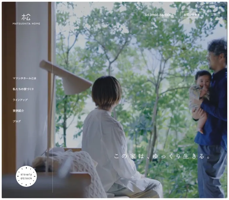
Matsushita Home uses the language of a quiet architectural journal. A close view of condensation on a glass vessel fills the opening frame. The logo, navigation, and widely spaced Japanese slogan sit directly over the image. A small circular clock graphic introduces the recurring “slowly o'clock” identity without turning it into a conventional promotional badge.
Below this opening, the page moves through a long narrative interval before presenting the housing ranges. White space, small corner radii, black buttons, pale rules, and regular-weight English headings provide continuity. Japanese Mincho passages supply the emotional voice; Japanese Gothic text handles navigation and practical information. Architectural and domestic photography supplies most of the color.
This is a complete housing-company homepage with several browsing paths. Its reference value lies in the relationship between atmosphere, editorial pacing, product explanation, and accessible contact information.
閉じる
Matsushita Home — Style Reference
An unhurried portrait of everyday life, framed by white space, restrained typography, and fine rules.
Website: matsushitahome.com Original URL: https://matsushitahome.com/ Final URL: https://matsushitahome.com/ Theme: light content surfaces with white navigation over a dark photographic opening Inspected: October 2, 2026, Japan Standard Time; supplied retrieval timestamp: October 1, 2026, 18:29:37.701 UTC Viewports: desktop 1440 × 1000 CSS pixels; mobile 390 × 844 CSS pixels Scope: the currently served homepage: opening visual, introductory narrative, two housing ranges, blog rail, project entry, About/Feature/Voice links, contact section, and footer. Menu contents are supported by DOM evidence, but the open menu was not visually inspected. Linked pages and forms were not inspected.
Matsushita Home uses the language of a quiet architectural journal. A close view of condensation on a glass vessel fills the opening frame. The logo, navigation, and widely spaced Japanese slogan sit directly over the image. A small circular clock graphic introduces the recurring “slowly o'clock” identity without turning it into a conventional promotional badge.
Below this opening, the page moves through a long narrative interval before presenting the housing ranges. White space, small corner radii, black buttons, pale rules, and regular-weight English headings provide continuity. Japanese Mincho passages supply the emotional voice; Japanese Gothic text handles navigation and practical information. Architectural and domestic photography supplies most of the color.
This is a complete housing-company homepage with several browsing paths. Its reference value lies in the relationship between atmosphere, editorial pacing, product explanation, and accessible contact information.
How to Read This Reference
- Measured means a value appears in the supplied rendered DOM, computed styles, or custom properties. Dimensions are rounded where fractional precision would not help implementation.
- Visually observed means the supplied current-page screenshots show the treatment. Screenshot estimates are identified explicitly.
- Calculated means a value follows from supplied measurements or formulas, such as content gutters or the composite color of a translucent rule.
- Recommended means an implementation choice for reuse. It is not a claim about the original source.
- Token aliases beginning with
--mh-are introduced by this reference. Original variable names are identified separately. - DOM extraction includes menu content that is not painted in the supplied closed-menu screenshots. A nonzero bounding box alone does not establish visibility.
- Some sampled bounds include transforms and typographic trimming. Prefer the recorded font sizes and line heights over inferring typography from rectangle height.
Tokens — Colors
Default Palette
| Name | Value | Evidence / token | Role |
|---|---|---|---|
| Canvas White | #ffffff |
Measured: source --color-bg, body background; alias --mh-canvas |
Main page, contact area, footer, space around photographs |
| Ink Black | #000000 |
Measured: source --color-txt; alias --mh-ink |
Main text, filled buttons, icons, black brand marks |
| Reverse White | #ffffff |
Measured: source --color-txt-white |
Header controls and navigation over the opening image; labels inside black buttons |
| Secondary Ink | rgba(0,0,0,.7) |
Measured: source --color-txt3; alias --mh-muted |
Housing descriptions, blog excerpts, explanatory contact copy |
| Secondary Ink on White | Approximately #4d4d4d |
Calculated composite of Secondary Ink over white | Useful opaque approximation; not interchangeable on colored surfaces |
| Fine Rule | rgba(0,0,0,.1) |
Measured: source --line is solid 1px rgba(0,0,0,.1) |
Quiet structural separation |
| Fine Rule on White | Approximately #e6e6e6 |
Calculated composite | Direct-color approximation for white sections |
| White Rule | rgba(255,255,255,.4) |
Measured source declaration: --line-white |
Compatible with the thin vertical division visible over the hero; exact element binding was not supplied |
| Pale Blush Panel | Approximately #f2ebeb |
Visual estimate from the first housing-range panel; alias --mh-panel |
Large, low-contrast information surface beside the architectural grid |
| Secondary Neutral | #eae8dd |
Declared source --color-bg2 |
Available source token; its use on a particular captured element is unverified |
| Light Gray | #f0f0f0 |
Declared source --color-light-gray |
Available neutral token; not a substitute for the visually observed blush panel |
The blue-gray cast of the opening photograph is image color, not an established interface accent. Likewise, trees, blue sky, and timber introduce green, blue, and warm brown through photography rather than through colored controls.
The source also declares red, orange, blue, brown, and pale-blue values. Their presence in the variable inventory does not establish a visible accent system on this homepage. The reusable interface palette should remain white, black, translucent gray, and the restrained product-panel tint.
Theme Behavior
The supplied evidence shows one light page design. The white-on-image opening and black-on-white scrolled views are contrast treatments within that design. No user-selectable theme control was observed.
The opening image appears dark enough for white labels, but the evidence does not isolate a tint layer, filter, or its opacity. Apply any additional shading only after checking the actual image; avoid darkening an already graded asset twice.
Tokens — Typography
Japanese Gothic — Navigation and Information
The computed body family is:
游ゴシック体, "游ゴシック Medium", "Yu Gothic Medium", 游ゴシック, "Yu Gothic", "ヒラギノ角ゴ Pro", "Hiragino Kaku Gothic Pro", "Noto Sans CJK", "Noto Sans JP", メイリオ, Meiryo, sans-serif
Most sampled Japanese UI and body text uses weight 500. Housing descriptions are small but generously led: 14px type with 30px line height and 0.7px tracking. Navigation and button labels use much tighter line boxes.
Preserve this distinction between comfortable reading paragraphs and compact controls. A global line-height: 1 would reproduce the body's inherited declaration but would not reproduce the actual content typography.
Lato — English Section Labels and Telephone Numbers
- Measured family:
Lato, sans-serif. - Section labels: regular
400, including “Lineup,” “Blog,” “Products,” and “Contact.” - Header telephone link:
18px, weight500. - Contact telephone number on mobile:
30px, weight400, with1.5pxtracking. - Character: open, restrained, and contemporary, with none of the exaggerated weight associated with a large advertising headline.
Computed styles identify the requested family; the supplied evidence does not include font-file URLs. Load Lato from an approved project source when implementing it rather than inventing an original asset path.
Japanese Mincho — Narrative and Housing Statements
The measured source stack is:
"游明朝体", "Yu Mincho", YuMincho, "ヒラギノ明朝 Pro", "Hiragino Mincho Pro", "Noto Serif JP", serif
Use this voice selectively. It appears in the poetic introduction and the two-line housing statements, while descriptions and controls remain Gothic.
The narrative blocks use 15px type, 40px line height, and 2.25px tracking at both inspected widths. Their tall, narrow geometry strongly suggests vertical Japanese composition, but writing-mode was not included in the supplied computed properties. A vertical setting in the starter is therefore a geometry-informed recommendation.
Graphic Lettering and Brand Marks
The opening slogan reads “この家は、ゆっくり生きる。” Its sampled paragraph has no extracted text and measures approximately 520 × 30.35px on desktop and 250 × 14.58px on mobile. Treat it as graphic lettering unless the actual asset or text implementation becomes available. The wrapper's inherited 10px font size does not describe the visible slogan.
The main logo, clock badge, and housing-range wordmarks should also be preserved as artwork. Do not recreate their lettering by guessing a font.
Type Scale
All values below are computed unless marked otherwise. The root font size is 10px at both inspected viewports.
| Role | Desktop | Mobile | Weight / tracking | Notes |
|---|---|---|---|---|
| Main English section label | 40px / 40px |
30px / 30px |
400; 0.01em |
Lineup, Blog, Products |
| Contact English label | 40px / 40px |
25px / 25px |
400; 0.01em |
A distinct mobile exception |
| About / Feature / Voice label | 30px / 30px |
30px / 30px |
400; 0.01em |
Does not shrink on mobile |
| Japanese section label | 16px / 16px |
14px / 14px |
500; 0.01em |
Main section headings |
| Housing statement | 20px / 40px |
16px / 30px |
500; 0.13em |
Mincho; typically two lines |
| Housing description | 14px / 30px |
14px / 30px |
500; 0.05em |
Secondary ink |
| Introductory narrative | 15px / 40px |
15px / 40px |
500; 0.15em |
Narrow Mincho blocks |
| Closing narrative statement | 18px / 50px |
18px / 40px |
500; 0.3em |
Two centered lines |
| Hero side navigation | 15px / 15px |
Not visible | 500; normal tracking |
Each row has generous vertical padding |
| Header utility buttons | 13px / 13px |
Not visible | 500; 0.5px |
Outlined request/contact links |
| Main detail button | 15px / 15px |
15px / 15px |
500; 0.5px |
White label on black |
| Blog title | 16px / 28px |
15px / 26.25px |
500; 0.05em |
Measured first-row articles |
| Blog excerpt | 13px / 25px |
12px / 21.4px |
500; 0.05em |
Secondary ink |
| Blog category tag | 11px / 11px |
10px / 10px |
500; 0.5px |
Compact pill geometry |
| Contact method label | Approximately 15px, visual estimate |
15px / 15px |
Mobile 500; 0.75px |
Under the outline icon |
| Contact telephone number | Approximately 30px, visual estimate |
30px / 30px |
Mobile 400; 1.5px |
Lato |
| Mobile copyright | Not separately measured | 10px / 10px |
400; 0.5px |
Lato |
Source size variables use expressions such as max(4rem,32px), but individual components have their own overrides. Do not infer the mobile scale from those variables alone: the measured mobile Lineup label is 30px, and Contact is 25px.
Tokens — Spacing & Shapes
Spacing Scale
The layout combines proportional page gutters with fixed component dimensions. It is not an entirely fluid, viewport-scaled type system.
| Use | Desktop | Mobile | Evidence |
|---|---|---|---|
| Outer hero frame | 10px |
5px |
Source --space-border: 1rem / .5rem; visible in captures |
| Main content width | 92% |
89.333…% |
Source ratios 2760/3000 and 670/750 |
| Main side gutter | 57.6px |
20.8px |
Calculated at inspected widths; confirmed by DOM |
| Housing image-grid gaps | Approximately 10px |
Not visually measured | Desktop screenshot estimate |
| Housing-range separation | Approximately 50px |
Approximately 20px |
Difference between sampled component bounds |
| Blog card gap | 40px |
20px |
Calculated from successive card positions |
| Destination-card gap | 38px horizontally |
55px vertically |
Calculated from sampled bounds |
| Section-label language gap | Approximately 27px |
Approximately 16px |
Calculated from English/Japanese label bounds |
| Main detail button height | 50px |
50px |
Measured |
| Contact mail button width | Approximately 210px |
210px |
Desktop screenshot; mobile DOM |
| Content-to-contact breathing room | Main bottom padding 104px |
Main bottom padding 94px |
Measured; not a universal section gap |
Use a small set of reusable spacing aliases, but retain these component-specific differences. Making every gap 24px would remove the site's pacing.
Border Radius
| Element | Value | Status |
|---|---|---|
| Main buttons | 5px |
Measured |
| Header outline links | 5px |
Measured |
| Hero and visible photo corners | Approximately 5px |
Screenshot observation, consistent with source --radius: .5rem |
| Clock badge | 50% |
Measured |
| Blog category pills | 100px |
Measured |
| Large page regions | Unboxed | Visually observed |
Rounded corners soften image edges without becoming a dominant motif. Pills are reserved for category labels; the principal CTAs are shallow rectangles.
Layout Measurements
| Element | Desktop 1440 × 1000 | Mobile 390 × 844 |
|---|---|---|
| Document height | Approximately 7317.14px |
Approximately 8481.55px |
| Hero visible frame | Approximately 1420 × 980px |
Approximately 380 × 714px |
| Header logo wrapper | 150 × 58.09px at (70,76) |
100 × 38.92px at (20.8,31) |
| Hero side-navigation row | 279 × 59px |
Not visible |
| Menu button box | 60 × 43px |
40 × 33px |
| Menu line width | Approximately 50px |
Approximately 30px |
| Slogan graphic wrapper | 520 × 30.35px |
250 × 14.58px |
| Clock link | 116 × 115.5px |
85 × 85px |
| First housing module | Approximately 1324.8 × 684.35px |
Approximately 348.4 × 945.72px |
| Housing description wrapper | Approximately 427.1px wide |
Approximately 306.8px, with 18.31px inner padding per side |
| Housing detail button | 230 × 50px |
190 × 50px |
| Narrative detail button | 230 × 50px |
230 × 50px |
| Blog card main link | Approximately 280 × 421px |
Approximately 240 × 359.13px |
| Products entry | Approximately 1440 × 440px |
Approximately 390 × 320px |
| Destination card | Approximately 416.27 × 497.27px |
Approximately 348.4 × 419.4px |
| Mobile footer | — | Approximately 390 × 299.13px |
The hero heights are observations, not recovered CSS formulas. In particular, the mobile opening ends at about y=719px, leaving a preview of the next section within the 844px viewport.
Components
Opening Visual and Header
Role: introduce the brand through a domestic detail while keeping the main destinations available.
A near-full-screen photograph sits inside a thin white frame. On desktop, the white logo occupies the upper left. A telephone link, two outlined links labeled “資料請求” and “お問い合わせ,” and a three-line menu control occupy the upper right. These controls remain visually lightweight: the two outline links are only 33px high, with 9px 18px padding and 13px labels.
A vertical rule divides the left navigation territory from the main image. Five links sit in this rail: company information, approach, lineup, projects, and blog. Each link occupies a 279 × 59px row with 22px vertical padding and a 60px left inset. This is a broad navigation target with a small label, not five floating chips.
Place the slogan well below center and toward the right. Its measured desktop bounds begin near (810,764). Leave the image's central detail unobstructed.
On mobile, remove the visible side rail and utility links. Retain a smaller logo, menu control, slogan, and clock badge. The image uses a much tighter portrait crop. Do not simply shrink the desktop composition to fit.
Clock Link
Role: give the slow-living concept a memorable, compact entry point.
The white circular badge has irregular black clock ticks and small lettering. It links to /slowly-oclock/. Desktop size is approximately 116px; mobile size is 85px. In the mobile opening it sits at (20,614), leaving about 20px below the badge before the hero ends.
A 550ms transform transition is attached to the link. The hover transform itself was not supplied, so rotation or scale should not be asserted as observed behavior.
Preserve the badge as artwork. A stock clock icon or a large conversion button would lose its distinctive role.
Persistent Menu Control and Menu Structure
Role: maintain site-wide access without keeping the entire header visible over lower sections.
The menu's three hairlines remain at the upper right in the desktop lineup and footer captures and in the mobile contact/footer capture. They appear white over the photograph and black over white content. This supports persistent access and context-dependent contrast; the exact positioning and color-switching mechanism were not supplied.
The menu DOM contains a broader hierarchy than the five hero links: home, company information, approach with two sublinks, lineup with two housing-range sublinks, projects, blog, a home-viewing destination, request/contact links, and Instagram.
Sampled menu styles use 20px bold primary labels on desktop and 16px on mobile. Sublinks use 14px and 13px, respectively. Desktop bounds suggest a separate brand region and navigation/contact columns; mobile bounds form a single vertical sequence. These are DOM observations, not an inspected open-menu screenshot. Do not invent the opening direction, close icon, backdrop appearance, or focus behavior.
Introductory Narrative
Role: establish the emotional pace before introducing products.
This is a substantial section: roughly 2079px tall on desktop and 2086px on mobile. It contains three poetic text blocks, a two-line closing statement, a graphic heading, and a centered detail link. The near-equal section heights show that mobile retains a long narrative interval.
The text blocks alternate across the composition. Their measured widths are 135px, 95px, and 95px, with generous line spacing. The mobile opening capture shows small, offset domestic photographs entering beneath the hero, including a reading detail and fruit. A complete screenshot of the narrative arrangement was not supplied, so the full collage and any movement remain unverified.
The closing copy, “ゆっくりと生きる。てざわりのある時間を。”, uses 18px Mincho with unusually wide 5.4px tracking. Its detail button stays 230 × 50px on both viewports.
Bilingual Section Heading
Role: make large sections easy to scan while retaining Japanese labels.
Use a regular Lato English label as the visual lead and a smaller Japanese heading beside it. The observed markup uses an English paragraph and a Japanese h2. “Lineup” is 40px on desktop with a 16px Japanese label; mobile uses 30px and 14px.
The desktop lineup section begins beneath a faint horizontal rule and substantial white space. Keep the pairing compact and left aligned. Avoid an oversized, bold display style or decorative punctuation.
Housing-Range Module
Role: pair a concise product explanation with evidence of the houses themselves.
The first desktop module splits into two nearly equal halves with a narrow gap. The left side is a pale blush panel; the right side is a two-by-two grid of architectural photographs. The full module is about 1325px wide and 684px high. Each visible photo is approximately 324 × 337px, with small rounded corners and narrow white gutters.
The information panel contains four levels:
- The
i-works projectgraphic wordmark, approximately300pxwide on desktop. - A centered, two-line Mincho statement at
20px / 40pxwith0.13emtracking. - A left-aligned Gothic description, approximately
427pxwide, at14px / 30pxin secondary ink. - A centered black “詳しく見る” link,
230 × 50px.
The second range, casa cago, follows the same content hierarchy. Its desktop text bounds move to the right-hand half, establishing an alternating layout. Its complete photographic arrangement was not shown in the supplied screenshots.
On mobile, both modules become tall blocks. The wordmark and text appear after a substantial media region, consistent with image-first stacking. The first wordmark shrinks to 215px; the second is 200px. Statements become 16px / 30px, but body text remains 14px / 30px. Detail buttons narrow to 190px while retaining 50px height.
This preserves reading comfort while changing composition. Do not reduce all text proportionally to the screen width.
Blog Rail and Category Links
Role: show an active mix of company news, staff writing, events, and practical housing articles.
The desktop heading shares a row with six category links. Their measured geometry is pill-shaped: 100px radius, 14px labels, and approximately 32px total height. Their exact border treatment was not included in the supplied element data. The category-navigation row is absent from the mobile visible-text evidence.
Article cards occupy one horizontal track. Successive desktop cards start 320px apart and are 280px wide, leaving 40px gaps. Mobile cards are 240px wide with 20px gaps. The DOM includes ten articles extending beyond the viewport.
Each article consists of a media region, title, short excerpt, and a separate category link. The spacing before titles is consistent with square thumbnails plus about 26px on desktop and 20px on mobile; the square image ratio is an inference because image rectangles were not supplied.
The article link and category link are separate targets. Preserve this structure rather than nesting one anchor inside another. The geometry establishes a horizontal rail, but dragging, arrows, autoplay, snapping, and swipe behavior were not tested.
Products Entry
Role: direct visitors to completed-house examples.
The DOM records a full-width entry measuring approximately 1440 × 440px on desktop and 390 × 320px on mobile. A single anchor contains the English “Products” label, Japanese “実例紹介,” and a “詳しく見る” treatment.
Desktop text begins around x=173px, farther inward than the ordinary content gutter. Mobile text returns to the standard 20.8px gutter. The inner detail treatment measures 160 × 40px at both widths.
Its complete visual background was not supplied. Reuse the dimensions and hierarchy without inventing a particular photograph, overlay, or hover effect.
About / Feature / Voice Cards
Role: offer three parallel routes into company identity, building philosophy, and customer/community content.
Desktop presents three equal cards, approximately 416px wide, with 38px gaps. Each has a large image, a 30px Lato label, and a 14px Japanese subtitle. The photographed subjects visible in the lower-page capture include a round sign against sky, a timber interior, and people inside a wooden room.
The cards have no visible enclosing box or shadow. The image carries the boundary; the text sits directly on the white canvas. DOM spacing is consistent with square images.
Mobile stacks these cards at approximately 348px wide with 55px between cards. The English labels remain 30px, maintaining a strong editorial rhythm despite the narrower layout.
Contact Section
Role: make telephone and form contact equally clear at the end of the browsing journey.
The desktop section uses a 2:1:1 arrangement within the main content width. The introductory half contains “Contact,” its Japanese label, and explanatory copy. The remaining quarters present telephone and email contact, separated by faint vertical rules. Horizontal rules bound the overall section.
Each method follows a simple centered anatomy: an outline icon, a short Japanese label, a small horizontal rule, then the contact action. The telephone number is typographically prominent. The email action is a black 210 × 50px button labeled “メールフォーム.” The visible phone and envelope icons are approximately 40–44px; no icon-library identity is established.
On mobile, the introduction, phone method, and email method form a vertical sequence. Horizontal rules replace the desktop column divisions. The phone remains 30px, and the mail button retains its desktop-sized 210 × 50px footprint. This is a deliberate contact block, not a sticky mobile CTA bar.
The telephone uses the observed tel:0966-86-0065 target. The mail button navigates to /contact/; no form controls are present in the inspected homepage.
Footer
Role: close the page with identity, navigation, and a social destination.
The desktop footer places a horizontal brand lockup and Instagram at the left, two navigation columns in the middle, and a secondary corporate mark toward the right. It continues the white background and fine-rule system. The visible secondary mark should not be interpreted as a website-production credit.
Mobile removes the visible footer sitemap and centers a short stack: the main 160 × 31px logo, 23px Instagram icon, 10px copyright, and a secondary 110 × 18.33px mark. The total footer is approximately 299px high. The main logo starts about 71px below its upper boundary.
Preserve the horizontal footer logo format; it differs from the stacked logo used over the opening image.
Tokens — Motion & Interaction
Measured Transitions
| Treatment | Supplied value | What the evidence establishes |
|---|---|---|
| General links and menu controls | 280ms cubic-bezier(0.39,0.575,0.565,1) |
Transition declaration is present; final hover appearance was not captured |
| Filled button colors | Background and color over the same 280ms easing |
Color changes are supported by CSS; hover state was not exercised |
| Clock link | Transform over 550ms cubic-bezier(0.165,0.84,0.44,1) |
Transform transition exists; target scale or rotation is unknown |
| Slogan, housing modules, Products entry | Opacity and transform over 1300ms cubic-bezier(0.165,0.84,0.44,1), with 200ms delay |
Declared entrance/reveal treatment; exact initial displacement was not supplied |
| About / Feature / Voice | Same 1300ms opacity/transform transition |
Delays are 340ms, 480ms, and 620ms, respectively |
| Sitemap timing token | 1000ms desktop; 750ms mobile, using the same quartic-out curve |
Source variable only; open-menu choreography is unverified |
| Modal timing token | 650ms with the quartic-out curve |
Declared infrastructure; no modal was inspected |
| Fixed-background timing token | 2000ms with the quartic-out curve |
Does not independently prove parallax or a particular background animation |
The supported motion language is slow reveal with gentle settling, paired with shorter utility transitions. The sampled elements report animation: none, but that does not rule out transitions, script-driven movement, or media playback.
Observed Interaction Scope
The supplied collection documents vertical traversal and settled captures. Link destinations are present in the DOM. No menu activation, hover result, blog-rail manipulation, form submission, or media control interaction was documented.
The hero should be described as a photographic visual. Its media type, loop length, autoplay behavior, audio, and sequence of frames cannot be established from the supplied current-page screenshots and element sample.
For reuse, preserve the calm timing where motion is appropriate, but make every section available in a static state. Do not add parallax, automatic card movement, or continuous badge rotation as if they were verified features.
Surfaces
| Layer | Appearance | Structural purpose |
|---|---|---|
| Page canvas | Pure white | Connects the long editorial sequence |
| Opening visual | Dark photographic field inside a narrow white frame | Establishes atmosphere and supports reverse navigation |
| Housing information panel | Very pale blush, visually estimated | Groups product explanation without strong elevation |
| Architectural image grid | Photographs with small radii and white gutters | Supplies product evidence and most of the color |
| Article and destination cards | White/unboxed | Keeps the page light despite many destinations |
| Primary button | Black fill, white label, 5px radius |
Clear action emphasis |
| Hero utility link | Transparent fill, thin white outline | Secondary action over imagery |
| Contact and footer | White with pale rules | Organizes practical information without introducing a new theme |
No visible card-shadow system is needed. Separation comes from spacing, photographs, pale fills, and thin dividers.
Imagery
The opening emphasizes material and atmosphere rather than an exterior hero shot: condensation, reflective glass, soft focus, and a dark lower area. Its cool photographic palette contrasts with the warmer timber and planted surroundings visible farther down the page.
The first housing-range grid shows four different houses and gardens. Preserve the variation in building shape, facade color, trees, paving, and sky. Use architectural photographs with convincing verticals and natural daylight. Avoid replacing them with repeated crops of one house.
Small domestic details support the narrative. The visible mobile transition includes separated images rather than a uniform gallery strip. The lower destination cards use broader subjects—place, interior, people—to distinguish their destinations.
Photography should remain smooth and natural. No pixelated rendering, heavy texture overlay, decorative frame, or aggressive duotone is evidenced.
Observed Asset References
No original image filenames, video URLs, SVG paths, or font-file URLs were supplied. The following inventory identifies visible roles, not recoverable asset paths.
| Asset role | Current-page evidence | Reuse guidance |
|---|---|---|
| Opening photograph or media frame | Desktop opening and mobile opening captures | Supply an approved high-resolution asset and a separate portrait crop |
| Stacked white logo | Both opening captures; measured wrappers | Use the original brand artwork when authorized |
| Slogan lettering | Both opening captures; empty-text graphic wrapper | Preserve its width and proportions; provide an accessible equivalent |
| Clock badge | Both opening captures; link to /slowly-oclock/ |
Preserve the irregular ticks and small lettering |
i-works project wordmark |
Desktop lineup capture and DOM bounds | Use supplied artwork, not an approximate text font |
| Architectural quartet | Desktop lineup capture | Four distinct photographs with consistent cropping rules |
| About / Feature / Voice images | Lower desktop capture and card geometry | Large, likely square images followed by unboxed captions |
| Footer logos and Instagram symbol | Desktop and mobile footer captures | Keep their separate identity roles and monochrome treatment |
Layout & Responsive Behavior
Page Rhythm
The observed sequence is opening visual → narrative → Lineup → Blog → Products → About/Feature/Voice → Contact → footer. The narrative occupies roughly two desktop viewport heights before product browsing begins. This pacing is central to the design.
The page uses several different layout systems: a framed photographic opening, offset narrative material, alternating product modules, a horizontal article rail, a broad project entry, and a three-card destination row. A single generic card grid cannot reproduce those relationships.
Desktop-to-Mobile Changes
| Area | Desktop behavior | Mobile behavior |
|---|---|---|
| Main content width | 92vw |
Approximately 89.333vw |
| Opening navigation | Logo, utility links, left rail, menu | Logo and menu; rail and utilities absent |
| Hero composition | Wide image; lower-right slogan | Tight portrait crop; smaller slogan; next section visible below |
| Narrative | Text blocks distributed across a wide field | Narrower placement with almost the same total section height |
| Housing modules | Side-by-side media and copy; second copy region on the right | Media precedes copy; substantially taller modules |
| Blog | 280px cards, 40px gaps; category-navigation row |
240px cards, 20px gaps; category-navigation row absent |
| Destination cards | Three columns | One column with 55px gaps |
| Contact | Introduction plus two parallel methods | Three sequential blocks with centered contact methods |
| Footer | Brand, navigation columns, secondary mark | Centered brand/social/copyright/secondary-mark stack |
Responsive Formulas and Limits
The supplied source ratios establish:
/* Observed content-width ratios */
--desktop-content-width: 92%;
--mobile-content-width: 89.333333%;
At the inspected widths these produce 1324.8px and 348.4px content areas. Their side gutters are 57.6px and 20.8px.
The evidence includes only two viewport widths. The exact breakpoint, intermediate tablet layout, landscape treatment, maximum container width, and mobile hero-height formula are unknown. The CSS starter uses an explicitly recommended breakpoint and a height model calibrated to the captures.
Do not use desktop absolute page coordinates as layout rules. The content must reflow, while the observed widths, reading sizes, and component relationships guide the implementation.
Do’s and Don’ts
Do
- Keep the white canvas, black controls, and fine gray rules as the interface foundation.
- Let photography provide color and atmosphere.
- Preserve the small white frame around the opening image.
- Pair regular Lato English labels with smaller Japanese Gothic labels.
- Reserve Mincho for narrative and housing statements.
- Keep housing body copy at
14px / 30pxon both inspected layouts. - Preserve the alternating desktop product composition and mobile image-first sequence.
- Keep blog cards in a horizontal rail with different desktop and mobile widths.
- Use shallow
5pxcorners and generous whitespace instead of card shadows. - Retain the circular clock artwork as a distinct concept link.
- Keep phone and form contact equally legible near the footer.
- Separate verified motion declarations from interaction assumptions.
Don't
- Don't turn the opening into an oversized headline with a large colored sales button.
- Don't treat the photograph's blue-gray cast as a required blue interface theme.
- Don't replace every section with identical cards or repeated split-screen blocks.
- Don't make primary CTAs pill-shaped because the blog categories use pills.
- Don't apply heavy bold typography to the English section labels.
- Don't shrink all mobile text; several measured sizes stay unchanged.
- Don't infer media autoplay, a carousel mechanism, or parallax from still images.
- Don't infer a graphic's visible font size from its empty wrapper's inherited styles.
- Don't assume hidden menu DOM represents the visible page state.
- Don't invent original asset paths or a production-credit relationship from footer marks.
Recommended Implementation Additions
These are recommendations for a new implementation, not verified features of the original site:
- Give the menu button an accessible name,
aria-expanded, and an associated navigation region. Support Escape and focus return if it opens an overlay. - Increase the mobile menu hit area to at least
44 × 44pxwhile retaining its approximately30pxline artwork. - Give graphic logos and the slogan useful accessible text. Avoid repeating the same announcement through both image alternatives and hidden text.
- Check white text contrast against every actual hero frame or crop. If motion media is used, provide a static poster and appropriate pause/reduced-motion behavior.
- Make the blog rail keyboard reachable and horizontally scrollable without requiring dragging. Expose any added previous/next controls with clear labels.
- Preserve readable focus states on both white and photographic surfaces.
- Keep content visible when JavaScript or reveal initialization fails. Reduced-motion mode should show final positions immediately.
- Keep telephone contact as a real
tel:link and the form action as a real navigation link. - Use responsive image sources and intrinsic dimensions. Prioritize the opening asset and defer lower-page images where appropriate.
Agent Prompt Guide
Quick Color Reference
- Canvas and footer:
#ffffff. - Text, icons, and filled actions:
#000000. - Secondary text:
rgba(0,0,0,.7). - Structural rules:
1px solid rgba(0,0,0,.1). - First housing panel: approximately
#f2ebeb; this is an estimate. - Hero navigation: white over appropriately contrasted photography.
- Color accents: supplied by photographs rather than colored buttons.
Overall Prompt
“Create a Japanese housing-company homepage inspired by Matsushita Home's current composition. Begin with a large domestic-detail photograph inside a narrow white frame. Overlay a small white brand mark, restrained utility links, a desktop left navigation rail, a lower-right Japanese slogan, and a small illustrated clock link. Follow with a spacious narrative section, alternating housing-range modules, a horizontal blog rail, a project entry, three photographic destination cards, and a clear phone/email contact section. Use white surfaces, black rectangular buttons with 5px corners, pale rules, regular Lato English labels, Japanese Gothic information text, and selectively tracked Mincho statements. On mobile, remove the opening rail, stack product media before text, preserve comfortable paragraph sizes, and center the footer identity. Treat media playback and unverified interactions as separate implementation decisions.”
Example Component Prompts
- Opening: “A framed photographic opening using a cool, close domestic detail. Keep a small white stacked logo at upper left, light utility links at upper right, a fine vertical divider beside five desktop navigation rows, and graphic Japanese copy near the lower right. Add the supplied circular clock artwork near the lower left. At 390px, use a portrait crop, hide the rail and utility links, and reveal a little of the next section.”
- Housing range: “A roughly equal desktop split between a very pale blush information panel and a two-by-two architectural photo grid. Center the product wordmark and a two-line Mincho statement; keep the 14px/30px description left aligned beneath it. Finish with a black 230×50px detail link. On mobile, show media first and narrow the button to 190px.”
- Blog: “An unboxed horizontal article rail on white. Use 280px desktop cards with 40px gaps, changing to 240px cards with 20px gaps on mobile. Stack a photograph, restrained Japanese title, muted excerpt, and a separate small category link. Implement accessible native horizontal scrolling unless another interaction is explicitly requested.”
- Destination cards: “Three large photographic links labeled About, Feature, and Voice in regular 30px Lato, each followed by a small Japanese subtitle. Keep the captions on the page canvas with no shadow or enclosing card fill. Stack them on mobile with generous vertical gaps.”
- Contact: “A white contact band divided by pale rules. On desktop, allocate half the width to explanation and one quarter each to telephone and email. Center thin outline icons, labels, small separators, a 30px phone number, and a 210×50px black mail-form link. Stack the methods on mobile.”
Quick Start
CSS Custom Properties
This is a reusable adaptation, not recovered source code. It keeps the surrounding project's normal root font size and expresses measured dimensions explicitly. The shortened font stacks retain the observed English family names and fallbacks. Font files, brand artwork, and photographs must be supplied separately.
The 800px breakpoint, hero height formulas, native blog scrolling, and focus/hover enhancements below are recommendations. The hero height model yields approximately 980px at the desktop capture and 714px at the mobile capture; its behavior at other heights must be tested.
Expected component structure: a .hero with media, logo, utilities, rail, slogan, and badge; a .lineup containing .lineup__media and .lineup__info; a .blog-rail of articles; a destination grid; and a contact grid with one introduction and two methods. Use semantic headings and anchors within these wrappers.
:root {
  /* Measured colors, with one explicitly estimated panel color */
  --mh-canvas: #fff;
  --mh-ink: #000;
  --mh-muted: rgb(0 0 0 / .7);
  --mh-rule: rgb(0 0 0 / .1);
  --mh-panel: #f2ebeb; /* Visual estimate */

  /* Source-derived font stacks; load Lato separately */
  --mh-font-body: 'Yu Gothic Medium', 'Yu Gothic',
    'Hiragino Kaku Gothic Pro', 'Noto Sans CJK',
    'Noto Sans JP', Meiryo, sans-serif;
  --mh-font-en: Lato, sans-serif;
  --mh-font-editorial: 'Yu Mincho', YuMincho,
    'Hiragino Mincho Pro', 'Noto Serif JP', serif;

  --mh-content-width: 92%;
  --mh-gutter: 4vw;
  --mh-frame: 10px;
  --mh-radius: 5px;
  --mh-section-size: 40px;
  --mh-blog-width: 280px;
  --mh-blog-gap: 40px;

  --mh-ease-ui: cubic-bezier(.39, .575, .565, 1);
  --mh-ease-reveal: cubic-bezier(.165, .84, .44, 1);
  --mh-ui-duration: 280ms;
  --mh-reveal-duration: 1300ms;
}

* { box-sizing: border-box; }

body {
  margin: 0;
  color: var(--mh-ink);
  background: var(--mh-canvas);
  font: 500 14px/1.75 var(--mh-font-body);
}

img { display: block; max-width: 100%; }
a { color: inherit; }
button { font: inherit; }

.wrap {
  width: var(--mh-content-width);
  margin-inline: auto;
}

/* Preserve focus visibility across light and dark contexts. */
:where(a, button, [tabindex]):focus-visible {
  outline: 2px solid currentColor;
  outline-offset: 5px;
}

.hero {
  position: relative;
  isolation: isolate;
  height: calc(100svh - 20px); /* Recommended height model */
  min-height: 640px;
  margin: var(--mh-frame) var(--mh-frame) 0;
  overflow: hidden;
  border-radius: var(--mh-radius);
  color: #fff;
  background: #151719;
}

.hero__media {
  position: absolute;
  inset: 0;
  z-index: -1;
  width: 100%;
  height: 100%;
  object-fit: cover;
  object-position: center;
}

.hero__logo {
  position: absolute;
  top: 66px;
  left: 60px;
  width: 150px;
}

.hero__utilities {
  position: absolute;
  top: 54px;
  right: calc(4vw + 80px);
  display: flex;
  align-items: center;
  gap: 15px;
}

.hero__phone {
  margin-right: 22px;
  font: 500 18px/1 var(--mh-font-en);
  letter-spacing: .5px;
  text-decoration: none;
}

.utility-link {
  padding: 9px 18px;
  border: 1px solid currentColor;
  border-radius: var(--mh-radius);
  font-size: 13px;
  line-height: 1;
  letter-spacing: .5px;
  text-decoration: none;
}

.hero__rail {
  position: absolute;
  inset-block: 30px;
  left: 0;
  display: flex;
  align-items: center;
  width: 280px;
  border-right: 1px solid rgb(255 255 255 / .4);
}

.hero__rail nav { width: 100%; }
.hero__rail a {
  display: block;
  padding: 22px 0 22px 60px;
  font-size: 15px;
  line-height: 15px;
  text-decoration: none;
}

.hero__slogan {
  position: absolute;
  right: 100px;
  bottom: 20%;
  width: 520px;
  margin: 0;
}

.hero__slogan img { width: 100%; }

.hero__clock {
  position: absolute;
  left: 77px;
  bottom: 63px;
  width: 116px;
  aspect-ratio: 1;
  border-radius: 50%;
  transition: transform 550ms var(--mh-ease-reveal);
}

.menu-button {
  position: fixed;
  z-index: 100;
  top: 59px;
  right: calc(4vw - 5px);
  display: grid;
  align-content: center;
  gap: 5px;
  width: 60px;
  height: 43px;
  padding: 15px 5px;
  border: 0;
  color: var(--mh-ink);
  background: transparent;
  cursor: pointer;
}

.menu-button span {
  display: block;
  height: 1px;
  background: currentColor;
}

/* A controller must set this state when the menu overlaps the hero. */
.menu-button[data-tone='light'] { color: #fff; }

.section-heading {
  display: flex;
  align-items: baseline;
  gap: 27px;
  margin-bottom: 60px;
}

.section-heading__en {
  margin: 0;
  font: 400 var(--mh-section-size)/1 var(--mh-font-en);
  letter-spacing: .01em;
}

.section-heading__ja {
  margin: 0;
  font-size: 16px;
  font-weight: 500;
  line-height: 1;
  letter-spacing: .01em;
}

/* Geometry-informed recommendation, not a recovered writing-mode. */
.story-poem {
  writing-mode: vertical-rl;
  font: 500 15px/40px var(--mh-font-editorial);
  letter-spacing: .15em;
}

.story-closing {
  text-align: center;
  font: 500 18px/50px var(--mh-font-editorial);
  letter-spacing: .3em;
}

.button {
  display: inline-flex;
  align-items: center;
  justify-content: center;
  width: 230px;
  max-width: 100%;
  min-height: 50px;
  padding: 12px 20px;
  border: 1px solid var(--mh-ink);
  border-radius: var(--mh-radius);
  color: #fff;
  background: var(--mh-ink);
  font-size: 15px;
  line-height: 1;
  letter-spacing: .5px;
  text-decoration: none;
  transition: color var(--mh-ui-duration) var(--mh-ease-ui),
    background-color var(--mh-ui-duration) var(--mh-ease-ui);
}

/* Recommended hover state, consistent with declared hover colors. */
@media (hover: hover) {
  .button:hover {
    color: var(--mh-ink);
    background: var(--mh-canvas);
  }
}

.lineup {
  display: grid;
  grid-template-columns: repeat(2, minmax(0, 1fr));
  gap: 10px;
}

.lineup + .lineup { margin-top: 50px; }

.lineup__info {
  grid-column: 1;
  grid-row: 1;
  display: flex;
  flex-direction: column;
  align-items: center;
  justify-content: space-between;
  gap: 32px;
  min-height: 684px;
  padding: 120px 8vw 105px;
  border-radius: var(--mh-radius);
  background: var(--mh-panel);
}

.lineup__logo { width: 300px; }

.lineup__statement {
  margin: 0;
  text-align: center;
  font: 500 20px/40px var(--mh-font-editorial);
  letter-spacing: .13em;
}

.lineup__description {
  width: 100%;
  margin: 0;
  color: var(--mh-muted);
  font-size: 14px;
  line-height: 30px;
  letter-spacing: .05em;
}

.lineup__media {
  grid-column: 2;
  grid-row: 1;
  display: grid;
  grid-template-columns: repeat(2, minmax(0, 1fr));
  grid-template-rows: repeat(2, minmax(0, 1fr));
  gap: 10px;
  min-width: 0;
  min-height: 0;
}

.lineup__media img {
  width: 100%;
  height: 100%;
  min-height: 0;
  object-fit: cover;
  border-radius: var(--mh-radius);
}

.lineup--reverse .lineup__info { grid-column: 2; }
.lineup--reverse .lineup__media { grid-column: 1; }

/* Native scrolling is a recommended implementation of the rail. */
.blog-rail {
  display: grid;
  grid-auto-flow: column;
  grid-auto-columns: var(--mh-blog-width);
  gap: var(--mh-blog-gap);
  overflow-x: auto;
  overscroll-behavior-inline: contain;
  padding: 6px var(--mh-gutter) 24px;
}

.blog-card { min-width: 0; }
.blog-card__link { display: block; text-decoration: none; }
.blog-card__image {
  width: 100%;
  aspect-ratio: 1; /* Inferred from the supplied card geometry */
  object-fit: cover;
  border-radius: var(--mh-radius);
}

.blog-card__title {
  margin: 26px 0 16px;
  font-size: 16px;
  font-weight: 500;
  line-height: 28px;
  letter-spacing: .05em;
}

.blog-card__excerpt {
  margin: 0 0 22px;
  color: var(--mh-muted);
  font-size: 13px;
  line-height: 25px;
  letter-spacing: .05em;
}

.category-link {
  display: inline-block;
  padding: 5.5px 12.5px;
  border: 1px solid var(--mh-rule); /* Recommended edge treatment */
  border-radius: 100px;
  font-size: 11px;
  line-height: 11px;
  letter-spacing: .5px;
  text-decoration: none;
}

.destination-grid {
  display: grid;
  grid-template-columns: repeat(3, minmax(0, 1fr));
  gap: 38px;
}

.destination { text-decoration: none; }
.destination img {
  width: 100%;
  aspect-ratio: 1;
  object-fit: cover;
  border-radius: var(--mh-radius);
}

.destination__en {
  margin: 22px 0;
  font: 400 30px/1 var(--mh-font-en);
  letter-spacing: .01em;
}

.destination__ja {
  margin: 0;
  font-size: 14px;
  font-weight: 500;
  line-height: 1;
}

.contact {
  display: grid;
  grid-template-columns: 2fr 1fr 1fr;
  margin-top: 104px;
  padding-block: 40px;
  border-block: 1px solid var(--mh-rule);
}

.contact__intro { padding: 40px 13.333vw 54px 0; }
.contact__title {
  margin: 0;
  font: 400 40px/1 var(--mh-font-en);
  letter-spacing: .01em;
}

.contact__subtitle { margin: 20px 0 36px; }
.contact__copy {
  margin: 0;
  color: var(--mh-muted);
  font-size: 14px;
  line-height: 25px;
  letter-spacing: .05em;
}

.contact__method {
  padding: 40px 20px 36px;
  border-left: 1px solid var(--mh-rule);
  text-align: center;
}

.contact__icon {
  display: block;
  width: 44px;
  height: 40px;
  margin-inline: auto;
}

.contact__label {
  margin: 20px 0 0;
  font-size: 15px;
  font-weight: 500;
  line-height: 1;
  letter-spacing: .05em;
}

.contact__label::after {
  content: '';
  display: block;
  width: 30px;
  height: 1px;
  margin: 28px auto 30px;
  background: var(--mh-rule);
}

.contact__phone {
  font: 400 30px/1 var(--mh-font-en);
  letter-spacing: .05em;
  text-decoration: none;
  white-space: nowrap;
}

.contact__note { margin: 18px 0 0; font-size: 12px; }
.contact__method .button { width: 210px; }

.site-footer {
  display: grid;
  grid-template-columns: 1fr 1.3fr 1fr;
  align-items: start;
  gap: 40px;
  padding-block: 80px;
}

.site-footer__logo { width: 190px; }
.site-footer__social { display: block; width: 23px; margin-top: 32px; }
.site-footer__copyright {
  margin: 25px 0 0;
  font: 400 10px/1 var(--mh-font-en);
  letter-spacing: .05em;
}

.site-footer__nav {
  display: grid;
  grid-template-columns: repeat(2, minmax(0, 1fr));
  gap: 40px;
}

.site-footer__nav a { display: block; margin-bottom: 18px; }
.site-footer__secondary { justify-self: end; width: 150px; }

/* Optional reveal enhancement; content is visible by default. */
[data-reveal] {
  opacity: 1;
  transform: none;
  transition:
    opacity var(--mh-reveal-duration) var(--mh-ease-reveal),
    transform var(--mh-reveal-duration) var(--mh-ease-reveal);
  transition-delay: var(--reveal-delay, 200ms);
}

/* Add this class only after a working reveal controller initializes. */
.motion-ready [data-reveal]:not(.is-visible) {
  opacity: 0;
  transform: translateY(20px); /* Recommended distance */
}

/* Recommended breakpoint; the original threshold was not supplied. */
@media (max-width: 800px) {
  :root {
    --mh-content-width: 89.333333%;
    --mh-gutter: 5.333333vw;
    --mh-frame: 5px;
    --mh-section-size: 30px;
    --mh-blog-width: 240px;
    --mh-blog-gap: 20px;
  }

  .hero {
    height: calc(100svh - 130px);
    min-height: 560px;
  }
  .hero__logo { top: 26px; left: calc(var(--mh-gutter) - 5px); width: 100px; }
  .hero__utilities, .hero__rail { display: none; }
  .hero__slogan { right: 8.4vw; bottom: 24.65%; width: min(250px, 75%); }
  .hero__clock { left: 15px; bottom: 20px; width: 85px; }

  /* Enlarged hit target; the line artwork stays approximately 30px wide. */
  .menu-button {
    top: 18px;
    right: calc(var(--mh-gutter) - 7px);
    width: 44px;
    height: 44px;
    padding: 10px 7px;
  }

  .section-heading { gap: 16px; margin-bottom: 50px; }
  .section-heading__ja { font-size: 14px; }
  .story-closing { line-height: 40px; }

  .lineup { grid-template-columns: minmax(0, 1fr); gap: 0; }
  .lineup + .lineup { margin-top: 20px; }
  .lineup__media, .lineup--reverse .lineup__media {
    grid-column: 1;
    grid-row: 1;
    aspect-ratio: 1;
  }
  .lineup__info, .lineup--reverse .lineup__info {
    grid-column: 1;
    grid-row: 2;
    justify-content: flex-start;
    gap: 0;
    min-height: 0;
    padding: 72px var(--mh-gutter) 70px;
  }
  .lineup__logo { width: 215px; }
  .lineup__statement { margin-top: 27px; font-size: 16px; line-height: 30px; }
  .lineup__description { margin-top: 32px; padding-inline: 18px; }
  .lineup__info .button { width: 190px; margin-top: 46px; }

  .blog-card__title { margin-top: 20px; font-size: 15px; line-height: 26.25px; }
  .blog-card__excerpt { font-size: 12px; line-height: 21.4px; }
  .category-link { padding: 4px 9px; font-size: 10px; line-height: 10px; }

  .destination-grid { grid-template-columns: 1fr; gap: 55px; }
  .destination__en { margin-bottom: 12px; }

  .contact { display: block; margin-top: 94px; padding: 0; }
  .contact__intro { padding: 50px 0 47px; }
  .contact__title { font-size: 25px; }
  .contact__subtitle { margin: 12px 0 22px; }
  .contact__method { padding: 40px 0 52px; border-left: 0; }
  .contact__method + .contact__method { border-top: 1px solid var(--mh-rule); }

  .site-footer {
    display: flex;
    flex-direction: column;
    align-items: center;
    gap: 28px;
    padding-block: 70px 62px;
    text-align: center;
  }
  .site-footer__logo { width: 160px; }
  .site-footer__social { margin-inline: auto; }
  .site-footer__nav { display: none; }
  .site-footer__secondary { width: 110px; }
}

@media (prefers-reduced-motion: reduce) {
  [data-reveal],
  .motion-ready [data-reveal]:not(.is-visible) {
    opacity: 1;
    transform: none;
    transition: none;
  }
  .button, .hero__clock { transition: none; }
}
The CSS supplies appearance and responsive relationships. It does not implement menu state, media playback, or reveal triggers. The exact narrative collage and unpictured Products background also require additional asset/layout evidence before a faithful reconstruction.
Tailwind v4 Token Mapping
Optional aliases for projects already using Tailwind v4. This does not imply that the original site uses Tailwind. Define the --mh- variables above first.
@theme inline {
  --color-canvas: var(--mh-canvas);
  --color-ink: var(--mh-ink);
  --color-muted: var(--mh-muted);
  --color-rule: var(--mh-rule);
  --color-panel: var(--mh-panel);

  --font-sans: var(--mh-font-body);
  --font-english: var(--mh-font-en);
  --font-editorial: var(--mh-font-editorial);

  --text-section: var(--mh-section-size);
  --spacing-page: var(--mh-gutter);
  --spacing-frame: var(--mh-frame);
  --radius-soft: var(--mh-radius);
}
Sources & Evidence
- Inspected original and final website: Matsushita Home. Both supplied URLs are identical; the recorded response is HTTP
200. - Capture timestamp:
2026-10-01T18:29:37.701Z, equivalent to October 2, 2026, 03:29:37.701 JST. - Desktop evidence: three current-page captures at
1440 × 1000, showing the opening, first housing-range module, and lower destination/contact/footer area; rendered DOM, link targets, computed styles, and custom properties were supplied for the broader homepage. - Mobile evidence: two current-page captures at
390 × 844, showing the opening and contact/footer area; mobile DOM measurements establish the additional stacking, text-size, card-width, and visibility changes described above. - Inspection procedure: the supplied collector waited for load, visible image decoding, layout/text stability, and finite motion within bounded time limits. It traversed intermediate scroll positions. Perpetual animations were temporarily paused during readiness checks and resumed afterward.
- Interaction limits: only the supplied observations were analyzed. No independent browsing, click testing, source download, media inspection, or form interaction was performed for this reference. Readiness checks do not establish every delayed state or animation.
- Current-page interpretation: an article titled “ホームページ移行しました” appears among the blog entries and links to the corresponding article. That article was not opened. The root URL still supplied the branded, populated homepage documented here; the article title alone does not establish discontinuation or a different current design.
All design findings above derive from the supplied current original-page captures and rendered evidence. Asset formats, intermediate breakpoints, exact hero-height logic, complete menu presentation, and unexercised interactions remain outside the verified scope.
# Matsushita Home — Style Reference

> An unhurried portrait of everyday life, framed by white space, restrained typography, and fine rules.

**Website:** [matsushitahome.com](https://matsushitahome.com/)
**Original URL:** https://matsushitahome.com/
**Final URL:** https://matsushitahome.com/
**Theme:** light content surfaces with white navigation over a dark photographic opening
**Inspected:** October 2, 2026, Japan Standard Time; supplied retrieval timestamp: October 1, 2026, 18:29:37.701 UTC
**Viewports:** desktop 1440 × 1000 CSS pixels; mobile 390 × 844 CSS pixels
**Scope:** the currently served homepage: opening visual, introductory narrative, two housing ranges, blog rail, project entry, About/Feature/Voice links, contact section, and footer. Menu contents are supported by DOM evidence, but the open menu was not visually inspected. Linked pages and forms were not inspected.

Matsushita Home uses the language of a quiet architectural journal. A close view of condensation on a glass vessel fills the opening frame. The logo, navigation, and widely spaced Japanese slogan sit directly over the image. A small circular clock graphic introduces the recurring “slowly o'clock” identity without turning it into a conventional promotional badge.

Below this opening, the page moves through a long narrative interval before presenting the housing ranges. White space, small corner radii, black buttons, pale rules, and regular-weight English headings provide continuity. Japanese Mincho passages supply the emotional voice; Japanese Gothic text handles navigation and practical information. Architectural and domestic photography supplies most of the color.

This is a complete housing-company homepage with several browsing paths. Its reference value lies in the relationship between atmosphere, editorial pacing, product explanation, and accessible contact information.
閉じる
# Matsushita Home — Style Reference

> An unhurried portrait of everyday life, framed by white space, restrained typography, and fine rules.

**Website:** [matsushitahome.com](https://matsushitahome.com/)
**Original URL:** https://matsushitahome.com/
**Final URL:** https://matsushitahome.com/
**Theme:** light content surfaces with white navigation over a dark photographic opening
**Inspected:** October 2, 2026, Japan Standard Time; supplied retrieval timestamp: October 1, 2026, 18:29:37.701 UTC
**Viewports:** desktop 1440 × 1000 CSS pixels; mobile 390 × 844 CSS pixels
**Scope:** the currently served homepage: opening visual, introductory narrative, two housing ranges, blog rail, project entry, About/Feature/Voice links, contact section, and footer. Menu contents are supported by DOM evidence, but the open menu was not visually inspected. Linked pages and forms were not inspected.

Matsushita Home uses the language of a quiet architectural journal. A close view of condensation on a glass vessel fills the opening frame. The logo, navigation, and widely spaced Japanese slogan sit directly over the image. A small circular clock graphic introduces the recurring “slowly o'clock” identity without turning it into a conventional promotional badge.

Below this opening, the page moves through a long narrative interval before presenting the housing ranges. White space, small corner radii, black buttons, pale rules, and regular-weight English headings provide continuity. Japanese Mincho passages supply the emotional voice; Japanese Gothic text handles navigation and practical information. Architectural and domestic photography supplies most of the color.

This is a complete housing-company homepage with several browsing paths. Its reference value lies in the relationship between atmosphere, editorial pacing, product explanation, and accessible contact information.

## How to Read This Reference

- **Measured** means a value appears in the supplied rendered DOM, computed styles, or custom properties. Dimensions are rounded where fractional precision would not help implementation.
- **Visually observed** means the supplied current-page screenshots show the treatment. Screenshot estimates are identified explicitly.
- **Calculated** means a value follows from supplied measurements or formulas, such as content gutters or the composite color of a translucent rule.
- **Recommended** means an implementation choice for reuse. It is not a claim about the original source.
- Token aliases beginning with `--mh-` are introduced by this reference. Original variable names are identified separately.
- DOM extraction includes menu content that is not painted in the supplied closed-menu screenshots. A nonzero bounding box alone does not establish visibility.
- Some sampled bounds include transforms and typographic trimming. Prefer the recorded font sizes and line heights over inferring typography from rectangle height.

## Tokens — Colors

### Default Palette

| Name | Value | Evidence / token | Role |
| --- | --- | --- | --- |
| Canvas White | `#ffffff` | Measured: source `--color-bg`, body background; alias `--mh-canvas` | Main page, contact area, footer, space around photographs |
| Ink Black | `#000000` | Measured: source `--color-txt`; alias `--mh-ink` | Main text, filled buttons, icons, black brand marks |
| Reverse White | `#ffffff` | Measured: source `--color-txt-white` | Header controls and navigation over the opening image; labels inside black buttons |
| Secondary Ink | `rgba(0,0,0,.7)` | Measured: source `--color-txt3`; alias `--mh-muted` | Housing descriptions, blog excerpts, explanatory contact copy |
| Secondary Ink on White | Approximately `#4d4d4d` | Calculated composite of Secondary Ink over white | Useful opaque approximation; not interchangeable on colored surfaces |
| Fine Rule | `rgba(0,0,0,.1)` | Measured: source `--line` is `solid 1px rgba(0,0,0,.1)` | Quiet structural separation |
| Fine Rule on White | Approximately `#e6e6e6` | Calculated composite | Direct-color approximation for white sections |
| White Rule | `rgba(255,255,255,.4)` | Measured source declaration: `--line-white` | Compatible with the thin vertical division visible over the hero; exact element binding was not supplied |
| Pale Blush Panel | Approximately `#f2ebeb` | Visual estimate from the first housing-range panel; alias `--mh-panel` | Large, low-contrast information surface beside the architectural grid |
| Secondary Neutral | `#eae8dd` | Declared source `--color-bg2` | Available source token; its use on a particular captured element is unverified |
| Light Gray | `#f0f0f0` | Declared source `--color-light-gray` | Available neutral token; not a substitute for the visually observed blush panel |

The blue-gray cast of the opening photograph is image color, not an established interface accent. Likewise, trees, blue sky, and timber introduce green, blue, and warm brown through photography rather than through colored controls.

The source also declares red, orange, blue, brown, and pale-blue values. Their presence in the variable inventory does not establish a visible accent system on this homepage. The reusable interface palette should remain white, black, translucent gray, and the restrained product-panel tint.

### Theme Behavior

The supplied evidence shows one light page design. The white-on-image opening and black-on-white scrolled views are contrast treatments within that design. No user-selectable theme control was observed.

The opening image appears dark enough for white labels, but the evidence does not isolate a tint layer, filter, or its opacity. Apply any additional shading only after checking the actual image; avoid darkening an already graded asset twice.

## Tokens — Typography

### Japanese Gothic — Navigation and Information

The computed body family is:

`游ゴシック体, "游ゴシック Medium", "Yu Gothic Medium", 游ゴシック, "Yu Gothic", "ヒラギノ角ゴ Pro", "Hiragino Kaku Gothic Pro", "Noto Sans CJK", "Noto Sans JP", メイリオ, Meiryo, sans-serif`

Most sampled Japanese UI and body text uses weight `500`. Housing descriptions are small but generously led: `14px` type with `30px` line height and `0.7px` tracking. Navigation and button labels use much tighter line boxes.

Preserve this distinction between comfortable reading paragraphs and compact controls. A global `line-height: 1` would reproduce the body's inherited declaration but would not reproduce the actual content typography.

### Lato — English Section Labels and Telephone Numbers

- **Measured family:** `Lato, sans-serif`.
- **Section labels:** regular `400`, including “Lineup,” “Blog,” “Products,” and “Contact.”
- **Header telephone link:** `18px`, weight `500`.
- **Contact telephone number on mobile:** `30px`, weight `400`, with `1.5px` tracking.
- **Character:** open, restrained, and contemporary, with none of the exaggerated weight associated with a large advertising headline.

Computed styles identify the requested family; the supplied evidence does not include font-file URLs. Load Lato from an approved project source when implementing it rather than inventing an original asset path.

### Japanese Mincho — Narrative and Housing Statements

The measured source stack is:

`"游明朝体", "Yu Mincho", YuMincho, "ヒラギノ明朝 Pro", "Hiragino Mincho Pro", "Noto Serif JP", serif`

Use this voice selectively. It appears in the poetic introduction and the two-line housing statements, while descriptions and controls remain Gothic.

The narrative blocks use `15px` type, `40px` line height, and `2.25px` tracking at both inspected widths. Their tall, narrow geometry strongly suggests vertical Japanese composition, but `writing-mode` was not included in the supplied computed properties. A vertical setting in the starter is therefore a geometry-informed recommendation.

### Graphic Lettering and Brand Marks

The opening slogan reads “この家は、ゆっくり生きる。” Its sampled paragraph has no extracted text and measures approximately `520 × 30.35px` on desktop and `250 × 14.58px` on mobile. Treat it as graphic lettering unless the actual asset or text implementation becomes available. The wrapper's inherited `10px` font size does not describe the visible slogan.

The main logo, clock badge, and housing-range wordmarks should also be preserved as artwork. Do not recreate their lettering by guessing a font.

### Type Scale

All values below are computed unless marked otherwise. The root font size is `10px` at both inspected viewports.

| Role | Desktop | Mobile | Weight / tracking | Notes |
| --- | --- | --- | --- | --- |
| Main English section label | `40px / 40px` | `30px / 30px` | `400`; `0.01em` | Lineup, Blog, Products |
| Contact English label | `40px / 40px` | `25px / 25px` | `400`; `0.01em` | A distinct mobile exception |
| About / Feature / Voice label | `30px / 30px` | `30px / 30px` | `400`; `0.01em` | Does not shrink on mobile |
| Japanese section label | `16px / 16px` | `14px / 14px` | `500`; `0.01em` | Main section headings |
| Housing statement | `20px / 40px` | `16px / 30px` | `500`; `0.13em` | Mincho; typically two lines |
| Housing description | `14px / 30px` | `14px / 30px` | `500`; `0.05em` | Secondary ink |
| Introductory narrative | `15px / 40px` | `15px / 40px` | `500`; `0.15em` | Narrow Mincho blocks |
| Closing narrative statement | `18px / 50px` | `18px / 40px` | `500`; `0.3em` | Two centered lines |
| Hero side navigation | `15px / 15px` | Not visible | `500`; normal tracking | Each row has generous vertical padding |
| Header utility buttons | `13px / 13px` | Not visible | `500`; `0.5px` | Outlined request/contact links |
| Main detail button | `15px / 15px` | `15px / 15px` | `500`; `0.5px` | White label on black |
| Blog title | `16px / 28px` | `15px / 26.25px` | `500`; `0.05em` | Measured first-row articles |
| Blog excerpt | `13px / 25px` | `12px / 21.4px` | `500`; `0.05em` | Secondary ink |
| Blog category tag | `11px / 11px` | `10px / 10px` | `500`; `0.5px` | Compact pill geometry |
| Contact method label | Approximately `15px`, visual estimate | `15px / 15px` | Mobile `500`; `0.75px` | Under the outline icon |
| Contact telephone number | Approximately `30px`, visual estimate | `30px / 30px` | Mobile `400`; `1.5px` | Lato |
| Mobile copyright | Not separately measured | `10px / 10px` | `400`; `0.5px` | Lato |

Source size variables use expressions such as `max(4rem,32px)`, but individual components have their own overrides. Do not infer the mobile scale from those variables alone: the measured mobile Lineup label is `30px`, and Contact is `25px`.

## Tokens — Spacing & Shapes

### Spacing Scale

The layout combines proportional page gutters with fixed component dimensions. It is not an entirely fluid, viewport-scaled type system.

| Use | Desktop | Mobile | Evidence |
| --- | --- | --- | --- |
| Outer hero frame | `10px` | `5px` | Source `--space-border`: `1rem` / `.5rem`; visible in captures |
| Main content width | `92%` | `89.333…%` | Source ratios `2760/3000` and `670/750` |
| Main side gutter | `57.6px` | `20.8px` | Calculated at inspected widths; confirmed by DOM |
| Housing image-grid gaps | Approximately `10px` | Not visually measured | Desktop screenshot estimate |
| Housing-range separation | Approximately `50px` | Approximately `20px` | Difference between sampled component bounds |
| Blog card gap | `40px` | `20px` | Calculated from successive card positions |
| Destination-card gap | `38px` horizontally | `55px` vertically | Calculated from sampled bounds |
| Section-label language gap | Approximately `27px` | Approximately `16px` | Calculated from English/Japanese label bounds |
| Main detail button height | `50px` | `50px` | Measured |
| Contact mail button width | Approximately `210px` | `210px` | Desktop screenshot; mobile DOM |
| Content-to-contact breathing room | Main bottom padding `104px` | Main bottom padding `94px` | Measured; not a universal section gap |

Use a small set of reusable spacing aliases, but retain these component-specific differences. Making every gap `24px` would remove the site's pacing.

### Border Radius

| Element | Value | Status |
| --- | --- | --- |
| Main buttons | `5px` | Measured |
| Header outline links | `5px` | Measured |
| Hero and visible photo corners | Approximately `5px` | Screenshot observation, consistent with source `--radius: .5rem` |
| Clock badge | `50%` | Measured |
| Blog category pills | `100px` | Measured |
| Large page regions | Unboxed | Visually observed |

Rounded corners soften image edges without becoming a dominant motif. Pills are reserved for category labels; the principal CTAs are shallow rectangles.

### Layout Measurements

| Element | Desktop 1440 × 1000 | Mobile 390 × 844 |
| --- | --- | --- |
| Document height | Approximately `7317.14px` | Approximately `8481.55px` |
| Hero visible frame | Approximately `1420 × 980px` | Approximately `380 × 714px` |
| Header logo wrapper | `150 × 58.09px` at `(70,76)` | `100 × 38.92px` at `(20.8,31)` |
| Hero side-navigation row | `279 × 59px` | Not visible |
| Menu button box | `60 × 43px` | `40 × 33px` |
| Menu line width | Approximately `50px` | Approximately `30px` |
| Slogan graphic wrapper | `520 × 30.35px` | `250 × 14.58px` |
| Clock link | `116 × 115.5px` | `85 × 85px` |
| First housing module | Approximately `1324.8 × 684.35px` | Approximately `348.4 × 945.72px` |
| Housing description wrapper | Approximately `427.1px` wide | Approximately `306.8px`, with `18.31px` inner padding per side |
| Housing detail button | `230 × 50px` | `190 × 50px` |
| Narrative detail button | `230 × 50px` | `230 × 50px` |
| Blog card main link | Approximately `280 × 421px` | Approximately `240 × 359.13px` |
| Products entry | Approximately `1440 × 440px` | Approximately `390 × 320px` |
| Destination card | Approximately `416.27 × 497.27px` | Approximately `348.4 × 419.4px` |
| Mobile footer | — | Approximately `390 × 299.13px` |

The hero heights are observations, not recovered CSS formulas. In particular, the mobile opening ends at about `y=719px`, leaving a preview of the next section within the 844px viewport.

## Components

### Opening Visual and Header

**Role:** introduce the brand through a domestic detail while keeping the main destinations available.

A near-full-screen photograph sits inside a thin white frame. On desktop, the white logo occupies the upper left. A telephone link, two outlined links labeled “資料請求” and “お問い合わせ,” and a three-line menu control occupy the upper right. These controls remain visually lightweight: the two outline links are only `33px` high, with `9px 18px` padding and `13px` labels.

A vertical rule divides the left navigation territory from the main image. Five links sit in this rail: company information, approach, lineup, projects, and blog. Each link occupies a `279 × 59px` row with `22px` vertical padding and a `60px` left inset. This is a broad navigation target with a small label, not five floating chips.

Place the slogan well below center and toward the right. Its measured desktop bounds begin near `(810,764)`. Leave the image's central detail unobstructed.

On mobile, remove the visible side rail and utility links. Retain a smaller logo, menu control, slogan, and clock badge. The image uses a much tighter portrait crop. Do not simply shrink the desktop composition to fit.

### Clock Link

**Role:** give the slow-living concept a memorable, compact entry point.

The white circular badge has irregular black clock ticks and small lettering. It links to `/slowly-oclock/`. Desktop size is approximately `116px`; mobile size is `85px`. In the mobile opening it sits at `(20,614)`, leaving about `20px` below the badge before the hero ends.

A `550ms` transform transition is attached to the link. The hover transform itself was not supplied, so rotation or scale should not be asserted as observed behavior.

Preserve the badge as artwork. A stock clock icon or a large conversion button would lose its distinctive role.

### Persistent Menu Control and Menu Structure

**Role:** maintain site-wide access without keeping the entire header visible over lower sections.

The menu's three hairlines remain at the upper right in the desktop lineup and footer captures and in the mobile contact/footer capture. They appear white over the photograph and black over white content. This supports persistent access and context-dependent contrast; the exact positioning and color-switching mechanism were not supplied.

The menu DOM contains a broader hierarchy than the five hero links: home, company information, approach with two sublinks, lineup with two housing-range sublinks, projects, blog, a home-viewing destination, request/contact links, and Instagram.

Sampled menu styles use `20px` bold primary labels on desktop and `16px` on mobile. Sublinks use `14px` and `13px`, respectively. Desktop bounds suggest a separate brand region and navigation/contact columns; mobile bounds form a single vertical sequence. These are DOM observations, not an inspected open-menu screenshot. Do not invent the opening direction, close icon, backdrop appearance, or focus behavior.

### Introductory Narrative

**Role:** establish the emotional pace before introducing products.

This is a substantial section: roughly `2079px` tall on desktop and `2086px` on mobile. It contains three poetic text blocks, a two-line closing statement, a graphic heading, and a centered detail link. The near-equal section heights show that mobile retains a long narrative interval.

The text blocks alternate across the composition. Their measured widths are `135px`, `95px`, and `95px`, with generous line spacing. The mobile opening capture shows small, offset domestic photographs entering beneath the hero, including a reading detail and fruit. A complete screenshot of the narrative arrangement was not supplied, so the full collage and any movement remain unverified.

The closing copy, “ゆっくりと生きる。てざわりのある時間を。”, uses `18px` Mincho with unusually wide `5.4px` tracking. Its detail button stays `230 × 50px` on both viewports.

### Bilingual Section Heading

**Role:** make large sections easy to scan while retaining Japanese labels.

Use a regular Lato English label as the visual lead and a smaller Japanese heading beside it. The observed markup uses an English paragraph and a Japanese `h2`. “Lineup” is `40px` on desktop with a `16px` Japanese label; mobile uses `30px` and `14px`.

The desktop lineup section begins beneath a faint horizontal rule and substantial white space. Keep the pairing compact and left aligned. Avoid an oversized, bold display style or decorative punctuation.

### Housing-Range Module

**Role:** pair a concise product explanation with evidence of the houses themselves.

The first desktop module splits into two nearly equal halves with a narrow gap. The left side is a pale blush panel; the right side is a two-by-two grid of architectural photographs. The full module is about `1325px` wide and `684px` high. Each visible photo is approximately `324 × 337px`, with small rounded corners and narrow white gutters.

The information panel contains four levels:

1. The `i-works project` graphic wordmark, approximately `300px` wide on desktop.
2. A centered, two-line Mincho statement at `20px / 40px` with `0.13em` tracking.
3. A left-aligned Gothic description, approximately `427px` wide, at `14px / 30px` in secondary ink.
4. A centered black “詳しく見る” link, `230 × 50px`.

The second range, `casa cago`, follows the same content hierarchy. Its desktop text bounds move to the right-hand half, establishing an alternating layout. Its complete photographic arrangement was not shown in the supplied screenshots.

On mobile, both modules become tall blocks. The wordmark and text appear after a substantial media region, consistent with image-first stacking. The first wordmark shrinks to `215px`; the second is `200px`. Statements become `16px / 30px`, but body text remains `14px / 30px`. Detail buttons narrow to `190px` while retaining `50px` height.

This preserves reading comfort while changing composition. Do not reduce all text proportionally to the screen width.

### Blog Rail and Category Links

**Role:** show an active mix of company news, staff writing, events, and practical housing articles.

The desktop heading shares a row with six category links. Their measured geometry is pill-shaped: `100px` radius, `14px` labels, and approximately `32px` total height. Their exact border treatment was not included in the supplied element data. The category-navigation row is absent from the mobile visible-text evidence.

Article cards occupy one horizontal track. Successive desktop cards start `320px` apart and are `280px` wide, leaving `40px` gaps. Mobile cards are `240px` wide with `20px` gaps. The DOM includes ten articles extending beyond the viewport.

Each article consists of a media region, title, short excerpt, and a separate category link. The spacing before titles is consistent with square thumbnails plus about `26px` on desktop and `20px` on mobile; the square image ratio is an inference because image rectangles were not supplied.

The article link and category link are separate targets. Preserve this structure rather than nesting one anchor inside another. The geometry establishes a horizontal rail, but dragging, arrows, autoplay, snapping, and swipe behavior were not tested.

### Products Entry

**Role:** direct visitors to completed-house examples.

The DOM records a full-width entry measuring approximately `1440 × 440px` on desktop and `390 × 320px` on mobile. A single anchor contains the English “Products” label, Japanese “実例紹介,” and a “詳しく見る” treatment.

Desktop text begins around `x=173px`, farther inward than the ordinary content gutter. Mobile text returns to the standard `20.8px` gutter. The inner detail treatment measures `160 × 40px` at both widths.

Its complete visual background was not supplied. Reuse the dimensions and hierarchy without inventing a particular photograph, overlay, or hover effect.

### About / Feature / Voice Cards

**Role:** offer three parallel routes into company identity, building philosophy, and customer/community content.

Desktop presents three equal cards, approximately `416px` wide, with `38px` gaps. Each has a large image, a `30px` Lato label, and a `14px` Japanese subtitle. The photographed subjects visible in the lower-page capture include a round sign against sky, a timber interior, and people inside a wooden room.

The cards have no visible enclosing box or shadow. The image carries the boundary; the text sits directly on the white canvas. DOM spacing is consistent with square images.

Mobile stacks these cards at approximately `348px` wide with `55px` between cards. The English labels remain `30px`, maintaining a strong editorial rhythm despite the narrower layout.

### Contact Section

**Role:** make telephone and form contact equally clear at the end of the browsing journey.

The desktop section uses a `2:1:1` arrangement within the main content width. The introductory half contains “Contact,” its Japanese label, and explanatory copy. The remaining quarters present telephone and email contact, separated by faint vertical rules. Horizontal rules bound the overall section.

Each method follows a simple centered anatomy: an outline icon, a short Japanese label, a small horizontal rule, then the contact action. The telephone number is typographically prominent. The email action is a black `210 × 50px` button labeled “メールフォーム.” The visible phone and envelope icons are approximately `40–44px`; no icon-library identity is established.

On mobile, the introduction, phone method, and email method form a vertical sequence. Horizontal rules replace the desktop column divisions. The phone remains `30px`, and the mail button retains its desktop-sized `210 × 50px` footprint. This is a deliberate contact block, not a sticky mobile CTA bar.

The telephone uses the observed `tel:0966-86-0065` target. The mail button navigates to `/contact/`; no form controls are present in the inspected homepage.

### Footer

**Role:** close the page with identity, navigation, and a social destination.

The desktop footer places a horizontal brand lockup and Instagram at the left, two navigation columns in the middle, and a secondary corporate mark toward the right. It continues the white background and fine-rule system. The visible secondary mark should not be interpreted as a website-production credit.

Mobile removes the visible footer sitemap and centers a short stack: the main `160 × 31px` logo, `23px` Instagram icon, `10px` copyright, and a secondary `110 × 18.33px` mark. The total footer is approximately `299px` high. The main logo starts about `71px` below its upper boundary.

Preserve the horizontal footer logo format; it differs from the stacked logo used over the opening image.

## Tokens — Motion & Interaction

### Measured Transitions

| Treatment | Supplied value | What the evidence establishes |
| --- | --- | --- |
| General links and menu controls | `280ms cubic-bezier(0.39,0.575,0.565,1)` | Transition declaration is present; final hover appearance was not captured |
| Filled button colors | Background and color over the same `280ms` easing | Color changes are supported by CSS; hover state was not exercised |
| Clock link | Transform over `550ms cubic-bezier(0.165,0.84,0.44,1)` | Transform transition exists; target scale or rotation is unknown |
| Slogan, housing modules, Products entry | Opacity and transform over `1300ms cubic-bezier(0.165,0.84,0.44,1)`, with `200ms` delay | Declared entrance/reveal treatment; exact initial displacement was not supplied |
| About / Feature / Voice | Same `1300ms` opacity/transform transition | Delays are `340ms`, `480ms`, and `620ms`, respectively |
| Sitemap timing token | `1000ms` desktop; `750ms` mobile, using the same quartic-out curve | Source variable only; open-menu choreography is unverified |
| Modal timing token | `650ms` with the quartic-out curve | Declared infrastructure; no modal was inspected |
| Fixed-background timing token | `2000ms` with the quartic-out curve | Does not independently prove parallax or a particular background animation |

The supported motion language is slow reveal with gentle settling, paired with shorter utility transitions. The sampled elements report `animation: none`, but that does not rule out transitions, script-driven movement, or media playback.

### Observed Interaction Scope

The supplied collection documents vertical traversal and settled captures. Link destinations are present in the DOM. No menu activation, hover result, blog-rail manipulation, form submission, or media control interaction was documented.

The hero should be described as a photographic visual. Its media type, loop length, autoplay behavior, audio, and sequence of frames cannot be established from the supplied current-page screenshots and element sample.

For reuse, preserve the calm timing where motion is appropriate, but make every section available in a static state. Do not add parallax, automatic card movement, or continuous badge rotation as if they were verified features.

## Surfaces

| Layer | Appearance | Structural purpose |
| --- | --- | --- |
| Page canvas | Pure white | Connects the long editorial sequence |
| Opening visual | Dark photographic field inside a narrow white frame | Establishes atmosphere and supports reverse navigation |
| Housing information panel | Very pale blush, visually estimated | Groups product explanation without strong elevation |
| Architectural image grid | Photographs with small radii and white gutters | Supplies product evidence and most of the color |
| Article and destination cards | White/unboxed | Keeps the page light despite many destinations |
| Primary button | Black fill, white label, `5px` radius | Clear action emphasis |
| Hero utility link | Transparent fill, thin white outline | Secondary action over imagery |
| Contact and footer | White with pale rules | Organizes practical information without introducing a new theme |

No visible card-shadow system is needed. Separation comes from spacing, photographs, pale fills, and thin dividers.

## Imagery

The opening emphasizes material and atmosphere rather than an exterior hero shot: condensation, reflective glass, soft focus, and a dark lower area. Its cool photographic palette contrasts with the warmer timber and planted surroundings visible farther down the page.

The first housing-range grid shows four different houses and gardens. Preserve the variation in building shape, facade color, trees, paving, and sky. Use architectural photographs with convincing verticals and natural daylight. Avoid replacing them with repeated crops of one house.

Small domestic details support the narrative. The visible mobile transition includes separated images rather than a uniform gallery strip. The lower destination cards use broader subjects—place, interior, people—to distinguish their destinations.

Photography should remain smooth and natural. No pixelated rendering, heavy texture overlay, decorative frame, or aggressive duotone is evidenced.

### Observed Asset References

No original image filenames, video URLs, SVG paths, or font-file URLs were supplied. The following inventory identifies visible roles, not recoverable asset paths.

| Asset role | Current-page evidence | Reuse guidance |
| --- | --- | --- |
| Opening photograph or media frame | Desktop opening and mobile opening captures | Supply an approved high-resolution asset and a separate portrait crop |
| Stacked white logo | Both opening captures; measured wrappers | Use the original brand artwork when authorized |
| Slogan lettering | Both opening captures; empty-text graphic wrapper | Preserve its width and proportions; provide an accessible equivalent |
| Clock badge | Both opening captures; link to `/slowly-oclock/` | Preserve the irregular ticks and small lettering |
| `i-works project` wordmark | Desktop lineup capture and DOM bounds | Use supplied artwork, not an approximate text font |
| Architectural quartet | Desktop lineup capture | Four distinct photographs with consistent cropping rules |
| About / Feature / Voice images | Lower desktop capture and card geometry | Large, likely square images followed by unboxed captions |
| Footer logos and Instagram symbol | Desktop and mobile footer captures | Keep their separate identity roles and monochrome treatment |

## Layout & Responsive Behavior

### Page Rhythm

The observed sequence is opening visual → narrative → Lineup → Blog → Products → About/Feature/Voice → Contact → footer. The narrative occupies roughly two desktop viewport heights before product browsing begins. This pacing is central to the design.

The page uses several different layout systems: a framed photographic opening, offset narrative material, alternating product modules, a horizontal article rail, a broad project entry, and a three-card destination row. A single generic card grid cannot reproduce those relationships.

### Desktop-to-Mobile Changes

| Area | Desktop behavior | Mobile behavior |
| --- | --- | --- |
| Main content width | `92vw` | Approximately `89.333vw` |
| Opening navigation | Logo, utility links, left rail, menu | Logo and menu; rail and utilities absent |
| Hero composition | Wide image; lower-right slogan | Tight portrait crop; smaller slogan; next section visible below |
| Narrative | Text blocks distributed across a wide field | Narrower placement with almost the same total section height |
| Housing modules | Side-by-side media and copy; second copy region on the right | Media precedes copy; substantially taller modules |
| Blog | `280px` cards, `40px` gaps; category-navigation row | `240px` cards, `20px` gaps; category-navigation row absent |
| Destination cards | Three columns | One column with `55px` gaps |
| Contact | Introduction plus two parallel methods | Three sequential blocks with centered contact methods |
| Footer | Brand, navigation columns, secondary mark | Centered brand/social/copyright/secondary-mark stack |

### Responsive Formulas and Limits

The supplied source ratios establish:

```css
/* Observed content-width ratios */
--desktop-content-width: 92%;
--mobile-content-width: 89.333333%;
```

At the inspected widths these produce `1324.8px` and `348.4px` content areas. Their side gutters are `57.6px` and `20.8px`.

The evidence includes only two viewport widths. The exact breakpoint, intermediate tablet layout, landscape treatment, maximum container width, and mobile hero-height formula are unknown. The CSS starter uses an explicitly recommended breakpoint and a height model calibrated to the captures.

Do not use desktop absolute page coordinates as layout rules. The content must reflow, while the observed widths, reading sizes, and component relationships guide the implementation.

## Do’s and Don’ts

### Do

- Keep the white canvas, black controls, and fine gray rules as the interface foundation.
- Let photography provide color and atmosphere.
- Preserve the small white frame around the opening image.
- Pair regular Lato English labels with smaller Japanese Gothic labels.
- Reserve Mincho for narrative and housing statements.
- Keep housing body copy at `14px / 30px` on both inspected layouts.
- Preserve the alternating desktop product composition and mobile image-first sequence.
- Keep blog cards in a horizontal rail with different desktop and mobile widths.
- Use shallow `5px` corners and generous whitespace instead of card shadows.
- Retain the circular clock artwork as a distinct concept link.
- Keep phone and form contact equally legible near the footer.
- Separate verified motion declarations from interaction assumptions.

### Don't

- Don't turn the opening into an oversized headline with a large colored sales button.
- Don't treat the photograph's blue-gray cast as a required blue interface theme.
- Don't replace every section with identical cards or repeated split-screen blocks.
- Don't make primary CTAs pill-shaped because the blog categories use pills.
- Don't apply heavy bold typography to the English section labels.
- Don't shrink all mobile text; several measured sizes stay unchanged.
- Don't infer media autoplay, a carousel mechanism, or parallax from still images.
- Don't infer a graphic's visible font size from its empty wrapper's inherited styles.
- Don't assume hidden menu DOM represents the visible page state.
- Don't invent original asset paths or a production-credit relationship from footer marks.

## Recommended Implementation Additions

These are recommendations for a new implementation, not verified features of the original site:

- Give the menu button an accessible name, `aria-expanded`, and an associated navigation region. Support Escape and focus return if it opens an overlay.
- Increase the mobile menu hit area to at least `44 × 44px` while retaining its approximately `30px` line artwork.
- Give graphic logos and the slogan useful accessible text. Avoid repeating the same announcement through both image alternatives and hidden text.
- Check white text contrast against every actual hero frame or crop. If motion media is used, provide a static poster and appropriate pause/reduced-motion behavior.
- Make the blog rail keyboard reachable and horizontally scrollable without requiring dragging. Expose any added previous/next controls with clear labels.
- Preserve readable focus states on both white and photographic surfaces.
- Keep content visible when JavaScript or reveal initialization fails. Reduced-motion mode should show final positions immediately.
- Keep telephone contact as a real `tel:` link and the form action as a real navigation link.
- Use responsive image sources and intrinsic dimensions. Prioritize the opening asset and defer lower-page images where appropriate.

## Agent Prompt Guide

### Quick Color Reference

- Canvas and footer: `#ffffff`.
- Text, icons, and filled actions: `#000000`.
- Secondary text: `rgba(0,0,0,.7)`.
- Structural rules: `1px solid rgba(0,0,0,.1)`.
- First housing panel: approximately `#f2ebeb`; this is an estimate.
- Hero navigation: white over appropriately contrasted photography.
- Color accents: supplied by photographs rather than colored buttons.

### Overall Prompt

“Create a Japanese housing-company homepage inspired by Matsushita Home's current composition. Begin with a large domestic-detail photograph inside a narrow white frame. Overlay a small white brand mark, restrained utility links, a desktop left navigation rail, a lower-right Japanese slogan, and a small illustrated clock link. Follow with a spacious narrative section, alternating housing-range modules, a horizontal blog rail, a project entry, three photographic destination cards, and a clear phone/email contact section. Use white surfaces, black rectangular buttons with 5px corners, pale rules, regular Lato English labels, Japanese Gothic information text, and selectively tracked Mincho statements. On mobile, remove the opening rail, stack product media before text, preserve comfortable paragraph sizes, and center the footer identity. Treat media playback and unverified interactions as separate implementation decisions.”

### Example Component Prompts

1. **Opening:** “A framed photographic opening using a cool, close domestic detail. Keep a small white stacked logo at upper left, light utility links at upper right, a fine vertical divider beside five desktop navigation rows, and graphic Japanese copy near the lower right. Add the supplied circular clock artwork near the lower left. At 390px, use a portrait crop, hide the rail and utility links, and reveal a little of the next section.”
2. **Housing range:** “A roughly equal desktop split between a very pale blush information panel and a two-by-two architectural photo grid. Center the product wordmark and a two-line Mincho statement; keep the 14px/30px description left aligned beneath it. Finish with a black 230×50px detail link. On mobile, show media first and narrow the button to 190px.”
3. **Blog:** “An unboxed horizontal article rail on white. Use 280px desktop cards with 40px gaps, changing to 240px cards with 20px gaps on mobile. Stack a photograph, restrained Japanese title, muted excerpt, and a separate small category link. Implement accessible native horizontal scrolling unless another interaction is explicitly requested.”
4. **Destination cards:** “Three large photographic links labeled About, Feature, and Voice in regular 30px Lato, each followed by a small Japanese subtitle. Keep the captions on the page canvas with no shadow or enclosing card fill. Stack them on mobile with generous vertical gaps.”
5. **Contact:** “A white contact band divided by pale rules. On desktop, allocate half the width to explanation and one quarter each to telephone and email. Center thin outline icons, labels, small separators, a 30px phone number, and a 210×50px black mail-form link. Stack the methods on mobile.”

## Quick Start

### CSS Custom Properties

This is a reusable adaptation, not recovered source code. It keeps the surrounding project's normal root font size and expresses measured dimensions explicitly. The shortened font stacks retain the observed English family names and fallbacks. Font files, brand artwork, and photographs must be supplied separately.

The `800px` breakpoint, hero height formulas, native blog scrolling, and focus/hover enhancements below are recommendations. The hero height model yields approximately `980px` at the desktop capture and `714px` at the mobile capture; its behavior at other heights must be tested.

Expected component structure: a `.hero` with media, logo, utilities, rail, slogan, and badge; a `.lineup` containing `.lineup__media` and `.lineup__info`; a `.blog-rail` of articles; a destination grid; and a contact grid with one introduction and two methods. Use semantic headings and anchors within these wrappers.

```css
:root {
  /* Measured colors, with one explicitly estimated panel color */
  --mh-canvas: #fff;
  --mh-ink: #000;
  --mh-muted: rgb(0 0 0 / .7);
  --mh-rule: rgb(0 0 0 / .1);
  --mh-panel: #f2ebeb; /* Visual estimate */

  /* Source-derived font stacks; load Lato separately */
  --mh-font-body: 'Yu Gothic Medium', 'Yu Gothic',
    'Hiragino Kaku Gothic Pro', 'Noto Sans CJK',
    'Noto Sans JP', Meiryo, sans-serif;
  --mh-font-en: Lato, sans-serif;
  --mh-font-editorial: 'Yu Mincho', YuMincho,
    'Hiragino Mincho Pro', 'Noto Serif JP', serif;

  --mh-content-width: 92%;
  --mh-gutter: 4vw;
  --mh-frame: 10px;
  --mh-radius: 5px;
  --mh-section-size: 40px;
  --mh-blog-width: 280px;
  --mh-blog-gap: 40px;

  --mh-ease-ui: cubic-bezier(.39, .575, .565, 1);
  --mh-ease-reveal: cubic-bezier(.165, .84, .44, 1);
  --mh-ui-duration: 280ms;
  --mh-reveal-duration: 1300ms;
}

* { box-sizing: border-box; }

body {
  margin: 0;
  color: var(--mh-ink);
  background: var(--mh-canvas);
  font: 500 14px/1.75 var(--mh-font-body);
}

img { display: block; max-width: 100%; }
a { color: inherit; }
button { font: inherit; }

.wrap {
  width: var(--mh-content-width);
  margin-inline: auto;
}

/* Preserve focus visibility across light and dark contexts. */
:where(a, button, [tabindex]):focus-visible {
  outline: 2px solid currentColor;
  outline-offset: 5px;
}

.hero {
  position: relative;
  isolation: isolate;
  height: calc(100svh - 20px); /* Recommended height model */
  min-height: 640px;
  margin: var(--mh-frame) var(--mh-frame) 0;
  overflow: hidden;
  border-radius: var(--mh-radius);
  color: #fff;
  background: #151719;
}

.hero__media {
  position: absolute;
  inset: 0;
  z-index: -1;
  width: 100%;
  height: 100%;
  object-fit: cover;
  object-position: center;
}

.hero__logo {
  position: absolute;
  top: 66px;
  left: 60px;
  width: 150px;
}

.hero__utilities {
  position: absolute;
  top: 54px;
  right: calc(4vw + 80px);
  display: flex;
  align-items: center;
  gap: 15px;
}

.hero__phone {
  margin-right: 22px;
  font: 500 18px/1 var(--mh-font-en);
  letter-spacing: .5px;
  text-decoration: none;
}

.utility-link {
  padding: 9px 18px;
  border: 1px solid currentColor;
  border-radius: var(--mh-radius);
  font-size: 13px;
  line-height: 1;
  letter-spacing: .5px;
  text-decoration: none;
}

.hero__rail {
  position: absolute;
  inset-block: 30px;
  left: 0;
  display: flex;
  align-items: center;
  width: 280px;
  border-right: 1px solid rgb(255 255 255 / .4);
}

.hero__rail nav { width: 100%; }
.hero__rail a {
  display: block;
  padding: 22px 0 22px 60px;
  font-size: 15px;
  line-height: 15px;
  text-decoration: none;
}

.hero__slogan {
  position: absolute;
  right: 100px;
  bottom: 20%;
  width: 520px;
  margin: 0;
}

.hero__slogan img { width: 100%; }

.hero__clock {
  position: absolute;
  left: 77px;
  bottom: 63px;
  width: 116px;
  aspect-ratio: 1;
  border-radius: 50%;
  transition: transform 550ms var(--mh-ease-reveal);
}

.menu-button {
  position: fixed;
  z-index: 100;
  top: 59px;
  right: calc(4vw - 5px);
  display: grid;
  align-content: center;
  gap: 5px;
  width: 60px;
  height: 43px;
  padding: 15px 5px;
  border: 0;
  color: var(--mh-ink);
  background: transparent;
  cursor: pointer;
}

.menu-button span {
  display: block;
  height: 1px;
  background: currentColor;
}

/* A controller must set this state when the menu overlaps the hero. */
.menu-button[data-tone='light'] { color: #fff; }

.section-heading {
  display: flex;
  align-items: baseline;
  gap: 27px;
  margin-bottom: 60px;
}

.section-heading__en {
  margin: 0;
  font: 400 var(--mh-section-size)/1 var(--mh-font-en);
  letter-spacing: .01em;
}

.section-heading__ja {
  margin: 0;
  font-size: 16px;
  font-weight: 500;
  line-height: 1;
  letter-spacing: .01em;
}

/* Geometry-informed recommendation, not a recovered writing-mode. */
.story-poem {
  writing-mode: vertical-rl;
  font: 500 15px/40px var(--mh-font-editorial);
  letter-spacing: .15em;
}

.story-closing {
  text-align: center;
  font: 500 18px/50px var(--mh-font-editorial);
  letter-spacing: .3em;
}

.button {
  display: inline-flex;
  align-items: center;
  justify-content: center;
  width: 230px;
  max-width: 100%;
  min-height: 50px;
  padding: 12px 20px;
  border: 1px solid var(--mh-ink);
  border-radius: var(--mh-radius);
  color: #fff;
  background: var(--mh-ink);
  font-size: 15px;
  line-height: 1;
  letter-spacing: .5px;
  text-decoration: none;
  transition: color var(--mh-ui-duration) var(--mh-ease-ui),
    background-color var(--mh-ui-duration) var(--mh-ease-ui);
}

/* Recommended hover state, consistent with declared hover colors. */
@media (hover: hover) {
  .button:hover {
    color: var(--mh-ink);
    background: var(--mh-canvas);
  }
}

.lineup {
  display: grid;
  grid-template-columns: repeat(2, minmax(0, 1fr));
  gap: 10px;
}

.lineup + .lineup { margin-top: 50px; }

.lineup__info {
  grid-column: 1;
  grid-row: 1;
  display: flex;
  flex-direction: column;
  align-items: center;
  justify-content: space-between;
  gap: 32px;
  min-height: 684px;
  padding: 120px 8vw 105px;
  border-radius: var(--mh-radius);
  background: var(--mh-panel);
}

.lineup__logo { width: 300px; }

.lineup__statement {
  margin: 0;
  text-align: center;
  font: 500 20px/40px var(--mh-font-editorial);
  letter-spacing: .13em;
}

.lineup__description {
  width: 100%;
  margin: 0;
  color: var(--mh-muted);
  font-size: 14px;
  line-height: 30px;
  letter-spacing: .05em;
}

.lineup__media {
  grid-column: 2;
  grid-row: 1;
  display: grid;
  grid-template-columns: repeat(2, minmax(0, 1fr));
  grid-template-rows: repeat(2, minmax(0, 1fr));
  gap: 10px;
  min-width: 0;
  min-height: 0;
}

.lineup__media img {
  width: 100%;
  height: 100%;
  min-height: 0;
  object-fit: cover;
  border-radius: var(--mh-radius);
}

.lineup--reverse .lineup__info { grid-column: 2; }
.lineup--reverse .lineup__media { grid-column: 1; }

/* Native scrolling is a recommended implementation of the rail. */
.blog-rail {
  display: grid;
  grid-auto-flow: column;
  grid-auto-columns: var(--mh-blog-width);
  gap: var(--mh-blog-gap);
  overflow-x: auto;
  overscroll-behavior-inline: contain;
  padding: 6px var(--mh-gutter) 24px;
}

.blog-card { min-width: 0; }
.blog-card__link { display: block; text-decoration: none; }
.blog-card__image {
  width: 100%;
  aspect-ratio: 1; /* Inferred from the supplied card geometry */
  object-fit: cover;
  border-radius: var(--mh-radius);
}

.blog-card__title {
  margin: 26px 0 16px;
  font-size: 16px;
  font-weight: 500;
  line-height: 28px;
  letter-spacing: .05em;
}

.blog-card__excerpt {
  margin: 0 0 22px;
  color: var(--mh-muted);
  font-size: 13px;
  line-height: 25px;
  letter-spacing: .05em;
}

.category-link {
  display: inline-block;
  padding: 5.5px 12.5px;
  border: 1px solid var(--mh-rule); /* Recommended edge treatment */
  border-radius: 100px;
  font-size: 11px;
  line-height: 11px;
  letter-spacing: .5px;
  text-decoration: none;
}

.destination-grid {
  display: grid;
  grid-template-columns: repeat(3, minmax(0, 1fr));
  gap: 38px;
}

.destination { text-decoration: none; }
.destination img {
  width: 100%;
  aspect-ratio: 1;
  object-fit: cover;
  border-radius: var(--mh-radius);
}

.destination__en {
  margin: 22px 0;
  font: 400 30px/1 var(--mh-font-en);
  letter-spacing: .01em;
}

.destination__ja {
  margin: 0;
  font-size: 14px;
  font-weight: 500;
  line-height: 1;
}

.contact {
  display: grid;
  grid-template-columns: 2fr 1fr 1fr;
  margin-top: 104px;
  padding-block: 40px;
  border-block: 1px solid var(--mh-rule);
}

.contact__intro { padding: 40px 13.333vw 54px 0; }
.contact__title {
  margin: 0;
  font: 400 40px/1 var(--mh-font-en);
  letter-spacing: .01em;
}

.contact__subtitle { margin: 20px 0 36px; }
.contact__copy {
  margin: 0;
  color: var(--mh-muted);
  font-size: 14px;
  line-height: 25px;
  letter-spacing: .05em;
}

.contact__method {
  padding: 40px 20px 36px;
  border-left: 1px solid var(--mh-rule);
  text-align: center;
}

.contact__icon {
  display: block;
  width: 44px;
  height: 40px;
  margin-inline: auto;
}

.contact__label {
  margin: 20px 0 0;
  font-size: 15px;
  font-weight: 500;
  line-height: 1;
  letter-spacing: .05em;
}

.contact__label::after {
  content: '';
  display: block;
  width: 30px;
  height: 1px;
  margin: 28px auto 30px;
  background: var(--mh-rule);
}

.contact__phone {
  font: 400 30px/1 var(--mh-font-en);
  letter-spacing: .05em;
  text-decoration: none;
  white-space: nowrap;
}

.contact__note { margin: 18px 0 0; font-size: 12px; }
.contact__method .button { width: 210px; }

.site-footer {
  display: grid;
  grid-template-columns: 1fr 1.3fr 1fr;
  align-items: start;
  gap: 40px;
  padding-block: 80px;
}

.site-footer__logo { width: 190px; }
.site-footer__social { display: block; width: 23px; margin-top: 32px; }
.site-footer__copyright {
  margin: 25px 0 0;
  font: 400 10px/1 var(--mh-font-en);
  letter-spacing: .05em;
}

.site-footer__nav {
  display: grid;
  grid-template-columns: repeat(2, minmax(0, 1fr));
  gap: 40px;
}

.site-footer__nav a { display: block; margin-bottom: 18px; }
.site-footer__secondary { justify-self: end; width: 150px; }

/* Optional reveal enhancement; content is visible by default. */
[data-reveal] {
  opacity: 1;
  transform: none;
  transition:
    opacity var(--mh-reveal-duration) var(--mh-ease-reveal),
    transform var(--mh-reveal-duration) var(--mh-ease-reveal);
  transition-delay: var(--reveal-delay, 200ms);
}

/* Add this class only after a working reveal controller initializes. */
.motion-ready [data-reveal]:not(.is-visible) {
  opacity: 0;
  transform: translateY(20px); /* Recommended distance */
}

/* Recommended breakpoint; the original threshold was not supplied. */
@media (max-width: 800px) {
  :root {
    --mh-content-width: 89.333333%;
    --mh-gutter: 5.333333vw;
    --mh-frame: 5px;
    --mh-section-size: 30px;
    --mh-blog-width: 240px;
    --mh-blog-gap: 20px;
  }

  .hero {
    height: calc(100svh - 130px);
    min-height: 560px;
  }
  .hero__logo { top: 26px; left: calc(var(--mh-gutter) - 5px); width: 100px; }
  .hero__utilities, .hero__rail { display: none; }
  .hero__slogan { right: 8.4vw; bottom: 24.65%; width: min(250px, 75%); }
  .hero__clock { left: 15px; bottom: 20px; width: 85px; }

  /* Enlarged hit target; the line artwork stays approximately 30px wide. */
  .menu-button {
    top: 18px;
    right: calc(var(--mh-gutter) - 7px);
    width: 44px;
    height: 44px;
    padding: 10px 7px;
  }

  .section-heading { gap: 16px; margin-bottom: 50px; }
  .section-heading__ja { font-size: 14px; }
  .story-closing { line-height: 40px; }

  .lineup { grid-template-columns: minmax(0, 1fr); gap: 0; }
  .lineup + .lineup { margin-top: 20px; }
  .lineup__media, .lineup--reverse .lineup__media {
    grid-column: 1;
    grid-row: 1;
    aspect-ratio: 1;
  }
  .lineup__info, .lineup--reverse .lineup__info {
    grid-column: 1;
    grid-row: 2;
    justify-content: flex-start;
    gap: 0;
    min-height: 0;
    padding: 72px var(--mh-gutter) 70px;
  }
  .lineup__logo { width: 215px; }
  .lineup__statement { margin-top: 27px; font-size: 16px; line-height: 30px; }
  .lineup__description { margin-top: 32px; padding-inline: 18px; }
  .lineup__info .button { width: 190px; margin-top: 46px; }

  .blog-card__title { margin-top: 20px; font-size: 15px; line-height: 26.25px; }
  .blog-card__excerpt { font-size: 12px; line-height: 21.4px; }
  .category-link { padding: 4px 9px; font-size: 10px; line-height: 10px; }

  .destination-grid { grid-template-columns: 1fr; gap: 55px; }
  .destination__en { margin-bottom: 12px; }

  .contact { display: block; margin-top: 94px; padding: 0; }
  .contact__intro { padding: 50px 0 47px; }
  .contact__title { font-size: 25px; }
  .contact__subtitle { margin: 12px 0 22px; }
  .contact__method { padding: 40px 0 52px; border-left: 0; }
  .contact__method + .contact__method { border-top: 1px solid var(--mh-rule); }

  .site-footer {
    display: flex;
    flex-direction: column;
    align-items: center;
    gap: 28px;
    padding-block: 70px 62px;
    text-align: center;
  }
  .site-footer__logo { width: 160px; }
  .site-footer__social { margin-inline: auto; }
  .site-footer__nav { display: none; }
  .site-footer__secondary { width: 110px; }
}

@media (prefers-reduced-motion: reduce) {
  [data-reveal],
  .motion-ready [data-reveal]:not(.is-visible) {
    opacity: 1;
    transform: none;
    transition: none;
  }
  .button, .hero__clock { transition: none; }
}
```

The CSS supplies appearance and responsive relationships. It does not implement menu state, media playback, or reveal triggers. The exact narrative collage and unpictured Products background also require additional asset/layout evidence before a faithful reconstruction.

### Tailwind v4 Token Mapping

Optional aliases for projects already using Tailwind v4. This does not imply that the original site uses Tailwind. Define the `--mh-` variables above first.

```css
@theme inline {
  --color-canvas: var(--mh-canvas);
  --color-ink: var(--mh-ink);
  --color-muted: var(--mh-muted);
  --color-rule: var(--mh-rule);
  --color-panel: var(--mh-panel);

  --font-sans: var(--mh-font-body);
  --font-english: var(--mh-font-en);
  --font-editorial: var(--mh-font-editorial);

  --text-section: var(--mh-section-size);
  --spacing-page: var(--mh-gutter);
  --spacing-frame: var(--mh-frame);
  --radius-soft: var(--mh-radius);
}
```

## Sources & Evidence

- **Inspected original and final website:** [Matsushita Home](https://matsushitahome.com/). Both supplied URLs are identical; the recorded response is HTTP `200`.
- **Capture timestamp:** `2026-10-01T18:29:37.701Z`, equivalent to October 2, 2026, 03:29:37.701 JST.
- **Desktop evidence:** three current-page captures at `1440 × 1000`, showing the opening, first housing-range module, and lower destination/contact/footer area; rendered DOM, link targets, computed styles, and custom properties were supplied for the broader homepage.
- **Mobile evidence:** two current-page captures at `390 × 844`, showing the opening and contact/footer area; mobile DOM measurements establish the additional stacking, text-size, card-width, and visibility changes described above.
- **Inspection procedure:** the supplied collector waited for load, visible image decoding, layout/text stability, and finite motion within bounded time limits. It traversed intermediate scroll positions. Perpetual animations were temporarily paused during readiness checks and resumed afterward.
- **Interaction limits:** only the supplied observations were analyzed. No independent browsing, click testing, source download, media inspection, or form interaction was performed for this reference. Readiness checks do not establish every delayed state or animation.
- **Current-page interpretation:** an article titled “ホームページ移行しました” appears among the blog entries and links to [the corresponding article](https://matsushitahome.com/blog/888/). That article was not opened. The root URL still supplied the branded, populated homepage documented here; the article title alone does not establish discontinuation or a different current design.

All design findings above derive from the supplied current original-page captures and rendered evidence. Asset formats, intermediate breakpoints, exact hero-height logic, complete menu presentation, and unexercised interactions remain outside the verified scope.関連するデザイン
スタイルやページの種類、ジャンルが近いデザインを集めました。