プレビュー準備中デザインリファレンスを見る
Abe Mamoru Shouten — Style Reference
A seafood shop presented through brush ink, vertical Japanese text, quiet paper, and richly photographed meals.
Original URL: abemamoru-shouten.com
Final URL: abemamoru-shouten.com — unchanged; supplied response status: HTTP 200.
Theme: light paper with black ink, a restrained red identity accent, and a pale blue-gray service footer.
Inspected: October 2, 2026, Japan Standard Time. Supplied capture timestamp: 2026-10-01T19:21:46.594Z, equivalent to October 2 at 04:21:46.594 JST.
Viewports: desktop 1440 × 1000 and mobile 390 × 844 CSS pixels.
Scope: the current shop and brand homepage, including its illustrated opening, food imagery, brand narrative, product introductions, recipe index, preparation story, news, coastal image strip, customer guidance, and store information. Attached visual coverage includes the desktop opening, a product/recipe slice, and the footer; mobile screenshots show the opening and lower footer. Supplied DOM and computed styles cover additional homepage sections. Linked pages, checkout, account screens, and the expanded menu were not inspected.
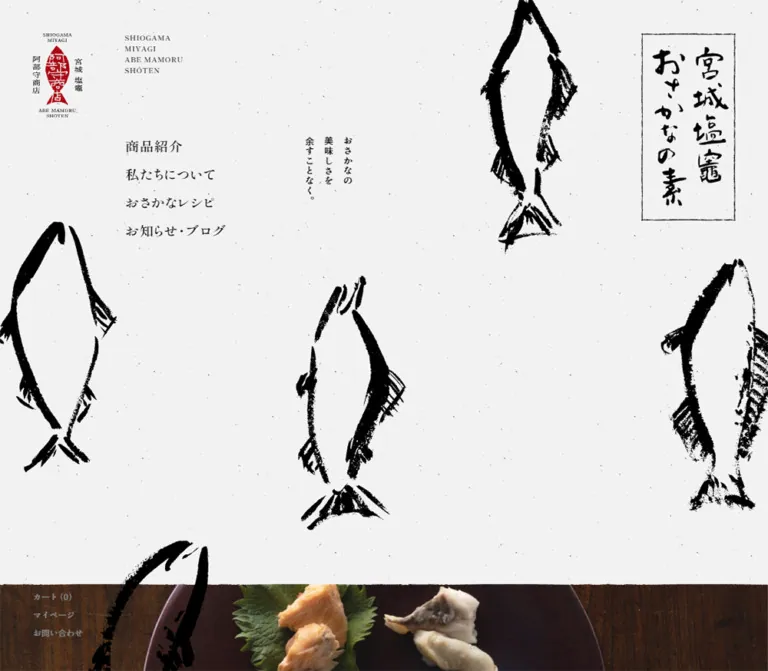
The opening behaves like a large illustrated shop sign. Sparse black fish contours extend beyond the edges of a lightly flecked paper field. A red fish-shaped seal identifies the business at the upper left; a framed calligraphic product plaque sits toward the upper right on desktop. Ordinary navigation, modest vertical copy, and large areas of empty paper share the composition without competing with the artwork.
Below the opening, the site becomes an editorial storefront. Food photography supplies warmth and appetite, while product descriptions, prices, recipes, and service information remain small and carefully aligned. The page alternates expansive image regions with narrow text columns and vertical section labels. Its identity depends on these relationships—not simply on adding a paper texture to a conventional product grid.
閉じる
Abe Mamoru Shouten — Style Reference
A seafood shop presented through brush ink, vertical Japanese text, quiet paper, and richly photographed meals.
Original URL: abemamoru-shouten.com
Final URL: abemamoru-shouten.com — unchanged; supplied response status: HTTP 200.
Theme: light paper with black ink, a restrained red identity accent, and a pale blue-gray service footer.
Inspected: October 2, 2026, Japan Standard Time. Supplied capture timestamp: 2026-10-01T19:21:46.594Z, equivalent to October 2 at 04:21:46.594 JST.
Viewports: desktop 1440 × 1000 and mobile 390 × 844 CSS pixels.
Scope: the current shop and brand homepage, including its illustrated opening, food imagery, brand narrative, product introductions, recipe index, preparation story, news, coastal image strip, customer guidance, and store information. Attached visual coverage includes the desktop opening, a product/recipe slice, and the footer; mobile screenshots show the opening and lower footer. Supplied DOM and computed styles cover additional homepage sections. Linked pages, checkout, account screens, and the expanded menu were not inspected.
The opening behaves like a large illustrated shop sign. Sparse black fish contours extend beyond the edges of a lightly flecked paper field. A red fish-shaped seal identifies the business at the upper left; a framed calligraphic product plaque sits toward the upper right on desktop. Ordinary navigation, modest vertical copy, and large areas of empty paper share the composition without competing with the artwork.
Below the opening, the site becomes an editorial storefront. Food photography supplies warmth and appetite, while product descriptions, prices, recipes, and service information remain small and carefully aligned. The page alternates expansive image regions with narrow text columns and vertical section labels. Its identity depends on these relationships—not simply on adding a paper texture to a conventional product grid.
How to Read This Reference
- Measured values come from the supplied rendered DOM, computed styles, or recorded viewport dimensions. Values are rounded for readability.
- Visual estimates describe screenshot geometry or colors that were not included in the computed-style sample. They are explicitly identified.
- Derived values are arithmetic relationships between measured dimensions, such as a
230.4pxinset equaling16vwat the desktop viewport. They do not prove the original stylesheet uses that expression. - Recommendations describe a reusable implementation, accessibility improvements, and behavior that was not exercised in the supplied inspection.
- All custom-property names in this document are proposed aliases. The evidence returned no source custom properties.
- Element rectangles can include wrappers, transformed geometry, or offscreen navigation. A DOM entry alone does not establish that an element was visible in a supplied screenshot.
Tokens — Colors
Default Palette
| Name | Value | Suggested token | Evidence and role |
|---|---|---|---|
| Paper | #f2f2f2 |
--color-paper |
Measured background on the overlapping narrative heading; visually consistent with the broader light canvas. The sampled body itself is transparent, so this is not a verified body-background declaration. |
| Ink | #000000 |
--color-ink |
Measured text color throughout; also the visible color of fish artwork, lettering, rules, and icons. |
| Utility Gray | #818283 |
--color-muted |
Measured on desktop cart/account/contact utilities, news dates, and copyright. |
| Sea Paper | approximately #b9cdd0 |
--color-sea |
Visual estimate for the blue-gray footer field. Its color-bearing layer was not identified in the sampled styles. |
| Seal Red | approximately #b50018 |
--color-seal |
Visual estimate from the brand mark. A small red outlined arrow also appears beside the product-detail label. Their exact source colors were not supplied. |
| News Wash | rgba(0, 0, 0, 0.05) |
--color-news-wash |
Measured background on the news section at both viewports. |
| News Composite | approximately #e6e6e6 |
— | Calculated result of the measured wash over #f2f2f2, before texture. This is not an independently sampled color. |
Black and pale paper dominate the interface. Red remains concentrated in identity and small directional details; it does not become a broad button-fill system. The footer introduces a substantial cool color field after the coastal photography.
Texture changes the appearance of otherwise simple colors. On the opening, small dark flecks interrupt the pale paper. In the footer, light flecks interrupt the blue-gray field. The exact texture assets, opacity, and layering method were not provided.
Color Application
| Context | Treatment |
|---|---|
| Opening and editorial sections | Light paper, black text, black brush artwork |
| Food images | Natural photographic color: warm wood, dark ceramics, orange fish, green garnish |
| Product detail link | Black text, restrained underline/rule, small red outlined arrow |
| News | A subtle black wash over the paper surface |
| Customer guidance and store information | Blue-gray paper, black rules and text |
| Secondary utilities | Muted gray rather than a filled container |
No alternate theme or theme-switching control is established by the evidence.
Tokens — Typography
Heading Family
The captured heading stack begins with:
shippori-mincho, shippori-antique, '游明朝 Medium',
YuMincho, 'Yu Mincho', 'Helvetica Neue', serif, san-serif
The prominent navigation links, product-use headings, recipe titles, and vertical section labels use this stack with weight 600. Their measured tracking is consistently 0.04em: for example, 1.02857px on the 25.7143px opening navigation.
These are the actual family identifiers returned by computed styles. Font-file URLs, font-service configuration, and the resolved face for each character were not supplied. Do not expand these aliases into an unverified commercial or hosted font name.
Body and Utility Family
The captured body/component stack begins with:
shippori-antique, '游明朝 Medium', YuMincho,
'Yu Mincho', 'Helvetica Neue', serif, san-serif
This family stack appears on body paragraphs, service information, utility links, and the small vertical opening statement. Its sampled weight is 400. Paragraph leading is often generous: 2 for product and recipe descriptions, and 1.75 for denser feature and service copy.
The final captured token san-serif is not a standard CSS generic family. The Quick Start uses a valid serif fallback. The root element's Times value should not be mistaken for the font used by the styled content components.
Artwork Lettering
The framed lettering reading 宮城塩竈 おさかなの素 is visually distinct from live text. Its sampled H2 wrapper has no extracted text, while the screenshot clearly shows calligraphic artwork. Treat this plaque as an identity asset; its wrapper's computed font size does not describe the lettering inside it.
The red brand mark likewise combines drawn lettering, Japanese side labels, and small Latin wording. Preserve its proportions and spacing as a whole instead of rebuilding it with a generic display font.
Type Scale
Values below are measured computed sizes, not screenshot estimates.
| Role | Desktop size / line height | Mobile size / line height | Weight and spacing |
|---|---|---|---|
| Opening primary navigation | 25.71 / 34.71px |
Not visible in the closed opening | 600, 0.04em tracking |
| Compact desktop navigation present in DOM | 14.40 / 25.20px |
Replaced by mobile navigation elements | 600, 0.04em; visibility in the opening screenshot is not established |
| Opening vertical statement | 16.46 / 18.93px |
13.52 / 15.55px |
400; values describe the sampled wrapper |
| Vertical section heading | 33.94 / 35.64px |
24.96 / 26.21px |
600, 0.04em |
| Product-use heading | 33.94 / 37.34px |
24.96 / 27.46px |
600, 0.04em |
| Brand narrative paragraph | 16.46 / 32.91px |
13.52 / 27.04px |
400 |
| Product and recipe description | 13.37 / 26.74px |
12.48 / 24.96px |
400 |
| Recipe title | 20.57 / 30.86px |
20.80 / 31.20px |
600, 0.04em |
| Preparation-story heading | 22.63 / 33.94px |
18.72 / 28.08px |
600, 0.04em |
| Preparation-story paragraph | 13.37 / 23.40px |
13.52 / 23.66px |
400 |
| Footer group heading | 16.46 / 24.69px |
16.64 / 24.96px |
400 |
| Service-row label | 16.46 / 16.46px |
12.48 / 12.48px |
400 on sampled link wrapper |
| Service-row description | 13.37 / 23.40px |
10.40 / 18.20px |
400 |
| Footer navigation | 13.37 / 20.06px |
13.52 / 20.28px |
400 |
| Copyright | 10.29 / 18px |
10.40 / 18.20px |
400, muted gray |
| Mobile cart and menu | — | 13.52 / 27.04px |
400 |
The mobile recipe title is almost the same size as its desktop equivalent. This is selective recomposition, not uniform scaling of every element.
Vertical Text
Vertical text performs several different jobs: the small opening statement, the product plaque, section titles, and parts of the brand narrative. Preserve those distinctions. A section label is a narrow navigational landmark; the plaque is artwork; body paragraphs must remain readable content.
Recommended implementation: use real text with writing-mode: vertical-rl where appropriate. For the opening statement, three individually vertical spans in a right-to-left flex sequence provide direct control over column spacing. Avoid rotating an entire horizontal sentence or converting essential copy into an image.
Tokens — Spacing & Shapes
Responsive Unit
The measured root font size is 10.2857px on desktop and 10.4px on mobile. In this reference, u means the measured root size at the relevant viewport.
Many component values are simple multiples of that unit:
- Desktop body text:
1.6u; mobile body text:1.3u. - Desktop major headings:
3.3u; mobile major headings:2.4u. - Recipe titles:
2uat both sizes. - Service-row vertical padding:
1.6uat both sizes.
The endpoints are mathematically consistent with viewport width / 140 on desktop and viewport width / 37.5 on mobile. The evidence does not include the source media queries, caps, or interpolation rules. These relationships must not be presented as recovered source CSS.
Spacing Scale
| Use | Desktop | Mobile | Status |
|---|---|---|---|
| Narrative heading internal padding | 10.29px 15.43px |
8.32px 10.40px |
Measured |
| Service-row vertical padding | 16.46px |
16.64px |
Measured |
| Product-link vertical padding | 24.69px |
20.80px |
Measured |
| Product thumbnail-to-text gap | About 25px |
Not visually measured | Desktop screenshot estimate |
| Opening navigation top-to-top interval | 52.20px |
Not applicable | Derived from element rectangles |
| Footer navigation top-to-top interval | 28.28px |
28.58px |
Derived |
| News section vertical padding | 123.43px |
62.40px |
Measured |
| Footer top-to-first-group interval | 123.42px |
83.19px |
Derived |
| Recipe section-to-next major section gap | About 246.84px |
About 124.80px |
Derived from section rectangles |
Large blank areas are structural. On desktop, a compact product summary occupies only a portion of an 870px-high product panel. Filling that space with more controls would change the page's pacing.
Border Radius and Rules
| Element | Treatment | Evidence |
|---|---|---|
| Sampled links, sections, headings, and mobile menu button | 0px radius |
Computed styles |
| Food and product imagery | Square visible corners | Screenshots |
| Menu and calligraphy plaque frames | Thin, irregular rectangular outlines | Screenshots; exact stroke assets unprovided |
| Service dividers | Fine horizontal ink lines, with visibly uneven heavier group boundaries | Screenshots |
| Directional indicators | Small outlined circles, approximately 15–17px |
Visual estimate |
There is no visible general-purpose shadow or raised-card system. Hierarchy comes from typography, image scale, alignment, texture, and rules.
Layout Measurements
| Element | Desktop 1440 × 1000 |
Mobile 390 × 844 |
|---|---|---|
| Document height | 8494.78px |
9042.97px |
| Opening section | 1440 × 870px |
390 × 844px |
| Brand-mark link | 92.16 × 155.64px, at (60.47, 61.70) |
46.80 × 79.03px, at (16.38, 17.67) |
| Opening content inset | 230.40px, equivalent to 16vw |
Desktop inset removed |
| Product plaque | 172.80 × 345.59px, at (1206.73, 61.70) |
85.80 × 171.59px, at (152.09, 272.58) |
| Opening statement | 89.63 × 133.09px, at (561.59, 246.84) |
73.63 × 127.22px, at (158.19, 452.72) |
| Mobile menu button | Not shown in supplied desktop opening | 99.83 × 39.52px, at (273.80, 31.19) |
| Product-copy column | 352.80px wide, left edge 291.59px |
273px wide, left edge 19.50px |
| Large product photo | Approximately 504px wide, left edge 720px |
Exact image rectangle not supplied |
| Recipe item | 1008 × 140.91px, left edge 432px |
273 × 365.66px, left edge 92.05px |
| Footer content | 1065.60px wide, from 230.40px to 1296px |
340.09px wide, approximately 24.96px side margins |
| Footer category/data split | Approximately 319.68 / 745.92px |
Groups stack vertically |
Photo width in this table is a screenshot estimate. Other listed rectangles come from the supplied DOM.
Components
Desktop Identity Rail
Role: maintain identity and access to commerce utilities while the page scrolls.
The tall red-and-black brand mark sits about 60px from the top and left edges. Cart, account, and contact links form a muted vertical stack near the lower left. The utilities use 15.43px type and approximately 32.91px top-to-top spacing.
The logo and utilities occupy matching viewport positions in the desktop opening, product, and footer screenshots. This supports a persistent rail treatment, although the actual position declaration was not included in the sample.
The rail has no enclosing panel. Paper, photography, and the blue footer pass behind its region. Preserve the separation between this rail and the main content, whose common desktop inset is 16vw.
Illustrated Opening
Role: establish product identity and the shop's visual character.
The desktop opening contains five distinct layers:
- A pale, lightly flecked paper field.
- Large black fish contours cropped by the viewport and section edges.
- The persistent brand mark at the upper left.
- A small Latin identity block and four large text navigation links beginning around
x = 230px. - A small three-column vertical statement near
x = 562pxand a framed product plaque at the upper right.
The navigation labels are 商品紹介, 私たちについて, おさかなレシピ, and お知らせ・ブログ. They are links to separate content areas, not a row of conversion buttons.
Fish placement is deliberately uneven. In the desktop screenshot, one descends from the upper center-right, another enters from the left, a third occupies the lower middle, and another is cropped along the right edge. Some artwork continues visually across the boundary into the following photograph. Keep decoration independent of the text layout.
The small statement reads おさかなの / 美味しさを / 余すことなく。. Its modest size is important: the fish and plaque supply the visual scale.
Mobile Opening and Menu Control
Role: preserve the illustrated identity while making room for navigation on a narrow screen.
The mobile opening fills the recorded 844px viewport. The brand mark shrinks to roughly half the desktop dimensions and sits at the upper left. A cart label appears near the upper center-right; the rectangular メニュー control occupies the upper right.
The plaque moves to the horizontal center at approximately y = 273px, and the vertical statement sits immediately below it. Fish are rearranged around this central stack. The upper fish is clipped by the top edge, side fish frame the plaque, and a lower fish fills the bottom portion of the opening.
The mobile menu button remains at the same upper-right position in the footer screenshot. The logo and cart are absent from that lower screenshot; their exact scroll-dependent visibility behavior is unverified.
The DOM contains grouped menu links above the visible viewport, including products, company information, recipes, news, service guidance, and legal links. These offscreen rectangles establish available destinations, not the appearance of an opened menu. Opening direction, backdrop, close behavior, focus management, and animation were not exercised.
Full-Width Food Image and Narrative
Role: move from illustrated identity into the product's everyday use.
A full-width image section follows the opening. Its measured height is 1000px on desktop and 585px on mobile. The desktop opening screenshot reveals its upper edge: a dark plate and green garnish on a warm wooden surface.
The following narrative introduces the product with the heading 毎日の食卓の / 主役にも、 / 脇役にも。. The heading has a measured paper-colored background and overlaps the preceding section boundary. Its desktop top is about 61.70px above the narrative section start; the mobile overlap is about 41.59px.
Desktop paragraph rectangles form narrow groups progressing from right to left. Their dimensions and line-broken text are consistent with vertical editorial copy. On mobile, the same paragraphs become a downward sequence of broad blocks beginning around x = 31px. The exact child-level writing-mode rules were not included, so preserve the observed reading order without claiming an unprovided implementation.
The narrative ends with a modest text link to the company page. It does not resolve into a large filled CTA.
Product Feature Panel
Role: explain a serving use and lead into a product detail page.
Two product features are present: an ochazuke set and a mixed-rice set. On desktop, the combined product section is 1740px high, with the second product-use heading exactly 870px below the first.
The visible mixed-rice composition has a narrow copy column at the left, a tall food photograph occupying approximately 35vw in the middle-right, and a vertical product-section label farther right. The photograph shows salmon pieces and rice in dark cookware, with a wooden serving utensil and a softly focused background.
Copy anatomy:
- A
33.94px, weight-600 use heading. - A small paragraph at
13.37pxwith26.74pxleading. - A fine divider.
- A linked product summary containing a square thumbnail, product name, compact price lines, and
商品詳細with a small circular arrow.
The thumbnail is approximately 116 × 116px in the supplied desktop slice. The link wrapper is measured at 352.80px wide, with about 24.69px vertical padding. It is a quiet inline product entry, not a raised shopping card.
On mobile, the text column measures 273px, or 70% of the viewport, and starts at 5vw. The first product heading begins about 399px after the product-section start, consistent with substantial media above it. Exact mobile photo dimensions and cropping are unverified because those image rectangles and a product screenshot were not supplied.
Recipe Index
Role: demonstrate uses for the product and link to complete recipes.
Four recipes are present. Desktop entries run horizontally from x = 432px to the right edge, beside a vertical section title near x = 256px.
Each row combines a title, a short description with a detail affordance, and a food image at the far right. Measured title and description widths are 262.08px and 372.95px. The desktop screenshot confirms the beginning of this layout and a partially visible pasta image.
A useful reconstruction of the measured desktop proportions is a row with 26% title, 37% description, and approximately 20% image, distributing the remaining space between them. This is an implementation equivalent; the sampled source rows use flex layout.
On mobile, entries become 273px-wide vertical blocks positioned to the right of the section-title lane. The first title starts about 200px below its row's top. This is consistent with media preceding the title, but the media dimensions were not sampled. Rows are approximately 365.66px high with 24.95px between them.
The whole entry is an anchor to a recipe fragment such as /recipe#recipe-recipe-1. Do not nest an additional interactive button inside that anchor merely to reproduce the visible detail label.
Preparation and Selection Story
Role: explain ingredient selection and cooking quality.
The DOM establishes two supporting stories around the vertical heading 美味しさの理由: selection through fishing and fish-retail experience, and controlled cooking for a tender result.
Desktop text blocks are staggered. One heading begins near (224.64, 6048.27) and the other near (951.42, 5600.56), with the section title centered around x = 702px. On mobile, both text blocks expand to approximately 340px and stack below the introductory title area.
This is an asymmetric editorial arrangement. Its photographic details are not visible in the attached captures, so do not invent specific factory, fishing, or portrait imagery for this section. A new implementation may use relevant licensed imagery, but that would be an addition.
News List
Role: provide updates without disrupting the restrained storefront.
A subtle rgba(0, 0, 0, 0.05) surface distinguishes the section. On desktop, a small section heading sits at the left, while four linked entries occupy a 662.39px-wide column starting around x = 547px.
Each entry stacks a gray date/category line over a black title, with approximately 16.46px vertical padding. Desktop entry height is 92.56px; mobile entries measure 85.25px in the supplied content.
Mobile places the heading above a full-width list within 24.96px side margins. The list-view link is aligned toward the right below the entries. Displayed dates from 2022 are content dates; they are not the inspection date and do not establish that the site is discontinued.
Coastal Transition
Role: connect the shop's marine identity to the footer's cool palette.
The desktop footer screenshot includes a strip of blue water and floating buoys immediately above the blue-gray service field. The corresponding section measures 504px high on desktop and 214.5px on mobile, though the attached desktop screenshot shows only its lower portion.
A fine dark, irregular boundary separates the photograph from the footer. Keep this transition photographic and quiet; there is no evidence of a video or interactive map in this region.
Service and Store Rows
Role: make buying guidance and contact details directly accessible.
The footer first groups ordering, delivery, payment, and gift guidance, then groups address, telephone, contact, and sister-store information.
Desktop anatomy has three reading levels:
- Group title in a
319.68pxleft column. - Linked row label in the right-hand region.
- Description beside that label, with a small outlined arrow aligned near the far right.
The right-hand region is 745.92px wide. Its label-to-description offset is approximately 223.77px, or 30% of that region. Short rows are 57.58px high; wrapped rows are 79.72px high.
Mobile moves the group heading above the rows. Labels and descriptions stack inside a 340.09px content width, while the circular arrow remains at the right and centers against the row. Descriptions reserve roughly 10% of the row width for the arrow region. Row heights become approximately 75.88px or 94.08px.
The supplied links establish the intended actions: guide pages, a map destination, a tel: link, a contact page, and an external sister-store destination. Those destinations were not opened during this analysis.
Footer Navigation and Social Links
Role: close the page with secondary navigation and brand ownership information.
Desktop navigation forms three compact columns beginning around x = 550, 774, and 998px. Copyright sits farther left, near the lower edge. Instagram and the observed Twitter bird icon sit beneath the rightmost links.
Mobile reorganizes this into two columns beginning around x = 25 and 195px. Terms and privacy occupy the final text row, followed by a separate social row and copyright. The screenshot retains substantial blue-gray space between the store-information rows and navigation.
The public-facing identity is supported by the page title, brand mark, company link, and © ABE MAMORU SHOUTEN footer. No production-credit claim is established by the inspected original page.
Tokens — Motion & Interaction
Declared Motion
| Element | Captured declaration | What it establishes |
|---|---|---|
| Opening section | transform 1.5s cubic-bezier(0.39, 0, 0, 0.9) |
A transform transition is defined at both sizes. Trigger, direction, and distance are unknown. |
| Brand-mark link | transform 0.6s ease-in-out, opacity 0.4s ease-in-out |
Transform and opacity changes have explicit timings. The triggering state was not supplied. |
| Many other sampled elements | transition: all |
No useful duration or interaction effect is established by this abbreviated record. |
| Sampled animation fields | none |
No animation was recorded on those sampled elements at capture time. This does not exclude scripts, pseudo-elements, or unsampled animated descendants. |
The capture procedure waited for finite motion and sampled layout/text stability. Perpetual animation was paused during readiness checks and then resumed. These precautions improve screenshot stability, but they do not provide a motion recording or prove that every delayed state appeared.
Observed Interaction Boundaries
- Scroll-separated desktop captures support a persistent logo and utility rail.
- Mobile captures support a persistent upper-right menu control.
- Product summaries, recipe entries, news items, and service rows have actual link destinations in the rendered DOM.
- No menu toggle, hover, keyboard focus, cart mutation, checkout, or form interaction was documented.
- Fish swimming, cursor-following decoration, parallax, sticky product photography, and automatic carousels are not established by the supplied evidence.
Recommended behavior: keep ordinary link feedback small and legible, such as a short opacity or underline change. Preserve the recorded transition timings only for intentionally implemented equivalent states. Provide reduced-motion behavior rather than inventing continuous fish movement.
Surfaces
| Layer | Appearance | Purpose |
|---|---|---|
| Main canvas | Pale neutral paper with sparse dark flecks | Connects illustration, text, and product content |
| Decorative artwork | Dense black brush edges with open light interiors | Supplies visual identity and scale |
| Narrative label | Paper-colored rectangle beneath text | Keeps overlapping copy readable against photography |
| Product and recipe entries | Unboxed content on the canvas | Maintains an editorial catalog feeling |
| News | Subtle translucent dark wash | Separates updates with minimal visual weight |
| Footer | Pale blue-gray with light speckling | Creates a calm service and contact area |
| Menu control | Paper-toned visible face with an irregular dark frame | Makes navigation recognizable without a solid accent fill |
The menu button's own sampled background is transparent; its visible face may come from another layer. Likewise, a transparent footer element does not mean the blue-gray field is absent. Treat screenshots as the authority for visible surfaces and computed styles as evidence for the specific sampled node.
Imagery
Brush Fish and Identity Artwork
The fish are recognizable through uneven contours, broad ink deposits, and dry-brush gaps. Large areas inside their bodies remain light, so their scale does not make the opening feel solid or crowded. Fin and tail marks vary in density. Do not substitute uniformly weighted line icons or smooth vector silhouettes.
The red mark is much smaller than the black fish. This scale contrast keeps the identity distinct while allowing decoration to dominate the visual field. The product plaque contributes a second kind of handwork: dense calligraphic characters enclosed by an imperfect rectangular frame.
Use high-quality artwork with normal image interpolation. There is no evidence that pixelated scaling is part of this site's treatment.
Food Photography
The visible photography is natural and close. Dark bowls and pots frame warm food, wood surfaces add depth, and selective focus leaves some background details soft. The rice image emphasizes flakes of fish and the texture of cooked grains; the partially visible recipe image shows plated pasta.
The photography remains fully colored. Do not recolor it into the black/red identity palette, cover it with a heavy paper wash, or apply artificial halftone processing. Reserve text for adjacent paper regions unless a separate paper label provides separation.
Observed Asset References
No original image URLs, file formats, or native dimensions were included in the evidence. These are observed asset roles, not filenames or downloadable paths.
| Asset role | Confirmed visual use | Limitation |
|---|---|---|
| Red fish-shaped brand mark | Desktop rail and mobile upper-left identity | Native format and source path unknown |
| Black brush fish | Desktop and mobile opening compositions | Exact asset count, duplication, and transparency unknown |
| Framed calligraphy plaque | Desktop upper right; mobile center | Wrapper measured; artwork file unavailable |
| Paper texture | Opening and editorial canvas | Tile size and opacity unknown |
| Light footer flecks | Blue-gray service/footer field | Layering method unknown |
| Prepared-food photograph | Beginning of full-width section beneath desktop opening | Only its upper slice is attached |
| Mixed-rice photograph and thumbnail | Desktop product feature | Large image width visually estimated |
| Pasta photograph | Partial desktop recipe row | Other recipe images not visually documented |
| Coastal water and buoys | Transition above the footer | Only the lower desktop slice is attached |
| Circular arrows and social marks | Product, service, and footer links | Asset formats and icon library unknown |
Use authorized original assets when available. CSS can reproduce spacing and surface relationships; it cannot recreate the specific brand lettering and brushwork.
Layout & Responsive Behavior
Page Sequence
Section positions below come from the measured document coordinates. Intervening whitespace and unlabeled sections account for gaps between entries.
| Section | Desktop top / height | Mobile top / height |
|---|---|---|
| Illustrated opening | 0 / 870px |
0 / 844px |
| First full-width image region | 870 / 1000px |
844 / 585px |
| Brand narrative | 1870 / 573.02px |
1429 / 910.77px |
| Product features | 2731.03 / 1740px |
2509.25 / 1449.05px |
| Recipe index | 4621.19 / 696.53px |
4041.48 / 1622.06px |
| Preparation story | 5564.56 / 635.16px |
5788.34 / 1142.53px |
| News | 6409.55 / 671.59px |
7043.19 / 596.59px |
| Coastal image region | 7081.14 / 504px |
7639.78 / 214.50px |
| Footer | 7585.14 / 909.64px |
7854.28 / 1188.69px |
Desktop Composition
A common 16vw left inset allows content to coexist with the identity rail. Individual sections deliberately deviate from a single centered container: product copy starts around 20.25vw, recipe rows at 30vw, and full-width images extend to both edges.
The product photo occupies approximately 35vw, leaving room for a vertical section title on its right. In contrast, recipe rows extend to the viewport edge with a smaller image at the far right. Preserve these different image scales; a uniform card grid would erase the section hierarchy.
The footer returns to a more explicit alignment system: a 30% category column and a 70% data region within a 74vw content area.
Mobile Recomposition
The left rail disappears as a desktop layout constraint. The opening plaque moves to the center; navigation becomes cart plus menu; fish positions change substantially. The opening also grows from 870px in a 1000px desktop viewport to the full 844px mobile viewport.
Interior content uses several purposeful widths rather than one universal inset. Product copy is 70vw at a 5vw left offset. Recipe cards are also 70vw, but shifted right to preserve a left lane for the vertical heading. Service and news sections use approximately 6.4vw side margins.
Recipes account for a major part of the increased mobile document height: their section grows from approximately 697px to 1622px. Footer groups also become taller as labels and descriptions stack. Typography changes selectively, with recipe titles staying near 21px while major headings reduce from about 34px to 25px.
Responsive Limits
Only two viewport sizes are documented. The original breakpoint, tablet layout, landscape behavior, browser zoom behavior, and safe-area handling remain unverified.
Recommended breakpoint for an adaptation: approximately 48rem, followed by testing at intermediate widths. This is a practical starting point, not a recovered source value. Let real text determine row height and preserve deliberate column relationships without forcing every measured pixel into a fixed-height layout.
Do’s and Don’ts
Do
- Treat the page as a shop and brand homepage with editorial content, product discovery, and practical service information.
- Preserve the neutral paper/black-ink foundation and use red sparingly.
- Use a distinct cool footer surface connected visually to coastal photography.
- Keep fish artwork large, irregular, partially cropped, and separated from functional text.
- Preserve the calligraphy plaque as artwork and ordinary content as live text.
- Keep the small vertical opening statement modest beside the large illustrations.
- Maintain the desktop identity rail and section-specific content offsets.
- Combine large food photographs with small linked product summaries.
- Keep prices and service details plainly readable rather than styling them as promotional badges.
- Recompose the mobile opening, recipe list, and footer deliberately.
- Use square imagery, fine rules, and small outlined directional marks.
- Label estimates, inferred relationships, and implementation additions honestly.
Don’t
- Do not replace the opening with an oversized horizontal headline and a large filled purchase button.
- Do not turn every section into identical rounded cards.
- Do not make the page cream or sepia-heavy; the observed paper is a light neutral gray.
- Do not extend the red accent into broad backgrounds or unrelated status colors.
- Do not smooth away the dry-brush texture or replace fish with generic thin-line icons.
- Do not apply grain overlays that obscure the food photography.
- Do not scale every mobile font down by the desktop-to-mobile width ratio.
- Do not assume all DOM navigation entries were visible at capture time.
- Do not invent menu, hover, parallax, or checkout behavior from static screenshots.
- Do not copy the measured small root-unit numbers into a standard
16pxrem system without conversion. - Do not treat the very small mobile service text as an accessibility target for a new implementation.
Recommended Implementation Additions
These are recommendations for a new implementation, not verified features of the inspected site.
- Make the menu a real button with
aria-expandedandaria-controls. Keep its closed content hidden from keyboard and assistive-technology navigation. If implemented as a modal, manage focus and provide an explicit close action. - Increase the menu's interactive area to at least
44pxhigh while retaining its compact visible frame. Expand social-icon hit areas similarly. - Give the brand link and icon-only social links accessible names. Mark purely decorative fish and paper textures as decorative.
- Provide an equivalent accessible label for the calligraphy plaque. Keep a coherent heading hierarchy around it and the live opening statement.
- Increase mobile service descriptions from the observed
10.4pxto a practical12.5–14pxor larger, allowing rows to grow naturally. - Check muted-gray text against paper, blue-gray, and photography. The desktop utility rail crosses different backgrounds; give essential controls sufficient contrast in each region.
- Provide a visible keyboard focus outline in ink or a suitably contrasting accent.
- Keep complete product and recipe rows as single links without nested controls.
- Use intrinsic image dimensions and responsive sources to reserve space for large photographs. Lazy-load lower content without delaying the opening identity assets.
- Test vertical punctuation, reading order, long labels, enlarged text, and narrow landscape screens.
- Respect
prefers-reduced-motion; do not make content visibility depend on an animation completing.
Agent Prompt Guide
Quick Color Reference
- Paper:
#f2f2f2, measured on a narrative heading surface and visually representative of the canvas. - Ink:
#000000, measured. - Muted utility text:
#818283, measured. - Footer: approximately
#b9cdd0, visual estimate. - Identity red: approximately
#b50018, visual estimate. - News surface:
rgba(0, 0, 0, 0.05), measured. - Primary navigation treatment: black text and restrained directional marks; no general filled-button system.
Overall Prompt
“Create a Japanese seafood shop and brand homepage with pale neutral paper, sparse grain, large dry-brush fish contours, a small red fish-shaped identity mark, and a framed calligraphy plaque. Use the supplied identity artwork rather than inventing a font substitute. On desktop, reserve a persistent left identity rail and begin primary editorial content near 16vw. Pair small vertical Japanese statements and Mincho-style headings with substantial negative space. Follow the illustrated opening with natural food photography, two spacious product-use features, a recipe index, preparation stories, and a quiet news list. Finish with a pale blue-gray textured service footer using fine ink rules and small outlined arrows. On mobile, center the plaque and vertical statement, rearrange the fish, use an upper-right menu button, stack recipe content, and reorganize footer navigation into two columns. Avoid rounded card grids and oversized filled CTAs.”
Example Component Prompts
- Opening: “At 1440px wide, create an 870px-tall paper opening with a tall brand mark around x60/y62, primary navigation around x231/y255, a small vertical statement around x562/y247, and a 173 × 346px calligraphy plaque near the upper right. Place large irregular brush fish around these elements with intentional edge cropping. These coordinates are reference measurements, not a universal fixed layout.”
- Mobile opening: “At 390 × 844, keep the full opening viewport-height. Place a roughly 47 × 79px logo at the upper left, a compact outlined menu at the upper right, an 86 × 172px plaque centered around y273, and three narrow vertical copy columns below it. Reposition fish around this central composition instead of shrinking the desktop arrangement.”
- Product feature: “Create an unboxed product-use feature with a narrow text column, a large portrait crop of prepared food, and a vertical section label at the far right. Beneath the small description, add a ruled linked summary with a square thumbnail, product name, compact price lines, and a small circular arrow beside the detail label.”
- Recipe row: “On desktop, arrange a recipe title, two-line description, and small food photograph across a long horizontal row beside a vertical section heading. On mobile, place media above title and description in a 70vw-wide column shifted right to leave a title lane. Use square image corners and no shadow.”
- Service footer: “Use pale blue-gray paper with subtle light flecks. Build ordering and store-information groups with fine irregular horizontal rules. Desktop has a category column, label column, description, and tiny outlined arrow. Mobile stacks labels and descriptions with the arrow centered at the right, followed by two columns of navigation.”
- Motion: “Use the documented 1.5-second opening transform easing only if implementing an equivalent state transition. Keep ordinary link feedback restrained, add reduced-motion support, and do not invent continuous fish movement or parallax.”
Quick Start
CSS Custom Properties
This is a recommended adaptation, not copied source CSS. It keeps a conventional document root and expresses the observed small-unit system through --u. The bounded viewport formulas fit the supplied endpoints; their caps and the 48rem breakpoint are implementation choices.
The footer and seal colors remain estimates. Register the observed font aliases only when their actual font files are available. Paper textures and original artwork must be supplied separately; the code invents no asset URLs. Straight CSS borders are functional substitutes for the original irregular frames and rules.
:root {
  --color-paper: #f2f2f2;
  --color-ink: #000;
  --color-muted: #818283;
  --color-sea: #b9cdd0; /* Visual estimate */
  --color-seal: #b50018; /* Visual estimate */
  --color-news-wash: rgb(0 0 0 / 5%);
  --color-rule: rgb(0 0 0 / 55%);

  --font-body: shippori-antique, '游明朝 Medium',
    YuMincho, 'Yu Mincho', 'Helvetica Neue', serif;
  --font-heading: shippori-mincho, var(--font-body);
  --weight-body: 400;
  --weight-heading: 600;

  /* Endpoint-matching adaptation, not a recovered source formula */
  --u: clamp(8px, 0.714286vw, 12px);
  --text-body: calc(1.6 * var(--u));
  --text-small: calc(1.3 * var(--u));
  --text-display: calc(3.3 * var(--u));
  --text-recipe: calc(2 * var(--u));
  --leading-body: 2;
  --tracking-heading: 0.04em;

  --space-row: calc(1.6 * var(--u));
  --space-product: calc(2.4 * var(--u));
  --space-section: calc(12 * var(--u));
  --rail-inset: 4.2vw;
  --content-inset: 16vw;
  --rule-width: 1px;
  --radius: 0;

  /* Durations observed on specific source elements */
  --motion-opening: 1.5s cubic-bezier(0.39, 0, 0, 0.9);
  --motion-brand-transform: 0.6s ease-in-out;
  --motion-brand-opacity: 0.4s ease-in-out;
}

* { box-sizing: border-box; }
body { margin: 0; }
img { display: block; max-width: 100%; }
button { font: inherit; }

.site {
  overflow-x: clip;
  color: var(--color-ink);
  background-color: var(--color-paper);
  background-image: var(--paper-texture, none);
  font-family: var(--font-body);
  font-size: var(--text-body);
  font-weight: var(--weight-body);
  line-height: var(--leading-body);
}

.site a { color: inherit; text-decoration: none; }
.site :focus-visible {
  outline: 2px solid currentColor;
  outline-offset: 5px;
}

.brand {
  position: fixed;
  z-index: 20;
  top: calc(6 * var(--u));
  left: var(--rail-inset);
  width: 6.4vw;
}
.brand img { width: 100%; height: auto; }

.utility-links {
  position: fixed;
  z-index: 20;
  left: var(--rail-inset);
  bottom: calc(6 * var(--u));
  display: grid;
  gap: calc(1.7 * var(--u));
  color: var(--color-muted);
  font-size: calc(1.5 * var(--u));
  line-height: 1;
}

.menu-button, .mobile-cart { display: none; }

.hero {
  position: relative;
  z-index: 1;
  isolation: isolate;
  min-height: 87svh;
  padding: calc(6 * var(--u)) 4.2vw 0 16vw;
}

.hero__roman {
  position: relative;
  z-index: 2;
  margin: 0;
  font-size: calc(1.4 * var(--u));
  line-height: 1.4;
  letter-spacing: 0.04em;
}

.hero__index {
  position: absolute;
  z-index: 2;
  top: calc(24.8 * var(--u));
  left: 16vw;
  display: grid;
  gap: calc(1.7 * var(--u));
  font-family: var(--font-heading);
  font-size: calc(2.5 * var(--u));
  font-weight: var(--weight-heading);
  line-height: 1.35;
  letter-spacing: var(--tracking-heading);
}

.hero__plaque {
  position: absolute;
  z-index: 2;
  top: calc(6 * var(--u));
  right: 4.2vw;
  width: 12vw;
  aspect-ratio: 1 / 2;
  object-fit: contain;
}

.hero__tagline {
  position: absolute;
  z-index: 2;
  top: calc(24 * var(--u));
  left: 39vw;
  display: flex;
  flex-direction: row-reverse;
  gap: 1em;
  margin: 0;
  padding-top: calc(0.4 * var(--u));
  font-size: var(--text-body);
  font-weight: 400;
  line-height: 1.15;
}
.hero__tagline span { writing-mode: vertical-rl; }

/* Placement guides for separately supplied decorative artwork */
.hero__fish { position: absolute; z-index: 0; pointer-events: none; }
.hero__fish--top { width: 13vw; left: 61.5%; top: -2%; }
.hero__fish--left { width: 15vw; left: -0.5%; top: 47%; }
.hero__fish--middle { width: 14vw; left: 38%; top: 58.5%; }
.hero__fish--right { width: 16vw; left: 84.5%; top: 54.8%; }

.feature-photo { position: relative; z-index: 0; height: 100svh; }
.feature-photo img { width: 100%; height: 100%; object-fit: cover; }

.section-heading {
  margin: 0;
  font-family: var(--font-heading);
  font-size: var(--text-display);
  font-weight: var(--weight-heading);
  line-height: 1.05;
  letter-spacing: var(--tracking-heading);
}
.vertical-heading { writing-mode: vertical-rl; }

.product-panel {
  display: grid;
  grid-template-columns: 50% 35% 15%;
  min-height: 87svh;
}
.product-panel__copy {
  grid-column: 1;
  width: 24.5vw;
  margin-left: 20.25vw;
  padding-top: 5vw;
}
.product-panel__copy > p {
  font-size: var(--text-small);
  line-height: 2;
}
.product-panel__photo {
  grid-column: 2;
  width: 100%;
  height: 87svh;
  object-fit: cover;
}
.product-panel__label {
  grid-column: 3;
  justify-self: center;
  align-self: start;
  margin-top: calc(6 * var(--u));
}

.product-link {
  display: flex;
  align-items: flex-start;
  gap: var(--space-product);
  padding-block: var(--space-product);
  border-top: var(--rule-width) solid var(--color-rule);
}
.product-link__image { width: 33%; aspect-ratio: 1; object-fit: cover; }
.product-link__info { flex: 1; min-width: 0; }
.product-link__title {
  margin: 0;
  font-family: var(--font-heading);
  font-size: calc(1.8 * var(--u));
  font-weight: 600;
  line-height: 1.5;
}
.product-link__price { margin: 0; font-size: var(--text-small); }
.detail-label { display: inline-flex; align-items: center; gap: 0.5em; }

.circle-arrow {
  display: inline-grid;
  place-items: center;
  width: 16px;
  height: 16px;
  border: 1px solid currentColor;
  border-radius: 50%;
  font-size: 11px;
  line-height: 1;
}
.product-link .circle-arrow { color: var(--color-seal); }

.recipe-list { margin-left: 30vw; }
.recipe-row {
  display: grid;
  grid-template-columns: 26% 37% 20%;
  justify-content: space-between;
  align-items: center;
  min-height: 9.785vw;
}
.recipe-row h3 {
  margin: 0;
  font-family: var(--font-heading);
  font-size: var(--text-recipe);
  font-weight: 600;
  line-height: 1.5;
  letter-spacing: 0.04em;
}
.recipe-row__description { font-size: var(--text-small); line-height: 2; }
.recipe-row img { width: 100%; aspect-ratio: 10 / 7; object-fit: cover; }

.news {
  display: grid;
  grid-template-columns: 18.7% 67.65%;
  justify-content: space-between;
  padding: var(--space-section) 16vw;
  background: var(--color-news-wash);
}
.news-item { display: block; padding-block: var(--space-row); }
.news-item__meta { color: var(--color-muted); font-size: var(--text-small); }

.site-footer {
  padding: calc(12 * var(--u)) 10vw calc(6 * var(--u)) 16vw;
  background-color: var(--color-sea);
  background-image: var(--footer-texture, none);
}
.service-group {
  display: grid;
  grid-template-columns: 30% 70%;
  border-top: 1px solid var(--color-ink);
}
.service-group__heading {
  margin: 0;
  padding-block: var(--space-row);
  font-size: calc(1.6 * var(--u));
  font-weight: 400;
  line-height: 1.5;
}
.service-row {
  display: grid;
  grid-template-columns: 30% 44% 1fr;
  align-items: start;
  padding-block: var(--space-row);
}
.service-row + .service-row { border-top: 1px solid var(--color-rule); }
.service-row__label { line-height: 1.5; }
.service-row__description { font-size: var(--text-small); line-height: 1.75; }
.service-row .circle-arrow { justify-self: end; align-self: center; }

.footer-bottom {
  display: grid;
  grid-template-columns: 30% 70%;
  align-items: end;
  margin-top: calc(9 * var(--u));
}
.footer-nav { display: grid; grid-template-columns: 30% 30% 40%; }
.footer-nav__group {
  display: grid;
  align-content: start;
  gap: calc(0.8 * var(--u));
  font-size: var(--text-small);
  line-height: 1.5;
}
.social-links { display: flex; gap: calc(1.2 * var(--u)); }
.copyright {
  margin: 0;
  color: var(--color-muted);
  font-size: var(--u);
  line-height: 1.75;
}

@media (max-width: 48rem) {
  :root {
    --u: clamp(9px, 2.666667vw, 12px);
    --text-body: calc(1.3 * var(--u));
    --text-small: calc(1.2 * var(--u));
    --text-display: calc(2.4 * var(--u));
    --space-product: calc(2 * var(--u));
    --space-section: calc(6 * var(--u));
  }

  .brand { position: absolute; top: calc(1.7 * var(--u)); width: 12vw; }
  .utility-links, .hero__roman, .hero__index { display: none; }
  .mobile-cart {
    display: block;
    position: absolute;
    z-index: 20;
    top: calc(3.6 * var(--u));
    right: 34vw;
  }
  .menu-button {
    display: flex;
    align-items: center;
    justify-content: center;
    gap: 8px;
    position: fixed;
    z-index: 30;
    top: calc(3 * var(--u));
    right: 4.2vw;
    width: calc(9.6 * var(--u));
    min-height: 44px; /* Recommended larger target */
    padding: 8px;
    border: 1px solid var(--color-ink);
    border-radius: 0;
    color: var(--color-ink);
    background: var(--color-paper);
    cursor: pointer;
  }

  .hero { min-height: 100svh; padding: 0; }
  .hero__plaque { top: 32.3svh; left: 39vw; right: auto; width: 22vw; }
  .hero__tagline {
    top: calc(32.3svh + 44vw + 0.8 * var(--u));
    left: 50%;
    transform: translateX(-50%);
  }
  .hero__fish--top { width: 26vw; left: 50%; top: -2%; }
  .hero__fish--left { width: 29vw; left: -2%; top: 26%; }
  .hero__fish--middle { width: 30vw; left: 32%; top: 68%; }
  .hero__fish--right { width: 31vw; left: 70%; top: 37%; }
  .feature-photo { height: 150vw; }

  .product-panel { position: relative; display: flex; flex-direction: column; min-height: 0; }
  .product-panel__photo { order: -1; width: 75%; height: 100vw; }
  .product-panel__copy { width: 70%; margin-left: 5%; padding-top: var(--u); }
  .product-panel__label { position: absolute; top: 0; right: 9vw; margin: 0; }

  .recipe-list { margin-inline: 23.6vw 6.4vw; }
  .recipe-row {
    display: flex;
    flex-direction: column;
    align-items: stretch;
    gap: calc(1.6 * var(--u));
    margin-bottom: calc(2.4 * var(--u));
  }
  .recipe-row img { order: -1; aspect-ratio: 3 / 2; }
  .news { display: block; padding: var(--space-section) 6.4vw; }

  .site-footer { padding: calc(8 * var(--u)) 6.4vw calc(2.4 * var(--u)); }
  .service-group { display: block; margin-bottom: calc(2 * var(--u)); border: 0; }
  .service-group__heading { padding: 0 0 var(--space-row); }
  .service-rows { border-top: 1px solid var(--color-ink); }
  .service-row { grid-template-columns: 1fr 18px; gap: calc(0.8 * var(--u)); }
  .service-row__label { grid-column: 1; font-size: var(--text-small); }
  .service-row__description {
    grid-column: 1;
    font-size: max(12.5px, var(--text-small)); /* Larger than the observed mobile detail text */
  }
  .service-row .circle-arrow { grid-column: 2; grid-row: 1 / span 2; }

  .footer-bottom {
    display: flex;
    flex-direction: column-reverse;
    align-items: stretch;
    gap: calc(3.2 * var(--u));
    margin-top: calc(8 * var(--u));
  }
  .footer-nav { grid-template-columns: 1fr 1fr; }
  .footer-nav__group { font-size: var(--text-body); }
  .footer-nav__group:last-child { grid-column: 1 / -1; grid-template-columns: 1fr 1fr; }
  .social-links { grid-column: 1 / -1; margin-top: calc(3.2 * var(--u)); }
}

/* Recommended feedback; original hover behavior was not tested */
@media (hover: hover) {
  .hero__index a:hover,
  .footer-nav a:hover { text-decoration: underline; text-underline-offset: 0.25em; }
}

@media (prefers-reduced-motion: reduce) {
  .site *, .site *::before, .site *::after {
    animation: none !important;
    transition: none !important;
    scroll-behavior: auto !important;
  }
}
Component Markup
The following examples use actual source labels. They demonstrate live vertical text and a whole-row link. The circular glyph is a simple implementation substitute for the original arrow artwork.
<h1 class='hero__tagline' lang='ja'>
  <span>おさかなの</span>
  <span>美味しさを</span>
  <span>余すことなく。</span>
</h1>

<section class='service-group' aria-labelledby='guide-title'>
  <h2 class='service-group__heading' id='guide-title'>ご利用案内</h2>
  <div class='service-rows'>
    <a class='service-row' href='https://abemamoru-shouten.com/guide/delivery'>
      <span class='service-row__label'>お届けについて</span>
      <span class='service-row__description'>配送、送料などについてのご案内</span>
      <span class='circle-arrow' aria-hidden='true'>›</span>
    </a>
  </div>
</section>
For the footer CSS, place copyright before the navigation in .footer-bottom, and use three .footer-nav__group elements. The third group contains terms, privacy, and .social-links. Mobile styling distributes that final group across the two columns.
For product panels, use copy, photo, and an optional vertical label as direct children. Avoid repeating the section label on every panel if it describes the whole product group. The mobile photo ratio and recipe-image ratios in this adaptation are recommendations because original image rectangles were not supplied.
The CSS does not implement a menu state machine, shopping cart, account flow, or scroll-triggered transforms. Those require explicit behavior and testing; the evidence does not define them.
Tailwind v4 Token Mapping
Optional aliases for a project already using Tailwind v4. This does not imply the original website uses Tailwind. Define the custom properties above first.
@theme inline {
  --color-paper: #f2f2f2;
  --color-ink: #000000;
  --color-muted: #818283;
  --color-sea: #b9cdd0;
  --color-seal: #b50018;

  --font-editorial: var(--font-heading);
  --font-copy: var(--font-body);

  --text-copy: var(--text-body);
  --text-detail: var(--text-small);
  --text-section: var(--text-display);
  --text-recipe-title: var(--text-recipe);

  --spacing-unit: var(--u);
  --spacing-row: var(--space-row);
  --spacing-section: var(--space-section);
  --radius-paper: 0px;
}
Sources & Evidence
- Inspected original and final page: https://abemamoru-shouten.com/. The supplied response was HTTP 200 and the final URL was unchanged.
- Capture timestamp:
2026-10-01T19:21:46.594Z, or October 2, 2026 at 04:21:46.594 JST. Individual screenshot timestamps were not separately supplied. - Desktop evidence: three original-page captures at
1440 × 1000, showing the opening, a product/recipe slice, and the footer. Rendered DOM includes section coordinates, text, links, computed typography, selected backgrounds, padding, and transition declarations. Measured document height:8494.78px. - Mobile evidence: two original-page captures at
390 × 844, showing the opening and lower footer, plus corresponding rendered DOM and computed styles. Measured document height:9042.97px. - Identity evidence: the original-page title, visible brand mark, company link, store-information block, and footer copyright establish the public-facing shop identity. A legal entity form was not independently verified.
- Interaction evidence: supplied scrolling produced views at different document positions. Link destinations and transition declarations are documented; menu opening, hover, focus, cart changes, and downstream destinations were not exercised.
- Capture limitations: the supplied process waited for document loading, finite motion, sampled layout/text stability, and visible image decoding within stated time limits. Perpetual animations were temporarily paused for readiness checks. SharedWorkers and service workers were disabled. Delayed content and unexercised states may still be absent.
- Measurement limitations: computed samples do not identify every visual layer, pseudo-element, image, or loaded font file. Footer/red colors, texture implementation, and some image dimensions remain estimates. Tablet layouts and exact breakpoints were not supplied.
This reference analyzes the supplied current-page evidence. It does not report an independent browsing session, a historical reconstruction, or verified behavior beyond the documented captures and DOM observations.
# Abe Mamoru Shouten — Style Reference

> A seafood shop presented through brush ink, vertical Japanese text, quiet paper, and richly photographed meals.

**Original URL:** [abemamoru-shouten.com](https://abemamoru-shouten.com/)
**Final URL:** [abemamoru-shouten.com](https://abemamoru-shouten.com/) — unchanged; supplied response status: HTTP 200.
**Theme:** light paper with black ink, a restrained red identity accent, and a pale blue-gray service footer.
**Inspected:** October 2, 2026, Japan Standard Time. Supplied capture timestamp: `2026-10-01T19:21:46.594Z`, equivalent to October 2 at 04:21:46.594 JST.
**Viewports:** desktop `1440 × 1000` and mobile `390 × 844` CSS pixels.
**Scope:** the current shop and brand homepage, including its illustrated opening, food imagery, brand narrative, product introductions, recipe index, preparation story, news, coastal image strip, customer guidance, and store information. Attached visual coverage includes the desktop opening, a product/recipe slice, and the footer; mobile screenshots show the opening and lower footer. Supplied DOM and computed styles cover additional homepage sections. Linked pages, checkout, account screens, and the expanded menu were not inspected.

The opening behaves like a large illustrated shop sign. Sparse black fish contours extend beyond the edges of a lightly flecked paper field. A red fish-shaped seal identifies the business at the upper left; a framed calligraphic product plaque sits toward the upper right on desktop. Ordinary navigation, modest vertical copy, and large areas of empty paper share the composition without competing with the artwork.

Below the opening, the site becomes an editorial storefront. Food photography supplies warmth and appetite, while product descriptions, prices, recipes, and service information remain small and carefully aligned. The page alternates expansive image regions with narrow text columns and vertical section labels. Its identity depends on these relationships—not simply on adding a paper texture to a conventional product grid.
閉じる
# Abe Mamoru Shouten — Style Reference

> A seafood shop presented through brush ink, vertical Japanese text, quiet paper, and richly photographed meals.

**Original URL:** [abemamoru-shouten.com](https://abemamoru-shouten.com/)
**Final URL:** [abemamoru-shouten.com](https://abemamoru-shouten.com/) — unchanged; supplied response status: HTTP 200.
**Theme:** light paper with black ink, a restrained red identity accent, and a pale blue-gray service footer.
**Inspected:** October 2, 2026, Japan Standard Time. Supplied capture timestamp: `2026-10-01T19:21:46.594Z`, equivalent to October 2 at 04:21:46.594 JST.
**Viewports:** desktop `1440 × 1000` and mobile `390 × 844` CSS pixels.
**Scope:** the current shop and brand homepage, including its illustrated opening, food imagery, brand narrative, product introductions, recipe index, preparation story, news, coastal image strip, customer guidance, and store information. Attached visual coverage includes the desktop opening, a product/recipe slice, and the footer; mobile screenshots show the opening and lower footer. Supplied DOM and computed styles cover additional homepage sections. Linked pages, checkout, account screens, and the expanded menu were not inspected.

The opening behaves like a large illustrated shop sign. Sparse black fish contours extend beyond the edges of a lightly flecked paper field. A red fish-shaped seal identifies the business at the upper left; a framed calligraphic product plaque sits toward the upper right on desktop. Ordinary navigation, modest vertical copy, and large areas of empty paper share the composition without competing with the artwork.

Below the opening, the site becomes an editorial storefront. Food photography supplies warmth and appetite, while product descriptions, prices, recipes, and service information remain small and carefully aligned. The page alternates expansive image regions with narrow text columns and vertical section labels. Its identity depends on these relationships—not simply on adding a paper texture to a conventional product grid.

## How to Read This Reference

- **Measured** values come from the supplied rendered DOM, computed styles, or recorded viewport dimensions. Values are rounded for readability.
- **Visual estimates** describe screenshot geometry or colors that were not included in the computed-style sample. They are explicitly identified.
- **Derived** values are arithmetic relationships between measured dimensions, such as a `230.4px` inset equaling `16vw` at the desktop viewport. They do not prove the original stylesheet uses that expression.
- **Recommendations** describe a reusable implementation, accessibility improvements, and behavior that was not exercised in the supplied inspection.
- All custom-property names in this document are proposed aliases. The evidence returned no source custom properties.
- Element rectangles can include wrappers, transformed geometry, or offscreen navigation. A DOM entry alone does not establish that an element was visible in a supplied screenshot.

## Tokens — Colors

### Default Palette

| Name | Value | Suggested token | Evidence and role |
| --- | --- | --- | --- |
| Paper | `#f2f2f2` | `--color-paper` | Measured background on the overlapping narrative heading; visually consistent with the broader light canvas. The sampled body itself is transparent, so this is not a verified body-background declaration. |
| Ink | `#000000` | `--color-ink` | Measured text color throughout; also the visible color of fish artwork, lettering, rules, and icons. |
| Utility Gray | `#818283` | `--color-muted` | Measured on desktop cart/account/contact utilities, news dates, and copyright. |
| Sea Paper | approximately `#b9cdd0` | `--color-sea` | Visual estimate for the blue-gray footer field. Its color-bearing layer was not identified in the sampled styles. |
| Seal Red | approximately `#b50018` | `--color-seal` | Visual estimate from the brand mark. A small red outlined arrow also appears beside the product-detail label. Their exact source colors were not supplied. |
| News Wash | `rgba(0, 0, 0, 0.05)` | `--color-news-wash` | Measured background on the news section at both viewports. |
| News Composite | approximately `#e6e6e6` | — | Calculated result of the measured wash over `#f2f2f2`, before texture. This is not an independently sampled color. |

Black and pale paper dominate the interface. Red remains concentrated in identity and small directional details; it does not become a broad button-fill system. The footer introduces a substantial cool color field after the coastal photography.

Texture changes the appearance of otherwise simple colors. On the opening, small dark flecks interrupt the pale paper. In the footer, light flecks interrupt the blue-gray field. The exact texture assets, opacity, and layering method were not provided.

### Color Application

| Context | Treatment |
| --- | --- |
| Opening and editorial sections | Light paper, black text, black brush artwork |
| Food images | Natural photographic color: warm wood, dark ceramics, orange fish, green garnish |
| Product detail link | Black text, restrained underline/rule, small red outlined arrow |
| News | A subtle black wash over the paper surface |
| Customer guidance and store information | Blue-gray paper, black rules and text |
| Secondary utilities | Muted gray rather than a filled container |

No alternate theme or theme-switching control is established by the evidence.

## Tokens — Typography

### Heading Family

The captured heading stack begins with:

```css
shippori-mincho, shippori-antique, '游明朝 Medium',
YuMincho, 'Yu Mincho', 'Helvetica Neue', serif, san-serif
```

The prominent navigation links, product-use headings, recipe titles, and vertical section labels use this stack with **weight `600`**. Their measured tracking is consistently **`0.04em`**: for example, `1.02857px` on the `25.7143px` opening navigation.

These are the actual family identifiers returned by computed styles. Font-file URLs, font-service configuration, and the resolved face for each character were not supplied. Do not expand these aliases into an unverified commercial or hosted font name.

### Body and Utility Family

The captured body/component stack begins with:

```css
shippori-antique, '游明朝 Medium', YuMincho,
'Yu Mincho', 'Helvetica Neue', serif, san-serif
```

This family stack appears on body paragraphs, service information, utility links, and the small vertical opening statement. Its sampled weight is **`400`**. Paragraph leading is often generous: `2` for product and recipe descriptions, and `1.75` for denser feature and service copy.

The final captured token `san-serif` is not a standard CSS generic family. The Quick Start uses a valid `serif` fallback. The root element's `Times` value should not be mistaken for the font used by the styled content components.

### Artwork Lettering

The framed lettering reading `宮城塩竈 おさかなの素` is visually distinct from live text. Its sampled `H2` wrapper has no extracted text, while the screenshot clearly shows calligraphic artwork. Treat this plaque as an identity asset; its wrapper's computed font size does not describe the lettering inside it.

The red brand mark likewise combines drawn lettering, Japanese side labels, and small Latin wording. Preserve its proportions and spacing as a whole instead of rebuilding it with a generic display font.

### Type Scale

Values below are measured computed sizes, not screenshot estimates.

| Role | Desktop size / line height | Mobile size / line height | Weight and spacing |
| --- | --- | --- | --- |
| Opening primary navigation | `25.71 / 34.71px` | Not visible in the closed opening | `600`, `0.04em` tracking |
| Compact desktop navigation present in DOM | `14.40 / 25.20px` | Replaced by mobile navigation elements | `600`, `0.04em`; visibility in the opening screenshot is not established |
| Opening vertical statement | `16.46 / 18.93px` | `13.52 / 15.55px` | `400`; values describe the sampled wrapper |
| Vertical section heading | `33.94 / 35.64px` | `24.96 / 26.21px` | `600`, `0.04em` |
| Product-use heading | `33.94 / 37.34px` | `24.96 / 27.46px` | `600`, `0.04em` |
| Brand narrative paragraph | `16.46 / 32.91px` | `13.52 / 27.04px` | `400` |
| Product and recipe description | `13.37 / 26.74px` | `12.48 / 24.96px` | `400` |
| Recipe title | `20.57 / 30.86px` | `20.80 / 31.20px` | `600`, `0.04em` |
| Preparation-story heading | `22.63 / 33.94px` | `18.72 / 28.08px` | `600`, `0.04em` |
| Preparation-story paragraph | `13.37 / 23.40px` | `13.52 / 23.66px` | `400` |
| Footer group heading | `16.46 / 24.69px` | `16.64 / 24.96px` | `400` |
| Service-row label | `16.46 / 16.46px` | `12.48 / 12.48px` | `400` on sampled link wrapper |
| Service-row description | `13.37 / 23.40px` | `10.40 / 18.20px` | `400` |
| Footer navigation | `13.37 / 20.06px` | `13.52 / 20.28px` | `400` |
| Copyright | `10.29 / 18px` | `10.40 / 18.20px` | `400`, muted gray |
| Mobile cart and menu | — | `13.52 / 27.04px` | `400` |

The mobile recipe title is almost the same size as its desktop equivalent. This is selective recomposition, not uniform scaling of every element.

### Vertical Text

Vertical text performs several different jobs: the small opening statement, the product plaque, section titles, and parts of the brand narrative. Preserve those distinctions. A section label is a narrow navigational landmark; the plaque is artwork; body paragraphs must remain readable content.

**Recommended implementation:** use real text with `writing-mode: vertical-rl` where appropriate. For the opening statement, three individually vertical spans in a right-to-left flex sequence provide direct control over column spacing. Avoid rotating an entire horizontal sentence or converting essential copy into an image.

## Tokens — Spacing & Shapes

### Responsive Unit

The measured root font size is `10.2857px` on desktop and `10.4px` on mobile. In this reference, **`u` means the measured root size at the relevant viewport**.

Many component values are simple multiples of that unit:

- Desktop body text: `1.6u`; mobile body text: `1.3u`.
- Desktop major headings: `3.3u`; mobile major headings: `2.4u`.
- Recipe titles: `2u` at both sizes.
- Service-row vertical padding: `1.6u` at both sizes.

The endpoints are mathematically consistent with `viewport width / 140` on desktop and `viewport width / 37.5` on mobile. The evidence does not include the source media queries, caps, or interpolation rules. These relationships must not be presented as recovered source CSS.

### Spacing Scale

| Use | Desktop | Mobile | Status |
| --- | --- | --- | --- |
| Narrative heading internal padding | `10.29px 15.43px` | `8.32px 10.40px` | Measured |
| Service-row vertical padding | `16.46px` | `16.64px` | Measured |
| Product-link vertical padding | `24.69px` | `20.80px` | Measured |
| Product thumbnail-to-text gap | About `25px` | Not visually measured | Desktop screenshot estimate |
| Opening navigation top-to-top interval | `52.20px` | Not applicable | Derived from element rectangles |
| Footer navigation top-to-top interval | `28.28px` | `28.58px` | Derived |
| News section vertical padding | `123.43px` | `62.40px` | Measured |
| Footer top-to-first-group interval | `123.42px` | `83.19px` | Derived |
| Recipe section-to-next major section gap | About `246.84px` | About `124.80px` | Derived from section rectangles |

Large blank areas are structural. On desktop, a compact product summary occupies only a portion of an `870px`-high product panel. Filling that space with more controls would change the page's pacing.

### Border Radius and Rules

| Element | Treatment | Evidence |
| --- | --- | --- |
| Sampled links, sections, headings, and mobile menu button | `0px` radius | Computed styles |
| Food and product imagery | Square visible corners | Screenshots |
| Menu and calligraphy plaque frames | Thin, irregular rectangular outlines | Screenshots; exact stroke assets unprovided |
| Service dividers | Fine horizontal ink lines, with visibly uneven heavier group boundaries | Screenshots |
| Directional indicators | Small outlined circles, approximately `15–17px` | Visual estimate |

There is no visible general-purpose shadow or raised-card system. Hierarchy comes from typography, image scale, alignment, texture, and rules.

### Layout Measurements

| Element | Desktop `1440 × 1000` | Mobile `390 × 844` |
| --- | --- | --- |
| Document height | `8494.78px` | `9042.97px` |
| Opening section | `1440 × 870px` | `390 × 844px` |
| Brand-mark link | `92.16 × 155.64px`, at `(60.47, 61.70)` | `46.80 × 79.03px`, at `(16.38, 17.67)` |
| Opening content inset | `230.40px`, equivalent to `16vw` | Desktop inset removed |
| Product plaque | `172.80 × 345.59px`, at `(1206.73, 61.70)` | `85.80 × 171.59px`, at `(152.09, 272.58)` |
| Opening statement | `89.63 × 133.09px`, at `(561.59, 246.84)` | `73.63 × 127.22px`, at `(158.19, 452.72)` |
| Mobile menu button | Not shown in supplied desktop opening | `99.83 × 39.52px`, at `(273.80, 31.19)` |
| Product-copy column | `352.80px` wide, left edge `291.59px` | `273px` wide, left edge `19.50px` |
| Large product photo | Approximately `504px` wide, left edge `720px` | Exact image rectangle not supplied |
| Recipe item | `1008 × 140.91px`, left edge `432px` | `273 × 365.66px`, left edge `92.05px` |
| Footer content | `1065.60px` wide, from `230.40px` to `1296px` | `340.09px` wide, approximately `24.96px` side margins |
| Footer category/data split | Approximately `319.68 / 745.92px` | Groups stack vertically |

Photo width in this table is a screenshot estimate. Other listed rectangles come from the supplied DOM.

## Components

### Desktop Identity Rail

**Role:** maintain identity and access to commerce utilities while the page scrolls.

The tall red-and-black brand mark sits about `60px` from the top and left edges. Cart, account, and contact links form a muted vertical stack near the lower left. The utilities use `15.43px` type and approximately `32.91px` top-to-top spacing.

The logo and utilities occupy matching viewport positions in the desktop opening, product, and footer screenshots. This supports a persistent rail treatment, although the actual `position` declaration was not included in the sample.

The rail has no enclosing panel. Paper, photography, and the blue footer pass behind its region. Preserve the separation between this rail and the main content, whose common desktop inset is `16vw`.

### Illustrated Opening

**Role:** establish product identity and the shop's visual character.

The desktop opening contains five distinct layers:

1. A pale, lightly flecked paper field.
2. Large black fish contours cropped by the viewport and section edges.
3. The persistent brand mark at the upper left.
4. A small Latin identity block and four large text navigation links beginning around `x = 230px`.
5. A small three-column vertical statement near `x = 562px` and a framed product plaque at the upper right.

The navigation labels are `商品紹介`, `私たちについて`, `おさかなレシピ`, and `お知らせ・ブログ`. They are links to separate content areas, not a row of conversion buttons.

Fish placement is deliberately uneven. In the desktop screenshot, one descends from the upper center-right, another enters from the left, a third occupies the lower middle, and another is cropped along the right edge. Some artwork continues visually across the boundary into the following photograph. Keep decoration independent of the text layout.

The small statement reads `おさかなの / 美味しさを / 余すことなく。`. Its modest size is important: the fish and plaque supply the visual scale.

### Mobile Opening and Menu Control

**Role:** preserve the illustrated identity while making room for navigation on a narrow screen.

The mobile opening fills the recorded `844px` viewport. The brand mark shrinks to roughly half the desktop dimensions and sits at the upper left. A cart label appears near the upper center-right; the rectangular `メニュー` control occupies the upper right.

The plaque moves to the horizontal center at approximately `y = 273px`, and the vertical statement sits immediately below it. Fish are rearranged around this central stack. The upper fish is clipped by the top edge, side fish frame the plaque, and a lower fish fills the bottom portion of the opening.

The mobile menu button remains at the same upper-right position in the footer screenshot. The logo and cart are absent from that lower screenshot; their exact scroll-dependent visibility behavior is unverified.

The DOM contains grouped menu links above the visible viewport, including products, company information, recipes, news, service guidance, and legal links. These offscreen rectangles establish available destinations, not the appearance of an opened menu. Opening direction, backdrop, close behavior, focus management, and animation were not exercised.

### Full-Width Food Image and Narrative

**Role:** move from illustrated identity into the product's everyday use.

A full-width image section follows the opening. Its measured height is `1000px` on desktop and `585px` on mobile. The desktop opening screenshot reveals its upper edge: a dark plate and green garnish on a warm wooden surface.

The following narrative introduces the product with the heading `毎日の食卓の / 主役にも、 / 脇役にも。`. The heading has a measured paper-colored background and overlaps the preceding section boundary. Its desktop top is about `61.70px` above the narrative section start; the mobile overlap is about `41.59px`.

Desktop paragraph rectangles form narrow groups progressing from right to left. Their dimensions and line-broken text are consistent with vertical editorial copy. On mobile, the same paragraphs become a downward sequence of broad blocks beginning around `x = 31px`. The exact child-level writing-mode rules were not included, so preserve the observed reading order without claiming an unprovided implementation.

The narrative ends with a modest text link to the company page. It does not resolve into a large filled CTA.

### Product Feature Panel

**Role:** explain a serving use and lead into a product detail page.

Two product features are present: an ochazuke set and a mixed-rice set. On desktop, the combined product section is `1740px` high, with the second product-use heading exactly `870px` below the first.

The visible mixed-rice composition has a narrow copy column at the left, a tall food photograph occupying approximately `35vw` in the middle-right, and a vertical product-section label farther right. The photograph shows salmon pieces and rice in dark cookware, with a wooden serving utensil and a softly focused background.

Copy anatomy:

- A `33.94px`, weight-600 use heading.
- A small paragraph at `13.37px` with `26.74px` leading.
- A fine divider.
- A linked product summary containing a square thumbnail, product name, compact price lines, and `商品詳細` with a small circular arrow.

The thumbnail is approximately `116 × 116px` in the supplied desktop slice. The link wrapper is measured at `352.80px` wide, with about `24.69px` vertical padding. It is a quiet inline product entry, not a raised shopping card.

On mobile, the text column measures `273px`, or `70%` of the viewport, and starts at `5vw`. The first product heading begins about `399px` after the product-section start, consistent with substantial media above it. Exact mobile photo dimensions and cropping are unverified because those image rectangles and a product screenshot were not supplied.

### Recipe Index

**Role:** demonstrate uses for the product and link to complete recipes.

Four recipes are present. Desktop entries run horizontally from `x = 432px` to the right edge, beside a vertical section title near `x = 256px`.

Each row combines a title, a short description with a detail affordance, and a food image at the far right. Measured title and description widths are `262.08px` and `372.95px`. The desktop screenshot confirms the beginning of this layout and a partially visible pasta image.

A useful reconstruction of the measured desktop proportions is a row with `26%` title, `37%` description, and approximately `20%` image, distributing the remaining space between them. This is an implementation equivalent; the sampled source rows use flex layout.

On mobile, entries become `273px`-wide vertical blocks positioned to the right of the section-title lane. The first title starts about `200px` below its row's top. This is consistent with media preceding the title, but the media dimensions were not sampled. Rows are approximately `365.66px` high with `24.95px` between them.

The whole entry is an anchor to a recipe fragment such as `/recipe#recipe-recipe-1`. Do not nest an additional interactive button inside that anchor merely to reproduce the visible detail label.

### Preparation and Selection Story

**Role:** explain ingredient selection and cooking quality.

The DOM establishes two supporting stories around the vertical heading `美味しさの理由`: selection through fishing and fish-retail experience, and controlled cooking for a tender result.

Desktop text blocks are staggered. One heading begins near `(224.64, 6048.27)` and the other near `(951.42, 5600.56)`, with the section title centered around `x = 702px`. On mobile, both text blocks expand to approximately `340px` and stack below the introductory title area.

This is an asymmetric editorial arrangement. Its photographic details are not visible in the attached captures, so do not invent specific factory, fishing, or portrait imagery for this section. A new implementation may use relevant licensed imagery, but that would be an addition.

### News List

**Role:** provide updates without disrupting the restrained storefront.

A subtle `rgba(0, 0, 0, 0.05)` surface distinguishes the section. On desktop, a small section heading sits at the left, while four linked entries occupy a `662.39px`-wide column starting around `x = 547px`.

Each entry stacks a gray date/category line over a black title, with approximately `16.46px` vertical padding. Desktop entry height is `92.56px`; mobile entries measure `85.25px` in the supplied content.

Mobile places the heading above a full-width list within `24.96px` side margins. The list-view link is aligned toward the right below the entries. Displayed dates from 2022 are content dates; they are not the inspection date and do not establish that the site is discontinued.

### Coastal Transition

**Role:** connect the shop's marine identity to the footer's cool palette.

The desktop footer screenshot includes a strip of blue water and floating buoys immediately above the blue-gray service field. The corresponding section measures `504px` high on desktop and `214.5px` on mobile, though the attached desktop screenshot shows only its lower portion.

A fine dark, irregular boundary separates the photograph from the footer. Keep this transition photographic and quiet; there is no evidence of a video or interactive map in this region.

### Service and Store Rows

**Role:** make buying guidance and contact details directly accessible.

The footer first groups ordering, delivery, payment, and gift guidance, then groups address, telephone, contact, and sister-store information.

Desktop anatomy has three reading levels:

- Group title in a `319.68px` left column.
- Linked row label in the right-hand region.
- Description beside that label, with a small outlined arrow aligned near the far right.

The right-hand region is `745.92px` wide. Its label-to-description offset is approximately `223.77px`, or `30%` of that region. Short rows are `57.58px` high; wrapped rows are `79.72px` high.

Mobile moves the group heading above the rows. Labels and descriptions stack inside a `340.09px` content width, while the circular arrow remains at the right and centers against the row. Descriptions reserve roughly `10%` of the row width for the arrow region. Row heights become approximately `75.88px` or `94.08px`.

The supplied links establish the intended actions: guide pages, a map destination, a `tel:` link, a contact page, and an external sister-store destination. Those destinations were not opened during this analysis.

### Footer Navigation and Social Links

**Role:** close the page with secondary navigation and brand ownership information.

Desktop navigation forms three compact columns beginning around `x = 550`, `774`, and `998px`. Copyright sits farther left, near the lower edge. Instagram and the observed Twitter bird icon sit beneath the rightmost links.

Mobile reorganizes this into two columns beginning around `x = 25` and `195px`. Terms and privacy occupy the final text row, followed by a separate social row and copyright. The screenshot retains substantial blue-gray space between the store-information rows and navigation.

The public-facing identity is supported by the page title, brand mark, company link, and `© ABE MAMORU SHOUTEN` footer. No production-credit claim is established by the inspected original page.

## Tokens — Motion & Interaction

### Declared Motion

| Element | Captured declaration | What it establishes |
| --- | --- | --- |
| Opening section | `transform 1.5s cubic-bezier(0.39, 0, 0, 0.9)` | A transform transition is defined at both sizes. Trigger, direction, and distance are unknown. |
| Brand-mark link | `transform 0.6s ease-in-out, opacity 0.4s ease-in-out` | Transform and opacity changes have explicit timings. The triggering state was not supplied. |
| Many other sampled elements | `transition: all` | No useful duration or interaction effect is established by this abbreviated record. |
| Sampled animation fields | `none` | No animation was recorded on those sampled elements at capture time. This does not exclude scripts, pseudo-elements, or unsampled animated descendants. |

The capture procedure waited for finite motion and sampled layout/text stability. Perpetual animation was paused during readiness checks and then resumed. These precautions improve screenshot stability, but they do not provide a motion recording or prove that every delayed state appeared.

### Observed Interaction Boundaries

- Scroll-separated desktop captures support a persistent logo and utility rail.
- Mobile captures support a persistent upper-right menu control.
- Product summaries, recipe entries, news items, and service rows have actual link destinations in the rendered DOM.
- No menu toggle, hover, keyboard focus, cart mutation, checkout, or form interaction was documented.
- Fish swimming, cursor-following decoration, parallax, sticky product photography, and automatic carousels are **not established** by the supplied evidence.

**Recommended behavior:** keep ordinary link feedback small and legible, such as a short opacity or underline change. Preserve the recorded transition timings only for intentionally implemented equivalent states. Provide reduced-motion behavior rather than inventing continuous fish movement.

## Surfaces

| Layer | Appearance | Purpose |
| --- | --- | --- |
| Main canvas | Pale neutral paper with sparse dark flecks | Connects illustration, text, and product content |
| Decorative artwork | Dense black brush edges with open light interiors | Supplies visual identity and scale |
| Narrative label | Paper-colored rectangle beneath text | Keeps overlapping copy readable against photography |
| Product and recipe entries | Unboxed content on the canvas | Maintains an editorial catalog feeling |
| News | Subtle translucent dark wash | Separates updates with minimal visual weight |
| Footer | Pale blue-gray with light speckling | Creates a calm service and contact area |
| Menu control | Paper-toned visible face with an irregular dark frame | Makes navigation recognizable without a solid accent fill |

The menu button's own sampled background is transparent; its visible face may come from another layer. Likewise, a transparent footer element does not mean the blue-gray field is absent. Treat screenshots as the authority for visible surfaces and computed styles as evidence for the specific sampled node.

## Imagery

### Brush Fish and Identity Artwork

The fish are recognizable through uneven contours, broad ink deposits, and dry-brush gaps. Large areas inside their bodies remain light, so their scale does not make the opening feel solid or crowded. Fin and tail marks vary in density. Do not substitute uniformly weighted line icons or smooth vector silhouettes.

The red mark is much smaller than the black fish. This scale contrast keeps the identity distinct while allowing decoration to dominate the visual field. The product plaque contributes a second kind of handwork: dense calligraphic characters enclosed by an imperfect rectangular frame.

Use high-quality artwork with normal image interpolation. There is no evidence that pixelated scaling is part of this site's treatment.

### Food Photography

The visible photography is natural and close. Dark bowls and pots frame warm food, wood surfaces add depth, and selective focus leaves some background details soft. The rice image emphasizes flakes of fish and the texture of cooked grains; the partially visible recipe image shows plated pasta.

The photography remains fully colored. Do not recolor it into the black/red identity palette, cover it with a heavy paper wash, or apply artificial halftone processing. Reserve text for adjacent paper regions unless a separate paper label provides separation.

### Observed Asset References

No original image URLs, file formats, or native dimensions were included in the evidence. These are observed asset roles, not filenames or downloadable paths.

| Asset role | Confirmed visual use | Limitation |
| --- | --- | --- |
| Red fish-shaped brand mark | Desktop rail and mobile upper-left identity | Native format and source path unknown |
| Black brush fish | Desktop and mobile opening compositions | Exact asset count, duplication, and transparency unknown |
| Framed calligraphy plaque | Desktop upper right; mobile center | Wrapper measured; artwork file unavailable |
| Paper texture | Opening and editorial canvas | Tile size and opacity unknown |
| Light footer flecks | Blue-gray service/footer field | Layering method unknown |
| Prepared-food photograph | Beginning of full-width section beneath desktop opening | Only its upper slice is attached |
| Mixed-rice photograph and thumbnail | Desktop product feature | Large image width visually estimated |
| Pasta photograph | Partial desktop recipe row | Other recipe images not visually documented |
| Coastal water and buoys | Transition above the footer | Only the lower desktop slice is attached |
| Circular arrows and social marks | Product, service, and footer links | Asset formats and icon library unknown |

Use authorized original assets when available. CSS can reproduce spacing and surface relationships; it cannot recreate the specific brand lettering and brushwork.

## Layout & Responsive Behavior

### Page Sequence

Section positions below come from the measured document coordinates. Intervening whitespace and unlabeled sections account for gaps between entries.

| Section | Desktop top / height | Mobile top / height |
| --- | --- | --- |
| Illustrated opening | `0 / 870px` | `0 / 844px` |
| First full-width image region | `870 / 1000px` | `844 / 585px` |
| Brand narrative | `1870 / 573.02px` | `1429 / 910.77px` |
| Product features | `2731.03 / 1740px` | `2509.25 / 1449.05px` |
| Recipe index | `4621.19 / 696.53px` | `4041.48 / 1622.06px` |
| Preparation story | `5564.56 / 635.16px` | `5788.34 / 1142.53px` |
| News | `6409.55 / 671.59px` | `7043.19 / 596.59px` |
| Coastal image region | `7081.14 / 504px` | `7639.78 / 214.50px` |
| Footer | `7585.14 / 909.64px` | `7854.28 / 1188.69px` |

### Desktop Composition

A common `16vw` left inset allows content to coexist with the identity rail. Individual sections deliberately deviate from a single centered container: product copy starts around `20.25vw`, recipe rows at `30vw`, and full-width images extend to both edges.

The product photo occupies approximately `35vw`, leaving room for a vertical section title on its right. In contrast, recipe rows extend to the viewport edge with a smaller image at the far right. Preserve these different image scales; a uniform card grid would erase the section hierarchy.

The footer returns to a more explicit alignment system: a `30%` category column and a `70%` data region within a `74vw` content area.

### Mobile Recomposition

The left rail disappears as a desktop layout constraint. The opening plaque moves to the center; navigation becomes cart plus menu; fish positions change substantially. The opening also grows from `870px` in a `1000px` desktop viewport to the full `844px` mobile viewport.

Interior content uses several purposeful widths rather than one universal inset. Product copy is `70vw` at a `5vw` left offset. Recipe cards are also `70vw`, but shifted right to preserve a left lane for the vertical heading. Service and news sections use approximately `6.4vw` side margins.

Recipes account for a major part of the increased mobile document height: their section grows from approximately `697px` to `1622px`. Footer groups also become taller as labels and descriptions stack. Typography changes selectively, with recipe titles staying near `21px` while major headings reduce from about `34px` to `25px`.

### Responsive Limits

Only two viewport sizes are documented. The original breakpoint, tablet layout, landscape behavior, browser zoom behavior, and safe-area handling remain unverified.

**Recommended breakpoint for an adaptation:** approximately `48rem`, followed by testing at intermediate widths. This is a practical starting point, not a recovered source value. Let real text determine row height and preserve deliberate column relationships without forcing every measured pixel into a fixed-height layout.

## Do’s and Don’ts

### Do

- Treat the page as a shop and brand homepage with editorial content, product discovery, and practical service information.
- Preserve the neutral paper/black-ink foundation and use red sparingly.
- Use a distinct cool footer surface connected visually to coastal photography.
- Keep fish artwork large, irregular, partially cropped, and separated from functional text.
- Preserve the calligraphy plaque as artwork and ordinary content as live text.
- Keep the small vertical opening statement modest beside the large illustrations.
- Maintain the desktop identity rail and section-specific content offsets.
- Combine large food photographs with small linked product summaries.
- Keep prices and service details plainly readable rather than styling them as promotional badges.
- Recompose the mobile opening, recipe list, and footer deliberately.
- Use square imagery, fine rules, and small outlined directional marks.
- Label estimates, inferred relationships, and implementation additions honestly.

### Don’t

- Do not replace the opening with an oversized horizontal headline and a large filled purchase button.
- Do not turn every section into identical rounded cards.
- Do not make the page cream or sepia-heavy; the observed paper is a light neutral gray.
- Do not extend the red accent into broad backgrounds or unrelated status colors.
- Do not smooth away the dry-brush texture or replace fish with generic thin-line icons.
- Do not apply grain overlays that obscure the food photography.
- Do not scale every mobile font down by the desktop-to-mobile width ratio.
- Do not assume all DOM navigation entries were visible at capture time.
- Do not invent menu, hover, parallax, or checkout behavior from static screenshots.
- Do not copy the measured small root-unit numbers into a standard `16px` rem system without conversion.
- Do not treat the very small mobile service text as an accessibility target for a new implementation.

## Recommended Implementation Additions

These are recommendations for a new implementation, not verified features of the inspected site.

- Make the menu a real button with `aria-expanded` and `aria-controls`. Keep its closed content hidden from keyboard and assistive-technology navigation. If implemented as a modal, manage focus and provide an explicit close action.
- Increase the menu's interactive area to at least `44px` high while retaining its compact visible frame. Expand social-icon hit areas similarly.
- Give the brand link and icon-only social links accessible names. Mark purely decorative fish and paper textures as decorative.
- Provide an equivalent accessible label for the calligraphy plaque. Keep a coherent heading hierarchy around it and the live opening statement.
- Increase mobile service descriptions from the observed `10.4px` to a practical `12.5–14px` or larger, allowing rows to grow naturally.
- Check muted-gray text against paper, blue-gray, and photography. The desktop utility rail crosses different backgrounds; give essential controls sufficient contrast in each region.
- Provide a visible keyboard focus outline in ink or a suitably contrasting accent.
- Keep complete product and recipe rows as single links without nested controls.
- Use intrinsic image dimensions and responsive sources to reserve space for large photographs. Lazy-load lower content without delaying the opening identity assets.
- Test vertical punctuation, reading order, long labels, enlarged text, and narrow landscape screens.
- Respect `prefers-reduced-motion`; do not make content visibility depend on an animation completing.

## Agent Prompt Guide

### Quick Color Reference

- Paper: `#f2f2f2`, measured on a narrative heading surface and visually representative of the canvas.
- Ink: `#000000`, measured.
- Muted utility text: `#818283`, measured.
- Footer: approximately `#b9cdd0`, visual estimate.
- Identity red: approximately `#b50018`, visual estimate.
- News surface: `rgba(0, 0, 0, 0.05)`, measured.
- Primary navigation treatment: black text and restrained directional marks; no general filled-button system.

### Overall Prompt

“Create a Japanese seafood shop and brand homepage with pale neutral paper, sparse grain, large dry-brush fish contours, a small red fish-shaped identity mark, and a framed calligraphy plaque. Use the supplied identity artwork rather than inventing a font substitute. On desktop, reserve a persistent left identity rail and begin primary editorial content near 16vw. Pair small vertical Japanese statements and Mincho-style headings with substantial negative space. Follow the illustrated opening with natural food photography, two spacious product-use features, a recipe index, preparation stories, and a quiet news list. Finish with a pale blue-gray textured service footer using fine ink rules and small outlined arrows. On mobile, center the plaque and vertical statement, rearrange the fish, use an upper-right menu button, stack recipe content, and reorganize footer navigation into two columns. Avoid rounded card grids and oversized filled CTAs.”

### Example Component Prompts

1. **Opening:** “At 1440px wide, create an 870px-tall paper opening with a tall brand mark around x60/y62, primary navigation around x231/y255, a small vertical statement around x562/y247, and a 173 × 346px calligraphy plaque near the upper right. Place large irregular brush fish around these elements with intentional edge cropping. These coordinates are reference measurements, not a universal fixed layout.”
2. **Mobile opening:** “At 390 × 844, keep the full opening viewport-height. Place a roughly 47 × 79px logo at the upper left, a compact outlined menu at the upper right, an 86 × 172px plaque centered around y273, and three narrow vertical copy columns below it. Reposition fish around this central composition instead of shrinking the desktop arrangement.”
3. **Product feature:** “Create an unboxed product-use feature with a narrow text column, a large portrait crop of prepared food, and a vertical section label at the far right. Beneath the small description, add a ruled linked summary with a square thumbnail, product name, compact price lines, and a small circular arrow beside the detail label.”
4. **Recipe row:** “On desktop, arrange a recipe title, two-line description, and small food photograph across a long horizontal row beside a vertical section heading. On mobile, place media above title and description in a 70vw-wide column shifted right to leave a title lane. Use square image corners and no shadow.”
5. **Service footer:** “Use pale blue-gray paper with subtle light flecks. Build ordering and store-information groups with fine irregular horizontal rules. Desktop has a category column, label column, description, and tiny outlined arrow. Mobile stacks labels and descriptions with the arrow centered at the right, followed by two columns of navigation.”
6. **Motion:** “Use the documented 1.5-second opening transform easing only if implementing an equivalent state transition. Keep ordinary link feedback restrained, add reduced-motion support, and do not invent continuous fish movement or parallax.”

## Quick Start

### CSS Custom Properties

This is a **recommended adaptation**, not copied source CSS. It keeps a conventional document root and expresses the observed small-unit system through `--u`. The bounded viewport formulas fit the supplied endpoints; their caps and the `48rem` breakpoint are implementation choices.

The footer and seal colors remain estimates. Register the observed font aliases only when their actual font files are available. Paper textures and original artwork must be supplied separately; the code invents no asset URLs. Straight CSS borders are functional substitutes for the original irregular frames and rules.

```css
:root {
  --color-paper: #f2f2f2;
  --color-ink: #000;
  --color-muted: #818283;
  --color-sea: #b9cdd0; /* Visual estimate */
  --color-seal: #b50018; /* Visual estimate */
  --color-news-wash: rgb(0 0 0 / 5%);
  --color-rule: rgb(0 0 0 / 55%);

  --font-body: shippori-antique, '游明朝 Medium',
    YuMincho, 'Yu Mincho', 'Helvetica Neue', serif;
  --font-heading: shippori-mincho, var(--font-body);
  --weight-body: 400;
  --weight-heading: 600;

  /* Endpoint-matching adaptation, not a recovered source formula */
  --u: clamp(8px, 0.714286vw, 12px);
  --text-body: calc(1.6 * var(--u));
  --text-small: calc(1.3 * var(--u));
  --text-display: calc(3.3 * var(--u));
  --text-recipe: calc(2 * var(--u));
  --leading-body: 2;
  --tracking-heading: 0.04em;

  --space-row: calc(1.6 * var(--u));
  --space-product: calc(2.4 * var(--u));
  --space-section: calc(12 * var(--u));
  --rail-inset: 4.2vw;
  --content-inset: 16vw;
  --rule-width: 1px;
  --radius: 0;

  /* Durations observed on specific source elements */
  --motion-opening: 1.5s cubic-bezier(0.39, 0, 0, 0.9);
  --motion-brand-transform: 0.6s ease-in-out;
  --motion-brand-opacity: 0.4s ease-in-out;
}

* { box-sizing: border-box; }
body { margin: 0; }
img { display: block; max-width: 100%; }
button { font: inherit; }

.site {
  overflow-x: clip;
  color: var(--color-ink);
  background-color: var(--color-paper);
  background-image: var(--paper-texture, none);
  font-family: var(--font-body);
  font-size: var(--text-body);
  font-weight: var(--weight-body);
  line-height: var(--leading-body);
}

.site a { color: inherit; text-decoration: none; }
.site :focus-visible {
  outline: 2px solid currentColor;
  outline-offset: 5px;
}

.brand {
  position: fixed;
  z-index: 20;
  top: calc(6 * var(--u));
  left: var(--rail-inset);
  width: 6.4vw;
}
.brand img { width: 100%; height: auto; }

.utility-links {
  position: fixed;
  z-index: 20;
  left: var(--rail-inset);
  bottom: calc(6 * var(--u));
  display: grid;
  gap: calc(1.7 * var(--u));
  color: var(--color-muted);
  font-size: calc(1.5 * var(--u));
  line-height: 1;
}

.menu-button, .mobile-cart { display: none; }

.hero {
  position: relative;
  z-index: 1;
  isolation: isolate;
  min-height: 87svh;
  padding: calc(6 * var(--u)) 4.2vw 0 16vw;
}

.hero__roman {
  position: relative;
  z-index: 2;
  margin: 0;
  font-size: calc(1.4 * var(--u));
  line-height: 1.4;
  letter-spacing: 0.04em;
}

.hero__index {
  position: absolute;
  z-index: 2;
  top: calc(24.8 * var(--u));
  left: 16vw;
  display: grid;
  gap: calc(1.7 * var(--u));
  font-family: var(--font-heading);
  font-size: calc(2.5 * var(--u));
  font-weight: var(--weight-heading);
  line-height: 1.35;
  letter-spacing: var(--tracking-heading);
}

.hero__plaque {
  position: absolute;
  z-index: 2;
  top: calc(6 * var(--u));
  right: 4.2vw;
  width: 12vw;
  aspect-ratio: 1 / 2;
  object-fit: contain;
}

.hero__tagline {
  position: absolute;
  z-index: 2;
  top: calc(24 * var(--u));
  left: 39vw;
  display: flex;
  flex-direction: row-reverse;
  gap: 1em;
  margin: 0;
  padding-top: calc(0.4 * var(--u));
  font-size: var(--text-body);
  font-weight: 400;
  line-height: 1.15;
}
.hero__tagline span { writing-mode: vertical-rl; }

/* Placement guides for separately supplied decorative artwork */
.hero__fish { position: absolute; z-index: 0; pointer-events: none; }
.hero__fish--top { width: 13vw; left: 61.5%; top: -2%; }
.hero__fish--left { width: 15vw; left: -0.5%; top: 47%; }
.hero__fish--middle { width: 14vw; left: 38%; top: 58.5%; }
.hero__fish--right { width: 16vw; left: 84.5%; top: 54.8%; }

.feature-photo { position: relative; z-index: 0; height: 100svh; }
.feature-photo img { width: 100%; height: 100%; object-fit: cover; }

.section-heading {
  margin: 0;
  font-family: var(--font-heading);
  font-size: var(--text-display);
  font-weight: var(--weight-heading);
  line-height: 1.05;
  letter-spacing: var(--tracking-heading);
}
.vertical-heading { writing-mode: vertical-rl; }

.product-panel {
  display: grid;
  grid-template-columns: 50% 35% 15%;
  min-height: 87svh;
}
.product-panel__copy {
  grid-column: 1;
  width: 24.5vw;
  margin-left: 20.25vw;
  padding-top: 5vw;
}
.product-panel__copy > p {
  font-size: var(--text-small);
  line-height: 2;
}
.product-panel__photo {
  grid-column: 2;
  width: 100%;
  height: 87svh;
  object-fit: cover;
}
.product-panel__label {
  grid-column: 3;
  justify-self: center;
  align-self: start;
  margin-top: calc(6 * var(--u));
}

.product-link {
  display: flex;
  align-items: flex-start;
  gap: var(--space-product);
  padding-block: var(--space-product);
  border-top: var(--rule-width) solid var(--color-rule);
}
.product-link__image { width: 33%; aspect-ratio: 1; object-fit: cover; }
.product-link__info { flex: 1; min-width: 0; }
.product-link__title {
  margin: 0;
  font-family: var(--font-heading);
  font-size: calc(1.8 * var(--u));
  font-weight: 600;
  line-height: 1.5;
}
.product-link__price { margin: 0; font-size: var(--text-small); }
.detail-label { display: inline-flex; align-items: center; gap: 0.5em; }

.circle-arrow {
  display: inline-grid;
  place-items: center;
  width: 16px;
  height: 16px;
  border: 1px solid currentColor;
  border-radius: 50%;
  font-size: 11px;
  line-height: 1;
}
.product-link .circle-arrow { color: var(--color-seal); }

.recipe-list { margin-left: 30vw; }
.recipe-row {
  display: grid;
  grid-template-columns: 26% 37% 20%;
  justify-content: space-between;
  align-items: center;
  min-height: 9.785vw;
}
.recipe-row h3 {
  margin: 0;
  font-family: var(--font-heading);
  font-size: var(--text-recipe);
  font-weight: 600;
  line-height: 1.5;
  letter-spacing: 0.04em;
}
.recipe-row__description { font-size: var(--text-small); line-height: 2; }
.recipe-row img { width: 100%; aspect-ratio: 10 / 7; object-fit: cover; }

.news {
  display: grid;
  grid-template-columns: 18.7% 67.65%;
  justify-content: space-between;
  padding: var(--space-section) 16vw;
  background: var(--color-news-wash);
}
.news-item { display: block; padding-block: var(--space-row); }
.news-item__meta { color: var(--color-muted); font-size: var(--text-small); }

.site-footer {
  padding: calc(12 * var(--u)) 10vw calc(6 * var(--u)) 16vw;
  background-color: var(--color-sea);
  background-image: var(--footer-texture, none);
}
.service-group {
  display: grid;
  grid-template-columns: 30% 70%;
  border-top: 1px solid var(--color-ink);
}
.service-group__heading {
  margin: 0;
  padding-block: var(--space-row);
  font-size: calc(1.6 * var(--u));
  font-weight: 400;
  line-height: 1.5;
}
.service-row {
  display: grid;
  grid-template-columns: 30% 44% 1fr;
  align-items: start;
  padding-block: var(--space-row);
}
.service-row + .service-row { border-top: 1px solid var(--color-rule); }
.service-row__label { line-height: 1.5; }
.service-row__description { font-size: var(--text-small); line-height: 1.75; }
.service-row .circle-arrow { justify-self: end; align-self: center; }

.footer-bottom {
  display: grid;
  grid-template-columns: 30% 70%;
  align-items: end;
  margin-top: calc(9 * var(--u));
}
.footer-nav { display: grid; grid-template-columns: 30% 30% 40%; }
.footer-nav__group {
  display: grid;
  align-content: start;
  gap: calc(0.8 * var(--u));
  font-size: var(--text-small);
  line-height: 1.5;
}
.social-links { display: flex; gap: calc(1.2 * var(--u)); }
.copyright {
  margin: 0;
  color: var(--color-muted);
  font-size: var(--u);
  line-height: 1.75;
}

@media (max-width: 48rem) {
  :root {
    --u: clamp(9px, 2.666667vw, 12px);
    --text-body: calc(1.3 * var(--u));
    --text-small: calc(1.2 * var(--u));
    --text-display: calc(2.4 * var(--u));
    --space-product: calc(2 * var(--u));
    --space-section: calc(6 * var(--u));
  }

  .brand { position: absolute; top: calc(1.7 * var(--u)); width: 12vw; }
  .utility-links, .hero__roman, .hero__index { display: none; }
  .mobile-cart {
    display: block;
    position: absolute;
    z-index: 20;
    top: calc(3.6 * var(--u));
    right: 34vw;
  }
  .menu-button {
    display: flex;
    align-items: center;
    justify-content: center;
    gap: 8px;
    position: fixed;
    z-index: 30;
    top: calc(3 * var(--u));
    right: 4.2vw;
    width: calc(9.6 * var(--u));
    min-height: 44px; /* Recommended larger target */
    padding: 8px;
    border: 1px solid var(--color-ink);
    border-radius: 0;
    color: var(--color-ink);
    background: var(--color-paper);
    cursor: pointer;
  }

  .hero { min-height: 100svh; padding: 0; }
  .hero__plaque { top: 32.3svh; left: 39vw; right: auto; width: 22vw; }
  .hero__tagline {
    top: calc(32.3svh + 44vw + 0.8 * var(--u));
    left: 50%;
    transform: translateX(-50%);
  }
  .hero__fish--top { width: 26vw; left: 50%; top: -2%; }
  .hero__fish--left { width: 29vw; left: -2%; top: 26%; }
  .hero__fish--middle { width: 30vw; left: 32%; top: 68%; }
  .hero__fish--right { width: 31vw; left: 70%; top: 37%; }
  .feature-photo { height: 150vw; }

  .product-panel { position: relative; display: flex; flex-direction: column; min-height: 0; }
  .product-panel__photo { order: -1; width: 75%; height: 100vw; }
  .product-panel__copy { width: 70%; margin-left: 5%; padding-top: var(--u); }
  .product-panel__label { position: absolute; top: 0; right: 9vw; margin: 0; }

  .recipe-list { margin-inline: 23.6vw 6.4vw; }
  .recipe-row {
    display: flex;
    flex-direction: column;
    align-items: stretch;
    gap: calc(1.6 * var(--u));
    margin-bottom: calc(2.4 * var(--u));
  }
  .recipe-row img { order: -1; aspect-ratio: 3 / 2; }
  .news { display: block; padding: var(--space-section) 6.4vw; }

  .site-footer { padding: calc(8 * var(--u)) 6.4vw calc(2.4 * var(--u)); }
  .service-group { display: block; margin-bottom: calc(2 * var(--u)); border: 0; }
  .service-group__heading { padding: 0 0 var(--space-row); }
  .service-rows { border-top: 1px solid var(--color-ink); }
  .service-row { grid-template-columns: 1fr 18px; gap: calc(0.8 * var(--u)); }
  .service-row__label { grid-column: 1; font-size: var(--text-small); }
  .service-row__description {
    grid-column: 1;
    font-size: max(12.5px, var(--text-small)); /* Larger than the observed mobile detail text */
  }
  .service-row .circle-arrow { grid-column: 2; grid-row: 1 / span 2; }

  .footer-bottom {
    display: flex;
    flex-direction: column-reverse;
    align-items: stretch;
    gap: calc(3.2 * var(--u));
    margin-top: calc(8 * var(--u));
  }
  .footer-nav { grid-template-columns: 1fr 1fr; }
  .footer-nav__group { font-size: var(--text-body); }
  .footer-nav__group:last-child { grid-column: 1 / -1; grid-template-columns: 1fr 1fr; }
  .social-links { grid-column: 1 / -1; margin-top: calc(3.2 * var(--u)); }
}

/* Recommended feedback; original hover behavior was not tested */
@media (hover: hover) {
  .hero__index a:hover,
  .footer-nav a:hover { text-decoration: underline; text-underline-offset: 0.25em; }
}

@media (prefers-reduced-motion: reduce) {
  .site *, .site *::before, .site *::after {
    animation: none !important;
    transition: none !important;
    scroll-behavior: auto !important;
  }
}
```

### Component Markup

The following examples use actual source labels. They demonstrate live vertical text and a whole-row link. The circular glyph is a simple implementation substitute for the original arrow artwork.

```html
<h1 class='hero__tagline' lang='ja'>
  <span>おさかなの</span>
  <span>美味しさを</span>
  <span>余すことなく。</span>
</h1>

<section class='service-group' aria-labelledby='guide-title'>
  <h2 class='service-group__heading' id='guide-title'>ご利用案内</h2>
  <div class='service-rows'>
    <a class='service-row' href='https://abemamoru-shouten.com/guide/delivery'>
      <span class='service-row__label'>お届けについて</span>
      <span class='service-row__description'>配送、送料などについてのご案内</span>
      <span class='circle-arrow' aria-hidden='true'>›</span>
    </a>
  </div>
</section>
```

For the footer CSS, place copyright before the navigation in `.footer-bottom`, and use three `.footer-nav__group` elements. The third group contains terms, privacy, and `.social-links`. Mobile styling distributes that final group across the two columns.

For product panels, use copy, photo, and an optional vertical label as direct children. Avoid repeating the section label on every panel if it describes the whole product group. The mobile photo ratio and recipe-image ratios in this adaptation are recommendations because original image rectangles were not supplied.

The CSS does not implement a menu state machine, shopping cart, account flow, or scroll-triggered transforms. Those require explicit behavior and testing; the evidence does not define them.

### Tailwind v4 Token Mapping

Optional aliases for a project already using Tailwind v4. This does not imply the original website uses Tailwind. Define the custom properties above first.

```css
@theme inline {
  --color-paper: #f2f2f2;
  --color-ink: #000000;
  --color-muted: #818283;
  --color-sea: #b9cdd0;
  --color-seal: #b50018;

  --font-editorial: var(--font-heading);
  --font-copy: var(--font-body);

  --text-copy: var(--text-body);
  --text-detail: var(--text-small);
  --text-section: var(--text-display);
  --text-recipe-title: var(--text-recipe);

  --spacing-unit: var(--u);
  --spacing-row: var(--space-row);
  --spacing-section: var(--space-section);
  --radius-paper: 0px;
}
```

## Sources & Evidence

- **Inspected original and final page:** [https://abemamoru-shouten.com/](https://abemamoru-shouten.com/). The supplied response was HTTP 200 and the final URL was unchanged.
- **Capture timestamp:** `2026-10-01T19:21:46.594Z`, or October 2, 2026 at 04:21:46.594 JST. Individual screenshot timestamps were not separately supplied.
- **Desktop evidence:** three original-page captures at `1440 × 1000`, showing the opening, a product/recipe slice, and the footer. Rendered DOM includes section coordinates, text, links, computed typography, selected backgrounds, padding, and transition declarations. Measured document height: `8494.78px`.
- **Mobile evidence:** two original-page captures at `390 × 844`, showing the opening and lower footer, plus corresponding rendered DOM and computed styles. Measured document height: `9042.97px`.
- **Identity evidence:** the original-page title, visible brand mark, company link, store-information block, and footer copyright establish the public-facing shop identity. A legal entity form was not independently verified.
- **Interaction evidence:** supplied scrolling produced views at different document positions. Link destinations and transition declarations are documented; menu opening, hover, focus, cart changes, and downstream destinations were not exercised.
- **Capture limitations:** the supplied process waited for document loading, finite motion, sampled layout/text stability, and visible image decoding within stated time limits. Perpetual animations were temporarily paused for readiness checks. SharedWorkers and service workers were disabled. Delayed content and unexercised states may still be absent.
- **Measurement limitations:** computed samples do not identify every visual layer, pseudo-element, image, or loaded font file. Footer/red colors, texture implementation, and some image dimensions remain estimates. Tablet layouts and exact breakpoints were not supplied.

This reference analyzes the supplied current-page evidence. It does not report an independent browsing session, a historical reconstruction, or verified behavior beyond the documented captures and DOM observations.関連するデザイン
スタイルやページの種類、ジャンルが近いデザインを集めました。