プレビュー準備中デザインリファレンスを見る
DESIGN REFERENCE
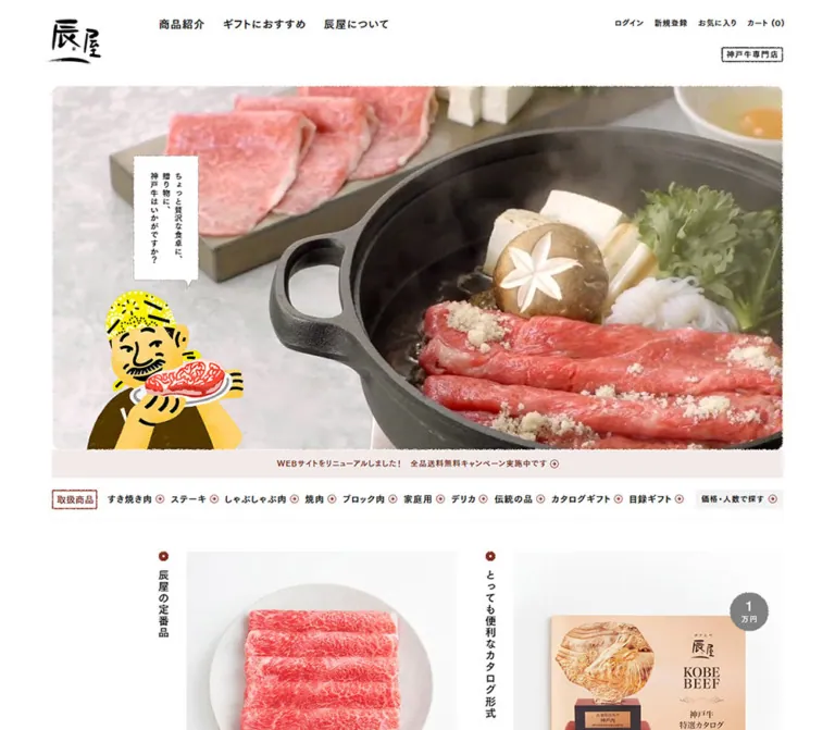
神戸元町辰屋|写真と縦書きで魅せる神戸牛通販サイト
白い余白に神戸牛の写真、縦書きの見出し、親しみのある店主イラストを組み合わせたECサイト。赤茶のアクセントと濃灰のフッターが、老舗らしい落ち着きと温かさを支えている。
Kobe Motomachi Tatsuya — Style Reference
A premium beef catalog with the warmth of a neighborhood butcher: generous white space, vertical Japanese captions, and an illustrated shopkeeper.
Original URL: https://www.kobebeef.co.jp/
Final URL: https://www.kobebeef.co.jp/
Theme: white storefront with brick-red accents and a charcoal footer; no selectable theme was evidenced.
Inspected: October 5, 2026, at 05:38:48 JST. Supplied retrieval timestamp: 2026-10-04T20:38:48.391Z.
Viewports: desktop 1440 × 1000 and mobile 390 × 844 CSS pixels.
Scope: the current Japanese storefront homepage, including its opening media, category directory, thirteen product entries, membership programs, shop introduction, news, newsletter link, social links, store information, calendar, and persistent support artwork. Linked destination pages and opened overlays were not inspected.
Tatsuya uses food photography as its main visual argument. Large images of marbled beef sit against quiet white space, while modest Japanese typography supplies product names, quantities, prices, and reviews. A brush-lettered wordmark, small shop stamps, imperfect edges, and a smiling illustrated shopkeeper make the presentation feel personal. Brick red connects the language announcement, small arrows, review stars, and promotional emphasis. Yellow belongs primarily to the character artwork.
The homepage is a working shop with multiple shopping routes. Desktop composition begins with a broad cooking scene, then shifts into a narrower catalog beside a left identity rail. Two products receive large opening positions; subsequent products form three-column rows. On mobile, the catalog becomes one column, its vertical captions become horizontal headings, and a deliberate left lane remains beside much of the content. Preserve these changes in hierarchy and alignment when adapting the design.
閉じる
Kobe Motomachi Tatsuya — Style Reference
A premium beef catalog with the warmth of a neighborhood butcher: generous white space, vertical Japanese captions, and an illustrated shopkeeper.
Original URL: https://www.kobebeef.co.jp/
Final URL: https://www.kobebeef.co.jp/
Theme: white storefront with brick-red accents and a charcoal footer; no selectable theme was evidenced.
Inspected: October 5, 2026, at 05:38:48 JST. Supplied retrieval timestamp: 2026-10-04T20:38:48.391Z.
Viewports: desktop 1440 × 1000 and mobile 390 × 844 CSS pixels.
Scope: the current Japanese storefront homepage, including its opening media, category directory, thirteen product entries, membership programs, shop introduction, news, newsletter link, social links, store information, calendar, and persistent support artwork. Linked destination pages and opened overlays were not inspected.
Tatsuya uses food photography as its main visual argument. Large images of marbled beef sit against quiet white space, while modest Japanese typography supplies product names, quantities, prices, and reviews. A brush-lettered wordmark, small shop stamps, imperfect edges, and a smiling illustrated shopkeeper make the presentation feel personal. Brick red connects the language announcement, small arrows, review stars, and promotional emphasis. Yellow belongs primarily to the character artwork.
The homepage is a working shop with multiple shopping routes. Desktop composition begins with a broad cooking scene, then shifts into a narrower catalog beside a left identity rail. Two products receive large opening positions; subsequent products form three-column rows. On mobile, the catalog becomes one column, its vertical captions become horizontal headings, and a deliberate left lane remains beside much of the content. Preserve these changes in hierarchy and alignment when adapting the design.
How to Read This Reference
- Measured values come from the supplied rendered DOM, computed styles, or explicit viewport metadata. Element coordinates describe the sampled state and are not universal positioning rules.
- Calculated values are arithmetic relationships between those measurements, such as the
178pxdesktop content inset. - Visual estimates describe the current-page screenshots where a corresponding computed property was not supplied. They are marked with approximately or an explicit qualification.
- Recommendations describe a new implementation. Breakpoints, CSS class names, accessible states, and fallback geometry below are implementation choices unless identified as measured.
- Font-family strings identify the declared computed stack. They do not independently establish which font file rendered every glyph.
- Desktop screenshots cover the opening, a product section, and the footer. Mobile screenshots cover the opening and footer; mobile catalog geometry is supported by DOM measurements rather than a supplied catalog screenshot.
- Generic
--chakra-*and--tw-*properties appear in the property inventory. Their presence does not establish the storefront’s design system, palette, or implementation framework.
Tokens — Colors
Default Palette
Token names are reusable aliases, not recovered source variable names.
| Name | Value | Suggested token | Evidence and role |
|---|---|---|---|
| White | #ffffff |
--paper |
Visible main canvas; also measured on specific white elements. The body itself computes to a transparent background. |
| Black Ink | #000000 |
--ink |
Measured primary text color; also the visible wordmark and principal linework. |
| Brick Red | #803126 |
--brick |
Exact source property --jdgm-paginate-color. The banner, stars, arrows, and captured newsletter treatment visually share this red-brown family; their individual fills were not all sampled. |
| Announcement Blush | #f2eae9 |
--announcement |
Measured background of the media-mention strip below the hero. |
| Action Gray | #f3f3f3 |
--action-surface |
Measured on the price/party-size filter, catalog continuation link, and newsletter anchor in the DOM snapshot. |
| Program Gray | #f7f7f7 |
--program-surface |
Measured backgrounds of the three membership and referral cards. |
| Footer Charcoal | #333333 |
--footer |
Measured full-width footer background. Also measured on the English language link in the white header. |
| Muted Gray | #999999 |
--muted-on-dark |
Measured map link and closed-date text in the footer calendar. |
| Outside-Month Gray | #4c4c4c |
--calendar-outside |
Measured calendar dates outside the displayed month. |
| Outlined-Date Gray | #b2b2b2 |
--calendar-marked |
Measured text color of the outlined October 5 date. |
| Fine Rule | approximately #cccccc |
--rule |
Visual estimate for pale separators on white. Exact border colors were not supplied. |
| Chat Gray | approximately #808080 |
--chat-surface |
Visual estimate for the rectangular support tab. |
| Character Yellow | approximately #f5e600 |
--character-yellow |
An illustration-only approximation. Actual artwork contains several yellows, ochres, black, and brown. |
Palette Interpretation
White is the dominant interface surface. The warm browns and pinks occupying much of the opening screen come from cooking footage and meat photography, not from a tinted page background. Keep photographic color separate from semantic UI tokens.
Brick red is restrained but recurring. Use it for small directional marks, stars, promotional emphasis, and the language banner. Keep the shopping catalog predominantly white, black, and muted gray. The mascot’s bright yellow should not become a universal button color.
Newsletter evidence differs by layer or state: the desktop footer capture shows a brick-red newsletter panel with light text. The sampled anchor reports #f3f3f3 with black text. The evidence does not establish whether descendants, pseudo-elements, hover, or capture timing explain this difference. Treat the red appearance as a captured rendered treatment, not a proven default or hover rule. The Quick Start exposes it as an explicit modifier.
Tokens — Typography
Japanese Body — TsukuGoPr5-L
The body’s measured stack begins with TsukuGoPr5-L, followed by Japanese Gothic fallbacks including Hiragino Kaku Gothic Pro W3, Yu Gothic Medium, Yu Gothic, and Meiryo equivalents.
- Computed base:
12px, weight400,12pxline height,0.96pxtracking. - Character: light, open Japanese sans-serif forms with conspicuous breathing room between characters.
- Role: supporting text, inherited product-link typography, and quieter interface details.
- Implementation caution: the base
12pxline height is not the reading line height of every paragraph. Child elements override it.
Japanese Navigation and Headings — TsukuGoPr5-D
Primary navigation, category links, product-story headings, program headings, and footer text commonly begin with TsukuGoPr5-D.
The measured weight remains 400. The hierarchy comes partly from a different named face, not an across-the-board font-weight: 700 rule. Preserve that distinction if the fonts are available; otherwise choose a deliberate fallback weight and verify its density.
Latin Utilities — Helvetica Identifiers
HelveticaNeueLTPro-Romanbegins the stack for English links and the language-banner controls.HelveticaNeueLTPro-Mdbegins the stack for calendar dates and the month label.- Arial appears as a fallback.
- The English banner link uses weight
600; sampled language links and calendar labels generally use400.
No font URLs were provided. Do not invent font files or infer licensing from a family identifier.
Wordmark and Artwork Lettering
The brush-style 辰屋 identity is artwork, not evidence of a calligraphic font used for the interface. The bordered 神戸牛専門店 mark likewise behaves visually as a compact shop seal. Keep ordinary headings in the measured Gothic families.
Type Scale
| Role | Desktop measurement | Mobile measurement | Tracking and notes |
|---|---|---|---|
| Body inheritance | 12px / 12px |
Same | 0.96px; individual reading elements override leading. |
| Primary navigation | 18px / 32px |
Replaced by compact controls in the captured header | 1.26px; TsukuGoPr5-D, weight 400. |
| Account/cart utilities | 13px / 13px |
Icons replace these text groups in the header | 0.96px; link padding enlarges the box. |
| English header link | 13px / 30px |
10px / 10px |
0.96px. |
| Header descriptor | 13px / 13px |
11px / 11px |
0.96px; mobile copy is shorter. |
| English banner link | 14px / 21px |
12px / 18px |
0.56px and 0.48px; weight 600. |
| Announcement anchor | 13px / 28px |
13px / 28px |
0.96px desktop, 1.82px mobile; nested text may have its own leading. |
| Introductory heading | 13px / 22.1px |
Same | 0.96px; inline with the explanatory passage. |
| Category links | 15px / 32px |
15px / 28px |
1.35px desktop, 0.96px mobile. |
| Product-story heading | 18px, vertical arrangement |
18px / 28px, horizontal |
1.08px desktop, 0.96px mobile. |
| Program heading | 18px / 27px |
17px / 25.5px |
0.96px. |
| Program body | 15px / 26px |
14px / 24px |
0.96px. |
| Newsletter anchor | 18px / 28px |
15px / 28px |
2.34px desktop, 0.96px mobile. |
| Footer contact links | 13px / 28px |
13px / 31.2px |
1.56px. |
| Footer navigation | 12px / 24px |
11px / 20.9px |
0.96px. |
| Calendar date | 11px / 11px |
13px / 13px |
0.44px desktop, 0.39px mobile. |
Product names look approximately 15px, prices approximately 13px, and review metadata approximately 12px in the desktop product capture. These are visual estimates: the sampled product anchors expose inherited 12px typography, not the complete child styles.
The desktop product-story headings report line-height: 0px on an inline-flex container. This is a container-level result, not a usable paragraph recipe. For a fresh implementation, native vertical writing with an explicit readable line height is a safer approximation.
Tokens — Spacing & Shapes
The layout mixes generous structural space with compact shopping details. There is no evidence of a single source spacing scale. The following measurements can be organized into reusable tokens without claiming they were authored that way.
Layout Measurements
| Element | Desktop at 1440 × 1000 | Mobile at 390 × 844 | Evidence |
|---|---|---|---|
| Main outer frame | x: 114px, width 1212px |
x: 18px, width 354px |
Measured. |
| Outer side margins | 114px each |
18px each |
Calculated from the frame. |
| Opening main position | y: 205px |
y: 150px |
Measured. |
| Cooking hero | Approximately 1212 × 682px |
Approximately 354 × 441px |
Screenshot geometry; near 16:9 and 4:5. |
| Notice strip | 1212 × 46px |
354 × 89px |
Measured; mobile copy wraps. |
| Later content alignment | Mostly x: 292px, width 1034px |
Products/news mostly x: 68px, width 304px |
Measured. |
| Content inset inside outer frame | 178px |
50px |
Calculated. |
| Featured product-link width | 447px |
304px |
Measured; two desktop lead entries become individual mobile entries. |
| Standard product-link width | 267px |
304px |
Measured. |
| Heading-to-image origin offset | About 46px horizontally |
53px vertically |
Calculated from heading and link coordinates. |
| Standard desktop card group pitch | 361px |
Not applicable | Calculated between product-link origins. |
| Repeating standard row pitch | Usually 404px; one wrapping row is 427px |
Usually approximately 482px |
Calculated; content-dependent. |
| Program cards | About 328.7 × 247px, three across |
290px wide, stacked |
Measured. |
| Program-card gaps | 24px |
16px |
Calculated. |
| Newsletter anchor | 1034 × 112px |
304 × 81px |
Measured; appearance has the state/layer caveat above. |
| Footer | Full width, 570px tall |
Full width, 1119.75px tall |
Measured in the captured content state. |
| Document height | 5294.42px |
10954.58px |
Measured; not a height to hardcode. |
The desktop catalog geometry can be approximated with a 46px caption lane inside each group and approximately 48px between groups. Within the 1034px content region, this gives two 447px featured image/link columns or three approximately 267px standard columns. This is a reconstruction from coordinates, not a recovered grid declaration.
Useful Spacing Aliases
| Alias | Value | Basis |
|---|---|---|
| Hero-to-notice separation | Approximately 5px |
Visible spacing and neighboring measured coordinates. |
| Mobile outer inset | 18px |
Measured main frame. |
| Program gap, mobile | 16px |
Calculated from stacked card positions. |
| Program gap, desktop | 24px |
Calculated from adjacent card positions. |
| Program padding, desktop | 32px 28px |
Measured. |
| Program padding, mobile | 26px 22px 28px |
Measured. |
| Mobile story-heading clearance | 25px below a 28px line box |
Calculated before each product link. |
| Desktop content rail reservation | 178px |
Calculated. |
| Mobile catalog rail reservation | 50px |
Calculated. |
| Extra mobile program inset | 14px |
Programs start at 82px, products at 68px. |
| Space after main before footer | 104px desktop, 74px mobile |
Calculated from measured main and footer bounds. |
Border Radius and Edge Treatment
| Element | Treatment | Evidence |
|---|---|---|
| Product links and major action bands | Square containers | Measured 0px radius and visible geometry. |
| Program cards | 2px radius |
Measured. |
| English banner link | 999px radius |
Measured capsule. |
| Calendar navigation | 2px radius |
Measured. |
| Calendar day boxes | 50% radius on 20 × 20px boxes |
Measured. |
| Hero corners | Softly rounded, approximately 12–16px, with an irregular edge |
Visual estimate; exact masking method unknown. |
| Small directional icons | Thin outlined circles, approximately 16–18px |
Visual estimate. |
| Newsletter arrow | Approximately 32px outlined circle |
Visual estimate. |
| Speech bubbles | White rectangles with a pointed tail and distressed perimeter | Screenshot observation; no mask asset supplied. |
Avoid turning the irregular edges into a general torn-paper background. Most of the page is clean white; texture is concentrated at image boundaries, stamps, speech bubbles, and character artwork.
Components
Language Announcement Bar
Role: offer the English storefront before the main shopping interface.
A full-width brick-red strip contains a short English sentence, an outlined capsule link, and a separate close control. Its visible height is 63px on desktop and 68px on mobile. The combined sentence/link group is near the center; the close control is positioned toward the right edge.
The desktop link measures approximately 155 × 35px, with 6px 16px padding. Mobile reduces it to approximately 130 × 30px, with 5px 12px padding. White type and a thin light outline provide contrast without a second filled button.
The mobile footer capture still shows this bar at the top of the viewport. It is absent from the supplied desktop footer capture. Dismissal behavior, persistence across visits, and subsequent layout changes were not tested.
Main Header and Scrolled Identity
Role: identify the shop and provide navigation, account access, language selection, and cart access.
At the desktop opening, the header spans the 1212px outer frame. The wordmark anchor is 93 × 75px at x: 102px, y: 95px; its brush strokes extend slightly left of the main frame. Three primary links begin beside the reserved identity area: 商品紹介, ギフトにおすすめ, and 辰屋について.
Each primary link uses a 64px-high box with 16px 15px padding. Smaller utility links occupy the upper right. Below them, a bordered specialty-store stamp and a right-aligned one-line description establish the shop’s identity without an oversized headline.
Mobile uses a 57 × 46px wordmark anchor, a horizontal specialty stamp, small language links, a bag icon, and a three-line menu icon. The sampled menu target is #/m/menu; the open menu was not captured. The descriptor is shortened to fit the right side of the header.
The desktop footer capture shows a compact horizontal header, while the product capture shows the left wordmark and vertical shop stamp without that full horizontal navigation. The DOM also contains a second 100px header positioned above the initial viewport. Together these support a separate scrolled presentation, but do not establish its activation threshold or scroll-direction rules.
Cooking Hero with Shopkeeper and Speech Bubble
Role: establish appetite and personal service before product browsing.
The desktop capture shows a slice of marbled beef held over a steaming cooking vessel. The mobile capture shows beef on a grill, lifted with chopsticks. Both are tightly composed food scenes with natural photographic color.
The frame changes from a broad landscape area to a tall mobile crop. A textured shopkeeper illustration overlaps the lower right, and a narrow white speech bubble sits above it. In the desktop capture the bubble is approximately 108px wide; in mobile it is approximately 76px wide. The Japanese copy is vertically arranged.
The character is not a generic icon: a yellow patterned headscarf, expressive black facial marks, dark brown clothing, and uneven printed texture carry the shop’s friendliness. Keep the media, bubble, and character as separate compositional layers.
A video-initialization reference and a desktop poster path are present in the supplied DOM text. Playback timing, sound, looping, mobile media selection, and available controls were not verified. The different captured scenes do not by themselves establish a carousel or its sequence.
Media Mention and Quality Introduction
Role: connect a current announcement to a short explanation of the shop’s offer.
Immediately below the hero, a pale blush strip links to a media-mention article. Its text appears brick red in the screenshots and ends with a small circled arrow. Desktop uses one centered line inside a 46px band. Mobile becomes an 89px block with three visible lines and more pronounced character spacing.
The following introduction remains small and editorial. It describes Kobe beef quality and fulfillment, with an inline heading and an underlined reference link. At mobile width it becomes a readable multiline paragraph spanning the full 354px opening frame. Preserve the modest scale; it is supporting context rather than another hero headline.
Category Directory
Role: let visitors browse by cut, use, gift format, price, or party size.
Desktop presents the 取扱商品 stamp, ten category links, and a neutral price/party-size action in a horizontal directory. The category links have tall 72px boxes despite relatively small 15px text.
Mobile places the ten categories in two columns. Each measured link is 168px wide and 28px tall; the columns are separated by 18px, and successive rows begin 46px apart. The price/party-size action becomes a full-width 354 × 44px strip below the directory.
A second category sequence appears after the mobile catalog continuation link. Its measured children extend horizontally beyond the viewport. The evidence does not show whether users scroll it, whether it animates, or how it is clipped. Any implementation of that sequence should provide deliberate overflow behavior rather than accidental page overflow.
Featured Product Pair and Standard Product Grid
Role: combine editorial recommendations with product-level shopping information.
The current desktop catalog begins with two large entries: beef jerky and a sukiyaki product. Their links are 447px wide. The following entries use a three-column arrangement of 267px links. The final row contains two entries and retains the unused space at the right.
Each product group has distinct parts:
- A short recommendation or use-case heading beside the image, often introduced by a small brick-red rosette.
- A square product photograph, gift image, or package image.
- An occasional small image-corner label, such as
セットor配送日指定不可. - A product-name line with a small circled arrow at the right.
- A quieter quantity and price line.
- A review row with brick-red stars, a numeric score, and a review count where present.
The product photograph and its name/price content are represented by a product anchor in the supplied DOM. Review-widget click behavior is not established. Do not assume every part is a separate action or introduce nested links.
Desktop recommendation headings use a narrow vertical arrangement at the left of each image. The visible product heading box can be only 16px wide while its glyph size is 18px; this reflects the original’s specialized text construction. Native writing-mode: vertical-rl is a practical adaptation, not a measured source declaration.
Mobile changes these recommendations to horizontal 18px / 28px headings above each product. The product link is 304px wide at x: 68px, preserving the left lane. All thirteen items form one column. Longer names increase their block height; do not force every entry into a fixed-height card.
Product Metadata and Reviews
Role: make the catalog informative without surrounding each product with heavy chrome.
The photograph has no padded card shell or elevated surface. Metadata sits directly on white, aligned to the image’s left edge. Product names are darker than quantities and prices. Review stars add a small but repeated red accent.
The desktop screenshot includes scores such as 4.87 / 47 for the selected shabu-shabu item and 5.00 / 17 for the boxed yakiniku selection. These are captured content, not permanent design constants. Bind prices, quantities, availability labels, and ratings to product data.
Thin image-edge details and small arrows give the entries definition. Avoid adding large filled purchase buttons to every catalog item unless the new shopping flow requires them; the inspected homepage entries primarily lead to product pages.
Catalog Continuation Action
Role: lead from the curated selection to the complete catalog.
A broad #f3f3f3 link closes the product sequence. Desktop measures approximately 1035 × 80px, with 26px top and bottom padding. Mobile measures 290 × 99px at x: 82px, and its message wraps to two lines.
This action continues the content alignment rather than spanning the entire viewport. It should feel like a quiet directory sign, with generous internal space and restrained typography.
Membership and Referral Programs
Role: explain repeat-purchase benefits after product browsing.
Three linked cards describe points, the official LINE account, and the referral program. Desktop cards are approximately 328.7px wide, share a 247px height in the sampled content, and are separated by 24px.
Their anatomy is a small program label, an 18px / 27px heading, a 15px / 26px explanatory paragraph, and an optional text action. The background is #f7f7f7; the 2px radius is almost square. Padding is 32px 28px.
Mobile stacks the cards with 16px gaps and 26px 22px 28px padding. Heading size becomes 17px, body size 14px, and card heights vary with wrapping. The group is 290px wide, starting 14px farther right than the product list.
Shop Introduction and Adjacent Media Controls
Role: give the store a human and historical context between commercial content and news.
The DOM contains a linked shop-introduction passage and two unlabeled 88 × 88px buttons around the preceding media region. The introduction link measures 370 × 270px on desktop and 270 × 236px on mobile.
The supplied screenshots do not show this complete section. Its exact image composition, button artwork, and media sequence are therefore unverified. Retain the existence and placement of the story section in a page plan, but do not fabricate a specific photograph or carousel behavior.
News List
Role: communicate recent coverage and store events.
Desktop uses another vertical section heading, three compact dated rows, and a small list-index link toward the right. Each sampled news anchor is 841px wide and 28px tall. Dates, category labels, and titles share each row.
Mobile makes the section heading horizontal. Each news anchor is 304 × 88px, with 14px vertical padding, allowing the same information to wrap. Preserve dates and category labels as distinct metadata rather than turning every announcement into an image card.
Newsletter and Social Links
Role: create a final ongoing-contact opportunity before store information.
The desktop newsletter panel is approximately 1034 × 112px. Its measured padding is 39px 40px 37px 49px. The screenshot shows a red field, a light 18px title, subdued supporting text, and a large outlined arrow at the far right. Apply the earlier state/layer caveat when reproducing this appearance.
Below it, a sentence invites visitors to follow the shop. A fine rule bridges the open space toward three named social links, each with a small arrow. The desktop composition is horizontal and airy.
Mobile social anchors are stacked, each 304 × 46px, with 12px top and 11px bottom padding. The newsletter anchor itself is only 81px high in the mobile DOM sample; the exact presentation of its supporting copy was not visually captured.
Store Footer and Business Calendar
Role: provide operational confidence, contact details, shopping help, policies, and closure information.
The footer switches to a full-width #333333 surface. Desktop keeps its main information aligned with the catalog at x: 292px. Store details occupy the left, while a compact calendar sits near the right edge. Contact values are white; supporting labels and notes are quieter gray. The map link is underlined.
The calendar has a month label, two small navigation controls, seven weekday columns, and six date rows. Day boxes are 20 × 20px, while desktop columns are spaced approximately 41px apart. Closed dates use hatching; outside-month dates are dark gray. October 5 has a circular outline, but its exact current-date or selection semantics were not exercised.
The sampled previous/next buttons are only 14 × 14px. Their visual size can be retained inside larger hit areas in a new implementation. This calendar communicates business closures; there is no evidence that it is a booking interface.
Mobile stacks the store details, address, calendar, and footer links. The content continues to start near x: 68px. The calendar’s date text increases from 11px to 13px, an important exception to the general tendency to reduce mobile type. Footer links wrap into several short rows, followed by language links and a quiet copyright line.
Persistent Shopkeeper and Chat Tab
Role: keep the shop’s personal-service voice present during a long browsing session.
In the desktop product and footer screenshots, a speech bubble, illustrated shopkeeper, and gray chat rectangle occupy consistent positions near the lower left. The chat rectangle is approximately 110 × 64px; the character extends beyond it. This placement visually reads as a persistent companion beside the content.
Mobile compresses the treatment into the far-left lane: a narrow vertical speech strip, a partly cropped character, and an approximately 49px-wide gray consultation tab. The footer screenshot also shows white header artwork over the charcoal area.
The available evidence does not establish the chat provider, opening animation, dismissal behavior, or whether the underlying positioning uses fixed or sticky elements. Do not replace this treatment with an unrelated floating circular chat icon if preserving the visual identity is the goal.
Tokens — Motion & Interaction
Measured Transition Declarations
| Element | Supplied computed transition | What it establishes |
|---|---|---|
| Many navigation and text links | opacity 0.2s cubic-bezier(0.25, 0.46, 0.45, 0.94) |
A short opacity transition is defined; the target opacity and exact trigger were not supplied. |
| English banner link | background-color 0.2s, color 0.2s |
Color changes have a 200ms transition; before/after interaction states were not captured. |
| Banner close control | opacity 0.15s |
A 150ms opacity transition is defined. |
| Mobile wordmark container | transform 0.2s cubic-bezier(0.165, 0.84, 0.44, 1) |
Transform changes can animate; transform endpoints and triggers remain unknown. |
| Mobile header descriptor | opacity 0.2s cubic-bezier(0.165, 0.84, 0.44, 1) |
A short descriptor fade is defined. |
| Paired buttons near the story region | transform 0.4s cubic-bezier(0.895, 0.03, 0.685, 0.22) 0.5s and opacity 0.3s ease-in-out 0.5s |
Delayed transform and opacity transitions exist; the associated interaction was not tested. |
Numerous sampled elements report transition: all without a nonzero duration and animation: none. These values are not evidence of an active animation.
Observed Behavior and Limits
- Scrolled captures establish different header and companion-art presentations at different page positions. They do not establish the exact activation logic.
- The DOM supports a media-based hero, but no playback timeline, audio state, or loop length was recorded.
- Speech copy and character poses differ between captures. The evidence does not establish whether changes are timed, random, responsive, or state-dependent.
- Menu, language-banner dismissal, chat, calendar navigation, product navigation, and account flows were not exercised.
- The capture procedure waited for visible image decoding and finite layout motion, temporarily pausing perpetual animations during readiness checks. A settled screenshot is not proof that the live page is static.
For a new implementation, keep ordinary feedback brief and quiet. Use opacity and small state changes around the media and artwork. Avoid inventing parallax, card lifts, bouncing characters, or a timed carousel without an independent product requirement.
Surfaces
| Surface | Appearance | Structural purpose |
|---|---|---|
| Storefront canvas | White, mostly untextured | Gives photographs and vertical captions room. |
| Product area | White with exposed image edges | Organizes merchandise without card elevation. |
| Announcement strip | Pale blush | Separates a timely notice from the cooking scene. |
| Directory actions | Very light gray, square | Provides broad but quiet navigation targets. |
| Program cards | Slightly lighter gray, 2px corners |
Groups explanatory benefits. |
| Language bar | Brick red with white details | Makes the English route immediately visible. |
| Newsletter, captured desktop treatment | Brick red with light type | Supplies a final promotional emphasis. |
| Footer | Charcoal with white and gray text | Distinguishes operational information from shopping. |
| Speech bubbles | White with imperfect edges | Connects readable copy to the illustrated shopkeeper. |
| Chat tab | Medium gray with white details | Keeps consultation available beside the page. |
There is no general shadow-based elevation system in the visible catalog. Separation comes from space, image boundaries, thin rules, restrained surface changes, and the strong footer contrast.
Imagery
Food Photography
Use two photographic modes. The opening scene is immersive and close: chopsticks, marbling, steam, heat, and cooking equipment. Product imagery is controlled and descriptive: overhead meat arrangements on pale plates, prepared-food packages, gift materials, and a dark divided presentation box.
Product images generally occupy square fields. Pale backgrounds and centered arrangements make differences in cuts, quantities, and packaging easy to compare. Retain natural red and pink meat tones and visible fat marbling. The premium impression comes from detail and composition, not artificial gold overlays or heavy saturation.
Character and Graphic Identity
The shopkeeper illustration introduces a different material quality: flat color, rough ink, irregular outlines, and a humorous face. Its yellow headscarf and dark clothing remain legible beside both photographs and the dark footer. Different captured poses belong to the same character system.
Small rosettes, imperfect stamp outlines, circled arrows, and distressed speech-bubble edges reinforce this printed character. Keep these accents selective. The brush wordmark should remain a supplied graphic rather than a substitute typed in a decorative font.
Observed Asset References
Only one explicit image asset URL is recoverable from the supplied original-page text. It is a reference, not an asset bundled with this document.
| Asset | Observed reference | Confidence and use |
|---|---|---|
| Desktop hero poster | https://www.kobebeef.co.jp/cdn/shop/t/7/assets/mov-kv-alt-pc.jpg?v=124654145620283502101599206030 |
Referenced by the page’s video-initialization text; not independently fetched during this analysis. |
| Hero media | Identifiers kvVideo and mov-kv appear in initialization text |
Identifiers only; complete media URLs and playback settings were not supplied. |
| Product photographs | Visible in current desktop captures | Individual file URLs were not included. |
| Wordmark, shopkeeper, seals, and edge artwork | Visible in current desktop/mobile captures | Individual file URLs and production formats were not included. |
Do not infer missing mobile poster, video, font, or character filenames from naming conventions. The CSS starter reproduces the layout and offers simple geometric fallbacks; it does not reproduce the original artwork or its edge masks.
Layout & Responsive Behavior
Desktop Structure
The opening uses the full 1212px centered frame. The hero begins at 205px, with the notice and quality introduction directly below. The category directory spans this broad frame before the layout reserves a left identity lane.
The main shopping region then starts around 292px, leaving a calculated 178px inset within the outer frame. This region contains the two-feature opening, three-column catalog, continuation action, program cards, news, newsletter, and social links. The footer preserves the same principal alignment.
This is an intentionally asymmetric page. Centering every section independently or making all merchandise images the same desktop size would erase its structure.
Mobile Structure
The opening uses 18px side margins and a 354px content width. The hero becomes portrait-shaped. The announcement and introductory paragraph remain full width within those margins, followed by a two-column category directory.
The product sequence then shifts right to x: 68px, becoming 304px wide. Recommendation headings rotate back to horizontal text. Each product is presented individually, and the two large desktop lead entries join the same mobile width as the remaining products.
Some later blocks use an additional inset: the continuation action and program cards start at 82px and are 290px wide. News, newsletter, social links, and much of the footer return to the 68px alignment. The narrow left lane accommodates the persistent support treatment.
Responsive Evidence Boundary
| Change | Supported observation | Unverified detail |
|---|---|---|
| Main navigation | Text navigation on desktop; bag/menu controls on mobile | Exact breakpoint and opened-menu layout. |
| Hero shape | Approximately 16:9 desktop and 4:5 mobile |
Source aspect-ratio rule and media focal-position settings. |
| Product columns | Two lead entries, then three columns on desktop; one column on mobile | Intermediate tablet arrangements. |
| Product-story headings | Vertical desktop arrangement; horizontal mobile headings | Original glyph-level implementation. |
| Program cards | Three across to three stacked cards | Intermediate wrapping rules. |
| Social links | Horizontal desktop grouping; stacked mobile links | Intermediate breakpoint. |
| Footer | Store/calendar columns to a long stacked layout | Exact responsive CSS rules. |
| Persistent chrome | Mobile language banner remains visible near the footer | Positioning method and visibility thresholds. |
The Quick Start uses 64rem as a recommended layout breakpoint. This value was not recovered from the source. Test intermediate widths and zoom before adopting it unchanged.
Do’s and Don’ts
Do
- Preserve the white canvas, black typography, brick-red details, and charcoal footer.
- Let close food imagery carry the opening instead of adding an oversized marketing headline.
- Keep two prominent desktop products before the smaller three-column catalog.
- Reserve the left identity lane and retain its narrower mobile counterpart.
- Use vertical Japanese recommendations beside desktop images and horizontal headings above mobile products.
- Keep product names, portions, prices, and reviews clearly separated but visually compact.
- Preserve the distinction between natural photography and rough printed character artwork.
- Use small circled arrows, rosettes, and shop seals as recurring details.
- Allow longer product names and program descriptions to change component height.
- Treat calendar closures, shopping links, and store information as useful parts of the shop experience.
Don’t
- Don’t recast the homepage as a single conversion funnel with repeated oversized CTA sections.
- Don’t replace the catalog with uniformly rounded, shadowed cards.
- Don’t center away the content’s deliberate left/right imbalance.
- Don’t keep vertical product headings on the measured mobile layout.
- Don’t turn the mascot’s yellow into a general action color.
- Don’t add texture to the entire white page or apply a gold-and-black luxury theme.
- Don’t treat the wordmark as evidence for a decorative body font.
- Don’t copy the vertical-heading container’s zero line height into readable text.
- Don’t infer hover endpoints, chat behavior, or autoplay settings from transition declarations alone.
- Don’t claim that the red newsletter capture establishes its default interaction state.
Recommended Implementation Additions
These are recommendations for a new implementation, not verified features of the inspected page.
- Enlarge the hit areas around the
14pxcalendar arrows and compact mobile controls while retaining their small visible artwork. A44pxtarget is a useful default for essential touch controls. - Give the menu, bag, close button, calendar arrows, and consultation control explicit accessible names. Keep a visible keyboard-focus outline on both white and charcoal surfaces.
- Keep vertical captions in logical text order. Use CSS writing mode rather than individually positioned characters when the resulting typography is acceptable.
- Expose numeric ratings and review counts as text; decorative stars should not be the only accessible representation.
- Preserve space for the left consultation tab so it cannot cover prices, footer links, or the currently focused control. Verify the scrolled mobile header against the address and calendar.
- Describe closed dates textually as well as with hatching. Use noninteractive date markup if dates are informational, and reserve buttons for actual actions.
- Improve contrast for essential footer copy. Dark outside-month dates may be intentionally subdued, but information needed to understand store availability should remain readable.
- Offer a static hero poster and respect reduced-motion preferences in media playback code. Do not assume CSS transition suppression pauses a video.
- Reserve media dimensions before loading, load below-the-fold product images lazily, and preserve useful product alternatives when imagery fails.
- Implement the secondary mobile category strip as an intentional, keyboard-accessible overflow region or a wrapping list. Do not allow its long row to widen the document.
Agent Prompt Guide
Quick Color Reference
- Canvas: white
#ffffff. - Primary type and linework: black
#000000. - Restrained brand accent: brick red
#803126; exact evidence comes from the review pagination token. - Hero notice: blush
#f2eae9. - Directory actions:
#f3f3f3. - Membership surfaces:
#f7f7f7. - Footer: charcoal
#333333. - Bright yellow: confined to character artwork; do not use it as a general CTA fill.
Overall Prompt
“Create a Japanese premium beef storefront inspired by the current Kobe Motomachi Tatsuya homepage. Use a white canvas, compact Japanese Gothic typography with open tracking, small brick-red arrows and review stars, and a full-width charcoal store-information footer. Begin with a broad cooking-media frame, an illustrated shopkeeper at the lower right, and a narrow vertical speech bubble. Follow it with a blush announcement strip and a category directory. On desktop, reserve a left identity rail and present two large featured products followed by three-column product rows. Place vertical recommendation headings beside square product images, then product names, quantities, prices, and reviews beneath. On mobile, use a portrait hero, two-column category links, one-column products with horizontal headings, and a narrow left lane for consultation artwork. Keep program cards almost square-cornered and avoid elevated product-card shells. Treat unverified media, menu, calendar, and chat behavior as separate implementation decisions.”
Example Component Prompts
- Product group: “Build a white catalog entry with a narrow vertical Japanese recommendation at left, a square pale-background food photograph, a modest product-name line with a small brick-red circled arrow, gray quantity/price text, and a compact rating row. At mobile width, move the recommendation above the image and retain a left content inset. Allow text wrapping to increase height.”
- Cooking hero: “Use a 16:9 desktop cooking scene and an approximately 4:5 mobile frame. Layer a rough printed shopkeeper illustration at the lower right and a white vertical speech bubble above it. Keep the food sharp and naturally colored. Use a simple rounded edge only as a fallback for the original irregular mask.”
- Header: “Compose a brush-lettered shop identity at left, three restrained Japanese navigation links, small account utilities at right, and a compact specialty-store stamp. Mobile should show a smaller wordmark, language links, a bag icon, and a menu icon. Keep the English-language announcement in a separate brick-red strip.”
- Store footer: “Create a charcoal footer aligned with the inset catalog. Place white contact values and gray labels at left, a compact seven-column closure calendar at right, and small wrapped utility links below. Stack the regions on mobile while retaining room beside the left consultation tab. Use hatching plus text for closures.”
- Newsletter panel: “Create a broad, nearly square-cornered newsletter link with an 18px title and an outlined arrow. Support both a neutral-gray surface and an explicit brick-red presentation matching the captured desktop treatment. Do not assume the color modifier is a hover state.”
Quick Start
CSS Custom Properties
This is an adaptation, not the original stylesheet. It reproduces the principal measured widths at the two inspected viewports, approximates the catalog geometry, and supplies explicit responsive rules. The 64rem breakpoint, hover endpoint, focus treatment, and simple hero radius are recommendations. Font files, original edge masks, media playback, menu behavior, calendar logic, and chat integration require separate implementation.
Use .site-frame for the outer opening frame. Place later content inside .inset-content. Use separate .product-grid--featured and standard .product-grid containers for the desktop hierarchy. The optional .newsletter--brick class reproduces the captured red treatment without assigning an unverified trigger.
:root {
  /* Measured colors, except the estimated rule and chat colors */
  --paper: #ffffff;
  --ink: #000000;
  --brick: #803126;
  --announcement: #f2eae9;
  --action-surface: #f3f3f3;
  --program-surface: #f7f7f7;
  --footer: #333333;
  --muted-on-dark: #999999;
  --rule: #cccccc;
  --chat-surface: #808080;

  /* Declared source family identifiers; no font files are bundled */
  --font-body: 'TsukuGoPr5-L', 'Hiragino Kaku Gothic Pro W3',
    'Yu Gothic Medium', 'Yu Gothic', Meiryo, sans-serif;
  --font-heading: 'TsukuGoPr5-D', 'Hiragino Kaku Gothic Pro W3',
    'Yu Gothic Medium', 'Yu Gothic', Meiryo, sans-serif;
  --font-latin: 'HelveticaNeueLTPro-Roman', Arial, sans-serif;
  --font-calendar: 'HelveticaNeueLTPro-Md', Arial, sans-serif;
  --tracking: 0.96px;

  /* Geometry reconstructed from the supplied viewport measurements */
  --frame-max: 1212px;
  --outer-inset: 18px;
  --content-inset: 50px;
  --caption-lane: 46px;
  --catalog-column-gap: 48px;
  --banner-height: 68px;
  --radius-small: 2px;
  --radius-hero-fallback: 12px;

  /* Measured link transition; hover endpoint is chosen below */
  --link-motion: 200ms cubic-bezier(0.25, 0.46, 0.45, 0.94);
}

* { box-sizing: border-box; }
html { font-size: 16px; }
body {
  margin: 0;
  color: var(--ink);
  background: var(--paper);
  font-family: var(--font-body);
  font-size: 12px;
  font-weight: 400;
  line-height: 1.7; /* Recommended readable default */
  letter-spacing: var(--tracking);
}
button, input { font: inherit; }
a { color: inherit; }
img, video { display: block; max-width: 100%; }

.site-frame {
  width: min(calc(100% - 2 * var(--outer-inset)), var(--frame-max));
  margin-inline: auto;
}
.inset-content { margin-inline-start: var(--content-inset); }

.language-banner {
  position: sticky; /* Recommended mobile behavior */
  top: 0;
  z-index: 60;
  color: var(--paper);
  background: var(--brick);
  font-family: var(--font-latin);
  letter-spacing: 0.04em;
}
.language-banner__inner {
  position: relative;
  display: flex;
  align-items: center;
  justify-content: center;
  gap: 12px;
  min-height: var(--banner-height);
  padding-inline-end: 32px;
}
.language-banner__link {
  flex: none;
  padding: 5px 12px;
  border: 1px solid currentColor;
  border-radius: 999px;
  font-size: 12px;
  font-weight: 600;
  line-height: 18px;
  text-decoration: none;
  transition: background-color 200ms, color 200ms;
}
.language-banner__close {
  position: absolute;
  inset-inline-end: 0;
  display: grid;
  place-items: center;
  width: 32px;
  height: 32px;
  padding: 0;
  border: 0;
  color: inherit;
  background: transparent;
  font-size: 20px;
  transition: opacity 150ms;
}

.site-header {
  position: relative;
  display: flex;
  min-height: 82px;
  padding-block: 8px;
}
.brand-logo {
  position: absolute;
  top: 18px;
  left: -7px;
  width: 57px;
  height: 46px;
  object-fit: contain;
}
.primary-nav { display: none; }
.header-tools {
  display: flex;
  align-items: center;
  gap: 12px;
  margin-inline-start: auto;
}
.header-descriptor {
  position: absolute;
  right: 0;
  bottom: 18px;
  margin: 0;
  font-size: 11px;
  line-height: 18px;
  text-align: right;
}

.hero {
  position: relative;
  aspect-ratio: 4 / 5;
  overflow: hidden;
  border-radius: var(--radius-hero-fallback);
}
.hero__media {
  width: 100%;
  height: 100%;
  object-fit: cover;
}
.hero__mascot {
  position: absolute;
  right: 0;
  bottom: 0;
  width: 46%;
  height: auto;
  pointer-events: none;
}
.hero__speech {
  position: absolute;
  top: 33%;
  right: 7%;
  display: grid;
  place-items: center;
  width: 76px;
  min-height: 124px;
  padding: 16px;
  background: var(--paper);
}
.hero__speech p {
  margin: 0;
  writing-mode: vertical-rl;
  font-size: 12px;
  line-height: 1.5;
}
.hero__speech::after {
  content: '';
  position: absolute;
  right: 10px;
  bottom: -12px;
  border-top: 12px solid var(--paper);
  border-right: 8px solid transparent;
}

.announcement {
  display: flex;
  align-items: center;
  justify-content: center;
  gap: 16px;
  margin-block-start: 5px;
  padding: 15px 20px 14px 17px;
  color: var(--brick);
  background: var(--announcement);
  font-family: var(--font-heading);
  font-size: 13px;
  line-height: 1.55;
  letter-spacing: 1.82px;
  text-decoration: none;
}
.introduction {
  margin-block: 33px 30px;
  font-size: 13px;
  line-height: 22.1px;
}
.category-directory {
  display: grid;
  grid-template-columns: repeat(2, minmax(0, 1fr));
  gap: 18px;
}
.category-directory a {
  min-height: 28px;
  font-family: var(--font-heading);
  font-size: 15px;
  line-height: 28px;
  text-decoration: none;
}
.category-directory__filter {
  grid-column: 1 / -1;
  padding: 8px 16px;
  background: var(--action-surface);
}

.product-grid {
  display: grid;
  grid-template-columns: minmax(0, 1fr);
  gap: 38px;
}
.product-grid + .product-grid { margin-block-start: 38px; }
.product { min-width: 0; }
.product__story {
  margin: 0 0 25px;
  font-family: var(--font-heading);
  font-size: 18px;
  font-weight: 400;
  line-height: 28px;
}
.product__body { min-width: 0; }
.product__link {
  display: block;
  text-decoration: none;
}
.product__image {
  position: relative;
  aspect-ratio: 1;
  background: var(--program-surface);
}
.product__image img {
  width: 100%;
  height: 100%;
  object-fit: cover;
}
.product__label {
  position: absolute;
  top: 8px;
  right: 8px;
  color: #666666;
  font-size: 10px;
}
.product__title {
  display: flex;
  align-items: baseline;
  justify-content: space-between;
  gap: 12px;
  margin: 16px 0 0;
  font-family: var(--font-heading);
  font-size: 15px; /* Visual estimate */
  font-weight: 400;
  line-height: 23px;
}
.product__price {
  margin: 4px 0 0;
  color: #666666;
  font-size: 13px; /* Visual estimate */
  line-height: 20px;
}
.product__rating {
  display: flex;
  flex-wrap: wrap;
  gap: 8px;
  margin: 8px 0 0;
  font-size: 12px;
  line-height: 16px;
}
.product__stars { color: var(--brick); }
.circle-arrow {
  display: inline-grid;
  place-items: center;
  flex: none;
  width: 18px;
  height: 18px;
  border: 1px solid currentColor;
  border-radius: 50%;
  color: var(--brick);
  font-family: Arial, sans-serif;
  font-size: 11px;
  line-height: 1;
}

.program-grid {
  display: grid;
  gap: 16px;
  margin-inline-start: 14px;
}
.program-card {
  display: block;
  padding: 26px 22px 28px;
  border-radius: var(--radius-small);
  background: var(--program-surface);
  text-decoration: none;
}
.program-card h2 {
  margin: 8px 0 12px;
  font-family: var(--font-heading);
  font-size: 17px;
  font-weight: 400;
  line-height: 25.5px;
}
.program-card p {
  margin: 0;
  font-family: var(--font-heading);
  font-size: 14px;
  line-height: 24px;
}
.newsletter {
  display: flex;
  align-items: center;
  justify-content: space-between;
  gap: 24px;
  min-height: 81px;
  padding: 27px 30px 26px;
  background: var(--action-surface);
  font-size: 15px;
  line-height: 28px;
  text-decoration: none;
}
.newsletter--brick {
  color: var(--paper);
  background: var(--brick);
}
.newsletter .circle-arrow {
  width: 32px;
  height: 32px;
  color: inherit;
  font-size: 16px;
}

.site-footer {
  margin-block-start: 74px;
  padding-block: 48px;
  color: var(--paper);
  background: var(--footer);
  font-family: var(--font-heading);
}
.footer-columns {
  display: grid;
  grid-template-columns: minmax(0, 1fr);
  gap: 40px;
}
.footer-contact { font-size: 13px; line-height: 2.4; }
.footer-muted { color: #b2b2b2; } /* Recommended contrast increase */
.footer-links {
  display: flex;
  flex-wrap: wrap;
  gap: 14px 10px;
  margin-block-start: 80px;
  padding-block-start: 32px;
  border-top: 1px dotted #555555;
}
.footer-links a {
  padding: 4px;
  font-size: 11px;
  line-height: 20.9px;
  text-decoration: none;
}
.calendar {
  width: 100%;
  table-layout: fixed;
  border-collapse: collapse;
  font-family: var(--font-calendar);
}
.calendar th {
  color: var(--muted-on-dark);
  font-size: 12px;
  font-weight: 400;
}
.calendar td { height: 24px; text-align: center; }
.calendar__day {
  display: inline-grid;
  place-items: center;
  width: 20px;
  height: 20px;
  border-radius: 50%;
  font-size: 13px;
  line-height: 1;
  letter-spacing: 0.03em;
}
.calendar__day.is-closed {
  color: #b2b2b2;
  background: repeating-linear-gradient(
    135deg, transparent 0 2px, #666666 2px 3px
  );
}
.calendar__day.is-marked { outline: 1px solid #b2b2b2; }
.calendar__day.is-outside { color: #4c4c4c; }

/* Recommended interaction endpoints and focus treatment */
a, button { transition: opacity var(--link-motion); }
@media (hover: hover) {
  a:hover, button:hover { opacity: 0.75; }
}
:where(a, button, input):focus-visible {
  outline: 2px solid var(--brick);
  outline-offset: 4px;
}
.site-footer :focus-visible,
.language-banner :focus-visible { outline-color: var(--paper); }

/* Recommended breakpoint, not a recovered source media query */
@media (min-width: 64rem) {
  :root {
    --outer-inset: 32px;
    --content-inset: 178px;
    --banner-height: 63px;
  }
  .language-banner { position: relative; }
  .language-banner__link {
    padding: 6px 16px;
    font-size: 14px;
    line-height: 21px;
  }
  .site-header { min-height: 134px; margin-block-end: 8px; }
  .brand-logo { top: 32px; left: -12px; width: 93px; height: 75px; }
  .primary-nav { display: flex; margin-inline-start: 162px; }
  .primary-nav a {
    display: flex;
    align-items: center;
    min-height: 64px;
    padding: 16px 15px;
    font-family: var(--font-heading);
    font-size: 18px;
    line-height: 32px;
    letter-spacing: 1.26px;
    text-decoration: none;
  }
  .header-descriptor { bottom: 7px; font-size: 13px; line-height: 28px; }
  .hero { aspect-ratio: 16 / 9; }
  .hero__mascot { width: 33%; }
  .hero__speech {
    top: 26.5%;
    right: 9.5%;
    width: 108px;
    min-height: 220px;
  }
  .announcement {
    padding: 9px 16px 9px 18px;
    line-height: 28px;
    letter-spacing: 0.96px;
  }
  .introduction { margin-block-start: 22px; }
  .category-directory {
    display: flex;
    flex-wrap: wrap;
    align-items: center;
    gap: 10px;
  }
  .category-directory a { display: flex; align-items: center; min-height: 72px; }
  .category-directory .category-directory__filter { min-height: 33px; }
  .product-grid {
    grid-template-columns: repeat(3, minmax(0, 1fr));
    gap: 50px var(--catalog-column-gap);
  }
  .product-grid--featured { grid-template-columns: repeat(2, minmax(0, 1fr)); }
  .product-grid + .product-grid { margin-block-start: 46px; }
  .product {
    display: grid;
    grid-template-columns: var(--caption-lane) minmax(0, 1fr);
    align-items: start;
  }
  .product__story {
    justify-self: start;
    margin: 0;
    writing-mode: vertical-rl;
    text-orientation: mixed;
    line-height: 1.2;
    letter-spacing: 1.08px;
  }
  .program-grid {
    grid-template-columns: repeat(3, minmax(0, 1fr));
    gap: 24px;
    margin-inline-start: 0;
  }
  .program-card { padding: 32px 28px; }
  .program-card h2 { font-size: 18px; line-height: 27px; }
  .program-card p { font-size: 15px; line-height: 26px; }
  .newsletter {
    min-height: 112px;
    padding: 39px 40px 37px 49px;
    font-size: 18px;
    letter-spacing: 2.34px;
  }
  .site-footer { margin-block-start: 104px; }
  .footer-columns { grid-template-columns: minmax(0, 1fr) 268px; gap: 48px; }
  .footer-contact { line-height: 28px; }
  .footer-links a { font-size: 12px; line-height: 24px; }
  .calendar__day { font-size: 11px; letter-spacing: 0.44px; }
}

@media (prefers-reduced-motion: reduce) {
  *, *::before, *::after {
    transition-duration: 0s !important;
    animation: none !important;
  }
  /* Pause video and show its poster in application code as well. */
}
A minimal product structure follows. The image filename is an implementation placeholder, not an observed asset URL. Product copy and the sample rating reflect the captured shabu-shabu entry; production values should come from current product data.
<section class='site-frame'>
  <div class='inset-content'>
    <div class='product-grid'>
      <article class='product'>
        <h2 class='product__story' lang='ja'>家族みんなで楽しめます</h2>
        <div class='product__body'>
          <a class='product__link' href='/products/syt?variant=39328151830659'>
            <div class='product__image'>
              <img src='/assets/product-example.jpg'
                   width='608' height='608' loading='lazy'
                   alt='Thin slices of marbled Kobe beef arranged on a pale plate'>
            </div>
            <h3 class='product__title'>
              <span lang='ja'>神戸牛 しゃぶしゃぶ肉 特選</span>
              <span class='circle-arrow' aria-hidden='true'>→</span>
            </h3>
            <p class='product__price'>400g · ¥10,368 and up</p>
          </a>
          <p class='product__rating'>
            <span class='product__stars' aria-hidden='true'>★★★★★</span>
            <span>4.87 out of 5 · 47 reviews</span>
          </p>
        </div>
      </article>
    </div>
  </div>
</section>
Tailwind v4 Token Mapping
Optional aliases for an implementation already using Tailwind v4. This is not evidence that the inspected storefront uses Tailwind. Define the custom properties above first.
@theme inline {
  --color-paper: var(--paper);
  --color-ink: var(--ink);
  --color-brick: var(--brick);
  --color-announcement: var(--announcement);
  --color-action-surface: var(--action-surface);
  --color-program-surface: var(--program-surface);
  --color-footer: var(--footer);

  --font-shop-body: var(--font-body);
  --font-shop-heading: var(--font-heading);
  --font-shop-latin: var(--font-latin);

  --spacing-shop-inset: var(--content-inset);
  --spacing-caption-lane: var(--caption-lane);
  --spacing-catalog-gap: var(--catalog-column-gap);
  --radius-shop-small: var(--radius-small);
  --radius-hero-fallback: 12px;
}
Sources & Evidence
- Inspected original and final page: https://www.kobebeef.co.jp/. The supplied observation records HTTP
200and no URL change. - Capture timestamp:
2026-10-04T20:38:48.391Z, corresponding to October 5, 2026, at 05:38:48 JST. - Desktop evidence: three current-page captures at
1440 × 1000, showing the opening, a scrolled product region, and the footer; rendered DOM dimensions and computed styles for the homepage; measured document height approximately5294.42px. - Mobile evidence: two current-page captures at
390 × 844, showing the opening and footer; rendered DOM dimensions and computed styles across the homepage; measured document height approximately10954.58px. - Original-page content evidence: page title, navigation targets, product links, quantities, prices, program text, news links, contact information, calendar markup, and footer copyright were included in the supplied rendered-page record. Linked destinations were not independently inspected.
- Motion evidence: computed transition declarations, differing captured media/character states, and scrolled presentations. No click-through menu, chat, calendar, checkout, or account interaction was supplied.
- Inspection limitations: the initial observation lasted at least five seconds. Capture readiness waited for document loading, finite motion, sampled layout/text stability, and visible image decoding, subject to time limits. Perpetual animations were paused during readiness checks and resumed afterward. SharedWorkers and service workers were disabled. These conditions do not prove that all delayed or conditional content was visible.
- Interpretation limits: selected DOM measurements do not include every nested element or pseudo-element. Newsletter color differs between the visible capture and the sampled anchor. Exact breakpoints, font-file loading, hero playback settings, edge masks, and sticky-state triggers remain unverified. Script fragments, duplicated widget placeholders, and generic injected style variables were not treated as visible storefront content.
This reference describes the supplied current homepage evidence. Measurements, visual estimates, and recommended implementation choices are identified separately throughout.
# Kobe Motomachi Tatsuya — Style Reference

> A premium beef catalog with the warmth of a neighborhood butcher: generous white space, vertical Japanese captions, and an illustrated shopkeeper.

**Original URL:** [https://www.kobebeef.co.jp/](https://www.kobebeef.co.jp/)
**Final URL:** [https://www.kobebeef.co.jp/](https://www.kobebeef.co.jp/)
**Theme:** white storefront with brick-red accents and a charcoal footer; no selectable theme was evidenced.
**Inspected:** October 5, 2026, at 05:38:48 JST. Supplied retrieval timestamp: `2026-10-04T20:38:48.391Z`.
**Viewports:** desktop `1440 × 1000` and mobile `390 × 844` CSS pixels.
**Scope:** the current Japanese storefront homepage, including its opening media, category directory, thirteen product entries, membership programs, shop introduction, news, newsletter link, social links, store information, calendar, and persistent support artwork. Linked destination pages and opened overlays were not inspected.

Tatsuya uses food photography as its main visual argument. Large images of marbled beef sit against quiet white space, while modest Japanese typography supplies product names, quantities, prices, and reviews. A brush-lettered wordmark, small shop stamps, imperfect edges, and a smiling illustrated shopkeeper make the presentation feel personal. Brick red connects the language announcement, small arrows, review stars, and promotional emphasis. Yellow belongs primarily to the character artwork.

The homepage is a working shop with multiple shopping routes. Desktop composition begins with a broad cooking scene, then shifts into a narrower catalog beside a left identity rail. Two products receive large opening positions; subsequent products form three-column rows. On mobile, the catalog becomes one column, its vertical captions become horizontal headings, and a deliberate left lane remains beside much of the content. Preserve these changes in hierarchy and alignment when adapting the design.
閉じる
# Kobe Motomachi Tatsuya — Style Reference

> A premium beef catalog with the warmth of a neighborhood butcher: generous white space, vertical Japanese captions, and an illustrated shopkeeper.

**Original URL:** [https://www.kobebeef.co.jp/](https://www.kobebeef.co.jp/)
**Final URL:** [https://www.kobebeef.co.jp/](https://www.kobebeef.co.jp/)
**Theme:** white storefront with brick-red accents and a charcoal footer; no selectable theme was evidenced.
**Inspected:** October 5, 2026, at 05:38:48 JST. Supplied retrieval timestamp: `2026-10-04T20:38:48.391Z`.
**Viewports:** desktop `1440 × 1000` and mobile `390 × 844` CSS pixels.
**Scope:** the current Japanese storefront homepage, including its opening media, category directory, thirteen product entries, membership programs, shop introduction, news, newsletter link, social links, store information, calendar, and persistent support artwork. Linked destination pages and opened overlays were not inspected.

Tatsuya uses food photography as its main visual argument. Large images of marbled beef sit against quiet white space, while modest Japanese typography supplies product names, quantities, prices, and reviews. A brush-lettered wordmark, small shop stamps, imperfect edges, and a smiling illustrated shopkeeper make the presentation feel personal. Brick red connects the language announcement, small arrows, review stars, and promotional emphasis. Yellow belongs primarily to the character artwork.

The homepage is a working shop with multiple shopping routes. Desktop composition begins with a broad cooking scene, then shifts into a narrower catalog beside a left identity rail. Two products receive large opening positions; subsequent products form three-column rows. On mobile, the catalog becomes one column, its vertical captions become horizontal headings, and a deliberate left lane remains beside much of the content. Preserve these changes in hierarchy and alignment when adapting the design.

## How to Read This Reference

- **Measured** values come from the supplied rendered DOM, computed styles, or explicit viewport metadata. Element coordinates describe the sampled state and are not universal positioning rules.
- **Calculated** values are arithmetic relationships between those measurements, such as the `178px` desktop content inset.
- **Visual estimates** describe the current-page screenshots where a corresponding computed property was not supplied. They are marked with approximately or an explicit qualification.
- **Recommendations** describe a new implementation. Breakpoints, CSS class names, accessible states, and fallback geometry below are implementation choices unless identified as measured.
- Font-family strings identify the declared computed stack. They do not independently establish which font file rendered every glyph.
- Desktop screenshots cover the opening, a product section, and the footer. Mobile screenshots cover the opening and footer; mobile catalog geometry is supported by DOM measurements rather than a supplied catalog screenshot.
- Generic `--chakra-*` and `--tw-*` properties appear in the property inventory. Their presence does not establish the storefront’s design system, palette, or implementation framework.

## Tokens — Colors

### Default Palette

Token names are reusable aliases, not recovered source variable names.

| Name | Value | Suggested token | Evidence and role |
| --- | --- | --- | --- |
| White | `#ffffff` | `--paper` | Visible main canvas; also measured on specific white elements. The body itself computes to a transparent background. |
| Black Ink | `#000000` | `--ink` | Measured primary text color; also the visible wordmark and principal linework. |
| Brick Red | `#803126` | `--brick` | Exact source property `--jdgm-paginate-color`. The banner, stars, arrows, and captured newsletter treatment visually share this red-brown family; their individual fills were not all sampled. |
| Announcement Blush | `#f2eae9` | `--announcement` | Measured background of the media-mention strip below the hero. |
| Action Gray | `#f3f3f3` | `--action-surface` | Measured on the price/party-size filter, catalog continuation link, and newsletter anchor in the DOM snapshot. |
| Program Gray | `#f7f7f7` | `--program-surface` | Measured backgrounds of the three membership and referral cards. |
| Footer Charcoal | `#333333` | `--footer` | Measured full-width footer background. Also measured on the English language link in the white header. |
| Muted Gray | `#999999` | `--muted-on-dark` | Measured map link and closed-date text in the footer calendar. |
| Outside-Month Gray | `#4c4c4c` | `--calendar-outside` | Measured calendar dates outside the displayed month. |
| Outlined-Date Gray | `#b2b2b2` | `--calendar-marked` | Measured text color of the outlined October 5 date. |
| Fine Rule | approximately `#cccccc` | `--rule` | Visual estimate for pale separators on white. Exact border colors were not supplied. |
| Chat Gray | approximately `#808080` | `--chat-surface` | Visual estimate for the rectangular support tab. |
| Character Yellow | approximately `#f5e600` | `--character-yellow` | An illustration-only approximation. Actual artwork contains several yellows, ochres, black, and brown. |

### Palette Interpretation

White is the dominant interface surface. The warm browns and pinks occupying much of the opening screen come from cooking footage and meat photography, not from a tinted page background. Keep photographic color separate from semantic UI tokens.

Brick red is restrained but recurring. Use it for small directional marks, stars, promotional emphasis, and the language banner. Keep the shopping catalog predominantly white, black, and muted gray. The mascot’s bright yellow should not become a universal button color.

**Newsletter evidence differs by layer or state:** the desktop footer capture shows a brick-red newsletter panel with light text. The sampled anchor reports `#f3f3f3` with black text. The evidence does not establish whether descendants, pseudo-elements, hover, or capture timing explain this difference. Treat the red appearance as a captured rendered treatment, not a proven default or hover rule. The Quick Start exposes it as an explicit modifier.

## Tokens — Typography

### Japanese Body — `TsukuGoPr5-L`

The body’s measured stack begins with `TsukuGoPr5-L`, followed by Japanese Gothic fallbacks including `Hiragino Kaku Gothic Pro W3`, `Yu Gothic Medium`, `Yu Gothic`, and Meiryo equivalents.

- **Computed base:** `12px`, weight `400`, `12px` line height, `0.96px` tracking.
- **Character:** light, open Japanese sans-serif forms with conspicuous breathing room between characters.
- **Role:** supporting text, inherited product-link typography, and quieter interface details.
- **Implementation caution:** the base `12px` line height is not the reading line height of every paragraph. Child elements override it.

### Japanese Navigation and Headings — `TsukuGoPr5-D`

Primary navigation, category links, product-story headings, program headings, and footer text commonly begin with `TsukuGoPr5-D`.

The measured weight remains `400`. The hierarchy comes partly from a different named face, not an across-the-board `font-weight: 700` rule. Preserve that distinction if the fonts are available; otherwise choose a deliberate fallback weight and verify its density.

### Latin Utilities — Helvetica Identifiers

- `HelveticaNeueLTPro-Roman` begins the stack for English links and the language-banner controls.
- `HelveticaNeueLTPro-Md` begins the stack for calendar dates and the month label.
- Arial appears as a fallback.
- The English banner link uses weight `600`; sampled language links and calendar labels generally use `400`.

No font URLs were provided. Do not invent font files or infer licensing from a family identifier.

### Wordmark and Artwork Lettering

The brush-style `辰屋` identity is artwork, not evidence of a calligraphic font used for the interface. The bordered `神戸牛専門店` mark likewise behaves visually as a compact shop seal. Keep ordinary headings in the measured Gothic families.

### Type Scale

| Role | Desktop measurement | Mobile measurement | Tracking and notes |
| --- | --- | --- | --- |
| Body inheritance | `12px / 12px` | Same | `0.96px`; individual reading elements override leading. |
| Primary navigation | `18px / 32px` | Replaced by compact controls in the captured header | `1.26px`; `TsukuGoPr5-D`, weight `400`. |
| Account/cart utilities | `13px / 13px` | Icons replace these text groups in the header | `0.96px`; link padding enlarges the box. |
| English header link | `13px / 30px` | `10px / 10px` | `0.96px`. |
| Header descriptor | `13px / 13px` | `11px / 11px` | `0.96px`; mobile copy is shorter. |
| English banner link | `14px / 21px` | `12px / 18px` | `0.56px` and `0.48px`; weight `600`. |
| Announcement anchor | `13px / 28px` | `13px / 28px` | `0.96px` desktop, `1.82px` mobile; nested text may have its own leading. |
| Introductory heading | `13px / 22.1px` | Same | `0.96px`; inline with the explanatory passage. |
| Category links | `15px / 32px` | `15px / 28px` | `1.35px` desktop, `0.96px` mobile. |
| Product-story heading | `18px`, vertical arrangement | `18px / 28px`, horizontal | `1.08px` desktop, `0.96px` mobile. |
| Program heading | `18px / 27px` | `17px / 25.5px` | `0.96px`. |
| Program body | `15px / 26px` | `14px / 24px` | `0.96px`. |
| Newsletter anchor | `18px / 28px` | `15px / 28px` | `2.34px` desktop, `0.96px` mobile. |
| Footer contact links | `13px / 28px` | `13px / 31.2px` | `1.56px`. |
| Footer navigation | `12px / 24px` | `11px / 20.9px` | `0.96px`. |
| Calendar date | `11px / 11px` | `13px / 13px` | `0.44px` desktop, `0.39px` mobile. |

Product names look approximately `15px`, prices approximately `13px`, and review metadata approximately `12px` in the desktop product capture. These are visual estimates: the sampled product anchors expose inherited `12px` typography, not the complete child styles.

The desktop product-story headings report `line-height: 0px` on an `inline-flex` container. This is a container-level result, not a usable paragraph recipe. For a fresh implementation, native vertical writing with an explicit readable line height is a safer approximation.

## Tokens — Spacing & Shapes

The layout mixes generous structural space with compact shopping details. There is no evidence of a single source spacing scale. The following measurements can be organized into reusable tokens without claiming they were authored that way.

### Layout Measurements

| Element | Desktop at 1440 × 1000 | Mobile at 390 × 844 | Evidence |
| --- | --- | --- | --- |
| Main outer frame | `x: 114px`, width `1212px` | `x: 18px`, width `354px` | Measured. |
| Outer side margins | `114px` each | `18px` each | Calculated from the frame. |
| Opening main position | `y: 205px` | `y: 150px` | Measured. |
| Cooking hero | Approximately `1212 × 682px` | Approximately `354 × 441px` | Screenshot geometry; near `16:9` and `4:5`. |
| Notice strip | `1212 × 46px` | `354 × 89px` | Measured; mobile copy wraps. |
| Later content alignment | Mostly `x: 292px`, width `1034px` | Products/news mostly `x: 68px`, width `304px` | Measured. |
| Content inset inside outer frame | `178px` | `50px` | Calculated. |
| Featured product-link width | `447px` | `304px` | Measured; two desktop lead entries become individual mobile entries. |
| Standard product-link width | `267px` | `304px` | Measured. |
| Heading-to-image origin offset | About `46px` horizontally | `53px` vertically | Calculated from heading and link coordinates. |
| Standard desktop card group pitch | `361px` | Not applicable | Calculated between product-link origins. |
| Repeating standard row pitch | Usually `404px`; one wrapping row is `427px` | Usually approximately `482px` | Calculated; content-dependent. |
| Program cards | About `328.7 × 247px`, three across | `290px` wide, stacked | Measured. |
| Program-card gaps | `24px` | `16px` | Calculated. |
| Newsletter anchor | `1034 × 112px` | `304 × 81px` | Measured; appearance has the state/layer caveat above. |
| Footer | Full width, `570px` tall | Full width, `1119.75px` tall | Measured in the captured content state. |
| Document height | `5294.42px` | `10954.58px` | Measured; not a height to hardcode. |

The desktop catalog geometry can be approximated with a `46px` caption lane inside each group and approximately `48px` between groups. Within the `1034px` content region, this gives two `447px` featured image/link columns or three approximately `267px` standard columns. This is a reconstruction from coordinates, not a recovered grid declaration.

### Useful Spacing Aliases

| Alias | Value | Basis |
| --- | --- | --- |
| Hero-to-notice separation | Approximately `5px` | Visible spacing and neighboring measured coordinates. |
| Mobile outer inset | `18px` | Measured main frame. |
| Program gap, mobile | `16px` | Calculated from stacked card positions. |
| Program gap, desktop | `24px` | Calculated from adjacent card positions. |
| Program padding, desktop | `32px 28px` | Measured. |
| Program padding, mobile | `26px 22px 28px` | Measured. |
| Mobile story-heading clearance | `25px` below a `28px` line box | Calculated before each product link. |
| Desktop content rail reservation | `178px` | Calculated. |
| Mobile catalog rail reservation | `50px` | Calculated. |
| Extra mobile program inset | `14px` | Programs start at `82px`, products at `68px`. |
| Space after main before footer | `104px` desktop, `74px` mobile | Calculated from measured main and footer bounds. |

### Border Radius and Edge Treatment

| Element | Treatment | Evidence |
| --- | --- | --- |
| Product links and major action bands | Square containers | Measured `0px` radius and visible geometry. |
| Program cards | `2px` radius | Measured. |
| English banner link | `999px` radius | Measured capsule. |
| Calendar navigation | `2px` radius | Measured. |
| Calendar day boxes | `50%` radius on `20 × 20px` boxes | Measured. |
| Hero corners | Softly rounded, approximately `12–16px`, with an irregular edge | Visual estimate; exact masking method unknown. |
| Small directional icons | Thin outlined circles, approximately `16–18px` | Visual estimate. |
| Newsletter arrow | Approximately `32px` outlined circle | Visual estimate. |
| Speech bubbles | White rectangles with a pointed tail and distressed perimeter | Screenshot observation; no mask asset supplied. |

Avoid turning the irregular edges into a general torn-paper background. Most of the page is clean white; texture is concentrated at image boundaries, stamps, speech bubbles, and character artwork.

## Components

### Language Announcement Bar

**Role:** offer the English storefront before the main shopping interface.

A full-width brick-red strip contains a short English sentence, an outlined capsule link, and a separate close control. Its visible height is `63px` on desktop and `68px` on mobile. The combined sentence/link group is near the center; the close control is positioned toward the right edge.

The desktop link measures approximately `155 × 35px`, with `6px 16px` padding. Mobile reduces it to approximately `130 × 30px`, with `5px 12px` padding. White type and a thin light outline provide contrast without a second filled button.

The mobile footer capture still shows this bar at the top of the viewport. It is absent from the supplied desktop footer capture. Dismissal behavior, persistence across visits, and subsequent layout changes were not tested.

### Main Header and Scrolled Identity

**Role:** identify the shop and provide navigation, account access, language selection, and cart access.

At the desktop opening, the header spans the `1212px` outer frame. The wordmark anchor is `93 × 75px` at `x: 102px, y: 95px`; its brush strokes extend slightly left of the main frame. Three primary links begin beside the reserved identity area: `商品紹介`, `ギフトにおすすめ`, and `辰屋について`.

Each primary link uses a `64px`-high box with `16px 15px` padding. Smaller utility links occupy the upper right. Below them, a bordered specialty-store stamp and a right-aligned one-line description establish the shop’s identity without an oversized headline.

Mobile uses a `57 × 46px` wordmark anchor, a horizontal specialty stamp, small language links, a bag icon, and a three-line menu icon. The sampled menu target is `#/m/menu`; the open menu was not captured. The descriptor is shortened to fit the right side of the header.

The desktop footer capture shows a compact horizontal header, while the product capture shows the left wordmark and vertical shop stamp without that full horizontal navigation. The DOM also contains a second `100px` header positioned above the initial viewport. Together these support a separate scrolled presentation, but do not establish its activation threshold or scroll-direction rules.

### Cooking Hero with Shopkeeper and Speech Bubble

**Role:** establish appetite and personal service before product browsing.

The desktop capture shows a slice of marbled beef held over a steaming cooking vessel. The mobile capture shows beef on a grill, lifted with chopsticks. Both are tightly composed food scenes with natural photographic color.

The frame changes from a broad landscape area to a tall mobile crop. A textured shopkeeper illustration overlaps the lower right, and a narrow white speech bubble sits above it. In the desktop capture the bubble is approximately `108px` wide; in mobile it is approximately `76px` wide. The Japanese copy is vertically arranged.

The character is not a generic icon: a yellow patterned headscarf, expressive black facial marks, dark brown clothing, and uneven printed texture carry the shop’s friendliness. Keep the media, bubble, and character as separate compositional layers.

A video-initialization reference and a desktop poster path are present in the supplied DOM text. Playback timing, sound, looping, mobile media selection, and available controls were not verified. The different captured scenes do not by themselves establish a carousel or its sequence.

### Media Mention and Quality Introduction

**Role:** connect a current announcement to a short explanation of the shop’s offer.

Immediately below the hero, a pale blush strip links to a media-mention article. Its text appears brick red in the screenshots and ends with a small circled arrow. Desktop uses one centered line inside a `46px` band. Mobile becomes an `89px` block with three visible lines and more pronounced character spacing.

The following introduction remains small and editorial. It describes Kobe beef quality and fulfillment, with an inline heading and an underlined reference link. At mobile width it becomes a readable multiline paragraph spanning the full `354px` opening frame. Preserve the modest scale; it is supporting context rather than another hero headline.

### Category Directory

**Role:** let visitors browse by cut, use, gift format, price, or party size.

Desktop presents the `取扱商品` stamp, ten category links, and a neutral price/party-size action in a horizontal directory. The category links have tall `72px` boxes despite relatively small `15px` text.

Mobile places the ten categories in two columns. Each measured link is `168px` wide and `28px` tall; the columns are separated by `18px`, and successive rows begin `46px` apart. The price/party-size action becomes a full-width `354 × 44px` strip below the directory.

A second category sequence appears after the mobile catalog continuation link. Its measured children extend horizontally beyond the viewport. The evidence does not show whether users scroll it, whether it animates, or how it is clipped. Any implementation of that sequence should provide deliberate overflow behavior rather than accidental page overflow.

### Featured Product Pair and Standard Product Grid

**Role:** combine editorial recommendations with product-level shopping information.

The current desktop catalog begins with two large entries: beef jerky and a sukiyaki product. Their links are `447px` wide. The following entries use a three-column arrangement of `267px` links. The final row contains two entries and retains the unused space at the right.

Each product group has distinct parts:

1. A short recommendation or use-case heading beside the image, often introduced by a small brick-red rosette.
2. A square product photograph, gift image, or package image.
3. An occasional small image-corner label, such as `セット` or `配送日指定不可`.
4. A product-name line with a small circled arrow at the right.
5. A quieter quantity and price line.
6. A review row with brick-red stars, a numeric score, and a review count where present.

The product photograph and its name/price content are represented by a product anchor in the supplied DOM. Review-widget click behavior is not established. Do not assume every part is a separate action or introduce nested links.

Desktop recommendation headings use a narrow vertical arrangement at the left of each image. The visible product heading box can be only `16px` wide while its glyph size is `18px`; this reflects the original’s specialized text construction. Native `writing-mode: vertical-rl` is a practical adaptation, not a measured source declaration.

Mobile changes these recommendations to horizontal `18px / 28px` headings above each product. The product link is `304px` wide at `x: 68px`, preserving the left lane. All thirteen items form one column. Longer names increase their block height; do not force every entry into a fixed-height card.

### Product Metadata and Reviews

**Role:** make the catalog informative without surrounding each product with heavy chrome.

The photograph has no padded card shell or elevated surface. Metadata sits directly on white, aligned to the image’s left edge. Product names are darker than quantities and prices. Review stars add a small but repeated red accent.

The desktop screenshot includes scores such as `4.87 / 47` for the selected shabu-shabu item and `5.00 / 17` for the boxed yakiniku selection. These are captured content, not permanent design constants. Bind prices, quantities, availability labels, and ratings to product data.

Thin image-edge details and small arrows give the entries definition. Avoid adding large filled purchase buttons to every catalog item unless the new shopping flow requires them; the inspected homepage entries primarily lead to product pages.

### Catalog Continuation Action

**Role:** lead from the curated selection to the complete catalog.

A broad `#f3f3f3` link closes the product sequence. Desktop measures approximately `1035 × 80px`, with `26px` top and bottom padding. Mobile measures `290 × 99px` at `x: 82px`, and its message wraps to two lines.

This action continues the content alignment rather than spanning the entire viewport. It should feel like a quiet directory sign, with generous internal space and restrained typography.

### Membership and Referral Programs

**Role:** explain repeat-purchase benefits after product browsing.

Three linked cards describe points, the official LINE account, and the referral program. Desktop cards are approximately `328.7px` wide, share a `247px` height in the sampled content, and are separated by `24px`.

Their anatomy is a small program label, an `18px / 27px` heading, a `15px / 26px` explanatory paragraph, and an optional text action. The background is `#f7f7f7`; the `2px` radius is almost square. Padding is `32px 28px`.

Mobile stacks the cards with `16px` gaps and `26px 22px 28px` padding. Heading size becomes `17px`, body size `14px`, and card heights vary with wrapping. The group is `290px` wide, starting `14px` farther right than the product list.

### Shop Introduction and Adjacent Media Controls

**Role:** give the store a human and historical context between commercial content and news.

The DOM contains a linked shop-introduction passage and two unlabeled `88 × 88px` buttons around the preceding media region. The introduction link measures `370 × 270px` on desktop and `270 × 236px` on mobile.

The supplied screenshots do not show this complete section. Its exact image composition, button artwork, and media sequence are therefore unverified. Retain the existence and placement of the story section in a page plan, but do not fabricate a specific photograph or carousel behavior.

### News List

**Role:** communicate recent coverage and store events.

Desktop uses another vertical section heading, three compact dated rows, and a small list-index link toward the right. Each sampled news anchor is `841px` wide and `28px` tall. Dates, category labels, and titles share each row.

Mobile makes the section heading horizontal. Each news anchor is `304 × 88px`, with `14px` vertical padding, allowing the same information to wrap. Preserve dates and category labels as distinct metadata rather than turning every announcement into an image card.

### Newsletter and Social Links

**Role:** create a final ongoing-contact opportunity before store information.

The desktop newsletter panel is approximately `1034 × 112px`. Its measured padding is `39px 40px 37px 49px`. The screenshot shows a red field, a light `18px` title, subdued supporting text, and a large outlined arrow at the far right. Apply the earlier state/layer caveat when reproducing this appearance.

Below it, a sentence invites visitors to follow the shop. A fine rule bridges the open space toward three named social links, each with a small arrow. The desktop composition is horizontal and airy.

Mobile social anchors are stacked, each `304 × 46px`, with `12px` top and `11px` bottom padding. The newsletter anchor itself is only `81px` high in the mobile DOM sample; the exact presentation of its supporting copy was not visually captured.

### Store Footer and Business Calendar

**Role:** provide operational confidence, contact details, shopping help, policies, and closure information.

The footer switches to a full-width `#333333` surface. Desktop keeps its main information aligned with the catalog at `x: 292px`. Store details occupy the left, while a compact calendar sits near the right edge. Contact values are white; supporting labels and notes are quieter gray. The map link is underlined.

The calendar has a month label, two small navigation controls, seven weekday columns, and six date rows. Day boxes are `20 × 20px`, while desktop columns are spaced approximately `41px` apart. Closed dates use hatching; outside-month dates are dark gray. October 5 has a circular outline, but its exact current-date or selection semantics were not exercised.

The sampled previous/next buttons are only `14 × 14px`. Their visual size can be retained inside larger hit areas in a new implementation. This calendar communicates business closures; there is no evidence that it is a booking interface.

Mobile stacks the store details, address, calendar, and footer links. The content continues to start near `x: 68px`. The calendar’s date text increases from `11px` to `13px`, an important exception to the general tendency to reduce mobile type. Footer links wrap into several short rows, followed by language links and a quiet copyright line.

### Persistent Shopkeeper and Chat Tab

**Role:** keep the shop’s personal-service voice present during a long browsing session.

In the desktop product and footer screenshots, a speech bubble, illustrated shopkeeper, and gray chat rectangle occupy consistent positions near the lower left. The chat rectangle is approximately `110 × 64px`; the character extends beyond it. This placement visually reads as a persistent companion beside the content.

Mobile compresses the treatment into the far-left lane: a narrow vertical speech strip, a partly cropped character, and an approximately `49px`-wide gray consultation tab. The footer screenshot also shows white header artwork over the charcoal area.

The available evidence does not establish the chat provider, opening animation, dismissal behavior, or whether the underlying positioning uses fixed or sticky elements. Do not replace this treatment with an unrelated floating circular chat icon if preserving the visual identity is the goal.

## Tokens — Motion & Interaction

### Measured Transition Declarations

| Element | Supplied computed transition | What it establishes |
| --- | --- | --- |
| Many navigation and text links | `opacity 0.2s cubic-bezier(0.25, 0.46, 0.45, 0.94)` | A short opacity transition is defined; the target opacity and exact trigger were not supplied. |
| English banner link | `background-color 0.2s, color 0.2s` | Color changes have a 200ms transition; before/after interaction states were not captured. |
| Banner close control | `opacity 0.15s` | A 150ms opacity transition is defined. |
| Mobile wordmark container | `transform 0.2s cubic-bezier(0.165, 0.84, 0.44, 1)` | Transform changes can animate; transform endpoints and triggers remain unknown. |
| Mobile header descriptor | `opacity 0.2s cubic-bezier(0.165, 0.84, 0.44, 1)` | A short descriptor fade is defined. |
| Paired buttons near the story region | `transform 0.4s cubic-bezier(0.895, 0.03, 0.685, 0.22) 0.5s` and `opacity 0.3s ease-in-out 0.5s` | Delayed transform and opacity transitions exist; the associated interaction was not tested. |

Numerous sampled elements report `transition: all` without a nonzero duration and `animation: none`. These values are not evidence of an active animation.

### Observed Behavior and Limits

- Scrolled captures establish different header and companion-art presentations at different page positions. They do not establish the exact activation logic.
- The DOM supports a media-based hero, but no playback timeline, audio state, or loop length was recorded.
- Speech copy and character poses differ between captures. The evidence does not establish whether changes are timed, random, responsive, or state-dependent.
- Menu, language-banner dismissal, chat, calendar navigation, product navigation, and account flows were not exercised.
- The capture procedure waited for visible image decoding and finite layout motion, temporarily pausing perpetual animations during readiness checks. A settled screenshot is not proof that the live page is static.

For a new implementation, keep ordinary feedback brief and quiet. Use opacity and small state changes around the media and artwork. Avoid inventing parallax, card lifts, bouncing characters, or a timed carousel without an independent product requirement.

## Surfaces

| Surface | Appearance | Structural purpose |
| --- | --- | --- |
| Storefront canvas | White, mostly untextured | Gives photographs and vertical captions room. |
| Product area | White with exposed image edges | Organizes merchandise without card elevation. |
| Announcement strip | Pale blush | Separates a timely notice from the cooking scene. |
| Directory actions | Very light gray, square | Provides broad but quiet navigation targets. |
| Program cards | Slightly lighter gray, `2px` corners | Groups explanatory benefits. |
| Language bar | Brick red with white details | Makes the English route immediately visible. |
| Newsletter, captured desktop treatment | Brick red with light type | Supplies a final promotional emphasis. |
| Footer | Charcoal with white and gray text | Distinguishes operational information from shopping. |
| Speech bubbles | White with imperfect edges | Connects readable copy to the illustrated shopkeeper. |
| Chat tab | Medium gray with white details | Keeps consultation available beside the page. |

There is no general shadow-based elevation system in the visible catalog. Separation comes from space, image boundaries, thin rules, restrained surface changes, and the strong footer contrast.

## Imagery

### Food Photography

Use two photographic modes. The opening scene is immersive and close: chopsticks, marbling, steam, heat, and cooking equipment. Product imagery is controlled and descriptive: overhead meat arrangements on pale plates, prepared-food packages, gift materials, and a dark divided presentation box.

Product images generally occupy square fields. Pale backgrounds and centered arrangements make differences in cuts, quantities, and packaging easy to compare. Retain natural red and pink meat tones and visible fat marbling. The premium impression comes from detail and composition, not artificial gold overlays or heavy saturation.

### Character and Graphic Identity

The shopkeeper illustration introduces a different material quality: flat color, rough ink, irregular outlines, and a humorous face. Its yellow headscarf and dark clothing remain legible beside both photographs and the dark footer. Different captured poses belong to the same character system.

Small rosettes, imperfect stamp outlines, circled arrows, and distressed speech-bubble edges reinforce this printed character. Keep these accents selective. The brush wordmark should remain a supplied graphic rather than a substitute typed in a decorative font.

### Observed Asset References

Only one explicit image asset URL is recoverable from the supplied original-page text. It is a reference, not an asset bundled with this document.

| Asset | Observed reference | Confidence and use |
| --- | --- | --- |
| Desktop hero poster | `https://www.kobebeef.co.jp/cdn/shop/t/7/assets/mov-kv-alt-pc.jpg?v=124654145620283502101599206030` | Referenced by the page’s video-initialization text; not independently fetched during this analysis. |
| Hero media | Identifiers `kvVideo` and `mov-kv` appear in initialization text | Identifiers only; complete media URLs and playback settings were not supplied. |
| Product photographs | Visible in current desktop captures | Individual file URLs were not included. |
| Wordmark, shopkeeper, seals, and edge artwork | Visible in current desktop/mobile captures | Individual file URLs and production formats were not included. |

Do not infer missing mobile poster, video, font, or character filenames from naming conventions. The CSS starter reproduces the layout and offers simple geometric fallbacks; it does not reproduce the original artwork or its edge masks.

## Layout & Responsive Behavior

### Desktop Structure

The opening uses the full `1212px` centered frame. The hero begins at `205px`, with the notice and quality introduction directly below. The category directory spans this broad frame before the layout reserves a left identity lane.

The main shopping region then starts around `292px`, leaving a calculated `178px` inset within the outer frame. This region contains the two-feature opening, three-column catalog, continuation action, program cards, news, newsletter, and social links. The footer preserves the same principal alignment.

This is an intentionally asymmetric page. Centering every section independently or making all merchandise images the same desktop size would erase its structure.

### Mobile Structure

The opening uses `18px` side margins and a `354px` content width. The hero becomes portrait-shaped. The announcement and introductory paragraph remain full width within those margins, followed by a two-column category directory.

The product sequence then shifts right to `x: 68px`, becoming `304px` wide. Recommendation headings rotate back to horizontal text. Each product is presented individually, and the two large desktop lead entries join the same mobile width as the remaining products.

Some later blocks use an additional inset: the continuation action and program cards start at `82px` and are `290px` wide. News, newsletter, social links, and much of the footer return to the `68px` alignment. The narrow left lane accommodates the persistent support treatment.

### Responsive Evidence Boundary

| Change | Supported observation | Unverified detail |
| --- | --- | --- |
| Main navigation | Text navigation on desktop; bag/menu controls on mobile | Exact breakpoint and opened-menu layout. |
| Hero shape | Approximately `16:9` desktop and `4:5` mobile | Source aspect-ratio rule and media focal-position settings. |
| Product columns | Two lead entries, then three columns on desktop; one column on mobile | Intermediate tablet arrangements. |
| Product-story headings | Vertical desktop arrangement; horizontal mobile headings | Original glyph-level implementation. |
| Program cards | Three across to three stacked cards | Intermediate wrapping rules. |
| Social links | Horizontal desktop grouping; stacked mobile links | Intermediate breakpoint. |
| Footer | Store/calendar columns to a long stacked layout | Exact responsive CSS rules. |
| Persistent chrome | Mobile language banner remains visible near the footer | Positioning method and visibility thresholds. |

The Quick Start uses `64rem` as a recommended layout breakpoint. This value was not recovered from the source. Test intermediate widths and zoom before adopting it unchanged.

## Do’s and Don’ts

### Do

- Preserve the white canvas, black typography, brick-red details, and charcoal footer.
- Let close food imagery carry the opening instead of adding an oversized marketing headline.
- Keep two prominent desktop products before the smaller three-column catalog.
- Reserve the left identity lane and retain its narrower mobile counterpart.
- Use vertical Japanese recommendations beside desktop images and horizontal headings above mobile products.
- Keep product names, portions, prices, and reviews clearly separated but visually compact.
- Preserve the distinction between natural photography and rough printed character artwork.
- Use small circled arrows, rosettes, and shop seals as recurring details.
- Allow longer product names and program descriptions to change component height.
- Treat calendar closures, shopping links, and store information as useful parts of the shop experience.

### Don’t

- Don’t recast the homepage as a single conversion funnel with repeated oversized CTA sections.
- Don’t replace the catalog with uniformly rounded, shadowed cards.
- Don’t center away the content’s deliberate left/right imbalance.
- Don’t keep vertical product headings on the measured mobile layout.
- Don’t turn the mascot’s yellow into a general action color.
- Don’t add texture to the entire white page or apply a gold-and-black luxury theme.
- Don’t treat the wordmark as evidence for a decorative body font.
- Don’t copy the vertical-heading container’s zero line height into readable text.
- Don’t infer hover endpoints, chat behavior, or autoplay settings from transition declarations alone.
- Don’t claim that the red newsletter capture establishes its default interaction state.

## Recommended Implementation Additions

These are recommendations for a new implementation, not verified features of the inspected page.

- Enlarge the hit areas around the `14px` calendar arrows and compact mobile controls while retaining their small visible artwork. A `44px` target is a useful default for essential touch controls.
- Give the menu, bag, close button, calendar arrows, and consultation control explicit accessible names. Keep a visible keyboard-focus outline on both white and charcoal surfaces.
- Keep vertical captions in logical text order. Use CSS writing mode rather than individually positioned characters when the resulting typography is acceptable.
- Expose numeric ratings and review counts as text; decorative stars should not be the only accessible representation.
- Preserve space for the left consultation tab so it cannot cover prices, footer links, or the currently focused control. Verify the scrolled mobile header against the address and calendar.
- Describe closed dates textually as well as with hatching. Use noninteractive date markup if dates are informational, and reserve buttons for actual actions.
- Improve contrast for essential footer copy. Dark outside-month dates may be intentionally subdued, but information needed to understand store availability should remain readable.
- Offer a static hero poster and respect reduced-motion preferences in media playback code. Do not assume CSS transition suppression pauses a video.
- Reserve media dimensions before loading, load below-the-fold product images lazily, and preserve useful product alternatives when imagery fails.
- Implement the secondary mobile category strip as an intentional, keyboard-accessible overflow region or a wrapping list. Do not allow its long row to widen the document.

## Agent Prompt Guide

### Quick Color Reference

- Canvas: white `#ffffff`.
- Primary type and linework: black `#000000`.
- Restrained brand accent: brick red `#803126`; exact evidence comes from the review pagination token.
- Hero notice: blush `#f2eae9`.
- Directory actions: `#f3f3f3`.
- Membership surfaces: `#f7f7f7`.
- Footer: charcoal `#333333`.
- Bright yellow: confined to character artwork; do not use it as a general CTA fill.

### Overall Prompt

“Create a Japanese premium beef storefront inspired by the current Kobe Motomachi Tatsuya homepage. Use a white canvas, compact Japanese Gothic typography with open tracking, small brick-red arrows and review stars, and a full-width charcoal store-information footer. Begin with a broad cooking-media frame, an illustrated shopkeeper at the lower right, and a narrow vertical speech bubble. Follow it with a blush announcement strip and a category directory. On desktop, reserve a left identity rail and present two large featured products followed by three-column product rows. Place vertical recommendation headings beside square product images, then product names, quantities, prices, and reviews beneath. On mobile, use a portrait hero, two-column category links, one-column products with horizontal headings, and a narrow left lane for consultation artwork. Keep program cards almost square-cornered and avoid elevated product-card shells. Treat unverified media, menu, calendar, and chat behavior as separate implementation decisions.”

### Example Component Prompts

1. **Product group:** “Build a white catalog entry with a narrow vertical Japanese recommendation at left, a square pale-background food photograph, a modest product-name line with a small brick-red circled arrow, gray quantity/price text, and a compact rating row. At mobile width, move the recommendation above the image and retain a left content inset. Allow text wrapping to increase height.”
2. **Cooking hero:** “Use a 16:9 desktop cooking scene and an approximately 4:5 mobile frame. Layer a rough printed shopkeeper illustration at the lower right and a white vertical speech bubble above it. Keep the food sharp and naturally colored. Use a simple rounded edge only as a fallback for the original irregular mask.”
3. **Header:** “Compose a brush-lettered shop identity at left, three restrained Japanese navigation links, small account utilities at right, and a compact specialty-store stamp. Mobile should show a smaller wordmark, language links, a bag icon, and a menu icon. Keep the English-language announcement in a separate brick-red strip.”
4. **Store footer:** “Create a charcoal footer aligned with the inset catalog. Place white contact values and gray labels at left, a compact seven-column closure calendar at right, and small wrapped utility links below. Stack the regions on mobile while retaining room beside the left consultation tab. Use hatching plus text for closures.”
5. **Newsletter panel:** “Create a broad, nearly square-cornered newsletter link with an 18px title and an outlined arrow. Support both a neutral-gray surface and an explicit brick-red presentation matching the captured desktop treatment. Do not assume the color modifier is a hover state.”

## Quick Start

### CSS Custom Properties

This is an adaptation, not the original stylesheet. It reproduces the principal measured widths at the two inspected viewports, approximates the catalog geometry, and supplies explicit responsive rules. The `64rem` breakpoint, hover endpoint, focus treatment, and simple hero radius are recommendations. Font files, original edge masks, media playback, menu behavior, calendar logic, and chat integration require separate implementation.

Use `.site-frame` for the outer opening frame. Place later content inside `.inset-content`. Use separate `.product-grid--featured` and standard `.product-grid` containers for the desktop hierarchy. The optional `.newsletter--brick` class reproduces the captured red treatment without assigning an unverified trigger.

```css
:root {
  /* Measured colors, except the estimated rule and chat colors */
  --paper: #ffffff;
  --ink: #000000;
  --brick: #803126;
  --announcement: #f2eae9;
  --action-surface: #f3f3f3;
  --program-surface: #f7f7f7;
  --footer: #333333;
  --muted-on-dark: #999999;
  --rule: #cccccc;
  --chat-surface: #808080;

  /* Declared source family identifiers; no font files are bundled */
  --font-body: 'TsukuGoPr5-L', 'Hiragino Kaku Gothic Pro W3',
    'Yu Gothic Medium', 'Yu Gothic', Meiryo, sans-serif;
  --font-heading: 'TsukuGoPr5-D', 'Hiragino Kaku Gothic Pro W3',
    'Yu Gothic Medium', 'Yu Gothic', Meiryo, sans-serif;
  --font-latin: 'HelveticaNeueLTPro-Roman', Arial, sans-serif;
  --font-calendar: 'HelveticaNeueLTPro-Md', Arial, sans-serif;
  --tracking: 0.96px;

  /* Geometry reconstructed from the supplied viewport measurements */
  --frame-max: 1212px;
  --outer-inset: 18px;
  --content-inset: 50px;
  --caption-lane: 46px;
  --catalog-column-gap: 48px;
  --banner-height: 68px;
  --radius-small: 2px;
  --radius-hero-fallback: 12px;

  /* Measured link transition; hover endpoint is chosen below */
  --link-motion: 200ms cubic-bezier(0.25, 0.46, 0.45, 0.94);
}

* { box-sizing: border-box; }
html { font-size: 16px; }
body {
  margin: 0;
  color: var(--ink);
  background: var(--paper);
  font-family: var(--font-body);
  font-size: 12px;
  font-weight: 400;
  line-height: 1.7; /* Recommended readable default */
  letter-spacing: var(--tracking);
}
button, input { font: inherit; }
a { color: inherit; }
img, video { display: block; max-width: 100%; }

.site-frame {
  width: min(calc(100% - 2 * var(--outer-inset)), var(--frame-max));
  margin-inline: auto;
}
.inset-content { margin-inline-start: var(--content-inset); }

.language-banner {
  position: sticky; /* Recommended mobile behavior */
  top: 0;
  z-index: 60;
  color: var(--paper);
  background: var(--brick);
  font-family: var(--font-latin);
  letter-spacing: 0.04em;
}
.language-banner__inner {
  position: relative;
  display: flex;
  align-items: center;
  justify-content: center;
  gap: 12px;
  min-height: var(--banner-height);
  padding-inline-end: 32px;
}
.language-banner__link {
  flex: none;
  padding: 5px 12px;
  border: 1px solid currentColor;
  border-radius: 999px;
  font-size: 12px;
  font-weight: 600;
  line-height: 18px;
  text-decoration: none;
  transition: background-color 200ms, color 200ms;
}
.language-banner__close {
  position: absolute;
  inset-inline-end: 0;
  display: grid;
  place-items: center;
  width: 32px;
  height: 32px;
  padding: 0;
  border: 0;
  color: inherit;
  background: transparent;
  font-size: 20px;
  transition: opacity 150ms;
}

.site-header {
  position: relative;
  display: flex;
  min-height: 82px;
  padding-block: 8px;
}
.brand-logo {
  position: absolute;
  top: 18px;
  left: -7px;
  width: 57px;
  height: 46px;
  object-fit: contain;
}
.primary-nav { display: none; }
.header-tools {
  display: flex;
  align-items: center;
  gap: 12px;
  margin-inline-start: auto;
}
.header-descriptor {
  position: absolute;
  right: 0;
  bottom: 18px;
  margin: 0;
  font-size: 11px;
  line-height: 18px;
  text-align: right;
}

.hero {
  position: relative;
  aspect-ratio: 4 / 5;
  overflow: hidden;
  border-radius: var(--radius-hero-fallback);
}
.hero__media {
  width: 100%;
  height: 100%;
  object-fit: cover;
}
.hero__mascot {
  position: absolute;
  right: 0;
  bottom: 0;
  width: 46%;
  height: auto;
  pointer-events: none;
}
.hero__speech {
  position: absolute;
  top: 33%;
  right: 7%;
  display: grid;
  place-items: center;
  width: 76px;
  min-height: 124px;
  padding: 16px;
  background: var(--paper);
}
.hero__speech p {
  margin: 0;
  writing-mode: vertical-rl;
  font-size: 12px;
  line-height: 1.5;
}
.hero__speech::after {
  content: '';
  position: absolute;
  right: 10px;
  bottom: -12px;
  border-top: 12px solid var(--paper);
  border-right: 8px solid transparent;
}

.announcement {
  display: flex;
  align-items: center;
  justify-content: center;
  gap: 16px;
  margin-block-start: 5px;
  padding: 15px 20px 14px 17px;
  color: var(--brick);
  background: var(--announcement);
  font-family: var(--font-heading);
  font-size: 13px;
  line-height: 1.55;
  letter-spacing: 1.82px;
  text-decoration: none;
}
.introduction {
  margin-block: 33px 30px;
  font-size: 13px;
  line-height: 22.1px;
}
.category-directory {
  display: grid;
  grid-template-columns: repeat(2, minmax(0, 1fr));
  gap: 18px;
}
.category-directory a {
  min-height: 28px;
  font-family: var(--font-heading);
  font-size: 15px;
  line-height: 28px;
  text-decoration: none;
}
.category-directory__filter {
  grid-column: 1 / -1;
  padding: 8px 16px;
  background: var(--action-surface);
}

.product-grid {
  display: grid;
  grid-template-columns: minmax(0, 1fr);
  gap: 38px;
}
.product-grid + .product-grid { margin-block-start: 38px; }
.product { min-width: 0; }
.product__story {
  margin: 0 0 25px;
  font-family: var(--font-heading);
  font-size: 18px;
  font-weight: 400;
  line-height: 28px;
}
.product__body { min-width: 0; }
.product__link {
  display: block;
  text-decoration: none;
}
.product__image {
  position: relative;
  aspect-ratio: 1;
  background: var(--program-surface);
}
.product__image img {
  width: 100%;
  height: 100%;
  object-fit: cover;
}
.product__label {
  position: absolute;
  top: 8px;
  right: 8px;
  color: #666666;
  font-size: 10px;
}
.product__title {
  display: flex;
  align-items: baseline;
  justify-content: space-between;
  gap: 12px;
  margin: 16px 0 0;
  font-family: var(--font-heading);
  font-size: 15px; /* Visual estimate */
  font-weight: 400;
  line-height: 23px;
}
.product__price {
  margin: 4px 0 0;
  color: #666666;
  font-size: 13px; /* Visual estimate */
  line-height: 20px;
}
.product__rating {
  display: flex;
  flex-wrap: wrap;
  gap: 8px;
  margin: 8px 0 0;
  font-size: 12px;
  line-height: 16px;
}
.product__stars { color: var(--brick); }
.circle-arrow {
  display: inline-grid;
  place-items: center;
  flex: none;
  width: 18px;
  height: 18px;
  border: 1px solid currentColor;
  border-radius: 50%;
  color: var(--brick);
  font-family: Arial, sans-serif;
  font-size: 11px;
  line-height: 1;
}

.program-grid {
  display: grid;
  gap: 16px;
  margin-inline-start: 14px;
}
.program-card {
  display: block;
  padding: 26px 22px 28px;
  border-radius: var(--radius-small);
  background: var(--program-surface);
  text-decoration: none;
}
.program-card h2 {
  margin: 8px 0 12px;
  font-family: var(--font-heading);
  font-size: 17px;
  font-weight: 400;
  line-height: 25.5px;
}
.program-card p {
  margin: 0;
  font-family: var(--font-heading);
  font-size: 14px;
  line-height: 24px;
}
.newsletter {
  display: flex;
  align-items: center;
  justify-content: space-between;
  gap: 24px;
  min-height: 81px;
  padding: 27px 30px 26px;
  background: var(--action-surface);
  font-size: 15px;
  line-height: 28px;
  text-decoration: none;
}
.newsletter--brick {
  color: var(--paper);
  background: var(--brick);
}
.newsletter .circle-arrow {
  width: 32px;
  height: 32px;
  color: inherit;
  font-size: 16px;
}

.site-footer {
  margin-block-start: 74px;
  padding-block: 48px;
  color: var(--paper);
  background: var(--footer);
  font-family: var(--font-heading);
}
.footer-columns {
  display: grid;
  grid-template-columns: minmax(0, 1fr);
  gap: 40px;
}
.footer-contact { font-size: 13px; line-height: 2.4; }
.footer-muted { color: #b2b2b2; } /* Recommended contrast increase */
.footer-links {
  display: flex;
  flex-wrap: wrap;
  gap: 14px 10px;
  margin-block-start: 80px;
  padding-block-start: 32px;
  border-top: 1px dotted #555555;
}
.footer-links a {
  padding: 4px;
  font-size: 11px;
  line-height: 20.9px;
  text-decoration: none;
}
.calendar {
  width: 100%;
  table-layout: fixed;
  border-collapse: collapse;
  font-family: var(--font-calendar);
}
.calendar th {
  color: var(--muted-on-dark);
  font-size: 12px;
  font-weight: 400;
}
.calendar td { height: 24px; text-align: center; }
.calendar__day {
  display: inline-grid;
  place-items: center;
  width: 20px;
  height: 20px;
  border-radius: 50%;
  font-size: 13px;
  line-height: 1;
  letter-spacing: 0.03em;
}
.calendar__day.is-closed {
  color: #b2b2b2;
  background: repeating-linear-gradient(
    135deg, transparent 0 2px, #666666 2px 3px
  );
}
.calendar__day.is-marked { outline: 1px solid #b2b2b2; }
.calendar__day.is-outside { color: #4c4c4c; }

/* Recommended interaction endpoints and focus treatment */
a, button { transition: opacity var(--link-motion); }
@media (hover: hover) {
  a:hover, button:hover { opacity: 0.75; }
}
:where(a, button, input):focus-visible {
  outline: 2px solid var(--brick);
  outline-offset: 4px;
}
.site-footer :focus-visible,
.language-banner :focus-visible { outline-color: var(--paper); }

/* Recommended breakpoint, not a recovered source media query */
@media (min-width: 64rem) {
  :root {
    --outer-inset: 32px;
    --content-inset: 178px;
    --banner-height: 63px;
  }
  .language-banner { position: relative; }
  .language-banner__link {
    padding: 6px 16px;
    font-size: 14px;
    line-height: 21px;
  }
  .site-header { min-height: 134px; margin-block-end: 8px; }
  .brand-logo { top: 32px; left: -12px; width: 93px; height: 75px; }
  .primary-nav { display: flex; margin-inline-start: 162px; }
  .primary-nav a {
    display: flex;
    align-items: center;
    min-height: 64px;
    padding: 16px 15px;
    font-family: var(--font-heading);
    font-size: 18px;
    line-height: 32px;
    letter-spacing: 1.26px;
    text-decoration: none;
  }
  .header-descriptor { bottom: 7px; font-size: 13px; line-height: 28px; }
  .hero { aspect-ratio: 16 / 9; }
  .hero__mascot { width: 33%; }
  .hero__speech {
    top: 26.5%;
    right: 9.5%;
    width: 108px;
    min-height: 220px;
  }
  .announcement {
    padding: 9px 16px 9px 18px;
    line-height: 28px;
    letter-spacing: 0.96px;
  }
  .introduction { margin-block-start: 22px; }
  .category-directory {
    display: flex;
    flex-wrap: wrap;
    align-items: center;
    gap: 10px;
  }
  .category-directory a { display: flex; align-items: center; min-height: 72px; }
  .category-directory .category-directory__filter { min-height: 33px; }
  .product-grid {
    grid-template-columns: repeat(3, minmax(0, 1fr));
    gap: 50px var(--catalog-column-gap);
  }
  .product-grid--featured { grid-template-columns: repeat(2, minmax(0, 1fr)); }
  .product-grid + .product-grid { margin-block-start: 46px; }
  .product {
    display: grid;
    grid-template-columns: var(--caption-lane) minmax(0, 1fr);
    align-items: start;
  }
  .product__story {
    justify-self: start;
    margin: 0;
    writing-mode: vertical-rl;
    text-orientation: mixed;
    line-height: 1.2;
    letter-spacing: 1.08px;
  }
  .program-grid {
    grid-template-columns: repeat(3, minmax(0, 1fr));
    gap: 24px;
    margin-inline-start: 0;
  }
  .program-card { padding: 32px 28px; }
  .program-card h2 { font-size: 18px; line-height: 27px; }
  .program-card p { font-size: 15px; line-height: 26px; }
  .newsletter {
    min-height: 112px;
    padding: 39px 40px 37px 49px;
    font-size: 18px;
    letter-spacing: 2.34px;
  }
  .site-footer { margin-block-start: 104px; }
  .footer-columns { grid-template-columns: minmax(0, 1fr) 268px; gap: 48px; }
  .footer-contact { line-height: 28px; }
  .footer-links a { font-size: 12px; line-height: 24px; }
  .calendar__day { font-size: 11px; letter-spacing: 0.44px; }
}

@media (prefers-reduced-motion: reduce) {
  *, *::before, *::after {
    transition-duration: 0s !important;
    animation: none !important;
  }
  /* Pause video and show its poster in application code as well. */
}
```

A minimal product structure follows. The image filename is an implementation placeholder, not an observed asset URL. Product copy and the sample rating reflect the captured shabu-shabu entry; production values should come from current product data.

```html
<section class='site-frame'>
  <div class='inset-content'>
    <div class='product-grid'>
      <article class='product'>
        <h2 class='product__story' lang='ja'>家族みんなで楽しめます</h2>
        <div class='product__body'>
          <a class='product__link' href='/products/syt?variant=39328151830659'>
            <div class='product__image'>
              <img src='/assets/product-example.jpg'
                   width='608' height='608' loading='lazy'
                   alt='Thin slices of marbled Kobe beef arranged on a pale plate'>
            </div>
            <h3 class='product__title'>
              <span lang='ja'>神戸牛 しゃぶしゃぶ肉 特選</span>
              <span class='circle-arrow' aria-hidden='true'>→</span>
            </h3>
            <p class='product__price'>400g · ¥10,368 and up</p>
          </a>
          <p class='product__rating'>
            <span class='product__stars' aria-hidden='true'>★★★★★</span>
            <span>4.87 out of 5 · 47 reviews</span>
          </p>
        </div>
      </article>
    </div>
  </div>
</section>
```

### Tailwind v4 Token Mapping

Optional aliases for an implementation already using Tailwind v4. This is not evidence that the inspected storefront uses Tailwind. Define the custom properties above first.

```css
@theme inline {
  --color-paper: var(--paper);
  --color-ink: var(--ink);
  --color-brick: var(--brick);
  --color-announcement: var(--announcement);
  --color-action-surface: var(--action-surface);
  --color-program-surface: var(--program-surface);
  --color-footer: var(--footer);

  --font-shop-body: var(--font-body);
  --font-shop-heading: var(--font-heading);
  --font-shop-latin: var(--font-latin);

  --spacing-shop-inset: var(--content-inset);
  --spacing-caption-lane: var(--caption-lane);
  --spacing-catalog-gap: var(--catalog-column-gap);
  --radius-shop-small: var(--radius-small);
  --radius-hero-fallback: 12px;
}
```

## Sources & Evidence

- **Inspected original and final page:** [https://www.kobebeef.co.jp/](https://www.kobebeef.co.jp/). The supplied observation records HTTP `200` and no URL change.
- **Capture timestamp:** `2026-10-04T20:38:48.391Z`, corresponding to October 5, 2026, at 05:38:48 JST.
- **Desktop evidence:** three current-page captures at `1440 × 1000`, showing the opening, a scrolled product region, and the footer; rendered DOM dimensions and computed styles for the homepage; measured document height approximately `5294.42px`.
- **Mobile evidence:** two current-page captures at `390 × 844`, showing the opening and footer; rendered DOM dimensions and computed styles across the homepage; measured document height approximately `10954.58px`.
- **Original-page content evidence:** page title, navigation targets, product links, quantities, prices, program text, news links, contact information, calendar markup, and footer copyright were included in the supplied rendered-page record. Linked destinations were not independently inspected.
- **Motion evidence:** computed transition declarations, differing captured media/character states, and scrolled presentations. No click-through menu, chat, calendar, checkout, or account interaction was supplied.
- **Inspection limitations:** the initial observation lasted at least five seconds. Capture readiness waited for document loading, finite motion, sampled layout/text stability, and visible image decoding, subject to time limits. Perpetual animations were paused during readiness checks and resumed afterward. SharedWorkers and service workers were disabled. These conditions do not prove that all delayed or conditional content was visible.
- **Interpretation limits:** selected DOM measurements do not include every nested element or pseudo-element. Newsletter color differs between the visible capture and the sampled anchor. Exact breakpoints, font-file loading, hero playback settings, edge masks, and sticky-state triggers remain unverified. Script fragments, duplicated widget placeholders, and generic injected style variables were not treated as visible storefront content.

This reference describes the supplied current homepage evidence. Measurements, visual estimates, and recommended implementation choices are identified separately throughout.関連するデザイン
スタイルやページの種類、ジャンルが近いデザインを集めました。