プレビュー準備中デザインリファレンスを見る
DESIGN REFERENCE
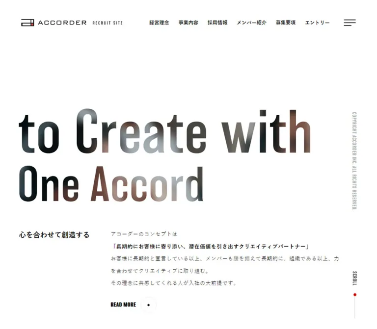
アコーダー 採用サイト
白黒を基調に、縦長の英字見出し、大胆な余白、写真リンク、罫線で区切った募集職種を組み合わせた採用サイト。現行の案内モーダルとスマートフォン表示も詳しく記録。
ACCORDER Recruit — Style Reference
An expansive recruitment editorial: condensed English statements, measured Japanese copy, photographic links, and a stark two-choice entrance dialog.
Website: ACCORDER Recruit
Original URL: https://www.accorder.co.jp/recruit/
Final URL: https://www.accorder.co.jp/recruit/
Response: HTTP 200; no redirect recorded.
Theme: predominantly white with black text, a dark lower editorial section, and a red desktop entry panel. No theme selector was evidenced.
Inspected: October 2, 2026, 02:46 JST. Supplied evidence retrieval timestamp: 2026-10-01T17:46:49.973Z, equivalent to October 1 at 17:46 UTC.
Viewports: desktop 1440 × 1000 and mobile 390 × 844 CSS pixels.
Scope: the current recruitment homepage, its visible audience-selection dialog, initial header and hero, recruitment content, job rows, linked photographic panels, entry area, footer, and floating video promotion. Three desktop and two mobile current-page captures were supplied, together with rendered DOM/computed-style evidence. Navigation destinations and application forms were not inspected.
ACCORDER presents recruitment as an introduction to a creative organization. Large, narrow English display lettering gives the page its scale, while Japanese paragraphs supply the practical detail. The layout alternates broad empty space, offset text columns, wide imagery, substantial job rows, and a darker closing sequence. Most elements have square corners. Small outlined circles and central dots provide a repeated navigation motif.
The current captured experience is dominated by an audience-selection dialog. A white rectangle offers one path for job seekers and another for companies seeking website production. It remains centered in every supplied capture, while a dark veil covers the page and its floating video promotion. This foreground state is part of the current reference; the darkened screenshot background must not be mistaken for the site's normal page color.
閉じる
ACCORDER Recruit — Style Reference
An expansive recruitment editorial: condensed English statements, measured Japanese copy, photographic links, and a stark two-choice entrance dialog.
Website: ACCORDER Recruit
Original URL: https://www.accorder.co.jp/recruit/
Final URL: https://www.accorder.co.jp/recruit/
Response: HTTP 200; no redirect recorded.
Theme: predominantly white with black text, a dark lower editorial section, and a red desktop entry panel. No theme selector was evidenced.
Inspected: October 2, 2026, 02:46 JST. Supplied evidence retrieval timestamp: 2026-10-01T17:46:49.973Z, equivalent to October 1 at 17:46 UTC.
Viewports: desktop 1440 × 1000 and mobile 390 × 844 CSS pixels.
Scope: the current recruitment homepage, its visible audience-selection dialog, initial header and hero, recruitment content, job rows, linked photographic panels, entry area, footer, and floating video promotion. Three desktop and two mobile current-page captures were supplied, together with rendered DOM/computed-style evidence. Navigation destinations and application forms were not inspected.
ACCORDER presents recruitment as an introduction to a creative organization. Large, narrow English display lettering gives the page its scale, while Japanese paragraphs supply the practical detail. The layout alternates broad empty space, offset text columns, wide imagery, substantial job rows, and a darker closing sequence. Most elements have square corners. Small outlined circles and central dots provide a repeated navigation motif.
The current captured experience is dominated by an audience-selection dialog. A white rectangle offers one path for job seekers and another for companies seeking website production. It remains centered in every supplied capture, while a dark veil covers the page and its floating video promotion. This foreground state is part of the current reference; the darkened screenshot background must not be mistaken for the site's normal page color.
How to Read This Reference
- Measured means a value appears in the supplied rendered DOM or computed styles. Positions and dimensions describe the inspected viewport, not necessarily a source CSS formula.
- Estimated means a dimension, color, or relationship was read from the current screenshots. Estimates are marked explicitly.
- Calculated means simple arithmetic using measured values, such as an aspect ratio or viewport clearance.
- Recommended means a proposed implementation choice. Breakpoints, fallback fonts, accessibility behavior, and unmeasured colors in the Quick Start belong to this category.
- Token names are implementation aliases. The source did not expose a corresponding semantic design-token system.
- The open dialog obscures important portions of the hero, imagery, and entry panel. DOM evidence establishes much of their geometry and text, but does not reveal every visual detail.
- Several wrappers report
font-size: 0, including the hero H1 and some link labels. Their visible descendants or artwork must be considered separately; zero is not a usable display-text size. - Some anchor wrappers report browser link blue, while their visible children are black or white. Likewise, the presence of
--swiper-theme-color: #007affdoes not establish blue as a visible brand color or verify a carousel.
Tokens — Colors
Default Palette
| Name | Value | Suggested token | Evidence and role |
|---|---|---|---|
| Page White | #ffffff |
--color-paper |
Measured HTML background, dialog controls, and entry-link fill; visually consistent with the dialog surface |
| Ink Black | #000000 |
--color-ink |
Measured text and filled business-destination button |
| Side Copyright Gray | #ababab |
--color-side-note |
Measured vertical desktop copyright text |
| Footer Copyright Gray | #777777 |
--color-footer-note |
Measured small footer copyright text |
| Dialog Veil | approximately rgba(0, 0, 0, 0.8) |
--color-veil-estimate |
Screenshot estimate; normally white page regions appear near dark charcoal beneath the dialog |
| Fine Divider Gray | exact value unavailable | --color-rule-recommended |
Job dividers are visible but dimmed; #e5e5e5 is a recommended starting value |
| Entry Red | exact value unavailable | --color-accent-recommended |
A red desktop entry panel is visible through the veil; #d60000 is an implementation recommendation, not a measured source color |
The palette is organized by large fields: white editorial space, black text, a dark lower section, and one concentrated red recruitment area. The bright white dialog remains outside the dimmed background treatment.
Compositing caution: an 80% black overlay would turn white into approximately #333333. This explains the captures' charcoal appearance without requiring a charcoal page token. The overlay opacity was not included in the supplied computed styles, so the 80% value remains an estimate. Do not reverse-engineer an exact source red from the darkened panel without an unobscured color measurement.
No general gradient, multicolor badge system, or alternate theme palette was established. Tonal variation inside the exposed hero lettering is not enough to identify a CSS gradient or a specific image-compositing technique.
Tokens — Typography
Japanese Text — Source System Stack
The measured stack is:
font-family: 游ゴシック, YuGothic, 'Hiragino Kaku Gothic ProN',
  メイリオ, Meiryo, Arial, Verdana, 'MS Pゴシック', sans-serif;
This is a Japanese sans-serif system stack. Body text uses weight 400; navigation, job titles, and supporting headings commonly use 600; dialog headings and explanations use 700.
The root reports 16px and 1px letter spacing. Individual components override these values: navigation often uses normal tracking, and introductory body copy uses 0.7px.
English Display — Balboa
balboa is explicitly present in computed font-family values for the desktop editorial statements, photographic panel headings, off-canvas English navigation, and copyright text. The exposed lettering has a narrow, upright character that allows unusually large statements without filling the entire horizontal composition.
Measured roles include:
- Desktop editorial statements:
110px, weight300, line height110px, tracking3px. - Desktop photographic panel titles:
41px, weight300, line height41px. - Mobile photographic panel titles:
20px, weight500, line height20px. - Off-canvas desktop navigation titles:
70px, weight100, line height70px; these elements were outside the viewport, not an opened-menu screenshot. - Footer copyright:
10px, weight400, line height10px, tracking0.7px.
No font-file URL or loading diagnostic was supplied. Use the declared family when legitimately available; fallback choices in the Quick Start are recommendations.
Hero Lettering and Graphic Labels
The desktop hero H1 is an empty-text wrapper measuring 820 × 262px; on mobile it measures 351 × 112.14px. The current desktop capture exposes part of a very large, two-line English composition, but the dialog covers its center and right side.
Do not assign the H1 a 262px font size or claim its lettering is definitely rendered with Balboa. The supplied evidence does not identify its internal asset, font, mask, or media technique. Preserve the measured artwork region and obtain the actual permitted artwork before attempting an exact reproduction.
Type Scale
| Role | Desktop measured value | Mobile measured value | Weight and tracking |
|---|---|---|---|
| Dialog heading | 19.7392px; 29px rendered line box |
18.0277px; 27px rendered line box |
700; 1px |
| Dialog explanation | 15px; 23px one-line box |
15px; 46px two-line box |
700; 1px |
| Dialog actions | 13px |
13px |
Return 400; business link 700; 1px |
| Main header navigation | 14px / 128px |
Desktop navigation absent | 600; normal tracking |
| Hero Japanese heading | 20px / 20px |
16px / 16px |
600; normal tracking |
| Hero body | 15px / 34.5px |
14px / 26.6px |
400; 0.7px |
| Secondary editorial body | 15px / 33px |
14px / 28px |
400; 1px |
| English editorial statement | 110px / 110px |
Corresponding text-node styling not supplied | Balboa 300; 3px |
| Job title | 20px; 35px box including 5px bottom padding |
16px; 24px box |
600; 1px |
| Job description | 16px / 30.4px |
16px / 27.2px |
400; 1px |
| Member feature caption | 28.0416px; 42px box |
15.1896px; 23px box |
700; 1px |
| Photo panel English title | 41px / 41px |
20px / 20px |
Balboa 300 → 500; normal tracking |
| Photo panel Japanese label | 15px / 15px |
12px / 12px |
600; 1px |
| Entry supporting copy | 16px; 24px box |
15px / 27px; 108px block |
600; 1px |
| Entry link | 16px / 66px |
16px / 66px |
Wrapper 400; 1px |
| Footer navigation | 14px / 14px |
14px / 14px |
Usually 600; normal tracking |
| Footer copyright | 10px / 10px |
10px / 10px |
Balboa 400; 0.7px |
The job descriptions remain 16px on the phone even though surrounding editorial paragraphs reduce to 14px. Preserve this distinction: practical recruitment information receives more readable text than secondary brand narrative.
Tokens — Spacing & Shapes
Density: sparse editorial composition with substantial row interiors and compact utility controls. Geometry: square panels and rectangular buttons, punctuated by small circular navigation marks. Scaling: the evidence shows component-specific desktop/mobile adjustments, not a single uniform spacing multiplier.
Spacing Scale
| Use | Value | Status |
|---|---|---|
| Main mobile content margin | 19.5px, equivalent to 5vw at 390px |
Measured position; percentage relationship calculated |
| Dialog outside horizontal clearance on mobile | 20px |
Screenshot estimate, consistent with measured inner content |
| Dialog horizontal padding | 20px |
Derived from screenshot panel edges and measured text bounds |
| Dialog top/bottom padding | approximately 60px |
Derived from panel and content bounds |
| Dialog explanation-to-action gap | 14px |
Calculated from measured rectangles |
| First action to divider | 46px |
Calculated from measured rectangles |
| Divider to second heading content | 36px padding, plus the rule |
Measured padding |
| Desktop hero artwork to introductory body | 75px |
Calculated |
| Mobile hero artwork to Japanese heading | approximately 47px |
Calculated |
| Desktop job row padding | 50px 139.125px 46px 17px |
Measured |
| Mobile job row padding | 31px 8px 23px |
Measured |
| Desktop footer-link padding | 15px 5px |
Measured |
| Mobile footer-link padding | 10px 5px |
Measured |
| Floating video right/bottom clearance | 18px |
Calculated at both viewports |
These values are useful component dimensions, not evidence of a strict global 4px or 8px grid.
Border Radius
| Element | Treatment | Evidence |
|---|---|---|
| Dialog | Square | Current screenshots |
| Dialog actions | 0 |
Computed styles |
| Job rows | 0 |
Computed styles |
| Photographic links | Square | Current captures and measured wrappers |
| Circular link motif | Thin circle with central dot | Current desktop captures; exact internal construction unavailable |
| Video close button | 50%; 18 × 18px |
Computed styles and rectangle |
Layout Measurements
| Element | Desktop | Mobile |
|---|---|---|
| Document height | 7147px |
4918px |
| Initial header logo link | 284 × 20px, at (60, 54.23) |
175 × 12.31px, at (27, 26) |
| Header navigation line box | 128px high |
Not present in the initial header |
| Main content alignment | Common left edge 100px; 1240px-wide region |
Common left edge 19.5px; 351px-wide region |
| Hero artwork wrapper | 820 × 262px, at (100, 306) |
351 × 112.14px, at (19.5, 292.5) |
| Hero body | 635.41px wide, starting at x=369.59 |
351px wide, starting at x=19.5 |
| Offset editorial region | Starts at x=205.39; width 1134.61px |
Selected text blocks start at x=19.5; width 306px |
| Member feature link | 1134.61 × 576.30px |
390 × 197.59px |
| Job title column | 316.20px wide |
Stacked above the list |
| Job list column | 818.39px wide |
351px wide |
| First job row | 818.39 × 262.56px |
351 × 285.31px |
| Second job row | 818.39 × 232.17px |
351 × 203.75px |
| Each lower photographic link | approximately 480 × 687px |
390 × 205px |
| Entry link | 550 × 66px |
284.30 × 66px |
| Floating video link | 336 × 189px |
336 × 189px |
| Dialog panel | approximately 470 × 419px |
approximately 350 × 461px |
| Dialog content width | 430px |
310px |
| Dialog actions | 210 × 42px |
210 × 42px |
Components
Audience-Selection Dialog
Role: distinguishes recruitment visitors from businesses seeking website production.
This is the clearest fully visible component in the supplied captures. On desktop, the white panel occupies approximately x=485–955 and y=291–710. On mobile, it occupies approximately x=20–370 and y=192–653. Both are centered in their respective viewports. The mobile panel grows vertically because both explanations wrap to two lines; its action widths remain unchanged.
The anatomy is deliberately simple:
- Bold centered heading,
求人情報をお探しの方. - Bold supporting sentence explaining that recruitment visitors may continue.
- White, black-outlined
採用サイトに戻るbutton. - Full content-width black divider.
- Bold centered heading,
サイト制作についてご検討中の方. - Bold supporting sentence for prospective website-production clients.
- Black button-like link,
弊社ホームページはこちら, with white text.
Use approximately 60px of top/bottom breathing room and 20px horizontal padding. The divider spans 430px on desktop and 310px on mobile. Both actions measure 210 × 42px, with square corners and 13px text.
The two controls have different semantics in the evidence: the recruitment control is a button; the business control is an anchor to https://www.accorder.co.jp/service/web/. Despite its homepage wording, that anchor points to the web-service route rather than the corporate root.
The recruitment button's label suggests returning to the underlying page, but its click result was not tested. No separate close icon is visible on this dialog. Do not confuse the nearby video's close control or the off-canvas menu's CLOSE text with a dialog close button.
Initial Header and Menu Control
Role: identifies the recruitment site and exposes primary routes.
The desktop logo combines the ACCORDER mark, wordmark, and small recruitment descriptor in a measured 284 × 20px link. It sits 60px from the left. Six Japanese navigation links occupy the right side, followed by a thin three-line menu icon. Navigation uses 14px, weight 600, and a 128px line box.
The observed destinations cover philosophy, business, recruitment information, members, job requirements, and entry. The members link points to the organization's note publication. Its external-link symbol is visible in the desktop header.
On mobile, the logo shrinks to 175 × 12.31px, starts at (27, 26), and the six-link navigation is absent. The hamburger remains at the upper right. The initial mobile header composition is roughly 64px tall by visual estimate.
The desktop menu icon also appears near the upper-right corner in scrolled captures, while the full initial navigation row does not. This supports a persistent menu affordance, not a claim that the entire header remains fixed unchanged.
Off-Canvas Navigation — DOM Evidence Only
Role: additional navigation structure associated with the menu control.
Desktop navigation entries were measured outside the viewport, including two columns of bilingual links. English labels use Balboa at 70px / 70px, weight 100; Japanese labels use 18px / 18px, weight 600. Corporate and branding destinations are also present.
On mobile, offscreen link rows begin around x=409.5, beyond the 390px viewport. Most rows measure 351 × 79px, with 14px Japanese labels. English labels present in desktop text styling are not exposed as equivalent visible mobile text in the supplied element set.
These measurements establish an off-canvas structure. They do not establish its opened background, slide direction, duration, focus behavior, or exact visual state. No menu-opening interaction was supplied.
Hero and Introductory Statement
Role: introduces the agency's collaborative creative philosophy.
A large graphic-like English title region sits well below the header. At desktop, it starts at (100, 306) and measures 820 × 262px. Its exposed lettering is extremely condensed and vertically imposing. The modal prevents a complete current-state reading of the composition.
Below it, the Japanese heading 心を合わせて創造する occupies a compact left column. The explanatory paragraph begins farther right at x=369.59, creating an asymmetrical editorial row rather than a centered title-and-subtitle stack. The paragraph is 15px / 34.5px, with a bold phrase embedded in the copy and a READ MORE link beneath.
The mobile H1 region keeps essentially the same aspect ratio while shrinking to 351px wide. The Japanese heading and paragraph then stack at the same 19.5px left edge. The heading begins about 47px below the artwork, followed by a 17px gap before the body. Significant empty space above the artwork remains part of the measured mobile composition.
Text Link with Circular Motif
Role: a recurring low-chrome route to more information.
READ MORE and VIEW ALL combine compact uppercase lettering with a thin outlined circle containing a small central dot. Desktop link rectangles are about 46px high; the hero link is 129.36px wide and reserves 58px on the right for its graphic treatment.
The mobile hero link remains 46px high but narrows to 116.36px, with 45px of right-side padding. The precise font styling of the visible label descendant was not supplied, so a wrapper's font-size or default link color should not be copied as the final appearance.
Use this motif as a quiet directional device. Do not replace every instance with a large filled CTA.
Respect Statement and Member Feature
Role: connects the organization’s values with employee content.
The desktop statement reads With Respect to and One Another, set in two lines of Balboa at 110px / 110px, weight 300, with 3px tracking. It begins at the offset editorial edge, x=205.39. Japanese explanatory content occupies a separate right-side region, starting at x=805 with a width of 535px.
Below, a MEMBER INTERVIEW heading and recruitment sentence introduce a broad linked image region. The desktop link measures 1134.61 × 576.30px; mobile becomes a full-viewport 390 × 197.59px link. Both are close to a 1.97:1 ratio.
The overlaid caption アコーダー公式noteで公開中 is white and bold, approximately 28.04px on desktop and 15.19px on mobile. The link destination is the organization's note magazine. The complete image content and asset URL were not supplied; only a small portion appears in the current job-section capture.
Job List
Role: exposes the currently advertised roles without making visitors navigate away first.
Desktop uses a two-part composition. A JOB LIST / 募集中職種 heading sits in the left column; large linked job rows occupy the right. The heading region begins at x=205.39, and the rows at x=521.59. Thin horizontal separators, substantial vertical padding, and right-aligned circular motifs provide structure without card backgrounds or shadows.
Two roles are present:
ウェブディレクター, linked to/recruit/job/web-director/.マークアップエンジニア / WEBコーダー, linked to/recruit/job/front-engineer/.
Each whole row is an anchor containing an H3, descriptive paragraph, and decorative navigation mark. Desktop titles use 20px, weight 600; descriptions use 16px / 30.4px. The first description occupies approximately four lines and the second approximately three, producing different row heights.
On mobile, the section heading moves above the list. Rows span 351px, with 8px side padding and descriptions occupying 335px. Titles reduce to 16px, while descriptions stay at 16px and tighten to 27.2px line height. The circle wrapper changes from 45 × 51px to 37 × 43px and moves near the row's upper-right title area.
VIEW ALL is aligned to the far right beneath the desktop list but starts at the normal left content edge on mobile. Preserve this alignment change rather than centering the link at both sizes.
Dark Customer Editorial Section
Role: connects recruitment to the agency's customer relationships and history.
Desktop DOM evidence records Together with and our customers as white Balboa statements at 110px / 110px, weight 300, with 3px tracking. A separate Japanese heading and white paragraph sit beneath, offset from the page edge. The body paragraph measures 582.80px wide at desktop and 351px on mobile.
The current lower-page capture shows a substantial dark field before the entry area. Its exact unobscured background color was not measured. Use black as a practical implementation starting point, while retaining the distinction between this actual dark section and the modal veil covering the rest of the page.
On mobile, the corresponding English statement is not available as a measured text node. A non-text region measures 351 × 74.42px. This indicates a different presentation, but does not establish the asset type or prove that the English statement has been removed.
Business / Work / Company Photographic Links
Role: sends recruitment visitors to broader business, work, and company information.
Three edge-to-edge photographic links form a desktop triptych. Each measures approximately 480 × 687px, with no gutter between panels. The English category title appears near the lower left, followed by a Japanese label. A READ MORE treatment and outlined circular mark occupy the lower-right area.
Desktop English titles are 41px Balboa, weight 300; Japanese labels are 15px, weight 600. The supplied lower-page capture shows the panel bottoms and photography through the veil, not the entire unobscured images.
Mobile changes the composition substantially: the panels stack vertically and each becomes 390 × 205px. English labels shrink to 20px and increase to weight 500; Japanese labels become 12px. The right-side affordance is a 36px square graphic region, without a visibly expanded READ MORE text treatment in the mobile evidence.
The destinations are /recruit/business/, /works.html, and /about.html. Their contents were not visited. A reproduction needs separate mobile crop decisions; simply shrinking the tall desktop panels would not match these measured proportions.
Entry Panel
Role: provides the final application route.
The desktop capture shows a broad red rectangle crossing the visual transition between the dark section and the white footer. Its visible edges are approximately 72px from each side, giving a width near 1296px, or 90% of the viewport. This panel measurement is a screenshot estimate.
A centered white recruitment sentence sits above a wide white ENTRY link. The link measures 550 × 66px on desktop and 284.30 × 66px on mobile. On mobile, the supporting copy occupies a centered 260px-wide, 108px-high block at 15px / 27px.
The dialog obscures the central panel in the screenshots, especially on mobile. The desktop red field is visible, but its exact color and the complete mobile surface treatment cannot be established. The actual entry destination is /recruit/contact/; no form state was inspected.
Footer
Role: repeats site navigation and provides corporate and application-document links.
Desktop places the logo block at the left, starting at x=100, and navigation to its right. Primary links use 14px, weight 600, with 44px-high padded rectangles. A second row contains the application consent-document link and corporate-site link. The copyright is a small, muted Balboa line beneath the logo region.
Mobile reorganizes the six primary links into three columns across two rows. Each regular column measures approximately 115.83px. The consent-document link occupies a full-width row, the corporate link is centered below, and the 210px-wide logo block moves below the navigation. The copyright follows at 10px / 10px.
The linked application document was not opened. Its presence supports the footer's information architecture, not any claim about the document's contents.
Floating Video Promotion
Role: promotes an employee-focused video while visitors browse.
A 336 × 189px link stays 18px from the right and bottom edges in both viewport sizes. This is exactly a 16:9 link region. At desktop it begins at (1086, 793); at mobile at (36, 637). Its size does not shrink between these inspected viewports, so it occupies about 86% of the phone's width.
The poster visibly contains an outdoor seated person, Japanese lettering, and a red play symbol. An 18px circular close button overlaps the upper-right corner; a soft shadow separates the promotion from the page. Both the poster and close button are dimmed beneath the dialog veil.
The anchor points to https://www.youtube.com/watch?v=ZwwaCYE8E3E. This establishes a video destination, not verified inline playback or autoplay. The close button was not exercised. The poster asset URL was not supplied.
Tokens — Motion & Interaction
| Element or treatment | Supplied evidence | Interpretation and limit |
|---|---|---|
| Root element | Transition shorthand 0.4s |
A transition declaration exists; no specific visible effect was identified |
| Logo and main navigation links | 0.3s |
Timing is measured; changed properties and hover appearance were not exercised |
| Off-canvas navigation text | 0.3s |
Does not establish the menu container's entrance motion |
| Job-title H3 | background-size 0.5s cubic-bezier(0.165, 0.84, 0.44, 1) |
Supports a background-size transition; an underline-growth interpretation is plausible but the endpoint was not supplied |
| Entry link | 0.3s |
Timing is measured; interaction appearance remains unverified |
| Audience dialog across captures | Same centered foreground geometry at different page positions | Supports viewport anchoring; no entrance or dismissal animation was recorded |
| Floating video across captures | Same viewport clearance and dimensions | Supports persistent viewport positioning |
| Sampled element animations | animation: none |
Applies to the sampled elements, not necessarily to descendants, pseudo-elements, media, or the entire site |
Many elements report a transition shorthand of all without a positive duration in the supplied summary. Do not turn this into a claim that every element animates.
The capture process waited for document readiness, relevant finite motion, sampled layout stability, and visible image decoding, subject to time limits. Perpetual animations were paused during readiness checks and then resumed. This process cannot establish the absence of delayed content, looping media, scroll effects, or interaction states.
No supplied action record verifies dialog dismissal, menu opening, hover endpoints, video playback, or application submission. Different background scroll positions were captured while the dialog remained centered; this does not prove how normal wheel/touch scrolling or focus trapping behaves with the dialog open.
For a new implementation, use restrained 300ms feedback and reserve the measured 500ms curve for a title underline or equivalent small detail. Treat these applications as recommendations unless matching a verified source state.
Surfaces
| Layer | Appearance | Purpose |
|---|---|---|
| Main page | White, mostly unboxed | Editorial text, recruitment information, and footer |
| Job list | Same white surface with thin rules | Grouping through alignment and separation |
| Dark editorial section | Visually near-black beneath the veil | Strong tonal change before corporate links and entry |
| Photographic panels | Edge-to-edge image surfaces with white labels | Navigation through imagery |
| Entry panel | Red desktop field with white content | Concentrated application emphasis |
| Video promotion | Rectangular poster with a visible shadow | Persistent media invitation |
| Dialog veil | Uniform dark overlay, approximately 80% black | Separates foreground choice from the page |
| Dialog | Bright white, square, no prominent decorative shadow | Clear visitor routing |
There is no evidence of a general rounded-card or layered elevation system. The video promotion is a specific shadowed exception. Most hierarchy comes from scale, whitespace, rules, image boundaries, and large changes of field color.
Imagery
The page combines graphic English lettering with photography and a video poster. The image treatments occupy very different geometries: a wide hero-lettering region, a nearly 2:1 member feature, tall desktop navigation panels, wide mobile navigation panels, and a fixed 16:9 video link.
Use photography as part of the page's composition rather than as interchangeable thumbnail decoration. Preserve the distinction between the broad member feature and the three destination panels. The mobile panels require deliberate cropping because their proportions change from approximately 0.70:1 on desktop to 1.90:1 on mobile.
Exposed hero strokes show tonal variation in the current desktop capture. The supplied evidence does not reveal whether this comes from a static image, clipping mask, video, or another technique. Do not invent a moving photographic text fill or a particular asset pipeline.
Observed Asset References
No direct logo, hero, photograph, poster, or font-file URLs were included in the supplied evidence. The following are observed regions and link destinations, not downloadable asset paths.
| Region | Confirmed reference | Implementation consequence |
|---|---|---|
| Header identity | Logo link to /recruit/; measured desktop/mobile bounds |
Use authorized brand artwork; do not substitute a text approximation for an exact reference |
| Hero lettering | H1 wrapper 820 × 262px / 351 × 112.14px |
Asset and internal rendering technique remain unknown |
| Member feature | Link to https://note.com/accorder_inc/m/mb1402bf9578b |
This is a destination, not an image source |
| Business / Work / Company | Three measured photo-link regions | Obtain their actual imagery before choosing crops |
| Video promotion | Link to https://www.youtube.com/watch?v=ZwwaCYE8E3E |
Do not treat the destination as a supplied poster URL or verified embed |
| English display font | Computed family balboa |
No font-file URL supplied |
Layout & Responsive Behavior
The desktop layout uses several alignments rather than one universal centered container. The initial logo starts at 60px; the hero and footer commonly start at 100px; the respect/member/job heading sequence starts at approximately 205.39px. Body copy then receives its own offsets. This staggered structure is a defining part of the page's editorial character.
On the phone, most content returns to a 19.5px left margin and a 351px width, equivalent to a 90%-wide region at the inspected viewport. Some respect/member text blocks remain narrower at 306px, while the member image and destination panels reach the full viewport width. Do not force every mobile section into an identical container.
Confirmed Responsive Changes
| Component | Desktop behavior | Mobile behavior |
|---|---|---|
| Header | Logo plus six links and menu icon | Smaller logo and menu icon |
| Hero artwork region | 820px wide | 351px wide with essentially preserved aspect ratio |
| Introductory text | Separate heading and body columns | Heading, paragraph, and link stacked |
| Editorial statements | Large measured English text | Corresponding non-text regions; exact rendering unresolved |
| Member image | Offset 1134.61px-wide link | Full-width 390px link |
| Job list | Section heading beside rows | Section heading above rows |
| Job descriptions | 16px with 30.4px leading | 16px with 27.2px leading |
| View-all link | Right aligned | Left aligned |
| Destination imagery | Three tall columns | Three wide stacked panels |
| Entry link | 550px wide | Approximately 284.30px wide |
| Footer | Logo beside navigation | Navigation above centered logo |
| Audience dialog | Approximately 470 × 419px | Approximately 350 × 461px |
| Floating video | 336 × 189px | Still 336 × 189px |
The modal's two measured widths are consistent with a rule such as min(470px, 100vw - 40px), but that rule is an implementation recommendation, not recovered source CSS. Its action dimensions remain fixed while its copy wraps.
The total document becomes shorter on mobile despite additional paragraph wrapping. Large changes such as the photographic panels' reduction from 687px to 205px high contribute to this result; the page is not a uniformly scaled desktop design.
Only two viewport sizes were supplied. Exact media-query thresholds, tablet behavior, very narrow screens, browser zoom, and landscape layouts remain unverified. The Quick Start uses explicitly recommended breakpoints and short-viewport overflow protection.
Do’s and Don’ts
Do
- Preserve the white base page and distinguish it from the dark dialog veil.
- Treat the current two-choice dialog as a real component with two different destination types.
- Keep the dialog square, centered, and spacious, with 210px-wide actions and a crisp divider.
- Use the measured Japanese system stack and the declared Balboa family in their respective roles.
- Preserve the staggered desktop alignments and stacked mobile content.
- Keep job descriptions at 16px on mobile and give entire job rows a coherent link target.
- Use thin circles and central dots as restrained navigation motifs.
- Recompose photographic links into wide mobile panels rather than scaling the desktop triptych unchanged.
- Preserve the contrast between white editorial sections, the dark closing section, and the desktop red entry field.
- Label unavailable assets, uncertain effects, and proposed behavior explicitly.
Don’t
- Don't use the dimmed screenshots' charcoal as the normal page background.
- Don't remove the audience dialog from a description of the captured current state.
- Don't infer an exact red hex value from a panel viewed through an unmeasured scrim.
- Don't assign the hero wrapper's
font-size: 0or 262px height to visible headline typography. - Don't use default anchor blue or an unused framework variable as a brand accent.
- Don't flatten the layout into identical centered sections or a rounded-card grid.
- Don't shrink all Japanese body copy equally on mobile; job text follows a different scale.
- Don't describe the YouTube link as verified autoplay or inline playback.
- Don't invent menu motion, modal dismissal behavior, hover colors, or scroll choreography.
- Don't fabricate direct asset paths or claim that a destination URL is an image source.
Recommended Implementation Additions
These are recommendations for a new implementation, not verified features of the inspected page:
- Use a native modal dialog or an equivalent accessible dialog pattern. Give it a programmatic name, manage initial focus, restore focus on close, and define keyboard dismissal deliberately.
- Make the recruitment continuation action explicit and preserve the separate corporate web-service destination.
- Keep the dialog usable on short screens with a maximum viewport-relative height and internal scrolling. Do not rely solely on the two inspected heights.
- Increase the effective touch target around the observed 18px video close symbol. Its small visible circle can remain, while the button hit area grows.
- Give the menu and video controls accessible names and maintain visible keyboard focus on every linked row.
- Ensure graphical headlines have equivalent accessible text. Decorative text-fill media should not be the only carrier of the headline.
- Test the persistent video promotion against mobile content and the on-screen keyboard. Consider a compact or dismissible presentation after user choice.
- Maintain a fallback display font without assuming it will reproduce Balboa's exact line widths.
- Honor reduced-motion preferences and avoid enabling sound without user action.
- Verify text contrast using the actual unobscured accent and photographic assets before finalizing a production palette.
Agent Prompt Guide
Quick Color Reference
- Main page and dialog surface: measured white
#ffffff. - Main text and filled dialog action: measured black
#000000. - Side copyright: measured
#ababab. - Footer copyright: measured
#777777. - Dialog veil: approximately 80% black; screenshot estimate.
- Entry red: visually present on desktop; exact source value unavailable.
#d60000is a recommended provisional token. - Job dividers: light gray;
#e5e5e5is a recommended provisional token. - Primary visual distinction: squared editorial surfaces with small circular navigation marks.
Overall Prompt
“Create a Japanese creative-agency recruitment homepage with a white canvas, black Japanese sans-serif text, very large condensed English editorial statements, asymmetrical desktop text columns, and generous vertical space. Use Balboa for the English text roles where available, with a clearly identified fallback. Include a substantial ruled job list, an almost 2:1 member feature, three tall photographic destination panels that become wide stacked panels on mobile, a dark closing section, and a concentrated red entry area. Reproduce the captured entrance state with a centered square white audience dialog, two stacked choices, a black divider, and an approximately 80% black veil. Keep the floating video promotion beneath that veil. Use measured component dimensions where provided; leave unavailable hero and photographic assets explicitly unresolved.”
Example Component Prompts
- Audience dialog: “Create a square white dialog approximately 470px wide on desktop and 350px wide at a 390px viewport. Use 60px vertical and 20px horizontal padding, centered bold Japanese headings, 15px explanations, and two 210 × 42px actions. The recruitment action is outlined; the web-service link is black with white text. Separate the groups with a full-width 1px black rule. Let mobile explanations wrap and increase panel height.”
- Job list: “Build a white recruitment section with a narrow bilingual heading column beside wide linked job rows. Each row has a 20px Japanese title, 16px explanatory copy, a thin separator, and a small right-side circle with a central dot. On mobile, stack the section heading above the rows, reduce titles to 16px, retain 16px body text, and move the circle near the title line.”
- Hero composition: “Reserve an 820 × 262px desktop region for authorized two-line condensed English artwork, positioned below generous header whitespace. Place a small Japanese philosophy heading at the left and a 635px-wide paragraph farther right. At 390px, use a 351px-wide artwork region and stack the Japanese content. Do not invent the missing artwork or its animation technique.”
- Destination panels: “Create three adjacent desktop photo links, approximately 480 × 687px each, with white condensed English labels near the bottom and smaller Japanese captions. On mobile, stack them as 390 × 205px panels. Use deliberate responsive crops and small circular route affordances; keep corners square.”
- Video promotion: “Place a 336 × 189px video-poster link 18px from the viewport's bottom-right corner, with a small overlapping circular close symbol and a subtle shadow. Keep it below the entrance dialog's backdrop. Provide an accessible enlarged close hit area and do not assume autoplay.”
Quick Start
CSS Custom Properties
This is a practical adaptation of the measured component anatomy, not recovered source CSS. The dialog spacing closely follows both supplied viewports. The page grid, fallback fonts, 80rem/48rem breakpoints, divider color, red accent, hover endpoint, and reduced-motion handling are recommendations. Original assets and a licensed Balboa font file are not included.
:root {
  /* Measured colors */
  --color-paper: #ffffff;
  --color-ink: #000000;
  --color-side-note: #ababab;
  --color-footer-note: #777777;

  /* Estimated or recommended colors */
  --color-veil-estimate: rgb(0 0 0 / 80%);
  --color-rule-recommended: #e5e5e5;
  --color-accent-recommended: #d60000;

  /* Source Japanese stack; recommended display fallbacks */
  --font-jp: '游ゴシック', YuGothic, 'Hiragino Kaku Gothic ProN',
    'メイリオ', Meiryo, Arial, Verdana, 'MS Pゴシック', sans-serif;
  --font-latin: 'balboa', 'Arial Narrow', sans-serif;

  --text-route: 19.7392px;
  --text-body: 15px;
  --text-job: 16px;
  --text-job-title: 20px;
  --text-statement: 110px;
  --tracking-body: 0.7px;
  --tracking-interface: 1px;

  --page-gutter: 100px;
  --page-max: 1240px;
  --dialog-width: 470px;
  --dialog-inset: 20px;
  --dialog-block-padding: 60px;
  --action-width: 210px;
  --action-height: 42px;
  --video-width: 336px;
  --video-clearance: 18px;

  --motion-link: 300ms;
  --motion-title: 500ms cubic-bezier(0.165, 0.84, 0.44, 1);
}

*,
*::before,
*::after {
  box-sizing: border-box;
}

body {
  margin: 0;
  color: var(--color-ink);
  background: var(--color-paper);
  font-family: var(--font-jp);
  font-size: 16px;
  letter-spacing: var(--tracking-interface);
}

.page-shell {
  width: calc(100% - 2 * var(--page-gutter));
  max-width: var(--page-max);
  margin-inline: auto;
}

/* This preserves the measured artwork region, not its unknown internals. */
.hero-artwork {
  width: min(820px, 100%);
  aspect-ratio: 820 / 262;
}

.hero-artwork > img {
  display: block;
  width: 100%;
  height: auto;
}

.hero-intro {
  display: grid;
  grid-template-columns: 220px minmax(0, 635.4px);
  gap: 49.6px;
  margin-top: 75px;
}

.hero-intro h2 {
  margin: 9px 0 0;
  font-size: 20px;
  font-weight: 600;
  line-height: 1;
  letter-spacing: normal;
}

.hero-copy {
  margin: 0;
  font-size: 15px;
  line-height: 2.3;
  letter-spacing: var(--tracking-body);
}

.display-statement {
  margin: 0;
  font-family: var(--font-latin);
  font-size: var(--text-statement);
  font-weight: 300;
  line-height: 1;
  letter-spacing: 3px;
}

/* Recommended native-dialog implementation. */
.audience-dialog {
  position: fixed;
  inset: auto;
  top: 50%;
  left: 50%;
  transform: translate(-50%, -50%);
  width: min(var(--dialog-width), calc(100% - 40px));
  max-width: none;
  max-height: calc(100dvh - 40px);
  margin: 0;
  padding: var(--dialog-block-padding) var(--dialog-inset);
  overflow: auto;
  border: 0;
  border-radius: 0;
  color: var(--color-ink);
  background: var(--color-paper);
  font-family: var(--font-jp);
  text-align: center;
}

.audience-dialog::backdrop {
  background: var(--color-veil-estimate);
}

.audience-dialog h2 {
  margin: 0;
  font-size: var(--text-route);
  font-weight: 700;
  line-height: 29px;
  letter-spacing: 1px;
}

.audience-dialog p {
  margin: 0;
  font-size: 15px;
  font-weight: 700;
  line-height: 23px;
  letter-spacing: 1px;
}

.audience-dialog section + section {
  margin-top: 46px;
  padding-top: 36px;
  border-top: 1px solid var(--color-ink);
}

.audience-action {
  display: grid;
  place-items: center;
  width: min(var(--action-width), 100%);
  height: var(--action-height);
  margin: 14px auto 0;
  padding: 0 6px;
  border: 1px solid var(--color-ink);
  border-radius: 0;
  color: var(--color-ink);
  background: var(--color-paper);
  font: 400 13px / 1.4 var(--font-jp);
  letter-spacing: 1px;
  text-decoration: none;
  cursor: pointer;
}

.audience-action--filled {
  color: var(--color-paper);
  background: var(--color-ink);
  font-weight: 700;
}

.mobile-break {
  display: none;
}

/* Grid proportions approximate the measured desktop columns. */
.jobs {
  display: grid;
  grid-template-columns: 27.87% minmax(0, 1fr);
  margin-left: 8.5%;
}

.job-row {
  position: relative;
  display: block;
  padding: 50px 17% 46px 17px;
  border-top: 1px solid var(--color-rule-recommended);
  color: inherit;
  text-decoration: none;
}

.job-row:last-child {
  border-bottom: 1px solid var(--color-rule-recommended);
}

.job-title {
  display: inline-block;
  margin: 0 0 10px;
  padding-bottom: 5px;
  font-size: var(--text-job-title);
  font-weight: 600;
  line-height: 1.5;
  background: linear-gradient(currentColor, currentColor)
    left bottom / 0 1px no-repeat;
  transition: background-size var(--motion-title);
}

.job-description {
  margin: 0;
  font-size: var(--text-job);
  line-height: 1.9;
}

.circle-mark {
  position: absolute;
  top: 50%;
  right: 0;
  display: grid;
  place-items: center;
  width: 45px;
  aspect-ratio: 1;
  border: 1px solid var(--color-rule-recommended);
  border-radius: 50%;
  transform: translateY(-50%);
}

.circle-mark::after {
  width: 6px;
  aspect-ratio: 1;
  border-radius: 50%;
  background: currentColor;
  content: '';
}

/* Recommended hover endpoint; only its transition is source-measured. */
@media (hover: hover) {
  .job-row:hover .job-title {
    background-size: 100% 1px;
  }
}

.destination-grid {
  display: grid;
  grid-template-columns: repeat(3, minmax(0, 1fr));
}

.destination-panel {
  position: relative;
  display: block;
  min-height: 687px;
  color: var(--color-paper);
  background: var(--color-ink);
  text-decoration: none;
}

.destination-panel > img {
  position: absolute;
  inset: 0;
  width: 100%;
  height: 100%;
  object-fit: cover;
}

.destination-label {
  position: absolute;
  right: 7.4%;
  bottom: 43px;
  left: 7.4%;
}

.destination-label strong {
  display: block;
  font: 300 41px / 1 var(--font-latin);
  letter-spacing: normal;
}

.destination-label span {
  display: block;
  margin-top: 14px;
  font-size: 15px;
  font-weight: 600;
  line-height: 1;
}

.entry-panel {
  width: 90%;
  margin-inline: auto;
  padding: 80px 5%;
  color: var(--color-paper);
  background: var(--color-accent-recommended);
  text-align: center;
}

.entry-link {
  display: grid;
  place-items: center;
  width: min(550px, 100%);
  min-height: 66px;
  margin: 20px auto 0;
  color: var(--color-ink);
  background: var(--color-paper);
  text-decoration: none;
}

.video-promo {
  position: fixed;
  right: var(--video-clearance);
  bottom: var(--video-clearance);
  z-index: 20;
  width: min(var(--video-width), calc(100vw - 36px));
  aspect-ratio: 16 / 9;
}

.video-promo img {
  display: block;
  width: 100%;
  height: 100%;
  object-fit: cover;
}

/* Recommended focus treatment. */
:where(a, button):focus-visible {
  outline: 2px solid currentColor;
  outline-offset: 5px;
}

/* Recommended intermediate adaptation, not a recovered breakpoint. */
@media (max-width: 80rem) {
  :root {
    --page-gutter: 5vw;
  }

  .hero-intro {
    grid-template-columns: minmax(160px, 24%) minmax(0, 1fr);
    gap: 4%;
  }

  .display-statement {
    font-size: clamp(56px, 7.64vw, 110px);
  }
}

/* Recommended mobile breakpoint; values target the supplied phone view. */
@media (max-width: 48rem) {
  :root {
    --text-route: 18.0277px;
    --text-job-title: 16px;
  }

  .hero-intro {
    display: block;
    margin-top: 47px;
  }

  .hero-intro h2 {
    margin: 0 0 17px;
    font-size: 16px;
  }

  .hero-copy {
    font-size: 14px;
    line-height: 1.9;
  }

  .audience-dialog h2 {
    line-height: 27px;
  }

  .mobile-break {
    display: initial;
  }

  .jobs {
    display: block;
    margin-left: 0;
  }

  .job-row {
    padding: 31px 8px 23px;
  }

  .job-title {
    display: block;
    margin-bottom: 17px;
    padding: 0 45px 0 0;
  }

  .job-description {
    line-height: 1.7;
  }

  .circle-mark {
    top: 22px;
    right: 8px;
    width: 37px;
    transform: none;
  }

  .destination-grid {
    grid-template-columns: 1fr;
  }

  .destination-panel {
    min-height: 205px;
  }

  .destination-label {
    right: 5%;
    bottom: 27px;
    left: 5%;
  }

  .destination-label strong {
    font-size: 20px;
    font-weight: 500;
  }

  .destination-label span {
    margin-top: 5px;
    font-size: 12px;
  }

  .entry-link {
    width: min(284.3px, 100%);
  }
}

@media (prefers-reduced-motion: reduce) {
  .job-title {
    transition: none;
  }
}
Dialog Markup Example
This semantic markup is a recommended implementation. It reproduces the visible content grouping without claiming the original uses a native dialog. Wire the return button to close the dialog, manage focus, and then open it with showModal() when the entrance state is required. The link retains the destination present in the original-page evidence.
<dialog class="audience-dialog" aria-labelledby="audience-title">
  <section aria-labelledby="audience-title">
    <h2 id="audience-title">求人情報をお探しの方</h2>
    <p>
      採用情報をお探しの方は<br class="mobile-break">
      このままご覧ください
    </p>
    <button class="audience-action" type="button" data-close-dialog>
      採用サイトに戻る
    </button>
  </section>

  <section aria-labelledby="business-title">
    <h2 id="business-title">サイト制作についてご検討中の方</h2>
    <p>
      サイト制作のご相談・制作依頼などを<br class="mobile-break">
      ご検討の企業様
    </p>
    <a class="audience-action audience-action--filled"
       href="https://www.accorder.co.jp/service/web/">
      弊社ホームページはこちら
    </a>
  </section>
</dialog>
The Quick Start deliberately does not implement an unverified menu animation, invent hero assets, or embed the linked video. Its mobile job-title padding reserves space for the circle as a recommended collision safeguard; this may wrap long titles differently from the captured source.
Tailwind v4 Token Mapping
Optional mapping for a project already using Tailwind v4. Define the custom properties above first. This is not evidence that the original site uses Tailwind.
@theme inline {
  --color-page: var(--color-paper);
  --color-content: var(--color-ink);
  --color-side-note: #ababab;
  --color-footer-note: #777777;
  --color-rule: var(--color-rule-recommended);
  --color-accent: var(--color-accent-recommended);

  --font-sans: var(--font-jp);
  --font-display: var(--font-latin);

  --text-editorial: 15px;
  --text-job: 16px;
  --text-route: var(--text-route-size, 19.7392px);

  --spacing-page-gutter: var(--page-gutter);
  --spacing-dialog-inset: 20px;
  --radius-panel: 0px;
}
Sources & Evidence
- Inspected original and final page: https://www.accorder.co.jp/recruit/. The supplied record reports HTTP 200 and identical original/final URLs.
- Capture date: supplied retrieval timestamp
2026-10-01T17:46:49.973Z, corresponding to October 2, 2026, at 02:46 JST. Individual screenshots were not supplied with separate timestamps. - Desktop evidence: three current-page captures at
1440 × 1000, covering the initial composition, job area, and lower entry/footer area. Recorded document height: 7147px. - Mobile evidence: two current-page captures at
390 × 844, covering the initial and lower-page positions. Recorded document height: 4918px. - Rendered DOM/computed styles: supplied text, anchor destinations, element rectangles, font families, sizes, weights, line heights, tracking, padding, color values, radii, and transition summaries at both viewports. Measurements outside the visible captures are identified as DOM evidence.
- Observed state: the audience-selection dialog and dark veil remain present in all current screenshots. The video promotion remains near the bottom-right viewport corner. Background content was captured at multiple document positions.
- Interaction limitations: no supplied click record establishes dialog dismissal, menu opening, video playback, hover endpoints, or form behavior. Linked pages and media were not opened for this reference.
- Visual limitations: no unobscured current-page capture, direct image/font asset inventory, modal-backdrop computed style, or exact entry-panel background color was supplied. Long-page regions outside the screenshots rely on DOM geometry and text rather than a complete visual inspection.
This reference describes the current page represented by the supplied original-site evidence. Exact measurements, screenshot estimates, and recommended implementation choices are intentionally kept distinct.
# ACCORDER Recruit — Style Reference

> An expansive recruitment editorial: condensed English statements, measured Japanese copy, photographic links, and a stark two-choice entrance dialog.

**Website:** [ACCORDER Recruit](https://www.accorder.co.jp/recruit/)
**Original URL:** https://www.accorder.co.jp/recruit/
**Final URL:** https://www.accorder.co.jp/recruit/
**Response:** HTTP 200; no redirect recorded.
**Theme:** predominantly white with black text, a dark lower editorial section, and a red desktop entry panel. No theme selector was evidenced.
**Inspected:** October 2, 2026, 02:46 JST. Supplied evidence retrieval timestamp: `2026-10-01T17:46:49.973Z`, equivalent to October 1 at 17:46 UTC.
**Viewports:** desktop `1440 × 1000` and mobile `390 × 844` CSS pixels.
**Scope:** the current recruitment homepage, its visible audience-selection dialog, initial header and hero, recruitment content, job rows, linked photographic panels, entry area, footer, and floating video promotion. Three desktop and two mobile current-page captures were supplied, together with rendered DOM/computed-style evidence. Navigation destinations and application forms were not inspected.

ACCORDER presents recruitment as an introduction to a creative organization. Large, narrow English display lettering gives the page its scale, while Japanese paragraphs supply the practical detail. The layout alternates broad empty space, offset text columns, wide imagery, substantial job rows, and a darker closing sequence. Most elements have square corners. Small outlined circles and central dots provide a repeated navigation motif.

The current captured experience is dominated by an audience-selection dialog. A white rectangle offers one path for job seekers and another for companies seeking website production. It remains centered in every supplied capture, while a dark veil covers the page and its floating video promotion. This foreground state is part of the current reference; the darkened screenshot background must not be mistaken for the site's normal page color.
閉じる
# ACCORDER Recruit — Style Reference

> An expansive recruitment editorial: condensed English statements, measured Japanese copy, photographic links, and a stark two-choice entrance dialog.

**Website:** [ACCORDER Recruit](https://www.accorder.co.jp/recruit/)
**Original URL:** https://www.accorder.co.jp/recruit/
**Final URL:** https://www.accorder.co.jp/recruit/
**Response:** HTTP 200; no redirect recorded.
**Theme:** predominantly white with black text, a dark lower editorial section, and a red desktop entry panel. No theme selector was evidenced.
**Inspected:** October 2, 2026, 02:46 JST. Supplied evidence retrieval timestamp: `2026-10-01T17:46:49.973Z`, equivalent to October 1 at 17:46 UTC.
**Viewports:** desktop `1440 × 1000` and mobile `390 × 844` CSS pixels.
**Scope:** the current recruitment homepage, its visible audience-selection dialog, initial header and hero, recruitment content, job rows, linked photographic panels, entry area, footer, and floating video promotion. Three desktop and two mobile current-page captures were supplied, together with rendered DOM/computed-style evidence. Navigation destinations and application forms were not inspected.

ACCORDER presents recruitment as an introduction to a creative organization. Large, narrow English display lettering gives the page its scale, while Japanese paragraphs supply the practical detail. The layout alternates broad empty space, offset text columns, wide imagery, substantial job rows, and a darker closing sequence. Most elements have square corners. Small outlined circles and central dots provide a repeated navigation motif.

The current captured experience is dominated by an audience-selection dialog. A white rectangle offers one path for job seekers and another for companies seeking website production. It remains centered in every supplied capture, while a dark veil covers the page and its floating video promotion. This foreground state is part of the current reference; the darkened screenshot background must not be mistaken for the site's normal page color.

## How to Read This Reference

- **Measured** means a value appears in the supplied rendered DOM or computed styles. Positions and dimensions describe the inspected viewport, not necessarily a source CSS formula.
- **Estimated** means a dimension, color, or relationship was read from the current screenshots. Estimates are marked explicitly.
- **Calculated** means simple arithmetic using measured values, such as an aspect ratio or viewport clearance.
- **Recommended** means a proposed implementation choice. Breakpoints, fallback fonts, accessibility behavior, and unmeasured colors in the Quick Start belong to this category.
- Token names are implementation aliases. The source did not expose a corresponding semantic design-token system.
- The open dialog obscures important portions of the hero, imagery, and entry panel. DOM evidence establishes much of their geometry and text, but does not reveal every visual detail.
- Several wrappers report `font-size: 0`, including the hero H1 and some link labels. Their visible descendants or artwork must be considered separately; zero is not a usable display-text size.
- Some anchor wrappers report browser link blue, while their visible children are black or white. Likewise, the presence of `--swiper-theme-color: #007aff` does not establish blue as a visible brand color or verify a carousel.

## Tokens — Colors

### Default Palette

| Name | Value | Suggested token | Evidence and role |
| --- | --- | --- | --- |
| Page White | `#ffffff` | `--color-paper` | Measured HTML background, dialog controls, and entry-link fill; visually consistent with the dialog surface |
| Ink Black | `#000000` | `--color-ink` | Measured text and filled business-destination button |
| Side Copyright Gray | `#ababab` | `--color-side-note` | Measured vertical desktop copyright text |
| Footer Copyright Gray | `#777777` | `--color-footer-note` | Measured small footer copyright text |
| Dialog Veil | approximately `rgba(0, 0, 0, 0.8)` | `--color-veil-estimate` | Screenshot estimate; normally white page regions appear near dark charcoal beneath the dialog |
| Fine Divider Gray | exact value unavailable | `--color-rule-recommended` | Job dividers are visible but dimmed; `#e5e5e5` is a recommended starting value |
| Entry Red | exact value unavailable | `--color-accent-recommended` | A red desktop entry panel is visible through the veil; `#d60000` is an implementation recommendation, not a measured source color |

The palette is organized by large fields: white editorial space, black text, a dark lower section, and one concentrated red recruitment area. The bright white dialog remains outside the dimmed background treatment.

**Compositing caution:** an 80% black overlay would turn white into approximately `#333333`. This explains the captures' charcoal appearance without requiring a charcoal page token. The overlay opacity was not included in the supplied computed styles, so the 80% value remains an estimate. Do not reverse-engineer an exact source red from the darkened panel without an unobscured color measurement.

No general gradient, multicolor badge system, or alternate theme palette was established. Tonal variation inside the exposed hero lettering is not enough to identify a CSS gradient or a specific image-compositing technique.

## Tokens — Typography

### Japanese Text — Source System Stack

The measured stack is:

```css
font-family: 游ゴシック, YuGothic, 'Hiragino Kaku Gothic ProN',
  メイリオ, Meiryo, Arial, Verdana, 'MS Pゴシック', sans-serif;
```

This is a Japanese sans-serif system stack. Body text uses weight `400`; navigation, job titles, and supporting headings commonly use `600`; dialog headings and explanations use `700`.

The root reports `16px` and `1px` letter spacing. Individual components override these values: navigation often uses normal tracking, and introductory body copy uses `0.7px`.

### English Display — Balboa

`balboa` is explicitly present in computed font-family values for the desktop editorial statements, photographic panel headings, off-canvas English navigation, and copyright text. The exposed lettering has a narrow, upright character that allows unusually large statements without filling the entire horizontal composition.

Measured roles include:

- Desktop editorial statements: `110px`, weight `300`, line height `110px`, tracking `3px`.
- Desktop photographic panel titles: `41px`, weight `300`, line height `41px`.
- Mobile photographic panel titles: `20px`, weight `500`, line height `20px`.
- Off-canvas desktop navigation titles: `70px`, weight `100`, line height `70px`; these elements were outside the viewport, not an opened-menu screenshot.
- Footer copyright: `10px`, weight `400`, line height `10px`, tracking `0.7px`.

No font-file URL or loading diagnostic was supplied. Use the declared family when legitimately available; fallback choices in the Quick Start are recommendations.

### Hero Lettering and Graphic Labels

The desktop hero H1 is an empty-text wrapper measuring `820 × 262px`; on mobile it measures `351 × 112.14px`. The current desktop capture exposes part of a very large, two-line English composition, but the dialog covers its center and right side.

Do not assign the H1 a `262px` font size or claim its lettering is definitely rendered with Balboa. The supplied evidence does not identify its internal asset, font, mask, or media technique. Preserve the measured artwork region and obtain the actual permitted artwork before attempting an exact reproduction.

### Type Scale

| Role | Desktop measured value | Mobile measured value | Weight and tracking |
| --- | --- | --- | --- |
| Dialog heading | `19.7392px`; 29px rendered line box | `18.0277px`; 27px rendered line box | `700`; `1px` |
| Dialog explanation | `15px`; 23px one-line box | `15px`; 46px two-line box | `700`; `1px` |
| Dialog actions | `13px` | `13px` | Return `400`; business link `700`; `1px` |
| Main header navigation | `14px / 128px` | Desktop navigation absent | `600`; normal tracking |
| Hero Japanese heading | `20px / 20px` | `16px / 16px` | `600`; normal tracking |
| Hero body | `15px / 34.5px` | `14px / 26.6px` | `400`; `0.7px` |
| Secondary editorial body | `15px / 33px` | `14px / 28px` | `400`; `1px` |
| English editorial statement | `110px / 110px` | Corresponding text-node styling not supplied | Balboa `300`; `3px` |
| Job title | `20px`; 35px box including 5px bottom padding | `16px`; 24px box | `600`; `1px` |
| Job description | `16px / 30.4px` | `16px / 27.2px` | `400`; `1px` |
| Member feature caption | `28.0416px`; 42px box | `15.1896px`; 23px box | `700`; `1px` |
| Photo panel English title | `41px / 41px` | `20px / 20px` | Balboa `300` → `500`; normal tracking |
| Photo panel Japanese label | `15px / 15px` | `12px / 12px` | `600`; `1px` |
| Entry supporting copy | `16px`; 24px box | `15px / 27px`; 108px block | `600`; `1px` |
| Entry link | `16px / 66px` | `16px / 66px` | Wrapper `400`; `1px` |
| Footer navigation | `14px / 14px` | `14px / 14px` | Usually `600`; normal tracking |
| Footer copyright | `10px / 10px` | `10px / 10px` | Balboa `400`; `0.7px` |

The job descriptions remain `16px` on the phone even though surrounding editorial paragraphs reduce to `14px`. Preserve this distinction: practical recruitment information receives more readable text than secondary brand narrative.

## Tokens — Spacing & Shapes

**Density:** sparse editorial composition with substantial row interiors and compact utility controls.
**Geometry:** square panels and rectangular buttons, punctuated by small circular navigation marks.
**Scaling:** the evidence shows component-specific desktop/mobile adjustments, not a single uniform spacing multiplier.

### Spacing Scale

| Use | Value | Status |
| --- | --- | --- |
| Main mobile content margin | `19.5px`, equivalent to `5vw` at 390px | Measured position; percentage relationship calculated |
| Dialog outside horizontal clearance on mobile | `20px` | Screenshot estimate, consistent with measured inner content |
| Dialog horizontal padding | `20px` | Derived from screenshot panel edges and measured text bounds |
| Dialog top/bottom padding | approximately `60px` | Derived from panel and content bounds |
| Dialog explanation-to-action gap | `14px` | Calculated from measured rectangles |
| First action to divider | `46px` | Calculated from measured rectangles |
| Divider to second heading content | `36px` padding, plus the rule | Measured padding |
| Desktop hero artwork to introductory body | `75px` | Calculated |
| Mobile hero artwork to Japanese heading | approximately `47px` | Calculated |
| Desktop job row padding | `50px 139.125px 46px 17px` | Measured |
| Mobile job row padding | `31px 8px 23px` | Measured |
| Desktop footer-link padding | `15px 5px` | Measured |
| Mobile footer-link padding | `10px 5px` | Measured |
| Floating video right/bottom clearance | `18px` | Calculated at both viewports |

These values are useful component dimensions, not evidence of a strict global 4px or 8px grid.

### Border Radius

| Element | Treatment | Evidence |
| --- | --- | --- |
| Dialog | Square | Current screenshots |
| Dialog actions | `0` | Computed styles |
| Job rows | `0` | Computed styles |
| Photographic links | Square | Current captures and measured wrappers |
| Circular link motif | Thin circle with central dot | Current desktop captures; exact internal construction unavailable |
| Video close button | `50%`; `18 × 18px` | Computed styles and rectangle |

### Layout Measurements

| Element | Desktop | Mobile |
| --- | --- | --- |
| Document height | `7147px` | `4918px` |
| Initial header logo link | `284 × 20px`, at `(60, 54.23)` | `175 × 12.31px`, at `(27, 26)` |
| Header navigation line box | `128px` high | Not present in the initial header |
| Main content alignment | Common left edge `100px`; 1240px-wide region | Common left edge `19.5px`; 351px-wide region |
| Hero artwork wrapper | `820 × 262px`, at `(100, 306)` | `351 × 112.14px`, at `(19.5, 292.5)` |
| Hero body | `635.41px` wide, starting at `x=369.59` | `351px` wide, starting at `x=19.5` |
| Offset editorial region | Starts at `x=205.39`; width `1134.61px` | Selected text blocks start at `x=19.5`; width `306px` |
| Member feature link | `1134.61 × 576.30px` | `390 × 197.59px` |
| Job title column | `316.20px` wide | Stacked above the list |
| Job list column | `818.39px` wide | `351px` wide |
| First job row | `818.39 × 262.56px` | `351 × 285.31px` |
| Second job row | `818.39 × 232.17px` | `351 × 203.75px` |
| Each lower photographic link | approximately `480 × 687px` | `390 × 205px` |
| Entry link | `550 × 66px` | `284.30 × 66px` |
| Floating video link | `336 × 189px` | `336 × 189px` |
| Dialog panel | approximately `470 × 419px` | approximately `350 × 461px` |
| Dialog content width | `430px` | `310px` |
| Dialog actions | `210 × 42px` | `210 × 42px` |

## Components

### Audience-Selection Dialog

**Role:** distinguishes recruitment visitors from businesses seeking website production.

This is the clearest fully visible component in the supplied captures. On desktop, the white panel occupies approximately `x=485–955` and `y=291–710`. On mobile, it occupies approximately `x=20–370` and `y=192–653`. Both are centered in their respective viewports. The mobile panel grows vertically because both explanations wrap to two lines; its action widths remain unchanged.

The anatomy is deliberately simple:

1. Bold centered heading, `求人情報をお探しの方`.
2. Bold supporting sentence explaining that recruitment visitors may continue.
3. White, black-outlined `採用サイトに戻る` button.
4. Full content-width black divider.
5. Bold centered heading, `サイト制作についてご検討中の方`.
6. Bold supporting sentence for prospective website-production clients.
7. Black button-like link, `弊社ホームページはこちら`, with white text.

Use approximately 60px of top/bottom breathing room and 20px horizontal padding. The divider spans 430px on desktop and 310px on mobile. Both actions measure `210 × 42px`, with square corners and `13px` text.

The two controls have different semantics in the evidence: the recruitment control is a `button`; the business control is an anchor to `https://www.accorder.co.jp/service/web/`. Despite its homepage wording, that anchor points to the web-service route rather than the corporate root.

The recruitment button's label suggests returning to the underlying page, but its click result was not tested. No separate close icon is visible on this dialog. Do not confuse the nearby video's close control or the off-canvas menu's `CLOSE` text with a dialog close button.

### Initial Header and Menu Control

**Role:** identifies the recruitment site and exposes primary routes.

The desktop logo combines the ACCORDER mark, wordmark, and small recruitment descriptor in a measured `284 × 20px` link. It sits 60px from the left. Six Japanese navigation links occupy the right side, followed by a thin three-line menu icon. Navigation uses `14px`, weight `600`, and a 128px line box.

The observed destinations cover philosophy, business, recruitment information, members, job requirements, and entry. The members link points to the organization's note publication. Its external-link symbol is visible in the desktop header.

On mobile, the logo shrinks to `175 × 12.31px`, starts at `(27, 26)`, and the six-link navigation is absent. The hamburger remains at the upper right. The initial mobile header composition is roughly 64px tall by visual estimate.

The desktop menu icon also appears near the upper-right corner in scrolled captures, while the full initial navigation row does not. This supports a persistent menu affordance, not a claim that the entire header remains fixed unchanged.

### Off-Canvas Navigation — DOM Evidence Only

**Role:** additional navigation structure associated with the menu control.

Desktop navigation entries were measured outside the viewport, including two columns of bilingual links. English labels use Balboa at `70px / 70px`, weight `100`; Japanese labels use `18px / 18px`, weight `600`. Corporate and branding destinations are also present.

On mobile, offscreen link rows begin around `x=409.5`, beyond the 390px viewport. Most rows measure `351 × 79px`, with `14px` Japanese labels. English labels present in desktop text styling are not exposed as equivalent visible mobile text in the supplied element set.

These measurements establish an off-canvas structure. They do not establish its opened background, slide direction, duration, focus behavior, or exact visual state. No menu-opening interaction was supplied.

### Hero and Introductory Statement

**Role:** introduces the agency's collaborative creative philosophy.

A large graphic-like English title region sits well below the header. At desktop, it starts at `(100, 306)` and measures `820 × 262px`. Its exposed lettering is extremely condensed and vertically imposing. The modal prevents a complete current-state reading of the composition.

Below it, the Japanese heading `心を合わせて創造する` occupies a compact left column. The explanatory paragraph begins farther right at `x=369.59`, creating an asymmetrical editorial row rather than a centered title-and-subtitle stack. The paragraph is `15px / 34.5px`, with a bold phrase embedded in the copy and a `READ MORE` link beneath.

The mobile H1 region keeps essentially the same aspect ratio while shrinking to 351px wide. The Japanese heading and paragraph then stack at the same 19.5px left edge. The heading begins about 47px below the artwork, followed by a 17px gap before the body. Significant empty space above the artwork remains part of the measured mobile composition.

### Text Link with Circular Motif

**Role:** a recurring low-chrome route to more information.

`READ MORE` and `VIEW ALL` combine compact uppercase lettering with a thin outlined circle containing a small central dot. Desktop link rectangles are about 46px high; the hero link is `129.36px` wide and reserves 58px on the right for its graphic treatment.

The mobile hero link remains 46px high but narrows to `116.36px`, with 45px of right-side padding. The precise font styling of the visible label descendant was not supplied, so a wrapper's font-size or default link color should not be copied as the final appearance.

Use this motif as a quiet directional device. Do not replace every instance with a large filled CTA.

### Respect Statement and Member Feature

**Role:** connects the organization’s values with employee content.

The desktop statement reads `With Respect to` and `One Another`, set in two lines of Balboa at `110px / 110px`, weight `300`, with `3px` tracking. It begins at the offset editorial edge, `x=205.39`. Japanese explanatory content occupies a separate right-side region, starting at `x=805` with a width of 535px.

Below, a `MEMBER INTERVIEW` heading and recruitment sentence introduce a broad linked image region. The desktop link measures `1134.61 × 576.30px`; mobile becomes a full-viewport `390 × 197.59px` link. Both are close to a 1.97:1 ratio.

The overlaid caption `アコーダー公式noteで公開中` is white and bold, approximately 28.04px on desktop and 15.19px on mobile. The link destination is the organization's note magazine. The complete image content and asset URL were not supplied; only a small portion appears in the current job-section capture.

### Job List

**Role:** exposes the currently advertised roles without making visitors navigate away first.

Desktop uses a two-part composition. A `JOB LIST` / `募集中職種` heading sits in the left column; large linked job rows occupy the right. The heading region begins at `x=205.39`, and the rows at `x=521.59`. Thin horizontal separators, substantial vertical padding, and right-aligned circular motifs provide structure without card backgrounds or shadows.

Two roles are present:

- `ウェブディレクター`, linked to `/recruit/job/web-director/`.
- `マークアップエンジニア / WEBコーダー`, linked to `/recruit/job/front-engineer/`.

Each whole row is an anchor containing an H3, descriptive paragraph, and decorative navigation mark. Desktop titles use `20px`, weight `600`; descriptions use `16px / 30.4px`. The first description occupies approximately four lines and the second approximately three, producing different row heights.

On mobile, the section heading moves above the list. Rows span 351px, with 8px side padding and descriptions occupying 335px. Titles reduce to 16px, while descriptions stay at 16px and tighten to `27.2px` line height. The circle wrapper changes from `45 × 51px` to `37 × 43px` and moves near the row's upper-right title area.

`VIEW ALL` is aligned to the far right beneath the desktop list but starts at the normal left content edge on mobile. Preserve this alignment change rather than centering the link at both sizes.

### Dark Customer Editorial Section

**Role:** connects recruitment to the agency's customer relationships and history.

Desktop DOM evidence records `Together with` and `our customers` as white Balboa statements at `110px / 110px`, weight `300`, with `3px` tracking. A separate Japanese heading and white paragraph sit beneath, offset from the page edge. The body paragraph measures `582.80px` wide at desktop and 351px on mobile.

The current lower-page capture shows a substantial dark field before the entry area. Its exact unobscured background color was not measured. Use black as a practical implementation starting point, while retaining the distinction between this actual dark section and the modal veil covering the rest of the page.

On mobile, the corresponding English statement is not available as a measured text node. A non-text region measures `351 × 74.42px`. This indicates a different presentation, but does not establish the asset type or prove that the English statement has been removed.

### Business / Work / Company Photographic Links

**Role:** sends recruitment visitors to broader business, work, and company information.

Three edge-to-edge photographic links form a desktop triptych. Each measures approximately `480 × 687px`, with no gutter between panels. The English category title appears near the lower left, followed by a Japanese label. A `READ MORE` treatment and outlined circular mark occupy the lower-right area.

Desktop English titles are `41px` Balboa, weight `300`; Japanese labels are `15px`, weight `600`. The supplied lower-page capture shows the panel bottoms and photography through the veil, not the entire unobscured images.

Mobile changes the composition substantially: the panels stack vertically and each becomes `390 × 205px`. English labels shrink to 20px and increase to weight `500`; Japanese labels become 12px. The right-side affordance is a 36px square graphic region, without a visibly expanded `READ MORE` text treatment in the mobile evidence.

The destinations are `/recruit/business/`, `/works.html`, and `/about.html`. Their contents were not visited. A reproduction needs separate mobile crop decisions; simply shrinking the tall desktop panels would not match these measured proportions.

### Entry Panel

**Role:** provides the final application route.

The desktop capture shows a broad red rectangle crossing the visual transition between the dark section and the white footer. Its visible edges are approximately 72px from each side, giving a width near 1296px, or 90% of the viewport. This panel measurement is a screenshot estimate.

A centered white recruitment sentence sits above a wide white `ENTRY` link. The link measures `550 × 66px` on desktop and `284.30 × 66px` on mobile. On mobile, the supporting copy occupies a centered 260px-wide, 108px-high block at `15px / 27px`.

The dialog obscures the central panel in the screenshots, especially on mobile. The desktop red field is visible, but its exact color and the complete mobile surface treatment cannot be established. The actual entry destination is `/recruit/contact/`; no form state was inspected.

### Footer

**Role:** repeats site navigation and provides corporate and application-document links.

Desktop places the logo block at the left, starting at `x=100`, and navigation to its right. Primary links use `14px`, weight `600`, with 44px-high padded rectangles. A second row contains the application consent-document link and corporate-site link. The copyright is a small, muted Balboa line beneath the logo region.

Mobile reorganizes the six primary links into three columns across two rows. Each regular column measures approximately 115.83px. The consent-document link occupies a full-width row, the corporate link is centered below, and the 210px-wide logo block moves below the navigation. The copyright follows at `10px / 10px`.

The linked application document was not opened. Its presence supports the footer's information architecture, not any claim about the document's contents.

### Floating Video Promotion

**Role:** promotes an employee-focused video while visitors browse.

A `336 × 189px` link stays 18px from the right and bottom edges in both viewport sizes. This is exactly a 16:9 link region. At desktop it begins at `(1086, 793)`; at mobile at `(36, 637)`. Its size does not shrink between these inspected viewports, so it occupies about 86% of the phone's width.

The poster visibly contains an outdoor seated person, Japanese lettering, and a red play symbol. An 18px circular close button overlaps the upper-right corner; a soft shadow separates the promotion from the page. Both the poster and close button are dimmed beneath the dialog veil.

The anchor points to `https://www.youtube.com/watch?v=ZwwaCYE8E3E`. This establishes a video destination, not verified inline playback or autoplay. The close button was not exercised. The poster asset URL was not supplied.

## Tokens — Motion & Interaction

| Element or treatment | Supplied evidence | Interpretation and limit |
| --- | --- | --- |
| Root element | Transition shorthand `0.4s` | A transition declaration exists; no specific visible effect was identified |
| Logo and main navigation links | `0.3s` | Timing is measured; changed properties and hover appearance were not exercised |
| Off-canvas navigation text | `0.3s` | Does not establish the menu container's entrance motion |
| Job-title H3 | `background-size 0.5s cubic-bezier(0.165, 0.84, 0.44, 1)` | Supports a background-size transition; an underline-growth interpretation is plausible but the endpoint was not supplied |
| Entry link | `0.3s` | Timing is measured; interaction appearance remains unverified |
| Audience dialog across captures | Same centered foreground geometry at different page positions | Supports viewport anchoring; no entrance or dismissal animation was recorded |
| Floating video across captures | Same viewport clearance and dimensions | Supports persistent viewport positioning |
| Sampled element animations | `animation: none` | Applies to the sampled elements, not necessarily to descendants, pseudo-elements, media, or the entire site |

Many elements report a transition shorthand of `all` without a positive duration in the supplied summary. Do not turn this into a claim that every element animates.

The capture process waited for document readiness, relevant finite motion, sampled layout stability, and visible image decoding, subject to time limits. Perpetual animations were paused during readiness checks and then resumed. This process cannot establish the absence of delayed content, looping media, scroll effects, or interaction states.

No supplied action record verifies dialog dismissal, menu opening, hover endpoints, video playback, or application submission. Different background scroll positions were captured while the dialog remained centered; this does not prove how normal wheel/touch scrolling or focus trapping behaves with the dialog open.

For a new implementation, use restrained 300ms feedback and reserve the measured 500ms curve for a title underline or equivalent small detail. Treat these applications as recommendations unless matching a verified source state.

## Surfaces

| Layer | Appearance | Purpose |
| --- | --- | --- |
| Main page | White, mostly unboxed | Editorial text, recruitment information, and footer |
| Job list | Same white surface with thin rules | Grouping through alignment and separation |
| Dark editorial section | Visually near-black beneath the veil | Strong tonal change before corporate links and entry |
| Photographic panels | Edge-to-edge image surfaces with white labels | Navigation through imagery |
| Entry panel | Red desktop field with white content | Concentrated application emphasis |
| Video promotion | Rectangular poster with a visible shadow | Persistent media invitation |
| Dialog veil | Uniform dark overlay, approximately 80% black | Separates foreground choice from the page |
| Dialog | Bright white, square, no prominent decorative shadow | Clear visitor routing |

There is no evidence of a general rounded-card or layered elevation system. The video promotion is a specific shadowed exception. Most hierarchy comes from scale, whitespace, rules, image boundaries, and large changes of field color.

## Imagery

The page combines graphic English lettering with photography and a video poster. The image treatments occupy very different geometries: a wide hero-lettering region, a nearly 2:1 member feature, tall desktop navigation panels, wide mobile navigation panels, and a fixed 16:9 video link.

Use photography as part of the page's composition rather than as interchangeable thumbnail decoration. Preserve the distinction between the broad member feature and the three destination panels. The mobile panels require deliberate cropping because their proportions change from approximately `0.70:1` on desktop to `1.90:1` on mobile.

Exposed hero strokes show tonal variation in the current desktop capture. The supplied evidence does not reveal whether this comes from a static image, clipping mask, video, or another technique. Do not invent a moving photographic text fill or a particular asset pipeline.

### Observed Asset References

No direct logo, hero, photograph, poster, or font-file URLs were included in the supplied evidence. The following are observed regions and link destinations, not downloadable asset paths.

| Region | Confirmed reference | Implementation consequence |
| --- | --- | --- |
| Header identity | Logo link to `/recruit/`; measured desktop/mobile bounds | Use authorized brand artwork; do not substitute a text approximation for an exact reference |
| Hero lettering | H1 wrapper `820 × 262px` / `351 × 112.14px` | Asset and internal rendering technique remain unknown |
| Member feature | Link to `https://note.com/accorder_inc/m/mb1402bf9578b` | This is a destination, not an image source |
| Business / Work / Company | Three measured photo-link regions | Obtain their actual imagery before choosing crops |
| Video promotion | Link to `https://www.youtube.com/watch?v=ZwwaCYE8E3E` | Do not treat the destination as a supplied poster URL or verified embed |
| English display font | Computed family `balboa` | No font-file URL supplied |

## Layout & Responsive Behavior

The desktop layout uses several alignments rather than one universal centered container. The initial logo starts at 60px; the hero and footer commonly start at 100px; the respect/member/job heading sequence starts at approximately 205.39px. Body copy then receives its own offsets. This staggered structure is a defining part of the page's editorial character.

On the phone, most content returns to a 19.5px left margin and a 351px width, equivalent to a 90%-wide region at the inspected viewport. Some respect/member text blocks remain narrower at 306px, while the member image and destination panels reach the full viewport width. Do not force every mobile section into an identical container.

### Confirmed Responsive Changes

| Component | Desktop behavior | Mobile behavior |
| --- | --- | --- |
| Header | Logo plus six links and menu icon | Smaller logo and menu icon |
| Hero artwork region | 820px wide | 351px wide with essentially preserved aspect ratio |
| Introductory text | Separate heading and body columns | Heading, paragraph, and link stacked |
| Editorial statements | Large measured English text | Corresponding non-text regions; exact rendering unresolved |
| Member image | Offset 1134.61px-wide link | Full-width 390px link |
| Job list | Section heading beside rows | Section heading above rows |
| Job descriptions | 16px with 30.4px leading | 16px with 27.2px leading |
| View-all link | Right aligned | Left aligned |
| Destination imagery | Three tall columns | Three wide stacked panels |
| Entry link | 550px wide | Approximately 284.30px wide |
| Footer | Logo beside navigation | Navigation above centered logo |
| Audience dialog | Approximately 470 × 419px | Approximately 350 × 461px |
| Floating video | 336 × 189px | Still 336 × 189px |

The modal's two measured widths are consistent with a rule such as `min(470px, 100vw - 40px)`, but that rule is an implementation recommendation, not recovered source CSS. Its action dimensions remain fixed while its copy wraps.

The total document becomes shorter on mobile despite additional paragraph wrapping. Large changes such as the photographic panels' reduction from 687px to 205px high contribute to this result; the page is not a uniformly scaled desktop design.

Only two viewport sizes were supplied. Exact media-query thresholds, tablet behavior, very narrow screens, browser zoom, and landscape layouts remain unverified. The Quick Start uses explicitly recommended breakpoints and short-viewport overflow protection.

## Do’s and Don’ts

### Do

- Preserve the white base page and distinguish it from the dark dialog veil.
- Treat the current two-choice dialog as a real component with two different destination types.
- Keep the dialog square, centered, and spacious, with 210px-wide actions and a crisp divider.
- Use the measured Japanese system stack and the declared Balboa family in their respective roles.
- Preserve the staggered desktop alignments and stacked mobile content.
- Keep job descriptions at 16px on mobile and give entire job rows a coherent link target.
- Use thin circles and central dots as restrained navigation motifs.
- Recompose photographic links into wide mobile panels rather than scaling the desktop triptych unchanged.
- Preserve the contrast between white editorial sections, the dark closing section, and the desktop red entry field.
- Label unavailable assets, uncertain effects, and proposed behavior explicitly.

### Don’t

- Don't use the dimmed screenshots' charcoal as the normal page background.
- Don't remove the audience dialog from a description of the captured current state.
- Don't infer an exact red hex value from a panel viewed through an unmeasured scrim.
- Don't assign the hero wrapper's `font-size: 0` or 262px height to visible headline typography.
- Don't use default anchor blue or an unused framework variable as a brand accent.
- Don't flatten the layout into identical centered sections or a rounded-card grid.
- Don't shrink all Japanese body copy equally on mobile; job text follows a different scale.
- Don't describe the YouTube link as verified autoplay or inline playback.
- Don't invent menu motion, modal dismissal behavior, hover colors, or scroll choreography.
- Don't fabricate direct asset paths or claim that a destination URL is an image source.

## Recommended Implementation Additions

These are recommendations for a new implementation, not verified features of the inspected page:

- Use a native modal dialog or an equivalent accessible dialog pattern. Give it a programmatic name, manage initial focus, restore focus on close, and define keyboard dismissal deliberately.
- Make the recruitment continuation action explicit and preserve the separate corporate web-service destination.
- Keep the dialog usable on short screens with a maximum viewport-relative height and internal scrolling. Do not rely solely on the two inspected heights.
- Increase the effective touch target around the observed 18px video close symbol. Its small visible circle can remain, while the button hit area grows.
- Give the menu and video controls accessible names and maintain visible keyboard focus on every linked row.
- Ensure graphical headlines have equivalent accessible text. Decorative text-fill media should not be the only carrier of the headline.
- Test the persistent video promotion against mobile content and the on-screen keyboard. Consider a compact or dismissible presentation after user choice.
- Maintain a fallback display font without assuming it will reproduce Balboa's exact line widths.
- Honor reduced-motion preferences and avoid enabling sound without user action.
- Verify text contrast using the actual unobscured accent and photographic assets before finalizing a production palette.

## Agent Prompt Guide

### Quick Color Reference

- Main page and dialog surface: measured white `#ffffff`.
- Main text and filled dialog action: measured black `#000000`.
- Side copyright: measured `#ababab`.
- Footer copyright: measured `#777777`.
- Dialog veil: approximately 80% black; screenshot estimate.
- Entry red: visually present on desktop; exact source value unavailable. `#d60000` is a recommended provisional token.
- Job dividers: light gray; `#e5e5e5` is a recommended provisional token.
- Primary visual distinction: squared editorial surfaces with small circular navigation marks.

### Overall Prompt

“Create a Japanese creative-agency recruitment homepage with a white canvas, black Japanese sans-serif text, very large condensed English editorial statements, asymmetrical desktop text columns, and generous vertical space. Use Balboa for the English text roles where available, with a clearly identified fallback. Include a substantial ruled job list, an almost 2:1 member feature, three tall photographic destination panels that become wide stacked panels on mobile, a dark closing section, and a concentrated red entry area. Reproduce the captured entrance state with a centered square white audience dialog, two stacked choices, a black divider, and an approximately 80% black veil. Keep the floating video promotion beneath that veil. Use measured component dimensions where provided; leave unavailable hero and photographic assets explicitly unresolved.”

### Example Component Prompts

1. **Audience dialog:** “Create a square white dialog approximately 470px wide on desktop and 350px wide at a 390px viewport. Use 60px vertical and 20px horizontal padding, centered bold Japanese headings, 15px explanations, and two 210 × 42px actions. The recruitment action is outlined; the web-service link is black with white text. Separate the groups with a full-width 1px black rule. Let mobile explanations wrap and increase panel height.”
2. **Job list:** “Build a white recruitment section with a narrow bilingual heading column beside wide linked job rows. Each row has a 20px Japanese title, 16px explanatory copy, a thin separator, and a small right-side circle with a central dot. On mobile, stack the section heading above the rows, reduce titles to 16px, retain 16px body text, and move the circle near the title line.”
3. **Hero composition:** “Reserve an 820 × 262px desktop region for authorized two-line condensed English artwork, positioned below generous header whitespace. Place a small Japanese philosophy heading at the left and a 635px-wide paragraph farther right. At 390px, use a 351px-wide artwork region and stack the Japanese content. Do not invent the missing artwork or its animation technique.”
4. **Destination panels:** “Create three adjacent desktop photo links, approximately 480 × 687px each, with white condensed English labels near the bottom and smaller Japanese captions. On mobile, stack them as 390 × 205px panels. Use deliberate responsive crops and small circular route affordances; keep corners square.”
5. **Video promotion:** “Place a 336 × 189px video-poster link 18px from the viewport's bottom-right corner, with a small overlapping circular close symbol and a subtle shadow. Keep it below the entrance dialog's backdrop. Provide an accessible enlarged close hit area and do not assume autoplay.”

## Quick Start

### CSS Custom Properties

This is a practical adaptation of the measured component anatomy, not recovered source CSS. The dialog spacing closely follows both supplied viewports. The page grid, fallback fonts, 80rem/48rem breakpoints, divider color, red accent, hover endpoint, and reduced-motion handling are recommendations. Original assets and a licensed Balboa font file are not included.

```css
:root {
  /* Measured colors */
  --color-paper: #ffffff;
  --color-ink: #000000;
  --color-side-note: #ababab;
  --color-footer-note: #777777;

  /* Estimated or recommended colors */
  --color-veil-estimate: rgb(0 0 0 / 80%);
  --color-rule-recommended: #e5e5e5;
  --color-accent-recommended: #d60000;

  /* Source Japanese stack; recommended display fallbacks */
  --font-jp: '游ゴシック', YuGothic, 'Hiragino Kaku Gothic ProN',
    'メイリオ', Meiryo, Arial, Verdana, 'MS Pゴシック', sans-serif;
  --font-latin: 'balboa', 'Arial Narrow', sans-serif;

  --text-route: 19.7392px;
  --text-body: 15px;
  --text-job: 16px;
  --text-job-title: 20px;
  --text-statement: 110px;
  --tracking-body: 0.7px;
  --tracking-interface: 1px;

  --page-gutter: 100px;
  --page-max: 1240px;
  --dialog-width: 470px;
  --dialog-inset: 20px;
  --dialog-block-padding: 60px;
  --action-width: 210px;
  --action-height: 42px;
  --video-width: 336px;
  --video-clearance: 18px;

  --motion-link: 300ms;
  --motion-title: 500ms cubic-bezier(0.165, 0.84, 0.44, 1);
}

*,
*::before,
*::after {
  box-sizing: border-box;
}

body {
  margin: 0;
  color: var(--color-ink);
  background: var(--color-paper);
  font-family: var(--font-jp);
  font-size: 16px;
  letter-spacing: var(--tracking-interface);
}

.page-shell {
  width: calc(100% - 2 * var(--page-gutter));
  max-width: var(--page-max);
  margin-inline: auto;
}

/* This preserves the measured artwork region, not its unknown internals. */
.hero-artwork {
  width: min(820px, 100%);
  aspect-ratio: 820 / 262;
}

.hero-artwork > img {
  display: block;
  width: 100%;
  height: auto;
}

.hero-intro {
  display: grid;
  grid-template-columns: 220px minmax(0, 635.4px);
  gap: 49.6px;
  margin-top: 75px;
}

.hero-intro h2 {
  margin: 9px 0 0;
  font-size: 20px;
  font-weight: 600;
  line-height: 1;
  letter-spacing: normal;
}

.hero-copy {
  margin: 0;
  font-size: 15px;
  line-height: 2.3;
  letter-spacing: var(--tracking-body);
}

.display-statement {
  margin: 0;
  font-family: var(--font-latin);
  font-size: var(--text-statement);
  font-weight: 300;
  line-height: 1;
  letter-spacing: 3px;
}

/* Recommended native-dialog implementation. */
.audience-dialog {
  position: fixed;
  inset: auto;
  top: 50%;
  left: 50%;
  transform: translate(-50%, -50%);
  width: min(var(--dialog-width), calc(100% - 40px));
  max-width: none;
  max-height: calc(100dvh - 40px);
  margin: 0;
  padding: var(--dialog-block-padding) var(--dialog-inset);
  overflow: auto;
  border: 0;
  border-radius: 0;
  color: var(--color-ink);
  background: var(--color-paper);
  font-family: var(--font-jp);
  text-align: center;
}

.audience-dialog::backdrop {
  background: var(--color-veil-estimate);
}

.audience-dialog h2 {
  margin: 0;
  font-size: var(--text-route);
  font-weight: 700;
  line-height: 29px;
  letter-spacing: 1px;
}

.audience-dialog p {
  margin: 0;
  font-size: 15px;
  font-weight: 700;
  line-height: 23px;
  letter-spacing: 1px;
}

.audience-dialog section + section {
  margin-top: 46px;
  padding-top: 36px;
  border-top: 1px solid var(--color-ink);
}

.audience-action {
  display: grid;
  place-items: center;
  width: min(var(--action-width), 100%);
  height: var(--action-height);
  margin: 14px auto 0;
  padding: 0 6px;
  border: 1px solid var(--color-ink);
  border-radius: 0;
  color: var(--color-ink);
  background: var(--color-paper);
  font: 400 13px / 1.4 var(--font-jp);
  letter-spacing: 1px;
  text-decoration: none;
  cursor: pointer;
}

.audience-action--filled {
  color: var(--color-paper);
  background: var(--color-ink);
  font-weight: 700;
}

.mobile-break {
  display: none;
}

/* Grid proportions approximate the measured desktop columns. */
.jobs {
  display: grid;
  grid-template-columns: 27.87% minmax(0, 1fr);
  margin-left: 8.5%;
}

.job-row {
  position: relative;
  display: block;
  padding: 50px 17% 46px 17px;
  border-top: 1px solid var(--color-rule-recommended);
  color: inherit;
  text-decoration: none;
}

.job-row:last-child {
  border-bottom: 1px solid var(--color-rule-recommended);
}

.job-title {
  display: inline-block;
  margin: 0 0 10px;
  padding-bottom: 5px;
  font-size: var(--text-job-title);
  font-weight: 600;
  line-height: 1.5;
  background: linear-gradient(currentColor, currentColor)
    left bottom / 0 1px no-repeat;
  transition: background-size var(--motion-title);
}

.job-description {
  margin: 0;
  font-size: var(--text-job);
  line-height: 1.9;
}

.circle-mark {
  position: absolute;
  top: 50%;
  right: 0;
  display: grid;
  place-items: center;
  width: 45px;
  aspect-ratio: 1;
  border: 1px solid var(--color-rule-recommended);
  border-radius: 50%;
  transform: translateY(-50%);
}

.circle-mark::after {
  width: 6px;
  aspect-ratio: 1;
  border-radius: 50%;
  background: currentColor;
  content: '';
}

/* Recommended hover endpoint; only its transition is source-measured. */
@media (hover: hover) {
  .job-row:hover .job-title {
    background-size: 100% 1px;
  }
}

.destination-grid {
  display: grid;
  grid-template-columns: repeat(3, minmax(0, 1fr));
}

.destination-panel {
  position: relative;
  display: block;
  min-height: 687px;
  color: var(--color-paper);
  background: var(--color-ink);
  text-decoration: none;
}

.destination-panel > img {
  position: absolute;
  inset: 0;
  width: 100%;
  height: 100%;
  object-fit: cover;
}

.destination-label {
  position: absolute;
  right: 7.4%;
  bottom: 43px;
  left: 7.4%;
}

.destination-label strong {
  display: block;
  font: 300 41px / 1 var(--font-latin);
  letter-spacing: normal;
}

.destination-label span {
  display: block;
  margin-top: 14px;
  font-size: 15px;
  font-weight: 600;
  line-height: 1;
}

.entry-panel {
  width: 90%;
  margin-inline: auto;
  padding: 80px 5%;
  color: var(--color-paper);
  background: var(--color-accent-recommended);
  text-align: center;
}

.entry-link {
  display: grid;
  place-items: center;
  width: min(550px, 100%);
  min-height: 66px;
  margin: 20px auto 0;
  color: var(--color-ink);
  background: var(--color-paper);
  text-decoration: none;
}

.video-promo {
  position: fixed;
  right: var(--video-clearance);
  bottom: var(--video-clearance);
  z-index: 20;
  width: min(var(--video-width), calc(100vw - 36px));
  aspect-ratio: 16 / 9;
}

.video-promo img {
  display: block;
  width: 100%;
  height: 100%;
  object-fit: cover;
}

/* Recommended focus treatment. */
:where(a, button):focus-visible {
  outline: 2px solid currentColor;
  outline-offset: 5px;
}

/* Recommended intermediate adaptation, not a recovered breakpoint. */
@media (max-width: 80rem) {
  :root {
    --page-gutter: 5vw;
  }

  .hero-intro {
    grid-template-columns: minmax(160px, 24%) minmax(0, 1fr);
    gap: 4%;
  }

  .display-statement {
    font-size: clamp(56px, 7.64vw, 110px);
  }
}

/* Recommended mobile breakpoint; values target the supplied phone view. */
@media (max-width: 48rem) {
  :root {
    --text-route: 18.0277px;
    --text-job-title: 16px;
  }

  .hero-intro {
    display: block;
    margin-top: 47px;
  }

  .hero-intro h2 {
    margin: 0 0 17px;
    font-size: 16px;
  }

  .hero-copy {
    font-size: 14px;
    line-height: 1.9;
  }

  .audience-dialog h2 {
    line-height: 27px;
  }

  .mobile-break {
    display: initial;
  }

  .jobs {
    display: block;
    margin-left: 0;
  }

  .job-row {
    padding: 31px 8px 23px;
  }

  .job-title {
    display: block;
    margin-bottom: 17px;
    padding: 0 45px 0 0;
  }

  .job-description {
    line-height: 1.7;
  }

  .circle-mark {
    top: 22px;
    right: 8px;
    width: 37px;
    transform: none;
  }

  .destination-grid {
    grid-template-columns: 1fr;
  }

  .destination-panel {
    min-height: 205px;
  }

  .destination-label {
    right: 5%;
    bottom: 27px;
    left: 5%;
  }

  .destination-label strong {
    font-size: 20px;
    font-weight: 500;
  }

  .destination-label span {
    margin-top: 5px;
    font-size: 12px;
  }

  .entry-link {
    width: min(284.3px, 100%);
  }
}

@media (prefers-reduced-motion: reduce) {
  .job-title {
    transition: none;
  }
}
```

### Dialog Markup Example

This semantic markup is a recommended implementation. It reproduces the visible content grouping without claiming the original uses a native dialog. Wire the return button to close the dialog, manage focus, and then open it with `showModal()` when the entrance state is required. The link retains the destination present in the original-page evidence.

```html
<dialog class="audience-dialog" aria-labelledby="audience-title">
  <section aria-labelledby="audience-title">
    <h2 id="audience-title">求人情報をお探しの方</h2>
    <p>
      採用情報をお探しの方は<br class="mobile-break">
      このままご覧ください
    </p>
    <button class="audience-action" type="button" data-close-dialog>
      採用サイトに戻る
    </button>
  </section>

  <section aria-labelledby="business-title">
    <h2 id="business-title">サイト制作についてご検討中の方</h2>
    <p>
      サイト制作のご相談・制作依頼などを<br class="mobile-break">
      ご検討の企業様
    </p>
    <a class="audience-action audience-action--filled"
       href="https://www.accorder.co.jp/service/web/">
      弊社ホームページはこちら
    </a>
  </section>
</dialog>
```

The Quick Start deliberately does not implement an unverified menu animation, invent hero assets, or embed the linked video. Its mobile job-title padding reserves space for the circle as a recommended collision safeguard; this may wrap long titles differently from the captured source.

### Tailwind v4 Token Mapping

Optional mapping for a project already using Tailwind v4. Define the custom properties above first. This is not evidence that the original site uses Tailwind.

```css
@theme inline {
  --color-page: var(--color-paper);
  --color-content: var(--color-ink);
  --color-side-note: #ababab;
  --color-footer-note: #777777;
  --color-rule: var(--color-rule-recommended);
  --color-accent: var(--color-accent-recommended);

  --font-sans: var(--font-jp);
  --font-display: var(--font-latin);

  --text-editorial: 15px;
  --text-job: 16px;
  --text-route: var(--text-route-size, 19.7392px);

  --spacing-page-gutter: var(--page-gutter);
  --spacing-dialog-inset: 20px;
  --radius-panel: 0px;
}
```

## Sources & Evidence

- **Inspected original and final page:** [https://www.accorder.co.jp/recruit/](https://www.accorder.co.jp/recruit/). The supplied record reports HTTP 200 and identical original/final URLs.
- **Capture date:** supplied retrieval timestamp `2026-10-01T17:46:49.973Z`, corresponding to October 2, 2026, at 02:46 JST. Individual screenshots were not supplied with separate timestamps.
- **Desktop evidence:** three current-page captures at `1440 × 1000`, covering the initial composition, job area, and lower entry/footer area. Recorded document height: 7147px.
- **Mobile evidence:** two current-page captures at `390 × 844`, covering the initial and lower-page positions. Recorded document height: 4918px.
- **Rendered DOM/computed styles:** supplied text, anchor destinations, element rectangles, font families, sizes, weights, line heights, tracking, padding, color values, radii, and transition summaries at both viewports. Measurements outside the visible captures are identified as DOM evidence.
- **Observed state:** the audience-selection dialog and dark veil remain present in all current screenshots. The video promotion remains near the bottom-right viewport corner. Background content was captured at multiple document positions.
- **Interaction limitations:** no supplied click record establishes dialog dismissal, menu opening, video playback, hover endpoints, or form behavior. Linked pages and media were not opened for this reference.
- **Visual limitations:** no unobscured current-page capture, direct image/font asset inventory, modal-backdrop computed style, or exact entry-panel background color was supplied. Long-page regions outside the screenshots rely on DOM geometry and text rather than a complete visual inspection.

This reference describes the current page represented by the supplied original-site evidence. Exact measurements, screenshot estimates, and recommended implementation choices are intentionally kept distinct.関連するデザイン
スタイルやページの種類、ジャンルが近いデザインを集めました。