プレビュー準備中デザインリファレンスを見る
日本のWebデザインを、AIの制作リファレンスに。
DESIGN REFERENCE
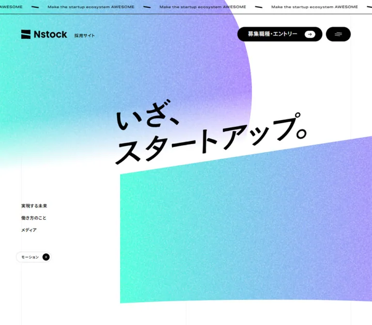
ミントから紫へ移る粒状グラデーションと、大きな英字見出し、繊細な罫線グリッドが特徴の採用サイト。余白の広い白い本文とチャコールの採用・フッター領域を組み合わせています。
オリジナルサイトを見るA precise editorial grid beneath an expansive, grainy mint-and-violet opening.
Original URL: recruit.nstock.co.jp
Final URL: recruit.nstock.co.jp
Theme: white canvas with black typography; charcoal recruitment and footer sections.
Inspected: September 17, 2026, at 04:56:58 JST; supplied retrieval timestamp: September 16, 2026, at 19:56:58.390 UTC.
Viewports: desktop 1440 × 1000; mobile 390 × 844, in CSS pixels.
Scope: the current recruitment homepage. Visual captures cover the desktop opening, Work Style matrix, resource cards, and footer, plus the mobile opening and lower resource/footer area. Rendered DOM and computed styles additionally document About, Job Categories, Media, Company Deck, and recruitment sections. Linked pages, application destinations, the open menu, and toggled motion states were not inspected.
Nstock’s recruitment homepage combines a conspicuous graphic opening with restrained information design. Mint-to-violet fields carry dense pale grain, a large rounded silhouette, and a sloping white corridor containing the Japanese message “いざ、スタートアップ。” Below this opening, white space, thin rules, wide English headings, and small Japanese labels establish an orderly reading rhythm.
This is a recruitment website homepage with routes into company purpose, job categories, working conditions, media, and applications. Its design depends on the relationship between those destinations and the long editorial page. Preserve the hierarchy of an exploratory website: a memorable opening, substantial company information, clear section links, two recruitment routes, and supporting media.
A precise editorial grid beneath an expansive, grainy mint-and-violet opening.
Original URL: recruit.nstock.co.jp
Final URL: recruit.nstock.co.jp
Theme: white canvas with black typography; charcoal recruitment and footer sections.
Inspected: September 17, 2026, at 04:56:58 JST; supplied retrieval timestamp: September 16, 2026, at 19:56:58.390 UTC.
Viewports: desktop 1440 × 1000; mobile 390 × 844, in CSS pixels.
Scope: the current recruitment homepage. Visual captures cover the desktop opening, Work Style matrix, resource cards, and footer, plus the mobile opening and lower resource/footer area. Rendered DOM and computed styles additionally document About, Job Categories, Media, Company Deck, and recruitment sections. Linked pages, application destinations, the open menu, and toggled motion states were not inspected.
Nstock’s recruitment homepage combines a conspicuous graphic opening with restrained information design. Mint-to-violet fields carry dense pale grain, a large rounded silhouette, and a sloping white corridor containing the Japanese message “いざ、スタートアップ。” Below this opening, white space, thin rules, wide English headings, and small Japanese labels establish an orderly reading rhythm.
This is a recruitment website homepage with routes into company purpose, job categories, working conditions, media, and applications. Its design depends on the relationship between those destinations and the long editorial page. Preserve the hierarchy of an exploratory website: a memorable opening, substantial company information, clear section links, two recruitment routes, and supporting media.
| Name | Value | Source or implementation token | Role and evidence |
|---|---|---|---|
| Canvas White | #ffffff |
Source --color-white |
Measured body background; the dominant editorial surface |
| Ink Black | #000000 |
Source --color-black |
Measured primary text; visible control fills, logo treatment, and arrows |
| Charcoal | #2d2d2d |
Source --color-dark |
Measured recruitment-section and footer backgrounds |
| Structural Grid | #eeeeee |
Source --color-grid |
Declared grid color; visually corresponds to the faint page guides |
| Secondary Rule | #dddddd |
Source --color-lines |
Declared rule token; exact assignment to every border was not supplied |
| Gradient Mint | #46ffda |
Endpoint of source --gradient |
Left side of the main decorative gradient |
| Gradient Violet | #a981ff |
Endpoint of source --gradient |
Right side of the main decorative gradient |
The supplied source declares:
--gradient: linear-gradient(90deg, #46ffda 0, #a981ff 100%);
--gradient-trans: linear-gradient(90deg, #46ffda66 0, #a981ff66 100%);
The translucent variant uses approximately 40% alpha at both endpoints. Its declaration is confirmed; its exact application is not established by the element sample.
In the opening screenshots, this color transition is modified by dense grain and a broad fade toward white. The visible result contains many intermediate cyan, blue, lilac, and pale tones. These are part of the composited artwork, not additional interface accent tokens.
Keep the gradient concentrated in large graphic fields. Body links, small arrows, navigation, and primary buttons remain monochrome. The chartreuse podcast cover is content artwork, not evidence of a second site-wide action color.
There is no observed theme selector. White and charcoal are section treatments within one page.
Measured family: "Noto Sans JP", "Noto Sans JP Fallback".
Body text uses regular weight, generous double line spacing, and light positive tracking. At desktop it is 16px / 32px with 0.64px tracking; mobile is approximately 15.015px / 30.029px with 0.601px tracking. Both correspond to approximately 0.04em at body size.
Japanese section labels are consistently modest: 15px, weight 500, and 30px line height at both inspected widths. They identify the section while the much larger English title supplies visual hierarchy.
The computed HTML root lists Times at 10px, but visible body content overrides it. Times should not be introduced as an additional display face.
Source family: "aktiv-grotesk-extended", sans-serif, also exposed as --ff-en.
Large English titles use weight 400, a line-height ratio of 1.2, and tracking of -0.04em. Their broad letterforms create horizontal presence without requiring a bold weight. Dates, resource names, and copyright use the same declared family at smaller sizes, often weight 500.
Use the actual face only when available and licensed. A generic sans-serif fallback is supported by the source, but its narrower proportions may change wrapping. Do not compensate by indiscriminately increasing font weight.
The Japanese hero slogan is visible in the images but is absent from the supplied extracted text and element metrics. Its exact family, rendering medium, and font size are therefore unknown. It appears as large, angled black lettering in two lines:
“いざ、” “スタートアップ。”
A visual estimate places the lettering near a 100px scale on desktop and roughly 45–50px on mobile. Treat these as artwork proportions, not measured type tokens.
Similarly, the wordmark’s letterforms should be preserved as brand artwork. The measured 12px header style belongs to the surrounding identity element and Japanese descriptor; it is not the size of the visible Nstock logo.
| Role | Desktop size / line height | Mobile size / line height | Weight and tracking | Evidence |
|---|---|---|---|---|
| Main English section title | 99 / 118.8px |
57.592 / 69.110px |
400, -0.04em |
Measured on About, Job Categories, Work Style, and recruitment titles |
| Secondary English section title | 71 / 85.2px |
42.409 / 50.890px |
400, -0.04em |
Measured on Media, Company Deck, and Discover More |
| Japanese section label | 15 / 30px |
15 / 30px |
500 |
Measured H2 elements |
| About statement | 40 / 64px |
30.141 / 48.226px |
500 |
Measured |
| About explanatory paragraphs | 23.996 / 47.992px |
18.085 / 36.169px |
400 |
Measured |
| Recruitment introduction | 27.998 / 55.997px |
20.113 / 40.226px |
400 |
Measured |
| Standard body | 16 / 32px |
15.015 / 30.029px |
400, approximately 0.04em |
Measured |
| Resource description | 14 / 28px |
14 / 28px |
400, inherited body tracking |
Measured |
| Resource name and article date | 14 / 20.3px |
14 / 20.3px |
English face, 500, normal tracking |
Measured |
| Navigation and footer links | 12 / 24px |
12 / 24px |
500 |
Measured |
| Identity descriptor | 12 / 22.8px |
10.076 / 19.145px |
500 |
Measured |
| Copyright | 11 / 13.2px |
11 / 13.2px |
English face, 500 |
Measured |
| Work Style item name | Approximately 40px |
Not independently measured | Visually regular English display | Desktop visual estimate |
Source utilities also include --to-cap: .245em and --from-bl: calc(1lh - 1cap - .245em + 1px). These indicate attention to cap-height and baseline alignment. The starter below simplifies those adjustments rather than claiming to reproduce the original title-wrapper logic.
The inspected root font size is 10px at both viewports. Several source dimensions use a scale that stops shrinking below a 1440px viewport.
Let W be viewport width in CSS pixels and S = max(1440, W) / 1440:
--px resolves to S × 1px.--rem resolves to S × 10px at the inspected root size.--_px instead follows W / 1440 × 1px without the minimum.--_rem follows W / 1440 × 10px without the minimum.At both inspected widths, S = 1. Mobile differences come from clamps and responsive overrides, not a blanket 390/1440 reduction of the entire interface.
The horizontal inset formula simplifies to:
clamp(20S, 0.03756W + 5.915S, 60S) pixels
This produces 60px on desktop and 20.5634px on mobile. The supplied desktop --offset is separately expressed as 40px + 2rem, also resolving to 60px; mobile uses the fluid inset expression.
| Source token or measured use | Desktop | Mobile | Status |
|---|---|---|---|
--space-01 |
About 200px |
About 101.408px |
Calculated from source formula |
--space-02 |
120px |
80.563px |
Calculated |
--space-03 |
80px |
60.282px |
Calculated |
--space-04 |
60px |
40.282px |
Calculated |
--space-05 |
40px |
30.141px |
Calculated |
--space-06 |
20px |
20px |
Calculated |
Source --gap |
59.996px |
15.634px |
Calculated; not used for every visible gap |
| Main horizontal inset | 60px |
20.563px |
Measured |
| Common section top padding | About 200px |
86.620px |
Measured on Job Categories, Work Style, Media, and Company Deck |
| Work Style cell padding | 80px 60px |
50.422px 0 |
Measured |
| Resource-card row gap | 20px |
20px |
Measured |
| Space between mobile resource cards | — | About 30.141px |
Calculated from adjacent card rectangles |
| Footer link pitch | 34px |
34px |
Measured: 24px line box plus 10px separation |
Do not equate a similarly sized source token with every component’s padding. The mobile section padding, for example, is 86.620px rather than the 101.408px result of --space-01.
| Element | Desktop | Mobile | Evidence |
|---|---|---|---|
| Editorial sections, Work Style cells, resource images | Square | Square | Visual and measured zero-radius containers |
| Standard section-link pill | 30px |
30px |
Measured; approximately 60px high |
| Header application link | 20px |
Not visible | Measured; approximately 40px high |
| Menu control | 20px |
17.115px |
Measured |
| Motion control | 15px |
17.115px |
Measured |
| Small arrow capsule | Approximately half its height | Similar appearance | Visual estimate: about 30 × 20px |
Rounded shapes belong primarily to controls and hero geometry. Content is not placed inside rounded, elevated cards.
| Element | Desktop 1440 × 1000 |
Mobile 390 × 844 |
|---|---|---|
| Document height | Approximately 11,196px |
Approximately 10,319px |
| Main content width | 1320px |
348.875px |
| Half-width content column | 660px |
Full-width stacking for main editorial content |
| Structural quarter width | 330px, calculated |
Half-content guide at viewport x=195px |
| Top mission ribbon | Approximately 40px high, visually measured |
Approximately 40px high |
| Initial menu bounds | 70 × 40.047px, x=1310, y=80 |
60.375 × 34.219px, x=309.047, y=70.141 |
| Initial application control | 240.234 × 40.047px |
Not visible |
| Initial motion control | 99.719 × 30px, x=45, y=890 |
99.719 × 34.219px, x=199.328, y=70.141 |
| Work Style cell | 660 × 230.297px |
348.875 × 195.203px |
| Resource card width | 300px; four columns |
348.875px; one card per row |
| Resource image | Approximately 300 × 169px |
Approximately 174.438 × 98.1px |
| Recruitment action | 660 × 480px; two columns |
348.875 × 194.078px; stacked |
| Footer height | 414.188px |
469.641px |
The resource cards use a separate four-column layout: x positions 60, 400, 740, and 1080 produce 300px cards and 40px gutters. These are not identical to the 330px structural quarters. Preserve both systems instead of forcing every component onto one gap value.
Role: a narrow recurring statement of purpose.
A roughly 40px strip sits across the top edge. It contains repeated English copy, “Building the infrastructure for Japan's decacorns,” separated by short angled black marks. A crisp dark bottom rule gives it a distinct boundary. The text is compact and widely spread horizontally rather than treated as a large heading.
The same wording appears again in the recruitment section’s extracted content. A 30-second loop token exists, but a recording of the actual loop was not supplied. Treat the repeated composition as observed and its precise travel behavior as unverified.
Role: brand identification and fast access to applications, navigation, and motion settings.
On desktop, the identity begins at x=60px. Its approximately 130px-wide visible wordmark is followed by the Japanese descriptor “採用サイト,” with a measured 20px flex gap. At the upper right, a long black application capsule sits beside a smaller black menu capsule, separated visually by about 10px.
The application control contains the label “募集職種・エントリー” and a white inner arrow capsule. The menu contains a small group of fine, slanted white strokes. Use the supplied graphic appearance as the guide; an unrelated large hamburger icon would change the balance.
The motion control is a white outlined capsule with “モーション” and a black circular pause symbol. Initially it sits near the lower left on desktop, underneath the side navigation. On mobile it moves into the upper-right control group, immediately before the menu.
The desktop application control is absent from the mobile visible-element list and screenshot. The mobile brand descriptor moves below the wordmark.
Right-side controls remain visible in the lower-page captures: desktop shows the application and menu controls near y=40px, while the mobile lower capture shows the menu near y=30px. This supports persistent control behavior, but the exact positioning implementation and scroll thresholds are not supplied. The brand and mobile motion control are not visible in those lower captures.
Role: establishes identity and introduces the recruitment message.
The hero uses two large colored masses separated by open white space:
The slogan occupies the white corridor between those masses. Its angled placement follows the diagonal composition. It is offset rather than centered inside a conventional text box.
Visual estimates: the lower plane begins around x=480px on desktop, with its top near y=550px at that left edge and y=405px at the right edge. On mobile, it begins around x=84px, with the top falling near y=387px on the left and y=341px at the right. These are capture-specific artwork bounds, not responsive formulas.
Desktop provides a small left-side navigation stack near the lower portion of the first viewport:
/about/work/environment/mediaEach measured link is 24px high, with a 34px vertical pitch. This stack is not visible in the mobile opening.
The mobile opening retains the graphic ambition rather than reducing it to a small banner. The colored plane reaches roughly y=690px, and a partial people photograph enters near the bottom of the 844px capture. The wider image sequence and its movement are not sufficiently shown to describe a gallery or carousel.
Role: repeatable editorial section identification.
The dominant section-title pattern is a large regular-weight English line followed by a much smaller Japanese H2. For example, “Work Style” is paired with “働き方のこと.” In the extracted DOM, the English display title is a paragraph and the Japanese label is the semantic heading.
On desktop, many introductions occupy the right 660px half of the 1320px content frame. This creates an intentional empty left half beneath the title. The Work Style introduction begins at x=720px and uses two lines of 16px / 32px text.
On mobile, introductory copy spans the content width below the heading. Preserve the whitespace between title, label, description, and next component. It is a primary part of the hierarchy.
Role: introduces the company’s purpose and directs readers into work information.
About pairs a left-hand Japanese statement with larger explanatory paragraphs in the right half. The statement uses 40px / 64px, weight 500, on desktop. The explanatory paragraphs use approximately 24px / 48px. On mobile these become approximately 30px / 48px and 18px / 36px, arranged sequentially at full content width.
Job Categories uses the same title system, a right-aligned desktop introduction, and a pill link to /work. Its mobile English title wraps into two lines; the computed title size remains approximately 57.6px. Do not force the phrase onto one line by shrinking it far below the rest of the title system.
Standard section-link pills are approximately 60px high with 30px radii. About and Job Categories links align right on desktop and are centered on mobile. Their exact inner icon animation was not inspected.
Role: four large navigation targets into working conditions.
The desktop matrix is two columns by two rows, bounded by thin rules. Each cell is an entire anchor, with square corners, generous internal padding, and no raised surface.
Anatomy:
| Index | Display name | Japanese label | Destination |
|---|---|---|---|
| 01 | Welfare | “働きやすい環境・福利厚生” | /environment#welfare |
| 02 | HR | “人事制度” | /environment#management-system |
| 03 | Numbers | “数字で見るNstock” | /environment#numbers |
| 04 | Office | “オフィス環境” | /environment#office |
Desktop cells measure approximately 660 × 230.3px, with 80px 60px padding. Mobile changes to four full-width rows measuring approximately 348.9 × 195.2px, with 50.4px vertical padding and no horizontal padding inside the content frame.
The mobile parent layout is measured, but the supplied mobile screenshots do not show the matrix. Exact nested label wrapping and item-name sizing remain unverified.
Role: presents recent company stories without introducing a separate card aesthetic.
The supplied DOM contains three dated article anchors. Desktop rows measure 1320 × 308px and use a three-column grid of approximately 360px tracks with 60px gaps, inside 60px padding. Dates and titles start around x=540px, consistent with a first-column media area and text extending across the remaining space.
A separate “Blog” label occupies a 60px-wide side rail in the desktop DOM. Its exact text orientation is not confirmed by the provided screenshots. On mobile it becomes a regular full-width heading at 25px / 30px.
Mobile article anchors become block layouts with no container padding. The date and title follow an upper media-sized region. Their heights vary with title length, so avoid equal-height mobile cards.
The visible text and links establish the content order. Exact thumbnail crops, row hover states, and any animated image treatment are not documented in the supplied visual captures.
Role: offers a longer company introduction and access to presentation material.
This section uses the smaller English display scale: 71px on desktop and approximately 42.4px on mobile. Its Japanese explanatory copy occupies the left desktop half with a 60px right inset; mobile text fills the content frame.
An external-view link points to https://speakerdeck.com/nstock/we-are-hiring. It is approximately 226px wide and 60px high, aligned left on desktop and centered on mobile.
The space and link are documented, but no deck image, embed controls, or playback state was supplied. Do not invent a carousel, player chrome, or loading behavior for this reference.
Role: concentrates the two principal recruitment routes.
The background switches to measured charcoal #2d2d2d, with white text. The heading “We Are Hiring!” uses the main English display scale, followed by a small Japanese section label and a larger invitation paragraph.
Desktop places the introduction in the right half. Below it are two equal 660px-wide anchors, each 480px high:
/requirements.On mobile, the invitation becomes full width and the two anchors stack at approximately 194px high each. The recruitment section retains substantial whitespace and large targets even after reducing their height.
The dark surface, text, link dimensions, and destinations are measured. Additional iconography or hover artwork inside these large anchors was not visually inspected.
Role: provides access to company writing and podcasts.
Desktop shows four independent, unboxed cards. Each begins with an approximately 16:9 image, followed by an English resource name, a Japanese description, and a small external-arrow capsule. Images are square-cornered. There are no shadows, enclosing card borders, or colored category chips.
The four resources are Nstock Blog, Nstock Tech Blog, Nstock Radio, and Nstock Tech Radio. Their artwork supplies the strongest color variation outside the hero.
Desktop anatomy:
14px / 20.3px, weight 500.14px / 28px.30 × 20px black external-arrow capsule.Card heights depend on copy length. The radio card is roughly 28px shorter than its neighbors; the arrows are not all forced onto a shared bottom baseline.
On mobile, each card spans the full 348.875px content width. Its upper area has two equal 174.438px tracks: image on the left, title and arrow on the right. The text begins at x=215.563px, which includes an approximately 20.563px inset within the right track. The description spans both tracks below, separated from the image area by 20px.
This is a deliberate internal card rearrangement, not simply four desktop columns collapsed into four narrow vertical stacks.
Role: closes the page with identity and a compact sitemap.
The footer uses the same charcoal as the recruitment section. White identity artwork sits left, with five internal links and two external links distributed to the right. Faint vertical guides continue through the dark field.
Desktop follows a 2fr 1fr 1fr relationship within the 1320px frame: 660px for identity, then two 330px link regions. The main footer area is approximately 320px tall. A full-width horizontal rule separates it from a roughly 94px copyright row.
Mobile places the identity first, with “採用サイト” beneath the wordmark. The internal and external link groups then sit in two equal columns, beginning at x≈20.6px and x=195px. The copyright remains right aligned in a separate bottom row, approximately 74.5px high.
The observed copyright is “© 2024 Nstock, Inc.” This is page content, not the inspection date.
| Treatment | Supplied evidence | What can be concluded |
|---|---|---|
| Repeating ribbon | Repeated copy; --loop-duration: 30s |
A loop timing token exists; exact direction, distance, and easing were not recorded |
| Navigation transition | --navigation-duration: .8s; --navigation-ease: cubic-bezier(.77, 0, .175, 1) |
Declared navigation timing |
| Identity and motion-control movement | Computed translate 0.8s cubic-bezier(0.77, 0, 0.175, 1) |
A concrete translate transition is assigned to these elements |
| Hover timing | --hover-duration: .6s; --hover-ease: cubic-bezier(.23, 1, .32, 1) |
Available hover timing; affected properties and visible end states are unverified |
| Title timing | --title-duration: 1.4s |
Declared title timing; no verified reveal sequence |
| Menu icon timing | --hamburger-duration: 1s |
Declared timing; open-menu transformation not exercised |
| Motion control | Visible label and pause symbol | A motion-control affordance exists; pause scope and persistence were not tested |
| Scroll persistence | Right controls appear in opening and lower captures | Controls persist visually; precise scroll-state logic is unknown |
| Hero motion | Static captures with grainy geometry | Neither morphing, parallax, nor animated grain can be confirmed |
Most sampled parent elements report animation: none. This does not exclude animation on descendants, pseudo-elements, or through JavaScript. Similarly, a generic computed transition: all without a supplied duration is not proof of visible animation.
The capture process waited for initial rendering and finite geometric motion, temporarily paused perpetual animations during readiness checks, and then resumed them. This supports inspection of settled states but does not establish complete animation choreography.
For a new implementation, keep motion subordinate to navigation and reading. Reuse confirmed timing tokens where appropriate, but design and test the actual menu, title, and pause behaviors independently.
| Surface | Appearance | Structural purpose |
|---|---|---|
| Main canvas | Solid white | Continuous editorial background |
| Grid guides | Very pale vertical and horizontal rules | Aligns sections and exposes the underlying page structure |
| Hero artwork | Mint-to-violet gradient, pale grain, curved and diagonal geometry | Supplies visual identity and scale |
| Navigation controls | Black capsules with white details | Strong, compact affordances against changing backgrounds |
| Motion control | White outlined capsule with black details | Separates a utility setting from navigation actions |
| Work Style cells | White, square, divided by rules | Large navigable areas without elevation |
| Resource cards | Unboxed images and text | Lets each media identity remain recognizable |
| Recruitment and footer | Charcoal with white text and restrained rules | Marks major action and closing regions |
The visible interface does not use a general shadow system, glass blur, or layered card elevation. Hierarchy comes from scale, whitespace, rule placement, and occasional full-width color changes.
The hero’s defining material is high-frequency grain over a smooth horizontal color transition. Pale speckles remain visible across both colored masses, and the upper form dissolves into white. Preserve the grain’s fine scale when resizing; a coarse noise filter or cloudy blur would produce a different surface.
The geometric treatment combines a large rounded upper form with an asymmetric lower plane. Avoid reducing it to a rectangular gradient behind centered text. The white space between the forms is part of the composition.
Content imagery is more literal. The corporate blog cover uses a collage of people in workplace and conversational settings. The technical blog cover is typographic on a pale neutral background. The radio covers use expressive lettering: dark lettering on chartreuse for one, and mint lettering on a near-black violet surface for the other.
Do not apply the hero grain over every photograph or cover. The supplied resource images keep their own visual identities.
No image src values or asset URLs were supplied. The following inventory identifies visible material without inventing filenames.
| Asset | Evidence | Treatment |
|---|---|---|
| Black and white Nstock identities | Header and footer screenshots | Brand artwork; preserve supplied proportions |
| Main hero composition | Desktop and mobile opening screenshots | Gradient, pale grain, white fade, rounded silhouette, sloping plane |
| Hero slogan | Opening screenshots | Angled black Japanese lettering; exact font and medium unknown |
| People photography below opening | Partial mobile screenshot | Only a fragment is visible; full composition unverified |
| Nstock Blog cover | Desktop resource screenshot | People collage and neutral caption area |
| Nstock Tech Blog cover | Desktop resource screenshot | Typographic artwork on pale gray |
| Nstock Radio cover | Desktop resource screenshot | Chartreuse field and expressive black lettering |
| Nstock Tech Radio cover | Desktop and mobile resource screenshots | Mint lettering on a dark violet-black field |
Use authorized original assets when available. A replacement texture or font must be identified as an approximation, especially for the hero and logo.
The page remains a long scrolling document at both inspected sizes. Mobile does not remove the major content sections: its approximately 10,319px document still contains the same sequence of purpose, work, environment, media, deck, recruitment, resources, and footer.
| Pattern | Desktop observation | Mobile observation |
|---|---|---|
| Outer frame | 60px insets | Approximately 20.6px insets |
| Header identity | Wordmark and descriptor in one row | Descriptor below wordmark |
| Header actions | Application capsule and menu | Motion capsule and menu; application capsule absent |
| Opening navigation | Four small links at left | Not visible |
| Hero | Large rightward plane begins around one third of viewport width | Plane starts around 84px; artwork extends beyond the right edge |
| English titles | Main scale 99px | Main scale approximately 57.6px; long titles wrap |
| Editorial columns | Frequent 50/50 division | Full-width sequential content |
| Section pills | Often aligned right | Commonly centered |
| Work Style | Two columns, two rows | Four single-column rows |
| Blog list | Wide rows with a side label rail | Stacked block entries and a regular heading |
| Recruitment links | Two large side-by-side regions | Two shorter stacked regions |
| Resource cards | Four 300px columns | One card per row, internally split image/title area |
| Footer | Identity plus two right-hand link columns | Identity above two link columns |
The exact responsive breakpoint was not supplied. Do not present a conventional 768px breakpoint as recovered source CSS. The starter uses it as a practical recommendation to reproduce the two inspected endpoints.
The layout formulas also imply continued scaling above 1440px, but no wider viewport was visually inspected. Test large monitors independently rather than assuming a fixed maximum-width container.
#46ffda and #a981ff.These are recommendations for a new implementation, not confirmed features of the inspected site:
aria-expanded, and an associated navigation region. Test keyboard focus and return focus when the menu closes.aria-pressed, and ensure it actually pauses every decorative loop it claims to control.prefers-reduced-motion and provide a complete static hero state.#ffffff.#000000.#eeeeee; secondary source rule token: #dddddd.#2d2d2d, with white content.#46ffda → #a981ff, modified by pale grain and a white fade.“Create a recruitment website homepage with Nstock’s observed design relationships: a large grainy mint-to-violet opening, angled Japanese display lettering in a white corridor, a narrow repeating English mission ribbon, and compact black capsule controls. Below the opening, use a white editorial canvas with very pale grid rules, broad regular-weight English headings, small Japanese section labels, and generous double-spaced body text. At 1440px, use 60px outer insets and frequent 660px half-columns. Present working conditions as four large ruled navigation cells, supporting media as unboxed image-and-text cards, and recruitment actions in a charcoal section. On mobile, use approximately 20px insets, stack editorial columns and work links, and rearrange each resource card into an image-left/title-right upper row with a full-width description below. Do not invent the original menu or hero animation.”
This is a recommended implementation starter, not recovered site code. It keeps a conventional root font size while expressing the supplied scaling model through a one-pixel unit. Primary display sizing and spacing formulas derive from source tokens. The body and secondary-title interpolation reproduce the measured endpoints but are implementation approximations.
The CSS covers the editorial frame, controls, Work Style matrix, resource cards, and footer. Original hero artwork, font loading, menu behavior, motion state, and presentation media require separate implementation. The mobile breakpoint and nested mobile Work Style styling are recommendations.
:root {
  /* Confirmed palette */
  --canvas: #fff;
  --ink: #000;
  --dark: #2d2d2d;
  --grid: #eee;
  --rule: #ddd;
  --mint: #46ffda;
  --violet: #a981ff;
  --hero-gradient: linear-gradient(90deg, var(--mint), var(--violet));
  --hero-gradient-translucent: linear-gradient(90deg, #46ffda66, #a981ff66);

  /* Source families; font files are not included */
  --font-ja: 'Noto Sans JP', 'Noto Sans JP Fallback', sans-serif;
  --font-en: 'aktiv-grotesk-extended', sans-serif;

  /* Source-derived unit, without changing the root font size */
  --u: max(1px, calc(100vw / 1440));
  --inset: clamp(
    calc(20 * var(--u)),
    calc(3.756vw + 5.915 * var(--u)),
    calc(60 * var(--u))
  );
  --space-1: clamp(
    calc(100 * var(--u)),
    calc(9.39vw + 64.787 * var(--u)),
    calc(200 * var(--u))
  );
  --space-2: clamp(
    calc(80 * var(--u)),
    calc(3.756vw + 65.915 * var(--u)),
    calc(120 * var(--u))
  );
  --space-3: clamp(
    calc(60 * var(--u)),
    calc(1.878vw + 52.958 * var(--u)),
    calc(80 * var(--u))
  );
  --space-4: clamp(
    calc(40 * var(--u)),
    calc(1.878vw + 32.958 * var(--u)),
    calc(60 * var(--u))
  );
  --space-5: clamp(
    calc(30 * var(--u)),
    calc(.939vw + 26.479 * var(--u)),
    calc(40 * var(--u))
  );
  --space-6: calc(20 * var(--u));

  --text-display: clamp(
    calc(57 * var(--u)),
    calc(3.944vw + 42.21 * var(--u)),
    calc(99 * var(--u))
  );

  /* Recommended interpolation between measured endpoints */
  --text-display-small: clamp(
    calc(42 * var(--u)),
    calc(2.723vw + 31.789 * var(--u)),
    calc(71 * var(--u))
  );
  --text-body: clamp(
    calc(15 * var(--u)),
    calc(.09385vw + 14.6486 * var(--u)),
    calc(16 * var(--u))
  );
  --text-small: calc(14 * var(--u));
  --text-label: calc(15 * var(--u));
  --text-nav: calc(12 * var(--u));

  --duration-hover: .6s;
  --duration-navigation: .8s;
  --duration-title: 1.4s;
  --duration-menu: 1s;
  --duration-loop: 30s;
  --ease-hover: cubic-bezier(.23, 1, .32, 1);
  --ease-navigation: cubic-bezier(.77, 0, .175, 1);
}

* { box-sizing: border-box; }

body {
  margin: 0;
  color: var(--ink);
  background: var(--canvas);
  font-family: var(--font-ja);
  font-size: var(--text-body);
  font-weight: 400;
  line-height: 2;
  letter-spacing: .04em;
}

img { display: block; max-inline-size: 100%; }
button, a { -webkit-tap-highlight-color: transparent; }
button { font: inherit; }
a { color: inherit; }

.recruit-page { isolation: isolate; }
.frame { margin-inline: var(--inset); }

/* Recommended guide layer: place inside a positioned section */
.guided { position: relative; }
.guided::before {
  content: '';
  position: absolute;
  inset: 0 var(--inset);
  z-index: -1;
  pointer-events: none;
  border-inline: 1px solid var(--grid);
  background: linear-gradient(
    90deg,
    transparent calc(50% - .5px),
    var(--grid) calc(50% - .5px),
    var(--grid) calc(50% + .5px),
    transparent calc(50% + .5px)
  );
}

.editorial-section { padding-block-start: var(--space-1); }
.section-title {
  margin: 0;
  font-family: var(--font-en);
  font-size: var(--text-display);
  font-weight: 400;
  line-height: 1.2;
  letter-spacing: -.04em;
}
.section-title--small { font-size: var(--text-display-small); }
.section-label {
  margin: 0;
  font-size: var(--text-label);
  font-weight: 500;
  line-height: 2;
}
.section-intro {
  inline-size: 50%;
  margin: var(--space-3) 0 var(--space-3) auto;
}
.section-intro p { margin: 0; }
.section-action {
  display: flex;
  justify-content: flex-end;
  margin-block-start: var(--space-3);
}

.pill {
  display: inline-flex;
  align-items: center;
  justify-content: center;
  gap: var(--space-6);
  min-block-size: calc(60 * var(--u));
  padding-inline: calc(30 * var(--u));
  border: 0;
  border-radius: 999px;
  color: var(--canvas);
  background: var(--ink);
  text-decoration: none;
}
.pill--compact { min-block-size: calc(40 * var(--u)); }
.arrow-capsule {
  display: inline-flex;
  align-items: center;
  justify-content: center;
  flex: none;
  inline-size: calc(30 * var(--u));
  block-size: calc(20 * var(--u));
  border-radius: 999px;
  color: var(--canvas);
  background: var(--ink);
  font: 12px/1 sans-serif;
  letter-spacing: 0;
}
.pill .arrow-capsule {
  color: var(--ink);
  background: var(--canvas);
}

.work-grid {
  display: grid;
  grid-template-columns: repeat(2, minmax(0, 1fr));
  border-block-start: 1px solid var(--grid);
}
.work-item {
  display: grid;
  grid-template-columns: minmax(0, 1fr) auto;
  align-items: center;
  gap: var(--space-6);
  min-block-size: calc(230.3 * var(--u));
  padding: calc(80 * var(--u)) calc(60 * var(--u));
  border-block-end: 1px solid var(--grid);
  text-decoration: none;
}
.work-item:nth-child(odd) { border-inline-end: 1px solid var(--grid); }
.work-item__index {
  display: block;
  font-family: var(--font-en);
  font-size: var(--text-small);
  line-height: 1.45;
  letter-spacing: 0;
}
.work-item__name {
  display: block;
  font-family: var(--font-en);
  font-size: calc(40 * var(--u));
  line-height: 1.2;
  letter-spacing: -.04em;
}
.work-item__meta {
  display: flex;
  align-items: center;
  gap: var(--space-6);
}

.discover-grid {
  display: grid;
  grid-template-columns: repeat(4, minmax(0, 1fr));
  gap: calc(40 * var(--u));
  align-items: start;
}
.discover-card {
  display: grid;
  grid-template-areas: 'image' 'title' 'copy' 'arrow';
  row-gap: var(--space-6);
  text-decoration: none;
}
.discover-card__image {
  grid-area: image;
  inline-size: 100%;
  aspect-ratio: 16 / 9;
  object-fit: cover;
}
.discover-card__meta { display: contents; }
.discover-card__title {
  grid-area: title;
  margin: 0;
  padding-block-start: var(--space-6);
  font-family: var(--font-en);
  font-size: var(--text-small);
  font-weight: 500;
  line-height: 1.45;
  letter-spacing: 0;
}
.discover-card__summary {
  grid-area: copy;
  margin: 0;
  font-size: var(--text-small);
  line-height: 2;
}
.discover-card__arrow { grid-area: arrow; }

.recruitment, .site-footer {
  color: var(--canvas);
  background: var(--dark);
}
.recruitment { padding-block-start: var(--space-2); }
.recruitment-actions {
  display: grid;
  grid-template-columns: repeat(2, minmax(0, 1fr));
}
.recruitment-action {
  display: grid;
  align-content: center;
  min-block-size: calc(480 * var(--u));
  padding: var(--space-4);
  border-block-start: 1px solid rgb(255 255 255 / .12);
  text-decoration: none;
}

.footer-grid {
  display: grid;
  grid-template-columns: 2fr 1fr 1fr;
  padding-block: var(--space-3);
}
.footer-nav {
  display: grid;
  align-content: start;
  justify-items: start;
  gap: calc(10 * var(--u));
}
.footer-nav a {
  font-size: var(--text-nav);
  font-weight: 500;
  line-height: 2;
  text-decoration: none;
}
.footer-copyright {
  margin: 0;
  padding: var(--space-5) var(--inset);
  border-block-start: 1px solid rgb(255 255 255 / .12);
  text-align: right;
  font-family: var(--font-en);
  font-size: calc(11 * var(--u));
  font-weight: 500;
  line-height: 1.2;
  letter-spacing: 0;
}

/* Recommended breakpoint; not recovered from the source */
@media (max-width: 48rem) {
  .editorial-section { padding-block-start: 86.62px; }
  .section-intro { inline-size: 100%; }
  .section-action { justify-content: center; }

  .work-grid { grid-template-columns: minmax(0, 1fr); }
  .work-item {
    grid-template-columns: minmax(0, 1fr);
    gap: 6px;
    min-block-size: 195.2px;
    padding: 50.42px 0;
  }
  .work-item:nth-child(odd) { border-inline-end: 0; }
  .work-item__name { font-size: 32px; }
  .work-item__meta { justify-content: space-between; }

  .discover-grid {
    grid-template-columns: minmax(0, 1fr);
    gap: var(--space-5);
  }
  .discover-card {
    grid-template-columns: repeat(2, minmax(0, 1fr));
    grid-template-areas: 'image meta' 'copy copy';
  }
  .discover-card__meta {
    grid-area: meta;
    display: flex;
    flex-direction: column;
    align-items: flex-start;
    gap: 15px;
    padding-inline-start: var(--inset);
  }
  .discover-card__title { padding-block-start: 0; }

  .recruitment-actions { grid-template-columns: minmax(0, 1fr); }
  .recruitment-action {
    min-block-size: 194.08px;
    padding-inline: 0;
  }
  .footer-grid {
    grid-template-columns: repeat(2, minmax(0, 1fr));
    row-gap: var(--space-3);
  }
  .footer-brand { grid-column: 1 / -1; }
}

/* Recommended keyboard treatment */
.recruit-page :is(a, button):focus-visible {
  outline: 2px solid currentColor;
  outline-offset: 5px;
}

/* Apply these classes to optional decorative motion */
.recruit-page[data-motion='paused'] .decorative-loop {
  animation-play-state: paused;
}
@media (prefers-reduced-motion: reduce) {
  .recruit-page .decorative-loop { animation: none; }
  .recruit-page .motion-transition { transition: none; }
}
The resource-card structure below supports the desktop and mobile rearrangement without duplicating its visible title. Replace the example image path with an authorized local asset; it is not an observed source filename. The whole card is the link, and the arrow is decorative.
<a class='discover-card' href='/journal'>
  <img
    class='discover-card__image'
    src='/media/example-cover.webp'
    width='1600'
    height='900'
    alt='Team members talking in the office'
  >
  <div class='discover-card__meta'>
    <h3 class='discover-card__title'>Company Journal</h3>
    <span
      class='arrow-capsule discover-card__arrow'
      aria-hidden='true'
    >↗</span>
  </div>
  <p class='discover-card__summary'>
    Stories about the team, its work, and everyday company life.
  </p>
</a>
For Work Style links, use .work-item around a title group containing .work-item__index and .work-item__name, followed by .work-item__meta containing the explanatory label and decorative arrow. For the footer, .footer-grid contains .footer-brand and two .footer-nav groups.
Optional aliases for a project already using Tailwind v4. This does not identify the original implementation framework. Load the custom properties above first.
@theme inline {
  --color-canvas: var(--canvas);
  --color-ink: var(--ink);
  --color-charcoal: var(--dark);
  --color-grid: var(--grid);
  --color-mint: var(--mint);
  --color-violet: var(--violet);

  --font-body: var(--font-ja);
  --font-display: var(--font-en);

  --text-section: var(--text-display);
  --text-section-small: var(--text-display-small);
  --text-copy: var(--text-body);
  --text-resource: var(--text-small);

  --spacing-page: var(--inset);
  --spacing-section: var(--space-1);
  --spacing-content: var(--space-3);
  --spacing-detail: var(--space-6);

  --radius-capsule: 999px;
}
2026-09-16T19:56:58.390Z, corresponding to September 17, 2026, at 04:56:58 JST. The footer’s 2024 copyright is not used as the capture date.1440 × 1000, showing the opening, Work Style matrix, and lower resources/footer; rendered DOM, links, element rectangles, computed typography, colors, spacing, and custom properties.390 × 844, showing the opening and lower resources/footer; matching rendered DOM and computed-style evidence for the complete homepage content sequence.This document describes the current supplied homepage evidence. Measurements, visual estimates, calculated formulas, and implementation recommendations are distinguished throughout.
# Nstock Recruit — Style Reference

> A precise editorial grid beneath an expansive, grainy mint-and-violet opening.

**Original URL:** [recruit.nstock.co.jp](https://recruit.nstock.co.jp/)
**Final URL:** [recruit.nstock.co.jp](https://recruit.nstock.co.jp/)
**Theme:** white canvas with black typography; charcoal recruitment and footer sections.
**Inspected:** September 17, 2026, at 04:56:58 JST; supplied retrieval timestamp: September 16, 2026, at 19:56:58.390 UTC.
**Viewports:** desktop `1440 × 1000`; mobile `390 × 844`, in CSS pixels.
**Scope:** the current recruitment homepage. Visual captures cover the desktop opening, Work Style matrix, resource cards, and footer, plus the mobile opening and lower resource/footer area. Rendered DOM and computed styles additionally document About, Job Categories, Media, Company Deck, and recruitment sections. Linked pages, application destinations, the open menu, and toggled motion states were not inspected.

Nstock’s recruitment homepage combines a conspicuous graphic opening with restrained information design. Mint-to-violet fields carry dense pale grain, a large rounded silhouette, and a sloping white corridor containing the Japanese message “いざ、スタートアップ。” Below this opening, white space, thin rules, wide English headings, and small Japanese labels establish an orderly reading rhythm.

This is a recruitment website homepage with routes into company purpose, job categories, working conditions, media, and applications. Its design depends on the relationship between those destinations and the long editorial page. Preserve the hierarchy of an exploratory website: a memorable opening, substantial company information, clear section links, two recruitment routes, and supporting media.
# Nstock Recruit — Style Reference

> A precise editorial grid beneath an expansive, grainy mint-and-violet opening.

**Original URL:** [recruit.nstock.co.jp](https://recruit.nstock.co.jp/)
**Final URL:** [recruit.nstock.co.jp](https://recruit.nstock.co.jp/)
**Theme:** white canvas with black typography; charcoal recruitment and footer sections.
**Inspected:** September 17, 2026, at 04:56:58 JST; supplied retrieval timestamp: September 16, 2026, at 19:56:58.390 UTC.
**Viewports:** desktop `1440 × 1000`; mobile `390 × 844`, in CSS pixels.
**Scope:** the current recruitment homepage. Visual captures cover the desktop opening, Work Style matrix, resource cards, and footer, plus the mobile opening and lower resource/footer area. Rendered DOM and computed styles additionally document About, Job Categories, Media, Company Deck, and recruitment sections. Linked pages, application destinations, the open menu, and toggled motion states were not inspected.

Nstock’s recruitment homepage combines a conspicuous graphic opening with restrained information design. Mint-to-violet fields carry dense pale grain, a large rounded silhouette, and a sloping white corridor containing the Japanese message “いざ、スタートアップ。” Below this opening, white space, thin rules, wide English headings, and small Japanese labels establish an orderly reading rhythm.

This is a recruitment website homepage with routes into company purpose, job categories, working conditions, media, and applications. Its design depends on the relationship between those destinations and the long editorial page. Preserve the hierarchy of an exploratory website: a memorable opening, substantial company information, clear section links, two recruitment routes, and supporting media.

## How to Read This Reference

- **Measured** means a value supplied by rendered DOM, computed styles, or source custom properties. Values are rounded for readability where appropriate.
- **Visually estimated** means a proportion or treatment read from the supplied original-page screenshots. These estimates are not recovered CSS declarations.
- **Calculated** means a result derived from the supplied source formulas or measured geometry.
- **Recommended** means an implementation choice for a new project, including the CSS starter and its breakpoint.
- Token aliases are descriptive unless explicitly identified as source variables.
- A computed font family identifies the declared stack. No independent font-file or glyph-loading inspection was supplied.
- Element rectangles can include stretched grid areas, transforms, and animation wrappers. They should not all become fixed heights in an implementation. For example, the desktop About statement occupies a 648px-high rectangle while its text uses a 64px line height.
- Repeated strings in the extracted DOM are not evidence that two copies are visibly displayed. Screenshots show single section titles and single control labels.

## Tokens — Colors

### Default Palette

| Name | Value | Source or implementation token | Role and evidence |
| --- | --- | --- | --- |
| Canvas White | `#ffffff` | Source `--color-white` | Measured body background; the dominant editorial surface |
| Ink Black | `#000000` | Source `--color-black` | Measured primary text; visible control fills, logo treatment, and arrows |
| Charcoal | `#2d2d2d` | Source `--color-dark` | Measured recruitment-section and footer backgrounds |
| Structural Grid | `#eeeeee` | Source `--color-grid` | Declared grid color; visually corresponds to the faint page guides |
| Secondary Rule | `#dddddd` | Source `--color-lines` | Declared rule token; exact assignment to every border was not supplied |
| Gradient Mint | `#46ffda` | Endpoint of source `--gradient` | Left side of the main decorative gradient |
| Gradient Violet | `#a981ff` | Endpoint of source `--gradient` | Right side of the main decorative gradient |

### Gradient Treatment

The supplied source declares:

```css
--gradient: linear-gradient(90deg, #46ffda 0, #a981ff 100%);
--gradient-trans: linear-gradient(90deg, #46ffda66 0, #a981ff66 100%);
```

The translucent variant uses approximately 40% alpha at both endpoints. Its declaration is confirmed; its exact application is not established by the element sample.

In the opening screenshots, this color transition is modified by dense grain and a broad fade toward white. The visible result contains many intermediate cyan, blue, lilac, and pale tones. These are part of the composited artwork, not additional interface accent tokens.

Keep the gradient concentrated in large graphic fields. Body links, small arrows, navigation, and primary buttons remain monochrome. The chartreuse podcast cover is content artwork, not evidence of a second site-wide action color.

There is no observed theme selector. White and charcoal are section treatments within one page.

## Tokens — Typography

### Japanese Body and Labels

**Measured family:** `"Noto Sans JP", "Noto Sans JP Fallback"`.

Body text uses regular weight, generous double line spacing, and light positive tracking. At desktop it is `16px / 32px` with `0.64px` tracking; mobile is approximately `15.015px / 30.029px` with `0.601px` tracking. Both correspond to approximately `0.04em` at body size.

Japanese section labels are consistently modest: `15px`, weight `500`, and `30px` line height at both inspected widths. They identify the section while the much larger English title supplies visual hierarchy.

The computed HTML root lists Times at 10px, but visible body content overrides it. Times should not be introduced as an additional display face.

### Extended English Display

**Source family:** `"aktiv-grotesk-extended", sans-serif`, also exposed as `--ff-en`.

Large English titles use weight `400`, a line-height ratio of `1.2`, and tracking of `-0.04em`. Their broad letterforms create horizontal presence without requiring a bold weight. Dates, resource names, and copyright use the same declared family at smaller sizes, often weight `500`.

Use the actual face only when available and licensed. A generic sans-serif fallback is supported by the source, but its narrower proportions may change wrapping. Do not compensate by indiscriminately increasing font weight.

### Hero Lettering and Brand Artwork

The Japanese hero slogan is visible in the images but is absent from the supplied extracted text and element metrics. Its exact family, rendering medium, and font size are therefore unknown. It appears as large, angled black lettering in two lines:

“いざ、”
“スタートアップ。”

A visual estimate places the lettering near a 100px scale on desktop and roughly 45–50px on mobile. Treat these as artwork proportions, not measured type tokens.

Similarly, the wordmark’s letterforms should be preserved as brand artwork. The measured 12px header style belongs to the surrounding identity element and Japanese descriptor; it is not the size of the visible Nstock logo.

### Type Scale

| Role | Desktop size / line height | Mobile size / line height | Weight and tracking | Evidence |
| --- | --- | --- | --- | --- |
| Main English section title | `99 / 118.8px` | `57.592 / 69.110px` | `400`, `-0.04em` | Measured on About, Job Categories, Work Style, and recruitment titles |
| Secondary English section title | `71 / 85.2px` | `42.409 / 50.890px` | `400`, `-0.04em` | Measured on Media, Company Deck, and Discover More |
| Japanese section label | `15 / 30px` | `15 / 30px` | `500` | Measured H2 elements |
| About statement | `40 / 64px` | `30.141 / 48.226px` | `500` | Measured |
| About explanatory paragraphs | `23.996 / 47.992px` | `18.085 / 36.169px` | `400` | Measured |
| Recruitment introduction | `27.998 / 55.997px` | `20.113 / 40.226px` | `400` | Measured |
| Standard body | `16 / 32px` | `15.015 / 30.029px` | `400`, approximately `0.04em` | Measured |
| Resource description | `14 / 28px` | `14 / 28px` | `400`, inherited body tracking | Measured |
| Resource name and article date | `14 / 20.3px` | `14 / 20.3px` | English face, `500`, normal tracking | Measured |
| Navigation and footer links | `12 / 24px` | `12 / 24px` | `500` | Measured |
| Identity descriptor | `12 / 22.8px` | `10.076 / 19.145px` | `500` | Measured |
| Copyright | `11 / 13.2px` | `11 / 13.2px` | English face, `500` | Measured |
| Work Style item name | Approximately `40px` | Not independently measured | Visually regular English display | Desktop visual estimate |

Source utilities also include `--to-cap: .245em` and `--from-bl: calc(1lh - 1cap - .245em + 1px)`. These indicate attention to cap-height and baseline alignment. The starter below simplifies those adjustments rather than claiming to reproduce the original title-wrapper logic.

## Tokens — Spacing & Shapes

### Responsive Unit

The inspected root font size is `10px` at both viewports. Several source dimensions use a scale that stops shrinking below a 1440px viewport.

Let `W` be viewport width in CSS pixels and `S = max(1440, W) / 1440`:

- Source `--px` resolves to `S × 1px`.
- Source `--rem` resolves to `S × 10px` at the inspected root size.
- Source `--_px` instead follows `W / 1440 × 1px` without the minimum.
- Source `--_rem` follows `W / 1440 × 10px` without the minimum.

At both inspected widths, `S = 1`. Mobile differences come from clamps and responsive overrides, not a blanket 390/1440 reduction of the entire interface.

The horizontal inset formula simplifies to:

```text
clamp(20S, 0.03756W + 5.915S, 60S) pixels
```

This produces `60px` on desktop and `20.5634px` on mobile. The supplied desktop `--offset` is separately expressed as `40px + 2rem`, also resolving to 60px; mobile uses the fluid inset expression.

### Spacing Scale

| Source token or measured use | Desktop | Mobile | Status |
| --- | --- | --- | --- |
| `--space-01` | About `200px` | About `101.408px` | Calculated from source formula |
| `--space-02` | `120px` | `80.563px` | Calculated |
| `--space-03` | `80px` | `60.282px` | Calculated |
| `--space-04` | `60px` | `40.282px` | Calculated |
| `--space-05` | `40px` | `30.141px` | Calculated |
| `--space-06` | `20px` | `20px` | Calculated |
| Source `--gap` | `59.996px` | `15.634px` | Calculated; not used for every visible gap |
| Main horizontal inset | `60px` | `20.563px` | Measured |
| Common section top padding | About `200px` | `86.620px` | Measured on Job Categories, Work Style, Media, and Company Deck |
| Work Style cell padding | `80px 60px` | `50.422px 0` | Measured |
| Resource-card row gap | `20px` | `20px` | Measured |
| Space between mobile resource cards | — | About `30.141px` | Calculated from adjacent card rectangles |
| Footer link pitch | `34px` | `34px` | Measured: 24px line box plus 10px separation |

Do not equate a similarly sized source token with every component’s padding. The mobile section padding, for example, is 86.620px rather than the 101.408px result of `--space-01`.

### Border Radius

| Element | Desktop | Mobile | Evidence |
| --- | --- | --- | --- |
| Editorial sections, Work Style cells, resource images | Square | Square | Visual and measured zero-radius containers |
| Standard section-link pill | `30px` | `30px` | Measured; approximately 60px high |
| Header application link | `20px` | Not visible | Measured; approximately 40px high |
| Menu control | `20px` | `17.115px` | Measured |
| Motion control | `15px` | `17.115px` | Measured |
| Small arrow capsule | Approximately half its height | Similar appearance | Visual estimate: about `30 × 20px` |

Rounded shapes belong primarily to controls and hero geometry. Content is not placed inside rounded, elevated cards.

### Layout Measurements

| Element | Desktop `1440 × 1000` | Mobile `390 × 844` |
| --- | --- | --- |
| Document height | Approximately `11,196px` | Approximately `10,319px` |
| Main content width | `1320px` | `348.875px` |
| Half-width content column | `660px` | Full-width stacking for main editorial content |
| Structural quarter width | `330px`, calculated | Half-content guide at viewport x=`195px` |
| Top mission ribbon | Approximately `40px` high, visually measured | Approximately `40px` high |
| Initial menu bounds | `70 × 40.047px`, x=`1310`, y=`80` | `60.375 × 34.219px`, x=`309.047`, y=`70.141` |
| Initial application control | `240.234 × 40.047px` | Not visible |
| Initial motion control | `99.719 × 30px`, x=`45`, y=`890` | `99.719 × 34.219px`, x=`199.328`, y=`70.141` |
| Work Style cell | `660 × 230.297px` | `348.875 × 195.203px` |
| Resource card width | `300px`; four columns | `348.875px`; one card per row |
| Resource image | Approximately `300 × 169px` | Approximately `174.438 × 98.1px` |
| Recruitment action | `660 × 480px`; two columns | `348.875 × 194.078px`; stacked |
| Footer height | `414.188px` | `469.641px` |

The resource cards use a separate four-column layout: x positions `60`, `400`, `740`, and `1080` produce 300px cards and 40px gutters. These are not identical to the 330px structural quarters. Preserve both systems instead of forcing every component onto one gap value.

## Components

### Mission Ribbon

**Role:** a narrow recurring statement of purpose.

A roughly 40px strip sits across the top edge. It contains repeated English copy, “Building the infrastructure for Japan's decacorns,” separated by short angled black marks. A crisp dark bottom rule gives it a distinct boundary. The text is compact and widely spread horizontally rather than treated as a large heading.

The same wording appears again in the recruitment section’s extracted content. A 30-second loop token exists, but a recording of the actual loop was not supplied. Treat the repeated composition as observed and its precise travel behavior as unverified.

### Header and Utility Controls

**Role:** brand identification and fast access to applications, navigation, and motion settings.

On desktop, the identity begins at x=60px. Its approximately 130px-wide visible wordmark is followed by the Japanese descriptor “採用サイト,” with a measured 20px flex gap. At the upper right, a long black application capsule sits beside a smaller black menu capsule, separated visually by about 10px.

The application control contains the label “募集職種・エントリー” and a white inner arrow capsule. The menu contains a small group of fine, slanted white strokes. Use the supplied graphic appearance as the guide; an unrelated large hamburger icon would change the balance.

The motion control is a white outlined capsule with “モーション” and a black circular pause symbol. Initially it sits near the lower left on desktop, underneath the side navigation. On mobile it moves into the upper-right control group, immediately before the menu.

The desktop application control is absent from the mobile visible-element list and screenshot. The mobile brand descriptor moves below the wordmark.

Right-side controls remain visible in the lower-page captures: desktop shows the application and menu controls near y=40px, while the mobile lower capture shows the menu near y=30px. This supports persistent control behavior, but the exact positioning implementation and scroll thresholds are not supplied. The brand and mobile motion control are not visible in those lower captures.

### Hero Graphic and Side Navigation

**Role:** establishes identity and introduces the recruitment message.

The hero uses two large colored masses separated by open white space:

1. An upper rounded field extends from the left edge and fades toward white below. At desktop its visible right extent is around x=960px; at mobile, around x=306px.
2. A lower grainy plane enters from the right. Its top edge slopes upward toward the right, while its lower edge is gently curved rather than a perfectly rigid rectangle.

The slogan occupies the white corridor between those masses. Its angled placement follows the diagonal composition. It is offset rather than centered inside a conventional text box.

**Visual estimates:** the lower plane begins around x=480px on desktop, with its top near y=550px at that left edge and y=405px at the right edge. On mobile, it begins around x=84px, with the top falling near y=387px on the left and y=341px at the right. These are capture-specific artwork bounds, not responsive formulas.

Desktop provides a small left-side navigation stack near the lower portion of the first viewport:

- “実現する未来” → `/about`
- “仕事のこと” → `/work`
- “働き方のこと” → `/environment`
- “メディア” → `/media`

Each measured link is 24px high, with a 34px vertical pitch. This stack is not visible in the mobile opening.

The mobile opening retains the graphic ambition rather than reducing it to a small banner. The colored plane reaches roughly y=690px, and a partial people photograph enters near the bottom of the 844px capture. The wider image sequence and its movement are not sufficiently shown to describe a gallery or carousel.

### Section Heading and Introduction

**Role:** repeatable editorial section identification.

The dominant section-title pattern is a large regular-weight English line followed by a much smaller Japanese H2. For example, “Work Style” is paired with “働き方のこと.” In the extracted DOM, the English display title is a paragraph and the Japanese label is the semantic heading.

On desktop, many introductions occupy the right 660px half of the 1320px content frame. This creates an intentional empty left half beneath the title. The Work Style introduction begins at x=720px and uses two lines of `16px / 32px` text.

On mobile, introductory copy spans the content width below the heading. Preserve the whitespace between title, label, description, and next component. It is a primary part of the hierarchy.

### About and Job Categories

**Role:** introduces the company’s purpose and directs readers into work information.

About pairs a left-hand Japanese statement with larger explanatory paragraphs in the right half. The statement uses `40px / 64px`, weight 500, on desktop. The explanatory paragraphs use approximately `24px / 48px`. On mobile these become approximately `30px / 48px` and `18px / 36px`, arranged sequentially at full content width.

Job Categories uses the same title system, a right-aligned desktop introduction, and a pill link to `/work`. Its mobile English title wraps into two lines; the computed title size remains approximately 57.6px. Do not force the phrase onto one line by shrinking it far below the rest of the title system.

Standard section-link pills are approximately 60px high with 30px radii. About and Job Categories links align right on desktop and are centered on mobile. Their exact inner icon animation was not inspected.

### Work Style Link Matrix

**Role:** four large navigation targets into working conditions.

The desktop matrix is two columns by two rows, bounded by thin rules. Each cell is an entire anchor, with square corners, generous internal padding, and no raised surface.

Anatomy:

- A compact parenthesized index such as “( 01 )”.
- A larger English destination name beneath it.
- A Japanese explanation aligned toward the right.
- A small black arrow capsule at the far right.

| Index | Display name | Japanese label | Destination |
| --- | --- | --- | --- |
| 01 | Welfare | “働きやすい環境・福利厚生” | `/environment#welfare` |
| 02 | HR | “人事制度” | `/environment#management-system` |
| 03 | Numbers | “数字で見るNstock” | `/environment#numbers` |
| 04 | Office | “オフィス環境” | `/environment#office` |

Desktop cells measure approximately `660 × 230.3px`, with `80px 60px` padding. Mobile changes to four full-width rows measuring approximately `348.9 × 195.2px`, with `50.4px` vertical padding and no horizontal padding inside the content frame.

The mobile parent layout is measured, but the supplied mobile screenshots do not show the matrix. Exact nested label wrapping and item-name sizing remain unverified.

### Media and Blog List

**Role:** presents recent company stories without introducing a separate card aesthetic.

The supplied DOM contains three dated article anchors. Desktop rows measure `1320 × 308px` and use a three-column grid of approximately 360px tracks with 60px gaps, inside 60px padding. Dates and titles start around x=540px, consistent with a first-column media area and text extending across the remaining space.

A separate “Blog” label occupies a 60px-wide side rail in the desktop DOM. Its exact text orientation is not confirmed by the provided screenshots. On mobile it becomes a regular full-width heading at `25px / 30px`.

Mobile article anchors become block layouts with no container padding. The date and title follow an upper media-sized region. Their heights vary with title length, so avoid equal-height mobile cards.

The visible text and links establish the content order. Exact thumbnail crops, row hover states, and any animated image treatment are not documented in the supplied visual captures.

### Company Deck

**Role:** offers a longer company introduction and access to presentation material.

This section uses the smaller English display scale: 71px on desktop and approximately 42.4px on mobile. Its Japanese explanatory copy occupies the left desktop half with a 60px right inset; mobile text fills the content frame.

An external-view link points to `https://speakerdeck.com/nstock/we-are-hiring`. It is approximately 226px wide and 60px high, aligned left on desktop and centered on mobile.

The space and link are documented, but no deck image, embed controls, or playback state was supplied. Do not invent a carousel, player chrome, or loading behavior for this reference.

### Recruitment Section

**Role:** concentrates the two principal recruitment routes.

The background switches to measured charcoal `#2d2d2d`, with white text. The heading “We Are Hiring!” uses the main English display scale, followed by a small Japanese section label and a larger invitation paragraph.

Desktop places the introduction in the right half. Below it are two equal 660px-wide anchors, each 480px high:

- “Apply” with “募集要項・エントリー,” linking to `/requirements`.
- “Casual Interview” with “カジュアル面談,” linking to the supplied external recruitment destination.

On mobile, the invitation becomes full width and the two anchors stack at approximately 194px high each. The recruitment section retains substantial whitespace and large targets even after reducing their height.

The dark surface, text, link dimensions, and destinations are measured. Additional iconography or hover artwork inside these large anchors was not visually inspected.

### Discover More Resource Card

**Role:** provides access to company writing and podcasts.

Desktop shows four independent, unboxed cards. Each begins with an approximately 16:9 image, followed by an English resource name, a Japanese description, and a small external-arrow capsule. Images are square-cornered. There are no shadows, enclosing card borders, or colored category chips.

The four resources are Nstock Blog, Nstock Tech Blog, Nstock Radio, and Nstock Tech Radio. Their artwork supplies the strongest color variation outside the hero.

Desktop anatomy:

- 300px-wide image, approximately 169px high.
- Resource name in the English face at `14px / 20.3px`, weight 500.
- Additional 20px top padding on the title element.
- Description at `14px / 28px`.
- Approximately `30 × 20px` black external-arrow capsule.
- Measured 20px grid row gaps.

Card heights depend on copy length. The radio card is roughly 28px shorter than its neighbors; the arrows are not all forced onto a shared bottom baseline.

On mobile, each card spans the full 348.875px content width. Its upper area has two equal 174.438px tracks: image on the left, title and arrow on the right. The text begins at x=215.563px, which includes an approximately 20.563px inset within the right track. The description spans both tracks below, separated from the image area by 20px.

This is a deliberate internal card rearrangement, not simply four desktop columns collapsed into four narrow vertical stacks.

### Footer

**Role:** closes the page with identity and a compact sitemap.

The footer uses the same charcoal as the recruitment section. White identity artwork sits left, with five internal links and two external links distributed to the right. Faint vertical guides continue through the dark field.

Desktop follows a `2fr 1fr 1fr` relationship within the 1320px frame: 660px for identity, then two 330px link regions. The main footer area is approximately 320px tall. A full-width horizontal rule separates it from a roughly 94px copyright row.

Mobile places the identity first, with “採用サイト” beneath the wordmark. The internal and external link groups then sit in two equal columns, beginning at x≈20.6px and x=195px. The copyright remains right aligned in a separate bottom row, approximately 74.5px high.

The observed copyright is “© 2024 Nstock, Inc.” This is page content, not the inspection date.

## Tokens — Motion & Interaction

| Treatment | Supplied evidence | What can be concluded |
| --- | --- | --- |
| Repeating ribbon | Repeated copy; `--loop-duration: 30s` | A loop timing token exists; exact direction, distance, and easing were not recorded |
| Navigation transition | `--navigation-duration: .8s`; `--navigation-ease: cubic-bezier(.77, 0, .175, 1)` | Declared navigation timing |
| Identity and motion-control movement | Computed `translate 0.8s cubic-bezier(0.77, 0, 0.175, 1)` | A concrete translate transition is assigned to these elements |
| Hover timing | `--hover-duration: .6s`; `--hover-ease: cubic-bezier(.23, 1, .32, 1)` | Available hover timing; affected properties and visible end states are unverified |
| Title timing | `--title-duration: 1.4s` | Declared title timing; no verified reveal sequence |
| Menu icon timing | `--hamburger-duration: 1s` | Declared timing; open-menu transformation not exercised |
| Motion control | Visible label and pause symbol | A motion-control affordance exists; pause scope and persistence were not tested |
| Scroll persistence | Right controls appear in opening and lower captures | Controls persist visually; precise scroll-state logic is unknown |
| Hero motion | Static captures with grainy geometry | Neither morphing, parallax, nor animated grain can be confirmed |

Most sampled parent elements report `animation: none`. This does not exclude animation on descendants, pseudo-elements, or through JavaScript. Similarly, a generic computed `transition: all` without a supplied duration is not proof of visible animation.

The capture process waited for initial rendering and finite geometric motion, temporarily paused perpetual animations during readiness checks, and then resumed them. This supports inspection of settled states but does not establish complete animation choreography.

For a new implementation, keep motion subordinate to navigation and reading. Reuse confirmed timing tokens where appropriate, but design and test the actual menu, title, and pause behaviors independently.

## Surfaces

| Surface | Appearance | Structural purpose |
| --- | --- | --- |
| Main canvas | Solid white | Continuous editorial background |
| Grid guides | Very pale vertical and horizontal rules | Aligns sections and exposes the underlying page structure |
| Hero artwork | Mint-to-violet gradient, pale grain, curved and diagonal geometry | Supplies visual identity and scale |
| Navigation controls | Black capsules with white details | Strong, compact affordances against changing backgrounds |
| Motion control | White outlined capsule with black details | Separates a utility setting from navigation actions |
| Work Style cells | White, square, divided by rules | Large navigable areas without elevation |
| Resource cards | Unboxed images and text | Lets each media identity remain recognizable |
| Recruitment and footer | Charcoal with white text and restrained rules | Marks major action and closing regions |

The visible interface does not use a general shadow system, glass blur, or layered card elevation. Hierarchy comes from scale, whitespace, rule placement, and occasional full-width color changes.

## Imagery

The hero’s defining material is high-frequency grain over a smooth horizontal color transition. Pale speckles remain visible across both colored masses, and the upper form dissolves into white. Preserve the grain’s fine scale when resizing; a coarse noise filter or cloudy blur would produce a different surface.

The geometric treatment combines a large rounded upper form with an asymmetric lower plane. Avoid reducing it to a rectangular gradient behind centered text. The white space between the forms is part of the composition.

Content imagery is more literal. The corporate blog cover uses a collage of people in workplace and conversational settings. The technical blog cover is typographic on a pale neutral background. The radio covers use expressive lettering: dark lettering on chartreuse for one, and mint lettering on a near-black violet surface for the other.

Do not apply the hero grain over every photograph or cover. The supplied resource images keep their own visual identities.

### Observed Asset References

No image `src` values or asset URLs were supplied. The following inventory identifies visible material without inventing filenames.

| Asset | Evidence | Treatment |
| --- | --- | --- |
| Black and white Nstock identities | Header and footer screenshots | Brand artwork; preserve supplied proportions |
| Main hero composition | Desktop and mobile opening screenshots | Gradient, pale grain, white fade, rounded silhouette, sloping plane |
| Hero slogan | Opening screenshots | Angled black Japanese lettering; exact font and medium unknown |
| People photography below opening | Partial mobile screenshot | Only a fragment is visible; full composition unverified |
| Nstock Blog cover | Desktop resource screenshot | People collage and neutral caption area |
| Nstock Tech Blog cover | Desktop resource screenshot | Typographic artwork on pale gray |
| Nstock Radio cover | Desktop resource screenshot | Chartreuse field and expressive black lettering |
| Nstock Tech Radio cover | Desktop and mobile resource screenshots | Mint lettering on a dark violet-black field |

Use authorized original assets when available. A replacement texture or font must be identified as an approximation, especially for the hero and logo.

## Layout & Responsive Behavior

The page remains a long scrolling document at both inspected sizes. Mobile does not remove the major content sections: its approximately 10,319px document still contains the same sequence of purpose, work, environment, media, deck, recruitment, resources, and footer.

| Pattern | Desktop observation | Mobile observation |
| --- | --- | --- |
| Outer frame | 60px insets | Approximately 20.6px insets |
| Header identity | Wordmark and descriptor in one row | Descriptor below wordmark |
| Header actions | Application capsule and menu | Motion capsule and menu; application capsule absent |
| Opening navigation | Four small links at left | Not visible |
| Hero | Large rightward plane begins around one third of viewport width | Plane starts around 84px; artwork extends beyond the right edge |
| English titles | Main scale 99px | Main scale approximately 57.6px; long titles wrap |
| Editorial columns | Frequent 50/50 division | Full-width sequential content |
| Section pills | Often aligned right | Commonly centered |
| Work Style | Two columns, two rows | Four single-column rows |
| Blog list | Wide rows with a side label rail | Stacked block entries and a regular heading |
| Recruitment links | Two large side-by-side regions | Two shorter stacked regions |
| Resource cards | Four 300px columns | One card per row, internally split image/title area |
| Footer | Identity plus two right-hand link columns | Identity above two link columns |

The exact responsive breakpoint was not supplied. Do not present a conventional 768px breakpoint as recovered source CSS. The starter uses it as a practical recommendation to reproduce the two inspected endpoints.

The layout formulas also imply continued scaling above 1440px, but no wider viewport was visually inspected. Test large monitors independently rather than assuming a fixed maximum-width container.

## Do’s and Don’ts

### Do

- Preserve the exact mint and violet endpoints: `#46ffda` and `#a981ff`.
- Keep the hero grain fine and the white fade broad.
- Use large, regular-weight extended English headings with restrained Japanese labels.
- Retain generous Japanese line spacing, particularly in the About section.
- Align major editorial content to the 60px desktop and approximately 20.6px mobile insets.
- Distinguish the structural half/quarter grid from the resource cards’ 40px desktop gutters.
- Keep content surfaces flat, square, and mostly white.
- Reserve capsule shapes for controls and small arrows.
- Make the whole Work Style cell and resource card a coherent link target.
- Preserve the mobile resource card’s image-left, title-right, description-below structure.
- Use charcoal for both the recruitment block and footer.
- Treat motion behavior beyond the supplied declarations as a separate implementation task.

### Don’t

- Don’t replace the recruitment homepage with a short generic campaign layout.
- Don’t center every section or remove the intentional empty desktop half-columns.
- Don’t turn the four Work Style destinations into floating rounded cards.
- Don’t spread the gradient onto every button, label, or content surface.
- Don’t make the English headings bold simply to imitate their visual width.
- Don’t assume the hero lettering uses the body font.
- Don’t infer a carousel from the partial people image or uninspected deck area.
- Don’t copy duplicate extracted titles into visible UI.
- Don’t treat every measured wrapper height as a fixed component height.
- Don’t hardcode desktop resource cards and merely shrink them on mobile.
- Don’t claim a verified menu animation or functional pause behavior from a label and timing token alone.

## Recommended Implementation Additions

These are recommendations for a new implementation, not confirmed features of the inspected site:

- Give the menu button an accessible name, `aria-expanded`, and an associated navigation region. Test keyboard focus and return focus when the menu closes.
- Give the motion control an explicit state, such as `aria-pressed`, and ensure it actually pauses every decorative loop it claims to control.
- Honor `prefers-reduced-motion` and provide a complete static hero state.
- Hide decorative duplicate title and ribbon copies from assistive technology while retaining one readable copy.
- Preserve the compact visual capsules while providing suitably large touch targets around small menu and motion controls.
- Provide visible keyboard focus on the entire Work Style cell and resource card, not only the tiny arrow.
- Keep navigation destinations as anchors. Use buttons for state changes such as opening navigation or pausing motion.
- Use meaningful image alternatives for editorial images; mark purely decorative hero shapes and grain as decorative.
- Reserve media aspect ratios before loading to protect the carefully aligned layout.
- Check the extended font at intermediate widths and browser zoom levels. Allow deliberate wrapping rather than clipping headings.
- Keep gradient grain in an isolated decorative layer so it cannot reduce text contrast or intercept pointer events.

## Agent Prompt Guide

### Quick Color Reference

- Canvas: `#ffffff`.
- Text and principal controls: `#000000`.
- Grid guides: `#eeeeee`; secondary source rule token: `#dddddd`.
- Recruitment and footer: `#2d2d2d`, with white content.
- Hero: horizontal `#46ffda` → `#a981ff`, modified by pale grain and a white fade.
- Media-cover colors remain local to their supplied artwork.

### Overall Prompt

“Create a recruitment website homepage with Nstock’s observed design relationships: a large grainy mint-to-violet opening, angled Japanese display lettering in a white corridor, a narrow repeating English mission ribbon, and compact black capsule controls. Below the opening, use a white editorial canvas with very pale grid rules, broad regular-weight English headings, small Japanese section labels, and generous double-spaced body text. At 1440px, use 60px outer insets and frequent 660px half-columns. Present working conditions as four large ruled navigation cells, supporting media as unboxed image-and-text cards, and recruitment actions in a charcoal section. On mobile, use approximately 20px insets, stack editorial columns and work links, and rearrange each resource card into an image-left/title-right upper row with a full-width description below. Do not invent the original menu or hero animation.”

### Example Component Prompts

1. **Hero:** “Compose two large mint-to-violet graphic masses with fine pale grain. Give the upper mass a rounded right edge and a fade to white; give the lower mass a rising diagonal top edge. Place the Japanese copy ‘いざ、スタートアップ。’ in the white space between them. Use the reference proportions without claiming a known source font or animation.”
2. **Section introduction:** “Build an editorial section with a 99px regular extended English title, a 15px Japanese label beneath it, and 16px/32px explanatory copy in the right half of a 1320px desktop frame. On a 390px screen, use approximately 57.6px title type and full-width copy inside 20.6px insets.”
3. **Work Style matrix:** “Create a two-by-two matrix of square white links separated by fine gray rules. Each desktop cell is approximately 660px wide with 80px vertical and 60px horizontal padding. Place a small numbered index above a regular English title, and a Japanese explanation plus a tiny black arrow capsule toward the right. Stack the cells on mobile.”
4. **Resource card:** “Create an unboxed resource link with a square-cornered 16:9 image, a 14px extended-sans name, a Japanese description at 14px/28px, and a small external-arrow capsule. Desktop uses four 300px columns with 40px gaps. Mobile uses a half-width image beside the title and arrow, with the description across the full width below.”
5. **Footer:** “Use a flat charcoal footer with white identity artwork, small Japanese navigation links at 12px/24px, faint vertical guides, and a separate ruled copyright row. Desktop has identity occupying half the content width and two quarter-width link groups. Mobile places identity above two equal link columns.”

## Quick Start

### CSS Custom Properties

This is a recommended implementation starter, not recovered site code. It keeps a conventional root font size while expressing the supplied scaling model through a one-pixel unit. Primary display sizing and spacing formulas derive from source tokens. The body and secondary-title interpolation reproduce the measured endpoints but are implementation approximations.

The CSS covers the editorial frame, controls, Work Style matrix, resource cards, and footer. Original hero artwork, font loading, menu behavior, motion state, and presentation media require separate implementation. The mobile breakpoint and nested mobile Work Style styling are recommendations.

```css
:root {
  /* Confirmed palette */
  --canvas: #fff;
  --ink: #000;
  --dark: #2d2d2d;
  --grid: #eee;
  --rule: #ddd;
  --mint: #46ffda;
  --violet: #a981ff;
  --hero-gradient: linear-gradient(90deg, var(--mint), var(--violet));
  --hero-gradient-translucent: linear-gradient(90deg, #46ffda66, #a981ff66);

  /* Source families; font files are not included */
  --font-ja: 'Noto Sans JP', 'Noto Sans JP Fallback', sans-serif;
  --font-en: 'aktiv-grotesk-extended', sans-serif;

  /* Source-derived unit, without changing the root font size */
  --u: max(1px, calc(100vw / 1440));
  --inset: clamp(
    calc(20 * var(--u)),
    calc(3.756vw + 5.915 * var(--u)),
    calc(60 * var(--u))
  );
  --space-1: clamp(
    calc(100 * var(--u)),
    calc(9.39vw + 64.787 * var(--u)),
    calc(200 * var(--u))
  );
  --space-2: clamp(
    calc(80 * var(--u)),
    calc(3.756vw + 65.915 * var(--u)),
    calc(120 * var(--u))
  );
  --space-3: clamp(
    calc(60 * var(--u)),
    calc(1.878vw + 52.958 * var(--u)),
    calc(80 * var(--u))
  );
  --space-4: clamp(
    calc(40 * var(--u)),
    calc(1.878vw + 32.958 * var(--u)),
    calc(60 * var(--u))
  );
  --space-5: clamp(
    calc(30 * var(--u)),
    calc(.939vw + 26.479 * var(--u)),
    calc(40 * var(--u))
  );
  --space-6: calc(20 * var(--u));

  --text-display: clamp(
    calc(57 * var(--u)),
    calc(3.944vw + 42.21 * var(--u)),
    calc(99 * var(--u))
  );

  /* Recommended interpolation between measured endpoints */
  --text-display-small: clamp(
    calc(42 * var(--u)),
    calc(2.723vw + 31.789 * var(--u)),
    calc(71 * var(--u))
  );
  --text-body: clamp(
    calc(15 * var(--u)),
    calc(.09385vw + 14.6486 * var(--u)),
    calc(16 * var(--u))
  );
  --text-small: calc(14 * var(--u));
  --text-label: calc(15 * var(--u));
  --text-nav: calc(12 * var(--u));

  --duration-hover: .6s;
  --duration-navigation: .8s;
  --duration-title: 1.4s;
  --duration-menu: 1s;
  --duration-loop: 30s;
  --ease-hover: cubic-bezier(.23, 1, .32, 1);
  --ease-navigation: cubic-bezier(.77, 0, .175, 1);
}

* { box-sizing: border-box; }

body {
  margin: 0;
  color: var(--ink);
  background: var(--canvas);
  font-family: var(--font-ja);
  font-size: var(--text-body);
  font-weight: 400;
  line-height: 2;
  letter-spacing: .04em;
}

img { display: block; max-inline-size: 100%; }
button, a { -webkit-tap-highlight-color: transparent; }
button { font: inherit; }
a { color: inherit; }

.recruit-page { isolation: isolate; }
.frame { margin-inline: var(--inset); }

/* Recommended guide layer: place inside a positioned section */
.guided { position: relative; }
.guided::before {
  content: '';
  position: absolute;
  inset: 0 var(--inset);
  z-index: -1;
  pointer-events: none;
  border-inline: 1px solid var(--grid);
  background: linear-gradient(
    90deg,
    transparent calc(50% - .5px),
    var(--grid) calc(50% - .5px),
    var(--grid) calc(50% + .5px),
    transparent calc(50% + .5px)
  );
}

.editorial-section { padding-block-start: var(--space-1); }
.section-title {
  margin: 0;
  font-family: var(--font-en);
  font-size: var(--text-display);
  font-weight: 400;
  line-height: 1.2;
  letter-spacing: -.04em;
}
.section-title--small { font-size: var(--text-display-small); }
.section-label {
  margin: 0;
  font-size: var(--text-label);
  font-weight: 500;
  line-height: 2;
}
.section-intro {
  inline-size: 50%;
  margin: var(--space-3) 0 var(--space-3) auto;
}
.section-intro p { margin: 0; }
.section-action {
  display: flex;
  justify-content: flex-end;
  margin-block-start: var(--space-3);
}

.pill {
  display: inline-flex;
  align-items: center;
  justify-content: center;
  gap: var(--space-6);
  min-block-size: calc(60 * var(--u));
  padding-inline: calc(30 * var(--u));
  border: 0;
  border-radius: 999px;
  color: var(--canvas);
  background: var(--ink);
  text-decoration: none;
}
.pill--compact { min-block-size: calc(40 * var(--u)); }
.arrow-capsule {
  display: inline-flex;
  align-items: center;
  justify-content: center;
  flex: none;
  inline-size: calc(30 * var(--u));
  block-size: calc(20 * var(--u));
  border-radius: 999px;
  color: var(--canvas);
  background: var(--ink);
  font: 12px/1 sans-serif;
  letter-spacing: 0;
}
.pill .arrow-capsule {
  color: var(--ink);
  background: var(--canvas);
}

.work-grid {
  display: grid;
  grid-template-columns: repeat(2, minmax(0, 1fr));
  border-block-start: 1px solid var(--grid);
}
.work-item {
  display: grid;
  grid-template-columns: minmax(0, 1fr) auto;
  align-items: center;
  gap: var(--space-6);
  min-block-size: calc(230.3 * var(--u));
  padding: calc(80 * var(--u)) calc(60 * var(--u));
  border-block-end: 1px solid var(--grid);
  text-decoration: none;
}
.work-item:nth-child(odd) { border-inline-end: 1px solid var(--grid); }
.work-item__index {
  display: block;
  font-family: var(--font-en);
  font-size: var(--text-small);
  line-height: 1.45;
  letter-spacing: 0;
}
.work-item__name {
  display: block;
  font-family: var(--font-en);
  font-size: calc(40 * var(--u));
  line-height: 1.2;
  letter-spacing: -.04em;
}
.work-item__meta {
  display: flex;
  align-items: center;
  gap: var(--space-6);
}

.discover-grid {
  display: grid;
  grid-template-columns: repeat(4, minmax(0, 1fr));
  gap: calc(40 * var(--u));
  align-items: start;
}
.discover-card {
  display: grid;
  grid-template-areas: 'image' 'title' 'copy' 'arrow';
  row-gap: var(--space-6);
  text-decoration: none;
}
.discover-card__image {
  grid-area: image;
  inline-size: 100%;
  aspect-ratio: 16 / 9;
  object-fit: cover;
}
.discover-card__meta { display: contents; }
.discover-card__title {
  grid-area: title;
  margin: 0;
  padding-block-start: var(--space-6);
  font-family: var(--font-en);
  font-size: var(--text-small);
  font-weight: 500;
  line-height: 1.45;
  letter-spacing: 0;
}
.discover-card__summary {
  grid-area: copy;
  margin: 0;
  font-size: var(--text-small);
  line-height: 2;
}
.discover-card__arrow { grid-area: arrow; }

.recruitment, .site-footer {
  color: var(--canvas);
  background: var(--dark);
}
.recruitment { padding-block-start: var(--space-2); }
.recruitment-actions {
  display: grid;
  grid-template-columns: repeat(2, minmax(0, 1fr));
}
.recruitment-action {
  display: grid;
  align-content: center;
  min-block-size: calc(480 * var(--u));
  padding: var(--space-4);
  border-block-start: 1px solid rgb(255 255 255 / .12);
  text-decoration: none;
}

.footer-grid {
  display: grid;
  grid-template-columns: 2fr 1fr 1fr;
  padding-block: var(--space-3);
}
.footer-nav {
  display: grid;
  align-content: start;
  justify-items: start;
  gap: calc(10 * var(--u));
}
.footer-nav a {
  font-size: var(--text-nav);
  font-weight: 500;
  line-height: 2;
  text-decoration: none;
}
.footer-copyright {
  margin: 0;
  padding: var(--space-5) var(--inset);
  border-block-start: 1px solid rgb(255 255 255 / .12);
  text-align: right;
  font-family: var(--font-en);
  font-size: calc(11 * var(--u));
  font-weight: 500;
  line-height: 1.2;
  letter-spacing: 0;
}

/* Recommended breakpoint; not recovered from the source */
@media (max-width: 48rem) {
  .editorial-section { padding-block-start: 86.62px; }
  .section-intro { inline-size: 100%; }
  .section-action { justify-content: center; }

  .work-grid { grid-template-columns: minmax(0, 1fr); }
  .work-item {
    grid-template-columns: minmax(0, 1fr);
    gap: 6px;
    min-block-size: 195.2px;
    padding: 50.42px 0;
  }
  .work-item:nth-child(odd) { border-inline-end: 0; }
  .work-item__name { font-size: 32px; }
  .work-item__meta { justify-content: space-between; }

  .discover-grid {
    grid-template-columns: minmax(0, 1fr);
    gap: var(--space-5);
  }
  .discover-card {
    grid-template-columns: repeat(2, minmax(0, 1fr));
    grid-template-areas: 'image meta' 'copy copy';
  }
  .discover-card__meta {
    grid-area: meta;
    display: flex;
    flex-direction: column;
    align-items: flex-start;
    gap: 15px;
    padding-inline-start: var(--inset);
  }
  .discover-card__title { padding-block-start: 0; }

  .recruitment-actions { grid-template-columns: minmax(0, 1fr); }
  .recruitment-action {
    min-block-size: 194.08px;
    padding-inline: 0;
  }
  .footer-grid {
    grid-template-columns: repeat(2, minmax(0, 1fr));
    row-gap: var(--space-3);
  }
  .footer-brand { grid-column: 1 / -1; }
}

/* Recommended keyboard treatment */
.recruit-page :is(a, button):focus-visible {
  outline: 2px solid currentColor;
  outline-offset: 5px;
}

/* Apply these classes to optional decorative motion */
.recruit-page[data-motion='paused'] .decorative-loop {
  animation-play-state: paused;
}
@media (prefers-reduced-motion: reduce) {
  .recruit-page .decorative-loop { animation: none; }
  .recruit-page .motion-transition { transition: none; }
}
```

### Component Markup Contract

The resource-card structure below supports the desktop and mobile rearrangement without duplicating its visible title. Replace the example image path with an authorized local asset; it is not an observed source filename. The whole card is the link, and the arrow is decorative.

```html
<a class='discover-card' href='/journal'>
  <img
    class='discover-card__image'
    src='/media/example-cover.webp'
    width='1600'
    height='900'
    alt='Team members talking in the office'
  >
  <div class='discover-card__meta'>
    <h3 class='discover-card__title'>Company Journal</h3>
    <span
      class='arrow-capsule discover-card__arrow'
      aria-hidden='true'
    >↗</span>
  </div>
  <p class='discover-card__summary'>
    Stories about the team, its work, and everyday company life.
  </p>
</a>
```

For Work Style links, use `.work-item` around a title group containing `.work-item__index` and `.work-item__name`, followed by `.work-item__meta` containing the explanatory label and decorative arrow. For the footer, `.footer-grid` contains `.footer-brand` and two `.footer-nav` groups.

### Tailwind v4 Token Mapping

Optional aliases for a project already using Tailwind v4. This does not identify the original implementation framework. Load the custom properties above first.

```css
@theme inline {
  --color-canvas: var(--canvas);
  --color-ink: var(--ink);
  --color-charcoal: var(--dark);
  --color-grid: var(--grid);
  --color-mint: var(--mint);
  --color-violet: var(--violet);

  --font-body: var(--font-ja);
  --font-display: var(--font-en);

  --text-section: var(--text-display);
  --text-section-small: var(--text-display-small);
  --text-copy: var(--text-body);
  --text-resource: var(--text-small);

  --spacing-page: var(--inset);
  --spacing-section: var(--space-1);
  --spacing-content: var(--space-3);
  --spacing-detail: var(--space-6);

  --radius-capsule: 999px;
}
```

## Sources & Evidence

- **Inspected original and final website:** [Nstock recruitment homepage](https://recruit.nstock.co.jp/). Both supplied URLs are identical; the reported HTTP status is 200.
- **Capture time:** `2026-09-16T19:56:58.390Z`, corresponding to September 17, 2026, at 04:56:58 JST. The footer’s 2024 copyright is not used as the capture date.
- **Desktop evidence:** three original-page screenshots at `1440 × 1000`, showing the opening, Work Style matrix, and lower resources/footer; rendered DOM, links, element rectangles, computed typography, colors, spacing, and custom properties.
- **Mobile evidence:** two original-page screenshots at `390 × 844`, showing the opening and lower resources/footer; matching rendered DOM and computed-style evidence for the complete homepage content sequence.
- **Capture procedure:** the supplied process included at least five seconds of initial observation, load and stability checks, image-decoding waits, and intermediate scrolling. Perpetual animations were temporarily paused during readiness checks and resumed afterward. These checks do not verify every delayed state or animation sequence.
- **Interaction limits:** scrolling is represented by the captures and collection notes. No supplied evidence records opening the menu, activating the motion control, hovering links, submitting an application, or operating a deck embed. Link destinations establish navigation targets only.
- **Asset limits:** image URLs, font files, full stylesheets, hero rendering code, and exact responsive breakpoints were not supplied. No additional browsing or file access was performed for this reference.

This document describes the current supplied homepage evidence. Measurements, visual estimates, calculated formulas, and implementation recommendations are distinguished throughout.スタイルやページの種類、ジャンルが近いデザインを集めました。