プレビュー準備中デザインリファレンスを見る
日本のWebデザインを、AIの制作リファレンスに。
DESIGN REFERENCE
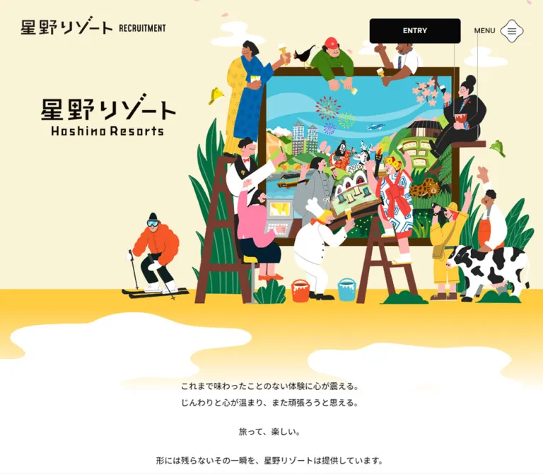
多彩な人物イラストと淡いクリーム色で、旅をつくる仕事の楽しさを表現。大きな英字見出し、写真の楕円トリミング、絵の具のような採用パネルを組み合わせた採用サイト。
オリジナルサイトを見るA colorful world of travel and teamwork, surrounded by quiet cream paper.
Website: Hoshino Resorts Recruitment Original URL: https://hoshinoresorts.com/jp/recruit/ Final URL: https://hoshinoresorts.com/jp/recruit/ Theme: light; no alternative theme was evidenced. Inspected: September 23, 2026 at 00:30:38 JST, from the supplied browser record dated September 22, 2026 at 15:30:38.426 UTC. Viewports: desktop 1440 × 1000 CSS pixels; mobile 390 × 844 CSS pixels. Scope: the current recruitment homepage, including the illustrated opening, introductory statement, five content destinations, job navigation, topics, application routes, and footer. Visual evidence includes three desktop captures and two mobile captures; rendered DOM measurements cover additional sections. Destination pages and open navigation panels were not visually inspected.
This is a recruitment information hub with a substantial editorial introduction. Its structure connects company history, people, management strategy, careers, news, and several application routes. The page should be understood through that information architecture rather than reduced to a single conversion section.
The opening places a large brand graphic beside an illustration of people collectively painting a framed travel scene. Chefs, hospitality staff, outdoor activity figures, local performers, plants, animals, and destination imagery share the composition. A pale yellow sky and yellow ground give the scene warmth, while black utility controls remain easy to identify.
Below the illustration, the rhythm becomes quieter: spacious Japanese prose, oversized condensed English section titles, large photographs, and relatively little interface framing. Elliptical crops and irregular gold seals connect the photographic sections to the playful opening. Coral, green, and blue paint textures distinguish application categories near the bottom. The design depends on this balance between expressive imagery and restrained navigation.
A colorful world of travel and teamwork, surrounded by quiet cream paper.
Website: Hoshino Resorts Recruitment Original URL: https://hoshinoresorts.com/jp/recruit/ Final URL: https://hoshinoresorts.com/jp/recruit/ Theme: light; no alternative theme was evidenced. Inspected: September 23, 2026 at 00:30:38 JST, from the supplied browser record dated September 22, 2026 at 15:30:38.426 UTC. Viewports: desktop 1440 × 1000 CSS pixels; mobile 390 × 844 CSS pixels. Scope: the current recruitment homepage, including the illustrated opening, introductory statement, five content destinations, job navigation, topics, application routes, and footer. Visual evidence includes three desktop captures and two mobile captures; rendered DOM measurements cover additional sections. Destination pages and open navigation panels were not visually inspected.
This is a recruitment information hub with a substantial editorial introduction. Its structure connects company history, people, management strategy, careers, news, and several application routes. The page should be understood through that information architecture rather than reduced to a single conversion section.
The opening places a large brand graphic beside an illustration of people collectively painting a framed travel scene. Chefs, hospitality staff, outdoor activity figures, local performers, plants, animals, and destination imagery share the composition. A pale yellow sky and yellow ground give the scene warmth, while black utility controls remain easy to identify.
Below the illustration, the rhythm becomes quieter: spacious Japanese prose, oversized condensed English section titles, large photographs, and relatively little interface framing. Elliptical crops and irregular gold seals connect the photographic sections to the playful opening. Coral, green, and blue paint textures distinguish application categories near the bottom. The design depends on this balance between expressive imagery and restrained navigation.
| Name | Value | Suggested token | Evidence and role |
|---|---|---|---|
| Hero Cream | #faf3d6 |
--color-hero |
Measured hero-section background at both viewports; the pale yellow field behind the illustration |
| Warm Paper | #fcf5ef |
--color-paper |
Measured document and footer background; the main editorial canvas |
| Near Black | #080808 |
--color-ink |
Measured document text, topics archive button, and desktop topics controls |
| White | #ffffff |
--color-white |
Measured job-section and desktop application-band surfaces; also visible in clouds and reversed labels |
| Muted Gold | #cea125 |
--color-gold |
Measured navigation-group text; a useful approximation for the visually related gold seals, whose strokes were not separately sampled |
| Burnt Orange | #d95300 |
--color-orange |
Measured tall job-link backgrounds; use as a related accent for small orange navigation markers |
| Tag Gray | #e3e0dd |
--color-tag |
Measured topics-category chip background |
These values are practical fallback colors, not exact source declarations. Texture and local variation are essential to their appearance.
| Name | Approximate value | Role |
|---|---|---|
| Coral Paint | #ff8f7e |
Graduate application panel and floating recruitment notice |
| Leaf Paint | #7d9c70 |
Career application panel; the original varies from darker green to pale olive |
| Sky Paint | #91c5d0 |
Partner application panel |
| Ground Yellow | #ffd247 |
Bright ground beneath the hero characters, fading toward the white transition |
| Illustration Cyan | #49bfd2 |
Prominent sky and water inside the framed travel scene; keep this within the artwork rather than treating it as the main action color |
Keep the two creams distinct. The hero is yellow cream; the main page and footer are a softer peach cream. Using one beige everywhere removes a visible section transition.
Read parent styles alongside the screenshots. The sampled header ENTRY button parent has a transparent background and black text, while its visible face is black with a white label. Its appearance therefore involves styling beyond the sampled parent. Similarly, the copyright appears muted in the captures although its sampled text color is near black. The missing descendant and compositing details should not be replaced with invented source rules.
The recorded WordPress font presets and Swiper blue default are implementation defaults, not evidence of additional brand colors.
The computed stack begins with Noto Sans JP, then Noto Sans, followed by Japanese Gothic fallbacks including MyYuGothicM, Yu Gothic, Hiragino Kaku Gothic ProN, and Meiryo.
The body is modest in scale. Most readable content uses medium weight rather than uniformly bold text. Japanese content titles and footer group headings supply stronger emphasis. Long introductory paragraphs use double line spacing, which gives the statement an unusually calm pace.
The document default has 0.84px tracking at 14px, equivalent to 0.06em. Many actual content elements explicitly reset tracking to normal. Do not apply the root tracking indiscriminately to every heading, caption, and link.
Mohave, sans-serif.600.120px, with 120px line height and -4.8px tracking.84px, with 84px line height and -3.36px tracking.CONTENTS, JOB at HOSHINO RESORTS, and TOPICS.These headings are graphic section markers. Their scale provides contrast with the restrained Japanese paragraphs and captions. Do not extend this font assignment to the logo or every uppercase label: those uses were not verified.
The copyright uses Albert Sans, sans-serif, 11px, weight 500, and 19.8px line height. Desktop tracking is 0.84px; mobile tracking is normal.
The hero H1 has no extracted text and contains a visible Japanese/English brand lockup. Its measured dimensions describe a graphic container, not a typeset headline. The angular Japanese lettering, English wordmark, and compact RECRUITMENT lockups should be treated as supplied brand artwork.
Do not attempt to recreate these graphics by selecting a vaguely similar font. The empty extracted text also does not prove that the original lacks an accessible image alternative; that information was not included.
| Role | Desktop | Mobile | Weight and tracking |
|---|---|---|---|
| Document default | 14px / 25.2px |
Same | 400; 0.84px tracking |
| Introductory statement | 16px / 32px |
14px / 28px |
500; normal tracking |
| English section title | 120px / 120px |
84px / 84px |
Mohave 600; -0.04em |
| Content-card title | 32px / 57.6px |
24px / 28.8px |
700; normal tracking |
| Content-card caption | 16px / 28.8px |
14px / 21px |
500; normal tracking |
| Topic headline | 18px / 32.4px |
16px / 28.8px |
500; normal tracking |
| Topic category chip | 11px / 19.8px |
Same | 500; normal tracking |
| Topics archive button | 14px / 25.2px |
Same | 700; normal tracking |
| Footer group heading | 20px / 36px |
18px / 32.4px |
700; normal tracking |
| Footer main link | 16px / 28.8px |
14px / 25.2px |
500; normal tracking |
| Footer recruitment sublink | 13px / 23.4px |
Same | 400; normal tracking |
| Footer legal link | 11px / 19.8px |
Same | 400; 0.84px tracking |
| Copyright | 11px / 19.8px |
Same | Albert Sans 500; tracking changes by viewport |
Additional DOM-only navigation measurements show desktop group labels at 30px / 30px, weight 700, with 2.4px tracking. Main navigation links generally use 18px bold text on desktop and 16px / 24px, weight 500, on mobile. Their open-panel appearance was not captured.
Density: broad editorial spacing around large images, with compact utility controls and footer links.
There is no proven universal spacing unit. The following values document component relationships rather than imposing an invented source scale.
| Use | Desktop | Mobile | Status |
|---|---|---|---|
| Header logo left offset | 40px |
16px |
Measured |
| Header logo top offset | 30px |
14px |
Measured |
| Content-card area side margin | 152px |
25px |
Measured at the inspected widths |
| Gap between paired content cards | 63px |
Not applicable | Derived from adjacent desktop link rectangles |
| Gap between ordinary stacked content cards | Not applicable | 64px |
Derived from mobile link rectangles |
| Gap before the staff banner | 130px after the preceding card row |
64px |
Derived |
| Gap after the staff banner | 120px |
64px |
Derived |
| Intro paragraph separation | 24px |
17px |
Derived from consecutive paragraph boxes |
| Intro first-paragraph offset from section start | 140px |
90px |
Derived |
| Topics-card horizontal gap | 75px |
24px |
Derived from adjacent article-link boxes |
| Application-panel desktop gap | About 8px |
Full-width rows | Derived |
| Footer padding | 64px top, 24px bottom |
64px 25px 25px |
Measured |
| Footer main-link marker allowance | 18px |
16px |
Measured left padding |
| Topic-chip padding | 3px 12px |
Same | Measured |
| Element | Treatment | Evidence |
|---|---|---|
| Topics archive button | 6px radius |
Measured |
| Desktop topics navigation buttons | 6px radius |
Measured |
| Topics category chips | 15px radius |
Measured |
| Mobile job-section panel | 16px radius |
Measured; desktop section reports 0px |
| Rectangular strategy photograph | Approximately 8px radius |
Screenshot estimate |
| Career-path photograph | Broad ellipse | Visually observed on desktop |
| Application panels | Approximately 8px radius on desktop |
Screenshot estimate |
| Header entry face | Approximately 6px radius |
Screenshot estimate of the visible face |
| Content arrows and notice close control | Black circles | Visually observed; close-button box is measured |
| Number badges and back-to-top artwork | Irregular gold outlines | Visually observed; exact paths unavailable |
| Menu icon | White rounded diamond with a fine dark outline | Visually observed; not a standard rounded-square button |
The organic shapes are selective. Ordinary buttons remain compact rectangles; the expressive silhouettes belong to seals, image crops, the menu symbol, and artwork.
| Element | Desktop 1440 × 1000 | Mobile 390 × 844 |
|---|---|---|
| Document height | 6888.38px |
7766.66px |
| Header brand link | 280 × 38px |
142 × 49.80px |
| Header entry button box | 176 × 48px |
80 × 36px |
| Header menu button box | 101.23 × 56px including label |
40 × 40px; label not visible |
| Hero section box | 1440 × 810px |
390 × 692.86px |
| Hero brand container | 357.75 × 114.75px |
297.44 × 95.39px |
| Hero brand position | x=108, y=245.25 |
x=46.28, y=110.27 |
| Intro section box | 1440 × 1110px |
390 × 1075px |
| Ordinary content-card link | 536.5 × 522.77px |
340 × 327.06px |
| Staff-feature link | 1136 × 403px |
340 × 436.63px |
| Job-section panel | 1232 × 913px |
370 × 1033.05px |
| Individual tall job-link box | 96 × 408px |
76 × 328px |
| Topics article-link width | 448px |
294px |
| Topics archive button | 320 × 64px |
325 × 56px |
| Career and partner application panels | Each 365.33 × 335px |
Each 390 × 164px |
| Each graduate application route | 365.33 × 116px inside one shared panel |
390 × 163px |
| Floating notice link | 200 × 202px |
120 × 122px |
| Notice close button | 40 × 40px |
Same |
| Back-to-top link | 66 × 77px |
Same |
| Footer section | 1440 × 472.52px |
390 × 921.09px |
The desktop content frame is 1136px wide: two 536.5px cards plus a 63px gap. On mobile it becomes a 340px column with 25px side margins.
The hero's desktop box happens to be 16:9 at the sampled viewport. This is a measured ratio, not evidence of the source CSS formula. The painted ground and cloud transition extend beyond the visual logic of that section box, so its 810px height is not a hard boundary for every illustrated feature.
Role: brand recognition and immediate access to navigation and application routes.
On desktop, the brand lockup sits at the upper left. A wide black ENTRY face sits near the upper right, followed by MENU and a white rounded-diamond icon containing three horizontal lines. The visual treatment is flat, with no visible elevation shadow.
The entry button's measured position is approximately x=1104.77, y=36. The menu button begins about 26px to its right. The logo combines the Japanese brand and a compact horizontal RECRUITMENT label.
Mobile changes the lockup rather than merely shrinking the desktop line: RECRUITMENT sits below the Japanese logo. The entry button is 80 × 36px, and only the menu symbol remains visible. The measured menu interaction box is 40 × 40px; its decorative artwork appears to extend beyond that box.
The desktop header remains visible across the supplied opening, content, and footer captures, supporting persistent placement. The mobile footer capture does not show it. The exact mobile hide/show rule was not recorded.
Role: express the variety of people and experiences involved in making travel possible.
The desktop composition has two distinct zones: a relatively quiet left area for the brand graphic, and a large illustrated ensemble across the center and right. A brown frame encloses a travel landscape. Figures interact with its edges using brushes, ladders, tools, and gestures. Some characters belong to hospitality work; others evoke outdoor activities, local culture, food, and destinations.
Large green leaves, a cow, a skier, birds, and white cloud shapes extend the scene beyond the central rectangle. The framed image is the organizing device that keeps this density readable.
The hero brand is a graphic, not a large block of recruitment copy. Maintain its clear space. The header is the main visible application control in the opening scene.
On mobile, the brand graphic moves above the ensemble and remains nearly 300px wide. The illustrated scene is enlarged and cropped laterally: peripheral characters extend beyond the screen while the central frame and collaborative activity stay readable. A miniature uncropped desktop image would not reproduce this composition.
Role: explain the organization's view of travel, teamwork, diversity, and long-term continuity.
The text follows the illustrated opening in a spacious white-looking transition area. Its first statement begins with これまで味わったことのない体験に心が震える。, followed by several short paragraphs and a vertically stacked series of principles.
Desktop paragraphs use 16px / 32px, weight 500, with 24px between measured paragraph boxes. Mobile uses 14px / 28px and 17px paragraph separation. The mobile text contains additional intentional line breaks, including the statement about providing an experience that leaves no physical form.
Keep the editorial pacing. This section has substantial open space above and below the copy; it is not a compact description directly attached to a CTA. The DOM reports full-width paragraph boxes, so those widths should not be mistaken for actual line lengths.
The first mobile capture shows the opening lines partially covered by the recruitment notice. The unobstructed appearance of the entire desktop statement was not supplied, although its text and typography are documented in the DOM.
Role: navigate to the site's five principal editorial destinations.
The index follows this sequence:
星野リゾートの歩み — history.私たちについて — organizational information.110年×110人.経営戦略 — management strategy.CAREER PATH SYSTEM — career support.Desktop uses a pair of cards, a full-width staff feature, then another pair. Each ordinary card is one large anchor containing a numbered marker, image area, prominent title, and smaller caption. The title is accompanied by a black circular arrow in the visible lower pair.
The strategy photograph shows colorful threads and a loom in a softly rounded rectangle. The career-path photograph shows two people in a green forest, cropped into a broad ellipse. Their visible image areas are approximately 537 × 404px, close to 4:3 before masking. These image dimensions are screenshot estimates; the link-box dimensions are measured separately.
A gold irregular outline containing 04 or 05 overlaps the upper-left region of each image. The seals are approximately 100px across in the desktop capture. They are identifiers within the card, not separate buttons.
Mobile places all five destinations in a single column. Ordinary link boxes are 340px wide, with titles reduced to 24px / 28.8px and captions to 14px / 21px. The supplied mobile images do not show these cards, so their precise mobile masks and arrow placement remain unverified.
Role: give the people feature a distinct editorial identity within the contents sequence.
The desktop link spans the full 1136px content width. The visible portion combines resort scenery with circular photographic cutouts of staff, activities, and objects. A white central panel holds the large anniversary-related graphic and a supporting line of Japanese copy. The outer composition has broad rounded ends.
This is a deliberately different component from the neighboring single-image cards. Keep the portrait montage and central graphic as one coordinated editorial composition.
Its mobile anchor is 340 × 436.63px, taller than the ordinary cards. The rendered mobile text separates its caption into two lines. This proves a major proportional change, but the exact mobile image arrangement was not visually captured.
Role: provide three routes for new graduates, career applicants, and partner employees.
The DOM records a white job section with the oversized Mohave heading JOB at HOSHINO RESORTS. On desktop its panel is 1232px wide, with 64px 40px padding. Three narrow orange link containers occupy the right portion of the section, each measuring 96 × 408px, separated by 16px.
On mobile the panel has 10px outer margins and a measured 16px corner radius. The three links remain side by side, each 76 × 328px, also separated by 16px. They are centered as a group.
This section was not included in the visual captures. Its box geometry, labels, heading family, and anchor backgrounds are documented; inner illustration, lettering orientation, decorative edges, and hover effects are not. Do not extrapolate an entire scenic job component from the hero artwork.
Role: surface current recruitment news and events.
The DOM contains five dated articles, with the newest dated September 9, 2026. Each article link groups its date and headline; separate category anchors follow it. Category chips use a gray fill, 11px medium text, 3px 12px padding, and a 15px radius.
Measured article positions establish a horizontal rail. Desktop article-link widths are 448px, with 75px between them. Mobile widths are 294px, with 24px between them. The second mobile article starts at x=343, beyond most of the first viewport. The exact clipping edge was not captured.
Desktop has two measured 50 × 50px black navigation buttons with 6px corners. Equivalent button samples were not supplied for mobile. The archive link TOPICS一覧へ is a centered black button with white text: 320 × 64px on desktop and 325 × 56px on mobile.
The upper media area and actual topics imagery were not visually inspected. Carousel movement, swipe support, autoplay, looping, and disabled-state behavior remain unverified.
Role: separate application routes by applicant category and graduation cohort.
The desktop capture shows a white full-width band containing three textured panels. The inner row begins at x=164 and spans approximately 1112px, slightly narrower than the editorial content frame.
26卒 / 27卒 and 28卒 / 29卒 / 30卒.キャリア採用.パートナー社員採用.Each panel uses a paint-like texture rather than a perfectly uniform fill. White labels and white outlined ENTRY faces sit directly over the texture. The visible outlined faces are approximately 240 × 56px, with roughly 2px borders and small rounded corners; these are screenshot estimates.
Graduate cohorts are emphasized with large numerals and smaller 卒 suffixes. The other panels place their category label above a lower entry face. The career and partner anchors include 52px bottom padding in the desktop measurement.
The three visual panels contain four actual routes. On mobile, the DOM records four successive full-width anchors: two 390 × 163px graduate rows, then two 390 × 164px category rows. Do not preserve a three-column arrangement or compress all four routes into one small mobile block.
The graduate and career links point to external recruitment systems; the partner route points to the site's partner page. Link destinations are known from the record, but new-tab behavior and the destination experiences were not tested.
Role: keep a general recruitment route visible during browsing.
The visible notice is a coral paint texture cut into an irregular scalloped silhouette, with white 通年採用 実施中! lettering. A separate black circular close control overlaps its upper-right area.
On desktop the notice link is 200 × 202px, positioned 32px from the right and 22px from the bottom in the measured viewport. On mobile it becomes 120 × 122px, 16px from the right and 12px from the bottom. The close-button box remains 40 × 40px.
The notice is visible in the desktop middle and footer captures and the mobile opening capture. It is absent from the supplied desktop opening and mobile footer images. These differences do not establish a delay, dismissal persistence, or footer-suppression rule.
The underlying notice anchor points to the job page. A close-button affordance is visible, but its actual dismissal action was not exercised. Keep the link and dismissal control as separate interactive elements in a new implementation.
Role: provide a comprehensive, calm sitemap after the application area.
The footer returns to warm paper and organizes destinations into three temporal groups: the organization's past, present, and future. Desktop shows these groups across the page; mobile stacks the groups vertically while retaining smaller two-column arrangements inside the denser groups.
Main links have small orange diamond markers. Recruitment sublinks sit indented beneath the jobs route without repeating the same prominence. Use bold group labels, medium main links, and smaller regular-weight sublinks to preserve this hierarchy.
The desktop brand lockup spans approximately 408px. On mobile it becomes a centered 228px lockup with RECRUITMENT underneath. The recorded logo anchors are only 14px high because they are inline boxes; those heights do not describe the visible artwork.
A gold outlined back-to-top graphic includes an upward arrow and curved TOPへ戻る lettering. Its link box is 66 × 77px at both viewports. It sits near the desktop footer's upper right and above the centered mobile brand.
Desktop places legal links at lower left and copyright toward the right. Mobile keeps the legal links in a compact row, then puts copyright below. The original footer visibly names Hoshino Resorts Inc.; no production credits were verified from the inspected original page.
The header DOM contains grouped navigation destinations and a separate set of application links. The menu button includes both MENU and CLOSE text in the extracted data, while the screenshots show its closed-state appearance.
The evidence supports the existence of controls and panel content. It does not establish the opened panel's final surface, movement direction, backdrop, focus handling, scrolling, or closing behavior. An implementation should not present a speculative fullscreen overlay as a measured original component.
| Treatment | Recorded evidence | What can be concluded |
|---|---|---|
| Many navigation and footer links | 0.3s transition |
A 300ms transition is declared; changed properties and visible end states were not supplied |
| Header entry button | 0.3s transition |
Short feedback timing is supported; the open-entry interaction was not recorded |
| Mobile header element | 0.3s transition |
A transition exists; its relation to scroll visibility is unknown |
| Desktop topics controls | 0.3s transition |
Feedback timing is declared; carousel movement was not tested |
| Topics archive button | 0.3s transition |
A short transition is declared |
| Mobile section headings | 0.3s 1s forwards pika_anime |
Named animation with 300ms duration, 1s delay, and forwards fill; keyframes and trigger were not supplied |
| Many other sampled elements | animation: none or transition reported only as all |
Does not establish that descendants, pseudo-elements, images, or script-driven transforms are static |
| Back-to-top graphic | Anchor to the page root fragment | Navigation target is known; smooth scrolling and duration are unverified |
| Floating notice close control | Visible close symbol and button rectangle | Dismissal affordance is established; persistence and timing are not |
The animation name pika_anime is not sufficient evidence for a sparkle, flash, scale, or opacity effect. No such keyframes should be invented.
No temporal image sequence was supplied. Character animation, drifting petals, rotating seals, parallax, image zoom, carousel autoplay, and reveal choreography remain unverified.
Recommended motion approach: use restrained 300ms feedback for ordinary controls, keep text visible without animation, and add movement only when its purpose and reduced-motion fallback are defined. The CSS starter intentionally does not reconstruct the undocumented heading animation.
| Layer | Appearance | Function |
|---|---|---|
| Hero field | Pale yellow cream | Holds the large illustrated ensemble |
| Ground and transition | Bright yellow fading toward white, with organic cloud edges | Connects the scene to the introductory statement |
| Editorial canvas | Peach cream, mostly unboxed | Supports content cards and spacious section rhythms |
| Job panel | White; mobile has measured rounded corners | Separates recruitment navigation from surrounding editorial material |
| Desktop application band | White | Frames the three painted category panels |
| Application panel | Textured coral, green, or blue | Distinguishes routes without adding many small badges |
| Main action face | Near black with white lettering | Supplies strong, compact utility emphasis |
| Category chip | Soft gray with dark text | Provides secondary news classification |
| Floating notice | Coral texture with an irregular silhouette | A separate recruitment reminder |
| Footer | Warm paper | Returns to the site's quiet navigation language |
The supplied captures do not show a general card-shadow or glass-blur system. Most separation comes from whitespace, image masks, background changes, and solid black controls. The paint textures and yellow transition are the principal exceptions to otherwise flat surfaces.
The opening illustration uses flat color, exaggerated proportions, varied clothing, simplified faces, and fine selective linework. Its energy comes from people acting together around a shared picture. Local culture, travel, food, nature, and hospitality appear within one scene rather than as disconnected icons.
Photography introduces a different kind of specificity: woven material, forest light, resort architecture, staff portraits, and activity details. In the visible content pair, the contrast between a structured textile image and an elliptical forest image is part of the composition.
The paint textures in the entry panels and notice add a tactile material quality. They should retain uneven streaks and color variation. A smooth digital gradient can serve as a loading fallback, but it will not reproduce the finished surface.
No original image URLs, filenames, native dimensions, or asset formats were supplied. The following are implementation slots identified from visible artwork, not a recovered asset manifest.
| Asset slot | Evidence | Implementation guidance |
|---|---|---|
| Header recruitment lockup | Desktop and mobile opening captures | Supply desktop and stacked mobile variants |
| Hero brand graphic | Both opening captures and H1 rectangles | Preserve the approximately 3.12:1 graphic ratio |
| Hero ensemble | Both opening captures | Use deliberate mobile art direction and lateral cropping |
| Ground/cloud transition | Both opening captures | Use authored artwork or an SVG edge; a generic wave is only an approximation |
| Strategy photograph | Desktop content capture | Broad rectangular image with small rounded corners |
| Career-path photograph | Desktop content capture | Landscape image clipped to an ellipse |
| Staff montage | Partially visible desktop banner | Coordinate portrait cutouts, background scenery, and central title graphic |
| Entry paint textures | Desktop application capture | Provide separate coral, green, and blue textures |
| Recruitment notice artwork | Desktop middle/footer and mobile opening | Preserve scalloped silhouette, white lettering, and separate close control |
| Number and back-to-top seals | Desktop content/footer and mobile footer | Prefer authored vector outlines for consistent irregular curves |
Use authorized brand assets when available. For a new brand, create an original ensemble with the same compositional principles rather than copying recognizable characters, destination imagery, or wordmarks. The scene should remain crisp at normal display scale; there is no evidence for deliberate pixelated rendering.
The desktop page combines a wide illustrated opening with a centered editorial frame. The main content-card width is 1136px, but the job panel expands to 1232px, and the application row contracts to roughly 1112px. These small changes prevent the page from feeling like one repeated grid.
The content sequence is measured as two cards, a full-width feature, then two cards. The topics section introduces a horizontal rail. Application options form three visual columns, followed by a three-group footer.
Mobile recomposes these relationships:
| Area | Observed mobile change |
|---|---|
| Header | Stacked logo lockup, smaller entry face, icon-only menu |
| Hero | Brand above scene; artwork enlarged and cropped laterally |
| Intro | Smaller type, narrower intentional line breaks, tighter paragraph spacing |
| Content index | All five destinations stack in order within a 340px column |
| Staff feature | Becomes a taller feature than ordinary content cards |
| Job section | White rounded panel nearly spans the viewport; three narrow route links remain adjacent |
| Topics | Article width becomes 294px; horizontal placement continues |
| Applications | Four full-width rows replace the desktop three-panel composition |
| Footer | Temporal groups stack; internal link pairs remain in two columns where useful |
| Floating notice | Shrinks to 120px wide while the close control remains 40px |
The mobile document is approximately 878px taller than the desktop document despite the narrower cards and smaller text. Stacking the content and applications, together with the taller footer, explains the longer reading path.
The recorded mobile CONTENTS heading box is 435.13px wide and begins at x=-22.56, exceeding the viewport. Without its corresponding screenshot and transform styles, this cannot be classified as intentional clipping or a layout defect. A new implementation should keep essential heading text readable and prevent decorative overflow from creating page-wide horizontal scrolling.
Only the two supplied widths were inspected. Exact breakpoints, tablet composition, landscape behavior, safe-area rules, and intermediate fluid formulas are unknown. The breakpoint in the starter below is a recommendation.
These recommendations are not verified features of the original page:
36px-high mobile entry face and 40px icon controls toward at least 44px, while retaining their visual proportions.#faf3d6.#fcf5ef.#080808.#ffffff.#cea125 on navigation-group text; use as an approximation for related seals.#d95300.#e3e0dd.#ff8f7e, green #7d9c70, and blue #91c5d0; use actual texture assets for the finished panels.“Create a Japanese hospitality recruitment homepage with a spacious employer-brand story and several editorial destinations. Use a pale yellow hero, peach cream editorial background, near-black utility controls, and white transition areas. Compose an original flat-color illustration of people collaboratively creating a framed travel scene, with the brand graphic in clear space at desktop left and above the artwork on mobile. Use Noto Sans JP for readable Japanese text and Mohave for oversized English section markers. Follow the introduction with two photographic destination cards, a full-width staff feature, then another pair of cards. Include narrow job-route controls, a news rail, four application routes grouped into three textured desktop panels, and a footer organized around past, present, and future. Recompose mobile layouts deliberately. Treat motion beyond short control feedback as a separate design decision.”
This is an implementation starter, not recovered source CSS. It combines measured colors and typography with recommended layout rules. The 767px breakpoint, fitted hero scaling, hover treatment, and simplified footer grid are recommendations.
Load authorized font files separately. Supply original or authorized illustration, logo, texture, and seal assets through markup or the indicated custom properties. Flat paint colors and rounded notice shapes are fallbacks; they do not reproduce the original textures or scalloped paths.
The starter uses a fixed desktop header and an absolute mobile header as an approximation of the supplied views. The original mobile visibility controller is unknown. It leaves undocumented overlay behavior and heading animation to a separate implementation.
:root {
  /* Measured shell colors */
  --color-hero: #faf3d6;
  --color-paper: #fcf5ef;
  --color-ink: #080808;
  --color-white: #ffffff;
  --color-gold: #cea125;
  --color-orange: #d95300;
  --color-tag: #e3e0dd;

  /* Estimated image-color fallbacks */
  --color-coral: #ff8f7e;
  --color-leaf: #7d9c70;
  --color-sky: #91c5d0;

  /* Recommended shortened fallback stacks */
  --font-body: 'Noto Sans JP', 'Noto Sans', 'Yu Gothic',
    'Hiragino Kaku Gothic ProN', Meiryo, sans-serif;
  --font-display: Mohave, sans-serif;
  --font-small-latin: 'Albert Sans', sans-serif;

  --text-body: 14px;
  --text-intro: 16px;
  --text-display: 120px;
  --text-card: 32px;
  --text-caption: 16px;
  --text-topic: 18px;
  --text-footer-heading: 20px;
  --text-footer-link: 16px;
  --text-small: 11px;
  --leading-card: 1.8;
  --leading-caption: 1.8;

  --content-width: 1136px;
  --content-gap: 63px;
  --topic-width: 448px;
  --topic-gap: 75px;
  --radius-control: 6px;
  --radius-photo: 8px; /* Estimated */
  --radius-tag: 15px;
  --motion-ui: 300ms;

  /* Replace none with authorized image URLs */
  --graduate-texture: none;
  --career-texture: none;
  --partner-texture: none;
  --notice-texture: none;
}

* { box-sizing: border-box; }
body {
  margin: 0;
  color: var(--color-ink);
  background: var(--color-paper);
  font-family: var(--font-body);
  font-size: var(--text-body);
  line-height: 1.8;
}
button, input { font: inherit; }
button { cursor: pointer; }
a { color: inherit; }
img { display: block; max-width: 100%; }

.content-shell {
  width: min(calc(100% - 50px), var(--content-width));
  margin-inline: auto;
}

.recruit-header {
  position: fixed;
  inset: 30px 32px auto 40px;
  z-index: 30;
  display: flex;
  align-items: center;
  justify-content: space-between;
  pointer-events: none;
}
.recruit-header > * { pointer-events: auto; }
.header-brand { width: 280px; }
.header-actions { display: flex; align-items: center; gap: 26px; }
.entry-button, .archive-button {
  display: inline-flex;
  align-items: center;
  justify-content: center;
  border: 0;
  border-radius: var(--radius-control);
  color: var(--color-white);
  background: var(--color-ink);
  font-size: 14px;
  font-weight: 700;
  text-decoration: none;
  transition: opacity var(--motion-ui) ease;
}
.entry-button { width: 176px; min-height: 48px; }
.menu-button {
  display: inline-flex;
  align-items: center;
  gap: 10px;
  padding: 0;
  border: 0;
  color: var(--color-ink);
  background: transparent;
}
.menu-button__art { width: 56px; height: 56px; }

/* Fitted proportions; not verified source formulas */
.hero {
  position: relative;
  height: clamp(620px, 56.25vw, 960px);
  background: var(--color-hero);
}
.hero__scene-frame { position: absolute; inset: 0; overflow: hidden; }
.hero__scene {
  position: absolute;
  right: 0;
  bottom: 0;
  width: 78%;
  height: 100%;
  object-fit: contain;
  object-position: right bottom;
}
.hero__brand {
  position: absolute;
  top: 30.28%;
  left: 7.5%;
  width: 24.84375%;
  margin: 0;
}
.hero__brand img { width: 100%; height: auto; }
/* Insert the authored ground/cloud transition separately. */
.intro {
  padding: 140px 25px 190px;
  background: var(--color-white);
  text-align: center;
  font-size: var(--text-intro);
  font-weight: 500;
  line-height: 2;
}
.intro p { margin: 0; }
.intro p + p { margin-top: 24px; }

.section-title {
  margin: 0 0 64px;
  font-family: var(--font-display);
  font-size: var(--text-display);
  font-weight: 600;
  line-height: 1;
  letter-spacing: -0.04em;
  text-align: center;
  overflow-wrap: anywhere; /* Recommended fallback-font protection */
}
.contents-grid {
  display: grid;
  grid-template-columns: repeat(2, minmax(0, 1fr));
  column-gap: var(--content-gap);
  row-gap: 120px;
}
.content-card {
  position: relative;
  display: block;
  min-width: 0;
  text-align: center;
  text-decoration: none;
}
.content-card__media {
  position: relative;
  aspect-ratio: 4 / 3; /* Approximation from visible desktop photographs */
}
.content-card__photo {
  width: 100%;
  height: 100%;
  object-fit: cover;
  border-radius: var(--radius-photo);
}
.content-card--ellipse .content-card__photo { border-radius: 50%; }
.content-card__number {
  position: absolute;
  top: 22px;
  left: 22px;
  width: 100px;
  height: 100px;
  color: var(--color-gold);
  /* Use authored seal artwork for the irregular outline. */
}
.content-card__title {
  margin: 32px 0 0;
  font-size: var(--text-card);
  font-weight: 700;
  line-height: var(--leading-card);
}
.content-card__caption {
  margin: 0;
  font-size: var(--text-caption);
  font-weight: 500;
  line-height: var(--leading-caption);
}
.content-card__arrow {
  display: inline-grid;
  place-items: center;
  width: 48px;
  height: 48px;
  margin-left: 12px;
  border-radius: 50%;
  color: var(--color-white);
  background: var(--color-ink);
  vertical-align: middle;
}
.staff-feature { grid-column: 1 / -1; }

.job-panel {
  width: min(calc(100% - 20px), 1232px);
  margin: 96px auto;
  padding: 64px 40px;
  background: var(--color-white);
}
.job-links { display: flex; justify-content: flex-end; gap: 16px; }
.job-link {
  display: flex;
  align-items: center;
  justify-content: center;
  width: 96px;
  min-height: 408px;
  padding: 16px;
  background: var(--color-orange);
  text-align: center;
  text-decoration: none;
  /* Inner artwork and text arrangement require a separate design. */
}

/* Recommended native scrolling; original carousel behavior is unknown. */
.topics-rail {
  display: grid;
  grid-auto-flow: column;
  grid-auto-columns: var(--topic-width);
  gap: var(--topic-gap);
  overflow-x: auto;
  overscroll-behavior-inline: contain;
  scroll-snap-type: x proximity;
  padding: 4px 4px 20px;
}
.topic-card { min-width: 0; scroll-snap-align: start; }
.topic-card__link { text-decoration: none; }
.topic-card__title {
  font-size: var(--text-topic);
  font-weight: 500;
  line-height: 1.8;
}
.topic-tags { display: flex; flex-wrap: wrap; gap: 6px; }
.topic-tag {
  display: inline-flex;
  padding: 3px 12px;
  border-radius: var(--radius-tag);
  background: var(--color-tag);
  font-size: var(--text-small);
  font-weight: 500;
  line-height: 1.8;
  text-decoration: none;
}
.archive-button {
  width: 320px;
  min-height: 64px;
  margin: 36px auto 0;
  display: flex;
}

.application-band {
  margin-top: 96px;
  padding-block: 42px;
  background: var(--color-white);
}
.application-grid {
  display: grid;
  grid-template-columns: repeat(3, minmax(0, 1fr));
  gap: 8px;
  width: min(calc(100% - 50px), 1112px);
  margin-inline: auto;
}
.application-panel {
  min-height: 335px;
  border-radius: 8px;
  overflow: hidden;
  color: var(--color-white);
  background-size: cover;
  background-position: center;
}
.application-panel--graduate {
  display: grid;
  align-content: center;
  gap: 26px;
  background-color: var(--color-coral);
  background-image: var(--graduate-texture);
}
.application-panel--career {
  background-color: var(--color-leaf);
  background-image: var(--career-texture);
}
.application-panel--partner {
  background-color: var(--color-sky);
  background-image: var(--partner-texture);
}
.application-route {
  display: flex;
  min-height: 335px;
  flex-direction: column;
  align-items: center;
  justify-content: center;
  gap: 64px;
  padding: 24px;
  text-align: center;
  text-decoration: none;
}
.application-panel--graduate .application-route {
  min-height: 116px;
  gap: 12px;
  padding: 0 24px;
}
.application-route__label { margin: 0; font-size: 24px; font-weight: 700; }
.application-route__face {
  display: grid;
  place-items: center;
  width: min(240px, 100%);
  min-height: 56px;
  border: 2px solid currentColor;
  border-radius: 6px;
  font-size: 18px;
  font-weight: 500;
}

.site-footer { padding: 64px 0 24px; }
.footer-inner { position: relative; }
.footer-brand { display: block; width: 408px; margin-bottom: 64px; }
.footer-groups {
  display: grid;
  grid-template-columns: 1fr 1.3fr 1.7fr;
  gap: 64px;
}
.footer-heading {
  margin: 0 0 26px;
  font-size: var(--text-footer-heading);
  font-weight: 700;
  line-height: 1.8;
}
.footer-link {
  position: relative;
  display: block;
  padding-left: 18px;
  font-size: var(--text-footer-link);
  font-weight: 500;
  text-decoration: none;
}
.footer-link + .footer-link { margin-top: 8px; }
.footer-link::before {
  content: '';
  position: absolute;
  top: 0.75em;
  left: 3px;
  width: 6px;
  height: 6px;
  background: var(--color-orange);
  transform: rotate(45deg);
}
.footer-sublinks { margin: 8px 0 0 20px; font-size: 13px; }
.footer-sublinks a { display: block; text-decoration: none; }
.footer-subgrid { display: grid; grid-template-columns: 1fr 1fr; gap: 24px; }
.footer-legal {
  display: flex;
  justify-content: space-between;
  align-items: baseline;
  gap: 16px;
  margin-top: 64px;
  font-size: 11px;
}
.footer-legal nav { display: flex; flex-wrap: wrap; gap: 24px; }
.footer-legal a { text-decoration: none; }
.copyright { font-family: var(--font-small-latin); }
.back-to-top { position: absolute; top: -38px; right: 0; width: 66px; height: 77px; }

.recruit-notice {
  position: fixed;
  right: 32px;
  bottom: 22px;
  z-index: 20;
  width: 200px;
  height: 202px;
}
.recruit-notice[hidden] { display: none; }
.recruit-notice__link {
  display: grid;
  place-content: center;
  width: 100%;
  height: 100%;
  color: var(--color-white);
  background-color: var(--color-coral);
  background-image: var(--notice-texture);
  background-size: cover;
  border-radius: 45%; /* Fallback only; replace with a scalloped mask. */
  text-align: center;
  text-decoration: none;
  font-weight: 700;
}
.recruit-notice__close {
  position: absolute;
  top: 16px;
  right: 0;
  display: grid;
  place-items: center;
  width: 40px;
  height: 40px;
  border: 0;
  border-radius: 50%;
  color: var(--color-white);
  background: var(--color-ink);
}

/* Recommended accessible feedback */
:where(a, button):focus-visible {
  outline: 3px solid var(--color-ink);
  outline-offset: 4px;
}
@media (hover: hover) {
  .entry-button:hover, .archive-button:hover { opacity: 0.8; }
  .footer-link:hover { text-decoration: underline; }
}

@media (max-width: 767px) {
  :root {
    --text-intro: 14px;
    --text-display: 84px;
    --text-card: 24px;
    --text-caption: 14px;
    --text-topic: 16px;
    --text-footer-heading: 18px;
    --text-footer-link: 14px;
    --leading-card: 1.2;
    --leading-caption: 1.5;
    --topic-width: 294px;
    --topic-gap: 24px;
  }
  .recruit-header { position: absolute; inset: 14px 15px auto 16px; }
  .header-brand { width: 142px; }
  .header-actions { gap: 20px; }
  .entry-button { width: 80px; min-height: 36px; }
  .menu-button__label { display: none; }
  .menu-button__art { width: 40px; height: 40px; }
  .hero { height: clamp(620px, 177.66vw, 780px); }
  .hero__brand { top: 110px; left: 11.87%; width: 76.26%; }
  .hero__scene {
    left: -20%;
    right: auto;
    width: 140%;
    height: 68%;
    object-fit: cover;
    object-position: center bottom;
  }
  .intro { padding: 90px 25px 150px; }
  .intro p + p { margin-top: 17px; }
  .section-title { margin-bottom: 48px; }
  .contents-grid { grid-template-columns: minmax(0, 1fr); row-gap: 64px; }
  .staff-feature { grid-column: auto; }
  .content-card__title { margin-top: 14px; }
  .content-card__caption { margin-top: 9px; }
  .content-card__number { width: 64px; height: 64px; top: 14px; left: 14px; }
  .content-card__arrow { width: 32px; height: 32px; margin-left: 8px; }
  .job-panel { padding: 44px 0 48px; border-radius: 16px; }
  .job-links { justify-content: center; }
  .job-link { width: 76px; min-height: 328px; padding: 10px; }
  .archive-button { width: min(325px, 100%); min-height: 56px; }
  .application-band { padding: 0; background: transparent; }
  .application-grid { width: 100%; grid-template-columns: 1fr; gap: 0; }
  .application-panel { min-height: 0; border-radius: 0; }
  .application-panel--graduate { gap: 0; }
  .application-route { min-height: 164px; gap: 16px; padding: 20px 25px; }
  .application-panel--graduate .application-route {
    min-height: 163px;
    padding: 20px 25px;
  }
  .site-footer { padding: 64px 0 25px; }
  .back-to-top { position: static; display: block; margin: 0 auto 64px; }
  .footer-brand { width: 228px; margin: 0 auto 48px; }
  .footer-groups { grid-template-columns: 1fr; gap: 40px; }
  .footer-heading { margin-bottom: 20px; }
  .footer-link { padding-left: 16px; }
  .footer-subgrid { gap: 24px; }
  .footer-legal { display: block; margin-top: 48px; }
  .footer-legal nav { gap: 18px; }
  .copyright { margin-top: 16px; }
  .recruit-notice { right: 16px; bottom: 12px; width: 120px; height: 122px; }
  .recruit-notice__close { top: 0; }
}

@media (prefers-reduced-motion: reduce) {
  .entry-button, .archive-button { transition: none; }
  .topics-rail { scroll-behavior: auto; }
}
The CSS establishes the shell and component proportions. Header panels, notice dismissal, carousel controls, authorized artwork, image alternatives, and any visibility rules require corresponding markup and behavior. The painted surfaces should be checked for contrast after their actual textures are added.
Optional aliases for projects already using Tailwind v4. This does not imply that the original site uses Tailwind. Define the properties above first.
@theme inline {
  --color-recruit-paper: var(--color-paper);
  --color-recruit-hero: var(--color-hero);
  --color-recruit-ink: var(--color-ink);
  --color-recruit-gold: var(--color-gold);
  --color-recruit-orange: var(--color-orange);
  --color-recruit-tag: var(--color-tag);

  --font-recruit-body: var(--font-body);
  --font-recruit-display: var(--font-display);
  --font-recruit-small: var(--font-small-latin);

  --text-recruit-display: var(--text-display);
  --text-recruit-card: var(--text-card);
  --text-recruit-caption: var(--text-caption);
  --text-recruit-topic: var(--text-topic);

  --radius-recruit-control: var(--radius-control);
  --radius-recruit-photo: var(--radius-photo);
  --radius-recruit-tag: var(--radius-tag);
}
星野リゾート 採用サイト【公式】.15:30:38.426 UTC, equivalent to September 23, 2026 at 00:30:38.426 JST.1440 × 1000 captures showing the opening, the lower contents area, and the application/footer area.390 × 844 captures showing the opening and footer.This reference describes the current supplied page evidence. Values labeled estimated or recommended should remain distinguishable from measurements when reused in an implementation brief.
# Hoshino Resorts Recruitment — Style Reference

> A colorful world of travel and teamwork, surrounded by quiet cream paper.

**Website:** [Hoshino Resorts Recruitment](https://hoshinoresorts.com/jp/recruit/)
**Original URL:** https://hoshinoresorts.com/jp/recruit/
**Final URL:** https://hoshinoresorts.com/jp/recruit/
**Theme:** light; no alternative theme was evidenced.
**Inspected:** September 23, 2026 at 00:30:38 JST, from the supplied browser record dated September 22, 2026 at 15:30:38.426 UTC.
**Viewports:** desktop 1440 × 1000 CSS pixels; mobile 390 × 844 CSS pixels.
**Scope:** the current recruitment homepage, including the illustrated opening, introductory statement, five content destinations, job navigation, topics, application routes, and footer. Visual evidence includes three desktop captures and two mobile captures; rendered DOM measurements cover additional sections. Destination pages and open navigation panels were not visually inspected.

This is a recruitment information hub with a substantial editorial introduction. Its structure connects company history, people, management strategy, careers, news, and several application routes. The page should be understood through that information architecture rather than reduced to a single conversion section.

The opening places a large brand graphic beside an illustration of people collectively painting a framed travel scene. Chefs, hospitality staff, outdoor activity figures, local performers, plants, animals, and destination imagery share the composition. A pale yellow sky and yellow ground give the scene warmth, while black utility controls remain easy to identify.

Below the illustration, the rhythm becomes quieter: spacious Japanese prose, oversized condensed English section titles, large photographs, and relatively little interface framing. Elliptical crops and irregular gold seals connect the photographic sections to the playful opening. Coral, green, and blue paint textures distinguish application categories near the bottom. The design depends on this balance between expressive imagery and restrained navigation.
# Hoshino Resorts Recruitment — Style Reference

> A colorful world of travel and teamwork, surrounded by quiet cream paper.

**Website:** [Hoshino Resorts Recruitment](https://hoshinoresorts.com/jp/recruit/)
**Original URL:** https://hoshinoresorts.com/jp/recruit/
**Final URL:** https://hoshinoresorts.com/jp/recruit/
**Theme:** light; no alternative theme was evidenced.
**Inspected:** September 23, 2026 at 00:30:38 JST, from the supplied browser record dated September 22, 2026 at 15:30:38.426 UTC.
**Viewports:** desktop 1440 × 1000 CSS pixels; mobile 390 × 844 CSS pixels.
**Scope:** the current recruitment homepage, including the illustrated opening, introductory statement, five content destinations, job navigation, topics, application routes, and footer. Visual evidence includes three desktop captures and two mobile captures; rendered DOM measurements cover additional sections. Destination pages and open navigation panels were not visually inspected.

This is a recruitment information hub with a substantial editorial introduction. Its structure connects company history, people, management strategy, careers, news, and several application routes. The page should be understood through that information architecture rather than reduced to a single conversion section.

The opening places a large brand graphic beside an illustration of people collectively painting a framed travel scene. Chefs, hospitality staff, outdoor activity figures, local performers, plants, animals, and destination imagery share the composition. A pale yellow sky and yellow ground give the scene warmth, while black utility controls remain easy to identify.

Below the illustration, the rhythm becomes quieter: spacious Japanese prose, oversized condensed English section titles, large photographs, and relatively little interface framing. Elliptical crops and irregular gold seals connect the photographic sections to the playful opening. Coral, green, and blue paint textures distinguish application categories near the bottom. The design depends on this balance between expressive imagery and restrained navigation.

## How to Read This Reference

- **Measured** values come from the supplied rendered DOM and computed-style records. Measurements are CSS pixels unless stated otherwise.
- **Derived** values are arithmetic relationships between measured boxes, such as the gap between adjacent cards.
- **Estimated** values describe visible screenshot features whose relevant image, descendant, or pseudo-element styles were not supplied.
- **Recommended** values and behaviors belong to a reusable implementation, not to the verified original site.
- Token names are descriptive implementation aliases. They are not original source variable names.
- A computed font-family declaration identifies the requested stack, not proof that every character used its first font.
- Element rectangles can include transformed or overflowing content. Inline logo-link heights, in particular, are not reliable measurements of the visible logo artwork.
- Screenshots establish appearance at particular capture states. DOM presence alone does not establish visibility, an opened panel, or a successful interaction.

## Tokens — Colors

### Default Palette

| Name | Value | Suggested token | Evidence and role |
| --- | --- | --- | --- |
| Hero Cream | `#faf3d6` | `--color-hero` | Measured hero-section background at both viewports; the pale yellow field behind the illustration |
| Warm Paper | `#fcf5ef` | `--color-paper` | Measured document and footer background; the main editorial canvas |
| Near Black | `#080808` | `--color-ink` | Measured document text, topics archive button, and desktop topics controls |
| White | `#ffffff` | `--color-white` | Measured job-section and desktop application-band surfaces; also visible in clouds and reversed labels |
| Muted Gold | `#cea125` | `--color-gold` | Measured navigation-group text; a useful approximation for the visually related gold seals, whose strokes were not separately sampled |
| Burnt Orange | `#d95300` | `--color-orange` | Measured tall job-link backgrounds; use as a related accent for small orange navigation markers |
| Tag Gray | `#e3e0dd` | `--color-tag` | Measured topics-category chip background |

### Image-Based Color Estimates

These values are practical fallback colors, not exact source declarations. Texture and local variation are essential to their appearance.

| Name | Approximate value | Role |
| --- | --- | --- |
| Coral Paint | `#ff8f7e` | Graduate application panel and floating recruitment notice |
| Leaf Paint | `#7d9c70` | Career application panel; the original varies from darker green to pale olive |
| Sky Paint | `#91c5d0` | Partner application panel |
| Ground Yellow | `#ffd247` | Bright ground beneath the hero characters, fading toward the white transition |
| Illustration Cyan | `#49bfd2` | Prominent sky and water inside the framed travel scene; keep this within the artwork rather than treating it as the main action color |

**Keep the two creams distinct.** The hero is yellow cream; the main page and footer are a softer peach cream. Using one beige everywhere removes a visible section transition.

**Read parent styles alongside the screenshots.** The sampled header `ENTRY` button parent has a transparent background and black text, while its visible face is black with a white label. Its appearance therefore involves styling beyond the sampled parent. Similarly, the copyright appears muted in the captures although its sampled text color is near black. The missing descendant and compositing details should not be replaced with invented source rules.

The recorded WordPress font presets and Swiper blue default are implementation defaults, not evidence of additional brand colors.

## Tokens — Typography

### Japanese Text and General Interface

The computed stack begins with `Noto Sans JP`, then `Noto Sans`, followed by Japanese Gothic fallbacks including `MyYuGothicM`, Yu Gothic, Hiragino Kaku Gothic ProN, and Meiryo.

The body is modest in scale. Most readable content uses medium weight rather than uniformly bold text. Japanese content titles and footer group headings supply stronger emphasis. Long introductory paragraphs use double line spacing, which gives the statement an unusually calm pace.

The document default has `0.84px` tracking at `14px`, equivalent to `0.06em`. Many actual content elements explicitly reset tracking to normal. Do not apply the root tracking indiscriminately to every heading, caption, and link.

### English Section Display

- **Computed family:** `Mohave, sans-serif`.
- **Measured weight:** `600`.
- **Desktop size:** `120px`, with `120px` line height and `-4.8px` tracking.
- **Mobile size:** `84px`, with `84px` line height and `-3.36px` tracking.
- **Observed labels:** `CONTENTS`, `JOB at HOSHINO RESORTS`, and `TOPICS`.

These headings are graphic section markers. Their scale provides contrast with the restrained Japanese paragraphs and captions. Do not extend this font assignment to the logo or every uppercase label: those uses were not verified.

### Copyright

The copyright uses `Albert Sans, sans-serif`, `11px`, weight `500`, and `19.8px` line height. Desktop tracking is `0.84px`; mobile tracking is normal.

### Brand Graphics

The hero H1 has no extracted text and contains a visible Japanese/English brand lockup. Its measured dimensions describe a graphic container, not a typeset headline. The angular Japanese lettering, English wordmark, and compact `RECRUITMENT` lockups should be treated as supplied brand artwork.

Do not attempt to recreate these graphics by selecting a vaguely similar font. The empty extracted text also does not prove that the original lacks an accessible image alternative; that information was not included.

### Type Scale

| Role | Desktop | Mobile | Weight and tracking |
| --- | --- | --- | --- |
| Document default | `14px / 25.2px` | Same | `400`; `0.84px` tracking |
| Introductory statement | `16px / 32px` | `14px / 28px` | `500`; normal tracking |
| English section title | `120px / 120px` | `84px / 84px` | Mohave `600`; `-0.04em` |
| Content-card title | `32px / 57.6px` | `24px / 28.8px` | `700`; normal tracking |
| Content-card caption | `16px / 28.8px` | `14px / 21px` | `500`; normal tracking |
| Topic headline | `18px / 32.4px` | `16px / 28.8px` | `500`; normal tracking |
| Topic category chip | `11px / 19.8px` | Same | `500`; normal tracking |
| Topics archive button | `14px / 25.2px` | Same | `700`; normal tracking |
| Footer group heading | `20px / 36px` | `18px / 32.4px` | `700`; normal tracking |
| Footer main link | `16px / 28.8px` | `14px / 25.2px` | `500`; normal tracking |
| Footer recruitment sublink | `13px / 23.4px` | Same | `400`; normal tracking |
| Footer legal link | `11px / 19.8px` | Same | `400`; `0.84px` tracking |
| Copyright | `11px / 19.8px` | Same | Albert Sans `500`; tracking changes by viewport |

Additional DOM-only navigation measurements show desktop group labels at `30px / 30px`, weight `700`, with `2.4px` tracking. Main navigation links generally use `18px` bold text on desktop and `16px / 24px`, weight `500`, on mobile. Their open-panel appearance was not captured.

## Tokens — Spacing & Shapes

**Density:** broad editorial spacing around large images, with compact utility controls and footer links.

There is no proven universal spacing unit. The following values document component relationships rather than imposing an invented source scale.

### Spacing Scale

| Use | Desktop | Mobile | Status |
| --- | --- | --- | --- |
| Header logo left offset | `40px` | `16px` | Measured |
| Header logo top offset | `30px` | `14px` | Measured |
| Content-card area side margin | `152px` | `25px` | Measured at the inspected widths |
| Gap between paired content cards | `63px` | Not applicable | Derived from adjacent desktop link rectangles |
| Gap between ordinary stacked content cards | Not applicable | `64px` | Derived from mobile link rectangles |
| Gap before the staff banner | `130px` after the preceding card row | `64px` | Derived |
| Gap after the staff banner | `120px` | `64px` | Derived |
| Intro paragraph separation | `24px` | `17px` | Derived from consecutive paragraph boxes |
| Intro first-paragraph offset from section start | `140px` | `90px` | Derived |
| Topics-card horizontal gap | `75px` | `24px` | Derived from adjacent article-link boxes |
| Application-panel desktop gap | About `8px` | Full-width rows | Derived |
| Footer padding | `64px` top, `24px` bottom | `64px 25px 25px` | Measured |
| Footer main-link marker allowance | `18px` | `16px` | Measured left padding |
| Topic-chip padding | `3px 12px` | Same | Measured |

### Border Radius and Outline Language

| Element | Treatment | Evidence |
| --- | --- | --- |
| Topics archive button | `6px` radius | Measured |
| Desktop topics navigation buttons | `6px` radius | Measured |
| Topics category chips | `15px` radius | Measured |
| Mobile job-section panel | `16px` radius | Measured; desktop section reports `0px` |
| Rectangular strategy photograph | Approximately `8px` radius | Screenshot estimate |
| Career-path photograph | Broad ellipse | Visually observed on desktop |
| Application panels | Approximately `8px` radius on desktop | Screenshot estimate |
| Header entry face | Approximately `6px` radius | Screenshot estimate of the visible face |
| Content arrows and notice close control | Black circles | Visually observed; close-button box is measured |
| Number badges and back-to-top artwork | Irregular gold outlines | Visually observed; exact paths unavailable |
| Menu icon | White rounded diamond with a fine dark outline | Visually observed; not a standard rounded-square button |

The organic shapes are selective. Ordinary buttons remain compact rectangles; the expressive silhouettes belong to seals, image crops, the menu symbol, and artwork.

### Layout Measurements

| Element | Desktop 1440 × 1000 | Mobile 390 × 844 |
| --- | --- | --- |
| Document height | `6888.38px` | `7766.66px` |
| Header brand link | `280 × 38px` | `142 × 49.80px` |
| Header entry button box | `176 × 48px` | `80 × 36px` |
| Header menu button box | `101.23 × 56px` including label | `40 × 40px`; label not visible |
| Hero section box | `1440 × 810px` | `390 × 692.86px` |
| Hero brand container | `357.75 × 114.75px` | `297.44 × 95.39px` |
| Hero brand position | `x=108`, `y=245.25` | `x=46.28`, `y=110.27` |
| Intro section box | `1440 × 1110px` | `390 × 1075px` |
| Ordinary content-card link | `536.5 × 522.77px` | `340 × 327.06px` |
| Staff-feature link | `1136 × 403px` | `340 × 436.63px` |
| Job-section panel | `1232 × 913px` | `370 × 1033.05px` |
| Individual tall job-link box | `96 × 408px` | `76 × 328px` |
| Topics article-link width | `448px` | `294px` |
| Topics archive button | `320 × 64px` | `325 × 56px` |
| Career and partner application panels | Each `365.33 × 335px` | Each `390 × 164px` |
| Each graduate application route | `365.33 × 116px` inside one shared panel | `390 × 163px` |
| Floating notice link | `200 × 202px` | `120 × 122px` |
| Notice close button | `40 × 40px` | Same |
| Back-to-top link | `66 × 77px` | Same |
| Footer section | `1440 × 472.52px` | `390 × 921.09px` |

The desktop content frame is `1136px` wide: two `536.5px` cards plus a `63px` gap. On mobile it becomes a `340px` column with `25px` side margins.

The hero's desktop box happens to be 16:9 at the sampled viewport. This is a measured ratio, not evidence of the source CSS formula. The painted ground and cloud transition extend beyond the visual logic of that section box, so its `810px` height is not a hard boundary for every illustrated feature.

## Components

### Recruitment Header

**Role:** brand recognition and immediate access to navigation and application routes.

On desktop, the brand lockup sits at the upper left. A wide black `ENTRY` face sits near the upper right, followed by `MENU` and a white rounded-diamond icon containing three horizontal lines. The visual treatment is flat, with no visible elevation shadow.

The entry button's measured position is approximately `x=1104.77`, `y=36`. The menu button begins about `26px` to its right. The logo combines the Japanese brand and a compact horizontal `RECRUITMENT` label.

Mobile changes the lockup rather than merely shrinking the desktop line: `RECRUITMENT` sits below the Japanese logo. The entry button is `80 × 36px`, and only the menu symbol remains visible. The measured menu interaction box is `40 × 40px`; its decorative artwork appears to extend beyond that box.

The desktop header remains visible across the supplied opening, content, and footer captures, supporting persistent placement. The mobile footer capture does not show it. The exact mobile hide/show rule was not recorded.

### Illustrated Hero

**Role:** express the variety of people and experiences involved in making travel possible.

The desktop composition has two distinct zones: a relatively quiet left area for the brand graphic, and a large illustrated ensemble across the center and right. A brown frame encloses a travel landscape. Figures interact with its edges using brushes, ladders, tools, and gestures. Some characters belong to hospitality work; others evoke outdoor activities, local culture, food, and destinations.

Large green leaves, a cow, a skier, birds, and white cloud shapes extend the scene beyond the central rectangle. The framed image is the organizing device that keeps this density readable.

The hero brand is a graphic, not a large block of recruitment copy. Maintain its clear space. The header is the main visible application control in the opening scene.

On mobile, the brand graphic moves above the ensemble and remains nearly `300px` wide. The illustrated scene is enlarged and cropped laterally: peripheral characters extend beyond the screen while the central frame and collaborative activity stay readable. A miniature uncropped desktop image would not reproduce this composition.

### Introductory Manifesto

**Role:** explain the organization's view of travel, teamwork, diversity, and long-term continuity.

The text follows the illustrated opening in a spacious white-looking transition area. Its first statement begins with `これまで味わったことのない体験に心が震える。`, followed by several short paragraphs and a vertically stacked series of principles.

Desktop paragraphs use `16px / 32px`, weight `500`, with `24px` between measured paragraph boxes. Mobile uses `14px / 28px` and `17px` paragraph separation. The mobile text contains additional intentional line breaks, including the statement about providing an experience that leaves no physical form.

Keep the editorial pacing. This section has substantial open space above and below the copy; it is not a compact description directly attached to a CTA. The DOM reports full-width paragraph boxes, so those widths should not be mistaken for actual line lengths.

The first mobile capture shows the opening lines partially covered by the recruitment notice. The unobstructed appearance of the entire desktop statement was not supplied, although its text and typography are documented in the DOM.

### Contents Index Cards

**Role:** navigate to the site's five principal editorial destinations.

The index follows this sequence:

1. `星野リゾートの歩み` — history.
2. `私たちについて` — organizational information.
3. A staff feature associated with `110年×110人`.
4. `経営戦略` — management strategy.
5. `CAREER PATH SYSTEM` — career support.

Desktop uses a pair of cards, a full-width staff feature, then another pair. Each ordinary card is one large anchor containing a numbered marker, image area, prominent title, and smaller caption. The title is accompanied by a black circular arrow in the visible lower pair.

The strategy photograph shows colorful threads and a loom in a softly rounded rectangle. The career-path photograph shows two people in a green forest, cropped into a broad ellipse. Their visible image areas are approximately `537 × 404px`, close to 4:3 before masking. These image dimensions are screenshot estimates; the link-box dimensions are measured separately.

A gold irregular outline containing `04` or `05` overlaps the upper-left region of each image. The seals are approximately `100px` across in the desktop capture. They are identifiers within the card, not separate buttons.

Mobile places all five destinations in a single column. Ordinary link boxes are `340px` wide, with titles reduced to `24px / 28.8px` and captions to `14px / 21px`. The supplied mobile images do not show these cards, so their precise mobile masks and arrow placement remain unverified.

### Staff Feature Banner

**Role:** give the people feature a distinct editorial identity within the contents sequence.

The desktop link spans the full `1136px` content width. The visible portion combines resort scenery with circular photographic cutouts of staff, activities, and objects. A white central panel holds the large anniversary-related graphic and a supporting line of Japanese copy. The outer composition has broad rounded ends.

This is a deliberately different component from the neighboring single-image cards. Keep the portrait montage and central graphic as one coordinated editorial composition.

Its mobile anchor is `340 × 436.63px`, taller than the ordinary cards. The rendered mobile text separates its caption into two lines. This proves a major proportional change, but the exact mobile image arrangement was not visually captured.

### Job Navigation

**Role:** provide three routes for new graduates, career applicants, and partner employees.

The DOM records a white job section with the oversized Mohave heading `JOB at HOSHINO RESORTS`. On desktop its panel is `1232px` wide, with `64px 40px` padding. Three narrow orange link containers occupy the right portion of the section, each measuring `96 × 408px`, separated by `16px`.

On mobile the panel has `10px` outer margins and a measured `16px` corner radius. The three links remain side by side, each `76 × 328px`, also separated by `16px`. They are centered as a group.

This section was not included in the visual captures. Its box geometry, labels, heading family, and anchor backgrounds are documented; inner illustration, lettering orientation, decorative edges, and hover effects are not. Do not extrapolate an entire scenic job component from the hero artwork.

### Topics Rail and Category Chips

**Role:** surface current recruitment news and events.

The DOM contains five dated articles, with the newest dated September 9, 2026. Each article link groups its date and headline; separate category anchors follow it. Category chips use a gray fill, `11px` medium text, `3px 12px` padding, and a `15px` radius.

Measured article positions establish a horizontal rail. Desktop article-link widths are `448px`, with `75px` between them. Mobile widths are `294px`, with `24px` between them. The second mobile article starts at `x=343`, beyond most of the first viewport. The exact clipping edge was not captured.

Desktop has two measured `50 × 50px` black navigation buttons with `6px` corners. Equivalent button samples were not supplied for mobile. The archive link `TOPICS一覧へ` is a centered black button with white text: `320 × 64px` on desktop and `325 × 56px` on mobile.

The upper media area and actual topics imagery were not visually inspected. Carousel movement, swipe support, autoplay, looping, and disabled-state behavior remain unverified.

### Application Entry Panels

**Role:** separate application routes by applicant category and graduation cohort.

The desktop capture shows a white full-width band containing three textured panels. The inner row begins at `x=164` and spans approximately `1112px`, slightly narrower than the editorial content frame.

- The coral panel contains two graduate routes: `26卒 / 27卒` and `28卒 / 29卒 / 30卒`.
- The green panel contains `キャリア採用`.
- The blue panel contains `パートナー社員採用`.

Each panel uses a paint-like texture rather than a perfectly uniform fill. White labels and white outlined `ENTRY` faces sit directly over the texture. The visible outlined faces are approximately `240 × 56px`, with roughly `2px` borders and small rounded corners; these are screenshot estimates.

Graduate cohorts are emphasized with large numerals and smaller `卒` suffixes. The other panels place their category label above a lower entry face. The career and partner anchors include `52px` bottom padding in the desktop measurement.

The three visual panels contain four actual routes. On mobile, the DOM records four successive full-width anchors: two `390 × 163px` graduate rows, then two `390 × 164px` category rows. Do not preserve a three-column arrangement or compress all four routes into one small mobile block.

The graduate and career links point to external recruitment systems; the partner route points to the site's partner page. Link destinations are known from the record, but new-tab behavior and the destination experiences were not tested.

### Floating Recruitment Notice

**Role:** keep a general recruitment route visible during browsing.

The visible notice is a coral paint texture cut into an irregular scalloped silhouette, with white `通年採用 実施中!` lettering. A separate black circular close control overlaps its upper-right area.

On desktop the notice link is `200 × 202px`, positioned `32px` from the right and `22px` from the bottom in the measured viewport. On mobile it becomes `120 × 122px`, `16px` from the right and `12px` from the bottom. The close-button box remains `40 × 40px`.

The notice is visible in the desktop middle and footer captures and the mobile opening capture. It is absent from the supplied desktop opening and mobile footer images. These differences do not establish a delay, dismissal persistence, or footer-suppression rule.

The underlying notice anchor points to the job page. A close-button affordance is visible, but its actual dismissal action was not exercised. Keep the link and dismissal control as separate interactive elements in a new implementation.

### Footer and Back-to-Top

**Role:** provide a comprehensive, calm sitemap after the application area.

The footer returns to warm paper and organizes destinations into three temporal groups: the organization's past, present, and future. Desktop shows these groups across the page; mobile stacks the groups vertically while retaining smaller two-column arrangements inside the denser groups.

Main links have small orange diamond markers. Recruitment sublinks sit indented beneath the jobs route without repeating the same prominence. Use bold group labels, medium main links, and smaller regular-weight sublinks to preserve this hierarchy.

The desktop brand lockup spans approximately `408px`. On mobile it becomes a centered `228px` lockup with `RECRUITMENT` underneath. The recorded logo anchors are only `14px` high because they are inline boxes; those heights do not describe the visible artwork.

A gold outlined back-to-top graphic includes an upward arrow and curved `TOPへ戻る` lettering. Its link box is `66 × 77px` at both viewports. It sits near the desktop footer's upper right and above the centered mobile brand.

Desktop places legal links at lower left and copyright toward the right. Mobile keeps the legal links in a compact row, then puts copyright below. The original footer visibly names Hoshino Resorts Inc.; no production credits were verified from the inspected original page.

### Menu and Entry Panels — DOM-Only Evidence

The header DOM contains grouped navigation destinations and a separate set of application links. The menu button includes both `MENU` and `CLOSE` text in the extracted data, while the screenshots show its closed-state appearance.

The evidence supports the existence of controls and panel content. It does not establish the opened panel's final surface, movement direction, backdrop, focus handling, scrolling, or closing behavior. An implementation should not present a speculative fullscreen overlay as a measured original component.

## Tokens — Motion & Interaction

| Treatment | Recorded evidence | What can be concluded |
| --- | --- | --- |
| Many navigation and footer links | `0.3s` transition | A 300ms transition is declared; changed properties and visible end states were not supplied |
| Header entry button | `0.3s` transition | Short feedback timing is supported; the open-entry interaction was not recorded |
| Mobile header element | `0.3s` transition | A transition exists; its relation to scroll visibility is unknown |
| Desktop topics controls | `0.3s` transition | Feedback timing is declared; carousel movement was not tested |
| Topics archive button | `0.3s` transition | A short transition is declared |
| Mobile section headings | `0.3s 1s forwards pika_anime` | Named animation with 300ms duration, 1s delay, and forwards fill; keyframes and trigger were not supplied |
| Many other sampled elements | `animation: none` or transition reported only as `all` | Does not establish that descendants, pseudo-elements, images, or script-driven transforms are static |
| Back-to-top graphic | Anchor to the page root fragment | Navigation target is known; smooth scrolling and duration are unverified |
| Floating notice close control | Visible close symbol and button rectangle | Dismissal affordance is established; persistence and timing are not |

The animation name `pika_anime` is not sufficient evidence for a sparkle, flash, scale, or opacity effect. No such keyframes should be invented.

No temporal image sequence was supplied. Character animation, drifting petals, rotating seals, parallax, image zoom, carousel autoplay, and reveal choreography remain unverified.

**Recommended motion approach:** use restrained 300ms feedback for ordinary controls, keep text visible without animation, and add movement only when its purpose and reduced-motion fallback are defined. The CSS starter intentionally does not reconstruct the undocumented heading animation.

## Surfaces

| Layer | Appearance | Function |
| --- | --- | --- |
| Hero field | Pale yellow cream | Holds the large illustrated ensemble |
| Ground and transition | Bright yellow fading toward white, with organic cloud edges | Connects the scene to the introductory statement |
| Editorial canvas | Peach cream, mostly unboxed | Supports content cards and spacious section rhythms |
| Job panel | White; mobile has measured rounded corners | Separates recruitment navigation from surrounding editorial material |
| Desktop application band | White | Frames the three painted category panels |
| Application panel | Textured coral, green, or blue | Distinguishes routes without adding many small badges |
| Main action face | Near black with white lettering | Supplies strong, compact utility emphasis |
| Category chip | Soft gray with dark text | Provides secondary news classification |
| Floating notice | Coral texture with an irregular silhouette | A separate recruitment reminder |
| Footer | Warm paper | Returns to the site's quiet navigation language |

The supplied captures do not show a general card-shadow or glass-blur system. Most separation comes from whitespace, image masks, background changes, and solid black controls. The paint textures and yellow transition are the principal exceptions to otherwise flat surfaces.

## Imagery

The opening illustration uses flat color, exaggerated proportions, varied clothing, simplified faces, and fine selective linework. Its energy comes from people acting together around a shared picture. Local culture, travel, food, nature, and hospitality appear within one scene rather than as disconnected icons.

Photography introduces a different kind of specificity: woven material, forest light, resort architecture, staff portraits, and activity details. In the visible content pair, the contrast between a structured textile image and an elliptical forest image is part of the composition.

The paint textures in the entry panels and notice add a tactile material quality. They should retain uneven streaks and color variation. A smooth digital gradient can serve as a loading fallback, but it will not reproduce the finished surface.

### Observed Asset References

No original image URLs, filenames, native dimensions, or asset formats were supplied. The following are implementation slots identified from visible artwork, not a recovered asset manifest.

| Asset slot | Evidence | Implementation guidance |
| --- | --- | --- |
| Header recruitment lockup | Desktop and mobile opening captures | Supply desktop and stacked mobile variants |
| Hero brand graphic | Both opening captures and H1 rectangles | Preserve the approximately 3.12:1 graphic ratio |
| Hero ensemble | Both opening captures | Use deliberate mobile art direction and lateral cropping |
| Ground/cloud transition | Both opening captures | Use authored artwork or an SVG edge; a generic wave is only an approximation |
| Strategy photograph | Desktop content capture | Broad rectangular image with small rounded corners |
| Career-path photograph | Desktop content capture | Landscape image clipped to an ellipse |
| Staff montage | Partially visible desktop banner | Coordinate portrait cutouts, background scenery, and central title graphic |
| Entry paint textures | Desktop application capture | Provide separate coral, green, and blue textures |
| Recruitment notice artwork | Desktop middle/footer and mobile opening | Preserve scalloped silhouette, white lettering, and separate close control |
| Number and back-to-top seals | Desktop content/footer and mobile footer | Prefer authored vector outlines for consistent irregular curves |

Use authorized brand assets when available. For a new brand, create an original ensemble with the same compositional principles rather than copying recognizable characters, destination imagery, or wordmarks. The scene should remain crisp at normal display scale; there is no evidence for deliberate pixelated rendering.

## Layout & Responsive Behavior

The desktop page combines a wide illustrated opening with a centered editorial frame. The main content-card width is `1136px`, but the job panel expands to `1232px`, and the application row contracts to roughly `1112px`. These small changes prevent the page from feeling like one repeated grid.

The content sequence is measured as two cards, a full-width feature, then two cards. The topics section introduces a horizontal rail. Application options form three visual columns, followed by a three-group footer.

Mobile recomposes these relationships:

| Area | Observed mobile change |
| --- | --- |
| Header | Stacked logo lockup, smaller entry face, icon-only menu |
| Hero | Brand above scene; artwork enlarged and cropped laterally |
| Intro | Smaller type, narrower intentional line breaks, tighter paragraph spacing |
| Content index | All five destinations stack in order within a `340px` column |
| Staff feature | Becomes a taller feature than ordinary content cards |
| Job section | White rounded panel nearly spans the viewport; three narrow route links remain adjacent |
| Topics | Article width becomes `294px`; horizontal placement continues |
| Applications | Four full-width rows replace the desktop three-panel composition |
| Footer | Temporal groups stack; internal link pairs remain in two columns where useful |
| Floating notice | Shrinks to `120px` wide while the close control remains `40px` |

The mobile document is approximately `878px` taller than the desktop document despite the narrower cards and smaller text. Stacking the content and applications, together with the taller footer, explains the longer reading path.

The recorded mobile `CONTENTS` heading box is `435.13px` wide and begins at `x=-22.56`, exceeding the viewport. Without its corresponding screenshot and transform styles, this cannot be classified as intentional clipping or a layout defect. A new implementation should keep essential heading text readable and prevent decorative overflow from creating page-wide horizontal scrolling.

Only the two supplied widths were inspected. Exact breakpoints, tablet composition, landscape behavior, safe-area rules, and intermediate fluid formulas are unknown. The breakpoint in the starter below is a recommendation.

## Do’s and Don’ts

### Do

- Preserve the distinction between yellow hero cream and peach editorial paper.
- Make the collaborative framed illustration the opening's main visual event.
- Keep the brand graphic clear of the dense ensemble.
- Recompose the hero for mobile and let peripheral artwork crop deliberately.
- Pair large Mohave section markers with modest, spacious Japanese body text.
- Keep content destinations as generous linked compositions with captions.
- Alternate the visible rectangular and elliptical photographic treatments.
- Reserve irregular seals and painted textures for a small set of recognizable components.
- Preserve four application destinations, even when desktop groups them into three panels.
- Retain the footer's past, present, and future organization.
- Use black for primary utility faces and gray for secondary topic categories.
- Separate measured component boxes from estimates of the artwork inside them.

### Don’t

- Don't replace the recruitment hub with a generic single-offer page.
- Don't reduce the mobile hero to a small uncropped desktop image.
- Don't typeset the brand mark using an approximate display font.
- Don't assign Mohave to every uppercase label without evidence.
- Don't flatten the painted application panels into unrelated glossy gradients.
- Don't add shadows and rounded containers to every content link.
- Don't replace all image masks with identical rounded rectangles.
- Don't use the Swiper default blue as a brand accent.
- Don't infer autoplay, parallax, rotating seals, or character animation from static artwork.
- Don't copy inline logo-link heights as image dimensions.
- Don't assume the floating notice or mobile header remains visible in every scroll state.
- Don't allow a fixed reminder to permanently cover application controls or reading text in a new implementation.

## Recommended Implementation Additions

These recommendations are not verified features of the original page:

- Give the menu, notice dismissal, carousel controls, and back-to-top link explicit accessible names. Empty extracted text alone does not establish the original accessible name.
- Give menu and entry toggles accurate expanded states. If they open modal panels, implement focus placement, Escape handling, and focus restoration.
- Preserve a visible keyboard focus indicator on entire linked cards and application routes.
- Increase the effective touch area of the `36px`-high mobile entry face and `40px` icon controls toward at least `44px`, while retaining their visual proportions.
- Check white text against the lightest portions of each paint texture. Add a restrained darkening layer where necessary for readable contrast.
- Reposition, suppress, or reserve space for the recruitment notice when it would obstruct essential content. The mobile opening capture demonstrates a real overlap to address.
- Provide native links for every news item and a reachable archive route even if carousel scripting fails.
- Keep headings visible when reduced motion is requested or animation scripts fail.
- Use meaningful alternatives for informative photographs and the main brand image; mark purely decorative scene fragments appropriately.
- Give images explicit dimensions, prioritize the opening artwork, and defer below-fold media. Use art-directed responsive assets to avoid sending an unnecessarily large desktop scene to a phone.
- Keep graduation cohorts and recruitment destinations data-driven. They are time-sensitive content, not permanent labels in a design system.

## Agent Prompt Guide

### Quick Color Reference

- Hero background: measured `#faf3d6`.
- Main page and footer: measured `#fcf5ef`.
- Main ink and solid actions: measured `#080808`.
- White panels and reversed labels: `#ffffff`.
- Gold reference: measured `#cea125` on navigation-group text; use as an approximation for related seals.
- Job-link orange: measured `#d95300`.
- Topic-category fill: measured `#e3e0dd`.
- Paint fallbacks: estimated coral `#ff8f7e`, green `#7d9c70`, and blue `#91c5d0`; use actual texture assets for the finished panels.

### Overall Prompt

“Create a Japanese hospitality recruitment homepage with a spacious employer-brand story and several editorial destinations. Use a pale yellow hero, peach cream editorial background, near-black utility controls, and white transition areas. Compose an original flat-color illustration of people collaboratively creating a framed travel scene, with the brand graphic in clear space at desktop left and above the artwork on mobile. Use Noto Sans JP for readable Japanese text and Mohave for oversized English section markers. Follow the introduction with two photographic destination cards, a full-width staff feature, then another pair of cards. Include narrow job-route controls, a news rail, four application routes grouped into three textured desktop panels, and a footer organized around past, present, and future. Recompose mobile layouts deliberately. Treat motion beyond short control feedback as a separate design decision.”

### Example Component Prompts

1. **Hero:** “A pale yellow recruitment opening with a quiet brand area on the left and a large, original ensemble illustration on the right. People with varied hospitality and travel roles gather around a brown-framed destination picture. Add green foliage and a warm yellow ground, then transition through organic white cloud edges. On mobile, place the brand above the enlarged central scene and crop peripheral figures.”
2. **Content pair:** “Two large editorial links on peach cream, approximately 537px wide at a 1440px viewport. Use a softly rounded textile photograph on the left and an elliptical forest photograph on the right. Overlay small gold irregular number seals near the image tops. Center bold Japanese or English titles and short captions below, with compact black circular arrows. Keep the links unboxed and shadow-free.”
3. **Applications:** “Three desktop paint-texture panels in coral, green, and blue on a white band. Place two graduate-cohort routes inside the coral panel, one career route in green, and one partner route in blue. Use white labels and simple white outlined entry faces. On a phone, display all four routes as separate full-width rows.”
4. **Footer:** “A warm paper recruitment footer with a prominent brand lockup, a gold outlined back-to-top seal, and navigation grouped into past, present, and future. Use small orange diamond bullets, bold group headings, and indented recruitment sublinks. Stack the groups on mobile while preserving useful internal two-column link arrangements.”
5. **Topics:** “A horizontal recruitment-news rail with substantial article widths, medium Japanese headlines, dates, and small gray category pills. Use a large condensed TOPICS marker and a centered black archive button. Keep every article accessible as a normal link. Define swipe and arrow behavior explicitly rather than assuming autoplay.”

## Quick Start

### CSS Custom Properties

This is an implementation starter, not recovered source CSS. It combines measured colors and typography with recommended layout rules. The `767px` breakpoint, fitted hero scaling, hover treatment, and simplified footer grid are recommendations.

Load authorized font files separately. Supply original or authorized illustration, logo, texture, and seal assets through markup or the indicated custom properties. Flat paint colors and rounded notice shapes are fallbacks; they do not reproduce the original textures or scalloped paths.

The starter uses a fixed desktop header and an absolute mobile header as an approximation of the supplied views. The original mobile visibility controller is unknown. It leaves undocumented overlay behavior and heading animation to a separate implementation.

```css
:root {
  /* Measured shell colors */
  --color-hero: #faf3d6;
  --color-paper: #fcf5ef;
  --color-ink: #080808;
  --color-white: #ffffff;
  --color-gold: #cea125;
  --color-orange: #d95300;
  --color-tag: #e3e0dd;

  /* Estimated image-color fallbacks */
  --color-coral: #ff8f7e;
  --color-leaf: #7d9c70;
  --color-sky: #91c5d0;

  /* Recommended shortened fallback stacks */
  --font-body: 'Noto Sans JP', 'Noto Sans', 'Yu Gothic',
    'Hiragino Kaku Gothic ProN', Meiryo, sans-serif;
  --font-display: Mohave, sans-serif;
  --font-small-latin: 'Albert Sans', sans-serif;

  --text-body: 14px;
  --text-intro: 16px;
  --text-display: 120px;
  --text-card: 32px;
  --text-caption: 16px;
  --text-topic: 18px;
  --text-footer-heading: 20px;
  --text-footer-link: 16px;
  --text-small: 11px;
  --leading-card: 1.8;
  --leading-caption: 1.8;

  --content-width: 1136px;
  --content-gap: 63px;
  --topic-width: 448px;
  --topic-gap: 75px;
  --radius-control: 6px;
  --radius-photo: 8px; /* Estimated */
  --radius-tag: 15px;
  --motion-ui: 300ms;

  /* Replace none with authorized image URLs */
  --graduate-texture: none;
  --career-texture: none;
  --partner-texture: none;
  --notice-texture: none;
}

* { box-sizing: border-box; }
body {
  margin: 0;
  color: var(--color-ink);
  background: var(--color-paper);
  font-family: var(--font-body);
  font-size: var(--text-body);
  line-height: 1.8;
}
button, input { font: inherit; }
button { cursor: pointer; }
a { color: inherit; }
img { display: block; max-width: 100%; }

.content-shell {
  width: min(calc(100% - 50px), var(--content-width));
  margin-inline: auto;
}

.recruit-header {
  position: fixed;
  inset: 30px 32px auto 40px;
  z-index: 30;
  display: flex;
  align-items: center;
  justify-content: space-between;
  pointer-events: none;
}
.recruit-header > * { pointer-events: auto; }
.header-brand { width: 280px; }
.header-actions { display: flex; align-items: center; gap: 26px; }
.entry-button, .archive-button {
  display: inline-flex;
  align-items: center;
  justify-content: center;
  border: 0;
  border-radius: var(--radius-control);
  color: var(--color-white);
  background: var(--color-ink);
  font-size: 14px;
  font-weight: 700;
  text-decoration: none;
  transition: opacity var(--motion-ui) ease;
}
.entry-button { width: 176px; min-height: 48px; }
.menu-button {
  display: inline-flex;
  align-items: center;
  gap: 10px;
  padding: 0;
  border: 0;
  color: var(--color-ink);
  background: transparent;
}
.menu-button__art { width: 56px; height: 56px; }

/* Fitted proportions; not verified source formulas */
.hero {
  position: relative;
  height: clamp(620px, 56.25vw, 960px);
  background: var(--color-hero);
}
.hero__scene-frame { position: absolute; inset: 0; overflow: hidden; }
.hero__scene {
  position: absolute;
  right: 0;
  bottom: 0;
  width: 78%;
  height: 100%;
  object-fit: contain;
  object-position: right bottom;
}
.hero__brand {
  position: absolute;
  top: 30.28%;
  left: 7.5%;
  width: 24.84375%;
  margin: 0;
}
.hero__brand img { width: 100%; height: auto; }
/* Insert the authored ground/cloud transition separately. */
.intro {
  padding: 140px 25px 190px;
  background: var(--color-white);
  text-align: center;
  font-size: var(--text-intro);
  font-weight: 500;
  line-height: 2;
}
.intro p { margin: 0; }
.intro p + p { margin-top: 24px; }

.section-title {
  margin: 0 0 64px;
  font-family: var(--font-display);
  font-size: var(--text-display);
  font-weight: 600;
  line-height: 1;
  letter-spacing: -0.04em;
  text-align: center;
  overflow-wrap: anywhere; /* Recommended fallback-font protection */
}
.contents-grid {
  display: grid;
  grid-template-columns: repeat(2, minmax(0, 1fr));
  column-gap: var(--content-gap);
  row-gap: 120px;
}
.content-card {
  position: relative;
  display: block;
  min-width: 0;
  text-align: center;
  text-decoration: none;
}
.content-card__media {
  position: relative;
  aspect-ratio: 4 / 3; /* Approximation from visible desktop photographs */
}
.content-card__photo {
  width: 100%;
  height: 100%;
  object-fit: cover;
  border-radius: var(--radius-photo);
}
.content-card--ellipse .content-card__photo { border-radius: 50%; }
.content-card__number {
  position: absolute;
  top: 22px;
  left: 22px;
  width: 100px;
  height: 100px;
  color: var(--color-gold);
  /* Use authored seal artwork for the irregular outline. */
}
.content-card__title {
  margin: 32px 0 0;
  font-size: var(--text-card);
  font-weight: 700;
  line-height: var(--leading-card);
}
.content-card__caption {
  margin: 0;
  font-size: var(--text-caption);
  font-weight: 500;
  line-height: var(--leading-caption);
}
.content-card__arrow {
  display: inline-grid;
  place-items: center;
  width: 48px;
  height: 48px;
  margin-left: 12px;
  border-radius: 50%;
  color: var(--color-white);
  background: var(--color-ink);
  vertical-align: middle;
}
.staff-feature { grid-column: 1 / -1; }

.job-panel {
  width: min(calc(100% - 20px), 1232px);
  margin: 96px auto;
  padding: 64px 40px;
  background: var(--color-white);
}
.job-links { display: flex; justify-content: flex-end; gap: 16px; }
.job-link {
  display: flex;
  align-items: center;
  justify-content: center;
  width: 96px;
  min-height: 408px;
  padding: 16px;
  background: var(--color-orange);
  text-align: center;
  text-decoration: none;
  /* Inner artwork and text arrangement require a separate design. */
}

/* Recommended native scrolling; original carousel behavior is unknown. */
.topics-rail {
  display: grid;
  grid-auto-flow: column;
  grid-auto-columns: var(--topic-width);
  gap: var(--topic-gap);
  overflow-x: auto;
  overscroll-behavior-inline: contain;
  scroll-snap-type: x proximity;
  padding: 4px 4px 20px;
}
.topic-card { min-width: 0; scroll-snap-align: start; }
.topic-card__link { text-decoration: none; }
.topic-card__title {
  font-size: var(--text-topic);
  font-weight: 500;
  line-height: 1.8;
}
.topic-tags { display: flex; flex-wrap: wrap; gap: 6px; }
.topic-tag {
  display: inline-flex;
  padding: 3px 12px;
  border-radius: var(--radius-tag);
  background: var(--color-tag);
  font-size: var(--text-small);
  font-weight: 500;
  line-height: 1.8;
  text-decoration: none;
}
.archive-button {
  width: 320px;
  min-height: 64px;
  margin: 36px auto 0;
  display: flex;
}

.application-band {
  margin-top: 96px;
  padding-block: 42px;
  background: var(--color-white);
}
.application-grid {
  display: grid;
  grid-template-columns: repeat(3, minmax(0, 1fr));
  gap: 8px;
  width: min(calc(100% - 50px), 1112px);
  margin-inline: auto;
}
.application-panel {
  min-height: 335px;
  border-radius: 8px;
  overflow: hidden;
  color: var(--color-white);
  background-size: cover;
  background-position: center;
}
.application-panel--graduate {
  display: grid;
  align-content: center;
  gap: 26px;
  background-color: var(--color-coral);
  background-image: var(--graduate-texture);
}
.application-panel--career {
  background-color: var(--color-leaf);
  background-image: var(--career-texture);
}
.application-panel--partner {
  background-color: var(--color-sky);
  background-image: var(--partner-texture);
}
.application-route {
  display: flex;
  min-height: 335px;
  flex-direction: column;
  align-items: center;
  justify-content: center;
  gap: 64px;
  padding: 24px;
  text-align: center;
  text-decoration: none;
}
.application-panel--graduate .application-route {
  min-height: 116px;
  gap: 12px;
  padding: 0 24px;
}
.application-route__label { margin: 0; font-size: 24px; font-weight: 700; }
.application-route__face {
  display: grid;
  place-items: center;
  width: min(240px, 100%);
  min-height: 56px;
  border: 2px solid currentColor;
  border-radius: 6px;
  font-size: 18px;
  font-weight: 500;
}

.site-footer { padding: 64px 0 24px; }
.footer-inner { position: relative; }
.footer-brand { display: block; width: 408px; margin-bottom: 64px; }
.footer-groups {
  display: grid;
  grid-template-columns: 1fr 1.3fr 1.7fr;
  gap: 64px;
}
.footer-heading {
  margin: 0 0 26px;
  font-size: var(--text-footer-heading);
  font-weight: 700;
  line-height: 1.8;
}
.footer-link {
  position: relative;
  display: block;
  padding-left: 18px;
  font-size: var(--text-footer-link);
  font-weight: 500;
  text-decoration: none;
}
.footer-link + .footer-link { margin-top: 8px; }
.footer-link::before {
  content: '';
  position: absolute;
  top: 0.75em;
  left: 3px;
  width: 6px;
  height: 6px;
  background: var(--color-orange);
  transform: rotate(45deg);
}
.footer-sublinks { margin: 8px 0 0 20px; font-size: 13px; }
.footer-sublinks a { display: block; text-decoration: none; }
.footer-subgrid { display: grid; grid-template-columns: 1fr 1fr; gap: 24px; }
.footer-legal {
  display: flex;
  justify-content: space-between;
  align-items: baseline;
  gap: 16px;
  margin-top: 64px;
  font-size: 11px;
}
.footer-legal nav { display: flex; flex-wrap: wrap; gap: 24px; }
.footer-legal a { text-decoration: none; }
.copyright { font-family: var(--font-small-latin); }
.back-to-top { position: absolute; top: -38px; right: 0; width: 66px; height: 77px; }

.recruit-notice {
  position: fixed;
  right: 32px;
  bottom: 22px;
  z-index: 20;
  width: 200px;
  height: 202px;
}
.recruit-notice[hidden] { display: none; }
.recruit-notice__link {
  display: grid;
  place-content: center;
  width: 100%;
  height: 100%;
  color: var(--color-white);
  background-color: var(--color-coral);
  background-image: var(--notice-texture);
  background-size: cover;
  border-radius: 45%; /* Fallback only; replace with a scalloped mask. */
  text-align: center;
  text-decoration: none;
  font-weight: 700;
}
.recruit-notice__close {
  position: absolute;
  top: 16px;
  right: 0;
  display: grid;
  place-items: center;
  width: 40px;
  height: 40px;
  border: 0;
  border-radius: 50%;
  color: var(--color-white);
  background: var(--color-ink);
}

/* Recommended accessible feedback */
:where(a, button):focus-visible {
  outline: 3px solid var(--color-ink);
  outline-offset: 4px;
}
@media (hover: hover) {
  .entry-button:hover, .archive-button:hover { opacity: 0.8; }
  .footer-link:hover { text-decoration: underline; }
}

@media (max-width: 767px) {
  :root {
    --text-intro: 14px;
    --text-display: 84px;
    --text-card: 24px;
    --text-caption: 14px;
    --text-topic: 16px;
    --text-footer-heading: 18px;
    --text-footer-link: 14px;
    --leading-card: 1.2;
    --leading-caption: 1.5;
    --topic-width: 294px;
    --topic-gap: 24px;
  }
  .recruit-header { position: absolute; inset: 14px 15px auto 16px; }
  .header-brand { width: 142px; }
  .header-actions { gap: 20px; }
  .entry-button { width: 80px; min-height: 36px; }
  .menu-button__label { display: none; }
  .menu-button__art { width: 40px; height: 40px; }
  .hero { height: clamp(620px, 177.66vw, 780px); }
  .hero__brand { top: 110px; left: 11.87%; width: 76.26%; }
  .hero__scene {
    left: -20%;
    right: auto;
    width: 140%;
    height: 68%;
    object-fit: cover;
    object-position: center bottom;
  }
  .intro { padding: 90px 25px 150px; }
  .intro p + p { margin-top: 17px; }
  .section-title { margin-bottom: 48px; }
  .contents-grid { grid-template-columns: minmax(0, 1fr); row-gap: 64px; }
  .staff-feature { grid-column: auto; }
  .content-card__title { margin-top: 14px; }
  .content-card__caption { margin-top: 9px; }
  .content-card__number { width: 64px; height: 64px; top: 14px; left: 14px; }
  .content-card__arrow { width: 32px; height: 32px; margin-left: 8px; }
  .job-panel { padding: 44px 0 48px; border-radius: 16px; }
  .job-links { justify-content: center; }
  .job-link { width: 76px; min-height: 328px; padding: 10px; }
  .archive-button { width: min(325px, 100%); min-height: 56px; }
  .application-band { padding: 0; background: transparent; }
  .application-grid { width: 100%; grid-template-columns: 1fr; gap: 0; }
  .application-panel { min-height: 0; border-radius: 0; }
  .application-panel--graduate { gap: 0; }
  .application-route { min-height: 164px; gap: 16px; padding: 20px 25px; }
  .application-panel--graduate .application-route {
    min-height: 163px;
    padding: 20px 25px;
  }
  .site-footer { padding: 64px 0 25px; }
  .back-to-top { position: static; display: block; margin: 0 auto 64px; }
  .footer-brand { width: 228px; margin: 0 auto 48px; }
  .footer-groups { grid-template-columns: 1fr; gap: 40px; }
  .footer-heading { margin-bottom: 20px; }
  .footer-link { padding-left: 16px; }
  .footer-subgrid { gap: 24px; }
  .footer-legal { display: block; margin-top: 48px; }
  .footer-legal nav { gap: 18px; }
  .copyright { margin-top: 16px; }
  .recruit-notice { right: 16px; bottom: 12px; width: 120px; height: 122px; }
  .recruit-notice__close { top: 0; }
}

@media (prefers-reduced-motion: reduce) {
  .entry-button, .archive-button { transition: none; }
  .topics-rail { scroll-behavior: auto; }
}
```

The CSS establishes the shell and component proportions. Header panels, notice dismissal, carousel controls, authorized artwork, image alternatives, and any visibility rules require corresponding markup and behavior. The painted surfaces should be checked for contrast after their actual textures are added.

### Tailwind v4 Token Mapping

Optional aliases for projects already using Tailwind v4. This does not imply that the original site uses Tailwind. Define the properties above first.

```css
@theme inline {
  --color-recruit-paper: var(--color-paper);
  --color-recruit-hero: var(--color-hero);
  --color-recruit-ink: var(--color-ink);
  --color-recruit-gold: var(--color-gold);
  --color-recruit-orange: var(--color-orange);
  --color-recruit-tag: var(--color-tag);

  --font-recruit-body: var(--font-body);
  --font-recruit-display: var(--font-display);
  --font-recruit-small: var(--font-small-latin);

  --text-recruit-display: var(--text-display);
  --text-recruit-card: var(--text-card);
  --text-recruit-caption: var(--text-caption);
  --text-recruit-topic: var(--text-topic);

  --radius-recruit-control: var(--radius-control);
  --radius-recruit-photo: var(--radius-photo);
  --radius-recruit-tag: var(--radius-tag);
}
```

## Sources & Evidence

- **Original and final page:** [Hoshino Resorts Recruitment](https://hoshinoresorts.com/jp/recruit/). Both URLs are identical; the supplied response status is HTTP 200. The rendered page title is `星野リゾート 採用サイト【公式】`.
- **Capture record:** September 22, 2026 at `15:30:38.426 UTC`, equivalent to September 23, 2026 at `00:30:38.426 JST`.
- **Desktop visual evidence:** three supplied `1440 × 1000` captures showing the opening, the lower contents area, and the application/footer area.
- **Mobile visual evidence:** two supplied `390 × 844` captures showing the opening and footer.
- **Rendered evidence:** text, anchors, element rectangles, selected computed styles, and custom properties at both viewports. These establish the documented typography, palette declarations, link destinations, section sequence, and responsive box changes.
- **Inspection conditions:** the supplied process observed the initial page for at least five seconds, waited for loading, sampled layout and text stability, and awaited relevant finite animations and image decoding within bounded time limits. Perpetual animation was temporarily paused during readiness checks. Scrolling traversed intermediate positions. SharedWorkers and service workers were disabled.
- **Limits:** the record does not provide a complete stylesheet, image asset manifest, animation keyframes, open-panel screenshots, accessibility tree, or interaction results for menu opening, entry opening, notice dismissal, topics navigation, or back-to-top scrolling. Delayed content and unexercised behavior remain unverified.

This reference describes the current supplied page evidence. Values labeled estimated or recommended should remain distinguishable from measurements when reused in an implementation brief.スタイルやページの種類、ジャンルが近いデザインを集めました。