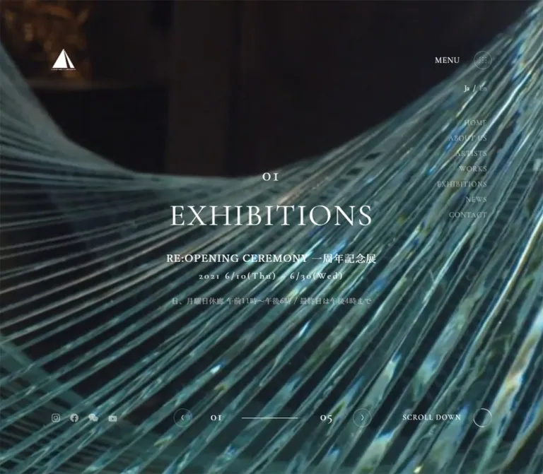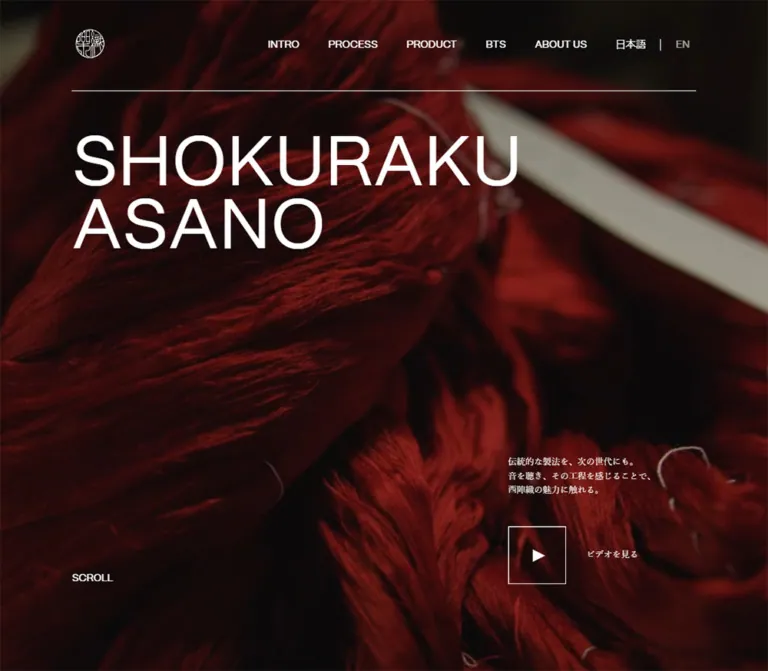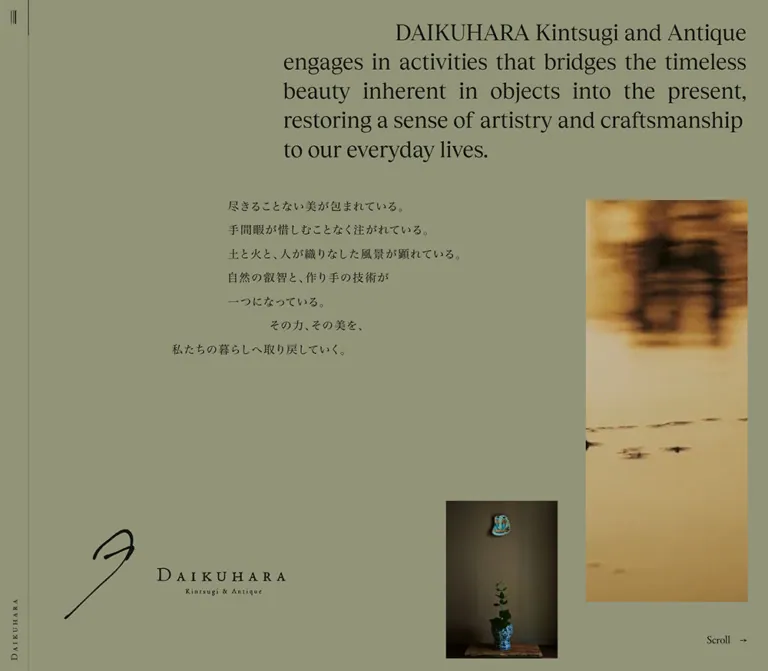
プレビュー準備中デザインリファレンスを見る
Aimoriyama / 藍森山 — Style Reference
A quiet portrait of a working textile studio, framed by delicate lettering and generous space.
Website / original URL: aimoriyama.com Final URL: https://aimoriyama.com/ Theme: dark photographic opening, light editorial foundations, and deep navy footer surfaces; no theme selector was verified. Inspected: supplied evidence dated October 2, 2026, 06:14:08.949 JST / October 1, 2026, 21:14:08.949 UTC. Viewports: 1440 × 1000 desktop and 390 × 844 mobile, in CSS pixels. Scope: the current homepage, including three desktop opening captures, two mobile opening captures, and rendered text, links, computed styles, and selected element bounds throughout the homepage. Below-the-fold composition is documented from DOM measurements rather than matching screenshots. Menu opening, language changes, pagination, dragging, and link destinations were not exercised in the supplied evidence.
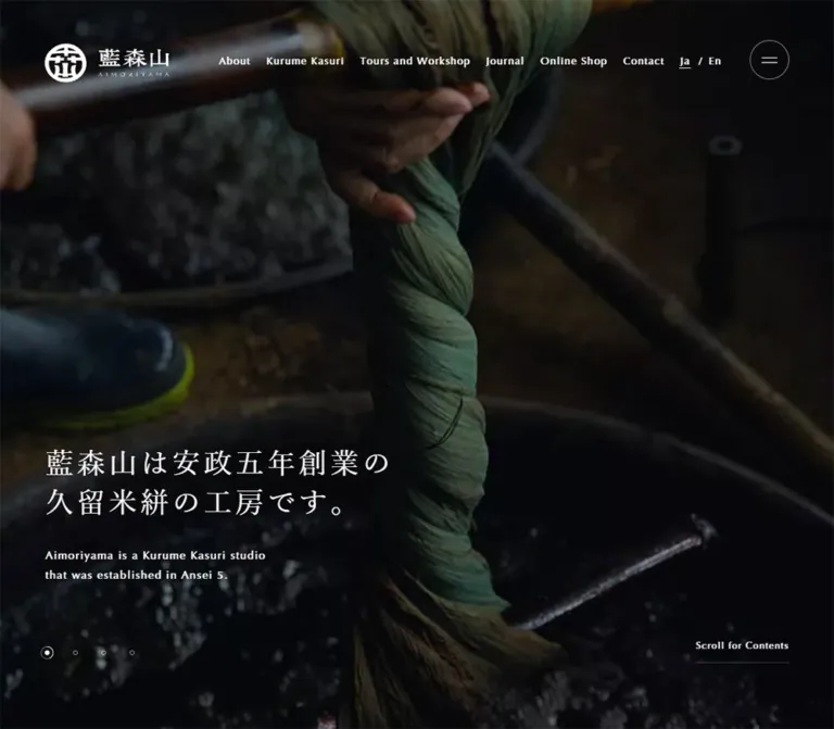
Aimoriyama presents a Kurume Kasuri and indigo-dyeing studio through its work, history, and material character. The desktop opening fills the viewport with a dim workshop scene: a worker carries bundles of yarn between vats, timber, equipment, and accumulated supplies. A small white identity mark sits at the upper left. Fine English navigation runs across the upper right. The Japanese introduction and its English translation sit near the lower left, leaving the worker and workshop as the dominant visual information.
The homepage continues into history, textile explanation, tours and workshops, a journal, social links, shopping, and contact information. This is a studio brand website with several routes into its content. Its hierarchy comes from photography, changes in scale, alternating text positions, and substantial spacing. Calls to action are generally compact text links.
Both mobile captures show the same typography and controls over a flat brown-charcoal field, with no visible hero photograph. That is a verified captured state. The evidence does not establish whether the missing image is an intended mobile treatment, a media fallback, or a rendering limitation.
閉じる
Aimoriyama / 藍森山 — Style Reference
A quiet portrait of a working textile studio, framed by delicate lettering and generous space.
Website / original URL: aimoriyama.com Final URL: https://aimoriyama.com/ Theme: dark photographic opening, light editorial foundations, and deep navy footer surfaces; no theme selector was verified. Inspected: supplied evidence dated October 2, 2026, 06:14:08.949 JST / October 1, 2026, 21:14:08.949 UTC. Viewports: 1440 × 1000 desktop and 390 × 844 mobile, in CSS pixels. Scope: the current homepage, including three desktop opening captures, two mobile opening captures, and rendered text, links, computed styles, and selected element bounds throughout the homepage. Below-the-fold composition is documented from DOM measurements rather than matching screenshots. Menu opening, language changes, pagination, dragging, and link destinations were not exercised in the supplied evidence.
Aimoriyama presents a Kurume Kasuri and indigo-dyeing studio through its work, history, and material character. The desktop opening fills the viewport with a dim workshop scene: a worker carries bundles of yarn between vats, timber, equipment, and accumulated supplies. A small white identity mark sits at the upper left. Fine English navigation runs across the upper right. The Japanese introduction and its English translation sit near the lower left, leaving the worker and workshop as the dominant visual information.
The homepage continues into history, textile explanation, tours and workshops, a journal, social links, shopping, and contact information. This is a studio brand website with several routes into its content. Its hierarchy comes from photography, changes in scale, alternating text positions, and substantial spacing. Calls to action are generally compact text links.
Both mobile captures show the same typography and controls over a flat brown-charcoal field, with no visible hero photograph. That is a verified captured state. The evidence does not establish whether the missing image is an intended mobile treatment, a media fallback, or a rendering limitation.
How to Read This Reference
- Measured means a value is present in the supplied computed styles or element rectangles. Dimensions are CSS pixels; decimals are rounded where helpful.
- Visually observed means the feature is visible in the original-page captures. These screenshots show the opening viewport only.
- Estimated means a visual approximation, such as the mobile field color or a thin outline's opacity. Estimates are not extracted source values.
- Recommended means an implementation choice for a new site. Proposed breakpoints, accessibility improvements, media fallbacks, and the Quick Start belong to this category.
- DOM-only identifies content or geometry outside the photographed viewport, or elements that exist in the DOM without a verified visible state.
- Named custom properties in this document are reusable aliases. No site-specific token names were supplied. The numerous WordPress preset variables are not evidence that their gradients, bright colors, or shadows appear in this design.
- A computed font-family list identifies the requested stack. It does not confirm which font file supplied every rendered glyph.
Tokens — Colors
Default Palette
| Name | Value | Suggested token | Evidence and role |
|---|---|---|---|
| Textile Ink | #131922 |
--color-ink |
Measured rgb(19, 25, 34) on body and editorial text; also the footer identity panel background |
| Footer Night | #0d1117 |
--color-night |
Measured rgb(13, 17, 23) on the footer |
| White | #ffffff |
--color-white |
Measured hero text, navigation, social text, and footer text; also the root background |
| Muted Ink | rgba(19, 25, 34, 0.5) |
--color-ink-muted |
Measured journal dates |
| Muted White | rgba(255, 255, 255, 0.5) |
--color-white-muted |
Measured footer Japanese captions and copyright |
| Mobile Charcoal | approximately #3e3b32 |
--color-media-fallback |
Estimated from the flat field in both mobile captures; not a measured CSS background |
| Hairline White | approximately rgba(255, 255, 255, 0.4) |
--color-rule-light |
Recommended approximation for the visible menu ring and scroll underline |
The desktop background supplies earthy browns, gray-blue clothing, near-black shadows, and pale yarn. These are photographic colors rather than a separate interface palette. Indigo is central to the studio's subject matter, but the supplied interface does not use a vivid blue action color.
Color Boundaries
The hero is visibly dark enough to support white lettering. Its actual overlay color and opacity were not included in the measurements. For a new implementation, start with a black overlay around 0.35 opacity and tune it against the chosen image; this is a recommendation, not a recovered source setting.
Most measured editorial sections have transparent backgrounds over a white root. That supports a white baseline for reconstruction, but does not identify every intervening media layer. The social section has white lettering while its sampled section background is transparent, so its exact painted backing remains unverified.
Some button containers report black text while their visible descendants are white. Use the visible text and decorative layers to determine component colors, rather than treating every container's inherited color as a painted feature.
Tokens — Typography
Source Font Stack
The sampled body and interface elements use:
font-family: OptimaLTProRoman, YakuHanMP, yu-mincho-pr6n,
  YuMincho, 'Hiragino Mincho ProN', 'Yu Mincho',
  'MS PMincho', 'Times New Roman', serif;
The declared stack combines an Optima face for Latin text with Japanese Mincho families and serif fallbacks. The visible result is fine, restrained, and lightly tracked. All sampled text uses weight 400, including headings, navigation, and calls to action.
The root element's browser serif family is not the operative brand stack: the body overrides it. No font file URLs or font-loading verification were supplied. Reuse named faces only when available and appropriately licensed; expect fallback metrics to change wrapping.
Hierarchy and Tracking
The hero places Japanese first and uses a smaller English translation beneath it. Editorial sections often reverse that hierarchy: a small English category label precedes an English heading, followed by a Japanese lead and explanatory copy. Footer links pair a larger English title with a much smaller Japanese caption.
Tracking follows three useful measured ratios:
- Hero Japanese:
0.12em. - Navigation, hero English, and Japanese leads: approximately
0.1em. - Editorial English headings, body text, dates, and text links: approximately
0.07em.
Type Scale
Values are measured at the two supplied viewports. Size and line height are shown as size / line-height.
| Role | Desktop | Mobile | Tracking |
|---|---|---|---|
| Japanese hero heading | 36 / 50px |
24 / 36px |
0.12em |
| English hero translation | 14 / 25px |
12 / 20px |
0.1em |
| Primary navigation | 13 / 13px |
Not visible | 0.1em |
| Header language controls | 13px, normal line height |
Same | 0.1em |
| Scroll cue | 12 / 40px |
12 / 34px |
0.1em |
| Editorial category label | 14 / 21px |
12 / 18px |
0.07em |
| History English heading | 34 / 50px |
26 / 36px |
0.07em |
| History Japanese lead | 22 / 36px |
16 / 30px |
0.1em |
| History body | 14 / 30px |
14 / 24px |
0.07em |
| Kasuri / workshop English heading | 27 / 41.73px |
22 / 34px |
0.07em |
| Kasuri / workshop Japanese lead | 20 / 30px |
16 / 30px |
0.1em |
| Kasuri / workshop body | 13 / 27px |
14 / 24px |
0.07em |
| View More / View All | 14 / 21px |
Same | 0.07em |
| Journal heading | 27 / 40.5px |
24 / 36px |
0.07em |
| Journal date | 12 / 12px |
Same | 0.07em |
| Journal article title | 14 / 24px |
12 / 24px |
0.07em |
| Follow Us heading | 32 / 48px |
28 / 42px |
0.07em |
| Shop / contact heading | 36 / 36px |
24 / 24px |
0.07em |
| Footer English link | 16 / 24px |
14 / 21px |
0.07em |
| Footer Japanese caption | 10 / 15px |
Same | 0.1em |
| Secondary navigation, DOM-only | 33 / 49.5px |
26 / 39px |
0.07em |
The mobile body text does not uniformly shrink. Kasuri and workshop descriptions increase from 13px to 14px, while their line height tightens from 27px to 24px. Preserve that reading priority instead of applying a single scale factor to the whole page.
Tokens — Spacing & Shapes
There is no demonstrated universal spacing unit. Small controls use fixed dimensions; broad layout spacing changes substantially between viewports.
Spacing Measurements
| Use | Desktop | Mobile | Interpretation |
|---|---|---|---|
| Hero horizontal inset | 78px |
20.796875px |
Approximately 5.42% and 5.33% of viewport width |
| Editorial horizontal inset | 130px |
20.796875px |
Main editorial width is 1180px / 348.40625px |
| Gaps between desktop navigation links | 50px |
Navigation absent | Derived from consecutive link bounds |
| Hero heading-to-English gap | 27px |
18px |
Derived from text rectangles |
| Pagination center spacing | 36px |
36px |
Fixed across both observations |
| History section padding | 297px 130px 191px |
119px 20.7969px 51px |
Computed padding, not a recommended fixed height |
| Journal section padding | 142px 130px 148px |
51px 20.7969px 55px |
Computed padding |
| Social section padding | 150px 130px 140px |
58px 20.7969px 60px |
Computed padding |
| Desktop journal column gap | approximately 35px |
— | Derived from link positions |
| Mobile journal item gap | — | 36px |
Derived from successive link bounds |
| Social link gap | 5px horizontally |
20px vertically |
Derived from link bounds |
Geometry
| Element | Measured or observed shape |
|---|---|
| Header identity link | 158 × 50px desktop; 116 × 36px mobile |
| Menu button | 50 × 50px at both sizes; visible circular outline with two short horizontal strokes |
| Pagination button boxes | 20 × 20px desktop; 18 × 18px mobile |
| Pagination marks | Visually tiny outlined dots; selected dot has a larger ring and bright center |
| Text-link boxes | View More approximately 103.78 × 31px; View All approximately 88.02 × 31px |
| Journal entry links | Approximately 369.98 × 284.44px desktop; 348.41 × 267.58px mobile |
| Social links | 290 × 290px desktop; approximately 348.41 × 156.47px mobile |
| Footer identity panel | 375 × 460px desktop; 390 × 164px mobile |
Sampled component boxes have border-radius: 0. The visible circular menu outline therefore belongs to an inner or decorative layer rather than proving that the button's own box has a circular border radius. A direct border-radius: 50% is a reasonable implementation substitute.
No shadow-based elevation system is visible in the opening. The measured WordPress shadow presets should not be imported into the design merely because they exist.
Components
Global Header
Role: identity, direct navigation, language access, and a compact menu affordance.
The desktop identity link begins at (78, 55) and measures 158 × 50px. The white artwork combines a circular emblem, the Japanese name, and a tiny Roman-letter line. Treat it as an identity asset; do not attempt to reproduce the emblem with ordinary text.
Six small English links run from approximately x = 445.3 to x = 1162.3: About, Kurume Kasuri, Tours and Workshop, Journal, Online Shop, and Contact. They use 13px text, 1.3px tracking, and 13px vertical padding. Consecutive link boxes are separated by 50px.
The language group follows, then a circular menu control at (1312, 51). The background remains the hero image; no separate opaque navigation bar is visible.
At mobile width, the six direct links disappear from the visible header. The identity begins at (20.80, 27) and measures 116 × 36px. Language controls remain, and the menu button begins at (319.20, 20). Its diameter stays 50px.
Header persistence during scrolling was not verified. Absolute positioning within the opening section is sufficient for the demonstrated state; fixed positioning would be an additional behavior choice.
Hero Media Field
Role: introduce the workshop through physical work and atmosphere.
The opening header measures exactly one supplied viewport: 1440 × 1000px or 390 × 844px. Desktop photography reaches all four edges. The worker is near the center, seen from behind, with pale yarn hanging on either side. The left lower area remains usable for text despite the detailed surroundings.
The three desktop captures have slightly different subject and background positions while the interface stays aligned. This supports a changing media frame or animated framing, but does not identify whether the source is video, a moving still, or another mechanism.
Both mobile captures retain a solid brown-charcoal field. Document this as a captured media-unavailable appearance. Do not infer that the original deliberately disables photography on every mobile visit.
Bilingual Hero Introduction
Role: state the studio's identity and founding era without competing with the image.
The source Japanese heading is:
藍森山は安政五年創業の
久留米絣の工房です。
The English translation reads:
Aimoriyama is a Kurume Kasuri studio
that was established in Ansei 5.
On desktop, the heading starts at (78, 634.94), with two 50px lines. The English block starts at y = 761.94, after a 27px gap, and occupies approximately 50px in height. Although the heading's measured box spans 1284px, its actual lettering occupies only the lower-left portion. Do not mistake the box width for a narrow fixed text-column width.
On mobile, the heading begins at (20.80, 613.02) and occupies two 36px lines. The English text begins at y = 703.02, with an 18px gap. Its wrapping changes: the first line extends through “that was,” and the second contains “established in Ansei 5.”
The effect depends on low placement, regular weight, and generous tracking. Increasing the heading to a conventional oversized promotional scale would change the composition.
Language Controls
Role: expose Japanese and English options.
The visible treatment is Ja / En, with a fine underline beneath Ja in the supplied state. The DOM identifies Ja and En as buttons, not destination links. Their computed type is 13px with 0.1em tracking and 13px 1px padding.
The translation mechanism and resulting page state were not tested. Do not assume a URL change, full reload, or client-side content swap.
Circular Menu Control and Secondary Navigation
Role: provide additional navigation access, including at mobile width.
The visible control is a restrained 50px ring containing two approximately 20px horizontal lines. Stroke thickness is visually about one pixel; exact decorative styles were not supplied.
The DOM also contains a second set of larger navigation links. They measure 33 / 49.5px on desktop and 26 / 39px on mobile. Their vertical pitch is 71.5px desktop and 55px mobile. This set is followed by social links, language controls, and copyright text.
These large links are absent from the supplied screenshots. Their measured rectangles do not prove that a menu was open. The panel's actual background, entrance, dismissal, focus behavior, and scroll handling remain unverified.
Hero Pagination
Role: indicate a sequence associated with the opening media.
Four small dots sit near the lower left, with the second selected in the original-page captures. Desktop button boxes begin at x = 71, 107, 143, 179, each 20px wide. Mobile boxes begin at approximately x = 14.80, 50.80, 86.80, 122.80, each 18px wide. Center spacing is 36px in both layouts.
The visible selected mark has an outer ring and a solid bright center. Keep the marks delicate; their visual weight should remain far below the logo or headline.
Click behavior, automatic advancement, slide count beyond the four controls, and keyboard interaction were not verified. Four controls are evidence of the visible interface, not proof of a particular carousel library.
Scroll for Contents
Role: invite progression from the immersive opening into the editorial page.
A plain text button sits at the lower right with a thin underline. Its width is approximately 118.19px. Desktop bounds are (1243.81, 868.91) with a 39.98px height; mobile bounds are (251.02, 780.02) with a 33.98px height.
The lower edge is about 91.11px above the desktop viewport bottom and 30px above the mobile bottom. The label remains 12px at both sizes. It has no filled pill or large arrow in the supplied images.
The target section and scroll animation were not exercised. For a new implementation, a native anchor to the history section is a reliable adaptation.
History Introduction
Role: establish the studio's history and craft philosophy.
This section begins immediately after the hero in the measured content coordinates. Its anatomy is a small English category label, the three-part English heading “Fine Patterns / and / Beautiful Indigo.”, a Japanese lead, a descriptive paragraph, and a View More link to /about/.
Desktop geometry places the heading group at x = 130, with a 528px box. The Japanese text begins at x = 694, with a 616px box. The horizontal gap between these boxes is 36px. This produces an asymmetric two-column introduction rather than a centered heading followed by centered prose.
On mobile, both groups share the 348.41px content width and stack at x = 20.80. The Japanese lead follows the measured heading-group box by 42px.
The mobile English heading reports a 150px bounding height despite a 36px line height. This may reflect internal wrappers or reserved geometry. Do not derive line count or force a 150px CSS height from that rectangle alone.
Kasuri and Workshop Editorial Sections
Role: introduce the textile and invite studio visits.
Both sections use the same content anatomy:
- Small English category label.
- Larger English heading.
- Japanese lead in two measured lines.
- Japanese explanatory paragraph.
- A compact View More link.
The desktop Kasuri text begins at approximately x = 694, with a 477px width. The workshop text begins at x = 260, with a 488px width. Their sampled sections use display: flex, supporting an alternating horizontal arrangement.
On mobile, the sections use display: block, and both text groups occupy the common 348.41px width. Their header groups begin approximately 268.19px below each section's top. This demonstrates substantial preceding space, but the supplied extraction does not identify the corresponding media element or its asset.
The safe reusable pattern is alternating editorial text groups on desktop, followed by a single reading column on mobile. Specific image positions and crops below the hero require additional visual evidence.
View More and View All Links
Role: continue into a subject without introducing a competing action style.
View More is 14 / 21px, with 0.98px tracking. Its inline-flex anchor measures approximately 103.78 × 31px, including 5px vertical padding. The visible text occupies approximately 75.78px; the remaining width belongs to other spacing or decoration not identified in the supplied extraction.
Each link also contains a destination-specific text node in a 1 × 1px box, such as “History of Aimoriyama.” This is consistent with visually hidden context. Preserve meaningful destination naming when reusing generic visible labels.
The exact arrow or line decoration cannot be recovered from the text-only measurements. A subtle arrow may be added in an adaptation, but should be labeled an implementation choice.
Journal Entries
Role: provide current practical information and studio announcements.
The measured section contains a Journal heading, a right-side View All link, and two article links. The entries are dated 2025.07.11 and 2021.05.29. Their topics concern visit/dyeing-experience guidance and the website announcement.
At desktop width, the entries begin at x = 130 and x = 534.97, each approximately 369.98px wide. This leaves unused space toward the right of the 1180px content area. At mobile width, they stack at the common 20.80px inset, with a 36px vertical gap.
Each link contains a substantial region before the date: approximately 244.44px from link top to date on desktop and 226.58px on mobile. The image element itself was not measured, so these distances must not be reported as an exact thumbnail height or aspect ratio.
Dates use half-opacity ink. Titles follow with a 24px line height. The extraction does not establish whether long titles are clipped, truncated, or otherwise constrained; a new implementation should allow meaningful titles to wrap.
Follow Us
Role: connect visitors to the studio's ongoing activity.
The DOM-defined desktop composition combines a 264px text group with three 290 × 290px links for Facebook, Instagram, and Twitter. The links begin at x = 430, 725, 1020, leaving 5px between them. Labels use white 14 / 21px text near their lower portions.
Mobile rearranges this content vertically. The three links become approximately 348.41 × 156.47px rectangles with 20px gaps. The heading becomes 28 / 42px.
The white text is measured, but the exact underlying image or background treatment is not visible in the supplied captures. A dark surface is a reasonable implementation requirement for contrast, not proof of a particular original color here.
Shop and Contact Invitations
Role: provide two distinct practical next steps after the editorial content.
Desktop has two equal-width linked blocks: Online Shop and Contact Us. Each measured anchor is 719px wide, positioned in a nominal two-half composition. Within each are an English heading, a smaller Japanese explanation, and a text action: “Visit to Online Shop” or “View Info.”
The action labels' measured horizontal positions support centered alignment within each half. Headings use 36px text; supporting copy is 12 / 18px.
Mobile stacks the blocks at x = 20.80, with 348.41px widths. Headings decrease to 24px, and action-label line height decreases from 48px to 28px. Each entire measured anchor contains its heading, explanation, and action; avoid nesting another interactive button inside that link.
Footer
Role: close the page with identity and a compact bilingual directory.
The desktop footer measures 1440 × 460px and uses a #0d1117 background. Its left identity link occupies 375 × 460px on #131922. The right side contains five bilingual navigation groups, social links, and copyright.
English link names use 16 / 24px; their Japanese captions use 10 / 15px at half-opacity white. The copyright is 12px, also half-opacity white.
Mobile switches the footer from flex to block layout. The identity panel becomes 390 × 164px across the top. Navigation forms two columns, with left origins near 20.80px and 228.81px; the last item occupies the left column. Social links remain in a row, and copyright moves below them. The total measured mobile footer height is 584px.
Tokens — Motion & Interaction
| Treatment | Supplied evidence | What can be concluded |
|---|---|---|
| Hero English text transition | transform and opacity, 1s cubic-bezier(0.4, 0.15, 0.2, 1), 0.07s delay |
A defined smooth text transition; starting transform and trigger are unknown |
| Pagination visibility transition | opacity 0.8s cubic-bezier(0.27, 0.1, 0.2, 1) |
Defined opacity transition on each control |
| Pagination delays | 0.14s, 0.17s, 0.20s, 0.23s |
A 30ms stagger in source-computed timing |
| Scroll cue transition | Same 0.8s opacity curve, 0.21s delay |
Defined entrance/visibility timing, not measured scroll duration |
| Some editorial text | 0s 0.07s |
Delayed style changes are present; no nonzero animation duration is established |
| Desktop background changes | Slight changes between three captures | Changing media or framing; mechanism and timing unverified |
| Drag / Prev / Next | Text nodes in the rendered DOM | Interaction-related labels exist; activation regions and visible cursor behavior unverified |
| Menu, language, pagination activation | Controls are present | Resulting states were not tested |
Many sampled elements report animation: none or a generic transition: all. Neither establishes the absence of JavaScript motion, media playback, or animation on unmeasured descendants. Conversely, a transition declaration does not prove that a particular interaction was observed.
Recommended motion character: use restrained opacity and short-distance movement, keeping the photographic scene dominant. Do not invent parallax, spring motion, autoplay intervals, or scroll-scrubbed timelines as original-site facts. Supply a static image and immediate text visibility for reduced-motion users.
Surfaces
| Layer | Evidence | Reusable treatment |
|---|---|---|
| Desktop opening | Visually observed dark edge-to-edge workshop photography | Full-bleed media with a contrast-preserving dark treatment |
| Mobile opening | Visually observed flat brown-charcoal field | Maintain a deliberate fallback with readable white text |
| Editorial baseline | Measured white root and transparent section boxes | White canvas with deep navy text; verify any media layers separately |
| Small links and controls | Mostly transparent measured backgrounds | Use typography, spacing, fine rules, and rings |
| Social region | Measured white lettering; backing unverified | A suitably dark backing is recommended |
| Footer identity panel | Measured #131922 |
Slightly lighter than the neighboring footer surface |
| Footer directory | Measured #0d1117 |
Deep, nearly black navy with white and muted-white text |
The visible opening does not rely on floating cards, glass blur, badges, or shadows. Its small circular controls are exceptions within an otherwise rectangular, unboxed composition.
Imagery
The verified desktop image is documentary in character. A worker, photographed from behind, carries long bundles of pale yarn through a dim workshop. Vats occupy the lower foreground; timber, tools, fabric, and stored materials fill the surroundings. The image feels like an ongoing process rather than a posed product advertisement.
Preserve the relationship between the central worker, vertical yarn bundles, and lower-left text. Use full-bleed cropping without stretching the image. Keep material texture visible even when darkening the scene for typography.
Recommended Art Direction
- Photograph actual dyeing, yarn preparation, weaving, tools, and working spaces when available and authorized.
- Favor natural, subdued light and believable material colors.
- Reserve quieter image areas for white type; adjust crop before making the overlay excessively dark.
- Keep the logo as supplied artwork, with a suitable text alternative on its home link.
- Provide an intentional static poster or fallback if animated media cannot display.
- Avoid replacing the observed workshop with unrelated lifestyle or fashion imagery solely because the business sells textiles.
Observed Asset References
| Asset role | Available evidence | Limitation |
|---|---|---|
| Header identity artwork | Visible in both desktop and mobile captures | No asset URL or file format supplied |
| Workshop hero media | Visible in all three desktop captures | No media URL, intrinsic dimensions, or confirmed media type supplied |
| Pagination and menu decoration | Visible in the original-page captures | SVG, CSS, or other implementation mechanism unverified |
| Editorial and journal media | Content geometry exists below the opening | No corresponding image URLs or screenshots supplied |
No original image paths can be documented from this evidence. The homepage and article links are navigation destinations, not image asset references.
Layout & Responsive Behavior
Measured Overview
| Region | Desktop: 1440 × 1000 | Mobile: 390 × 844 |
|---|---|---|
| Hero | 1440 × 1000px |
390 × 844px |
| Hero identity width | 158px |
116px |
| Menu button | 50 × 50px |
50 × 50px |
| Primary navigation | Six direct links visible | Direct links absent from header |
| Hero text inset | 78px |
20.80px |
| Hero heading top | 634.94px |
613.02px |
| Hero translation bottom | 811.91px |
743.02px |
| Scroll cue bottom clearance | 91.11px |
30px |
| Common editorial width | 1180px |
348.41px |
| Journal entries | Two links side by side | Two links stacked |
| Social links | Three squares in a row | Three wide rectangles stacked |
| Shop / contact | Two horizontal halves | Two stacked groups |
| Footer | Identity panel beside directory | Identity panel above directory |
| Main element height | approximately 7355.83px |
approximately 5977.81px |
| Reported document height | 1000px |
844px |
The difference between document height and main-element height is significant. It is consistent with a constrained outer shell, transformed content, or custom scrolling, but the mechanism cannot be identified from these measurements alone. The repeated hero screenshots do not prove that lower-page scrolling succeeded.
Use the main element and its section rectangles as evidence that this is a long homepage. Do not reduce the page to one viewport because the document-height field equals the viewport height. Equally, do not copy a custom scroll engine without verifying how it works.
Responsive Principles
The mobile design retains the identity, bilingual introduction, language buttons, circular menu, pagination, and scroll cue. It removes the horizontal navigation row and reduces large text while preserving the small utility scale.
Editorial content collapses into one inset reading column. Alternating desktop text positions become a consistent mobile left edge. Journal and social content stack. The footer changes its major axis while retaining a two-column directory.
Only two viewport widths are supplied. Exact breakpoints, tablet behavior, landscape behavior, sticky positioning, and safe-area handling remain unverified. The Quick Start uses a recommended 75rem breakpoint to avoid crowding the long desktop navigation; this is not a recovered source media query.
Do’s and Don’ts
Do
- Let documentary workshop imagery carry the opening's emotional weight.
- Preserve the small upper-left identity and low, left-aligned bilingual introduction.
- Use regular-weight lettering with the measured
0.07em,0.1em, and0.12emtracking relationships. - Keep utility controls light: thin rings, small dots, text links, and narrow rules.
- Use
#131922for editorial ink and distinguish it from the darker#0d1117footer. - Retain broad desktop spacing and a coherent approximately
21pxmobile inset at the observed width. - Preserve the different English/Japanese hierarchy in the hero, editorial sections, and footer.
- Keep body copy readable on mobile, including the observed
14pxdescriptions. - Treat the missing mobile media as a documented state with an unresolved cause.
- Separate below-the-fold DOM findings from visually verified opening details.
Don’t
- Don’t turn every section into a rounded card or use a large filled action button in every block.
- Don’t replace the restrained introduction with an oversized bold sans-serif headline.
- Don’t introduce vivid blue solely because indigo is part of the studio's craft.
- Don’t mistake WordPress default gradients and shadows for the site's visual tokens.
- Don’t invent background images, asset paths, or precise thumbnail ratios for unpictured sections.
- Don’t claim the large secondary navigation was opened merely because its elements have rectangles.
- Don’t label the hero as confirmed video or assign it an unobserved autoplay interval.
- Don’t assume the header stays fixed while scrolling.
- Don’t reproduce
18–20pxpagination targets without considering their usability. - Don’t force sampled section heights where wrapping and content should determine the layout.
Recommended Implementation Additions
These are recommendations for a new implementation, not verified original-site features:
- Give the logo link, menu button, language controls, and pagination explicit accessible names and states. Use
aria-expandedandaria-controlsfor an implemented menu. - Keep small pagination marks inside larger hit areas, ideally
44 × 44pxwhere space permits. The Quick Start deliberately enlarges these targets and their pitch. - Provide visible keyboard focus, and preserve destination-specific context for generic View More links.
- Make page content usable without reveal scripts. Add animation only after initialization succeeds.
- Keep ordinary document scrolling as the baseline. Test any enhanced scroll system with keyboard navigation, anchors, reduced motion, and browser find.
- Offer a static authorized image when moving media fails or reduced motion is requested. If media autoplays, provide an appropriate pause mechanism.
- Verify text contrast against several media frames, not just one captured moment.
- Let article titles wrap and content sections grow at increased text size.
- Use a scrollable, focus-managed menu that remains usable on short screens; do not copy its sampled absolute coordinates as a fixed layout.
- Treat half-opacity footer captions and dates as visual references, then verify contrast at their small sizes.
Agent Prompt Guide
Quick Color Reference
- Editorial ink and footer identity panel:
#131922. - Footer directory:
#0d1117. - Hero and dark-surface lettering:
#ffffff. - Muted dates:
rgba(19, 25, 34, 0.5). - Muted footer captions:
rgba(255, 255, 255, 0.5). - Captured mobile field: approximately
#3e3b32; estimated, not source-measured. - Media overlay: choose against the actual image;
rgba(0, 0, 0, 0.35)is only a starting recommendation.
Overall Prompt
“Create a Japanese textile studio homepage inspired by the observed Aimoriyama composition. Open with a full-viewport documentary workshop image, darkened enough for fine white type. Place a compact identity asset at the upper left, six small English navigation links across the upper right, Ja / En controls, and a thin circular menu button. Put a regular-weight Japanese introduction at the lower left with a smaller English translation. Add four delicate pagination marks and a right-aligned Scroll for Contents cue. Continue with spacious history, textile, workshop, journal, social, shop, and contact sections. Use deep navy editorial ink, a white baseline, and a two-tone navy footer. On mobile, retain the language and menu controls, stack editorial content, and provide a deliberate media fallback. Mark unverified assets and interactions as implementation decisions.”
Example Component Prompts
- Hero: “At 1440 × 1000, use 78px horizontal insets. Position a two-line Japanese heading near y = 635 at 36/50px with 0.12em tracking. Place its English translation 27px below at 14/25px with 0.1em tracking. Keep both white and regular weight over an authorized workshop photograph.”
- Mobile header: “At 390px width, use an approximately 20.8px inset, a 116 × 36px identity asset, visible Ja / En options, and a 50px outlined circular menu control. Hide the long direct navigation row. Preserve generous empty space below the header.”
- History introduction: “Build a spacious two-column editorial section with a small English category label and 34px English title on the left, a 22px Japanese lead and 14px explanation on the right, and a compact View More link. Stack it into one inset mobile column; keep the paragraph at 14px.”
- Journal: “Use a plain Journal heading, a small View All link, and two unboxed article links. Show dates in muted navy and titles in regular-weight type. Place entries side by side on desktop and stack them with a 36px gap on mobile. Do not assume an image ratio until assets are available.”
- Footer: “Use #131922 for a dedicated identity panel and #0d1117 for the directory. Pair white English link names with smaller muted Japanese captions. Put the identity panel beside the directory on desktop and above a two-column link list on mobile. Avoid rounded cards and shadows.”
Quick Start
CSS Custom Properties
This is a practical adaptation of the measured typography and layout relationships, not the original stylesheet. It uses ordinary document flow. The 75rem breakpoint, media overlay, enlarged hit targets, and focus styling are recommendations. Hero placement is calibrated to the supplied viewport proportions; lower sections use flexible layouts rather than copying every sampled coordinate.
The font stack does not load font files. Supply licensed fonts and authorized media separately. An empty media container renders the estimated fallback color, so the shell remains usable without an asset.
:root {
  /* Measured colors */
  --color-ink: #131922;
  --color-night: #0d1117;
  --color-white: #fff;
  --color-ink-muted: rgba(19, 25, 34, 0.5);
  --color-white-muted: rgba(255, 255, 255, 0.5);

  /* Estimated or recommended colors */
  --color-media-fallback: #3e3b32;
  --color-rule-light: rgba(255, 255, 255, 0.4);
  --media-shade: rgba(0, 0, 0, 0.35);

  /* Measured family request; font files are not included */
  --font-studio: OptimaLTProRoman, YakuHanMP, yu-mincho-pr6n,
    YuMincho, 'Hiragino Mincho ProN', 'Yu Mincho',
    'MS PMincho', 'Times New Roman', serif;
  --weight-regular: 400;
  --tracking-editorial: 0.07em;
  --tracking-utility: 0.1em;
  --tracking-hero: 0.12em;

  /* Desktop endpoint: 78px and 130px at 1440px */
  --edge: min(5.416667vw, 78px);
  --content-edge: min(9.027778vw, 130px);
  --content-max: 1180px;
  --menu-size: 50px;
  --hero-title-size: 36px;
  --hero-title-leading: 50px;
  --hero-copy-bottom: 18.81%;
  --hero-controls-bottom: 91px;

  /* Measured transition timings */
  --ease-reveal: cubic-bezier(0.4, 0.15, 0.2, 1);
  --ease-controls: cubic-bezier(0.27, 0.1, 0.2, 1);
  --motion-copy: 1s var(--ease-reveal) 0.07s;
  --motion-controls: 0.8s var(--ease-controls);
}

* { box-sizing: border-box; }

html {
  color: var(--color-ink);
  background: var(--color-white);
}

body {
  margin: 0;
  font-family: var(--font-studio);
  font-weight: var(--weight-regular);
}

button, a { -webkit-tap-highlight-color: transparent; }
button { font: inherit; }
a { color: inherit; }
img { display: block; max-width: 100%; }

.container {
  width: min(
    calc(100% - 2 * var(--content-edge)),
    var(--content-max)
  );
  margin-inline: auto;
}

.hero {
  position: relative;
  isolation: isolate;
  min-height: 100vh;
  min-height: max(100svh, 44rem);
  overflow: hidden;
  color: var(--color-white);
  background: var(--color-media-fallback);
}

.hero-media {
  position: absolute;
  inset: 0;
  z-index: -1;
}

.hero-media > img,
.hero-media > video {
  width: 100%;
  height: 100%;
  object-fit: cover;
  object-position: center;
}

.hero-media::after {
  content: '';
  position: absolute;
  inset: 0;
  background: var(--media-shade);
}

.hero-media:empty { display: none; }

.site-header {
  position: absolute;
  inset: 51px var(--edge) auto;
  display: flex;
  align-items: center;
  z-index: 2;
}

.brand {
  display: block;
  flex: 0 0 auto;
  width: 158px;
  height: 50px;
  text-decoration: none;
}

.brand img {
  width: 100%;
  height: 100%;
  object-fit: contain;
}

.primary-nav {
  display: flex;
  align-items: center;
  gap: 50px;
  margin-left: auto;
}

.primary-nav a {
  padding-block: 13px;
  font-size: 13px;
  line-height: 13px;
  letter-spacing: var(--tracking-utility);
  text-decoration: none;
}

.language-controls {
  display: flex;
  align-items: center;
  gap: 10px;
  margin-left: 48px;
  font-size: 13px;
  letter-spacing: var(--tracking-utility);
}

.language-controls button {
  padding: 13px 1px;
  border: 0;
  color: inherit;
  background: transparent;
  cursor: pointer;
}

.language-controls [aria-pressed='true'] {
  text-decoration: underline;
  text-underline-offset: 5px;
  text-decoration-thickness: 1px;
}

.menu-toggle {
  display: grid;
  place-content: center;
  gap: 5px;
  flex: 0 0 var(--menu-size);
  width: var(--menu-size);
  height: var(--menu-size);
  margin-left: 47px;
  padding: 0;
  border: 1px solid var(--color-rule-light);
  border-radius: 50%;
  color: inherit;
  background: transparent;
  cursor: pointer;
}

.menu-toggle::before,
.menu-toggle::after {
  content: '';
  width: 20px;
  height: 1px;
  background: currentColor;
}

.hero-copy {
  position: absolute;
  inset-inline: var(--edge);
  bottom: var(--hero-copy-bottom);
}

.hero-title {
  margin: 0;
  font-size: var(--hero-title-size);
  font-weight: 400;
  line-height: var(--hero-title-leading);
  letter-spacing: var(--tracking-hero);
}

.hero-title span { display: block; }

.hero-translation {
  margin: 27px 0 0;
  font-size: 14px;
  line-height: 25px;
  letter-spacing: var(--tracking-utility);
  transition: transform var(--motion-copy), opacity var(--motion-copy);
}

.hero-controls {
  position: absolute;
  inset-inline: var(--edge);
  bottom: var(--hero-controls-bottom);
  display: flex;
  align-items: end;
  justify-content: space-between;
  gap: 16px;
}

.hero-pagination {
  display: flex;
  margin-left: -19px;
}

/* Enlarged targets deliberately differ from the measured source. */
.hero-dot {
  position: relative;
  width: 44px;
  height: 44px;
  padding: 0;
  border: 0;
  color: inherit;
  background: transparent;
  cursor: pointer;
  transition: opacity var(--motion-controls);
}

.hero-dot::before,
.hero-dot[aria-current='true']::after {
  content: '';
  position: absolute;
  top: 50%;
  left: 50%;
  border-radius: 50%;
  transform: translate(-50%, -50%);
}

.hero-dot::before {
  width: 5px;
  height: 5px;
  border: 1px solid var(--color-rule-light);
}

.hero-dot[aria-current='true']::before {
  background: currentColor;
  border-color: currentColor;
}

.hero-dot[aria-current='true']::after {
  width: 14px;
  height: 14px;
  border: 1px solid var(--color-rule-light);
}

.hero-dot:nth-child(1) { transition-delay: 0.14s; }
.hero-dot:nth-child(2) { transition-delay: 0.17s; }
.hero-dot:nth-child(3) { transition-delay: 0.20s; }
.hero-dot:nth-child(4) { transition-delay: 0.23s; }

.scroll-cue {
  display: inline-block;
  min-height: 44px;
  border-bottom: 1px solid var(--color-rule-light);
  font-size: 12px;
  line-height: 40px;
  letter-spacing: var(--tracking-utility);
  text-decoration: none;
  white-space: nowrap;
  transition: opacity var(--motion-controls) 0.21s;
}

.history { padding-block: 297px 191px; }

.history-layout {
  display: grid;
  grid-template-columns: minmax(0, 528fr) minmax(0, 616fr);
  gap: 36px;
}

.eyebrow {
  margin: 0 0 8px;
  font-size: 14px;
  line-height: 21px;
  letter-spacing: var(--tracking-editorial);
}

.history-title {
  margin: 0;
  font-size: 34px;
  font-weight: 400;
  line-height: 50px;
  letter-spacing: var(--tracking-editorial);
}

.history-copy { padding-top: 53px; }

.history-lead {
  margin: 0 0 16px;
  font-size: 22px;
  line-height: 36px;
  letter-spacing: var(--tracking-utility);
}

.history-body {
  margin: 0;
  font-size: 14px;
  line-height: 30px;
  letter-spacing: var(--tracking-editorial);
}

.text-link {
  display: inline-flex;
  align-items: center;
  gap: 12px;
  min-height: 44px;
  margin-top: 28px;
  font-size: 14px;
  line-height: 21px;
  letter-spacing: var(--tracking-editorial);
  text-decoration: none;
}

/* A fine arrow is an adaptation, not a recovered source asset. */
.text-link::after { content: '→'; }

.journal { padding-block: 142px 148px; }

.section-heading {
  display: flex;
  align-items: baseline;
  justify-content: space-between;
  gap: 24px;
  margin-bottom: 35px;
}

.section-heading h2 {
  margin: 0;
  font-size: 27px;
  font-weight: 400;
  line-height: 1.5;
  letter-spacing: var(--tracking-editorial);
}

.section-heading .text-link { margin-top: 0; }

.journal-grid {
  display: grid;
  grid-template-columns: repeat(3, minmax(0, 1fr));
  gap: 35px;
}

.journal-entry {
  display: block;
  text-decoration: none;
}

/* Preserve supplied image proportions until a crop is approved. */
.journal-entry img { width: 100%; height: auto; }

.journal-date {
  display: block;
  margin-top: 20px;
  color: var(--color-ink-muted);
  font-size: 12px;
  line-height: 12px;
  letter-spacing: var(--tracking-editorial);
}

.journal-title {
  margin: 4px 0 0;
  font-size: 14px;
  font-weight: 400;
  line-height: 24px;
  letter-spacing: var(--tracking-editorial);
}

.site-footer {
  display: grid;
  grid-template-columns: 375px minmax(0, 1fr);
  color: var(--color-white);
  background: var(--color-night);
}

.footer-brand {
  display: grid;
  place-items: center;
  min-height: 460px;
  background: var(--color-ink);
}

.footer-content { padding: 100px; }

.footer-nav {
  display: grid;
  grid-template-columns: repeat(5, minmax(0, 1fr));
  gap: 28px;
}

.footer-nav a { text-decoration: none; }

.footer-nav .en {
  display: block;
  font-size: 16px;
  line-height: 24px;
  letter-spacing: var(--tracking-editorial);
}

.footer-nav .ja {
  display: block;
  color: var(--color-white-muted);
  font-size: 10px;
  line-height: 15px;
  letter-spacing: var(--tracking-utility);
}

/* Recommended focus visibility. */
:where(a, button):focus-visible {
  outline: 2px solid currentColor;
  outline-offset: 5px;
}

/* Recommended breakpoint; the original threshold is unknown. */
@media (max-width: 75rem) {
  :root {
    --edge: 5.333333vw;
    --content-edge: var(--edge);
    --hero-title-size: 24px;
    --hero-title-leading: 36px;
    --hero-copy-bottom: 101px;
    --hero-controls-bottom: 30px;
  }

  .site-header { top: 20px; }
  .brand { width: 116px; height: 36px; }
  .primary-nav { display: none; }
  .language-controls { margin-left: auto; }
  .menu-toggle { margin-left: 31px; }

  .hero-translation {
    margin-top: 18px;
    font-size: 12px;
    line-height: 20px;
  }

  .wide-break { display: none; }
  .scroll-cue { line-height: 34px; }

  .history { padding-block: 119px 51px; }
  .history-layout { grid-template-columns: 1fr; gap: 42px; }
  .history-copy { padding-top: 0; }
  .eyebrow { font-size: 12px; line-height: 18px; }
  .history-title { font-size: 26px; line-height: 36px; }
  .history-lead { font-size: 16px; line-height: 30px; }
  .history-body { line-height: 24px; }

  .journal { padding-block: 51px 55px; }
  .section-heading h2 { font-size: 24px; }
  .journal-grid { grid-template-columns: 1fr; gap: 36px; }
  .journal-title { font-size: 12px; }

  .site-footer { grid-template-columns: 1fr; }
  .footer-brand { min-height: 164px; }
  .footer-content { padding: 40px var(--edge) 60px; }
  .footer-nav { grid-template-columns: 1fr 1fr; gap: 38px 40px; }
  .footer-nav .en { font-size: 14px; line-height: 21px; }
}

@media (prefers-reduced-motion: reduce) {
  .hero-translation,
  .hero-dot,
  .scroll-cue {
    transition: none;
  }
}
Minimal Hero Markup
This demonstrates the shell and content hierarchy. Insert an authorized identity image and hero media into the indicated locations. Menu, language, and pagination controls require real behavior before publication; this excerpt does not claim to reproduce their original scripts. The scroll cue uses a native anchor as a recommended adaptation.
<section class='hero' aria-labelledby='hero-title'>
  <!-- Insert an authorized image or video; leave empty for fallback. -->
  <div class='hero-media' aria-hidden='true'></div>

  <header class='site-header'>
    <a class='brand' href='/' aria-label='Aimoriyama home'>
      <!-- Insert the authorized identity image here. -->
    </a>

    <nav class='primary-nav' aria-label='Primary navigation'>
      <a href='/about/'>About</a>
      <a href='/kurume-kasuri/'>Kurume Kasuri</a>
      <a href='/tours-and-workshop/'>Tours and Workshop</a>
      <a href='/journal/'>Journal</a>
      <a href='https://store.aimoriyama.com/'>Online Shop</a>
      <a href='/contact/'>Contact</a>
    </nav>

    <div class='language-controls' role='group' aria-label='Language'>
      <button type='button' aria-label='Japanese' aria-pressed='true'>Ja</button>
      <span aria-hidden='true'>/</span>
      <button type='button' aria-label='English' aria-pressed='false'>En</button>
    </div>

    <button class='menu-toggle' type='button'
      aria-label='Open navigation' aria-expanded='false'></button>
  </header>

  <div class='hero-copy'>
    <h1 class='hero-title' id='hero-title' lang='ja'>
      <span>藍森山は安政五年創業の</span>
      <span>久留米絣の工房です。</span>
    </h1>
    <p class='hero-translation' lang='en'>
      Aimoriyama is a Kurume Kasuri studio<br class='wide-break'>
      that was established in Ansei 5.
    </p>
  </div>

  <div class='hero-controls'>
    <div class='hero-pagination' role='group' aria-label='Hero scenes'>
      <button class='hero-dot' type='button' aria-label='Show scene 1'></button>
      <button class='hero-dot' type='button' aria-label='Show scene 2'
        aria-current='true'></button>
      <button class='hero-dot' type='button' aria-label='Show scene 3'></button>
      <button class='hero-dot' type='button' aria-label='Show scene 4'></button>
    </div>
    <a class='scroll-cue' href='#history'>Scroll for Contents</a>
  </div>
</section>

<section class='history' id='history' aria-labelledby='history-title'>
  <div class='container history-layout'>
    <header>
      <p class='eyebrow'>History of Aimoriyama</p>
      <h2 class='history-title' id='history-title'>
        Fine Patterns<br>and<br>Beautiful Indigo.
      </h2>
    </header>
    <div class='history-copy'>
      <!-- Add the approved lead and paragraph using the matching classes. -->
      <a class='text-link' href='/about/'
        aria-label='View more about the history of Aimoriyama'>View More</a>
    </div>
  </div>
</section>
The three-column journal grid in the CSS is a reconstruction choice that matches the observed desktop entry widths and leaves an unused third position when only two articles exist. It is not a measured grid-template-columns declaration from the original.
Tailwind v4 Token Mapping
Optional aliases for a project already using Tailwind v4. Define the custom properties above first. This does not imply that the original website uses Tailwind.
@theme inline {
  --color-studio-ink: var(--color-ink);
  --color-studio-night: var(--color-night);
  --color-studio-white: var(--color-white);
  --color-studio-muted: var(--color-ink-muted);
  --color-studio-fallback: var(--color-media-fallback);

  --font-studio: OptimaLTProRoman, YakuHanMP, yu-mincho-pr6n,
    YuMincho, 'Hiragino Mincho ProN', 'Yu Mincho',
    'MS PMincho', 'Times New Roman', serif;

  --text-studio-caption: 12px;
  --text-studio-body: 14px;
  --text-studio-hero: var(--hero-title-size);
  --text-studio-hero--line-height: var(--hero-title-leading);

  --tracking-studio-editorial: 0.07em;
  --tracking-studio-utility: 0.1em;
  --tracking-studio-hero: 0.12em;

  --spacing-studio-edge: var(--edge);
  --spacing-studio-content-edge: var(--content-edge);
  --spacing-studio-menu: 50px;
  --container-studio: 1180px;
}
Sources & Evidence
- Inspected original and final page: https://aimoriyama.com/. The supplied record reports HTTP
200with no URL change. - Evidence timestamp:
2026-10-01T21:14:08.949Z, equivalent to October 2, 2026, 06:14:08.949 JST. Individual image timestamps were not supplied separately. - Visual evidence: three original desktop captures at
1440 × 1000and two original mobile captures at390 × 844. These show the opening viewport, including identity, navigation or language controls, introduction, pagination, and scroll cue. - Rendered evidence: page text, destination links, selected computed styles, and element rectangles for the hero, editorial sections, journal, social links, shop/contact groups, footer, and secondary navigation.
- Capture procedure: the supplied collector waited for document load, sampled text/layout stability, relevant finite animations, and visible image decoding within bounded readiness windows. Its initial observation lasted at least five seconds. Perpetual animations were paused during readiness checks and resumed afterward; service workers and SharedWorkers were disabled.
- Inspection limitations: no raw asset URLs, font files, full stylesheet, JavaScript, below-the-fold screenshots, or exercised menu/language/pagination states were supplied. Lower-section geometry is DOM-only. Mobile hero media absence has an unresolved cause. Reported document and main-element heights differ substantially, so the actual scrolling implementation remains unverified.
This reference describes the current supplied homepage evidence. Measured endpoint values, visual estimates, and implementation recommendations remain distinct throughout; the Quick Start is a reusable adaptation rather than a verified copy of the original implementation.
# Aimoriyama / 藍森山 — Style Reference

> A quiet portrait of a working textile studio, framed by delicate lettering and generous space.

**Website / original URL:** [aimoriyama.com](https://aimoriyama.com/)
**Final URL:** [https://aimoriyama.com/](https://aimoriyama.com/)
**Theme:** dark photographic opening, light editorial foundations, and deep navy footer surfaces; no theme selector was verified.
**Inspected:** supplied evidence dated October 2, 2026, 06:14:08.949 JST / October 1, 2026, 21:14:08.949 UTC.
**Viewports:** 1440 × 1000 desktop and 390 × 844 mobile, in CSS pixels.
**Scope:** the current homepage, including three desktop opening captures, two mobile opening captures, and rendered text, links, computed styles, and selected element bounds throughout the homepage. Below-the-fold composition is documented from DOM measurements rather than matching screenshots. Menu opening, language changes, pagination, dragging, and link destinations were not exercised in the supplied evidence.

Aimoriyama presents a Kurume Kasuri and indigo-dyeing studio through its work, history, and material character. The desktop opening fills the viewport with a dim workshop scene: a worker carries bundles of yarn between vats, timber, equipment, and accumulated supplies. A small white identity mark sits at the upper left. Fine English navigation runs across the upper right. The Japanese introduction and its English translation sit near the lower left, leaving the worker and workshop as the dominant visual information.

The homepage continues into history, textile explanation, tours and workshops, a journal, social links, shopping, and contact information. This is a studio brand website with several routes into its content. Its hierarchy comes from photography, changes in scale, alternating text positions, and substantial spacing. Calls to action are generally compact text links.

Both mobile captures show the same typography and controls over a flat brown-charcoal field, with no visible hero photograph. That is a verified captured state. The evidence does not establish whether the missing image is an intended mobile treatment, a media fallback, or a rendering limitation.
閉じる
# Aimoriyama / 藍森山 — Style Reference

> A quiet portrait of a working textile studio, framed by delicate lettering and generous space.

**Website / original URL:** [aimoriyama.com](https://aimoriyama.com/)
**Final URL:** [https://aimoriyama.com/](https://aimoriyama.com/)
**Theme:** dark photographic opening, light editorial foundations, and deep navy footer surfaces; no theme selector was verified.
**Inspected:** supplied evidence dated October 2, 2026, 06:14:08.949 JST / October 1, 2026, 21:14:08.949 UTC.
**Viewports:** 1440 × 1000 desktop and 390 × 844 mobile, in CSS pixels.
**Scope:** the current homepage, including three desktop opening captures, two mobile opening captures, and rendered text, links, computed styles, and selected element bounds throughout the homepage. Below-the-fold composition is documented from DOM measurements rather than matching screenshots. Menu opening, language changes, pagination, dragging, and link destinations were not exercised in the supplied evidence.

Aimoriyama presents a Kurume Kasuri and indigo-dyeing studio through its work, history, and material character. The desktop opening fills the viewport with a dim workshop scene: a worker carries bundles of yarn between vats, timber, equipment, and accumulated supplies. A small white identity mark sits at the upper left. Fine English navigation runs across the upper right. The Japanese introduction and its English translation sit near the lower left, leaving the worker and workshop as the dominant visual information.

The homepage continues into history, textile explanation, tours and workshops, a journal, social links, shopping, and contact information. This is a studio brand website with several routes into its content. Its hierarchy comes from photography, changes in scale, alternating text positions, and substantial spacing. Calls to action are generally compact text links.

Both mobile captures show the same typography and controls over a flat brown-charcoal field, with no visible hero photograph. That is a verified captured state. The evidence does not establish whether the missing image is an intended mobile treatment, a media fallback, or a rendering limitation.

## How to Read This Reference

- **Measured** means a value is present in the supplied computed styles or element rectangles. Dimensions are CSS pixels; decimals are rounded where helpful.
- **Visually observed** means the feature is visible in the original-page captures. These screenshots show the opening viewport only.
- **Estimated** means a visual approximation, such as the mobile field color or a thin outline's opacity. Estimates are not extracted source values.
- **Recommended** means an implementation choice for a new site. Proposed breakpoints, accessibility improvements, media fallbacks, and the Quick Start belong to this category.
- **DOM-only** identifies content or geometry outside the photographed viewport, or elements that exist in the DOM without a verified visible state.
- Named custom properties in this document are reusable aliases. No site-specific token names were supplied. The numerous WordPress preset variables are not evidence that their gradients, bright colors, or shadows appear in this design.
- A computed font-family list identifies the requested stack. It does not confirm which font file supplied every rendered glyph.

## Tokens — Colors

### Default Palette

| Name | Value | Suggested token | Evidence and role |
| --- | --- | --- | --- |
| Textile Ink | `#131922` | `--color-ink` | Measured `rgb(19, 25, 34)` on body and editorial text; also the footer identity panel background |
| Footer Night | `#0d1117` | `--color-night` | Measured `rgb(13, 17, 23)` on the footer |
| White | `#ffffff` | `--color-white` | Measured hero text, navigation, social text, and footer text; also the root background |
| Muted Ink | `rgba(19, 25, 34, 0.5)` | `--color-ink-muted` | Measured journal dates |
| Muted White | `rgba(255, 255, 255, 0.5)` | `--color-white-muted` | Measured footer Japanese captions and copyright |
| Mobile Charcoal | approximately `#3e3b32` | `--color-media-fallback` | Estimated from the flat field in both mobile captures; not a measured CSS background |
| Hairline White | approximately `rgba(255, 255, 255, 0.4)` | `--color-rule-light` | Recommended approximation for the visible menu ring and scroll underline |

The desktop background supplies earthy browns, gray-blue clothing, near-black shadows, and pale yarn. These are photographic colors rather than a separate interface palette. Indigo is central to the studio's subject matter, but the supplied interface does not use a vivid blue action color.

### Color Boundaries

The hero is visibly dark enough to support white lettering. Its actual overlay color and opacity were not included in the measurements. For a new implementation, start with a black overlay around `0.35` opacity and tune it against the chosen image; this is a recommendation, not a recovered source setting.

Most measured editorial sections have transparent backgrounds over a white root. That supports a white baseline for reconstruction, but does not identify every intervening media layer. The social section has white lettering while its sampled section background is transparent, so its exact painted backing remains unverified.

Some button containers report black text while their visible descendants are white. Use the visible text and decorative layers to determine component colors, rather than treating every container's inherited color as a painted feature.

## Tokens — Typography

### Source Font Stack

The sampled body and interface elements use:

```css
font-family: OptimaLTProRoman, YakuHanMP, yu-mincho-pr6n,
  YuMincho, 'Hiragino Mincho ProN', 'Yu Mincho',
  'MS PMincho', 'Times New Roman', serif;
```

The declared stack combines an Optima face for Latin text with Japanese Mincho families and serif fallbacks. The visible result is fine, restrained, and lightly tracked. All sampled text uses weight `400`, including headings, navigation, and calls to action.

The root element's browser serif family is not the operative brand stack: the body overrides it. No font file URLs or font-loading verification were supplied. Reuse named faces only when available and appropriately licensed; expect fallback metrics to change wrapping.

### Hierarchy and Tracking

The hero places Japanese first and uses a smaller English translation beneath it. Editorial sections often reverse that hierarchy: a small English category label precedes an English heading, followed by a Japanese lead and explanatory copy. Footer links pair a larger English title with a much smaller Japanese caption.

Tracking follows three useful measured ratios:

- **Hero Japanese:** `0.12em`.
- **Navigation, hero English, and Japanese leads:** approximately `0.1em`.
- **Editorial English headings, body text, dates, and text links:** approximately `0.07em`.

### Type Scale

Values are measured at the two supplied viewports. Size and line height are shown as `size / line-height`.

| Role | Desktop | Mobile | Tracking |
| --- | --- | --- | --- |
| Japanese hero heading | `36 / 50px` | `24 / 36px` | `0.12em` |
| English hero translation | `14 / 25px` | `12 / 20px` | `0.1em` |
| Primary navigation | `13 / 13px` | Not visible | `0.1em` |
| Header language controls | `13px`, normal line height | Same | `0.1em` |
| Scroll cue | `12 / 40px` | `12 / 34px` | `0.1em` |
| Editorial category label | `14 / 21px` | `12 / 18px` | `0.07em` |
| History English heading | `34 / 50px` | `26 / 36px` | `0.07em` |
| History Japanese lead | `22 / 36px` | `16 / 30px` | `0.1em` |
| History body | `14 / 30px` | `14 / 24px` | `0.07em` |
| Kasuri / workshop English heading | `27 / 41.73px` | `22 / 34px` | `0.07em` |
| Kasuri / workshop Japanese lead | `20 / 30px` | `16 / 30px` | `0.1em` |
| Kasuri / workshop body | `13 / 27px` | `14 / 24px` | `0.07em` |
| View More / View All | `14 / 21px` | Same | `0.07em` |
| Journal heading | `27 / 40.5px` | `24 / 36px` | `0.07em` |
| Journal date | `12 / 12px` | Same | `0.07em` |
| Journal article title | `14 / 24px` | `12 / 24px` | `0.07em` |
| Follow Us heading | `32 / 48px` | `28 / 42px` | `0.07em` |
| Shop / contact heading | `36 / 36px` | `24 / 24px` | `0.07em` |
| Footer English link | `16 / 24px` | `14 / 21px` | `0.07em` |
| Footer Japanese caption | `10 / 15px` | Same | `0.1em` |
| Secondary navigation, DOM-only | `33 / 49.5px` | `26 / 39px` | `0.07em` |

The mobile body text does not uniformly shrink. Kasuri and workshop descriptions increase from `13px` to `14px`, while their line height tightens from `27px` to `24px`. Preserve that reading priority instead of applying a single scale factor to the whole page.

## Tokens — Spacing & Shapes

There is no demonstrated universal spacing unit. Small controls use fixed dimensions; broad layout spacing changes substantially between viewports.

### Spacing Measurements

| Use | Desktop | Mobile | Interpretation |
| --- | --- | --- | --- |
| Hero horizontal inset | `78px` | `20.796875px` | Approximately `5.42%` and `5.33%` of viewport width |
| Editorial horizontal inset | `130px` | `20.796875px` | Main editorial width is `1180px` / `348.40625px` |
| Gaps between desktop navigation links | `50px` | Navigation absent | Derived from consecutive link bounds |
| Hero heading-to-English gap | `27px` | `18px` | Derived from text rectangles |
| Pagination center spacing | `36px` | `36px` | Fixed across both observations |
| History section padding | `297px 130px 191px` | `119px 20.7969px 51px` | Computed padding, not a recommended fixed height |
| Journal section padding | `142px 130px 148px` | `51px 20.7969px 55px` | Computed padding |
| Social section padding | `150px 130px 140px` | `58px 20.7969px 60px` | Computed padding |
| Desktop journal column gap | approximately `35px` | — | Derived from link positions |
| Mobile journal item gap | — | `36px` | Derived from successive link bounds |
| Social link gap | `5px` horizontally | `20px` vertically | Derived from link bounds |

### Geometry

| Element | Measured or observed shape |
| --- | --- |
| Header identity link | `158 × 50px` desktop; `116 × 36px` mobile |
| Menu button | `50 × 50px` at both sizes; visible circular outline with two short horizontal strokes |
| Pagination button boxes | `20 × 20px` desktop; `18 × 18px` mobile |
| Pagination marks | Visually tiny outlined dots; selected dot has a larger ring and bright center |
| Text-link boxes | View More approximately `103.78 × 31px`; View All approximately `88.02 × 31px` |
| Journal entry links | Approximately `369.98 × 284.44px` desktop; `348.41 × 267.58px` mobile |
| Social links | `290 × 290px` desktop; approximately `348.41 × 156.47px` mobile |
| Footer identity panel | `375 × 460px` desktop; `390 × 164px` mobile |

Sampled component boxes have `border-radius: 0`. The visible circular menu outline therefore belongs to an inner or decorative layer rather than proving that the button's own box has a circular border radius. A direct `border-radius: 50%` is a reasonable implementation substitute.

No shadow-based elevation system is visible in the opening. The measured WordPress shadow presets should not be imported into the design merely because they exist.

## Components

### Global Header

**Role:** identity, direct navigation, language access, and a compact menu affordance.

The desktop identity link begins at `(78, 55)` and measures `158 × 50px`. The white artwork combines a circular emblem, the Japanese name, and a tiny Roman-letter line. Treat it as an identity asset; do not attempt to reproduce the emblem with ordinary text.

Six small English links run from approximately `x = 445.3` to `x = 1162.3`: About, Kurume Kasuri, Tours and Workshop, Journal, Online Shop, and Contact. They use `13px` text, `1.3px` tracking, and `13px` vertical padding. Consecutive link boxes are separated by `50px`.

The language group follows, then a circular menu control at `(1312, 51)`. The background remains the hero image; no separate opaque navigation bar is visible.

At mobile width, the six direct links disappear from the visible header. The identity begins at `(20.80, 27)` and measures `116 × 36px`. Language controls remain, and the menu button begins at `(319.20, 20)`. Its diameter stays `50px`.

Header persistence during scrolling was not verified. Absolute positioning within the opening section is sufficient for the demonstrated state; fixed positioning would be an additional behavior choice.

### Hero Media Field

**Role:** introduce the workshop through physical work and atmosphere.

The opening header measures exactly one supplied viewport: `1440 × 1000px` or `390 × 844px`. Desktop photography reaches all four edges. The worker is near the center, seen from behind, with pale yarn hanging on either side. The left lower area remains usable for text despite the detailed surroundings.

The three desktop captures have slightly different subject and background positions while the interface stays aligned. This supports a changing media frame or animated framing, but does not identify whether the source is video, a moving still, or another mechanism.

Both mobile captures retain a solid brown-charcoal field. Document this as a captured media-unavailable appearance. Do not infer that the original deliberately disables photography on every mobile visit.

### Bilingual Hero Introduction

**Role:** state the studio's identity and founding era without competing with the image.

The source Japanese heading is:

> 藍森山は安政五年創業の<br>久留米絣の工房です。

The English translation reads:

> Aimoriyama is a Kurume Kasuri studio<br>that was established in Ansei 5.

On desktop, the heading starts at `(78, 634.94)`, with two `50px` lines. The English block starts at `y = 761.94`, after a `27px` gap, and occupies approximately `50px` in height. Although the heading's measured box spans `1284px`, its actual lettering occupies only the lower-left portion. Do not mistake the box width for a narrow fixed text-column width.

On mobile, the heading begins at `(20.80, 613.02)` and occupies two `36px` lines. The English text begins at `y = 703.02`, with an `18px` gap. Its wrapping changes: the first line extends through “that was,” and the second contains “established in Ansei 5.”

The effect depends on low placement, regular weight, and generous tracking. Increasing the heading to a conventional oversized promotional scale would change the composition.

### Language Controls

**Role:** expose Japanese and English options.

The visible treatment is `Ja / En`, with a fine underline beneath Ja in the supplied state. The DOM identifies Ja and En as buttons, not destination links. Their computed type is `13px` with `0.1em` tracking and `13px 1px` padding.

The translation mechanism and resulting page state were not tested. Do not assume a URL change, full reload, or client-side content swap.

### Circular Menu Control and Secondary Navigation

**Role:** provide additional navigation access, including at mobile width.

The visible control is a restrained `50px` ring containing two approximately `20px` horizontal lines. Stroke thickness is visually about one pixel; exact decorative styles were not supplied.

The DOM also contains a second set of larger navigation links. They measure `33 / 49.5px` on desktop and `26 / 39px` on mobile. Their vertical pitch is `71.5px` desktop and `55px` mobile. This set is followed by social links, language controls, and copyright text.

These large links are absent from the supplied screenshots. Their measured rectangles do not prove that a menu was open. The panel's actual background, entrance, dismissal, focus behavior, and scroll handling remain unverified.

### Hero Pagination

**Role:** indicate a sequence associated with the opening media.

Four small dots sit near the lower left, with the second selected in the original-page captures. Desktop button boxes begin at `x = 71, 107, 143, 179`, each `20px` wide. Mobile boxes begin at approximately `x = 14.80, 50.80, 86.80, 122.80`, each `18px` wide. Center spacing is `36px` in both layouts.

The visible selected mark has an outer ring and a solid bright center. Keep the marks delicate; their visual weight should remain far below the logo or headline.

Click behavior, automatic advancement, slide count beyond the four controls, and keyboard interaction were not verified. Four controls are evidence of the visible interface, not proof of a particular carousel library.

### Scroll for Contents

**Role:** invite progression from the immersive opening into the editorial page.

A plain text button sits at the lower right with a thin underline. Its width is approximately `118.19px`. Desktop bounds are `(1243.81, 868.91)` with a `39.98px` height; mobile bounds are `(251.02, 780.02)` with a `33.98px` height.

The lower edge is about `91.11px` above the desktop viewport bottom and `30px` above the mobile bottom. The label remains `12px` at both sizes. It has no filled pill or large arrow in the supplied images.

The target section and scroll animation were not exercised. For a new implementation, a native anchor to the history section is a reliable adaptation.

### History Introduction

**Role:** establish the studio's history and craft philosophy.

This section begins immediately after the hero in the measured content coordinates. Its anatomy is a small English category label, the three-part English heading “Fine Patterns / and / Beautiful Indigo.”, a Japanese lead, a descriptive paragraph, and a View More link to `/about/`.

Desktop geometry places the heading group at `x = 130`, with a `528px` box. The Japanese text begins at `x = 694`, with a `616px` box. The horizontal gap between these boxes is `36px`. This produces an asymmetric two-column introduction rather than a centered heading followed by centered prose.

On mobile, both groups share the `348.41px` content width and stack at `x = 20.80`. The Japanese lead follows the measured heading-group box by `42px`.

The mobile English heading reports a `150px` bounding height despite a `36px` line height. This may reflect internal wrappers or reserved geometry. Do not derive line count or force a `150px` CSS height from that rectangle alone.

### Kasuri and Workshop Editorial Sections

**Role:** introduce the textile and invite studio visits.

Both sections use the same content anatomy:

1. Small English category label.
2. Larger English heading.
3. Japanese lead in two measured lines.
4. Japanese explanatory paragraph.
5. A compact View More link.

The desktop Kasuri text begins at approximately `x = 694`, with a `477px` width. The workshop text begins at `x = 260`, with a `488px` width. Their sampled sections use `display: flex`, supporting an alternating horizontal arrangement.

On mobile, the sections use `display: block`, and both text groups occupy the common `348.41px` width. Their header groups begin approximately `268.19px` below each section's top. This demonstrates substantial preceding space, but the supplied extraction does not identify the corresponding media element or its asset.

The safe reusable pattern is alternating editorial text groups on desktop, followed by a single reading column on mobile. Specific image positions and crops below the hero require additional visual evidence.

### View More and View All Links

**Role:** continue into a subject without introducing a competing action style.

View More is `14 / 21px`, with `0.98px` tracking. Its inline-flex anchor measures approximately `103.78 × 31px`, including `5px` vertical padding. The visible text occupies approximately `75.78px`; the remaining width belongs to other spacing or decoration not identified in the supplied extraction.

Each link also contains a destination-specific text node in a `1 × 1px` box, such as “History of Aimoriyama.” This is consistent with visually hidden context. Preserve meaningful destination naming when reusing generic visible labels.

The exact arrow or line decoration cannot be recovered from the text-only measurements. A subtle arrow may be added in an adaptation, but should be labeled an implementation choice.

### Journal Entries

**Role:** provide current practical information and studio announcements.

The measured section contains a Journal heading, a right-side View All link, and two article links. The entries are dated `2025.07.11` and `2021.05.29`. Their topics concern visit/dyeing-experience guidance and the website announcement.

At desktop width, the entries begin at `x = 130` and `x = 534.97`, each approximately `369.98px` wide. This leaves unused space toward the right of the `1180px` content area. At mobile width, they stack at the common `20.80px` inset, with a `36px` vertical gap.

Each link contains a substantial region before the date: approximately `244.44px` from link top to date on desktop and `226.58px` on mobile. The image element itself was not measured, so these distances must not be reported as an exact thumbnail height or aspect ratio.

Dates use half-opacity ink. Titles follow with a `24px` line height. The extraction does not establish whether long titles are clipped, truncated, or otherwise constrained; a new implementation should allow meaningful titles to wrap.

### Follow Us

**Role:** connect visitors to the studio's ongoing activity.

The DOM-defined desktop composition combines a `264px` text group with three `290 × 290px` links for Facebook, Instagram, and Twitter. The links begin at `x = 430, 725, 1020`, leaving `5px` between them. Labels use white `14 / 21px` text near their lower portions.

Mobile rearranges this content vertically. The three links become approximately `348.41 × 156.47px` rectangles with `20px` gaps. The heading becomes `28 / 42px`.

The white text is measured, but the exact underlying image or background treatment is not visible in the supplied captures. A dark surface is a reasonable implementation requirement for contrast, not proof of a particular original color here.

### Shop and Contact Invitations

**Role:** provide two distinct practical next steps after the editorial content.

Desktop has two equal-width linked blocks: Online Shop and Contact Us. Each measured anchor is `719px` wide, positioned in a nominal two-half composition. Within each are an English heading, a smaller Japanese explanation, and a text action: “Visit to Online Shop” or “View Info.”

The action labels' measured horizontal positions support centered alignment within each half. Headings use `36px` text; supporting copy is `12 / 18px`.

Mobile stacks the blocks at `x = 20.80`, with `348.41px` widths. Headings decrease to `24px`, and action-label line height decreases from `48px` to `28px`. Each entire measured anchor contains its heading, explanation, and action; avoid nesting another interactive button inside that link.

### Footer

**Role:** close the page with identity and a compact bilingual directory.

The desktop footer measures `1440 × 460px` and uses a `#0d1117` background. Its left identity link occupies `375 × 460px` on `#131922`. The right side contains five bilingual navigation groups, social links, and copyright.

English link names use `16 / 24px`; their Japanese captions use `10 / 15px` at half-opacity white. The copyright is `12px`, also half-opacity white.

Mobile switches the footer from flex to block layout. The identity panel becomes `390 × 164px` across the top. Navigation forms two columns, with left origins near `20.80px` and `228.81px`; the last item occupies the left column. Social links remain in a row, and copyright moves below them. The total measured mobile footer height is `584px`.

## Tokens — Motion & Interaction

| Treatment | Supplied evidence | What can be concluded |
| --- | --- | --- |
| Hero English text transition | `transform` and `opacity`, `1s cubic-bezier(0.4, 0.15, 0.2, 1)`, `0.07s` delay | A defined smooth text transition; starting transform and trigger are unknown |
| Pagination visibility transition | `opacity 0.8s cubic-bezier(0.27, 0.1, 0.2, 1)` | Defined opacity transition on each control |
| Pagination delays | `0.14s`, `0.17s`, `0.20s`, `0.23s` | A `30ms` stagger in source-computed timing |
| Scroll cue transition | Same `0.8s` opacity curve, `0.21s` delay | Defined entrance/visibility timing, not measured scroll duration |
| Some editorial text | `0s 0.07s` | Delayed style changes are present; no nonzero animation duration is established |
| Desktop background changes | Slight changes between three captures | Changing media or framing; mechanism and timing unverified |
| Drag / Prev / Next | Text nodes in the rendered DOM | Interaction-related labels exist; activation regions and visible cursor behavior unverified |
| Menu, language, pagination activation | Controls are present | Resulting states were not tested |

Many sampled elements report `animation: none` or a generic `transition: all`. Neither establishes the absence of JavaScript motion, media playback, or animation on unmeasured descendants. Conversely, a transition declaration does not prove that a particular interaction was observed.

**Recommended motion character:** use restrained opacity and short-distance movement, keeping the photographic scene dominant. Do not invent parallax, spring motion, autoplay intervals, or scroll-scrubbed timelines as original-site facts. Supply a static image and immediate text visibility for reduced-motion users.

## Surfaces

| Layer | Evidence | Reusable treatment |
| --- | --- | --- |
| Desktop opening | Visually observed dark edge-to-edge workshop photography | Full-bleed media with a contrast-preserving dark treatment |
| Mobile opening | Visually observed flat brown-charcoal field | Maintain a deliberate fallback with readable white text |
| Editorial baseline | Measured white root and transparent section boxes | White canvas with deep navy text; verify any media layers separately |
| Small links and controls | Mostly transparent measured backgrounds | Use typography, spacing, fine rules, and rings |
| Social region | Measured white lettering; backing unverified | A suitably dark backing is recommended |
| Footer identity panel | Measured `#131922` | Slightly lighter than the neighboring footer surface |
| Footer directory | Measured `#0d1117` | Deep, nearly black navy with white and muted-white text |

The visible opening does not rely on floating cards, glass blur, badges, or shadows. Its small circular controls are exceptions within an otherwise rectangular, unboxed composition.

## Imagery

The verified desktop image is documentary in character. A worker, photographed from behind, carries long bundles of pale yarn through a dim workshop. Vats occupy the lower foreground; timber, tools, fabric, and stored materials fill the surroundings. The image feels like an ongoing process rather than a posed product advertisement.

Preserve the relationship between the central worker, vertical yarn bundles, and lower-left text. Use full-bleed cropping without stretching the image. Keep material texture visible even when darkening the scene for typography.

### Recommended Art Direction

- Photograph actual dyeing, yarn preparation, weaving, tools, and working spaces when available and authorized.
- Favor natural, subdued light and believable material colors.
- Reserve quieter image areas for white type; adjust crop before making the overlay excessively dark.
- Keep the logo as supplied artwork, with a suitable text alternative on its home link.
- Provide an intentional static poster or fallback if animated media cannot display.
- Avoid replacing the observed workshop with unrelated lifestyle or fashion imagery solely because the business sells textiles.

### Observed Asset References

| Asset role | Available evidence | Limitation |
| --- | --- | --- |
| Header identity artwork | Visible in both desktop and mobile captures | No asset URL or file format supplied |
| Workshop hero media | Visible in all three desktop captures | No media URL, intrinsic dimensions, or confirmed media type supplied |
| Pagination and menu decoration | Visible in the original-page captures | SVG, CSS, or other implementation mechanism unverified |
| Editorial and journal media | Content geometry exists below the opening | No corresponding image URLs or screenshots supplied |

No original image paths can be documented from this evidence. The homepage and article links are navigation destinations, not image asset references.

## Layout & Responsive Behavior

### Measured Overview

| Region | Desktop: 1440 × 1000 | Mobile: 390 × 844 |
| --- | --- | --- |
| Hero | `1440 × 1000px` | `390 × 844px` |
| Hero identity width | `158px` | `116px` |
| Menu button | `50 × 50px` | `50 × 50px` |
| Primary navigation | Six direct links visible | Direct links absent from header |
| Hero text inset | `78px` | `20.80px` |
| Hero heading top | `634.94px` | `613.02px` |
| Hero translation bottom | `811.91px` | `743.02px` |
| Scroll cue bottom clearance | `91.11px` | `30px` |
| Common editorial width | `1180px` | `348.41px` |
| Journal entries | Two links side by side | Two links stacked |
| Social links | Three squares in a row | Three wide rectangles stacked |
| Shop / contact | Two horizontal halves | Two stacked groups |
| Footer | Identity panel beside directory | Identity panel above directory |
| Main element height | approximately `7355.83px` | approximately `5977.81px` |
| Reported document height | `1000px` | `844px` |

The difference between document height and main-element height is significant. It is consistent with a constrained outer shell, transformed content, or custom scrolling, but the mechanism cannot be identified from these measurements alone. The repeated hero screenshots do not prove that lower-page scrolling succeeded.

Use the main element and its section rectangles as evidence that this is a long homepage. Do not reduce the page to one viewport because the document-height field equals the viewport height. Equally, do not copy a custom scroll engine without verifying how it works.

### Responsive Principles

The mobile design retains the identity, bilingual introduction, language buttons, circular menu, pagination, and scroll cue. It removes the horizontal navigation row and reduces large text while preserving the small utility scale.

Editorial content collapses into one inset reading column. Alternating desktop text positions become a consistent mobile left edge. Journal and social content stack. The footer changes its major axis while retaining a two-column directory.

Only two viewport widths are supplied. Exact breakpoints, tablet behavior, landscape behavior, sticky positioning, and safe-area handling remain unverified. The Quick Start uses a recommended `75rem` breakpoint to avoid crowding the long desktop navigation; this is not a recovered source media query.

## Do’s and Don’ts

### Do

- Let documentary workshop imagery carry the opening's emotional weight.
- Preserve the small upper-left identity and low, left-aligned bilingual introduction.
- Use regular-weight lettering with the measured `0.07em`, `0.1em`, and `0.12em` tracking relationships.
- Keep utility controls light: thin rings, small dots, text links, and narrow rules.
- Use `#131922` for editorial ink and distinguish it from the darker `#0d1117` footer.
- Retain broad desktop spacing and a coherent approximately `21px` mobile inset at the observed width.
- Preserve the different English/Japanese hierarchy in the hero, editorial sections, and footer.
- Keep body copy readable on mobile, including the observed `14px` descriptions.
- Treat the missing mobile media as a documented state with an unresolved cause.
- Separate below-the-fold DOM findings from visually verified opening details.

### Don’t

- Don’t turn every section into a rounded card or use a large filled action button in every block.
- Don’t replace the restrained introduction with an oversized bold sans-serif headline.
- Don’t introduce vivid blue solely because indigo is part of the studio's craft.
- Don’t mistake WordPress default gradients and shadows for the site's visual tokens.
- Don’t invent background images, asset paths, or precise thumbnail ratios for unpictured sections.
- Don’t claim the large secondary navigation was opened merely because its elements have rectangles.
- Don’t label the hero as confirmed video or assign it an unobserved autoplay interval.
- Don’t assume the header stays fixed while scrolling.
- Don’t reproduce `18–20px` pagination targets without considering their usability.
- Don’t force sampled section heights where wrapping and content should determine the layout.

## Recommended Implementation Additions

These are recommendations for a new implementation, not verified original-site features:

- Give the logo link, menu button, language controls, and pagination explicit accessible names and states. Use `aria-expanded` and `aria-controls` for an implemented menu.
- Keep small pagination marks inside larger hit areas, ideally `44 × 44px` where space permits. The Quick Start deliberately enlarges these targets and their pitch.
- Provide visible keyboard focus, and preserve destination-specific context for generic View More links.
- Make page content usable without reveal scripts. Add animation only after initialization succeeds.
- Keep ordinary document scrolling as the baseline. Test any enhanced scroll system with keyboard navigation, anchors, reduced motion, and browser find.
- Offer a static authorized image when moving media fails or reduced motion is requested. If media autoplays, provide an appropriate pause mechanism.
- Verify text contrast against several media frames, not just one captured moment.
- Let article titles wrap and content sections grow at increased text size.
- Use a scrollable, focus-managed menu that remains usable on short screens; do not copy its sampled absolute coordinates as a fixed layout.
- Treat half-opacity footer captions and dates as visual references, then verify contrast at their small sizes.

## Agent Prompt Guide

### Quick Color Reference

- Editorial ink and footer identity panel: `#131922`.
- Footer directory: `#0d1117`.
- Hero and dark-surface lettering: `#ffffff`.
- Muted dates: `rgba(19, 25, 34, 0.5)`.
- Muted footer captions: `rgba(255, 255, 255, 0.5)`.
- Captured mobile field: approximately `#3e3b32`; estimated, not source-measured.
- Media overlay: choose against the actual image; `rgba(0, 0, 0, 0.35)` is only a starting recommendation.

### Overall Prompt

“Create a Japanese textile studio homepage inspired by the observed Aimoriyama composition. Open with a full-viewport documentary workshop image, darkened enough for fine white type. Place a compact identity asset at the upper left, six small English navigation links across the upper right, Ja / En controls, and a thin circular menu button. Put a regular-weight Japanese introduction at the lower left with a smaller English translation. Add four delicate pagination marks and a right-aligned Scroll for Contents cue. Continue with spacious history, textile, workshop, journal, social, shop, and contact sections. Use deep navy editorial ink, a white baseline, and a two-tone navy footer. On mobile, retain the language and menu controls, stack editorial content, and provide a deliberate media fallback. Mark unverified assets and interactions as implementation decisions.”

### Example Component Prompts

1. **Hero:** “At 1440 × 1000, use 78px horizontal insets. Position a two-line Japanese heading near y = 635 at 36/50px with 0.12em tracking. Place its English translation 27px below at 14/25px with 0.1em tracking. Keep both white and regular weight over an authorized workshop photograph.”
2. **Mobile header:** “At 390px width, use an approximately 20.8px inset, a 116 × 36px identity asset, visible Ja / En options, and a 50px outlined circular menu control. Hide the long direct navigation row. Preserve generous empty space below the header.”
3. **History introduction:** “Build a spacious two-column editorial section with a small English category label and 34px English title on the left, a 22px Japanese lead and 14px explanation on the right, and a compact View More link. Stack it into one inset mobile column; keep the paragraph at 14px.”
4. **Journal:** “Use a plain Journal heading, a small View All link, and two unboxed article links. Show dates in muted navy and titles in regular-weight type. Place entries side by side on desktop and stack them with a 36px gap on mobile. Do not assume an image ratio until assets are available.”
5. **Footer:** “Use #131922 for a dedicated identity panel and #0d1117 for the directory. Pair white English link names with smaller muted Japanese captions. Put the identity panel beside the directory on desktop and above a two-column link list on mobile. Avoid rounded cards and shadows.”

## Quick Start

### CSS Custom Properties

This is a practical adaptation of the measured typography and layout relationships, not the original stylesheet. It uses ordinary document flow. The `75rem` breakpoint, media overlay, enlarged hit targets, and focus styling are recommendations. Hero placement is calibrated to the supplied viewport proportions; lower sections use flexible layouts rather than copying every sampled coordinate.

The font stack does not load font files. Supply licensed fonts and authorized media separately. An empty media container renders the estimated fallback color, so the shell remains usable without an asset.

```css
:root {
  /* Measured colors */
  --color-ink: #131922;
  --color-night: #0d1117;
  --color-white: #fff;
  --color-ink-muted: rgba(19, 25, 34, 0.5);
  --color-white-muted: rgba(255, 255, 255, 0.5);

  /* Estimated or recommended colors */
  --color-media-fallback: #3e3b32;
  --color-rule-light: rgba(255, 255, 255, 0.4);
  --media-shade: rgba(0, 0, 0, 0.35);

  /* Measured family request; font files are not included */
  --font-studio: OptimaLTProRoman, YakuHanMP, yu-mincho-pr6n,
    YuMincho, 'Hiragino Mincho ProN', 'Yu Mincho',
    'MS PMincho', 'Times New Roman', serif;
  --weight-regular: 400;
  --tracking-editorial: 0.07em;
  --tracking-utility: 0.1em;
  --tracking-hero: 0.12em;

  /* Desktop endpoint: 78px and 130px at 1440px */
  --edge: min(5.416667vw, 78px);
  --content-edge: min(9.027778vw, 130px);
  --content-max: 1180px;
  --menu-size: 50px;
  --hero-title-size: 36px;
  --hero-title-leading: 50px;
  --hero-copy-bottom: 18.81%;
  --hero-controls-bottom: 91px;

  /* Measured transition timings */
  --ease-reveal: cubic-bezier(0.4, 0.15, 0.2, 1);
  --ease-controls: cubic-bezier(0.27, 0.1, 0.2, 1);
  --motion-copy: 1s var(--ease-reveal) 0.07s;
  --motion-controls: 0.8s var(--ease-controls);
}

* { box-sizing: border-box; }

html {
  color: var(--color-ink);
  background: var(--color-white);
}

body {
  margin: 0;
  font-family: var(--font-studio);
  font-weight: var(--weight-regular);
}

button, a { -webkit-tap-highlight-color: transparent; }
button { font: inherit; }
a { color: inherit; }
img { display: block; max-width: 100%; }

.container {
  width: min(
    calc(100% - 2 * var(--content-edge)),
    var(--content-max)
  );
  margin-inline: auto;
}

.hero {
  position: relative;
  isolation: isolate;
  min-height: 100vh;
  min-height: max(100svh, 44rem);
  overflow: hidden;
  color: var(--color-white);
  background: var(--color-media-fallback);
}

.hero-media {
  position: absolute;
  inset: 0;
  z-index: -1;
}

.hero-media > img,
.hero-media > video {
  width: 100%;
  height: 100%;
  object-fit: cover;
  object-position: center;
}

.hero-media::after {
  content: '';
  position: absolute;
  inset: 0;
  background: var(--media-shade);
}

.hero-media:empty { display: none; }

.site-header {
  position: absolute;
  inset: 51px var(--edge) auto;
  display: flex;
  align-items: center;
  z-index: 2;
}

.brand {
  display: block;
  flex: 0 0 auto;
  width: 158px;
  height: 50px;
  text-decoration: none;
}

.brand img {
  width: 100%;
  height: 100%;
  object-fit: contain;
}

.primary-nav {
  display: flex;
  align-items: center;
  gap: 50px;
  margin-left: auto;
}

.primary-nav a {
  padding-block: 13px;
  font-size: 13px;
  line-height: 13px;
  letter-spacing: var(--tracking-utility);
  text-decoration: none;
}

.language-controls {
  display: flex;
  align-items: center;
  gap: 10px;
  margin-left: 48px;
  font-size: 13px;
  letter-spacing: var(--tracking-utility);
}

.language-controls button {
  padding: 13px 1px;
  border: 0;
  color: inherit;
  background: transparent;
  cursor: pointer;
}

.language-controls [aria-pressed='true'] {
  text-decoration: underline;
  text-underline-offset: 5px;
  text-decoration-thickness: 1px;
}

.menu-toggle {
  display: grid;
  place-content: center;
  gap: 5px;
  flex: 0 0 var(--menu-size);
  width: var(--menu-size);
  height: var(--menu-size);
  margin-left: 47px;
  padding: 0;
  border: 1px solid var(--color-rule-light);
  border-radius: 50%;
  color: inherit;
  background: transparent;
  cursor: pointer;
}

.menu-toggle::before,
.menu-toggle::after {
  content: '';
  width: 20px;
  height: 1px;
  background: currentColor;
}

.hero-copy {
  position: absolute;
  inset-inline: var(--edge);
  bottom: var(--hero-copy-bottom);
}

.hero-title {
  margin: 0;
  font-size: var(--hero-title-size);
  font-weight: 400;
  line-height: var(--hero-title-leading);
  letter-spacing: var(--tracking-hero);
}

.hero-title span { display: block; }

.hero-translation {
  margin: 27px 0 0;
  font-size: 14px;
  line-height: 25px;
  letter-spacing: var(--tracking-utility);
  transition: transform var(--motion-copy), opacity var(--motion-copy);
}

.hero-controls {
  position: absolute;
  inset-inline: var(--edge);
  bottom: var(--hero-controls-bottom);
  display: flex;
  align-items: end;
  justify-content: space-between;
  gap: 16px;
}

.hero-pagination {
  display: flex;
  margin-left: -19px;
}

/* Enlarged targets deliberately differ from the measured source. */
.hero-dot {
  position: relative;
  width: 44px;
  height: 44px;
  padding: 0;
  border: 0;
  color: inherit;
  background: transparent;
  cursor: pointer;
  transition: opacity var(--motion-controls);
}

.hero-dot::before,
.hero-dot[aria-current='true']::after {
  content: '';
  position: absolute;
  top: 50%;
  left: 50%;
  border-radius: 50%;
  transform: translate(-50%, -50%);
}

.hero-dot::before {
  width: 5px;
  height: 5px;
  border: 1px solid var(--color-rule-light);
}

.hero-dot[aria-current='true']::before {
  background: currentColor;
  border-color: currentColor;
}

.hero-dot[aria-current='true']::after {
  width: 14px;
  height: 14px;
  border: 1px solid var(--color-rule-light);
}

.hero-dot:nth-child(1) { transition-delay: 0.14s; }
.hero-dot:nth-child(2) { transition-delay: 0.17s; }
.hero-dot:nth-child(3) { transition-delay: 0.20s; }
.hero-dot:nth-child(4) { transition-delay: 0.23s; }

.scroll-cue {
  display: inline-block;
  min-height: 44px;
  border-bottom: 1px solid var(--color-rule-light);
  font-size: 12px;
  line-height: 40px;
  letter-spacing: var(--tracking-utility);
  text-decoration: none;
  white-space: nowrap;
  transition: opacity var(--motion-controls) 0.21s;
}

.history { padding-block: 297px 191px; }

.history-layout {
  display: grid;
  grid-template-columns: minmax(0, 528fr) minmax(0, 616fr);
  gap: 36px;
}

.eyebrow {
  margin: 0 0 8px;
  font-size: 14px;
  line-height: 21px;
  letter-spacing: var(--tracking-editorial);
}

.history-title {
  margin: 0;
  font-size: 34px;
  font-weight: 400;
  line-height: 50px;
  letter-spacing: var(--tracking-editorial);
}

.history-copy { padding-top: 53px; }

.history-lead {
  margin: 0 0 16px;
  font-size: 22px;
  line-height: 36px;
  letter-spacing: var(--tracking-utility);
}

.history-body {
  margin: 0;
  font-size: 14px;
  line-height: 30px;
  letter-spacing: var(--tracking-editorial);
}

.text-link {
  display: inline-flex;
  align-items: center;
  gap: 12px;
  min-height: 44px;
  margin-top: 28px;
  font-size: 14px;
  line-height: 21px;
  letter-spacing: var(--tracking-editorial);
  text-decoration: none;
}

/* A fine arrow is an adaptation, not a recovered source asset. */
.text-link::after { content: '→'; }

.journal { padding-block: 142px 148px; }

.section-heading {
  display: flex;
  align-items: baseline;
  justify-content: space-between;
  gap: 24px;
  margin-bottom: 35px;
}

.section-heading h2 {
  margin: 0;
  font-size: 27px;
  font-weight: 400;
  line-height: 1.5;
  letter-spacing: var(--tracking-editorial);
}

.section-heading .text-link { margin-top: 0; }

.journal-grid {
  display: grid;
  grid-template-columns: repeat(3, minmax(0, 1fr));
  gap: 35px;
}

.journal-entry {
  display: block;
  text-decoration: none;
}

/* Preserve supplied image proportions until a crop is approved. */
.journal-entry img { width: 100%; height: auto; }

.journal-date {
  display: block;
  margin-top: 20px;
  color: var(--color-ink-muted);
  font-size: 12px;
  line-height: 12px;
  letter-spacing: var(--tracking-editorial);
}

.journal-title {
  margin: 4px 0 0;
  font-size: 14px;
  font-weight: 400;
  line-height: 24px;
  letter-spacing: var(--tracking-editorial);
}

.site-footer {
  display: grid;
  grid-template-columns: 375px minmax(0, 1fr);
  color: var(--color-white);
  background: var(--color-night);
}

.footer-brand {
  display: grid;
  place-items: center;
  min-height: 460px;
  background: var(--color-ink);
}

.footer-content { padding: 100px; }

.footer-nav {
  display: grid;
  grid-template-columns: repeat(5, minmax(0, 1fr));
  gap: 28px;
}

.footer-nav a { text-decoration: none; }

.footer-nav .en {
  display: block;
  font-size: 16px;
  line-height: 24px;
  letter-spacing: var(--tracking-editorial);
}

.footer-nav .ja {
  display: block;
  color: var(--color-white-muted);
  font-size: 10px;
  line-height: 15px;
  letter-spacing: var(--tracking-utility);
}

/* Recommended focus visibility. */
:where(a, button):focus-visible {
  outline: 2px solid currentColor;
  outline-offset: 5px;
}

/* Recommended breakpoint; the original threshold is unknown. */
@media (max-width: 75rem) {
  :root {
    --edge: 5.333333vw;
    --content-edge: var(--edge);
    --hero-title-size: 24px;
    --hero-title-leading: 36px;
    --hero-copy-bottom: 101px;
    --hero-controls-bottom: 30px;
  }

  .site-header { top: 20px; }
  .brand { width: 116px; height: 36px; }
  .primary-nav { display: none; }
  .language-controls { margin-left: auto; }
  .menu-toggle { margin-left: 31px; }

  .hero-translation {
    margin-top: 18px;
    font-size: 12px;
    line-height: 20px;
  }

  .wide-break { display: none; }
  .scroll-cue { line-height: 34px; }

  .history { padding-block: 119px 51px; }
  .history-layout { grid-template-columns: 1fr; gap: 42px; }
  .history-copy { padding-top: 0; }
  .eyebrow { font-size: 12px; line-height: 18px; }
  .history-title { font-size: 26px; line-height: 36px; }
  .history-lead { font-size: 16px; line-height: 30px; }
  .history-body { line-height: 24px; }

  .journal { padding-block: 51px 55px; }
  .section-heading h2 { font-size: 24px; }
  .journal-grid { grid-template-columns: 1fr; gap: 36px; }
  .journal-title { font-size: 12px; }

  .site-footer { grid-template-columns: 1fr; }
  .footer-brand { min-height: 164px; }
  .footer-content { padding: 40px var(--edge) 60px; }
  .footer-nav { grid-template-columns: 1fr 1fr; gap: 38px 40px; }
  .footer-nav .en { font-size: 14px; line-height: 21px; }
}

@media (prefers-reduced-motion: reduce) {
  .hero-translation,
  .hero-dot,
  .scroll-cue {
    transition: none;
  }
}
```

### Minimal Hero Markup

This demonstrates the shell and content hierarchy. Insert an authorized identity image and hero media into the indicated locations. Menu, language, and pagination controls require real behavior before publication; this excerpt does not claim to reproduce their original scripts. The scroll cue uses a native anchor as a recommended adaptation.

```html
<section class='hero' aria-labelledby='hero-title'>
  <!-- Insert an authorized image or video; leave empty for fallback. -->
  <div class='hero-media' aria-hidden='true'></div>

  <header class='site-header'>
    <a class='brand' href='/' aria-label='Aimoriyama home'>
      <!-- Insert the authorized identity image here. -->
    </a>

    <nav class='primary-nav' aria-label='Primary navigation'>
      <a href='/about/'>About</a>
      <a href='/kurume-kasuri/'>Kurume Kasuri</a>
      <a href='/tours-and-workshop/'>Tours and Workshop</a>
      <a href='/journal/'>Journal</a>
      <a href='https://store.aimoriyama.com/'>Online Shop</a>
      <a href='/contact/'>Contact</a>
    </nav>

    <div class='language-controls' role='group' aria-label='Language'>
      <button type='button' aria-label='Japanese' aria-pressed='true'>Ja</button>
      <span aria-hidden='true'>/</span>
      <button type='button' aria-label='English' aria-pressed='false'>En</button>
    </div>

    <button class='menu-toggle' type='button'
      aria-label='Open navigation' aria-expanded='false'></button>
  </header>

  <div class='hero-copy'>
    <h1 class='hero-title' id='hero-title' lang='ja'>
      <span>藍森山は安政五年創業の</span>
      <span>久留米絣の工房です。</span>
    </h1>
    <p class='hero-translation' lang='en'>
      Aimoriyama is a Kurume Kasuri studio<br class='wide-break'>
      that was established in Ansei 5.
    </p>
  </div>

  <div class='hero-controls'>
    <div class='hero-pagination' role='group' aria-label='Hero scenes'>
      <button class='hero-dot' type='button' aria-label='Show scene 1'></button>
      <button class='hero-dot' type='button' aria-label='Show scene 2'
        aria-current='true'></button>
      <button class='hero-dot' type='button' aria-label='Show scene 3'></button>
      <button class='hero-dot' type='button' aria-label='Show scene 4'></button>
    </div>
    <a class='scroll-cue' href='#history'>Scroll for Contents</a>
  </div>
</section>

<section class='history' id='history' aria-labelledby='history-title'>
  <div class='container history-layout'>
    <header>
      <p class='eyebrow'>History of Aimoriyama</p>
      <h2 class='history-title' id='history-title'>
        Fine Patterns<br>and<br>Beautiful Indigo.
      </h2>
    </header>
    <div class='history-copy'>
      <!-- Add the approved lead and paragraph using the matching classes. -->
      <a class='text-link' href='/about/'
        aria-label='View more about the history of Aimoriyama'>View More</a>
    </div>
  </div>
</section>
```

The three-column journal grid in the CSS is a reconstruction choice that matches the observed desktop entry widths and leaves an unused third position when only two articles exist. It is not a measured `grid-template-columns` declaration from the original.

### Tailwind v4 Token Mapping

Optional aliases for a project already using Tailwind v4. Define the custom properties above first. This does not imply that the original website uses Tailwind.

```css
@theme inline {
  --color-studio-ink: var(--color-ink);
  --color-studio-night: var(--color-night);
  --color-studio-white: var(--color-white);
  --color-studio-muted: var(--color-ink-muted);
  --color-studio-fallback: var(--color-media-fallback);

  --font-studio: OptimaLTProRoman, YakuHanMP, yu-mincho-pr6n,
    YuMincho, 'Hiragino Mincho ProN', 'Yu Mincho',
    'MS PMincho', 'Times New Roman', serif;

  --text-studio-caption: 12px;
  --text-studio-body: 14px;
  --text-studio-hero: var(--hero-title-size);
  --text-studio-hero--line-height: var(--hero-title-leading);

  --tracking-studio-editorial: 0.07em;
  --tracking-studio-utility: 0.1em;
  --tracking-studio-hero: 0.12em;

  --spacing-studio-edge: var(--edge);
  --spacing-studio-content-edge: var(--content-edge);
  --spacing-studio-menu: 50px;
  --container-studio: 1180px;
}
```

## Sources & Evidence

- **Inspected original and final page:** [https://aimoriyama.com/](https://aimoriyama.com/). The supplied record reports HTTP `200` with no URL change.
- **Evidence timestamp:** `2026-10-01T21:14:08.949Z`, equivalent to October 2, 2026, 06:14:08.949 JST. Individual image timestamps were not supplied separately.
- **Visual evidence:** three original desktop captures at `1440 × 1000` and two original mobile captures at `390 × 844`. These show the opening viewport, including identity, navigation or language controls, introduction, pagination, and scroll cue.
- **Rendered evidence:** page text, destination links, selected computed styles, and element rectangles for the hero, editorial sections, journal, social links, shop/contact groups, footer, and secondary navigation.
- **Capture procedure:** the supplied collector waited for document load, sampled text/layout stability, relevant finite animations, and visible image decoding within bounded readiness windows. Its initial observation lasted at least five seconds. Perpetual animations were paused during readiness checks and resumed afterward; service workers and SharedWorkers were disabled.
- **Inspection limitations:** no raw asset URLs, font files, full stylesheet, JavaScript, below-the-fold screenshots, or exercised menu/language/pagination states were supplied. Lower-section geometry is DOM-only. Mobile hero media absence has an unresolved cause. Reported document and main-element heights differ substantially, so the actual scrolling implementation remains unverified.

This reference describes the current supplied homepage evidence. Measured endpoint values, visual estimates, and implementation recommendations remain distinct throughout; the Quick Start is a reusable adaptation rather than a verified copy of the original implementation.関連するデザイン
スタイルやページの種類、ジャンルが近いデザインを集めました。