プレビュー準備中デザインリファレンスを見る
DESIGN REFERENCE
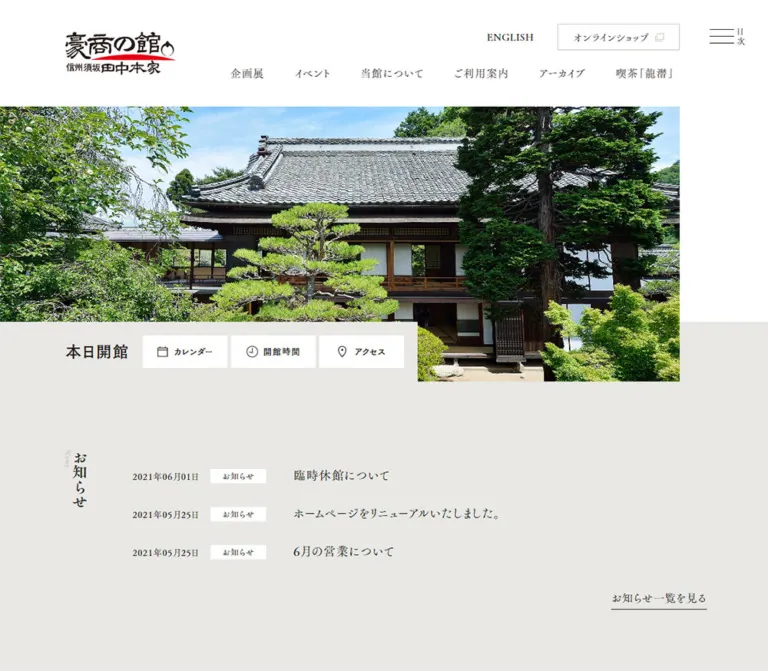
田中本家博物館 — 庭園写真と縦組み明朝の文化施設サイト
庭園の写真、余白を生かした非対称レイアウト、縦組みの明朝見出しが特徴。温かみのある灰白色と濃茶色を基調に、展示・イベント・来館案内を整理した博物館サイト。
Tanaka Honke Museum — Style Reference
A quiet museum guide framed by garden photography, vertical Mincho headings, and generous, uneven margins.
Original URL: tanakahonke.org Final URL: tanakahonke.org Theme: light editorial surfaces with a dark brown footer; no theme selector evidenced. Inspected: supplied capture collected October 5, 2026 at 06:43:08.650 JST / October 4, 2026 at 21:43:08.650 UTC. Viewports: desktop 1440 × 1000 CSS px and mobile 390 × 844 CSS px. Scope: the current museum homepage: identity and navigation, photographic opening, visitor shortcuts, important notices, news, exhibition promotion, content gateways, rental plans, museum introduction/location area, events, social links, and footer. Detail pages and external destinations were not inspected.
Tanaka Honke Museum presents a cultural institution through its gardens, objects, traditional rooms, and seasonal activities. The homepage supports several parallel tasks: planning a visit, checking exhibitions, reading announcements, exploring collections, finding events, and reaching the shop. Its hierarchy comes from photography, vertical section titles, and changes in alignment rather than a single dominant conversion action.
The interface combines white, a warm gray field, and very dark brown typography. Japanese Mincho lettering gives the page an established, literary character; a contrasting Gothic face makes immediate visitor information easier to identify. Thin rules, square corners, small underlined links, and ample breathing room keep the interface restrained. Natural greens and product colors belong mainly to the photographs.
The defining layout device is asymmetry. The opening photograph leaves a right-hand rail, visitor utilities overlap its lower-left corner, content gateways begin well inside the desktop page, and vertical headings occupy separate side columns. Mobile preserves this character while changing navigation density, card arrangement, and footer alignment.
閉じる
Tanaka Honke Museum — Style Reference
A quiet museum guide framed by garden photography, vertical Mincho headings, and generous, uneven margins.
Original URL: tanakahonke.org Final URL: tanakahonke.org Theme: light editorial surfaces with a dark brown footer; no theme selector evidenced. Inspected: supplied capture collected October 5, 2026 at 06:43:08.650 JST / October 4, 2026 at 21:43:08.650 UTC. Viewports: desktop 1440 × 1000 CSS px and mobile 390 × 844 CSS px. Scope: the current museum homepage: identity and navigation, photographic opening, visitor shortcuts, important notices, news, exhibition promotion, content gateways, rental plans, museum introduction/location area, events, social links, and footer. Detail pages and external destinations were not inspected.
Tanaka Honke Museum presents a cultural institution through its gardens, objects, traditional rooms, and seasonal activities. The homepage supports several parallel tasks: planning a visit, checking exhibitions, reading announcements, exploring collections, finding events, and reaching the shop. Its hierarchy comes from photography, vertical section titles, and changes in alignment rather than a single dominant conversion action.
The interface combines white, a warm gray field, and very dark brown typography. Japanese Mincho lettering gives the page an established, literary character; a contrasting Gothic face makes immediate visitor information easier to identify. Thin rules, square corners, small underlined links, and ample breathing room keep the interface restrained. Natural greens and product colors belong mainly to the photographs.
The defining layout device is asymmetry. The opening photograph leaves a right-hand rail, visitor utilities overlap its lower-left corner, content gateways begin well inside the desktop page, and vertical headings occupy separate side columns. Mobile preserves this character while changing navigation density, card arrangement, and footer alignment.
How to Read This Reference
- Measured values come from the supplied rendered DOM and computed-style records. They describe the two inspected viewport sizes, not a recovered stylesheet or an inferred universal formula.
- Visual estimates come from the current desktop/mobile captures. Hero bounds, thin borders, and image treatments are labeled accordingly where their own element styles were not supplied.
- Calculated values are simple differences or ratios between recorded measurements.
- Recommended values and implementation choices belong to the reusable CSS and prompts. They are not claims about original behavior.
- Custom properties in this document are descriptive aliases. The supplied source variables are largely standard WordPress presets; their presence does not establish that the visible design uses those colors, gradients, shadows, or spacing scales.
- Some anchors have inline bounding boxes only 15–16px high while their images and text occupy much larger areas. Those boxes must not be mistaken for complete card dimensions.
- Navigation-menu descendants appear in the DOM even though the menu is closed in the screenshots. Their measurements establish available content and declared typography, not an observed open-menu appearance.
Tokens — Colors
Default Palette
| Name | Value | Suggested token | Evidence and role |
|---|---|---|---|
| White | #FFFFFF |
--color-white |
Measured body background and reversed text; visually used by the header, utility surfaces, plan banners, and social area |
| Warm Stone | #E8E8E4 |
--color-stone |
Measured background of important notices, news, exhibition, and the content-gateway section |
| Brown Ink | #231815 |
--color-ink |
Measured body text and footer background; the principal structural color |
| Pale Gray | #CBC9C4 |
--color-muted |
Measured English section-label text; a suitable approximate rule color for adaptations |
| Muted Olive | #9A9774 |
--color-heritage |
Measured Japanese heading over the museum-introduction photograph |
| Notice Red | #E50012 |
--color-notice |
Measured important-notice heading; use sparingly |
The visible border color was not separately reported. Reusing Pale Gray for borders is a recommendation, supported by the appearance of the thin warm-gray rules. It should not be described as a measured border declaration.
Color Behavior
The page has no evidenced palette switching. White and Warm Stone alternate or overlap behind content, while the footer reverses the relationship to white details on Brown Ink. Notice Red is a small editorial signal, not a general button fill.
Photography supplies the saturated greens, pinks, reds, and yellow-browns. The pink cast of the shop tile is part of the image treatment, not evidence for a pink interface token. Likewise, the logo's red underline is visually related to the notice accent, but its exact asset color was not measured.
Do not adopt the supplied WordPress purple, cyan, orange, gradients, or shadow presets as brand tokens. They were present in the environment without corresponding evidence in this homepage's visible interface.
Tokens — Typography
Editorial Mincho — Body and Navigation
- Measured family:
"FOT-筑紫Aオールド明朝 Pr6 R", serif. - Desktop body:
16px / 28.8px, weight400, tracking0.8px. - Mobile body:
14.56px / 26.208px, weight400, tracking0.728px. - Both body treatments use a 1.8 line-height ratio and 0.05em tracking.
- Desktop primary navigation uses the same R family with computed weight
700. - English labels and ordinary Latin text also inherit this editorial family in the sampled elements.
The supplied HTML root remains 16px at both sizes. The mobile body size is therefore not evidence that the entire document changes to a 14.56px root.
Display Mincho — Headings
- Measured family:
"FOT-筑紫Aオールド明朝 Pr6 B", serif. - Most section, exhibition, event, and plan headings have computed weight
700. - Some elements using the B family, including the important-notice heading, have computed weight
400. A separately named face and a CSS weight are distinct pieces of evidence. - Large Japanese section headings use vertical composition. Their English companions are smaller, pale, and vertically oriented beside them.
The brush-like museum logo is artwork. Do not attempt to recreate it by typing the museum name in the body font.
Gothic — Immediate Visitor Utilities
- Measured stack:
"FOT-筑紫オールドゴシック Std B", "ヒラギノ角ゴ Pro W3", メイリオ, sans-serif. - Used for the opening-status text and the calendar, hours, and access shortcuts.
- The desktop status reads
24px / 43.2px, weight700; mobile reads16px / 28.8px. - The desktop shortcut anchors are
14px / 25.2px, weight500. - Mobile anchors inherit
14.56px, but their visible child captions are much smaller in the screenshot. Their actual child font size is not included in the supplied style sample; approximately 9–10px is a visual estimate, not a measured token.
Type Scale
Values below are measured unless otherwise stated. Sizes are rounded for readability.
| Role | Desktop size / line height | Mobile size / line height | Notes |
|---|---|---|---|
| Body | 16 / 28.8px |
14.56 / 26.208px |
Regular editorial Mincho |
| Primary header navigation | 16 / 28.8px |
Not visible in closed mobile header | R family, weight 700 |
| Menu primary links, DOM only | 24 / 43.2px |
16.64 / 29.952px |
Open state was not exercised |
| English header link | 14 / 25.2px |
10 / 18px |
Small, unboxed utility |
| Opening status | 24 / 43.2px |
16 / 28.8px |
Gothic |
| Important-notice heading | 14 / 25.2px |
10.4 / 18.72px |
Red, B family, weight 400 |
| Important-notice links | 18 / 36px |
14.56 / 29.12px |
Underlined text links |
| News Japanese section heading | 27.551 / 35.816px |
27.04 / 35.152px |
Remains nearly the same size |
| Main Japanese section headings | 47.755 / 62.082px |
27.04 / 35.152px |
Exhibition, About, and Event |
| Main English section companions | 23.878 / 42.980px |
10.4 / 18.72px |
Pale Gray |
| News English companion | 11.939 / 21.490px |
10.4 / 18.72px |
Smaller than other desktop companions |
| News date | 13 / 23.4px |
12.48 / 22.464px |
Compact metadata |
| News title | 18 / 32.4px |
14.56 / 26.208px |
Regular R family |
| Exhibition title | 24 / 43.2px |
17.68 / 31.824px |
B family, weight 700 |
| Content-gateway Japanese title | 33.061 / 59.510px |
22.88 / 41.184px |
Tracking 0.1em |
| Content-gateway description | 14.694 / 26.449px |
Not rendered in mobile text evidence | White text over imagery |
| Plan-banner title | 23.878 / 42.980px |
16.64 / 29.952px |
B family |
| Event title | 18 / 32.4px |
17.68 / 31.824px |
Almost unchanged in size |
| Event description/date | 16 / 28.8px |
12.48 / 22.464px |
Content length varies substantially |
| Social-link label | 16.531 / 29.755px |
14.56 / 26.208px |
Weight 700 |
| Footer contact details | 16 / 32px |
14.56 / 29.12px |
Line height 2 |
| Footer legal links | 12 / 21.6px |
10.4 / 18.72px |
Small reversed text |
| Copyright | 10 / 20px |
10.4 / 20.8px |
Two lines on mobile |
These values do not establish the original responsive formulas. The Quick Start uses measured endpoints with a recommended breakpoint. Font files, licensing arrangements, and per-glyph fallback behavior were not supplied.
Tokens — Spacing & Shapes
Overall density: generous section spacing around relatively compact text and controls. Geometry: rectangular photographs, square banners, fine rules, and minimal decorative framing.
Spacing Scale
The source does not expose a verified shared spacing scale. These are recurring measured distances and useful aliases.
| Use | Desktop | Mobile | Evidence |
|---|---|---|---|
| Header logo left inset | 96px |
25px |
Measured |
| Hero right rail | About 130px |
About 25px |
Screenshot estimate |
| Gap between visitor shortcuts | 5px |
5px |
Calculated from anchor positions |
| News section top padding | 100px |
70.2px |
Measured |
| Exhibition, gateway, and About section top padding | 150px |
70.2px |
Measured |
| Event section top padding | 100px |
70.2px |
Measured |
| Gateway copy left inset | 24px |
About 21.83px |
Calculated from supplied positions |
| Plan-banner inner padding | 8.094px |
6.75px |
Measured anchor padding |
| Gap between desktop event columns | About 37.95px |
Stacked | Calculated |
| Footer padding | 155px 65px |
39px 25px |
Measured |
Border Radius
The sampled elements report 0px radius, consistent with the visible square-cornered design. Social symbols contain their own rounded or circular forms, but those shapes do not establish a rounded-card system.
Thin borders and underlines appear approximately 1px wide in the screenshots. No general elevation or card-shadow system is visible. The shadow around the partly loaded embedded location panel should not be generalized to the museum's own components.
Layout Measurements
| Element | Desktop, 1440px wide | Mobile, 390px wide | Basis |
|---|---|---|---|
| Header height | 157.797px |
70.766px |
Measured |
| Header logo heading box | 163 × 62.703px |
80 × 30.766px |
Measured |
| Menu-button box | 36 × 30px at x1354, y38 |
26 × 30px at x339, y22 |
Measured; caption can extend outside this box |
| Opening photograph | About 1310 × 530px |
About 365 × 521px |
Current screenshot estimate |
| Visitor-panel overlap | About 88px |
About 52px |
Screenshot estimate |
| Visitor shortcut | 125 × 48px |
63 × 42px |
Measured anchor box |
| Important notices | Heading x96; links x236 | Heading and links x25 | Measured |
| News content column | x349.5, width 845.5px |
x99.813, width 265.188px |
Measured |
| Gateway columns | Start x300.203; about 379.94px each |
One column, width 340px, x25 |
Widths and positions measured; full panel heights unverified |
| Plan-banner anchor | 404.984 × 127.328px |
338 × 106.266px |
Measured; visible outside border adds roughly 2px |
| Museum-introduction image link | 720 × 720px |
390 × 390px |
Measured |
| Event content width | 336.094px per column |
265.188px |
Measured |
| Social-link anchor | 314.469 × 90px |
161.188 × 45px |
Measured; surrounding border is additional |
| Footer height | 686.375px |
408.297px |
Measured |
| Total document height | 5930.156px |
6310.094px |
Measured |
Avoid forcing every section into one centered maximum-width container. The changing left and right edges are a significant part of the design.
Components
Identity Header
Role: establish the museum and expose the main visitor routes.
The desktop header is a tall white band. A compact illustrated wordmark sits at x96, approximately 48px from the top. English translation and a thinly outlined shop link occupy an upper-right utility row. A second row contains six primary links: exhibition, events, museum information, visitor guide, archive, and café.
The shop link's measured inner box is 178 × 37px; its visible frame is approximately 180 × 39px. It is a quiet outlined utility, not a filled primary CTA.
On mobile, the header is about 71px tall. The logo becomes 80px wide at x25, the English link stays visible, and the desktop navigation and shop utility disappear from the closed header. The menu control remains at the right.
Persistent Table-of-Contents Control
Role: provide access to the broader site directory.
Three fine horizontal strokes sit beside the small vertical label 目次. The button has the rendered accessible text メニューを開閉する. It remains in the upper-right region in the supplied scrolled captures, supporting a persistent viewport control. The full header is not shown to remain fixed.
The DOM contains primary links, archive subsections, contact, privacy, shop, and social destinations. Desktop menu-link measurements suggest multiple groups; mobile measurements suggest two primary columns with secondary utilities below. The menu was not opened, so its actual visibility transition, backdrop, scroll locking, focus handling, and close behavior are unverified.
Photographic Opening
Role: create a sense of place before presenting practical information.
The current photograph shows a duck with ducklings in a garden pond, surrounded by moss and foliage. It begins directly below the header and extends from the left viewport edge, leaving an uncovered rail on the right. No large promotional headline or large CTA is visible over the photograph.
Desktop presents a broad landscape window, approximately 1310px wide and 530px tall. Mobile changes it into a tall crop, approximately 365px wide and 521px tall. The image treatment is actively recomposed rather than simply scaled to a short landscape strip.
The actual asset URL, source dimensions, responsive-image configuration, and focal-position CSS were not supplied. Implement crop control explicitly in a new build and check that the mother duck and group remain legible at both sizes. Do not infer a slideshow from the available still captures.
Opening Status and Visitor Shortcuts
Role: answer the immediate questions of whether the museum is open, when to visit, and how to get there.
A Warm Stone panel overlaps the lower-left edge of the photograph. It contains the Gothic status 本日開館, followed by three white rectangular shortcuts with calendar, clock, and location-pin icons.
Desktop keeps icon and label side by side inside 125 × 48px links. Mobile uses compact 63 × 42px links with the icon above a small caption. The status and all three links remain in one row.
The destinations are evidenced directly by hrefs:
| Label | Destination | Verified meaning |
|---|---|---|
カレンダー |
/guide#close |
Link to the visitor-guide calendar section |
開館時間 |
/guide#open |
Link to opening-hours information |
アクセス |
/guide#access |
Link to access information |
These are navigation links. No calendar popup, hours dialog, or inline map interaction was observed. The status is a captured content value; its scheduling logic is unknown.
Important Notices
Role: separate operational updates from general news.
The notices sit on Warm Stone immediately below the opening. A small red heading accompanies three dated links. Each link has an underline that follows the text width rather than a full-width row border.
Desktop places the heading at x96 and the links at x236. Mobile puts the heading above the list with a common 25px left inset. Current examples concern admission-price changes and donations.
Preserve the low-key treatment: a red heading, dark links, and fine rules. There is no evidenced red alert banner, large warning icon, or colored card background.
News List with Vertical Heading
Role: present recent updates without competing with the imagery.
The section uses a narrow vertical title rail and a wider list. The Japanese title is dark; the small English News label is pale and sits beside it. On desktop, date, category stamp, and title share a horizontal row. Three items are followed by a right-aligned, underlined archive link.
On mobile, the title rail remains. Content starts at x99.813 and is about 265.188px wide. The date/category area precedes the title, which can wrap onto another line. The section grows from about 358px to 450px tall even though its outer top padding decreases.
Use actual text and content-dependent row heights. The measured desktop date box is 115px wide, while mobile is about 98.375px. Category stamps are small white rectangles in the current desktop capture; their exact child typography and border treatment were not separately sampled.
Exhibition Feature
Role: give one exhibition more prominence than the news list.
The section remains on Warm Stone and begins with substantial space. A large vertical Japanese heading and pale English companion occupy the right side. The current DOM identifies a kimono exhibition, its dates, a details label, and an exhibition archive link.
Desktop title text begins at x859 in a roughly 514px-wide region. Mobile moves the title and supporting text into a roughly 310px-wide region starting at x52.297. The title changes from 24px to 17.68px; the date reduces to 12.48px.
The supplied screenshots do not show the complete exhibition artwork. Its colors, native aspect ratio, crop, and exact image/text overlap must remain unspecified. The DOM supports an image/content feature with a right-side section heading, not a precise reconstruction of unseen promotional artwork.
Café, Archive, and Shop Gateways
Role: offer three equally important routes into the museum's broader experience.
Desktop shows three adjoining photographic panels beginning around x300. Each is approximately 380px wide. Text is white and placed over subdued imagery: a small tracked English label, a larger Japanese title, and a short description.
The visible subjects are ceramic coffee cups, ducks beside the pond, and a decorative floral box. Their distinct colors come from the photographs. The panels have square edges, no individual card borders, and no gaps between desktop columns.
The copy begins 24px inside each desktop panel. Japanese titles use approximately 33.06px type with 0.1em tracking; descriptions use approximately 14.69px / 26.45px. The screenshot suggests a darkened image treatment, but its compositing method and opacity are unmeasured.
Mobile DOM measurements show three vertically arranged 340px-wide links at x25. Titles reduce to 22.88px, and the descriptions are absent from rendered mobile text while still present in anchor text data. The full mobile panel bounds were not supplied, so do not equate the 15px inline anchor height with image height or infer complete panel spacing from it.
The lower background around this group visibly becomes white, even though the sampled parent section reports Warm Stone. Preserve the visible background transition; a single uniform parent fill would miss the layered composition.
Photography and Room-Rental Plan Banners
Role: present two practical secondary services.
Two thinly bordered white banners sit below the image gateways. Each contains a landscape image on the left and a centered Mincho title on the right. The photography banner adds a smaller subtitle beneath its title.
The images show formal Japanese clothing and an open tatami room facing the garden. Desktop places the banners side by side, with outside dimensions of approximately 407 × 129px. Mobile stacks them at approximately 340 × 108px while retaining the image-left/text-right structure.
The banners link to /event/garden-plan/ and /event/zashiki-plan/. They are complete navigation surfaces, not forms or booking widgets.
Museum Introduction and Location Area
Role: connect the museum's history with its physical setting.
A square photograph of greenery and traditional architecture occupies the left half of desktop. Its link box is exactly 720 × 720px in the supplied measurement. A two-column vertical Japanese heading in Muted Olive sits near the upper-right of the photograph, accompanied by a pale English About label. White descriptive copy and a details label sit near the lower-left.
An adjacent location area begins slightly lower in the desktop screenshot. It contains address and contact information in the DOM. The visible embedded region is incomplete: a white panel with a blue loading indicator appears over a gray surface. The completed map or embed, provider, and controls are not verified.
Mobile turns the introduction into a full-width 390 × 390px square and places the location area below it. Keep the vertical heading and lower text placement, but allow actual text wrapping to determine the required safe space.
Event Articles
Role: surface bookable experiences and seasonal activities.
Desktop uses a left vertical title rail followed by three image-led columns, each about 336px wide with approximately 38px gaps. Each entry groups an image, small outlined status labels, a bold Mincho title, and descriptive/date text.
The first event contains a long reservation-availability list; the other entries contain much shorter date information. Their content heights differ substantially. Do not force equal text heights or truncate all entries to match the shortest one when reproducing the observed presentation.
Mobile stacks the entries inside the same inset content column used by news: approximately 265px wide at x100. The final mobile screenshot shows a small 開催予定 outline stamp, the title 秋の見晴らし茶席, and its date beneath an interior photograph.
An underlined event-archive link aligns with the right edge of the content column. The homepage contains reservation status text, but an actual reservation flow was not inspected.
Social-Link Band
Role: provide a clear transition from editorial content to the institutional footer.
A thin top rule separates this white band from the preceding content. Desktop contains four wide outlined rectangles in one row. Mobile uses a two-by-two arrangement with roughly 163px-wide outer frames and 47px outer heights.
Each rectangle centers a recognizable dark platform icon and a serif label. The supplied UI uses Twitter, Facebook, Instagram, and Youtube, including the Twitter bird symbol. Keep those observed labels when documenting the current interface.
This is one of the few repeated framed component groups. It remains flat, square, and quiet.
Institutional Footer
Role: close the page with identity, contact information, and secondary links.
The footer is a large Brown Ink field with a reversed logo, postal address, telephone/fax line, small social icons, contact/privacy links, and a copyright line. Desktop centers the composition and uses 155px 65px padding. The logo link is 158px wide; the visible logo height is approximately 61px.
Mobile changes to left alignment with 39px 25px padding. The logo becomes 115px wide, and copyright occupies two lines. The result is approximately 408px tall rather than the desktop's 686px.
The telephone is a real tel: link. Contact and privacy are ordinary links. The captured copyright year is page content, not the inspection date.
Tokens — Motion & Interaction
Evidence and Limits
| Element or action | Supplied evidence | What can be concluded |
|---|---|---|
| Menu button | Computed transition 0.3s ease-in-out |
A transition is declared; its animated property and visible open/close result were not tested |
| Primary/menu text links | Computed transition 0.3s on sampled links |
Short transition timing is part of the CSS; hover endpoint is unknown |
| Important-notice links | Computed transition 0.3s |
Duration verified, visual hover change unverified |
| News, exhibition, and event text | Computed transition 0.3s on selected title/body elements |
Supports restrained feedback, not a proven reveal animation |
| Many other elements | Transition field reported as all |
This alone does not establish a nonzero duration or visible animation |
| Sampled animation field | none |
No keyframe animation on those sampled elements; descendants and scripts are not exhaustively covered |
| Scrolling | Settled top, middle, and lower captures supplied | Normal vertical document browsing is evidenced |
| Upper-right menu | Reappears at the same viewport corner in scrolled screenshots | Persistent control is visually supported |
| Hero | Still photographs only | Autoplay, slide count, crossfade, and drag behavior are unverified |
| Location embed | Loading indicator visible | Final loaded state and interaction are unverified |
The collection process included an initial observation of at least five seconds and waited for visible image decoding and sampled layout stability within time limits. Perpetual animations were temporarily paused during readiness checks. This procedure does not constitute a recording of every interaction or prove that delayed content completed.
Link Behavior
The ENGLISH control links to a Google Translate URL for the homepage. It should not be described as a verified native English edition. The shop links point to https://tanakahonke.base.shop/; shopping and checkout behavior were not inspected. Social destinations and visitor-guide fragments are evidenced as hrefs only.
Recommended Motion
For a new implementation, use subtle color, opacity, or underline changes in the 150–300ms range. Keep the page readable before animation runs. No evidence requires parallax, scroll hijacking, staggered entrances, image zoom, or an automatic hero carousel.
Provide reduced-motion handling. If a menu overlay is implemented, verify keyboard focus, Escape dismissal, state announcements, and restoration of focus to the trigger.
Surfaces
| Surface | Appearance | Structural purpose |
|---|---|---|
| Header and open whitespace | White | Clear framing for identity and navigation |
| Notice/news/exhibition field | Warm Stone | Joins informational sections without heavy card borders |
| Visitor utility panel | Warm Stone with white shortcut cells | Connects the photograph with practical information |
| Photographic gateways | Natural imagery with white overlaid text | Gives separate destinations their own atmosphere |
| Plan and social frames | White, approximately 1px warm-gray border | Defines utility targets without elevation |
| Museum-introduction image | Green architectural photograph, olive heading, white copy | Connects history to a physical place |
| Footer | Brown Ink with white details | Strong visual ending and institutional identity |
Structure comes from image edges, empty space, background changes, and rules. Gradients are not evidenced as a general decorative language. A dark image scrim may be used as an implementation aid, but its exact source form is unknown.
Imagery
The current visual language is photographic and place-specific: garden water, moss, ducks, foliage, cups, traditional interiors, clothing, and museum goods. Images feel connected to a visit rather than to a generic tourism campaign.
Preserve natural textures and recognizable spaces. White overlay text requires controlled image contrast, but the photographs should retain their seasonal colors. Avoid applying a uniform sepia or duotone filter across the site; the current captures show full-color imagery.
Observed Asset References
No original image-file URLs, native dimensions, or file formats were included in the evidence. The following inventory identifies observed subjects and placements without inventing asset paths.
| Asset role | Observed subject | Evidence and implementation note |
|---|---|---|
| Header/footer identity | Calligraphic museum logo with red underline | Dark and reversed versions visible; preserve as authorized artwork |
| Opening photograph | Duck and ducklings in a mossy garden pond | Current desktop and mobile views; different crop proportions |
| Café gateway | Blue-decorated ceramic cups beside greenery | Desktop middle capture; white type over darkened image |
| Archive gateway | Ducks and pond stones | Desktop middle capture; do not assume it is the identical hero file |
| Shop gateway | Wooden box with red and white floral decoration | Desktop middle capture; pink tone belongs to the image |
| Photography plan | Formal Japanese clothing | Small landscape crop in bordered banner |
| Room-rental plan | Tatami interior opening to a garden | Small landscape crop in bordered banner |
| Museum introduction | Dense greenery beside a traditional building | Large square composition with vertical heading |
| Final visible event | Traditional interior with a red mat | Partial image visible in the lower mobile capture |
| Exhibition artwork | Not fully visible in supplied screenshots | Content is identified by DOM; artwork appearance remains unverified |
| Utility/social icons | Calendar, clock, pin, and platform marks | Shapes visible; asset format and icon library unknown |
Use appropriately licensed photographs and identity artwork. For meaningful content images, write subject-specific alternative text. Decorative duplicate icons should not repeat the neighboring visible label for assistive technology.
Layout & Responsive Behavior
Page Sequence
The rendered homepage follows this order:
- Header and garden photograph.
- Overlapping opening status and visitor shortcuts.
- Important notices and recent news.
- Featured exhibition.
- Café, archive, and shop gateways.
- Photography and room-rental plans.
- Museum introduction and location information.
- Event articles.
- Social-link band and dark footer.
Desktop Composition
At 1440px wide, the page alternates several alignment systems. The logo and important notices use a 96px inset. News occupies a more centered editorial region. Exhibition headings sit near the right edge. Three gateways start at approximately x300 and continue to the right viewport edge. About uses half-width square regions. Events return to a left title rail with a three-column content group.
The opening photograph's right rail and the gateway group's large left offset balance one another across the page. The design should not be flattened into a sequence of identical centered sections.
Mobile Composition
At 390px wide, the main recurring horizontal inset is 25px, but not every region uses it. The hero still touches the left viewport edge, the opening-status panel begins at x0, and the museum-introduction image fills the entire width.
News and event content retain a side rail for vertical headings, leaving only about 265px for the articles. Plan banners retain internal horizontal image/text anatomy while stacking as a group. Gateway cards stack. Social links become two columns, and the footer becomes left aligned.
The mobile homepage is approximately 6310px tall versus 5930px on desktop. Stacked content and wrapping offset the smaller section spacing. This is a content-driven long page; it is not a fixed-height application shell.
Known and Unknown Responsive Rules
| Behavior | Evidence status |
|---|---|
| Header changes from two desktop navigation rows to compact logo/English/menu | Observed |
| Hero becomes a tall crop | Observed visually |
| Main vertical headings reduce from about 47.76px to 27.04px | Measured |
| News heading stays near 27px at both sizes | Measured |
| Gateway descriptions disappear from rendered mobile content | Supported by mobile rendered text and absent paragraph samples |
| Plans change from two columns to one | Measured positions |
| About/location change from side-by-side to stacked | Measured positions and section geometry |
| Events change from three columns to one | Measured positions |
| Social links change from four columns to two | Measured and visible |
| Footer changes from centered to left aligned | Visible and measured |
| Exact breakpoint, tablet layout, and interpolation formulas | Not supplied |
| Mobile gateway image height and full spacing | Not established by the available inline boxes |
Do’s and Don’ts
Do
- Preserve the exact measured core colors:
#FFFFFF,#E8E8E4, and#231815. - Use Mincho typography for editorial content and a distinct Gothic treatment for immediate visitor utilities.
- Preserve vertical Japanese section headings with small pale English companions.
- Keep multiple alignment systems and meaningful empty space across the desktop page.
- Recompose photographic crops deliberately for mobile.
- Keep important notices visually separate from general news.
- Use thin rules, square frames, and understated underlined archive links.
- Preserve content-dependent event heights and readable reservation information.
- Retain the mobile title rail, two-column social band, and left-aligned footer.
- Treat the current opening status, dates, and reservation counts as editable content.
Don’t
- Don’t turn the museum homepage into a single-purpose sales funnel.
- Don’t add a giant headline or prominent filled CTA over the opening photograph.
- Don’t replace every section with equal-width rounded cards.
- Don’t make all typography sans-serif or approximate the logo with ordinary text.
- Don’t use Notice Red as the default button background.
- Don’t introduce generic gradients, glossy shadows, or glass effects from unused framework presets.
- Don’t assume inline anchor heights describe complete image cards.
- Don’t label untested hover, menu, carousel, or map behavior as observed.
- Don’t shrink the desktop composition uniformly to create mobile.
- Don’t reproduce the location-loading indicator as an intentional permanent component.
Recommended Implementation Additions
These are recommendations for a new implementation, not verified features of the original homepage:
- Keep one clear page-level heading for the museum and a logical section hierarchy; avoid repeating heading levels merely to wrap logo artwork.
- Expand menu and icon-link hit areas to at least 44px where practical. The measured mobile visitor links are only 42px tall, and the menu-button box is smaller still.
- Preserve fine typography while offering more readable utility captions and legal text where needed. Do not confuse a small visual icon with a necessarily small interactive target.
- Use real links for navigation and a button for menu state. Expose
aria-expandedand connect the trigger to the menu region. - Apply visible keyboard focus indicators on white, stone, photographic, and dark surfaces.
- Verify white text contrast against every responsive image crop. Use a controlled scrim if needed, and retain meaningful text outside an image when contrast cannot be maintained.
- Treat Pale Gray English companions as secondary decoration; do not use that low-contrast color for essential instructions.
- Derive opening status and event availability from maintained content. A captured
本日開館label is not reusable business logic. - Provide a stable address and directions fallback when an embedded location panel cannot load.
- Reserve image dimensions to prevent layout shifts. Prioritize the opening image and defer noncritical lower-page imagery appropriately.
- Verify responsive behavior at tablet widths, narrow phones, zoomed text, and with fallback fonts.
- Audit the two observed privacy-link casings,
/privacyand/Privacy, before implementation; their destination behavior was not tested.
Agent Prompt Guide
Quick Color Reference
- Main canvas and utility surfaces:
#FFFFFF. - Informational section field:
#E8E8E4. - Main text, icons, and footer background:
#231815. - English section companions:
#CBC9C4. - Museum-introduction heading:
#9A9774. - Important-notice heading:
#E50012. - Rules: thin warm gray;
#CBC9C4is an implementation approximation. - Photography: natural full color, with controlled contrast behind white text.
Overall Prompt
“Create a Japanese museum homepage inspired by the current Tanaka Honke Museum composition. Use white and warm stone #E8E8E4 surfaces, dark brown #231815 text, expressive Mincho typography, vertical Japanese section headings, and small pale English companions. Begin with a compact museum logo, quiet navigation, and a large garden photograph aligned to the left with a right-side rail. Overlap its lower-left corner with opening status and three white visitor shortcuts. Continue with operational notices, a news list, a featured exhibition, three photographic content gateways, two bordered service banners, a square museum-introduction image, event articles, outlined social links, and a spacious dark footer. Preserve asymmetrical margins and square corners. On mobile, retain vertical heading rails, stack content groups, use two social columns, and left-align the footer. Use authorized photography and logo assets; do not invent original interaction behavior.”
Example Component Prompts
- Visitor panel: “Build a warm-gray panel overlapping the lower-left of a garden photograph. Set
本日開館in a bold Japanese Gothic face and place calendar, opening-hours, and access links in three white square-cornered cells. Use icon-plus-label rows on desktop and icon-over-caption cells on mobile. Treat the status as supplied content.” - News section: “Create a warm-stone news section with a narrow vertical Japanese heading and a pale vertical English companion. Use three dated rows with small white category stamps and dark Mincho titles. On mobile, retain the heading rail and place metadata above wrapping titles. Finish with an underlined archive link aligned right.”
- Content gateways: “Arrange café, archive, and shop photographs as three adjoining desktop panels starting after a generous left margin. Overlay a small tracked English label, a 33px Japanese Mincho heading, and compact white description text. Stack the panels on mobile and simplify to the labels and titles. Use a restrained scrim without rounded corners or elevation.”
- Plan banner: “Create a thinly outlined white horizontal banner with a small landscape photograph on the left and a centered Japanese Mincho title on the right. Add an optional small subtitle. Pair two banners on desktop and stack them on mobile while preserving their internal horizontal structure.”
- Event group: “Use a vertical section-title rail beside three image-led event columns. Place small outlined availability labels above 18px Mincho titles and variable-length dates or reservation details. Stack entries in a narrow inset mobile column. Keep content heights natural.”
- Footer: “Build a spacious dark brown
#231815institutional footer with a reversed museum logo, two contact lines, small white social icons, contact/privacy links, and understated copyright text. Center the desktop composition with large vertical padding; switch to 25px-inset left alignment on mobile.”
Quick Start
CSS Custom Properties
This is a recommended adaptation, not recovered source CSS. It uses the measured desktop/mobile endpoints, a conventional 16px root, and an example 767px breakpoint. The original breakpoint is unknown. The hero crop, rule color, gateway scrim, and intermediate layout choices are approximations.
Use an image element inside .hero, followed by .visit-panel. Within the panel, place .visit-status and a .visit-links group. A .section-heading contains a Japanese heading and an English paragraph. Gateway and event classes assume semantic links, headings, and images supplied by the implementation.
The font-family names below are measured declarations. They do not load font files or grant access to them. If those faces are unavailable, the serif/sans-serif fallbacks apply and wrapping must be rechecked.
:root {
  /* Measured interface colors */
  --color-white: #ffffff;
  --color-stone: #e8e8e4;
  --color-ink: #231815;
  --color-muted: #cbc9c4;
  --color-heritage: #9a9774;
  --color-notice: #e50012;

  /* Recommended reuse of the measured muted color */
  --color-rule: var(--color-muted);

  /* Measured family declarations */
  --font-editorial: 'FOT-筑紫Aオールド明朝 Pr6 R', serif;
  --font-display: 'FOT-筑紫Aオールド明朝 Pr6 B', serif;
  --font-utility: 'FOT-筑紫オールドゴシック Std B',
    'ヒラギノ角ゴ Pro W3', メイリオ, sans-serif;

  --text-body: 16px;
  --text-section: 47.755px;
  --text-section-en: 23.878px;
  --text-news-heading: 27.551px;
  --text-card: 33.061px;
  --text-event: 18px;
  --leading-body: 1.8;
  --tracking-body: 0.05em;

  --header-height: 157.797px;
  --header-inset: 96px;
  --hero-rail: 130px;
  --hero-height: 530px;
  --visit-overlap: 88px;
  --section-gap: 150px;
  --section-gap-small: 100px;
  --rule-width: 1px;

  /* Recommended interaction timing */
  --motion-feedback: 200ms ease;
}

* { box-sizing: border-box; }

body {
  margin: 0;
  color: var(--color-ink);
  background: var(--color-white);
  font-family: var(--font-editorial);
  font-size: var(--text-body);
  line-height: var(--leading-body);
  letter-spacing: var(--tracking-body);
}

img { display: block; max-width: 100%; }
a { color: inherit; }
button { font: inherit; }

.museum-header {
  position: relative;
  height: var(--header-height);
  background: var(--color-white);
}

.header-logo {
  position: absolute;
  top: 47.55px;
  left: var(--header-inset);
  width: 163px;
}

.header-utilities {
  position: absolute;
  top: 35px;
  right: var(--hero-rail);
  display: flex;
  align-items: center;
  gap: 35px;
  font-size: 14px;
}

.shop-link {
  display: grid;
  place-items: center;
  width: 180px;
  min-height: 39px;
  border: var(--rule-width) solid var(--color-rule);
  font-size: 15px;
  text-decoration: none;
}

.primary-nav {
  position: absolute;
  right: 138px;
  bottom: 35px;
  display: flex;
  gap: 44px;
  font-weight: 700;
}

.primary-nav a { text-decoration: none; }

/* Recommended 44px target around the smaller visual glyph */
.menu-toggle {
  position: fixed;
  z-index: 20;
  top: 31px;
  right: 46px;
  display: grid;
  place-items: center;
  width: 44px;
  height: 44px;
  padding: 0;
  border: 0;
  color: var(--color-ink);
  background: transparent;
  cursor: pointer;
}

.menu-glyph {
  display: grid;
  align-content: space-between;
  width: 36px;
  height: 21px;
}

.menu-glyph span {
  height: 1px;
  background: currentColor;
}

.hero {
  position: relative;
  background: linear-gradient(
    to bottom,
    var(--color-white) calc(100% - var(--visit-overlap)),
    var(--color-stone) 0
  );
}

.hero > img {
  width: calc(100% - var(--hero-rail));
  height: var(--hero-height);
  object-fit: cover;
  object-position: var(--hero-focal-point, 50% 50%);
}

.visit-panel {
  position: absolute;
  bottom: 0;
  left: 0;
  display: flex;
  align-items: center;
  gap: 20px;
  padding: 20px 20px 20px var(--header-inset);
  background: var(--color-stone);
  font-family: var(--font-utility);
}

.visit-status {
  margin: 0;
  font-size: 24px;
  font-weight: 700;
  white-space: nowrap;
}

.visit-links {
  display: grid;
  grid-template-columns: repeat(3, 125px);
  gap: 5px;
}

.visit-links a {
  display: flex;
  align-items: center;
  justify-content: center;
  gap: 8px;
  min-height: 48px;
  background: var(--color-white);
  font-size: 14px;
  text-decoration: none;
}

.visit-links svg { width: 18px; height: 18px; }

.important-notices {
  display: grid;
  grid-template-columns: 119px minmax(0, 1fr);
  align-items: center;
  gap: 21px;
  padding: 32px var(--header-inset) 0;
  background: var(--color-stone);
}

.important-notices h2 {
  margin: 0;
  color: var(--color-notice);
  font-family: var(--font-display);
  font-size: 14px;
  font-weight: 400;
}

.notice-list { margin: 0; padding: 0; list-style: none; }
.notice-list li + li { margin-top: 5px; }
.notice-list a { font-size: 18px; line-height: 2; }

.notice-list a,
.text-link {
  text-decoration-thickness: 1px;
  text-underline-offset: 8px;
}

.stone-section { background: var(--color-stone); }
.section-space { padding-top: var(--section-gap); }
.section-space-small { padding-top: var(--section-gap-small); }

.section-heading {
  display: flex;
  flex-direction: row-reverse;
  align-items: flex-start;
  justify-content: flex-end;
}

.section-heading h2,
.section-heading p {
  margin: 0;
  writing-mode: vertical-rl;
}

.section-heading h2 {
  font-family: var(--font-display);
  font-size: var(--text-section);
  font-weight: 700;
  line-height: 1.3;
  letter-spacing: normal;
}

.section-heading p {
  color: var(--color-muted);
  font-size: var(--text-section-en);
  line-height: 1.8;
}

.news-layout {
  display: grid;
  grid-template-columns: 104.5px minmax(0, 1fr);
  gap: 30px;
  width: min(1010px, calc(100% - 50px));
  margin-inline: auto;
  padding-right: 30px;
}

.news-layout .section-heading h2 {
  font-size: var(--text-news-heading);
}

.news-layout .section-heading p { font-size: 11.939px; }
.news-list { min-width: 0; padding-top: 43.7px; }

.news-row {
  display: grid;
  grid-template-columns: 115px 100px minmax(0, 1fr);
  align-items: start;
  gap: 11px;
  margin-bottom: 24px;
  text-decoration: none;
}

.news-row time { font-size: 13px; }
.news-row h3 { margin: 0; font-size: 18px; font-weight: 400; }
.news-category { background: white; text-align: center; font-size: 12px; }
.archive-link { display: block; width: fit-content; margin: 32px 0 0 auto; }

.gateway-grid {
  display: grid;
  grid-template-columns: repeat(3, minmax(0, 1fr));
  margin-left: 20.8474%;
}

.gateway-tile {
  position: relative;
  display: block;
  isolation: isolate;
  color: white;
  text-decoration: none;
}

.gateway-tile > img { width: 100%; height: auto; }

/* Recommended scrim; original opacity and method are unverified */
.gateway-tile::after {
  position: absolute;
  z-index: 1;
  inset: 0;
  background: rgb(35 24 21 / 30%);
  content: '';
  pointer-events: none;
}

.gateway-copy {
  position: absolute;
  z-index: 2;
  right: 24px;
  bottom: 28px;
  left: 24px;
  max-width: 256px;
}

.gateway-copy h3 {
  margin: 0;
  font-family: var(--font-display);
  font-size: var(--text-card);
  letter-spacing: 0.1em;
}

.gateway-copy .eyebrow { display: block; font-size: 15px; }
.gateway-description { margin: 14.7px 0 0; font-size: 14.694px; }

.plan-grid {
  display: grid;
  grid-template-columns: repeat(2, minmax(0, 1fr));
  gap: 34px;
  width: min(848px, calc(100% - 50px));
  margin: 86px auto 0;
}

.plan-card {
  display: grid;
  grid-template-columns: 43% minmax(0, 1fr);
  align-items: center;
  padding: 8px;
  border: 1px solid var(--color-rule);
  background: white;
  text-align: center;
  text-decoration: none;
}

.plan-card img { width: 100%; aspect-ratio: 3 / 2; object-fit: cover; }
.plan-card h3 { margin: 0; font: 700 23.878px/1.8 var(--font-display); }
.plan-card small { display: block; font-size: 12px; }

.about-layout { display: grid; grid-template-columns: 1fr 1fr; }
.about-panel { position: relative; display: block; aspect-ratio: 1; color: white; }
.about-panel > img { width: 100%; height: 100%; object-fit: cover; }
.about-panel .section-heading { position: absolute; top: 6.4%; right: 6.4%; }
.about-panel h2 { color: var(--color-heritage); }
.about-copy { position: absolute; right: 6.4%; bottom: 6.4%; left: 6.4%; }
.location-panel { margin-top: 50px; background: var(--color-stone); }

.event-grid { display: grid; grid-template-columns: repeat(3, minmax(0, 1fr)); gap: 38px; }
.event-card { min-width: 0; text-decoration: none; }
.event-card > img { width: 100%; height: auto; }
.event-card h3 { margin: 8px 0 0; font: 700 var(--text-event)/1.8 var(--font-display); }
.event-card p { margin: 8px 0 0; }
.event-status { display: inline-block; padding: 0 12px; border: 1px solid var(--color-rule); font-size: 12px; }

.social-band { border-top: 1px solid var(--color-rule); padding: 58px 32px; }
.social-grid { display: grid; grid-template-columns: repeat(4, minmax(0, 1fr)); gap: 36px; }
.social-grid a { display: flex; align-items: center; justify-content: center; gap: 14px; min-height: 92px; border: 1px solid var(--color-rule); text-decoration: none; }

.museum-footer { padding: 155px 65px; color: white; background: var(--color-ink); text-align: center; }
.footer-logo { width: 158px; margin-inline: auto; }
.footer-contact { margin: 32px 0 0; line-height: 2; }
.footer-socials { display: flex; justify-content: center; gap: 26px; margin-top: 88px; }
.footer-links { margin-top: 24px; font-size: 12px; }
.footer-links a + a { margin-left: 20px; }
.footer-copyright { margin: 50px 0 0; font-size: 10px; line-height: 2; }

/* Recommended accessible focus and restrained feedback */
a, button { transition: color var(--motion-feedback), opacity var(--motion-feedback); }
:focus-visible { outline: 2px solid currentColor; outline-offset: 5px; }

@media (max-width: 767px) {
  :root {
    --text-body: 14.56px;
    --text-section: 27.04px;
    --text-section-en: 10.4px;
    --text-news-heading: 27.04px;
    --text-card: 22.88px;
    --text-event: 17.68px;
    --header-height: 70.766px;
    --header-inset: 25px;
    --hero-rail: 25px;
    --visit-overlap: 54px;
    --section-gap: 70.2px;
    --section-gap-small: 70.2px;
  }

  .header-logo { top: 20px; width: 80px; }
  .header-utilities { top: 26.375px; right: 70px; font-size: 10px; }
  .primary-nav, .header-utilities .shop-link { display: none; }
  .menu-toggle { top: 15px; right: 16px; }
  .menu-glyph { width: 26px; height: 16px; }

  /* Approximate observed crop; tune the focal point to the supplied asset */
  .hero > img { height: auto; aspect-ratio: 7 / 10; }
  .visit-panel { gap: 15px; padding: 10px 10px 0; }
  .visit-status { font-size: 16px; }
  .visit-links { grid-template-columns: repeat(3, 63px); }
  .visit-links a { flex-direction: column; gap: 1px; min-height: 44px; font-size: 10px; line-height: 1.2; }

  .important-notices { display: block; padding: 37px 25px 0; }
  .important-notices h2 { font-size: 10.4px; }
  .notice-list a { font-size: 14.56px; }

  .news-layout { grid-template-columns: 49px minmax(0, 1fr); gap: 25.8px; padding-right: 0; }
  .news-layout .section-heading p { font-size: 10.4px; }
  .news-list { padding-top: 57.2px; }
  .news-row { grid-template-columns: auto 1fr; gap: 4px 8px; }
  .news-row time { font-size: 12.48px; }
  .news-row h3 { grid-column: 1 / -1; font-size: 14.56px; }
  .news-category { justify-self: start; padding-inline: 8px; }

  /* Panel image height remains asset-dependent; full mobile bounds were unmeasured */
  .gateway-grid { grid-template-columns: 1fr; gap: 32px; margin-inline: 25px; }
  .gateway-copy { left: 21.83px; bottom: 20px; }
  .gateway-description { display: none; }
  .gateway-copy .eyebrow { font-size: 10.4px; }

  .plan-grid { grid-template-columns: 1fr; gap: 20px; margin-top: 70px; }
  .plan-card { padding: 6.75px; }
  .plan-card h3 { font-size: 16.64px; }
  .plan-card small { font-size: 10.4px; }

  .about-layout { grid-template-columns: 1fr; }
  .location-panel { margin-top: 0; }
  .event-grid { grid-template-columns: 1fr; gap: 29px; }
  .event-card p { font-size: 12.48px; }

  .social-band { padding: 39px 25px; }
  .social-grid { grid-template-columns: repeat(2, minmax(0, 1fr)); gap: 11px 14px; }
  .social-grid a { min-height: 47px; gap: 10px; }

  .museum-footer { padding: 39px 25px; text-align: left; }
  .footer-logo { width: 115px; margin-inline: 0; }
  .footer-contact { margin-top: 39px; }
  .footer-socials { justify-content: flex-start; gap: 21px; margin-top: 54px; }
  .footer-links { margin-top: 19px; font-size: 10.4px; }
  .footer-copyright { margin-top: 38px; font-size: 10.4px; }
}

@media (prefers-reduced-motion: reduce) {
  a, button { transition: none; }
}
The code deliberately leaves image URLs, menu state management, opening-status logic, exhibition artwork layout, and location integration to the implementation. Gateway image proportions must be supplied and verified; the mobile gateway gap is a recommendation. The mobile shortcut height is increased from the measured 42px to 44px. The background gradient in .hero creates a hard two-color boundary, not a decorative color fade.
Tailwind v4 Token Mapping
Optional aliases for an implementation already using Tailwind v4. These do not imply that the original site uses Tailwind. Define the properties above first.
@theme inline {
  --color-museum-white: var(--color-white);
  --color-museum-stone: var(--color-stone);
  --color-museum-ink: var(--color-ink);
  --color-museum-muted: var(--color-muted);
  --color-museum-heritage: var(--color-heritage);
  --color-museum-notice: var(--color-notice);

  --font-museum-editorial: var(--font-editorial);
  --font-museum-display: var(--font-display);
  --font-museum-utility: var(--font-utility);

  --text-museum-body: var(--text-body);
  --text-museum-section: var(--text-section);
  --text-museum-card: var(--text-card);
  --text-museum-event: var(--text-event);

  --spacing-museum-section: var(--section-gap);
  --spacing-museum-section-small: var(--section-gap-small);
  --radius-museum: 0px;
}
Sources & Evidence
- Inspected original and final page: Tanaka Honke Museum homepage. Both supplied URLs are identical; the recorded response was HTTP 200.
- Capture time:
2026-10-04T21:43:08.650Z, equivalent to October 5, 2026 at 06:43:08.650 JST. - Desktop evidence: three supplied current-page screenshots at 1440 × 1000, showing the opening, middle content, and social/footer region; rendered DOM, link targets, element rectangles, computed typography, colors, spacing, transitions, and document height.
- Mobile evidence: two supplied current-page screenshots at 390 × 844, showing the opening and lower event/social/footer region; a corresponding rendered DOM and computed-style record for the homepage.
- Observed browsing scope: initial page observation and scrolling to settled capture positions. Menu activation, hover states, keyboard navigation, translation, shop flows, reservations, telephone activation, and destination pages were not exercised in the supplied evidence.
- Inspection limitations: screenshots cover selected viewports rather than every continuous page segment. Unshown exhibition artwork, full mobile gateway geometry, exact breakpoint rules, image-file paths, complete menu behavior, and the final location-embed state remain unverified. Collection waited for sampled readiness within time limits; this does not guarantee semantic completeness.
This reference describes the supplied current homepage. All implementation aliases, accessibility additions, CSS breakpoint choices, and unspecified visual treatments are recommendations rather than recovered source rules.
# Tanaka Honke Museum — Style Reference

> A quiet museum guide framed by garden photography, vertical Mincho headings, and generous, uneven margins.

**Original URL:** [tanakahonke.org](https://tanakahonke.org/)
**Final URL:** [tanakahonke.org](https://tanakahonke.org/)
**Theme:** light editorial surfaces with a dark brown footer; no theme selector evidenced.
**Inspected:** supplied capture collected October 5, 2026 at 06:43:08.650 JST / October 4, 2026 at 21:43:08.650 UTC.
**Viewports:** desktop **1440 × 1000 CSS px** and mobile **390 × 844 CSS px**.
**Scope:** the current museum homepage: identity and navigation, photographic opening, visitor shortcuts, important notices, news, exhibition promotion, content gateways, rental plans, museum introduction/location area, events, social links, and footer. Detail pages and external destinations were not inspected.

Tanaka Honke Museum presents a cultural institution through its gardens, objects, traditional rooms, and seasonal activities. The homepage supports several parallel tasks: planning a visit, checking exhibitions, reading announcements, exploring collections, finding events, and reaching the shop. Its hierarchy comes from photography, vertical section titles, and changes in alignment rather than a single dominant conversion action.

The interface combines white, a warm gray field, and very dark brown typography. Japanese Mincho lettering gives the page an established, literary character; a contrasting Gothic face makes immediate visitor information easier to identify. Thin rules, square corners, small underlined links, and ample breathing room keep the interface restrained. Natural greens and product colors belong mainly to the photographs.

The defining layout device is asymmetry. The opening photograph leaves a right-hand rail, visitor utilities overlap its lower-left corner, content gateways begin well inside the desktop page, and vertical headings occupy separate side columns. Mobile preserves this character while changing navigation density, card arrangement, and footer alignment.
閉じる
# Tanaka Honke Museum — Style Reference

> A quiet museum guide framed by garden photography, vertical Mincho headings, and generous, uneven margins.

**Original URL:** [tanakahonke.org](https://tanakahonke.org/)
**Final URL:** [tanakahonke.org](https://tanakahonke.org/)
**Theme:** light editorial surfaces with a dark brown footer; no theme selector evidenced.
**Inspected:** supplied capture collected October 5, 2026 at 06:43:08.650 JST / October 4, 2026 at 21:43:08.650 UTC.
**Viewports:** desktop **1440 × 1000 CSS px** and mobile **390 × 844 CSS px**.
**Scope:** the current museum homepage: identity and navigation, photographic opening, visitor shortcuts, important notices, news, exhibition promotion, content gateways, rental plans, museum introduction/location area, events, social links, and footer. Detail pages and external destinations were not inspected.

Tanaka Honke Museum presents a cultural institution through its gardens, objects, traditional rooms, and seasonal activities. The homepage supports several parallel tasks: planning a visit, checking exhibitions, reading announcements, exploring collections, finding events, and reaching the shop. Its hierarchy comes from photography, vertical section titles, and changes in alignment rather than a single dominant conversion action.

The interface combines white, a warm gray field, and very dark brown typography. Japanese Mincho lettering gives the page an established, literary character; a contrasting Gothic face makes immediate visitor information easier to identify. Thin rules, square corners, small underlined links, and ample breathing room keep the interface restrained. Natural greens and product colors belong mainly to the photographs.

The defining layout device is asymmetry. The opening photograph leaves a right-hand rail, visitor utilities overlap its lower-left corner, content gateways begin well inside the desktop page, and vertical headings occupy separate side columns. Mobile preserves this character while changing navigation density, card arrangement, and footer alignment.

## How to Read This Reference

- **Measured** values come from the supplied rendered DOM and computed-style records. They describe the two inspected viewport sizes, not a recovered stylesheet or an inferred universal formula.
- **Visual estimates** come from the current desktop/mobile captures. Hero bounds, thin borders, and image treatments are labeled accordingly where their own element styles were not supplied.
- **Calculated** values are simple differences or ratios between recorded measurements.
- **Recommended** values and implementation choices belong to the reusable CSS and prompts. They are not claims about original behavior.
- Custom properties in this document are descriptive aliases. The supplied source variables are largely standard WordPress presets; their presence does not establish that the visible design uses those colors, gradients, shadows, or spacing scales.
- Some anchors have inline bounding boxes only 15–16px high while their images and text occupy much larger areas. Those boxes must not be mistaken for complete card dimensions.
- Navigation-menu descendants appear in the DOM even though the menu is closed in the screenshots. Their measurements establish available content and declared typography, not an observed open-menu appearance.

## Tokens — Colors

### Default Palette

| Name | Value | Suggested token | Evidence and role |
| --- | --- | --- | --- |
| White | `#FFFFFF` | `--color-white` | Measured body background and reversed text; visually used by the header, utility surfaces, plan banners, and social area |
| Warm Stone | `#E8E8E4` | `--color-stone` | Measured background of important notices, news, exhibition, and the content-gateway section |
| Brown Ink | `#231815` | `--color-ink` | Measured body text and footer background; the principal structural color |
| Pale Gray | `#CBC9C4` | `--color-muted` | Measured English section-label text; a suitable approximate rule color for adaptations |
| Muted Olive | `#9A9774` | `--color-heritage` | Measured Japanese heading over the museum-introduction photograph |
| Notice Red | `#E50012` | `--color-notice` | Measured important-notice heading; use sparingly |

The visible border color was not separately reported. Reusing Pale Gray for borders is a **recommendation**, supported by the appearance of the thin warm-gray rules. It should not be described as a measured border declaration.

### Color Behavior

The page has no evidenced palette switching. White and Warm Stone alternate or overlap behind content, while the footer reverses the relationship to white details on Brown Ink. Notice Red is a small editorial signal, not a general button fill.

Photography supplies the saturated greens, pinks, reds, and yellow-browns. The pink cast of the shop tile is part of the image treatment, not evidence for a pink interface token. Likewise, the logo's red underline is visually related to the notice accent, but its exact asset color was not measured.

Do not adopt the supplied WordPress purple, cyan, orange, gradients, or shadow presets as brand tokens. They were present in the environment without corresponding evidence in this homepage's visible interface.

## Tokens — Typography

### Editorial Mincho — Body and Navigation

- **Measured family:** `"FOT-筑紫Aオールド明朝 Pr6 R", serif`.
- **Desktop body:** `16px / 28.8px`, weight `400`, tracking `0.8px`.
- **Mobile body:** `14.56px / 26.208px`, weight `400`, tracking `0.728px`.
- Both body treatments use a **1.8 line-height ratio** and **0.05em tracking**.
- Desktop primary navigation uses the same R family with computed weight `700`.
- English labels and ordinary Latin text also inherit this editorial family in the sampled elements.

The supplied HTML root remains `16px` at both sizes. The mobile body size is therefore not evidence that the entire document changes to a 14.56px root.

### Display Mincho — Headings

- **Measured family:** `"FOT-筑紫Aオールド明朝 Pr6 B", serif`.
- Most section, exhibition, event, and plan headings have computed weight `700`.
- Some elements using the B family, including the important-notice heading, have computed weight `400`. A separately named face and a CSS weight are distinct pieces of evidence.
- Large Japanese section headings use vertical composition. Their English companions are smaller, pale, and vertically oriented beside them.

The brush-like museum logo is artwork. Do not attempt to recreate it by typing the museum name in the body font.

### Gothic — Immediate Visitor Utilities

- **Measured stack:** `"FOT-筑紫オールドゴシック Std B", "ヒラギノ角ゴ Pro W3", メイリオ, sans-serif`.
- Used for the opening-status text and the calendar, hours, and access shortcuts.
- The desktop status reads `24px / 43.2px`, weight `700`; mobile reads `16px / 28.8px`.
- The desktop shortcut anchors are `14px / 25.2px`, weight `500`.
- Mobile anchors inherit `14.56px`, but their visible child captions are much smaller in the screenshot. Their actual child font size is not included in the supplied style sample; approximately 9–10px is a **visual estimate**, not a measured token.

### Type Scale

Values below are measured unless otherwise stated. Sizes are rounded for readability.

| Role | Desktop size / line height | Mobile size / line height | Notes |
| --- | --- | --- | --- |
| Body | `16 / 28.8px` | `14.56 / 26.208px` | Regular editorial Mincho |
| Primary header navigation | `16 / 28.8px` | Not visible in closed mobile header | R family, weight 700 |
| Menu primary links, DOM only | `24 / 43.2px` | `16.64 / 29.952px` | Open state was not exercised |
| English header link | `14 / 25.2px` | `10 / 18px` | Small, unboxed utility |
| Opening status | `24 / 43.2px` | `16 / 28.8px` | Gothic |
| Important-notice heading | `14 / 25.2px` | `10.4 / 18.72px` | Red, B family, weight 400 |
| Important-notice links | `18 / 36px` | `14.56 / 29.12px` | Underlined text links |
| News Japanese section heading | `27.551 / 35.816px` | `27.04 / 35.152px` | Remains nearly the same size |
| Main Japanese section headings | `47.755 / 62.082px` | `27.04 / 35.152px` | Exhibition, About, and Event |
| Main English section companions | `23.878 / 42.980px` | `10.4 / 18.72px` | Pale Gray |
| News English companion | `11.939 / 21.490px` | `10.4 / 18.72px` | Smaller than other desktop companions |
| News date | `13 / 23.4px` | `12.48 / 22.464px` | Compact metadata |
| News title | `18 / 32.4px` | `14.56 / 26.208px` | Regular R family |
| Exhibition title | `24 / 43.2px` | `17.68 / 31.824px` | B family, weight 700 |
| Content-gateway Japanese title | `33.061 / 59.510px` | `22.88 / 41.184px` | Tracking `0.1em` |
| Content-gateway description | `14.694 / 26.449px` | Not rendered in mobile text evidence | White text over imagery |
| Plan-banner title | `23.878 / 42.980px` | `16.64 / 29.952px` | B family |
| Event title | `18 / 32.4px` | `17.68 / 31.824px` | Almost unchanged in size |
| Event description/date | `16 / 28.8px` | `12.48 / 22.464px` | Content length varies substantially |
| Social-link label | `16.531 / 29.755px` | `14.56 / 26.208px` | Weight 700 |
| Footer contact details | `16 / 32px` | `14.56 / 29.12px` | Line height 2 |
| Footer legal links | `12 / 21.6px` | `10.4 / 18.72px` | Small reversed text |
| Copyright | `10 / 20px` | `10.4 / 20.8px` | Two lines on mobile |

These values do not establish the original responsive formulas. The Quick Start uses measured endpoints with a recommended breakpoint. Font files, licensing arrangements, and per-glyph fallback behavior were not supplied.

## Tokens — Spacing & Shapes

**Overall density:** generous section spacing around relatively compact text and controls.
**Geometry:** rectangular photographs, square banners, fine rules, and minimal decorative framing.

### Spacing Scale

The source does not expose a verified shared spacing scale. These are recurring measured distances and useful aliases.

| Use | Desktop | Mobile | Evidence |
| --- | --- | --- | --- |
| Header logo left inset | `96px` | `25px` | Measured |
| Hero right rail | About `130px` | About `25px` | Screenshot estimate |
| Gap between visitor shortcuts | `5px` | `5px` | Calculated from anchor positions |
| News section top padding | `100px` | `70.2px` | Measured |
| Exhibition, gateway, and About section top padding | `150px` | `70.2px` | Measured |
| Event section top padding | `100px` | `70.2px` | Measured |
| Gateway copy left inset | `24px` | About `21.83px` | Calculated from supplied positions |
| Plan-banner inner padding | `8.094px` | `6.75px` | Measured anchor padding |
| Gap between desktop event columns | About `37.95px` | Stacked | Calculated |
| Footer padding | `155px 65px` | `39px 25px` | Measured |

### Border Radius

The sampled elements report `0px` radius, consistent with the visible square-cornered design. Social symbols contain their own rounded or circular forms, but those shapes do not establish a rounded-card system.

Thin borders and underlines appear approximately **1px** wide in the screenshots. No general elevation or card-shadow system is visible. The shadow around the partly loaded embedded location panel should not be generalized to the museum's own components.

### Layout Measurements

| Element | Desktop, 1440px wide | Mobile, 390px wide | Basis |
| --- | --- | --- | --- |
| Header height | `157.797px` | `70.766px` | Measured |
| Header logo heading box | `163 × 62.703px` | `80 × 30.766px` | Measured |
| Menu-button box | `36 × 30px` at x1354, y38 | `26 × 30px` at x339, y22 | Measured; caption can extend outside this box |
| Opening photograph | About `1310 × 530px` | About `365 × 521px` | Current screenshot estimate |
| Visitor-panel overlap | About `88px` | About `52px` | Screenshot estimate |
| Visitor shortcut | `125 × 48px` | `63 × 42px` | Measured anchor box |
| Important notices | Heading x96; links x236 | Heading and links x25 | Measured |
| News content column | x349.5, width `845.5px` | x99.813, width `265.188px` | Measured |
| Gateway columns | Start x300.203; about `379.94px` each | One column, width `340px`, x25 | Widths and positions measured; full panel heights unverified |
| Plan-banner anchor | `404.984 × 127.328px` | `338 × 106.266px` | Measured; visible outside border adds roughly 2px |
| Museum-introduction image link | `720 × 720px` | `390 × 390px` | Measured |
| Event content width | `336.094px` per column | `265.188px` | Measured |
| Social-link anchor | `314.469 × 90px` | `161.188 × 45px` | Measured; surrounding border is additional |
| Footer height | `686.375px` | `408.297px` | Measured |
| Total document height | `5930.156px` | `6310.094px` | Measured |

Avoid forcing every section into one centered maximum-width container. The changing left and right edges are a significant part of the design.

## Components

### Identity Header

**Role:** establish the museum and expose the main visitor routes.

The desktop header is a tall white band. A compact illustrated wordmark sits at x96, approximately 48px from the top. English translation and a thinly outlined shop link occupy an upper-right utility row. A second row contains six primary links: exhibition, events, museum information, visitor guide, archive, and café.

The shop link's measured inner box is `178 × 37px`; its visible frame is approximately `180 × 39px`. It is a quiet outlined utility, not a filled primary CTA.

On mobile, the header is about 71px tall. The logo becomes 80px wide at x25, the English link stays visible, and the desktop navigation and shop utility disappear from the closed header. The menu control remains at the right.

### Persistent Table-of-Contents Control

**Role:** provide access to the broader site directory.

Three fine horizontal strokes sit beside the small vertical label `目次`. The button has the rendered accessible text `メニューを開閉する`. It remains in the upper-right region in the supplied scrolled captures, supporting a persistent viewport control. The full header is not shown to remain fixed.

The DOM contains primary links, archive subsections, contact, privacy, shop, and social destinations. Desktop menu-link measurements suggest multiple groups; mobile measurements suggest two primary columns with secondary utilities below. The menu was not opened, so its actual visibility transition, backdrop, scroll locking, focus handling, and close behavior are unverified.

### Photographic Opening

**Role:** create a sense of place before presenting practical information.

The current photograph shows a duck with ducklings in a garden pond, surrounded by moss and foliage. It begins directly below the header and extends from the left viewport edge, leaving an uncovered rail on the right. No large promotional headline or large CTA is visible over the photograph.

Desktop presents a broad landscape window, approximately 1310px wide and 530px tall. Mobile changes it into a tall crop, approximately 365px wide and 521px tall. The image treatment is actively recomposed rather than simply scaled to a short landscape strip.

The actual asset URL, source dimensions, responsive-image configuration, and focal-position CSS were not supplied. Implement crop control explicitly in a new build and check that the mother duck and group remain legible at both sizes. Do not infer a slideshow from the available still captures.

### Opening Status and Visitor Shortcuts

**Role:** answer the immediate questions of whether the museum is open, when to visit, and how to get there.

A Warm Stone panel overlaps the lower-left edge of the photograph. It contains the Gothic status `本日開館`, followed by three white rectangular shortcuts with calendar, clock, and location-pin icons.

Desktop keeps icon and label side by side inside `125 × 48px` links. Mobile uses compact `63 × 42px` links with the icon above a small caption. The status and all three links remain in one row.

The destinations are evidenced directly by hrefs:

| Label | Destination | Verified meaning |
| --- | --- | --- |
| `カレンダー` | `/guide#close` | Link to the visitor-guide calendar section |
| `開館時間` | `/guide#open` | Link to opening-hours information |
| `アクセス` | `/guide#access` | Link to access information |

These are navigation links. No calendar popup, hours dialog, or inline map interaction was observed. The status is a captured content value; its scheduling logic is unknown.

### Important Notices

**Role:** separate operational updates from general news.

The notices sit on Warm Stone immediately below the opening. A small red heading accompanies three dated links. Each link has an underline that follows the text width rather than a full-width row border.

Desktop places the heading at x96 and the links at x236. Mobile puts the heading above the list with a common 25px left inset. Current examples concern admission-price changes and donations.

Preserve the low-key treatment: a red heading, dark links, and fine rules. There is no evidenced red alert banner, large warning icon, or colored card background.

### News List with Vertical Heading

**Role:** present recent updates without competing with the imagery.

The section uses a narrow vertical title rail and a wider list. The Japanese title is dark; the small English `News` label is pale and sits beside it. On desktop, date, category stamp, and title share a horizontal row. Three items are followed by a right-aligned, underlined archive link.

On mobile, the title rail remains. Content starts at x99.813 and is about 265.188px wide. The date/category area precedes the title, which can wrap onto another line. The section grows from about 358px to 450px tall even though its outer top padding decreases.

Use actual text and content-dependent row heights. The measured desktop date box is 115px wide, while mobile is about 98.375px. Category stamps are small white rectangles in the current desktop capture; their exact child typography and border treatment were not separately sampled.

### Exhibition Feature

**Role:** give one exhibition more prominence than the news list.

The section remains on Warm Stone and begins with substantial space. A large vertical Japanese heading and pale English companion occupy the right side. The current DOM identifies a kimono exhibition, its dates, a details label, and an exhibition archive link.

Desktop title text begins at x859 in a roughly 514px-wide region. Mobile moves the title and supporting text into a roughly 310px-wide region starting at x52.297. The title changes from `24px` to `17.68px`; the date reduces to `12.48px`.

The supplied screenshots do not show the complete exhibition artwork. Its colors, native aspect ratio, crop, and exact image/text overlap must remain unspecified. The DOM supports an image/content feature with a right-side section heading, not a precise reconstruction of unseen promotional artwork.

### Café, Archive, and Shop Gateways

**Role:** offer three equally important routes into the museum's broader experience.

Desktop shows three adjoining photographic panels beginning around x300. Each is approximately 380px wide. Text is white and placed over subdued imagery: a small tracked English label, a larger Japanese title, and a short description.

The visible subjects are ceramic coffee cups, ducks beside the pond, and a decorative floral box. Their distinct colors come from the photographs. The panels have square edges, no individual card borders, and no gaps between desktop columns.

The copy begins 24px inside each desktop panel. Japanese titles use approximately `33.06px` type with `0.1em` tracking; descriptions use approximately `14.69px / 26.45px`. The screenshot suggests a darkened image treatment, but its compositing method and opacity are unmeasured.

Mobile DOM measurements show three vertically arranged 340px-wide links at x25. Titles reduce to `22.88px`, and the descriptions are absent from rendered mobile text while still present in anchor text data. The full mobile panel bounds were not supplied, so do not equate the 15px inline anchor height with image height or infer complete panel spacing from it.

The lower background around this group visibly becomes white, even though the sampled parent section reports Warm Stone. Preserve the visible background transition; a single uniform parent fill would miss the layered composition.

### Photography and Room-Rental Plan Banners

**Role:** present two practical secondary services.

Two thinly bordered white banners sit below the image gateways. Each contains a landscape image on the left and a centered Mincho title on the right. The photography banner adds a smaller subtitle beneath its title.

The images show formal Japanese clothing and an open tatami room facing the garden. Desktop places the banners side by side, with outside dimensions of approximately `407 × 129px`. Mobile stacks them at approximately `340 × 108px` while retaining the image-left/text-right structure.

The banners link to `/event/garden-plan/` and `/event/zashiki-plan/`. They are complete navigation surfaces, not forms or booking widgets.

### Museum Introduction and Location Area

**Role:** connect the museum's history with its physical setting.

A square photograph of greenery and traditional architecture occupies the left half of desktop. Its link box is exactly `720 × 720px` in the supplied measurement. A two-column vertical Japanese heading in Muted Olive sits near the upper-right of the photograph, accompanied by a pale English `About` label. White descriptive copy and a details label sit near the lower-left.

An adjacent location area begins slightly lower in the desktop screenshot. It contains address and contact information in the DOM. The visible embedded region is incomplete: a white panel with a blue loading indicator appears over a gray surface. The completed map or embed, provider, and controls are not verified.

Mobile turns the introduction into a full-width `390 × 390px` square and places the location area below it. Keep the vertical heading and lower text placement, but allow actual text wrapping to determine the required safe space.

### Event Articles

**Role:** surface bookable experiences and seasonal activities.

Desktop uses a left vertical title rail followed by three image-led columns, each about 336px wide with approximately 38px gaps. Each entry groups an image, small outlined status labels, a bold Mincho title, and descriptive/date text.

The first event contains a long reservation-availability list; the other entries contain much shorter date information. Their content heights differ substantially. Do not force equal text heights or truncate all entries to match the shortest one when reproducing the observed presentation.

Mobile stacks the entries inside the same inset content column used by news: approximately 265px wide at x100. The final mobile screenshot shows a small `開催予定` outline stamp, the title `秋の見晴らし茶席`, and its date beneath an interior photograph.

An underlined event-archive link aligns with the right edge of the content column. The homepage contains reservation status text, but an actual reservation flow was not inspected.

### Social-Link Band

**Role:** provide a clear transition from editorial content to the institutional footer.

A thin top rule separates this white band from the preceding content. Desktop contains four wide outlined rectangles in one row. Mobile uses a two-by-two arrangement with roughly 163px-wide outer frames and 47px outer heights.

Each rectangle centers a recognizable dark platform icon and a serif label. The supplied UI uses `Twitter`, `Facebook`, `Instagram`, and `Youtube`, including the Twitter bird symbol. Keep those observed labels when documenting the current interface.

This is one of the few repeated framed component groups. It remains flat, square, and quiet.

### Institutional Footer

**Role:** close the page with identity, contact information, and secondary links.

The footer is a large Brown Ink field with a reversed logo, postal address, telephone/fax line, small social icons, contact/privacy links, and a copyright line. Desktop centers the composition and uses `155px 65px` padding. The logo link is 158px wide; the visible logo height is approximately 61px.

Mobile changes to left alignment with `39px 25px` padding. The logo becomes 115px wide, and copyright occupies two lines. The result is approximately 408px tall rather than the desktop's 686px.

The telephone is a real `tel:` link. Contact and privacy are ordinary links. The captured copyright year is page content, not the inspection date.

## Tokens — Motion & Interaction

### Evidence and Limits

| Element or action | Supplied evidence | What can be concluded |
| --- | --- | --- |
| Menu button | Computed transition `0.3s ease-in-out` | A transition is declared; its animated property and visible open/close result were not tested |
| Primary/menu text links | Computed transition `0.3s` on sampled links | Short transition timing is part of the CSS; hover endpoint is unknown |
| Important-notice links | Computed transition `0.3s` | Duration verified, visual hover change unverified |
| News, exhibition, and event text | Computed transition `0.3s` on selected title/body elements | Supports restrained feedback, not a proven reveal animation |
| Many other elements | Transition field reported as `all` | This alone does not establish a nonzero duration or visible animation |
| Sampled animation field | `none` | No keyframe animation on those sampled elements; descendants and scripts are not exhaustively covered |
| Scrolling | Settled top, middle, and lower captures supplied | Normal vertical document browsing is evidenced |
| Upper-right menu | Reappears at the same viewport corner in scrolled screenshots | Persistent control is visually supported |
| Hero | Still photographs only | Autoplay, slide count, crossfade, and drag behavior are unverified |
| Location embed | Loading indicator visible | Final loaded state and interaction are unverified |

The collection process included an initial observation of at least five seconds and waited for visible image decoding and sampled layout stability within time limits. Perpetual animations were temporarily paused during readiness checks. This procedure does not constitute a recording of every interaction or prove that delayed content completed.

### Link Behavior

The `ENGLISH` control links to a Google Translate URL for the homepage. It should not be described as a verified native English edition. The shop links point to `https://tanakahonke.base.shop/`; shopping and checkout behavior were not inspected. Social destinations and visitor-guide fragments are evidenced as hrefs only.

### Recommended Motion

For a new implementation, use subtle color, opacity, or underline changes in the **150–300ms** range. Keep the page readable before animation runs. No evidence requires parallax, scroll hijacking, staggered entrances, image zoom, or an automatic hero carousel.

Provide reduced-motion handling. If a menu overlay is implemented, verify keyboard focus, Escape dismissal, state announcements, and restoration of focus to the trigger.

## Surfaces

| Surface | Appearance | Structural purpose |
| --- | --- | --- |
| Header and open whitespace | White | Clear framing for identity and navigation |
| Notice/news/exhibition field | Warm Stone | Joins informational sections without heavy card borders |
| Visitor utility panel | Warm Stone with white shortcut cells | Connects the photograph with practical information |
| Photographic gateways | Natural imagery with white overlaid text | Gives separate destinations their own atmosphere |
| Plan and social frames | White, approximately 1px warm-gray border | Defines utility targets without elevation |
| Museum-introduction image | Green architectural photograph, olive heading, white copy | Connects history to a physical place |
| Footer | Brown Ink with white details | Strong visual ending and institutional identity |

Structure comes from image edges, empty space, background changes, and rules. Gradients are not evidenced as a general decorative language. A dark image scrim may be used as an implementation aid, but its exact source form is unknown.

## Imagery

The current visual language is photographic and place-specific: garden water, moss, ducks, foliage, cups, traditional interiors, clothing, and museum goods. Images feel connected to a visit rather than to a generic tourism campaign.

Preserve natural textures and recognizable spaces. White overlay text requires controlled image contrast, but the photographs should retain their seasonal colors. Avoid applying a uniform sepia or duotone filter across the site; the current captures show full-color imagery.

### Observed Asset References

No original image-file URLs, native dimensions, or file formats were included in the evidence. The following inventory identifies observed subjects and placements without inventing asset paths.

| Asset role | Observed subject | Evidence and implementation note |
| --- | --- | --- |
| Header/footer identity | Calligraphic museum logo with red underline | Dark and reversed versions visible; preserve as authorized artwork |
| Opening photograph | Duck and ducklings in a mossy garden pond | Current desktop and mobile views; different crop proportions |
| Café gateway | Blue-decorated ceramic cups beside greenery | Desktop middle capture; white type over darkened image |
| Archive gateway | Ducks and pond stones | Desktop middle capture; do not assume it is the identical hero file |
| Shop gateway | Wooden box with red and white floral decoration | Desktop middle capture; pink tone belongs to the image |
| Photography plan | Formal Japanese clothing | Small landscape crop in bordered banner |
| Room-rental plan | Tatami interior opening to a garden | Small landscape crop in bordered banner |
| Museum introduction | Dense greenery beside a traditional building | Large square composition with vertical heading |
| Final visible event | Traditional interior with a red mat | Partial image visible in the lower mobile capture |
| Exhibition artwork | Not fully visible in supplied screenshots | Content is identified by DOM; artwork appearance remains unverified |
| Utility/social icons | Calendar, clock, pin, and platform marks | Shapes visible; asset format and icon library unknown |

Use appropriately licensed photographs and identity artwork. For meaningful content images, write subject-specific alternative text. Decorative duplicate icons should not repeat the neighboring visible label for assistive technology.

## Layout & Responsive Behavior

### Page Sequence

The rendered homepage follows this order:

1. Header and garden photograph.
2. Overlapping opening status and visitor shortcuts.
3. Important notices and recent news.
4. Featured exhibition.
5. Café, archive, and shop gateways.
6. Photography and room-rental plans.
7. Museum introduction and location information.
8. Event articles.
9. Social-link band and dark footer.

### Desktop Composition

At 1440px wide, the page alternates several alignment systems. The logo and important notices use a 96px inset. News occupies a more centered editorial region. Exhibition headings sit near the right edge. Three gateways start at approximately x300 and continue to the right viewport edge. About uses half-width square regions. Events return to a left title rail with a three-column content group.

The opening photograph's right rail and the gateway group's large left offset balance one another across the page. The design should not be flattened into a sequence of identical centered sections.

### Mobile Composition

At 390px wide, the main recurring horizontal inset is 25px, but not every region uses it. The hero still touches the left viewport edge, the opening-status panel begins at x0, and the museum-introduction image fills the entire width.

News and event content retain a side rail for vertical headings, leaving only about 265px for the articles. Plan banners retain internal horizontal image/text anatomy while stacking as a group. Gateway cards stack. Social links become two columns, and the footer becomes left aligned.

The mobile homepage is approximately 6310px tall versus 5930px on desktop. Stacked content and wrapping offset the smaller section spacing. This is a content-driven long page; it is not a fixed-height application shell.

### Known and Unknown Responsive Rules

| Behavior | Evidence status |
| --- | --- |
| Header changes from two desktop navigation rows to compact logo/English/menu | Observed |
| Hero becomes a tall crop | Observed visually |
| Main vertical headings reduce from about 47.76px to 27.04px | Measured |
| News heading stays near 27px at both sizes | Measured |
| Gateway descriptions disappear from rendered mobile content | Supported by mobile rendered text and absent paragraph samples |
| Plans change from two columns to one | Measured positions |
| About/location change from side-by-side to stacked | Measured positions and section geometry |
| Events change from three columns to one | Measured positions |
| Social links change from four columns to two | Measured and visible |
| Footer changes from centered to left aligned | Visible and measured |
| Exact breakpoint, tablet layout, and interpolation formulas | Not supplied |
| Mobile gateway image height and full spacing | Not established by the available inline boxes |

## Do’s and Don’ts

### Do

- Preserve the exact measured core colors: `#FFFFFF`, `#E8E8E4`, and `#231815`.
- Use Mincho typography for editorial content and a distinct Gothic treatment for immediate visitor utilities.
- Preserve vertical Japanese section headings with small pale English companions.
- Keep multiple alignment systems and meaningful empty space across the desktop page.
- Recompose photographic crops deliberately for mobile.
- Keep important notices visually separate from general news.
- Use thin rules, square frames, and understated underlined archive links.
- Preserve content-dependent event heights and readable reservation information.
- Retain the mobile title rail, two-column social band, and left-aligned footer.
- Treat the current opening status, dates, and reservation counts as editable content.

### Don’t

- Don’t turn the museum homepage into a single-purpose sales funnel.
- Don’t add a giant headline or prominent filled CTA over the opening photograph.
- Don’t replace every section with equal-width rounded cards.
- Don’t make all typography sans-serif or approximate the logo with ordinary text.
- Don’t use Notice Red as the default button background.
- Don’t introduce generic gradients, glossy shadows, or glass effects from unused framework presets.
- Don’t assume inline anchor heights describe complete image cards.
- Don’t label untested hover, menu, carousel, or map behavior as observed.
- Don’t shrink the desktop composition uniformly to create mobile.
- Don’t reproduce the location-loading indicator as an intentional permanent component.

## Recommended Implementation Additions

These are recommendations for a new implementation, not verified features of the original homepage:

- Keep one clear page-level heading for the museum and a logical section hierarchy; avoid repeating heading levels merely to wrap logo artwork.
- Expand menu and icon-link hit areas to at least 44px where practical. The measured mobile visitor links are only 42px tall, and the menu-button box is smaller still.
- Preserve fine typography while offering more readable utility captions and legal text where needed. Do not confuse a small visual icon with a necessarily small interactive target.
- Use real links for navigation and a button for menu state. Expose `aria-expanded` and connect the trigger to the menu region.
- Apply visible keyboard focus indicators on white, stone, photographic, and dark surfaces.
- Verify white text contrast against every responsive image crop. Use a controlled scrim if needed, and retain meaningful text outside an image when contrast cannot be maintained.
- Treat Pale Gray English companions as secondary decoration; do not use that low-contrast color for essential instructions.
- Derive opening status and event availability from maintained content. A captured `本日開館` label is not reusable business logic.
- Provide a stable address and directions fallback when an embedded location panel cannot load.
- Reserve image dimensions to prevent layout shifts. Prioritize the opening image and defer noncritical lower-page imagery appropriately.
- Verify responsive behavior at tablet widths, narrow phones, zoomed text, and with fallback fonts.
- Audit the two observed privacy-link casings, `/privacy` and `/Privacy`, before implementation; their destination behavior was not tested.

## Agent Prompt Guide

### Quick Color Reference

- Main canvas and utility surfaces: `#FFFFFF`.
- Informational section field: `#E8E8E4`.
- Main text, icons, and footer background: `#231815`.
- English section companions: `#CBC9C4`.
- Museum-introduction heading: `#9A9774`.
- Important-notice heading: `#E50012`.
- Rules: thin warm gray; `#CBC9C4` is an implementation approximation.
- Photography: natural full color, with controlled contrast behind white text.

### Overall Prompt

“Create a Japanese museum homepage inspired by the current Tanaka Honke Museum composition. Use white and warm stone `#E8E8E4` surfaces, dark brown `#231815` text, expressive Mincho typography, vertical Japanese section headings, and small pale English companions. Begin with a compact museum logo, quiet navigation, and a large garden photograph aligned to the left with a right-side rail. Overlap its lower-left corner with opening status and three white visitor shortcuts. Continue with operational notices, a news list, a featured exhibition, three photographic content gateways, two bordered service banners, a square museum-introduction image, event articles, outlined social links, and a spacious dark footer. Preserve asymmetrical margins and square corners. On mobile, retain vertical heading rails, stack content groups, use two social columns, and left-align the footer. Use authorized photography and logo assets; do not invent original interaction behavior.”

### Example Component Prompts

1. **Visitor panel:** “Build a warm-gray panel overlapping the lower-left of a garden photograph. Set `本日開館` in a bold Japanese Gothic face and place calendar, opening-hours, and access links in three white square-cornered cells. Use icon-plus-label rows on desktop and icon-over-caption cells on mobile. Treat the status as supplied content.”
2. **News section:** “Create a warm-stone news section with a narrow vertical Japanese heading and a pale vertical English companion. Use three dated rows with small white category stamps and dark Mincho titles. On mobile, retain the heading rail and place metadata above wrapping titles. Finish with an underlined archive link aligned right.”
3. **Content gateways:** “Arrange café, archive, and shop photographs as three adjoining desktop panels starting after a generous left margin. Overlay a small tracked English label, a 33px Japanese Mincho heading, and compact white description text. Stack the panels on mobile and simplify to the labels and titles. Use a restrained scrim without rounded corners or elevation.”
4. **Plan banner:** “Create a thinly outlined white horizontal banner with a small landscape photograph on the left and a centered Japanese Mincho title on the right. Add an optional small subtitle. Pair two banners on desktop and stack them on mobile while preserving their internal horizontal structure.”
5. **Event group:** “Use a vertical section-title rail beside three image-led event columns. Place small outlined availability labels above 18px Mincho titles and variable-length dates or reservation details. Stack entries in a narrow inset mobile column. Keep content heights natural.”
6. **Footer:** “Build a spacious dark brown `#231815` institutional footer with a reversed museum logo, two contact lines, small white social icons, contact/privacy links, and understated copyright text. Center the desktop composition with large vertical padding; switch to 25px-inset left alignment on mobile.”

## Quick Start

### CSS Custom Properties

This is a **recommended adaptation**, not recovered source CSS. It uses the measured desktop/mobile endpoints, a conventional 16px root, and an example **767px breakpoint**. The original breakpoint is unknown. The hero crop, rule color, gateway scrim, and intermediate layout choices are approximations.

Use an image element inside `.hero`, followed by `.visit-panel`. Within the panel, place `.visit-status` and a `.visit-links` group. A `.section-heading` contains a Japanese heading and an English paragraph. Gateway and event classes assume semantic links, headings, and images supplied by the implementation.

The font-family names below are measured declarations. They do not load font files or grant access to them. If those faces are unavailable, the serif/sans-serif fallbacks apply and wrapping must be rechecked.

```css
:root {
  /* Measured interface colors */
  --color-white: #ffffff;
  --color-stone: #e8e8e4;
  --color-ink: #231815;
  --color-muted: #cbc9c4;
  --color-heritage: #9a9774;
  --color-notice: #e50012;

  /* Recommended reuse of the measured muted color */
  --color-rule: var(--color-muted);

  /* Measured family declarations */
  --font-editorial: 'FOT-筑紫Aオールド明朝 Pr6 R', serif;
  --font-display: 'FOT-筑紫Aオールド明朝 Pr6 B', serif;
  --font-utility: 'FOT-筑紫オールドゴシック Std B',
    'ヒラギノ角ゴ Pro W3', メイリオ, sans-serif;

  --text-body: 16px;
  --text-section: 47.755px;
  --text-section-en: 23.878px;
  --text-news-heading: 27.551px;
  --text-card: 33.061px;
  --text-event: 18px;
  --leading-body: 1.8;
  --tracking-body: 0.05em;

  --header-height: 157.797px;
  --header-inset: 96px;
  --hero-rail: 130px;
  --hero-height: 530px;
  --visit-overlap: 88px;
  --section-gap: 150px;
  --section-gap-small: 100px;
  --rule-width: 1px;

  /* Recommended interaction timing */
  --motion-feedback: 200ms ease;
}

* { box-sizing: border-box; }

body {
  margin: 0;
  color: var(--color-ink);
  background: var(--color-white);
  font-family: var(--font-editorial);
  font-size: var(--text-body);
  line-height: var(--leading-body);
  letter-spacing: var(--tracking-body);
}

img { display: block; max-width: 100%; }
a { color: inherit; }
button { font: inherit; }

.museum-header {
  position: relative;
  height: var(--header-height);
  background: var(--color-white);
}

.header-logo {
  position: absolute;
  top: 47.55px;
  left: var(--header-inset);
  width: 163px;
}

.header-utilities {
  position: absolute;
  top: 35px;
  right: var(--hero-rail);
  display: flex;
  align-items: center;
  gap: 35px;
  font-size: 14px;
}

.shop-link {
  display: grid;
  place-items: center;
  width: 180px;
  min-height: 39px;
  border: var(--rule-width) solid var(--color-rule);
  font-size: 15px;
  text-decoration: none;
}

.primary-nav {
  position: absolute;
  right: 138px;
  bottom: 35px;
  display: flex;
  gap: 44px;
  font-weight: 700;
}

.primary-nav a { text-decoration: none; }

/* Recommended 44px target around the smaller visual glyph */
.menu-toggle {
  position: fixed;
  z-index: 20;
  top: 31px;
  right: 46px;
  display: grid;
  place-items: center;
  width: 44px;
  height: 44px;
  padding: 0;
  border: 0;
  color: var(--color-ink);
  background: transparent;
  cursor: pointer;
}

.menu-glyph {
  display: grid;
  align-content: space-between;
  width: 36px;
  height: 21px;
}

.menu-glyph span {
  height: 1px;
  background: currentColor;
}

.hero {
  position: relative;
  background: linear-gradient(
    to bottom,
    var(--color-white) calc(100% - var(--visit-overlap)),
    var(--color-stone) 0
  );
}

.hero > img {
  width: calc(100% - var(--hero-rail));
  height: var(--hero-height);
  object-fit: cover;
  object-position: var(--hero-focal-point, 50% 50%);
}

.visit-panel {
  position: absolute;
  bottom: 0;
  left: 0;
  display: flex;
  align-items: center;
  gap: 20px;
  padding: 20px 20px 20px var(--header-inset);
  background: var(--color-stone);
  font-family: var(--font-utility);
}

.visit-status {
  margin: 0;
  font-size: 24px;
  font-weight: 700;
  white-space: nowrap;
}

.visit-links {
  display: grid;
  grid-template-columns: repeat(3, 125px);
  gap: 5px;
}

.visit-links a {
  display: flex;
  align-items: center;
  justify-content: center;
  gap: 8px;
  min-height: 48px;
  background: var(--color-white);
  font-size: 14px;
  text-decoration: none;
}

.visit-links svg { width: 18px; height: 18px; }

.important-notices {
  display: grid;
  grid-template-columns: 119px minmax(0, 1fr);
  align-items: center;
  gap: 21px;
  padding: 32px var(--header-inset) 0;
  background: var(--color-stone);
}

.important-notices h2 {
  margin: 0;
  color: var(--color-notice);
  font-family: var(--font-display);
  font-size: 14px;
  font-weight: 400;
}

.notice-list { margin: 0; padding: 0; list-style: none; }
.notice-list li + li { margin-top: 5px; }
.notice-list a { font-size: 18px; line-height: 2; }

.notice-list a,
.text-link {
  text-decoration-thickness: 1px;
  text-underline-offset: 8px;
}

.stone-section { background: var(--color-stone); }
.section-space { padding-top: var(--section-gap); }
.section-space-small { padding-top: var(--section-gap-small); }

.section-heading {
  display: flex;
  flex-direction: row-reverse;
  align-items: flex-start;
  justify-content: flex-end;
}

.section-heading h2,
.section-heading p {
  margin: 0;
  writing-mode: vertical-rl;
}

.section-heading h2 {
  font-family: var(--font-display);
  font-size: var(--text-section);
  font-weight: 700;
  line-height: 1.3;
  letter-spacing: normal;
}

.section-heading p {
  color: var(--color-muted);
  font-size: var(--text-section-en);
  line-height: 1.8;
}

.news-layout {
  display: grid;
  grid-template-columns: 104.5px minmax(0, 1fr);
  gap: 30px;
  width: min(1010px, calc(100% - 50px));
  margin-inline: auto;
  padding-right: 30px;
}

.news-layout .section-heading h2 {
  font-size: var(--text-news-heading);
}

.news-layout .section-heading p { font-size: 11.939px; }
.news-list { min-width: 0; padding-top: 43.7px; }

.news-row {
  display: grid;
  grid-template-columns: 115px 100px minmax(0, 1fr);
  align-items: start;
  gap: 11px;
  margin-bottom: 24px;
  text-decoration: none;
}

.news-row time { font-size: 13px; }
.news-row h3 { margin: 0; font-size: 18px; font-weight: 400; }
.news-category { background: white; text-align: center; font-size: 12px; }
.archive-link { display: block; width: fit-content; margin: 32px 0 0 auto; }

.gateway-grid {
  display: grid;
  grid-template-columns: repeat(3, minmax(0, 1fr));
  margin-left: 20.8474%;
}

.gateway-tile {
  position: relative;
  display: block;
  isolation: isolate;
  color: white;
  text-decoration: none;
}

.gateway-tile > img { width: 100%; height: auto; }

/* Recommended scrim; original opacity and method are unverified */
.gateway-tile::after {
  position: absolute;
  z-index: 1;
  inset: 0;
  background: rgb(35 24 21 / 30%);
  content: '';
  pointer-events: none;
}

.gateway-copy {
  position: absolute;
  z-index: 2;
  right: 24px;
  bottom: 28px;
  left: 24px;
  max-width: 256px;
}

.gateway-copy h3 {
  margin: 0;
  font-family: var(--font-display);
  font-size: var(--text-card);
  letter-spacing: 0.1em;
}

.gateway-copy .eyebrow { display: block; font-size: 15px; }
.gateway-description { margin: 14.7px 0 0; font-size: 14.694px; }

.plan-grid {
  display: grid;
  grid-template-columns: repeat(2, minmax(0, 1fr));
  gap: 34px;
  width: min(848px, calc(100% - 50px));
  margin: 86px auto 0;
}

.plan-card {
  display: grid;
  grid-template-columns: 43% minmax(0, 1fr);
  align-items: center;
  padding: 8px;
  border: 1px solid var(--color-rule);
  background: white;
  text-align: center;
  text-decoration: none;
}

.plan-card img { width: 100%; aspect-ratio: 3 / 2; object-fit: cover; }
.plan-card h3 { margin: 0; font: 700 23.878px/1.8 var(--font-display); }
.plan-card small { display: block; font-size: 12px; }

.about-layout { display: grid; grid-template-columns: 1fr 1fr; }
.about-panel { position: relative; display: block; aspect-ratio: 1; color: white; }
.about-panel > img { width: 100%; height: 100%; object-fit: cover; }
.about-panel .section-heading { position: absolute; top: 6.4%; right: 6.4%; }
.about-panel h2 { color: var(--color-heritage); }
.about-copy { position: absolute; right: 6.4%; bottom: 6.4%; left: 6.4%; }
.location-panel { margin-top: 50px; background: var(--color-stone); }

.event-grid { display: grid; grid-template-columns: repeat(3, minmax(0, 1fr)); gap: 38px; }
.event-card { min-width: 0; text-decoration: none; }
.event-card > img { width: 100%; height: auto; }
.event-card h3 { margin: 8px 0 0; font: 700 var(--text-event)/1.8 var(--font-display); }
.event-card p { margin: 8px 0 0; }
.event-status { display: inline-block; padding: 0 12px; border: 1px solid var(--color-rule); font-size: 12px; }

.social-band { border-top: 1px solid var(--color-rule); padding: 58px 32px; }
.social-grid { display: grid; grid-template-columns: repeat(4, minmax(0, 1fr)); gap: 36px; }
.social-grid a { display: flex; align-items: center; justify-content: center; gap: 14px; min-height: 92px; border: 1px solid var(--color-rule); text-decoration: none; }

.museum-footer { padding: 155px 65px; color: white; background: var(--color-ink); text-align: center; }
.footer-logo { width: 158px; margin-inline: auto; }
.footer-contact { margin: 32px 0 0; line-height: 2; }
.footer-socials { display: flex; justify-content: center; gap: 26px; margin-top: 88px; }
.footer-links { margin-top: 24px; font-size: 12px; }
.footer-links a + a { margin-left: 20px; }
.footer-copyright { margin: 50px 0 0; font-size: 10px; line-height: 2; }

/* Recommended accessible focus and restrained feedback */
a, button { transition: color var(--motion-feedback), opacity var(--motion-feedback); }
:focus-visible { outline: 2px solid currentColor; outline-offset: 5px; }

@media (max-width: 767px) {
  :root {
    --text-body: 14.56px;
    --text-section: 27.04px;
    --text-section-en: 10.4px;
    --text-news-heading: 27.04px;
    --text-card: 22.88px;
    --text-event: 17.68px;
    --header-height: 70.766px;
    --header-inset: 25px;
    --hero-rail: 25px;
    --visit-overlap: 54px;
    --section-gap: 70.2px;
    --section-gap-small: 70.2px;
  }

  .header-logo { top: 20px; width: 80px; }
  .header-utilities { top: 26.375px; right: 70px; font-size: 10px; }
  .primary-nav, .header-utilities .shop-link { display: none; }
  .menu-toggle { top: 15px; right: 16px; }
  .menu-glyph { width: 26px; height: 16px; }

  /* Approximate observed crop; tune the focal point to the supplied asset */
  .hero > img { height: auto; aspect-ratio: 7 / 10; }
  .visit-panel { gap: 15px; padding: 10px 10px 0; }
  .visit-status { font-size: 16px; }
  .visit-links { grid-template-columns: repeat(3, 63px); }
  .visit-links a { flex-direction: column; gap: 1px; min-height: 44px; font-size: 10px; line-height: 1.2; }

  .important-notices { display: block; padding: 37px 25px 0; }
  .important-notices h2 { font-size: 10.4px; }
  .notice-list a { font-size: 14.56px; }

  .news-layout { grid-template-columns: 49px minmax(0, 1fr); gap: 25.8px; padding-right: 0; }
  .news-layout .section-heading p { font-size: 10.4px; }
  .news-list { padding-top: 57.2px; }
  .news-row { grid-template-columns: auto 1fr; gap: 4px 8px; }
  .news-row time { font-size: 12.48px; }
  .news-row h3 { grid-column: 1 / -1; font-size: 14.56px; }
  .news-category { justify-self: start; padding-inline: 8px; }

  /* Panel image height remains asset-dependent; full mobile bounds were unmeasured */
  .gateway-grid { grid-template-columns: 1fr; gap: 32px; margin-inline: 25px; }
  .gateway-copy { left: 21.83px; bottom: 20px; }
  .gateway-description { display: none; }
  .gateway-copy .eyebrow { font-size: 10.4px; }

  .plan-grid { grid-template-columns: 1fr; gap: 20px; margin-top: 70px; }
  .plan-card { padding: 6.75px; }
  .plan-card h3 { font-size: 16.64px; }
  .plan-card small { font-size: 10.4px; }

  .about-layout { grid-template-columns: 1fr; }
  .location-panel { margin-top: 0; }
  .event-grid { grid-template-columns: 1fr; gap: 29px; }
  .event-card p { font-size: 12.48px; }

  .social-band { padding: 39px 25px; }
  .social-grid { grid-template-columns: repeat(2, minmax(0, 1fr)); gap: 11px 14px; }
  .social-grid a { min-height: 47px; gap: 10px; }

  .museum-footer { padding: 39px 25px; text-align: left; }
  .footer-logo { width: 115px; margin-inline: 0; }
  .footer-contact { margin-top: 39px; }
  .footer-socials { justify-content: flex-start; gap: 21px; margin-top: 54px; }
  .footer-links { margin-top: 19px; font-size: 10.4px; }
  .footer-copyright { margin-top: 38px; font-size: 10.4px; }
}

@media (prefers-reduced-motion: reduce) {
  a, button { transition: none; }
}
```

The code deliberately leaves image URLs, menu state management, opening-status logic, exhibition artwork layout, and location integration to the implementation. Gateway image proportions must be supplied and verified; the mobile gateway gap is a recommendation. The mobile shortcut height is increased from the measured 42px to 44px. The background gradient in `.hero` creates a hard two-color boundary, not a decorative color fade.

### Tailwind v4 Token Mapping

Optional aliases for an implementation already using Tailwind v4. These do not imply that the original site uses Tailwind. Define the properties above first.

```css
@theme inline {
  --color-museum-white: var(--color-white);
  --color-museum-stone: var(--color-stone);
  --color-museum-ink: var(--color-ink);
  --color-museum-muted: var(--color-muted);
  --color-museum-heritage: var(--color-heritage);
  --color-museum-notice: var(--color-notice);

  --font-museum-editorial: var(--font-editorial);
  --font-museum-display: var(--font-display);
  --font-museum-utility: var(--font-utility);

  --text-museum-body: var(--text-body);
  --text-museum-section: var(--text-section);
  --text-museum-card: var(--text-card);
  --text-museum-event: var(--text-event);

  --spacing-museum-section: var(--section-gap);
  --spacing-museum-section-small: var(--section-gap-small);
  --radius-museum: 0px;
}
```

## Sources & Evidence

- **Inspected original and final page:** [Tanaka Honke Museum homepage](https://tanakahonke.org/). Both supplied URLs are identical; the recorded response was HTTP 200.
- **Capture time:** `2026-10-04T21:43:08.650Z`, equivalent to October 5, 2026 at 06:43:08.650 JST.
- **Desktop evidence:** three supplied current-page screenshots at 1440 × 1000, showing the opening, middle content, and social/footer region; rendered DOM, link targets, element rectangles, computed typography, colors, spacing, transitions, and document height.
- **Mobile evidence:** two supplied current-page screenshots at 390 × 844, showing the opening and lower event/social/footer region; a corresponding rendered DOM and computed-style record for the homepage.
- **Observed browsing scope:** initial page observation and scrolling to settled capture positions. Menu activation, hover states, keyboard navigation, translation, shop flows, reservations, telephone activation, and destination pages were not exercised in the supplied evidence.
- **Inspection limitations:** screenshots cover selected viewports rather than every continuous page segment. Unshown exhibition artwork, full mobile gateway geometry, exact breakpoint rules, image-file paths, complete menu behavior, and the final location-embed state remain unverified. Collection waited for sampled readiness within time limits; this does not guarantee semantic completeness.

This reference describes the supplied current homepage. All implementation aliases, accessibility additions, CSS breakpoint choices, and unspecified visual treatments are recommendations rather than recovered source rules.関連するデザイン
スタイルやページの種類、ジャンルが近いデザインを集めました。