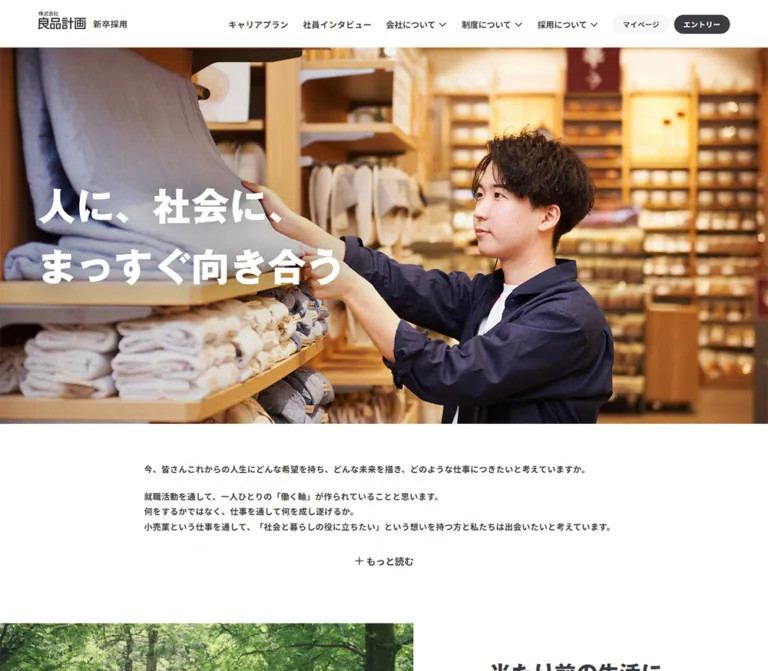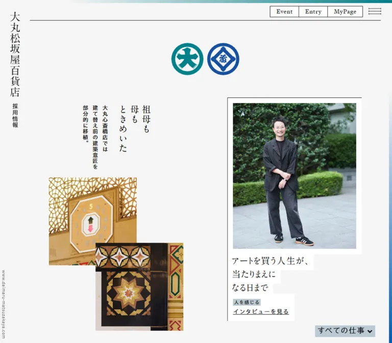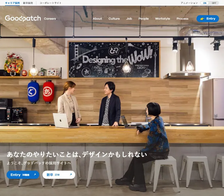
プレビュー準備中デザインリファレンスを見る
DESIGN REFERENCE
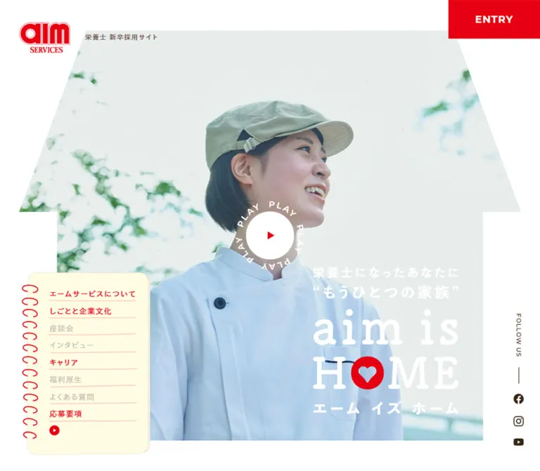
エームサービス「aim is HOME」栄養士新卒採用サイト
家型に切り抜いた人物写真とリングノート風ナビゲーションが特徴の採用サイト。白を基調に赤・茶・淡いピーチ色を組み合わせ、企業紹介や社員の情報をゆったり配置しています。
aim is HOME / AIM Services Recruitment — Style Reference
A welcoming recruitment home built from house-shaped photographs, red notebook rings, and generous white space.
Website: AIM Services — aim is HOME
Original URL: https://www.aimservices.co.jp/recruit/senmon/
Final URL: https://www.aimservices.co.jp/recruit/senmon/
Theme: light, with white primary surfaces, vivid red actions, warm brown text, and peach section backgrounds.
Inspected: October 2, 2026, Japan Standard Time. Supplied retrieval timestamp: 2026-10-01T16:10:21.733Z, equivalent to October 2 at 01:10:21.733 JST.
Viewports: desktop 1440 × 1000 and mobile 390 × 844 CSS pixels.
Scope: the current recruitment homepage for new graduate nutritionists: opening composition, persistent navigation, introductory copy, news, department and employee-content gateways, Instagram content, recruitment links, and footer. Three desktop captures and two mobile captures show selected positions; the rendered DOM provides additional document-wide measurements. Linked detail pages and the external application portal were not inspected.
The page presents recruitment as joining a supportive household. Its strongest visual device is a broad house silhouette containing photography: a smiling uniformed employee fills the opening view, while food preparation and colleagues appear in later house-shaped compositions. The white campaign lettering, including a heart inside the red O of HOME, makes the message feel personal and reassuring.
A cream spiral notebook serves as persistent desktop navigation. A red ENTRY rectangle occupies the opposite upper corner, and a three-image Instagram tray stays near the bottom. These small, tangible interface objects sit around large photographs and spacious editorial sections. Brown typography softens the strong red identity; peach introduces a second large surface color without competing with the photography.
This is a recruitment site index with multiple destination pages. Its anatomy includes news, company information, employee stories, career information, benefits, and application guidance. Preserve that navigational depth when adapting the design.
閉じる
aim is HOME / AIM Services Recruitment — Style Reference
A welcoming recruitment home built from house-shaped photographs, red notebook rings, and generous white space.
Website: AIM Services — aim is HOME
Original URL: https://www.aimservices.co.jp/recruit/senmon/
Final URL: https://www.aimservices.co.jp/recruit/senmon/
Theme: light, with white primary surfaces, vivid red actions, warm brown text, and peach section backgrounds.
Inspected: October 2, 2026, Japan Standard Time. Supplied retrieval timestamp: 2026-10-01T16:10:21.733Z, equivalent to October 2 at 01:10:21.733 JST.
Viewports: desktop 1440 × 1000 and mobile 390 × 844 CSS pixels.
Scope: the current recruitment homepage for new graduate nutritionists: opening composition, persistent navigation, introductory copy, news, department and employee-content gateways, Instagram content, recruitment links, and footer. Three desktop captures and two mobile captures show selected positions; the rendered DOM provides additional document-wide measurements. Linked detail pages and the external application portal were not inspected.
The page presents recruitment as joining a supportive household. Its strongest visual device is a broad house silhouette containing photography: a smiling uniformed employee fills the opening view, while food preparation and colleagues appear in later house-shaped compositions. The white campaign lettering, including a heart inside the red O of HOME, makes the message feel personal and reassuring.
A cream spiral notebook serves as persistent desktop navigation. A red ENTRY rectangle occupies the opposite upper corner, and a three-image Instagram tray stays near the bottom. These small, tangible interface objects sit around large photographs and spacious editorial sections. Brown typography softens the strong red identity; peach introduces a second large surface color without competing with the photography.
This is a recruitment site index with multiple destination pages. Its anatomy includes news, company information, employee stories, career information, benefits, and application guidance. Preserve that navigational depth when adapting the design.
How to Read This Reference
- Measured means a value appears in the supplied rendered DOM, computed styles, custom properties, or element rectangles. Coordinates refer to the initial document measurement unless a screenshot position is explicitly stated.
- Estimated means a visual approximation from the current desktop or mobile captures. These values are useful starting points, not recovered source CSS.
- Calculated means arithmetic using supplied measurements, such as the distance between neighboring cards.
- Recommended means an implementation choice for a new build. The Quick Start breakpoint, clipping polygons, state hooks, and accessibility additions belong to this category.
- Source custom properties are identified explicitly. Other token names are descriptive aliases.
- An empty text extraction does not establish that an element is visually empty. Several prominent headings and action labels have visible artwork but little or no extracted text.
- Only the supplied evidence was analyzed. No additional browsing, interaction testing, file inspection, or asset retrieval was performed.
Tokens — Colors
Default Palette
| Name | Value | Token or source variable | Role | Evidence |
|---|---|---|---|---|
| Recruitment Red | #fe0000 |
Source --color-primary |
ENTRY, recruitment CTA, footer, navigation text, arrows, notebook rings, Instagram tab | Measured |
| White | #ffffff |
Source --color-bg: #fff |
Main page surface, reversed lettering, play disc | Measured |
| Warm Brown | #695143 |
Source --color-text |
Body copy, section lettering, utility text, social icons | Measured |
| Soft Peach | #ffcfc5 |
Source --color-secondary |
Employee-content section background, news action, corporate-site pill, copyright text | Measured |
| Date Gray | #808080 |
Suggested --color-date |
News dates | Measured computed text color |
| Notebook Cream | Approximately #fffbe5 |
Suggested --color-notebook |
Notebook navigation and Instagram tray | Estimated from screenshots |
| Paper Edge | Approximately #d4ccbd |
Suggested --color-paper-edge |
Fine notebook and tray outlines | Estimated from screenshots |
| Muted Taupe | Approximately #9b8a80 |
Suggested --color-return |
Circular return-to-top control | Estimated from screenshots |
White occupies most of the composition. Red is concentrated in identity, persistent application access, small directional marks, and the final footer. Brown carries ordinary reading text. Peach is a substantial section surface as well as a secondary-action fill.
The hero photograph adds pale blue uniform fabric, soft green foliage, and a light gray-green background. These are image colors, not additional interface tokens. The red inside campaign artwork may differ slightly from the CSS primary color; the artwork itself was not color-sampled.
The supplied custom-property list also contains numerous general CMS presets. Their presence does not establish that their gradients, shadows, or colors are used by this page. The four --color-* source variables above are the relevant measured brand palette.
Tokens — Typography
Japanese Body and Navigation
- Measured family:
toppan-bunkyu-gothic-pr6n, sans-serif. - Measured default weight:
600. - Measured root size:
16pxat both inspected viewports. - Character: sturdy Japanese text with generous tracking, softened visually by the warm brown color.
- Role: identity caption, navigation, introductory copy, news titles, social excerpts, and legal links.
Use the named family only when it is available and appropriately licensed. The supplied evidence does not include font files or a reusable font-loading configuration. A sans-serif fallback is present in the source stack.
Dates and Copyright
- Measured family:
montserrat, sans-serif. - Measured weight:
500. - Role: news dates and copyright text.
- Tracking: news dates use
1.8pxat a12pxsize; copyright uses0.1em.
Do not extend this font attribution to every English heading. The evidence confirms it for these utility elements, while the large display lettering has a separate visual treatment.
Campaign and Section Lettering
The opening campaign uses large, rounded serif lettering. The heart-filled O is an integrated graphic detail. Desktop places aim is HOME across one line; mobile stacks aim is above HOME and wraps the supporting Japanese statement.
The hero H1 has no extracted text and measures 684 × 171.70px on desktop versus 210 × 205.36px on mobile. These are artwork/container dimensions, not font sizes. The exact display typeface and rendering mechanism were not supplied.
Section lettering is bold and predominantly brown, with a red circular initial in the visible About Us and Q&A treatments. Several desktop H2 elements report 100 × 100px boxes despite artwork visibly extending farther. Do not derive a 100px font size or a square title layout from those wrapper rectangles.
Type Scale
| Role | Desktop | Mobile | Weight / tracking | Evidence |
|---|---|---|---|---|
| Default text | 16px, normal line height |
Same | 600 |
Measured |
| Header caption | 13px / 13px |
10px / 10px |
600, 0.1em |
Measured |
| Notebook links | 15px / 36px |
16px / 38.22px |
600, 0.08em |
Measured; mobile links are offscreen in the closed state |
| Introductory paragraph | 20px / 44px |
16px / 32px |
600; tracking 2.4px / 1.312px |
Measured |
| News title | 16px / 23.04px |
15px / 21.6px |
600, 0.1em |
Measured |
| News date | 12px / 12px |
Same | Montserrat 500, 1.8px |
Measured |
| Instagram tray tab | 18px / 18px |
16px / 16px |
600 |
Measured; tab box remains 28px tall |
| In-page social excerpt | 14px / 19.6px |
Same | 600, normal tracking |
Measured |
| In-page social date | 13px / 13px |
Same | 600 |
Measured |
| Privacy link | 13px / 13px |
Same | 600 |
Measured |
| Copyright | 12px / 12px |
10px / 10px |
Montserrat 500, 0.1em |
Measured |
| Hero display lettering | Roughly 90–100px visual scale |
Roughly 60–70px visual scale |
Typeface unknown | Estimated from artwork |
| Large English section lettering | Roughly 72–84px in visible desktop teaser |
Roughly 44–56px in visible mobile utilities |
Typeface unknown | Estimated from artwork |
The ENTRY and Recruit Info anchors report font-size: 0px while their labels remain visible. Treat this as an implementation detail of the original label rendering. A new semantic text button should use an ordinary readable font size.
Tokens — Spacing & Shapes
Base system: a conventional measured 16px root, with component-specific pixel dimensions and responsive layout changes.
Density: broad editorial spacing around photographs; compact persistent navigation and social previews.
Spacing Scale
| Use | Value | Status |
|---|---|---|
| Fixed Instagram thumbnail gap | 7px |
Calculated from neighboring link rectangles at both viewports |
| Social excerpt-to-date gap | About 7px |
Calculated from supplied text rectangles |
| Mobile news image-to-copy gap | 15px |
Measured grid gap |
| General mobile content inset | 20px |
Measured in intro, news, utility links, and recruitment CTA |
| Mobile in-page social inset | 28px |
Measured |
| Desktop header logo-to-caption gap | 29px |
Measured |
| Mobile news row separation | 30px |
Calculated: 110px row pitch minus 80px row height |
| Desktop social-card gap | 40px |
Calculated from column coordinates |
| Mobile social-card column gap | 20px |
Calculated |
| Desktop feature-image separation | Approximately 80px vertically |
Estimated from the middle capture |
| Intro top/bottom padding | 134px / 134px desktop; 78px / 60px mobile |
Measured |
| Corporate-link top/bottom surrounding space | 80px / 152px desktop; 50px / 108px mobile |
Measured wrapper padding |
Shape Vocabulary
| Element | Shape | Evidence |
|---|---|---|
| Hero and visible feature photographs | Flat-topped house silhouette with sloping roof edges and inset walls | Observed visually; exact mask implementation unknown |
| Main actions | Square-cornered rectangles | Measured 0px radius on ENTRY, VIEW MORE, and Recruit Info anchors |
| Notebook | Soft corners, fine outline, red spiral loops, pale horizontal rules | Observed; approximately 18–24px corner rounding |
| Instagram tray | Small rounded cream frame | Observed; approximately 8px rounding |
| Instagram title tab | Red raised tab with sloping side treatment | Observed; H2 has measured 6px 6px 0 0 radius |
| Corporate link | Peach capsule | Observed; approximately half-height radius |
| Play and return controls | Circles | Observed |
| Small tray control | White circle with red minus | Measured 26 × 26px, 100px border radius |
Layout Measurements
| Element | Desktop: 1440 × 1000 | Mobile: 390 × 844 | Evidence |
|---|---|---|---|
| Document height | 9151px |
9376px |
Supplied document measurements |
| Header identity group | (38, 44), 272.39 × 59.70px |
(16, 16), 110.31 × 56.03px |
Measured |
| ENTRY | (1260, 0), 180 × 76px |
(290, 0), 100 × 45px |
Measured |
| Hero artwork group | (378, 360), 684 × 171.70px |
(90, 242), 210 × 205.36px |
Measured |
| Hero photo silhouette | Approximately (50, 65), 1340 × 870px |
Approximately (10, 172), 370 × 500px |
Screenshot estimates |
| Notebook outer paper | Approximately (49, 562), 250 × 406px |
Closed handle at (350, 60), 40 × 80px |
Desktop estimate; mobile measured handle |
| Standard VIEW MORE target | 240 × 80px |
240 × 80px |
Measured |
| Fixed Instagram tray body | Approximately 480 × 205px, right inset 90px |
Approximately 340 × 147px, centered with 25px side insets |
Estimated outer geometry, supported by measured child coordinates |
| Fixed Instagram preview link | 149.33 × 187.16px |
102.66 × 128.81px |
Measured |
| Welfare / FAQ link | Two links, each 422.5 × 240px |
Stacked links, each 350 × 161px |
Measured |
| Recruit Info | 480 × 101px, x = 539 |
350 × 61px, x = 20 |
Measured |
| Corporate-site link | 280 × 60px |
224 × 48px |
Measured |
| Return-to-top visual wrapper | 80 × 80px |
48 × 48px |
Measured |
| Footer | Approximately 220px high |
Approximately 264px high |
Measured |
The desktop page does not use one universal centered container. News begins at x = 408, the full social feed at x = 392, and large photo compositions extend farther left. The recruitment and corporate-link pair share a center near x = 779. Preserve these relationships instead of mechanically centering every section on the viewport.
Components
Floating Identity and ENTRY
Role: persistent site identity and direct access to application registration.
The red AIM Services logo sits at the upper left. On desktop, the small label 栄養士 新卒採用サイト appears to its right with a measured 29px gap. On mobile, the label moves underneath the smaller logo. The whole identity group links to the recruitment homepage.
ENTRY is flush with the upper-right viewport corner: a red rectangle with a white uppercase label. Its measured size changes from 180 × 76px to 100 × 45px. The supplied destination is https://mypage.3010.i-webs.jp/aimservices-2028/; the destination itself was not opened.
The header element has a measured height of zero, while its children occupy their own positions. Across the captures, identity and ENTRY remain at consistent viewport coordinates. Recreate the floating composition without adding a thick full-width masthead. The mobile footer capture also shows page lettering passing behind the identity area, so an opaque header background is not established by the evidence.
Spiral Notebook Navigation
Role: a persistent table of contents linking to recruitment destination pages.
The desktop navigation resembles a small cream notebook near the lower-left corner. Red loops protrude from its left edge, thin pale red rules separate the rows, and red text sits well inside the paper edge. Its links begin near x = 97 and have a measured 170.16 × 36px box.
The ten visible labels are ニュース, エームサービスについて, しごとと企業文化, 座談会, インタビュー, キャリア, Instagram, 福利厚生, よくある質問, and 応募要項. A small red circular play-like mark appears beneath them.
These are destination links. Company information, culture, interviews, and other entries point to distinct paths such as /aboutus, /job_and_culture, and /interview; the Instagram item points to the official external account. Do not implement the whole notebook as same-page scrolling based only on its appearance.
On mobile, only a cream paper edge and a few red rings remain visible at the right. The link rectangles sit beyond the viewport at approximately x = 493. This establishes a closed offscreen state. The expanded layout, focus behavior, and opening interaction were not exercised.
House-Shaped Opening Photograph
Role: the central visual expression of the HOME theme.
A bright portrait of a uniformed employee fills a wide house silhouette. Its roof has a long horizontal top, diagonal sides, projecting eaves, and narrower vertical walls. The photograph is lightly colored, with pale blue clothing and green foliage against a bright background.
On desktop, the silhouette spans nearly the full width while preserving white margins. The campaign statement sits centrally over the subject. On mobile, the house becomes tall and narrow, the portrait is cropped much more tightly, and considerable white space separates the header from the roof.
Clip the photograph itself while placing the campaign lettering and controls in a separate layer. This keeps lettering from being cut by the roof and allows independent composition at each viewport.
Campaign Wordmark and Play Affordance
Role: expresses the recruitment message and offers an apparent media entry point.
The white supporting statement reads 栄養士になったあなたに“もうひとつの家族”. Below it, the large aim is HOME lettering incorporates a red O with a heart cutout. The smaller Japanese reading エーム イズ ホーム completes the artwork.
The white play disc contains a small red triangle and is surrounded by repeated PLAY lettering. Its visible disc is approximately 72px across on desktop and 56px on mobile; the surrounding lettering creates a larger circular footprint.
A play affordance is visible, but its activation was not recorded. Video playback, modal presentation, sound, autoplay, and rotation of the surrounding lettering remain unverified. Preserve the visual invitation while implementing an explicit, accessible media action appropriate to the new site.
Introductory Statement
Role: explains the workplace-as-home idea before the informational index.
The paragraph emphasizes supportive colleagues, customers, food, and the ability to work confidently. Desktop typography is 20px / 44px with 2.4px tracking, occupying a 930px-wide box beginning at x = 410. Mobile uses a 350px-wide box with 16px / 32px type and 1.312px tracking.
The paragraph is deliberately broken into short lines. Mobile changes several line breaks instead of simply shrinking the desktop composition. Its measured text height is 576px, compared with 704px on desktop.
The computed paragraph color is white, while the sampled section background is transparent. No attached capture shows the complete background behind this section. The actual supporting image or color must be verified before reproducing it. A red fallback in the Quick Start is a recommendation, not an observed background claim.
News Index
Role: recent recruitment and company updates.
Six items are present. Desktop places them in three columns and two rows. Card widths measure approximately 228.95px; their x coordinates are 408, 713.27, and 1018.53. The calculated horizontal gap is about 76.31px. Each item combines media, a brown tracked title, and a small gray Montserrat date.
Mobile changes the anatomy to a horizontal row: an 80px media column, a 15px column gap, and a 255px text column. Each whole link is 350 × 80px, and consecutive rows start 110px apart. The title and date occupy the right column.
A peach 240 × 80px VIEW MORE action follows the list. Its label is brown, with a thin red right arrow. The action points to /news.
The news media elements were not individually included in the measured element list. Their exact desktop crop ratio should be checked separately; the mobile 80px media column is established by the grid measurement.
Photographic Section Gateways
Role: substantial links into company information, workplace culture, employee discussions, interviews, and careers.
The visible About Us composition pairs a house-shaped photograph of lettuce being cut with large brown English lettering, a red initial badge, a Japanese subtitle, and a VIEW MORE action. The photograph occupies approximately 765 × 400px in the desktop middle capture. The heading overlaps its right side, and the white action block aligns with its lower edge.
The following visible photo begins farther right, creating an alternating rhythm. DOM measurements also alternate the action positions between approximately x = 726 and x = 397 for the company/culture and discussion/interview pairs.
The company and workplace-culture pair sits on white. The discussion and interview pair has a measured peach section background. Career returns to white. Only the first pair is directly visible in the supplied middle screenshot; the later destinations and backgrounds are established by DOM evidence.
On mobile, heading boxes begin at x = 20 and actions are centered at x = 75. Each gateway becomes a taller vertical composition. Preserve heading, photograph, and destination action as one group, with sufficient room for Japanese subtitles and the house silhouette.
Persistent Instagram Preview
Role: keeps current social content visible while the visitor explores the site.
A cream tray contains three portrait previews separated by 7px gaps. A raised red Instagram tab sits above the center, and a small white circular control with a red minus overlaps the upper-right edge.
On desktop, the tray occupies roughly 480px at the lower right, ending near x = 1350. The separate social rail remains visible to its right. On mobile, the tray is centered with approximately 25px side margins, and it still contains three previews. It does not switch to the two-column structure used by the full in-page feed.
The preview links point to three specific Instagram posts. The same previews persist across the supplied top and footer positions. The minus control indicates a likely collapse action, but the collapsed state and its persistence were not observed.
Including the raised tab, the mobile preview occupies approximately 175px of the 844px viewport, or about 21% of its height. This is a significant compositional layer and requires deliberate content-clearance decisions.
Desktop Social Rail
Role: secondary access to external social channels.
A narrow right-edge stack includes vertical FOLLOW US lettering, a short vertical rule, and Facebook, Instagram, and YouTube icons. The first two icon links measure 20 × 20px; the YouTube link measures approximately 20 × 14px. Their measured vertical starts are about 44px apart.
These use the warm brown text color. The mobile measurements place corresponding social links outside the viewport in the closed navigation arrangement. A separate visible mobile rail is not shown.
In-Page Instagram Feed
Role: provides a fuller social-content index within the document.
This is distinct from the floating preview. Six linked posts include portrait media, compact excerpts, and dates. The body copy can be long in the DOM, while the excerpt boxes are only about 39.19px tall: two lines at 14px / 19.6px.
Desktop uses three columns of approximately 258.66px with 40px gaps, spanning 856px from x = 392. Mobile uses two 157px columns with a 20px gap inside a 334px region beginning at x = 28. Mobile row gaps calculate to approximately 28px.
Media-to-caption offsets are consistent with 4:5 portrait images and a small following gap. Use short visible excerpts and preserve access to the full post through the link.
Welfare and FAQ Links
Role: simple gateways to practical information near the end of the page.
Desktop provides two broad link regions separated by fine vertical rules. Each measures 422.5 × 240px. The lower desktop capture clearly shows the rules and VIEW MORE actions, but the large title artwork is not legible in that captured state.
Mobile shows the Welfare and Q&A lettering, Japanese subtitles, thin horizontal dividers, and right-facing red arrows. Each link occupies 350 × 161px. The Q begins inside a large red circle. Use the mobile evidence for this visible lettering treatment; the exact desktop artwork visibility remains uncertain.
Recruitment and Corporate Actions
Role: close the content sequence with application information and corporate-site access.
Recruit Info is a strong red rectangle containing a white English label, the smaller Japanese label 応募要項, and a white arrow. It points to /recruit/senmon/info, which is separate from the header's external ENTRY destination.
Its size changes from 480 × 101px on desktop to 350 × 61px on mobile. It remains square-cornered. The corporate link below is peach, pill-shaped, and visually quieter, with the label コーポレートサイト and a red arrow.
The desktop corporate link is 280 × 60px; mobile reduces it to 224 × 48px. Large gaps around these actions keep the ending calm despite the fixed social tray.
Footer and Return to Top
Role: legal information, identity, and an exit back through the page.
The footer is a full-width #fe0000 field. Its privacy link is white and the copyright text is peach. The desktop grid has measured columns of 832px and 100px, with content beginning at x = 408. Mobile centers the footer content vertically in a block layout.
A muted taupe circle containing a thin white upward arrow sits just above the footer toward the right. The source link points to the homepage hash. Its visual wrapper is 80px on desktop and 48px on mobile. Smooth scrolling and focus movement were not tested.
The fixed Instagram tray overlaps much of the lower mobile footer in the supplied capture. Keep this overlap in mind when adapting the composition, especially for legal links and keyboard focus targets.
Tokens — Motion & Interaction
| Element or behavior | Evidence | What is established | Limitation |
|---|---|---|---|
| Mobile notebook handle | transform 0.4s, -webkit-transform 0.4s |
A 400ms transform transition is declared | Open state, travel distance, and trigger were not tested |
| Instagram tab | Computed transition 0.3s |
A 300ms transition is declared | Changed property and resulting state are not identified |
| Instagram minus control | Computed transition 0.3s |
A 300ms transition is declared | Collapse, expansion, and persistence remain unverified |
| Floating identity, notebook, and preview | Consistent positions in captures at different document locations | Viewport-pinned presentation is strongly supported | Full positioning rules and z-index values were not supplied |
| Hero play disc and PLAY ring | Visible in both opening captures | A media affordance exists | Playback and ring animation were not recorded |
| Opening document space | Intro begins at y = 2000 desktop and y = 1688 mobile | Intro begins at exactly twice the corresponding viewport height | This does not prove pinning, parallax, or a particular scroll animation |
| General sampled elements | Many report animation: none and transition all |
No named animation is exposed on those sampled elements | Descendant, pseudo-element, script, and media motion may still exist |
| Navigation and article links | Destination URLs are present | Links target internal pages or identified external destinations | Navigation results were not inspected |
The capture procedure waited for bounded layout and image readiness and traversed intermediate scroll positions. Perpetual animations were paused during readiness checks and then resumed. These conditions improve screenshot stability but do not establish that every delayed or interactive state was captured.
For a new implementation, restrained 200–400ms interface transitions are compatible with the observed controls. This is a recommendation. Do not assign invented durations to hero rotation, media transitions, hover effects, or scroll reveals.
Surfaces
| Layer | Appearance | Purpose |
|---|---|---|
| Page canvas | Flat white | Space around photographs and editorial content |
| Employee-content section | Flat peach | Groups discussion and interview gateways |
| Navigation paper | Pale cream, fine outline, red rings and rules | Makes the persistent menu feel like a familiar physical object |
| Social preview tray | Pale cream, small rounded frame | Contains dense external-content imagery |
| Primary actions | Solid red with white graphics or text | ENTRY and recruitment information |
| Secondary actions | Peach with brown or red detail | News index and corporate-site access |
| Footer | Solid red | Strong visual ending and legal information |
| Return control | Muted taupe circle | Quiet upward navigation |
There is no visible general-purpose elevation system. Depth comes from overlap, clipping, notebook edges, and a few foreground controls. Broad gradients, glass blur, and soft card shadows are not part of the observed treatment.
Imagery
Photography conveys practical food service and human warmth. The opening portrait uses natural light, a relaxed expression, a pale uniform, and blurred greenery. The visible company teaser shows gloved hands cutting lettuce; the next photograph shows colleagues in matching work clothes outdoors.
The house silhouette is a framing device for both people and work. Keep recognizable faces and task details away from the clipped roof corners. Mobile needs deliberate cropping: the opening portrait moves much closer, while the campaign artwork changes its line arrangement.
Social previews are visually denser than the main photography. They include food graphics, employee portraits, and promotional artwork with embedded Japanese text. Preserve their individual identity inside the restrained cream tray; applying a uniform brand tint would obscure the actual content.
Observed Asset References
Exact image, SVG, video, and font-file URLs were not included in the supplied extract. These references identify visible assets without inventing filenames.
| Asset | Evidence and role | Reuse guidance |
|---|---|---|
| AIM Services logo | Header in desktop and mobile captures | Use authorized logo artwork; do not typeset an approximation |
| Opening employee portrait | Desktop and mobile opening captures | Provide responsive crops or art-directed sources |
| Campaign wordmark | White lettering with red heart/O | Preserve the distinctive artwork and supply an equivalent accessible text label |
| PLAY ring and triangle | Circular opening affordance | Keep the graphic separate from the photograph and the actual interactive button |
| Food-preparation photograph | Visible About Us gateway | Retain task detail within the house crop |
| Colleague photograph | Following desktop gateway | Preserve group framing when adapting to narrow screens |
| Notebook decoration | Desktop panel and mobile handle | Authorized artwork is preferable; CSS can approximate the paper and loops |
| Instagram post images | Fixed preview and in-page post links | Use current authorized content; preserve portrait proportions |
Layout & Responsive Behavior
Desktop Composition
The page balances three persistent edge elements around a large central scene: notebook at lower left, ENTRY at upper right, and social preview at lower right. The social rail occupies a narrow strip farther right. The hero can therefore be wide, while later reading regions shift right to leave room for the notebook.
News and social content use three-column grids. Large photographic gateways alternate image and title emphasis. The final utility links sit side by side, followed by a broad recruitment action and a smaller corporate-site pill.
The document measures 9151px tall. The introductory section begins at y = 2000, news at approximately y = 3247, the first gateway pair at y = 4244, the peach pair at y = 5283, and the footer at y = 8931. These are recorded positions for this content and viewport, not permanent design tokens.
Mobile Composition
The identity condenses into a stacked logo and caption. ENTRY becomes 100px wide. The notebook is parked offscreen to the right, leaving a 40px-wide paper handle visible below the upper controls.
The roof begins around y = 172, and the campaign artwork begins at y = 242. The wordmark wraps into two main English lines. This is a composed mobile layout rather than a proportional shrink of the desktop hero.
News becomes a one-column list of media-and-copy rows. Photographic gateways become vertical groups. The full Instagram feed changes to two columns, while the floating preview retains three. Welfare and FAQ become stacked full-width rows, and Recruit Info nearly fills the page between 20px insets.
The document measures 9376px tall despite the shorter mobile introductory section. Stacked gateway layouts and the three-row social grid account for much of the added length.
Responsive Implementation Boundaries
Only two viewport sizes were inspected. No exact breakpoint, tablet composition, landscape-phone behavior, or browser zoom behavior can be recovered from them. The Quick Start uses 900px as a recommended switch point; it is not a source breakpoint.
The source exposes --vh: 10px on desktop and --vh: 8.44px on mobile, matching 1% of the captured viewport height. The formulas consuming this variable were not included. Avoid assuming it governs every vertical dimension.
At other heights, check the house crop, notebook fit, and preview obstruction independently. A mobile preview that consumes about one fifth of the screen can cover important content on a short viewport. Safe-area spacing and reachable controls should be added explicitly in a new implementation.
Do’s and Don’ts
Do
- Keep the measured core palette: white,
#fe0000,#695143, and#ffcfc5. - Use the house silhouette as a recurring structural motif for photography.
- Preserve the combination of intimate employee portraits and concrete food-service activity.
- Keep the notebook's red rings, cream paper, and compact ruled links.
- Maintain generous white space around the larger section gateways.
- Use brown for reading text and reserve strong red for identity, actions, and small directional details.
- Preserve distinct destinations for ENTRY and Recruit Info.
- Recompose the campaign artwork and image crop for mobile.
- Keep the fixed three-preview tray separate from the full social feed.
- Use measured typography for body copy and dates, while treating display lettering as separate artwork.
Don’t
- Don't reduce the whole site to a single conversion form or remove its editorial destinations.
- Don't turn every section into an identical rounded card.
- Don't replace the house geometry with generic rounded image rectangles.
- Don't invent a display font from the empty H1/H2 text extraction.
- Don't apply zero-sized text to new buttons merely because the original graphic-label wrappers use it.
- Don't use the unused CMS gradient and shadow presets as design evidence.
- Don't make all notebook links scroll to local sections; the supplied links mostly target separate pages.
- Don't shrink desktop news cards into a tiny mobile three-column grid.
- Don't claim that the PLAY ring rotates, that a video autoplays, or that the preview collapses in a particular way without testing.
- Don't allow persistent overlays to make legal links, focused controls, or application information unreachable.
Recommended Implementation Additions
These are additions for a new implementation, not verified original-site features:
- Give the mobile notebook handle a real button with an accessible name,
aria-expanded, andaria-controls. Keep offscreen navigation inert while closed. - Give graphic headings meaningful accessible text without duplicating their visible lettering for screen readers.
- Provide clear names for the play button, social icons, preview control, and return-to-top link.
- Keep small 26px visual controls inside at least 44px interactive targets.
- Offer keyboard dismissal and focus restoration for any media dialog or expanded navigation.
- Provide a reliable way to minimize the social preview and ensure its collapsed control remains discoverable.
- Reserve scroll clearance for fixed overlays, especially when focusing links near the footer.
- Review normal-sized white text on bright red:
#fe0000against white is approximately 4.03:1, below the usual 4.5:1 target for normal text. Retain the palette while adjusting text size, weight, or the relevant action surface where needed. - Verify the contrast of white campaign lettering over every responsive photo crop.
- Honor reduced-motion preferences and start audible media only after an explicit user action.
- Load a prioritized hero image with stable dimensions, and lazy-load lower-page photography and social media.
Agent Prompt Guide
Quick Color Reference
- Main surface: white
#ffffff. - Primary red:
#fe0000. - Reading text and most section lettering: warm brown
#695143. - Secondary section and action surface: peach
#ffcfc5. - Notebook and preview paper: approximately
#fffbe5, an estimated adaptation value. - News dates: measured gray
#808080. - Depth: overlapping graphic layers and fine paper edges.
Overall Prompt
“Create a welcoming Japanese nutritionist recruitment site inspired by the current aim is HOME composition. Use a white canvas, vivid red #fe0000, warm brown #695143, and peach #ffcfc5. Make a bright employee portrait fill a broad house-shaped mask with a flat roof top, diagonal roof sides, projecting eaves, and inset walls. Overlay composed white campaign lettering with a red heart/O detail and a circular play affordance. Keep a compact cream spiral-notebook navigation at the lower left on desktop, a red ENTRY rectangle at the upper right, and a cream three-image Instagram tray near the bottom. Build a real recruitment index with news, company and employee-content gateways, careers, benefits, FAQ, and recruitment information. Use large alternating house-shaped photos and generous spacing. On mobile, show a right-edge notebook handle, stack the campaign wordmark, turn news into thumbnail rows, and use two columns for the full social feed.”
Example Component Prompts
- Notebook navigation: “Create a roughly 250px cream notebook with soft corners, a fine paper outline, red spiral loops protruding on the left, and ten red destination links on pale horizontal rules. Use 15px Japanese text, 36px row rhythm, and modest tracking. On mobile, keep only a narrow notebook edge visible at the upper right until an accessible menu button opens it.”
- Photo gateway: “Create an About Us gateway with a house-shaped photograph of food preparation, a large brown English title with a red circular initial, a Japanese subtitle, and a square 240 × 80px VIEW MORE action with a thin red arrow. Overlap the title with the photo's right edge on desktop and stack the elements on mobile.”
- News list: “Use three desktop columns of image, brown tracked title, and small gray Montserrat date. At phone width, each item becomes an 80px thumbnail beside the title and date with a 15px gap. Leave 30px between rows and place a peach VIEW MORE rectangle after the list.”
- Social preview: “Create a fixed cream tray with three 4:5-style portrait previews, 7px gaps, a raised red Instagram tab, and a white circular minus control. Use about 480px width on desktop and 340px at a 390px viewport. Keep the close control keyboard accessible and provide content clearance.”
- Recruitment ending: “Place a strong square red Recruit Info link above a smaller peach corporate-site pill. Use a muted taupe circular return-to-top link and finish with a full-width red footer containing compact white legal text and peach copyright text.”
Quick Start
CSS Custom Properties
This is a reusable adaptation of the observed composition. It preserves measured colors, typography, important control dimensions, and the desktop/mobile layout distinctions. The 900px breakpoint, house polygons, preview-paper colors, and viewport formulas are recommendations fitted to the supplied captures.
Use authorized images and heading artwork. The expected hero structure is a .hero-media image layer and a separate .hero-content containing .hero-title artwork and .hero-play. Each .feature contains .feature-media, .feature-heading, and .view-more as direct children. News and social cards use their named child classes below.
The example uses a normal one-viewport hero. The source's two-viewport space before the introduction requires separate scroll-behavior verification. The red intro background is an explicit fallback because the original background behind that text was not shown. Menu state requires a controller to update data-open, ARIA state, and inertness; media and preview-collapse behavior also require implementation.
:root {
  /* Measured source palette */
  --color-bg: #fff;
  --color-primary: #fe0000;
  --color-secondary: #ffcfc5;
  --color-text: #695143;
  --color-date: #808080;

  /* Estimated supporting colors */
  --color-notebook: #fffbe5;
  --color-paper-edge: #d4ccbd;
  --color-return: #9b8a80;
  --color-divider: #b7aea8;

  /* Measured font stacks; font files are not included */
  --font-body: toppan-bunkyu-gothic-pr6n, sans-serif;
  --font-data: montserrat, sans-serif;
  --weight-body: 600;
  --weight-data: 500;

  --mobile-inset: 20px;
  --view-more-width: 240px;
  --view-more-height: 80px;
  --notebook-width: 250px;
  --preview-width: 480px;
  --preview-gap: 7px;
  --safe-bottom: env(safe-area-inset-bottom, 0px);

  /* Durations supported by sampled controls */
  --motion-menu: 400ms;
  --motion-preview: 300ms;

  /* Recommended approximation of the desktop silhouette */
  --house-shape: polygon(
    13.5% 0, 86.5% 0,
    100% 44.3%, 95.4% 44.3%,
    95.4% 100%, 4.6% 100%,
    4.6% 44.3%, 0 44.3%
  );
}

* { box-sizing: border-box; }
body {
  margin: 0;
  color: var(--color-text);
  background: var(--color-bg);
  font-family: var(--font-body);
  font-size: 16px;
  font-weight: var(--weight-body);
}
button, input { font: inherit; }
img { display: block; max-width: 100%; }
a { color: inherit; }
[hidden] { display: none !important; }

/* Recommended focus and scroll clearance */
html { scroll-padding: 100px 0 230px; }
:focus-visible {
  outline: 3px solid var(--color-text);
  outline-offset: 5px;
}

.site-brand {
  position: fixed;
  z-index: 60;
  top: 44px;
  left: 38px;
  display: flex;
  align-items: center;
  gap: 29px;
  text-decoration: none;
  font-size: 13px;
  line-height: 1;
  letter-spacing: .1em;
}
.site-brand__logo { width: 100px; height: auto; }
.entry {
  position: fixed;
  z-index: 70;
  top: 0;
  right: 0;
  display: grid;
  place-items: center;
  width: 180px;
  height: 76px;
  color: #fff;
  background: var(--color-primary);
  text-decoration: none;
  /* Live-text approximation of the graphic label */
  font-size: 20px;
  font-weight: 700;
  letter-spacing: .06em;
}

.notebook {
  position: fixed;
  z-index: 40;
  left: 50px;
  bottom: 32px;
  width: var(--notebook-width);
  padding: 10px 32px 10px 46px;
  border: 1px solid var(--color-paper-edge);
  border-radius: 20px 20px 26px 16px;
  background: var(--color-notebook);
}
.notebook ul { margin: 0; padding: 0; list-style: none; }
.notebook li { position: relative; }
.notebook li > a {
  display: block;
  border-bottom: 1px solid var(--color-secondary);
  color: var(--color-primary);
  font-size: 15px;
  line-height: 36px;
  letter-spacing: .08em;
  text-decoration: none;
}
/* Decorative approximation; original ring spacing may differ */
.notebook li::before {
  content: '';
  position: absolute;
  top: 12px;
  left: -58px;
  width: 30px;
  height: 13px;
  border: 2px solid var(--color-primary);
  border-right-color: transparent;
  border-radius: 50%;
  pointer-events: none;
}
.notebook__utility {
  display: block;
  width: 20px;
  height: 20px;
  margin-top: 5px;
}
.menu-handle { display: none; }

.hero { position: relative; min-height: 100svh; }
.hero-media {
  position: absolute;
  inset: 6.5svh 50px;
  clip-path: var(--house-shape);
}
.hero-media img {
  width: 100%;
  height: 100%;
  object-fit: cover;
  object-position: center;
}
.hero-content {
  position: absolute;
  top: 36svh;
  left: 50%;
  width: min(684px, calc(100% - 60px));
  transform: translateX(-50%);
  text-align: center;
}
.hero-title, .hero-title img { display: block; width: 100%; }
.hero-play {
  position: relative;
  display: grid;
  place-items: center;
  width: 72px;
  height: 72px;
  margin: 54px auto 0;
  padding: 0;
  border: 0;
  border-radius: 50%;
  background: #fff;
  cursor: pointer;
}
.hero-play::after {
  content: '';
  width: 11px;
  height: 13px;
  margin-left: 3px;
  background: var(--color-primary);
  clip-path: polygon(0 0, 100% 50%, 0 100%);
}
.play-ring {
  position: absolute;
  inset: -16px;
  width: calc(100% + 32px);
  max-width: none;
  pointer-events: none;
}

.intro {
  padding: 134px 100px 134px 28.47vw;
  color: #fff;
  /* Recommended fallback; original supporting surface is unverified */
  background: var(--color-primary);
}
.intro p {
  margin: 0;
  font-size: 20px;
  line-height: 44px;
  letter-spacing: .12em;
}
.content-rail { margin-inline: 28.333vw 13.333vw; }
.news-grid {
  display: grid;
  grid-template-columns: repeat(3, minmax(0, 1fr));
  gap: 40px 9%;
}
.news-card {
  display: grid;
  align-content: start;
  gap: 10px;
  text-decoration: none;
}
.news-card__image {
  width: 100%;
  /* Recommended desktop crop; source ratio was not measured */
  aspect-ratio: 5 / 4;
  object-fit: cover;
}
.news-card__title {
  margin: 0;
  font-size: 16px;
  line-height: 1.44;
  letter-spacing: .1em;
}
.news-card__date {
  color: var(--color-date);
  font-family: var(--font-data);
  font-size: 12px;
  font-weight: 500;
  line-height: 1;
  letter-spacing: .15em;
}
.view-more {
  display: flex;
  align-items: center;
  justify-content: center;
  gap: 14px;
  width: var(--view-more-width);
  max-width: 100%;
  height: var(--view-more-height);
  background: var(--color-secondary);
  text-decoration: none;
  font-size: 16px;
  letter-spacing: .08em;
}
.news-more { margin: 40px auto 0; }
.arrow {
  position: relative;
  display: inline-block;
  flex: 0 0 26px;
  width: 26px;
  height: 2px;
  color: var(--color-primary);
  background: currentColor;
}
.arrow::after {
  content: '';
  position: absolute;
  top: -5px;
  right: 0;
  width: 10px;
  height: 10px;
  border-top: 2px solid currentColor;
  border-right: 2px solid currentColor;
  transform: rotate(45deg);
}

.features {
  --section-surface: var(--color-bg);
  display: grid;
  gap: 80px;
  padding-block: 80px;
  background: var(--section-surface);
}
.features--peach { --section-surface: var(--color-secondary); }
.feature {
  display: grid;
  grid-template-columns: 65% 35%;
  grid-template-rows: 1fr auto;
  margin-inline: 9.2vw;
}
.feature-media {
  grid-area: 1 / 1 / 3 / 2;
  width: 100%;
  aspect-ratio: 765 / 400;
  object-fit: cover;
  clip-path: var(--house-shape);
}
.feature-heading {
  position: relative;
  z-index: 1;
  grid-area: 1 / 2;
  align-self: end;
  width: 420px;
  max-width: calc(100% + 190px);
  margin: 0 0 32px -190px;
}
.feature > .view-more {
  position: relative;
  z-index: 1;
  grid-area: 2 / 2;
  margin-left: -170px;
  background: var(--section-surface);
}
.feature--reverse { grid-template-columns: 35% 65%; }
.feature--reverse .feature-media { grid-area: 1 / 2 / 3 / 3; }
.feature--reverse .feature-heading {
  grid-area: 1 / 1;
  margin-left: 0;
}
.feature--reverse > .view-more {
  grid-area: 2 / 1;
  margin-left: 30px;
}

.social-feed { margin-inline: 27.222vw 13.333vw; }
.social-grid {
  display: grid;
  grid-template-columns: repeat(3, minmax(0, 1fr));
  gap: 40px;
}
.post-card { text-decoration: none; }
.post-card img { width: 100%; aspect-ratio: 4 / 5; object-fit: cover; }
.post-card__excerpt {
  display: -webkit-box;
  -webkit-box-orient: vertical;
  -webkit-line-clamp: 2;
  overflow: hidden;
  margin: 7px 0;
  font-size: 14px;
  line-height: 1.4;
}
.post-card__date { font-size: 13px; line-height: 1; }

.feed-dock {
  position: fixed;
  z-index: 50;
  right: 90px;
  bottom: var(--safe-bottom);
  width: var(--preview-width);
  padding: 8px;
  border: 1px solid var(--color-paper-edge);
  border-radius: 9px;
  background: var(--color-notebook);
}
.feed-dock__items {
  display: grid;
  grid-template-columns: repeat(3, minmax(0, 1fr));
  gap: var(--preview-gap);
}
.feed-dock__items img {
  width: 100%;
  aspect-ratio: 4 / 5;
  object-fit: cover;
  border-radius: 4px;
}
.feed-dock__tab {
  position: absolute;
  left: 50%;
  bottom: 100%;
  display: grid;
  place-items: center;
  width: 130px;
  height: 28px;
  margin: 0;
  transform: translateX(-50%);
  background: var(--color-primary);
  color: #fff;
  font-size: 18px;
  line-height: 1;
  clip-path: polygon(8% 0, 92% 0, 100% 100%, 0 100%);
}
/* Recommended 44px hit area around the observed 26px visual */
.feed-dock__toggle {
  position: absolute;
  top: -22px;
  right: -22px;
  display: grid;
  place-items: center;
  width: 44px;
  height: 44px;
  padding: 0;
  border: 0;
  background: transparent;
  cursor: pointer;
}
.feed-dock__toggle::before {
  content: '−';
  display: grid;
  place-items: center;
  width: 26px;
  height: 26px;
  border: 1px solid var(--color-paper-edge);
  border-radius: 50%;
  color: var(--color-primary);
  background: #fff;
  transition: color var(--motion-preview);
}

.utility-links {
  display: grid;
  grid-template-columns: repeat(2, minmax(0, 1fr));
  border-left: 1px solid var(--color-divider);
}
.utility-links > a {
  display: flex;
  flex-direction: column;
  align-items: center;
  justify-content: center;
  gap: 45px;
  min-height: 240px;
  border-right: 1px solid var(--color-divider);
  text-decoration: none;
}
.cta-rail {
  display: flow-root;
  margin-inline: 28.472vw 20.278vw;
}
.recruit-cta, .corporate-link {
  display: flex;
  align-items: center;
  justify-content: center;
  gap: 16px;
  text-decoration: none;
}
.recruit-cta {
  width: min(480px, 100%);
  min-height: 101px;
  margin: 80px auto 0;
  color: #fff;
  background: var(--color-primary);
  font-size: 22px;
}
.recruit-cta small { font-size: 13px; }
.recruit-cta .arrow { color: #fff; }
.corporate-link {
  width: 280px;
  height: 60px;
  margin: 80px auto 152px;
  border-radius: 999px;
  color: var(--color-primary);
  background: var(--color-secondary);
}
.site-footer {
  position: relative;
  padding: 80px 100px 80px 28.333vw;
  color: #fff;
  background: var(--color-primary);
}
.site-footer__legal { font-size: 13px; }
.site-footer__copyright {
  margin-top: 20px;
  color: var(--color-secondary);
  font-family: var(--font-data);
  font-size: 12px;
  font-weight: 500;
  letter-spacing: .1em;
}
.back-to-top {
  position: absolute;
  top: -130px;
  right: 90px;
  display: grid;
  place-items: center;
  width: 80px;
  height: 80px;
  border-radius: 50%;
  color: #fff;
  background: var(--color-return);
  text-decoration: none;
}

/* Recommended breakpoint; not recovered from the source */
@media (max-width: 900px) {
  :root {
    --preview-width: min(340px, calc(100vw - 50px));
  }
  .site-brand {
    top: 16px;
    left: 16px;
    display: block;
    font-size: 10px;
  }
  .site-brand__logo { width: 57px; margin-bottom: 12px; }
  .entry { width: 100px; height: 45px; font-size: 13px; }
  .menu-handle {
    position: fixed;
    z-index: 80;
    top: 60px;
    right: 0;
    display: block;
    width: 40px;
    height: 80px;
    border: 1px solid var(--color-paper-edge);
    border-radius: 10px 0 0 10px;
    color: var(--color-primary);
    background: var(--color-notebook);
  }
  .notebook {
    top: 60px;
    right: 0;
    bottom: auto;
    left: auto;
    width: min(330px, calc(100vw - 40px));
    max-height: calc(100dvh - 80px);
    overflow-y: auto;
    visibility: hidden;
    transform: translateX(110%);
    transition: transform var(--motion-menu);
  }
  .notebook[data-open='true'] {
    visibility: visible;
    transform: translateX(0);
  }
  .notebook li > a { font-size: 16px; line-height: 38.22px; }
  .hero-media {
    top: 20.38svh;
    right: 10px;
    bottom: auto;
    left: 10px;
    height: 59.24svh;
    clip-path: polygon(
      20.5% 0, 79.5% 0,
      100% 45.8%, 92.4% 45.8%,
      92.4% 100%, 7.6% 100%,
      7.6% 45.8%, 0 45.8%
    );
  }
  .hero-content { top: 28.67svh; width: 210px; }
  .hero-play { width: 56px; height: 56px; margin-top: 30px; }
  .play-ring { inset: -14px; width: calc(100% + 28px); }
  .intro { padding: 78px 20px 60px; }
  .intro p { font-size: 16px; line-height: 32px; letter-spacing: .082em; }
  .content-rail, .cta-rail { margin-inline: 20px; }
  .news-grid { grid-template-columns: 1fr; gap: 30px; }
  .news-card {
    grid-template-columns: 80px minmax(0, 1fr);
    grid-template-rows: auto 1fr;
    gap: 10px 15px;
    min-height: 80px;
  }
  .news-card__image {
    grid-area: 1 / 1 / 3 / 2;
    width: 80px;
    height: 80px;
    aspect-ratio: 1;
  }
  .news-card__title { grid-area: 1 / 2; font-size: 15px; }
  .news-card__date { grid-area: 2 / 2; }
  .features { gap: 60px; padding-block: 60px; }
  .feature, .feature--reverse {
    grid-template-columns: minmax(0, 1fr);
    grid-template-rows: auto auto auto;
    gap: 40px;
    margin-inline: 20px;
  }
  .feature .feature-heading {
    grid-area: 1 / 1;
    width: min(var(--mobile-heading-width, 335px), 100%);
    max-width: 100%;
    margin: 0;
  }
  .feature .feature-media {
    grid-area: 2 / 1;
    /* Recommended mobile crop; tune to each photograph */
    aspect-ratio: 1;
  }
  .feature > .view-more { grid-area: 3 / 1; margin: 0 auto; }
  .social-feed { margin-inline: 28px; }
  .social-grid { grid-template-columns: repeat(2, minmax(0, 1fr)); gap: 28px 20px; }
  .feed-dock { right: 50%; transform: translateX(50%); }
  .feed-dock__tab { font-size: 16px; }
  .utility-links { grid-template-columns: 1fr; border-left: 0; }
  .utility-links > a {
    min-height: 161px;
    flex-direction: row;
    justify-content: space-between;
    border-right: 0;
    border-bottom: 1px solid var(--color-divider);
  }
  .utility-links > a:first-child { border-top: 1px solid var(--color-divider); }
  .recruit-cta { min-height: 61px; margin-top: 60px; }
  .corporate-link { width: 224px; height: 48px; margin: 50px auto 108px; font-size: 13px; }
  .site-footer { padding: 30px 20px 50px; text-align: center; }
  .site-footer__copyright { font-size: 10px; }
  .back-to-top { top: -68px; right: 20px; width: 48px; height: 48px; }
}

/* Recommended accessibility behavior */
@media (prefers-reduced-motion: reduce) {
  *, *::before, *::after {
    animation: none !important;
    transition: none !important;
  }
  html { scroll-behavior: auto; }
}
The CSS provides the visual shell and responsive layout patterns. Authorized campaign graphics, the social rail icons, exact notebook decoration, live content, and any media experience must be supplied separately. Test at the two observed viewports and at intermediate widths before choosing final image crops and overlay clearances.
Tailwind v4 Token Mapping
Optional aliases for a project already using Tailwind v4. This mapping does not identify the original site's framework. The cream and taupe values remain estimates.
@theme inline {
  --color-aim-red: #fe0000;
  --color-aim-brown: #695143;
  --color-aim-peach: #ffcfc5;
  --color-aim-white: #ffffff;
  --color-aim-date: #808080;
  --color-aim-paper: #fffbe5;
  --color-aim-taupe: #9b8a80;

  --font-aim-body: toppan-bunkyu-gothic-pr6n, sans-serif;
  --font-aim-data: montserrat, sans-serif;

  --spacing-mobile-inset: 20px;
  --spacing-preview-gap: 7px;
  --spacing-view-more: 240px;
  --spacing-action-height: 80px;

  --radius-notebook: 20px;
  --radius-preview: 9px;
}
Sources & Evidence
- AIM Services — aim is HOME: the supplied original and final URL, both identical, with HTTP status 200.
- Supplied browser retrieval:
2026-10-01T16:10:21.733Z, or October 2, 2026 at 01:10 JST. The analysis uses this capture time rather than claiming a separate live inspection. - Current original-page screenshots: three desktop views at
1440 × 1000, showing the opening, a middle gateway region, and the footer; two mobile views at390 × 844, showing the opening and footer region. - Rendered DOM evidence: page text, destination URLs, document heights, computed font stacks, colors, spacing, element rectangles, custom properties, and limited transition declarations at both viewports.
- Observed interaction scope: automated loading and scrolling to captured positions. Menu opening, hover states, video activation, preview collapse, external navigation, keyboard operation, and reduced-motion behavior were not exercised.
- Inspection limitations: readiness checks were bounded, and the element extract does not include all asset URLs, pseudo-element styles, complete stylesheets, or animation logic. Some regions are represented by DOM evidence without a corresponding supplied screenshot.
This reference describes the current page represented by the supplied evidence. Estimated geometry and recommended implementation choices are labeled separately from measured source values.
# aim is HOME / AIM Services Recruitment — Style Reference

> A welcoming recruitment home built from house-shaped photographs, red notebook rings, and generous white space.

**Website:** [AIM Services — aim is HOME](https://www.aimservices.co.jp/recruit/senmon/)
**Original URL:** https://www.aimservices.co.jp/recruit/senmon/
**Final URL:** https://www.aimservices.co.jp/recruit/senmon/
**Theme:** light, with white primary surfaces, vivid red actions, warm brown text, and peach section backgrounds.
**Inspected:** October 2, 2026, Japan Standard Time. Supplied retrieval timestamp: `2026-10-01T16:10:21.733Z`, equivalent to October 2 at 01:10:21.733 JST.
**Viewports:** desktop `1440 × 1000` and mobile `390 × 844` CSS pixels.
**Scope:** the current recruitment homepage for new graduate nutritionists: opening composition, persistent navigation, introductory copy, news, department and employee-content gateways, Instagram content, recruitment links, and footer. Three desktop captures and two mobile captures show selected positions; the rendered DOM provides additional document-wide measurements. Linked detail pages and the external application portal were not inspected.

The page presents recruitment as joining a supportive household. Its strongest visual device is a broad house silhouette containing photography: a smiling uniformed employee fills the opening view, while food preparation and colleagues appear in later house-shaped compositions. The white campaign lettering, including a heart inside the red O of HOME, makes the message feel personal and reassuring.

A cream spiral notebook serves as persistent desktop navigation. A red ENTRY rectangle occupies the opposite upper corner, and a three-image Instagram tray stays near the bottom. These small, tangible interface objects sit around large photographs and spacious editorial sections. Brown typography softens the strong red identity; peach introduces a second large surface color without competing with the photography.

This is a recruitment site index with multiple destination pages. Its anatomy includes news, company information, employee stories, career information, benefits, and application guidance. Preserve that navigational depth when adapting the design.
閉じる
# aim is HOME / AIM Services Recruitment — Style Reference

> A welcoming recruitment home built from house-shaped photographs, red notebook rings, and generous white space.

**Website:** [AIM Services — aim is HOME](https://www.aimservices.co.jp/recruit/senmon/)
**Original URL:** https://www.aimservices.co.jp/recruit/senmon/
**Final URL:** https://www.aimservices.co.jp/recruit/senmon/
**Theme:** light, with white primary surfaces, vivid red actions, warm brown text, and peach section backgrounds.
**Inspected:** October 2, 2026, Japan Standard Time. Supplied retrieval timestamp: `2026-10-01T16:10:21.733Z`, equivalent to October 2 at 01:10:21.733 JST.
**Viewports:** desktop `1440 × 1000` and mobile `390 × 844` CSS pixels.
**Scope:** the current recruitment homepage for new graduate nutritionists: opening composition, persistent navigation, introductory copy, news, department and employee-content gateways, Instagram content, recruitment links, and footer. Three desktop captures and two mobile captures show selected positions; the rendered DOM provides additional document-wide measurements. Linked detail pages and the external application portal were not inspected.

The page presents recruitment as joining a supportive household. Its strongest visual device is a broad house silhouette containing photography: a smiling uniformed employee fills the opening view, while food preparation and colleagues appear in later house-shaped compositions. The white campaign lettering, including a heart inside the red O of HOME, makes the message feel personal and reassuring.

A cream spiral notebook serves as persistent desktop navigation. A red ENTRY rectangle occupies the opposite upper corner, and a three-image Instagram tray stays near the bottom. These small, tangible interface objects sit around large photographs and spacious editorial sections. Brown typography softens the strong red identity; peach introduces a second large surface color without competing with the photography.

This is a recruitment site index with multiple destination pages. Its anatomy includes news, company information, employee stories, career information, benefits, and application guidance. Preserve that navigational depth when adapting the design.

## How to Read This Reference

- **Measured** means a value appears in the supplied rendered DOM, computed styles, custom properties, or element rectangles. Coordinates refer to the initial document measurement unless a screenshot position is explicitly stated.
- **Estimated** means a visual approximation from the current desktop or mobile captures. These values are useful starting points, not recovered source CSS.
- **Calculated** means arithmetic using supplied measurements, such as the distance between neighboring cards.
- **Recommended** means an implementation choice for a new build. The Quick Start breakpoint, clipping polygons, state hooks, and accessibility additions belong to this category.
- Source custom properties are identified explicitly. Other token names are descriptive aliases.
- An empty text extraction does not establish that an element is visually empty. Several prominent headings and action labels have visible artwork but little or no extracted text.
- Only the supplied evidence was analyzed. No additional browsing, interaction testing, file inspection, or asset retrieval was performed.

## Tokens — Colors

### Default Palette

| Name | Value | Token or source variable | Role | Evidence |
| --- | --- | --- | --- | --- |
| Recruitment Red | `#fe0000` | Source `--color-primary` | ENTRY, recruitment CTA, footer, navigation text, arrows, notebook rings, Instagram tab | Measured |
| White | `#ffffff` | Source `--color-bg: #fff` | Main page surface, reversed lettering, play disc | Measured |
| Warm Brown | `#695143` | Source `--color-text` | Body copy, section lettering, utility text, social icons | Measured |
| Soft Peach | `#ffcfc5` | Source `--color-secondary` | Employee-content section background, news action, corporate-site pill, copyright text | Measured |
| Date Gray | `#808080` | Suggested `--color-date` | News dates | Measured computed text color |
| Notebook Cream | Approximately `#fffbe5` | Suggested `--color-notebook` | Notebook navigation and Instagram tray | Estimated from screenshots |
| Paper Edge | Approximately `#d4ccbd` | Suggested `--color-paper-edge` | Fine notebook and tray outlines | Estimated from screenshots |
| Muted Taupe | Approximately `#9b8a80` | Suggested `--color-return` | Circular return-to-top control | Estimated from screenshots |

White occupies most of the composition. Red is concentrated in identity, persistent application access, small directional marks, and the final footer. Brown carries ordinary reading text. Peach is a substantial section surface as well as a secondary-action fill.

The hero photograph adds pale blue uniform fabric, soft green foliage, and a light gray-green background. These are image colors, not additional interface tokens. The red inside campaign artwork may differ slightly from the CSS primary color; the artwork itself was not color-sampled.

The supplied custom-property list also contains numerous general CMS presets. Their presence does not establish that their gradients, shadows, or colors are used by this page. The four `--color-*` source variables above are the relevant measured brand palette.

## Tokens — Typography

### Japanese Body and Navigation

- **Measured family:** `toppan-bunkyu-gothic-pr6n, sans-serif`.
- **Measured default weight:** `600`.
- **Measured root size:** `16px` at both inspected viewports.
- **Character:** sturdy Japanese text with generous tracking, softened visually by the warm brown color.
- **Role:** identity caption, navigation, introductory copy, news titles, social excerpts, and legal links.

Use the named family only when it is available and appropriately licensed. The supplied evidence does not include font files or a reusable font-loading configuration. A `sans-serif` fallback is present in the source stack.

### Dates and Copyright

- **Measured family:** `montserrat, sans-serif`.
- **Measured weight:** `500`.
- **Role:** news dates and copyright text.
- **Tracking:** news dates use `1.8px` at a `12px` size; copyright uses `0.1em`.

Do not extend this font attribution to every English heading. The evidence confirms it for these utility elements, while the large display lettering has a separate visual treatment.

### Campaign and Section Lettering

The opening campaign uses large, rounded serif lettering. The heart-filled O is an integrated graphic detail. Desktop places `aim is HOME` across one line; mobile stacks `aim is` above `HOME` and wraps the supporting Japanese statement.

The hero H1 has no extracted text and measures `684 × 171.70px` on desktop versus `210 × 205.36px` on mobile. These are artwork/container dimensions, not font sizes. The exact display typeface and rendering mechanism were not supplied.

Section lettering is bold and predominantly brown, with a red circular initial in the visible About Us and Q&A treatments. Several desktop H2 elements report `100 × 100px` boxes despite artwork visibly extending farther. Do not derive a 100px font size or a square title layout from those wrapper rectangles.

### Type Scale

| Role | Desktop | Mobile | Weight / tracking | Evidence |
| --- | --- | --- | --- | --- |
| Default text | `16px`, normal line height | Same | `600` | Measured |
| Header caption | `13px / 13px` | `10px / 10px` | `600`, `0.1em` | Measured |
| Notebook links | `15px / 36px` | `16px / 38.22px` | `600`, `0.08em` | Measured; mobile links are offscreen in the closed state |
| Introductory paragraph | `20px / 44px` | `16px / 32px` | `600`; tracking `2.4px` / `1.312px` | Measured |
| News title | `16px / 23.04px` | `15px / 21.6px` | `600`, `0.1em` | Measured |
| News date | `12px / 12px` | Same | Montserrat `500`, `1.8px` | Measured |
| Instagram tray tab | `18px / 18px` | `16px / 16px` | `600` | Measured; tab box remains 28px tall |
| In-page social excerpt | `14px / 19.6px` | Same | `600`, normal tracking | Measured |
| In-page social date | `13px / 13px` | Same | `600` | Measured |
| Privacy link | `13px / 13px` | Same | `600` | Measured |
| Copyright | `12px / 12px` | `10px / 10px` | Montserrat `500`, `0.1em` | Measured |
| Hero display lettering | Roughly `90–100px` visual scale | Roughly `60–70px` visual scale | Typeface unknown | Estimated from artwork |
| Large English section lettering | Roughly `72–84px` in visible desktop teaser | Roughly `44–56px` in visible mobile utilities | Typeface unknown | Estimated from artwork |

The ENTRY and Recruit Info anchors report `font-size: 0px` while their labels remain visible. Treat this as an implementation detail of the original label rendering. A new semantic text button should use an ordinary readable font size.

## Tokens — Spacing & Shapes

**Base system:** a conventional measured `16px` root, with component-specific pixel dimensions and responsive layout changes.
**Density:** broad editorial spacing around photographs; compact persistent navigation and social previews.

### Spacing Scale

| Use | Value | Status |
| --- | --- | --- |
| Fixed Instagram thumbnail gap | `7px` | Calculated from neighboring link rectangles at both viewports |
| Social excerpt-to-date gap | About `7px` | Calculated from supplied text rectangles |
| Mobile news image-to-copy gap | `15px` | Measured grid gap |
| General mobile content inset | `20px` | Measured in intro, news, utility links, and recruitment CTA |
| Mobile in-page social inset | `28px` | Measured |
| Desktop header logo-to-caption gap | `29px` | Measured |
| Mobile news row separation | `30px` | Calculated: 110px row pitch minus 80px row height |
| Desktop social-card gap | `40px` | Calculated from column coordinates |
| Mobile social-card column gap | `20px` | Calculated |
| Desktop feature-image separation | Approximately `80px` vertically | Estimated from the middle capture |
| Intro top/bottom padding | `134px / 134px` desktop; `78px / 60px` mobile | Measured |
| Corporate-link top/bottom surrounding space | `80px / 152px` desktop; `50px / 108px` mobile | Measured wrapper padding |

### Shape Vocabulary

| Element | Shape | Evidence |
| --- | --- | --- |
| Hero and visible feature photographs | Flat-topped house silhouette with sloping roof edges and inset walls | Observed visually; exact mask implementation unknown |
| Main actions | Square-cornered rectangles | Measured `0px` radius on ENTRY, VIEW MORE, and Recruit Info anchors |
| Notebook | Soft corners, fine outline, red spiral loops, pale horizontal rules | Observed; approximately 18–24px corner rounding |
| Instagram tray | Small rounded cream frame | Observed; approximately 8px rounding |
| Instagram title tab | Red raised tab with sloping side treatment | Observed; H2 has measured `6px 6px 0 0` radius |
| Corporate link | Peach capsule | Observed; approximately half-height radius |
| Play and return controls | Circles | Observed |
| Small tray control | White circle with red minus | Measured `26 × 26px`, `100px` border radius |

### Layout Measurements

| Element | Desktop: 1440 × 1000 | Mobile: 390 × 844 | Evidence |
| --- | --- | --- | --- |
| Document height | `9151px` | `9376px` | Supplied document measurements |
| Header identity group | `(38, 44)`, `272.39 × 59.70px` | `(16, 16)`, `110.31 × 56.03px` | Measured |
| ENTRY | `(1260, 0)`, `180 × 76px` | `(290, 0)`, `100 × 45px` | Measured |
| Hero artwork group | `(378, 360)`, `684 × 171.70px` | `(90, 242)`, `210 × 205.36px` | Measured |
| Hero photo silhouette | Approximately `(50, 65)`, `1340 × 870px` | Approximately `(10, 172)`, `370 × 500px` | Screenshot estimates |
| Notebook outer paper | Approximately `(49, 562)`, `250 × 406px` | Closed handle at `(350, 60)`, `40 × 80px` | Desktop estimate; mobile measured handle |
| Standard VIEW MORE target | `240 × 80px` | `240 × 80px` | Measured |
| Fixed Instagram tray body | Approximately `480 × 205px`, right inset 90px | Approximately `340 × 147px`, centered with 25px side insets | Estimated outer geometry, supported by measured child coordinates |
| Fixed Instagram preview link | `149.33 × 187.16px` | `102.66 × 128.81px` | Measured |
| Welfare / FAQ link | Two links, each `422.5 × 240px` | Stacked links, each `350 × 161px` | Measured |
| Recruit Info | `480 × 101px`, x = 539 | `350 × 61px`, x = 20 | Measured |
| Corporate-site link | `280 × 60px` | `224 × 48px` | Measured |
| Return-to-top visual wrapper | `80 × 80px` | `48 × 48px` | Measured |
| Footer | Approximately `220px` high | Approximately `264px` high | Measured |

The desktop page does not use one universal centered container. News begins at x = 408, the full social feed at x = 392, and large photo compositions extend farther left. The recruitment and corporate-link pair share a center near x = 779. Preserve these relationships instead of mechanically centering every section on the viewport.

## Components

### Floating Identity and ENTRY

**Role:** persistent site identity and direct access to application registration.

The red AIM Services logo sits at the upper left. On desktop, the small label `栄養士 新卒採用サイト` appears to its right with a measured 29px gap. On mobile, the label moves underneath the smaller logo. The whole identity group links to the recruitment homepage.

ENTRY is flush with the upper-right viewport corner: a red rectangle with a white uppercase label. Its measured size changes from `180 × 76px` to `100 × 45px`. The supplied destination is `https://mypage.3010.i-webs.jp/aimservices-2028/`; the destination itself was not opened.

The header element has a measured height of zero, while its children occupy their own positions. Across the captures, identity and ENTRY remain at consistent viewport coordinates. Recreate the floating composition without adding a thick full-width masthead. The mobile footer capture also shows page lettering passing behind the identity area, so an opaque header background is not established by the evidence.

### Spiral Notebook Navigation

**Role:** a persistent table of contents linking to recruitment destination pages.

The desktop navigation resembles a small cream notebook near the lower-left corner. Red loops protrude from its left edge, thin pale red rules separate the rows, and red text sits well inside the paper edge. Its links begin near x = 97 and have a measured `170.16 × 36px` box.

The ten visible labels are `ニュース`, `エームサービスについて`, `しごとと企業文化`, `座談会`, `インタビュー`, `キャリア`, `Instagram`, `福利厚生`, `よくある質問`, and `応募要項`. A small red circular play-like mark appears beneath them.

These are destination links. Company information, culture, interviews, and other entries point to distinct paths such as `/aboutus`, `/job_and_culture`, and `/interview`; the Instagram item points to the official external account. Do not implement the whole notebook as same-page scrolling based only on its appearance.

On mobile, only a cream paper edge and a few red rings remain visible at the right. The link rectangles sit beyond the viewport at approximately x = 493. This establishes a closed offscreen state. The expanded layout, focus behavior, and opening interaction were not exercised.

### House-Shaped Opening Photograph

**Role:** the central visual expression of the HOME theme.

A bright portrait of a uniformed employee fills a wide house silhouette. Its roof has a long horizontal top, diagonal sides, projecting eaves, and narrower vertical walls. The photograph is lightly colored, with pale blue clothing and green foliage against a bright background.

On desktop, the silhouette spans nearly the full width while preserving white margins. The campaign statement sits centrally over the subject. On mobile, the house becomes tall and narrow, the portrait is cropped much more tightly, and considerable white space separates the header from the roof.

Clip the photograph itself while placing the campaign lettering and controls in a separate layer. This keeps lettering from being cut by the roof and allows independent composition at each viewport.

### Campaign Wordmark and Play Affordance

**Role:** expresses the recruitment message and offers an apparent media entry point.

The white supporting statement reads `栄養士になったあなたに“もうひとつの家族”`. Below it, the large `aim is HOME` lettering incorporates a red O with a heart cutout. The smaller Japanese reading `エーム イズ ホーム` completes the artwork.

The white play disc contains a small red triangle and is surrounded by repeated PLAY lettering. Its visible disc is approximately 72px across on desktop and 56px on mobile; the surrounding lettering creates a larger circular footprint.

A play affordance is visible, but its activation was not recorded. Video playback, modal presentation, sound, autoplay, and rotation of the surrounding lettering remain unverified. Preserve the visual invitation while implementing an explicit, accessible media action appropriate to the new site.

### Introductory Statement

**Role:** explains the workplace-as-home idea before the informational index.

The paragraph emphasizes supportive colleagues, customers, food, and the ability to work confidently. Desktop typography is `20px / 44px` with `2.4px` tracking, occupying a 930px-wide box beginning at x = 410. Mobile uses a 350px-wide box with `16px / 32px` type and `1.312px` tracking.

The paragraph is deliberately broken into short lines. Mobile changes several line breaks instead of simply shrinking the desktop composition. Its measured text height is 576px, compared with 704px on desktop.

The computed paragraph color is white, while the sampled section background is transparent. No attached capture shows the complete background behind this section. The actual supporting image or color must be verified before reproducing it. A red fallback in the Quick Start is a recommendation, not an observed background claim.

### News Index

**Role:** recent recruitment and company updates.

Six items are present. Desktop places them in three columns and two rows. Card widths measure approximately 228.95px; their x coordinates are 408, 713.27, and 1018.53. The calculated horizontal gap is about 76.31px. Each item combines media, a brown tracked title, and a small gray Montserrat date.

Mobile changes the anatomy to a horizontal row: an 80px media column, a 15px column gap, and a 255px text column. Each whole link is `350 × 80px`, and consecutive rows start 110px apart. The title and date occupy the right column.

A peach `240 × 80px` VIEW MORE action follows the list. Its label is brown, with a thin red right arrow. The action points to `/news`.

The news media elements were not individually included in the measured element list. Their exact desktop crop ratio should be checked separately; the mobile 80px media column is established by the grid measurement.

### Photographic Section Gateways

**Role:** substantial links into company information, workplace culture, employee discussions, interviews, and careers.

The visible About Us composition pairs a house-shaped photograph of lettuce being cut with large brown English lettering, a red initial badge, a Japanese subtitle, and a VIEW MORE action. The photograph occupies approximately `765 × 400px` in the desktop middle capture. The heading overlaps its right side, and the white action block aligns with its lower edge.

The following visible photo begins farther right, creating an alternating rhythm. DOM measurements also alternate the action positions between approximately x = 726 and x = 397 for the company/culture and discussion/interview pairs.

The company and workplace-culture pair sits on white. The discussion and interview pair has a measured peach section background. Career returns to white. Only the first pair is directly visible in the supplied middle screenshot; the later destinations and backgrounds are established by DOM evidence.

On mobile, heading boxes begin at x = 20 and actions are centered at x = 75. Each gateway becomes a taller vertical composition. Preserve heading, photograph, and destination action as one group, with sufficient room for Japanese subtitles and the house silhouette.

### Persistent Instagram Preview

**Role:** keeps current social content visible while the visitor explores the site.

A cream tray contains three portrait previews separated by 7px gaps. A raised red Instagram tab sits above the center, and a small white circular control with a red minus overlaps the upper-right edge.

On desktop, the tray occupies roughly 480px at the lower right, ending near x = 1350. The separate social rail remains visible to its right. On mobile, the tray is centered with approximately 25px side margins, and it still contains three previews. It does not switch to the two-column structure used by the full in-page feed.

The preview links point to three specific Instagram posts. The same previews persist across the supplied top and footer positions. The minus control indicates a likely collapse action, but the collapsed state and its persistence were not observed.

Including the raised tab, the mobile preview occupies approximately 175px of the 844px viewport, or about 21% of its height. This is a significant compositional layer and requires deliberate content-clearance decisions.

### Desktop Social Rail

**Role:** secondary access to external social channels.

A narrow right-edge stack includes vertical FOLLOW US lettering, a short vertical rule, and Facebook, Instagram, and YouTube icons. The first two icon links measure `20 × 20px`; the YouTube link measures approximately `20 × 14px`. Their measured vertical starts are about 44px apart.

These use the warm brown text color. The mobile measurements place corresponding social links outside the viewport in the closed navigation arrangement. A separate visible mobile rail is not shown.

### In-Page Instagram Feed

**Role:** provides a fuller social-content index within the document.

This is distinct from the floating preview. Six linked posts include portrait media, compact excerpts, and dates. The body copy can be long in the DOM, while the excerpt boxes are only about 39.19px tall: two lines at `14px / 19.6px`.

Desktop uses three columns of approximately 258.66px with 40px gaps, spanning 856px from x = 392. Mobile uses two 157px columns with a 20px gap inside a 334px region beginning at x = 28. Mobile row gaps calculate to approximately 28px.

Media-to-caption offsets are consistent with 4:5 portrait images and a small following gap. Use short visible excerpts and preserve access to the full post through the link.

### Welfare and FAQ Links

**Role:** simple gateways to practical information near the end of the page.

Desktop provides two broad link regions separated by fine vertical rules. Each measures `422.5 × 240px`. The lower desktop capture clearly shows the rules and VIEW MORE actions, but the large title artwork is not legible in that captured state.

Mobile shows the Welfare and Q&A lettering, Japanese subtitles, thin horizontal dividers, and right-facing red arrows. Each link occupies `350 × 161px`. The Q begins inside a large red circle. Use the mobile evidence for this visible lettering treatment; the exact desktop artwork visibility remains uncertain.

### Recruitment and Corporate Actions

**Role:** close the content sequence with application information and corporate-site access.

Recruit Info is a strong red rectangle containing a white English label, the smaller Japanese label `応募要項`, and a white arrow. It points to `/recruit/senmon/info`, which is separate from the header's external ENTRY destination.

Its size changes from `480 × 101px` on desktop to `350 × 61px` on mobile. It remains square-cornered. The corporate link below is peach, pill-shaped, and visually quieter, with the label `コーポレートサイト` and a red arrow.

The desktop corporate link is `280 × 60px`; mobile reduces it to `224 × 48px`. Large gaps around these actions keep the ending calm despite the fixed social tray.

### Footer and Return to Top

**Role:** legal information, identity, and an exit back through the page.

The footer is a full-width `#fe0000` field. Its privacy link is white and the copyright text is peach. The desktop grid has measured columns of 832px and 100px, with content beginning at x = 408. Mobile centers the footer content vertically in a block layout.

A muted taupe circle containing a thin white upward arrow sits just above the footer toward the right. The source link points to the homepage hash. Its visual wrapper is 80px on desktop and 48px on mobile. Smooth scrolling and focus movement were not tested.

The fixed Instagram tray overlaps much of the lower mobile footer in the supplied capture. Keep this overlap in mind when adapting the composition, especially for legal links and keyboard focus targets.

## Tokens — Motion & Interaction

| Element or behavior | Evidence | What is established | Limitation |
| --- | --- | --- | --- |
| Mobile notebook handle | `transform 0.4s, -webkit-transform 0.4s` | A 400ms transform transition is declared | Open state, travel distance, and trigger were not tested |
| Instagram tab | Computed transition `0.3s` | A 300ms transition is declared | Changed property and resulting state are not identified |
| Instagram minus control | Computed transition `0.3s` | A 300ms transition is declared | Collapse, expansion, and persistence remain unverified |
| Floating identity, notebook, and preview | Consistent positions in captures at different document locations | Viewport-pinned presentation is strongly supported | Full positioning rules and z-index values were not supplied |
| Hero play disc and PLAY ring | Visible in both opening captures | A media affordance exists | Playback and ring animation were not recorded |
| Opening document space | Intro begins at y = 2000 desktop and y = 1688 mobile | Intro begins at exactly twice the corresponding viewport height | This does not prove pinning, parallax, or a particular scroll animation |
| General sampled elements | Many report `animation: none` and transition `all` | No named animation is exposed on those sampled elements | Descendant, pseudo-element, script, and media motion may still exist |
| Navigation and article links | Destination URLs are present | Links target internal pages or identified external destinations | Navigation results were not inspected |

The capture procedure waited for bounded layout and image readiness and traversed intermediate scroll positions. Perpetual animations were paused during readiness checks and then resumed. These conditions improve screenshot stability but do not establish that every delayed or interactive state was captured.

For a new implementation, restrained 200–400ms interface transitions are compatible with the observed controls. This is a recommendation. Do not assign invented durations to hero rotation, media transitions, hover effects, or scroll reveals.

## Surfaces

| Layer | Appearance | Purpose |
| --- | --- | --- |
| Page canvas | Flat white | Space around photographs and editorial content |
| Employee-content section | Flat peach | Groups discussion and interview gateways |
| Navigation paper | Pale cream, fine outline, red rings and rules | Makes the persistent menu feel like a familiar physical object |
| Social preview tray | Pale cream, small rounded frame | Contains dense external-content imagery |
| Primary actions | Solid red with white graphics or text | ENTRY and recruitment information |
| Secondary actions | Peach with brown or red detail | News index and corporate-site access |
| Footer | Solid red | Strong visual ending and legal information |
| Return control | Muted taupe circle | Quiet upward navigation |

There is no visible general-purpose elevation system. Depth comes from overlap, clipping, notebook edges, and a few foreground controls. Broad gradients, glass blur, and soft card shadows are not part of the observed treatment.

## Imagery

Photography conveys practical food service and human warmth. The opening portrait uses natural light, a relaxed expression, a pale uniform, and blurred greenery. The visible company teaser shows gloved hands cutting lettuce; the next photograph shows colleagues in matching work clothes outdoors.

The house silhouette is a framing device for both people and work. Keep recognizable faces and task details away from the clipped roof corners. Mobile needs deliberate cropping: the opening portrait moves much closer, while the campaign artwork changes its line arrangement.

Social previews are visually denser than the main photography. They include food graphics, employee portraits, and promotional artwork with embedded Japanese text. Preserve their individual identity inside the restrained cream tray; applying a uniform brand tint would obscure the actual content.

### Observed Asset References

Exact image, SVG, video, and font-file URLs were not included in the supplied extract. These references identify visible assets without inventing filenames.

| Asset | Evidence and role | Reuse guidance |
| --- | --- | --- |
| AIM Services logo | Header in desktop and mobile captures | Use authorized logo artwork; do not typeset an approximation |
| Opening employee portrait | Desktop and mobile opening captures | Provide responsive crops or art-directed sources |
| Campaign wordmark | White lettering with red heart/O | Preserve the distinctive artwork and supply an equivalent accessible text label |
| PLAY ring and triangle | Circular opening affordance | Keep the graphic separate from the photograph and the actual interactive button |
| Food-preparation photograph | Visible About Us gateway | Retain task detail within the house crop |
| Colleague photograph | Following desktop gateway | Preserve group framing when adapting to narrow screens |
| Notebook decoration | Desktop panel and mobile handle | Authorized artwork is preferable; CSS can approximate the paper and loops |
| Instagram post images | Fixed preview and in-page post links | Use current authorized content; preserve portrait proportions |

## Layout & Responsive Behavior

### Desktop Composition

The page balances three persistent edge elements around a large central scene: notebook at lower left, ENTRY at upper right, and social preview at lower right. The social rail occupies a narrow strip farther right. The hero can therefore be wide, while later reading regions shift right to leave room for the notebook.

News and social content use three-column grids. Large photographic gateways alternate image and title emphasis. The final utility links sit side by side, followed by a broad recruitment action and a smaller corporate-site pill.

The document measures 9151px tall. The introductory section begins at y = 2000, news at approximately y = 3247, the first gateway pair at y = 4244, the peach pair at y = 5283, and the footer at y = 8931. These are recorded positions for this content and viewport, not permanent design tokens.

### Mobile Composition

The identity condenses into a stacked logo and caption. ENTRY becomes 100px wide. The notebook is parked offscreen to the right, leaving a 40px-wide paper handle visible below the upper controls.

The roof begins around y = 172, and the campaign artwork begins at y = 242. The wordmark wraps into two main English lines. This is a composed mobile layout rather than a proportional shrink of the desktop hero.

News becomes a one-column list of media-and-copy rows. Photographic gateways become vertical groups. The full Instagram feed changes to two columns, while the floating preview retains three. Welfare and FAQ become stacked full-width rows, and Recruit Info nearly fills the page between 20px insets.

The document measures 9376px tall despite the shorter mobile introductory section. Stacked gateway layouts and the three-row social grid account for much of the added length.

### Responsive Implementation Boundaries

Only two viewport sizes were inspected. No exact breakpoint, tablet composition, landscape-phone behavior, or browser zoom behavior can be recovered from them. The Quick Start uses `900px` as a recommended switch point; it is not a source breakpoint.

The source exposes `--vh: 10px` on desktop and `--vh: 8.44px` on mobile, matching 1% of the captured viewport height. The formulas consuming this variable were not included. Avoid assuming it governs every vertical dimension.

At other heights, check the house crop, notebook fit, and preview obstruction independently. A mobile preview that consumes about one fifth of the screen can cover important content on a short viewport. Safe-area spacing and reachable controls should be added explicitly in a new implementation.

## Do’s and Don’ts

### Do

- Keep the measured core palette: white, `#fe0000`, `#695143`, and `#ffcfc5`.
- Use the house silhouette as a recurring structural motif for photography.
- Preserve the combination of intimate employee portraits and concrete food-service activity.
- Keep the notebook's red rings, cream paper, and compact ruled links.
- Maintain generous white space around the larger section gateways.
- Use brown for reading text and reserve strong red for identity, actions, and small directional details.
- Preserve distinct destinations for ENTRY and Recruit Info.
- Recompose the campaign artwork and image crop for mobile.
- Keep the fixed three-preview tray separate from the full social feed.
- Use measured typography for body copy and dates, while treating display lettering as separate artwork.

### Don’t

- Don't reduce the whole site to a single conversion form or remove its editorial destinations.
- Don't turn every section into an identical rounded card.
- Don't replace the house geometry with generic rounded image rectangles.
- Don't invent a display font from the empty H1/H2 text extraction.
- Don't apply zero-sized text to new buttons merely because the original graphic-label wrappers use it.
- Don't use the unused CMS gradient and shadow presets as design evidence.
- Don't make all notebook links scroll to local sections; the supplied links mostly target separate pages.
- Don't shrink desktop news cards into a tiny mobile three-column grid.
- Don't claim that the PLAY ring rotates, that a video autoplays, or that the preview collapses in a particular way without testing.
- Don't allow persistent overlays to make legal links, focused controls, or application information unreachable.

## Recommended Implementation Additions

These are additions for a new implementation, not verified original-site features:

- Give the mobile notebook handle a real button with an accessible name, `aria-expanded`, and `aria-controls`. Keep offscreen navigation inert while closed.
- Give graphic headings meaningful accessible text without duplicating their visible lettering for screen readers.
- Provide clear names for the play button, social icons, preview control, and return-to-top link.
- Keep small 26px visual controls inside at least 44px interactive targets.
- Offer keyboard dismissal and focus restoration for any media dialog or expanded navigation.
- Provide a reliable way to minimize the social preview and ensure its collapsed control remains discoverable.
- Reserve scroll clearance for fixed overlays, especially when focusing links near the footer.
- Review normal-sized white text on bright red: `#fe0000` against white is approximately 4.03:1, below the usual 4.5:1 target for normal text. Retain the palette while adjusting text size, weight, or the relevant action surface where needed.
- Verify the contrast of white campaign lettering over every responsive photo crop.
- Honor reduced-motion preferences and start audible media only after an explicit user action.
- Load a prioritized hero image with stable dimensions, and lazy-load lower-page photography and social media.

## Agent Prompt Guide

### Quick Color Reference

- Main surface: white `#ffffff`.
- Primary red: `#fe0000`.
- Reading text and most section lettering: warm brown `#695143`.
- Secondary section and action surface: peach `#ffcfc5`.
- Notebook and preview paper: approximately `#fffbe5`, an estimated adaptation value.
- News dates: measured gray `#808080`.
- Depth: overlapping graphic layers and fine paper edges.

### Overall Prompt

“Create a welcoming Japanese nutritionist recruitment site inspired by the current aim is HOME composition. Use a white canvas, vivid red `#fe0000`, warm brown `#695143`, and peach `#ffcfc5`. Make a bright employee portrait fill a broad house-shaped mask with a flat roof top, diagonal roof sides, projecting eaves, and inset walls. Overlay composed white campaign lettering with a red heart/O detail and a circular play affordance. Keep a compact cream spiral-notebook navigation at the lower left on desktop, a red ENTRY rectangle at the upper right, and a cream three-image Instagram tray near the bottom. Build a real recruitment index with news, company and employee-content gateways, careers, benefits, FAQ, and recruitment information. Use large alternating house-shaped photos and generous spacing. On mobile, show a right-edge notebook handle, stack the campaign wordmark, turn news into thumbnail rows, and use two columns for the full social feed.”

### Example Component Prompts

1. **Notebook navigation:** “Create a roughly 250px cream notebook with soft corners, a fine paper outline, red spiral loops protruding on the left, and ten red destination links on pale horizontal rules. Use 15px Japanese text, 36px row rhythm, and modest tracking. On mobile, keep only a narrow notebook edge visible at the upper right until an accessible menu button opens it.”
2. **Photo gateway:** “Create an About Us gateway with a house-shaped photograph of food preparation, a large brown English title with a red circular initial, a Japanese subtitle, and a square 240 × 80px VIEW MORE action with a thin red arrow. Overlap the title with the photo's right edge on desktop and stack the elements on mobile.”
3. **News list:** “Use three desktop columns of image, brown tracked title, and small gray Montserrat date. At phone width, each item becomes an 80px thumbnail beside the title and date with a 15px gap. Leave 30px between rows and place a peach VIEW MORE rectangle after the list.”
4. **Social preview:** “Create a fixed cream tray with three 4:5-style portrait previews, 7px gaps, a raised red Instagram tab, and a white circular minus control. Use about 480px width on desktop and 340px at a 390px viewport. Keep the close control keyboard accessible and provide content clearance.”
5. **Recruitment ending:** “Place a strong square red Recruit Info link above a smaller peach corporate-site pill. Use a muted taupe circular return-to-top link and finish with a full-width red footer containing compact white legal text and peach copyright text.”

## Quick Start

### CSS Custom Properties

This is a reusable adaptation of the observed composition. It preserves measured colors, typography, important control dimensions, and the desktop/mobile layout distinctions. The `900px` breakpoint, house polygons, preview-paper colors, and viewport formulas are recommendations fitted to the supplied captures.

Use authorized images and heading artwork. The expected hero structure is a `.hero-media` image layer and a separate `.hero-content` containing `.hero-title` artwork and `.hero-play`. Each `.feature` contains `.feature-media`, `.feature-heading`, and `.view-more` as direct children. News and social cards use their named child classes below.

The example uses a normal one-viewport hero. The source's two-viewport space before the introduction requires separate scroll-behavior verification. The red intro background is an explicit fallback because the original background behind that text was not shown. Menu state requires a controller to update `data-open`, ARIA state, and inertness; media and preview-collapse behavior also require implementation.

```css
:root {
  /* Measured source palette */
  --color-bg: #fff;
  --color-primary: #fe0000;
  --color-secondary: #ffcfc5;
  --color-text: #695143;
  --color-date: #808080;

  /* Estimated supporting colors */
  --color-notebook: #fffbe5;
  --color-paper-edge: #d4ccbd;
  --color-return: #9b8a80;
  --color-divider: #b7aea8;

  /* Measured font stacks; font files are not included */
  --font-body: toppan-bunkyu-gothic-pr6n, sans-serif;
  --font-data: montserrat, sans-serif;
  --weight-body: 600;
  --weight-data: 500;

  --mobile-inset: 20px;
  --view-more-width: 240px;
  --view-more-height: 80px;
  --notebook-width: 250px;
  --preview-width: 480px;
  --preview-gap: 7px;
  --safe-bottom: env(safe-area-inset-bottom, 0px);

  /* Durations supported by sampled controls */
  --motion-menu: 400ms;
  --motion-preview: 300ms;

  /* Recommended approximation of the desktop silhouette */
  --house-shape: polygon(
    13.5% 0, 86.5% 0,
    100% 44.3%, 95.4% 44.3%,
    95.4% 100%, 4.6% 100%,
    4.6% 44.3%, 0 44.3%
  );
}

* { box-sizing: border-box; }
body {
  margin: 0;
  color: var(--color-text);
  background: var(--color-bg);
  font-family: var(--font-body);
  font-size: 16px;
  font-weight: var(--weight-body);
}
button, input { font: inherit; }
img { display: block; max-width: 100%; }
a { color: inherit; }
[hidden] { display: none !important; }

/* Recommended focus and scroll clearance */
html { scroll-padding: 100px 0 230px; }
:focus-visible {
  outline: 3px solid var(--color-text);
  outline-offset: 5px;
}

.site-brand {
  position: fixed;
  z-index: 60;
  top: 44px;
  left: 38px;
  display: flex;
  align-items: center;
  gap: 29px;
  text-decoration: none;
  font-size: 13px;
  line-height: 1;
  letter-spacing: .1em;
}
.site-brand__logo { width: 100px; height: auto; }
.entry {
  position: fixed;
  z-index: 70;
  top: 0;
  right: 0;
  display: grid;
  place-items: center;
  width: 180px;
  height: 76px;
  color: #fff;
  background: var(--color-primary);
  text-decoration: none;
  /* Live-text approximation of the graphic label */
  font-size: 20px;
  font-weight: 700;
  letter-spacing: .06em;
}

.notebook {
  position: fixed;
  z-index: 40;
  left: 50px;
  bottom: 32px;
  width: var(--notebook-width);
  padding: 10px 32px 10px 46px;
  border: 1px solid var(--color-paper-edge);
  border-radius: 20px 20px 26px 16px;
  background: var(--color-notebook);
}
.notebook ul { margin: 0; padding: 0; list-style: none; }
.notebook li { position: relative; }
.notebook li > a {
  display: block;
  border-bottom: 1px solid var(--color-secondary);
  color: var(--color-primary);
  font-size: 15px;
  line-height: 36px;
  letter-spacing: .08em;
  text-decoration: none;
}
/* Decorative approximation; original ring spacing may differ */
.notebook li::before {
  content: '';
  position: absolute;
  top: 12px;
  left: -58px;
  width: 30px;
  height: 13px;
  border: 2px solid var(--color-primary);
  border-right-color: transparent;
  border-radius: 50%;
  pointer-events: none;
}
.notebook__utility {
  display: block;
  width: 20px;
  height: 20px;
  margin-top: 5px;
}
.menu-handle { display: none; }

.hero { position: relative; min-height: 100svh; }
.hero-media {
  position: absolute;
  inset: 6.5svh 50px;
  clip-path: var(--house-shape);
}
.hero-media img {
  width: 100%;
  height: 100%;
  object-fit: cover;
  object-position: center;
}
.hero-content {
  position: absolute;
  top: 36svh;
  left: 50%;
  width: min(684px, calc(100% - 60px));
  transform: translateX(-50%);
  text-align: center;
}
.hero-title, .hero-title img { display: block; width: 100%; }
.hero-play {
  position: relative;
  display: grid;
  place-items: center;
  width: 72px;
  height: 72px;
  margin: 54px auto 0;
  padding: 0;
  border: 0;
  border-radius: 50%;
  background: #fff;
  cursor: pointer;
}
.hero-play::after {
  content: '';
  width: 11px;
  height: 13px;
  margin-left: 3px;
  background: var(--color-primary);
  clip-path: polygon(0 0, 100% 50%, 0 100%);
}
.play-ring {
  position: absolute;
  inset: -16px;
  width: calc(100% + 32px);
  max-width: none;
  pointer-events: none;
}

.intro {
  padding: 134px 100px 134px 28.47vw;
  color: #fff;
  /* Recommended fallback; original supporting surface is unverified */
  background: var(--color-primary);
}
.intro p {
  margin: 0;
  font-size: 20px;
  line-height: 44px;
  letter-spacing: .12em;
}
.content-rail { margin-inline: 28.333vw 13.333vw; }
.news-grid {
  display: grid;
  grid-template-columns: repeat(3, minmax(0, 1fr));
  gap: 40px 9%;
}
.news-card {
  display: grid;
  align-content: start;
  gap: 10px;
  text-decoration: none;
}
.news-card__image {
  width: 100%;
  /* Recommended desktop crop; source ratio was not measured */
  aspect-ratio: 5 / 4;
  object-fit: cover;
}
.news-card__title {
  margin: 0;
  font-size: 16px;
  line-height: 1.44;
  letter-spacing: .1em;
}
.news-card__date {
  color: var(--color-date);
  font-family: var(--font-data);
  font-size: 12px;
  font-weight: 500;
  line-height: 1;
  letter-spacing: .15em;
}
.view-more {
  display: flex;
  align-items: center;
  justify-content: center;
  gap: 14px;
  width: var(--view-more-width);
  max-width: 100%;
  height: var(--view-more-height);
  background: var(--color-secondary);
  text-decoration: none;
  font-size: 16px;
  letter-spacing: .08em;
}
.news-more { margin: 40px auto 0; }
.arrow {
  position: relative;
  display: inline-block;
  flex: 0 0 26px;
  width: 26px;
  height: 2px;
  color: var(--color-primary);
  background: currentColor;
}
.arrow::after {
  content: '';
  position: absolute;
  top: -5px;
  right: 0;
  width: 10px;
  height: 10px;
  border-top: 2px solid currentColor;
  border-right: 2px solid currentColor;
  transform: rotate(45deg);
}

.features {
  --section-surface: var(--color-bg);
  display: grid;
  gap: 80px;
  padding-block: 80px;
  background: var(--section-surface);
}
.features--peach { --section-surface: var(--color-secondary); }
.feature {
  display: grid;
  grid-template-columns: 65% 35%;
  grid-template-rows: 1fr auto;
  margin-inline: 9.2vw;
}
.feature-media {
  grid-area: 1 / 1 / 3 / 2;
  width: 100%;
  aspect-ratio: 765 / 400;
  object-fit: cover;
  clip-path: var(--house-shape);
}
.feature-heading {
  position: relative;
  z-index: 1;
  grid-area: 1 / 2;
  align-self: end;
  width: 420px;
  max-width: calc(100% + 190px);
  margin: 0 0 32px -190px;
}
.feature > .view-more {
  position: relative;
  z-index: 1;
  grid-area: 2 / 2;
  margin-left: -170px;
  background: var(--section-surface);
}
.feature--reverse { grid-template-columns: 35% 65%; }
.feature--reverse .feature-media { grid-area: 1 / 2 / 3 / 3; }
.feature--reverse .feature-heading {
  grid-area: 1 / 1;
  margin-left: 0;
}
.feature--reverse > .view-more {
  grid-area: 2 / 1;
  margin-left: 30px;
}

.social-feed { margin-inline: 27.222vw 13.333vw; }
.social-grid {
  display: grid;
  grid-template-columns: repeat(3, minmax(0, 1fr));
  gap: 40px;
}
.post-card { text-decoration: none; }
.post-card img { width: 100%; aspect-ratio: 4 / 5; object-fit: cover; }
.post-card__excerpt {
  display: -webkit-box;
  -webkit-box-orient: vertical;
  -webkit-line-clamp: 2;
  overflow: hidden;
  margin: 7px 0;
  font-size: 14px;
  line-height: 1.4;
}
.post-card__date { font-size: 13px; line-height: 1; }

.feed-dock {
  position: fixed;
  z-index: 50;
  right: 90px;
  bottom: var(--safe-bottom);
  width: var(--preview-width);
  padding: 8px;
  border: 1px solid var(--color-paper-edge);
  border-radius: 9px;
  background: var(--color-notebook);
}
.feed-dock__items {
  display: grid;
  grid-template-columns: repeat(3, minmax(0, 1fr));
  gap: var(--preview-gap);
}
.feed-dock__items img {
  width: 100%;
  aspect-ratio: 4 / 5;
  object-fit: cover;
  border-radius: 4px;
}
.feed-dock__tab {
  position: absolute;
  left: 50%;
  bottom: 100%;
  display: grid;
  place-items: center;
  width: 130px;
  height: 28px;
  margin: 0;
  transform: translateX(-50%);
  background: var(--color-primary);
  color: #fff;
  font-size: 18px;
  line-height: 1;
  clip-path: polygon(8% 0, 92% 0, 100% 100%, 0 100%);
}
/* Recommended 44px hit area around the observed 26px visual */
.feed-dock__toggle {
  position: absolute;
  top: -22px;
  right: -22px;
  display: grid;
  place-items: center;
  width: 44px;
  height: 44px;
  padding: 0;
  border: 0;
  background: transparent;
  cursor: pointer;
}
.feed-dock__toggle::before {
  content: '−';
  display: grid;
  place-items: center;
  width: 26px;
  height: 26px;
  border: 1px solid var(--color-paper-edge);
  border-radius: 50%;
  color: var(--color-primary);
  background: #fff;
  transition: color var(--motion-preview);
}

.utility-links {
  display: grid;
  grid-template-columns: repeat(2, minmax(0, 1fr));
  border-left: 1px solid var(--color-divider);
}
.utility-links > a {
  display: flex;
  flex-direction: column;
  align-items: center;
  justify-content: center;
  gap: 45px;
  min-height: 240px;
  border-right: 1px solid var(--color-divider);
  text-decoration: none;
}
.cta-rail {
  display: flow-root;
  margin-inline: 28.472vw 20.278vw;
}
.recruit-cta, .corporate-link {
  display: flex;
  align-items: center;
  justify-content: center;
  gap: 16px;
  text-decoration: none;
}
.recruit-cta {
  width: min(480px, 100%);
  min-height: 101px;
  margin: 80px auto 0;
  color: #fff;
  background: var(--color-primary);
  font-size: 22px;
}
.recruit-cta small { font-size: 13px; }
.recruit-cta .arrow { color: #fff; }
.corporate-link {
  width: 280px;
  height: 60px;
  margin: 80px auto 152px;
  border-radius: 999px;
  color: var(--color-primary);
  background: var(--color-secondary);
}
.site-footer {
  position: relative;
  padding: 80px 100px 80px 28.333vw;
  color: #fff;
  background: var(--color-primary);
}
.site-footer__legal { font-size: 13px; }
.site-footer__copyright {
  margin-top: 20px;
  color: var(--color-secondary);
  font-family: var(--font-data);
  font-size: 12px;
  font-weight: 500;
  letter-spacing: .1em;
}
.back-to-top {
  position: absolute;
  top: -130px;
  right: 90px;
  display: grid;
  place-items: center;
  width: 80px;
  height: 80px;
  border-radius: 50%;
  color: #fff;
  background: var(--color-return);
  text-decoration: none;
}

/* Recommended breakpoint; not recovered from the source */
@media (max-width: 900px) {
  :root {
    --preview-width: min(340px, calc(100vw - 50px));
  }
  .site-brand {
    top: 16px;
    left: 16px;
    display: block;
    font-size: 10px;
  }
  .site-brand__logo { width: 57px; margin-bottom: 12px; }
  .entry { width: 100px; height: 45px; font-size: 13px; }
  .menu-handle {
    position: fixed;
    z-index: 80;
    top: 60px;
    right: 0;
    display: block;
    width: 40px;
    height: 80px;
    border: 1px solid var(--color-paper-edge);
    border-radius: 10px 0 0 10px;
    color: var(--color-primary);
    background: var(--color-notebook);
  }
  .notebook {
    top: 60px;
    right: 0;
    bottom: auto;
    left: auto;
    width: min(330px, calc(100vw - 40px));
    max-height: calc(100dvh - 80px);
    overflow-y: auto;
    visibility: hidden;
    transform: translateX(110%);
    transition: transform var(--motion-menu);
  }
  .notebook[data-open='true'] {
    visibility: visible;
    transform: translateX(0);
  }
  .notebook li > a { font-size: 16px; line-height: 38.22px; }
  .hero-media {
    top: 20.38svh;
    right: 10px;
    bottom: auto;
    left: 10px;
    height: 59.24svh;
    clip-path: polygon(
      20.5% 0, 79.5% 0,
      100% 45.8%, 92.4% 45.8%,
      92.4% 100%, 7.6% 100%,
      7.6% 45.8%, 0 45.8%
    );
  }
  .hero-content { top: 28.67svh; width: 210px; }
  .hero-play { width: 56px; height: 56px; margin-top: 30px; }
  .play-ring { inset: -14px; width: calc(100% + 28px); }
  .intro { padding: 78px 20px 60px; }
  .intro p { font-size: 16px; line-height: 32px; letter-spacing: .082em; }
  .content-rail, .cta-rail { margin-inline: 20px; }
  .news-grid { grid-template-columns: 1fr; gap: 30px; }
  .news-card {
    grid-template-columns: 80px minmax(0, 1fr);
    grid-template-rows: auto 1fr;
    gap: 10px 15px;
    min-height: 80px;
  }
  .news-card__image {
    grid-area: 1 / 1 / 3 / 2;
    width: 80px;
    height: 80px;
    aspect-ratio: 1;
  }
  .news-card__title { grid-area: 1 / 2; font-size: 15px; }
  .news-card__date { grid-area: 2 / 2; }
  .features { gap: 60px; padding-block: 60px; }
  .feature, .feature--reverse {
    grid-template-columns: minmax(0, 1fr);
    grid-template-rows: auto auto auto;
    gap: 40px;
    margin-inline: 20px;
  }
  .feature .feature-heading {
    grid-area: 1 / 1;
    width: min(var(--mobile-heading-width, 335px), 100%);
    max-width: 100%;
    margin: 0;
  }
  .feature .feature-media {
    grid-area: 2 / 1;
    /* Recommended mobile crop; tune to each photograph */
    aspect-ratio: 1;
  }
  .feature > .view-more { grid-area: 3 / 1; margin: 0 auto; }
  .social-feed { margin-inline: 28px; }
  .social-grid { grid-template-columns: repeat(2, minmax(0, 1fr)); gap: 28px 20px; }
  .feed-dock { right: 50%; transform: translateX(50%); }
  .feed-dock__tab { font-size: 16px; }
  .utility-links { grid-template-columns: 1fr; border-left: 0; }
  .utility-links > a {
    min-height: 161px;
    flex-direction: row;
    justify-content: space-between;
    border-right: 0;
    border-bottom: 1px solid var(--color-divider);
  }
  .utility-links > a:first-child { border-top: 1px solid var(--color-divider); }
  .recruit-cta { min-height: 61px; margin-top: 60px; }
  .corporate-link { width: 224px; height: 48px; margin: 50px auto 108px; font-size: 13px; }
  .site-footer { padding: 30px 20px 50px; text-align: center; }
  .site-footer__copyright { font-size: 10px; }
  .back-to-top { top: -68px; right: 20px; width: 48px; height: 48px; }
}

/* Recommended accessibility behavior */
@media (prefers-reduced-motion: reduce) {
  *, *::before, *::after {
    animation: none !important;
    transition: none !important;
  }
  html { scroll-behavior: auto; }
}
```

The CSS provides the visual shell and responsive layout patterns. Authorized campaign graphics, the social rail icons, exact notebook decoration, live content, and any media experience must be supplied separately. Test at the two observed viewports and at intermediate widths before choosing final image crops and overlay clearances.

### Tailwind v4 Token Mapping

Optional aliases for a project already using Tailwind v4. This mapping does not identify the original site's framework. The cream and taupe values remain estimates.

```css
@theme inline {
  --color-aim-red: #fe0000;
  --color-aim-brown: #695143;
  --color-aim-peach: #ffcfc5;
  --color-aim-white: #ffffff;
  --color-aim-date: #808080;
  --color-aim-paper: #fffbe5;
  --color-aim-taupe: #9b8a80;

  --font-aim-body: toppan-bunkyu-gothic-pr6n, sans-serif;
  --font-aim-data: montserrat, sans-serif;

  --spacing-mobile-inset: 20px;
  --spacing-preview-gap: 7px;
  --spacing-view-more: 240px;
  --spacing-action-height: 80px;

  --radius-notebook: 20px;
  --radius-preview: 9px;
}
```

## Sources & Evidence

- [AIM Services — aim is HOME](https://www.aimservices.co.jp/recruit/senmon/): the supplied original and final URL, both identical, with HTTP status 200.
- Supplied browser retrieval: `2026-10-01T16:10:21.733Z`, or October 2, 2026 at 01:10 JST. The analysis uses this capture time rather than claiming a separate live inspection.
- Current original-page screenshots: three desktop views at `1440 × 1000`, showing the opening, a middle gateway region, and the footer; two mobile views at `390 × 844`, showing the opening and footer region.
- Rendered DOM evidence: page text, destination URLs, document heights, computed font stacks, colors, spacing, element rectangles, custom properties, and limited transition declarations at both viewports.
- Observed interaction scope: automated loading and scrolling to captured positions. Menu opening, hover states, video activation, preview collapse, external navigation, keyboard operation, and reduced-motion behavior were not exercised.
- Inspection limitations: readiness checks were bounded, and the element extract does not include all asset URLs, pseudo-element styles, complete stylesheets, or animation logic. Some regions are represented by DOM evidence without a corresponding supplied screenshot.

This reference describes the current page represented by the supplied evidence. Estimated geometry and recommended implementation choices are labeled separately from measured source values.関連するデザイン
スタイルやページの種類、ジャンルが近いデザインを集めました。