プレビュー準備中デザインリファレンスを見る
日本のWebデザインを、AIの制作リファレンスに。
DESIGN REFERENCE
白とチャコール、店舗で働く人の写真、大きな余白で構成された新卒採用サイト。モバイルでは縦書きの見出しと積み重なるコンテンツが特徴。
オリジナルサイトを見るA spacious recruitment index where substantial Japanese typography and everyday store photography carry the identity.
Website: careers.muji.com/jp/recruit Original URL: https://careers.muji.com/jp/recruit Final URL: https://careers.muji.com/jp/recruit Theme: light; white canvas, charcoal text, pale gray supporting sections, and warm photography. No theme switch was verified. Inspected: September 17, 2026, at 04:54 JST, corresponding to the supplied retrieval timestamp of September 16, 2026, 19:54:03.698 UTC. Viewports: 1440 × 1000 and 390 × 844 CSS pixels. Scope: the current Japanese graduate recruitment index, including its persistent header, hero, introductory statement, career and company sections, employee stories, benefits, sustainability, company facts, events, application links, FAQ, project stories, topic navigation, internship badge, and footer. Visual evidence covers desktop opening, middle, and footer views and mobile opening and footer views; rendered DOM measurements cover additional sections at both widths. Linked pages and application workflows were not inspected.
This is a substantial recruitment website index with multiple destinations and reading paths. Its design depends on a restrained interface around people, stores, products, and company information. White and charcoal establish continuity; large photographs supply warmth. Strong Japanese headings, long line heights, thin rules, and extensive empty space organize the content without a prominent card-shadow system.
The most distinctive responsive change happens in the hero. The desktop headline occupies two horizontal lines over a wide store photograph. On the phone, it becomes two vertical Japanese columns beside a close crop of the employee. Farther down, editorial layouts and article grids become a long reading sequence, while the footer retains two navigation columns.
A spacious recruitment index where substantial Japanese typography and everyday store photography carry the identity.
Website: careers.muji.com/jp/recruit Original URL: https://careers.muji.com/jp/recruit Final URL: https://careers.muji.com/jp/recruit Theme: light; white canvas, charcoal text, pale gray supporting sections, and warm photography. No theme switch was verified. Inspected: September 17, 2026, at 04:54 JST, corresponding to the supplied retrieval timestamp of September 16, 2026, 19:54:03.698 UTC. Viewports: 1440 × 1000 and 390 × 844 CSS pixels. Scope: the current Japanese graduate recruitment index, including its persistent header, hero, introductory statement, career and company sections, employee stories, benefits, sustainability, company facts, events, application links, FAQ, project stories, topic navigation, internship badge, and footer. Visual evidence covers desktop opening, middle, and footer views and mobile opening and footer views; rendered DOM measurements cover additional sections at both widths. Linked pages and application workflows were not inspected.
This is a substantial recruitment website index with multiple destinations and reading paths. Its design depends on a restrained interface around people, stores, products, and company information. White and charcoal establish continuity; large photographs supply warmth. Strong Japanese headings, long line heights, thin rules, and extensive empty space organize the content without a prominent card-shadow system.
The most distinctive responsive change happens in the hero. The desktop headline occupies two horizontal lines over a wide store photograph. On the phone, it becomes two vertical Japanese columns beside a close crop of the employee. Farther down, editorial layouts and article grids become a long reading sequence, while the footer retains two navigation columns.
| Name | Value | Source property / reuse alias | Evidence and role |
|---|---|---|---|
| White | #FFFFFF |
--site--color--white / --color-canvas |
Declared; computed on the header and outlined button surfaces. Visually the main page canvas. |
| Charcoal | #3C3C43 |
--site--color--default, --site--color--gray800 / --color-ink |
Declared and computed on body text, navigation, headings, and filled application actions. |
| Pale Gray | #F5F5F5 |
--site--color--gray100 / --color-surface |
Computed footer background and header account-button fill; also visually present behind the project-story ending. |
| Light Beige | #F4EEDE |
--site--color--beige_light / --color-beige |
Declared; visually consistent with the circular internship artwork. The artwork's fill was not separately measured. |
| Outline Gray | #C4C4C6 |
--site--color--gray400 / --color-outline |
Declared. Recommended approximation for the fine button outlines visible in the captures; border colors were not included in the element samples. |
| Divider Gray | #D8D8D9 |
--site--color--gray300 / --color-rule |
Declared. Recommended approximation for the light horizontal rules in the benefits list. |
The primary action is charcoal with white text. The observed page does not use a large red application button. Warm browns, amber light, navy clothing, and muted blue-gray textiles belong to the photographs rather than the interface token system.
| Source property | Value | Interpretation |
|---|---|---|
--site--color--gray900 |
#1D1D1F |
Available darker neutral; no specific sampled component requires it. |
--site--color--gray600 |
#76767B |
Available muted neutral. |
--site--color--gray500 |
#9D9DA0 |
Available intermediate gray. |
--site--color--gray200 |
#EBEBEC |
Available pale neutral. |
--site--color--beige |
#E0CEAA |
Available stronger beige; do not spread it across the white page without a reason. |
--site--color--muji_primary |
#7F0019 |
Declared brand color, not the observed primary CTA fill. |
--site--color--alert |
#DC063A |
Declared alert color; no alert state was captured. |
--bg-color |
#D4D4D1 |
A declared value whose component association is unverified. It is not evidence that the page canvas is this gray. |
--swiper-theme-color |
#007AFF |
A library-related token. Its presence does not establish a visible blue accent or an active carousel. |
Use the first palette for reconstruction. Keep additional declared colors separate from colors actually verified on components.
The hero, major section headings, and employee-story titles compute to a stack beginning with "ゴシックMB101 B", "Gothic MB101 Bold". The stack then includes Helvetica Neue, Helvetica, Arial, Verdana, Roboto, and Japanese system fallbacks.
The headings are dense and substantial, with generous line spacing. Their weight provides emphasis without decorative outlines, gradients, or English display lettering. The computed weight is 700; the named bold face is part of the requested family stack.
Reuse alias: --font-display.
The body, navigation, buttons, descriptive paragraphs, project-story titles, and footer compute to "Noto Sans JP Variable", sans-serif.
Regular narrative paragraphs use weight 400. Navigation and action labels use 700. The introductory statement is a notable exception: its heading uses Noto Sans JP Variable at 900, and its body copy uses 700.
Reuse alias: --font-body.
Most sampled content inherits an absolute 0.48px letter spacing. At the 16px body size this equals 0.03em, but it remains 0.48px on many smaller descendants. Using 0.03em separately on every element would change those smaller labels.
Ordinary narrative paragraphs use 1.8 line height. Major headings and many labels use 1.6. The body node itself computes to 18.4px line height at 16px; this is not the line height used by the measured reading paragraphs.
The mobile hero is special: 40px type, 64px line height, and 8px tracking. Its vertical reading direction and enlarged character spacing must be handled as a distinct treatment.
| Role | Desktop size / line height | Mobile size / line height | Family and weight |
|---|---|---|---|
| Hero headline | 64 / 102.4px |
40 / 64px |
Gothic MB101 Bold stack, 700 |
| Main section heading | 36 / 57.6px |
32 / 51.2px |
Gothic MB101 Bold stack, 700 |
| Introductory statement heading | 36 / 57.6px |
32 / 51.2px |
Noto Sans JP Variable, 900 |
| Employee-story title | 28 / 44.8px |
24 / 38.4px |
Gothic MB101 Bold stack, 700 |
| Smaller section heading | 22 / 35.2px |
22 / 35.2px |
Noto Sans JP Variable, 700 |
| Project-story title | 18 / 28.8px |
18 / 28.8px |
Noto Sans JP Variable, 700 |
| Narrative paragraph | 16 / 28.8px |
16 / 28.8px |
Noto Sans JP Variable, 400 |
| Introductory statement paragraph | 14 / 25.2px |
14 / 25.2px |
Noto Sans JP Variable, 700 |
| Desktop navigation link | 14 / 22.4px |
Mobile menu DOM requests 16 / 25.6px |
Noto Sans JP Variable, 700; mobile open state unverified |
| Header account pill | 12 / 12px |
10 / 10px |
Noto Sans JP Variable, 700 |
| Standard content button | 16 / 25.6px |
16 / 25.6px |
Noto Sans JP Variable, 700 |
| Large content button | 18 / 28.8px |
16 / 25.6px |
Noto Sans JP Variable, 700 |
| Benefits-row title | 16 / 25.6px |
16 / 25.6px |
Noto Sans JP Variable, 700 |
| Benefits-row description | 12 / 19.2px |
12 / 19.2px |
Noto Sans JP Variable, 400 |
| Project category label | 12 / 19.2px |
12 / 19.2px |
Noto Sans JP Variable, 700 |
| Footer navigation link | 12 / 19.2px |
12 / 19.2px |
Noto Sans JP Variable, 400 |
The source exposes several nominal size tokens whose values change on mobile: --site--font-size--36 becomes 32px, --site--font-size--38 becomes 32px, and the 48 and 72 tokens become 40px. The 64 token remains 64px even though the mobile hero computes to 40px. Do not infer responsive component styles from token names alone.
| Measurement | Desktop | Mobile | Evidence |
|---|---|---|---|
| Main content width | 1224px |
360px |
Measured heading and content rectangles |
| Main content left edge | 108px |
15px |
Measured |
| Source content-width token | 76.5em |
76.5em |
Declared; equals 1224px when evaluated at 16px |
| Source wide-width token | 84.5em |
84.5em |
Declared; equals 1352px at 16px, but not the width of every section |
| Source gutter token | 1.5em, equivalent to 24px |
.9375em, equivalent to 15px |
Declared and consistent with mobile content edges |
| Introductory reading column | 808px, starting at x=316 |
360px, starting at x=15 |
Measured |
| Three-column card width | 392px |
360px, stacked |
Measured |
| Desktop card gap | 24px |
Section-specific vertical gaps | Calculated from card positions |
At 1440px, the 108px outside margin comes from centering the 1224px content region. It is not the same quantity as the declared 24px gutter.
| Value | Verified or calculated use |
|---|---|
4px |
Benefits title-to-description gap; project category-to-title gap |
8px |
Gap between the two header account pills; mobile logo-to-label gap |
12px |
Desktop logo-to-label gap; mobile topic-link gaps; gap between stacked application buttons |
15px |
Mobile page inset; text inset within benefits rows |
16px |
Standard button vertical padding; desktop topic-link horizontal gap |
20px |
Large button vertical padding |
21px |
Space between measured introductory paragraphs |
24px |
Desktop card gaps; narrative heading-to-paragraph gap in multiple sections; standard button horizontal padding |
32px |
Introductory heading-to-paragraph gap; mobile space after the final topic link before the footer |
40px |
Common narrative-to-button gap; section heading-to-card gap; project-card-to-more-button gap |
48px |
Mobile project-story vertical gap |
96px |
Hero-bottom to introductory heading; desktop topic-row to footer gap |
160px |
Desktop application-area to FAQ-heading gap in the supplied layout |
These are recurring measurements, not proof of a single global spacing scale. The page includes section-specific compositions and larger areas of empty space.
| Element | Measured geometry |
|---|---|
| Header account pill | 9999px radius; approximately 94 × 32px desktop and 79 × 26.66px mobile |
| Standard outlined button | 240 × 59.59px; 16px 24px padding; 3.56px radius |
| Large outlined button | 370 × 70.80px; 20px 32px padding; 4px radius |
| Large filled application button | 370 × 68.80px desktop; 240 × 57.59px mobile |
| Small outlined button | 40.39px high; 8px padding; 3.11px radius |
| Mobile event button | 160 × 40.39px |
| Internship badge | 180 × 180px desktop; 140 × 140px mobile; circular visible artwork |
| Editorial photographs | Square visible corners in the supplied captures |
Outlined buttons are approximately 2px taller than filled buttons with the same text and padding, consistent with a 1px border on each side. The screenshots show fine outlines, but the supplied computed records do not include their border-color declarations.
| Element | Desktop | Mobile | Status |
|---|---|---|---|
| Header height | 80px |
50px |
Measured |
| Hero photograph region | Approximately 1440 × 634px |
Approximately 390 × 568px |
Screenshot estimate |
| Hero headline bounds | x=108, y=294.61, 1224 × 204.78px |
x=24, y=90, 128 × 384px |
Measured |
| Internship badge position | Left 24px, bottom 24px |
Left 16px, bottom 16px |
Measured viewport coordinates and screenshot persistence |
| Document height | 9778.31px |
13593.80px |
Measured at capture time |
The two hero dimensions are observed endpoint compositions. No source formula for hero height or image positioning was supplied.
Role: preserve identity, expose major information categories, and keep application access available.
The desktop header is a white 80px strip. Its inner content aligns to the 1224px container, beginning at x=108. The logo and 新卒採用 label form a single linked group, approximately 151px wide and 30px high, with a 12px internal gap.
The navigation combines two direct links, three disclosure buttons, and two account actions. Labels include キャリアプラン, 社員インタビュー, 会社について, 制度について, and 採用について. The category buttons use small downward chevrons rather than filled boxes. The light マイページ pill and charcoal エントリー pill sit at the right with an 8px gap.
On mobile, the header is 50px high. The identity group starts at x=15 and measures approximately 121 × 24px. Both account actions remain visible, followed by a 20 × 20px hamburger control at x=355. The desktop navigation is not visible in the opening mobile screenshot, although its entries remain represented in the supplied DOM.
The header remains at the top in the scrolled captures. The exact distinction between fixed and sticky positioning was not provided; the Quick Start uses sticky positioning as an adaptation. Dropdown layouts, open-menu appearance, focus behavior, and close interactions were not tested.
Role: connect recruitment to the actual work environment before presenting detailed company information.
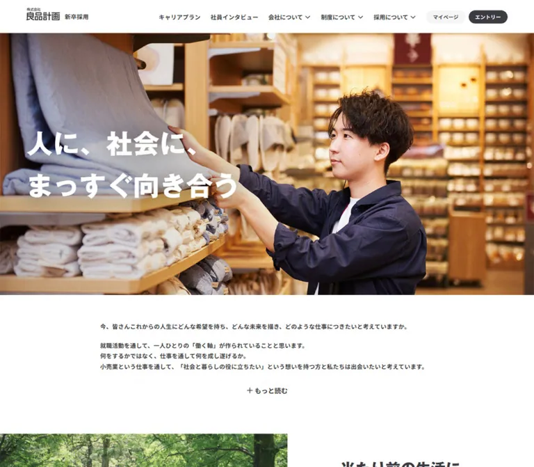
A full-width photograph shows an employee arranging bedding in a warmly lit store. Shelves and pale textiles fill the left side; the employee occupies the right side. The desktop headline, 人に、社会に、まっすぐ向き合う, sits in two white horizontal lines, aligned with the main content edge.
There is no large CTA layered into this hero. Application access stays in the header, allowing the photograph and statement to remain the dominant opening composition.
On mobile, the photo becomes a tall crop. The employee remains visible on the right, while the heading occupies two vertical columns at the upper left. The first phrase is the right column and the second phrase is the left column. Use Japanese vertical writing with an intentional line break; do not simulate it by inserting a break after every character.
No separate dark gradient or image overlay was established by the supplied styles. Do not add a heavy overlay by default. Adjust the crop and text position using the actual photograph, and verify contrast across responsive sizes.
Role: establish the company's position and invite a deeper reading of its recruitment message.
The desktop statement uses an 808px centered column, narrower than the main 1224px layout. It starts approximately 96px below the hero. The heading, ぶれず、たゆまず ともに挑戦し続ける, uses Noto Sans JP Variable at weight 900, rather than the display family used by most section headings.
Body copy begins 32px below the heading and uses 14px bold text with a 25.2px line height. This makes the message visually denser and more emphatic than the regular 16px narrative copy elsewhere.
A compact もっと読む button is present. The DOM contains the complete multi-paragraph statement, but its paragraph rectangles extend beyond the apparent collapsed flow and overlap later document coordinates. This is consistent with clipped content; it is not evidence that all paragraphs are visible at once. Expansion behavior, the expanded height, and any animation were not exercised.
On mobile, the reading column becomes the standard 360px width. The fixed internship badge visibly overlaps the introductory heading in the opening screenshot.
Role: introduce the company's outlook, business model, career development, and sustainability through longer narrative modules.
The desktop layout changes its image/text balance between sections. Measured copy widths include 392px for the everyday-life and business-model messages, 496px for the career-plan message, and 612px for the company-initiatives block. These are not interchangeable 50/50 panels.
Major headings use 36px display type with a 57.6px line height. Regular paragraphs use 16px type with a 28.8px line height. A centered 240px outlined 詳しくみる button commonly follows the paragraph after 40px.
The supplied middle screenshot demonstrates the rhythm clearly: company-support copy sits on the left while an employee/customer photograph extends to the right edge. The following sustainability section places a ReMUJI store photograph against the left edge and copy on the right.
On mobile, measured heading and paragraph positions show intervening media space in the business-model, career, support, and sustainability modules. Preserve the ability to order content as heading, media, paragraph, and action. Simply stacking a desktop image beside an indivisible text wrapper may produce the wrong mobile sequence. Exact image bounds in these intermediate mobile sections were not supplied.
Role: provide individual examples of career development and store management.
Three linked stories form a desktop row at x=108, 524, and 940. Each link is 392px wide; gaps are 24px. Each contains a story headline, store and role information, employee initials and joining year, and an 記事を読む label.
Desktop headlines use 28px display type with 44.8px leading. Their measured text boxes begin 24px inside the card edges. A large media allocation precedes the text, but the supplied records do not include the individual image rectangles or asset URLs; do not infer exact image ratios from the overall card height.
On mobile, all three stories appear sequentially at x=15 with a width of 360px. Headline size changes to 24px with 38.4px leading, and the measured title no longer has the desktop horizontal inset. Content height varies with wrapping. This is a stacked list in the measured mobile layout, not an established swipe carousel.
The centered もっとみる button changes from 370px wide on desktop to 240px on mobile.
Role: route readers to benefits and internal activities without introducing another card style.
The desktop text region is 612px wide. Beneath its heading and paragraph, two large rows link to 制度・福利厚生 and 社内活動. Thin gray horizontal rules separate the rows. Each row combines a bold 16px title, a regular 12px supporting sentence, and a small right-pointing chevron near the far edge.
The measured row height is approximately 128.78px. Text begins 15px inside the left edge; the title and description have a 4px gap. The generous vertical spacing makes the whole row read as a destination.
On mobile, the row links span the full 390px viewport, while their text retains a 15px inset. The first row measures approximately 120.78px high; the second grows to 139.97px because its description wraps. Do not give both rows a fixed height.
The adjacent desktop photograph shows an employee holding a tablet and talking to a customer. Its visible right-hand region starts at x=840 and reaches the viewport edge. The screenshot clips the upper part behind the persistent header, so its visible height is not a reliable full-image measurement.
Role: connect company values to a concrete store initiative.
The supplied desktop view shows part of a large ReMUJI store photograph extending from the left viewport edge to approximately x=812. The copy begins at x=940, leaving substantial separation between media and text.
The heading 100年後の人と社会のために、今できること uses the same 36px display system as other narrative features. Supporting copy and a centered outlined detail button follow. The architectural store scene supplies specificity; abstract sustainability illustrations are not part of the captured treatment.
Role: introduce organizational scale alongside the company overview.
The desktop overview copy occupies a 392px left column. Four fact labels occupy a two-by-two region to the right. The supplied content reports 1,474 stores, 28 countries and regions, 28,432 group employees, and a 33.2% share of women in management. These are captured page values, not evergreen constants.
Fact labels use 14px bold Noto Sans JP Variable with 22.4px leading. The numeric typography and complete tile surfaces were not measured, so their exact display sizes should remain unspecified.
On mobile, the fact labels retain two columns: 172.5px each with a calculated 15px gap. The overview appears above the facts and its detail button below them. This section therefore behaves differently from the single-column article lists.
Role: offer explanatory sessions, internships, and registration for updates.
Three desktop modules share the familiar 392px column width. Their descriptive text sits within a 312px region, indicating 40px horizontal insets. Body copy uses 14px regular text with 25.2px leading. Each module ends in a 240px outlined action.
On mobile, the modules stack. Descriptive text measures 310px wide and starts at x=40, inside the 360px main content region. Actions become smaller 160 × 40.39px buttons with 14px labels and 8px padding. This compact variant should not be confused with the 240px buttons used by the main editorial sections.
Role: give candidates an explicit route to application and account access after the informational sections.
The main application area uses two vertically stacked, centered actions. 本選考エントリー has a charcoal fill and white type; マイページ uses a white fill and a fine outline. They are 370px wide on desktop and 240px on mobile, with a 12px gap. A smaller internship-information link appears below.
The recorded account and application links point to the external job.axol.jp service. Their destinations are present in the evidence, but authentication, eligibility, submission behavior, and external-page design were not inspected.
Role: answer practical questions about eligibility, interviews, reapplication, work location, and employee visits.
The extracted page contains seven question labels. On desktop, the FAQ heading occupies a 288px-wide left region. On mobile, it spans the standard 360px content width above the questions.
The desktop heading rectangle is unusually tall because of its layout allocation; it must not be interpreted as a 697px text line height. The heading's measured typography is 22px with 25.3px leading.
Question-row geometry, icons, answer surfaces, and expanded states were not supplied. A disclosure-based implementation would be a recommendation, not a verified reconstruction of the interaction.
Role: extend recruitment into records of product development and community work.
Three desktop links occupy 392px columns with 24px gaps. The captured subjects are curry development, towel development, and food-related regional initiatives. Each card has a media allocation above a small category label and a larger title.
Category labels use 12px bold Noto Sans JP Variable with 19.2px leading. Titles use 18px bold Noto Sans JP Variable with 28.8px leading, rather than the Gothic MB101 display face used for employee-interview titles. The gap between category and title is approximately 4px.
The visible lower portion of this section has a pale gray background. A centered outlined もっとみる action follows the cards after 40px. On mobile, cards stack at 360px wide with 48px vertical gaps, and the action becomes 240px wide.
Role: provide a compact final index of the site's main graduate-recruitment destinations.
A white band contains the centered label 新卒採用について and nine outlined links. On desktop, the links form a centered horizontal row with 16px gaps. Each uses 14px bold text, 8px padding, an approximately 3.11px radius, and a 40.39px total height.
On mobile, the links become a single column of 360px-wide buttons with 12px gaps. The section leaves 32px after the last link before the footer, compared with 96px on desktop. These are navigation links, not selectable filter chips.
Role: keep the internship destination visible throughout the page.
The badge is a circular pale-beige composition with a small group photograph in the upper portion, bold インターンシップ lettering, and a smaller 確認する line. The visible circle is part of the artwork; the sampled anchor itself has a transparent background and a zero computed radius.
It measures 180px square at 24px from the desktop left and bottom edges. On mobile, it becomes 140px square at 16px from the left and bottom edges. It stays in the same viewport position across the supplied top and bottom captures.
This persistence has a visible cost: the mobile badge obscures part of the introductory heading and some footer content. Record the overlap as an observed limitation. For a reusable implementation, provide an inline mobile placement, a dismissible state, or another arrangement that preserves access to covered content.
Role: connect graduate recruitment to the wider recruitment site, company information, store, and privacy policy.
The footer uses a full-width #F5F5F5 surface. On desktop, the brand sits at x=108, while four navigation groups begin at x=524, 732, 940, and 1148. This aligns naturally with a 12-column interpretation: four columns for the identity and two for each navigation group.
Links use 12px regular Noto Sans JP Variable with 19.2px leading. Their vertical start positions are approximately 31.19px apart, corresponding to a 19.19px line box plus 12px of separation. Group headings are visually stronger than their links.
On mobile, the logo is a separate top row. Navigation groups become two columns beginning at x=15 and x=207, with a second row for the remaining groups. The privacy link and copyright follow below. The footer measures approximately 368.92px high on desktop and 538.28px on mobile in the captured state.
| Treatment | Supplied evidence | Interpretation |
|---|---|---|
| General duration token | --site--transition--duration: .3s |
Declared shared duration |
| Header account pills | background-color 0.3s, color 0.3s |
Explicit color-transition properties; destination colors were not exercised |
| Content buttons and topic links | Computed transition serialized as 0.3s |
A transition is configured; its complete behavior is not established by the excerpt |
| Project-story titles | color 0.6s cubic-bezier(0.22, 1, 0.36, 1) |
Explicit, slower title-color transition |
| Sampled heading/body animations | animation: none |
No animation on those sampled nodes at capture time |
| Header during scrolling | Remains at the viewport top in supplied captures | Persistent presentation; implementation mechanism unverified |
| Internship badge during scrolling | Same lower-left placement across captures | Persistent overlay behavior |
| Read-more control | Button present | Expanded state and transition unverified |
| Navigation disclosures and hamburger | Buttons present | Open states and interaction mechanics unverified |
| FAQ | Question labels present | Expansion behavior unverified |
The capture process waited for document load, finite animation settling, layout/text stability, and visible image decoding within its stated limits. It temporarily paused perpetual animation during readiness checks and then resumed it. These procedures improve screenshot stability but do not establish that the page has no delayed or unobserved motion.
Do not invent parallax, automatic hero rotation, animated counters, sticky section transitions, or interview sliders. Library custom properties and generic transition: all entries are insufficient evidence for those behaviors.
For reuse, favor brief color changes and restrained feedback. Any proposed movement, focus styling, or expanded-state animation should be identified as a new implementation choice.
| Surface | Appearance | Function |
|---|---|---|
| Main canvas | White | Supports long reading sections and large photographs |
| Header | White, without a prominent visible shadow | Maintains navigation continuity during scrolling |
| Editorial media | Full-color photography with square visible corners | Supplies warmth, context, and human presence |
| Benefits list | White with fine horizontal rules | Groups related destinations without separate card boxes |
| Secondary action | White with a fine gray outline and very small radius | Indicates a destination while keeping visual emphasis on content |
| Primary application action | Charcoal with white text | Provides the strongest interface contrast |
| Project-story ending | Pale gray in the supplied desktop view | Separates the editorial archive from adjacent sections |
| Footer | #F5F5F5 |
Collects utility and broader recruitment navigation |
| Internship badge | Circular pale-beige artwork | Distinct persistent promotional destination |
No general soft-shadow elevation system is visible in the supplied views. Separation comes primarily from whitespace, rules, changes between white and pale gray, and the boundaries of photographs.
The observed photographs show work in context. The hero features a concrete task—arranging bedding—rather than a posed corporate portrait. The support section shows an employee/customer conversation around a tablet. The sustainability image shows a ReMUJI store environment. Wood, textiles, shelves, lighting, and recognizable retail spaces create the visual atmosphere.
The hero is compositionally functional. Pale bedding and shelving provide a relatively calm area for white copy on the left, while the employee gives the right side a clear human focus. The mobile crop maintains this relationship even as the image becomes taller and the headline changes writing direction.
The internship badge uses a different image treatment: a small group cutout over a flat circular beige field. This is a localized promotional device, not a reason to turn the rest of the site into collages or illustrated circles.
The supplied evidence does not expose original image filenames, image URLs, srcset values, or font-file URLs. The following are visual references, not downloadable asset paths.
| Visual | Current-page evidence | Reuse guidance |
|---|---|---|
| Hero employee arranging bedding | Desktop and mobile opening captures | Preserve the task, warm store setting, and subject-right composition; tune crops independently |
| Employee with tablet and customer | Desktop middle capture | Keep the interaction and store context visible |
| ReMUJI store scene | Lower part of the desktop middle capture | Use a wide architectural crop with square edges |
| Internship group composition | All supplied original-page captures | Keep its beige circular field and compact hierarchy if reproducing the badge |
| Corporate wordmark | Header and footer at both widths | Use an authorized brand asset; do not approximate it with ordinary body text |
Use authorized photography and identity assets when available. Do not fabricate source paths or claim that a newly created photograph is an original page asset.
The page uses a centered 1224px content system, but photographs sometimes extend to a viewport edge. Main content begins at x=108. The introductory statement narrows to 808px. Three-column content uses 392px columns and 24px gaps.
Editorial sections alternate direction and width. The company-support copy is wider than the sustainability copy, and the career-plan text uses another width. Preserve these differences instead of forcing every section into the same two-column component configuration.
The hero begins below an 80px header and ends around y=714. The introductory heading begins at y=810. Navigation and the internship badge remain visible in subsequent scrolled views.
The standard content width is 360px with 15px side insets. The header becomes 50px high while retaining both account actions and a hamburger button. The hero ends around y=618 and the introductory heading begins at y=714, preserving the approximately 96px gap seen on desktop.
Major headings reduce only modestly, from 36px to 32px. Body paragraphs remain 16px. The design therefore gains height through wrapping and stacking instead of shrinking all typography proportionally.
Employee and project stories become single-column lists. Company statistics retain two columns, and footer navigation also retains two columns. Benefits rows extend edge to edge while keeping inset text. Topic-navigation links expand to the full content width.
| Feature | Desktop | Mobile |
|---|---|---|
| Hero headline | Two horizontal lines | Two vertical Japanese columns |
| Hero crop | Wide store environment | Tall crop emphasizing the employee and left text area |
| Primary navigation | Full text navigation | Hamburger; open panel not visually verified |
| Account actions | 12px labels, 32px-high pills | 10px labels, approximately 26.66px-high pills |
| Introductory column | 808px centered | 360px |
| Employee cards | Three columns | Single-column sequence |
| Project-story cards | Three columns | Single-column sequence with 48px gaps |
| Company facts | Two-by-two region beside overview | Two columns below overview |
| Benefits rows | 612px wide | Full 390px viewport width |
| Main list-ending button | 370px wide | 240px wide |
| Event-module button | 240px wide | 160px wide |
| Topic navigation | Horizontal outlined links | Nine stacked full-width links |
| Footer | Identity plus four groups | Identity above two-column navigation |
| Internship badge | 180px circle | 140px circle, visibly overlapping some content |
Exact breakpoints and intermediate tablet layouts are unknown. The Quick Start supplies recommended breakpoints solely to make the adaptation usable. Validate widths between the two captured endpoints before treating them as final.
1.6 leading and body paragraphs 1.8 leading.These are recommendations for a new implementation, not verified features of the original page:
aria-expanded, and an associated controlled region. Verify keyboard operation and focus return when implementing the mobile menu.#FFFFFF.#3C3C43.#F5F5F5.#F4EEDE.#C4C4C6 and #D8D8D9.#7F0019 is not the captured primary action color.“Create a Japanese graduate recruitment index inspired by the current Ryohin Keikaku recruitment page. Use a white canvas, charcoal #3C3C43, pale gray supporting sections, thin rules, and broad whitespace. Request Gothic MB101 Bold for major headings when available and authorized, with Noto Sans JP Variable for body text, navigation, and buttons. Begin with a full-width photograph of an employee doing a real store task, a large white two-line Japanese headline, and a persistent white recruitment header. At 390px, recompose the headline into two vertical Japanese columns and preserve the employee on the right. Follow with a narrow, emphatic introductory statement, varied editorial image/text sections, employee stories, benefits rows, company facts, events, application links, FAQ, project stories, a topic index, and a structured footer. Keep primary actions charcoal and secondary actions lightly outlined. Stack article cards on phones while retaining two columns for facts and footer links. Clearly label any behavior or breakpoint added beyond the supplied evidence.”
新卒採用 label at left, plain text navigation and small disclosure chevrons in the middle, and light マイページ and charcoal エントリー pills at right. At the mobile endpoint, use a 50px strip with both pills and a hamburger control. Keep accessible hit areas larger than the visible small controls.”人に、社会に、 and まっすぐ向き合う in white 64px display type with 1.6 leading. At 390px, use 40px vertical Japanese text with 8px tracking, beginning 24px from the left and 40px below the hero top. Tune the mobile crop independently; do not insert a hero CTA.”This is a usable adaptation of the measured system, not the original stylesheet. It preserves the two inspected endpoint sizes and provides a representative editorial layout, cards, buttons, benefits rows, topic navigation, and footer.
The header breakpoint of 72rem and content breakpoint of 48rem are recommendations. Hero heights reproduce the approximate captured regions; they are not recovered source formulas. Border-color assignments, hover destination colors, focus styles, and the optional inline badge mode are also recommendations.
Provide authorized font files and image assets separately. For the hero, use an img.hero-photo followed by .container.hero-inner containing .hero-title, with one intentional line break between the Japanese phrases. For an editorial feature, place .feature-title, .feature-media, and .feature-copy as siblings so the mobile order can change without moving individual paragraphs with scripts.
:root {
  /* Measured colors and declared palette values */
  --color-canvas: #ffffff;
  --color-ink: #3c3c43;
  --color-surface: #f5f5f5;
  --color-beige: #f4eede;

  /* Recommended assignments from declared neutral colors */
  --color-outline: #c4c4c6;
  --color-rule: #d8d8d9;
  --color-ink-strong: #1d1d1f;

  --font-body: 'Noto Sans JP Variable', sans-serif;
  --font-display: 'ゴシックMB101 B', 'Gothic MB101 Bold',
    'Helvetica Neue', Helvetica, Arial, Verdana, Roboto,
    '游ゴシック', 'Yu Gothic', '游ゴシック体', YuGothic,
    'ヒラギノ角ゴ Pro W3', 'Hiragino Kaku Gothic Pro',
    'Meiryo UI', 'メイリオ', Meiryo,
    'MS Pゴシック', 'MS PGothic', sans-serif;

  --tracking-body: 0.48px;
  --text-hero: 64px;
  --text-section: 36px;
  --text-interview: 28px;
  --leading-heading: 1.6;
  --leading-body: 1.8;

  --content-max: 1224px;
  --reading-max: 808px;
  --page-gutter: 24px;
  --grid-gap: 24px;
  --header-height: 80px;
  --hero-height: 634px;
  --radius-control: 3.55556px;
  --motion-control: 300ms;
  --motion-story: 600ms cubic-bezier(0.22, 1, 0.36, 1);

  /* Adaptation for photographs that reach a viewport edge */
  --page-bleed: max(
    var(--page-gutter),
    calc((100vw - var(--content-max)) / 2)
  );
}

* {
  box-sizing: border-box;
}

html {
  scroll-padding-top: calc(var(--header-height) + 16px);
}

body {
  margin: 0;
  color: var(--color-ink);
  background: var(--color-canvas);
  font-family: var(--font-body);
  font-size: 16px;
  line-height: var(--leading-body);
  letter-spacing: var(--tracking-body);
}

button,
input,
select,
textarea {
  font: inherit;
}

button,
a {
  -webkit-tap-highlight-color: transparent;
}

a {
  color: inherit;
}

img {
  display: block;
  max-width: 100%;
}

.container {
  width: min(
    calc(100% - 2 * var(--page-gutter)),
    var(--content-max)
  );
  margin-inline: auto;
}

.recruit-header {
  position: sticky;
  inset-block-start: 0;
  z-index: 30;
  height: var(--header-height);
  background: var(--color-canvas);
}

.header-inner {
  display: flex;
  align-items: center;
  gap: 24px;
  height: 100%;
}

.brand {
  display: flex;
  align-items: center;
  flex-shrink: 0;
  gap: 12px;
  margin-inline-end: auto;
  font-weight: 700;
  text-decoration: none;
  white-space: nowrap;
}

.brand img {
  width: auto;
  height: 30px;
}

.primary-nav,
.account-actions {
  display: flex;
  align-items: center;
}

.primary-nav {
  gap: 24px;
  font-size: 14px;
  font-weight: 700;
  line-height: 1.6;
  white-space: nowrap;
}

.primary-nav a {
  text-decoration: none;
}

.nav-disclosure {
  display: inline-flex;
  align-items: center;
  gap: 4px;
  padding: 0;
  border: 0;
  color: inherit;
  background: transparent;
  font-size: 14px;
  font-weight: 700;
  line-height: 1.15;
  letter-spacing: normal;
  cursor: pointer;
}

.account-actions {
  flex-shrink: 0;
  gap: 8px;
}

.account-pill {
  display: inline-flex;
  align-items: center;
  justify-content: center;
  padding: 10px 16px;
  border-radius: 9999px;
  color: var(--color-ink);
  background: var(--color-surface);
  font-size: 12px;
  font-weight: 700;
  line-height: 1;
  text-decoration: none;
  white-space: nowrap;
  transition:
    background-color var(--motion-control),
    color var(--motion-control);
}

.account-pill--primary {
  color: var(--color-canvas);
  background: var(--color-ink);
}

.menu-toggle {
  display: none;
  position: relative;
  width: 20px;
  height: 20px;
  padding: 0;
  border: 0;
  color: inherit;
  background: transparent;
  cursor: pointer;
}

.recruit-hero {
  position: relative;
  isolation: isolate;
  height: var(--hero-height);
  overflow: hidden;
}

.hero-photo {
  position: absolute;
  inset: 0;
  z-index: 0;
  width: 100%;
  height: 100%;
  object-fit: cover;
  object-position: var(--hero-position, 50% 50%);
}

.hero-inner {
  position: relative;
  z-index: 1;
  display: flex;
  align-items: center;
  height: 100%;
}

.hero-title {
  width: 100%;
  margin: 0;
  color: var(--color-canvas);
  font-family: var(--font-display);
  font-size: var(--text-hero);
  font-weight: 700;
  line-height: var(--leading-heading);
}

.intro {
  width: min(
    calc(100% - 2 * var(--page-gutter)),
    var(--reading-max)
  );
  margin: 96px auto;
}

.intro-title {
  margin: 0 0 32px;
  font-family: var(--font-body);
  font-size: var(--text-section);
  font-weight: 900;
  line-height: var(--leading-heading);
}

.intro p {
  margin: 0 0 21px;
  font-size: 14px;
  font-weight: 700;
  line-height: 1.8;
}

.read-more {
  display: flex;
  align-items: center;
  justify-content: center;
  gap: 4px;
  margin-inline: auto;
  padding: 0 10px;
  border: 0;
  background: transparent;
  font-size: 16px;
  font-weight: 700;
  line-height: 1.15;
  cursor: pointer;
}

.section-title {
  margin: 0;
  font-family: var(--font-display);
  font-size: var(--text-section);
  font-weight: 700;
  line-height: var(--leading-heading);
}

.section-kicker {
  margin: 0 0 16px;
  font-size: 22px;
  font-weight: 700;
  line-height: 1.6;
}

/* Representative editorial composition, not every source variant */
.feature {
  display: grid;
  grid-template-columns: repeat(12, minmax(0, 1fr));
  gap: 24px;
  margin-block: 96px;
}

.feature-title {
  grid-column: 9 / -1;
  grid-row: 1;
  align-self: end;
}

.feature-copy {
  grid-column: 9 / -1;
  grid-row: 2;
  align-self: start;
}

.feature-copy p {
  margin: 0;
  font-size: 16px;
  line-height: 1.8;
}

.feature-media {
  grid-column: 1 / 8;
  grid-row: 1 / 3;
  align-self: stretch;
  width: calc(100% + var(--page-bleed));
  max-width: none;
  height: 100%;
  margin-inline-start: calc(-1 * var(--page-bleed));
  object-fit: cover;
}

.feature--reverse .feature-title,
.feature--reverse .feature-copy {
  grid-column: 1 / 5;
}

.feature--reverse .feature-media {
  grid-column: 6 / -1;
  margin-inline-start: 0;
  margin-inline-end: calc(-1 * var(--page-bleed));
}

.button {
  display: flex;
  align-items: center;
  justify-content: center;
  gap: 3.55556px;
  width: min(240px, 100%);
  margin-inline: auto;
  padding: 16px 24px;
  border: 1px solid var(--color-outline);
  border-radius: var(--radius-control);
  color: var(--color-ink);
  background: var(--color-canvas);
  font-size: 16px;
  font-weight: 700;
  line-height: 1.6;
  text-align: center;
  text-decoration: none;
  transition:
    background-color var(--motion-control),
    color var(--motion-control),
    border-color var(--motion-control);
}

.feature-copy .button {
  margin-block-start: 40px;
}

.button--large {
  width: min(370px, 100%);
  gap: 4px;
  padding: 20px 32px;
  border-radius: 4px;
  font-size: 18px;
}

.button--primary {
  border: 0;
  color: var(--color-canvas);
  background: var(--color-ink);
}

.application-actions {
  display: grid;
  gap: 12px;
}

.cards {
  display: grid;
  grid-template-columns: repeat(3, minmax(0, 1fr));
  gap: var(--grid-gap);
  margin-block-start: 40px;
}

.story-link {
  min-width: 0;
  text-decoration: none;
}

.story-link img {
  width: 100%;
  height: auto;
}

.interview-copy {
  padding: 24px;
}

.interview-title {
  margin: 0;
  font-family: var(--font-display);
  font-size: var(--text-interview);
  font-weight: 700;
  line-height: 1.6;
}

.project-category {
  margin: 16px 0 4px;
  font-size: 12px;
  font-weight: 700;
  line-height: 1.6;
}

.project-title {
  margin: 0;
  font-size: 18px;
  font-weight: 700;
  line-height: 1.6;
  transition: color var(--motion-story);
}

.list-action {
  margin-block-start: 40px;
}

.benefit-list {
  border-block-start: 1px solid var(--color-rule);
}

.benefit-row {
  display: grid;
  grid-template-columns: minmax(0, 1fr) auto;
  align-items: center;
  gap: 24px;
  padding: 40px 15px;
  border-block-end: 1px solid var(--color-rule);
  text-decoration: none;
}

.benefit-title {
  margin: 0;
  font-size: 16px;
  font-weight: 700;
  line-height: 1.6;
}

.benefit-description {
  margin: 4px 0 0;
  font-size: 12px;
  line-height: 1.6;
}

.benefit-chevron {
  width: 7px;
  height: 7px;
  border-block-start: 1px solid currentColor;
  border-inline-end: 1px solid currentColor;
  transform: rotate(45deg);
}

.topic-index {
  padding-block: 96px;
}

.topic-links {
  display: flex;
  flex-wrap: wrap;
  justify-content: center;
  gap: 16px;
}

.topic-links a {
  display: flex;
  align-items: center;
  justify-content: center;
  padding: 8px;
  border: 1px solid var(--color-outline);
  border-radius: 3.11111px;
  font-size: 14px;
  font-weight: 700;
  line-height: 1.6;
  text-align: center;
  text-decoration: none;
}

.recruit-footer {
  padding-block: 96px 24px;
  background: var(--color-surface);
}

.footer-grid {
  display: grid;
  grid-template-columns: repeat(12, minmax(0, 1fr));
  gap: 24px;
  align-items: start;
}

.footer-brand {
  grid-column: span 4;
}

.footer-group {
  grid-column: span 2;
  min-width: 0;
  font-size: 12px;
  line-height: 1.6;
}

.footer-group h2 {
  margin: 0 0 12px;
  font-size: 12px;
  font-weight: 700;
}

.footer-group ul {
  display: grid;
  gap: 12px;
  margin: 0;
  padding: 0;
  list-style: none;
}

.footer-group a {
  text-decoration: none;
}

.footer-legal {
  display: flex;
  justify-content: space-between;
  gap: 24px;
  margin-block-start: 36px;
  font-size: 12px;
}

.internship-badge {
  position: fixed;
  inset-inline-start: 24px;
  inset-block-end: max(24px, env(safe-area-inset-bottom, 0px));
  z-index: 20;
  width: 180px;
  aspect-ratio: 1;
  overflow: hidden;
  border-radius: 50%;
  background: var(--color-beige);
}

.internship-badge img {
  width: 100%;
  height: 100%;
  object-fit: contain;
}

/* Recommended focus treatment */
:where(a, button, summary, input, select, textarea):focus-visible {
  outline: 2px solid var(--color-ink);
  outline-offset: 4px;
}

/* Proposed state colors; only transition durations were measured */
@media (hover: hover) {
  .button:not(.button--primary):hover,
  .topic-links a:hover {
    background: var(--color-surface);
  }

  .button--primary:hover,
  .account-pill--primary:hover {
    background: var(--color-ink-strong);
  }
}

/* Recommended navigation breakpoint, not a recovered source rule */
@media (max-width: 72rem) {
  :root {
    --header-height: 50px;
  }

  .header-inner {
    gap: 8px;
  }

  .brand {
    gap: 8px;
    font-size: 12px;
  }

  .brand img {
    height: 24px;
  }

  .primary-nav {
    display: none;
  }

  .account-pill {
    padding: 8.33333px 13.33333px;
    font-size: 10px;
  }

  .menu-toggle {
    display: grid;
    place-items: center;
  }
}

/* Recommended content breakpoint matching the mobile endpoint */
@media (max-width: 48rem) {
  :root {
    --page-gutter: 15px;
    --text-hero: 40px;
    --text-section: 32px;
    --text-interview: 24px;
    --hero-height: 568px;
  }

  .hero-inner {
    align-items: flex-start;
    width: 100%;
    padding: 40px 24px 0;
  }

  .hero-title {
    width: auto;
    writing-mode: vertical-rl;
    text-orientation: mixed;
    letter-spacing: 8px;
  }

  .hero-photo {
    /* Supply a crop appropriate to the selected photograph. */
    object-position: var(--hero-position-mobile, 50% 50%);
  }

  .feature {
    grid-template-columns: minmax(0, 1fr);
  }

  .feature .feature-title {
    grid-column: 1;
    grid-row: 1;
  }

  .feature .feature-media {
    grid-column: 1;
    grid-row: 2;
    width: 100%;
    height: auto;
    margin-inline: 0;
  }

  .feature .feature-copy {
    grid-column: 1;
    grid-row: 3;
  }

  .cards {
    grid-template-columns: minmax(0, 1fr);
  }

  .project-cards {
    row-gap: 48px;
  }

  .interview-copy {
    padding: 20px 0;
  }

  .button--large {
    width: min(240px, 100%);
    padding: 16px 24px;
    border-radius: var(--radius-control);
    font-size: 16px;
  }

  .event-card .button {
    width: min(160px, 100%);
    padding: 8px;
    border-radius: 3.11111px;
    font-size: 14px;
  }

  .benefit-list {
    margin-inline: calc(-1 * var(--page-gutter));
  }

  .benefit-row {
    padding-block: 36px;
  }

  .topic-index {
    padding-block-end: 32px;
  }

  .topic-links {
    flex-direction: column;
    gap: 12px;
  }

  .recruit-footer {
    padding-block-start: 26px;
  }

  .footer-grid {
    grid-template-columns: repeat(2, minmax(0, 1fr));
    row-gap: 48px;
  }

  .footer-brand {
    grid-column: 1 / -1;
  }

  .footer-group {
    grid-column: span 1;
  }

  .footer-legal {
    flex-direction: column;
    gap: 32px;
  }

  .internship-badge {
    inset-inline-start: 16px;
    inset-block-end: max(16px, env(safe-area-inset-bottom, 0px));
    width: 140px;
  }

  /* Recommended opt-in alternative to the observed obstruction */
  .internship-badge.is-inline {
    position: static;
    display: block;
    margin: 24px var(--page-gutter);
  }
}

/* Recommended reduced-motion behavior */
@media (prefers-reduced-motion: reduce) {
  .account-pill,
  .button,
  .project-title {
    transition: none;
  }
}
This CSS does not implement hidden menu contents, introductory clipping, FAQ answers, or application workflows. Add those behaviors only with explicit semantics and verified requirements. Avoid hardcoding the measured document height or card heights: they depend on text wrapping, font availability, images, and disclosure state.
Optional mapping for a project already using Tailwind v4. This is not evidence that the original website uses Tailwind. Define the custom properties above first.
@theme inline {
  --color-recruit-canvas: var(--color-canvas);
  --color-recruit-ink: var(--color-ink);
  --color-recruit-surface: var(--color-surface);
  --color-recruit-beige: var(--color-beige);
  --color-recruit-outline: var(--color-outline);
  --color-recruit-rule: var(--color-rule);

  --font-recruit-body: var(--font-body);
  --font-recruit-display: var(--font-display);

  --text-recruit-hero: var(--text-hero);
  --text-recruit-hero--line-height: 1.6;
  --text-recruit-section: var(--text-section);
  --text-recruit-section--line-height: 1.6;
  --text-recruit-interview: var(--text-interview);
  --text-recruit-interview--line-height: 1.6;

  --spacing-recruit-gutter: var(--page-gutter);
  --spacing-recruit-gap: var(--grid-gap);
  --radius-recruit-control: var(--radius-control);
}
2026-09-16T19:54:03.698Z, equivalent to September 17, 2026, 04:54 JST.All design observations above derive from the supplied current-page captures and rendered evidence. Estimated image geometry, declared-but-unassigned tokens, and recommended implementation choices are identified separately.
# Ryohin Keikaku / New Graduate Recruitment — Style Reference

> A spacious recruitment index where substantial Japanese typography and everyday store photography carry the identity.

**Website:** [careers.muji.com/jp/recruit](https://careers.muji.com/jp/recruit)
**Original URL:** https://careers.muji.com/jp/recruit
**Final URL:** https://careers.muji.com/jp/recruit
**Theme:** light; white canvas, charcoal text, pale gray supporting sections, and warm photography. No theme switch was verified.
**Inspected:** September 17, 2026, at 04:54 JST, corresponding to the supplied retrieval timestamp of September 16, 2026, 19:54:03.698 UTC.
**Viewports:** 1440 × 1000 and 390 × 844 CSS pixels.
**Scope:** the current Japanese graduate recruitment index, including its persistent header, hero, introductory statement, career and company sections, employee stories, benefits, sustainability, company facts, events, application links, FAQ, project stories, topic navigation, internship badge, and footer. Visual evidence covers desktop opening, middle, and footer views and mobile opening and footer views; rendered DOM measurements cover additional sections at both widths. Linked pages and application workflows were not inspected.

This is a substantial recruitment website index with multiple destinations and reading paths. Its design depends on a restrained interface around people, stores, products, and company information. White and charcoal establish continuity; large photographs supply warmth. Strong Japanese headings, long line heights, thin rules, and extensive empty space organize the content without a prominent card-shadow system.

The most distinctive responsive change happens in the hero. The desktop headline occupies two horizontal lines over a wide store photograph. On the phone, it becomes two vertical Japanese columns beside a close crop of the employee. Farther down, editorial layouts and article grids become a long reading sequence, while the footer retains two navigation columns.
# Ryohin Keikaku / New Graduate Recruitment — Style Reference

> A spacious recruitment index where substantial Japanese typography and everyday store photography carry the identity.

**Website:** [careers.muji.com/jp/recruit](https://careers.muji.com/jp/recruit)
**Original URL:** https://careers.muji.com/jp/recruit
**Final URL:** https://careers.muji.com/jp/recruit
**Theme:** light; white canvas, charcoal text, pale gray supporting sections, and warm photography. No theme switch was verified.
**Inspected:** September 17, 2026, at 04:54 JST, corresponding to the supplied retrieval timestamp of September 16, 2026, 19:54:03.698 UTC.
**Viewports:** 1440 × 1000 and 390 × 844 CSS pixels.
**Scope:** the current Japanese graduate recruitment index, including its persistent header, hero, introductory statement, career and company sections, employee stories, benefits, sustainability, company facts, events, application links, FAQ, project stories, topic navigation, internship badge, and footer. Visual evidence covers desktop opening, middle, and footer views and mobile opening and footer views; rendered DOM measurements cover additional sections at both widths. Linked pages and application workflows were not inspected.

This is a substantial recruitment website index with multiple destinations and reading paths. Its design depends on a restrained interface around people, stores, products, and company information. White and charcoal establish continuity; large photographs supply warmth. Strong Japanese headings, long line heights, thin rules, and extensive empty space organize the content without a prominent card-shadow system.

The most distinctive responsive change happens in the hero. The desktop headline occupies two horizontal lines over a wide store photograph. On the phone, it becomes two vertical Japanese columns beside a close crop of the employee. Farther down, editorial layouts and article grids become a long reading sequence, while the footer retains two navigation columns.

## How to Read This Reference

- **Measured** means a value appears in the supplied computed styles or element rectangles. Measurements are CSS pixels unless stated otherwise; fractional values are rounded for readability.
- **Declared** means a custom property exists in the supplied evidence. Its existence does not establish that a particular visible component uses it.
- **Visual estimate** means a dimension, color association, crop, or surface treatment is read from an attached current-page screenshot rather than an element measurement.
- **Calculated** means a value follows directly from supplied measurements, such as a grid gap or distance between elements.
- **Recommended** means an implementation choice for reuse, including unverified breakpoints, accessible states, and the CSS adaptation below.
- Computed font-family stacks identify the requested families. Font files, loading success, and the exact face used for each glyph were not independently verified.
- Extracted text and rectangles can include clipped or hidden content. In particular, the mobile navigation entries and complete introductory statement must not be assumed visible simply because the DOM contains them.

## Tokens — Colors

### Default Palette

| Name | Value | Source property / reuse alias | Evidence and role |
| --- | --- | --- | --- |
| White | `#FFFFFF` | `--site--color--white` / `--color-canvas` | Declared; computed on the header and outlined button surfaces. Visually the main page canvas. |
| Charcoal | `#3C3C43` | `--site--color--default`, `--site--color--gray800` / `--color-ink` | Declared and computed on body text, navigation, headings, and filled application actions. |
| Pale Gray | `#F5F5F5` | `--site--color--gray100` / `--color-surface` | Computed footer background and header account-button fill; also visually present behind the project-story ending. |
| Light Beige | `#F4EEDE` | `--site--color--beige_light` / `--color-beige` | Declared; visually consistent with the circular internship artwork. The artwork's fill was not separately measured. |
| Outline Gray | `#C4C4C6` | `--site--color--gray400` / `--color-outline` | Declared. Recommended approximation for the fine button outlines visible in the captures; border colors were not included in the element samples. |
| Divider Gray | `#D8D8D9` | `--site--color--gray300` / `--color-rule` | Declared. Recommended approximation for the light horizontal rules in the benefits list. |

The primary action is charcoal with white text. The observed page does not use a large red application button. Warm browns, amber light, navy clothing, and muted blue-gray textiles belong to the photographs rather than the interface token system.

### Additional Declared Colors

| Source property | Value | Interpretation |
| --- | --- | --- |
| `--site--color--gray900` | `#1D1D1F` | Available darker neutral; no specific sampled component requires it. |
| `--site--color--gray600` | `#76767B` | Available muted neutral. |
| `--site--color--gray500` | `#9D9DA0` | Available intermediate gray. |
| `--site--color--gray200` | `#EBEBEC` | Available pale neutral. |
| `--site--color--beige` | `#E0CEAA` | Available stronger beige; do not spread it across the white page without a reason. |
| `--site--color--muji_primary` | `#7F0019` | Declared brand color, not the observed primary CTA fill. |
| `--site--color--alert` | `#DC063A` | Declared alert color; no alert state was captured. |
| `--bg-color` | `#D4D4D1` | A declared value whose component association is unverified. It is not evidence that the page canvas is this gray. |
| `--swiper-theme-color` | `#007AFF` | A library-related token. Its presence does not establish a visible blue accent or an active carousel. |

Use the first palette for reconstruction. Keep additional declared colors separate from colors actually verified on components.

## Tokens — Typography

### Gothic MB101 Bold — Major Headings

The hero, major section headings, and employee-story titles compute to a stack beginning with `"ゴシックMB101 B", "Gothic MB101 Bold"`. The stack then includes Helvetica Neue, Helvetica, Arial, Verdana, Roboto, and Japanese system fallbacks.

The headings are dense and substantial, with generous line spacing. Their weight provides emphasis without decorative outlines, gradients, or English display lettering. The computed weight is `700`; the named bold face is part of the requested family stack.

**Reuse alias:** `--font-display`.

### Noto Sans JP Variable — Body, Navigation, and Utilities

The body, navigation, buttons, descriptive paragraphs, project-story titles, and footer compute to `"Noto Sans JP Variable", sans-serif`.

Regular narrative paragraphs use weight `400`. Navigation and action labels use `700`. The introductory statement is a notable exception: its heading uses Noto Sans JP Variable at `900`, and its body copy uses `700`.

**Reuse alias:** `--font-body`.

### Tracking and Leading

Most sampled content inherits an absolute `0.48px` letter spacing. At the 16px body size this equals `0.03em`, but it remains `0.48px` on many smaller descendants. Using `0.03em` separately on every element would change those smaller labels.

Ordinary narrative paragraphs use `1.8` line height. Major headings and many labels use `1.6`. The body node itself computes to `18.4px` line height at 16px; this is not the line height used by the measured reading paragraphs.

The mobile hero is special: `40px` type, `64px` line height, and `8px` tracking. Its vertical reading direction and enlarged character spacing must be handled as a distinct treatment.

### Type Scale

| Role | Desktop size / line height | Mobile size / line height | Family and weight |
| --- | --- | --- | --- |
| Hero headline | `64 / 102.4px` | `40 / 64px` | Gothic MB101 Bold stack, `700` |
| Main section heading | `36 / 57.6px` | `32 / 51.2px` | Gothic MB101 Bold stack, `700` |
| Introductory statement heading | `36 / 57.6px` | `32 / 51.2px` | Noto Sans JP Variable, `900` |
| Employee-story title | `28 / 44.8px` | `24 / 38.4px` | Gothic MB101 Bold stack, `700` |
| Smaller section heading | `22 / 35.2px` | `22 / 35.2px` | Noto Sans JP Variable, `700` |
| Project-story title | `18 / 28.8px` | `18 / 28.8px` | Noto Sans JP Variable, `700` |
| Narrative paragraph | `16 / 28.8px` | `16 / 28.8px` | Noto Sans JP Variable, `400` |
| Introductory statement paragraph | `14 / 25.2px` | `14 / 25.2px` | Noto Sans JP Variable, `700` |
| Desktop navigation link | `14 / 22.4px` | Mobile menu DOM requests `16 / 25.6px` | Noto Sans JP Variable, `700`; mobile open state unverified |
| Header account pill | `12 / 12px` | `10 / 10px` | Noto Sans JP Variable, `700` |
| Standard content button | `16 / 25.6px` | `16 / 25.6px` | Noto Sans JP Variable, `700` |
| Large content button | `18 / 28.8px` | `16 / 25.6px` | Noto Sans JP Variable, `700` |
| Benefits-row title | `16 / 25.6px` | `16 / 25.6px` | Noto Sans JP Variable, `700` |
| Benefits-row description | `12 / 19.2px` | `12 / 19.2px` | Noto Sans JP Variable, `400` |
| Project category label | `12 / 19.2px` | `12 / 19.2px` | Noto Sans JP Variable, `700` |
| Footer navigation link | `12 / 19.2px` | `12 / 19.2px` | Noto Sans JP Variable, `400` |

The source exposes several nominal size tokens whose values change on mobile: `--site--font-size--36` becomes `32px`, `--site--font-size--38` becomes `32px`, and the `48` and `72` tokens become `40px`. The `64` token remains `64px` even though the mobile hero computes to 40px. Do not infer responsive component styles from token names alone.

## Tokens — Spacing & Shapes

### Container System

| Measurement | Desktop | Mobile | Evidence |
| --- | --- | --- | --- |
| Main content width | `1224px` | `360px` | Measured heading and content rectangles |
| Main content left edge | `108px` | `15px` | Measured |
| Source content-width token | `76.5em` | `76.5em` | Declared; equals 1224px when evaluated at 16px |
| Source wide-width token | `84.5em` | `84.5em` | Declared; equals 1352px at 16px, but not the width of every section |
| Source gutter token | `1.5em`, equivalent to `24px` | `.9375em`, equivalent to `15px` | Declared and consistent with mobile content edges |
| Introductory reading column | `808px`, starting at `x=316` | `360px`, starting at `x=15` | Measured |
| Three-column card width | `392px` | `360px`, stacked | Measured |
| Desktop card gap | `24px` | Section-specific vertical gaps | Calculated from card positions |

At 1440px, the 108px outside margin comes from centering the 1224px content region. It is not the same quantity as the declared 24px gutter.

### Spacing Scale

| Value | Verified or calculated use |
| --- | --- |
| `4px` | Benefits title-to-description gap; project category-to-title gap |
| `8px` | Gap between the two header account pills; mobile logo-to-label gap |
| `12px` | Desktop logo-to-label gap; mobile topic-link gaps; gap between stacked application buttons |
| `15px` | Mobile page inset; text inset within benefits rows |
| `16px` | Standard button vertical padding; desktop topic-link horizontal gap |
| `20px` | Large button vertical padding |
| `21px` | Space between measured introductory paragraphs |
| `24px` | Desktop card gaps; narrative heading-to-paragraph gap in multiple sections; standard button horizontal padding |
| `32px` | Introductory heading-to-paragraph gap; mobile space after the final topic link before the footer |
| `40px` | Common narrative-to-button gap; section heading-to-card gap; project-card-to-more-button gap |
| `48px` | Mobile project-story vertical gap |
| `96px` | Hero-bottom to introductory heading; desktop topic-row to footer gap |
| `160px` | Desktop application-area to FAQ-heading gap in the supplied layout |

These are recurring measurements, not proof of a single global spacing scale. The page includes section-specific compositions and larger areas of empty space.

### Border Radius and Button Geometry

| Element | Measured geometry |
| --- | --- |
| Header account pill | `9999px` radius; approximately `94 × 32px` desktop and `79 × 26.66px` mobile |
| Standard outlined button | `240 × 59.59px`; `16px 24px` padding; `3.56px` radius |
| Large outlined button | `370 × 70.80px`; `20px 32px` padding; `4px` radius |
| Large filled application button | `370 × 68.80px` desktop; `240 × 57.59px` mobile |
| Small outlined button | `40.39px` high; `8px` padding; `3.11px` radius |
| Mobile event button | `160 × 40.39px` |
| Internship badge | `180 × 180px` desktop; `140 × 140px` mobile; circular visible artwork |
| Editorial photographs | Square visible corners in the supplied captures |

Outlined buttons are approximately 2px taller than filled buttons with the same text and padding, consistent with a 1px border on each side. The screenshots show fine outlines, but the supplied computed records do not include their border-color declarations.

### Hero and Persistent Elements

| Element | Desktop | Mobile | Status |
| --- | --- | --- | --- |
| Header height | `80px` | `50px` | Measured |
| Hero photograph region | Approximately `1440 × 634px` | Approximately `390 × 568px` | Screenshot estimate |
| Hero headline bounds | `x=108`, `y=294.61`, `1224 × 204.78px` | `x=24`, `y=90`, `128 × 384px` | Measured |
| Internship badge position | Left `24px`, bottom `24px` | Left `16px`, bottom `16px` | Measured viewport coordinates and screenshot persistence |
| Document height | `9778.31px` | `13593.80px` | Measured at capture time |

The two hero dimensions are observed endpoint compositions. No source formula for hero height or image positioning was supplied.

## Components

### Persistent Recruitment Header

**Role:** preserve identity, expose major information categories, and keep application access available.

The desktop header is a white 80px strip. Its inner content aligns to the 1224px container, beginning at x=108. The logo and `新卒採用` label form a single linked group, approximately 151px wide and 30px high, with a 12px internal gap.

The navigation combines two direct links, three disclosure buttons, and two account actions. Labels include `キャリアプラン`, `社員インタビュー`, `会社について`, `制度について`, and `採用について`. The category buttons use small downward chevrons rather than filled boxes. The light `マイページ` pill and charcoal `エントリー` pill sit at the right with an 8px gap.

On mobile, the header is 50px high. The identity group starts at x=15 and measures approximately 121 × 24px. Both account actions remain visible, followed by a 20 × 20px hamburger control at x=355. The desktop navigation is not visible in the opening mobile screenshot, although its entries remain represented in the supplied DOM.

The header remains at the top in the scrolled captures. The exact distinction between fixed and sticky positioning was not provided; the Quick Start uses sticky positioning as an adaptation. Dropdown layouts, open-menu appearance, focus behavior, and close interactions were not tested.

### Store-Photography Hero

**Role:** connect recruitment to the actual work environment before presenting detailed company information.

A full-width photograph shows an employee arranging bedding in a warmly lit store. Shelves and pale textiles fill the left side; the employee occupies the right side. The desktop headline, `人に、社会に、まっすぐ向き合う`, sits in two white horizontal lines, aligned with the main content edge.

There is no large CTA layered into this hero. Application access stays in the header, allowing the photograph and statement to remain the dominant opening composition.

On mobile, the photo becomes a tall crop. The employee remains visible on the right, while the heading occupies two vertical columns at the upper left. The first phrase is the right column and the second phrase is the left column. Use Japanese vertical writing with an intentional line break; do not simulate it by inserting a break after every character.

No separate dark gradient or image overlay was established by the supplied styles. Do not add a heavy overlay by default. Adjust the crop and text position using the actual photograph, and verify contrast across responsive sizes.

### Introductory Statement and Read-More Control

**Role:** establish the company's position and invite a deeper reading of its recruitment message.

The desktop statement uses an 808px centered column, narrower than the main 1224px layout. It starts approximately 96px below the hero. The heading, `ぶれず、たゆまず ともに挑戦し続ける`, uses Noto Sans JP Variable at weight 900, rather than the display family used by most section headings.

Body copy begins 32px below the heading and uses 14px bold text with a 25.2px line height. This makes the message visually denser and more emphatic than the regular 16px narrative copy elsewhere.

A compact `もっと読む` button is present. The DOM contains the complete multi-paragraph statement, but its paragraph rectangles extend beyond the apparent collapsed flow and overlap later document coordinates. This is consistent with clipped content; it is not evidence that all paragraphs are visible at once. Expansion behavior, the expanded height, and any animation were not exercised.

On mobile, the reading column becomes the standard 360px width. The fixed internship badge visibly overlaps the introductory heading in the opening screenshot.

### Alternating Editorial Sections

**Role:** introduce the company's outlook, business model, career development, and sustainability through longer narrative modules.

The desktop layout changes its image/text balance between sections. Measured copy widths include 392px for the everyday-life and business-model messages, 496px for the career-plan message, and 612px for the company-initiatives block. These are not interchangeable 50/50 panels.

Major headings use 36px display type with a 57.6px line height. Regular paragraphs use 16px type with a 28.8px line height. A centered 240px outlined `詳しくみる` button commonly follows the paragraph after 40px.

The supplied middle screenshot demonstrates the rhythm clearly: company-support copy sits on the left while an employee/customer photograph extends to the right edge. The following sustainability section places a ReMUJI store photograph against the left edge and copy on the right.

On mobile, measured heading and paragraph positions show intervening media space in the business-model, career, support, and sustainability modules. Preserve the ability to order content as heading, media, paragraph, and action. Simply stacking a desktop image beside an indivisible text wrapper may produce the wrong mobile sequence. Exact image bounds in these intermediate mobile sections were not supplied.

### Employee-Interview Cards

**Role:** provide individual examples of career development and store management.

Three linked stories form a desktop row at x=108, 524, and 940. Each link is 392px wide; gaps are 24px. Each contains a story headline, store and role information, employee initials and joining year, and an `記事を読む` label.

Desktop headlines use 28px display type with 44.8px leading. Their measured text boxes begin 24px inside the card edges. A large media allocation precedes the text, but the supplied records do not include the individual image rectangles or asset URLs; do not infer exact image ratios from the overall card height.

On mobile, all three stories appear sequentially at x=15 with a width of 360px. Headline size changes to 24px with 38.4px leading, and the measured title no longer has the desktop horizontal inset. Content height varies with wrapping. This is a stacked list in the measured mobile layout, not an established swipe carousel.

The centered `もっとみる` button changes from 370px wide on desktop to 240px on mobile.

### Company-Support Link Rows

**Role:** route readers to benefits and internal activities without introducing another card style.

The desktop text region is 612px wide. Beneath its heading and paragraph, two large rows link to `制度・福利厚生` and `社内活動`. Thin gray horizontal rules separate the rows. Each row combines a bold 16px title, a regular 12px supporting sentence, and a small right-pointing chevron near the far edge.

The measured row height is approximately 128.78px. Text begins 15px inside the left edge; the title and description have a 4px gap. The generous vertical spacing makes the whole row read as a destination.

On mobile, the row links span the full 390px viewport, while their text retains a 15px inset. The first row measures approximately 120.78px high; the second grows to 139.97px because its description wraps. Do not give both rows a fixed height.

The adjacent desktop photograph shows an employee holding a tablet and talking to a customer. Its visible right-hand region starts at x=840 and reaches the viewport edge. The screenshot clips the upper part behind the persistent header, so its visible height is not a reliable full-image measurement.

### Sustainability Feature

**Role:** connect company values to a concrete store initiative.

The supplied desktop view shows part of a large ReMUJI store photograph extending from the left viewport edge to approximately x=812. The copy begins at x=940, leaving substantial separation between media and text.

The heading `100年後の人と社会のために、今できること` uses the same 36px display system as other narrative features. Supporting copy and a centered outlined detail button follow. The architectural store scene supplies specificity; abstract sustainability illustrations are not part of the captured treatment.

### Company Facts

**Role:** introduce organizational scale alongside the company overview.

The desktop overview copy occupies a 392px left column. Four fact labels occupy a two-by-two region to the right. The supplied content reports 1,474 stores, 28 countries and regions, 28,432 group employees, and a 33.2% share of women in management. These are captured page values, not evergreen constants.

Fact labels use 14px bold Noto Sans JP Variable with 22.4px leading. The numeric typography and complete tile surfaces were not measured, so their exact display sizes should remain unspecified.

On mobile, the fact labels retain two columns: 172.5px each with a calculated 15px gap. The overview appears above the facts and its detail button below them. This section therefore behaves differently from the single-column article lists.

### Event and Information Modules

**Role:** offer explanatory sessions, internships, and registration for updates.

Three desktop modules share the familiar 392px column width. Their descriptive text sits within a 312px region, indicating 40px horizontal insets. Body copy uses 14px regular text with 25.2px leading. Each module ends in a 240px outlined action.

On mobile, the modules stack. Descriptive text measures 310px wide and starts at x=40, inside the 360px main content region. Actions become smaller 160 × 40.39px buttons with 14px labels and 8px padding. This compact variant should not be confused with the 240px buttons used by the main editorial sections.

### Application Actions

**Role:** give candidates an explicit route to application and account access after the informational sections.

The main application area uses two vertically stacked, centered actions. `本選考エントリー` has a charcoal fill and white type; `マイページ` uses a white fill and a fine outline. They are 370px wide on desktop and 240px on mobile, with a 12px gap. A smaller internship-information link appears below.

The recorded account and application links point to the external `job.axol.jp` service. Their destinations are present in the evidence, but authentication, eligibility, submission behavior, and external-page design were not inspected.

### FAQ Region

**Role:** answer practical questions about eligibility, interviews, reapplication, work location, and employee visits.

The extracted page contains seven question labels. On desktop, the FAQ heading occupies a 288px-wide left region. On mobile, it spans the standard 360px content width above the questions.

The desktop heading rectangle is unusually tall because of its layout allocation; it must not be interpreted as a 697px text line height. The heading's measured typography is 22px with 25.3px leading.

Question-row geometry, icons, answer surfaces, and expanded states were not supplied. A disclosure-based implementation would be a recommendation, not a verified reconstruction of the interaction.

### Project-Story Cards

**Role:** extend recruitment into records of product development and community work.

Three desktop links occupy 392px columns with 24px gaps. The captured subjects are curry development, towel development, and food-related regional initiatives. Each card has a media allocation above a small category label and a larger title.

Category labels use 12px bold Noto Sans JP Variable with 19.2px leading. Titles use 18px bold Noto Sans JP Variable with 28.8px leading, rather than the Gothic MB101 display face used for employee-interview titles. The gap between category and title is approximately 4px.

The visible lower portion of this section has a pale gray background. A centered outlined `もっとみる` action follows the cards after 40px. On mobile, cards stack at 360px wide with 48px vertical gaps, and the action becomes 240px wide.

### Recruitment Topic Navigation

**Role:** provide a compact final index of the site's main graduate-recruitment destinations.

A white band contains the centered label `新卒採用について` and nine outlined links. On desktop, the links form a centered horizontal row with 16px gaps. Each uses 14px bold text, 8px padding, an approximately 3.11px radius, and a 40.39px total height.

On mobile, the links become a single column of 360px-wide buttons with 12px gaps. The section leaves 32px after the last link before the footer, compared with 96px on desktop. These are navigation links, not selectable filter chips.

### Floating Internship Badge

**Role:** keep the internship destination visible throughout the page.

The badge is a circular pale-beige composition with a small group photograph in the upper portion, bold `インターンシップ` lettering, and a smaller `確認する` line. The visible circle is part of the artwork; the sampled anchor itself has a transparent background and a zero computed radius.

It measures 180px square at 24px from the desktop left and bottom edges. On mobile, it becomes 140px square at 16px from the left and bottom edges. It stays in the same viewport position across the supplied top and bottom captures.

This persistence has a visible cost: the mobile badge obscures part of the introductory heading and some footer content. Record the overlap as an observed limitation. For a reusable implementation, provide an inline mobile placement, a dismissible state, or another arrangement that preserves access to covered content.

### Recruitment Footer

**Role:** connect graduate recruitment to the wider recruitment site, company information, store, and privacy policy.

The footer uses a full-width `#F5F5F5` surface. On desktop, the brand sits at x=108, while four navigation groups begin at x=524, 732, 940, and 1148. This aligns naturally with a 12-column interpretation: four columns for the identity and two for each navigation group.

Links use 12px regular Noto Sans JP Variable with 19.2px leading. Their vertical start positions are approximately 31.19px apart, corresponding to a 19.19px line box plus 12px of separation. Group headings are visually stronger than their links.

On mobile, the logo is a separate top row. Navigation groups become two columns beginning at x=15 and x=207, with a second row for the remaining groups. The privacy link and copyright follow below. The footer measures approximately 368.92px high on desktop and 538.28px on mobile in the captured state.

## Tokens — Motion & Interaction

| Treatment | Supplied evidence | Interpretation |
| --- | --- | --- |
| General duration token | `--site--transition--duration: .3s` | Declared shared duration |
| Header account pills | `background-color 0.3s, color 0.3s` | Explicit color-transition properties; destination colors were not exercised |
| Content buttons and topic links | Computed transition serialized as `0.3s` | A transition is configured; its complete behavior is not established by the excerpt |
| Project-story titles | `color 0.6s cubic-bezier(0.22, 1, 0.36, 1)` | Explicit, slower title-color transition |
| Sampled heading/body animations | `animation: none` | No animation on those sampled nodes at capture time |
| Header during scrolling | Remains at the viewport top in supplied captures | Persistent presentation; implementation mechanism unverified |
| Internship badge during scrolling | Same lower-left placement across captures | Persistent overlay behavior |
| Read-more control | Button present | Expanded state and transition unverified |
| Navigation disclosures and hamburger | Buttons present | Open states and interaction mechanics unverified |
| FAQ | Question labels present | Expansion behavior unverified |

The capture process waited for document load, finite animation settling, layout/text stability, and visible image decoding within its stated limits. It temporarily paused perpetual animation during readiness checks and then resumed it. These procedures improve screenshot stability but do not establish that the page has no delayed or unobserved motion.

Do not invent parallax, automatic hero rotation, animated counters, sticky section transitions, or interview sliders. Library custom properties and generic `transition: all` entries are insufficient evidence for those behaviors.

For reuse, favor brief color changes and restrained feedback. Any proposed movement, focus styling, or expanded-state animation should be identified as a new implementation choice.

## Surfaces

| Surface | Appearance | Function |
| --- | --- | --- |
| Main canvas | White | Supports long reading sections and large photographs |
| Header | White, without a prominent visible shadow | Maintains navigation continuity during scrolling |
| Editorial media | Full-color photography with square visible corners | Supplies warmth, context, and human presence |
| Benefits list | White with fine horizontal rules | Groups related destinations without separate card boxes |
| Secondary action | White with a fine gray outline and very small radius | Indicates a destination while keeping visual emphasis on content |
| Primary application action | Charcoal with white text | Provides the strongest interface contrast |
| Project-story ending | Pale gray in the supplied desktop view | Separates the editorial archive from adjacent sections |
| Footer | `#F5F5F5` | Collects utility and broader recruitment navigation |
| Internship badge | Circular pale-beige artwork | Distinct persistent promotional destination |

No general soft-shadow elevation system is visible in the supplied views. Separation comes primarily from whitespace, rules, changes between white and pale gray, and the boundaries of photographs.

## Imagery

The observed photographs show work in context. The hero features a concrete task—arranging bedding—rather than a posed corporate portrait. The support section shows an employee/customer conversation around a tablet. The sustainability image shows a ReMUJI store environment. Wood, textiles, shelves, lighting, and recognizable retail spaces create the visual atmosphere.

The hero is compositionally functional. Pale bedding and shelving provide a relatively calm area for white copy on the left, while the employee gives the right side a clear human focus. The mobile crop maintains this relationship even as the image becomes taller and the headline changes writing direction.

The internship badge uses a different image treatment: a small group cutout over a flat circular beige field. This is a localized promotional device, not a reason to turn the rest of the site into collages or illustrated circles.

### Observed Asset References

The supplied evidence does not expose original image filenames, image URLs, `srcset` values, or font-file URLs. The following are visual references, not downloadable asset paths.

| Visual | Current-page evidence | Reuse guidance |
| --- | --- | --- |
| Hero employee arranging bedding | Desktop and mobile opening captures | Preserve the task, warm store setting, and subject-right composition; tune crops independently |
| Employee with tablet and customer | Desktop middle capture | Keep the interaction and store context visible |
| ReMUJI store scene | Lower part of the desktop middle capture | Use a wide architectural crop with square edges |
| Internship group composition | All supplied original-page captures | Keep its beige circular field and compact hierarchy if reproducing the badge |
| Corporate wordmark | Header and footer at both widths | Use an authorized brand asset; do not approximate it with ordinary body text |

Use authorized photography and identity assets when available. Do not fabricate source paths or claim that a newly created photograph is an original page asset.

## Layout & Responsive Behavior

### Desktop: 1440 × 1000

The page uses a centered 1224px content system, but photographs sometimes extend to a viewport edge. Main content begins at x=108. The introductory statement narrows to 808px. Three-column content uses 392px columns and 24px gaps.

Editorial sections alternate direction and width. The company-support copy is wider than the sustainability copy, and the career-plan text uses another width. Preserve these differences instead of forcing every section into the same two-column component configuration.

The hero begins below an 80px header and ends around y=714. The introductory heading begins at y=810. Navigation and the internship badge remain visible in subsequent scrolled views.

### Mobile: 390 × 844

The standard content width is 360px with 15px side insets. The header becomes 50px high while retaining both account actions and a hamburger button. The hero ends around y=618 and the introductory heading begins at y=714, preserving the approximately 96px gap seen on desktop.

Major headings reduce only modestly, from 36px to 32px. Body paragraphs remain 16px. The design therefore gains height through wrapping and stacking instead of shrinking all typography proportionally.

Employee and project stories become single-column lists. Company statistics retain two columns, and footer navigation also retains two columns. Benefits rows extend edge to edge while keeping inset text. Topic-navigation links expand to the full content width.

### Responsive Comparison

| Feature | Desktop | Mobile |
| --- | --- | --- |
| Hero headline | Two horizontal lines | Two vertical Japanese columns |
| Hero crop | Wide store environment | Tall crop emphasizing the employee and left text area |
| Primary navigation | Full text navigation | Hamburger; open panel not visually verified |
| Account actions | 12px labels, 32px-high pills | 10px labels, approximately 26.66px-high pills |
| Introductory column | 808px centered | 360px |
| Employee cards | Three columns | Single-column sequence |
| Project-story cards | Three columns | Single-column sequence with 48px gaps |
| Company facts | Two-by-two region beside overview | Two columns below overview |
| Benefits rows | 612px wide | Full 390px viewport width |
| Main list-ending button | 370px wide | 240px wide |
| Event-module button | 240px wide | 160px wide |
| Topic navigation | Horizontal outlined links | Nine stacked full-width links |
| Footer | Identity plus four groups | Identity above two-column navigation |
| Internship badge | 180px circle | 140px circle, visibly overlapping some content |

Exact breakpoints and intermediate tablet layouts are unknown. The Quick Start supplies recommended breakpoints solely to make the adaptation usable. Validate widths between the two captured endpoints before treating them as final.

## Do’s and Don’ts

### Do

- Build the interface around white, charcoal, and pale gray; let store photography provide warmth.
- Use the measured distinction between Gothic MB101 display headings and Noto Sans JP Variable body and utility text.
- Preserve the especially heavy Noto treatment of the introductory statement.
- Keep the desktop 1224px content width, 808px introductory column, and 24px card gaps as separate layout concepts.
- Give Japanese headlines generous `1.6` leading and body paragraphs `1.8` leading.
- Recompose the mobile hero with vertical writing and a deliberate crop.
- Keep the three button sizes distinct, including the compact mobile event action.
- Use thin rules and small corner radii for secondary destinations.
- Preserve the two-column mobile statistics and footer while stacking article cards.
- Treat the fixed internship badge's obstruction as an issue to resolve in a new implementation.

### Don't

- Don't turn the index into a short sequence of generic promotional cards; its information architecture is extensive.
- Don't use the declared maroon as the primary application fill when matching the captured page.
- Don't apply the display font to every paragraph or make every heading Noto Sans JP.
- Don't shrink the desktop hero headline into a tiny horizontal mobile caption.
- Don't make all editorial sections equal halves or crop every photograph to the same ratio.
- Don't add large rounded containers, glossy gradients, glass effects, or pervasive shadows.
- Don't infer a carousel from the presence of Swiper variables; the measured mobile stories stack.
- Don't present hidden navigation rectangles or clipped introductory text as visible screenshot content.
- Don't copy snapshot company statistics into a reusable component as permanent constants.
- Don't invent menu states, FAQ animations, asset URLs, or production credits.

## Recommended Implementation Additions

These are recommendations for a new implementation, not verified features of the original page:

- Make the internship promotion inline on narrow screens, dismissible, or otherwise unable to cover headings, privacy links, and focused controls.
- Preserve the compact appearance of the mobile header while providing approximately 44px touch targets through layout or an appropriately expanded hit area. The observed 20px hamburger and 26.66px-high pills are smaller than this recommendation.
- Give navigation disclosures accessible names, `aria-expanded`, and an associated controlled region. Verify keyboard operation and focus return when implementing the mobile menu.
- Implement the introductory read-more control with a real disclosure relationship. Its hidden content must not remain unexpectedly focusable or unreadable to assistive technology.
- If the FAQ uses disclosures, provide semantic controls and explicit expanded states. Do not rely on color or an unlabelled icon alone.
- Associate the full benefits-row hit area with its visible title. Empty extracted anchor text is not a complete accessibility audit, so inspect the final accessible name rather than assuming one is absent.
- Keep hero copy as selectable text. Use vertical writing only for the intended Japanese phrase, with a sensible DOM reading order.
- Supply meaningful alternative text for editorial images; mark duplicate or purely decorative promotional imagery appropriately.
- Add visible keyboard focus, sufficient contrast in all states, reduced-motion behavior, and header-aware scroll offsets.
- Reserve image dimensions to prevent layout movement, provide responsive image candidates, and validate the face/text relationship at intermediate widths.

## Agent Prompt Guide

### Quick Color Reference

- Main canvas and header: `#FFFFFF`.
- Text and primary application action: `#3C3C43`.
- Footer and secondary surface: `#F5F5F5`.
- Internship artwork approximation: `#F4EEDE`.
- Recommended outline and divider approximations: `#C4C4C6` and `#D8D8D9`.
- Declared brand maroon `#7F0019` is not the captured primary action color.
- Photography supplies the warm wood, amber lighting, navy clothing, and muted textiles.

### Overall Prompt

“Create a Japanese graduate recruitment index inspired by the current Ryohin Keikaku recruitment page. Use a white canvas, charcoal `#3C3C43`, pale gray supporting sections, thin rules, and broad whitespace. Request Gothic MB101 Bold for major headings when available and authorized, with Noto Sans JP Variable for body text, navigation, and buttons. Begin with a full-width photograph of an employee doing a real store task, a large white two-line Japanese headline, and a persistent white recruitment header. At 390px, recompose the headline into two vertical Japanese columns and preserve the employee on the right. Follow with a narrow, emphatic introductory statement, varied editorial image/text sections, employee stories, benefits rows, company facts, events, application links, FAQ, project stories, a topic index, and a structured footer. Keep primary actions charcoal and secondary actions lightly outlined. Stack article cards on phones while retaining two columns for facts and footer links. Clearly label any behavior or breakpoint added beyond the supplied evidence.”

### Example Component Prompts

1. **Header:** “Build an 80px white desktop recruitment header within a centered 1224px content region. Place the authorized company wordmark and `新卒採用` label at left, plain text navigation and small disclosure chevrons in the middle, and light `マイページ` and charcoal `エントリー` pills at right. At the mobile endpoint, use a 50px strip with both pills and a hamburger control. Keep accessible hit areas larger than the visible small controls.”
2. **Hero:** “Use a warm, realistic store photograph with an employee arranging bedding on the right. Overlay `人に、社会に、` and `まっすぐ向き合う` in white 64px display type with 1.6 leading. At 390px, use 40px vertical Japanese text with 8px tracking, beginning 24px from the left and 40px below the hero top. Tune the mobile crop independently; do not insert a hero CTA.”
3. **Benefits rows:** “Create two white destination rows separated by fine gray rules. Each contains a bold 16px Japanese title, a regular 12px explanatory line, and a small right chevron. Use a 612px desktop region and full-width mobile rows with 15px text insets. Let descriptions wrap and increase row height.”
4. **Employee stories:** “Create three equal 392px desktop story columns separated by 24px. Use substantial media space, 28px display titles inset 24px, compact store and employee details, and a reading label. Stack the stories at 360px wide on mobile, use 24px titles, and remove the horizontal title inset. Do not introduce swipe behavior without a new requirement.”
5. **Footer:** “Create a pale gray recruitment footer with the identity occupying the first four columns of a 12-column desktop grid and four link groups occupying two columns each. Use 12px links with 19.2px leading and 12px vertical gaps. On mobile, put the identity above a two-column navigation grid. Keep the privacy link and copyright unobscured.”

## Quick Start

### CSS Custom Properties

This is a usable adaptation of the measured system, not the original stylesheet. It preserves the two inspected endpoint sizes and provides a representative editorial layout, cards, buttons, benefits rows, topic navigation, and footer.

The header breakpoint of `72rem` and content breakpoint of `48rem` are recommendations. Hero heights reproduce the approximate captured regions; they are not recovered source formulas. Border-color assignments, hover destination colors, focus styles, and the optional inline badge mode are also recommendations.

Provide authorized font files and image assets separately. For the hero, use an `img.hero-photo` followed by `.container.hero-inner` containing `.hero-title`, with one intentional line break between the Japanese phrases. For an editorial feature, place `.feature-title`, `.feature-media`, and `.feature-copy` as siblings so the mobile order can change without moving individual paragraphs with scripts.

```css
:root {
  /* Measured colors and declared palette values */
  --color-canvas: #ffffff;
  --color-ink: #3c3c43;
  --color-surface: #f5f5f5;
  --color-beige: #f4eede;

  /* Recommended assignments from declared neutral colors */
  --color-outline: #c4c4c6;
  --color-rule: #d8d8d9;
  --color-ink-strong: #1d1d1f;

  --font-body: 'Noto Sans JP Variable', sans-serif;
  --font-display: 'ゴシックMB101 B', 'Gothic MB101 Bold',
    'Helvetica Neue', Helvetica, Arial, Verdana, Roboto,
    '游ゴシック', 'Yu Gothic', '游ゴシック体', YuGothic,
    'ヒラギノ角ゴ Pro W3', 'Hiragino Kaku Gothic Pro',
    'Meiryo UI', 'メイリオ', Meiryo,
    'MS Pゴシック', 'MS PGothic', sans-serif;

  --tracking-body: 0.48px;
  --text-hero: 64px;
  --text-section: 36px;
  --text-interview: 28px;
  --leading-heading: 1.6;
  --leading-body: 1.8;

  --content-max: 1224px;
  --reading-max: 808px;
  --page-gutter: 24px;
  --grid-gap: 24px;
  --header-height: 80px;
  --hero-height: 634px;
  --radius-control: 3.55556px;
  --motion-control: 300ms;
  --motion-story: 600ms cubic-bezier(0.22, 1, 0.36, 1);

  /* Adaptation for photographs that reach a viewport edge */
  --page-bleed: max(
    var(--page-gutter),
    calc((100vw - var(--content-max)) / 2)
  );
}

* {
  box-sizing: border-box;
}

html {
  scroll-padding-top: calc(var(--header-height) + 16px);
}

body {
  margin: 0;
  color: var(--color-ink);
  background: var(--color-canvas);
  font-family: var(--font-body);
  font-size: 16px;
  line-height: var(--leading-body);
  letter-spacing: var(--tracking-body);
}

button,
input,
select,
textarea {
  font: inherit;
}

button,
a {
  -webkit-tap-highlight-color: transparent;
}

a {
  color: inherit;
}

img {
  display: block;
  max-width: 100%;
}

.container {
  width: min(
    calc(100% - 2 * var(--page-gutter)),
    var(--content-max)
  );
  margin-inline: auto;
}

.recruit-header {
  position: sticky;
  inset-block-start: 0;
  z-index: 30;
  height: var(--header-height);
  background: var(--color-canvas);
}

.header-inner {
  display: flex;
  align-items: center;
  gap: 24px;
  height: 100%;
}

.brand {
  display: flex;
  align-items: center;
  flex-shrink: 0;
  gap: 12px;
  margin-inline-end: auto;
  font-weight: 700;
  text-decoration: none;
  white-space: nowrap;
}

.brand img {
  width: auto;
  height: 30px;
}

.primary-nav,
.account-actions {
  display: flex;
  align-items: center;
}

.primary-nav {
  gap: 24px;
  font-size: 14px;
  font-weight: 700;
  line-height: 1.6;
  white-space: nowrap;
}

.primary-nav a {
  text-decoration: none;
}

.nav-disclosure {
  display: inline-flex;
  align-items: center;
  gap: 4px;
  padding: 0;
  border: 0;
  color: inherit;
  background: transparent;
  font-size: 14px;
  font-weight: 700;
  line-height: 1.15;
  letter-spacing: normal;
  cursor: pointer;
}

.account-actions {
  flex-shrink: 0;
  gap: 8px;
}

.account-pill {
  display: inline-flex;
  align-items: center;
  justify-content: center;
  padding: 10px 16px;
  border-radius: 9999px;
  color: var(--color-ink);
  background: var(--color-surface);
  font-size: 12px;
  font-weight: 700;
  line-height: 1;
  text-decoration: none;
  white-space: nowrap;
  transition:
    background-color var(--motion-control),
    color var(--motion-control);
}

.account-pill--primary {
  color: var(--color-canvas);
  background: var(--color-ink);
}

.menu-toggle {
  display: none;
  position: relative;
  width: 20px;
  height: 20px;
  padding: 0;
  border: 0;
  color: inherit;
  background: transparent;
  cursor: pointer;
}

.recruit-hero {
  position: relative;
  isolation: isolate;
  height: var(--hero-height);
  overflow: hidden;
}

.hero-photo {
  position: absolute;
  inset: 0;
  z-index: 0;
  width: 100%;
  height: 100%;
  object-fit: cover;
  object-position: var(--hero-position, 50% 50%);
}

.hero-inner {
  position: relative;
  z-index: 1;
  display: flex;
  align-items: center;
  height: 100%;
}

.hero-title {
  width: 100%;
  margin: 0;
  color: var(--color-canvas);
  font-family: var(--font-display);
  font-size: var(--text-hero);
  font-weight: 700;
  line-height: var(--leading-heading);
}

.intro {
  width: min(
    calc(100% - 2 * var(--page-gutter)),
    var(--reading-max)
  );
  margin: 96px auto;
}

.intro-title {
  margin: 0 0 32px;
  font-family: var(--font-body);
  font-size: var(--text-section);
  font-weight: 900;
  line-height: var(--leading-heading);
}

.intro p {
  margin: 0 0 21px;
  font-size: 14px;
  font-weight: 700;
  line-height: 1.8;
}

.read-more {
  display: flex;
  align-items: center;
  justify-content: center;
  gap: 4px;
  margin-inline: auto;
  padding: 0 10px;
  border: 0;
  background: transparent;
  font-size: 16px;
  font-weight: 700;
  line-height: 1.15;
  cursor: pointer;
}

.section-title {
  margin: 0;
  font-family: var(--font-display);
  font-size: var(--text-section);
  font-weight: 700;
  line-height: var(--leading-heading);
}

.section-kicker {
  margin: 0 0 16px;
  font-size: 22px;
  font-weight: 700;
  line-height: 1.6;
}

/* Representative editorial composition, not every source variant */
.feature {
  display: grid;
  grid-template-columns: repeat(12, minmax(0, 1fr));
  gap: 24px;
  margin-block: 96px;
}

.feature-title {
  grid-column: 9 / -1;
  grid-row: 1;
  align-self: end;
}

.feature-copy {
  grid-column: 9 / -1;
  grid-row: 2;
  align-self: start;
}

.feature-copy p {
  margin: 0;
  font-size: 16px;
  line-height: 1.8;
}

.feature-media {
  grid-column: 1 / 8;
  grid-row: 1 / 3;
  align-self: stretch;
  width: calc(100% + var(--page-bleed));
  max-width: none;
  height: 100%;
  margin-inline-start: calc(-1 * var(--page-bleed));
  object-fit: cover;
}

.feature--reverse .feature-title,
.feature--reverse .feature-copy {
  grid-column: 1 / 5;
}

.feature--reverse .feature-media {
  grid-column: 6 / -1;
  margin-inline-start: 0;
  margin-inline-end: calc(-1 * var(--page-bleed));
}

.button {
  display: flex;
  align-items: center;
  justify-content: center;
  gap: 3.55556px;
  width: min(240px, 100%);
  margin-inline: auto;
  padding: 16px 24px;
  border: 1px solid var(--color-outline);
  border-radius: var(--radius-control);
  color: var(--color-ink);
  background: var(--color-canvas);
  font-size: 16px;
  font-weight: 700;
  line-height: 1.6;
  text-align: center;
  text-decoration: none;
  transition:
    background-color var(--motion-control),
    color var(--motion-control),
    border-color var(--motion-control);
}

.feature-copy .button {
  margin-block-start: 40px;
}

.button--large {
  width: min(370px, 100%);
  gap: 4px;
  padding: 20px 32px;
  border-radius: 4px;
  font-size: 18px;
}

.button--primary {
  border: 0;
  color: var(--color-canvas);
  background: var(--color-ink);
}

.application-actions {
  display: grid;
  gap: 12px;
}

.cards {
  display: grid;
  grid-template-columns: repeat(3, minmax(0, 1fr));
  gap: var(--grid-gap);
  margin-block-start: 40px;
}

.story-link {
  min-width: 0;
  text-decoration: none;
}

.story-link img {
  width: 100%;
  height: auto;
}

.interview-copy {
  padding: 24px;
}

.interview-title {
  margin: 0;
  font-family: var(--font-display);
  font-size: var(--text-interview);
  font-weight: 700;
  line-height: 1.6;
}

.project-category {
  margin: 16px 0 4px;
  font-size: 12px;
  font-weight: 700;
  line-height: 1.6;
}

.project-title {
  margin: 0;
  font-size: 18px;
  font-weight: 700;
  line-height: 1.6;
  transition: color var(--motion-story);
}

.list-action {
  margin-block-start: 40px;
}

.benefit-list {
  border-block-start: 1px solid var(--color-rule);
}

.benefit-row {
  display: grid;
  grid-template-columns: minmax(0, 1fr) auto;
  align-items: center;
  gap: 24px;
  padding: 40px 15px;
  border-block-end: 1px solid var(--color-rule);
  text-decoration: none;
}

.benefit-title {
  margin: 0;
  font-size: 16px;
  font-weight: 700;
  line-height: 1.6;
}

.benefit-description {
  margin: 4px 0 0;
  font-size: 12px;
  line-height: 1.6;
}

.benefit-chevron {
  width: 7px;
  height: 7px;
  border-block-start: 1px solid currentColor;
  border-inline-end: 1px solid currentColor;
  transform: rotate(45deg);
}

.topic-index {
  padding-block: 96px;
}

.topic-links {
  display: flex;
  flex-wrap: wrap;
  justify-content: center;
  gap: 16px;
}

.topic-links a {
  display: flex;
  align-items: center;
  justify-content: center;
  padding: 8px;
  border: 1px solid var(--color-outline);
  border-radius: 3.11111px;
  font-size: 14px;
  font-weight: 700;
  line-height: 1.6;
  text-align: center;
  text-decoration: none;
}

.recruit-footer {
  padding-block: 96px 24px;
  background: var(--color-surface);
}

.footer-grid {
  display: grid;
  grid-template-columns: repeat(12, minmax(0, 1fr));
  gap: 24px;
  align-items: start;
}

.footer-brand {
  grid-column: span 4;
}

.footer-group {
  grid-column: span 2;
  min-width: 0;
  font-size: 12px;
  line-height: 1.6;
}

.footer-group h2 {
  margin: 0 0 12px;
  font-size: 12px;
  font-weight: 700;
}

.footer-group ul {
  display: grid;
  gap: 12px;
  margin: 0;
  padding: 0;
  list-style: none;
}

.footer-group a {
  text-decoration: none;
}

.footer-legal {
  display: flex;
  justify-content: space-between;
  gap: 24px;
  margin-block-start: 36px;
  font-size: 12px;
}

.internship-badge {
  position: fixed;
  inset-inline-start: 24px;
  inset-block-end: max(24px, env(safe-area-inset-bottom, 0px));
  z-index: 20;
  width: 180px;
  aspect-ratio: 1;
  overflow: hidden;
  border-radius: 50%;
  background: var(--color-beige);
}

.internship-badge img {
  width: 100%;
  height: 100%;
  object-fit: contain;
}

/* Recommended focus treatment */
:where(a, button, summary, input, select, textarea):focus-visible {
  outline: 2px solid var(--color-ink);
  outline-offset: 4px;
}

/* Proposed state colors; only transition durations were measured */
@media (hover: hover) {
  .button:not(.button--primary):hover,
  .topic-links a:hover {
    background: var(--color-surface);
  }

  .button--primary:hover,
  .account-pill--primary:hover {
    background: var(--color-ink-strong);
  }
}

/* Recommended navigation breakpoint, not a recovered source rule */
@media (max-width: 72rem) {
  :root {
    --header-height: 50px;
  }

  .header-inner {
    gap: 8px;
  }

  .brand {
    gap: 8px;
    font-size: 12px;
  }

  .brand img {
    height: 24px;
  }

  .primary-nav {
    display: none;
  }

  .account-pill {
    padding: 8.33333px 13.33333px;
    font-size: 10px;
  }

  .menu-toggle {
    display: grid;
    place-items: center;
  }
}

/* Recommended content breakpoint matching the mobile endpoint */
@media (max-width: 48rem) {
  :root {
    --page-gutter: 15px;
    --text-hero: 40px;
    --text-section: 32px;
    --text-interview: 24px;
    --hero-height: 568px;
  }

  .hero-inner {
    align-items: flex-start;
    width: 100%;
    padding: 40px 24px 0;
  }

  .hero-title {
    width: auto;
    writing-mode: vertical-rl;
    text-orientation: mixed;
    letter-spacing: 8px;
  }

  .hero-photo {
    /* Supply a crop appropriate to the selected photograph. */
    object-position: var(--hero-position-mobile, 50% 50%);
  }

  .feature {
    grid-template-columns: minmax(0, 1fr);
  }

  .feature .feature-title {
    grid-column: 1;
    grid-row: 1;
  }

  .feature .feature-media {
    grid-column: 1;
    grid-row: 2;
    width: 100%;
    height: auto;
    margin-inline: 0;
  }

  .feature .feature-copy {
    grid-column: 1;
    grid-row: 3;
  }

  .cards {
    grid-template-columns: minmax(0, 1fr);
  }

  .project-cards {
    row-gap: 48px;
  }

  .interview-copy {
    padding: 20px 0;
  }

  .button--large {
    width: min(240px, 100%);
    padding: 16px 24px;
    border-radius: var(--radius-control);
    font-size: 16px;
  }

  .event-card .button {
    width: min(160px, 100%);
    padding: 8px;
    border-radius: 3.11111px;
    font-size: 14px;
  }

  .benefit-list {
    margin-inline: calc(-1 * var(--page-gutter));
  }

  .benefit-row {
    padding-block: 36px;
  }

  .topic-index {
    padding-block-end: 32px;
  }

  .topic-links {
    flex-direction: column;
    gap: 12px;
  }

  .recruit-footer {
    padding-block-start: 26px;
  }

  .footer-grid {
    grid-template-columns: repeat(2, minmax(0, 1fr));
    row-gap: 48px;
  }

  .footer-brand {
    grid-column: 1 / -1;
  }

  .footer-group {
    grid-column: span 1;
  }

  .footer-legal {
    flex-direction: column;
    gap: 32px;
  }

  .internship-badge {
    inset-inline-start: 16px;
    inset-block-end: max(16px, env(safe-area-inset-bottom, 0px));
    width: 140px;
  }

  /* Recommended opt-in alternative to the observed obstruction */
  .internship-badge.is-inline {
    position: static;
    display: block;
    margin: 24px var(--page-gutter);
  }
}

/* Recommended reduced-motion behavior */
@media (prefers-reduced-motion: reduce) {
  .account-pill,
  .button,
  .project-title {
    transition: none;
  }
}
```

This CSS does not implement hidden menu contents, introductory clipping, FAQ answers, or application workflows. Add those behaviors only with explicit semantics and verified requirements. Avoid hardcoding the measured document height or card heights: they depend on text wrapping, font availability, images, and disclosure state.

### Tailwind v4 Token Mapping

Optional mapping for a project already using Tailwind v4. This is not evidence that the original website uses Tailwind. Define the custom properties above first.

```css
@theme inline {
  --color-recruit-canvas: var(--color-canvas);
  --color-recruit-ink: var(--color-ink);
  --color-recruit-surface: var(--color-surface);
  --color-recruit-beige: var(--color-beige);
  --color-recruit-outline: var(--color-outline);
  --color-recruit-rule: var(--color-rule);

  --font-recruit-body: var(--font-body);
  --font-recruit-display: var(--font-display);

  --text-recruit-hero: var(--text-hero);
  --text-recruit-hero--line-height: 1.6;
  --text-recruit-section: var(--text-section);
  --text-recruit-section--line-height: 1.6;
  --text-recruit-interview: var(--text-interview);
  --text-recruit-interview--line-height: 1.6;

  --spacing-recruit-gutter: var(--page-gutter);
  --spacing-recruit-gap: var(--grid-gap);
  --radius-recruit-control: var(--radius-control);
}
```

## Sources & Evidence

- **Inspected original and final page:** [New Graduate Recruitment — Ryohin Keikaku](https://careers.muji.com/jp/recruit). The supplied browser record reports HTTP 200 with no URL change.
- **Capture timestamp:** `2026-09-16T19:54:03.698Z`, equivalent to September 17, 2026, 04:54 JST.
- **Desktop evidence:** 1440 × 1000 CSS-pixel viewport; opening, middle, and footer captures; rendered text, links, custom properties, and sampled computed element styles. Measured document height: approximately 9778.31px.
- **Mobile evidence:** 390 × 844 CSS-pixel viewport; opening and footer captures; rendered text, links, custom properties, and sampled computed element styles. Measured document height: approximately 13593.80px.
- **Verified presentation changes:** horizontal-to-vertical hero typography, reduced header and account-pill sizes, stacked article lists, edge-to-edge benefits rows, two-column facts and footer navigation, and persistent header and internship promotion across captured scroll positions.
- **Inspection limits:** no independently exercised navigation disclosures, mobile menu, read-more expansion, FAQ expansion, hover states, keyboard flows, or external application pages. Image and font asset URLs were not supplied. Computed family names do not prove font-file loading or per-glyph face selection.
- **Capture-method limits:** readiness checks waited for load, finite motion, sampled layout/text stability, and visible image decoding within bounded waits. Delayed content and unexercised motion remain unverified. SharedWorkers and service workers were disabled during the supplied inspection.

All design observations above derive from the supplied current-page captures and rendered evidence. Estimated image geometry, declared-but-unassigned tokens, and recommended implementation choices are identified separately.スタイルやページの種類、ジャンルが近いデザインを集めました。