プレビュー準備中デザインリファレンスを見る
日本のWebデザインを、AIの制作リファレンスに。
DESIGN REFERENCE
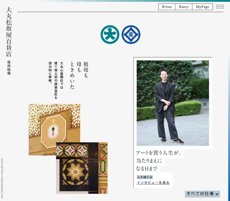
縦組みの見出しと建築・社員写真を組み合わせた採用サイト。余白を生かした非対称レイアウト、白い短冊状の文字背景、細い罫線が特徴。
オリジナルサイトを見るA department-store editorial spread, composed from vertical Japanese writing, architectural fragments, and portraits of people at work.
Website: Daimaru Matsuzakaya graduate recruitment Original URL: https://www.daimaru-matsuzakaya.com/recruit/newgraduate/ Final URL: https://www.daimaru-matsuzakaya.com/recruit/newgraduate/ Theme: light canvas; no alternate theme was evidenced. Inspected: September 17, 2026, at 04:29 JST. Supplied retrieval timestamp: September 16, 2026, at 19:29:19.238 UTC. Viewports: desktop 1440 × 1000 and mobile 390 × 844 CSS pixels. Scope: the current recruitment homepage: persistent identity and navigation, opening editorial collection, business directory, vision and employee links, employment information, announcements, entry link, recruitment social channels, and corporate footer. Linked destination pages and expanded interactive states were not inspected.
The homepage introduces the company through its people, places, objects, and changing business practices. A pale gray canvas holds irregularly positioned photographs and short Japanese headlines. Vertical writing connects the masthead and architectural stories to a print-editorial tradition. Employee portraits use horizontal captions whose white backgrounds follow individual lines, producing a stepped silhouette instead of a rectangular text panel.
The opening collection is deliberately spacious and asymmetric. Beneath it, the page becomes a more regular directory of business stories and recruitment information. Application utilities remain compact in the header. The visual hierarchy gives cultural and human material substantial space while keeping practical recruitment routes easy to locate.
A department-store editorial spread, composed from vertical Japanese writing, architectural fragments, and portraits of people at work.
Website: Daimaru Matsuzakaya graduate recruitment Original URL: https://www.daimaru-matsuzakaya.com/recruit/newgraduate/ Final URL: https://www.daimaru-matsuzakaya.com/recruit/newgraduate/ Theme: light canvas; no alternate theme was evidenced. Inspected: September 17, 2026, at 04:29 JST. Supplied retrieval timestamp: September 16, 2026, at 19:29:19.238 UTC. Viewports: desktop 1440 × 1000 and mobile 390 × 844 CSS pixels. Scope: the current recruitment homepage: persistent identity and navigation, opening editorial collection, business directory, vision and employee links, employment information, announcements, entry link, recruitment social channels, and corporate footer. Linked destination pages and expanded interactive states were not inspected.
The homepage introduces the company through its people, places, objects, and changing business practices. A pale gray canvas holds irregularly positioned photographs and short Japanese headlines. Vertical writing connects the masthead and architectural stories to a print-editorial tradition. Employee portraits use horizontal captions whose white backgrounds follow individual lines, producing a stepped silhouette instead of a rectangular text panel.
The opening collection is deliberately spacious and asymmetric. Beneath it, the page becomes a more regular directory of business stories and recruitment information. Application utilities remain compact in the header. The visual hierarchy gives cultural and human material substantial space while keeping practical recruitment routes easy to locate.
| Name | Value | Source token | Observed or declared role |
|---|---|---|---|
| Pale Canvas | #f5f5f5 |
--color-background, --color-gray-900 |
Measured body background and the dominant page surface |
| Editorial Ink | #181b1c |
--color-text, --color-border, --color-gray-100 |
Measured link and button text; declared primary border color |
| White Paper | #ffffff |
--color-white |
Measured utility-button and entry-link backgrounds; visible photograph mats and caption strips |
| Blue Gray | #bbc9d2 |
--color-blue-100, --color-gray-600, --color-cursor |
Visible category-label and selected-filter treatment; cursor use is declared but unverified |
| Light Divider | #e3e0de |
--color-border-light, --color-gray-700 |
Fine section separators; also declared as --color-background-menu |
| Muted Gray | #7c7e7e |
--color-text-light, --color-gray-500 |
Secondary-information color, consistent with dates and the small vertical domain label |
| Plain Black | #000000 |
--color-black |
Measured body and heading-container color; some descendants explicitly use Editorial Ink |
The body computes to black while many links compute to #181b1c. Both belong to the observed system. A reproduction should not assume that the semantic text variable is applied uniformly to every node.
The paired store emblems supply teal and blue. A narrow wash along the top fades toward teal at the right; the right edge fades from the canvas into blue farther down the viewport. These are perimeter details rather than large colored content sections.
Exact emblem fills, gradient stops, and decorative-layer CSS were not supplied. For a new implementation, #00858d for teal and #1854a3 for blue are recommended visual approximations, not measured source colors. The starter CSS labels them accordingly.
Platform logos retain their own recognizable colors: green for LINE and Spotify, purple for Apple Podcasts, and black wordmarks for note and Amazon Music. These colors belong to the imagery, not to a general-purpose interface palette.
No color-theme selector or alternate palette was observed. The declared menu background does not establish the appearance of an opened menu.
Measured stack: 'Aoto Gothic Regular', 'Helvetica Neue', arial, 'Hiragino Kaku Gothic ProN', 'Hiragino Sans', meiryo, sans-serif.
Desktop body text is 16px, weight 400, with 28px line height and 0.8px tracking. This corresponds to the declared 1.75 line height and 0.05em tracking. Navigation and business-directory text share this restrained, regular-weight treatment.
The source also declares 'Aoto Gothic Light' and 'Aoto Gothic DemiBold'. Their application to specific visible elements was not demonstrated by the supplied element samples. Do not make all headings bold merely because a bold family exists.
Measured heading-container stack: 'A1 Mincho', serif.
The sampled section-heading containers use weight 400, 18.72px type, 32.76px line height, and 1.404px tracking on desktop. These are container measurements; the screenshots suggest that some inner labels are larger. An inner span's computed size was not supplied.
The vertical masthead, opening vertical headline, and large story captions visibly use a Mincho-style character. Their precise descendant font assignments were not included. Use the declared display family when licensed and available; otherwise select a Japanese serif fallback and recheck wrapping.
The source declares 'Signifier', sans-serif through --typo-font-english. The visible Event, Entry, and MyPage lettering appears serif in the screenshots. However, the measured enclosing anchors report the base Gothic stack. The supplied evidence does not include the relevant inner text element or font-file requests.
For reuse, assign the English token explicitly to an inner utility label. Treat that assignment as a recommendation rather than a verified original selector.
| Role | Desktop | Mobile at 390px | Line height and tracking |
|---|---|---|---|
| Body and primary navigation | 16px | 15.99px | 1.75; approximately 0.8px tracking |
| Header announcement links | 13px | Not present in the closed mobile header | 13px measured desktop line height |
| Event / Entry / MyPage anchor | 16px | 15.99px | Approximately 28px; inner font assignment unverified |
| Business-row introductory text | 16px | 12.99px | 28px desktop; 22.74px mobile |
| Section-heading container | 18.72px | 18.71px | Approximately 1.75; 0.075em tracking |
| Employment-information links | 15px | 14.99px | Approximately 1.75 |
| Lower announcement links | 13px | 12.99px | Approximately 22.75px |
| Large entry link | 18px | 17.99px | 1.3; approximately 0.8px tracking |
| Footer legal links and copyright | 13px | 12.99px | Approximately 22.75px |
| Opening story headlines | About 24px, visual estimate | About 24px, visual estimate | Approximately 1.5 for horizontal captions |
| Vertical masthead title | About 28px, visual estimate | About 22px, visual estimate | Compact vertical setting |
At the desktop 16px root, the supplied size variables resolve as follows. These are available tokens, not evidence that every size appears on this homepage.
| Source token | Value | Desktop equivalent |
|---|---|---|
--typo-size-10 |
.6875rem |
11px |
--typo-size-50 |
.8125rem |
13px |
--typo-size-90 |
.9375rem |
15px |
--typo-size-100 |
1rem |
16px |
--typo-size-200 |
1.125rem |
18px |
--typo-size-400 |
1.3125rem |
21px |
--typo-size-500 |
1.5rem |
24px |
--typo-size-600 |
1.75rem |
28px |
--typo-size-700 |
2rem |
32px |
--typo-size-900 |
2.25rem |
36px |
The declared line-height scale is 1, 1.2, 1.3, 1.5, and 1.75. Most measured UI text remains regular weight. The design gains emphasis through placement, writing direction, whitespace, and white caption fragments.
The desktop root is measured at 16px. On mobile, --typo-size-base becomes min(4.1vw, 1rem) and the root measures 15.99px at 390px wide. This is a very small reduction at the inspected phone width, not a wholesale shrinking of the desktop layout.
The declared left gutter changes from 7.5rem to 3rem, approximately 120px to 47.97px. The right gutter changes from 1.875em to 1rem, approximately 30px to 15.99px.
| Source or observed value | Desktop equivalent | Role and qualification |
|---|---|---|
--size-sm: .5rem |
8px | Declared small spacing |
--size-md: 1rem |
16px | Standard inset and utility-button horizontal padding |
--size-dlg: 1.875em |
30px at a 16px local font size | Declared spacing; em remains context-dependent |
--size-lg: 2rem |
32px | Declared spacing |
--size-xl: 3rem |
48px | Declared spacing; mobile left gutter |
--size-xxl: 5rem |
80px | Declared large spacing |
--size-3xl: 7.5rem |
120px | Desktop left gutter and large spatial rhythm |
| Directory image/text gap | 15px measured | Approximately 14.99px on mobile |
| Editorial photograph mat | About 15px, visual estimate | White inset around the portrait |
| Opening column gap | 60px derived | 420px column pitch minus a 360px card |
| Directory row gap | 30px derived | 210px row pitch minus a 180px row |
The sampled buttons and links have border-radius: 0. The photographs, mats, caption backgrounds, and outlined controls are square. Fine rules are approximately 1px in the screenshots.
A .5rem radius variable exists, but it should not become a general card radius: the visible page does not use rounded editorial cards. Circular store emblems and branded social icons are separate artwork.
No shadow-based elevation system is visible. Distinction comes from white against pale gray, black rules, image edges, and carefully arranged whitespace.
| Element | Desktop 1440 × 1000 | Mobile 390 × 844 |
|---|---|---|
| Brand-home link box | x 0; width 120px; height 351.61px | x 0; width 47.97px; height 297.39px |
| Header bottom rule | About y 94px, visual estimate | About y 54px, visual estimate |
Opening main rectangle |
x 120, y 95; width 1320; height 2763px | x 31.97, y 54.92; width 358.03; height 6063.20px |
Opening main padding |
Right 30px | Left and right 15.99px |
| Art employee card | x 960, y 215; 360 × 595.59px | x 62.94, y 964.03; 296.09 × 519.91px |
| Sales employee card | x 540, y 361; 360 × 595.59px | x 62.94, y 1543.89; 296.09 × 519.91px |
| Business directory width | 1200px, beginning at x 180 | 326.05px, beginning at x 47.97 |
| Business link row | 600 × 180px | 326.05 × 97.42px |
| Load-more button | 114 × 30px | 113.92 × 29.97px |
| Entry link | 668.80 × 55.39px | 326.05 × 55.34px |
The desktop opening and lower directory use different left boundaries: 120px and 180px. Preserve this deliberate change in alignment rather than imposing one centered container on the whole page.
The mobile main node begins left of the visible content boundary. Its padding brings the content to approximately x 48; the opening cards add another approximately 15px. This explains why the mobile stories are about 296px wide while lower information rows are about 326px wide.
Declared layer values are title 1, footer 5, navigation 10, header links 20, header 30, and fixed parts 50. These are source tokens; complete stacking-context rules were not supplied.
Role: maintain company identity while the editorial page scrolls.
A narrow left rail carries the vertical company name, followed by the smaller vertical label 採用情報. The full identity is a home link. A tiny vertical domain label sits near the lower left edge.
The rail remains visible in both opening and footer captures. Its desktop link box is 120px wide, while the mobile box contracts to approximately 48px. The lettering itself occupies only part of that width.
For implementation, use genuine vertical text or authorized wordmark artwork. Keep the smaller recruitment label distinct from the company name. The rail should remain clear of horizontally flowing content and should not be treated as an ordinary sidebar full of navigation links.
Role: provide editorial routes and practical recruitment access.
The desktop header combines three regions above a long bottom rule:
ビジョンに触れる, 事業を感じる, 人を感じる, and the button 働くを知る.Primary links begin at x 120. Their gaps are approximately 30px. The utility group begins at x 1161.38 and ends at x 1410. Each control is 30px high with 16px horizontal padding. Adjacent borders visually form one segmented strip.
On mobile, the primary items and header announcements are absent from the closed header. The utility strip remains, beginning at approximately x 77.58, followed by a hamburger button measuring approximately 40 × 30px. The brand rail stays at the left. The expanded mobile menu was not captured.
The desktop employment button has a real button element and a measured background-color transition. Additional employment links occur in the desktop DOM, but their visible expanded presentation was not exercised.
Role: establish the two-store identity inside the opening composition.
Two circular emblems appear side by side, teal first and blue second. Each is approximately 86 × 86px, with a roughly 10px gap, based on the current screenshots.
On desktop they occupy the open space above the middle portrait, with the pair centered around x 720. On mobile they are centered within the usable content region around x 211 and appear before the vertical architectural story.
Use authorized emblem assets with intact proportions. Their internal forms are artwork, not characters to approximate with a standard font.
Role: tell a short story through vertical copy and overlapping detail photography.
The opening headline reads 祖母も 母も ときめいた. Its short vertical columns sit to the right of narrower supporting text about retained architectural details at the Shinsaibashi store.
Below the writing, two nearly square photographs overlap: a gold elevator indicator and decorative latticework, followed by dark ornamental panels with star motifs. Neither photograph has a white portrait mat.
Visual estimates from the current screenshots:
| Geometry | Desktop | Mobile |
|---|---|---|
| Each photograph | About 235 × 235px | About 235 × 235px |
| Second image offset from first | About 125px right and 175px down | About 61px right and 186px down |
| First image position | About x 120, y 429 | About x 63, y 474 |
The photographs retain approximately the same physical size on mobile while their overlap increases horizontally. This is an important responsive observation: the phone composition is rearranged, not uniformly scaled down.
The supplied link inventory does not establish a destination for this vignette. Preserve the distinction between editorial material and linked feature cards.
Role: link into an employee interview or business feature.
The opening art and sales cards share a clear anatomy:
インタビューを見る.The whole sampled card is an anchor. On desktop, its width is 360px. The visible photo is approximately 330 × 390px, suggesting an estimated 11:13 image ratio. On mobile the anchor width becomes approximately 296px. Retaining the mat and image ratio accounts for much of the measured height reduction.
The art portrait shows a standing employee outdoors against greenery. The sales portrait shows an employee beside an open car carrying store bags. Their context communicates the work; avoid replacing them with tightly cropped generic headshots.
The white headline shape is essential. Use inline fragments with box-decoration-break: clone, or individually wrapped lines, instead of placing the entire caption inside a white rectangle. Category and destination text continue the white-paper treatment at a smaller scale.
Role: introduce the breadth of the company before the formal directory.
The desktop arrangement has three 360px columns at x 120, 540, and 960. The first employee cards start at different vertical positions. Later content mixes linked features with stories about packaging, reused paper, a local-material lounge, and the surrounding city.
The presidential-message anchor spans 780 × 360px on desktop and uses a horizontal flex layout. On mobile it becomes a 296px-wide block about 431px high. This is evidence of component-specific adaptation within the collection, not one universal card shape.
Five opening feature destinations are directly evidenced as links: two employee interviews, the Asumise project, the president's message, and VMD. Other editorial fragments should not receive invented destinations.
Role: expose categories within the opening collection.
The desktop screenshot shows a right-aligned vertical stack: 原点の仕事, ローカルの仕事, 新しくする仕事, and すべての仕事. Labels sit on tight white backgrounds; the all-work choice has the blue-gray fill.
On mobile, the visible control is the compact すべての仕事 label with a downward chevron near the lower right of the opening viewport. The desktop list moves toward the top as the collection leaves the screen, and it is absent from the footer captures. This is consistent with a section-bounded floating or sticky control. Exact positioning rules were not supplied.
Filtering, expansion, selected-state changes, and resulting content order were not tested. The starter CSS demonstrates a section-bounded position, but functional behavior must be implemented separately.
Role: offer continuation of the opening collection.
もっと見る is a measured button approximately 114 × 30px, with a white fill, thin ink outline, square corners, and regular 16px text. It sits in generous open space beneath the stories.
The button is present in both viewport DOMs. Its result, loading feedback, pagination model, and keyboard behavior were not observed. Do not infer infinite scrolling or a specific number of additional stories.
Role: turn the exploratory opening into a compact index of projects.
A light divider introduces 事業を感じる. On desktop, the heading shares its row with an explanatory sentence and a right-aligned underlined 詳しくみる link. The explanatory sentence is absent from the mobile rendered text, while the heading and destination remain.
Five project links follow: a local-store discussion, external-client sales, Asumise, VMD, and AnotherADdress. Desktop entries form two columns. Each 600px-wide row contains a 120 × 180px portrait thumbnail and text separated by a measured 15px gap. The first row pair begins at y 3101; subsequent rows advance by 210px.
On mobile, entries form one column. The row measures approximately 326 × 97px. From the text offset and measured gap, the thumbnail width is derived as about 64.95px; its approximately 97.42px height suggests the same 2:3 ratio. Introductory text reduces from 16px to about 13px.
These are unboxed image-and-text rows. Keep the open background and the compact relation between introductory sentence and project name.
Role: provide broad recruitment routes beneath the business index.
Desktop vision and employee-interview sections occupy two 570px-wide columns separated by 60px. Their link rectangles measure approximately 570 × 449.75px. On mobile, they become separate compact rows approximately 326 × 100.61px, with descriptive text beside the image region.
The supplied screenshots do not show these desktop panels in detail, so their precise imagery and crops cannot be specified. Their dimensions, labels, descriptions, and responsive change are supported by the DOM evidence.
The employment section lists six plain links: company outline, application guidelines, desired qualities, career development, company data, and recruitment FAQ. Desktop uses two groups of three; mobile uses one vertical sequence. Measured link text is approximately 15px with a 1.75 line height.
Role: separate time-sensitive recruitment updates from evergreen editorial content.
The lower announcement list is centered within the desktop information area, beginning around x 445.59. Dates are secondary, linked descriptions are underlined, and light horizontal rules divide entries. Mobile announcements use the full approximately 326px information width and allow longer descriptions to wrap.
The large 2027年卒エントリー link follows the list. It is approximately 669 × 55px on desktop and 326 × 55px on mobile, with 18px text, a white fill, a thin border, and 15px vertical padding. An outward arrow is visible in the capture.
Keep the entry-year wording data-driven in a new implementation. The supplied label describes the inspected page, not a permanent content token. The observed destination is the site's entry route; the visible arrow alone does not prove a new-tab behavior.
Role: offer continuing contact channels and close with institutional identity.
A full-width light divider introduces the recruitment social area. Desktop groups LINE, note, and the podcast channels into a broad horizontal arrangement. The podcast services appear in a row below their shared label.
Measured link boxes are 40 × 40px for LINE, Apple Podcasts, and Spotify; 106 × 40px for note; and 150 × 32px for Amazon Music. These are clickable-region dimensions, not necessarily the exact visible mark bounds.
On mobile, the groups stack vertically and center within the content area. Podcast services also stack, with about 30px between consecutive icon boxes. Ample whitespace preserves their separate identities.
A further divider introduces the corporate mark, legal links, corporate-site link, and copyright. The mark is visually about 190px wide; its enclosing anchor stretches across a much wider container. Desktop legal links form one centered row. Mobile links stack and the copyright wraps to two lines.
The current page's title, corporate link, logo, and copyright independently establish Daimaru Matsuzakaya's identity. No production credits were supplied in the original-page evidence.
| Item | Evidence | Practical interpretation |
|---|---|---|
| Desktop employment button | background-color 0.25s cubic-bezier(0.19, 1, 0.22, 1) |
A 250ms background transition is explicitly measured; its triggered color was not captured |
| Shared easing | --anim-easing: cubic-bezier(.19, 1, .22, 1) |
Declared easing available for reuse |
| Other sampled controls | Computed transition field reported as all, without a supplied duration |
Insufficient evidence to prescribe an active transition |
| Sampled elements | animation: none in the supplied samples |
Does not establish that all descendants, pseudo-elements, or scripts are static |
| Header and brand rail | Same screen placement in top and lower captures | Persistent positioning is visually supported; exact CSS mechanism is not supplied |
| Work-category controls | Desktop stack and mobile compact state are visible | Expanded and filtered states remain unverified |
| Load more | A button exists in both layouts | Result and loading behavior remain unverified |
| Story and utility links | Real destinations appear in the rendered link inventory | Navigation intent is supported; destination-page behavior was not inspected |
The capture process waited for visible finite motion and layout stability and temporarily paused perpetual animations during readiness checks. That process does not document an animation sequence. Do not add claims of parallax, scrolling marquees, animated gradients, or staggered reveals.
For a new implementation, a restrained 250ms background transition using the declared easing is a reasonable extension. Reduced-motion handling and explicit focus states are recommended additions.
| Layer | Appearance | Purpose |
|---|---|---|
| Page canvas | Flat #f5f5f5 |
Gives photographs and white fragments room to stand out |
| Persistent navigation | Canvas-colored ground and a fine dark rule | Maintains orientation without a heavy toolbar block |
| Photograph mat | White, square, about 15px deep | Separates employee imagery from the canvas |
| Headline fragments | White backgrounds following individual text lines | Creates the characteristic stepped caption silhouette |
| Category label | Compact blue-gray rectangle | Identifies an editorial category |
| Utility and entry controls | White fill with a thin dark outline | Keeps practical actions clear and understated |
| Section separation | Fine #e3e0de rules |
Organizes the long information area |
| Decorative perimeter | Narrow teal and blue fades | Adds brand color without occupying content space |
The page does not require a generic elevated-card surface. Broad white panels would erase the distinction between the pale canvas, photograph mats, and tightly fitted caption backgrounds.
Photography carries the site's richness. Architectural details supply gold, dark timber, patterned stone, and geometric ornament. Employee photographs introduce greenery, daylight, business clothing, store bags, and actual working environments. Smaller directory crops bring these subjects into a more functional index.
The contrast between old architectural craft and contemporary employees is central to the composition. Preserve context around a person and enough detail in the decorative photographs for the materials to remain recognizable. Avoid applying a uniform duotone treatment or heavy color grading; the observed photographs retain natural color.
No original image src, font-file URL, or asset manifest was supplied. The references below identify visible materials without inventing file paths.
| Material | Evidence | Reuse guidance |
|---|---|---|
| Paired teal and blue store emblems | Desktop and mobile opening captures | Use authorized artwork; preserve internal forms and circular geometry |
| Gold elevator indicator and lattice | Desktop and mobile heritage vignette | Square crop; retain the indicator and surrounding ornament |
| Star-pattern architectural panel | Desktop and mobile heritage vignette | Square crop overlapping the first image; preserve the dark ornamental contrast |
| Art employee portrait | Desktop opening capture | Tall contextual portrait, white mat, greenery behind the subject |
| Sales employee beside a car | Desktop opening capture | Retain the vehicle, store bags, and standing figure |
| Business-directory thumbnails | Desktop middle capture | 2:3 crops with consistent dimensions and no rounded mask |
| Recruitment social-service marks | Desktop and mobile lower captures | Preserve native logo colors and differing wordmark proportions |
| Corporate footer mark | Desktop and mobile footer captures | Use the complete authorized mark rather than reconstructing it as plain text |
Link destinations for interviews and projects are supported by the rendered DOM. They are page routes, not image asset locations.
The page has two related layout systems: a spacious opening collection and a more regular information directory. Both retain the vertical identity rail, but their content widths and inset rules differ.
| Concern | Desktop observation | Mobile observation |
|---|---|---|
| Header | Primary routes, two announcement rows, three utility links | Utility links and hamburger; primary routes and header announcements hidden |
| Identity | 120px rail | Approximately 48px rail |
| Opening composition | Three staggered columns; wide president-message feature | One story column approximately 296px wide |
| Emblems | Occupy open space above the middle portrait | Appear before the heritage story |
| Architectural photographs | Two overlapping 235px squares | Similar image size, increased horizontal overlap |
| Story order | Visual positions differ from a simple left-to-right sequence | Heritage, art interview, sales interview, then subsequent stories |
| Business index | Two columns of image-and-text rows | One compact column; smaller introductory copy |
| Vision and people links | Two large side-by-side areas | Separate compact rows |
| Employment links | Two columns | One vertical sequence |
| Social area | Grouped horizontally | Centered vertical stack, including podcast services |
| Footer | Inline legal links and one-line copyright | Stacked legal links and wrapped copyright |
At mobile width, the first employee card starts around y 964, below the initial 844px viewport. This is the observed consequence of placing the emblems, vertical copy, and architectural collage first. Do not pull the portrait into the initial phone screen merely to imitate the desktop opening.
The mobile root is almost the same size as desktop at the inspected width. Structural rearrangement accounts for the main change. The document grows from approximately 5936px to 9167px while many lower rows become more compact.
Only two current-site viewport widths were supplied. Exact breakpoints and intermediate layouts are unknown. The starter stylesheet uses 80rem and 48rem as recommended breakpoints, not as recovered original values.
These are recommendations for a new implementation, not verified original features:
aria-expanded and aria-controls on actual disclosures, and preserve visible keyboard focus.scroll-margin-top so fixed navigation does not obscure in-page destinations or focused content.#f5f5f5.#181b1c.#000000.#ffffff.#bbc9d2.#e3e0de.#7c7e7e.“Create an editorial recruitment homepage inspired by the current Daimaru Matsuzakaya graduate site. Use a pale gray #f5f5f5 canvas, near-black typography, thin rules, a persistent vertical Japanese masthead, and compact Event / Entry / MyPage utilities. Arrange architectural details and contextual employee portraits in a spacious, staggered desktop collection. Use Japanese serif display text, regular Gothic body text, white photograph mats, and white backgrounds that follow each headline line. Include small blue-gray category labels and underlined destination text. Follow the opening with a compact business directory, recruitment information, dated announcements, an outlined entry link, social marks, and a restrained corporate footer. On mobile, retain the left rail, collapse navigation into a menu control, and stack the editorial stories while preserving the overlapping architectural collage. Treat unobserved interactions as implementation decisions.”
This is a reusable adaptation of the observed visual system, not the original stylesheet. It preserves a conventional root size for readability; at the inspected 390px width this differs from the original by only 0.01px. Font files and brand artwork must be supplied separately.
The opening selectors model the first three stories. Populate the remaining editorial material in a logical order and assign content-specific desktop placements. The starter does not implement menus, filtering, or load-more behavior.
:root {
  /* Measured or declared source colors */
  --canvas: #f5f5f5;
  --ink: #181b1c;
  --paper: #fff;
  --label: #bbc9d2;
  --divider: #e3e0de;
  --muted: #7c7e7e;

  /* Recommended approximations; original fills were not supplied */
  --brand-teal: #00858d;
  --brand-blue: #1854a3;

  /* Declared source font stacks; font files are not bundled */
  --font-body: 'Aoto Gothic Regular', 'Helvetica Neue', Arial,
    'Hiragino Kaku Gothic ProN', 'Hiragino Sans', Meiryo, sans-serif;
  --font-display: 'A1 Mincho', serif;
  --font-english: 'Signifier', sans-serif;

  --text-small: .8125rem;
  --text-link: .9375rem;
  --text-body: 1rem;
  --text-entry: 1.125rem;
  --text-story: 1.5rem;
  --leading-body: 1.75;
  --tracking-body: .05em;

  --space-sm: .5rem;
  --space-md: 1rem;
  --space-lg: 2rem;
  --space-xl: 3rem;
  --space-xxl: 5rem;
  --space-3xl: 7.5rem;

  --rail: 7.5rem;
  --edge-right: 1.875rem;
  --header-height: 95px;
  --edge-width: 15px;
  --card-gap: 60px;
  --rule: 1px;
  --ease: cubic-bezier(.19, 1, .22, 1);
}

* { box-sizing: border-box; }

html {
  font-size: 100%;
  scroll-padding-top: calc(var(--header-height) + 1rem);
}

body {
  margin: 0;
  color: var(--ink);
  background: var(--canvas);
  font-family: var(--font-body);
  font-weight: 400;
  line-height: var(--leading-body);
  letter-spacing: var(--tracking-body);
}

img { display: block; max-width: 100%; }
a { color: inherit; }
button { font: inherit; color: inherit; cursor: pointer; }

/* Decorative approximation of the captured perimeter wash */
.recruit-page::before,
.recruit-page::after {
  content: '';
  position: fixed;
  pointer-events: none;
  z-index: 50;
}

.recruit-page::before {
  inset: 0 0 auto;
  height: var(--edge-width);
  background: linear-gradient(90deg, transparent 45%, var(--brand-teal));
}

.recruit-page::after {
  inset: 0 0 0 auto;
  width: var(--edge-width);
  background: linear-gradient(180deg, transparent 25%, var(--brand-blue));
}

.brand-rail {
  position: fixed;
  inset: 0 auto 0 0;
  width: var(--rail);
  z-index: 30;
}

.brand-home {
  display: flex;
  flex-direction: column;
  align-items: center;
  gap: 1rem;
  padding-top: 30px;
  text-decoration: none;
}

.brand-name,
.brand-subtitle {
  margin: 0;
  writing-mode: vertical-rl;
  text-orientation: upright;
}

.brand-name {
  font-family: var(--font-display);
  font-size: 1.75rem;
  line-height: 1;
}

.brand-subtitle { font-size: 1rem; line-height: 1.2; }

.brand-domain {
  position: absolute;
  bottom: 12px;
  left: 2px;
  writing-mode: vertical-rl;
  font-size: .6875rem;
  color: var(--muted);
}

.site-header {
  position: fixed;
  inset: 0 var(--edge-right) auto var(--rail);
  z-index: 30;
  height: var(--header-height);
  display: flex;
  align-items: flex-start;
  gap: 1rem;
  padding-top: 30px;
  border-bottom: var(--rule) solid var(--ink);
  background: var(--canvas);
}

.primary-nav { display: flex; gap: 30px; padding-top: 3px; }
.primary-nav a { text-decoration: none; white-space: nowrap; }

.nav-disclosure {
  padding: 0;
  border: 0;
  background: transparent;
  transition: background-color 250ms var(--ease);
}

.header-news {
  margin-left: auto;
  font-size: var(--text-small);
  line-height: 21px;
}

.header-news p { margin: 0; white-space: nowrap; }
.header-news time { margin-right: 1rem; color: var(--muted); }
.utility-links { display: flex; flex: none; margin-top: 2px; }

.utility-links a,
.small-outline {
  display: inline-flex;
  align-items: center;
  justify-content: center;
  min-height: 30px;
  padding: 0 1rem;
  border: var(--rule) solid var(--ink);
  border-radius: 0;
  background: var(--paper);
  text-decoration: none;
  line-height: 28px;
}

.utility-links a + a { margin-left: -1px; }
.utility-label { font-family: var(--font-english); }
.menu-toggle { display: none; }

/* Visible boundaries are reproduced without copying source DOM nesting. */
.recruit-main {
  margin-left: var(--rail);
  margin-right: var(--edge-right);
  padding-top: var(--header-height);
}

.opening { position: relative; }

.editorial-grid {
  position: relative;
  display: grid;
  grid-template-columns: repeat(3, minmax(0, 1fr));
  align-items: start;
  gap: var(--card-gap);
  max-width: 1200px;
  padding-top: 120px;
}

.brand-emblems {
  position: absolute;
  top: 120px;
  left: 50%;
  transform: translateX(-50%);
  display: flex;
  gap: 10px;
}

.brand-emblems img { width: 86px; height: 86px; object-fit: contain; }
.heritage { grid-area: 1 / 1; padding-top: 20px; }
.story--art { grid-area: 1 / 3; }
.story--sales { grid-area: 1 / 2; margin-top: 146px; }

.heritage-copy {
  display: flex;
  flex-direction: row-reverse;
  justify-content: center;
  gap: 30px;
  min-height: 170px;
  margin-bottom: 24px;
}

.heritage-copy h2,
.heritage-copy p {
  margin: 0;
  writing-mode: vertical-rl;
  text-orientation: mixed;
}

.heritage-copy h2 {
  font: 400 1.5rem / 1.3 var(--font-display);
  letter-spacing: .075em;
}

.heritage-copy p { font-size: .875rem; line-height: 1.9; }

.heritage-images { position: relative; height: 410px; }

.heritage-images img {
  position: absolute;
  width: min(235px, 100%);
  aspect-ratio: 1;
  object-fit: cover;
}

.heritage-images img:first-child { top: 0; left: 0; }
.heritage-images img:last-child { top: 175px; right: 0; }

.story-card {
  display: block;
  min-width: 0;
  border-top: var(--rule) solid var(--ink);
  border-left: var(--rule) solid var(--ink);
  text-decoration: none;
}

.story-card__media {
  margin: 0;
  padding: 14px 15px 15px 14px;
  background: var(--paper);
}

.story-card__media img {
  width: 100%;
  aspect-ratio: 11 / 13;
  object-fit: cover;
}

.story-card__title {
  margin: 0;
  font: 400 var(--text-story) / 1.5 var(--font-display);
  letter-spacing: .05em;
}

.story-card__title span {
  padding: .05em .45em .15em;
  background: var(--paper);
  -webkit-box-decoration-break: clone;
  box-decoration-break: clone;
}

.story-card__meta {
  width: fit-content;
  max-width: 100%;
  padding: 10px 14px;
  background: var(--paper);
}

.story-card__category {
  display: table;
  padding: 0 .2em;
  background: var(--label);
  font-size: var(--text-small);
  line-height: 1.2;
}

.story-card__destination {
  display: block;
  margin-top: 5px;
  text-decoration: underline;
  text-underline-offset: .15em;
}

/* Recommended section-bounded placement; filtering needs application logic. */
.filter-track { position: absolute; inset: 0; pointer-events: none; }

.work-filter {
  position: sticky;
  top: calc(100svh - 184px);
  display: grid;
  justify-items: end;
  gap: 8px;
  width: max-content;
  margin-left: auto;
  pointer-events: auto;
}

.work-filter button {
  border: 0;
  border-radius: 0;
  padding: 0 .3em;
  background: var(--paper);
  font-size: 1.3125rem;
}

.work-filter [aria-pressed='true'],
.work-filter__compact { background: var(--label); }
.work-filter__compact { display: none; }

.more-row { padding: 120px 0 60px; text-align: center; }

.information {
  max-width: 1200px;
  margin: 120px 30px 0 60px;
}

.info-section { padding-block: 30px 60px; border-top: 1px solid var(--divider); }

.section-heading {
  display: flex;
  align-items: center;
  gap: 30px;
  margin-bottom: 60px;
}

.section-heading h2 {
  margin: 0;
  font: 400 1.5rem / 1.75 var(--font-display);
}

.section-heading p { margin: 0; font-size: 1rem; }
.section-heading > a { margin-left: auto; font-size: var(--text-small); }

.project-list {
  display: grid;
  grid-template-columns: repeat(2, minmax(0, 1fr));
  row-gap: 30px;
}

.project-row {
  display: flex;
  align-items: center;
  gap: 15px;
  min-width: 0;
  padding-right: 1rem;
  text-decoration: none;
}

.project-row img {
  flex: none;
  width: 120px;
  aspect-ratio: 2 / 3;
  object-fit: cover;
}

.project-row p { margin: 0; }
.project-row__name { margin-top: .25rem; font-size: 1.125rem; }

.announcements { max-width: 669px; margin: 80px auto 60px; }
.announcement { padding: 15px 0; border-bottom: 1px solid var(--divider); }
.announcement time { display: block; color: var(--muted); }
.announcement { font-size: var(--text-small); }

.entry-link {
  display: flex;
  align-items: center;
  justify-content: center;
  gap: .75rem;
  width: 100%;
  margin-top: 60px;
  padding: 15px 30px;
  border: 1px solid var(--ink);
  background: var(--paper);
  font-size: var(--text-entry);
  line-height: 1.3;
  text-decoration: none;
}

.social-groups {
  display: flex;
  align-items: flex-start;
  justify-content: center;
  gap: 60px;
  padding-block: 40px 60px;
}

.social-group { text-align: center; }
.social-group > p { margin: 0 0 20px; }
.social-links { display: flex; align-items: center; justify-content: center; gap: 60px; }
.social-icon { width: 40px; height: 40px; object-fit: contain; }
.social-note { width: 106px; height: 40px; object-fit: contain; }
.social-amazon { width: 150px; height: 32px; object-fit: contain; }

.site-footer {
  padding: 60px 0;
  border-top: 1px solid var(--divider);
  text-align: center;
  font-size: var(--text-small);
}

.footer-mark { width: 190px; margin: 0 auto 20px; }
.footer-links { display: flex; justify-content: center; gap: 30px; flex-wrap: wrap; }
.site-footer p { margin: 15px 0 0; }

/* Recommended breakpoint; intermediate original layouts were not supplied. */
@media (max-width: 80rem) {
  .primary-nav, .header-news { display: none; }
  .site-header { justify-content: flex-end; }
  .menu-toggle {
    display: flex;
    align-items: center;
    justify-content: center;
    width: 40px;
    height: 30px;
    margin-top: 2px;
    padding: 0;
    border: 0;
    background: transparent;
  }
  .editorial-grid { grid-template-columns: repeat(2, minmax(0, 1fr)); }
  .brand-emblems { top: 40px; }
  .editorial-grid { padding-top: 180px; }
  .story--art { grid-area: 1 / 2; }
  .story--sales { grid-area: auto; margin-top: 0; }
  .social-groups, .social-links { gap: 30px; }
}

/* Recommended phone breakpoint; endpoint proportions follow the captures. */
@media (max-width: 48rem) {
  :root {
    --rail: 3rem;
    --edge-right: 1rem;
    --header-height: 55px;
    --edge-width: 8px;
  }

  .brand-home { padding-top: 16px; }
  .brand-name { font-size: 1.375rem; }
  .site-header { gap: 12px; padding-top: 16px; }
  .utility-links, .menu-toggle { margin-top: 0; }

  .editorial-grid {
    grid-template-columns: minmax(0, 1fr);
    gap: 60px;
    margin-inline: 15px;
    padding-top: 227px;
  }

  .brand-emblems { top: 60px; }
  .heritage, .story--art, .story--sales { grid-area: auto; margin-top: 0; }
  .heritage { padding-top: 0; margin-bottom: 8px; }
  .heritage-copy { min-height: 168px; }
  .heritage-images { height: 422px; }
  .heritage-images img:last-child { top: 186px; }

  .work-filter { top: calc(100svh - 48px); margin-right: 15px; }
  .work-filter__option { display: none; }
  .work-filter__compact { display: block; }
  .information { margin: 120px 0 0; }
  .info-section { padding-bottom: 40px; }
  .section-heading { gap: 15px; margin-bottom: 15px; }
  .section-heading p { display: none; }
  .section-heading h2 { font-size: 1.17rem; }

  .project-list { grid-template-columns: 1fr; row-gap: 15px; }
  .project-row img { width: 65px; }
  .project-row p { font-size: var(--text-small); }
  .project-row__name { font-size: 1rem; }
  .announcements { margin-top: 60px; }

  .social-groups { flex-direction: column; align-items: center; gap: 48px; }
  .social-links { flex-direction: column; gap: 30px; }
  .footer-links { flex-direction: column; align-items: center; gap: 10px; }
  .site-footer p { margin-top: 30px; }
}

/* Recommended accessibility additions */
:where(a, button):focus-visible {
  outline: 2px solid var(--ink);
  outline-offset: 4px;
}

@media (prefers-reduced-motion: reduce) {
  .nav-disclosure { transition: none; }
}
Use one anchor for the full story card. The example file path below is a project-owned placeholder, not an observed original asset URL. Retain deliberate Japanese line breaks where editorially appropriate, but allow other content to wrap naturally.
<a class='story-card story--art' href='/interviews/art/'>
  <figure class='story-card__media'>
    <img
      src='/assets/employee-portrait.jpg'
      width='330'
      height='390'
      alt='An employee standing outdoors beside the store'
    >
  </figure>
  <h2 class='story-card__title'>
    <span>アートを買う人生が、<br>当たりまえに<br>なる日まで</span>
  </h2>
  <div class='story-card__meta'>
    <span class='story-card__category'>人を感じる</span>
    <span class='story-card__destination'>インタビューを見る</span>
  </div>
</a>
For the opening grid, place the heritage vignette before the art and sales cards in the DOM. Desktop grid placement can position the art card in the third column while preserving the observed phone sequence. Place the optional .filter-track inside .opening so its sticky controls remain bounded by that section.
Optional aliases for a project already using Tailwind v4. This does not imply that the original site uses Tailwind. Define the properties above first.
@theme inline {
  --color-canvas: var(--canvas);
  --color-ink: var(--ink);
  --color-paper: var(--paper);
  --color-label: var(--label);
  --color-divider: var(--divider);
  --color-muted: var(--muted);

  --font-editorial: var(--font-display);
  --font-interface: var(--font-body);
  --font-utility: var(--font-english);

  --text-caption: .8125rem;
  --text-body: 1rem;
  --text-entry: 1.125rem;
  --text-story: 1.5rem;

  --spacing-photo-mat: 15px;
  --spacing-story-gap: 60px;
  --spacing-brand-rail: var(--rail);
  --radius-editorial: 0px;
}
2026-09-16T19:29:19.238Z, equivalent to September 17, 2026, 04:29:19.238 JST.This reference describes the current supplied homepage evidence. Estimates, derived measurements, and recommended implementation choices are labeled separately from measured source values.
# Daimaru Matsuzakaya — Graduate Recruitment Style Reference

> A department-store editorial spread, composed from vertical Japanese writing, architectural fragments, and portraits of people at work.

**Website:** [Daimaru Matsuzakaya graduate recruitment](https://www.daimaru-matsuzakaya.com/recruit/newgraduate/)
**Original URL:** https://www.daimaru-matsuzakaya.com/recruit/newgraduate/
**Final URL:** https://www.daimaru-matsuzakaya.com/recruit/newgraduate/
**Theme:** light canvas; no alternate theme was evidenced.
**Inspected:** September 17, 2026, at 04:29 JST. Supplied retrieval timestamp: September 16, 2026, at 19:29:19.238 UTC.
**Viewports:** desktop 1440 × 1000 and mobile 390 × 844 CSS pixels.
**Scope:** the current recruitment homepage: persistent identity and navigation, opening editorial collection, business directory, vision and employee links, employment information, announcements, entry link, recruitment social channels, and corporate footer. Linked destination pages and expanded interactive states were not inspected.

The homepage introduces the company through its people, places, objects, and changing business practices. A pale gray canvas holds irregularly positioned photographs and short Japanese headlines. Vertical writing connects the masthead and architectural stories to a print-editorial tradition. Employee portraits use horizontal captions whose white backgrounds follow individual lines, producing a stepped silhouette instead of a rectangular text panel.

The opening collection is deliberately spacious and asymmetric. Beneath it, the page becomes a more regular directory of business stories and recruitment information. Application utilities remain compact in the header. The visual hierarchy gives cultural and human material substantial space while keeping practical recruitment routes easy to locate.
# Daimaru Matsuzakaya — Graduate Recruitment Style Reference

> A department-store editorial spread, composed from vertical Japanese writing, architectural fragments, and portraits of people at work.

**Website:** [Daimaru Matsuzakaya graduate recruitment](https://www.daimaru-matsuzakaya.com/recruit/newgraduate/)
**Original URL:** https://www.daimaru-matsuzakaya.com/recruit/newgraduate/
**Final URL:** https://www.daimaru-matsuzakaya.com/recruit/newgraduate/
**Theme:** light canvas; no alternate theme was evidenced.
**Inspected:** September 17, 2026, at 04:29 JST. Supplied retrieval timestamp: September 16, 2026, at 19:29:19.238 UTC.
**Viewports:** desktop 1440 × 1000 and mobile 390 × 844 CSS pixels.
**Scope:** the current recruitment homepage: persistent identity and navigation, opening editorial collection, business directory, vision and employee links, employment information, announcements, entry link, recruitment social channels, and corporate footer. Linked destination pages and expanded interactive states were not inspected.

The homepage introduces the company through its people, places, objects, and changing business practices. A pale gray canvas holds irregularly positioned photographs and short Japanese headlines. Vertical writing connects the masthead and architectural stories to a print-editorial tradition. Employee portraits use horizontal captions whose white backgrounds follow individual lines, producing a stepped silhouette instead of a rectangular text panel.

The opening collection is deliberately spacious and asymmetric. Beneath it, the page becomes a more regular directory of business stories and recruitment information. Application utilities remain compact in the header. The visual hierarchy gives cultural and human material substantial space while keeping practical recruitment routes easy to locate.

## How to Read This Reference

- **Measured** means supplied computed styles, custom properties, or rendered element rectangles. Measurements are CSS pixels unless stated otherwise.
- **Visual estimate** means an approximation from the supplied current-page screenshots. Image dimensions, decorative edge widths, and some inner typography fall into this category.
- **Derived** means arithmetic using measured rectangles or declared values; the derivation is identified where useful.
- **Declared** means a source custom property was supplied. Its existence does not establish that every corresponding component uses it.
- **Recommended** means implementation guidance for a new build. Breakpoints, accessibility additions, and starter component selectors are recommendations, not recovered source code.
- Element coordinates below are document coordinates from the initial layout unless described as screenshot coordinates. The complete measured document heights are approximately 5936.27px on desktop and 9167.44px on mobile.

## Tokens — Colors

### Default Palette

| Name | Value | Source token | Observed or declared role |
| --- | --- | --- | --- |
| Pale Canvas | `#f5f5f5` | `--color-background`, `--color-gray-900` | Measured body background and the dominant page surface |
| Editorial Ink | `#181b1c` | `--color-text`, `--color-border`, `--color-gray-100` | Measured link and button text; declared primary border color |
| White Paper | `#ffffff` | `--color-white` | Measured utility-button and entry-link backgrounds; visible photograph mats and caption strips |
| Blue Gray | `#bbc9d2` | `--color-blue-100`, `--color-gray-600`, `--color-cursor` | Visible category-label and selected-filter treatment; cursor use is declared but unverified |
| Light Divider | `#e3e0de` | `--color-border-light`, `--color-gray-700` | Fine section separators; also declared as `--color-background-menu` |
| Muted Gray | `#7c7e7e` | `--color-text-light`, `--color-gray-500` | Secondary-information color, consistent with dates and the small vertical domain label |
| Plain Black | `#000000` | `--color-black` | Measured body and heading-container color; some descendants explicitly use Editorial Ink |

The body computes to black while many links compute to `#181b1c`. Both belong to the observed system. A reproduction should not assume that the semantic text variable is applied uniformly to every node.

### Brand Accents and Edge Treatment

The paired store emblems supply teal and blue. A narrow wash along the top fades toward teal at the right; the right edge fades from the canvas into blue farther down the viewport. These are perimeter details rather than large colored content sections.

Exact emblem fills, gradient stops, and decorative-layer CSS were not supplied. For a new implementation, `#00858d` for teal and `#1854a3` for blue are **recommended visual approximations**, not measured source colors. The starter CSS labels them accordingly.

Platform logos retain their own recognizable colors: green for LINE and Spotify, purple for Apple Podcasts, and black wordmarks for note and Amazon Music. These colors belong to the imagery, not to a general-purpose interface palette.

No color-theme selector or alternate palette was observed. The declared menu background does not establish the appearance of an opened menu.

## Tokens — Typography

### Japanese Body and Navigation

**Measured stack:** `'Aoto Gothic Regular', 'Helvetica Neue', arial, 'Hiragino Kaku Gothic ProN', 'Hiragino Sans', meiryo, sans-serif`.

Desktop body text is 16px, weight 400, with 28px line height and 0.8px tracking. This corresponds to the declared `1.75` line height and `0.05em` tracking. Navigation and business-directory text share this restrained, regular-weight treatment.

The source also declares `'Aoto Gothic Light'` and `'Aoto Gothic DemiBold'`. Their application to specific visible elements was not demonstrated by the supplied element samples. Do not make all headings bold merely because a bold family exists.

### Japanese Display Typography

**Measured heading-container stack:** `'A1 Mincho', serif`.

The sampled section-heading containers use weight 400, 18.72px type, 32.76px line height, and 1.404px tracking on desktop. These are container measurements; the screenshots suggest that some inner labels are larger. An inner span's computed size was not supplied.

The vertical masthead, opening vertical headline, and large story captions visibly use a Mincho-style character. Their precise descendant font assignments were not included. Use the declared display family when licensed and available; otherwise select a Japanese serif fallback and recheck wrapping.

### English Utilities

The source declares `'Signifier', sans-serif` through `--typo-font-english`. The visible Event, Entry, and MyPage lettering appears serif in the screenshots. However, the measured enclosing anchors report the base Gothic stack. The supplied evidence does not include the relevant inner text element or font-file requests.

For reuse, assign the English token explicitly to an inner utility label. Treat that assignment as a recommendation rather than a verified original selector.

### Measured Type Roles

| Role | Desktop | Mobile at 390px | Line height and tracking |
| --- | --- | --- | --- |
| Body and primary navigation | 16px | 15.99px | 1.75; approximately 0.8px tracking |
| Header announcement links | 13px | Not present in the closed mobile header | 13px measured desktop line height |
| Event / Entry / MyPage anchor | 16px | 15.99px | Approximately 28px; inner font assignment unverified |
| Business-row introductory text | 16px | 12.99px | 28px desktop; 22.74px mobile |
| Section-heading container | 18.72px | 18.71px | Approximately 1.75; 0.075em tracking |
| Employment-information links | 15px | 14.99px | Approximately 1.75 |
| Lower announcement links | 13px | 12.99px | Approximately 22.75px |
| Large entry link | 18px | 17.99px | 1.3; approximately 0.8px tracking |
| Footer legal links and copyright | 13px | 12.99px | Approximately 22.75px |
| Opening story headlines | About 24px, visual estimate | About 24px, visual estimate | Approximately 1.5 for horizontal captions |
| Vertical masthead title | About 28px, visual estimate | About 22px, visual estimate | Compact vertical setting |

### Declared Type Scale

At the desktop 16px root, the supplied size variables resolve as follows. These are available tokens, not evidence that every size appears on this homepage.

| Source token | Value | Desktop equivalent |
| --- | --- | --- |
| `--typo-size-10` | `.6875rem` | 11px |
| `--typo-size-50` | `.8125rem` | 13px |
| `--typo-size-90` | `.9375rem` | 15px |
| `--typo-size-100` | `1rem` | 16px |
| `--typo-size-200` | `1.125rem` | 18px |
| `--typo-size-400` | `1.3125rem` | 21px |
| `--typo-size-500` | `1.5rem` | 24px |
| `--typo-size-600` | `1.75rem` | 28px |
| `--typo-size-700` | `2rem` | 32px |
| `--typo-size-900` | `2.25rem` | 36px |

The declared line-height scale is `1`, `1.2`, `1.3`, `1.5`, and `1.75`. Most measured UI text remains regular weight. The design gains emphasis through placement, writing direction, whitespace, and white caption fragments.

## Tokens — Spacing & Shapes

### Root and Gutter Behavior

The desktop root is measured at 16px. On mobile, `--typo-size-base` becomes `min(4.1vw, 1rem)` and the root measures 15.99px at 390px wide. This is a very small reduction at the inspected phone width, not a wholesale shrinking of the desktop layout.

The declared left gutter changes from `7.5rem` to `3rem`, approximately 120px to 47.97px. The right gutter changes from `1.875em` to `1rem`, approximately 30px to 15.99px.

### Spacing Scale

| Source or observed value | Desktop equivalent | Role and qualification |
| --- | --- | --- |
| `--size-sm: .5rem` | 8px | Declared small spacing |
| `--size-md: 1rem` | 16px | Standard inset and utility-button horizontal padding |
| `--size-dlg: 1.875em` | 30px at a 16px local font size | Declared spacing; `em` remains context-dependent |
| `--size-lg: 2rem` | 32px | Declared spacing |
| `--size-xl: 3rem` | 48px | Declared spacing; mobile left gutter |
| `--size-xxl: 5rem` | 80px | Declared large spacing |
| `--size-3xl: 7.5rem` | 120px | Desktop left gutter and large spatial rhythm |
| Directory image/text gap | 15px measured | Approximately 14.99px on mobile |
| Editorial photograph mat | About 15px, visual estimate | White inset around the portrait |
| Opening column gap | 60px derived | 420px column pitch minus a 360px card |
| Directory row gap | 30px derived | 210px row pitch minus a 180px row |

### Border and Shape Language

The sampled buttons and links have `border-radius: 0`. The photographs, mats, caption backgrounds, and outlined controls are square. Fine rules are approximately 1px in the screenshots.

A `.5rem` radius variable exists, but it should not become a general card radius: the visible page does not use rounded editorial cards. Circular store emblems and branded social icons are separate artwork.

No shadow-based elevation system is visible. Distinction comes from white against pale gray, black rules, image edges, and carefully arranged whitespace.

### Layout Measurements

| Element | Desktop 1440 × 1000 | Mobile 390 × 844 |
| --- | --- | --- |
| Brand-home link box | x 0; width 120px; height 351.61px | x 0; width 47.97px; height 297.39px |
| Header bottom rule | About y 94px, visual estimate | About y 54px, visual estimate |
| Opening `main` rectangle | x 120, y 95; width 1320; height 2763px | x 31.97, y 54.92; width 358.03; height 6063.20px |
| Opening `main` padding | Right 30px | Left and right 15.99px |
| Art employee card | x 960, y 215; 360 × 595.59px | x 62.94, y 964.03; 296.09 × 519.91px |
| Sales employee card | x 540, y 361; 360 × 595.59px | x 62.94, y 1543.89; 296.09 × 519.91px |
| Business directory width | 1200px, beginning at x 180 | 326.05px, beginning at x 47.97 |
| Business link row | 600 × 180px | 326.05 × 97.42px |
| Load-more button | 114 × 30px | 113.92 × 29.97px |
| Entry link | 668.80 × 55.39px | 326.05 × 55.34px |

The desktop opening and lower directory use different left boundaries: 120px and 180px. Preserve this deliberate change in alignment rather than imposing one centered container on the whole page.

The mobile `main` node begins left of the visible content boundary. Its padding brings the content to approximately x 48; the opening cards add another approximately 15px. This explains why the mobile stories are about 296px wide while lower information rows are about 326px wide.

Declared layer values are title `1`, footer `5`, navigation `10`, header links `20`, header `30`, and fixed parts `50`. These are source tokens; complete stacking-context rules were not supplied.

## Components

### Persistent Brand Rail

**Role:** maintain company identity while the editorial page scrolls.

A narrow left rail carries the vertical company name, followed by the smaller vertical label `採用情報`. The full identity is a home link. A tiny vertical domain label sits near the lower left edge.

The rail remains visible in both opening and footer captures. Its desktop link box is 120px wide, while the mobile box contracts to approximately 48px. The lettering itself occupies only part of that width.

For implementation, use genuine vertical text or authorized wordmark artwork. Keep the smaller recruitment label distinct from the company name. The rail should remain clear of horizontally flowing content and should not be treated as an ordinary sidebar full of navigation links.

### Header Navigation and Application Utilities

**Role:** provide editorial routes and practical recruitment access.

The desktop header combines three regions above a long bottom rule:

- Four primary items: `ビジョンに触れる`, `事業を感じる`, `人を感じる`, and the button `働くを知る`.
- Two compact announcement rows with muted dates and underlined linked text.
- Three connected white outlined links: Event, Entry, and MyPage.

Primary links begin at x 120. Their gaps are approximately 30px. The utility group begins at x 1161.38 and ends at x 1410. Each control is 30px high with 16px horizontal padding. Adjacent borders visually form one segmented strip.

On mobile, the primary items and header announcements are absent from the closed header. The utility strip remains, beginning at approximately x 77.58, followed by a hamburger button measuring approximately 40 × 30px. The brand rail stays at the left. The expanded mobile menu was not captured.

The desktop employment button has a real button element and a measured background-color transition. Additional employment links occur in the desktop DOM, but their visible expanded presentation was not exercised.

### Paired Store Emblems

**Role:** establish the two-store identity inside the opening composition.

Two circular emblems appear side by side, teal first and blue second. Each is approximately 86 × 86px, with a roughly 10px gap, based on the current screenshots.

On desktop they occupy the open space above the middle portrait, with the pair centered around x 720. On mobile they are centered within the usable content region around x 211 and appear before the vertical architectural story.

Use authorized emblem assets with intact proportions. Their internal forms are artwork, not characters to approximate with a standard font.

### Architectural Heritage Vignette

**Role:** tell a short story through vertical copy and overlapping detail photography.

The opening headline reads `祖母も 母も ときめいた`. Its short vertical columns sit to the right of narrower supporting text about retained architectural details at the Shinsaibashi store.

Below the writing, two nearly square photographs overlap: a gold elevator indicator and decorative latticework, followed by dark ornamental panels with star motifs. Neither photograph has a white portrait mat.

Visual estimates from the current screenshots:

| Geometry | Desktop | Mobile |
| --- | --- | --- |
| Each photograph | About 235 × 235px | About 235 × 235px |
| Second image offset from first | About 125px right and 175px down | About 61px right and 186px down |
| First image position | About x 120, y 429 | About x 63, y 474 |

The photographs retain approximately the same physical size on mobile while their overlap increases horizontally. This is an important responsive observation: the phone composition is rearranged, not uniformly scaled down.

The supplied link inventory does not establish a destination for this vignette. Preserve the distinction between editorial material and linked feature cards.

### Portrait Story Card

**Role:** link into an employee interview or business feature.

The opening art and sales cards share a clear anatomy:

1. A thin top and left ink rule defining the card's edge.
2. A white photograph mat approximately 15px deep.
3. A tall photograph with square corners.
4. A regular-weight Mincho-style headline, about 24px, broken into short lines.
5. White backgrounds that follow each headline line separately.
6. A small blue-gray category label.
7. An underlined destination label, such as `インタビューを見る`.

The whole sampled card is an anchor. On desktop, its width is 360px. The visible photo is approximately 330 × 390px, suggesting an **estimated 11:13 image ratio**. On mobile the anchor width becomes approximately 296px. Retaining the mat and image ratio accounts for much of the measured height reduction.

The art portrait shows a standing employee outdoors against greenery. The sales portrait shows an employee beside an open car carrying store bags. Their context communicates the work; avoid replacing them with tightly cropped generic headshots.

The white headline shape is essential. Use inline fragments with `box-decoration-break: clone`, or individually wrapped lines, instead of placing the entire caption inside a white rectangle. Category and destination text continue the white-paper treatment at a smaller scale.

### Opening Story Collection

**Role:** introduce the breadth of the company before the formal directory.

The desktop arrangement has three 360px columns at x 120, 540, and 960. The first employee cards start at different vertical positions. Later content mixes linked features with stories about packaging, reused paper, a local-material lounge, and the surrounding city.

The presidential-message anchor spans 780 × 360px on desktop and uses a horizontal flex layout. On mobile it becomes a 296px-wide block about 431px high. This is evidence of component-specific adaptation within the collection, not one universal card shape.

Five opening feature destinations are directly evidenced as links: two employee interviews, the Asumise project, the president's message, and VMD. Other editorial fragments should not receive invented destinations.

### Work-Category Controls

**Role:** expose categories within the opening collection.

The desktop screenshot shows a right-aligned vertical stack: `原点の仕事`, `ローカルの仕事`, `新しくする仕事`, and `すべての仕事`. Labels sit on tight white backgrounds; the all-work choice has the blue-gray fill.

On mobile, the visible control is the compact `すべての仕事` label with a downward chevron near the lower right of the opening viewport. The desktop list moves toward the top as the collection leaves the screen, and it is absent from the footer captures. This is consistent with a section-bounded floating or sticky control. Exact positioning rules were not supplied.

Filtering, expansion, selected-state changes, and resulting content order were not tested. The starter CSS demonstrates a section-bounded position, but functional behavior must be implemented separately.

### Load-More Control

**Role:** offer continuation of the opening collection.

`もっと見る` is a measured button approximately 114 × 30px, with a white fill, thin ink outline, square corners, and regular 16px text. It sits in generous open space beneath the stories.

The button is present in both viewport DOMs. Its result, loading feedback, pagination model, and keyboard behavior were not observed. Do not infer infinite scrolling or a specific number of additional stories.

### Business Directory

**Role:** turn the exploratory opening into a compact index of projects.

A light divider introduces `事業を感じる`. On desktop, the heading shares its row with an explanatory sentence and a right-aligned underlined `詳しくみる` link. The explanatory sentence is absent from the mobile rendered text, while the heading and destination remain.

Five project links follow: a local-store discussion, external-client sales, Asumise, VMD, and AnotherADdress. Desktop entries form two columns. Each 600px-wide row contains a 120 × 180px portrait thumbnail and text separated by a measured 15px gap. The first row pair begins at y 3101; subsequent rows advance by 210px.

On mobile, entries form one column. The row measures approximately 326 × 97px. From the text offset and measured gap, the thumbnail width is **derived** as about 64.95px; its approximately 97.42px height suggests the same 2:3 ratio. Introductory text reduces from 16px to about 13px.

These are unboxed image-and-text rows. Keep the open background and the compact relation between introductory sentence and project name.

### Vision, People, and Employment Information

**Role:** provide broad recruitment routes beneath the business index.

Desktop vision and employee-interview sections occupy two 570px-wide columns separated by 60px. Their link rectangles measure approximately 570 × 449.75px. On mobile, they become separate compact rows approximately 326 × 100.61px, with descriptive text beside the image region.

The supplied screenshots do not show these desktop panels in detail, so their precise imagery and crops cannot be specified. Their dimensions, labels, descriptions, and responsive change are supported by the DOM evidence.

The employment section lists six plain links: company outline, application guidelines, desired qualities, career development, company data, and recruitment FAQ. Desktop uses two groups of three; mobile uses one vertical sequence. Measured link text is approximately 15px with a 1.75 line height.

### Announcements and Entry Link

**Role:** separate time-sensitive recruitment updates from evergreen editorial content.

The lower announcement list is centered within the desktop information area, beginning around x 445.59. Dates are secondary, linked descriptions are underlined, and light horizontal rules divide entries. Mobile announcements use the full approximately 326px information width and allow longer descriptions to wrap.

The large `2027年卒エントリー` link follows the list. It is approximately 669 × 55px on desktop and 326 × 55px on mobile, with 18px text, a white fill, a thin border, and 15px vertical padding. An outward arrow is visible in the capture.

Keep the entry-year wording data-driven in a new implementation. The supplied label describes the inspected page, not a permanent content token. The observed destination is the site's entry route; the visible arrow alone does not prove a new-tab behavior.

### Recruitment Social Area and Corporate Footer

**Role:** offer continuing contact channels and close with institutional identity.

A full-width light divider introduces the recruitment social area. Desktop groups LINE, note, and the podcast channels into a broad horizontal arrangement. The podcast services appear in a row below their shared label.

Measured link boxes are 40 × 40px for LINE, Apple Podcasts, and Spotify; 106 × 40px for note; and 150 × 32px for Amazon Music. These are clickable-region dimensions, not necessarily the exact visible mark bounds.

On mobile, the groups stack vertically and center within the content area. Podcast services also stack, with about 30px between consecutive icon boxes. Ample whitespace preserves their separate identities.

A further divider introduces the corporate mark, legal links, corporate-site link, and copyright. The mark is visually about 190px wide; its enclosing anchor stretches across a much wider container. Desktop legal links form one centered row. Mobile links stack and the copyright wraps to two lines.

The current page's title, corporate link, logo, and copyright independently establish Daimaru Matsuzakaya's identity. No production credits were supplied in the original-page evidence.

## Tokens — Motion & Interaction

| Item | Evidence | Practical interpretation |
| --- | --- | --- |
| Desktop employment button | `background-color 0.25s cubic-bezier(0.19, 1, 0.22, 1)` | A 250ms background transition is explicitly measured; its triggered color was not captured |
| Shared easing | `--anim-easing: cubic-bezier(.19, 1, .22, 1)` | Declared easing available for reuse |
| Other sampled controls | Computed transition field reported as `all`, without a supplied duration | Insufficient evidence to prescribe an active transition |
| Sampled elements | `animation: none` in the supplied samples | Does not establish that all descendants, pseudo-elements, or scripts are static |
| Header and brand rail | Same screen placement in top and lower captures | Persistent positioning is visually supported; exact CSS mechanism is not supplied |
| Work-category controls | Desktop stack and mobile compact state are visible | Expanded and filtered states remain unverified |
| Load more | A button exists in both layouts | Result and loading behavior remain unverified |
| Story and utility links | Real destinations appear in the rendered link inventory | Navigation intent is supported; destination-page behavior was not inspected |

The capture process waited for visible finite motion and layout stability and temporarily paused perpetual animations during readiness checks. That process does not document an animation sequence. Do not add claims of parallax, scrolling marquees, animated gradients, or staggered reveals.

For a new implementation, a restrained 250ms background transition using the declared easing is a reasonable extension. Reduced-motion handling and explicit focus states are recommended additions.

## Surfaces

| Layer | Appearance | Purpose |
| --- | --- | --- |
| Page canvas | Flat `#f5f5f5` | Gives photographs and white fragments room to stand out |
| Persistent navigation | Canvas-colored ground and a fine dark rule | Maintains orientation without a heavy toolbar block |
| Photograph mat | White, square, about 15px deep | Separates employee imagery from the canvas |
| Headline fragments | White backgrounds following individual text lines | Creates the characteristic stepped caption silhouette |
| Category label | Compact blue-gray rectangle | Identifies an editorial category |
| Utility and entry controls | White fill with a thin dark outline | Keeps practical actions clear and understated |
| Section separation | Fine `#e3e0de` rules | Organizes the long information area |
| Decorative perimeter | Narrow teal and blue fades | Adds brand color without occupying content space |

The page does not require a generic elevated-card surface. Broad white panels would erase the distinction between the pale canvas, photograph mats, and tightly fitted caption backgrounds.

## Imagery

Photography carries the site's richness. Architectural details supply gold, dark timber, patterned stone, and geometric ornament. Employee photographs introduce greenery, daylight, business clothing, store bags, and actual working environments. Smaller directory crops bring these subjects into a more functional index.

The contrast between old architectural craft and contemporary employees is central to the composition. Preserve context around a person and enough detail in the decorative photographs for the materials to remain recognizable. Avoid applying a uniform duotone treatment or heavy color grading; the observed photographs retain natural color.

### Observed Asset References

No original image `src`, font-file URL, or asset manifest was supplied. The references below identify visible materials without inventing file paths.

| Material | Evidence | Reuse guidance |
| --- | --- | --- |
| Paired teal and blue store emblems | Desktop and mobile opening captures | Use authorized artwork; preserve internal forms and circular geometry |
| Gold elevator indicator and lattice | Desktop and mobile heritage vignette | Square crop; retain the indicator and surrounding ornament |
| Star-pattern architectural panel | Desktop and mobile heritage vignette | Square crop overlapping the first image; preserve the dark ornamental contrast |
| Art employee portrait | Desktop opening capture | Tall contextual portrait, white mat, greenery behind the subject |
| Sales employee beside a car | Desktop opening capture | Retain the vehicle, store bags, and standing figure |
| Business-directory thumbnails | Desktop middle capture | 2:3 crops with consistent dimensions and no rounded mask |
| Recruitment social-service marks | Desktop and mobile lower captures | Preserve native logo colors and differing wordmark proportions |
| Corporate footer mark | Desktop and mobile footer captures | Use the complete authorized mark rather than reconstructing it as plain text |

Link destinations for interviews and projects are supported by the rendered DOM. They are page routes, not image asset locations.

## Layout & Responsive Behavior

The page has two related layout systems: a spacious opening collection and a more regular information directory. Both retain the vertical identity rail, but their content widths and inset rules differ.

| Concern | Desktop observation | Mobile observation |
| --- | --- | --- |
| Header | Primary routes, two announcement rows, three utility links | Utility links and hamburger; primary routes and header announcements hidden |
| Identity | 120px rail | Approximately 48px rail |
| Opening composition | Three staggered columns; wide president-message feature | One story column approximately 296px wide |
| Emblems | Occupy open space above the middle portrait | Appear before the heritage story |
| Architectural photographs | Two overlapping 235px squares | Similar image size, increased horizontal overlap |
| Story order | Visual positions differ from a simple left-to-right sequence | Heritage, art interview, sales interview, then subsequent stories |
| Business index | Two columns of image-and-text rows | One compact column; smaller introductory copy |
| Vision and people links | Two large side-by-side areas | Separate compact rows |
| Employment links | Two columns | One vertical sequence |
| Social area | Grouped horizontally | Centered vertical stack, including podcast services |
| Footer | Inline legal links and one-line copyright | Stacked legal links and wrapped copyright |

At mobile width, the first employee card starts around y 964, below the initial 844px viewport. This is the observed consequence of placing the emblems, vertical copy, and architectural collage first. Do not pull the portrait into the initial phone screen merely to imitate the desktop opening.

The mobile root is almost the same size as desktop at the inspected width. Structural rearrangement accounts for the main change. The document grows from approximately 5936px to 9167px while many lower rows become more compact.

Only two current-site viewport widths were supplied. Exact breakpoints and intermediate layouts are unknown. The starter stylesheet uses 80rem and 48rem as **recommended breakpoints**, not as recovered original values.

## Do’s and Don’ts

### Do

- Preserve the pale gray canvas and separate white image mats and caption fragments.
- Keep the vertical masthead visible throughout the long page.
- Mix vertical editorial writing with horizontal navigation and practical information.
- Retain regular-weight type, generous line spacing, and restrained tracking.
- Stagger opening stories and leave meaningful empty space around the emblems.
- Use contextual employee photography and detailed architectural crops.
- Preserve the top-and-left rules and square geometry of feature cards.
- Let the architectural photographs overlap differently on mobile.
- Make the lower business index denser and more regular than the opening collection.
- Keep application utilities compact and consistently available.
- Preserve the distinct widths of opening cards and lower information rows on mobile.

### Don’t

- Turn the homepage into a single oversized recruitment slogan followed by uniform feature cards.
- Replace stepped white headline backgrounds with a full-width caption panel.
- Add rounded corners or shadows to every photograph and link row.
- Treat the declared radius token as proof of rounded editorial surfaces.
- Scale the complete desktop composition down to fit a phone.
- Assign links to static editorial fragments without a supported destination.
- Treat approximate emblem or gradient colors as measured CSS values.
- Invent menu contents, filter results, load-more behavior, or scroll animation.
- Force social wordmarks into identical square icon containers.
- Hardcode the measured document height or recruitment year into a reusable design system.

## Recommended Implementation Additions

These are recommendations for a new implementation, not verified original features:

- Give the hamburger, icon-only social links, and category disclosure clear accessible names. Empty extracted link text does not establish whether the original has an accessible name.
- Use `aria-expanded` and `aria-controls` on actual disclosures, and preserve visible keyboard focus.
- Make selected category state available programmatically and provide a clear result update when filtering is implemented.
- Increase effective touch areas around the approximately 30px-high utilities and 40px social icons, with enough separation to prevent overlap.
- Keep a logical DOM reading order when applying staggered desktop placement. Mobile should follow the editorial sequence naturally.
- Reserve image dimensions to prevent layout shifts, and defer below-the-fold photography without withholding the opening imagery.
- Provide useful alternative text for editorial photographs and an accessible name for linked brand marks. Hide purely decorative edge gradients from assistive technology.
- Use `scroll-margin-top` so fixed navigation does not obscure in-page destinations or focused content.
- Test vertical writing, headline fragments, and fallback fonts at increased text size. Let copy grow instead of clipping it to the measured capture height.
- Make the load-more control communicate loading and completion if it adds content dynamically.
- Keep menu access and essential content usable without optional animation, and honor reduced-motion preferences.

## Agent Prompt Guide

### Quick Color Reference

- Canvas: measured `#f5f5f5`.
- Main links and strong rules: measured or declared `#181b1c`.
- Some inherited text: measured `#000000`.
- Photograph mats, caption fragments, and utility surfaces: `#ffffff`.
- Category and selected-filter fill: source `#bbc9d2`.
- Light dividers: source `#e3e0de`.
- Secondary text: source `#7c7e7e`.
- Decorative teal and blue: use authorized artwork; any CSS approximations must remain labeled as recommendations.

### Overall Prompt

“Create an editorial recruitment homepage inspired by the current Daimaru Matsuzakaya graduate site. Use a pale gray `#f5f5f5` canvas, near-black typography, thin rules, a persistent vertical Japanese masthead, and compact Event / Entry / MyPage utilities. Arrange architectural details and contextual employee portraits in a spacious, staggered desktop collection. Use Japanese serif display text, regular Gothic body text, white photograph mats, and white backgrounds that follow each headline line. Include small blue-gray category labels and underlined destination text. Follow the opening with a compact business directory, recruitment information, dated announcements, an outlined entry link, social marks, and a restrained corporate footer. On mobile, retain the left rail, collapse navigation into a menu control, and stack the editorial stories while preserving the overlapping architectural collage. Treat unobserved interactions as implementation decisions.”

### Example Component Prompts

1. **Heritage vignette:** “Compose a short vertical Japanese headline to the right of narrower vertical explanatory text. Below it, overlap two square architectural photographs: warm gold metalwork and a dark ornamental panel. Keep the background pale gray and omit a surrounding card. On mobile, retain the image size while increasing the horizontal overlap.”
2. **Employee feature:** “Build a square-cornered linked portrait feature with a thin top and left rule, an approximately 15px white image mat, a tall contextual portrait, and a regular 24px Japanese serif headline. Apply white backgrounds to individual headline lines. Add a small blue-gray category label and an underlined interview label.”
3. **Persistent header:** “Use a narrow vertical company masthead at the left. On desktop, place four editorial navigation items, two small dated notices, and a connected three-part outlined utility strip above a fine rule. On mobile, keep the utility strip and add a clearly named hamburger button.”
4. **Business index:** “Create two desktop columns of unboxed project links. Each row has a 120 × 180px image and two levels of regular Japanese text separated from the image by 15px. Stack the rows on mobile, reducing thumbnail width to about 65px and supporting text to about 13px.”
5. **Social and footer area:** “Separate the recruitment social section with a light rule. Present LINE, note, and a podcast service group with their original logo proportions. Use a horizontal desktop arrangement and a centered vertical phone stack. End with a corporate mark, small legal links, and lightly tracked copyright text.”

## Quick Start

### CSS Custom Properties

This is a reusable adaptation of the observed visual system, not the original stylesheet. It preserves a conventional root size for readability; at the inspected 390px width this differs from the original by only 0.01px. Font files and brand artwork must be supplied separately.

The opening selectors model the first three stories. Populate the remaining editorial material in a logical order and assign content-specific desktop placements. The starter does not implement menus, filtering, or load-more behavior.

```css
:root {
  /* Measured or declared source colors */
  --canvas: #f5f5f5;
  --ink: #181b1c;
  --paper: #fff;
  --label: #bbc9d2;
  --divider: #e3e0de;
  --muted: #7c7e7e;

  /* Recommended approximations; original fills were not supplied */
  --brand-teal: #00858d;
  --brand-blue: #1854a3;

  /* Declared source font stacks; font files are not bundled */
  --font-body: 'Aoto Gothic Regular', 'Helvetica Neue', Arial,
    'Hiragino Kaku Gothic ProN', 'Hiragino Sans', Meiryo, sans-serif;
  --font-display: 'A1 Mincho', serif;
  --font-english: 'Signifier', sans-serif;

  --text-small: .8125rem;
  --text-link: .9375rem;
  --text-body: 1rem;
  --text-entry: 1.125rem;
  --text-story: 1.5rem;
  --leading-body: 1.75;
  --tracking-body: .05em;

  --space-sm: .5rem;
  --space-md: 1rem;
  --space-lg: 2rem;
  --space-xl: 3rem;
  --space-xxl: 5rem;
  --space-3xl: 7.5rem;

  --rail: 7.5rem;
  --edge-right: 1.875rem;
  --header-height: 95px;
  --edge-width: 15px;
  --card-gap: 60px;
  --rule: 1px;
  --ease: cubic-bezier(.19, 1, .22, 1);
}

* { box-sizing: border-box; }

html {
  font-size: 100%;
  scroll-padding-top: calc(var(--header-height) + 1rem);
}

body {
  margin: 0;
  color: var(--ink);
  background: var(--canvas);
  font-family: var(--font-body);
  font-weight: 400;
  line-height: var(--leading-body);
  letter-spacing: var(--tracking-body);
}

img { display: block; max-width: 100%; }
a { color: inherit; }
button { font: inherit; color: inherit; cursor: pointer; }

/* Decorative approximation of the captured perimeter wash */
.recruit-page::before,
.recruit-page::after {
  content: '';
  position: fixed;
  pointer-events: none;
  z-index: 50;
}

.recruit-page::before {
  inset: 0 0 auto;
  height: var(--edge-width);
  background: linear-gradient(90deg, transparent 45%, var(--brand-teal));
}

.recruit-page::after {
  inset: 0 0 0 auto;
  width: var(--edge-width);
  background: linear-gradient(180deg, transparent 25%, var(--brand-blue));
}

.brand-rail {
  position: fixed;
  inset: 0 auto 0 0;
  width: var(--rail);
  z-index: 30;
}

.brand-home {
  display: flex;
  flex-direction: column;
  align-items: center;
  gap: 1rem;
  padding-top: 30px;
  text-decoration: none;
}

.brand-name,
.brand-subtitle {
  margin: 0;
  writing-mode: vertical-rl;
  text-orientation: upright;
}

.brand-name {
  font-family: var(--font-display);
  font-size: 1.75rem;
  line-height: 1;
}

.brand-subtitle { font-size: 1rem; line-height: 1.2; }

.brand-domain {
  position: absolute;
  bottom: 12px;
  left: 2px;
  writing-mode: vertical-rl;
  font-size: .6875rem;
  color: var(--muted);
}

.site-header {
  position: fixed;
  inset: 0 var(--edge-right) auto var(--rail);
  z-index: 30;
  height: var(--header-height);
  display: flex;
  align-items: flex-start;
  gap: 1rem;
  padding-top: 30px;
  border-bottom: var(--rule) solid var(--ink);
  background: var(--canvas);
}

.primary-nav { display: flex; gap: 30px; padding-top: 3px; }
.primary-nav a { text-decoration: none; white-space: nowrap; }

.nav-disclosure {
  padding: 0;
  border: 0;
  background: transparent;
  transition: background-color 250ms var(--ease);
}

.header-news {
  margin-left: auto;
  font-size: var(--text-small);
  line-height: 21px;
}

.header-news p { margin: 0; white-space: nowrap; }
.header-news time { margin-right: 1rem; color: var(--muted); }
.utility-links { display: flex; flex: none; margin-top: 2px; }

.utility-links a,
.small-outline {
  display: inline-flex;
  align-items: center;
  justify-content: center;
  min-height: 30px;
  padding: 0 1rem;
  border: var(--rule) solid var(--ink);
  border-radius: 0;
  background: var(--paper);
  text-decoration: none;
  line-height: 28px;
}

.utility-links a + a { margin-left: -1px; }
.utility-label { font-family: var(--font-english); }
.menu-toggle { display: none; }

/* Visible boundaries are reproduced without copying source DOM nesting. */
.recruit-main {
  margin-left: var(--rail);
  margin-right: var(--edge-right);
  padding-top: var(--header-height);
}

.opening { position: relative; }

.editorial-grid {
  position: relative;
  display: grid;
  grid-template-columns: repeat(3, minmax(0, 1fr));
  align-items: start;
  gap: var(--card-gap);
  max-width: 1200px;
  padding-top: 120px;
}

.brand-emblems {
  position: absolute;
  top: 120px;
  left: 50%;
  transform: translateX(-50%);
  display: flex;
  gap: 10px;
}

.brand-emblems img { width: 86px; height: 86px; object-fit: contain; }
.heritage { grid-area: 1 / 1; padding-top: 20px; }
.story--art { grid-area: 1 / 3; }
.story--sales { grid-area: 1 / 2; margin-top: 146px; }

.heritage-copy {
  display: flex;
  flex-direction: row-reverse;
  justify-content: center;
  gap: 30px;
  min-height: 170px;
  margin-bottom: 24px;
}

.heritage-copy h2,
.heritage-copy p {
  margin: 0;
  writing-mode: vertical-rl;
  text-orientation: mixed;
}

.heritage-copy h2 {
  font: 400 1.5rem / 1.3 var(--font-display);
  letter-spacing: .075em;
}

.heritage-copy p { font-size: .875rem; line-height: 1.9; }

.heritage-images { position: relative; height: 410px; }

.heritage-images img {
  position: absolute;
  width: min(235px, 100%);
  aspect-ratio: 1;
  object-fit: cover;
}

.heritage-images img:first-child { top: 0; left: 0; }
.heritage-images img:last-child { top: 175px; right: 0; }

.story-card {
  display: block;
  min-width: 0;
  border-top: var(--rule) solid var(--ink);
  border-left: var(--rule) solid var(--ink);
  text-decoration: none;
}

.story-card__media {
  margin: 0;
  padding: 14px 15px 15px 14px;
  background: var(--paper);
}

.story-card__media img {
  width: 100%;
  aspect-ratio: 11 / 13;
  object-fit: cover;
}

.story-card__title {
  margin: 0;
  font: 400 var(--text-story) / 1.5 var(--font-display);
  letter-spacing: .05em;
}

.story-card__title span {
  padding: .05em .45em .15em;
  background: var(--paper);
  -webkit-box-decoration-break: clone;
  box-decoration-break: clone;
}

.story-card__meta {
  width: fit-content;
  max-width: 100%;
  padding: 10px 14px;
  background: var(--paper);
}

.story-card__category {
  display: table;
  padding: 0 .2em;
  background: var(--label);
  font-size: var(--text-small);
  line-height: 1.2;
}

.story-card__destination {
  display: block;
  margin-top: 5px;
  text-decoration: underline;
  text-underline-offset: .15em;
}

/* Recommended section-bounded placement; filtering needs application logic. */
.filter-track { position: absolute; inset: 0; pointer-events: none; }

.work-filter {
  position: sticky;
  top: calc(100svh - 184px);
  display: grid;
  justify-items: end;
  gap: 8px;
  width: max-content;
  margin-left: auto;
  pointer-events: auto;
}

.work-filter button {
  border: 0;
  border-radius: 0;
  padding: 0 .3em;
  background: var(--paper);
  font-size: 1.3125rem;
}

.work-filter [aria-pressed='true'],
.work-filter__compact { background: var(--label); }
.work-filter__compact { display: none; }

.more-row { padding: 120px 0 60px; text-align: center; }

.information {
  max-width: 1200px;
  margin: 120px 30px 0 60px;
}

.info-section { padding-block: 30px 60px; border-top: 1px solid var(--divider); }

.section-heading {
  display: flex;
  align-items: center;
  gap: 30px;
  margin-bottom: 60px;
}

.section-heading h2 {
  margin: 0;
  font: 400 1.5rem / 1.75 var(--font-display);
}

.section-heading p { margin: 0; font-size: 1rem; }
.section-heading > a { margin-left: auto; font-size: var(--text-small); }

.project-list {
  display: grid;
  grid-template-columns: repeat(2, minmax(0, 1fr));
  row-gap: 30px;
}

.project-row {
  display: flex;
  align-items: center;
  gap: 15px;
  min-width: 0;
  padding-right: 1rem;
  text-decoration: none;
}

.project-row img {
  flex: none;
  width: 120px;
  aspect-ratio: 2 / 3;
  object-fit: cover;
}

.project-row p { margin: 0; }
.project-row__name { margin-top: .25rem; font-size: 1.125rem; }

.announcements { max-width: 669px; margin: 80px auto 60px; }
.announcement { padding: 15px 0; border-bottom: 1px solid var(--divider); }
.announcement time { display: block; color: var(--muted); }
.announcement { font-size: var(--text-small); }

.entry-link {
  display: flex;
  align-items: center;
  justify-content: center;
  gap: .75rem;
  width: 100%;
  margin-top: 60px;
  padding: 15px 30px;
  border: 1px solid var(--ink);
  background: var(--paper);
  font-size: var(--text-entry);
  line-height: 1.3;
  text-decoration: none;
}

.social-groups {
  display: flex;
  align-items: flex-start;
  justify-content: center;
  gap: 60px;
  padding-block: 40px 60px;
}

.social-group { text-align: center; }
.social-group > p { margin: 0 0 20px; }
.social-links { display: flex; align-items: center; justify-content: center; gap: 60px; }
.social-icon { width: 40px; height: 40px; object-fit: contain; }
.social-note { width: 106px; height: 40px; object-fit: contain; }
.social-amazon { width: 150px; height: 32px; object-fit: contain; }

.site-footer {
  padding: 60px 0;
  border-top: 1px solid var(--divider);
  text-align: center;
  font-size: var(--text-small);
}

.footer-mark { width: 190px; margin: 0 auto 20px; }
.footer-links { display: flex; justify-content: center; gap: 30px; flex-wrap: wrap; }
.site-footer p { margin: 15px 0 0; }

/* Recommended breakpoint; intermediate original layouts were not supplied. */
@media (max-width: 80rem) {
  .primary-nav, .header-news { display: none; }
  .site-header { justify-content: flex-end; }
  .menu-toggle {
    display: flex;
    align-items: center;
    justify-content: center;
    width: 40px;
    height: 30px;
    margin-top: 2px;
    padding: 0;
    border: 0;
    background: transparent;
  }
  .editorial-grid { grid-template-columns: repeat(2, minmax(0, 1fr)); }
  .brand-emblems { top: 40px; }
  .editorial-grid { padding-top: 180px; }
  .story--art { grid-area: 1 / 2; }
  .story--sales { grid-area: auto; margin-top: 0; }
  .social-groups, .social-links { gap: 30px; }
}

/* Recommended phone breakpoint; endpoint proportions follow the captures. */
@media (max-width: 48rem) {
  :root {
    --rail: 3rem;
    --edge-right: 1rem;
    --header-height: 55px;
    --edge-width: 8px;
  }

  .brand-home { padding-top: 16px; }
  .brand-name { font-size: 1.375rem; }
  .site-header { gap: 12px; padding-top: 16px; }
  .utility-links, .menu-toggle { margin-top: 0; }

  .editorial-grid {
    grid-template-columns: minmax(0, 1fr);
    gap: 60px;
    margin-inline: 15px;
    padding-top: 227px;
  }

  .brand-emblems { top: 60px; }
  .heritage, .story--art, .story--sales { grid-area: auto; margin-top: 0; }
  .heritage { padding-top: 0; margin-bottom: 8px; }
  .heritage-copy { min-height: 168px; }
  .heritage-images { height: 422px; }
  .heritage-images img:last-child { top: 186px; }

  .work-filter { top: calc(100svh - 48px); margin-right: 15px; }
  .work-filter__option { display: none; }
  .work-filter__compact { display: block; }
  .information { margin: 120px 0 0; }
  .info-section { padding-bottom: 40px; }
  .section-heading { gap: 15px; margin-bottom: 15px; }
  .section-heading p { display: none; }
  .section-heading h2 { font-size: 1.17rem; }

  .project-list { grid-template-columns: 1fr; row-gap: 15px; }
  .project-row img { width: 65px; }
  .project-row p { font-size: var(--text-small); }
  .project-row__name { font-size: 1rem; }
  .announcements { margin-top: 60px; }

  .social-groups { flex-direction: column; align-items: center; gap: 48px; }
  .social-links { flex-direction: column; gap: 30px; }
  .footer-links { flex-direction: column; align-items: center; gap: 10px; }
  .site-footer p { margin-top: 30px; }
}

/* Recommended accessibility additions */
:where(a, button):focus-visible {
  outline: 2px solid var(--ink);
  outline-offset: 4px;
}

@media (prefers-reduced-motion: reduce) {
  .nav-disclosure { transition: none; }
}
```

### Component Markup Contract

Use one anchor for the full story card. The example file path below is a project-owned placeholder, not an observed original asset URL. Retain deliberate Japanese line breaks where editorially appropriate, but allow other content to wrap naturally.

```html
<a class='story-card story--art' href='/interviews/art/'>
  <figure class='story-card__media'>
    <img
      src='/assets/employee-portrait.jpg'
      width='330'
      height='390'
      alt='An employee standing outdoors beside the store'
    >
  </figure>
  <h2 class='story-card__title'>
    <span>アートを買う人生が、<br>当たりまえに<br>なる日まで</span>
  </h2>
  <div class='story-card__meta'>
    <span class='story-card__category'>人を感じる</span>
    <span class='story-card__destination'>インタビューを見る</span>
  </div>
</a>
```

For the opening grid, place the heritage vignette before the art and sales cards in the DOM. Desktop grid placement can position the art card in the third column while preserving the observed phone sequence. Place the optional `.filter-track` inside `.opening` so its sticky controls remain bounded by that section.

### Tailwind v4 Token Mapping

Optional aliases for a project already using Tailwind v4. This does not imply that the original site uses Tailwind. Define the properties above first.

```css
@theme inline {
  --color-canvas: var(--canvas);
  --color-ink: var(--ink);
  --color-paper: var(--paper);
  --color-label: var(--label);
  --color-divider: var(--divider);
  --color-muted: var(--muted);

  --font-editorial: var(--font-display);
  --font-interface: var(--font-body);
  --font-utility: var(--font-english);

  --text-caption: .8125rem;
  --text-body: 1rem;
  --text-entry: 1.125rem;
  --text-story: 1.5rem;

  --spacing-photo-mat: 15px;
  --spacing-story-gap: 60px;
  --spacing-brand-rail: var(--rail);
  --radius-editorial: 0px;
}
```

## Sources & Evidence

- **Inspected original and final page:** [Daimaru Matsuzakaya graduate recruitment](https://www.daimaru-matsuzakaya.com/recruit/newgraduate/). The supplied response status is HTTP 200 and the final URL matches the original URL.
- **Capture date:** supplied retrieval at `2026-09-16T19:29:19.238Z`, equivalent to September 17, 2026, 04:29:19.238 JST.
- **Current-page visual evidence:** three 1440 × 1000 desktop captures covering the opening, business-directory transition, and footer; two 390 × 844 mobile captures covering the opening and lower social/footer area.
- **Rendered evidence:** page title, visible text, link destinations, CSS custom properties, computed element styles, and document-coordinate rectangles for both viewports. These support the exact values labeled measured or declared throughout this document.
- **Identity evidence:** the original page's recruitment title, brand-home link, corporate footer mark, copyright, and link to the [corporate website](https://www.daimaru-matsuzakaya.com/). The corporate destination itself was not separately inspected.
- **Inspection limitations:** no additional browsing or file inspection was performed for this reference. Menu opening, work filtering, load-more activation, hover states, keyboard behavior, destination pages, and animation sequences were not supplied. Image source URLs and font loading records were also unavailable. Static captures and readiness checks do not establish the behavior of delayed or unexercised content.

This reference describes the current supplied homepage evidence. Estimates, derived measurements, and recommended implementation choices are labeled separately from measured source values.
スタイルやページの種類、ジャンルが近いデザインを集めました。