プレビュー準備中デザインリファレンスを見る
日本のWebデザインを、AIの制作リファレンスに。
DESIGN REFERENCE
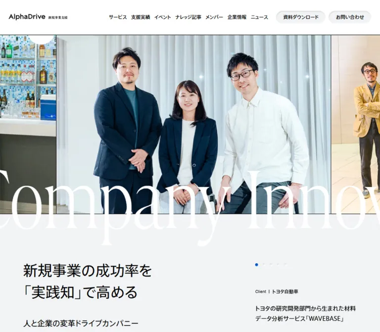
大きなセリフ体と人物写真、方眼グリッド、鮮やかな青を組み合わせた新規事業支援サイト。余白の広い情報配置と、曲線が印象的なフッターが特徴。
オリジナルサイトを見るDocumentary business photography, oversized white serif lettering, and a precise blue-and-gray information system.
Website: alphadrive.co.jp
Original URL: https://alphadrive.co.jp/
Final URL: https://alphadrive.co.jp/
Theme: light surfaces with black text and a saturated blue accent
Inspected: September 22, 2026; supplied browser retrieval at 2026-09-22T13:53:21.259Z
Viewports: desktop 1440 × 1000; mobile 390 × 844, in CSS pixels
Scope: the current AlphaDrive business-support homepage. Visual evidence covers the opening, a middle service section, and the footer on desktop, plus the opening and lower footer on mobile. Rendered text and selected computed styles additionally document the company introduction, approach, service features, consultant directory, news, events, knowledge articles, and download/contact links. Linked destinations and open menus were not inspected.
AlphaDrive presents its expertise through people and accumulated experience. Large, natural-color photographs of client teams establish the opening. An exceptionally large, delicate serif phrase crosses the lower edge of the photographs, while the Japanese proposition sits below in regular-weight sans-serif type. White, cool gray, black, and a single saturated blue keep the surrounding interface restrained.
The page functions as a service homepage and content hub. Its navigation connects service descriptions, case studies, events, articles, members, and a separate corporate website. The long page alternates broad photographic or typographic gestures with carefully aligned information. Square image edges, small metadata, thin rules, and substantial spacing provide structure; rounded shapes are concentrated in action pills, small badges, circular controls, and the broad curve at the foot of the page.
Documentary business photography, oversized white serif lettering, and a precise blue-and-gray information system.
Website: alphadrive.co.jp
Original URL: https://alphadrive.co.jp/
Final URL: https://alphadrive.co.jp/
Theme: light surfaces with black text and a saturated blue accent
Inspected: September 22, 2026; supplied browser retrieval at 2026-09-22T13:53:21.259Z
Viewports: desktop 1440 × 1000; mobile 390 × 844, in CSS pixels
Scope: the current AlphaDrive business-support homepage. Visual evidence covers the opening, a middle service section, and the footer on desktop, plus the opening and lower footer on mobile. Rendered text and selected computed styles additionally document the company introduction, approach, service features, consultant directory, news, events, knowledge articles, and download/contact links. Linked destinations and open menus were not inspected.
AlphaDrive presents its expertise through people and accumulated experience. Large, natural-color photographs of client teams establish the opening. An exceptionally large, delicate serif phrase crosses the lower edge of the photographs, while the Japanese proposition sits below in regular-weight sans-serif type. White, cool gray, black, and a single saturated blue keep the surrounding interface restrained.
The page functions as a service homepage and content hub. Its navigation connects service descriptions, case studies, events, articles, members, and a separate corporate website. The long page alternates broad photographic or typographic gestures with carefully aligned information. Square image edges, small metadata, thin rules, and substantial spacing provide structure; rounded shapes are concentrated in action pills, small badges, circular controls, and the broad curve at the foot of the page.
--ad- are reference aliases. The original blue preset is identified separately.16px high. Those rectangles are not the image height. Image-strip heights below come from the screenshot boundaries, corroborated by the surrounding geometry.| Name | Value | Reference token | Evidence and role |
|---|---|---|---|
| AlphaDrive Blue | #005ABE |
--ad-blue |
Measured on header actions and Interview badge backgrounds; also declared as source --wp--preset--color--blue |
| Cool Canvas | #F1F3F5 |
--ad-canvas |
Measured body background at both viewports; visually matches the opening information field and footer sheet |
| White | #FFFFFF |
--ad-white |
Measured header background and oversized display lettering; white service surfaces are visible in the middle capture |
| Black | #000000 |
--ad-ink |
Measured primary text; visually used for boundary rules, icons, and the circular Pagetop control |
| Muted Gray | #919699 |
--ad-muted |
Measured date-note text; visually similar to secondary footer links and tags |
| Grid Line | Approximately #D8DCDD |
--ad-grid |
Estimated fine grid strokes; exact computed stroke color was not supplied |
The blue is primarily an action and identity color. It appears on header pills, service actions, Interview badges, selected pagination dots, and the exposed curved field at the footer. Most text remains black. The photographs contribute greens, wood tones, clothing colors, and sky blue without expanding the interface palette.
The supplied custom properties contain numerous WordPress preset gradients, colors, and shadows. Their availability does not establish visible use. Likewise, --swiper-theme-color: #007aff is present, but the measured action blue is #005ABE.
Only a light appearance is evidenced. No theme selector or dark-mode behavior was inspected.
Measured family: "A+mfCv-AXIS Font ベーシック R ProN", sans-serif.
This family is declared on the body and sampled Japanese headings, paragraphs, navigation containers, service descriptions, and metadata wrappers. Sampled text uses weight 400. The impression is calm and direct, with generous line spacing rather than heavy weight establishing hierarchy.
Use this family when properly available. Its exact generated family name should be preserved when connecting an existing font setup; the evidence does not provide a font-file URL or licensing configuration.
Measured family: marlide-display-variable, sans-serif.
The repeated phrase Innovation Drive Company and the service divider text use this family at 240px on desktop and 120px on mobile. The sampled service value 153 uses it at 80px on both viewports. All three uses have measured weight 400.
The visible letterforms have strong thick–thin contrast and narrow, elegant proportions. Their scale creates the expressive layer over the otherwise practical interface. The serif appearance is especially important: replacing this layer with a heavy geometric sans-serif would substantially change the page.
The source fallback is sans-serif. The Quick Start deliberately recommends a generic serif fallback when the named display font is unavailable; that fallback is not a claim about the original declaration.
Measured family: nimbus-sans, sans-serif.
The Client label is 12px on desktop and 11px on mobile, at weight 400. A sampled offscreen mobile navigation copyright also declares Nimbus Sans at 10px. This does not establish the font of every English heading or footer label.
The visible lockup combines AlphaDrive with the Japanese descriptor 新規事業支援. Its desktop bounding box is approximately 272 × 31.88px; mobile is 163 × 19.09px.
The sampled H1 contains no text. The evidence therefore does not identify the logo's asset format or constituent typeface. Treat the complete lockup as a brand asset rather than rebuilding it from an assumed font.
| Role | Desktop | Mobile | Evidence |
|---|---|---|---|
| Repeated display phrase | 240px / 240px, weight 400 |
120px / 120px, weight 400 |
Measured; visible element bounds are shorter than the declared line height |
| Opening Japanese proposition | 40px / 60px |
28px / 42px |
Measured; mobile tracking is 1.4px, equivalent to 0.05em |
| Opening proof lines | 21px / 31.5px |
18px / 27px |
Measured |
| Introduction lead paragraph | 32px / 56px |
20px / 35px |
Measured |
| Explanatory body paragraphs | 16px / 32px |
13px / 26px |
Measured in introduction, approach, and sampled service copy |
| Case-study titles | 16px / 28px |
16px / 28px |
Measured; these stay larger than mobile explanatory copy |
| Initiative titles | 16px / 28px |
16px / 28px |
Measured |
Service value 153 |
80px / 80px |
80px / 80px |
Measured; do not assume all numerals shrink on mobile |
| Service metric label | 15px / 22.5px |
13px / 19.5px |
Measured |
| Service metric unit | 13px / 19.5px |
11px / 16.5px |
Measured |
| Date note | 11px / 16.5px |
11px / 16.5px |
Measured |
| Client utility label | 12px / 12px |
11px / 11px |
Measured |
| Desktop navigation lettering | Approximately 13px visually |
Not displayed in the closed mobile header | Estimate for visible child text; sampled link containers declare 16px |
| Footer links | Approximately 13px |
Approximately 11–12px |
Screenshot estimate; footer child styles were not supplied |
The opening proposition is visually prominent but is a paragraph in the supplied DOM; the brand wrapper is the H1. For a new implementation, a meaningful page-heading hierarchy is recommended.
Layout character: broad section spacing, compact navigation details, and a desktop grid with deliberate unused columns.
| Use | Value | Status |
|---|---|---|
| Gap between desktop header action pills | 8px |
Derived from their measured positions |
| Inset before a client name | 9px |
Measured left padding |
| Desktop navigation horizontal padding | 12px per side |
Measured |
| Desktop compact CTA horizontal padding | 20px per side |
Measured |
| Metadata spacing | 20px |
Measured in sampled tag wrappers |
| Mobile page inset and structural gap | 24px |
Measured |
| Bilingual section-heading internal gap | 28px desktop; 20px mobile |
Measured on sampled heading grids |
| Desktop main grid gap | 40px |
Measured |
| Desktop header outside inset | 40px |
Measured logo and final-action alignment |
| Desktop content inset | 64px |
Measured |
| Mobile service paragraph to case preview | 64px |
Derived from adjacent sampled bounds |
| Introduction-to-approach separation | 176px desktop; 96px mobile |
Derived for this particular section boundary |
These values form a useful reuse scale, but they are not evidence of a universal spacing variable system in the original CSS.
| Element | Value or appearance | Status |
|---|---|---|
| Header action pills | 32px radius; 36px high |
Measured |
| Interview badge | 32px radius |
Measured; effectively a capsule at its small height |
| Approach rail controls | 48 × 48px, 32px radius |
Measured desktop buttons |
| Photographs and normal content groups | Square corners | Visible screenshots; sampled content containers report 0px |
| Mobile menu button | 0px radius |
Measured |
| Pagetop control | Circle, approximately 120px desktop and 72px mobile |
Screenshot estimate |
| Footer sheet | Very broad curve at the lower right | Observed; exact path or radius formula unavailable |
| Element | Desktop, 1440px wide | Mobile, 390px wide | Status |
|---|---|---|---|
| Header | 97px high |
64px high |
Measured |
| Main start | y = 96px |
y = 64px |
Measured; desktop header/main boundary overlaps by about one pixel |
| Brand lockup | x = 40px, width 272px |
x = 26px, width 163px |
Measured |
| Mobile menu button | Absent from the visible desktop header | x = 326px, 64 × 62px measured button box |
Measured |
| Main content width | 1312px |
342px |
Measured |
| Main content outside inset | 64px |
24px |
Measured |
| Hero photograph strip | Approximately 496px high |
Approximately 196px high |
Screenshot boundaries, corroborated by DOM geometry |
| Typical hero photograph width | Approximately 744px |
Approximately 294px |
Measured linked-item widths; some images are slightly wider |
| Hero proposition origin | x = 64px, y = 728px |
x = 24px, y = 340px |
Measured |
| Hero text preview width | 411px |
342px |
Measured; mobile visibility differs from the screenshot |
| Service description width | 523.33px |
342px |
Measured |
| Service case-study region | 636px wide |
342px wide |
Measured |
| Initiative rail item | 410.66px wide, 40px gap |
318px wide, 24px gap |
Measured and derived |
| Document height | Approximately 12,938px |
Approximately 13,552px |
Measured capture metadata; not a layout target |
Role: persistent identity, primary navigation, and access to downloads and inquiries.
The desktop header is a white horizontal band with a fine black lower boundary. The brand sits 40px from the left edge. Seven compact navigation categories occupy the right half, followed by two blue pills labeled 資料ダウンロード and お問い合わせ.
The measured action sizes are approximately 137.36 × 36px and 114.89 × 36px. Both use blue #005ABE, white text, 20px horizontal padding, and 32px radius. Their small scale fits the header rather than competing with the hero.
The same header remains at the top of the supplied middle and footer screenshots, supporting persistent positioning. The exact fixed versus sticky implementation is not provided.
On mobile, the header becomes a 64px strip. The lockup begins at x = 26px. A square menu region occupies the final 64px, separated by a vertical black rule. Its symbol is two short, fine horizontal strokes, not a large three-line icon.
Service and company submenu links exist in the DOM. Mobile navigation entries have offscreen negative coordinates in the captured closed state. No menu opening, hover trigger, focus behavior, or expansion animation was exercised. The supplied lower mobile screenshot is the footer, not evidence of an open navigation menu.
Role: establish business credibility through actual client teams and working environments.
Landscape photographs form a continuous horizontal strip with narrow black seams. The current desktop screenshot shows a central four-person group at a table, with neighboring photographs cut off at both viewport edges. The phone shows a different group with partial neighboring images. The composition favors a shared image height over a fixed viewport-width slide.
Typical visible geometry is close to a 3:2 photograph: approximately 744 × 496px on desktop and 294 × 196px on mobile. Width differences in the DOM indicate that the original assets are not all identical in proportion.
Keep image edges square and retain natural color. The hero contains several repeated sets of links to five projects. This supports a rail or looping arrangement, but does not establish an autoplay interval, movement direction, or touch behavior.
Role: the page's main expressive typographic device.
Innovation Drive Company repeats horizontally in white, high-contrast display type. It crosses the boundary between photography and the cool gray field below. Cropping is intentional: the viewer sees part of a phrase rather than a centered slogan fitted neatly into the screen.
Measured typography is 240px / 240px on desktop and 120px / 120px on mobile. Each sampled phrase has horizontal padding equal to 0.08em: 19.2px and 9.6px respectively. Desktop phrase width is approximately 1984.78px; mobile is approximately 992.39px.
A related repeated Our Service treatment appears later in the DOM at the same respective display sizes. Its full surrounding visual composition is not included in the screenshots.
Do not force the decorative phrase to wrap into a readable multiline heading. Keep the Japanese proposition separate and fully readable. In a new implementation, expose one accessible text equivalent and hide decorative duplicates from assistive technology.
Role: explain the service plainly after the photographic opening.
The proposition reads 新規事業の成功率を「実践知」で高める, split into two lines. It uses regular-weight AXIS text, not a bold marketing weight. The desktop size is 40px with 60px leading; mobile is 28px with 42px leading and 0.05em tracking.
Two proof lines sit underneath: 伴走社数累計 260社 and 事業化・会社化件数 250件. They use 21px desktop and 18px mobile text. Their modest scale differentiates these opening facts from the large display numerals used deeper in the page.
On desktop, the proposition occupies an eight-column region and a compact project preview occupies the four-column region on the right. The phone gives the proposition the full 342px content width. Ample space above and below the copy is part of the composition; the mobile photograph strip ends near y = 260px, while the proposition begins at y = 340px.
Role: connect service claims to a specific client result.
The reusable information anatomy is:
Client label.Interview capsule.16px / 28px.The desktop badge box is approximately 65.73 × 24px, with 10px side padding. The mobile box is approximately 57.92 × 20px, with 8px side padding. The screenshot shows small white lettering; sampled wrapper styles are insufficient to establish the exact child font size.
The opening preview is text-only because the photographs sit in the separate hero rail. In service sections, the preview includes a large landscape photograph above the metadata. The middle desktop capture shows a 636px-wide photograph, with metadata about 40px below its lower edge. The title uses a narrower measure than the photograph, leaving room and visual quiet on the right.
Five tiny pagination dots are visible in the desktop examples, with one blue active dot. Their diameter is approximately 8px, with roughly 20px center spacing. Inactive dots have a subtle pale, recessed appearance. Dot activation and its relationship to the photograph were not tested.
Not every case has an Interview badge. The rendered text includes a project for 三菱UFJ信託銀行 without that label; preserve optional metadata rather than hardcoding it into every card.
Role: a compact recognition layer between the opening and the company introduction.
The mobile screenshot contains a full-width strip of client logos on white rectangular tiles over a fine square grid. Tiles have square corners and generous internal white space. Partial tiles at the edges suggest a horizontally overflowing sequence.
In that capture, the strip occupies approximately y = 575–704px, and the grid cells are about 16px. Logo assets and their exact dimensions were not exposed in the supplied element sample.
This region requires an evidence qualification: the mobile DOM places case-preview text around y = 557–750px, but the screenshot shows the logo strip and does not visibly show that text. The available evidence cannot resolve whether this is caused by visibility rules, overlapping layers, or capture-state differences. Do not describe the preview as definitively removed on mobile, and do not position both components over each other based solely on their extracted rectangles.
Role: divide the long service homepage into recognizable editorial chapters.
Examples include Who we are, Our approach, and Lead consultants, each accompanied by a Japanese label. The sampled introduction and approach H2 wrappers use a grid with a 28px internal gap on desktop and 20px on mobile.
The mobile opening shows a tiny blue dot before Who we are. This is a restrained locator, not a large decorative icon. The exact child type styles are not included in the selected computed-style sample.
For reuse, keep the English locator small and the Japanese section label readable. Do not apply the enormous marquee size to every section heading.
Role: explain the support model and establish experience.
The introductory desktop layout places the section heading in four columns and the explanatory content in eight. The right content begins near x = 514.66px and is approximately 861.34px wide. A 32px / 56px lead is followed by 16px / 32px explanatory copy.
On mobile, the section becomes a single readable column. The lead becomes 20px / 35px; the body becomes 13px / 26px. The sampled heading ends at y = 852px, the lead begins at 916px, and the body begins at 1019px, preserving considerable vertical separation.
Three factual metrics follow the explanatory material. Their labels describe idea count, supported companies, and businesses incorporated or commercialized. Desktop measurements place them in three equal regions; mobile measurements stack them vertically, all aligned to x = 24px.
The large metric values are nested inside wrappers whose measured heights are 84px desktop and 56px mobile. Those wrapper dimensions do not establish the child font size. Only the separate service value 153 has a directly supplied 80px font measurement.
Keep the displayed August and September 2025 qualification dates with their relevant facts. The inspection date is in 2026, but it does not update the source's dated business figures.
Role: broaden the service narrative and direct visitors toward related initiatives.
The desktop approach text occupies approximately half of the content grid, 636px. Its explanatory paragraph uses the same 16px / 32px treatment as the introduction. Mobile copy spans 342px at 13px / 26px.
A following row contains linked initiatives with image regions above regular 16px / 28px titles. The desktop sample places three 410.66px items within the main grid, with a fourth continuing beyond the viewport. Two circular 48px buttons sit at the lower right.
On mobile, each rail item measures 318px, separated by 24px. With the first item starting at 24px, the next begins at 366px, leaving a visible edge cue within the 390px viewport. This is evidence of horizontal continuation; a swipe gesture itself was not tested.
The image-to-title geometry is consistent with landscape artwork close to 16:9, but image element dimensions were not supplied. Treat that ratio as a practical reconstruction choice.
Role: pair a detailed service explanation with proof from a client project.
The sampled desktop service section uses twelve columns with 40px gaps. Its left text spans five columns, approximately 523.33px; the right case region spans six columns, 636px, beginning near x = 739.98px. The sixth column is left unused between them, producing a substantially wider separation than a normal two-column gutter.
The left side contains an English service descriptor, a multiline Japanese heading, a metric, a paragraph, and two actions. The metric combines a small descriptive label and date note with a thin divider, a large serif number, and a small Japanese unit. The sampled 153 remains 80px on both viewports.
The middle desktop screenshot shows a blue もっと見る pill approximately 184 × 64px, followed by a pale secondary download pill approximately 196 × 48px. These sizes are visual estimates. Both carry a small right-facing arrow, with comfortable separation between label and arrow. The secondary control appears vertically centered against the taller primary control.
On mobile, the measured service grid has two 159px tracks separated by 24px, but its heading, paragraph, and case preview span the full 342px. The paragraph precedes the case image. Do not shrink the desktop five/six-column relationship into two cramped text columns.
Role: distinguish technical-business-development and open-innovation offerings.
The supplied middle screenshot transitions from a white service surface into a fine grid field. Two broad areas display the marks R&D Incubation Center and UNIDGE. The grid appears to use approximately 24px cells in this desktop region.
The rendered text confirms corresponding descriptions and separate detail/download links for the technical and open-innovation services. The screenshot shows only the upper portion of this region, so its complete panel height and mobile arrangement are not verified.
Retain the combination of large brand marks and a quiet technical grid. The visible field does not use floating rounded cards or strong shadows.
Role: provide evidence of expertise and maintain an active information hub.
These sections are confirmed by the rendered text, but their complete visual layouts are not shown in the supplied captures:
| Module | Confirmed content anatomy | Unverified details |
|---|---|---|
| Lead consultants | Name, experience summary, topic hashtags, and a link to the member directory | Portrait crop, visible item count, movement, and profile-opening behavior |
| News | Date, category labels, headline, and corporate-news destination | Row dimensions and exact divider treatment |
| Event | Date, weekday, time, optional registration status, title, and tags | Card layout, status styling, and registration flow |
| Knowledge | Article title, topic tags, and article destination | Thumbnail treatment, column count, and hover state |
Consultant entries repeat in the extracted DOM and use javascript:; links. This suggests client-side behavior but does not establish a modal, drawer, or animation. For a new implementation, use actual buttons when an entry opens a panel, and real links when it navigates.
Role: offer two distinct next steps at the end of the content sequence.
The rendered page includes a Download group with a Japanese heading, a short description of available service materials, and the action 今すぐ資料ダウンロードする. A Contact group has its own explanatory copy and 今すぐ問い合わせる action.
The two groups link to /download/ and /contact/. Their full container anchors are present in the evidence, but their visual arrangement was not captured. Do not infer their background colors, desktop split, or hover effects from the header pills.
A practical adaptation should preserve the two choices and avoid nested interactive controls inside an already clickable panel.
Role: promote a business book without replacing the main page navigation.
A horizontal promotional image appears near the lower-right viewport corner in the opening and middle desktop captures and in the mobile opening. Its artwork combines a projecting book cover, bold Japanese book typography, a blue lower band, and an author portrait on the right.
The visible width is approximately 400px on desktop and 300px on mobile. It sits roughly 16px from the desktop right/bottom edges and 12px from the phone edges; the book extends above the main banner rectangle.
Its repeated viewport position supports an anchored treatment. It is absent from the footer screenshots, and no visibility threshold or dismissal behavior is evidenced. The rendered page includes an external book link, but the image asset URL is not supplied.
The phone banner visibly covers part of the company-introduction area. For reuse, reserve clearance or make the promotion inline on small screens; reproducing this obstruction is unnecessary to preserve the design language.
Role: a comprehensive site map and a distinctive visual ending.
The desktop footer begins with a white HOME strip separated by fine black rules. Below it, a large cool-gray sheet contains the brand, three black social marks, service links, industry-filter links, knowledge categories, and general navigation. Top-level labels are black; secondary links are much lighter.
The footer uses five visual columns: one wider brand column, followed by four navigation groups. Approximate column starts in the supplied screenshot are 64, 404, 627, 850, and 1073px. The pale content field occupies about 1344px, leaving a 96px grid-patterned rail on the right.
The gray sheet ends in an unusually broad lower-right curve, revealing blue underneath. This single sweeping boundary creates more identity than many smaller rounded containers would. The right rail carries a vertically oriented copyright line.
A black circular Pagetop control straddles the gray/blue area and the grid rail. Its label is a narrow white serif. The anchor target is explicitly https://alphadrive.co.jp/#top; click and scroll behavior were not tested.
On mobile, the navigation groups occupy two columns aligned near x = 24px and x = 207px. The lower-right curve remains, while the grid rail becomes a horizontal strip beneath the footer. Copyright is horizontal in that strip. The circular control reduces to approximately 72px and overlaps the boundary near the lower-right corner.
| Treatment | Supplied evidence | What can safely be concluded |
|---|---|---|
| Body background | background-color 0.6s |
A 600ms color transition is declared; its trigger and target colors are not established |
| Navigation link color | color 0.6s |
Color changes have a declared 600ms transition; hover/focus destination colors were not captured |
| Repeated display text color | color 0.6s |
Color can transition; this value does not describe horizontal movement |
| Opening proof reveal | transform 0.6s 2s, opacity 0.6s 2s |
Declared transform/opacity transitions last 600ms after a 2s delay; initial offset and trigger are unknown |
| Hero photograph sequence | Repeated links and offscreen image positions | A repeated horizontal structure exists; autoplay, speed, easing, drag, and synchronization are unverified |
| Case pagination | Five dots with one visibly blue | Active-state appearance is observed; interaction and timing are unverified |
| Initiative navigation | Two measured 48px desktop buttons |
Controls exist; their activation result was not exercised |
| Persistent header | Same top position across scroll captures | Persistent appearance is evidenced; exact positioning implementation is unavailable |
| Mobile menu | Closed button and offscreen navigation content | Menu content exists; opening, focus management, and animation are unverified |
| Pagetop | Explicit #top anchor |
Destination is known; smooth scrolling and duration are unverified |
Many sampled elements report animation: none. This applies to those elements at the sampled instant and does not exclude motion on ancestors or JavaScript-driven transforms.
The capture process waited for finite motion and layout stability, temporarily paused perpetual animations during readiness checks, and resumed them afterward. Static captures therefore cannot establish movement speed or sequencing.
Recommended motion approach: preserve the declared 600ms color/reveal character where useful, keep content visible without animation, and make any new rail autoplay optional. Pause moving content on focus and provide a reduced-motion/static presentation. These are implementation recommendations, not verified original features.
| Layer | Appearance | Design role |
|---|---|---|
| Header | White, thin black boundary | Stable navigation plane |
| Opening information field | Cool gray | Quiet support for proposition and proof |
| Service content | White in the supplied middle capture | Readability for detailed explanations |
| Grid field | Fine gray square lines on a light ground | Technical structure behind logos and specialist offerings |
| Content preview | Unboxed text and square photography | Editorial credibility without card chrome |
| Action pill | Saturated blue with white lettering | Clear, compact navigation or conversion emphasis |
| Secondary action | Pale gray with dark lettering | Lower-emphasis alternative |
| Footer sheet | Cool gray over an exposed blue curve | Site-map organization and visual closure |
| Footer rail | Fine grid with black boundary | Copyright placement and contrast with the curved sheet |
| Pagetop | Black circle with white serif text | A strong terminal control |
There is no evidenced general elevation scale for content. The screenshot suggests subtle inset or edge shading on pills and inactive dots, but exact shadows were not supplied. Avoid promoting those small details into a site-wide shadow system.
Use documentary-style business photography: real project participants, office tables, product demonstrations, meeting spaces, plants, windows, and occasional outdoor settings. People appear in small groups, often facing the camera together. Environments remain legible, helping each image feel like evidence of a particular collaboration.
Keep photography in natural color. Clothing, greenery, wood, and city backgrounds create warmth against the cool interface. No global duotone, heavy tint, dark overlay, or image-wide blur is visible in the supplied hero captures.
The hero uses adjoining landscape frames; service cases use individual landscape photographs above their metadata. Client logos sit inside white rectangular tiles. The promotional book banner is supplied artwork with its own typography and composition; it should not define the typography of the surrounding interface.
No image src, logo file path, or font-file URL was included in the supplied evidence. The references below identify visible content or actual anchor destinations, not downloadable asset paths.
| Content | Original-page evidence | Reuse guidance |
|---|---|---|
| AlphaDrive brand lockup | Visible desktop/mobile header and desktop footer | Use the authorized complete lockup; do not guess its font or file format |
| Kikkoman project photography | Current desktop hero and service screenshot; associated link project page | Preserve the group, table, and product context; the linked page was not inspected |
| Mitsubishi Materials project | Current mobile hero geometry and associated project link | Use the correct authorized project photograph; do not substitute an unrelated team |
| Client logos | White tiles in the mobile grid strip | Preserve each logo's own proportions and adequate white space |
| Specialist-service marks | R&D Incubation Center and UNIDGE in the middle desktop capture |
Treat as distinct marks within the shared grid field |
| Book promotion | Bottom-right artwork in current opening/middle captures | Use the supplied artwork when available; preserve its projecting book-cover silhouette |
The sampled service container is 1312px wide, with twelve approximately 72.66px columns and eleven 40px gutters. A practical reconstruction is:
/* Reconstruction of the measured desktop grid, not recovered source CSS. */
.ad-grid {
  display: grid;
  grid-template-columns: repeat(12, minmax(0, 1fr));
  column-gap: 40px;
  margin-inline: 64px;
}
| Span | Derived width at 1440px | Observed use |
|---|---|---|
| Four columns | Approximately 410.67px |
Section-label region, initiative item, opening case preview |
| Five columns | Approximately 523.33px |
Service explanation |
| Six columns | 636px |
Service case region and approach copy |
| Eight columns | Approximately 861.33px |
Opening proposition region and introduction content |
The page changes the relationship between these spans. The introduction uses four plus eight; the opening uses eight plus four; service features use five plus six with an unused column between. Preserve this controlled asymmetry instead of forcing every section into equal halves.
The phone content width is 342px, with 24px outside margins. The sampled service grid has two 159px tracks and a 24px gap, while long-form text spans both tracks.
The principal changes are directly observed:
97px to 64px, and visible navigation becomes a menu button.496px to 196px.240px to 120px, remaining intentionally wider than the viewport.40px to 28px; proof lines decrease from 21px to 18px.16px / 32px to 13px / 26px, while case titles remain 16px / 28px.Only two viewport widths were inspected. Exact breakpoints, tablet behavior, landscape-phone behavior, safe-area handling, and zoom behavior are unverified. The Quick Start uses a recommended 80rem desktop breakpoint, not a source-derived one.
The mobile case-preview/logo-strip discrepancy remains unresolved. A new implementation should keep all essential case content reachable, while verifying the intended current visual state before attempting pixel-level correspondence.
#005ABE for the principal blue actions and small active indicators.These are recommendations for a new implementation, not verified features of the inspected site:
#005ABE.#F1F3F5.#FFFFFF.#000000.#919699; strengthen for small essential text if needed.#D8DCDD, with region-specific spacing around 16–24px.“Create a Japanese business-support homepage inspired by the current AlphaDrive page. Use a white persistent header, a compact black brand lockup, small navigation labels, and blue pill actions. Build the opening from adjoining natural-color client-team photographs and enormous white, high-contrast serif text reading ‘Innovation Drive Company’ that crosses the photo boundary and is cropped by the viewport. Place a regular-weight Japanese proposition below on cool gray. Use a twelve-column desktop grid with 64px outside margins and 40px gaps, alternating four/eight-column introductions and five/six-column service features with an unused column between. Keep cases unboxed, images square, metadata compact, and body leading generous. Finish with a multi-column pale footer, a sweeping blue lower-right curve, a fine grid rail, and a black circular Pagetop control. Recompose the phone layout with 24px margins, a 64px header, 120px display lettering, stacked service content, and a two-column footer. Treat animation timing and menu behavior as explicit implementation decisions.”
The following CSS supplies a reusable visual shell. It uses measured endpoint values, a recommended breakpoint, and explicit approximations for the display-text trim, grid texture, footer curve, and subtle pill shading. It does not load proprietary fonts or image assets and does not implement carousel or menu behavior.
Class assumptions: .ad-hero contains a media rail, decorative title track, and summary; .ad-service contains copy and a case region; .ad-footer contains a main region, copyright rail, and Pagetop link. Repeated decorative title copies should be hidden from assistive technology. The mobile case preview remains available in normal flow as a recommended fallback for the unresolved captured state.
:root {
  /* Measured colors; grid stroke is a visual approximation. */
  --ad-blue: #005abe;
  --ad-canvas: #f1f3f5;
  --ad-white: #fff;
  --ad-ink: #000;
  --ad-muted: #919699;
  --ad-grid: #d8dcdd;
  --ad-muted-readable: #62696e;

  /* Source families; serif fallback is an adaptation. */
  --ad-font-body: 'A+mfCv-AXIS Font ベーシック R ProN', sans-serif;
  --ad-font-display: 'marlide-display-variable', serif;
  --ad-font-utility: 'nimbus-sans', sans-serif;

  /* Measured mobile endpoint values. */
  --ad-inset: 24px;
  --ad-gap: 24px;
  --ad-header-height: 64px;
  --ad-brand-width: 163px;
  --ad-hero-height: 196px;
  --ad-display-size: 120px;
  --ad-title-overlap: 59px;
  --ad-proposition-size: 28px;
  --ad-proof-size: 18px;
  --ad-lead-size: 20px;
  --ad-body-size: 13px;
  --ad-section-space: 96px;
  --ad-grid-size: 16px;
  --ad-footer-rail: 0px;
  --ad-pagetop-size: 72px;
  --ad-pill-radius: 32px;
  --ad-color-duration: 600ms;
}

* { box-sizing: border-box; }

html {
  scroll-padding-top: calc(var(--ad-header-height) + 16px);
}

body {
  margin: 0;
  color: var(--ad-ink);
  background: var(--ad-canvas);
  font-family: var(--ad-font-body);
  font-size: 16px;
  font-weight: 400;
  line-height: 1.75;
}

img { display: block; max-width: 100%; }
button, input, select, textarea { font: inherit; }
button, a { -webkit-tap-highlight-color: transparent; }
a { color: inherit; }
[hidden] { display: none !important; }
h1, h2, h3, p { margin: 0; }

.ad-container { padding-inline: var(--ad-inset); }
.ad-section { margin-block: var(--ad-section-space); }
.ad-grid {
  display: grid;
  grid-template-columns: repeat(2, minmax(0, 1fr));
  gap: var(--ad-gap);
}

.ad-header {
  position: sticky;
  top: 0;
  z-index: 50;
  display: flex;
  align-items: center;
  justify-content: space-between;
  height: var(--ad-header-height);
  padding-left: 26px;
  background: var(--ad-white);
  border-block: 1px solid var(--ad-ink);
}
.ad-brand {
  display: block;
  flex: none;
  width: var(--ad-brand-width);
}
.ad-brand img { width: 100%; height: auto; }
.ad-desktop-nav { display: none; }
.ad-menu-button {
  display: grid;
  align-content: center;
  justify-items: center;
  gap: 4px;
  width: 64px;
  height: 100%;
  padding: 0;
  border: 0;
  border-left: 1px solid var(--ad-ink);
  background: transparent;
  cursor: pointer;
}
.ad-menu-button::before,
.ad-menu-button::after {
  content: '';
  width: 20px;
  height: 1px;
  background: currentColor;
}

.ad-pill {
  display: inline-flex;
  align-items: center;
  justify-content: space-between;
  gap: 36px;
  min-height: 56px;
  padding: 12px 24px 12px 28px;
  border: 0;
  border-radius: var(--ad-pill-radius);
  color: var(--ad-white);
  background: var(--ad-blue);
  font-size: 13px;
  line-height: 1.5;
  text-decoration: none;
  /* Approximation of the subtle visible edge shading. */
  box-shadow: inset 0 2px 3px rgb(0 0 0 / 12%);
}
.ad-pill--secondary {
  color: var(--ad-ink);
  background: var(--ad-canvas);
}
.ad-pill__arrow {
  width: 7px;
  height: 7px;
  border-top: 1px solid currentColor;
  border-right: 1px solid currentColor;
  transform: rotate(45deg);
}
.ad-actions {
  display: flex;
  align-items: center;
  flex-wrap: wrap;
  gap: 24px 32px;
  margin-top: 56px;
}

.ad-hero { position: relative; }
.ad-hero-media {
  display: flex;
  height: var(--ad-hero-height);
  overflow-x: auto;
  overscroll-behavior-inline: contain;
}
.ad-hero-project {
  display: block;
  flex: 0 0 auto;
  height: 100%;
  aspect-ratio: 3 / 2;
  border-right: 1px solid var(--ad-ink);
}
.ad-hero-project img {
  width: 100%;
  height: 100%;
  object-fit: cover;
}
.ad-hero-title {
  position: absolute;
  top: calc(var(--ad-hero-height) - var(--ad-title-overlap));
  inset-inline: 0;
  z-index: 2;
  overflow: hidden;
  color: var(--ad-white);
  font-family: var(--ad-font-display);
  font-size: var(--ad-display-size);
  font-weight: 400;
  /* Approximation of the short measured display bounds. */
  line-height: .7;
  pointer-events: none;
}
.ad-hero-title__track {
  display: flex;
  width: max-content;
}
.ad-hero-title__copy {
  flex: none;
  padding-inline: .08em;
  white-space: nowrap;
}
.ad-hero-summary {
  display: grid;
  gap: 48px var(--ad-gap);
  padding: 80px var(--ad-inset);
}
.ad-proposition {
  font-size: var(--ad-proposition-size);
  font-weight: 400;
  line-height: 1.5;
  letter-spacing: .05em;
}
.ad-proof {
  margin-top: 40px;
  font-size: var(--ad-proof-size);
  line-height: 1.5;
}

.ad-section-heading {
  display: grid;
  gap: 20px;
  font-weight: 400;
}
.ad-eyebrow {
  display: flex;
  align-items: center;
  gap: 12px;
  font-family: var(--ad-font-utility);
  font-size: 12px;
  line-height: 1;
}
.ad-eyebrow::before {
  content: '';
  width: 5px;
  height: 5px;
  border-radius: 50%;
  background: var(--ad-blue);
}
.ad-lead {
  font-size: var(--ad-lead-size);
  line-height: 1.75;
}
.ad-body {
  font-size: var(--ad-body-size);
  line-height: 2;
}
.ad-lead + .ad-body { margin-top: 48px; }

.ad-introduction,
.ad-service {
  display: grid;
  grid-template-columns: repeat(2, minmax(0, 1fr));
  gap: 64px var(--ad-gap);
}
.ad-introduction > *,
.ad-service > * { grid-column: 1 / -1; min-width: 0; }
.ad-service-surface {
  padding-block: 96px;
  background: var(--ad-white);
}
.ad-service-copy .ad-body { margin-top: 48px; }
.ad-service-metric {
  display: flex;
  align-items: center;
  gap: 32px;
  margin-top: 56px;
}
.ad-service-metric__label {
  padding-right: 28px;
  border-right: 1px solid var(--ad-ink);
  font-size: 13px;
  line-height: 1.5;
}
.ad-note {
  display: block;
  margin-top: 16px;
  color: var(--ad-muted);
  font-size: 11px;
  line-height: 1.5;
}
.ad-service-metric__value {
  display: flex;
  align-items: baseline;
  gap: 8px;
}
.ad-service-metric__number {
  font-family: var(--ad-font-display);
  font-size: 80px;
  line-height: 1;
  font-weight: 400;
}
.ad-service-metric__unit { font-size: 11px; }

.ad-case { min-width: 0; text-decoration: none; }
.ad-case-image {
  width: 100%;
  aspect-ratio: 16 / 9;
  object-fit: cover;
  border-radius: 0;
}
.ad-case-image + .ad-case-meta { margin-top: 40px; }
.ad-case-meta {
  display: flex;
  align-items: center;
  flex-wrap: wrap;
  gap: 8px 16px;
  font-size: 11px;
  line-height: 1.4;
}
.ad-client { font-family: var(--ad-font-utility); }
.ad-client-name {
  margin-left: -8px;
  padding-left: 9px;
  border-left: 1px solid currentColor;
}
.ad-interview {
  display: inline-flex;
  align-items: center;
  min-height: 20px;
  padding-inline: 8px;
  border-radius: 32px;
  color: var(--ad-white);
  background: var(--ad-blue);
  font-family: var(--ad-font-utility);
  font-size: 11px;
}
.ad-case-title {
  max-width: 100%;
  margin-top: 24px;
  font-size: 16px;
  font-weight: 400;
  line-height: 1.75;
}
.ad-tags {
  display: flex;
  flex-wrap: wrap;
  gap: 12px 20px;
  margin-top: 28px;
  color: var(--ad-muted-readable);
  font-size: 11px;
  line-height: 1.5;
}

.ad-pattern {
  background-image:
    linear-gradient(var(--ad-grid) 1px, transparent 1px),
    linear-gradient(90deg, var(--ad-grid) 1px, transparent 1px);
  background-size: var(--ad-grid-size) var(--ad-grid-size);
}
.ad-initiative-rail {
  display: grid;
  grid-auto-flow: column;
  grid-auto-columns: calc(100% - 24px);
  gap: var(--ad-gap);
  overflow-x: auto;
  overscroll-behavior-inline: contain;
}
.ad-initiative-title {
  margin-top: 20px;
  font-size: 16px;
  font-weight: 400;
  line-height: 1.75;
}

.ad-footer { position: relative; }
.ad-footer-main { background: var(--ad-blue); }
.ad-breadcrumb {
  padding: 28px var(--ad-inset);
  border-block: 1px solid var(--ad-ink);
  background: var(--ad-white);
  font-size: 13px;
}
.ad-footer-sheet {
  padding: 80px var(--ad-inset) 120px;
  border-bottom-right-radius: 100% 120px;
  background: var(--ad-canvas);
}
.ad-footer-columns {
  display: grid;
  grid-template-columns: repeat(2, minmax(0, 1fr));
  gap: 48px 24px;
}
.ad-footer-brand { grid-column: 1 / -1; }
.ad-footer-group { display: grid; align-content: start; gap: 24px; }
.ad-footer-group a {
  color: var(--ad-muted-readable);
  font-size: 12px;
  line-height: 1.6;
  text-decoration: none;
}
.ad-footer-group .ad-footer-primary { color: var(--ad-ink); }
.ad-footer-legal {
  display: flex;
  flex-wrap: wrap;
  gap: 12px 20px;
  margin-top: 64px;
  font-size: 11px;
}
.ad-footer-rail {
  min-height: 64px;
  padding: 24px;
  border-top: 1px solid var(--ad-ink);
  font-family: var(--ad-font-utility);
  font-size: 10px;
}
.ad-pagetop {
  position: absolute;
  right: 12px;
  bottom: 12px;
  display: grid;
  place-items: center;
  width: var(--ad-pagetop-size);
  height: var(--ad-pagetop-size);
  border-radius: 50%;
  color: var(--ad-white);
  background: var(--ad-ink);
  font-family: var(--ad-font-display);
  font-size: 16px;
  text-decoration: none;
}

/* Recommended desktop breakpoint; only endpoint sizes were inspected. */
@media (min-width: 80rem) {
  :root {
    --ad-inset: 64px;
    --ad-gap: 40px;
    --ad-header-height: 97px;
    --ad-brand-width: 272px;
    --ad-hero-height: 496px;
    --ad-display-size: 240px;
    --ad-title-overlap: 123px;
    --ad-proposition-size: 40px;
    --ad-proof-size: 21px;
    --ad-lead-size: 32px;
    --ad-body-size: 16px;
    --ad-section-space: 176px;
    --ad-grid-size: 24px;
    --ad-footer-rail: 96px;
    --ad-pagetop-size: 120px;
  }
  .ad-grid,
  .ad-introduction,
  .ad-service,
  .ad-hero-summary {
    grid-template-columns: repeat(12, minmax(0, 1fr));
  }
  .ad-header { padding-inline: 40px; border-top: 0; }
  .ad-menu-button { display: none; }
  .ad-desktop-nav {
    display: flex;
    align-items: center;
    margin-left: auto;
  }
  .ad-nav-link {
    display: flex;
    align-items: center;
    min-height: 96px;
    padding-inline: 12px;
    font-size: 13px;
    text-decoration: none;
    transition: color var(--ad-color-duration);
  }
  .ad-header-actions { display: flex; gap: 8px; margin-left: 24px; }
  .ad-header-actions .ad-pill {
    min-height: 36px;
    padding: 0 20px;
    gap: 0;
  }
  .ad-hero-summary { padding-top: 136px; }
  .ad-hero-copy { grid-column: 1 / span 8; }
  .ad-hero-feature { grid-column: 9 / span 4; }
  .ad-proposition { letter-spacing: normal; }
  .ad-proof { margin-top: 56px; }
  .ad-section-heading { gap: 28px; }
  .ad-introduction > .ad-section-heading { grid-column: 1 / span 4; }
  .ad-introduction > .ad-introduction-copy { grid-column: 5 / span 8; }
  .ad-service > .ad-service-copy { grid-column: 1 / span 5; }
  .ad-service > .ad-service-case { grid-column: 7 / span 6; }
  .ad-service .ad-pill:not(.ad-pill--secondary) { min-height: 64px; }
  .ad-service .ad-pill--secondary { min-height: 48px; }
  .ad-case-meta { font-size: 12px; }
  .ad-interview { min-height: 24px; padding-inline: 10px; }
  .ad-case-title { max-width: 411px; }
  .ad-tags { font-size: 13px; }
  .ad-initiative-rail { grid-auto-columns: calc((100% - 80px) / 3); }
  .ad-footer {
    display: grid;
    grid-template-columns: minmax(0, 1fr) var(--ad-footer-rail);
  }
  .ad-footer-sheet {
    padding-top: 120px;
    padding-bottom: 140px;
    border-bottom-right-radius: 100% 460px;
  }
  .ad-footer-columns {
    grid-template-columns: 1.6fr repeat(4, minmax(0, 1fr));
    gap: 40px;
  }
  .ad-footer-brand { grid-column: auto; }
  .ad-footer-group a { font-size: 13px; }
  .ad-footer-rail {
    display: flex;
    align-items: center;
    justify-content: center;
    padding: 0;
    border-top: 0;
    border-left: 1px solid var(--ad-ink);
    background-size: 16px 16px;
  }
  .ad-footer-rail p { writing-mode: vertical-rl; }
  .ad-pagetop { right: 40px; bottom: 40px; font-size: 26px; }
}

/* Recommended accessibility treatments. */
:where(a, button, input, select, textarea):focus-visible {
  outline: 2px solid var(--ad-blue);
  outline-offset: 4px;
}
.ad-pill:focus-visible { outline-color: var(--ad-ink); }

@media (prefers-reduced-motion: reduce) {
  html { scroll-behavior: auto; }
  .ad-nav-link { transition: none; }
  .ad-hero-title__track { animation: none; transform: none; }
}
The first three priority adjustments after inserting real content are the authorized logo and display font, image cropping, and headline baseline position. The supplied display text has shorter measured bounds than its declared line height, so a normal fallback font will need optical adjustment. The footer curve is also an approximation and should be tuned against both reference viewport sizes.
Optional aliases for a project already using Tailwind v4. This does not imply that the original website uses Tailwind. Define the custom properties above first.
@theme inline {
  --color-ad-blue: var(--ad-blue);
  --color-ad-canvas: var(--ad-canvas);
  --color-ad-ink: var(--ad-ink);
  --color-ad-muted: var(--ad-muted);
  --color-ad-muted-readable: var(--ad-muted-readable);
  --color-ad-grid: var(--ad-grid);

  --font-ad-body: var(--ad-font-body);
  --font-ad-display: var(--ad-font-display);
  --font-ad-utility: var(--ad-font-utility);

  --text-ad-display: var(--ad-display-size);
  --text-ad-proposition: var(--ad-proposition-size);
  --text-ad-proof: var(--ad-proof-size);
  --text-ad-lead: var(--ad-lead-size);
  --text-ad-body: var(--ad-body-size);

  --spacing-ad-inset: var(--ad-inset);
  --spacing-ad-gap: var(--ad-gap);
  --spacing-ad-section: var(--ad-section-space);
  --radius-ad-pill: var(--ad-pill-radius);
}
200 and the same original/final URL.2026-09-22T13:53:21.259Z, equivalent to approximately 22:53 JST.1440 × 1000, covering the opening, middle service content, and footer. Supplied document height is approximately 12,938px.390 × 844, covering the opening and lower footer. Supplied document height is approximately 13,552px.#top destination. No click-through, hover-state, menu-open, carousel-drag, or form-submission interaction was supplied.©AlphaDrive Co.,Ltd. All Rights Reserved. and links to its corporate website. The inspected original-page evidence does not identify production studios.This reference describes the supplied current-page state. Measurements, visual estimates, and recommended implementation choices are distinguished throughout; linked pages and asset files were not independently inspected.
# AlphaDrive — Style Reference

> Documentary business photography, oversized white serif lettering, and a precise blue-and-gray information system.

**Website:** [alphadrive.co.jp](https://alphadrive.co.jp/)
**Original URL:** https://alphadrive.co.jp/
**Final URL:** https://alphadrive.co.jp/
**Theme:** light surfaces with black text and a saturated blue accent
**Inspected:** September 22, 2026; supplied browser retrieval at `2026-09-22T13:53:21.259Z`
**Viewports:** desktop `1440 × 1000`; mobile `390 × 844`, in CSS pixels
**Scope:** the current AlphaDrive business-support homepage. Visual evidence covers the opening, a middle service section, and the footer on desktop, plus the opening and lower footer on mobile. Rendered text and selected computed styles additionally document the company introduction, approach, service features, consultant directory, news, events, knowledge articles, and download/contact links. Linked destinations and open menus were not inspected.

AlphaDrive presents its expertise through people and accumulated experience. Large, natural-color photographs of client teams establish the opening. An exceptionally large, delicate serif phrase crosses the lower edge of the photographs, while the Japanese proposition sits below in regular-weight sans-serif type. White, cool gray, black, and a single saturated blue keep the surrounding interface restrained.

The page functions as a service homepage and content hub. Its navigation connects service descriptions, case studies, events, articles, members, and a separate corporate website. The long page alternates broad photographic or typographic gestures with carefully aligned information. Square image edges, small metadata, thin rules, and substantial spacing provide structure; rounded shapes are concentrated in action pills, small badges, circular controls, and the broad curve at the foot of the page.
# AlphaDrive — Style Reference

> Documentary business photography, oversized white serif lettering, and a precise blue-and-gray information system.

**Website:** [alphadrive.co.jp](https://alphadrive.co.jp/)
**Original URL:** https://alphadrive.co.jp/
**Final URL:** https://alphadrive.co.jp/
**Theme:** light surfaces with black text and a saturated blue accent
**Inspected:** September 22, 2026; supplied browser retrieval at `2026-09-22T13:53:21.259Z`
**Viewports:** desktop `1440 × 1000`; mobile `390 × 844`, in CSS pixels
**Scope:** the current AlphaDrive business-support homepage. Visual evidence covers the opening, a middle service section, and the footer on desktop, plus the opening and lower footer on mobile. Rendered text and selected computed styles additionally document the company introduction, approach, service features, consultant directory, news, events, knowledge articles, and download/contact links. Linked destinations and open menus were not inspected.

AlphaDrive presents its expertise through people and accumulated experience. Large, natural-color photographs of client teams establish the opening. An exceptionally large, delicate serif phrase crosses the lower edge of the photographs, while the Japanese proposition sits below in regular-weight sans-serif type. White, cool gray, black, and a single saturated blue keep the surrounding interface restrained.

The page functions as a service homepage and content hub. Its navigation connects service descriptions, case studies, events, articles, members, and a separate corporate website. The long page alternates broad photographic or typographic gestures with carefully aligned information. Square image edges, small metadata, thin rules, and substantial spacing provide structure; rounded shapes are concentrated in action pills, small badges, circular controls, and the broad curve at the foot of the page.

## How to Read This Reference

- **Measured** means a value explicitly supplied by the rendered DOM, computed styles, or viewport metadata. Decimal measurements are rounded where that improves readability.
- **Derived** means arithmetic based on those measurements, such as column spans and distances between sampled elements.
- **Estimated** means a visual approximation from the current-page screenshots. Grid-line color, some footer dimensions, and unsampled child-label typography belong to this category.
- **Recommended** means an implementation choice for reuse. The Quick Start is an adaptation, not recovered source code.
- Token names beginning with `--ad-` are reference aliases. The original blue preset is identified separately.
- Computed styles were sampled selectively. A container's font size or color does not necessarily describe a styled child. For example, badge wrappers report black text while the visible badge lettering is white.
- Several linked photographs have inline anchor rectangles only `16px` high. Those rectangles are not the image height. Image-strip heights below come from the screenshot boundaries, corroborated by the surrounding geometry.
- Offscreen elements and repeated carousel entries occur in the extraction. Their presence does not prove simultaneous visibility or a successfully exercised interaction.

## Tokens — Colors

### Default Palette

| Name | Value | Reference token | Evidence and role |
| --- | --- | --- | --- |
| AlphaDrive Blue | `#005ABE` | `--ad-blue` | Measured on header actions and Interview badge backgrounds; also declared as source `--wp--preset--color--blue` |
| Cool Canvas | `#F1F3F5` | `--ad-canvas` | Measured body background at both viewports; visually matches the opening information field and footer sheet |
| White | `#FFFFFF` | `--ad-white` | Measured header background and oversized display lettering; white service surfaces are visible in the middle capture |
| Black | `#000000` | `--ad-ink` | Measured primary text; visually used for boundary rules, icons, and the circular Pagetop control |
| Muted Gray | `#919699` | `--ad-muted` | Measured date-note text; visually similar to secondary footer links and tags |
| Grid Line | Approximately `#D8DCDD` | `--ad-grid` | Estimated fine grid strokes; exact computed stroke color was not supplied |

The blue is primarily an action and identity color. It appears on header pills, service actions, Interview badges, selected pagination dots, and the exposed curved field at the footer. Most text remains black. The photographs contribute greens, wood tones, clothing colors, and sky blue without expanding the interface palette.

The supplied custom properties contain numerous WordPress preset gradients, colors, and shadows. Their availability does not establish visible use. Likewise, `--swiper-theme-color: #007aff` is present, but the measured action blue is `#005ABE`.

Only a light appearance is evidenced. No theme selector or dark-mode behavior was inspected.

## Tokens — Typography

### Japanese Text — AXIS Font

**Measured family:** `"A+mfCv-AXIS Font ベーシック R ProN", sans-serif`.

This family is declared on the body and sampled Japanese headings, paragraphs, navigation containers, service descriptions, and metadata wrappers. Sampled text uses weight `400`. The impression is calm and direct, with generous line spacing rather than heavy weight establishing hierarchy.

Use this family when properly available. Its exact generated family name should be preserved when connecting an existing font setup; the evidence does not provide a font-file URL or licensing configuration.

### Oversized Display Text and Service Numerals

**Measured family:** `marlide-display-variable, sans-serif`.

The repeated phrase `Innovation Drive Company` and the service divider text use this family at `240px` on desktop and `120px` on mobile. The sampled service value `153` uses it at `80px` on both viewports. All three uses have measured weight `400`.

The visible letterforms have strong thick–thin contrast and narrow, elegant proportions. Their scale creates the expressive layer over the otherwise practical interface. The serif appearance is especially important: replacing this layer with a heavy geometric sans-serif would substantially change the page.

The source fallback is `sans-serif`. The Quick Start deliberately recommends a generic serif fallback when the named display font is unavailable; that fallback is not a claim about the original declaration.

### Small English Utility Text

**Measured family:** `nimbus-sans, sans-serif`.

The `Client` label is `12px` on desktop and `11px` on mobile, at weight `400`. A sampled offscreen mobile navigation copyright also declares Nimbus Sans at `10px`. This does not establish the font of every English heading or footer label.

### Brand Lockup

The visible lockup combines `AlphaDrive` with the Japanese descriptor `新規事業支援`. Its desktop bounding box is approximately `272 × 31.88px`; mobile is `163 × 19.09px`.

The sampled H1 contains no text. The evidence therefore does not identify the logo's asset format or constituent typeface. Treat the complete lockup as a brand asset rather than rebuilding it from an assumed font.

### Type Scale

| Role | Desktop | Mobile | Evidence |
| --- | --- | --- | --- |
| Repeated display phrase | `240px / 240px`, weight `400` | `120px / 120px`, weight `400` | Measured; visible element bounds are shorter than the declared line height |
| Opening Japanese proposition | `40px / 60px` | `28px / 42px` | Measured; mobile tracking is `1.4px`, equivalent to `0.05em` |
| Opening proof lines | `21px / 31.5px` | `18px / 27px` | Measured |
| Introduction lead paragraph | `32px / 56px` | `20px / 35px` | Measured |
| Explanatory body paragraphs | `16px / 32px` | `13px / 26px` | Measured in introduction, approach, and sampled service copy |
| Case-study titles | `16px / 28px` | `16px / 28px` | Measured; these stay larger than mobile explanatory copy |
| Initiative titles | `16px / 28px` | `16px / 28px` | Measured |
| Service value `153` | `80px / 80px` | `80px / 80px` | Measured; do not assume all numerals shrink on mobile |
| Service metric label | `15px / 22.5px` | `13px / 19.5px` | Measured |
| Service metric unit | `13px / 19.5px` | `11px / 16.5px` | Measured |
| Date note | `11px / 16.5px` | `11px / 16.5px` | Measured |
| Client utility label | `12px / 12px` | `11px / 11px` | Measured |
| Desktop navigation lettering | Approximately `13px` visually | Not displayed in the closed mobile header | Estimate for visible child text; sampled link containers declare `16px` |
| Footer links | Approximately `13px` | Approximately `11–12px` | Screenshot estimate; footer child styles were not supplied |

The opening proposition is visually prominent but is a paragraph in the supplied DOM; the brand wrapper is the H1. For a new implementation, a meaningful page-heading hierarchy is recommended.

## Tokens — Spacing & Shapes

**Layout character:** broad section spacing, compact navigation details, and a desktop grid with deliberate unused columns.

### Spacing Scale

| Use | Value | Status |
| --- | --- | --- |
| Gap between desktop header action pills | `8px` | Derived from their measured positions |
| Inset before a client name | `9px` | Measured left padding |
| Desktop navigation horizontal padding | `12px` per side | Measured |
| Desktop compact CTA horizontal padding | `20px` per side | Measured |
| Metadata spacing | `20px` | Measured in sampled tag wrappers |
| Mobile page inset and structural gap | `24px` | Measured |
| Bilingual section-heading internal gap | `28px` desktop; `20px` mobile | Measured on sampled heading grids |
| Desktop main grid gap | `40px` | Measured |
| Desktop header outside inset | `40px` | Measured logo and final-action alignment |
| Desktop content inset | `64px` | Measured |
| Mobile service paragraph to case preview | `64px` | Derived from adjacent sampled bounds |
| Introduction-to-approach separation | `176px` desktop; `96px` mobile | Derived for this particular section boundary |

These values form a useful reuse scale, but they are not evidence of a universal spacing variable system in the original CSS.

### Border Radius

| Element | Value or appearance | Status |
| --- | --- | --- |
| Header action pills | `32px` radius; `36px` high | Measured |
| Interview badge | `32px` radius | Measured; effectively a capsule at its small height |
| Approach rail controls | `48 × 48px`, `32px` radius | Measured desktop buttons |
| Photographs and normal content groups | Square corners | Visible screenshots; sampled content containers report `0px` |
| Mobile menu button | `0px` radius | Measured |
| Pagetop control | Circle, approximately `120px` desktop and `72px` mobile | Screenshot estimate |
| Footer sheet | Very broad curve at the lower right | Observed; exact path or radius formula unavailable |

### Layout Measurements

| Element | Desktop, 1440px wide | Mobile, 390px wide | Status |
| --- | --- | --- | --- |
| Header | `97px` high | `64px` high | Measured |
| Main start | `y = 96px` | `y = 64px` | Measured; desktop header/main boundary overlaps by about one pixel |
| Brand lockup | `x = 40px`, width `272px` | `x = 26px`, width `163px` | Measured |
| Mobile menu button | Absent from the visible desktop header | `x = 326px`, `64 × 62px` measured button box | Measured |
| Main content width | `1312px` | `342px` | Measured |
| Main content outside inset | `64px` | `24px` | Measured |
| Hero photograph strip | Approximately `496px` high | Approximately `196px` high | Screenshot boundaries, corroborated by DOM geometry |
| Typical hero photograph width | Approximately `744px` | Approximately `294px` | Measured linked-item widths; some images are slightly wider |
| Hero proposition origin | `x = 64px`, `y = 728px` | `x = 24px`, `y = 340px` | Measured |
| Hero text preview width | `411px` | `342px` | Measured; mobile visibility differs from the screenshot |
| Service description width | `523.33px` | `342px` | Measured |
| Service case-study region | `636px` wide | `342px` wide | Measured |
| Initiative rail item | `410.66px` wide, `40px` gap | `318px` wide, `24px` gap | Measured and derived |
| Document height | Approximately `12,938px` | Approximately `13,552px` | Measured capture metadata; not a layout target |

## Components

### Global Header

**Role:** persistent identity, primary navigation, and access to downloads and inquiries.

The desktop header is a white horizontal band with a fine black lower boundary. The brand sits `40px` from the left edge. Seven compact navigation categories occupy the right half, followed by two blue pills labeled `資料ダウンロード` and `お問い合わせ`.

The measured action sizes are approximately `137.36 × 36px` and `114.89 × 36px`. Both use blue `#005ABE`, white text, `20px` horizontal padding, and `32px` radius. Their small scale fits the header rather than competing with the hero.

The same header remains at the top of the supplied middle and footer screenshots, supporting persistent positioning. The exact `fixed` versus `sticky` implementation is not provided.

On mobile, the header becomes a `64px` strip. The lockup begins at `x = 26px`. A square menu region occupies the final `64px`, separated by a vertical black rule. Its symbol is two short, fine horizontal strokes, not a large three-line icon.

Service and company submenu links exist in the DOM. Mobile navigation entries have offscreen negative coordinates in the captured closed state. No menu opening, hover trigger, focus behavior, or expansion animation was exercised. The supplied lower mobile screenshot is the footer, not evidence of an open navigation menu.

### Hero Photograph Rail

**Role:** establish business credibility through actual client teams and working environments.

Landscape photographs form a continuous horizontal strip with narrow black seams. The current desktop screenshot shows a central four-person group at a table, with neighboring photographs cut off at both viewport edges. The phone shows a different group with partial neighboring images. The composition favors a shared image height over a fixed viewport-width slide.

Typical visible geometry is close to a `3:2` photograph: approximately `744 × 496px` on desktop and `294 × 196px` on mobile. Width differences in the DOM indicate that the original assets are not all identical in proportion.

Keep image edges square and retain natural color. The hero contains several repeated sets of links to five projects. This supports a rail or looping arrangement, but does not establish an autoplay interval, movement direction, or touch behavior.

### Oversized Display Phrase

**Role:** the page's main expressive typographic device.

`Innovation Drive Company` repeats horizontally in white, high-contrast display type. It crosses the boundary between photography and the cool gray field below. Cropping is intentional: the viewer sees part of a phrase rather than a centered slogan fitted neatly into the screen.

Measured typography is `240px / 240px` on desktop and `120px / 120px` on mobile. Each sampled phrase has horizontal padding equal to `0.08em`: `19.2px` and `9.6px` respectively. Desktop phrase width is approximately `1984.78px`; mobile is approximately `992.39px`.

A related repeated `Our Service` treatment appears later in the DOM at the same respective display sizes. Its full surrounding visual composition is not included in the screenshots.

Do not force the decorative phrase to wrap into a readable multiline heading. Keep the Japanese proposition separate and fully readable. In a new implementation, expose one accessible text equivalent and hide decorative duplicates from assistive technology.

### Opening Proposition and Proof

**Role:** explain the service plainly after the photographic opening.

The proposition reads `新規事業の成功率を「実践知」で高める`, split into two lines. It uses regular-weight AXIS text, not a bold marketing weight. The desktop size is `40px` with `60px` leading; mobile is `28px` with `42px` leading and `0.05em` tracking.

Two proof lines sit underneath: `伴走社数累計 260社` and `事業化・会社化件数 250件`. They use `21px` desktop and `18px` mobile text. Their modest scale differentiates these opening facts from the large display numerals used deeper in the page.

On desktop, the proposition occupies an eight-column region and a compact project preview occupies the four-column region on the right. The phone gives the proposition the full `342px` content width. Ample space above and below the copy is part of the composition; the mobile photograph strip ends near `y = 260px`, while the proposition begins at `y = 340px`.

### Case-Study Preview

**Role:** connect service claims to a specific client result.

The reusable information anatomy is:

1. A compact `Client` label.
2. A client name separated by a thin vertical rule or equivalent visual separator.
3. An optional blue `Interview` capsule.
4. A regular-weight project title at `16px / 28px`.
5. A parenthesized industry label followed by muted hashtag topics.
6. Pagination dots for the visible case group.

The desktop badge box is approximately `65.73 × 24px`, with `10px` side padding. The mobile box is approximately `57.92 × 20px`, with `8px` side padding. The screenshot shows small white lettering; sampled wrapper styles are insufficient to establish the exact child font size.

The opening preview is text-only because the photographs sit in the separate hero rail. In service sections, the preview includes a large landscape photograph above the metadata. The middle desktop capture shows a `636px`-wide photograph, with metadata about `40px` below its lower edge. The title uses a narrower measure than the photograph, leaving room and visual quiet on the right.

Five tiny pagination dots are visible in the desktop examples, with one blue active dot. Their diameter is approximately `8px`, with roughly `20px` center spacing. Inactive dots have a subtle pale, recessed appearance. Dot activation and its relationship to the photograph were not tested.

Not every case has an Interview badge. The rendered text includes a project for `三菱UFJ信託銀行` without that label; preserve optional metadata rather than hardcoding it into every card.

### Client-Logo Grid Strip

**Role:** a compact recognition layer between the opening and the company introduction.

The mobile screenshot contains a full-width strip of client logos on white rectangular tiles over a fine square grid. Tiles have square corners and generous internal white space. Partial tiles at the edges suggest a horizontally overflowing sequence.

In that capture, the strip occupies approximately `y = 575–704px`, and the grid cells are about `16px`. Logo assets and their exact dimensions were not exposed in the supplied element sample.

This region requires an evidence qualification: the mobile DOM places case-preview text around `y = 557–750px`, but the screenshot shows the logo strip and does not visibly show that text. The available evidence cannot resolve whether this is caused by visibility rules, overlapping layers, or capture-state differences. Do not describe the preview as definitively removed on mobile, and do not position both components over each other based solely on their extracted rectangles.

### Bilingual Section Heading

**Role:** divide the long service homepage into recognizable editorial chapters.

Examples include `Who we are`, `Our approach`, and `Lead consultants`, each accompanied by a Japanese label. The sampled introduction and approach H2 wrappers use a grid with a `28px` internal gap on desktop and `20px` on mobile.

The mobile opening shows a tiny blue dot before `Who we are`. This is a restrained locator, not a large decorative icon. The exact child type styles are not included in the selected computed-style sample.

For reuse, keep the English locator small and the Japanese section label readable. Do not apply the enormous marquee size to every section heading.

### Company Introduction and Metrics

**Role:** explain the support model and establish experience.

The introductory desktop layout places the section heading in four columns and the explanatory content in eight. The right content begins near `x = 514.66px` and is approximately `861.34px` wide. A `32px / 56px` lead is followed by `16px / 32px` explanatory copy.

On mobile, the section becomes a single readable column. The lead becomes `20px / 35px`; the body becomes `13px / 26px`. The sampled heading ends at `y = 852px`, the lead begins at `916px`, and the body begins at `1019px`, preserving considerable vertical separation.

Three factual metrics follow the explanatory material. Their labels describe idea count, supported companies, and businesses incorporated or commercialized. Desktop measurements place them in three equal regions; mobile measurements stack them vertically, all aligned to `x = 24px`.

The large metric values are nested inside wrappers whose measured heights are `84px` desktop and `56px` mobile. Those wrapper dimensions do not establish the child font size. Only the separate service value `153` has a directly supplied `80px` font measurement.

Keep the displayed August and September 2025 qualification dates with their relevant facts. The inspection date is in 2026, but it does not update the source's dated business figures.

### Approach and Initiative Rail

**Role:** broaden the service narrative and direct visitors toward related initiatives.

The desktop approach text occupies approximately half of the content grid, `636px`. Its explanatory paragraph uses the same `16px / 32px` treatment as the introduction. Mobile copy spans `342px` at `13px / 26px`.

A following row contains linked initiatives with image regions above regular `16px / 28px` titles. The desktop sample places three `410.66px` items within the main grid, with a fourth continuing beyond the viewport. Two circular `48px` buttons sit at the lower right.

On mobile, each rail item measures `318px`, separated by `24px`. With the first item starting at `24px`, the next begins at `366px`, leaving a visible edge cue within the `390px` viewport. This is evidence of horizontal continuation; a swipe gesture itself was not tested.

The image-to-title geometry is consistent with landscape artwork close to `16:9`, but image element dimensions were not supplied. Treat that ratio as a practical reconstruction choice.

### Service Feature

**Role:** pair a detailed service explanation with proof from a client project.

The sampled desktop service section uses twelve columns with `40px` gaps. Its left text spans five columns, approximately `523.33px`; the right case region spans six columns, `636px`, beginning near `x = 739.98px`. The sixth column is left unused between them, producing a substantially wider separation than a normal two-column gutter.

The left side contains an English service descriptor, a multiline Japanese heading, a metric, a paragraph, and two actions. The metric combines a small descriptive label and date note with a thin divider, a large serif number, and a small Japanese unit. The sampled `153` remains `80px` on both viewports.

The middle desktop screenshot shows a blue `もっと見る` pill approximately `184 × 64px`, followed by a pale secondary download pill approximately `196 × 48px`. These sizes are visual estimates. Both carry a small right-facing arrow, with comfortable separation between label and arrow. The secondary control appears vertically centered against the taller primary control.

On mobile, the measured service grid has two `159px` tracks separated by `24px`, but its heading, paragraph, and case preview span the full `342px`. The paragraph precedes the case image. Do not shrink the desktop five/six-column relationship into two cramped text columns.

### Specialist Service Panels

**Role:** distinguish technical-business-development and open-innovation offerings.

The supplied middle screenshot transitions from a white service surface into a fine grid field. Two broad areas display the marks `R&D Incubation Center` and `UNIDGE`. The grid appears to use approximately `24px` cells in this desktop region.

The rendered text confirms corresponding descriptions and separate detail/download links for the technical and open-innovation services. The screenshot shows only the upper portion of this region, so its complete panel height and mobile arrangement are not verified.

Retain the combination of large brand marks and a quiet technical grid. The visible field does not use floating rounded cards or strong shadows.

### Consultant and Editorial Sections

**Role:** provide evidence of expertise and maintain an active information hub.

These sections are confirmed by the rendered text, but their complete visual layouts are not shown in the supplied captures:

| Module | Confirmed content anatomy | Unverified details |
| --- | --- | --- |
| Lead consultants | Name, experience summary, topic hashtags, and a link to the member directory | Portrait crop, visible item count, movement, and profile-opening behavior |
| News | Date, category labels, headline, and corporate-news destination | Row dimensions and exact divider treatment |
| Event | Date, weekday, time, optional registration status, title, and tags | Card layout, status styling, and registration flow |
| Knowledge | Article title, topic tags, and article destination | Thumbnail treatment, column count, and hover state |

Consultant entries repeat in the extracted DOM and use `javascript:;` links. This suggests client-side behavior but does not establish a modal, drawer, or animation. For a new implementation, use actual buttons when an entry opens a panel, and real links when it navigates.

### Download and Contact Links

**Role:** offer two distinct next steps at the end of the content sequence.

The rendered page includes a Download group with a Japanese heading, a short description of available service materials, and the action `今すぐ資料ダウンロードする`. A Contact group has its own explanatory copy and `今すぐ問い合わせる` action.

The two groups link to `/download/` and `/contact/`. Their full container anchors are present in the evidence, but their visual arrangement was not captured. Do not infer their background colors, desktop split, or hover effects from the header pills.

A practical adaptation should preserve the two choices and avoid nested interactive controls inside an already clickable panel.

### Floating Book Promotion

**Role:** promote a business book without replacing the main page navigation.

A horizontal promotional image appears near the lower-right viewport corner in the opening and middle desktop captures and in the mobile opening. Its artwork combines a projecting book cover, bold Japanese book typography, a blue lower band, and an author portrait on the right.

The visible width is approximately `400px` on desktop and `300px` on mobile. It sits roughly `16px` from the desktop right/bottom edges and `12px` from the phone edges; the book extends above the main banner rectangle.

Its repeated viewport position supports an anchored treatment. It is absent from the footer screenshots, and no visibility threshold or dismissal behavior is evidenced. The rendered page includes an external book link, but the image asset URL is not supplied.

The phone banner visibly covers part of the company-introduction area. For reuse, reserve clearance or make the promotion inline on small screens; reproducing this obstruction is unnecessary to preserve the design language.

### Footer and Pagetop

**Role:** a comprehensive site map and a distinctive visual ending.

The desktop footer begins with a white `HOME` strip separated by fine black rules. Below it, a large cool-gray sheet contains the brand, three black social marks, service links, industry-filter links, knowledge categories, and general navigation. Top-level labels are black; secondary links are much lighter.

The footer uses five visual columns: one wider brand column, followed by four navigation groups. Approximate column starts in the supplied screenshot are `64`, `404`, `627`, `850`, and `1073px`. The pale content field occupies about `1344px`, leaving a `96px` grid-patterned rail on the right.

The gray sheet ends in an unusually broad lower-right curve, revealing blue underneath. This single sweeping boundary creates more identity than many smaller rounded containers would. The right rail carries a vertically oriented copyright line.

A black circular `Pagetop` control straddles the gray/blue area and the grid rail. Its label is a narrow white serif. The anchor target is explicitly `https://alphadrive.co.jp/#top`; click and scroll behavior were not tested.

On mobile, the navigation groups occupy two columns aligned near `x = 24px` and `x = 207px`. The lower-right curve remains, while the grid rail becomes a horizontal strip beneath the footer. Copyright is horizontal in that strip. The circular control reduces to approximately `72px` and overlaps the boundary near the lower-right corner.

## Tokens — Motion & Interaction

| Treatment | Supplied evidence | What can safely be concluded |
| --- | --- | --- |
| Body background | `background-color 0.6s` | A 600ms color transition is declared; its trigger and target colors are not established |
| Navigation link color | `color 0.6s` | Color changes have a declared 600ms transition; hover/focus destination colors were not captured |
| Repeated display text color | `color 0.6s` | Color can transition; this value does not describe horizontal movement |
| Opening proof reveal | `transform 0.6s 2s, opacity 0.6s 2s` | Declared transform/opacity transitions last 600ms after a 2s delay; initial offset and trigger are unknown |
| Hero photograph sequence | Repeated links and offscreen image positions | A repeated horizontal structure exists; autoplay, speed, easing, drag, and synchronization are unverified |
| Case pagination | Five dots with one visibly blue | Active-state appearance is observed; interaction and timing are unverified |
| Initiative navigation | Two measured `48px` desktop buttons | Controls exist; their activation result was not exercised |
| Persistent header | Same top position across scroll captures | Persistent appearance is evidenced; exact positioning implementation is unavailable |
| Mobile menu | Closed button and offscreen navigation content | Menu content exists; opening, focus management, and animation are unverified |
| Pagetop | Explicit `#top` anchor | Destination is known; smooth scrolling and duration are unverified |

Many sampled elements report `animation: none`. This applies to those elements at the sampled instant and does not exclude motion on ancestors or JavaScript-driven transforms.

The capture process waited for finite motion and layout stability, temporarily paused perpetual animations during readiness checks, and resumed them afterward. Static captures therefore cannot establish movement speed or sequencing.

**Recommended motion approach:** preserve the declared 600ms color/reveal character where useful, keep content visible without animation, and make any new rail autoplay optional. Pause moving content on focus and provide a reduced-motion/static presentation. These are implementation recommendations, not verified original features.

## Surfaces

| Layer | Appearance | Design role |
| --- | --- | --- |
| Header | White, thin black boundary | Stable navigation plane |
| Opening information field | Cool gray | Quiet support for proposition and proof |
| Service content | White in the supplied middle capture | Readability for detailed explanations |
| Grid field | Fine gray square lines on a light ground | Technical structure behind logos and specialist offerings |
| Content preview | Unboxed text and square photography | Editorial credibility without card chrome |
| Action pill | Saturated blue with white lettering | Clear, compact navigation or conversion emphasis |
| Secondary action | Pale gray with dark lettering | Lower-emphasis alternative |
| Footer sheet | Cool gray over an exposed blue curve | Site-map organization and visual closure |
| Footer rail | Fine grid with black boundary | Copyright placement and contrast with the curved sheet |
| Pagetop | Black circle with white serif text | A strong terminal control |

There is no evidenced general elevation scale for content. The screenshot suggests subtle inset or edge shading on pills and inactive dots, but exact shadows were not supplied. Avoid promoting those small details into a site-wide shadow system.

## Imagery

Use documentary-style business photography: real project participants, office tables, product demonstrations, meeting spaces, plants, windows, and occasional outdoor settings. People appear in small groups, often facing the camera together. Environments remain legible, helping each image feel like evidence of a particular collaboration.

Keep photography in natural color. Clothing, greenery, wood, and city backgrounds create warmth against the cool interface. No global duotone, heavy tint, dark overlay, or image-wide blur is visible in the supplied hero captures.

The hero uses adjoining landscape frames; service cases use individual landscape photographs above their metadata. Client logos sit inside white rectangular tiles. The promotional book banner is supplied artwork with its own typography and composition; it should not define the typography of the surrounding interface.

### Observed Asset References

No image `src`, logo file path, or font-file URL was included in the supplied evidence. The references below identify visible content or actual anchor destinations, not downloadable asset paths.

| Content | Original-page evidence | Reuse guidance |
| --- | --- | --- |
| AlphaDrive brand lockup | Visible desktop/mobile header and desktop footer | Use the authorized complete lockup; do not guess its font or file format |
| Kikkoman project photography | Current desktop hero and service screenshot; associated link [project page](https://alphadrive.co.jp/project-archive/kikkoman_paqupa/) | Preserve the group, table, and product context; the linked page was not inspected |
| Mitsubishi Materials project | Current mobile hero geometry and associated [project link](https://alphadrive.co.jp/project-archive/mitsubishi_material/) | Use the correct authorized project photograph; do not substitute an unrelated team |
| Client logos | White tiles in the mobile grid strip | Preserve each logo's own proportions and adequate white space |
| Specialist-service marks | `R&D Incubation Center` and `UNIDGE` in the middle desktop capture | Treat as distinct marks within the shared grid field |
| Book promotion | Bottom-right artwork in current opening/middle captures | Use the supplied artwork when available; preserve its projecting book-cover silhouette |

## Layout & Responsive Behavior

### Desktop Grid

The sampled service container is `1312px` wide, with twelve approximately `72.66px` columns and eleven `40px` gutters. A practical reconstruction is:

```css
/* Reconstruction of the measured desktop grid, not recovered source CSS. */
.ad-grid {
  display: grid;
  grid-template-columns: repeat(12, minmax(0, 1fr));
  column-gap: 40px;
  margin-inline: 64px;
}
```

| Span | Derived width at 1440px | Observed use |
| --- | --- | --- |
| Four columns | Approximately `410.67px` | Section-label region, initiative item, opening case preview |
| Five columns | Approximately `523.33px` | Service explanation |
| Six columns | `636px` | Service case region and approach copy |
| Eight columns | Approximately `861.33px` | Opening proposition region and introduction content |

The page changes the relationship between these spans. The introduction uses four plus eight; the opening uses eight plus four; service features use five plus six with an unused column between. Preserve this controlled asymmetry instead of forcing every section into equal halves.

### Mobile Recomposition

The phone content width is `342px`, with `24px` outside margins. The sampled service grid has two `159px` tracks and a `24px` gap, while long-form text spans both tracks.

The principal changes are directly observed:

- The header shrinks from `97px` to `64px`, and visible navigation becomes a menu button.
- The hero photograph height decreases from approximately `496px` to `196px`.
- Display lettering decreases from `240px` to `120px`, remaining intentionally wider than the viewport.
- The proposition decreases from `40px` to `28px`; proof lines decrease from `21px` to `18px`.
- Explanatory paragraphs decrease from `16px / 32px` to `13px / 26px`, while case titles remain `16px / 28px`.
- Introduction metrics stack vertically.
- Service text precedes its full-width case preview.
- Initiative cards remain a horizontal continuation, with one main item and a visible next-item edge.
- Footer navigation becomes two columns, and the copyright grid moves from the right side to the bottom.

Only two viewport widths were inspected. Exact breakpoints, tablet behavior, landscape-phone behavior, safe-area handling, and zoom behavior are unverified. The Quick Start uses a recommended `80rem` desktop breakpoint, not a source-derived one.

The mobile case-preview/logo-strip discrepancy remains unresolved. A new implementation should keep all essential case content reachable, while verifying the intended current visual state before attempting pixel-level correspondence.

## Do’s and Don’ts

### Do

- Use `#005ABE` for the principal blue actions and small active indicators.
- Pair cool-gray fields with white content regions and black text.
- Preserve the contrast between enormous delicate display lettering and regular Japanese sans-serif copy.
- Let the hero phrase extend beyond the viewport and cross the image boundary.
- Keep project photography natural, specific, and visibly connected to people and products.
- Use the twelve-column desktop grid and deliberately vary its spans by section.
- Keep photographs square-cornered and most content unboxed.
- Give case studies a clear client, title, industry, and topic hierarchy.
- Preserve small captions and generous paragraph leading as separate typographic systems.
- Retain the fine grid motif and the single broad blue footer curve.
- Treat the phone as a recomposed layout with persistent brand proportions.

### Don’t

- Don’t make every heading bold or replace the display serif with a heavy sans-serif.
- Don’t center all content into an undifferentiated marketing column.
- Don’t turn every case, paragraph, or logo into a floating rounded card.
- Don’t use the available WordPress rainbow presets as evidence of the active palette.
- Don’t replace natural project photography with generic abstract technology imagery.
- Don’t assume that every repeated DOM entry is visible or separately navigable.
- Don’t infer carousel timing from the unrelated 600ms color transitions.
- Don’t treat the mobile footer screenshot as an open-menu state.
- Don’t copy inline link heights as photograph dimensions.
- Don’t use the dated business counts as automatically current 2026 figures.
- Don’t reproduce mobile promotional overlap when it blocks useful content.

## Recommended Implementation Additions

These are recommendations for a new implementation, not verified features of the inspected site:

- Provide one meaningful page H1 and a logical heading hierarchy for the service sections.
- Give the logo link, menu button, social icons, pagination dots, and arrow-only controls explicit accessible names.
- Keep inactive carousel content out of keyboard navigation, and hide decorative repeated text from assistive technology.
- If a mobile menu is implemented as an overlay, support Escape, return focus to its trigger, and manage background interaction appropriately.
- Use a darker secondary text color for small essential links. The observed muted gray should be contrast-checked on both white and cool gray.
- Preserve the visual size of pagination dots inside larger touch targets; enlarge compact header actions when needed for touch use.
- Respect reduced-motion preferences and provide pause controls for any newly implemented automatic rails.
- Keep the book promotion inline on narrow screens or reserve enough space to prevent overlap.
- Include image dimensions and responsive sources to avoid layout shifts. Prioritize the initial hero image and defer distant page imagery.
- Use content-specific alternative text for client photographs and useful link labels for image-only project links.

## Agent Prompt Guide

### Quick Color Reference

- Main blue: `#005ABE`.
- Cool canvas and footer sheet: `#F1F3F5`.
- Header and service reading surfaces: `#FFFFFF`.
- Primary text, rules, icons, and Pagetop circle: `#000000`.
- Observed muted text: `#919699`; strengthen for small essential text if needed.
- Fine grid: approximately `#D8DCDD`, with region-specific spacing around `16–24px`.

### Overall Prompt

“Create a Japanese business-support homepage inspired by the current AlphaDrive page. Use a white persistent header, a compact black brand lockup, small navigation labels, and blue pill actions. Build the opening from adjoining natural-color client-team photographs and enormous white, high-contrast serif text reading ‘Innovation Drive Company’ that crosses the photo boundary and is cropped by the viewport. Place a regular-weight Japanese proposition below on cool gray. Use a twelve-column desktop grid with 64px outside margins and 40px gaps, alternating four/eight-column introductions and five/six-column service features with an unused column between. Keep cases unboxed, images square, metadata compact, and body leading generous. Finish with a multi-column pale footer, a sweeping blue lower-right curve, a fine grid rail, and a black circular Pagetop control. Recompose the phone layout with 24px margins, a 64px header, 120px display lettering, stacked service content, and a two-column footer. Treat animation timing and menu behavior as explicit implementation decisions.”

### Example Component Prompts

1. **Header:** “A 97px white desktop header with a fine black bottom rule, a 272px-wide brand lockup at the left, seven small navigation categories, and two 36px-high blue capsules at the right. At phone width, use a 64px header, a 163px lockup, and a square two-stroke menu button behind a vertical divider.”
2. **Hero:** “Join landscape photographs of real client teams into a horizontal strip with black seams and no rounded corners. Cross its lower edge with white display-serif text at 240px desktop and 120px mobile. Keep the phrase wider than the viewport and place the readable Japanese proposition separately below.”
3. **Service feature:** “On a twelve-column grid, give the description five columns and the client case six columns, leaving one column unused between them. Stack a bilingual heading, a dated metric with an 80px serif numeral, generous Japanese body copy, and blue/pale pill links. Put a square-cornered landscape photograph and compact case metadata on the right.”
4. **Case metadata:** “An unboxed client row with a small English ‘Client’ label, a thin separator, a Japanese company name, and an optional blue Interview capsule. Follow with a 16px title at 28px leading and muted industry/topic metadata. Keep the large photograph visually dominant.”
5. **Initiative rail:** “Show three approximately 411px landscape initiative previews on desktop with 40px gaps. On a 390px phone, use a 318px item with a 24px gap and a partial next item. Use regular 16px titles and square images; implement accessible navigation separately.”
6. **Footer:** “Create a pale-gray site-map sheet over a blue base. Use one wide brand column and four navigation columns on desktop. Curve the sheet broadly upward at the lower right, exposing blue. Add a 96px grid rail for vertical copyright and a 120px black Pagetop circle. On mobile, use two navigation columns, a bottom grid strip, horizontal copyright, and a 72px circle.”

## Quick Start

### CSS Custom Properties

The following CSS supplies a reusable visual shell. It uses measured endpoint values, a recommended breakpoint, and explicit approximations for the display-text trim, grid texture, footer curve, and subtle pill shading. It does not load proprietary fonts or image assets and does not implement carousel or menu behavior.

Class assumptions: `.ad-hero` contains a media rail, decorative title track, and summary; `.ad-service` contains copy and a case region; `.ad-footer` contains a main region, copyright rail, and Pagetop link. Repeated decorative title copies should be hidden from assistive technology. The mobile case preview remains available in normal flow as a recommended fallback for the unresolved captured state.

```css
:root {
  /* Measured colors; grid stroke is a visual approximation. */
  --ad-blue: #005abe;
  --ad-canvas: #f1f3f5;
  --ad-white: #fff;
  --ad-ink: #000;
  --ad-muted: #919699;
  --ad-grid: #d8dcdd;
  --ad-muted-readable: #62696e;

  /* Source families; serif fallback is an adaptation. */
  --ad-font-body: 'A+mfCv-AXIS Font ベーシック R ProN', sans-serif;
  --ad-font-display: 'marlide-display-variable', serif;
  --ad-font-utility: 'nimbus-sans', sans-serif;

  /* Measured mobile endpoint values. */
  --ad-inset: 24px;
  --ad-gap: 24px;
  --ad-header-height: 64px;
  --ad-brand-width: 163px;
  --ad-hero-height: 196px;
  --ad-display-size: 120px;
  --ad-title-overlap: 59px;
  --ad-proposition-size: 28px;
  --ad-proof-size: 18px;
  --ad-lead-size: 20px;
  --ad-body-size: 13px;
  --ad-section-space: 96px;
  --ad-grid-size: 16px;
  --ad-footer-rail: 0px;
  --ad-pagetop-size: 72px;
  --ad-pill-radius: 32px;
  --ad-color-duration: 600ms;
}

* { box-sizing: border-box; }

html {
  scroll-padding-top: calc(var(--ad-header-height) + 16px);
}

body {
  margin: 0;
  color: var(--ad-ink);
  background: var(--ad-canvas);
  font-family: var(--ad-font-body);
  font-size: 16px;
  font-weight: 400;
  line-height: 1.75;
}

img { display: block; max-width: 100%; }
button, input, select, textarea { font: inherit; }
button, a { -webkit-tap-highlight-color: transparent; }
a { color: inherit; }
[hidden] { display: none !important; }
h1, h2, h3, p { margin: 0; }

.ad-container { padding-inline: var(--ad-inset); }
.ad-section { margin-block: var(--ad-section-space); }
.ad-grid {
  display: grid;
  grid-template-columns: repeat(2, minmax(0, 1fr));
  gap: var(--ad-gap);
}

.ad-header {
  position: sticky;
  top: 0;
  z-index: 50;
  display: flex;
  align-items: center;
  justify-content: space-between;
  height: var(--ad-header-height);
  padding-left: 26px;
  background: var(--ad-white);
  border-block: 1px solid var(--ad-ink);
}
.ad-brand {
  display: block;
  flex: none;
  width: var(--ad-brand-width);
}
.ad-brand img { width: 100%; height: auto; }
.ad-desktop-nav { display: none; }
.ad-menu-button {
  display: grid;
  align-content: center;
  justify-items: center;
  gap: 4px;
  width: 64px;
  height: 100%;
  padding: 0;
  border: 0;
  border-left: 1px solid var(--ad-ink);
  background: transparent;
  cursor: pointer;
}
.ad-menu-button::before,
.ad-menu-button::after {
  content: '';
  width: 20px;
  height: 1px;
  background: currentColor;
}

.ad-pill {
  display: inline-flex;
  align-items: center;
  justify-content: space-between;
  gap: 36px;
  min-height: 56px;
  padding: 12px 24px 12px 28px;
  border: 0;
  border-radius: var(--ad-pill-radius);
  color: var(--ad-white);
  background: var(--ad-blue);
  font-size: 13px;
  line-height: 1.5;
  text-decoration: none;
  /* Approximation of the subtle visible edge shading. */
  box-shadow: inset 0 2px 3px rgb(0 0 0 / 12%);
}
.ad-pill--secondary {
  color: var(--ad-ink);
  background: var(--ad-canvas);
}
.ad-pill__arrow {
  width: 7px;
  height: 7px;
  border-top: 1px solid currentColor;
  border-right: 1px solid currentColor;
  transform: rotate(45deg);
}
.ad-actions {
  display: flex;
  align-items: center;
  flex-wrap: wrap;
  gap: 24px 32px;
  margin-top: 56px;
}

.ad-hero { position: relative; }
.ad-hero-media {
  display: flex;
  height: var(--ad-hero-height);
  overflow-x: auto;
  overscroll-behavior-inline: contain;
}
.ad-hero-project {
  display: block;
  flex: 0 0 auto;
  height: 100%;
  aspect-ratio: 3 / 2;
  border-right: 1px solid var(--ad-ink);
}
.ad-hero-project img {
  width: 100%;
  height: 100%;
  object-fit: cover;
}
.ad-hero-title {
  position: absolute;
  top: calc(var(--ad-hero-height) - var(--ad-title-overlap));
  inset-inline: 0;
  z-index: 2;
  overflow: hidden;
  color: var(--ad-white);
  font-family: var(--ad-font-display);
  font-size: var(--ad-display-size);
  font-weight: 400;
  /* Approximation of the short measured display bounds. */
  line-height: .7;
  pointer-events: none;
}
.ad-hero-title__track {
  display: flex;
  width: max-content;
}
.ad-hero-title__copy {
  flex: none;
  padding-inline: .08em;
  white-space: nowrap;
}
.ad-hero-summary {
  display: grid;
  gap: 48px var(--ad-gap);
  padding: 80px var(--ad-inset);
}
.ad-proposition {
  font-size: var(--ad-proposition-size);
  font-weight: 400;
  line-height: 1.5;
  letter-spacing: .05em;
}
.ad-proof {
  margin-top: 40px;
  font-size: var(--ad-proof-size);
  line-height: 1.5;
}

.ad-section-heading {
  display: grid;
  gap: 20px;
  font-weight: 400;
}
.ad-eyebrow {
  display: flex;
  align-items: center;
  gap: 12px;
  font-family: var(--ad-font-utility);
  font-size: 12px;
  line-height: 1;
}
.ad-eyebrow::before {
  content: '';
  width: 5px;
  height: 5px;
  border-radius: 50%;
  background: var(--ad-blue);
}
.ad-lead {
  font-size: var(--ad-lead-size);
  line-height: 1.75;
}
.ad-body {
  font-size: var(--ad-body-size);
  line-height: 2;
}
.ad-lead + .ad-body { margin-top: 48px; }

.ad-introduction,
.ad-service {
  display: grid;
  grid-template-columns: repeat(2, minmax(0, 1fr));
  gap: 64px var(--ad-gap);
}
.ad-introduction > *,
.ad-service > * { grid-column: 1 / -1; min-width: 0; }
.ad-service-surface {
  padding-block: 96px;
  background: var(--ad-white);
}
.ad-service-copy .ad-body { margin-top: 48px; }
.ad-service-metric {
  display: flex;
  align-items: center;
  gap: 32px;
  margin-top: 56px;
}
.ad-service-metric__label {
  padding-right: 28px;
  border-right: 1px solid var(--ad-ink);
  font-size: 13px;
  line-height: 1.5;
}
.ad-note {
  display: block;
  margin-top: 16px;
  color: var(--ad-muted);
  font-size: 11px;
  line-height: 1.5;
}
.ad-service-metric__value {
  display: flex;
  align-items: baseline;
  gap: 8px;
}
.ad-service-metric__number {
  font-family: var(--ad-font-display);
  font-size: 80px;
  line-height: 1;
  font-weight: 400;
}
.ad-service-metric__unit { font-size: 11px; }

.ad-case { min-width: 0; text-decoration: none; }
.ad-case-image {
  width: 100%;
  aspect-ratio: 16 / 9;
  object-fit: cover;
  border-radius: 0;
}
.ad-case-image + .ad-case-meta { margin-top: 40px; }
.ad-case-meta {
  display: flex;
  align-items: center;
  flex-wrap: wrap;
  gap: 8px 16px;
  font-size: 11px;
  line-height: 1.4;
}
.ad-client { font-family: var(--ad-font-utility); }
.ad-client-name {
  margin-left: -8px;
  padding-left: 9px;
  border-left: 1px solid currentColor;
}
.ad-interview {
  display: inline-flex;
  align-items: center;
  min-height: 20px;
  padding-inline: 8px;
  border-radius: 32px;
  color: var(--ad-white);
  background: var(--ad-blue);
  font-family: var(--ad-font-utility);
  font-size: 11px;
}
.ad-case-title {
  max-width: 100%;
  margin-top: 24px;
  font-size: 16px;
  font-weight: 400;
  line-height: 1.75;
}
.ad-tags {
  display: flex;
  flex-wrap: wrap;
  gap: 12px 20px;
  margin-top: 28px;
  color: var(--ad-muted-readable);
  font-size: 11px;
  line-height: 1.5;
}

.ad-pattern {
  background-image:
    linear-gradient(var(--ad-grid) 1px, transparent 1px),
    linear-gradient(90deg, var(--ad-grid) 1px, transparent 1px);
  background-size: var(--ad-grid-size) var(--ad-grid-size);
}
.ad-initiative-rail {
  display: grid;
  grid-auto-flow: column;
  grid-auto-columns: calc(100% - 24px);
  gap: var(--ad-gap);
  overflow-x: auto;
  overscroll-behavior-inline: contain;
}
.ad-initiative-title {
  margin-top: 20px;
  font-size: 16px;
  font-weight: 400;
  line-height: 1.75;
}

.ad-footer { position: relative; }
.ad-footer-main { background: var(--ad-blue); }
.ad-breadcrumb {
  padding: 28px var(--ad-inset);
  border-block: 1px solid var(--ad-ink);
  background: var(--ad-white);
  font-size: 13px;
}
.ad-footer-sheet {
  padding: 80px var(--ad-inset) 120px;
  border-bottom-right-radius: 100% 120px;
  background: var(--ad-canvas);
}
.ad-footer-columns {
  display: grid;
  grid-template-columns: repeat(2, minmax(0, 1fr));
  gap: 48px 24px;
}
.ad-footer-brand { grid-column: 1 / -1; }
.ad-footer-group { display: grid; align-content: start; gap: 24px; }
.ad-footer-group a {
  color: var(--ad-muted-readable);
  font-size: 12px;
  line-height: 1.6;
  text-decoration: none;
}
.ad-footer-group .ad-footer-primary { color: var(--ad-ink); }
.ad-footer-legal {
  display: flex;
  flex-wrap: wrap;
  gap: 12px 20px;
  margin-top: 64px;
  font-size: 11px;
}
.ad-footer-rail {
  min-height: 64px;
  padding: 24px;
  border-top: 1px solid var(--ad-ink);
  font-family: var(--ad-font-utility);
  font-size: 10px;
}
.ad-pagetop {
  position: absolute;
  right: 12px;
  bottom: 12px;
  display: grid;
  place-items: center;
  width: var(--ad-pagetop-size);
  height: var(--ad-pagetop-size);
  border-radius: 50%;
  color: var(--ad-white);
  background: var(--ad-ink);
  font-family: var(--ad-font-display);
  font-size: 16px;
  text-decoration: none;
}

/* Recommended desktop breakpoint; only endpoint sizes were inspected. */
@media (min-width: 80rem) {
  :root {
    --ad-inset: 64px;
    --ad-gap: 40px;
    --ad-header-height: 97px;
    --ad-brand-width: 272px;
    --ad-hero-height: 496px;
    --ad-display-size: 240px;
    --ad-title-overlap: 123px;
    --ad-proposition-size: 40px;
    --ad-proof-size: 21px;
    --ad-lead-size: 32px;
    --ad-body-size: 16px;
    --ad-section-space: 176px;
    --ad-grid-size: 24px;
    --ad-footer-rail: 96px;
    --ad-pagetop-size: 120px;
  }
  .ad-grid,
  .ad-introduction,
  .ad-service,
  .ad-hero-summary {
    grid-template-columns: repeat(12, minmax(0, 1fr));
  }
  .ad-header { padding-inline: 40px; border-top: 0; }
  .ad-menu-button { display: none; }
  .ad-desktop-nav {
    display: flex;
    align-items: center;
    margin-left: auto;
  }
  .ad-nav-link {
    display: flex;
    align-items: center;
    min-height: 96px;
    padding-inline: 12px;
    font-size: 13px;
    text-decoration: none;
    transition: color var(--ad-color-duration);
  }
  .ad-header-actions { display: flex; gap: 8px; margin-left: 24px; }
  .ad-header-actions .ad-pill {
    min-height: 36px;
    padding: 0 20px;
    gap: 0;
  }
  .ad-hero-summary { padding-top: 136px; }
  .ad-hero-copy { grid-column: 1 / span 8; }
  .ad-hero-feature { grid-column: 9 / span 4; }
  .ad-proposition { letter-spacing: normal; }
  .ad-proof { margin-top: 56px; }
  .ad-section-heading { gap: 28px; }
  .ad-introduction > .ad-section-heading { grid-column: 1 / span 4; }
  .ad-introduction > .ad-introduction-copy { grid-column: 5 / span 8; }
  .ad-service > .ad-service-copy { grid-column: 1 / span 5; }
  .ad-service > .ad-service-case { grid-column: 7 / span 6; }
  .ad-service .ad-pill:not(.ad-pill--secondary) { min-height: 64px; }
  .ad-service .ad-pill--secondary { min-height: 48px; }
  .ad-case-meta { font-size: 12px; }
  .ad-interview { min-height: 24px; padding-inline: 10px; }
  .ad-case-title { max-width: 411px; }
  .ad-tags { font-size: 13px; }
  .ad-initiative-rail { grid-auto-columns: calc((100% - 80px) / 3); }
  .ad-footer {
    display: grid;
    grid-template-columns: minmax(0, 1fr) var(--ad-footer-rail);
  }
  .ad-footer-sheet {
    padding-top: 120px;
    padding-bottom: 140px;
    border-bottom-right-radius: 100% 460px;
  }
  .ad-footer-columns {
    grid-template-columns: 1.6fr repeat(4, minmax(0, 1fr));
    gap: 40px;
  }
  .ad-footer-brand { grid-column: auto; }
  .ad-footer-group a { font-size: 13px; }
  .ad-footer-rail {
    display: flex;
    align-items: center;
    justify-content: center;
    padding: 0;
    border-top: 0;
    border-left: 1px solid var(--ad-ink);
    background-size: 16px 16px;
  }
  .ad-footer-rail p { writing-mode: vertical-rl; }
  .ad-pagetop { right: 40px; bottom: 40px; font-size: 26px; }
}

/* Recommended accessibility treatments. */
:where(a, button, input, select, textarea):focus-visible {
  outline: 2px solid var(--ad-blue);
  outline-offset: 4px;
}
.ad-pill:focus-visible { outline-color: var(--ad-ink); }

@media (prefers-reduced-motion: reduce) {
  html { scroll-behavior: auto; }
  .ad-nav-link { transition: none; }
  .ad-hero-title__track { animation: none; transform: none; }
}
```

The first three priority adjustments after inserting real content are the authorized logo and display font, image cropping, and headline baseline position. The supplied display text has shorter measured bounds than its declared line height, so a normal fallback font will need optical adjustment. The footer curve is also an approximation and should be tuned against both reference viewport sizes.

### Tailwind v4 Token Mapping

Optional aliases for a project already using Tailwind v4. This does not imply that the original website uses Tailwind. Define the custom properties above first.

```css
@theme inline {
  --color-ad-blue: var(--ad-blue);
  --color-ad-canvas: var(--ad-canvas);
  --color-ad-ink: var(--ad-ink);
  --color-ad-muted: var(--ad-muted);
  --color-ad-muted-readable: var(--ad-muted-readable);
  --color-ad-grid: var(--ad-grid);

  --font-ad-body: var(--ad-font-body);
  --font-ad-display: var(--ad-font-display);
  --font-ad-utility: var(--ad-font-utility);

  --text-ad-display: var(--ad-display-size);
  --text-ad-proposition: var(--ad-proposition-size);
  --text-ad-proof: var(--ad-proof-size);
  --text-ad-lead: var(--ad-lead-size);
  --text-ad-body: var(--ad-body-size);

  --spacing-ad-inset: var(--ad-inset);
  --spacing-ad-gap: var(--ad-gap);
  --spacing-ad-section: var(--ad-section-space);
  --radius-ad-pill: var(--ad-pill-radius);
}
```

## Sources & Evidence

- **Inspected original and final page:** [https://alphadrive.co.jp/](https://alphadrive.co.jp/). The supplied browser evidence reports HTTP `200` and the same original/final URL.
- **Capture date:** September 22, 2026, with retrieval timestamp `2026-09-22T13:53:21.259Z`, equivalent to approximately 22:53 JST.
- **Desktop evidence:** three supplied current-page captures at `1440 × 1000`, covering the opening, middle service content, and footer. Supplied document height is approximately `12,938px`.
- **Mobile evidence:** two supplied current-page captures at `390 × 844`, covering the opening and lower footer. Supplied document height is approximately `13,552px`.
- **Rendered DOM and computed styles:** page text, anchor destinations, selected element rectangles, font declarations, colors, spacing, grid tracks, border radii, transitions, and custom properties. The selected element sample does not provide complete styles for every lower-page module or child label.
- **Observed navigation evidence:** persistent header appearance across scroll captures, visible pagination indicators, a closed mobile menu button, initiative-control elements, and the explicit `#top` destination. No click-through, hover-state, menu-open, carousel-drag, or form-submission interaction was supplied.
- **Capture limitations:** the process waited for document readiness, finite motion, layout/text stability, and visible image decoding within bounded time limits. Perpetual animations were paused during readiness checks and resumed. This does not establish all delayed content, exact animation timing, or unexercised behavior.
- **Specific unresolved state:** the mobile hero case-preview rectangles and the visible logo-strip screenshot overlap spatially in the supplied evidence. Their exact visibility relationship remains unverified.
- **Identity evidence:** the original-page footer states `©AlphaDrive Co.,Ltd. All Rights Reserved.` and links to its corporate website. The inspected original-page evidence does not identify production studios.

This reference describes the supplied current-page state. Measurements, visual estimates, and recommended implementation choices are distinguished throughout; linked pages and asset files were not independently inspected.スタイルやページの種類、ジャンルが近いデザインを集めました。