プレビュー準備中デザインリファレンスを見る
日本のWebデザインを、AIの制作リファレンスに。
DESIGN REFERENCE
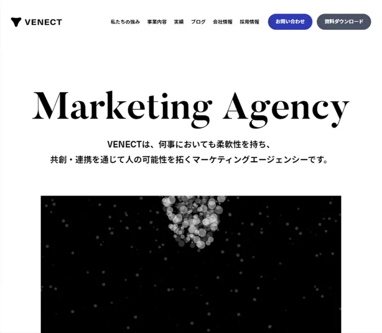
大きなセリフ体見出しと広い余白、青いピル型ボタン、横スクロールの実績一覧、黒いフッターが特徴のマーケティング企業サイト。
オリジナルサイトを見るMonumental serif typography, quiet white space, and precise blue actions for a marketing agency.
Website: VENECT
Original URL: https://www.venect.jp/
Final URL: https://www.venect.jp/
Theme: predominantly white, with a cool gray case-study section and a black footer; no theme selector was evidenced.
Inspected: September 23, 2026, Japan time. Supplied evidence retrieval timestamp: 2026-09-22T17:46:35.079Z, equivalent to September 23 at 02:46:35.079 JST.
Viewports: desktop 1440 × 1000 CSS pixels; mobile 390 × 844 CSS pixels.
Scope: the current corporate homepage. Supplied images cover the desktop opening, case-study section, and footer, plus the mobile opening and footer. Rendered DOM and computed styles additionally cover News, Solution, Related services, Blog, Contact, Download, and Recruit. Linked destinations were not inspected.
VENECT pairs a large Butler serif headline with compact Japanese navigation and substantial areas of white space. Black establishes identity and hierarchy; blue #303ab2 marks selected actions, section labels, and case categories. Slate #4b5165 supports body text and secondary buttons. A rectangular black particle scene introduces a more expressive visual register without changing the restrained interface palette.
The homepage operates as a broad corporate entry point: it introduces the agency, explains its services, presents work and articles, and provides contact, download, and recruitment routes. Its distinctive rhythm comes from large editorial headings, generous section intervals, unboxed image-and-text cards, and a dense black sitemap footer. On mobile, the hero becomes left aligned, horizontal content rails remain horizontal, and the footer reorganizes into two independent navigation stacks.
Monumental serif typography, quiet white space, and precise blue actions for a marketing agency.
Website: VENECT
Original URL: https://www.venect.jp/
Final URL: https://www.venect.jp/
Theme: predominantly white, with a cool gray case-study section and a black footer; no theme selector was evidenced.
Inspected: September 23, 2026, Japan time. Supplied evidence retrieval timestamp: 2026-09-22T17:46:35.079Z, equivalent to September 23 at 02:46:35.079 JST.
Viewports: desktop 1440 × 1000 CSS pixels; mobile 390 × 844 CSS pixels.
Scope: the current corporate homepage. Supplied images cover the desktop opening, case-study section, and footer, plus the mobile opening and footer. Rendered DOM and computed styles additionally cover News, Solution, Related services, Blog, Contact, Download, and Recruit. Linked destinations were not inspected.
VENECT pairs a large Butler serif headline with compact Japanese navigation and substantial areas of white space. Black establishes identity and hierarchy; blue #303ab2 marks selected actions, section labels, and case categories. Slate #4b5165 supports body text and secondary buttons. A rectangular black particle scene introduces a more expressive visual register without changing the restrained interface palette.
The homepage operates as a broad corporate entry point: it introduces the agency, explains its services, presents work and articles, and provides contact, download, and recruitment routes. Its distinctive rhythm comes from large editorial headings, generous section intervals, unboxed image-and-text cards, and a dense black sitemap footer. On mobile, the hero becomes left aligned, horizontal content rails remain horizontal, and the footer reorganizes into two independent navigation stacks.
| Name | Value | Suggested token | Evidence and role |
|---|---|---|---|
| White canvas | #ffffff |
--color-canvas |
Visually observed page canvas; also measured as reversed button and footer text. The sampled body itself has a transparent background. |
| Black ink | #000000 |
--color-ink |
Measured navigation and headline color; measured footer background; visible particle-scene field. |
| Agency blue | #303ab2 |
--color-primary |
Measured contact button, large service and recruitment buttons, section eyebrows, and case category text. |
| Slate | #4b5165 |
--color-body |
Measured body text, download button, and consent button. |
| Case gray | #d4d4db |
--color-case |
Measured background on the Case section at both viewports. |
| Tag gray | #f6f6f8 |
--color-tag |
Measured background of Blog category tags. |
| Legal gray | #9397a3 |
--color-muted |
Measured footer copyright and legal text. |
| Footer divider | Approximately #242424 |
--color-footer-rule |
Screenshot estimate for the thin rules on black; exact border color was not supplied. |
| Cookie surface | Translucent white appearance | --color-cookie |
The screenshots show the notice becoming gray over black content. Exact background and opacity were not sampled. |
Use the measured blue rather than estimating it from the compressed or color-managed screenshots. The visible design is primarily white, black, slate, and one saturated action color.
The Case section provides the principal cool gray surface change. Case tags have blue text and a thin blue outline, while Blog tags use slate text on a very pale gray fill. These are two related treatments with different visual emphasis.
The footer reverses the page to black. Navigation group headings and social marks appear bright white; subordinate links look more muted in the capture even though their sampled link color is white. An ancestor opacity or another compositing treatment may contribute, but its value was not supplied.
The extracted custom properties include many WordPress preset colors, gradients, shadows, and a default --swiper-theme-color: #007aff. Their availability does not make them VENECT design tokens. No visible rainbow palette or general shadow system is supported by the inspected page.
Butler.700.--font-display: 'Butler', Georgia, serif. Georgia is a recommended fallback, not an observed source fallback.The hero paragraph reports a base size of 16px on desktop and 14px on mobile, but its visible letters are much larger. The character-level descendants were not included in the sample. Do not copy those parent sizes as the hero headline size.
neue-haas-unica, kinto-sans, sans-serif.400 for ordinary body text and many links; 700 for navigation, hero supporting copy, section labels, and prominent buttons.16px / 28px on desktop and 14px / 24.5px on mobile, both a 1.75 line-height ratio.normal; the evidence does not support broadly letterspacing all Japanese copy.The black wordmark is an SVG asset, not text set in the interface font. Preserve the supplied brand proportions rather than reconstructing it with a typed name and an approximate symbol.
The sampled consent button declares Arial at 14px, weight 700. Carousel buttons also expose browser-default Arial values, although their visible content is graphical. These control-level values should not replace the measured main font stack throughout the page.
| Role | Desktop | Mobile | Status / implementation implication |
|---|---|---|---|
| Hero display letters | Approximately 104px |
Approximately 60px |
Estimated from screenshots and wrapper geometry; descendant font sizes were not supplied. |
| English section heading | 80px, weight 700 |
56px, weight 700 |
Measured Butler declaration. Visible heading boxes are about 80px and 56px high. |
| Case heading, “実績” | 52px, weight 700 |
40px, weight 700 |
Measured Butler declaration; actual Japanese glyph font is unverified. |
| Hero supporting copy | 24px / 42px, 700 |
18px / 31.5px, 700 |
Measured; two desktop lines and three mobile lines. |
| Related services heading | 32px / 48px, 700 |
28px / 42px, 700 |
Measured Japanese sans-serif heading. |
| Service group heading | 28px / 42px, 700 |
20px / 30px, 700 |
Measured. |
| Case card title | Approximately 24px / 36px |
Approximately 18px / 27px |
Estimated; title descendants were not sampled directly. |
| Body / section description | 16px / 28px |
14px / 24.5px |
Measured. |
| Main navigation | 14px / 24.5px, 700 |
20px / 30px, 700 in menu DOM |
Mobile menu typography is DOM evidence, not an opened-menu observation. |
| Standard section eyebrow | 14px / 24.5px, 700 |
12px / 21px, 700 |
Measured for Solution, Blog, and Recruit. The mobile Case eyebrow remains 14px. |
| News links | 14px / 24.5px |
12px / 21px |
Measured. |
| Service detail copy | 14px / 24.5px |
12px / 21px |
Measured. |
| Category tag | 12px / 21px |
10px / 17.5px |
Measured. |
| Footer group heading | 18px / 31.5px, 700 |
16px / 28px, 700 |
Measured. |
| Footer subordinate link | 14px / 24.5px |
14px / 24.5px |
Measured; these do not shrink with the mobile body text. |
| Copyright and legal copy | 12px / 21px |
10px / 17.5px |
Measured. |
| Cookie explanatory copy | 14px / 24.5px |
10px / 17.5px |
Measured. |
The English section headings report computed line heights of 140px at an 80px font size and 98px at 56px, while their flex containers occupy approximately one font-size unit in height. Character wrappers affect the result. The Quick Start uses a simple line-height: 1 for these display blocks as an adaptation; reproducing the original split-character markup would require additional inspection.
Density: spacious at section level, compact in utility controls and metadata. Geometry: square media and content surfaces, small rounded category tags, and strongly rounded action buttons.
| Use | Desktop | Mobile | Evidence |
|---|---|---|---|
| Standard content inset | 112px at 1440px viewport width |
30px |
Measured content origins. |
| Hero inset | 112px |
31.203px |
Measured; mobile hero is slightly narrower than the standard content container. |
| Header text-link gap | 20px |
Not applicable in closed menu | Calculated from desktop link bounds. |
| Gap between header CTA pills | 12px |
15px vertical gap in menu DOM |
Calculated. |
| Main section top interval | Commonly 120px |
Commonly 80px |
Calculated between section starts and their first labels. |
| Large section bottom padding | 120–160px |
80–100px |
Measured, varying by section. |
| Description to card rail | 64px |
40px |
Calculated for Case and Blog. |
| Case card gap | 32px |
15px |
Calculated from card origins. |
| Blog column gap | 65px |
15px |
Calculated. |
| Article link to category tags | 16px |
10px |
Calculated from bounds. |
| Related-service row padding | 32px 104px 32px 32px |
20px 45px 20px 0 |
Measured. |
| Footer vertical padding | 120px |
80px |
Measured. |
| Social-icon gap | 32px |
32px |
Calculated between icon bounds. |
This is not a rigid eight-pixel-only system. Values such as 15px, 20px, 30px, and 65px are part of the observed layout. Preserve the relationships rather than rounding every measurement to one scale.
| Element | Value | Evidence |
|---|---|---|
| Media, case cards, service rows | Square | Visually observed for media; sampled row and link radii are 0. |
| Category tag | 4px |
Measured at both viewports. |
| Header contact/download pill | 30px |
Measured. |
| Large service/recruitment pill | 60px |
Measured; the resulting visible shape is a capsule. |
| Consent pill | 30px |
Measured on desktop. |
| Trailing action marker | Circle | Visually observed; approximately 56px desktop and 30px mobile. |
| Element | Desktop, 1440 × 1000 | Mobile, 390 × 844 |
|---|---|---|
| Document height | 8215.188px |
8044.016px |
| Standard inner content width | 1216px |
330px |
| Initial header height | 120px |
80px |
| Header height in scrolled screenshots | Approximately 80px |
Approximately 60px |
| Header wordmark width | 140px |
100px |
| Hero display wrapper | 1216 × 135.188px, top 224px |
327.594 × 133.391px, top 166px |
| Hero support wrapper | 1216 × 84px, top 375.188px |
327.594 × 94.5px, top 312.391px |
| Case card width | 488px |
272.5px |
| First case thumbnail at 16:9 | 488 × 274.5px |
Approximately 272.5 × 153.281px |
| Blog card width | 362px |
272.5px |
| Large service/recruitment button | 592 × 80px |
330 × 58.5px |
| Contact or Download panel | 720 × 499px |
390 × 320.5px |
| Footer | 1039.5px high |
1606.5px high |
| Footer wordmark width | 240px |
200px |
| Cookie notice height | Approximately 64px |
Approximately 77.5px |
A 1216px content cap with 30px minimum side gutters reproduces the two measured standard container widths. That is a recommended interpolation, not a recovered source media-query formula.
Role: brand identity, primary navigation, and direct conversion routes.
The desktop header places the black SVG wordmark at the left edge of the 1216px content area. Six compact text links sit on the right, followed by the blue “お問い合わせ” pill and slate “資料ダウンロード” pill. Text links use black, bold 14px type. The contact pill measures approximately 122.313 × 43.5px; the download pill is 149.078 × 43.5px.
The first desktop capture has a 120px header. The Case and footer captures retain a white header at the viewport top with an approximately 80px height. Mobile similarly changes from an 80px opening header to an approximately 60px header in the footer capture. Persistence and the two sizes are visible; the scroll threshold and exact positioning mechanism were not supplied.
On mobile, the logo sits at x = 30px and a 30 × 30px menu button sits at x = 330px. Its visible icon uses two thin horizontal strokes. The closed-menu capture does not show navigation links or CTA pills.
Role: access to the desktop navigation on a narrow viewport.
The mobile DOM contains six 20px / 30px links spaced at 60px vertical intervals, followed by full-width blue and slate pills measuring 330 × 60.5px. These measurements describe menu content available in the DOM. They do not establish the appearance, backdrop, animation, focus behavior, or scroll locking of an opened menu.
For reuse, implement a real menu button with an accessible name, aria-expanded, and a relationship to the navigation panel. Treat the panel presentation as an implementation decision until an opened state is inspected.
Role: state the agency category and current positioning.
Desktop anatomy is a centered, single-line “Marketing Agency” display, a two-line bold Japanese statement, and a wide black media rectangle. The display wrapper begins 104px below the initial header. The supporting text begins 16px after that wrapper. The current statement is “VENECTは、伴走型支援でビジネスを加速する / マーケティングエージェンシーです。”
The mobile composition is deliberately different: two left-aligned display lines, three lines of supporting copy, and an explicit “私たちの強みを知る” link with a blue circular arrow. The link measures approximately 160.469 × 30px and begins 30px after the supporting copy. The media begins approximately 60px below that link.
The mobile hero uses an approximately 327.6px content width, corresponding to 84% of the inspected viewport. Keep the intentional two-word line break; do not reduce the headline until both words fit on one line.
The original DOM places the logo inside an h1 and represents the hero display as a paragraph with split text. A new implementation can preserve the appearance while giving the main page introduction a more useful heading structure.
Role: provide an expressive, abstract brand moment beneath the introductory text.
The current screenshots show translucent gray and white circular particles on black. A denser cluster appears toward the upper central region, surrounded by widely scattered small dots. The media has square edges and aligns with the hero content rather than bleeding across the entire viewport.
The visible media starts near y = 539px on desktop and y = 526px on mobile. Its full lower boundary is not visible in the supplied opening captures, so its complete aspect ratio cannot be measured from them.
No media URL, canvas implementation, frame rate, pointer response, or animation timeline was supplied. The desktop DOM includes helper text “私たちの強みを知る” and “DRAG” with circular-sized bounds, but neither helper is visibly established in the provided desktop frame. Treat these as interaction hints, not proof of working drag or cursor-follow behavior.
Role: provide compact, dated updates after the opening presentation.
This component is documented from DOM evidence. It contains a small “News” heading and three dated links. Desktop link text is 14px / 24.5px; mobile text is 12px / 21px.
The desktop section is approximately 187.5px high, with its label at x = 160px and update links beginning around x = 315px. On mobile, it becomes a 229px-high block with the heading and update links sharing an inner left edge of 50px. This adds a 20px inset inside the standard 30px mobile gutter.
Retain the compact date-plus-title hierarchy. A decorative card surface or elaborate icon treatment cannot be established from the supplied measurements.
Role: introduce major areas with a consistent bilingual hierarchy.
Solution, Blog, and Recruit use a small blue Japanese eyebrow, a large black English Butler heading, and a slate introductory paragraph. Desktop English headings use 80px; mobile uses 56px. The Japanese eyebrow is offset slightly to the right of the main title in the sampled bounds: 4px on desktop and 2px on mobile.
Case reverses the language emphasis: “Case” is the small blue eyebrow and “実績” is the large black title. Its title uses 52px on desktop and 40px on mobile. Preserve this section-specific difference rather than imposing an English display heading on every section.
Role: explain the agency's service structure.
The DOM describes an overarching “Accompanying support” group, followed by Project Forge and the three marketing stages Research & Analysis, Strategy planning, and Execution. The component includes inline graphical markup, but its detailed illustration style is not visible in the supplied screenshots.
On desktop, the Project Forge group occupies approximately 240.438px at x = 172px. The three-stage group starts around x = 456.531px and occupies 811.469px. These groups share their top alignment. Their group headings use bold 28px / 42px text; explanatory copy uses 14px / 24.5px.
On mobile, Project Forge becomes a 330px-wide block above the three-stage group. The latter is approximately 573px high. Descriptions start at x = 128px, leaving a 98px offset from the group edge for the other component content. Preserve this stacked explanatory structure; the evidence does not support simply shrinking the entire desktop diagram into a tiny image.
Role: provide a prominent section-level destination.
The service and recruitment actions share a blue capsule with white bold text. Desktop dimensions are 592 × 80px, with 26px 80px padding and a 60px radius. Mobile dimensions are 330 × 58.5px, with 16px 60px 18px padding. Text changes from 16px / 28px to 14px / 24.5px.
These controls are centered within the broad desktop layout and fill the standard mobile content width. Keep the label centered and allow the control to grow if longer replacement copy requires wrapping.
Role: offer specific services below the broader service explanation.
The desktop layout has a 400px introductory column, a 16px gap, and an 800px list column. The list contains three linked rows: brand awareness research, marketing PMO, and new-business support.
Each row is square and reserves substantial space on the right: measured padding is 32px 104px 32px 32px. Rows are approximately 135.5–160px high depending on copy length. Their coordinates leave approximately 1px between neighboring row boxes; exact separator styling was not sampled.
Mobile stacks the introduction above the list. Row padding becomes 20px 45px 20px 0, and heights vary from 117px to 159px. This is a text-led service list, not a grid of floating cards.
Role: showcase client work while inviting horizontal exploration.
The Case section has a measured #d4d4db background. Its desktop capture shows two complete large cards and part of the next card at the viewport edge. Card origins are 112px, 632px, and 1152px: a 488px width and 32px gap.
Each card contains a square-cornered landscape image, a bold black title below it, and a separate category anchor. The first image depicts two people against a neutral wall; subsequent visible images are designed marketing PMO covers. The first three supplied image dimensions are 976 × 549, exactly 16:9.
The title and image share an article link, while the category is a separate link. Preserve this anatomy so a category link does not become nested inside the case-study link. Tags sit 16px below the article link on desktop and 10px below on mobile. Desktop tags use 12px type, 12px horizontal padding, a 4px radius, and a visible thin blue border. Mobile tags use 10px type and 10px horizontal padding.
At 390px, cards remain horizontal at 272.5px wide with 15px gaps. The second card starts at 317.5px, beyond the first card and partly beyond the viewport. Do not convert this component into a vertical stack when reproducing the inspected mobile structure.
Role: provide directional controls and a route to the complete collection.
The desktop Case capture shows a thin horizontal progress track, a darker active segment approximately one third of the track width, two arrow controls below it at the left, and an “実績の一覧を見る” action at the right.
The measured arrow button boxes are 24 × 24px on desktop and 20 × 20px on mobile. The previous control is visually muted in the captured initial state. The action at the right combines black text with a blue circle, approximately 56px on desktop and 30px on mobile.
The desktop circle contains a small white central mark in the captured frame; the mobile hero circle clearly contains a right arrow. Do not infer an icon-morph sequence from these separate states. Progress semantics, arrow activation, drag behavior, and autoplay were not exercised in the supplied evidence.
Role: publish the agency's knowledge, interviews, and announcements.
This component is documented through the rendered DOM. Desktop presents three article cards across the 1216px content area. Each is 362px wide, with calculated 65px gaps. Cards include landscape imagery, a date, a title, and one or more category links.
Blog tags differ from Case tags: they use a pale #f6f6f8 fill with slate text. Multiple tags wrap onto a second line where needed.
Mobile changes the collection to a horizontal rail with the same 272.5px card width and 15px gap observed in Case. Mobile previous/next button elements are present below the rail. Thus, the mobile page retains two distinct horizontally browsable content collections.
Role: provide two substantial conversion destinations.
The DOM places two full-width image-backed links side by side on desktop. Each occupies 720 × 499px; together they span the 1440px viewport without a central gutter. The links use white text and contain an English label, a Japanese label, explanatory copy, and action wording.
On mobile, they stack vertically, each measuring 390 × 320.5px with 60px 30px padding. Their background image URLs are known, but their visual subjects are not shown in the supplied current-page screenshots. Do not substitute an asserted office, meeting, or landscape scene based only on a filename.
For implementation, make each panel one coherent link. If an action label is styled like a button inside it, use a noninteractive element rather than nesting another link.
Role: introduce employment opportunities after the conversion panels.
The desktop heading, description, and button occupy a centered 592px column beginning at x = 424px. Mobile expands this group to the standard 330px content width. It uses the same blue eyebrow, Butler display heading, slate paragraph, and blue large-pill vocabulary as other sections.
The full section is substantially taller than these sampled text elements: approximately 1044.5px on desktop and 809px on mobile. The supplied evidence does not visually resolve the remainder of that space. Do not fill it with invented artwork or describe an unobserved recruitment animation.
Role: provide comprehensive navigation, social destinations, and legal information.
Desktop uses a full-width black surface with 120px vertical padding. Four navigation groups begin at x = 112, 320, 528, and 736px. A white 240px-wide VENECT wordmark sits toward the right at x = 1088px.
The first navigation group combines strengths and services. The second lists case categories. The third lists Blog categories. The fourth contains company, recruitment, contact, and download links. Group headings use white bold 18px type; subordinate links use 14px type and appear visually subdued.
Below the sitemap, a thin rule introduces a social row containing X, Facebook, YouTube, Qiita, and Wantedly marks. The privacy-policy link sits at the far right on desktop. Another rule separates this row from copyright and multilingual legal copy in #9397a3.
Mobile places a 200px white wordmark above two navigation stacks. The left stack contains strengths, services, and case categories; the right contains Blog categories and the utility destinations. Column origins are 30px and 202.5px, consistent with two 157.5px columns and a 15px gap. The social row retains all five marks; the privacy link moves beneath it. Legal copy becomes 10px / 17.5px.
The footer identifies VENECT Inc. and names ヴェネクト株式会社 in its copyright text. This identity is supported directly by the inspected homepage.
Role: present the current cookie-use statement and its acceptance action.
A notice remains at the bottom of every supplied current-page capture. On desktop, it is approximately 64px high, with the message at the standard left gutter, an underlined privacy-policy link near the right, and a slate “承諾する” pill measuring 98 × 40px.
Mobile uses a compact two-column arrangement. The message and privacy link occupy the left column with a 15px outer inset; the acceptance pill sits at the right. Text is measured at 10px / 17.5px, and the complete strip is approximately 77.5px high. Its appearance changes with the content behind it, consistent with a translucent surface, although exact compositing was not measured.
The acceptance action was not activated. Dismissal, persistence duration, and any further settings interface remain unverified.
| Target | Computed declaration | Evidence boundary |
|---|---|---|
| Header background | background 0.6s cubic-bezier(0.19, 1, 0.22, 1) |
Timing and property are measured; exact triggering threshold is not. |
| Desktop navigation | background-size 0.6s cubic-bezier(0.19, 1, 0.22, 1), color 0.6s cubic-bezier(0.19, 1, 0.22, 1) |
Supports a defined link treatment, but hover endpoints were not captured. |
| Desktop header CTA pills | background 0.5s cubic-bezier(0.22, 1, 0.36, 1), color 0.5s cubic-bezier(0.22, 1, 0.36, 1) |
Exact hover colors are unverified. |
| Desktop category tags | background 0.6s cubic-bezier(0.19, 1, 0.22, 1), color 0.6s cubic-bezier(0.19, 1, 0.22, 1) |
Declaration only. |
| Mobile service groups | opacity 0.6s, transform 0.6s cubic-bezier(0.23, 1, 0.32, 1) |
Suggests reveal-capable styling; starting offset and trigger were not supplied. |
| Desktop rail arrows | opacity 0.6s cubic-bezier(0.19, 1, 0.22, 1) |
Disabled-looking initial previous arrow is visible; navigation was not tested. |
| Desktop footer links | background-size 0.6s cubic-bezier(0.19, 1, 0.22, 1) |
Underline-like transition property; endpoints unverified. |
| Desktop consent button | background 0.6s cubic-bezier(0.19, 1, 0.22, 1) |
Acceptance and hover behavior were not exercised. |
These curves decelerate strongly and support composed, smooth transitions. They are more appropriate reference values than adding unrelated springs or exaggerated bounce.
animation: none. This does not rule out animated descendants, JavaScript transforms, video, or canvas rendering.The capture process waited for initial readiness and finite motion, with an initial observation of at least five seconds. Perpetual animations were paused during readiness checks and resumed afterward. This process is not a frame-by-frame motion recording.
| Layer | Appearance | Purpose |
|---|---|---|
| Main canvas | White | Broad, calm space for typography and corporate content. |
| Header | White appearance in captures | Persistent navigation with strong contrast against the black footer. |
| Hero media | Black rectangle with gray/white particles | Abstract visual expression beneath the editorial introduction. |
| Case section | Measured #d4d4db base |
Distinguishes the work collection from surrounding white sections. |
| Article cards | Unboxed image and text | Allows imagery, titles, and spacing to define the component. |
| Case categories | Transparent-looking fill, blue outline and text | Compact category navigation with stronger emphasis. |
| Blog categories | #f6f6f8 fill, slate text |
Quiet supporting metadata. |
| Conversion panels | Image-backed, white text | Large contact and download destinations; image subjects unverified. |
| Footer | Black, white navigation, gray legal text | Dense information architecture and brand closure. |
| Cookie notice | Translucent white appearance | Persistent utility layer over the page. |
The visible card system does not depend on shadows or floating panels. Separation comes from white space, section background changes, image edges, and fine rules. The subtle variation visible within the Case screenshot is not sufficient evidence to assign an exact gradient or overlay formula.
The opening image language is abstract and monochrome: circular particles vary in size, opacity, and density against black. Keep that scene visually distinct from the clear, static typography above it. The black rectangle and generous surrounding white space are as important as the particles themselves.
Case-study imagery is more practical and varied. The first visible card is a portrait photograph of two people against a neutral wall. The next visible cards combine large marketing PMO typography with photographic or conceptual imagery. The interface does not recolor all case assets into monochrome; content images retain their own colors while the surrounding UI stays restrained.
Use landscape crops with consistent displayed proportions. Most supplied case assets are 976 × 549; one later asset is 976 × 651. The latter's exact visible crop was not provided. Blog assets are recorded at 787 × 443, approximately 16:9.
Brand and social marks are SVG assets. Use those assets, where authorized, instead of approximating them with generic icons. No hero particle asset URL was included.
All paths below are relative to https://www.venect.jp/ and were present in the supplied original-page evidence. They were not separately opened for this analysis.
| Asset | Observed path | Evidence / use |
|---|---|---|
| Black wordmark | /h89kmysb/wp-content/themes/venect/assets/img/common/logo.svg |
Header brand asset. |
| White wordmark | /h89kmysb/wp-content/themes/venect/assets/img/common/logo_white.svg |
Footer brand asset. |
| First case image | /h89kmysb/wp-content/uploads/2026/03/Top-976x549.jpg |
Visible two-person photograph. |
| Second case image | /h89kmysb/wp-content/uploads/2025/05/PMO_KV_07-976x549.jpg |
Visible PMO cover with a connected wooden-figure composition. |
| Third case image | /h89kmysb/wp-content/uploads/2025/05/PMO_KV_06-976x549.jpg |
Partially visible PMO cover using an overhead workspace composition. |
| First Blog image | /h89kmysb/wp-content/uploads/2025/10/VENECT_blog01-787x443.jpg |
DOM reference; image subject not visually inspected. |
| Contact background | /h89kmysb/wp-content/themes/venect/assets/img/common/cv_bg_contact_pc.jpg |
DOM reference for the contact panel. |
| Download background | /h89kmysb/wp-content/themes/venect/assets/img/common/cv_bg_download_pc.jpg |
DOM reference for the download panel. |
| Social marks | /h89kmysb/wp-content/themes/venect/assets/img/common/icon-sns-x.svg, icon-sns-facebook.svg, icon-sns-youtube.svg, icon-sns-qiita.svg, icon-sns-wantedly.svg |
The latter filenames share the same directory; all five marks are visible in the footer. |
The rendered homepage follows this order: header, agency introduction and particle field, News, Solution, Related services, Case, Blog, Contact and Download, Recruit, and sitemap footer. The cookie notice overlays the viewport bottom.
This broad information architecture is part of the design. Preserve distinct routes to services, work, editorial content, company information, hiring, contact, and downloads when adapting it to another corporate site.
| Area | Desktop observation | Mobile observation |
|---|---|---|
| Header | Logo, six links, two pills | Logo and two-line menu icon; menu content exists separately in the DOM. |
| Hero alignment | Centered display and supporting copy | Left aligned display and copy. |
| Hero title | One line | Two lines, one word per line. |
| Hero supporting statement | Two lines | Three lines. |
| Strengths action | Desktop helper text exists but is not visibly established | Explicit inline link with a circular arrow. |
| Standard content | 1216px wide |
330px wide. |
| Solution overview | Project group beside three marketing stages | Project group above vertically arranged stages. |
| Related services | Introductory column beside linked rows | Introduction above full-width rows. |
| Case collection | 488px cards, 32px gaps |
272.5px cards, 15px gaps; horizontal continuation retained. |
| Blog collection | Three 362px columns |
Horizontal 272.5px cards and arrow controls. |
| Contact / Download | Two equal columns across viewport | Two full-width panels stacked vertically. |
| Recruit text and action | Centered 592px column |
Standard 330px content width. |
| Footer | Four navigation groups with logo at right | Logo above two independent navigation stacks. |
| Cookie notice | One horizontal utility row | Copy and policy link at left, acceptance action at right. |
Only the two stated viewport sizes were supplied. Exact media-query breakpoints, intermediate tablet behavior, safe-area handling, and landscape layouts remain unverified. The Quick Start uses a recommended 64rem breakpoint to demonstrate the observed layout changes; it is not a source value.
The small difference in total document height between desktop and mobile should not be treated as a fixed design target. Several regions get shorter while services and footer content become taller. Page height will also change as editorial content changes.
#303ab2 consistently for primary action emphasis and #4b5165 for body text and secondary controls.16px or 14px computed size onto the visible display letters.These are recommendations for a new implementation, not verified features of the original page:
20–30px icon controls to at least 44px interactive areas without enlarging the visible glyphs unnecessarily.10px category and utility text in a production adaptation, then reflow the notice rather than clipping it.#ffffff.#000000.#303ab2.#4b5165.#d4d4db.#f6f6f8.#9397a3.“Create a Japanese marketing-agency corporate homepage using VENECT's observed visual principles. Use a white canvas, black Butler display headings, and Neue Haas Unica/Kinto Sans-style body typography. Build a broad navigation header with a black SVG wordmark, compact text links, a blue contact capsule, and a slate download capsule. Center a large ‘Marketing Agency’ introduction on desktop and split it into two left-aligned lines on mobile. Place a square-edged black particle visual below the supporting statement. Follow with news, service explanations, a cool gray case-study rail, editorial articles, paired contact/download panels, recruitment, and a dense black sitemap footer. Keep images square-cornered, cards unboxed, tags small, and whitespace generous. Preserve horizontal Case and Blog rails on mobile. Use measured blue #303ab2 and slate #4b5165. Treat unverified menu, particle, and carousel behavior as implementation decisions.”
#d4d4db. Use 488px-wide cards with 32px gaps on desktop, 16:9 images, bold black titles, and separate blue outlined category links. At 390px, use 272.5px-wide cards with 15px gaps so the next item remains partially visible.”This is a reusable adaptation, not extracted production CSS. It preserves the measured palette and endpoint geometry, uses estimated hero typography, and replaces the original split-character headings with ordinary text. The 64rem breakpoint, accessible control hit areas, hover endpoints, media placeholder ratios, and footer link opacity are recommendations.
Expected structure: use .container for ordinary content; give the hero title two .hero-word spans; place .case-rail outside that container so it can continue to the viewport edge. Keep category links outside .article-link. For the footer, use two .footer-stack wrappers: the first contains the strengths/services group and Case group, and the second contains Blog and utility groups.
:root {
  /* Measured colors, except the explicitly approximate surfaces. */
  --color-canvas: #ffffff;
  --color-ink: #000000;
  --color-primary: #303ab2;
  --color-body: #4b5165;
  --color-case: #d4d4db;
  --color-tag: #f6f6f8;
  --color-muted: #9397a3;
  --color-footer-rule: #242424; /* Visual estimate. */
  --color-cookie: rgb(255 255 255 / 80%); /* Approximation. */

  /* Declared source families; display fallbacks are recommendations. */
  --font-display: 'Butler', Georgia, serif;
  --font-body: neue-haas-unica, kinto-sans, sans-serif;
  --text-body: 16px;
  --text-display: 80px;
  --text-case-heading: 52px;
  --leading-body: 1.75;

  /* Container interpolation reproduces the supplied endpoints. */
  --content-max: 1216px;
  --gutter: 30px;
  --page-inset: max(var(--gutter), calc((100vw - 1216px) / 2));
  --header-height: 120px;
  --section-top: 120px;
  --section-bottom: 120px;
  --card-gap: 32px;
  --case-card-width: 488px;
  --radius-tag: 4px;
  --radius-pill: 30px;

  /* Measured transition curves. */
  --ease-link: cubic-bezier(0.19, 1, 0.22, 1);
  --ease-pill: cubic-bezier(0.22, 1, 0.36, 1);
  --ease-reveal: cubic-bezier(0.23, 1, 0.32, 1);
  --motion-link: 600ms;
  --motion-pill: 500ms;

  /* Recommended viewport-clearance budget; update if notice grows. */
  --notice-clearance: 80px;
}

* { box-sizing: border-box; }

html {
  scroll-padding-top: calc(var(--header-height) + 16px);
  scroll-padding-bottom: calc(var(--notice-clearance) + 16px);
}

body {
  margin: 0;
  color: var(--color-body);
  background: var(--color-canvas);
  font: 400 var(--text-body) / var(--leading-body) var(--font-body);
}

img { display: block; max-width: 100%; }
button, input { font: inherit; }
a { color: inherit; }
button { cursor: pointer; }

.container {
  width: min(var(--content-max), calc(100% - 2 * var(--gutter)));
  margin-inline: auto;
}

.site-header {
  position: sticky;
  top: 0;
  z-index: 40;
  background: var(--color-canvas);
  transition: background var(--motion-link) var(--ease-link);
}

.site-header__inner {
  display: flex;
  align-items: center;
  justify-content: space-between;
  gap: 24px;
  min-height: var(--header-height);
}

.site-logo { width: 140px; flex: 0 0 auto; }
.site-header__nav, .nav-links, .nav-actions {
  display: flex;
  align-items: center;
}
.site-header__nav { gap: 24px; }
.nav-links { gap: 20px; }
.nav-actions { gap: 12px; }

.nav-link {
  color: var(--color-ink);
  font-size: 14px;
  font-weight: 700;
  text-decoration: none;
  white-space: nowrap;
  background: linear-gradient(currentColor, currentColor)
    no-repeat 0 100% / 0 1px;
  transition:
    background-size var(--motion-link) var(--ease-link),
    color var(--motion-link) var(--ease-link);
}

.pill {
  display: inline-flex;
  align-items: center;
  justify-content: center;
  min-height: 43.5px;
  padding: 8px 20px 9px;
  border: 0;
  border-radius: var(--radius-pill);
  color: #fff;
  background: var(--color-primary);
  font-size: 14px;
  font-weight: 700;
  line-height: 24.5px;
  text-align: center;
  text-decoration: none;
  transition:
    background var(--motion-pill) var(--ease-pill),
    color var(--motion-pill) var(--ease-pill);
}

.pill--secondary { background: var(--color-body); }
.pill--wide {
  width: min(592px, 100%);
  min-height: 80px;
  padding: 26px 80px;
  border-radius: 60px;
  font-size: 16px;
  line-height: 28px;
}

.menu-toggle { display: none; }

/* Hook only: the scroll trigger is an implementation decision. */
.site-header[data-condensed='true'] { --header-height: 80px; }

.hero { padding-top: 104px; }
.hero-title {
  margin: 0;
  color: var(--color-ink);
  font-family: var(--font-display);
  font-size: clamp(64px, 7.2222vw, 104px); /* Estimated scale. */
  font-weight: 700;
  line-height: 1.3;
  text-align: center;
}
.hero-copy {
  margin: 16px 0 0;
  color: var(--color-ink);
  font-size: 24px;
  font-weight: 700;
  line-height: 42px;
  text-align: center;
}
.hero-strengths { display: none; }
.hero-media {
  margin-top: 80px;
  overflow: hidden;
  background: #000;
  aspect-ratio: 3 / 2; /* Placeholder: full source height is unknown. */
}
.hero-media > :is(img, video, canvas) {
  display: block;
  width: 100%;
  height: 100%;
  object-fit: cover;
}

.section { padding-block: var(--section-top) var(--section-bottom); }
.section-eyebrow {
  margin: 0 0 16px;
  color: var(--color-primary);
  font-size: 14px;
  font-weight: 700;
  line-height: 24.5px;
}
.section-title {
  margin: 0;
  color: var(--color-ink);
  font: 700 var(--text-display) / 1 var(--font-display);
}
.section-title--jp {
  font-family: var(--font-body); /* Recommended explicit glyph stack. */
  font-size: var(--text-case-heading);
}
.section-description { margin: 16px 0 0; }

.service-layout {
  display: grid;
  grid-template-columns: 240.4375px minmax(0, 1fr);
  gap: 44px;
  padding-inline: 60px;
}
.service-stages {
  display: grid;
  grid-template-columns: repeat(3, minmax(0, 1fr));
  gap: 32px; /* Recommended internal spacing. */
}
.service-group-title {
  color: var(--color-ink);
  font-size: 28px;
  font-weight: 700;
  line-height: 42px;
}
.related-services {
  display: grid;
  grid-template-columns: 400px minmax(0, 1fr);
  gap: 16px;
}
.service-row {
  display: block;
  padding: 32px 104px 32px 32px;
  border-top: 1px solid #d4d4db; /* Recommended separator. */
  text-decoration: none;
}

.case-section { background: var(--color-case); }
.case-rail {
  display: flex;
  gap: var(--card-gap);
  margin-top: 64px;
  padding-inline: var(--page-inset);
  overflow-x: auto;
  scroll-snap-type: x proximity; /* Recommended native fallback. */
  scroll-padding-inline: var(--page-inset);
}
.case-card {
  flex: 0 0 var(--case-card-width);
  min-width: 0;
  scroll-snap-align: start;
}
.article-link { display: block; text-decoration: none; }
.article-image {
  width: 100%;
  aspect-ratio: 16 / 9;
  object-fit: cover;
  border-radius: 0;
}
.article-title {
  margin: 24px 0 0;
  color: var(--color-ink);
  font-size: 24px; /* Case-title estimate. */
  font-weight: 700;
  line-height: 1.5;
}
.article-tags {
  display: flex;
  flex-wrap: wrap;
  align-items: flex-start;
  gap: 8px;
  margin-top: 16px;
}
.tag {
  display: inline-flex;
  padding: 0 12px 1.5px;
  border: 1px solid var(--color-primary);
  border-radius: var(--radius-tag);
  color: var(--color-primary);
  font-size: 12px;
  line-height: 21px;
  text-decoration: none;
}
.tag--blog {
  border-color: transparent;
  color: var(--color-body);
  background: var(--color-tag);
}

.rail-progress {
  height: 3px; /* Screenshot estimate. */
  margin-top: 64px;
  background: rgb(75 81 101 / 12%); /* Approximation. */
}
.rail-progress__fill {
  width: var(--rail-progress, 34%); /* Update from real rail position. */
  height: 100%;
  background: var(--color-body);
}
.rail-controls {
  display: flex;
  align-items: center;
  justify-content: space-between;
  gap: 16px;
  margin-top: 48px;
}
.rail-arrows { display: flex; gap: 4px; }
.rail-arrow {
  display: grid;
  place-items: center;
  width: 44px; /* Recommended hit area around the smaller source icon. */
  height: 44px;
  padding: 10px;
  border: 0;
  color: var(--color-primary);
  background: transparent;
}
.rail-arrow:disabled { opacity: 0.35; cursor: default; }
.text-action {
  display: inline-flex;
  align-items: center;
  gap: 16px;
  color: var(--color-ink);
  text-decoration: none;
}
.action-circle {
  display: grid;
  place-items: center;
  flex: 0 0 56px;
  width: 56px;
  height: 56px;
  border-radius: 50%;
  color: #fff;
  background: var(--color-primary);
}

.blog-rail {
  display: grid;
  grid-template-columns: repeat(3, minmax(0, 1fr));
  gap: 65px;
  width: min(var(--content-max), calc(100% - 60px));
  margin: 64px auto 0;
}
.blog-card { min-width: 0; }

.conversion-grid {
  display: grid;
  grid-template-columns: repeat(2, minmax(0, 1fr));
}
.conversion-panel {
  position: relative;
  display: block;
  min-height: 499px;
  padding: 118px 30px 125px;
  overflow: hidden;
  color: #fff;
  background: var(--color-body);
  text-align: center;
  text-decoration: none;
}
.conversion-panel__image {
  position: absolute;
  inset: 0;
  width: 100%;
  height: 100%;
  object-fit: cover;
}
.conversion-panel__content { position: relative; }
.recruit-inner { width: min(592px, 100%); margin-inline: auto; }

.site-footer {
  padding-block: 120px;
  color: #fff;
  background: #000;
}
.footer-top {
  display: grid;
  grid-template-columns: minmax(0, 800px) 240px;
  justify-content: space-between;
  gap: 32px;
}
.footer-nav {
  display: grid;
  grid-template-columns: repeat(4, minmax(0, 1fr));
  gap: 32px;
}
.footer-stack { display: contents; }
.footer-logo { width: 240px; }
.footer-group-title {
  margin: 0 0 12px;
  font-size: 18px;
  font-weight: 700;
  line-height: 31.5px;
}
.footer-links { display: grid; gap: 8px; }
.footer-links a {
  color: rgb(255 255 255 / 70%); /* Visual approximation. */
  font-size: 14px;
  line-height: 24.5px;
  text-decoration: none;
}
.footer-social-row {
  display: flex;
  align-items: center;
  justify-content: space-between;
  gap: 24px;
  margin-top: 80px;
  padding-block: 32px;
  border-block: 1px solid var(--color-footer-rule);
}
.social-links { display: flex; align-items: center; gap: 32px; }
.footer-legal {
  margin-top: 32px;
  color: var(--color-muted);
  font-size: 12px;
  line-height: 21px;
}

.cookie-notice {
  position: fixed;
  inset: auto 0 0;
  z-index: 60;
  color: #000;
  background: var(--color-cookie);
}
.cookie-inner {
  display: grid;
  grid-template-columns: minmax(0, 1fr) auto auto;
  align-items: center;
  gap: 20px;
  padding-block: 12px;
  font-size: 14px;
  line-height: 24.5px;
}
.cookie-copy { margin: 0; }
.cookie-policy { text-decoration: underline; }
.cookie-accept {
  min-width: 98px;
  height: 40px;
  padding: 0 20px 1px;
  border: 0;
  border-radius: 30px;
  color: #fff;
  background: var(--color-body);
  font: 700 14px / 24.5px Arial, sans-serif;
}

/* Recommended hover endpoint; source endpoint was not captured. */
@media (hover: hover) {
  .nav-link:hover { background-size: 100% 1px; }
}

:where(a, button):focus-visible {
  outline: 2px solid var(--color-primary);
  outline-offset: 4px;
}
.site-footer :where(a, button):focus-visible {
  outline-color: #fff;
}

/* Recommended breakpoint; only 1440px and 390px were inspected. */
@media (max-width: 64rem) {
  :root {
    --text-body: 14px;
    --text-display: 56px;
    --text-case-heading: 40px;
    --header-height: 80px;
    --section-top: 80px;
    --section-bottom: 80px;
    --card-gap: 15px;
    --case-card-width: min(272.5px, calc(100vw - 60px));
    --notice-clearance: 100px;
  }

  .site-logo { width: 100px; }
  .site-header__nav { display: none; }
  .site-header[data-condensed='true'] { --header-height: 60px; }
  .menu-toggle {
    display: grid;
    align-content: center;
    gap: 6px;
    width: 44px;
    height: 44px;
    margin-right: -7px;
    padding: 7px;
    border: 0;
    color: #000;
    background: transparent;
  }
  .menu-toggle::before, .menu-toggle::after {
    content: '';
    display: block;
    height: 1px;
    background: currentColor;
  }

  .hero { padding-top: 86px; }
  .hero .container { width: 84%; }
  .hero-title {
    font-size: clamp(48px, 15.4vw, 60px);
    line-height: 1.1116;
    text-align: left;
  }
  .hero-word { display: block; }
  .hero-copy {
    margin-top: 13px;
    font-size: 18px;
    line-height: 31.5px;
    text-align: left;
  }
  .hero-strengths { display: flex; margin-top: 30px; }
  .hero-media {
    margin-top: 60px;
    aspect-ratio: 1; /* Placeholder, not a measured source ratio. */
  }

  .section-eyebrow { margin-bottom: 10px; font-size: 12px; line-height: 21px; }
  .case-section .section-eyebrow { font-size: 14px; line-height: 24.5px; }
  .section-description { margin-top: 10px; }
  .pill--wide {
    min-height: 58.5px;
    padding: 16px 60px 18px;
    font-size: 14px;
    line-height: 24.5px;
  }
  .service-layout, .service-stages, .related-services {
    grid-template-columns: minmax(0, 1fr);
    padding-inline: 0;
  }
  .service-layout { gap: 32px; }
  .related-services { gap: 40px; }
  .service-group-title { font-size: 20px; line-height: 30px; }
  .service-row { padding: 20px 45px 20px 0; }

  .case-rail { margin-top: 40px; }
  .article-title { margin-top: 15px; font-size: 18px; }
  .article-tags { gap: 5px; margin-top: 10px; }
  .tag { padding: 0 10px; font-size: 10px; line-height: 17.5px; }
  .action-circle { flex-basis: 30px; width: 30px; height: 30px; }
  .text-action { gap: 12px; font-size: 14px; }
  .blog-rail {
    display: flex;
    gap: 15px;
    width: 100%;
    margin-top: 40px;
    padding-inline: 30px;
    overflow-x: auto;
    scroll-snap-type: x proximity;
    scroll-padding-inline: 30px;
  }
  .blog-card { flex: 0 0 var(--case-card-width); scroll-snap-align: start; }

  .conversion-grid { grid-template-columns: minmax(0, 1fr); }
  .conversion-panel { min-height: 320.5px; padding: 60px 30px; }
  .site-footer { padding-block: 80px; }
  .footer-top { display: flex; flex-direction: column; gap: 60px; }
  .footer-logo { order: -1; width: 200px; }
  .footer-nav { grid-template-columns: repeat(2, minmax(0, 1fr)); gap: 15px; }
  .footer-stack { display: grid; align-content: start; gap: 32px; }
  .footer-group-title { font-size: 16px; line-height: 28px; }
  .footer-links { gap: 10px; }
  .footer-social-row { align-items: flex-start; flex-direction: column; gap: 20px; }
  .social-links { gap: clamp(16px, 8.2vw, 32px); }
  .footer-legal { margin-top: 24px; font-size: 10px; line-height: 17.5px; }

  .cookie-inner {
    width: calc(100% - 30px);
    grid-template-columns: minmax(0, 1fr) 90px;
    column-gap: 20px;
    row-gap: 5px;
    padding-block: 10px;
    padding-bottom: calc(10px + env(safe-area-inset-bottom, 0px));
    font-size: 10px;
    line-height: 17.5px;
  }
  .cookie-copy { grid-column: 1; grid-row: 1; }
  .cookie-policy { grid-column: 1; grid-row: 2; }
  .cookie-accept {
    grid-column: 2;
    grid-row: 1 / 3;
    min-width: 90px;
    padding-inline: 14px;
    font-size: 12px; /* Screenshot estimate. */
  }
}

/* Recommended safeguard; pause canvas/video separately in application code. */
@media (prefers-reduced-motion: reduce) {
  *, *::before, *::after {
    animation: none !important;
    transition: none !important;
    scroll-behavior: auto !important;
  }
}
The CSS supplies the visual shell and a native horizontal-scroll fallback. A menu controller, header-state trigger, synchronized rail controls, real progress calculation, cookie persistence, and particle renderer require separate implementation. Background images should be selected and checked for text contrast before enabling the conversion panels. The CSS has not been executed against a reconstructed page.
Optional mapping for a project already using Tailwind v4. These names are adaptation aliases and do not imply that the original site uses Tailwind. Define the custom properties above first.
@theme inline {
  --color-canvas: #ffffff;
  --color-ink: #000000;
  --color-primary: #303ab2;
  --color-slate: #4b5165;
  --color-case: #d4d4db;
  --color-tag: #f6f6f8;
  --color-muted: #9397a3;

  --font-display: 'Butler', Georgia, serif;
  --font-body: neue-haas-unica, kinto-sans, sans-serif;

  --text-section: var(--text-display);
  --text-copy: var(--text-body);
  --text-category: 12px;

  --spacing-page-gutter: var(--gutter);
  --spacing-section-top: var(--section-top);
  --spacing-section-bottom: var(--section-bottom);
  --spacing-card-gap: var(--card-gap);

  --radius-tag: 4px;
  --radius-pill: 30px;
  --radius-wide-pill: 60px;

  --ease-interface: cubic-bezier(0.19, 1, 0.22, 1);
  --ease-action: cubic-bezier(0.22, 1, 0.36, 1);
}
200 and no URL change.2026-09-22T17:46:35.079Z, or September 23, 2026 at 02:46:35.079 JST. Separate timestamps for individual screenshots were not supplied.1440 × 1000 current-page captures showing the opening, Case section, and footer; rendered DOM and computed styles across an approximately 8215.188px document.390 × 844 current-page captures showing the opening and footer; rendered DOM and computed styles across an approximately 8044.016px document.The document describes the current homepage represented by this evidence. Estimates and implementation additions are explicitly separated from measured source values.
# VENECT — Style Reference

> Monumental serif typography, quiet white space, and precise blue actions for a marketing agency.

**Website:** [VENECT](https://www.venect.jp/)
**Original URL:** https://www.venect.jp/
**Final URL:** https://www.venect.jp/
**Theme:** predominantly white, with a cool gray case-study section and a black footer; no theme selector was evidenced.
**Inspected:** September 23, 2026, Japan time. Supplied evidence retrieval timestamp: `2026-09-22T17:46:35.079Z`, equivalent to September 23 at 02:46:35.079 JST.
**Viewports:** desktop `1440 × 1000` CSS pixels; mobile `390 × 844` CSS pixels.
**Scope:** the current corporate homepage. Supplied images cover the desktop opening, case-study section, and footer, plus the mobile opening and footer. Rendered DOM and computed styles additionally cover News, Solution, Related services, Blog, Contact, Download, and Recruit. Linked destinations were not inspected.

VENECT pairs a large Butler serif headline with compact Japanese navigation and substantial areas of white space. Black establishes identity and hierarchy; blue `#303ab2` marks selected actions, section labels, and case categories. Slate `#4b5165` supports body text and secondary buttons. A rectangular black particle scene introduces a more expressive visual register without changing the restrained interface palette.

The homepage operates as a broad corporate entry point: it introduces the agency, explains its services, presents work and articles, and provides contact, download, and recruitment routes. Its distinctive rhythm comes from large editorial headings, generous section intervals, unboxed image-and-text cards, and a dense black sitemap footer. On mobile, the hero becomes left aligned, horizontal content rails remain horizontal, and the footer reorganizes into two independent navigation stacks.
# VENECT — Style Reference

> Monumental serif typography, quiet white space, and precise blue actions for a marketing agency.

**Website:** [VENECT](https://www.venect.jp/)
**Original URL:** https://www.venect.jp/
**Final URL:** https://www.venect.jp/
**Theme:** predominantly white, with a cool gray case-study section and a black footer; no theme selector was evidenced.
**Inspected:** September 23, 2026, Japan time. Supplied evidence retrieval timestamp: `2026-09-22T17:46:35.079Z`, equivalent to September 23 at 02:46:35.079 JST.
**Viewports:** desktop `1440 × 1000` CSS pixels; mobile `390 × 844` CSS pixels.
**Scope:** the current corporate homepage. Supplied images cover the desktop opening, case-study section, and footer, plus the mobile opening and footer. Rendered DOM and computed styles additionally cover News, Solution, Related services, Blog, Contact, Download, and Recruit. Linked destinations were not inspected.

VENECT pairs a large Butler serif headline with compact Japanese navigation and substantial areas of white space. Black establishes identity and hierarchy; blue `#303ab2` marks selected actions, section labels, and case categories. Slate `#4b5165` supports body text and secondary buttons. A rectangular black particle scene introduces a more expressive visual register without changing the restrained interface palette.

The homepage operates as a broad corporate entry point: it introduces the agency, explains its services, presents work and articles, and provides contact, download, and recruitment routes. Its distinctive rhythm comes from large editorial headings, generous section intervals, unboxed image-and-text cards, and a dense black sitemap footer. On mobile, the hero becomes left aligned, horizontal content rails remain horizontal, and the footer reorganizes into two independent navigation stacks.

## How to Read This Reference

- **Measured** means a value appears in the supplied rendered element bounds or computed styles. Measurements are in CSS pixels unless stated otherwise.
- **Calculated** means a value follows directly from supplied dimensions, such as the gap between two cards or a thumbnail height derived from its aspect ratio.
- **Estimated** means a visual approximation from the current-page screenshots. These values are not stylesheet declarations.
- **Recommended** means an implementation choice for reuse. The CSS classes, semantic token names, breakpoint, and unverified interaction endpoints below are adaptations.
- Computed font families establish the declared stacks, not the exact font file used for every glyph. In particular, Japanese glyph fallback within a Butler-declared heading was not identified.
- The DOM contains duplicated link labels, split heading characters, and mobile navigation elements that are not visible in the closed-menu screenshot. Their presence does not establish a visible duplicated label, an open menu, or a particular animation sequence.
- Detailed visual claims are limited to the supplied current-page captures. Components seen only through DOM evidence are identified accordingly.

## Tokens — Colors

### Default Palette

| Name | Value | Suggested token | Evidence and role |
| --- | --- | --- | --- |
| White canvas | `#ffffff` | `--color-canvas` | Visually observed page canvas; also measured as reversed button and footer text. The sampled body itself has a transparent background. |
| Black ink | `#000000` | `--color-ink` | Measured navigation and headline color; measured footer background; visible particle-scene field. |
| Agency blue | `#303ab2` | `--color-primary` | Measured contact button, large service and recruitment buttons, section eyebrows, and case category text. |
| Slate | `#4b5165` | `--color-body` | Measured body text, download button, and consent button. |
| Case gray | `#d4d4db` | `--color-case` | Measured background on the Case section at both viewports. |
| Tag gray | `#f6f6f8` | `--color-tag` | Measured background of Blog category tags. |
| Legal gray | `#9397a3` | `--color-muted` | Measured footer copyright and legal text. |
| Footer divider | Approximately `#242424` | `--color-footer-rule` | Screenshot estimate for the thin rules on black; exact border color was not supplied. |
| Cookie surface | Translucent white appearance | `--color-cookie` | The screenshots show the notice becoming gray over black content. Exact background and opacity were not sampled. |

Use the measured blue rather than estimating it from the compressed or color-managed screenshots. The visible design is primarily white, black, slate, and one saturated action color.

### Palette Behavior

The Case section provides the principal cool gray surface change. Case tags have blue text and a thin blue outline, while Blog tags use slate text on a very pale gray fill. These are two related treatments with different visual emphasis.

The footer reverses the page to black. Navigation group headings and social marks appear bright white; subordinate links look more muted in the capture even though their sampled link color is white. An ancestor opacity or another compositing treatment may contribute, but its value was not supplied.

The extracted custom properties include many WordPress preset colors, gradients, shadows, and a default `--swiper-theme-color: #007aff`. Their availability does not make them VENECT design tokens. No visible rainbow palette or general shadow system is supported by the inspected page.

## Tokens — Typography

### Butler — Display Headings

- **Measured family declaration:** `Butler`.
- **Measured weight:** `700`.
- **Roles:** the large “Marketing Agency” introduction and English section headings including “Solution,” “Blog,” and “Recruit.”
- **Character:** high stroke contrast, prominent serifs, and large rounded counters. It supplies the editorial personality against restrained Japanese sans-serif text.
- **Implementation alias:** `--font-display: 'Butler', Georgia, serif`. Georgia is a recommended fallback, not an observed source fallback.

The hero paragraph reports a base size of `16px` on desktop and `14px` on mobile, but its visible letters are much larger. The character-level descendants were not included in the sample. Do not copy those parent sizes as the hero headline size.

### Neue Haas Unica / Kinto Sans — Interface and Body

- **Measured stack:** `neue-haas-unica, kinto-sans, sans-serif`.
- **Measured weights:** `400` for ordinary body text and many links; `700` for navigation, hero supporting copy, section labels, and prominent buttons.
- **Body rhythm:** `16px / 28px` on desktop and `14px / 24.5px` on mobile, both a `1.75` line-height ratio.
- **Tracking:** sampled text uses `normal`; the evidence does not support broadly letterspacing all Japanese copy.

The black wordmark is an SVG asset, not text set in the interface font. Preserve the supplied brand proportions rather than reconstructing it with a typed name and an approximate symbol.

### Native Button Text

The sampled consent button declares Arial at `14px`, weight `700`. Carousel buttons also expose browser-default Arial values, although their visible content is graphical. These control-level values should not replace the measured main font stack throughout the page.

### Type Scale

| Role | Desktop | Mobile | Status / implementation implication |
| --- | --- | --- | --- |
| Hero display letters | Approximately `104px` | Approximately `60px` | Estimated from screenshots and wrapper geometry; descendant font sizes were not supplied. |
| English section heading | `80px`, weight `700` | `56px`, weight `700` | Measured Butler declaration. Visible heading boxes are about `80px` and `56px` high. |
| Case heading, “実績” | `52px`, weight `700` | `40px`, weight `700` | Measured Butler declaration; actual Japanese glyph font is unverified. |
| Hero supporting copy | `24px / 42px`, `700` | `18px / 31.5px`, `700` | Measured; two desktop lines and three mobile lines. |
| Related services heading | `32px / 48px`, `700` | `28px / 42px`, `700` | Measured Japanese sans-serif heading. |
| Service group heading | `28px / 42px`, `700` | `20px / 30px`, `700` | Measured. |
| Case card title | Approximately `24px / 36px` | Approximately `18px / 27px` | Estimated; title descendants were not sampled directly. |
| Body / section description | `16px / 28px` | `14px / 24.5px` | Measured. |
| Main navigation | `14px / 24.5px`, `700` | `20px / 30px`, `700` in menu DOM | Mobile menu typography is DOM evidence, not an opened-menu observation. |
| Standard section eyebrow | `14px / 24.5px`, `700` | `12px / 21px`, `700` | Measured for Solution, Blog, and Recruit. The mobile Case eyebrow remains `14px`. |
| News links | `14px / 24.5px` | `12px / 21px` | Measured. |
| Service detail copy | `14px / 24.5px` | `12px / 21px` | Measured. |
| Category tag | `12px / 21px` | `10px / 17.5px` | Measured. |
| Footer group heading | `18px / 31.5px`, `700` | `16px / 28px`, `700` | Measured. |
| Footer subordinate link | `14px / 24.5px` | `14px / 24.5px` | Measured; these do not shrink with the mobile body text. |
| Copyright and legal copy | `12px / 21px` | `10px / 17.5px` | Measured. |
| Cookie explanatory copy | `14px / 24.5px` | `10px / 17.5px` | Measured. |

The English section headings report computed line heights of `140px` at an `80px` font size and `98px` at `56px`, while their flex containers occupy approximately one font-size unit in height. Character wrappers affect the result. The Quick Start uses a simple `line-height: 1` for these display blocks as an adaptation; reproducing the original split-character markup would require additional inspection.

## Tokens — Spacing & Shapes

**Density:** spacious at section level, compact in utility controls and metadata.
**Geometry:** square media and content surfaces, small rounded category tags, and strongly rounded action buttons.

### Spacing Scale

| Use | Desktop | Mobile | Evidence |
| --- | --- | --- | --- |
| Standard content inset | `112px` at 1440px viewport width | `30px` | Measured content origins. |
| Hero inset | `112px` | `31.203px` | Measured; mobile hero is slightly narrower than the standard content container. |
| Header text-link gap | `20px` | Not applicable in closed menu | Calculated from desktop link bounds. |
| Gap between header CTA pills | `12px` | `15px` vertical gap in menu DOM | Calculated. |
| Main section top interval | Commonly `120px` | Commonly `80px` | Calculated between section starts and their first labels. |
| Large section bottom padding | `120–160px` | `80–100px` | Measured, varying by section. |
| Description to card rail | `64px` | `40px` | Calculated for Case and Blog. |
| Case card gap | `32px` | `15px` | Calculated from card origins. |
| Blog column gap | `65px` | `15px` | Calculated. |
| Article link to category tags | `16px` | `10px` | Calculated from bounds. |
| Related-service row padding | `32px 104px 32px 32px` | `20px 45px 20px 0` | Measured. |
| Footer vertical padding | `120px` | `80px` | Measured. |
| Social-icon gap | `32px` | `32px` | Calculated between icon bounds. |

This is not a rigid eight-pixel-only system. Values such as `15px`, `20px`, `30px`, and `65px` are part of the observed layout. Preserve the relationships rather than rounding every measurement to one scale.

### Border Radius

| Element | Value | Evidence |
| --- | --- | --- |
| Media, case cards, service rows | Square | Visually observed for media; sampled row and link radii are `0`. |
| Category tag | `4px` | Measured at both viewports. |
| Header contact/download pill | `30px` | Measured. |
| Large service/recruitment pill | `60px` | Measured; the resulting visible shape is a capsule. |
| Consent pill | `30px` | Measured on desktop. |
| Trailing action marker | Circle | Visually observed; approximately `56px` desktop and `30px` mobile. |

### Layout Measurements

| Element | Desktop, 1440 × 1000 | Mobile, 390 × 844 |
| --- | --- | --- |
| Document height | `8215.188px` | `8044.016px` |
| Standard inner content width | `1216px` | `330px` |
| Initial header height | `120px` | `80px` |
| Header height in scrolled screenshots | Approximately `80px` | Approximately `60px` |
| Header wordmark width | `140px` | `100px` |
| Hero display wrapper | `1216 × 135.188px`, top `224px` | `327.594 × 133.391px`, top `166px` |
| Hero support wrapper | `1216 × 84px`, top `375.188px` | `327.594 × 94.5px`, top `312.391px` |
| Case card width | `488px` | `272.5px` |
| First case thumbnail at 16:9 | `488 × 274.5px` | Approximately `272.5 × 153.281px` |
| Blog card width | `362px` | `272.5px` |
| Large service/recruitment button | `592 × 80px` | `330 × 58.5px` |
| Contact or Download panel | `720 × 499px` | `390 × 320.5px` |
| Footer | `1039.5px` high | `1606.5px` high |
| Footer wordmark width | `240px` | `200px` |
| Cookie notice height | Approximately `64px` | Approximately `77.5px` |

A `1216px` content cap with `30px` minimum side gutters reproduces the two measured standard container widths. That is a recommended interpolation, not a recovered source media-query formula.

## Components

### Persistent Header

**Role:** brand identity, primary navigation, and direct conversion routes.

The desktop header places the black SVG wordmark at the left edge of the `1216px` content area. Six compact text links sit on the right, followed by the blue “お問い合わせ” pill and slate “資料ダウンロード” pill. Text links use black, bold `14px` type. The contact pill measures approximately `122.313 × 43.5px`; the download pill is `149.078 × 43.5px`.

The first desktop capture has a `120px` header. The Case and footer captures retain a white header at the viewport top with an approximately `80px` height. Mobile similarly changes from an `80px` opening header to an approximately `60px` header in the footer capture. Persistence and the two sizes are visible; the scroll threshold and exact positioning mechanism were not supplied.

On mobile, the logo sits at `x = 30px` and a `30 × 30px` menu button sits at `x = 330px`. Its visible icon uses two thin horizontal strokes. The closed-menu capture does not show navigation links or CTA pills.

### Mobile Navigation Structure

**Role:** access to the desktop navigation on a narrow viewport.

The mobile DOM contains six `20px / 30px` links spaced at `60px` vertical intervals, followed by full-width blue and slate pills measuring `330 × 60.5px`. These measurements describe menu content available in the DOM. They do not establish the appearance, backdrop, animation, focus behavior, or scroll locking of an opened menu.

For reuse, implement a real menu button with an accessible name, `aria-expanded`, and a relationship to the navigation panel. Treat the panel presentation as an implementation decision until an opened state is inspected.

### Editorial Hero

**Role:** state the agency category and current positioning.

Desktop anatomy is a centered, single-line “Marketing Agency” display, a two-line bold Japanese statement, and a wide black media rectangle. The display wrapper begins `104px` below the initial header. The supporting text begins `16px` after that wrapper. The current statement is “VENECTは、伴走型支援でビジネスを加速する / マーケティングエージェンシーです。”

The mobile composition is deliberately different: two left-aligned display lines, three lines of supporting copy, and an explicit “私たちの強みを知る” link with a blue circular arrow. The link measures approximately `160.469 × 30px` and begins `30px` after the supporting copy. The media begins approximately `60px` below that link.

The mobile hero uses an approximately `327.6px` content width, corresponding to `84%` of the inspected viewport. Keep the intentional two-word line break; do not reduce the headline until both words fit on one line.

The original DOM places the logo inside an `h1` and represents the hero display as a paragraph with split text. A new implementation can preserve the appearance while giving the main page introduction a more useful heading structure.

### Particle Media Field

**Role:** provide an expressive, abstract brand moment beneath the introductory text.

The current screenshots show translucent gray and white circular particles on black. A denser cluster appears toward the upper central region, surrounded by widely scattered small dots. The media has square edges and aligns with the hero content rather than bleeding across the entire viewport.

The visible media starts near `y = 539px` on desktop and `y = 526px` on mobile. Its full lower boundary is not visible in the supplied opening captures, so its complete aspect ratio cannot be measured from them.

No media URL, canvas implementation, frame rate, pointer response, or animation timeline was supplied. The desktop DOM includes helper text “私たちの強みを知る” and “DRAG” with circular-sized bounds, but neither helper is visibly established in the provided desktop frame. Treat these as interaction hints, not proof of working drag or cursor-follow behavior.

### News List

**Role:** provide compact, dated updates after the opening presentation.

This component is documented from DOM evidence. It contains a small “News” heading and three dated links. Desktop link text is `14px / 24.5px`; mobile text is `12px / 21px`.

The desktop section is approximately `187.5px` high, with its label at `x = 160px` and update links beginning around `x = 315px`. On mobile, it becomes a `229px`-high block with the heading and update links sharing an inner left edge of `50px`. This adds a `20px` inset inside the standard `30px` mobile gutter.

Retain the compact date-plus-title hierarchy. A decorative card surface or elaborate icon treatment cannot be established from the supplied measurements.

### Section Heading Group

**Role:** introduce major areas with a consistent bilingual hierarchy.

Solution, Blog, and Recruit use a small blue Japanese eyebrow, a large black English Butler heading, and a slate introductory paragraph. Desktop English headings use `80px`; mobile uses `56px`. The Japanese eyebrow is offset slightly to the right of the main title in the sampled bounds: `4px` on desktop and `2px` on mobile.

Case reverses the language emphasis: “Case” is the small blue eyebrow and “実績” is the large black title. Its title uses `52px` on desktop and `40px` on mobile. Preserve this section-specific difference rather than imposing an English display heading on every section.

### Solution Overview

**Role:** explain the agency's service structure.

The DOM describes an overarching “Accompanying support” group, followed by Project Forge and the three marketing stages Research & Analysis, Strategy planning, and Execution. The component includes inline graphical markup, but its detailed illustration style is not visible in the supplied screenshots.

On desktop, the Project Forge group occupies approximately `240.438px` at `x = 172px`. The three-stage group starts around `x = 456.531px` and occupies `811.469px`. These groups share their top alignment. Their group headings use bold `28px / 42px` text; explanatory copy uses `14px / 24.5px`.

On mobile, Project Forge becomes a `330px`-wide block above the three-stage group. The latter is approximately `573px` high. Descriptions start at `x = 128px`, leaving a `98px` offset from the group edge for the other component content. Preserve this stacked explanatory structure; the evidence does not support simply shrinking the entire desktop diagram into a tiny image.

### Large Pill Action

**Role:** provide a prominent section-level destination.

The service and recruitment actions share a blue capsule with white bold text. Desktop dimensions are `592 × 80px`, with `26px 80px` padding and a `60px` radius. Mobile dimensions are `330 × 58.5px`, with `16px 60px 18px` padding. Text changes from `16px / 28px` to `14px / 24.5px`.

These controls are centered within the broad desktop layout and fill the standard mobile content width. Keep the label centered and allow the control to grow if longer replacement copy requires wrapping.

### Related Services List

**Role:** offer specific services below the broader service explanation.

The desktop layout has a `400px` introductory column, a `16px` gap, and an `800px` list column. The list contains three linked rows: brand awareness research, marketing PMO, and new-business support.

Each row is square and reserves substantial space on the right: measured padding is `32px 104px 32px 32px`. Rows are approximately `135.5–160px` high depending on copy length. Their coordinates leave approximately `1px` between neighboring row boxes; exact separator styling was not sampled.

Mobile stacks the introduction above the list. Row padding becomes `20px 45px 20px 0`, and heights vary from `117px` to `159px`. This is a text-led service list, not a grid of floating cards.

### Case-Study Rail

**Role:** showcase client work while inviting horizontal exploration.

The Case section has a measured `#d4d4db` background. Its desktop capture shows two complete large cards and part of the next card at the viewport edge. Card origins are `112px`, `632px`, and `1152px`: a `488px` width and `32px` gap.

Each card contains a square-cornered landscape image, a bold black title below it, and a separate category anchor. The first image depicts two people against a neutral wall; subsequent visible images are designed marketing PMO covers. The first three supplied image dimensions are `976 × 549`, exactly `16:9`.

The title and image share an article link, while the category is a separate link. Preserve this anatomy so a category link does not become nested inside the case-study link. Tags sit `16px` below the article link on desktop and `10px` below on mobile. Desktop tags use `12px` type, `12px` horizontal padding, a `4px` radius, and a visible thin blue border. Mobile tags use `10px` type and `10px` horizontal padding.

At `390px`, cards remain horizontal at `272.5px` wide with `15px` gaps. The second card starts at `317.5px`, beyond the first card and partly beyond the viewport. Do not convert this component into a vertical stack when reproducing the inspected mobile structure.

### Rail Controls and Text Actions

**Role:** provide directional controls and a route to the complete collection.

The desktop Case capture shows a thin horizontal progress track, a darker active segment approximately one third of the track width, two arrow controls below it at the left, and an “実績の一覧を見る” action at the right.

The measured arrow button boxes are `24 × 24px` on desktop and `20 × 20px` on mobile. The previous control is visually muted in the captured initial state. The action at the right combines black text with a blue circle, approximately `56px` on desktop and `30px` on mobile.

The desktop circle contains a small white central mark in the captured frame; the mobile hero circle clearly contains a right arrow. Do not infer an icon-morph sequence from these separate states. Progress semantics, arrow activation, drag behavior, and autoplay were not exercised in the supplied evidence.

### Blog Collection

**Role:** publish the agency's knowledge, interviews, and announcements.

This component is documented through the rendered DOM. Desktop presents three article cards across the `1216px` content area. Each is `362px` wide, with calculated `65px` gaps. Cards include landscape imagery, a date, a title, and one or more category links.

Blog tags differ from Case tags: they use a pale `#f6f6f8` fill with slate text. Multiple tags wrap onto a second line where needed.

Mobile changes the collection to a horizontal rail with the same `272.5px` card width and `15px` gap observed in Case. Mobile previous/next button elements are present below the rail. Thus, the mobile page retains two distinct horizontally browsable content collections.

### Contact and Download Panels

**Role:** provide two substantial conversion destinations.

The DOM places two full-width image-backed links side by side on desktop. Each occupies `720 × 499px`; together they span the `1440px` viewport without a central gutter. The links use white text and contain an English label, a Japanese label, explanatory copy, and action wording.

On mobile, they stack vertically, each measuring `390 × 320.5px` with `60px 30px` padding. Their background image URLs are known, but their visual subjects are not shown in the supplied current-page screenshots. Do not substitute an asserted office, meeting, or landscape scene based only on a filename.

For implementation, make each panel one coherent link. If an action label is styled like a button inside it, use a noninteractive element rather than nesting another link.

### Recruitment Section

**Role:** introduce employment opportunities after the conversion panels.

The desktop heading, description, and button occupy a centered `592px` column beginning at `x = 424px`. Mobile expands this group to the standard `330px` content width. It uses the same blue eyebrow, Butler display heading, slate paragraph, and blue large-pill vocabulary as other sections.

The full section is substantially taller than these sampled text elements: approximately `1044.5px` on desktop and `809px` on mobile. The supplied evidence does not visually resolve the remainder of that space. Do not fill it with invented artwork or describe an unobserved recruitment animation.

### Black Sitemap Footer

**Role:** provide comprehensive navigation, social destinations, and legal information.

Desktop uses a full-width black surface with `120px` vertical padding. Four navigation groups begin at `x = 112`, `320`, `528`, and `736px`. A white `240px`-wide VENECT wordmark sits toward the right at `x = 1088px`.

The first navigation group combines strengths and services. The second lists case categories. The third lists Blog categories. The fourth contains company, recruitment, contact, and download links. Group headings use white bold `18px` type; subordinate links use `14px` type and appear visually subdued.

Below the sitemap, a thin rule introduces a social row containing X, Facebook, YouTube, Qiita, and Wantedly marks. The privacy-policy link sits at the far right on desktop. Another rule separates this row from copyright and multilingual legal copy in `#9397a3`.

Mobile places a `200px` white wordmark above two navigation stacks. The left stack contains strengths, services, and case categories; the right contains Blog categories and the utility destinations. Column origins are `30px` and `202.5px`, consistent with two `157.5px` columns and a `15px` gap. The social row retains all five marks; the privacy link moves beneath it. Legal copy becomes `10px / 17.5px`.

The footer identifies VENECT Inc. and names ヴェネクト株式会社 in its copyright text. This identity is supported directly by the inspected homepage.

### Cookie Notice

**Role:** present the current cookie-use statement and its acceptance action.

A notice remains at the bottom of every supplied current-page capture. On desktop, it is approximately `64px` high, with the message at the standard left gutter, an underlined privacy-policy link near the right, and a slate “承諾する” pill measuring `98 × 40px`.

Mobile uses a compact two-column arrangement. The message and privacy link occupy the left column with a `15px` outer inset; the acceptance pill sits at the right. Text is measured at `10px / 17.5px`, and the complete strip is approximately `77.5px` high. Its appearance changes with the content behind it, consistent with a translucent surface, although exact compositing was not measured.

The acceptance action was not activated. Dismissal, persistence duration, and any further settings interface remain unverified.

## Tokens — Motion & Interaction

### Measured Transition Declarations

| Target | Computed declaration | Evidence boundary |
| --- | --- | --- |
| Header background | `background 0.6s cubic-bezier(0.19, 1, 0.22, 1)` | Timing and property are measured; exact triggering threshold is not. |
| Desktop navigation | `background-size 0.6s cubic-bezier(0.19, 1, 0.22, 1), color 0.6s cubic-bezier(0.19, 1, 0.22, 1)` | Supports a defined link treatment, but hover endpoints were not captured. |
| Desktop header CTA pills | `background 0.5s cubic-bezier(0.22, 1, 0.36, 1), color 0.5s cubic-bezier(0.22, 1, 0.36, 1)` | Exact hover colors are unverified. |
| Desktop category tags | `background 0.6s cubic-bezier(0.19, 1, 0.22, 1), color 0.6s cubic-bezier(0.19, 1, 0.22, 1)` | Declaration only. |
| Mobile service groups | `opacity 0.6s, transform 0.6s cubic-bezier(0.23, 1, 0.32, 1)` | Suggests reveal-capable styling; starting offset and trigger were not supplied. |
| Desktop rail arrows | `opacity 0.6s cubic-bezier(0.19, 1, 0.22, 1)` | Disabled-looking initial previous arrow is visible; navigation was not tested. |
| Desktop footer links | `background-size 0.6s cubic-bezier(0.19, 1, 0.22, 1)` | Underline-like transition property; endpoints unverified. |
| Desktop consent button | `background 0.6s cubic-bezier(0.19, 1, 0.22, 1)` | Acceptance and hover behavior were not exercised. |

These curves decelerate strongly and support composed, smooth transitions. They are more appropriate reference values than adding unrelated springs or exaggerated bounce.

### Observed States and Limitations

- The supplied scrolled screenshots preserve the header and bottom notice. They also show a more compact header than the opening captures.
- Horizontal card placement, partial next cards, arrow elements, and a progress track support a carousel presentation. They do not establish successful swiping, keyboard navigation, or autoplay.
- Split heading letters and repeated button labels are consistent with animation-ready markup. No exact stagger interval, direction, duration, or reveal trigger was supplied.
- The particle field is visible, but temporal movement cannot be measured from the static captures. Its renderer and response to pointer input are unknown.
- Most sampled elements report `animation: none`. This does not rule out animated descendants, JavaScript transforms, video, or canvas rendering.

The capture process waited for initial readiness and finite motion, with an initial observation of at least five seconds. Perpetual animations were paused during readiness checks and resumed afterward. This process is not a frame-by-frame motion recording.

## Surfaces

| Layer | Appearance | Purpose |
| --- | --- | --- |
| Main canvas | White | Broad, calm space for typography and corporate content. |
| Header | White appearance in captures | Persistent navigation with strong contrast against the black footer. |
| Hero media | Black rectangle with gray/white particles | Abstract visual expression beneath the editorial introduction. |
| Case section | Measured `#d4d4db` base | Distinguishes the work collection from surrounding white sections. |
| Article cards | Unboxed image and text | Allows imagery, titles, and spacing to define the component. |
| Case categories | Transparent-looking fill, blue outline and text | Compact category navigation with stronger emphasis. |
| Blog categories | `#f6f6f8` fill, slate text | Quiet supporting metadata. |
| Conversion panels | Image-backed, white text | Large contact and download destinations; image subjects unverified. |
| Footer | Black, white navigation, gray legal text | Dense information architecture and brand closure. |
| Cookie notice | Translucent white appearance | Persistent utility layer over the page. |

The visible card system does not depend on shadows or floating panels. Separation comes from white space, section background changes, image edges, and fine rules. The subtle variation visible within the Case screenshot is not sufficient evidence to assign an exact gradient or overlay formula.

## Imagery

The opening image language is abstract and monochrome: circular particles vary in size, opacity, and density against black. Keep that scene visually distinct from the clear, static typography above it. The black rectangle and generous surrounding white space are as important as the particles themselves.

Case-study imagery is more practical and varied. The first visible card is a portrait photograph of two people against a neutral wall. The next visible cards combine large marketing PMO typography with photographic or conceptual imagery. The interface does not recolor all case assets into monochrome; content images retain their own colors while the surrounding UI stays restrained.

Use landscape crops with consistent displayed proportions. Most supplied case assets are `976 × 549`; one later asset is `976 × 651`. The latter's exact visible crop was not provided. Blog assets are recorded at `787 × 443`, approximately `16:9`.

Brand and social marks are SVG assets. Use those assets, where authorized, instead of approximating them with generic icons. No hero particle asset URL was included.

### Observed Asset References

All paths below are relative to `https://www.venect.jp/` and were present in the supplied original-page evidence. They were not separately opened for this analysis.

| Asset | Observed path | Evidence / use |
| --- | --- | --- |
| Black wordmark | `/h89kmysb/wp-content/themes/venect/assets/img/common/logo.svg` | Header brand asset. |
| White wordmark | `/h89kmysb/wp-content/themes/venect/assets/img/common/logo_white.svg` | Footer brand asset. |
| First case image | `/h89kmysb/wp-content/uploads/2026/03/Top-976x549.jpg` | Visible two-person photograph. |
| Second case image | `/h89kmysb/wp-content/uploads/2025/05/PMO_KV_07-976x549.jpg` | Visible PMO cover with a connected wooden-figure composition. |
| Third case image | `/h89kmysb/wp-content/uploads/2025/05/PMO_KV_06-976x549.jpg` | Partially visible PMO cover using an overhead workspace composition. |
| First Blog image | `/h89kmysb/wp-content/uploads/2025/10/VENECT_blog01-787x443.jpg` | DOM reference; image subject not visually inspected. |
| Contact background | `/h89kmysb/wp-content/themes/venect/assets/img/common/cv_bg_contact_pc.jpg` | DOM reference for the contact panel. |
| Download background | `/h89kmysb/wp-content/themes/venect/assets/img/common/cv_bg_download_pc.jpg` | DOM reference for the download panel. |
| Social marks | `/h89kmysb/wp-content/themes/venect/assets/img/common/icon-sns-x.svg`, `icon-sns-facebook.svg`, `icon-sns-youtube.svg`, `icon-sns-qiita.svg`, `icon-sns-wantedly.svg` | The latter filenames share the same directory; all five marks are visible in the footer. |

## Layout & Responsive Behavior

### Page Sequence

The rendered homepage follows this order: header, agency introduction and particle field, News, Solution, Related services, Case, Blog, Contact and Download, Recruit, and sitemap footer. The cookie notice overlays the viewport bottom.

This broad information architecture is part of the design. Preserve distinct routes to services, work, editorial content, company information, hiring, contact, and downloads when adapting it to another corporate site.

### Responsive Transformations

| Area | Desktop observation | Mobile observation |
| --- | --- | --- |
| Header | Logo, six links, two pills | Logo and two-line menu icon; menu content exists separately in the DOM. |
| Hero alignment | Centered display and supporting copy | Left aligned display and copy. |
| Hero title | One line | Two lines, one word per line. |
| Hero supporting statement | Two lines | Three lines. |
| Strengths action | Desktop helper text exists but is not visibly established | Explicit inline link with a circular arrow. |
| Standard content | `1216px` wide | `330px` wide. |
| Solution overview | Project group beside three marketing stages | Project group above vertically arranged stages. |
| Related services | Introductory column beside linked rows | Introduction above full-width rows. |
| Case collection | `488px` cards, `32px` gaps | `272.5px` cards, `15px` gaps; horizontal continuation retained. |
| Blog collection | Three `362px` columns | Horizontal `272.5px` cards and arrow controls. |
| Contact / Download | Two equal columns across viewport | Two full-width panels stacked vertically. |
| Recruit text and action | Centered `592px` column | Standard `330px` content width. |
| Footer | Four navigation groups with logo at right | Logo above two independent navigation stacks. |
| Cookie notice | One horizontal utility row | Copy and policy link at left, acceptance action at right. |

Only the two stated viewport sizes were supplied. Exact media-query breakpoints, intermediate tablet behavior, safe-area handling, and landscape layouts remain unverified. The Quick Start uses a recommended `64rem` breakpoint to demonstrate the observed layout changes; it is not a source value.

The small difference in total document height between desktop and mobile should not be treated as a fixed design target. Several regions get shorter while services and footer content become taller. Page height will also change as editorial content changes.

## Do’s and Don’ts

### Do

- Pair large Butler display text with the measured sans-serif body stack.
- Use `#303ab2` consistently for primary action emphasis and `#4b5165` for body text and secondary controls.
- Preserve the generous white space before the hero and around section introductions.
- Keep the mobile hero left aligned with a deliberate break between “Marketing” and “Agency.”
- Use square media, unboxed article content, compact tags, and capsule-shaped primary buttons.
- Retain horizontal continuation for both mobile Case and Blog collections.
- Keep article links and category links as separate interactive elements.
- Distinguish outlined Case categories from filled Blog categories.
- Preserve the footer's extensive navigation and mobile two-stack arrangement.
- Use the measured transition curves when adding restrained link or surface motion.

### Don’t

- Don’t copy the hero wrapper's `16px` or `14px` computed size onto the visible display letters.
- Don’t treat the Japanese Case title as proof that Butler supplies the rendered Japanese glyphs.
- Don’t turn every content item into a rounded card with a shadow.
- Don’t introduce additional accent colors from unused WordPress or carousel defaults.
- Don’t make the Case and Blog rails vertical merely because the viewport is narrow.
- Don’t render duplicated DOM labels twice in the visible interface or accessible name.
- Don’t infer particle physics, cursor following, autoplay, or letter-reveal timing from static imagery.
- Don’t invent a mobile menu animation or an acceptance-persistence policy and describe it as observed behavior.
- Don’t assign image subjects to the unpictured conversion or recruitment regions.
- Don’t hard-code the measured total document height.

## Recommended Implementation Additions

These are recommendations for a new implementation, not verified features of the original page:

- Give the main agency introduction a useful semantic heading and keep animated decorative duplicates out of the accessibility tree.
- Provide explicit labels for menu, rail arrows, and social links. Preserve one accessible label when using duplicated text for visual effects.
- Expand the `20–30px` icon controls to at least `44px` interactive areas without enlarging the visible glyphs unnecessarily.
- Add visible keyboard focus on light and dark surfaces. Keep focused content clear of the persistent header and cookie notice.
- Make horizontal collections usable with keyboard controls and touch. Communicate disabled arrow states and update any progress display from actual position.
- Use a static particle frame or paused scene when reduced motion is requested. CSS alone cannot pause a JavaScript renderer.
- Keep text and navigation available if animation scripts fail; content should not remain invisible waiting for a reveal trigger.
- Consider increasing mobile `10px` category and utility text in a production adaptation, then reflow the notice rather than clipping it.
- Verify the mobile menu's focus behavior, close action, and background scrolling once its actual presentation is implemented.
- Account for the cookie notice's variable height and device safe areas. Avoid covering final footer links or the currently focused action.
- Load licensed font assets deliberately and check wrapping with fallback fonts; no font-file URLs were provided in the evidence.

## Agent Prompt Guide

### Quick Color Reference

- Main canvas: `#ffffff`.
- Display text, main navigation, footer background: `#000000`.
- Primary action, section eyebrows, Case categories: `#303ab2`.
- Body text and secondary pills: `#4b5165`.
- Case section: `#d4d4db`.
- Blog category surface: `#f6f6f8`.
- Footer legal text: `#9397a3`.
- Cookie surface: translucent white appearance; use a clearly labeled approximation until exact styles are available.

### Overall Prompt

“Create a Japanese marketing-agency corporate homepage using VENECT's observed visual principles. Use a white canvas, black Butler display headings, and Neue Haas Unica/Kinto Sans-style body typography. Build a broad navigation header with a black SVG wordmark, compact text links, a blue contact capsule, and a slate download capsule. Center a large ‘Marketing Agency’ introduction on desktop and split it into two left-aligned lines on mobile. Place a square-edged black particle visual below the supporting statement. Follow with news, service explanations, a cool gray case-study rail, editorial articles, paired contact/download panels, recruitment, and a dense black sitemap footer. Keep images square-cornered, cards unboxed, tags small, and whitespace generous. Preserve horizontal Case and Blog rails on mobile. Use measured blue `#303ab2` and slate `#4b5165`. Treat unverified menu, particle, and carousel behavior as implementation decisions.”

### Example Component Prompts

1. **Header:** “At a 1440px viewport, place a 140px black wordmark at the left of a 1216px inner container. Place six bold 14px navigation links and two rounded pills at the right. Use blue for contact and slate for download. On mobile, use a 100px wordmark and a two-stroke menu icon inside 30px gutters.”
2. **Hero:** “Use a high-contrast black Butler display around 104px on desktop, centered above a bold two-line Japanese statement. At 390px, use an approximately 60px two-line display, left-aligned 18px supporting copy, and a small text link with a blue circular arrow. These display sizes are visual approximations.”
3. **Case rail:** “Build an unboxed horizontal case-study rail on `#d4d4db`. Use 488px-wide cards with 32px gaps on desktop, 16:9 images, bold black titles, and separate blue outlined category links. At 390px, use 272.5px-wide cards with 15px gaps so the next item remains partially visible.”
4. **Service list:** “Place a 400px introduction beside an 800px linked service list with a 16px gap. Use generous text-row padding and reserve room for a trailing affordance. On mobile, stack the introduction above the rows; retain a text-led layout without shadows or floating cards.”
5. **Footer:** “Create a black corporate sitemap footer with a white wordmark, four desktop navigation groups, five white social marks, thin dark rules, and muted legal copy. On mobile, move the wordmark above two independent navigation stacks and place the privacy link below the social row.”
6. **Motion specification:** “Use 500–600ms decelerating transitions for colors, backgrounds, and restrained link treatments. Do not invent a source animation timeline. Make all content available without motion and provide a static alternative to any particle renderer.”

## Quick Start

### CSS Custom Properties

This is a reusable adaptation, not extracted production CSS. It preserves the measured palette and endpoint geometry, uses estimated hero typography, and replaces the original split-character headings with ordinary text. The `64rem` breakpoint, accessible control hit areas, hover endpoints, media placeholder ratios, and footer link opacity are recommendations.

Expected structure: use `.container` for ordinary content; give the hero title two `.hero-word` spans; place `.case-rail` outside that container so it can continue to the viewport edge. Keep category links outside `.article-link`. For the footer, use two `.footer-stack` wrappers: the first contains the strengths/services group and Case group, and the second contains Blog and utility groups.

```css
:root {
  /* Measured colors, except the explicitly approximate surfaces. */
  --color-canvas: #ffffff;
  --color-ink: #000000;
  --color-primary: #303ab2;
  --color-body: #4b5165;
  --color-case: #d4d4db;
  --color-tag: #f6f6f8;
  --color-muted: #9397a3;
  --color-footer-rule: #242424; /* Visual estimate. */
  --color-cookie: rgb(255 255 255 / 80%); /* Approximation. */

  /* Declared source families; display fallbacks are recommendations. */
  --font-display: 'Butler', Georgia, serif;
  --font-body: neue-haas-unica, kinto-sans, sans-serif;
  --text-body: 16px;
  --text-display: 80px;
  --text-case-heading: 52px;
  --leading-body: 1.75;

  /* Container interpolation reproduces the supplied endpoints. */
  --content-max: 1216px;
  --gutter: 30px;
  --page-inset: max(var(--gutter), calc((100vw - 1216px) / 2));
  --header-height: 120px;
  --section-top: 120px;
  --section-bottom: 120px;
  --card-gap: 32px;
  --case-card-width: 488px;
  --radius-tag: 4px;
  --radius-pill: 30px;

  /* Measured transition curves. */
  --ease-link: cubic-bezier(0.19, 1, 0.22, 1);
  --ease-pill: cubic-bezier(0.22, 1, 0.36, 1);
  --ease-reveal: cubic-bezier(0.23, 1, 0.32, 1);
  --motion-link: 600ms;
  --motion-pill: 500ms;

  /* Recommended viewport-clearance budget; update if notice grows. */
  --notice-clearance: 80px;
}

* { box-sizing: border-box; }

html {
  scroll-padding-top: calc(var(--header-height) + 16px);
  scroll-padding-bottom: calc(var(--notice-clearance) + 16px);
}

body {
  margin: 0;
  color: var(--color-body);
  background: var(--color-canvas);
  font: 400 var(--text-body) / var(--leading-body) var(--font-body);
}

img { display: block; max-width: 100%; }
button, input { font: inherit; }
a { color: inherit; }
button { cursor: pointer; }

.container {
  width: min(var(--content-max), calc(100% - 2 * var(--gutter)));
  margin-inline: auto;
}

.site-header {
  position: sticky;
  top: 0;
  z-index: 40;
  background: var(--color-canvas);
  transition: background var(--motion-link) var(--ease-link);
}

.site-header__inner {
  display: flex;
  align-items: center;
  justify-content: space-between;
  gap: 24px;
  min-height: var(--header-height);
}

.site-logo { width: 140px; flex: 0 0 auto; }
.site-header__nav, .nav-links, .nav-actions {
  display: flex;
  align-items: center;
}
.site-header__nav { gap: 24px; }
.nav-links { gap: 20px; }
.nav-actions { gap: 12px; }

.nav-link {
  color: var(--color-ink);
  font-size: 14px;
  font-weight: 700;
  text-decoration: none;
  white-space: nowrap;
  background: linear-gradient(currentColor, currentColor)
    no-repeat 0 100% / 0 1px;
  transition:
    background-size var(--motion-link) var(--ease-link),
    color var(--motion-link) var(--ease-link);
}

.pill {
  display: inline-flex;
  align-items: center;
  justify-content: center;
  min-height: 43.5px;
  padding: 8px 20px 9px;
  border: 0;
  border-radius: var(--radius-pill);
  color: #fff;
  background: var(--color-primary);
  font-size: 14px;
  font-weight: 700;
  line-height: 24.5px;
  text-align: center;
  text-decoration: none;
  transition:
    background var(--motion-pill) var(--ease-pill),
    color var(--motion-pill) var(--ease-pill);
}

.pill--secondary { background: var(--color-body); }
.pill--wide {
  width: min(592px, 100%);
  min-height: 80px;
  padding: 26px 80px;
  border-radius: 60px;
  font-size: 16px;
  line-height: 28px;
}

.menu-toggle { display: none; }

/* Hook only: the scroll trigger is an implementation decision. */
.site-header[data-condensed='true'] { --header-height: 80px; }

.hero { padding-top: 104px; }
.hero-title {
  margin: 0;
  color: var(--color-ink);
  font-family: var(--font-display);
  font-size: clamp(64px, 7.2222vw, 104px); /* Estimated scale. */
  font-weight: 700;
  line-height: 1.3;
  text-align: center;
}
.hero-copy {
  margin: 16px 0 0;
  color: var(--color-ink);
  font-size: 24px;
  font-weight: 700;
  line-height: 42px;
  text-align: center;
}
.hero-strengths { display: none; }
.hero-media {
  margin-top: 80px;
  overflow: hidden;
  background: #000;
  aspect-ratio: 3 / 2; /* Placeholder: full source height is unknown. */
}
.hero-media > :is(img, video, canvas) {
  display: block;
  width: 100%;
  height: 100%;
  object-fit: cover;
}

.section { padding-block: var(--section-top) var(--section-bottom); }
.section-eyebrow {
  margin: 0 0 16px;
  color: var(--color-primary);
  font-size: 14px;
  font-weight: 700;
  line-height: 24.5px;
}
.section-title {
  margin: 0;
  color: var(--color-ink);
  font: 700 var(--text-display) / 1 var(--font-display);
}
.section-title--jp {
  font-family: var(--font-body); /* Recommended explicit glyph stack. */
  font-size: var(--text-case-heading);
}
.section-description { margin: 16px 0 0; }

.service-layout {
  display: grid;
  grid-template-columns: 240.4375px minmax(0, 1fr);
  gap: 44px;
  padding-inline: 60px;
}
.service-stages {
  display: grid;
  grid-template-columns: repeat(3, minmax(0, 1fr));
  gap: 32px; /* Recommended internal spacing. */
}
.service-group-title {
  color: var(--color-ink);
  font-size: 28px;
  font-weight: 700;
  line-height: 42px;
}
.related-services {
  display: grid;
  grid-template-columns: 400px minmax(0, 1fr);
  gap: 16px;
}
.service-row {
  display: block;
  padding: 32px 104px 32px 32px;
  border-top: 1px solid #d4d4db; /* Recommended separator. */
  text-decoration: none;
}

.case-section { background: var(--color-case); }
.case-rail {
  display: flex;
  gap: var(--card-gap);
  margin-top: 64px;
  padding-inline: var(--page-inset);
  overflow-x: auto;
  scroll-snap-type: x proximity; /* Recommended native fallback. */
  scroll-padding-inline: var(--page-inset);
}
.case-card {
  flex: 0 0 var(--case-card-width);
  min-width: 0;
  scroll-snap-align: start;
}
.article-link { display: block; text-decoration: none; }
.article-image {
  width: 100%;
  aspect-ratio: 16 / 9;
  object-fit: cover;
  border-radius: 0;
}
.article-title {
  margin: 24px 0 0;
  color: var(--color-ink);
  font-size: 24px; /* Case-title estimate. */
  font-weight: 700;
  line-height: 1.5;
}
.article-tags {
  display: flex;
  flex-wrap: wrap;
  align-items: flex-start;
  gap: 8px;
  margin-top: 16px;
}
.tag {
  display: inline-flex;
  padding: 0 12px 1.5px;
  border: 1px solid var(--color-primary);
  border-radius: var(--radius-tag);
  color: var(--color-primary);
  font-size: 12px;
  line-height: 21px;
  text-decoration: none;
}
.tag--blog {
  border-color: transparent;
  color: var(--color-body);
  background: var(--color-tag);
}

.rail-progress {
  height: 3px; /* Screenshot estimate. */
  margin-top: 64px;
  background: rgb(75 81 101 / 12%); /* Approximation. */
}
.rail-progress__fill {
  width: var(--rail-progress, 34%); /* Update from real rail position. */
  height: 100%;
  background: var(--color-body);
}
.rail-controls {
  display: flex;
  align-items: center;
  justify-content: space-between;
  gap: 16px;
  margin-top: 48px;
}
.rail-arrows { display: flex; gap: 4px; }
.rail-arrow {
  display: grid;
  place-items: center;
  width: 44px; /* Recommended hit area around the smaller source icon. */
  height: 44px;
  padding: 10px;
  border: 0;
  color: var(--color-primary);
  background: transparent;
}
.rail-arrow:disabled { opacity: 0.35; cursor: default; }
.text-action {
  display: inline-flex;
  align-items: center;
  gap: 16px;
  color: var(--color-ink);
  text-decoration: none;
}
.action-circle {
  display: grid;
  place-items: center;
  flex: 0 0 56px;
  width: 56px;
  height: 56px;
  border-radius: 50%;
  color: #fff;
  background: var(--color-primary);
}

.blog-rail {
  display: grid;
  grid-template-columns: repeat(3, minmax(0, 1fr));
  gap: 65px;
  width: min(var(--content-max), calc(100% - 60px));
  margin: 64px auto 0;
}
.blog-card { min-width: 0; }

.conversion-grid {
  display: grid;
  grid-template-columns: repeat(2, minmax(0, 1fr));
}
.conversion-panel {
  position: relative;
  display: block;
  min-height: 499px;
  padding: 118px 30px 125px;
  overflow: hidden;
  color: #fff;
  background: var(--color-body);
  text-align: center;
  text-decoration: none;
}
.conversion-panel__image {
  position: absolute;
  inset: 0;
  width: 100%;
  height: 100%;
  object-fit: cover;
}
.conversion-panel__content { position: relative; }
.recruit-inner { width: min(592px, 100%); margin-inline: auto; }

.site-footer {
  padding-block: 120px;
  color: #fff;
  background: #000;
}
.footer-top {
  display: grid;
  grid-template-columns: minmax(0, 800px) 240px;
  justify-content: space-between;
  gap: 32px;
}
.footer-nav {
  display: grid;
  grid-template-columns: repeat(4, minmax(0, 1fr));
  gap: 32px;
}
.footer-stack { display: contents; }
.footer-logo { width: 240px; }
.footer-group-title {
  margin: 0 0 12px;
  font-size: 18px;
  font-weight: 700;
  line-height: 31.5px;
}
.footer-links { display: grid; gap: 8px; }
.footer-links a {
  color: rgb(255 255 255 / 70%); /* Visual approximation. */
  font-size: 14px;
  line-height: 24.5px;
  text-decoration: none;
}
.footer-social-row {
  display: flex;
  align-items: center;
  justify-content: space-between;
  gap: 24px;
  margin-top: 80px;
  padding-block: 32px;
  border-block: 1px solid var(--color-footer-rule);
}
.social-links { display: flex; align-items: center; gap: 32px; }
.footer-legal {
  margin-top: 32px;
  color: var(--color-muted);
  font-size: 12px;
  line-height: 21px;
}

.cookie-notice {
  position: fixed;
  inset: auto 0 0;
  z-index: 60;
  color: #000;
  background: var(--color-cookie);
}
.cookie-inner {
  display: grid;
  grid-template-columns: minmax(0, 1fr) auto auto;
  align-items: center;
  gap: 20px;
  padding-block: 12px;
  font-size: 14px;
  line-height: 24.5px;
}
.cookie-copy { margin: 0; }
.cookie-policy { text-decoration: underline; }
.cookie-accept {
  min-width: 98px;
  height: 40px;
  padding: 0 20px 1px;
  border: 0;
  border-radius: 30px;
  color: #fff;
  background: var(--color-body);
  font: 700 14px / 24.5px Arial, sans-serif;
}

/* Recommended hover endpoint; source endpoint was not captured. */
@media (hover: hover) {
  .nav-link:hover { background-size: 100% 1px; }
}

:where(a, button):focus-visible {
  outline: 2px solid var(--color-primary);
  outline-offset: 4px;
}
.site-footer :where(a, button):focus-visible {
  outline-color: #fff;
}

/* Recommended breakpoint; only 1440px and 390px were inspected. */
@media (max-width: 64rem) {
  :root {
    --text-body: 14px;
    --text-display: 56px;
    --text-case-heading: 40px;
    --header-height: 80px;
    --section-top: 80px;
    --section-bottom: 80px;
    --card-gap: 15px;
    --case-card-width: min(272.5px, calc(100vw - 60px));
    --notice-clearance: 100px;
  }

  .site-logo { width: 100px; }
  .site-header__nav { display: none; }
  .site-header[data-condensed='true'] { --header-height: 60px; }
  .menu-toggle {
    display: grid;
    align-content: center;
    gap: 6px;
    width: 44px;
    height: 44px;
    margin-right: -7px;
    padding: 7px;
    border: 0;
    color: #000;
    background: transparent;
  }
  .menu-toggle::before, .menu-toggle::after {
    content: '';
    display: block;
    height: 1px;
    background: currentColor;
  }

  .hero { padding-top: 86px; }
  .hero .container { width: 84%; }
  .hero-title {
    font-size: clamp(48px, 15.4vw, 60px);
    line-height: 1.1116;
    text-align: left;
  }
  .hero-word { display: block; }
  .hero-copy {
    margin-top: 13px;
    font-size: 18px;
    line-height: 31.5px;
    text-align: left;
  }
  .hero-strengths { display: flex; margin-top: 30px; }
  .hero-media {
    margin-top: 60px;
    aspect-ratio: 1; /* Placeholder, not a measured source ratio. */
  }

  .section-eyebrow { margin-bottom: 10px; font-size: 12px; line-height: 21px; }
  .case-section .section-eyebrow { font-size: 14px; line-height: 24.5px; }
  .section-description { margin-top: 10px; }
  .pill--wide {
    min-height: 58.5px;
    padding: 16px 60px 18px;
    font-size: 14px;
    line-height: 24.5px;
  }
  .service-layout, .service-stages, .related-services {
    grid-template-columns: minmax(0, 1fr);
    padding-inline: 0;
  }
  .service-layout { gap: 32px; }
  .related-services { gap: 40px; }
  .service-group-title { font-size: 20px; line-height: 30px; }
  .service-row { padding: 20px 45px 20px 0; }

  .case-rail { margin-top: 40px; }
  .article-title { margin-top: 15px; font-size: 18px; }
  .article-tags { gap: 5px; margin-top: 10px; }
  .tag { padding: 0 10px; font-size: 10px; line-height: 17.5px; }
  .action-circle { flex-basis: 30px; width: 30px; height: 30px; }
  .text-action { gap: 12px; font-size: 14px; }
  .blog-rail {
    display: flex;
    gap: 15px;
    width: 100%;
    margin-top: 40px;
    padding-inline: 30px;
    overflow-x: auto;
    scroll-snap-type: x proximity;
    scroll-padding-inline: 30px;
  }
  .blog-card { flex: 0 0 var(--case-card-width); scroll-snap-align: start; }

  .conversion-grid { grid-template-columns: minmax(0, 1fr); }
  .conversion-panel { min-height: 320.5px; padding: 60px 30px; }
  .site-footer { padding-block: 80px; }
  .footer-top { display: flex; flex-direction: column; gap: 60px; }
  .footer-logo { order: -1; width: 200px; }
  .footer-nav { grid-template-columns: repeat(2, minmax(0, 1fr)); gap: 15px; }
  .footer-stack { display: grid; align-content: start; gap: 32px; }
  .footer-group-title { font-size: 16px; line-height: 28px; }
  .footer-links { gap: 10px; }
  .footer-social-row { align-items: flex-start; flex-direction: column; gap: 20px; }
  .social-links { gap: clamp(16px, 8.2vw, 32px); }
  .footer-legal { margin-top: 24px; font-size: 10px; line-height: 17.5px; }

  .cookie-inner {
    width: calc(100% - 30px);
    grid-template-columns: minmax(0, 1fr) 90px;
    column-gap: 20px;
    row-gap: 5px;
    padding-block: 10px;
    padding-bottom: calc(10px + env(safe-area-inset-bottom, 0px));
    font-size: 10px;
    line-height: 17.5px;
  }
  .cookie-copy { grid-column: 1; grid-row: 1; }
  .cookie-policy { grid-column: 1; grid-row: 2; }
  .cookie-accept {
    grid-column: 2;
    grid-row: 1 / 3;
    min-width: 90px;
    padding-inline: 14px;
    font-size: 12px; /* Screenshot estimate. */
  }
}

/* Recommended safeguard; pause canvas/video separately in application code. */
@media (prefers-reduced-motion: reduce) {
  *, *::before, *::after {
    animation: none !important;
    transition: none !important;
    scroll-behavior: auto !important;
  }
}
```

The CSS supplies the visual shell and a native horizontal-scroll fallback. A menu controller, header-state trigger, synchronized rail controls, real progress calculation, cookie persistence, and particle renderer require separate implementation. Background images should be selected and checked for text contrast before enabling the conversion panels. The CSS has not been executed against a reconstructed page.

### Tailwind v4 Token Mapping

Optional mapping for a project already using Tailwind v4. These names are adaptation aliases and do not imply that the original site uses Tailwind. Define the custom properties above first.

```css
@theme inline {
  --color-canvas: #ffffff;
  --color-ink: #000000;
  --color-primary: #303ab2;
  --color-slate: #4b5165;
  --color-case: #d4d4db;
  --color-tag: #f6f6f8;
  --color-muted: #9397a3;

  --font-display: 'Butler', Georgia, serif;
  --font-body: neue-haas-unica, kinto-sans, sans-serif;

  --text-section: var(--text-display);
  --text-copy: var(--text-body);
  --text-category: 12px;

  --spacing-page-gutter: var(--gutter);
  --spacing-section-top: var(--section-top);
  --spacing-section-bottom: var(--section-bottom);
  --spacing-card-gap: var(--card-gap);

  --radius-tag: 4px;
  --radius-pill: 30px;
  --radius-wide-pill: 60px;

  --ease-interface: cubic-bezier(0.19, 1, 0.22, 1);
  --ease-action: cubic-bezier(0.22, 1, 0.36, 1);
}
```

## Sources & Evidence

- **Inspected original and final page:** [https://www.venect.jp/](https://www.venect.jp/). The supplied observation records HTTP `200` and no URL change.
- **Evidence date:** retrieval timestamp `2026-09-22T17:46:35.079Z`, or September 23, 2026 at 02:46:35.079 JST. Separate timestamps for individual screenshots were not supplied.
- **Desktop evidence:** three `1440 × 1000` current-page captures showing the opening, Case section, and footer; rendered DOM and computed styles across an approximately `8215.188px` document.
- **Mobile evidence:** two `390 × 844` current-page captures showing the opening and footer; rendered DOM and computed styles across an approximately `8044.016px` document.
- **Measurements:** element rectangles, font declarations, text colors, backgrounds, padding, radii, transition strings, link destinations, and image references supplied by the browser observation. Calculated gaps and aspect-ratio dimensions are labeled in this reference.
- **Interaction scope:** page loading and vertical traversal are evidenced. Menu opening, button hover, carousel activation, dragging, consent acceptance, and linked-page navigation were not demonstrated.
- **Readiness limits:** the supplied capture process waited for document readiness, finite motion, sampled layout/text stability, and visible image decoding, subject to time limits. Perpetual animations were temporarily paused during checks. Delayed content and unexercised behaviors may remain unresolved; service workers and SharedWorkers were disabled during inspection.
- **Analysis boundary:** this reference uses only the supplied original-page screenshots and rendered evidence. No additional browsing, asset retrieval, command execution, or local-file inspection was performed.

The document describes the current homepage represented by this evidence. Estimates and implementation additions are explicitly separated from measured source values.スタイルやページの種類、ジャンルが近いデザインを集めました。