プレビュー準備中デザインリファレンスを見る
日本のWebデザインを、AIの制作リファレンスに。
DESIGN REFERENCE
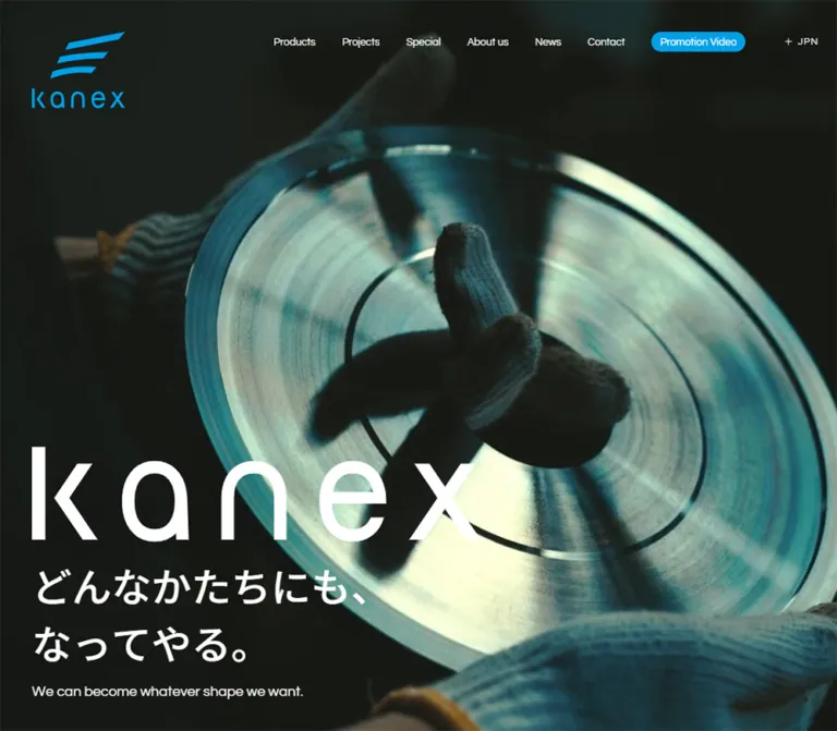
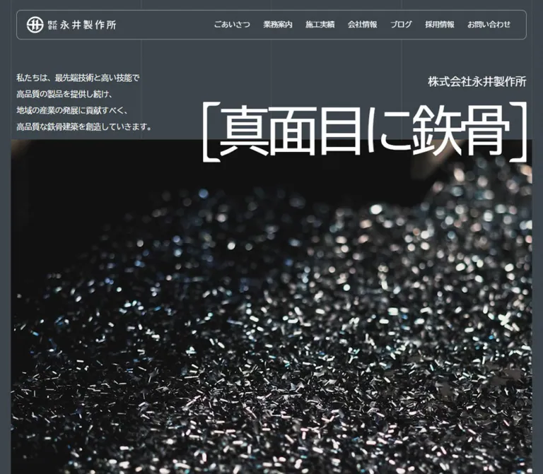
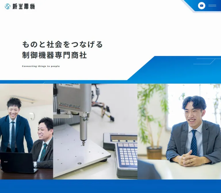
工業写真を全面に配した導入部、大きな英字見出し、固定的な左ナビゲーションが特徴のコーポレートサイト。ブルーと淡いグレーを基調に、広い余白と細い罫線で製品・事業情報を整理しています。
オリジナルサイトを見るIndustrial precision expressed through expansive photography, oversized blue lettering, and quietly structured Japanese information.
Website: saginomiya.co.jp Original URL: https://www.saginomiya.co.jp/ Final URL: https://www.saginomiya.co.jp/ Theme: light content canvas, photographic opening, and a solid blue footer. Inspected: September 22, 2026, at 14:17:48.260 UTC / 23:17:48.260 JST, according to the supplied browser evidence. Viewports: desktop 1440 × 1000 CSS pixels; mobile 390 × 844 CSS pixels. Scope: the current Japanese corporate homepage. Visual captures cover the desktop opening, a market-to-products transition, the news/footer boundary, and the mobile opening and footer. Rendered text, link destinations, element geometry, and computed styles cover the intervening homepage sections at both widths. Search, menu opening, destination pages, and hover results were not exercised in the supplied evidence.
SAGINOMIYA combines a dramatic photographic introduction with a substantial industrial information directory. Bright blue headings establish the major chapters; slate-colored Japanese text handles explanation, navigation, and product selection. The pale canvas, square corners, thin rules, and exceptionally generous vertical spacing make a technically dense site feel controlled and spacious.
The desktop composition is deliberately asymmetric. A narrow navigation rail occupies the left edge while the main reading axis begins farther inward. Photography can extend behind that rail or approach the right viewport edge. On mobile, the rail gives way to a compact logo/search/menu header, product entries become taller, news metadata moves above headlines, and the blue footer reorganizes into two primary columns followed by a single policy list.
Industrial precision expressed through expansive photography, oversized blue lettering, and quietly structured Japanese information.
Website: saginomiya.co.jp Original URL: https://www.saginomiya.co.jp/ Final URL: https://www.saginomiya.co.jp/ Theme: light content canvas, photographic opening, and a solid blue footer. Inspected: September 22, 2026, at 14:17:48.260 UTC / 23:17:48.260 JST, according to the supplied browser evidence. Viewports: desktop 1440 × 1000 CSS pixels; mobile 390 × 844 CSS pixels. Scope: the current Japanese corporate homepage. Visual captures cover the desktop opening, a market-to-products transition, the news/footer boundary, and the mobile opening and footer. Rendered text, link destinations, element geometry, and computed styles cover the intervening homepage sections at both widths. Search, menu opening, destination pages, and hover results were not exercised in the supplied evidence.
SAGINOMIYA combines a dramatic photographic introduction with a substantial industrial information directory. Bright blue headings establish the major chapters; slate-colored Japanese text handles explanation, navigation, and product selection. The pale canvas, square corners, thin rules, and exceptionally generous vertical spacing make a technically dense site feel controlled and spacious.
The desktop composition is deliberately asymmetric. A narrow navigation rail occupies the left edge while the main reading axis begins farther inward. Photography can extend behind that rail or approach the right viewport edge. On mobile, the rail gives way to a compact logo/search/menu header, product entries become taller, news metadata moves above headlines, and the blue footer reorganizes into two primary columns followed by a single policy list.
≈ or identified explicitly.| Name | Value | Suggested token | Evidence and role |
|---|---|---|---|
| Corporate Blue | #0A7FD3 |
--sg-blue |
Measured as rgb(10, 127, 211) on section headings, the anniversary heading, and the footer background. |
| Slate Ink | #41536A |
--sg-ink |
Measured body, paragraph, directory-link, and news text color. Softer than black while retaining a technical character. |
| Pale Canvas | #F5F5F5 |
--sg-paper |
Measured body background at both viewports. Main content and the scrolled navigation appear on this light field. |
| Reversed White | #FFFFFF |
--sg-white |
Measured opening navigation, company-section text, and footer text. Also visibly used by the reversed wordmark. |
| Fine Rule | #C5CCD4 |
--sg-rule |
Recommended approximation for the pale blue-gray rules visible in the captures. This value occurs on a sampled search control, but actual border-color declarations were not supplied. |
| Secondary Neutral | ≈ #EFEEED |
--sg-panel |
Visual approximation of the slightly darker neutral field behind the captured market content. Its exact background declaration was not supplied. |
The main blue performs two different jobs: large text on pale backgrounds and a full-width field carrying white footer content. Avoid spreading it across every small label or filling every link with it. The design relies on extensive neutral areas between blue landmarks.
The blue wordmark visible after scrolling appears deeper than the large heading blue. Its asset colors were not measured; preserve the authorized logo artwork instead of recoloring it to an assumed token.
No selectable themes were observed. White controls over photography, slate controls over pale content, and the blue footer are contextual surface treatments within one design. They do not establish a dark-mode feature.
Measured family stack:
'IBM Plex Sans JP', YuGothic, '游ゴシック',
'Hiragino Kaku Gothic ProN', 'Hiragino Sans', Meiryo, sans-serif
The body uses 16px, weight 400, 28px line height, and -0.32px letter spacing at both inspected widths. Individual mobile paragraphs reduce to 13px or 14px. Japanese section labels and directory entries generally use weight 600; the anniversary heading uses 700.
Business explanations are intentionally loose on desktop: 16px / 36px. Mobile business text changes to 14px / 26px, preserving breathing room without retaining desktop leading.
Measured declared family: Poppins, followed by the Japanese body stack.
Measured wrapper weight: 600.
Role: large chapter markers such as AUTOMATIC CONTROLS, DYNAMIC SERVO, MARKET, OUR PRODUCTS, OUR BUSINESS, and NEWS.
The sampled H2 wrappers report 16px, but the visible letters are much larger. Their child-level font declarations were not included. Do not use the wrapper's inherited size to reproduce these headings.
The captured desktop OUR PRODUCTS heading suggests approximately 100px display type. Its measured box is 114px high. Standard mobile chapter boxes are 67px high per line, supporting an implementation estimate around 56px with approximately 1.2 line height. Two-line business headings instead measure 126px overall on mobile, so one universal line-height value will not exactly reproduce every chapter.
The SAGINOMIYA identity is custom artwork. It is not a heading set in Poppins. Preserve its angular strokes, mixed letter proportions, and continuous silhouette using an authorized asset. The artwork's file format and source URL were not supplied.
The Times declaration on the HTML root is not the site's visible body typography: BODY explicitly establishes the sans-serif stack.
| Role | Desktop | Mobile | Weight | Status |
|---|---|---|---|---|
| Base body | 16px / 28px |
16px / 28px |
400 | Measured inheritance. |
| Business and market paragraphs | 16px / 36px |
14px / 26px |
400 | Measured. |
| Anniversary heading | 18px / 31.5px |
16px / 28px |
700 | Measured. |
| Anniversary paragraph | 16px / 28px |
13px / 22.75px |
400 | Measured. |
| Japanese section heading | 28px / 49px |
19px / 33.25px |
600 | Measured in business and news sections; some directory headings use tighter line heights. |
| Market navigation | 16px / 28px |
14px / 24.5px |
600 | Measured. |
| Product category label | 20px / 20px |
19px / 19px |
600 | Measured parent text styles; English child styles were not separately supplied. |
| Outlined destination link | 16px / 28px |
16px / 28px |
400 | Measured. |
| News headline | 16px / 28px |
14px / 24.5px |
600 | Measured. |
| News category text | 14px / 14px |
12px / 12px |
400 | Measured. |
| Main footer links | 16px / 16px |
14px / 14px |
600 | Measured computed line heights. |
| Footer policy links | 12px / 12px |
12px / 12px |
600 | Measured. |
| Copyright | 10px / 10px |
10px / 10px |
400 | Measured. |
| Standard English display | ≈ 96–104px |
≈ 52–60px |
600 on sampled wrappers | Estimated letter size; use 100px and 56px as starting values. |
| Mobile opening statement | Not the captured desktop statement | ≈ 20px |
Visually semibold | Screenshot estimate only. |
Keep the English headings large and the Japanese hierarchy restrained. The strong size contrast does more work than numerous font weights, colored badges, or decorative typefaces.
Density: sparse chapter transitions surrounding more compact, highly ordered navigation lists. Geometry: square corners and fine lines. No general rounded-card or shadow system is visible in the supplied captures.
| Relationship | Desktop | Mobile | Evidence |
|---|---|---|---|
| English heading to Japanese business label | 36px | 16px | Calculated from measured box edges. |
| Japanese business label to paragraph | 48px | 36px | Calculated from measured box edges. |
| Business paragraph to destination link | 32px | 36px | Calculated from measured box edges. |
| News list to archive link | 72px | 72px | Calculated from measured box edges. |
| Market-link vertical pitch | 80px | 63.5px | Measured successive link positions. |
| Product-entry vertical padding | 39px top, 41px bottom | 34px top and bottom | Measured; mobile content can make entries taller. |
| Automatic-controls section top padding | 200px | 120px | Measured. Other content inside the mobile section precedes its text heading. |
| Dynamic-servo section top padding | 318px | 120px | Measured. |
| Market section top padding | 440px | 240px | Measured section padding, not necessarily the distance to its first visible text. |
| Product section top padding | 320px | 240px | Measured. |
| News section padding | 320px top, 120px bottom | 0px top, 80px bottom | Measured; mobile also has a preceding inter-section gap. |
| Footer padding | 80px top and bottom | 63px top, 46px bottom | Measured. |
Large gaps are part of the composition. Replacing every section transition with a conventional 64px or 96px spacing token would substantially change the page's rhythm.
| Element | Treatment | Evidence |
|---|---|---|
| Destination links | Square, 0px radius |
Measured and visually confirmed. |
| Product and market links | Square, 0px radius |
Measured. |
| News category boxes | Rectangular, sharp corners | Screenshot observation; sampled inner labels also have zero radius. |
| Photography | Straight rectangular edges in the captured market image | Visual observation. |
| Search icon | Circular lens with a diagonal handle | Icon geometry, not a rounded UI surface. |
Use approximately 1px rules as a visual starting point. Exact border widths were not included in the computed-style export.
| Element | Desktop 1440 × 1000 | Mobile 390 × 844 | Status |
|---|---|---|---|
| Document height | 11,607.72px | 13,129.48px | Measured body rectangles. |
| Desktop rail boundary | ≈ x = 248px |
Rail absent from opening capture | Screenshot estimate. |
| Standard chapter left edge | 357px | 20.80px | Measured; market content sometimes uses 362.95px and 20px. |
| Standard chapter width | 1,033.77px | 348.39px | Measured on products/news heading wrappers. |
| Business paragraph width | 462.78px | 263.19px | Measured. Mobile paragraph begins at x = 48.80px. |
| Standard destination link | 325 × 64px | 280 × 74px | Measured. |
| Custom-product inquiry link | 420 × 96px | 303 × 75px | Measured. |
| Market link | 392.77 × 50px | 350 × 51.5px | Measured. |
| Standard product entry | 571.36 × 100px | 348.39 × 168px | Measured; longer mobile entries reach 172–191px. |
| News list width | 886.19px | 348.39px | Measured. |
| News row height | 92.5px | 97.5px or 122px | Measured; mobile height follows headline wrapping. |
| Footer height | 473px | 807px | Measured. |
| Footer content left edge | 148.11px | 20.80px | Measured. |
| Opening mobile wordmark box | — | 192.35 × 25.99px at x = 18px, y = 21px | Measured H1 rectangle, consistent with the capture. |
Role: persistent access to the site's product, corporate, recruitment, news, and utility destinations.
In the opening capture, a white wordmark sits at approximately x = 32px, y = 62px. Its link width is measured at 325px, and the artwork visually extends beyond the eventual rail width. The navigation occupies the lower-left region rather than sitting immediately beneath the logo.
The six primary destinations begin with 製品 - 自動制御機器 and 製品 - 試験装置, followed by business, corporate information, recruitment, and news. Their desktop anchor positions advance by 38px. A short dotted separator distinguishes the sales-network and contact utilities. The baseball destination carries an external-link symbol, and site search combines a small magnifier with サイト内検索.
Over photography, labels and logo are white. In the middle desktop capture, the rail becomes pale with slate labels, a fine right boundary near x = 248px, and a smaller blue logo approximately 160px wide. The exact scroll threshold and transition are unverified.
At the footer boundary, the rail content has moved upward and its divider terminates above the blue footer. Use a rail constrained by the main content region; an indefinitely fixed panel overlapping the footer would not match the captured endpoint.
Role: preserve identity and access while removing the desktop rail from the narrow layout.
The opening header places the white wordmark at x = 18px, y ≈ 21px. The visible search button measures 28 × 28px at x = 290px, y = 20px. The hamburger drawing measures 32 × 18px at x = 338px, y = 25px. Both use thin white strokes over the photograph.
A compact pale header fragment with a smaller blue logo remains visible above the footer in the final mobile capture. Its 37px visible slice is not evidence of a 37px full header height.
Menu and search markup exists in the DOM, including navigation and language links, but no opened state was captured. Do not infer the panel's background, entry direction, focus handling, or animation from those nodes. For a new implementation, enlarge the invisible hit areas without enlarging the icon drawings.
Role: establish the manufacturer's identity before the information directory begins.
The desktop opening fills the 1440 × 1000 capture with a close view of hands handling a metal control component. White AUTOMATIC CONTROLS lettering occupies two lines in the lower central-left area, beginning around x = 302px. The wordmark remains upper-left, language links stack at upper-right, and a slender vertical line marker sits near the lower-right edge.
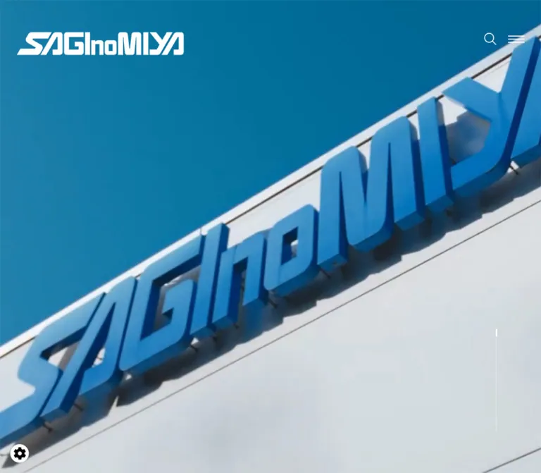
The mobile opening uses a different captured composition: a blue sky and a diagonally rising building sign. Always act for somebody else sits near the vertical midpoint, framed by short horizontal strokes. The statement is much smaller than the desktop industrial heading.
These are verified presentations, but their relationship to media playback, responsive assets, or a timed sequence is not established. The desktop DOM includes several industrial phrases and the same brand statement. A single frame cannot prove that the mobile slogan is permanently exclusive to mobile or identify an autoplay cycle.
Preserve a full-bleed photographic crop, strong white identity, and adequate negative space around text. The precise darkening overlay and media asset URLs were not supplied.
Role: link to the Japanese, English, and Chinese versions.
Desktop shows JP, EN, and CN in a vertical stack near the upper-right. The active Japanese label has a short underline in the capture. EN and CN links use measured 16px text with 6px 13px padding.
Mobile language links are present in the navigation DOM with 12px text and 6px 8px padding, but they are not visible in the closed-header screenshot. The links establish available destinations, not tested language-switch behavior.
Role: add current corporate context after the photographic introduction.
The rendered page includes the source heading 鷺宮製作所は85周年を迎えました, supporting text, and an outlined management-plan link. It is an inset text block rather than a dominant campaign banner.
On desktop its text begins at x = 405px and spans 416.06px. On mobile it begins at x = 52.80px and spans 284.39px. The heading is blue and bold, while the body remains slate. Its destination link follows the common arrow-outline pattern.
The anniversary and management-plan wording is current content, not a permanent design token.
Role: explain the automatic-control and testing-system businesses before presenting detailed directories.
Each section follows a consistent text hierarchy: a small English for your phrase, a larger comfort or safety keyword within that introductory treatment, a major English business heading, a Japanese label, a narrow explanatory paragraph, and an outlined destination link. Child-level sizes inside the introductory phrase were not separately sampled.
Desktop text aligns around x = 357px. English heading wrappers measure 228px high across two lines. The Japanese labels use 28px semibold type, and the descriptive column remains approximately 463px wide with 36px leading.
On mobile, the major heading occupies a 348.39px column; the paragraph shifts inward by a further 28px and narrows to approximately 263px. The section's initial content precedes this text group, so the measured 120px section padding must not be mistaken for the complete distance to its heading. Media placement in these sections was not visually captured.
Role: provide an application-based route into both business families.
The automatic-control group offers four market destinations: home/office, factory/commercial facilities, cold chain, and transport. The testing-system group offers mobility, infrastructure, and materials.
Each desktop link is a slate semibold label above a fine horizontal rule, with a small right-pointing arrow at the far end. The captured list column is approximately 393px wide. In the middle screenshot, a large, square-cornered photograph of a vertical test rig sits to its right, occupying roughly x = 894–1425px. The photograph is cropped by the top of the capture, so its complete aspect ratio cannot be recovered.
The mobile DOM shows full 350px-wide rows with a tighter 63.5px vertical pitch. Preserve the distinction between the two market groups rather than flattening all seven destinations into an undifferentiated list.
Role: expose the actual breadth of the product catalog.
OUR PRODUCTS introduces two substantial groups, each containing eight category destinations. The first covers automatic controls, including valves, pressure and temperature controls, other equipment, and Danfoss products. The second covers material, vibration, fatigue, automotive, civil-engineering, aviation/railway, electric-servo, and hydraulic-power testing systems.
On desktop, automatic-control entries occupy a 571.36px-wide list beginning at x = 819.41px, while the Japanese group heading begins at x = 357px. Testing-system entries later begin at x = 357px. This is an asymmetric directory layout, not a uniform grid of promotional cards.
Desktop entries measure 100px high and have 50px of left padding. Their Japanese labels are 20px semibold. English product names occur in the DOM, but their precise desktop visibility and interaction treatment are not established by the supplied product-transition screenshot.
On mobile, entries occupy the full 348.39px content column and grow to 168–191px high. A 112px region precedes a 203px-wide text box, which adds 25px of internal left padding. This geometry reserves a distinct leading region, but its media contents were not included in the sampled elements or visible mobile captures. Do not invent product photographs or asset dimensions from that gap alone.
Mobile English names are exposed as multiple lines in the rendered text. Allow their full labels to wrap, especially for the longer control-valve and construction-testing categories.
Role: a repeated route to deeper information without creating a competing action color.
The common component is a sharp rectangular outline with a centered Japanese label. A thin horizontal arrow crosses its right edge and extends beyond the box. The captured news button provides a clear example: the box is 325 × 64px and the arrow extends approximately 36px beyond its right boundary.
Desktop text uses 16px regular weight. Standard mobile links become narrower but taller at 280 × 74px. The custom-product inquiry is a separate two-line variant: 420 × 96px desktop and 303 × 75px mobile.
The computed transition is 1.2s cubic-bezier(0.745, 0.065, 0.17, 1). Its endpoint styles and animated properties were not captured. Reserve space for the protruding arrow and provide a visible keyboard focus state in adaptations.
Role: connect product selection to service needs.
Two supporting blocks follow the testing categories: 受託試験サービス and アフターサポート. Each combines a service label, a compact explanatory paragraph, and a standard outlined destination link.
Desktop paragraphs occupy two separate columns of 476.38px, beginning at x = 357px and x = 914.39px. Their typography is 14px / 28px. Mobile stacks the blocks within the 348.39px content width, changes paragraph leading to 26px, and centers the 280px links.
Role: return from product details to corporate identity.
The OUR BUSINESS section uses measured white headings, white explanatory text, and a white destination link. Desktop places the description farther right, at x = 794px with a width of 596.77px. Mobile uses a 290px content column with 50px side insets.
The desktop section measures 945px high; mobile measures 787.25px. Its background imagery or underlying surface was not included in the supplied screenshots, and the sampled section background itself is transparent. Preserve the reversed hierarchy while treating the exact backdrop as unresolved.
Role: present current corporate updates in a restrained chronological table-like list.
Three entries are present. Desktop rows contain a date, a small outlined category box, and a semibold headline. The list begins at x = 357px and is 886.19px wide. Headlines start at x = 683px, leaving a substantial metadata region on the left. Fine horizontal rules separate the 92.5px rows.
The category's visible outer box is approximately 110 × 34px in the screenshot; the sampled inner text slot is 90px wide. Categories such as 展示会 and お知らせ remain neutral outlines rather than differently colored badges.
On mobile, each row becomes a block: date and category first, headline below. Row padding changes from 29px to 16px vertically, and headline type reduces to 14px. The longer sustainability headline wraps and expands its row to 122px.
The ニュース一覧 link sits 72px below the list. It aligns to the list's right edge on desktop and is centered on mobile.
Role: finish the page with a strong identity field and a complete secondary navigation structure.
The footer spans the entire viewport, including the desktop rail's horizontal territory. Its measured background is #0A7FD3, with white logo artwork, links, copyright, and a vertical PAGE TOP control.
Desktop content begins at x = 148.11px, wider and more centered than the main section axis. The approximately 325px wordmark sits above four navigation columns: two primary groups followed by two smaller policy/utility groups. Primary link positions advance by 42px; policy links advance by 32px. Copyright is aligned toward the right in the capture.
Mobile retains two primary columns, beginning at x = 20.80px and x = 234.14px. The six policy/utility links consolidate into one vertical list below them. Main links use 14px semibold type, policy links remain 12px, and copyright remains 10px. The footer grows from 473px to 807px, retaining generous separation instead of compressing into a dense utility block.
The PAGE TOP drawing is a narrow vertical label above a long upward arrow. Its measured button box is only 14px wide and approximately 112px tall. Click behavior and scrolling duration were not tested; an enlarged invisible hit area is recommended.
| Treatment | Supported evidence | Practical interpretation |
|---|---|---|
| Outlined destination-link transition | Measured 1.2s cubic-bezier(0.745, 0.065, 0.17, 1) at both widths |
Preserve this easing only where a corresponding transition is implemented; the original endpoint treatment is unknown. |
| Large-heading repetition | Repeated English strings in rendered DOM; one readable heading in the captures | Likely separate presentation layers, but clipping, reveal direction, and timing are unverified. |
| Opening media | Photographic frames and multiple desktop phrases | No verified video element, autoplay schedule, loop length, audio state, or slider controls. |
| Navigation appearance | White over the opening; blue/slate on pale content later | The two visual states are observed. The trigger and transition duration are not. |
| Desktop vertical hero marker | Thin track and short bright segment visible | Its progress semantics, animation, and interactivity were not tested. |
| Search and mobile menu | Visible controls plus DOM content | Opening behavior, panel appearance, and keyboard interaction are unverified. |
| Page-top control | Button and directional artwork observed | Destination intent is clear; click result and smooth-scrolling behavior are unverified. |
| Other sampled transitions | Many entries report only all; sampled elements report animation: none |
This is insufficient to establish a timing system or conclude that the entire page has no animation. |
For a new implementation, keep the unanimated layout fully readable. Add restrained link feedback and optional media behavior after establishing the two captured layouts. Do not invent parallax, scroll snapping, staggered reveals, or image-following hover effects and label them as original behavior.
| Layer | Appearance | Purpose |
|---|---|---|
| Opening | Full-bleed industrial photography with white foreground elements | Establish scale and identity. |
| Main canvas | Solid #F5F5F5 |
Maintain a quiet foundation for long technical content. |
| Captured market field | Slightly darker neutral, exact value unmeasured | Separate the application directory from the following product chapter. |
| Navigation and directory structure | Thin rules, open space, square outlines | Group information without card elevation. |
| Company section | White typography; underlying backdrop unresolved | Create a reversed corporate interlude. |
| Footer | Solid #0A7FD3 with white content |
Provide a clear full-width ending and secondary sitemap. |
There is no visible glass treatment, general shadow hierarchy, or pill-shaped action system in the captured portions.
The verified imagery is specific to manufacturing: a component being handled, a branded industrial building, and a vertical testing machine in a bright laboratory. Real metal surfaces, machine geometry, human hands, and the company's physical identity carry the visual credibility.
The opening crop is immersive and close. The mobile building image uses a strong diagonal against a large blue sky, leaving negative space for the statement. The market image is more descriptive and rectangular, showing equipment clearly beside a navigational list.
No original image, video, logo, or font-file URLs were included in the supplied asset evidence. The following identifies visible subjects without inventing paths.
| Asset role | Verified appearance | Reuse guidance |
|---|---|---|
| Desktop opening media | Hands holding a metallic control component, with blue work clothing and a subdued background | Use an authorized industrial close-up with enough contrast for white text. |
| Mobile opening media | Blue sky, pale building facade, and diagonal SAGINOMIYA signage | Preserve the diagonal and sky space when preparing a narrow crop. |
| Testing-market photograph | Vertical test rig, polished columns, and laboratory structure | Keep straight edges and a descriptive landscape presentation. |
| Wordmark | Angular white and blue SAGINOMIYA artwork | Use the brand asset; do not approximate it with ordinary text. |
| Interface symbols | Thin magnifier, hamburger, directional arrows, external-link mark | Match the restrained stroke character; exact icon sources are unverified. |
Do not infer product thumbnails, factory montages, or background videos that are absent from the visual evidence. For a new implementation, use genuine authorized product imagery where available and preserve the measured layout around it.
The page is a long corporate homepage with multiple routes into a technical catalog. Its observed sequence is opening, anniversary announcement, two business introductions, market solutions, product directories, service blocks, company information, news, and footer.
Desktop uses several related alignment axes rather than a single centered container. The rail ends around x = 248px; chapter headings begin at x = 357px; market details shift slightly to x ≈ 363px; the anniversary text moves farther in to x = 405px; and the footer starts independently at x ≈ 148px. Preserve these intentional differences where they structure the composition.
| Behavior | Desktop observation | Mobile observation |
|---|---|---|
| Navigation | Persistent left rail in upper/middle captures | Logo, search, and menu in a compact top header. |
| Opening composition | Component close-up and large two-line industrial statement | Building-sign crop and small centered brand statement. |
| Chapter headings | Broad single lines where space permits | Long titles occupy two lines; OUR PRODUCTS wrapper grows from 114px to 134px. |
| Business explanation | Narrow column aligned with its heading | Further inset paragraph inside the wider heading column. |
| Market links | Narrow list beside a large photograph in the captured section | Approximately 350px-wide rows; complete mobile media placement was not visually captured. |
| Product entries | Asymmetric 571px lists, 100px rows | Full content width, taller entries, multiline bilingual labels. |
| Services | Two measured text columns | Sequential blocks. |
| News | Metadata and headline share a row | Metadata above headline. |
| Footer | Four navigation columns | Two primary columns, then one policy list. |
The exact breakpoint is unknown: only 390px and 1440px widths were inspected. The Quick Start uses 1024px as an explicit recommendation. Test intermediate widths instead of treating that choice as source evidence.
Mobile spacing does not simply scale down by a constant ratio. Standard links become taller, product rows expand, the footer nearly doubles in height, and chapter transitions still use large gaps. The document grows by approximately 1,522px despite smaller type.
These are recommendations for a new implementation, not verified features of the inspected website.
#F5F5F5.#41536A.#0A7FD3.#C5CCD4 is an implementation approximation.“Create a Japanese industrial corporate homepage inspired by the supplied SAGINOMIYA reference. Use a pale #F5F5F5 canvas, slate #41536A text, and strong #0A7FD3 chapter headings. Pair IBM Plex Sans JP interface typography with large Poppins English headings. Open with full-viewport manufacturing photography and white identity elements. On desktop, place navigation in a roughly 248px left rail while beginning the main chapter axis around x = 357px at a 1440px viewport. Build spacious business introductions, application-based market lists, asymmetric product directories, compact chronological news rows, and a full-width blue footer. Use sharp corners, fine rules, and outlined links with arrows extending beyond their right edges. On mobile, replace the rail with a logo/search/menu header, allow bilingual product names to wrap, stack news metadata above headlines, and reorganize the footer into two main columns followed by a policy list. Treat uncaptured motion and overlay behavior as new implementation decisions.”
This is an implementation scaffold, not extracted production CSS. Measured colors and component sizes are combined with estimated display sizes, a recommended 1024px breakpoint, and approximate responsive interpolation. Load authorized font and image assets separately. No asset paths are implied.
Suggested structure: a .page-stage containing .site-rail and .page-main, followed by .site-footer outside that stage. Put normal sections in .section-shell; keep .hero full width. A separate .mobile-header supplies the narrow-screen controls. Set data-surface='light' on navigation when appropriate; the source's exact trigger is unknown.
:root {
  /* Measured colors */
  --sg-blue: #0a7fd3;
  --sg-ink: #41536a;
  --sg-paper: #f5f5f5;
  --sg-white: #fff;

  /* Approximate supporting colors */
  --sg-rule: #c5ccd4;
  --sg-panel: #efeeed;

  /* Declared source families; font loading is separate */
  --sg-font-jp: 'IBM Plex Sans JP', YuGothic, '游ゴシック',
    'Hiragino Kaku Gothic ProN', 'Hiragino Sans', Meiryo, sans-serif;
  --sg-font-display: Poppins, var(--sg-font-jp);
  --sg-tracking: -0.32px;

  /* Endpoint-based layout approximation */
  --sg-rail: 248px;
  --sg-inset: clamp(36px, 7.57vw, 109px);
  --sg-right: clamp(24px, 3.42vw, 50px);
  --sg-display: clamp(56px, 6.944vw, 100px);
  --sg-chapter-gap: 320px;
  --sg-link-width: 325px;
  --sg-link-height: 64px;
  --sg-arrow-overhang: 36px;

  /* Measured destination-link transition */
  --sg-link-duration: 1.2s;
  --sg-link-ease: cubic-bezier(0.745, 0.065, 0.17, 1);
}

* { box-sizing: border-box; }

body {
  margin: 0;
  color: var(--sg-ink);
  background: var(--sg-paper);
  font-family: var(--sg-font-jp);
  font-size: 16px;
  line-height: 1.75;
  letter-spacing: var(--sg-tracking);
}

a { color: inherit; }
button { font: inherit; }
img { display: block; max-width: 100%; }

.page-stage {
  position: relative;
  display: grid;
  grid-template-columns: var(--sg-rail) minmax(0, 1fr);
}

.page-main {
  grid-column: 1 / -1;
  grid-row: 1;
  min-width: 0;
}

.site-rail {
  position: sticky;
  top: 0;
  z-index: 5;
  grid-column: 1;
  grid-row: 1;
  align-self: start;
  height: 100vh;
  height: 100svh;
  color: var(--sg-white);
  border-right: 1px solid transparent;
}

.rail-brand {
  position: absolute;
  top: 62px;
  left: 32px;
  width: 325px;
}

.rail-brand img { width: 100%; }

.rail-nav {
  position: absolute;
  right: 24px;
  bottom: 60px;
  left: 32px;
}

.rail-nav ul {
  margin: 0;
  padding: 0;
  list-style: none;
}

.rail-primary { display: grid; gap: 22px; }
.rail-primary a { font-size: 16px; line-height: 16px; }
.rail-nav a { text-decoration: none; }

.rail-utilities {
  display: grid;
  gap: 22px;
  margin-top: 26px !important;
  padding-top: 20px !important;
  border-top: 1px dotted currentColor;
  font-size: 14px;
}

.site-rail[data-surface='light'] {
  color: var(--sg-ink);
  background: var(--sg-paper);
  border-right-color: var(--sg-rule);
}

.site-rail[data-surface='light'] .rail-brand {
  top: 46px;
  left: 16px;
  width: 160px;
}

/* Switch authorized logo variants with the surface state. */
.mobile-header { display: none; }

.hero {
  position: relative;
  isolation: isolate;
  min-height: 100vh;
  min-height: 100svh;
  color: var(--sg-white);
  background: var(--sg-ink);
}

.hero-media {
  position: absolute;
  inset: 0;
  z-index: -2;
  width: 100%;
  height: 100%;
  object-fit: cover;
}

/* Recommended overlay; original opacity was not measured. */
.hero::after {
  content: '';
  position: absolute;
  inset: 0;
  z-index: -1;
  background: rgb(0 0 0 / 22%);
}

.hero-title {
  position: absolute;
  top: 59%;
  left: calc(var(--sg-rail) + 54px);
  margin: 0;
  font-family: var(--sg-font-display);
  font-size: var(--sg-display);
  font-weight: 600;
  line-height: 1.08;
}

.hero-title span { display: block; }
.hero-statement { display: none; }

.section-shell {
  margin-left: calc(var(--sg-rail) + var(--sg-inset));
  margin-right: var(--sg-right);
}

.chapter { padding-top: var(--sg-chapter-gap); }

.display-title {
  margin: 0;
  color: var(--sg-blue);
  font-family: var(--sg-font-display);
  font-size: var(--sg-display);
  font-weight: 600;
  line-height: 1.14;
}

.display-title .mobile-line { display: inline; }

.section-label {
  margin: 36px 0 0;
  font-size: 28px;
  font-weight: 600;
  line-height: 1.75;
}

.business-copy {
  max-width: 462.78px;
  margin: 48px 0 32px;
  font-size: 16px;
  line-height: 36px;
}

.destination-link {
  position: relative;
  display: flex;
  align-items: center;
  justify-content: center;
  width: min(var(--sg-link-width), calc(100% - 40px));
  min-height: var(--sg-link-height);
  padding: 12px 24px;
  border: 1px solid currentColor;
  border-radius: 0;
  color: inherit;
  background: transparent;
  font-size: 16px;
  line-height: 28px;
  text-align: center;
  text-decoration: none;
}

.destination-link::before {
  content: '';
  position: absolute;
  top: 50%;
  right: calc(-1 * var(--sg-arrow-overhang));
  width: 72px;
  height: 1px;
  background: currentColor;
}

.destination-link::after {
  content: '';
  position: absolute;
  top: calc(50% - 5px);
  right: calc(-1 * var(--sg-arrow-overhang));
  width: 10px;
  height: 10px;
  border-top: 1px solid currentColor;
  border-right: 1px solid currentColor;
  transform: rotate(45deg);
}

.destination-link--inquiry {
  width: min(420px, calc(100% - 40px));
  min-height: 96px;
}

/* Proposed feedback, not a verified original hover state. */
.destination-link::before,
.destination-link::after {
  transition: translate var(--sg-link-duration) var(--sg-link-ease);
}

@media (hover: hover) {
  .destination-link:hover::before,
  .destination-link:hover::after { translate: 6px 0; }
}

.market-link {
  display: flex;
  align-items: center;
  justify-content: space-between;
  min-height: 50px;
  margin-bottom: 30px;
  padding: 6px 0 16px;
  border-bottom: 1px solid var(--sg-rule);
  font-weight: 600;
  text-decoration: none;
}

.product-list { margin: 0; padding: 0; list-style: none; }

.product-link {
  display: flex;
  align-items: center;
  min-height: 100px;
  padding: 39px 32px 41px 50px;
  border-bottom: 1px solid var(--sg-rule);
  text-decoration: none;
}

.product-name {
  margin: 0;
  font-size: 20px;
  font-weight: 600;
  line-height: 1.35;
}

/* English child sizing is a recommendation. */
.product-name small {
  display: block;
  margin-top: 12px;
  font-family: var(--sg-font-display);
  font-size: 12px;
  line-height: 1.4;
}

.news-list { max-width: 886.19px; }

.news-row {
  display: grid;
  grid-template-columns: 326px minmax(0, 1fr);
  align-items: center;
  min-height: 92.5px;
  padding-block: 29px;
  border-bottom: 1px solid var(--sg-rule);
  text-decoration: none;
}

.news-meta { display: flex; align-items: center; gap: 32px; }
.news-date { font-size: 14px; white-space: nowrap; }

.news-category {
  width: 110px;
  padding: 9px 10px;
  border: 1px solid currentColor;
  font-size: 14px;
  line-height: 14px;
  text-align: center;
}

.news-title { margin: 0; font-size: 16px; font-weight: 600; }
.news-archive { margin: 72px 0 0 auto; }

.site-footer {
  position: relative;
  z-index: 6;
  min-height: 473px;
  padding: 80px 0;
  color: var(--sg-white);
  background: var(--sg-blue);
}

.footer-inner { position: relative; width: 79.43%; margin-inline: auto; }
.footer-brand { width: 325px; }

.footer-nav {
  display: grid;
  grid-template-columns: 22.75% 20.49% minmax(0, 1fr);
  gap: 0;
  margin-top: 88px;
}

.footer-group { display: grid; align-content: start; gap: 26px; }
.footer-group a { font-weight: 600; line-height: 16px; text-decoration: none; }

.footer-policies {
  display: grid;
  grid-template-columns: 47.4% minmax(0, 1fr);
}

.footer-policies .footer-group { gap: 20px; }
.footer-policies a { font-size: 12px; line-height: 12px; }

.copyright {
  margin: 14px 0 0;
  font-size: 10px;
  line-height: 1.4;
  text-align: right;
}

/* Recommended focus treatment. */
a:focus-visible,
button:focus-visible {
  outline: 2px solid currentColor;
  outline-offset: 5px;
}

/* Recommended breakpoint; original breakpoint is unknown. */
@media (max-width: 64rem) {
  :root {
    --sg-rail: 0px;
    --sg-inset: 5.333vw;
    --sg-right: 5.333vw;
    --sg-display: 56px;
    --sg-chapter-gap: 240px;
    --sg-link-width: 280px;
    --sg-link-height: 74px;
  }

  .page-stage { display: block; }
  .site-rail { display: none; }

  .mobile-header {
    position: fixed;
    inset: 0 0 auto;
    z-index: 10;
    display: flex;
    align-items: center;
    gap: 4px;
    min-height: 68px;
    padding: env(safe-area-inset-top, 0px) 18px 0;
    color: var(--sg-white);
  }

  .mobile-header[data-surface='light'] {
    color: var(--sg-ink);
    background: var(--sg-paper);
  }

  .mobile-brand { width: 192.35px; margin-right: auto; }

  .icon-button {
    display: grid;
    place-items: center;
    width: 44px;
    height: 44px;
    padding: 0;
    border: 0;
    color: inherit;
    background: transparent;
  }

  /* Static recreation of the two captured opening states. */
  .hero-title { display: none; }
  .hero-statement {
    position: absolute;
    top: 50%;
    left: 20px;
    right: 20px;
    display: block;
    margin: 0;
    transform: translateY(-50%);
    font-size: 20px;
    font-weight: 600;
    line-height: 1.4;
    text-align: center;
  }

  .display-title { line-height: 1.196; }
  .display-title .mobile-line { display: block; }
  .section-label { margin-top: 16px; font-size: 19px; }

  .business-copy {
    width: 75.6%;
    margin: 36px 0 36px 28px;
    font-size: 14px;
    line-height: 26px;
  }

  .destination-link { margin-inline: auto; }
  .destination-link--inquiry { width: min(303px, calc(100% - 40px)); min-height: 75px; }
  .market-link { min-height: 51.5px; margin-bottom: 12px; font-size: 14px; }

  .product-link { min-height: 168px; padding: 34px 0; }
  .product-name { font-size: 19px; overflow-wrap: anywhere; }

  /* Use only when an authorized leading product asset is supplied. */
  .product-link--with-media {
    display: grid;
    grid-template-columns: minmax(0, 112px) minmax(0, 1fr);
  }
  .product-link--with-media .product-name { padding-left: 25px; }

  .news-row { display: block; padding-block: 16px; }
  .news-meta { gap: 24px; }
  .news-category { width: 86px; padding: 4px 10px; font-size: 12px; line-height: 12px; }
  .news-title { margin-top: 18px; font-size: 14px; line-height: 24.5px; }
  .news-archive { margin-top: 72px; }

  .site-footer { min-height: 807px; padding: 63px 0 46px; }
  .footer-inner { width: calc(100% - 10.666vw); }
  .footer-brand { width: 185px; }
  .footer-nav { grid-template-columns: 61.24% minmax(0, 1fr); row-gap: 96px; margin-top: 160px; }
  .footer-group { gap: 38px; }
  .footer-group a { font-size: 14px; line-height: 14px; }
  .footer-policies { grid-column: 1 / -1; grid-template-columns: 1fr; gap: 20px; }
  .footer-policies a { font-size: 12px; line-height: 12px; }
  .copyright { margin-top: 46px; text-align: left; }
}

@media (prefers-reduced-motion: reduce) {
  .destination-link::before,
  .destination-link::after { transition: none; }
  html { scroll-behavior: auto; }
}
This scaffold deliberately leaves the company-section backdrop, media sequence, menu/search overlays, and product imagery to separately verified assets and behavior. The heading sizes and footer spacing should be checked against the supplied captures after fonts load. The CSS was not executed or browser-tested for this reference.
Optional aliases for a project already using Tailwind v4. This does not imply that the original website uses Tailwind. Define the properties above first.
@theme inline {
  --color-brand: var(--sg-blue);
  --color-ink: var(--sg-ink);
  --color-paper: var(--sg-paper);
  --color-rule: var(--sg-rule);
  --color-panel: var(--sg-panel);

  --font-body: var(--sg-font-jp);
  --font-display: var(--sg-font-display);

  --text-display: var(--sg-display);
  --spacing-rail: var(--sg-rail);
  --spacing-chapter: var(--sg-chapter-gap);
  --spacing-link-width: var(--sg-link-width);
  --spacing-link-height: var(--sg-link-height);

  --radius-control: 0px;
}
株式会社鷺宮製作所; the footer independently displays the SAGINOMIYA SEISAKUSHO, INC. copyright identity.This document describes the current homepage represented by those captures. Measured endpoint values, visual estimates, and implementation recommendations are identified separately throughout.
# SAGINOMIYA — Style Reference

> Industrial precision expressed through expansive photography, oversized blue lettering, and quietly structured Japanese information.

**Website:** [saginomiya.co.jp](https://www.saginomiya.co.jp/)
**Original URL:** https://www.saginomiya.co.jp/
**Final URL:** https://www.saginomiya.co.jp/
**Theme:** light content canvas, photographic opening, and a solid blue footer.
**Inspected:** September 22, 2026, at 14:17:48.260 UTC / 23:17:48.260 JST, according to the supplied browser evidence.
**Viewports:** desktop 1440 × 1000 CSS pixels; mobile 390 × 844 CSS pixels.
**Scope:** the current Japanese corporate homepage. Visual captures cover the desktop opening, a market-to-products transition, the news/footer boundary, and the mobile opening and footer. Rendered text, link destinations, element geometry, and computed styles cover the intervening homepage sections at both widths. Search, menu opening, destination pages, and hover results were not exercised in the supplied evidence.

SAGINOMIYA combines a dramatic photographic introduction with a substantial industrial information directory. Bright blue headings establish the major chapters; slate-colored Japanese text handles explanation, navigation, and product selection. The pale canvas, square corners, thin rules, and exceptionally generous vertical spacing make a technically dense site feel controlled and spacious.

The desktop composition is deliberately asymmetric. A narrow navigation rail occupies the left edge while the main reading axis begins farther inward. Photography can extend behind that rail or approach the right viewport edge. On mobile, the rail gives way to a compact logo/search/menu header, product entries become taller, news metadata moves above headlines, and the blue footer reorganizes into two primary columns followed by a single policy list.
# SAGINOMIYA — Style Reference

> Industrial precision expressed through expansive photography, oversized blue lettering, and quietly structured Japanese information.

**Website:** [saginomiya.co.jp](https://www.saginomiya.co.jp/)
**Original URL:** https://www.saginomiya.co.jp/
**Final URL:** https://www.saginomiya.co.jp/
**Theme:** light content canvas, photographic opening, and a solid blue footer.
**Inspected:** September 22, 2026, at 14:17:48.260 UTC / 23:17:48.260 JST, according to the supplied browser evidence.
**Viewports:** desktop 1440 × 1000 CSS pixels; mobile 390 × 844 CSS pixels.
**Scope:** the current Japanese corporate homepage. Visual captures cover the desktop opening, a market-to-products transition, the news/footer boundary, and the mobile opening and footer. Rendered text, link destinations, element geometry, and computed styles cover the intervening homepage sections at both widths. Search, menu opening, destination pages, and hover results were not exercised in the supplied evidence.

SAGINOMIYA combines a dramatic photographic introduction with a substantial industrial information directory. Bright blue headings establish the major chapters; slate-colored Japanese text handles explanation, navigation, and product selection. The pale canvas, square corners, thin rules, and exceptionally generous vertical spacing make a technically dense site feel controlled and spacious.

The desktop composition is deliberately asymmetric. A narrow navigation rail occupies the left edge while the main reading axis begins farther inward. Photography can extend behind that rail or approach the right viewport edge. On mobile, the rail gives way to a compact logo/search/menu header, product entries become taller, news metadata moves above headlines, and the blue footer reorganizes into two primary columns followed by a single policy list.

## How to Read This Reference

- **Measured** means a value appears in the supplied computed styles or element rectangles. These are observations at the two inspected viewports, not recovered responsive formulas.
- **Estimated** means a visual approximation from the original-page captures. Estimated values are marked with `≈` or identified explicitly.
- **Recommended** means an implementation choice for reuse. Breakpoints, uncaptured interaction states, and the Quick Start are recommendations rather than recovered source code.
- **Token names** are new descriptive aliases. The supplied custom-property inventory was empty; it does not establish that the production stylesheet has no variables.
- **Declared font families** are supported by computed styles. Font-file requests and the exact face used for every glyph were not supplied.
- Several headings contain repeated text in the DOM. The captures show a single readable heading, so duplicated DOM strings must not become duplicated visible copy.
- A rectangle can describe a wrapper, hidden interaction layer, or stretched layout item. The logo link's zero-height text rectangle and the product heading's unusually tall box are not visual size specifications for their artwork or letters.

## Tokens — Colors

### Default Palette

| Name | Value | Suggested token | Evidence and role |
| --- | --- | --- | --- |
| Corporate Blue | `#0A7FD3` | `--sg-blue` | Measured as `rgb(10, 127, 211)` on section headings, the anniversary heading, and the footer background. |
| Slate Ink | `#41536A` | `--sg-ink` | Measured body, paragraph, directory-link, and news text color. Softer than black while retaining a technical character. |
| Pale Canvas | `#F5F5F5` | `--sg-paper` | Measured body background at both viewports. Main content and the scrolled navigation appear on this light field. |
| Reversed White | `#FFFFFF` | `--sg-white` | Measured opening navigation, company-section text, and footer text. Also visibly used by the reversed wordmark. |
| Fine Rule | `#C5CCD4` | `--sg-rule` | Recommended approximation for the pale blue-gray rules visible in the captures. This value occurs on a sampled search control, but actual border-color declarations were not supplied. |
| Secondary Neutral | `≈ #EFEEED` | `--sg-panel` | Visual approximation of the slightly darker neutral field behind the captured market content. Its exact background declaration was not supplied. |

The main blue performs two different jobs: large text on pale backgrounds and a full-width field carrying white footer content. Avoid spreading it across every small label or filling every link with it. The design relies on extensive neutral areas between blue landmarks.

The blue wordmark visible after scrolling appears deeper than the large heading blue. Its asset colors were not measured; preserve the authorized logo artwork instead of recoloring it to an assumed token.

### Theme Presets

No selectable themes were observed. White controls over photography, slate controls over pale content, and the blue footer are contextual surface treatments within one design. They do not establish a dark-mode feature.

## Tokens — Typography

### Japanese Body and Interface

**Measured family stack:**

```css
'IBM Plex Sans JP', YuGothic, '游ゴシック',
'Hiragino Kaku Gothic ProN', 'Hiragino Sans', Meiryo, sans-serif
```

The body uses `16px`, weight `400`, `28px` line height, and `-0.32px` letter spacing at both inspected widths. Individual mobile paragraphs reduce to 13px or 14px. Japanese section labels and directory entries generally use weight `600`; the anniversary heading uses `700`.

Business explanations are intentionally loose on desktop: `16px / 36px`. Mobile business text changes to `14px / 26px`, preserving breathing room without retaining desktop leading.

### English Display Headings

**Measured declared family:** `Poppins`, followed by the Japanese body stack.
**Measured wrapper weight:** `600`.
**Role:** large chapter markers such as `AUTOMATIC CONTROLS`, `DYNAMIC SERVO`, `MARKET`, `OUR PRODUCTS`, `OUR BUSINESS`, and `NEWS`.

The sampled H2 wrappers report `16px`, but the visible letters are much larger. Their child-level font declarations were not included. Do not use the wrapper's inherited size to reproduce these headings.

The captured desktop `OUR PRODUCTS` heading suggests approximately 100px display type. Its measured box is 114px high. Standard mobile chapter boxes are 67px high per line, supporting an implementation estimate around 56px with approximately 1.2 line height. Two-line business headings instead measure 126px overall on mobile, so one universal line-height value will not exactly reproduce every chapter.

### Brand Wordmark

The SAGINOMIYA identity is custom artwork. It is not a heading set in Poppins. Preserve its angular strokes, mixed letter proportions, and continuous silhouette using an authorized asset. The artwork's file format and source URL were not supplied.

The `Times` declaration on the HTML root is not the site's visible body typography: BODY explicitly establishes the sans-serif stack.

### Type Scale

| Role | Desktop | Mobile | Weight | Status |
| --- | --- | --- | --- | --- |
| Base body | `16px / 28px` | `16px / 28px` | 400 | Measured inheritance. |
| Business and market paragraphs | `16px / 36px` | `14px / 26px` | 400 | Measured. |
| Anniversary heading | `18px / 31.5px` | `16px / 28px` | 700 | Measured. |
| Anniversary paragraph | `16px / 28px` | `13px / 22.75px` | 400 | Measured. |
| Japanese section heading | `28px / 49px` | `19px / 33.25px` | 600 | Measured in business and news sections; some directory headings use tighter line heights. |
| Market navigation | `16px / 28px` | `14px / 24.5px` | 600 | Measured. |
| Product category label | `20px / 20px` | `19px / 19px` | 600 | Measured parent text styles; English child styles were not separately supplied. |
| Outlined destination link | `16px / 28px` | `16px / 28px` | 400 | Measured. |
| News headline | `16px / 28px` | `14px / 24.5px` | 600 | Measured. |
| News category text | `14px / 14px` | `12px / 12px` | 400 | Measured. |
| Main footer links | `16px / 16px` | `14px / 14px` | 600 | Measured computed line heights. |
| Footer policy links | `12px / 12px` | `12px / 12px` | 600 | Measured. |
| Copyright | `10px / 10px` | `10px / 10px` | 400 | Measured. |
| Standard English display | `≈ 96–104px` | `≈ 52–60px` | 600 on sampled wrappers | Estimated letter size; use 100px and 56px as starting values. |
| Mobile opening statement | Not the captured desktop statement | `≈ 20px` | Visually semibold | Screenshot estimate only. |

Keep the English headings large and the Japanese hierarchy restrained. The strong size contrast does more work than numerous font weights, colored badges, or decorative typefaces.

## Tokens — Spacing & Shapes

**Density:** sparse chapter transitions surrounding more compact, highly ordered navigation lists.
**Geometry:** square corners and fine lines. No general rounded-card or shadow system is visible in the supplied captures.

### Spacing Scale

| Relationship | Desktop | Mobile | Evidence |
| --- | --- | --- | --- |
| English heading to Japanese business label | 36px | 16px | Calculated from measured box edges. |
| Japanese business label to paragraph | 48px | 36px | Calculated from measured box edges. |
| Business paragraph to destination link | 32px | 36px | Calculated from measured box edges. |
| News list to archive link | 72px | 72px | Calculated from measured box edges. |
| Market-link vertical pitch | 80px | 63.5px | Measured successive link positions. |
| Product-entry vertical padding | 39px top, 41px bottom | 34px top and bottom | Measured; mobile content can make entries taller. |
| Automatic-controls section top padding | 200px | 120px | Measured. Other content inside the mobile section precedes its text heading. |
| Dynamic-servo section top padding | 318px | 120px | Measured. |
| Market section top padding | 440px | 240px | Measured section padding, not necessarily the distance to its first visible text. |
| Product section top padding | 320px | 240px | Measured. |
| News section padding | 320px top, 120px bottom | 0px top, 80px bottom | Measured; mobile also has a preceding inter-section gap. |
| Footer padding | 80px top and bottom | 63px top, 46px bottom | Measured. |

Large gaps are part of the composition. Replacing every section transition with a conventional 64px or 96px spacing token would substantially change the page's rhythm.

### Border Radius

| Element | Treatment | Evidence |
| --- | --- | --- |
| Destination links | Square, `0px` radius | Measured and visually confirmed. |
| Product and market links | Square, `0px` radius | Measured. |
| News category boxes | Rectangular, sharp corners | Screenshot observation; sampled inner labels also have zero radius. |
| Photography | Straight rectangular edges in the captured market image | Visual observation. |
| Search icon | Circular lens with a diagonal handle | Icon geometry, not a rounded UI surface. |

Use approximately 1px rules as a visual starting point. Exact border widths were not included in the computed-style export.

### Layout Measurements

| Element | Desktop 1440 × 1000 | Mobile 390 × 844 | Status |
| --- | --- | --- | --- |
| Document height | 11,607.72px | 13,129.48px | Measured body rectangles. |
| Desktop rail boundary | `≈ x = 248px` | Rail absent from opening capture | Screenshot estimate. |
| Standard chapter left edge | 357px | 20.80px | Measured; market content sometimes uses 362.95px and 20px. |
| Standard chapter width | 1,033.77px | 348.39px | Measured on products/news heading wrappers. |
| Business paragraph width | 462.78px | 263.19px | Measured. Mobile paragraph begins at x = 48.80px. |
| Standard destination link | 325 × 64px | 280 × 74px | Measured. |
| Custom-product inquiry link | 420 × 96px | 303 × 75px | Measured. |
| Market link | 392.77 × 50px | 350 × 51.5px | Measured. |
| Standard product entry | 571.36 × 100px | 348.39 × 168px | Measured; longer mobile entries reach 172–191px. |
| News list width | 886.19px | 348.39px | Measured. |
| News row height | 92.5px | 97.5px or 122px | Measured; mobile height follows headline wrapping. |
| Footer height | 473px | 807px | Measured. |
| Footer content left edge | 148.11px | 20.80px | Measured. |
| Opening mobile wordmark box | — | 192.35 × 25.99px at x = 18px, y = 21px | Measured H1 rectangle, consistent with the capture. |

## Components

### Desktop Identity and Navigation Rail

**Role:** persistent access to the site's product, corporate, recruitment, news, and utility destinations.

In the opening capture, a white wordmark sits at approximately x = 32px, y = 62px. Its link width is measured at 325px, and the artwork visually extends beyond the eventual rail width. The navigation occupies the lower-left region rather than sitting immediately beneath the logo.

The six primary destinations begin with `製品 - 自動制御機器` and `製品 - 試験装置`, followed by business, corporate information, recruitment, and news. Their desktop anchor positions advance by 38px. A short dotted separator distinguishes the sales-network and contact utilities. The baseball destination carries an external-link symbol, and site search combines a small magnifier with `サイト内検索`.

Over photography, labels and logo are white. In the middle desktop capture, the rail becomes pale with slate labels, a fine right boundary near x = 248px, and a smaller blue logo approximately 160px wide. The exact scroll threshold and transition are unverified.

At the footer boundary, the rail content has moved upward and its divider terminates above the blue footer. Use a rail constrained by the main content region; an indefinitely fixed panel overlapping the footer would not match the captured endpoint.

### Mobile Header

**Role:** preserve identity and access while removing the desktop rail from the narrow layout.

The opening header places the white wordmark at x = 18px, y ≈ 21px. The visible search button measures 28 × 28px at x = 290px, y = 20px. The hamburger drawing measures 32 × 18px at x = 338px, y = 25px. Both use thin white strokes over the photograph.

A compact pale header fragment with a smaller blue logo remains visible above the footer in the final mobile capture. Its 37px visible slice is not evidence of a 37px full header height.

Menu and search markup exists in the DOM, including navigation and language links, but no opened state was captured. Do not infer the panel's background, entry direction, focus handling, or animation from those nodes. For a new implementation, enlarge the invisible hit areas without enlarging the icon drawings.

### Full-Viewport Photographic Opening

**Role:** establish the manufacturer's identity before the information directory begins.

The desktop opening fills the 1440 × 1000 capture with a close view of hands handling a metal control component. White `AUTOMATIC CONTROLS` lettering occupies two lines in the lower central-left area, beginning around x = 302px. The wordmark remains upper-left, language links stack at upper-right, and a slender vertical line marker sits near the lower-right edge.

The mobile opening uses a different captured composition: a blue sky and a diagonally rising building sign. `Always act for somebody else` sits near the vertical midpoint, framed by short horizontal strokes. The statement is much smaller than the desktop industrial heading.

These are verified presentations, but their relationship to media playback, responsive assets, or a timed sequence is not established. The desktop DOM includes several industrial phrases and the same brand statement. A single frame cannot prove that the mobile slogan is permanently exclusive to mobile or identify an autoplay cycle.

Preserve a full-bleed photographic crop, strong white identity, and adequate negative space around text. The precise darkening overlay and media asset URLs were not supplied.

### Language Navigation

**Role:** link to the Japanese, English, and Chinese versions.

Desktop shows `JP`, `EN`, and `CN` in a vertical stack near the upper-right. The active Japanese label has a short underline in the capture. EN and CN links use measured 16px text with `6px 13px` padding.

Mobile language links are present in the navigation DOM with 12px text and `6px 8px` padding, but they are not visible in the closed-header screenshot. The links establish available destinations, not tested language-switch behavior.

### Anniversary Announcement

**Role:** add current corporate context after the photographic introduction.

The rendered page includes the source heading `鷺宮製作所は85周年を迎えました`, supporting text, and an outlined management-plan link. It is an inset text block rather than a dominant campaign banner.

On desktop its text begins at x = 405px and spans 416.06px. On mobile it begins at x = 52.80px and spans 284.39px. The heading is blue and bold, while the body remains slate. Its destination link follows the common arrow-outline pattern.

The anniversary and management-plan wording is current content, not a permanent design token.

### Business Introduction Sections

**Role:** explain the automatic-control and testing-system businesses before presenting detailed directories.

Each section follows a consistent text hierarchy: a small English `for your` phrase, a larger comfort or safety keyword within that introductory treatment, a major English business heading, a Japanese label, a narrow explanatory paragraph, and an outlined destination link. Child-level sizes inside the introductory phrase were not separately sampled.

Desktop text aligns around x = 357px. English heading wrappers measure 228px high across two lines. The Japanese labels use 28px semibold type, and the descriptive column remains approximately 463px wide with 36px leading.

On mobile, the major heading occupies a 348.39px column; the paragraph shifts inward by a further 28px and narrows to approximately 263px. The section's initial content precedes this text group, so the measured 120px section padding must not be mistaken for the complete distance to its heading. Media placement in these sections was not visually captured.

### Market Navigation and Equipment Image

**Role:** provide an application-based route into both business families.

The automatic-control group offers four market destinations: home/office, factory/commercial facilities, cold chain, and transport. The testing-system group offers mobility, infrastructure, and materials.

Each desktop link is a slate semibold label above a fine horizontal rule, with a small right-pointing arrow at the far end. The captured list column is approximately 393px wide. In the middle screenshot, a large, square-cornered photograph of a vertical test rig sits to its right, occupying roughly x = 894–1425px. The photograph is cropped by the top of the capture, so its complete aspect ratio cannot be recovered.

The mobile DOM shows full 350px-wide rows with a tighter 63.5px vertical pitch. Preserve the distinction between the two market groups rather than flattening all seven destinations into an undifferentiated list.

### Product Directories

**Role:** expose the actual breadth of the product catalog.

`OUR PRODUCTS` introduces two substantial groups, each containing eight category destinations. The first covers automatic controls, including valves, pressure and temperature controls, other equipment, and Danfoss products. The second covers material, vibration, fatigue, automotive, civil-engineering, aviation/railway, electric-servo, and hydraulic-power testing systems.

On desktop, automatic-control entries occupy a 571.36px-wide list beginning at x = 819.41px, while the Japanese group heading begins at x = 357px. Testing-system entries later begin at x = 357px. This is an asymmetric directory layout, not a uniform grid of promotional cards.

Desktop entries measure 100px high and have 50px of left padding. Their Japanese labels are 20px semibold. English product names occur in the DOM, but their precise desktop visibility and interaction treatment are not established by the supplied product-transition screenshot.

On mobile, entries occupy the full 348.39px content column and grow to 168–191px high. A 112px region precedes a 203px-wide text box, which adds 25px of internal left padding. This geometry reserves a distinct leading region, but its media contents were not included in the sampled elements or visible mobile captures. Do not invent product photographs or asset dimensions from that gap alone.

Mobile English names are exposed as multiple lines in the rendered text. Allow their full labels to wrap, especially for the longer control-valve and construction-testing categories.

### Outlined Destination Link

**Role:** a repeated route to deeper information without creating a competing action color.

The common component is a sharp rectangular outline with a centered Japanese label. A thin horizontal arrow crosses its right edge and extends beyond the box. The captured news button provides a clear example: the box is 325 × 64px and the arrow extends approximately 36px beyond its right boundary.

Desktop text uses 16px regular weight. Standard mobile links become narrower but taller at 280 × 74px. The custom-product inquiry is a separate two-line variant: 420 × 96px desktop and 303 × 75px mobile.

The computed transition is `1.2s cubic-bezier(0.745, 0.065, 0.17, 1)`. Its endpoint styles and animated properties were not captured. Reserve space for the protruding arrow and provide a visible keyboard focus state in adaptations.

### Testing Services and After-Support

**Role:** connect product selection to service needs.

Two supporting blocks follow the testing categories: `受託試験サービス` and `アフターサポート`. Each combines a service label, a compact explanatory paragraph, and a standard outlined destination link.

Desktop paragraphs occupy two separate columns of 476.38px, beginning at x = 357px and x = 914.39px. Their typography is `14px / 28px`. Mobile stacks the blocks within the 348.39px content width, changes paragraph leading to 26px, and centers the 280px links.

### Reversed Company Section

**Role:** return from product details to corporate identity.

The `OUR BUSINESS` section uses measured white headings, white explanatory text, and a white destination link. Desktop places the description farther right, at x = 794px with a width of 596.77px. Mobile uses a 290px content column with 50px side insets.

The desktop section measures 945px high; mobile measures 787.25px. Its background imagery or underlying surface was not included in the supplied screenshots, and the sampled section background itself is transparent. Preserve the reversed hierarchy while treating the exact backdrop as unresolved.

### News List

**Role:** present current corporate updates in a restrained chronological table-like list.

Three entries are present. Desktop rows contain a date, a small outlined category box, and a semibold headline. The list begins at x = 357px and is 886.19px wide. Headlines start at x = 683px, leaving a substantial metadata region on the left. Fine horizontal rules separate the 92.5px rows.

The category's visible outer box is approximately 110 × 34px in the screenshot; the sampled inner text slot is 90px wide. Categories such as `展示会` and `お知らせ` remain neutral outlines rather than differently colored badges.

On mobile, each row becomes a block: date and category first, headline below. Row padding changes from 29px to 16px vertically, and headline type reduces to 14px. The longer sustainability headline wraps and expands its row to 122px.

The `ニュース一覧` link sits 72px below the list. It aligns to the list's right edge on desktop and is centered on mobile.

### Full-Width Blue Footer

**Role:** finish the page with a strong identity field and a complete secondary navigation structure.

The footer spans the entire viewport, including the desktop rail's horizontal territory. Its measured background is `#0A7FD3`, with white logo artwork, links, copyright, and a vertical `PAGE TOP` control.

Desktop content begins at x = 148.11px, wider and more centered than the main section axis. The approximately 325px wordmark sits above four navigation columns: two primary groups followed by two smaller policy/utility groups. Primary link positions advance by 42px; policy links advance by 32px. Copyright is aligned toward the right in the capture.

Mobile retains two primary columns, beginning at x = 20.80px and x = 234.14px. The six policy/utility links consolidate into one vertical list below them. Main links use 14px semibold type, policy links remain 12px, and copyright remains 10px. The footer grows from 473px to 807px, retaining generous separation instead of compressing into a dense utility block.

The `PAGE TOP` drawing is a narrow vertical label above a long upward arrow. Its measured button box is only 14px wide and approximately 112px tall. Click behavior and scrolling duration were not tested; an enlarged invisible hit area is recommended.

## Tokens — Motion & Interaction

| Treatment | Supported evidence | Practical interpretation |
| --- | --- | --- |
| Outlined destination-link transition | Measured `1.2s cubic-bezier(0.745, 0.065, 0.17, 1)` at both widths | Preserve this easing only where a corresponding transition is implemented; the original endpoint treatment is unknown. |
| Large-heading repetition | Repeated English strings in rendered DOM; one readable heading in the captures | Likely separate presentation layers, but clipping, reveal direction, and timing are unverified. |
| Opening media | Photographic frames and multiple desktop phrases | No verified video element, autoplay schedule, loop length, audio state, or slider controls. |
| Navigation appearance | White over the opening; blue/slate on pale content later | The two visual states are observed. The trigger and transition duration are not. |
| Desktop vertical hero marker | Thin track and short bright segment visible | Its progress semantics, animation, and interactivity were not tested. |
| Search and mobile menu | Visible controls plus DOM content | Opening behavior, panel appearance, and keyboard interaction are unverified. |
| Page-top control | Button and directional artwork observed | Destination intent is clear; click result and smooth-scrolling behavior are unverified. |
| Other sampled transitions | Many entries report only `all`; sampled elements report `animation: none` | This is insufficient to establish a timing system or conclude that the entire page has no animation. |

For a new implementation, keep the unanimated layout fully readable. Add restrained link feedback and optional media behavior after establishing the two captured layouts. Do not invent parallax, scroll snapping, staggered reveals, or image-following hover effects and label them as original behavior.

## Surfaces

| Layer | Appearance | Purpose |
| --- | --- | --- |
| Opening | Full-bleed industrial photography with white foreground elements | Establish scale and identity. |
| Main canvas | Solid `#F5F5F5` | Maintain a quiet foundation for long technical content. |
| Captured market field | Slightly darker neutral, exact value unmeasured | Separate the application directory from the following product chapter. |
| Navigation and directory structure | Thin rules, open space, square outlines | Group information without card elevation. |
| Company section | White typography; underlying backdrop unresolved | Create a reversed corporate interlude. |
| Footer | Solid `#0A7FD3` with white content | Provide a clear full-width ending and secondary sitemap. |

There is no visible glass treatment, general shadow hierarchy, or pill-shaped action system in the captured portions.

## Imagery

The verified imagery is specific to manufacturing: a component being handled, a branded industrial building, and a vertical testing machine in a bright laboratory. Real metal surfaces, machine geometry, human hands, and the company's physical identity carry the visual credibility.

The opening crop is immersive and close. The mobile building image uses a strong diagonal against a large blue sky, leaving negative space for the statement. The market image is more descriptive and rectangular, showing equipment clearly beside a navigational list.

### Observed Asset References

No original image, video, logo, or font-file URLs were included in the supplied asset evidence. The following identifies visible subjects without inventing paths.

| Asset role | Verified appearance | Reuse guidance |
| --- | --- | --- |
| Desktop opening media | Hands holding a metallic control component, with blue work clothing and a subdued background | Use an authorized industrial close-up with enough contrast for white text. |
| Mobile opening media | Blue sky, pale building facade, and diagonal SAGINOMIYA signage | Preserve the diagonal and sky space when preparing a narrow crop. |
| Testing-market photograph | Vertical test rig, polished columns, and laboratory structure | Keep straight edges and a descriptive landscape presentation. |
| Wordmark | Angular white and blue SAGINOMIYA artwork | Use the brand asset; do not approximate it with ordinary text. |
| Interface symbols | Thin magnifier, hamburger, directional arrows, external-link mark | Match the restrained stroke character; exact icon sources are unverified. |

Do not infer product thumbnails, factory montages, or background videos that are absent from the visual evidence. For a new implementation, use genuine authorized product imagery where available and preserve the measured layout around it.

## Layout & Responsive Behavior

The page is a long corporate homepage with multiple routes into a technical catalog. Its observed sequence is opening, anniversary announcement, two business introductions, market solutions, product directories, service blocks, company information, news, and footer.

Desktop uses several related alignment axes rather than a single centered container. The rail ends around x = 248px; chapter headings begin at x = 357px; market details shift slightly to x ≈ 363px; the anniversary text moves farther in to x = 405px; and the footer starts independently at x ≈ 148px. Preserve these intentional differences where they structure the composition.

| Behavior | Desktop observation | Mobile observation |
| --- | --- | --- |
| Navigation | Persistent left rail in upper/middle captures | Logo, search, and menu in a compact top header. |
| Opening composition | Component close-up and large two-line industrial statement | Building-sign crop and small centered brand statement. |
| Chapter headings | Broad single lines where space permits | Long titles occupy two lines; `OUR PRODUCTS` wrapper grows from 114px to 134px. |
| Business explanation | Narrow column aligned with its heading | Further inset paragraph inside the wider heading column. |
| Market links | Narrow list beside a large photograph in the captured section | Approximately 350px-wide rows; complete mobile media placement was not visually captured. |
| Product entries | Asymmetric 571px lists, 100px rows | Full content width, taller entries, multiline bilingual labels. |
| Services | Two measured text columns | Sequential blocks. |
| News | Metadata and headline share a row | Metadata above headline. |
| Footer | Four navigation columns | Two primary columns, then one policy list. |

The exact breakpoint is unknown: only 390px and 1440px widths were inspected. The Quick Start uses 1024px as an explicit recommendation. Test intermediate widths instead of treating that choice as source evidence.

Mobile spacing does not simply scale down by a constant ratio. Standard links become taller, product rows expand, the footer nearly doubles in height, and chapter transitions still use large gaps. The document grows by approximately 1,522px despite smaller type.

## Do’s and Don’ts

### Do

- Use the measured blue, slate, and pale canvas as the primary color relationship.
- Pair oversized English chapter headings with smaller Japanese labels and explanations.
- Preserve the desktop rail and the additional breathing room before the main content axis.
- Keep large vertical pauses before major directory chapters.
- Use thin rules and square, arrow-ended destination links.
- Present markets, products, services, and news as distinct information structures.
- Let mobile labels wrap and rows grow naturally.
- Keep the footer full width and give its mobile navigation generous spacing.
- Use authentic manufacturing imagery and authorized wordmark artwork.

### Don’t

- Turn the corporate homepage into a short campaign page with one dominant conversion button.
- Replace the product directories with a uniform grid of rounded promotional cards.
- Flatten all content onto one centered desktop alignment axis.
- Set the visible English headings to 16px because that is the sampled wrapper value.
- Render duplicated DOM heading strings as repeated visible copy.
- Give news categories unrelated colors or oversized pill shapes.
- Keep the desktop rail fixed over the blue footer.
- Shrink all mobile spacing proportionally or force long product names into fixed-height rows.
- Invent media loops, menu animations, or hover previews from static captures.
- Recreate the wordmark by typing the company name in the display font.

## Recommended Implementation Additions

These are recommendations for a new implementation, not verified features of the inspected website.

- Give search, menu, external-link, and page-top controls explicit accessible names. Increase small icon hit areas to approximately 44 × 44px.
- If the menu or search opens an overlay, implement focus management, Escape dismissal, and a reliable return of focus to its trigger.
- Keep only one semantic copy of animated headings available to assistive technology; mark decorative duplicate layers as hidden.
- Provide visible keyboard focus around entire directory links and arrow-ended buttons.
- Check small footer text contrast. White on the measured blue is approximately 4.2:1 by calculation; an accessibility-focused variant should improve contrast for small text.
- If using moving hero media, provide a static poster and reduced-motion behavior. Pausing video requires media logic, not just a CSS animation override.
- Load approved font files deliberately and test fallback wrapping, particularly the long English product names.
- Test the desktop rail's footer boundary, mobile safe areas, and arrow protrusion at widths between the two inspected endpoints.
- Keep dates, anniversary copy, and product categories content-driven rather than embedding them in decorative assets.

## Agent Prompt Guide

### Quick Color Reference

- Main canvas: `#F5F5F5`.
- Main text and outlined controls: `#41536A`.
- Large chapter headings and footer field: `#0A7FD3`.
- Text and wordmark over photography or footer: white.
- Fine separators: pale blue-gray; `#C5CCD4` is an implementation approximation.
- Avoid additional action colors, decorative gradients, and soft card shadows.

### Overall Prompt

“Create a Japanese industrial corporate homepage inspired by the supplied SAGINOMIYA reference. Use a pale `#F5F5F5` canvas, slate `#41536A` text, and strong `#0A7FD3` chapter headings. Pair IBM Plex Sans JP interface typography with large Poppins English headings. Open with full-viewport manufacturing photography and white identity elements. On desktop, place navigation in a roughly 248px left rail while beginning the main chapter axis around x = 357px at a 1440px viewport. Build spacious business introductions, application-based market lists, asymmetric product directories, compact chronological news rows, and a full-width blue footer. Use sharp corners, fine rules, and outlined links with arrows extending beyond their right edges. On mobile, replace the rail with a logo/search/menu header, allow bilingual product names to wrap, stack news metadata above headlines, and reorganize the footer into two main columns followed by a policy list. Treat uncaptured motion and overlay behavior as new implementation decisions.”

### Example Component Prompts

1. **Desktop navigation:** “A pale left rail approximately 248px wide with a small blue industrial wordmark near the top and a restrained Japanese navigation group lower down. Use slate labels, a dotted utility separator, and a fine right border. Provide a transparent white-on-photography variant and constrain the rail above the full-width footer.”
2. **Market directory:** “Place a narrow list of Japanese market links beside a large rectangular photograph of testing equipment. Each link has a semibold slate label, a thin blue-gray bottom rule, and a small right arrow. Keep the surrounding space generous and omit card shadows.”
3. **Destination link:** “A square-cornered 325 × 64px outlined link with centered 16px Japanese text. Extend a thin horizontal arrow approximately 36px beyond the right edge. On mobile, use a 280 × 74px version and preserve space around the protruding arrow.”
4. **News list:** “Build three pale-background rows with date, outlined category, and semibold headline. Keep all text slate and separate rows with hairlines. At mobile width, move the headline beneath the metadata and let longer headlines increase row height.”
5. **Footer:** “A solid corporate-blue footer with a white custom wordmark, four desktop navigation columns, a narrow vertical page-top arrow, and small copyright text. On mobile, keep two primary columns above a separate single-column policy list and retain large vertical gaps.”

## Quick Start

### CSS Custom Properties

This is an implementation scaffold, not extracted production CSS. Measured colors and component sizes are combined with estimated display sizes, a recommended 1024px breakpoint, and approximate responsive interpolation. Load authorized font and image assets separately. No asset paths are implied.

Suggested structure: a `.page-stage` containing `.site-rail` and `.page-main`, followed by `.site-footer` outside that stage. Put normal sections in `.section-shell`; keep `.hero` full width. A separate `.mobile-header` supplies the narrow-screen controls. Set `data-surface='light'` on navigation when appropriate; the source's exact trigger is unknown.

```css
:root {
  /* Measured colors */
  --sg-blue: #0a7fd3;
  --sg-ink: #41536a;
  --sg-paper: #f5f5f5;
  --sg-white: #fff;

  /* Approximate supporting colors */
  --sg-rule: #c5ccd4;
  --sg-panel: #efeeed;

  /* Declared source families; font loading is separate */
  --sg-font-jp: 'IBM Plex Sans JP', YuGothic, '游ゴシック',
    'Hiragino Kaku Gothic ProN', 'Hiragino Sans', Meiryo, sans-serif;
  --sg-font-display: Poppins, var(--sg-font-jp);
  --sg-tracking: -0.32px;

  /* Endpoint-based layout approximation */
  --sg-rail: 248px;
  --sg-inset: clamp(36px, 7.57vw, 109px);
  --sg-right: clamp(24px, 3.42vw, 50px);
  --sg-display: clamp(56px, 6.944vw, 100px);
  --sg-chapter-gap: 320px;
  --sg-link-width: 325px;
  --sg-link-height: 64px;
  --sg-arrow-overhang: 36px;

  /* Measured destination-link transition */
  --sg-link-duration: 1.2s;
  --sg-link-ease: cubic-bezier(0.745, 0.065, 0.17, 1);
}

* { box-sizing: border-box; }

body {
  margin: 0;
  color: var(--sg-ink);
  background: var(--sg-paper);
  font-family: var(--sg-font-jp);
  font-size: 16px;
  line-height: 1.75;
  letter-spacing: var(--sg-tracking);
}

a { color: inherit; }
button { font: inherit; }
img { display: block; max-width: 100%; }

.page-stage {
  position: relative;
  display: grid;
  grid-template-columns: var(--sg-rail) minmax(0, 1fr);
}

.page-main {
  grid-column: 1 / -1;
  grid-row: 1;
  min-width: 0;
}

.site-rail {
  position: sticky;
  top: 0;
  z-index: 5;
  grid-column: 1;
  grid-row: 1;
  align-self: start;
  height: 100vh;
  height: 100svh;
  color: var(--sg-white);
  border-right: 1px solid transparent;
}

.rail-brand {
  position: absolute;
  top: 62px;
  left: 32px;
  width: 325px;
}

.rail-brand img { width: 100%; }

.rail-nav {
  position: absolute;
  right: 24px;
  bottom: 60px;
  left: 32px;
}

.rail-nav ul {
  margin: 0;
  padding: 0;
  list-style: none;
}

.rail-primary { display: grid; gap: 22px; }
.rail-primary a { font-size: 16px; line-height: 16px; }
.rail-nav a { text-decoration: none; }

.rail-utilities {
  display: grid;
  gap: 22px;
  margin-top: 26px !important;
  padding-top: 20px !important;
  border-top: 1px dotted currentColor;
  font-size: 14px;
}

.site-rail[data-surface='light'] {
  color: var(--sg-ink);
  background: var(--sg-paper);
  border-right-color: var(--sg-rule);
}

.site-rail[data-surface='light'] .rail-brand {
  top: 46px;
  left: 16px;
  width: 160px;
}

/* Switch authorized logo variants with the surface state. */
.mobile-header { display: none; }

.hero {
  position: relative;
  isolation: isolate;
  min-height: 100vh;
  min-height: 100svh;
  color: var(--sg-white);
  background: var(--sg-ink);
}

.hero-media {
  position: absolute;
  inset: 0;
  z-index: -2;
  width: 100%;
  height: 100%;
  object-fit: cover;
}

/* Recommended overlay; original opacity was not measured. */
.hero::after {
  content: '';
  position: absolute;
  inset: 0;
  z-index: -1;
  background: rgb(0 0 0 / 22%);
}

.hero-title {
  position: absolute;
  top: 59%;
  left: calc(var(--sg-rail) + 54px);
  margin: 0;
  font-family: var(--sg-font-display);
  font-size: var(--sg-display);
  font-weight: 600;
  line-height: 1.08;
}

.hero-title span { display: block; }
.hero-statement { display: none; }

.section-shell {
  margin-left: calc(var(--sg-rail) + var(--sg-inset));
  margin-right: var(--sg-right);
}

.chapter { padding-top: var(--sg-chapter-gap); }

.display-title {
  margin: 0;
  color: var(--sg-blue);
  font-family: var(--sg-font-display);
  font-size: var(--sg-display);
  font-weight: 600;
  line-height: 1.14;
}

.display-title .mobile-line { display: inline; }

.section-label {
  margin: 36px 0 0;
  font-size: 28px;
  font-weight: 600;
  line-height: 1.75;
}

.business-copy {
  max-width: 462.78px;
  margin: 48px 0 32px;
  font-size: 16px;
  line-height: 36px;
}

.destination-link {
  position: relative;
  display: flex;
  align-items: center;
  justify-content: center;
  width: min(var(--sg-link-width), calc(100% - 40px));
  min-height: var(--sg-link-height);
  padding: 12px 24px;
  border: 1px solid currentColor;
  border-radius: 0;
  color: inherit;
  background: transparent;
  font-size: 16px;
  line-height: 28px;
  text-align: center;
  text-decoration: none;
}

.destination-link::before {
  content: '';
  position: absolute;
  top: 50%;
  right: calc(-1 * var(--sg-arrow-overhang));
  width: 72px;
  height: 1px;
  background: currentColor;
}

.destination-link::after {
  content: '';
  position: absolute;
  top: calc(50% - 5px);
  right: calc(-1 * var(--sg-arrow-overhang));
  width: 10px;
  height: 10px;
  border-top: 1px solid currentColor;
  border-right: 1px solid currentColor;
  transform: rotate(45deg);
}

.destination-link--inquiry {
  width: min(420px, calc(100% - 40px));
  min-height: 96px;
}

/* Proposed feedback, not a verified original hover state. */
.destination-link::before,
.destination-link::after {
  transition: translate var(--sg-link-duration) var(--sg-link-ease);
}

@media (hover: hover) {
  .destination-link:hover::before,
  .destination-link:hover::after { translate: 6px 0; }
}

.market-link {
  display: flex;
  align-items: center;
  justify-content: space-between;
  min-height: 50px;
  margin-bottom: 30px;
  padding: 6px 0 16px;
  border-bottom: 1px solid var(--sg-rule);
  font-weight: 600;
  text-decoration: none;
}

.product-list { margin: 0; padding: 0; list-style: none; }

.product-link {
  display: flex;
  align-items: center;
  min-height: 100px;
  padding: 39px 32px 41px 50px;
  border-bottom: 1px solid var(--sg-rule);
  text-decoration: none;
}

.product-name {
  margin: 0;
  font-size: 20px;
  font-weight: 600;
  line-height: 1.35;
}

/* English child sizing is a recommendation. */
.product-name small {
  display: block;
  margin-top: 12px;
  font-family: var(--sg-font-display);
  font-size: 12px;
  line-height: 1.4;
}

.news-list { max-width: 886.19px; }

.news-row {
  display: grid;
  grid-template-columns: 326px minmax(0, 1fr);
  align-items: center;
  min-height: 92.5px;
  padding-block: 29px;
  border-bottom: 1px solid var(--sg-rule);
  text-decoration: none;
}

.news-meta { display: flex; align-items: center; gap: 32px; }
.news-date { font-size: 14px; white-space: nowrap; }

.news-category {
  width: 110px;
  padding: 9px 10px;
  border: 1px solid currentColor;
  font-size: 14px;
  line-height: 14px;
  text-align: center;
}

.news-title { margin: 0; font-size: 16px; font-weight: 600; }
.news-archive { margin: 72px 0 0 auto; }

.site-footer {
  position: relative;
  z-index: 6;
  min-height: 473px;
  padding: 80px 0;
  color: var(--sg-white);
  background: var(--sg-blue);
}

.footer-inner { position: relative; width: 79.43%; margin-inline: auto; }
.footer-brand { width: 325px; }

.footer-nav {
  display: grid;
  grid-template-columns: 22.75% 20.49% minmax(0, 1fr);
  gap: 0;
  margin-top: 88px;
}

.footer-group { display: grid; align-content: start; gap: 26px; }
.footer-group a { font-weight: 600; line-height: 16px; text-decoration: none; }

.footer-policies {
  display: grid;
  grid-template-columns: 47.4% minmax(0, 1fr);
}

.footer-policies .footer-group { gap: 20px; }
.footer-policies a { font-size: 12px; line-height: 12px; }

.copyright {
  margin: 14px 0 0;
  font-size: 10px;
  line-height: 1.4;
  text-align: right;
}

/* Recommended focus treatment. */
a:focus-visible,
button:focus-visible {
  outline: 2px solid currentColor;
  outline-offset: 5px;
}

/* Recommended breakpoint; original breakpoint is unknown. */
@media (max-width: 64rem) {
  :root {
    --sg-rail: 0px;
    --sg-inset: 5.333vw;
    --sg-right: 5.333vw;
    --sg-display: 56px;
    --sg-chapter-gap: 240px;
    --sg-link-width: 280px;
    --sg-link-height: 74px;
  }

  .page-stage { display: block; }
  .site-rail { display: none; }

  .mobile-header {
    position: fixed;
    inset: 0 0 auto;
    z-index: 10;
    display: flex;
    align-items: center;
    gap: 4px;
    min-height: 68px;
    padding: env(safe-area-inset-top, 0px) 18px 0;
    color: var(--sg-white);
  }

  .mobile-header[data-surface='light'] {
    color: var(--sg-ink);
    background: var(--sg-paper);
  }

  .mobile-brand { width: 192.35px; margin-right: auto; }

  .icon-button {
    display: grid;
    place-items: center;
    width: 44px;
    height: 44px;
    padding: 0;
    border: 0;
    color: inherit;
    background: transparent;
  }

  /* Static recreation of the two captured opening states. */
  .hero-title { display: none; }
  .hero-statement {
    position: absolute;
    top: 50%;
    left: 20px;
    right: 20px;
    display: block;
    margin: 0;
    transform: translateY(-50%);
    font-size: 20px;
    font-weight: 600;
    line-height: 1.4;
    text-align: center;
  }

  .display-title { line-height: 1.196; }
  .display-title .mobile-line { display: block; }
  .section-label { margin-top: 16px; font-size: 19px; }

  .business-copy {
    width: 75.6%;
    margin: 36px 0 36px 28px;
    font-size: 14px;
    line-height: 26px;
  }

  .destination-link { margin-inline: auto; }
  .destination-link--inquiry { width: min(303px, calc(100% - 40px)); min-height: 75px; }
  .market-link { min-height: 51.5px; margin-bottom: 12px; font-size: 14px; }

  .product-link { min-height: 168px; padding: 34px 0; }
  .product-name { font-size: 19px; overflow-wrap: anywhere; }

  /* Use only when an authorized leading product asset is supplied. */
  .product-link--with-media {
    display: grid;
    grid-template-columns: minmax(0, 112px) minmax(0, 1fr);
  }
  .product-link--with-media .product-name { padding-left: 25px; }

  .news-row { display: block; padding-block: 16px; }
  .news-meta { gap: 24px; }
  .news-category { width: 86px; padding: 4px 10px; font-size: 12px; line-height: 12px; }
  .news-title { margin-top: 18px; font-size: 14px; line-height: 24.5px; }
  .news-archive { margin-top: 72px; }

  .site-footer { min-height: 807px; padding: 63px 0 46px; }
  .footer-inner { width: calc(100% - 10.666vw); }
  .footer-brand { width: 185px; }
  .footer-nav { grid-template-columns: 61.24% minmax(0, 1fr); row-gap: 96px; margin-top: 160px; }
  .footer-group { gap: 38px; }
  .footer-group a { font-size: 14px; line-height: 14px; }
  .footer-policies { grid-column: 1 / -1; grid-template-columns: 1fr; gap: 20px; }
  .footer-policies a { font-size: 12px; line-height: 12px; }
  .copyright { margin-top: 46px; text-align: left; }
}

@media (prefers-reduced-motion: reduce) {
  .destination-link::before,
  .destination-link::after { transition: none; }
  html { scroll-behavior: auto; }
}
```

This scaffold deliberately leaves the company-section backdrop, media sequence, menu/search overlays, and product imagery to separately verified assets and behavior. The heading sizes and footer spacing should be checked against the supplied captures after fonts load. The CSS was not executed or browser-tested for this reference.

### Tailwind v4 Token Mapping

Optional aliases for a project already using Tailwind v4. This does not imply that the original website uses Tailwind. Define the properties above first.

```css
@theme inline {
  --color-brand: var(--sg-blue);
  --color-ink: var(--sg-ink);
  --color-paper: var(--sg-paper);
  --color-rule: var(--sg-rule);
  --color-panel: var(--sg-panel);

  --font-body: var(--sg-font-jp);
  --font-display: var(--sg-font-display);

  --text-display: var(--sg-display);
  --spacing-rail: var(--sg-rail);
  --spacing-chapter: var(--sg-chapter-gap);
  --spacing-link-width: var(--sg-link-width);
  --spacing-link-height: var(--sg-link-height);

  --radius-control: 0px;
}
```

## Sources & Evidence

- **Inspected original and final page:** [SAGINOMIYA Japanese homepage](https://www.saginomiya.co.jp/). Both supplied URLs are identical, and the browser record reports HTTP 200.
- **Capture timestamp:** September 22, 2026, 14:17:48.260 UTC. Viewports were 1440 × 1000 and 390 × 844 CSS pixels.
- **Original-page visual evidence:** three desktop captures covering the opening, market/products transition, and news/footer boundary; two mobile captures covering the opening and footer.
- **Rendered evidence:** page title, homepage text, link inventory, element rectangles, computed font stacks, sizes, weights, colors, spacing, and transition strings at both widths. The title identifies `株式会社鷺宮製作所`; the footer independently displays the SAGINOMIYA SEISAKUSHO, INC. copyright identity.
- **Interaction scope:** initial observation and settled scrolling are documented. No opened menu/search state, hover result, language navigation result, destination-page inspection, or page-top click result was supplied.
- **Readiness limitations:** the collection waited for loading, image decoding, and sampled layout/text stability within bounded time limits. Perpetual animations were temporarily paused during checks and resumed afterward. These procedures do not establish complete media timing, delayed-content completeness, or every interaction state.
- **Asset and implementation limitations:** original asset URLs, complete stylesheets, child-level display-heading styles, exact breakpoints, and event-handler behavior were not supplied. This reference uses the provided evidence only; no additional browsing, command execution, or file inspection was performed.

This document describes the current homepage represented by those captures. Measured endpoint values, visual estimates, and implementation recommendations are identified separately throughout.スタイルやページの種類、ジャンルが近いデザインを集めました。