プレビュー準備中デザインリファレンスを見る
DESIGN REFERENCE
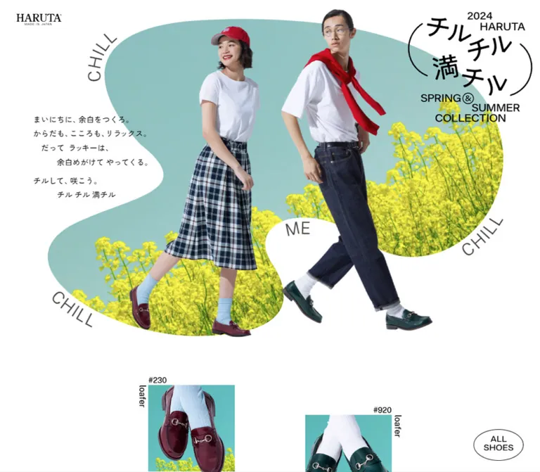
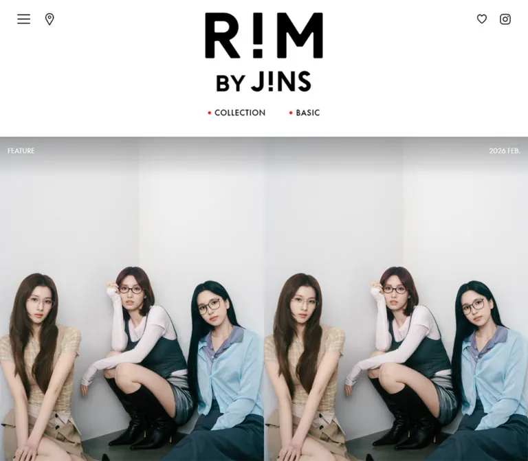
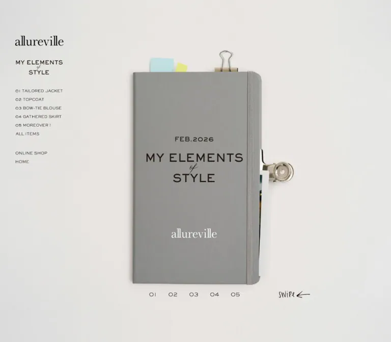
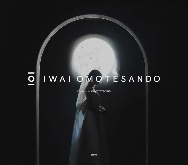
BASCO|紙の質感と装いの写真で綴る企業サイト
白縁のファッション写真、水彩のにじみ、繊細な明朝体を組み合わせたアパレル企業サイト。余白を活かす編集的な構成と、モバイルで横に連なるニュース・ブランド一覧が特徴です。
BASCO Co., Ltd. — Style Reference
A fashion company presented as a quiet paper portfolio, with floating photographs and room for individual character.
Website: basco1989.com Original URL: https://basco1989.com/ Final URL: https://basco1989.com/ Theme: predominantly light, textured editorial pages; the opening presentation includes distinct light and dark visual states. Inspected: September 24, 2026, Japan Standard Time. Supplied evidence timestamp: September 23, 2026, 21:13:28.086 UTC, equivalent to September 24 at 06:13:28.086 JST. Viewports: desktop 1440 × 1000 CSS pixels; mobile 390 × 844 CSS pixels. Scope: the current corporate homepage: opening brand presentation, garment-making introduction, five-brand feature, staff photograph, recruitment, company history, news, brand directory, and footer. Linked destination pages and the opened menu were not inspected.
BASCO combines the spaciousness of a fashion lookbook with the small labels and careful alignment of an editorial publication. Garment photographs provide the color and personality. The surrounding interface stays restrained: pale paper texture, charcoal text, warm brown section labels, delicate rules, and rectangular double-outline links. Japanese Mincho headlines sit beside generous Gothic body text, while Readex Pro gives the English navigation a consistent, modest scale.
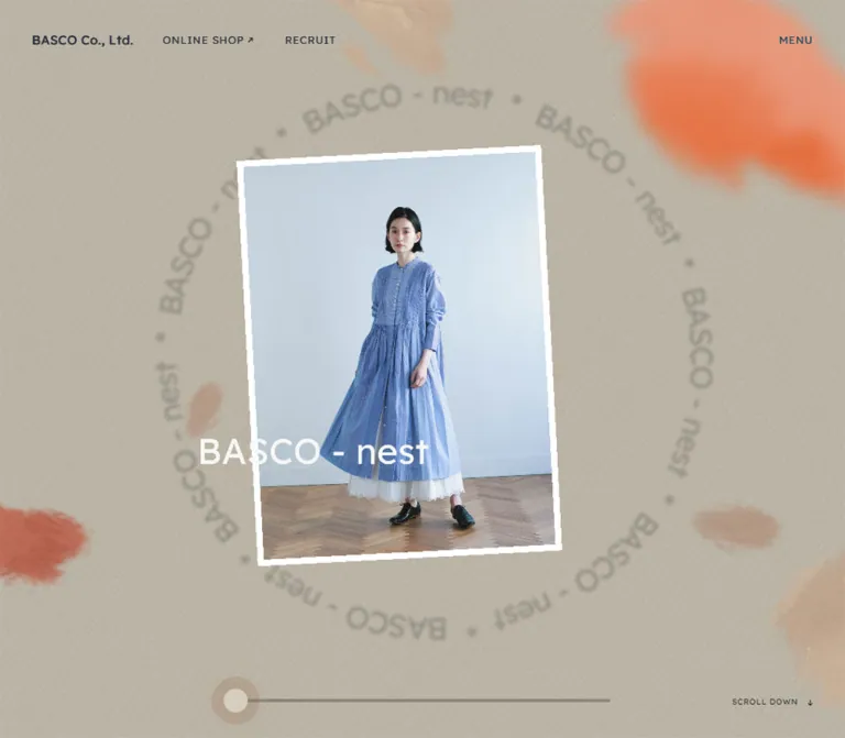
The opening is a visual presentation rather than a conventional headline-and-button composition. A white-edged fashion photograph floats against textured space, with faint circular brand lettering and irregular watercolor-like marks. The supplied desktop opening shows a small Chronicle photograph on a dark field; the mobile opening shows an enlarged, partially cropped BASCO-nest photograph against warm beige. These are sampled presentation states, not evidence of a visitor-selectable theme system.
Below the opening, the page becomes a long corporate narrative. Its order matters: making clothes, introducing the brands, showing the people, recruiting colleagues, recalling the company history, and publishing recent news. The footer returns to the five brands through a compact photographic directory.
閉じる
BASCO Co., Ltd. — Style Reference
A fashion company presented as a quiet paper portfolio, with floating photographs and room for individual character.
Website: basco1989.com Original URL: https://basco1989.com/ Final URL: https://basco1989.com/ Theme: predominantly light, textured editorial pages; the opening presentation includes distinct light and dark visual states. Inspected: September 24, 2026, Japan Standard Time. Supplied evidence timestamp: September 23, 2026, 21:13:28.086 UTC, equivalent to September 24 at 06:13:28.086 JST. Viewports: desktop 1440 × 1000 CSS pixels; mobile 390 × 844 CSS pixels. Scope: the current corporate homepage: opening brand presentation, garment-making introduction, five-brand feature, staff photograph, recruitment, company history, news, brand directory, and footer. Linked destination pages and the opened menu were not inspected.
BASCO combines the spaciousness of a fashion lookbook with the small labels and careful alignment of an editorial publication. Garment photographs provide the color and personality. The surrounding interface stays restrained: pale paper texture, charcoal text, warm brown section labels, delicate rules, and rectangular double-outline links. Japanese Mincho headlines sit beside generous Gothic body text, while Readex Pro gives the English navigation a consistent, modest scale.
The opening is a visual presentation rather than a conventional headline-and-button composition. A white-edged fashion photograph floats against textured space, with faint circular brand lettering and irregular watercolor-like marks. The supplied desktop opening shows a small Chronicle photograph on a dark field; the mobile opening shows an enlarged, partially cropped BASCO-nest photograph against warm beige. These are sampled presentation states, not evidence of a visitor-selectable theme system.
Below the opening, the page becomes a long corporate narrative. Its order matters: making clothes, introducing the brands, showing the people, recruiting colleagues, recalling the company history, and publishing recent news. The footer returns to the five brands through a compact photographic directory.
How to Read This Reference
- Measured means a value appears in the supplied rendered DOM, computed styles, or element rectangles. These values describe the sampled state.
- Calculated means arithmetic derived from those measurements. The reconstructed grid is a useful example; its original implementation was not supplied.
- Estimated means a visual approximation from an original-page capture. Estimated hex colors were not obtained through pixel sampling.
- Recommended means an implementation choice for a new adaptation, including the CSS below. It is not a claim about existing behavior.
- Font names below are computed family declarations. Font files, licensing, loading success, and individual rendered glyph provenance were not independently checked.
- The captures and DOM records are not guaranteed to show the same animation instant. A sampled color, active brand, transform, or year must not be treated as a permanent state.
- Direct visual coverage includes the desktop opening, the brand-to-staff-image boundary, the desktop news/footer, and the mobile opening and news/footer. Most craftsmanship, recruitment, and history details are supported by DOM evidence rather than a dedicated visible capture.
Tokens — Colors
Default Palette
Names are implementation aliases, not recovered source variable names.
| Name | Value | Evidence | Role |
|---|---|---|---|
| Charcoal Ink | #222222 |
Measured: rgb(34, 34, 34) |
Body copy, editorial headings, news titles, and most lower-page controls |
| Section Brown | #946b45 |
Measured: rgb(148, 107, 69) |
Small Japanese section labels |
| Light Header Ink | #dddddd |
Measured on sampled header elements | A light navigation state over the opening; not the navigation color in every capture |
| Warm Sand | #d6cdbf |
Measured on the DRAG text |
A verified auxiliary color; also a useful recommended approximation for pale outlines |
| White | #ffffff |
Measured on brand-feature captions and the footer directory heading | Reversed text; photo borders also appear white visually |
| Paper | approximately #f0f0ee |
Estimated | Light, finely textured lower-page canvas |
| Directory Charcoal | approximately #4b4c4b |
Estimated | Broad horizontal band behind the upper portion of footer brand photographs |
| Opening Beige | approximately #bbb4a2 |
Estimated | Warm ground in the mobile BASCO-nest opening |
| Opening Dark | approximately #20201f |
Estimated | Dark field in the captured desktop Chronicle state |
| Fine Rule | approximately #d6d6d2 |
Estimated | Header and footer separators |
The paper surface is not a flat white card background. A subtle material texture remains visible in the quiet spaces around news and footer content. The beige opening has a stronger fabric-or-paper impression and diffuse painted marks. Keep these textures subordinate to photographs and type.
Most sampled structural elements have transparent computed backgrounds. Their transparency does not establish the final canvas color: the visible surface may belong to an ancestor, background layer, or decoration that was not included in the sampled elements.
The numerous generic CMS colors, gradients, shadows, and utility custom properties in the evidence are not evidence of visible design usage. Bright preset purple, orange, cyan, and default shadow values should not enter this reference palette merely because they exist in the document.
Theme Presets
No selectable theme control was inspected. The opening has at least two evidenced visual compositions:
| Captured composition | Visible treatment | Interpretation limit |
|---|---|---|
| Desktop Chronicle opening | Nearly black ground, gray diffuse marks, small tilted portrait, white edge and brand label | A captured state; its scale and duration are not established as the resting desktop layout |
| Mobile BASCO-nest opening | Warm beige ground, faint circular lettering, muted painted marks, large blue-dress portrait | A captured mobile state; its difference from desktop does not prove a breakpoint-specific brand choice |
The lower editorial page remains light in the supplied scrolled captures. Do not recolor the entire homepage dark just because the first desktop frame is dark.
Tokens — Typography
Japanese Editorial Headlines
- Computed family:
ten-mincho-text, serif. - Weight:
400. - Role: the substantive Japanese statements beneath small section labels.
- Character: delicate Mincho strokes and deliberate line breaks, with substantial space around short phrases.
- Source examples:
BASCOだから作れる、ここにしかないもの。,5つのブランド、多彩な表情。, and小さな小さな3坪のお店から始まりました。
The first garment-making headline is larger on desktop than subsequent editorial headlines. Mobile consolidates these roles at 24px. Preserve this distinction instead of making every section a large display headline.
Japanese Body and Section Labels
- Computed family:
dnp-shuei-gothic-gin-std, sans-serif. - Body weight:
400. - Section-label weight:
400on desktop and500on mobile in the sampled elements. - Body rhythm: 14px type with 28px line height in the main editorial paragraphs.
- Role: calm, readable supporting copy. The relatively loose leading is a central part of the page's pace.
English Identity and Utility Text
- Computed family:
"Readex Pro", sans-serif. - Identity: 16px, weight
400, with 0.32px tracking on the home link. - Navigation: 13px, weight
300, with 1.04px tracking. - Supporting roles: loading text, brand-feature captions, footer social links, copyright, and page-position controls.
- Character: compact, lightly tracked, and generally unboxed.
Use the declared families only when properly available. A Japanese serif, Japanese sans-serif, and ordinary sans-serif fallback can preserve hierarchy, but should be identified as an adaptation rather than an exact typographic match.
Type Scale
| Role | Desktop | Mobile | Tracking and weight | Evidence |
|---|---|---|---|---|
| Root/body inheritance | 16px / 32px |
Same | 0.64px, 400 |
Measured |
| Home-link wordmark | 16px / 32px |
Same | 0.32px, 400 |
Measured |
| Header utilities | 13px / 26px |
Same | 1.04px, 300 |
Measured |
| Small Japanese section label | 14px / 28px |
Same | 0.7px; weight 400 → 500 |
Measured |
| Leading craftsmanship headline | 42px / 51.66px |
24px / 33.6px |
Desktop 1.26px; mobile 1.2px; 400 |
Measured |
| Other editorial headlines | 32px / 48px |
24px / 33.6px |
Desktop 2.56px; mobile 1.2px; 400 |
Measured |
| Editorial paragraph | 14px / 28px |
Same | Desktop 0.56px; mobile 0.28px; 400 |
Measured |
| News title | 14px / 23.8px |
14px / 19.6px |
Desktop normal tracking, 400; mobile 0.42px, 500 |
Measured |
| Brand-feature caption | 10px / 20px |
Same | 0.8px; weight 300 → 400 |
Measured |
Footer BRAND (5) heading |
13px / 13px |
Same | 1.04px, 400 |
Measured |
| Social link | 12px / 12px |
12px / 31.2px |
1.14px; weight 300 → 400 |
Measured |
| Copyright | 10px / 10px |
10px / 20px |
Desktop 1.2px; mobile 1.6px; 400 |
Measured |
Visible READ MORE caption |
Approximately 10px |
Approximately 10px |
Small tracked uppercase | Estimated from captures |
| News date | Approximately 10px |
Approximately 10px |
Warm brown, tracked numerals | Estimated from captures |
| Footer brand name | Approximately 12px |
Approximately 12px |
Dark, compact, lightly tracked | Estimated from captures |
Wrapper values are not always label values. Most READ MORE anchors inherit 16px body styling, and the desktop history anchor even inherits 32px Mincho styling. The visible captions are much smaller. The nested caption styles were not supplied, so those anchor values must not become the button-label specification.
Tokens — Spacing & Shapes
Root size: a conventional measured 16px. No special tiny-rem system is indicated.
Overall density: sparse editorial sections, moderately compact utility navigation, and concentrated horizontal image collections near the bottom.
Spacing Scale
| Use | Desktop | Mobile | Evidence |
|---|---|---|---|
| Outer page gutter | 40px |
20px |
Measured positions and section padding |
| Main section-label left edge | 153.75px |
20px |
Measured |
| Typical editorial-copy left edge | 153.75px |
49.58px |
Measured |
| Mobile narrow history-column left edge | — | 79.16px |
Measured |
| First label-to-headline gap | 24px |
24px |
Calculated from rectangles |
| First headline-to-body gap | 65px |
25px |
Calculated |
| First body-to-link gap | 50px |
36px |
Calculated |
| News-card horizontal gap | 20px |
18px |
Calculated |
| News content-to-link gap | 48px |
48px |
Calculated from tallest card |
| News section vertical padding | 100px top and bottom |
Same | Measured |
| Footer brand-card gap | Approximately 31.67px |
20px |
Calculated |
Use these as relationships, not a universal spacing ladder. The site deliberately mixes a strict alignment system with different amounts of breathing room for different sections.
Border Radius
| Element | Observed treatment |
|---|---|
| News artwork frames | Square corners |
READ MORE links |
Square corners, two fine outlines |
| Footer brand photographs | Square corners |
| Opening photographs | White-edged and tilted; no rounded-card treatment |
| Pagination marks | Small circles |
The repeated component language does not use pills or rounded content cards. A soft shadow is visible around a raised photograph in the desktop brand feature, but there is no evidence of a general card-elevation system.
Layout Measurements
| Element | Desktop 1440 × 1000 | Mobile 390 × 844 | Evidence |
|---|---|---|---|
| Document height | 6103.67px |
5821.48px |
Measured |
| Header height | 101px |
68px |
Measured bounding boxes |
| Header source height token | 6.25rem = 100px |
4.1875rem = 67px |
Measured source properties; extra pixel is consistent with the visible separator |
| First editorial section start | y = 1000px |
y = 1000px |
Measured |
Standard READ MORE link |
222 × 50px |
222 × 50px |
Measured |
| Brand-feature link | 220 × 50px |
231.67 × 50px |
Measured |
| Main recruitment body width | 450px |
290.83px |
Measured |
| History text column | 256px including 21px right padding |
231.67px, no right padding |
Measured |
| News card width | 240px |
163.80px |
Measured |
| News row start | x = 210px |
x = 48px |
Measured |
| Footer brand-link width | Approximately 178.42px |
85.80px |
Measured |
| Footer brand image | Approximately 178 × 238px |
Approximately 86 × 114px |
Estimated from captures; approximately 3:4 |
| Total footer height | 450.89px |
414.77px |
Measured |
Reconstructed Alignment Grid
A twelve-column grid with 5px gaps closely reproduces several independent measured alignments. This is a calculated model, not recovered source CSS.
For available content width W:
column width = (W - 11 × 5px) / 12
column step  = column width + 5px
At desktop, W = 1440 - 80 = 1360px. A column is 108.75px and a step is 113.75px. One step after the 40px gutter is 153.75px, exactly the main editorial left edge. Two steps give the 267.5px footer-photo and header-shop alignment. A five-column span is 563.75px, matching the first headline container.
At mobile, W = 390 - 40 = 350px. A column is approximately 24.58px and a step is approximately 29.58px. One step after the 20px gutter gives 49.58px; a ten-column span gives 290.83px. Two steps give 79.17px and an eight-column span gives 231.67px, closely matching the history column and brand-feature link.
The news row follows its own widths and offsets. Do not force every component onto the reconstructed editorial grid.
Components
Persistent Header
Role: company identity, shop access, recruitment access, and menu entry.
The header stays at the top in the supplied scrolled views. It is visually transparent, with a very fine separator and no solid navigation card. The exact fixed-versus-sticky mechanism was not included in the sampled style fields.
On desktop, the wordmark starts at x=40px, ONLINE SHOP at x=267.5px, RECRUIT at approximately x=435px, and MENU aligns to the 40px right gutter. The online-shop label carries a small northeast arrow in the captures. The wordmark is a home link; shop and recruitment are links; menu is a button.
On mobile, the left and right gutters become 20px. The wordmark, shop link, and menu remain on one line. RECRUIT is absent from the visible mobile navigation and extracted mobile link list. Utility text remains 13px rather than becoming substantially smaller.
The desktop DOM records a temporary header y-position of −20.2px. Do not bake this offset into the header layout. Similarly, the sampled light header text and dark text in later captures indicate changing presentation conditions; the color-switching mechanism was not inspected.
Opening Brand Presentation
Role: introduce the clothing through atmosphere, photography, and brand identity.
The visible anatomy is a full-width textured stage, irregular diffuse marks, faint circular brand lettering, a floating portrait photograph with a white edge, and a brand name over the image. A small SCROLL DOWN button exists in the DOM near the lower right.
In the desktop Chronicle capture, the visible transformed frame occupies roughly 195 × 248px around the center of a 1440 × 1000 field. Its top edge slopes down toward the right. The surrounding space is unusually large and dark.
In the mobile BASCO-nest capture, the photograph is much larger. Its right edge is visible around x=330px, while its left edge and part of the overlaid name lie outside the viewport. The visible frame extends approximately from y=242px to y=780px. Those are visible bounds, not the untransformed image dimensions. The full photograph must be wider than its visible portion.
Preserve the impression of a photograph placed in space. A generic full-bleed background image would remove the white edge, independent image scale, and deliberate offscreen composition. Exact scene sequencing, depth transforms, automatic advancement, and interaction rules remain unverified.
Loading Layer
Role: prepare the opening experience.
The DOM contains a separate company-name paragraph and a small LOADING label. The name has a computed 20px Readex Pro size, while the loading label is 10px. The captures do not establish the complete loading sequence or its duration.
The mobile loading label is measured below the 844px viewport, and the document can retain loading-related text after photographs are present. Do not reproduce every extracted text node as simultaneously visible page content.
Editorial Section Label and Headline
Role: provide a small navigational category followed by the actual statement.
Labels such as バスコの服づくり, ブランド紹介, 採用情報, and バスコのあゆみ use 14px Gothic text in Section Brown. Their text begins approximately 27–28px inside the label wrapper. The supplied evidence does not establish the exact leading ornament, so preserve the indentation without inventing a specific icon.
The headline below uses Mincho, regular weight, and deliberate two- or three-line phrasing. Supporting copy remains 14px/28px. On mobile, the section label starts at the outer gutter while the headline, paragraph, and link move inward by one reconstructed grid step. This nested alignment gives small screens more editorial character than a uniformly flush-left stack.
Double-Outline READ MORE Link
Role: a consistent, understated route into detail pages.
The standard link is 222 × 50px with square corners and two closely spaced pale outlines. The label sits toward the left with approximately 20px inset, while a thin right-pointing arrow occupies the right side. The visible caption is around 10px; the exact nested text style is not supplied.
Use a transparent or paper-matched interior. There is no solid brand-color fill in the observed resting state. Its emphasis comes from geometry, whitespace, and repetition.
Measured variations include a 220px-wide desktop brand-feature link and a 231.67px-wide mobile brand-feature link. Keep these variations intentional. The news link is centered on desktop and aligned to x=48px on mobile.
Recorded destinations include /create/, the five brand pages, /recruit/, /about/history/, and /news/. These links are evidenced; their destination designs were not inspected.
Garment-Making Introduction
Role: explain the company's approach to materials, design, pattern-making, and finishing.
The desktop section begins at y=1000px and occupies another 1000px in the measured document. Its principal text begins at x=153.75px. The headline is 42px, the largest measured editorial headline on this page, and the supporting paragraph has three measured lines.
On mobile, the same section begins at y=1000px and measures approximately 978.63px high. The headline drops to 24px, the body column becomes approximately 290.83px wide, and the standard link remains 222px wide.
The supplied DOM establishes this text layout. It does not provide enough visual coverage to specify all surrounding imagery or decorative placement in this section.
Five-Brand Feature
Role: introduce the breadth of BASCO's clothing rather than display purchasable products.
The feature combines a small Japanese section label, a two-line Mincho headline, explanatory copy, large framed fashion imagery, an active brand caption, a detail link, and five pagination controls.
The five brands are BASCO-nest, Chronicle, Haddow, KusaKanmuri, and HAVAMATOU. The supplied desktop transition capture shows a large white-framed blue-dress photograph toward the center-left and a compact caption/link/pagination group on the right. Another photograph enters at the left edge. A soft shadow beneath the raised frame gives this particular composition depth.
On desktop, the narrow introductory paragraph measures approximately 225.31px wide. On mobile, it widens relative to the screen to 290.83px and sits above the presentation. The caption is centered around x=195px, and the detail link occupies approximately x=79.16–310.83px.
Five pagination buttons are measured at 10 × 40px each, with approximately 15.42px between their starting positions. The visible dots are much smaller, approximately 6px across. Mobile also has two additional 50 × 50px button boxes near opposite sides of the presentation. Their placement is consistent with directional controls, but their actions and accessible names were not supplied.
Do not render the five overlapping caption/link records as five simultaneous content blocks. Their shared coordinates and varying active text indicate presentation states.
Full-Width Staff Photograph
Role: connect the brands to people and lead into recruitment.
A photograph of four people in layered, relaxed clothing spans the full desktop width. Light gray architecture, soft natural lighting, and restrained garment colors keep it connected to the paper palette. Thin hand-drawn loops and scribbles sit across the image area.
The document interval between the end of the brand feature and the recruitment section is 670px on desktop and approximately 181.45px on mobile. These values correspond closely to a full-width image ratio of 1440:670, or about 2.15:1. This is a calculation from neighboring section bounds, supported by the desktop capture, rather than a directly supplied image rectangle.
Use the photograph as a broad visual pause. Do not turn the people into individual profile cards or add separate labels that are absent from the evidence.
Recruitment Section
Role: invite people to join the company through its approach to clothing and customers.
Desktop uses an asymmetric two-column composition: a broad headline region at x=153.75px and a 450px paragraph column at x=836.25px. The link follows the right-hand paragraph. The measured section padding is 94px top, 40px horizontally, and 100px bottom.
On mobile, label, headline, paragraph, and link stack. The section uses 40px top padding and 100px bottom padding. The headline occupies three measured lines, while the body uses four lines at 14px/28px. The inset text alignment remains approximately x=49.58px.
History Section
Role: introduce the company's origins and direct visitors to its longer story.
The DOM includes a four-digit year display, a short three-line Mincho heading, a narrow paragraph, and the shared outlined link. The paragraph recounts the company's beginning in 1989 and the development of its original clothing.
Desktop places the principal history text at approximately x=614.67px in a 256px box. The body has 21px of right padding, leaving about 235px for text. On mobile, the main column is 231.67px wide and begins around x=79.16px, creating a more deeply inset composition than the recruitment text.
The sampled year differs: 2026 on desktop and 1989 on mobile. This supports a changing or state-dependent presentation, but does not prove a particular counter animation or a responsive content rule. The surrounding historical imagery and exact year styling were not visually established in the supplied captures.
News Row
Role: publish collection announcements, exhibitions, and temporary events.
Each item is one link containing a portrait announcement image, a small warm date, and a dark title. A thin pale frame surrounds the artwork; the text sits directly on the paper canvas. There is no enclosing raised card.
Desktop shows four 240px-wide items with 20px gaps, producing a 1020px row centered at x=210px. The supplied content includes POP-UP 2026 Autumn~Winter, 2027 Spring Collection, 展示会出展のお知らせ, and POP-UP 2026 Spring~Summer.
On mobile, item width becomes 163.80px with 18px gaps. The first begins at x=48px; subsequent items start around x=229.80px, x=411.59px, and x=593.39px. They remain in one horizontal sequence. The second item is already slightly clipped by the viewport edge, while later items are outside it.
This is evidence of an overflowed horizontal presentation, not a two-column wrapping grid. Scrolling or dragging the row was not demonstrated. A new implementation should provide an explicit usable overflow mechanism.
News titles change from 14px/23.8px at weight 400 to 14px/19.6px at weight 500 on mobile. Their smaller line height helps two-line titles fit the narrow cards without making the whole row excessively tall.
Footer Brand Directory
Role: offer a final visual route into each of the five brands.
A dark gray horizontal band sits behind the upper portion of the photographs. The images extend below it onto the light page, so the directory visually straddles two surfaces. The BRAND (5) heading is white, while the names beneath the pictures are dark.
On desktop, the heading occupies the left margin region and the five photographs run from approximately x=267.5px to x=1286.25px. Each link is about 178.42px wide, with approximately 31.67px gaps. The visible images are close to 3:4 portraits.
On mobile, the heading becomes its own row at the 20px gutter. The image sequence begins below it, with 85.80px-wide links and 20px gaps. Three full portraits and part of the fourth are visible. The fifth remains offscreen. Maintain this compact horizontal collection rather than stacking five large photographs vertically.
Estimated background-band height is about 158px on desktop and 125px on mobile. These are visual estimates, not recovered background dimensions.
Footer Utility Row
Role: social links, privacy information, copyright, and return to the top.
A fine rule separates the utility row from the brand directory. Desktop places copyright at the left, social links across the next columns, privacy toward the right, and PAGE TOP at the far right.
Mobile rearranges the content: Instagram and YouTube share the first social row, Facebook follows below, PAGE TOP sits at the right, and privacy/copyright share the bottom row. The utility content remains text-based and lightly tracked.
The visible copyright reads ©2023 BASCO. This is page content, not the inspection year. Do not use it to date the current design or substitute it for the capture timestamp.
Tokens — Motion & Interaction
The evidence contains computed transitions and multiple presentation states, but no recorded menu opening, successful drag, pagination click, or page-top activation.
| Treatment | Measured value or evidence | What can be concluded |
|---|---|---|
| Header utility opacity | 1.8s cubic-bezier(0.18, 0.06, 0.23, 1) |
A long opacity transition is declared; its precise triggering state is unverified |
| Several news titles and footer links | Same 1.8s opacity transition |
Their styling shares the slow utility timing |
| Brand explanatory paragraph | 1.6s cubic-bezier(0.25, 0.74, 0.22, 0.99) 0.8s |
A delayed transition is declared; the changed property and trigger are not established by the shorthand alone |
| Brand captions | 0.5s or 0.8s cubic-bezier(0.18, 0.06, 0.23, 1) |
Caption state changes have distinct sampled timings |
| Pagination buttons | 0.3s cubic-bezier(0.77, 0.2, 0.05, 1) |
A shorter control transition is declared |
DRAG label |
Multiple properties at 0.5s cubic-bezier(0.77, 0.2, 0.05, 1) |
A styled drag-related label exists; no drag result was recorded |
| Loading label | 0s 0.4s |
A zero-duration change with delay is declared; it does not establish total loading duration |
| Opening photographs and backgrounds | Different current captures show different compositions | The presentation is state-dependent; exact cycle, easing, and rendering technology are unknown |
| History year | Desktop 2026; mobile 1989 | A state difference exists; its cause is unverified |
The source exposes --easing-1: cubic-bezier(0.18,0.06,0.23,1) and --easing-11: cubic-bezier(0.25,0.74,0.22,0.99), both reflected in sampled transitions. Additional easing variables are present, but their visible uses were not established.
Sampled text nodes often report animation: none. This does not prove that the opening is static or identify how it is rendered. Scripted transforms, other elements, and external visual layers were not inspected in sufficient detail.
Implementation direction: preserve a calm, gradual presentation. If adding new image transitions, use restrained opacity and small positional changes, with timings explicitly treated as recommendations. Do not invent an automatic five-second carousel interval, a specific animation library, or a verified drag-to-change interaction.
Surfaces
| Layer | Appearance | Function |
|---|---|---|
| Editorial canvas | Pale, subtly textured paper | Unifies the long corporate narrative |
| Opening stage | Dark or warm beige, with diffuse marks and faint lettering | Establishes the current brand atmosphere |
| Floating photograph | White edge, slight angular displacement; shadow visible in the brand feature | Gives photography an independent physical presence |
| Editorial text region | Unboxed text directly on the canvas | Keeps the page spacious and publication-like |
| Detail link | Transparent interior, two fine pale outlines | Provides a consistent low-key action shape |
| News image frame | Thin warm outline, small inset, square artwork | Makes announcements resemble printed inserts |
| Footer directory band | Flat charcoal behind only part of the portraits | Creates a strong ending without a fully dark footer |
| Utility separator | Fine light rule | Organizes navigation with minimal visual weight |
Material texture and image boundaries provide most of the depth. Avoid applying shadows to every content item or replacing the paper with glossy gradients.
Imagery
Photography should show the clothing as worn: complete outfits, visible fabric drape, relaxed poses, and quiet studio or architectural settings. The current imagery includes a blue full-length dress, dark tailoring against a dark curtain, a pale shirt near a window, a bright scarf, and airy white clothing. These variations distinguish the five brands while sharing restrained lighting and presentation.
The staff photograph uses a wider, social composition with four people and an informal sense of connection. Keep enough of their outfits and surrounding architecture to support the relationship between people and clothing.
Decorative marks are irregular and tactile: diffuse watercolor-like stains around the opening and very fine hand-drawn loops near the staff image. Their low contrast matters. They should not compete with faces, garment details, or navigation.
The opening and brand feature treat photographs as white-edged objects. The footer removes that theatrical framing and uses simple aligned portrait crops. Reusing the same photography across these different contexts helps tie the experience together.
Observed Asset References
Original image URLs, filenames, and native resolutions were not included in the evidence. The following identifies subjects and treatments only; these are not downloadable asset paths.
| Asset or subject | Original-page evidence | Treatment to preserve |
|---|---|---|
| Chronicle seated portrait | Desktop opening and desktop/mobile footer captures | Dark clothing and backdrop; floating white frame in the opening |
| BASCO-nest blue-dress portrait | Mobile opening, desktop brand-feature boundary, and footer captures | Full outfit, light interior, blue fabric, white edge in the opening/feature |
| Haddow portrait | Footer captures | Pale shirt, darker trousers, window-side setting |
| KusaKanmuri portrait | Footer captures | Colorful scarf against a restrained outfit |
| HAVAMATOU portrait | Desktop footer capture | Airy white clothing and light architectural ground |
| Four-person staff photograph | Desktop middle capture | Full-width group composition and delicate line decorations |
| Seasonal news artwork | Desktop/mobile lower-page captures | Preserve embedded announcement typography and image proportions |
| Paper and painted textures | Opening and lower-page captures | Subtle grain below text; larger diffuse marks in the opening |
For reuse, supply authorized photography and actual texture assets. Do not fabricate original asset URLs. Embedded text in announcement artwork should remain part of that artwork unless a separate accessible text equivalent is added.
Layout & Responsive Behavior
Document Structure
| Region | Desktop vertical bounds | Mobile vertical bounds | Evidence |
|---|---|---|---|
| Opening allocation | 0–1000px |
0–1000px |
Calculated from the first following section |
| Garment-making section | 1000–2000px |
1000–1978.63px |
Measured |
| Brand feature | 2000–2906px |
1978.63–2976.63px |
Measured |
| Staff-image interval | 2906–3576px |
2976.63–3158.08px |
Calculated from neighboring sections |
| Recruitment | 3576–4062px |
3158.08–3683.86px |
Measured |
| History | 4062–4966px |
3683.86–4810.42px |
Measured |
| News | 4966–5652.78px |
4810.42–5406.72px |
Measured |
| Footer | 5652.78–6103.67px |
5406.72–5821.48px |
Measured |
These bounds document the supplied state, not a prescription to hardcode every section height.
Desktop Composition
Use 40px outer gutters and a broader internal alignment system. Editorial text often starts one grid step inside that gutter, while the footer directory and shop navigation start two steps inside it. Recruitment uses separated left and right text groups. History compresses its principal text into a narrow, more central column.
Wide image regions interrupt these contained text layouts. The staff photograph reaches both viewport edges. News forms an independent centered four-item row. The footer directory spreads five portraits across most of the usable width while reserving a left-hand label region.
Mobile Composition
Reduce the outer gutter to 20px, but preserve secondary insets around prose. Main editorial text uses approximately 290.83px within a 390px screen; history narrows further to approximately 231.67px. Headlines become 24px/33.6px while body text remains 14px/28px.
The header loses its visible recruitment link. The brand feature stacks its introduction above the image presentation. Recruitment changes from separated desktop columns to a vertical sequence. News and the footer brand directory retain horizontal sequences, with neighboring items visibly clipped at the right edge.
The mobile footer rearranges utility links instead of merely shrinking the desktop row. This is a structural response to width, not uniform proportional scaling.
Viewport-Height Caveat
The mobile DOM still reports --vh: 10px, the same value as desktop. Its first editorial section begins at y=1000px even though the viewport is only 844px tall. The mobile SCROLL DOWN button is measured at y=942px and is therefore below the initial capture.
This could reflect a retained viewport measurement or another implementation choice; the supplied evidence does not resolve the cause. Do not claim the observed mobile opening is exactly 100dvh. For a new implementation, updating viewport sizing on resize and using an appropriate modern viewport unit is recommended.
The exact breakpoint rules were not supplied. The 48rem breakpoint in the Quick Start is an adaptation choice, not a recovered source value.
Do’s and Don’ts
Do
- Preserve the long corporate-story sequence and the distinct role of each section.
- Let garments and people provide color while the interface stays predominantly paper, charcoal, and warm brown.
- Use the measured Mincho/Gothic/Readex hierarchy where the fonts are available.
- Retain 14px/28px editorial body rhythm and deliberate short headline lines.
- Keep the mobile nested insets; labels and paragraphs do not all share one left edge.
- Use white-edged, angled photographs in the opening and brand feature.
- Keep news and footer portraits in horizontal sequences on mobile.
- Reproduce the footer's partial-height dark band behind the photographs.
- Keep
READ MORElinks rectangular, fine-lined, and visually quiet. - Treat different opening scenes and year values as sampled states rather than permanent responsive content.
Don’t
- Don't replace the corporate narrative with a generic conversion page or product-card catalog.
- Don't turn every section into a rounded, shadowed card.
- Don't use a saturated accent color for all buttons or section headings.
- Don't crop away garment silhouettes simply to fill a standard wide hero.
- Don't use the inherited font size of a link wrapper as its visible caption size.
- Don't infer the active desktop and mobile brand from viewport width alone.
- Don't reproduce the 1000px mobile opening as a universal design requirement without checking viewport behavior.
- Don't collapse the five-brand footer into a large vertical image list.
- Don't assume menu contents, hover destinations, drag mechanics, or autoplay timing that were not observed.
- Don't derive visible styles from unused CMS presets or invent original image paths.
Recommended Implementation Additions
These are recommendations for a new implementation, not verified features of the original page:
- Give the menu button an explicit expanded state, an associated navigation region, keyboard operation, and sensible focus return.
- Provide accessible names and selected-state information for pagination controls. The evidence contains empty visible button text, but does not expose their accessibility metadata.
- Increase pagination hit areas without enlarging the approximately 6px visual dots. The sampled 10px-wide boxes are narrow touch targets.
- Make overflowing news and brand rows keyboard-reachable and touch-scrollable. Provide visible focus and avoid page-wide horizontal overflow.
- Keep inactive brand slides out of the tab order and accessibility reading sequence while preserving an understandable active-slide label.
- Offer a static opening and reduced-motion treatment. Avoid making brand links depend on a scene finishing an animation.
- Ensure header text remains legible over both dark and light scenes. Verify contrast at the transition boundaries as well as at rest.
- Retain meaningful alternative text for outfit and staff images. Mark paint marks, circular repetitions, and doodles as decorative.
- Keep the important words from news artwork available as actual text, including event and collection names.
- Validate viewport-height updates and the reachability of the opening's scroll cue on real mobile browsers.
- Load properly licensed fonts and test the fallback layout, especially Japanese line breaks and the single-row mobile header.
Agent Prompt Guide
Quick Color Reference
- Main text: measured
#222222. - Small Japanese section labels: measured
#946b45. - Auxiliary sand color: measured
#d6cdbf; pale frame usage is a recommended adaptation. - Lower-page paper: approximately
#f0f0ee, with subtle texture. - Footer band: approximately
#4b4c4b. - Mobile opening ground: approximately
#bbb4a2. - White photo edges and restrained thin rules complete the system.
Overall Prompt
“Create a Japanese fashion-company homepage inspired by BASCO's current editorial structure. Use subtle pale paper texture, charcoal text, warm brown section labels, regular Mincho headlines, Japanese Gothic body text at 14px/28px, and compact tracked English navigation. Begin with a white-edged fashion photograph floating in a textured stage with faint circular brand lettering and soft irregular painted marks. Continue through garment-making, five brands, a full-width staff photograph, recruitment, history, news, and a photographic brand directory. Use a reconstructed twelve-column alignment system with 40px desktop gutters and 20px mobile gutters. Preserve secondary mobile text insets and horizontal news/brand sequences. Use square double-outline detail links rather than filled buttons. Treat animation timing and untested controls as implementation choices.”
Example Component Prompts
- Header: “Create a transparent persistent header with BASCO's text identity at left, a small ONLINE SHOP link with a northeast arrow, a desktop RECRUIT link, and a MENU text button at right. Use 16px identity text, 13px tracked utility text, 40px desktop gutters, and 20px mobile gutters. Remove the visible recruitment link on mobile. Keep the separator delicate.”
- Editorial section: “Place a 14px warm-brown Japanese label above a regular Mincho headline. Use 42px for the leading desktop statement and 32px for other desktop statements, reducing to 24px/33.6px on mobile. Set body copy at 14px/28px. Inset mobile prose one grid step beyond the outer label alignment.”
- Detail link: “Build a 222 × 50px square-corner link with two fine sand-colored outlines, a small tracked READ MORE caption on the left, and a thin arrow on the right. Use a transparent interior and no resting shadow.”
- News row: “Show four portrait announcement artworks in a centered 1020px desktop row with 240px items and 20px gaps. Add small brown dates and plain dark titles below. On a 390px screen, use approximately 164px items, 18px gaps, and a 48px leading inset in a horizontally accessible row.”
- Brand directory: “Place five 3:4 fashion portraits across a footer region whose charcoal background ends behind the upper part of the photographs. Keep captions on pale paper. On mobile, move BRAND (5) above the sequence and use approximately 86px images with 20px gaps, leaving the next item partially visible.”
- Opening scene: “Art-direct a white-edged full-outfit photograph as an independent object over a textured ground. Use low-contrast circular brand lettering and irregular translucent painted marks. Allow the photograph to extend beyond a phone viewport. Keep the stable company identity readable and provide a static accessible fallback; do not assume a particular autoplay interval.”
Quick Start
CSS Custom Properties
This is a reusable adaptation, not extracted source CSS. Measured type, colors, and dimensions are retained where practical. Estimated paper colors, decorative frame details, the 48rem breakpoint, native horizontal scrolling, focus treatment, and viewport sizing are recommendations. No original photo or texture URLs are available; the texture custom properties default to none.
Expected structure: a .site-header containing .site-header__inner; editorial sections using .editorial-grid; links with .read-more; a .news-rail containing .news-card links; and a .brand-directory containing its heading and .brand-rail. Each brand link contains an image and a caption span. This CSS supplies layout and appearance, not menu or slideshow logic.
:root {
  /* Measured colors */
  --color-ink: #222222;
  --color-section: #946b45;
  --color-sand: #d6cdbf;
  --color-light-ink: #dddddd;
  --color-white: #ffffff;

  /* Visual estimates used as adaptation defaults */
  --color-paper: #f0f0ee;
  --color-rule: #d6d6d2;
  --color-directory: #4b4c4b;
  --color-opening: #bbb4a2;
  --color-opening-dark: #20201f;
  --paper-texture: none;
  --opening-art: none;

  /* Source-declared families; font files are not bundled */
  --font-body: dnp-shuei-gothic-gin-std, sans-serif;
  --font-editorial: ten-mincho-text, serif;
  --font-utility: 'Readex Pro', sans-serif;

  --text-body: 14px;
  --leading-body: 28px;
  --text-headline: 32px;
  --leading-headline: 48px;
  --text-feature: 42px;
  --leading-feature: 51.66px;
  --text-nav: 13px;
  --text-caption: 10px;

  --gutter: 40px;
  --grid-gap: 5px;
  --header-height: 100px;
  --button-width: 222px;
  --button-height: 50px;

  /* Source-supported transition tokens */
  --ease-soft: cubic-bezier(0.18, 0.06, 0.23, 1);
  --ease-reveal: cubic-bezier(0.25, 0.74, 0.22, 0.99);
  --ease-control: cubic-bezier(0.77, 0.2, 0.05, 1);
  --motion-opacity: 1.8s var(--ease-soft);
}

* { box-sizing: border-box; }

html {
  font-size: 16px;
  scroll-padding-top: calc(var(--header-height) + 16px);
}

body {
  margin: 0;
  color: var(--color-ink);
  background-color: var(--color-paper);
  background-image: var(--paper-texture);
  font-family: var(--font-body);
  font-weight: 400;
}

img { display: block; max-width: 100%; }
a { color: inherit; }
button { font: inherit; }

/* Recommended fixed-header implementation */
.site-header {
  position: fixed;
  inset: 0 0 auto;
  z-index: 30;
  padding-inline: var(--gutter);
  color: var(--header-ink, var(--color-ink));
}

.site-header__inner {
  display: flex;
  align-items: center;
  min-height: var(--header-height);
  border-bottom: 1px solid var(--color-rule);
}

.site-logo {
  flex: 0 0 calc((100% - 25px) / 6);
  margin-right: 5px;
  font: 400 16px/32px var(--font-utility);
  letter-spacing: 0.02em;
  text-decoration: none;
  white-space: nowrap;
}

.header-links {
  display: flex;
  align-items: center;
  gap: 52px;
}

.header-link,
.menu-button {
  display: inline-flex;
  align-items: center;
  min-height: 67px;
  padding: 0;
  border: 0;
  background: transparent;
  color: inherit;
  font: 300 var(--text-nav)/26px var(--font-utility);
  letter-spacing: 0.08em;
  text-decoration: none;
  white-space: nowrap;
  cursor: pointer;
}

.menu-button { margin-left: auto; }

/* Static scene scaffold; artwork and state logic are separate */
.opening {
  position: relative;
  min-height: 100svh;
  overflow: clip;
  background-color: var(--color-opening);
  background-image: var(--opening-art);
  background-position: center;
  background-size: cover;
}

.opening[data-scene='chronicle'] {
  background-color: var(--color-opening-dark);
}

.opening-photo {
  position: absolute;
  top: 52%;
  left: 50%;
  width: var(--photo-width, 400px);
  max-width: none;
  margin: 0;
  padding: 7px;
  background: var(--color-white);
  transform: translate(-50%, -50%) rotate(var(--photo-angle, -3deg));
}

.opening-photo img {
  width: 100%;
  height: auto;
}

/* Sampled small dark scene, not a universal desktop photo size */
.opening[data-scene='chronicle'] .opening-photo {
  --photo-width: 175px;
  --photo-angle: 4deg;
}

.editorial-grid {
  display: grid;
  grid-template-columns: repeat(12, minmax(0, 1fr));
  column-gap: var(--grid-gap);
  margin-inline: var(--gutter);
}

.editorial-section { padding-block: 90px 100px; }

.section-label {
  grid-column: 2 / -2;
  margin: 0 0 24px;
  padding-left: 27px;
  color: var(--color-section);
  font: 400 14px/28px var(--font-body);
  letter-spacing: 0.05em;
}

.editorial-heading {
  grid-column: 2 / span 5;
  margin: 0;
  font: 400 var(--text-headline)/var(--leading-headline)
    var(--font-editorial);
  letter-spacing: 0.08em;
}

.editorial-heading--feature {
  font-size: var(--text-feature);
  line-height: var(--leading-feature);
  letter-spacing: 0.03em;
}

.editorial-copy {
  grid-column: 2 / span 5;
  margin-top: 60px;
  font-size: var(--text-body);
  line-height: var(--leading-body);
  letter-spacing: 0.04em;
}

.editorial-copy p { margin: 0; }
.editorial-copy .read-more { margin-top: 50px; }

.recruit-heading { grid-column: 2 / span 6; }
.recruit-copy { grid-column: 8 / span 4; }

/* Caption size and inset border are visual approximations */
.read-more {
  position: relative;
  display: inline-flex;
  align-items: center;
  justify-content: space-between;
  gap: 24px;
  width: var(--button-width);
  max-width: 100%;
  min-height: var(--button-height);
  padding: 12px 21px;
  border: 1px solid var(--color-sand);
  color: var(--color-ink);
  background: transparent;
  font: 400 var(--text-caption)/20px var(--font-utility);
  letter-spacing: 0.08em;
  text-decoration: none;
}

.read-more::before {
  content: '';
  position: absolute;
  inset: 2px;
  border: 1px solid var(--color-sand);
  pointer-events: none;
}

.read-more__arrow {
  position: relative;
  flex: 0 0 24px;
  height: 1px;
  background: currentColor;
}

.read-more__arrow::after {
  content: '';
  position: absolute;
  right: 0;
  top: -3px;
  width: 7px;
  height: 7px;
  border-top: 1px solid currentColor;
  border-right: 1px solid currentColor;
  transform: rotate(45deg);
}

.staff-photo {
  width: 100%;
  aspect-ratio: 1440 / 670;
  object-fit: cover;
}

.news { padding-block: 100px; }

.news-rail {
  display: grid;
  grid-template-columns: repeat(4, minmax(0, 1fr));
  gap: 20px;
  width: min(1020px, calc(100% - 2 * var(--gutter)));
  margin-inline: auto;
}

.news-card {
  min-width: 0;
  text-decoration: none;
}

.news-artwork {
  padding: 6px;
  border: 1px solid var(--color-sand);
}

.news-artwork img {
  width: 100%;
  height: auto;
}

.news-date {
  display: block;
  margin-top: 12px;
  color: var(--color-section);
  font: 400 10px/20px var(--font-utility);
  letter-spacing: 0.08em;
}

.news-title {
  margin: 6px 0 0;
  font: 400 14px/23.8px var(--font-body);
  letter-spacing: normal;
}

.news-more {
  display: flex;
  width: var(--button-width);
  margin: 48px auto 0;
}

.brand-directory {
  position: relative;
  isolation: isolate;
  display: grid;
  grid-template-columns: repeat(12, minmax(0, 1fr));
  column-gap: var(--grid-gap);
  padding: 48px var(--gutter) 72px;
}

.brand-directory::before {
  content: '';
  position: absolute;
  z-index: -1;
  inset: 0 0 auto;
  height: 158px;
  background: var(--color-directory);
}

.brand-directory__heading {
  grid-column: 1 / span 2;
  margin: 0;
  color: var(--color-white);
  font: 400 13px/13px var(--font-utility);
  letter-spacing: 0.08em;
}

.brand-rail {
  grid-column: 3 / span 9;
  display: grid;
  grid-template-columns: repeat(5, minmax(0, 1fr));
  gap: 31.67px;
  min-width: 0;
  padding-top: 2px;
}

.brand-card { min-width: 0; text-decoration: none; }

.brand-card img {
  width: 100%;
  aspect-ratio: 3 / 4;
  object-fit: cover;
}

.brand-card span {
  display: block;
  margin-top: 7px;
  font: 400 12px/20px var(--font-utility);
  letter-spacing: 0.06em;
  white-space: nowrap;
}

.footer-meta {
  display: flex;
  align-items: center;
  gap: 48px;
  min-height: 64px;
  margin-inline: var(--gutter);
  border-top: 1px solid var(--color-rule);
  font: 400 10px/20px var(--font-utility);
  letter-spacing: 0.08em;
}

.footer-socials {
  display: flex;
  gap: 48px;
  font-size: 12px;
  letter-spacing: 0.095em;
}

.footer-meta a { text-decoration: none; }
.footer-page-top { margin-left: auto; }

@media (max-width: 48rem) {
  :root {
    --gutter: 20px;
    --header-height: 67px;
    --text-headline: 24px;
    --leading-headline: 33.6px;
    --text-feature: 24px;
    --leading-feature: 33.6px;
  }

  .site-logo { flex: 0 0 auto; margin-right: auto; }
  .header-links { margin-left: 20px; }
  .header-recruit { display: none; }
  .menu-button { margin-left: auto; }

  /* Recommended mobile art direction, not a measured transform */
  .opening-photo,
  .opening[data-scene='chronicle'] .opening-photo {
    --photo-width: 102vw;
    left: 33%;
    top: 60%;
  }

  .editorial-section { padding-block: 40px 100px; }
  .section-label { grid-column: 1 / -1; font-weight: 500; }

  .editorial-heading,
  .editorial-copy,
  .recruit-heading,
  .recruit-copy {
    grid-column: 2 / span 10;
  }

  .editorial-heading { letter-spacing: 0.05em; }
  .editorial-copy { margin-top: 25px; letter-spacing: 0.02em; }
  .editorial-copy .read-more { margin-top: 36px; }

  .news-rail {
    grid-template-columns: none;
    grid-auto-flow: column;
    grid-auto-columns: 42vw;
    gap: 18px;
    width: 100%;
    padding: 4px 48px;
    overflow-x: auto;
    scroll-padding-inline: 48px;
    scroll-snap-type: x proximity;
  }

  .news-card { scroll-snap-align: start; }
  .news-title { font-weight: 500; line-height: 19.6px; letter-spacing: 0.03em; }
  .news-more { margin-left: 48px; margin-right: 20px; }

  .brand-directory { display: block; padding: 28px 0 70px; }
  .brand-directory::before { height: 125px; }
  .brand-directory__heading { padding-inline: 20px; }

  .brand-rail {
    grid-template-columns: none;
    grid-auto-flow: column;
    grid-auto-columns: 22vw;
    gap: 20px;
    margin-top: 30px;
    padding: 0 20px 4px;
    overflow-x: auto;
    scroll-padding-inline: 20px;
  }

  /* Arrange individual footer links to match the documented order */
  .footer-meta {
    flex-wrap: wrap;
    gap: 16px 24px;
    padding-block: 24px 20px;
  }

  .footer-socials {
    display: grid;
    grid-template-columns: repeat(2, auto);
    gap: 0 32px;
    line-height: 31.2px;
  }
}

/* Recommended interaction additions */
a:focus-visible,
button:focus-visible {
  outline: 2px solid var(--color-section);
  outline-offset: 4px;
}

@media (hover: hover) {
  .header-link,
  .menu-button,
  .news-title {
    transition: opacity var(--motion-opacity);
  }

  .header-link:hover,
  .menu-button:hover,
  .news-card:hover .news-title {
    opacity: 0.65;
  }
}

@media (prefers-reduced-motion: reduce) {
  *, *::before, *::after {
    animation: none !important;
    transition: none !important;
  }

  html { scroll-behavior: auto; }
}
The hover opacity endpoint is a recommendation; only the transition timing is source-supported. The CSS deliberately keeps native image proportions for news artwork so embedded announcement text is not cropped. The opening requires actual art assets and a chosen static or interactive implementation. Reduced-motion handling must also be applied to any added JavaScript animation.
Tailwind v4 Token Mapping
Optional aliases for a project already using Tailwind v4. This is not a claim about the original site's authoring framework. Define the custom properties above first.
@theme inline {
  --color-paper: var(--color-paper);
  --color-ink: var(--color-ink);
  --color-section-brown: var(--color-section);
  --color-frame: var(--color-sand);
  --color-brand-band: var(--color-directory);

  --font-editorial: ten-mincho-text, serif;
  --font-body: dnp-shuei-gothic-gin-std, sans-serif;
  --font-utility: 'Readex Pro', sans-serif;

  --text-editorial: var(--text-headline);
  --text-editorial--line-height: var(--leading-headline);
  --text-feature: var(--text-feature);
  --text-feature--line-height: var(--leading-feature);
  --text-copy: 14px;
  --text-copy--line-height: 28px;
  --text-utility: 13px;
  --text-caption: 10px;

  --spacing-page-gutter: var(--gutter);
  --spacing-editorial-gap: 5px;
  --spacing-detail-width: 222px;
  --spacing-detail-height: 50px;
  --radius-editorial: 0px;
}
When integrating these aliases, avoid redeclaring a token through a self-reference in the generated stylesheet. For example, a project may use distinct base names such as --basco-paper and map --color-paper to those names. The plain CSS implementation above does not require Tailwind.
Sources & Evidence
- Original and final website: BASCO Co., Ltd.. Both supplied URL fields are identical; the recorded HTTP status is 200.
- Capture timestamp: September 23, 2026, 21:13:28.086 UTC; September 24, 2026, 06:13:28.086 JST.
- Desktop evidence: 1440 × 1000 viewport, approximately 6104px document height; original-page opening, middle, and lower-page captures, plus rendered text, links, computed styles, custom properties, and element rectangles.
- Mobile evidence: 390 × 844 viewport, approximately 5821px document height; original-page opening and lower-page captures, plus corresponding DOM and computed-style records.
- Recorded navigation: the home link, external shop link, garment-making page, five brand pages, recruitment, history, news, privacy, and social destinations. Destination pages were not independently inspected.
- Observed presentation limits: captures establish different brand compositions and an overflowed mobile layout. They do not establish menu contents, pagination outcomes, drag mechanics, autoplay intervals, page-top behavior, or complete animation sequences.
- Capture readiness: the supplied process waited for document load, selected animation and layout stability, and visible image decoding within time limits. Perpetual animations were paused during readiness checks and resumed. These checks do not guarantee semantic completeness or reveal all delayed content.
- Environment limits: shared workers and service workers were disabled during the supplied inspection. No additional browsing, commands, file inspection, or interaction testing was performed for this reference.
This document describes the current homepage supported by the supplied original-page evidence. Measured values, calculated layout relationships, visual estimates, and recommended implementation additions are identified separately. Production attribution is not established by the inspected homepage material.
# BASCO Co., Ltd. — Style Reference

> A fashion company presented as a quiet paper portfolio, with floating photographs and room for individual character.

**Website:** [basco1989.com](https://basco1989.com/)
**Original URL:** https://basco1989.com/
**Final URL:** https://basco1989.com/
**Theme:** predominantly light, textured editorial pages; the opening presentation includes distinct light and dark visual states.
**Inspected:** September 24, 2026, Japan Standard Time. Supplied evidence timestamp: September 23, 2026, 21:13:28.086 UTC, equivalent to September 24 at 06:13:28.086 JST.
**Viewports:** desktop 1440 × 1000 CSS pixels; mobile 390 × 844 CSS pixels.
**Scope:** the current corporate homepage: opening brand presentation, garment-making introduction, five-brand feature, staff photograph, recruitment, company history, news, brand directory, and footer. Linked destination pages and the opened menu were not inspected.

BASCO combines the spaciousness of a fashion lookbook with the small labels and careful alignment of an editorial publication. Garment photographs provide the color and personality. The surrounding interface stays restrained: pale paper texture, charcoal text, warm brown section labels, delicate rules, and rectangular double-outline links. Japanese Mincho headlines sit beside generous Gothic body text, while Readex Pro gives the English navigation a consistent, modest scale.

The opening is a visual presentation rather than a conventional headline-and-button composition. A white-edged fashion photograph floats against textured space, with faint circular brand lettering and irregular watercolor-like marks. The supplied desktop opening shows a small Chronicle photograph on a dark field; the mobile opening shows an enlarged, partially cropped BASCO-nest photograph against warm beige. These are sampled presentation states, not evidence of a visitor-selectable theme system.

Below the opening, the page becomes a long corporate narrative. Its order matters: making clothes, introducing the brands, showing the people, recruiting colleagues, recalling the company history, and publishing recent news. The footer returns to the five brands through a compact photographic directory.
閉じる
# BASCO Co., Ltd. — Style Reference

> A fashion company presented as a quiet paper portfolio, with floating photographs and room for individual character.

**Website:** [basco1989.com](https://basco1989.com/)
**Original URL:** https://basco1989.com/
**Final URL:** https://basco1989.com/
**Theme:** predominantly light, textured editorial pages; the opening presentation includes distinct light and dark visual states.
**Inspected:** September 24, 2026, Japan Standard Time. Supplied evidence timestamp: September 23, 2026, 21:13:28.086 UTC, equivalent to September 24 at 06:13:28.086 JST.
**Viewports:** desktop 1440 × 1000 CSS pixels; mobile 390 × 844 CSS pixels.
**Scope:** the current corporate homepage: opening brand presentation, garment-making introduction, five-brand feature, staff photograph, recruitment, company history, news, brand directory, and footer. Linked destination pages and the opened menu were not inspected.

BASCO combines the spaciousness of a fashion lookbook with the small labels and careful alignment of an editorial publication. Garment photographs provide the color and personality. The surrounding interface stays restrained: pale paper texture, charcoal text, warm brown section labels, delicate rules, and rectangular double-outline links. Japanese Mincho headlines sit beside generous Gothic body text, while Readex Pro gives the English navigation a consistent, modest scale.

The opening is a visual presentation rather than a conventional headline-and-button composition. A white-edged fashion photograph floats against textured space, with faint circular brand lettering and irregular watercolor-like marks. The supplied desktop opening shows a small Chronicle photograph on a dark field; the mobile opening shows an enlarged, partially cropped BASCO-nest photograph against warm beige. These are sampled presentation states, not evidence of a visitor-selectable theme system.

Below the opening, the page becomes a long corporate narrative. Its order matters: making clothes, introducing the brands, showing the people, recruiting colleagues, recalling the company history, and publishing recent news. The footer returns to the five brands through a compact photographic directory.

## How to Read This Reference

- **Measured** means a value appears in the supplied rendered DOM, computed styles, or element rectangles. These values describe the sampled state.
- **Calculated** means arithmetic derived from those measurements. The reconstructed grid is a useful example; its original implementation was not supplied.
- **Estimated** means a visual approximation from an original-page capture. Estimated hex colors were not obtained through pixel sampling.
- **Recommended** means an implementation choice for a new adaptation, including the CSS below. It is not a claim about existing behavior.
- Font names below are computed family declarations. Font files, licensing, loading success, and individual rendered glyph provenance were not independently checked.
- The captures and DOM records are not guaranteed to show the same animation instant. A sampled color, active brand, transform, or year must not be treated as a permanent state.
- Direct visual coverage includes the desktop opening, the brand-to-staff-image boundary, the desktop news/footer, and the mobile opening and news/footer. Most craftsmanship, recruitment, and history details are supported by DOM evidence rather than a dedicated visible capture.

## Tokens — Colors

### Default Palette

Names are implementation aliases, not recovered source variable names.

| Name | Value | Evidence | Role |
| --- | --- | --- | --- |
| Charcoal Ink | `#222222` | Measured: `rgb(34, 34, 34)` | Body copy, editorial headings, news titles, and most lower-page controls |
| Section Brown | `#946b45` | Measured: `rgb(148, 107, 69)` | Small Japanese section labels |
| Light Header Ink | `#dddddd` | Measured on sampled header elements | A light navigation state over the opening; not the navigation color in every capture |
| Warm Sand | `#d6cdbf` | Measured on the `DRAG` text | A verified auxiliary color; also a useful recommended approximation for pale outlines |
| White | `#ffffff` | Measured on brand-feature captions and the footer directory heading | Reversed text; photo borders also appear white visually |
| Paper | approximately `#f0f0ee` | Estimated | Light, finely textured lower-page canvas |
| Directory Charcoal | approximately `#4b4c4b` | Estimated | Broad horizontal band behind the upper portion of footer brand photographs |
| Opening Beige | approximately `#bbb4a2` | Estimated | Warm ground in the mobile BASCO-nest opening |
| Opening Dark | approximately `#20201f` | Estimated | Dark field in the captured desktop Chronicle state |
| Fine Rule | approximately `#d6d6d2` | Estimated | Header and footer separators |

The paper surface is not a flat white card background. A subtle material texture remains visible in the quiet spaces around news and footer content. The beige opening has a stronger fabric-or-paper impression and diffuse painted marks. Keep these textures subordinate to photographs and type.

Most sampled structural elements have transparent computed backgrounds. Their transparency does not establish the final canvas color: the visible surface may belong to an ancestor, background layer, or decoration that was not included in the sampled elements.

The numerous generic CMS colors, gradients, shadows, and utility custom properties in the evidence are not evidence of visible design usage. Bright preset purple, orange, cyan, and default shadow values should not enter this reference palette merely because they exist in the document.

### Theme Presets

No selectable theme control was inspected. The opening has at least two evidenced visual compositions:

| Captured composition | Visible treatment | Interpretation limit |
| --- | --- | --- |
| Desktop Chronicle opening | Nearly black ground, gray diffuse marks, small tilted portrait, white edge and brand label | A captured state; its scale and duration are not established as the resting desktop layout |
| Mobile BASCO-nest opening | Warm beige ground, faint circular lettering, muted painted marks, large blue-dress portrait | A captured mobile state; its difference from desktop does not prove a breakpoint-specific brand choice |

The lower editorial page remains light in the supplied scrolled captures. Do not recolor the entire homepage dark just because the first desktop frame is dark.

## Tokens — Typography

### Japanese Editorial Headlines

- **Computed family:** `ten-mincho-text, serif`.
- **Weight:** `400`.
- **Role:** the substantive Japanese statements beneath small section labels.
- **Character:** delicate Mincho strokes and deliberate line breaks, with substantial space around short phrases.
- **Source examples:** `BASCOだから作れる、ここにしかないもの。`, `5つのブランド、多彩な表情。`, and `小さな小さな3坪のお店から始まりました。`

The first garment-making headline is larger on desktop than subsequent editorial headlines. Mobile consolidates these roles at 24px. Preserve this distinction instead of making every section a large display headline.

### Japanese Body and Section Labels

- **Computed family:** `dnp-shuei-gothic-gin-std, sans-serif`.
- **Body weight:** `400`.
- **Section-label weight:** `400` on desktop and `500` on mobile in the sampled elements.
- **Body rhythm:** 14px type with 28px line height in the main editorial paragraphs.
- **Role:** calm, readable supporting copy. The relatively loose leading is a central part of the page's pace.

### English Identity and Utility Text

- **Computed family:** `"Readex Pro", sans-serif`.
- **Identity:** 16px, weight `400`, with 0.32px tracking on the home link.
- **Navigation:** 13px, weight `300`, with 1.04px tracking.
- **Supporting roles:** loading text, brand-feature captions, footer social links, copyright, and page-position controls.
- **Character:** compact, lightly tracked, and generally unboxed.

Use the declared families only when properly available. A Japanese serif, Japanese sans-serif, and ordinary sans-serif fallback can preserve hierarchy, but should be identified as an adaptation rather than an exact typographic match.

### Type Scale

| Role | Desktop | Mobile | Tracking and weight | Evidence |
| --- | --- | --- | --- | --- |
| Root/body inheritance | `16px / 32px` | Same | `0.64px`, `400` | Measured |
| Home-link wordmark | `16px / 32px` | Same | `0.32px`, `400` | Measured |
| Header utilities | `13px / 26px` | Same | `1.04px`, `300` | Measured |
| Small Japanese section label | `14px / 28px` | Same | `0.7px`; weight `400 → 500` | Measured |
| Leading craftsmanship headline | `42px / 51.66px` | `24px / 33.6px` | Desktop `1.26px`; mobile `1.2px`; `400` | Measured |
| Other editorial headlines | `32px / 48px` | `24px / 33.6px` | Desktop `2.56px`; mobile `1.2px`; `400` | Measured |
| Editorial paragraph | `14px / 28px` | Same | Desktop `0.56px`; mobile `0.28px`; `400` | Measured |
| News title | `14px / 23.8px` | `14px / 19.6px` | Desktop normal tracking, `400`; mobile `0.42px`, `500` | Measured |
| Brand-feature caption | `10px / 20px` | Same | `0.8px`; weight `300 → 400` | Measured |
| Footer `BRAND (5)` heading | `13px / 13px` | Same | `1.04px`, `400` | Measured |
| Social link | `12px / 12px` | `12px / 31.2px` | `1.14px`; weight `300 → 400` | Measured |
| Copyright | `10px / 10px` | `10px / 20px` | Desktop `1.2px`; mobile `1.6px`; `400` | Measured |
| Visible `READ MORE` caption | Approximately `10px` | Approximately `10px` | Small tracked uppercase | Estimated from captures |
| News date | Approximately `10px` | Approximately `10px` | Warm brown, tracked numerals | Estimated from captures |
| Footer brand name | Approximately `12px` | Approximately `12px` | Dark, compact, lightly tracked | Estimated from captures |

**Wrapper values are not always label values.** Most `READ MORE` anchors inherit 16px body styling, and the desktop history anchor even inherits 32px Mincho styling. The visible captions are much smaller. The nested caption styles were not supplied, so those anchor values must not become the button-label specification.

## Tokens — Spacing & Shapes

**Root size:** a conventional measured 16px. No special tiny-rem system is indicated.

**Overall density:** sparse editorial sections, moderately compact utility navigation, and concentrated horizontal image collections near the bottom.

### Spacing Scale

| Use | Desktop | Mobile | Evidence |
| --- | --- | --- | --- |
| Outer page gutter | `40px` | `20px` | Measured positions and section padding |
| Main section-label left edge | `153.75px` | `20px` | Measured |
| Typical editorial-copy left edge | `153.75px` | `49.58px` | Measured |
| Mobile narrow history-column left edge | — | `79.16px` | Measured |
| First label-to-headline gap | `24px` | `24px` | Calculated from rectangles |
| First headline-to-body gap | `65px` | `25px` | Calculated |
| First body-to-link gap | `50px` | `36px` | Calculated |
| News-card horizontal gap | `20px` | `18px` | Calculated |
| News content-to-link gap | `48px` | `48px` | Calculated from tallest card |
| News section vertical padding | `100px` top and bottom | Same | Measured |
| Footer brand-card gap | Approximately `31.67px` | `20px` | Calculated |

Use these as relationships, not a universal spacing ladder. The site deliberately mixes a strict alignment system with different amounts of breathing room for different sections.

### Border Radius

| Element | Observed treatment |
| --- | --- |
| News artwork frames | Square corners |
| `READ MORE` links | Square corners, two fine outlines |
| Footer brand photographs | Square corners |
| Opening photographs | White-edged and tilted; no rounded-card treatment |
| Pagination marks | Small circles |

The repeated component language does not use pills or rounded content cards. A soft shadow is visible around a raised photograph in the desktop brand feature, but there is no evidence of a general card-elevation system.

### Layout Measurements

| Element | Desktop 1440 × 1000 | Mobile 390 × 844 | Evidence |
| --- | --- | --- | --- |
| Document height | `6103.67px` | `5821.48px` | Measured |
| Header height | `101px` | `68px` | Measured bounding boxes |
| Header source height token | `6.25rem = 100px` | `4.1875rem = 67px` | Measured source properties; extra pixel is consistent with the visible separator |
| First editorial section start | `y = 1000px` | `y = 1000px` | Measured |
| Standard `READ MORE` link | `222 × 50px` | `222 × 50px` | Measured |
| Brand-feature link | `220 × 50px` | `231.67 × 50px` | Measured |
| Main recruitment body width | `450px` | `290.83px` | Measured |
| History text column | `256px` including 21px right padding | `231.67px`, no right padding | Measured |
| News card width | `240px` | `163.80px` | Measured |
| News row start | `x = 210px` | `x = 48px` | Measured |
| Footer brand-link width | Approximately `178.42px` | `85.80px` | Measured |
| Footer brand image | Approximately `178 × 238px` | Approximately `86 × 114px` | Estimated from captures; approximately 3:4 |
| Total footer height | `450.89px` | `414.77px` | Measured |

### Reconstructed Alignment Grid

A twelve-column grid with 5px gaps closely reproduces several independent measured alignments. This is a **calculated model**, not recovered source CSS.

For available content width `W`:

```text
column width = (W - 11 × 5px) / 12
column step  = column width + 5px
```

At desktop, `W = 1440 - 80 = 1360px`. A column is 108.75px and a step is 113.75px. One step after the 40px gutter is 153.75px, exactly the main editorial left edge. Two steps give the 267.5px footer-photo and header-shop alignment. A five-column span is 563.75px, matching the first headline container.

At mobile, `W = 390 - 40 = 350px`. A column is approximately 24.58px and a step is approximately 29.58px. One step after the 20px gutter gives 49.58px; a ten-column span gives 290.83px. Two steps give 79.17px and an eight-column span gives 231.67px, closely matching the history column and brand-feature link.

The news row follows its own widths and offsets. Do not force every component onto the reconstructed editorial grid.

## Components

### Persistent Header

**Role:** company identity, shop access, recruitment access, and menu entry.

The header stays at the top in the supplied scrolled views. It is visually transparent, with a very fine separator and no solid navigation card. The exact fixed-versus-sticky mechanism was not included in the sampled style fields.

On desktop, the wordmark starts at x=40px, `ONLINE SHOP` at x=267.5px, `RECRUIT` at approximately x=435px, and `MENU` aligns to the 40px right gutter. The online-shop label carries a small northeast arrow in the captures. The wordmark is a home link; shop and recruitment are links; menu is a button.

On mobile, the left and right gutters become 20px. The wordmark, shop link, and menu remain on one line. `RECRUIT` is absent from the visible mobile navigation and extracted mobile link list. Utility text remains 13px rather than becoming substantially smaller.

The desktop DOM records a temporary header y-position of −20.2px. Do not bake this offset into the header layout. Similarly, the sampled light header text and dark text in later captures indicate changing presentation conditions; the color-switching mechanism was not inspected.

### Opening Brand Presentation

**Role:** introduce the clothing through atmosphere, photography, and brand identity.

The visible anatomy is a full-width textured stage, irregular diffuse marks, faint circular brand lettering, a floating portrait photograph with a white edge, and a brand name over the image. A small `SCROLL DOWN` button exists in the DOM near the lower right.

In the desktop Chronicle capture, the visible transformed frame occupies roughly 195 × 248px around the center of a 1440 × 1000 field. Its top edge slopes down toward the right. The surrounding space is unusually large and dark.

In the mobile BASCO-nest capture, the photograph is much larger. Its right edge is visible around x=330px, while its left edge and part of the overlaid name lie outside the viewport. The visible frame extends approximately from y=242px to y=780px. Those are visible bounds, not the untransformed image dimensions. The full photograph must be wider than its visible portion.

Preserve the impression of a photograph placed in space. A generic full-bleed background image would remove the white edge, independent image scale, and deliberate offscreen composition. Exact scene sequencing, depth transforms, automatic advancement, and interaction rules remain unverified.

### Loading Layer

**Role:** prepare the opening experience.

The DOM contains a separate company-name paragraph and a small `LOADING` label. The name has a computed 20px Readex Pro size, while the loading label is 10px. The captures do not establish the complete loading sequence or its duration.

The mobile loading label is measured below the 844px viewport, and the document can retain loading-related text after photographs are present. Do not reproduce every extracted text node as simultaneously visible page content.

### Editorial Section Label and Headline

**Role:** provide a small navigational category followed by the actual statement.

Labels such as `バスコの服づくり`, `ブランド紹介`, `採用情報`, and `バスコのあゆみ` use 14px Gothic text in Section Brown. Their text begins approximately 27–28px inside the label wrapper. The supplied evidence does not establish the exact leading ornament, so preserve the indentation without inventing a specific icon.

The headline below uses Mincho, regular weight, and deliberate two- or three-line phrasing. Supporting copy remains 14px/28px. On mobile, the section label starts at the outer gutter while the headline, paragraph, and link move inward by one reconstructed grid step. This nested alignment gives small screens more editorial character than a uniformly flush-left stack.

### Double-Outline `READ MORE` Link

**Role:** a consistent, understated route into detail pages.

The standard link is 222 × 50px with square corners and two closely spaced pale outlines. The label sits toward the left with approximately 20px inset, while a thin right-pointing arrow occupies the right side. The visible caption is around 10px; the exact nested text style is not supplied.

Use a transparent or paper-matched interior. There is no solid brand-color fill in the observed resting state. Its emphasis comes from geometry, whitespace, and repetition.

Measured variations include a 220px-wide desktop brand-feature link and a 231.67px-wide mobile brand-feature link. Keep these variations intentional. The news link is centered on desktop and aligned to x=48px on mobile.

Recorded destinations include `/create/`, the five brand pages, `/recruit/`, `/about/history/`, and `/news/`. These links are evidenced; their destination designs were not inspected.

### Garment-Making Introduction

**Role:** explain the company's approach to materials, design, pattern-making, and finishing.

The desktop section begins at y=1000px and occupies another 1000px in the measured document. Its principal text begins at x=153.75px. The headline is 42px, the largest measured editorial headline on this page, and the supporting paragraph has three measured lines.

On mobile, the same section begins at y=1000px and measures approximately 978.63px high. The headline drops to 24px, the body column becomes approximately 290.83px wide, and the standard link remains 222px wide.

The supplied DOM establishes this text layout. It does not provide enough visual coverage to specify all surrounding imagery or decorative placement in this section.

### Five-Brand Feature

**Role:** introduce the breadth of BASCO's clothing rather than display purchasable products.

The feature combines a small Japanese section label, a two-line Mincho headline, explanatory copy, large framed fashion imagery, an active brand caption, a detail link, and five pagination controls.

The five brands are BASCO-nest, Chronicle, Haddow, KusaKanmuri, and HAVAMATOU. The supplied desktop transition capture shows a large white-framed blue-dress photograph toward the center-left and a compact caption/link/pagination group on the right. Another photograph enters at the left edge. A soft shadow beneath the raised frame gives this particular composition depth.

On desktop, the narrow introductory paragraph measures approximately 225.31px wide. On mobile, it widens relative to the screen to 290.83px and sits above the presentation. The caption is centered around x=195px, and the detail link occupies approximately x=79.16–310.83px.

Five pagination buttons are measured at 10 × 40px each, with approximately 15.42px between their starting positions. The visible dots are much smaller, approximately 6px across. Mobile also has two additional 50 × 50px button boxes near opposite sides of the presentation. Their placement is consistent with directional controls, but their actions and accessible names were not supplied.

Do not render the five overlapping caption/link records as five simultaneous content blocks. Their shared coordinates and varying active text indicate presentation states.

### Full-Width Staff Photograph

**Role:** connect the brands to people and lead into recruitment.

A photograph of four people in layered, relaxed clothing spans the full desktop width. Light gray architecture, soft natural lighting, and restrained garment colors keep it connected to the paper palette. Thin hand-drawn loops and scribbles sit across the image area.

The document interval between the end of the brand feature and the recruitment section is 670px on desktop and approximately 181.45px on mobile. These values correspond closely to a full-width image ratio of 1440:670, or about 2.15:1. This is a calculation from neighboring section bounds, supported by the desktop capture, rather than a directly supplied image rectangle.

Use the photograph as a broad visual pause. Do not turn the people into individual profile cards or add separate labels that are absent from the evidence.

### Recruitment Section

**Role:** invite people to join the company through its approach to clothing and customers.

Desktop uses an asymmetric two-column composition: a broad headline region at x=153.75px and a 450px paragraph column at x=836.25px. The link follows the right-hand paragraph. The measured section padding is 94px top, 40px horizontally, and 100px bottom.

On mobile, label, headline, paragraph, and link stack. The section uses 40px top padding and 100px bottom padding. The headline occupies three measured lines, while the body uses four lines at 14px/28px. The inset text alignment remains approximately x=49.58px.

### History Section

**Role:** introduce the company's origins and direct visitors to its longer story.

The DOM includes a four-digit year display, a short three-line Mincho heading, a narrow paragraph, and the shared outlined link. The paragraph recounts the company's beginning in 1989 and the development of its original clothing.

Desktop places the principal history text at approximately x=614.67px in a 256px box. The body has 21px of right padding, leaving about 235px for text. On mobile, the main column is 231.67px wide and begins around x=79.16px, creating a more deeply inset composition than the recruitment text.

The sampled year differs: 2026 on desktop and 1989 on mobile. This supports a changing or state-dependent presentation, but does not prove a particular counter animation or a responsive content rule. The surrounding historical imagery and exact year styling were not visually established in the supplied captures.

### News Row

**Role:** publish collection announcements, exhibitions, and temporary events.

Each item is one link containing a portrait announcement image, a small warm date, and a dark title. A thin pale frame surrounds the artwork; the text sits directly on the paper canvas. There is no enclosing raised card.

Desktop shows four 240px-wide items with 20px gaps, producing a 1020px row centered at x=210px. The supplied content includes `POP-UP 2026 Autumn~Winter`, `2027 Spring Collection`, `展示会出展のお知らせ`, and `POP-UP 2026 Spring~Summer`.

On mobile, item width becomes 163.80px with 18px gaps. The first begins at x=48px; subsequent items start around x=229.80px, x=411.59px, and x=593.39px. They remain in one horizontal sequence. The second item is already slightly clipped by the viewport edge, while later items are outside it.

This is evidence of an overflowed horizontal presentation, not a two-column wrapping grid. Scrolling or dragging the row was not demonstrated. A new implementation should provide an explicit usable overflow mechanism.

News titles change from 14px/23.8px at weight 400 to 14px/19.6px at weight 500 on mobile. Their smaller line height helps two-line titles fit the narrow cards without making the whole row excessively tall.

### Footer Brand Directory

**Role:** offer a final visual route into each of the five brands.

A dark gray horizontal band sits behind the upper portion of the photographs. The images extend below it onto the light page, so the directory visually straddles two surfaces. The `BRAND (5)` heading is white, while the names beneath the pictures are dark.

On desktop, the heading occupies the left margin region and the five photographs run from approximately x=267.5px to x=1286.25px. Each link is about 178.42px wide, with approximately 31.67px gaps. The visible images are close to 3:4 portraits.

On mobile, the heading becomes its own row at the 20px gutter. The image sequence begins below it, with 85.80px-wide links and 20px gaps. Three full portraits and part of the fourth are visible. The fifth remains offscreen. Maintain this compact horizontal collection rather than stacking five large photographs vertically.

Estimated background-band height is about 158px on desktop and 125px on mobile. These are visual estimates, not recovered background dimensions.

### Footer Utility Row

**Role:** social links, privacy information, copyright, and return to the top.

A fine rule separates the utility row from the brand directory. Desktop places copyright at the left, social links across the next columns, privacy toward the right, and `PAGE TOP` at the far right.

Mobile rearranges the content: Instagram and YouTube share the first social row, Facebook follows below, `PAGE TOP` sits at the right, and privacy/copyright share the bottom row. The utility content remains text-based and lightly tracked.

The visible copyright reads `©2023 BASCO`. This is page content, not the inspection year. Do not use it to date the current design or substitute it for the capture timestamp.

## Tokens — Motion & Interaction

The evidence contains computed transitions and multiple presentation states, but no recorded menu opening, successful drag, pagination click, or page-top activation.

| Treatment | Measured value or evidence | What can be concluded |
| --- | --- | --- |
| Header utility opacity | `1.8s cubic-bezier(0.18, 0.06, 0.23, 1)` | A long opacity transition is declared; its precise triggering state is unverified |
| Several news titles and footer links | Same `1.8s` opacity transition | Their styling shares the slow utility timing |
| Brand explanatory paragraph | `1.6s cubic-bezier(0.25, 0.74, 0.22, 0.99) 0.8s` | A delayed transition is declared; the changed property and trigger are not established by the shorthand alone |
| Brand captions | `0.5s` or `0.8s cubic-bezier(0.18, 0.06, 0.23, 1)` | Caption state changes have distinct sampled timings |
| Pagination buttons | `0.3s cubic-bezier(0.77, 0.2, 0.05, 1)` | A shorter control transition is declared |
| `DRAG` label | Multiple properties at `0.5s cubic-bezier(0.77, 0.2, 0.05, 1)` | A styled drag-related label exists; no drag result was recorded |
| Loading label | `0s 0.4s` | A zero-duration change with delay is declared; it does not establish total loading duration |
| Opening photographs and backgrounds | Different current captures show different compositions | The presentation is state-dependent; exact cycle, easing, and rendering technology are unknown |
| History year | Desktop 2026; mobile 1989 | A state difference exists; its cause is unverified |

The source exposes `--easing-1: cubic-bezier(0.18,0.06,0.23,1)` and `--easing-11: cubic-bezier(0.25,0.74,0.22,0.99)`, both reflected in sampled transitions. Additional easing variables are present, but their visible uses were not established.

Sampled text nodes often report `animation: none`. This does not prove that the opening is static or identify how it is rendered. Scripted transforms, other elements, and external visual layers were not inspected in sufficient detail.

**Implementation direction:** preserve a calm, gradual presentation. If adding new image transitions, use restrained opacity and small positional changes, with timings explicitly treated as recommendations. Do not invent an automatic five-second carousel interval, a specific animation library, or a verified drag-to-change interaction.

## Surfaces

| Layer | Appearance | Function |
| --- | --- | --- |
| Editorial canvas | Pale, subtly textured paper | Unifies the long corporate narrative |
| Opening stage | Dark or warm beige, with diffuse marks and faint lettering | Establishes the current brand atmosphere |
| Floating photograph | White edge, slight angular displacement; shadow visible in the brand feature | Gives photography an independent physical presence |
| Editorial text region | Unboxed text directly on the canvas | Keeps the page spacious and publication-like |
| Detail link | Transparent interior, two fine pale outlines | Provides a consistent low-key action shape |
| News image frame | Thin warm outline, small inset, square artwork | Makes announcements resemble printed inserts |
| Footer directory band | Flat charcoal behind only part of the portraits | Creates a strong ending without a fully dark footer |
| Utility separator | Fine light rule | Organizes navigation with minimal visual weight |

Material texture and image boundaries provide most of the depth. Avoid applying shadows to every content item or replacing the paper with glossy gradients.

## Imagery

Photography should show the clothing as worn: complete outfits, visible fabric drape, relaxed poses, and quiet studio or architectural settings. The current imagery includes a blue full-length dress, dark tailoring against a dark curtain, a pale shirt near a window, a bright scarf, and airy white clothing. These variations distinguish the five brands while sharing restrained lighting and presentation.

The staff photograph uses a wider, social composition with four people and an informal sense of connection. Keep enough of their outfits and surrounding architecture to support the relationship between people and clothing.

Decorative marks are irregular and tactile: diffuse watercolor-like stains around the opening and very fine hand-drawn loops near the staff image. Their low contrast matters. They should not compete with faces, garment details, or navigation.

The opening and brand feature treat photographs as white-edged objects. The footer removes that theatrical framing and uses simple aligned portrait crops. Reusing the same photography across these different contexts helps tie the experience together.

### Observed Asset References

Original image URLs, filenames, and native resolutions were not included in the evidence. The following identifies subjects and treatments only; these are not downloadable asset paths.

| Asset or subject | Original-page evidence | Treatment to preserve |
| --- | --- | --- |
| Chronicle seated portrait | Desktop opening and desktop/mobile footer captures | Dark clothing and backdrop; floating white frame in the opening |
| BASCO-nest blue-dress portrait | Mobile opening, desktop brand-feature boundary, and footer captures | Full outfit, light interior, blue fabric, white edge in the opening/feature |
| Haddow portrait | Footer captures | Pale shirt, darker trousers, window-side setting |
| KusaKanmuri portrait | Footer captures | Colorful scarf against a restrained outfit |
| HAVAMATOU portrait | Desktop footer capture | Airy white clothing and light architectural ground |
| Four-person staff photograph | Desktop middle capture | Full-width group composition and delicate line decorations |
| Seasonal news artwork | Desktop/mobile lower-page captures | Preserve embedded announcement typography and image proportions |
| Paper and painted textures | Opening and lower-page captures | Subtle grain below text; larger diffuse marks in the opening |

For reuse, supply authorized photography and actual texture assets. Do not fabricate original asset URLs. Embedded text in announcement artwork should remain part of that artwork unless a separate accessible text equivalent is added.

## Layout & Responsive Behavior

### Document Structure

| Region | Desktop vertical bounds | Mobile vertical bounds | Evidence |
| --- | --- | --- | --- |
| Opening allocation | `0–1000px` | `0–1000px` | Calculated from the first following section |
| Garment-making section | `1000–2000px` | `1000–1978.63px` | Measured |
| Brand feature | `2000–2906px` | `1978.63–2976.63px` | Measured |
| Staff-image interval | `2906–3576px` | `2976.63–3158.08px` | Calculated from neighboring sections |
| Recruitment | `3576–4062px` | `3158.08–3683.86px` | Measured |
| History | `4062–4966px` | `3683.86–4810.42px` | Measured |
| News | `4966–5652.78px` | `4810.42–5406.72px` | Measured |
| Footer | `5652.78–6103.67px` | `5406.72–5821.48px` | Measured |

These bounds document the supplied state, not a prescription to hardcode every section height.

### Desktop Composition

Use 40px outer gutters and a broader internal alignment system. Editorial text often starts one grid step inside that gutter, while the footer directory and shop navigation start two steps inside it. Recruitment uses separated left and right text groups. History compresses its principal text into a narrow, more central column.

Wide image regions interrupt these contained text layouts. The staff photograph reaches both viewport edges. News forms an independent centered four-item row. The footer directory spreads five portraits across most of the usable width while reserving a left-hand label region.

### Mobile Composition

Reduce the outer gutter to 20px, but preserve secondary insets around prose. Main editorial text uses approximately 290.83px within a 390px screen; history narrows further to approximately 231.67px. Headlines become 24px/33.6px while body text remains 14px/28px.

The header loses its visible recruitment link. The brand feature stacks its introduction above the image presentation. Recruitment changes from separated desktop columns to a vertical sequence. News and the footer brand directory retain horizontal sequences, with neighboring items visibly clipped at the right edge.

The mobile footer rearranges utility links instead of merely shrinking the desktop row. This is a structural response to width, not uniform proportional scaling.

### Viewport-Height Caveat

The mobile DOM still reports `--vh: 10px`, the same value as desktop. Its first editorial section begins at y=1000px even though the viewport is only 844px tall. The mobile `SCROLL DOWN` button is measured at y=942px and is therefore below the initial capture.

This could reflect a retained viewport measurement or another implementation choice; the supplied evidence does not resolve the cause. Do not claim the observed mobile opening is exactly `100dvh`. For a new implementation, updating viewport sizing on resize and using an appropriate modern viewport unit is recommended.

The exact breakpoint rules were not supplied. The 48rem breakpoint in the Quick Start is an adaptation choice, not a recovered source value.

## Do’s and Don’ts

### Do

- Preserve the long corporate-story sequence and the distinct role of each section.
- Let garments and people provide color while the interface stays predominantly paper, charcoal, and warm brown.
- Use the measured Mincho/Gothic/Readex hierarchy where the fonts are available.
- Retain 14px/28px editorial body rhythm and deliberate short headline lines.
- Keep the mobile nested insets; labels and paragraphs do not all share one left edge.
- Use white-edged, angled photographs in the opening and brand feature.
- Keep news and footer portraits in horizontal sequences on mobile.
- Reproduce the footer's partial-height dark band behind the photographs.
- Keep `READ MORE` links rectangular, fine-lined, and visually quiet.
- Treat different opening scenes and year values as sampled states rather than permanent responsive content.

### Don’t

- Don't replace the corporate narrative with a generic conversion page or product-card catalog.
- Don't turn every section into a rounded, shadowed card.
- Don't use a saturated accent color for all buttons or section headings.
- Don't crop away garment silhouettes simply to fill a standard wide hero.
- Don't use the inherited font size of a link wrapper as its visible caption size.
- Don't infer the active desktop and mobile brand from viewport width alone.
- Don't reproduce the 1000px mobile opening as a universal design requirement without checking viewport behavior.
- Don't collapse the five-brand footer into a large vertical image list.
- Don't assume menu contents, hover destinations, drag mechanics, or autoplay timing that were not observed.
- Don't derive visible styles from unused CMS presets or invent original image paths.

## Recommended Implementation Additions

These are recommendations for a new implementation, not verified features of the original page:

- Give the menu button an explicit expanded state, an associated navigation region, keyboard operation, and sensible focus return.
- Provide accessible names and selected-state information for pagination controls. The evidence contains empty visible button text, but does not expose their accessibility metadata.
- Increase pagination hit areas without enlarging the approximately 6px visual dots. The sampled 10px-wide boxes are narrow touch targets.
- Make overflowing news and brand rows keyboard-reachable and touch-scrollable. Provide visible focus and avoid page-wide horizontal overflow.
- Keep inactive brand slides out of the tab order and accessibility reading sequence while preserving an understandable active-slide label.
- Offer a static opening and reduced-motion treatment. Avoid making brand links depend on a scene finishing an animation.
- Ensure header text remains legible over both dark and light scenes. Verify contrast at the transition boundaries as well as at rest.
- Retain meaningful alternative text for outfit and staff images. Mark paint marks, circular repetitions, and doodles as decorative.
- Keep the important words from news artwork available as actual text, including event and collection names.
- Validate viewport-height updates and the reachability of the opening's scroll cue on real mobile browsers.
- Load properly licensed fonts and test the fallback layout, especially Japanese line breaks and the single-row mobile header.

## Agent Prompt Guide

### Quick Color Reference

- Main text: measured `#222222`.
- Small Japanese section labels: measured `#946b45`.
- Auxiliary sand color: measured `#d6cdbf`; pale frame usage is a recommended adaptation.
- Lower-page paper: approximately `#f0f0ee`, with subtle texture.
- Footer band: approximately `#4b4c4b`.
- Mobile opening ground: approximately `#bbb4a2`.
- White photo edges and restrained thin rules complete the system.

### Overall Prompt

“Create a Japanese fashion-company homepage inspired by BASCO's current editorial structure. Use subtle pale paper texture, charcoal text, warm brown section labels, regular Mincho headlines, Japanese Gothic body text at 14px/28px, and compact tracked English navigation. Begin with a white-edged fashion photograph floating in a textured stage with faint circular brand lettering and soft irregular painted marks. Continue through garment-making, five brands, a full-width staff photograph, recruitment, history, news, and a photographic brand directory. Use a reconstructed twelve-column alignment system with 40px desktop gutters and 20px mobile gutters. Preserve secondary mobile text insets and horizontal news/brand sequences. Use square double-outline detail links rather than filled buttons. Treat animation timing and untested controls as implementation choices.”

### Example Component Prompts

1. **Header:** “Create a transparent persistent header with BASCO's text identity at left, a small ONLINE SHOP link with a northeast arrow, a desktop RECRUIT link, and a MENU text button at right. Use 16px identity text, 13px tracked utility text, 40px desktop gutters, and 20px mobile gutters. Remove the visible recruitment link on mobile. Keep the separator delicate.”
2. **Editorial section:** “Place a 14px warm-brown Japanese label above a regular Mincho headline. Use 42px for the leading desktop statement and 32px for other desktop statements, reducing to 24px/33.6px on mobile. Set body copy at 14px/28px. Inset mobile prose one grid step beyond the outer label alignment.”
3. **Detail link:** “Build a 222 × 50px square-corner link with two fine sand-colored outlines, a small tracked READ MORE caption on the left, and a thin arrow on the right. Use a transparent interior and no resting shadow.”
4. **News row:** “Show four portrait announcement artworks in a centered 1020px desktop row with 240px items and 20px gaps. Add small brown dates and plain dark titles below. On a 390px screen, use approximately 164px items, 18px gaps, and a 48px leading inset in a horizontally accessible row.”
5. **Brand directory:** “Place five 3:4 fashion portraits across a footer region whose charcoal background ends behind the upper part of the photographs. Keep captions on pale paper. On mobile, move BRAND (5) above the sequence and use approximately 86px images with 20px gaps, leaving the next item partially visible.”
6. **Opening scene:** “Art-direct a white-edged full-outfit photograph as an independent object over a textured ground. Use low-contrast circular brand lettering and irregular translucent painted marks. Allow the photograph to extend beyond a phone viewport. Keep the stable company identity readable and provide a static accessible fallback; do not assume a particular autoplay interval.”

## Quick Start

### CSS Custom Properties

This is a reusable adaptation, not extracted source CSS. Measured type, colors, and dimensions are retained where practical. Estimated paper colors, decorative frame details, the 48rem breakpoint, native horizontal scrolling, focus treatment, and viewport sizing are recommendations. No original photo or texture URLs are available; the texture custom properties default to `none`.

Expected structure: a `.site-header` containing `.site-header__inner`; editorial sections using `.editorial-grid`; links with `.read-more`; a `.news-rail` containing `.news-card` links; and a `.brand-directory` containing its heading and `.brand-rail`. Each brand link contains an image and a caption span. This CSS supplies layout and appearance, not menu or slideshow logic.

```css
:root {
  /* Measured colors */
  --color-ink: #222222;
  --color-section: #946b45;
  --color-sand: #d6cdbf;
  --color-light-ink: #dddddd;
  --color-white: #ffffff;

  /* Visual estimates used as adaptation defaults */
  --color-paper: #f0f0ee;
  --color-rule: #d6d6d2;
  --color-directory: #4b4c4b;
  --color-opening: #bbb4a2;
  --color-opening-dark: #20201f;
  --paper-texture: none;
  --opening-art: none;

  /* Source-declared families; font files are not bundled */
  --font-body: dnp-shuei-gothic-gin-std, sans-serif;
  --font-editorial: ten-mincho-text, serif;
  --font-utility: 'Readex Pro', sans-serif;

  --text-body: 14px;
  --leading-body: 28px;
  --text-headline: 32px;
  --leading-headline: 48px;
  --text-feature: 42px;
  --leading-feature: 51.66px;
  --text-nav: 13px;
  --text-caption: 10px;

  --gutter: 40px;
  --grid-gap: 5px;
  --header-height: 100px;
  --button-width: 222px;
  --button-height: 50px;

  /* Source-supported transition tokens */
  --ease-soft: cubic-bezier(0.18, 0.06, 0.23, 1);
  --ease-reveal: cubic-bezier(0.25, 0.74, 0.22, 0.99);
  --ease-control: cubic-bezier(0.77, 0.2, 0.05, 1);
  --motion-opacity: 1.8s var(--ease-soft);
}

* { box-sizing: border-box; }

html {
  font-size: 16px;
  scroll-padding-top: calc(var(--header-height) + 16px);
}

body {
  margin: 0;
  color: var(--color-ink);
  background-color: var(--color-paper);
  background-image: var(--paper-texture);
  font-family: var(--font-body);
  font-weight: 400;
}

img { display: block; max-width: 100%; }
a { color: inherit; }
button { font: inherit; }

/* Recommended fixed-header implementation */
.site-header {
  position: fixed;
  inset: 0 0 auto;
  z-index: 30;
  padding-inline: var(--gutter);
  color: var(--header-ink, var(--color-ink));
}

.site-header__inner {
  display: flex;
  align-items: center;
  min-height: var(--header-height);
  border-bottom: 1px solid var(--color-rule);
}

.site-logo {
  flex: 0 0 calc((100% - 25px) / 6);
  margin-right: 5px;
  font: 400 16px/32px var(--font-utility);
  letter-spacing: 0.02em;
  text-decoration: none;
  white-space: nowrap;
}

.header-links {
  display: flex;
  align-items: center;
  gap: 52px;
}

.header-link,
.menu-button {
  display: inline-flex;
  align-items: center;
  min-height: 67px;
  padding: 0;
  border: 0;
  background: transparent;
  color: inherit;
  font: 300 var(--text-nav)/26px var(--font-utility);
  letter-spacing: 0.08em;
  text-decoration: none;
  white-space: nowrap;
  cursor: pointer;
}

.menu-button { margin-left: auto; }

/* Static scene scaffold; artwork and state logic are separate */
.opening {
  position: relative;
  min-height: 100svh;
  overflow: clip;
  background-color: var(--color-opening);
  background-image: var(--opening-art);
  background-position: center;
  background-size: cover;
}

.opening[data-scene='chronicle'] {
  background-color: var(--color-opening-dark);
}

.opening-photo {
  position: absolute;
  top: 52%;
  left: 50%;
  width: var(--photo-width, 400px);
  max-width: none;
  margin: 0;
  padding: 7px;
  background: var(--color-white);
  transform: translate(-50%, -50%) rotate(var(--photo-angle, -3deg));
}

.opening-photo img {
  width: 100%;
  height: auto;
}

/* Sampled small dark scene, not a universal desktop photo size */
.opening[data-scene='chronicle'] .opening-photo {
  --photo-width: 175px;
  --photo-angle: 4deg;
}

.editorial-grid {
  display: grid;
  grid-template-columns: repeat(12, minmax(0, 1fr));
  column-gap: var(--grid-gap);
  margin-inline: var(--gutter);
}

.editorial-section { padding-block: 90px 100px; }

.section-label {
  grid-column: 2 / -2;
  margin: 0 0 24px;
  padding-left: 27px;
  color: var(--color-section);
  font: 400 14px/28px var(--font-body);
  letter-spacing: 0.05em;
}

.editorial-heading {
  grid-column: 2 / span 5;
  margin: 0;
  font: 400 var(--text-headline)/var(--leading-headline)
    var(--font-editorial);
  letter-spacing: 0.08em;
}

.editorial-heading--feature {
  font-size: var(--text-feature);
  line-height: var(--leading-feature);
  letter-spacing: 0.03em;
}

.editorial-copy {
  grid-column: 2 / span 5;
  margin-top: 60px;
  font-size: var(--text-body);
  line-height: var(--leading-body);
  letter-spacing: 0.04em;
}

.editorial-copy p { margin: 0; }
.editorial-copy .read-more { margin-top: 50px; }

.recruit-heading { grid-column: 2 / span 6; }
.recruit-copy { grid-column: 8 / span 4; }

/* Caption size and inset border are visual approximations */
.read-more {
  position: relative;
  display: inline-flex;
  align-items: center;
  justify-content: space-between;
  gap: 24px;
  width: var(--button-width);
  max-width: 100%;
  min-height: var(--button-height);
  padding: 12px 21px;
  border: 1px solid var(--color-sand);
  color: var(--color-ink);
  background: transparent;
  font: 400 var(--text-caption)/20px var(--font-utility);
  letter-spacing: 0.08em;
  text-decoration: none;
}

.read-more::before {
  content: '';
  position: absolute;
  inset: 2px;
  border: 1px solid var(--color-sand);
  pointer-events: none;
}

.read-more__arrow {
  position: relative;
  flex: 0 0 24px;
  height: 1px;
  background: currentColor;
}

.read-more__arrow::after {
  content: '';
  position: absolute;
  right: 0;
  top: -3px;
  width: 7px;
  height: 7px;
  border-top: 1px solid currentColor;
  border-right: 1px solid currentColor;
  transform: rotate(45deg);
}

.staff-photo {
  width: 100%;
  aspect-ratio: 1440 / 670;
  object-fit: cover;
}

.news { padding-block: 100px; }

.news-rail {
  display: grid;
  grid-template-columns: repeat(4, minmax(0, 1fr));
  gap: 20px;
  width: min(1020px, calc(100% - 2 * var(--gutter)));
  margin-inline: auto;
}

.news-card {
  min-width: 0;
  text-decoration: none;
}

.news-artwork {
  padding: 6px;
  border: 1px solid var(--color-sand);
}

.news-artwork img {
  width: 100%;
  height: auto;
}

.news-date {
  display: block;
  margin-top: 12px;
  color: var(--color-section);
  font: 400 10px/20px var(--font-utility);
  letter-spacing: 0.08em;
}

.news-title {
  margin: 6px 0 0;
  font: 400 14px/23.8px var(--font-body);
  letter-spacing: normal;
}

.news-more {
  display: flex;
  width: var(--button-width);
  margin: 48px auto 0;
}

.brand-directory {
  position: relative;
  isolation: isolate;
  display: grid;
  grid-template-columns: repeat(12, minmax(0, 1fr));
  column-gap: var(--grid-gap);
  padding: 48px var(--gutter) 72px;
}

.brand-directory::before {
  content: '';
  position: absolute;
  z-index: -1;
  inset: 0 0 auto;
  height: 158px;
  background: var(--color-directory);
}

.brand-directory__heading {
  grid-column: 1 / span 2;
  margin: 0;
  color: var(--color-white);
  font: 400 13px/13px var(--font-utility);
  letter-spacing: 0.08em;
}

.brand-rail {
  grid-column: 3 / span 9;
  display: grid;
  grid-template-columns: repeat(5, minmax(0, 1fr));
  gap: 31.67px;
  min-width: 0;
  padding-top: 2px;
}

.brand-card { min-width: 0; text-decoration: none; }

.brand-card img {
  width: 100%;
  aspect-ratio: 3 / 4;
  object-fit: cover;
}

.brand-card span {
  display: block;
  margin-top: 7px;
  font: 400 12px/20px var(--font-utility);
  letter-spacing: 0.06em;
  white-space: nowrap;
}

.footer-meta {
  display: flex;
  align-items: center;
  gap: 48px;
  min-height: 64px;
  margin-inline: var(--gutter);
  border-top: 1px solid var(--color-rule);
  font: 400 10px/20px var(--font-utility);
  letter-spacing: 0.08em;
}

.footer-socials {
  display: flex;
  gap: 48px;
  font-size: 12px;
  letter-spacing: 0.095em;
}

.footer-meta a { text-decoration: none; }
.footer-page-top { margin-left: auto; }

@media (max-width: 48rem) {
  :root {
    --gutter: 20px;
    --header-height: 67px;
    --text-headline: 24px;
    --leading-headline: 33.6px;
    --text-feature: 24px;
    --leading-feature: 33.6px;
  }

  .site-logo { flex: 0 0 auto; margin-right: auto; }
  .header-links { margin-left: 20px; }
  .header-recruit { display: none; }
  .menu-button { margin-left: auto; }

  /* Recommended mobile art direction, not a measured transform */
  .opening-photo,
  .opening[data-scene='chronicle'] .opening-photo {
    --photo-width: 102vw;
    left: 33%;
    top: 60%;
  }

  .editorial-section { padding-block: 40px 100px; }
  .section-label { grid-column: 1 / -1; font-weight: 500; }

  .editorial-heading,
  .editorial-copy,
  .recruit-heading,
  .recruit-copy {
    grid-column: 2 / span 10;
  }

  .editorial-heading { letter-spacing: 0.05em; }
  .editorial-copy { margin-top: 25px; letter-spacing: 0.02em; }
  .editorial-copy .read-more { margin-top: 36px; }

  .news-rail {
    grid-template-columns: none;
    grid-auto-flow: column;
    grid-auto-columns: 42vw;
    gap: 18px;
    width: 100%;
    padding: 4px 48px;
    overflow-x: auto;
    scroll-padding-inline: 48px;
    scroll-snap-type: x proximity;
  }

  .news-card { scroll-snap-align: start; }
  .news-title { font-weight: 500; line-height: 19.6px; letter-spacing: 0.03em; }
  .news-more { margin-left: 48px; margin-right: 20px; }

  .brand-directory { display: block; padding: 28px 0 70px; }
  .brand-directory::before { height: 125px; }
  .brand-directory__heading { padding-inline: 20px; }

  .brand-rail {
    grid-template-columns: none;
    grid-auto-flow: column;
    grid-auto-columns: 22vw;
    gap: 20px;
    margin-top: 30px;
    padding: 0 20px 4px;
    overflow-x: auto;
    scroll-padding-inline: 20px;
  }

  /* Arrange individual footer links to match the documented order */
  .footer-meta {
    flex-wrap: wrap;
    gap: 16px 24px;
    padding-block: 24px 20px;
  }

  .footer-socials {
    display: grid;
    grid-template-columns: repeat(2, auto);
    gap: 0 32px;
    line-height: 31.2px;
  }
}

/* Recommended interaction additions */
a:focus-visible,
button:focus-visible {
  outline: 2px solid var(--color-section);
  outline-offset: 4px;
}

@media (hover: hover) {
  .header-link,
  .menu-button,
  .news-title {
    transition: opacity var(--motion-opacity);
  }

  .header-link:hover,
  .menu-button:hover,
  .news-card:hover .news-title {
    opacity: 0.65;
  }
}

@media (prefers-reduced-motion: reduce) {
  *, *::before, *::after {
    animation: none !important;
    transition: none !important;
  }

  html { scroll-behavior: auto; }
}
```

The hover opacity endpoint is a recommendation; only the transition timing is source-supported. The CSS deliberately keeps native image proportions for news artwork so embedded announcement text is not cropped. The opening requires actual art assets and a chosen static or interactive implementation. Reduced-motion handling must also be applied to any added JavaScript animation.

### Tailwind v4 Token Mapping

Optional aliases for a project already using Tailwind v4. This is not a claim about the original site's authoring framework. Define the custom properties above first.

```css
@theme inline {
  --color-paper: var(--color-paper);
  --color-ink: var(--color-ink);
  --color-section-brown: var(--color-section);
  --color-frame: var(--color-sand);
  --color-brand-band: var(--color-directory);

  --font-editorial: ten-mincho-text, serif;
  --font-body: dnp-shuei-gothic-gin-std, sans-serif;
  --font-utility: 'Readex Pro', sans-serif;

  --text-editorial: var(--text-headline);
  --text-editorial--line-height: var(--leading-headline);
  --text-feature: var(--text-feature);
  --text-feature--line-height: var(--leading-feature);
  --text-copy: 14px;
  --text-copy--line-height: 28px;
  --text-utility: 13px;
  --text-caption: 10px;

  --spacing-page-gutter: var(--gutter);
  --spacing-editorial-gap: 5px;
  --spacing-detail-width: 222px;
  --spacing-detail-height: 50px;
  --radius-editorial: 0px;
}
```

When integrating these aliases, avoid redeclaring a token through a self-reference in the generated stylesheet. For example, a project may use distinct base names such as `--basco-paper` and map `--color-paper` to those names. The plain CSS implementation above does not require Tailwind.

## Sources & Evidence

- **Original and final website:** [BASCO Co., Ltd.](https://basco1989.com/). Both supplied URL fields are identical; the recorded HTTP status is 200.
- **Capture timestamp:** September 23, 2026, 21:13:28.086 UTC; September 24, 2026, 06:13:28.086 JST.
- **Desktop evidence:** 1440 × 1000 viewport, approximately 6104px document height; original-page opening, middle, and lower-page captures, plus rendered text, links, computed styles, custom properties, and element rectangles.
- **Mobile evidence:** 390 × 844 viewport, approximately 5821px document height; original-page opening and lower-page captures, plus corresponding DOM and computed-style records.
- **Recorded navigation:** the home link, external shop link, garment-making page, five brand pages, recruitment, history, news, privacy, and social destinations. Destination pages were not independently inspected.
- **Observed presentation limits:** captures establish different brand compositions and an overflowed mobile layout. They do not establish menu contents, pagination outcomes, drag mechanics, autoplay intervals, page-top behavior, or complete animation sequences.
- **Capture readiness:** the supplied process waited for document load, selected animation and layout stability, and visible image decoding within time limits. Perpetual animations were paused during readiness checks and resumed. These checks do not guarantee semantic completeness or reveal all delayed content.
- **Environment limits:** shared workers and service workers were disabled during the supplied inspection. No additional browsing, commands, file inspection, or interaction testing was performed for this reference.

This document describes the current homepage supported by the supplied original-page evidence. Measured values, calculated layout relationships, visual estimates, and recommended implementation additions are identified separately. Production attribution is not established by the inspected homepage material.関連するデザイン
スタイルやページの種類、ジャンルが近いデザインを集めました。