プレビュー準備中デザインリファレンスを見る
日本のWebデザインを、AIの制作リファレンスに。
DESIGN REFERENCE
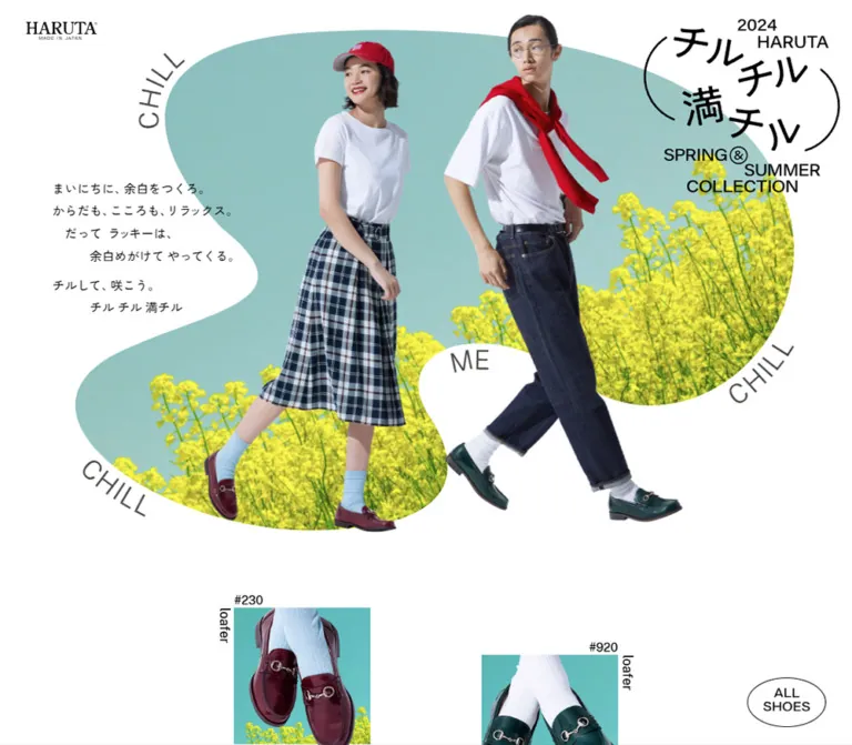
白い余白にモデルの切り抜き写真と有機的な花畑を重ねた春夏カタログ。遊びのある文字配置、楕円ボタン、左右にずらした商品紹介、13商品の一覧が特徴です。
オリジナルサイトを見るA spacious fashion lookbook where cutout figures walk across islands of spring scenery.
Website: HARUTA 2024 Spring/Summer Original URL: https://www.haruta-shoes.co.jp/catalog/ss2024/ Final URL: https://www.haruta-shoes.co.jp/catalog/ss2024/ Theme: white canvas, black interface, colorful photographic compositions Inspected: September 23, 2026, at 02:31 JST; supplied retrieval timestamp: September 22, 2026, at 17:31:28.325 UTC Viewports: desktop 1440 × 1000 CSS px; mobile 390 × 844 CSS px Scope: the currently served seasonal catalog, including its opening composition, a later editorial scene, product descriptions and links, thirteen-item product index, credits, and footer. Visual evidence consists of three desktop captures and two mobile captures, supplemented by rendered DOM measurements from both viewports.
HARUTA presents its spring/summer collection as a long photographic lookbook. A white background provides space around full-length models, irregularly cropped flower fields, angled words, small product labels, and thin outlined controls. Color lives mainly inside the photography: muted aqua sky, bright yellow flowers, navy clothing, red accessories, and occasional vivid blue socks. The interface stays restrained enough for the styling and shoes to remain prominent.
The page alternates expressive fashion compositions with product information, then gathers the collection into a regular index. It ends with a plain, carefully aligned credit list and compact external navigation. The defining contrast is between freely arranged imagery and orderly information. The year 2024 identifies the campaign currently served at this URL; it is not the inspection date.
A spacious fashion lookbook where cutout figures walk across islands of spring scenery.
Website: HARUTA 2024 Spring/Summer Original URL: https://www.haruta-shoes.co.jp/catalog/ss2024/ Final URL: https://www.haruta-shoes.co.jp/catalog/ss2024/ Theme: white canvas, black interface, colorful photographic compositions Inspected: September 23, 2026, at 02:31 JST; supplied retrieval timestamp: September 22, 2026, at 17:31:28.325 UTC Viewports: desktop 1440 × 1000 CSS px; mobile 390 × 844 CSS px Scope: the currently served seasonal catalog, including its opening composition, a later editorial scene, product descriptions and links, thirteen-item product index, credits, and footer. Visual evidence consists of three desktop captures and two mobile captures, supplemented by rendered DOM measurements from both viewports.
HARUTA presents its spring/summer collection as a long photographic lookbook. A white background provides space around full-length models, irregularly cropped flower fields, angled words, small product labels, and thin outlined controls. Color lives mainly inside the photography: muted aqua sky, bright yellow flowers, navy clothing, red accessories, and occasional vivid blue socks. The interface stays restrained enough for the styling and shoes to remain prominent.
The page alternates expressive fashion compositions with product information, then gathers the collection into a regular index. It ends with a plain, carefully aligned credit list and compact external navigation. The defining contrast is between freely arranged imagery and orderly information. The year 2024 identifies the campaign currently served at this URL; it is not the inspection date.
The source defines a small monochrome interface palette. There is no evidenced alternate theme or colored surface system.
| Name | Value | Source token | Evidence and role |
|---|---|---|---|
| Canvas White | #FFFFFF |
--color-bg |
Measured body background; the continuous surface behind scenes, products, credits, and footer |
| Main Black | #000000 |
--color-main |
Measured body text; visually used for brand graphics, utility lettering, and oval outlines |
| Secondary Gray | #4C4948 |
--color-sub |
Measured source variable; visually consistent with the quieter decorative words and outline lettering |
| Inverse White | #FFFFFF |
--color-invert |
Defined source token; a distinct selected or inverted control state was not captured |
Black on white supplies the structure. Keep photographic colors out of navigation backgrounds unless a new requirement explicitly calls for them.
These are approximate implementation swatches for coordinating new artwork. They are not additional source CSS colors or uniform fills found throughout the photographs.
| Name | Approximate value | Visible reference | Reuse guidance |
|---|---|---|---|
| Spring Aqua | #8FBFC0 |
Opening scene's sky-colored field | Useful for preparing a matching backdrop; retain the photograph's tonal variation |
| Flower Yellow | #E5EB48 |
Yellow blossoms across the opening field | Keep concentrated in scenery rather than turning it into a button color |
| Accessory Red | #D71932 |
Cap and shoulder-draped garment | A small, strong focal accent within the styling |
| Pale Sky Cyan | #BFE9EF |
Upper area of the seated-model scene | A lighter photographic variation, not a second interface theme |
Green grass, burgundy leather, dark teal shoes, navy fabric, and cobalt socks also contribute to the imagery. Their exact colors vary with lighting and image content; no fixed tokens are justified by the supplied evidence.
Measured source declaration: "Public Sans", "Zen Kaku Gothic New", sans-serif through --ff.
Body text, product headings, introductory paragraphs, and sampled links share this computed stack and a weight of 500. Latin text appears clean and practical, while Japanese copy remains compact and conversational. The evidence identifies the declared stack, but does not separately verify which font file rendered each glyph.
The source also defines:
--ff-normal: -apple-system, BlinkMacSystemFont, "Segoe UI",
  Helvetica, Arial, "Zen Kaku Gothic New", sans-serif;
This is an available source stack, not proof that a particular visible component uses it.
The HARUTA wordmark has a contrasting serif appearance. The campaign title combines Japanese lettering, curved enclosing strokes, the year, the brand name, and a stepped English season caption. Treat both as supplied brand artwork. The captures do not establish their font names or whether the graphics are SVG, raster images, or another implementation.
The visible CREDIT heading uses outlined capitals. Its sampled H2 has no extracted text, so its inherited font size is not a reliable measurement of the drawn letters. Several footer links also have empty extracted text despite visible labels. This limits conclusions about their internal markup and accessible names.
The measured HTML root is 10px. The source's rem values must therefore be interpreted against that root.
| Mode | Source --f0 |
Calculated value at inspected width |
|---|---|---|
| Desktop | clamp(1.4rem, 1.08rem + .5vw, 1.9rem) |
18px at 1440px |
| Mobile | clamp(1.2rem, 1.2125rem + .5vw, 1.8rem) |
14.075px at 390px |
The source defines a modular multiplier of 1.2. It provides steps from --f-4 through --f6; their existence does not mean every step appears in the supplied captures.
| Token | Relationship | Desktop calculation | Mobile calculation |
|---|---|---|---|
--f-2 |
Base ÷ 1.2² | 12.5px |
9.774px |
--f-1 |
Base ÷ 1.2 | 15px |
11.729px |
--f0 |
Base | 18px |
14.075px |
--f1 |
Base × 1.2 | 21.6px |
16.89px |
--f2 |
Base × 1.2² | 25.92px |
20.268px |
--f3 |
Base × 1.2³ | 31.104px |
24.322px |
| Role | Desktop | Mobile | Notes |
|---|---|---|---|
| Body | 18px / 28.8px |
14.075px / 22.52px |
Weight 500; line height 1.6 |
| Introductory copy | 17.1px / 30.78px |
14.075px / 25.335px |
Line height 1.8; desktop size is 95% of the base |
| Product description H3 | 18px / 23.4px |
14.075px / 18.2975px |
Line height 1.3; weight 500 |
| Product destination anchor | 15px / 15px |
11.7292px / 11.7292px |
Sampled oval link; visible lettering may be graphic content |
| Footer anchor | 18px / 18px |
14.075px / 14.075px |
Computed anchor type, not a guarantee of graphic glyph size |
| Credit rows | Approximately 18–20px |
Approximately 9–10px |
Visual estimates; row elements were not included in the computed-style sample |
Floating ALL SHOES lettering |
Approximately 20px |
Approximately 16px |
Visual estimates from the captures |
Measured tracking is normal on the sampled text elements. The open feeling comes primarily from composition and line spacing, rather than large global letter spacing.
The opening copy is a six-line composition, including まいにちに、余白をつくろ。 and チル チル 満チル. Some lines are indented by approximately one or three text ems. A small extra pause precedes the final two lines.
Preserve the deliberate line grouping and staggered left edges when adapting the copy. Do not turn it into a centered marketing heading and a wide paragraph. The unusual character sequences in extracted decorative text should not be copied literally into new interface labels; the screenshots visibly show words such as CHILL and ME.
The source defines --s1 through --s29 as integer multiples of the fluid base. It also combines these units with viewport-based widths and independently positioned artwork.
| Unit | Desktop at 1440px | Mobile at 390px | Relevant use |
|---|---|---|---|
1 × base |
18px |
14.075px |
Fundamental spacing unit |
1.5 × base |
27px |
21.1125px |
Source top-gap token; also matches the approximate mobile credits inset |
2 × base |
36px |
28.15px |
Desktop body side padding; mobile footer gap |
3 × base |
54px |
42.225px |
Mobile body side padding |
5 × base |
90px |
70.375px |
Larger section spacing reference |
10 × base |
180px |
140.75px |
Desktop index gap between measured square anchor boxes |
The body padding is intentionally larger on mobile in base-unit terms. This does not constrain every composition: the opening art, staggered product modules, and credits use their own horizontal arrangements.
| Element | Desktop measurement | Mobile measurement |
|---|---|---|
| Body side padding | 36px |
42.225px |
| Main content box | 1368px wide |
Approximately 305.56px wide |
| Brand home-link box | 118.80 × 29.61px, at (36, 27) |
62.39 × 23.25px, at approximately (14.06, 7.03) |
| First intro paragraph | (72, 334.62), width 258.52px |
(95.67, 872.14), width 212.72px |
| Product description box | 458.78px wide |
203.69px wide |
| Product oval link | 97.52 × 61.25px |
76.63 × 48.33px |
| Movie-link box | 108 × 67.5px |
84.44 × 56.30px |
| Index anchor/image box | 230.39 × 230.39px |
131.39 × 131.39px |
| Document height | 15,234.81px |
11,714.89px |
Coordinates are supplied rendered positions. They should not be used as hardcoded section positions in a new page, especially where transforms or independently positioned content may affect the boxes.
| Shape | Evidence | Purpose |
|---|---|---|
| Irregular photographic island | Visible in the opening capture | Creates two deep white intrusions and a flowing field around the models |
| Broad asymmetric oval | Visible in the seated-model scene | Frames sky and meadow without enclosing the figures |
| Thin outlined ellipse | ALL SHOES visibly uses this treatment; sampled product and movie links have 50% radius |
Repeated navigation motif |
| Square photographic tile | Measured product-index anchors | Makes the final collection overview easy to scan |
| Outlined capital lettering and numerals | CREDIT and the visible final index number 13 |
Lightweight sectional emphasis |
| Fine straight rule | Visible above mobile credits | Separates the product overview from production information |
There is no visible general system of rounded rectangular cards, shadows, or raised panels.
The small HARUTA mark sits at the upper left, with MADE IN JAPAN beneath it. The measured home-link destination is https://www.haruta-shoes.co.jp/.
The sampled header and H1 have zero layout height while the logo link occupies a separate visible box. This supports an overlaid opening identity rather than a conventional header bar that pushes content down. The supplied data does not expose its positioning declaration.
Use the authorized wordmark artwork and maintain its small scale. On mobile, distinguish the measured link box from the smaller ink footprint inside it.
The upper-right mark acts as a second identity anchor. Its anatomy is:
チル チル 満チル.SPRING & SUMMER COLLECTION caption.The opening desktop mark occupies approximately 330 × 295px. In the later desktop scene and footer it appears nearer 215 × 195px. The mobile opening version is approximately 155 × 140px.
These are visual estimates. A smaller mark remains at the top right in the supplied scrolled desktop captures, but the mechanism and exact switching point are unverified. It is absent from the supplied mobile footer capture; do not assume identical persistence on both layouts.
The opening view combines four visual systems on one white canvas:
On desktop, the woman appears left of center and the man right of center. Their walking poses create diagonals across the frame. Shoes remain visible near the bottom rather than disappearing into a cropped portrait. The background has a left-side white indentation for the copy and another deep opening near the lower center.
The background field and the figures have visibly independent boundaries. A practical implementation can use a transparent scene asset plus separate foreground cutouts, or an equivalent responsive composition. The supplied evidence does not establish the original asset pipeline.
On mobile, the woman moves above and behind the man. The meadow crosses the middle of the viewport, while the man's legs extend into the white area below. The introductory copy moves beneath the first screen. This is a different art direction, not a uniformly scaled desktop poster.
The desktop copy occupies the white indentation to the left of the models. Its first paragraph begins at x = 72px, approximately twice the body inset, and at y = 334.62px. The line height is generous relative to its modest size.
At 390px wide, the first line starts at document y = 872.14px, below the 844px opening viewport. Its x-coordinate is approximately 95.67px. The changing indents remain present.
Keep this text as a readable content block independent of the photographic layer. It should be possible to change the wording without modifying the image asset.
The second desktop capture shows two seated figures against a large asymmetric oval of pale sky, green meadow, and soft-focus flowers. The left outfit uses stripes, navy, gray, and white. The right outfit combines a blue shirt, light skirt, bright blue socks, and dark shoes.
The background is approximately bounded by x = 95–1359px and y = 133–952px in that capture. These are visual estimates. The figures exceed the background boundary, particularly at their heads and shoes. ME sits above the field and CHILL follows its lower-right edge.
Reuse the relationship between scenery and silhouette, while giving each scene its own crop and pose. The supplied captures do not justify assigning this exact shape to every section of the page.
The DOM contains thirteen product entries with a code, a lowercase English category, a short Japanese description, and a destination link. Categories include loafers, bit loafers, tassel loafers, postman shoes, wing-tip shoes, sandals, sneafer styles, and spock shoes.
Measured product descriptions use the base font at 1.3 line height. The associated destination anchors are white, elliptical, and use 50% radius. Their measured desktop padding is approximately 21.75px 10.5px 22.5px; mobile padding is approximately 17.01px 8.21px 17.59px.
Modules are arranged with horizontal and vertical offsets. For the first pair:
| Position | Desktop | Mobile |
|---|---|---|
| First description | (281.80, 1321.95) |
(22.11, 1353.61) |
| Second description | (699.41, 1401.14) |
(164.20, 1615.60) |
| Vertical difference | About 79.19px |
About 261.98px |
This staggered rhythm continues through other pairs. Several single mobile descriptions are centered near x = 93.16px with the same 203.69px width. Avoid forcing all product features into an identical row height or a uniform mobile stack.
The visible text of the individual oval links was not recovered. Do not invent a source CTA label. For a new implementation, provide an explicit accessible name based on the product code and destination.
The index repeats all thirteen product links in a more regular overview. Desktop uses four columns; mobile uses two. The last item starts a new row at the left in both layouts.
| Property | Desktop | Mobile |
|---|---|---|
| First column x-position | 133.92px |
42.22px |
| Tile width | 230.39px |
131.39px |
| Column pitch | 313.92px |
174.17px |
| Calculated horizontal gap | 83.53px |
42.78px |
| Row pitch | 410.39px |
193.31px |
| Calculated space between square anchor boxes | 180px |
61.92px |
The desktop grid spans approximately 1172.16px, matching the source 81.4vw large-width token. Mobile instead follows the narrower body content box.
The final mobile capture shows part of the last photographic tile and an outlined 13 underneath. The DOM confirms product-code and category text for every link. The complete visual arrangement of every index caption is not exposed, so preserve those content relationships without asserting a specific placement for every label.
ALL SHOES ControlA white oval with a thin black outline contains two stacked lines, ALL and SHOES. It has no visible shadow, icon, or colored fill.
It appears at the lower right in the desktop opening and editorial captures, approximately 108 × 67px. On mobile it moves to the lower left and measures approximately 85 × 55px visually. In both footer captures it sits higher relative to the viewport bottom, leaving room for footer content.
The label and the separate product index suggest an index-navigation function, but no activation result or target was supplied. Preserve the control's appearance; verify its intended destination before implementing its action. Likewise, the exact fixed, sticky, or footer-docking logic remains unverified.
The rendered page includes an elliptical anchor to https://youtu.be/bi2kv5l4pVg. This establishes an external movie destination. It does not establish an inline player, lightbox, autoplay behavior, sound policy, or loading state.
Maintain a visually related oval control if implementing this destination. Any richer playback interface would be an additional design decision.
Desktop credits have three visual columns: outlined CREDIT at the left, role labels in the middle, and names at the right. The heading box begins at x = 133.92px; role text appears around x = 400px, and names around x = 809px in the capture. Rows have generous vertical separation and no individual borders.
On mobile, a thin divider spans approximately 348px with a 21px side inset. The heading sits beneath it, followed by two columns of roles and names. Longer roles and affiliations wrap. The visible text is very small; a new implementation should consider a larger minimum size while preserving the pairing.
The inspected original page directly supplies these credits:
| Role | Credit as shown |
|---|---|
| Creative Direction | Yoshiko Yazawa |
| Art direction & Design | Takuro Suzuki (Nippon Design Center) |
| Copy Writing | Reina Takasaki |
| Photography / Movie Direction / Movie Editing | Yuki Yamaguchi (W) |
| Styling for Girl | Emiko Akashi |
| Styling for Boy | Eiji Kawasaki |
| Hair & Make-up | Naoyuki Ohgimoto (POIL) |
| Model | Yui Okamoto / Kazuki Kaneko |
| Retouch | Takashi Suzuki (Nippon Design Center) |
| Technical Direction / Web Development | Taro Higuchi (BERRY'Z) |
| Produce | Sayaka Soga (Nippon Design Center) |
These are on-page credits. Individual portfolio URLs were not supplied and should not be guessed.
The footer uses uppercase labels for BRAND SITE, SHOP LIST, INSTAGRAM, FACEBOOK, X, and WEIBO. Desktop places them in one centered line, with privacy information at the right. Mobile wraps them into two centered lines of three links, then places PRIVACY POLICY and the copyright below.
The source footer uses flex layout. Desktop bottom padding is 36px. Mobile padding is 14.075px 0 28.15px, with a measured gap of 28.15px.
A thin double upward chevron appears above the footer area. It visually suggests returning upward, but its actual activation behavior was not tested. Use a proper link or button with a text alternative when reproducing this affordance.
| Treatment | Evidence | What can be concluded |
|---|---|---|
| Brand-link transform transition | transform 3s cubic-bezier(0.2, 0.28, 0, 1.12) 0.25s |
A three-second transform transition with a 250ms delay is declared on the sampled logo link |
| Base easing | --easing-base: cubic-bezier(.06, .89, .23, 1) |
Defined source easing; no particular component association was supplied |
| Slow easing | --easing-slow: cubic-bezier(.075, .82, .165, 1) |
Defined source easing; trigger and duration are unknown |
| Chewy easing | --easing-chewy: cubic-bezier(.2,.28,0,1.12) |
Defined easing with an overshooting control point; also present on the brand-link transition |
| Smaller desktop campaign mark in scrolled views | Visible across supplied captures | Multiple visual sizes exist; the transition mechanism and timing are unverified |
| Oval control moves above footer content | Visible in footer captures | Different placement is evidenced; its positioning logic is not |
The source's named easing curves support an elastic or gently overshooting motion vocabulary, but the evidence does not establish model parallax, floating scenery loops, scroll scrubbing, or animated word paths.
Many sampled elements report animation: none. Other elements report a generic transition: all without a useful duration. Neither finding proves that the entire page is static or animated.
ALL SHOES, the upward chevron, hover states, keyboard focus states, and intermediate responsive states were not exercised in the supplied evidence.The capture process waited for document loading, visible image decoding, and sampled layout stability. It conservatively waited for finite geometric motion and temporarily paused perpetual animations during readiness checks. This improves confidence in the settled screenshots but does not prove the presence or absence of any specific animation.
Implementation recommendation: begin with a correct static composition. Add movement only where its purpose is clear, and keep decorative movement independent of reading and product navigation. Do not assign arbitrary three-second transitions to every component merely because the logo uses one.
| Layer | Appearance | Function |
|---|---|---|
| Page canvas | Continuous solid white | Holds the full scrolling catalog together |
| Scenery | Photographic color inside irregular boundaries | Establishes seasonal atmosphere |
| Foreground figures | Clean silhouettes extending beyond scenery | Carries fashion styling, pose, and shoe visibility |
| Product modules | Text and imagery placed directly on white | Connects the editorial scenes to product destinations |
| Product index | Square image links separated by open space | Provides an orderly collection overview |
| Navigation ovals | White or transparent-looking interior, fine black edge | Repeats a recognizable control shape |
| Credits and footer | Same white canvas, black text, minimal linework | Provides information without introducing a new panel style |
The visual depth comes from overlap and silhouette boundaries. There is no evidenced need for box-shadow elevation, translucent glass, textured paper, or gradient interface panels.
The opening art combines crisp full-length fashion photography with a softer seasonal landscape. The model cutouts have clear hair, clothing, and shoe edges. Clothing supplies graphic patterns and accents: plaid, stripes, dark denim, a red cap, and red fabric draped over shoulders. Expressions and walking poses make the composition feel relaxed and lightly theatrical.
The scenery should remain recognizably photographic. Yellow flower heads, stems, and aqua sky create a dense lower field and a calmer upper field. The later seated scene uses a brighter sky and softer flowers, demonstrating that scene color can vary while the white interface remains stable.
Important compositional rules:
No original image URLs, mask definitions, font-file URLs, or asset filenames were included in the supplied evidence. The following is an asset-role inventory, not a claimed source manifest.
| Asset role | Evidence | Practical requirement |
|---|---|---|
| HARUTA brand mark | Opening desktop and mobile captures | Preserve its original proportions and small subline |
| Campaign mark | Desktop opening, later scene, credits; mobile opening | Provide sharp artwork that remains readable at both observed sizes |
| Opening scenic field | Aqua sky and yellow flowers with an irregular edge | Use an authorized transparent asset or a separately authored mask |
| Opening figures | Two independent silhouettes visually overlapping the field | Keep enough source resolution for full-length display |
| Seated editorial composition | Later desktop capture | Preserve the softer scenery and foreground overlap |
| Product index imagery | Final mobile tile fragment and square DOM link boxes | Supply consistent square crops without adding generic card chrome |
| Outline heading and decorative lettering | Captures and empty-text heading boxes | Preserve visible appearance while supplying accessible text |
A reusable build may separate scene, models, and lettering into layers. That is an implementation recommendation, not a finding about the original files.
The document is a long scrolling page, approximately fifteen viewport heights at the inspected size. Its opening composition nearly fills the first screen. Utility elements occupy the corners while models, flower fields, and text are arranged across the center.
The large-width source token is --w-l: calc(var(--vw) * 81.4), where the sampled --vw is 14.4px. Its calculated width is 1172.16px, matching the measured desktop index span. Product features use separate positions and do not consistently align to that grid.
The index provides the strongest repeated layout structure: four columns with large vertical gaps. Credits continue the broad desktop alignment while changing to label/value information. The footer returns to a centered horizontal line.
The first screen is recomposed around a vertical relationship between the two models. The small brand mark stays upper left; the campaign mark stays upper right; the scenery occupies a band across the middle. The introductory text begins below the viewport.
Several distinct mobile widths coexist:
| Region | Observed or calculated width behavior |
|---|---|
| Main body content | About 305.56px inside 42.225px side padding |
| Opening scenery | Visually extends to and beyond the side edges |
| Product description box | 203.69px, placed left, right, or centrally by module |
| Source shoe-width token | --w-shoes: 58.6vw, calculated as 228.54px; not the index tile width |
| Product index | Two 131.39px columns inside the body content box |
| Credits heading/divider region | Approximately 347.78px, beginning near 21.11px |
This is not one global container with a single mobile gutter. Preserve the distinction between full-width art, staggered product groups, the compact index, and the wider credits block.
The source still defines --w-l on mobile, but its calculated 317.46px should not be mistaken for the observed index width. A defined custom property is not proof that every section uses it.
Only 1440px and 390px widths were inspected. The original breakpoint, tablet composition, landscape behavior, safe-area handling, and intermediate campaign-mark sizes are unknown.
The Quick Start uses a recommended 767px breakpoint to demonstrate two modes. Test additional widths, long text, browser zoom, and viewport-height changes before adopting it. The measured page heights describe this content and capture state; they are not fixed layout targets.
Times declaration as the visible body typeface.rem formulas into a conventional root without converting their units.These are improvements or implementation safeguards, not verified features of the original page:
CHILL and ME lettering out of the reading order when it conveys no additional content.#FFFFFF, measured source color.#000000, measured source color.#4C4948, measured source variable.#8FBFC0 and flower yellow approximately #E5EB48.#D71932.“Create a long seasonal footwear lookbook inspired by HARUTA's currently served 2024 spring/summer catalog. Use a white canvas, black medium-weight typography, a Public Sans and Zen Kaku Gothic New stack, generous negative space, and fine outlined oval controls. Build the opening around two full-length fashion cutouts overlapping an irregular aqua-and-yellow flower field. Keep the shoes visible, position a small brand mark at upper left and campaign artwork at upper right, and place short staggered Japanese copy in a white opening beside the image. Alternate editorial scenes with asymmetrically placed product information, then provide a thirteen-item index, aligned credits, and a compact uppercase footer. On mobile, arrange the figures vertically, move the introductory copy below the first screen, use two index columns, and retain independent gutters for art, products, and credits. Treat any motion beyond the evidenced logo transition as a separate recommendation.”
This adaptation keeps a conventional document root and expresses the observed 10px-root formulas directly in pixels. It combines measured tokens with explicitly estimated scene positions and recommended responsive behavior.
The scene expects an authorized, already masked background image and separate foreground artwork. These are reusable implementation layers; they are not claimed original asset files. The CSS does not create the campaign lettering or reconstruct the exact scenic contour.
:root {
  /* Measured interface colors */
  --paper: #ffffff;
  --ink: #000000;
  --sub: #4c4948;

  /* Approximate photographic coordination colors */
  --scene-aqua: #8fbfc0;
  --scene-yellow: #e5eb48;
  --styling-red: #d71932;

  /* Measured declared stack; supply licensed font files separately */
  --font-body: "Public Sans", "Zen Kaku Gothic New", sans-serif;
  --weight-body: 500;

  /* Source formula converted from its 10px root */
  --u: clamp(14px, calc(10.8px + 0.5vw), 19px);
  --f-small: calc(var(--u) / 1.2);
  --f-body: var(--u);
  --f-large: calc(var(--u) * 1.2);
  --leading-body: 1.6;
  --leading-product: 1.3;
  --leading-copy: 1.8;

  --page-side: calc(2 * var(--u));
  --page-top: calc(1.5 * var(--u));
  --large-width: 81.4vw;
  --rule: 1px;

  /* Measured source easing curves */
  --ease-base: cubic-bezier(0.06, 0.89, 0.23, 1);
  --ease-slow: cubic-bezier(0.075, 0.82, 0.165, 1);
  --ease-chewy: cubic-bezier(0.2, 0.28, 0, 1.12);
}

* {
  box-sizing: border-box;
}

body.lookbook {
  margin: 0;
  padding-inline: var(--page-side);
  background: var(--paper);
  color: var(--ink);
  font-family: var(--font-body);
  font-size: var(--f-body);
  font-weight: var(--weight-body);
  line-height: var(--leading-body);
}

.lookbook img {
  display: block;
  max-width: 100%;
}

.lookbook a {
  color: inherit;
}

.lookbook :focus-visible {
  outline: 2px solid var(--ink);
  outline-offset: 5px;
}

/* Estimated artboard geometry, not recovered source CSS */
.opening-scene {
  position: relative;
  isolation: isolate;
  height: min(69.444vw, 1000px);
  min-height: 620px;
  margin-inline: calc(-1 * var(--page-side));
}

.brand-mark {
  position: absolute;
  z-index: 5;
  top: var(--page-top);
  left: var(--page-side);
  width: 8.25vw;
  max-width: 119px;
  line-height: 1;
  transition: transform 3s var(--ease-chewy) 250ms;
}

.brand-mark img,
.campaign-mark img {
  width: 100%;
  height: auto;
}

.campaign-mark {
  position: absolute;
  z-index: 5;
  top: var(--page-top);
  right: var(--page-side);
  width: 23.2vw;
  max-width: 335px;
}

/* Optional visual variant; the original switching trigger is unknown */
.campaign-mark--compact {
  width: 15vw;
  max-width: 216px;
}

.scene-field,
.scene-person {
  position: absolute;
  pointer-events: none;
}

.scene-field {
  z-index: 0;
  inset: 5.5% 7.4% 8% 7.9%;
}

.scene-field img,
.scene-person img {
  width: 100%;
  height: 100%;
  object-fit: contain;
}

/* Use a transparent field asset to retain its white intrusions */
.scene-person--woman {
  z-index: 1;
  left: 23.4%;
  top: 6.5%;
  width: 25%;
  height: 84%;
}

.scene-person--man {
  z-index: 2;
  left: 52.1%;
  top: 1.9%;
  width: 28.5%;
  height: 87%;
}

.intro-copy {
  position: absolute;
  z-index: 3;
  top: 33.46%;
  left: 5%;
  width: 18%;
  font-size: calc(0.95 * var(--u));
  line-height: var(--leading-copy);
}

.intro-copy p {
  margin: 0;
}

.intro-copy .indent-one {
  margin-left: 1em;
}

.intro-copy .indent-three {
  margin-left: 3em;
}

.intro-copy .copy-pause {
  margin-top: 0.56em;
}

.oval-link {
  display: grid;
  place-content: center;
  min-height: 44px;
  border: var(--rule) solid var(--ink);
  border-radius: 50%;
  background: var(--paper);
  color: var(--ink);
  text-align: center;
  text-decoration: none;
  line-height: 1;
}

.product-link {
  width: calc(5.4175 * var(--u));
  min-height: calc(3.403 * var(--u));
  margin-inline: auto;
  font-size: var(--f-small);
}

/* Default floating position; implement footer docking separately */
.all-shoes {
  position: fixed;
  z-index: 20;
  right: max(var(--page-side), env(safe-area-inset-right));
  bottom: max(25px, env(safe-area-inset-bottom));
  width: 108px;
  min-height: 67px;
  font-size: 20px;
}

.product-description {
  margin: 0;
  font-size: var(--f-body);
  font-weight: var(--weight-body);
  line-height: var(--leading-product);
}

/* Keep editorial feature positioning separate from this index grid */
.collection-index {
  width: var(--large-width);
  margin-inline: auto;
  scroll-margin-top: calc(2 * var(--u));
}

.product-grid {
  display: grid;
  grid-template-columns: repeat(4, 16vw);
  justify-content: space-between;
  row-gap: calc(10 * var(--u));
  margin: 0;
  padding: 0;
  list-style: none;
}

.product-tile {
  min-width: 0;
}

.product-tile__image {
  display: block;
  width: 100%;
  aspect-ratio: 1;
  text-decoration: none;
}

.product-tile__image img {
  width: 100%;
  height: 100%;
  object-fit: cover;
}

/* Caption placement is a recommendation, not a measured source rule */
.product-tile__caption {
  margin-top: 0.4em;
  font-size: var(--f-small);
  line-height: 1.3;
}

.outline-label {
  color: var(--sub);
  font-weight: 500;
  line-height: 1;
}

@supports (-webkit-text-stroke: 1px #000) {
  .outline-label {
    color: transparent;
    -webkit-text-stroke: 0.6px var(--sub);
  }
}

.product-tile__ordinal {
  display: block;
  margin-top: 0.5em;
  text-align: center;
  font-size: var(--f-large);
}

.credits {
  display: grid;
  grid-template-columns: 22.7% minmax(0, 1fr);
  width: var(--large-width);
  margin: calc(12 * var(--u)) auto 0;
}

.credits__title {
  margin: 0;
  font-size: 36px;
}

.credits__list {
  display: grid;
  gap: var(--u);
  margin: 0;
}

.credit-row {
  display: grid;
  grid-template-columns: 43% minmax(0, 1fr);
  gap: 20px;
  align-items: start;
}

.credit-row dt,
.credit-row dd {
  margin: 0;
  overflow-wrap: anywhere;
}

.back-to-top {
  position: relative;
  display: block;
  width: 44px;
  height: 44px;
  margin: calc(8 * var(--u)) auto calc(3 * var(--u));
  color: var(--sub);
}

.back-to-top::before,
.back-to-top::after {
  content: "";
  position: absolute;
  left: 10px;
  width: 24px;
  height: 24px;
  border-top: 1px solid currentColor;
  border-left: 1px solid currentColor;
  transform: rotate(45deg);
}

.back-to-top::before {
  top: 12px;
}

.back-to-top::after {
  top: 21px;
}

.site-footer {
  position: relative;
  padding-bottom: calc(2 * var(--u));
  line-height: 1;
}

.footer-links {
  display: flex;
  flex-wrap: wrap;
  justify-content: center;
  gap: 7px calc(1.5 * var(--u));
}

.footer-links a,
.footer-legal a {
  text-decoration: none;
}

.footer-legal {
  position: absolute;
  right: 0;
  bottom: calc(2 * var(--u));
  text-align: right;
}

.footer-legal small {
  display: block;
  margin-top: 1em;
  font-size: 11px;
}

/* Recommended breakpoint; the original threshold was not supplied */
@media (max-width: 767px) {
  :root {
    --u: clamp(12px, calc(12.125px + 0.5vw), 18px);
    --page-side: calc(3 * var(--u));
    --shoe-width: 58.6vw;
  }

  .opening-scene {
    height: 100svh;
    min-height: 760px;
    margin-bottom: calc(14 * var(--u));
  }

  .brand-mark {
    top: calc(0.5 * var(--u));
    left: var(--u);
    width: 16vw;
    max-width: none;
  }

  .campaign-mark {
    top: var(--u);
    right: 10px;
    width: 40vw;
    max-width: none;
  }

  .scene-field {
    inset: auto;
    top: 29.6%;
    left: -7.5%;
    width: 115%;
    height: 38%;
  }

  .scene-person--woman {
    left: 5.4%;
    top: 9.8%;
    width: 50%;
    height: 56%;
  }

  .scene-person--man {
    left: 38%;
    top: 28.3%;
    width: 57%;
    height: 58%;
  }

  .intro-copy {
    top: calc(100% + 2 * var(--u));
    left: 24.53%;
    width: 55%;
    font-size: var(--f-body);
  }

  .all-shoes {
    right: auto;
    left: max(var(--u), env(safe-area-inset-left));
    bottom: max(18px, env(safe-area-inset-bottom));
    width: calc(6 * var(--u));
    min-height: calc(4 * var(--u));
    font-size: 16px;
  }

  .collection-index {
    width: 100%;
  }

  .product-grid {
    grid-template-columns: repeat(2, 43%);
    row-gap: calc(4.4 * var(--u));
  }

  .credits {
    display: block;
    width: calc(100% + 3 * var(--u));
    margin-inline: calc(-1.5 * var(--u));
    padding-top: calc(4 * var(--u));
    border-top: var(--rule) solid var(--ink);
  }

  .credits__title {
    margin-bottom: calc(2.5 * var(--u));
    font-size: 28px;
  }

  .credits__list {
    gap: 12px;
    /* Readability improvement over the approximately 9–10px capture */
    font-size: 12px;
    line-height: 1.5;
  }

  .credit-row {
    grid-template-columns: 44% minmax(0, 1fr);
    gap: 12px;
  }

  .site-footer {
    padding-block: var(--u) calc(2 * var(--u));
  }

  .footer-links {
    column-gap: calc(1.25 * var(--u));
  }

  .footer-legal {
    position: static;
    margin-top: calc(2 * var(--u));
    text-align: center;
  }
}

/* Recommended reduced-motion support */
@media (prefers-reduced-motion: reduce) {
  .lookbook *,
  .lookbook *::before,
  .lookbook *::after {
    animation: none !important;
    transition: none !important;
    scroll-behavior: auto !important;
  }
}
Markup contract: place the brand, campaign artwork, scenic field, two figure wrappers, and introductory copy inside .opening-scene. Use real links for product destinations. Each .credit-row can be a div containing one dt and one dd inside .credits__list. Give the upward link a real target and an accessible name. Treat decorative scene layers as noninteractive.
Integration limits: adjust scene coordinates against the actual asset bounds, since transparent padding changes visible alignment. Reserve enough flow space for introductory copy if its wording grows. Clip only decorative overhang where necessary, without clipping text or focus indicators. Implement the floating control's footer state separately; the default fixed rule alone does not reproduce the supplied footer captures. The CSS does not implement source-specific scene animation, campaign-mark state changes, or unverified button actions.
Optional aliases for a project already using Tailwind v4. This does not claim the original site uses Tailwind. Define the properties above first.
@theme inline {
  --color-paper: var(--paper);
  --color-ink: var(--ink);
  --color-secondary: var(--sub);
  --color-scene-aqua: var(--scene-aqua);
  --color-scene-yellow: var(--scene-yellow);

  --font-lookbook: var(--font-body);
  --text-lookbook-small: var(--f-small);
  --text-lookbook-body: var(--f-body);
  --text-lookbook-large: var(--f-large);

  --spacing-lookbook-unit: var(--u);
  --spacing-lookbook-side: var(--page-side);
  --spacing-lookbook-wide: var(--large-width);
  --radius-oval: 50%;
}
17:31:28.325Z, corresponding to September 23, 2026, at 02:31:28.325 JST.15,234.81px.11,714.89px.This reference describes the page currently served at the inspected URL. Measured tokens, visual estimates, and recommended implementation choices are identified separately throughout.
# HARUTA 2024 Spring/Summer — Style Reference

> A spacious fashion lookbook where cutout figures walk across islands of spring scenery.

**Website:** [HARUTA 2024 Spring/Summer](https://www.haruta-shoes.co.jp/catalog/ss2024/)
**Original URL:** https://www.haruta-shoes.co.jp/catalog/ss2024/
**Final URL:** https://www.haruta-shoes.co.jp/catalog/ss2024/
**Theme:** white canvas, black interface, colorful photographic compositions
**Inspected:** September 23, 2026, at 02:31 JST; supplied retrieval timestamp: September 22, 2026, at 17:31:28.325 UTC
**Viewports:** desktop 1440 × 1000 CSS px; mobile 390 × 844 CSS px
**Scope:** the currently served seasonal catalog, including its opening composition, a later editorial scene, product descriptions and links, thirteen-item product index, credits, and footer. Visual evidence consists of three desktop captures and two mobile captures, supplemented by rendered DOM measurements from both viewports.

HARUTA presents its spring/summer collection as a long photographic lookbook. A white background provides space around full-length models, irregularly cropped flower fields, angled words, small product labels, and thin outlined controls. Color lives mainly inside the photography: muted aqua sky, bright yellow flowers, navy clothing, red accessories, and occasional vivid blue socks. The interface stays restrained enough for the styling and shoes to remain prominent.

The page alternates expressive fashion compositions with product information, then gathers the collection into a regular index. It ends with a plain, carefully aligned credit list and compact external navigation. The defining contrast is between freely arranged imagery and orderly information. The year 2024 identifies the campaign currently served at this URL; it is not the inspection date.
# HARUTA 2024 Spring/Summer — Style Reference

> A spacious fashion lookbook where cutout figures walk across islands of spring scenery.

**Website:** [HARUTA 2024 Spring/Summer](https://www.haruta-shoes.co.jp/catalog/ss2024/)
**Original URL:** https://www.haruta-shoes.co.jp/catalog/ss2024/
**Final URL:** https://www.haruta-shoes.co.jp/catalog/ss2024/
**Theme:** white canvas, black interface, colorful photographic compositions
**Inspected:** September 23, 2026, at 02:31 JST; supplied retrieval timestamp: September 22, 2026, at 17:31:28.325 UTC
**Viewports:** desktop 1440 × 1000 CSS px; mobile 390 × 844 CSS px
**Scope:** the currently served seasonal catalog, including its opening composition, a later editorial scene, product descriptions and links, thirteen-item product index, credits, and footer. Visual evidence consists of three desktop captures and two mobile captures, supplemented by rendered DOM measurements from both viewports.

HARUTA presents its spring/summer collection as a long photographic lookbook. A white background provides space around full-length models, irregularly cropped flower fields, angled words, small product labels, and thin outlined controls. Color lives mainly inside the photography: muted aqua sky, bright yellow flowers, navy clothing, red accessories, and occasional vivid blue socks. The interface stays restrained enough for the styling and shoes to remain prominent.

The page alternates expressive fashion compositions with product information, then gathers the collection into a regular index. It ends with a plain, carefully aligned credit list and compact external navigation. The defining contrast is between freely arranged imagery and orderly information. The year 2024 identifies the campaign currently served at this URL; it is not the inspection date.

## How to Read This Reference

- **Measured** values come from the supplied rendered DOM, computed styles, or custom properties. Dimensions are CSS pixels unless stated otherwise.
- **Calculated** values are arithmetic derived from those measurements or source formulas. They are not additional browser observations.
- **Visual estimates** describe proportions or colors visible in the original-page captures where no computed measurement was supplied. Photographic color estimates were not sampled pixel by pixel.
- **Recommendations** and the Quick Start are implementation guidance. They do not establish that the original uses the same markup, breakpoints, asset construction, or event handling.
- The supplied DOM excerpt does not include a complete element hierarchy, asset manifest, event handlers, or every styled element. Parent font sizes do not necessarily describe lettering rendered inside graphics.
- The original-page captures establish appearance. Product destinations are supported by their rendered links, but those destinations were not inspected.

## Tokens — Colors

### Interface Palette

The source defines a small monochrome interface palette. There is no evidenced alternate theme or colored surface system.

| Name | Value | Source token | Evidence and role |
| --- | --- | --- | --- |
| Canvas White | `#FFFFFF` | `--color-bg` | Measured body background; the continuous surface behind scenes, products, credits, and footer |
| Main Black | `#000000` | `--color-main` | Measured body text; visually used for brand graphics, utility lettering, and oval outlines |
| Secondary Gray | `#4C4948` | `--color-sub` | Measured source variable; visually consistent with the quieter decorative words and outline lettering |
| Inverse White | `#FFFFFF` | `--color-invert` | Defined source token; a distinct selected or inverted control state was not captured |

Black on white supplies the structure. Keep photographic colors out of navigation backgrounds unless a new requirement explicitly calls for them.

### Photographic Color References

These are approximate implementation swatches for coordinating new artwork. They are not additional source CSS colors or uniform fills found throughout the photographs.

| Name | Approximate value | Visible reference | Reuse guidance |
| --- | --- | --- | --- |
| Spring Aqua | `#8FBFC0` | Opening scene's sky-colored field | Useful for preparing a matching backdrop; retain the photograph's tonal variation |
| Flower Yellow | `#E5EB48` | Yellow blossoms across the opening field | Keep concentrated in scenery rather than turning it into a button color |
| Accessory Red | `#D71932` | Cap and shoulder-draped garment | A small, strong focal accent within the styling |
| Pale Sky Cyan | `#BFE9EF` | Upper area of the seated-model scene | A lighter photographic variation, not a second interface theme |

Green grass, burgundy leather, dark teal shoes, navy fabric, and cobalt socks also contribute to the imagery. Their exact colors vary with lighting and image content; no fixed tokens are justified by the supplied evidence.

## Tokens — Typography

### Main Text Stack

**Measured source declaration:** `"Public Sans", "Zen Kaku Gothic New", sans-serif` through `--ff`.

Body text, product headings, introductory paragraphs, and sampled links share this computed stack and a weight of `500`. Latin text appears clean and practical, while Japanese copy remains compact and conversational. The evidence identifies the declared stack, but does not separately verify which font file rendered each glyph.

The source also defines:

```css
--ff-normal: -apple-system, BlinkMacSystemFont, "Segoe UI",
  Helvetica, Arial, "Zen Kaku Gothic New", sans-serif;
```

This is an available source stack, not proof that a particular visible component uses it.

### Brand and Campaign Lettering

The HARUTA wordmark has a contrasting serif appearance. The campaign title combines Japanese lettering, curved enclosing strokes, the year, the brand name, and a stepped English season caption. Treat both as supplied brand artwork. The captures do not establish their font names or whether the graphics are SVG, raster images, or another implementation.

The visible `CREDIT` heading uses outlined capitals. Its sampled H2 has no extracted text, so its inherited font size is not a reliable measurement of the drawn letters. Several footer links also have empty extracted text despite visible labels. This limits conclusions about their internal markup and accessible names.

### Fluid Type Formula

The measured HTML root is `10px`. The source's `rem` values must therefore be interpreted against that root.

| Mode | Source `--f0` | Calculated value at inspected width |
| --- | --- | --- |
| Desktop | `clamp(1.4rem, 1.08rem + .5vw, 1.9rem)` | `18px` at 1440px |
| Mobile | `clamp(1.2rem, 1.2125rem + .5vw, 1.8rem)` | `14.075px` at 390px |

The source defines a modular multiplier of `1.2`. It provides steps from `--f-4` through `--f6`; their existence does not mean every step appears in the supplied captures.

| Token | Relationship | Desktop calculation | Mobile calculation |
| --- | --- | --- | --- |
| `--f-2` | Base ÷ 1.2² | `12.5px` | `9.774px` |
| `--f-1` | Base ÷ 1.2 | `15px` | `11.729px` |
| `--f0` | Base | `18px` | `14.075px` |
| `--f1` | Base × 1.2 | `21.6px` | `16.89px` |
| `--f2` | Base × 1.2² | `25.92px` | `20.268px` |
| `--f3` | Base × 1.2³ | `31.104px` | `24.322px` |

### Measured Component Type

| Role | Desktop | Mobile | Notes |
| --- | --- | --- | --- |
| Body | `18px / 28.8px` | `14.075px / 22.52px` | Weight `500`; line height `1.6` |
| Introductory copy | `17.1px / 30.78px` | `14.075px / 25.335px` | Line height `1.8`; desktop size is 95% of the base |
| Product description H3 | `18px / 23.4px` | `14.075px / 18.2975px` | Line height `1.3`; weight `500` |
| Product destination anchor | `15px / 15px` | `11.7292px / 11.7292px` | Sampled oval link; visible lettering may be graphic content |
| Footer anchor | `18px / 18px` | `14.075px / 14.075px` | Computed anchor type, not a guarantee of graphic glyph size |
| Credit rows | Approximately `18–20px` | Approximately `9–10px` | Visual estimates; row elements were not included in the computed-style sample |
| Floating `ALL SHOES` lettering | Approximately `20px` | Approximately `16px` | Visual estimates from the captures |

Measured tracking is `normal` on the sampled text elements. The open feeling comes primarily from composition and line spacing, rather than large global letter spacing.

### Copy Rhythm

The opening copy is a six-line composition, including `まいにちに、余白をつくろ。` and `チル チル 満チル`. Some lines are indented by approximately one or three text ems. A small extra pause precedes the final two lines.

Preserve the deliberate line grouping and staggered left edges when adapting the copy. Do not turn it into a centered marketing heading and a wide paragraph. The unusual character sequences in extracted decorative text should not be copied literally into new interface labels; the screenshots visibly show words such as `CHILL` and `ME`.

## Tokens — Spacing & Shapes

### Base Spacing System

The source defines `--s1` through `--s29` as integer multiples of the fluid base. It also combines these units with viewport-based widths and independently positioned artwork.

| Unit | Desktop at 1440px | Mobile at 390px | Relevant use |
| --- | --- | --- | --- |
| `1 × base` | `18px` | `14.075px` | Fundamental spacing unit |
| `1.5 × base` | `27px` | `21.1125px` | Source top-gap token; also matches the approximate mobile credits inset |
| `2 × base` | `36px` | `28.15px` | Desktop body side padding; mobile footer gap |
| `3 × base` | `54px` | `42.225px` | Mobile body side padding |
| `5 × base` | `90px` | `70.375px` | Larger section spacing reference |
| `10 × base` | `180px` | `140.75px` | Desktop index gap between measured square anchor boxes |

The body padding is intentionally larger on mobile in base-unit terms. This does not constrain every composition: the opening art, staggered product modules, and credits use their own horizontal arrangements.

### Measured Geometry

| Element | Desktop measurement | Mobile measurement |
| --- | --- | --- |
| Body side padding | `36px` | `42.225px` |
| Main content box | `1368px` wide | Approximately `305.56px` wide |
| Brand home-link box | `118.80 × 29.61px`, at `(36, 27)` | `62.39 × 23.25px`, at approximately `(14.06, 7.03)` |
| First intro paragraph | `(72, 334.62)`, width `258.52px` | `(95.67, 872.14)`, width `212.72px` |
| Product description box | `458.78px` wide | `203.69px` wide |
| Product oval link | `97.52 × 61.25px` | `76.63 × 48.33px` |
| Movie-link box | `108 × 67.5px` | `84.44 × 56.30px` |
| Index anchor/image box | `230.39 × 230.39px` | `131.39 × 131.39px` |
| Document height | `15,234.81px` | `11,714.89px` |

Coordinates are supplied rendered positions. They should not be used as hardcoded section positions in a new page, especially where transforms or independently positioned content may affect the boxes.

### Shape Vocabulary

| Shape | Evidence | Purpose |
| --- | --- | --- |
| Irregular photographic island | Visible in the opening capture | Creates two deep white intrusions and a flowing field around the models |
| Broad asymmetric oval | Visible in the seated-model scene | Frames sky and meadow without enclosing the figures |
| Thin outlined ellipse | `ALL SHOES` visibly uses this treatment; sampled product and movie links have `50%` radius | Repeated navigation motif |
| Square photographic tile | Measured product-index anchors | Makes the final collection overview easy to scan |
| Outlined capital lettering and numerals | `CREDIT` and the visible final index number `13` | Lightweight sectional emphasis |
| Fine straight rule | Visible above mobile credits | Separates the product overview from production information |

There is no visible general system of rounded rectangular cards, shadows, or raised panels.

## Components

### Brand Marker

The small HARUTA mark sits at the upper left, with `MADE IN JAPAN` beneath it. The measured home-link destination is `https://www.haruta-shoes.co.jp/`.

The sampled header and H1 have zero layout height while the logo link occupies a separate visible box. This supports an overlaid opening identity rather than a conventional header bar that pushes content down. The supplied data does not expose its positioning declaration.

Use the authorized wordmark artwork and maintain its small scale. On mobile, distinguish the measured link box from the smaller ink footprint inside it.

### Campaign Mark

The upper-right mark acts as a second identity anchor. Its anatomy is:

1. A small year and HARUTA label.
2. Large, playfully arranged Japanese campaign lettering, `チル チル 満チル`.
3. Curved strokes enclosing the main lettering.
4. A stepped `SPRING & SUMMER COLLECTION` caption.

The opening desktop mark occupies approximately `330 × 295px`. In the later desktop scene and footer it appears nearer `215 × 195px`. The mobile opening version is approximately `155 × 140px`.

These are visual estimates. A smaller mark remains at the top right in the supplied scrolled desktop captures, but the mechanism and exact switching point are unverified. It is absent from the supplied mobile footer capture; do not assume identical persistence on both layouts.

### Opening Editorial Composition

The opening view combines four visual systems on one white canvas:

- A small upper-left brand mark and a large upper-right campaign mark.
- A pale aqua field with yellow flowers, cropped into an irregular island.
- Two full-length model silhouettes extending beyond that field.
- Introductory copy and gray decorative words placed in the remaining white space.

On desktop, the woman appears left of center and the man right of center. Their walking poses create diagonals across the frame. Shoes remain visible near the bottom rather than disappearing into a cropped portrait. The background has a left-side white indentation for the copy and another deep opening near the lower center.

The background field and the figures have visibly independent boundaries. A practical implementation can use a transparent scene asset plus separate foreground cutouts, or an equivalent responsive composition. The supplied evidence does not establish the original asset pipeline.

On mobile, the woman moves above and behind the man. The meadow crosses the middle of the viewport, while the man's legs extend into the white area below. The introductory copy moves beneath the first screen. This is a different art direction, not a uniformly scaled desktop poster.

### Introductory Copy

The desktop copy occupies the white indentation to the left of the models. Its first paragraph begins at `x = 72px`, approximately twice the body inset, and at `y = 334.62px`. The line height is generous relative to its modest size.

At 390px wide, the first line starts at document `y = 872.14px`, below the 844px opening viewport. Its x-coordinate is approximately `95.67px`. The changing indents remain present.

Keep this text as a readable content block independent of the photographic layer. It should be possible to change the wording without modifying the image asset.

### Later Editorial Scene

The second desktop capture shows two seated figures against a large asymmetric oval of pale sky, green meadow, and soft-focus flowers. The left outfit uses stripes, navy, gray, and white. The right outfit combines a blue shirt, light skirt, bright blue socks, and dark shoes.

The background is approximately bounded by `x = 95–1359px` and `y = 133–952px` in that capture. These are visual estimates. The figures exceed the background boundary, particularly at their heads and shoes. `ME` sits above the field and `CHILL` follows its lower-right edge.

Reuse the relationship between scenery and silhouette, while giving each scene its own crop and pose. The supplied captures do not justify assigning this exact shape to every section of the page.

### Product Feature Module

The DOM contains thirteen product entries with a code, a lowercase English category, a short Japanese description, and a destination link. Categories include loafers, bit loafers, tassel loafers, postman shoes, wing-tip shoes, sandals, sneafer styles, and spock shoes.

Measured product descriptions use the base font at `1.3` line height. The associated destination anchors are white, elliptical, and use `50%` radius. Their measured desktop padding is approximately `21.75px 10.5px 22.5px`; mobile padding is approximately `17.01px 8.21px 17.59px`.

Modules are arranged with horizontal and vertical offsets. For the first pair:

| Position | Desktop | Mobile |
| --- | --- | --- |
| First description | `(281.80, 1321.95)` | `(22.11, 1353.61)` |
| Second description | `(699.41, 1401.14)` | `(164.20, 1615.60)` |
| Vertical difference | About `79.19px` | About `261.98px` |

This staggered rhythm continues through other pairs. Several single mobile descriptions are centered near `x = 93.16px` with the same `203.69px` width. Avoid forcing all product features into an identical row height or a uniform mobile stack.

The visible text of the individual oval links was not recovered. Do not invent a source CTA label. For a new implementation, provide an explicit accessible name based on the product code and destination.

### Collection Index

The index repeats all thirteen product links in a more regular overview. Desktop uses four columns; mobile uses two. The last item starts a new row at the left in both layouts.

| Property | Desktop | Mobile |
| --- | --- | --- |
| First column x-position | `133.92px` | `42.22px` |
| Tile width | `230.39px` | `131.39px` |
| Column pitch | `313.92px` | `174.17px` |
| Calculated horizontal gap | `83.53px` | `42.78px` |
| Row pitch | `410.39px` | `193.31px` |
| Calculated space between square anchor boxes | `180px` | `61.92px` |

The desktop grid spans approximately `1172.16px`, matching the source `81.4vw` large-width token. Mobile instead follows the narrower body content box.

The final mobile capture shows part of the last photographic tile and an outlined `13` underneath. The DOM confirms product-code and category text for every link. The complete visual arrangement of every index caption is not exposed, so preserve those content relationships without asserting a specific placement for every label.

### Floating `ALL SHOES` Control

A white oval with a thin black outline contains two stacked lines, `ALL` and `SHOES`. It has no visible shadow, icon, or colored fill.

It appears at the lower right in the desktop opening and editorial captures, approximately `108 × 67px`. On mobile it moves to the lower left and measures approximately `85 × 55px` visually. In both footer captures it sits higher relative to the viewport bottom, leaving room for footer content.

The label and the separate product index suggest an index-navigation function, but no activation result or target was supplied. Preserve the control's appearance; verify its intended destination before implementing its action. Likewise, the exact fixed, sticky, or footer-docking logic remains unverified.

### Movie Link

The rendered page includes an elliptical anchor to `https://youtu.be/bi2kv5l4pVg`. This establishes an external movie destination. It does not establish an inline player, lightbox, autoplay behavior, sound policy, or loading state.

Maintain a visually related oval control if implementing this destination. Any richer playback interface would be an additional design decision.

### Credits

Desktop credits have three visual columns: outlined `CREDIT` at the left, role labels in the middle, and names at the right. The heading box begins at `x = 133.92px`; role text appears around `x = 400px`, and names around `x = 809px` in the capture. Rows have generous vertical separation and no individual borders.

On mobile, a thin divider spans approximately `348px` with a `21px` side inset. The heading sits beneath it, followed by two columns of roles and names. Longer roles and affiliations wrap. The visible text is very small; a new implementation should consider a larger minimum size while preserving the pairing.

The inspected original page directly supplies these credits:

| Role | Credit as shown |
| --- | --- |
| Creative Direction | Yoshiko Yazawa |
| Art direction & Design | Takuro Suzuki (Nippon Design Center) |
| Copy Writing | Reina Takasaki |
| Photography / Movie Direction / Movie Editing | Yuki Yamaguchi (W) |
| Styling for Girl | Emiko Akashi |
| Styling for Boy | Eiji Kawasaki |
| Hair & Make-up | Naoyuki Ohgimoto (POIL) |
| Model | Yui Okamoto / Kazuki Kaneko |
| Retouch | Takashi Suzuki (Nippon Design Center) |
| Technical Direction / Web Development | Taro Higuchi (BERRY'Z) |
| Produce | Sayaka Soga (Nippon Design Center) |

These are on-page credits. Individual portfolio URLs were not supplied and should not be guessed.

### Footer and Upward Chevron

The footer uses uppercase labels for `BRAND SITE`, `SHOP LIST`, `INSTAGRAM`, `FACEBOOK`, `X`, and `WEIBO`. Desktop places them in one centered line, with privacy information at the right. Mobile wraps them into two centered lines of three links, then places `PRIVACY POLICY` and the copyright below.

The source footer uses flex layout. Desktop bottom padding is `36px`. Mobile padding is `14.075px 0 28.15px`, with a measured gap of `28.15px`.

A thin double upward chevron appears above the footer area. It visually suggests returning upward, but its actual activation behavior was not tested. Use a proper link or button with a text alternative when reproducing this affordance.

## Tokens — Motion & Interaction

### Source Motion Evidence

| Treatment | Evidence | What can be concluded |
| --- | --- | --- |
| Brand-link transform transition | `transform 3s cubic-bezier(0.2, 0.28, 0, 1.12) 0.25s` | A three-second transform transition with a 250ms delay is declared on the sampled logo link |
| Base easing | `--easing-base: cubic-bezier(.06, .89, .23, 1)` | Defined source easing; no particular component association was supplied |
| Slow easing | `--easing-slow: cubic-bezier(.075, .82, .165, 1)` | Defined source easing; trigger and duration are unknown |
| Chewy easing | `--easing-chewy: cubic-bezier(.2,.28,0,1.12)` | Defined easing with an overshooting control point; also present on the brand-link transition |
| Smaller desktop campaign mark in scrolled views | Visible across supplied captures | Multiple visual sizes exist; the transition mechanism and timing are unverified |
| Oval control moves above footer content | Visible in footer captures | Different placement is evidenced; its positioning logic is not |

The source's named easing curves support an elastic or gently overshooting motion vocabulary, but the evidence does not establish model parallax, floating scenery loops, scroll scrubbing, or animated word paths.

Many sampled elements report `animation: none`. Other elements report a generic `transition: all` without a useful duration. Neither finding proves that the entire page is static or animated.

### Interaction Evidence

- Product anchors expose actual item or keyword-filter destinations on the HARUTA domain.
- The movie control exposes an external YouTube URL.
- Brand, store, social, and privacy destinations are present in the rendered link list.
- `ALL SHOES`, the upward chevron, hover states, keyboard focus states, and intermediate responsive states were not exercised in the supplied evidence.

The capture process waited for document loading, visible image decoding, and sampled layout stability. It conservatively waited for finite geometric motion and temporarily paused perpetual animations during readiness checks. This improves confidence in the settled screenshots but does not prove the presence or absence of any specific animation.

**Implementation recommendation:** begin with a correct static composition. Add movement only where its purpose is clear, and keep decorative movement independent of reading and product navigation. Do not assign arbitrary three-second transitions to every component merely because the logo uses one.

## Surfaces

| Layer | Appearance | Function |
| --- | --- | --- |
| Page canvas | Continuous solid white | Holds the full scrolling catalog together |
| Scenery | Photographic color inside irregular boundaries | Establishes seasonal atmosphere |
| Foreground figures | Clean silhouettes extending beyond scenery | Carries fashion styling, pose, and shoe visibility |
| Product modules | Text and imagery placed directly on white | Connects the editorial scenes to product destinations |
| Product index | Square image links separated by open space | Provides an orderly collection overview |
| Navigation ovals | White or transparent-looking interior, fine black edge | Repeats a recognizable control shape |
| Credits and footer | Same white canvas, black text, minimal linework | Provides information without introducing a new panel style |

The visual depth comes from overlap and silhouette boundaries. There is no evidenced need for box-shadow elevation, translucent glass, textured paper, or gradient interface panels.

## Imagery

The opening art combines crisp full-length fashion photography with a softer seasonal landscape. The model cutouts have clear hair, clothing, and shoe edges. Clothing supplies graphic patterns and accents: plaid, stripes, dark denim, a red cap, and red fabric draped over shoulders. Expressions and walking poses make the composition feel relaxed and lightly theatrical.

The scenery should remain recognizably photographic. Yellow flower heads, stems, and aqua sky create a dense lower field and a calmer upper field. The later seated scene uses a brighter sky and softer flowers, demonstrating that scene color can vary while the white interface remains stable.

Important compositional rules:

- Keep the shoes visible and large enough to identify as the subject of the collection.
- Let heads and feet extend beyond the scenic boundary.
- Preserve substantial white openings inside and around the composition.
- Use gray decorative words as peripheral accents, with rotation following the local shape.
- Give mobile its own silhouette arrangement so faces, footwear, and campaign identity remain legible.
- Retain natural photographic detail; there is no pixel-art or posterization treatment in the supplied original captures.

### Observed Asset References

No original image URLs, mask definitions, font-file URLs, or asset filenames were included in the supplied evidence. The following is an asset-role inventory, not a claimed source manifest.

| Asset role | Evidence | Practical requirement |
| --- | --- | --- |
| HARUTA brand mark | Opening desktop and mobile captures | Preserve its original proportions and small subline |
| Campaign mark | Desktop opening, later scene, credits; mobile opening | Provide sharp artwork that remains readable at both observed sizes |
| Opening scenic field | Aqua sky and yellow flowers with an irregular edge | Use an authorized transparent asset or a separately authored mask |
| Opening figures | Two independent silhouettes visually overlapping the field | Keep enough source resolution for full-length display |
| Seated editorial composition | Later desktop capture | Preserve the softer scenery and foreground overlap |
| Product index imagery | Final mobile tile fragment and square DOM link boxes | Supply consistent square crops without adding generic card chrome |
| Outline heading and decorative lettering | Captures and empty-text heading boxes | Preserve visible appearance while supplying accessible text |

A reusable build may separate scene, models, and lettering into layers. That is an implementation recommendation, not a finding about the original files.

## Layout & Responsive Behavior

### Desktop

The document is a long scrolling page, approximately fifteen viewport heights at the inspected size. Its opening composition nearly fills the first screen. Utility elements occupy the corners while models, flower fields, and text are arranged across the center.

The large-width source token is `--w-l: calc(var(--vw) * 81.4)`, where the sampled `--vw` is `14.4px`. Its calculated width is `1172.16px`, matching the measured desktop index span. Product features use separate positions and do not consistently align to that grid.

The index provides the strongest repeated layout structure: four columns with large vertical gaps. Credits continue the broad desktop alignment while changing to label/value information. The footer returns to a centered horizontal line.

### Mobile

The first screen is recomposed around a vertical relationship between the two models. The small brand mark stays upper left; the campaign mark stays upper right; the scenery occupies a band across the middle. The introductory text begins below the viewport.

Several distinct mobile widths coexist:

| Region | Observed or calculated width behavior |
| --- | --- |
| Main body content | About `305.56px` inside `42.225px` side padding |
| Opening scenery | Visually extends to and beyond the side edges |
| Product description box | `203.69px`, placed left, right, or centrally by module |
| Source shoe-width token | `--w-shoes: 58.6vw`, calculated as `228.54px`; not the index tile width |
| Product index | Two `131.39px` columns inside the body content box |
| Credits heading/divider region | Approximately `347.78px`, beginning near `21.11px` |

This is not one global container with a single mobile gutter. Preserve the distinction between full-width art, staggered product groups, the compact index, and the wider credits block.

The source still defines `--w-l` on mobile, but its calculated `317.46px` should not be mistaken for the observed index width. A defined custom property is not proof that every section uses it.

### Responsive Limits

Only 1440px and 390px widths were inspected. The original breakpoint, tablet composition, landscape behavior, safe-area handling, and intermediate campaign-mark sizes are unknown.

The Quick Start uses a **recommended 767px breakpoint** to demonstrate two modes. Test additional widths, long text, browser zoom, and viewport-height changes before adopting it. The measured page heights describe this content and capture state; they are not fixed layout targets.

## Do’s and Don’ts

### Do

- Use exact white, black, and secondary gray for the interface foundation.
- Let scenery and clothing provide most of the color.
- Keep model silhouettes independent from the background boundary.
- Preserve the white intrusions that make room for copy and prevent the opening from becoming a solid image rectangle.
- Maintain visible shoes and full-body poses in the principal editorial scenes.
- Pair compact medium-weight text with generous surrounding space.
- Use narrow outlined ellipses for the repeated utility-control motif.
- Preserve staggered product features and a separate regular collection index.
- Recompose the mobile opening and move its introductory copy below the scene.
- Keep credits as aligned role/name pairs and retain the simple footer hierarchy.

### Don’t

- Don't replace the lookbook with a generic feature-card page or a product grid alone.
- Don't crop the models into torso portraits that remove the footwear.
- Don't turn every photographic color into a semantic UI color.
- Don't add shadows, glass panels, thick borders, or filled rectangular CTAs throughout the page.
- Don't scale the complete desktop opening down to phone width.
- Don't force every section to share the body's mobile side padding.
- Don't interpret the root's `Times` declaration as the visible body typeface.
- Don't infer the campaign artwork's font from the surrounding H1 styles.
- Don't copy source `rem` formulas into a conventional root without converting their units.
- Don't invent parallax, autoplay, menu behavior, hover effects, or asset paths from static captures.

## Recommended Implementation Additions

These are improvements or implementation safeguards, not verified features of the original page:

- Give graphical brand links, campaign headings, product links, and the upward chevron meaningful accessible names. Empty extracted text alone does not establish whether the original already supplies them.
- Keep ornamental `CHILL` and `ME` lettering out of the reading order when it conveys no additional content.
- Use semantic headings for the collection and credits, even when their visible form is graphical or outlined.
- Keep oval controls at least 44px high and provide a visible keyboard-focus treatment.
- Increase the very small mobile credit text to at least 12px, preferably 14px where space permits. Allow extra wrapping and document height.
- Provide reduced-motion behavior and make the static scene complete before any entrance transition runs.
- Reserve layout dimensions for imagery, load the opening artwork deliberately, and defer lower-page images where appropriate.
- Prevent floating controls from obscuring footer links or focused content. Verify the footer position separately from the ordinary scrolling state.
- Preserve product-code associations and reading order even when visual placement alternates left and right.
- Keep introductory copy available as text rather than embedding it in photography.

## Agent Prompt Guide

### Quick Color Reference

- Canvas and control interiors: `#FFFFFF`, measured source color.
- Main text and outlines: `#000000`, measured source color.
- Secondary tone: `#4C4948`, measured source variable.
- Opening scenery reference: aqua approximately `#8FBFC0` and flower yellow approximately `#E5EB48`.
- Styling accent reference: red approximately `#D71932`.
- Photographic swatches are approximate artwork guidance, not additional interface fills.

### Overall Prompt

“Create a long seasonal footwear lookbook inspired by HARUTA's currently served 2024 spring/summer catalog. Use a white canvas, black medium-weight typography, a Public Sans and Zen Kaku Gothic New stack, generous negative space, and fine outlined oval controls. Build the opening around two full-length fashion cutouts overlapping an irregular aqua-and-yellow flower field. Keep the shoes visible, position a small brand mark at upper left and campaign artwork at upper right, and place short staggered Japanese copy in a white opening beside the image. Alternate editorial scenes with asymmetrically placed product information, then provide a thirteen-item index, aligned credits, and a compact uppercase footer. On mobile, arrange the figures vertically, move the introductory copy below the first screen, use two index columns, and retain independent gutters for art, products, and credits. Treat any motion beyond the evidenced logo transition as a separate recommendation.”

### Example Component Prompts

1. **Opening scene:** “Compose a spacious white fashion spread with a walking woman left of center and a walking man right of center. Place an irregular aqua sky and yellow-flower field behind them, with two deep white cutouts in its perimeter. Let heads and shoes escape the scenic boundary. Add small gray CHILL and ME ornaments without covering the figures.”
2. **Mobile opening:** “Art-direct a 390 × 844 opening with a small brand mark at upper left, compact campaign lettering at upper right, the woman higher and behind the man, and a flower-field band across the middle. Keep the man's shoes visible near the lower-right area. Place the introductory copy below this screen.”
3. **Product feature pair:** “Place two footwear features at different horizontal and vertical positions on white. Each has a product code, lowercase category, short Japanese description, imagery, and a small outlined elliptical destination control. Use 18px medium text on desktop and approximately 14px on mobile; preserve stagger rather than forcing identical card rows.”
4. **Collection index:** “Build a white product overview with thirteen square photographic links, four columns on desktop and two on mobile. Use broad gaps, compact product identifiers, and lightweight outlined ordinal numerals. Keep the last item aligned to the first column.”
5. **Credits and footer:** “Use an outlined CREDIT heading, clean role/name columns, and no row boxes. On mobile, move the heading above the paired columns and increase tiny text where needed. Finish with two centered rows of uppercase navigation links, then privacy and copyright information.”

## Quick Start

### CSS Custom Properties

This adaptation keeps a conventional document root and expresses the observed 10px-root formulas directly in pixels. It combines measured tokens with explicitly estimated scene positions and recommended responsive behavior.

The scene expects an authorized, already masked background image and separate foreground artwork. These are reusable implementation layers; they are not claimed original asset files. The CSS does not create the campaign lettering or reconstruct the exact scenic contour.

```css
:root {
  /* Measured interface colors */
  --paper: #ffffff;
  --ink: #000000;
  --sub: #4c4948;

  /* Approximate photographic coordination colors */
  --scene-aqua: #8fbfc0;
  --scene-yellow: #e5eb48;
  --styling-red: #d71932;

  /* Measured declared stack; supply licensed font files separately */
  --font-body: "Public Sans", "Zen Kaku Gothic New", sans-serif;
  --weight-body: 500;

  /* Source formula converted from its 10px root */
  --u: clamp(14px, calc(10.8px + 0.5vw), 19px);
  --f-small: calc(var(--u) / 1.2);
  --f-body: var(--u);
  --f-large: calc(var(--u) * 1.2);
  --leading-body: 1.6;
  --leading-product: 1.3;
  --leading-copy: 1.8;

  --page-side: calc(2 * var(--u));
  --page-top: calc(1.5 * var(--u));
  --large-width: 81.4vw;
  --rule: 1px;

  /* Measured source easing curves */
  --ease-base: cubic-bezier(0.06, 0.89, 0.23, 1);
  --ease-slow: cubic-bezier(0.075, 0.82, 0.165, 1);
  --ease-chewy: cubic-bezier(0.2, 0.28, 0, 1.12);
}

* {
  box-sizing: border-box;
}

body.lookbook {
  margin: 0;
  padding-inline: var(--page-side);
  background: var(--paper);
  color: var(--ink);
  font-family: var(--font-body);
  font-size: var(--f-body);
  font-weight: var(--weight-body);
  line-height: var(--leading-body);
}

.lookbook img {
  display: block;
  max-width: 100%;
}

.lookbook a {
  color: inherit;
}

.lookbook :focus-visible {
  outline: 2px solid var(--ink);
  outline-offset: 5px;
}

/* Estimated artboard geometry, not recovered source CSS */
.opening-scene {
  position: relative;
  isolation: isolate;
  height: min(69.444vw, 1000px);
  min-height: 620px;
  margin-inline: calc(-1 * var(--page-side));
}

.brand-mark {
  position: absolute;
  z-index: 5;
  top: var(--page-top);
  left: var(--page-side);
  width: 8.25vw;
  max-width: 119px;
  line-height: 1;
  transition: transform 3s var(--ease-chewy) 250ms;
}

.brand-mark img,
.campaign-mark img {
  width: 100%;
  height: auto;
}

.campaign-mark {
  position: absolute;
  z-index: 5;
  top: var(--page-top);
  right: var(--page-side);
  width: 23.2vw;
  max-width: 335px;
}

/* Optional visual variant; the original switching trigger is unknown */
.campaign-mark--compact {
  width: 15vw;
  max-width: 216px;
}

.scene-field,
.scene-person {
  position: absolute;
  pointer-events: none;
}

.scene-field {
  z-index: 0;
  inset: 5.5% 7.4% 8% 7.9%;
}

.scene-field img,
.scene-person img {
  width: 100%;
  height: 100%;
  object-fit: contain;
}

/* Use a transparent field asset to retain its white intrusions */
.scene-person--woman {
  z-index: 1;
  left: 23.4%;
  top: 6.5%;
  width: 25%;
  height: 84%;
}

.scene-person--man {
  z-index: 2;
  left: 52.1%;
  top: 1.9%;
  width: 28.5%;
  height: 87%;
}

.intro-copy {
  position: absolute;
  z-index: 3;
  top: 33.46%;
  left: 5%;
  width: 18%;
  font-size: calc(0.95 * var(--u));
  line-height: var(--leading-copy);
}

.intro-copy p {
  margin: 0;
}

.intro-copy .indent-one {
  margin-left: 1em;
}

.intro-copy .indent-three {
  margin-left: 3em;
}

.intro-copy .copy-pause {
  margin-top: 0.56em;
}

.oval-link {
  display: grid;
  place-content: center;
  min-height: 44px;
  border: var(--rule) solid var(--ink);
  border-radius: 50%;
  background: var(--paper);
  color: var(--ink);
  text-align: center;
  text-decoration: none;
  line-height: 1;
}

.product-link {
  width: calc(5.4175 * var(--u));
  min-height: calc(3.403 * var(--u));
  margin-inline: auto;
  font-size: var(--f-small);
}

/* Default floating position; implement footer docking separately */
.all-shoes {
  position: fixed;
  z-index: 20;
  right: max(var(--page-side), env(safe-area-inset-right));
  bottom: max(25px, env(safe-area-inset-bottom));
  width: 108px;
  min-height: 67px;
  font-size: 20px;
}

.product-description {
  margin: 0;
  font-size: var(--f-body);
  font-weight: var(--weight-body);
  line-height: var(--leading-product);
}

/* Keep editorial feature positioning separate from this index grid */
.collection-index {
  width: var(--large-width);
  margin-inline: auto;
  scroll-margin-top: calc(2 * var(--u));
}

.product-grid {
  display: grid;
  grid-template-columns: repeat(4, 16vw);
  justify-content: space-between;
  row-gap: calc(10 * var(--u));
  margin: 0;
  padding: 0;
  list-style: none;
}

.product-tile {
  min-width: 0;
}

.product-tile__image {
  display: block;
  width: 100%;
  aspect-ratio: 1;
  text-decoration: none;
}

.product-tile__image img {
  width: 100%;
  height: 100%;
  object-fit: cover;
}

/* Caption placement is a recommendation, not a measured source rule */
.product-tile__caption {
  margin-top: 0.4em;
  font-size: var(--f-small);
  line-height: 1.3;
}

.outline-label {
  color: var(--sub);
  font-weight: 500;
  line-height: 1;
}

@supports (-webkit-text-stroke: 1px #000) {
  .outline-label {
    color: transparent;
    -webkit-text-stroke: 0.6px var(--sub);
  }
}

.product-tile__ordinal {
  display: block;
  margin-top: 0.5em;
  text-align: center;
  font-size: var(--f-large);
}

.credits {
  display: grid;
  grid-template-columns: 22.7% minmax(0, 1fr);
  width: var(--large-width);
  margin: calc(12 * var(--u)) auto 0;
}

.credits__title {
  margin: 0;
  font-size: 36px;
}

.credits__list {
  display: grid;
  gap: var(--u);
  margin: 0;
}

.credit-row {
  display: grid;
  grid-template-columns: 43% minmax(0, 1fr);
  gap: 20px;
  align-items: start;
}

.credit-row dt,
.credit-row dd {
  margin: 0;
  overflow-wrap: anywhere;
}

.back-to-top {
  position: relative;
  display: block;
  width: 44px;
  height: 44px;
  margin: calc(8 * var(--u)) auto calc(3 * var(--u));
  color: var(--sub);
}

.back-to-top::before,
.back-to-top::after {
  content: "";
  position: absolute;
  left: 10px;
  width: 24px;
  height: 24px;
  border-top: 1px solid currentColor;
  border-left: 1px solid currentColor;
  transform: rotate(45deg);
}

.back-to-top::before {
  top: 12px;
}

.back-to-top::after {
  top: 21px;
}

.site-footer {
  position: relative;
  padding-bottom: calc(2 * var(--u));
  line-height: 1;
}

.footer-links {
  display: flex;
  flex-wrap: wrap;
  justify-content: center;
  gap: 7px calc(1.5 * var(--u));
}

.footer-links a,
.footer-legal a {
  text-decoration: none;
}

.footer-legal {
  position: absolute;
  right: 0;
  bottom: calc(2 * var(--u));
  text-align: right;
}

.footer-legal small {
  display: block;
  margin-top: 1em;
  font-size: 11px;
}

/* Recommended breakpoint; the original threshold was not supplied */
@media (max-width: 767px) {
  :root {
    --u: clamp(12px, calc(12.125px + 0.5vw), 18px);
    --page-side: calc(3 * var(--u));
    --shoe-width: 58.6vw;
  }

  .opening-scene {
    height: 100svh;
    min-height: 760px;
    margin-bottom: calc(14 * var(--u));
  }

  .brand-mark {
    top: calc(0.5 * var(--u));
    left: var(--u);
    width: 16vw;
    max-width: none;
  }

  .campaign-mark {
    top: var(--u);
    right: 10px;
    width: 40vw;
    max-width: none;
  }

  .scene-field {
    inset: auto;
    top: 29.6%;
    left: -7.5%;
    width: 115%;
    height: 38%;
  }

  .scene-person--woman {
    left: 5.4%;
    top: 9.8%;
    width: 50%;
    height: 56%;
  }

  .scene-person--man {
    left: 38%;
    top: 28.3%;
    width: 57%;
    height: 58%;
  }

  .intro-copy {
    top: calc(100% + 2 * var(--u));
    left: 24.53%;
    width: 55%;
    font-size: var(--f-body);
  }

  .all-shoes {
    right: auto;
    left: max(var(--u), env(safe-area-inset-left));
    bottom: max(18px, env(safe-area-inset-bottom));
    width: calc(6 * var(--u));
    min-height: calc(4 * var(--u));
    font-size: 16px;
  }

  .collection-index {
    width: 100%;
  }

  .product-grid {
    grid-template-columns: repeat(2, 43%);
    row-gap: calc(4.4 * var(--u));
  }

  .credits {
    display: block;
    width: calc(100% + 3 * var(--u));
    margin-inline: calc(-1.5 * var(--u));
    padding-top: calc(4 * var(--u));
    border-top: var(--rule) solid var(--ink);
  }

  .credits__title {
    margin-bottom: calc(2.5 * var(--u));
    font-size: 28px;
  }

  .credits__list {
    gap: 12px;
    /* Readability improvement over the approximately 9–10px capture */
    font-size: 12px;
    line-height: 1.5;
  }

  .credit-row {
    grid-template-columns: 44% minmax(0, 1fr);
    gap: 12px;
  }

  .site-footer {
    padding-block: var(--u) calc(2 * var(--u));
  }

  .footer-links {
    column-gap: calc(1.25 * var(--u));
  }

  .footer-legal {
    position: static;
    margin-top: calc(2 * var(--u));
    text-align: center;
  }
}

/* Recommended reduced-motion support */
@media (prefers-reduced-motion: reduce) {
  .lookbook *,
  .lookbook *::before,
  .lookbook *::after {
    animation: none !important;
    transition: none !important;
    scroll-behavior: auto !important;
  }
}
```

**Markup contract:** place the brand, campaign artwork, scenic field, two figure wrappers, and introductory copy inside `.opening-scene`. Use real links for product destinations. Each `.credit-row` can be a div containing one `dt` and one `dd` inside `.credits__list`. Give the upward link a real target and an accessible name. Treat decorative scene layers as noninteractive.

**Integration limits:** adjust scene coordinates against the actual asset bounds, since transparent padding changes visible alignment. Reserve enough flow space for introductory copy if its wording grows. Clip only decorative overhang where necessary, without clipping text or focus indicators. Implement the floating control's footer state separately; the default fixed rule alone does not reproduce the supplied footer captures. The CSS does not implement source-specific scene animation, campaign-mark state changes, or unverified button actions.

### Tailwind v4 Token Mapping

Optional aliases for a project already using Tailwind v4. This does not claim the original site uses Tailwind. Define the properties above first.

```css
@theme inline {
  --color-paper: var(--paper);
  --color-ink: var(--ink);
  --color-secondary: var(--sub);
  --color-scene-aqua: var(--scene-aqua);
  --color-scene-yellow: var(--scene-yellow);

  --font-lookbook: var(--font-body);
  --text-lookbook-small: var(--f-small);
  --text-lookbook-body: var(--f-body);
  --text-lookbook-large: var(--f-large);

  --spacing-lookbook-unit: var(--u);
  --spacing-lookbook-side: var(--page-side);
  --spacing-lookbook-wide: var(--large-width);
  --radius-oval: 50%;
}
```

## Sources & Evidence

- **Original and final page:** [HARUTA 2024 Spring/Summer](https://www.haruta-shoes.co.jp/catalog/ss2024/). The supplied browser observation reports HTTP 200 and the same original and final URL.
- **Capture session:** retrieved September 22, 2026, at `17:31:28.325Z`, corresponding to September 23, 2026, at `02:31:28.325 JST`.
- **Desktop evidence:** 1440 × 1000 CSS-pixel viewport; opening scene, later seated-model scene, and credits/footer captures; rendered document height approximately `15,234.81px`.
- **Mobile evidence:** 390 × 844 CSS-pixel viewport; opening and bottom-of-page captures; rendered document height approximately `11,714.89px`.
- **Rendered DOM and computed styles:** source color and font variables, 10px root, fluid type formulas, body padding, text dimensions, product anchors, index coordinates, footer geometry, and the logo-link transition.
- **Original-page attribution:** the visible credit list and extracted credit text independently support the production names recorded in this reference. The brand mark, home link, and HARUTA copyright support brand identity; a separate legal operator entity was not established.
- **Observed navigation evidence:** product, brand, store, social, privacy, and movie hrefs were supplied. Destination pages and click results were not inspected.
- **Limitations:** no complete stylesheet, original asset manifest, font-loading audit, interaction recording, tablet capture, or source breakpoint was supplied. Hover behavior, exact sticky/fixed logic, intermediate animation frames, and delayed content remain unverified.

This reference describes the page currently served at the inspected URL. Measured tokens, visual estimates, and recommended implementation choices are identified separately throughout.スタイルやページの種類、ジャンルが近いデザインを集めました。