プレビュー準備中デザインリファレンスを見る
DESIGN REFERENCE
IWAI OMOTESANDO STORY|縦書きと自然光で綴る結婚式場のデザイン
生成りの余白に明朝体の縦書きと非対称な写真配置を重ねた、結婚式場のストーリーページ。控えめな予約導線と静かなタイポグラフィが、祝う時間や人とのつながりを伝えます。
IWAI OMOTESANDO STORY — Style Reference
A quiet wedding story told through vertical Japanese type, natural light, and generous paper-colored space.
Website: IWAI OMOTESANDO STORY Original URL: https://iwai-omotesando-lp-story.crazy.co.jp/ Final URL: https://iwai-omotesando-lp-story.crazy.co.jp/ Inspected: September 23, 2026, 06:00:30 JST; supplied retrieval timestamp September 22, 2026, 21:00:30.249 UTC. Viewports: desktop 1440 × 1000 CSS pixels; mobile 390 × 844 CSS pixels. Theme: warm light surfaces with a dark opening visual; no theme selector is evidenced. Scope: the current wedding venue story page, including its persistent header, opening identity, introductory statement, three narrative chapters, chapter buttons, visit-booking link, nine-image gallery, visible mobile film embed, and copyright footer. Reservation destinations and chapter-button outcomes were not inspected.
IWAI OMOTESANDO STORY presents a wedding venue through relationships, letters, shared meals, and the atmosphere of its rooms. Its visual structure is editorial: short passages of vertical Japanese text sit among photographs with deliberately unequal sizes and positions. Warm off-white space, charcoal typography, restrained bronze accents, and naturally lit photography establish the tone.
The contrast between scales is central. The wordmark occupies the opening viewport, but subsequent headings remain only 24px. Small serif text and broad empty areas slow the reading pace. A compact reservation link stays at the top, while a much larger outlined invitation appears near the end. Images remain rectangular and mostly unframed; the closing reservation pill is the conspicuous rounded element.
閉じる
IWAI OMOTESANDO STORY — Style Reference
A quiet wedding story told through vertical Japanese type, natural light, and generous paper-colored space.
Website: IWAI OMOTESANDO STORY Original URL: https://iwai-omotesando-lp-story.crazy.co.jp/ Final URL: https://iwai-omotesando-lp-story.crazy.co.jp/ Inspected: September 23, 2026, 06:00:30 JST; supplied retrieval timestamp September 22, 2026, 21:00:30.249 UTC. Viewports: desktop 1440 × 1000 CSS pixels; mobile 390 × 844 CSS pixels. Theme: warm light surfaces with a dark opening visual; no theme selector is evidenced. Scope: the current wedding venue story page, including its persistent header, opening identity, introductory statement, three narrative chapters, chapter buttons, visit-booking link, nine-image gallery, visible mobile film embed, and copyright footer. Reservation destinations and chapter-button outcomes were not inspected.
IWAI OMOTESANDO STORY presents a wedding venue through relationships, letters, shared meals, and the atmosphere of its rooms. Its visual structure is editorial: short passages of vertical Japanese text sit among photographs with deliberately unequal sizes and positions. Warm off-white space, charcoal typography, restrained bronze accents, and naturally lit photography establish the tone.
The contrast between scales is central. The wordmark occupies the opening viewport, but subsequent headings remain only 24px. Small serif text and broad empty areas slow the reading pace. A compact reservation link stays at the top, while a much larger outlined invitation appears near the end. Images remain rectangular and mostly unframed; the closing reservation pill is the conspicuous rounded element.
How to Read This Reference
- Measured means a value was supplied in rendered DOM bounds or computed styles. Measurements describe the captured state, not necessarily the original CSS formula.
- Visually observed means a feature is visible in the supplied current-page screenshots. Image dimensions estimated from those screenshots are labeled approximate.
- Calculated means simple arithmetic from measured bounds, such as the space between a paragraph and the next link.
- Recommended means a reusable implementation choice. The CSS below is an adaptation, not a recovered stylesheet.
- Token names are descriptive aliases unless a source variable is explicitly identified.
- The desktop opening capture is predominantly black, and its closing capture is unusually empty. These states limit visual confirmation; they do not establish intentional blank sections or permanent missing content.
- Mobile screenshots cover the opening and closing areas. Intermediate mobile typography and ordering are supported by DOM measurements, but their complete photographic compositions are not visually documented.
Tokens — Colors
Default Palette
| Name | Value | Suggested token | Evidence and role |
|---|---|---|---|
| Warm Paper | #F9F8F4 |
--color-paper |
Measured footer background. Header and story surfaces look consistent with this family; their exact fills were not separately included in the sampled elements. |
| Charcoal | #24292E |
--color-ink |
Measured chapter text, footer text, and header reservation fill. Source variable --s-color-d0a8371e is #24292eff. |
| Utility Gray | #333333 |
--color-utility |
Measured MORE label and several parent elements. Child text styles take precedence over inherited parent colors. |
| Bronze Text | #C19976 |
--color-accent |
Measured closing reservation label: rgb(193, 153, 118). |
| Pale Bronze Edge | Approximately #D1A581 |
--color-accent-edge |
Visual estimate for the closing pill outline and chevron. Exact border and icon colors were not supplied. |
| White | #FFFFFF |
--color-white |
Measured hero captions, introductory text, header reservation label, and closing reservation fill. Also the computed body background. |
| Media Black | Approximately #000000 |
--color-media |
Appearance of the large desktop opening field; suitable as a recommended media fallback. No exact hero background declaration was supplied. |
The computed white body does not mean the visible story canvas is pure white. Nested surfaces provide the warm-paper appearance, and the footer explicitly measures #F9F8F4.
Green leaves, gray concrete, warm wood, flowers, and orange seating belong to the photography. They are not evidence of additional interface accent tokens. Keep bronze confined to identity details and the closing invitation rather than using every photographic color in controls.
Palette Behavior
The supplied evidence shows one interface palette. The opening reverses text to white over a dark visual field; the later narrative uses charcoal on warm paper. No selectable dark mode, gradient-based theme system, or palette-switch interaction was observed.
Numerous transparent gradient variables appear in the DOM. Their presence alone does not establish a visible gradient treatment.
Tokens — Typography
Japanese Editorial Text
- Measured family:
A1明朝, referenced by source variable--s-font-64b4b36e. - Primary weight:
400for narrative headings, poetry-like paragraphs, and the header reservation label. - Closing reservation weight: computed
700. - Character: delicate Japanese serif forms, generous tracking, and clearly separated vertical columns.
- Recommended fallback:
serifwhen the named font is unavailable. Font files and licensing information were not supplied.
Vertical composition is essential. Use proper vertical writing for Japanese text rather than rotating a horizontal paragraph. In vertical writing, line height controls the horizontal distance between columns; letter spacing separates characters along the vertical reading direction.
English Utility Text
Lato is measured on the hero production caption, scroll, and copyright. Source variable --s-font-f5a14e4c names it. These labels are modest, regular-weight, and largely unadorned.
EB Garamond is measured on MORE, using source variable --s-font-b2a213ba. This small Latin serif accent connects chapter controls to the editorial text without making them look like prominent conversion buttons.
Wordmarks and Icons
The IWAI wordmark has widely spaced Latin capitals and a distinctive vertical emblem. Its actual lettering family was not identified by the supplied text-element styles. Preserve it as approved brand artwork instead of assigning the logo to Lato or another guessed font.
The extracted labels play_arrow and keyboard_arrow_right identify icon content. Their rendered font family was not supplied. The reusable CSS uses simple geometric equivalents; it does not claim a particular icon library.
Roboto, two A1 Gothic families, and Font Awesome variables also appear in the global declarations. That does not prove their use in the components described here. Similarly, the root element's Times fallback is not the measured narrative font.
Type Scale
All values below are measured computed styles unless indicated otherwise.
| Role | Family | Desktop size / line height | Mobile size / line height | Weight | Tracking |
|---|---|---|---|---|---|
| Chapter heading and closing statement | A1 Mincho | 24px / 43.2px |
24px / 43.2px |
400 |
3.84px, or 0.16em |
| Introductory paragraph | A1 Mincho | 16px / 38.4px |
14px / 33.6px |
400 |
0.12em |
| Chapter paragraph | A1 Mincho | 15px / 30px |
14px / 28px |
400 |
0.12em |
| Header reservation label | A1 Mincho | 16px / 22.4px |
12px / 16.8px |
400 |
Normal |
| Closing reservation label | A1 Mincho | 18px / 25.2px |
17px / 23.8px |
700 |
Normal |
MORE |
EB Garamond | 20px / 28px |
15px / 21px |
400 |
Normal |
| Hero production caption | Lato | 12px / 16.8px |
10px / 14px |
400 |
0.05em |
scroll |
Lato | 14px / 19.6px |
14px / 19.6px |
400 |
Normal |
| Copyright | Lato | 10px / 14px |
10px / 14px |
400 |
Normal |
The hierarchy survives mobile adaptation by keeping chapter headings at 24px while reducing body text and utility controls. Do not shrink the entire page uniformly.
Tokens — Spacing & Shapes
Density: sparse narrative composition with compact persistent controls. Spacing logic: many interface distances use multiples of 8px, but no universal source spacing unit was supplied. Treat an 8px implementation scale as a convenience, not a recovered design-system rule.
Spacing Scale
| Use | Value | Evidence |
|---|---|---|
| Text-to-icon gap | 8px |
Measured on chapter buttons and the closing reservation link |
| Desktop header action padding | 12px 32px |
Measured |
| Mobile header action padding | 8px 16px |
Measured |
| Header horizontal clearance | 32px desktop; 12px mobile |
Measured from logo and reservation bounds |
| Mobile closing-content clearance | 24px |
Measured reservation position and width |
| Footer vertical padding | 24px |
Measured |
| Reservation-to-gallery distance | 32px |
Calculated at both viewports |
| Mobile chapter heading-to-copy distance | 40px |
Calculated for the letter and shared-meal chapters |
| Closing statement-to-reservation distance | 56px |
Calculated at both viewports |
| Mobile gallery-to-film distance | Approximately 56px |
Supported by screenshot geometry and remaining document height |
| Desktop narrative outer clearance | 56px |
Measured text placement and visible image alignment |
| Desktop lower-image stagger | Approximately 80px |
Visual estimate in the letter chapter |
| Introductory title-to-copy horizontal gap | 96px desktop; 40px mobile |
Calculated from measured vertical-text bounds |
| Letter copy offset below its heading | 120px desktop |
Calculated from measured top positions |
| Last chapter button to closing statement | 540px desktop; 312px mobile |
Calculated between element bounds; not proof of a single padding declaration |
Border Radius
| Element | Value | Evidence |
|---|---|---|
| Header reservation link | 0 |
Measured |
| Chapter buttons | 0 |
Measured |
| Gallery links | 0 |
Measured |
| Narrative photographs | Square corners | Visually observed |
| Closing reservation link | 96px |
Measured; produces a capsule within an 80px-high box |
No general card-shadow or raised-surface system is visible. The strongest shape contrast is between square photographs, the rectangular header action, and the single large closing capsule.
Layout Measurements
| Element | Desktop: 1440 × 1000 | Mobile: 390 × 844 | Qualification |
|---|---|---|---|
| Document height | 10312.66px |
7787.70px |
Measured |
| Header logo link | 240 × 27.19px, x 32px |
150 × 17px, x 12px |
Measured link bounds |
| Header reservation link | 144 × 46.39px, x 1264px, y 12px |
92 × 32.80px, x 286px, y 8px |
Measured |
| Header visual height | About 70.4px |
About 48.8px |
Calculated from symmetric spacing and supported by screenshots |
| Hero wordmark artwork | Approximately 700px wide |
Approximately 334px wide |
Visual estimate; not a measured text size |
| Introductory copy | 230.34 × 358.41px |
201.56 × 313.61px |
Measured |
| Letter chapter heading | 86.38 × 167.05px |
86.38 × 167.05px |
Measured |
| Letter chapter paragraph | 240 × 302.41px |
224 × 282.25px |
Measured |
| Shared-meal paragraph | 330 × 235.20px |
308 × 219.53px |
Measured |
| Closing reservation | 400 × 80px |
342 × 80px |
Measured |
| Gallery tile | 388.94 × 388.94px |
113.88 × 113.88px |
Measured |
| Complete three-column gallery | Approximately 1166.81px wide |
Approximately 341.63px wide |
Calculated from tile bounds |
| Footer | 1440 × 62px |
390 × 62px |
Measured |
The letter paragraph widths are consistent with eight column advances: 240 / 30 = 8 and 224 / 28 = 8. The shared-meal paragraph similarly occupies eleven advances. These calculations include the effect of authored stanza spacing; they are useful checks when implementing vertical text.
Components
Persistent Header
Role: retain identity and direct access to a wedding fair reservation throughout the story.
A warm, full-width strip contains just two visible elements: the small brand link at the left and the dark reservation rectangle at the right. There is no visible navigation menu or hamburger control in the supplied captures.
The desktop brand link begins 32px from the left. The reservation link ends 32px from the right and uses 12px vertical, 32px horizontal padding. On mobile, these outer clearances become 12px, and the action padding becomes 8px by 16px.
The label is フェア予約, in white A1 Mincho. The measured label style is smaller on mobile, but the dark fill remains #24292E and the corners remain square.
The header occupies the same top-screen position in opening, intermediate, and closing captures. Persistent positioning is visually supported; the actual position declaration was not supplied. The Quick Start uses a fixed header as an implementation choice.
The logo link targets the current story URL. The reservation link targets https://iwai-omotesando-lp-story.crazy.co.jp/fair/fair. Only the href was inspected.
Cinematic Opening
Role: establish the venue's identity before the longer narrative begins.
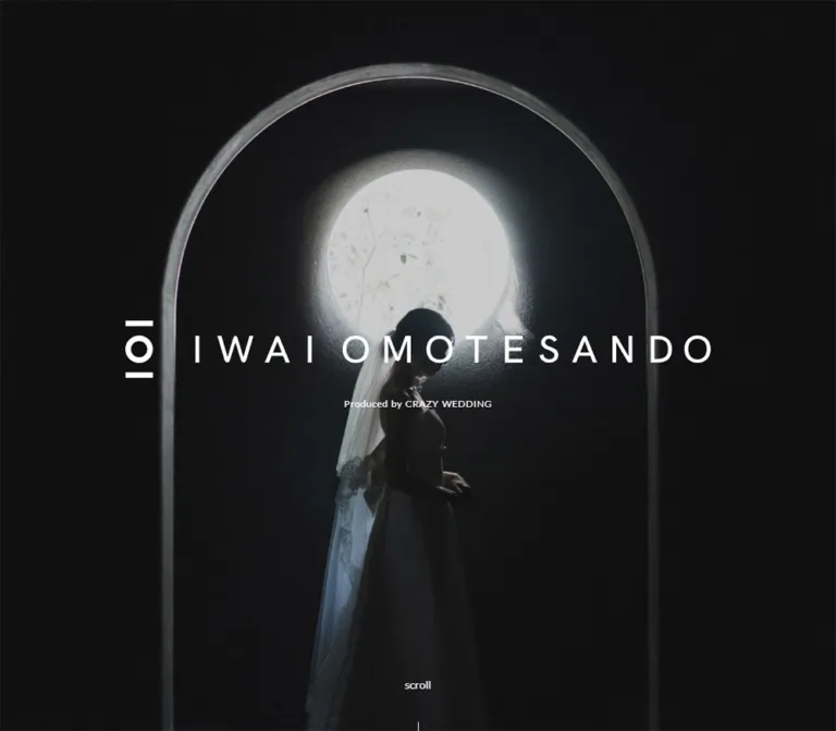
The opening has a large central white IWAI wordmark, a small Produced by CRAZY WEDDING line, and a bottom-centered scroll cue with a fine vertical line. It has the visual scale of a full-screen opening rather than a boxed banner.
In the current mobile capture, the background shows a tall dark vase on a pedestal, flowering branches, and a quiet gray interior. The image is sufficiently darkened for the white identity to remain prominent. The exact overlay opacity, media source, and whether the background is a still or moving media were not established.
The desktop capture is mostly black below a narrow visible strip of imagery. Preserve this as a capture limitation: it is not sufficient evidence to specify a permanently black opening or a loading animation.
The production caption is centered at x ≈ 720px on desktop and x ≈ 195px on mobile. Its measured top is 538.27px on desktop and 428.63px on mobile. This is visible brand copy; it does not independently identify the website's designer or developer.
The scroll paragraph begins at y ≈ 932.41px on desktop and y = 692px on mobile. The mobile line ends around y = 760px, leaving considerably more bottom clearance than the desktop cue. No clickable scroll action was demonstrated.
Introductory Vertical Statement
Role: explain the venue's philosophy through a small, concentrated reading block.
The heading 人生を祝うための時空間 and accompanying paragraph use white A1 Mincho text. The heading is a single vertical column at 24px. The paragraph forms multiple vertical columns, with deliberately authored line breaks and short phrases.
On desktop, the heading sits to the right of the paragraph with a calculated 96px gap. On mobile, the gap is 40px, and the paragraph changes from 16px to 14px while the heading remains 24px.
The measured white text supports an inverse treatment, but the complete introductory background is not visible in the supplied screenshots. A dark backdrop in a new implementation is a reasonable recommendation, not a verified reconstruction of that entire section.
Narrative Chapters
Role: turn the wedding experience into three editorial stories.
| Chapter | Source heading | Content emphasis | Confirmed structure |
|---|---|---|---|
| Vows | 過去と未来を/愛す誓いの場 |
The lives each person brings to the ceremony | Heading, separate passages, imagery in the document flow, and a MORE button |
| Letters | あなただけに/伝える言葉 |
Gratitude and words addressed to individual guests | Vertical title and copy, visible asymmetric photographs, and a MORE button |
| Shared table | 共に歩んだ日々を/抱きしめる時間 |
Eating together and recognizing lasting connections | Heading, vertical copy, and a MORE button |
The slash above indicates a source line break; it is not part of the visible heading.
Titles and paragraphs are spatially independent on desktop. The shared-meal title, for example, sits to the right of its paragraph at the same measured top position. The letter paragraph begins 120px below its heading.
On mobile, the letter and shared-meal headings appear before their paragraphs and are horizontally centered. Both paragraphs begin 40px below their heading's measured lower edge. Maintain authored stanza breaks rather than replacing them with a long, automatically wrapped paragraph.
Letter Chapter Composition
Role: combine intimate written communication with architectural and human details.
The intermediate desktop screenshot is the strongest visual evidence for the narrative layout. A narrow portrait photograph of leaves and shadows occupies the upper-right area. Vertical copy sits substantially to its left, while the heading occupies a separate column between them.
Below, two photographs begin at different heights. The left image shows a hand interacting with small compartments or letter slots. The right image shows formal trousers and shoes crossing a floor patterned with sunlight and shadows.
Approximate screenshot geometry:
- Upper-right foliage photograph: x ≈ 1052px to 1384px, or about 332px wide. Its top is partly obscured by the persistent header, so the visible crop does not establish the complete asset ratio.
- Lower-left photograph: x ≈ 56px, y ≈ 615px, about 648px wide in the supplied viewport.
- Lower-right photograph: x ≈ 720px, y ≈ 695px, about 540px wide.
- The lower pair has approximately 16px of horizontal separation and an 80px difference in top alignment.
This composition depends on unequal widths and deliberate offsets. Replacing it with three equally sized cards would remove its editorial rhythm. The image coordinates are viewport estimates, not recovered source CSS.
Chapter MORE Button
Role: offer an additional action after each chapter.
Three actual button elements are present. Each combines MORE, an 8px gap, and a right-pointing play-style glyph. The fill is transparent and the corner radius is zero.
Desktop button bounds are approximately 80.83 × 37px; mobile bounds are 66.13 × 30px. The label changes from 20px EB Garamond to 15px. Subtracting the label width and gap leaves a calculated 14px icon allocation at both sizes.
The source includes 8px bottom padding. The remaining height is consistent with a fine baseline rule, but the supplied style fields do not confirm its border treatment. The Quick Start's 1px bottom rule is therefore a reconstruction choice.
These are buttons, not inspected navigation links. Their behavior after activation—such as expanding content or opening media—was not demonstrated. Do not assign a modal or playback flow without additional evidence.
Closing Statement and Visit Reservation
Role: move from the emotional narrative to a concrete visit invitation.
A single centered vertical statement, 人生をお祝いしよう, uses the same 24px heading system. Its measured size is approximately 43.19 × 250.56px at both viewports. A calculated 56px gap separates it from the reservation link.
The link reads IWAIの見学予約をする. It is a white capsule with a pale bronze outline, bronze serif text, and a right chevron placed toward the outer edge. The label remains centered rather than being centered together with the icon as one undifferentiated group.
Desktop dimensions are 400 × 80px; mobile dimensions are 342 × 80px, leaving 24px at either side. Its computed radius is 96px. Border thickness looks approximately 2px in the mobile screenshot, but was not supplied as a computed value.
The link uses the same /fair/fair destination as the header action. The two appearances serve different positions in the reading journey: a compact persistent utility and a spacious closing invitation.
Nine-Image Gallery
Role: present a concentrated overview of people, spaces, and details after the visit invitation.
Nine square image links form a contiguous three-by-three mosaic. There are no visible gutters, captions, rounded frames, or cards. The three-column structure is present in both desktop DOM measurements and the mobile screenshot.
Desktop tiles measure about 388.94px square. Mobile tiles measure about 113.88px square. The gallery begins 32px below the reservation link at both sizes.
All nine anchors point to https://iwai-omotesando-lp.crazy.co.jp/. This is a linked image mosaic, not evidence of a social-feed integration or a lightbox. The destination was not opened.
The supplied mobile DOM includes background-image declarations associated with pseudo-elements. Empty link text therefore does not prove that the tiles are empty, but it also does not establish adequate accessible link names.
Closing Film Embed
Role: provide a video-based view of the venue's celebrations.
The mobile closing screenshot visibly contains a YouTube player preview below the mosaic. It is approximately 342px wide and 192px high, consistent with a 16:9 frame. Its left and right edges align with the closing content area, and approximately 56px separates it from the mosaic.
The preview contains its own provider controls, channel identity, thumbnail text, and red play button. These are embedded-player elements, not additions to the host site's typography or accent palette.
Playback, audio behavior, captions, loading policy, and the exact embed URL were not inspected. Desktop embed dimensions are not directly established by the supplied element sample or its blank closing screenshot.
Copyright Footer
Role: end the page quietly.
The footer is 62px high at both viewports: 24px top padding, a 14px text line, and 24px bottom padding. It uses the measured warm-paper fill #F9F8F4 and centered Lato text at 10px / 14px in charcoal.
The original page visibly states © CRAZY,Inc.. There is no visible multi-column footer navigation in the supplied captures.
Tokens — Motion & Interaction
Measured Transition Declarations
| Target | Supplied value | What the evidence establishes |
|---|---|---|
| Body background | 0.5s cubic-bezier(0.4, 0.4, 0, 1) |
A background transition is declared; a specific color-change event was not observed. |
| Many links, buttons, labels, and containers | 0.3s cubic-bezier(0.4, 0.4, 0, 1) |
A common transition timing exists. Exact hover and active endpoints were not supplied. |
| Desktop chapter headings and paragraphs | 1s cubic-bezier(0.445, 0.05, 0.55, 0.95) 0.2s |
Longer transitions with a 200ms delay are declared on these elements. |
| Corresponding mobile chapter text | 0.3s cubic-bezier(0.4, 0.4, 0, 1) |
The sampled mobile styles do not retain the desktop's longer timing. |
| Sampled element animations | none |
No named CSS animation was reported on these sampled elements. This does not cover every descendant, pseudo-element, script, or media stream. |
The desktop chapter timing is compatible with restrained reveals, but the trigger and starting opacity or transform were not supplied. Do not describe a particular slide distance, parallax effect, image zoom, or scroll-scrub sequence as observed.
Interaction Evidence
| Element | Confirmed | Unverified |
|---|---|---|
| Header brand | Link to the current story page | Hover appearance and navigation result |
| Header and closing reservations | Identical /fair/fair href |
Destination content and booking workflow |
| Chapter actions | Three button elements with MORE and an icon |
Expanded state, media behavior, or dialog |
| Gallery | Nine links to the related venue URL | Destination behavior and hover treatment |
| Film | Visible YouTube preview on mobile | Playback, audio, and player interaction |
| Scroll cue | Text and a fine line | Whether it is interactive |
The capture process waited for load, sampled layout stability, visible image decoding, and finite animations within stated limits. Perpetual animations were temporarily paused and resumed. This improves capture consistency but does not establish a complete motion sequence or guarantee that every delayed element appeared.
Recommended motion direction: use restrained opacity changes and short, gentle movement only where useful. Keep content visible by default and add reveals progressively. Provide a static media fallback and reduced-motion behavior.
Surfaces
| Layer | Appearance | Function |
|---|---|---|
| Header | Warm light strip, no visible elevation | Persistent identity and booking access |
| Opening | Dark visual field with white brand artwork | Establish atmosphere and orientation |
| Introductory text | White vertical lettering | Concentrated philosophical statement |
| Narrative canvas | Warm paper, charcoal text, broad open space | Separate passages and photographs without cards |
| Header action | Solid charcoal rectangle | Strong but compact utility control |
| Chapter action | Transparent label-and-icon treatment | Low-emphasis chapter continuation |
| Closing invitation | White capsule with bronze details | Distinct final reservation action |
| Mosaic | Edge-to-edge square photographs | Dense visual recap |
| Film | Rectangular provider-controlled media surface | Optional viewing experience |
| Footer | Warm paper with tiny centered copyright | Quiet termination |
Separation comes from spacing, image edges, text orientation, and contrast. There is no evidence for glass blur, decorative gradients, floating cards, or a general shadow hierarchy.
Imagery
The current-page imagery pairs architecture with small human gestures. Concrete, glass, foliage, table settings, letters, clothing, and daylight carry much of the storytelling. The photographs alternate between broad spatial views and close details, allowing the page to imply an experience without placing explanatory text over every image.
The mobile opening shows flowering branches in a dark vessel against gray architecture. The visible desktop story uses leaves against a pale wall, a hand at letter compartments, and shoes moving through patterned light. The mobile mosaic adds dining tables, a ceremony space, guests, a seated couple, glassware, and soft foliage details.
Use natural directional light, believable shadow, subdued neutrals, and occasional warm material colors. Preserve recognizable human actions and architectural space when cropping. The evidence does not establish a global desaturation, sepia, or contrast filter; reproduce the photographic selection rather than automatically applying a filter to unrelated stock images.
Observed Asset References
| Asset group | Current evidence | Reuse guidance |
|---|---|---|
| Header identity | Small dark wordmark with bronze emblem | Use authorized artwork; preserve its proportions. |
| Opening identity | Large white wordmark and emblem | Use a white brand variant rather than recreating the lettering with a guessed font. |
| Opening visual | Flower arrangement and interior visible on mobile | Supply an appropriate poster; moving-media implementation is unverified. |
| Letter chapter images | Foliage, letter compartments, and walking detail | Preserve distinct scales and offsets. |
| Closing mosaic | Nine visible square crops on mobile | Art-direct each crop separately; retain three columns. |
| Film preview | Visible YouTube player on mobile | Use the approved embed and its actual controls. |
Full logo files, complete photograph URLs, opening-media URLs, and the embed URL were not included in the supplied evidence. Some background-image URLs are truncated in the DOM excerpt. No fetchable asset paths are invented here.
Layout & Responsive Behavior
Desktop Composition
At 1440px wide, the page uses several alignment systems rather than one narrow central container. Header content sits 32px from the edges. Narrative imagery reaches an approximate 56px outer margin, giving a calculated working width of 1328px. The closing mosaic is narrower and centered, with measured outer margins of approximately 136.59px.
The text is not simply centered above each image. It occupies narrow vertical regions within much wider compositions. The letter chapter's title, copy, botanical photograph, and lower photographs each have distinct positions. Empty space between them is part of the reading rhythm.
The desktop document is about 10,313px tall. Several large separations are supported by DOM coordinates, but the unusually blank final screenshot should not be reproduced as a deliberate empty viewport. Its gallery links and other closing content still exist in the supplied document evidence.
Mobile Composition
At 390px wide, the header reduces its brand width from 240px to 150px and its action from about 144 × 46px to 92 × 33px. Main closing content uses 24px side margins, while the header uses 12px.
Vertical headings remain 24px and retain their measured dimensions. The letter heading is centered at x ≈ 151.81px in an 86.38px-wide box. Its copy is 224px wide and centered at x = 83px. The shared-meal copy is wider, at 308px with x = 41px, because it contains more vertical columns.
The closing action retains its 80px height and nearly its desktop label size. The mosaic stays three columns; it does not become a one-column photo list. The film preview aligns with the same approximately 342px-wide content region.
Responsive Limits
A max-width: 1140px rule is visible in a truncated source excerpt controlling line-break visibility. This establishes at least one responsive rule, not the exact breakpoint for every layout change.
No tablet, landscape-phone, or intermediate-width capture was supplied. The 767px breakpoint in the Quick Start is a recommended implementation boundary. Its intermediate photographic stack is an adaptation because the mobile screenshots do not show those sections in full.
Do’s and Don’ts
Do
- Preserve the combination of vertical Japanese serif text and small Latin utility labels.
- Keep the 24px chapter headings on mobile; reduce spacing and supporting type selectively.
- Use warm paper and charcoal as the dominant interface pair.
- Reserve bronze for small identity details and the closing invitation.
- Build desktop story compositions with unequal image widths and deliberate offsets.
- Retain authored line and stanza breaks in vertical copy.
- Keep the header reservation rectangular and the closing reservation rounded.
- Maintain the gapless three-by-three gallery at the inspected mobile width.
- Use photographs with natural light, human gestures, and architectural context.
- Give missing or delayed media a useful static fallback.
Don’t
- Don't replace the story with a uniform grid of feature cards.
- Don't turn every heading into an oversized horizontal marketing headline.
- Don't assign the wordmark a font inferred from surrounding captions.
- Don't make every photograph rounded or give it a drop shadow.
- Don't add bright interface colors merely because they appear inside photographs or the video player.
- Don't treat the desktop black opening or empty closing capture as a verified permanent design state.
- Don't invent modal, lightbox, autoplay, or parallax behavior from icon names and transition declarations.
- Don't convert the nine linked photographs into a social-feed component without supporting evidence.
- Don't hardcode the measured document heights as layout requirements.
- Don't hide essential narrative content until an animation or observer happens to run.
Recommended Implementation Additions
These are recommendations for a new implementation, not verified features of the original page:
- Use semantic section headings and paragraphs with
lang='ja'; apply vertical writing with CSS while retaining a sensible document reading order. - Provide visible keyboard focus and descriptive accessible names for the brand, image links, chapter actions, and media frame.
- Give repeated
MOREbuttons chapter-specific accessible names and implement a real action before presenting them as functional controls. - Increase the effective hit areas of the approximately 33px-high mobile header action and 30px-high chapter buttons to at least 44px without necessarily changing their visible proportions.
- Test the measured bronze label against white for text contrast. An optional darker bronze such as
#8A6549is a recommended accessible variant, not a source color. - If the opening uses video, retain an independently available poster, provide appropriate playback controls, and honor reduced-motion preferences.
- Keep narrative content visible if enhancement scripts fail. Reserve image space with dimensions or aspect ratios to reduce layout movement.
- Ensure authored vertical columns remain reachable at narrow widths and increased text sizes. Permit layout changes instead of clipping copy.
- Preserve captions and accessible alternatives for meaningful media. Treat the third-party video preview as its own component rather than duplicating its interface in the host page.
Agent Prompt Guide
Quick Color Reference
- Warm surface:
#F9F8F4, measured on the footer and visually consistent with the story canvas. - Narrative text and header action:
#24292E. - Secondary chapter-control text:
#333333. - Closing invitation label:
#C19976. - Closing outline and chevron: pale bronze, approximately
#D1A581; estimate only. - Reversed text and closing button fill:
#FFFFFF. - Photography supplies greens, wood tones, concrete grays, and occasional orange; keep these out of the general control palette.
Overall Prompt
“Create an editorial wedding-venue story page inspired by the current IWAI OMOTESANDO STORY evidence. Use warm paper #F9F8F4, charcoal #24292E, restrained bronze details, vertical Japanese Mincho headings at 24px, and short widely spaced narrative passages. Keep a compact brand-and-reservation header persistent. Begin with a dark full-screen photographic composition, centered white brand artwork, a small production caption, and a fine scroll cue. Arrange later photographs asymmetrically among generous empty areas. End with a vertical invitation, a white bronze-outlined reservation capsule, a gapless three-by-three photo mosaic, a film frame, and a tiny centered copyright. Keep chapter-button behavior explicit and do not invent interactions from the reference.”
Example Component Prompts
- Header: “A warm off-white full-width header with a small IWAI brand asset on the left and a square charcoal reservation link on the right. Use the source label
フェア予約in white Japanese serif type. Desktop edge spacing is 32px; mobile edge spacing is 12px. Preserve the compact mobile appearance while providing an adequate hit area.” - Vertical story: “Set
あなただけに/伝える言葉as two vertical Japanese heading columns in regular Mincho, 24px, line height 1.8, tracking 0.16em. Place short narrative columns separately, using 15px type with 30px column pitch on desktop and 14px with 28px pitch on mobile. Keep authored stanza breaks.” - Photographic composition: “On a warm-paper desktop canvas, place a narrow foliage photograph high on the right, a broader close-up of a hand at letter compartments below on the left, and a smaller walking-detail photograph offset about 80px lower to its right. Use square corners and no captions or card frames. Treat dimensions as an editorial adaptation.”
- Closing reservation: “Center a white 400 × 80px capsule with a pale bronze outline, bronze Mincho text reading
IWAIの見学予約をする, and a small right chevron near the edge. On a 390px viewport, use 24px outer margins and retain the 80px height. Keep the label itself centered.” - Closing mosaic: “Create nine square photographic links in a contiguous three-by-three grid. Retain all three columns on mobile, with approximately 114px tiles inside a 342px content area. Mix ceremony space, dining, people, glassware, foliage, and light-and-shadow details. No gutters, rounded corners, text overlays, or social-feed chrome.”
Quick Start
CSS Custom Properties
This adaptation uses the measured palette and type scale with a conventional root font size. It approximates the visible header, opening, vertical reading blocks, asymmetric letter composition, and closing components.
The 767px breakpoint, opening overlay opacity, botanical crop ratio, focus treatment, geometric icons, and inferred chapter-button rule are recommendations. The nominal 1168px gallery maximum approximates the measured 1166.81px occupied width; the original width formula was not supplied. Provide authorized fonts and image assets separately.
For the opening, place an always-available poster image behind any optional video. Use semantic links for navigation and buttons only for implemented actions. The CSS does not implement chapter expansion or media playback.
:root {
  /* Measured colors, except the estimated edge and recommended variants */
  --color-paper: #f9f8f4;
  --color-ink: #24292e;
  --color-utility: #333333;
  --color-accent: #c19976;
  --color-accent-edge: #d1a581;
  --color-white: #ffffff;
  --color-media: #000000;
  --color-accent-readable: #8a6549;

  /* Named fonts require separately supplied, authorized font files */
  --font-editorial: 'A1明朝', serif;
  --font-utility: 'Lato', sans-serif;
  --font-chapter-action: 'EB Garamond', serif;

  --text-heading: 24px;
  --text-story: 15px;
  --text-intro: 16px;
  --text-fair: 16px;
  --text-visit: 18px;
  --text-more: 20px;
  --text-production: 12px;
  --text-scroll: 14px;
  --text-copyright: 10px;
  --tracking-heading: 0.16em;
  --tracking-story: 0.12em;

  --header-height: 70.4px;
  --header-inset: 32px;
  --story-inset: 56px;
  --intro-gap: 96px;
  --gallery-max: 1168px;
  --closing-pause: 540px;
  --radius-visit: 96px;

  --ease-ui: cubic-bezier(0.4, 0.4, 0, 1);
  --ease-story: cubic-bezier(0.445, 0.05, 0.55, 0.95);
  --motion-ui: 300ms var(--ease-ui);
  --motion-story: 1000ms var(--ease-story);
  --story-delay: 200ms;
}

* { box-sizing: border-box; }

html { scroll-padding-top: calc(var(--header-height) + 16px); }

.iwai-page {
  margin: 0;
  color: var(--color-ink);
  background: var(--color-paper);
  font-family: var(--font-editorial);
  font-weight: 400;
}

.iwai-page img { display: block; max-width: 100%; }

.iwai-header {
  position: fixed;
  inset: 0 0 auto;
  z-index: 100;
  display: flex;
  align-items: center;
  justify-content: space-between;
  min-height: var(--header-height);
  padding: 12px var(--header-inset);
  background: var(--color-paper);
}

.brand-link { display: block; width: 240px; }
.brand-link img { width: 100%; height: auto; }

.fair-link {
  position: relative;
  display: inline-flex;
  align-items: center;
  justify-content: center;
  padding: 12px 32px;
  border-radius: 0;
  color: var(--color-white);
  background: var(--color-ink);
  font: 400 var(--text-fair)/1.4 var(--font-editorial);
  text-decoration: none;
  white-space: nowrap;
}

/* Recommended hit-area expansion without changing the visible box */
.fair-link::after { content: ''; position: absolute; inset: -6px 0; }

.hero {
  position: relative;
  min-height: 100vh;
  min-height: 100svh;
  isolation: isolate;
  color: var(--color-white);
  background: var(--color-media);
}

.hero-media {
  position: absolute;
  inset: 0;
  width: 100%;
  height: 100%;
  object-fit: cover;
}

/* Recommended overlay; the original opacity was not measured */
.hero::after {
  content: '';
  position: absolute;
  inset: 0;
  z-index: 1;
  background: rgb(0 0 0 / 38%);
  pointer-events: none;
}

.hero-identity {
  position: absolute;
  top: 50%;
  left: 50%;
  z-index: 2;
  width: min(700px, calc(100% - 56px));
  transform: translate(-50%, -50%);
  text-align: center;
}

.hero-logo { width: 100%; height: auto; }

.hero-production {
  margin: 24px 0 0;
  font: 400 var(--text-production)/1.4 var(--font-utility);
  letter-spacing: 0.05em;
}

.scroll-cue {
  position: absolute;
  bottom: 0;
  left: 50%;
  z-index: 2;
  transform: translateX(-50%);
  font: 400 var(--text-scroll)/1.4 var(--font-utility);
  text-align: center;
}

.scroll-cue::after {
  content: '';
  display: block;
  width: 1px;
  height: 40px;
  margin: 8px auto 0;
  background: currentColor;
}

.vertical-title,
.poem {
  margin: 0;
  writing-mode: vertical-rl;
  text-orientation: mixed;
  font-family: var(--font-editorial);
  font-weight: 400;
  justify-self: center;
}

.vertical-title {
  font-size: var(--text-heading);
  line-height: 1.8;
  letter-spacing: var(--tracking-heading);
}

.poem {
  font-size: var(--text-story);
  line-height: 2;
  letter-spacing: var(--tracking-story);
}

/* Recommended dark backing for the measured white introductory text */
.manifesto {
  padding: 160px 24px;
  color: var(--color-white);
  background: var(--color-ink);
}

.manifesto-inner {
  display: flex;
  flex-direction: row-reverse;
  justify-content: center;
  align-items: flex-start;
  gap: var(--intro-gap);
}

.manifesto .poem { font-size: var(--text-intro); line-height: 2.4; }

.story {
  margin-inline: var(--story-inset);
  padding-top: 120px;
}

/* Recommended editorial grid, not the recovered source layout */
.letter-layout {
  display: grid;
  grid-template-columns: repeat(12, minmax(0, 1fr));
  align-items: start;
  row-gap: 80px;
}

.letter-layout .vertical-title { grid-column: 8 / 10; grid-row: 1; }
.letter-layout .poem { grid-column: 4 / 7; grid-row: 1; margin-top: 120px; }

.botanical {
  grid-column: 10 / 13;
  grid-row: 1;
  width: 100%;
  aspect-ratio: 5 / 8;
  object-fit: cover;
}

.letter-main {
  grid-column: 1 / 7;
  grid-row: 2;
  width: calc(100% - 16px);
  height: auto;
}

.letter-detail {
  grid-column: 7 / 12;
  grid-row: 2;
  width: 100%;
  max-width: 540px;
  height: auto;
  margin-top: 80px;
}

.more-button {
  position: relative;
  display: flex;
  align-items: center;
  gap: 8px;
  width: max-content;
  margin: 80px auto 0;
  padding: 0 0 8px;
  border: 0;
  border-bottom: 1px solid currentColor;
  border-radius: 0;
  color: var(--color-utility);
  background: transparent;
  font: 400 var(--text-more)/1.4 var(--font-chapter-action);
  cursor: pointer;
}

.more-button::before { content: ''; position: absolute; inset: -8px; }

/* Geometric replacement for the observed play-style icon */
.more-icon { display: grid; place-items: center; width: 14px; height: 14px; }
.more-icon::after {
  content: '';
  border-top: 4px solid transparent;
  border-bottom: 4px solid transparent;
  border-left: 6px solid currentColor;
}

.closing {
  display: flex;
  flex-direction: column;
  align-items: center;
  padding: var(--closing-pause) 24px 0;
}

.visit-link {
  position: relative;
  display: flex;
  align-items: center;
  justify-content: center;
  width: min(400px, 100%);
  min-height: 80px;
  margin-top: 56px;
  padding: 20px 48px;
  border: 2px solid var(--color-accent-edge);
  border-radius: var(--radius-visit);
  color: var(--color-accent);
  background: var(--color-white);
  font: 700 var(--text-visit)/1.4 var(--font-editorial);
  text-align: center;
  text-decoration: none;
}

.visit-link::after {
  content: '';
  position: absolute;
  right: 28px;
  width: 10px;
  height: 10px;
  border-right: 2px solid var(--color-accent-edge);
  border-bottom: 2px solid var(--color-accent-edge);
  transform: rotate(-45deg);
}

/* Optional accessible color variant, not an observed source state */
.visit-link.is-high-contrast { color: var(--color-accent-readable); }

.photo-grid {
  display: grid;
  grid-template-columns: repeat(3, minmax(0, 1fr));
  gap: 0;
  width: min(var(--gallery-max), 100%);
  margin-top: 32px;
}

.photo-grid a { display: block; aspect-ratio: 1; }
.photo-grid img { width: 100%; height: 100%; object-fit: cover; }

.film {
  width: min(var(--gallery-max), 100%);
  aspect-ratio: 16 / 9;
  margin-top: 56px;
  background: var(--color-media);
}

.film iframe { display: block; width: 100%; height: 100%; border: 0; }

.iwai-footer {
  padding: 24px 0;
  color: var(--color-ink);
  background: var(--color-paper);
  font: 400 var(--text-copyright)/1.4 var(--font-utility);
  text-align: center;
}

.iwai-footer p { margin: 0; }

.iwai-page :focus-visible {
  outline: 2px solid var(--color-ink);
  outline-offset: 4px;
}

/* Recommended breakpoint; the original layout threshold is unknown */
@media (max-width: 767px) {
  :root {
    --text-story: 14px;
    --text-intro: 14px;
    --text-fair: 12px;
    --text-visit: 17px;
    --text-more: 15px;
    --text-production: 10px;
    --header-height: 48.8px;
    --header-inset: 12px;
    --story-inset: 24px;
    --intro-gap: 40px;
    --closing-pause: 312px;
    --motion-story: 300ms var(--ease-ui);
    --story-delay: 0ms;
  }

  .iwai-header { padding-block: 8px; }
  .brand-link { width: 150px; }
  .fair-link { padding: 8px 16px; }
  .hero-identity { top: 49%; }
  .hero-production { margin-top: 16px; }
  .scroll-cue { bottom: 84px; }
  .manifesto { padding-block: 120px; }
  .story { padding-top: 80px; }

  /* Safe linear adaptation for intermediate imagery not shown on mobile */
  .letter-layout { grid-template-columns: minmax(0, 1fr); row-gap: 40px; }
  .letter-layout > * { grid-column: 1; grid-row: auto; }
  .letter-layout .poem { margin-top: 0; }
  .botanical,
  .letter-main,
  .letter-detail { width: 100%; max-width: none; margin: 0; }
  .more-button { margin-top: 56px; }
}

@media (prefers-reduced-motion: reduce) {
  .iwai-page *,
  .iwai-page *::before,
  .iwai-page *::after {
    animation: none !important;
    transition: none !important;
    scroll-behavior: auto !important;
  }

  /* An independent poster image must remain available behind the video */
  .hero video.hero-media { display: none; }
}
For the letter layout, use a logical source order of heading, paragraph, and photographs. Desktop grid placement provides the asymmetric composition; mobile returns to document order. Keep the text's authored line breaks and verify that all vertical columns fit before introducing any fixed-height text container.
Tailwind v4 Token Mapping
Optional aliases for a project already using Tailwind v4. Define the custom properties above first. This does not imply that the original website uses Tailwind.
@theme inline {
  --color-paper: #f9f8f4;
  --color-ink: #24292e;
  --color-utility: #333333;
  --color-bronze: #c19976;
  --color-bronze-edge: #d1a581;

  --font-editorial: 'A1明朝', serif;
  --font-utility: 'Lato', sans-serif;
  --font-chapter-action: 'EB Garamond', serif;

  --text-story-title: var(--text-heading);
  --text-story-copy: var(--text-story);
  --text-intro-copy: var(--text-intro);
  --text-fair-label: var(--text-fair);
  --text-visit-label: var(--text-visit);
  --text-more-label: var(--text-more);
  --text-production-label: var(--text-production);

  --spacing-header-inset: var(--header-inset);
  --spacing-story-inset: var(--story-inset);
  --spacing-statement-gap: 56px;
  --spacing-gallery-gap: 32px;
  --radius-visit-pill: 96px;
}

@utility vertical-japanese {
  writing-mode: vertical-rl;
  text-orientation: mixed;
}
Sources & Evidence
- Current IWAI OMOTESANDO STORY page: supplied original-page response, rendered text, link destinations, element bounds, computed typography, color values, and transition declarations. Original and final URLs are identical; the reported response status is HTTP 200.
- Capture timestamp: September 22, 2026, 21:00:30.249 UTC, equivalent to September 23, 2026, 06:00:30.249 JST. This is the supplied inspection time, not a newly performed visit.
- Desktop evidence: 1440 × 1000 viewport; opening, intermediate letter-story, and closing captures; measured document height 10312.65625px.
- Mobile evidence: 390 × 844 viewport; opening and closing captures; rendered DOM for the narrative content; measured document height 7787.703125px.
- Inspection procedure: the supplied browser process waited for load, finite motion, sampled stability, and visible image decoding within its stated time limits, and traversed intermediate scroll positions. Shared workers and service workers were disabled.
No additional browsing, destination navigation, file inspection, or interaction testing was performed for this reference. Chapter-button outcomes, hover states, complete media behavior, exact image sources, tablet layouts, and portions of desktop visual completeness remain unverified. Measured declarations, screenshot estimates, and recommended implementation choices are distinguished throughout.
# IWAI OMOTESANDO STORY — Style Reference

> A quiet wedding story told through vertical Japanese type, natural light, and generous paper-colored space.

**Website:** [IWAI OMOTESANDO STORY](https://iwai-omotesando-lp-story.crazy.co.jp/)
**Original URL:** https://iwai-omotesando-lp-story.crazy.co.jp/
**Final URL:** https://iwai-omotesando-lp-story.crazy.co.jp/
**Inspected:** September 23, 2026, 06:00:30 JST; supplied retrieval timestamp September 22, 2026, 21:00:30.249 UTC.
**Viewports:** desktop 1440 × 1000 CSS pixels; mobile 390 × 844 CSS pixels.
**Theme:** warm light surfaces with a dark opening visual; no theme selector is evidenced.
**Scope:** the current wedding venue story page, including its persistent header, opening identity, introductory statement, three narrative chapters, chapter buttons, visit-booking link, nine-image gallery, visible mobile film embed, and copyright footer. Reservation destinations and chapter-button outcomes were not inspected.

IWAI OMOTESANDO STORY presents a wedding venue through relationships, letters, shared meals, and the atmosphere of its rooms. Its visual structure is editorial: short passages of vertical Japanese text sit among photographs with deliberately unequal sizes and positions. Warm off-white space, charcoal typography, restrained bronze accents, and naturally lit photography establish the tone.

The contrast between scales is central. The wordmark occupies the opening viewport, but subsequent headings remain only 24px. Small serif text and broad empty areas slow the reading pace. A compact reservation link stays at the top, while a much larger outlined invitation appears near the end. Images remain rectangular and mostly unframed; the closing reservation pill is the conspicuous rounded element.
閉じる
# IWAI OMOTESANDO STORY — Style Reference

> A quiet wedding story told through vertical Japanese type, natural light, and generous paper-colored space.

**Website:** [IWAI OMOTESANDO STORY](https://iwai-omotesando-lp-story.crazy.co.jp/)
**Original URL:** https://iwai-omotesando-lp-story.crazy.co.jp/
**Final URL:** https://iwai-omotesando-lp-story.crazy.co.jp/
**Inspected:** September 23, 2026, 06:00:30 JST; supplied retrieval timestamp September 22, 2026, 21:00:30.249 UTC.
**Viewports:** desktop 1440 × 1000 CSS pixels; mobile 390 × 844 CSS pixels.
**Theme:** warm light surfaces with a dark opening visual; no theme selector is evidenced.
**Scope:** the current wedding venue story page, including its persistent header, opening identity, introductory statement, three narrative chapters, chapter buttons, visit-booking link, nine-image gallery, visible mobile film embed, and copyright footer. Reservation destinations and chapter-button outcomes were not inspected.

IWAI OMOTESANDO STORY presents a wedding venue through relationships, letters, shared meals, and the atmosphere of its rooms. Its visual structure is editorial: short passages of vertical Japanese text sit among photographs with deliberately unequal sizes and positions. Warm off-white space, charcoal typography, restrained bronze accents, and naturally lit photography establish the tone.

The contrast between scales is central. The wordmark occupies the opening viewport, but subsequent headings remain only 24px. Small serif text and broad empty areas slow the reading pace. A compact reservation link stays at the top, while a much larger outlined invitation appears near the end. Images remain rectangular and mostly unframed; the closing reservation pill is the conspicuous rounded element.

## How to Read This Reference

- **Measured** means a value was supplied in rendered DOM bounds or computed styles. Measurements describe the captured state, not necessarily the original CSS formula.
- **Visually observed** means a feature is visible in the supplied current-page screenshots. Image dimensions estimated from those screenshots are labeled approximate.
- **Calculated** means simple arithmetic from measured bounds, such as the space between a paragraph and the next link.
- **Recommended** means a reusable implementation choice. The CSS below is an adaptation, not a recovered stylesheet.
- Token names are descriptive aliases unless a source variable is explicitly identified.
- The desktop opening capture is predominantly black, and its closing capture is unusually empty. These states limit visual confirmation; they do not establish intentional blank sections or permanent missing content.
- Mobile screenshots cover the opening and closing areas. Intermediate mobile typography and ordering are supported by DOM measurements, but their complete photographic compositions are not visually documented.

## Tokens — Colors

### Default Palette

| Name | Value | Suggested token | Evidence and role |
| --- | --- | --- | --- |
| Warm Paper | `#F9F8F4` | `--color-paper` | Measured footer background. Header and story surfaces look consistent with this family; their exact fills were not separately included in the sampled elements. |
| Charcoal | `#24292E` | `--color-ink` | Measured chapter text, footer text, and header reservation fill. Source variable `--s-color-d0a8371e` is `#24292eff`. |
| Utility Gray | `#333333` | `--color-utility` | Measured `MORE` label and several parent elements. Child text styles take precedence over inherited parent colors. |
| Bronze Text | `#C19976` | `--color-accent` | Measured closing reservation label: `rgb(193, 153, 118)`. |
| Pale Bronze Edge | Approximately `#D1A581` | `--color-accent-edge` | Visual estimate for the closing pill outline and chevron. Exact border and icon colors were not supplied. |
| White | `#FFFFFF` | `--color-white` | Measured hero captions, introductory text, header reservation label, and closing reservation fill. Also the computed body background. |
| Media Black | Approximately `#000000` | `--color-media` | Appearance of the large desktop opening field; suitable as a recommended media fallback. No exact hero background declaration was supplied. |

The computed white body does not mean the visible story canvas is pure white. Nested surfaces provide the warm-paper appearance, and the footer explicitly measures `#F9F8F4`.

Green leaves, gray concrete, warm wood, flowers, and orange seating belong to the photography. They are not evidence of additional interface accent tokens. Keep bronze confined to identity details and the closing invitation rather than using every photographic color in controls.

### Palette Behavior

The supplied evidence shows one interface palette. The opening reverses text to white over a dark visual field; the later narrative uses charcoal on warm paper. No selectable dark mode, gradient-based theme system, or palette-switch interaction was observed.

Numerous transparent gradient variables appear in the DOM. Their presence alone does not establish a visible gradient treatment.

## Tokens — Typography

### Japanese Editorial Text

- **Measured family:** `A1明朝`, referenced by source variable `--s-font-64b4b36e`.
- **Primary weight:** `400` for narrative headings, poetry-like paragraphs, and the header reservation label.
- **Closing reservation weight:** computed `700`.
- **Character:** delicate Japanese serif forms, generous tracking, and clearly separated vertical columns.
- **Recommended fallback:** `serif` when the named font is unavailable. Font files and licensing information were not supplied.

Vertical composition is essential. Use proper vertical writing for Japanese text rather than rotating a horizontal paragraph. In vertical writing, line height controls the horizontal distance between columns; letter spacing separates characters along the vertical reading direction.

### English Utility Text

**Lato** is measured on the hero production caption, `scroll`, and copyright. Source variable `--s-font-f5a14e4c` names it. These labels are modest, regular-weight, and largely unadorned.

**EB Garamond** is measured on `MORE`, using source variable `--s-font-b2a213ba`. This small Latin serif accent connects chapter controls to the editorial text without making them look like prominent conversion buttons.

### Wordmarks and Icons

The IWAI wordmark has widely spaced Latin capitals and a distinctive vertical emblem. Its actual lettering family was not identified by the supplied text-element styles. Preserve it as approved brand artwork instead of assigning the logo to Lato or another guessed font.

The extracted labels `play_arrow` and `keyboard_arrow_right` identify icon content. Their rendered font family was not supplied. The reusable CSS uses simple geometric equivalents; it does not claim a particular icon library.

Roboto, two A1 Gothic families, and Font Awesome variables also appear in the global declarations. That does not prove their use in the components described here. Similarly, the root element's Times fallback is not the measured narrative font.

### Type Scale

All values below are measured computed styles unless indicated otherwise.

| Role | Family | Desktop size / line height | Mobile size / line height | Weight | Tracking |
| --- | --- | --- | --- | --- | --- |
| Chapter heading and closing statement | A1 Mincho | `24px / 43.2px` | `24px / 43.2px` | `400` | `3.84px`, or `0.16em` |
| Introductory paragraph | A1 Mincho | `16px / 38.4px` | `14px / 33.6px` | `400` | `0.12em` |
| Chapter paragraph | A1 Mincho | `15px / 30px` | `14px / 28px` | `400` | `0.12em` |
| Header reservation label | A1 Mincho | `16px / 22.4px` | `12px / 16.8px` | `400` | Normal |
| Closing reservation label | A1 Mincho | `18px / 25.2px` | `17px / 23.8px` | `700` | Normal |
| `MORE` | EB Garamond | `20px / 28px` | `15px / 21px` | `400` | Normal |
| Hero production caption | Lato | `12px / 16.8px` | `10px / 14px` | `400` | `0.05em` |
| `scroll` | Lato | `14px / 19.6px` | `14px / 19.6px` | `400` | Normal |
| Copyright | Lato | `10px / 14px` | `10px / 14px` | `400` | Normal |

The hierarchy survives mobile adaptation by keeping chapter headings at 24px while reducing body text and utility controls. Do not shrink the entire page uniformly.

## Tokens — Spacing & Shapes

**Density:** sparse narrative composition with compact persistent controls.
**Spacing logic:** many interface distances use multiples of 8px, but no universal source spacing unit was supplied. Treat an 8px implementation scale as a convenience, not a recovered design-system rule.

### Spacing Scale

| Use | Value | Evidence |
| --- | --- | --- |
| Text-to-icon gap | `8px` | Measured on chapter buttons and the closing reservation link |
| Desktop header action padding | `12px 32px` | Measured |
| Mobile header action padding | `8px 16px` | Measured |
| Header horizontal clearance | `32px` desktop; `12px` mobile | Measured from logo and reservation bounds |
| Mobile closing-content clearance | `24px` | Measured reservation position and width |
| Footer vertical padding | `24px` | Measured |
| Reservation-to-gallery distance | `32px` | Calculated at both viewports |
| Mobile chapter heading-to-copy distance | `40px` | Calculated for the letter and shared-meal chapters |
| Closing statement-to-reservation distance | `56px` | Calculated at both viewports |
| Mobile gallery-to-film distance | Approximately `56px` | Supported by screenshot geometry and remaining document height |
| Desktop narrative outer clearance | `56px` | Measured text placement and visible image alignment |
| Desktop lower-image stagger | Approximately `80px` | Visual estimate in the letter chapter |
| Introductory title-to-copy horizontal gap | `96px` desktop; `40px` mobile | Calculated from measured vertical-text bounds |
| Letter copy offset below its heading | `120px` desktop | Calculated from measured top positions |
| Last chapter button to closing statement | `540px` desktop; `312px` mobile | Calculated between element bounds; not proof of a single padding declaration |

### Border Radius

| Element | Value | Evidence |
| --- | --- | --- |
| Header reservation link | `0` | Measured |
| Chapter buttons | `0` | Measured |
| Gallery links | `0` | Measured |
| Narrative photographs | Square corners | Visually observed |
| Closing reservation link | `96px` | Measured; produces a capsule within an 80px-high box |

No general card-shadow or raised-surface system is visible. The strongest shape contrast is between square photographs, the rectangular header action, and the single large closing capsule.

### Layout Measurements

| Element | Desktop: 1440 × 1000 | Mobile: 390 × 844 | Qualification |
| --- | --- | --- | --- |
| Document height | `10312.66px` | `7787.70px` | Measured |
| Header logo link | `240 × 27.19px`, x `32px` | `150 × 17px`, x `12px` | Measured link bounds |
| Header reservation link | `144 × 46.39px`, x `1264px`, y `12px` | `92 × 32.80px`, x `286px`, y `8px` | Measured |
| Header visual height | About `70.4px` | About `48.8px` | Calculated from symmetric spacing and supported by screenshots |
| Hero wordmark artwork | Approximately `700px` wide | Approximately `334px` wide | Visual estimate; not a measured text size |
| Introductory copy | `230.34 × 358.41px` | `201.56 × 313.61px` | Measured |
| Letter chapter heading | `86.38 × 167.05px` | `86.38 × 167.05px` | Measured |
| Letter chapter paragraph | `240 × 302.41px` | `224 × 282.25px` | Measured |
| Shared-meal paragraph | `330 × 235.20px` | `308 × 219.53px` | Measured |
| Closing reservation | `400 × 80px` | `342 × 80px` | Measured |
| Gallery tile | `388.94 × 388.94px` | `113.88 × 113.88px` | Measured |
| Complete three-column gallery | Approximately `1166.81px` wide | Approximately `341.63px` wide | Calculated from tile bounds |
| Footer | `1440 × 62px` | `390 × 62px` | Measured |

The letter paragraph widths are consistent with eight column advances: `240 / 30 = 8` and `224 / 28 = 8`. The shared-meal paragraph similarly occupies eleven advances. These calculations include the effect of authored stanza spacing; they are useful checks when implementing vertical text.

## Components

### Persistent Header

**Role:** retain identity and direct access to a wedding fair reservation throughout the story.

A warm, full-width strip contains just two visible elements: the small brand link at the left and the dark reservation rectangle at the right. There is no visible navigation menu or hamburger control in the supplied captures.

The desktop brand link begins 32px from the left. The reservation link ends 32px from the right and uses 12px vertical, 32px horizontal padding. On mobile, these outer clearances become 12px, and the action padding becomes 8px by 16px.

The label is `フェア予約`, in white A1 Mincho. The measured label style is smaller on mobile, but the dark fill remains `#24292E` and the corners remain square.

The header occupies the same top-screen position in opening, intermediate, and closing captures. Persistent positioning is visually supported; the actual `position` declaration was not supplied. The Quick Start uses a fixed header as an implementation choice.

The logo link targets the current story URL. The reservation link targets `https://iwai-omotesando-lp-story.crazy.co.jp/fair/fair`. Only the href was inspected.

### Cinematic Opening

**Role:** establish the venue's identity before the longer narrative begins.

The opening has a large central white IWAI wordmark, a small `Produced by CRAZY WEDDING` line, and a bottom-centered `scroll` cue with a fine vertical line. It has the visual scale of a full-screen opening rather than a boxed banner.

In the current mobile capture, the background shows a tall dark vase on a pedestal, flowering branches, and a quiet gray interior. The image is sufficiently darkened for the white identity to remain prominent. The exact overlay opacity, media source, and whether the background is a still or moving media were not established.

The desktop capture is mostly black below a narrow visible strip of imagery. Preserve this as a capture limitation: it is not sufficient evidence to specify a permanently black opening or a loading animation.

The production caption is centered at x ≈ 720px on desktop and x ≈ 195px on mobile. Its measured top is 538.27px on desktop and 428.63px on mobile. This is visible brand copy; it does not independently identify the website's designer or developer.

The `scroll` paragraph begins at y ≈ 932.41px on desktop and y = 692px on mobile. The mobile line ends around y = 760px, leaving considerably more bottom clearance than the desktop cue. No clickable scroll action was demonstrated.

### Introductory Vertical Statement

**Role:** explain the venue's philosophy through a small, concentrated reading block.

The heading `人生を祝うための時空間` and accompanying paragraph use white A1 Mincho text. The heading is a single vertical column at 24px. The paragraph forms multiple vertical columns, with deliberately authored line breaks and short phrases.

On desktop, the heading sits to the right of the paragraph with a calculated 96px gap. On mobile, the gap is 40px, and the paragraph changes from 16px to 14px while the heading remains 24px.

The measured white text supports an inverse treatment, but the complete introductory background is not visible in the supplied screenshots. A dark backdrop in a new implementation is a reasonable recommendation, not a verified reconstruction of that entire section.

### Narrative Chapters

**Role:** turn the wedding experience into three editorial stories.

| Chapter | Source heading | Content emphasis | Confirmed structure |
| --- | --- | --- | --- |
| Vows | `過去と未来を/愛す誓いの場` | The lives each person brings to the ceremony | Heading, separate passages, imagery in the document flow, and a `MORE` button |
| Letters | `あなただけに/伝える言葉` | Gratitude and words addressed to individual guests | Vertical title and copy, visible asymmetric photographs, and a `MORE` button |
| Shared table | `共に歩んだ日々を/抱きしめる時間` | Eating together and recognizing lasting connections | Heading, vertical copy, and a `MORE` button |

The slash above indicates a source line break; it is not part of the visible heading.

Titles and paragraphs are spatially independent on desktop. The shared-meal title, for example, sits to the right of its paragraph at the same measured top position. The letter paragraph begins 120px below its heading.

On mobile, the letter and shared-meal headings appear before their paragraphs and are horizontally centered. Both paragraphs begin 40px below their heading's measured lower edge. Maintain authored stanza breaks rather than replacing them with a long, automatically wrapped paragraph.

### Letter Chapter Composition

**Role:** combine intimate written communication with architectural and human details.

The intermediate desktop screenshot is the strongest visual evidence for the narrative layout. A narrow portrait photograph of leaves and shadows occupies the upper-right area. Vertical copy sits substantially to its left, while the heading occupies a separate column between them.

Below, two photographs begin at different heights. The left image shows a hand interacting with small compartments or letter slots. The right image shows formal trousers and shoes crossing a floor patterned with sunlight and shadows.

Approximate screenshot geometry:

- Upper-right foliage photograph: x ≈ 1052px to 1384px, or about 332px wide. Its top is partly obscured by the persistent header, so the visible crop does not establish the complete asset ratio.
- Lower-left photograph: x ≈ 56px, y ≈ 615px, about 648px wide in the supplied viewport.
- Lower-right photograph: x ≈ 720px, y ≈ 695px, about 540px wide.
- The lower pair has approximately 16px of horizontal separation and an 80px difference in top alignment.

This composition depends on unequal widths and deliberate offsets. Replacing it with three equally sized cards would remove its editorial rhythm. The image coordinates are viewport estimates, not recovered source CSS.

### Chapter `MORE` Button

**Role:** offer an additional action after each chapter.

Three actual button elements are present. Each combines `MORE`, an 8px gap, and a right-pointing play-style glyph. The fill is transparent and the corner radius is zero.

Desktop button bounds are approximately `80.83 × 37px`; mobile bounds are `66.13 × 30px`. The label changes from 20px EB Garamond to 15px. Subtracting the label width and gap leaves a calculated 14px icon allocation at both sizes.

The source includes 8px bottom padding. The remaining height is consistent with a fine baseline rule, but the supplied style fields do not confirm its border treatment. The Quick Start's 1px bottom rule is therefore a reconstruction choice.

These are buttons, not inspected navigation links. Their behavior after activation—such as expanding content or opening media—was not demonstrated. Do not assign a modal or playback flow without additional evidence.

### Closing Statement and Visit Reservation

**Role:** move from the emotional narrative to a concrete visit invitation.

A single centered vertical statement, `人生をお祝いしよう`, uses the same 24px heading system. Its measured size is approximately `43.19 × 250.56px` at both viewports. A calculated 56px gap separates it from the reservation link.

The link reads `IWAIの見学予約をする`. It is a white capsule with a pale bronze outline, bronze serif text, and a right chevron placed toward the outer edge. The label remains centered rather than being centered together with the icon as one undifferentiated group.

Desktop dimensions are `400 × 80px`; mobile dimensions are `342 × 80px`, leaving 24px at either side. Its computed radius is 96px. Border thickness looks approximately 2px in the mobile screenshot, but was not supplied as a computed value.

The link uses the same `/fair/fair` destination as the header action. The two appearances serve different positions in the reading journey: a compact persistent utility and a spacious closing invitation.

### Nine-Image Gallery

**Role:** present a concentrated overview of people, spaces, and details after the visit invitation.

Nine square image links form a contiguous three-by-three mosaic. There are no visible gutters, captions, rounded frames, or cards. The three-column structure is present in both desktop DOM measurements and the mobile screenshot.

Desktop tiles measure about 388.94px square. Mobile tiles measure about 113.88px square. The gallery begins 32px below the reservation link at both sizes.

All nine anchors point to `https://iwai-omotesando-lp.crazy.co.jp/`. This is a linked image mosaic, not evidence of a social-feed integration or a lightbox. The destination was not opened.

The supplied mobile DOM includes background-image declarations associated with pseudo-elements. Empty link text therefore does not prove that the tiles are empty, but it also does not establish adequate accessible link names.

### Closing Film Embed

**Role:** provide a video-based view of the venue's celebrations.

The mobile closing screenshot visibly contains a YouTube player preview below the mosaic. It is approximately 342px wide and 192px high, consistent with a 16:9 frame. Its left and right edges align with the closing content area, and approximately 56px separates it from the mosaic.

The preview contains its own provider controls, channel identity, thumbnail text, and red play button. These are embedded-player elements, not additions to the host site's typography or accent palette.

Playback, audio behavior, captions, loading policy, and the exact embed URL were not inspected. Desktop embed dimensions are not directly established by the supplied element sample or its blank closing screenshot.

### Copyright Footer

**Role:** end the page quietly.

The footer is 62px high at both viewports: 24px top padding, a 14px text line, and 24px bottom padding. It uses the measured warm-paper fill `#F9F8F4` and centered Lato text at `10px / 14px` in charcoal.

The original page visibly states `© CRAZY,Inc.`. There is no visible multi-column footer navigation in the supplied captures.

## Tokens — Motion & Interaction

### Measured Transition Declarations

| Target | Supplied value | What the evidence establishes |
| --- | --- | --- |
| Body background | `0.5s cubic-bezier(0.4, 0.4, 0, 1)` | A background transition is declared; a specific color-change event was not observed. |
| Many links, buttons, labels, and containers | `0.3s cubic-bezier(0.4, 0.4, 0, 1)` | A common transition timing exists. Exact hover and active endpoints were not supplied. |
| Desktop chapter headings and paragraphs | `1s cubic-bezier(0.445, 0.05, 0.55, 0.95) 0.2s` | Longer transitions with a 200ms delay are declared on these elements. |
| Corresponding mobile chapter text | `0.3s cubic-bezier(0.4, 0.4, 0, 1)` | The sampled mobile styles do not retain the desktop's longer timing. |
| Sampled element animations | `none` | No named CSS animation was reported on these sampled elements. This does not cover every descendant, pseudo-element, script, or media stream. |

The desktop chapter timing is compatible with restrained reveals, but the trigger and starting opacity or transform were not supplied. Do not describe a particular slide distance, parallax effect, image zoom, or scroll-scrub sequence as observed.

### Interaction Evidence

| Element | Confirmed | Unverified |
| --- | --- | --- |
| Header brand | Link to the current story page | Hover appearance and navigation result |
| Header and closing reservations | Identical `/fair/fair` href | Destination content and booking workflow |
| Chapter actions | Three button elements with `MORE` and an icon | Expanded state, media behavior, or dialog |
| Gallery | Nine links to the related venue URL | Destination behavior and hover treatment |
| Film | Visible YouTube preview on mobile | Playback, audio, and player interaction |
| Scroll cue | Text and a fine line | Whether it is interactive |

The capture process waited for load, sampled layout stability, visible image decoding, and finite animations within stated limits. Perpetual animations were temporarily paused and resumed. This improves capture consistency but does not establish a complete motion sequence or guarantee that every delayed element appeared.

**Recommended motion direction:** use restrained opacity changes and short, gentle movement only where useful. Keep content visible by default and add reveals progressively. Provide a static media fallback and reduced-motion behavior.

## Surfaces

| Layer | Appearance | Function |
| --- | --- | --- |
| Header | Warm light strip, no visible elevation | Persistent identity and booking access |
| Opening | Dark visual field with white brand artwork | Establish atmosphere and orientation |
| Introductory text | White vertical lettering | Concentrated philosophical statement |
| Narrative canvas | Warm paper, charcoal text, broad open space | Separate passages and photographs without cards |
| Header action | Solid charcoal rectangle | Strong but compact utility control |
| Chapter action | Transparent label-and-icon treatment | Low-emphasis chapter continuation |
| Closing invitation | White capsule with bronze details | Distinct final reservation action |
| Mosaic | Edge-to-edge square photographs | Dense visual recap |
| Film | Rectangular provider-controlled media surface | Optional viewing experience |
| Footer | Warm paper with tiny centered copyright | Quiet termination |

Separation comes from spacing, image edges, text orientation, and contrast. There is no evidence for glass blur, decorative gradients, floating cards, or a general shadow hierarchy.

## Imagery

The current-page imagery pairs architecture with small human gestures. Concrete, glass, foliage, table settings, letters, clothing, and daylight carry much of the storytelling. The photographs alternate between broad spatial views and close details, allowing the page to imply an experience without placing explanatory text over every image.

The mobile opening shows flowering branches in a dark vessel against gray architecture. The visible desktop story uses leaves against a pale wall, a hand at letter compartments, and shoes moving through patterned light. The mobile mosaic adds dining tables, a ceremony space, guests, a seated couple, glassware, and soft foliage details.

Use natural directional light, believable shadow, subdued neutrals, and occasional warm material colors. Preserve recognizable human actions and architectural space when cropping. The evidence does not establish a global desaturation, sepia, or contrast filter; reproduce the photographic selection rather than automatically applying a filter to unrelated stock images.

### Observed Asset References

| Asset group | Current evidence | Reuse guidance |
| --- | --- | --- |
| Header identity | Small dark wordmark with bronze emblem | Use authorized artwork; preserve its proportions. |
| Opening identity | Large white wordmark and emblem | Use a white brand variant rather than recreating the lettering with a guessed font. |
| Opening visual | Flower arrangement and interior visible on mobile | Supply an appropriate poster; moving-media implementation is unverified. |
| Letter chapter images | Foliage, letter compartments, and walking detail | Preserve distinct scales and offsets. |
| Closing mosaic | Nine visible square crops on mobile | Art-direct each crop separately; retain three columns. |
| Film preview | Visible YouTube player on mobile | Use the approved embed and its actual controls. |

Full logo files, complete photograph URLs, opening-media URLs, and the embed URL were not included in the supplied evidence. Some background-image URLs are truncated in the DOM excerpt. No fetchable asset paths are invented here.

## Layout & Responsive Behavior

### Desktop Composition

At 1440px wide, the page uses several alignment systems rather than one narrow central container. Header content sits 32px from the edges. Narrative imagery reaches an approximate 56px outer margin, giving a calculated working width of 1328px. The closing mosaic is narrower and centered, with measured outer margins of approximately 136.59px.

The text is not simply centered above each image. It occupies narrow vertical regions within much wider compositions. The letter chapter's title, copy, botanical photograph, and lower photographs each have distinct positions. Empty space between them is part of the reading rhythm.

The desktop document is about 10,313px tall. Several large separations are supported by DOM coordinates, but the unusually blank final screenshot should not be reproduced as a deliberate empty viewport. Its gallery links and other closing content still exist in the supplied document evidence.

### Mobile Composition

At 390px wide, the header reduces its brand width from 240px to 150px and its action from about 144 × 46px to 92 × 33px. Main closing content uses 24px side margins, while the header uses 12px.

Vertical headings remain 24px and retain their measured dimensions. The letter heading is centered at x ≈ 151.81px in an 86.38px-wide box. Its copy is 224px wide and centered at x = 83px. The shared-meal copy is wider, at 308px with x = 41px, because it contains more vertical columns.

The closing action retains its 80px height and nearly its desktop label size. The mosaic stays three columns; it does not become a one-column photo list. The film preview aligns with the same approximately 342px-wide content region.

### Responsive Limits

A `max-width: 1140px` rule is visible in a truncated source excerpt controlling line-break visibility. This establishes at least one responsive rule, not the exact breakpoint for every layout change.

No tablet, landscape-phone, or intermediate-width capture was supplied. The 767px breakpoint in the Quick Start is a recommended implementation boundary. Its intermediate photographic stack is an adaptation because the mobile screenshots do not show those sections in full.

## Do’s and Don’ts

### Do

- Preserve the combination of vertical Japanese serif text and small Latin utility labels.
- Keep the 24px chapter headings on mobile; reduce spacing and supporting type selectively.
- Use warm paper and charcoal as the dominant interface pair.
- Reserve bronze for small identity details and the closing invitation.
- Build desktop story compositions with unequal image widths and deliberate offsets.
- Retain authored line and stanza breaks in vertical copy.
- Keep the header reservation rectangular and the closing reservation rounded.
- Maintain the gapless three-by-three gallery at the inspected mobile width.
- Use photographs with natural light, human gestures, and architectural context.
- Give missing or delayed media a useful static fallback.

### Don’t

- Don't replace the story with a uniform grid of feature cards.
- Don't turn every heading into an oversized horizontal marketing headline.
- Don't assign the wordmark a font inferred from surrounding captions.
- Don't make every photograph rounded or give it a drop shadow.
- Don't add bright interface colors merely because they appear inside photographs or the video player.
- Don't treat the desktop black opening or empty closing capture as a verified permanent design state.
- Don't invent modal, lightbox, autoplay, or parallax behavior from icon names and transition declarations.
- Don't convert the nine linked photographs into a social-feed component without supporting evidence.
- Don't hardcode the measured document heights as layout requirements.
- Don't hide essential narrative content until an animation or observer happens to run.

## Recommended Implementation Additions

These are recommendations for a new implementation, not verified features of the original page:

- Use semantic section headings and paragraphs with `lang='ja'`; apply vertical writing with CSS while retaining a sensible document reading order.
- Provide visible keyboard focus and descriptive accessible names for the brand, image links, chapter actions, and media frame.
- Give repeated `MORE` buttons chapter-specific accessible names and implement a real action before presenting them as functional controls.
- Increase the effective hit areas of the approximately 33px-high mobile header action and 30px-high chapter buttons to at least 44px without necessarily changing their visible proportions.
- Test the measured bronze label against white for text contrast. An optional darker bronze such as `#8A6549` is a recommended accessible variant, not a source color.
- If the opening uses video, retain an independently available poster, provide appropriate playback controls, and honor reduced-motion preferences.
- Keep narrative content visible if enhancement scripts fail. Reserve image space with dimensions or aspect ratios to reduce layout movement.
- Ensure authored vertical columns remain reachable at narrow widths and increased text sizes. Permit layout changes instead of clipping copy.
- Preserve captions and accessible alternatives for meaningful media. Treat the third-party video preview as its own component rather than duplicating its interface in the host page.

## Agent Prompt Guide

### Quick Color Reference

- Warm surface: `#F9F8F4`, measured on the footer and visually consistent with the story canvas.
- Narrative text and header action: `#24292E`.
- Secondary chapter-control text: `#333333`.
- Closing invitation label: `#C19976`.
- Closing outline and chevron: pale bronze, approximately `#D1A581`; estimate only.
- Reversed text and closing button fill: `#FFFFFF`.
- Photography supplies greens, wood tones, concrete grays, and occasional orange; keep these out of the general control palette.

### Overall Prompt

“Create an editorial wedding-venue story page inspired by the current IWAI OMOTESANDO STORY evidence. Use warm paper `#F9F8F4`, charcoal `#24292E`, restrained bronze details, vertical Japanese Mincho headings at 24px, and short widely spaced narrative passages. Keep a compact brand-and-reservation header persistent. Begin with a dark full-screen photographic composition, centered white brand artwork, a small production caption, and a fine scroll cue. Arrange later photographs asymmetrically among generous empty areas. End with a vertical invitation, a white bronze-outlined reservation capsule, a gapless three-by-three photo mosaic, a film frame, and a tiny centered copyright. Keep chapter-button behavior explicit and do not invent interactions from the reference.”

### Example Component Prompts

1. **Header:** “A warm off-white full-width header with a small IWAI brand asset on the left and a square charcoal reservation link on the right. Use the source label `フェア予約` in white Japanese serif type. Desktop edge spacing is 32px; mobile edge spacing is 12px. Preserve the compact mobile appearance while providing an adequate hit area.”
2. **Vertical story:** “Set `あなただけに/伝える言葉` as two vertical Japanese heading columns in regular Mincho, 24px, line height 1.8, tracking 0.16em. Place short narrative columns separately, using 15px type with 30px column pitch on desktop and 14px with 28px pitch on mobile. Keep authored stanza breaks.”
3. **Photographic composition:** “On a warm-paper desktop canvas, place a narrow foliage photograph high on the right, a broader close-up of a hand at letter compartments below on the left, and a smaller walking-detail photograph offset about 80px lower to its right. Use square corners and no captions or card frames. Treat dimensions as an editorial adaptation.”
4. **Closing reservation:** “Center a white 400 × 80px capsule with a pale bronze outline, bronze Mincho text reading `IWAIの見学予約をする`, and a small right chevron near the edge. On a 390px viewport, use 24px outer margins and retain the 80px height. Keep the label itself centered.”
5. **Closing mosaic:** “Create nine square photographic links in a contiguous three-by-three grid. Retain all three columns on mobile, with approximately 114px tiles inside a 342px content area. Mix ceremony space, dining, people, glassware, foliage, and light-and-shadow details. No gutters, rounded corners, text overlays, or social-feed chrome.”

## Quick Start

### CSS Custom Properties

This adaptation uses the measured palette and type scale with a conventional root font size. It approximates the visible header, opening, vertical reading blocks, asymmetric letter composition, and closing components.

The 767px breakpoint, opening overlay opacity, botanical crop ratio, focus treatment, geometric icons, and inferred chapter-button rule are recommendations. The nominal 1168px gallery maximum approximates the measured 1166.81px occupied width; the original width formula was not supplied. Provide authorized fonts and image assets separately.

For the opening, place an always-available poster image behind any optional video. Use semantic links for navigation and buttons only for implemented actions. The CSS does not implement chapter expansion or media playback.

```css
:root {
  /* Measured colors, except the estimated edge and recommended variants */
  --color-paper: #f9f8f4;
  --color-ink: #24292e;
  --color-utility: #333333;
  --color-accent: #c19976;
  --color-accent-edge: #d1a581;
  --color-white: #ffffff;
  --color-media: #000000;
  --color-accent-readable: #8a6549;

  /* Named fonts require separately supplied, authorized font files */
  --font-editorial: 'A1明朝', serif;
  --font-utility: 'Lato', sans-serif;
  --font-chapter-action: 'EB Garamond', serif;

  --text-heading: 24px;
  --text-story: 15px;
  --text-intro: 16px;
  --text-fair: 16px;
  --text-visit: 18px;
  --text-more: 20px;
  --text-production: 12px;
  --text-scroll: 14px;
  --text-copyright: 10px;
  --tracking-heading: 0.16em;
  --tracking-story: 0.12em;

  --header-height: 70.4px;
  --header-inset: 32px;
  --story-inset: 56px;
  --intro-gap: 96px;
  --gallery-max: 1168px;
  --closing-pause: 540px;
  --radius-visit: 96px;

  --ease-ui: cubic-bezier(0.4, 0.4, 0, 1);
  --ease-story: cubic-bezier(0.445, 0.05, 0.55, 0.95);
  --motion-ui: 300ms var(--ease-ui);
  --motion-story: 1000ms var(--ease-story);
  --story-delay: 200ms;
}

* { box-sizing: border-box; }

html { scroll-padding-top: calc(var(--header-height) + 16px); }

.iwai-page {
  margin: 0;
  color: var(--color-ink);
  background: var(--color-paper);
  font-family: var(--font-editorial);
  font-weight: 400;
}

.iwai-page img { display: block; max-width: 100%; }

.iwai-header {
  position: fixed;
  inset: 0 0 auto;
  z-index: 100;
  display: flex;
  align-items: center;
  justify-content: space-between;
  min-height: var(--header-height);
  padding: 12px var(--header-inset);
  background: var(--color-paper);
}

.brand-link { display: block; width: 240px; }
.brand-link img { width: 100%; height: auto; }

.fair-link {
  position: relative;
  display: inline-flex;
  align-items: center;
  justify-content: center;
  padding: 12px 32px;
  border-radius: 0;
  color: var(--color-white);
  background: var(--color-ink);
  font: 400 var(--text-fair)/1.4 var(--font-editorial);
  text-decoration: none;
  white-space: nowrap;
}

/* Recommended hit-area expansion without changing the visible box */
.fair-link::after { content: ''; position: absolute; inset: -6px 0; }

.hero {
  position: relative;
  min-height: 100vh;
  min-height: 100svh;
  isolation: isolate;
  color: var(--color-white);
  background: var(--color-media);
}

.hero-media {
  position: absolute;
  inset: 0;
  width: 100%;
  height: 100%;
  object-fit: cover;
}

/* Recommended overlay; the original opacity was not measured */
.hero::after {
  content: '';
  position: absolute;
  inset: 0;
  z-index: 1;
  background: rgb(0 0 0 / 38%);
  pointer-events: none;
}

.hero-identity {
  position: absolute;
  top: 50%;
  left: 50%;
  z-index: 2;
  width: min(700px, calc(100% - 56px));
  transform: translate(-50%, -50%);
  text-align: center;
}

.hero-logo { width: 100%; height: auto; }

.hero-production {
  margin: 24px 0 0;
  font: 400 var(--text-production)/1.4 var(--font-utility);
  letter-spacing: 0.05em;
}

.scroll-cue {
  position: absolute;
  bottom: 0;
  left: 50%;
  z-index: 2;
  transform: translateX(-50%);
  font: 400 var(--text-scroll)/1.4 var(--font-utility);
  text-align: center;
}

.scroll-cue::after {
  content: '';
  display: block;
  width: 1px;
  height: 40px;
  margin: 8px auto 0;
  background: currentColor;
}

.vertical-title,
.poem {
  margin: 0;
  writing-mode: vertical-rl;
  text-orientation: mixed;
  font-family: var(--font-editorial);
  font-weight: 400;
  justify-self: center;
}

.vertical-title {
  font-size: var(--text-heading);
  line-height: 1.8;
  letter-spacing: var(--tracking-heading);
}

.poem {
  font-size: var(--text-story);
  line-height: 2;
  letter-spacing: var(--tracking-story);
}

/* Recommended dark backing for the measured white introductory text */
.manifesto {
  padding: 160px 24px;
  color: var(--color-white);
  background: var(--color-ink);
}

.manifesto-inner {
  display: flex;
  flex-direction: row-reverse;
  justify-content: center;
  align-items: flex-start;
  gap: var(--intro-gap);
}

.manifesto .poem { font-size: var(--text-intro); line-height: 2.4; }

.story {
  margin-inline: var(--story-inset);
  padding-top: 120px;
}

/* Recommended editorial grid, not the recovered source layout */
.letter-layout {
  display: grid;
  grid-template-columns: repeat(12, minmax(0, 1fr));
  align-items: start;
  row-gap: 80px;
}

.letter-layout .vertical-title { grid-column: 8 / 10; grid-row: 1; }
.letter-layout .poem { grid-column: 4 / 7; grid-row: 1; margin-top: 120px; }

.botanical {
  grid-column: 10 / 13;
  grid-row: 1;
  width: 100%;
  aspect-ratio: 5 / 8;
  object-fit: cover;
}

.letter-main {
  grid-column: 1 / 7;
  grid-row: 2;
  width: calc(100% - 16px);
  height: auto;
}

.letter-detail {
  grid-column: 7 / 12;
  grid-row: 2;
  width: 100%;
  max-width: 540px;
  height: auto;
  margin-top: 80px;
}

.more-button {
  position: relative;
  display: flex;
  align-items: center;
  gap: 8px;
  width: max-content;
  margin: 80px auto 0;
  padding: 0 0 8px;
  border: 0;
  border-bottom: 1px solid currentColor;
  border-radius: 0;
  color: var(--color-utility);
  background: transparent;
  font: 400 var(--text-more)/1.4 var(--font-chapter-action);
  cursor: pointer;
}

.more-button::before { content: ''; position: absolute; inset: -8px; }

/* Geometric replacement for the observed play-style icon */
.more-icon { display: grid; place-items: center; width: 14px; height: 14px; }
.more-icon::after {
  content: '';
  border-top: 4px solid transparent;
  border-bottom: 4px solid transparent;
  border-left: 6px solid currentColor;
}

.closing {
  display: flex;
  flex-direction: column;
  align-items: center;
  padding: var(--closing-pause) 24px 0;
}

.visit-link {
  position: relative;
  display: flex;
  align-items: center;
  justify-content: center;
  width: min(400px, 100%);
  min-height: 80px;
  margin-top: 56px;
  padding: 20px 48px;
  border: 2px solid var(--color-accent-edge);
  border-radius: var(--radius-visit);
  color: var(--color-accent);
  background: var(--color-white);
  font: 700 var(--text-visit)/1.4 var(--font-editorial);
  text-align: center;
  text-decoration: none;
}

.visit-link::after {
  content: '';
  position: absolute;
  right: 28px;
  width: 10px;
  height: 10px;
  border-right: 2px solid var(--color-accent-edge);
  border-bottom: 2px solid var(--color-accent-edge);
  transform: rotate(-45deg);
}

/* Optional accessible color variant, not an observed source state */
.visit-link.is-high-contrast { color: var(--color-accent-readable); }

.photo-grid {
  display: grid;
  grid-template-columns: repeat(3, minmax(0, 1fr));
  gap: 0;
  width: min(var(--gallery-max), 100%);
  margin-top: 32px;
}

.photo-grid a { display: block; aspect-ratio: 1; }
.photo-grid img { width: 100%; height: 100%; object-fit: cover; }

.film {
  width: min(var(--gallery-max), 100%);
  aspect-ratio: 16 / 9;
  margin-top: 56px;
  background: var(--color-media);
}

.film iframe { display: block; width: 100%; height: 100%; border: 0; }

.iwai-footer {
  padding: 24px 0;
  color: var(--color-ink);
  background: var(--color-paper);
  font: 400 var(--text-copyright)/1.4 var(--font-utility);
  text-align: center;
}

.iwai-footer p { margin: 0; }

.iwai-page :focus-visible {
  outline: 2px solid var(--color-ink);
  outline-offset: 4px;
}

/* Recommended breakpoint; the original layout threshold is unknown */
@media (max-width: 767px) {
  :root {
    --text-story: 14px;
    --text-intro: 14px;
    --text-fair: 12px;
    --text-visit: 17px;
    --text-more: 15px;
    --text-production: 10px;
    --header-height: 48.8px;
    --header-inset: 12px;
    --story-inset: 24px;
    --intro-gap: 40px;
    --closing-pause: 312px;
    --motion-story: 300ms var(--ease-ui);
    --story-delay: 0ms;
  }

  .iwai-header { padding-block: 8px; }
  .brand-link { width: 150px; }
  .fair-link { padding: 8px 16px; }
  .hero-identity { top: 49%; }
  .hero-production { margin-top: 16px; }
  .scroll-cue { bottom: 84px; }
  .manifesto { padding-block: 120px; }
  .story { padding-top: 80px; }

  /* Safe linear adaptation for intermediate imagery not shown on mobile */
  .letter-layout { grid-template-columns: minmax(0, 1fr); row-gap: 40px; }
  .letter-layout > * { grid-column: 1; grid-row: auto; }
  .letter-layout .poem { margin-top: 0; }
  .botanical,
  .letter-main,
  .letter-detail { width: 100%; max-width: none; margin: 0; }
  .more-button { margin-top: 56px; }
}

@media (prefers-reduced-motion: reduce) {
  .iwai-page *,
  .iwai-page *::before,
  .iwai-page *::after {
    animation: none !important;
    transition: none !important;
    scroll-behavior: auto !important;
  }

  /* An independent poster image must remain available behind the video */
  .hero video.hero-media { display: none; }
}
```

For the letter layout, use a logical source order of heading, paragraph, and photographs. Desktop grid placement provides the asymmetric composition; mobile returns to document order. Keep the text's authored line breaks and verify that all vertical columns fit before introducing any fixed-height text container.

### Tailwind v4 Token Mapping

Optional aliases for a project already using Tailwind v4. Define the custom properties above first. This does not imply that the original website uses Tailwind.

```css
@theme inline {
  --color-paper: #f9f8f4;
  --color-ink: #24292e;
  --color-utility: #333333;
  --color-bronze: #c19976;
  --color-bronze-edge: #d1a581;

  --font-editorial: 'A1明朝', serif;
  --font-utility: 'Lato', sans-serif;
  --font-chapter-action: 'EB Garamond', serif;

  --text-story-title: var(--text-heading);
  --text-story-copy: var(--text-story);
  --text-intro-copy: var(--text-intro);
  --text-fair-label: var(--text-fair);
  --text-visit-label: var(--text-visit);
  --text-more-label: var(--text-more);
  --text-production-label: var(--text-production);

  --spacing-header-inset: var(--header-inset);
  --spacing-story-inset: var(--story-inset);
  --spacing-statement-gap: 56px;
  --spacing-gallery-gap: 32px;
  --radius-visit-pill: 96px;
}

@utility vertical-japanese {
  writing-mode: vertical-rl;
  text-orientation: mixed;
}
```

## Sources & Evidence

- [Current IWAI OMOTESANDO STORY page](https://iwai-omotesando-lp-story.crazy.co.jp/): supplied original-page response, rendered text, link destinations, element bounds, computed typography, color values, and transition declarations. Original and final URLs are identical; the reported response status is HTTP 200.
- **Capture timestamp:** September 22, 2026, 21:00:30.249 UTC, equivalent to September 23, 2026, 06:00:30.249 JST. This is the supplied inspection time, not a newly performed visit.
- **Desktop evidence:** 1440 × 1000 viewport; opening, intermediate letter-story, and closing captures; measured document height 10312.65625px.
- **Mobile evidence:** 390 × 844 viewport; opening and closing captures; rendered DOM for the narrative content; measured document height 7787.703125px.
- **Inspection procedure:** the supplied browser process waited for load, finite motion, sampled stability, and visible image decoding within its stated time limits, and traversed intermediate scroll positions. Shared workers and service workers were disabled.

No additional browsing, destination navigation, file inspection, or interaction testing was performed for this reference. Chapter-button outcomes, hover states, complete media behavior, exact image sources, tablet layouts, and portions of desktop visual completeness remain unverified. Measured declarations, screenshot estimates, and recommended implementation choices are distinguished throughout.関連するデザイン
スタイルやページの種類、ジャンルが近いデザインを集めました。