プレビュー準備中デザインリファレンスを見る
DESIGN REFERENCE
Peach × BAYFLOW|旅気分を楽しむコラボアイテム特集
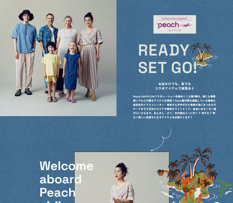
青いテクスチャ背景に、多世代のファッション写真、南国のイラスト、大きな英字を重ねたルックブック。自由な写真配置と商品リンクを組み合わせ、モバイルでは縦のストーリーへ再構成しています。
Peach × BAYFLOW — Style Reference
A travel-themed fashion lookbook assembled on grainy ocean-blue paper.
Original URL: bayflow.jp/topics/peach/item/ Final URL: bayflow.jp/topics/peach/item/ Inspected: October 2, 2026, 03:45:21.948 JST / October 1, 2026, 18:45:21.948 UTC. Viewports: 1440 × 1000 desktop and 390 × 844 mobile, in CSS pixels. Theme: a textured blue editorial canvas followed by a white brand footer; one color treatment was observed. Scope: the currently served collaboration feature, including its introduction, fashion and accessory scenes, product captions, collection link, and brand footer. Visual evidence includes desktop opening, middle, and closing captures, mobile opening and closing captures, and rendered DOM measurements across the document.
Peach × BAYFLOW presents clothing and accessories through an extended editorial story. A square group portrait establishes the collection, while a ticket-shaped collaboration mark and the oversized graphic headline READY SET GO! introduce a playful flight narrative. White English headings, Japanese introductory copy, illustrated islands, and hand-drawn flight paths sit directly on a continuous blue texture.
The main compositional device is deliberate imbalance: large portraits alternate with smaller photographs, accessory still lifes, floating lettering, and generous blue intervals. Product names and prices remain compact, underlined captions beside the imagery. The page eventually resolves into a single outlined ITEM LINE UP link and a quiet white footer. This is a shoppable editorial feature; its design should be understood through the relationship between storytelling and product identification.
閉じる
Peach × BAYFLOW — Style Reference
A travel-themed fashion lookbook assembled on grainy ocean-blue paper.
Original URL: bayflow.jp/topics/peach/item/ Final URL: bayflow.jp/topics/peach/item/ Inspected: October 2, 2026, 03:45:21.948 JST / October 1, 2026, 18:45:21.948 UTC. Viewports: 1440 × 1000 desktop and 390 × 844 mobile, in CSS pixels. Theme: a textured blue editorial canvas followed by a white brand footer; one color treatment was observed. Scope: the currently served collaboration feature, including its introduction, fashion and accessory scenes, product captions, collection link, and brand footer. Visual evidence includes desktop opening, middle, and closing captures, mobile opening and closing captures, and rendered DOM measurements across the document.
Peach × BAYFLOW presents clothing and accessories through an extended editorial story. A square group portrait establishes the collection, while a ticket-shaped collaboration mark and the oversized graphic headline READY SET GO! introduce a playful flight narrative. White English headings, Japanese introductory copy, illustrated islands, and hand-drawn flight paths sit directly on a continuous blue texture.
The main compositional device is deliberate imbalance: large portraits alternate with smaller photographs, accessory still lifes, floating lettering, and generous blue intervals. Product names and prices remain compact, underlined captions beside the imagery. The page eventually resolves into a single outlined ITEM LINE UP link and a quiet white footer. This is a shoppable editorial feature; its design should be understood through the relationship between storytelling and product identification.
How to Read This Reference
- Measured values come from the supplied rendered DOM and computed styles. Coordinates are document coordinates unless identified as screenshot estimates.
- Visual estimates describe geometry, colors, or artwork visible in the captures but absent from the computed-style extract. Estimated hex colors are implementation approximations, not sampled source values.
- Calculated values are derived from measured dimensions and are labeled accordingly.
- Recommendations describe a reusable implementation. They do not establish the original stylesheet, breakpoint, asset format, or interaction logic.
- Token names in this document are descriptive aliases. The supplied source custom properties do not expose a campaign token system.
- Font-family values identify computed family lists. Font-file loading and the exact font used for every glyph were not separately verified.
- The capture process waited for image decoding and layout stability and traversed the page by scrolling. It did not establish every hover state, animation trigger, or destination behavior.
Tokens — Colors
Default Palette
| Name | Value | Suggested token | Evidence and role |
|---|---|---|---|
| Ocean Paper | Approximately #477D9F |
--color-sea |
Visual estimate of the dominant textured blue; use as the base beneath a texture asset |
| White Lettering | #FFFFFF |
--color-on-sea |
Measured on Japanese copy, English headings, product links, and collection CTA |
| Footer White | #FFFFFF |
--color-footer |
Measured body background; visually supplies the footer and its surrounding white space |
| Footer Ink | #000000 |
--color-ink |
Measured footer navigation text; social and store marks appear black |
| Ticket Paper | Approximately #E7E7DF |
--color-ticket |
Visual estimate for the collaboration ticket and pale graphic lettering |
| Peach Magenta | Approximately #982B8D |
--color-peach |
Visual estimate within the collaboration artwork; a brand accent, not the general link color |
| Illustration Orange | Approximately #DE4D05 |
--color-island-orange |
Visual estimate in characters, trunks, and island outlines |
| Illustration Brown | Approximately #3B3029 |
--color-island-brown |
Visual estimate in palms, illustrated figures, and photographic frame edges |
| Island Olive | Approximately #8C913F |
--color-island-olive |
Visual estimate in island vegetation and land shapes |
| Footer Rule | Approximately #D6D6D6 |
--color-rule |
Visual estimate for fine footer separators |
The blue is a visibly mottled surface with fine light and dark flecks. A flat fill alone misses much of the page's character. Its source image, repeat dimensions, and rendering method are not included in the evidence; do not claim that a particular CSS noise technique reproduces the original.
The Japanese introduction and product captions are computed white. The large READY SET GO! lettering looks warmer because it belongs to the graphic composition. Keep those observations separate rather than changing all live text to cream.
The reported --swiper-theme-color: #007aff is a library variable, not evidence for the visible campaign background or an active blue control.
Color Distribution
Blue supplies the continuous editorial field. White supplies the reading hierarchy and navigation cues. Magenta is concentrated in the collaboration mark, while orange, brown, and olive remain largely inside illustrations. The white footer creates a clear transition back to the broader BAYFLOW brand system.
Tokens — Typography
Japanese Introduction
Computed family: Zen Kaku Gothic Antique, sans-serif.
The introductory heading and paragraph both use weight 700. Their small scale, open tracking, and generous line spacing hold up against the textured background. The two-line heading is centered; the explanatory paragraph is left aligned within a narrower column.
The visible heading is:
お出かけでも、家でも
コラボアイテムで旅気分♪
Use Japanese text as live content, preserving explicit editorial line breaks only where they are intentional.
English Storytelling and Product Captions
Computed family: Space Grotesk, sans-serif.
Weight: 600 for the sampled English headings, dialogue, product links, and collection CTA.
The same family connects large travel-themed phrases with tiny merchandise labels. Headings are composed individually: Welcome / aboard / Peach / airline uses four short lines, while other phrases use two or four lines with different sizes. This is not a single heading scale applied uniformly to every scene.
Most story headings use 0.05em tracking. The Welcome heading and product links use normal tracking in the supplied measurements.
Graphic Headings and Brand Marks
The collaboration H1 and READY SET GO! H2 have empty extracted text and visibly contain graphic compositions. Their inherited 14px desktop font size does not describe the large lettering seen in the screenshot.
Treat the ticket, the READY SET GO! artwork, and the BAYFLOW, HEREIAM, and bijorie wordmarks as supplied brand graphics. Their lettering does not justify inventing an additional font family. The extract does not include enough accessibility information to determine their existing alternative text.
Footer Typography
Desktop text navigation declares Helvetica, neue-haas-unica, sans-serif, at 12px / 18px, weight 400, and 0.6px tracking. PAGE TOP declares the same stack at 11px / 16.5px with 0.22px tracking.
The general body stack begins with -apple-system, system-ui, YuGothic, Yu Gothic, Hiragino Kaku Gothic ProN and continues through Meiryo and sans-serif. These fallbacks are separate from the campaign's explicitly named Japanese and English families.
Type Scale
Values below are measured computed styles, not reconstructed source declarations.
| Role | Desktop size / line height | Mobile size / line height | Weight and tracking |
|---|---|---|---|
| Japanese introductory heading | 16 / 24px |
16.64 / 24.96px |
700, 0.08em |
| Japanese paragraph | 13 / 22px |
13.52 / 22.88px |
700, 0.05em |
| Welcome heading | 65 / 70px |
26 / 31.2px |
600, normal |
| flight 123 heading | 50 / 55px |
46.8 / 52px |
600, 0.05em |
| So now ready for takeoff. | 50 / 55px |
26 / 31.2px |
600, 0.05em |
| Please fasten your seatbelt. | 40 / 45px |
36.4 / 41.6px |
600, 0.05em |
| We hope you will enjoy… | 40 / 45px |
26 / 31.2px |
600, 0.05em |
| Enjoy! Enjoy! Enjoy! | 55 / 60px |
41.6 / 46.8px |
600, 0.05em |
| Product links | 14 / 21px |
13.52 / 20.28px |
600, normal |
| ITEM LINE UP | 20 / 64px |
20.8 / 62.4px |
600, normal |
| Desktop footer navigation | 12 / 18px |
Not displayed in the mobile evidence | 400, 0.05em |
The CTA's line height corresponds to its control height, not a recommended paragraph leading.
Dialogue Scale
The later conversational scene uses several sizes within one exchange:
| Text | Desktop | Mobile |
|---|---|---|
| I think I fall asleep / while standing. | 27 / 34px |
14.56 / 17.68px |
| You what? | 32 / 48px |
17.68 / 26.52px |
| coz, I was exciting / last night… | 20 / 25px |
12.48 / 13px |
| Me too but nonsense… | 16 / 24px |
13.52 / 20.28px |
These are editorial accents, not reusable body-text sizes. Their content and measurements are supported by the DOM; the complete scene is not visible in the supplied screenshot excerpts.
Tokens — Spacing & Shapes
Density: broad editorial spacing around compact product captions. Dominant geometry: square photographs, portrait frames, occasional organic photo masks, a serrated ticket, and one pill-shaped collection link.
Root Size and Scaling
The measured HTML font size is 10px on desktop and 10.4px at 390px wide. The mobile value is consistent with scaling a 375px design by 390 / 375 = 1.04, but two observations do not establish the site's actual formula or breakpoint.
Do not copy numeric source rem assumptions into a project with a conventional root size. The Quick Start uses explicit values and separately labeled responsive recommendations.
Spacing Measurements
| Relationship | Desktop | Mobile | Status |
|---|---|---|---|
| Introductory heading to paragraph | 20px |
Approximately 20.8px |
Calculated from measured rectangles |
| Paragraph content width | 438px |
Approximately 317.22px |
Desktop measured; mobile calculated after horizontal padding |
| Mobile paragraph inset | — | 36.39px each side |
Measured |
| Product-link row pitch | 27px |
Approximately 24.95px |
Calculated from consecutive link positions |
| Space between product-link line boxes | 6px |
Approximately 4.67px |
Calculated; not necessarily a CSS gap declaration |
| Gap between takeoff caption columns | 25px |
Groups stack vertically | Calculated from desktop link rectangles |
| CTA left text padding | 33px |
34.32px |
Measured |
| Main bottom padding | 115px |
73.84px |
Measured; visually contributes to the white footer transition |
| Desktop footer navigation gap | Approximately 30px between adjacent plain links |
— | Calculated from supplied rectangles |
A reusable implementation can begin with 6, 20, 25, 40, 80, and 120px spacing steps, then add scene-specific offsets. This is a recommendation, not a discovered spacing scale.
Border Radius and Linework
| Element | Treatment | Evidence |
|---|---|---|
| Main group portrait | Square corners | Visible in both opening captures |
| Editorial portrait frames | Square corners, approximately 2px dark outline |
Visual estimate |
| Accessory still life | Large asymmetric curved crop | Visible in the desktop middle capture; exact mask unavailable |
| Collaboration mark | Serrated vertical edges | Artwork, not an ordinary rounded rectangle |
| Collection CTA | 100px radius |
Measured computed style |
| Collection CTA outline | Approximately 2px, white |
Visual estimate |
| Closing divider | Fine white dotted rule | Visible in the desktop closing capture |
| Footer dividers | Fine gray solid rules | Visible in closing captures |
Layout Measurements
| Element | Desktop | Mobile | Evidence |
|---|---|---|---|
| Opening group photograph | 720 × 720px |
390 × 390px |
Screenshot geometry |
| Introductory section | 1440 × 720px |
390 × 919.78px |
Measured DOM |
| Collaboration graphic box | 268.45 × 113.64px |
167.44 × 70.88px |
Measured DOM |
| Collaboration graphic top | 80px |
368.17px |
Measured DOM |
| READY SET GO! composition box | 487.53 × 190.52px |
325.52 × 127.20px |
Measured DOM; includes composition space, not just letter ink |
| Collection CTA | 320 × 64px |
336.95 × 62.39px |
Measured DOM |
| CTA mobile side margins | — | Approximately 26.52px |
Calculated |
| Footer element | 304px high |
614.75px high |
Measured DOM |
| Complete document | 7776.88px high |
10359.41px high |
Measured DOM |
On mobile, the collaboration graphic overlaps the bottom of the square photograph by approximately 21.83px, calculated from its top position and the photograph's visible 390px boundary.
Components
Split Introduction
Role: introduce the collection through people, collaboration identity, and a short editorial statement.
At desktop width, the square group photograph occupies the entire left half of the viewport. The right half contains four vertically separated elements: collaboration ticket, graphic headline, centered Japanese heading, and narrow explanatory paragraph. The photograph reaches the top and left viewport edges. No global navigation bar appears in the supplied opening capture.
The right panel is not a conventional centered text card. Its headline composition includes an illustrated island that extends toward the right, while the paragraph remains only 438px wide. The text and artwork use different horizontal bounds.
On mobile, the photograph becomes a full-width square. The ticket straddles its lower edge, followed by the graphic headline and Japanese text. The introduction extends below the first 844px viewport; do not compress the entire introduction to fit one screen.
Collaboration Ticket
Role: provide a compact identity stamp at the beginning of the story.
The pale ticket contains the Peach mark, small promotional lettering, an airplane motif, and a widely spaced BAYFLOW wordmark. Thin magenta rules reinforce the printed-ticket appearance. Zigzag edges create the strongest small-scale shape detail in the opening composition.
The desktop graphic is centered around the right panel's horizontal midpoint. On mobile it becomes an overlapping bridge between the photograph and blue field. Keep its internal spacing and logos in the artwork instead of approximating them with arbitrary text styles.
READY SET GO! Composition
Role: establish energy before the smaller descriptive copy.
Two lines of large pale uppercase lettering sit beside and partly beneath an island illustration. Dark palms, orange accents, olive land, and cream water strokes interrupt the otherwise typographic block.
The measured H2 rectangle is the composition's box, not a font-size measurement. Preserve the original aspect ratio and the relationship between letters and island. If rebuilding an equivalent graphic, avoid allowing the illustration to cover essential letters or create an accidental third line.
Editorial Look Scene
Role: show a styled outfit within the travel narrative.
A scene consists of a dominant photograph, a nearby English phrase, smaller decorative artwork, and one or more product-caption groups. Photography varies in size and horizontal position. In the desktop middle capture, a large portrait of an adult and child sits to the right, while a smaller portrait starts lower on the left. Their top edges intentionally do not align.
The So now / ready / for / takeoff. heading crosses the left edge of the larger photograph. A character and dashed path overlap its upper area. The photographic frame remains crisp and flat, with no elevation shadow.
Use a relatively positioned scene wrapper and keep the photo and its captions semantically together. Decorative placement may overlap neighboring space, but product labels should retain a clear association with their photograph.
Product Caption Group
Role: identify purchasable items without interrupting the editorial flow.
Each product is a real anchor combining collection prefix where applicable, uppercase item type, yen price, and (tax-in). An observed example is [P×B]ONE PIECE ¥8,690 (tax-in). The label is white, underlined, and set in Space Grotesk at weight 600.
Multi-person photographs use small left and right labels. Desktop groups can sit side by side; mobile groups stack below the relevant image. The group containing the takeoff outfits begins at desktop x≈817 and x≈1051, while both groups use x≈36.39 on mobile.
These anchors point to external product URLs on dot-st.com. The supplied evidence establishes their destinations, not whether the products remain available, whether links open new tabs, or what happens after navigation.
Accessory Still Life
Role: vary the pace between full-body photographs and show collection details.
The middle desktop capture includes a pale tabletop composition with a pouch, wallet, currency, and other small travel objects. A large curved lower-right edge makes the image feel like a cut-paper insert. A separate small image containing a model airplane uses another organic outline.
Captions remain outside the image on the blue surface. Preserve the difference between these soft masks and the square portrait frames. Applying the same rounded-card radius to every photograph would erase this distinction.
Illustrated Connectors
Role: link scenes and sustain the imagined journey.
White looping arrows, short wave strokes, illustrated islands, palms, and orange figures occupy the blue negative space. A dark dashed line in the middle capture adds another flight-path cue. These marks are composed around photographs rather than confined to identical decoration slots.
The curved arrow beneath the introduction points toward the first editorial photograph. It is a visual connector; the evidence does not establish it as an interactive scroll control.
Recommended implementation: use separate artwork layers with pointer-events: none and decorative alternative text handling. Keep their placement relative to a scene so they do not drift across product links at intermediate widths.
Conversational Interlude
Role: introduce humor and a slower editorial beat later in the page.
The DOM records four short English remarks with different sizes and placements. They are ordinary paragraphs rather than a transcript panel or interface chat component. Clothing and accessory links surround the exchange.
The full visual arrangement of this interlude is not included in the supplied image excerpts. Its measured text hierarchy is usable evidence; a specific photographic sequence, animated conversation, or interaction should not be invented.
Collection Link
Role: provide a clear exit from the editorial story to the complete merchandise list.
The desktop closing area has a long dotted white divider, a large island illustration, and an outlined pill labeled ITEM LINE UP. The button is transparent, with left-aligned text and a slim decorative arrow at the right. It measures 320 × 64px with 33px left padding.
On mobile the link occupies approximately 86.4% of the viewport width and remains roughly 62px high. This makes the final action more prominent without adding a filled accent color.
Its recorded destination is the collection list on dot-st.com. It is an outbound link, not evidence of a locally opening product drawer.
Brand Footer
Role: return from the campaign to brand, store, social, and corporate navigation.
The desktop footer uses a broad white field. BAYFLOW, HEREIAM, and bijorie marks sit at the left; store links and grouped social links sit at the right. A small horizontal row contains EVENT, NEWS, SHOP LIST, CONTACT, and PRIVACY POLICY. PAGE TOP appears vertically near the far-right edge. A thin rule separates the copyright line below.
On mobile the composition changes substantially: an upward arrow is centered, the three brand marks form a centered cluster, store links occupy a row between gray rules, and social groups stack vertically. The desktop utility-navigation row is absent from the mobile capture and its visible-link evidence. Copyright is centered at the bottom.
The screenshot's white region begins before the FOOTER element's measured top. The MAIN element's bottom padding accounts for approximately 115px of that desktop white transition and 73.84px on mobile. Consequently, the visible white closing area is about 419px high on desktop and 688.59px on mobile, larger than the footer element alone.
The copyright identifies Adastria Co., Ltd. The introduction separately names 尚味 as the illustrator behind the collection's Amami Ōshima motifs. That supports a product-illustration credit; it does not identify the web designer, developer, or photographer.
Tokens — Motion & Interaction
| Element or treatment | Recorded value or behavior | What the evidence supports |
|---|---|---|
| Desktop product anchors | opacity 0.2s linear |
An opacity transition is declared; the hovered endpoint was not supplied |
| Desktop footer links | 0.25s cubic-bezier(0, 0, 0.25, 1) |
A transition is declared; the specific visual property and endpoint were not exercised |
| Several mobile story headings | 0.7s cubic-bezier(0, 0, 0.25, 1) forwards jsUpShow |
A named reveal animation is present in computed styles |
| Sampled desktop story headings | animation: none |
Describes the captured desktop state, not proof that desktop headings never animate |
| Mobile product anchors | Transition reported as all, animation none |
No meaningful duration or active animated effect can be inferred from that shorthand alone |
| PAGE TOP | Anchor to the original page's #TOP fragment |
A top-of-page navigation target exists; smooth scrolling and timing were not verified |
| Product and collection navigation | External anchor destinations in rendered DOM | Navigation intent is known; destination loading and purchase behavior were not tested |
The name jsUpShow suggests a reveal convention, but the supplied evidence does not contain its keyframes. Exact translation distance, starting opacity, delay, trigger threshold, and replay behavior remain unknown. Do not turn the recorded 700ms duration into a claim about a specific 30px slide or a particular scroll library.
Some headings are represented in the DOM but not visible in the supplied desktop image excerpt at the corresponding area. Treat the images and DOM as complementary capture states; their difference does not establish a permanent hidden state.
The capture procedure temporarily paused perpetual animation during readiness checks and resumed it afterward. Static images therefore cannot verify any continuous motion. Swiper custom properties alone do not establish a carousel, autoplay, or swipe behavior.
Recommended adaptation: keep content visible without JavaScript. If adding reveal motion, use a short opacity and translation effect with reduced-motion support, and reserve it for scene entrances. Product links should remain immediately available.
Surfaces
| Surface | Appearance | Purpose |
|---|---|---|
| Editorial canvas | Continuous grainy blue | Connects otherwise varied scenes |
| Studio photography | Pale neutral backdrop with softly lit people | Keeps garments and poses legible |
| Portrait frame | Thin dark edge, square corners | Separates photography from textured paper |
| Still-life crop | Pale photo surface with a large organic boundary | Adds variation and a collage feeling |
| Collaboration ticket | Pale paper with magenta printing | Distinct identity stamp |
| Collection CTA | Transparent blue interior with white outline | Clear navigation without a new fill color |
| Footer | White with black marks and gray rules | Quiet brand and utility navigation |
No general card-shadow system is visible. Structure comes from photographic edges, changing image scale, typography, illustration, and space.
Imagery
Photography
The opening portrait brings adults and children together against a neutral gray-beige studio backdrop. Full-body framing shows clothing, sandals, and relaxed poses. Later visible photographs retain the same studio setting but add playful gestures and travel props. This continuity allows substantial layout variation without making the page feel visually fragmented.
The accessory images are editorial still lifes rather than isolated catalog cutouts. Preserve material texture, soft light, and the pale tabletop. Natural photographic rendering is appropriate; pixelation, heavy duotone processing, and saturated filters are not observed.
Illustration
The islands combine dark palm silhouettes, orange trunks and figures, olive terrain, and pale water strokes. Small creatures and musical details make the final island more narrative than a generic tropical icon. Their irregular edges and limited colors contrast with the carefully lit photography.
Illustration often escapes a photograph's boundary or occupies the space between images. This overlap is central to the collage effect. Keep product descriptions outside those decorative collisions.
Observed Asset References
No image src values, stylesheet background URLs, or asset filenames were supplied. The references below identify visible assets by placement; they are not downloadable file paths.
| Asset | Evidence location | Reuse guidance |
|---|---|---|
| Six-person collection portrait | Desktop and mobile opening captures | Preserve square framing and full-body visibility |
| Peach × BAYFLOW ticket | Desktop and mobile opening captures | Preserve internal artwork and serrated sides |
| READY SET GO! and island composition | Desktop and mobile opening captures | Maintain lettering-to-island proportions |
| Adult-and-child takeoff portrait | Desktop middle capture | Retain portrait ratio and nearby left/right captions |
| Travel accessory still life | Desktop middle capture | Preserve the asymmetric photo mask |
| Island and character decorations | Opening, middle, and closing desktop captures | Position as independent scene artwork where available |
| Final island illustration | Desktop closing capture | Pair with the collection CTA without turning it into a button background |
| Brand, store, and social marks | Desktop and mobile closing captures | Use actual marks instead of unrelated replacement icons |
For a new implementation, supply the photographs, graphics, texture, and logos separately. A flattened screenshot would lose responsive composition, accessible text, and individual product links.
Layout & Responsive Behavior
Desktop Composition
The opening uses a true half-width photograph and a separately composed right panel. Below it, the page becomes an editorial collage rather than a repeated equal-column catalog. Image sizes, heading positions, and caption alignment change from scene to scene.
The long closing divider and footer content suggest a roughly 1200px inner span at 1440px viewport width, with approximately 120px side margins. This is a visual estimate for those regions, not a universal page container: other headings and imagery extend beyond it.
Measured section rectangles also overlap. The large flight section ends at approximately y=4383.69, while the following section begins at y=4043.69, a 340px overlap. This supports interlocking scene composition; it does not reveal whether the original implementation uses negative margins, transforms, absolute positioning, or a combination.
Mobile Recomposition
The phone layout changes relationships rather than uniformly shrinking the desktop canvas:
- The opening photograph becomes a full-width square, and the collaboration ticket overlaps its bottom edge.
- The introduction moves below the photograph. The paragraph gains approximately 36.39px side insets.
- Product groups that sit side by side on desktop become vertically ordered lists.
- Headline sizes change independently. Welcome falls from 65px to 26px, while flight 123 remains comparatively large at 46.8px.
- The final CTA becomes almost full width.
- Footer regions center and stack; the desktop utility row disappears from the observed mobile presentation.
The mobile document is approximately 33.2% taller than the desktop document, calculated from their measured heights. This is consistent with longer sequential reading and stacked product groups.
The mobile flight 123 heading has a reported rectangle beginning at x=-2px and measuring approximately 405.59px wide in a 390px viewport. This may reflect composition or transformed content bounds. The evidence does not establish whether it causes horizontal scrolling. Treat intermediate-width overflow checks as a recommendation rather than reproducing overflow automatically.
Implementation Guidance
Use ordinary document flow for photos, captions, and primary text. Add scene-specific grid placement and decorative positioning on wider screens. At narrow widths, reset unnecessary overlaps and retain the semantic sequence: heading, image, associated products.
The original breakpoint is unknown. A breakpoint near 48rem is a practical starting point for a new implementation, followed by checks between the two observed viewport widths. Do not present that breakpoint as measured source CSS.
The mobile middle content is supported by DOM measurements, but its complete visual layout is not included in the supplied mobile screenshots. Exact mobile illustration placement and photo masks in those regions remain unverified.
Do’s and Don’ts
Do
- Preserve the continuous blue texture and the strong white footer transition.
- Keep the opening group portrait square and full bleed within its column.
- Use Space Grotesk for English editorial text and Zen Kaku Gothic Antique for Japanese introduction copy.
- Treat the collaboration mark and READY SET GO! composition as artwork.
- Vary photographic size, alignment, and vertical starting position.
- Keep product names, prices, and tax notation underlined and close to their photograph.
- Preserve left/right outfit grouping when mobile captions stack.
- Use island illustrations and hand-drawn paths to connect scenes.
- Reserve the pill outline for the closing collection link.
- Adapt each headline for mobile instead of applying one global reduction factor.
- Keep decorative overlays from blocking reading and link activation.
Don’t
- Don’t replace the editorial sequence with identical product cards.
- Don’t use the library's bright blue variable as the campaign background.
- Don’t convert all accents into magenta buttons or badges.
- Don’t add soft shadows, glass panels, or generic rounded containers throughout.
- Don’t infer a display font from inherited styles on image-based headings.
- Don’t apply the same corner radius to studio portraits and organic still-life crops.
- Don’t shrink product text proportionally with the entire desktop canvas.
- Don’t claim a slider, parallax system, or exact reveal keyframes without evidence.
- Don’t make a historical product price or recorded outbound link imply current stock availability.
- Don’t treat the footer's DOM height as the entire visible white closing region.
Recommended Implementation Additions
These are recommendations for a new implementation, not verified features of the original:
- Give the collaboration graphic a meaningful accessible heading and provide a text equivalent for READY SET GO! when it is image based.
- Use descriptive photograph alternatives; mark purely decorative islands, arrows, and flourishes as decorative.
- Keep each product group in the same figure or clearly associated section as its photograph. Use explicit outfit labels beyond visual positioning where useful.
- Provide visible keyboard focus on product, collection, store, social, and page-top links.
- Expand small social and merchandise hit areas for touch without allowing neighboring targets to overlap.
- Verify text contrast against the brightest parts of the actual blue texture, not only against an approximate flat swatch.
- Preserve content visibility when animation scripts fail and offer a reduced-motion path.
- Set image dimensions or aspect ratios before loading. Load below-the-fold photography progressively while prioritizing the opening image.
- Check narrow widths, intermediate widths, and text zoom for overlap between large headings, artwork, and captions.
- Keep essential contact and privacy destinations reachable in the mobile experience, even if their placement differs from the captured footer.
Agent Prompt Guide
Quick Color Reference
- Editorial base: approximately
#477D9F, with a fine mottled paper texture. - Live text and outlined collection action: measured
#FFFFFF. - Footer: measured white background and black text.
- Ticket: approximately
#E7E7DFwith magenta artwork around#982B8D. - Illustrations: dark brown, orange, olive, and pale wave strokes.
- Treat all artwork-derived hex values as approximations until actual assets are available.
Overall Prompt
“Create a shoppable fashion editorial inspired by the observed Peach × BAYFLOW page. Use a continuous grainy ocean-blue canvas, white Space Grotesk English headings, bold Zen Kaku Gothic Antique Japanese introduction text, and softly lit studio photographs. Open with a square group portrait occupying the left half of desktop and a ticket-shaped collaboration mark, large graphic headline, and narrow introduction at right. Continue with asymmetric portrait and accessory scenes, illustrated islands, hand-drawn flight paths, and compact underlined product captions. End with a transparent white-outline ITEM LINE UP pill and a spacious white brand footer. Recompose the page vertically on mobile, overlap the ticket across the hero-photo edge, and stack outfit captions.”
Example Component Prompts
- Introduction: “Build a two-column desktop opening with a full-bleed square studio group portrait at left. At right, vertically separate a pale serrated collaboration ticket, a large two-line graphic headline with an island, a centered Japanese subheading, and a 438px-wide paragraph. On a 390px phone, show the square photo first and overlap the ticket across its bottom edge.”
- Editorial scene: “Arrange a large bordered portrait toward the right, a smaller image lower on the left, and a white four-line travel phrase crossing the larger image's left edge. Keep the blue background visible between them. Add independent island artwork without covering product captions.”
- Product captions: “Use white underlined Space Grotesk labels at approximately 14px and weight 600. Include item name, yen price, and tax notation in each anchor. Place left/right outfit groups beside one another on desktop and stack them in reading order on mobile.”
- Accessory still life: “Place a softly lit travel-accessory photograph on the blue field with a large asymmetric curved edge. Position compact underlined product links beneath it. Keep the treatment distinct from the square portrait frames.”
- Closing action: “After a fine dotted white divider, pair a colorful island illustration with a 320 × 64px transparent pill outlined in white. Set ITEM LINE UP toward the left and a slim arrow at the right. On mobile, expand the link to approximately 86% of the viewport.”
- Footer: “Build a white footer with brand marks at left and store/social groups at right on desktop. On mobile, center an upward navigation arrow, the brand cluster, a ruled store-link row, and vertically separated social groups. Use black marks, fine gray dividers, and generous whitespace.”
- Motion adaptation: “Use the observed 700ms easing
cubic-bezier(0, 0, 0.25, 1)as a reference for restrained scene reveals. Treat translation and opacity endpoints as new implementation choices. Keep content visible without JavaScript and remove nonessential motion when reduced motion is requested.”
Quick Start
CSS Custom Properties
This is a recommended implementation scaffold, not the original stylesheet. Exact computed typography and CTA geometry are retained where practical. Texture color, borders, scene layout, breakpoint, and reveal endpoints are adaptations.
Provide the two named campaign fonts through the project's font-loading setup. Set --sea-texture to an actual texture image when available; no asset path was supplied. Use real graphic assets for the ticket, headline composition, and logos.
Suggested structure: a .campaign wrapper contains .hero, editorial .scene sections, and .collection-end. Place .site-footer after it. Within each scene, keep the image and product captions together in a figure. The footer padding below recreates the visible white transition without duplicating the original MAIN/FOOTER boundary.
:root {
  /* Estimated artwork colors; replace with asset-derived values if available. */
  --color-sea: #477d9f;
  --color-ticket: #e7e7df;
  --color-peach: #982b8d;
  --color-island-orange: #de4d05;
  --color-island-brown: #3b3029;
  --color-island-olive: #8c913f;
  --color-rule: #d6d6d6;

  /* Measured live text and page colors. */
  --color-on-sea: #fff;
  --color-footer: #fff;
  --color-ink: #000;

  --font-story: 'Space Grotesk', sans-serif;
  --font-japanese: 'Zen Kaku Gothic Antique', sans-serif;
  --font-footer: Helvetica, neue-haas-unica, sans-serif;

  --text-product: 14px;
  --leading-product: 21px;
  --text-intro: 13px;
  --leading-intro: 22px;
  --text-subhead: 16px;
  --leading-subhead: 24px;

  --space-caption: 6px;
  --space-copy: 20px;
  --space-outfits: 25px;
  --content-width: 1200px;
  --page-gutter: clamp(24px, 8.333vw, 120px);
  --radius-action: 100px;

  /* Exact recorded timings; effects using them are defined below. */
  --motion-link: 200ms linear;
  --motion-footer: 250ms cubic-bezier(0, 0, 0.25, 1);
  --motion-reveal: 700ms cubic-bezier(0, 0, 0.25, 1);
  --sea-texture: none;
}

* {
  box-sizing: border-box;
}

body {
  margin: 0;
  background: var(--color-footer);
}

.campaign {
  color: var(--color-on-sea);
  background-color: var(--color-sea);
  background-image: var(--sea-texture);
  background-repeat: repeat;
  font-family: var(--font-story);
  font-weight: 600;
}

.campaign img,
.site-footer img {
  display: block;
  max-width: 100%;
}

.campaign figure,
.campaign h1,
.campaign h2,
.campaign h3,
.campaign p {
  margin: 0;
}

.hero {
  display: grid;
  grid-template-columns: repeat(2, minmax(0, 1fr));
  align-items: start;
}

.hero__photo img {
  width: 100%;
  aspect-ratio: 1;
  object-fit: cover;
}

.hero__panel {
  padding-block: 80px 29px;
}

.hero__mark {
  width: 37.285%;
  margin-inline: auto !important;
}

.hero__mark img,
.hero__art img {
  width: 100%;
  height: auto;
}

.hero__art {
  width: 67.713%;
  margin: 55.53px auto 0 !important;
  transform: translateX(4%);
}

.hero__subhead {
  margin-top: 51.42px !important;
  font: 700 var(--text-subhead) / var(--leading-subhead)
    var(--font-japanese);
  letter-spacing: 0.08em;
  text-align: center;
}

.hero__intro {
  width: min(438px, calc(100% - 48px));
  margin: var(--space-copy) auto 0 !important;
  font: 700 var(--text-intro) / var(--leading-intro)
    var(--font-japanese);
  letter-spacing: 0.05em;
}

/* Recommended reusable scene structure; individual scenes need art direction. */
.scene {
  position: relative;
  isolation: isolate;
  display: grid;
  grid-template-columns: minmax(0, 0.85fr) minmax(0, 1.15fr);
  align-items: start;
  gap: clamp(32px, 6vw, 100px);
  width: min(var(--content-width), calc(100% - 2 * var(--page-gutter)));
  margin-inline: auto;
  padding-block: clamp(80px, 10vw, 170px);
}

.scene__figure {
  min-width: 0;
}

.scene__photo {
  width: 100%;
  height: auto;
  border: 2px solid var(--color-island-brown);
}

.scene__title {
  position: relative;
  z-index: 2;
  font: 600 50px / 55px var(--font-story);
  letter-spacing: 0.05em;
}

.scene__title--welcome {
  font-size: 65px;
  line-height: 70px;
  letter-spacing: normal;
}

.scene__title--small {
  font-size: 40px;
  line-height: 45px;
}

.scene__title--enjoy {
  font-size: 55px;
  line-height: 60px;
}

.scene__decoration {
  position: absolute;
  z-index: 3;
  pointer-events: none;
  user-select: none;
}

/* Supply scene-specific coordinates for each decorative asset. */
.scene__decoration--corner {
  width: 24%;
  right: -3%;
  top: 7%;
}

/* Approximation only; use the actual mask when available. */
.scene__photo--organic {
  border: 0;
  border-radius: 0 0 45% 0;
}

.outfit-groups {
  display: flex;
  flex-wrap: wrap;
  gap: var(--space-outfits);
  margin-top: 40px;
}

.outfit-group {
  min-width: 0;
}

.outfit-group__label {
  margin-bottom: 6px !important;
  font-size: 13px;
  line-height: 21px;
}

.product-list {
  display: grid;
  gap: var(--space-caption);
  margin: 0;
  padding: 0;
  list-style: none;
}

.product-list a {
  color: inherit;
  font: 600 var(--text-product) / var(--leading-product)
    var(--font-story);
  text-decoration: underline;
  text-underline-offset: 2px;
  transition: opacity var(--motion-link);
  overflow-wrap: anywhere;
}

.collection-end {
  width: min(var(--content-width), calc(100% - 2 * var(--page-gutter)));
  margin-inline: auto;
  padding-block: 40px 56px;
  border-top: 2px dotted currentColor;
}

.collection-end__inner {
  display: flex;
  align-items: center;
  justify-content: center;
  gap: 36px;
}

.collection-end__art {
  width: min(300px, 40%);
  height: auto;
}

.collection-link {
  display: flex;
  align-items: center;
  justify-content: space-between;
  flex: 0 0 auto;
  width: 320px;
  min-height: 64px;
  padding-inline: 33px 26px;
  border: 2px solid currentColor;
  border-radius: var(--radius-action);
  color: inherit;
  background: transparent;
  font: 600 20px / 1 var(--font-story);
  text-decoration: none;
}

.collection-link__arrow {
  width: 32px;
  height: auto;
}

.site-footer {
  position: relative;
  padding-top: 115px;
  color: var(--color-ink);
  background: var(--color-footer);
  font-family: var(--font-footer);
}

.site-footer__inner {
  display: grid;
  grid-template-columns: minmax(0, 1fr) auto;
  gap: 36px;
  width: min(var(--content-width), calc(100% - 48px));
  margin-inline: auto;
  padding-bottom: 48px;
}

.site-footer__brands {
  display: grid;
  gap: 12px;
  justify-items: start;
}

.site-footer__stores,
.site-footer__icons,
.site-footer__nav {
  display: flex;
  align-items: center;
}

.site-footer__stores {
  justify-content: flex-end;
  gap: 20px;
}

.site-footer__socials {
  display: grid;
  gap: 10px;
  margin-top: 25px;
}

.site-footer__social-group {
  display: flex;
  align-items: center;
  justify-content: flex-end;
  gap: 20px;
}

.site-footer__icons {
  gap: 10px;
}

.site-footer__nav {
  flex-wrap: wrap;
  gap: 30px;
  margin-top: 40px;
  font-size: 12px;
  line-height: 18px;
  letter-spacing: 0.05em;
}

.site-footer a {
  color: inherit;
  text-decoration: none;
  transition: opacity var(--motion-footer);
}

.site-footer__copyright {
  margin: 0;
  padding: 38px max(24px, calc((100% - 1200px) / 2));
  border-top: 1px solid var(--color-rule);
  font-size: 12px;
  line-height: 18px;
  text-align: right;
}

/* Recommended focus and hover endpoints; original endpoints were not captured. */
.campaign a:focus-visible,
.site-footer a:focus-visible {
  outline: 2px solid currentColor;
  outline-offset: 5px;
}

@media (hover: hover) {
  .product-list a:hover,
  .site-footer a:hover {
    opacity: 0.7;
  }
}

/* Recommended reveal endpoints, using the measured duration and easing. */
@keyframes campaign-reveal {
  from {
    opacity: 0;
    transform: translateY(16px);
  }
  to {
    opacity: 1;
    transform: translateY(0);
  }
}

.scene__title[data-reveal='active'] {
  animation: campaign-reveal var(--motion-reveal) forwards;
}

/* Recommended breakpoint, not an observed source breakpoint. */
@media (max-width: 48rem) {
  .campaign {
    --text-product: 13.52px;
    --leading-product: 20.28px;
    --text-intro: 13.52px;
    --leading-intro: 22.88px;
    --text-subhead: 16.64px;
    --leading-subhead: 24.96px;
    --space-caption: 4.67px;
  }

  .hero {
    display: block;
  }

  .hero__panel {
    padding: 0;
  }

  .hero__mark {
    position: relative;
    width: 42.933%;
    margin-top: -5.597vw !important;
  }

  .hero__art {
    width: 83.466%;
    margin-top: 9.6vw !important;
    transform: translateX(3%);
  }

  .hero__subhead {
    margin-top: 10.133vw !important;
  }

  .hero__intro {
    width: auto;
    margin: 20.8px 9.331% 0 !important;
  }

  .scene {
    grid-template-columns: minmax(0, 1fr);
    width: calc(100% - 48px);
    gap: 32px;
    padding-block: 80px;
  }

  .scene__title,
  .scene__title--welcome {
    font-size: 26px;
    line-height: 31.2px;
  }

  .scene__title--flight {
    font-size: clamp(32px, 12vw, 46.8px);
    line-height: 1.111;
  }

  .scene__title--seatbelt {
    font-size: 36.4px;
    line-height: 41.6px;
  }

  .scene__title--enjoy {
    font-size: 41.6px;
    line-height: 46.8px;
  }

  .outfit-groups {
    display: grid;
    gap: 24px;
    margin-top: 28px;
  }

  .collection-end {
    width: calc(100% - 48px);
    padding-bottom: 46px;
  }

  .collection-end__inner {
    flex-direction: column;
    gap: 36px;
  }

  .collection-end__art {
    width: min(240px, 75%);
  }

  .collection-link {
    width: min(336.95px, 100%);
    min-height: 62.4px;
    padding-left: 34.32px;
    font-size: 20.8px;
  }

  .site-footer {
    padding-top: 73.84px;
  }

  .site-footer__inner {
    grid-template-columns: minmax(0, 1fr);
    width: calc(100% - 42px);
    gap: 52px;
    padding-bottom: 60px;
    text-align: center;
  }

  .site-footer__brands {
    justify-items: center;
  }

  .site-footer__stores {
    justify-content: center;
    padding-block: 22px;
    border-block: 1px solid var(--color-rule);
  }

  .site-footer__socials {
    gap: 30px;
    margin-top: 44px;
  }

  .site-footer__social-group {
    flex-direction: column;
    gap: 10px;
  }

  /* Keep essential utility links reachable in the chosen implementation. */
  .site-footer__nav {
    justify-content: center;
    gap: 16px 24px;
  }

  .site-footer__copyright {
    padding: 0 20px 24px;
    border: 0;
    text-align: center;
  }
}

@media (prefers-reduced-motion: reduce) {
  .scene__title[data-reveal='active'] {
    animation: none;
    opacity: 1;
    transform: none;
  }

  .campaign a,
  .site-footer a {
    transition: none;
  }
}
The scaffold intentionally leaves scene-specific photography, heading overlap, page-top artwork, and illustration coordinates to the supplied assets. Its mobile utility links remain reachable as an explicit recommendation; that differs from the captured mobile footer.
Tailwind v4 Token Mapping
Optional aliases for a project already using Tailwind v4. These do not imply that the original website uses Tailwind. Define the custom properties above first.
@theme inline {
  --color-sea: #477d9f;
  --color-on-sea: #fff;
  --color-footer: #fff;
  --color-ink: #000;
  --color-ticket: #e7e7df;
  --color-peach: #982b8d;

  --font-story: 'Space Grotesk', sans-serif;
  --font-japanese: 'Zen Kaku Gothic Antique', sans-serif;
  --font-footer: Helvetica, neue-haas-unica, sans-serif;

  --text-product: 14px;
  --text-intro: 13px;
  --text-story: 50px;
  --text-action: 20px;

  --spacing-caption: 6px;
  --spacing-copy: 20px;
  --spacing-outfits: 25px;
  --spacing-editorial: 120px;

  --radius-action: 100px;
}
Sources & Evidence
- Original and final page: Peach × BAYFLOW item feature. Both URLs are identical; the supplied browser observation reports HTTP 200.
- Capture timestamp:
2026-10-01T18:45:21.948Z, equivalent to October 2, 2026, 03:45:21.948 JST. - Desktop evidence: 1440 × 1000 viewport; opening, middle, and closing screenshots; rendered document height approximately 7776.88px.
- Mobile evidence: 390 × 844 viewport; opening and closing screenshots; rendered document height approximately 10359.41px.
- Rendered DOM and computed styles: heading and paragraph families, sizes, weights, line heights, tracking, element rectangles, product destinations, CTA dimensions, footer structure, and sampled transition/animation declarations.
- Navigation evidence: merchandise anchors, the collection-list anchor, store and social anchors, and the page-top fragment. Their presence and destinations were recorded; clicks and destination-page states were not supplied.
- Attribution visible on the original page: the footer names Adastria Co., Ltd.; introductory copy names 尚味 for the collection's illustrated motifs. No web production or photography credit was established.
- Inspection limitations: no asset URLs, complete stylesheet, animation keyframes, intermediate-width screenshots, hover captures, keyboard tests, or outbound-page checks were supplied. The inspection disabled service workers and SharedWorkers. Readiness checks reduce incomplete captures but do not prove semantic completeness or reveal every delayed state.
This reference describes the page currently served at the recorded capture time. It does not reconstruct an earlier version or verify current merchandise availability. Exact measurements, visual approximations, and implementation recommendations are distinguished throughout.
# Peach × BAYFLOW — Style Reference

> A travel-themed fashion lookbook assembled on grainy ocean-blue paper.

**Original URL:** [bayflow.jp/topics/peach/item/](https://www.bayflow.jp/topics/peach/item/)
**Final URL:** [bayflow.jp/topics/peach/item/](https://www.bayflow.jp/topics/peach/item/)
**Inspected:** October 2, 2026, 03:45:21.948 JST / October 1, 2026, 18:45:21.948 UTC.
**Viewports:** 1440 × 1000 desktop and 390 × 844 mobile, in CSS pixels.
**Theme:** a textured blue editorial canvas followed by a white brand footer; one color treatment was observed.
**Scope:** the currently served collaboration feature, including its introduction, fashion and accessory scenes, product captions, collection link, and brand footer. Visual evidence includes desktop opening, middle, and closing captures, mobile opening and closing captures, and rendered DOM measurements across the document.

Peach × BAYFLOW presents clothing and accessories through an extended editorial story. A square group portrait establishes the collection, while a ticket-shaped collaboration mark and the oversized graphic headline READY SET GO! introduce a playful flight narrative. White English headings, Japanese introductory copy, illustrated islands, and hand-drawn flight paths sit directly on a continuous blue texture.

The main compositional device is deliberate imbalance: large portraits alternate with smaller photographs, accessory still lifes, floating lettering, and generous blue intervals. Product names and prices remain compact, underlined captions beside the imagery. The page eventually resolves into a single outlined ITEM LINE UP link and a quiet white footer. This is a shoppable editorial feature; its design should be understood through the relationship between storytelling and product identification.
閉じる
# Peach × BAYFLOW — Style Reference

> A travel-themed fashion lookbook assembled on grainy ocean-blue paper.

**Original URL:** [bayflow.jp/topics/peach/item/](https://www.bayflow.jp/topics/peach/item/)
**Final URL:** [bayflow.jp/topics/peach/item/](https://www.bayflow.jp/topics/peach/item/)
**Inspected:** October 2, 2026, 03:45:21.948 JST / October 1, 2026, 18:45:21.948 UTC.
**Viewports:** 1440 × 1000 desktop and 390 × 844 mobile, in CSS pixels.
**Theme:** a textured blue editorial canvas followed by a white brand footer; one color treatment was observed.
**Scope:** the currently served collaboration feature, including its introduction, fashion and accessory scenes, product captions, collection link, and brand footer. Visual evidence includes desktop opening, middle, and closing captures, mobile opening and closing captures, and rendered DOM measurements across the document.

Peach × BAYFLOW presents clothing and accessories through an extended editorial story. A square group portrait establishes the collection, while a ticket-shaped collaboration mark and the oversized graphic headline READY SET GO! introduce a playful flight narrative. White English headings, Japanese introductory copy, illustrated islands, and hand-drawn flight paths sit directly on a continuous blue texture.

The main compositional device is deliberate imbalance: large portraits alternate with smaller photographs, accessory still lifes, floating lettering, and generous blue intervals. Product names and prices remain compact, underlined captions beside the imagery. The page eventually resolves into a single outlined ITEM LINE UP link and a quiet white footer. This is a shoppable editorial feature; its design should be understood through the relationship between storytelling and product identification.

## How to Read This Reference

- **Measured** values come from the supplied rendered DOM and computed styles. Coordinates are document coordinates unless identified as screenshot estimates.
- **Visual estimates** describe geometry, colors, or artwork visible in the captures but absent from the computed-style extract. Estimated hex colors are implementation approximations, not sampled source values.
- **Calculated** values are derived from measured dimensions and are labeled accordingly.
- **Recommendations** describe a reusable implementation. They do not establish the original stylesheet, breakpoint, asset format, or interaction logic.
- Token names in this document are descriptive aliases. The supplied source custom properties do not expose a campaign token system.
- Font-family values identify computed family lists. Font-file loading and the exact font used for every glyph were not separately verified.
- The capture process waited for image decoding and layout stability and traversed the page by scrolling. It did not establish every hover state, animation trigger, or destination behavior.

## Tokens — Colors

### Default Palette

| Name | Value | Suggested token | Evidence and role |
| --- | --- | --- | --- |
| Ocean Paper | Approximately `#477D9F` | `--color-sea` | Visual estimate of the dominant textured blue; use as the base beneath a texture asset |
| White Lettering | `#FFFFFF` | `--color-on-sea` | Measured on Japanese copy, English headings, product links, and collection CTA |
| Footer White | `#FFFFFF` | `--color-footer` | Measured body background; visually supplies the footer and its surrounding white space |
| Footer Ink | `#000000` | `--color-ink` | Measured footer navigation text; social and store marks appear black |
| Ticket Paper | Approximately `#E7E7DF` | `--color-ticket` | Visual estimate for the collaboration ticket and pale graphic lettering |
| Peach Magenta | Approximately `#982B8D` | `--color-peach` | Visual estimate within the collaboration artwork; a brand accent, not the general link color |
| Illustration Orange | Approximately `#DE4D05` | `--color-island-orange` | Visual estimate in characters, trunks, and island outlines |
| Illustration Brown | Approximately `#3B3029` | `--color-island-brown` | Visual estimate in palms, illustrated figures, and photographic frame edges |
| Island Olive | Approximately `#8C913F` | `--color-island-olive` | Visual estimate in island vegetation and land shapes |
| Footer Rule | Approximately `#D6D6D6` | `--color-rule` | Visual estimate for fine footer separators |

The blue is a visibly mottled surface with fine light and dark flecks. A flat fill alone misses much of the page's character. Its source image, repeat dimensions, and rendering method are not included in the evidence; do not claim that a particular CSS noise technique reproduces the original.

The Japanese introduction and product captions are computed white. The large READY SET GO! lettering looks warmer because it belongs to the graphic composition. Keep those observations separate rather than changing all live text to cream.

The reported `--swiper-theme-color: #007aff` is a library variable, not evidence for the visible campaign background or an active blue control.

### Color Distribution

Blue supplies the continuous editorial field. White supplies the reading hierarchy and navigation cues. Magenta is concentrated in the collaboration mark, while orange, brown, and olive remain largely inside illustrations. The white footer creates a clear transition back to the broader BAYFLOW brand system.

## Tokens — Typography

### Japanese Introduction

**Computed family:** Zen Kaku Gothic Antique, sans-serif.

The introductory heading and paragraph both use weight `700`. Their small scale, open tracking, and generous line spacing hold up against the textured background. The two-line heading is centered; the explanatory paragraph is left aligned within a narrower column.

The visible heading is:

> お出かけでも、家でも
> コラボアイテムで旅気分♪

Use Japanese text as live content, preserving explicit editorial line breaks only where they are intentional.

### English Storytelling and Product Captions

**Computed family:** Space Grotesk, sans-serif.
**Weight:** `600` for the sampled English headings, dialogue, product links, and collection CTA.

The same family connects large travel-themed phrases with tiny merchandise labels. Headings are composed individually: Welcome / aboard / Peach / airline uses four short lines, while other phrases use two or four lines with different sizes. This is not a single heading scale applied uniformly to every scene.

Most story headings use `0.05em` tracking. The Welcome heading and product links use normal tracking in the supplied measurements.

### Graphic Headings and Brand Marks

The collaboration H1 and READY SET GO! H2 have empty extracted text and visibly contain graphic compositions. Their inherited `14px` desktop font size does not describe the large lettering seen in the screenshot.

Treat the ticket, the READY SET GO! artwork, and the BAYFLOW, HEREIAM, and bijorie wordmarks as supplied brand graphics. Their lettering does not justify inventing an additional font family. The extract does not include enough accessibility information to determine their existing alternative text.

### Footer Typography

Desktop text navigation declares `Helvetica, neue-haas-unica, sans-serif`, at `12px / 18px`, weight `400`, and `0.6px` tracking. PAGE TOP declares the same stack at `11px / 16.5px` with `0.22px` tracking.

The general body stack begins with `-apple-system, system-ui, YuGothic, Yu Gothic, Hiragino Kaku Gothic ProN` and continues through Meiryo and sans-serif. These fallbacks are separate from the campaign's explicitly named Japanese and English families.

### Type Scale

Values below are measured computed styles, not reconstructed source declarations.

| Role | Desktop size / line height | Mobile size / line height | Weight and tracking |
| --- | --- | --- | --- |
| Japanese introductory heading | `16 / 24px` | `16.64 / 24.96px` | `700`, `0.08em` |
| Japanese paragraph | `13 / 22px` | `13.52 / 22.88px` | `700`, `0.05em` |
| Welcome heading | `65 / 70px` | `26 / 31.2px` | `600`, normal |
| flight 123 heading | `50 / 55px` | `46.8 / 52px` | `600`, `0.05em` |
| So now ready for takeoff. | `50 / 55px` | `26 / 31.2px` | `600`, `0.05em` |
| Please fasten your seatbelt. | `40 / 45px` | `36.4 / 41.6px` | `600`, `0.05em` |
| We hope you will enjoy… | `40 / 45px` | `26 / 31.2px` | `600`, `0.05em` |
| Enjoy! Enjoy! Enjoy! | `55 / 60px` | `41.6 / 46.8px` | `600`, `0.05em` |
| Product links | `14 / 21px` | `13.52 / 20.28px` | `600`, normal |
| ITEM LINE UP | `20 / 64px` | `20.8 / 62.4px` | `600`, normal |
| Desktop footer navigation | `12 / 18px` | Not displayed in the mobile evidence | `400`, `0.05em` |

The CTA's line height corresponds to its control height, not a recommended paragraph leading.

### Dialogue Scale

The later conversational scene uses several sizes within one exchange:

| Text | Desktop | Mobile |
| --- | --- | --- |
| I think I fall asleep / while standing. | `27 / 34px` | `14.56 / 17.68px` |
| You what? | `32 / 48px` | `17.68 / 26.52px` |
| coz, I was exciting / last night… | `20 / 25px` | `12.48 / 13px` |
| Me too but nonsense… | `16 / 24px` | `13.52 / 20.28px` |

These are editorial accents, not reusable body-text sizes. Their content and measurements are supported by the DOM; the complete scene is not visible in the supplied screenshot excerpts.

## Tokens — Spacing & Shapes

**Density:** broad editorial spacing around compact product captions.
**Dominant geometry:** square photographs, portrait frames, occasional organic photo masks, a serrated ticket, and one pill-shaped collection link.

### Root Size and Scaling

The measured HTML font size is `10px` on desktop and `10.4px` at 390px wide. The mobile value is consistent with scaling a 375px design by `390 / 375 = 1.04`, but two observations do not establish the site's actual formula or breakpoint.

Do not copy numeric source `rem` assumptions into a project with a conventional root size. The Quick Start uses explicit values and separately labeled responsive recommendations.

### Spacing Measurements

| Relationship | Desktop | Mobile | Status |
| --- | --- | --- | --- |
| Introductory heading to paragraph | `20px` | Approximately `20.8px` | Calculated from measured rectangles |
| Paragraph content width | `438px` | Approximately `317.22px` | Desktop measured; mobile calculated after horizontal padding |
| Mobile paragraph inset | — | `36.39px` each side | Measured |
| Product-link row pitch | `27px` | Approximately `24.95px` | Calculated from consecutive link positions |
| Space between product-link line boxes | `6px` | Approximately `4.67px` | Calculated; not necessarily a CSS gap declaration |
| Gap between takeoff caption columns | `25px` | Groups stack vertically | Calculated from desktop link rectangles |
| CTA left text padding | `33px` | `34.32px` | Measured |
| Main bottom padding | `115px` | `73.84px` | Measured; visually contributes to the white footer transition |
| Desktop footer navigation gap | Approximately `30px` between adjacent plain links | — | Calculated from supplied rectangles |

A reusable implementation can begin with `6`, `20`, `25`, `40`, `80`, and `120px` spacing steps, then add scene-specific offsets. This is a recommendation, not a discovered spacing scale.

### Border Radius and Linework

| Element | Treatment | Evidence |
| --- | --- | --- |
| Main group portrait | Square corners | Visible in both opening captures |
| Editorial portrait frames | Square corners, approximately `2px` dark outline | Visual estimate |
| Accessory still life | Large asymmetric curved crop | Visible in the desktop middle capture; exact mask unavailable |
| Collaboration mark | Serrated vertical edges | Artwork, not an ordinary rounded rectangle |
| Collection CTA | `100px` radius | Measured computed style |
| Collection CTA outline | Approximately `2px`, white | Visual estimate |
| Closing divider | Fine white dotted rule | Visible in the desktop closing capture |
| Footer dividers | Fine gray solid rules | Visible in closing captures |

### Layout Measurements

| Element | Desktop | Mobile | Evidence |
| --- | --- | --- | --- |
| Opening group photograph | `720 × 720px` | `390 × 390px` | Screenshot geometry |
| Introductory section | `1440 × 720px` | `390 × 919.78px` | Measured DOM |
| Collaboration graphic box | `268.45 × 113.64px` | `167.44 × 70.88px` | Measured DOM |
| Collaboration graphic top | `80px` | `368.17px` | Measured DOM |
| READY SET GO! composition box | `487.53 × 190.52px` | `325.52 × 127.20px` | Measured DOM; includes composition space, not just letter ink |
| Collection CTA | `320 × 64px` | `336.95 × 62.39px` | Measured DOM |
| CTA mobile side margins | — | Approximately `26.52px` | Calculated |
| Footer element | `304px` high | `614.75px` high | Measured DOM |
| Complete document | `7776.88px` high | `10359.41px` high | Measured DOM |

On mobile, the collaboration graphic overlaps the bottom of the square photograph by approximately `21.83px`, calculated from its top position and the photograph's visible 390px boundary.

## Components

### Split Introduction

**Role:** introduce the collection through people, collaboration identity, and a short editorial statement.

At desktop width, the square group photograph occupies the entire left half of the viewport. The right half contains four vertically separated elements: collaboration ticket, graphic headline, centered Japanese heading, and narrow explanatory paragraph. The photograph reaches the top and left viewport edges. No global navigation bar appears in the supplied opening capture.

The right panel is not a conventional centered text card. Its headline composition includes an illustrated island that extends toward the right, while the paragraph remains only 438px wide. The text and artwork use different horizontal bounds.

On mobile, the photograph becomes a full-width square. The ticket straddles its lower edge, followed by the graphic headline and Japanese text. The introduction extends below the first 844px viewport; do not compress the entire introduction to fit one screen.

### Collaboration Ticket

**Role:** provide a compact identity stamp at the beginning of the story.

The pale ticket contains the Peach mark, small promotional lettering, an airplane motif, and a widely spaced BAYFLOW wordmark. Thin magenta rules reinforce the printed-ticket appearance. Zigzag edges create the strongest small-scale shape detail in the opening composition.

The desktop graphic is centered around the right panel's horizontal midpoint. On mobile it becomes an overlapping bridge between the photograph and blue field. Keep its internal spacing and logos in the artwork instead of approximating them with arbitrary text styles.

### READY SET GO! Composition

**Role:** establish energy before the smaller descriptive copy.

Two lines of large pale uppercase lettering sit beside and partly beneath an island illustration. Dark palms, orange accents, olive land, and cream water strokes interrupt the otherwise typographic block.

The measured H2 rectangle is the composition's box, not a font-size measurement. Preserve the original aspect ratio and the relationship between letters and island. If rebuilding an equivalent graphic, avoid allowing the illustration to cover essential letters or create an accidental third line.

### Editorial Look Scene

**Role:** show a styled outfit within the travel narrative.

A scene consists of a dominant photograph, a nearby English phrase, smaller decorative artwork, and one or more product-caption groups. Photography varies in size and horizontal position. In the desktop middle capture, a large portrait of an adult and child sits to the right, while a smaller portrait starts lower on the left. Their top edges intentionally do not align.

The So now / ready / for / takeoff. heading crosses the left edge of the larger photograph. A character and dashed path overlap its upper area. The photographic frame remains crisp and flat, with no elevation shadow.

Use a relatively positioned scene wrapper and keep the photo and its captions semantically together. Decorative placement may overlap neighboring space, but product labels should retain a clear association with their photograph.

### Product Caption Group

**Role:** identify purchasable items without interrupting the editorial flow.

Each product is a real anchor combining collection prefix where applicable, uppercase item type, yen price, and `(tax-in)`. An observed example is `[P×B]ONE PIECE ¥8,690 (tax-in)`. The label is white, underlined, and set in Space Grotesk at weight 600.

Multi-person photographs use small left and right labels. Desktop groups can sit side by side; mobile groups stack below the relevant image. The group containing the takeoff outfits begins at desktop x≈817 and x≈1051, while both groups use x≈36.39 on mobile.

These anchors point to external product URLs on `dot-st.com`. The supplied evidence establishes their destinations, not whether the products remain available, whether links open new tabs, or what happens after navigation.

### Accessory Still Life

**Role:** vary the pace between full-body photographs and show collection details.

The middle desktop capture includes a pale tabletop composition with a pouch, wallet, currency, and other small travel objects. A large curved lower-right edge makes the image feel like a cut-paper insert. A separate small image containing a model airplane uses another organic outline.

Captions remain outside the image on the blue surface. Preserve the difference between these soft masks and the square portrait frames. Applying the same rounded-card radius to every photograph would erase this distinction.

### Illustrated Connectors

**Role:** link scenes and sustain the imagined journey.

White looping arrows, short wave strokes, illustrated islands, palms, and orange figures occupy the blue negative space. A dark dashed line in the middle capture adds another flight-path cue. These marks are composed around photographs rather than confined to identical decoration slots.

The curved arrow beneath the introduction points toward the first editorial photograph. It is a visual connector; the evidence does not establish it as an interactive scroll control.

Recommended implementation: use separate artwork layers with `pointer-events: none` and decorative alternative text handling. Keep their placement relative to a scene so they do not drift across product links at intermediate widths.

### Conversational Interlude

**Role:** introduce humor and a slower editorial beat later in the page.

The DOM records four short English remarks with different sizes and placements. They are ordinary paragraphs rather than a transcript panel or interface chat component. Clothing and accessory links surround the exchange.

The full visual arrangement of this interlude is not included in the supplied image excerpts. Its measured text hierarchy is usable evidence; a specific photographic sequence, animated conversation, or interaction should not be invented.

### Collection Link

**Role:** provide a clear exit from the editorial story to the complete merchandise list.

The desktop closing area has a long dotted white divider, a large island illustration, and an outlined pill labeled ITEM LINE UP. The button is transparent, with left-aligned text and a slim decorative arrow at the right. It measures 320 × 64px with 33px left padding.

On mobile the link occupies approximately 86.4% of the viewport width and remains roughly 62px high. This makes the final action more prominent without adding a filled accent color.

Its recorded destination is the collection list on `dot-st.com`. It is an outbound link, not evidence of a locally opening product drawer.

### Brand Footer

**Role:** return from the campaign to brand, store, social, and corporate navigation.

The desktop footer uses a broad white field. BAYFLOW, HEREIAM, and bijorie marks sit at the left; store links and grouped social links sit at the right. A small horizontal row contains EVENT, NEWS, SHOP LIST, CONTACT, and PRIVACY POLICY. PAGE TOP appears vertically near the far-right edge. A thin rule separates the copyright line below.

On mobile the composition changes substantially: an upward arrow is centered, the three brand marks form a centered cluster, store links occupy a row between gray rules, and social groups stack vertically. The desktop utility-navigation row is absent from the mobile capture and its visible-link evidence. Copyright is centered at the bottom.

The screenshot's white region begins before the FOOTER element's measured top. The MAIN element's bottom padding accounts for approximately 115px of that desktop white transition and 73.84px on mobile. Consequently, the visible white closing area is about 419px high on desktop and 688.59px on mobile, larger than the footer element alone.

The copyright identifies Adastria Co., Ltd. The introduction separately names 尚味 as the illustrator behind the collection's Amami Ōshima motifs. That supports a product-illustration credit; it does not identify the web designer, developer, or photographer.

## Tokens — Motion & Interaction

| Element or treatment | Recorded value or behavior | What the evidence supports |
| --- | --- | --- |
| Desktop product anchors | `opacity 0.2s linear` | An opacity transition is declared; the hovered endpoint was not supplied |
| Desktop footer links | `0.25s cubic-bezier(0, 0, 0.25, 1)` | A transition is declared; the specific visual property and endpoint were not exercised |
| Several mobile story headings | `0.7s cubic-bezier(0, 0, 0.25, 1) forwards jsUpShow` | A named reveal animation is present in computed styles |
| Sampled desktop story headings | `animation: none` | Describes the captured desktop state, not proof that desktop headings never animate |
| Mobile product anchors | Transition reported as `all`, animation `none` | No meaningful duration or active animated effect can be inferred from that shorthand alone |
| PAGE TOP | Anchor to the original page's `#TOP` fragment | A top-of-page navigation target exists; smooth scrolling and timing were not verified |
| Product and collection navigation | External anchor destinations in rendered DOM | Navigation intent is known; destination loading and purchase behavior were not tested |

The name `jsUpShow` suggests a reveal convention, but the supplied evidence does not contain its keyframes. Exact translation distance, starting opacity, delay, trigger threshold, and replay behavior remain unknown. Do not turn the recorded 700ms duration into a claim about a specific 30px slide or a particular scroll library.

Some headings are represented in the DOM but not visible in the supplied desktop image excerpt at the corresponding area. Treat the images and DOM as complementary capture states; their difference does not establish a permanent hidden state.

The capture procedure temporarily paused perpetual animation during readiness checks and resumed it afterward. Static images therefore cannot verify any continuous motion. Swiper custom properties alone do not establish a carousel, autoplay, or swipe behavior.

**Recommended adaptation:** keep content visible without JavaScript. If adding reveal motion, use a short opacity and translation effect with reduced-motion support, and reserve it for scene entrances. Product links should remain immediately available.

## Surfaces

| Surface | Appearance | Purpose |
| --- | --- | --- |
| Editorial canvas | Continuous grainy blue | Connects otherwise varied scenes |
| Studio photography | Pale neutral backdrop with softly lit people | Keeps garments and poses legible |
| Portrait frame | Thin dark edge, square corners | Separates photography from textured paper |
| Still-life crop | Pale photo surface with a large organic boundary | Adds variation and a collage feeling |
| Collaboration ticket | Pale paper with magenta printing | Distinct identity stamp |
| Collection CTA | Transparent blue interior with white outline | Clear navigation without a new fill color |
| Footer | White with black marks and gray rules | Quiet brand and utility navigation |

No general card-shadow system is visible. Structure comes from photographic edges, changing image scale, typography, illustration, and space.

## Imagery

### Photography

The opening portrait brings adults and children together against a neutral gray-beige studio backdrop. Full-body framing shows clothing, sandals, and relaxed poses. Later visible photographs retain the same studio setting but add playful gestures and travel props. This continuity allows substantial layout variation without making the page feel visually fragmented.

The accessory images are editorial still lifes rather than isolated catalog cutouts. Preserve material texture, soft light, and the pale tabletop. Natural photographic rendering is appropriate; pixelation, heavy duotone processing, and saturated filters are not observed.

### Illustration

The islands combine dark palm silhouettes, orange trunks and figures, olive terrain, and pale water strokes. Small creatures and musical details make the final island more narrative than a generic tropical icon. Their irregular edges and limited colors contrast with the carefully lit photography.

Illustration often escapes a photograph's boundary or occupies the space between images. This overlap is central to the collage effect. Keep product descriptions outside those decorative collisions.

### Observed Asset References

No image `src` values, stylesheet background URLs, or asset filenames were supplied. The references below identify visible assets by placement; they are not downloadable file paths.

| Asset | Evidence location | Reuse guidance |
| --- | --- | --- |
| Six-person collection portrait | Desktop and mobile opening captures | Preserve square framing and full-body visibility |
| Peach × BAYFLOW ticket | Desktop and mobile opening captures | Preserve internal artwork and serrated sides |
| READY SET GO! and island composition | Desktop and mobile opening captures | Maintain lettering-to-island proportions |
| Adult-and-child takeoff portrait | Desktop middle capture | Retain portrait ratio and nearby left/right captions |
| Travel accessory still life | Desktop middle capture | Preserve the asymmetric photo mask |
| Island and character decorations | Opening, middle, and closing desktop captures | Position as independent scene artwork where available |
| Final island illustration | Desktop closing capture | Pair with the collection CTA without turning it into a button background |
| Brand, store, and social marks | Desktop and mobile closing captures | Use actual marks instead of unrelated replacement icons |

For a new implementation, supply the photographs, graphics, texture, and logos separately. A flattened screenshot would lose responsive composition, accessible text, and individual product links.

## Layout & Responsive Behavior

### Desktop Composition

The opening uses a true half-width photograph and a separately composed right panel. Below it, the page becomes an editorial collage rather than a repeated equal-column catalog. Image sizes, heading positions, and caption alignment change from scene to scene.

The long closing divider and footer content suggest a roughly 1200px inner span at 1440px viewport width, with approximately 120px side margins. This is a visual estimate for those regions, not a universal page container: other headings and imagery extend beyond it.

Measured section rectangles also overlap. The large flight section ends at approximately y=4383.69, while the following section begins at y=4043.69, a 340px overlap. This supports interlocking scene composition; it does not reveal whether the original implementation uses negative margins, transforms, absolute positioning, or a combination.

### Mobile Recomposition

The phone layout changes relationships rather than uniformly shrinking the desktop canvas:

1. The opening photograph becomes a full-width square, and the collaboration ticket overlaps its bottom edge.
2. The introduction moves below the photograph. The paragraph gains approximately 36.39px side insets.
3. Product groups that sit side by side on desktop become vertically ordered lists.
4. Headline sizes change independently. Welcome falls from 65px to 26px, while flight 123 remains comparatively large at 46.8px.
5. The final CTA becomes almost full width.
6. Footer regions center and stack; the desktop utility row disappears from the observed mobile presentation.

The mobile document is approximately 33.2% taller than the desktop document, calculated from their measured heights. This is consistent with longer sequential reading and stacked product groups.

The mobile flight 123 heading has a reported rectangle beginning at x=-2px and measuring approximately 405.59px wide in a 390px viewport. This may reflect composition or transformed content bounds. The evidence does not establish whether it causes horizontal scrolling. Treat intermediate-width overflow checks as a recommendation rather than reproducing overflow automatically.

### Implementation Guidance

Use ordinary document flow for photos, captions, and primary text. Add scene-specific grid placement and decorative positioning on wider screens. At narrow widths, reset unnecessary overlaps and retain the semantic sequence: heading, image, associated products.

The original breakpoint is unknown. A breakpoint near 48rem is a practical starting point for a new implementation, followed by checks between the two observed viewport widths. Do not present that breakpoint as measured source CSS.

The mobile middle content is supported by DOM measurements, but its complete visual layout is not included in the supplied mobile screenshots. Exact mobile illustration placement and photo masks in those regions remain unverified.

## Do’s and Don’ts

### Do

- Preserve the continuous blue texture and the strong white footer transition.
- Keep the opening group portrait square and full bleed within its column.
- Use Space Grotesk for English editorial text and Zen Kaku Gothic Antique for Japanese introduction copy.
- Treat the collaboration mark and READY SET GO! composition as artwork.
- Vary photographic size, alignment, and vertical starting position.
- Keep product names, prices, and tax notation underlined and close to their photograph.
- Preserve left/right outfit grouping when mobile captions stack.
- Use island illustrations and hand-drawn paths to connect scenes.
- Reserve the pill outline for the closing collection link.
- Adapt each headline for mobile instead of applying one global reduction factor.
- Keep decorative overlays from blocking reading and link activation.

### Don’t

- Don’t replace the editorial sequence with identical product cards.
- Don’t use the library's bright blue variable as the campaign background.
- Don’t convert all accents into magenta buttons or badges.
- Don’t add soft shadows, glass panels, or generic rounded containers throughout.
- Don’t infer a display font from inherited styles on image-based headings.
- Don’t apply the same corner radius to studio portraits and organic still-life crops.
- Don’t shrink product text proportionally with the entire desktop canvas.
- Don’t claim a slider, parallax system, or exact reveal keyframes without evidence.
- Don’t make a historical product price or recorded outbound link imply current stock availability.
- Don’t treat the footer's DOM height as the entire visible white closing region.

## Recommended Implementation Additions

These are recommendations for a new implementation, not verified features of the original:

- Give the collaboration graphic a meaningful accessible heading and provide a text equivalent for READY SET GO! when it is image based.
- Use descriptive photograph alternatives; mark purely decorative islands, arrows, and flourishes as decorative.
- Keep each product group in the same figure or clearly associated section as its photograph. Use explicit outfit labels beyond visual positioning where useful.
- Provide visible keyboard focus on product, collection, store, social, and page-top links.
- Expand small social and merchandise hit areas for touch without allowing neighboring targets to overlap.
- Verify text contrast against the brightest parts of the actual blue texture, not only against an approximate flat swatch.
- Preserve content visibility when animation scripts fail and offer a reduced-motion path.
- Set image dimensions or aspect ratios before loading. Load below-the-fold photography progressively while prioritizing the opening image.
- Check narrow widths, intermediate widths, and text zoom for overlap between large headings, artwork, and captions.
- Keep essential contact and privacy destinations reachable in the mobile experience, even if their placement differs from the captured footer.

## Agent Prompt Guide

### Quick Color Reference

- Editorial base: approximately `#477D9F`, with a fine mottled paper texture.
- Live text and outlined collection action: measured `#FFFFFF`.
- Footer: measured white background and black text.
- Ticket: approximately `#E7E7DF` with magenta artwork around `#982B8D`.
- Illustrations: dark brown, orange, olive, and pale wave strokes.
- Treat all artwork-derived hex values as approximations until actual assets are available.

### Overall Prompt

“Create a shoppable fashion editorial inspired by the observed Peach × BAYFLOW page. Use a continuous grainy ocean-blue canvas, white Space Grotesk English headings, bold Zen Kaku Gothic Antique Japanese introduction text, and softly lit studio photographs. Open with a square group portrait occupying the left half of desktop and a ticket-shaped collaboration mark, large graphic headline, and narrow introduction at right. Continue with asymmetric portrait and accessory scenes, illustrated islands, hand-drawn flight paths, and compact underlined product captions. End with a transparent white-outline ITEM LINE UP pill and a spacious white brand footer. Recompose the page vertically on mobile, overlap the ticket across the hero-photo edge, and stack outfit captions.”

### Example Component Prompts

1. **Introduction:** “Build a two-column desktop opening with a full-bleed square studio group portrait at left. At right, vertically separate a pale serrated collaboration ticket, a large two-line graphic headline with an island, a centered Japanese subheading, and a 438px-wide paragraph. On a 390px phone, show the square photo first and overlap the ticket across its bottom edge.”
2. **Editorial scene:** “Arrange a large bordered portrait toward the right, a smaller image lower on the left, and a white four-line travel phrase crossing the larger image's left edge. Keep the blue background visible between them. Add independent island artwork without covering product captions.”
3. **Product captions:** “Use white underlined Space Grotesk labels at approximately 14px and weight 600. Include item name, yen price, and tax notation in each anchor. Place left/right outfit groups beside one another on desktop and stack them in reading order on mobile.”
4. **Accessory still life:** “Place a softly lit travel-accessory photograph on the blue field with a large asymmetric curved edge. Position compact underlined product links beneath it. Keep the treatment distinct from the square portrait frames.”
5. **Closing action:** “After a fine dotted white divider, pair a colorful island illustration with a 320 × 64px transparent pill outlined in white. Set ITEM LINE UP toward the left and a slim arrow at the right. On mobile, expand the link to approximately 86% of the viewport.”
6. **Footer:** “Build a white footer with brand marks at left and store/social groups at right on desktop. On mobile, center an upward navigation arrow, the brand cluster, a ruled store-link row, and vertically separated social groups. Use black marks, fine gray dividers, and generous whitespace.”
7. **Motion adaptation:** “Use the observed 700ms easing `cubic-bezier(0, 0, 0.25, 1)` as a reference for restrained scene reveals. Treat translation and opacity endpoints as new implementation choices. Keep content visible without JavaScript and remove nonessential motion when reduced motion is requested.”

## Quick Start

### CSS Custom Properties

This is a recommended implementation scaffold, not the original stylesheet. Exact computed typography and CTA geometry are retained where practical. Texture color, borders, scene layout, breakpoint, and reveal endpoints are adaptations.

Provide the two named campaign fonts through the project's font-loading setup. Set `--sea-texture` to an actual texture image when available; no asset path was supplied. Use real graphic assets for the ticket, headline composition, and logos.

Suggested structure: a `.campaign` wrapper contains `.hero`, editorial `.scene` sections, and `.collection-end`. Place `.site-footer` after it. Within each scene, keep the image and product captions together in a figure. The footer padding below recreates the visible white transition without duplicating the original MAIN/FOOTER boundary.

```css
:root {
  /* Estimated artwork colors; replace with asset-derived values if available. */
  --color-sea: #477d9f;
  --color-ticket: #e7e7df;
  --color-peach: #982b8d;
  --color-island-orange: #de4d05;
  --color-island-brown: #3b3029;
  --color-island-olive: #8c913f;
  --color-rule: #d6d6d6;

  /* Measured live text and page colors. */
  --color-on-sea: #fff;
  --color-footer: #fff;
  --color-ink: #000;

  --font-story: 'Space Grotesk', sans-serif;
  --font-japanese: 'Zen Kaku Gothic Antique', sans-serif;
  --font-footer: Helvetica, neue-haas-unica, sans-serif;

  --text-product: 14px;
  --leading-product: 21px;
  --text-intro: 13px;
  --leading-intro: 22px;
  --text-subhead: 16px;
  --leading-subhead: 24px;

  --space-caption: 6px;
  --space-copy: 20px;
  --space-outfits: 25px;
  --content-width: 1200px;
  --page-gutter: clamp(24px, 8.333vw, 120px);
  --radius-action: 100px;

  /* Exact recorded timings; effects using them are defined below. */
  --motion-link: 200ms linear;
  --motion-footer: 250ms cubic-bezier(0, 0, 0.25, 1);
  --motion-reveal: 700ms cubic-bezier(0, 0, 0.25, 1);
  --sea-texture: none;
}

* {
  box-sizing: border-box;
}

body {
  margin: 0;
  background: var(--color-footer);
}

.campaign {
  color: var(--color-on-sea);
  background-color: var(--color-sea);
  background-image: var(--sea-texture);
  background-repeat: repeat;
  font-family: var(--font-story);
  font-weight: 600;
}

.campaign img,
.site-footer img {
  display: block;
  max-width: 100%;
}

.campaign figure,
.campaign h1,
.campaign h2,
.campaign h3,
.campaign p {
  margin: 0;
}

.hero {
  display: grid;
  grid-template-columns: repeat(2, minmax(0, 1fr));
  align-items: start;
}

.hero__photo img {
  width: 100%;
  aspect-ratio: 1;
  object-fit: cover;
}

.hero__panel {
  padding-block: 80px 29px;
}

.hero__mark {
  width: 37.285%;
  margin-inline: auto !important;
}

.hero__mark img,
.hero__art img {
  width: 100%;
  height: auto;
}

.hero__art {
  width: 67.713%;
  margin: 55.53px auto 0 !important;
  transform: translateX(4%);
}

.hero__subhead {
  margin-top: 51.42px !important;
  font: 700 var(--text-subhead) / var(--leading-subhead)
    var(--font-japanese);
  letter-spacing: 0.08em;
  text-align: center;
}

.hero__intro {
  width: min(438px, calc(100% - 48px));
  margin: var(--space-copy) auto 0 !important;
  font: 700 var(--text-intro) / var(--leading-intro)
    var(--font-japanese);
  letter-spacing: 0.05em;
}

/* Recommended reusable scene structure; individual scenes need art direction. */
.scene {
  position: relative;
  isolation: isolate;
  display: grid;
  grid-template-columns: minmax(0, 0.85fr) minmax(0, 1.15fr);
  align-items: start;
  gap: clamp(32px, 6vw, 100px);
  width: min(var(--content-width), calc(100% - 2 * var(--page-gutter)));
  margin-inline: auto;
  padding-block: clamp(80px, 10vw, 170px);
}

.scene__figure {
  min-width: 0;
}

.scene__photo {
  width: 100%;
  height: auto;
  border: 2px solid var(--color-island-brown);
}

.scene__title {
  position: relative;
  z-index: 2;
  font: 600 50px / 55px var(--font-story);
  letter-spacing: 0.05em;
}

.scene__title--welcome {
  font-size: 65px;
  line-height: 70px;
  letter-spacing: normal;
}

.scene__title--small {
  font-size: 40px;
  line-height: 45px;
}

.scene__title--enjoy {
  font-size: 55px;
  line-height: 60px;
}

.scene__decoration {
  position: absolute;
  z-index: 3;
  pointer-events: none;
  user-select: none;
}

/* Supply scene-specific coordinates for each decorative asset. */
.scene__decoration--corner {
  width: 24%;
  right: -3%;
  top: 7%;
}

/* Approximation only; use the actual mask when available. */
.scene__photo--organic {
  border: 0;
  border-radius: 0 0 45% 0;
}

.outfit-groups {
  display: flex;
  flex-wrap: wrap;
  gap: var(--space-outfits);
  margin-top: 40px;
}

.outfit-group {
  min-width: 0;
}

.outfit-group__label {
  margin-bottom: 6px !important;
  font-size: 13px;
  line-height: 21px;
}

.product-list {
  display: grid;
  gap: var(--space-caption);
  margin: 0;
  padding: 0;
  list-style: none;
}

.product-list a {
  color: inherit;
  font: 600 var(--text-product) / var(--leading-product)
    var(--font-story);
  text-decoration: underline;
  text-underline-offset: 2px;
  transition: opacity var(--motion-link);
  overflow-wrap: anywhere;
}

.collection-end {
  width: min(var(--content-width), calc(100% - 2 * var(--page-gutter)));
  margin-inline: auto;
  padding-block: 40px 56px;
  border-top: 2px dotted currentColor;
}

.collection-end__inner {
  display: flex;
  align-items: center;
  justify-content: center;
  gap: 36px;
}

.collection-end__art {
  width: min(300px, 40%);
  height: auto;
}

.collection-link {
  display: flex;
  align-items: center;
  justify-content: space-between;
  flex: 0 0 auto;
  width: 320px;
  min-height: 64px;
  padding-inline: 33px 26px;
  border: 2px solid currentColor;
  border-radius: var(--radius-action);
  color: inherit;
  background: transparent;
  font: 600 20px / 1 var(--font-story);
  text-decoration: none;
}

.collection-link__arrow {
  width: 32px;
  height: auto;
}

.site-footer {
  position: relative;
  padding-top: 115px;
  color: var(--color-ink);
  background: var(--color-footer);
  font-family: var(--font-footer);
}

.site-footer__inner {
  display: grid;
  grid-template-columns: minmax(0, 1fr) auto;
  gap: 36px;
  width: min(var(--content-width), calc(100% - 48px));
  margin-inline: auto;
  padding-bottom: 48px;
}

.site-footer__brands {
  display: grid;
  gap: 12px;
  justify-items: start;
}

.site-footer__stores,
.site-footer__icons,
.site-footer__nav {
  display: flex;
  align-items: center;
}

.site-footer__stores {
  justify-content: flex-end;
  gap: 20px;
}

.site-footer__socials {
  display: grid;
  gap: 10px;
  margin-top: 25px;
}

.site-footer__social-group {
  display: flex;
  align-items: center;
  justify-content: flex-end;
  gap: 20px;
}

.site-footer__icons {
  gap: 10px;
}

.site-footer__nav {
  flex-wrap: wrap;
  gap: 30px;
  margin-top: 40px;
  font-size: 12px;
  line-height: 18px;
  letter-spacing: 0.05em;
}

.site-footer a {
  color: inherit;
  text-decoration: none;
  transition: opacity var(--motion-footer);
}

.site-footer__copyright {
  margin: 0;
  padding: 38px max(24px, calc((100% - 1200px) / 2));
  border-top: 1px solid var(--color-rule);
  font-size: 12px;
  line-height: 18px;
  text-align: right;
}

/* Recommended focus and hover endpoints; original endpoints were not captured. */
.campaign a:focus-visible,
.site-footer a:focus-visible {
  outline: 2px solid currentColor;
  outline-offset: 5px;
}

@media (hover: hover) {
  .product-list a:hover,
  .site-footer a:hover {
    opacity: 0.7;
  }
}

/* Recommended reveal endpoints, using the measured duration and easing. */
@keyframes campaign-reveal {
  from {
    opacity: 0;
    transform: translateY(16px);
  }
  to {
    opacity: 1;
    transform: translateY(0);
  }
}

.scene__title[data-reveal='active'] {
  animation: campaign-reveal var(--motion-reveal) forwards;
}

/* Recommended breakpoint, not an observed source breakpoint. */
@media (max-width: 48rem) {
  .campaign {
    --text-product: 13.52px;
    --leading-product: 20.28px;
    --text-intro: 13.52px;
    --leading-intro: 22.88px;
    --text-subhead: 16.64px;
    --leading-subhead: 24.96px;
    --space-caption: 4.67px;
  }

  .hero {
    display: block;
  }

  .hero__panel {
    padding: 0;
  }

  .hero__mark {
    position: relative;
    width: 42.933%;
    margin-top: -5.597vw !important;
  }

  .hero__art {
    width: 83.466%;
    margin-top: 9.6vw !important;
    transform: translateX(3%);
  }

  .hero__subhead {
    margin-top: 10.133vw !important;
  }

  .hero__intro {
    width: auto;
    margin: 20.8px 9.331% 0 !important;
  }

  .scene {
    grid-template-columns: minmax(0, 1fr);
    width: calc(100% - 48px);
    gap: 32px;
    padding-block: 80px;
  }

  .scene__title,
  .scene__title--welcome {
    font-size: 26px;
    line-height: 31.2px;
  }

  .scene__title--flight {
    font-size: clamp(32px, 12vw, 46.8px);
    line-height: 1.111;
  }

  .scene__title--seatbelt {
    font-size: 36.4px;
    line-height: 41.6px;
  }

  .scene__title--enjoy {
    font-size: 41.6px;
    line-height: 46.8px;
  }

  .outfit-groups {
    display: grid;
    gap: 24px;
    margin-top: 28px;
  }

  .collection-end {
    width: calc(100% - 48px);
    padding-bottom: 46px;
  }

  .collection-end__inner {
    flex-direction: column;
    gap: 36px;
  }

  .collection-end__art {
    width: min(240px, 75%);
  }

  .collection-link {
    width: min(336.95px, 100%);
    min-height: 62.4px;
    padding-left: 34.32px;
    font-size: 20.8px;
  }

  .site-footer {
    padding-top: 73.84px;
  }

  .site-footer__inner {
    grid-template-columns: minmax(0, 1fr);
    width: calc(100% - 42px);
    gap: 52px;
    padding-bottom: 60px;
    text-align: center;
  }

  .site-footer__brands {
    justify-items: center;
  }

  .site-footer__stores {
    justify-content: center;
    padding-block: 22px;
    border-block: 1px solid var(--color-rule);
  }

  .site-footer__socials {
    gap: 30px;
    margin-top: 44px;
  }

  .site-footer__social-group {
    flex-direction: column;
    gap: 10px;
  }

  /* Keep essential utility links reachable in the chosen implementation. */
  .site-footer__nav {
    justify-content: center;
    gap: 16px 24px;
  }

  .site-footer__copyright {
    padding: 0 20px 24px;
    border: 0;
    text-align: center;
  }
}

@media (prefers-reduced-motion: reduce) {
  .scene__title[data-reveal='active'] {
    animation: none;
    opacity: 1;
    transform: none;
  }

  .campaign a,
  .site-footer a {
    transition: none;
  }
}
```

The scaffold intentionally leaves scene-specific photography, heading overlap, page-top artwork, and illustration coordinates to the supplied assets. Its mobile utility links remain reachable as an explicit recommendation; that differs from the captured mobile footer.

### Tailwind v4 Token Mapping

Optional aliases for a project already using Tailwind v4. These do not imply that the original website uses Tailwind. Define the custom properties above first.

```css
@theme inline {
  --color-sea: #477d9f;
  --color-on-sea: #fff;
  --color-footer: #fff;
  --color-ink: #000;
  --color-ticket: #e7e7df;
  --color-peach: #982b8d;

  --font-story: 'Space Grotesk', sans-serif;
  --font-japanese: 'Zen Kaku Gothic Antique', sans-serif;
  --font-footer: Helvetica, neue-haas-unica, sans-serif;

  --text-product: 14px;
  --text-intro: 13px;
  --text-story: 50px;
  --text-action: 20px;

  --spacing-caption: 6px;
  --spacing-copy: 20px;
  --spacing-outfits: 25px;
  --spacing-editorial: 120px;

  --radius-action: 100px;
}
```

## Sources & Evidence

- **Original and final page:** [Peach × BAYFLOW item feature](https://www.bayflow.jp/topics/peach/item/). Both URLs are identical; the supplied browser observation reports HTTP 200.
- **Capture timestamp:** `2026-10-01T18:45:21.948Z`, equivalent to October 2, 2026, 03:45:21.948 JST.
- **Desktop evidence:** 1440 × 1000 viewport; opening, middle, and closing screenshots; rendered document height approximately 7776.88px.
- **Mobile evidence:** 390 × 844 viewport; opening and closing screenshots; rendered document height approximately 10359.41px.
- **Rendered DOM and computed styles:** heading and paragraph families, sizes, weights, line heights, tracking, element rectangles, product destinations, CTA dimensions, footer structure, and sampled transition/animation declarations.
- **Navigation evidence:** merchandise anchors, the collection-list anchor, store and social anchors, and [the page-top fragment](https://www.bayflow.jp/topics/peach/item/#TOP). Their presence and destinations were recorded; clicks and destination-page states were not supplied.
- **Attribution visible on the original page:** the footer names Adastria Co., Ltd.; introductory copy names 尚味 for the collection's illustrated motifs. No web production or photography credit was established.
- **Inspection limitations:** no asset URLs, complete stylesheet, animation keyframes, intermediate-width screenshots, hover captures, keyboard tests, or outbound-page checks were supplied. The inspection disabled service workers and SharedWorkers. Readiness checks reduce incomplete captures but do not prove semantic completeness or reveal every delayed state.

This reference describes the page currently served at the recorded capture time. It does not reconstruct an earlier version or verify current merchandise availability. Exact measurements, visual approximations, and implementation recommendations are distinguished throughout.関連するデザイン
スタイルやページの種類、ジャンルが近いデザインを集めました。