プレビュー準備中デザインリファレンスを見る
DESIGN REFERENCE
Tabio MEN 2022秋コレクション|デザイン分析
全画面ムービー、詰めた字間の欧文見出し、生成りの背景と余白を組み合わせた靴下のルックブック。人物別の5章から商品購入へつなぐ構成。
Tabio MEN 2022 Autumn Collection — Style Reference
A fashion film opening into a quietly typeset, person-led sock collection.
Website: Tabio MEN 2022 Autumn Collection Original URL: https://tabio.com/jp/tabiomen_2022autumn/ Final URL: https://tabio.com/jp/tabiomen_2022autumn/ Theme: warm off-white editorial canvas, near-black text, and white typography over opening media. Inspected: October 2, 2026, at 03:28:32 JST; supplied retrieval timestamp: October 1, 2026, at 18:28:32.166 UTC. Viewports: 1440 × 1000 desktop and 390 × 844 mobile, in CSS pixels. Scope: supplied current-page movie-introduction captures and rendered DOM/computed-style evidence for the underlying campaign header, introduction, crew index, five look chapters, product links, closing campaign identity, credits, social links, and footer. The editorial body beneath the introduction was not visually exposed in the supplied current-page screenshots.
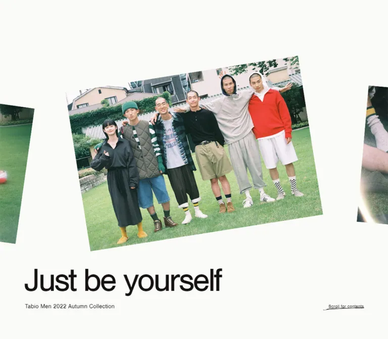
The opening gives almost the entire screen to fashion footage. Grass, warm window light, dark clothing, checkerboard socks, and small red accents carry the color. White Nimbus Sans copy stays restrained despite its large size: regular weight, tightly compressed tracking, one campaign line, one small collection subtitle, and a quiet Skip Movie control.
The underlying document describes a longer editorial shopping experience. A warm off-white base supports a short Japanese statement, five crew entries, and five differently paced look chapters. Small reference numbers and transparent product links sit at varied horizontal positions. The page repeats the campaign identity near its closing credits. Its useful design principle is the contrast in scale between expansive imagery and compact typography.
This reference describes the page currently served at the collection URL. The year in its title is campaign content; it does not establish the page's publication history or product availability.
閉じる
Tabio MEN 2022 Autumn Collection — Style Reference
A fashion film opening into a quietly typeset, person-led sock collection.
Website: Tabio MEN 2022 Autumn Collection Original URL: https://tabio.com/jp/tabiomen_2022autumn/ Final URL: https://tabio.com/jp/tabiomen_2022autumn/ Theme: warm off-white editorial canvas, near-black text, and white typography over opening media. Inspected: October 2, 2026, at 03:28:32 JST; supplied retrieval timestamp: October 1, 2026, at 18:28:32.166 UTC. Viewports: 1440 × 1000 desktop and 390 × 844 mobile, in CSS pixels. Scope: supplied current-page movie-introduction captures and rendered DOM/computed-style evidence for the underlying campaign header, introduction, crew index, five look chapters, product links, closing campaign identity, credits, social links, and footer. The editorial body beneath the introduction was not visually exposed in the supplied current-page screenshots.
The opening gives almost the entire screen to fashion footage. Grass, warm window light, dark clothing, checkerboard socks, and small red accents carry the color. White Nimbus Sans copy stays restrained despite its large size: regular weight, tightly compressed tracking, one campaign line, one small collection subtitle, and a quiet Skip Movie control.
The underlying document describes a longer editorial shopping experience. A warm off-white base supports a short Japanese statement, five crew entries, and five differently paced look chapters. Small reference numbers and transparent product links sit at varied horizontal positions. The page repeats the campaign identity near its closing credits. Its useful design principle is the contrast in scale between expansive imagery and compact typography.
This reference describes the page currently served at the collection URL. The year in its title is campaign content; it does not establish the page's publication history or product availability.
How to Read This Reference
- Measured means supplied computed styles or element bounding rectangles. Values are rounded to two decimals where helpful.
- Visually observed means visible in one of the five current-page captures: three desktop movie frames and two mobile introduction states.
- Calculated means arithmetic derived from those measurements, such as a gutter-to-viewport ratio or the gap between two rectangles.
- Estimated means an optical approximation, such as the apparent movie-label size or the black media field.
- Recommended means implementation guidance for a new build. The Quick Start, breakpoint, fallback behavior, and accessibility additions belong to this category.
- All custom-property names below are implementation aliases. The supplied custom-property extraction was empty; it did not expose an original token system.
- Offscreen DOM geometry documents layout, but does not prove that every measured element was visible or reachable during the introduction. No button activation, hover sequence, purchase flow, or movie completion was recorded.
Tokens — Colors
Default Palette
| Name | Value | Suggested token | Evidence and role |
|---|---|---|---|
| Warm Canvas | #fafaf7 |
--color-canvas |
Measured HTML background, rgb(250, 250, 247). Base color beneath transparent editorial elements. |
| Soft Black | #151212 |
--color-ink |
Measured main text color, rgb(21, 18, 18), across the underlying header, chapters, links, and footer. |
| Movie White | #ffffff |
--color-on-media |
Measured opening title, subtitle, and Skip Movie button color. |
| Movie Black | Approximately #000000 |
--color-media-fallback |
Visually observed black mobile introduction state. An exact underlying CSS declaration was not supplied. |
| Transparent | transparent |
— | Measured backgrounds of sampled buttons, links, sections, and header containers. |
The editorial canvas is slightly warmer than pure white. Preserve that distinction when transitioning between white text over media and dark text on the document.
The film supplies olive and grass greens, deep green stripes, charcoal, cream, warm brown, and red. These are photographic colors, not verified interface accents. Do not convert the red clothing or green lawn into default button colors.
Theme Presets
The evidence documents one light editorial palette and an opening media layer with reversed text. No theme selector or alternative user-selectable palette is evidenced.
Tokens — Typography
Nimbus Sans — Campaign and Editorial Type
Computed family: nimbus-sans, sans-serif.
This stack appears on campaign titles, subtitles, section headings, crew identifiers, number captions, closing labels, and social-link text. The measured weight is consistently 400. The large campaign line gets its character from tight tracking and its proportions, rather than a bold weight.
Computed family names do not independently verify which font file rendered every glyph. Font files and loading status were not supplied. A new implementation needs an authorized font source or an explicitly accepted fallback; the CSS family name alone does not load Nimbus Sans.
Japanese Copy and Control Containers
Computed stack: heisei-kaku-gothic-std, 'Hiragino Sans', 'ヒラギノ角ゴ ProN W3', 'Hiragino Kaku Gothic ProN', Meiryo, メイリオ, Osaka, 'MS PGothic', arial, helvetica, sans-serif.
The Japanese introduction uses small text with generous leading and 0.1em tracking. Several buttons and product-link containers inherit this stack, while their descendants may use separate typography. A container's computed font size should not automatically be assigned to every visible child label.
The HTML element reports Times; the BODY overrides it. There is no evidence that browser-serif type is part of the visible design.
Type Scale
All entries below are measured unless identified otherwise. Sizes and line heights are in CSS pixels.
| Role | Desktop | Mobile | Tracking | Weight |
|---|---|---|---|---|
| Opening title and underlying H1 | 90 / 90 |
50 / 50 |
-0.06em: -5.4px / -3px |
400 |
| Opening/header subtitle | 16 / 16 |
12 / 12 |
Normal | 400 |
| Introduction heading | 29 / 29 |
22 / 22 |
Normal | 400 |
| The Crew heading | 29 / 29 |
20 / 20 |
Normal | 400 |
| Look-chapter heading | 30 / 30 |
20 / 20 |
-0.02em: -0.6px / -0.4px |
400 |
| Chapter identifier, such as Crew 01 | 14 / 14 |
13 / 13 |
Normal | 400 |
| Japanese introduction | 12 / 30 |
11 / 20 |
0.1em: 1.2px / 1.1px |
400 |
| Number caption | 10 / 10 |
9 / 9 |
Normal | 400 |
| Closing campaign title | 90 / 90 |
36 / 36 |
-0.06em |
400 |
| Closing subtitle | 16 / 16 |
11 / 11 |
Normal | 400 |
| All Items text | 24 / 24 |
11 / 11 |
Normal | 400 |
| Credit and Social headings | 12 / 12 |
12 / 12 |
Normal | 400 |
| Social-link text | 12 / 12 |
11 / 11 |
Normal | 400 |
| Copyright | 10 / 10 |
10 / 10 |
Normal | 400 |
| Skip Movie and scroll-button container | 13.3333 / normal |
13.3333 / normal |
Normal | 400 |
The visible Skip Movie lettering appears approximately 10–12px in the captures. Its nested label styling was not recorded, so this optical estimate should remain separate from the measured button-container value.
Hierarchy Rules
Use one very large campaign phrase, medium editorial headings, and small supporting details. The mobile closing title deliberately drops to 36px while the opening title remains 50px. A single global H1-sized campaign component would miss this distinction.
The measured 9–12px supporting text is part of the original proportion system. For a new implementation, preserve small reference captions selectively and increase essential reading or action text where usability requires it.
Tokens — Spacing & Shapes
Root size: measured 16px.
Density: broad editorial intervals, sparse controls, compact labels.
Geometry: square sampled containers, with one measured circular All Items link region.
Spacing Scale
There is no evidence of a universal four- or eight-pixel scale. Reuse the actual relationships instead of rounding all distances into a new system.
| Relationship | Desktop | Mobile | Evidence |
|---|---|---|---|
| Main editorial horizontal inset | 90px |
31.19px |
Measured introduction/footer padding |
| Inset as viewport fraction | 6.25% |
Approximately 8% |
Calculated; original responsive formula unknown |
| Campaign title-to-subtitle gap | 19px |
16px |
Calculated from text rectangles |
| Introduction section top padding | 110px |
83px |
Measured |
| Introduction heading offset from section top | 206px |
140px |
Calculated; includes additional internal space beyond section padding |
| Crew heading-to-button-row gap | 41px |
1px |
Calculated between heading and first button row |
| Crew button top padding | 60px |
30px |
Measured |
| Crew button bottom padding | 39px |
0px |
Measured |
| Look-chapter top padding | 150px |
100px |
Measured |
| Chapter identifier-to-heading gap | 8px |
6px |
Calculated |
| Product-link row height | 72px |
52px |
Measured across six product links |
| Social-link vertical pitch | 26px |
25px |
Calculated between consecutive rows |
| Footer padding, top / bottom | 92px / 99px |
59px / 59px |
Measured |
The introduction's extra internal spacing is not explained by the sampled elements. Do not treat its measured top padding as the entire distance to the heading.
Border Radius
| Element | Measured value | Interpretation |
|---|---|---|
| Sampled sections, buttons, headings, and product links | 0 |
No rounded-card geometry in these measured containers |
| All Items link | 50% |
Circular clipping/hit-region geometry |
The All Items link reports a transparent background. The evidence does not identify the element or asset that paints its visible surface.
Layout Measurements
| Element | Desktop at 1440 × 1000 | Mobile at 390 × 844 |
|---|---|---|
| Underlying campaign header | 1440 × 1000px |
390 × 844px |
| Opening title rectangle | x90, y794, 533.92 × 90px |
x0, y373, 390 × 50px; text visually centered |
| Opening subtitle rectangle | x90, y903, 533.92 × 16px |
x0, y439, 390 × 12px; text visually centered |
| Skip Movie button | x1187, y830, 164 × 94px |
x143, y747, 104 × 58px |
| Underlying H1 rectangle | Same title position as desktop opening | x46.67, y637.33, 296.64 × 50px |
| Scroll for contents button | 118.06 × 70.67px, bottom clearance 56px |
131.06 × 70.67px, bottom clearance 25px |
| Crew entry outer box | 288 × 511px |
195 × 293.03px |
| Chapter header outer height | 90px |
65px |
| All Items bounding rectangle | Approximately 232.75 × 232.75px |
Approximately 90.92 × 90.92px |
| Footer home-link region | 128 × 38px |
80.17 × 23.80px |
Bounding rectangles describe the final measured bounds. In particular, the All Items dimensions should not be assumed to be its original CSS width before any unrecorded transforms.
Components
Opening Movie Introduction
Role: establish the collection's atmosphere before the editorial document.
The visible anatomy is a full-screen media field, a campaign-title paragraph, a collection subtitle, and a Skip Movie button. The title is not the document H1 in this layer; a separate H1 exists in the underlying campaign header.
At desktop size, the title begins 90px from the left. Its line box starts at y794, and the subtitle ends 81px above the viewport bottom. The Skip Movie button sits near the lower-right corner. Its 164 × 94px measured box is substantially larger than its quiet visible label.
On mobile, the title and subtitle move into a centered group. Their combined measured height, including the gap, is 78px, with its center at y412: 10px above the viewport center. The Skip Movie button remains separate near the bottom, with a 39px clearance below its measured box.
One mobile capture shows a black field with the same white copy; another shows a close crop of checkerboard socks and dark shoes. The black state could be a media frame, a transition, or a pre-media state. Its cause and duration are unverified.
No native playback controls, sound control, or progress indicator are visible in these captures. Playback policy and audio behavior were not recorded.
Underlying Campaign Header
Role: introduce the scrollable editorial content after the opening layer.
The DOM contains an H1 reading Just be yourself, the subtitle Tabio Men 2022 Autumn Collection, and a Scroll for contents button. Its measured height equals the viewport at both inspected sizes.
Desktop title geometry matches the opening copy, while text changes to Soft Black. On mobile, this H1 is lower than the opening title: y637.33 instead of y373. The scroll cue sits beneath it near the bottom center.
This distinction requires two placement modes in an implementation. Reusing the mobile movie-centered position for the underlying header would not match the measured layout.
The underlying header's imagery and any associated transition were not visually captured. Its image composition cannot be reconstructed from text measurements.
Introduction Statement
Role: connect the collection imagery to a concise statement about enjoying socks.
The section heading is Fun socks for everyone, followed by this source copy:
ファッションと同じように、靴下にも気持ちを明るくするパワーがある。お気に入りの一足を履けば気分は上がるし、笑顔も増える。さぁ今季も、あなたらしく自由に靴下を楽しもう。
The heading rectangle is centered at both viewports. The Japanese paragraph occupies a 1260px-wide box on desktop and a 327.63px-wide box on mobile. Its paragraph alignment was not included in the computed-style sample.
Desktop paragraph height is 90px at 30px leading, consistent with three lines. Mobile evidence explicitly breaks the copy into five lines at 20px leading. Preserve intentional phrase breaks when adapting the copy, while allowing reflow for narrower screens and larger text settings.
The Crew Index
Role: offer five person-based entries into the look chapters.
Each measured entry is a button containing a crew number, a name, and View Look:
| Entry | Name | Corresponding chapter heading |
|---|---|---|
| Crew 01 | Riku | Easy To Match Classic Patterns |
| Crew 02 | Masayuki | Witty Pop Color Panel Design |
| Crew 03 | Kou | Eco-Friendly And Comfortable |
| Crew 04 | Ryuhei & Takeru | Look Great On The Street |
| Crew 05 | Maru | Coloring With A Playful Touch |
Desktop uses five equal-width entries across the full viewport: x0, 288, 576, 864, and 1152. The buttons share a 511px height and have no gap between their measured outer boxes.
Mobile uses two 195px columns and three rows. The fifth entry occupies the left position of the final row. This is a measured two-column arrangement; it should not be replaced with a single-column list or an assumed horizontal carousel.
The sample does not include the image-element bounds or internal label styles within these buttons. Their portrait treatment and precise image-to-caption relationship remain unverified. The labels imply navigation to the corresponding looks, but activation behavior was not tested.
Look Chapter
Role: pair a person and styling theme with a sequence of product-related content.
Each chapter starts with a small crew identifier, a centered English H2, and a Name : ... line. The title uses 30px type on desktop and 20px on mobile, with -0.02em tracking. A 150px desktop or 100px mobile top inset separates the chapter from preceding content.
The chapters have different measured heights:
| Chapter | Desktop height | Mobile height |
|---|---|---|
| Crew 01 | 2279.41px |
1638.77px |
| Crew 02 | 2529.09px |
1276.58px |
| Crew 03 | 2060.11px |
1275.38px |
| Crew 04 | 2219.30px |
2018px |
| Crew 05 | 2315.30px |
1831.67px |
These are snapshot bounds, not recommended fixed section heights. Content should determine height in a new implementation.
The varied positions of reference captions and product links support an asymmetrical editorial composition. The actual look-image dimensions and crops are not present in the supplied element sample, so a complete image layout remains outside the verified scope.
Number Captions
Role: provide small reference labels associated with the chapter content.
Examples include Number : 39930010 and Number : 39950023. These strings are not the same identifiers as the product-detail URL paths, so their exact inventory meaning should not be assumed.
Most sampled labels occupy narrow vertical footprints: approximately 10 × 87.55px on desktop and 9 × 78.80px on mobile. This supports sideways or vertical label placement, but neither transform direction nor writing-mode declarations were supplied.
There are also horizontal captions. In Crew 02, two number labels occupy 540 × 10px rectangles side by side on desktop, and approximately 188.70 × 9px rectangles side by side on mobile. The component therefore needs both horizontal and side-caption variants.
Product Purchase Row
Role: connect a look to an actual product page.
The entire sampled component is an anchor containing a product name, a yen price, and Buy Now. Its measured display is flex, background is transparent, and border radius is zero. Child alignment, iconography, and hover treatment were not supplied.
Six product links appear across the five chapters. The College lettered regular product is repeated in Crew 04 and Crew 05.
| Product | Displayed price | Recorded destination |
|---|---|---|
| Multi stripe crew | ¥1,100 | /jp/detail/062141965/ |
| Pop rugg crew | ¥1,320 | /jp/detail/062141975/ |
| Organic cotton melange rib crew | ¥1,210 | /jp/detail/062141971/ |
| College lettered regular | ¥1,210 | /jp/detail/062141955/ |
| Checkerboard crew | ¥1,320 | /jp/detail/062141963/ |
These are displayed campaign values and recorded links. Destination availability and current checkout prices were not inspected.
The link widths vary with their editorial placement:
| Placement | Desktop x / width | Mobile x / width |
|---|---|---|
| Riku product | 865.16 / 395.98px |
124.80 / 234.02px |
| Masayuki product | 254.47 / 395.98px |
31.19 / 202.81px |
| Kou product | 91.11 / 718.88px |
31.20 / 358.80px |
| Crew 04, first product | 162 / 504px |
44.19 / 301.63px |
| Crew 04, second product | 774 / 504px |
44.19 / 301.63px |
| Maru product | 918.02 / 431.98px |
31.19 / 326.55px |
Crew 04's two product rows share the same desktop y-coordinate. On mobile they occur sequentially, approximately 521.27px apart. This is concrete evidence of reflow rather than uniform scaling.
Closing Identity and All Items Link
Role: repeat the campaign signature and lead into the wider men's collection.
The campaign title returns in Soft Black. It retains 90px desktop type but shrinks to 36px on mobile; its subtitle becomes 11px on mobile. The All Items anchor points to https://tabio.com/jp/mens/.
The anchor has a measured 50% border radius, an approximately 232.75px desktop bounding square, and a 90.92px mobile bounding square. Its label is Warm Canvas. The anchor's own background is transparent, and the supplied evidence does not identify its painted shape or decoration.
For a new implementation, a Soft Black circular link with Warm Canvas text is a practical approximation. It must be labeled as an adaptation rather than an exact reconstruction of the original badge.
Credits, Social Links, and Footer
Role: close the editorial experience with production information and brand destinations.
On desktop, Credit and Social occupy a 160px-wide left column starting at x90. Social links start at x250. On mobile, the headings occupy the full inset width, and links stack beneath them at x31.19.
Social rows use small Nimbus Sans labels and reserve an 18px horizontal interval before their text. The content of that leading interval was not included in the evidence, so no icon family should be inferred.
The original-page credit text independently lists Design & Development as Supplement, DAICHI OOBA. It also names photography, movie, styling, hair and make-up, models, and editing roles. The footer reads ©Tabio Corporation.
The footer home-link region measures 128 × 38px on desktop and 80.17 × 23.80px on mobile. Its visual asset was not supplied. Copyright stays at 10px at both sizes, aligned toward the right side of the footer.
Tokens — Motion & Interaction
| Element or behavior | Evidence | What can be concluded |
|---|---|---|
| Opening media | Different fashion frames appear across the captures; Skip Movie is visible | A movie-introduction presentation is supported. Duration, looping, autoplay policy, audio, and completion behavior are unverified. |
| Black mobile introduction | One capture shows a black field with unchanged white copy | A black visual state exists; its trigger and duration are unknown. |
| Scroll for contents | Computed opacity 0.3s cubic-bezier(0, 0.24, 0.194, 1) |
An opacity transition is defined. Trigger and target opacity were not recorded. |
| Social links | Same computed opacity transition | Reusable transition timing is evidenced; a particular hover result is not. |
| Footer home link | Same computed opacity transition | The same timing applies to this sampled link. |
| Closing subtitle | Computed 0s 0.08s transition |
A zero-duration transition with an 80ms delay is reported. No property-specific visual effect is established. |
| Crew buttons | Button semantics and chapter-related labels | Activation is available in the DOM; destination or scrolling implementation is unverified. |
| Buy Now and All Items | Real anchor destinations | Navigation targets are recorded; destination pages were not opened. |
| Other sampled elements | Frequently report transition: all and animation: none |
These values alone do not establish a visible animation or rule out JavaScript/media motion. |
The capture process waited for initial readiness and sampled layout stability, but that does not prove the introduction completed. Perpetual animations were temporarily paused for readiness checks and resumed. No timing should be reverse-engineered from the order of the supplied still images.
For an adaptation, reuse the measured 300ms opacity timing for subtle feedback. A hover opacity such as 0.65 would be a new design choice. Keep any movie-to-document transition separately specified and tested.
Surfaces
| Layer | Verified treatment | Practical implication |
|---|---|---|
| Opening media | Edge-to-edge imagery with white text | Let the film carry texture and color; keep controls visually quiet. |
| Black introduction state | Black field with white title, subtitle, and skip label | Maintain readable identity while media imagery is absent. |
| Editorial root | #fafaf7 background |
Use a warm neutral base throughout the underlying document. |
| Sampled content containers | Transparent backgrounds and zero radius | Separate content with spacing and composition. |
| Product-link containers | Transparent flex anchors | Keep purchase information attached to its editorial placement. |
| All Items region | Circular radius and Warm Canvas text; paint unrecorded | Verify the original asset before reproducing its exact appearance. |
| Footer | Transparent container with broad padding | Continue the document's restrained surface treatment. |
No general elevation or shadow system is established by the evidence. A new build should not add rounded panels or shadows as its default grouping mechanism.
Imagery
The visible movie frames have soft detail, warm interior light, deep shadows, and a lightly grainy appearance. This is an optical description; no film stock, grading preset, overlay texture, or exact filter is identified.
The desktop frames include a cropped walking figure on grass, a figure against tall windows, and a close foreground crop of striped clothing. The mobile media frame gives prominence to checkerboard socks and dark shoes. These compositions connect the larger outfit to the product through cropping and proximity.
The useful visual ingredients are natural light, lived-in architectural surfaces, relaxed clothing, prominent sock patterns, and occasional red accents inside the scene. Keep the interface palette separate from those image colors.
Desktop and mobile captures show different moments. They do not establish whether the original uses one responsively cropped movie or separate media files. Asset selection, focal-point rules, and video dimensions remain unverified.
Observed Asset References
No image, video, font-file, or icon-asset URLs were included in the supplied original-page evidence.
| Asset category | Available evidence | Missing information |
|---|---|---|
| Opening movie | Visible frames at both viewports | Source URL, dimensions, duration, audio, poster, and responsive variants |
| Underlying header media | Header and text geometry | Current visual composition and asset references |
| Crew-entry imagery | Large button regions | Image bounds, crop, and source assets |
| Look-chapter imagery | Chapter bounds, captions, and product-link positions | Individual image elements, aspect ratios, and files |
| Footer identity asset | Home-link region and destination | Asset format and exact appearance |
Use authorized media and preserve its photographic character. The CSS shell can reproduce the typography and placement system; it cannot establish the missing artwork.
Layout & Responsive Behavior
Opening Placement Changes by State
Desktop opening and underlying-header titles share their measured position. Mobile deliberately separates them: the movie title is centered around the middle of the screen, while the underlying H1 sits in the lower portion of its full-height header.
The mobile Skip Movie control is horizontally centered and stays well below the title. The desktop control moves to the lower right. Preserve this change in alignment, not just the change from 90px to 50px type.
Crew Index Reflows from Five Columns to Two
At 1440px, five 288px-wide buttons form one row. At 390px, two 195px-wide buttons form each row, with the final entry at the left. The mobile section becomes taller than the desktop index because it uses three rows.
The breakpoint between these layouts was not supplied. A breakpoint around 48rem is a reasonable starting recommendation, subject to actual imagery and intermediate-width testing.
Chapters Retain Unequal Widths and Alignments
Product rows occupy different fractions of the viewport at both sizes. Some remain narrow and offset; the Kou row reaches the mobile right edge. Crew 04 changes its paired purchase layout into a sequential one. Preserve the editorial variation instead of forcing every chapter into identical full-width cards.
The placement of number captions also changes by chapter. On mobile, some captions sit close to the common outer inset, while others follow more deeply inset content. A single global caption coordinate would be inaccurate.
Footer Becomes Vertically Organized
Desktop credits and social content use a label column beside their detail column. Mobile places each heading above its detail content. The final home-link region and copyright remain separated horizontally inside the inset footer.
Scroll-Extent Limitation
The supplied documentHeight equals the viewport height: 1000px on desktop and 844px on mobile. Nevertheless, sampled footer bounds extend to approximately y20910.34 and y13227.91 respectively.
Those values describe different aspects of the captured state. They may involve an introduction scroll restriction or another layout mechanism, but the cause is unverified. Do not report the latter bounds as a confirmed reachable scroll height, and do not hardcode them as document heights.
There is also a large uncharacterized interval between the final look chapter and the closing identity. The sampled text and control elements do not explain it. It must not be reconstructed as an intentional blank spacer without additional original-page evidence.
Do’s and Don’ts
Do
- Preserve the warm
#fafaf7canvas and#151212editorial text. - Use regular-weight Nimbus Sans styling with
-0.06emcampaign-title tracking. - Keep the opening typography white and visually subordinate to the movie's subject matter.
- Separate the centered mobile movie title from the lower mobile main-header title.
- Retain large measured control regions around quiet opening labels.
- Use five crew entries across desktop and two columns on the inspected mobile layout.
- Keep chapter identifiers, descriptive titles, person names, reference numbers, and product links as distinct levels.
- Preserve varied product-row widths and the paired-to-sequential change in Crew 04.
- Treat actual asset selection and focal-point placement as essential design work.
- Mark uncaptured image layouts and untested interactions as unresolved rather than filling them with invented source behavior.
Don’t
- Don't make campaign titles bold or remove their tight tracking.
- Don't turn photographic red and green into a new interface accent system.
- Don't replace the crew index with a swipe carousel without a separate design decision.
- Don't standardize every look into the same rounded product card.
- Don't assume every mobile image should fill the same width.
- Don't interpret
transition: allas proof of a specific animation. - Don't invent movie durations, sound behavior, reveal effects, or click results.
- Don't assume a transparent circular anchor proves a particular visible badge fill.
- Don't use the measured offscreen y-coordinates as fixed section or document heights.
- Don't treat the 2022 collection label as evidence that the current URL is discontinued.
Recommended Implementation Additions
These are recommendations for a new implementation, not verified features of the original page:
- Keep the editorial content available when video cannot load or JavaScript fails. An introduction should not permanently prevent access to products and credits.
- Provide a reliable Skip Movie action that stops the media, removes the opening layer, and moves focus to the underlying content. If the introduction blocks interaction, manage keyboard focus consistently.
- Respect reduced-motion preferences by offering the main document or a static poster directly. CSS transition suppression alone does not stop video playback.
- Specify sound behavior explicitly. Use muted playback for an automatic decorative introduction and require an intentional action for audible playback.
- Test white text against the brightest movie frames. Adjust authorized media crops or add a restrained contrast treatment where needed; no particular source scrim was measured.
- Preserve generous hit areas for the small utility labels and add visible keyboard focus states.
- Increase essential body and action text for accessibility where the original 9–12px scale is too small. Keep reference annotations subordinate without making product information difficult to read.
- Prefer real section links for crew navigation when the intended behavior is moving to an existing chapter. Maintain meaningful headings and browser history behavior where appropriate.
- Supply descriptive text alternatives for editorial stills. Keep decorative media from duplicating the nearby campaign title in assistive output.
- Verify the two supplied viewports, intermediate widths, short landscape screens, larger text settings, and failed-media states before considering a reproduction complete.
Agent Prompt Guide
Quick Color Reference
- Editorial background:
#fafaf7. - Editorial text:
#151212. - Opening text:
#ffffff. - Black introduction field: approximately
#000000, visually observed. - Green, red, brown, and cream belong primarily to the photography.
- Product links use the neutral editorial palette; no colored purchase-button system is evidenced.
Overall Prompt
“Create a Japanese sock-collection editorial inspired by the supplied Tabio MEN page. Use a warm off-white #fafaf7 canvas, near-black #151212 text, regular Nimbus Sans-style Latin typography, and a large tightly tracked campaign line. Open with authorized fashion footage filling the viewport and white typography. At 1440 × 1000, use a 90px title near the lower left; at 390 × 844, use a centered 50px movie title and a separate bottom-centered skip control. Build the main document around a brief Japanese statement, five crew entries, five differently composed look chapters, small number annotations, and understated name/price/Buy Now links. Reflow the crew index from five columns to two. Keep measured geometry distinct from proposed imagery, navigation behavior, and media transitions.”
Example Component Prompts
- Movie introduction: “Build a full-viewport media layer with a regular 90px campaign title at
-0.06emtracking, a 16px subtitle, and a quiet Skip Movie label inside a 164 × 94px desktop control region. On a 390 × 844 screen, center a 50px title and 12px subtitle around y412 and place a 104 × 58px skip control 39px above the bottom. Keep a readable static state when media is unavailable.” - Crew index: “Create five equal-width editorial navigation entries containing Crew number, person name, and View Look. Use five columns on desktop and two on mobile, leaving the fifth item at the left of the last row. Use transparent surfaces and square geometry. Determine internal imagery from authorized assets rather than inventing source image dimensions.”
- Look chapter: “Start a sock-styling chapter with a small crew identifier, a centered regular-weight English heading, and a person-name line. Use 30px headings on desktop and 20px on mobile with
-0.02emtracking. Compose varied image widths and compact number annotations, preserving clear product associations. Avoid a uniform card grid.” - Purchase row: “Make the entire product-information row one anchor containing the name, yen price, and Buy Now. Use a transparent neutral surface, a 72px desktop row and 52px mobile row, and a width tied to the surrounding editorial composition. Keep the price and action readable when the product name wraps.”
- Closing section: “Repeat the campaign title at 90px on desktop and 36px on mobile. Pair it with an All Items destination and then compact Credit and Social sections. Use a 160px desktop label column, stack headings above details on mobile, and retain generous footer whitespace. Treat any circular CTA paint as a proposed approximation until its original asset is available.”
Quick Start
CSS Custom Properties
This is a recommended implementation scaffold, not extracted source CSS. It preserves the measured palette, typography, principal gutters, opening placement, crew-column counts, and chapter spacing. The 48rem breakpoint, percentage gutter formulas, media fitting, internal purchase-row alignment, and circular CTA fill are adaptation choices.
The fonts must be loaded separately from authorized sources. The media assets, exact look-image composition, and state controller are intentionally unspecified because their implementation was not supplied.
:root {
  /* Measured interface colors; black is a visual approximation. */
  --color-canvas: #fafaf7;
  --color-ink: #151212;
  --color-on-media: #ffffff;
  --color-media-fallback: #000000;

  /* Observed family declarations; these do not load font files. */
  --font-latin: 'nimbus-sans', sans-serif;
  --font-japanese: 'heisei-kaku-gothic-std', 'Hiragino Sans',
    'ヒラギノ角ゴ ProN W3', 'Hiragino Kaku Gothic ProN',
    Meiryo, 'メイリオ', Osaka, 'MS PGothic', Arial, Helvetica,
    sans-serif;

  --weight-regular: 400;
  --text-campaign: 90px;
  --text-subtitle: 16px;
  --text-statement-heading: 29px;
  --text-index-heading: 29px;
  --text-look-heading: 30px;
  --text-crew-number: 14px;
  --text-reference: 10px;
  --text-japanese: 12px;
  --leading-japanese: 30px;
  --text-closing: 90px;
  --text-social: 12px;
  --tracking-campaign: -0.06em;
  --tracking-look: -0.02em;

  /* Responsive formulas are recommendations based on two samples. */
  --page-inset: 6.25vw;
  --campaign-copy-gap: 19px;
  --chapter-top: 150px;
  --product-row-height: 72px;

  /* Measured transition timing; activation states are new choices. */
  --motion-opacity: 300ms cubic-bezier(0, 0.24, 0.194, 1);
}

* { box-sizing: border-box; }

html {
  color: var(--color-ink);
  background: var(--color-canvas);
  font-size: 16px;
}

body {
  margin: 0;
  font-family: var(--font-japanese);
  font-weight: var(--weight-regular);
}

button, a { -webkit-tap-highlight-color: transparent; }
button { font: inherit; }
a { color: inherit; }

.campaign-header {
  position: relative;
  min-height: 100vh;
  min-height: 100svh;
  background: var(--color-canvas);
}

.campaign-lockup {
  position: absolute;
  inset-inline-start: var(--page-inset);
  bottom: 81px;
}

.campaign-title {
  margin: 0;
  font-family: var(--font-latin);
  font-size: var(--text-campaign);
  font-weight: 400;
  line-height: 1;
  letter-spacing: var(--tracking-campaign);
}

.campaign-subtitle {
  margin: var(--campaign-copy-gap) 0 0;
  padding-inline-start: 2px;
  font-family: var(--font-latin);
  font-size: var(--text-subtitle);
  line-height: 1;
}

.movie-intro {
  position: fixed;
  inset: 0;
  z-index: 20;
  overflow: hidden;
  color: var(--color-on-media);
  background: var(--color-media-fallback);
}

.movie-intro[hidden] { display: none; }

.movie-intro__media {
  position: absolute;
  inset: 0;
  width: 100%;
  height: 100%;
  object-fit: cover;
  /* Set object-position per authorized asset after crop testing. */
}

.skip-movie,
.scroll-cue {
  position: absolute;
  display: grid;
  place-items: center;
  border: 0;
  border-radius: 0;
  color: inherit;
  background: transparent;
  text-decoration: none;
  cursor: pointer;
}

.skip-movie {
  right: var(--page-inset);
  bottom: 76px;
  width: 164px;
  height: 94px;
  padding: 0;
  /* Optical approximation of the visible label, not its container. */
  font-family: var(--font-latin);
  font-size: 11px;
}

.scroll-cue {
  right: calc(var(--page-inset) - 11px);
  bottom: 56px;
  width: 118.06px;
  min-height: 70.67px;
  padding: 20px 10px;
  font-size: 13.3333px;
  transition: opacity var(--motion-opacity);
}

.statement {
  padding: 110px var(--page-inset) 90px;
  /* Additional original internal offsets are not reconstructed. */
}

.statement__heading,
.crew-index__heading {
  margin: 0;
  font-family: var(--font-latin);
  font-weight: 400;
  line-height: 1;
  text-align: center;
}

.statement__heading { font-size: var(--text-statement-heading); }

.statement__copy {
  margin: 40px 0 0;
  font-size: var(--text-japanese);
  line-height: var(--leading-japanese);
  letter-spacing: 0.1em;
  /* Centering is an adaptation; paragraph alignment was unrecorded. */
  text-align: center;
}

.crew-index__heading { font-size: var(--text-index-heading); }

.crew-grid {
  display: grid;
  grid-template-columns: repeat(5, minmax(0, 1fr));
  gap: 0;
  margin-top: 41px;
}

.crew-entry {
  min-width: 0;
  min-height: 511px;
  padding: 60px 0 39px;
  border: 0;
  border-radius: 0;
  color: inherit;
  background: transparent;
  text-align: center;
  text-decoration: none;
  cursor: pointer;
  /* Arrange internal media and labels after their assets are known. */
}

.look-chapter { padding-top: var(--chapter-top); }
.look-chapter__header { text-align: center; }

.look-chapter__number {
  margin: 0;
  font: 400 var(--text-crew-number) / 1 var(--font-latin);
}

.look-chapter__title {
  margin: 8px 0 0;
  font: 400 var(--text-look-heading) / 1 var(--font-latin);
  letter-spacing: var(--tracking-look);
}

.reference-number {
  margin: 0;
  font: 400 var(--text-reference) / 1 var(--font-latin);
}

.reference-number--side {
  /* Proposed direction; the original orientation rule is unknown. */
  writing-mode: vertical-rl;
  white-space: nowrap;
}

.product-link {
  display: flex;
  align-items: center;
  justify-content: space-between;
  gap: 16px;
  min-height: var(--product-row-height);
  color: var(--color-ink);
  background: transparent;
  border-radius: 0;
  text-decoration: none;
  /* Set width and alignment on each chapter's figure/container. */
}

.product-link__details { min-width: 0; }
.product-link__action { flex-shrink: 0; }

.closing {
  display: flex;
  align-items: center;
  justify-content: space-between;
  gap: 16px;
  padding-inline: var(--page-inset);
}

.closing__title {
  margin: 0;
  font: 400 var(--text-closing) / 1 var(--font-latin);
  letter-spacing: var(--tracking-campaign);
}

.all-items {
  display: grid;
  flex: 0 0 auto;
  place-items: center;
  width: 232.75px;
  aspect-ratio: 1;
  border-radius: 50%;
  color: var(--color-canvas);
  background: var(--color-ink);
  font: 400 24px / 1 var(--font-latin);
  text-decoration: none;
  /* Solid disk and nominal size approximate an unrecorded surface. */
}

.meta-section {
  display: grid;
  grid-template-columns: 160px minmax(0, 1fr);
  margin-inline: var(--page-inset);
}

.meta-section__heading {
  margin: 0;
  font: 400 12px / 1 var(--font-latin);
}

.social-links {
  display: grid;
  justify-items: start;
  row-gap: 14px;
}

.social-links a {
  font: 400 var(--text-social) / 1 var(--font-latin);
  transition: opacity var(--motion-opacity);
}

.site-footer {
  display: flex;
  align-items: center;
  justify-content: space-between;
  gap: 24px;
  padding: 92px var(--page-inset) 99px;
}

.site-footer__copyright {
  margin: 0;
  font: 400 10px / 1 var(--font-latin);
}

/* Recommended keyboard feedback. */
:where(a, button):focus-visible {
  outline: 2px solid currentColor;
  outline-offset: 4px;
}

@media (max-width: 48rem) {
  :root {
    --page-inset: 8vw;
    --text-campaign: 50px;
    --text-subtitle: 12px;
    --text-statement-heading: 22px;
    --text-index-heading: 20px;
    --text-look-heading: 20px;
    --text-crew-number: 13px;
    --text-reference: 9px;
    --text-japanese: 11px;
    --leading-japanese: 20px;
    --text-closing: 36px;
    --text-social: 11px;
    --campaign-copy-gap: 16px;
    --chapter-top: 100px;
    --product-row-height: 52px;
  }

  .campaign-title {
    /* Matches 50px at 390px; shrinks on narrower screens. */
    font-size: min(var(--text-campaign), 12.8205vw);
  }

  .campaign-header .campaign-lockup {
    inset-inline: 0;
    bottom: 128.67px;
    text-align: center;
  }

  .movie-intro .campaign-lockup {
    inset-inline: 0;
    top: calc(50% - 10px);
    bottom: auto;
    transform: translateY(-50%);
    text-align: center;
  }

  .campaign-subtitle { padding-inline-start: 0; }

  .skip-movie {
    left: 50%;
    right: auto;
    bottom: max(39px, env(safe-area-inset-bottom, 0px));
    width: 104px;
    height: 58px;
    transform: translateX(-50%);
    font-size: 10px;
  }

  .scroll-cue {
    left: 50%;
    right: auto;
    bottom: max(25px, env(safe-area-inset-bottom, 0px));
    width: 131.06px;
    transform: translateX(-50%);
  }

  .statement { padding: 83px var(--page-inset) 46px; }
  .statement__copy { margin-top: 20px; }

  .crew-grid {
    grid-template-columns: repeat(2, minmax(0, 1fr));
    margin-top: 1px;
  }

  .crew-entry {
    min-height: 293.03px;
    padding: 30px 0 0;
  }

  .look-chapter__title { margin-top: 6px; }

  .closing {
    gap: 0;
    padding-inline: var(--page-inset);
  }

  .closing__title { font-size: min(36px, 9.2308vw); }

  .all-items {
    width: min(90.92px, 23.3128vw);
    font-size: 11px;
  }

  .meta-section {
    grid-template-columns: minmax(0, 1fr);
    row-gap: 24px;
  }

  .site-footer { padding-block: 59px; }
}

@media (prefers-reduced-motion: reduce) {
  .scroll-cue,
  .social-links a { transition: none; }
  /* The media controller must separately bypass or pause video. */
}
Minimal Structure
This fragment demonstrates the two campaign-title layers. The opening is hidden by default so an absent media controller does not block the document. The native scroll link is a recommended alternative to the observed button. Load authorized media and implement Skip Movie before enabling the introduction.
<main class='collection' id='collection' tabindex='-1'>
  <header class='campaign-header'>
    <!-- Add verified header artwork when available. -->
    <div class='campaign-lockup'>
      <h1 class='campaign-title'>Just be yourself</h1>
      <p class='campaign-subtitle'>Tabio Men 2022 Autumn Collection</p>
    </div>
    <a class='scroll-cue' href='#contents'>Scroll for contents</a>
  </header>

  <section class='statement' id='contents'>
    <h2 class='statement__heading'>Fun socks for everyone</h2>
    <p class='statement__copy'>
      ファッションと同じように、靴下にも気持ちを明るくするパワーがある。
      お気に入りの一足を履けば気分は上がるし、笑顔も増える。
      さぁ今季も、あなたらしく自由に靴下を楽しもう。
    </p>
  </section>

  <!-- Add the crew index, look chapters, closing content, and footer. -->
</main>

<aside class='movie-intro' hidden aria-label='Collection introduction'>
  <!-- Insert authorized media with the movie-intro__media class. -->
  <div class='campaign-lockup'>
    <p class='campaign-title'>Just be yourself</p>
    <p class='campaign-subtitle'>Tabio Men 2022 Autumn Collection</p>
  </div>
  <button class='skip-movie' type='button'>Skip Movie</button>
</aside>
Tailwind v4 Token Mapping
Optional aliases for an implementation already using Tailwind v4. This is not evidence that the original page uses Tailwind. Define the custom properties above first.
@theme inline {
  --color-editorial-canvas: var(--color-canvas);
  --color-editorial-ink: var(--color-ink);
  --color-movie-copy: var(--color-on-media);
  --font-campaign: var(--font-latin);
  --font-copy-jp: var(--font-japanese);
  --text-campaign-display: var(--text-campaign);
  --text-collection-subtitle: var(--text-subtitle);
  --text-chapter-heading: var(--text-look-heading);
  --text-item-reference: var(--text-reference);
  --spacing-editorial-inset: var(--page-inset);
  --spacing-chapter-top: var(--chapter-top);
  --spacing-purchase-row: var(--product-row-height);
}
Sources & Evidence
- Original and final website: Tabio MEN — 2022 Autumn Collection. The supplied response reports HTTP 200 with no change between original and final URLs.
- Capture timestamp: October 1, 2026, at 18:28:32.166 UTC, equivalent to October 2, 2026, at 03:28:32.166 JST.
- Inspected viewports: 1440 × 1000 and 390 × 844 CSS pixels.
- Visual evidence: three desktop introduction frames, one black mobile introduction state, and one mobile movie frame. These support the opening composition, photographic character, and visible controls.
- Rendered evidence: supplied page text, link destinations, element rectangles, computed colors, family declarations, font metrics, padding, display values, radii, and selected transitions. These support the underlying content hierarchy and responsive geometry.
- Interaction scope: no recorded activation of Skip Movie, Scroll for contents, crew buttons, product links, or All Items. No hover outcome, audio state, completed introduction, or purchase destination was independently verified.
- Inspection limits: the supplied readiness procedure does not establish semantic completeness. The underlying body imagery, asset URLs, exact responsive breakpoints, media implementation, and true post-introduction scroll extent remain unverified. SharedWorkers and service workers were disabled during capture.
This reference uses only the supplied original-page captures and rendered evidence for design findings. No additional browsing or file inspection was performed. Recommendations and code adaptations are explicitly separated from measured source behavior.
# Tabio MEN 2022 Autumn Collection — Style Reference

> A fashion film opening into a quietly typeset, person-led sock collection.

**Website:** [Tabio MEN 2022 Autumn Collection](https://tabio.com/jp/tabiomen_2022autumn/)
**Original URL:** https://tabio.com/jp/tabiomen_2022autumn/
**Final URL:** https://tabio.com/jp/tabiomen_2022autumn/
**Theme:** warm off-white editorial canvas, near-black text, and white typography over opening media.
**Inspected:** October 2, 2026, at 03:28:32 JST; supplied retrieval timestamp: October 1, 2026, at 18:28:32.166 UTC.
**Viewports:** 1440 × 1000 desktop and 390 × 844 mobile, in CSS pixels.
**Scope:** supplied current-page movie-introduction captures and rendered DOM/computed-style evidence for the underlying campaign header, introduction, crew index, five look chapters, product links, closing campaign identity, credits, social links, and footer. The editorial body beneath the introduction was not visually exposed in the supplied current-page screenshots.

The opening gives almost the entire screen to fashion footage. Grass, warm window light, dark clothing, checkerboard socks, and small red accents carry the color. White Nimbus Sans copy stays restrained despite its large size: regular weight, tightly compressed tracking, one campaign line, one small collection subtitle, and a quiet `Skip Movie` control.

The underlying document describes a longer editorial shopping experience. A warm off-white base supports a short Japanese statement, five crew entries, and five differently paced look chapters. Small reference numbers and transparent product links sit at varied horizontal positions. The page repeats the campaign identity near its closing credits. Its useful design principle is the contrast in scale between expansive imagery and compact typography.

This reference describes the page currently served at the collection URL. The year in its title is campaign content; it does not establish the page's publication history or product availability.
閉じる
# Tabio MEN 2022 Autumn Collection — Style Reference

> A fashion film opening into a quietly typeset, person-led sock collection.

**Website:** [Tabio MEN 2022 Autumn Collection](https://tabio.com/jp/tabiomen_2022autumn/)
**Original URL:** https://tabio.com/jp/tabiomen_2022autumn/
**Final URL:** https://tabio.com/jp/tabiomen_2022autumn/
**Theme:** warm off-white editorial canvas, near-black text, and white typography over opening media.
**Inspected:** October 2, 2026, at 03:28:32 JST; supplied retrieval timestamp: October 1, 2026, at 18:28:32.166 UTC.
**Viewports:** 1440 × 1000 desktop and 390 × 844 mobile, in CSS pixels.
**Scope:** supplied current-page movie-introduction captures and rendered DOM/computed-style evidence for the underlying campaign header, introduction, crew index, five look chapters, product links, closing campaign identity, credits, social links, and footer. The editorial body beneath the introduction was not visually exposed in the supplied current-page screenshots.

The opening gives almost the entire screen to fashion footage. Grass, warm window light, dark clothing, checkerboard socks, and small red accents carry the color. White Nimbus Sans copy stays restrained despite its large size: regular weight, tightly compressed tracking, one campaign line, one small collection subtitle, and a quiet `Skip Movie` control.

The underlying document describes a longer editorial shopping experience. A warm off-white base supports a short Japanese statement, five crew entries, and five differently paced look chapters. Small reference numbers and transparent product links sit at varied horizontal positions. The page repeats the campaign identity near its closing credits. Its useful design principle is the contrast in scale between expansive imagery and compact typography.

This reference describes the page currently served at the collection URL. The year in its title is campaign content; it does not establish the page's publication history or product availability.

## How to Read This Reference

- **Measured** means supplied computed styles or element bounding rectangles. Values are rounded to two decimals where helpful.
- **Visually observed** means visible in one of the five current-page captures: three desktop movie frames and two mobile introduction states.
- **Calculated** means arithmetic derived from those measurements, such as a gutter-to-viewport ratio or the gap between two rectangles.
- **Estimated** means an optical approximation, such as the apparent movie-label size or the black media field.
- **Recommended** means implementation guidance for a new build. The Quick Start, breakpoint, fallback behavior, and accessibility additions belong to this category.
- All custom-property names below are implementation aliases. The supplied custom-property extraction was empty; it did not expose an original token system.
- Offscreen DOM geometry documents layout, but does not prove that every measured element was visible or reachable during the introduction. No button activation, hover sequence, purchase flow, or movie completion was recorded.

## Tokens — Colors

### Default Palette

| Name | Value | Suggested token | Evidence and role |
| --- | --- | --- | --- |
| Warm Canvas | `#fafaf7` | `--color-canvas` | Measured HTML background, `rgb(250, 250, 247)`. Base color beneath transparent editorial elements. |
| Soft Black | `#151212` | `--color-ink` | Measured main text color, `rgb(21, 18, 18)`, across the underlying header, chapters, links, and footer. |
| Movie White | `#ffffff` | `--color-on-media` | Measured opening title, subtitle, and Skip Movie button color. |
| Movie Black | Approximately `#000000` | `--color-media-fallback` | Visually observed black mobile introduction state. An exact underlying CSS declaration was not supplied. |
| Transparent | `transparent` | — | Measured backgrounds of sampled buttons, links, sections, and header containers. |

The editorial canvas is slightly warmer than pure white. Preserve that distinction when transitioning between white text over media and dark text on the document.

The film supplies olive and grass greens, deep green stripes, charcoal, cream, warm brown, and red. These are photographic colors, not verified interface accents. Do not convert the red clothing or green lawn into default button colors.

### Theme Presets

The evidence documents one light editorial palette and an opening media layer with reversed text. No theme selector or alternative user-selectable palette is evidenced.

## Tokens — Typography

### Nimbus Sans — Campaign and Editorial Type

**Computed family:** `nimbus-sans, sans-serif`.

This stack appears on campaign titles, subtitles, section headings, crew identifiers, number captions, closing labels, and social-link text. The measured weight is consistently `400`. The large campaign line gets its character from tight tracking and its proportions, rather than a bold weight.

Computed family names do not independently verify which font file rendered every glyph. Font files and loading status were not supplied. A new implementation needs an authorized font source or an explicitly accepted fallback; the CSS family name alone does not load Nimbus Sans.

### Japanese Copy and Control Containers

**Computed stack:** `heisei-kaku-gothic-std, 'Hiragino Sans', 'ヒラギノ角ゴ ProN W3', 'Hiragino Kaku Gothic ProN', Meiryo, メイリオ, Osaka, 'MS PGothic', arial, helvetica, sans-serif`.

The Japanese introduction uses small text with generous leading and `0.1em` tracking. Several buttons and product-link containers inherit this stack, while their descendants may use separate typography. A container's computed font size should not automatically be assigned to every visible child label.

The HTML element reports `Times`; the BODY overrides it. There is no evidence that browser-serif type is part of the visible design.

### Type Scale

All entries below are measured unless identified otherwise. Sizes and line heights are in CSS pixels.

| Role | Desktop | Mobile | Tracking | Weight |
| --- | --- | --- | --- | --- |
| Opening title and underlying H1 | `90 / 90` | `50 / 50` | `-0.06em`: `-5.4px` / `-3px` | `400` |
| Opening/header subtitle | `16 / 16` | `12 / 12` | Normal | `400` |
| Introduction heading | `29 / 29` | `22 / 22` | Normal | `400` |
| The Crew heading | `29 / 29` | `20 / 20` | Normal | `400` |
| Look-chapter heading | `30 / 30` | `20 / 20` | `-0.02em`: `-0.6px` / `-0.4px` | `400` |
| Chapter identifier, such as Crew 01 | `14 / 14` | `13 / 13` | Normal | `400` |
| Japanese introduction | `12 / 30` | `11 / 20` | `0.1em`: `1.2px` / `1.1px` | `400` |
| Number caption | `10 / 10` | `9 / 9` | Normal | `400` |
| Closing campaign title | `90 / 90` | `36 / 36` | `-0.06em` | `400` |
| Closing subtitle | `16 / 16` | `11 / 11` | Normal | `400` |
| All Items text | `24 / 24` | `11 / 11` | Normal | `400` |
| Credit and Social headings | `12 / 12` | `12 / 12` | Normal | `400` |
| Social-link text | `12 / 12` | `11 / 11` | Normal | `400` |
| Copyright | `10 / 10` | `10 / 10` | Normal | `400` |
| Skip Movie and scroll-button container | `13.3333 / normal` | `13.3333 / normal` | Normal | `400` |

The visible `Skip Movie` lettering appears approximately 10–12px in the captures. Its nested label styling was not recorded, so this optical estimate should remain separate from the measured button-container value.

### Hierarchy Rules

Use one very large campaign phrase, medium editorial headings, and small supporting details. The mobile closing title deliberately drops to 36px while the opening title remains 50px. A single global H1-sized campaign component would miss this distinction.

The measured 9–12px supporting text is part of the original proportion system. For a new implementation, preserve small reference captions selectively and increase essential reading or action text where usability requires it.

## Tokens — Spacing & Shapes

**Root size:** measured `16px`.
**Density:** broad editorial intervals, sparse controls, compact labels.
**Geometry:** square sampled containers, with one measured circular All Items link region.

### Spacing Scale

There is no evidence of a universal four- or eight-pixel scale. Reuse the actual relationships instead of rounding all distances into a new system.

| Relationship | Desktop | Mobile | Evidence |
| --- | --- | --- | --- |
| Main editorial horizontal inset | `90px` | `31.19px` | Measured introduction/footer padding |
| Inset as viewport fraction | `6.25%` | Approximately `8%` | Calculated; original responsive formula unknown |
| Campaign title-to-subtitle gap | `19px` | `16px` | Calculated from text rectangles |
| Introduction section top padding | `110px` | `83px` | Measured |
| Introduction heading offset from section top | `206px` | `140px` | Calculated; includes additional internal space beyond section padding |
| Crew heading-to-button-row gap | `41px` | `1px` | Calculated between heading and first button row |
| Crew button top padding | `60px` | `30px` | Measured |
| Crew button bottom padding | `39px` | `0px` | Measured |
| Look-chapter top padding | `150px` | `100px` | Measured |
| Chapter identifier-to-heading gap | `8px` | `6px` | Calculated |
| Product-link row height | `72px` | `52px` | Measured across six product links |
| Social-link vertical pitch | `26px` | `25px` | Calculated between consecutive rows |
| Footer padding, top / bottom | `92px / 99px` | `59px / 59px` | Measured |

The introduction's extra internal spacing is not explained by the sampled elements. Do not treat its measured top padding as the entire distance to the heading.

### Border Radius

| Element | Measured value | Interpretation |
| --- | --- | --- |
| Sampled sections, buttons, headings, and product links | `0` | No rounded-card geometry in these measured containers |
| All Items link | `50%` | Circular clipping/hit-region geometry |

The All Items link reports a transparent background. The evidence does not identify the element or asset that paints its visible surface.

### Layout Measurements

| Element | Desktop at 1440 × 1000 | Mobile at 390 × 844 |
| --- | --- | --- |
| Underlying campaign header | `1440 × 1000px` | `390 × 844px` |
| Opening title rectangle | `x90, y794, 533.92 × 90px` | `x0, y373, 390 × 50px`; text visually centered |
| Opening subtitle rectangle | `x90, y903, 533.92 × 16px` | `x0, y439, 390 × 12px`; text visually centered |
| Skip Movie button | `x1187, y830, 164 × 94px` | `x143, y747, 104 × 58px` |
| Underlying H1 rectangle | Same title position as desktop opening | `x46.67, y637.33, 296.64 × 50px` |
| Scroll for contents button | `118.06 × 70.67px`, bottom clearance `56px` | `131.06 × 70.67px`, bottom clearance `25px` |
| Crew entry outer box | `288 × 511px` | `195 × 293.03px` |
| Chapter header outer height | `90px` | `65px` |
| All Items bounding rectangle | Approximately `232.75 × 232.75px` | Approximately `90.92 × 90.92px` |
| Footer home-link region | `128 × 38px` | `80.17 × 23.80px` |

Bounding rectangles describe the final measured bounds. In particular, the All Items dimensions should not be assumed to be its original CSS width before any unrecorded transforms.

## Components

### Opening Movie Introduction

**Role:** establish the collection's atmosphere before the editorial document.

The visible anatomy is a full-screen media field, a campaign-title paragraph, a collection subtitle, and a `Skip Movie` button. The title is not the document H1 in this layer; a separate H1 exists in the underlying campaign header.

At desktop size, the title begins 90px from the left. Its line box starts at y794, and the subtitle ends 81px above the viewport bottom. The Skip Movie button sits near the lower-right corner. Its 164 × 94px measured box is substantially larger than its quiet visible label.

On mobile, the title and subtitle move into a centered group. Their combined measured height, including the gap, is 78px, with its center at y412: 10px above the viewport center. The Skip Movie button remains separate near the bottom, with a 39px clearance below its measured box.

One mobile capture shows a black field with the same white copy; another shows a close crop of checkerboard socks and dark shoes. The black state could be a media frame, a transition, or a pre-media state. Its cause and duration are unverified.

No native playback controls, sound control, or progress indicator are visible in these captures. Playback policy and audio behavior were not recorded.

### Underlying Campaign Header

**Role:** introduce the scrollable editorial content after the opening layer.

The DOM contains an H1 reading `Just be yourself`, the subtitle `Tabio Men 2022 Autumn Collection`, and a `Scroll for contents` button. Its measured height equals the viewport at both inspected sizes.

Desktop title geometry matches the opening copy, while text changes to Soft Black. On mobile, this H1 is lower than the opening title: y637.33 instead of y373. The scroll cue sits beneath it near the bottom center.

This distinction requires two placement modes in an implementation. Reusing the mobile movie-centered position for the underlying header would not match the measured layout.

The underlying header's imagery and any associated transition were not visually captured. Its image composition cannot be reconstructed from text measurements.

### Introduction Statement

**Role:** connect the collection imagery to a concise statement about enjoying socks.

The section heading is `Fun socks for everyone`, followed by this source copy:

> ファッションと同じように、靴下にも気持ちを明るくするパワーがある。お気に入りの一足を履けば気分は上がるし、笑顔も増える。さぁ今季も、あなたらしく自由に靴下を楽しもう。

The heading rectangle is centered at both viewports. The Japanese paragraph occupies a 1260px-wide box on desktop and a 327.63px-wide box on mobile. Its paragraph alignment was not included in the computed-style sample.

Desktop paragraph height is 90px at 30px leading, consistent with three lines. Mobile evidence explicitly breaks the copy into five lines at 20px leading. Preserve intentional phrase breaks when adapting the copy, while allowing reflow for narrower screens and larger text settings.

### The Crew Index

**Role:** offer five person-based entries into the look chapters.

Each measured entry is a button containing a crew number, a name, and `View Look`:

| Entry | Name | Corresponding chapter heading |
| --- | --- | --- |
| Crew 01 | Riku | Easy To Match Classic Patterns |
| Crew 02 | Masayuki | Witty Pop Color Panel Design |
| Crew 03 | Kou | Eco-Friendly And Comfortable |
| Crew 04 | Ryuhei & Takeru | Look Great On The Street |
| Crew 05 | Maru | Coloring With A Playful Touch |

Desktop uses five equal-width entries across the full viewport: x0, 288, 576, 864, and 1152. The buttons share a 511px height and have no gap between their measured outer boxes.

Mobile uses two 195px columns and three rows. The fifth entry occupies the left position of the final row. This is a measured two-column arrangement; it should not be replaced with a single-column list or an assumed horizontal carousel.

The sample does not include the image-element bounds or internal label styles within these buttons. Their portrait treatment and precise image-to-caption relationship remain unverified. The labels imply navigation to the corresponding looks, but activation behavior was not tested.

### Look Chapter

**Role:** pair a person and styling theme with a sequence of product-related content.

Each chapter starts with a small crew identifier, a centered English H2, and a `Name : ...` line. The title uses 30px type on desktop and 20px on mobile, with `-0.02em` tracking. A 150px desktop or 100px mobile top inset separates the chapter from preceding content.

The chapters have different measured heights:

| Chapter | Desktop height | Mobile height |
| --- | --- | --- |
| Crew 01 | `2279.41px` | `1638.77px` |
| Crew 02 | `2529.09px` | `1276.58px` |
| Crew 03 | `2060.11px` | `1275.38px` |
| Crew 04 | `2219.30px` | `2018px` |
| Crew 05 | `2315.30px` | `1831.67px` |

These are snapshot bounds, not recommended fixed section heights. Content should determine height in a new implementation.

The varied positions of reference captions and product links support an asymmetrical editorial composition. The actual look-image dimensions and crops are not present in the supplied element sample, so a complete image layout remains outside the verified scope.

### Number Captions

**Role:** provide small reference labels associated with the chapter content.

Examples include `Number : 39930010` and `Number : 39950023`. These strings are not the same identifiers as the product-detail URL paths, so their exact inventory meaning should not be assumed.

Most sampled labels occupy narrow vertical footprints: approximately 10 × 87.55px on desktop and 9 × 78.80px on mobile. This supports sideways or vertical label placement, but neither transform direction nor writing-mode declarations were supplied.

There are also horizontal captions. In Crew 02, two number labels occupy 540 × 10px rectangles side by side on desktop, and approximately 188.70 × 9px rectangles side by side on mobile. The component therefore needs both horizontal and side-caption variants.

### Product Purchase Row

**Role:** connect a look to an actual product page.

The entire sampled component is an anchor containing a product name, a yen price, and `Buy Now`. Its measured display is `flex`, background is transparent, and border radius is zero. Child alignment, iconography, and hover treatment were not supplied.

Six product links appear across the five chapters. The College lettered regular product is repeated in Crew 04 and Crew 05.

| Product | Displayed price | Recorded destination |
| --- | --- | --- |
| Multi stripe crew | ¥1,100 | `/jp/detail/062141965/` |
| Pop rugg crew | ¥1,320 | `/jp/detail/062141975/` |
| Organic cotton melange rib crew | ¥1,210 | `/jp/detail/062141971/` |
| College lettered regular | ¥1,210 | `/jp/detail/062141955/` |
| Checkerboard crew | ¥1,320 | `/jp/detail/062141963/` |

These are displayed campaign values and recorded links. Destination availability and current checkout prices were not inspected.

The link widths vary with their editorial placement:

| Placement | Desktop x / width | Mobile x / width |
| --- | --- | --- |
| Riku product | `865.16 / 395.98px` | `124.80 / 234.02px` |
| Masayuki product | `254.47 / 395.98px` | `31.19 / 202.81px` |
| Kou product | `91.11 / 718.88px` | `31.20 / 358.80px` |
| Crew 04, first product | `162 / 504px` | `44.19 / 301.63px` |
| Crew 04, second product | `774 / 504px` | `44.19 / 301.63px` |
| Maru product | `918.02 / 431.98px` | `31.19 / 326.55px` |

Crew 04's two product rows share the same desktop y-coordinate. On mobile they occur sequentially, approximately 521.27px apart. This is concrete evidence of reflow rather than uniform scaling.

### Closing Identity and All Items Link

**Role:** repeat the campaign signature and lead into the wider men's collection.

The campaign title returns in Soft Black. It retains 90px desktop type but shrinks to 36px on mobile; its subtitle becomes 11px on mobile. The `All Items` anchor points to `https://tabio.com/jp/mens/`.

The anchor has a measured `50%` border radius, an approximately 232.75px desktop bounding square, and a 90.92px mobile bounding square. Its label is Warm Canvas. The anchor's own background is transparent, and the supplied evidence does not identify its painted shape or decoration.

For a new implementation, a Soft Black circular link with Warm Canvas text is a practical approximation. It must be labeled as an adaptation rather than an exact reconstruction of the original badge.

### Credits, Social Links, and Footer

**Role:** close the editorial experience with production information and brand destinations.

On desktop, `Credit` and `Social` occupy a 160px-wide left column starting at x90. Social links start at x250. On mobile, the headings occupy the full inset width, and links stack beneath them at x31.19.

Social rows use small Nimbus Sans labels and reserve an 18px horizontal interval before their text. The content of that leading interval was not included in the evidence, so no icon family should be inferred.

The original-page credit text independently lists `Design & Development` as `Supplement, DAICHI OOBA`. It also names photography, movie, styling, hair and make-up, models, and editing roles. The footer reads `©Tabio Corporation`.

The footer home-link region measures 128 × 38px on desktop and 80.17 × 23.80px on mobile. Its visual asset was not supplied. Copyright stays at 10px at both sizes, aligned toward the right side of the footer.

## Tokens — Motion & Interaction

| Element or behavior | Evidence | What can be concluded |
| --- | --- | --- |
| Opening media | Different fashion frames appear across the captures; Skip Movie is visible | A movie-introduction presentation is supported. Duration, looping, autoplay policy, audio, and completion behavior are unverified. |
| Black mobile introduction | One capture shows a black field with unchanged white copy | A black visual state exists; its trigger and duration are unknown. |
| Scroll for contents | Computed `opacity 0.3s cubic-bezier(0, 0.24, 0.194, 1)` | An opacity transition is defined. Trigger and target opacity were not recorded. |
| Social links | Same computed opacity transition | Reusable transition timing is evidenced; a particular hover result is not. |
| Footer home link | Same computed opacity transition | The same timing applies to this sampled link. |
| Closing subtitle | Computed `0s 0.08s` transition | A zero-duration transition with an 80ms delay is reported. No property-specific visual effect is established. |
| Crew buttons | Button semantics and chapter-related labels | Activation is available in the DOM; destination or scrolling implementation is unverified. |
| Buy Now and All Items | Real anchor destinations | Navigation targets are recorded; destination pages were not opened. |
| Other sampled elements | Frequently report `transition: all` and `animation: none` | These values alone do not establish a visible animation or rule out JavaScript/media motion. |

The capture process waited for initial readiness and sampled layout stability, but that does not prove the introduction completed. Perpetual animations were temporarily paused for readiness checks and resumed. No timing should be reverse-engineered from the order of the supplied still images.

For an adaptation, reuse the measured 300ms opacity timing for subtle feedback. A hover opacity such as `0.65` would be a new design choice. Keep any movie-to-document transition separately specified and tested.

## Surfaces

| Layer | Verified treatment | Practical implication |
| --- | --- | --- |
| Opening media | Edge-to-edge imagery with white text | Let the film carry texture and color; keep controls visually quiet. |
| Black introduction state | Black field with white title, subtitle, and skip label | Maintain readable identity while media imagery is absent. |
| Editorial root | `#fafaf7` background | Use a warm neutral base throughout the underlying document. |
| Sampled content containers | Transparent backgrounds and zero radius | Separate content with spacing and composition. |
| Product-link containers | Transparent flex anchors | Keep purchase information attached to its editorial placement. |
| All Items region | Circular radius and Warm Canvas text; paint unrecorded | Verify the original asset before reproducing its exact appearance. |
| Footer | Transparent container with broad padding | Continue the document's restrained surface treatment. |

No general elevation or shadow system is established by the evidence. A new build should not add rounded panels or shadows as its default grouping mechanism.

## Imagery

The visible movie frames have soft detail, warm interior light, deep shadows, and a lightly grainy appearance. This is an optical description; no film stock, grading preset, overlay texture, or exact filter is identified.

The desktop frames include a cropped walking figure on grass, a figure against tall windows, and a close foreground crop of striped clothing. The mobile media frame gives prominence to checkerboard socks and dark shoes. These compositions connect the larger outfit to the product through cropping and proximity.

The useful visual ingredients are natural light, lived-in architectural surfaces, relaxed clothing, prominent sock patterns, and occasional red accents inside the scene. Keep the interface palette separate from those image colors.

Desktop and mobile captures show different moments. They do not establish whether the original uses one responsively cropped movie or separate media files. Asset selection, focal-point rules, and video dimensions remain unverified.

### Observed Asset References

No image, video, font-file, or icon-asset URLs were included in the supplied original-page evidence.

| Asset category | Available evidence | Missing information |
| --- | --- | --- |
| Opening movie | Visible frames at both viewports | Source URL, dimensions, duration, audio, poster, and responsive variants |
| Underlying header media | Header and text geometry | Current visual composition and asset references |
| Crew-entry imagery | Large button regions | Image bounds, crop, and source assets |
| Look-chapter imagery | Chapter bounds, captions, and product-link positions | Individual image elements, aspect ratios, and files |
| Footer identity asset | Home-link region and destination | Asset format and exact appearance |

Use authorized media and preserve its photographic character. The CSS shell can reproduce the typography and placement system; it cannot establish the missing artwork.

## Layout & Responsive Behavior

### Opening Placement Changes by State

Desktop opening and underlying-header titles share their measured position. Mobile deliberately separates them: the movie title is centered around the middle of the screen, while the underlying H1 sits in the lower portion of its full-height header.

The mobile Skip Movie control is horizontally centered and stays well below the title. The desktop control moves to the lower right. Preserve this change in alignment, not just the change from 90px to 50px type.

### Crew Index Reflows from Five Columns to Two

At 1440px, five 288px-wide buttons form one row. At 390px, two 195px-wide buttons form each row, with the final entry at the left. The mobile section becomes taller than the desktop index because it uses three rows.

The breakpoint between these layouts was not supplied. A breakpoint around 48rem is a reasonable starting recommendation, subject to actual imagery and intermediate-width testing.

### Chapters Retain Unequal Widths and Alignments

Product rows occupy different fractions of the viewport at both sizes. Some remain narrow and offset; the Kou row reaches the mobile right edge. Crew 04 changes its paired purchase layout into a sequential one. Preserve the editorial variation instead of forcing every chapter into identical full-width cards.

The placement of number captions also changes by chapter. On mobile, some captions sit close to the common outer inset, while others follow more deeply inset content. A single global caption coordinate would be inaccurate.

### Footer Becomes Vertically Organized

Desktop credits and social content use a label column beside their detail column. Mobile places each heading above its detail content. The final home-link region and copyright remain separated horizontally inside the inset footer.

### Scroll-Extent Limitation

The supplied `documentHeight` equals the viewport height: 1000px on desktop and 844px on mobile. Nevertheless, sampled footer bounds extend to approximately y20910.34 and y13227.91 respectively.

Those values describe different aspects of the captured state. They may involve an introduction scroll restriction or another layout mechanism, but the cause is unverified. Do not report the latter bounds as a confirmed reachable scroll height, and do not hardcode them as document heights.

There is also a large uncharacterized interval between the final look chapter and the closing identity. The sampled text and control elements do not explain it. It must not be reconstructed as an intentional blank spacer without additional original-page evidence.

## Do’s and Don’ts

### Do

- Preserve the warm `#fafaf7` canvas and `#151212` editorial text.
- Use regular-weight Nimbus Sans styling with `-0.06em` campaign-title tracking.
- Keep the opening typography white and visually subordinate to the movie's subject matter.
- Separate the centered mobile movie title from the lower mobile main-header title.
- Retain large measured control regions around quiet opening labels.
- Use five crew entries across desktop and two columns on the inspected mobile layout.
- Keep chapter identifiers, descriptive titles, person names, reference numbers, and product links as distinct levels.
- Preserve varied product-row widths and the paired-to-sequential change in Crew 04.
- Treat actual asset selection and focal-point placement as essential design work.
- Mark uncaptured image layouts and untested interactions as unresolved rather than filling them with invented source behavior.

### Don’t

- Don't make campaign titles bold or remove their tight tracking.
- Don't turn photographic red and green into a new interface accent system.
- Don't replace the crew index with a swipe carousel without a separate design decision.
- Don't standardize every look into the same rounded product card.
- Don't assume every mobile image should fill the same width.
- Don't interpret `transition: all` as proof of a specific animation.
- Don't invent movie durations, sound behavior, reveal effects, or click results.
- Don't assume a transparent circular anchor proves a particular visible badge fill.
- Don't use the measured offscreen y-coordinates as fixed section or document heights.
- Don't treat the 2022 collection label as evidence that the current URL is discontinued.

## Recommended Implementation Additions

These are recommendations for a new implementation, not verified features of the original page:

- Keep the editorial content available when video cannot load or JavaScript fails. An introduction should not permanently prevent access to products and credits.
- Provide a reliable Skip Movie action that stops the media, removes the opening layer, and moves focus to the underlying content. If the introduction blocks interaction, manage keyboard focus consistently.
- Respect reduced-motion preferences by offering the main document or a static poster directly. CSS transition suppression alone does not stop video playback.
- Specify sound behavior explicitly. Use muted playback for an automatic decorative introduction and require an intentional action for audible playback.
- Test white text against the brightest movie frames. Adjust authorized media crops or add a restrained contrast treatment where needed; no particular source scrim was measured.
- Preserve generous hit areas for the small utility labels and add visible keyboard focus states.
- Increase essential body and action text for accessibility where the original 9–12px scale is too small. Keep reference annotations subordinate without making product information difficult to read.
- Prefer real section links for crew navigation when the intended behavior is moving to an existing chapter. Maintain meaningful headings and browser history behavior where appropriate.
- Supply descriptive text alternatives for editorial stills. Keep decorative media from duplicating the nearby campaign title in assistive output.
- Verify the two supplied viewports, intermediate widths, short landscape screens, larger text settings, and failed-media states before considering a reproduction complete.

## Agent Prompt Guide

### Quick Color Reference

- Editorial background: `#fafaf7`.
- Editorial text: `#151212`.
- Opening text: `#ffffff`.
- Black introduction field: approximately `#000000`, visually observed.
- Green, red, brown, and cream belong primarily to the photography.
- Product links use the neutral editorial palette; no colored purchase-button system is evidenced.

### Overall Prompt

“Create a Japanese sock-collection editorial inspired by the supplied Tabio MEN page. Use a warm off-white `#fafaf7` canvas, near-black `#151212` text, regular Nimbus Sans-style Latin typography, and a large tightly tracked campaign line. Open with authorized fashion footage filling the viewport and white typography. At 1440 × 1000, use a 90px title near the lower left; at 390 × 844, use a centered 50px movie title and a separate bottom-centered skip control. Build the main document around a brief Japanese statement, five crew entries, five differently composed look chapters, small number annotations, and understated name/price/Buy Now links. Reflow the crew index from five columns to two. Keep measured geometry distinct from proposed imagery, navigation behavior, and media transitions.”

### Example Component Prompts

1. **Movie introduction:** “Build a full-viewport media layer with a regular 90px campaign title at `-0.06em` tracking, a 16px subtitle, and a quiet Skip Movie label inside a 164 × 94px desktop control region. On a 390 × 844 screen, center a 50px title and 12px subtitle around y412 and place a 104 × 58px skip control 39px above the bottom. Keep a readable static state when media is unavailable.”
2. **Crew index:** “Create five equal-width editorial navigation entries containing Crew number, person name, and View Look. Use five columns on desktop and two on mobile, leaving the fifth item at the left of the last row. Use transparent surfaces and square geometry. Determine internal imagery from authorized assets rather than inventing source image dimensions.”
3. **Look chapter:** “Start a sock-styling chapter with a small crew identifier, a centered regular-weight English heading, and a person-name line. Use 30px headings on desktop and 20px on mobile with `-0.02em` tracking. Compose varied image widths and compact number annotations, preserving clear product associations. Avoid a uniform card grid.”
4. **Purchase row:** “Make the entire product-information row one anchor containing the name, yen price, and Buy Now. Use a transparent neutral surface, a 72px desktop row and 52px mobile row, and a width tied to the surrounding editorial composition. Keep the price and action readable when the product name wraps.”
5. **Closing section:** “Repeat the campaign title at 90px on desktop and 36px on mobile. Pair it with an All Items destination and then compact Credit and Social sections. Use a 160px desktop label column, stack headings above details on mobile, and retain generous footer whitespace. Treat any circular CTA paint as a proposed approximation until its original asset is available.”

## Quick Start

### CSS Custom Properties

This is a recommended implementation scaffold, not extracted source CSS. It preserves the measured palette, typography, principal gutters, opening placement, crew-column counts, and chapter spacing. The 48rem breakpoint, percentage gutter formulas, media fitting, internal purchase-row alignment, and circular CTA fill are adaptation choices.

The fonts must be loaded separately from authorized sources. The media assets, exact look-image composition, and state controller are intentionally unspecified because their implementation was not supplied.

```css
:root {
  /* Measured interface colors; black is a visual approximation. */
  --color-canvas: #fafaf7;
  --color-ink: #151212;
  --color-on-media: #ffffff;
  --color-media-fallback: #000000;

  /* Observed family declarations; these do not load font files. */
  --font-latin: 'nimbus-sans', sans-serif;
  --font-japanese: 'heisei-kaku-gothic-std', 'Hiragino Sans',
    'ヒラギノ角ゴ ProN W3', 'Hiragino Kaku Gothic ProN',
    Meiryo, 'メイリオ', Osaka, 'MS PGothic', Arial, Helvetica,
    sans-serif;

  --weight-regular: 400;
  --text-campaign: 90px;
  --text-subtitle: 16px;
  --text-statement-heading: 29px;
  --text-index-heading: 29px;
  --text-look-heading: 30px;
  --text-crew-number: 14px;
  --text-reference: 10px;
  --text-japanese: 12px;
  --leading-japanese: 30px;
  --text-closing: 90px;
  --text-social: 12px;
  --tracking-campaign: -0.06em;
  --tracking-look: -0.02em;

  /* Responsive formulas are recommendations based on two samples. */
  --page-inset: 6.25vw;
  --campaign-copy-gap: 19px;
  --chapter-top: 150px;
  --product-row-height: 72px;

  /* Measured transition timing; activation states are new choices. */
  --motion-opacity: 300ms cubic-bezier(0, 0.24, 0.194, 1);
}

* { box-sizing: border-box; }

html {
  color: var(--color-ink);
  background: var(--color-canvas);
  font-size: 16px;
}

body {
  margin: 0;
  font-family: var(--font-japanese);
  font-weight: var(--weight-regular);
}

button, a { -webkit-tap-highlight-color: transparent; }
button { font: inherit; }
a { color: inherit; }

.campaign-header {
  position: relative;
  min-height: 100vh;
  min-height: 100svh;
  background: var(--color-canvas);
}

.campaign-lockup {
  position: absolute;
  inset-inline-start: var(--page-inset);
  bottom: 81px;
}

.campaign-title {
  margin: 0;
  font-family: var(--font-latin);
  font-size: var(--text-campaign);
  font-weight: 400;
  line-height: 1;
  letter-spacing: var(--tracking-campaign);
}

.campaign-subtitle {
  margin: var(--campaign-copy-gap) 0 0;
  padding-inline-start: 2px;
  font-family: var(--font-latin);
  font-size: var(--text-subtitle);
  line-height: 1;
}

.movie-intro {
  position: fixed;
  inset: 0;
  z-index: 20;
  overflow: hidden;
  color: var(--color-on-media);
  background: var(--color-media-fallback);
}

.movie-intro[hidden] { display: none; }

.movie-intro__media {
  position: absolute;
  inset: 0;
  width: 100%;
  height: 100%;
  object-fit: cover;
  /* Set object-position per authorized asset after crop testing. */
}

.skip-movie,
.scroll-cue {
  position: absolute;
  display: grid;
  place-items: center;
  border: 0;
  border-radius: 0;
  color: inherit;
  background: transparent;
  text-decoration: none;
  cursor: pointer;
}

.skip-movie {
  right: var(--page-inset);
  bottom: 76px;
  width: 164px;
  height: 94px;
  padding: 0;
  /* Optical approximation of the visible label, not its container. */
  font-family: var(--font-latin);
  font-size: 11px;
}

.scroll-cue {
  right: calc(var(--page-inset) - 11px);
  bottom: 56px;
  width: 118.06px;
  min-height: 70.67px;
  padding: 20px 10px;
  font-size: 13.3333px;
  transition: opacity var(--motion-opacity);
}

.statement {
  padding: 110px var(--page-inset) 90px;
  /* Additional original internal offsets are not reconstructed. */
}

.statement__heading,
.crew-index__heading {
  margin: 0;
  font-family: var(--font-latin);
  font-weight: 400;
  line-height: 1;
  text-align: center;
}

.statement__heading { font-size: var(--text-statement-heading); }

.statement__copy {
  margin: 40px 0 0;
  font-size: var(--text-japanese);
  line-height: var(--leading-japanese);
  letter-spacing: 0.1em;
  /* Centering is an adaptation; paragraph alignment was unrecorded. */
  text-align: center;
}

.crew-index__heading { font-size: var(--text-index-heading); }

.crew-grid {
  display: grid;
  grid-template-columns: repeat(5, minmax(0, 1fr));
  gap: 0;
  margin-top: 41px;
}

.crew-entry {
  min-width: 0;
  min-height: 511px;
  padding: 60px 0 39px;
  border: 0;
  border-radius: 0;
  color: inherit;
  background: transparent;
  text-align: center;
  text-decoration: none;
  cursor: pointer;
  /* Arrange internal media and labels after their assets are known. */
}

.look-chapter { padding-top: var(--chapter-top); }
.look-chapter__header { text-align: center; }

.look-chapter__number {
  margin: 0;
  font: 400 var(--text-crew-number) / 1 var(--font-latin);
}

.look-chapter__title {
  margin: 8px 0 0;
  font: 400 var(--text-look-heading) / 1 var(--font-latin);
  letter-spacing: var(--tracking-look);
}

.reference-number {
  margin: 0;
  font: 400 var(--text-reference) / 1 var(--font-latin);
}

.reference-number--side {
  /* Proposed direction; the original orientation rule is unknown. */
  writing-mode: vertical-rl;
  white-space: nowrap;
}

.product-link {
  display: flex;
  align-items: center;
  justify-content: space-between;
  gap: 16px;
  min-height: var(--product-row-height);
  color: var(--color-ink);
  background: transparent;
  border-radius: 0;
  text-decoration: none;
  /* Set width and alignment on each chapter's figure/container. */
}

.product-link__details { min-width: 0; }
.product-link__action { flex-shrink: 0; }

.closing {
  display: flex;
  align-items: center;
  justify-content: space-between;
  gap: 16px;
  padding-inline: var(--page-inset);
}

.closing__title {
  margin: 0;
  font: 400 var(--text-closing) / 1 var(--font-latin);
  letter-spacing: var(--tracking-campaign);
}

.all-items {
  display: grid;
  flex: 0 0 auto;
  place-items: center;
  width: 232.75px;
  aspect-ratio: 1;
  border-radius: 50%;
  color: var(--color-canvas);
  background: var(--color-ink);
  font: 400 24px / 1 var(--font-latin);
  text-decoration: none;
  /* Solid disk and nominal size approximate an unrecorded surface. */
}

.meta-section {
  display: grid;
  grid-template-columns: 160px minmax(0, 1fr);
  margin-inline: var(--page-inset);
}

.meta-section__heading {
  margin: 0;
  font: 400 12px / 1 var(--font-latin);
}

.social-links {
  display: grid;
  justify-items: start;
  row-gap: 14px;
}

.social-links a {
  font: 400 var(--text-social) / 1 var(--font-latin);
  transition: opacity var(--motion-opacity);
}

.site-footer {
  display: flex;
  align-items: center;
  justify-content: space-between;
  gap: 24px;
  padding: 92px var(--page-inset) 99px;
}

.site-footer__copyright {
  margin: 0;
  font: 400 10px / 1 var(--font-latin);
}

/* Recommended keyboard feedback. */
:where(a, button):focus-visible {
  outline: 2px solid currentColor;
  outline-offset: 4px;
}

@media (max-width: 48rem) {
  :root {
    --page-inset: 8vw;
    --text-campaign: 50px;
    --text-subtitle: 12px;
    --text-statement-heading: 22px;
    --text-index-heading: 20px;
    --text-look-heading: 20px;
    --text-crew-number: 13px;
    --text-reference: 9px;
    --text-japanese: 11px;
    --leading-japanese: 20px;
    --text-closing: 36px;
    --text-social: 11px;
    --campaign-copy-gap: 16px;
    --chapter-top: 100px;
    --product-row-height: 52px;
  }

  .campaign-title {
    /* Matches 50px at 390px; shrinks on narrower screens. */
    font-size: min(var(--text-campaign), 12.8205vw);
  }

  .campaign-header .campaign-lockup {
    inset-inline: 0;
    bottom: 128.67px;
    text-align: center;
  }

  .movie-intro .campaign-lockup {
    inset-inline: 0;
    top: calc(50% - 10px);
    bottom: auto;
    transform: translateY(-50%);
    text-align: center;
  }

  .campaign-subtitle { padding-inline-start: 0; }

  .skip-movie {
    left: 50%;
    right: auto;
    bottom: max(39px, env(safe-area-inset-bottom, 0px));
    width: 104px;
    height: 58px;
    transform: translateX(-50%);
    font-size: 10px;
  }

  .scroll-cue {
    left: 50%;
    right: auto;
    bottom: max(25px, env(safe-area-inset-bottom, 0px));
    width: 131.06px;
    transform: translateX(-50%);
  }

  .statement { padding: 83px var(--page-inset) 46px; }
  .statement__copy { margin-top: 20px; }

  .crew-grid {
    grid-template-columns: repeat(2, minmax(0, 1fr));
    margin-top: 1px;
  }

  .crew-entry {
    min-height: 293.03px;
    padding: 30px 0 0;
  }

  .look-chapter__title { margin-top: 6px; }

  .closing {
    gap: 0;
    padding-inline: var(--page-inset);
  }

  .closing__title { font-size: min(36px, 9.2308vw); }

  .all-items {
    width: min(90.92px, 23.3128vw);
    font-size: 11px;
  }

  .meta-section {
    grid-template-columns: minmax(0, 1fr);
    row-gap: 24px;
  }

  .site-footer { padding-block: 59px; }
}

@media (prefers-reduced-motion: reduce) {
  .scroll-cue,
  .social-links a { transition: none; }
  /* The media controller must separately bypass or pause video. */
}
```

### Minimal Structure

This fragment demonstrates the two campaign-title layers. The opening is hidden by default so an absent media controller does not block the document. The native scroll link is a recommended alternative to the observed button. Load authorized media and implement Skip Movie before enabling the introduction.

```html
<main class='collection' id='collection' tabindex='-1'>
  <header class='campaign-header'>
    <!-- Add verified header artwork when available. -->
    <div class='campaign-lockup'>
      <h1 class='campaign-title'>Just be yourself</h1>
      <p class='campaign-subtitle'>Tabio Men 2022 Autumn Collection</p>
    </div>
    <a class='scroll-cue' href='#contents'>Scroll for contents</a>
  </header>

  <section class='statement' id='contents'>
    <h2 class='statement__heading'>Fun socks for everyone</h2>
    <p class='statement__copy'>
      ファッションと同じように、靴下にも気持ちを明るくするパワーがある。
      お気に入りの一足を履けば気分は上がるし、笑顔も増える。
      さぁ今季も、あなたらしく自由に靴下を楽しもう。
    </p>
  </section>

  <!-- Add the crew index, look chapters, closing content, and footer. -->
</main>

<aside class='movie-intro' hidden aria-label='Collection introduction'>
  <!-- Insert authorized media with the movie-intro__media class. -->
  <div class='campaign-lockup'>
    <p class='campaign-title'>Just be yourself</p>
    <p class='campaign-subtitle'>Tabio Men 2022 Autumn Collection</p>
  </div>
  <button class='skip-movie' type='button'>Skip Movie</button>
</aside>
```

### Tailwind v4 Token Mapping

Optional aliases for an implementation already using Tailwind v4. This is not evidence that the original page uses Tailwind. Define the custom properties above first.

```css
@theme inline {
  --color-editorial-canvas: var(--color-canvas);
  --color-editorial-ink: var(--color-ink);
  --color-movie-copy: var(--color-on-media);
  --font-campaign: var(--font-latin);
  --font-copy-jp: var(--font-japanese);
  --text-campaign-display: var(--text-campaign);
  --text-collection-subtitle: var(--text-subtitle);
  --text-chapter-heading: var(--text-look-heading);
  --text-item-reference: var(--text-reference);
  --spacing-editorial-inset: var(--page-inset);
  --spacing-chapter-top: var(--chapter-top);
  --spacing-purchase-row: var(--product-row-height);
}
```

## Sources & Evidence

- **Original and final website:** [Tabio MEN — 2022 Autumn Collection](https://tabio.com/jp/tabiomen_2022autumn/). The supplied response reports HTTP 200 with no change between original and final URLs.
- **Capture timestamp:** October 1, 2026, at 18:28:32.166 UTC, equivalent to October 2, 2026, at 03:28:32.166 JST.
- **Inspected viewports:** 1440 × 1000 and 390 × 844 CSS pixels.
- **Visual evidence:** three desktop introduction frames, one black mobile introduction state, and one mobile movie frame. These support the opening composition, photographic character, and visible controls.
- **Rendered evidence:** supplied page text, link destinations, element rectangles, computed colors, family declarations, font metrics, padding, display values, radii, and selected transitions. These support the underlying content hierarchy and responsive geometry.
- **Interaction scope:** no recorded activation of Skip Movie, Scroll for contents, crew buttons, product links, or All Items. No hover outcome, audio state, completed introduction, or purchase destination was independently verified.
- **Inspection limits:** the supplied readiness procedure does not establish semantic completeness. The underlying body imagery, asset URLs, exact responsive breakpoints, media implementation, and true post-introduction scroll extent remain unverified. SharedWorkers and service workers were disabled during capture.

This reference uses only the supplied original-page captures and rendered evidence for design findings. No additional browsing or file inspection was performed. Recommendations and code adaptations are explicitly separated from measured source behavior.関連するデザイン
スタイルやページの種類、ジャンルが近いデザインを集めました。