プレビュー準備中デザインリファレンスを見る
DESIGN REFERENCE
THE NORTH FACE ヌプシジャケット30周年特設サイト
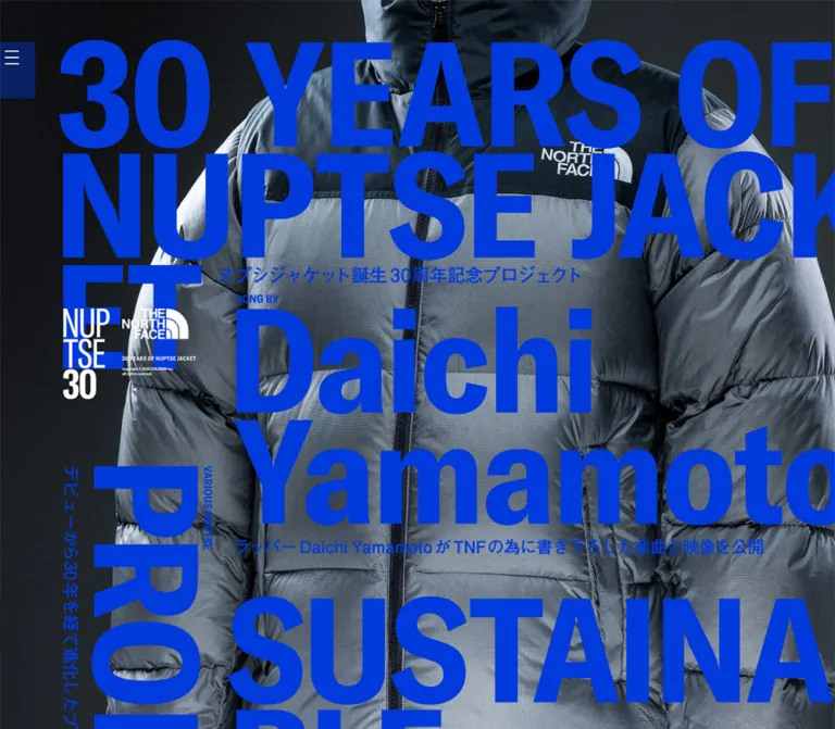
全面写真に巨大な欧文タイポグラフィを重ねた周年サイト。デスクトップは鮮やかな青と縦横に交差する文字、モバイルは白文字と縦一列の構成で、製品・音楽・歴史・人物の記事へ導きます。
THE NORTH FACE / 30 YEARS OF NUPTSE JACKET — Style Reference
A photographic anniversary index where monumental lettering becomes the navigation.
Original URL: thenorthface.jp/special/30yearsofnuptsejacket/ Final URL: thenorthface.jp/special/30yearsofnuptsejacket/ Theme: dark photographic canvas; electric-blue lettering in the desktop captures and white lettering in the mobile captures. Inspected: October 2, 2026, 01:54 JST; supplied retrieval timestamp: October 1, 2026, 16:54:44.838 UTC. Viewports: 1440 × 1000 desktop and 390 × 844 mobile, in CSS pixels. Scope: the current anniversary index, including its opening composition, seven editorial destinations, three photographic backgrounds, edge menu control, and anniversary branding. Evidence includes three desktop captures, two mobile captures, and rendered DOM measurements. Open-menu states, destination pages, hover states, and media playback were not inspected.
This page presents the Nuptse anniversary as an oversized photographic contents spread. A tightly cropped jacket, an exposed climbing scene, and stacked textile bales form a continuous background. Huge English titles sit directly on those photographs. Small uppercase qualifiers and short Japanese descriptions explain the destinations without introducing cards or separate content surfaces.
On desktop, saturated blue lettering forms an asymmetric composition. Most stories share an axis around 40% of the viewport width, while PRODUCTS and PORTRAIT rotate down the sides. The phone layout changes this arrangement substantially: white lettering, horizontal story titles, a consistent right-hand reading column, and a brand lockup near the lower left. The photography continues behind several links at once, so image boundaries and content boundaries deliberately do not coincide.
閉じる
THE NORTH FACE / 30 YEARS OF NUPTSE JACKET — Style Reference
A photographic anniversary index where monumental lettering becomes the navigation.
Original URL: thenorthface.jp/special/30yearsofnuptsejacket/ Final URL: thenorthface.jp/special/30yearsofnuptsejacket/ Theme: dark photographic canvas; electric-blue lettering in the desktop captures and white lettering in the mobile captures. Inspected: October 2, 2026, 01:54 JST; supplied retrieval timestamp: October 1, 2026, 16:54:44.838 UTC. Viewports: 1440 × 1000 desktop and 390 × 844 mobile, in CSS pixels. Scope: the current anniversary index, including its opening composition, seven editorial destinations, three photographic backgrounds, edge menu control, and anniversary branding. Evidence includes three desktop captures, two mobile captures, and rendered DOM measurements. Open-menu states, destination pages, hover states, and media playback were not inspected.
This page presents the Nuptse anniversary as an oversized photographic contents spread. A tightly cropped jacket, an exposed climbing scene, and stacked textile bales form a continuous background. Huge English titles sit directly on those photographs. Small uppercase qualifiers and short Japanese descriptions explain the destinations without introducing cards or separate content surfaces.
On desktop, saturated blue lettering forms an asymmetric composition. Most stories share an axis around 40% of the viewport width, while PRODUCTS and PORTRAIT rotate down the sides. The phone layout changes this arrangement substantially: white lettering, horizontal story titles, a consistent right-hand reading column, and a brand lockup near the lower left. The photography continues behind several links at once, so image boundaries and content boundaries deliberately do not coincide.
How to Read This Reference
- Measured means a value was supplied by the rendered DOM or computed-style evidence. Bounding rectangles describe the sampled elements, including any transforms; they do not necessarily reveal the original CSS declarations.
- Visual estimate means a size, position, or color was estimated from the supplied original-page captures. No pixel color sampling or source asset inspection was performed.
- Derived means simple arithmetic using measured values, such as the percentage position of a content axis.
- Recommended means an implementation choice for reuse. It is not a verified feature of the original website.
- Token names in this document are descriptive aliases. The only supplied source custom properties are Swiper defaults, which do not establish the visible campaign palette or prove that a carousel is active.
- The extracted visible text is empty even though lettering is clearly present in the captures. The presentation is consistent with graphic lettering, but its delivery as SVG, raster images, backgrounds, or another mechanism is unverified.
- No historical reconstruction is attempted. Anniversary wording does not establish when the currently served design was last changed.
Tokens — Colors
Default Palette
| Name | Value | Suggested token | Role and evidence |
|---|---|---|---|
| Campaign Blue | Approximately #0033DD |
--campaign-blue |
Visual estimate of the vivid desktop titles, qualifiers, and Japanese descriptions. The precise asset fill was not supplied. |
| Reversed White | Approximately #FFFFFF |
--campaign-white |
Visible mobile lettering, anniversary marks, and menu strokes. Screenshot-based estimate. |
| Canvas Black | #000000 |
--canvas-black |
Measured body background at both viewports; also a suitable fallback while photographs load. |
| Jacket Silver | Approximately #89959F |
--photo-silver |
Representative photographic midtone, not a flat interface surface or measured CSS token. |
| Rock Brown | Approximately #79684C |
--photo-rock |
Representative climbing-image color, not a UI accent. |
| Menu Blue Veil | Dark, translucent blue | --menu-fill |
Visually estimated rectangular backing behind the white menu strokes. Exact color and opacity are unknown. |
The page's strongest color relationship is saturated lettering against low-saturation photography. The photographs retain their own colors: cool gray nylon, dark equipment, warm stone, blue mountains, and muted textile wrappers. They are not uniformly monochrome.
Do not substitute the sampled anchor color rgb(0, 0, 238) for the campaign blue. That value belongs to anchor containers in the DOM evidence and does not describe the large rendered artwork. Likewise, --swiper-theme-color: #007aff is a library variable, not evidence of the visible title color.
Responsive Color Treatment
| Captured state | Main lettering | Brand marks and menu strokes | Background |
|---|---|---|---|
| Desktop, 1440 × 1000 | Electric blue | White | Full-width photographs over black |
| Mobile, 390 × 844 | White | White | The same sequence of photographic subjects, with different crops and vertical allocation |
This is an observed difference between viewport captures. A user-selectable theme control was not observed, and the breakpoint or mechanism responsible for the color change was not supplied.
Tokens — Typography
Source Text Stack
The measured body stack begins with Helvetica, heisei-kaku-gothic-std and continues through Hiragino, Yu Gothic, Meiryo, MS PGothic, Arial, Verdana, and generic sans-serif fallbacks. These are declared families, not proof that every font loaded or rendered.
| Measured property | Desktop | Mobile |
|---|---|---|
| Root font size | 10px |
10px |
| Body font size | 14px |
11px |
| Body weight | 500 |
500 |
| Body line height | 28px |
19.25px |
| Body letter spacing | normal |
normal |
| H1 container font size | 28px |
22px |
| H1 container weight | 700 |
700 |
| H1 container line height | 56px |
38.5px |
The H1 container values do not explain the giant visible anniversary title. Its rendered graphic occupies approximately 1162 × 475px on desktop and 378 × 155px on mobile. Copying font-size: 28px would therefore reproduce neither its scale nor its character.
Display Lettering
The visible English lettering is extremely heavy, compact, and sans-serif, with tight line stacking. Uppercase category names coexist with mixed-case personal names. It has the visual character of a bold condensed grotesk, but the exact display typeface is not identified by the evidence.
Preserve the deliberate breaks:
30 YEARS OF/NUPTSE JACK/ETin the masthead.Daichi/Yamamoto.SUSTAINA/BLE.Conrad/Anker.CELEB/RATION.
These splits shape the composition. They are not ordinary paragraph wrapping and should not be replaced by automatic balanced text without checking the result.
Type Scale
| Role | Desktop visual estimate | Mobile visual estimate | Treatment |
|---|---|---|---|
| Anniversary title | Roughly 150–155px visible capital height | Roughly 48–51px visible capital height | Three tightly stacked lines, with intentional edge pressure |
| Primary story titles | Similar monumental scale to the masthead | Roughly 48–51px visible capital height | One or two lines; some titles extend beyond the right edge |
| Approximate live-text equivalent | Around 200px |
Around 64–68px |
Recommendation only; depends strongly on the chosen font |
| Japanese descriptions | Approximately 23–25px visually |
Approximately 11–12px visually |
Short, dense explanatory lines; often part of a graphic grouping |
| Uppercase qualifiers | Approximately 14–16px visually |
Often only 4–6px visually |
Small labels such as SONG BY and WITH ARTISTS |
| Brand microcopy | Very small | Very small | Part of the supplied identity artwork; exact size unavailable |
Visible letter height is not CSS font size. Use these estimates to judge proportions, not to assert source declarations.
Recommended: use approved lettering artwork where available. For editable text, choose a licensed heavy condensed sans-serif and compare its glyph widths against the composition. The Quick Start uses a system sans-serif approximation and does not claim to identify the original display font.
Tokens — Spacing & Shapes
The layout is governed by large artwork dimensions and offset axes rather than a conventional card-spacing system. Almost every visible edge is square. Photographs, type, and the small menu rectangle supply the structure.
Spacing Scale
| Use | Value | Evidence status |
|---|---|---|
| Desktop H1 left inset | 108px |
Measured; exactly 7.5% of the inspected width |
| Desktop H1 top inset | 56.5px |
Measured |
| Mobile H1 left inset | 23.39px |
Measured; approximately 6% of the inspected width |
| Mobile H1 top inset | 28px |
Measured |
| Desktop main reading axis | Approximately 580–584px |
Measured graphic-link positions; around 40.5% of viewport width |
| Mobile main reading axis | 115.36px |
Measured inline-link x-position; approximately 29.6% of viewport width |
| Desktop section bottom padding | 160px |
Measured computed padding |
| Desktop section left padding | 108px |
Measured computed padding |
| Mobile section padding | 0px |
Measured; child positioning creates the visible inset |
| Mobile inter-story breathing room | Approximately 18–25px |
Visual estimate; exact gaps vary with qualifiers and descriptions |
| Menu top position | About 60px desktop, 30px mobile |
Visual estimate, consistent across the respective scroll captures |
Border Radius
| Element | Observed treatment |
|---|---|
| Photographs | Square, full-width boundaries |
| Story links | No enclosing surface or visible radius |
| Menu backing | Square rectangle |
| Anniversary artwork | Unboxed white marks |
There is no observed general system of pills, rounded cards, drop shadows, or elevated panels.
Layout Measurements
| Element | Desktop | Mobile |
|---|---|---|
| Document height | 2462.39px |
1302.03px |
| Header bounds | 1440 × 531.39px |
390 × 182.75px |
| H1 bounds | x 108, y 56.5, w 1161.5, h 474.89 |
x 23.39, y 28, w 377.64, h 154.75 |
| Main start | y 424.89px |
y 159.05px |
| Header/main overlap | 106.5px, derived |
23.70px, derived |
| Main section display | flex |
block |
| Daichi graphic-link bounds | Approximately x 580.10, y 424.89, w 889.86, h 374.67 |
Inline anchor bounds do not measure the full visible title |
| Rotated PRODUCTS bounds | Approximately x 334.97, y 672.07, w 214.14, h 933 |
Presented horizontally in the screenshot |
| Rotated PORTRAIT bounds | Approximately x 1226.77, y 1417.56, w 222.83, h 859.51 |
Presented horizontally in the screenshot |
Some mobile inline anchors report only 13px of height despite their much larger visible lettering. Do not treat these line boxes as the full artwork dimensions or as verified pointer-target sizes.
The mobile H1's measured right edge is approximately 401px, beyond the 390px viewport. Several desktop graphic bounds also extend past the viewport. This supports the visible edge cropping; it does not establish whether horizontal scrolling is enabled.
Components
Photographic Page Canvas
Role: gives the entire index a tactile product and expedition context.
Three large photographic fields sit behind the navigation composition:
- A gray and black Nuptse jacket, closely cropped around the body, zip, baffles, and chest logo.
- A climber and equipment against a large rock face, with a mountain range visible through the opening.
- Stacked fabric-wrapped bales, with creased surfaces, ties, frayed edges, and muted yellow accents.
The backgrounds span the viewport without card gutters. A title can begin over one photograph and finish over another. Do not assign one independent image card to each destination: seven story links share three background scenes.
The photographs appear dark enough to support superimposed lettering, but the evidence does not distinguish original image grading from a separate dark overlay.
Anniversary Masthead
Role: identifies the project and establishes the page's scale immediately.
A three-line graphic title starts near the upper left, with the final ET forming a short third line. The Japanese anniversary descriptor sits beside that short line, rather than underneath the entire heading in a standard centered subtitle arrangement.
On desktop, the H1 begins at x 108px and y 56.5px. On mobile, it begins at x 23.39px and y 28px, while its right edge extends slightly beyond the viewport. The first story begins before the header's measured block has ended, producing a deliberately interlocking composition.
Keep the title, Japanese descriptor, first story, and brand marks as separate elements. Their overlap is part of the layout, not a reason to flatten the whole page into one inaccessible screenshot.
Editorial Story Link
Role: combines destination, topic, and visual identity in one oversized navigation unit.
The recurring anatomy is:
- A very small uppercase qualifier, placed above or below the title depending on the story.
- A dominant English name or category title.
- A short Japanese description.
- A link destination corresponding to the story topic.
There is no separate pill CTA, arrow button, card border, or shaded container in the inspected index. The lettering itself is the primary invitation to navigate.
The following destination suffixes are present under the inspected index URL. Their pages were not opened.
| Visible title | Qualifier | Destination suffix | Specific composition |
|---|---|---|---|
| Daichi Yamamoto | SONG BY | daichi/ |
Large two-line artist name; description below explains the commissioned music and video |
| PRODUCTS | VARIOUS NUPTSE | product/ |
Rotated side link on desktop; horizontal entry after Daichi on mobile |
| SUSTAINA / BLE | QUALITY | sustainable/ |
Two-line title with description beside the short second line |
| HISTORY | OF NUPTSE | history/ |
Single-line title; qualifier and historical description below |
| Conrad Anker | INTERVIEW WITH | interview/ |
Two-line personal name; athlete interview description beneath |
| PORTRAIT | OF PEOPLE WITH NUPTSE JACKET | portrait/ |
Right-side rotated desktop link; ordinary horizontal mobile entry |
| CELEB / RATION | WITH ARTISTS | celebration/ |
Two-line closing title; description concerns anniversary commemorative items |
Daichi Yamamoto Feature
The first feature starts around x 580px, y 425px on desktop. SONG BY is tiny relative to the name, and the second line stretches beyond the right edge of the capture. A single Japanese line follows the title on desktop; the phone version wraps the description into a compact block.
The desktop graphic-link rectangle is approximately 890 × 375px. Its size demonstrates the page's hierarchy: one navigation entry is larger than many conventional hero panels, but it has no independent surface.
Rotated Side Links
PRODUCTS runs downward to the left of the main editorial axis. PORTRAIT forms a similar vertical intervention at the far right. Both use rotated horizontal lettering, accompanied by small qualifiers and Japanese descriptions.
Their measured transformed bounds are tall and narrow: about 214 × 933px for PRODUCTS and 223 × 860px for PORTRAIT. These are not ordinary vertical Japanese text columns.
On mobile, both return to horizontal reading. Preserve their semantic positions in the seven-item sequence even if desktop layout places them beside other stories.
Sustainable Materials Feature
The title splits into SUSTAINA and BLE. Its short second line leaves room for the Japanese description to sit to the right, close to the baseline area. QUALITY appears beneath the title block.
This is a useful reusable composition: a long first line, a short second line, and small explanatory text occupying the remaining lower-right space. Treat it as a designed title group rather than letting the caption fall arbitrarily beneath both lines.
History and Interview Features
HISTORY serves as a broad horizontal anchor near the transition into the climbing photograph. Conrad Anker follows with a two-line name, a small INTERVIEW WITH qualifier above, and a short description below.
The climbing image provides depth and human scale behind the typography. Neither feature receives its own image crop, container, or divider.
Celebration Feature
CELEB / RATION closes the main sequence. On desktop, its lower description crosses into the textile-bale photograph. On mobile, the title and description sit fully over that final photographic field, leaving substantial image area below for the brand lockup.
Keep the unusual word split. A compact single-line CELEBRATION label would lose the block-like ending of the page.
Edge Menu Control
A small blue-backed rectangle touches the left edge of the viewport. Three thin white horizontal strokes identify the menu.
The visible backing is approximately 50 × 80px on desktop and 30 × 52px on mobile. Desktop strokes are around 20px wide; mobile strokes appear around 12px wide. These are visual estimates, not measured button hit areas.
Its position stays near y 60px across the desktop scroll captures and y 30px across the mobile captures, consistent with viewport anchoring. The actual positioning declaration and open-state behavior were not supplied.
The DOM contains an additional set of navigation links. Some desktop entries have negative y coordinates. Their presence does not prove that the menu was open or visible, so no expanded-menu design is asserted here.
Anniversary Brand Lockup
White anniversary lettering and THE NORTH FACE branding remain visually separate from the blue desktop editorial layer. Desktop captures show a broad combined lockup in the left rail; mobile uses a narrower vertical arrangement near the lower left.
The desktop mark appears higher in the opening capture and near the lower left in later captures. The evidence is insufficient to identify its exact sticky, fixed, animated, or scroll-dependent positioning rule. Preserve its visual hierarchy without inventing that behavior.
Use approved brand artwork. Do not approximate the brand symbol or anniversary lettering with ordinary text and geometric shapes.
Tokens — Motion & Interaction
| Treatment | Evidence | Implementation consequence |
|---|---|---|
| Vertical browsing | Successive desktop and mobile captures reveal later stories and photographic fields | Build a vertically navigable document with all seven entries reachable |
| Story navigation | Seven destination routes and a home route are present in the DOM | Use real links with meaningful accessible names |
| Viewport-anchored menu appearance | Menu remains at the same visible top position across captures | A fixed control is a reasonable implementation recommendation, not a confirmed source declaration |
| CSS animation on sampled elements | Sampled elements report animation: none |
No specific keyframes or timing can be recovered from these samples |
| Transition samples | Evidence contains transition: all without a usable duration/easing sequence |
Do not infer a visible transition from the property name alone |
| Menu opening and closing | Not exercised | Open-state layout, duration, easing, focus behavior, and dismissal remain unknown |
| Hover and focus | Not captured | Any proposed response must be labeled as an addition |
| Parallax or background transforms | Not established by static scroll captures | Do not prescribe scroll-speed ratios or pinning timelines as source behavior |
| Music or video playback | Referenced by the Daichi story copy, not observed on this index | Do not add autoplay or media controls based on that reference |
The supplied capture procedure waited for document loading, image decoding, and sampled visual stability. Perpetual animations were temporarily paused during readiness checks and resumed afterward. This improves capture reliability but does not establish that the page has no motion, delayed states, or script-driven interactions.
Recommended motion approach: begin with a stable photographic index. If adding hover feedback, underline the short description or provide another restrained response. Introduce larger transitions only after separately validating their behavior and reduced-motion alternatives.
Surfaces
| Layer | Appearance | Purpose |
|---|---|---|
| Base canvas | Measured solid black | Prevents bright gaps around or before images |
| Background fields | Full-width photographs with square boundaries | Establish product, expedition, and material context |
| Editorial layer | Blue desktop lettering; white mobile lettering | Provides the main navigation and visual structure |
| Brand layer | White logo and anniversary graphics | Maintains identity independently of the editorial titles |
| Menu backing | Small translucent-looking blue rectangle | Makes the edge control recognizable over changing imagery |
There is no visible card elevation hierarchy. Separation comes from title orientation, scale, alignment, and changes in photographic subject.
Imagery
The photography should feel physical rather than decorative. The first scene emphasizes nylon sheen, quilting seams, a zip, and the volume of insulation. The second combines a nearby climber and equipment with distant mountain space. The last emphasizes compression, creases, fabric edges, and repeated wrapped forms.
The images are tightly cropped and sometimes partially obscured by type. This is intentional: the viewer reads the material and setting through the typography. Preserve useful subject fragments rather than forcing every complete object into view.
Observed Asset References
No image source URLs, filenames, SVG paths, or font files were supplied. The following references identify visible subjects, not retrievable asset paths.
| Visible asset | Evidence location | Reuse guidance |
|---|---|---|
| Gray Nuptse jacket close-up | Opening desktop and mobile captures | Use a large portrait-like crop with clear baffle texture and dark surrounding areas |
| Climbing wall and mountain scene | Middle desktop and mobile captures | Preserve both the nearby human activity and distant landscape |
| Stacked textile bales | Lower desktop and mobile captures | Keep the repeated shapes, creases, and subdued colors visible |
| Anniversary and brand lockups | Left rail on desktop; lower left on mobile | Use authorized identity assets with correct proportions |
| Giant title graphics | Throughout the index | Asset format and display font are unknown; do not invent source filenames |
The exact material content and processing stage shown in the bale photograph are not established by the capture. Its visual role can be described without assuming a particular recycling process.
Layout & Responsive Behavior
Desktop Composition
At 1440px width, the masthead begins at 7.5% of the viewport. The main horizontal stories begin much farther right, near 40.5%. PRODUCTS occupies a rotated column between those axes. PORTRAIT sits at the far right and is partially cropped by the viewport.
This is an asymmetric editorial arrangement, not a centered maximum-width content column. Large letterforms exceed their local reading space, and the first story overlaps the header's vertical extent.
From the screenshots, the jacket-to-climbing boundary is approximately 1306px down the document, and the climbing-to-bales boundary is approximately 2267px down. These are visual estimates obtained by aligning the scroll captures, not measured image-element bounds.
Mobile Composition
At 390px width, the masthead starts around 6% from the left edge. The seven stories form one vertical sequence beginning around x 115px, or 29.6% of the viewport. That substantial left photographic rail remains even on a narrow phone.
The order is Daichi Yamamoto, PRODUCTS, SUSTAINABLE, HISTORY, Conrad Anker, PORTRAIT, and CELEBRATION. All titles read horizontally. Large lettering still presses against or extends beyond the right edge; the layout does not simply shrink every title until it fits.
The jacket photograph ends at approximately document y 432px, and the climbing photograph ends near y 708px. The textile-bale image therefore occupies much more of the mobile page than the short strip visible at the bottom of the desktop page. These are screenshot estimates, not source CSS percentages.
The mobile document is approximately 1302px tall, allowing the second 844px capture to show the lower content and brand lockup. A tall phone does not turn the page into a sequence of full-height slides.
Responsive Comparison
| Property | Desktop observation | Mobile observation |
|---|---|---|
| Editorial color | Blue | White |
| Main story arrangement | Horizontal titles plus two rotated side links | One vertical sequence of horizontal titles |
| Main reading axis | About 40.5% from the left | About 29.6% from the left |
| Masthead inset | 108px | 23.39px |
| Photography | Long jacket and climbing fields; short final bale strip | Shorter opening fields; much taller final bale field |
| Anniversary lockup | Broad arrangement in the left rail | Narrow vertical arrangement near the bottom left |
| Right-edge clipping | Present | Present |
Only two viewport widths were inspected. The exact breakpoint, intermediate tablet behavior, landscape layout, and safe-area handling are unknown. The Quick Start chooses 768px as an adaptation breakpoint; this is not a recovered source value.
Do’s and Don’ts
Do
- Treat the page as a photographic editorial index with seven destinations.
- Make oversized lettering the main navigation device.
- Preserve blue desktop lettering and white mobile lettering as observed endpoint treatments.
- Keep the jacket, climbing scene, and textile imagery continuous behind multiple stories.
- Retain deliberate word breaks and close line stacking.
- Use rotated PRODUCTS and PORTRAIT treatments on wide screens when reproducing this composition.
- Keep the phone's left photographic rail and offset reading axis.
- Maintain the contrast between monumental titles, tiny qualifiers, and short Japanese descriptions.
- Use square image boundaries and unboxed links.
- Keep complete semantic labels available even where decorative lettering is cropped.
Don’t
- Don't replace the index with product cards, prices, ratings, and purchase buttons.
- Don't give each story a separate rounded image tile.
- Don't center every title or normalize the composition into equal columns.
- Don't treat sampled 28px H1 styling as the visible display scale.
- Don't identify an exact display typeface from the body font stack.
- Don't mistake library blue or browser anchor blue for the campaign artwork color.
- Don't assume the menu has a particular animation, overlay, or focus trap.
- Don't describe the background as parallax without motion evidence.
- Don't infer autoplay from the music-story description.
- Don't copy tiny mobile qualifiers without evaluating legibility in a new implementation.
Recommended Implementation Additions
These are recommendations for a new implementation, not verified original features:
- Give every image-based title a complete accessible name and retain a logical heading hierarchy.
- Make each full story grouping keyboard-operable as one link. Check the actual hit region rather than relying on a small inline anchor rectangle.
- Keep DOM reading order consistent with the mobile sequence, even when desktop items are rotated or repositioned.
- Provide a clearly visible focus state over all three photographs. A small opaque backing behind the focused description can help where the image is bright.
- Preserve the narrow visual menu tab while making its interactive target at least 44 × 44px.
- Increase micro-label sizes where they convey essential information. The observed miniature labels should not be the sole source of meaning.
- Keep right-edge clipping within decorative title layers. Descriptions, focus indicators, and expanded navigation should remain reachable.
- Add accessible expanded-state and dismissal behavior when implementing the menu; its original behavior is unknown.
- Use responsive image sources and explicit image dimensions. Prioritize the opening photograph and avoid unnecessarily loading all large image variants at once.
- Provide reduced-motion behavior for any newly added animation and keep navigation usable without it.
Agent Prompt Guide
Quick Color Reference
- Desktop editorial ink: approximately
#0033DD; visual estimate, not an extracted source fill. - Mobile editorial ink: white.
- Base canvas: measured
#000000. - Brand marks and menu strokes: white.
- Photography: cool jacket gray, dark equipment, warm rock, blue mountains, and muted textile colors.
- Menu backing: restrained translucent-looking blue.
- Surface treatment: no cards, soft shadows, glossy gradients, or rounded content panels.
Overall Prompt
“Create a photographic anniversary contents page inspired by THE NORTH FACE's 30 YEARS OF NUPTSE JACKET index. Place monumental, heavy sans-serif English lettering directly over three full-width photographic fields: a close-up technical jacket, an exposed climbing scene, and stacked textile bales. Use vivid blue lettering on desktop and white lettering on mobile. Offset the desktop reading axis to about 40% of the viewport and rotate PRODUCTS and PORTRAIT down the sides. On mobile, restore all seven stories to horizontal reading in one column beginning near 30% of the viewport width. Preserve unusually tight line spacing, deliberate word splits, small uppercase qualifiers, short Japanese descriptions, square edges, a narrow left-edge menu tab, and separate white anniversary branding. Keep the layout navigational and editorial, with complete accessible link names.”
Example Component Prompts
- Masthead: “Build a three-line anniversary masthead reading 30 YEARS OF / NUPTSE JACK / ET. Use extremely large, tightly stacked heavy lettering. Place a small Japanese project descriptor beside the short final line. Let the first story overlap the masthead's vertical extent while keeping separate semantic elements.”
- Artist story: “Create an unboxed photographic story link with a tiny SONG BY qualifier, a two-line Daichi / Yamamoto title, and a short Japanese description. The title should dominate the frame and may crop at the right edge; keep its full accessible name.”
- Rotated category: “Create a desktop PRODUCTS link rotated clockwise down the left side of the main editorial axis, with a small qualifier and description. Return it to horizontal reading in the mobile sequence without changing DOM order.”
- Split-word feature: “Set SUSTAINA above BLE in monumental type. Place the small descriptive text beside BLE and QUALITY beneath the title. Keep the photograph visible through all surrounding space.”
- Mobile index: “Use white display lettering over dark photography, a masthead inset of roughly 6%, and a story column beginning at roughly 30%. Preserve seven ordered links, controlled decorative edge cropping, and a small vertical brand lockup near the lower left. Avoid individual cards.”
Quick Start
CSS Custom Properties
This is a runnable layout approximation, not recovered source CSS. It uses a conventional root font size, viewport-derived lengths, and editable system text. The blue, photographic band proportions, menu opacity, and breakpoint are estimates or recommendations. Mobile micro-labels and descriptions are intentionally enlarged for readability, so text flow may produce a taller page than the capture.
Supply authorized photographs and identity artwork. The badge positioning below approximates the opening desktop placement; its original scroll behavior remains unverified. Menu behavior requires a separate implementation.
:root {
  /* Measured base and visually estimated editorial colors */
  --canvas-black: #000000;
  --campaign-blue: #0033dd;
  --campaign-white: #ffffff;
  --editorial-ink: var(--campaign-blue);
  --menu-fill: rgb(0 51 221 / 38%);

  /* Declared body families; display use is an approximation */
  --font-body: Helvetica, heisei-kaku-gothic-std,
    'Hiragino Kaku Gothic Pro', YuGothic, Meiryo,
    'MS PGothic', Arial, Verdana, sans-serif;
  --font-display: Helvetica, Arial, sans-serif;

  /* Adaptation unit: 1px at the inspected desktop width */
  --u: calc(100vw / 1440);
  --page-height: calc(2462.4 * var(--u));
  --display-size: calc(200 * var(--u));
  --display-leading: 0.81;
  --label-size: calc(14 * var(--u));
  --copy-size: calc(24 * var(--u));
  --focus-width: 2px;
}

* {
  box-sizing: border-box;
}

body {
  margin: 0;
  background: var(--canvas-black);
  font-family: var(--font-body);
}

.nuptse-page {
  position: relative;
  isolation: isolate;
  min-height: var(--page-height);
  overflow-x: clip;
  color: var(--editorial-ink);
}

.photo-fields {
  position: absolute;
  inset: 0;
  z-index: -1;
  display: grid;
  /* Estimated from the supplied desktop captures */
  grid-template-rows: 53% 39% 8%;
  pointer-events: none;
}

.photo-field {
  min-height: 0;
  overflow: hidden;
  background: var(--canvas-black);
}

.photo-field img {
  display: block;
  width: 100%;
  height: 100%;
  object-fit: cover;
}

.photo-field--jacket img {
  object-position: 55% center;
}

.photo-field--climbing img {
  object-position: center;
}

.photo-field--bales img {
  object-position: center;
}

.masthead {
  position: absolute;
  top: calc(56.5 * var(--u));
  left: calc(108 * var(--u));
  width: calc(1161.5 * var(--u));
  margin: 0;
  font-family: var(--font-display);
  font-size: var(--display-size);
  font-weight: 900;
  line-height: var(--display-leading);
  letter-spacing: -0.045em;
}

.display-art {
  display: block;
  white-space: nowrap;
}

.masthead-note {
  position: absolute;
  top: calc(385 * var(--u));
  left: calc(330 * var(--u));
  margin: 0;
  font-size: var(--copy-size);
  font-weight: 700;
  line-height: 1.2;
}

.story {
  position: absolute;
  display: block;
  color: inherit;
  text-decoration: none;
  transform-origin: top left;
}

.story h2 {
  margin: 0;
  font-family: var(--font-display);
  font-size: var(--display-size);
  font-weight: 900;
  line-height: var(--display-leading);
  letter-spacing: -0.045em;
}

.kicker {
  display: block;
  font-size: var(--label-size);
  font-weight: 800;
  line-height: 1;
}

.story-copy {
  margin: calc(12 * var(--u)) 0 0;
  font-size: var(--copy-size);
  font-weight: 700;
  line-height: 1.2;
}

.story--daichi {
  left: calc(584 * var(--u));
  top: calc(425 * var(--u));
  width: calc(890 * var(--u));
}

.story--product {
  left: calc(549 * var(--u));
  top: calc(672 * var(--u));
  width: calc(933 * var(--u));
  transform: rotate(90deg);
}

.story--sustainable {
  left: calc(576 * var(--u));
  top: calc(860 * var(--u));
  width: calc(870 * var(--u));
}

.story--sustainable .story-copy {
  position: absolute;
  left: calc(324 * var(--u));
  top: calc(278 * var(--u));
  width: calc(450 * var(--u));
}

.story--history {
  left: calc(584 * var(--u));
  top: calc(1226 * var(--u));
  width: calc(743 * var(--u));
}

.story--interview {
  left: calc(584 * var(--u));
  top: calc(1489 * var(--u));
  width: calc(598 * var(--u));
}

.story--portrait {
  left: calc(1450 * var(--u));
  top: calc(1418 * var(--u));
  width: calc(860 * var(--u));
  transform: rotate(90deg);
}

.story--celebration {
  left: calc(580 * var(--u));
  top: calc(1925 * var(--u));
  width: calc(655 * var(--u));
}

.brand-lockup {
  position: absolute;
  left: calc(108 * var(--u));
  top: calc(444 * var(--u));
  width: calc(180 * var(--u));
}

.brand-lockup img {
  display: block;
  width: 100%;
  height: auto;
}

.edge-menu {
  position: fixed;
  z-index: 10;
  top: 60px;
  left: 0;
  width: 50px;
  height: 80px;
  padding: 0;
  border: 0;
  border-radius: 0;
  color: white;
  background: transparent;
  cursor: pointer;
}

.edge-menu::before {
  position: absolute;
  inset: 0;
  content: '';
  background: var(--menu-fill);
}

.edge-menu span {
  position: absolute;
  left: 7px;
  width: 20px;
  height: 2px;
  background: currentColor;
}

.edge-menu span:nth-child(1) { top: 12px; }
.edge-menu span:nth-child(2) { top: 21px; }
.edge-menu span:nth-child(3) { top: 30px; }

/* Recommended feedback; original states were not captured */
.story:focus-visible,
.edge-menu:focus-visible,
.brand-lockup:focus-visible {
  outline: var(--focus-width) solid white;
  outline-offset: 4px;
}

@media (hover: hover) {
  .story:hover .story-copy {
    text-decoration: underline;
    text-underline-offset: 0.2em;
  }
}

/* Chosen adaptation breakpoint, not a source measurement */
@media (max-width: 767px) {
  :root {
    --u: calc(100vw / 390);
    --page-height: calc(1302 * var(--u));
    --editorial-ink: var(--campaign-white);
    --display-size: calc(65 * var(--u));
    --label-size: max(8px, calc(4.5 * var(--u)));
    --copy-size: max(12px, calc(11 * var(--u)));
  }

  .photo-fields {
    /* Estimated mobile photographic allocation */
    grid-template-rows: 33.18% 21.2% 45.62%;
  }

  .masthead {
    top: calc(28 * var(--u));
    left: calc(23.39 * var(--u));
    width: calc(377.64 * var(--u));
  }

  .masthead-note {
    top: calc(136 * var(--u));
    left: calc(93 * var(--u));
    max-width: calc(285 * var(--u));
    font-size: max(8px, calc(7 * var(--u)));
  }

  .stories {
    display: flex;
    flex-direction: column;
    gap: calc(20 * var(--u));
    padding-top: calc(159 * var(--u));
    padding-left: calc(115.36 * var(--u));
    padding-right: calc(12 * var(--u));
  }

  .story {
    position: relative;
    top: auto;
    left: auto;
    width: 100%;
    transform: none;
  }

  .story-copy {
    margin-top: calc(6 * var(--u));
    overflow-wrap: anywhere;
  }

  .story--sustainable .story-copy {
    left: calc(106 * var(--u));
    top: calc(71 * var(--u));
    width: calc(155 * var(--u));
    margin: 0;
  }

  .brand-lockup {
    position: static;
    display: block;
    width: calc(82 * var(--u));
    margin: calc(65 * var(--u)) 0 calc(70 * var(--u))
      calc(22 * var(--u));
  }

  .edge-menu {
    top: 30px;
    width: 44px;
    height: 52px;
  }

  .edge-menu::before {
    right: auto;
    width: 30px;
  }

  .edge-menu span {
    left: 5px;
    width: 12px;
    height: 1px;
  }

  .edge-menu span:nth-child(1) { top: 9px; }
  .edge-menu span:nth-child(2) { top: 14px; }
  .edge-menu span:nth-child(3) { top: 19px; }
}
Minimal Markup Pattern
The uppercase image values below are replacement placeholders, not original asset paths. Use the class names from the CSS for all seven stories. The example preserves actual source wording where shown; each link receives a full accessible label independent of the visual line breaks.
<main class='nuptse-page'>
  <div class='photo-fields' aria-hidden='true'>
    <div class='photo-field photo-field--jacket'>
      <img src='YOUR_LICENSED_JACKET_IMAGE' alt=''>
    </div>
    <div class='photo-field photo-field--climbing'>
      <img src='YOUR_LICENSED_CLIMBING_IMAGE' alt=''>
    </div>
    <div class='photo-field photo-field--bales'>
      <img src='YOUR_LICENSED_BALES_IMAGE' alt=''>
    </div>
  </div>

  <h1 class='masthead' aria-label='30 years of Nuptse Jacket'>
    <span class='display-art' aria-hidden='true'>
      30 YEARS OF<br>NUPTSE JACK<br>ET
    </span>
  </h1>
  <p class='masthead-note' lang='ja'>
    ヌプシジャケット誕生30周年記念プロジェクト
  </p>

  <nav class='stories' aria-label='Anniversary stories'>
    <a class='story story--daichi'
       href='/special/30yearsofnuptsejacket/daichi/'
       aria-label='Daichi Yamamoto: song and video'>
      <span class='kicker'>SONG BY</span>
      <h2><span class='display-art'>Daichi<br>Yamamoto</span></h2>
      <p class='story-copy' lang='ja'>
        ラッパー Daichi Yamamoto が TNFの為に書き下ろした楽曲と映像を公開
      </p>
    </a>

    <a class='story story--product'
       href='/special/30yearsofnuptsejacket/product/'
       aria-label='Products: Nuptse collection'>
      <span class='kicker'>VARIOUS NUPTSE</span>
      <h2><span class='display-art'>PRODUCTS</span></h2>
      <p class='story-copy' lang='ja'>
        デビューから30年を経て進化したプロダクトラインナップ
      </p>
    </a>

    <a class='story story--sustainable'
       href='/special/30yearsofnuptsejacket/sustainable/'
       aria-label='Sustainable materials'>
      <h2><span class='display-art'>SUSTAINA<br>BLE</span></h2>
      <span class='kicker'>QUALITY</span>
      <p class='story-copy' lang='ja'>
        持続可能な未来へ繋ぐ進化したマテリアル
      </p>
    </a>

    <a class='story story--history'
       href='/special/30yearsofnuptsejacket/history/'
       aria-label='History of Nuptse'>
      <h2><span class='display-art'>HISTORY</span></h2>
      <span class='kicker'>OF NUPTSE</span>
      <p class='story-copy' lang='ja'>
        1992年に誕生したヌプシジャケットの歴史を紐解く
      </p>
    </a>

    <a class='story story--interview'
       href='/special/30yearsofnuptsejacket/interview/'
       aria-label='Interview with Conrad Anker'>
      <span class='kicker'>INTERVIEW WITH</span>
      <h2><span class='display-art'>Conrad<br>Anker</span></h2>
      <p class='story-copy' lang='ja'>
        TNFアスリート コンラッド・アンカーのインタビュー
      </p>
    </a>

    <a class='story story--portrait'
       href='/special/30yearsofnuptsejacket/portrait/'
       aria-label='Portraits of people with Nuptse Jacket'>
      <h2><span class='display-art'>PORTRAIT</span></h2>
      <span class='kicker'>OF PEOPLE WITH NUPTSE JACKET</span>
      <p class='story-copy' lang='ja'>
        様々な業界やフィールドで探求を続ける人々とヌプシジャケットのポートレイト
      </p>
    </a>

    <a class='story story--celebration'
       href='/special/30yearsofnuptsejacket/celebration/'
       aria-label='Celebration with artists'>
      <h2><span class='display-art'>CELEB<br>RATION</span></h2>
      <span class='kicker'>WITH ARTISTS</span>
      <p class='story-copy' lang='ja'>
        ヌプシジャケット誕生30周年を記念して制作されたノベルティ
      </p>
    </a>
  </nav>

  <a class='brand-lockup'
     href='/special/30yearsofnuptsejacket/'
     aria-label='30 years of Nuptse Jacket home'>
    <picture>
      <source media='(max-width: 767px)'
              srcset='YOUR_APPROVED_VERTICAL_LOCKUP'>
      <img src='YOUR_APPROVED_DESKTOP_LOCKUP'
           alt='THE NORTH FACE — Nuptse 30'>
    </picture>
  </a>
</main>
The .edge-menu styles are provided separately from this markup. Add the control only when its navigation panel, expanded state, keyboard behavior, and dismissal are implemented. The observed index alone does not specify those details.
Tailwind v4 Token Mapping
Optional mapping for a project already using Tailwind v4. This does not imply that the original website uses Tailwind. Define the custom properties above first.
@theme inline {
  --color-campaign: var(--editorial-ink);
  --color-campaign-blue: var(--campaign-blue);
  --color-campaign-white: var(--campaign-white);
  --color-canvas: var(--canvas-black);

  --font-body: Helvetica, heisei-kaku-gothic-std,
    'Hiragino Kaku Gothic Pro', YuGothic, Meiryo,
    Arial, sans-serif;
  --font-display: Helvetica, Arial, sans-serif;

  --text-monumental: var(--display-size);
  --text-qualifier: var(--label-size);
  --text-story-copy: var(--copy-size);

  --spacing-art-unit: var(--u);
  --radius-editorial: 0px;
}
Sources & Evidence
- Current original page: supplied HTTP status
200; final URL is identical to the requested URL. The document title is30 YEARS OF NUPTSE JACKET|THE NORTH FACE. - Capture time: October 1, 2026, 16:54:44.838 UTC, equivalent to October 2, 2026, 01:54:44.838 JST.
- Desktop evidence: three original-page captures at 1440 × 1000 CSS pixels, covering the opening, middle, and lower composition; measured document height approximately 2462.39px.
- Mobile evidence: two original-page captures at 390 × 844 CSS pixels, covering the opening and lower composition; measured document height approximately 1302.03px.
- Rendered DOM and computed styles: body background, body and H1 font declarations, element rectangles, section display and padding, destination links, sampled transition and animation fields, and two Swiper custom properties.
- Observed navigation evidence: seven editorial destination URLs and the index home URL. Destination content and resulting navigation behavior were not inspected.
- Inspection limitations: no raw stylesheet, image source list, font files, exact display-art fills, open-menu capture, hover/focus capture, motion recording, media playback, or intermediate viewport evidence was supplied. Static captures cannot establish parallax, timing, or the brand lockup's scroll behavior. No additional browsing or asset retrieval was performed for this reference.
Measurements in this document describe the supplied current-page inspection. Screenshot estimates, editable-text substitutions, accessibility additions, and implementation code are explicitly separate from verified source values.
# THE NORTH FACE / 30 YEARS OF NUPTSE JACKET — Style Reference

> A photographic anniversary index where monumental lettering becomes the navigation.

**Original URL:** [thenorthface.jp/special/30yearsofnuptsejacket/](https://www.thenorthface.jp/special/30yearsofnuptsejacket/)
**Final URL:** [thenorthface.jp/special/30yearsofnuptsejacket/](https://www.thenorthface.jp/special/30yearsofnuptsejacket/)
**Theme:** dark photographic canvas; electric-blue lettering in the desktop captures and white lettering in the mobile captures.
**Inspected:** October 2, 2026, 01:54 JST; supplied retrieval timestamp: October 1, 2026, 16:54:44.838 UTC.
**Viewports:** 1440 × 1000 desktop and 390 × 844 mobile, in CSS pixels.
**Scope:** the current anniversary index, including its opening composition, seven editorial destinations, three photographic backgrounds, edge menu control, and anniversary branding. Evidence includes three desktop captures, two mobile captures, and rendered DOM measurements. Open-menu states, destination pages, hover states, and media playback were not inspected.

This page presents the Nuptse anniversary as an oversized photographic contents spread. A tightly cropped jacket, an exposed climbing scene, and stacked textile bales form a continuous background. Huge English titles sit directly on those photographs. Small uppercase qualifiers and short Japanese descriptions explain the destinations without introducing cards or separate content surfaces.

On desktop, saturated blue lettering forms an asymmetric composition. Most stories share an axis around 40% of the viewport width, while PRODUCTS and PORTRAIT rotate down the sides. The phone layout changes this arrangement substantially: white lettering, horizontal story titles, a consistent right-hand reading column, and a brand lockup near the lower left. The photography continues behind several links at once, so image boundaries and content boundaries deliberately do not coincide.
閉じる
# THE NORTH FACE / 30 YEARS OF NUPTSE JACKET — Style Reference

> A photographic anniversary index where monumental lettering becomes the navigation.

**Original URL:** [thenorthface.jp/special/30yearsofnuptsejacket/](https://www.thenorthface.jp/special/30yearsofnuptsejacket/)
**Final URL:** [thenorthface.jp/special/30yearsofnuptsejacket/](https://www.thenorthface.jp/special/30yearsofnuptsejacket/)
**Theme:** dark photographic canvas; electric-blue lettering in the desktop captures and white lettering in the mobile captures.
**Inspected:** October 2, 2026, 01:54 JST; supplied retrieval timestamp: October 1, 2026, 16:54:44.838 UTC.
**Viewports:** 1440 × 1000 desktop and 390 × 844 mobile, in CSS pixels.
**Scope:** the current anniversary index, including its opening composition, seven editorial destinations, three photographic backgrounds, edge menu control, and anniversary branding. Evidence includes three desktop captures, two mobile captures, and rendered DOM measurements. Open-menu states, destination pages, hover states, and media playback were not inspected.

This page presents the Nuptse anniversary as an oversized photographic contents spread. A tightly cropped jacket, an exposed climbing scene, and stacked textile bales form a continuous background. Huge English titles sit directly on those photographs. Small uppercase qualifiers and short Japanese descriptions explain the destinations without introducing cards or separate content surfaces.

On desktop, saturated blue lettering forms an asymmetric composition. Most stories share an axis around 40% of the viewport width, while PRODUCTS and PORTRAIT rotate down the sides. The phone layout changes this arrangement substantially: white lettering, horizontal story titles, a consistent right-hand reading column, and a brand lockup near the lower left. The photography continues behind several links at once, so image boundaries and content boundaries deliberately do not coincide.

## How to Read This Reference

- **Measured** means a value was supplied by the rendered DOM or computed-style evidence. Bounding rectangles describe the sampled elements, including any transforms; they do not necessarily reveal the original CSS declarations.
- **Visual estimate** means a size, position, or color was estimated from the supplied original-page captures. No pixel color sampling or source asset inspection was performed.
- **Derived** means simple arithmetic using measured values, such as the percentage position of a content axis.
- **Recommended** means an implementation choice for reuse. It is not a verified feature of the original website.
- Token names in this document are descriptive aliases. The only supplied source custom properties are Swiper defaults, which do not establish the visible campaign palette or prove that a carousel is active.
- The extracted visible text is empty even though lettering is clearly present in the captures. The presentation is consistent with graphic lettering, but its delivery as SVG, raster images, backgrounds, or another mechanism is unverified.
- No historical reconstruction is attempted. Anniversary wording does not establish when the currently served design was last changed.

## Tokens — Colors

### Default Palette

| Name | Value | Suggested token | Role and evidence |
| --- | --- | --- | --- |
| Campaign Blue | Approximately `#0033DD` | `--campaign-blue` | Visual estimate of the vivid desktop titles, qualifiers, and Japanese descriptions. The precise asset fill was not supplied. |
| Reversed White | Approximately `#FFFFFF` | `--campaign-white` | Visible mobile lettering, anniversary marks, and menu strokes. Screenshot-based estimate. |
| Canvas Black | `#000000` | `--canvas-black` | Measured body background at both viewports; also a suitable fallback while photographs load. |
| Jacket Silver | Approximately `#89959F` | `--photo-silver` | Representative photographic midtone, not a flat interface surface or measured CSS token. |
| Rock Brown | Approximately `#79684C` | `--photo-rock` | Representative climbing-image color, not a UI accent. |
| Menu Blue Veil | Dark, translucent blue | `--menu-fill` | Visually estimated rectangular backing behind the white menu strokes. Exact color and opacity are unknown. |

The page's strongest color relationship is saturated lettering against low-saturation photography. The photographs retain their own colors: cool gray nylon, dark equipment, warm stone, blue mountains, and muted textile wrappers. They are not uniformly monochrome.

Do not substitute the sampled anchor color `rgb(0, 0, 238)` for the campaign blue. That value belongs to anchor containers in the DOM evidence and does not describe the large rendered artwork. Likewise, `--swiper-theme-color: #007aff` is a library variable, not evidence of the visible title color.

### Responsive Color Treatment

| Captured state | Main lettering | Brand marks and menu strokes | Background |
| --- | --- | --- | --- |
| Desktop, 1440 × 1000 | Electric blue | White | Full-width photographs over black |
| Mobile, 390 × 844 | White | White | The same sequence of photographic subjects, with different crops and vertical allocation |

This is an observed difference between viewport captures. A user-selectable theme control was not observed, and the breakpoint or mechanism responsible for the color change was not supplied.

## Tokens — Typography

### Source Text Stack

The measured body stack begins with `Helvetica, heisei-kaku-gothic-std` and continues through Hiragino, Yu Gothic, Meiryo, MS PGothic, Arial, Verdana, and generic sans-serif fallbacks. These are declared families, not proof that every font loaded or rendered.

| Measured property | Desktop | Mobile |
| --- | --- | --- |
| Root font size | `10px` | `10px` |
| Body font size | `14px` | `11px` |
| Body weight | `500` | `500` |
| Body line height | `28px` | `19.25px` |
| Body letter spacing | `normal` | `normal` |
| H1 container font size | `28px` | `22px` |
| H1 container weight | `700` | `700` |
| H1 container line height | `56px` | `38.5px` |

The H1 container values do **not** explain the giant visible anniversary title. Its rendered graphic occupies approximately 1162 × 475px on desktop and 378 × 155px on mobile. Copying `font-size: 28px` would therefore reproduce neither its scale nor its character.

### Display Lettering

The visible English lettering is extremely heavy, compact, and sans-serif, with tight line stacking. Uppercase category names coexist with mixed-case personal names. It has the visual character of a bold condensed grotesk, but the exact display typeface is not identified by the evidence.

Preserve the deliberate breaks:

- `30 YEARS OF` / `NUPTSE JACK` / `ET` in the masthead.
- `Daichi` / `Yamamoto`.
- `SUSTAINA` / `BLE`.
- `Conrad` / `Anker`.
- `CELEB` / `RATION`.

These splits shape the composition. They are not ordinary paragraph wrapping and should not be replaced by automatic balanced text without checking the result.

### Type Scale

| Role | Desktop visual estimate | Mobile visual estimate | Treatment |
| --- | --- | --- | --- |
| Anniversary title | Roughly 150–155px visible capital height | Roughly 48–51px visible capital height | Three tightly stacked lines, with intentional edge pressure |
| Primary story titles | Similar monumental scale to the masthead | Roughly 48–51px visible capital height | One or two lines; some titles extend beyond the right edge |
| Approximate live-text equivalent | Around `200px` | Around `64–68px` | Recommendation only; depends strongly on the chosen font |
| Japanese descriptions | Approximately `23–25px` visually | Approximately `11–12px` visually | Short, dense explanatory lines; often part of a graphic grouping |
| Uppercase qualifiers | Approximately `14–16px` visually | Often only `4–6px` visually | Small labels such as SONG BY and WITH ARTISTS |
| Brand microcopy | Very small | Very small | Part of the supplied identity artwork; exact size unavailable |

Visible letter height is not CSS font size. Use these estimates to judge proportions, not to assert source declarations.

**Recommended:** use approved lettering artwork where available. For editable text, choose a licensed heavy condensed sans-serif and compare its glyph widths against the composition. The Quick Start uses a system sans-serif approximation and does not claim to identify the original display font.

## Tokens — Spacing & Shapes

The layout is governed by large artwork dimensions and offset axes rather than a conventional card-spacing system. Almost every visible edge is square. Photographs, type, and the small menu rectangle supply the structure.

### Spacing Scale

| Use | Value | Evidence status |
| --- | --- | --- |
| Desktop H1 left inset | `108px` | Measured; exactly 7.5% of the inspected width |
| Desktop H1 top inset | `56.5px` | Measured |
| Mobile H1 left inset | `23.39px` | Measured; approximately 6% of the inspected width |
| Mobile H1 top inset | `28px` | Measured |
| Desktop main reading axis | Approximately `580–584px` | Measured graphic-link positions; around 40.5% of viewport width |
| Mobile main reading axis | `115.36px` | Measured inline-link x-position; approximately 29.6% of viewport width |
| Desktop section bottom padding | `160px` | Measured computed padding |
| Desktop section left padding | `108px` | Measured computed padding |
| Mobile section padding | `0px` | Measured; child positioning creates the visible inset |
| Mobile inter-story breathing room | Approximately `18–25px` | Visual estimate; exact gaps vary with qualifiers and descriptions |
| Menu top position | About `60px` desktop, `30px` mobile | Visual estimate, consistent across the respective scroll captures |

### Border Radius

| Element | Observed treatment |
| --- | --- |
| Photographs | Square, full-width boundaries |
| Story links | No enclosing surface or visible radius |
| Menu backing | Square rectangle |
| Anniversary artwork | Unboxed white marks |

There is no observed general system of pills, rounded cards, drop shadows, or elevated panels.

### Layout Measurements

| Element | Desktop | Mobile |
| --- | --- | --- |
| Document height | `2462.39px` | `1302.03px` |
| Header bounds | `1440 × 531.39px` | `390 × 182.75px` |
| H1 bounds | x `108`, y `56.5`, w `1161.5`, h `474.89` | x `23.39`, y `28`, w `377.64`, h `154.75` |
| Main start | y `424.89px` | y `159.05px` |
| Header/main overlap | `106.5px`, derived | `23.70px`, derived |
| Main section display | `flex` | `block` |
| Daichi graphic-link bounds | Approximately x `580.10`, y `424.89`, w `889.86`, h `374.67` | Inline anchor bounds do not measure the full visible title |
| Rotated PRODUCTS bounds | Approximately x `334.97`, y `672.07`, w `214.14`, h `933` | Presented horizontally in the screenshot |
| Rotated PORTRAIT bounds | Approximately x `1226.77`, y `1417.56`, w `222.83`, h `859.51` | Presented horizontally in the screenshot |

Some mobile inline anchors report only `13px` of height despite their much larger visible lettering. Do not treat these line boxes as the full artwork dimensions or as verified pointer-target sizes.

The mobile H1's measured right edge is approximately `401px`, beyond the 390px viewport. Several desktop graphic bounds also extend past the viewport. This supports the visible edge cropping; it does not establish whether horizontal scrolling is enabled.

## Components

### Photographic Page Canvas

**Role:** gives the entire index a tactile product and expedition context.

Three large photographic fields sit behind the navigation composition:

1. A gray and black Nuptse jacket, closely cropped around the body, zip, baffles, and chest logo.
2. A climber and equipment against a large rock face, with a mountain range visible through the opening.
3. Stacked fabric-wrapped bales, with creased surfaces, ties, frayed edges, and muted yellow accents.

The backgrounds span the viewport without card gutters. A title can begin over one photograph and finish over another. Do not assign one independent image card to each destination: seven story links share three background scenes.

The photographs appear dark enough to support superimposed lettering, but the evidence does not distinguish original image grading from a separate dark overlay.

### Anniversary Masthead

**Role:** identifies the project and establishes the page's scale immediately.

A three-line graphic title starts near the upper left, with the final `ET` forming a short third line. The Japanese anniversary descriptor sits beside that short line, rather than underneath the entire heading in a standard centered subtitle arrangement.

On desktop, the H1 begins at x 108px and y 56.5px. On mobile, it begins at x 23.39px and y 28px, while its right edge extends slightly beyond the viewport. The first story begins before the header's measured block has ended, producing a deliberately interlocking composition.

Keep the title, Japanese descriptor, first story, and brand marks as separate elements. Their overlap is part of the layout, not a reason to flatten the whole page into one inaccessible screenshot.

### Editorial Story Link

**Role:** combines destination, topic, and visual identity in one oversized navigation unit.

The recurring anatomy is:

- A very small uppercase qualifier, placed above or below the title depending on the story.
- A dominant English name or category title.
- A short Japanese description.
- A link destination corresponding to the story topic.

There is no separate pill CTA, arrow button, card border, or shaded container in the inspected index. The lettering itself is the primary invitation to navigate.

The following destination suffixes are present under the inspected index URL. Their pages were not opened.

| Visible title | Qualifier | Destination suffix | Specific composition |
| --- | --- | --- | --- |
| Daichi Yamamoto | SONG BY | `daichi/` | Large two-line artist name; description below explains the commissioned music and video |
| PRODUCTS | VARIOUS NUPTSE | `product/` | Rotated side link on desktop; horizontal entry after Daichi on mobile |
| SUSTAINA / BLE | QUALITY | `sustainable/` | Two-line title with description beside the short second line |
| HISTORY | OF NUPTSE | `history/` | Single-line title; qualifier and historical description below |
| Conrad Anker | INTERVIEW WITH | `interview/` | Two-line personal name; athlete interview description beneath |
| PORTRAIT | OF PEOPLE WITH NUPTSE JACKET | `portrait/` | Right-side rotated desktop link; ordinary horizontal mobile entry |
| CELEB / RATION | WITH ARTISTS | `celebration/` | Two-line closing title; description concerns anniversary commemorative items |

### Daichi Yamamoto Feature

The first feature starts around x 580px, y 425px on desktop. SONG BY is tiny relative to the name, and the second line stretches beyond the right edge of the capture. A single Japanese line follows the title on desktop; the phone version wraps the description into a compact block.

The desktop graphic-link rectangle is approximately 890 × 375px. Its size demonstrates the page's hierarchy: one navigation entry is larger than many conventional hero panels, but it has no independent surface.

### Rotated Side Links

PRODUCTS runs downward to the left of the main editorial axis. PORTRAIT forms a similar vertical intervention at the far right. Both use rotated horizontal lettering, accompanied by small qualifiers and Japanese descriptions.

Their measured transformed bounds are tall and narrow: about 214 × 933px for PRODUCTS and 223 × 860px for PORTRAIT. These are not ordinary vertical Japanese text columns.

On mobile, both return to horizontal reading. Preserve their semantic positions in the seven-item sequence even if desktop layout places them beside other stories.

### Sustainable Materials Feature

The title splits into `SUSTAINA` and `BLE`. Its short second line leaves room for the Japanese description to sit to the right, close to the baseline area. QUALITY appears beneath the title block.

This is a useful reusable composition: a long first line, a short second line, and small explanatory text occupying the remaining lower-right space. Treat it as a designed title group rather than letting the caption fall arbitrarily beneath both lines.

### History and Interview Features

HISTORY serves as a broad horizontal anchor near the transition into the climbing photograph. Conrad Anker follows with a two-line name, a small INTERVIEW WITH qualifier above, and a short description below.

The climbing image provides depth and human scale behind the typography. Neither feature receives its own image crop, container, or divider.

### Celebration Feature

CELEB / RATION closes the main sequence. On desktop, its lower description crosses into the textile-bale photograph. On mobile, the title and description sit fully over that final photographic field, leaving substantial image area below for the brand lockup.

Keep the unusual word split. A compact single-line CELEBRATION label would lose the block-like ending of the page.

### Edge Menu Control

A small blue-backed rectangle touches the left edge of the viewport. Three thin white horizontal strokes identify the menu.

The visible backing is approximately 50 × 80px on desktop and 30 × 52px on mobile. Desktop strokes are around 20px wide; mobile strokes appear around 12px wide. These are visual estimates, not measured button hit areas.

Its position stays near y 60px across the desktop scroll captures and y 30px across the mobile captures, consistent with viewport anchoring. The actual positioning declaration and open-state behavior were not supplied.

The DOM contains an additional set of navigation links. Some desktop entries have negative y coordinates. Their presence does not prove that the menu was open or visible, so no expanded-menu design is asserted here.

### Anniversary Brand Lockup

White anniversary lettering and THE NORTH FACE branding remain visually separate from the blue desktop editorial layer. Desktop captures show a broad combined lockup in the left rail; mobile uses a narrower vertical arrangement near the lower left.

The desktop mark appears higher in the opening capture and near the lower left in later captures. The evidence is insufficient to identify its exact sticky, fixed, animated, or scroll-dependent positioning rule. Preserve its visual hierarchy without inventing that behavior.

Use approved brand artwork. Do not approximate the brand symbol or anniversary lettering with ordinary text and geometric shapes.

## Tokens — Motion & Interaction

| Treatment | Evidence | Implementation consequence |
| --- | --- | --- |
| Vertical browsing | Successive desktop and mobile captures reveal later stories and photographic fields | Build a vertically navigable document with all seven entries reachable |
| Story navigation | Seven destination routes and a home route are present in the DOM | Use real links with meaningful accessible names |
| Viewport-anchored menu appearance | Menu remains at the same visible top position across captures | A fixed control is a reasonable implementation recommendation, not a confirmed source declaration |
| CSS animation on sampled elements | Sampled elements report `animation: none` | No specific keyframes or timing can be recovered from these samples |
| Transition samples | Evidence contains `transition: all` without a usable duration/easing sequence | Do not infer a visible transition from the property name alone |
| Menu opening and closing | Not exercised | Open-state layout, duration, easing, focus behavior, and dismissal remain unknown |
| Hover and focus | Not captured | Any proposed response must be labeled as an addition |
| Parallax or background transforms | Not established by static scroll captures | Do not prescribe scroll-speed ratios or pinning timelines as source behavior |
| Music or video playback | Referenced by the Daichi story copy, not observed on this index | Do not add autoplay or media controls based on that reference |

The supplied capture procedure waited for document loading, image decoding, and sampled visual stability. Perpetual animations were temporarily paused during readiness checks and resumed afterward. This improves capture reliability but does not establish that the page has no motion, delayed states, or script-driven interactions.

**Recommended motion approach:** begin with a stable photographic index. If adding hover feedback, underline the short description or provide another restrained response. Introduce larger transitions only after separately validating their behavior and reduced-motion alternatives.

## Surfaces

| Layer | Appearance | Purpose |
| --- | --- | --- |
| Base canvas | Measured solid black | Prevents bright gaps around or before images |
| Background fields | Full-width photographs with square boundaries | Establish product, expedition, and material context |
| Editorial layer | Blue desktop lettering; white mobile lettering | Provides the main navigation and visual structure |
| Brand layer | White logo and anniversary graphics | Maintains identity independently of the editorial titles |
| Menu backing | Small translucent-looking blue rectangle | Makes the edge control recognizable over changing imagery |

There is no visible card elevation hierarchy. Separation comes from title orientation, scale, alignment, and changes in photographic subject.

## Imagery

The photography should feel physical rather than decorative. The first scene emphasizes nylon sheen, quilting seams, a zip, and the volume of insulation. The second combines a nearby climber and equipment with distant mountain space. The last emphasizes compression, creases, fabric edges, and repeated wrapped forms.

The images are tightly cropped and sometimes partially obscured by type. This is intentional: the viewer reads the material and setting through the typography. Preserve useful subject fragments rather than forcing every complete object into view.

### Observed Asset References

No image source URLs, filenames, SVG paths, or font files were supplied. The following references identify visible subjects, not retrievable asset paths.

| Visible asset | Evidence location | Reuse guidance |
| --- | --- | --- |
| Gray Nuptse jacket close-up | Opening desktop and mobile captures | Use a large portrait-like crop with clear baffle texture and dark surrounding areas |
| Climbing wall and mountain scene | Middle desktop and mobile captures | Preserve both the nearby human activity and distant landscape |
| Stacked textile bales | Lower desktop and mobile captures | Keep the repeated shapes, creases, and subdued colors visible |
| Anniversary and brand lockups | Left rail on desktop; lower left on mobile | Use authorized identity assets with correct proportions |
| Giant title graphics | Throughout the index | Asset format and display font are unknown; do not invent source filenames |

The exact material content and processing stage shown in the bale photograph are not established by the capture. Its visual role can be described without assuming a particular recycling process.

## Layout & Responsive Behavior

### Desktop Composition

At 1440px width, the masthead begins at 7.5% of the viewport. The main horizontal stories begin much farther right, near 40.5%. PRODUCTS occupies a rotated column between those axes. PORTRAIT sits at the far right and is partially cropped by the viewport.

This is an asymmetric editorial arrangement, not a centered maximum-width content column. Large letterforms exceed their local reading space, and the first story overlaps the header's vertical extent.

From the screenshots, the jacket-to-climbing boundary is approximately 1306px down the document, and the climbing-to-bales boundary is approximately 2267px down. These are visual estimates obtained by aligning the scroll captures, not measured image-element bounds.

### Mobile Composition

At 390px width, the masthead starts around 6% from the left edge. The seven stories form one vertical sequence beginning around x 115px, or 29.6% of the viewport. That substantial left photographic rail remains even on a narrow phone.

The order is Daichi Yamamoto, PRODUCTS, SUSTAINABLE, HISTORY, Conrad Anker, PORTRAIT, and CELEBRATION. All titles read horizontally. Large lettering still presses against or extends beyond the right edge; the layout does not simply shrink every title until it fits.

The jacket photograph ends at approximately document y 432px, and the climbing photograph ends near y 708px. The textile-bale image therefore occupies much more of the mobile page than the short strip visible at the bottom of the desktop page. These are screenshot estimates, not source CSS percentages.

The mobile document is approximately 1302px tall, allowing the second 844px capture to show the lower content and brand lockup. A tall phone does not turn the page into a sequence of full-height slides.

### Responsive Comparison

| Property | Desktop observation | Mobile observation |
| --- | --- | --- |
| Editorial color | Blue | White |
| Main story arrangement | Horizontal titles plus two rotated side links | One vertical sequence of horizontal titles |
| Main reading axis | About 40.5% from the left | About 29.6% from the left |
| Masthead inset | 108px | 23.39px |
| Photography | Long jacket and climbing fields; short final bale strip | Shorter opening fields; much taller final bale field |
| Anniversary lockup | Broad arrangement in the left rail | Narrow vertical arrangement near the bottom left |
| Right-edge clipping | Present | Present |

Only two viewport widths were inspected. The exact breakpoint, intermediate tablet behavior, landscape layout, and safe-area handling are unknown. The Quick Start chooses 768px as an adaptation breakpoint; this is not a recovered source value.

## Do’s and Don’ts

### Do

- Treat the page as a photographic editorial index with seven destinations.
- Make oversized lettering the main navigation device.
- Preserve blue desktop lettering and white mobile lettering as observed endpoint treatments.
- Keep the jacket, climbing scene, and textile imagery continuous behind multiple stories.
- Retain deliberate word breaks and close line stacking.
- Use rotated PRODUCTS and PORTRAIT treatments on wide screens when reproducing this composition.
- Keep the phone's left photographic rail and offset reading axis.
- Maintain the contrast between monumental titles, tiny qualifiers, and short Japanese descriptions.
- Use square image boundaries and unboxed links.
- Keep complete semantic labels available even where decorative lettering is cropped.

### Don’t

- Don't replace the index with product cards, prices, ratings, and purchase buttons.
- Don't give each story a separate rounded image tile.
- Don't center every title or normalize the composition into equal columns.
- Don't treat sampled 28px H1 styling as the visible display scale.
- Don't identify an exact display typeface from the body font stack.
- Don't mistake library blue or browser anchor blue for the campaign artwork color.
- Don't assume the menu has a particular animation, overlay, or focus trap.
- Don't describe the background as parallax without motion evidence.
- Don't infer autoplay from the music-story description.
- Don't copy tiny mobile qualifiers without evaluating legibility in a new implementation.

## Recommended Implementation Additions

These are recommendations for a new implementation, not verified original features:

- Give every image-based title a complete accessible name and retain a logical heading hierarchy.
- Make each full story grouping keyboard-operable as one link. Check the actual hit region rather than relying on a small inline anchor rectangle.
- Keep DOM reading order consistent with the mobile sequence, even when desktop items are rotated or repositioned.
- Provide a clearly visible focus state over all three photographs. A small opaque backing behind the focused description can help where the image is bright.
- Preserve the narrow visual menu tab while making its interactive target at least 44 × 44px.
- Increase micro-label sizes where they convey essential information. The observed miniature labels should not be the sole source of meaning.
- Keep right-edge clipping within decorative title layers. Descriptions, focus indicators, and expanded navigation should remain reachable.
- Add accessible expanded-state and dismissal behavior when implementing the menu; its original behavior is unknown.
- Use responsive image sources and explicit image dimensions. Prioritize the opening photograph and avoid unnecessarily loading all large image variants at once.
- Provide reduced-motion behavior for any newly added animation and keep navigation usable without it.

## Agent Prompt Guide

### Quick Color Reference

- Desktop editorial ink: approximately `#0033DD`; visual estimate, not an extracted source fill.
- Mobile editorial ink: white.
- Base canvas: measured `#000000`.
- Brand marks and menu strokes: white.
- Photography: cool jacket gray, dark equipment, warm rock, blue mountains, and muted textile colors.
- Menu backing: restrained translucent-looking blue.
- Surface treatment: no cards, soft shadows, glossy gradients, or rounded content panels.

### Overall Prompt

“Create a photographic anniversary contents page inspired by THE NORTH FACE's 30 YEARS OF NUPTSE JACKET index. Place monumental, heavy sans-serif English lettering directly over three full-width photographic fields: a close-up technical jacket, an exposed climbing scene, and stacked textile bales. Use vivid blue lettering on desktop and white lettering on mobile. Offset the desktop reading axis to about 40% of the viewport and rotate PRODUCTS and PORTRAIT down the sides. On mobile, restore all seven stories to horizontal reading in one column beginning near 30% of the viewport width. Preserve unusually tight line spacing, deliberate word splits, small uppercase qualifiers, short Japanese descriptions, square edges, a narrow left-edge menu tab, and separate white anniversary branding. Keep the layout navigational and editorial, with complete accessible link names.”

### Example Component Prompts

1. **Masthead:** “Build a three-line anniversary masthead reading 30 YEARS OF / NUPTSE JACK / ET. Use extremely large, tightly stacked heavy lettering. Place a small Japanese project descriptor beside the short final line. Let the first story overlap the masthead's vertical extent while keeping separate semantic elements.”
2. **Artist story:** “Create an unboxed photographic story link with a tiny SONG BY qualifier, a two-line Daichi / Yamamoto title, and a short Japanese description. The title should dominate the frame and may crop at the right edge; keep its full accessible name.”
3. **Rotated category:** “Create a desktop PRODUCTS link rotated clockwise down the left side of the main editorial axis, with a small qualifier and description. Return it to horizontal reading in the mobile sequence without changing DOM order.”
4. **Split-word feature:** “Set SUSTAINA above BLE in monumental type. Place the small descriptive text beside BLE and QUALITY beneath the title. Keep the photograph visible through all surrounding space.”
5. **Mobile index:** “Use white display lettering over dark photography, a masthead inset of roughly 6%, and a story column beginning at roughly 30%. Preserve seven ordered links, controlled decorative edge cropping, and a small vertical brand lockup near the lower left. Avoid individual cards.”

## Quick Start

### CSS Custom Properties

This is a runnable layout approximation, not recovered source CSS. It uses a conventional root font size, viewport-derived lengths, and editable system text. The blue, photographic band proportions, menu opacity, and breakpoint are estimates or recommendations. Mobile micro-labels and descriptions are intentionally enlarged for readability, so text flow may produce a taller page than the capture.

Supply authorized photographs and identity artwork. The badge positioning below approximates the opening desktop placement; its original scroll behavior remains unverified. Menu behavior requires a separate implementation.

```css
:root {
  /* Measured base and visually estimated editorial colors */
  --canvas-black: #000000;
  --campaign-blue: #0033dd;
  --campaign-white: #ffffff;
  --editorial-ink: var(--campaign-blue);
  --menu-fill: rgb(0 51 221 / 38%);

  /* Declared body families; display use is an approximation */
  --font-body: Helvetica, heisei-kaku-gothic-std,
    'Hiragino Kaku Gothic Pro', YuGothic, Meiryo,
    'MS PGothic', Arial, Verdana, sans-serif;
  --font-display: Helvetica, Arial, sans-serif;

  /* Adaptation unit: 1px at the inspected desktop width */
  --u: calc(100vw / 1440);
  --page-height: calc(2462.4 * var(--u));
  --display-size: calc(200 * var(--u));
  --display-leading: 0.81;
  --label-size: calc(14 * var(--u));
  --copy-size: calc(24 * var(--u));
  --focus-width: 2px;
}

* {
  box-sizing: border-box;
}

body {
  margin: 0;
  background: var(--canvas-black);
  font-family: var(--font-body);
}

.nuptse-page {
  position: relative;
  isolation: isolate;
  min-height: var(--page-height);
  overflow-x: clip;
  color: var(--editorial-ink);
}

.photo-fields {
  position: absolute;
  inset: 0;
  z-index: -1;
  display: grid;
  /* Estimated from the supplied desktop captures */
  grid-template-rows: 53% 39% 8%;
  pointer-events: none;
}

.photo-field {
  min-height: 0;
  overflow: hidden;
  background: var(--canvas-black);
}

.photo-field img {
  display: block;
  width: 100%;
  height: 100%;
  object-fit: cover;
}

.photo-field--jacket img {
  object-position: 55% center;
}

.photo-field--climbing img {
  object-position: center;
}

.photo-field--bales img {
  object-position: center;
}

.masthead {
  position: absolute;
  top: calc(56.5 * var(--u));
  left: calc(108 * var(--u));
  width: calc(1161.5 * var(--u));
  margin: 0;
  font-family: var(--font-display);
  font-size: var(--display-size);
  font-weight: 900;
  line-height: var(--display-leading);
  letter-spacing: -0.045em;
}

.display-art {
  display: block;
  white-space: nowrap;
}

.masthead-note {
  position: absolute;
  top: calc(385 * var(--u));
  left: calc(330 * var(--u));
  margin: 0;
  font-size: var(--copy-size);
  font-weight: 700;
  line-height: 1.2;
}

.story {
  position: absolute;
  display: block;
  color: inherit;
  text-decoration: none;
  transform-origin: top left;
}

.story h2 {
  margin: 0;
  font-family: var(--font-display);
  font-size: var(--display-size);
  font-weight: 900;
  line-height: var(--display-leading);
  letter-spacing: -0.045em;
}

.kicker {
  display: block;
  font-size: var(--label-size);
  font-weight: 800;
  line-height: 1;
}

.story-copy {
  margin: calc(12 * var(--u)) 0 0;
  font-size: var(--copy-size);
  font-weight: 700;
  line-height: 1.2;
}

.story--daichi {
  left: calc(584 * var(--u));
  top: calc(425 * var(--u));
  width: calc(890 * var(--u));
}

.story--product {
  left: calc(549 * var(--u));
  top: calc(672 * var(--u));
  width: calc(933 * var(--u));
  transform: rotate(90deg);
}

.story--sustainable {
  left: calc(576 * var(--u));
  top: calc(860 * var(--u));
  width: calc(870 * var(--u));
}

.story--sustainable .story-copy {
  position: absolute;
  left: calc(324 * var(--u));
  top: calc(278 * var(--u));
  width: calc(450 * var(--u));
}

.story--history {
  left: calc(584 * var(--u));
  top: calc(1226 * var(--u));
  width: calc(743 * var(--u));
}

.story--interview {
  left: calc(584 * var(--u));
  top: calc(1489 * var(--u));
  width: calc(598 * var(--u));
}

.story--portrait {
  left: calc(1450 * var(--u));
  top: calc(1418 * var(--u));
  width: calc(860 * var(--u));
  transform: rotate(90deg);
}

.story--celebration {
  left: calc(580 * var(--u));
  top: calc(1925 * var(--u));
  width: calc(655 * var(--u));
}

.brand-lockup {
  position: absolute;
  left: calc(108 * var(--u));
  top: calc(444 * var(--u));
  width: calc(180 * var(--u));
}

.brand-lockup img {
  display: block;
  width: 100%;
  height: auto;
}

.edge-menu {
  position: fixed;
  z-index: 10;
  top: 60px;
  left: 0;
  width: 50px;
  height: 80px;
  padding: 0;
  border: 0;
  border-radius: 0;
  color: white;
  background: transparent;
  cursor: pointer;
}

.edge-menu::before {
  position: absolute;
  inset: 0;
  content: '';
  background: var(--menu-fill);
}

.edge-menu span {
  position: absolute;
  left: 7px;
  width: 20px;
  height: 2px;
  background: currentColor;
}

.edge-menu span:nth-child(1) { top: 12px; }
.edge-menu span:nth-child(2) { top: 21px; }
.edge-menu span:nth-child(3) { top: 30px; }

/* Recommended feedback; original states were not captured */
.story:focus-visible,
.edge-menu:focus-visible,
.brand-lockup:focus-visible {
  outline: var(--focus-width) solid white;
  outline-offset: 4px;
}

@media (hover: hover) {
  .story:hover .story-copy {
    text-decoration: underline;
    text-underline-offset: 0.2em;
  }
}

/* Chosen adaptation breakpoint, not a source measurement */
@media (max-width: 767px) {
  :root {
    --u: calc(100vw / 390);
    --page-height: calc(1302 * var(--u));
    --editorial-ink: var(--campaign-white);
    --display-size: calc(65 * var(--u));
    --label-size: max(8px, calc(4.5 * var(--u)));
    --copy-size: max(12px, calc(11 * var(--u)));
  }

  .photo-fields {
    /* Estimated mobile photographic allocation */
    grid-template-rows: 33.18% 21.2% 45.62%;
  }

  .masthead {
    top: calc(28 * var(--u));
    left: calc(23.39 * var(--u));
    width: calc(377.64 * var(--u));
  }

  .masthead-note {
    top: calc(136 * var(--u));
    left: calc(93 * var(--u));
    max-width: calc(285 * var(--u));
    font-size: max(8px, calc(7 * var(--u)));
  }

  .stories {
    display: flex;
    flex-direction: column;
    gap: calc(20 * var(--u));
    padding-top: calc(159 * var(--u));
    padding-left: calc(115.36 * var(--u));
    padding-right: calc(12 * var(--u));
  }

  .story {
    position: relative;
    top: auto;
    left: auto;
    width: 100%;
    transform: none;
  }

  .story-copy {
    margin-top: calc(6 * var(--u));
    overflow-wrap: anywhere;
  }

  .story--sustainable .story-copy {
    left: calc(106 * var(--u));
    top: calc(71 * var(--u));
    width: calc(155 * var(--u));
    margin: 0;
  }

  .brand-lockup {
    position: static;
    display: block;
    width: calc(82 * var(--u));
    margin: calc(65 * var(--u)) 0 calc(70 * var(--u))
      calc(22 * var(--u));
  }

  .edge-menu {
    top: 30px;
    width: 44px;
    height: 52px;
  }

  .edge-menu::before {
    right: auto;
    width: 30px;
  }

  .edge-menu span {
    left: 5px;
    width: 12px;
    height: 1px;
  }

  .edge-menu span:nth-child(1) { top: 9px; }
  .edge-menu span:nth-child(2) { top: 14px; }
  .edge-menu span:nth-child(3) { top: 19px; }
}
```

### Minimal Markup Pattern

The uppercase image values below are replacement placeholders, not original asset paths. Use the class names from the CSS for all seven stories. The example preserves actual source wording where shown; each link receives a full accessible label independent of the visual line breaks.

```html
<main class='nuptse-page'>
  <div class='photo-fields' aria-hidden='true'>
    <div class='photo-field photo-field--jacket'>
      <img src='YOUR_LICENSED_JACKET_IMAGE' alt=''>
    </div>
    <div class='photo-field photo-field--climbing'>
      <img src='YOUR_LICENSED_CLIMBING_IMAGE' alt=''>
    </div>
    <div class='photo-field photo-field--bales'>
      <img src='YOUR_LICENSED_BALES_IMAGE' alt=''>
    </div>
  </div>

  <h1 class='masthead' aria-label='30 years of Nuptse Jacket'>
    <span class='display-art' aria-hidden='true'>
      30 YEARS OF<br>NUPTSE JACK<br>ET
    </span>
  </h1>
  <p class='masthead-note' lang='ja'>
    ヌプシジャケット誕生30周年記念プロジェクト
  </p>

  <nav class='stories' aria-label='Anniversary stories'>
    <a class='story story--daichi'
       href='/special/30yearsofnuptsejacket/daichi/'
       aria-label='Daichi Yamamoto: song and video'>
      <span class='kicker'>SONG BY</span>
      <h2><span class='display-art'>Daichi<br>Yamamoto</span></h2>
      <p class='story-copy' lang='ja'>
        ラッパー Daichi Yamamoto が TNFの為に書き下ろした楽曲と映像を公開
      </p>
    </a>

    <a class='story story--product'
       href='/special/30yearsofnuptsejacket/product/'
       aria-label='Products: Nuptse collection'>
      <span class='kicker'>VARIOUS NUPTSE</span>
      <h2><span class='display-art'>PRODUCTS</span></h2>
      <p class='story-copy' lang='ja'>
        デビューから30年を経て進化したプロダクトラインナップ
      </p>
    </a>

    <a class='story story--sustainable'
       href='/special/30yearsofnuptsejacket/sustainable/'
       aria-label='Sustainable materials'>
      <h2><span class='display-art'>SUSTAINA<br>BLE</span></h2>
      <span class='kicker'>QUALITY</span>
      <p class='story-copy' lang='ja'>
        持続可能な未来へ繋ぐ進化したマテリアル
      </p>
    </a>

    <a class='story story--history'
       href='/special/30yearsofnuptsejacket/history/'
       aria-label='History of Nuptse'>
      <h2><span class='display-art'>HISTORY</span></h2>
      <span class='kicker'>OF NUPTSE</span>
      <p class='story-copy' lang='ja'>
        1992年に誕生したヌプシジャケットの歴史を紐解く
      </p>
    </a>

    <a class='story story--interview'
       href='/special/30yearsofnuptsejacket/interview/'
       aria-label='Interview with Conrad Anker'>
      <span class='kicker'>INTERVIEW WITH</span>
      <h2><span class='display-art'>Conrad<br>Anker</span></h2>
      <p class='story-copy' lang='ja'>
        TNFアスリート コンラッド・アンカーのインタビュー
      </p>
    </a>

    <a class='story story--portrait'
       href='/special/30yearsofnuptsejacket/portrait/'
       aria-label='Portraits of people with Nuptse Jacket'>
      <h2><span class='display-art'>PORTRAIT</span></h2>
      <span class='kicker'>OF PEOPLE WITH NUPTSE JACKET</span>
      <p class='story-copy' lang='ja'>
        様々な業界やフィールドで探求を続ける人々とヌプシジャケットのポートレイト
      </p>
    </a>

    <a class='story story--celebration'
       href='/special/30yearsofnuptsejacket/celebration/'
       aria-label='Celebration with artists'>
      <h2><span class='display-art'>CELEB<br>RATION</span></h2>
      <span class='kicker'>WITH ARTISTS</span>
      <p class='story-copy' lang='ja'>
        ヌプシジャケット誕生30周年を記念して制作されたノベルティ
      </p>
    </a>
  </nav>

  <a class='brand-lockup'
     href='/special/30yearsofnuptsejacket/'
     aria-label='30 years of Nuptse Jacket home'>
    <picture>
      <source media='(max-width: 767px)'
              srcset='YOUR_APPROVED_VERTICAL_LOCKUP'>
      <img src='YOUR_APPROVED_DESKTOP_LOCKUP'
           alt='THE NORTH FACE — Nuptse 30'>
    </picture>
  </a>
</main>
```

The `.edge-menu` styles are provided separately from this markup. Add the control only when its navigation panel, expanded state, keyboard behavior, and dismissal are implemented. The observed index alone does not specify those details.

### Tailwind v4 Token Mapping

Optional mapping for a project already using Tailwind v4. This does not imply that the original website uses Tailwind. Define the custom properties above first.

```css
@theme inline {
  --color-campaign: var(--editorial-ink);
  --color-campaign-blue: var(--campaign-blue);
  --color-campaign-white: var(--campaign-white);
  --color-canvas: var(--canvas-black);

  --font-body: Helvetica, heisei-kaku-gothic-std,
    'Hiragino Kaku Gothic Pro', YuGothic, Meiryo,
    Arial, sans-serif;
  --font-display: Helvetica, Arial, sans-serif;

  --text-monumental: var(--display-size);
  --text-qualifier: var(--label-size);
  --text-story-copy: var(--copy-size);

  --spacing-art-unit: var(--u);
  --radius-editorial: 0px;
}
```

## Sources & Evidence

- [Current original page](https://www.thenorthface.jp/special/30yearsofnuptsejacket/): supplied HTTP status `200`; final URL is identical to the requested URL. The document title is `30 YEARS OF NUPTSE JACKET|THE NORTH FACE`.
- **Capture time:** October 1, 2026, 16:54:44.838 UTC, equivalent to October 2, 2026, 01:54:44.838 JST.
- **Desktop evidence:** three original-page captures at 1440 × 1000 CSS pixels, covering the opening, middle, and lower composition; measured document height approximately 2462.39px.
- **Mobile evidence:** two original-page captures at 390 × 844 CSS pixels, covering the opening and lower composition; measured document height approximately 1302.03px.
- **Rendered DOM and computed styles:** body background, body and H1 font declarations, element rectangles, section display and padding, destination links, sampled transition and animation fields, and two Swiper custom properties.
- **Observed navigation evidence:** seven editorial destination URLs and the index home URL. Destination content and resulting navigation behavior were not inspected.
- **Inspection limitations:** no raw stylesheet, image source list, font files, exact display-art fills, open-menu capture, hover/focus capture, motion recording, media playback, or intermediate viewport evidence was supplied. Static captures cannot establish parallax, timing, or the brand lockup's scroll behavior. No additional browsing or asset retrieval was performed for this reference.

Measurements in this document describe the supplied current-page inspection. Screenshot estimates, editable-text substitutions, accessibility additions, and implementation code are explicitly separate from verified source values.関連するデザイン
スタイルやページの種類、ジャンルが近いデザインを集めました。