プレビュー準備中デザインリファレンスを見る
日本のWebデザインを、AIの制作リファレンスに。
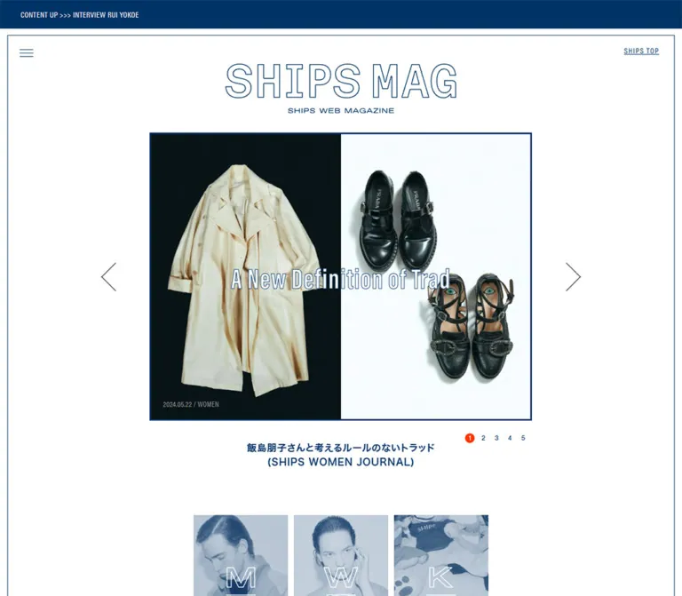
DESIGN REFERENCE
白とネイビー、細い罫線、アウトラインのロゴが特徴のファッションメディア。大小の記事を交互に配置し、写真と余白で雑誌らしいリズムをつくる。
オリジナルサイトを見るA fashion magazine organized with navy rules, outlined lettering, generous white space, and alternating photographic spreads.
Website: SHIPS MAG Original URL: https://www.shipsltd.co.jp/shipsmag/ Final URL: https://www.shipsltd.co.jp/shipsmag/ Theme: white canvas with navy typography and linework; navy announcement and footer bands. Inspected: September 22, 2026, at 14:17:46 UTC / 23:17:46 JST, using the supplied browser evidence. Viewports: desktop 1440 × 1000 CSS pixels; mobile 390 × 844 CSS pixels. Scope: the current magazine index, including the supplied illustrated desktop state, masthead and featured-story carousel, category gateways, article and recurring-series catalog, sharing area, and brand footer. Article destinations and the expanded menu were not inspected.
SHIPS MAG presents fashion through an editorial index. Its hierarchy comes from image size, placement, and spacing: a large feature occupies one side of a desktop spread while four smaller stories occupy the other. The next spread reverses this arrangement. Thin navy rules give the long archive a consistent structure without enclosing every story in a box.
The visual identity combines outlined brand lettering, compact Japanese captions, narrow Latin display type, and photography ranging from studio clothing collages to portraits and everyday scenes. Most of the interface remains white. Navy provides both the fine details and the large closing color field; a small orange-red carousel marker supplies the clearest interface accent.
A fashion magazine organized with navy rules, outlined lettering, generous white space, and alternating photographic spreads.
Website: SHIPS MAG Original URL: https://www.shipsltd.co.jp/shipsmag/ Final URL: https://www.shipsltd.co.jp/shipsmag/ Theme: white canvas with navy typography and linework; navy announcement and footer bands. Inspected: September 22, 2026, at 14:17:46 UTC / 23:17:46 JST, using the supplied browser evidence. Viewports: desktop 1440 × 1000 CSS pixels; mobile 390 × 844 CSS pixels. Scope: the current magazine index, including the supplied illustrated desktop state, masthead and featured-story carousel, category gateways, article and recurring-series catalog, sharing area, and brand footer. Article destinations and the expanded menu were not inspected.
SHIPS MAG presents fashion through an editorial index. Its hierarchy comes from image size, placement, and spacing: a large feature occupies one side of a desktop spread while four smaller stories occupy the other. The next spread reverses this arrangement. Thin navy rules give the long archive a consistent structure without enclosing every story in a box.
The visual identity combines outlined brand lettering, compact Japanese captions, narrow Latin display type, and photography ranging from studio clothing collages to portraits and everyday scenes. Most of the interface remains white. Navy provides both the fine details and the large closing color field; a small orange-red carousel marker supplies the clearest interface accent.
The first desktop image shows a repeated illustration composition, while the desktop DOM records the photographic carousel and catalog underneath or in another recorded state. Their precise temporal relationship is unknown. Treat the illustration as an observed state, not as proof of a particular loading sequence.
The desktop export reports a 1000px document height even though catalog elements extend tens of thousands of pixels below the viewport. This conflicts with its own element geometry and the supplied scrolled captures. Do not use that value to infer a fixed-height application.
| Name | Value | Suggested token | Evidence and role |
|---|---|---|---|
| Navy Ink | #003366 |
--mag-ink |
Measured: rgb(0, 51, 102) on announcement background, utility text, hero caption, and content heading. Visually also defines rules and footer surfaces. |
| White Paper | #FFFFFF |
--mag-paper |
Measured: HTML background and announcement text. Main page and article surfaces appear white. |
| Metadata Gray | Approximately #8C8C8C |
--mag-muted |
Visual estimate: dates and audience labels beneath stories. Exact child-element color was not supplied. |
| Active Orange | Approximately #FF3C00 |
--mag-active |
Visual estimate: filled circle behind the current mobile carousel number. Keep its use local to selection feedback. |
| Photographic Blue Gray | Variable | No fixed UI token | Blue-tinted portraits and recurring-series artwork. This is image treatment, not a measured interface surface color. |
Navy and white should establish nearly all structural contrast. The photos supply additional hues, including olive, tan, red, denim blue, and skin tones. Do not convert those content colors into category-specific interface palettes.
Some parent elements compute to black while visible descendant captions appear navy. A parent wrapper's color is not enough to identify the final text color of its children.
The exported --vc-* and --hacobune-* custom properties include black and bright blue defaults. Their use in the visible magazine interface was not established; they are not treated here as brand tokens.
Recorded stack: 'Hiragino Kaku Gothic Pro', メイリオ, 'MS Pゴシック', -apple-system, 'system-ui', sans-serif.
Story captions use compact, bold sans-serif text. Japanese titles sit above or alongside parenthesized English series labels. Both remain centered under the image. Preserve the short line lengths and deliberate wrapping rather than turning each item into a paragraph of descriptive copy.
The sampled caption wrappers use weight 700. Their computed line heights are often equal to their font sizes, but their total boxes contain multiple child lines and spacing. Those wrapper values should not be copied as a complete multiline typography system.
Recorded family: acumin-pro-condensed, sans-serif.
Verified uses include the announcement, SHIPS TOP, and the content section heading. Tracking ranges from restrained spacing in the announcement to a more pronounced treatment in utility navigation. Dates visually have a similarly narrow character, but their own computed font declarations were not supplied.
Recorded family: acumin-pro-extra-condensed, sans-serif.
The current hero title, HOW SHIPS WEARS Barbour, uses weight 800, white text, and 0.03em tracking. The screenshot shows a fine contrasting edge around the letters. The precise stroke or shadow declaration was not provided.
The outlined SHIPS MAG mark has its own lettering and proportions. Its link measures 435 × 93px on desktop and approximately 160.16 × 108.66px on mobile. The mobile screenshot shows a stacked SHIPS / MAG composition with a small descriptor above it.
These are artwork bounds, not font sizes. No wordmark font or original asset URL was established. Use authorized brand artwork when available instead of substituting the caption font.
| Role | Desktop | Mobile | Weight / tracking | Evidence |
|---|---|---|---|---|
| Root font size | 10px |
11.7188px |
400 |
Measured; not the typical visible story size |
| Announcement | 15px / 54px |
11.44px / 34.84px |
400; 0.04em |
Measured font size / line height |
| SHIPS TOP | 15px / 15px |
12.48px / 12.48px |
400; 0.1em desktop, 0.05em mobile |
Measured |
| Hero image title | 54px / 54px |
36.4px / 36.4px |
800; 0.03em |
Measured |
| Hero caption wrapper | 18px / 18px |
13px / 13px |
700 |
Measured wrapper values |
| Content section heading | 25px / 25px |
22px / 22px |
500; 0.05em |
Measured |
| Large story caption wrapper | 16px / 16px |
13px / 13px |
700 |
Measured wrapper values |
| Small story caption wrapper | 13px / 13px |
12px / 12px |
700 |
Measured wrapper values |
| Dates and audience labels | About 11–13px |
About 10–12px |
Visually regular and narrow | Visual estimate |
| Closing slogan band | About 38px |
About 36px |
Visually medium | Visual estimate |
Recommended adaptation: use explicit pixel or conventional rem values, with approximately 1.5 line height for small captions and 1.8 for large story titles. Keep the recorded source root sizes as evidence rather than applying them to an unrelated project. The root gets larger on mobile while several components get smaller, so this is not one uniform scaling system.
Character: narrow outer frames, broad interior gutters, centered captions, square media, and occasional small ellipses.
These measurements do not establish a universal base unit.
| Relationship | Desktop | Mobile | Status |
|---|---|---|---|
| Announcement to hero section | 13px |
About 8.31px |
Derived from DOM rectangles |
| Outer hero frame inset | 16.875px |
About 7.8px |
Desktop measured; mobile visible border and slide edge agree |
| Hero image to caption | 41px |
15.61px |
Derived |
| Hero section to category tiles | 70px |
25px |
Derived |
| Gap between category tiles | 11px |
About 2.61px |
Derived |
| Catalog section top padding | 78px |
45px |
Measured |
| Article image to caption | 18px |
15px large; 13px small |
Derived assuming the observed square image geometry |
| Gap between desktop spread halves | About 92–93px |
Halves stack | Derived |
| Gap between desktop small-story columns | 99px |
About 50.45px between card bounds |
Derived |
| Gap between desktop small-story rows | 41px |
About 70.70px after the taller first-row card |
Derived from the sampled opening group |
| Gap between desktop spread groups | 84px |
Content-dependent | Derived |
The desktop's 99px small-card gap includes the space occupied visually by a fine divider. A 100px implementation gap is a useful approximation when building with CSS Grid.
| Element | Treatment | Evidence |
|---|---|---|
| Hero frame and image areas | Square | Visible; sampled wrappers also report 0px radius |
| Article images | Square corners | Visible in the catalog capture |
| Article layout | Open sides with fine rules | Visible; not a collection of fully bordered cards |
| VIEW label | Thin elliptical outline, about 76 × 35px |
Visual estimate |
| Active carousel number | Filled circle, about 26px diameter |
Visual estimate |
| Circled MEN label in illustration state | Irregular hand-drawn oval | Visible artwork; not evidence of a standard control radius |
Rules appear approximately 1px thick. The supplied computed-style export does not include their exact border-width declarations.
| Element | At 1440 × 1000 | At 390 × 844 |
|---|---|---|
| Announcement band | 1440 × 54px |
Approximately 390 × 34.83px |
| Hero section rectangle | x=16.875, y=67, 1406.25 × 834px |
x=0, y=43.14, 390 × 695.55px; visible frame is inset |
| Masthead link | 435 × 93px |
160.16 × 108.66px |
| Active slide link | 715 × 537px, at x=362.5 |
374.39 × 374.39px, at x=7.80 |
| Hero arrow link | 37 × 37px |
52 × 52px |
| Menu link | 50 × 50px |
26 × 26px |
| Each category gateway | 178 × 246px |
119.59 × 165.36px |
| Catalog section | 1280px wide, at x=80 |
390px wide |
| Visible article spread span | Approximately 1052px, from x=194 to 1246 |
Full-width sequence of large and paired small articles |
| Large story link | 480 × 697px in sampled groups |
353.59px wide; sampled heights 466.5–518.28px |
| Small story link | 190 × 328px in sampled groups |
144.55px wide; height varies with text |
A full-width navy strip introduces the publication with the source label SHIPSが発信するファッションWEBマガジン. Text is white and small relative to the band.
The desktop text container begins around x=52.88px; the mobile screenshot centers the label. The band reduces from 54px to approximately 34.84px high. It should read as a publication identifier, leaving the editorial image as the dominant opening content.
The masthead places a hamburger at the upper left, the SHIPS MAG identity centrally, and an underlined SHIPS TOP link at the upper right. The latter directly links to the main SHIPS website.
On mobile, the stacked logo occupies a taller proportion of the header. The screenshot places it between approximately y=72 and 180px; the image begins around y=198px. Keep a clear gap between the masthead and image without introducing a separate colored navigation bar.
The menu icon is three fine navy horizontal lines. Its mobile link rectangle is only 26px square in the recorded DOM; enlarging its interactive area is a recommended improvement.
The recorded active story is HOW SHIPS WEARS Barbour, dated September 16, 2026, with MEN and WOMEN metadata. Its anatomy is:
Desktop slide bounds are approximately 4:3 at 715 × 537px. The mobile slide is square at 374.39 × 374.39px. This changes the composition substantially; choose or crop imagery for both formats.
Desktop arrow rectangles sit outside the central slide near its vertical midpoint. On mobile, the arrows move below the caption, flanking the numbered pagination. The first number appears inside an orange-red circle in the supplied mobile capture. The arrow marks themselves are thin open chevrons, considerably smaller than their mobile link boxes.
The DOM contains repeated first and last story links around the five distinct stories. This is consistent with a looping carousel implementation, but autoplay, looping behavior, swipe support, and control outcomes were not tested.
Three adjacent portrait tiles introduce MEN, WOMEN, and KIDS. The supplied mobile screenshot shows blue-tinted imagery with large outlined M, W, and K lettering beginning near its lower edge.
Desktop links measure 178 × 246px with 11px gaps. Mobile links measure about 119.59 × 165.36px with only 2.61px gaps, filling a 364px strip between 13px outer margins.
These three links have # destinations in the exported DOM. Their click behavior is unverified. Separate footer and navigation links explicitly expose the category URLs ?gender=men, ?gender=women, and ?gender=kids.
A small centered condensed heading introduces the article index. The page text includes (CONTENTS), while the exported heading text combines to (FORCONTENTS). The exact visible arrangement of those fragments is not established by the provided catalog screenshot.
The measured heading is 25px on desktop and 22px on mobile, weight 500, with 0.05em tracking. Preserve the restrained section-marker role; it should not compete with the image titles.
The main desktop unit pairs one large story with a two-by-two cluster of small stories. Large stories alternate left and right from one group to the next. A fine vertical rule marks the central division; smaller internal dividers subdivide the compact-story side.
At the measured desktop size, the large image is 480px square and the smaller images are 190px square. The overall visible spread spans approximately 1052px. These unequal image sizes establish priority without colored badges or large action buttons.
The current catalog includes both recent entries and older articles. The 2023 stories visible in the supplied desktop capture are entries in the current archive, not evidence of a separate historical page design.
A large card combines a square image, centered bold title, secondary series or audience text, and a small outlined VIEW ellipse. In the recorded DOM, the full card is an anchor containing this information.
Recurring series such as MY PRIMARY, my standard, and GENTLEMAN in GINZA. appear throughout the archive. They act as prominent editorial entry points among dated stories. A series card can show an audience label such as FOR WOMEN instead of a publication date.
The supplied MY PRIMARY capture uses a cool blue-gray portrait, narrow white title lettering over the image, a centered Japanese series caption below, and generous space around the audience label and VIEW control.
For implementation, make VIEW a visual child of the main article link rather than nesting a second link inside it.
A small story is a square image above a centered caption block. The title and parenthesized series label are bold navy; the date and category line is smaller and gray. There is no separate VIEW ellipse in the sampled small cards.
Desktop links use repeated 190 × 328px rectangles. Mobile cards remain in pairs but become approximately 144.55px wide, and their heights vary with the copy. Titles should wrap naturally. Avoid forcing all captions to one or two lines.
The card background stays continuous with the page. Horizontal rules sit below entries, while vertical separators occupy the generous space between columns.
The first desktop capture shows a white panel with a fine navy outline, approximately 17px from each side and 30px from the top and bottom. Staggered repeated modules combine:
SHIPS MEN ACCESSORY lettering.Modules are deliberately clipped at the frame edges, creating a repeating composition rather than a neatly contained illustration card. The broad white gaps are as important as the drawing.
Its trigger, duration, exit behavior, and relationship to navigation were not established. Do not prescribe an automatic splash, hover overlay, or loading screen from this one capture.
The DOM includes a navigation structure with SHIPS TOP, GENDER, SERIES, and ARCHIVE. Series links include the shopping recommendations, personal standards, Ginza profiles, children's classics, and tips collections.
The closed hamburger state is visible. The expanded panel's position, typography, backdrop, transition, and focus behavior remain unverified. A new implementation may organize these items into accessible groups, but its panel design must be labeled as an addition.
A navy strip carries oversized white text repeating SHIPS / STYLISH STANDARD / SHIPS MAG / MEN WOMEN KIDS /. Text extends beyond the viewport and is clipped at the edges.
The supplied captures suggest a band about 90–92px high on both viewports. The repeated DOM strings support a repeating track structure. Static screenshots do not establish movement direction, speed, or whether it was moving at capture time.
Below the slogan band, the white closing area centers a Share label, social icons, a small stacked SHIPS MAG mark, and MEN / WOMEN / KIDS links. A fine back-to-top symbol sits toward the lower right.
Desktop shows Facebook and Twitter bird icons for sharing. Mobile adds LINE and places the three icons in a wide row bounded by thin navy rules. The mobile ruled row runs approximately from x=13 to 377px.
The share links use #fb, #tw, and, on mobile, #line. Their handlers and resulting share interfaces were not exercised. The back-to-top outcome was also not tested.
A full-width navy block closes the page with a large white SHIPS mark, a row of five social icons, and © SHIPS ALL RIGHTS RESERVED. The destinations in the DOM identify Facebook, Twitter, Instagram, Pinterest, and YouTube.
The block is approximately 305px high in the desktop footer capture and 224px on mobile. These are screenshot estimates. Maintain the generous vertical separation between the brand mark, social row, and small copyright line.
| Element | Recorded value | What it establishes |
|---|---|---|
| Masthead link | opacity 0.13s ease-in-out |
An opacity transition is declared; the target opacity and trigger were not recorded. |
| Carousel slide link | transform 0.25s cubic-bezier(0.25, 0.46, 0.45, 0.94) |
A transform transition is available; its endpoints were not supplied. |
| Hero title | 0.75s cubic-bezier(0.165, 0.84, 0.44, 1) both sliderTxt |
Named title animation and timing are recorded. Keyframes are unavailable. |
| Hero caption | 0.45s cubic-bezier(0.215, 0.61, 0.355, 1) both sliderCap |
Named caption animation and timing are recorded. Keyframes are unavailable. |
| Many other wrappers | transition: all |
This export does not supply a useful nonzero duration or a verified state change. |
The title and caption use different durations and easing curves, suggesting separately authored animation layers. Their movement direction, distance, delays, and replay conditions are unknown.
The supplied inspection includes initial observation and scroll traversal to settled captures. It does not include confirmed carousel clicks, menu opening, category selection, hover states, sharing, or back-to-top activation.
Perpetual animations were paused during readiness checks and resumed afterward. Consequently, the captures cannot establish continuous-motion timing for the slogan band or illustrated state.
Recommended implementation: use the recorded timings only when implementing a deliberately chosen animation. Keep navigation available without animation, provide a pause mechanism if adding autoplay, and disable decorative continuous motion under reduced-motion preferences. The Quick Start does not invent the missing source keyframes.
| Surface | Appearance | Function |
|---|---|---|
| Main canvas | White | Continuous editorial background |
| Outer frame and dividers | Fine navy lines | Structure and alignment |
| Story area | White with square imagery | Editorial links without raised containers |
| Featured image | Full-color photograph or collage | Main visual emphasis |
| Series and category imagery | Often cool blue-gray | Connects recurring editorial destinations |
| Active slide marker | Small orange-red circle | Local selection state |
| Announcement and slogan bands | Navy with white text | Opening and closing publication identity |
| Brand footer | Solid navy | Strong final visual anchor |
No general shadow or rounded-card elevation system is visible in the supplied states. Depth comes from the photographs, not from interface containers.
The current mobile hero assembles outerwear, tartan fabric, mannequins, and models on a pale studio ground. Olive and brown garments create warmth inside the otherwise cool interface. Its English headline crosses the photographic composition while date metadata stays near the bottom edge.
The catalog mixes product still lifes, fashion portraits, children, shop interiors, and collages. The supplied desktop view includes a red fashion collage, denim against a navy ground, a child beside clothing, and a camera-store scene. Keep this editorial variety while maintaining consistent square thumbnail frames.
Recurring-series images and category gateways use visibly cool, muted blue treatments. A navy overlay or color grade is a possible implementation technique, but the original processing method is unknown. Do not apply one blanket filter to all article photography.
The illustrated state adds a different texture: uneven painted fills and drawn lines, surrounded by large white areas. Preserve that handmade quality when authorized artwork is available. Uniform stock icons would not reproduce it.
The evidence provides article destinations, not image src URLs, filenames, resolutions, or font-file locations. These links identify the content associated with visible artwork; they are not downloadable asset paths.
| Visible material | Associated link recorded on the index | Evidence |
|---|---|---|
| Current Barbour feature | how_ships_wears_barbour | Mobile hero screenshot and both DOM exports |
| MY PRIMARY portrait | myprimary | Desktop catalog screenshot and DOM |
| Red fashion collage | renewal_our_trad | Desktop catalog screenshot and matching article text |
| Denim still life | mystandard_018 | Desktop catalog screenshot and matching article text |
| Illustrated repeated composition | No asset address supplied | First desktop screenshot only |
Use licensed photographs and brand artwork in production. Reserve their aspect ratios before loading. For photographs, retain normal browser image interpolation; pixelated rendering is not part of this design.
The 1280px catalog section sits at x=80px. Inside it, the first large card begins at x=194px, leaving a further 114px of internal clearance. The large card is 480px wide; the opposite small cards begin at x=767px and 1056px.
The first group begins at y=1443px. Small-card rows begin at 1443px and 1812px, a 369px pitch comprising a 328px link box and a 41px gap. The next spread begins at 2224px, 84px after the previous group's bottom. Its feature moves to the right at x=766px.
This repeated structure explains the page's rhythm more accurately than a generic masonry grid: one feature and four companions remain a recognizable group.
The hierarchy survives the narrow viewport. A large story spans about 353.59px between roughly 18.20px margins. Four small stories follow in two rows, with card starts around x=25.22px and 220.22px.
The first feature begins at y=1050.64px. Its four companions begin at approximately 1616.23px and 1944.48px. The next large series card begins at 2305.81px. Large cards therefore lead each group on mobile, including groups whose features sit on the right on desktop.
Small mobile card heights vary with wrapping. The grid should size each row to its taller item and leave room before the following row. Fixed desktop heights should not be carried into the mobile layout.
| Region | Desktop | Mobile |
|---|---|---|
| Masthead | Wide logo link | Stacked logo composition |
| Hero image | Approximately 4:3 | Square |
| Carousel arrows | Outside image at mid-height | Below caption, beside pagination |
| Category strip | Narrow centered group with 11px gaps | Almost full width with very small gaps |
| Feature groups | Feature beside four companions | Feature above four companions |
| Sharing | Two centered icons | Three icons in a ruled row, including LINE |
| Brand footer | Larger mark and taller field | Smaller mark and shorter field |
Only these two viewport widths were supplied. The exact breakpoint, intermediate tablet behavior, sticky positioning, and safe-area handling were not established. A breakpoint near 900px is used below as an explicit adaptation choice, not an observed source rule.
The mobile document measures approximately 54,413px high, reflecting the long archive. The desktop catalog section itself measures 33,931px high, but a trustworthy total desktop document height is unavailable.
#003366 and white.These are improvements for a new implementation, not verified original features:
#FFFFFF, measured.#003366, measured.#8C8C8C, visually estimated.#FF3C00, visually estimated.“Create an editorial fashion-magazine index inspired by the current SHIPS MAG structure. Use white space, navy #003366, fine rules, an outlined publication mark, compact bold Japanese captions, and condensed Latin utility lettering. Open with a framed masthead and photographic story carousel. Use an approximately 4:3 desktop hero and a square mobile hero. Below three portrait category gateways, build alternating desktop spreads containing one 480px feature image and four 190px companion images. On mobile, place a wide square feature above two rows of paired stories. Keep captions centered, metadata small and gray, and VIEW labels elliptical. Finish with a clipped navy slogan strip, a white sharing and magazine-navigation area, and a solid navy brand footer. Treat unverified menu and animation behavior as implementation decisions.”
This is an implementation starting point, not the original stylesheet. It preserves the measured palette and principal desktop proportions, approximates visible rules and ellipses, and uses a recommended 900px layout switch. Metadata gray, active orange, text-outline thickness, multiline leading, and intermediate scaling are adaptation values.
Use a normal root font size. Expected structure: a .mag-shell contains the framed hero, category strip, catalog, and white closing area; the solid brand footer follows it. Each .mag-spread contains a .story--feature anchor followed by a .story-cluster with four .story--small anchors. Put .story__view inside the feature anchor as a noninteractive span.
The hero grid expects direct children for media, caption, previous control, next control, and pagination. Each pagination button contains a span for its visible number. Use appropriate horizontal and stacked logo artwork through a responsive picture element. Image files, icons, carousel state, and menu behavior must be supplied separately.
:root {
  /* Measured interface colors */
  --mag-ink: #003366;
  --mag-paper: #ffffff;

  /* Visual approximations */
  --mag-muted: #8c8c8c;
  --mag-active: #ff3c00;
  --mag-rule: 1px solid var(--mag-ink);

  /* Recorded families; system-ui is a functional fallback here */
  --mag-font-jp: 'Hiragino Kaku Gothic Pro', 'メイリオ',
    'MS Pゴシック', -apple-system, system-ui, sans-serif;
  --mag-font-utility: acumin-pro-condensed, sans-serif;
  --mag-font-display: acumin-pro-extra-condensed, sans-serif;

  /* Desktop endpoints from the supplied geometry */
  --mag-frame-inset: 16.875px;
  --mag-content-width: 1280px;
  --mag-spread-width: 1052px;
  --mag-spread-gap: clamp(48px, 6.389vw, 92px);
  --mag-cluster-gap: clamp(40px, 6.944vw, 100px);
  --mag-group-gap: 84px;

  /* Recorded transition timings, without invented keyframes */
  --mag-logo-transition: 130ms ease-in-out;
  --mag-slide-transition: 250ms cubic-bezier(.25, .46, .45, .94);
  --mag-title-duration: 750ms;
  --mag-caption-duration: 450ms;
}

*, *::before, *::after { box-sizing: border-box; }
body { margin: 0; }

.mag-site {
  color: var(--mag-ink);
  background: var(--mag-paper);
  font-family: var(--mag-font-jp);
}

.mag-site img { display: block; max-inline-size: 100%; }
.mag-site button { font: inherit; cursor: pointer; }
.mag-site a { color: inherit; }

.mag-notice {
  min-block-size: 54px;
  padding-inline: 3.67%;
  color: var(--mag-paper);
  background: var(--mag-ink);
  font: 400 15px/54px var(--mag-font-utility);
  letter-spacing: .04em;
}
.mag-notice p { margin: 0; }

.mag-shell { position: relative; padding-block-start: 13px; }
.mag-shell::before {
  content: '';
  position: absolute;
  inset: 13px var(--mag-frame-inset) 0;
  border-inline: var(--mag-rule);
  pointer-events: none;
}

.mag-hero-frame {
  margin-inline: var(--mag-frame-inset);
  border-block: var(--mag-rule);
}

.mag-masthead {
  position: relative;
  display: grid;
  place-items: center;
  padding: 52px 80px 39px;
}
.mag-wordmark {
  display: block;
  inline-size: 435px;
  max-inline-size: 100%;
  transition: opacity var(--mag-logo-transition);
}
.mag-wordmark img { inline-size: 100%; block-size: auto; }
.mag-menu {
  position: absolute;
  inset-block-start: 8px;
  inset-inline-start: 10px;
  inline-size: 50px;
  block-size: 50px;
  border: 0;
  color: inherit;
  background: transparent;
}
.mag-home {
  position: absolute;
  inset-block-start: 20px;
  inset-inline-end: 28px;
  font: 400 15px/1 var(--mag-font-utility);
  letter-spacing: .1em;
  text-underline-offset: 2px;
}

/* Pagination below the caption is an adaptation on desktop. */
.mag-hero {
  display: grid;
  grid-template-columns: minmax(44px, 1fr) minmax(0, 715px)
    minmax(44px, 1fr);
  padding-block-end: 20px;
}
.hero-media {
  grid-area: 1 / 2;
  position: relative;
  display: block;
  aspect-ratio: 715 / 537;
  overflow: hidden;
  transition: transform var(--mag-slide-transition);
}
.hero-media img {
  inline-size: 100%;
  block-size: 100%;
  object-fit: cover;
}
.hero-headline {
  position: absolute;
  inset-inline: 12px;
  inset-block-start: 50%;
  margin: 0;
  transform: translateY(-50%);
  color: white;
  text-align: center;
  font: 800 54px/1 var(--mag-font-display);
  letter-spacing: .03em;
  -webkit-text-stroke: .5px var(--mag-ink);
}
.hero-caption {
  grid-area: 2 / 2;
  margin: 40px 0 16px;
  text-align: center;
  font-size: 18px;
  font-weight: 700;
  line-height: 1.5;
}
.hero-caption span { display: block; }
.hero-arrow {
  align-self: center;
  inline-size: 37px;
  block-size: 37px;
  border: 0;
  color: inherit;
  background: transparent;
}
.hero-prev { grid-area: 1 / 1; justify-self: end; margin-right: 49px; }
.hero-next { grid-area: 1 / 3; justify-self: start; margin-left: 49px; }
.hero-pages {
  grid-area: 3 / 2;
  display: flex;
  align-items: center;
  justify-content: center;
}
.hero-pages button {
  display: grid;
  place-items: center;
  inline-size: 32px;
  min-block-size: 44px;
  padding: 0;
  border: 0;
  color: inherit;
  background: transparent;
  font-size: 12px;
}
.hero-pages span {
  display: grid;
  place-items: center;
  inline-size: 26px;
  block-size: 26px;
  border-radius: 50%;
}
.hero-pages [aria-current='true'] span {
  color: white;
  background: var(--mag-active);
}

.mag-genders {
  display: grid;
  grid-template-columns: repeat(3, minmax(0, 1fr));
  gap: 11px;
  inline-size: min(556px, calc(100% - 26px));
  margin: 70px auto 80px;
}
.mag-genders img {
  inline-size: 100%;
  aspect-ratio: 178 / 246;
  object-fit: cover;
}

.mag-content {
  max-inline-size: var(--mag-content-width);
  margin-inline: auto;
  padding-block-start: 78px;
}
.mag-content-heading {
  margin: 0 0 43px;
  text-align: center;
  font: 500 25px/1 var(--mag-font-utility);
  letter-spacing: .05em;
}
.mag-spreads {
  inline-size: min(var(--mag-spread-width), calc(100% - 48px));
  margin-inline: auto;
}
.mag-spread {
  position: relative;
  display: grid;
  grid-template-columns: repeat(2, minmax(0, 1fr));
  column-gap: var(--mag-spread-gap);
  align-items: start;
}
.mag-spread + .mag-spread { margin-block-start: var(--mag-group-gap); }
.mag-spread::before {
  content: '';
  position: absolute;
  inset-block: 0;
  inset-inline-start: 50%;
  border-inline-start: var(--mag-rule);
  pointer-events: none;
}
.story-cluster {
  display: grid;
  grid-template-columns: repeat(2, minmax(0, 1fr));
  gap: 41px var(--mag-cluster-gap);
}
.mag-spread:nth-child(even) > .story--feature { grid-area: 1 / 2; }
.mag-spread:nth-child(even) > .story-cluster { grid-area: 1 / 1; }

.story {
  position: relative;
  display: block;
  min-inline-size: 0;
  padding-block-end: 20px;
  border-block-end: var(--mag-rule);
  text-align: center;
  text-decoration: none;
}
.story--feature { min-block-size: 697px; }
.story--small { min-block-size: 328px; }
.story--small:nth-child(odd)::after {
  content: '';
  position: absolute;
  inset-block: -7px 32px;
  inset-inline-end: calc(-.5 * var(--mag-cluster-gap));
  border-inline-end: var(--mag-rule);
  pointer-events: none;
}
.story__media {
  inline-size: 100%;
  aspect-ratio: 1;
  object-fit: cover;
  border-radius: 0;
}
.story__title {
  margin: 18px 0 0;
  font-size: 13px;
  font-weight: 700;
  line-height: 1.5;
  overflow-wrap: anywhere;
}
.story--feature .story__title { font-size: 16px; line-height: 1.8; }
.story__series { display: block; }
.story__meta {
  margin: 12px 0 0;
  color: var(--mag-muted);
  font: 400 12px/1.4 var(--mag-font-utility);
}
.story__view {
  display: grid;
  place-items: center;
  inline-size: 76px;
  block-size: 35px;
  margin: 26px auto 0;
  border: var(--mag-rule);
  border-radius: 50%;
  font-size: 13px;
  font-weight: 400;
}

.mag-marquee {
  margin: 160px var(--mag-frame-inset) 0;
  overflow: hidden;
  color: white;
  background: var(--mag-ink);
}
.mag-marquee__track {
  inline-size: max-content;
  white-space: nowrap;
  font: 500 38px/92px sans-serif;
}

.mag-closing { position: relative; padding: 48px 24px 68px; text-align: center; }
.mag-share__label { margin: 0; font-size: 14px; letter-spacing: .04em; }
.mag-share__links, .mag-footer-socials, .mag-footer-genders {
  display: flex;
  align-items: center;
  justify-content: center;
  gap: 26px;
}
.mag-share__links { margin-block-start: 10px; }
.mag-share__links a, .mag-footer-socials a {
  display: grid;
  place-items: center;
  min-inline-size: 44px;
  min-block-size: 44px;
}
.mag-closing__logo { inline-size: 140px; margin: 76px auto 32px; }
.mag-footer-genders { font-size: 14px; letter-spacing: .05em; }
.mag-footer-genders a { padding-block: 10px; text-decoration: none; }

.mag-brand-footer {
  padding: 64px 24px 56px;
  color: white;
  background: var(--mag-ink);
  text-align: center;
}
.mag-brand-footer__logo { inline-size: 154px; margin-inline: auto; }
.mag-footer-socials { gap: 46px; margin-block: 24px 30px; }
.mag-copyright { margin: 0; font: 400 12px/1.4 var(--mag-font-utility); }

/* Recommended focus and hover feedback, not inspected source states. */
.mag-site :focus-visible { outline: 2px solid currentColor; outline-offset: 4px; }
@media (hover: hover) {
  .story:hover .story__title { text-decoration: underline; text-underline-offset: 3px; }
}

/* Recommended breakpoint; mobile values target the supplied 390px view. */
@media (max-width: 900px) {
  :root { --mag-frame-inset: 7.8px; }
  .mag-notice {
    min-block-size: 34.84px;
    padding-inline: 8px;
    text-align: center;
    font-size: 11.44px;
    line-height: 34.84px;
  }
  .mag-shell { padding-block-start: 8.31px; }
  .mag-shell::before { display: none; }
  .mag-hero-frame { border: var(--mag-rule); }
  .mag-masthead { padding: 28px 50px 17.5px; }
  .mag-wordmark { inline-size: 160.16px; }
  .mag-menu { inline-size: 44px; block-size: 44px; inset: 6px auto auto 7px; }
  .mag-home { top: 15px; right: 15px; font-size: 12.48px; letter-spacing: .05em; }
  .mag-hero { grid-template-columns: 52px minmax(0, 1fr) 52px; padding-bottom: 32px; }
  .hero-media { grid-area: 1 / 1 / 2 / -1; aspect-ratio: 1; }
  .hero-headline { font-size: clamp(26px, 9.333vw, 44px); }
  .hero-caption { grid-area: 2 / 1 / 3 / -1; margin: 15.6px 8px 27px; font-size: 13px; }
  .hero-arrow { inline-size: 52px; block-size: 52px; margin: 0; }
  .hero-prev { grid-area: 3 / 1; }
  .hero-next { grid-area: 3 / 3; }
  .hero-pages { grid-area: 3 / 2; }
  .mag-genders { gap: 2.6px; margin-block: 25px 0; }
  .mag-content { padding-block-start: 45px; }
  .mag-content-heading { margin-bottom: 54.6px; font-size: 22px; }
  .mag-spreads { inline-size: 100%; }
  .mag-spread { grid-template-columns: minmax(0, 1fr); row-gap: 70.7px; }
  .mag-spread::before { display: none; }
  .mag-spread:nth-child(even) > .story--feature,
  .mag-spread:nth-child(even) > .story-cluster { grid-area: auto; }
  .mag-spread + .mag-spread { margin-block-start: 85.8px; }
  .story--feature {
    inline-size: min(90.6667%, 480px);
    min-block-size: 0;
    justify-self: center;
  }
  .story-cluster { gap: 70.7px 0; }
  .story--small { inline-size: 74.1266%; min-block-size: 0; justify-self: center; }
  .story--small:nth-child(odd)::after { display: none; }
  .story__title { margin-top: 13px; font-size: 12px; }
  .story--feature .story__title { margin-top: 15px; font-size: 13px; }
  .mag-marquee { margin: 100px 0 0; }
  .mag-marquee__track { font-size: 36px; line-height: 90px; }
  .mag-closing { padding: 74px 13px 32px; }
  .mag-share__label { font-size: 11px; }
  .mag-share__links { margin-top: 14px; padding-block: 18px; border-block: var(--mag-rule); gap: 36px; }
  .mag-closing__logo { inline-size: 92px; margin: 96px auto 20px; }
  .mag-footer-genders { gap: 22px; font-size: 11px; }
  .mag-brand-footer { padding: 40px 20px 36px; }
  .mag-brand-footer__logo { inline-size: 100px; }
  .mag-footer-socials { gap: 14px; margin-block: 24px; }
  .mag-copyright { font-size: 11px; }
}

@media (prefers-reduced-motion: reduce) {
  .mag-wordmark, .hero-media { transition: none; }
  .hero-headline, .hero-caption, .mag-marquee__track { animation: none; }
}
The CSS leaves the slogan static and does not recreate the illustrated state. Carousel controls require application logic; links to articles and category destinations should remain real anchors. If continuous animation is added later, implement its reduced-motion behavior in both CSS and JavaScript.
Optional aliases for a project already using Tailwind v4. These do not identify the original site's framework. Define the custom properties above first.
@theme inline {
  --color-mag-ink: var(--mag-ink);
  --color-mag-paper: var(--mag-paper);
  --color-mag-muted: var(--mag-muted);
  --color-mag-active: var(--mag-active);

  --font-mag-body: var(--mag-font-jp);
  --font-mag-utility: var(--mag-font-utility);
  --font-mag-display: var(--mag-font-display);

  --text-mag-small: 13px;
  --text-mag-feature: 16px;
  --text-mag-section: 25px;
  --text-mag-hero: 54px;

  --spacing-mag-feature: 480px;
  --spacing-mag-small-image: 190px;
  --spacing-mag-group: 84px;
  --radius-mag-square: 0px;
}
All measured claims above derive from the supplied current-page evidence. Estimated values and recommended implementation choices are identified separately. The CSS is a reusable starting point and was not executed or browser-tested in this task.
# SHIPS MAG — Style Reference

> A fashion magazine organized with navy rules, outlined lettering, generous white space, and alternating photographic spreads.

**Website:** [SHIPS MAG](https://www.shipsltd.co.jp/shipsmag/)
**Original URL:** https://www.shipsltd.co.jp/shipsmag/
**Final URL:** https://www.shipsltd.co.jp/shipsmag/
**Theme:** white canvas with navy typography and linework; navy announcement and footer bands.
**Inspected:** September 22, 2026, at 14:17:46 UTC / 23:17:46 JST, using the supplied browser evidence.
**Viewports:** desktop 1440 × 1000 CSS pixels; mobile 390 × 844 CSS pixels.
**Scope:** the current magazine index, including the supplied illustrated desktop state, masthead and featured-story carousel, category gateways, article and recurring-series catalog, sharing area, and brand footer. Article destinations and the expanded menu were not inspected.

SHIPS MAG presents fashion through an editorial index. Its hierarchy comes from image size, placement, and spacing: a large feature occupies one side of a desktop spread while four smaller stories occupy the other. The next spread reverses this arrangement. Thin navy rules give the long archive a consistent structure without enclosing every story in a box.

The visual identity combines outlined brand lettering, compact Japanese captions, narrow Latin display type, and photography ranging from studio clothing collages to portraits and everyday scenes. Most of the interface remains white. Navy provides both the fine details and the large closing color field; a small orange-red carousel marker supplies the clearest interface accent.
# SHIPS MAG — Style Reference

> A fashion magazine organized with navy rules, outlined lettering, generous white space, and alternating photographic spreads.

**Website:** [SHIPS MAG](https://www.shipsltd.co.jp/shipsmag/)
**Original URL:** https://www.shipsltd.co.jp/shipsmag/
**Final URL:** https://www.shipsltd.co.jp/shipsmag/
**Theme:** white canvas with navy typography and linework; navy announcement and footer bands.
**Inspected:** September 22, 2026, at 14:17:46 UTC / 23:17:46 JST, using the supplied browser evidence.
**Viewports:** desktop 1440 × 1000 CSS pixels; mobile 390 × 844 CSS pixels.
**Scope:** the current magazine index, including the supplied illustrated desktop state, masthead and featured-story carousel, category gateways, article and recurring-series catalog, sharing area, and brand footer. Article destinations and the expanded menu were not inspected.

SHIPS MAG presents fashion through an editorial index. Its hierarchy comes from image size, placement, and spacing: a large feature occupies one side of a desktop spread while four smaller stories occupy the other. The next spread reverses this arrangement. Thin navy rules give the long archive a consistent structure without enclosing every story in a box.

The visual identity combines outlined brand lettering, compact Japanese captions, narrow Latin display type, and photography ranging from studio clothing collages to portraits and everyday scenes. Most of the interface remains white. Navy provides both the fine details and the large closing color field; a small orange-red carousel marker supplies the clearest interface accent.

## How to Read This Reference

- **Measured** means a value appears in the supplied rendered DOM or computed-style evidence. Rectangles describe the recorded state, including elements outside the viewport.
- **Visual estimate** means an approximate reading of the supplied current-page screenshots. Estimated colors were not obtained through pixel sampling.
- **Derived** means arithmetic based on measured rectangles, such as the gap between two articles.
- **Recommended** means implementation guidance for a new build. Proposed tokens, breakpoints, accessibility improvements, and CSS selectors are not original source declarations.
- **Declared font families** identify computed stacks. They do not prove which font supplied every glyph or that a particular font file loaded successfully.

The first desktop image shows a repeated illustration composition, while the desktop DOM records the photographic carousel and catalog underneath or in another recorded state. Their precise temporal relationship is unknown. Treat the illustration as an observed state, not as proof of a particular loading sequence.

The desktop export reports a 1000px document height even though catalog elements extend tens of thousands of pixels below the viewport. This conflicts with its own element geometry and the supplied scrolled captures. Do not use that value to infer a fixed-height application.

## Tokens — Colors

### Default Palette

| Name | Value | Suggested token | Evidence and role |
| --- | --- | --- | --- |
| Navy Ink | `#003366` | `--mag-ink` | **Measured:** `rgb(0, 51, 102)` on announcement background, utility text, hero caption, and content heading. Visually also defines rules and footer surfaces. |
| White Paper | `#FFFFFF` | `--mag-paper` | **Measured:** HTML background and announcement text. Main page and article surfaces appear white. |
| Metadata Gray | Approximately `#8C8C8C` | `--mag-muted` | **Visual estimate:** dates and audience labels beneath stories. Exact child-element color was not supplied. |
| Active Orange | Approximately `#FF3C00` | `--mag-active` | **Visual estimate:** filled circle behind the current mobile carousel number. Keep its use local to selection feedback. |
| Photographic Blue Gray | Variable | No fixed UI token | Blue-tinted portraits and recurring-series artwork. This is image treatment, not a measured interface surface color. |

Navy and white should establish nearly all structural contrast. The photos supply additional hues, including olive, tan, red, denim blue, and skin tones. Do not convert those content colors into category-specific interface palettes.

Some parent elements compute to black while visible descendant captions appear navy. A parent wrapper's color is not enough to identify the final text color of its children.

The exported `--vc-*` and `--hacobune-*` custom properties include black and bright blue defaults. Their use in the visible magazine interface was not established; they are not treated here as brand tokens.

## Tokens — Typography

### Japanese Editorial Text

**Recorded stack:** `'Hiragino Kaku Gothic Pro', メイリオ, 'MS Pゴシック', -apple-system, 'system-ui', sans-serif`.

Story captions use compact, bold sans-serif text. Japanese titles sit above or alongside parenthesized English series labels. Both remain centered under the image. Preserve the short line lengths and deliberate wrapping rather than turning each item into a paragraph of descriptive copy.

The sampled caption wrappers use weight `700`. Their computed line heights are often equal to their font sizes, but their total boxes contain multiple child lines and spacing. Those wrapper values should not be copied as a complete multiline typography system.

### Condensed Utility Type

**Recorded family:** `acumin-pro-condensed, sans-serif`.

Verified uses include the announcement, `SHIPS TOP`, and the content section heading. Tracking ranges from restrained spacing in the announcement to a more pronounced treatment in utility navigation. Dates visually have a similarly narrow character, but their own computed font declarations were not supplied.

### Extra-Condensed Feature Type

**Recorded family:** `acumin-pro-extra-condensed, sans-serif`.

The current hero title, `HOW SHIPS WEARS Barbour`, uses weight `800`, white text, and `0.03em` tracking. The screenshot shows a fine contrasting edge around the letters. The precise stroke or shadow declaration was not provided.

### Brand Lettering

The outlined SHIPS MAG mark has its own lettering and proportions. Its link measures `435 × 93px` on desktop and approximately `160.16 × 108.66px` on mobile. The mobile screenshot shows a stacked SHIPS / MAG composition with a small descriptor above it.

These are artwork bounds, not font sizes. No wordmark font or original asset URL was established. Use authorized brand artwork when available instead of substituting the caption font.

### Type Scale

| Role | Desktop | Mobile | Weight / tracking | Evidence |
| --- | --- | --- | --- | --- |
| Root font size | `10px` | `11.7188px` | `400` | Measured; not the typical visible story size |
| Announcement | `15px / 54px` | `11.44px / 34.84px` | `400`; `0.04em` | Measured font size / line height |
| SHIPS TOP | `15px / 15px` | `12.48px / 12.48px` | `400`; `0.1em` desktop, `0.05em` mobile | Measured |
| Hero image title | `54px / 54px` | `36.4px / 36.4px` | `800`; `0.03em` | Measured |
| Hero caption wrapper | `18px / 18px` | `13px / 13px` | `700` | Measured wrapper values |
| Content section heading | `25px / 25px` | `22px / 22px` | `500`; `0.05em` | Measured |
| Large story caption wrapper | `16px / 16px` | `13px / 13px` | `700` | Measured wrapper values |
| Small story caption wrapper | `13px / 13px` | `12px / 12px` | `700` | Measured wrapper values |
| Dates and audience labels | About `11–13px` | About `10–12px` | Visually regular and narrow | Visual estimate |
| Closing slogan band | About `38px` | About `36px` | Visually medium | Visual estimate |

**Recommended adaptation:** use explicit pixel or conventional rem values, with approximately `1.5` line height for small captions and `1.8` for large story titles. Keep the recorded source root sizes as evidence rather than applying them to an unrelated project. The root gets larger on mobile while several components get smaller, so this is not one uniform scaling system.

## Tokens — Spacing & Shapes

**Character:** narrow outer frames, broad interior gutters, centered captions, square media, and occasional small ellipses.

### Spacing Scale

These measurements do not establish a universal base unit.

| Relationship | Desktop | Mobile | Status |
| --- | --- | --- | --- |
| Announcement to hero section | `13px` | About `8.31px` | Derived from DOM rectangles |
| Outer hero frame inset | `16.875px` | About `7.8px` | Desktop measured; mobile visible border and slide edge agree |
| Hero image to caption | `41px` | `15.61px` | Derived |
| Hero section to category tiles | `70px` | `25px` | Derived |
| Gap between category tiles | `11px` | About `2.61px` | Derived |
| Catalog section top padding | `78px` | `45px` | Measured |
| Article image to caption | `18px` | `15px` large; `13px` small | Derived assuming the observed square image geometry |
| Gap between desktop spread halves | About `92–93px` | Halves stack | Derived |
| Gap between desktop small-story columns | `99px` | About `50.45px` between card bounds | Derived |
| Gap between desktop small-story rows | `41px` | About `70.70px` after the taller first-row card | Derived from the sampled opening group |
| Gap between desktop spread groups | `84px` | Content-dependent | Derived |

The desktop's 99px small-card gap includes the space occupied visually by a fine divider. A 100px implementation gap is a useful approximation when building with CSS Grid.

### Border Radius

| Element | Treatment | Evidence |
| --- | --- | --- |
| Hero frame and image areas | Square | Visible; sampled wrappers also report `0px` radius |
| Article images | Square corners | Visible in the catalog capture |
| Article layout | Open sides with fine rules | Visible; not a collection of fully bordered cards |
| VIEW label | Thin elliptical outline, about `76 × 35px` | Visual estimate |
| Active carousel number | Filled circle, about `26px` diameter | Visual estimate |
| Circled MEN label in illustration state | Irregular hand-drawn oval | Visible artwork; not evidence of a standard control radius |

Rules appear approximately `1px` thick. The supplied computed-style export does not include their exact border-width declarations.

### Layout Measurements

| Element | At 1440 × 1000 | At 390 × 844 |
| --- | --- | --- |
| Announcement band | `1440 × 54px` | Approximately `390 × 34.83px` |
| Hero section rectangle | `x=16.875`, `y=67`, `1406.25 × 834px` | `x=0`, `y=43.14`, `390 × 695.55px`; visible frame is inset |
| Masthead link | `435 × 93px` | `160.16 × 108.66px` |
| Active slide link | `715 × 537px`, at `x=362.5` | `374.39 × 374.39px`, at `x=7.80` |
| Hero arrow link | `37 × 37px` | `52 × 52px` |
| Menu link | `50 × 50px` | `26 × 26px` |
| Each category gateway | `178 × 246px` | `119.59 × 165.36px` |
| Catalog section | `1280px` wide, at `x=80` | `390px` wide |
| Visible article spread span | Approximately `1052px`, from `x=194` to `1246` | Full-width sequence of large and paired small articles |
| Large story link | `480 × 697px` in sampled groups | `353.59px` wide; sampled heights `466.5–518.28px` |
| Small story link | `190 × 328px` in sampled groups | `144.55px` wide; height varies with text |

## Components

### Announcement Strip

A full-width navy strip introduces the publication with the source label `SHIPSが発信するファッションWEBマガジン`. Text is white and small relative to the band.

The desktop text container begins around `x=52.88px`; the mobile screenshot centers the label. The band reduces from `54px` to approximately `34.84px` high. It should read as a publication identifier, leaving the editorial image as the dominant opening content.

### Framed Masthead

The masthead places a hamburger at the upper left, the SHIPS MAG identity centrally, and an underlined `SHIPS TOP` link at the upper right. The latter directly links to the main SHIPS website.

On mobile, the stacked logo occupies a taller proportion of the header. The screenshot places it between approximately `y=72` and `180px`; the image begins around `y=198px`. Keep a clear gap between the masthead and image without introducing a separate colored navigation bar.

The menu icon is three fine navy horizontal lines. Its mobile link rectangle is only `26px` square in the recorded DOM; enlarging its interactive area is a recommended improvement.

### Featured-Story Carousel

The recorded active story is `HOW SHIPS WEARS Barbour`, dated September 16, 2026, with MEN and WOMEN metadata. Its anatomy is:

1. A large linked editorial image.
2. A centered extra-condensed English title over the image.
3. Small date and category metadata near the image's lower edge.
4. A centered Japanese caption with an English feature label below the image.
5. Previous and next arrow links and five numbered position indicators.

Desktop slide bounds are approximately 4:3 at `715 × 537px`. The mobile slide is square at `374.39 × 374.39px`. This changes the composition substantially; choose or crop imagery for both formats.

Desktop arrow rectangles sit outside the central slide near its vertical midpoint. On mobile, the arrows move below the caption, flanking the numbered pagination. The first number appears inside an orange-red circle in the supplied mobile capture. The arrow marks themselves are thin open chevrons, considerably smaller than their mobile link boxes.

The DOM contains repeated first and last story links around the five distinct stories. This is consistent with a looping carousel implementation, but autoplay, looping behavior, swipe support, and control outcomes were not tested.

### Category Gateways

Three adjacent portrait tiles introduce MEN, WOMEN, and KIDS. The supplied mobile screenshot shows blue-tinted imagery with large outlined M, W, and K lettering beginning near its lower edge.

Desktop links measure `178 × 246px` with 11px gaps. Mobile links measure about `119.59 × 165.36px` with only 2.61px gaps, filling a 364px strip between 13px outer margins.

These three links have `#` destinations in the exported DOM. Their click behavior is unverified. Separate footer and navigation links explicitly expose the category URLs `?gender=men`, `?gender=women`, and `?gender=kids`.

### Catalog Heading

A small centered condensed heading introduces the article index. The page text includes `(CONTENTS)`, while the exported heading text combines to `(FORCONTENTS)`. The exact visible arrangement of those fragments is not established by the provided catalog screenshot.

The measured heading is `25px` on desktop and `22px` on mobile, weight `500`, with `0.05em` tracking. Preserve the restrained section-marker role; it should not compete with the image titles.

### Editorial Spread

The main desktop unit pairs one large story with a two-by-two cluster of small stories. Large stories alternate left and right from one group to the next. A fine vertical rule marks the central division; smaller internal dividers subdivide the compact-story side.

At the measured desktop size, the large image is 480px square and the smaller images are 190px square. The overall visible spread spans approximately 1052px. These unequal image sizes establish priority without colored badges or large action buttons.

The current catalog includes both recent entries and older articles. The 2023 stories visible in the supplied desktop capture are entries in the current archive, not evidence of a separate historical page design.

### Large Feature or Series Card

A large card combines a square image, centered bold title, secondary series or audience text, and a small outlined `VIEW` ellipse. In the recorded DOM, the full card is an anchor containing this information.

Recurring series such as `MY PRIMARY`, `my standard`, and `GENTLEMAN in GINZA.` appear throughout the archive. They act as prominent editorial entry points among dated stories. A series card can show an audience label such as `FOR WOMEN` instead of a publication date.

The supplied `MY PRIMARY` capture uses a cool blue-gray portrait, narrow white title lettering over the image, a centered Japanese series caption below, and generous space around the audience label and VIEW control.

For implementation, make VIEW a visual child of the main article link rather than nesting a second link inside it.

### Small Story Card

A small story is a square image above a centered caption block. The title and parenthesized series label are bold navy; the date and category line is smaller and gray. There is no separate VIEW ellipse in the sampled small cards.

Desktop links use repeated `190 × 328px` rectangles. Mobile cards remain in pairs but become approximately 144.55px wide, and their heights vary with the copy. Titles should wrap naturally. Avoid forcing all captions to one or two lines.

The card background stays continuous with the page. Horizontal rules sit below entries, while vertical separators occupy the generous space between columns.

### Illustrated Full-Frame State

The first desktop capture shows a white panel with a fine navy outline, approximately 17px from each side and 30px from the top and bottom. Staggered repeated modules combine:

- An angled outlined SHIPS MAG wordmark and small magazine descriptor.
- A hand-rendered blue portrait of a bearded man wearing a jacket.
- Curved `SHIPS MEN ACCESSORY` lettering.
- A vertical MEN / WOMEN / KIDS list with MEN circled.

Modules are deliberately clipped at the frame edges, creating a repeating composition rather than a neatly contained illustration card. The broad white gaps are as important as the drawing.

Its trigger, duration, exit behavior, and relationship to navigation were not established. Do not prescribe an automatic splash, hover overlay, or loading screen from this one capture.

### Navigation Inventory

The DOM includes a navigation structure with `SHIPS TOP`, `GENDER`, `SERIES`, and `ARCHIVE`. Series links include the shopping recommendations, personal standards, Ginza profiles, children's classics, and tips collections.

The closed hamburger state is visible. The expanded panel's position, typography, backdrop, transition, and focus behavior remain unverified. A new implementation may organize these items into accessible groups, but its panel design must be labeled as an addition.

### Closing Slogan Band

A navy strip carries oversized white text repeating `SHIPS / STYLISH STANDARD / SHIPS MAG / MEN WOMEN KIDS /`. Text extends beyond the viewport and is clipped at the edges.

The supplied captures suggest a band about `90–92px` high on both viewports. The repeated DOM strings support a repeating track structure. Static screenshots do not establish movement direction, speed, or whether it was moving at capture time.

### Share and Magazine Footer

Below the slogan band, the white closing area centers a Share label, social icons, a small stacked SHIPS MAG mark, and MEN / WOMEN / KIDS links. A fine back-to-top symbol sits toward the lower right.

Desktop shows Facebook and Twitter bird icons for sharing. Mobile adds LINE and places the three icons in a wide row bounded by thin navy rules. The mobile ruled row runs approximately from `x=13` to `377px`.

The share links use `#fb`, `#tw`, and, on mobile, `#line`. Their handlers and resulting share interfaces were not exercised. The back-to-top outcome was also not tested.

### Brand Footer

A full-width navy block closes the page with a large white SHIPS mark, a row of five social icons, and `© SHIPS ALL RIGHTS RESERVED.` The destinations in the DOM identify Facebook, Twitter, Instagram, Pinterest, and YouTube.

The block is approximately 305px high in the desktop footer capture and 224px on mobile. These are screenshot estimates. Maintain the generous vertical separation between the brand mark, social row, and small copyright line.

## Tokens — Motion & Interaction

### Recorded Declarations

| Element | Recorded value | What it establishes |
| --- | --- | --- |
| Masthead link | `opacity 0.13s ease-in-out` | An opacity transition is declared; the target opacity and trigger were not recorded. |
| Carousel slide link | `transform 0.25s cubic-bezier(0.25, 0.46, 0.45, 0.94)` | A transform transition is available; its endpoints were not supplied. |
| Hero title | `0.75s cubic-bezier(0.165, 0.84, 0.44, 1) both sliderTxt` | Named title animation and timing are recorded. Keyframes are unavailable. |
| Hero caption | `0.45s cubic-bezier(0.215, 0.61, 0.355, 1) both sliderCap` | Named caption animation and timing are recorded. Keyframes are unavailable. |
| Many other wrappers | `transition: all` | This export does not supply a useful nonzero duration or a verified state change. |

The title and caption use different durations and easing curves, suggesting separately authored animation layers. Their movement direction, distance, delays, and replay conditions are unknown.

### Interaction Limits

The supplied inspection includes initial observation and scroll traversal to settled captures. It does not include confirmed carousel clicks, menu opening, category selection, hover states, sharing, or back-to-top activation.

Perpetual animations were paused during readiness checks and resumed afterward. Consequently, the captures cannot establish continuous-motion timing for the slogan band or illustrated state.

**Recommended implementation:** use the recorded timings only when implementing a deliberately chosen animation. Keep navigation available without animation, provide a pause mechanism if adding autoplay, and disable decorative continuous motion under reduced-motion preferences. The Quick Start does not invent the missing source keyframes.

## Surfaces

| Surface | Appearance | Function |
| --- | --- | --- |
| Main canvas | White | Continuous editorial background |
| Outer frame and dividers | Fine navy lines | Structure and alignment |
| Story area | White with square imagery | Editorial links without raised containers |
| Featured image | Full-color photograph or collage | Main visual emphasis |
| Series and category imagery | Often cool blue-gray | Connects recurring editorial destinations |
| Active slide marker | Small orange-red circle | Local selection state |
| Announcement and slogan bands | Navy with white text | Opening and closing publication identity |
| Brand footer | Solid navy | Strong final visual anchor |

No general shadow or rounded-card elevation system is visible in the supplied states. Depth comes from the photographs, not from interface containers.

## Imagery

The current mobile hero assembles outerwear, tartan fabric, mannequins, and models on a pale studio ground. Olive and brown garments create warmth inside the otherwise cool interface. Its English headline crosses the photographic composition while date metadata stays near the bottom edge.

The catalog mixes product still lifes, fashion portraits, children, shop interiors, and collages. The supplied desktop view includes a red fashion collage, denim against a navy ground, a child beside clothing, and a camera-store scene. Keep this editorial variety while maintaining consistent square thumbnail frames.

Recurring-series images and category gateways use visibly cool, muted blue treatments. A navy overlay or color grade is a possible implementation technique, but the original processing method is unknown. Do not apply one blanket filter to all article photography.

The illustrated state adds a different texture: uneven painted fills and drawn lines, surrounded by large white areas. Preserve that handmade quality when authorized artwork is available. Uniform stock icons would not reproduce it.

### Observed Asset References

The evidence provides article destinations, not image `src` URLs, filenames, resolutions, or font-file locations. These links identify the content associated with visible artwork; they are not downloadable asset paths.

| Visible material | Associated link recorded on the index | Evidence |
| --- | --- | --- |
| Current Barbour feature | [how_ships_wears_barbour](https://www.shipsltd.co.jp/shipsmag/content/how_ships_wears_barbour/) | Mobile hero screenshot and both DOM exports |
| MY PRIMARY portrait | [myprimary](https://www.shipsltd.co.jp/shipsmag/content/myprimary/) | Desktop catalog screenshot and DOM |
| Red fashion collage | [renewal_our_trad](https://www.shipsltd.co.jp/shipsmag/content/renewal_our_trad/) | Desktop catalog screenshot and matching article text |
| Denim still life | [mystandard_018](https://www.shipsltd.co.jp/shipsmag/content/mystandard_018/) | Desktop catalog screenshot and matching article text |
| Illustrated repeated composition | No asset address supplied | First desktop screenshot only |

Use licensed photographs and brand artwork in production. Reserve their aspect ratios before loading. For photographs, retain normal browser image interpolation; pixelated rendering is not part of this design.

## Layout & Responsive Behavior

### Desktop: Alternating Editorial Spreads

The 1280px catalog section sits at `x=80px`. Inside it, the first large card begins at `x=194px`, leaving a further 114px of internal clearance. The large card is 480px wide; the opposite small cards begin at `x=767px` and `1056px`.

The first group begins at `y=1443px`. Small-card rows begin at `1443px` and `1812px`, a 369px pitch comprising a 328px link box and a 41px gap. The next spread begins at `2224px`, 84px after the previous group's bottom. Its feature moves to the right at `x=766px`.

This repeated structure explains the page's rhythm more accurately than a generic masonry grid: one feature and four companions remain a recognizable group.

### Mobile: Large Feature Followed by Paired Stories

The hierarchy survives the narrow viewport. A large story spans about 353.59px between roughly 18.20px margins. Four small stories follow in two rows, with card starts around `x=25.22px` and `220.22px`.

The first feature begins at `y=1050.64px`. Its four companions begin at approximately `1616.23px` and `1944.48px`. The next large series card begins at `2305.81px`. Large cards therefore lead each group on mobile, including groups whose features sit on the right on desktop.

Small mobile card heights vary with wrapping. The grid should size each row to its taller item and leave room before the following row. Fixed desktop heights should not be carried into the mobile layout.

### Header and Footer Changes

| Region | Desktop | Mobile |
| --- | --- | --- |
| Masthead | Wide logo link | Stacked logo composition |
| Hero image | Approximately 4:3 | Square |
| Carousel arrows | Outside image at mid-height | Below caption, beside pagination |
| Category strip | Narrow centered group with 11px gaps | Almost full width with very small gaps |
| Feature groups | Feature beside four companions | Feature above four companions |
| Sharing | Two centered icons | Three icons in a ruled row, including LINE |
| Brand footer | Larger mark and taller field | Smaller mark and shorter field |

Only these two viewport widths were supplied. The exact breakpoint, intermediate tablet behavior, sticky positioning, and safe-area handling were not established. A breakpoint near 900px is used below as an explicit adaptation choice, not an observed source rule.

The mobile document measures approximately 54,413px high, reflecting the long archive. The desktop catalog section itself measures 33,931px high, but a trustworthy total desktop document height is unavailable.

## Do’s and Don’ts

### Do

- Anchor the interface in measured navy `#003366` and white.
- Preserve the alternating one-large-plus-four-small desktop structure.
- Put the large feature first when each group stacks on mobile.
- Keep story photography square while treating the hero's desktop and mobile ratios separately.
- Use narrow Latin display type alongside compact bold Japanese captions.
- Give captions, dates, and VIEW ellipses distinct vertical space.
- Use thin rules and generous gutters to organize the archive.
- Preserve the wide desktop mark and stacked mobile mark as separate compositions.
- Keep orange-red selection feedback small and local.
- Treat the illustrated frame as an observed state whose behavior still needs verification.

### Don’t

- Don't flatten every story into an equally sized card.
- Don't introduce shadows, rounded image corners, or tinted card panels throughout the catalog.
- Don't turn article links into product cards with prices and cart controls.
- Don't use colorful category badges to replace the quiet metadata line.
- Don't stretch the mobile square hero into the desktop ratio without reconsidering its composition.
- Don't assume generic wrapper line heights describe every nested caption line.
- Don't infer autoplay, hover scaling, or an opening splash sequence from static captures.
- Don't copy the inconsistent desktop document-height reading into an implementation.
- Don't replace older archive entries with a reconstruction of an earlier design.

## Recommended Implementation Additions

These are improvements for a new implementation, not verified original features:

- Use semantic buttons for menu and carousel actions, with explicit accessible names and current-slide state.
- Expand small icon targets, particularly the recorded 26px mobile menu link, toward 44px where practical.
- Keep full-card anchors and avoid nested interactive VIEW elements.
- Give Japanese text appropriate language metadata and allow captions to grow at larger text sizes.
- Verify metadata contrast. Darken the estimated gray if needed without changing the navy hierarchy.
- Provide visible keyboard focus and predictable focus restoration for any menu overlay.
- If adding autoplay or a moving slogan track, include pause behavior and honor reduced motion.
- Hide duplicate carousel slides and repeated decorative slogan copies appropriately from assistive technology.
- Load below-the-fold imagery progressively while reserving dimensions, and keep category and archive navigation usable on this very long index.

## Agent Prompt Guide

### Quick Color Reference

- Canvas and story surfaces: `#FFFFFF`, measured.
- Text, rules, navigation, and dark bands: `#003366`, measured.
- Metadata: approximately `#8C8C8C`, visually estimated.
- Current slide marker: approximately `#FF3C00`, visually estimated.
- Blue-gray portrait treatments belong to selected artwork, not all photographs.
- Primary article action: the linked story, with a small outlined VIEW ellipse on large features.

### Overall Prompt

“Create an editorial fashion-magazine index inspired by the current SHIPS MAG structure. Use white space, navy `#003366`, fine rules, an outlined publication mark, compact bold Japanese captions, and condensed Latin utility lettering. Open with a framed masthead and photographic story carousel. Use an approximately 4:3 desktop hero and a square mobile hero. Below three portrait category gateways, build alternating desktop spreads containing one 480px feature image and four 190px companion images. On mobile, place a wide square feature above two rows of paired stories. Keep captions centered, metadata small and gray, and VIEW labels elliptical. Finish with a clipped navy slogan strip, a white sharing and magazine-navigation area, and a solid navy brand footer. Treat unverified menu and animation behavior as implementation decisions.”

### Example Component Prompts

1. **Editorial spread:** “Build a 1052px desktop magazine group with two 480px halves and about 92px between them. One half contains a large square feature and an outlined VIEW label; the other contains four smaller square story images in two rows. Add fine navy dividers and centered captions. Alternate the feature side in successive groups.”
2. **Mobile hero:** “At a 390px viewport, create a fine navy frame about 8px from each edge, a centered stacked outlined wordmark, a square editorial collage, and a narrow white English title over the image. Place a two-line Japanese caption below it, followed by thin arrows and five numbers with one orange-red circular selection.”
3. **Small story:** “A square fashion photograph above a compact bold navy caption and parenthesized series label, then a small gray date/category line. White background, centered alignment, square corners, and a thin lower divider. Allow the mobile title to wrap without truncation.”
4. **Closing area:** “Use a navy strip with oversized white publication text clipped horizontally. Follow it with a spacious white sharing area, a small outlined magazine mark, category links, and a restrained back-to-top icon. End in a navy block with a white brand mark, five social icons, and small copyright text.”
5. **Illustration treatment:** “Arrange authorized blue hand-drawn portrait artwork and angled outlined publication marks in staggered repeating modules on white. Leave broad gaps and clip the repetition at a fine rectangular frame. Do not assume a trigger or animation sequence.”

## Quick Start

### CSS Custom Properties

This is an implementation starting point, not the original stylesheet. It preserves the measured palette and principal desktop proportions, approximates visible rules and ellipses, and uses a recommended 900px layout switch. Metadata gray, active orange, text-outline thickness, multiline leading, and intermediate scaling are adaptation values.

Use a normal root font size. Expected structure: a `.mag-shell` contains the framed hero, category strip, catalog, and white closing area; the solid brand footer follows it. Each `.mag-spread` contains a `.story--feature` anchor followed by a `.story-cluster` with four `.story--small` anchors. Put `.story__view` inside the feature anchor as a noninteractive span.

The hero grid expects direct children for media, caption, previous control, next control, and pagination. Each pagination button contains a span for its visible number. Use appropriate horizontal and stacked logo artwork through a responsive picture element. Image files, icons, carousel state, and menu behavior must be supplied separately.

```css
:root {
  /* Measured interface colors */
  --mag-ink: #003366;
  --mag-paper: #ffffff;

  /* Visual approximations */
  --mag-muted: #8c8c8c;
  --mag-active: #ff3c00;
  --mag-rule: 1px solid var(--mag-ink);

  /* Recorded families; system-ui is a functional fallback here */
  --mag-font-jp: 'Hiragino Kaku Gothic Pro', 'メイリオ',
    'MS Pゴシック', -apple-system, system-ui, sans-serif;
  --mag-font-utility: acumin-pro-condensed, sans-serif;
  --mag-font-display: acumin-pro-extra-condensed, sans-serif;

  /* Desktop endpoints from the supplied geometry */
  --mag-frame-inset: 16.875px;
  --mag-content-width: 1280px;
  --mag-spread-width: 1052px;
  --mag-spread-gap: clamp(48px, 6.389vw, 92px);
  --mag-cluster-gap: clamp(40px, 6.944vw, 100px);
  --mag-group-gap: 84px;

  /* Recorded transition timings, without invented keyframes */
  --mag-logo-transition: 130ms ease-in-out;
  --mag-slide-transition: 250ms cubic-bezier(.25, .46, .45, .94);
  --mag-title-duration: 750ms;
  --mag-caption-duration: 450ms;
}

*, *::before, *::after { box-sizing: border-box; }
body { margin: 0; }

.mag-site {
  color: var(--mag-ink);
  background: var(--mag-paper);
  font-family: var(--mag-font-jp);
}

.mag-site img { display: block; max-inline-size: 100%; }
.mag-site button { font: inherit; cursor: pointer; }
.mag-site a { color: inherit; }

.mag-notice {
  min-block-size: 54px;
  padding-inline: 3.67%;
  color: var(--mag-paper);
  background: var(--mag-ink);
  font: 400 15px/54px var(--mag-font-utility);
  letter-spacing: .04em;
}
.mag-notice p { margin: 0; }

.mag-shell { position: relative; padding-block-start: 13px; }
.mag-shell::before {
  content: '';
  position: absolute;
  inset: 13px var(--mag-frame-inset) 0;
  border-inline: var(--mag-rule);
  pointer-events: none;
}

.mag-hero-frame {
  margin-inline: var(--mag-frame-inset);
  border-block: var(--mag-rule);
}

.mag-masthead {
  position: relative;
  display: grid;
  place-items: center;
  padding: 52px 80px 39px;
}
.mag-wordmark {
  display: block;
  inline-size: 435px;
  max-inline-size: 100%;
  transition: opacity var(--mag-logo-transition);
}
.mag-wordmark img { inline-size: 100%; block-size: auto; }
.mag-menu {
  position: absolute;
  inset-block-start: 8px;
  inset-inline-start: 10px;
  inline-size: 50px;
  block-size: 50px;
  border: 0;
  color: inherit;
  background: transparent;
}
.mag-home {
  position: absolute;
  inset-block-start: 20px;
  inset-inline-end: 28px;
  font: 400 15px/1 var(--mag-font-utility);
  letter-spacing: .1em;
  text-underline-offset: 2px;
}

/* Pagination below the caption is an adaptation on desktop. */
.mag-hero {
  display: grid;
  grid-template-columns: minmax(44px, 1fr) minmax(0, 715px)
    minmax(44px, 1fr);
  padding-block-end: 20px;
}
.hero-media {
  grid-area: 1 / 2;
  position: relative;
  display: block;
  aspect-ratio: 715 / 537;
  overflow: hidden;
  transition: transform var(--mag-slide-transition);
}
.hero-media img {
  inline-size: 100%;
  block-size: 100%;
  object-fit: cover;
}
.hero-headline {
  position: absolute;
  inset-inline: 12px;
  inset-block-start: 50%;
  margin: 0;
  transform: translateY(-50%);
  color: white;
  text-align: center;
  font: 800 54px/1 var(--mag-font-display);
  letter-spacing: .03em;
  -webkit-text-stroke: .5px var(--mag-ink);
}
.hero-caption {
  grid-area: 2 / 2;
  margin: 40px 0 16px;
  text-align: center;
  font-size: 18px;
  font-weight: 700;
  line-height: 1.5;
}
.hero-caption span { display: block; }
.hero-arrow {
  align-self: center;
  inline-size: 37px;
  block-size: 37px;
  border: 0;
  color: inherit;
  background: transparent;
}
.hero-prev { grid-area: 1 / 1; justify-self: end; margin-right: 49px; }
.hero-next { grid-area: 1 / 3; justify-self: start; margin-left: 49px; }
.hero-pages {
  grid-area: 3 / 2;
  display: flex;
  align-items: center;
  justify-content: center;
}
.hero-pages button {
  display: grid;
  place-items: center;
  inline-size: 32px;
  min-block-size: 44px;
  padding: 0;
  border: 0;
  color: inherit;
  background: transparent;
  font-size: 12px;
}
.hero-pages span {
  display: grid;
  place-items: center;
  inline-size: 26px;
  block-size: 26px;
  border-radius: 50%;
}
.hero-pages [aria-current='true'] span {
  color: white;
  background: var(--mag-active);
}

.mag-genders {
  display: grid;
  grid-template-columns: repeat(3, minmax(0, 1fr));
  gap: 11px;
  inline-size: min(556px, calc(100% - 26px));
  margin: 70px auto 80px;
}
.mag-genders img {
  inline-size: 100%;
  aspect-ratio: 178 / 246;
  object-fit: cover;
}

.mag-content {
  max-inline-size: var(--mag-content-width);
  margin-inline: auto;
  padding-block-start: 78px;
}
.mag-content-heading {
  margin: 0 0 43px;
  text-align: center;
  font: 500 25px/1 var(--mag-font-utility);
  letter-spacing: .05em;
}
.mag-spreads {
  inline-size: min(var(--mag-spread-width), calc(100% - 48px));
  margin-inline: auto;
}
.mag-spread {
  position: relative;
  display: grid;
  grid-template-columns: repeat(2, minmax(0, 1fr));
  column-gap: var(--mag-spread-gap);
  align-items: start;
}
.mag-spread + .mag-spread { margin-block-start: var(--mag-group-gap); }
.mag-spread::before {
  content: '';
  position: absolute;
  inset-block: 0;
  inset-inline-start: 50%;
  border-inline-start: var(--mag-rule);
  pointer-events: none;
}
.story-cluster {
  display: grid;
  grid-template-columns: repeat(2, minmax(0, 1fr));
  gap: 41px var(--mag-cluster-gap);
}
.mag-spread:nth-child(even) > .story--feature { grid-area: 1 / 2; }
.mag-spread:nth-child(even) > .story-cluster { grid-area: 1 / 1; }

.story {
  position: relative;
  display: block;
  min-inline-size: 0;
  padding-block-end: 20px;
  border-block-end: var(--mag-rule);
  text-align: center;
  text-decoration: none;
}
.story--feature { min-block-size: 697px; }
.story--small { min-block-size: 328px; }
.story--small:nth-child(odd)::after {
  content: '';
  position: absolute;
  inset-block: -7px 32px;
  inset-inline-end: calc(-.5 * var(--mag-cluster-gap));
  border-inline-end: var(--mag-rule);
  pointer-events: none;
}
.story__media {
  inline-size: 100%;
  aspect-ratio: 1;
  object-fit: cover;
  border-radius: 0;
}
.story__title {
  margin: 18px 0 0;
  font-size: 13px;
  font-weight: 700;
  line-height: 1.5;
  overflow-wrap: anywhere;
}
.story--feature .story__title { font-size: 16px; line-height: 1.8; }
.story__series { display: block; }
.story__meta {
  margin: 12px 0 0;
  color: var(--mag-muted);
  font: 400 12px/1.4 var(--mag-font-utility);
}
.story__view {
  display: grid;
  place-items: center;
  inline-size: 76px;
  block-size: 35px;
  margin: 26px auto 0;
  border: var(--mag-rule);
  border-radius: 50%;
  font-size: 13px;
  font-weight: 400;
}

.mag-marquee {
  margin: 160px var(--mag-frame-inset) 0;
  overflow: hidden;
  color: white;
  background: var(--mag-ink);
}
.mag-marquee__track {
  inline-size: max-content;
  white-space: nowrap;
  font: 500 38px/92px sans-serif;
}

.mag-closing { position: relative; padding: 48px 24px 68px; text-align: center; }
.mag-share__label { margin: 0; font-size: 14px; letter-spacing: .04em; }
.mag-share__links, .mag-footer-socials, .mag-footer-genders {
  display: flex;
  align-items: center;
  justify-content: center;
  gap: 26px;
}
.mag-share__links { margin-block-start: 10px; }
.mag-share__links a, .mag-footer-socials a {
  display: grid;
  place-items: center;
  min-inline-size: 44px;
  min-block-size: 44px;
}
.mag-closing__logo { inline-size: 140px; margin: 76px auto 32px; }
.mag-footer-genders { font-size: 14px; letter-spacing: .05em; }
.mag-footer-genders a { padding-block: 10px; text-decoration: none; }

.mag-brand-footer {
  padding: 64px 24px 56px;
  color: white;
  background: var(--mag-ink);
  text-align: center;
}
.mag-brand-footer__logo { inline-size: 154px; margin-inline: auto; }
.mag-footer-socials { gap: 46px; margin-block: 24px 30px; }
.mag-copyright { margin: 0; font: 400 12px/1.4 var(--mag-font-utility); }

/* Recommended focus and hover feedback, not inspected source states. */
.mag-site :focus-visible { outline: 2px solid currentColor; outline-offset: 4px; }
@media (hover: hover) {
  .story:hover .story__title { text-decoration: underline; text-underline-offset: 3px; }
}

/* Recommended breakpoint; mobile values target the supplied 390px view. */
@media (max-width: 900px) {
  :root { --mag-frame-inset: 7.8px; }
  .mag-notice {
    min-block-size: 34.84px;
    padding-inline: 8px;
    text-align: center;
    font-size: 11.44px;
    line-height: 34.84px;
  }
  .mag-shell { padding-block-start: 8.31px; }
  .mag-shell::before { display: none; }
  .mag-hero-frame { border: var(--mag-rule); }
  .mag-masthead { padding: 28px 50px 17.5px; }
  .mag-wordmark { inline-size: 160.16px; }
  .mag-menu { inline-size: 44px; block-size: 44px; inset: 6px auto auto 7px; }
  .mag-home { top: 15px; right: 15px; font-size: 12.48px; letter-spacing: .05em; }
  .mag-hero { grid-template-columns: 52px minmax(0, 1fr) 52px; padding-bottom: 32px; }
  .hero-media { grid-area: 1 / 1 / 2 / -1; aspect-ratio: 1; }
  .hero-headline { font-size: clamp(26px, 9.333vw, 44px); }
  .hero-caption { grid-area: 2 / 1 / 3 / -1; margin: 15.6px 8px 27px; font-size: 13px; }
  .hero-arrow { inline-size: 52px; block-size: 52px; margin: 0; }
  .hero-prev { grid-area: 3 / 1; }
  .hero-next { grid-area: 3 / 3; }
  .hero-pages { grid-area: 3 / 2; }
  .mag-genders { gap: 2.6px; margin-block: 25px 0; }
  .mag-content { padding-block-start: 45px; }
  .mag-content-heading { margin-bottom: 54.6px; font-size: 22px; }
  .mag-spreads { inline-size: 100%; }
  .mag-spread { grid-template-columns: minmax(0, 1fr); row-gap: 70.7px; }
  .mag-spread::before { display: none; }
  .mag-spread:nth-child(even) > .story--feature,
  .mag-spread:nth-child(even) > .story-cluster { grid-area: auto; }
  .mag-spread + .mag-spread { margin-block-start: 85.8px; }
  .story--feature {
    inline-size: min(90.6667%, 480px);
    min-block-size: 0;
    justify-self: center;
  }
  .story-cluster { gap: 70.7px 0; }
  .story--small { inline-size: 74.1266%; min-block-size: 0; justify-self: center; }
  .story--small:nth-child(odd)::after { display: none; }
  .story__title { margin-top: 13px; font-size: 12px; }
  .story--feature .story__title { margin-top: 15px; font-size: 13px; }
  .mag-marquee { margin: 100px 0 0; }
  .mag-marquee__track { font-size: 36px; line-height: 90px; }
  .mag-closing { padding: 74px 13px 32px; }
  .mag-share__label { font-size: 11px; }
  .mag-share__links { margin-top: 14px; padding-block: 18px; border-block: var(--mag-rule); gap: 36px; }
  .mag-closing__logo { inline-size: 92px; margin: 96px auto 20px; }
  .mag-footer-genders { gap: 22px; font-size: 11px; }
  .mag-brand-footer { padding: 40px 20px 36px; }
  .mag-brand-footer__logo { inline-size: 100px; }
  .mag-footer-socials { gap: 14px; margin-block: 24px; }
  .mag-copyright { font-size: 11px; }
}

@media (prefers-reduced-motion: reduce) {
  .mag-wordmark, .hero-media { transition: none; }
  .hero-headline, .hero-caption, .mag-marquee__track { animation: none; }
}
```

The CSS leaves the slogan static and does not recreate the illustrated state. Carousel controls require application logic; links to articles and category destinations should remain real anchors. If continuous animation is added later, implement its reduced-motion behavior in both CSS and JavaScript.

### Tailwind v4 Token Mapping

Optional aliases for a project already using Tailwind v4. These do not identify the original site's framework. Define the custom properties above first.

```css
@theme inline {
  --color-mag-ink: var(--mag-ink);
  --color-mag-paper: var(--mag-paper);
  --color-mag-muted: var(--mag-muted);
  --color-mag-active: var(--mag-active);

  --font-mag-body: var(--mag-font-jp);
  --font-mag-utility: var(--mag-font-utility);
  --font-mag-display: var(--mag-font-display);

  --text-mag-small: 13px;
  --text-mag-feature: 16px;
  --text-mag-section: 25px;
  --text-mag-hero: 54px;

  --spacing-mag-feature: 480px;
  --spacing-mag-small-image: 190px;
  --spacing-mag-group: 84px;
  --radius-mag-square: 0px;
}
```

## Sources & Evidence

- **Inspected original and final page:** [SHIPS MAG — SHIPS WEB MAGAZINE](https://www.shipsltd.co.jp/shipsmag/). Both URLs are identical; the supplied browser record reports HTTP 200.
- **Capture time:** September 22, 2026, 14:17:46.377 UTC / 23:17:46.377 JST.
- **Current-page visual evidence:** three desktop captures at 1440 × 1000 showing the illustrated frame, an archive spread, and the footer; two mobile captures at 390 × 844 showing the opening hero and footer.
- **Rendered DOM evidence:** both viewport exports provide page text, link destinations, element rectangles, computed font stacks, sizes, weights, selected colors, transition declarations, and named hero animations. Article URLs cited above were recorded as index links; their destination pages were not inspected.
- **Inspection procedure supplied with the evidence:** initial observation of at least five seconds; bounded checks for layout and text stability, finite animations, and visible image decoding; scroll traversal to settled positions. Perpetual animations were paused during readiness checks and resumed afterward. SharedWorkers and service workers were disabled.
- **Limits:** no additional browsing or interaction testing was performed for this reference. Expanded navigation, carousel playback, hover outcomes, share handlers, back-to-top behavior, image asset addresses, animation keyframes, and exact responsive breakpoints remain unverified. The desktop document-height export is inconsistent with its catalog rectangles.

All measured claims above derive from the supplied current-page evidence. Estimated values and recommended implementation choices are identified separately. The CSS is a reusable starting point and was not executed or browser-tested in this task.スタイルやページの種類、ジャンルが近いデザインを集めました。