プレビュー準備中デザインリファレンスを見る
DESIGN REFERENCE
プレスバターサンド|チョコレートコレクション
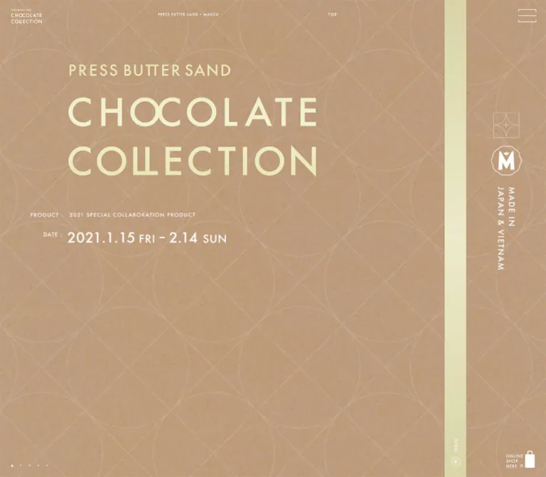
クラフト紙の質感、大きな欧文タイトル、繊細な線画が特徴の菓子コレクション特設ページ。PCでは章を横方向に配置し、スマートフォンでは縦方向へ展開。帯状のOPEN表示も右側から画面下部へ移ります。
PRESS BUTTER SAND CHOCOLATE COLLECTION — Style Reference
A confectionery collection presented like a paper box, with oversized lettering and a narrow opening ribbon.
Original URL: buttersand.com/chocolate-collection Final URL: buttersand.com/chocolate-collection Theme: light, tactile paper surfaces with cream or white graphics; several cover appearances are captured, without a verified theme selector. Inspected: October 6, 2026, at 01:21 JST. The supplied retrieval timestamp is October 5, 2026, at 16:21:43.451 UTC. Viewports: 1440 × 1000 desktop and 390 × 844 mobile, in CSS pixels. Scope: five original-page captures of the opening composition, plus rendered DOM and computed styles for the collaboration story, chocolate and packaging descriptions, special collection, product lineup, and shopping information. Later chapters are documented from DOM evidence rather than visually inspected screenshots.
The page makes its confectionery identity tangible through paper grain, restrained linework, and the proportions of packaging. An enormous uppercase collection title occupies an otherwise quiet field. Tiny navigation labels, a small corner wordmark, and a shopping-bag symbol surround it. A narrow colored ribbon divides the desktop composition near its right edge; on mobile, that ribbon becomes a horizontal strip above the bottom identity area.
This is a full-viewport collection presentation with an extended product story. Desktop chapter rectangles sit side by side, while mobile chapter rectangles stack vertically. The opening screen is therefore only the first part of the composition. Preserve the contrast between its spacious cover and the compact Japanese editorial text found in the subsequent DOM.
The currently served page displays the campaign dates 2021.1.15–2.14. Those dates are observed content, not the inspection date or evidence of current product availability.
閉じる
PRESS BUTTER SAND CHOCOLATE COLLECTION — Style Reference
A confectionery collection presented like a paper box, with oversized lettering and a narrow opening ribbon.
Original URL: buttersand.com/chocolate-collection Final URL: buttersand.com/chocolate-collection Theme: light, tactile paper surfaces with cream or white graphics; several cover appearances are captured, without a verified theme selector. Inspected: October 6, 2026, at 01:21 JST. The supplied retrieval timestamp is October 5, 2026, at 16:21:43.451 UTC. Viewports: 1440 × 1000 desktop and 390 × 844 mobile, in CSS pixels. Scope: five original-page captures of the opening composition, plus rendered DOM and computed styles for the collaboration story, chocolate and packaging descriptions, special collection, product lineup, and shopping information. Later chapters are documented from DOM evidence rather than visually inspected screenshots.
The page makes its confectionery identity tangible through paper grain, restrained linework, and the proportions of packaging. An enormous uppercase collection title occupies an otherwise quiet field. Tiny navigation labels, a small corner wordmark, and a shopping-bag symbol surround it. A narrow colored ribbon divides the desktop composition near its right edge; on mobile, that ribbon becomes a horizontal strip above the bottom identity area.
This is a full-viewport collection presentation with an extended product story. Desktop chapter rectangles sit side by side, while mobile chapter rectangles stack vertically. The opening screen is therefore only the first part of the composition. Preserve the contrast between its spacious cover and the compact Japanese editorial text found in the subsequent DOM.
The currently served page displays the campaign dates 2021.1.15–2.14. Those dates are observed content, not the inspection date or evidence of current product availability.
How to Read This Reference
- Measured means a value appears in the supplied computed styles or element bounds. Coordinates describe the captured layout state.
- Calculated means a relationship derived from those measurements, such as a width percentage or a gap between rectangles.
- Estimated means a visual approximation from the original-page screenshots. Paper colors, visible graphic letter sizes, and ribbon dimensions fall into this category where no corresponding DOM measurement was supplied.
- Recommended means guidance for a new implementation. Breakpoints, accessibility improvements, fallback fonts, and the Quick Start are recommendations unless explicitly identified otherwise.
- All named tokens are implementation aliases. The evidence reports no extracted custom properties; it does not establish that the original site has none.
- An element outside the viewport establishes rendered structure, but does not establish that its imagery was visually inspected or that its navigation was successfully exercised.
Tokens — Colors
Measured Interface and Chapter Colors
| Name | Value | Suggested token | Evidence and role |
|---|---|---|---|
| White | #FFFFFF |
--ink-white |
Measured text color on collection sections and editorial copy; white graphics are also visible in the cover captures |
| Action Orange | #FC3400 |
--action-orange |
Measured background of the product's ONLINE SHOP link and the two large shopping-information links |
| Cacao Navy | #053279 |
--chapter-navy |
Measured background of the chapter describing the dark chocolate butter sandwich; outside the supplied visual captures |
| Gift Pink — desktop | #EF7697 |
--chapter-pink-desktop |
Measured desktop background of the limited packaging chapter |
| Gift Pink — mobile | #F0A2B6 |
--chapter-pink-mobile |
Measured mobile background of that chapter; the responsive difference is explicit in the evidence |
| Shop Gray | #A5A5A5 |
--chapter-shop |
Measured background of the final shopping-information section |
The HTML and BODY records have transparent backgrounds and black inherited text. Those values do not describe the visible cover palette: section text is white, while the paper surface and graphic lettering have their own visual treatment.
Estimated Cover Palette
These values are practical starting points, not sampled pixels or recovered stylesheet declarations. Paper grain produces many local colors.
| Name | Approximate value | Suggested token | Visible role |
|---|---|---|---|
| Kraft Paper | #C4A582 |
--paper-kraft |
Warm tan field in two desktop captures and the patterned mobile capture |
| Cream Lettering | #EEECC8 |
--ink-cream |
Collection lettering in the cream-colored cover appearances |
| Pale Ribbon | #DEDEB6 |
--ribbon-pale |
Desktop vertical ribbon and mobile horizontal ribbon |
| Warm Gray Paper | #AEAA9A |
--paper-gray |
Third desktop cover appearance |
| Peach Paper | #F3BE9F |
--paper-peach |
Second mobile cover appearance |
| Silver Ribbon | #BDBDBB |
--ribbon-silver |
Representative midtone of the silver-toned desktop ribbon; its visible lightness varies along its height |
| Vivid Ribbon | #FF321F |
--ribbon-vivid |
Approximation of the bright red-orange ribbon in the gray-paper desktop capture |
Do not substitute the measured action orange for every orange-looking surface without checking the artwork. The ribbon and the product links are different evidence sources.
Captured Cover Appearances
| Original-page capture | Paper | Lettering and ribbon | Additional visible detail |
|---|---|---|---|
| Desktop A | Kraft | Cream title and pale ribbon | SPECIAL EDITION identity at right |
| Desktop B | Kraft | White title and silver-toned ribbon | A halo appears around the small OPEN marker |
| Desktop C | Warm gray | White title and vivid ribbon | Same overall composition as the other desktop captures |
| Mobile A | Kraft | Cream title and pale ribbon | Large, faint geometric line pattern; paired collaboration emblems |
| Mobile B | Peach | Cream title and pale ribbon | SPECIAL EDITION identity; no similarly prominent geometric pattern |
These are captured appearances, not verified user-selectable themes. Their trigger, order, and timing were not supplied.
Tokens — Typography
Japanese Editorial Text
Measured source stack: 'Noto Serif JP Medium', -apple-system, 'system-ui', 'Segoe UI', Roboto, 'Helvetica Neue', Arial, sans-serif.
The story headings and paragraphs use a measured weight of 500. This stack establishes the declared family, but the supplied evidence does not independently verify which font file rendered. Retain the exact declared family when the authorized font is available; otherwise test the fallback carefully because several fallbacks are sans-serif.
The editorial treatment is compact and deliberate. Desktop paragraphs are only 251px wide, with 12px text and 22px leading. Mobile paragraphs become wider and more generously led, despite the smaller viewport.
Collection Title and Graphic Labels
The title looks like custom geometric sans-serif lettering: broad circular forms, thin-to-medium strokes, open spacing, and two large uppercase lines below a smaller PRESS BUTTER SAND line.
Its H1 has an empty text extract and a computed 16px font size, while its measured box is 654 × 299.16px on desktop. The visible lettering therefore cannot be explained by the H1's inherited font declaration. Treat it as graphic title content; the supplied evidence does not reveal its file format or typeface.
The same caution applies to the corner identity and several empty H2 elements. Do not apply the Japanese body family to every visible graphic label or report a guessed display-font name as fact.
Type Scale
| Role | Desktop | Mobile | Status and use |
|---|---|---|---|
| Main title group | 654 × 299.16px box | 279.23 × 127.72px box | Measured graphic-container dimensions, not font sizes |
| Large collection lettering | Approximately 100–108px equivalent | Approximately 43–46px equivalent | Visual estimate for a text fallback; exact artwork is preferable |
| PRESS BUTTER SAND title line | Approximately 40px equivalent | Approximately 17px equivalent | Visual estimate |
| Story heading | 18px / 27px, weight 500 |
18.72px / 28.08px, weight 500 |
Measured H3 styles |
| Story paragraph | 12px / 22px, weight 500 |
13.52px / 28.08px, weight 500 |
Measured paragraph styles |
| Collaboration introduction | 13px / 24px, weight 500 |
13.52px / 32.76px, weight 500 |
Measured; mobile introduction has particularly open leading |
| Mobile editorial tracking | — | 0.03em |
Calculated from 0.4056px paragraph and 0.5616px heading tracking |
| Lineup introductory copy | 11px / 30px, tracking 1.1px |
Not established as equivalent visible text | Measured desktop paragraph |
| Product ONLINE SHOP label | 13px / 14.95px |
10.4px / 11.96px |
Measured anchor styles |
| Shop availability note | 10px / 15px |
10px / 15px |
Measured |
| Cover utility labels | Approximately 9–14px | Approximately 7–12px | Visual estimate; several labels may be graphic content |
A later desktop H2 reports 96px / 110.4px, but its extracted text is empty. That isolated declaration is not a reliable substitute for the visible cover-title scale.
Tokens — Spacing & Shapes
The page has two distinct spacing systems: expansive cover composition and small editorial text groups. There is insufficient evidence to claim a universal spacing unit.
Spacing Measurements
| Relationship | Desktop | Mobile | Evidence |
|---|---|---|---|
| Corner identity inset | 30px left, 25px top | 15.59px left and top | Measured link bounds |
| Main title position | x = 180px; y = 264.42px | x = 73.83px; y = 157.03px | Measured H1 bounds |
| Story paragraph left edge within a chapter | 246.75px for the repeated editorial chapters | 63.95px | Measured, after subtracting desktop chapter offsets |
| Standard story paragraph width | 251px | 310.45px | Measured |
| Standard story heading width | 225.5px | Usually 278.92px | Measured; one mobile packaging-related heading is wider |
| Heading-to-paragraph gap | 30px | Approximately 22.88px | Calculated from successive bounds |
| Numbered packaging paragraph gap | 20px | Approximately 22.88px | Calculated |
| Desktop chapter-marker pitch | 23px | Not present in supplied mobile links | Calculated from x = 30, 53, 76, 99, 122 |
| Large shop-link gap | 50px horizontally | Approximately 31.19px vertically | Calculated |
Shapes
| Element | Observed treatment |
|---|---|
| Page and chapter surfaces | Rectangular, full bleed |
| Product shop link | Square corners; measured radius 0 |
| Large shopping links | Square tiles; measured radius 0 |
| Emblems | Fine outlined squares and a circular or scalloped brand seal, depending on the captured appearance |
| Menu glyph | Three fine horizontal rules with short vertical returns visible in the artwork |
| Section indicators | Tiny dots, with a diamond-like active marker in the desktop captures |
| OPEN marker | Small circular point; a surrounding halo appears in some desktop captures |
There is no general rounded-card or shadow-elevation system in the observed cover.
Opening Composition
| Element | Desktop at 1440 × 1000 | Mobile at 390 × 844 |
|---|---|---|
| Cover section | Measured 1440 × 1000px | Measured 390 × 844px |
| Corner wordmark link | Measured 80 × 37px | Measured 63.44 × 29.33px |
| Menu link | Measured 32 × 25px | Measured 25 × 25px |
| Shopping-bag link | Measured 74 × 44.44px | Measured 49.91 × 30.23px |
| Opening ribbon | Approximately x = 1173px, width = 57px, full height | Approximately y = 686px, height = 44px, full width |
| Edition area | Approximately the rightmost 210px | Approximately the bottom 114px below the ribbon |
| Product/date block | Approximately x = 80px, y = 657px | Approximately x = 74px, y = 405px |
Ribbon and metadata measurements above are screenshot estimates, because their specific element bounds were not included.
Components
Corner Identity
A miniature three-line collection identity sits at the upper left. Its measured link points to the collection URL. On desktop it occupies an 80 × 37px box, inset 30px horizontally and 25px vertically. On mobile the box becomes approximately 63 × 29px with a 15.6px inset.
Its small scale is intentional: the central title establishes the collection, while this corner element acts as a persistent-looking signature. Persistence during chapter navigation was not tested.
Collection Cover Title
The title group contains a smaller brand line followed by CHOCOLATE and COLLECTION on separate lines. It is left aligned, with substantial space around it and no containing panel.
Desktop bounds are x = 180px, y = 264.42px, width = 654px, height = 299.16px. Mobile bounds are x = 73.83px, y = 157.03px, width = 279.23px, height = 127.72px.
The mobile group is approximately 42.7% of the desktop group's width and height, preserving its overall proportions. Relative to the viewport, however, it grows from 45.4% to 71.6% of the available width. Keep the graphic intact while changing its surrounding composition.
Product and Date Block
This secondary block identifies the collaboration and its dates. The desktop arrangement uses short labels at left and larger values to their right. PRODUCT introduces a small uppercase description; DATE introduces the much larger numeric date line.
On mobile, the labels move above their values. Both rows align with the title's left edge rather than the far-left navigation strip. A large blank interval separates the title from this information.
The observed copy includes 2021 SPECIAL COLLABORATION PRODUCT and 2021.1.15 FRI – 2.14 SUN. These are campaign labels, not live availability indicators.
Chapter Labels and Section Markers
Desktop places PRESS BUTTER SAND × MAROU near the top, with TOP farther right. Five small links sit at the lower left. Their measured footprints are 4 × 4px, spaced at 23px intervals.
The recorded fragments are #top, #collabolation, #special, #lineup, and #shoplist. Preserve the spelling of #collabolation when referencing the existing destination.
Mobile moves the collaboration label into a vertical strip near the left edge, starting around y = 153px. TOP appears farther down that strip around y = 438px. The desktop dot-link set is absent from the supplied mobile link inventory and screenshots.
These links establish navigation destinations. Their scroll animation and selected-state logic remain unverified.
Menu Control
The upper-right control is a sparse line drawing without a surrounding filled button. The recorded anchor uses javascript:void(0) and has no extracted text.
Only its closed appearance is supplied. The menu layout, opening transition, available items, dismissal behavior, and keyboard handling are unknown. A new implementation should use a semantic button and an explicit accessible name, while preserving the small visible glyph inside a larger target.
OPEN Ribbon
On desktop, the ribbon is a narrow vertical strip between the main title field and the edition area. OPEN runs vertically near its lower end, with a tiny point beneath it. The strip spans the full captured height.
On mobile, the same visual idea becomes a full-width horizontal band around y = 686px. OPEN is horizontal and aligned near the right edge.
The strip evokes a package opening or seal. Its actual activation result was not supplied, and no reliable element measurement or handler was included. Do not invent a drawer, door animation, or chapter transition as an observed behavior.
Edition and Collaboration Signature
The desktop right-hand area combines fine emblems with vertical SPECIAL EDITION text. On mobile, the identity becomes a horizontal group beneath the ribbon. One mobile capture shows paired collaboration emblems with MADE IN JAPAN & VIETNAM; another shows the special-edition combination.
Keep these marks visually delicate and subordinate to the collection title. Their exact shapes belong to the identity artwork and should not be replaced with a generic icon set when authorized originals are available.
Corner Online-Shop Link
A white shopping-bag symbol sits beside tiny stacked ONLINE SHOP HERE text and a diagonal arrow. Desktop places it at the lower right; mobile moves it to the lower left.
Its destination is the PRESS BUTTER SAND collection on the external shop. The measured anchor is 74 × 44.44px on desktop and 49.91 × 30.23px on mobile. The destination was recorded, but its current content and purchase flow were not inspected.
Editorial Story Chapter
Repeated desktop chapters occupy 1440 × 1000px rectangles. A narrow text column usually starts 246.75px inside the chapter. H3 headings use 18px type, 27px leading, and a 225.5px width. Paragraphs use 12px type, 22px leading, and a 251px width, beginning 30px below the heading.
On mobile, the same copy moves to a roughly 310px-wide column at x = 63.95px. Headings become 18.72px and paragraphs 13.52px. Both use 28.08px leading, while the introductory collaboration paragraph uses 32.76px leading.
A large linked media region is recorded in the MAROU chapter: 780 × 543.39px on desktop and 390 × 273.39px on mobile. Its javascript:void(0) link does not establish whether it opens a film, gallery, or another interaction.
Story Sequence
| Chapter content established by the DOM | Desktop arrangement | Mobile arrangement |
|---|---|---|
| Collaboration introduction | Chapter begins at x = 1440px | Begins at y = 844px; approximately 1524.5px tall |
| MAROU brand introduction | x = 2880px | y = 2368.5px; approximately 1361.31px tall |
| Original chocolate blend | x = 4320px | y = 3729.81px; approximately 1133.92px tall |
| Butter-sandwich taste and ingredients | x = 5760px | y = 4863.73px; approximately 977.5px tall |
| Packaging story | x = 7200px | y = 5841.23px; approximately 1857.66px tall |
| Graphic interlude associated with the special collection | x = 8640px; empty heading text extract | y = 7698.89px; 844px tall |
| Dark chocolate butter sandwich | x = 10080px; navy background | y = 8542.89px; approximately 1120.98px tall |
| Limited gift packaging | x = 11520px; desktop pink background | y = 9663.88px; approximately 1283.34px tall |
These measurements establish the sequence and responsive reflow. They do not establish the complete visual appearance of the chapters.
Packaging Notes
Three numbered paragraphs explain paper selection, embossed box patterning, and a sticker gradient associated with the chocolate blend. Desktop uses a 20px gap between paragraphs; mobile uses approximately 22.88px.
Treat these as editorial annotations. The supplied evidence does not show a separate card around each note. References to embossing and foil describe the physical packaging; they do not prove that the web interface applies emboss or foil effects to every element.
Product Lineup Entry
The DOM identifies a three-piece assortment containing two MAROU chocolate butter sandwiches and one original butter sandwich, with a displayed tax-inclusive price of ¥864.
A rectangular ONLINE SHOP link follows the product information. Its measured size is 160 × 36px on desktop and 184.59 × 41.59px on mobile, with #FC3400 fill and white text. The mobile label is smaller even though its button rectangle is larger.
Product imagery, alignment of every product field, and additional lineup items were not visually established. The recorded price and assortment are page content, not verified current retail information.
Shopping-Information Section
A measured #A5A5A5 section contains two orange square links: one to product-availability news and one to the external collection shop.
Desktop squares are 420 × 420px with a 50px horizontal gap. Mobile squares are approximately 249.59 × 249.59px, stacked with a 31.19px vertical gap and positioned toward the right at x = 124.81px.
A small availability note uses 10px type with 15px leading. Its mobile rectangle overlaps the vertical range of the first square, so the desktop note placement should not simply be copied to mobile. The screenshots do not show the finished section or establish how its graphics and text are layered.
Tokens — Motion & Interaction
| Evidence | Established behavior or value | Limitation |
|---|---|---|
| Multiple original cover captures | Paper, title, ribbon, and identity appearances differ | Trigger, sequencing, duration, and automatic advancement are unknown |
| Large shopping links | Measured transition: 0.3s cubic-bezier(0.6, 0, 0.6, 1) |
The changed property and hover endpoint were not supplied |
| Most sampled elements | Computed animation is none |
This does not rule out animation on descendants, pseudo-elements, or through JavaScript |
| Most sampled transitions | Reported as all |
No usable duration is established by that value alone |
| Section-marker anchors | Five recorded chapter fragments on desktop | Actual scrolling behavior was not exercised in the supplied evidence |
| Menu and linked media region | javascript:void(0) anchors exist |
Activation behavior is unknown |
| OPEN ribbon | Visible label and small marker | Opening action is unverified |
| Product and shop links | Actual destination URLs are recorded | Destination pages and checkout behavior were not inspected |
The geometric arrangement supports a desktop chapter sequence, but does not prove wheel hijacking, drag navigation, horizontal snapping, or a particular animation library. Avoid assigning spring motion, parallax, crossfades, or automatic theme cycling to the original without additional evidence.
For an adaptation, keep transitions restrained and make every chapter reachable without a precision gesture. The measured 300ms easing is a reasonable local reference for controls, provided its new use is identified as a recommendation.
Surfaces
| Layer | Appearance | Function |
|---|---|---|
| Opening canvas | Fine paper grain in tan, gray, or peach appearances | Establishes material character across the full viewport |
| Optional cover pattern | Faint arcs and diagonals over the paper | Suggests printed or embossed packaging ornament |
| Title and utility graphics | Cream or white, without containing cards | Creates hierarchy through scale and placement |
| Opening ribbon | Pale, silver-toned, or vivid strip | Divides the desktop composition and marks the mobile bottom region |
| Editorial chapters | Mostly transparent sampled section backgrounds; explicit navy and pink for specific chapters | Supports the product narrative; underlying surfaces are not fully documented |
| Product shop action | Flat orange rectangle | Provides a compact purchasing destination |
| Shopping-information area | Gray field with orange square links | Separates availability and shop destinations |
Use scale, color fields, texture, and fine marks to establish hierarchy. The captured cover has no conventional elevated content panels.
Imagery
The directly observed imagery is material and graphic: paper fibers, fine grain, thin geometric ornament, outlined emblems, a shopping-bag silhouette, and custom-looking uppercase lettering.
The patterned mobile cover uses large intersecting circles or arcs and diagonal lines. The ornament stays faint enough that the title remains dominant. Its exact repeat dimensions, opacity, and implementation are unknown. A reconstruction should keep the pattern low contrast and avoid turning it into a prominent geometric wallpaper.
The grain is continuous across large areas. It should feel like a paper stock viewed at a consistent scale, rather than coarse noise independently generated inside each component.
No product photography is visible in the five original-page captures. The DOM establishes product and packaging subjects, but it does not establish photographic lighting, cropping, backgrounds, or image treatment.
Observed Asset References
No image src, SVG source, font-file URL, or background-image path was supplied. The following inventory describes visible roles, not recovered filenames.
| Asset role | Established appearance | Implementation guidance |
|---|---|---|
| Main collection title | Three-line graphic group with preserved proportions | Use authorized artwork when available; keep a meaningful text alternative |
| Corner collection identity | Small stacked white wordmark | Preserve its proportions and fine lettering |
| Paper surface | Fine, irregular grain across the viewport | Use a seamless licensed texture at a stable scale |
| Geometric ornament | Faint large arcs and diagonal lines in one mobile capture | Treat as a separate decorative layer; exact construction is unverified |
| Collaboration and edition emblems | Delicate outlined marks | Use original authorized identity assets rather than approximate brand symbols |
| Shop symbol | White bag, tiny caption, diagonal arrow | Preserve the compact relationship between symbol and caption |
| Menu glyph | Fine horizontal rules with small returns | A CSS fallback can approximate it, but exact linework requires the artwork |
For a new product story, carefully lit packaging and ingredient photographs would be a reasonable addition. That is a recommendation, not a description of inspected imagery.
Layout & Responsive Behavior
Desktop
The opening is a viewport-sized composition with an asymmetric split. The title occupies the left field; a narrow ribbon begins around 81.5% of the viewport width; the remaining right-hand area contains the edition identity and shop link.
Small top labels run horizontally. Section markers occupy the lower left. The title is placed well below the top edge, leaving approximately 264px above its measured box at the inspected size.
Later section bounds occur at x = 1440, 2880, 4320, and subsequent viewport-width intervals. This is direct evidence of horizontally arranged chapters. The final shopping section has a different measured width of 1260px, so the entire sequence should not be assumed to consist only of identical slides.
Mobile
The opening remains 390 × 844px. The title starts at approximately 18.9% of viewport width and 18.6% of viewport height. Its left offset leaves room for vertical navigation labels.
The product/date block stacks its labels above values. The right-side ribbon moves to a full-width horizontal position, and edition marks move into the bottom region. The shop link changes corners, from bottom right to bottom left.
Later chapters become vertically arranged and have variable heights. Their paragraph column is about 310px wide, leaving approximately 64px on the left and 16px on the right. That asymmetry is a defining part of the mobile composition.
Responsive Relationships
| Relationship | Calculation | Interpretation |
|---|---|---|
| Title width | 45.4% of desktop width; 71.6% of mobile width | The title receives more relative width on mobile |
| Title artwork scale | Mobile dimensions are approximately 42.7% of desktop dimensions | The group preserves its aspect ratio |
| Paragraph width | 251px desktop → 310.45px mobile | Mobile editorial text is not a uniformly shrunken desktop layout |
| Mobile paragraph tracking | 0.4056 ÷ 13.52 = 0.03em | Consistent proportional tracking |
| Mobile heading tracking | 0.5616 ÷ 18.72 = 0.03em | Same tracking relationship as paragraphs |
| Mobile type proportions | Several sizes equal a 1.04 multiple of round values | Consistent with viewport scaling from a 375px reference, but the actual source formula is unverified |
The document-height values remain equal to the viewport heights even though descendant bounds extend far beyond them. An internal, clipped, or transformed content structure is involved; the supplied evidence does not identify the exact scroll container or controller.
Only the two specified viewport sizes were inspected. The breakpoint, intermediate widths, landscape behavior, zoom behavior, and safe-area handling remain unknown.
Do’s and Don’ts
Do
- Make the paper surface continuous across the opening composition.
- Preserve the three-line title as a coherent graphic group.
- Keep the title, corner identity, utility labels, and editorial text at clearly different scales.
- Maintain the asymmetric mobile inset for the title and story text.
- Reorient the opening ribbon from vertical on desktop to horizontal on mobile.
- Use thin white or cream identity marks and generous empty space.
- Preserve the measured orange, navy, pink, and gray values when reproducing their DOM-established roles.
- Keep Japanese editorial text in narrow, carefully led columns.
- Distinguish observed artwork from recommended replacement assets.
- Verify navigation and state changes before reproducing their motion.
Don’t
- Don’t treat the H1's inherited 16px declaration as the visible title size.
- Don’t identify the graphic title with a guessed font family.
- Don’t turn each paragraph into a rounded card.
- Don’t add a large central purchase button to the quiet opening composition.
- Don’t infer a theme switcher or slideshow timing from the differing captures.
- Don’t describe unseen product photography as if it had been inspected.
- Don’t assume the viewport-height document contains only one screen of content.
- Don’t flatten mobile into a proportionally scaled desktop composition.
- Don’t use the old campaign dates or displayed price as proof of current availability.
- Don’t reproduce tiny link footprints without improving keyboard and touch access.
Recommended Implementation Additions
These are recommendations for a new implementation, not verified features of the original:
- Give the graphic collection title a meaningful accessible name. An empty text extract alone does not establish whether the original image already has suitable alternative text.
- Enlarge menu, dot, and shop targets to at least 44 × 44px while retaining their delicate visible artwork.
- Provide named chapter links and expose the current chapter programmatically.
- Use a semantic button for menu toggling, with focus management and an expanded state.
- Define OPEN as a clear link or button only after its intended action is specified.
- Keep all story content reachable through ordinary keyboard navigation and a usable scroll path.
- Audit cream and white text against each paper appearance. Small utility text is the most likely area needing a stronger contrast treatment.
- Offer reduced-motion behavior for any added transitions or automatic appearance changes.
- Test a larger mobile body size, such as 15–16px, if reading comfort takes priority over literal source proportions.
- Make campaign status and external shopping destinations clear if adapting this page for an active collection.
Agent Prompt Guide
Quick Color Reference
- Kraft cover approximation:
#C4A582. - Cream graphic approximation:
#EEECC8. - Pale ribbon approximation:
#DEDEB6. - Measured white interface text:
#FFFFFF. - Measured shopping-action fill:
#FC3400. - Measured dark product chapter:
#053279. - Measured gift chapter: desktop
#EF7697, mobile#F0A2B6. - Measured shopping-information field:
#A5A5A5.
Overall Prompt
“Create a confectionery collection presentation inspired by a finely printed paper box. Use a continuous kraft-paper texture, enormous cream geometric title artwork, tiny white utility labels, and delicate outlined identity marks. At 1440 × 1000, place a 654 × 299px title group near x = 180 and y = 264. Divide the right edge with a roughly 57px vertical ribbon and reserve approximately 210px for edition marks. Keep the product description and date well below the title. At 390 × 844, scale the title group to about 279 × 128px at x = 74 and y = 157, move navigation labels into a left vertical strip, and convert the ribbon to a horizontal band near the bottom. Use compact Japanese editorial chapters after the cover. Preserve generous empty space, square corners, and material texture. Treat menu and opening behavior as requirements to define explicitly.”
Example Component Prompts
- Opening title: “A three-line cream collection graphic over fine tan paper grain. Small PRESS BUTTER SAND line above two large lines, CHOCOLATE and COLLECTION. Preserve the artwork's proportions, left alignment, and broad blank margins. No card, frame, or title shadow.”
- Ribbon and edge identity: “A narrow pale vertical strip near the desktop right edge, with a small vertical OPEN label near its bottom. Place thin edition emblems in the adjacent paper area. On mobile, convert the strip to a full-width horizontal band and arrange the edition identity below it.”
- Editorial chapter: “A restrained Japanese product-story block using the declared Noto Serif JP Medium stack. Desktop heading: 18px with 27px leading; paragraph: 12px with 22px leading in a 251px column. Mobile paragraph: approximately 310px wide with 13.52px type, 28.08px leading, and 0.03em tracking. Keep the larger left mobile margin.”
- Shopping links: “A gray shopping-information surface containing two square orange links. Use measured colors #A5A5A5 and #FC3400. Desktop links are 420px squares separated by 50px; mobile links are approximately 250px squares stacked toward the right. Supply meaningful link labels and visible keyboard focus.”
Quick Start
CSS Custom Properties
This recommended adaptation reproduces the opening proportions and measured text treatments. It provides ordinary document flow for later content; the original horizontal chapter controller is not implemented here.
The 767px breakpoint is a recommendation. Paper colors are visual approximations. Texture and pattern variables default to none because no original asset URLs were supplied.
Expected component structure: .collection-cover contains the corner identity, menu, two chapter labels, title artwork, product/date definition list, ribbon, edition marks, shop link, and optional desktop dots. Editorial sections follow as .story-panel elements. Use real anchors and buttons for actions; their behavior must be implemented separately.
:root {
  /* Estimated cover colors */
  --paper-kraft: #c4a582;
  --paper-gray: #aeaa9a;
  --paper-peach: #f3be9f;
  --ink-cream: #eeecc8;
  --ribbon-pale: #dedeb6;

  /* Measured DOM colors */
  --ink-white: #fff;
  --action-orange: #fc3400;
  --chapter-navy: #053279;
  --chapter-pink-desktop: #ef7697;
  --chapter-pink-mobile: #f0a2b6;
  --chapter-shop: #a5a5a5;

  /* Declared source stack; font files are not included */
  --font-story: 'Noto Serif JP Medium', -apple-system,
    system-ui, 'Segoe UI', Roboto, 'Helvetica Neue', Arial,
    sans-serif;

  /* Recommended fallback for utility text, not an identified font */
  --font-utility: system-ui, sans-serif;

  --text-story: 12px;
  --leading-story: 22px;
  --text-story-heading: 18px;
  --leading-story-heading: 27px;
  --story-column: 251px;
  --story-copy-gap: 30px;

  /* Supply licensed texture assets in the integrating project */
  --paper-texture: none;
  --paper-pattern: none;
  --paper-texture-size: 512px auto;

  /* Measured easing on the large shop links */
  --motion-link: 300ms cubic-bezier(0.6, 0, 0.6, 1);
}

* {
  box-sizing: border-box;
}

body {
  margin: 0;
}

.collection-cover {
  position: relative;
  isolation: isolate;
  height: 100svh;
  min-height: 760px;
  color: var(--ink-white);
  background-color: var(--paper-kraft);
  background-image: var(--paper-pattern), var(--paper-texture);
  background-size: cover, var(--paper-texture-size);
  background-repeat: no-repeat, repeat;
}

.brand-link,
.shop-link {
  position: absolute;
  z-index: 2;
  display: block;
  color: inherit;
  text-decoration: none;
}

.brand-link {
  top: 25px;
  left: 30px;
  width: 80px;
}

.shop-link {
  right: 30px;
  bottom: 25px;
  width: 74px;
}

.brand-link img,
.shop-link img,
.cover-title img,
.cover-title svg {
  display: block;
  width: 100%;
  height: auto;
}

/* Authorized graphic artwork supplies the exact letterforms. */
.cover-title {
  position: absolute;
  top: 26.442%;
  left: 12.5%;
  width: 45.4167%;
  max-width: 654px;
  margin: 0;
  color: var(--ink-cream);
}

/* Recommended enlarged target around the small visible glyph. */
.menu-button {
  position: absolute;
  z-index: 3;
  top: 15.5px;
  right: 24px;
  display: grid;
  place-items: center;
  width: 44px;
  height: 44px;
  padding: 0;
  border: 0;
  background: transparent;
  color: inherit;
  cursor: pointer;
}

.menu-glyph {
  display: block;
  width: 32px;
  height: 25px;
  border-block: 1px solid currentColor;
  background:
    linear-gradient(currentColor, currentColor)
    center / 100% 1px no-repeat;
}

.collaboration-label,
.current-label {
  position: absolute;
  top: 25px;
  font-family: var(--font-utility);
  font-size: 9px;
  line-height: 1.2;
  letter-spacing: 0.14em;
}

.collaboration-label {
  left: 29%;
}

.current-label {
  left: 59.375%;
}

/* Screenshot-derived placement; text metrics are approximations. */
.cover-meta {
  position: absolute;
  top: 65.5%;
  left: 5.5556%;
  margin: 0;
  font-family: var(--font-utility);
}

.cover-meta > div {
  display: grid;
  grid-template-columns: 88px auto;
  align-items: baseline;
  column-gap: 16px;
}

.cover-meta > div + div {
  margin-top: 24px;
}

.cover-meta dt {
  text-align: right;
  font-size: 14px;
  letter-spacing: 0.08em;
}

.cover-meta dd {
  margin: 0;
  font-size: 14px;
  line-height: 1.4;
  letter-spacing: 0.09em;
}

.cover-meta .date-value {
  font-size: 40px;
  line-height: 1.2;
  letter-spacing: 0.02em;
}

.date-value small {
  font-size: 0.72em;
}

.open-ribbon {
  position: absolute;
  top: 0;
  right: 14.5833%;
  display: flex;
  flex-direction: column;
  align-items: center;
  justify-content: flex-end;
  gap: 16px;
  width: 3.9583%;
  min-width: 44px;
  height: 100%;
  padding: 0 0 30px;
  border: 0;
  border-radius: 0;
  background: var(--ribbon-pale);
  color: var(--ink-white);
  text-decoration: none;
  font-family: var(--font-utility);
}

.open-ribbon-label {
  writing-mode: vertical-rl;
  font-size: 10px;
  line-height: 1;
  letter-spacing: 0.2em;
}

.open-ribbon-marker {
  width: 4px;
  height: 4px;
  border-radius: 50%;
  background: currentColor;
}

.edition-mark {
  position: absolute;
  top: 25.5%;
  right: 0;
  left: 85.4167%;
  display: flex;
  flex-direction: column;
  align-items: center;
  gap: 18px;
}

.edition-mark img,
.edition-mark svg {
  display: block;
  width: 50px;
  height: auto;
}

.edition-caption {
  writing-mode: vertical-rl;
  font-family: var(--font-utility);
  font-size: 14px;
  letter-spacing: 0.08em;
}

.section-dots {
  position: absolute;
  bottom: 8px;
  left: 10px;
  display: flex;
  gap: 2px;
}

/* Larger targets preserve the small visible marker scale. */
.section-dots a {
  display: grid;
  place-items: center;
  width: 44px;
  height: 44px;
  color: inherit;
}

.section-dots a::before {
  content: '';
  width: 4px;
  height: 4px;
  border-radius: 50%;
  background: currentColor;
  opacity: 0.55;
}

.section-dots a[aria-current]::before {
  border-radius: 0;
  opacity: 1;
  transform: rotate(45deg);
}

/* Natural-flow chapter adaptation; media must be supplied separately. */
.story-panel {
  display: grid;
  grid-template-columns: var(--story-column) minmax(0, 1fr);
  align-content: start;
  gap: 4.6vw;
  min-height: 100svh;
  padding: 20.45svh 6.6667vw 7.4svh 17.1354vw;
  background: var(--paper-kraft);
  color: var(--ink-white);
  font-family: var(--font-story);
}

.story-copy h3 {
  max-width: 225.5px;
  margin: 0 0 var(--story-copy-gap);
  font-size: var(--text-story-heading);
  font-weight: 500;
  line-height: var(--leading-story-heading);
}

.story-copy p {
  margin: 0;
  font-size: var(--text-story);
  font-weight: 500;
  line-height: var(--leading-story);
}

.story-copy p + p {
  margin-top: 20px;
}

.story-panel--navy {
  background: var(--chapter-navy);
}

.story-panel--pink {
  background: var(--chapter-pink-desktop);
}

.product-shop-link {
  display: inline-flex;
  align-items: center;
  justify-content: center;
  width: 160px;
  min-height: 36px;
  padding: 8px;
  border-radius: 0;
  background: var(--action-orange);
  color: var(--ink-white);
  font-family: var(--font-story);
  font-size: 13px;
  line-height: 1.15;
  text-decoration: none;
}

.shop-information {
  padding: 80px 30px;
  background: var(--chapter-shop);
  color: var(--ink-white);
}

.shop-links {
  display: flex;
  justify-content: center;
  gap: 50px;
}

.shop-tile {
  display: grid;
  place-items: center;
  width: min(420px, 40vw);
  aspect-ratio: 1;
  padding: 24px;
  border-radius: 0;
  background: var(--action-orange);
  color: inherit;
  text-decoration: none;
  transition: opacity var(--motion-link);
}

/* Recommended hover endpoint; the original endpoint is unknown. */
@media (hover: hover) {
  .shop-tile:hover {
    opacity: 0.85;
  }
}

:where(a, button):focus-visible {
  outline: 2px solid var(--chapter-navy);
  outline-offset: 4px;
}

@media (max-width: 767px) {
  .collection-cover {
    min-height: 780px;
  }

  .brand-link {
    top: 4vw;
    left: 4vw;
    width: 16.267vw;
  }

  .menu-button {
    top: calc(4vw - 9.5px);
    right: calc(4vw - 9.5px);
  }

  .menu-glyph {
    width: 25px;
  }

  .cover-title {
    top: 18.606%;
    left: 18.93%;
    width: 71.5986%;
  }

  .collaboration-label,
  .current-label {
    left: 4%;
    writing-mode: vertical-rl;
    font-size: 9px;
  }

  .collaboration-label {
    top: 18.15%;
  }

  .current-label {
    top: 51.8%;
  }

  .cover-meta {
    top: 47.87%;
    right: 4%;
    left: 18.93%;
  }

  .cover-meta > div {
    display: block;
  }

  .cover-meta > div + div {
    margin-top: 16px;
  }

  .cover-meta dt {
    margin-bottom: 7px;
    text-align: left;
    font-size: 10px;
  }

  .cover-meta dd {
    font-size: 12px;
  }

  .cover-meta .date-value {
    font-size: clamp(21px, 6.15vw, 30px);
  }

  .open-ribbon {
    top: auto;
    right: 0;
    bottom: 13.51%;
    left: 0;
    flex-direction: row;
    justify-content: flex-end;
    gap: 8px;
    width: auto;
    height: 5.214%;
    min-height: 44px;
    padding: 0 4%;
  }

  .open-ribbon-label {
    writing-mode: horizontal-tb;
    font-size: 9px;
  }

  .edition-mark {
    top: auto;
    right: 4%;
    bottom: 2.2%;
    left: 43.8%;
    flex-direction: row;
    justify-content: flex-start;
    gap: 12px;
  }

  .edition-mark img,
  .edition-mark svg {
    width: 34px;
  }

  .edition-caption {
    writing-mode: horizontal-tb;
    font-size: 10px;
    line-height: 1.5;
  }

  .shop-link {
    right: auto;
    bottom: 2.28%;
    left: 4%;
    width: 12.797vw;
  }

  .section-dots {
    display: none;
  }

  .story-panel {
    display: block;
    min-height: auto;
    padding: 32vw 4vw 32vw 16.4vw;
  }

  .story-copy h3 {
    max-width: 71.52vw;
    margin-bottom: 22.88px;
    font-size: 18.72px;
    line-height: 28.08px;
    letter-spacing: 0.03em;
  }

  .story-copy p {
    font-size: 13.52px;
    line-height: 28.08px;
    letter-spacing: 0.03em;
  }

  .story-copy p + p {
    margin-top: 22.88px;
  }

  .story-copy--introduction p {
    line-height: 32.76px;
  }

  .story-panel--pink {
    background: var(--chapter-pink-mobile);
  }

  .product-shop-link {
    width: 184.59px;
    min-height: 44px;
    font-size: 10.4px;
  }

  .shop-information {
    padding: 32vw 4vw;
  }

  .shop-links {
    flex-direction: column;
    align-items: flex-end;
    gap: 8vw;
  }

  .shop-tile {
    width: 64vw;
  }
}

@media (prefers-reduced-motion: reduce) {
  .shop-tile {
    transition: none;
  }
}
The enlarged dot targets use a wider pitch than the measured original. The minimum cover heights and 44px mobile shop-button height are also recommended usability adjustments. Exact artwork, material assets, intermediate-width refinements, and menu behavior remain integration work.
Tailwind v4 Token Mapping
Optional aliases for a project that already uses Tailwind v4. This is not evidence that the original site uses Tailwind. Define the custom properties above first.
@theme inline {
  --color-kraft: var(--paper-kraft);
  --color-cream: var(--ink-cream);
  --color-ribbon: var(--ribbon-pale);
  --color-action: var(--action-orange);
  --color-cacao: var(--chapter-navy);
  --color-gift: var(--chapter-pink-desktop);
  --color-shop: var(--chapter-shop);

  --font-editorial: var(--font-story);
  --font-interface: var(--font-utility);

  --text-story: 12px;
  --text-story-heading: 18px;
  --spacing-story-column: 251px;
  --spacing-touch-target: 44px;
  --radius-flat: 0px;
}
Sources & Evidence
- Original and final website: PRESS BUTTER SAND CHOCOLATE COLLECTION. The supplied response status is HTTP 200, with no URL change.
- Capture time: October 5, 2026, 16:21:43.451 UTC; October 6, 2026, 01:21:43.451 JST.
- Visual evidence: three original-page desktop captures at 1440 × 1000 and two original-page mobile captures at 390 × 844. All show the opening composition in differing appearances.
- Rendered evidence: page title, extracted text, link destinations, element rectangles, computed typography, selected background colors, border radii, and transition declarations at both viewports.
- Recorded original-page destinations:
#top,#collabolation,#special,#lineup, and#shoplist; the product-availability link points to the campaign news URL. Link targets were recorded without inspecting destination pages. - Readiness limitations: the supplied capture process waited for loading, sampled stability, and relevant finite motion within time limits. It temporarily paused perpetual animation during readiness checks. This supports settled captures but does not establish a complete interaction sequence.
- Inspection limitations: no raw stylesheet, source asset paths, font files, open-menu capture, verified OPEN action, or successful chapter-navigation trace was supplied. Later chapters are documented from rendered DOM measurements, not from visual captures of their complete compositions.
This reference describes the page currently served at the inspected URL. It preserves the distinction between visible evidence, off-viewport DOM structure, calculated relationships, and implementation recommendations.
# PRESS BUTTER SAND CHOCOLATE COLLECTION — Style Reference

> A confectionery collection presented like a paper box, with oversized lettering and a narrow opening ribbon.

**Original URL:** [buttersand.com/chocolate-collection](https://buttersand.com/chocolate-collection/)
**Final URL:** [buttersand.com/chocolate-collection](https://buttersand.com/chocolate-collection/)
**Theme:** light, tactile paper surfaces with cream or white graphics; several cover appearances are captured, without a verified theme selector.
**Inspected:** October 6, 2026, at 01:21 JST. The supplied retrieval timestamp is October 5, 2026, at 16:21:43.451 UTC.
**Viewports:** 1440 × 1000 desktop and 390 × 844 mobile, in CSS pixels.
**Scope:** five original-page captures of the opening composition, plus rendered DOM and computed styles for the collaboration story, chocolate and packaging descriptions, special collection, product lineup, and shopping information. Later chapters are documented from DOM evidence rather than visually inspected screenshots.

The page makes its confectionery identity tangible through paper grain, restrained linework, and the proportions of packaging. An enormous uppercase collection title occupies an otherwise quiet field. Tiny navigation labels, a small corner wordmark, and a shopping-bag symbol surround it. A narrow colored ribbon divides the desktop composition near its right edge; on mobile, that ribbon becomes a horizontal strip above the bottom identity area.

This is a full-viewport collection presentation with an extended product story. Desktop chapter rectangles sit side by side, while mobile chapter rectangles stack vertically. The opening screen is therefore only the first part of the composition. Preserve the contrast between its spacious cover and the compact Japanese editorial text found in the subsequent DOM.

The currently served page displays the campaign dates **2021.1.15–2.14**. Those dates are observed content, not the inspection date or evidence of current product availability.
閉じる
# PRESS BUTTER SAND CHOCOLATE COLLECTION — Style Reference

> A confectionery collection presented like a paper box, with oversized lettering and a narrow opening ribbon.

**Original URL:** [buttersand.com/chocolate-collection](https://buttersand.com/chocolate-collection/)
**Final URL:** [buttersand.com/chocolate-collection](https://buttersand.com/chocolate-collection/)
**Theme:** light, tactile paper surfaces with cream or white graphics; several cover appearances are captured, without a verified theme selector.
**Inspected:** October 6, 2026, at 01:21 JST. The supplied retrieval timestamp is October 5, 2026, at 16:21:43.451 UTC.
**Viewports:** 1440 × 1000 desktop and 390 × 844 mobile, in CSS pixels.
**Scope:** five original-page captures of the opening composition, plus rendered DOM and computed styles for the collaboration story, chocolate and packaging descriptions, special collection, product lineup, and shopping information. Later chapters are documented from DOM evidence rather than visually inspected screenshots.

The page makes its confectionery identity tangible through paper grain, restrained linework, and the proportions of packaging. An enormous uppercase collection title occupies an otherwise quiet field. Tiny navigation labels, a small corner wordmark, and a shopping-bag symbol surround it. A narrow colored ribbon divides the desktop composition near its right edge; on mobile, that ribbon becomes a horizontal strip above the bottom identity area.

This is a full-viewport collection presentation with an extended product story. Desktop chapter rectangles sit side by side, while mobile chapter rectangles stack vertically. The opening screen is therefore only the first part of the composition. Preserve the contrast between its spacious cover and the compact Japanese editorial text found in the subsequent DOM.

The currently served page displays the campaign dates **2021.1.15–2.14**. Those dates are observed content, not the inspection date or evidence of current product availability.

## How to Read This Reference

- **Measured** means a value appears in the supplied computed styles or element bounds. Coordinates describe the captured layout state.
- **Calculated** means a relationship derived from those measurements, such as a width percentage or a gap between rectangles.
- **Estimated** means a visual approximation from the original-page screenshots. Paper colors, visible graphic letter sizes, and ribbon dimensions fall into this category where no corresponding DOM measurement was supplied.
- **Recommended** means guidance for a new implementation. Breakpoints, accessibility improvements, fallback fonts, and the Quick Start are recommendations unless explicitly identified otherwise.
- All named tokens are implementation aliases. The evidence reports no extracted custom properties; it does not establish that the original site has none.
- An element outside the viewport establishes rendered structure, but does not establish that its imagery was visually inspected or that its navigation was successfully exercised.

## Tokens — Colors

### Measured Interface and Chapter Colors

| Name | Value | Suggested token | Evidence and role |
| --- | --- | --- | --- |
| White | `#FFFFFF` | `--ink-white` | Measured text color on collection sections and editorial copy; white graphics are also visible in the cover captures |
| Action Orange | `#FC3400` | `--action-orange` | Measured background of the product's ONLINE SHOP link and the two large shopping-information links |
| Cacao Navy | `#053279` | `--chapter-navy` | Measured background of the chapter describing the dark chocolate butter sandwich; outside the supplied visual captures |
| Gift Pink — desktop | `#EF7697` | `--chapter-pink-desktop` | Measured desktop background of the limited packaging chapter |
| Gift Pink — mobile | `#F0A2B6` | `--chapter-pink-mobile` | Measured mobile background of that chapter; the responsive difference is explicit in the evidence |
| Shop Gray | `#A5A5A5` | `--chapter-shop` | Measured background of the final shopping-information section |

The HTML and BODY records have transparent backgrounds and black inherited text. Those values do not describe the visible cover palette: section text is white, while the paper surface and graphic lettering have their own visual treatment.

### Estimated Cover Palette

These values are practical starting points, not sampled pixels or recovered stylesheet declarations. Paper grain produces many local colors.

| Name | Approximate value | Suggested token | Visible role |
| --- | --- | --- | --- |
| Kraft Paper | `#C4A582` | `--paper-kraft` | Warm tan field in two desktop captures and the patterned mobile capture |
| Cream Lettering | `#EEECC8` | `--ink-cream` | Collection lettering in the cream-colored cover appearances |
| Pale Ribbon | `#DEDEB6` | `--ribbon-pale` | Desktop vertical ribbon and mobile horizontal ribbon |
| Warm Gray Paper | `#AEAA9A` | `--paper-gray` | Third desktop cover appearance |
| Peach Paper | `#F3BE9F` | `--paper-peach` | Second mobile cover appearance |
| Silver Ribbon | `#BDBDBB` | `--ribbon-silver` | Representative midtone of the silver-toned desktop ribbon; its visible lightness varies along its height |
| Vivid Ribbon | `#FF321F` | `--ribbon-vivid` | Approximation of the bright red-orange ribbon in the gray-paper desktop capture |

Do not substitute the measured action orange for every orange-looking surface without checking the artwork. The ribbon and the product links are different evidence sources.

### Captured Cover Appearances

| Original-page capture | Paper | Lettering and ribbon | Additional visible detail |
| --- | --- | --- | --- |
| Desktop A | Kraft | Cream title and pale ribbon | SPECIAL EDITION identity at right |
| Desktop B | Kraft | White title and silver-toned ribbon | A halo appears around the small OPEN marker |
| Desktop C | Warm gray | White title and vivid ribbon | Same overall composition as the other desktop captures |
| Mobile A | Kraft | Cream title and pale ribbon | Large, faint geometric line pattern; paired collaboration emblems |
| Mobile B | Peach | Cream title and pale ribbon | SPECIAL EDITION identity; no similarly prominent geometric pattern |

These are captured appearances, not verified user-selectable themes. Their trigger, order, and timing were not supplied.

## Tokens — Typography

### Japanese Editorial Text

**Measured source stack:** `'Noto Serif JP Medium', -apple-system, 'system-ui', 'Segoe UI', Roboto, 'Helvetica Neue', Arial, sans-serif`.

The story headings and paragraphs use a measured weight of `500`. This stack establishes the declared family, but the supplied evidence does not independently verify which font file rendered. Retain the exact declared family when the authorized font is available; otherwise test the fallback carefully because several fallbacks are sans-serif.

The editorial treatment is compact and deliberate. Desktop paragraphs are only 251px wide, with 12px text and 22px leading. Mobile paragraphs become wider and more generously led, despite the smaller viewport.

### Collection Title and Graphic Labels

The title looks like custom geometric sans-serif lettering: broad circular forms, thin-to-medium strokes, open spacing, and two large uppercase lines below a smaller PRESS BUTTER SAND line.

Its H1 has an empty text extract and a computed `16px` font size, while its measured box is 654 × 299.16px on desktop. The visible lettering therefore cannot be explained by the H1's inherited font declaration. Treat it as graphic title content; the supplied evidence does not reveal its file format or typeface.

The same caution applies to the corner identity and several empty H2 elements. Do not apply the Japanese body family to every visible graphic label or report a guessed display-font name as fact.

### Type Scale

| Role | Desktop | Mobile | Status and use |
| --- | --- | --- | --- |
| Main title group | 654 × 299.16px box | 279.23 × 127.72px box | Measured graphic-container dimensions, not font sizes |
| Large collection lettering | Approximately 100–108px equivalent | Approximately 43–46px equivalent | Visual estimate for a text fallback; exact artwork is preferable |
| PRESS BUTTER SAND title line | Approximately 40px equivalent | Approximately 17px equivalent | Visual estimate |
| Story heading | `18px / 27px`, weight `500` | `18.72px / 28.08px`, weight `500` | Measured H3 styles |
| Story paragraph | `12px / 22px`, weight `500` | `13.52px / 28.08px`, weight `500` | Measured paragraph styles |
| Collaboration introduction | `13px / 24px`, weight `500` | `13.52px / 32.76px`, weight `500` | Measured; mobile introduction has particularly open leading |
| Mobile editorial tracking | — | `0.03em` | Calculated from 0.4056px paragraph and 0.5616px heading tracking |
| Lineup introductory copy | `11px / 30px`, tracking `1.1px` | Not established as equivalent visible text | Measured desktop paragraph |
| Product ONLINE SHOP label | `13px / 14.95px` | `10.4px / 11.96px` | Measured anchor styles |
| Shop availability note | `10px / 15px` | `10px / 15px` | Measured |
| Cover utility labels | Approximately 9–14px | Approximately 7–12px | Visual estimate; several labels may be graphic content |

A later desktop H2 reports `96px / 110.4px`, but its extracted text is empty. That isolated declaration is not a reliable substitute for the visible cover-title scale.

## Tokens — Spacing & Shapes

The page has two distinct spacing systems: expansive cover composition and small editorial text groups. There is insufficient evidence to claim a universal spacing unit.

### Spacing Measurements

| Relationship | Desktop | Mobile | Evidence |
| --- | --- | --- | --- |
| Corner identity inset | 30px left, 25px top | 15.59px left and top | Measured link bounds |
| Main title position | x = 180px; y = 264.42px | x = 73.83px; y = 157.03px | Measured H1 bounds |
| Story paragraph left edge within a chapter | 246.75px for the repeated editorial chapters | 63.95px | Measured, after subtracting desktop chapter offsets |
| Standard story paragraph width | 251px | 310.45px | Measured |
| Standard story heading width | 225.5px | Usually 278.92px | Measured; one mobile packaging-related heading is wider |
| Heading-to-paragraph gap | 30px | Approximately 22.88px | Calculated from successive bounds |
| Numbered packaging paragraph gap | 20px | Approximately 22.88px | Calculated |
| Desktop chapter-marker pitch | 23px | Not present in supplied mobile links | Calculated from x = 30, 53, 76, 99, 122 |
| Large shop-link gap | 50px horizontally | Approximately 31.19px vertically | Calculated |

### Shapes

| Element | Observed treatment |
| --- | --- |
| Page and chapter surfaces | Rectangular, full bleed |
| Product shop link | Square corners; measured radius `0` |
| Large shopping links | Square tiles; measured radius `0` |
| Emblems | Fine outlined squares and a circular or scalloped brand seal, depending on the captured appearance |
| Menu glyph | Three fine horizontal rules with short vertical returns visible in the artwork |
| Section indicators | Tiny dots, with a diamond-like active marker in the desktop captures |
| OPEN marker | Small circular point; a surrounding halo appears in some desktop captures |

There is no general rounded-card or shadow-elevation system in the observed cover.

### Opening Composition

| Element | Desktop at 1440 × 1000 | Mobile at 390 × 844 |
| --- | --- | --- |
| Cover section | Measured 1440 × 1000px | Measured 390 × 844px |
| Corner wordmark link | Measured 80 × 37px | Measured 63.44 × 29.33px |
| Menu link | Measured 32 × 25px | Measured 25 × 25px |
| Shopping-bag link | Measured 74 × 44.44px | Measured 49.91 × 30.23px |
| Opening ribbon | Approximately x = 1173px, width = 57px, full height | Approximately y = 686px, height = 44px, full width |
| Edition area | Approximately the rightmost 210px | Approximately the bottom 114px below the ribbon |
| Product/date block | Approximately x = 80px, y = 657px | Approximately x = 74px, y = 405px |

Ribbon and metadata measurements above are screenshot estimates, because their specific element bounds were not included.

## Components

### Corner Identity

A miniature three-line collection identity sits at the upper left. Its measured link points to the collection URL. On desktop it occupies an 80 × 37px box, inset 30px horizontally and 25px vertically. On mobile the box becomes approximately 63 × 29px with a 15.6px inset.

Its small scale is intentional: the central title establishes the collection, while this corner element acts as a persistent-looking signature. Persistence during chapter navigation was not tested.

### Collection Cover Title

The title group contains a smaller brand line followed by CHOCOLATE and COLLECTION on separate lines. It is left aligned, with substantial space around it and no containing panel.

Desktop bounds are x = 180px, y = 264.42px, width = 654px, height = 299.16px. Mobile bounds are x = 73.83px, y = 157.03px, width = 279.23px, height = 127.72px.

The mobile group is approximately 42.7% of the desktop group's width and height, preserving its overall proportions. Relative to the viewport, however, it grows from 45.4% to 71.6% of the available width. Keep the graphic intact while changing its surrounding composition.

### Product and Date Block

This secondary block identifies the collaboration and its dates. The desktop arrangement uses short labels at left and larger values to their right. PRODUCT introduces a small uppercase description; DATE introduces the much larger numeric date line.

On mobile, the labels move above their values. Both rows align with the title's left edge rather than the far-left navigation strip. A large blank interval separates the title from this information.

The observed copy includes `2021 SPECIAL COLLABORATION PRODUCT` and `2021.1.15 FRI – 2.14 SUN`. These are campaign labels, not live availability indicators.

### Chapter Labels and Section Markers

Desktop places PRESS BUTTER SAND × MAROU near the top, with TOP farther right. Five small links sit at the lower left. Their measured footprints are 4 × 4px, spaced at 23px intervals.

The recorded fragments are `#top`, `#collabolation`, `#special`, `#lineup`, and `#shoplist`. Preserve the spelling of `#collabolation` when referencing the existing destination.

Mobile moves the collaboration label into a vertical strip near the left edge, starting around y = 153px. TOP appears farther down that strip around y = 438px. The desktop dot-link set is absent from the supplied mobile link inventory and screenshots.

These links establish navigation destinations. Their scroll animation and selected-state logic remain unverified.

### Menu Control

The upper-right control is a sparse line drawing without a surrounding filled button. The recorded anchor uses `javascript:void(0)` and has no extracted text.

Only its closed appearance is supplied. The menu layout, opening transition, available items, dismissal behavior, and keyboard handling are unknown. A new implementation should use a semantic button and an explicit accessible name, while preserving the small visible glyph inside a larger target.

### OPEN Ribbon

On desktop, the ribbon is a narrow vertical strip between the main title field and the edition area. OPEN runs vertically near its lower end, with a tiny point beneath it. The strip spans the full captured height.

On mobile, the same visual idea becomes a full-width horizontal band around y = 686px. OPEN is horizontal and aligned near the right edge.

The strip evokes a package opening or seal. Its actual activation result was not supplied, and no reliable element measurement or handler was included. Do not invent a drawer, door animation, or chapter transition as an observed behavior.

### Edition and Collaboration Signature

The desktop right-hand area combines fine emblems with vertical SPECIAL EDITION text. On mobile, the identity becomes a horizontal group beneath the ribbon. One mobile capture shows paired collaboration emblems with MADE IN JAPAN & VIETNAM; another shows the special-edition combination.

Keep these marks visually delicate and subordinate to the collection title. Their exact shapes belong to the identity artwork and should not be replaced with a generic icon set when authorized originals are available.

### Corner Online-Shop Link

A white shopping-bag symbol sits beside tiny stacked ONLINE SHOP HERE text and a diagonal arrow. Desktop places it at the lower right; mobile moves it to the lower left.

Its destination is the PRESS BUTTER SAND collection on the external shop. The measured anchor is 74 × 44.44px on desktop and 49.91 × 30.23px on mobile. The destination was recorded, but its current content and purchase flow were not inspected.

### Editorial Story Chapter

Repeated desktop chapters occupy 1440 × 1000px rectangles. A narrow text column usually starts 246.75px inside the chapter. H3 headings use 18px type, 27px leading, and a 225.5px width. Paragraphs use 12px type, 22px leading, and a 251px width, beginning 30px below the heading.

On mobile, the same copy moves to a roughly 310px-wide column at x = 63.95px. Headings become 18.72px and paragraphs 13.52px. Both use 28.08px leading, while the introductory collaboration paragraph uses 32.76px leading.

A large linked media region is recorded in the MAROU chapter: 780 × 543.39px on desktop and 390 × 273.39px on mobile. Its `javascript:void(0)` link does not establish whether it opens a film, gallery, or another interaction.

### Story Sequence

| Chapter content established by the DOM | Desktop arrangement | Mobile arrangement |
| --- | --- | --- |
| Collaboration introduction | Chapter begins at x = 1440px | Begins at y = 844px; approximately 1524.5px tall |
| MAROU brand introduction | x = 2880px | y = 2368.5px; approximately 1361.31px tall |
| Original chocolate blend | x = 4320px | y = 3729.81px; approximately 1133.92px tall |
| Butter-sandwich taste and ingredients | x = 5760px | y = 4863.73px; approximately 977.5px tall |
| Packaging story | x = 7200px | y = 5841.23px; approximately 1857.66px tall |
| Graphic interlude associated with the special collection | x = 8640px; empty heading text extract | y = 7698.89px; 844px tall |
| Dark chocolate butter sandwich | x = 10080px; navy background | y = 8542.89px; approximately 1120.98px tall |
| Limited gift packaging | x = 11520px; desktop pink background | y = 9663.88px; approximately 1283.34px tall |

These measurements establish the sequence and responsive reflow. They do not establish the complete visual appearance of the chapters.

### Packaging Notes

Three numbered paragraphs explain paper selection, embossed box patterning, and a sticker gradient associated with the chocolate blend. Desktop uses a 20px gap between paragraphs; mobile uses approximately 22.88px.

Treat these as editorial annotations. The supplied evidence does not show a separate card around each note. References to embossing and foil describe the physical packaging; they do not prove that the web interface applies emboss or foil effects to every element.

### Product Lineup Entry

The DOM identifies a three-piece assortment containing two MAROU chocolate butter sandwiches and one original butter sandwich, with a displayed tax-inclusive price of ¥864.

A rectangular ONLINE SHOP link follows the product information. Its measured size is 160 × 36px on desktop and 184.59 × 41.59px on mobile, with `#FC3400` fill and white text. The mobile label is smaller even though its button rectangle is larger.

Product imagery, alignment of every product field, and additional lineup items were not visually established. The recorded price and assortment are page content, not verified current retail information.

### Shopping-Information Section

A measured `#A5A5A5` section contains two orange square links: one to product-availability news and one to the external collection shop.

Desktop squares are 420 × 420px with a 50px horizontal gap. Mobile squares are approximately 249.59 × 249.59px, stacked with a 31.19px vertical gap and positioned toward the right at x = 124.81px.

A small availability note uses 10px type with 15px leading. Its mobile rectangle overlaps the vertical range of the first square, so the desktop note placement should not simply be copied to mobile. The screenshots do not show the finished section or establish how its graphics and text are layered.

## Tokens — Motion & Interaction

| Evidence | Established behavior or value | Limitation |
| --- | --- | --- |
| Multiple original cover captures | Paper, title, ribbon, and identity appearances differ | Trigger, sequencing, duration, and automatic advancement are unknown |
| Large shopping links | Measured transition: `0.3s cubic-bezier(0.6, 0, 0.6, 1)` | The changed property and hover endpoint were not supplied |
| Most sampled elements | Computed animation is `none` | This does not rule out animation on descendants, pseudo-elements, or through JavaScript |
| Most sampled transitions | Reported as `all` | No usable duration is established by that value alone |
| Section-marker anchors | Five recorded chapter fragments on desktop | Actual scrolling behavior was not exercised in the supplied evidence |
| Menu and linked media region | `javascript:void(0)` anchors exist | Activation behavior is unknown |
| OPEN ribbon | Visible label and small marker | Opening action is unverified |
| Product and shop links | Actual destination URLs are recorded | Destination pages and checkout behavior were not inspected |

The geometric arrangement supports a desktop chapter sequence, but does not prove wheel hijacking, drag navigation, horizontal snapping, or a particular animation library. Avoid assigning spring motion, parallax, crossfades, or automatic theme cycling to the original without additional evidence.

For an adaptation, keep transitions restrained and make every chapter reachable without a precision gesture. The measured 300ms easing is a reasonable local reference for controls, provided its new use is identified as a recommendation.

## Surfaces

| Layer | Appearance | Function |
| --- | --- | --- |
| Opening canvas | Fine paper grain in tan, gray, or peach appearances | Establishes material character across the full viewport |
| Optional cover pattern | Faint arcs and diagonals over the paper | Suggests printed or embossed packaging ornament |
| Title and utility graphics | Cream or white, without containing cards | Creates hierarchy through scale and placement |
| Opening ribbon | Pale, silver-toned, or vivid strip | Divides the desktop composition and marks the mobile bottom region |
| Editorial chapters | Mostly transparent sampled section backgrounds; explicit navy and pink for specific chapters | Supports the product narrative; underlying surfaces are not fully documented |
| Product shop action | Flat orange rectangle | Provides a compact purchasing destination |
| Shopping-information area | Gray field with orange square links | Separates availability and shop destinations |

Use scale, color fields, texture, and fine marks to establish hierarchy. The captured cover has no conventional elevated content panels.

## Imagery

The directly observed imagery is material and graphic: paper fibers, fine grain, thin geometric ornament, outlined emblems, a shopping-bag silhouette, and custom-looking uppercase lettering.

The patterned mobile cover uses large intersecting circles or arcs and diagonal lines. The ornament stays faint enough that the title remains dominant. Its exact repeat dimensions, opacity, and implementation are unknown. A reconstruction should keep the pattern low contrast and avoid turning it into a prominent geometric wallpaper.

The grain is continuous across large areas. It should feel like a paper stock viewed at a consistent scale, rather than coarse noise independently generated inside each component.

No product photography is visible in the five original-page captures. The DOM establishes product and packaging subjects, but it does not establish photographic lighting, cropping, backgrounds, or image treatment.

### Observed Asset References

No image `src`, SVG source, font-file URL, or background-image path was supplied. The following inventory describes visible roles, not recovered filenames.

| Asset role | Established appearance | Implementation guidance |
| --- | --- | --- |
| Main collection title | Three-line graphic group with preserved proportions | Use authorized artwork when available; keep a meaningful text alternative |
| Corner collection identity | Small stacked white wordmark | Preserve its proportions and fine lettering |
| Paper surface | Fine, irregular grain across the viewport | Use a seamless licensed texture at a stable scale |
| Geometric ornament | Faint large arcs and diagonal lines in one mobile capture | Treat as a separate decorative layer; exact construction is unverified |
| Collaboration and edition emblems | Delicate outlined marks | Use original authorized identity assets rather than approximate brand symbols |
| Shop symbol | White bag, tiny caption, diagonal arrow | Preserve the compact relationship between symbol and caption |
| Menu glyph | Fine horizontal rules with small returns | A CSS fallback can approximate it, but exact linework requires the artwork |

For a new product story, carefully lit packaging and ingredient photographs would be a reasonable addition. That is a recommendation, not a description of inspected imagery.

## Layout & Responsive Behavior

### Desktop

The opening is a viewport-sized composition with an asymmetric split. The title occupies the left field; a narrow ribbon begins around 81.5% of the viewport width; the remaining right-hand area contains the edition identity and shop link.

Small top labels run horizontally. Section markers occupy the lower left. The title is placed well below the top edge, leaving approximately 264px above its measured box at the inspected size.

Later section bounds occur at x = 1440, 2880, 4320, and subsequent viewport-width intervals. This is direct evidence of horizontally arranged chapters. The final shopping section has a different measured width of 1260px, so the entire sequence should not be assumed to consist only of identical slides.

### Mobile

The opening remains 390 × 844px. The title starts at approximately 18.9% of viewport width and 18.6% of viewport height. Its left offset leaves room for vertical navigation labels.

The product/date block stacks its labels above values. The right-side ribbon moves to a full-width horizontal position, and edition marks move into the bottom region. The shop link changes corners, from bottom right to bottom left.

Later chapters become vertically arranged and have variable heights. Their paragraph column is about 310px wide, leaving approximately 64px on the left and 16px on the right. That asymmetry is a defining part of the mobile composition.

### Responsive Relationships

| Relationship | Calculation | Interpretation |
| --- | --- | --- |
| Title width | 45.4% of desktop width; 71.6% of mobile width | The title receives more relative width on mobile |
| Title artwork scale | Mobile dimensions are approximately 42.7% of desktop dimensions | The group preserves its aspect ratio |
| Paragraph width | 251px desktop → 310.45px mobile | Mobile editorial text is not a uniformly shrunken desktop layout |
| Mobile paragraph tracking | 0.4056 ÷ 13.52 = 0.03em | Consistent proportional tracking |
| Mobile heading tracking | 0.5616 ÷ 18.72 = 0.03em | Same tracking relationship as paragraphs |
| Mobile type proportions | Several sizes equal a 1.04 multiple of round values | Consistent with viewport scaling from a 375px reference, but the actual source formula is unverified |

The document-height values remain equal to the viewport heights even though descendant bounds extend far beyond them. An internal, clipped, or transformed content structure is involved; the supplied evidence does not identify the exact scroll container or controller.

Only the two specified viewport sizes were inspected. The breakpoint, intermediate widths, landscape behavior, zoom behavior, and safe-area handling remain unknown.

## Do’s and Don’ts

### Do

- Make the paper surface continuous across the opening composition.
- Preserve the three-line title as a coherent graphic group.
- Keep the title, corner identity, utility labels, and editorial text at clearly different scales.
- Maintain the asymmetric mobile inset for the title and story text.
- Reorient the opening ribbon from vertical on desktop to horizontal on mobile.
- Use thin white or cream identity marks and generous empty space.
- Preserve the measured orange, navy, pink, and gray values when reproducing their DOM-established roles.
- Keep Japanese editorial text in narrow, carefully led columns.
- Distinguish observed artwork from recommended replacement assets.
- Verify navigation and state changes before reproducing their motion.

### Don’t

- Don’t treat the H1's inherited 16px declaration as the visible title size.
- Don’t identify the graphic title with a guessed font family.
- Don’t turn each paragraph into a rounded card.
- Don’t add a large central purchase button to the quiet opening composition.
- Don’t infer a theme switcher or slideshow timing from the differing captures.
- Don’t describe unseen product photography as if it had been inspected.
- Don’t assume the viewport-height document contains only one screen of content.
- Don’t flatten mobile into a proportionally scaled desktop composition.
- Don’t use the old campaign dates or displayed price as proof of current availability.
- Don’t reproduce tiny link footprints without improving keyboard and touch access.

## Recommended Implementation Additions

These are recommendations for a new implementation, not verified features of the original:

- Give the graphic collection title a meaningful accessible name. An empty text extract alone does not establish whether the original image already has suitable alternative text.
- Enlarge menu, dot, and shop targets to at least 44 × 44px while retaining their delicate visible artwork.
- Provide named chapter links and expose the current chapter programmatically.
- Use a semantic button for menu toggling, with focus management and an expanded state.
- Define OPEN as a clear link or button only after its intended action is specified.
- Keep all story content reachable through ordinary keyboard navigation and a usable scroll path.
- Audit cream and white text against each paper appearance. Small utility text is the most likely area needing a stronger contrast treatment.
- Offer reduced-motion behavior for any added transitions or automatic appearance changes.
- Test a larger mobile body size, such as 15–16px, if reading comfort takes priority over literal source proportions.
- Make campaign status and external shopping destinations clear if adapting this page for an active collection.

## Agent Prompt Guide

### Quick Color Reference

- Kraft cover approximation: `#C4A582`.
- Cream graphic approximation: `#EEECC8`.
- Pale ribbon approximation: `#DEDEB6`.
- Measured white interface text: `#FFFFFF`.
- Measured shopping-action fill: `#FC3400`.
- Measured dark product chapter: `#053279`.
- Measured gift chapter: desktop `#EF7697`, mobile `#F0A2B6`.
- Measured shopping-information field: `#A5A5A5`.

### Overall Prompt

“Create a confectionery collection presentation inspired by a finely printed paper box. Use a continuous kraft-paper texture, enormous cream geometric title artwork, tiny white utility labels, and delicate outlined identity marks. At 1440 × 1000, place a 654 × 299px title group near x = 180 and y = 264. Divide the right edge with a roughly 57px vertical ribbon and reserve approximately 210px for edition marks. Keep the product description and date well below the title. At 390 × 844, scale the title group to about 279 × 128px at x = 74 and y = 157, move navigation labels into a left vertical strip, and convert the ribbon to a horizontal band near the bottom. Use compact Japanese editorial chapters after the cover. Preserve generous empty space, square corners, and material texture. Treat menu and opening behavior as requirements to define explicitly.”

### Example Component Prompts

1. **Opening title:** “A three-line cream collection graphic over fine tan paper grain. Small PRESS BUTTER SAND line above two large lines, CHOCOLATE and COLLECTION. Preserve the artwork's proportions, left alignment, and broad blank margins. No card, frame, or title shadow.”
2. **Ribbon and edge identity:** “A narrow pale vertical strip near the desktop right edge, with a small vertical OPEN label near its bottom. Place thin edition emblems in the adjacent paper area. On mobile, convert the strip to a full-width horizontal band and arrange the edition identity below it.”
3. **Editorial chapter:** “A restrained Japanese product-story block using the declared Noto Serif JP Medium stack. Desktop heading: 18px with 27px leading; paragraph: 12px with 22px leading in a 251px column. Mobile paragraph: approximately 310px wide with 13.52px type, 28.08px leading, and 0.03em tracking. Keep the larger left mobile margin.”
4. **Shopping links:** “A gray shopping-information surface containing two square orange links. Use measured colors #A5A5A5 and #FC3400. Desktop links are 420px squares separated by 50px; mobile links are approximately 250px squares stacked toward the right. Supply meaningful link labels and visible keyboard focus.”

## Quick Start

### CSS Custom Properties

This recommended adaptation reproduces the opening proportions and measured text treatments. It provides ordinary document flow for later content; the original horizontal chapter controller is not implemented here.

The 767px breakpoint is a recommendation. Paper colors are visual approximations. Texture and pattern variables default to `none` because no original asset URLs were supplied.

Expected component structure: `.collection-cover` contains the corner identity, menu, two chapter labels, title artwork, product/date definition list, ribbon, edition marks, shop link, and optional desktop dots. Editorial sections follow as `.story-panel` elements. Use real anchors and buttons for actions; their behavior must be implemented separately.

```css
:root {
  /* Estimated cover colors */
  --paper-kraft: #c4a582;
  --paper-gray: #aeaa9a;
  --paper-peach: #f3be9f;
  --ink-cream: #eeecc8;
  --ribbon-pale: #dedeb6;

  /* Measured DOM colors */
  --ink-white: #fff;
  --action-orange: #fc3400;
  --chapter-navy: #053279;
  --chapter-pink-desktop: #ef7697;
  --chapter-pink-mobile: #f0a2b6;
  --chapter-shop: #a5a5a5;

  /* Declared source stack; font files are not included */
  --font-story: 'Noto Serif JP Medium', -apple-system,
    system-ui, 'Segoe UI', Roboto, 'Helvetica Neue', Arial,
    sans-serif;

  /* Recommended fallback for utility text, not an identified font */
  --font-utility: system-ui, sans-serif;

  --text-story: 12px;
  --leading-story: 22px;
  --text-story-heading: 18px;
  --leading-story-heading: 27px;
  --story-column: 251px;
  --story-copy-gap: 30px;

  /* Supply licensed texture assets in the integrating project */
  --paper-texture: none;
  --paper-pattern: none;
  --paper-texture-size: 512px auto;

  /* Measured easing on the large shop links */
  --motion-link: 300ms cubic-bezier(0.6, 0, 0.6, 1);
}

* {
  box-sizing: border-box;
}

body {
  margin: 0;
}

.collection-cover {
  position: relative;
  isolation: isolate;
  height: 100svh;
  min-height: 760px;
  color: var(--ink-white);
  background-color: var(--paper-kraft);
  background-image: var(--paper-pattern), var(--paper-texture);
  background-size: cover, var(--paper-texture-size);
  background-repeat: no-repeat, repeat;
}

.brand-link,
.shop-link {
  position: absolute;
  z-index: 2;
  display: block;
  color: inherit;
  text-decoration: none;
}

.brand-link {
  top: 25px;
  left: 30px;
  width: 80px;
}

.shop-link {
  right: 30px;
  bottom: 25px;
  width: 74px;
}

.brand-link img,
.shop-link img,
.cover-title img,
.cover-title svg {
  display: block;
  width: 100%;
  height: auto;
}

/* Authorized graphic artwork supplies the exact letterforms. */
.cover-title {
  position: absolute;
  top: 26.442%;
  left: 12.5%;
  width: 45.4167%;
  max-width: 654px;
  margin: 0;
  color: var(--ink-cream);
}

/* Recommended enlarged target around the small visible glyph. */
.menu-button {
  position: absolute;
  z-index: 3;
  top: 15.5px;
  right: 24px;
  display: grid;
  place-items: center;
  width: 44px;
  height: 44px;
  padding: 0;
  border: 0;
  background: transparent;
  color: inherit;
  cursor: pointer;
}

.menu-glyph {
  display: block;
  width: 32px;
  height: 25px;
  border-block: 1px solid currentColor;
  background:
    linear-gradient(currentColor, currentColor)
    center / 100% 1px no-repeat;
}

.collaboration-label,
.current-label {
  position: absolute;
  top: 25px;
  font-family: var(--font-utility);
  font-size: 9px;
  line-height: 1.2;
  letter-spacing: 0.14em;
}

.collaboration-label {
  left: 29%;
}

.current-label {
  left: 59.375%;
}

/* Screenshot-derived placement; text metrics are approximations. */
.cover-meta {
  position: absolute;
  top: 65.5%;
  left: 5.5556%;
  margin: 0;
  font-family: var(--font-utility);
}

.cover-meta > div {
  display: grid;
  grid-template-columns: 88px auto;
  align-items: baseline;
  column-gap: 16px;
}

.cover-meta > div + div {
  margin-top: 24px;
}

.cover-meta dt {
  text-align: right;
  font-size: 14px;
  letter-spacing: 0.08em;
}

.cover-meta dd {
  margin: 0;
  font-size: 14px;
  line-height: 1.4;
  letter-spacing: 0.09em;
}

.cover-meta .date-value {
  font-size: 40px;
  line-height: 1.2;
  letter-spacing: 0.02em;
}

.date-value small {
  font-size: 0.72em;
}

.open-ribbon {
  position: absolute;
  top: 0;
  right: 14.5833%;
  display: flex;
  flex-direction: column;
  align-items: center;
  justify-content: flex-end;
  gap: 16px;
  width: 3.9583%;
  min-width: 44px;
  height: 100%;
  padding: 0 0 30px;
  border: 0;
  border-radius: 0;
  background: var(--ribbon-pale);
  color: var(--ink-white);
  text-decoration: none;
  font-family: var(--font-utility);
}

.open-ribbon-label {
  writing-mode: vertical-rl;
  font-size: 10px;
  line-height: 1;
  letter-spacing: 0.2em;
}

.open-ribbon-marker {
  width: 4px;
  height: 4px;
  border-radius: 50%;
  background: currentColor;
}

.edition-mark {
  position: absolute;
  top: 25.5%;
  right: 0;
  left: 85.4167%;
  display: flex;
  flex-direction: column;
  align-items: center;
  gap: 18px;
}

.edition-mark img,
.edition-mark svg {
  display: block;
  width: 50px;
  height: auto;
}

.edition-caption {
  writing-mode: vertical-rl;
  font-family: var(--font-utility);
  font-size: 14px;
  letter-spacing: 0.08em;
}

.section-dots {
  position: absolute;
  bottom: 8px;
  left: 10px;
  display: flex;
  gap: 2px;
}

/* Larger targets preserve the small visible marker scale. */
.section-dots a {
  display: grid;
  place-items: center;
  width: 44px;
  height: 44px;
  color: inherit;
}

.section-dots a::before {
  content: '';
  width: 4px;
  height: 4px;
  border-radius: 50%;
  background: currentColor;
  opacity: 0.55;
}

.section-dots a[aria-current]::before {
  border-radius: 0;
  opacity: 1;
  transform: rotate(45deg);
}

/* Natural-flow chapter adaptation; media must be supplied separately. */
.story-panel {
  display: grid;
  grid-template-columns: var(--story-column) minmax(0, 1fr);
  align-content: start;
  gap: 4.6vw;
  min-height: 100svh;
  padding: 20.45svh 6.6667vw 7.4svh 17.1354vw;
  background: var(--paper-kraft);
  color: var(--ink-white);
  font-family: var(--font-story);
}

.story-copy h3 {
  max-width: 225.5px;
  margin: 0 0 var(--story-copy-gap);
  font-size: var(--text-story-heading);
  font-weight: 500;
  line-height: var(--leading-story-heading);
}

.story-copy p {
  margin: 0;
  font-size: var(--text-story);
  font-weight: 500;
  line-height: var(--leading-story);
}

.story-copy p + p {
  margin-top: 20px;
}

.story-panel--navy {
  background: var(--chapter-navy);
}

.story-panel--pink {
  background: var(--chapter-pink-desktop);
}

.product-shop-link {
  display: inline-flex;
  align-items: center;
  justify-content: center;
  width: 160px;
  min-height: 36px;
  padding: 8px;
  border-radius: 0;
  background: var(--action-orange);
  color: var(--ink-white);
  font-family: var(--font-story);
  font-size: 13px;
  line-height: 1.15;
  text-decoration: none;
}

.shop-information {
  padding: 80px 30px;
  background: var(--chapter-shop);
  color: var(--ink-white);
}

.shop-links {
  display: flex;
  justify-content: center;
  gap: 50px;
}

.shop-tile {
  display: grid;
  place-items: center;
  width: min(420px, 40vw);
  aspect-ratio: 1;
  padding: 24px;
  border-radius: 0;
  background: var(--action-orange);
  color: inherit;
  text-decoration: none;
  transition: opacity var(--motion-link);
}

/* Recommended hover endpoint; the original endpoint is unknown. */
@media (hover: hover) {
  .shop-tile:hover {
    opacity: 0.85;
  }
}

:where(a, button):focus-visible {
  outline: 2px solid var(--chapter-navy);
  outline-offset: 4px;
}

@media (max-width: 767px) {
  .collection-cover {
    min-height: 780px;
  }

  .brand-link {
    top: 4vw;
    left: 4vw;
    width: 16.267vw;
  }

  .menu-button {
    top: calc(4vw - 9.5px);
    right: calc(4vw - 9.5px);
  }

  .menu-glyph {
    width: 25px;
  }

  .cover-title {
    top: 18.606%;
    left: 18.93%;
    width: 71.5986%;
  }

  .collaboration-label,
  .current-label {
    left: 4%;
    writing-mode: vertical-rl;
    font-size: 9px;
  }

  .collaboration-label {
    top: 18.15%;
  }

  .current-label {
    top: 51.8%;
  }

  .cover-meta {
    top: 47.87%;
    right: 4%;
    left: 18.93%;
  }

  .cover-meta > div {
    display: block;
  }

  .cover-meta > div + div {
    margin-top: 16px;
  }

  .cover-meta dt {
    margin-bottom: 7px;
    text-align: left;
    font-size: 10px;
  }

  .cover-meta dd {
    font-size: 12px;
  }

  .cover-meta .date-value {
    font-size: clamp(21px, 6.15vw, 30px);
  }

  .open-ribbon {
    top: auto;
    right: 0;
    bottom: 13.51%;
    left: 0;
    flex-direction: row;
    justify-content: flex-end;
    gap: 8px;
    width: auto;
    height: 5.214%;
    min-height: 44px;
    padding: 0 4%;
  }

  .open-ribbon-label {
    writing-mode: horizontal-tb;
    font-size: 9px;
  }

  .edition-mark {
    top: auto;
    right: 4%;
    bottom: 2.2%;
    left: 43.8%;
    flex-direction: row;
    justify-content: flex-start;
    gap: 12px;
  }

  .edition-mark img,
  .edition-mark svg {
    width: 34px;
  }

  .edition-caption {
    writing-mode: horizontal-tb;
    font-size: 10px;
    line-height: 1.5;
  }

  .shop-link {
    right: auto;
    bottom: 2.28%;
    left: 4%;
    width: 12.797vw;
  }

  .section-dots {
    display: none;
  }

  .story-panel {
    display: block;
    min-height: auto;
    padding: 32vw 4vw 32vw 16.4vw;
  }

  .story-copy h3 {
    max-width: 71.52vw;
    margin-bottom: 22.88px;
    font-size: 18.72px;
    line-height: 28.08px;
    letter-spacing: 0.03em;
  }

  .story-copy p {
    font-size: 13.52px;
    line-height: 28.08px;
    letter-spacing: 0.03em;
  }

  .story-copy p + p {
    margin-top: 22.88px;
  }

  .story-copy--introduction p {
    line-height: 32.76px;
  }

  .story-panel--pink {
    background: var(--chapter-pink-mobile);
  }

  .product-shop-link {
    width: 184.59px;
    min-height: 44px;
    font-size: 10.4px;
  }

  .shop-information {
    padding: 32vw 4vw;
  }

  .shop-links {
    flex-direction: column;
    align-items: flex-end;
    gap: 8vw;
  }

  .shop-tile {
    width: 64vw;
  }
}

@media (prefers-reduced-motion: reduce) {
  .shop-tile {
    transition: none;
  }
}
```

The enlarged dot targets use a wider pitch than the measured original. The minimum cover heights and 44px mobile shop-button height are also recommended usability adjustments. Exact artwork, material assets, intermediate-width refinements, and menu behavior remain integration work.

### Tailwind v4 Token Mapping

Optional aliases for a project that already uses Tailwind v4. This is not evidence that the original site uses Tailwind. Define the custom properties above first.

```css
@theme inline {
  --color-kraft: var(--paper-kraft);
  --color-cream: var(--ink-cream);
  --color-ribbon: var(--ribbon-pale);
  --color-action: var(--action-orange);
  --color-cacao: var(--chapter-navy);
  --color-gift: var(--chapter-pink-desktop);
  --color-shop: var(--chapter-shop);

  --font-editorial: var(--font-story);
  --font-interface: var(--font-utility);

  --text-story: 12px;
  --text-story-heading: 18px;
  --spacing-story-column: 251px;
  --spacing-touch-target: 44px;
  --radius-flat: 0px;
}
```

## Sources & Evidence

- **Original and final website:** [PRESS BUTTER SAND CHOCOLATE COLLECTION](https://buttersand.com/chocolate-collection/). The supplied response status is HTTP 200, with no URL change.
- **Capture time:** October 5, 2026, 16:21:43.451 UTC; October 6, 2026, 01:21:43.451 JST.
- **Visual evidence:** three original-page desktop captures at 1440 × 1000 and two original-page mobile captures at 390 × 844. All show the opening composition in differing appearances.
- **Rendered evidence:** page title, extracted text, link destinations, element rectangles, computed typography, selected background colors, border radii, and transition declarations at both viewports.
- **Recorded original-page destinations:** `#top`, `#collabolation`, `#special`, `#lineup`, and `#shoplist`; the product-availability link points to [the campaign news URL](https://buttersand.com/news/maroucollabo2021). Link targets were recorded without inspecting destination pages.
- **Readiness limitations:** the supplied capture process waited for loading, sampled stability, and relevant finite motion within time limits. It temporarily paused perpetual animation during readiness checks. This supports settled captures but does not establish a complete interaction sequence.
- **Inspection limitations:** no raw stylesheet, source asset paths, font files, open-menu capture, verified OPEN action, or successful chapter-navigation trace was supplied. Later chapters are documented from rendered DOM measurements, not from visual captures of their complete compositions.

This reference describes the page currently served at the inspected URL. It preserves the distinction between visible evidence, off-viewport DOM structure, calculated relationships, and implementation recommendations.関連するデザイン
スタイルやページの種類、ジャンルが近いデザインを集めました。