プレビュー準備中デザインリファレンスを見る
日本のWebデザインを、AIの制作リファレンスに。
DESIGN REFERENCE
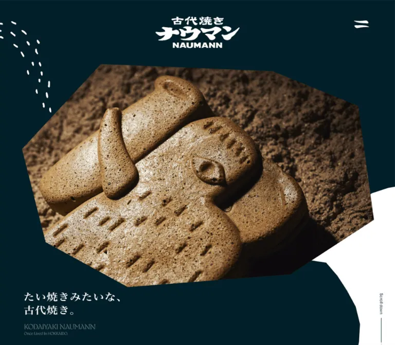
札幌の古代焼きナウマンのブランド・店舗サイト。深い青緑、白、砂色を基調に、岩片のような写真トリミング、大きな英字見出し、明朝体と広い余白で商品や店舗情報を紹介。
オリジナルサイトを見るAn elephant-shaped bake presented like an unearthed object: deep teal, warm earth, irregular silhouettes, and generous editorial space.
Website: kodaiyaki-nauman.com Original URL: https://kodaiyaki-nauman.com/ Final URL: https://kodaiyaki-nauman.com/ Theme: a fixed palette of deep teal, white, and sand, distributed across contrasting sections. Inspected: September 23, 2026, 02:57:29 JST; supplied retrieval timestamp: September 22, 2026, 17:57:29.617 UTC. Viewports: 1440 × 1000 desktop and 390 × 844 mobile, in CSS pixels. Scope: the current brand and store website, including its opening composition, Product story, Features, Menu, Scene, Instagram invitation, Store information, and footer. Visual evidence comprises three desktop captures and two mobile captures; rendered text and computed element measurements cover the longer document. Menu opening, hover behavior, and destination-page interactions were not exercised in the supplied evidence.
Kodaiyaki Naumann builds its identity around a close photograph of a browned elephant-shaped bake against rough earth. The photograph occupies an irregular, broad polygon, while white brush-like lettering and scattered white marks sit over a nearly black blue-green field. A pale opening at the right edge makes room for a vertical scroll cue. The effect connects the product's prehistoric namesake with its crisp, porous surface.
The rest of the page is a long editorial sequence. Large English section names establish navigation; Japanese Mincho headings supply a quieter voice; compact Gothic paragraphs explain ingredients, fillings, and store details. White feature sections alternate with sand-colored menu and scene sections. A dark footer returns to the opening palette. Navigation, social links, and practical store information provide the observed actions; the supplied page does not show a cart or checkout interface.
An elephant-shaped bake presented like an unearthed object: deep teal, warm earth, irregular silhouettes, and generous editorial space.
Website: kodaiyaki-nauman.com Original URL: https://kodaiyaki-nauman.com/ Final URL: https://kodaiyaki-nauman.com/ Theme: a fixed palette of deep teal, white, and sand, distributed across contrasting sections. Inspected: September 23, 2026, 02:57:29 JST; supplied retrieval timestamp: September 22, 2026, 17:57:29.617 UTC. Viewports: 1440 × 1000 desktop and 390 × 844 mobile, in CSS pixels. Scope: the current brand and store website, including its opening composition, Product story, Features, Menu, Scene, Instagram invitation, Store information, and footer. Visual evidence comprises three desktop captures and two mobile captures; rendered text and computed element measurements cover the longer document. Menu opening, hover behavior, and destination-page interactions were not exercised in the supplied evidence.
Kodaiyaki Naumann builds its identity around a close photograph of a browned elephant-shaped bake against rough earth. The photograph occupies an irregular, broad polygon, while white brush-like lettering and scattered white marks sit over a nearly black blue-green field. A pale opening at the right edge makes room for a vertical scroll cue. The effect connects the product's prehistoric namesake with its crisp, porous surface.
The rest of the page is a long editorial sequence. Large English section names establish navigation; Japanese Mincho headings supply a quieter voice; compact Gothic paragraphs explain ingredients, fillings, and store details. White feature sections alternate with sand-colored menu and scene sections. A dark footer returns to the opening palette. Navigation, social links, and practical store information provide the observed actions; the supplied page does not show a cart or checkout interface.
| Name | Value | Suggested token | Evidence and role |
|---|---|---|---|
| Deep Teal | #001f28 |
--color-ink |
Measured rgb(0, 31, 40). Body text, Product background, footer background, icons, and text on light sections. Visually also dominates the opening. |
| White | #ffffff |
--color-paper |
Measured section backgrounds and reversed text. Features and Store surfaces; white identity artwork on dark areas. |
| Sand | #c6b488 |
--color-sand |
Measured rgb(198, 180, 136). Menu and Scene backgrounds. |
Warm brown, tan, and near-black tones come primarily from photography. They are not additional measured interface tokens. The small identity mark on white sections appears black or very dark in the captures; its asset-level fill was not supplied.
The English signature near the bottom of the opening appears subdued gray-green even though its computed text color is white. Ancestor opacity, filters, or compositing were not included in the relevant evidence. Preserve the visibly subordinate treatment when adapting the composition, but do not present a guessed opacity as a measured value.
Calculated contrast: solid Deep Teal against White is approximately 17.1:1; Deep Teal against Sand is approximately 8.4:1. White against Sand is only about 2.0:1, so use dark text on the sand sections. These calculations do not establish contrast over photography or for the muted hero signature.
Use color in large fields rather than small decorative badges. The opening and Product establish the dark world; Features provides a white interval; Menu and Scene introduce sand; Store returns to white; the footer closes in deep teal. The social invitation has white text, but its underlying image or background treatment cannot be determined from the supplied visual excerpts and transparent computed backgrounds alone.
gyst-variablegyst-variable, sans-serif.400 throughout the sampled display text.--font-display.Do not make the English headings bold merely to increase prominence. Their size, spacing, and placement already establish hierarchy.
"FP-ヒラギノ明朝 ProN W3", FP-HiraMinProN-W3.400.--font-editorial.The Product story uses exceptionally generous line spacing. Its paragraphs read as a paced narrative, while feature and menu text is more compact.
yu-gothic-pr6nyu-gothic-pr6n, sans-serif.400.--font-body.NHaasGroteskTXPro-55RgNHaasGroteskTXPro-55Rg.0.02em on Scroll down; 0.04em on flavor labels and the main social invitation's Instagram text.--font-utility.The logo is artwork. Its visible brush lettering must not be inferred from the H1's inherited body font. The Japanese opening slogan also lacks a separate text-node measurement in the supplied extract; its serif-like appearance can be described visually, but its exact font and size are unverified.
All entries below are measured unless identified otherwise. Values are desktop → mobile.
| Role | Font size | Line height | Additional detail |
|---|---|---|---|
| Features heading | 103px → 62.4px |
118.45px → 71.76px |
English display; intentionally larger than other section titles |
| Menu and Scene headings | 80px → 48px |
92px → 55.2px |
English display |
| Store heading | 80px → 34px |
92px → 39.1px |
Stronger mobile reduction |
| Follow Us heading | 60px → 34px |
69px → 39.1px |
English display |
| Product side label | 46.08px → 21.84px |
52.992px → 25.116px |
Narrow, vertically oriented bounds |
| Product Japanese heading | 54px → 32px |
83.7px → 49.6px |
-0.02em tracking |
| Product narrative | 18px → 15px |
49.86px → 41.55px |
2.77 line-height ratio; mobile tracking 0.02em |
| Japanese section subtitle | 22px → 16.38px |
25.3px → 18.837px |
Mincho |
| Feature number | 60px → 50.7px |
69px → 58.305px |
English display, regular weight |
| Feature heading | 36px → 28px |
41.4px → 32.2px |
Mincho |
| Feature description | 15px → 13px |
27.9px → 24.18px |
Gothic; -0.02em tracking |
| Menu item name | 34px → 26px |
39.1px → 29.9px |
Mobile tracking 0.04em |
| Menu description | 15px → 13px |
25.95px → 22.49px |
Mobile tracking -0.02em |
| Menu price | 17px → 15px |
19.55px → 17.25px |
Mincho; mobile tracking 0.04em |
| English flavor label | 16px → 12px |
18.4px → 13.8px |
Utility family; 0.04em tracking |
| Scene caption | 17px → 17px |
19.55px → 19.55px |
Size remains unchanged |
| Store information | 13px → 13px |
21.97px → 21.97px |
Size remains unchanged |
| Footer section link | 36px → 21.84px |
41.4px → 25.116px |
English display |
| Footer Instagram | 14px → 12.48px |
16.1px → 14.352px |
Utility family |
| Back to Top | 16px → 11px |
18.4px → 12.65px |
5px padding on both viewports |
| Opening English name | 25.92px → 14px |
29.808px → 16.1px |
Subordinate visual treatment |
| Opening English subtitle | 14.4px → 11px |
16.56px → 12.65px |
English display |
| Scroll down | 10px → 10px |
11.5px → 11.5px |
0.2px tracking |
| Copyright | 8px → 8px |
9.2px → 9.2px |
Very small utility text |
Several mobile values correspond to viewport proportions: 62.4px = 16vw, 50.7px = 13vw, and 21.84px = 5.6vw at 390px. These are calculated correspondences, not recovered responsive formulas. Do not assume every size scales continuously between the two inspected widths.
Density: sparse at section scale, compact within descriptions and utility rows.
The page does not use one universal content width. Its opening, story, feature copy, menu copy, and footer have distinct alignments. Those changes in measure are a significant part of the composition.
| Element | Desktop | Mobile |
|---|---|---|
| Header alignment span | 1200px, starting at x = 120px |
342.44px, starting at x = 23.78px |
| Wide section/footer text span | 1075px, starting at x = 182.5px |
Common outer span 342.44px |
| Product narrative span | 863px, starting at x = 288.5px |
288.63px, starting at x = 50.69px |
| Feature copy | 334px on right; 361px on left |
291.06px, starting at x = 49.47px |
| Menu copy | 346.28px per column |
264.02px, starting at x = 62.98px |
| Scene column | 322.5px |
Caption box 342.44px |
| Social link panel | 1342.08px |
355.67px |
| Header menu button | 50 × 50px |
35 × 35px |
| Header top inset | 36px |
17px |
| Relationship | Measured value | Use |
|---|---|---|
| Desktop feature number to heading | 20px |
Separates number from editorial title |
| Feature heading to description | 20px desktop; 15px mobile |
Maintains clear text hierarchy |
| Menu title to description | 20px |
Shared across both viewports |
| Menu description to price | 20px desktop; 11px mobile |
Price remains part of the item text block |
| Store address to phone row | Approximately 25px after the address box |
Repeated with the hours row |
| Footer navigation row gap | Approximately 24.5px between link boxes |
Similar gap at both viewports |
| Mobile footer logo to navigation | 58px |
Measured from logo bottom to first link row |
| Features bottom padding | 249.12px → 117px |
Large pause before Menu |
| Menu top / bottom padding | 230.4 / 187.2px → 105.3 / 120.9px |
Spacious catalog section |
| Store top / bottom padding | 184.32 / 158.4px → 109.2 / 58.5px |
Separates the practical information section |
The Product section has 296.64px / 590.4px desktop top/bottom padding and 149.76px / 452.4px on mobile. These values coexist with media and shaped transitions. They should not be applied indiscriminately to ordinary text sections.
| Element | Shape | Evidence status |
|---|---|---|
| Hero photograph | Broad irregular polygon with roughly eight major corners | Visible; vertex positions are estimates |
| Feature photograph in the supplied middle capture | Uneven clipped outline with sloping lower edges | Visible; exact path unavailable |
| White-to-sand transition | Broad, low, uneven zigzag | Visible; desktop peak-to-trough height approximately 67px |
| Opening dark field | Asymmetric silhouette with a white opening at the right | Visible; exact mask unavailable |
| Social link panel | 0 7px 7px 0 corner radii |
Computed measurement |
| Store photograph | Restrained rounded corners | Visible; approximately 7px, not independently measured |
| Menu entries and text groups | Unboxed | No card border or shadow system established by the evidence |
The photograph's irregularity is deliberate, but it is not a random rotation applied to a rectangular card. Keep the image itself upright within a carefully chosen mask and preserve the important subject features.
Anatomy: compact brand/home link at the left, an empty-text button at the right, and navigation content present in the header DOM.
The menu symbol consists of two uneven white strokes in the opening captures. The measured button is 50px square on desktop and 35px square on mobile. Its right edge aligns with the main header gutter: 120px on desktop and approximately 23.78px on mobile.
The header brand link measures 150 × 56.55px on desktop and 112 × 42.22px on mobile. It is visible at the upper left in the scrolled captures, while the opening composition emphasizes a separate, much larger centered wordmark. This supports a persistent header and a changing identity presentation during scrolling. The exact positioning property, visibility threshold, and color-switching mechanism were not supplied.
The open navigation layout, close icon, focus behavior, and background treatment remain unverified. Reuse the observed closed-state proportions without inventing an original menu overlay.
Anatomy: dark shaped field, clipped food photograph, centered white brand artwork, left-side decorative white marks, lower-left Japanese slogan, muted English signature, and right-side vertical scroll cue.
On desktop, the centered brand artwork has a measured H1 box of 302.39 × 114.02px at approximately (568.8, 59.03). On mobile it measures 200.45 × 75.58px at (94.77, 50.30).
The desktop photograph visually spans approximately (90, 110) to (1354, 911), or about 1264 × 801px. These are screenshot estimates. Its crop reveals the elephant's large ears, raised trunk, face, and textured body. The photo is the dominant object; the logo overlaps its upper edge.
The mobile capture uses a substantially tighter crop that runs beyond the viewport sides. The face and trunk remain legible while the photograph becomes a tall foreground presence. This is art direction, not a uniformly reduced desktop image.
The Japanese slogan reads “たい焼きみたいな、古代焼き。” beneath the photograph's main subject. The supporting English lines are “KODAIYAKI NAUMANN” and “Once Lived In HOKKAIDO.” The vertical Scroll down label is 10px at both widths and is paired with a thin line.
The first Product section starts at document y = 1000px on desktop and 663px on mobile. These are layout boundaries, not the visible endpoints of every overlapping dark shape or decorative image.
Anatomy: vertically oriented Product label, media/decorative area, large two-line Japanese heading, and a loosely spaced narrative paragraph.
The heading “香ばしく蘇る、古代焼きナウマン。” uses Mincho at 54px on desktop and 32px on mobile. The narrative beneath it has a line-height ratio of 2.77, much more open than the explanatory text elsewhere.
Desktop story text occupies the centered 863px span. Mobile narrows that span to approximately 289px, creating about 51px of side clearance. Preserve deliberate line breaks and the separation between narrative passages rather than filling the complete available width.
The section background and text are measured as Deep Teal and White. The supplied screenshots do not expose the complete Product media arrangement, so its individual asset shapes and layering should remain unspecified.
Anatomy: large Features heading and Japanese subtitle, followed by three numbered image-and-copy groups.
The three headings are “古代米の米粉を使用”, “北海道らしい味わい”, and “パリパリともちもち”. Each item combines an oversized regular-weight number, a Mincho title, and a short Gothic paragraph.
Desktop copy alternates right, left, right. The first and third text blocks begin at x = 817.5px; the second begins at x = 288.5px. The supplied middle capture confirms a large irregularly clipped photograph on the left of the third item's copy. Its subject is a group of browned bakes on a cooking surface.
Mobile changes the sequence substantially. Each number sits near the outer 23.78px gutter, while the heading and paragraph use an inset column beginning at x = 49.47px. The first number starts at y = 2800.09px and its heading at y = 3177.66px, establishing a substantial intervening media region. Exact mobile feature-image masks are not visible in the supplied captures.
Do not compress this sequence into small equal-height feature cards. Its identity comes from large media, alternating desktop composition, prominent numbers, and long pauses between groups.
Anatomy: media region with a vertical English flavor label, Japanese item name, short description, and a separate tax-inclusive price line.
The rendered content lists four items:
| English label | Japanese name | Price at inspection |
|---|---|---|
| HOKKAIDO AZUKI | 北海道あずき | 290円(税込) |
| CREAM | クリーム | 330円(税込) |
| GRILLED CORNS | 焼とうきび | 370円(税込) |
| SPICE CURRY | スパイスカレー | 390円(税込) |
Desktop uses two columns and two rows. The first-row titles share y = 6779.66px, and the second-row titles share y = 7447.03px. Mobile presents one item at a time, with consecutive title starts separated by 568.75px.
The English labels have narrow, tall bounds consistent with vertical orientation. On mobile they align with the outer gutter, while descriptions occupy the narrower 264px column. This offset is important: the media labels and explanatory copy do not share one flat left edge.
The supplied excerpts do not show the menu photographs themselves. Image crop style, product cutouts, and decorative details within those media regions are therefore unverified. A new implementation should use appropriate product photography without claiming an unseen treatment as an original finding.
Anatomy: centered English/Japanese section heading and three media groups with short Mincho captions.
The captions describe immediate eating, a small gift, and a larger delivery of treats: “そのまますぐパオ〜ン!”, “ちょっとした手土産に!”, and “大量差し入れも大歓迎!”.
Desktop uses three 322.5px columns within a 1075px span. The calculated horizontal gap is 53.75px. Caption starts are staggered by 0px, 110px, and 205px, producing a descending rhythm rather than a level card row.
Mobile stacks the groups, with caption starts 601.75px apart. Caption size remains 17px, and the measured text box includes 117px of left padding. The exact scene imagery is outside the visible screenshot excerpts.
Anatomy: a large linked region containing Follow Us, a short Japanese explanation, and an Instagram label with icon.
The anchor begins at the left edge and stops short of the viewport's right edge: approximately 93.2% width on desktop and 91.2% on mobile. It measures 1342.08 × 597.55px on desktop and 355.67 × 322.20px on mobile, with 7px radii only on its right corners.
Its white text is centered within an internal text group. Follow Us scales from 60px to 34px; the Japanese line scales from 19px to 13px. The linked destination is https://www.instagram.com/nauman_sapporo.
The panel begins before the measured Scene section ends, indicating overlapping section geometry. Its underlying artwork is not available in the supplied visual excerpts. The Quick Start uses a dark fallback surface as a recommendation.
Anatomy: English/Japanese heading, storefront photograph, and three compact rows for address, phone, and opening hours.
The desktop capture places information on the left and a storefront photo on the right. The visible photograph shows rough tan plaster, a dark round service opening, a wooden ledge, and hanging signs. Its visible width is approximately 432px. The photo has restrained corner rounding rather than the large polygonal treatment of the food images.
Mobile puts the photograph before the contact rows. Text remains 13px with 21.97px line height at both widths. Small dark location, telephone, and clock icons establish the row types; the address and hours each span two lines.
The supplied DOM provides a map link, a tel:0112141211 link, and the displayed opening hours of 14:00–17:00. These are recorded page contents, not independently verified business information. The map destination and telephone action were not opened.
A small unboxed link sits at the lower right of the white area immediately before the footer. The label is Back to Top ↑. It uses a plain text arrow rather than a circular icon button.
The anchor points to #. Its measured text size changes from 16px to 11px; padding remains 5px. Smooth scrolling, animation duration, and resulting focus behavior are unverified.
Anatomy: solid dark surface, section navigation, a separate Instagram link, white brand artwork, and small copyright text.
Desktop navigation has two columns: Product, Features, Menu on the left; Scene, Store, Instagram on the right. The first two columns start at x = 182.5px and 418.5px. Section links use 36px display type, while Instagram is a much smaller 14px utility label with its outline icon.
The desktop white brand artwork sits toward the right. Its link box is 223px wide and 192.28px tall; the visible logo is much shorter than that box, so the entire link height must not be interpreted as artwork height. The footer is 502.19px tall.
Mobile moves the 195 × 73.52px logo above the navigation and centers it. Navigation remains two columns, with 21.84px section labels and approximately 24.5px gaps between link boxes. Copyright is centered near the bottom. The footer is 453.61px tall, with 71.37px of top padding.
The DOM repeats the letters of several navigation labels, while the screenshots show each label once. This suggests layered presentation markup, but the exact animation is unverified. A recreation should expose each link name only once to assistive technology.
| Evidence | Supplied value or state | What can be concluded |
|---|---|---|
| Header brand link | 0.3s transition |
A transition is declared; changed properties and trigger are not established |
| Footer brand and Instagram links | 0.3s transition |
Short feedback is available in the source; no hover result was captured |
| Product section label | opacity 0.6s, filter 0.6s |
Opacity and filter transitions are defined; start/end values and reveal trigger are unknown |
| Most sampled elements | animation: none |
Those sampled elements had no reported CSS animation; this does not cover every descendant, pseudo-element, or script-driven effect |
| Other transition fields | all without a supplied duration |
Insufficient evidence for a perceptible transition |
| Section links | #product, #features, #menu, #scene, #store |
In-page navigation targets are present |
| Header menu button | Closed state visible | Open-state behavior and appearance remain unverified |
| Repeated navigation lettering | Duplicate text layers in DOM | Potential animation structure, not proof of a specific rolling or staggered effect |
The supplied capture process waited for finite motion and layout stability within bounded time limits. Perpetual animations were temporarily paused during readiness checks and then resumed. Static screenshots therefore cannot establish the complete motion vocabulary.
Recommended adaptation: use restrained 300ms feedback for utility links and, if desired, a 600ms opacity reveal for decorative section labels. Keep essential content visible by default and disable optional motion for reduced-motion preferences. Do not introduce parallax, continuous image rotation, or an animated menu style and describe them as observed behavior.
| Surface | Treatment | Purpose |
|---|---|---|
| Opening | Deep teal silhouette, white identity artwork, large clipped photograph | Establishes the product and prehistoric theme |
| Product | Deep teal with white narrative | Continues the brand story |
| Features | White with dark type and irregular food imagery | Provides a lighter explanatory interval |
| Menu | Sand with dark text and separated product groups | Creates a warm catalog field |
| Scene | Sand with staggered media groups | Extends the product into use occasions |
| Social invitation | White text; underlying visual unverified | Large external-link affordance |
| Store | White, compact icon-led details, restrained photo rounding | Presents practical information |
| Footer | Deep teal, white navigation and identity | Returns to the opening palette |
There is no evidenced general-purpose elevation system. Separation comes from broad color changes, masked imagery, staggered alignment, and empty space. The photographs provide texture; the solid interface backgrounds stay clean.
The photographed bake is the main identity carrier. Its browned pores, impressed marks, raised facial details, and uneven edges are visible at unusually large scale. Directional light produces strong highlights and deep shadows. The rough earthen background connects the baked object to the ancient-animal story without requiring explanatory illustration.
Preserve the face and trunk when changing crops. On mobile, allow the image to extend beyond the horizontal viewport while containing the page itself, so the close-up remains intentional and does not create horizontal scrolling.
Decorative marks in the opening are small white, irregular strokes arranged along loose descending arcs. They complement the brush-like wordmark. Their meaning and exact asset format are not established; avoid assigning a literal interpretation such as snow or footprints as a factual source claim.
The storefront photograph has a different job: it documents a place. Keep the service window and signage recognizable and use a quieter rectangular treatment with slight rounding.
No image source URLs, SVG paths, or font-file URLs were included in the supplied extract. The references below identify visible content, not downloadable filenames.
| Asset | Evidence | Reuse guidance |
|---|---|---|
| White brand artwork | Desktop/mobile opening and footer captures | Preserve the supplied lettering as artwork |
| Compact dark brand artwork | Scrolled header captures | Maintain a separate compact identity treatment on light areas |
| Elephant-shaped bake close-up | Desktop/mobile opening captures | Use separate crop positioning for wide and narrow screens |
| Multiple bakes on a cooking surface | Desktop feature capture | Keep natural browned texture and the irregular image boundary |
| Storefront photograph | Desktop/mobile store captures | Preserve the round window, wooden ledge, and signage |
| White decorative strokes | Opening captures | Reuse as noninteractive decoration |
| Location, phone, clock, and Instagram symbols | Store/footer captures | Keep them small, dark or reversed, and visually subordinate |
Use appropriately supplied brand and photographic assets. CSS masks can reproduce the framing language, but they cannot replace the product photograph or wordmark.
The following are section-box measurements, rounded to two decimals. Overlapping artwork may extend beyond these boxes.
| Region | Desktop start / height | Mobile start / height |
|---|---|---|
| Opening extent before Product | 0 / 1000px |
0 / 663px |
| Product | 1000 / 2423.09px |
663 / 1707.41px |
| Features | 3423.09 / 2483.95px |
2370.41 / 2189.05px |
| Menu | 5907.05 / 1903.63px |
4559.45 / 2508.20px |
| Scene | 8386.67 / 1667.56px |
7309.45 / 2353.45px |
| Follow Us | 9779.20 / 597.55px |
9463.23 / 322.20px |
| Store | 10376.75 / 880.39px |
9785.44 / 802.25px |
| Footer | 11304.03 / 502.19px |
10624.33 / 453.61px |
| Complete document | 11806.22px |
11077.94px |
There is a 576px interval between the Menu and Scene section boxes on desktop and approximately 241.80px on mobile. Conversely, Follow Us begins approximately 275.03px before Scene ends on desktop and 199.67px before it ends on mobile. These measurements demonstrate that the composition is not a simple stack of independent rectangular blocks. The exact intervening elements and overlap implementation were not provided.
The mobile document is only about 728px shorter than the desktop document. Although several large spaces shrink, stacking Menu and Scene increases their heights. Preserve this spacious rhythm rather than treating mobile as a compressed summary.
Breakpoint limitation: only two viewport widths were inspected. The 767px breakpoint in the Quick Start is a recommended implementation choice, not an observed source breakpoint.
#001f28, White #ffffff, and Sand #c6b488.These are recommendations for a new implementation, not verified original-site features:
aria-expanded, and a relationship to its controlled navigation. Define keyboard and focus behavior when the panel is implemented.#001f28.#ffffff.#c6b488.“Create a long-form food brand and store website inspired by Kodaiyaki Naumann. Use deep teal #001f28, white #ffffff, and sand #c6b488. Open with a large, dramatically lit close-up of an elephant-shaped bake, clipped into a broad irregular polygon. Layer white brush-style brand artwork above it, small scattered white marks at the left, a short Japanese slogan near the lower left, and a vertical scroll cue at the right. Combine regular-weight characterful English display headings with Japanese Mincho titles and compact Gothic body text. Follow with a spacious dark narrative, alternating white feature compositions, a sand-colored menu, staggered scene groups, a large social invitation, practical store details, and a dark footer. Preserve generous empty space and art-directed mobile cropping. On mobile, stack menu and scene groups, place the store photograph above its details, and move the footer logo above its two-column navigation.”
This is an implementation scaffold using measured colors and type roles. Polygon coordinates, responsive formulas, the 767px breakpoint, fallback surfaces, and hover feedback are recommendations. Load the named font families separately if available; the generic fallbacks will change the typography.
Suggested structure: a persistent .site-header; a main document containing .hero, .product, .features, .menu, .scene, .follow, and .store; then .site-footer. Each feature row contains a number, media, and copy as separate grid children. Menu items contain media with a side label, followed by copy. Supply real images and brand artwork through normal semantic image elements.
The scaffold covers reusable components. Oversized transition artwork, final photo positioning, and the unobserved menu interaction require separate integration. It does not hardcode the original document length.
:root {
  /* Measured palette */
  --color-ink: #001f28;
  --color-paper: #ffffff;
  --color-sand: #c6b488;

  /* Observed families; generic fallbacks are recommendations */
  --font-display: 'gyst-variable', sans-serif;
  --font-editorial: 'FP-ヒラギノ明朝 ProN W3', 'FP-HiraMinProN-W3', serif;
  --font-body: 'yu-gothic-pr6n', sans-serif;
  --font-utility: 'NHaasGroteskTXPro-55Rg', sans-serif;

  --width-header: 1200px;
  --width-wide: 1075px;
  --width-story: 863px;
  --space-small: 15px;
  --space-copy: 20px;
  --space-row: 25px;
  --radius-small: 7px;
  --motion-link: 300ms;
  --motion-reveal: 600ms;

  /* Estimated framing, not recovered source paths */
  --photo-mask: polygon(
    22.5% 0, 70.4% 3.2%, 95.6% 18.7%, 100% 69.7%,
    76.3% 94.3%, 30% 100%, 6.7% 80%, 0 38%
  );
  --ridge-height: clamp(20px, 4.65vw, 67px);
}

* { box-sizing: border-box; }
body {
  margin: 0;
  color: var(--color-ink);
  background: var(--color-paper);
  font: 400 16px/1.15 var(--font-body);
}
img { display: block; max-width: 100%; }
a { color: inherit; }
button { font: inherit; }
h1, h2, h3, p, figure { margin: 0; }
section[id] { scroll-margin-top: 110px; }

.frame {
  width: min(var(--width-wide), calc(100% - 48px));
  margin-inline: auto;
}
.section-title {
  font: 400 80px/1.15 var(--font-display);
}
.section-subtitle {
  padding-left: 5px;
  font: 400 22px/1.15 var(--font-editorial);
}

.site-header {
  position: fixed;
  inset: 0 0 auto;
  z-index: 50;
  padding-top: 36px;
  color: var(--color-paper);
}
.header-inner {
  width: min(var(--width-header), calc(100% - 48px));
  margin-inline: auto;
  display: flex;
  align-items: flex-start;
  justify-content: space-between;
}
.header-brand { display: block; width: 150px; }
.header-brand img, .hero-logo img, .footer-brand img {
  width: 100%;
  height: auto;
}
.menu-toggle {
  display: grid;
  place-items: center;
  width: 50px;
  height: 50px;
  padding: 0;
  border: 0;
  background: transparent;
  color: inherit;
  cursor: pointer;
}
/* Integration hooks; these are not original source selectors. */
.site-header[data-surface='light'] { color: var(--color-ink); }
.site-header[data-at-top='true'] .header-brand { visibility: hidden; }

.hero {
  position: relative;
  isolation: isolate;
  height: 100svh;
  min-height: 720px;
  overflow: hidden;
  background: var(--color-paper);
}
.hero::before {
  content: '';
  position: absolute;
  inset: 0;
  z-index: -1;
  background: var(--color-ink);
  /* Approximation of the asymmetric dark field. */
  clip-path: polygon(
    0 0, 100% 0, 100% 43%, 94% 45%, 86% 75%,
    90% 86%, 91.4% 92.6%, 90.9% 100%, 0 100%
  );
}
.hero-photo {
  position: absolute;
  left: 6.25%;
  top: 11%;
  width: 87.8%;
  max-width: none;
  height: 80.1%;
  object-fit: cover;
  object-position: center;
  clip-path: var(--photo-mask);
}
.hero-logo {
  position: absolute;
  z-index: 2;
  top: 5.9%;
  left: 50%;
  width: min(21vw, 302.4px);
  transform: translateX(-50%);
}
.hero-copy {
  position: absolute;
  z-index: 3;
  left: max(24px, calc((100% - 1200px) / 2));
  bottom: 30px;
  color: var(--color-paper);
}
.hero-slogan {
  margin-bottom: 14px;
  /* Recommended approximation; slogan typography was not measured. */
  font: 400 28px/1.3 var(--font-editorial);
}
.hero-signature {
  font: 400 clamp(14px, 1.8vw, 25.92px)/1.15 var(--font-display);
  /* Estimated visual treatment, not a recovered opacity. */
  opacity: 0.35;
}
.hero-signature small {
  display: block;
  font-size: clamp(11px, 1vw, 14.4px);
}
.hero-scroll {
  position: absolute;
  right: 40px;
  top: 86.2%;
  font: 400 10px/1.15 var(--font-utility);
  letter-spacing: 0.02em;
  writing-mode: vertical-rl;
}
.hero-scroll::after {
  content: '';
  display: inline-block;
  width: 1px;
  height: 72px;
  margin-top: 9px;
  background: currentColor;
}

.product {
  padding-block: 297px 590px;
  color: var(--color-paper);
  background: var(--color-ink);
}
.product-copy {
  width: min(var(--width-story), calc(100% - 48px));
  margin-inline: auto;
}
.product-copy h3 {
  font: 400 54px/1.55 var(--font-editorial);
  letter-spacing: -0.02em;
}
.product-copy p {
  margin-top: 86px;
  font: 400 18px/2.77 var(--font-editorial);
}
.product-label {
  writing-mode: vertical-rl;
  font: 400 46.08px/1.15 var(--font-display);
}

.features {
  padding-block: 120px 249px;
  background: var(--color-paper);
}
.features .section-title { font-size: 103px; }
.feature-list {
  width: min(1032px, 87.8%);
  margin: 150px auto 0;
  display: grid;
  gap: 120px;
}
.feature-row {
  display: grid;
  grid-template-columns: minmax(0, 1.45fr) minmax(0, 1fr);
  grid-template-areas: 'media number' 'media copy';
  gap: 20px 70px;
  align-items: start;
}
.feature-row:nth-child(even) {
  grid-template-columns: minmax(0, 1fr) minmax(0, 1.45fr);
  grid-template-areas: 'number media' 'copy media';
}
.feature-number {
  grid-area: number;
  font: 400 60px/1.15 var(--font-display);
}
.feature-media { grid-area: media; }
.feature-media img {
  width: 100%;
  /* Recommended crop; original media dimensions were not supplied. */
  aspect-ratio: 4 / 3;
  object-fit: cover;
  clip-path: polygon(4% 0, 96% 4%, 100% 49%, 86% 94%, 40% 100%, 6% 80%, 0 25%);
}
.feature-copy { grid-area: copy; }
.feature-copy h3 { font: 400 36px/1.15 var(--font-editorial); }
.feature-copy p {
  margin-top: 20px;
  font: 400 15px/1.86 var(--font-body);
  letter-spacing: -0.02em;
}

.menu, .scene { background: var(--color-sand); }
.menu { position: relative; padding-block: 230px 187px; }
.menu::before {
  content: '';
  position: absolute;
  top: calc(-1 * var(--ridge-height));
  width: 100%;
  height: calc(var(--ridge-height) + 1px);
  background: var(--color-sand);
  /* Estimated broad ridge from the visible section transition. */
  clip-path: polygon(
    0 46%, 7.9% 0, 37% 100%, 49.6% 0, 69.4% 100%,
    84% 48%, 94.8% 100%, 100% 58%, 100% 100%, 0 100%
  );
}
.menu > .section-heading, .scene > .section-heading { text-align: center; }
.menu-grid {
  width: min(980px, 87.8%);
  margin: 150px auto 0;
  display: grid;
  grid-template-columns: repeat(2, minmax(0, 1fr));
  gap: 120px min(12vw, 173px);
}
.menu-media { position: relative; }
.menu-media img { width: 100%; height: auto; }
.menu-label {
  position: absolute;
  inset: 0 auto auto 0;
  writing-mode: vertical-rl;
  font: 400 16px/1.15 var(--font-utility);
  letter-spacing: 0.04em;
}
.menu-copy { width: 86%; margin: 28px auto 0; }
.menu-copy h3 { font: 400 34px/1.15 var(--font-editorial); }
.menu-description { margin-top: 20px; font: 400 15px/1.73 var(--font-body); }
.menu-price { margin-top: 20px; font: 400 17px/1.15 var(--font-editorial); }

.scene { padding-block: 236px 606px; }
.scene-grid {
  display: grid;
  grid-template-columns: repeat(3, minmax(0, 1fr));
  gap: 53.75px;
  margin-top: 109px;
}
.scene-item:nth-child(2) { transform: translateY(110px); }
.scene-item:nth-child(3) { transform: translateY(205px); }
.scene-caption {
  padding-bottom: 17px;
  font: 400 17px/1.15 var(--font-editorial);
}

.follow-card {
  display: grid;
  place-items: center;
  width: 93.2%;
  min-height: 598px;
  padding: 40px;
  border-radius: 0 var(--radius-small) var(--radius-small) 0;
  color: var(--color-paper);
  /* Recommended fallback; original backdrop is unverified. */
  background: var(--color-ink);
  text-align: center;
  text-decoration: none;
}
.follow-card h3 { font: 400 60px/1.15 var(--font-display); }
.follow-copy { margin-top: 10px; font: 400 19px/1.15 var(--font-editorial); }
.follow-label { margin-top: 70px; font: 400 19px/1.15 var(--font-utility); }

.store { padding-block: 184px 158px; }
.store-layout {
  display: grid;
  grid-template-columns: minmax(0, 1fr) 432px;
  gap: 80px;
  align-items: center;
  margin-top: 80px;
}
.store-details { order: 1; }
.store-photo { order: 2; }
.store-photo img { width: 100%; border-radius: var(--radius-small); }
.contact-list { display: grid; gap: 25px; }
.contact-row {
  display: grid;
  grid-template-columns: 20px minmax(0, 1fr);
  gap: 10px;
  font: 400 13px/1.69 var(--font-body);
}
.back-to-top {
  display: block;
  width: fit-content;
  margin: 0 max(24px, calc((100% - 1075px) / 2)) 18px auto;
  padding: 5px;
  font-size: 16px;
  text-decoration: none;
}

.site-footer { color: var(--color-paper); background: var(--color-ink); }
.footer-inner {
  display: grid;
  grid-template-columns: 1fr auto;
  align-items: start;
  gap: 64px;
  padding-top: 131px;
}
.footer-nav {
  display: grid;
  grid-template-columns: 236px 236px;
  row-gap: 24.5px;
  align-items: center;
}
.footer-nav a {
  font: 400 36px/1.15 var(--font-display);
  text-decoration: none;
}
.footer-nav .footer-social { font: 400 14px/1.15 var(--font-utility); }
.footer-brand { display: block; width: 223px; }
.footer-copyright {
  margin-top: 141px;
  padding-bottom: 47px;
  font: 400 8px/1.15 var(--font-utility);
}
.header-brand, .footer-social { transition: opacity var(--motion-link); }

/* Recommended keyboard and pointer feedback. */
:where(a, button):focus-visible { outline: 2px solid currentColor; outline-offset: 5px; }
@media (hover: hover) {
  .header-brand:hover, .footer-social:hover { opacity: 0.7; }
}

/* Recommended breakpoint, not recovered source CSS. */
@media (max-width: 767px) {
  .frame, .header-inner { width: 87.8%; }
  section[id] { scroll-margin-top: 80px; }
  .section-title { font-size: 48px; }
  .section-subtitle { font-size: 16.38px; }
  .site-header { padding-top: 17px; }
  .header-brand { width: 112px; }
  .menu-toggle { width: 44px; height: 44px; }

  .hero { height: 170vw; min-height: 0; }
  .hero-logo { top: 12.9vw; width: 51.4vw; }
  .hero-photo { top: 22.6vw; left: -12vw; width: 124vw; height: 134vw; }
  .hero-copy { left: 6.1%; bottom: 12px; }
  .hero-slogan { font-size: 20px; margin-bottom: 10px; }
  .hero-signature { font-size: 14px; }
  .hero-signature small { font-size: 11px; }
  .hero-scroll { right: 20px; top: 79.2%; }
  .hero-scroll::after { height: 60px; }

  .product { padding-block: 150px 452px; }
  .product-copy { width: 74%; }
  .product-copy h3 { font-size: 32px; }
  .product-copy p { margin-top: 35px; font-size: 15px; letter-spacing: 0.02em; }
  .product-label { font-size: 21.84px; }

  .features { padding-block: 80px 117px; }
  .features .section-title { font-size: 62.4px; }
  .feature-list { margin-top: 73px; gap: 72px; }
  .feature-row, .feature-row:nth-child(even) {
    grid-template-columns: minmax(0, 1fr);
    grid-template-areas: 'number' 'media' 'copy';
    gap: 20px;
  }
  .feature-number { font-size: 50.7px; }
  .feature-copy { width: 85%; margin-inline: auto; }
  .feature-copy h3 { font-size: 28px; }
  .feature-copy p { margin-top: 15px; font-size: 13px; }

  .menu { padding-block: 105px 121px; }
  .menu-grid { grid-template-columns: minmax(0, 1fr); margin-top: 59px; gap: 120px; }
  .menu-label { font-size: 12px; }
  .menu-copy { width: 77.1%; }
  .menu-copy h3 { font-size: 26px; letter-spacing: 0.04em; }
  .menu-description { font-size: 13px; letter-spacing: -0.02em; }
  .menu-price { margin-top: 11px; font-size: 15px; letter-spacing: 0.04em; }

  .scene { padding-block: 121px 422px; }
  .scene-grid { grid-template-columns: minmax(0, 1fr); gap: 100px; }
  .scene-item:nth-child(n) { transform: none; }
  .scene-caption { padding: 0 0 25px 30vw; }

  .follow-card { width: 91.2%; min-height: 322px; padding: 30px; }
  .follow-card h3 { font-size: 34px; }
  .follow-copy { font-size: 13px; }
  .follow-label { margin-top: 53px; font-size: 15px; }

  .store { padding-block: 109px 59px; }
  .store .section-title { font-size: 34px; }
  .store-layout { grid-template-columns: minmax(0, 1fr); gap: 55px; margin-top: 50px; }
  .store-photo { order: 0; }
  .store-details { width: 87%; margin-inline: auto; }
  .back-to-top { margin-right: 6.1%; margin-bottom: 14px; font-size: 11px; }

  .footer-inner { display: flex; flex-direction: column; gap: 58px; padding-top: 71px; }
  .footer-brand { order: -1; align-self: center; width: 195px; }
  .footer-nav { width: 83.5%; margin-left: auto; grid-template-columns: 1fr 1fr; }
  .footer-nav a { font-size: 21.84px; }
  .footer-nav .footer-social { font-size: 12.48px; }
  .footer-copyright { margin-top: 96px; padding-bottom: 24px; text-align: center; }
}

@media (prefers-reduced-motion: reduce) {
  .header-brand, .footer-social { transition: none; }
}
The hero photograph and background mask need separate mobile refinement when the actual image is integrated. Keep the full elephant face in view and reproduce the larger section silhouettes with dedicated artwork or masks rather than stretching these starter polygons indiscriminately.
Optional mapping for a project already using Tailwind v4. These are implementation aliases, not evidence that the original site uses Tailwind. Define the properties above first.
@theme inline {
  --color-ink: #001f28;
  --color-paper: #ffffff;
  --color-sand: #c6b488;

  --font-display: 'gyst-variable', sans-serif;
  --font-editorial: 'FP-ヒラギノ明朝 ProN W3', 'FP-HiraMinProN-W3', serif;
  --font-body: 'yu-gothic-pr6n', sans-serif;
  --font-utility: 'NHaasGroteskTXPro-55Rg', sans-serif;

  --text-section: 80px;
  --text-feature-display: 103px;
  --text-feature-title: 36px;
  --text-body-copy: 15px;
  --text-store-copy: 13px;

  --spacing-copy: 20px;
  --spacing-contact: 25px;
  --radius-photo: 7px;
  --container-story: 863px;
  --container-editorial: 1075px;
}
Use responsive utilities or component rules for the separately measured mobile sizes; a single fluid text token does not reproduce every role.
2026-09-22T17:57:29.617Z, equivalent to September 23, 2026, 02:57:29.617 JST.This reference describes the current page represented by the supplied original-site evidence. Measured values, screenshot estimates, and recommended implementation choices are identified separately throughout.
# Kodaiyaki Naumann — Style Reference

> An elephant-shaped bake presented like an unearthed object: deep teal, warm earth, irregular silhouettes, and generous editorial space.

**Website:** [kodaiyaki-nauman.com](https://kodaiyaki-nauman.com/)
**Original URL:** https://kodaiyaki-nauman.com/
**Final URL:** https://kodaiyaki-nauman.com/
**Theme:** a fixed palette of deep teal, white, and sand, distributed across contrasting sections.
**Inspected:** September 23, 2026, 02:57:29 JST; supplied retrieval timestamp: September 22, 2026, 17:57:29.617 UTC.
**Viewports:** 1440 × 1000 desktop and 390 × 844 mobile, in CSS pixels.
**Scope:** the current brand and store website, including its opening composition, Product story, Features, Menu, Scene, Instagram invitation, Store information, and footer. Visual evidence comprises three desktop captures and two mobile captures; rendered text and computed element measurements cover the longer document. Menu opening, hover behavior, and destination-page interactions were not exercised in the supplied evidence.

Kodaiyaki Naumann builds its identity around a close photograph of a browned elephant-shaped bake against rough earth. The photograph occupies an irregular, broad polygon, while white brush-like lettering and scattered white marks sit over a nearly black blue-green field. A pale opening at the right edge makes room for a vertical scroll cue. The effect connects the product's prehistoric namesake with its crisp, porous surface.

The rest of the page is a long editorial sequence. Large English section names establish navigation; Japanese Mincho headings supply a quieter voice; compact Gothic paragraphs explain ingredients, fillings, and store details. White feature sections alternate with sand-colored menu and scene sections. A dark footer returns to the opening palette. Navigation, social links, and practical store information provide the observed actions; the supplied page does not show a cart or checkout interface.
# Kodaiyaki Naumann — Style Reference

> An elephant-shaped bake presented like an unearthed object: deep teal, warm earth, irregular silhouettes, and generous editorial space.

**Website:** [kodaiyaki-nauman.com](https://kodaiyaki-nauman.com/)
**Original URL:** https://kodaiyaki-nauman.com/
**Final URL:** https://kodaiyaki-nauman.com/
**Theme:** a fixed palette of deep teal, white, and sand, distributed across contrasting sections.
**Inspected:** September 23, 2026, 02:57:29 JST; supplied retrieval timestamp: September 22, 2026, 17:57:29.617 UTC.
**Viewports:** 1440 × 1000 desktop and 390 × 844 mobile, in CSS pixels.
**Scope:** the current brand and store website, including its opening composition, Product story, Features, Menu, Scene, Instagram invitation, Store information, and footer. Visual evidence comprises three desktop captures and two mobile captures; rendered text and computed element measurements cover the longer document. Menu opening, hover behavior, and destination-page interactions were not exercised in the supplied evidence.

Kodaiyaki Naumann builds its identity around a close photograph of a browned elephant-shaped bake against rough earth. The photograph occupies an irregular, broad polygon, while white brush-like lettering and scattered white marks sit over a nearly black blue-green field. A pale opening at the right edge makes room for a vertical scroll cue. The effect connects the product's prehistoric namesake with its crisp, porous surface.

The rest of the page is a long editorial sequence. Large English section names establish navigation; Japanese Mincho headings supply a quieter voice; compact Gothic paragraphs explain ingredients, fillings, and store details. White feature sections alternate with sand-colored menu and scene sections. A dark footer returns to the opening palette. Navigation, social links, and practical store information provide the observed actions; the supplied page does not show a cart or checkout interface.

## How to Read This Reference

- **Measured** values come from the supplied rendered DOM and computed-style records. Coordinates are document coordinates unless explicitly described as screenshot estimates.
- **Visual estimates** describe geometry visible in the original-page captures, such as polygon vertices and artwork bounds. They are not recovered CSS declarations.
- **Calculated** values are arithmetic relationships between supplied measurements, such as column gaps or proportional widths.
- **Recommendations** and the Quick Start are implementation guidance. Their breakpoints, fallback fonts, masks, and interaction hooks are not claims about the original source code.
- The named custom properties in this document are reusable aliases. The provided root-property extract does not expose a complete original design-token system.
- Computed font-family declarations establish the requested families, but do not independently prove which font file rendered every glyph.
- Both desktop and mobile were captured. Intermediate widths and landscape layouts remain unverified.

## Tokens — Colors

### Default Palette

| Name | Value | Suggested token | Evidence and role |
| --- | --- | --- | --- |
| Deep Teal | `#001f28` | `--color-ink` | Measured `rgb(0, 31, 40)`. Body text, Product background, footer background, icons, and text on light sections. Visually also dominates the opening. |
| White | `#ffffff` | `--color-paper` | Measured section backgrounds and reversed text. Features and Store surfaces; white identity artwork on dark areas. |
| Sand | `#c6b488` | `--color-sand` | Measured `rgb(198, 180, 136)`. Menu and Scene backgrounds. |

Warm brown, tan, and near-black tones come primarily from photography. They are not additional measured interface tokens. The small identity mark on white sections appears black or very dark in the captures; its asset-level fill was not supplied.

The English signature near the bottom of the opening appears subdued gray-green even though its computed text color is white. Ancestor opacity, filters, or compositing were not included in the relevant evidence. Preserve the visibly subordinate treatment when adapting the composition, but do not present a guessed opacity as a measured value.

**Calculated contrast:** solid Deep Teal against White is approximately 17.1:1; Deep Teal against Sand is approximately 8.4:1. White against Sand is only about 2.0:1, so use dark text on the sand sections. These calculations do not establish contrast over photography or for the muted hero signature.

### Color Distribution

Use color in large fields rather than small decorative badges. The opening and Product establish the dark world; Features provides a white interval; Menu and Scene introduce sand; Store returns to white; the footer closes in deep teal. The social invitation has white text, but its underlying image or background treatment cannot be determined from the supplied visual excerpts and transparent computed backgrounds alone.

## Tokens — Typography

### English Display — `gyst-variable`

- **Measured stack:** `gyst-variable, sans-serif`.
- **Measured weight:** `400` throughout the sampled display text.
- **Roles:** English section headings, feature numbers, footer navigation, and the opening's English signature.
- **Visible character:** curved strokes and distinctive joins give the large English labels a softer, more individual shape than a neutral utility sans-serif.
- **Implementation alias:** `--font-display`.

Do not make the English headings bold merely to increase prominence. Their size, spacing, and placement already establish hierarchy.

### Japanese Editorial — Hiragino Mincho Declaration

- **Measured stack:** `"FP-ヒラギノ明朝 ProN W3", FP-HiraMinProN-W3`.
- **Measured weight:** `400`.
- **Roles:** Product story, Japanese section subtitles, feature headings, menu names and prices, scene captions, and social supporting copy.
- **Implementation alias:** `--font-editorial`.

The Product story uses exceptionally generous line spacing. Its paragraphs read as a paced narrative, while feature and menu text is more compact.

### Japanese Body — `yu-gothic-pr6n`

- **Measured stack:** `yu-gothic-pr6n, sans-serif`.
- **Measured weight:** `400`.
- **Roles:** ingredient descriptions, menu explanations, store details, and Back to Top.
- **Implementation alias:** `--font-body`.

### Utility English — `NHaasGroteskTXPro-55Rg`

- **Measured family:** `NHaasGroteskTXPro-55Rg`.
- **Roles:** vertical scroll cue, vertical English flavor labels, Instagram labels, and copyright.
- **Tracking:** `0.02em` on Scroll down; `0.04em` on flavor labels and the main social invitation's Instagram text.
- **Implementation alias:** `--font-utility`.

The logo is artwork. Its visible brush lettering must not be inferred from the H1's inherited body font. The Japanese opening slogan also lacks a separate text-node measurement in the supplied extract; its serif-like appearance can be described visually, but its exact font and size are unverified.

### Type Scale

All entries below are measured unless identified otherwise. Values are desktop → mobile.

| Role | Font size | Line height | Additional detail |
| --- | --- | --- | --- |
| Features heading | `103px → 62.4px` | `118.45px → 71.76px` | English display; intentionally larger than other section titles |
| Menu and Scene headings | `80px → 48px` | `92px → 55.2px` | English display |
| Store heading | `80px → 34px` | `92px → 39.1px` | Stronger mobile reduction |
| Follow Us heading | `60px → 34px` | `69px → 39.1px` | English display |
| Product side label | `46.08px → 21.84px` | `52.992px → 25.116px` | Narrow, vertically oriented bounds |
| Product Japanese heading | `54px → 32px` | `83.7px → 49.6px` | `-0.02em` tracking |
| Product narrative | `18px → 15px` | `49.86px → 41.55px` | `2.77` line-height ratio; mobile tracking `0.02em` |
| Japanese section subtitle | `22px → 16.38px` | `25.3px → 18.837px` | Mincho |
| Feature number | `60px → 50.7px` | `69px → 58.305px` | English display, regular weight |
| Feature heading | `36px → 28px` | `41.4px → 32.2px` | Mincho |
| Feature description | `15px → 13px` | `27.9px → 24.18px` | Gothic; `-0.02em` tracking |
| Menu item name | `34px → 26px` | `39.1px → 29.9px` | Mobile tracking `0.04em` |
| Menu description | `15px → 13px` | `25.95px → 22.49px` | Mobile tracking `-0.02em` |
| Menu price | `17px → 15px` | `19.55px → 17.25px` | Mincho; mobile tracking `0.04em` |
| English flavor label | `16px → 12px` | `18.4px → 13.8px` | Utility family; `0.04em` tracking |
| Scene caption | `17px → 17px` | `19.55px → 19.55px` | Size remains unchanged |
| Store information | `13px → 13px` | `21.97px → 21.97px` | Size remains unchanged |
| Footer section link | `36px → 21.84px` | `41.4px → 25.116px` | English display |
| Footer Instagram | `14px → 12.48px` | `16.1px → 14.352px` | Utility family |
| Back to Top | `16px → 11px` | `18.4px → 12.65px` | `5px` padding on both viewports |
| Opening English name | `25.92px → 14px` | `29.808px → 16.1px` | Subordinate visual treatment |
| Opening English subtitle | `14.4px → 11px` | `16.56px → 12.65px` | English display |
| Scroll down | `10px → 10px` | `11.5px → 11.5px` | `0.2px` tracking |
| Copyright | `8px → 8px` | `9.2px → 9.2px` | Very small utility text |

Several mobile values correspond to viewport proportions: `62.4px = 16vw`, `50.7px = 13vw`, and `21.84px = 5.6vw` at 390px. These are calculated correspondences, not recovered responsive formulas. Do not assume every size scales continuously between the two inspected widths.

## Tokens — Spacing & Shapes

**Density:** sparse at section scale, compact within descriptions and utility rows.

The page does not use one universal content width. Its opening, story, feature copy, menu copy, and footer have distinct alignments. Those changes in measure are a significant part of the composition.

### Measured Widths and Insets

| Element | Desktop | Mobile |
| --- | --- | --- |
| Header alignment span | `1200px`, starting at `x = 120px` | `342.44px`, starting at `x = 23.78px` |
| Wide section/footer text span | `1075px`, starting at `x = 182.5px` | Common outer span `342.44px` |
| Product narrative span | `863px`, starting at `x = 288.5px` | `288.63px`, starting at `x = 50.69px` |
| Feature copy | `334px` on right; `361px` on left | `291.06px`, starting at `x = 49.47px` |
| Menu copy | `346.28px` per column | `264.02px`, starting at `x = 62.98px` |
| Scene column | `322.5px` | Caption box `342.44px` |
| Social link panel | `1342.08px` | `355.67px` |
| Header menu button | `50 × 50px` | `35 × 35px` |
| Header top inset | `36px` | `17px` |

### Local Spacing

| Relationship | Measured value | Use |
| --- | --- | --- |
| Desktop feature number to heading | `20px` | Separates number from editorial title |
| Feature heading to description | `20px` desktop; `15px` mobile | Maintains clear text hierarchy |
| Menu title to description | `20px` | Shared across both viewports |
| Menu description to price | `20px` desktop; `11px` mobile | Price remains part of the item text block |
| Store address to phone row | Approximately `25px` after the address box | Repeated with the hours row |
| Footer navigation row gap | Approximately `24.5px` between link boxes | Similar gap at both viewports |
| Mobile footer logo to navigation | `58px` | Measured from logo bottom to first link row |
| Features bottom padding | `249.12px → 117px` | Large pause before Menu |
| Menu top / bottom padding | `230.4 / 187.2px → 105.3 / 120.9px` | Spacious catalog section |
| Store top / bottom padding | `184.32 / 158.4px → 109.2 / 58.5px` | Separates the practical information section |

The Product section has `296.64px / 590.4px` desktop top/bottom padding and `149.76px / 452.4px` on mobile. These values coexist with media and shaped transitions. They should not be applied indiscriminately to ordinary text sections.

### Geometry

| Element | Shape | Evidence status |
| --- | --- | --- |
| Hero photograph | Broad irregular polygon with roughly eight major corners | Visible; vertex positions are estimates |
| Feature photograph in the supplied middle capture | Uneven clipped outline with sloping lower edges | Visible; exact path unavailable |
| White-to-sand transition | Broad, low, uneven zigzag | Visible; desktop peak-to-trough height approximately `67px` |
| Opening dark field | Asymmetric silhouette with a white opening at the right | Visible; exact mask unavailable |
| Social link panel | `0 7px 7px 0` corner radii | Computed measurement |
| Store photograph | Restrained rounded corners | Visible; approximately `7px`, not independently measured |
| Menu entries and text groups | Unboxed | No card border or shadow system established by the evidence |

The photograph's irregularity is deliberate, but it is not a random rotation applied to a rectangular card. Keep the image itself upright within a carefully chosen mask and preserve the important subject features.

## Components

### Persistent Header and Menu Control

**Anatomy:** compact brand/home link at the left, an empty-text button at the right, and navigation content present in the header DOM.

The menu symbol consists of two uneven white strokes in the opening captures. The measured button is 50px square on desktop and 35px square on mobile. Its right edge aligns with the main header gutter: 120px on desktop and approximately 23.78px on mobile.

The header brand link measures `150 × 56.55px` on desktop and `112 × 42.22px` on mobile. It is visible at the upper left in the scrolled captures, while the opening composition emphasizes a separate, much larger centered wordmark. This supports a persistent header and a changing identity presentation during scrolling. The exact positioning property, visibility threshold, and color-switching mechanism were not supplied.

The open navigation layout, close icon, focus behavior, and background treatment remain unverified. Reuse the observed closed-state proportions without inventing an original menu overlay.

### Opening Composition

**Anatomy:** dark shaped field, clipped food photograph, centered white brand artwork, left-side decorative white marks, lower-left Japanese slogan, muted English signature, and right-side vertical scroll cue.

On desktop, the centered brand artwork has a measured H1 box of `302.39 × 114.02px` at approximately `(568.8, 59.03)`. On mobile it measures `200.45 × 75.58px` at `(94.77, 50.30)`.

The desktop photograph visually spans approximately `(90, 110)` to `(1354, 911)`, or about `1264 × 801px`. These are screenshot estimates. Its crop reveals the elephant's large ears, raised trunk, face, and textured body. The photo is the dominant object; the logo overlaps its upper edge.

The mobile capture uses a substantially tighter crop that runs beyond the viewport sides. The face and trunk remain legible while the photograph becomes a tall foreground presence. This is art direction, not a uniformly reduced desktop image.

The Japanese slogan reads “たい焼きみたいな、古代焼き。” beneath the photograph's main subject. The supporting English lines are “KODAIYAKI NAUMANN” and “Once Lived In HOKKAIDO.” The vertical Scroll down label is 10px at both widths and is paired with a thin line.

The first Product section starts at document y = 1000px on desktop and 663px on mobile. These are layout boundaries, not the visible endpoints of every overlapping dark shape or decorative image.

### Product Story

**Anatomy:** vertically oriented Product label, media/decorative area, large two-line Japanese heading, and a loosely spaced narrative paragraph.

The heading “香ばしく蘇る、古代焼きナウマン。” uses Mincho at 54px on desktop and 32px on mobile. The narrative beneath it has a line-height ratio of 2.77, much more open than the explanatory text elsewhere.

Desktop story text occupies the centered 863px span. Mobile narrows that span to approximately 289px, creating about 51px of side clearance. Preserve deliberate line breaks and the separation between narrative passages rather than filling the complete available width.

The section background and text are measured as Deep Teal and White. The supplied screenshots do not expose the complete Product media arrangement, so its individual asset shapes and layering should remain unspecified.

### Feature Sequence

**Anatomy:** large Features heading and Japanese subtitle, followed by three numbered image-and-copy groups.

The three headings are “古代米の米粉を使用”, “北海道らしい味わい”, and “パリパリともちもち”. Each item combines an oversized regular-weight number, a Mincho title, and a short Gothic paragraph.

Desktop copy alternates right, left, right. The first and third text blocks begin at x = 817.5px; the second begins at x = 288.5px. The supplied middle capture confirms a large irregularly clipped photograph on the left of the third item's copy. Its subject is a group of browned bakes on a cooking surface.

Mobile changes the sequence substantially. Each number sits near the outer 23.78px gutter, while the heading and paragraph use an inset column beginning at x = 49.47px. The first number starts at y = 2800.09px and its heading at y = 3177.66px, establishing a substantial intervening media region. Exact mobile feature-image masks are not visible in the supplied captures.

Do not compress this sequence into small equal-height feature cards. Its identity comes from large media, alternating desktop composition, prominent numbers, and long pauses between groups.

### Menu Item

**Anatomy:** media region with a vertical English flavor label, Japanese item name, short description, and a separate tax-inclusive price line.

The rendered content lists four items:

| English label | Japanese name | Price at inspection |
| --- | --- | --- |
| HOKKAIDO AZUKI | 北海道あずき | 290円(税込) |
| CREAM | クリーム | 330円(税込) |
| GRILLED CORNS | 焼とうきび | 370円(税込) |
| SPICE CURRY | スパイスカレー | 390円(税込) |

Desktop uses two columns and two rows. The first-row titles share y = 6779.66px, and the second-row titles share y = 7447.03px. Mobile presents one item at a time, with consecutive title starts separated by 568.75px.

The English labels have narrow, tall bounds consistent with vertical orientation. On mobile they align with the outer gutter, while descriptions occupy the narrower 264px column. This offset is important: the media labels and explanatory copy do not share one flat left edge.

The supplied excerpts do not show the menu photographs themselves. Image crop style, product cutouts, and decorative details within those media regions are therefore unverified. A new implementation should use appropriate product photography without claiming an unseen treatment as an original finding.

### Scene Sequence

**Anatomy:** centered English/Japanese section heading and three media groups with short Mincho captions.

The captions describe immediate eating, a small gift, and a larger delivery of treats: “そのまますぐパオ〜ン!”, “ちょっとした手土産に!”, and “大量差し入れも大歓迎!”.

Desktop uses three 322.5px columns within a 1075px span. The calculated horizontal gap is 53.75px. Caption starts are staggered by 0px, 110px, and 205px, producing a descending rhythm rather than a level card row.

Mobile stacks the groups, with caption starts 601.75px apart. Caption size remains 17px, and the measured text box includes 117px of left padding. The exact scene imagery is outside the visible screenshot excerpts.

### Instagram Invitation

**Anatomy:** a large linked region containing Follow Us, a short Japanese explanation, and an Instagram label with icon.

The anchor begins at the left edge and stops short of the viewport's right edge: approximately 93.2% width on desktop and 91.2% on mobile. It measures `1342.08 × 597.55px` on desktop and `355.67 × 322.20px` on mobile, with 7px radii only on its right corners.

Its white text is centered within an internal text group. Follow Us scales from 60px to 34px; the Japanese line scales from 19px to 13px. The linked destination is `https://www.instagram.com/nauman_sapporo`.

The panel begins before the measured Scene section ends, indicating overlapping section geometry. Its underlying artwork is not available in the supplied visual excerpts. The Quick Start uses a dark fallback surface as a recommendation.

### Store Information

**Anatomy:** English/Japanese heading, storefront photograph, and three compact rows for address, phone, and opening hours.

The desktop capture places information on the left and a storefront photo on the right. The visible photograph shows rough tan plaster, a dark round service opening, a wooden ledge, and hanging signs. Its visible width is approximately 432px. The photo has restrained corner rounding rather than the large polygonal treatment of the food images.

Mobile puts the photograph before the contact rows. Text remains 13px with 21.97px line height at both widths. Small dark location, telephone, and clock icons establish the row types; the address and hours each span two lines.

The supplied DOM provides a map link, a `tel:0112141211` link, and the displayed opening hours of 14:00–17:00. These are recorded page contents, not independently verified business information. The map destination and telephone action were not opened.

### Back to Top

A small unboxed link sits at the lower right of the white area immediately before the footer. The label is Back to Top ↑. It uses a plain text arrow rather than a circular icon button.

The anchor points to `#`. Its measured text size changes from 16px to 11px; padding remains 5px. Smooth scrolling, animation duration, and resulting focus behavior are unverified.

### Footer

**Anatomy:** solid dark surface, section navigation, a separate Instagram link, white brand artwork, and small copyright text.

Desktop navigation has two columns: Product, Features, Menu on the left; Scene, Store, Instagram on the right. The first two columns start at x = 182.5px and 418.5px. Section links use 36px display type, while Instagram is a much smaller 14px utility label with its outline icon.

The desktop white brand artwork sits toward the right. Its link box is 223px wide and 192.28px tall; the visible logo is much shorter than that box, so the entire link height must not be interpreted as artwork height. The footer is 502.19px tall.

Mobile moves the `195 × 73.52px` logo above the navigation and centers it. Navigation remains two columns, with 21.84px section labels and approximately 24.5px gaps between link boxes. Copyright is centered near the bottom. The footer is 453.61px tall, with 71.37px of top padding.

The DOM repeats the letters of several navigation labels, while the screenshots show each label once. This suggests layered presentation markup, but the exact animation is unverified. A recreation should expose each link name only once to assistive technology.

## Tokens — Motion & Interaction

| Evidence | Supplied value or state | What can be concluded |
| --- | --- | --- |
| Header brand link | `0.3s` transition | A transition is declared; changed properties and trigger are not established |
| Footer brand and Instagram links | `0.3s` transition | Short feedback is available in the source; no hover result was captured |
| Product section label | `opacity 0.6s, filter 0.6s` | Opacity and filter transitions are defined; start/end values and reveal trigger are unknown |
| Most sampled elements | `animation: none` | Those sampled elements had no reported CSS animation; this does not cover every descendant, pseudo-element, or script-driven effect |
| Other transition fields | `all` without a supplied duration | Insufficient evidence for a perceptible transition |
| Section links | `#product`, `#features`, `#menu`, `#scene`, `#store` | In-page navigation targets are present |
| Header menu button | Closed state visible | Open-state behavior and appearance remain unverified |
| Repeated navigation lettering | Duplicate text layers in DOM | Potential animation structure, not proof of a specific rolling or staggered effect |

The supplied capture process waited for finite motion and layout stability within bounded time limits. Perpetual animations were temporarily paused during readiness checks and then resumed. Static screenshots therefore cannot establish the complete motion vocabulary.

**Recommended adaptation:** use restrained 300ms feedback for utility links and, if desired, a 600ms opacity reveal for decorative section labels. Keep essential content visible by default and disable optional motion for reduced-motion preferences. Do not introduce parallax, continuous image rotation, or an animated menu style and describe them as observed behavior.

## Surfaces

| Surface | Treatment | Purpose |
| --- | --- | --- |
| Opening | Deep teal silhouette, white identity artwork, large clipped photograph | Establishes the product and prehistoric theme |
| Product | Deep teal with white narrative | Continues the brand story |
| Features | White with dark type and irregular food imagery | Provides a lighter explanatory interval |
| Menu | Sand with dark text and separated product groups | Creates a warm catalog field |
| Scene | Sand with staggered media groups | Extends the product into use occasions |
| Social invitation | White text; underlying visual unverified | Large external-link affordance |
| Store | White, compact icon-led details, restrained photo rounding | Presents practical information |
| Footer | Deep teal, white navigation and identity | Returns to the opening palette |

There is no evidenced general-purpose elevation system. Separation comes from broad color changes, masked imagery, staggered alignment, and empty space. The photographs provide texture; the solid interface backgrounds stay clean.

## Imagery

The photographed bake is the main identity carrier. Its browned pores, impressed marks, raised facial details, and uneven edges are visible at unusually large scale. Directional light produces strong highlights and deep shadows. The rough earthen background connects the baked object to the ancient-animal story without requiring explanatory illustration.

Preserve the face and trunk when changing crops. On mobile, allow the image to extend beyond the horizontal viewport while containing the page itself, so the close-up remains intentional and does not create horizontal scrolling.

Decorative marks in the opening are small white, irregular strokes arranged along loose descending arcs. They complement the brush-like wordmark. Their meaning and exact asset format are not established; avoid assigning a literal interpretation such as snow or footprints as a factual source claim.

The storefront photograph has a different job: it documents a place. Keep the service window and signage recognizable and use a quieter rectangular treatment with slight rounding.

### Observed Asset References

No image source URLs, SVG paths, or font-file URLs were included in the supplied extract. The references below identify visible content, not downloadable filenames.

| Asset | Evidence | Reuse guidance |
| --- | --- | --- |
| White brand artwork | Desktop/mobile opening and footer captures | Preserve the supplied lettering as artwork |
| Compact dark brand artwork | Scrolled header captures | Maintain a separate compact identity treatment on light areas |
| Elephant-shaped bake close-up | Desktop/mobile opening captures | Use separate crop positioning for wide and narrow screens |
| Multiple bakes on a cooking surface | Desktop feature capture | Keep natural browned texture and the irregular image boundary |
| Storefront photograph | Desktop/mobile store captures | Preserve the round window, wooden ledge, and signage |
| White decorative strokes | Opening captures | Reuse as noninteractive decoration |
| Location, phone, clock, and Instagram symbols | Store/footer captures | Keep them small, dark or reversed, and visually subordinate |

Use appropriately supplied brand and photographic assets. CSS masks can reproduce the framing language, but they cannot replace the product photograph or wordmark.

## Layout & Responsive Behavior

### Measured Document Map

The following are section-box measurements, rounded to two decimals. Overlapping artwork may extend beyond these boxes.

| Region | Desktop start / height | Mobile start / height |
| --- | --- | --- |
| Opening extent before Product | `0 / 1000px` | `0 / 663px` |
| Product | `1000 / 2423.09px` | `663 / 1707.41px` |
| Features | `3423.09 / 2483.95px` | `2370.41 / 2189.05px` |
| Menu | `5907.05 / 1903.63px` | `4559.45 / 2508.20px` |
| Scene | `8386.67 / 1667.56px` | `7309.45 / 2353.45px` |
| Follow Us | `9779.20 / 597.55px` | `9463.23 / 322.20px` |
| Store | `10376.75 / 880.39px` | `9785.44 / 802.25px` |
| Footer | `11304.03 / 502.19px` | `10624.33 / 453.61px` |
| Complete document | `11806.22px` | `11077.94px` |

There is a 576px interval between the Menu and Scene section boxes on desktop and approximately 241.80px on mobile. Conversely, Follow Us begins approximately 275.03px before Scene ends on desktop and 199.67px before it ends on mobile. These measurements demonstrate that the composition is not a simple stack of independent rectangular blocks. The exact intervening elements and overlap implementation were not provided.

### Desktop to Mobile Changes

- **Opening:** a broad horizontal photograph becomes a tall, tightly cropped composition. The central brand remains prominent rather than shrinking in proportion to viewport width.
- **Header:** horizontal gutters reduce from 120px to about 24px, and the measured menu-button box reduces from 50px to 35px.
- **Product:** the narrative becomes a narrow centered column. Its large line-height ratio is retained.
- **Features:** alternating image/copy compositions become vertically sequenced items, with outer-aligned numbers and inset copy.
- **Menu:** two columns become one. Text remains narrower than the available media region.
- **Scene:** three staggered columns become a vertical sequence. Caption size remains 17px.
- **Store:** the photograph moves above the details; contact text retains its 13px size.
- **Footer:** the logo moves from the right side to above the two-column navigation.

The mobile document is only about 728px shorter than the desktop document. Although several large spaces shrink, stacking Menu and Scene increases their heights. Preserve this spacious rhythm rather than treating mobile as a compressed summary.

**Breakpoint limitation:** only two viewport widths were inspected. The 767px breakpoint in the Quick Start is a recommended implementation choice, not an observed source breakpoint.

## Do’s and Don’ts

### Do

- Build the main palette around exact Deep Teal `#001f28`, White `#ffffff`, and Sand `#c6b488`.
- Let the elephant-shaped bake photograph carry the opening's scale and texture.
- Preserve large ears, raised trunk, and face when directing mobile crops.
- Use deliberate irregular masks with broad facets.
- Pair regular-weight English display headings with Japanese Mincho titles and Gothic explanatory text.
- Keep the Product narrative much more loosely spaced than feature descriptions.
- Maintain multiple content widths and meaningful changes in alignment.
- Preserve the desktop feature alternation, scene staggering, and mobile stacking.
- Treat prices as quiet text within product entries.
- Keep the store photograph and contact information straightforward and recognizable.
- Reorder the footer logo above navigation on mobile.

### Don’t

- Don’t replace the actual brand artwork with an approximate font treatment.
- Don’t flatten the opening photograph into a small rectangular card.
- Don’t crop away the product's identifying facial features on mobile.
- Don’t apply rounded cards, soft shadows, or floating panels to every content group.
- Don’t turn the warm photographic browns into an unrelated multicolor interface palette.
- Don’t make every English section heading the same size; Features and Store have distinct responsive scales.
- Don’t eliminate the long section pauses without considering the surrounding artwork.
- Don’t treat repeated DOM lettering as visible duplicated navigation text.
- Don’t infer parallax, smooth scrolling, menu animations, or unseen image treatments from static captures.
- Don’t treat the observed 35px mobile button box or 8px copyright as accessibility recommendations.

## Recommended Implementation Additions

These are recommendations for a new implementation, not verified original-site features:

- Give the menu button a clear accessible name, `aria-expanded`, and a relationship to its controlled navigation. Define keyboard and focus behavior when the panel is implemented.
- Increase the mobile menu control's interactive area to at least 44px while retaining the small brush-stroke symbol.
- Give logo links an accessible brand name. The empty text fields in the extract do not establish whether the original artwork has an appropriate accessible alternative.
- Hide decorative duplicate text layers from assistive technology and retain one readable name per link.
- Supply meaningful alternatives for informative product and storefront images; mark decorative strokes and section silhouettes as decorative.
- Keep content visible before animation enhancement loads. Respect reduced-motion preferences without withholding headings or images.
- Add visible keyboard focus styles and an anchor offset so fixed header content does not cover section headings.
- Test the muted opening signature over its actual background. Consider larger minimum sizes for small utility text in an adaptation.
- Use responsive image sources and explicit image dimensions. Prioritize the opening photograph and defer lower-page media where appropriate.

## Agent Prompt Guide

### Quick Color Reference

- Dark opening, Product field, footer, and primary text: `#001f28`.
- Features and Store surfaces; reversed identity and text: `#ffffff`.
- Menu and Scene surfaces: `#c6b488`.
- Brown texture comes from food and storefront photography.
- Keep the social invitation readable with white text; its original underlying artwork is unverified.
- Use color fields and composition for hierarchy, with little reliance on borders or elevation.

### Overall Prompt

“Create a long-form food brand and store website inspired by Kodaiyaki Naumann. Use deep teal #001f28, white #ffffff, and sand #c6b488. Open with a large, dramatically lit close-up of an elephant-shaped bake, clipped into a broad irregular polygon. Layer white brush-style brand artwork above it, small scattered white marks at the left, a short Japanese slogan near the lower left, and a vertical scroll cue at the right. Combine regular-weight characterful English display headings with Japanese Mincho titles and compact Gothic body text. Follow with a spacious dark narrative, alternating white feature compositions, a sand-colored menu, staggered scene groups, a large social invitation, practical store details, and a dark footer. Preserve generous empty space and art-directed mobile cropping. On mobile, stack menu and scene groups, place the store photograph above its details, and move the footer logo above its two-column navigation.”

### Example Component Prompts

1. **Opening:** “Create a deep teal and white opening composition dominated by a warm brown elephant-shaped bake. Use a wide uneven polygon for the photograph, a centered white wordmark overlapping its top edge, and a small lower-left Japanese slogan. Make the mobile image tall and closely cropped while keeping the face and trunk recognizable.”
2. **Feature item:** “Pair a large irregularly clipped food photograph with a regular-weight display number, a Japanese Mincho heading, and a 15px Gothic paragraph at approximately 1.86 line height. Alternate the desktop image position. On mobile, place the number near the outer gutter and inset the copy beneath the media.”
3. **Menu:** “Build an unboxed catalog on sand #c6b488. Give each item a media region, a vertical uppercase English flavor label, a Japanese Mincho name, a compact explanation, and a quiet tax-inclusive price. Use two columns on desktop and a narrow single-column text measure on mobile. Treat the exact product-image styling as a new art-direction decision.”
4. **Store:** “Arrange small dark location, telephone, and clock icons beside compact 13px store details. Place a lightly rounded storefront photograph at the right on desktop and above the details on mobile. Use a white background and generous space before a small right-aligned Back to Top link.”
5. **Footer:** “Use a solid deep teal footer with white regular-weight display navigation in two columns, a smaller Instagram link, and white brand artwork. Place the brand at the right on desktop and centered above the navigation on mobile. Keep the links unboxed and preserve broad vertical spacing.”

## Quick Start

### CSS Custom Properties

This is an implementation scaffold using measured colors and type roles. Polygon coordinates, responsive formulas, the 767px breakpoint, fallback surfaces, and hover feedback are recommendations. Load the named font families separately if available; the generic fallbacks will change the typography.

Suggested structure: a persistent `.site-header`; a main document containing `.hero`, `.product`, `.features`, `.menu`, `.scene`, `.follow`, and `.store`; then `.site-footer`. Each feature row contains a number, media, and copy as separate grid children. Menu items contain media with a side label, followed by copy. Supply real images and brand artwork through normal semantic image elements.

The scaffold covers reusable components. Oversized transition artwork, final photo positioning, and the unobserved menu interaction require separate integration. It does not hardcode the original document length.

```css
:root {
  /* Measured palette */
  --color-ink: #001f28;
  --color-paper: #ffffff;
  --color-sand: #c6b488;

  /* Observed families; generic fallbacks are recommendations */
  --font-display: 'gyst-variable', sans-serif;
  --font-editorial: 'FP-ヒラギノ明朝 ProN W3', 'FP-HiraMinProN-W3', serif;
  --font-body: 'yu-gothic-pr6n', sans-serif;
  --font-utility: 'NHaasGroteskTXPro-55Rg', sans-serif;

  --width-header: 1200px;
  --width-wide: 1075px;
  --width-story: 863px;
  --space-small: 15px;
  --space-copy: 20px;
  --space-row: 25px;
  --radius-small: 7px;
  --motion-link: 300ms;
  --motion-reveal: 600ms;

  /* Estimated framing, not recovered source paths */
  --photo-mask: polygon(
    22.5% 0, 70.4% 3.2%, 95.6% 18.7%, 100% 69.7%,
    76.3% 94.3%, 30% 100%, 6.7% 80%, 0 38%
  );
  --ridge-height: clamp(20px, 4.65vw, 67px);
}

* { box-sizing: border-box; }
body {
  margin: 0;
  color: var(--color-ink);
  background: var(--color-paper);
  font: 400 16px/1.15 var(--font-body);
}
img { display: block; max-width: 100%; }
a { color: inherit; }
button { font: inherit; }
h1, h2, h3, p, figure { margin: 0; }
section[id] { scroll-margin-top: 110px; }

.frame {
  width: min(var(--width-wide), calc(100% - 48px));
  margin-inline: auto;
}
.section-title {
  font: 400 80px/1.15 var(--font-display);
}
.section-subtitle {
  padding-left: 5px;
  font: 400 22px/1.15 var(--font-editorial);
}

.site-header {
  position: fixed;
  inset: 0 0 auto;
  z-index: 50;
  padding-top: 36px;
  color: var(--color-paper);
}
.header-inner {
  width: min(var(--width-header), calc(100% - 48px));
  margin-inline: auto;
  display: flex;
  align-items: flex-start;
  justify-content: space-between;
}
.header-brand { display: block; width: 150px; }
.header-brand img, .hero-logo img, .footer-brand img {
  width: 100%;
  height: auto;
}
.menu-toggle {
  display: grid;
  place-items: center;
  width: 50px;
  height: 50px;
  padding: 0;
  border: 0;
  background: transparent;
  color: inherit;
  cursor: pointer;
}
/* Integration hooks; these are not original source selectors. */
.site-header[data-surface='light'] { color: var(--color-ink); }
.site-header[data-at-top='true'] .header-brand { visibility: hidden; }

.hero {
  position: relative;
  isolation: isolate;
  height: 100svh;
  min-height: 720px;
  overflow: hidden;
  background: var(--color-paper);
}
.hero::before {
  content: '';
  position: absolute;
  inset: 0;
  z-index: -1;
  background: var(--color-ink);
  /* Approximation of the asymmetric dark field. */
  clip-path: polygon(
    0 0, 100% 0, 100% 43%, 94% 45%, 86% 75%,
    90% 86%, 91.4% 92.6%, 90.9% 100%, 0 100%
  );
}
.hero-photo {
  position: absolute;
  left: 6.25%;
  top: 11%;
  width: 87.8%;
  max-width: none;
  height: 80.1%;
  object-fit: cover;
  object-position: center;
  clip-path: var(--photo-mask);
}
.hero-logo {
  position: absolute;
  z-index: 2;
  top: 5.9%;
  left: 50%;
  width: min(21vw, 302.4px);
  transform: translateX(-50%);
}
.hero-copy {
  position: absolute;
  z-index: 3;
  left: max(24px, calc((100% - 1200px) / 2));
  bottom: 30px;
  color: var(--color-paper);
}
.hero-slogan {
  margin-bottom: 14px;
  /* Recommended approximation; slogan typography was not measured. */
  font: 400 28px/1.3 var(--font-editorial);
}
.hero-signature {
  font: 400 clamp(14px, 1.8vw, 25.92px)/1.15 var(--font-display);
  /* Estimated visual treatment, not a recovered opacity. */
  opacity: 0.35;
}
.hero-signature small {
  display: block;
  font-size: clamp(11px, 1vw, 14.4px);
}
.hero-scroll {
  position: absolute;
  right: 40px;
  top: 86.2%;
  font: 400 10px/1.15 var(--font-utility);
  letter-spacing: 0.02em;
  writing-mode: vertical-rl;
}
.hero-scroll::after {
  content: '';
  display: inline-block;
  width: 1px;
  height: 72px;
  margin-top: 9px;
  background: currentColor;
}

.product {
  padding-block: 297px 590px;
  color: var(--color-paper);
  background: var(--color-ink);
}
.product-copy {
  width: min(var(--width-story), calc(100% - 48px));
  margin-inline: auto;
}
.product-copy h3 {
  font: 400 54px/1.55 var(--font-editorial);
  letter-spacing: -0.02em;
}
.product-copy p {
  margin-top: 86px;
  font: 400 18px/2.77 var(--font-editorial);
}
.product-label {
  writing-mode: vertical-rl;
  font: 400 46.08px/1.15 var(--font-display);
}

.features {
  padding-block: 120px 249px;
  background: var(--color-paper);
}
.features .section-title { font-size: 103px; }
.feature-list {
  width: min(1032px, 87.8%);
  margin: 150px auto 0;
  display: grid;
  gap: 120px;
}
.feature-row {
  display: grid;
  grid-template-columns: minmax(0, 1.45fr) minmax(0, 1fr);
  grid-template-areas: 'media number' 'media copy';
  gap: 20px 70px;
  align-items: start;
}
.feature-row:nth-child(even) {
  grid-template-columns: minmax(0, 1fr) minmax(0, 1.45fr);
  grid-template-areas: 'number media' 'copy media';
}
.feature-number {
  grid-area: number;
  font: 400 60px/1.15 var(--font-display);
}
.feature-media { grid-area: media; }
.feature-media img {
  width: 100%;
  /* Recommended crop; original media dimensions were not supplied. */
  aspect-ratio: 4 / 3;
  object-fit: cover;
  clip-path: polygon(4% 0, 96% 4%, 100% 49%, 86% 94%, 40% 100%, 6% 80%, 0 25%);
}
.feature-copy { grid-area: copy; }
.feature-copy h3 { font: 400 36px/1.15 var(--font-editorial); }
.feature-copy p {
  margin-top: 20px;
  font: 400 15px/1.86 var(--font-body);
  letter-spacing: -0.02em;
}

.menu, .scene { background: var(--color-sand); }
.menu { position: relative; padding-block: 230px 187px; }
.menu::before {
  content: '';
  position: absolute;
  top: calc(-1 * var(--ridge-height));
  width: 100%;
  height: calc(var(--ridge-height) + 1px);
  background: var(--color-sand);
  /* Estimated broad ridge from the visible section transition. */
  clip-path: polygon(
    0 46%, 7.9% 0, 37% 100%, 49.6% 0, 69.4% 100%,
    84% 48%, 94.8% 100%, 100% 58%, 100% 100%, 0 100%
  );
}
.menu > .section-heading, .scene > .section-heading { text-align: center; }
.menu-grid {
  width: min(980px, 87.8%);
  margin: 150px auto 0;
  display: grid;
  grid-template-columns: repeat(2, minmax(0, 1fr));
  gap: 120px min(12vw, 173px);
}
.menu-media { position: relative; }
.menu-media img { width: 100%; height: auto; }
.menu-label {
  position: absolute;
  inset: 0 auto auto 0;
  writing-mode: vertical-rl;
  font: 400 16px/1.15 var(--font-utility);
  letter-spacing: 0.04em;
}
.menu-copy { width: 86%; margin: 28px auto 0; }
.menu-copy h3 { font: 400 34px/1.15 var(--font-editorial); }
.menu-description { margin-top: 20px; font: 400 15px/1.73 var(--font-body); }
.menu-price { margin-top: 20px; font: 400 17px/1.15 var(--font-editorial); }

.scene { padding-block: 236px 606px; }
.scene-grid {
  display: grid;
  grid-template-columns: repeat(3, minmax(0, 1fr));
  gap: 53.75px;
  margin-top: 109px;
}
.scene-item:nth-child(2) { transform: translateY(110px); }
.scene-item:nth-child(3) { transform: translateY(205px); }
.scene-caption {
  padding-bottom: 17px;
  font: 400 17px/1.15 var(--font-editorial);
}

.follow-card {
  display: grid;
  place-items: center;
  width: 93.2%;
  min-height: 598px;
  padding: 40px;
  border-radius: 0 var(--radius-small) var(--radius-small) 0;
  color: var(--color-paper);
  /* Recommended fallback; original backdrop is unverified. */
  background: var(--color-ink);
  text-align: center;
  text-decoration: none;
}
.follow-card h3 { font: 400 60px/1.15 var(--font-display); }
.follow-copy { margin-top: 10px; font: 400 19px/1.15 var(--font-editorial); }
.follow-label { margin-top: 70px; font: 400 19px/1.15 var(--font-utility); }

.store { padding-block: 184px 158px; }
.store-layout {
  display: grid;
  grid-template-columns: minmax(0, 1fr) 432px;
  gap: 80px;
  align-items: center;
  margin-top: 80px;
}
.store-details { order: 1; }
.store-photo { order: 2; }
.store-photo img { width: 100%; border-radius: var(--radius-small); }
.contact-list { display: grid; gap: 25px; }
.contact-row {
  display: grid;
  grid-template-columns: 20px minmax(0, 1fr);
  gap: 10px;
  font: 400 13px/1.69 var(--font-body);
}
.back-to-top {
  display: block;
  width: fit-content;
  margin: 0 max(24px, calc((100% - 1075px) / 2)) 18px auto;
  padding: 5px;
  font-size: 16px;
  text-decoration: none;
}

.site-footer { color: var(--color-paper); background: var(--color-ink); }
.footer-inner {
  display: grid;
  grid-template-columns: 1fr auto;
  align-items: start;
  gap: 64px;
  padding-top: 131px;
}
.footer-nav {
  display: grid;
  grid-template-columns: 236px 236px;
  row-gap: 24.5px;
  align-items: center;
}
.footer-nav a {
  font: 400 36px/1.15 var(--font-display);
  text-decoration: none;
}
.footer-nav .footer-social { font: 400 14px/1.15 var(--font-utility); }
.footer-brand { display: block; width: 223px; }
.footer-copyright {
  margin-top: 141px;
  padding-bottom: 47px;
  font: 400 8px/1.15 var(--font-utility);
}
.header-brand, .footer-social { transition: opacity var(--motion-link); }

/* Recommended keyboard and pointer feedback. */
:where(a, button):focus-visible { outline: 2px solid currentColor; outline-offset: 5px; }
@media (hover: hover) {
  .header-brand:hover, .footer-social:hover { opacity: 0.7; }
}

/* Recommended breakpoint, not recovered source CSS. */
@media (max-width: 767px) {
  .frame, .header-inner { width: 87.8%; }
  section[id] { scroll-margin-top: 80px; }
  .section-title { font-size: 48px; }
  .section-subtitle { font-size: 16.38px; }
  .site-header { padding-top: 17px; }
  .header-brand { width: 112px; }
  .menu-toggle { width: 44px; height: 44px; }

  .hero { height: 170vw; min-height: 0; }
  .hero-logo { top: 12.9vw; width: 51.4vw; }
  .hero-photo { top: 22.6vw; left: -12vw; width: 124vw; height: 134vw; }
  .hero-copy { left: 6.1%; bottom: 12px; }
  .hero-slogan { font-size: 20px; margin-bottom: 10px; }
  .hero-signature { font-size: 14px; }
  .hero-signature small { font-size: 11px; }
  .hero-scroll { right: 20px; top: 79.2%; }
  .hero-scroll::after { height: 60px; }

  .product { padding-block: 150px 452px; }
  .product-copy { width: 74%; }
  .product-copy h3 { font-size: 32px; }
  .product-copy p { margin-top: 35px; font-size: 15px; letter-spacing: 0.02em; }
  .product-label { font-size: 21.84px; }

  .features { padding-block: 80px 117px; }
  .features .section-title { font-size: 62.4px; }
  .feature-list { margin-top: 73px; gap: 72px; }
  .feature-row, .feature-row:nth-child(even) {
    grid-template-columns: minmax(0, 1fr);
    grid-template-areas: 'number' 'media' 'copy';
    gap: 20px;
  }
  .feature-number { font-size: 50.7px; }
  .feature-copy { width: 85%; margin-inline: auto; }
  .feature-copy h3 { font-size: 28px; }
  .feature-copy p { margin-top: 15px; font-size: 13px; }

  .menu { padding-block: 105px 121px; }
  .menu-grid { grid-template-columns: minmax(0, 1fr); margin-top: 59px; gap: 120px; }
  .menu-label { font-size: 12px; }
  .menu-copy { width: 77.1%; }
  .menu-copy h3 { font-size: 26px; letter-spacing: 0.04em; }
  .menu-description { font-size: 13px; letter-spacing: -0.02em; }
  .menu-price { margin-top: 11px; font-size: 15px; letter-spacing: 0.04em; }

  .scene { padding-block: 121px 422px; }
  .scene-grid { grid-template-columns: minmax(0, 1fr); gap: 100px; }
  .scene-item:nth-child(n) { transform: none; }
  .scene-caption { padding: 0 0 25px 30vw; }

  .follow-card { width: 91.2%; min-height: 322px; padding: 30px; }
  .follow-card h3 { font-size: 34px; }
  .follow-copy { font-size: 13px; }
  .follow-label { margin-top: 53px; font-size: 15px; }

  .store { padding-block: 109px 59px; }
  .store .section-title { font-size: 34px; }
  .store-layout { grid-template-columns: minmax(0, 1fr); gap: 55px; margin-top: 50px; }
  .store-photo { order: 0; }
  .store-details { width: 87%; margin-inline: auto; }
  .back-to-top { margin-right: 6.1%; margin-bottom: 14px; font-size: 11px; }

  .footer-inner { display: flex; flex-direction: column; gap: 58px; padding-top: 71px; }
  .footer-brand { order: -1; align-self: center; width: 195px; }
  .footer-nav { width: 83.5%; margin-left: auto; grid-template-columns: 1fr 1fr; }
  .footer-nav a { font-size: 21.84px; }
  .footer-nav .footer-social { font-size: 12.48px; }
  .footer-copyright { margin-top: 96px; padding-bottom: 24px; text-align: center; }
}

@media (prefers-reduced-motion: reduce) {
  .header-brand, .footer-social { transition: none; }
}
```

The hero photograph and background mask need separate mobile refinement when the actual image is integrated. Keep the full elephant face in view and reproduce the larger section silhouettes with dedicated artwork or masks rather than stretching these starter polygons indiscriminately.

### Tailwind v4 Token Mapping

Optional mapping for a project already using Tailwind v4. These are implementation aliases, not evidence that the original site uses Tailwind. Define the properties above first.

```css
@theme inline {
  --color-ink: #001f28;
  --color-paper: #ffffff;
  --color-sand: #c6b488;

  --font-display: 'gyst-variable', sans-serif;
  --font-editorial: 'FP-ヒラギノ明朝 ProN W3', 'FP-HiraMinProN-W3', serif;
  --font-body: 'yu-gothic-pr6n', sans-serif;
  --font-utility: 'NHaasGroteskTXPro-55Rg', sans-serif;

  --text-section: 80px;
  --text-feature-display: 103px;
  --text-feature-title: 36px;
  --text-body-copy: 15px;
  --text-store-copy: 13px;

  --spacing-copy: 20px;
  --spacing-contact: 25px;
  --radius-photo: 7px;
  --container-story: 863px;
  --container-editorial: 1075px;
}
```

Use responsive utilities or component rules for the separately measured mobile sizes; a single fluid text token does not reproduce every role.

## Sources & Evidence

- [Kodaiyaki Naumann — original and final website](https://kodaiyaki-nauman.com/): the supplied browser evidence reports HTTP 200 with no URL change. The rendered page title is “たい焼きみたいな、古代焼きナウマン|北海道 札幌のお土産に”.
- **Capture time:** `2026-09-22T17:57:29.617Z`, equivalent to September 23, 2026, 02:57:29.617 JST.
- **Desktop evidence:** 1440 × 1000 CSS-pixel viewport; opening, lower Features/section transition, and Store/footer screenshots; computed document height approximately 11806.22px.
- **Mobile evidence:** 390 × 844 CSS-pixel viewport; opening and Store/footer screenshots; computed document height approximately 11077.94px.
- **Rendered measurements:** element rectangles, computed colors, font-family declarations, font sizes, line heights, tracking, padding, selected radii, transition strings, text content, and link destinations supplied with both viewport snapshots.
- **Inspection limits:** menu opening, hovering, keyboard navigation, link activation, intermediate breakpoints, complete animation sequences, asset URLs, and font-file loading were not independently verified. Several middle-page sections have DOM measurements but no corresponding visible screenshot excerpt.
- **Capture conditions:** the supplied process waited for document load, image decoding, finite motion, and sampled layout/text stability within bounded limits. Perpetual animations were paused during readiness checks and resumed afterward. These checks do not establish semantic completeness or expose delayed and unexercised states.

This reference describes the current page represented by the supplied original-site evidence. Measured values, screenshot estimates, and recommended implementation choices are identified separately throughout.スタイルやページの種類、ジャンルが近いデザインを集めました。