プレビュー準備中デザインリファレンスを見る
日本のWebデザインを、AIの制作リファレンスに。
DESIGN REFERENCE
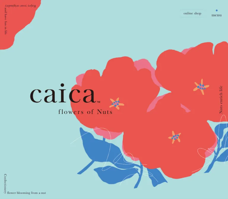
淡いアクアに大きな花のイラストを重ね、円形の商品写真と繊細なセリフ体で世界観を伝える菓子ブランドサイト。スマートフォンでは写真の重なりや縦積みのフッターへ構成が変化する。
オリジナルサイトを見るOversized painted flowers, delicate serif lettering, and confectionery photographs arranged like a colorful botanical exhibition.
Website: caica-nuts.com Original URL: https://caica-nuts.com/ Final URL: https://caica-nuts.com/ Theme: light aqua in the captured hero and product areas, with a saturated blue footer; no theme selector was evidenced. Inspected: September 23, 2026, at 02:32 JST, through the supplied browser inspection. Recorded retrieval: September 22, 2026, at 17:32:08.895 UTC. Viewports: 1440 × 1000 desktop and 390 × 844 mobile, in CSS pixels. Scope: the current brand homepage, including desktop and mobile opening compositions, product presentation, persistent utility controls, and footer. Concept, news, and navigation content also have rendered DOM evidence. Their complete visual states, linked pages, and open-menu behavior were not captured.
caica is a confectionery brand homepage with a story, news, five product introductions, store information, and links to an external online shop. Its visual identity comes from the relationship between enormous informal flowers and restrained, finely drawn typography. Pale aqua gives the illustrations and food photography room to breathe. Blue connects foliage, circular detail links, and the footer. Coral and pink belong primarily to the floral artwork, with a measured coral accent on the story link.
The page unfolds vertically over a substantial distance. Products appear one at a time as overlapping circular photographs, followed by centered English and Japanese names and a circular arrow link. Large vertical section labels occupy the left edge. The footer becomes a broad blue field with a compact directory rather than a final promotional panel. Preserve this sequence and its generous intervals when adapting the design.
Oversized painted flowers, delicate serif lettering, and confectionery photographs arranged like a colorful botanical exhibition.
Website: caica-nuts.com Original URL: https://caica-nuts.com/ Final URL: https://caica-nuts.com/ Theme: light aqua in the captured hero and product areas, with a saturated blue footer; no theme selector was evidenced. Inspected: September 23, 2026, at 02:32 JST, through the supplied browser inspection. Recorded retrieval: September 22, 2026, at 17:32:08.895 UTC. Viewports: 1440 × 1000 desktop and 390 × 844 mobile, in CSS pixels. Scope: the current brand homepage, including desktop and mobile opening compositions, product presentation, persistent utility controls, and footer. Concept, news, and navigation content also have rendered DOM evidence. Their complete visual states, linked pages, and open-menu behavior were not captured.
caica is a confectionery brand homepage with a story, news, five product introductions, store information, and links to an external online shop. Its visual identity comes from the relationship between enormous informal flowers and restrained, finely drawn typography. Pale aqua gives the illustrations and food photography room to breathe. Blue connects foliage, circular detail links, and the footer. Coral and pink belong primarily to the floral artwork, with a measured coral accent on the story link.
The page unfolds vertically over a substantial distance. Products appear one at a time as overlapping circular photographs, followed by centered English and Japanese names and a circular arrow link. Large vertical section labels occupy the left edge. The footer becomes a broad blue field with a compact directory rather than a final promotional panel. Preserve this sequence and its generous intervals when adapting the design.
--color-action and --relative-base-px are explicitly identified where they come from the original page.| Name | Value | Suggested token | Evidence and role |
|---|---|---|---|
| Aqua Canvas | Approximately #B0DCDD |
--color-aqua |
Visual estimate of the broad hero and product background; its backing element was not included in the computed-style sample |
| Action Blue | #4083C5 |
--color-action |
Measured source custom property; also the computed body background and product detail-link color; visually used for the footer and circular actions |
| Dark Ink | #231825 |
--color-ink |
Measured body text and product-title color; a very dark purple-brown rather than neutral black |
| Story Coral | #EA5550 |
--color-coral |
Measured story-link color; a useful approximation for the closely related floral red, whose asset pixels were not measured |
| Product Mint | #87D0CB |
--color-section |
Measured color of the large vertical product heading at both inspected widths |
| Footer Cyan | #BCFEFF |
--color-footer-ink |
Measured footer text color; also the desktop news heading's sampled color |
| Soft Teal | #98D3CF |
--color-soft-teal |
Measured page-to-top link color |
| Concept White | #FFFFFF |
--color-on-art |
Measured concept paragraph color; the complete background behind that paragraph was not visually supplied |
| Petal Pink | Approximately #EC7895 |
--color-petal-pink |
Visual estimate of secondary petals behind the coral flowers |
| Pollen Peach | Approximately #F4A36B |
--color-pollen |
Visual estimate of the small warm flower-center strokes |
| Decorative Cream | Approximately #FFFDED |
--color-cream |
Visual estimate of the pale circle beside the white-chocolate product imagery |
Keep backing layers distinct. The root and body compute to Action Blue, while the captured hero and product regions appear aqua. Their sampled containers are often transparent. Setting every section to the body background would lose the visible composition; treating the body as aqua would lose the footer's blue foundation.
Color changes in the evidence: the news heading computes to Footer Cyan on desktop and Action Blue on mobile. This establishes two sampled results, but the supplied data does not isolate whether a breakpoint, scroll state, or another layer controls the difference.
The illustrations contain additional photographic and painted colors. They are not evidence of a broader interface palette. WordPress and Swiper custom properties also appear in the page data; their presence does not make those framework colors part of the visible brand system.
bigmoore, serif.400 on product names, section headings, news dates, and footer navigation.0.05em, including product titles, dates, and footer links.--font-display: bigmoore, serif.The family declaration is directly supported. Font file URLs, licensing, and the exact downloaded face were not supplied. Use an authorized font installation; a generic serif fallback will alter line lengths and wrapping.
The measured body stack begins with "Zen Kaku Gothic New", "Noto Sans JP", "Noto Sans CJK JP", "Noto Sans Japanese", followed by Japanese system sans-serif fallbacks.
15px / 30px on desktop and 14px / 28px on mobile, weight 400.500, with a tighter 1.6 line-height ratio.500, set as short, deliberately separated lines rather than a dense paragraph.honoka-maru-gothic, sans-serif.20px / 28px, weight 400.18px / 27px, weight 400.Do not replace this tier with bold body sans-serif. Its softer shape and modest scale balance the larger English lettering.
The caica wordmark and “flowers of Nuts” form a distinct brand lockup. The mobile H1 has no extracted text and measures 260 × 97.5px; the supplied evidence does not identify whether its contents are an image, inline vector, or another graphic construction. Treat it as a supplied brand asset rather than recreating it with Bigmoore.
The peripheral English phrases are visually small serif lettering. Their exact font metrics were not included. The shop and menu labels also look serif in the screenshots, even though the sampled outer link and button have different font declarations. Do not apply the button wrapper's Arial declaration to all visible navigation text.
Values below are measured unless explicitly marked as estimates.
| Role | Desktop | Mobile | Tracking / notes |
|---|---|---|---|
| Body | 15px / 30px |
14px / 28px |
Weight 400 |
| English product title | 48px / 58px |
28px / 28px |
0.05em; word gaps measure 14.4px and 8.4px |
| Japanese product title | 20px / 28px |
18px / 27px |
Honoka Maru Gothic |
| Vertical product/news heading | 128px / 154px |
84px / 101px |
Regular Bigmoore |
| Concept H2, sampled state | 108px / 129.375px |
37.44px / 44.72px |
0.05em; computed text color is transparent in this state |
| Concept paragraph | 20px / 37px |
16px / 26px |
Weight 500; white |
| News headline | 18px / 28.8px |
15px / 24px |
Weight 500 |
| News date | 22px / 30.8px |
14px / 17px |
Bigmoore, 0.05em |
| Footer primary link | 20px / 24px |
20px / 24px |
Bigmoore, 0.05em |
| Footer product link | 16px / 19.2px |
16px / 19.2px |
Bigmoore, 0.05em |
| Footer FAQ link | 16px / 19px |
16px / 19px |
Smaller than adjacent primary links |
| Footer company/contact | 14px / 20px |
14px / 20px |
3px vertical padding |
| Detail-link caption | Approximately 18px / 22px |
Approximately 16px / 19px |
Visual and component-height estimate; child style not supplied |
| Peripheral phrases | Approximately 12–15px |
Approximately 11–13px |
Visual estimate only |
The transparent concept-heading sample should not be copied as the default state of a new heading. It may depend on an unobserved child treatment or reveal state.
The supplied source properties contain:
/* Observed at 1440px viewport width */
--relative-base-px: 1px;

/* Observed at 390px viewport width */
--relative-base-px: calc(390px / 375);
The mobile unit therefore evaluates to 1.04px. Several measurements are consistent with a 375-unit mobile composition: 300 × 1.04 = 312px for the main product image, 36 × 1.04 = 37.44px for the footer inset, and 20 × 1.04 = 20.8px for product-title side clearance.
This does not establish that every dimension scales with that unit. The mobile detail circle is 80px, the English product text is 28px, and body text is 14px. The source breakpoint and intermediate-width formulas were not supplied.
The design mixes small typographic gaps with very large section intervals rather than following a demonstrated universal spacing grid.
| Use | Desktop | Mobile | Basis |
|---|---|---|---|
| English-to-Japanese product title gap | 2px |
2px |
Calculated from title rectangles |
| Footer product-link interval | About 6px beyond the line box |
About 6px |
Calculated from adjacent links |
| Footer product-list indentation | 16px |
16px |
Measured x-coordinate difference |
| Primary footer-link interval | About 10px beyond the line box |
About 10px |
Calculated |
| Image-to-English-title gap | 25px |
20px |
Calculated |
| Japanese title-to-detail-link gap | 24px |
20px |
Calculated |
| Between product sections | 120px |
60px |
Calculated from section bounds |
| After final product, before footer | 200px |
80px |
Calculated from section and footer bounds |
| Footer left inset | 140px |
37.44px |
Measured |
| Product title side clearance | Content-dependent | 20.8px for wrapped titles |
Measured |
| Element | Treatment | Evidence |
|---|---|---|
| Main and companion product image links | 50% radius |
Measured |
| Detail action | Circular blue fill | Visible; diameter follows the link width |
| Online shop outline | 14px radius |
Measured on both viewports |
| Product panel's lower-left corner | Approximately 120px desktop, 80px mobile |
Visual estimate from footer captures |
| Mobile hero photo edges | Nearly square, with slight corner softening | Visual only; exact radius unavailable |
| Main content groups | No visible card shell or elevation | Captured hero, products, and footer |
The dominant geometry is circular photography and irregular painted silhouettes. Reserve conventional rounded rectangles for the small shop control rather than making every content block a rounded card.
| Element | Desktop at 1440 × 1000 | Mobile at 390 × 844 |
|---|---|---|
| Document height | 9682px |
Approximately 7404.09px |
| Start of concept section | y = 1090px |
y ≈ 893.66px |
| Concept section height | 2019px |
Approximately 1836.63px |
| News section height | 568px |
Approximately 889.81px |
| Product section width | 1280px, starting at x = 80px |
390px, starting at x = 0 |
| Main product image link | 640 × 640px, at x = 400px |
312 × 312px, at x = 39px |
| Companion image-link bounds | Approximately 451.37 × 451.37px |
Approximately 213.3 × 213.3px |
| Product section height | 915px for all five |
552px for the three longer names; 524px for the two shorter names |
| Detail-link total bounds | 100 × 138px |
80 × 115px |
| Footer height | 550px |
655px |
| Footer brand-link bounds | 240 × 88px |
Approximately 187.19 × 68.63px |
Companion-image values are rendered bounding rectangles. Without the source transforms, they should not be treated as native image dimensions or exact untransformed circle diameters.
Role: access to the external shop and site navigation while browsing the long page.
There is no conventional full-width header bar in the captures. The sampled header has zero layout height, while the controls occupy the upper-right corner and remain visible in the supplied scrolled views.
On desktop:
120 × 36px, beginning near x = 1209.28px, y = 43px.46.72 × 37px, beginning near x = 1357.28px, y = 43px.28px between their bounding boxes and a 36px right margin.On mobile, the arrangement turns vertical. The menu begins near y = 20px; the 50 × 50px shop link begins at y = 66px. The shop label breaks into “online” and “shop.” Both controls remain transparent against the page artwork.
Their persistence is visually supported. The exact fixed-position declarations were not included.
The rendered navigation contains story, product, shop, news, FAQ, online shop, Instagram, contact, and BAKE INC. destinations. Desktop data additionally contains the five nested product links. Those nested navigation links are absent from the mobile sample, although all five remain in the mobile footer.
Desktop primary navigation bounds begin at x = 220px, with most rows 69px high. The mobile primary rows begin near x = 37.44px, are about 315.13px wide, and are mostly 54px high. These are sampled layout values, not proof that the menu was visible in the captures.
The button's extracted text includes both “menu” and “close,” supporting alternate labels. No open-menu screenshot or click trace was supplied. Do not invent a drawer direction, full-screen overlay color, accordion, focus trap, or transition.
Role: establish the brand through illustration, typography, and food imagery.
The desktop capture is an expansive aqua canvas. A very large bouquet enters from the right and bottom: coral flowers sit over offset pink petals, blue leaves stretch toward the lower edge, peach strokes form the centers, and thin white scribbles cross the foliage. A cropped coral shape also enters from the upper-left corner.
The dark caica lockup sits left of center, overlapping the floral field. Its overall visible area is approximately 470 × 175px, starting near x = 245px, y = 410px; this is a screenshot estimate, not a supplied element measurement. The composition uses large open aqua space above the brand and to the left of the bouquet.
The mobile capture changes the arrangement substantially. The measured 260 × 97.5px brand container sits at x = 65px, y = 100px. Beneath it is a slightly tilted portrait photograph, with another image edge visible behind it. The photograph shows chocolate-and-nut confections staged with pale stone forms against turquoise, with cocoa-colored ground below. The visible stack occupies roughly x = 33–358px, y = 237–698px; the front image is tilted by approximately four degrees.
Only the mobile capture shows that photograph stack. The evidence does not prove that desktop permanently omits it or that it cycles as a slideshow. Treat these as two observed compositions, with timing and breakpoint-specific media visibility unresolved.
Small English phrases act as a frame around the opening image:
These fragments should remain secondary to the logo and artwork. Preserve deliberate rotations and edge alignment; do not turn them into a subtitle paragraph beneath the logo. Mobile lettering is visibly pale in the captured state, whereas the desktop phrases are dark.
Role: explain the brand through short poetic lines.
Rendered copy includes “芽吹いた,” “咲いた,” and “ナッツの花が,” followed by nut names and short statements about flavor, texture, and everyday color. The short lines are structurally important: this is a poetic composition rather than continuous sales prose.
The sampled paragraph is white, 20px / 37px on desktop and 16px / 26px on mobile. Its desktop bounds are 380px wide at x = 530px; mobile bounds are 208px wide at approximately x = 124.8px. The mobile placement is offset to the right, leaving a substantial left-side region.
The section ends with a “view story” link using the same overall proportions as the product detail controls, but its computed accent is coral. The full illustration, backing color, and reveal sequence were not supplied visually. Keep those details unresolved instead of extrapolating from the opening bouquet.
Role: current announcements within the brand homepage.
Three entries are present: two dated September 17, 2026, and one dated August 26, 2026. A separate “see all” link points to the news index.
Desktop rows measure 940 × 172px and begin at x = 300px. Each sampled row is a flex container with 16px vertical padding and a 50px gap. Dates occupy a 110px-wide region, while the measured headline region is 520px wide and begins at x = 460px. The remaining right-hand content is not identified by the supplied element sample.
Mobile rows change to block layout at approximately x = 95.8px, with 273.4px total width and 24px 10.4px padding. The headline is approximately 252.6px wide, followed by a smaller date. The first two rows have substantial space above their headlines; the underlying elements in that space were not supplied, so their imagery should not be invented.
This section is materially taller on mobile. Preserve flexible content height rather than forcing desktop row heights onto wrapped Japanese headlines.
Role: identify a long section without introducing a conventional horizontal banner.
The word “product” is displayed vertically along the left edge in pale mint. Its measured text size is 128px on desktop and 84px on mobile. The desktop bounding box begins at x = -15px; mobile begins at x = -1px, allowing the letters to extend slightly beyond the viewport boundary.
The label appears in multiple supplied product and footer-adjacent captures, sometimes partially cropped. The visual persistence is established, but the exact sticky or scroll-linked mechanism is not. A sticky label within the product group is a reasonable implementation recommendation, not a recovered source rule.
Role: present the food and its packaging as one composition.
Each product section contains two circular image links to the same product destination. The larger image is centered on the page; a smaller companion image sits to its right and slightly lower. In the captured white-chocolate example, the large image shows the confectionery and pale sculptural props, while the companion shows branded packaging.
Desktop primary bounds are 640 × 640px. The companion link begins approximately 541px to the right of the primary image's left edge and 139px below its top. On mobile, the primary becomes 312 × 312px, while the companion bounds begin approximately 178px to the right and 87px below. The overlap therefore increases proportionally on the phone.
The mobile companion's measured bounds reach approximately 40px beyond the viewport's right edge. Maintain the deliberate visual crop without introducing horizontal page scrolling.
Repeated English product names follow the circumference around the primary photograph. The supplied text extraction repeats these strings many times. This is decorative perimeter lettering, not additional product descriptions or a list of separate links. A static SVG text path is a suitable implementation option; the actual rendering method and any rotation were not supplied.
Role: name the product after the photographic composition.
The English title is centered, regular-weight Bigmoore, with 0.05em tracking and separate word elements. Desktop titles use 48px / 58px and fit on one line in the supplied layout. Mobile titles use 28px / 28px; the three longer Florentine names occupy two lines, while “chocolate brown cake” and “sOnomama Nuts” occupy one.
A Japanese title follows after a measured 2px gap. Both language tiers link to the same destination. The observed white-chocolate English label uses “sandwitch,” and its destination contains flolentine-whitechocolate-sandwitch; preserve the actual destination when reproducing source links rather than silently correcting the URL.
Role: provide an explicit route from the product presentation to its detail page.
An unboxed vertical link contains a filled blue circle, a thin pale right arrow centered inside it, and “view detail” beneath it in blue serif lettering. The circle is approximately 100px in diameter on desktop and 80px on mobile. The complete anchor measures 100 × 138px and 80 × 115px, respectively.
The circle and caption belong to one link. Keep the surrounding space open; do not place the control inside a product card or replace it with a wide pill button. Hover, arrow travel, and pressed-state behavior were not captured.
Role: provide the complete directory and company destinations.
The final aqua panel ends with a large rounded lower-left corner over the blue footer. In the desktop bottom capture, the footer begins about 450px down the viewport. In the mobile capture, the aqua edge sits about 189px down and covers part of the footer logo. This is evidence of layer overlap at that scroll position; it does not establish a particular parallax algorithm.
Desktop content forms three visual columns:
x = 140px.x = 550px, with the five product links indented by 16px.x = 940.5px.The footer uses pale cyan text on Action Blue. Primary directory labels are 20px, product links are 16px, and company utilities are 14px. The visible copyright reads “©BAKE Inc. All Rights Reserved.” The BAKE INC. link points to https://bake-jp.com/.
Mobile content becomes a single column with approximately 37.44px side inset. The brand lockup is centered above the directory. Social and company links follow the directory, and the longer doubleberry product name wraps naturally to a second line. The footer's measured height grows from 550px to 655px.
A thin upward arrow and vertical “page to top” label sit near the lower-right side of the footer. The sampled link bounds are 17 × 95.75px, with an 8px gap and Soft Teal color. The destination is the homepage's # fragment.
The anchor's presence and destination are verified. Smooth scrolling, easing, and keyboard behavior were not tested. A larger invisible hit area is recommended for a new implementation.
| Treatment | What is supported | What remains unverified |
|---|---|---|
| Long-page scrolling | Multiple supplied scroll captures and full document bounds | Scroll smoothing, acceleration, or snap rules |
| Persistent utility controls | Shop and menu remain in the upper-right area across captures | Exact positioning code and behavior during menu opening |
| Mobile hero photo stack | Tilted foreground photograph and a second image edge | Autoplay, slide count, swipe gestures, and duration |
| Curved product lettering | Repeated text arranged around circular imagery | Continuous rotation, speed, direction, and pause controls |
| Companion product images | Overlap and fractional rendered bounds | Orbiting, hover transforms, or scroll-linked movement |
| Footer reveal | Aqua panel overlaps the blue footer; mobile logo is partially covered | Pinning, parallax distance, and reveal timing |
| Menu control | Button and alternate “menu” / “close” text exist | Open state, transition, dismissal, and focus management |
| Product and shop links | Actual anchor destinations are present | Click outcomes, new-tab behavior, and hover feedback |
| Page-to-top control | Anchor points to # |
Animated scrolling |
Sampled elements report animation: none and a transition field of all, without usable duration or easing data. These values do not establish a site-wide absence of motion, and all alone is not a motion token. Child elements, pseudo-elements, SVGs, and script-driven effects were not fully described.
The capture process waited for initial loading and sampled stability, temporarily paused perpetual animations during readiness checks, and resumed them afterward. Static captures cannot recover a motion timeline from that procedure.
For an adaptation, start with a fully readable static layout. Optional feedback can use 160ms ease-out for a small arrow translation or link opacity change. These are recommendations, not original-site values. Avoid inventing automatic carousels or rotating every circle merely because the composition suggests movement. Honor reduced-motion preferences before adding decorative motion.
| Layer | Appearance | Purpose |
|---|---|---|
| Root canvas | Measured Action Blue | Underlying page and footer color |
| Captured hero | Estimated Aqua Canvas | Spacious field for the brand and flowers |
| Captured product area | Same apparent aqua | Connects the five product presentations |
| Floral artwork | Flat coral and pink masses, blue leaves, peach centers, pale scribbles | Main expressive identity |
| Product images | Circular crops without visible frames | Bring tactile food and packaging into the illustration system |
| Product action | Solid blue circle with a pale arrow | Clear repeated navigation target |
| Shop control | Transparent fill, faint outline, 14px radius |
A restrained persistent commerce link |
| Footer | Blue field with pale cyan and teal details | Full directory and company information |
The captures do not establish a general shadow, glass, gradient, or card-elevation system. Most separation comes from color fields, generous space, circular crops, and changes in scale. The complete concept and news surfaces are not visually documented.
Use oversized, uneven flower silhouettes with gently irregular edges. Coral petals are backed by offset pink shapes, while blue stems and leaves create directional movement across the lower portion of the composition. Small peach strokes and blue dots form the centers. Fine white scribbles add a contrasting hand-drawn texture.
The flowers extend beyond the frame. They should feel much larger than the logo and controls, with only portions of the bouquet visible at once. A small decorative flower icon repeated uniformly would not reproduce this scale relationship.
The supplied images combine appetizing food detail with sculptural staging:
Preserve ingredient texture and separation between food and props. Circular clipping should retain the focal confectionery rather than cutting through it arbitrarily. Use normal photographic rendering; pixelation and heavy interface-style filters are not part of the captured appearance.
No original image URLs, SVG paths, or font file URLs were supplied. The following inventory identifies visible roles without inventing filenames.
| Asset role | Evidence | Implementation guidance |
|---|---|---|
| caica brand lockup | Hero and footer captures; mobile H1 bounds | Use an authorized brand asset; preserve the subtitle proportions |
| Oversized floral composition | Desktop and mobile opening captures | Use supplied artwork or commission equivalent original illustration |
| Mobile portrait food photograph | Mobile opening capture | Preserve portrait orientation and layered, slightly tilted placement |
| Main circular food images | Product capture and five measured image-link groups | Prepare crops for both desktop and mobile circle sizes |
| Companion packaging images | Visible product example and paired image-link groups | Position as a separate circular asset, overlapping from the right |
| Circular product lettering | Captures and repeated DOM text | A decorative text-path layer is a reasonable adaptation |
| Thin arrows and social symbol | Product controls and footer capture | Small, lightweight line graphics; avoid oversized iconography |
CSS can reproduce the spacing and geometry, but the brand lockup, flower silhouettes, and staged photographs carry much of the identity.
The rendered order is opening composition, concept/story, news, five product sections, and footer. The homepage remains a vertical sequence on desktop. It does not become a grid of small product cards at wider widths.
The products appear in this order: chocolate Florentine sandwich, white-chocolate Florentine sandwich, doubleberry Florentine sandwich, chocolate brown cake, and sOnomama Nuts. Each uses the same basic image/title/action structure.
At 1440px width, product sections occupy a centered 1280px region. The primary photo is centered on the page, while the companion photo shifts the overall visual weight to the right. The large left-edge heading counterbalances this arrangement.
A product block's measured height can be reconstructed from its parts:
640px image + 25px gap + 58px English title + 2px gap + 28px Japanese title + 24px gap + 138px detail link = 915px.
The next product begins after another 120px. This rhythm is a major part of the design; shrinking it to ordinary card spacing would change the browsing experience.
At 390px width, the primary product photo is 312px, or exactly 80% of the inspected viewport. The companion remains large enough to overlap deeply and extend beyond the right edge. Wrapped product headings have approximately 20.8px side clearance.
For a longer title:
312px image + 20px gap + 56px English title + 2px gap + 27px Japanese title + 20px gap + 115px detail link = 552px.
The two shorter English names require one fewer 28px line, reducing their sections to 524px. Between-product spacing drops to 60px. Footer primary and product-link font sizes remain unchanged, so the mobile footer gains height through stacking and wrapping rather than uniformly shrinking its text.
| Area | Desktop | Mobile |
|---|---|---|
| Utility controls | Horizontal shop/menu grouping | Menu above a two-line shop control |
| Hero identity | Large lockup left of center | Smaller centered lockup near the top |
| Hero photography | Not visible in supplied opening frame | Tilted portrait stack visible |
| Product imagery | 640px primary circle |
312px primary circle |
| English product names | 48px, one line |
28px, one or two lines |
| Vertical section lettering | 128px |
84px |
| News | Horizontal flex rows | Taller block rows with date below headline |
| Footer | Three visual columns | One stacked directory beneath centered branding |
| Peripheral right phrase | Vertical | Horizontal near the bottom |
Only two widths were inspected. The CSS breakpoint below is a recommendation. Intermediate tablet layouts, landscape phones, browser zoom, and safe-area behavior remain unverified.
28px line rhythm.These are recommendations for a new implementation, not verified features of the original:
aria-expanded, and a relationship to its controlled navigation. If the menu is modal, implement Escape dismissal, focus containment, and focus return.44 × 44px without enlarging their visible marks.#B0DCDD; visual estimate.#4083C5.#231825.#EA5550; floral red is visually related but not pixel-measured.#87D0CB.#BCFEFF.#98D3CF.“Create a Japanese confectionery brand homepage inspired by the observed caica composition. Use a pale aqua hero and product area, a saturated blue footer, huge irregular coral flowers with pink backing petals and blue leaves, and a supplied dark brand lockup. Pair regular high-contrast serif English headings with restrained Japanese sans-serif copy and softer Japanese product captions. Present five products in a long vertical sequence, each with a large centered circular food photograph, a smaller overlapping packaging circle to the right, decorative curved product lettering, a centered bilingual name, and a blue circular arrow link with a caption below. Keep substantial vertical space and large vertical section labels along the left edge. On mobile, use 80vw primary product circles, 28px English titles that wrap, vertically stacked utility controls, and a single-column footer. Treat motion as an optional addition because its timing was not established.”
This starter reproduces the documented palette, product rhythm, utility layout, and footer hierarchy. Aqua and illustration accents remain estimates. The 48rem breakpoint, intermediate-width behavior, larger control hit areas, and optional feedback transition are recommendations. Companion positions approximate rendered bounds; they do not reproduce unknown source transforms. The footer stays in normal flow rather than implementing an unverified reveal.
Font declarations do not load the fonts. Supply authorized font files and artwork separately.
:root {
  /* Measured interface colors */
  --color-action: #4083c5;
  --color-ink: #231825;
  --color-coral: #ea5550;
  --color-section: #87d0cb;
  --color-footer-ink: #bcfeff;
  --color-soft-teal: #98d3cf;
  --color-on-art: #ffffff;

  /* Visual estimates */
  --color-aqua: #b0dcdd;
  --color-petal-pink: #ec7895;
  --color-pollen: #f4a36b;
  --color-cream: #fffded;

  --font-display: bigmoore, serif;
  --font-body: 'Zen Kaku Gothic New', 'Noto Sans JP',
    'Noto Sans CJK JP', 'Hiragino Kaku Gothic ProN', sans-serif;
  --font-product-ja: honoka-maru-gothic, sans-serif;

  --relative-unit: 1px;
  --text-body: 15px;
  --leading-body: 30px;
  --text-product: 48px;
  --leading-product: 58px;
  --text-product-ja: 20px;
  --leading-product-ja: 28px;
  --text-section: 128px;
  --tracking-display: 0.05em;

  --product-max: 1280px;
  --product-disc: 640px;
  --image-title-gap: 25px;
  --title-action-gap: 24px;
  --product-gap: 120px;
  --action-size: 100px;
  --panel-radius: 120px;
  --shop-radius: 14px;

  /* Recommended feedback timing, not an observed source value */
  --motion-feedback: 160ms ease-out;
}

* {
  box-sizing: border-box;
}

body {
  margin: 0;
  color: var(--color-ink);
  background: var(--color-action);
  font: 400 var(--text-body) / var(--leading-body) var(--font-body);
}

img {
  display: block;
  max-width: 100%;
}

button,
a {
  -webkit-tap-highlight-color: transparent;
}

a {
  color: inherit;
}

/* Clip decorative overflow without creating a horizontal scroller. */
.caica-main {
  position: relative;
  overflow-x: clip;
}

.site-tools {
  position: fixed;
  z-index: 20;
  top: 43px;
  right: 36px;
  display: flex;
  align-items: flex-start;
  gap: 28px;
}

.shop-link {
  display: grid;
  place-content: center;
  width: 120px;
  height: 36px;
  border: 1px solid rgb(135 208 203 / 65%);
  border-radius: var(--shop-radius);
  font: 400 16px / 1 var(--font-display);
  text-align: center;
  text-decoration: none;
}

.menu-toggle {
  display: flex;
  flex-direction: column;
  align-items: center;
  gap: 6px;
  min-width: 47px;
  min-height: 44px;
  padding: 1px 0 0;
  border: 0;
  background: transparent;
  color: var(--color-ink);
  font: 400 18px / 22px var(--font-display);
  letter-spacing: var(--tracking-display);
  cursor: pointer;
}

.menu-toggle::before {
  content: '';
  width: 8px;
  height: 8px;
  border-radius: 50%;
  background: var(--color-action);
}

/* Hero geometry is an approximation of the supplied opening frames. */
.hero {
  position: relative;
  min-height: 100svh;
  background: var(--color-aqua);
  isolation: isolate;
}

.hero-art {
  position: absolute;
  inset: 0;
  z-index: -1;
  width: 100%;
  height: 100%;
  object-fit: cover;
  pointer-events: none;
}

.hero-brand {
  position: absolute;
  top: 41%;
  left: 17%;
  width: min(470px, 35vw);
  margin: 0;
}

.hero-brand img {
  width: 100%;
  height: auto;
}

/* Optional photo stack; desktop visibility requires a project decision. */
.hero-photo-stack {
  position: absolute;
  width: 300px;
  aspect-ratio: 2 / 3;
}

.hero-photo-stack img {
  position: absolute;
  inset: 0;
  width: 100%;
  height: 100%;
  object-fit: cover;
  border-radius: 3px;
}

.hero-photo-stack img:first-child {
  transform: rotate(1deg) translateY(-8px);
}

.hero-photo-stack img:last-child {
  transform: rotate(4deg);
}

.products {
  position: relative;
  padding-block: 200px;
  border-bottom-left-radius: var(--panel-radius);
  background: var(--color-aqua);
}

/* A recommended sticky implementation of the observed side label. */
.product-index {
  position: absolute;
  inset: 150px auto 0 -15px;
  pointer-events: none;
}

.section-label {
  position: sticky;
  top: 0;
  margin: 0;
  color: var(--color-section);
  font: 400 var(--text-section) / 1.2 var(--font-display);
  writing-mode: vertical-rl;
}

.product {
  width: min(var(--product-max), calc(100% - 160px));
  margin-inline: auto;
  text-align: center;
}

.product + .product {
  margin-top: var(--product-gap);
}

.product-stage {
  position: relative;
  width: min(var(--product-disc), 100%);
  aspect-ratio: 1;
  margin-inline: auto;
  isolation: isolate;
}

.product-photo {
  display: block;
  overflow: hidden;
  aspect-ratio: 1;
  border-radius: 50%;
}

.product-photo img {
  width: 100%;
  height: 100%;
  object-fit: cover;
}

.product-photo--main {
  position: relative;
  z-index: 2;
  width: 100%;
}

.product-photo--companion {
  position: absolute;
  z-index: 1;
  top: 22%;
  left: 85%;
  width: 70%;
}

/* Optional decorative SVG text-path layer; no rotation is assumed. */
.product-ring {
  position: absolute;
  z-index: 3;
  inset: -8%;
  width: 116%;
  height: 116%;
  fill: var(--color-ink);
  font-family: var(--font-display);
  font-size: 16px;
  pointer-events: none;
}

.product-name {
  margin: var(--image-title-gap) 0 0;
  font: 400 var(--text-product) / var(--leading-product)
    var(--font-display);
  letter-spacing: var(--tracking-display);
}

.product-name a {
  display: flex;
  flex-wrap: wrap;
  justify-content: center;
  column-gap: 0.3em;
  text-decoration: none;
}

.product-name-ja {
  margin: 2px 0 0;
  font: 400 var(--text-product-ja) / var(--leading-product-ja)
    var(--font-product-ja);
}

.product-name-ja a {
  text-decoration: none;
}

.round-link {
  display: flex;
  flex-direction: column;
  align-items: center;
  gap: 16px;
  width: max-content;
  margin: var(--title-action-gap) auto 0;
  color: var(--color-action);
  font: 400 18px / 22px var(--font-display);
  letter-spacing: 0.025em;
  text-decoration: none;
}

.round-link__disc {
  display: grid;
  place-items: center;
  width: var(--action-size);
  height: var(--action-size);
  border-radius: 50%;
  background: currentColor;
}

.round-link__arrow {
  position: relative;
  width: 26px;
  height: 1px;
  color: var(--color-footer-ink);
  background: currentColor;
  transition: transform var(--motion-feedback);
}

.round-link__arrow::after {
  content: '';
  position: absolute;
  top: -3px;
  right: 0;
  width: 7px;
  height: 7px;
  border-top: 1px solid currentColor;
  border-right: 1px solid currentColor;
  transform: rotate(45deg);
}

.round-link--story {
  color: var(--color-coral);
}

.site-footer {
  position: relative;
  min-height: 550px;
  padding: 36px max(36px, calc((100% - 1160px) / 2)) 80px;
  color: var(--color-footer-ink);
  background: var(--color-action);
}

.footer-grid {
  display: grid;
  grid-template-columns: 1.05fr 1fr 0.92fr;
  align-items: start;
}

.footer-brand {
  display: block;
  width: 240px;
  max-width: 100%;
}

.footer-nav a,
.footer-nav p {
  display: block;
  margin: 0 0 10px;
  font: 400 20px / 24px var(--font-display);
  letter-spacing: 0.05em;
  text-decoration: none;
}

.footer-products {
  margin: 0 0 10px;
  padding-left: 16px;
  list-style: none;
}

.footer-products a {
  margin-bottom: 6px;
  font-size: 16px;
  line-height: 19.2px;
}

.footer-nav .footer-faq {
  font-size: 16px;
  line-height: 19px;
}

.footer-utility a {
  display: block;
  width: fit-content;
  padding-block: 3px;
  font: 400 14px / 20px var(--font-body);
  text-decoration: none;
}

.footer-copyright {
  margin: 44px 0 0;
  font-size: 12px;
  line-height: 1.5;
}

.page-top {
  position: absolute;
  right: 32px;
  bottom: 120px;
  display: flex;
  align-items: center;
  gap: 8px;
  min-width: 44px;
  padding: 8px;
  color: var(--color-soft-teal);
  font: 400 14px / 17px var(--font-display);
  writing-mode: vertical-rl;
  text-decoration: none;
}

/* Recommended keyboard focus treatment. */
a:focus-visible,
button:focus-visible {
  outline: 2px solid var(--color-ink);
  outline-offset: 5px;
}

@media (hover: hover) and (prefers-reduced-motion: no-preference) {
  .round-link:hover .round-link__arrow {
    transform: translateX(3px);
  }
}

@media (max-width: 48rem) {
  :root {
    --relative-unit: calc(100vw / 375);
    --text-body: 14px;
    --leading-body: 28px;
    --text-product: 28px;
    --leading-product: 28px;
    --text-product-ja: 18px;
    --leading-product-ja: 27px;
    --text-section: 84px;
    --product-disc: 80vw;
    --image-title-gap: 20px;
    --title-action-gap: 20px;
    --product-gap: 60px;
    --action-size: 80px;
    --panel-radius: 80px;
  }

  .site-tools {
    top: max(20px, env(safe-area-inset-top, 0px));
    right: max(4vw, env(safe-area-inset-right, 0px));
    display: block;
    width: 50px;
  }

  .site-tools .menu-toggle {
    position: absolute;
    top: 0;
    width: 50px;
  }

  .shop-link {
    position: absolute;
    top: 46px;
    width: 50px;
    height: 50px;
    font-size: 14px;
    line-height: 14px;
  }

  .shop-link span {
    display: block;
  }

  .hero-brand {
    top: 100px;
    left: 50%;
    width: min(260px, 70vw);
    transform: translateX(-50%);
  }

  .hero-photo-stack {
    top: 245px;
    left: 50%;
    width: min(300px, 77vw);
    transform: translateX(-50%);
  }

  .products {
    padding-block: 105px 80px;
  }

  .product-index {
    top: 95px;
    left: -1px;
  }

  .product {
    width: 100%;
  }

  .product-photo--companion {
    top: 28%;
    left: 57%;
    width: 68%;
  }

  .product-name,
  .product-name-ja {
    padding-inline: calc(20 * var(--relative-unit));
  }

  .round-link {
    font-size: 16px;
    line-height: 19px;
  }

  .site-footer {
    min-height: 655px;
    padding: 36px calc(36 * var(--relative-unit)) 64px;
  }

  .footer-grid {
    display: block;
  }

  .footer-brand {
    width: 48vw;
    margin: 0 auto 32px;
  }

  .footer-utility {
    margin-top: 20px;
  }

  .page-top {
    right: 24px;
    bottom: 72px;
  }
}

@media (prefers-reduced-motion: reduce) {
  .round-link__arrow {
    transition: none;
  }
}
The uppercase image URLs below are placeholders, not observed asset paths. Replace them with authorized images. This example uses one source-supported product destination and makes the generic visual action label specific to assistive technology.
<article class="product" aria-labelledby="product-chocolate-title">
  <div class="product-stage">
    <a class="product-photo product-photo--companion"
       href="https://caica-nuts.com/products/florentine-chocolate-sandwich/"
       aria-label="View Florentine chocolate sandwich packaging">
      <img src="PACKAGING_PHOTO_URL"
           width="640" height="640"
           alt="" loading="lazy" decoding="async">
    </a>
    <a class="product-photo product-photo--main"
       href="https://caica-nuts.com/products/florentine-chocolate-sandwich/">
      <img src="PRODUCT_PHOTO_URL"
           width="640" height="640"
           alt="Florentine chocolate sandwich with visible nut topping"
           loading="lazy" decoding="async">
    </a>
  </div>

  <h2 class="product-name" id="product-chocolate-title">
    <a href="https://caica-nuts.com/products/florentine-chocolate-sandwich/">
      <span>florentine</span>
      <span>chocolate</span>
      <span>sandwich</span>
    </a>
  </h2>
  <p class="product-name-ja" lang="ja">フロランショコラサンド</p>

  <a class="round-link"
     href="https://caica-nuts.com/products/florentine-chocolate-sandwich/"
     aria-label="View details of Florentine chocolate sandwich">
    <span class="round-link__disc" aria-hidden="true">
      <span class="round-link__arrow"></span>
    </span>
    <span>view detail</span>
  </a>
</article>
For a decorative text-path ring, insert an SVG with class="product-ring" inside the stage and mark it aria-hidden="true". Use unique path IDs for each product. No rotation is required by the evidence.
Optional aliases for a project already using Tailwind v4. This is not evidence that the original page uses Tailwind. Define the custom properties above first.
@theme inline {
  --color-aqua: #b0dcdd;
  --color-action: #4083c5;
  --color-ink: #231825;
  --color-coral: #ea5550;
  --color-section: #87d0cb;
  --color-footer-ink: #bcfeff;
  --color-soft-teal: #98d3cf;

  --font-display: bigmoore, serif;
  --font-body: 'Zen Kaku Gothic New', 'Noto Sans JP', sans-serif;
  --font-product-ja: honoka-maru-gothic, sans-serif;

  --text-product: var(--text-product);
  --text-product--line-height: var(--leading-product);
  --text-product-ja: var(--text-product-ja);
  --text-product-ja--line-height: var(--leading-product-ja);

  --spacing-product-disc: var(--product-disc);
  --spacing-product-gap: var(--product-gap);
  --spacing-action-disc: var(--action-size);
  --radius-shop: 14px;
  --radius-panel: var(--panel-radius);
}
When integrating Tailwind, avoid redeclaring an existing variable as a self-referencing custom property in generated CSS. If your build preserves those declarations, rename the source size tokens to --caica-text-product and --caica-text-product-ja before mapping them.
200 and no URL change in the supplied observation.17:32:08.895 UTC, equivalent to September 23, 2026, at 02:32:08.895 JST.9682px.7404px.This document describes the current supplied homepage evidence. Its estimated colors, suggested breakpoint, static footer treatment, accessible additions, and reusable code are explicitly implementation guidance rather than claims about unobserved source behavior.
# caica — Style Reference

> Oversized painted flowers, delicate serif lettering, and confectionery photographs arranged like a colorful botanical exhibition.

**Website:** [caica-nuts.com](https://caica-nuts.com/)
**Original URL:** https://caica-nuts.com/
**Final URL:** https://caica-nuts.com/
**Theme:** light aqua in the captured hero and product areas, with a saturated blue footer; no theme selector was evidenced.
**Inspected:** September 23, 2026, at 02:32 JST, through the supplied browser inspection. Recorded retrieval: September 22, 2026, at 17:32:08.895 UTC.
**Viewports:** 1440 × 1000 desktop and 390 × 844 mobile, in CSS pixels.
**Scope:** the current brand homepage, including desktop and mobile opening compositions, product presentation, persistent utility controls, and footer. Concept, news, and navigation content also have rendered DOM evidence. Their complete visual states, linked pages, and open-menu behavior were not captured.

caica is a confectionery brand homepage with a story, news, five product introductions, store information, and links to an external online shop. Its visual identity comes from the relationship between enormous informal flowers and restrained, finely drawn typography. Pale aqua gives the illustrations and food photography room to breathe. Blue connects foliage, circular detail links, and the footer. Coral and pink belong primarily to the floral artwork, with a measured coral accent on the story link.

The page unfolds vertically over a substantial distance. Products appear one at a time as overlapping circular photographs, followed by centered English and Japanese names and a circular arrow link. Large vertical section labels occupy the left edge. The footer becomes a broad blue field with a compact directory rather than a final promotional panel. Preserve this sequence and its generous intervals when adapting the design.
# caica — Style Reference

> Oversized painted flowers, delicate serif lettering, and confectionery photographs arranged like a colorful botanical exhibition.

**Website:** [caica-nuts.com](https://caica-nuts.com/)
**Original URL:** https://caica-nuts.com/
**Final URL:** https://caica-nuts.com/
**Theme:** light aqua in the captured hero and product areas, with a saturated blue footer; no theme selector was evidenced.
**Inspected:** September 23, 2026, at 02:32 JST, through the supplied browser inspection. Recorded retrieval: September 22, 2026, at 17:32:08.895 UTC.
**Viewports:** 1440 × 1000 desktop and 390 × 844 mobile, in CSS pixels.
**Scope:** the current brand homepage, including desktop and mobile opening compositions, product presentation, persistent utility controls, and footer. Concept, news, and navigation content also have rendered DOM evidence. Their complete visual states, linked pages, and open-menu behavior were not captured.

caica is a confectionery brand homepage with a story, news, five product introductions, store information, and links to an external online shop. Its visual identity comes from the relationship between enormous informal flowers and restrained, finely drawn typography. Pale aqua gives the illustrations and food photography room to breathe. Blue connects foliage, circular detail links, and the footer. Coral and pink belong primarily to the floral artwork, with a measured coral accent on the story link.

The page unfolds vertically over a substantial distance. Products appear one at a time as overlapping circular photographs, followed by centered English and Japanese names and a circular arrow link. Large vertical section labels occupy the left edge. The footer becomes a broad blue field with a compact directory rather than a final promotional panel. Preserve this sequence and its generous intervals when adapting the design.

## How to Read This Reference

- **Measured** means a value appears in the supplied computed styles or element rectangles. Measurements describe the captured state, not every possible viewport or scroll position.
- **Calculated** means simple arithmetic from measured values, such as the gap between two product sections.
- **Estimated** means a visual approximation from the original-page captures. Estimated colors have not been sampled with a pixel-reading tool.
- **Recommended** means implementation guidance for a new build. The CSS below is an adaptation, not recovered source code.
- Token names are descriptive aliases. `--color-action` and `--relative-base-px` are explicitly identified where they come from the original page.
- Parent-element typography does not necessarily describe the visible child lettering. Several links have sans-serif wrappers but visually serif captions.
- The screenshots establish appearance at particular moments. They do not establish animation duration, hover behavior, or the mechanism behind overlapping layers.

## Tokens — Colors

### Default Palette

| Name | Value | Suggested token | Evidence and role |
| --- | --- | --- | --- |
| Aqua Canvas | Approximately `#B0DCDD` | `--color-aqua` | Visual estimate of the broad hero and product background; its backing element was not included in the computed-style sample |
| Action Blue | `#4083C5` | `--color-action` | Measured source custom property; also the computed body background and product detail-link color; visually used for the footer and circular actions |
| Dark Ink | `#231825` | `--color-ink` | Measured body text and product-title color; a very dark purple-brown rather than neutral black |
| Story Coral | `#EA5550` | `--color-coral` | Measured story-link color; a useful approximation for the closely related floral red, whose asset pixels were not measured |
| Product Mint | `#87D0CB` | `--color-section` | Measured color of the large vertical product heading at both inspected widths |
| Footer Cyan | `#BCFEFF` | `--color-footer-ink` | Measured footer text color; also the desktop news heading's sampled color |
| Soft Teal | `#98D3CF` | `--color-soft-teal` | Measured page-to-top link color |
| Concept White | `#FFFFFF` | `--color-on-art` | Measured concept paragraph color; the complete background behind that paragraph was not visually supplied |
| Petal Pink | Approximately `#EC7895` | `--color-petal-pink` | Visual estimate of secondary petals behind the coral flowers |
| Pollen Peach | Approximately `#F4A36B` | `--color-pollen` | Visual estimate of the small warm flower-center strokes |
| Decorative Cream | Approximately `#FFFDED` | `--color-cream` | Visual estimate of the pale circle beside the white-chocolate product imagery |

**Keep backing layers distinct.** The root and body compute to Action Blue, while the captured hero and product regions appear aqua. Their sampled containers are often transparent. Setting every section to the body background would lose the visible composition; treating the body as aqua would lose the footer's blue foundation.

**Color changes in the evidence:** the news heading computes to Footer Cyan on desktop and Action Blue on mobile. This establishes two sampled results, but the supplied data does not isolate whether a breakpoint, scroll state, or another layer controls the difference.

The illustrations contain additional photographic and painted colors. They are not evidence of a broader interface palette. WordPress and Swiper custom properties also appear in the page data; their presence does not make those framework colors part of the visible brand system.

## Tokens — Typography

### Bigmoore — English Display and Directory Text

- **Measured family declaration:** `bigmoore, serif`.
- **Measured weight:** `400` on product names, section headings, news dates, and footer navigation.
- **Character:** pronounced thick-to-thin contrast, fine serifs, and open spacing. It gives the page an editorial character without heavy headings.
- **Tracking:** many sampled roles use `0.05em`, including product titles, dates, and footer links.
- **Implementation alias:** `--font-display: bigmoore, serif`.

The family declaration is directly supported. Font file URLs, licensing, and the exact downloaded face were not supplied. Use an authorized font installation; a generic serif fallback will alter line lengths and wrapping.

### Zen Kaku Gothic New — Japanese Body and Utilities

The measured body stack begins with `"Zen Kaku Gothic New", "Noto Sans JP", "Noto Sans CJK JP", "Noto Sans Japanese"`, followed by Japanese system sans-serif fallbacks.

- Body: `15px / 30px` on desktop and `14px / 28px` on mobile, weight `400`.
- News headlines: weight `500`, with a tighter `1.6` line-height ratio.
- Concept copy: weight `500`, set as short, deliberately separated lines rather than a dense paragraph.
- Contact and company links: small, plain sans-serif text within the otherwise serif-heavy footer.

### Honoka Maru Gothic — Japanese Product Names

- **Measured family:** `honoka-maru-gothic, sans-serif`.
- **Desktop:** `20px / 28px`, weight `400`.
- **Mobile:** `18px / 27px`, weight `400`.
- **Role:** soft Japanese product captions directly beneath the English names.

Do not replace this tier with bold body sans-serif. Its softer shape and modest scale balance the larger English lettering.

### Wordmark and Small Decorative Lettering

The caica wordmark and “flowers of Nuts” form a distinct brand lockup. The mobile H1 has no extracted text and measures `260 × 97.5px`; the supplied evidence does not identify whether its contents are an image, inline vector, or another graphic construction. Treat it as a supplied brand asset rather than recreating it with Bigmoore.

The peripheral English phrases are visually small serif lettering. Their exact font metrics were not included. The shop and menu labels also look serif in the screenshots, even though the sampled outer link and button have different font declarations. Do not apply the button wrapper's Arial declaration to all visible navigation text.

### Type Scale

Values below are measured unless explicitly marked as estimates.

| Role | Desktop | Mobile | Tracking / notes |
| --- | --- | --- | --- |
| Body | `15px / 30px` | `14px / 28px` | Weight `400` |
| English product title | `48px / 58px` | `28px / 28px` | `0.05em`; word gaps measure `14.4px` and `8.4px` |
| Japanese product title | `20px / 28px` | `18px / 27px` | Honoka Maru Gothic |
| Vertical product/news heading | `128px / 154px` | `84px / 101px` | Regular Bigmoore |
| Concept H2, sampled state | `108px / 129.375px` | `37.44px / 44.72px` | `0.05em`; computed text color is transparent in this state |
| Concept paragraph | `20px / 37px` | `16px / 26px` | Weight `500`; white |
| News headline | `18px / 28.8px` | `15px / 24px` | Weight `500` |
| News date | `22px / 30.8px` | `14px / 17px` | Bigmoore, `0.05em` |
| Footer primary link | `20px / 24px` | `20px / 24px` | Bigmoore, `0.05em` |
| Footer product link | `16px / 19.2px` | `16px / 19.2px` | Bigmoore, `0.05em` |
| Footer FAQ link | `16px / 19px` | `16px / 19px` | Smaller than adjacent primary links |
| Footer company/contact | `14px / 20px` | `14px / 20px` | `3px` vertical padding |
| Detail-link caption | Approximately `18px / 22px` | Approximately `16px / 19px` | Visual and component-height estimate; child style not supplied |
| Peripheral phrases | Approximately `12–15px` | Approximately `11–13px` | Visual estimate only |

The transparent concept-heading sample should not be copied as the default state of a new heading. It may depend on an unobserved child treatment or reveal state.

## Tokens — Spacing & Shapes

### Responsive Unit

The supplied source properties contain:

```css
/* Observed at 1440px viewport width */
--relative-base-px: 1px;

/* Observed at 390px viewport width */
--relative-base-px: calc(390px / 375);
```

The mobile unit therefore evaluates to `1.04px`. Several measurements are consistent with a 375-unit mobile composition: `300 × 1.04 = 312px` for the main product image, `36 × 1.04 = 37.44px` for the footer inset, and `20 × 1.04 = 20.8px` for product-title side clearance.

This does **not** establish that every dimension scales with that unit. The mobile detail circle is `80px`, the English product text is `28px`, and body text is `14px`. The source breakpoint and intermediate-width formulas were not supplied.

### Spacing Scale

The design mixes small typographic gaps with very large section intervals rather than following a demonstrated universal spacing grid.

| Use | Desktop | Mobile | Basis |
| --- | --- | --- | --- |
| English-to-Japanese product title gap | `2px` | `2px` | Calculated from title rectangles |
| Footer product-link interval | About `6px` beyond the line box | About `6px` | Calculated from adjacent links |
| Footer product-list indentation | `16px` | `16px` | Measured x-coordinate difference |
| Primary footer-link interval | About `10px` beyond the line box | About `10px` | Calculated |
| Image-to-English-title gap | `25px` | `20px` | Calculated |
| Japanese title-to-detail-link gap | `24px` | `20px` | Calculated |
| Between product sections | `120px` | `60px` | Calculated from section bounds |
| After final product, before footer | `200px` | `80px` | Calculated from section and footer bounds |
| Footer left inset | `140px` | `37.44px` | Measured |
| Product title side clearance | Content-dependent | `20.8px` for wrapped titles | Measured |

### Border Radius and Edges

| Element | Treatment | Evidence |
| --- | --- | --- |
| Main and companion product image links | `50%` radius | Measured |
| Detail action | Circular blue fill | Visible; diameter follows the link width |
| Online shop outline | `14px` radius | Measured on both viewports |
| Product panel's lower-left corner | Approximately `120px` desktop, `80px` mobile | Visual estimate from footer captures |
| Mobile hero photo edges | Nearly square, with slight corner softening | Visual only; exact radius unavailable |
| Main content groups | No visible card shell or elevation | Captured hero, products, and footer |

The dominant geometry is circular photography and irregular painted silhouettes. Reserve conventional rounded rectangles for the small shop control rather than making every content block a rounded card.

### Layout Measurements

| Element | Desktop at 1440 × 1000 | Mobile at 390 × 844 |
| --- | --- | --- |
| Document height | `9682px` | Approximately `7404.09px` |
| Start of concept section | `y = 1090px` | `y ≈ 893.66px` |
| Concept section height | `2019px` | Approximately `1836.63px` |
| News section height | `568px` | Approximately `889.81px` |
| Product section width | `1280px`, starting at `x = 80px` | `390px`, starting at `x = 0` |
| Main product image link | `640 × 640px`, at `x = 400px` | `312 × 312px`, at `x = 39px` |
| Companion image-link bounds | Approximately `451.37 × 451.37px` | Approximately `213.3 × 213.3px` |
| Product section height | `915px` for all five | `552px` for the three longer names; `524px` for the two shorter names |
| Detail-link total bounds | `100 × 138px` | `80 × 115px` |
| Footer height | `550px` | `655px` |
| Footer brand-link bounds | `240 × 88px` | Approximately `187.19 × 68.63px` |

Companion-image values are rendered bounding rectangles. Without the source transforms, they should not be treated as native image dimensions or exact untransformed circle diameters.

## Components

### Persistent Utility Controls

**Role:** access to the external shop and site navigation while browsing the long page.

There is no conventional full-width header bar in the captures. The sampled header has zero layout height, while the controls occupy the upper-right corner and remain visible in the supplied scrolled views.

On desktop:

- The shop link is `120 × 36px`, beginning near `x = 1209.28px`, `y = 43px`.
- The menu button is approximately `46.72 × 37px`, beginning near `x = 1357.28px`, `y = 43px`.
- The controls have approximately `28px` between their bounding boxes and a `36px` right margin.
- The menu uses a small blue dot above the word “menu,” rather than a hamburger icon.

On mobile, the arrangement turns vertical. The menu begins near `y = 20px`; the `50 × 50px` shop link begins at `y = 66px`. The shop label breaks into “online” and “shop.” Both controls remain transparent against the page artwork.

Their persistence is visually supported. The exact fixed-position declarations were not included.

### Navigation Content — DOM Evidence Only

The rendered navigation contains story, product, shop, news, FAQ, online shop, Instagram, contact, and BAKE INC. destinations. Desktop data additionally contains the five nested product links. Those nested navigation links are absent from the mobile sample, although all five remain in the mobile footer.

Desktop primary navigation bounds begin at `x = 220px`, with most rows `69px` high. The mobile primary rows begin near `x = 37.44px`, are about `315.13px` wide, and are mostly `54px` high. These are sampled layout values, not proof that the menu was visible in the captures.

The button's extracted text includes both “menu” and “close,” supporting alternate labels. No open-menu screenshot or click trace was supplied. Do not invent a drawer direction, full-screen overlay color, accordion, focus trap, or transition.

### Opening Brand Composition

**Role:** establish the brand through illustration, typography, and food imagery.

The desktop capture is an expansive aqua canvas. A very large bouquet enters from the right and bottom: coral flowers sit over offset pink petals, blue leaves stretch toward the lower edge, peach strokes form the centers, and thin white scribbles cross the foliage. A cropped coral shape also enters from the upper-left corner.

The dark caica lockup sits left of center, overlapping the floral field. Its overall visible area is approximately `470 × 175px`, starting near `x = 245px`, `y = 410px`; this is a screenshot estimate, not a supplied element measurement. The composition uses large open aqua space above the brand and to the left of the bouquet.

The mobile capture changes the arrangement substantially. The measured `260 × 97.5px` brand container sits at `x = 65px`, `y = 100px`. Beneath it is a slightly tilted portrait photograph, with another image edge visible behind it. The photograph shows chocolate-and-nut confections staged with pale stone forms against turquoise, with cocoa-colored ground below. The visible stack occupies roughly `x = 33–358px`, `y = 237–698px`; the front image is tilted by approximately four degrees.

Only the mobile capture shows that photograph stack. The evidence does not prove that desktop permanently omits it or that it cycles as a slideshow. Treat these as two observed compositions, with timing and breakpoint-specific media visibility unresolved.

### Peripheral Brand Phrases

Small English phrases act as a frame around the opening image:

- “Enjoy your originality” and “and have fun in life” turn around the upper-left corner.
- “Confectionery” runs vertically near the lower-left edge.
- “flower blooming from a nut” sits along the bottom-left area.
- “Nuts enrich life” is vertical at the desktop right edge and horizontal near the mobile lower-right edge.

These fragments should remain secondary to the logo and artwork. Preserve deliberate rotations and edge alignment; do not turn them into a subtitle paragraph beneath the logo. Mobile lettering is visibly pale in the captured state, whereas the desktop phrases are dark.

### Concept / Story Section

**Role:** explain the brand through short poetic lines.

Rendered copy includes “芽吹いた,” “咲いた,” and “ナッツの花が,” followed by nut names and short statements about flavor, texture, and everyday color. The short lines are structurally important: this is a poetic composition rather than continuous sales prose.

The sampled paragraph is white, `20px / 37px` on desktop and `16px / 26px` on mobile. Its desktop bounds are `380px` wide at `x = 530px`; mobile bounds are `208px` wide at approximately `x = 124.8px`. The mobile placement is offset to the right, leaving a substantial left-side region.

The section ends with a “view story” link using the same overall proportions as the product detail controls, but its computed accent is coral. The full illustration, backing color, and reveal sequence were not supplied visually. Keep those details unresolved instead of extrapolating from the opening bouquet.

### News List

**Role:** current announcements within the brand homepage.

Three entries are present: two dated September 17, 2026, and one dated August 26, 2026. A separate “see all” link points to the news index.

Desktop rows measure `940 × 172px` and begin at `x = 300px`. Each sampled row is a flex container with `16px` vertical padding and a `50px` gap. Dates occupy a `110px`-wide region, while the measured headline region is `520px` wide and begins at `x = 460px`. The remaining right-hand content is not identified by the supplied element sample.

Mobile rows change to block layout at approximately `x = 95.8px`, with `273.4px` total width and `24px 10.4px` padding. The headline is approximately `252.6px` wide, followed by a smaller date. The first two rows have substantial space above their headlines; the underlying elements in that space were not supplied, so their imagery should not be invented.

This section is materially taller on mobile. Preserve flexible content height rather than forcing desktop row heights onto wrapped Japanese headlines.

### Vertical Section Label

**Role:** identify a long section without introducing a conventional horizontal banner.

The word “product” is displayed vertically along the left edge in pale mint. Its measured text size is `128px` on desktop and `84px` on mobile. The desktop bounding box begins at `x = -15px`; mobile begins at `x = -1px`, allowing the letters to extend slightly beyond the viewport boundary.

The label appears in multiple supplied product and footer-adjacent captures, sometimes partially cropped. The visual persistence is established, but the exact sticky or scroll-linked mechanism is not. A sticky label within the product group is a reasonable implementation recommendation, not a recovered source rule.

### Product Image Pair

**Role:** present the food and its packaging as one composition.

Each product section contains two circular image links to the same product destination. The larger image is centered on the page; a smaller companion image sits to its right and slightly lower. In the captured white-chocolate example, the large image shows the confectionery and pale sculptural props, while the companion shows branded packaging.

Desktop primary bounds are `640 × 640px`. The companion link begins approximately `541px` to the right of the primary image's left edge and `139px` below its top. On mobile, the primary becomes `312 × 312px`, while the companion bounds begin approximately `178px` to the right and `87px` below. The overlap therefore increases proportionally on the phone.

The mobile companion's measured bounds reach approximately `40px` beyond the viewport's right edge. Maintain the deliberate visual crop without introducing horizontal page scrolling.

Repeated English product names follow the circumference around the primary photograph. The supplied text extraction repeats these strings many times. This is decorative perimeter lettering, not additional product descriptions or a list of separate links. A static SVG text path is a suitable implementation option; the actual rendering method and any rotation were not supplied.

### Bilingual Product Title

**Role:** name the product after the photographic composition.

The English title is centered, regular-weight Bigmoore, with `0.05em` tracking and separate word elements. Desktop titles use `48px / 58px` and fit on one line in the supplied layout. Mobile titles use `28px / 28px`; the three longer Florentine names occupy two lines, while “chocolate brown cake” and “sOnomama Nuts” occupy one.

A Japanese title follows after a measured `2px` gap. Both language tiers link to the same destination. The observed white-chocolate English label uses “sandwitch,” and its destination contains `flolentine-whitechocolate-sandwitch`; preserve the actual destination when reproducing source links rather than silently correcting the URL.

### Circular Detail Link

**Role:** provide an explicit route from the product presentation to its detail page.

An unboxed vertical link contains a filled blue circle, a thin pale right arrow centered inside it, and “view detail” beneath it in blue serif lettering. The circle is approximately `100px` in diameter on desktop and `80px` on mobile. The complete anchor measures `100 × 138px` and `80 × 115px`, respectively.

The circle and caption belong to one link. Keep the surrounding space open; do not place the control inside a product card or replace it with a wide pill button. Hover, arrow travel, and pressed-state behavior were not captured.

### Footer and Final Panel Edge

**Role:** provide the complete directory and company destinations.

The final aqua panel ends with a large rounded lower-left corner over the blue footer. In the desktop bottom capture, the footer begins about `450px` down the viewport. In the mobile capture, the aqua edge sits about `189px` down and covers part of the footer logo. This is evidence of layer overlap at that scroll position; it does not establish a particular parallax algorithm.

Desktop content forms three visual columns:

1. Brand lockup near `x = 140px`.
2. Primary directory near `x = 550px`, with the five product links indented by `16px`.
3. Instagram, contact, and company destinations near `x = 940.5px`.

The footer uses pale cyan text on Action Blue. Primary directory labels are `20px`, product links are `16px`, and company utilities are `14px`. The visible copyright reads “©BAKE Inc. All Rights Reserved.” The BAKE INC. link points to `https://bake-jp.com/`.

Mobile content becomes a single column with approximately `37.44px` side inset. The brand lockup is centered above the directory. Social and company links follow the directory, and the longer doubleberry product name wraps naturally to a second line. The footer's measured height grows from `550px` to `655px`.

### Page-to-Top Link

A thin upward arrow and vertical “page to top” label sit near the lower-right side of the footer. The sampled link bounds are `17 × 95.75px`, with an `8px` gap and Soft Teal color. The destination is the homepage's `#` fragment.

The anchor's presence and destination are verified. Smooth scrolling, easing, and keyboard behavior were not tested. A larger invisible hit area is recommended for a new implementation.

## Tokens — Motion & Interaction

### Evidence and Limits

| Treatment | What is supported | What remains unverified |
| --- | --- | --- |
| Long-page scrolling | Multiple supplied scroll captures and full document bounds | Scroll smoothing, acceleration, or snap rules |
| Persistent utility controls | Shop and menu remain in the upper-right area across captures | Exact positioning code and behavior during menu opening |
| Mobile hero photo stack | Tilted foreground photograph and a second image edge | Autoplay, slide count, swipe gestures, and duration |
| Curved product lettering | Repeated text arranged around circular imagery | Continuous rotation, speed, direction, and pause controls |
| Companion product images | Overlap and fractional rendered bounds | Orbiting, hover transforms, or scroll-linked movement |
| Footer reveal | Aqua panel overlaps the blue footer; mobile logo is partially covered | Pinning, parallax distance, and reveal timing |
| Menu control | Button and alternate “menu” / “close” text exist | Open state, transition, dismissal, and focus management |
| Product and shop links | Actual anchor destinations are present | Click outcomes, new-tab behavior, and hover feedback |
| Page-to-top control | Anchor points to `#` | Animated scrolling |

Sampled elements report `animation: none` and a transition field of `all`, without usable duration or easing data. These values do not establish a site-wide absence of motion, and `all` alone is not a motion token. Child elements, pseudo-elements, SVGs, and script-driven effects were not fully described.

The capture process waited for initial loading and sampled stability, temporarily paused perpetual animations during readiness checks, and resumed them afterward. Static captures cannot recover a motion timeline from that procedure.

### Recommended Motion Tokens

For an adaptation, start with a fully readable static layout. Optional feedback can use `160ms ease-out` for a small arrow translation or link opacity change. These are recommendations, not original-site values. Avoid inventing automatic carousels or rotating every circle merely because the composition suggests movement. Honor reduced-motion preferences before adding decorative motion.

## Surfaces

| Layer | Appearance | Purpose |
| --- | --- | --- |
| Root canvas | Measured Action Blue | Underlying page and footer color |
| Captured hero | Estimated Aqua Canvas | Spacious field for the brand and flowers |
| Captured product area | Same apparent aqua | Connects the five product presentations |
| Floral artwork | Flat coral and pink masses, blue leaves, peach centers, pale scribbles | Main expressive identity |
| Product images | Circular crops without visible frames | Bring tactile food and packaging into the illustration system |
| Product action | Solid blue circle with a pale arrow | Clear repeated navigation target |
| Shop control | Transparent fill, faint outline, `14px` radius | A restrained persistent commerce link |
| Footer | Blue field with pale cyan and teal details | Full directory and company information |

The captures do not establish a general shadow, glass, gradient, or card-elevation system. Most separation comes from color fields, generous space, circular crops, and changes in scale. The complete concept and news surfaces are not visually documented.

## Imagery

### Floral Illustration

Use oversized, uneven flower silhouettes with gently irregular edges. Coral petals are backed by offset pink shapes, while blue stems and leaves create directional movement across the lower portion of the composition. Small peach strokes and blue dots form the centers. Fine white scribbles add a contrasting hand-drawn texture.

The flowers extend beyond the frame. They should feel much larger than the logo and controls, with only portions of the bouquet visible at once. A small decorative flower icon repeated uniformly would not reproduce this scale relationship.

### Product Photography

The supplied images combine appetizing food detail with sculptural staging:

- Chocolate and nuts appear against saturated turquoise and cocoa-colored ground.
- Pale stone-like forms create height and contrast around dark confections.
- The white-chocolate scene uses pale surfaces, upright white chocolate shapes, small flowers, and warm nut textures.
- Packaging imagery repeats the botanical branding, connecting the product photographs to the page illustration.

Preserve ingredient texture and separation between food and props. Circular clipping should retain the focal confectionery rather than cutting through it arbitrarily. Use normal photographic rendering; pixelation and heavy interface-style filters are not part of the captured appearance.

### Observed Asset References

No original image URLs, SVG paths, or font file URLs were supplied. The following inventory identifies visible roles without inventing filenames.

| Asset role | Evidence | Implementation guidance |
| --- | --- | --- |
| caica brand lockup | Hero and footer captures; mobile H1 bounds | Use an authorized brand asset; preserve the subtitle proportions |
| Oversized floral composition | Desktop and mobile opening captures | Use supplied artwork or commission equivalent original illustration |
| Mobile portrait food photograph | Mobile opening capture | Preserve portrait orientation and layered, slightly tilted placement |
| Main circular food images | Product capture and five measured image-link groups | Prepare crops for both desktop and mobile circle sizes |
| Companion packaging images | Visible product example and paired image-link groups | Position as a separate circular asset, overlapping from the right |
| Circular product lettering | Captures and repeated DOM text | A decorative text-path layer is a reasonable adaptation |
| Thin arrows and social symbol | Product controls and footer capture | Small, lightweight line graphics; avoid oversized iconography |

CSS can reproduce the spacing and geometry, but the brand lockup, flower silhouettes, and staged photographs carry much of the identity.

## Layout & Responsive Behavior

### Page Sequence

The rendered order is opening composition, concept/story, news, five product sections, and footer. The homepage remains a vertical sequence on desktop. It does not become a grid of small product cards at wider widths.

The products appear in this order: chocolate Florentine sandwich, white-chocolate Florentine sandwich, doubleberry Florentine sandwich, chocolate brown cake, and sOnomama Nuts. Each uses the same basic image/title/action structure.

### Desktop Composition

At 1440px width, product sections occupy a centered `1280px` region. The primary photo is centered on the page, while the companion photo shifts the overall visual weight to the right. The large left-edge heading counterbalances this arrangement.

A product block's measured height can be reconstructed from its parts:

`640px image + 25px gap + 58px English title + 2px gap + 28px Japanese title + 24px gap + 138px detail link = 915px`.

The next product begins after another `120px`. This rhythm is a major part of the design; shrinking it to ordinary card spacing would change the browsing experience.

### Mobile Composition

At 390px width, the primary product photo is `312px`, or exactly `80%` of the inspected viewport. The companion remains large enough to overlap deeply and extend beyond the right edge. Wrapped product headings have approximately `20.8px` side clearance.

For a longer title:

`312px image + 20px gap + 56px English title + 2px gap + 27px Japanese title + 20px gap + 115px detail link = 552px`.

The two shorter English names require one fewer `28px` line, reducing their sections to `524px`. Between-product spacing drops to `60px`. Footer primary and product-link font sizes remain unchanged, so the mobile footer gains height through stacking and wrapping rather than uniformly shrinking its text.

### Changes Supported by Both Viewports

| Area | Desktop | Mobile |
| --- | --- | --- |
| Utility controls | Horizontal shop/menu grouping | Menu above a two-line shop control |
| Hero identity | Large lockup left of center | Smaller centered lockup near the top |
| Hero photography | Not visible in supplied opening frame | Tilted portrait stack visible |
| Product imagery | `640px` primary circle | `312px` primary circle |
| English product names | `48px`, one line | `28px`, one or two lines |
| Vertical section lettering | `128px` | `84px` |
| News | Horizontal flex rows | Taller block rows with date below headline |
| Footer | Three visual columns | One stacked directory beneath centered branding |
| Peripheral right phrase | Vertical | Horizontal near the bottom |

Only two widths were inspected. The CSS breakpoint below is a recommendation. Intermediate tablet layouts, landscape phones, browser zoom, and safe-area behavior remain unverified.

## Do’s and Don’ts

### Do

- Preserve the scale contrast between enormous flowers, large product photographs, and small utility controls.
- Keep the photographed hero and product backgrounds pale aqua, with a blue footer beneath them.
- Use regular Bigmoore for English display text and distinguish Japanese body copy from the softer product-caption face.
- Keep products in a generous vertical sequence with a primary circular photograph and an overlapping companion.
- Center the bilingual title stack and place the circular detail link beneath it.
- Allow long mobile English titles to wrap as words while preserving the measured `28px` line rhythm.
- Retain the large vertical section label and the small phrases around the hero perimeter.
- Recompose the header and footer for mobile instead of shrinking the desktop arrangement.
- Treat the brand lockup and illustration as assets with their own proportions.
- Keep estimates and unverified animation behavior separate from measured tokens.

### Don’t

- Don’t replace the product sequence with a compact shop grid, pricing cards, or invented add-to-cart controls.
- Don’t use a plain aqua body and assume it explains all of the page's backing layers.
- Don’t make coral a universal button color; product detail actions are blue and the story link is coral.
- Don’t turn the wordmark into a generic text heading or apply one sans-serif face to every role.
- Don’t add heavy shadows, glossy gradients, or boxed surfaces around the photographs.
- Don’t force mobile titles to one line with a much smaller font.
- Don’t remove the companion photograph merely because it exceeds the mobile viewport; clip the decorative overflow deliberately.
- Don’t infer a slideshow from the mobile photo stack or a rotating animation from curved lettering.
- Don’t treat transparent concept-heading text as a safe default implementation.
- Don’t intentionally obscure the footer logo in a static adaptation without implementing and testing the intended reveal behavior.

## Recommended Implementation Additions

These are recommendations for a new implementation, not verified features of the original:

- Give the menu button an accessible name, `aria-expanded`, and a relationship to its controlled navigation. If the menu is modal, implement Escape dismissal, focus containment, and focus return.
- Increase the menu and page-to-top hit areas to at least `44 × 44px` without enlarging their visible marks.
- Give graphic wordmarks meaningful alternative text. If implemented as inline SVG, provide an accessible title or equivalent label.
- Hide repeated perimeter product text and decorative flowers from assistive technology while keeping the actual product name available once in each meaningful heading.
- Give repeated “view detail” links product-specific accessible names.
- Check the contrast of blue captions on aqua, cyan footer text on blue, and the small pale mobile perimeter lettering. Preserve the colors for artwork while adjusting essential text where necessary.
- Clip artwork overflow at an appropriate wrapper without clipping keyboard focus outlines or producing horizontal scrolling.
- Provide reduced-motion behavior for any added photo transitions, circular lettering, or footer reveal.
- Keep footer content readable in normal document flow until a layered reveal has been tested at short viewport heights and with enlarged text.
- Reserve image space with explicit dimensions or aspect ratios. Load the opening image promptly and defer below-the-fold product imagery without delaying its layout.

## Agent Prompt Guide

### Quick Color Reference

- Hero and product canvas: approximately `#B0DCDD`; visual estimate.
- Primary interface blue and footer background: measured `#4083C5`.
- Main text: measured `#231825`.
- Story-link coral: measured `#EA5550`; floral red is visually related but not pixel-measured.
- Large product label: measured `#87D0CB`.
- Footer text: measured `#BCFEFF`.
- Page-to-top detail: measured `#98D3CF`.
- Pink, peach, and cream accents belong mainly to illustration and photography.

### Overall Prompt

“Create a Japanese confectionery brand homepage inspired by the observed caica composition. Use a pale aqua hero and product area, a saturated blue footer, huge irregular coral flowers with pink backing petals and blue leaves, and a supplied dark brand lockup. Pair regular high-contrast serif English headings with restrained Japanese sans-serif copy and softer Japanese product captions. Present five products in a long vertical sequence, each with a large centered circular food photograph, a smaller overlapping packaging circle to the right, decorative curved product lettering, a centered bilingual name, and a blue circular arrow link with a caption below. Keep substantial vertical space and large vertical section labels along the left edge. On mobile, use 80vw primary product circles, 28px English titles that wrap, vertically stacked utility controls, and a single-column footer. Treat motion as an optional addition because its timing was not established.”

### Example Component Prompts

1. **Desktop hero:** “A full-viewport pale aqua composition with an oversized cropped bouquet entering from the right and bottom. Irregular coral flowers, offset pink petals, blue foliage, peach centers, and fine pale scribbles. Place a supplied dark caica-style brand lockup left of center. Keep the top area spacious, with a tiny outlined shop link and dot-over-menu control in the upper-right corner.”
2. **Mobile opening:** “At 390 × 844, center a 260 × 97.5px supplied brand lockup near y = 100px. Below it, place a portrait confectionery photograph with a slight clockwise tilt and a second image edge behind it. Keep giant flowers cropped behind the photo and small peripheral English lettering around the edges. Do not assume carousel behavior.”
3. **Product presentation:** “A centered 640px circular food photograph on aqua, with a smaller packaging circle overlapping from the right. Add static repeated serif lettering around the photograph. Beneath it, set a 48px regular serif English name, a 20px Japanese caption, and a 100px blue circular arrow with ‘view detail’ below. Leave 120px before the next presentation.”
4. **Mobile product:** “Use a 312px primary circle in a 390px viewport and a roughly 213px companion bounding area that overlaps and is cropped at the right edge. Set the English name at 28px with 28px line height, allowing two lines. Follow with an 18px Japanese name and an 80px circular detail action. Leave 60px between products.”
5. **Footer:** “A flat blue footer with pale cyan lettering. Desktop uses a brand column, a directory with five indented product links, and a social/company column. Mobile centers the brand and stacks the directory at a roughly 37px side inset. Preserve small serif navigation, plain sans-serif company links, and a narrow vertical page-to-top detail.”

## Quick Start

### CSS Custom Properties

This starter reproduces the documented palette, product rhythm, utility layout, and footer hierarchy. Aqua and illustration accents remain estimates. The `48rem` breakpoint, intermediate-width behavior, larger control hit areas, and optional feedback transition are recommendations. Companion positions approximate rendered bounds; they do not reproduce unknown source transforms. The footer stays in normal flow rather than implementing an unverified reveal.

Font declarations do not load the fonts. Supply authorized font files and artwork separately.

```css
:root {
  /* Measured interface colors */
  --color-action: #4083c5;
  --color-ink: #231825;
  --color-coral: #ea5550;
  --color-section: #87d0cb;
  --color-footer-ink: #bcfeff;
  --color-soft-teal: #98d3cf;
  --color-on-art: #ffffff;

  /* Visual estimates */
  --color-aqua: #b0dcdd;
  --color-petal-pink: #ec7895;
  --color-pollen: #f4a36b;
  --color-cream: #fffded;

  --font-display: bigmoore, serif;
  --font-body: 'Zen Kaku Gothic New', 'Noto Sans JP',
    'Noto Sans CJK JP', 'Hiragino Kaku Gothic ProN', sans-serif;
  --font-product-ja: honoka-maru-gothic, sans-serif;

  --relative-unit: 1px;
  --text-body: 15px;
  --leading-body: 30px;
  --text-product: 48px;
  --leading-product: 58px;
  --text-product-ja: 20px;
  --leading-product-ja: 28px;
  --text-section: 128px;
  --tracking-display: 0.05em;

  --product-max: 1280px;
  --product-disc: 640px;
  --image-title-gap: 25px;
  --title-action-gap: 24px;
  --product-gap: 120px;
  --action-size: 100px;
  --panel-radius: 120px;
  --shop-radius: 14px;

  /* Recommended feedback timing, not an observed source value */
  --motion-feedback: 160ms ease-out;
}

* {
  box-sizing: border-box;
}

body {
  margin: 0;
  color: var(--color-ink);
  background: var(--color-action);
  font: 400 var(--text-body) / var(--leading-body) var(--font-body);
}

img {
  display: block;
  max-width: 100%;
}

button,
a {
  -webkit-tap-highlight-color: transparent;
}

a {
  color: inherit;
}

/* Clip decorative overflow without creating a horizontal scroller. */
.caica-main {
  position: relative;
  overflow-x: clip;
}

.site-tools {
  position: fixed;
  z-index: 20;
  top: 43px;
  right: 36px;
  display: flex;
  align-items: flex-start;
  gap: 28px;
}

.shop-link {
  display: grid;
  place-content: center;
  width: 120px;
  height: 36px;
  border: 1px solid rgb(135 208 203 / 65%);
  border-radius: var(--shop-radius);
  font: 400 16px / 1 var(--font-display);
  text-align: center;
  text-decoration: none;
}

.menu-toggle {
  display: flex;
  flex-direction: column;
  align-items: center;
  gap: 6px;
  min-width: 47px;
  min-height: 44px;
  padding: 1px 0 0;
  border: 0;
  background: transparent;
  color: var(--color-ink);
  font: 400 18px / 22px var(--font-display);
  letter-spacing: var(--tracking-display);
  cursor: pointer;
}

.menu-toggle::before {
  content: '';
  width: 8px;
  height: 8px;
  border-radius: 50%;
  background: var(--color-action);
}

/* Hero geometry is an approximation of the supplied opening frames. */
.hero {
  position: relative;
  min-height: 100svh;
  background: var(--color-aqua);
  isolation: isolate;
}

.hero-art {
  position: absolute;
  inset: 0;
  z-index: -1;
  width: 100%;
  height: 100%;
  object-fit: cover;
  pointer-events: none;
}

.hero-brand {
  position: absolute;
  top: 41%;
  left: 17%;
  width: min(470px, 35vw);
  margin: 0;
}

.hero-brand img {
  width: 100%;
  height: auto;
}

/* Optional photo stack; desktop visibility requires a project decision. */
.hero-photo-stack {
  position: absolute;
  width: 300px;
  aspect-ratio: 2 / 3;
}

.hero-photo-stack img {
  position: absolute;
  inset: 0;
  width: 100%;
  height: 100%;
  object-fit: cover;
  border-radius: 3px;
}

.hero-photo-stack img:first-child {
  transform: rotate(1deg) translateY(-8px);
}

.hero-photo-stack img:last-child {
  transform: rotate(4deg);
}

.products {
  position: relative;
  padding-block: 200px;
  border-bottom-left-radius: var(--panel-radius);
  background: var(--color-aqua);
}

/* A recommended sticky implementation of the observed side label. */
.product-index {
  position: absolute;
  inset: 150px auto 0 -15px;
  pointer-events: none;
}

.section-label {
  position: sticky;
  top: 0;
  margin: 0;
  color: var(--color-section);
  font: 400 var(--text-section) / 1.2 var(--font-display);
  writing-mode: vertical-rl;
}

.product {
  width: min(var(--product-max), calc(100% - 160px));
  margin-inline: auto;
  text-align: center;
}

.product + .product {
  margin-top: var(--product-gap);
}

.product-stage {
  position: relative;
  width: min(var(--product-disc), 100%);
  aspect-ratio: 1;
  margin-inline: auto;
  isolation: isolate;
}

.product-photo {
  display: block;
  overflow: hidden;
  aspect-ratio: 1;
  border-radius: 50%;
}

.product-photo img {
  width: 100%;
  height: 100%;
  object-fit: cover;
}

.product-photo--main {
  position: relative;
  z-index: 2;
  width: 100%;
}

.product-photo--companion {
  position: absolute;
  z-index: 1;
  top: 22%;
  left: 85%;
  width: 70%;
}

/* Optional decorative SVG text-path layer; no rotation is assumed. */
.product-ring {
  position: absolute;
  z-index: 3;
  inset: -8%;
  width: 116%;
  height: 116%;
  fill: var(--color-ink);
  font-family: var(--font-display);
  font-size: 16px;
  pointer-events: none;
}

.product-name {
  margin: var(--image-title-gap) 0 0;
  font: 400 var(--text-product) / var(--leading-product)
    var(--font-display);
  letter-spacing: var(--tracking-display);
}

.product-name a {
  display: flex;
  flex-wrap: wrap;
  justify-content: center;
  column-gap: 0.3em;
  text-decoration: none;
}

.product-name-ja {
  margin: 2px 0 0;
  font: 400 var(--text-product-ja) / var(--leading-product-ja)
    var(--font-product-ja);
}

.product-name-ja a {
  text-decoration: none;
}

.round-link {
  display: flex;
  flex-direction: column;
  align-items: center;
  gap: 16px;
  width: max-content;
  margin: var(--title-action-gap) auto 0;
  color: var(--color-action);
  font: 400 18px / 22px var(--font-display);
  letter-spacing: 0.025em;
  text-decoration: none;
}

.round-link__disc {
  display: grid;
  place-items: center;
  width: var(--action-size);
  height: var(--action-size);
  border-radius: 50%;
  background: currentColor;
}

.round-link__arrow {
  position: relative;
  width: 26px;
  height: 1px;
  color: var(--color-footer-ink);
  background: currentColor;
  transition: transform var(--motion-feedback);
}

.round-link__arrow::after {
  content: '';
  position: absolute;
  top: -3px;
  right: 0;
  width: 7px;
  height: 7px;
  border-top: 1px solid currentColor;
  border-right: 1px solid currentColor;
  transform: rotate(45deg);
}

.round-link--story {
  color: var(--color-coral);
}

.site-footer {
  position: relative;
  min-height: 550px;
  padding: 36px max(36px, calc((100% - 1160px) / 2)) 80px;
  color: var(--color-footer-ink);
  background: var(--color-action);
}

.footer-grid {
  display: grid;
  grid-template-columns: 1.05fr 1fr 0.92fr;
  align-items: start;
}

.footer-brand {
  display: block;
  width: 240px;
  max-width: 100%;
}

.footer-nav a,
.footer-nav p {
  display: block;
  margin: 0 0 10px;
  font: 400 20px / 24px var(--font-display);
  letter-spacing: 0.05em;
  text-decoration: none;
}

.footer-products {
  margin: 0 0 10px;
  padding-left: 16px;
  list-style: none;
}

.footer-products a {
  margin-bottom: 6px;
  font-size: 16px;
  line-height: 19.2px;
}

.footer-nav .footer-faq {
  font-size: 16px;
  line-height: 19px;
}

.footer-utility a {
  display: block;
  width: fit-content;
  padding-block: 3px;
  font: 400 14px / 20px var(--font-body);
  text-decoration: none;
}

.footer-copyright {
  margin: 44px 0 0;
  font-size: 12px;
  line-height: 1.5;
}

.page-top {
  position: absolute;
  right: 32px;
  bottom: 120px;
  display: flex;
  align-items: center;
  gap: 8px;
  min-width: 44px;
  padding: 8px;
  color: var(--color-soft-teal);
  font: 400 14px / 17px var(--font-display);
  writing-mode: vertical-rl;
  text-decoration: none;
}

/* Recommended keyboard focus treatment. */
a:focus-visible,
button:focus-visible {
  outline: 2px solid var(--color-ink);
  outline-offset: 5px;
}

@media (hover: hover) and (prefers-reduced-motion: no-preference) {
  .round-link:hover .round-link__arrow {
    transform: translateX(3px);
  }
}

@media (max-width: 48rem) {
  :root {
    --relative-unit: calc(100vw / 375);
    --text-body: 14px;
    --leading-body: 28px;
    --text-product: 28px;
    --leading-product: 28px;
    --text-product-ja: 18px;
    --leading-product-ja: 27px;
    --text-section: 84px;
    --product-disc: 80vw;
    --image-title-gap: 20px;
    --title-action-gap: 20px;
    --product-gap: 60px;
    --action-size: 80px;
    --panel-radius: 80px;
  }

  .site-tools {
    top: max(20px, env(safe-area-inset-top, 0px));
    right: max(4vw, env(safe-area-inset-right, 0px));
    display: block;
    width: 50px;
  }

  .site-tools .menu-toggle {
    position: absolute;
    top: 0;
    width: 50px;
  }

  .shop-link {
    position: absolute;
    top: 46px;
    width: 50px;
    height: 50px;
    font-size: 14px;
    line-height: 14px;
  }

  .shop-link span {
    display: block;
  }

  .hero-brand {
    top: 100px;
    left: 50%;
    width: min(260px, 70vw);
    transform: translateX(-50%);
  }

  .hero-photo-stack {
    top: 245px;
    left: 50%;
    width: min(300px, 77vw);
    transform: translateX(-50%);
  }

  .products {
    padding-block: 105px 80px;
  }

  .product-index {
    top: 95px;
    left: -1px;
  }

  .product {
    width: 100%;
  }

  .product-photo--companion {
    top: 28%;
    left: 57%;
    width: 68%;
  }

  .product-name,
  .product-name-ja {
    padding-inline: calc(20 * var(--relative-unit));
  }

  .round-link {
    font-size: 16px;
    line-height: 19px;
  }

  .site-footer {
    min-height: 655px;
    padding: 36px calc(36 * var(--relative-unit)) 64px;
  }

  .footer-grid {
    display: block;
  }

  .footer-brand {
    width: 48vw;
    margin: 0 auto 32px;
  }

  .footer-utility {
    margin-top: 20px;
  }

  .page-top {
    right: 24px;
    bottom: 72px;
  }
}

@media (prefers-reduced-motion: reduce) {
  .round-link__arrow {
    transition: none;
  }
}
```

### Product Markup Example

The uppercase image URLs below are placeholders, not observed asset paths. Replace them with authorized images. This example uses one source-supported product destination and makes the generic visual action label specific to assistive technology.

```html
<article class="product" aria-labelledby="product-chocolate-title">
  <div class="product-stage">
    <a class="product-photo product-photo--companion"
       href="https://caica-nuts.com/products/florentine-chocolate-sandwich/"
       aria-label="View Florentine chocolate sandwich packaging">
      <img src="PACKAGING_PHOTO_URL"
           width="640" height="640"
           alt="" loading="lazy" decoding="async">
    </a>
    <a class="product-photo product-photo--main"
       href="https://caica-nuts.com/products/florentine-chocolate-sandwich/">
      <img src="PRODUCT_PHOTO_URL"
           width="640" height="640"
           alt="Florentine chocolate sandwich with visible nut topping"
           loading="lazy" decoding="async">
    </a>
  </div>

  <h2 class="product-name" id="product-chocolate-title">
    <a href="https://caica-nuts.com/products/florentine-chocolate-sandwich/">
      <span>florentine</span>
      <span>chocolate</span>
      <span>sandwich</span>
    </a>
  </h2>
  <p class="product-name-ja" lang="ja">フロランショコラサンド</p>

  <a class="round-link"
     href="https://caica-nuts.com/products/florentine-chocolate-sandwich/"
     aria-label="View details of Florentine chocolate sandwich">
    <span class="round-link__disc" aria-hidden="true">
      <span class="round-link__arrow"></span>
    </span>
    <span>view detail</span>
  </a>
</article>
```

For a decorative text-path ring, insert an SVG with `class="product-ring"` inside the stage and mark it `aria-hidden="true"`. Use unique path IDs for each product. No rotation is required by the evidence.

### Tailwind v4 Token Mapping

Optional aliases for a project already using Tailwind v4. This is not evidence that the original page uses Tailwind. Define the custom properties above first.

```css
@theme inline {
  --color-aqua: #b0dcdd;
  --color-action: #4083c5;
  --color-ink: #231825;
  --color-coral: #ea5550;
  --color-section: #87d0cb;
  --color-footer-ink: #bcfeff;
  --color-soft-teal: #98d3cf;

  --font-display: bigmoore, serif;
  --font-body: 'Zen Kaku Gothic New', 'Noto Sans JP', sans-serif;
  --font-product-ja: honoka-maru-gothic, sans-serif;

  --text-product: var(--text-product);
  --text-product--line-height: var(--leading-product);
  --text-product-ja: var(--text-product-ja);
  --text-product-ja--line-height: var(--leading-product-ja);

  --spacing-product-disc: var(--product-disc);
  --spacing-product-gap: var(--product-gap);
  --spacing-action-disc: var(--action-size);
  --radius-shop: 14px;
  --radius-panel: var(--panel-radius);
}
```

When integrating Tailwind, avoid redeclaring an existing variable as a self-referencing custom property in generated CSS. If your build preserves those declarations, rename the source size tokens to `--caica-text-product` and `--caica-text-product-ja` before mapping them.

## Sources & Evidence

- **Inspected original and final page:** [https://caica-nuts.com/](https://caica-nuts.com/), with HTTP status `200` and no URL change in the supplied observation.
- **Capture timestamp:** September 22, 2026, at `17:32:08.895 UTC`, equivalent to September 23, 2026, at `02:32:08.895 JST`.
- **Desktop evidence:** 1440 × 1000 CSS-pixel viewport; opening, product-area, and footer captures; rendered text, links, custom properties, computed styles, and element rectangles. Reported document height: `9682px`.
- **Mobile evidence:** 390 × 844 CSS-pixel viewport; opening and footer captures; rendered text, links, custom properties, computed styles, and element rectangles. Reported document height: approximately `7404px`.
- **Destination evidence:** story, news, product, shop, FAQ, Instagram, contact, company, and online-shop URLs appear in the rendered homepage. Their linked pages were not independently inspected for this reference.
- **Inspection method:** the supplied browser process waited for document load, image decoding, and sampled layout/text stability, and traversed intermediate scroll positions. These checks do not establish delayed-content completeness or behavior of unexercised controls.
- **Coordinate limitation:** some footer child rectangles use viewport-like positions that do not align directly with the footer's document-flow y-coordinate. Use their sizes, horizontal relationships, and the supplied captures rather than combining all y-values into one supposed screenshot state.
- **Remaining limits:** no direct pixel sampling, asset-path inventory, complete stylesheet, open-menu capture, hover test, animation timeline, keyboard test, or additional viewport was provided. No commands, external browsing, or additional file access were used to prepare this reference.

This document describes the current supplied homepage evidence. Its estimated colors, suggested breakpoint, static footer treatment, accessible additions, and reusable code are explicitly implementation guidance rather than claims about unobserved source behavior.スタイルやページの種類、ジャンルが近いデザインを集めました。