プレビュー準備中デザインリファレンスを見る
日本のWebデザインを、AIの制作リファレンスに。
DESIGN REFERENCE
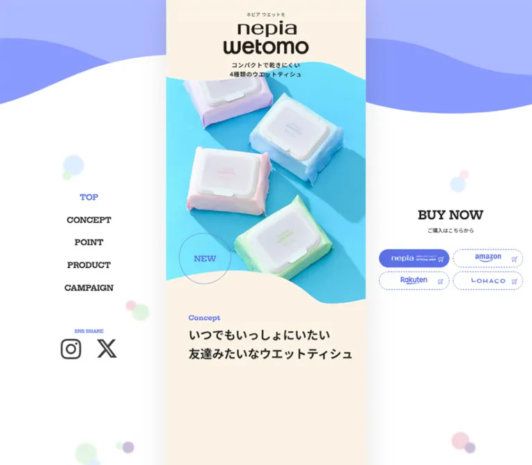
細長い中央カラムを固定ナビゲーションと購入導線で囲む商品紹介サイト。波形の境界、クリーム色の背景、4色のパステルカラー、鮮やかな商品写真が特徴。
オリジナルサイトを見るA narrow product story wrapped in cream paper, pastel waves, and bright everyday photography.
Website: e-nepia.com/products/wetomo Original URL: https://e-nepia.com/products/wetomo/ Final URL: https://e-nepia.com/products/wetomo/ Theme: light; cream content surfaces, white desktop margins, blue actions, and four pastel product identities. Inspected: September 17, 2026, 04:40:32 JST; supplied retrieval timestamp: September 16, 2026, 19:40:32.530 UTC. Viewports: 1440 × 1000 and 390 × 844 CSS pixels. Scope: the current wetomo product-range page, including its opening composition, concept, feature sequence, four product descriptions, comparison entry, story, related-product promotion, campaign entry, final product selector, desktop rails, mobile menu control, and footer. Visual evidence consists of three desktop captures and two mobile captures; supplied DOM measurements cover additional content between them.
The page presents four wet-tissue variants as approachable everyday companions. Its strongest visual relationship is between the bright cyan product photograph, quiet cream reading surface, and assertive blue controls. Pale blue, green, pink, and lavender distinguish the variants without competing with the shared action color. Curved section boundaries, thin circular stamps, and soft background dots make the composition feel light and tactile.
Desktop preserves a narrow, 540px central story instead of expanding the product content across the screen. Persistent section links occupy the left margin; a separate retailer panel occupies the right. On mobile, the story fills the viewport, the desktop rails disappear, and a circular menu button remains at the upper right. The long reading sequence and the two-column final product selector survive the change in width.
A narrow product story wrapped in cream paper, pastel waves, and bright everyday photography.
Website: e-nepia.com/products/wetomo Original URL: https://e-nepia.com/products/wetomo/ Final URL: https://e-nepia.com/products/wetomo/ Theme: light; cream content surfaces, white desktop margins, blue actions, and four pastel product identities. Inspected: September 17, 2026, 04:40:32 JST; supplied retrieval timestamp: September 16, 2026, 19:40:32.530 UTC. Viewports: 1440 × 1000 and 390 × 844 CSS pixels. Scope: the current wetomo product-range page, including its opening composition, concept, feature sequence, four product descriptions, comparison entry, story, related-product promotion, campaign entry, final product selector, desktop rails, mobile menu control, and footer. Visual evidence consists of three desktop captures and two mobile captures; supplied DOM measurements cover additional content between them.
The page presents four wet-tissue variants as approachable everyday companions. Its strongest visual relationship is between the bright cyan product photograph, quiet cream reading surface, and assertive blue controls. Pale blue, green, pink, and lavender distinguish the variants without competing with the shared action color. Curved section boundaries, thin circular stamps, and soft background dots make the composition feel light and tactile.
Desktop preserves a narrow, 540px central story instead of expanding the product content across the screen. Persistent section links occupy the left margin; a separate retailer panel occupies the right. On mobile, the story fills the viewport, the desktop rails disappear, and a circular menu button remains at the upper right. The long reading sequence and the two-column final product selector survive the change in width.
| Name | Value | Source or implementation token | Role |
|---|---|---|---|
| Action Blue | #5B71E7 |
Source --color-accent |
Active section labels, English headings, purchase controls, mobile menu control, and copyright strip |
| Main Ink | #222222 |
Source --color |
Japanese text, navigation, product names, and utility labels |
| Secondary Ink | #666666 |
Measured text color | Brand captions and explanatory text |
| Inverse White | #FFFFFF |
Source --color-inverse |
Text and symbols on blue controls; white secondary buttons |
| Alcohol Blue | #B9D5EE |
Source --color-product in the supplied context |
First product identity and first product-navigation tile |
| Non-alcohol Green | #C9E6CA |
Measured second product-navigation background | Second product identity |
| Moisture Pink | #F5D4DD |
Measured third product-navigation background | Moisturizing product identity |
| Virus-removal Lavender | #CDBDD9 |
Measured fourth product-navigation background | Fourth product identity |
The four product colors visibly recur in the product presentation and closing selector. Their exact values above are verified on the product-navigation tiles; not every larger colored surface was separately sampled.
| Name | Approximation | Role | Evidence limit |
|---|---|---|---|
| Warm Cream | #FCF3E4 |
Central opening, concept, and footer surfaces | Visual estimate; the sampled section backgrounds are transparent |
| Light Lavender Wave | #ADB6FF |
Upper desktop decoration | Visual estimate from the current captures |
| Deeper Lavender Wave | #8B98FF |
Overlapping desktop wave | Visual estimate from the current captures |
| Outer White | #FFFFFF |
Broad desktop margins | Visually white; no opaque body-background declaration supplied |
| Photographic Aqua | Varies across the image | Hero photography background | Part of the photograph, not a verified flat UI token |
Preserve the color hierarchy: blue communicates navigation and purchase actions; pastels identify products; cream supports the narrative. The hero's cyan is an image color and should not become an additional universal button color.
Several visibly filled controls have background: rgba(0, 0, 0, 0) in the extracted element styles. The visible fill may belong to another rendering layer. Reproduce the visible blue pills rather than interpreting a transparent parent declaration as an outlined control.
No selectable color themes or dark mode are evidenced.
Declared family: "Noto Sans JP", "Hiragino Kaku Gothic ProN", "ヒラギノ角ゴ ProN", "Hiragino Kaku Gothic Pro", "ヒラギノ角ゴ Pro", メイリオ, Meiryo, sans-serif.
Body text defaults to weight 500. Product names, major Japanese statements, concept copy, and purchase labels commonly use 700. The combination is firm and friendly, with generous leading in narrative passages. The concept paragraph uses a particularly open 2.4 line-height; the story paragraph uses 2.2.
Declared family: "Hepta Slab", 游明朝, YuMincho, "Hiragino Mincho ProN", "Hiragino Mincho Pro", HG明朝E, "MS 明朝", serif.
Weight 700 appears on section labels, navigation, BUY NOW, footer links, and copyright text. The slab-serif shapes give short English words a compact, recognizable silhouette against the Japanese sans-serif text. Most measured tracking is normal.
Use title case for narrative labels such as Concept and Story, and uppercase for navigation and utility labels such as PRODUCT and CONTACT.
The stacked nepia/wetomo lettering is a distinct visual asset. Its typeface is not identified by the text-style evidence. Preserve authorized wordmark artwork rather than attempting to recreate it with Hepta Slab or Noto Sans JP.
The measured h1 is the small Japanese brand caption above the large wordmark. Its 12px desktop size does not describe the size of the visible logo.
Values below are measured font size / line-height in CSS pixels. A dash means that the corresponding visible component is absent from that viewport.
| Role | Desktop | Mobile | Weight / treatment |
|---|---|---|---|
| Inherited body | 16 / 24 |
11.14 / 16.71 |
500, Japanese sans-serif |
| Small brand caption | 12 / 18 |
8.36 / 12.54 |
700; tracking 0.72px / 0.50px |
| Visible left navigation | 21 / 31.5 |
— | 700, Hepta Slab |
| Alternate navigation in DOM | 28 / 42 |
19.5 / 29.25 |
Closed-menu visibility not established by bounds |
| Desktop BUY NOW title | 32 / 48 |
— | 700, Hepta Slab |
| Desktop purchase subtitle | 14 / 21 |
— | 500, Japanese sans-serif |
| Concept / Story / Which eyebrow | 18 / 27 |
12.54 / 18.80 |
700, Hepta Slab |
| Major English section heading | 32 / 48 |
22.29 / 33.43 |
700, Hepta Slab |
| Concept / Story lead statement | 32 / 51.2 |
22.29 / 35.66 |
700, Japanese sans-serif |
| Concept paragraph | 20 / 48 |
13.93 / 33.43 |
700 |
| Feature heading | 24 / 36 |
16.71 / 25.07 |
700 |
| Feature description | 14 / 23.8 |
9.75 / 16.58 |
500, secondary ink |
| Main product title | 32 / 48 |
22.29 / 33.43 |
700 |
| Main product caption / pack count | 18 / 27 |
12.54 / 18.80 |
Caption 700; count 500 |
| Story paragraph | 18 / 39.6 |
12.54 / 27.58 |
700 |
| Main purchase button | 24 / normal |
16.71 / normal |
700 |
| Selector-card title | 16 / 24 |
11.14 / 16.71 |
700 |
| Selector-card metadata | 10 / 15 |
6.96 / 10.45 |
700 |
| Selector purchase button | 18 / normal |
12.54 / normal |
700 |
| Return-to-description link | 12 / 18 |
8.36 / 12.54 |
700 |
| Footer links | 16 / 24 |
11.14 / 16.71 |
700, Hepta Slab |
| Copyright | 10 / 15 |
6.96 / 10.45 |
700, white on blue |
The original mobile presentation contains very small supporting text. For a new implementation, preserve the hierarchy while introducing readable minimum sizes; do not treat 6.96px product metadata as a recommended target.
The measured root font size is 16px at 1440px viewport width and 11.1429px at 390px. Many dimensions therefore scale by approximately:
11.1429 / 16 ≈ 0.69643.
This mobile ratio is consistent with 390 / 560, but the supplied evidence does not include the rule that produces it. A 560px design basis is an inference, not a recovered stylesheet formula.
The content column follows a different relationship: 390 / 540 ≈ 0.72222. Its width and its internal type/spacing do not scale by exactly the same factor. This explains why some mobile content widths are not simple scaled copies of their desktop widths.
| Use | Desktop | Mobile | Status |
|---|---|---|---|
| Eyebrow-to-lead gap in Concept | 6px |
About 4.18px |
Derived from measured bounds |
| Main CTA icon gap | 10px |
6.96px |
Computed style |
| Selector return-link icon gap | 5px |
3.48px |
Computed style |
| Common product / selector edge inset | 20px |
13.92px |
Measured bounds |
| Main CTA padding | 20px 30px |
13.93px 20.89px |
Computed style |
| Concept heading left inset | 60px |
41.78px |
Measured bounds |
| Story paragraph side inset | 80px |
55.70px |
Measured bounds |
| Product section top padding | 120px |
83.57px |
Computed style |
| Footer top padding | 120px |
83.57px |
Computed style |
| Desktop navigation row pitch | 61.5px |
— | Measured bounds; 31.5px line-height plus approximately 30px gap |
| Retailer grid gap | 10px |
— | Derived from visible desktop link bounds |
The concept heading is deliberately offset: its desktop box begins 60px inside the column and leaves about 30px at the right. The story paragraph is narrower and centered. Do not impose one universal text inset on all narrative sections.
| Element | Geometry | Evidence |
|---|---|---|
| Retailer link | 190 × 50px, 50px radius |
Measured desktop bounds and radius |
| Main purchase button | 270 × 82px, 60px radius |
Measured desktop |
| Mobile main purchase button | About 188.03 × 57.09px, 41.79px radius |
Measured mobile |
| Selector purchase button | 200 × 61px desktop; about 146.27 × 42.47px mobile |
Measured |
| Selector return link | 200 × 41px desktop; about 146.27 × 28.55px mobile |
Measured |
| Mobile menu button | 48.75 × 48.75px, circular |
Measured |
| Product-navigation tile | 78 × 78px desktop; 54.31 × 54.31px mobile |
Measured |
| Product-navigation outer corners | 10px desktop; 6.96px mobile |
Measured on first and last tiles |
| NEW stamp | Thin outlined circle, about 140px desktop / 98px mobile |
Visual estimate |
| PAGETOP control | 143 × 140px desktop; 99.58 × 97.5px mobile |
Measured outer bounds; circular outline visible |
| Selector-card corners | About 10px desktop / 7px mobile |
Visual estimate |
| Section boundaries | Broad asymmetric waves | Visually observed; source paths unavailable |
The circular PAGETOP outline is visible even though the extracted anchor itself reports zero border radius. Likewise, the product photography and wave boundaries may use rendering layers not represented by the sampled parent element styles.
| Element | Desktop: 1440 × 1000 | Mobile: 390 × 844 |
|---|---|---|
| Central main column | x = 450, width 540px |
x = 0, width 390px |
| Outer margin on each side | 450px, calculated |
None |
| Opening section height | 847.39px |
607.25px |
| Concept section height | 729.88px |
508.72px |
| Feature section height | 2936px |
2044.67px |
| Product section, including comparison | 6750.55px |
4792.69px |
| Footer height | 487.5px |
339.44px |
| Copyright strip height | 40px |
27.84px |
| Total document height | Approximately 15586px |
Approximately 11123px |
These long section heights describe the captured state. They are useful for understanding pacing, but should not become fixed-height content containers in a reusable implementation.
The supplied custom properties include --breackpoint-md: 768px, retaining the source spelling. This does not independently prove which layout changes occur at that breakpoint.
Other supplied variables include desktop/mobile values of --header-height: 7.5rem / 3.75rem, --gap: 1rem / 0.75rem, and --padding-section: 10.25rem / 6.75rem. Their consuming rules are unavailable. In particular, the measured header has zero normal-flow height, so the header-height variable must not be mistaken for a visible top bar.
Role: carries the full narrative and product-selection sequence.
Keep the main content at 540px on the inspected desktop layout. Cream, product colors, photographs, and blue selector surfaces remain inside this strip. A faint broad shadow or halo visually separates it from the white outer field; the original shadow values are unavailable.
The sequence is: opening identity, Concept, Point features, Product with four detailed variants, Product comparison, Story and a related kitchen-wipe promotion, Campaign, Which selector, and footer. Some section boundaries overlap geometrically, consistent with the visible wave treatment.
Role: persistent orientation during a very long page.
Five centered links read TOP, CONCEPT, POINT, PRODUCT, and CAMPAIGN. At 1440 × 1000, the first visible link begins around y = 392px; subsequent link bounds advance by 61.5px. Use 21px bold Hepta Slab, without a surrounding card or divider.
The active link is blue: TOP in the opening capture, PRODUCT in the middle capture, and CAMPAIGN in the footer capture. The activation thresholds and implementation are unverified.
Below the navigation, a small blue SNS SHARE label sits above Instagram and X marks. Their recorded destinations are the brand's social accounts. The label alone does not establish a share-dialog interaction.
Role: keeps purchase destinations available beside the story.
At the inspected desktop size, the panel begins around x = 1026px. Stack a centered BUY NOW title, the Japanese subtitle ご購入はこちらから, and a two-by-two retailer grid. The first button row begins at y = 545px, followed by the second at y = 605px.
Each visible pill is 190 × 50px, blue with white retailer artwork and a small cart symbol. The destinations are the official nepia shop, Amazon, Rakuten, and LOHACO. The 10px grid gaps are compact relative to the generous surrounding whitespace.
A tilted product pack appears behind this panel in the middle desktop capture. Its display condition and movement are not established. Keep decorative content behind controls and preserve label legibility.
Role: introduces the identity and all four variants through one photograph.
The upper cream region contains a tiny Japanese caption, the large stacked wordmark, and the two-line statement コンパクトで乾きにくい / 4種類のウエットティシュ. The statement sits near the cream-to-photo wave, visually connecting the brand and product image.
The photograph shows four pastel packs arranged diagonally on a vivid aqua surface. Directional shadows extend across the background and make the pale lids and soft packaging read clearly. The image reaches both edges of the central column.
Use different wave profiles at the photograph's top and bottom. The lower edge rises gently on the left and falls into a deeper curved pocket on the right. A thin blue circular NEW stamp overlaps this boundary toward the left. It reads as a graphic stamp; no destination or interaction is established for it.
Role: translate the product's friendly positioning into slower editorial passages.
A small blue English eyebrow introduces a bold Japanese lead. Concept uses the actual line pair いつでもいっしょにいたい / 友達みたいなウエットティシュ. At mobile width, this appears at approximately 22.29px with 35.66px leading and a 41.78px left inset.
Supporting copy uses unusually generous line spacing rather than large paragraph boxes or heavy separators. Story follows a related pattern, with a narrower paragraph and the heading wetomoに / 込められた想い.
The supplied desktop opening still does not visibly show all text whose DOM bounds begin below the hero. The mobile Concept paragraph also has bounds but is absent from the visible lower part of its opening still. Preserve the content; its precise reveal state is unresolved.
Role: explains compactness, the opening lid, sheet size, and cleaning-liquid coverage.
Each entry has a Japanese heading and smaller gray explanation. The measured desktop heading and description boxes are 320px wide, with successive entries positioned 370px apart horizontally. Mobile text boxes are approximately 222.84px wide, with a corresponding horizontal progression.
This is evidence of a horizontal feature arrangement, not a conventional four-column grid filling the desktop viewport. Several entries lie outside the central column in the extracted coordinate state. The relationship between scrolling, clipping, transforms, and feature advancement was not exercised sufficiently to specify it.
For an adaptation, preserve the readable entry anatomy and provide an accessible way to reach every feature. Horizontal scrolling with optional snapping is a reasonable alternative implementation, but must be labeled as a recommendation.
Role: presents one variant with use context, identity, supporting information, and purchase access.
The visible moisturizing section combines a full-column domestic-use photograph, a large pack image crossing the transition into a pink field, and an outlined circular 保湿 mark. The photograph includes a hand with a sheet, a tiled counter area, bottles, and greenery. The overlapping pack makes the product feel present in the scene; the evidence does not establish whether this is one composite image or multiple positioned assets.
The DOM confirms a repeated content anatomy across the four variants: product-family caption, two-line product name, sheet count and fragrance information, a こんな方におすすめ recommendation group, and a centered 購入する button. Variant-specific notes remain attached to their relevant content. The fourth variant additionally includes 対物専用 and a ウイルス除去率99.9% button whose expanded behavior was not tested.
| Variant | Identity color | Recorded pack information |
|---|---|---|
| Alcohol type | Pale blue | 50 sheets, fragrance-free |
| Non-alcohol type | Pale green | 50 sheets, fragrance-free |
| Moisturizing type | Pink | 46 sheets, fragrance-free |
| Virus-removal type | Lavender | 46 sheets, fragrance-free; object-use label present |
The purchase controls in these sections are buttons in the supplied DOM. Their click results are unknown; do not silently reinterpret them as verified direct checkout links.
Role: provides short routes among the four detailed variants.
Four pastel tiles stack vertically against the central column's right edge. Each contains a small product-pack thumbnail. Thin white divisions and rounded outer left corners group them into one dock. At desktop width, its measured right edge is x = 990px, exactly the central column edge.
The links target #product1 through #product4. They are section anchors, not evidence of content-replacing tabs. The dock is visible in the middle desktop capture and absent from the supplied opening and footer stills. Mobile tile bounds exist in the DOM, but its visible behavior during mobile product reading is not shown.
Role: offers a compact route to compare all four variants.
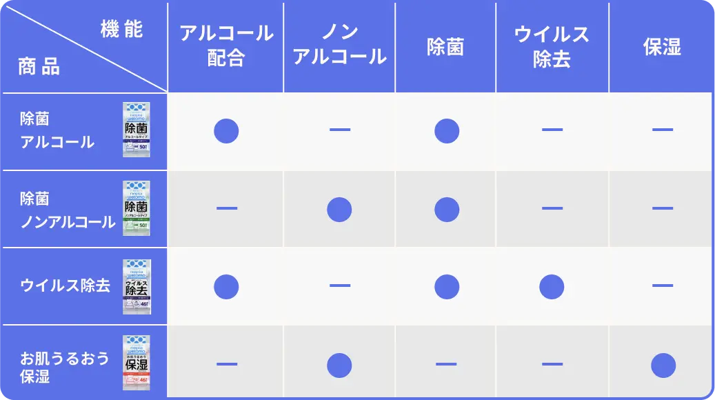
The DOM records a blue, two-line Product / comparison heading, explanatory text, the instruction ※クリックすると拡大します, and a linked comparison image. The observed destination is assets/img/comparison-data.webp under the current page URL.
This supports an enlargement affordance, but not a verified lightbox design. No opened state, closing behavior, image-native dimensions, or keyboard behavior was supplied. The measured inline anchor line box must not be mistaken for the rendered image's height.
Role: connect the product story to adjacent brand content.
The Story section contains a promotion for kitchen wet tissues with a pill-shaped link to the related product page. A later Campaign section contains a heading and a linked promotional asset. These elements are present in the DOM; their full artwork is not visible in the supplied stills.
Preserve them as distinct content blocks. Do not invent campaign dates, availability, banner composition, or destination behavior from the existence of the links.
Role: summarizes the four choices near the end of the page.
A blue section supports a white Which eyebrow and Japanese lead, followed by a two-column grid. Each card uses its variant's pastel background, a modest corner radius, and centered content.
The card anatomy is a small portrait retail-pack image, a gray family caption, a two-line product title, sheet-count information, a blue purchase pill with cart symbol, and a smaller white 説明にもどる pill with a backward arrow. These lower links lead to the detailed product anchors.
The grid remains two columns on the inspected phone. From the capture geometry, cards are approximately 240px wide on desktop and 174px wide on mobile, with approximately 20px and 14px gaps respectively. Card buttons fill the available inner width; the mobile 146px button width is not simply 200px × 0.69643.
Avoid enlarging the pack image until it overwhelms the card. The compact hierarchy and repeated purchase/description pair make the four choices easy to scan as one group.
Role: closes the product story while retaining brand and corporate routes.
An asymmetric wave transitions from the blue selector into cream. A thin outlined PAGETOP circle overlaps the boundary near the right edge, combining a small upward chevron with a compact label. Its recorded target is #top; smooth scrolling was not verified.
Below it, center the stacked wordmark, Instagram and X marks, and a single horizontal row of CONTACT, COMPANY, and PRIVACY POLICY. Keep substantial cream space around these groups. A blue strip at the bottom contains the small white copyright line © oji nepia co.,ltd. All rights reserved.
The footer remains confined to the central column on desktop and spans the phone width on mobile. The mobile footer retains the three-link horizontal arrangement.
Role: replaces the desktop rails with a compact navigation entry point.
The visible control is a blue circle with two thin white horizontal strokes. Its measured position is x = 327.33px, y = 13.92px at 390 × 844, leaving approximately 13.92px to the right edge. Its diameter is 48.75px.
It remains at the upper right in both mobile captures. The DOM includes navigation, retailer links, and social links associated with the alternate header structure, but the menu was not shown open. Overlay appearance, opening motion, focus management, and dismissal behavior are unverified.
| Treatment | Measured declaration | What it establishes |
|---|---|---|
| Many anchor links | 0.3s cubic-bezier(0.37, 0, 0.63, 1) for color, background, border, and box-shadow |
A shared short transition curve; target hover colors are not supplied |
| Selected introductory paragraphs | opacity 0.4s |
Opacity can transition; trigger and starting opacity are not established |
| The same paragraphs | transform 0.6s cubic-bezier(0.34, 1.56, 0.64, 1.26) |
An overshooting transform curve; travel distance and delay are unavailable |
| Sampled element animations | Frequently none |
No CSS animation on those sampled elements at that instant; this does not exclude descendant, pseudo-element, SVG, or JavaScript motion |
The inspection waited for document readiness, visible image decoding, and sampled layout/text stability, with finite animations conservatively awaited. Perpetual animations were temporarily paused during readiness checks and then resumed. These precautions reduce accidental loading captures but do not prove that all delayed or interaction-dependent content has appeared.
Recommended motion approach: retain the measured short link transitions and the restrained overshoot where appropriate. Keep ambient decoration slow and secondary, offer reduced motion, and make content visible if reveal scripts fail. Do not assign invented durations to the original waves or floating products.
| Layer | Appearance | Purpose |
|---|---|---|
| Desktop outer canvas | White with layered lavender waves | Frames the narrow story and leaves room for persistent controls |
| Ambient decorations | Soft pastel dots and occasional product imagery | Adds lightness without creating a separate content grid |
| Narrative surface | Warm cream | Connects opening, editorial content, and footer |
| Product field | One of four pale variant colors | Makes the range identifiable at a glance |
| Product photography | Full-column imagery with overlapping pack presentation | Demonstrates scale, packaging, and everyday use |
| Closing selector | Strong blue surrounding pastel cards | Gives the final product choice a distinct visual chapter |
| Primary control | Solid blue pill with white text or retailer artwork | Shared purchase language |
| Secondary control | White pill with dark label | Returns from summary to detailed explanation |
| Circular stamp | Fine outline with open interior | NEW, product identity, and page-top emphasis |
There is no broad system of elevated dashboard cards. Flat fields, photographic depth, wave boundaries, and a faint column halo provide the visible separation. Soft blur belongs to ambient decoration rather than text panels.
The hero uses bright studio product photography: four compact packages with pale lids on a saturated aqua plane. Pack colors are subtle, while the background and directional shadows provide separation. Preserve the diagonal arrangement and recognizable lid shapes rather than cropping the image into four unrelated thumbnails.
The visible product section uses warmer domestic photography. A hand and wet sheet show use; tiles, bottles, and a plant establish an everyday setting. A large package visually crosses the image-to-color boundary. The change from studio color to a lived-in scene gives the page variety while keeping the package central.
The selector and anchor dock use small portrait retail-pack images, which differ from the large horizontal soft-pack presentation. Preserve that distinction. Maintain original proportions, legible packaging, and smooth photographic rendering; pixelated image scaling would conflict with this design.
Brand, retailer, Instagram, and X marks should remain recognizable supplied artwork. Cart and directional symbols are thin, simple line elements. Do not replace brand marks with approximate text treatments.
Only one exact image URL is exposed in the supplied link evidence. Other assets are visually identifiable but their filenames and formats are not established.
| Asset | Available reference | Evidence / intended use |
|---|---|---|
| Comparison image | assets/img/comparison-data.webp | DOM link for the comparison enlargement |
| Four-pack aqua hero | Current desktop and mobile opening captures | Opening image; source path unavailable |
| Stacked nepia/wetomo wordmark | Current opening and footer captures | Brand identity; source path unavailable |
| Moisturizing-use photograph and large pack | Current middle desktop capture | Product presentation; compositing method unavailable |
| Four small retail-pack images | Current selector and product-dock captures | Navigation and final selection; source paths unavailable |
| Retailer and social marks | Current desktop rails and footer captures | Purchase and social routes; source paths unavailable |
| Wave and pastel-dot decoration | Current desktop captures | Background treatment; source geometry unavailable |
Use authorized original assets where available. The CSS below supplies structure and approximate decorative geometry; it cannot replace the identity carried by the photography and wordmarks.
The 1440px viewport allocates 540px to the center and 450px to each outer side. Navigation sits well inside the left margin, while the retailer grid occupies nearly 390px on the right. These controls stay at similar viewport positions across the supplied scroll captures, supporting a persistent-rail interpretation.
The main page remains a vertical sequence. Product details do not become a wide desktop comparison grid. Only the final selector uses a regular two-column card arrangement within the narrow column.
At 390px, the column fills the viewport. The external desktop decoration and rails are absent from the supplied phone captures. The blue menu control remains visible over both the opening and footer states.
The hero ends around y = 607px in the DOM; Concept starts immediately afterward, allowing its lead to appear within the first 844px viewport. The opening photograph retains all four products, and the circular NEW stamp still overlaps its lower wave.
Most measured typography and rem-based spacing shrink to approximately 69.64% of their desktop values. The final selector keeps two columns, creating very compact card captions and secondary actions. The footer retains its centered identity, social row, three corporate links, and blue copyright strip.
Only two viewport sizes were inspected. The exposed 768px breakpoint variable does not reveal the complete media-query logic, intermediate tablet layout, landscape behavior, or rail disappearance threshold.
For a new implementation, show desktop rails only when both can fit beside the 540px column with comfortable clearance. The Quick Start uses 1320px as a recommended rail threshold and fluid rail width near that threshold. Its 768px unit-scaling branch is an adaptation consistent with the observed token, not a recovered source rule.
Do not infer visibility from the duplicate menu links or product-dock rectangles alone. The supplied computed-style selection does not include a complete ancestor opacity, visibility, clipping, or accessibility-tree audit.
#5B71E7 consistent across purchase controls and active navigation.These are recommendations for a new implementation, not verified features of the original:
aria-expanded, and aria-controls. If it opens a modal panel, implement focus management and Escape dismissal.#5B71E7, measured.#222222; supporting text: #666666, measured.#B9D5EE, #C9E6CA, #F5D4DD, #CDBDD9, measured on product-navigation tiles.#FCF3E4.#ADB6FF and #8B98FF.“Create a Japanese consumer-product page inspired by the current nepia wetomo composition. Center a 540px story column on desktop, with persistent slab-serif section navigation on the left and a two-by-two retailer panel on the right. Use a warm cream narrative surface, measured blue #5B71E7 for actions, and four pastel variant colors: pale blue, green, pink, and lavender. Pair Noto Sans JP Japanese text with bold Hepta Slab English labels. Open with authorized stacked wordmark artwork and a full-column photograph of four pastel packs on aqua, framed by asymmetric waves and an outlined NEW circle. Follow with spacious editorial text, product-use photography, variant descriptions, and a two-column final selector. On mobile, fill the viewport with the story and use a circular two-line menu control. Preserve readable text, keyboard access, and reduced-motion behavior.”
#5B71E7. Put a small SNS label and social marks below. In the right margin, stack BUY NOW, a short Japanese subtitle, and four blue 190 × 50px retailer pills in two columns.”This starter keeps a conventional root font size and introduces --u for component scaling. At the two inspected widths, 1u is approximately 1px desktop and 0.69643px mobile. The interpolation and breakpoint choices are recommendations, not recovered source CSS.
The default component proportions reflect the supplied measurements. Add the optional .readable class to the .wetomo-site wrapper for larger supporting text and hit areas. Cream and wave colors, the column shadow, and decorative SVG paths are approximations. Supply authorized photography, wordmarks, and retailer artwork separately; no asset filenames are assumed.
:root {
  /* Measured colors */
  --color-accent: #5b71e7;
  --color-ink: #222222;
  --color-muted: #666666;
  --color-inverse: #ffffff;
  --product-blue: #b9d5ee;
  --product-green: #c9e6ca;
  --product-pink: #f5d4dd;
  --product-lavender: #cdbdd9;

  /* Visual approximations */
  --color-paper: #fcf3e4;
  --wave-light: #adb6ff;
  --wave-deep: #8b98ff;

  /* Declared families; load font files separately */
  --font-body: 'Noto Sans JP', 'Hiragino Kaku Gothic ProN', Meiryo, sans-serif;
  --font-label: 'Hepta Slab', YuMincho, 'Hiragino Mincho ProN', serif;

  /* Adaptation unit; does not alter the root font size */
  --u: 1px;
  --column-width: 540px;
  --space-small: calc(10 * var(--u));
  --space-inset: calc(20 * var(--u));
  --radius-card: calc(10 * var(--u));
  --text-body: calc(16 * var(--u));
  --text-lead: calc(32 * var(--u));
  --text-eyebrow: calc(18 * var(--u));

  /* Measured transition timings */
  --ease-link: cubic-bezier(0.37, 0, 0.63, 1);
  --ease-reveal: cubic-bezier(0.34, 1.56, 0.64, 1.26);
  --motion-link: 300ms var(--ease-link);
}

@media (max-width: 767px) {
  :root {
    /* Fits the measured 390px sample; interpolation is recommended */
    --u: clamp(0.625px, 0.17857143vw, 1px);
  }
}

.wetomo-site,
.wetomo-site * {
  box-sizing: border-box;
}

.wetomo-site {
  margin: 0;
  color: var(--color-ink);
  background: #fff;
  font: 500 var(--text-body) / 1.5 var(--font-body);
  isolation: isolate;
}

.wetomo-site img {
  display: block;
  max-inline-size: 100%;
}

.wetomo-site :is(a, button) {
  -webkit-tap-highlight-color: transparent;
}

.wetomo-site :is(a, button):focus-visible {
  outline: 3px solid var(--color-ink);
  outline-offset: 4px;
}

.wetomo-column {
  position: relative;
  z-index: 1;
  inline-size: min(100%, var(--column-width));
  margin-inline: auto;
  background: var(--color-paper);
  box-shadow: 0 0 60px rgb(0 0 0 / 6%);
}

.wetomo-column section[id] {
  scroll-margin-top: calc(90 * var(--u));
}

.ambient-wave,
.section-rail,
.purchase-rail {
  display: none;
}

.hero {
  position: relative;
  aspect-ratio: 540 / 847.39;
  background: var(--color-paper);
}

.hero__identity {
  position: absolute;
  z-index: 2;
  inset: calc(30 * var(--u)) 0 auto;
  text-align: center;
}

.hero__caption {
  margin: 0 0 calc(8 * var(--u));
  color: var(--color-muted);
  font-size: calc(12 * var(--u));
  font-weight: 700;
  line-height: 1.5;
  letter-spacing: 0.06em;
}

.hero__logo {
  inline-size: calc(236 * var(--u));
  block-size: auto;
  margin-inline: auto;
}

.hero__subtitle {
  margin: calc(12 * var(--u)) 0 0;
  font-size: calc(16 * var(--u));
  font-weight: 700;
}

.hero__photo {
  position: absolute;
  inset: calc(180 * var(--u)) 0 calc(24 * var(--u));
  overflow: hidden;
  /* Approximate static wave mask, not the original path */
  mask-image: url("data:image/svg+xml,%3Csvg xmlns='http://www.w3.org/2000/svg' viewBox='0 0 1000 1000' preserveAspectRatio='none'%3E%3Cpath fill='white' d='M0 35C260-35 520 0 760 35S930 55 1000 45V980C650 1080 780 805 490 810S110 790 0 815Z'/%3E%3C/svg%3E");
  mask-size: 100% 100%;
  mask-repeat: no-repeat;
}

.hero__photo img {
  inline-size: 100%;
  block-size: 100%;
  object-fit: cover;
}

.new-stamp {
  position: absolute;
  z-index: 3;
  inset-inline-start: calc(34 * var(--u));
  inset-block-start: 74.5%;
  display: grid;
  place-items: center;
  inline-size: calc(140 * var(--u));
  aspect-ratio: 1;
  border: 1px solid var(--color-accent);
  border-radius: 50%;
  color: var(--color-accent);
  font: 700 calc(22 * var(--u)) / 1 var(--font-label);
}

.concept-copy {
  padding: calc(30 * var(--u)) calc(30 * var(--u))
    calc(80 * var(--u)) calc(60 * var(--u));
}

.eyebrow {
  margin: 0 0 calc(6 * var(--u));
  color: var(--color-accent);
  font: 700 var(--text-eyebrow) / 1.5 var(--font-label);
}

.editorial-lead {
  margin: 0;
  font-size: var(--text-lead);
  font-weight: 700;
  line-height: 1.6;
}

.concept-copy__body {
  margin-block: calc(10 * var(--u)) 0;
  padding-inline-end: calc(20 * var(--u));
  font-size: calc(20 * var(--u));
  font-weight: 700;
  line-height: 2.4;
}

.story-copy {
  margin-inline: calc(80 * var(--u));
  font-size: calc(18 * var(--u));
  font-weight: 700;
  line-height: 2.2;
}

.product-panel,
.product-card {
  background: var(--variant, var(--product-blue));
}

.variant-blue { --variant: var(--product-blue); }
.variant-green { --variant: var(--product-green); }
.variant-pink { --variant: var(--product-pink); }
.variant-lavender { --variant: var(--product-lavender); }

.product-panel__content {
  padding: calc(40 * var(--u)) var(--space-inset)
    calc(70 * var(--u));
  text-align: center;
}

.product-panel__title {
  margin: calc(3 * var(--u)) 0 calc(6 * var(--u));
  font-size: calc(32 * var(--u));
  font-weight: 700;
  line-height: 1.5;
}

.pill {
  display: inline-flex;
  align-items: center;
  justify-content: center;
  gap: var(--space-small);
  border: 0;
  border-radius: 999px;
  color: var(--color-inverse);
  background: var(--color-accent);
  font-family: var(--font-body);
  font-weight: 700;
  text-decoration: none;
  cursor: pointer;
  transition: color var(--motion-link),
    background-color var(--motion-link),
    border-color var(--motion-link),
    box-shadow var(--motion-link);
}

.pill--purchase {
  inline-size: min(100%, calc(270 * var(--u)));
  min-block-size: calc(82 * var(--u));
  padding: calc(20 * var(--u)) calc(30 * var(--u));
  font-size: calc(24 * var(--u));
}

.which {
  padding: calc(80 * var(--u)) var(--space-inset)
    calc(100 * var(--u));
  color: #fff;
  background: var(--color-accent);
}

.which .eyebrow {
  color: inherit;
}

.product-grid {
  display: grid;
  grid-template-columns: repeat(2, minmax(0, 1fr));
  gap: var(--space-inset);
  margin-block-start: calc(40 * var(--u));
}

.product-card {
  min-inline-size: 0;
  padding: calc(40 * var(--u)) var(--space-inset);
  border-radius: var(--radius-card);
  color: var(--color-ink);
  text-align: center;
}

.product-card__pack {
  /* Approximate image width; preserve the asset's natural ratio */
  inline-size: 35%;
  block-size: auto;
  margin: 0 auto calc(14 * var(--u));
  object-fit: contain;
}

.product-card__meta {
  margin: 0;
  font-size: calc(10 * var(--u));
  font-weight: 700;
  line-height: 1.5;
}

.product-card__brand {
  color: var(--color-muted);
}

.product-card__title {
  margin: calc(2 * var(--u)) 0;
  font-size: calc(16 * var(--u));
  font-weight: 700;
  line-height: 1.5;
}

.product-card .pill {
  inline-size: 100%;
  margin-block-start: calc(20 * var(--u));
  min-block-size: calc(61 * var(--u));
  padding: calc(12 * var(--u)) calc(10 * var(--u));
  font-size: calc(18 * var(--u));
}

.product-card .pill--return {
  min-block-size: calc(41 * var(--u));
  margin-block-start: calc(15 * var(--u));
  padding: calc(10 * var(--u)) calc(5 * var(--u));
  gap: calc(5 * var(--u));
  color: var(--color-ink);
  background: #fff;
  font-size: calc(12 * var(--u));
}

.wave-edge {
  display: block;
  inline-size: 100%;
  block-size: calc(100 * var(--u));
  color: var(--color-accent);
  background: var(--color-paper);
}

.site-footer {
  position: relative;
  padding-block-start: calc(120 * var(--u));
  background: var(--color-paper);
  text-align: center;
}

.page-top {
  position: absolute;
  inset-block-start: calc(-120 * var(--u));
  inset-inline-end: calc(34 * var(--u));
  display: flex;
  flex-direction: column;
  align-items: center;
  justify-content: center;
  gap: calc(10 * var(--u));
  inline-size: calc(143 * var(--u));
  aspect-ratio: 143 / 140;
  border: 1px solid var(--color-ink);
  border-radius: 50%;
  color: var(--color-ink);
  font: 700 calc(16 * var(--u)) / 1.5 var(--font-label);
  text-decoration: none;
}

.footer-logo {
  inline-size: calc(236 * var(--u));
  block-size: auto;
  margin-inline: auto;
}

.social-icons {
  display: flex;
  align-items: center;
  justify-content: center;
  gap: calc(56 * var(--u));
}

.social-icons img,
.social-icons svg {
  inline-size: calc(40 * var(--u));
  block-size: calc(40 * var(--u));
}

.site-footer .social-icons {
  margin-block: calc(50 * var(--u)) calc(70 * var(--u));
}

.footer-links {
  display: flex;
  flex-wrap: wrap;
  justify-content: center;
  gap: calc(40 * var(--u));
  padding-inline: var(--space-inset);
  font: 700 calc(16 * var(--u)) / 1.5 var(--font-label);
}

.footer-links a {
  color: inherit;
  text-decoration: none;
}

.copyright {
  display: grid;
  place-items: center;
  min-block-size: calc(40 * var(--u));
  margin: calc(40 * var(--u)) 0 0;
  padding-inline: var(--space-inset);
  color: #fff;
  background: var(--color-accent);
  font: 700 calc(10 * var(--u)) / 1.5 var(--font-label);
}

.menu-toggle {
  position: fixed;
  z-index: 20;
  inset-block-start: max(env(safe-area-inset-top), calc(20 * var(--u)));
  inset-inline-end: max(calc(20 * var(--u)),
    calc((100vw - 540px) / 2 + 20 * var(--u)));
  inline-size: calc(70 * var(--u));
  block-size: calc(70 * var(--u));
  padding: 0;
  border: 0;
  border-radius: 50%;
  background: var(--color-accent);
  cursor: pointer;
}

.menu-toggle::before,
.menu-toggle::after {
  content: '';
  position: absolute;
  inset-inline: 22%;
  block-size: 2px;
  background: #fff;
}

.menu-toggle::before { inset-block-start: 40%; }
.menu-toggle::after { inset-block-start: 60%; }

@media (max-width: 767px) {
  .hero { aspect-ratio: 390 / 607.25; }
  .concept-copy { padding-block-start: 0; }
}

@media (min-width: 1320px) {
  /* Recommended rail threshold, not a verified source breakpoint */
  .menu-toggle { display: none; }

  .ambient-wave {
    display: block;
    position: fixed;
    z-index: 0;
    inset: 0 0 auto;
    inline-size: 100%;
    block-size: 308px;
    pointer-events: none;
  }

  .section-rail {
    display: block;
    position: fixed;
    z-index: 2;
    inset-block-start: 39vh;
    inset-inline-start: 16px;
    inline-size: calc((100vw - 540px) / 2);
    text-align: center;
  }

  .section-rail nav {
    display: grid;
    gap: 30px;
    font: 700 21px / 1.5 var(--font-label);
  }

  .section-rail nav a {
    color: var(--color-ink);
    text-decoration: none;
    transition: color var(--motion-link);
  }

  .section-rail nav a[aria-current='location'] {
    color: var(--color-accent);
  }

  .section-rail__social {
    margin-block-start: 90px;
  }

  .section-rail__social h3 {
    margin: 0 0 12px;
    color: var(--color-accent);
    font: 700 12px / 1.5 var(--font-label);
  }

  .section-rail .social-icons { gap: 42px; }

  .purchase-rail {
    display: block;
    position: fixed;
    z-index: 2;
    inset-block-start: 43vh;
    inset-inline-end: 24px;
    inline-size: min(390px, calc((100vw - 540px) / 2 - 48px));
    text-align: center;
  }

  .purchase-rail__title {
    margin: 0;
    font: 700 32px / 1.5 var(--font-label);
  }

  .purchase-rail__caption {
    margin: 6px 0 40px;
    font-size: 14px;
    line-height: 1.5;
  }

  .retailer-grid {
    display: grid;
    grid-template-columns: repeat(2, minmax(0, 1fr));
    gap: 10px;
  }

  .retailer-grid .pill {
    min-inline-size: 0;
    min-block-size: 50px;
    padding: 10px 20px;
  }
}

/* Optional recommended readability improvements */
.readable .product-card__meta {
  font-size: max(12px, calc(10 * var(--u)));
}

.readable .product-card__title {
  font-size: max(14px, calc(16 * var(--u)));
}

.readable .pill,
.readable .social-icons a {
  min-block-size: 44px;
}

.readable .social-icons a {
  display: grid;
  place-items: center;
  min-inline-size: 44px;
}

.readable .product-card .pill--return,
.readable .footer-links {
  font-size: max(12px, calc(12 * var(--u)));
}

.readable .copyright {
  font-size: max(10px, calc(10 * var(--u)));
}

@media (prefers-reduced-motion: reduce) {
  .wetomo-site *,
  .wetomo-site *::before,
  .wetomo-site *::after {
    animation: none !important;
    transition: none !important;
    scroll-behavior: auto !important;
  }
}
Place the footer inside .wetomo-column. The rails and ambient SVG sit outside that column within .wetomo-site. Use actual links for known destinations and buttons for state changes; the menu and purchase-button handlers require separate implementation.
The following decorative SVGs are approximate, static starting points. Place the first outside the column and the second between the closing selector and footer. Keep them noninteractive.
<svg class="ambient-wave" viewBox="0 0 1440 308"
     preserveAspectRatio="none" aria-hidden="true" focusable="false">
  <path fill="var(--wave-light)"
    d="M0 0H1440V204C1220 220 1170 110 990 106S640 230 450 202 160 104 0 104Z" />
  <path fill="var(--wave-deep)"
    d="M0 104C160 104 250 220 450 202S780 65 990 106 1200 220 1440 204V307C1240 307 1130 248 990 191S640 120 450 187 170 307 0 307Z" />
</svg>

<svg class="wave-edge" viewBox="0 0 540 100"
     preserveAspectRatio="none" aria-hidden="true" focusable="false">
  <path fill="currentColor"
    d="M0 0H540V30C440-40 330 65 180 90S35 70 0 40Z" />
</svg>
Optional aliases for a project already using Tailwind v4. This does not imply that the inspected page uses Tailwind. Define the custom properties above first.
@theme inline {
  --color-action: var(--color-accent);
  --color-paper: #fcf3e4;
  --color-ink: #222222;
  --color-muted: #666666;
  --color-variant-blue: #b9d5ee;
  --color-variant-green: #c9e6ca;
  --color-variant-pink: #f5d4dd;
  --color-variant-lavender: #cdbdd9;

  --font-japanese: var(--font-body);
  --font-editorial: var(--font-label);

  --text-eyebrow: calc(18 * var(--u));
  --text-lead: calc(32 * var(--u));
  --text-product-title: calc(32 * var(--u));
  --text-card-title: calc(16 * var(--u));

  --spacing-unit: var(--u);
  --spacing-inset: calc(20 * var(--u));
  --spacing-story: calc(80 * var(--u));
  --radius-product-card: calc(10 * var(--u));
}
2026-09-16T19:40:32.530Z, equivalent to September 17, 2026, 04:40:32.530 JST.This reference describes the current page supported by the supplied captures and measurements. Estimated colors, approximate wave geometry, responsive interpolation, and accessibility additions are explicitly separated from measured original-page evidence.
# nepia wetomo — Style Reference

> A narrow product story wrapped in cream paper, pastel waves, and bright everyday photography.

**Website:** [e-nepia.com/products/wetomo](https://e-nepia.com/products/wetomo/)
**Original URL:** https://e-nepia.com/products/wetomo/
**Final URL:** https://e-nepia.com/products/wetomo/
**Theme:** light; cream content surfaces, white desktop margins, blue actions, and four pastel product identities.
**Inspected:** September 17, 2026, 04:40:32 JST; supplied retrieval timestamp: September 16, 2026, 19:40:32.530 UTC.
**Viewports:** 1440 × 1000 and 390 × 844 CSS pixels.
**Scope:** the current wetomo product-range page, including its opening composition, concept, feature sequence, four product descriptions, comparison entry, story, related-product promotion, campaign entry, final product selector, desktop rails, mobile menu control, and footer. Visual evidence consists of three desktop captures and two mobile captures; supplied DOM measurements cover additional content between them.

The page presents four wet-tissue variants as approachable everyday companions. Its strongest visual relationship is between the bright cyan product photograph, quiet cream reading surface, and assertive blue controls. Pale blue, green, pink, and lavender distinguish the variants without competing with the shared action color. Curved section boundaries, thin circular stamps, and soft background dots make the composition feel light and tactile.

Desktop preserves a narrow, 540px central story instead of expanding the product content across the screen. Persistent section links occupy the left margin; a separate retailer panel occupies the right. On mobile, the story fills the viewport, the desktop rails disappear, and a circular menu button remains at the upper right. The long reading sequence and the two-column final product selector survive the change in width.
# nepia wetomo — Style Reference

> A narrow product story wrapped in cream paper, pastel waves, and bright everyday photography.

**Website:** [e-nepia.com/products/wetomo](https://e-nepia.com/products/wetomo/)
**Original URL:** https://e-nepia.com/products/wetomo/
**Final URL:** https://e-nepia.com/products/wetomo/
**Theme:** light; cream content surfaces, white desktop margins, blue actions, and four pastel product identities.
**Inspected:** September 17, 2026, 04:40:32 JST; supplied retrieval timestamp: September 16, 2026, 19:40:32.530 UTC.
**Viewports:** 1440 × 1000 and 390 × 844 CSS pixels.
**Scope:** the current wetomo product-range page, including its opening composition, concept, feature sequence, four product descriptions, comparison entry, story, related-product promotion, campaign entry, final product selector, desktop rails, mobile menu control, and footer. Visual evidence consists of three desktop captures and two mobile captures; supplied DOM measurements cover additional content between them.

The page presents four wet-tissue variants as approachable everyday companions. Its strongest visual relationship is between the bright cyan product photograph, quiet cream reading surface, and assertive blue controls. Pale blue, green, pink, and lavender distinguish the variants without competing with the shared action color. Curved section boundaries, thin circular stamps, and soft background dots make the composition feel light and tactile.

Desktop preserves a narrow, 540px central story instead of expanding the product content across the screen. Persistent section links occupy the left margin; a separate retailer panel occupies the right. On mobile, the story fills the viewport, the desktop rails disappear, and a circular menu button remains at the upper right. The long reading sequence and the two-column final product selector survive the change in width.

## How to Read This Reference

- **Measured** values come from the supplied rendered DOM and computed styles. Decimal values are rounded for readability.
- **Visual estimates** describe shapes, colors, or dimensions visible in the original-page captures but absent from the measured styles. Estimated hex colors are implementation starting points, not recovered source tokens.
- **Calculated** values are arithmetic derived from measurements, such as side-margin widths and mobile scaling ratios.
- **Recommendations** describe a reusable implementation or accessibility improvement. They are not claims about existing site behavior.
- Font-family declarations are available; successful loading of each named font face was not independently verified.
- Element bounds do not prove visibility. The extracted DOM includes a second navigation structure that is not visible in the closed-menu screenshots, and some text has bounds while remaining absent from the corresponding still image.
- The CSS Quick Start is an adaptation. It does not reproduce the original JavaScript, recover missing asset paths, or establish untested interaction outcomes.

## Tokens — Colors

### Measured Palette

| Name | Value | Source or implementation token | Role |
| --- | --- | --- | --- |
| Action Blue | `#5B71E7` | Source `--color-accent` | Active section labels, English headings, purchase controls, mobile menu control, and copyright strip |
| Main Ink | `#222222` | Source `--color` | Japanese text, navigation, product names, and utility labels |
| Secondary Ink | `#666666` | Measured text color | Brand captions and explanatory text |
| Inverse White | `#FFFFFF` | Source `--color-inverse` | Text and symbols on blue controls; white secondary buttons |
| Alcohol Blue | `#B9D5EE` | Source `--color-product` in the supplied context | First product identity and first product-navigation tile |
| Non-alcohol Green | `#C9E6CA` | Measured second product-navigation background | Second product identity |
| Moisture Pink | `#F5D4DD` | Measured third product-navigation background | Moisturizing product identity |
| Virus-removal Lavender | `#CDBDD9` | Measured fourth product-navigation background | Fourth product identity |

The four product colors visibly recur in the product presentation and closing selector. Their exact values above are verified on the product-navigation tiles; not every larger colored surface was separately sampled.

### Estimated Supporting Palette

| Name | Approximation | Role | Evidence limit |
| --- | --- | --- | --- |
| Warm Cream | `#FCF3E4` | Central opening, concept, and footer surfaces | Visual estimate; the sampled section backgrounds are transparent |
| Light Lavender Wave | `#ADB6FF` | Upper desktop decoration | Visual estimate from the current captures |
| Deeper Lavender Wave | `#8B98FF` | Overlapping desktop wave | Visual estimate from the current captures |
| Outer White | `#FFFFFF` | Broad desktop margins | Visually white; no opaque body-background declaration supplied |
| Photographic Aqua | Varies across the image | Hero photography background | Part of the photograph, not a verified flat UI token |

**Preserve the color hierarchy:** blue communicates navigation and purchase actions; pastels identify products; cream supports the narrative. The hero's cyan is an image color and should not become an additional universal button color.

Several visibly filled controls have `background: rgba(0, 0, 0, 0)` in the extracted element styles. The visible fill may belong to another rendering layer. Reproduce the visible blue pills rather than interpreting a transparent parent declaration as an outlined control.

No selectable color themes or dark mode are evidenced.

## Tokens — Typography

### Japanese Text — Noto Sans JP Stack

**Declared family:** `"Noto Sans JP", "Hiragino Kaku Gothic ProN", "ヒラギノ角ゴ ProN", "Hiragino Kaku Gothic Pro", "ヒラギノ角ゴ Pro", メイリオ, Meiryo, sans-serif`.

Body text defaults to weight `500`. Product names, major Japanese statements, concept copy, and purchase labels commonly use `700`. The combination is firm and friendly, with generous leading in narrative passages. The concept paragraph uses a particularly open `2.4` line-height; the story paragraph uses `2.2`.

### English Labels — Hepta Slab Stack

**Declared family:** `"Hepta Slab", 游明朝, YuMincho, "Hiragino Mincho ProN", "Hiragino Mincho Pro", HG明朝E, "MS 明朝", serif`.

Weight `700` appears on section labels, navigation, `BUY NOW`, footer links, and copyright text. The slab-serif shapes give short English words a compact, recognizable silhouette against the Japanese sans-serif text. Most measured tracking is normal.

Use title case for narrative labels such as `Concept` and `Story`, and uppercase for navigation and utility labels such as `PRODUCT` and `CONTACT`.

### Brand Wordmark

The stacked nepia/wetomo lettering is a distinct visual asset. Its typeface is not identified by the text-style evidence. Preserve authorized wordmark artwork rather than attempting to recreate it with Hepta Slab or Noto Sans JP.

The measured `h1` is the small Japanese brand caption above the large wordmark. Its 12px desktop size does not describe the size of the visible logo.

### Type Scale

Values below are measured font size / line-height in CSS pixels. A dash means that the corresponding visible component is absent from that viewport.

| Role | Desktop | Mobile | Weight / treatment |
| --- | --- | --- | --- |
| Inherited body | `16 / 24` | `11.14 / 16.71` | `500`, Japanese sans-serif |
| Small brand caption | `12 / 18` | `8.36 / 12.54` | `700`; tracking `0.72px` / `0.50px` |
| Visible left navigation | `21 / 31.5` | — | `700`, Hepta Slab |
| Alternate navigation in DOM | `28 / 42` | `19.5 / 29.25` | Closed-menu visibility not established by bounds |
| Desktop BUY NOW title | `32 / 48` | — | `700`, Hepta Slab |
| Desktop purchase subtitle | `14 / 21` | — | `500`, Japanese sans-serif |
| Concept / Story / Which eyebrow | `18 / 27` | `12.54 / 18.80` | `700`, Hepta Slab |
| Major English section heading | `32 / 48` | `22.29 / 33.43` | `700`, Hepta Slab |
| Concept / Story lead statement | `32 / 51.2` | `22.29 / 35.66` | `700`, Japanese sans-serif |
| Concept paragraph | `20 / 48` | `13.93 / 33.43` | `700` |
| Feature heading | `24 / 36` | `16.71 / 25.07` | `700` |
| Feature description | `14 / 23.8` | `9.75 / 16.58` | `500`, secondary ink |
| Main product title | `32 / 48` | `22.29 / 33.43` | `700` |
| Main product caption / pack count | `18 / 27` | `12.54 / 18.80` | Caption `700`; count `500` |
| Story paragraph | `18 / 39.6` | `12.54 / 27.58` | `700` |
| Main purchase button | `24 / normal` | `16.71 / normal` | `700` |
| Selector-card title | `16 / 24` | `11.14 / 16.71` | `700` |
| Selector-card metadata | `10 / 15` | `6.96 / 10.45` | `700` |
| Selector purchase button | `18 / normal` | `12.54 / normal` | `700` |
| Return-to-description link | `12 / 18` | `8.36 / 12.54` | `700` |
| Footer links | `16 / 24` | `11.14 / 16.71` | `700`, Hepta Slab |
| Copyright | `10 / 15` | `6.96 / 10.45` | `700`, white on blue |

The original mobile presentation contains very small supporting text. For a new implementation, preserve the hierarchy while introducing readable minimum sizes; do not treat 6.96px product metadata as a recommended target.

## Tokens — Spacing & Shapes

### Scaling Evidence

The measured root font size is `16px` at 1440px viewport width and `11.1429px` at 390px. Many dimensions therefore scale by approximately:

`11.1429 / 16 ≈ 0.69643`.

This mobile ratio is consistent with `390 / 560`, but the supplied evidence does not include the rule that produces it. A 560px design basis is an inference, not a recovered stylesheet formula.

The content column follows a different relationship: `390 / 540 ≈ 0.72222`. Its width and its internal type/spacing do not scale by exactly the same factor. This explains why some mobile content widths are not simple scaled copies of their desktop widths.

### Spacing Measurements

| Use | Desktop | Mobile | Status |
| --- | --- | --- | --- |
| Eyebrow-to-lead gap in Concept | `6px` | About `4.18px` | Derived from measured bounds |
| Main CTA icon gap | `10px` | `6.96px` | Computed style |
| Selector return-link icon gap | `5px` | `3.48px` | Computed style |
| Common product / selector edge inset | `20px` | `13.92px` | Measured bounds |
| Main CTA padding | `20px 30px` | `13.93px 20.89px` | Computed style |
| Concept heading left inset | `60px` | `41.78px` | Measured bounds |
| Story paragraph side inset | `80px` | `55.70px` | Measured bounds |
| Product section top padding | `120px` | `83.57px` | Computed style |
| Footer top padding | `120px` | `83.57px` | Computed style |
| Desktop navigation row pitch | `61.5px` | — | Measured bounds; `31.5px` line-height plus approximately `30px` gap |
| Retailer grid gap | `10px` | — | Derived from visible desktop link bounds |

The concept heading is deliberately offset: its desktop box begins 60px inside the column and leaves about 30px at the right. The story paragraph is narrower and centered. Do not impose one universal text inset on all narrative sections.

### Shapes

| Element | Geometry | Evidence |
| --- | --- | --- |
| Retailer link | `190 × 50px`, `50px` radius | Measured desktop bounds and radius |
| Main purchase button | `270 × 82px`, `60px` radius | Measured desktop |
| Mobile main purchase button | About `188.03 × 57.09px`, `41.79px` radius | Measured mobile |
| Selector purchase button | `200 × 61px` desktop; about `146.27 × 42.47px` mobile | Measured |
| Selector return link | `200 × 41px` desktop; about `146.27 × 28.55px` mobile | Measured |
| Mobile menu button | `48.75 × 48.75px`, circular | Measured |
| Product-navigation tile | `78 × 78px` desktop; `54.31 × 54.31px` mobile | Measured |
| Product-navigation outer corners | `10px` desktop; `6.96px` mobile | Measured on first and last tiles |
| NEW stamp | Thin outlined circle, about `140px` desktop / `98px` mobile | Visual estimate |
| PAGETOP control | `143 × 140px` desktop; `99.58 × 97.5px` mobile | Measured outer bounds; circular outline visible |
| Selector-card corners | About `10px` desktop / `7px` mobile | Visual estimate |
| Section boundaries | Broad asymmetric waves | Visually observed; source paths unavailable |

The circular PAGETOP outline is visible even though the extracted anchor itself reports zero border radius. Likewise, the product photography and wave boundaries may use rendering layers not represented by the sampled parent element styles.

### Layout Measurements

| Element | Desktop: 1440 × 1000 | Mobile: 390 × 844 |
| --- | --- | --- |
| Central main column | `x = 450`, width `540px` | `x = 0`, width `390px` |
| Outer margin on each side | `450px`, calculated | None |
| Opening section height | `847.39px` | `607.25px` |
| Concept section height | `729.88px` | `508.72px` |
| Feature section height | `2936px` | `2044.67px` |
| Product section, including comparison | `6750.55px` | `4792.69px` |
| Footer height | `487.5px` | `339.44px` |
| Copyright strip height | `40px` | `27.84px` |
| Total document height | Approximately `15586px` | Approximately `11123px` |

These long section heights describe the captured state. They are useful for understanding pacing, but should not become fixed-height content containers in a reusable implementation.

### Source Variables with Limited Context

The supplied custom properties include `--breackpoint-md: 768px`, retaining the source spelling. This does not independently prove which layout changes occur at that breakpoint.

Other supplied variables include desktop/mobile values of `--header-height: 7.5rem / 3.75rem`, `--gap: 1rem / 0.75rem`, and `--padding-section: 10.25rem / 6.75rem`. Their consuming rules are unavailable. In particular, the measured header has zero normal-flow height, so the header-height variable must not be mistaken for a visible top bar.

## Components

### Central Product Story

**Role:** carries the full narrative and product-selection sequence.

Keep the main content at 540px on the inspected desktop layout. Cream, product colors, photographs, and blue selector surfaces remain inside this strip. A faint broad shadow or halo visually separates it from the white outer field; the original shadow values are unavailable.

The sequence is: opening identity, Concept, Point features, Product with four detailed variants, Product comparison, Story and a related kitchen-wipe promotion, Campaign, Which selector, and footer. Some section boundaries overlap geometrically, consistent with the visible wave treatment.

### Desktop Section Rail

**Role:** persistent orientation during a very long page.

Five centered links read `TOP`, `CONCEPT`, `POINT`, `PRODUCT`, and `CAMPAIGN`. At 1440 × 1000, the first visible link begins around y = 392px; subsequent link bounds advance by 61.5px. Use 21px bold Hepta Slab, without a surrounding card or divider.

The active link is blue: TOP in the opening capture, PRODUCT in the middle capture, and CAMPAIGN in the footer capture. The activation thresholds and implementation are unverified.

Below the navigation, a small blue `SNS SHARE` label sits above Instagram and X marks. Their recorded destinations are the brand's social accounts. The label alone does not establish a share-dialog interaction.

### Desktop Retailer Rail

**Role:** keeps purchase destinations available beside the story.

At the inspected desktop size, the panel begins around x = 1026px. Stack a centered `BUY NOW` title, the Japanese subtitle `ご購入はこちらから`, and a two-by-two retailer grid. The first button row begins at y = 545px, followed by the second at y = 605px.

Each visible pill is 190 × 50px, blue with white retailer artwork and a small cart symbol. The destinations are the official nepia shop, Amazon, Rakuten, and LOHACO. The 10px grid gaps are compact relative to the generous surrounding whitespace.

A tilted product pack appears behind this panel in the middle desktop capture. Its display condition and movement are not established. Keep decorative content behind controls and preserve label legibility.

### Opening Composition

**Role:** introduces the identity and all four variants through one photograph.

The upper cream region contains a tiny Japanese caption, the large stacked wordmark, and the two-line statement `コンパクトで乾きにくい / 4種類のウエットティシュ`. The statement sits near the cream-to-photo wave, visually connecting the brand and product image.

The photograph shows four pastel packs arranged diagonally on a vivid aqua surface. Directional shadows extend across the background and make the pale lids and soft packaging read clearly. The image reaches both edges of the central column.

Use different wave profiles at the photograph's top and bottom. The lower edge rises gently on the left and falls into a deeper curved pocket on the right. A thin blue circular `NEW` stamp overlaps this boundary toward the left. It reads as a graphic stamp; no destination or interaction is established for it.

### Concept and Story Text Blocks

**Role:** translate the product's friendly positioning into slower editorial passages.

A small blue English eyebrow introduces a bold Japanese lead. Concept uses the actual line pair `いつでもいっしょにいたい / 友達みたいなウエットティシュ`. At mobile width, this appears at approximately 22.29px with 35.66px leading and a 41.78px left inset.

Supporting copy uses unusually generous line spacing rather than large paragraph boxes or heavy separators. Story follows a related pattern, with a narrower paragraph and the heading `wetomoに / 込められた想い`.

The supplied desktop opening still does not visibly show all text whose DOM bounds begin below the hero. The mobile Concept paragraph also has bounds but is absent from the visible lower part of its opening still. Preserve the content; its precise reveal state is unresolved.

### Point Feature Sequence

**Role:** explains compactness, the opening lid, sheet size, and cleaning-liquid coverage.

Each entry has a Japanese heading and smaller gray explanation. The measured desktop heading and description boxes are 320px wide, with successive entries positioned 370px apart horizontally. Mobile text boxes are approximately 222.84px wide, with a corresponding horizontal progression.

This is evidence of a horizontal feature arrangement, not a conventional four-column grid filling the desktop viewport. Several entries lie outside the central column in the extracted coordinate state. The relationship between scrolling, clipping, transforms, and feature advancement was not exercised sufficiently to specify it.

For an adaptation, preserve the readable entry anatomy and provide an accessible way to reach every feature. Horizontal scrolling with optional snapping is a reasonable alternative implementation, but must be labeled as a recommendation.

### Product Detail Section

**Role:** presents one variant with use context, identity, supporting information, and purchase access.

The visible moisturizing section combines a full-column domestic-use photograph, a large pack image crossing the transition into a pink field, and an outlined circular `保湿` mark. The photograph includes a hand with a sheet, a tiled counter area, bottles, and greenery. The overlapping pack makes the product feel present in the scene; the evidence does not establish whether this is one composite image or multiple positioned assets.

The DOM confirms a repeated content anatomy across the four variants: product-family caption, two-line product name, sheet count and fragrance information, a `こんな方におすすめ` recommendation group, and a centered `購入する` button. Variant-specific notes remain attached to their relevant content. The fourth variant additionally includes `対物専用` and a `ウイルス除去率99.9%` button whose expanded behavior was not tested.

| Variant | Identity color | Recorded pack information |
| --- | --- | --- |
| Alcohol type | Pale blue | 50 sheets, fragrance-free |
| Non-alcohol type | Pale green | 50 sheets, fragrance-free |
| Moisturizing type | Pink | 46 sheets, fragrance-free |
| Virus-removal type | Lavender | 46 sheets, fragrance-free; object-use label present |

The purchase controls in these sections are buttons in the supplied DOM. Their click results are unknown; do not silently reinterpret them as verified direct checkout links.

### Product Anchor Dock

**Role:** provides short routes among the four detailed variants.

Four pastel tiles stack vertically against the central column's right edge. Each contains a small product-pack thumbnail. Thin white divisions and rounded outer left corners group them into one dock. At desktop width, its measured right edge is x = 990px, exactly the central column edge.

The links target `#product1` through `#product4`. They are section anchors, not evidence of content-replacing tabs. The dock is visible in the middle desktop capture and absent from the supplied opening and footer stills. Mobile tile bounds exist in the DOM, but its visible behavior during mobile product reading is not shown.

### Product Comparison Entry

**Role:** offers a compact route to compare all four variants.

The DOM records a blue, two-line `Product / comparison` heading, explanatory text, the instruction `※クリックすると拡大します`, and a linked comparison image. The observed destination is `assets/img/comparison-data.webp` under the current page URL.

This supports an enlargement affordance, but not a verified lightbox design. No opened state, closing behavior, image-native dimensions, or keyboard behavior was supplied. The measured inline anchor line box must not be mistaken for the rendered image's height.

### Related Product and Campaign Entries

**Role:** connect the product story to adjacent brand content.

The Story section contains a promotion for kitchen wet tissues with a pill-shaped link to the related product page. A later Campaign section contains a heading and a linked promotional asset. These elements are present in the DOM; their full artwork is not visible in the supplied stills.

Preserve them as distinct content blocks. Do not invent campaign dates, availability, banner composition, or destination behavior from the existence of the links.

### Which Product Selector

**Role:** summarizes the four choices near the end of the page.

A blue section supports a white `Which` eyebrow and Japanese lead, followed by a two-column grid. Each card uses its variant's pastel background, a modest corner radius, and centered content.

The card anatomy is a small portrait retail-pack image, a gray family caption, a two-line product title, sheet-count information, a blue purchase pill with cart symbol, and a smaller white `説明にもどる` pill with a backward arrow. These lower links lead to the detailed product anchors.

The grid remains two columns on the inspected phone. From the capture geometry, cards are approximately 240px wide on desktop and 174px wide on mobile, with approximately 20px and 14px gaps respectively. Card buttons fill the available inner width; the mobile 146px button width is not simply `200px × 0.69643`.

Avoid enlarging the pack image until it overwhelms the card. The compact hierarchy and repeated purchase/description pair make the four choices easy to scan as one group.

### Footer and PAGETOP

**Role:** closes the product story while retaining brand and corporate routes.

An asymmetric wave transitions from the blue selector into cream. A thin outlined `PAGETOP` circle overlaps the boundary near the right edge, combining a small upward chevron with a compact label. Its recorded target is `#top`; smooth scrolling was not verified.

Below it, center the stacked wordmark, Instagram and X marks, and a single horizontal row of `CONTACT`, `COMPANY`, and `PRIVACY POLICY`. Keep substantial cream space around these groups. A blue strip at the bottom contains the small white copyright line `© oji nepia co.,ltd. All rights reserved.`

The footer remains confined to the central column on desktop and spans the phone width on mobile. The mobile footer retains the three-link horizontal arrangement.

### Mobile Menu Control

**Role:** replaces the desktop rails with a compact navigation entry point.

The visible control is a blue circle with two thin white horizontal strokes. Its measured position is x = 327.33px, y = 13.92px at 390 × 844, leaving approximately 13.92px to the right edge. Its diameter is 48.75px.

It remains at the upper right in both mobile captures. The DOM includes navigation, retailer links, and social links associated with the alternate header structure, but the menu was not shown open. Overlay appearance, opening motion, focus management, and dismissal behavior are unverified.

## Tokens — Motion & Interaction

### Measured Transition Declarations

| Treatment | Measured declaration | What it establishes |
| --- | --- | --- |
| Many anchor links | `0.3s cubic-bezier(0.37, 0, 0.63, 1)` for color, background, border, and box-shadow | A shared short transition curve; target hover colors are not supplied |
| Selected introductory paragraphs | `opacity 0.4s` | Opacity can transition; trigger and starting opacity are not established |
| The same paragraphs | `transform 0.6s cubic-bezier(0.34, 1.56, 0.64, 1.26)` | An overshooting transform curve; travel distance and delay are unavailable |
| Sampled element animations | Frequently `none` | No CSS animation on those sampled elements at that instant; this does not exclude descendant, pseudo-element, SVG, or JavaScript motion |

### Visible States and Limits

- The desktop navigation changes its blue active label across the opening, product, and ending captures. The section-state relationship is visible; exact thresholds are unknown.
- Wave contours and pastel-dot positions differ across captures. The evidence supports changing decoration but does not distinguish elapsed-time animation from scroll-linked movement.
- The tilted pack behind the retailer rail appears in the product capture. Its entry, exit, and trigger are unverified.
- Horizontal feature positions suggest a moving or scrollable arrangement. Autoplay, dragging, pinning, and wheel-to-horizontal behavior are not established.
- Purchase buttons, the mobile menu, the comparison enlargement, and the virus-removal information button have no supplied post-activation state.
- Anchor destinations are verified by the DOM. Scroll easing, offset handling, and history behavior were not tested.

The inspection waited for document readiness, visible image decoding, and sampled layout/text stability, with finite animations conservatively awaited. Perpetual animations were temporarily paused during readiness checks and then resumed. These precautions reduce accidental loading captures but do not prove that all delayed or interaction-dependent content has appeared.

**Recommended motion approach:** retain the measured short link transitions and the restrained overshoot where appropriate. Keep ambient decoration slow and secondary, offer reduced motion, and make content visible if reveal scripts fail. Do not assign invented durations to the original waves or floating products.

## Surfaces

| Layer | Appearance | Purpose |
| --- | --- | --- |
| Desktop outer canvas | White with layered lavender waves | Frames the narrow story and leaves room for persistent controls |
| Ambient decorations | Soft pastel dots and occasional product imagery | Adds lightness without creating a separate content grid |
| Narrative surface | Warm cream | Connects opening, editorial content, and footer |
| Product field | One of four pale variant colors | Makes the range identifiable at a glance |
| Product photography | Full-column imagery with overlapping pack presentation | Demonstrates scale, packaging, and everyday use |
| Closing selector | Strong blue surrounding pastel cards | Gives the final product choice a distinct visual chapter |
| Primary control | Solid blue pill with white text or retailer artwork | Shared purchase language |
| Secondary control | White pill with dark label | Returns from summary to detailed explanation |
| Circular stamp | Fine outline with open interior | NEW, product identity, and page-top emphasis |

There is no broad system of elevated dashboard cards. Flat fields, photographic depth, wave boundaries, and a faint column halo provide the visible separation. Soft blur belongs to ambient decoration rather than text panels.

## Imagery

The hero uses bright studio product photography: four compact packages with pale lids on a saturated aqua plane. Pack colors are subtle, while the background and directional shadows provide separation. Preserve the diagonal arrangement and recognizable lid shapes rather than cropping the image into four unrelated thumbnails.

The visible product section uses warmer domestic photography. A hand and wet sheet show use; tiles, bottles, and a plant establish an everyday setting. A large package visually crosses the image-to-color boundary. The change from studio color to a lived-in scene gives the page variety while keeping the package central.

The selector and anchor dock use small portrait retail-pack images, which differ from the large horizontal soft-pack presentation. Preserve that distinction. Maintain original proportions, legible packaging, and smooth photographic rendering; pixelated image scaling would conflict with this design.

Brand, retailer, Instagram, and X marks should remain recognizable supplied artwork. Cart and directional symbols are thin, simple line elements. Do not replace brand marks with approximate text treatments.

### Observed Asset References

Only one exact image URL is exposed in the supplied link evidence. Other assets are visually identifiable but their filenames and formats are not established.

| Asset | Available reference | Evidence / intended use |
| --- | --- | --- |
| Comparison image | [assets/img/comparison-data.webp](https://e-nepia.com/products/wetomo/assets/img/comparison-data.webp) | DOM link for the comparison enlargement |
| Four-pack aqua hero | Current desktop and mobile opening captures | Opening image; source path unavailable |
| Stacked nepia/wetomo wordmark | Current opening and footer captures | Brand identity; source path unavailable |
| Moisturizing-use photograph and large pack | Current middle desktop capture | Product presentation; compositing method unavailable |
| Four small retail-pack images | Current selector and product-dock captures | Navigation and final selection; source paths unavailable |
| Retailer and social marks | Current desktop rails and footer captures | Purchase and social routes; source paths unavailable |
| Wave and pastel-dot decoration | Current desktop captures | Background treatment; source geometry unavailable |

Use authorized original assets where available. The CSS below supplies structure and approximate decorative geometry; it cannot replace the identity carried by the photography and wordmarks.

## Layout & Responsive Behavior

### Desktop

The 1440px viewport allocates 540px to the center and 450px to each outer side. Navigation sits well inside the left margin, while the retailer grid occupies nearly 390px on the right. These controls stay at similar viewport positions across the supplied scroll captures, supporting a persistent-rail interpretation.

The main page remains a vertical sequence. Product details do not become a wide desktop comparison grid. Only the final selector uses a regular two-column card arrangement within the narrow column.

### Mobile

At 390px, the column fills the viewport. The external desktop decoration and rails are absent from the supplied phone captures. The blue menu control remains visible over both the opening and footer states.

The hero ends around y = 607px in the DOM; Concept starts immediately afterward, allowing its lead to appear within the first 844px viewport. The opening photograph retains all four products, and the circular NEW stamp still overlaps its lower wave.

Most measured typography and rem-based spacing shrink to approximately 69.64% of their desktop values. The final selector keeps two columns, creating very compact card captions and secondary actions. The footer retains its centered identity, social row, three corporate links, and blue copyright strip.

### Breakpoint and Visibility Limits

Only two viewport sizes were inspected. The exposed 768px breakpoint variable does not reveal the complete media-query logic, intermediate tablet layout, landscape behavior, or rail disappearance threshold.

For a new implementation, show desktop rails only when both can fit beside the 540px column with comfortable clearance. The Quick Start uses 1320px as a recommended rail threshold and fluid rail width near that threshold. Its 768px unit-scaling branch is an adaptation consistent with the observed token, not a recovered source rule.

Do not infer visibility from the duplicate menu links or product-dock rectangles alone. The supplied computed-style selection does not include a complete ancestor opacity, visibility, clipping, or accessibility-tree audit.

## Do’s and Don’ts

### Do

- Preserve the narrow desktop story and its separate navigation and purchase rails.
- Keep Action Blue `#5B71E7` consistent across purchase controls and active navigation.
- Carry the same four pastel identities through product details, anchor tiles, and selector cards.
- Pair bold Japanese sans-serif text with Hepta Slab English labels.
- Use generous narrative leading and varied text insets.
- Keep the full four-pack hero composition, directional shadows, and pale lids recognizable.
- Use broad asymmetric waves and thin circular outlines as recurring shapes.
- Preserve the two-column selector at the inspected phone size, while improving small text where necessary.
- Keep product notes and limitations attached to their relevant variant.
- Distinguish visible behavior, computed declarations, and untested controls in implementation documentation.

### Don’t

- Don’t stretch the central story across the full desktop width.
- Don’t turn every section into an elevated rounded card.
- Don’t assign separate saturated purchase colors to each variant.
- Don’t treat the aqua photograph background as a universal UI color.
- Don’t recreate the brand or retailer logos with guessed fonts.
- Don’t assume transparent computed backgrounds mean the visible buttons are outlined.
- Don’t copy 7–10px mobile supporting text without considering legibility.
- Don’t interpret product-anchor links as verified content-switching tabs.
- Don’t invent a lightbox, purchase modal, carousel mechanism, or menu transition from the available labels.
- Don’t omit content because a still capture shows an unresolved reveal state.

## Recommended Implementation Additions

These are recommendations for a new implementation, not verified features of the original:

- Set readable minimum sizes for descriptions, pack counts, and footer utilities. Allow affected cards and sections to grow vertically.
- Give purchase controls, product thumbnails, retailer marks, and social links explicit accessible names. Empty extracted link text does not prove that the original lacks image alternatives, so inspect those separately before making an accessibility claim.
- Give the menu button an accessible label, `aria-expanded`, and `aria-controls`. If it opens a modal panel, implement focus management and Escape dismissal.
- Keep keyboard focus visible against cream, blue, and all four pastels. Add a non-color-only current-section cue if navigation state must be communicated accessibly.
- Increase compact return links and social hit areas to at least 44px without requiring their artwork to become larger.
- Preserve the four product anchors and ensure the dock does not obscure text or focused controls on small screens.
- Provide a semantic comparison table alongside any comparison image.
- Offer reduced-motion behavior for decorative waves, dots, transforms, and any feature-track animation. Keep editorial text visible without animation support.
- If horizontal feature navigation is implemented, provide keyboard access and avoid trapping ordinary vertical scrolling.
- Account for safe-area insets around the floating mobile control and ensure fixed UI remains usable when text is enlarged.

## Agent Prompt Guide

### Quick Color Reference

- Primary action and active state: `#5B71E7`, measured.
- Main text: `#222222`; supporting text: `#666666`, measured.
- Variant sequence: `#B9D5EE`, `#C9E6CA`, `#F5D4DD`, `#CDBDD9`, measured on product-navigation tiles.
- Cream narrative surface: approximately `#FCF3E4`.
- Desktop waves: approximately `#ADB6FF` and `#8B98FF`.
- Primary action: blue pill with white label or retailer artwork and a small cart symbol.
- Secondary action: white pill with dark text and a backward arrow.

### Overall Prompt

“Create a Japanese consumer-product page inspired by the current nepia wetomo composition. Center a 540px story column on desktop, with persistent slab-serif section navigation on the left and a two-by-two retailer panel on the right. Use a warm cream narrative surface, measured blue `#5B71E7` for actions, and four pastel variant colors: pale blue, green, pink, and lavender. Pair Noto Sans JP Japanese text with bold Hepta Slab English labels. Open with authorized stacked wordmark artwork and a full-column photograph of four pastel packs on aqua, framed by asymmetric waves and an outlined NEW circle. Follow with spacious editorial text, product-use photography, variant descriptions, and a two-column final selector. On mobile, fill the viewport with the story and use a circular two-line menu control. Preserve readable text, keyboard access, and reduced-motion behavior.”

### Example Component Prompts

1. **Desktop rails:** “Place five centered uppercase Hepta Slab section links in the left white margin of a narrow product page. Highlight the current section in `#5B71E7`. Put a small SNS label and social marks below. In the right margin, stack BUY NOW, a short Japanese subtitle, and four blue 190 × 50px retailer pills in two columns.”
2. **Product panel:** “Build a full-width product-use photograph above a pale pink field. Let a large authorized wet-tissue pack visually overlap the boundary. Add a thin circular product-category mark, centered Japanese product naming, pack information, a recommendation group, and one blue purchase pill. Keep the presentation flat and spacious.”
3. **Product dock:** “Create four small pastel anchor tiles stacked against the story column's right edge. Use portrait retail-pack thumbnails, white dividing lines, and rounded upper-left and lower-left outer corners. Link to four product sections and keep the tiles clear of essential copy.”
4. **Closing selector:** “Create a blue section containing a two-column grid of four pastel cards. Center a small portrait pack, compact caption, two-line Japanese title, sheet count, a blue purchase button, and a smaller white return-to-description button. Retain the two-column relationship on a 390px phone while using accessible text and hit-area minimums.”
5. **Footer:** “Transition from the blue selector into a cream footer with one broad asymmetric wave. Overlap a thin outlined PAGETOP circle near the right edge. Center the stacked wordmark, social icons, and a horizontal row of three slab-serif corporate links above a small blue copyright strip.”

## Quick Start

### CSS Custom Properties

This starter keeps a conventional root font size and introduces `--u` for component scaling. At the two inspected widths, `1u` is approximately 1px desktop and 0.69643px mobile. The interpolation and breakpoint choices are recommendations, not recovered source CSS.

The default component proportions reflect the supplied measurements. Add the optional `.readable` class to the `.wetomo-site` wrapper for larger supporting text and hit areas. Cream and wave colors, the column shadow, and decorative SVG paths are approximations. Supply authorized photography, wordmarks, and retailer artwork separately; no asset filenames are assumed.

```css
:root {
  /* Measured colors */
  --color-accent: #5b71e7;
  --color-ink: #222222;
  --color-muted: #666666;
  --color-inverse: #ffffff;
  --product-blue: #b9d5ee;
  --product-green: #c9e6ca;
  --product-pink: #f5d4dd;
  --product-lavender: #cdbdd9;

  /* Visual approximations */
  --color-paper: #fcf3e4;
  --wave-light: #adb6ff;
  --wave-deep: #8b98ff;

  /* Declared families; load font files separately */
  --font-body: 'Noto Sans JP', 'Hiragino Kaku Gothic ProN', Meiryo, sans-serif;
  --font-label: 'Hepta Slab', YuMincho, 'Hiragino Mincho ProN', serif;

  /* Adaptation unit; does not alter the root font size */
  --u: 1px;
  --column-width: 540px;
  --space-small: calc(10 * var(--u));
  --space-inset: calc(20 * var(--u));
  --radius-card: calc(10 * var(--u));
  --text-body: calc(16 * var(--u));
  --text-lead: calc(32 * var(--u));
  --text-eyebrow: calc(18 * var(--u));

  /* Measured transition timings */
  --ease-link: cubic-bezier(0.37, 0, 0.63, 1);
  --ease-reveal: cubic-bezier(0.34, 1.56, 0.64, 1.26);
  --motion-link: 300ms var(--ease-link);
}

@media (max-width: 767px) {
  :root {
    /* Fits the measured 390px sample; interpolation is recommended */
    --u: clamp(0.625px, 0.17857143vw, 1px);
  }
}

.wetomo-site,
.wetomo-site * {
  box-sizing: border-box;
}

.wetomo-site {
  margin: 0;
  color: var(--color-ink);
  background: #fff;
  font: 500 var(--text-body) / 1.5 var(--font-body);
  isolation: isolate;
}

.wetomo-site img {
  display: block;
  max-inline-size: 100%;
}

.wetomo-site :is(a, button) {
  -webkit-tap-highlight-color: transparent;
}

.wetomo-site :is(a, button):focus-visible {
  outline: 3px solid var(--color-ink);
  outline-offset: 4px;
}

.wetomo-column {
  position: relative;
  z-index: 1;
  inline-size: min(100%, var(--column-width));
  margin-inline: auto;
  background: var(--color-paper);
  box-shadow: 0 0 60px rgb(0 0 0 / 6%);
}

.wetomo-column section[id] {
  scroll-margin-top: calc(90 * var(--u));
}

.ambient-wave,
.section-rail,
.purchase-rail {
  display: none;
}

.hero {
  position: relative;
  aspect-ratio: 540 / 847.39;
  background: var(--color-paper);
}

.hero__identity {
  position: absolute;
  z-index: 2;
  inset: calc(30 * var(--u)) 0 auto;
  text-align: center;
}

.hero__caption {
  margin: 0 0 calc(8 * var(--u));
  color: var(--color-muted);
  font-size: calc(12 * var(--u));
  font-weight: 700;
  line-height: 1.5;
  letter-spacing: 0.06em;
}

.hero__logo {
  inline-size: calc(236 * var(--u));
  block-size: auto;
  margin-inline: auto;
}

.hero__subtitle {
  margin: calc(12 * var(--u)) 0 0;
  font-size: calc(16 * var(--u));
  font-weight: 700;
}

.hero__photo {
  position: absolute;
  inset: calc(180 * var(--u)) 0 calc(24 * var(--u));
  overflow: hidden;
  /* Approximate static wave mask, not the original path */
  mask-image: url("data:image/svg+xml,%3Csvg xmlns='http://www.w3.org/2000/svg' viewBox='0 0 1000 1000' preserveAspectRatio='none'%3E%3Cpath fill='white' d='M0 35C260-35 520 0 760 35S930 55 1000 45V980C650 1080 780 805 490 810S110 790 0 815Z'/%3E%3C/svg%3E");
  mask-size: 100% 100%;
  mask-repeat: no-repeat;
}

.hero__photo img {
  inline-size: 100%;
  block-size: 100%;
  object-fit: cover;
}

.new-stamp {
  position: absolute;
  z-index: 3;
  inset-inline-start: calc(34 * var(--u));
  inset-block-start: 74.5%;
  display: grid;
  place-items: center;
  inline-size: calc(140 * var(--u));
  aspect-ratio: 1;
  border: 1px solid var(--color-accent);
  border-radius: 50%;
  color: var(--color-accent);
  font: 700 calc(22 * var(--u)) / 1 var(--font-label);
}

.concept-copy {
  padding: calc(30 * var(--u)) calc(30 * var(--u))
    calc(80 * var(--u)) calc(60 * var(--u));
}

.eyebrow {
  margin: 0 0 calc(6 * var(--u));
  color: var(--color-accent);
  font: 700 var(--text-eyebrow) / 1.5 var(--font-label);
}

.editorial-lead {
  margin: 0;
  font-size: var(--text-lead);
  font-weight: 700;
  line-height: 1.6;
}

.concept-copy__body {
  margin-block: calc(10 * var(--u)) 0;
  padding-inline-end: calc(20 * var(--u));
  font-size: calc(20 * var(--u));
  font-weight: 700;
  line-height: 2.4;
}

.story-copy {
  margin-inline: calc(80 * var(--u));
  font-size: calc(18 * var(--u));
  font-weight: 700;
  line-height: 2.2;
}

.product-panel,
.product-card {
  background: var(--variant, var(--product-blue));
}

.variant-blue { --variant: var(--product-blue); }
.variant-green { --variant: var(--product-green); }
.variant-pink { --variant: var(--product-pink); }
.variant-lavender { --variant: var(--product-lavender); }

.product-panel__content {
  padding: calc(40 * var(--u)) var(--space-inset)
    calc(70 * var(--u));
  text-align: center;
}

.product-panel__title {
  margin: calc(3 * var(--u)) 0 calc(6 * var(--u));
  font-size: calc(32 * var(--u));
  font-weight: 700;
  line-height: 1.5;
}

.pill {
  display: inline-flex;
  align-items: center;
  justify-content: center;
  gap: var(--space-small);
  border: 0;
  border-radius: 999px;
  color: var(--color-inverse);
  background: var(--color-accent);
  font-family: var(--font-body);
  font-weight: 700;
  text-decoration: none;
  cursor: pointer;
  transition: color var(--motion-link),
    background-color var(--motion-link),
    border-color var(--motion-link),
    box-shadow var(--motion-link);
}

.pill--purchase {
  inline-size: min(100%, calc(270 * var(--u)));
  min-block-size: calc(82 * var(--u));
  padding: calc(20 * var(--u)) calc(30 * var(--u));
  font-size: calc(24 * var(--u));
}

.which {
  padding: calc(80 * var(--u)) var(--space-inset)
    calc(100 * var(--u));
  color: #fff;
  background: var(--color-accent);
}

.which .eyebrow {
  color: inherit;
}

.product-grid {
  display: grid;
  grid-template-columns: repeat(2, minmax(0, 1fr));
  gap: var(--space-inset);
  margin-block-start: calc(40 * var(--u));
}

.product-card {
  min-inline-size: 0;
  padding: calc(40 * var(--u)) var(--space-inset);
  border-radius: var(--radius-card);
  color: var(--color-ink);
  text-align: center;
}

.product-card__pack {
  /* Approximate image width; preserve the asset's natural ratio */
  inline-size: 35%;
  block-size: auto;
  margin: 0 auto calc(14 * var(--u));
  object-fit: contain;
}

.product-card__meta {
  margin: 0;
  font-size: calc(10 * var(--u));
  font-weight: 700;
  line-height: 1.5;
}

.product-card__brand {
  color: var(--color-muted);
}

.product-card__title {
  margin: calc(2 * var(--u)) 0;
  font-size: calc(16 * var(--u));
  font-weight: 700;
  line-height: 1.5;
}

.product-card .pill {
  inline-size: 100%;
  margin-block-start: calc(20 * var(--u));
  min-block-size: calc(61 * var(--u));
  padding: calc(12 * var(--u)) calc(10 * var(--u));
  font-size: calc(18 * var(--u));
}

.product-card .pill--return {
  min-block-size: calc(41 * var(--u));
  margin-block-start: calc(15 * var(--u));
  padding: calc(10 * var(--u)) calc(5 * var(--u));
  gap: calc(5 * var(--u));
  color: var(--color-ink);
  background: #fff;
  font-size: calc(12 * var(--u));
}

.wave-edge {
  display: block;
  inline-size: 100%;
  block-size: calc(100 * var(--u));
  color: var(--color-accent);
  background: var(--color-paper);
}

.site-footer {
  position: relative;
  padding-block-start: calc(120 * var(--u));
  background: var(--color-paper);
  text-align: center;
}

.page-top {
  position: absolute;
  inset-block-start: calc(-120 * var(--u));
  inset-inline-end: calc(34 * var(--u));
  display: flex;
  flex-direction: column;
  align-items: center;
  justify-content: center;
  gap: calc(10 * var(--u));
  inline-size: calc(143 * var(--u));
  aspect-ratio: 143 / 140;
  border: 1px solid var(--color-ink);
  border-radius: 50%;
  color: var(--color-ink);
  font: 700 calc(16 * var(--u)) / 1.5 var(--font-label);
  text-decoration: none;
}

.footer-logo {
  inline-size: calc(236 * var(--u));
  block-size: auto;
  margin-inline: auto;
}

.social-icons {
  display: flex;
  align-items: center;
  justify-content: center;
  gap: calc(56 * var(--u));
}

.social-icons img,
.social-icons svg {
  inline-size: calc(40 * var(--u));
  block-size: calc(40 * var(--u));
}

.site-footer .social-icons {
  margin-block: calc(50 * var(--u)) calc(70 * var(--u));
}

.footer-links {
  display: flex;
  flex-wrap: wrap;
  justify-content: center;
  gap: calc(40 * var(--u));
  padding-inline: var(--space-inset);
  font: 700 calc(16 * var(--u)) / 1.5 var(--font-label);
}

.footer-links a {
  color: inherit;
  text-decoration: none;
}

.copyright {
  display: grid;
  place-items: center;
  min-block-size: calc(40 * var(--u));
  margin: calc(40 * var(--u)) 0 0;
  padding-inline: var(--space-inset);
  color: #fff;
  background: var(--color-accent);
  font: 700 calc(10 * var(--u)) / 1.5 var(--font-label);
}

.menu-toggle {
  position: fixed;
  z-index: 20;
  inset-block-start: max(env(safe-area-inset-top), calc(20 * var(--u)));
  inset-inline-end: max(calc(20 * var(--u)),
    calc((100vw - 540px) / 2 + 20 * var(--u)));
  inline-size: calc(70 * var(--u));
  block-size: calc(70 * var(--u));
  padding: 0;
  border: 0;
  border-radius: 50%;
  background: var(--color-accent);
  cursor: pointer;
}

.menu-toggle::before,
.menu-toggle::after {
  content: '';
  position: absolute;
  inset-inline: 22%;
  block-size: 2px;
  background: #fff;
}

.menu-toggle::before { inset-block-start: 40%; }
.menu-toggle::after { inset-block-start: 60%; }

@media (max-width: 767px) {
  .hero { aspect-ratio: 390 / 607.25; }
  .concept-copy { padding-block-start: 0; }
}

@media (min-width: 1320px) {
  /* Recommended rail threshold, not a verified source breakpoint */
  .menu-toggle { display: none; }

  .ambient-wave {
    display: block;
    position: fixed;
    z-index: 0;
    inset: 0 0 auto;
    inline-size: 100%;
    block-size: 308px;
    pointer-events: none;
  }

  .section-rail {
    display: block;
    position: fixed;
    z-index: 2;
    inset-block-start: 39vh;
    inset-inline-start: 16px;
    inline-size: calc((100vw - 540px) / 2);
    text-align: center;
  }

  .section-rail nav {
    display: grid;
    gap: 30px;
    font: 700 21px / 1.5 var(--font-label);
  }

  .section-rail nav a {
    color: var(--color-ink);
    text-decoration: none;
    transition: color var(--motion-link);
  }

  .section-rail nav a[aria-current='location'] {
    color: var(--color-accent);
  }

  .section-rail__social {
    margin-block-start: 90px;
  }

  .section-rail__social h3 {
    margin: 0 0 12px;
    color: var(--color-accent);
    font: 700 12px / 1.5 var(--font-label);
  }

  .section-rail .social-icons { gap: 42px; }

  .purchase-rail {
    display: block;
    position: fixed;
    z-index: 2;
    inset-block-start: 43vh;
    inset-inline-end: 24px;
    inline-size: min(390px, calc((100vw - 540px) / 2 - 48px));
    text-align: center;
  }

  .purchase-rail__title {
    margin: 0;
    font: 700 32px / 1.5 var(--font-label);
  }

  .purchase-rail__caption {
    margin: 6px 0 40px;
    font-size: 14px;
    line-height: 1.5;
  }

  .retailer-grid {
    display: grid;
    grid-template-columns: repeat(2, minmax(0, 1fr));
    gap: 10px;
  }

  .retailer-grid .pill {
    min-inline-size: 0;
    min-block-size: 50px;
    padding: 10px 20px;
  }
}

/* Optional recommended readability improvements */
.readable .product-card__meta {
  font-size: max(12px, calc(10 * var(--u)));
}

.readable .product-card__title {
  font-size: max(14px, calc(16 * var(--u)));
}

.readable .pill,
.readable .social-icons a {
  min-block-size: 44px;
}

.readable .social-icons a {
  display: grid;
  place-items: center;
  min-inline-size: 44px;
}

.readable .product-card .pill--return,
.readable .footer-links {
  font-size: max(12px, calc(12 * var(--u)));
}

.readable .copyright {
  font-size: max(10px, calc(10 * var(--u)));
}

@media (prefers-reduced-motion: reduce) {
  .wetomo-site *,
  .wetomo-site *::before,
  .wetomo-site *::after {
    animation: none !important;
    transition: none !important;
    scroll-behavior: auto !important;
  }
}
```

Place the footer inside `.wetomo-column`. The rails and ambient SVG sit outside that column within `.wetomo-site`. Use actual links for known destinations and buttons for state changes; the menu and purchase-button handlers require separate implementation.

The following decorative SVGs are approximate, static starting points. Place the first outside the column and the second between the closing selector and footer. Keep them noninteractive.

```html
<svg class="ambient-wave" viewBox="0 0 1440 308"
     preserveAspectRatio="none" aria-hidden="true" focusable="false">
  <path fill="var(--wave-light)"
    d="M0 0H1440V204C1220 220 1170 110 990 106S640 230 450 202 160 104 0 104Z" />
  <path fill="var(--wave-deep)"
    d="M0 104C160 104 250 220 450 202S780 65 990 106 1200 220 1440 204V307C1240 307 1130 248 990 191S640 120 450 187 170 307 0 307Z" />
</svg>

<svg class="wave-edge" viewBox="0 0 540 100"
     preserveAspectRatio="none" aria-hidden="true" focusable="false">
  <path fill="currentColor"
    d="M0 0H540V30C440-40 330 65 180 90S35 70 0 40Z" />
</svg>
```

### Tailwind v4 Token Mapping

Optional aliases for a project already using Tailwind v4. This does not imply that the inspected page uses Tailwind. Define the custom properties above first.

```css
@theme inline {
  --color-action: var(--color-accent);
  --color-paper: #fcf3e4;
  --color-ink: #222222;
  --color-muted: #666666;
  --color-variant-blue: #b9d5ee;
  --color-variant-green: #c9e6ca;
  --color-variant-pink: #f5d4dd;
  --color-variant-lavender: #cdbdd9;

  --font-japanese: var(--font-body);
  --font-editorial: var(--font-label);

  --text-eyebrow: calc(18 * var(--u));
  --text-lead: calc(32 * var(--u));
  --text-product-title: calc(32 * var(--u));
  --text-card-title: calc(16 * var(--u));

  --spacing-unit: var(--u);
  --spacing-inset: calc(20 * var(--u));
  --spacing-story: calc(80 * var(--u));
  --radius-product-card: calc(10 * var(--u));
}
```

## Sources & Evidence

- **Original and final website:** [nepia wetomo](https://e-nepia.com/products/wetomo/). The supplied retrieval reports HTTP 200 and an unchanged final URL.
- **Capture timestamp:** `2026-09-16T19:40:32.530Z`, equivalent to September 17, 2026, 04:40:32.530 JST.
- **Desktop evidence:** 1440 × 1000 CSS pixels; opening, middle product, and footer captures; supplied document height approximately 15586px.
- **Mobile evidence:** 390 × 844 CSS pixels; opening and footer captures; supplied document height approximately 11123px.
- **Rendered DOM and computed styles:** declared font stacks, colors, custom properties, element dimensions, text styles, link destinations, button semantics, section bounds, and transition declarations at both viewport sizes.
- **Original-page asset destination:** [comparison-data.webp](https://e-nepia.com/products/wetomo/assets/img/comparison-data.webp), recorded as the comparison link. Its opened presentation and native dimensions were not independently inspected.
- **Observed state changes:** different active desktop navigation labels across scroll captures; persistent desktop rails and mobile menu placement; product dock visible in the middle desktop capture; changing decorative positions across stills.
- **Limitations:** no independent browsing or additional file access was performed for this reference. The supplied evidence does not establish menu-open appearance, hover endpoints, purchase-button results, comparison enlargement behavior, feature-track controls, detailed animation timelines, font-download success, or intermediate responsive layouts. SharedWorkers and service workers were disabled during the supplied inspection.

This reference describes the current page supported by the supplied captures and measurements. Estimated colors, approximate wave geometry, responsive interpolation, and accessibility additions are explicitly separated from measured original-page evidence.スタイルやページの種類、ジャンルが近いデザインを集めました。