プレビュー準備中デザインリファレンスを見る
日本のWebデザインを、AIの制作リファレンスに。
DESIGN REFERENCE
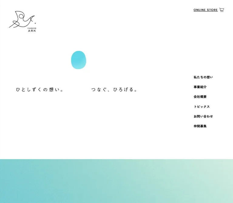
白い余白、繊細な線画ロゴ、水色の有機的なモチーフ、粒子感のあるグラデーションが特徴。右側の縦型ナビゲーションと、ゆったりした日本語組版で食と健康への想いを伝える企業サイト。
オリジナルサイトを見るA small cyan droplet suspended in white space, with delicate black linework and an expansive wash of color below.
Website: career-ark.co.jp Original URL: https://career-ark.co.jp/ Final URL: https://career-ark.co.jp/ Theme: light; white canvas, black typography, cyan accents Inspected: September 23, 2026, Japan Standard Time. The supplied evidence bundle is timestamped September 22, 2026, at 15:46:12.279 UTC, equivalent to September 23 at 00:46:12.279 JST. Viewports: 1440 × 1000 desktop and 390 × 844 mobile, in CSS pixels. Scope: the current corporate homepage. Visual evidence covers the desktop opening, mobile opening, and mobile footer. Rendered DOM measurements also cover the message, services, topics, company information, recruitment section, and desktop footer. Their complete visual compositions were not supplied.
Career Ark presents its food, agriculture, and health-related activities through a restrained corporate website. The opening contains very little: a thin black bird-like logo, two short Japanese phrases, a rounded cyan droplet, and navigation placed at the edges. A textured cyan-to-pale-mint field begins near the bottom of the first screen. The identity comes from the scale of the surrounding white space as much as from the artwork.
The page continues into a long sequence of company messaging, services, news, company information, and recruitment. Desktop measurements show asymmetric text placement and a two-column news collection. Mobile preserves generous vertical spacing while moving content into a 330px-wide column. This is a corporate homepage with multiple destinations, including an external shop; it should not be reduced to a single conversion funnel.
A small cyan droplet suspended in white space, with delicate black linework and an expansive wash of color below.
Website: career-ark.co.jp Original URL: https://career-ark.co.jp/ Final URL: https://career-ark.co.jp/ Theme: light; white canvas, black typography, cyan accents Inspected: September 23, 2026, Japan Standard Time. The supplied evidence bundle is timestamped September 22, 2026, at 15:46:12.279 UTC, equivalent to September 23 at 00:46:12.279 JST. Viewports: 1440 × 1000 desktop and 390 × 844 mobile, in CSS pixels. Scope: the current corporate homepage. Visual evidence covers the desktop opening, mobile opening, and mobile footer. Rendered DOM measurements also cover the message, services, topics, company information, recruitment section, and desktop footer. Their complete visual compositions were not supplied.
Career Ark presents its food, agriculture, and health-related activities through a restrained corporate website. The opening contains very little: a thin black bird-like logo, two short Japanese phrases, a rounded cyan droplet, and navigation placed at the edges. A textured cyan-to-pale-mint field begins near the bottom of the first screen. The identity comes from the scale of the surrounding white space as much as from the artwork.
The page continues into a long sequence of company messaging, services, news, company information, and recruitment. Desktop measurements show asymmetric text placement and a two-column news collection. Mobile preserves generous vertical spacing while moving content into a 330px-wide column. This is a corporate homepage with multiple destinations, including an external shop; it should not be reduced to a single conversion funnel.
The fifth current-page capture shows the mobile footer, not an opened global menu. Its link order, logo, address, and button positions match the footer measurements. The mobile menu button is visible, but an expanded menu state was not supplied.
| Name | Value | Source token | Role and evidence |
|---|---|---|---|
| White | #ffffff |
--white |
Measured body and footer background; dominant visible canvas; also used for some button surfaces and reversed text |
| Black | #000000 |
--black |
Measured main text; visible logo, navigation, fine outlines, and icons |
| Light Cyan | #78dfed |
--light-blue |
Declared accent token, consistent with the visible cyan family; exact use within the droplet or wash was not supplied |
| Bright Blue | #21c6ff |
--blue |
Declared token and measured text color on the lower shop and recruitment links |
| Pale Beige | #f1f2e6 |
--beige |
Declared supporting color; a specific visible application is not established by the supplied screenshots |
| Treatment | Visual estimate | Use |
|---|---|---|
| Droplet, stronger cyan | Approximately #58d2e4 |
Upper and left areas of the rounded opening motif |
| Droplet, lighter cyan | Approximately #8be3eb |
Softer lower and right areas of the same motif |
| Wash, cyan side | Approximately #7ecfd3 |
Left side of the full-width field beneath the white opening |
| Wash, pale side | Approximately #e2f1e6 |
Right side of that field |
These estimates are useful approximation colors, not extracted gradient stops. The visible wash includes fine grain; a perfectly smooth gradient will reproduce its broad color distribution but lose part of its material quality.
The white computed background of a recruitment link does not describe its entire painted appearance. In the mobile footer, that link visibly has a cyan textured fill. A child, background layer, or pseudo-element may supply the color; the implementation mechanism was not included in the evidence.
"Zen Kaku Gothic New", sans-serif.500 on the body, navigation, paragraphs, and sampled headings.400, 500, and 700 for Zen Kaku Gothic New.500.--en-font: "Poppins", sans-serif.400 and 500.ONLINE STORE, OUR SERVICE, TOPICS, and COMPANY.The Japanese opening phrases are visibly more distinctive than ordinary body copy: widely spaced, delicate, and slightly irregular in appearance. The measured H1 parent reports 16px Zen Kaku Gothic New, but its visible lettering occupies a roughly 26px-high desktop composition. That parent declaration is insufficient to identify the actual glyph renderer or font.
Preserve authorized original lettering if available. A live-text substitute can approximate its spacing, but it should be identified as a fallback rather than presented as an exact font match.
Values below are measured unless marked as visual estimates. Tracking expressed in em is calculated from the reported pixel values.
| Role | Desktop size / line height | Mobile size / line height | Tracking | Notes |
|---|---|---|---|---|
| Body default | 16px / normal |
16px / normal |
Normal | Weight 500 |
| Desktop navigation | 14px / 18.2px |
Not displayed in the opening | 0.04em |
Compact text with large gaps between links |
| Footer navigation | 14px / 18.2px |
14px / 33.88px |
0.04em |
Mobile line boxes are substantially taller |
| Address | 13px / 21.97px |
13px / 21.97px |
0.02em |
Three-line block |
| Message paragraphs | 17px / 31.79px |
15px / 31.95px |
0.06em |
Measured white text |
| Service introduction H2 | 26px / 49.92px |
22px / 41.8px |
Desktop -0.02em; mobile 0.02em |
Mobile changes to three lines |
| Service H3 | 22px / 44px |
20px / 38px |
Usually 0.02em |
Course heading has a desktop exception of 0.06em |
| Primary service body | 14px / 29.96px |
14px / 29.96px |
0.02em |
Size is retained across these viewports |
| Shop-related service body | 15px / 32.1px |
14px / 29.96px |
0.02em |
Slightly larger desktop copy |
| Topics section heading | 21px / 42px |
20px / 38px |
0.02em |
Separate from article titles |
| Article title | 18px / 33.84px |
18px / 33.84px |
0.02em |
Same measured scale on both viewports |
| Company heading | 22px / 44px |
20px / 38px |
Desktop 0.08em; mobile 0.02em |
Weight 500 |
| Recruitment heading | 32px / 51.84px |
22px / 41.8px |
0.14em |
Strongest measured tracking |
| Recruitment supporting copy | 15px / 27.9px |
14px / 23.94px |
0.02em |
White text |
| Button anchor parents | 16px / normal |
16px / normal |
Normal at sampled parent | Nested labels may have separate styling |
| Opening lettering | Approximately 26px visible height | Approximately 22px glyph height | Visually wide; exact value unknown | Screenshot estimate, not H1 font-size evidence |
| Footer copyright | Not independently sampled | Approximately 10px | Visually lightly tracked | Screenshot estimate |
The hierarchy relies on line height, tracking, placement, and whitespace more than on heavy weights. Avoid replacing it with large bold headings and tightly packed paragraphs.
| Property | Desktop | Mobile | Interpretation |
|---|---|---|---|
--vw |
14.4px |
3.9px |
Matches one percent of the inspected viewport width |
--vh |
10px |
8.44px |
Matches one percent of the inspected viewport height |
--base-vw |
1366 |
375 |
Different source design bases for the two observed layouts |
These properties establish viewport-aware authoring. They do not reveal a complete scaling formula or the breakpoint between desktop and mobile. Do not multiply every measurement by a viewport ratio: several font sizes and button widths remain unchanged.
| Use | Desktop | Mobile | Evidence |
|---|---|---|---|
| Header padding | 50px 40px 0 |
26px 20px 0 |
Computed |
| Main section text inset | Commonly 70px |
Commonly 30px |
Element positions |
| Opening copy left edge | 110.41px |
40px |
H1 rectangle |
| Desktop navigation row interval | 44.19px |
— | Calculated; approximately 26px between 18.19px line boxes |
| Footer navigation row interval | 42.19px |
47.88px |
Calculated |
| Service section top padding | 188px |
118px |
Computed |
| Topics section top padding | 200px |
100px |
Computed |
| Company section top padding | 173px |
100px |
Computed |
| Topics horizontal card gap | 60px |
Single column | Calculated |
| Topics vertical card gap | 70px between measured rows |
54px between successive cards |
Calculated |
| Footer action gap | 7px |
10px |
Calculated |
There is no evidence of a single universal spacing grid. A practical adaptation can group these into small interface gaps, 30–70px content spacing, and 100–200px section spacing while retaining the important measured exceptions.
| Element | Value or treatment | Evidence |
|---|---|---|
| Main content sections | 0 radius on sampled containers |
Computed |
| Topics links | 0 radius, transparent background |
Computed on outer links |
| Standard detail links | 30px radius |
Computed |
| Store and footer actions | 50px radius |
Computed |
| Droplet | Soft asymmetric oval, without a pointed tip | Visually observed; exact path unknown |
| Footer store outline | Approximately 1px black |
Visual estimate |
| Hamburger | Three fine horizontal rules | Visually observed; exact stroke width not supplied |
The roundness is concentrated in the droplet and action pills. It is not a general rounded-card design system.
| Element | Desktop, 1440 × 1000 | Mobile, 390 × 844 |
|---|---|---|
| Header logo link | 123 × 92.67px at (40, 50) |
90 × 67.98px at (20, 26) |
| Menu button | Not visible in the supplied opening | 44 × 44px at (311, 30) |
| Header store link | 149.33 × 20.16px at (1263, 35) |
Not visible in the supplied opening |
| Opening H1 | 729.5 × 26.34px at (110.41, 429.69) |
220 × 65px at (40, 265.72) |
| Opening droplet | Approximately 70–73 × 81–84px, near (445, 250) |
Approximately 52 × 62px, near (225, 496) |
| White-to-wash boundary | Approximately y = 781px |
Approximately y = 684px |
| Message text column | 440px wide at x = 583px |
330px wide at x = 30px |
| Primary service copy | 470px wide at x = 572.61px |
330px wide at x = 30px |
| Shop-related service copy | 586px wide at x = 403.52px |
330px wide at x = 30px |
| Topics cards | 292.03px wide; two columns |
330px wide; one column |
| Footer logo | 154 × 115.5px |
132 × 99px |
| Footer actions | 240 × 45px |
330 × 45px |
The wash boundary is a visible transition within the opening/message sequence. It is not the bottom of the entire first DOM section, which measures approximately 2007px on desktop and 2194px on mobile.
Role: establish the brand without creating a heavy navigation bar.
The header uses a transparent surface over the white opening. Its logo combines an abstract bird-like outline with a tiny stacked CAREER ARK wordmark. The linework is thin and largely unfilled. Preserve the complete mark and its internal spacing; a generic bird icon plus separately typeset brand text would change its character.
The logo is a home link with a descriptive Japanese accessible label. Its measured size decreases from 123px wide on desktop to 90px on mobile. Desktop positioning is 40px from the left and 50px from the top; mobile positioning is 20px and 26px.
The evidence does not establish that the logo remains fixed during scrolling. The mobile footer capture shows the menu button at the top, but its larger lower logo belongs to the footer.
Role: expose company sections and destinations without occupying the main composition.
Six unboxed Japanese links form a vertical rail beginning at x = 1263px. Their first line box starts near y = 380.44px, and their last starts near y = 601.38px. The group is approximately centered around the viewport's vertical midpoint.
The links are 私たちの想い, 事業紹介, 会社概要, トピックス, お問い合わせ, and 仲間募集. The first three point to homepage anchors; the remaining three point to dedicated pages. Use 14px type, 18.2px line height, 0.04em tracking, and approximately 26px gaps between line boxes.
The supplied DOM repeats some labels, while the screenshot shows one visible label per item. Do not render the repetitions as intentional content. They may support layered effects, but the exact mechanism and hover behavior were not demonstrated.
Fixed or sticky behavior for this desktop rail was not verified.
Role: give the external shop a distinct, lightweight route.
Place ONLINE STORE near the top-right corner with an underline and a fine outline cart. The measured anchor has a 6px internal gap and occupies approximately 149 × 20px. It links to https://www.career-ark.com/.
Its styling is closer to a utility link than a filled call-to-action. Keep the label, underline, and cart visually light. Do not enlarge it into the dominant element of the opening.
Role: communicate the brand's central idea before introducing detailed content.
The desktop headline is split into two distant phrases: ひとしずくの想い。 and つなぐ、ひろげる。. Their overall H1 box is 729.5px wide, but the empty interval between the phrases is part of the composition. A small cyan droplet sits above that interval. The group occupies the left and middle of the page, leaving a separate right-hand navigation zone.
On mobile, the same phrases stack into two lines at the left. The droplet moves below the wording and to the right, rather than remaining above the center. This is a recomposition, not a uniform reduction of the desktop layout.
There is no large hero button, product screenshot, or photography in the supplied opening. The white space should remain intentionally empty.
Role: give a tangible visual form to the repeated idea of a small drop spreading outward.
The motif is a small, slightly asymmetric rounded shape with a cyan gradient. It resembles a soft oval or pebble more than a pointed water-drop icon. Desktop size is approximately 70–73px wide; mobile size is approximately 52px wide.
Its exact outline, asset format, and rendering method are unknown. A CSS border-radius shape is an acceptable approximation for a new implementation, but should not be described as recovered original artwork.
The desktop captures show small changes in its position and dimensions. Preserve the possibility of subtle motion without inventing a particular loop, path, or duration.
Role: bridge the sparse white opening into the longer brand message.
A full-width color field begins around 781px down the desktop capture and 684px down the mobile capture. It blends from stronger cyan on the left toward a pale mint-white on the right. Fine grain prevents the surface from appearing glossy.
The visible top edge is straight. Do not add an unobserved wave-shaped section divider. The grain is decorative and should not interfere with text or create layout shifts.
Role: explain the company's values in a sequence of short, spacious statements.
The rendered text concerns natural resources, accessible food, health, and sharing products, knowledge, and information. On desktop, paragraphs sit in a 440px column starting at x = 583px. On mobile, they occupy the standard 330px content column with 30px side insets.
Measured text is white, at 17px on desktop and 15px on mobile. Both layouts retain approximately 32px line height and 0.06em tracking. Paragraph groups have substantial separation rather than forming one dense block.
Only the beginning of the surrounding wash is visually shown. The exact full background behind these paragraphs, and any changing artwork within it, remain unverified.
Role: connect the company's principles to its actual activities.
The section begins with OUR SERVICE, followed by a Japanese heading about changing food, awareness, and the environment. The heading changes from two lines on desktop to three on mobile. Its measured size changes from 26px to 22px, while its line height remains generous.
The primary service block has a heading, a long paragraph, a five-item activity list, and a concluding paragraph. Desktop copy is offset to the right in a 470px column. Mobile moves the content to the standard 30px inset and retains the 14px body size with nearly 30px line height.
A second service block describes connecting producers and consumers through the shop. Its desktop column is wider, at 586px, and starts farther left than the first block. Preserve this variation if recreating the measured editorial arrangement; do not force every paragraph into an identical centered width.
The large spaces between measured text blocks cannot be assumed to be empty. Unreported artwork or layout layers may occupy them.
Role: connect a service explanation to a dedicated course page.
The course heading is followed by supporting copy and a 詳しくはこちら link to the recorded course URL. The link measures 186 × 42px with a 30px radius on both inspected viewports.
On mobile its left edge is 174px, placing its right edge at the standard 360px content boundary. This is a compact, right-aligned action rather than a full-width mobile button.
The surrounding course artwork and complete promotional layout were not supplied visually.
Role: lead from editorial service content to the separate online store.
The rendered DOM includes a shop identity element and an ONLINE STORE pill. The desktop button is approximately 324 × 65px; mobile uses 310 × 45px, inset 40px from each side. Its measured text is bright blue on white, with a 50px radius.
The neighboring heading has an empty text sample but a nonzero layout box, while the broader text extraction includes the shop label. This supports the presence of a rendered identity element, but not a claim about its exact image format or lettering treatment.
Role: present current announcements and company activities.
The DOM describes four linked articles, each containing a category, title, and date. On desktop, the section heading sits at the left while the cards form a two-column collection farther right. Card left edges are approximately 438.69px and 790.72px; each card is 292.03px wide, with a 60px horizontal gap.
Mobile uses a single 330px-wide column. Successive cards have a measured 54px gap. Article titles remain 18px with 33.84px line height on both viewports, so longer titles increase card height instead of shrinking the type.
Outer card links have transparent backgrounds, no padding, and zero radius in the sampled styles. They behave structurally as linked content groups rather than elevated UI tiles. Their complete internal imagery, crop ratios, and category styling are not visually verified.
The もっと見る link below the collection measures 280 × 48px in both layouts, with a 30px radius. At 390px it is centered at x = 55px.
Role: provide formal company details and social destinations.
The section contains COMPANY, a Japanese heading, and label/value information for the company name, representative, location, founding date, email, and business activities. The original page independently identifies the operator as 株式会社キャリア・アーク.
The heading begins at x = 70px on desktop and x = 30px on mobile. Social links appear as a vertical group with 26px-high anchors and 48px row intervals. Their measured internal gap is 12px.
The individual company-detail rows were not included in the element measurement list. Use a semantic definition list or table when adapting this content, but do not claim specific dividers, column widths, or row spacing as observed.
Role: invite visitors who share the company's values to learn about participation.
The measured anatomy is a two-line white heading, white supporting copy, and a white pill with bright-blue text. Desktop heading size is 32px with 0.14em tracking; mobile reduces it to 22px while retaining that tracking ratio.
The desktop action measures 220 × 48px. Mobile expands it to 330 × 45px, aligned with the content column. The section itself is taller on mobile, approximately 745px compared with 558px on desktop.
These measurements establish text hierarchy and action placement. They do not reveal the complete background image, texture, or artwork behind the white text.
Role: replace the desktop navigation rail with a compact navigation control.
The opening shows a 44 × 44px button at (311, 30), with three thin horizontal lines centered inside it. Its accessible label is グローバルメニューを開く. The same control remains visible in the mobile footer capture.
The DOM contains a hidden global-menu subtree, but its sampled links have zero height at the viewport boundary. Those coordinates describe the hidden state and must not be used as the layout of an expanded menu.
Opening animation, focus handling, close behavior, and expanded-menu appearance were not demonstrated.
Role: repeat navigation, identify the company, and provide shop and recruitment routes.
The mobile footer is directly visible. Its order is:
プライバシーポリシー.ONLINE STORE pill with cart and right arrow.仲間募集 pill with white text and right arrow.The content aligns to 30px side insets. Links use 14px type and 33.88px line height, with approximately 14px between line boxes. The logo measures 132 × 99px; the two buttons are 330 × 45px, separated by 10px.
The screenshot-to-DOM correspondence is particularly clear here: the measured bottom scroll offset is approximately 11853.58 − 844 = 11009.58px. Subtracting that from the footer store button's document position, 11648.58px, places it at 639px in the screenshot, matching the visible button.
Desktop measurements show a horizontal arrangement: identity at the left, action pills toward the right, and the navigation column farther right. Its logo grows to 154px wide, while action pills narrow to 240px. The desktop footer's complete visual appearance was not separately captured.
| Treatment | Recorded value | What is established |
|---|---|---|
| Desktop header logo opacity | 0.24s cubic-bezier(0.445, 0.05, 0.55, 0.95) |
A transition declaration exists; trigger and endpoint opacity were not supplied |
| Desktop footer logo opacity | Same 0.24s curve |
Computed transition on the footer home link |
| Header store opacity | 1s cubic-bezier(0.39, -0.01, 0.16, 0.78) |
Computed transition; not proof of a one-second hover effect |
| Hidden menu action transforms | 0.8s cubic-bezier(0.79, -0.01, 0, 1) |
Computed on menu action links; motion distance and activation were not captured |
| General brand easing | cubic-bezier(0.39, -0.01, 0.16, 0.78) |
Declared as --ease-career-ark |
| Exponential-style easing | cubic-bezier(0.79, -0.01, 0, 1) |
Declared as --ease-career-ark-expo |
| In/out easing | cubic-bezier(0.445, 0.05, 0.55, 0.95) |
Declared as --ease-in-out |
The first desktop capture contains faint overlapping impressions around portions of the opening lettering; later captures show clean lettering. The droplet also changes slightly in position and size. These differences support a changing rendered state, but do not establish a precise animation sequence, duration, or technology.
Do not reproduce the overlapping lettering as a permanent text shadow. Likewise, do not assign an invented floating loop to the droplet and describe it as measured source behavior.
Many sampled parents report animation: none. This does not rule out animation on descendants, pseudo-elements, graphics, or JavaScript-controlled layers.
Homepage anchors, topic links, contact, recruitment, privacy, the course destination, social links, and the external store are present in the rendered link evidence. Their destinations are established; successful click-through behavior, scroll easing, and destination-page designs were not tested in this material.
SCROLL appears in the mobile text extraction but is not visibly legible in the supplied opening capture. Its styling and visibility timing remain unverified.
For a new implementation, a static droplet and immediately readable text are a sound baseline. Add motion only when its behavior is intentionally specified, with a reduced-motion alternative.
| Layer | Appearance | Evidence and purpose |
|---|---|---|
| Main canvas | White | Measured body background and visible opening |
| Header | Transparent over white | Measured; avoids a heavy bar |
| Navigation | Black text without visible boxes | Directly visible on desktop |
| Opening motif | Small cyan gradient oval | Directly visible on both layouts |
| Transition field | Grainy cyan-to-pale-mint wash | Directly visible at the bottom of both openings |
| Topics outer links | Transparent, square containers | Computed; internal media appearance not supplied |
| Store footer action | White with fine black outline | Directly visible on mobile |
| Recruitment footer action | Cyan textured fill, white label | Directly visible on mobile |
| Footer | White | Computed and directly visible on mobile |
There is no visible general-purpose shadow or glass-effect system in the supplied views. Do not introduce elevation as the main way to separate content.
The source declares --z-base: 0, --z-header: 100, --z-menu: 101, --z-menu-btn: 102, and --z-opening: 103. These establish a layer ordering vocabulary. The opening token alone is not evidence of a particular splash-screen design or transition.
The verified image language consists of restrained linework and soft abstract color. The logo is an unfilled, flowing bird-like mark. The droplet is compact and rounded, with a smooth cyan transition. The large wash adds fine grain while retaining a calm, light appearance. Cart and arrow icons use thin strokes compatible with the logo.
The opening contains no visible photography. No complete lower-page media assets were supplied, so this reference does not infer farm photography, product packaging, people, or illustration styles from the company's business descriptions.
No original asset URLs or filenames were included in the rendered evidence. The following inventory records verified visual roles without inventing paths.
| Asset or visual | Verified use | Implementation guidance |
|---|---|---|
| Career Ark outline logo | Header and mobile footer | Use authorized original artwork; retain its aspect ratio and thin strokes |
| Japanese opening lettering | Desktop and mobile headline composition | Preserve original artwork if available; live text is an approximation |
| Cyan droplet | Opening accent | Use the original shape when available, or label a CSS approximation clearly |
| Grainy color wash | Beginning of the message transition | Use a subtle texture layer over the broad gradient |
| Cart icon | Desktop store link and mobile footer store action | Match the fine outline weight |
| Right arrows | Mobile footer actions | Keep small and aligned near the right edge |
| Hamburger lines | Mobile navigation button | Three fine rules within a 44px target |
Do not infer SVG, canvas, video, or raster implementation solely from appearance. The rendering formats were not supplied.
The opening uses the viewport as a broad white field rather than a centered content card. The logo occupies the upper-left corner; the store link occupies the upper-right. The headline sits well below the logo and spans only the left-middle portion of the page. A separate vertical navigation rail remains near the right edge.
Below the opening, measured content is asymmetric. Message text starts at x = 583px, primary service copy at x = 572.61px, and another service block at x = 403.52px. Section headings often start at x = 70px. This changing alignment supplies editorial rhythm without requiring boxes around each section.
Topics use a left heading area and two right-side content columns. The footer reverses the emphasis into a broad identity area on the left and compact utility groups on the right.
The 390px layout uses three important horizontal insets:
The desktop navigation and top store link disappear from the visible opening, replaced by the hamburger. The opening phrases stack, and the droplet moves below them. The color wash still begins before the bottom of the first screen.
Body sections move into a 330px column. Topics become a single list, but article titles retain their desktop 18px size. Buttons adapt according to role: the 186px course link remains compact, the 280px topics link remains centered, and recruitment/footer actions expand to 330px.
The footer becomes a tall vertical composition with considerable spacing between navigation, identity, actions, and copyright. Its measured height is approximately 852px, close to one inspected mobile viewport.
The desktop collector reports a documentHeight of 1000px, while the body rectangle measures approximately 10214px and contains section coordinates extending to the footer. These values disagree. The evidence does not establish the cause, so neither a fixed one-screen page nor a particular virtual-scroll implementation should be inferred.
Mobile measurements are internally consistent: the page is approximately 11854px high, and the final capture aligns with its bottom footer. The desktop captures remain on the opening and do not visually validate the lower sections.
No intermediate viewport or tablet layout was supplied. The CSS below uses an 800px breakpoint as an explicit implementation recommendation, not as a recovered source breakpoint.
These are recommendations for a new implementation, not verified features of the original site:
aria-expanded and aria-controls, support Escape to close, and return focus to the trigger. Manage background focus according to whether the menu is implemented as a modal or a disclosure.#ffffff.#000000.#78dfed.#21c6ff.#f1f2e6; visible placement unconfirmed.#58d2e4 to #8be3eb.#7ecfd3 to #e2f1e6, with fine grain.“Create a spacious Japanese corporate homepage inspired by the current Career Ark composition. Use a white background, delicate black outline branding, medium-weight Zen Kaku Gothic New interface text, and the declared Poppins family for appropriate English labels. Place a small logo at the upper left, a restrained underlined shop link with an outline cart at the upper right, and six compact Japanese navigation links in a vertical rail near the right edge. Split the opening message into two widely separated phrases with a small rounded cyan gradient motif above the central gap. Begin a grainy cyan-to-pale-mint field near the bottom of the first screen. On mobile, stack the phrases at the left, move the motif below and right, and show a three-line menu button. Continue into generously spaced editorial sections and a two-column topics collection that becomes one column on mobile. Use pill-shaped actions sparingly. Keep the droplet static unless motion is separately specified.”
This is an adaptation, not extracted source CSS. Exact palette tokens, typography values, and selected dimensions come from the supplied measurements. The hero height formulas, 800px breakpoint, fallback headline typography, and procedural grain are recommendations.
The opening expects two child spans inside .hero-copy. Supply authorized artwork inside the brand links. .grain can be added to a wash or accent surface; its pseudo-element is decorative. The footer expects identity, navigation, actions, and copyright groups. Menu behavior requires an accessible controller and is not implemented by these styles.
:root {
  /* Recorded source palette */
  --color-paper: #ffffff;
  --color-ink: #000000;
  --color-light-blue: #78dfed;
  --color-blue: #21c6ff;
  --color-beige: #f1f2e6;

  /* Visual approximations, not extracted gradient stops */
  --color-drop-start: #58d2e4;
  --color-drop-end: #8be3eb;
  --color-wash-start: #7ecfd3;
  --color-wash-end: #e2f1e6;

  /* Recorded font families and common text values */
  --font-jp: "Zen Kaku Gothic New", sans-serif;
  --font-en: "Poppins", sans-serif;
  --weight-main: 500;
  --text-nav: 14px;
  --text-body: 14px;
  --text-article: 18px;
  --leading-body: 2.14;
  --tracking-body: 0.02em;
  --tracking-nav: 0.04em;

  --inset-desktop: 70px;
  --inset-mobile: 30px;
  --radius-action: 30px;
  --radius-pill: 50px;

  /* Recorded source easing values */
  --ease-brand: cubic-bezier(0.39, -0.01, 0.16, 0.78);
  --ease-brand-expo: cubic-bezier(0.79, -0.01, 0, 1);
  --ease-in-out: cubic-bezier(0.445, 0.05, 0.55, 0.95);

  /* Recorded source layer values */
  --z-header: 100;
  --z-menu: 101;
  --z-menu-button: 102;

  /* Recommended procedural substitute for the unprovided texture */
  --grain-image: url("data:image/svg+xml,%3Csvg xmlns='http://www.w3.org/2000/svg' width='160' height='160'%3E%3Cfilter id='n'%3E%3CfeTurbulence type='fractalNoise' baseFrequency='.85' numOctaves='3' stitchTiles='stitch'/%3E%3C/filter%3E%3Cpath fill='%23000' filter='url(%23n)' d='M0 0h160v160H0z'/%3E%3C/svg%3E");
}

* {
  box-sizing: border-box;
}

body {
  margin: 0;
  color: var(--color-ink);
  background: var(--color-paper);
  font-family: var(--font-jp);
  font-size: 16px;
  font-weight: var(--weight-main);
}

a {
  color: inherit;
}

button {
  font: inherit;
}

[hidden] {
  display: none !important;
}

.site-header {
  position: absolute;
  inset: 0 0 auto;
  z-index: var(--z-header);
  padding: 50px 40px 0;
}

.brand {
  display: block;
  width: 123px;
  transition: opacity 240ms var(--ease-in-out);
}

.brand img,
.brand svg,
.footer-brand img,
.footer-brand svg {
  display: block;
  width: 100%;
  height: auto;
}

.desktop-store {
  position: absolute;
  top: 35px;
  right: 28px;
  display: flex;
  align-items: center;
  gap: 6px;
  transition: opacity 1s var(--ease-brand);
}

/* Suggested child styling; the source child was not sampled. */
.store-label {
  font-family: var(--font-en);
  font-size: 14px;
  letter-spacing: 0.1em;
  text-underline-offset: 3px;
}

.desktop-nav {
  position: absolute;
  top: 50vh;
  right: 90px;
  display: grid;
  gap: 26px;
  transform: translateY(-50%);
}

.desktop-nav a {
  width: max-content;
  font-size: var(--text-nav);
  line-height: 1.3;
  letter-spacing: var(--tracking-nav);
  text-decoration: none;
}

.menu-toggle {
  display: none;
}

/* Recommended responsive height, anchored to the captured opening. */
.intro-stage {
  position: relative;
  min-height: 781px;
  min-height: clamp(680px, 78.1svh, 920px);
}

/* Live-text approximation; original opening lettering is unprovided. */
.hero-copy {
  position: absolute;
  top: 55%;
  left: 7.667%;
  display: flex;
  justify-content: space-between;
  width: 729.5px;
  max-width: calc(100% - 340px);
  margin: 0;
  font-size: 26px;
  font-weight: 500;
  line-height: 1.014;
  letter-spacing: 0.2em;
}

.hero-copy > span {
  display: block;
  white-space: nowrap;
}

.drop {
  position: absolute;
  top: 32%;
  left: 33.4%;
  width: 73px;
  aspect-ratio: 73 / 84;
  transform: translateX(-50%);
  border-radius: 49% 48% 46% 44% / 54% 53% 44% 44%;
  background: linear-gradient(
    135deg,
    var(--color-drop-start),
    var(--color-drop-end)
  );
}

/* Use on the appropriate message background, not as a fixed-height page. */
.wash {
  background: linear-gradient(
    110deg,
    var(--color-wash-start),
    var(--color-wash-end)
  );
}

.grain {
  position: relative;
  isolation: isolate;
}

.grain::after {
  content: "";
  position: absolute;
  inset: 0;
  z-index: -1;
  border-radius: inherit;
  background-image: var(--grain-image);
  opacity: 0.25;
  mix-blend-mode: soft-light;
  pointer-events: none;
}

.section {
  padding-inline: var(--inset-desktop);
}

.service-section {
  padding-top: 188px;
}

.topics-section {
  padding-top: 200px;
}

.company-section {
  padding-top: 173px;
}

.service-title {
  margin: 0;
  font-size: 26px;
  font-weight: 500;
  line-height: 1.92;
  letter-spacing: -0.02em;
}

.service-copy {
  max-width: 470px;
}

.service-copy h3 {
  margin: 0 0 20px;
  font-size: 22px;
  font-weight: 500;
  line-height: 2;
  letter-spacing: 0.02em;
}

.service-copy p {
  font-size: var(--text-body);
  line-height: var(--leading-body);
  letter-spacing: var(--tracking-body);
}

/* Desktop widths are based on the measured topics arrangement. */
.topics-layout {
  display: grid;
  grid-template-columns: 274.69px minmax(0, 644.06px);
  gap: 94px;
  align-items: start;
}

.topic-grid {
  display: grid;
  grid-template-columns: repeat(2, minmax(0, 1fr));
  gap: 70px 60px;
}

.topic-card {
  display: flex;
  flex-direction: column;
  min-width: 0;
  color: inherit;
  background: transparent;
  border-radius: 0;
  text-decoration: none;
}

.topic-card h3 {
  margin: 0;
  font-size: var(--text-article);
  font-weight: 500;
  line-height: 1.88;
  letter-spacing: 0.02em;
}

/* Preserve each supplied image's own ratio until art direction is known. */
.topic-card img {
  display: block;
  max-width: 100%;
  height: auto;
}

.pill {
  position: relative;
  display: flex;
  align-items: center;
  justify-content: center;
  gap: 8px;
  width: 280px;
  max-width: 100%;
  min-height: 48px;
  padding: 8px 36px;
  border: 0;
  border-radius: var(--radius-action);
  color: var(--color-ink);
  background: var(--color-paper);
  font-size: 16px;
  text-decoration: none;
}

.pill--outline {
  border: 1px solid var(--color-ink);
}

.pill--course {
  width: 186px;
  min-height: 42px;
  margin-left: auto;
}

.pill--recruit {
  border-radius: var(--radius-pill);
  color: var(--color-paper);
  background: linear-gradient(
    110deg,
    var(--color-drop-start),
    var(--color-drop-end)
  );
}

.pill-arrow {
  position: absolute;
  right: 20px;
}

/* Desktop footer approximation using measured horizontal positions. */
.site-footer {
  display: grid;
  grid-template-columns: minmax(0, 1fr) 240px 150px;
  column-gap: 60px;
  align-items: end;
  padding: 178px 76px 40px 60px;
  background: var(--color-paper);
}

.footer-identity {
  grid-area: 1 / 1;
  align-self: start;
}

.footer-brand {
  display: block;
  width: 154px;
}

.footer-address {
  margin: 20px 0 0;
  font-size: 13px;
  font-style: normal;
  line-height: 1.69;
  letter-spacing: 0.02em;
}

.footer-nav {
  grid-area: 1 / 3;
  display: grid;
  gap: 24px;
  padding-top: 12px;
}

.footer-nav a {
  font-size: 14px;
  line-height: 1.3;
  letter-spacing: 0.04em;
  text-decoration: none;
}

.footer-actions {
  grid-area: 1 / 2;
  display: grid;
  gap: 7px;
}

.footer-actions .pill {
  width: 100%;
  min-height: 45px;
  border-radius: 50px;
}

.footer-copyright {
  grid-column: 1 / -1;
  margin: 32px 0 0;
  font-size: 10px;
  line-height: 1.5;
  letter-spacing: 0.04em;
}

/* Recommended intermediate adaptation; this range was not inspected. */
@media (min-width: 801px) and (max-width: 1199px) {
  .hero-copy {
    gap: 40px;
    font-size: 22px;
    letter-spacing: 0.1em;
  }

  .topics-layout {
    grid-template-columns: 220px minmax(0, 1fr);
    gap: 40px;
  }

  .topic-grid {
    column-gap: 30px;
  }
}

/* Recommended breakpoint; the original breakpoint is unknown. */
@media (max-width: 800px) {
  .site-header {
    padding: 26px 20px 0;
  }

  .brand {
    width: 90px;
  }

  .desktop-store,
  .desktop-nav {
    display: none;
  }

  .menu-toggle {
    position: fixed;
    top: 30px;
    right: 35px;
    z-index: var(--z-menu-button);
    display: grid;
    align-content: center;
    gap: 5px;
    width: 44px;
    height: 44px;
    padding: 0;
    border: 0;
    background: transparent;
    color: var(--color-ink);
    cursor: pointer;
  }

  .menu-toggle > span {
    display: block;
    width: 44px;
    height: 1px;
    background: currentColor;
  }

  .intro-stage {
    min-height: 684px;
    min-height: clamp(620px, 81.043svh, 820px);
  }

  .hero-copy {
    top: 38.85%;
    left: 40px;
    display: grid;
    gap: 21px;
    width: 220px;
    max-width: calc(100% - 80px);
    font-size: clamp(18px, 5.64vw, 22px);
    line-height: 1;
    letter-spacing: 0.11em;
  }

  .drop {
    top: 72.5%;
    left: 64.23%;
    width: 52px;
    aspect-ratio: 52 / 62;
  }

  .section {
    padding-inline: var(--inset-mobile);
  }

  .service-section {
    padding-top: 118px;
  }

  .topics-section,
  .company-section {
    padding-top: 100px;
  }

  .service-title {
    font-size: 22px;
    line-height: 1.9;
    letter-spacing: 0.02em;
  }

  .service-copy {
    max-width: none;
  }

  .service-copy h3 {
    margin-bottom: 21px;
    font-size: 20px;
    line-height: 1.9;
  }

  .topics-layout {
    display: block;
  }

  .topic-grid {
    grid-template-columns: minmax(0, 1fr);
    gap: 54px;
    margin-top: 50px;
  }

  .site-footer {
    display: flex;
    flex-direction: column;
    align-items: stretch;
    padding: 94px 30px 22px;
  }

  .footer-nav {
    order: 0;
    gap: 14px;
    padding: 0;
  }

  .footer-nav a {
    width: 150px;
    line-height: 2.42;
  }

  .footer-identity {
    order: 1;
    align-self: stretch;
    margin-top: 72px;
  }

  .footer-brand {
    width: 132px;
  }

  .footer-address {
    margin-top: 18px;
  }

  .footer-actions {
    order: 2;
    gap: 10px;
    margin-top: 25px;
  }

  .footer-copyright {
    order: 3;
    margin-top: 70px;
  }
}

/* Recommended accessible focus treatment. */
a:focus-visible,
button:focus-visible {
  outline: 2px solid var(--color-ink);
  outline-offset: 4px;
}

/* Recommended motion fallback; no original droplet loop is assumed. */
@media (prefers-reduced-motion: reduce) {
  .brand,
  .desktop-store,
  .drop,
  .pill {
    animation: none;
    transition: none;
  }
}
The white-on-cyan recruitment style above follows the visible reference. For production, verify its text contrast and adjust the text or surface color if needed. The CSS does not recreate unprovided lower-page artwork, source text animation, or navigation state management.
Optional aliases for a project already using Tailwind v4. This is not evidence that the original site uses Tailwind.
@theme inline {
  --color-paper: #ffffff;
  --color-ink: #000000;
  --color-light-cyan: #78dfed;
  --color-bright-blue: #21c6ff;
  --color-pale-beige: #f1f2e6;

  --font-japanese: "Zen Kaku Gothic New", sans-serif;
  --font-english: "Poppins", sans-serif;

  --text-nav: 14px;
  --text-body: 14px;
  --text-article: 18px;
  --text-service-mobile: 20px;
  --text-service-desktop: 22px;

  --spacing-content-mobile: 30px;
  --spacing-content-desktop: 70px;
  --spacing-topic-column: 60px;

  --radius-action: 30px;
  --radius-pill: 50px;

  --ease-brand: cubic-bezier(0.39, -0.01, 0.16, 0.78);
  --ease-brand-expo: cubic-bezier(0.79, -0.01, 0, 1);
}
https://career-ark.co.jp/; the supplied response status is HTTP 200.This reference describes the current homepage evidenced by the supplied original-page material. Suggested CSS, responsive interpolation, procedural texture, and accessibility additions are implementation guidance, not a reconstruction of unavailable source code.
# Career Ark — Style Reference

> A small cyan droplet suspended in white space, with delicate black linework and an expansive wash of color below.

**Website:** [career-ark.co.jp](https://career-ark.co.jp/)
**Original URL:** https://career-ark.co.jp/
**Final URL:** https://career-ark.co.jp/
**Theme:** light; white canvas, black typography, cyan accents
**Inspected:** September 23, 2026, Japan Standard Time. The supplied evidence bundle is timestamped September 22, 2026, at 15:46:12.279 UTC, equivalent to September 23 at 00:46:12.279 JST.
**Viewports:** 1440 × 1000 desktop and 390 × 844 mobile, in CSS pixels.
**Scope:** the current corporate homepage. Visual evidence covers the desktop opening, mobile opening, and mobile footer. Rendered DOM measurements also cover the message, services, topics, company information, recruitment section, and desktop footer. Their complete visual compositions were not supplied.

Career Ark presents its food, agriculture, and health-related activities through a restrained corporate website. The opening contains very little: a thin black bird-like logo, two short Japanese phrases, a rounded cyan droplet, and navigation placed at the edges. A textured cyan-to-pale-mint field begins near the bottom of the first screen. The identity comes from the scale of the surrounding white space as much as from the artwork.

The page continues into a long sequence of company messaging, services, news, company information, and recruitment. Desktop measurements show asymmetric text placement and a two-column news collection. Mobile preserves generous vertical spacing while moving content into a 330px-wide column. This is a corporate homepage with multiple destinations, including an external shop; it should not be reduced to a single conversion funnel.
# Career Ark — Style Reference

> A small cyan droplet suspended in white space, with delicate black linework and an expansive wash of color below.

**Website:** [career-ark.co.jp](https://career-ark.co.jp/)
**Original URL:** https://career-ark.co.jp/
**Final URL:** https://career-ark.co.jp/
**Theme:** light; white canvas, black typography, cyan accents
**Inspected:** September 23, 2026, Japan Standard Time. The supplied evidence bundle is timestamped September 22, 2026, at 15:46:12.279 UTC, equivalent to September 23 at 00:46:12.279 JST.
**Viewports:** 1440 × 1000 desktop and 390 × 844 mobile, in CSS pixels.
**Scope:** the current corporate homepage. Visual evidence covers the desktop opening, mobile opening, and mobile footer. Rendered DOM measurements also cover the message, services, topics, company information, recruitment section, and desktop footer. Their complete visual compositions were not supplied.

Career Ark presents its food, agriculture, and health-related activities through a restrained corporate website. The opening contains very little: a thin black bird-like logo, two short Japanese phrases, a rounded cyan droplet, and navigation placed at the edges. A textured cyan-to-pale-mint field begins near the bottom of the first screen. The identity comes from the scale of the surrounding white space as much as from the artwork.

The page continues into a long sequence of company messaging, services, news, company information, and recruitment. Desktop measurements show asymmetric text placement and a two-column news collection. Mobile preserves generous vertical spacing while moving content into a 330px-wide column. This is a corporate homepage with multiple destinations, including an external shop; it should not be reduced to a single conversion funnel.

## How to Read This Reference

- **Measured** means a value appears in the supplied computed styles or element rectangles. Coordinates describe the captured state, not necessarily a permanent layout rule.
- **Calculated** means a value is derived from measured rectangles, such as the space between two news cards.
- **Visual estimate** means an approximate dimension or color inferred from the original-page screenshots. No pixel-sampling tool was used.
- **Declared source token** means a custom property was reported. Its existence does not establish where every token is visibly used.
- **Recommendation** means implementation guidance for a new project. Suggested breakpoints, fallback lettering, texture generation, and accessibility behavior are not recovered source code.
- **Visual scope matters:** the opening and mobile footer are directly visible. Most lower-page findings are supported by text and layout measurements, not screenshots of their imagery.

The fifth current-page capture shows the mobile footer, not an opened global menu. Its link order, logo, address, and button positions match the footer measurements. The mobile menu button is visible, but an expanded menu state was not supplied.

## Tokens — Colors

### Default Palette

| Name | Value | Source token | Role and evidence |
| --- | --- | --- | --- |
| White | `#ffffff` | `--white` | Measured body and footer background; dominant visible canvas; also used for some button surfaces and reversed text |
| Black | `#000000` | `--black` | Measured main text; visible logo, navigation, fine outlines, and icons |
| Light Cyan | `#78dfed` | `--light-blue` | Declared accent token, consistent with the visible cyan family; exact use within the droplet or wash was not supplied |
| Bright Blue | `#21c6ff` | `--blue` | Declared token and measured text color on the lower shop and recruitment links |
| Pale Beige | `#f1f2e6` | `--beige` | Declared supporting color; a specific visible application is not established by the supplied screenshots |

### Rendered Color Treatments

| Treatment | Visual estimate | Use |
| --- | --- | --- |
| Droplet, stronger cyan | Approximately `#58d2e4` | Upper and left areas of the rounded opening motif |
| Droplet, lighter cyan | Approximately `#8be3eb` | Softer lower and right areas of the same motif |
| Wash, cyan side | Approximately `#7ecfd3` | Left side of the full-width field beneath the white opening |
| Wash, pale side | Approximately `#e2f1e6` | Right side of that field |

These estimates are useful approximation colors, not extracted gradient stops. The visible wash includes fine grain; a perfectly smooth gradient will reproduce its broad color distribution but lose part of its material quality.

The white computed background of a recruitment link does not describe its entire painted appearance. In the mobile footer, that link visibly has a cyan textured fill. A child, background layer, or pseudo-element may supply the color; the implementation mechanism was not included in the evidence.

## Tokens — Typography

### Japanese Interface and Body Copy

- **Measured family:** `"Zen Kaku Gothic New", sans-serif`.
- **Measured dominant weight:** `500` on the body, navigation, paragraphs, and sampled headings.
- **Font request in the evidence:** weights `400`, `500`, and `700` for Zen Kaku Gothic New.
- **Character:** quiet, open Japanese sans-serif text with moderate tracking and unusually generous paragraph leading.
- **Important distinction:** available font weights are not evidence that all of them are used. Most sampled text uses `500`.

### English Labels

- **Declared family token:** `--en-font: "Poppins", sans-serif`.
- **Font request in the evidence:** Poppins weights `400` and `500`.
- **Visible labels:** `ONLINE STORE`, `OUR SERVICE`, `TOPICS`, and `COMPANY`.
- **Evidence limit:** the sampled store anchor inherits the Japanese family at its parent level. Child-level typography for every English label was not reported. Treat Poppins as the declared English family rather than claiming that every Latin character was individually verified.

### Opening Lettering

The Japanese opening phrases are visibly more distinctive than ordinary body copy: widely spaced, delicate, and slightly irregular in appearance. The measured H1 parent reports `16px` Zen Kaku Gothic New, but its visible lettering occupies a roughly 26px-high desktop composition. That parent declaration is insufficient to identify the actual glyph renderer or font.

Preserve authorized original lettering if available. A live-text substitute can approximate its spacing, but it should be identified as a fallback rather than presented as an exact font match.

### Type Scale

Values below are measured unless marked as visual estimates. Tracking expressed in `em` is calculated from the reported pixel values.

| Role | Desktop size / line height | Mobile size / line height | Tracking | Notes |
| --- | --- | --- | --- | --- |
| Body default | `16px / normal` | `16px / normal` | Normal | Weight `500` |
| Desktop navigation | `14px / 18.2px` | Not displayed in the opening | `0.04em` | Compact text with large gaps between links |
| Footer navigation | `14px / 18.2px` | `14px / 33.88px` | `0.04em` | Mobile line boxes are substantially taller |
| Address | `13px / 21.97px` | `13px / 21.97px` | `0.02em` | Three-line block |
| Message paragraphs | `17px / 31.79px` | `15px / 31.95px` | `0.06em` | Measured white text |
| Service introduction H2 | `26px / 49.92px` | `22px / 41.8px` | Desktop `-0.02em`; mobile `0.02em` | Mobile changes to three lines |
| Service H3 | `22px / 44px` | `20px / 38px` | Usually `0.02em` | Course heading has a desktop exception of `0.06em` |
| Primary service body | `14px / 29.96px` | `14px / 29.96px` | `0.02em` | Size is retained across these viewports |
| Shop-related service body | `15px / 32.1px` | `14px / 29.96px` | `0.02em` | Slightly larger desktop copy |
| Topics section heading | `21px / 42px` | `20px / 38px` | `0.02em` | Separate from article titles |
| Article title | `18px / 33.84px` | `18px / 33.84px` | `0.02em` | Same measured scale on both viewports |
| Company heading | `22px / 44px` | `20px / 38px` | Desktop `0.08em`; mobile `0.02em` | Weight `500` |
| Recruitment heading | `32px / 51.84px` | `22px / 41.8px` | `0.14em` | Strongest measured tracking |
| Recruitment supporting copy | `15px / 27.9px` | `14px / 23.94px` | `0.02em` | White text |
| Button anchor parents | `16px / normal` | `16px / normal` | Normal at sampled parent | Nested labels may have separate styling |
| Opening lettering | Approximately 26px visible height | Approximately 22px glyph height | Visually wide; exact value unknown | Screenshot estimate, not H1 font-size evidence |
| Footer copyright | Not independently sampled | Approximately 10px | Visually lightly tracked | Screenshot estimate |

The hierarchy relies on line height, tracking, placement, and whitespace more than on heavy weights. Avoid replacing it with large bold headings and tightly packed paragraphs.

## Tokens — Spacing & Shapes

### Source Viewport Variables

| Property | Desktop | Mobile | Interpretation |
| --- | --- | --- | --- |
| `--vw` | `14.4px` | `3.9px` | Matches one percent of the inspected viewport width |
| `--vh` | `10px` | `8.44px` | Matches one percent of the inspected viewport height |
| `--base-vw` | `1366` | `375` | Different source design bases for the two observed layouts |

These properties establish viewport-aware authoring. They do not reveal a complete scaling formula or the breakpoint between desktop and mobile. Do not multiply every measurement by a viewport ratio: several font sizes and button widths remain unchanged.

### Spacing Measurements

| Use | Desktop | Mobile | Evidence |
| --- | --- | --- | --- |
| Header padding | `50px 40px 0` | `26px 20px 0` | Computed |
| Main section text inset | Commonly `70px` | Commonly `30px` | Element positions |
| Opening copy left edge | `110.41px` | `40px` | H1 rectangle |
| Desktop navigation row interval | `44.19px` | — | Calculated; approximately 26px between 18.19px line boxes |
| Footer navigation row interval | `42.19px` | `47.88px` | Calculated |
| Service section top padding | `188px` | `118px` | Computed |
| Topics section top padding | `200px` | `100px` | Computed |
| Company section top padding | `173px` | `100px` | Computed |
| Topics horizontal card gap | `60px` | Single column | Calculated |
| Topics vertical card gap | `70px` between measured rows | `54px` between successive cards | Calculated |
| Footer action gap | `7px` | `10px` | Calculated |

There is no evidence of a single universal spacing grid. A practical adaptation can group these into small interface gaps, 30–70px content spacing, and 100–200px section spacing while retaining the important measured exceptions.

### Border Radius and Linework

| Element | Value or treatment | Evidence |
| --- | --- | --- |
| Main content sections | `0` radius on sampled containers | Computed |
| Topics links | `0` radius, transparent background | Computed on outer links |
| Standard detail links | `30px` radius | Computed |
| Store and footer actions | `50px` radius | Computed |
| Droplet | Soft asymmetric oval, without a pointed tip | Visually observed; exact path unknown |
| Footer store outline | Approximately `1px` black | Visual estimate |
| Hamburger | Three fine horizontal rules | Visually observed; exact stroke width not supplied |

The roundness is concentrated in the droplet and action pills. It is not a general rounded-card design system.

### Layout Measurements

| Element | Desktop, 1440 × 1000 | Mobile, 390 × 844 |
| --- | --- | --- |
| Header logo link | `123 × 92.67px` at `(40, 50)` | `90 × 67.98px` at `(20, 26)` |
| Menu button | Not visible in the supplied opening | `44 × 44px` at `(311, 30)` |
| Header store link | `149.33 × 20.16px` at `(1263, 35)` | Not visible in the supplied opening |
| Opening H1 | `729.5 × 26.34px` at `(110.41, 429.69)` | `220 × 65px` at `(40, 265.72)` |
| Opening droplet | Approximately `70–73 × 81–84px`, near `(445, 250)` | Approximately `52 × 62px`, near `(225, 496)` |
| White-to-wash boundary | Approximately `y = 781px` | Approximately `y = 684px` |
| Message text column | `440px` wide at `x = 583px` | `330px` wide at `x = 30px` |
| Primary service copy | `470px` wide at `x = 572.61px` | `330px` wide at `x = 30px` |
| Shop-related service copy | `586px` wide at `x = 403.52px` | `330px` wide at `x = 30px` |
| Topics cards | `292.03px` wide; two columns | `330px` wide; one column |
| Footer logo | `154 × 115.5px` | `132 × 99px` |
| Footer actions | `240 × 45px` | `330 × 45px` |

The wash boundary is a visible transition within the opening/message sequence. It is not the bottom of the entire first DOM section, which measures approximately 2007px on desktop and 2194px on mobile.

## Components

### Header Identity

**Role:** establish the brand without creating a heavy navigation bar.

The header uses a transparent surface over the white opening. Its logo combines an abstract bird-like outline with a tiny stacked `CAREER ARK` wordmark. The linework is thin and largely unfilled. Preserve the complete mark and its internal spacing; a generic bird icon plus separately typeset brand text would change its character.

The logo is a home link with a descriptive Japanese accessible label. Its measured size decreases from 123px wide on desktop to 90px on mobile. Desktop positioning is 40px from the left and 50px from the top; mobile positioning is 20px and 26px.

The evidence does not establish that the logo remains fixed during scrolling. The mobile footer capture shows the menu button at the top, but its larger lower logo belongs to the footer.

### Desktop Navigation Rail

**Role:** expose company sections and destinations without occupying the main composition.

Six unboxed Japanese links form a vertical rail beginning at `x = 1263px`. Their first line box starts near `y = 380.44px`, and their last starts near `y = 601.38px`. The group is approximately centered around the viewport's vertical midpoint.

The links are `私たちの想い`, `事業紹介`, `会社概要`, `トピックス`, `お問い合わせ`, and `仲間募集`. The first three point to homepage anchors; the remaining three point to dedicated pages. Use 14px type, 18.2px line height, 0.04em tracking, and approximately 26px gaps between line boxes.

The supplied DOM repeats some labels, while the screenshot shows one visible label per item. Do not render the repetitions as intentional content. They may support layered effects, but the exact mechanism and hover behavior were not demonstrated.

Fixed or sticky behavior for this desktop rail was not verified.

### Header Store Link

**Role:** give the external shop a distinct, lightweight route.

Place `ONLINE STORE` near the top-right corner with an underline and a fine outline cart. The measured anchor has a 6px internal gap and occupies approximately 149 × 20px. It links to `https://www.career-ark.com/`.

Its styling is closer to a utility link than a filled call-to-action. Keep the label, underline, and cart visually light. Do not enlarge it into the dominant element of the opening.

### Opening Composition

**Role:** communicate the brand's central idea before introducing detailed content.

The desktop headline is split into two distant phrases: `ひとしずくの想い。` and `つなぐ、ひろげる。`. Their overall H1 box is 729.5px wide, but the empty interval between the phrases is part of the composition. A small cyan droplet sits above that interval. The group occupies the left and middle of the page, leaving a separate right-hand navigation zone.

On mobile, the same phrases stack into two lines at the left. The droplet moves below the wording and to the right, rather than remaining above the center. This is a recomposition, not a uniform reduction of the desktop layout.

There is no large hero button, product screenshot, or photography in the supplied opening. The white space should remain intentionally empty.

### Rounded Droplet

**Role:** give a tangible visual form to the repeated idea of a small drop spreading outward.

The motif is a small, slightly asymmetric rounded shape with a cyan gradient. It resembles a soft oval or pebble more than a pointed water-drop icon. Desktop size is approximately 70–73px wide; mobile size is approximately 52px wide.

Its exact outline, asset format, and rendering method are unknown. A CSS border-radius shape is an acceptable approximation for a new implementation, but should not be described as recovered original artwork.

The desktop captures show small changes in its position and dimensions. Preserve the possibility of subtle motion without inventing a particular loop, path, or duration.

### Textured Color Wash

**Role:** bridge the sparse white opening into the longer brand message.

A full-width color field begins around 781px down the desktop capture and 684px down the mobile capture. It blends from stronger cyan on the left toward a pale mint-white on the right. Fine grain prevents the surface from appearing glossy.

The visible top edge is straight. Do not add an unobserved wave-shaped section divider. The grain is decorative and should not interfere with text or create layout shifts.

### Message Section

**Role:** explain the company's values in a sequence of short, spacious statements.

The rendered text concerns natural resources, accessible food, health, and sharing products, knowledge, and information. On desktop, paragraphs sit in a 440px column starting at `x = 583px`. On mobile, they occupy the standard 330px content column with 30px side insets.

Measured text is white, at 17px on desktop and 15px on mobile. Both layouts retain approximately 32px line height and 0.06em tracking. Paragraph groups have substantial separation rather than forming one dense block.

Only the beginning of the surrounding wash is visually shown. The exact full background behind these paragraphs, and any changing artwork within it, remain unverified.

### Service Introduction and Editorial Copy

**Role:** connect the company's principles to its actual activities.

The section begins with `OUR SERVICE`, followed by a Japanese heading about changing food, awareness, and the environment. The heading changes from two lines on desktop to three on mobile. Its measured size changes from 26px to 22px, while its line height remains generous.

The primary service block has a heading, a long paragraph, a five-item activity list, and a concluding paragraph. Desktop copy is offset to the right in a 470px column. Mobile moves the content to the standard 30px inset and retains the 14px body size with nearly 30px line height.

A second service block describes connecting producers and consumers through the shop. Its desktop column is wider, at 586px, and starts farther left than the first block. Preserve this variation if recreating the measured editorial arrangement; do not force every paragraph into an identical centered width.

The large spaces between measured text blocks cannot be assumed to be empty. Unreported artwork or layout layers may occupy them.

### Course Link

**Role:** connect a service explanation to a dedicated course page.

The course heading is followed by supporting copy and a `詳しくはこちら` link to the recorded course URL. The link measures `186 × 42px` with a 30px radius on both inspected viewports.

On mobile its left edge is `174px`, placing its right edge at the standard `360px` content boundary. This is a compact, right-aligned action rather than a full-width mobile button.

The surrounding course artwork and complete promotional layout were not supplied visually.

### Shop Callout

**Role:** lead from editorial service content to the separate online store.

The rendered DOM includes a shop identity element and an `ONLINE STORE` pill. The desktop button is approximately `324 × 65px`; mobile uses `310 × 45px`, inset 40px from each side. Its measured text is bright blue on white, with a 50px radius.

The neighboring heading has an empty text sample but a nonzero layout box, while the broader text extraction includes the shop label. This supports the presence of a rendered identity element, but not a claim about its exact image format or lettering treatment.

### Topics Collection

**Role:** present current announcements and company activities.

The DOM describes four linked articles, each containing a category, title, and date. On desktop, the section heading sits at the left while the cards form a two-column collection farther right. Card left edges are approximately 438.69px and 790.72px; each card is 292.03px wide, with a 60px horizontal gap.

Mobile uses a single 330px-wide column. Successive cards have a measured 54px gap. Article titles remain 18px with 33.84px line height on both viewports, so longer titles increase card height instead of shrinking the type.

Outer card links have transparent backgrounds, no padding, and zero radius in the sampled styles. They behave structurally as linked content groups rather than elevated UI tiles. Their complete internal imagery, crop ratios, and category styling are not visually verified.

The `もっと見る` link below the collection measures `280 × 48px` in both layouts, with a 30px radius. At 390px it is centered at `x = 55px`.

### Company Information

**Role:** provide formal company details and social destinations.

The section contains `COMPANY`, a Japanese heading, and label/value information for the company name, representative, location, founding date, email, and business activities. The original page independently identifies the operator as 株式会社キャリア・アーク.

The heading begins at `x = 70px` on desktop and `x = 30px` on mobile. Social links appear as a vertical group with 26px-high anchors and 48px row intervals. Their measured internal gap is 12px.

The individual company-detail rows were not included in the element measurement list. Use a semantic definition list or table when adapting this content, but do not claim specific dividers, column widths, or row spacing as observed.

### Recruitment Section

**Role:** invite visitors who share the company's values to learn about participation.

The measured anatomy is a two-line white heading, white supporting copy, and a white pill with bright-blue text. Desktop heading size is 32px with 0.14em tracking; mobile reduces it to 22px while retaining that tracking ratio.

The desktop action measures `220 × 48px`. Mobile expands it to `330 × 45px`, aligned with the content column. The section itself is taller on mobile, approximately 745px compared with 558px on desktop.

These measurements establish text hierarchy and action placement. They do not reveal the complete background image, texture, or artwork behind the white text.

### Mobile Menu Button

**Role:** replace the desktop navigation rail with a compact navigation control.

The opening shows a 44 × 44px button at `(311, 30)`, with three thin horizontal lines centered inside it. Its accessible label is `グローバルメニューを開く`. The same control remains visible in the mobile footer capture.

The DOM contains a hidden global-menu subtree, but its sampled links have zero height at the viewport boundary. Those coordinates describe the hidden state and must not be used as the layout of an expanded menu.

Opening animation, focus handling, close behavior, and expanded-menu appearance were not demonstrated.

### Footer

**Role:** repeat navigation, identify the company, and provide shop and recruitment routes.

The mobile footer is directly visible. Its order is:

1. Six text links, ending with `プライバシーポリシー`.
2. A larger version of the outline logo.
3. A three-line postal address.
4. An outlined `ONLINE STORE` pill with cart and right arrow.
5. A cyan textured `仲間募集` pill with white text and right arrow.
6. A small copyright line.

The content aligns to 30px side insets. Links use 14px type and 33.88px line height, with approximately 14px between line boxes. The logo measures `132 × 99px`; the two buttons are `330 × 45px`, separated by 10px.

The screenshot-to-DOM correspondence is particularly clear here: the measured bottom scroll offset is approximately `11853.58 − 844 = 11009.58px`. Subtracting that from the footer store button's document position, `11648.58px`, places it at `639px` in the screenshot, matching the visible button.

Desktop measurements show a horizontal arrangement: identity at the left, action pills toward the right, and the navigation column farther right. Its logo grows to 154px wide, while action pills narrow to 240px. The desktop footer's complete visual appearance was not separately captured.

## Tokens — Motion & Interaction

### Recorded Timing Values

| Treatment | Recorded value | What is established |
| --- | --- | --- |
| Desktop header logo opacity | `0.24s cubic-bezier(0.445, 0.05, 0.55, 0.95)` | A transition declaration exists; trigger and endpoint opacity were not supplied |
| Desktop footer logo opacity | Same `0.24s` curve | Computed transition on the footer home link |
| Header store opacity | `1s cubic-bezier(0.39, -0.01, 0.16, 0.78)` | Computed transition; not proof of a one-second hover effect |
| Hidden menu action transforms | `0.8s cubic-bezier(0.79, -0.01, 0, 1)` | Computed on menu action links; motion distance and activation were not captured |
| General brand easing | `cubic-bezier(0.39, -0.01, 0.16, 0.78)` | Declared as `--ease-career-ark` |
| Exponential-style easing | `cubic-bezier(0.79, -0.01, 0, 1)` | Declared as `--ease-career-ark-expo` |
| In/out easing | `cubic-bezier(0.445, 0.05, 0.55, 0.95)` | Declared as `--ease-in-out` |

### Visible State Differences

The first desktop capture contains faint overlapping impressions around portions of the opening lettering; later captures show clean lettering. The droplet also changes slightly in position and size. These differences support a changing rendered state, but do not establish a precise animation sequence, duration, or technology.

Do not reproduce the overlapping lettering as a permanent text shadow. Likewise, do not assign an invented floating loop to the droplet and describe it as measured source behavior.

Many sampled parents report `animation: none`. This does not rule out animation on descendants, pseudo-elements, graphics, or JavaScript-controlled layers.

### Navigation and State Limits

Homepage anchors, topic links, contact, recruitment, privacy, the course destination, social links, and the external store are present in the rendered link evidence. Their destinations are established; successful click-through behavior, scroll easing, and destination-page designs were not tested in this material.

`SCROLL` appears in the mobile text extraction but is not visibly legible in the supplied opening capture. Its styling and visibility timing remain unverified.

For a new implementation, a static droplet and immediately readable text are a sound baseline. Add motion only when its behavior is intentionally specified, with a reduced-motion alternative.

## Surfaces

| Layer | Appearance | Evidence and purpose |
| --- | --- | --- |
| Main canvas | White | Measured body background and visible opening |
| Header | Transparent over white | Measured; avoids a heavy bar |
| Navigation | Black text without visible boxes | Directly visible on desktop |
| Opening motif | Small cyan gradient oval | Directly visible on both layouts |
| Transition field | Grainy cyan-to-pale-mint wash | Directly visible at the bottom of both openings |
| Topics outer links | Transparent, square containers | Computed; internal media appearance not supplied |
| Store footer action | White with fine black outline | Directly visible on mobile |
| Recruitment footer action | Cyan textured fill, white label | Directly visible on mobile |
| Footer | White | Computed and directly visible on mobile |

There is no visible general-purpose shadow or glass-effect system in the supplied views. Do not introduce elevation as the main way to separate content.

### Declared Layer Tokens

The source declares `--z-base: 0`, `--z-header: 100`, `--z-menu: 101`, `--z-menu-btn: 102`, and `--z-opening: 103`. These establish a layer ordering vocabulary. The `opening` token alone is not evidence of a particular splash-screen design or transition.

## Imagery

The verified image language consists of restrained linework and soft abstract color. The logo is an unfilled, flowing bird-like mark. The droplet is compact and rounded, with a smooth cyan transition. The large wash adds fine grain while retaining a calm, light appearance. Cart and arrow icons use thin strokes compatible with the logo.

The opening contains no visible photography. No complete lower-page media assets were supplied, so this reference does not infer farm photography, product packaging, people, or illustration styles from the company's business descriptions.

### Observed Asset References

No original asset URLs or filenames were included in the rendered evidence. The following inventory records verified visual roles without inventing paths.

| Asset or visual | Verified use | Implementation guidance |
| --- | --- | --- |
| Career Ark outline logo | Header and mobile footer | Use authorized original artwork; retain its aspect ratio and thin strokes |
| Japanese opening lettering | Desktop and mobile headline composition | Preserve original artwork if available; live text is an approximation |
| Cyan droplet | Opening accent | Use the original shape when available, or label a CSS approximation clearly |
| Grainy color wash | Beginning of the message transition | Use a subtle texture layer over the broad gradient |
| Cart icon | Desktop store link and mobile footer store action | Match the fine outline weight |
| Right arrows | Mobile footer actions | Keep small and aligned near the right edge |
| Hamburger lines | Mobile navigation button | Three fine rules within a 44px target |

Do not infer SVG, canvas, video, or raster implementation solely from appearance. The rendering formats were not supplied.

## Layout & Responsive Behavior

### Desktop Composition

The opening uses the viewport as a broad white field rather than a centered content card. The logo occupies the upper-left corner; the store link occupies the upper-right. The headline sits well below the logo and spans only the left-middle portion of the page. A separate vertical navigation rail remains near the right edge.

Below the opening, measured content is asymmetric. Message text starts at `x = 583px`, primary service copy at `x = 572.61px`, and another service block at `x = 403.52px`. Section headings often start at `x = 70px`. This changing alignment supplies editorial rhythm without requiring boxes around each section.

Topics use a left heading area and two right-side content columns. The footer reverses the emphasis into a broad identity area on the left and compact utility groups on the right.

### Mobile Composition

The 390px layout uses three important horizontal insets:

- **20px:** header logo.
- **30px:** most body content, footer content, and full-width actions.
- **40px:** opening wording and the lower shop callout.

The desktop navigation and top store link disappear from the visible opening, replaced by the hamburger. The opening phrases stack, and the droplet moves below them. The color wash still begins before the bottom of the first screen.

Body sections move into a 330px column. Topics become a single list, but article titles retain their desktop 18px size. Buttons adapt according to role: the 186px course link remains compact, the 280px topics link remains centered, and recruitment/footer actions expand to 330px.

The footer becomes a tall vertical composition with considerable spacing between navigation, identity, actions, and copyright. Its measured height is approximately 852px, close to one inspected mobile viewport.

### Page Length and Measurement Limits

The desktop collector reports a `documentHeight` of 1000px, while the body rectangle measures approximately 10214px and contains section coordinates extending to the footer. These values disagree. The evidence does not establish the cause, so neither a fixed one-screen page nor a particular virtual-scroll implementation should be inferred.

Mobile measurements are internally consistent: the page is approximately 11854px high, and the final capture aligns with its bottom footer. The desktop captures remain on the opening and do not visually validate the lower sections.

No intermediate viewport or tablet layout was supplied. The CSS below uses an 800px breakpoint as an explicit implementation recommendation, not as a recovered source breakpoint.

## Do’s and Don’ts

### Do

- Preserve the white field as an active part of the composition.
- Keep the logo delicate and relatively small in the header.
- Separate desktop headline phrases with a meaningful area of empty space.
- Recompose the opening on mobile: stacked wording, droplet below and to the right.
- Use black for ordinary navigation and body text, with cyan reserved for expressive surfaces and selected actions.
- Retain the subtle grain in the large color wash and footer recruitment action.
- Use medium-weight Japanese text with generous leading.
- Keep article titles at a comfortable reading size on mobile.
- Preserve the distinction between compact detail links and full-width recruitment/footer actions.
- Treat the mobile footer as its own component, separate from the unverified expanded menu.
- Keep measured values, visual estimates, and implementation choices identifiable.

### Don’t

- Don't add a large filled hero CTA that overwhelms the opening message.
- Don't convert every section into a rounded card with a shadow.
- Don't replace the rounded droplet with a pointed stock water icon.
- Don't turn the grainy wash into a glossy three-dimensional effect.
- Don't make all headings bold or dramatically larger than the measured scale.
- Don't interpret duplicated DOM text as wording that should appear twice.
- Don't use the H1 parent's 16px declaration as an exact description of the visible opening lettering.
- Don't invent photography, illustration subjects, or media crop ratios for unshown lower sections.
- Don't treat hidden menu coordinates as an expanded-menu layout.
- Don't assign a perpetual animation duration or hover effect without evidence.
- Don't use the inconsistent desktop document-height field to truncate the homepage.

## Recommended Implementation Additions

These are recommendations for a new implementation, not verified features of the original site:

- Give the menu button `aria-expanded` and `aria-controls`, support Escape to close, and return focus to the trigger. Manage background focus according to whether the menu is implemented as a modal or a disclosure.
- If text is duplicated for transitions, expose one semantic copy and hide decorative copies from assistive technology.
- Provide a visible black focus outline around links and controls without changing the quiet visual hierarchy.
- Keep the 44px mobile menu target. Compact visual links can receive larger transparent hit areas without increasing glyph size.
- Check contrast for white text on pale cyan and bright-blue text on white. Darker text or a darker local surface may be needed for an accessible adaptation.
- Offer reduced motion and ensure the opening message appears even if animation initialization fails.
- Use native document flow and stable media dimensions so long sections remain reachable and do not shift during loading.
- Load the declared fonts deliberately, with suitable fallbacks. Font declarations alone do not guarantee that the fonts are available.
- Allow short or narrow screens to scroll naturally. Treat the captured opening proportions as reference points rather than mandatory fixed heights for every device.

## Agent Prompt Guide

### Quick Color Reference

- Canvas and footer: `#ffffff`.
- Text, fine outlines, and icons: `#000000`.
- Source light-cyan token: `#78dfed`.
- Source bright-blue token: `#21c6ff`.
- Declared supporting beige: `#f1f2e6`; visible placement unconfirmed.
- Approximate droplet gradient: `#58d2e4` to `#8be3eb`.
- Approximate broad wash: `#7ecfd3` to `#e2f1e6`, with fine grain.

### Overall Prompt

“Create a spacious Japanese corporate homepage inspired by the current Career Ark composition. Use a white background, delicate black outline branding, medium-weight Zen Kaku Gothic New interface text, and the declared Poppins family for appropriate English labels. Place a small logo at the upper left, a restrained underlined shop link with an outline cart at the upper right, and six compact Japanese navigation links in a vertical rail near the right edge. Split the opening message into two widely separated phrases with a small rounded cyan gradient motif above the central gap. Begin a grainy cyan-to-pale-mint field near the bottom of the first screen. On mobile, stack the phrases at the left, move the motif below and right, and show a three-line menu button. Continue into generously spaced editorial sections and a two-column topics collection that becomes one column on mobile. Use pill-shaped actions sparingly. Keep the droplet static unless motion is separately specified.”

### Example Component Prompts

1. **Desktop opening:** “At a 1440 × 1000 reference viewport, use a 123px-wide outline logo around x40/y50, a roughly 730px-wide split Japanese message around x110/y430, a small cyan oval near x445/y250, and a six-link navigation rail near x1263. Keep the white-to-textured-wash boundary around y781. Treat artwork dimensions as visual approximations where exact assets are unavailable.”
2. **Mobile opening:** “At 390 × 844, place a 90px-wide logo at x20/y26 and a 44px menu target at x311/y30. Stack the source phrases near x40/y266. Place an approximately 52 × 62px rounded cyan motif near x225/y496. Start the textured color field around y684. Preserve whitespace rather than scaling the whole desktop arrangement uniformly.”
3. **Topics collection:** “Build transparent article groups with category, title, and date. Use two approximately 292px desktop columns with a 60px gap, then a single 330px mobile column. Keep titles at 18px with about 34px line height and no outer card radius. Do not invent the source image content or crop ratio.”
4. **Mobile footer:** “Create a white footer with 30px side insets, six generously spaced text links ending in privacy policy, a 132px-wide outline logo, a three-line address, and two 330 × 45px pills. The shop action has a black outline and fine cart icon; the recruitment action has a grainy cyan fill and white label. Place small copyright text well below the buttons.”
5. **Editorial service block:** “Use medium-weight Japanese headings around 20–22px and body copy at 14px with nearly 30px line height. On desktop allow a narrow paragraph column to sit to the right of the section heading; on mobile align the content to 30px side margins. Separate content through space rather than shadows or boxed panels.”

## Quick Start

### CSS Custom Properties

This is an adaptation, not extracted source CSS. Exact palette tokens, typography values, and selected dimensions come from the supplied measurements. The hero height formulas, 800px breakpoint, fallback headline typography, and procedural grain are recommendations.

The opening expects two child spans inside `.hero-copy`. Supply authorized artwork inside the brand links. `.grain` can be added to a wash or accent surface; its pseudo-element is decorative. The footer expects identity, navigation, actions, and copyright groups. Menu behavior requires an accessible controller and is not implemented by these styles.

```css
:root {
  /* Recorded source palette */
  --color-paper: #ffffff;
  --color-ink: #000000;
  --color-light-blue: #78dfed;
  --color-blue: #21c6ff;
  --color-beige: #f1f2e6;

  /* Visual approximations, not extracted gradient stops */
  --color-drop-start: #58d2e4;
  --color-drop-end: #8be3eb;
  --color-wash-start: #7ecfd3;
  --color-wash-end: #e2f1e6;

  /* Recorded font families and common text values */
  --font-jp: "Zen Kaku Gothic New", sans-serif;
  --font-en: "Poppins", sans-serif;
  --weight-main: 500;
  --text-nav: 14px;
  --text-body: 14px;
  --text-article: 18px;
  --leading-body: 2.14;
  --tracking-body: 0.02em;
  --tracking-nav: 0.04em;

  --inset-desktop: 70px;
  --inset-mobile: 30px;
  --radius-action: 30px;
  --radius-pill: 50px;

  /* Recorded source easing values */
  --ease-brand: cubic-bezier(0.39, -0.01, 0.16, 0.78);
  --ease-brand-expo: cubic-bezier(0.79, -0.01, 0, 1);
  --ease-in-out: cubic-bezier(0.445, 0.05, 0.55, 0.95);

  /* Recorded source layer values */
  --z-header: 100;
  --z-menu: 101;
  --z-menu-button: 102;

  /* Recommended procedural substitute for the unprovided texture */
  --grain-image: url("data:image/svg+xml,%3Csvg xmlns='http://www.w3.org/2000/svg' width='160' height='160'%3E%3Cfilter id='n'%3E%3CfeTurbulence type='fractalNoise' baseFrequency='.85' numOctaves='3' stitchTiles='stitch'/%3E%3C/filter%3E%3Cpath fill='%23000' filter='url(%23n)' d='M0 0h160v160H0z'/%3E%3C/svg%3E");
}

* {
  box-sizing: border-box;
}

body {
  margin: 0;
  color: var(--color-ink);
  background: var(--color-paper);
  font-family: var(--font-jp);
  font-size: 16px;
  font-weight: var(--weight-main);
}

a {
  color: inherit;
}

button {
  font: inherit;
}

[hidden] {
  display: none !important;
}

.site-header {
  position: absolute;
  inset: 0 0 auto;
  z-index: var(--z-header);
  padding: 50px 40px 0;
}

.brand {
  display: block;
  width: 123px;
  transition: opacity 240ms var(--ease-in-out);
}

.brand img,
.brand svg,
.footer-brand img,
.footer-brand svg {
  display: block;
  width: 100%;
  height: auto;
}

.desktop-store {
  position: absolute;
  top: 35px;
  right: 28px;
  display: flex;
  align-items: center;
  gap: 6px;
  transition: opacity 1s var(--ease-brand);
}

/* Suggested child styling; the source child was not sampled. */
.store-label {
  font-family: var(--font-en);
  font-size: 14px;
  letter-spacing: 0.1em;
  text-underline-offset: 3px;
}

.desktop-nav {
  position: absolute;
  top: 50vh;
  right: 90px;
  display: grid;
  gap: 26px;
  transform: translateY(-50%);
}

.desktop-nav a {
  width: max-content;
  font-size: var(--text-nav);
  line-height: 1.3;
  letter-spacing: var(--tracking-nav);
  text-decoration: none;
}

.menu-toggle {
  display: none;
}

/* Recommended responsive height, anchored to the captured opening. */
.intro-stage {
  position: relative;
  min-height: 781px;
  min-height: clamp(680px, 78.1svh, 920px);
}

/* Live-text approximation; original opening lettering is unprovided. */
.hero-copy {
  position: absolute;
  top: 55%;
  left: 7.667%;
  display: flex;
  justify-content: space-between;
  width: 729.5px;
  max-width: calc(100% - 340px);
  margin: 0;
  font-size: 26px;
  font-weight: 500;
  line-height: 1.014;
  letter-spacing: 0.2em;
}

.hero-copy > span {
  display: block;
  white-space: nowrap;
}

.drop {
  position: absolute;
  top: 32%;
  left: 33.4%;
  width: 73px;
  aspect-ratio: 73 / 84;
  transform: translateX(-50%);
  border-radius: 49% 48% 46% 44% / 54% 53% 44% 44%;
  background: linear-gradient(
    135deg,
    var(--color-drop-start),
    var(--color-drop-end)
  );
}

/* Use on the appropriate message background, not as a fixed-height page. */
.wash {
  background: linear-gradient(
    110deg,
    var(--color-wash-start),
    var(--color-wash-end)
  );
}

.grain {
  position: relative;
  isolation: isolate;
}

.grain::after {
  content: "";
  position: absolute;
  inset: 0;
  z-index: -1;
  border-radius: inherit;
  background-image: var(--grain-image);
  opacity: 0.25;
  mix-blend-mode: soft-light;
  pointer-events: none;
}

.section {
  padding-inline: var(--inset-desktop);
}

.service-section {
  padding-top: 188px;
}

.topics-section {
  padding-top: 200px;
}

.company-section {
  padding-top: 173px;
}

.service-title {
  margin: 0;
  font-size: 26px;
  font-weight: 500;
  line-height: 1.92;
  letter-spacing: -0.02em;
}

.service-copy {
  max-width: 470px;
}

.service-copy h3 {
  margin: 0 0 20px;
  font-size: 22px;
  font-weight: 500;
  line-height: 2;
  letter-spacing: 0.02em;
}

.service-copy p {
  font-size: var(--text-body);
  line-height: var(--leading-body);
  letter-spacing: var(--tracking-body);
}

/* Desktop widths are based on the measured topics arrangement. */
.topics-layout {
  display: grid;
  grid-template-columns: 274.69px minmax(0, 644.06px);
  gap: 94px;
  align-items: start;
}

.topic-grid {
  display: grid;
  grid-template-columns: repeat(2, minmax(0, 1fr));
  gap: 70px 60px;
}

.topic-card {
  display: flex;
  flex-direction: column;
  min-width: 0;
  color: inherit;
  background: transparent;
  border-radius: 0;
  text-decoration: none;
}

.topic-card h3 {
  margin: 0;
  font-size: var(--text-article);
  font-weight: 500;
  line-height: 1.88;
  letter-spacing: 0.02em;
}

/* Preserve each supplied image's own ratio until art direction is known. */
.topic-card img {
  display: block;
  max-width: 100%;
  height: auto;
}

.pill {
  position: relative;
  display: flex;
  align-items: center;
  justify-content: center;
  gap: 8px;
  width: 280px;
  max-width: 100%;
  min-height: 48px;
  padding: 8px 36px;
  border: 0;
  border-radius: var(--radius-action);
  color: var(--color-ink);
  background: var(--color-paper);
  font-size: 16px;
  text-decoration: none;
}

.pill--outline {
  border: 1px solid var(--color-ink);
}

.pill--course {
  width: 186px;
  min-height: 42px;
  margin-left: auto;
}

.pill--recruit {
  border-radius: var(--radius-pill);
  color: var(--color-paper);
  background: linear-gradient(
    110deg,
    var(--color-drop-start),
    var(--color-drop-end)
  );
}

.pill-arrow {
  position: absolute;
  right: 20px;
}

/* Desktop footer approximation using measured horizontal positions. */
.site-footer {
  display: grid;
  grid-template-columns: minmax(0, 1fr) 240px 150px;
  column-gap: 60px;
  align-items: end;
  padding: 178px 76px 40px 60px;
  background: var(--color-paper);
}

.footer-identity {
  grid-area: 1 / 1;
  align-self: start;
}

.footer-brand {
  display: block;
  width: 154px;
}

.footer-address {
  margin: 20px 0 0;
  font-size: 13px;
  font-style: normal;
  line-height: 1.69;
  letter-spacing: 0.02em;
}

.footer-nav {
  grid-area: 1 / 3;
  display: grid;
  gap: 24px;
  padding-top: 12px;
}

.footer-nav a {
  font-size: 14px;
  line-height: 1.3;
  letter-spacing: 0.04em;
  text-decoration: none;
}

.footer-actions {
  grid-area: 1 / 2;
  display: grid;
  gap: 7px;
}

.footer-actions .pill {
  width: 100%;
  min-height: 45px;
  border-radius: 50px;
}

.footer-copyright {
  grid-column: 1 / -1;
  margin: 32px 0 0;
  font-size: 10px;
  line-height: 1.5;
  letter-spacing: 0.04em;
}

/* Recommended intermediate adaptation; this range was not inspected. */
@media (min-width: 801px) and (max-width: 1199px) {
  .hero-copy {
    gap: 40px;
    font-size: 22px;
    letter-spacing: 0.1em;
  }

  .topics-layout {
    grid-template-columns: 220px minmax(0, 1fr);
    gap: 40px;
  }

  .topic-grid {
    column-gap: 30px;
  }
}

/* Recommended breakpoint; the original breakpoint is unknown. */
@media (max-width: 800px) {
  .site-header {
    padding: 26px 20px 0;
  }

  .brand {
    width: 90px;
  }

  .desktop-store,
  .desktop-nav {
    display: none;
  }

  .menu-toggle {
    position: fixed;
    top: 30px;
    right: 35px;
    z-index: var(--z-menu-button);
    display: grid;
    align-content: center;
    gap: 5px;
    width: 44px;
    height: 44px;
    padding: 0;
    border: 0;
    background: transparent;
    color: var(--color-ink);
    cursor: pointer;
  }

  .menu-toggle > span {
    display: block;
    width: 44px;
    height: 1px;
    background: currentColor;
  }

  .intro-stage {
    min-height: 684px;
    min-height: clamp(620px, 81.043svh, 820px);
  }

  .hero-copy {
    top: 38.85%;
    left: 40px;
    display: grid;
    gap: 21px;
    width: 220px;
    max-width: calc(100% - 80px);
    font-size: clamp(18px, 5.64vw, 22px);
    line-height: 1;
    letter-spacing: 0.11em;
  }

  .drop {
    top: 72.5%;
    left: 64.23%;
    width: 52px;
    aspect-ratio: 52 / 62;
  }

  .section {
    padding-inline: var(--inset-mobile);
  }

  .service-section {
    padding-top: 118px;
  }

  .topics-section,
  .company-section {
    padding-top: 100px;
  }

  .service-title {
    font-size: 22px;
    line-height: 1.9;
    letter-spacing: 0.02em;
  }

  .service-copy {
    max-width: none;
  }

  .service-copy h3 {
    margin-bottom: 21px;
    font-size: 20px;
    line-height: 1.9;
  }

  .topics-layout {
    display: block;
  }

  .topic-grid {
    grid-template-columns: minmax(0, 1fr);
    gap: 54px;
    margin-top: 50px;
  }

  .site-footer {
    display: flex;
    flex-direction: column;
    align-items: stretch;
    padding: 94px 30px 22px;
  }

  .footer-nav {
    order: 0;
    gap: 14px;
    padding: 0;
  }

  .footer-nav a {
    width: 150px;
    line-height: 2.42;
  }

  .footer-identity {
    order: 1;
    align-self: stretch;
    margin-top: 72px;
  }

  .footer-brand {
    width: 132px;
  }

  .footer-address {
    margin-top: 18px;
  }

  .footer-actions {
    order: 2;
    gap: 10px;
    margin-top: 25px;
  }

  .footer-copyright {
    order: 3;
    margin-top: 70px;
  }
}

/* Recommended accessible focus treatment. */
a:focus-visible,
button:focus-visible {
  outline: 2px solid var(--color-ink);
  outline-offset: 4px;
}

/* Recommended motion fallback; no original droplet loop is assumed. */
@media (prefers-reduced-motion: reduce) {
  .brand,
  .desktop-store,
  .drop,
  .pill {
    animation: none;
    transition: none;
  }
}
```

The white-on-cyan recruitment style above follows the visible reference. For production, verify its text contrast and adjust the text or surface color if needed. The CSS does not recreate unprovided lower-page artwork, source text animation, or navigation state management.

### Tailwind v4 Token Mapping

Optional aliases for a project already using Tailwind v4. This is not evidence that the original site uses Tailwind.

```css
@theme inline {
  --color-paper: #ffffff;
  --color-ink: #000000;
  --color-light-cyan: #78dfed;
  --color-bright-blue: #21c6ff;
  --color-pale-beige: #f1f2e6;

  --font-japanese: "Zen Kaku Gothic New", sans-serif;
  --font-english: "Poppins", sans-serif;

  --text-nav: 14px;
  --text-body: 14px;
  --text-article: 18px;
  --text-service-mobile: 20px;
  --text-service-desktop: 22px;

  --spacing-content-mobile: 30px;
  --spacing-content-desktop: 70px;
  --spacing-topic-column: 60px;

  --radius-action: 30px;
  --radius-pill: 50px;

  --ease-brand: cubic-bezier(0.39, -0.01, 0.16, 0.78);
  --ease-brand-expo: cubic-bezier(0.79, -0.01, 0, 1);
}
```

## Sources & Evidence

- **Original and final website:** [Career Ark](https://career-ark.co.jp/). Both recorded URLs are `https://career-ark.co.jp/`; the supplied response status is HTTP 200.
- **Evidence timestamp:** September 22, 2026, 15:46:12.279 UTC, equivalent to September 23, 2026, 00:46:12.279 JST. Separate timestamps for each screenshot were not supplied.
- **Desktop evidence:** three original-page opening captures at 1440 × 1000, plus rendered text, links, custom properties, computed styles, and element rectangles for the homepage.
- **Mobile evidence:** opening and near-document-end/footer captures at 390 × 844, plus equivalent rendered measurements.
- **Visually confirmed:** opening composition, outline logo, droplet, beginning of the textured wash, desktop navigation and shop link, mobile menu button, and mobile footer.
- **DOM-confirmed beyond those views:** content order, company identity, destination links, paragraph and heading typography, service-column widths, topics-column geometry, action dimensions, and footer structure.
- **Interaction limits:** no supplied expanded-menu state, keyboard test, hover result, destination-page inspection, or timed animation recording. Repeated desktop captures show small state differences but cannot define full motion behavior.
- **Capture limits:** the collection process waited for document load, sampled layout/text stability, finite motion, and image decoding within stated time limits. Perpetual animations were temporarily paused during readiness checks and resumed afterward. Those checks do not prove that every delayed state or interaction was exercised.
- **Measurement inconsistency:** desktop document-height metadata conflicts with the measured body extent. Mobile page height and footer coordinates agree. Lower desktop artwork and complete lower-section surfaces therefore remain outside the verified visual scope.

This reference describes the current homepage evidenced by the supplied original-page material. Suggested CSS, responsive interpolation, procedural texture, and accessibility additions are implementation guidance, not a reconstruction of unavailable source code.スタイルやページの種類、ジャンルが近いデザインを集めました。