プレビュー準備中デザインリファレンスを見る
DESIGN REFERENCE
フィルダクト|淡い光のオブジェと余白を生かした企業サイト
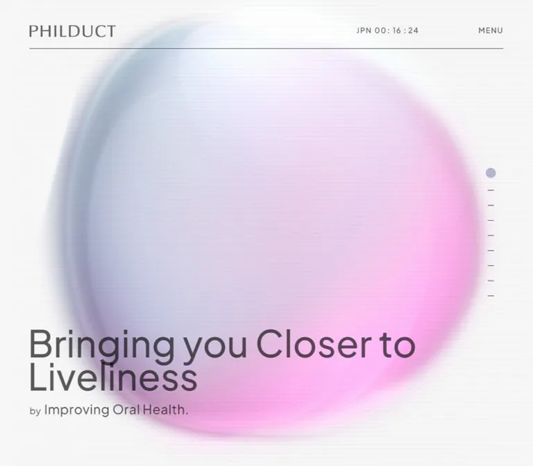
ピンクとブルーの柔らかな光のオブジェ、細い罫線、大きな英字見出しが特徴のオーラルテック企業サイト。段差のあるサービス紹介と、モバイルでも残る非対称な余白設計を詳しく整理。
PHILDUCT — Style Reference
A quiet oral-tech company profile built around diffuse light, precise type, and deliberately uneven space.
Website: philduct.com Original URL: https://philduct.com/ Final URL: https://philduct.com/ — supplied response status: 200. Theme: light, with an off-white canvas, translucent charcoal text, muted lavender labels, and pink–blue atmospheric artwork. Inspected: October 2, 2026, Japan Standard Time. Supplied evidence retrieval timestamp: October 1, 2026, 19:01:37.277 UTC. Viewports: 1440 × 1000 desktop and 390 × 844 mobile, in CSS pixels. Scope: the current corporate homepage, including its hero, company narrative, strategy, services, news previews, members, company information, history, recruitment, contact link, and footer. Visual captures show the desktop hero, a service section, and footer, plus the mobile hero and footer. Rendered DOM measurements cover additional homepage sections. Linked destinations and the opened menu were not inspected.
PHILDUCT presents an oral-health technology company through a restrained editorial layout. The opening statement sits near the bottom of a full-height hero, in front of a large, softly blurred form. Its pale blue edge, lavender interior, and pink glow soften an otherwise precise system of charcoal typography and fine horizontal rules. Subtle horizontal banding gives the luminous artwork a lightly screened texture.
The page is a long corporate narrative, rather than a single-purpose conversion page. Small uppercase section labels introduce large English headings or Japanese statements. Services, news, people, and company details follow with different column widths and alignments. The design repeatedly leaves one side quieter than the other. Mobile retains this asymmetry through narrower copy blocks, right-aligned news and member content, and generous intervals between sections.
閉じる
PHILDUCT — Style Reference
A quiet oral-tech company profile built around diffuse light, precise type, and deliberately uneven space.
Website: philduct.com Original URL: https://philduct.com/ Final URL: https://philduct.com/ — supplied response status: 200. Theme: light, with an off-white canvas, translucent charcoal text, muted lavender labels, and pink–blue atmospheric artwork. Inspected: October 2, 2026, Japan Standard Time. Supplied evidence retrieval timestamp: October 1, 2026, 19:01:37.277 UTC. Viewports: 1440 × 1000 desktop and 390 × 844 mobile, in CSS pixels. Scope: the current corporate homepage, including its hero, company narrative, strategy, services, news previews, members, company information, history, recruitment, contact link, and footer. Visual captures show the desktop hero, a service section, and footer, plus the mobile hero and footer. Rendered DOM measurements cover additional homepage sections. Linked destinations and the opened menu were not inspected.
PHILDUCT presents an oral-health technology company through a restrained editorial layout. The opening statement sits near the bottom of a full-height hero, in front of a large, softly blurred form. Its pale blue edge, lavender interior, and pink glow soften an otherwise precise system of charcoal typography and fine horizontal rules. Subtle horizontal banding gives the luminous artwork a lightly screened texture.
The page is a long corporate narrative, rather than a single-purpose conversion page. Small uppercase section labels introduce large English headings or Japanese statements. Services, news, people, and company details follow with different column widths and alignments. The design repeatedly leaves one side quieter than the other. Mobile retains this asymmetry through narrower copy blocks, right-aligned news and member content, and generous intervals between sections.
How to Read This Reference
- Measured means explicitly supplied by the rendered DOM, computed styles, or element rectangles. Coordinates outside screenshots describe document layout, not necessarily visible content in a particular frame.
- Derived means arithmetic based on measured values, such as column gaps or the composite color of translucent text.
- Estimated means a visual approximation from the original-page captures. Orb colors, blur, image corner radius, and hero text size fall into this category.
- Recommended means an implementation choice for a new project. The CSS scaffold, its breakpoint, and accessibility improvements are recommendations, not recovered source code.
- Token names are descriptive aliases. The only supplied source custom property is
--vh. - Extracted menu text and element rectangles do not establish that the menu was open. The captures show the closed header state.
- This document uses the supplied observations without additional browsing. No asset files, original scripts, or complete stylesheets were inspected.
Tokens — Colors
Default Palette
| Name | Value | Suggested token | Evidence and role |
|---|---|---|---|
| Off-white Canvas | #f7f7f7 |
--color-canvas |
Measured body background: rgb(247, 247, 247) at both viewports |
| Translucent Charcoal | rgba(0, 0, 0, 0.64) |
--color-ink |
Measured body, headings, paragraphs, and ordinary link color |
| Flat Charcoal Equivalent | Approximately #595959 |
--color-ink-flat |
Derived appearance of the measured text color over the plain canvas |
| Muted Lavender | #b1b6cd |
--color-accent |
Measured section labels, strategy numbers, member roles, and company field labels |
| White | #ffffff |
--color-white |
Measured menu-link text and pill-link text; this does not establish their enclosing surfaces |
| Bloom Pink | Approximately #f5b4e9 |
--color-bloom |
Estimated representative color within the diffuse hero/footer artwork |
| Mist Blue | Approximately #9baec0 |
--color-mist |
Estimated representative color near the artwork’s cooler edge |
| Faint Divider | Approximately #e7e7e7 |
--color-rule-soft |
Estimated from the footer’s subtle rules |
The charcoal is an alpha color, not a uniform opaque gray. Over #f7f7f7, each resulting channel is approximately 247 × 0.36 = 88.92, giving #595959. Over the pink and blue artwork, it produces a slightly tinted dark tone. Preserve this distinction when matching the hero.
The lavender accent organizes information. It is used for small labels and numbers rather than large filled panels. Pink and blue belong principally to the atmosphere; they are not evidenced as a general system of category badges or action colors.
Gradient and Texture Treatment
The original captures show a diffuse, dimensional, elliptical form with a cool upper/left region and warmer lower/right glow. Its perimeter is broad and soft, with little separation from the canvas. The center is pale enough for overlaid text to remain readable.
These are visual observations, not recovered gradient stops. The renderer, blend modes, exact color values, and blur radius are unknown. A layered CSS gradient can approximate the appearance, but should be labeled an adaptation.
Fine horizontal bands are visible across the hero and lower footer atmosphere. Their pitch appears to be several pixels, roughly 6–10px in the supplied images. This range is an estimate. Avoid turning the texture into a high-contrast scanline effect.
Tokens — Typography
Latin Interface and Editorial Headings
Measured family: "Plus Jakarta Sans", sans-serif.
This stack appears on the menu control, English section labels, large English section titles, strategy headings, service names, member names, footer navigation, and action labels. Most editorial headings use weight 500; utility navigation commonly uses 600.
The combination is clean and contemporary without relying on very heavy display type. Large words establish hierarchy while compact uppercase labels provide orientation.
Japanese Copy
Measured family: "Noto Sans JP", sans-serif for Japanese body copy and introductory statements.
Desktop body text is usually 14px with generous leading. Mobile body text commonly reduces to 12px, while company information values remain 14px. Japanese introductory statements use weight 600; biographies and service descriptions generally use 400.
The Japanese service title is assigned the Latin heading stack in the supplied computed styles. That declaration does not identify the font that ultimately supplies its Japanese glyphs.
Wordmark and Hero Type Limits
The PHILDUCT wordmark must be treated separately from ordinary text. Its anchor reports an inherited 10px font size on desktop, but the visible mark occupies a much larger graphic area. Do not use that inherited value to recreate the logo, or assign it an invented font. Use an approved wordmark asset when available.
The hero headline and subtitle are visible in the screenshots but are not individually represented in the supplied computed-style sample. Their sizes below are estimates. Reusing Plus Jakarta Sans for a new hero is a reasonable adaptation, not a verified measurement of that specific element.
Type Scale
Values use font-size / line-height in CSS pixels.
| Role | Desktop | Mobile | Weight | Status |
|---|---|---|---|---|
| Hero headline | Approximately 76 / 80 |
Approximately 38 / 37–39 |
Visually medium | Estimated |
| Hero subtitle, main phrase | Approximately 26 / 34 |
Approximately 18 / 25 |
Visually medium | Estimated |
| Menu control | 15 / 19 |
12 / 15 |
600 |
Measured |
| Uppercase section label | 16 / 20 |
10 / 12.5 |
500 |
Measured |
| Main English section title | 54 / 64.8 |
32 / 38.4 |
500 |
Measured |
| History section title | 44 / 52.8 |
32 / 38.4 |
500 |
Measured |
| Japanese introductory statement | 36 / 45 |
23 / 28.75 |
600 |
Measured |
| Strategy item heading | 40 / 56 |
27 / 37.8 |
500 desktop; 600 mobile |
Measured |
| Service title / Latin member name | 32 / 40 |
20 / 25 |
500 |
Measured |
| News headline | 24 / 30 |
17 / 21.25 |
500 |
Measured |
| Vision / credo Japanese text | 24 / 38.4 |
17 / 21.25 |
500 |
Measured |
| Introductory body copy | 14 / 35 |
12 / 24 |
400 |
Measured |
| Service / biography body copy | 14 / 28 |
12 / 21.6 |
400 |
Measured |
| News excerpt | 14 / 25.2 |
12 / 21.6 |
400 desktop; 500 mobile |
Measured |
| Japanese member name | 18 / 32.4 |
12 / 16.8 |
500 |
Measured |
| Company field label | 14 / 18 |
10 / 12.5 |
500 |
Measured |
| Company field value | 14 / 21 |
14 / 19.6 |
400 |
Measured |
| History description | 15 / 22 |
10 / 20 |
700 |
Measured |
| Pill action label | 16 / 22.4 |
13 / 18.2 |
600 |
Measured |
| Footer group heading | 24 / 30 |
19 / 24 |
600 |
Measured |
| Footer link | 14 / 18 |
12 / 15 |
600 |
Measured |
Tracking and Root Size
- Section labels use
3.2pxdesktop tracking and2pxmobile tracking:0.2emat their respective sizes. - MENU uses
1.5pxdesktop and1.2pxmobile tracking:0.1em. - Company field labels use
0.7pxdesktop and1pxmobile tracking. - The measured root size is 10px on desktop and 10.4px on mobile. No responsive root formula was supplied.
- The Quick Start keeps a conventional root size and expresses the observed dimensions explicitly. Do not copy source-scale numbers into a 16px
remsystem without conversion.
Tokens — Spacing & Shapes
The layout uses broad outer margins, several distinct text widths, and large vertical intervals. There is no evidence of a single universal spacing multiplier governing every section.
Spacing Scale
| Use | Desktop | Mobile | Evidence |
|---|---|---|---|
| Header horizontal inset | 80px |
31.2px |
Measured padding |
| Main section / footer inset | Commonly 120px |
Commonly 31.2px |
Measured content coordinates |
| Service column gap | 80px |
Single column | Derived from 560px columns at x=120 and x=760 |
| Service second-column offset | 127px lower |
Removed by stacking | Derived from link rectangles |
| Member column gap | 80px |
Single column | Derived from 480px blocks at x=120 and x=680 |
| Section label to large English title | 17px |
9px |
Derived for Our Service and several other headings |
| Service title to description | 24px |
12px |
Derived from heading and paragraph rectangles |
| Recurring major section interval | 240px |
175px |
Measured between selected preceding block ends and subsequent labels; not universal |
| Footer heading to first link | 35px |
18.5px |
Derived from text rectangles |
| Footer link start-to-start pitch | 35px |
22.5px |
Derived |
| Mobile news/member extra left offset | — | Approximately 57.2px inside the main container |
Derived |
| Mobile strategy paragraph left padding | — | 78px |
Measured |
At 390px, the main inset is exactly 8% of viewport width. This relationship is measured at that width; it does not prove the original implementation uses 8vw at every mobile size.
Border Radius
| Element | Value | Evidence |
|---|---|---|
| Visible lifestyle service photograph | Approximately 40px desktop radius |
Estimated from the capture |
| View All and recruitment links | 100px |
Measured computed radius |
| Active desktop section marker | Circular, about 20px diameter |
Visible shape with measured 20 × 20px anchor |
| Main canvas and text blocks | No enclosing rounded panel | Observed captures |
| Mobile media radius in Quick Start | 24px |
Recommendation; mobile service media was not visually captured |
Rounded corners are concentrated in media and selected action shapes. They do not form a universal card system.
Layout Measurements
| Element | Desktop: 1440 × 1000 | Mobile: 390 × 844 | Status |
|---|---|---|---|
| Header height | 97px |
71.41px |
Measured |
| Header wordmark link box | 172 × 26px, x=80, y=50 |
135.70 × 20.41px, x≈31.19, y=35 |
Measured link geometry |
| Hero boundary | Next section starts at y=1000 | Next section starts at y=844 | Measured |
| Common content width | 1200px |
Approximately 327.63px |
Measured |
| Introductory text width | 480px in About |
Approximately 249.59px |
Measured |
| Service link width | 560px |
Approximately 327.63px |
Measured |
| Service description width | 560px box with 40px right padding | Approximately 270.39px |
Measured |
| Visible lifestyle image | Approximately 560 × 620px |
Not visually measured | Estimated |
| News row | 1100px, flex layout |
Approximately 270.44px, block layout |
Measured |
| News text column | 650px, x=570 |
Approximately 270.44px, x≈88.38 |
Measured |
| Member text column | 480px |
Approximately 270.44px, x≈88.38 |
Measured |
| View All link | 280 × 74px |
205 × 60px |
Measured |
| Footer height | 586px |
Approximately 584.66px |
Measured |
| Total document height | Approximately 16863.34px |
Approximately 15125.77px |
Measured |
Components
Persistent Header
Role: maintain identity and access to navigation while the corporate narrative scrolls.
The header contains a home-linked PHILDUCT wordmark, a desktop JPN time readout, and a text-only MENU control. A fine rule spans the inner width beneath them. The desktop inner width is 1280px; the mobile width is approximately 327.6px.
The wordmark begins 50px from the top on desktop and 35px on mobile. Header background is measured as transparent. In the scrolled captures, page content can be visible behind the header area, reinforcing its light visual presence.
The header remains at the same viewport position in the desktop service and footer captures and in the mobile footer capture. This supports a persistent-header observation; the extracted styles do not identify the exact fixed/sticky implementation.
The mobile capture omits the visible time readout while retaining MENU. Time text is still present in the extracted mobile document, so DOM presence should not be confused with visibility.
Hero Composition
Role: communicate the company promise before introducing detailed business information.
The hero occupies the first viewport. Its headline reads “Bringing you Closer to Liveliness,” followed by “by Improving Oral Health.” The word “by” is visibly smaller than the main subtitle phrase.
On desktop, the headline is one line near the lower-left corner, beginning around x=80. The luminous form occupies most of the central canvas, with portions extending beyond the frame. The text overlaps its lower area.
On mobile, the artwork becomes a smaller, tilted ellipse in the middle of the screen. Substantial empty space remains above it. The headline sits below the artwork and breaks into three lines:
- Bringing you
- Closer to
- Liveliness
The mobile headline begins visually around x=27; the header and main content use approximately 31.2px insets. Do not assume that every visible glyph edge shares the exact same coordinate.
The supplied hero contains no prominent filled conversion button. Its emphasis is the statement, the atmosphere, and the invitation to explore the company.
Desktop Section Rail
Role: provide compact navigation through the long homepage.
Nine anchor targets are evidenced: top, About, Strategy, Service, News, Member, Company, Recruit, and Contact. Their desktop boxes are 20 × 20px, positioned at x=1320. The first begins at y=370; subsequent boxes start at y=405, then advance in 30px steps.
In the hero capture, the first marker is a lavender circle and the remaining markers appear as short dark horizontal strokes. The visible strokes are smaller than their anchor boxes.
The rail is absent from the mobile capture and mobile extracted link list. Click behavior, scrolling duration, and automatic active-state tracking were not exercised. The anchors establish destinations, not the animation used to reach them.
Section Opener
Role: introduce a new topic without using a colored panel or heavy divider.
A typical opener pairs a small lavender uppercase label with a much larger charcoal title. The DOM often uses an H2 for the uppercase label and a paragraph for the larger English title. Examples include SERVICE / Our Service, NEWS / Index, MEMBER / We Are Philduct, and RECRUIT / Join Us.
About and Strategy instead pair the label with a bold Japanese statement. The About statement occupies a 480px desktop column aligned left; the Strategy introduction appears in a 600px column beginning at x=720. This left/right alternation contributes to the editorial rhythm.
On mobile, both introductions begin at the main left inset, while their supporting paragraphs remain narrower than the full content width. Preserve that difference between heading width and reading width.
Numbered Strategy Item
Role: explain the company’s three operating principles.
Each item combines an English H3, a small lavender number aligned toward the right edge, and Japanese explanation text. The evidenced headings are Tech × Oral Health, Expertise, and Optimization, numbered 01–03.
Desktop headings use 40px type over a 600px block. Mobile headings use 27px type across the main content width, with the counter close to the right edge. Mobile paragraphs have 78px of left padding, leaving approximately 249.6px for copy.
Large vertical spaces separate headings from their explanations in the mobile DOM. Their intervening visual content is not shown in the supplied captures, so do not fill those spaces with invented diagrams or illustrations.
Mission, Vision, and Credo
Role: move from operational strategy to company principles.
The document contains a company-name explanation and separate MISSION, VISION, and CREDO blocks. Desktop principle blocks begin around x=710 with a width of 590px. Mobile blocks use the main 327.6px content width.
Vision and credo text use a noticeably larger Japanese scale than ordinary descriptions: 24px desktop and 17px mobile. Small lavender labels remain consistent with the rest of the page.
The supplied DOM establishes this hierarchy, but not all accompanying artwork or large English slogan styles are included in the measurements.
Service Feature
Role: present consumer, clinic, and broader oral-health initiatives.
The desktop service area uses two 560px columns separated by 80px. The second feature begins 127px below the first. A third feature occupies the left column farther down, leaving a large quiet area to its right in the supplied service capture.
The first two complete feature groups are links to DPEARL and DPEARL for Clinics. Their anatomy is a media region, title, Japanese description, and “Visit Web site” label with an outward arrow. Preserve the group-level link rather than adding a nested interactive link inside it.
The visible third feature is titled “オーラルヘルス社会実装事業”. It has a large rounded lifestyle photograph above its heading and body copy. The supplied link evidence does not establish a destination for this third feature.
The first two titles begin 670px below their desktop link tops. A roughly 620px-tall image plus a 50px gap is consistent with that geometry and the visible third photograph. The image height and gap decomposition are an interpretation, not separate computed-style measurements.
On mobile, the features stack. Link groups remain approximately 327.6px wide, while headings and descriptions narrow to approximately 270.4px and stay left aligned. This creates intentional empty space on the right below the wider media.
News Preview Row
Role: summarize recent company updates and lead to individual articles.
Each preview is a linked group containing a date, Japanese headline, excerpt, and Read More label. Some entries also include category or brand labels. Three article links are present in the supplied homepage evidence, followed by View All.
Desktop rows are flex containers 1100px wide. Their text begins 450px after the row’s left edge and occupies 650px. This establishes space for preceding content and separation, but does not independently establish an exact image width or image crop.
Mobile rows become blocks approximately 270.4px wide, aligned to the right side of the main container at x≈88.4. Section headings still begin at x≈31.2. This offset is a defining responsive detail.
View All is a pill-shaped link measuring 280 × 74px on desktop and 205 × 60px on mobile. Its text is white. The anchor’s measured background is transparent, so the actual painted fill may belong to a descendant or pseudo-element; that fill is not established by the supplied export.
Member Profile
Role: connect the corporate story to its leadership.
The text sequence is role, Latin name, Japanese name, biography, and an optional social link. Role labels use lavender. Latin names share the 32px desktop / 20px mobile service-title scale.
Desktop text blocks are 480px wide, with the second beginning at x=680 and 127px lower than the first role label. Mobile profiles stack and use the same right-aligned 270.4px content width as news rows.
The biography content and text measurements are evidenced. Portrait styling, framing, and backgrounds are not visible in the supplied captures and should not be invented.
Company Information
Role: provide formal business details in a quiet reference layout.
The original page identifies the company as Philduct Inc. The desktop section places its large section title to the left and field/value pairs farther right. Field labels begin at x=556 in 160px boxes, while values begin at x=716.
Labels use lavender Plus Jakarta Sans; values use charcoal Noto Sans JP. Fields include company name, representative, location, establishment date, and business content.
On mobile, each label sits above its value. Values retain a 14px font size and can use the full main content width. The address expands to multiple lines. This is a structural change from the desktop pairs, not just a smaller desktop table.
For a new implementation, a definition list is a suitable semantic structure.
History Strip
Role: summarize milestones across a horizontal sequence.
The supplied element positions establish a lateral layout. Desktop milestone paragraphs begin at x=120, 490, 860, and continue beyond the viewport. Mobile paragraphs begin at x≈31.2, 221.2, 411.2, and likewise continue beyond the viewport.
Desktop paragraph boxes are 370px wide with 190px right padding, leaving approximately 180px for text. Mobile paragraphs are 120px wide with a 190px start-to-start pitch.
These measurements support a horizontal history strip. They do not establish dragging, autoplay, arrow controls, wheel interception, or scroll snapping. A keyboard-accessible horizontal overflow region is a recommended implementation option.
Recruitment and Contact
Role: offer two different next steps: explore recruitment opportunities or contact the company directly.
Recruitment includes the RECRUIT / Join Us opener, a message, and a Read More link to the evidenced external recruitment destination. The link measures approximately 260.5 × 74px on desktop and 205 × 60px on mobile, with white text and a 100px radius.
The contact action is an actual mailto:info@philduct.com link containing “Please Say Hello!!” and an envelope symbol. In the mobile footer capture, it appears large and underlined above the footer navigation.
That capture catches the contact text passing beneath the persistent header. Treat this as a captured scroll overlap, not as a second item intentionally placed inside the header.
Footer Navigation
Role: provide a complete, compact directory at the end of the corporate story.
Four groups organize the footer: ABOUT, SERVICE, NEWS, and COMPANY. On desktop their left edges are x=120, 420, 720, and 1020, giving a 300px column pitch across the 1200px inner width.
The group title is followed by a generous gap and a tightly organized link list. External service links include small outward arrows. Fine horizontal rules separate the navigation region and the lower identity row.
Mobile uses two columns and two rows. ABOUT and SERVICE occupy the first row; NEWS and COMPANY occupy the second. The second column starts at x≈162.2, corresponding to a roughly 40% / 60% division of the inner width rather than equal halves. The second row begins 150px below the first.
A substantial gap separates the navigation from the bottom wordmark and copyright. The overall footer remains approximately 585px tall at both inspected sizes despite its changed column structure. A pink glow sits behind the navigation area and fades into the pale page.
Menu Content — DOM Evidence Only
The extracted navigation contains ABOUT, SERVICE, NEWS, MEMBER, COMPANY, RECRUIT, contact information, and a copyright line. MENU and CLOSE both occur in the control’s extracted text.
Menu links are measured at 20px / 25px with white text on both viewports. The menu email is 44px / 60px on desktop and 22px / 27.5px on mobile. These values describe available DOM content, not a verified open-menu composition.
The enclosing menu background, opening animation, focus behavior, dismissal behavior, and final visible arrangement remain unverified. Do not invent a dark overlay and present it as an observed feature.
Tokens — Motion & Interaction
| Treatment | Supplied evidence | What can be concluded |
|---|---|---|
| Header opacity | opacity 0.4s linear 0.6s |
A 400ms opacity transition with a 600ms delay is declared; its trigger was not supplied |
| Service headings and descriptions | 0.4s transition strings |
A transition duration is declared; affected visual state was not exercised |
| News headings | 0.4s transition strings |
Timing is evidenced; hover/reveal appearance is not |
| Footer navigation links | color 0.1s linear |
A short color transition is declared; destination color is unknown |
| Menu email link | 0.2s linear |
Transition timing is evidenced for that link; the property change is unresolved |
| Header time | Desktop captures show 04:01:17, 04:01:23, and 04:01:29 | The displayed readout changes between captures; implementation and exact update cadence are unknown |
| Section navigation | Hash links to nine homepage targets | Destinations are established; smooth scrolling and active-state logic are not verified |
| Hero/footer atmosphere | Diffuse artwork appears in multiple captured locations | Appearance is established; motion mechanism and timing are not |
| History strip | Items extend laterally beyond both viewports | Horizontal arrangement is established; interaction method is not |
Most sampled elements report animation: none. This does not prove that the atmospheric artwork is static: the sample does not cover every renderer, pseudo-element, or script-driven effect.
Similarly, a transition string containing only all does not establish a nonzero animation duration. Avoid turning it into a claimed site-wide motion token.
The capture process waited for document loading, sampled stability, visible image decoding, and eligible finite animations within bounded time limits. Perpetual animations were temporarily paused during readiness checks and resumed. This process does not establish the speed or behavior of any particular visual effect.
Recommended adaptation: begin with a static atmosphere. If motion is commissioned, add a subtle, slow transform to the decorative form and provide a reduced-motion alternative. Do not infer parallax, cursor tracking, morphing, or a WebGL implementation from the screenshots.
Surfaces
| Layer | Appearance | Structural role |
|---|---|---|
| Body canvas | Measured #f7f7f7 |
Continuous background for the entire corporate narrative |
| Hero atmosphere | Diffuse pink, lavender, and blue with horizontal banding | Primary visual identity |
| Header | Transparent container with a fine rule | Persistent navigation with minimal visual weight |
| Editorial sections | Canvas-colored or transparent sampled containers | Hierarchy comes from space, type, and alignment |
| Service media | Large photograph with visibly rounded corners | Human and lifestyle context |
| Text links | Mostly unboxed; selected links visibly underlined or arrow-marked | Lightweight navigation |
| Pill actions | Measured rounded geometry and white text; fill unresolved | Selected section-level next steps |
| Footer | Fine rules and a pale pink atmospheric area | Directory and brand closure |
The visible reference does not rely on repeated elevated cards or heavy shadows. Its main depth comes from the blurred artwork and photography.
Imagery
Two visual systems work together: abstract light for the company identity, and natural photography for the relationship between oral health and daily life.
The visible service photograph shows a woman seated on a wooden chair beneath a tree beside a bright sea view. A hammock, deck boards, foliage, and pale horizon create a relaxed setting. The image is bright without looking like an isolated product packshot. Green foliage and natural wood supply the strongest photographic colors within the otherwise restrained page.
The photograph is taller than it is wide in the supplied desktop crop, approximately 560 × 620px. Large rounded corners soften its boundary. Keep the person, tree, deck, and horizon legible when adapting the crop; do not replace the image’s sense of place with a tightly cropped generic smile.
The abstract form is not a crisp vector ellipse. Its identity depends on a diffuse perimeter, uneven light, a cool-to-warm balance, and substantial blending into the page. Keep the horizontal texture subtle enough that it does not compete with type.
Observed Asset References
No source asset URLs or image filenames are included in the supplied original-page evidence.
| Visual | Evidence location | What is established |
|---|---|---|
| PHILDUCT wordmark | Header and footer captures | Appearance and link-box dimensions; source format and asset path unknown |
| Diffuse atmospheric form | Desktop/mobile hero and footer captures | Color relationships, soft shape, and placement; rendering technology unknown |
| Lifestyle service photograph | Desktop service capture | Subject, visible crop, approximate dimensions, and rounded treatment |
| Outward arrow marks | Service link and footer captures | Small diagonal external-link indicators; icon source unknown |
| Envelope symbol | Contact text and mobile footer capture | An envelope character is included; platform rendering may vary |
Use licensed or owned imagery and an approved logo asset. Do not invent asset URLs or assume that uncaptured news and member media share a particular treatment.
Layout & Responsive Behavior
The desktop system has two related widths. The persistent header uses 80px side insets, while most content uses 120px insets. This makes the header slightly wider than the editorial body. On mobile, both systems converge around 31.2px side insets.
The hero is one viewport tall at both inspected sizes. Its responsive change is compositional: the desktop artwork fills much of the frame behind a single-line statement, while the mobile artwork becomes a smaller central ellipse above a three-line statement. Simply shrinking the desktop hero proportionally would not reproduce the mobile capture.
| Region | Desktop observation | Mobile observation |
|---|---|---|
| Header | Wordmark, visible time, MENU | Wordmark and MENU; time not visible |
| Section rail | Nine right-side anchor markers | Not present in the supplied mobile view |
| Introductions | Alternating left and right blocks | Left-aligned headings with narrower supporting copy |
| Services | Two columns with a 127px stagger | One column; narrower copy below wider feature groups |
| News | Horizontal flex rows | Stacked rows aligned to the right of the main container |
| Members | Two 480px text columns with a vertical offset | Stacked, right-aligned 270.4px text blocks |
| Company information | Side-by-side field labels and values | Labels above values |
| History | Lateral sequence extending beyond viewport | Lateral sequence retained at a smaller pitch |
| Footer | Four columns | Two rows of two unequal-width columns |
Mobile is not uniformly full-width. About and Strategy introduction paragraphs are approximately 249.6px wide; service copy is approximately 270.4px wide and aligned left; news and member blocks are approximately 270.4px wide and aligned right. These different alignments are central to the site’s character.
The source custom property --vh is 10px on desktop and 8.44px on mobile, equal to 1% of each inspected viewport height. The code that sets or updates it is not supplied. The Quick Start uses modern viewport units as an adaptation.
Only two widths were inspected. The actual breakpoint, tablet behavior, landscape layout, safe-area handling, and behavior under browser zoom are unknown. The 767px breakpoint below is a recommendation.
Do’s and Don’ts
Do
- Use
#f7f7f7as the continuous canvas and preserve the measured translucent charcoal text treatment. - Keep lavender labels small, tracked, and organizational.
- Pair Plus Jakarta Sans interface typography with Noto Sans JP body copy where those font files are available.
- Preserve the distinction between header width, main content width, and narrower reading columns.
- Keep the hero statement low in the viewport and reproduce its mobile three-line composition.
- Use diffuse pink–blue light with a soft boundary and restrained horizontal texture.
- Retain staggered desktop services and the mobile left/right offsets.
- Give photography enough space to communicate daily life and environment.
- Use fine rules and typography to organize the page.
- Keep navigation, service destinations, news, recruitment, and contact as distinct parts of the corporate site.
Don’t
- Don’t compress the page into a generic conversion funnel with repeated feature cards.
- Don’t replace the atmosphere with a sharp rainbow gradient or a crisp circular badge.
- Don’t turn pale lavender into the default color for essential small body text.
- Don’t make every mobile block span the same width or share the same alignment.
- Don’t infer the logo’s typeface from its anchor’s inherited font size.
- Don’t add unsupported cursor effects, parallax, autoplay, or menu transitions as if they were observed.
- Don’t assume the transparent pill anchor exposes the complete painted button surface.
- Don’t present uncaptured portrait styles or image paths as source facts.
- Don’t replicate the captured contact/header overlap as an intentional layout feature.
- Don’t copy fixed document heights into an implementation; let content determine page length.
Recommended Implementation Additions
These are recommendations for a new implementation, not verified features of the original:
- Use a semantic button for the menu toggle with
aria-expandedandaria-controls. Manage focus and Escape dismissal if the menu behaves as an overlay. - Give every section-rail link an accessible name. Mark the active destination appropriately if active-state tracking is implemented.
- Add a visible focus outline and adequate activation areas around the small menu and rail marks.
- Add header-aware
scroll-margin-topto anchor targets so section headings remain visible after navigation. - Review the contrast of lavender labels. Preserve their visual role while using a darker companion color when the label conveys essential information.
- Consider increasing 10–12px mobile text for reading-heavy deployments. Recheck line lengths and vertical spacing after doing so.
- Keep decorative atmosphere hidden from assistive technology, prevent it from intercepting input, and offer reduced-motion behavior if animated.
- Give meaningful photographs appropriate alternative text. Keep decorative logo duplicates from creating redundant announcements.
- Make all history items reachable by keyboard and touch without requiring an undisclosed gesture.
- Use a timezone-aware clock implementation if reproducing the JPN readout; avoid a rapidly announced live region.
- Prefer appropriate heading and definition-list semantics while preserving the observed visual hierarchy.
Agent Prompt Guide
Quick Color Reference
- Canvas: measured
#f7f7f7. - Main text: measured
rgba(0, 0, 0, 0.64); approximately#595959over the plain canvas. - Section labels and counters: measured
#b1b6cd. - Atmospheric pink: estimated
#f5b4e9. - Atmospheric blue: estimated
#9baec0. - Fine footer rules: estimated
#e7e7e7. - White action text is measured; the original pill fill is unresolved.
Overall Prompt
“Create a long-form oral-health technology corporate homepage inspired by the supplied PHILDUCT reference. Use an off-white #f7f7f7 canvas, translucent charcoal text, muted lavender section labels, Plus Jakarta Sans for English headings, and Noto Sans JP for Japanese copy. Build a persistent transparent header with a wordmark, desktop time readout, text-only menu control, and fine bottom rule. Place a large diffuse pink-and-blue elliptical light form behind a low-positioned hero statement. Continue through company narrative, strategy, services, news, people, company details, history, recruitment, and contact. Preserve staggered desktop columns and narrower, deliberately offset mobile content. Use restrained rounded photography, fine rules, and a four-column footer that becomes a two-by-two layout. Treat gradient stops, blur, and motion as implementation choices rather than recovered source values.”
Example Component Prompts
- Hero: “Create a full-height pale hero with a soft pink–blue luminous form and barely visible horizontal banding. Place the charcoal headline near the lower left. On a 390px-wide phone, reduce the form to a tilted central ellipse and break the headline into Bringing you / Closer to / Liveliness. Keep the subtitle beneath it and avoid adding a prominent conversion button.”
- Service feature: “Create a 560px-wide desktop service feature with a tall rounded lifestyle photograph, a 32px English title, 14px Japanese copy at 28px leading, and an underlined external-site label. Offset the adjacent feature downward by about 127px. On mobile, stack features and make the text narrower than the media.”
- News preview: “Create a spacious linked news preview with a date, Japanese headline, excerpt, and Read More label. Use a horizontal desktop arrangement with a 650px text column. On mobile, use a roughly 270px-wide block aligned to the right of a 328px main container.”
- Company information: “Create a restrained company information section with a large English title on the left and lavender field labels beside charcoal values on desktop. Stack labels above values on mobile, retaining readable 14px values and generous row spacing.”
- Footer: “Create an off-white footer with ABOUT, SERVICE, NEWS, and COMPANY groups, fine separators, and a faint pink glow behind the navigation. Use four desktop columns and a 40/60 two-column mobile grid across two rows. Leave substantial space before the bottom wordmark and copyright.”
Quick Start
CSS Custom Properties
This is a reusable CSS adaptation, not the original stylesheet. It reproduces measured text scales and selected layout relationships, while using estimated artwork colors and a static CSS ellipse. It keeps the root at a conventional size.
Use an approved image inside .brand, a decorative .aura-blob inside .hero and .site-footer, and three .hero-line spans for the mobile headline phrases. A service feature may be an anchor or an article; place its visible call-to-action label in a span when the entire feature is already linked.
The pill fill below is a recommended charcoal fallback because the original painted fill is not established. The CSS does not implement menu state, clock updates, section tracking, or the original atmospheric renderer. It has not been browser-tested in this evidence-only analysis.
:root {
  /* Measured colors */
  --color-canvas: #f7f7f7;
  --color-ink: rgb(0 0 0 / 64%);
  --color-accent: #b1b6cd;
  --color-white: #fff;

  /* Derived and visually estimated colors */
  --color-ink-flat: #595959;
  --color-bloom: #f5b4e9;
  --color-mist: #9baec0;
  --color-rule-soft: #e7e7e7;

  /* Measured font stacks; supply authorized font files separately */
  --font-latin: 'Plus Jakarta Sans', sans-serif;
  --font-japanese: 'Noto Sans JP', sans-serif;

  /* Desktop reference geometry */
  --header-inset: 80px;
  --content-width: 1200px;
  --content-inset: 40px;
  --header-height: 97px;
  --section-space: 240px;
  --service-gap: 80px;
  --service-stagger: 127px;

  /* Measured type scales */
  --text-label: 16px;
  --text-section: 54px;
  --text-statement: 36px;
  --text-service: 32px;
  --text-body: 14px;

  /* Visual estimates and adaptation choices */
  --text-hero: 76px;
  --radius-media: 40px;
  --radius-pill: 100px;
  --motion-link: 100ms linear;
}

* {
  box-sizing: border-box;
}

body {
  margin: 0;
  color: var(--color-ink);
  background: var(--color-canvas);
  font-family: var(--font-japanese);
  font-size: var(--text-body);
  line-height: 2;
}

a {
  color: inherit;
}

button {
  font: inherit;
}

img {
  display: block;
  max-width: 100%;
}

.container {
  width: min(
    var(--content-width),
    calc(100% - var(--content-inset) - var(--content-inset))
  );
  margin-inline: auto;
}

[id] {
  scroll-margin-top: calc(var(--header-height) + 24px);
}

.site-header {
  position: fixed;
  inset: 0 0 auto;
  z-index: 20;
  padding-inline: var(--header-inset);
}

.header-inner {
  display: flex;
  align-items: center;
  justify-content: space-between;
  padding-block: 50px 20px;
  border-bottom: 1px solid currentColor;
}

.brand {
  display: block;
  width: 172px;
  height: 26px;
}

.brand img {
  width: 100%;
  height: 100%;
  object-fit: contain;
}

.header-utilities {
  display: flex;
  align-items: center;
  gap: 110px; /* Visual approximation of the desktop utility spacing */
}

.menu-toggle,
.header-time {
  color: inherit;
  font-family: var(--font-latin);
  font-size: 15px;
  font-weight: 600;
  line-height: 19px;
  letter-spacing: 0.1em;
}

.menu-toggle {
  position: relative;
  padding: 0;
  border: 0;
  background: transparent;
  cursor: pointer;
}

/* Expand the pointer area without changing the visible label */
.menu-toggle::before {
  position: absolute;
  inset: -12px -8px;
  content: '';
}

.aura-surface {
  position: relative;
  isolation: isolate;
  overflow: hidden;
  background: var(--color-canvas);
}

.aura-blob {
  position: absolute;
  z-index: 0;
  pointer-events: none;
  border-radius: 48% 52% 47% 53%;
  background:
    radial-gradient(
      ellipse at 65% 18%,
      rgb(255 255 255 / 94%) 0%,
      transparent 49%
    ),
    radial-gradient(
      ellipse at 72% 84%,
      var(--color-bloom) 0%,
      transparent 67%
    ),
    linear-gradient(
      135deg,
      var(--color-mist),
      #d9d5e7 47%,
      var(--color-bloom)
    );
  filter: blur(18px); /* Estimated static artwork adaptation */
}

.aura-surface::after {
  position: absolute;
  inset: 0;
  z-index: 1;
  content: '';
  pointer-events: none;
  background: repeating-linear-gradient(
    to bottom,
    transparent 0 5px,
    rgb(255 255 255 / 22%) 5px 8px
  );
}

.hero {
  min-height: 100vh;
  min-height: 100svh;
  display: flex;
  align-items: flex-end;
  padding: 150px var(--header-inset) 96px;
}

.hero .aura-blob {
  top: 43%;
  left: 51%;
  width: min(74vw, 1060px);
  height: 1080px;
  transform: translate(-50%, -50%);
}

.hero-copy {
  position: relative;
  z-index: 2;
}

.hero-title {
  margin: 0;
  font-family: var(--font-latin);
  font-size: clamp(42px, 5.28vw, var(--text-hero));
  font-weight: 500;
  line-height: 1.05;
  letter-spacing: -0.025em;
}

.hero-line {
  display: inline;
}

.hero-subtitle {
  margin: 14px 0 0;
  font-family: var(--font-latin);
  font-size: 26px;
  font-weight: 500;
  line-height: 1.4;
}

.hero-subtitle small {
  font-size: 0.7em;
}

.section {
  margin-block: var(--section-space);
}

.section-label {
  margin: 0 0 17px;
  color: var(--color-accent);
  font-family: var(--font-latin);
  font-size: var(--text-label);
  font-weight: 500;
  line-height: 1.25;
  letter-spacing: 0.2em;
}

.section-title {
  margin: 0;
  font-family: var(--font-latin);
  font-size: var(--text-section);
  font-weight: 500;
  line-height: 1.2;
}

.intro-statement {
  margin: 20px 0 0;
  font-size: var(--text-statement);
  font-weight: 600;
  line-height: 1.25;
}

.intro-copy {
  max-width: 480px;
  margin-block: 41px 0;
  line-height: 2.5;
}

.service-grid {
  display: grid;
  grid-template-columns: repeat(2, minmax(0, 1fr));
  gap: 70px var(--service-gap);
  margin-top: 80px;
}

.service-card {
  display: block;
  min-width: 0;
  color: inherit;
  text-decoration: none;
}

.service-card:nth-child(2) {
  transform: translateY(var(--service-stagger));
}

.service-media {
  width: 100%;
  aspect-ratio: 28 / 31;
  object-fit: cover;
  border-radius: var(--radius-media);
}

.service-card h3 {
  margin: 50px 0 24px;
  font-family: var(--font-latin);
  font-size: var(--text-service);
  font-weight: 500;
  line-height: 1.25;
}

.service-card p {
  margin: 0;
  padding-right: 40px;
  line-height: 2;
}

.service-cta {
  display: inline-block;
  margin-top: 20px;
  font-family: var(--font-latin);
  font-size: 18px;
  line-height: 1.5;
  text-decoration: underline;
  text-underline-offset: 3px;
}

/* Recommended decomposition of the measured news row */
.news-row {
  display: grid;
  grid-template-columns: minmax(0, 400px) minmax(0, 650px);
  gap: 50px;
  max-width: 1100px;
  color: inherit;
  text-decoration: none;
}

.news-title {
  margin: 0 0 24px;
  font-size: 24px;
  font-weight: 500;
  line-height: 1.25;
}

.news-excerpt {
  margin: 0;
  line-height: 1.8;
}

.pill-link {
  display: inline-flex;
  align-items: center;
  justify-content: center;
  width: 280px;
  min-height: 74px;
  border-radius: var(--radius-pill);
  color: var(--color-white);
  background: var(--color-ink-flat); /* Recommended fill, not measured */
  font-family: var(--font-latin);
  font-size: 16px;
  font-weight: 600;
  line-height: 1.4;
  text-decoration: none;
}

.company-row {
  display: grid;
  grid-template-columns: 160px minmax(0, 1fr);
  padding-block: 40px;
}

.company-row dt {
  color: var(--color-accent);
  font-family: var(--font-latin);
  font-size: 14px;
  font-weight: 500;
  line-height: 18px;
  letter-spacing: 0.05em;
}

.company-row dd {
  margin: 0;
  font-size: 14px;
  line-height: 21px;
}

/* Recommended accessible overflow model for the history geometry */
.history-track {
  display: flex;
  overflow-x: auto;
  padding: 0 0 20px;
  list-style: none;
}

.history-item {
  flex: 0 0 370px;
}

.history-item p {
  width: 180px;
  font-size: 15px;
  font-weight: 700;
  line-height: 22px;
}

.site-footer .aura-blob {
  top: 67%;
  left: 50%;
  width: 900px;
  height: 520px;
  opacity: 0.65;
  transform: translate(-50%, -50%);
}

.footer-nav,
.footer-bottom {
  position: relative;
  z-index: 2;
}

.footer-nav {
  display: grid;
  grid-template-columns: repeat(4, minmax(0, 1fr));
  padding-block: 60px 140px;
  border-block: 1px solid var(--color-rule-soft);
}

.footer-group h2 {
  margin: 0 0 35px;
  font-family: var(--font-latin);
  font-size: 24px;
  font-weight: 600;
  line-height: 30px;
}

.footer-group ul {
  display: grid;
  gap: 17px;
  margin: 0;
  padding: 0;
  list-style: none;
}

.footer-group li {
  font-family: var(--font-latin);
  font-size: 14px;
  font-weight: 600;
  line-height: 18px;
}

.footer-group a {
  text-decoration: none;
  transition: color var(--motion-link);
}

.footer-bottom {
  display: flex;
  align-items: center;
  justify-content: space-between;
  gap: 20px;
  padding-block: 50px 120px;
  font-family: var(--font-latin);
}

:where(a, button, [tabindex]):focus-visible {
  outline: 2px solid var(--color-ink-flat);
  outline-offset: 5px;
}

@media (hover: hover) {
  /* Recommended state; the original destination color is unknown */
  .footer-group a:hover {
    color: #333;
    text-decoration: underline;
    text-underline-offset: 3px;
  }
}

/* Recommended breakpoint; only 1440px and 390px were inspected */
@media (max-width: 767px) {
  :root {
    --header-inset: 8vw;
    --content-inset: 8vw;
    --header-height: 71.4px;
    --section-space: 175px;
    --text-label: 10px;
    --text-section: 32px;
    --text-statement: 23px;
    --text-service: 20px;
    --text-body: 12px;
    --text-hero: 38px;
    --radius-media: 24px;
  }

  .header-inner {
    padding-block: 35px 15px;
  }

  .brand {
    width: 135.7px;
    height: 20.4px;
  }

  .header-time,
  .section-rail {
    display: none;
  }

  .menu-toggle {
    font-size: 12px;
    line-height: 15px;
  }

  .hero {
    padding: 110px var(--header-inset) 32px;
  }

  .hero .aura-blob {
    top: 53%;
    left: 50%;
    width: 92vw;
    height: 230px;
    filter: blur(8px);
    transform: translate(-50%, -50%) rotate(-20deg);
  }

  .hero-title {
    font-size: var(--text-hero);
    line-height: 0.98;
    letter-spacing: -0.025em;
  }

  .hero-line {
    display: block;
  }

  .hero-subtitle {
    margin-top: 16px;
    font-size: 18px;
  }

  .section-label {
    margin-bottom: 9px;
  }

  .intro-copy {
    width: 76.19%;
    line-height: 2;
  }

  .service-grid {
    grid-template-columns: minmax(0, 1fr);
    gap: 54px;
    margin-top: 40px;
  }

  .service-card:nth-child(2) {
    transform: none;
  }

  .service-card h3,
  .service-card p {
    width: 82.53%;
  }

  .service-card h3 {
    margin: 34px 0 12px;
  }

  .service-card p {
    padding-right: 0;
    line-height: 1.8;
  }

  .service-cta {
    font-size: 14px;
  }

  .news-row,
  .member-copy {
    display: block;
    width: 82.55%;
    margin-left: auto;
  }

  .news-title {
    margin-bottom: 16px;
    font-size: 17px;
    line-height: 1.25;
  }

  .pill-link {
    width: 205px;
    min-height: 60px;
    font-size: 13px;
  }

  .company-row {
    grid-template-columns: minmax(0, 1fr);
    gap: 7px;
  }

  .company-row dt {
    font-size: 10px;
    line-height: 12.5px;
    letter-spacing: 0.1em;
  }

  .company-row dd {
    line-height: 19.6px;
  }

  .history-item {
    flex-basis: 190px;
  }

  .history-item p {
    width: 120px;
    font-size: 10px;
    line-height: 20px;
  }

  .footer-nav {
    grid-template-columns: 40% 60%;
    row-gap: 47.5px;
    padding-block: 48.5px 0;
    border-bottom: 0;
  }

  .footer-group h2 {
    margin-bottom: 18.5px;
    font-size: 19px;
    line-height: 24px;
  }

  .footer-group ul {
    gap: 7.5px;
  }

  .footer-group li {
    font-size: 12px;
    line-height: 15px;
  }

  .footer-bottom {
    margin-top: 200px;
    padding-block: 0 40px;
    font-size: 10px;
  }

  .site-footer .aura-blob {
    top: 35%;
    width: 350px;
    height: 270px;
  }
}

@media (prefers-reduced-motion: reduce) {
  .aura-blob {
    animation: none;
  }

  .footer-group a {
    transition: none;
  }
}
Tailwind v4 Token Mapping
Optional aliases for a project already using Tailwind v4. This does not imply that the original site uses Tailwind. Load the custom properties above first.
@theme inline {
  --color-canvas: #f7f7f7;
  --color-ink: rgb(0 0 0 / 64%);
  --color-ink-flat: #595959;
  --color-accent: #b1b6cd;

  /* Estimated atmospheric palette */
  --color-bloom: #f5b4e9;
  --color-mist: #9baec0;

  --font-latin: 'Plus Jakarta Sans', sans-serif;
  --font-japanese: 'Noto Sans JP', sans-serif;

  --text-eyebrow: var(--text-label);
  --text-editorial: var(--text-section);
  --text-feature: var(--text-service);
  --text-copy: var(--text-body);

  --spacing-page: var(--content-inset);
  --spacing-chapter: var(--section-space);
  --radius-photo: var(--radius-media);
  --radius-action: 100px;
}
Sources & Evidence
- PHILDUCT — original and final homepage: supplied current-page response with HTTP 200 and unchanged final URL. Retrieval timestamp:
2026-10-01T19:01:37.277Z, equivalent to October 2, 2026, 04:01:37.277 JST. - Desktop evidence: 1440 × 1000 CSS-pixel viewport; original-page captures of the hero, a service feature, and footer. Supplied rendered document height: approximately 16863.34px.
- Mobile evidence: 390 × 844 CSS-pixel viewport; original-page captures of the hero and footer/contact area. Supplied rendered document height: approximately 15125.77px.
- Rendered DOM and computed styles: source of the measured font stacks, colors, type scales, element boxes, padding, link targets, transition strings, and
--vhvalues. Screenshot-only estimates are identified throughout. - Observed states: closed header, initial hero, scrolled service/footer views, responsive rearrangement, and differing displayed desktop clock values. No menu opening, hover action, section-rail click, history gesture, or outbound navigation was independently exercised.
- Inspection limits: shared workers and service workers were disabled during capture. Readiness checks were time-limited and do not establish semantic completeness, delayed content behavior, or unexercised interactions. Complete stylesheets, asset URLs, pseudo-element paint details, and rendering scripts were not supplied.
This reference describes the current homepage represented by those observations. Its CSS and prompt examples are reusable adaptations with explicitly stated estimates and recommendations.
# PHILDUCT — Style Reference

> A quiet oral-tech company profile built around diffuse light, precise type, and deliberately uneven space.

**Website:** [philduct.com](https://philduct.com/)
**Original URL:** https://philduct.com/
**Final URL:** https://philduct.com/ — supplied response status: 200.
**Theme:** light, with an off-white canvas, translucent charcoal text, muted lavender labels, and pink–blue atmospheric artwork.
**Inspected:** October 2, 2026, Japan Standard Time. Supplied evidence retrieval timestamp: October 1, 2026, 19:01:37.277 UTC.
**Viewports:** 1440 × 1000 desktop and 390 × 844 mobile, in CSS pixels.
**Scope:** the current corporate homepage, including its hero, company narrative, strategy, services, news previews, members, company information, history, recruitment, contact link, and footer. Visual captures show the desktop hero, a service section, and footer, plus the mobile hero and footer. Rendered DOM measurements cover additional homepage sections. Linked destinations and the opened menu were not inspected.

PHILDUCT presents an oral-health technology company through a restrained editorial layout. The opening statement sits near the bottom of a full-height hero, in front of a large, softly blurred form. Its pale blue edge, lavender interior, and pink glow soften an otherwise precise system of charcoal typography and fine horizontal rules. Subtle horizontal banding gives the luminous artwork a lightly screened texture.

The page is a long corporate narrative, rather than a single-purpose conversion page. Small uppercase section labels introduce large English headings or Japanese statements. Services, news, people, and company details follow with different column widths and alignments. The design repeatedly leaves one side quieter than the other. Mobile retains this asymmetry through narrower copy blocks, right-aligned news and member content, and generous intervals between sections.
閉じる
# PHILDUCT — Style Reference

> A quiet oral-tech company profile built around diffuse light, precise type, and deliberately uneven space.

**Website:** [philduct.com](https://philduct.com/)
**Original URL:** https://philduct.com/
**Final URL:** https://philduct.com/ — supplied response status: 200.
**Theme:** light, with an off-white canvas, translucent charcoal text, muted lavender labels, and pink–blue atmospheric artwork.
**Inspected:** October 2, 2026, Japan Standard Time. Supplied evidence retrieval timestamp: October 1, 2026, 19:01:37.277 UTC.
**Viewports:** 1440 × 1000 desktop and 390 × 844 mobile, in CSS pixels.
**Scope:** the current corporate homepage, including its hero, company narrative, strategy, services, news previews, members, company information, history, recruitment, contact link, and footer. Visual captures show the desktop hero, a service section, and footer, plus the mobile hero and footer. Rendered DOM measurements cover additional homepage sections. Linked destinations and the opened menu were not inspected.

PHILDUCT presents an oral-health technology company through a restrained editorial layout. The opening statement sits near the bottom of a full-height hero, in front of a large, softly blurred form. Its pale blue edge, lavender interior, and pink glow soften an otherwise precise system of charcoal typography and fine horizontal rules. Subtle horizontal banding gives the luminous artwork a lightly screened texture.

The page is a long corporate narrative, rather than a single-purpose conversion page. Small uppercase section labels introduce large English headings or Japanese statements. Services, news, people, and company details follow with different column widths and alignments. The design repeatedly leaves one side quieter than the other. Mobile retains this asymmetry through narrower copy blocks, right-aligned news and member content, and generous intervals between sections.

## How to Read This Reference

- **Measured** means explicitly supplied by the rendered DOM, computed styles, or element rectangles. Coordinates outside screenshots describe document layout, not necessarily visible content in a particular frame.
- **Derived** means arithmetic based on measured values, such as column gaps or the composite color of translucent text.
- **Estimated** means a visual approximation from the original-page captures. Orb colors, blur, image corner radius, and hero text size fall into this category.
- **Recommended** means an implementation choice for a new project. The CSS scaffold, its breakpoint, and accessibility improvements are recommendations, not recovered source code.
- Token names are descriptive aliases. The only supplied source custom property is `--vh`.
- Extracted menu text and element rectangles do not establish that the menu was open. The captures show the closed header state.
- This document uses the supplied observations without additional browsing. No asset files, original scripts, or complete stylesheets were inspected.

## Tokens — Colors

### Default Palette

| Name | Value | Suggested token | Evidence and role |
| --- | --- | --- | --- |
| Off-white Canvas | `#f7f7f7` | `--color-canvas` | Measured body background: `rgb(247, 247, 247)` at both viewports |
| Translucent Charcoal | `rgba(0, 0, 0, 0.64)` | `--color-ink` | Measured body, headings, paragraphs, and ordinary link color |
| Flat Charcoal Equivalent | Approximately `#595959` | `--color-ink-flat` | Derived appearance of the measured text color over the plain canvas |
| Muted Lavender | `#b1b6cd` | `--color-accent` | Measured section labels, strategy numbers, member roles, and company field labels |
| White | `#ffffff` | `--color-white` | Measured menu-link text and pill-link text; this does not establish their enclosing surfaces |
| Bloom Pink | Approximately `#f5b4e9` | `--color-bloom` | Estimated representative color within the diffuse hero/footer artwork |
| Mist Blue | Approximately `#9baec0` | `--color-mist` | Estimated representative color near the artwork’s cooler edge |
| Faint Divider | Approximately `#e7e7e7` | `--color-rule-soft` | Estimated from the footer’s subtle rules |

The charcoal is an alpha color, not a uniform opaque gray. Over `#f7f7f7`, each resulting channel is approximately `247 × 0.36 = 88.92`, giving `#595959`. Over the pink and blue artwork, it produces a slightly tinted dark tone. Preserve this distinction when matching the hero.

The lavender accent organizes information. It is used for small labels and numbers rather than large filled panels. Pink and blue belong principally to the atmosphere; they are not evidenced as a general system of category badges or action colors.

### Gradient and Texture Treatment

The original captures show a diffuse, dimensional, elliptical form with a cool upper/left region and warmer lower/right glow. Its perimeter is broad and soft, with little separation from the canvas. The center is pale enough for overlaid text to remain readable.

These are visual observations, not recovered gradient stops. The renderer, blend modes, exact color values, and blur radius are unknown. A layered CSS gradient can approximate the appearance, but should be labeled an adaptation.

Fine horizontal bands are visible across the hero and lower footer atmosphere. Their pitch appears to be several pixels, roughly 6–10px in the supplied images. This range is an estimate. Avoid turning the texture into a high-contrast scanline effect.

## Tokens — Typography

### Latin Interface and Editorial Headings

**Measured family:** `"Plus Jakarta Sans", sans-serif`.

This stack appears on the menu control, English section labels, large English section titles, strategy headings, service names, member names, footer navigation, and action labels. Most editorial headings use weight `500`; utility navigation commonly uses `600`.

The combination is clean and contemporary without relying on very heavy display type. Large words establish hierarchy while compact uppercase labels provide orientation.

### Japanese Copy

**Measured family:** `"Noto Sans JP", sans-serif` for Japanese body copy and introductory statements.

Desktop body text is usually 14px with generous leading. Mobile body text commonly reduces to 12px, while company information values remain 14px. Japanese introductory statements use weight `600`; biographies and service descriptions generally use `400`.

The Japanese service title is assigned the Latin heading stack in the supplied computed styles. That declaration does not identify the font that ultimately supplies its Japanese glyphs.

### Wordmark and Hero Type Limits

The PHILDUCT wordmark must be treated separately from ordinary text. Its anchor reports an inherited 10px font size on desktop, but the visible mark occupies a much larger graphic area. Do not use that inherited value to recreate the logo, or assign it an invented font. Use an approved wordmark asset when available.

The hero headline and subtitle are visible in the screenshots but are not individually represented in the supplied computed-style sample. Their sizes below are estimates. Reusing Plus Jakarta Sans for a new hero is a reasonable adaptation, not a verified measurement of that specific element.

### Type Scale

Values use `font-size / line-height` in CSS pixels.

| Role | Desktop | Mobile | Weight | Status |
| --- | --- | --- | --- | --- |
| Hero headline | Approximately `76 / 80` | Approximately `38 / 37–39` | Visually medium | Estimated |
| Hero subtitle, main phrase | Approximately `26 / 34` | Approximately `18 / 25` | Visually medium | Estimated |
| Menu control | `15 / 19` | `12 / 15` | `600` | Measured |
| Uppercase section label | `16 / 20` | `10 / 12.5` | `500` | Measured |
| Main English section title | `54 / 64.8` | `32 / 38.4` | `500` | Measured |
| History section title | `44 / 52.8` | `32 / 38.4` | `500` | Measured |
| Japanese introductory statement | `36 / 45` | `23 / 28.75` | `600` | Measured |
| Strategy item heading | `40 / 56` | `27 / 37.8` | `500` desktop; `600` mobile | Measured |
| Service title / Latin member name | `32 / 40` | `20 / 25` | `500` | Measured |
| News headline | `24 / 30` | `17 / 21.25` | `500` | Measured |
| Vision / credo Japanese text | `24 / 38.4` | `17 / 21.25` | `500` | Measured |
| Introductory body copy | `14 / 35` | `12 / 24` | `400` | Measured |
| Service / biography body copy | `14 / 28` | `12 / 21.6` | `400` | Measured |
| News excerpt | `14 / 25.2` | `12 / 21.6` | `400` desktop; `500` mobile | Measured |
| Japanese member name | `18 / 32.4` | `12 / 16.8` | `500` | Measured |
| Company field label | `14 / 18` | `10 / 12.5` | `500` | Measured |
| Company field value | `14 / 21` | `14 / 19.6` | `400` | Measured |
| History description | `15 / 22` | `10 / 20` | `700` | Measured |
| Pill action label | `16 / 22.4` | `13 / 18.2` | `600` | Measured |
| Footer group heading | `24 / 30` | `19 / 24` | `600` | Measured |
| Footer link | `14 / 18` | `12 / 15` | `600` | Measured |

### Tracking and Root Size

- Section labels use `3.2px` desktop tracking and `2px` mobile tracking: `0.2em` at their respective sizes.
- MENU uses `1.5px` desktop and `1.2px` mobile tracking: `0.1em`.
- Company field labels use `0.7px` desktop and `1px` mobile tracking.
- The measured root size is 10px on desktop and 10.4px on mobile. No responsive root formula was supplied.
- The Quick Start keeps a conventional root size and expresses the observed dimensions explicitly. Do not copy source-scale numbers into a 16px `rem` system without conversion.

## Tokens — Spacing & Shapes

The layout uses broad outer margins, several distinct text widths, and large vertical intervals. There is no evidence of a single universal spacing multiplier governing every section.

### Spacing Scale

| Use | Desktop | Mobile | Evidence |
| --- | --- | --- | --- |
| Header horizontal inset | `80px` | `31.2px` | Measured padding |
| Main section / footer inset | Commonly `120px` | Commonly `31.2px` | Measured content coordinates |
| Service column gap | `80px` | Single column | Derived from 560px columns at x=120 and x=760 |
| Service second-column offset | `127px` lower | Removed by stacking | Derived from link rectangles |
| Member column gap | `80px` | Single column | Derived from 480px blocks at x=120 and x=680 |
| Section label to large English title | `17px` | `9px` | Derived for Our Service and several other headings |
| Service title to description | `24px` | `12px` | Derived from heading and paragraph rectangles |
| Recurring major section interval | `240px` | `175px` | Measured between selected preceding block ends and subsequent labels; not universal |
| Footer heading to first link | `35px` | `18.5px` | Derived from text rectangles |
| Footer link start-to-start pitch | `35px` | `22.5px` | Derived |
| Mobile news/member extra left offset | — | Approximately `57.2px` inside the main container | Derived |
| Mobile strategy paragraph left padding | — | `78px` | Measured |

At 390px, the main inset is exactly 8% of viewport width. This relationship is measured at that width; it does not prove the original implementation uses `8vw` at every mobile size.

### Border Radius

| Element | Value | Evidence |
| --- | --- | --- |
| Visible lifestyle service photograph | Approximately `40px` desktop radius | Estimated from the capture |
| View All and recruitment links | `100px` | Measured computed radius |
| Active desktop section marker | Circular, about `20px` diameter | Visible shape with measured 20 × 20px anchor |
| Main canvas and text blocks | No enclosing rounded panel | Observed captures |
| Mobile media radius in Quick Start | `24px` | Recommendation; mobile service media was not visually captured |

Rounded corners are concentrated in media and selected action shapes. They do not form a universal card system.

### Layout Measurements

| Element | Desktop: 1440 × 1000 | Mobile: 390 × 844 | Status |
| --- | --- | --- | --- |
| Header height | `97px` | `71.41px` | Measured |
| Header wordmark link box | `172 × 26px`, x=80, y=50 | `135.70 × 20.41px`, x≈31.19, y=35 | Measured link geometry |
| Hero boundary | Next section starts at y=1000 | Next section starts at y=844 | Measured |
| Common content width | `1200px` | Approximately `327.63px` | Measured |
| Introductory text width | `480px` in About | Approximately `249.59px` | Measured |
| Service link width | `560px` | Approximately `327.63px` | Measured |
| Service description width | 560px box with 40px right padding | Approximately `270.39px` | Measured |
| Visible lifestyle image | Approximately `560 × 620px` | Not visually measured | Estimated |
| News row | `1100px`, flex layout | Approximately `270.44px`, block layout | Measured |
| News text column | `650px`, x=570 | Approximately `270.44px`, x≈88.38 | Measured |
| Member text column | `480px` | Approximately `270.44px`, x≈88.38 | Measured |
| View All link | `280 × 74px` | `205 × 60px` | Measured |
| Footer height | `586px` | Approximately `584.66px` | Measured |
| Total document height | Approximately `16863.34px` | Approximately `15125.77px` | Measured |

## Components

### Persistent Header

**Role:** maintain identity and access to navigation while the corporate narrative scrolls.

The header contains a home-linked PHILDUCT wordmark, a desktop JPN time readout, and a text-only MENU control. A fine rule spans the inner width beneath them. The desktop inner width is 1280px; the mobile width is approximately 327.6px.

The wordmark begins 50px from the top on desktop and 35px on mobile. Header background is measured as transparent. In the scrolled captures, page content can be visible behind the header area, reinforcing its light visual presence.

The header remains at the same viewport position in the desktop service and footer captures and in the mobile footer capture. This supports a persistent-header observation; the extracted styles do not identify the exact fixed/sticky implementation.

The mobile capture omits the visible time readout while retaining MENU. Time text is still present in the extracted mobile document, so DOM presence should not be confused with visibility.

### Hero Composition

**Role:** communicate the company promise before introducing detailed business information.

The hero occupies the first viewport. Its headline reads “Bringing you Closer to Liveliness,” followed by “by Improving Oral Health.” The word “by” is visibly smaller than the main subtitle phrase.

On desktop, the headline is one line near the lower-left corner, beginning around x=80. The luminous form occupies most of the central canvas, with portions extending beyond the frame. The text overlaps its lower area.

On mobile, the artwork becomes a smaller, tilted ellipse in the middle of the screen. Substantial empty space remains above it. The headline sits below the artwork and breaks into three lines:

- Bringing you
- Closer to
- Liveliness

The mobile headline begins visually around x=27; the header and main content use approximately 31.2px insets. Do not assume that every visible glyph edge shares the exact same coordinate.

The supplied hero contains no prominent filled conversion button. Its emphasis is the statement, the atmosphere, and the invitation to explore the company.

### Desktop Section Rail

**Role:** provide compact navigation through the long homepage.

Nine anchor targets are evidenced: top, About, Strategy, Service, News, Member, Company, Recruit, and Contact. Their desktop boxes are 20 × 20px, positioned at x=1320. The first begins at y=370; subsequent boxes start at y=405, then advance in 30px steps.

In the hero capture, the first marker is a lavender circle and the remaining markers appear as short dark horizontal strokes. The visible strokes are smaller than their anchor boxes.

The rail is absent from the mobile capture and mobile extracted link list. Click behavior, scrolling duration, and automatic active-state tracking were not exercised. The anchors establish destinations, not the animation used to reach them.

### Section Opener

**Role:** introduce a new topic without using a colored panel or heavy divider.

A typical opener pairs a small lavender uppercase label with a much larger charcoal title. The DOM often uses an H2 for the uppercase label and a paragraph for the larger English title. Examples include SERVICE / Our Service, NEWS / Index, MEMBER / We Are Philduct, and RECRUIT / Join Us.

About and Strategy instead pair the label with a bold Japanese statement. The About statement occupies a 480px desktop column aligned left; the Strategy introduction appears in a 600px column beginning at x=720. This left/right alternation contributes to the editorial rhythm.

On mobile, both introductions begin at the main left inset, while their supporting paragraphs remain narrower than the full content width. Preserve that difference between heading width and reading width.

### Numbered Strategy Item

**Role:** explain the company’s three operating principles.

Each item combines an English H3, a small lavender number aligned toward the right edge, and Japanese explanation text. The evidenced headings are Tech × Oral Health, Expertise, and Optimization, numbered 01–03.

Desktop headings use 40px type over a 600px block. Mobile headings use 27px type across the main content width, with the counter close to the right edge. Mobile paragraphs have 78px of left padding, leaving approximately 249.6px for copy.

Large vertical spaces separate headings from their explanations in the mobile DOM. Their intervening visual content is not shown in the supplied captures, so do not fill those spaces with invented diagrams or illustrations.

### Mission, Vision, and Credo

**Role:** move from operational strategy to company principles.

The document contains a company-name explanation and separate MISSION, VISION, and CREDO blocks. Desktop principle blocks begin around x=710 with a width of 590px. Mobile blocks use the main 327.6px content width.

Vision and credo text use a noticeably larger Japanese scale than ordinary descriptions: 24px desktop and 17px mobile. Small lavender labels remain consistent with the rest of the page.

The supplied DOM establishes this hierarchy, but not all accompanying artwork or large English slogan styles are included in the measurements.

### Service Feature

**Role:** present consumer, clinic, and broader oral-health initiatives.

The desktop service area uses two 560px columns separated by 80px. The second feature begins 127px below the first. A third feature occupies the left column farther down, leaving a large quiet area to its right in the supplied service capture.

The first two complete feature groups are links to DPEARL and DPEARL for Clinics. Their anatomy is a media region, title, Japanese description, and “Visit Web site” label with an outward arrow. Preserve the group-level link rather than adding a nested interactive link inside it.

The visible third feature is titled “オーラルヘルス社会実装事業”. It has a large rounded lifestyle photograph above its heading and body copy. The supplied link evidence does not establish a destination for this third feature.

The first two titles begin 670px below their desktop link tops. A roughly 620px-tall image plus a 50px gap is consistent with that geometry and the visible third photograph. The image height and gap decomposition are an interpretation, not separate computed-style measurements.

On mobile, the features stack. Link groups remain approximately 327.6px wide, while headings and descriptions narrow to approximately 270.4px and stay left aligned. This creates intentional empty space on the right below the wider media.

### News Preview Row

**Role:** summarize recent company updates and lead to individual articles.

Each preview is a linked group containing a date, Japanese headline, excerpt, and Read More label. Some entries also include category or brand labels. Three article links are present in the supplied homepage evidence, followed by View All.

Desktop rows are flex containers 1100px wide. Their text begins 450px after the row’s left edge and occupies 650px. This establishes space for preceding content and separation, but does not independently establish an exact image width or image crop.

Mobile rows become blocks approximately 270.4px wide, aligned to the right side of the main container at x≈88.4. Section headings still begin at x≈31.2. This offset is a defining responsive detail.

View All is a pill-shaped link measuring 280 × 74px on desktop and 205 × 60px on mobile. Its text is white. The anchor’s measured background is transparent, so the actual painted fill may belong to a descendant or pseudo-element; that fill is not established by the supplied export.

### Member Profile

**Role:** connect the corporate story to its leadership.

The text sequence is role, Latin name, Japanese name, biography, and an optional social link. Role labels use lavender. Latin names share the 32px desktop / 20px mobile service-title scale.

Desktop text blocks are 480px wide, with the second beginning at x=680 and 127px lower than the first role label. Mobile profiles stack and use the same right-aligned 270.4px content width as news rows.

The biography content and text measurements are evidenced. Portrait styling, framing, and backgrounds are not visible in the supplied captures and should not be invented.

### Company Information

**Role:** provide formal business details in a quiet reference layout.

The original page identifies the company as Philduct Inc. The desktop section places its large section title to the left and field/value pairs farther right. Field labels begin at x=556 in 160px boxes, while values begin at x=716.

Labels use lavender Plus Jakarta Sans; values use charcoal Noto Sans JP. Fields include company name, representative, location, establishment date, and business content.

On mobile, each label sits above its value. Values retain a 14px font size and can use the full main content width. The address expands to multiple lines. This is a structural change from the desktop pairs, not just a smaller desktop table.

For a new implementation, a definition list is a suitable semantic structure.

### History Strip

**Role:** summarize milestones across a horizontal sequence.

The supplied element positions establish a lateral layout. Desktop milestone paragraphs begin at x=120, 490, 860, and continue beyond the viewport. Mobile paragraphs begin at x≈31.2, 221.2, 411.2, and likewise continue beyond the viewport.

Desktop paragraph boxes are 370px wide with 190px right padding, leaving approximately 180px for text. Mobile paragraphs are 120px wide with a 190px start-to-start pitch.

These measurements support a horizontal history strip. They do not establish dragging, autoplay, arrow controls, wheel interception, or scroll snapping. A keyboard-accessible horizontal overflow region is a recommended implementation option.

### Recruitment and Contact

**Role:** offer two different next steps: explore recruitment opportunities or contact the company directly.

Recruitment includes the RECRUIT / Join Us opener, a message, and a Read More link to the evidenced external recruitment destination. The link measures approximately 260.5 × 74px on desktop and 205 × 60px on mobile, with white text and a 100px radius.

The contact action is an actual `mailto:info@philduct.com` link containing “Please Say Hello!!” and an envelope symbol. In the mobile footer capture, it appears large and underlined above the footer navigation.

That capture catches the contact text passing beneath the persistent header. Treat this as a captured scroll overlap, not as a second item intentionally placed inside the header.

### Footer Navigation

**Role:** provide a complete, compact directory at the end of the corporate story.

Four groups organize the footer: ABOUT, SERVICE, NEWS, and COMPANY. On desktop their left edges are x=120, 420, 720, and 1020, giving a 300px column pitch across the 1200px inner width.

The group title is followed by a generous gap and a tightly organized link list. External service links include small outward arrows. Fine horizontal rules separate the navigation region and the lower identity row.

Mobile uses two columns and two rows. ABOUT and SERVICE occupy the first row; NEWS and COMPANY occupy the second. The second column starts at x≈162.2, corresponding to a roughly 40% / 60% division of the inner width rather than equal halves. The second row begins 150px below the first.

A substantial gap separates the navigation from the bottom wordmark and copyright. The overall footer remains approximately 585px tall at both inspected sizes despite its changed column structure. A pink glow sits behind the navigation area and fades into the pale page.

### Menu Content — DOM Evidence Only

The extracted navigation contains ABOUT, SERVICE, NEWS, MEMBER, COMPANY, RECRUIT, contact information, and a copyright line. MENU and CLOSE both occur in the control’s extracted text.

Menu links are measured at 20px / 25px with white text on both viewports. The menu email is 44px / 60px on desktop and 22px / 27.5px on mobile. These values describe available DOM content, not a verified open-menu composition.

The enclosing menu background, opening animation, focus behavior, dismissal behavior, and final visible arrangement remain unverified. Do not invent a dark overlay and present it as an observed feature.

## Tokens — Motion & Interaction

| Treatment | Supplied evidence | What can be concluded |
| --- | --- | --- |
| Header opacity | `opacity 0.4s linear 0.6s` | A 400ms opacity transition with a 600ms delay is declared; its trigger was not supplied |
| Service headings and descriptions | `0.4s` transition strings | A transition duration is declared; affected visual state was not exercised |
| News headings | `0.4s` transition strings | Timing is evidenced; hover/reveal appearance is not |
| Footer navigation links | `color 0.1s linear` | A short color transition is declared; destination color is unknown |
| Menu email link | `0.2s linear` | Transition timing is evidenced for that link; the property change is unresolved |
| Header time | Desktop captures show 04:01:17, 04:01:23, and 04:01:29 | The displayed readout changes between captures; implementation and exact update cadence are unknown |
| Section navigation | Hash links to nine homepage targets | Destinations are established; smooth scrolling and active-state logic are not verified |
| Hero/footer atmosphere | Diffuse artwork appears in multiple captured locations | Appearance is established; motion mechanism and timing are not |
| History strip | Items extend laterally beyond both viewports | Horizontal arrangement is established; interaction method is not |

Most sampled elements report `animation: none`. This does not prove that the atmospheric artwork is static: the sample does not cover every renderer, pseudo-element, or script-driven effect.

Similarly, a transition string containing only `all` does not establish a nonzero animation duration. Avoid turning it into a claimed site-wide motion token.

The capture process waited for document loading, sampled stability, visible image decoding, and eligible finite animations within bounded time limits. Perpetual animations were temporarily paused during readiness checks and resumed. This process does not establish the speed or behavior of any particular visual effect.

**Recommended adaptation:** begin with a static atmosphere. If motion is commissioned, add a subtle, slow transform to the decorative form and provide a reduced-motion alternative. Do not infer parallax, cursor tracking, morphing, or a WebGL implementation from the screenshots.

## Surfaces

| Layer | Appearance | Structural role |
| --- | --- | --- |
| Body canvas | Measured `#f7f7f7` | Continuous background for the entire corporate narrative |
| Hero atmosphere | Diffuse pink, lavender, and blue with horizontal banding | Primary visual identity |
| Header | Transparent container with a fine rule | Persistent navigation with minimal visual weight |
| Editorial sections | Canvas-colored or transparent sampled containers | Hierarchy comes from space, type, and alignment |
| Service media | Large photograph with visibly rounded corners | Human and lifestyle context |
| Text links | Mostly unboxed; selected links visibly underlined or arrow-marked | Lightweight navigation |
| Pill actions | Measured rounded geometry and white text; fill unresolved | Selected section-level next steps |
| Footer | Fine rules and a pale pink atmospheric area | Directory and brand closure |

The visible reference does not rely on repeated elevated cards or heavy shadows. Its main depth comes from the blurred artwork and photography.

## Imagery

Two visual systems work together: abstract light for the company identity, and natural photography for the relationship between oral health and daily life.

The visible service photograph shows a woman seated on a wooden chair beneath a tree beside a bright sea view. A hammock, deck boards, foliage, and pale horizon create a relaxed setting. The image is bright without looking like an isolated product packshot. Green foliage and natural wood supply the strongest photographic colors within the otherwise restrained page.

The photograph is taller than it is wide in the supplied desktop crop, approximately 560 × 620px. Large rounded corners soften its boundary. Keep the person, tree, deck, and horizon legible when adapting the crop; do not replace the image’s sense of place with a tightly cropped generic smile.

The abstract form is not a crisp vector ellipse. Its identity depends on a diffuse perimeter, uneven light, a cool-to-warm balance, and substantial blending into the page. Keep the horizontal texture subtle enough that it does not compete with type.

### Observed Asset References

No source asset URLs or image filenames are included in the supplied original-page evidence.

| Visual | Evidence location | What is established |
| --- | --- | --- |
| PHILDUCT wordmark | Header and footer captures | Appearance and link-box dimensions; source format and asset path unknown |
| Diffuse atmospheric form | Desktop/mobile hero and footer captures | Color relationships, soft shape, and placement; rendering technology unknown |
| Lifestyle service photograph | Desktop service capture | Subject, visible crop, approximate dimensions, and rounded treatment |
| Outward arrow marks | Service link and footer captures | Small diagonal external-link indicators; icon source unknown |
| Envelope symbol | Contact text and mobile footer capture | An envelope character is included; platform rendering may vary |

Use licensed or owned imagery and an approved logo asset. Do not invent asset URLs or assume that uncaptured news and member media share a particular treatment.

## Layout & Responsive Behavior

The desktop system has two related widths. The persistent header uses 80px side insets, while most content uses 120px insets. This makes the header slightly wider than the editorial body. On mobile, both systems converge around 31.2px side insets.

The hero is one viewport tall at both inspected sizes. Its responsive change is compositional: the desktop artwork fills much of the frame behind a single-line statement, while the mobile artwork becomes a smaller central ellipse above a three-line statement. Simply shrinking the desktop hero proportionally would not reproduce the mobile capture.

| Region | Desktop observation | Mobile observation |
| --- | --- | --- |
| Header | Wordmark, visible time, MENU | Wordmark and MENU; time not visible |
| Section rail | Nine right-side anchor markers | Not present in the supplied mobile view |
| Introductions | Alternating left and right blocks | Left-aligned headings with narrower supporting copy |
| Services | Two columns with a 127px stagger | One column; narrower copy below wider feature groups |
| News | Horizontal flex rows | Stacked rows aligned to the right of the main container |
| Members | Two 480px text columns with a vertical offset | Stacked, right-aligned 270.4px text blocks |
| Company information | Side-by-side field labels and values | Labels above values |
| History | Lateral sequence extending beyond viewport | Lateral sequence retained at a smaller pitch |
| Footer | Four columns | Two rows of two unequal-width columns |

Mobile is not uniformly full-width. About and Strategy introduction paragraphs are approximately 249.6px wide; service copy is approximately 270.4px wide and aligned left; news and member blocks are approximately 270.4px wide and aligned right. These different alignments are central to the site’s character.

The source custom property `--vh` is 10px on desktop and 8.44px on mobile, equal to 1% of each inspected viewport height. The code that sets or updates it is not supplied. The Quick Start uses modern viewport units as an adaptation.

Only two widths were inspected. The actual breakpoint, tablet behavior, landscape layout, safe-area handling, and behavior under browser zoom are unknown. The 767px breakpoint below is a recommendation.

## Do’s and Don’ts

### Do

- Use `#f7f7f7` as the continuous canvas and preserve the measured translucent charcoal text treatment.
- Keep lavender labels small, tracked, and organizational.
- Pair Plus Jakarta Sans interface typography with Noto Sans JP body copy where those font files are available.
- Preserve the distinction between header width, main content width, and narrower reading columns.
- Keep the hero statement low in the viewport and reproduce its mobile three-line composition.
- Use diffuse pink–blue light with a soft boundary and restrained horizontal texture.
- Retain staggered desktop services and the mobile left/right offsets.
- Give photography enough space to communicate daily life and environment.
- Use fine rules and typography to organize the page.
- Keep navigation, service destinations, news, recruitment, and contact as distinct parts of the corporate site.

### Don’t

- Don’t compress the page into a generic conversion funnel with repeated feature cards.
- Don’t replace the atmosphere with a sharp rainbow gradient or a crisp circular badge.
- Don’t turn pale lavender into the default color for essential small body text.
- Don’t make every mobile block span the same width or share the same alignment.
- Don’t infer the logo’s typeface from its anchor’s inherited font size.
- Don’t add unsupported cursor effects, parallax, autoplay, or menu transitions as if they were observed.
- Don’t assume the transparent pill anchor exposes the complete painted button surface.
- Don’t present uncaptured portrait styles or image paths as source facts.
- Don’t replicate the captured contact/header overlap as an intentional layout feature.
- Don’t copy fixed document heights into an implementation; let content determine page length.

## Recommended Implementation Additions

These are recommendations for a new implementation, not verified features of the original:

- Use a semantic button for the menu toggle with `aria-expanded` and `aria-controls`. Manage focus and Escape dismissal if the menu behaves as an overlay.
- Give every section-rail link an accessible name. Mark the active destination appropriately if active-state tracking is implemented.
- Add a visible focus outline and adequate activation areas around the small menu and rail marks.
- Add header-aware `scroll-margin-top` to anchor targets so section headings remain visible after navigation.
- Review the contrast of lavender labels. Preserve their visual role while using a darker companion color when the label conveys essential information.
- Consider increasing 10–12px mobile text for reading-heavy deployments. Recheck line lengths and vertical spacing after doing so.
- Keep decorative atmosphere hidden from assistive technology, prevent it from intercepting input, and offer reduced-motion behavior if animated.
- Give meaningful photographs appropriate alternative text. Keep decorative logo duplicates from creating redundant announcements.
- Make all history items reachable by keyboard and touch without requiring an undisclosed gesture.
- Use a timezone-aware clock implementation if reproducing the JPN readout; avoid a rapidly announced live region.
- Prefer appropriate heading and definition-list semantics while preserving the observed visual hierarchy.

## Agent Prompt Guide

### Quick Color Reference

- Canvas: measured `#f7f7f7`.
- Main text: measured `rgba(0, 0, 0, 0.64)`; approximately `#595959` over the plain canvas.
- Section labels and counters: measured `#b1b6cd`.
- Atmospheric pink: estimated `#f5b4e9`.
- Atmospheric blue: estimated `#9baec0`.
- Fine footer rules: estimated `#e7e7e7`.
- White action text is measured; the original pill fill is unresolved.

### Overall Prompt

“Create a long-form oral-health technology corporate homepage inspired by the supplied PHILDUCT reference. Use an off-white `#f7f7f7` canvas, translucent charcoal text, muted lavender section labels, Plus Jakarta Sans for English headings, and Noto Sans JP for Japanese copy. Build a persistent transparent header with a wordmark, desktop time readout, text-only menu control, and fine bottom rule. Place a large diffuse pink-and-blue elliptical light form behind a low-positioned hero statement. Continue through company narrative, strategy, services, news, people, company details, history, recruitment, and contact. Preserve staggered desktop columns and narrower, deliberately offset mobile content. Use restrained rounded photography, fine rules, and a four-column footer that becomes a two-by-two layout. Treat gradient stops, blur, and motion as implementation choices rather than recovered source values.”

### Example Component Prompts

1. **Hero:** “Create a full-height pale hero with a soft pink–blue luminous form and barely visible horizontal banding. Place the charcoal headline near the lower left. On a 390px-wide phone, reduce the form to a tilted central ellipse and break the headline into Bringing you / Closer to / Liveliness. Keep the subtitle beneath it and avoid adding a prominent conversion button.”
2. **Service feature:** “Create a 560px-wide desktop service feature with a tall rounded lifestyle photograph, a 32px English title, 14px Japanese copy at 28px leading, and an underlined external-site label. Offset the adjacent feature downward by about 127px. On mobile, stack features and make the text narrower than the media.”
3. **News preview:** “Create a spacious linked news preview with a date, Japanese headline, excerpt, and Read More label. Use a horizontal desktop arrangement with a 650px text column. On mobile, use a roughly 270px-wide block aligned to the right of a 328px main container.”
4. **Company information:** “Create a restrained company information section with a large English title on the left and lavender field labels beside charcoal values on desktop. Stack labels above values on mobile, retaining readable 14px values and generous row spacing.”
5. **Footer:** “Create an off-white footer with ABOUT, SERVICE, NEWS, and COMPANY groups, fine separators, and a faint pink glow behind the navigation. Use four desktop columns and a 40/60 two-column mobile grid across two rows. Leave substantial space before the bottom wordmark and copyright.”

## Quick Start

### CSS Custom Properties

This is a reusable CSS adaptation, not the original stylesheet. It reproduces measured text scales and selected layout relationships, while using estimated artwork colors and a static CSS ellipse. It keeps the root at a conventional size.

Use an approved image inside `.brand`, a decorative `.aura-blob` inside `.hero` and `.site-footer`, and three `.hero-line` spans for the mobile headline phrases. A service feature may be an anchor or an article; place its visible call-to-action label in a span when the entire feature is already linked.

The pill fill below is a recommended charcoal fallback because the original painted fill is not established. The CSS does not implement menu state, clock updates, section tracking, or the original atmospheric renderer. It has not been browser-tested in this evidence-only analysis.

```css
:root {
  /* Measured colors */
  --color-canvas: #f7f7f7;
  --color-ink: rgb(0 0 0 / 64%);
  --color-accent: #b1b6cd;
  --color-white: #fff;

  /* Derived and visually estimated colors */
  --color-ink-flat: #595959;
  --color-bloom: #f5b4e9;
  --color-mist: #9baec0;
  --color-rule-soft: #e7e7e7;

  /* Measured font stacks; supply authorized font files separately */
  --font-latin: 'Plus Jakarta Sans', sans-serif;
  --font-japanese: 'Noto Sans JP', sans-serif;

  /* Desktop reference geometry */
  --header-inset: 80px;
  --content-width: 1200px;
  --content-inset: 40px;
  --header-height: 97px;
  --section-space: 240px;
  --service-gap: 80px;
  --service-stagger: 127px;

  /* Measured type scales */
  --text-label: 16px;
  --text-section: 54px;
  --text-statement: 36px;
  --text-service: 32px;
  --text-body: 14px;

  /* Visual estimates and adaptation choices */
  --text-hero: 76px;
  --radius-media: 40px;
  --radius-pill: 100px;
  --motion-link: 100ms linear;
}

* {
  box-sizing: border-box;
}

body {
  margin: 0;
  color: var(--color-ink);
  background: var(--color-canvas);
  font-family: var(--font-japanese);
  font-size: var(--text-body);
  line-height: 2;
}

a {
  color: inherit;
}

button {
  font: inherit;
}

img {
  display: block;
  max-width: 100%;
}

.container {
  width: min(
    var(--content-width),
    calc(100% - var(--content-inset) - var(--content-inset))
  );
  margin-inline: auto;
}

[id] {
  scroll-margin-top: calc(var(--header-height) + 24px);
}

.site-header {
  position: fixed;
  inset: 0 0 auto;
  z-index: 20;
  padding-inline: var(--header-inset);
}

.header-inner {
  display: flex;
  align-items: center;
  justify-content: space-between;
  padding-block: 50px 20px;
  border-bottom: 1px solid currentColor;
}

.brand {
  display: block;
  width: 172px;
  height: 26px;
}

.brand img {
  width: 100%;
  height: 100%;
  object-fit: contain;
}

.header-utilities {
  display: flex;
  align-items: center;
  gap: 110px; /* Visual approximation of the desktop utility spacing */
}

.menu-toggle,
.header-time {
  color: inherit;
  font-family: var(--font-latin);
  font-size: 15px;
  font-weight: 600;
  line-height: 19px;
  letter-spacing: 0.1em;
}

.menu-toggle {
  position: relative;
  padding: 0;
  border: 0;
  background: transparent;
  cursor: pointer;
}

/* Expand the pointer area without changing the visible label */
.menu-toggle::before {
  position: absolute;
  inset: -12px -8px;
  content: '';
}

.aura-surface {
  position: relative;
  isolation: isolate;
  overflow: hidden;
  background: var(--color-canvas);
}

.aura-blob {
  position: absolute;
  z-index: 0;
  pointer-events: none;
  border-radius: 48% 52% 47% 53%;
  background:
    radial-gradient(
      ellipse at 65% 18%,
      rgb(255 255 255 / 94%) 0%,
      transparent 49%
    ),
    radial-gradient(
      ellipse at 72% 84%,
      var(--color-bloom) 0%,
      transparent 67%
    ),
    linear-gradient(
      135deg,
      var(--color-mist),
      #d9d5e7 47%,
      var(--color-bloom)
    );
  filter: blur(18px); /* Estimated static artwork adaptation */
}

.aura-surface::after {
  position: absolute;
  inset: 0;
  z-index: 1;
  content: '';
  pointer-events: none;
  background: repeating-linear-gradient(
    to bottom,
    transparent 0 5px,
    rgb(255 255 255 / 22%) 5px 8px
  );
}

.hero {
  min-height: 100vh;
  min-height: 100svh;
  display: flex;
  align-items: flex-end;
  padding: 150px var(--header-inset) 96px;
}

.hero .aura-blob {
  top: 43%;
  left: 51%;
  width: min(74vw, 1060px);
  height: 1080px;
  transform: translate(-50%, -50%);
}

.hero-copy {
  position: relative;
  z-index: 2;
}

.hero-title {
  margin: 0;
  font-family: var(--font-latin);
  font-size: clamp(42px, 5.28vw, var(--text-hero));
  font-weight: 500;
  line-height: 1.05;
  letter-spacing: -0.025em;
}

.hero-line {
  display: inline;
}

.hero-subtitle {
  margin: 14px 0 0;
  font-family: var(--font-latin);
  font-size: 26px;
  font-weight: 500;
  line-height: 1.4;
}

.hero-subtitle small {
  font-size: 0.7em;
}

.section {
  margin-block: var(--section-space);
}

.section-label {
  margin: 0 0 17px;
  color: var(--color-accent);
  font-family: var(--font-latin);
  font-size: var(--text-label);
  font-weight: 500;
  line-height: 1.25;
  letter-spacing: 0.2em;
}

.section-title {
  margin: 0;
  font-family: var(--font-latin);
  font-size: var(--text-section);
  font-weight: 500;
  line-height: 1.2;
}

.intro-statement {
  margin: 20px 0 0;
  font-size: var(--text-statement);
  font-weight: 600;
  line-height: 1.25;
}

.intro-copy {
  max-width: 480px;
  margin-block: 41px 0;
  line-height: 2.5;
}

.service-grid {
  display: grid;
  grid-template-columns: repeat(2, minmax(0, 1fr));
  gap: 70px var(--service-gap);
  margin-top: 80px;
}

.service-card {
  display: block;
  min-width: 0;
  color: inherit;
  text-decoration: none;
}

.service-card:nth-child(2) {
  transform: translateY(var(--service-stagger));
}

.service-media {
  width: 100%;
  aspect-ratio: 28 / 31;
  object-fit: cover;
  border-radius: var(--radius-media);
}

.service-card h3 {
  margin: 50px 0 24px;
  font-family: var(--font-latin);
  font-size: var(--text-service);
  font-weight: 500;
  line-height: 1.25;
}

.service-card p {
  margin: 0;
  padding-right: 40px;
  line-height: 2;
}

.service-cta {
  display: inline-block;
  margin-top: 20px;
  font-family: var(--font-latin);
  font-size: 18px;
  line-height: 1.5;
  text-decoration: underline;
  text-underline-offset: 3px;
}

/* Recommended decomposition of the measured news row */
.news-row {
  display: grid;
  grid-template-columns: minmax(0, 400px) minmax(0, 650px);
  gap: 50px;
  max-width: 1100px;
  color: inherit;
  text-decoration: none;
}

.news-title {
  margin: 0 0 24px;
  font-size: 24px;
  font-weight: 500;
  line-height: 1.25;
}

.news-excerpt {
  margin: 0;
  line-height: 1.8;
}

.pill-link {
  display: inline-flex;
  align-items: center;
  justify-content: center;
  width: 280px;
  min-height: 74px;
  border-radius: var(--radius-pill);
  color: var(--color-white);
  background: var(--color-ink-flat); /* Recommended fill, not measured */
  font-family: var(--font-latin);
  font-size: 16px;
  font-weight: 600;
  line-height: 1.4;
  text-decoration: none;
}

.company-row {
  display: grid;
  grid-template-columns: 160px minmax(0, 1fr);
  padding-block: 40px;
}

.company-row dt {
  color: var(--color-accent);
  font-family: var(--font-latin);
  font-size: 14px;
  font-weight: 500;
  line-height: 18px;
  letter-spacing: 0.05em;
}

.company-row dd {
  margin: 0;
  font-size: 14px;
  line-height: 21px;
}

/* Recommended accessible overflow model for the history geometry */
.history-track {
  display: flex;
  overflow-x: auto;
  padding: 0 0 20px;
  list-style: none;
}

.history-item {
  flex: 0 0 370px;
}

.history-item p {
  width: 180px;
  font-size: 15px;
  font-weight: 700;
  line-height: 22px;
}

.site-footer .aura-blob {
  top: 67%;
  left: 50%;
  width: 900px;
  height: 520px;
  opacity: 0.65;
  transform: translate(-50%, -50%);
}

.footer-nav,
.footer-bottom {
  position: relative;
  z-index: 2;
}

.footer-nav {
  display: grid;
  grid-template-columns: repeat(4, minmax(0, 1fr));
  padding-block: 60px 140px;
  border-block: 1px solid var(--color-rule-soft);
}

.footer-group h2 {
  margin: 0 0 35px;
  font-family: var(--font-latin);
  font-size: 24px;
  font-weight: 600;
  line-height: 30px;
}

.footer-group ul {
  display: grid;
  gap: 17px;
  margin: 0;
  padding: 0;
  list-style: none;
}

.footer-group li {
  font-family: var(--font-latin);
  font-size: 14px;
  font-weight: 600;
  line-height: 18px;
}

.footer-group a {
  text-decoration: none;
  transition: color var(--motion-link);
}

.footer-bottom {
  display: flex;
  align-items: center;
  justify-content: space-between;
  gap: 20px;
  padding-block: 50px 120px;
  font-family: var(--font-latin);
}

:where(a, button, [tabindex]):focus-visible {
  outline: 2px solid var(--color-ink-flat);
  outline-offset: 5px;
}

@media (hover: hover) {
  /* Recommended state; the original destination color is unknown */
  .footer-group a:hover {
    color: #333;
    text-decoration: underline;
    text-underline-offset: 3px;
  }
}

/* Recommended breakpoint; only 1440px and 390px were inspected */
@media (max-width: 767px) {
  :root {
    --header-inset: 8vw;
    --content-inset: 8vw;
    --header-height: 71.4px;
    --section-space: 175px;
    --text-label: 10px;
    --text-section: 32px;
    --text-statement: 23px;
    --text-service: 20px;
    --text-body: 12px;
    --text-hero: 38px;
    --radius-media: 24px;
  }

  .header-inner {
    padding-block: 35px 15px;
  }

  .brand {
    width: 135.7px;
    height: 20.4px;
  }

  .header-time,
  .section-rail {
    display: none;
  }

  .menu-toggle {
    font-size: 12px;
    line-height: 15px;
  }

  .hero {
    padding: 110px var(--header-inset) 32px;
  }

  .hero .aura-blob {
    top: 53%;
    left: 50%;
    width: 92vw;
    height: 230px;
    filter: blur(8px);
    transform: translate(-50%, -50%) rotate(-20deg);
  }

  .hero-title {
    font-size: var(--text-hero);
    line-height: 0.98;
    letter-spacing: -0.025em;
  }

  .hero-line {
    display: block;
  }

  .hero-subtitle {
    margin-top: 16px;
    font-size: 18px;
  }

  .section-label {
    margin-bottom: 9px;
  }

  .intro-copy {
    width: 76.19%;
    line-height: 2;
  }

  .service-grid {
    grid-template-columns: minmax(0, 1fr);
    gap: 54px;
    margin-top: 40px;
  }

  .service-card:nth-child(2) {
    transform: none;
  }

  .service-card h3,
  .service-card p {
    width: 82.53%;
  }

  .service-card h3 {
    margin: 34px 0 12px;
  }

  .service-card p {
    padding-right: 0;
    line-height: 1.8;
  }

  .service-cta {
    font-size: 14px;
  }

  .news-row,
  .member-copy {
    display: block;
    width: 82.55%;
    margin-left: auto;
  }

  .news-title {
    margin-bottom: 16px;
    font-size: 17px;
    line-height: 1.25;
  }

  .pill-link {
    width: 205px;
    min-height: 60px;
    font-size: 13px;
  }

  .company-row {
    grid-template-columns: minmax(0, 1fr);
    gap: 7px;
  }

  .company-row dt {
    font-size: 10px;
    line-height: 12.5px;
    letter-spacing: 0.1em;
  }

  .company-row dd {
    line-height: 19.6px;
  }

  .history-item {
    flex-basis: 190px;
  }

  .history-item p {
    width: 120px;
    font-size: 10px;
    line-height: 20px;
  }

  .footer-nav {
    grid-template-columns: 40% 60%;
    row-gap: 47.5px;
    padding-block: 48.5px 0;
    border-bottom: 0;
  }

  .footer-group h2 {
    margin-bottom: 18.5px;
    font-size: 19px;
    line-height: 24px;
  }

  .footer-group ul {
    gap: 7.5px;
  }

  .footer-group li {
    font-size: 12px;
    line-height: 15px;
  }

  .footer-bottom {
    margin-top: 200px;
    padding-block: 0 40px;
    font-size: 10px;
  }

  .site-footer .aura-blob {
    top: 35%;
    width: 350px;
    height: 270px;
  }
}

@media (prefers-reduced-motion: reduce) {
  .aura-blob {
    animation: none;
  }

  .footer-group a {
    transition: none;
  }
}
```

### Tailwind v4 Token Mapping

Optional aliases for a project already using Tailwind v4. This does not imply that the original site uses Tailwind. Load the custom properties above first.

```css
@theme inline {
  --color-canvas: #f7f7f7;
  --color-ink: rgb(0 0 0 / 64%);
  --color-ink-flat: #595959;
  --color-accent: #b1b6cd;

  /* Estimated atmospheric palette */
  --color-bloom: #f5b4e9;
  --color-mist: #9baec0;

  --font-latin: 'Plus Jakarta Sans', sans-serif;
  --font-japanese: 'Noto Sans JP', sans-serif;

  --text-eyebrow: var(--text-label);
  --text-editorial: var(--text-section);
  --text-feature: var(--text-service);
  --text-copy: var(--text-body);

  --spacing-page: var(--content-inset);
  --spacing-chapter: var(--section-space);
  --radius-photo: var(--radius-media);
  --radius-action: 100px;
}
```

## Sources & Evidence

- [PHILDUCT — original and final homepage](https://philduct.com/): supplied current-page response with HTTP 200 and unchanged final URL. Retrieval timestamp: `2026-10-01T19:01:37.277Z`, equivalent to October 2, 2026, 04:01:37.277 JST.
- **Desktop evidence:** 1440 × 1000 CSS-pixel viewport; original-page captures of the hero, a service feature, and footer. Supplied rendered document height: approximately 16863.34px.
- **Mobile evidence:** 390 × 844 CSS-pixel viewport; original-page captures of the hero and footer/contact area. Supplied rendered document height: approximately 15125.77px.
- **Rendered DOM and computed styles:** source of the measured font stacks, colors, type scales, element boxes, padding, link targets, transition strings, and `--vh` values. Screenshot-only estimates are identified throughout.
- **Observed states:** closed header, initial hero, scrolled service/footer views, responsive rearrangement, and differing displayed desktop clock values. No menu opening, hover action, section-rail click, history gesture, or outbound navigation was independently exercised.
- **Inspection limits:** shared workers and service workers were disabled during capture. Readiness checks were time-limited and do not establish semantic completeness, delayed content behavior, or unexercised interactions. Complete stylesheets, asset URLs, pseudo-element paint details, and rendering scripts were not supplied.

This reference describes the current homepage represented by those observations. Its CSS and prompt examples are reusable adaptations with explicitly stated estimates and recommendations.関連するデザイン
スタイルやページの種類、ジャンルが近いデザインを集めました。