プレビュー準備中デザインリファレンスを見る
日本のWebデザインを、AIの制作リファレンスに。
DESIGN REFERENCE
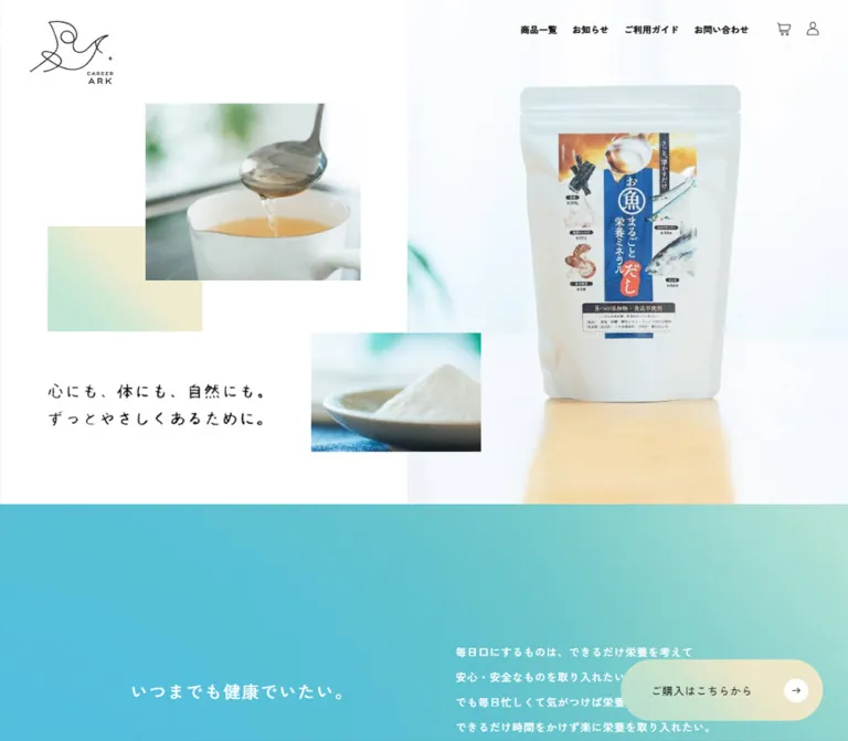
明るい商品・料理写真と手書き風のメッセージを、白い余白と粒子感のある水色〜ミントのグラデーションで構成。スマートフォンでは購入ボタンが画面下部の全面バーに切り替わる食品通販サイト。
オリジナルサイトを見るBright food photography, generous white space, and softly textured gradients make everyday nourishment feel calm and approachable.
Original URL: https://www.career-ark.com/
Final URL: https://www.career-ark.com/ — HTTP 200, unchanged.
Theme: light; white and warm ivory content surfaces, cyan–mint gradient sections, black typography.
Inspected: September 23, 2026, 00:56 JST. Supplied retrieval timestamp: 2026-09-22T15:56:20.800Z.
Viewports: desktop 1440 × 1000 and mobile 390 × 844 CSS pixels.
Scope: the current shop homepage: opening photo composition, introductory message, product story, cooking imagery, benefit and use-case content, product listing, persistent shopping controls, and footer. Visual evidence consists of desktop opening, food-photography, and footer captures, plus mobile opening and footer captures. Rendered DOM measurements cover additional middle-page content.
This is a shop homepage with a substantial product story. The persistent cart, account access, product catalog, shopping guide, and policy links are integral to its structure. The page introduces a mineral dashi product through atmospheric photography and a long editorial sequence before returning to a compact catalog presentation.
Its most distinctive relationship is between sharp rectangular photographs and soft color fields. The desktop opening balances a large product image on the right against smaller, staggered soup and powder photographs on the left. A handwritten-looking message occupies the remaining white space. Fine outline shopping icons and modest Japanese text keep the interface quiet. Rounded geometry is concentrated in the purchase controls, which remain visible while the page scrolls.
Bright food photography, generous white space, and softly textured gradients make everyday nourishment feel calm and approachable.
Original URL: https://www.career-ark.com/
Final URL: https://www.career-ark.com/ — HTTP 200, unchanged.
Theme: light; white and warm ivory content surfaces, cyan–mint gradient sections, black typography.
Inspected: September 23, 2026, 00:56 JST. Supplied retrieval timestamp: 2026-09-22T15:56:20.800Z.
Viewports: desktop 1440 × 1000 and mobile 390 × 844 CSS pixels.
Scope: the current shop homepage: opening photo composition, introductory message, product story, cooking imagery, benefit and use-case content, product listing, persistent shopping controls, and footer. Visual evidence consists of desktop opening, food-photography, and footer captures, plus mobile opening and footer captures. Rendered DOM measurements cover additional middle-page content.
This is a shop homepage with a substantial product story. The persistent cart, account access, product catalog, shopping guide, and policy links are integral to its structure. The page introduces a mineral dashi product through atmospheric photography and a long editorial sequence before returning to a compact catalog presentation.
Its most distinctive relationship is between sharp rectangular photographs and soft color fields. The desktop opening balances a large product image on the right against smaller, staggered soup and powder photographs on the left. A handwritten-looking message occupies the remaining white space. Fine outline shopping icons and modest Japanese text keep the interface quiet. Rounded geometry is concentrated in the purchase controls, which remain visible while the page scrolls.
| Name | Value | Evidence | Role |
|---|---|---|---|
| Canvas White | #ffffff |
Measured body background; source --white |
Opening canvas, product-listing background, arrow discs, reversed footer details |
| Black Ink | #000000 |
Measured content color; source --black |
Main text, visible opening logo, shopping icons |
| Light Ivory | #f8f8ed |
Measured product-story background; source --light-beige |
Long explanatory and cooking-content field |
| Beige | #f4f3de |
Declared source --beige |
Available neutral; exact visible assignment is not established |
| Dark Beige | #dbdacc |
Declared source --dark-beige |
Available secondary neutral; exact visible assignment is not established |
| Dark Brown | #391f00 |
Measured claim-explanation text; source --dark-brown |
Supporting copy within the product-claim area |
| Muted Gold | #b29208 |
Measured claim heading; source --dark-yellow |
Heading for the eight excluded additives/foods |
| Fresh Cyan | approximately #50bcd3 |
Visual estimate | Stronger blue area of the introductory and footer gradients |
| Pale Mint | approximately #bfe4d8 |
Visual estimate | Lighter gradient areas and the purchase-button color family |
| Soft Butter | approximately #eee8c9 |
Visual estimate | Warm end of the purchase control and decorative color rectangle |
The page's strongest chromatic areas are broad background fields, not numerous colored UI elements. Preserve the white–ivory distinction: white frames the opening and catalog, while ivory gives the long product story a warmer surface.
Three related treatments are visible:
The grain is visually evident, but its implementation is unknown. It could be carried by an image or another rendering layer. The measured section backgrounds sometimes remain transparent despite a visible gradient, so those computed values do not describe the complete rendered surface.
Header color discrepancy: desktop navigation anchors compute to white in the supplied DOM sample, while their text appears dark in the screenshots. The evidence does not identify the responsible compositing or state mechanism. For a static recreation, use the visible dark appearance rather than placing white links directly on the white opening image.
"Zen Kaku Gothic New", sans-serif.500, including body copy, navigation, section headings, and product titles.--jp-font.10px. This is a source implementation detail, not the normal reading size of the content."Poppins", sans-serif through --en-font.PRODUCTS, POINT.01, and PAGE TOP appear in the content inventory.The visible message, “心にも、体にも、自然にも。ずっとやさしくあるために。”, has irregular, handwritten-looking strokes. The extracted H1 contains no text, although its rectangle is measured. Its computed 20px font size therefore does not establish the size or font of the visible lettering.
Preserve this message as authorized artwork when available, with an accessible text equivalent. Its underlying asset format was not supplied. The CAREER ARK bird mark is similarly an identity graphic, with fine continuous linework and a small wordmark; it should not be approximated using an unrelated icon font.
All rows below are measured unless explicitly marked otherwise. Values are font size / line height in CSS pixels. Tracking is expressed in em for easier reuse.
| Role | Desktop | Mobile | Tracking and notes |
|---|---|---|---|
| Desktop navigation | 14 / 18.2 |
Inline links absent from opening capture | 0.04em, weight 500 |
| Mobile menu primary links | — | 14.547 / 35.204 |
0.04em; DOM measurement, open state unverified |
| Introductory heading | 27 / 50.49 |
24.96 / 46.675 |
0.09em |
| Introductory paragraph | 17 / 39.95 |
15.6 / 36.348 |
Desktop 0.06em; mobile 0.02em |
| Product-story title | 26 / 41.86 |
24.96 / 43.68 |
0.02em |
| Exclusion-claim heading | 20 / 42 |
19.773 / 43.698 |
0.02em, muted gold |
| Claim explanation | 16 / 27.2 |
15.6 / 26.52 |
0.02em, dark brown |
| Product-story note | 14 / 23.94 |
14.547 / 24.875 |
0.02em |
| Cooking-use heading | 28 / 45.92 |
22.893 / 42.581 |
0.02em |
| Cooking-use paragraph | 15 / 33.9 |
14.547 / 24.875 |
Desktop 0.06em; mobile 0.02em |
| Benefit caption | 20 / 37 |
20.787 / 40.535 |
0.02em |
| Catalog section title | 24 / normal |
24.96 / normal |
0.02em |
| Product-title link | 18 / 33.84 |
18.72 / 35.194 |
0.02em; nested lead-in text can differ |
| Footer primary links | 16 / 20.8 |
16.653 / 21.649 |
0.04em |
| Footer policy links | 14 / 18.2 |
14.547 / 18.911 |
0.04em |
| Purchase label | Approximately 18px |
Approximately 18px |
Visual estimate; anchor wrapper computes to 10px |
| Copyright | Approximately 11px |
Approximately 11px |
Visual estimate; small tracked Latin text |
Do not apply the wrapper's 10px value to the visible purchase label or all descendants of the product-title block. Their child styles are not included in the supplied sample.
The source declares --base-vw: 1366 at desktop and --base-vw: 375 at mobile. Several mobile measurements are consistent with a 375px design reference: at a 390px viewport, 24 × 390 / 375 = 24.96px, and a 30px reference inset becomes 31.2px.
The complete scaling formula, caps, and breakpoint rules were not supplied. This relationship should not be generalized to every source value. The Quick Start uses explicit approximations and retains a conventional root font size.
| Relationship | Desktop | Mobile |
|---|---|---|
| Header text-link gap | 24px, calculated from adjacent rectangles |
Text links replaced by menu control |
| Cart/account box gap | 16px |
Approximately 10.41px |
| Header right clearance | 41px after account box |
Approximately 24.95px after menu button |
| Main product-detail row inset | 137.088px |
31.2px |
| Product-detail row gap | 100px |
No explicit gap reported |
| Product-story outer padding | 201px top, 159px bottom |
99.84px top, 91.533px bottom |
| Typical mobile text width | — | Approximately 327.625px with 31.19px side insets |
| Floating purchase clearance | 40px right, 32px bottom |
Flush to left, right, and bottom |
| Footer primary-link vertical step | Approximately 39.8px |
Approximately 49.72px |
| Footer policy-link vertical step | Approximately 36.19px |
Approximately 45.92px |
This is not a strict small-unit grid. Large photographic offsets and section-specific whitespace matter more than forcing all dimensions into an 8px system.
| Element | Observed shape |
|---|---|
| Opening photographs | Square corners |
| Decorative color rectangle | Square corners |
| Catalog product image | Square corners |
| Desktop floating purchase control | 49px radius on a 97px-high shape |
| Mobile floating purchase control | 24.96px 24.96px 0 0 |
| In-flow purchase link | Desktop 36px; mobile 37.44px |
| Purchase arrow carrier | White circle, approximately 38–40px diameter |
| Cart and account icons | Thin outline drawings in unboxed control areas |
Visible separation comes from whitespace, image edges, and color fields. There is no visible general-purpose shadow or elevated-card system in the supplied captures.
| Element | Desktop 1440 × 1000 |
Mobile 390 × 844 |
|---|---|---|
| Document height | 6445.75px |
7343.61px |
| Opening section height | 843.34px |
874.63px |
| Opening logo | 133 × 100.84px at (50.53, 34.84) |
94.64 × 71.75px at (20.78, 20.78) |
| Graphic H1 rectangle | 358.41 × 69.56px at (81.20, 642.03) |
287.03 × 55.11px at (51.48, 433.66) |
| Introductory section height | 604.69px |
587.16px |
| Product image in catalog | 373 × 363.67px |
327.59 × 319.39px |
| In-flow purchase link | 456 × 73px |
327.63 × 74.81px |
| Floating purchase link | 321.19 × 97px |
390 × 66.52px |
| Footer height | 594.44px |
860.30px |
| Footer logo | 154 × 115.5px |
137.27 × 103.39px |
The catalog image ratio is approximately 1.026:1 at both sizes, calculated from its measured link rectangle. Keep it nearly square without forcing a portrait product-card convention.
Role: provides catalog navigation and shopping utilities while the product story scrolls.
On desktop, four text links occupy the upper right: “商品一覧”, “お知らせ”, “ご利用ガイド”, and “お問い合わせ”. Cart and account outline icons follow them. The cart and account link boxes measure 30 × 30px, with their top edge at 31px. Text links are vertically centered against these boxes, beginning around 36.91px.
The header remains at the same upper viewport position in the supplied scrolled captures. It has no visible enclosing panel, border, or shadow. Photography and gradient surfaces continue beneath its open layout.
At mobile, the visible controls are cart, account, and a three-line menu button. Cart and account boxes are approximately 35.36px square. The menu button measures 33.27 × 35.36px at approximately (331.78, 38.48).
The opening logo belongs to the opening content rather than this visible utility cluster. It disappears from the upper left in the scrolled captures while the shopping controls remain.
Observed destinations: catalog /c/products, guide /f/guide, contact /f/contact, cart /p/cart, and account /my/top. The news link points to https://news.career-ark.com/. These destinations were identified from anchors, not opened during this analysis.
Role: establishes the product, food context, and gentle brand message before detailed explanation.
The desktop composition contains five distinct visual layers:
(242, 173), approximately 361 × 296px by visual estimate.(543, 557), approximately 283 × 199px by visual estimate.(80, 378), approximately 257 × 175px, tucked behind the soup photograph.The product pouch remains part of a photographed setting: soft window light, a pale background, and a warm reflection below it. Retaining this atmosphere is more faithful than treating the pouch as an isolated cutout.
The collage is intentionally unequal. Images differ in scale and vertical position, and the powder image extends toward the large product-photo region. Large areas of white space remain around the small message and mark.
Role: preserves the same visual ingredients through a different reading order.
The mobile product photograph occupies the full width at the top and visually ends around 400px down the capture. The logo sits at the upper left while the shopping controls sit to its right.
The graphic message follows below the product photograph, at measured y-position 433.66px. The powder photograph then sits against the right edge, approximately (150, 530) with a 240 × 198px visible area. A pale rectangular color field begins behind it around (67, 587). A fragment of the next photograph appears near the lower left, partly covered by the fixed purchase bar.
This is a reordered composition, not the desktop collage uniformly scaled down. The supplied first-screen capture does not establish the full crop of the lowest photograph.
Role: changes the pace from product imagery to an empathetic statement about daily eating habits.
The content pairs “いつまでも健康でいたい。” with a paragraph about nutrition and convenience. Both compute to white text.
On desktop, the heading begins around x=254.91px, while the paragraph occupies a 415px-wide column beginning at x=770.08px. Their separation creates a spacious editorial spread. The section begins at document y=843.34px.
On mobile, both become a single column approximately 327.63px wide with 31.19px side insets. The heading breaks into two lines in the extracted mobile text. Its top is around y=1045.84px; the paragraph begins around y=1176.59px.
The mobile section starts at y=932.84px, approximately 58.22px after the measured opening-section bottom. The exact CSS mechanism for that intervening space was not supplied.
Role: introduces the named dashi product and organizes its detailed selling points.
A warm ivory field begins at y=1448.03px on desktop and y=1520px on mobile. The desktop detail section is a flex layout with 137.088px horizontal padding and a 100px gap. Its product title and claim text sit toward the right, beginning around x=828.5px.
The text hierarchy contains a short annotation, the two-line product title, the muted-gold heading “8つの添加物・食品不使用”, an explanatory sentence, grouped additive/food labels, additional claim lines, and a smaller concluding note.
The mobile title is centered near the top of the section. The claim heading appears farther down, around y=2145.92px, showing that the content has been vertically reorganized. The exact intermediate imagery and claim-container shapes are not visible in the supplied captures; avoid inventing a badge system from the text inventory alone.
For reuse, preserve the measured hierarchy and the separation between the main product title, gold subheading, brown explanatory text, and smaller black note.
Role: demonstrates the product through a complete meal rather than through interface decoration.
The supplied desktop middle-page capture shows a wide photograph of several Japanese dishes on a wooden table, with the product pouch standing near the back center. Bowls, plates, soup, and an omelet form a broad foreground arrangement. The pale background and bright exposure connect this scene to the opening product photography.
The photograph spans the viewport width. Its visible area extends to roughly 700px down that scrolled capture, followed by ivory space. This is a measurement of the visible crop, not the source image's full height or document position.
There is no visible caption panel or promotional text over the food itself. The persistent shopping header and purchase control remain over the page. A mobile crop for this particular photograph was not supplied.
Role: translates the product into familiar preparation methods and everyday benefits.
On desktop, the cooking-use heading sits at x=167.17px with a width of approximately 227.64px. The explanatory paragraph begins at x=530.81px and spans 742px. On mobile, these become consecutive blocks within the standard 327.63px text column.
Three modules are identified by POINT.01, POINT.02, and POINT.03. Their captions address quick preparation, soup-based nutrition, and use across age groups. Desktop caption positions establish three columns, starting around x=117, 528, and 961px at the same vertical level. Mobile caption positions establish a vertical sequence, around y=4019.53, 4410.09, and 4797.55px.
The module media and number-label styling are not separately visible in the supplied screenshots. A borderless image-and-caption treatment is a suitable implementation recommendation, but it should not be presented as a measured detail of these unseen blocks.
Role: closes the explanatory sequence with relatable situations and a clear product destination.
The source inventory includes the heading “こんなときに オススメ” and situations involving family meals, children, solo cooking, childcare, appetite, and travel. Several phrases wrap differently at mobile width.
The following purchase link uses “ご購入はこちらから” and points to /c/products/2023-1. Its measured desktop rectangle is 456 × 73px, centered at x=492px. On mobile it occupies the standard content column at 327.63 × 74.81px.
The link has a capsule-like radius at both sizes. Its exact interior styling is not independently visible in the supplied closeups. Reusing the fixed control's pale gradient is a recommendation rather than a separately verified fill for this instance.
Role: returns the narrative page to recognizable shop browsing.
The section includes an English PRODUCTS label, “商品一覧”, a “すべてを見る” link, and one product represented in the supplied homepage evidence.
On desktop, the section title sits in a narrow left area around x=114.69px. The product image begins at x=362.39px and measures 373 × 363.67px. Supporting copy, product name, and the displayed price “¥ 2,550” sit below it. The image and title link to the same product detail page. The visible treatment is unboxed, with substantial unused white space to the right.
On mobile, the section title comes first, followed by the image and product information in a single column. “すべてを見る” moves below the product block and aligns toward the right, at x=247.97px.
The extracted section text includes “前へ”, but no carousel interaction was verified. Do not infer autoplay, swipe behavior, or additional visible products from that string alone.
Role: keeps the featured product destination available throughout the long page.
The desktop control sits 40px from the right and 32px above the viewport bottom. Its measured size is 321.19 × 97px, with a 49px radius. A pale mint/butter gradient fills the capsule. The black label sits to the left of a white circular arrow carrier.
At mobile, the control becomes a full-width bottom bar: 390 × 66.52px, with approximately 25px rounded upper corners and square lower corners. The label and arrow form a centered group. The same bar appears in both opening and footer captures.
Both instances link to the product detail route /c/products/2023-1. The destination is part of the component's identity: this is a persistent way to reach the featured product.
Role: combines shopping support, legal navigation, identity, and return-to-top access in a large closing color field.
On desktop, the footer is approximately 594.44px tall. Primary links occupy a short column beginning around x=935.70px; the policy column begins around x=1102.27px. A white logo sits much lower and farther left at x=80px. The copyright line appears near the lower-left edge. A vertically arranged PAGE TOP link sits near the right edge.
The footer includes the visible copyright text Copyright © 2021 Career Ark,Inc.. This is a transcription of the original page's footer, not a statement about the site's publication date.
On mobile, the footer grows to approximately 860.30px. Primary links, policy links, and the white logo form a left-aligned vertical sequence with a 31.19px inset. The logo measures approximately 137.27 × 103.39px. The copyright line sits lower and toward the right. PAGE TOP remains at the upper-right side of the footer.
The shopping controls remain visible at the top of the mobile footer capture. This capture shows the footer, not a verified open-menu state.
The mobile DOM contains additional navigation with a home link, cart/account links, primary destinations, policies, and copyright text. The button has the extracted label “メニューを開く”.
This establishes a menu content inventory and button presence. It does not establish the menu's open-state appearance, panel dimensions, transition path, dismissal behavior, focus handling, or scroll locking. Reuse the observed navigation hierarchy while designing and testing those behaviors explicitly.
The following are computed transition declarations. They describe available transitions, not a complete record of triggered motion.
| Target | Observed declaration | Interpretation and limit |
|---|---|---|
| Header and opening logo | opacity 0.8s cubic-bezier(0.39, -0.01, 0.16, 0.78) |
Opacity staging is defined; start/end values and trigger are not supplied |
| Graphic H1 | mask-position 2s cubic-bezier(0.39, -0.01, 0.16, 0.78) 0.48s |
A delayed mask-position reveal is defined, including a prefixed equivalent |
| Introductory text and product-detail section | opacity, filter, and transform, each 0.6s cubic-bezier(0.445, 0.05, 0.55, 0.95) |
Coordinated reveal properties; offset and filter values are unknown |
| Cart/account links and footer logo | opacity 0.24s cubic-bezier(0.445, 0.05, 0.55, 0.95) |
Short opacity feedback is available; exact hover opacity is unknown |
| Mobile menu button | opacity 1.24s cubic-bezier(0.39, -0.01, 0.16, 0.78) |
Button opacity transition; does not describe menu opening |
| Floating purchase control | transform and opacity, each 1s cubic-bezier(0.39, -0.01, 0.16, 0.78) 1.6s |
Delayed entrance-related transition; direction and distance are unknown |
Additional declared easing tokens are cubic-bezier(0.79, -0.01, 0, 1) and cubic-bezier(0.165, 0.84, 0.44, 1). Their application was not established by the sampled elements.
#top destinations.PAGE TOP anchor establishes its target, but smooth scrolling was not verified.animation: none in their settled state. This does not mean the page has no motion: several transitions are explicitly present.For a new implementation, preserve the gentle pacing through short opacity feedback and restrained optional reveals. Keep content visible when animation logic is unavailable.
| Surface | Appearance | Purpose |
|---|---|---|
| Opening canvas | White with very pale photographic backgrounds | Allows the product and offset images to feel airy |
| Introductory field | Grain-textured cyan/mint gradient with white text | Separates the opening from the detailed product story |
| Product-story field | Solid #f8f8ed |
Supports long explanatory content with a warmer tone |
| Product listing | White, unboxed image and text | Restores straightforward shop browsing |
| Footer | Broad cyan/mint gradient with white links and mark | Closes the page with a recognizable color field |
| Purchase control | Pale mint/butter gradient with a white arrow disc | Provides persistent action without a strong unrelated accent color |
| Header | Visually open and transparent | Keeps utility controls present over changing page content |
The declared layer tokens are base 0, header 100, menu 101, menu button 102, and opening 103. These declarations are useful implementation context, but they do not verify the appearance or active stacking of an unseen menu or opening overlay.
Photography supplies nearly all of the page's visual weight. Use bright, softly lit scenes with pale surroundings, neutral ceramics, restrained green accents, and warm wood. Shadows and reflections are gentle. Product packaging remains recognizable and upright, while preparation details show the powder and resulting broth at close range.
The opening alternates scales: large product context, medium soup detail, smaller powder detail. The later wide meal photograph expands from ingredient to practical use. This sequence makes the imagery explanatory as well as atmospheric.
Preserve natural photographic softness. The shots are rectangular and unframed; rounded-card crops, strong contrast grading, and heavy artificial shadows would alter the visual language. The logo and utility icons remain fine-line graphics beside the soft photography.
No image src, SVG path, or source asset filename was included in the supplied evidence. The table identifies visible assets without inventing URLs.
| Asset | Observed use | Evidence and limitations |
|---|---|---|
| Black CAREER ARK bird mark | Upper-left opening identity | Visible in desktop and mobile opening captures |
| White CAREER ARK bird mark | Footer identity | Visible at both viewport sizes |
| Handwritten-looking two-line message | Graphic H1 | Visible in opening captures; empty extracted H1 text |
| Product pouch in a bright setting | Main opening photograph | Different desktop/mobile composition; source crops unknown |
| Broth and spoon closeup | Desktop upper-left collage image | Mobile lower photograph is only partially visible |
| Powder on a small plate | Lower collage image | Clearly visible at both viewport sizes |
| Meal spread with pouch | Wide cooking photograph | Desktop middle-page capture only |
| Product listing photograph | Nearly square product entry | Link rectangle measured at both sizes; desktop lower capture shows part of it |
| Cart, account, menu, and arrow graphics | Shopping controls | Visible outline treatment; underlying asset formats unknown |
| Fine grain | Gradient sections and purchase treatment | Visible texture; delivery method unknown |
Use authorized original assets when available. Replacement photography should preserve lighting, crop relationships, and subject scale rather than merely depicting the same ingredients.
| Region | Desktop document y / height | Mobile document y / height |
|---|---|---|
| Opening | 0 / 843.34px |
0 / 874.63px |
| Introduction | 843.34 / 604.69px |
932.84 / 587.16px |
| Product story | 1448.03 / 3560.83px |
1520 / 4112.91px |
| Product listing | 5008.86 / 842.45px |
5632.91 / 850.41px |
| Footer | 5851.31 / 594.44px |
6483.31 / 860.30px |
The mobile page is about 898px longer overall, calculated from the supplied document heights. This increase is not distributed uniformly: the product story and footer expand, while the opening is recomposed and the catalog retains a similar total section height.
Only two viewport sizes were inspected. Tablet behavior, exact breakpoints, landscape arrangements, and intermediate fluid sizing remain unverified. The 767px breakpoint in the Quick Start is a recommended implementation choice.
20px size.10px root convention into a new project without adapting its units.These are recommendations for a new implementation, not verified features of the original site:
44 × 44px while keeping the visible line drawings small.#ffffff.#f8f8ed.#000000.#b29208; supporting brown: #391f00.#50bcd3 and mint #bfe4d8.#bfe4d8 to butter #eee8c9.“Create a Japanese food-shop homepage inspired by the observed Hachidori Store composition. Use generous white space, Zen Kaku Gothic New at medium weight, bright product and cooking photography, and a warm ivory product-story background. Build a desktop opening with a large product photograph on the right, staggered rectangular soup and powder photographs on the left, a pale gradient rectangle, a fine-line bird-style identity area, and a small two-line handwritten artwork message. Follow with a cyan–mint introduction, a long editorial product story, a simple unboxed product listing, and a spacious gradient footer. Keep cart/account utilities at the top and a pale gradient purchase capsule at the lower right. On mobile, reorder the opening vertically and convert the purchase capsule into a full-width bottom bar. Use restrained opacity transitions; do not invent unverified menu or parallax behavior.”
This is a reusable visual approximation, not extracted source CSS. It uses measured colors and typography, estimated gradient stops, and screenshot-based opening positions. It does not reproduce the original mask asset or reveal triggers. Content remains visible by default.
Load the named fonts through your project's font setup. The optional grain image must be a subtle, already low-contrast texture. No original asset URLs were provided.
Expected anatomy: .ark-header contains .desktop-nav and .utility-nav; .ark-hero contains the brand link, three photographs, decorative wash, and graphic H1; .purchase is a persistent product link. Footer links use separate primary and policy groups.
:root {
  /* Measured source colors */
  --color-white: #fff;
  --color-ink: #000;
  --color-ivory: #f8f8ed;
  --color-beige: #f4f3de;
  --color-brown: #391f00;
  --color-gold: #b29208;

  /* Screenshot estimates */
  --color-cyan: #50bcd3;
  --color-mint: #bfe4d8;
  --color-butter: #eee8c9;
  --grain-image: none;

  --font-jp: 'Zen Kaku Gothic New', sans-serif;
  --font-en: 'Poppins', sans-serif;
  --weight-main: 500;
  --text-nav: 14px;
  --text-body: 15px;
  --text-heading: 27px;
  --tracking-body: 0.02em;

  /* Observed easing values */
  --ease-brand: cubic-bezier(0.39, -0.01, 0.16, 0.78);
  --ease-interface: cubic-bezier(0.445, 0.05, 0.55, 0.95);
  --motion-feedback: 240ms;
  --motion-reveal: 600ms;

  --z-header: 100;
  --z-menu: 101;
  --z-menu-button: 102;
  --z-purchase: 90; /* Recommended adaptation */
  --safe-bottom: env(safe-area-inset-bottom, 0px);
}

* { box-sizing: border-box; }
body {
  margin: 0;
  color: var(--color-ink);
  background: var(--color-white);
  font-family: var(--font-jp);
  font-size: 16px;
  font-weight: var(--weight-main);
}
img { display: block; max-width: 100%; }
a { color: inherit; }
button { font: inherit; }
.ark-page { overflow-x: clip; }

.ark-header {
  position: fixed;
  inset: 0 0 auto;
  z-index: var(--z-header);
  display: flex;
  justify-content: flex-end;
  align-items: center;
  gap: 40px;
  padding: 31px 40px 0;
  transition: opacity 800ms var(--ease-brand);
}
.desktop-nav,
.utility-nav { display: flex; align-items: center; }
.desktop-nav { gap: 24px; }
.desktop-nav a {
  font-size: var(--text-nav);
  line-height: 1.3;
  letter-spacing: 0.04em;
  text-decoration: none;
}
.utility-nav { gap: 16px; }
.utility-link,
.menu-toggle {
  display: grid;
  place-items: center;
  width: 30px;
  height: 30px;
  padding: 0;
  border: 0;
  background: transparent;
  color: inherit;
  transition: opacity var(--motion-feedback) var(--ease-interface);
}
.utility-link svg { width: 24px; height: 24px; }
.menu-toggle { display: none; }

/* Desktop collage coordinates approximate the 1440px capture. */
.ark-hero {
  position: relative;
  height: 58.5655vw;
  background: var(--color-white);
}
.hero__brand {
  position: absolute;
  z-index: 2;
  left: 3.509vw;
  top: 2.42vw;
  width: 9.236vw;
}
.hero__pack {
  position: absolute;
  inset: 0 0 0 auto;
  width: 51.1%;
  height: 100%;
  object-fit: cover;
}
.hero__wash {
  position: absolute;
  left: 5.556vw;
  top: 26.25vw;
  width: 17.847vw;
  height: 12.153vw;
  background-image: var(--grain-image),
    linear-gradient(45deg, var(--color-mint), var(--color-butter));
}
.hero__soup,
.hero__powder { position: absolute; object-fit: cover; }
.hero__soup {
  left: 16.806vw;
  top: 12.014vw;
  width: 25.069vw;
  aspect-ratio: 361 / 296;
}
.hero__powder {
  left: 37.708vw;
  top: 38.681vw;
  width: 19.653vw;
  aspect-ratio: 283 / 199;
}
.hero__message {
  position: absolute;
  left: 5.639vw;
  top: 44.586vw;
  width: 24.889vw;
  margin: 0;
}
.hero__message img { width: 100%; height: auto; }

.gradient-field {
  background-image: var(--grain-image),
    linear-gradient(110deg, var(--color-cyan), var(--color-mint));
}
.ark-intro {
  display: grid;
  grid-template-columns: minmax(0, 353px) minmax(0, 415px);
  justify-content: center;
  align-items: center;
  gap: clamp(70px, 11.25vw, 162px);
  min-height: 605px;
  padding: 150px 8vw;
  color: var(--color-white);
}
.ark-intro h2 {
  margin: 0;
  font-size: 27px;
  font-weight: 500;
  line-height: 1.87;
  letter-spacing: 0.09em;
}
.ark-intro p {
  margin: 0;
  font-size: 17px;
  line-height: 2.35;
  letter-spacing: 0.06em;
}
.feature-story {
  padding-block: 201px 159px;
  background: var(--color-ivory);
}
.feature-row {
  display: grid;
  grid-template-columns: minmax(0, 1fr) minmax(0, 443px);
  align-items: start;
  gap: 100px;
  padding-inline: 9.52%;
}
.feature-title {
  font-size: 26px;
  font-weight: 500;
  line-height: 1.61;
  letter-spacing: 0.02em;
}
.claim-heading {
  color: var(--color-gold);
  font-size: 20px;
  font-weight: 500;
  line-height: 2.1;
}
.claim-copy { color: var(--color-brown); line-height: 1.7; }
.food-photo { width: 100%; height: auto; }
.benefit-grid {
  display: grid;
  grid-template-columns: repeat(3, minmax(0, 1fr));
  gap: 48px;
  padding-inline: 8%;
}
.benefit-caption {
  font-size: 20px;
  line-height: 1.85;
  letter-spacing: 0.02em;
}

.catalog {
  display: grid;
  grid-template-columns: 207px minmax(0, 373px);
  gap: 40px;
  padding: 175px 7.965vw 150px;
}
.product-card { min-width: 0; }
.product-card img { width: 100%; aspect-ratio: 373 / 363.672; }
.product-card__title {
  margin: 24px 0;
  font-size: 18px;
  font-weight: 500;
  line-height: 1.88;
  letter-spacing: 0.02em;
}
.product-card a { text-decoration: none; }

.purchase,
.purchase-inline {
  display: flex;
  align-items: center;
  justify-content: center;
  gap: 32px;
  color: var(--color-ink);
  background-image: var(--grain-image),
    linear-gradient(105deg, var(--color-mint), var(--color-butter));
  font-size: 18px; /* Visual estimate */
  letter-spacing: 0.02em;
  text-decoration: none;
}
.purchase {
  position: fixed;
  z-index: var(--z-purchase);
  right: 40px;
  bottom: 32px;
  width: 321.19px;
  min-height: 97px;
  border-radius: 49px;
}
.purchase__arrow {
  display: grid;
  flex: 0 0 38px;
  place-items: center;
  width: 38px;
  height: 38px;
  border-radius: 50%;
  background: var(--color-white);
  font-size: 16px;
}
.purchase-inline {
  width: min(456px, 84%);
  min-height: 73px;
  margin-inline: auto;
  border-radius: 36px;
}

.ark-footer {
  position: relative;
  min-height: 594.44px;
  padding: 152px 149px 104px 80px;
  color: var(--color-white);
}
.footer__links {
  display: flex;
  justify-content: flex-end;
  align-items: flex-start;
  gap: 100px;
}
.footer__primary,
.footer__policies { display: grid; }
.footer__primary { gap: 19px; }
.footer__policies { gap: 18px; }
.footer__links a {
  font-size: 14px;
  line-height: 1.3;
  letter-spacing: 0.04em;
  text-decoration: none;
}
.footer__primary a { font-size: 16px; }
.footer__brand {
  position: absolute;
  left: 80px;
  bottom: 105px;
  width: 154px;
}
.footer__copyright {
  position: absolute;
  left: 68px;
  bottom: 31px;
  margin: 0;
  font-size: 11px;
  letter-spacing: 0.06em;
}
.page-top {
  position: absolute;
  right: 30px;
  top: 152px;
  display: flex;
  align-items: center;
  gap: 13px;
  writing-mode: vertical-rl;
  text-decoration: none;
  font-size: 13px;
}

/* Recommended feedback and focus styles. */
@media (hover: hover) {
  .utility-link:hover,
  .footer__brand:hover { opacity: 0.65; }
}
:where(a, button):focus-visible {
  outline: 2px solid currentColor;
  outline-offset: 5px;
}
.reveal {
  transition: opacity var(--motion-reveal) var(--ease-interface),
    filter var(--motion-reveal) var(--ease-interface),
    transform var(--motion-reveal) var(--ease-interface);
}

/* Recommended breakpoint; not recovered from the source. */
@media (max-width: 767px) {
  html {
    scroll-padding-bottom: calc(90px + var(--safe-bottom));
  }
  .ark-header { padding: 9.867vw 6.4vw 0; gap: 0; }
  .desktop-nav { display: none; }
  .utility-nav { gap: 2.667vw; }
  .utility-link { width: 9.067vw; height: 9.067vw; }
  .menu-toggle {
    display: grid;
    width: 8.53vw;
    height: 9.067vw;
    margin-left: 2.13vw;
  }
  .ark-hero { height: 224.26vw; margin-bottom: 14.93vw; }
  .hero__brand { left: 5.33vw; top: 5.33vw; width: 24.267vw; }
  .hero__pack { width: 100%; height: 102.56vw; }
  .hero__message { left: 13.2vw; top: 111.195vw; width: 73.6vw; }
  .hero__wash {
    left: 17.18vw;
    top: 150.51vw;
    width: 42.82vw;
    height: 48vw;
  }
  .hero__powder {
    left: 38.46vw;
    top: 135.9vw;
    width: 61.54vw;
    aspect-ratio: 240 / 198;
  }
  /* Lower soup placement is an estimate from the partial capture. */
  .hero__soup { left: 0; top: 197.4vw; width: 40vw; }
  .ark-intro {
    display: block;
    min-height: 587px;
    padding: 113px 8vw 100px;
  }
  .ark-intro h2 {
    margin-bottom: 37px;
    font-size: clamp(23px, 6.4vw, 27px);
  }
  .ark-intro p {
    font-size: clamp(15px, 4vw, 17px);
    line-height: 2.33;
    letter-spacing: 0.02em;
  }
  .feature-story { padding-block: 25.6vw 23.47vw; }
  .feature-row { display: flex; flex-direction: column; gap: 32px; padding-inline: 8vw; }
  .feature-title { font-size: 24.96px; line-height: 1.75; }
  .benefit-grid { grid-template-columns: 1fr; gap: 64px; }
  .benefit-caption { font-size: 20.787px; line-height: 1.95; }
  .catalog { display: block; padding: 92px 8vw 100px; }
  .product-card { margin-top: 48px; }
  .product-card__title { font-size: 18.72px; }
  .catalog__all { display: block; width: fit-content; margin: 48px 0 0 auto; }
  .purchase {
    inset: auto 0 0;
    width: 100%;
    min-height: calc(17.055vw + var(--safe-bottom));
    padding-bottom: var(--safe-bottom);
    border-radius: 6.4vw 6.4vw 0 0;
    gap: 20px;
  }
  .purchase-inline { min-height: 74.81px; border-radius: 37.44px; }
  .ark-footer {
    min-height: 220.59vw;
    padding: 27.73vw 8vw calc(100px + var(--safe-bottom));
    background-image: var(--grain-image),
      linear-gradient(170deg, var(--color-mint), var(--color-cyan) 75%);
  }
  .footer__links { display: grid; justify-content: start; gap: 15.47vw; }
  .footer__primary { gap: 7.2vw; }
  .footer__policies { gap: 6.93vw; }
  .footer__primary a { font-size: 16.653px; }
  .footer__policies a { font-size: 14.547px; }
  .footer__brand { left: 8vw; top: 134.77vw; bottom: auto; width: 35.196vw; }
  .footer__copyright { left: auto; right: 7.2vw; bottom: 38vw; }
  .page-top { right: 6.67vw; top: 26.93vw; }
}

@media (prefers-reduced-motion: reduce) {
  .ark-header,
  .utility-link,
  .menu-toggle,
  .reveal { transition: none; }
}
The fixed footer placements above reproduce the spacious captured composition for short link lists. For translated or expanded content, use normal-flow logo and copyright placement to prevent overlap. The product-detail mobile ordering needs markup that follows the intended reading sequence; its unseen media layout is not reconstructed here.
Asset names below are local authoring placeholders, not discovered original URLs. Replace them with authorized assets. The photograph used for the main product scene should include its pale surrounding setting.
<section class='ark-hero' aria-label='Store introduction'>
  <a class='hero__brand' href='/' aria-label='Home'>
    <img src='/media/brand-dark.svg' alt='CAREER ARK'>
  </a>
  <img class='hero__pack' src='/media/product-scene.jpg'
       alt='Mineral dashi pouch in a bright setting'>
  <div class='hero__wash' aria-hidden='true'></div>
  <img class='hero__soup' src='/media/broth-detail.jpg'
       alt='Prepared broth with a spoon'>
  <img class='hero__powder' src='/media/powder-detail.jpg'
       alt='Dashi powder on a small plate'>
  <h1 class='hero__message'>
    <img src='/media/message-artwork.svg'
         alt='心にも、体にも、自然にも。ずっとやさしくあるために。'>
  </h1>
</section>

<a class='purchase' href='/c/products/2023-1'>
  <span>ご購入はこちらから</span>
  <span class='purchase__arrow' aria-hidden='true'>→</span>
</a>
Optional aliases for a project already using Tailwind v4. This does not imply that the original site uses Tailwind. The cyan, mint, and butter colors remain visual estimates.
@theme inline {
  --color-ark-ink: #000;
  --color-ark-white: #fff;
  --color-ark-ivory: #f8f8ed;
  --color-ark-brown: #391f00;
  --color-ark-gold: #b29208;
  --color-ark-cyan: #50bcd3;
  --color-ark-mint: #bfe4d8;
  --color-ark-butter: #eee8c9;
  --font-ark-jp: 'Zen Kaku Gothic New', sans-serif;
  --font-ark-en: 'Poppins', sans-serif;
  --text-ark-nav: 14px;
  --text-ark-body: 15px;
  --text-ark-heading: 27px;
  --radius-ark-purchase: 49px;
  --radius-ark-mobile-top: 24.96px;
  --ease-ark-brand: cubic-bezier(0.39, -0.01, 0.16, 0.78);
}
2026-09-22T15:56:20.800Z, corresponding to September 23, 2026, 00:56 JST.1440 × 1000 viewport; opening, wide cooking photograph, and footer captures; rendered document height approximately 6445.75px.390 × 844 viewport; opening and footer captures; rendered document height approximately 7343.61px.This document describes the current homepage represented by the supplied original-page evidence. Its measurements, visual estimates, and implementation recommendations are identified separately throughout.
# Hachidori Store / はちどりストア — Style Reference

> Bright food photography, generous white space, and softly textured gradients make everyday nourishment feel calm and approachable.

**Original URL:** [https://www.career-ark.com/](https://www.career-ark.com/)
**Final URL:** [https://www.career-ark.com/](https://www.career-ark.com/) — HTTP 200, unchanged.
**Theme:** light; white and warm ivory content surfaces, cyan–mint gradient sections, black typography.
**Inspected:** September 23, 2026, 00:56 JST. Supplied retrieval timestamp: `2026-09-22T15:56:20.800Z`.
**Viewports:** desktop `1440 × 1000` and mobile `390 × 844` CSS pixels.
**Scope:** the current shop homepage: opening photo composition, introductory message, product story, cooking imagery, benefit and use-case content, product listing, persistent shopping controls, and footer. Visual evidence consists of desktop opening, food-photography, and footer captures, plus mobile opening and footer captures. Rendered DOM measurements cover additional middle-page content.

This is a shop homepage with a substantial product story. The persistent cart, account access, product catalog, shopping guide, and policy links are integral to its structure. The page introduces a mineral dashi product through atmospheric photography and a long editorial sequence before returning to a compact catalog presentation.

Its most distinctive relationship is between sharp rectangular photographs and soft color fields. The desktop opening balances a large product image on the right against smaller, staggered soup and powder photographs on the left. A handwritten-looking message occupies the remaining white space. Fine outline shopping icons and modest Japanese text keep the interface quiet. Rounded geometry is concentrated in the purchase controls, which remain visible while the page scrolls.
# Hachidori Store / はちどりストア — Style Reference

> Bright food photography, generous white space, and softly textured gradients make everyday nourishment feel calm and approachable.

**Original URL:** [https://www.career-ark.com/](https://www.career-ark.com/)
**Final URL:** [https://www.career-ark.com/](https://www.career-ark.com/) — HTTP 200, unchanged.
**Theme:** light; white and warm ivory content surfaces, cyan–mint gradient sections, black typography.
**Inspected:** September 23, 2026, 00:56 JST. Supplied retrieval timestamp: `2026-09-22T15:56:20.800Z`.
**Viewports:** desktop `1440 × 1000` and mobile `390 × 844` CSS pixels.
**Scope:** the current shop homepage: opening photo composition, introductory message, product story, cooking imagery, benefit and use-case content, product listing, persistent shopping controls, and footer. Visual evidence consists of desktop opening, food-photography, and footer captures, plus mobile opening and footer captures. Rendered DOM measurements cover additional middle-page content.

This is a shop homepage with a substantial product story. The persistent cart, account access, product catalog, shopping guide, and policy links are integral to its structure. The page introduces a mineral dashi product through atmospheric photography and a long editorial sequence before returning to a compact catalog presentation.

Its most distinctive relationship is between sharp rectangular photographs and soft color fields. The desktop opening balances a large product image on the right against smaller, staggered soup and powder photographs on the left. A handwritten-looking message occupies the remaining white space. Fine outline shopping icons and modest Japanese text keep the interface quiet. Rounded geometry is concentrated in the purchase controls, which remain visible while the page scrolls.

## How to Read This Reference

- **Measured** values come from the supplied rendered DOM, computed styles, and element rectangles. Measurements are specific to the two inspected viewports.
- **Visual estimates** describe screenshot-only details, including gradient colors, grain, photograph placement, and visible lettering without separate computed styles. Estimated hexadecimal colors are implementation approximations, not sampled source tokens.
- **Declared source tokens** were present as custom properties. Their presence does not establish that every token was visibly used.
- **Recommendations** and the Quick Start are implementation guidance. Their breakpoints, gradient construction, accessibility additions, and asset organization are not claims about the original source.
- Coordinates in the DOM generally describe document placement; the persistent purchase control is reported at its viewport position. Screenshot coordinates describe only the visible crop.
- The supplied evidence was reviewed without additional browsing, file access, or interaction testing. Middle-page details that lack a corresponding capture are described through their measured layout and text inventory.

## Tokens — Colors

### Default Palette

| Name | Value | Evidence | Role |
| --- | --- | --- | --- |
| Canvas White | `#ffffff` | Measured body background; source `--white` | Opening canvas, product-listing background, arrow discs, reversed footer details |
| Black Ink | `#000000` | Measured content color; source `--black` | Main text, visible opening logo, shopping icons |
| Light Ivory | `#f8f8ed` | Measured product-story background; source `--light-beige` | Long explanatory and cooking-content field |
| Beige | `#f4f3de` | Declared source `--beige` | Available neutral; exact visible assignment is not established |
| Dark Beige | `#dbdacc` | Declared source `--dark-beige` | Available secondary neutral; exact visible assignment is not established |
| Dark Brown | `#391f00` | Measured claim-explanation text; source `--dark-brown` | Supporting copy within the product-claim area |
| Muted Gold | `#b29208` | Measured claim heading; source `--dark-yellow` | Heading for the eight excluded additives/foods |
| Fresh Cyan | approximately `#50bcd3` | Visual estimate | Stronger blue area of the introductory and footer gradients |
| Pale Mint | approximately `#bfe4d8` | Visual estimate | Lighter gradient areas and the purchase-button color family |
| Soft Butter | approximately `#eee8c9` | Visual estimate | Warm end of the purchase control and decorative color rectangle |

The page's strongest chromatic areas are broad background fields, not numerous colored UI elements. Preserve the white–ivory distinction: white frames the opening and catalog, while ivory gives the long product story a warmer surface.

### Gradient Treatment

Three related treatments are visible:

1. **Introductory and footer fields:** cyan transitions into pale mint with a fine grain. The desktop footer is bluer toward the left/lower region and lighter toward the right/upper region. The mobile footer places more mint near the top and stronger cyan below.
2. **Purchase control:** a pale mint-to-butter gradient, with a separate white circular arrow carrier.
3. **Opening decoration:** a square-cornered mint/butter rectangle behind the photography. Its subdued color supports the collage without becoming another subject.

The grain is visually evident, but its implementation is unknown. It could be carried by an image or another rendering layer. The measured section backgrounds sometimes remain transparent despite a visible gradient, so those computed values do not describe the complete rendered surface.

**Header color discrepancy:** desktop navigation anchors compute to white in the supplied DOM sample, while their text appears dark in the screenshots. The evidence does not identify the responsible compositing or state mechanism. For a static recreation, use the visible dark appearance rather than placing white links directly on the white opening image.

## Tokens — Typography

### Japanese Interface and Editorial Copy

- **Measured family:** `"Zen Kaku Gothic New", sans-serif`.
- **Typical measured weight:** `500`, including body copy, navigation, section headings, and product titles.
- **Source custom property:** `--jp-font`.
- **Character:** clean, restrained Japanese sans-serif with generous leading. Hierarchy relies on placement, line breaks, and spacing more than strong weight changes.
- **Root measurement:** the original HTML and body report `10px`. This is a source implementation detail, not the normal reading size of the content.

### English Labels

- **Declared family:** `"Poppins", sans-serif` through `--en-font`.
- English labels such as `PRODUCTS`, `POINT.01`, and `PAGE TOP` appear in the content inventory.
- The supplied element samples do not establish the applied font and weight of every English label. Treat Poppins as an available source font rather than assigning it to all Latin text without qualification.

### Hero Message and Logo

The visible message, “心にも、体にも、自然にも。ずっとやさしくあるために。”, has irregular, handwritten-looking strokes. The extracted H1 contains no text, although its rectangle is measured. Its computed `20px` font size therefore does not establish the size or font of the visible lettering.

Preserve this message as authorized artwork when available, with an accessible text equivalent. Its underlying asset format was not supplied. The CAREER ARK bird mark is similarly an identity graphic, with fine continuous linework and a small wordmark; it should not be approximated using an unrelated icon font.

### Type Scale

All rows below are measured unless explicitly marked otherwise. Values are `font size / line height` in CSS pixels. Tracking is expressed in em for easier reuse.

| Role | Desktop | Mobile | Tracking and notes |
| --- | --- | --- | --- |
| Desktop navigation | `14 / 18.2` | Inline links absent from opening capture | `0.04em`, weight 500 |
| Mobile menu primary links | — | `14.547 / 35.204` | `0.04em`; DOM measurement, open state unverified |
| Introductory heading | `27 / 50.49` | `24.96 / 46.675` | `0.09em` |
| Introductory paragraph | `17 / 39.95` | `15.6 / 36.348` | Desktop `0.06em`; mobile `0.02em` |
| Product-story title | `26 / 41.86` | `24.96 / 43.68` | `0.02em` |
| Exclusion-claim heading | `20 / 42` | `19.773 / 43.698` | `0.02em`, muted gold |
| Claim explanation | `16 / 27.2` | `15.6 / 26.52` | `0.02em`, dark brown |
| Product-story note | `14 / 23.94` | `14.547 / 24.875` | `0.02em` |
| Cooking-use heading | `28 / 45.92` | `22.893 / 42.581` | `0.02em` |
| Cooking-use paragraph | `15 / 33.9` | `14.547 / 24.875` | Desktop `0.06em`; mobile `0.02em` |
| Benefit caption | `20 / 37` | `20.787 / 40.535` | `0.02em` |
| Catalog section title | `24 / normal` | `24.96 / normal` | `0.02em` |
| Product-title link | `18 / 33.84` | `18.72 / 35.194` | `0.02em`; nested lead-in text can differ |
| Footer primary links | `16 / 20.8` | `16.653 / 21.649` | `0.04em` |
| Footer policy links | `14 / 18.2` | `14.547 / 18.911` | `0.04em` |
| Purchase label | Approximately `18px` | Approximately `18px` | Visual estimate; anchor wrapper computes to `10px` |
| Copyright | Approximately `11px` | Approximately `11px` | Visual estimate; small tracked Latin text |

Do not apply the wrapper's `10px` value to the visible purchase label or all descendants of the product-title block. Their child styles are not included in the supplied sample.

## Tokens — Spacing & Shapes

### Scaling Evidence

The source declares `--base-vw: 1366` at desktop and `--base-vw: 375` at mobile. Several mobile measurements are consistent with a 375px design reference: at a 390px viewport, `24 × 390 / 375 = 24.96px`, and a 30px reference inset becomes `31.2px`.

The complete scaling formula, caps, and breakpoint rules were not supplied. This relationship should not be generalized to every source value. The Quick Start uses explicit approximations and retains a conventional root font size.

### Measured Spacing Relationships

| Relationship | Desktop | Mobile |
| --- | --- | --- |
| Header text-link gap | `24px`, calculated from adjacent rectangles | Text links replaced by menu control |
| Cart/account box gap | `16px` | Approximately `10.41px` |
| Header right clearance | `41px` after account box | Approximately `24.95px` after menu button |
| Main product-detail row inset | `137.088px` | `31.2px` |
| Product-detail row gap | `100px` | No explicit gap reported |
| Product-story outer padding | `201px` top, `159px` bottom | `99.84px` top, `91.533px` bottom |
| Typical mobile text width | — | Approximately `327.625px` with `31.19px` side insets |
| Floating purchase clearance | `40px` right, `32px` bottom | Flush to left, right, and bottom |
| Footer primary-link vertical step | Approximately `39.8px` | Approximately `49.72px` |
| Footer policy-link vertical step | Approximately `36.19px` | Approximately `45.92px` |

This is not a strict small-unit grid. Large photographic offsets and section-specific whitespace matter more than forcing all dimensions into an 8px system.

### Border Radius and Edges

| Element | Observed shape |
| --- | --- |
| Opening photographs | Square corners |
| Decorative color rectangle | Square corners |
| Catalog product image | Square corners |
| Desktop floating purchase control | `49px` radius on a `97px`-high shape |
| Mobile floating purchase control | `24.96px 24.96px 0 0` |
| In-flow purchase link | Desktop `36px`; mobile `37.44px` |
| Purchase arrow carrier | White circle, approximately `38–40px` diameter |
| Cart and account icons | Thin outline drawings in unboxed control areas |

Visible separation comes from whitespace, image edges, and color fields. There is no visible general-purpose shadow or elevated-card system in the supplied captures.

### Layout Measurements

| Element | Desktop `1440 × 1000` | Mobile `390 × 844` |
| --- | --- | --- |
| Document height | `6445.75px` | `7343.61px` |
| Opening section height | `843.34px` | `874.63px` |
| Opening logo | `133 × 100.84px` at `(50.53, 34.84)` | `94.64 × 71.75px` at `(20.78, 20.78)` |
| Graphic H1 rectangle | `358.41 × 69.56px` at `(81.20, 642.03)` | `287.03 × 55.11px` at `(51.48, 433.66)` |
| Introductory section height | `604.69px` | `587.16px` |
| Product image in catalog | `373 × 363.67px` | `327.59 × 319.39px` |
| In-flow purchase link | `456 × 73px` | `327.63 × 74.81px` |
| Floating purchase link | `321.19 × 97px` | `390 × 66.52px` |
| Footer height | `594.44px` | `860.30px` |
| Footer logo | `154 × 115.5px` | `137.27 × 103.39px` |

The catalog image ratio is approximately `1.026:1` at both sizes, calculated from its measured link rectangle. Keep it nearly square without forcing a portrait product-card convention.

## Components

### Persistent Shopping Header

**Role:** provides catalog navigation and shopping utilities while the product story scrolls.

On desktop, four text links occupy the upper right: “商品一覧”, “お知らせ”, “ご利用ガイド”, and “お問い合わせ”. Cart and account outline icons follow them. The cart and account link boxes measure `30 × 30px`, with their top edge at `31px`. Text links are vertically centered against these boxes, beginning around `36.91px`.

The header remains at the same upper viewport position in the supplied scrolled captures. It has no visible enclosing panel, border, or shadow. Photography and gradient surfaces continue beneath its open layout.

At mobile, the visible controls are cart, account, and a three-line menu button. Cart and account boxes are approximately `35.36px` square. The menu button measures `33.27 × 35.36px` at approximately `(331.78, 38.48)`.

The opening logo belongs to the opening content rather than this visible utility cluster. It disappears from the upper left in the scrolled captures while the shopping controls remain.

**Observed destinations:** catalog `/c/products`, guide `/f/guide`, contact `/f/contact`, cart `/p/cart`, and account `/my/top`. The news link points to `https://news.career-ark.com/`. These destinations were identified from anchors, not opened during this analysis.

### Opening Photo Composition

**Role:** establishes the product, food context, and gentle brand message before detailed explanation.

The desktop composition contains five distinct visual layers:

1. A large, bright product photograph occupying roughly the right half of the opening.
2. A smaller soup-and-spoon photograph around `(242, 173)`, approximately `361 × 296px` by visual estimate.
3. A powder-on-a-plate photograph around `(543, 557)`, approximately `283 × 199px` by visual estimate.
4. A pale gradient rectangle around `(80, 378)`, approximately `257 × 175px`, tucked behind the soup photograph.
5. The two-line graphic message near the lower left, whose H1 bounds are measured separately.

The product pouch remains part of a photographed setting: soft window light, a pale background, and a warm reflection below it. Retaining this atmosphere is more faithful than treating the pouch as an isolated cutout.

The collage is intentionally unequal. Images differ in scale and vertical position, and the powder image extends toward the large product-photo region. Large areas of white space remain around the small message and mark.

### Mobile Opening Composition

**Role:** preserves the same visual ingredients through a different reading order.

The mobile product photograph occupies the full width at the top and visually ends around `400px` down the capture. The logo sits at the upper left while the shopping controls sit to its right.

The graphic message follows below the product photograph, at measured y-position `433.66px`. The powder photograph then sits against the right edge, approximately `(150, 530)` with a `240 × 198px` visible area. A pale rectangular color field begins behind it around `(67, 587)`. A fragment of the next photograph appears near the lower left, partly covered by the fixed purchase bar.

This is a reordered composition, not the desktop collage uniformly scaled down. The supplied first-screen capture does not establish the full crop of the lowest photograph.

### Introductory Gradient Section

**Role:** changes the pace from product imagery to an empathetic statement about daily eating habits.

The content pairs “いつまでも健康でいたい。” with a paragraph about nutrition and convenience. Both compute to white text.

On desktop, the heading begins around x=`254.91px`, while the paragraph occupies a `415px`-wide column beginning at x=`770.08px`. Their separation creates a spacious editorial spread. The section begins at document y=`843.34px`.

On mobile, both become a single column approximately `327.63px` wide with `31.19px` side insets. The heading breaks into two lines in the extracted mobile text. Its top is around y=`1045.84px`; the paragraph begins around y=`1176.59px`.

The mobile section starts at y=`932.84px`, approximately `58.22px` after the measured opening-section bottom. The exact CSS mechanism for that intervening space was not supplied.

### Product Story and Claim Block

**Role:** introduces the named dashi product and organizes its detailed selling points.

A warm ivory field begins at y=`1448.03px` on desktop and y=`1520px` on mobile. The desktop detail section is a flex layout with `137.088px` horizontal padding and a `100px` gap. Its product title and claim text sit toward the right, beginning around x=`828.5px`.

The text hierarchy contains a short annotation, the two-line product title, the muted-gold heading “8つの添加物・食品不使用”, an explanatory sentence, grouped additive/food labels, additional claim lines, and a smaller concluding note.

The mobile title is centered near the top of the section. The claim heading appears farther down, around y=`2145.92px`, showing that the content has been vertically reorganized. The exact intermediate imagery and claim-container shapes are not visible in the supplied captures; avoid inventing a badge system from the text inventory alone.

For reuse, preserve the measured hierarchy and the separation between the main product title, gold subheading, brown explanatory text, and smaller black note.

### Full-Width Cooking Photograph

**Role:** demonstrates the product through a complete meal rather than through interface decoration.

The supplied desktop middle-page capture shows a wide photograph of several Japanese dishes on a wooden table, with the product pouch standing near the back center. Bowls, plates, soup, and an omelet form a broad foreground arrangement. The pale background and bright exposure connect this scene to the opening product photography.

The photograph spans the viewport width. Its visible area extends to roughly `700px` down that scrolled capture, followed by ivory space. This is a measurement of the visible crop, not the source image's full height or document position.

There is no visible caption panel or promotional text over the food itself. The persistent shopping header and purchase control remain over the page. A mobile crop for this particular photograph was not supplied.

### Cooking-Use Introduction and Benefit Modules

**Role:** translates the product into familiar preparation methods and everyday benefits.

On desktop, the cooking-use heading sits at x=`167.17px` with a width of approximately `227.64px`. The explanatory paragraph begins at x=`530.81px` and spans `742px`. On mobile, these become consecutive blocks within the standard `327.63px` text column.

Three modules are identified by `POINT.01`, `POINT.02`, and `POINT.03`. Their captions address quick preparation, soup-based nutrition, and use across age groups. Desktop caption positions establish three columns, starting around x=`117`, `528`, and `961px` at the same vertical level. Mobile caption positions establish a vertical sequence, around y=`4019.53`, `4410.09`, and `4797.55px`.

The module media and number-label styling are not separately visible in the supplied screenshots. A borderless image-and-caption treatment is a suitable implementation recommendation, but it should not be presented as a measured detail of these unseen blocks.

### Use-Case List and In-Flow Purchase Link

**Role:** closes the explanatory sequence with relatable situations and a clear product destination.

The source inventory includes the heading “こんなときに オススメ” and situations involving family meals, children, solo cooking, childcare, appetite, and travel. Several phrases wrap differently at mobile width.

The following purchase link uses “ご購入はこちらから” and points to `/c/products/2023-1`. Its measured desktop rectangle is `456 × 73px`, centered at x=`492px`. On mobile it occupies the standard content column at `327.63 × 74.81px`.

The link has a capsule-like radius at both sizes. Its exact interior styling is not independently visible in the supplied closeups. Reusing the fixed control's pale gradient is a recommendation rather than a separately verified fill for this instance.

### Product Listing

**Role:** returns the narrative page to recognizable shop browsing.

The section includes an English `PRODUCTS` label, “商品一覧”, a “すべてを見る” link, and one product represented in the supplied homepage evidence.

On desktop, the section title sits in a narrow left area around x=`114.69px`. The product image begins at x=`362.39px` and measures `373 × 363.67px`. Supporting copy, product name, and the displayed price “¥ 2,550” sit below it. The image and title link to the same product detail page. The visible treatment is unboxed, with substantial unused white space to the right.

On mobile, the section title comes first, followed by the image and product information in a single column. “すべてを見る” moves below the product block and aligns toward the right, at x=`247.97px`.

The extracted section text includes “前へ”, but no carousel interaction was verified. Do not infer autoplay, swipe behavior, or additional visible products from that string alone.

### Persistent Purchase Control

**Role:** keeps the featured product destination available throughout the long page.

The desktop control sits `40px` from the right and `32px` above the viewport bottom. Its measured size is `321.19 × 97px`, with a `49px` radius. A pale mint/butter gradient fills the capsule. The black label sits to the left of a white circular arrow carrier.

At mobile, the control becomes a full-width bottom bar: `390 × 66.52px`, with approximately `25px` rounded upper corners and square lower corners. The label and arrow form a centered group. The same bar appears in both opening and footer captures.

Both instances link to the product detail route `/c/products/2023-1`. The destination is part of the component's identity: this is a persistent way to reach the featured product.

### Footer

**Role:** combines shopping support, legal navigation, identity, and return-to-top access in a large closing color field.

On desktop, the footer is approximately `594.44px` tall. Primary links occupy a short column beginning around x=`935.70px`; the policy column begins around x=`1102.27px`. A white logo sits much lower and farther left at x=`80px`. The copyright line appears near the lower-left edge. A vertically arranged `PAGE TOP` link sits near the right edge.

The footer includes the visible copyright text `Copyright © 2021 Career Ark,Inc.`. This is a transcription of the original page's footer, not a statement about the site's publication date.

On mobile, the footer grows to approximately `860.30px`. Primary links, policy links, and the white logo form a left-aligned vertical sequence with a `31.19px` inset. The logo measures approximately `137.27 × 103.39px`. The copyright line sits lower and toward the right. `PAGE TOP` remains at the upper-right side of the footer.

The shopping controls remain visible at the top of the mobile footer capture. This capture shows the footer, not a verified open-menu state.

### Mobile Menu Evidence

The mobile DOM contains additional navigation with a home link, cart/account links, primary destinations, policies, and copyright text. The button has the extracted label “メニューを開く”.

This establishes a menu content inventory and button presence. It does not establish the menu's open-state appearance, panel dimensions, transition path, dismissal behavior, focus handling, or scroll locking. Reuse the observed navigation hierarchy while designing and testing those behaviors explicitly.

## Tokens — Motion & Interaction

### Declared Motion Values

The following are computed transition declarations. They describe available transitions, not a complete record of triggered motion.

| Target | Observed declaration | Interpretation and limit |
| --- | --- | --- |
| Header and opening logo | `opacity 0.8s cubic-bezier(0.39, -0.01, 0.16, 0.78)` | Opacity staging is defined; start/end values and trigger are not supplied |
| Graphic H1 | `mask-position 2s cubic-bezier(0.39, -0.01, 0.16, 0.78) 0.48s` | A delayed mask-position reveal is defined, including a prefixed equivalent |
| Introductory text and product-detail section | `opacity`, `filter`, and `transform`, each `0.6s cubic-bezier(0.445, 0.05, 0.55, 0.95)` | Coordinated reveal properties; offset and filter values are unknown |
| Cart/account links and footer logo | `opacity 0.24s cubic-bezier(0.445, 0.05, 0.55, 0.95)` | Short opacity feedback is available; exact hover opacity is unknown |
| Mobile menu button | `opacity 1.24s cubic-bezier(0.39, -0.01, 0.16, 0.78)` | Button opacity transition; does not describe menu opening |
| Floating purchase control | `transform` and `opacity`, each `1s cubic-bezier(0.39, -0.01, 0.16, 0.78) 1.6s` | Delayed entrance-related transition; direction and distance are unknown |

Additional declared easing tokens are `cubic-bezier(0.79, -0.01, 0, 1)` and `cubic-bezier(0.165, 0.84, 0.44, 1)`. Their application was not established by the sampled elements.

### Interaction Evidence and Limits

- Persistent header utilities and the purchase control retain their viewport positions across supplied scroll captures.
- Anchors establish product, catalog, cart, account, guide, contact, news, policy, and `#top` destinations.
- The `PAGE TOP` anchor establishes its target, but smooth scrolling was not verified.
- Sampled elements report `animation: none` in their settled state. This does not mean the page has no motion: several transitions are explicitly present.
- No hover sequence, menu toggle, cart operation, checkout flow, or product-carousel interaction was supplied.
- Continuous parallax, perpetual gradient animation, and exact reveal choreography cannot be inferred from these still captures.

For a new implementation, preserve the gentle pacing through short opacity feedback and restrained optional reveals. Keep content visible when animation logic is unavailable.

## Surfaces

| Surface | Appearance | Purpose |
| --- | --- | --- |
| Opening canvas | White with very pale photographic backgrounds | Allows the product and offset images to feel airy |
| Introductory field | Grain-textured cyan/mint gradient with white text | Separates the opening from the detailed product story |
| Product-story field | Solid `#f8f8ed` | Supports long explanatory content with a warmer tone |
| Product listing | White, unboxed image and text | Restores straightforward shop browsing |
| Footer | Broad cyan/mint gradient with white links and mark | Closes the page with a recognizable color field |
| Purchase control | Pale mint/butter gradient with a white arrow disc | Provides persistent action without a strong unrelated accent color |
| Header | Visually open and transparent | Keeps utility controls present over changing page content |

The declared layer tokens are base `0`, header `100`, menu `101`, menu button `102`, and opening `103`. These declarations are useful implementation context, but they do not verify the appearance or active stacking of an unseen menu or opening overlay.

## Imagery

Photography supplies nearly all of the page's visual weight. Use bright, softly lit scenes with pale surroundings, neutral ceramics, restrained green accents, and warm wood. Shadows and reflections are gentle. Product packaging remains recognizable and upright, while preparation details show the powder and resulting broth at close range.

The opening alternates scales: large product context, medium soup detail, smaller powder detail. The later wide meal photograph expands from ingredient to practical use. This sequence makes the imagery explanatory as well as atmospheric.

Preserve natural photographic softness. The shots are rectangular and unframed; rounded-card crops, strong contrast grading, and heavy artificial shadows would alter the visual language. The logo and utility icons remain fine-line graphics beside the soft photography.

### Observed Asset References

No image `src`, SVG path, or source asset filename was included in the supplied evidence. The table identifies visible assets without inventing URLs.

| Asset | Observed use | Evidence and limitations |
| --- | --- | --- |
| Black CAREER ARK bird mark | Upper-left opening identity | Visible in desktop and mobile opening captures |
| White CAREER ARK bird mark | Footer identity | Visible at both viewport sizes |
| Handwritten-looking two-line message | Graphic H1 | Visible in opening captures; empty extracted H1 text |
| Product pouch in a bright setting | Main opening photograph | Different desktop/mobile composition; source crops unknown |
| Broth and spoon closeup | Desktop upper-left collage image | Mobile lower photograph is only partially visible |
| Powder on a small plate | Lower collage image | Clearly visible at both viewport sizes |
| Meal spread with pouch | Wide cooking photograph | Desktop middle-page capture only |
| Product listing photograph | Nearly square product entry | Link rectangle measured at both sizes; desktop lower capture shows part of it |
| Cart, account, menu, and arrow graphics | Shopping controls | Visible outline treatment; underlying asset formats unknown |
| Fine grain | Gradient sections and purchase treatment | Visible texture; delivery method unknown |

Use authorized original assets when available. Replacement photography should preserve lighting, crop relationships, and subject scale rather than merely depicting the same ingredients.

## Layout & Responsive Behavior

### Measured Page Sequence

| Region | Desktop document y / height | Mobile document y / height |
| --- | --- | --- |
| Opening | `0 / 843.34px` | `0 / 874.63px` |
| Introduction | `843.34 / 604.69px` | `932.84 / 587.16px` |
| Product story | `1448.03 / 3560.83px` | `1520 / 4112.91px` |
| Product listing | `5008.86 / 842.45px` | `5632.91 / 850.41px` |
| Footer | `5851.31 / 594.44px` | `6483.31 / 860.30px` |

The mobile page is about `898px` longer overall, calculated from the supplied document heights. This increase is not distributed uniformly: the product story and footer expand, while the opening is recomposed and the catalog retains a similar total section height.

### Structural Changes

- **Header:** desktop text navigation becomes a mobile menu control; cart and account access remain visible.
- **Opening:** desktop juxtaposition becomes a full-width product image, message, and staggered detail images below.
- **Introductory copy:** separated desktop columns become one mobile text column.
- **Product story:** desktop side-by-side content reorganizes vertically, with a centered mobile product title.
- **Benefits:** three desktop caption columns become a mobile sequence.
- **Catalog:** the desktop side heading moves above the product; the all-products link moves below it.
- **Purchase control:** a floating desktop capsule becomes a full-width mobile bottom bar.
- **Footer:** right-aligned desktop link groups become a long left-aligned mobile stack.

Only two viewport sizes were inspected. Tablet behavior, exact breakpoints, landscape arrangements, and intermediate fluid sizing remain unverified. The `767px` breakpoint in the Quick Start is a recommended implementation choice.

## Do’s and Don’ts

### Do

- Preserve the shop structure: catalog, cart, account, guide, policies, and product-detail destinations.
- Use white and warm ivory as distinct surfaces.
- Keep the opening asymmetrical, with independent image sizes and substantial empty space.
- Preserve the mobile reading order rather than shrinking the desktop collage.
- Use Zen Kaku Gothic New at the measured medium weight and retain generous line height.
- Treat the handwritten-looking message and bird logo as artwork.
- Keep photographic corners square and concentrate rounded geometry in purchase controls.
- Use pale mint/butter for the purchase action and a white circle for its arrow.
- Retain the fixed purchase control's desktop and mobile forms.
- Keep the catalog entry visually unboxed and the footer deliberately spacious.
- Label uncertain asset, animation, and menu details instead of completing them through guesswork.

### Don’t

- Don't replace the opening with a centered oversized heading and a uniform card grid.
- Don't flatten the collage into equal tiles.
- Don't add strong shadows, glossy panels, or thick icon strokes.
- Don't turn every photograph into a rounded card.
- Don't use saturated green or orange as an unrelated primary-action color.
- Don't assume the graphic H1 uses the body font or its computed `20px` size.
- Don't apply Poppins to every English element solely because the token exists.
- Don't treat the mobile footer screenshot as evidence of an open menu.
- Don't invent parallax, autoplay, hover displacement, or menu choreography.
- Don't describe unseen claim graphics or benefit media as measured components.
- Don't copy the original `10px` root convention into a new project without adapting its units.

## Recommended Implementation Additions

These are recommendations for a new implementation, not verified features of the original site:

- Give the logo and graphic H1 meaningful accessible text equivalents; mark decorative gradient rectangles as decorative.
- Preserve the observed icon labels and enlarge touch targets toward `44 × 44px` while keeping the visible line drawings small.
- Implement the mobile menu with explicit expanded state, keyboard access, Escape dismissal, and appropriate focus handling for its chosen presentation.
- Check white-text contrast across the full gradient, especially its pale mint areas. Adjust the local background or text treatment where necessary.
- Add visible keyboard focus styling that works on both white and gradient surfaces.
- Respect reduced-motion preferences and provide a complete visible page without reveal scripting.
- Include safe-area padding and sufficient content clearance around the mobile purchase bar.
- Use responsive image sources, explicit dimensions, and intentional mobile crops. Prioritize the opening product image and defer later photographs.
- Verify the first image/heading order and text wrapping at intermediate widths before choosing the final breakpoint.

## Agent Prompt Guide

### Quick Color Reference

- Canvas and catalog: measured `#ffffff`.
- Product-story field: measured `#f8f8ed`.
- Main text and outline details: measured `#000000`.
- Claim heading: measured `#b29208`; supporting brown: `#391f00`.
- Large gradient: approximate cyan `#50bcd3` and mint `#bfe4d8`.
- Purchase gradient: approximate mint `#bfe4d8` to butter `#eee8c9`.
- Texture: subtle fine grain; original implementation unknown.

### Overall Prompt

“Create a Japanese food-shop homepage inspired by the observed Hachidori Store composition. Use generous white space, Zen Kaku Gothic New at medium weight, bright product and cooking photography, and a warm ivory product-story background. Build a desktop opening with a large product photograph on the right, staggered rectangular soup and powder photographs on the left, a pale gradient rectangle, a fine-line bird-style identity area, and a small two-line handwritten artwork message. Follow with a cyan–mint introduction, a long editorial product story, a simple unboxed product listing, and a spacious gradient footer. Keep cart/account utilities at the top and a pale gradient purchase capsule at the lower right. On mobile, reorder the opening vertically and convert the purchase capsule into a full-width bottom bar. Use restrained opacity transitions; do not invent unverified menu or parallax behavior.”

### Example Component Prompts

1. **Opening collage:** “Arrange a softly lit product photograph across the right half of a white desktop opening. Place a soup closeup above a smaller powder photograph on the left, with unequal rectangular crops and a pale mint/butter rectangle behind them. Leave room for a modest two-line graphic message at the lower left. No card borders or shadows.”
2. **Shopping header:** “Create an open, transparent upper-right navigation group with four small Japanese links followed by fine outline cart and account icons. Keep the logo separate in the opening content. On a phone, retain cart/account access and add a three-line menu button.”
3. **Purchase control:** “Create a 321 × 97px desktop capsule with an approximately 49px radius, pale mint-to-butter gradient, black Japanese purchase label, and a 38–40px white arrow disc. Position it 40px from the right and 32px from the bottom. At a 390px phone width, use a full-width 66.5px bottom bar with rounded upper corners.”
4. **Product listing:** “Place a nearly square product photograph above a short lead-in, medium-weight Japanese product title, and price. Keep the entry borderless on white. At desktop, position the section heading to its left with broad empty space to the right. On mobile, stack the heading and product, then right-align the all-products link below.”
5. **Footer:** “Build a spacious grain-textured cyan–mint footer with white text and a white line-art logo. On desktop, keep navigation groups toward the upper right and the logo near the lower left. On mobile, stack the links and logo with about 31px side padding, preserve a vertical PAGE TOP link, and leave room for the fixed purchase bar.”

## Quick Start

### CSS Custom Properties

This is a reusable visual approximation, not extracted source CSS. It uses measured colors and typography, estimated gradient stops, and screenshot-based opening positions. It does not reproduce the original mask asset or reveal triggers. Content remains visible by default.

Load the named fonts through your project's font setup. The optional grain image must be a subtle, already low-contrast texture. No original asset URLs were provided.

Expected anatomy: `.ark-header` contains `.desktop-nav` and `.utility-nav`; `.ark-hero` contains the brand link, three photographs, decorative wash, and graphic H1; `.purchase` is a persistent product link. Footer links use separate primary and policy groups.

```css
:root {
  /* Measured source colors */
  --color-white: #fff;
  --color-ink: #000;
  --color-ivory: #f8f8ed;
  --color-beige: #f4f3de;
  --color-brown: #391f00;
  --color-gold: #b29208;

  /* Screenshot estimates */
  --color-cyan: #50bcd3;
  --color-mint: #bfe4d8;
  --color-butter: #eee8c9;
  --grain-image: none;

  --font-jp: 'Zen Kaku Gothic New', sans-serif;
  --font-en: 'Poppins', sans-serif;
  --weight-main: 500;
  --text-nav: 14px;
  --text-body: 15px;
  --text-heading: 27px;
  --tracking-body: 0.02em;

  /* Observed easing values */
  --ease-brand: cubic-bezier(0.39, -0.01, 0.16, 0.78);
  --ease-interface: cubic-bezier(0.445, 0.05, 0.55, 0.95);
  --motion-feedback: 240ms;
  --motion-reveal: 600ms;

  --z-header: 100;
  --z-menu: 101;
  --z-menu-button: 102;
  --z-purchase: 90; /* Recommended adaptation */
  --safe-bottom: env(safe-area-inset-bottom, 0px);
}

* { box-sizing: border-box; }
body {
  margin: 0;
  color: var(--color-ink);
  background: var(--color-white);
  font-family: var(--font-jp);
  font-size: 16px;
  font-weight: var(--weight-main);
}
img { display: block; max-width: 100%; }
a { color: inherit; }
button { font: inherit; }
.ark-page { overflow-x: clip; }

.ark-header {
  position: fixed;
  inset: 0 0 auto;
  z-index: var(--z-header);
  display: flex;
  justify-content: flex-end;
  align-items: center;
  gap: 40px;
  padding: 31px 40px 0;
  transition: opacity 800ms var(--ease-brand);
}
.desktop-nav,
.utility-nav { display: flex; align-items: center; }
.desktop-nav { gap: 24px; }
.desktop-nav a {
  font-size: var(--text-nav);
  line-height: 1.3;
  letter-spacing: 0.04em;
  text-decoration: none;
}
.utility-nav { gap: 16px; }
.utility-link,
.menu-toggle {
  display: grid;
  place-items: center;
  width: 30px;
  height: 30px;
  padding: 0;
  border: 0;
  background: transparent;
  color: inherit;
  transition: opacity var(--motion-feedback) var(--ease-interface);
}
.utility-link svg { width: 24px; height: 24px; }
.menu-toggle { display: none; }

/* Desktop collage coordinates approximate the 1440px capture. */
.ark-hero {
  position: relative;
  height: 58.5655vw;
  background: var(--color-white);
}
.hero__brand {
  position: absolute;
  z-index: 2;
  left: 3.509vw;
  top: 2.42vw;
  width: 9.236vw;
}
.hero__pack {
  position: absolute;
  inset: 0 0 0 auto;
  width: 51.1%;
  height: 100%;
  object-fit: cover;
}
.hero__wash {
  position: absolute;
  left: 5.556vw;
  top: 26.25vw;
  width: 17.847vw;
  height: 12.153vw;
  background-image: var(--grain-image),
    linear-gradient(45deg, var(--color-mint), var(--color-butter));
}
.hero__soup,
.hero__powder { position: absolute; object-fit: cover; }
.hero__soup {
  left: 16.806vw;
  top: 12.014vw;
  width: 25.069vw;
  aspect-ratio: 361 / 296;
}
.hero__powder {
  left: 37.708vw;
  top: 38.681vw;
  width: 19.653vw;
  aspect-ratio: 283 / 199;
}
.hero__message {
  position: absolute;
  left: 5.639vw;
  top: 44.586vw;
  width: 24.889vw;
  margin: 0;
}
.hero__message img { width: 100%; height: auto; }

.gradient-field {
  background-image: var(--grain-image),
    linear-gradient(110deg, var(--color-cyan), var(--color-mint));
}
.ark-intro {
  display: grid;
  grid-template-columns: minmax(0, 353px) minmax(0, 415px);
  justify-content: center;
  align-items: center;
  gap: clamp(70px, 11.25vw, 162px);
  min-height: 605px;
  padding: 150px 8vw;
  color: var(--color-white);
}
.ark-intro h2 {
  margin: 0;
  font-size: 27px;
  font-weight: 500;
  line-height: 1.87;
  letter-spacing: 0.09em;
}
.ark-intro p {
  margin: 0;
  font-size: 17px;
  line-height: 2.35;
  letter-spacing: 0.06em;
}
.feature-story {
  padding-block: 201px 159px;
  background: var(--color-ivory);
}
.feature-row {
  display: grid;
  grid-template-columns: minmax(0, 1fr) minmax(0, 443px);
  align-items: start;
  gap: 100px;
  padding-inline: 9.52%;
}
.feature-title {
  font-size: 26px;
  font-weight: 500;
  line-height: 1.61;
  letter-spacing: 0.02em;
}
.claim-heading {
  color: var(--color-gold);
  font-size: 20px;
  font-weight: 500;
  line-height: 2.1;
}
.claim-copy { color: var(--color-brown); line-height: 1.7; }
.food-photo { width: 100%; height: auto; }
.benefit-grid {
  display: grid;
  grid-template-columns: repeat(3, minmax(0, 1fr));
  gap: 48px;
  padding-inline: 8%;
}
.benefit-caption {
  font-size: 20px;
  line-height: 1.85;
  letter-spacing: 0.02em;
}

.catalog {
  display: grid;
  grid-template-columns: 207px minmax(0, 373px);
  gap: 40px;
  padding: 175px 7.965vw 150px;
}
.product-card { min-width: 0; }
.product-card img { width: 100%; aspect-ratio: 373 / 363.672; }
.product-card__title {
  margin: 24px 0;
  font-size: 18px;
  font-weight: 500;
  line-height: 1.88;
  letter-spacing: 0.02em;
}
.product-card a { text-decoration: none; }

.purchase,
.purchase-inline {
  display: flex;
  align-items: center;
  justify-content: center;
  gap: 32px;
  color: var(--color-ink);
  background-image: var(--grain-image),
    linear-gradient(105deg, var(--color-mint), var(--color-butter));
  font-size: 18px; /* Visual estimate */
  letter-spacing: 0.02em;
  text-decoration: none;
}
.purchase {
  position: fixed;
  z-index: var(--z-purchase);
  right: 40px;
  bottom: 32px;
  width: 321.19px;
  min-height: 97px;
  border-radius: 49px;
}
.purchase__arrow {
  display: grid;
  flex: 0 0 38px;
  place-items: center;
  width: 38px;
  height: 38px;
  border-radius: 50%;
  background: var(--color-white);
  font-size: 16px;
}
.purchase-inline {
  width: min(456px, 84%);
  min-height: 73px;
  margin-inline: auto;
  border-radius: 36px;
}

.ark-footer {
  position: relative;
  min-height: 594.44px;
  padding: 152px 149px 104px 80px;
  color: var(--color-white);
}
.footer__links {
  display: flex;
  justify-content: flex-end;
  align-items: flex-start;
  gap: 100px;
}
.footer__primary,
.footer__policies { display: grid; }
.footer__primary { gap: 19px; }
.footer__policies { gap: 18px; }
.footer__links a {
  font-size: 14px;
  line-height: 1.3;
  letter-spacing: 0.04em;
  text-decoration: none;
}
.footer__primary a { font-size: 16px; }
.footer__brand {
  position: absolute;
  left: 80px;
  bottom: 105px;
  width: 154px;
}
.footer__copyright {
  position: absolute;
  left: 68px;
  bottom: 31px;
  margin: 0;
  font-size: 11px;
  letter-spacing: 0.06em;
}
.page-top {
  position: absolute;
  right: 30px;
  top: 152px;
  display: flex;
  align-items: center;
  gap: 13px;
  writing-mode: vertical-rl;
  text-decoration: none;
  font-size: 13px;
}

/* Recommended feedback and focus styles. */
@media (hover: hover) {
  .utility-link:hover,
  .footer__brand:hover { opacity: 0.65; }
}
:where(a, button):focus-visible {
  outline: 2px solid currentColor;
  outline-offset: 5px;
}
.reveal {
  transition: opacity var(--motion-reveal) var(--ease-interface),
    filter var(--motion-reveal) var(--ease-interface),
    transform var(--motion-reveal) var(--ease-interface);
}

/* Recommended breakpoint; not recovered from the source. */
@media (max-width: 767px) {
  html {
    scroll-padding-bottom: calc(90px + var(--safe-bottom));
  }
  .ark-header { padding: 9.867vw 6.4vw 0; gap: 0; }
  .desktop-nav { display: none; }
  .utility-nav { gap: 2.667vw; }
  .utility-link { width: 9.067vw; height: 9.067vw; }
  .menu-toggle {
    display: grid;
    width: 8.53vw;
    height: 9.067vw;
    margin-left: 2.13vw;
  }
  .ark-hero { height: 224.26vw; margin-bottom: 14.93vw; }
  .hero__brand { left: 5.33vw; top: 5.33vw; width: 24.267vw; }
  .hero__pack { width: 100%; height: 102.56vw; }
  .hero__message { left: 13.2vw; top: 111.195vw; width: 73.6vw; }
  .hero__wash {
    left: 17.18vw;
    top: 150.51vw;
    width: 42.82vw;
    height: 48vw;
  }
  .hero__powder {
    left: 38.46vw;
    top: 135.9vw;
    width: 61.54vw;
    aspect-ratio: 240 / 198;
  }
  /* Lower soup placement is an estimate from the partial capture. */
  .hero__soup { left: 0; top: 197.4vw; width: 40vw; }
  .ark-intro {
    display: block;
    min-height: 587px;
    padding: 113px 8vw 100px;
  }
  .ark-intro h2 {
    margin-bottom: 37px;
    font-size: clamp(23px, 6.4vw, 27px);
  }
  .ark-intro p {
    font-size: clamp(15px, 4vw, 17px);
    line-height: 2.33;
    letter-spacing: 0.02em;
  }
  .feature-story { padding-block: 25.6vw 23.47vw; }
  .feature-row { display: flex; flex-direction: column; gap: 32px; padding-inline: 8vw; }
  .feature-title { font-size: 24.96px; line-height: 1.75; }
  .benefit-grid { grid-template-columns: 1fr; gap: 64px; }
  .benefit-caption { font-size: 20.787px; line-height: 1.95; }
  .catalog { display: block; padding: 92px 8vw 100px; }
  .product-card { margin-top: 48px; }
  .product-card__title { font-size: 18.72px; }
  .catalog__all { display: block; width: fit-content; margin: 48px 0 0 auto; }
  .purchase {
    inset: auto 0 0;
    width: 100%;
    min-height: calc(17.055vw + var(--safe-bottom));
    padding-bottom: var(--safe-bottom);
    border-radius: 6.4vw 6.4vw 0 0;
    gap: 20px;
  }
  .purchase-inline { min-height: 74.81px; border-radius: 37.44px; }
  .ark-footer {
    min-height: 220.59vw;
    padding: 27.73vw 8vw calc(100px + var(--safe-bottom));
    background-image: var(--grain-image),
      linear-gradient(170deg, var(--color-mint), var(--color-cyan) 75%);
  }
  .footer__links { display: grid; justify-content: start; gap: 15.47vw; }
  .footer__primary { gap: 7.2vw; }
  .footer__policies { gap: 6.93vw; }
  .footer__primary a { font-size: 16.653px; }
  .footer__policies a { font-size: 14.547px; }
  .footer__brand { left: 8vw; top: 134.77vw; bottom: auto; width: 35.196vw; }
  .footer__copyright { left: auto; right: 7.2vw; bottom: 38vw; }
  .page-top { right: 6.67vw; top: 26.93vw; }
}

@media (prefers-reduced-motion: reduce) {
  .ark-header,
  .utility-link,
  .menu-toggle,
  .reveal { transition: none; }
}
```

The fixed footer placements above reproduce the spacious captured composition for short link lists. For translated or expanded content, use normal-flow logo and copyright placement to prevent overlap. The product-detail mobile ordering needs markup that follows the intended reading sequence; its unseen media layout is not reconstructed here.

### Minimal Component Markup

Asset names below are local authoring placeholders, not discovered original URLs. Replace them with authorized assets. The photograph used for the main product scene should include its pale surrounding setting.

```html
<section class='ark-hero' aria-label='Store introduction'>
  <a class='hero__brand' href='/' aria-label='Home'>
    <img src='/media/brand-dark.svg' alt='CAREER ARK'>
  </a>
  <img class='hero__pack' src='/media/product-scene.jpg'
       alt='Mineral dashi pouch in a bright setting'>
  <div class='hero__wash' aria-hidden='true'></div>
  <img class='hero__soup' src='/media/broth-detail.jpg'
       alt='Prepared broth with a spoon'>
  <img class='hero__powder' src='/media/powder-detail.jpg'
       alt='Dashi powder on a small plate'>
  <h1 class='hero__message'>
    <img src='/media/message-artwork.svg'
         alt='心にも、体にも、自然にも。ずっとやさしくあるために。'>
  </h1>
</section>

<a class='purchase' href='/c/products/2023-1'>
  <span>ご購入はこちらから</span>
  <span class='purchase__arrow' aria-hidden='true'>→</span>
</a>
```

### Tailwind v4 Token Mapping

Optional aliases for a project already using Tailwind v4. This does not imply that the original site uses Tailwind. The cyan, mint, and butter colors remain visual estimates.

```css
@theme inline {
  --color-ark-ink: #000;
  --color-ark-white: #fff;
  --color-ark-ivory: #f8f8ed;
  --color-ark-brown: #391f00;
  --color-ark-gold: #b29208;
  --color-ark-cyan: #50bcd3;
  --color-ark-mint: #bfe4d8;
  --color-ark-butter: #eee8c9;
  --font-ark-jp: 'Zen Kaku Gothic New', sans-serif;
  --font-ark-en: 'Poppins', sans-serif;
  --text-ark-nav: 14px;
  --text-ark-body: 15px;
  --text-ark-heading: 27px;
  --radius-ark-purchase: 49px;
  --radius-ark-mobile-top: 24.96px;
  --ease-ark-brand: cubic-bezier(0.39, -0.01, 0.16, 0.78);
}
```

## Sources & Evidence

- **Inspected original and final page:** [https://www.career-ark.com/](https://www.career-ark.com/). The supplied observation reports HTTP 200 and an unchanged final URL.
- **Capture time:** `2026-09-22T15:56:20.800Z`, corresponding to September 23, 2026, 00:56 JST.
- **Desktop evidence:** `1440 × 1000` viewport; opening, wide cooking photograph, and footer captures; rendered document height approximately `6445.75px`.
- **Mobile evidence:** `390 × 844` viewport; opening and footer captures; rendered document height approximately `7343.61px`.
- **Rendered DOM and computed styles:** page title, text inventory, anchor destinations, element rectangles, font declarations, colors, spacing, radii, transitions, and source custom properties supplied for both viewport sizes.
- **Capture readiness:** the collection process reports at least five seconds of initial observation, checks for load and layout/text stability, image decoding, and settling of finite motion. Perpetual animations were temporarily paused during readiness checks. These procedures do not prove that every delayed feature or interaction was captured.
- **Inspection limits:** no additional browsing or interaction tests were performed for this reference. The mobile menu, hover states, cart flow, carousel behavior, intermediate breakpoints, exact image URLs, and animation endpoints remain unverified. Several middle-page components are supported by DOM evidence without corresponding visual closeups.

This document describes the current homepage represented by the supplied original-page evidence. Its measurements, visual estimates, and implementation recommendations are identified separately throughout.スタイルやページの種類、ジャンルが近いデザインを集めました。