プレビュー準備中デザインリファレンスを見る
DESIGN REFERENCE
ノー・レーズン・サンドイッチ|(NO) RAISIN SANDWICH
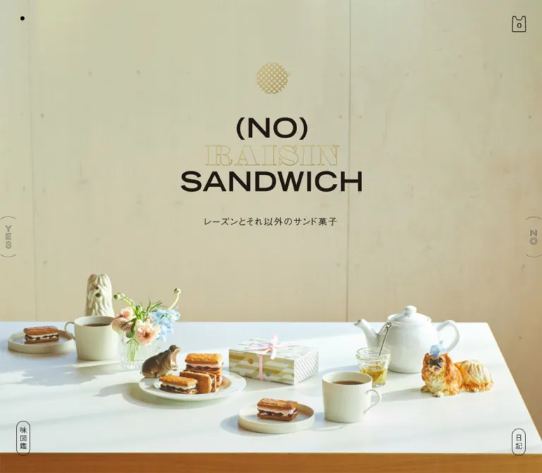
日差しの入るティーテーブルの写真、生成りの背景、端に固定された小さなナビゲーションが特徴の菓子ブランド公式ショップ。商品一覧から味の解説、ストーリー、店舗案内へと続き、円形のニュースレター登録ボタンで締めくくられます。
(NO) RAISIN SANDWICH — Style Reference
A sunlit tea table, generous paper margins, and a shop framed by tiny edge controls.
Original URL: noraisinsandwich.com Final URL: noraisinsandwich.com — unchanged; reported HTTP 200. Theme: a warm, light storefront with photographic color and restrained black interface details. Inspected: October 5, 2026, 06:16:57 JST; supplied retrieval timestamp: October 4, 2026, 21:16:57.500 UTC. Viewports: 1440 × 1000 desktop and 390 × 844 mobile, in CSS pixels. Scope: the current brand and commerce homepage: opening composition, Sweets and Goods catalogs, tea invitation, The Details of Taste, Story, Shop, newsletter, and persistent perimeter navigation. Product destinations, checkout, archive content, and linked informational pages were not inspected.
The page combines a carefully arranged food photograph with an unusually quiet shopping interface. Pale concrete, a white tabletop, flowers, ceramic animals, tea, and sandwich biscuits establish the opening scene. A centered three-line identity sits in the empty wall area. Its dark lettering and outlined gold middle line echo the biscuit-colored emblem above it.
Below the photograph, the interface becomes a long editorial shop on warm off-white. Large catalog columns alternate with narrower explanatory sections. English headings, Japanese descriptions, thin rules, small availability highlights, and isolated photographic ornaments provide hierarchy without a conventional card surface around every product. The final newsletter section changes to a slightly darker gray-beige and introduces two substantial circular actions.
This is a complete brand storefront with product browsing and supporting editorial content. Its defining relationships are photographic scale versus tiny perimeter controls, broad catalog layouts versus narrow reading columns, and precise typography versus playful ceramic characters.
閉じる
(NO) RAISIN SANDWICH — Style Reference
A sunlit tea table, generous paper margins, and a shop framed by tiny edge controls.
Original URL: noraisinsandwich.com Final URL: noraisinsandwich.com — unchanged; reported HTTP 200. Theme: a warm, light storefront with photographic color and restrained black interface details. Inspected: October 5, 2026, 06:16:57 JST; supplied retrieval timestamp: October 4, 2026, 21:16:57.500 UTC. Viewports: 1440 × 1000 desktop and 390 × 844 mobile, in CSS pixels. Scope: the current brand and commerce homepage: opening composition, Sweets and Goods catalogs, tea invitation, The Details of Taste, Story, Shop, newsletter, and persistent perimeter navigation. Product destinations, checkout, archive content, and linked informational pages were not inspected.
The page combines a carefully arranged food photograph with an unusually quiet shopping interface. Pale concrete, a white tabletop, flowers, ceramic animals, tea, and sandwich biscuits establish the opening scene. A centered three-line identity sits in the empty wall area. Its dark lettering and outlined gold middle line echo the biscuit-colored emblem above it.
Below the photograph, the interface becomes a long editorial shop on warm off-white. Large catalog columns alternate with narrower explanatory sections. English headings, Japanese descriptions, thin rules, small availability highlights, and isolated photographic ornaments provide hierarchy without a conventional card surface around every product. The final newsletter section changes to a slightly darker gray-beige and introduces two substantial circular actions.
This is a complete brand storefront with product browsing and supporting editorial content. Its defining relationships are photographic scale versus tiny perimeter controls, broad catalog layouts versus narrow reading columns, and precise typography versus playful ceramic characters.
How to Read This Reference
- Measured means a value reported in the supplied rendered DOM or computed-style evidence. Dimensions use CSS pixels.
- Derived means arithmetic from those measurements, such as the space between adjacent product anchors.
- Estimated means a visual approximation from the supplied original-page screenshots. Estimated colors are implementation starting points, not sampled source values.
- Recommended means a proposed implementation choice. The CSS Quick Start is an adaptation, not recovered production CSS.
- Font-family declarations are reported as supplied. They identify the declared stack, but do not independently prove which font file rendered every glyph.
- The evidence combines main-page measurements with later viewport-relative footer and utility measurements. Do not interpret every recorded
ycoordinate as belonging to one scroll position. - The token names below are descriptive aliases. The supplied source custom properties are only
--vhand--scroll-bar-width.
Three desktop captures show the opening, the end of the goods catalog and the transition into taste content, and the newsletter/footer. Two mobile captures show the opening and newsletter/footer. Other sections have detailed DOM evidence but are not fully pictured in the supplied captures.
Tokens — Colors
Default Palette
| Name | Value | Evidence | Suggested token | Role |
|---|---|---|---|---|
| Warm Paper | #f9f6f2 |
Measured: HTML and body background | --color-paper |
Main catalog and editorial canvas |
| Footer Stone | #e7e5dd |
Measured: footer background | --color-stone |
Newsletter and footer surface |
| Soft Black | #1a1a1a |
Measured: body text and LINE action fill | --color-ink |
Text, interface linework, filled circular action |
| Secondary Gray | #666666 |
Measured: ingredient descriptions, notes, map link | --color-muted |
Supporting information |
| White | #ffffff |
Measured: newsletter email action fill and LINE text | --color-white |
Reversed lettering and the outlined circular action |
| Biscuit Gold | Approximately #bba15b |
Estimated from the opening emblem and outlined lettering | --color-gold-estimate |
Small brand accents; use supplied artwork for exact color |
| Availability Mint | Approximately #c8e5da |
Estimated from the visible availability highlights | --color-stock-estimate |
A compact highlight behind an availability label |
The photographic wall introduces pale olive, cream, and warm beige. These are image colors, not additional verified interface background tokens. Likewise, the honey, biscuit crusts, gift packaging, flowers, and ceramic glaze should retain their natural photographic variation.
The main page and footer are distinct surfaces. Replacing both with pure white removes a meaningful change in atmosphere. Gold is confined to identity details; the visible registration actions use black and white rather than gold fills.
Theme Presets
Only one light treatment is evidenced. No theme selector, dark mode, or user-selectable palette was verified. The changing YES/NO side lettering is not evidence of a theme control.
Tokens — Typography
Japanese Body and Interface Text
The supplied source stack begins with a-otf-gothic-bbb-pr6n, followed by Hiragino Kaku Gothic, Yu Gothic, Meiryo, and sans-serif fallbacks. Most Japanese text has weight 400; newsletter actions and the shop name use 500.
The desktop body computes to 18px / 18px with 1.44px tracking. Mobile computes to 14px / 14px with 1.12px tracking. These are base styles, not paragraph recommendations: measured reading paragraphs use substantially larger line heights.
Use this face for the opening Japanese caption, product descriptions, ingredient explanations, story, store information, and registration labels. The broad tracking and relaxed paragraph leading are central to the atmosphere.
English Catalog and Editorial Headings
The declared family is roc-grotesk, with sans-serif or Japanese sans-serif fallbacks depending on the element. Measured section headings and product titles use weight 500. Footer links and ingredient labels use 400.
English product titles are uppercase and modestly tracked. The hierarchy distinguishes sweets from goods: sweets receive larger title type and wider columns. Do not flatten both categories into one universal product-card scale.
Identity and Newsletter Lettering
The visible brand lockup combines heavy dark lettering for (NO) and SANDWICH with a gold outlined serif treatment for RAISIN. The newsletter title is visibly a high-contrast serif treatment.
Their exact typefaces are not established by the supplied element samples. The hero H1 measurement covers the whole identity assembly, while its computed font size belongs to the surrounding text treatment. The sampled newsletter H2 has empty text despite the visible lettering. Neither measurement should be used to assign the visible artwork a font family.
For a faithful implementation, use authorized identity and title artwork. A serif fallback is acceptable for a new adaptation, but should be labeled as a substitution.
Type Scale
All values in this table are measured. Tracking pairs are desktop / mobile.
| Role | Desktop size / line height | Mobile size / line height | Weight | Tracking |
|---|---|---|---|---|
| Base Japanese text | 18 / 18px |
14 / 14px |
400 | 1.44 / 1.12px |
| Opening Japanese caption | 18 / 18px |
14 / 14px |
400 | 1.44 / 1.12px |
| Sweets and Goods headings | 48 / 48px |
28 / 28px |
500 | 0.96 / 0.56px |
| Story and Shop headings | 48 / 50px |
28 / 34px |
500 | 1.44 / 1.12px |
| Sweets product title | 25 / 31px |
18 / 24px |
500 | 1 / 0.72px |
| Goods product title | 19 / 24px |
16 / 20px |
500 | 0.76 / 0.64px |
| Ingredient English label | 12 / 12px |
11 / 11px |
400 | 1.44 / 1.32px |
| Ingredient description | 18 / 32px |
14 / 24px |
400 | 0.9 / 0.7px |
| Story paragraph | 24 / 40px |
18 / 30px |
400 | 2.88 / 0.72px |
| Shop name | 24 / 24px |
18 / 28px |
500 | 1.44 / 1.12px |
| Newsletter introduction | 18 / 32px |
14 / 24px |
400 | 1.44 / 1.12px |
| Newsletter note | 12 / 24px |
11 / 18px |
400 | 0.72 / 0.66px |
| Newsletter action | 18 / 24px |
14 / 19px |
500 | 1.44 / 1.12px |
| Footer text link | 15 / 15px |
11 / 24px |
400 | 0.75 / 0.22px |
| Vertical archive and journal links | 14 / 14px |
12 / 12px |
400 | 1.44 / 1.12px |
The visible desktop prices are approximately 22px tall in typographic scale, with much smaller tax in text. This is a screenshot estimate; the price element's computed font was not supplied.
Tokens — Spacing & Shapes
The layout uses several independent widths rather than one universal content container. Product browsing is wide; taste content is intermediate; story and shop information are narrow. Mobile preserves the distinction between the nearly full-width catalog and inset editorial content.
Layout Measurements
| Element | Desktop at 1440 × 1000 | Mobile at 390 × 844 | Evidence |
|---|---|---|---|
| Document height | 10588.77px |
9369.44px |
Measured |
| Catalog span | Approximately 1236px |
362px |
Derived from product bounds |
| Catalog side margins | 102px |
14px |
Measured |
| Sweets columns | 2 | 1 | Measured anchor positions |
| Sweets card width | Approximately 581.65px |
362px |
Measured |
| Goods columns | 4 | 2 | Measured anchor positions |
| Goods card width | Approximately 254.48px |
176px |
Measured |
| Catalog horizontal gap | Approximately 72.70px |
10px for goods |
Derived |
| Tea-invitation section | 832px wide |
289.11px wide |
Measured |
| Taste panel | 834px wide |
289.11px wide |
Measured outer rectangle |
| Story and Shop columns | 576px wide |
289.11px wide |
Measured |
| Newsletter content column | 832px wide |
289.11px wide |
Measured |
| Newsletter action diameter | 178px |
134px |
Measured |
| Newsletter footer rectangle | 1440 × 766px |
390 × 844px |
Measured at the captured footer state |
The mobile editorial width is approximately 74.13% of the viewport, leaving about 50.44px on each side. This ratio is derived from one viewport, not an established source formula.
Spacing Scale
These are section-specific distances, not evidence of a single spacing-unit system.
| Relationship | Desktop | Mobile | Evidence |
|---|---|---|---|
| Viewport bottom to first Sweets heading | 175px |
80px |
Derived, treating the pictured opening as one viewport |
| Sweets/Goods heading bottom to first product row | 106px |
72px |
Derived |
| Vertical gap between catalog rows | 123px |
94px |
Derived |
| Last sweets card bottom to Goods heading | 200px |
108px |
Derived |
| Last goods row bottom to tea invitation | 178px |
86px |
Derived |
| Tea invitation bottom to taste panel | 202px |
74px |
Derived |
| Taste panel bottom to Story | 170px |
77px |
Derived |
| Story section bottom to Shop | 170px |
77px |
Derived |
| Gap between Story paragraphs | 40px |
30px |
Derived |
| Shop section bottom padding | 175px |
129px |
Measured |
| Newsletter top to title box | 100px |
107px |
Derived within the footer capture |
Border Radius
| Element | Desktop | Mobile | Evidence |
|---|---|---|---|
| Product anchor wrapper | 0 |
0 |
Measured |
| Taste panel | 16px |
8px |
Measured |
| Archive/journal capsule | 13px |
10px |
Measured |
| Newsletter actions | 50% |
50% |
Measured |
Fine rules appear approximately 1px thick. The white registration circle appears to have an approximately 2px dark outline. These stroke widths are visual estimates because border-width values were not included in the evidence.
Viewport Variables
The source reports --vh: 10px on desktop and --vh: 8.44px on mobile, matching one hundredth of the respective captured viewport heights. It also reports --scroll-bar-width: 0px at both sizes. These values do not establish how the variables are consumed or whether the source uses a particular viewport-resize script.
Components
Opening Photo and Brand Lockup
Role: establish the brand through a staged tea scene before product browsing begins.
The opening photograph fills the visible viewport. Most of its upper portion is a pale concrete wall; the tabletop and objects occupy the lower portion. The logo is centered in the wall's negative space rather than placed in a separate header bar.
The identity assembly contains a small gold lattice emblem, a three-line wordmark, and the Japanese caption レーズンとそれ以外のサンド菓子. The H1 assembly begins at measured y ≈ 140.83px on desktop and 141.75px on mobile. Its total measured height changes from approximately 326px to 206.5px.
Visual estimates put the main lettering at about 386px wide on desktop and 224px on mobile, with the emblem approximately 68px and 38px wide respectively. The nearly unchanged top position is significant: the mobile composition is not simply a uniformly scaled desktop screen.
The tabletop begins around y = 675px on desktop and 490px on mobile. The phone crop retains the central gift box, biscuits, foreground plate, and cup while cutting off much of the outer arrangement. Preserve that central subject grouping when adapting the image. The precise background sizing rule and whether separate source images are used are unknown.
Persistent Perimeter Frame
Role: provide small, continuously visible routes around the large photographic and editorial content.
The perimeter contains a tiny dot near the upper-left corner, an outlined shopping-bag icon with count 0 near the upper-right, vertically arranged YES/NO lettering at the side edges, and narrow archive/journal capsules near the bottom corners.
The cart anchor measures 28 × 32px at desktop coordinates approximately (1381, 31) and 21 × 24px at mobile coordinates (355, 13). It links to https://store.noraisinsandwich.com/cart.
The archive link, 味図鑑, measures 27 × 68.33px on desktop and 22 × 61.38px on mobile. Its left offset changes from 32px to 14px; its captured bottom clearance is 34px and 14px. It points to the homepage hash route #/m/history. The route name alone does not prove a modal implementation.
The journal link, 日記, uses the same narrow capsule treatment and points to the store journal. Its height is shorter because it contains two characters. Its vertical placement varies between the opening and footer screenshots; do not assume the two bottom capsules are always aligned at both ends.
The side lettering sits within thin, partially clipped oval contours. Its arrangement changes between some captures. No clickable target or selection behavior was supplied for this ornament, and the upper-left dot's function is also unverified. Do not assign either element an invented menu, theme, or carousel behavior.
Sweets Catalog
Role: present the primary confectionery products with generous space.
The measured desktop layout is two columns of approximately 581.65px, separated by about 72.70px. The third product starts a new row at the left. Mobile presents all three in a single 362px column.
The current entries are OSATSU CARAMEL, KURUMI COFFEE, and ONLY RAISIN SANDWICH. Each entire item is an anchor to its product URL. Its English H3 begins at the top of the anchor; subsequent text provides the Japanese name, description, price, tax label, and availability.
The supplied element subset does not measure the product image nodes. Product-media dimensions, aspect ratios, and the complete internal image/text order should therefore be verified before an exact reconstruction. Do not derive square image slots from the overall card rectangle.
Desktop anchors measure approximately 830.65px tall at the captured state. Mobile heights are 546px for the first product and 570px for the other two. These are content-dependent results, not recommended fixed heights.
Goods Catalog
Role: offer smaller merchandise in a denser browsing rhythm.
Desktop uses four approximately 254.48px columns; mobile retains two 176px columns with a 10px gap. The current six items occupy two desktop rows and three mobile rows.
Titles are smaller than those in Sweets: 19 / 24px on desktop and 16 / 20px on mobile. Long titles wrap, and measured title boxes vary by row on mobile. Goods anchors have a computed display: grid, but the parent layout declaration was not supplied.
The visible desktop capture shows the bottom of the final goods row: descriptive text, a clear price, a tiny availability highlight, a fine arrow, and an oblique bottom rule. It leaves extensive open space below before the tea invitation. Preserve the space around these unboxed items instead of adding solid card backgrounds and shadows.
Price, Availability, Arrow, and Rule
Role: make each catalog item's shopping information legible without a large purchase button.
The price is bold and substantially larger than the adjacent tax in label. A small 販売中 highlight appears beneath it on the visible goods items. A delicate right-pointing arrow sits toward the right edge. The bottom rule rises slightly toward the right, giving the otherwise precise layout a small irregularity.
The captured visible states show OSATSU CARAMEL available and the other two sweets sold out. Goods are shown as available. These are capture-time content states, not permanent design properties.
Raw link text contains release dates and multiple possible status strings. That does not mean all statuses are simultaneously visible. A new implementation should expose one current status and retain a text distinction between available and sold-out items.
Tea Invitation
Role: pause the catalog and introduce the more editorial part of the page.
The desktop screenshot shows an irregular, thinly outlined speech bubble above a small ceramic cat cutout, surrounded by generous empty paper. The message is レーズン好きもそうでない人も、みんなで仲良くお茶しましょう。.
The measured section is 832 × 311.98px on desktop and 289.11 × 232.34px on mobile. Mobile DOM text breaks the invitation into four short lines; its paragraph computes to 11 / 16px. The mobile image arrangement is not visible in the supplied opening/footer captures.
Treat this as a discrete illustrated interlude, not a large testimonial card or a sales banner. Its scale is intentionally small relative to the surrounding whitespace.
The Details of Taste
Role: explain the sandwich's ingredients and craft through an editorial feature.
The measured outer panel is approximately 834px wide on desktop and 289.11px on mobile, with corner radii of 16px and 8px. Its top is partially visible in the desktop transition screenshot: preparation photography occupies the left, a pale title area sits to the right, a crosshatched strip marks the outer edge, and a biscuit cutout overlaps the upper border.
The section wrapper itself has a transparent computed background. The visible pale or white title region belongs to the panel's internal composition; do not infer a solid white background for every descendant.
Its content comprises an English/Japanese title, an introductory explanation, and three ingredient sections: Sable, Cream, and Raisins & Fruits. English ingredient labels occupy tall, narrow measured boxes: 12 × 148px on desktop and 11 × 146px on mobile. This supports a vertical label treatment, but the exact source writing-mode declaration was not supplied.
Desktop ingredient descriptions occupy 356px-wide columns at 18 / 32px; mobile descriptions occupy approximately 202.11px at 14 / 24px. Their color is #666666. Mobile text evidence breaks the feature title into The / Details of / Taste; do not force the desktop title composition into the narrow panel.
The total panel remains tall at both sizes: approximately 1710.72px desktop and 1693.11px mobile. Its content should reflow rather than be shrunk as one image.
Story
Role: give the brand's origin story a distinct reading pace.
This section narrows to 576px on desktop and approximately 289.11px on mobile. The measured paragraphs use 24 / 40px desktop and 18 / 30px mobile, with paragraph gaps of 40px and 30px.
Desktop story tracking is unusually spacious at 2.88px, while mobile reduces it to 0.72px. This is a meaningful responsive adjustment, not a uniform font-size reduction. The story uses short paragraphs and deliberate line breaks, including a separate question about using fruit other than raisins.
Keep it as continuous editorial reading. No bordered quote panel or multi-card story layout is evidenced.
Shop Information
Role: connect the online brand with its physical retail location.
The shop section shares the Story column width. It identifies (NO) RAISIN SANDWICH グランスタ東京店, followed by address, map link, telephone, and opening hours.
The shop name changes from 24px desktop to 18px mobile and wraps onto two lines on the phone. The map link uses secondary gray. Its desktop position is toward the right of the address area; on mobile it appears on a separate line at the column's left edge.
Use structured contact information and clear labels. The map destination is evidenced as a link, but its opened state and navigation behavior were not tested.
Newsletter Registration
Role: turn the long page's ending into a calm, recognizable subscription area.
The footer surface is #e7e5dd. A centered serif-style Newsletter graphic is followed by Japanese introductory copy, a smaller gray service note, and two circular registration links.
On desktop, each circle is 178px across. The left circle begins at x = 465px; the right begins at 797px. The 154px gap between them contains a small Thank You label and a ceramic bear cutout. The LINE action has an ink fill and white text. The email action has a white fill, dark text, and a thin dark outline. Each contains two lines of text above a compact service icon.
The mobile circles remain side by side, each 134px across, with a 10px gap. They begin at approximately x = 56px and 200px. The bear and Thank You move beneath the pair. This is a real composition change, not a scaled desktop row.
The action labels are LINEで友だち追加 and メルマガに登録する. Their anchors point to LINE and the store's newsletter page respectively. No inline email field, confirmation state, or submission interaction was verified on this homepage.
Social and Utility Footer
Role: provide low-emphasis secondary navigation beneath registration.
A tiny dash separates the registration composition from Instagram and X icons. Desktop icons measure 18px and 16px; mobile icons measure 14px and 13px. Text links follow for FAQs, Contact, Privacy Policy, Terms of Use, Terms of Sale, Journal, and Login.
Desktop links occupy one centered row with 15px English type. Mobile links use 11px type and wrap into two lines. The persistent corner navigation remains visible over the footer surface.
The raw footer text includes alternative account labels, but Login is the visible captured link. Likewise, extracted contact-form text elsewhere in the DOM does not establish an open contact form in these screenshots.
Tokens — Motion & Interaction
| Element or treatment | Evidence | Interpretation and limit |
|---|---|---|
| Hero H1 opacity | Measured opacity 0.2s ease-in-out transition |
A declared fade treatment; trigger and full transition sequence were not supplied |
| Cart transform | Measured transform 1.8s cubic-bezier(0.455, 0.03, 0.515, 0.955) |
Preserve as a component-specific timing reference; transform values and trigger are unknown |
| Most sampled elements | Transition reported only as all |
Insufficient to establish duration, easing, or visible animation |
| Sampled animation field | none |
Does not exclude motion on unsampled children, image assets, or scripts |
| YES/NO side ornaments | Their order differs between some captured states | State variation is visible; cycling, rotation, and click behavior are unverified |
| Upper-left dot | Filled and outlined appearances occur across captures | Cause and interaction semantics are unknown |
| Ceramic bear | Pose/orientation differs between desktop and mobile captures | Static frames cannot establish whether this is animation or responsive asset variation |
| Product and footer links | Actual destinations supplied in rendered evidence | Link semantics are supported; hover effects and destination interfaces are untested |
The capture process waited for finite motion and layout stability and temporarily paused perpetual animations during readiness checks. These measures improve settled captures but do not provide a motion recording. Do not invent parallax, scroll scrubbing, rotating figurines, or animated side toggles from these frames.
Recommended adaptation: use the measured short opacity timing where an identity fade is needed. Keep other feedback subtle and component-specific. The long cart transition should not become the default duration for all buttons. Provide a reduced-motion alternative for any motion added during implementation.
Surfaces
| Layer | Appearance | Purpose |
|---|---|---|
| Opening scene | Full-bleed, naturally lit photograph | Brand atmosphere and product context |
| Catalog canvas | Flat #f9f6f2 |
Broad product browsing without separate card fills |
| Product footer | Transparent surface with ink text, small status highlight, arrow, and fine rule | Shopping information and navigation cue |
| Taste feature | Rounded outlined composition with photography, pale regions, and crosshatching | A distinct editorial explanation |
| Story and Shop | Narrow text columns on the main paper | Reading and practical information |
| Newsletter/footer | Flat #e7e5dd |
A clear closing section |
| Filled registration action | #1a1a1a with white content |
LINE registration |
| Outlined registration action | White with ink content and outline | Email newsletter registration |
| Perimeter utilities | Thin ink details over the current surface | Persistent navigation with minimal visual weight |
There is no evidenced general elevation system. Photography supplies natural shadows, while interface separation comes from spacing, linework, fill contrast, and selective rounded outlines.
Imagery
The hero is an arranged still life, not an isolated product render. Preserve the relationship among pale wall, white table, strong directional daylight, biscuit layers, ceramic cups and teapot, small flowers, ribboned packaging, and animal ornaments. The long photographic shadows help the composition feel physical.
The desktop photograph is intentionally spacious. Mobile crops it much more tightly while keeping recognizable products in the lower half. A generic centered food close-up would not reproduce this spatial structure.
Small ceramic cat and bear cutouts recur as companions to the copy. Their photographic glaze and irregular shapes contrast with thin interface linework. The tea invitation pairs one with a hand-drawn speech bubble; the footer pairs another with a tiny Thank You label.
The taste feature introduces preparation photography and a biscuit cutout crossing the panel edge. Crosshatching echoes the gold lattice emblem and patterned packaging without covering the whole interface in texture.
Observed Asset References
No source image URLs, asset filenames, or file formats were included in the supplied DOM excerpt. The references below identify visible roles without inventing paths.
| Asset role | Original-page evidence | Implementation guidance |
|---|---|---|
| Tea-table hero photograph | Desktop and mobile opening captures | Use an authorized high-resolution source and verify both crops |
| Gold lattice emblem and brand lettering | Both opening captures | Preserve supplied artwork rather than guessing the display fonts |
| Cat and speech bubble | Desktop catalog-to-taste capture | Keep the photographic cutout and irregular contour distinct from body text |
| Preparation image and biscuit cutout | Top of taste feature in desktop capture | Preserve the overlap and selective framing |
| Newsletter title | Desktop and mobile footer captures | Exact typeface and asset format are unverified |
| Bear ornament | Desktop and mobile footer captures | Preserve its small scale; animation is not established |
| Cart, LINE, email, Instagram, and X symbols | Opening/footer captures and measured links | Use clear accessible names; exact source asset format is unknown |
| Catalog product media | Product sections are established, but image nodes are not measured | Verify asset dimensions and placement separately |
Use natural image interpolation for this photographic material. Pixelated rendering, posterization, or a blanket duotone would change its character.
Layout & Responsive Behavior
The page preserves two systems of scale: a broad catalog and a narrower editorial sequence. Desktop catalog margins are 102px, whereas Story and Shop begin at 432px. On mobile, products nearly fill the screen with 14px margins, while the editorial and newsletter columns retain approximately 50.44px margins.
| Behavior | Desktop observation | Mobile observation |
|---|---|---|
| Hero | Broad still life with most props visible | Tight central crop with outer props cut off |
| Identity | Large lettering and emblem in the upper wall area | Smaller lettering, with the assembly starting at nearly the same vertical coordinate |
| Sweets | Two columns | One column |
| Goods | Four columns | Two columns |
| Editorial width | Taste wider than Story and Shop | Taste, Story, Shop, and newsletter content share approximately 289px width |
| Taste title | A vertical/editorial title region is partially visible | Text evidence uses a three-line English title |
| Story typography | 24 / 40px, tracking 2.88px |
18 / 30px, tracking 0.72px |
| Newsletter actions | Circle, bear, circle | Two circles, with bear beneath |
| Footer links | One row | Two rows |
| Perimeter controls | Larger icons and wider offsets | Smaller visible artwork close to the screen edges |
The source breakpoint locations are unknown. The 767px breakpoint in the Quick Start is a recommendation chosen to demonstrate the measured endpoint layouts. Intermediate widths, landscape phones, browser zoom, safe areas, and unusually short viewports require testing.
Do not set card heights to the measured captured values. The rows contain different lengths of copy, and both availability and seasonal products can change. Let content determine height while retaining the observed grouping and inter-row spacing.
Do’s and Don’ts
Do
- Keep the measured main paper
#f9f6f2, footer stone#e7e5dd, and ink#1a1a1adistinct. - Build the opening around a spacious tea-table photograph and a centered identity assembly.
- Preserve the central gift box, biscuits, plate, and cup when selecting a mobile crop.
- Maintain separate product scales for Sweets and Goods.
- Use the measured Japanese and English font roles, with licensed assets where required.
- Give Story more generous type and paragraph spacing than ingredient descriptions.
- Keep product navigation unboxed, with prices, small statuses, fine arrows, and restrained rules.
- Retain the narrow editorial columns and the substantial pauses between sections.
- Move the footer bear below the two circles on mobile while keeping the actions adjacent.
- Treat figurines, speech-bubble contours, lattice patterns, and lettering artwork as important identity assets.
Don’t
- Don’t replace the storefront with a generic sequence of marketing feature cards.
- Don’t infer the logo or Newsletter typeface from their surrounding heading styles.
- Don’t turn gold into the primary button color or flood the page with mint accents.
- Don’t use the desktop goods grid unchanged on a phone.
- Don’t give every product a rounded white card, heavy border, or drop shadow.
- Don’t copy the body's
line-height: 1into long reading paragraphs. - Don’t render every status found in raw link text at once.
- Don’t assign interactions to the YES/NO ornaments or corner dot without evidence.
- Don’t claim animated figurines, parallax, or hover effects from static screenshots.
- Don’t hard-code the captured seasonal availability, card heights, or line breaks as universal rules.
Recommended Implementation Additions
These are recommendations for a new implementation, not verified features of the original:
- Keep the small visual utility icons, but provide touch targets of at least approximately
44 × 44pxwhere space permits. Ensure expanded hit areas do not cover nearby content. - Add explicit accessible names to cart and social links. Identify the cart count in its accessible label.
- Give the brand and Newsletter graphic meaningful heading text or suitable alternatives. Keep purely decorative figurines and pattern fragments out of the accessibility tree.
- Use keyboard-operable product links with a visible focus outline. Avoid nested interactive elements inside the whole-card anchor.
- Communicate availability in text and ensure inactive status strings are not announced as current states.
- Preserve paragraph readability under font fallback and text zoom, especially the narrow mobile ingredient column and small footer notes.
- Supply responsive hero imagery with known dimensions and deliberate focal points. Prioritize the opening photograph and defer lower-page media appropriately.
- Support reduced motion for implemented transitions and any animated assets. Keep essential content visible without animation.
- Account for device safe areas and confirm that persistent capsules do not obstruct the final links or product information.
- Test intermediate widths and short screens rather than relying on the two captured endpoints alone.
Agent Prompt Guide
Quick Color Reference
- Main page: measured
#f9f6f2. - Newsletter/footer: measured
#e7e5dd. - Text, outlines, and filled LINE action: measured
#1a1a1a. - Supporting copy: measured
#666666. - Email circle and reversed text: measured
#ffffff. - Identity gold: estimated
#bba15b; prefer the actual artwork. - Availability highlight: estimated
#c8e5da; keep it small.
Overall Prompt
“Create a Japanese confectionery brand storefront inspired by the current (NO) RAISIN SANDWICH homepage. Begin with a viewport-height, sunlit tea-table still life: pale concrete wall, white table, sandwich biscuits, a ribboned gift box, flowers, tea, and small ceramic animals. Center the supplied three-line identity above the objects. Continue onto warm paper #f9f6f2 with a two-column sweets catalog and four-column goods catalog on desktop, changing to one and two columns on mobile. Use Japanese sans-serif body text, medium-weight English grotesk catalog headings, thin rules, small availability highlights, and abundant whitespace. Narrow the page for taste explanations, story, and shop information. End on #e7e5dd with two black-and-white circular registration links and a small ceramic bear between them on desktop, below them on mobile. Keep the cart and vertical archive/journal links small at the perimeter. Treat unknown ornament behavior as unverified.”
Example Component Prompts
- Opening: “Compose a full-viewport photographic introduction with a pale wall occupying most of the upper area and a white tea table below. Center an authorized gold lattice emblem, three-line brand artwork, and a small Japanese caption. Preserve the central package and biscuits in the phone crop. Keep utility controls at the screen edges.”
- Catalog: “Build unboxed sweets and merchandise grids on
#f9f6f2. At 1440px, use a 1236px catalog span with approximately 72.7px column gaps: two sweets columns and four goods columns. At 390px, use 14px side margins, one sweets column, and two 176px goods columns separated by 10px. Use clear prices, small text statuses, fine arrows, and a slightly angled bottom rule.” - Taste feature: “Create an approximately 834px-wide desktop editorial panel with a 16px rounded outline, preparation photography, a pale title region, a narrow crosshatched edge, and a biscuit cutout overlapping the border. Inside, arrange Sable, Cream, and Raisins & Fruits explanations with narrow English labels and gray Japanese paragraphs. Reflow into a roughly 289px-wide mobile panel with an 8px radius.”
- Story: “Set a Japanese brand story in a quiet 576px reading column, using 24px type, 40px leading, and 40px paragraph gaps. On a 390px phone, narrow the column to about 289px and use 18px type, 30px leading, and reduced tracking. Preserve short paragraphs and deliberate pauses.”
- Newsletter: “Build a centered newsletter area on
#e7e5ddwith supplied serif title artwork, Japanese introduction, and smaller gray notes. Use 178px desktop registration circles: black for LINE and white with an ink outline for email. Place a small Thank You label and ceramic bear in the gap. On mobile, use two 134px circles with a 10px gap and move the bear underneath. Finish with small social icons and wrapping English utility links.”
Quick Start
CSS Custom Properties
The following CSS provides a usable shell and component treatment. It matches measured endpoint dimensions where practical; its breakpoint, intermediate interpolation, image crop rule, thin strokes, and product-rule angle are recommendations. It does not implement unknown motion or hidden interfaces.
Load authorized font files and artwork separately. The shortened fallback stacks below are implementation choices. Use an image inside .newsletter-heading for the title artwork. A product card can contain a heading group, media, description, and footer. Inside .newsletter-actions, use .action-line, .action-mail, and .thanks; the named grid areas handle the responsive visual order.
:root {
  /* Measured interface colors */
  --color-paper: #f9f6f2;
  --color-stone: #e7e5dd;
  --color-ink: #1a1a1a;
  --color-muted: #666666;
  --color-white: #ffffff;

  /* Visual estimates, not recovered source tokens */
  --color-gold-estimate: #bba15b;
  --color-stock-estimate: #c8e5da;

  /* Observed primary families with shortened fallback stacks */
  --font-ja: 'a-otf-gothic-bbb-pr6n',
    'Hiragino Kaku Gothic Pro W3', 'Yu Gothic', Meiryo, sans-serif;
  --font-en: 'roc-grotesk', sans-serif;

  --text-body: 18px;
  --leading-body: 32px;
  --text-section: 48px;
  --text-product: 25px;
  --leading-product: 31px;
  --text-goods: 19px;
  --leading-goods: 24px;

  --width-catalog: 1236px;
  --width-feature: 834px;
  --width-band: 832px;
  --width-reading: 576px;
  --width-narrow-mobile: 74.13%;
  --catalog-gap: clamp(10px, 5.05vw, 72.7px);
  --catalog-row-gap: 123px;
  --radius-feature: 16px;
  --circle-size: 178px;

  /* Measured transition declarations; triggers are not supplied */
  --motion-brand: 200ms ease-in-out;
  --motion-cart: 1.8s cubic-bezier(0.455, 0.03, 0.515, 0.955);
}

* { box-sizing: border-box; }

body {
  margin: 0;
  color: var(--color-ink);
  background: var(--color-paper);
  font-family: var(--font-ja);
  font-size: var(--text-body);
  line-height: var(--leading-body);
  letter-spacing: 0.08em;
}

img { display: block; max-width: 100%; height: auto; }
a { color: inherit; }

/* Recommended viewport and crop implementation */
.hero {
  position: relative;
  min-height: 100vh;
  min-height: 100svh;
  overflow: hidden;
}

.hero-media {
  position: absolute;
  inset: 0;
  width: 100%;
  height: 100%;
  object-fit: cover;
  object-position: center bottom;
}

.brand-lockup {
  position: absolute;
  top: min(142px, 18svh);
  inset-inline: 0;
  display: flex;
  flex-direction: column;
  align-items: center;
  margin: 0;
  font: inherit;
  line-height: 1;
  transition: opacity var(--motion-brand);
}

.brand-emblem { width: 68px; margin-bottom: 48px; }
.brand-wordmark { width: 386px; max-width: 80vw; }
.brand-caption { margin-top: 32px; font-size: 18px; }

/* Persistent utility artwork; accessible hit areas may be larger */
.cart-link {
  position: fixed;
  z-index: 20;
  top: max(31px, env(safe-area-inset-top, 0px));
  right: max(31px, env(safe-area-inset-right, 0px));
  width: 28px;
  height: 32px;
  line-height: 1;
  transition: transform var(--motion-cart);
}

.edge-pill {
  position: fixed;
  z-index: 20;
  left: max(32px, env(safe-area-inset-left, 0px));
  bottom: max(34px, env(safe-area-inset-bottom, 0px));
  width: 27px;
  padding: 10px 0;
  border: 1px solid currentColor;
  border-radius: 13px;
  font-size: 14px;
  line-height: 14px;
  letter-spacing: 1.44px;
  writing-mode: vertical-rl;
  text-orientation: upright;
  text-align: center;
  text-decoration: none;
}

.edge-pill--journal {
  left: auto;
  right: max(32px, env(safe-area-inset-right, 0px));
  bottom: max(50px, env(safe-area-inset-bottom, 0px));
}

/* The source behavior of the dot and YES/NO ornaments is unknown. */

.catalog-shell {
  width: min(var(--width-catalog), calc(100% - 28px));
  margin-inline: auto;
}

.sweets { padding-top: 175px; }
.goods { margin-top: 200px; }

.section-title {
  margin: 0;
  font-family: var(--font-en);
  font-size: var(--text-section);
  font-weight: 500;
  line-height: 1;
  letter-spacing: 0.02em;
  text-align: center;
}

.product-grid {
  display: grid;
  grid-template-columns: repeat(2, minmax(0, 1fr));
  gap: var(--catalog-row-gap) var(--catalog-gap);
  margin-top: 106px;
}

.goods .product-grid {
  grid-template-columns: repeat(4, minmax(0, 1fr));
}

.product-card {
  display: grid;
  grid-template-rows: auto auto 1fr auto;
  gap: 16px;
  min-width: 0;
  color: inherit;
  background: transparent;
  text-decoration: none;
  letter-spacing: 0.06em;
}

.product-title {
  margin: 0;
  font-family: var(--font-en);
  font-size: var(--text-product);
  font-weight: 500;
  line-height: var(--leading-product);
  letter-spacing: 0.04em;
}

.goods .product-title {
  font-size: var(--text-goods);
  line-height: var(--leading-goods);
}

.product-media { width: 100%; height: auto; }
.product-copy { margin: 0; }

.product-footer {
  position: relative;
  align-self: end;
  padding: 8px 30px 26px 0;
}

/* Price size and rule angle are visual approximations. */
.product-price {
  font-family: var(--font-en);
  font-size: 22px;
  font-weight: 500;
  letter-spacing: 0;
}

.product-tax { margin-left: 5px; font-size: 11px; }
.availability { font-size: 12px; line-height: 1.4; }
.availability--live { background: var(--color-stock-estimate); }

.product-arrow {
  position: absolute;
  right: 0;
  bottom: 25px;
  font-size: 26px;
  font-weight: 400;
}

.product-footer::after {
  content: '';
  position: absolute;
  right: 0;
  bottom: 0;
  left: 0;
  height: 1px;
  background: currentColor;
  transform: rotate(-1.4deg);
  transform-origin: left center;
}

.tea-callout {
  width: min(var(--width-band), var(--width-narrow-mobile));
  min-height: 312px;
  margin: 178px auto 202px;
  display: grid;
  place-items: center;
}

.taste-panel {
  width: min(var(--width-feature), var(--width-narrow-mobile));
  margin-inline: auto;
  border: 1px solid var(--color-ink);
  border-radius: var(--radius-feature);
}

/* Keep overlapping cutouts outside the clipped media wrapper. */
.taste-media {
  overflow: hidden;
  border-radius: calc(var(--radius-feature) - 1px);
}

.ingredient-row {
  display: grid;
  grid-template-columns: 12px minmax(0, 1fr);
  column-gap: 53px;
}

.ingredient-label {
  margin: 0;
  font-family: var(--font-en);
  font-size: 12px;
  line-height: 1;
  letter-spacing: 0.12em;
  writing-mode: vertical-rl;
}

.ingredient-description {
  color: var(--color-muted);
  font-size: var(--text-body);
  line-height: var(--leading-body);
  letter-spacing: 0.05em;
}

.reading-shell {
  width: min(var(--width-reading), var(--width-narrow-mobile));
  margin-inline: auto;
}

.story, .shop { margin-top: 170px; }
.shop { padding-bottom: 175px; }

.story p {
  margin: 40px 0 0;
  font-size: 24px;
  line-height: 40px;
  letter-spacing: 0.12em;
}

.newsletter {
  min-height: 766px;
  padding: 100px 0 99px;
  background: var(--color-stone);
  text-align: center;
}

.newsletter-inner {
  width: min(var(--width-band), var(--width-narrow-mobile));
  margin-inline: auto;
}

.newsletter-heading {
  display: flex;
  justify-content: center;
  height: 32px;
  margin: 0;
}

.newsletter-heading img { width: auto; height: 100%; }
.newsletter-lead { margin: 38px 0 0; line-height: 32px; }

.newsletter-note {
  margin: 10px 0 0;
  color: var(--color-muted);
  font-size: 12px;
  line-height: 24px;
  letter-spacing: 0.06em;
}

.newsletter-actions {
  display: grid;
  grid-template-columns: var(--circle-size) 154px var(--circle-size);
  grid-template-areas: 'line thanks mail';
  align-items: center;
  width: max-content;
  max-width: 100%;
  margin: 40px auto 0;
}

.circle-action {
  display: flex;
  flex-direction: column;
  align-items: center;
  justify-content: center;
  gap: 24px;
  width: var(--circle-size);
  height: var(--circle-size);
  border: 2px solid var(--color-ink);
  border-radius: 50%;
  font-size: 18px;
  font-weight: 500;
  line-height: 24px;
  text-decoration: none;
}

.action-line {
  grid-area: line;
  color: var(--color-white);
  background: var(--color-ink);
}

.action-mail {
  grid-area: mail;
  color: var(--color-ink);
  background: var(--color-white);
}

.action-icon { width: 32px; height: 32px; }

.thanks {
  grid-area: thanks;
  display: flex;
  flex-direction: column;
  align-items: center;
  gap: 8px;
  margin: 0;
  font-family: var(--font-en);
  font-size: 13px;
  line-height: 18px;
}

/* Ornament dimensions are an adaptation of the visible footprint. */
.thanks img { width: 80px; height: 80px; object-fit: contain; }

.footer-separator { margin: 40px 0 0; line-height: 18px; }

.footer-social {
  display: flex;
  align-items: center;
  justify-content: center;
  gap: 32px;
  margin-top: 21px;
}

.footer-social a { display: block; line-height: 1; }
.footer-social img, .footer-social svg { width: 18px; height: 18px; }

.footer-links {
  display: flex;
  flex-wrap: wrap;
  justify-content: center;
  column-gap: 16px;
  margin: 42px 0 0;
  padding: 0;
  list-style: none;
  font-family: var(--font-en);
  font-size: 15px;
  line-height: 18px;
  letter-spacing: 0.05em;
}

.footer-links a { text-decoration: none; }

/* Recommended breakpoint; the source breakpoint was not supplied. */
@media (max-width: 767px) {
  :root {
    --text-body: 14px;
    --leading-body: 24px;
    --text-section: 28px;
    --text-product: 18px;
    --leading-product: 24px;
    --text-goods: 16px;
    --leading-goods: 20px;
    --catalog-gap: 10px;
    --catalog-row-gap: 94px;
    --radius-feature: 8px;
    --circle-size: min(134px, 34.36vw);
  }

  .brand-emblem { width: 38px; margin-bottom: 27px; }
  .brand-wordmark { width: 224px; }
  .brand-caption { font-size: 14px; }

  .cart-link {
    top: max(13px, env(safe-area-inset-top, 0px));
    right: max(14px, env(safe-area-inset-right, 0px));
    width: 21px;
    height: 24px;
  }

  .edge-pill {
    left: max(14px, env(safe-area-inset-left, 0px));
    bottom: max(14px, env(safe-area-inset-bottom, 0px));
    width: 22px;
    border-radius: 10px;
    font-size: 12px;
    line-height: 12px;
    letter-spacing: 1.12px;
  }

  .edge-pill--journal {
    left: auto;
    right: max(14px, env(safe-area-inset-right, 0px));
    bottom: max(28px, env(safe-area-inset-bottom, 0px));
  }

  .sweets { padding-top: 80px; }
  .goods { margin-top: 108px; }
  .product-grid { grid-template-columns: 1fr; margin-top: 72px; }
  .goods .product-grid { grid-template-columns: repeat(2, minmax(0, 1fr)); }
  .tea-callout { min-height: 232px; margin-block: 86px 74px; }
  .ingredient-row { grid-template-columns: 11px minmax(0, 1fr); column-gap: 16px; }
  .ingredient-label { font-size: 11px; }
  .story, .shop { margin-top: 77px; }
  .shop { padding-bottom: 129px; }

  .story p {
    margin-top: 30px;
    font-size: 18px;
    line-height: 30px;
    letter-spacing: 0.04em;
  }

  .newsletter { min-height: 100svh; padding: 107px 0 102px; }
  .newsletter-heading { height: 21px; }
  .newsletter-lead { margin-top: 27px; line-height: 24px; }
  .newsletter-note { margin-top: 16px; font-size: 11px; line-height: 18px; }

  .newsletter-actions {
    grid-template-columns: repeat(2, var(--circle-size));
    grid-template-areas: 'line mail' 'thanks thanks';
    gap: 12px 10px;
    margin-top: 30px;
  }

  .circle-action { gap: 16px; font-size: 14px; line-height: 19px; }
  .action-icon { width: 24px; height: 24px; }
  .footer-separator { margin-top: 32px; line-height: 12px; }
  .footer-social { gap: 24px; margin-top: 19px; }
  .footer-social img, .footer-social svg { width: 14px; height: 14px; }
  .footer-links { margin-top: 38px; font-size: 11px; line-height: 24px; letter-spacing: 0.02em; }
}

/* Recommended accessibility additions */
a:focus-visible, button:focus-visible {
  outline: 2px solid var(--color-ink);
  outline-offset: 5px;
}

@media (prefers-reduced-motion: reduce) {
  .brand-lockup, .cart-link { transition: none; }
}
The CSS deliberately leaves content-driven heights flexible. The source images, logo, speech bubble, crosshatched graphics, and cart artwork are still required. The newsletter paragraph wrapping and image focal point should be checked with the actual assets and fonts at both measured viewports.
Tailwind v4 Token Mapping
Optional aliases for a project already using Tailwind v4. This is not evidence that the original site uses Tailwind. Define the custom properties above first.
@theme inline {
  --color-paper: #f9f6f2;
  --color-stone: #e7e5dd;
  --color-ink: #1a1a1a;
  --color-muted: #666666;
  --color-stock: #c8e5da;

  --font-body: var(--font-ja);
  --font-catalog: var(--font-en);
  --text-catalog-heading: var(--text-section);
  --text-product-heading: var(--text-product);
  --text-goods-heading: var(--text-goods);

  --spacing-catalog-column-gap: var(--catalog-gap);
  --spacing-catalog-row-gap: var(--catalog-row-gap);
  --spacing-registration-circle: var(--circle-size);
  --radius-editorial: var(--radius-feature);
}
Sources & Evidence
- Inspected original and final page: https://noraisinsandwich.com/. The supplied browser record reports HTTP 200 with no URL change.
- Capture timestamp:
2026-10-04T21:16:57.500Z, corresponding to October 5, 2026, 06:16:57.500 JST. - Desktop evidence: 1440 × 1000 viewport; approximately 10588.77px document height; original-page captures of the opening, goods-to-taste transition, and newsletter/footer.
- Mobile evidence: 390 × 844 viewport; approximately 9369.44px document height; original-page captures of the opening and newsletter/footer.
- Rendered DOM and computed styles: supplied text, actual anchor destinations, element rectangles, colors, font stacks, type sizes, line heights, letter spacing, selected display properties, radii, transitions, and two viewport-related custom properties.
- Observed navigation structure: product anchors, archive hash route, journal, cart, LINE, newsletter, social, map, and footer utility destinations. These destinations were read from the supplied page evidence; their pages were not separately inspected.
- Capture conditions: the provided process waited for document loading, visible image decoding, finite motion, and sampled layout stability. Perpetual animation was temporarily paused during readiness checks and resumed afterward. SharedWorkers and service workers were disabled.
- Inspection limits: no additional browsing or file inspection was performed for this reference. Static frames do not verify animation timelines. Hover, keyboard interaction, cart behavior, archive presentation, registration completion, and destination-page design remain untested. Exact asset paths, full stylesheet rules, breakpoint positions, font-loading outcomes, and complete product-media geometry were not supplied.
This reference describes the supplied current homepage evidence. All proposed breakpoints, accessibility changes, fallback choices, and reusable CSS are implementation guidance rather than claims about unobserved production behavior.
# (NO) RAISIN SANDWICH — Style Reference

> A sunlit tea table, generous paper margins, and a shop framed by tiny edge controls.

**Original URL:** [noraisinsandwich.com](https://noraisinsandwich.com/)
**Final URL:** [noraisinsandwich.com](https://noraisinsandwich.com/) — unchanged; reported HTTP 200.
**Theme:** a warm, light storefront with photographic color and restrained black interface details.
**Inspected:** October 5, 2026, 06:16:57 JST; supplied retrieval timestamp: October 4, 2026, 21:16:57.500 UTC.
**Viewports:** 1440 × 1000 desktop and 390 × 844 mobile, in CSS pixels.
**Scope:** the current brand and commerce homepage: opening composition, Sweets and Goods catalogs, tea invitation, The Details of Taste, Story, Shop, newsletter, and persistent perimeter navigation. Product destinations, checkout, archive content, and linked informational pages were not inspected.

The page combines a carefully arranged food photograph with an unusually quiet shopping interface. Pale concrete, a white tabletop, flowers, ceramic animals, tea, and sandwich biscuits establish the opening scene. A centered three-line identity sits in the empty wall area. Its dark lettering and outlined gold middle line echo the biscuit-colored emblem above it.

Below the photograph, the interface becomes a long editorial shop on warm off-white. Large catalog columns alternate with narrower explanatory sections. English headings, Japanese descriptions, thin rules, small availability highlights, and isolated photographic ornaments provide hierarchy without a conventional card surface around every product. The final newsletter section changes to a slightly darker gray-beige and introduces two substantial circular actions.

This is a complete brand storefront with product browsing and supporting editorial content. Its defining relationships are photographic scale versus tiny perimeter controls, broad catalog layouts versus narrow reading columns, and precise typography versus playful ceramic characters.
閉じる
# (NO) RAISIN SANDWICH — Style Reference

> A sunlit tea table, generous paper margins, and a shop framed by tiny edge controls.

**Original URL:** [noraisinsandwich.com](https://noraisinsandwich.com/)
**Final URL:** [noraisinsandwich.com](https://noraisinsandwich.com/) — unchanged; reported HTTP 200.
**Theme:** a warm, light storefront with photographic color and restrained black interface details.
**Inspected:** October 5, 2026, 06:16:57 JST; supplied retrieval timestamp: October 4, 2026, 21:16:57.500 UTC.
**Viewports:** 1440 × 1000 desktop and 390 × 844 mobile, in CSS pixels.
**Scope:** the current brand and commerce homepage: opening composition, Sweets and Goods catalogs, tea invitation, The Details of Taste, Story, Shop, newsletter, and persistent perimeter navigation. Product destinations, checkout, archive content, and linked informational pages were not inspected.

The page combines a carefully arranged food photograph with an unusually quiet shopping interface. Pale concrete, a white tabletop, flowers, ceramic animals, tea, and sandwich biscuits establish the opening scene. A centered three-line identity sits in the empty wall area. Its dark lettering and outlined gold middle line echo the biscuit-colored emblem above it.

Below the photograph, the interface becomes a long editorial shop on warm off-white. Large catalog columns alternate with narrower explanatory sections. English headings, Japanese descriptions, thin rules, small availability highlights, and isolated photographic ornaments provide hierarchy without a conventional card surface around every product. The final newsletter section changes to a slightly darker gray-beige and introduces two substantial circular actions.

This is a complete brand storefront with product browsing and supporting editorial content. Its defining relationships are photographic scale versus tiny perimeter controls, broad catalog layouts versus narrow reading columns, and precise typography versus playful ceramic characters.

## How to Read This Reference

- **Measured** means a value reported in the supplied rendered DOM or computed-style evidence. Dimensions use CSS pixels.
- **Derived** means arithmetic from those measurements, such as the space between adjacent product anchors.
- **Estimated** means a visual approximation from the supplied original-page screenshots. Estimated colors are implementation starting points, not sampled source values.
- **Recommended** means a proposed implementation choice. The CSS Quick Start is an adaptation, not recovered production CSS.
- Font-family declarations are reported as supplied. They identify the declared stack, but do not independently prove which font file rendered every glyph.
- The evidence combines main-page measurements with later viewport-relative footer and utility measurements. Do not interpret every recorded `y` coordinate as belonging to one scroll position.
- The token names below are descriptive aliases. The supplied source custom properties are only `--vh` and `--scroll-bar-width`.

Three desktop captures show the opening, the end of the goods catalog and the transition into taste content, and the newsletter/footer. Two mobile captures show the opening and newsletter/footer. Other sections have detailed DOM evidence but are not fully pictured in the supplied captures.

## Tokens — Colors

### Default Palette

| Name | Value | Evidence | Suggested token | Role |
| --- | --- | --- | --- | --- |
| Warm Paper | `#f9f6f2` | Measured: HTML and body background | `--color-paper` | Main catalog and editorial canvas |
| Footer Stone | `#e7e5dd` | Measured: footer background | `--color-stone` | Newsletter and footer surface |
| Soft Black | `#1a1a1a` | Measured: body text and LINE action fill | `--color-ink` | Text, interface linework, filled circular action |
| Secondary Gray | `#666666` | Measured: ingredient descriptions, notes, map link | `--color-muted` | Supporting information |
| White | `#ffffff` | Measured: newsletter email action fill and LINE text | `--color-white` | Reversed lettering and the outlined circular action |
| Biscuit Gold | Approximately `#bba15b` | Estimated from the opening emblem and outlined lettering | `--color-gold-estimate` | Small brand accents; use supplied artwork for exact color |
| Availability Mint | Approximately `#c8e5da` | Estimated from the visible availability highlights | `--color-stock-estimate` | A compact highlight behind an availability label |

The photographic wall introduces pale olive, cream, and warm beige. These are image colors, not additional verified interface background tokens. Likewise, the honey, biscuit crusts, gift packaging, flowers, and ceramic glaze should retain their natural photographic variation.

The main page and footer are distinct surfaces. Replacing both with pure white removes a meaningful change in atmosphere. Gold is confined to identity details; the visible registration actions use black and white rather than gold fills.

### Theme Presets

Only one light treatment is evidenced. No theme selector, dark mode, or user-selectable palette was verified. The changing YES/NO side lettering is not evidence of a theme control.

## Tokens — Typography

### Japanese Body and Interface Text

The supplied source stack begins with `a-otf-gothic-bbb-pr6n`, followed by Hiragino Kaku Gothic, Yu Gothic, Meiryo, and sans-serif fallbacks. Most Japanese text has weight `400`; newsletter actions and the shop name use `500`.

The desktop body computes to `18px / 18px` with `1.44px` tracking. Mobile computes to `14px / 14px` with `1.12px` tracking. These are base styles, not paragraph recommendations: measured reading paragraphs use substantially larger line heights.

Use this face for the opening Japanese caption, product descriptions, ingredient explanations, story, store information, and registration labels. The broad tracking and relaxed paragraph leading are central to the atmosphere.

### English Catalog and Editorial Headings

The declared family is `roc-grotesk`, with sans-serif or Japanese sans-serif fallbacks depending on the element. Measured section headings and product titles use weight `500`. Footer links and ingredient labels use `400`.

English product titles are uppercase and modestly tracked. The hierarchy distinguishes sweets from goods: sweets receive larger title type and wider columns. Do not flatten both categories into one universal product-card scale.

### Identity and Newsletter Lettering

The visible brand lockup combines heavy dark lettering for `(NO)` and `SANDWICH` with a gold outlined serif treatment for `RAISIN`. The newsletter title is visibly a high-contrast serif treatment.

Their exact typefaces are not established by the supplied element samples. The hero H1 measurement covers the whole identity assembly, while its computed font size belongs to the surrounding text treatment. The sampled newsletter H2 has empty text despite the visible lettering. Neither measurement should be used to assign the visible artwork a font family.

For a faithful implementation, use authorized identity and title artwork. A serif fallback is acceptable for a new adaptation, but should be labeled as a substitution.

### Type Scale

All values in this table are measured. Tracking pairs are desktop / mobile.

| Role | Desktop size / line height | Mobile size / line height | Weight | Tracking |
| --- | --- | --- | --- | --- |
| Base Japanese text | `18 / 18px` | `14 / 14px` | 400 | `1.44 / 1.12px` |
| Opening Japanese caption | `18 / 18px` | `14 / 14px` | 400 | `1.44 / 1.12px` |
| Sweets and Goods headings | `48 / 48px` | `28 / 28px` | 500 | `0.96 / 0.56px` |
| Story and Shop headings | `48 / 50px` | `28 / 34px` | 500 | `1.44 / 1.12px` |
| Sweets product title | `25 / 31px` | `18 / 24px` | 500 | `1 / 0.72px` |
| Goods product title | `19 / 24px` | `16 / 20px` | 500 | `0.76 / 0.64px` |
| Ingredient English label | `12 / 12px` | `11 / 11px` | 400 | `1.44 / 1.32px` |
| Ingredient description | `18 / 32px` | `14 / 24px` | 400 | `0.9 / 0.7px` |
| Story paragraph | `24 / 40px` | `18 / 30px` | 400 | `2.88 / 0.72px` |
| Shop name | `24 / 24px` | `18 / 28px` | 500 | `1.44 / 1.12px` |
| Newsletter introduction | `18 / 32px` | `14 / 24px` | 400 | `1.44 / 1.12px` |
| Newsletter note | `12 / 24px` | `11 / 18px` | 400 | `0.72 / 0.66px` |
| Newsletter action | `18 / 24px` | `14 / 19px` | 500 | `1.44 / 1.12px` |
| Footer text link | `15 / 15px` | `11 / 24px` | 400 | `0.75 / 0.22px` |
| Vertical archive and journal links | `14 / 14px` | `12 / 12px` | 400 | `1.44 / 1.12px` |

The visible desktop prices are approximately 22px tall in typographic scale, with much smaller `tax in` text. This is a screenshot estimate; the price element's computed font was not supplied.

## Tokens — Spacing & Shapes

The layout uses several independent widths rather than one universal content container. Product browsing is wide; taste content is intermediate; story and shop information are narrow. Mobile preserves the distinction between the nearly full-width catalog and inset editorial content.

### Layout Measurements

| Element | Desktop at 1440 × 1000 | Mobile at 390 × 844 | Evidence |
| --- | --- | --- | --- |
| Document height | `10588.77px` | `9369.44px` | Measured |
| Catalog span | Approximately `1236px` | `362px` | Derived from product bounds |
| Catalog side margins | `102px` | `14px` | Measured |
| Sweets columns | 2 | 1 | Measured anchor positions |
| Sweets card width | Approximately `581.65px` | `362px` | Measured |
| Goods columns | 4 | 2 | Measured anchor positions |
| Goods card width | Approximately `254.48px` | `176px` | Measured |
| Catalog horizontal gap | Approximately `72.70px` | `10px` for goods | Derived |
| Tea-invitation section | `832px` wide | `289.11px` wide | Measured |
| Taste panel | `834px` wide | `289.11px` wide | Measured outer rectangle |
| Story and Shop columns | `576px` wide | `289.11px` wide | Measured |
| Newsletter content column | `832px` wide | `289.11px` wide | Measured |
| Newsletter action diameter | `178px` | `134px` | Measured |
| Newsletter footer rectangle | `1440 × 766px` | `390 × 844px` | Measured at the captured footer state |

The mobile editorial width is approximately `74.13%` of the viewport, leaving about `50.44px` on each side. This ratio is derived from one viewport, not an established source formula.

### Spacing Scale

These are section-specific distances, not evidence of a single spacing-unit system.

| Relationship | Desktop | Mobile | Evidence |
| --- | --- | --- | --- |
| Viewport bottom to first Sweets heading | `175px` | `80px` | Derived, treating the pictured opening as one viewport |
| Sweets/Goods heading bottom to first product row | `106px` | `72px` | Derived |
| Vertical gap between catalog rows | `123px` | `94px` | Derived |
| Last sweets card bottom to Goods heading | `200px` | `108px` | Derived |
| Last goods row bottom to tea invitation | `178px` | `86px` | Derived |
| Tea invitation bottom to taste panel | `202px` | `74px` | Derived |
| Taste panel bottom to Story | `170px` | `77px` | Derived |
| Story section bottom to Shop | `170px` | `77px` | Derived |
| Gap between Story paragraphs | `40px` | `30px` | Derived |
| Shop section bottom padding | `175px` | `129px` | Measured |
| Newsletter top to title box | `100px` | `107px` | Derived within the footer capture |

### Border Radius

| Element | Desktop | Mobile | Evidence |
| --- | --- | --- | --- |
| Product anchor wrapper | `0` | `0` | Measured |
| Taste panel | `16px` | `8px` | Measured |
| Archive/journal capsule | `13px` | `10px` | Measured |
| Newsletter actions | `50%` | `50%` | Measured |

Fine rules appear approximately 1px thick. The white registration circle appears to have an approximately 2px dark outline. These stroke widths are visual estimates because border-width values were not included in the evidence.

### Viewport Variables

The source reports `--vh: 10px` on desktop and `--vh: 8.44px` on mobile, matching one hundredth of the respective captured viewport heights. It also reports `--scroll-bar-width: 0px` at both sizes. These values do not establish how the variables are consumed or whether the source uses a particular viewport-resize script.

## Components

### Opening Photo and Brand Lockup

**Role:** establish the brand through a staged tea scene before product browsing begins.

The opening photograph fills the visible viewport. Most of its upper portion is a pale concrete wall; the tabletop and objects occupy the lower portion. The logo is centered in the wall's negative space rather than placed in a separate header bar.

The identity assembly contains a small gold lattice emblem, a three-line wordmark, and the Japanese caption `レーズンとそれ以外のサンド菓子`. The H1 assembly begins at measured `y ≈ 140.83px` on desktop and `141.75px` on mobile. Its total measured height changes from approximately `326px` to `206.5px`.

Visual estimates put the main lettering at about `386px` wide on desktop and `224px` on mobile, with the emblem approximately `68px` and `38px` wide respectively. The nearly unchanged top position is significant: the mobile composition is not simply a uniformly scaled desktop screen.

The tabletop begins around `y = 675px` on desktop and `490px` on mobile. The phone crop retains the central gift box, biscuits, foreground plate, and cup while cutting off much of the outer arrangement. Preserve that central subject grouping when adapting the image. The precise background sizing rule and whether separate source images are used are unknown.

### Persistent Perimeter Frame

**Role:** provide small, continuously visible routes around the large photographic and editorial content.

The perimeter contains a tiny dot near the upper-left corner, an outlined shopping-bag icon with count `0` near the upper-right, vertically arranged YES/NO lettering at the side edges, and narrow archive/journal capsules near the bottom corners.

The cart anchor measures `28 × 32px` at desktop coordinates approximately `(1381, 31)` and `21 × 24px` at mobile coordinates `(355, 13)`. It links to `https://store.noraisinsandwich.com/cart`.

The archive link, `味図鑑`, measures `27 × 68.33px` on desktop and `22 × 61.38px` on mobile. Its left offset changes from `32px` to `14px`; its captured bottom clearance is `34px` and `14px`. It points to the homepage hash route `#/m/history`. The route name alone does not prove a modal implementation.

The journal link, `日記`, uses the same narrow capsule treatment and points to the store journal. Its height is shorter because it contains two characters. Its vertical placement varies between the opening and footer screenshots; do not assume the two bottom capsules are always aligned at both ends.

The side lettering sits within thin, partially clipped oval contours. Its arrangement changes between some captures. No clickable target or selection behavior was supplied for this ornament, and the upper-left dot's function is also unverified. Do not assign either element an invented menu, theme, or carousel behavior.

### Sweets Catalog

**Role:** present the primary confectionery products with generous space.

The measured desktop layout is two columns of approximately `581.65px`, separated by about `72.70px`. The third product starts a new row at the left. Mobile presents all three in a single `362px` column.

The current entries are OSATSU CARAMEL, KURUMI COFFEE, and ONLY RAISIN SANDWICH. Each entire item is an anchor to its product URL. Its English H3 begins at the top of the anchor; subsequent text provides the Japanese name, description, price, tax label, and availability.

The supplied element subset does not measure the product image nodes. Product-media dimensions, aspect ratios, and the complete internal image/text order should therefore be verified before an exact reconstruction. Do not derive square image slots from the overall card rectangle.

Desktop anchors measure approximately `830.65px` tall at the captured state. Mobile heights are `546px` for the first product and `570px` for the other two. These are content-dependent results, not recommended fixed heights.

### Goods Catalog

**Role:** offer smaller merchandise in a denser browsing rhythm.

Desktop uses four approximately `254.48px` columns; mobile retains two `176px` columns with a `10px` gap. The current six items occupy two desktop rows and three mobile rows.

Titles are smaller than those in Sweets: `19 / 24px` on desktop and `16 / 20px` on mobile. Long titles wrap, and measured title boxes vary by row on mobile. Goods anchors have a computed `display: grid`, but the parent layout declaration was not supplied.

The visible desktop capture shows the bottom of the final goods row: descriptive text, a clear price, a tiny availability highlight, a fine arrow, and an oblique bottom rule. It leaves extensive open space below before the tea invitation. Preserve the space around these unboxed items instead of adding solid card backgrounds and shadows.

### Price, Availability, Arrow, and Rule

**Role:** make each catalog item's shopping information legible without a large purchase button.

The price is bold and substantially larger than the adjacent `tax in` label. A small `販売中` highlight appears beneath it on the visible goods items. A delicate right-pointing arrow sits toward the right edge. The bottom rule rises slightly toward the right, giving the otherwise precise layout a small irregularity.

The captured visible states show OSATSU CARAMEL available and the other two sweets sold out. Goods are shown as available. These are capture-time content states, not permanent design properties.

Raw link text contains release dates and multiple possible status strings. That does not mean all statuses are simultaneously visible. A new implementation should expose one current status and retain a text distinction between available and sold-out items.

### Tea Invitation

**Role:** pause the catalog and introduce the more editorial part of the page.

The desktop screenshot shows an irregular, thinly outlined speech bubble above a small ceramic cat cutout, surrounded by generous empty paper. The message is `レーズン好きもそうでない人も、みんなで仲良くお茶しましょう。`.

The measured section is `832 × 311.98px` on desktop and `289.11 × 232.34px` on mobile. Mobile DOM text breaks the invitation into four short lines; its paragraph computes to `11 / 16px`. The mobile image arrangement is not visible in the supplied opening/footer captures.

Treat this as a discrete illustrated interlude, not a large testimonial card or a sales banner. Its scale is intentionally small relative to the surrounding whitespace.

### The Details of Taste

**Role:** explain the sandwich's ingredients and craft through an editorial feature.

The measured outer panel is approximately `834px` wide on desktop and `289.11px` on mobile, with corner radii of `16px` and `8px`. Its top is partially visible in the desktop transition screenshot: preparation photography occupies the left, a pale title area sits to the right, a crosshatched strip marks the outer edge, and a biscuit cutout overlaps the upper border.

The section wrapper itself has a transparent computed background. The visible pale or white title region belongs to the panel's internal composition; do not infer a solid white background for every descendant.

Its content comprises an English/Japanese title, an introductory explanation, and three ingredient sections: Sable, Cream, and Raisins & Fruits. English ingredient labels occupy tall, narrow measured boxes: `12 × 148px` on desktop and `11 × 146px` on mobile. This supports a vertical label treatment, but the exact source writing-mode declaration was not supplied.

Desktop ingredient descriptions occupy `356px`-wide columns at `18 / 32px`; mobile descriptions occupy approximately `202.11px` at `14 / 24px`. Their color is `#666666`. Mobile text evidence breaks the feature title into `The / Details of / Taste`; do not force the desktop title composition into the narrow panel.

The total panel remains tall at both sizes: approximately `1710.72px` desktop and `1693.11px` mobile. Its content should reflow rather than be shrunk as one image.

### Story

**Role:** give the brand's origin story a distinct reading pace.

This section narrows to `576px` on desktop and approximately `289.11px` on mobile. The measured paragraphs use `24 / 40px` desktop and `18 / 30px` mobile, with paragraph gaps of `40px` and `30px`.

Desktop story tracking is unusually spacious at `2.88px`, while mobile reduces it to `0.72px`. This is a meaningful responsive adjustment, not a uniform font-size reduction. The story uses short paragraphs and deliberate line breaks, including a separate question about using fruit other than raisins.

Keep it as continuous editorial reading. No bordered quote panel or multi-card story layout is evidenced.

### Shop Information

**Role:** connect the online brand with its physical retail location.

The shop section shares the Story column width. It identifies `(NO) RAISIN SANDWICH グランスタ東京店`, followed by address, map link, telephone, and opening hours.

The shop name changes from `24px` desktop to `18px` mobile and wraps onto two lines on the phone. The map link uses secondary gray. Its desktop position is toward the right of the address area; on mobile it appears on a separate line at the column's left edge.

Use structured contact information and clear labels. The map destination is evidenced as a link, but its opened state and navigation behavior were not tested.

### Newsletter Registration

**Role:** turn the long page's ending into a calm, recognizable subscription area.

The footer surface is `#e7e5dd`. A centered serif-style Newsletter graphic is followed by Japanese introductory copy, a smaller gray service note, and two circular registration links.

On desktop, each circle is `178px` across. The left circle begins at `x = 465px`; the right begins at `797px`. The `154px` gap between them contains a small Thank You label and a ceramic bear cutout. The LINE action has an ink fill and white text. The email action has a white fill, dark text, and a thin dark outline. Each contains two lines of text above a compact service icon.

The mobile circles remain side by side, each `134px` across, with a `10px` gap. They begin at approximately `x = 56px` and `200px`. The bear and Thank You move beneath the pair. This is a real composition change, not a scaled desktop row.

The action labels are `LINEで友だち追加` and `メルマガに登録する`. Their anchors point to LINE and the store's newsletter page respectively. No inline email field, confirmation state, or submission interaction was verified on this homepage.

### Social and Utility Footer

**Role:** provide low-emphasis secondary navigation beneath registration.

A tiny dash separates the registration composition from Instagram and X icons. Desktop icons measure `18px` and `16px`; mobile icons measure `14px` and `13px`. Text links follow for FAQs, Contact, Privacy Policy, Terms of Use, Terms of Sale, Journal, and Login.

Desktop links occupy one centered row with `15px` English type. Mobile links use `11px` type and wrap into two lines. The persistent corner navigation remains visible over the footer surface.

The raw footer text includes alternative account labels, but Login is the visible captured link. Likewise, extracted contact-form text elsewhere in the DOM does not establish an open contact form in these screenshots.

## Tokens — Motion & Interaction

| Element or treatment | Evidence | Interpretation and limit |
| --- | --- | --- |
| Hero H1 opacity | Measured `opacity 0.2s ease-in-out` transition | A declared fade treatment; trigger and full transition sequence were not supplied |
| Cart transform | Measured `transform 1.8s cubic-bezier(0.455, 0.03, 0.515, 0.955)` | Preserve as a component-specific timing reference; transform values and trigger are unknown |
| Most sampled elements | Transition reported only as `all` | Insufficient to establish duration, easing, or visible animation |
| Sampled animation field | `none` | Does not exclude motion on unsampled children, image assets, or scripts |
| YES/NO side ornaments | Their order differs between some captured states | State variation is visible; cycling, rotation, and click behavior are unverified |
| Upper-left dot | Filled and outlined appearances occur across captures | Cause and interaction semantics are unknown |
| Ceramic bear | Pose/orientation differs between desktop and mobile captures | Static frames cannot establish whether this is animation or responsive asset variation |
| Product and footer links | Actual destinations supplied in rendered evidence | Link semantics are supported; hover effects and destination interfaces are untested |

The capture process waited for finite motion and layout stability and temporarily paused perpetual animations during readiness checks. These measures improve settled captures but do not provide a motion recording. Do not invent parallax, scroll scrubbing, rotating figurines, or animated side toggles from these frames.

**Recommended adaptation:** use the measured short opacity timing where an identity fade is needed. Keep other feedback subtle and component-specific. The long cart transition should not become the default duration for all buttons. Provide a reduced-motion alternative for any motion added during implementation.

## Surfaces

| Layer | Appearance | Purpose |
| --- | --- | --- |
| Opening scene | Full-bleed, naturally lit photograph | Brand atmosphere and product context |
| Catalog canvas | Flat `#f9f6f2` | Broad product browsing without separate card fills |
| Product footer | Transparent surface with ink text, small status highlight, arrow, and fine rule | Shopping information and navigation cue |
| Taste feature | Rounded outlined composition with photography, pale regions, and crosshatching | A distinct editorial explanation |
| Story and Shop | Narrow text columns on the main paper | Reading and practical information |
| Newsletter/footer | Flat `#e7e5dd` | A clear closing section |
| Filled registration action | `#1a1a1a` with white content | LINE registration |
| Outlined registration action | White with ink content and outline | Email newsletter registration |
| Perimeter utilities | Thin ink details over the current surface | Persistent navigation with minimal visual weight |

There is no evidenced general elevation system. Photography supplies natural shadows, while interface separation comes from spacing, linework, fill contrast, and selective rounded outlines.

## Imagery

The hero is an arranged still life, not an isolated product render. Preserve the relationship among pale wall, white table, strong directional daylight, biscuit layers, ceramic cups and teapot, small flowers, ribboned packaging, and animal ornaments. The long photographic shadows help the composition feel physical.

The desktop photograph is intentionally spacious. Mobile crops it much more tightly while keeping recognizable products in the lower half. A generic centered food close-up would not reproduce this spatial structure.

Small ceramic cat and bear cutouts recur as companions to the copy. Their photographic glaze and irregular shapes contrast with thin interface linework. The tea invitation pairs one with a hand-drawn speech bubble; the footer pairs another with a tiny Thank You label.

The taste feature introduces preparation photography and a biscuit cutout crossing the panel edge. Crosshatching echoes the gold lattice emblem and patterned packaging without covering the whole interface in texture.

### Observed Asset References

No source image URLs, asset filenames, or file formats were included in the supplied DOM excerpt. The references below identify visible roles without inventing paths.

| Asset role | Original-page evidence | Implementation guidance |
| --- | --- | --- |
| Tea-table hero photograph | Desktop and mobile opening captures | Use an authorized high-resolution source and verify both crops |
| Gold lattice emblem and brand lettering | Both opening captures | Preserve supplied artwork rather than guessing the display fonts |
| Cat and speech bubble | Desktop catalog-to-taste capture | Keep the photographic cutout and irregular contour distinct from body text |
| Preparation image and biscuit cutout | Top of taste feature in desktop capture | Preserve the overlap and selective framing |
| Newsletter title | Desktop and mobile footer captures | Exact typeface and asset format are unverified |
| Bear ornament | Desktop and mobile footer captures | Preserve its small scale; animation is not established |
| Cart, LINE, email, Instagram, and X symbols | Opening/footer captures and measured links | Use clear accessible names; exact source asset format is unknown |
| Catalog product media | Product sections are established, but image nodes are not measured | Verify asset dimensions and placement separately |

Use natural image interpolation for this photographic material. Pixelated rendering, posterization, or a blanket duotone would change its character.

## Layout & Responsive Behavior

The page preserves two systems of scale: a broad catalog and a narrower editorial sequence. Desktop catalog margins are `102px`, whereas Story and Shop begin at `432px`. On mobile, products nearly fill the screen with `14px` margins, while the editorial and newsletter columns retain approximately `50.44px` margins.

| Behavior | Desktop observation | Mobile observation |
| --- | --- | --- |
| Hero | Broad still life with most props visible | Tight central crop with outer props cut off |
| Identity | Large lettering and emblem in the upper wall area | Smaller lettering, with the assembly starting at nearly the same vertical coordinate |
| Sweets | Two columns | One column |
| Goods | Four columns | Two columns |
| Editorial width | Taste wider than Story and Shop | Taste, Story, Shop, and newsletter content share approximately `289px` width |
| Taste title | A vertical/editorial title region is partially visible | Text evidence uses a three-line English title |
| Story typography | `24 / 40px`, tracking `2.88px` | `18 / 30px`, tracking `0.72px` |
| Newsletter actions | Circle, bear, circle | Two circles, with bear beneath |
| Footer links | One row | Two rows |
| Perimeter controls | Larger icons and wider offsets | Smaller visible artwork close to the screen edges |

The source breakpoint locations are unknown. The `767px` breakpoint in the Quick Start is a recommendation chosen to demonstrate the measured endpoint layouts. Intermediate widths, landscape phones, browser zoom, safe areas, and unusually short viewports require testing.

Do not set card heights to the measured captured values. The rows contain different lengths of copy, and both availability and seasonal products can change. Let content determine height while retaining the observed grouping and inter-row spacing.

## Do’s and Don’ts

### Do

- Keep the measured main paper `#f9f6f2`, footer stone `#e7e5dd`, and ink `#1a1a1a` distinct.
- Build the opening around a spacious tea-table photograph and a centered identity assembly.
- Preserve the central gift box, biscuits, plate, and cup when selecting a mobile crop.
- Maintain separate product scales for Sweets and Goods.
- Use the measured Japanese and English font roles, with licensed assets where required.
- Give Story more generous type and paragraph spacing than ingredient descriptions.
- Keep product navigation unboxed, with prices, small statuses, fine arrows, and restrained rules.
- Retain the narrow editorial columns and the substantial pauses between sections.
- Move the footer bear below the two circles on mobile while keeping the actions adjacent.
- Treat figurines, speech-bubble contours, lattice patterns, and lettering artwork as important identity assets.

### Don’t

- Don’t replace the storefront with a generic sequence of marketing feature cards.
- Don’t infer the logo or Newsletter typeface from their surrounding heading styles.
- Don’t turn gold into the primary button color or flood the page with mint accents.
- Don’t use the desktop goods grid unchanged on a phone.
- Don’t give every product a rounded white card, heavy border, or drop shadow.
- Don’t copy the body's `line-height: 1` into long reading paragraphs.
- Don’t render every status found in raw link text at once.
- Don’t assign interactions to the YES/NO ornaments or corner dot without evidence.
- Don’t claim animated figurines, parallax, or hover effects from static screenshots.
- Don’t hard-code the captured seasonal availability, card heights, or line breaks as universal rules.

## Recommended Implementation Additions

These are recommendations for a new implementation, not verified features of the original:

- Keep the small visual utility icons, but provide touch targets of at least approximately `44 × 44px` where space permits. Ensure expanded hit areas do not cover nearby content.
- Add explicit accessible names to cart and social links. Identify the cart count in its accessible label.
- Give the brand and Newsletter graphic meaningful heading text or suitable alternatives. Keep purely decorative figurines and pattern fragments out of the accessibility tree.
- Use keyboard-operable product links with a visible focus outline. Avoid nested interactive elements inside the whole-card anchor.
- Communicate availability in text and ensure inactive status strings are not announced as current states.
- Preserve paragraph readability under font fallback and text zoom, especially the narrow mobile ingredient column and small footer notes.
- Supply responsive hero imagery with known dimensions and deliberate focal points. Prioritize the opening photograph and defer lower-page media appropriately.
- Support reduced motion for implemented transitions and any animated assets. Keep essential content visible without animation.
- Account for device safe areas and confirm that persistent capsules do not obstruct the final links or product information.
- Test intermediate widths and short screens rather than relying on the two captured endpoints alone.

## Agent Prompt Guide

### Quick Color Reference

- Main page: measured `#f9f6f2`.
- Newsletter/footer: measured `#e7e5dd`.
- Text, outlines, and filled LINE action: measured `#1a1a1a`.
- Supporting copy: measured `#666666`.
- Email circle and reversed text: measured `#ffffff`.
- Identity gold: estimated `#bba15b`; prefer the actual artwork.
- Availability highlight: estimated `#c8e5da`; keep it small.

### Overall Prompt

“Create a Japanese confectionery brand storefront inspired by the current (NO) RAISIN SANDWICH homepage. Begin with a viewport-height, sunlit tea-table still life: pale concrete wall, white table, sandwich biscuits, a ribboned gift box, flowers, tea, and small ceramic animals. Center the supplied three-line identity above the objects. Continue onto warm paper `#f9f6f2` with a two-column sweets catalog and four-column goods catalog on desktop, changing to one and two columns on mobile. Use Japanese sans-serif body text, medium-weight English grotesk catalog headings, thin rules, small availability highlights, and abundant whitespace. Narrow the page for taste explanations, story, and shop information. End on `#e7e5dd` with two black-and-white circular registration links and a small ceramic bear between them on desktop, below them on mobile. Keep the cart and vertical archive/journal links small at the perimeter. Treat unknown ornament behavior as unverified.”

### Example Component Prompts

1. **Opening:** “Compose a full-viewport photographic introduction with a pale wall occupying most of the upper area and a white tea table below. Center an authorized gold lattice emblem, three-line brand artwork, and a small Japanese caption. Preserve the central package and biscuits in the phone crop. Keep utility controls at the screen edges.”
2. **Catalog:** “Build unboxed sweets and merchandise grids on `#f9f6f2`. At 1440px, use a 1236px catalog span with approximately 72.7px column gaps: two sweets columns and four goods columns. At 390px, use 14px side margins, one sweets column, and two 176px goods columns separated by 10px. Use clear prices, small text statuses, fine arrows, and a slightly angled bottom rule.”
3. **Taste feature:** “Create an approximately 834px-wide desktop editorial panel with a 16px rounded outline, preparation photography, a pale title region, a narrow crosshatched edge, and a biscuit cutout overlapping the border. Inside, arrange Sable, Cream, and Raisins & Fruits explanations with narrow English labels and gray Japanese paragraphs. Reflow into a roughly 289px-wide mobile panel with an 8px radius.”
4. **Story:** “Set a Japanese brand story in a quiet 576px reading column, using 24px type, 40px leading, and 40px paragraph gaps. On a 390px phone, narrow the column to about 289px and use 18px type, 30px leading, and reduced tracking. Preserve short paragraphs and deliberate pauses.”
5. **Newsletter:** “Build a centered newsletter area on `#e7e5dd` with supplied serif title artwork, Japanese introduction, and smaller gray notes. Use 178px desktop registration circles: black for LINE and white with an ink outline for email. Place a small Thank You label and ceramic bear in the gap. On mobile, use two 134px circles with a 10px gap and move the bear underneath. Finish with small social icons and wrapping English utility links.”

## Quick Start

### CSS Custom Properties

The following CSS provides a usable shell and component treatment. It matches measured endpoint dimensions where practical; its breakpoint, intermediate interpolation, image crop rule, thin strokes, and product-rule angle are recommendations. It does not implement unknown motion or hidden interfaces.

Load authorized font files and artwork separately. The shortened fallback stacks below are implementation choices. Use an image inside `.newsletter-heading` for the title artwork. A product card can contain a heading group, media, description, and footer. Inside `.newsletter-actions`, use `.action-line`, `.action-mail`, and `.thanks`; the named grid areas handle the responsive visual order.

```css
:root {
  /* Measured interface colors */
  --color-paper: #f9f6f2;
  --color-stone: #e7e5dd;
  --color-ink: #1a1a1a;
  --color-muted: #666666;
  --color-white: #ffffff;

  /* Visual estimates, not recovered source tokens */
  --color-gold-estimate: #bba15b;
  --color-stock-estimate: #c8e5da;

  /* Observed primary families with shortened fallback stacks */
  --font-ja: 'a-otf-gothic-bbb-pr6n',
    'Hiragino Kaku Gothic Pro W3', 'Yu Gothic', Meiryo, sans-serif;
  --font-en: 'roc-grotesk', sans-serif;

  --text-body: 18px;
  --leading-body: 32px;
  --text-section: 48px;
  --text-product: 25px;
  --leading-product: 31px;
  --text-goods: 19px;
  --leading-goods: 24px;

  --width-catalog: 1236px;
  --width-feature: 834px;
  --width-band: 832px;
  --width-reading: 576px;
  --width-narrow-mobile: 74.13%;
  --catalog-gap: clamp(10px, 5.05vw, 72.7px);
  --catalog-row-gap: 123px;
  --radius-feature: 16px;
  --circle-size: 178px;

  /* Measured transition declarations; triggers are not supplied */
  --motion-brand: 200ms ease-in-out;
  --motion-cart: 1.8s cubic-bezier(0.455, 0.03, 0.515, 0.955);
}

* { box-sizing: border-box; }

body {
  margin: 0;
  color: var(--color-ink);
  background: var(--color-paper);
  font-family: var(--font-ja);
  font-size: var(--text-body);
  line-height: var(--leading-body);
  letter-spacing: 0.08em;
}

img { display: block; max-width: 100%; height: auto; }
a { color: inherit; }

/* Recommended viewport and crop implementation */
.hero {
  position: relative;
  min-height: 100vh;
  min-height: 100svh;
  overflow: hidden;
}

.hero-media {
  position: absolute;
  inset: 0;
  width: 100%;
  height: 100%;
  object-fit: cover;
  object-position: center bottom;
}

.brand-lockup {
  position: absolute;
  top: min(142px, 18svh);
  inset-inline: 0;
  display: flex;
  flex-direction: column;
  align-items: center;
  margin: 0;
  font: inherit;
  line-height: 1;
  transition: opacity var(--motion-brand);
}

.brand-emblem { width: 68px; margin-bottom: 48px; }
.brand-wordmark { width: 386px; max-width: 80vw; }
.brand-caption { margin-top: 32px; font-size: 18px; }

/* Persistent utility artwork; accessible hit areas may be larger */
.cart-link {
  position: fixed;
  z-index: 20;
  top: max(31px, env(safe-area-inset-top, 0px));
  right: max(31px, env(safe-area-inset-right, 0px));
  width: 28px;
  height: 32px;
  line-height: 1;
  transition: transform var(--motion-cart);
}

.edge-pill {
  position: fixed;
  z-index: 20;
  left: max(32px, env(safe-area-inset-left, 0px));
  bottom: max(34px, env(safe-area-inset-bottom, 0px));
  width: 27px;
  padding: 10px 0;
  border: 1px solid currentColor;
  border-radius: 13px;
  font-size: 14px;
  line-height: 14px;
  letter-spacing: 1.44px;
  writing-mode: vertical-rl;
  text-orientation: upright;
  text-align: center;
  text-decoration: none;
}

.edge-pill--journal {
  left: auto;
  right: max(32px, env(safe-area-inset-right, 0px));
  bottom: max(50px, env(safe-area-inset-bottom, 0px));
}

/* The source behavior of the dot and YES/NO ornaments is unknown. */

.catalog-shell {
  width: min(var(--width-catalog), calc(100% - 28px));
  margin-inline: auto;
}

.sweets { padding-top: 175px; }
.goods { margin-top: 200px; }

.section-title {
  margin: 0;
  font-family: var(--font-en);
  font-size: var(--text-section);
  font-weight: 500;
  line-height: 1;
  letter-spacing: 0.02em;
  text-align: center;
}

.product-grid {
  display: grid;
  grid-template-columns: repeat(2, minmax(0, 1fr));
  gap: var(--catalog-row-gap) var(--catalog-gap);
  margin-top: 106px;
}

.goods .product-grid {
  grid-template-columns: repeat(4, minmax(0, 1fr));
}

.product-card {
  display: grid;
  grid-template-rows: auto auto 1fr auto;
  gap: 16px;
  min-width: 0;
  color: inherit;
  background: transparent;
  text-decoration: none;
  letter-spacing: 0.06em;
}

.product-title {
  margin: 0;
  font-family: var(--font-en);
  font-size: var(--text-product);
  font-weight: 500;
  line-height: var(--leading-product);
  letter-spacing: 0.04em;
}

.goods .product-title {
  font-size: var(--text-goods);
  line-height: var(--leading-goods);
}

.product-media { width: 100%; height: auto; }
.product-copy { margin: 0; }

.product-footer {
  position: relative;
  align-self: end;
  padding: 8px 30px 26px 0;
}

/* Price size and rule angle are visual approximations. */
.product-price {
  font-family: var(--font-en);
  font-size: 22px;
  font-weight: 500;
  letter-spacing: 0;
}

.product-tax { margin-left: 5px; font-size: 11px; }
.availability { font-size: 12px; line-height: 1.4; }
.availability--live { background: var(--color-stock-estimate); }

.product-arrow {
  position: absolute;
  right: 0;
  bottom: 25px;
  font-size: 26px;
  font-weight: 400;
}

.product-footer::after {
  content: '';
  position: absolute;
  right: 0;
  bottom: 0;
  left: 0;
  height: 1px;
  background: currentColor;
  transform: rotate(-1.4deg);
  transform-origin: left center;
}

.tea-callout {
  width: min(var(--width-band), var(--width-narrow-mobile));
  min-height: 312px;
  margin: 178px auto 202px;
  display: grid;
  place-items: center;
}

.taste-panel {
  width: min(var(--width-feature), var(--width-narrow-mobile));
  margin-inline: auto;
  border: 1px solid var(--color-ink);
  border-radius: var(--radius-feature);
}

/* Keep overlapping cutouts outside the clipped media wrapper. */
.taste-media {
  overflow: hidden;
  border-radius: calc(var(--radius-feature) - 1px);
}

.ingredient-row {
  display: grid;
  grid-template-columns: 12px minmax(0, 1fr);
  column-gap: 53px;
}

.ingredient-label {
  margin: 0;
  font-family: var(--font-en);
  font-size: 12px;
  line-height: 1;
  letter-spacing: 0.12em;
  writing-mode: vertical-rl;
}

.ingredient-description {
  color: var(--color-muted);
  font-size: var(--text-body);
  line-height: var(--leading-body);
  letter-spacing: 0.05em;
}

.reading-shell {
  width: min(var(--width-reading), var(--width-narrow-mobile));
  margin-inline: auto;
}

.story, .shop { margin-top: 170px; }
.shop { padding-bottom: 175px; }

.story p {
  margin: 40px 0 0;
  font-size: 24px;
  line-height: 40px;
  letter-spacing: 0.12em;
}

.newsletter {
  min-height: 766px;
  padding: 100px 0 99px;
  background: var(--color-stone);
  text-align: center;
}

.newsletter-inner {
  width: min(var(--width-band), var(--width-narrow-mobile));
  margin-inline: auto;
}

.newsletter-heading {
  display: flex;
  justify-content: center;
  height: 32px;
  margin: 0;
}

.newsletter-heading img { width: auto; height: 100%; }
.newsletter-lead { margin: 38px 0 0; line-height: 32px; }

.newsletter-note {
  margin: 10px 0 0;
  color: var(--color-muted);
  font-size: 12px;
  line-height: 24px;
  letter-spacing: 0.06em;
}

.newsletter-actions {
  display: grid;
  grid-template-columns: var(--circle-size) 154px var(--circle-size);
  grid-template-areas: 'line thanks mail';
  align-items: center;
  width: max-content;
  max-width: 100%;
  margin: 40px auto 0;
}

.circle-action {
  display: flex;
  flex-direction: column;
  align-items: center;
  justify-content: center;
  gap: 24px;
  width: var(--circle-size);
  height: var(--circle-size);
  border: 2px solid var(--color-ink);
  border-radius: 50%;
  font-size: 18px;
  font-weight: 500;
  line-height: 24px;
  text-decoration: none;
}

.action-line {
  grid-area: line;
  color: var(--color-white);
  background: var(--color-ink);
}

.action-mail {
  grid-area: mail;
  color: var(--color-ink);
  background: var(--color-white);
}

.action-icon { width: 32px; height: 32px; }

.thanks {
  grid-area: thanks;
  display: flex;
  flex-direction: column;
  align-items: center;
  gap: 8px;
  margin: 0;
  font-family: var(--font-en);
  font-size: 13px;
  line-height: 18px;
}

/* Ornament dimensions are an adaptation of the visible footprint. */
.thanks img { width: 80px; height: 80px; object-fit: contain; }

.footer-separator { margin: 40px 0 0; line-height: 18px; }

.footer-social {
  display: flex;
  align-items: center;
  justify-content: center;
  gap: 32px;
  margin-top: 21px;
}

.footer-social a { display: block; line-height: 1; }
.footer-social img, .footer-social svg { width: 18px; height: 18px; }

.footer-links {
  display: flex;
  flex-wrap: wrap;
  justify-content: center;
  column-gap: 16px;
  margin: 42px 0 0;
  padding: 0;
  list-style: none;
  font-family: var(--font-en);
  font-size: 15px;
  line-height: 18px;
  letter-spacing: 0.05em;
}

.footer-links a { text-decoration: none; }

/* Recommended breakpoint; the source breakpoint was not supplied. */
@media (max-width: 767px) {
  :root {
    --text-body: 14px;
    --leading-body: 24px;
    --text-section: 28px;
    --text-product: 18px;
    --leading-product: 24px;
    --text-goods: 16px;
    --leading-goods: 20px;
    --catalog-gap: 10px;
    --catalog-row-gap: 94px;
    --radius-feature: 8px;
    --circle-size: min(134px, 34.36vw);
  }

  .brand-emblem { width: 38px; margin-bottom: 27px; }
  .brand-wordmark { width: 224px; }
  .brand-caption { font-size: 14px; }

  .cart-link {
    top: max(13px, env(safe-area-inset-top, 0px));
    right: max(14px, env(safe-area-inset-right, 0px));
    width: 21px;
    height: 24px;
  }

  .edge-pill {
    left: max(14px, env(safe-area-inset-left, 0px));
    bottom: max(14px, env(safe-area-inset-bottom, 0px));
    width: 22px;
    border-radius: 10px;
    font-size: 12px;
    line-height: 12px;
    letter-spacing: 1.12px;
  }

  .edge-pill--journal {
    left: auto;
    right: max(14px, env(safe-area-inset-right, 0px));
    bottom: max(28px, env(safe-area-inset-bottom, 0px));
  }

  .sweets { padding-top: 80px; }
  .goods { margin-top: 108px; }
  .product-grid { grid-template-columns: 1fr; margin-top: 72px; }
  .goods .product-grid { grid-template-columns: repeat(2, minmax(0, 1fr)); }
  .tea-callout { min-height: 232px; margin-block: 86px 74px; }
  .ingredient-row { grid-template-columns: 11px minmax(0, 1fr); column-gap: 16px; }
  .ingredient-label { font-size: 11px; }
  .story, .shop { margin-top: 77px; }
  .shop { padding-bottom: 129px; }

  .story p {
    margin-top: 30px;
    font-size: 18px;
    line-height: 30px;
    letter-spacing: 0.04em;
  }

  .newsletter { min-height: 100svh; padding: 107px 0 102px; }
  .newsletter-heading { height: 21px; }
  .newsletter-lead { margin-top: 27px; line-height: 24px; }
  .newsletter-note { margin-top: 16px; font-size: 11px; line-height: 18px; }

  .newsletter-actions {
    grid-template-columns: repeat(2, var(--circle-size));
    grid-template-areas: 'line mail' 'thanks thanks';
    gap: 12px 10px;
    margin-top: 30px;
  }

  .circle-action { gap: 16px; font-size: 14px; line-height: 19px; }
  .action-icon { width: 24px; height: 24px; }
  .footer-separator { margin-top: 32px; line-height: 12px; }
  .footer-social { gap: 24px; margin-top: 19px; }
  .footer-social img, .footer-social svg { width: 14px; height: 14px; }
  .footer-links { margin-top: 38px; font-size: 11px; line-height: 24px; letter-spacing: 0.02em; }
}

/* Recommended accessibility additions */
a:focus-visible, button:focus-visible {
  outline: 2px solid var(--color-ink);
  outline-offset: 5px;
}

@media (prefers-reduced-motion: reduce) {
  .brand-lockup, .cart-link { transition: none; }
}
```

The CSS deliberately leaves content-driven heights flexible. The source images, logo, speech bubble, crosshatched graphics, and cart artwork are still required. The newsletter paragraph wrapping and image focal point should be checked with the actual assets and fonts at both measured viewports.

### Tailwind v4 Token Mapping

Optional aliases for a project already using Tailwind v4. This is not evidence that the original site uses Tailwind. Define the custom properties above first.

```css
@theme inline {
  --color-paper: #f9f6f2;
  --color-stone: #e7e5dd;
  --color-ink: #1a1a1a;
  --color-muted: #666666;
  --color-stock: #c8e5da;

  --font-body: var(--font-ja);
  --font-catalog: var(--font-en);
  --text-catalog-heading: var(--text-section);
  --text-product-heading: var(--text-product);
  --text-goods-heading: var(--text-goods);

  --spacing-catalog-column-gap: var(--catalog-gap);
  --spacing-catalog-row-gap: var(--catalog-row-gap);
  --spacing-registration-circle: var(--circle-size);
  --radius-editorial: var(--radius-feature);
}
```

## Sources & Evidence

- **Inspected original and final page:** [https://noraisinsandwich.com/](https://noraisinsandwich.com/). The supplied browser record reports HTTP 200 with no URL change.
- **Capture timestamp:** `2026-10-04T21:16:57.500Z`, corresponding to October 5, 2026, 06:16:57.500 JST.
- **Desktop evidence:** 1440 × 1000 viewport; approximately 10588.77px document height; original-page captures of the opening, goods-to-taste transition, and newsletter/footer.
- **Mobile evidence:** 390 × 844 viewport; approximately 9369.44px document height; original-page captures of the opening and newsletter/footer.
- **Rendered DOM and computed styles:** supplied text, actual anchor destinations, element rectangles, colors, font stacks, type sizes, line heights, letter spacing, selected display properties, radii, transitions, and two viewport-related custom properties.
- **Observed navigation structure:** product anchors, archive hash route, journal, cart, LINE, newsletter, social, map, and footer utility destinations. These destinations were read from the supplied page evidence; their pages were not separately inspected.
- **Capture conditions:** the provided process waited for document loading, visible image decoding, finite motion, and sampled layout stability. Perpetual animation was temporarily paused during readiness checks and resumed afterward. SharedWorkers and service workers were disabled.
- **Inspection limits:** no additional browsing or file inspection was performed for this reference. Static frames do not verify animation timelines. Hover, keyboard interaction, cart behavior, archive presentation, registration completion, and destination-page design remain untested. Exact asset paths, full stylesheet rules, breakpoint positions, font-loading outcomes, and complete product-media geometry were not supplied.

This reference describes the supplied current homepage evidence. All proposed breakpoints, accessibility changes, fallback choices, and reusable CSS are implementation guidance rather than claims about unobserved production behavior.関連するデザイン
スタイルやページの種類、ジャンルが近いデザインを集めました。