プレビュー準備中デザインリファレンスを見る
DESIGN REFERENCE
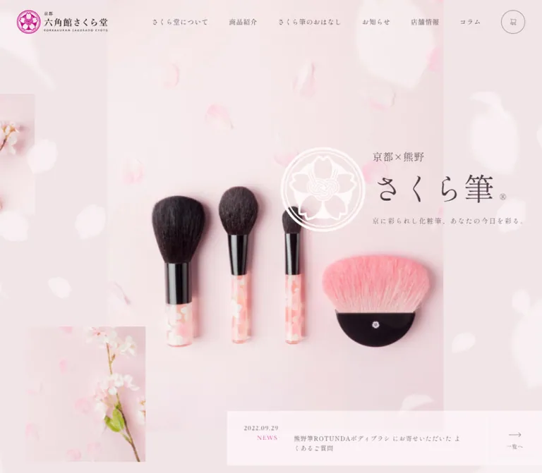
六角館さくら堂KYOTO — 桜色と明朝体で魅せる化粧筆専門店
淡い桜色と紫がかった墨色、明朝体、大きな欧文装飾文字を組み合わせたブランドサイト。化粧筆の写真、余白、横に連なる商品紹介で京都の上品な世界観を表現。
Rokkakukan Sakurado KYOTO — Style Reference
Fine makeup brushes presented through pale blossom color, spacious Mincho typography, and softly layered photography.
Website: Rokkakukan Sakurado KYOTO
Original URL: https://www.rokkakukan-sakurado.com/
Final URL: https://www.rokkakukan-sakurado.com/
Theme: light; blush surfaces, plum text, and restrained vivid-pink branding
Inspected: October 2, 2026, 01:55 JST; supplied retrieval timestamp 2026-10-01T16:55:25.293Z
Viewports: desktop 1440 × 1000; mobile 390 × 844, in CSS pixels
Scope: the current homepage: header, hero, introductory news link, About, Products, Story, Shops, Column, News, online-shop invitation, and footer. Linked pages and the separate online shop were not inspected.
Rokkakukan Sakurado is a makeup-brush specialist’s brand and retail-information website. Its homepage connects product families, craftsmanship, a physical store, editorial articles, announcements, and an external online shop. The design gives each subject considerable space while retaining a consistent Japanese serif voice.
The strongest visible composition is the desktop hero: a tall, pale-pink product photograph sits behind a white floral emblem and right-aligned brand copy. Smaller blossom photographs enter from the edges, while large, translucent petal shapes soften the foreground. Across the rest of the measured document, modest Japanese headings are paired with enormous, nearly white English section words. Product and article links extend horizontally beyond the viewport, with offset vertical positions rather than a conventional uniform card grid.
閉じる
Rokkakukan Sakurado KYOTO — Style Reference
Fine makeup brushes presented through pale blossom color, spacious Mincho typography, and softly layered photography.
Website: Rokkakukan Sakurado KYOTO
Original URL: https://www.rokkakukan-sakurado.com/
Final URL: https://www.rokkakukan-sakurado.com/
Theme: light; blush surfaces, plum text, and restrained vivid-pink branding
Inspected: October 2, 2026, 01:55 JST; supplied retrieval timestamp 2026-10-01T16:55:25.293Z
Viewports: desktop 1440 × 1000; mobile 390 × 844, in CSS pixels
Scope: the current homepage: header, hero, introductory news link, About, Products, Story, Shops, Column, News, online-shop invitation, and footer. Linked pages and the separate online shop were not inspected.
Rokkakukan Sakurado is a makeup-brush specialist’s brand and retail-information website. Its homepage connects product families, craftsmanship, a physical store, editorial articles, announcements, and an external online shop. The design gives each subject considerable space while retaining a consistent Japanese serif voice.
The strongest visible composition is the desktop hero: a tall, pale-pink product photograph sits behind a white floral emblem and right-aligned brand copy. Smaller blossom photographs enter from the edges, while large, translucent petal shapes soften the foreground. Across the rest of the measured document, modest Japanese headings are paired with enormous, nearly white English section words. Product and article links extend horizontally beyond the viewport, with offset vertical positions rather than a conventional uniform card grid.
How to Read This Reference
- Measured means a value supplied by the rendered DOM or computed-style evidence. Measurements describe the captured state, not a recovered stylesheet formula.
- Visually observed means visible in the supplied original-page screenshots. The desktop hero and mobile footer provide the clearest completed compositions.
- Estimated means an approximate visual measurement or color judgment. These values were not obtained through pixel sampling.
- Recommended means implementation guidance for a new build. Breakpoints, accessibility improvements, image-slot ratios, and fallback behavior are explicitly treated this way.
- Token names in this document are descriptive aliases. The only supplied source custom property was
--swiper-theme-color: #007aff; its presence does not make blue a visible brand color. - Computed font-family declarations identify requested families. Font files and the actual font used for each glyph were not independently verified.
Capture limitation: two desktop captures show the header over a pale wash, with petals in one, but without visible main content. The mobile opening capture similarly shows the logo, menu icon, and background without its hero copy or photograph. The DOM nevertheless contains the complete content and its geometry. The evidence does not establish whether these incomplete states result from animation, visibility logic, or capture timing. Do not reproduce an empty opening screen as an intentional design feature.
Tokens — Colors
Default Palette
| Name | Value | Suggested token | Evidence and role |
|---|---|---|---|
| Blush Canvas | #fff5f5 |
--color-canvas |
Measured body background at both viewports |
| Rose Hero | #f1e5e7 |
--color-hero |
Measured hero-section background |
| Plum Ink | #4b3a45 |
--color-ink |
Measured body, navigation, headings, and link text |
| Porcelain Lettering | #fdf8f9 |
--color-display |
Measured oversized English section lettering |
| Blossom Pink | approximately #e4007f |
--color-brand |
Estimated from the visible floral logo; exact logo color is unavailable |
| Muted Mauve Rule | approximately #9b8894 |
--color-rule |
Estimated from fine outlines and footer icons |
| Lavender Wash | approximately #e5e3ee |
--color-lavender |
Estimated cool region of background-only and footer captures |
| Pale Aqua Wash | approximately #e8fbfc |
--color-aqua |
Estimated right side of the mobile opening background |
| White Motif | approximately #ffffff |
--color-motif |
Visually observed white floral emblem and translucent petal forms |
The first four values are exact hexadecimal conversions of supplied computed RGB values. The remaining values are reusable approximations, not recovered source declarations.
Color Relationships
The page’s normal text uses a brownish purple instead of pure black. The principal canvas is warm and almost white; the hero is slightly deeper and dustier. The pink logo supplies the strongest chromatic accent, while the black brush ferrules and dark bristles supply contrast within the photography.
Several screenshots contain broad transitions between warm pink, lavender, and pale aqua. The body’s measured solid background does not explain the complete visible composite. No gradient stops, overlay opacity, or background animation keyframes were supplied. Use a gentle layered wash as an approximation, keeping its construction separate from the exact canvas token.
The very pale English display words are atmospheric typography. Maintain a separate, readable Japanese heading for every section rather than relying on the low-contrast word as its only label.
Tokens — Typography
Japanese Editorial Serif
Computed source stack: "Shippori Mincho", "Yu Mincho", 游明朝, YuMincho, "ヒラギノ明朝 ProN", serif, "Sawarabi Mincho".
Shippori Mincho leads the declared stack throughout the body, navigation, hero copy, product names, and section headings. Most text has weight 400. Desktop navigation uses 500; the online-shop supporting sentence uses 700.
The character comes from fine serif detail, moderate tracking, and generous paragraph leading. Avoid introducing heavy headline weights throughout the page: size and space provide most of the hierarchy.
English Display Serif
Computed source family: "Cormorant Infant", followed by the Japanese editorial stack.
This family is declared for ABOUT, PRODUCTS, STORY, SHOPS, COLUMN, NEWS, ONLINE SHOP, and the footer copyright. Main section words measure 240px on desktop and 99.84px on mobile. The online-shop word treatment uses a separate, smaller scale.
Some display words occupy very tall, narrow bounding boxes. This supports an orientation along a vertical axis, but the evidence does not identify whether the source uses rotation or vertical writing mode.
Brand Artwork
The header combines a vivid floral crest, Japanese wordmark, and a tiny Latin subtitle. Its proportions belong to the supplied logo artwork. Do not recreate this identity by setting ordinary text in the page font.
Type Scale
Sizes and line heights below are measured. Tracking is shown as the actual computed value.
| Role | Desktop size / line height | Mobile size / line height | Weight | Tracking |
|---|---|---|---|---|
| Body default | 16 / 24px |
15.6 / 23.4px |
400 | 1.6px / 1.56px |
| Desktop navigation / mobile offscreen menu links | 16 / 24px |
16.64 / 24.96px |
500 / 400 | 0.8px / 0.832px |
| Hero title | 72 / 96px |
49.92 / 58.24px |
400 | Normal |
| Hero origin line | 24 / 32px |
16.64 / 24.96px |
400 | 1.2px / 0.832px |
| Hero tagline | 16 / 32px |
14.56 / 24.96px |
400 | 2.4px / 1.456px |
| Japanese section heading | 24 / 32px |
20.8 / 33.28px |
400 | 2.4px / 2.08px |
| Editorial lead heading | 40 / 64px |
24.96 / 45.76px |
400 | 4px / 1.248px |
| About paragraph | 16 / 40px |
15.6 / 33.28px |
400 | 1.6px / 0.78px |
| Story paragraph | 16 / 40px |
15.6 / 33.28px |
400 | 1.6px / 1.56px |
| Product name | 24 / 36px |
20.8 / 33.28px |
400 | 1.6px / normal |
| Article title | 16 / 24px |
15.6 / 24.96px |
400 | 1.6px / 1.56px |
| Main English display word | 240 / 240px |
99.84 / 99.84px |
400 | Varies by word |
| Online-shop display word | 180 / 180px |
91.52 / 91.52px |
400 | 18px / 9.152px |
| Online-shop Japanese heading | 27 / 36px |
20.8 / 33.28px |
400 | 2.7px / 1.04px |
| Online-shop supporting sentence | 18 / 27px |
16.64 / 24.96px |
700 | 1.6px / 0.832px |
| Footer business information | 14 / 32px |
12.48 / 33.28px |
400 | 0.7px / 0.624px |
| Footer copyright | 14 / 20px |
12.48 / 16.64px |
400 | 1.4px / 1.248px |
For display-word tracking, desktop ABOUT uses normal spacing, while STORY, PRODUCTS, SHOPS, COLUMN, and NEWS measure 24px. On mobile, the horizontal ABOUT, STORY, COLUMN, and NEWS words use normal spacing; PRODUCTS and SHOPS retain 9.984px tracking.
The source root font size is 10px at both sampled widths. The Quick Start below uses explicit sizes and a conventional root instead of depending on the source’s rem convention.
Tokens — Spacing & Shapes
Spacing Scale
The design has several useful measured intervals, but the evidence does not establish a single universal spacing system.
| Use | Desktop | Mobile | Status |
|---|---|---|---|
| Header horizontal inset | 40px |
Logo begins at about 16.63px |
Measured |
| Header top inset | 24px |
Logo begins at about 16.63px |
Measured |
| Common section outer margin | 80px |
0px |
Measured |
| Common section inner padding | 40px |
Content often begins at 37.44px |
Measured |
| Product-card gap | 48px |
About 24.95px |
Calculated from measured boxes |
| Article-card gap | 72px |
About 24.95px |
Calculated from measured boxes |
| Arrow reservation in text links | 48px right padding |
41.6px right padding |
Measured |
| Repeated gap between major section boxes | 160px |
About 83.19px |
Calculated from supplied bounds |
| Hero-to-About section-box gap | 240px |
About 220.47px |
Calculated; heading bounds can extend outside section boxes |
| Footer top / bottom padding | 160 / 158px |
66.56 / 83.2px |
Measured |
Desktop editorial body text uses a 40px line height at a 16px font size. This unusually open leading is as important to the spaciousness as the section margins.
Border Radius and Linework
| Element | Value or appearance | Evidence |
|---|---|---|
| Header shop-link anchor | 44px radius |
Measured |
| Main shop-link anchor | 44px desktop; 45.76px mobile |
Measured |
| Sampled product and article link boxes | 0px radius |
Measured; image-corner styles were not included |
| Visible hero photographs | Rectangular, square corners | Screenshot observation |
| Footer return-to-top control | Approximately 50px circle |
Mobile screenshot estimate |
| Shop outline and contact underline | Approximately 1px |
Screenshot estimate |
Rounded geometry is concentrated in shop controls and the circular return control. The visible layout does not use a general system of rounded, elevated cards.
Layout Measurements
| Element | Desktop | Mobile |
|---|---|---|
| Document height | About 10463.30px |
About 8164.22px |
| Header box | 1440 × 80px |
390 × 64.47px |
| Header logo box | 215 × 56px |
About 191.36 × 49.83px |
| Hero section | 1440 × 1080px |
390 × 844px |
| Common desktop section box | 1280px wide, starting at x=80 |
Full viewport width |
| Common editorial content width | Varies; About paragraph 588px |
About 315.13px |
| Product-link box | 480 × 736px |
About 274.55 × 440.95px |
| Article-link box | 336 × 500px |
About 274.55 × 407.67px |
| Header shop-link anchor | 228 × 54px |
Not visible in the closed mobile header |
| Main shop-link anchor | 406 × 86px |
About 313.11 × 72.88px |
Document height is a captured result, not a recommended minimum height. Some measured children extend above their parent section or overlap other bounds. Missing transform and visibility details prevent treating every absolute coordinate as a settled layout specification.
Components
Desktop Header
Role: keep identity, six main destinations, and online shopping available above the visual composition.
The transparent header uses a horizontal flex layout with 24px 40px 0 padding. Its logo begins at (40, 24) and measures 215 × 56px. The first navigation anchor begins at approximately x=342.38; six links cover About, Products, Story, News, Shops, and Column. Each measured navigation anchor is 56px tall with 16px 4px padding.
The shop control sits at the far right. Its measured inner anchor is 228 × 54px; the visible outer outline is approximately 230 × 56px. A small cart symbol precedes the label オンラインショップ. Use a thin muted outline, a fully rounded silhouette, and the same plum text as the surrounding navigation.
There is no visible solid header bar in the opening composition. The header remains present in other supplied captures, including the mobile footer view; its precise positioning and scroll-state rules were not extracted.
Mobile Header and Offscreen Navigation
Role: preserve the full brand identity while reducing navigation to a compact trigger.
At 390px, the logo begins about 16.63px from the top and left and remains almost 192px wide. A three-stroke menu icon appears near the upper-right corner; its visible strokes are approximately 20px wide. The icon’s interactive hit area was not measured.
The DOM contains a separate menu structure with home, the six main destinations, shopping, contact, company information, social links, privacy, and copyright. Its links have negative horizontal coordinates in the sampled state, confirming that this content is outside the visible viewport. Its presence in extracted text is not evidence that the menu was open.
No menu activation was supplied. Opening direction, backdrop, focus behavior, close control, and scrolling within the menu remain unverified. For a new implementation, use a real button with an accessible name and an explicit expanded state, and keep closed-menu links out of keyboard navigation.
Product Hero
Role: establish the brush brand through product material, blossom imagery, and a short identity statement.
The measured desktop section is 1080px tall. In the visible capture, the main photograph begins near x=324, extends to approximately x=1116, and starts about 21px below the viewport top. Its visible width is therefore about 792px, or 55% of the viewport. Its complete image bounds and native aspect ratio were not supplied.
The photograph contains three upright brushes with dark bristles, black ferrules, and pale floral handles, alongside a low, broad pink brush with a black base. Petals are scattered across the pink photographic background. The dark materials anchor an otherwise very pale scene.
The text group begins at x=1029:
京都×熊野: top348px,24pxtype,32pxline height.さくら筆with its registered mark: top388px,72pxtype,96pxline height.京に彩られし化粧筆、あなたの今日を彩る。: top500px,16pxtype,32pxline height.
A white floral emblem approximately 200px across sits immediately to the left of this text, overlapping the photograph. Small blossom photographs enter from the left edge and lower-left region. Large, pale, softened petal silhouettes occupy the surrounding canvas.
This composition depends on controlled overlap: photograph, emblem, text, and peripheral imagery have distinct positions. Keep the brush silhouettes and the short title readable as separate elements.
Mobile geometry, not a verified completed visual: the DOM centers the title around x=195, with the origin line at y≈216.28, title at y≈249.55, and tagline at y≈324.41. The opening mobile screenshot does not show these elements, so its final image crop and layering cannot be established.
Introductory News Panel
Role: connect the atmospheric opening to a current announcement.
The visible desktop panel enters from the lower-right edge, beginning around (696, 935). It is a pale rectangular surface without rounded card styling. The article link contains a date, uppercase category, and announcement text; a separate right-hand region contains the arrow and 一覧へ link.
Measured desktop article-link bounds are approximately 519 × 69px, beginning at x=736. The separate list link measures 128 × 48px at x=1312. Only the top of the complete panel is visible in the desktop screenshot.
On mobile, the article-link box becomes approximately 229.89 × 116.45px, and the separate list link becomes 74.88 × 41.59px. This records substantially more wrapping. No rotating-news or ticker behavior was demonstrated.
Section Heading with English Display Word
Role: provide a quiet, readable section label within a much larger typographic landscape.
The Japanese label generally uses 24 / 32px on desktop. The pale English word uses Cormorant Infant at 240 / 240px. For About, the English box begins at y=1380, while the Japanese heading begins at y=1524, placing the smaller heading within the vertical span of the larger word.
Placement varies by section. About, Story, and News have centered Japanese headings. Products and Column use left-positioned labels. The Products display-word box measures 240 × 1451.33px, while Shops measures 240 × 851.98px, indicating a vertical presentation axis. Column’s desktop word begins at x=-270, deliberately extending beyond the viewport bounds in the supplied geometry.
On mobile, the main English scale drops to 99.84px, while Japanese labels become 20.8px. Preserve the distinction between readable section identity and decorative English lettering. Exact rotation and clipping methods require additional source evidence.
About Editorial Block
Role: introduce the Kyoto store and its approach to makeup brushes.
The desktop text is aligned to the left content edge at x=120. Its lead heading measures 40 / 64px, with 4px tracking, in a 616px box. The paragraph below is 588px wide and uses 16 / 40px type. The 詳しく読む link aligns to the paragraph’s right edge.
At mobile width, the lead is 24.96 / 45.76px. The paragraph occupies a 315.13px column beginning at x≈37.44, with 15.6 / 33.28px text. The source mobile copy introduces additional line breaks in the lead.
The evidence describes a renovated Kyoto townhouse in the copy, but does not provide a visible About photograph or its asset bounds. Do not infer the appearance of that image from the text alone.
Product Rail and Product Link
Role: introduce twelve product families as individually linked visual entries.
The measured sequence includes メタルSAKURA, ARシリーズ, 舞さくら, べっぴん桜筆, 粋 - Sui, 華さくら, 花ほほ筆, 化粧はな筆, 熊野筆ROTUNDA, 洗顔筆, ギフトセット, and その他.
Desktop link boxes are 480 × 736px. Their horizontal starting positions are 220, 748, 1276, and so on, producing a 528px stride and 48px gap. More entries extend beyond the viewport. Their vertical positions differ: the first three begin at y=2910, 2970, and 2870. These are captured offsets; the evidence does not establish whether every offset is a permanent layout rule or part of a transform state.
The first product heading begins 664px below its link’s top and uses 24 / 36px type. This geometry is consistent with a tall media region followed by a title, but image-element bounds are absent.
On mobile, link width becomes approximately 274.55px, with a 299.5px stride and 24.95px gap. The first item starts at x≈37.44, and the second at x≈336.94, leaving part of the next item inside the viewport. Product names use 20.8 / 33.28px type.
For an adaptation, a 3:4 media slot is a reasonable starting recommendation based on the title offsets. It is not a verified native image ratio. Provide reachable horizontal navigation; dragging, swiping, snapping, autoplay, and source controls were not tested.
Story Editorial Block
Role: explain the brush brand’s Kyoto and Kumano craft relationship.
The measured desktop copy moves to the right side. The lead begins at x=733.5, with the paragraph using a 546.75px width. The title 一生付き合える化粧筆。 uses the same 40 / 64px lead style as About, followed by 16 / 40px body text and a right-aligned detail link.
On mobile, the content returns to the common 315.13px reading column. The left-side desktop media composition was not visible in the supplied captures, so its subject and crop remain unspecified.
Shops Section
Role: introduce the Kyoto location and route visitors to store information.
The desktop section is 1280px wide with 72px 142px 0 padding. Its measured copy begins at x=222; the paragraph is 648px wide. A tall English SHOPS word occupies the right side. The Japanese heading, explanatory text, availability note, and 店舗情報を見る link form the textual sequence.
At mobile width, horizontal padding becomes 37.44px, top padding becomes 66.56px, and the paragraph uses the common 315.13px width. The large space before the measured heading suggests a substantial preceding visual region, but its image contents were not supplied.
Column Rail
Role: provide editorial entry points for brush use, care, gift etiquette, and related topics.
Ten article anchors appear in the rendered text. Each contains a date, category such as HOWTO, MANNER, or PICKUP, and a Japanese title.
Desktop cards measure 336 × 500px, with a 408px horizontal stride and 72px gap. The first three start at x=144, 552, and 960. Their top coordinates differ by 20px in the sampled state. Titles use the restrained body-sized 16 / 24px style rather than the larger product-name scale.
Mobile cards become approximately 274.55 × 407.67px, with the same 24.95px gap as the mobile product rail. Titles wrap to two or three lines at 15.6 / 24.96px.
A square media slot is a useful implementation recommendation because the desktop title begins 360px below the card top, consistent with a 336px image plus spacing. The evidence does not include the actual thumbnails, so do not claim a verified image ratio or photographic treatment for this section.
News List
Role: present three recent announcements in a text-led format.
The section combines the pale NEWS display word with a readable Japanese heading. Each article is a link grouping date, category, and title. The desktop link width is 1152px; the first, longer announcement measures 48px tall, while the two shorter links measure 24px tall. Their vertical starts are approximately 165px and 141px apart, giving the section considerable breathing room.
On mobile, links are 315.13px wide. The first measures about 95.66px tall and the shorter entries about 54.06px, reflecting wrapping and regrouping. The exact internal flex direction was not supplied. A centered お知らせ一覧を見る link closes the section.
Underlined Detail Link
Role: offer a modest next step after editorial content.
Examples include 詳しく読む, 店舗情報を見る, and お問い合わせ. Desktop links have 44px measured height, 4px top padding, and 48px right padding. Mobile examples have approximately 37.44px height and 41.6px right padding.
The mobile footer visibly shows a thin underline spanning the label-and-arrow composition, with a small right-pointing arrow above its end. Use text, a fine rule, and directional linework rather than a filled rectangular button. A larger invisible touch target is a recommended improvement over copying the mobile measured height exactly.
Online-Shop Invitation
Role: provide a prominent purchasing route after the informational sections.
The measured desktop layout places the invitation on the right: a two-line ONLINE SHOP display word at 180px, a 27px Japanese heading, an 18px bold supporting sentence, and a 406 × 86px shop-link anchor with 44px radius.
At mobile width, the text centers. The English display scale becomes 91.52px, and the shop anchor measures approximately 313.11 × 72.88px. Both header and main shopping links point to https://www.sakurado.kyoto.jp/. That destination was observed as a link only; its interface and checkout behavior are outside this reference.
Footer
Role: collect site navigation, business details, contact, social destinations, and legal information.
Desktop measurements describe three main regions: a 165px square brand-link box at x=120, navigation beginning at x=528, and business information beginning at x=834. Navigation rows begin 56px apart. Business information uses 14 / 32px type, followed by the detail-style contact link and two 20px social-link boxes.
The footer names 株式会社六角館さくら堂. This identity is directly supported by the inspected homepage.
On mobile, the footer stacks into one column with approximately 37.44px side insets. The footer brand-link box is centered and measures about 128.95 × 130.42px. Navigation starts roughly 44.19px apart. Business information uses 12.48 / 33.28px type. X and Instagram links sit together on the left; an outlined circular upward-arrow control is visible on the right. Its action was not tested.
The visible lower footer has a fine horizontal divider, a centered underlined privacy link, and small Cormorant Infant copyright text. The persistent header overlaps upper footer navigation in the supplied mobile capture. Treat that overlap as a captured limitation to resolve in an adaptation, not a desirable reading pattern.
Tokens — Motion & Interaction
Measured Declarations
| Target | Supplied computed declaration | What it supports |
|---|---|---|
| Header | Transform and background color: 1.2s cubic-bezier(0.32, 0.95, 0.6, 1) |
A slow, eased header-state transition is defined |
| Desktop logo heading | Transform: 1.2s cubic-bezier(0.32, 0.95, 0.6, 1) |
Logo movement can accompany a state change |
| Mobile logo heading | Transform 1.2s; opacity 1.2s with 0.2s delay, using the same easing |
Separate movement and delayed visibility treatment |
| Navigation anchors | Background color 0.6s; color 0.4s, using cubic-bezier(0.32, 0.95, 0.6, 1) |
Color transitions are defined; their endpoint colors are unknown |
| Editorial paragraphs, product links, article links | Clip path: 0.8s cubic-bezier(0.32, 0.95, 0.6, 1) 0.2s |
A delayed clipping transition is defined |
| The same reveal targets | Opacity: 2.6s cubic-bezier(0.16, 1, 0.3, 1) |
A much longer opacity transition accompanies clipping |
| Privacy link | TEXT-MASK-OVER, 0.6s cubic-bezier(0.23, 1, 0.32, 1), forwards |
A named text-mask animation exists; its keyframes were not supplied |
These declarations establish a soft, unhurried motion vocabulary. They do not prove which user action triggers each transition. A computed transition: all entry without a duration is insufficient evidence of a visible animation.
Visible States and Unverified Behavior
Petal shapes and background colors differ between screenshots, but the images are not a timed playback sequence. Petal speed, travel direction, looping, parallax, pointer response, and gradient timing remain unknown.
The horizontal geometry of Products and Column supports a rail layout. The supplied --swiper-theme-color property is consistent with slider-related styling being present, but does not establish autoplay, swipe handling, pagination, or a particular active slider configuration.
Navigation destinations are recorded as anchors. Menu opening, hover endpoints, product-rail operation, return-to-top activation, and external shopping were not exercised in the supplied evidence.
Recommended adaptation: retain the observed easing for optional reveals, but render essential content visibly by default. Enable a hidden reveal state only after its controller is ready, and provide a reduced-motion path that displays all content immediately.
Surfaces
| Layer | Appearance | Evidence and purpose |
|---|---|---|
| Base canvas | Near-white blush #fff5f5 |
Measured body background |
| Hero base | Dusty rose #f1e5e7 |
Measured section background beneath image composition |
| Atmospheric wash | Broad pink, lavender, and occasional aqua regions | Visible; exact layer construction unavailable |
| Product photograph | Soft pink photographic field with dark material contrast | Visible desktop hero |
| Decorative foreground | Pale, softened petals and white floral emblem | Visible desktop captures |
| English display lettering | Almost-white serif typography | Measured throughout section structure |
| Introductory news panel | Pale rectangular surface | Partially visible desktop hero |
| Shop controls | Transparent interiors with fine rounded outlines | Visible desktop header; radius measured elsewhere |
| Footer | Shared pale wash, fine rules, small plum text | Visible mobile footer |
No shadow-based elevation hierarchy is visible in the supplied header, hero, or footer. Lower-section box-shadow values were not included in the extraction, so this observation should not be expanded into a claim about every element on the site.
Imagery
The desktop hero uses high-key product still life with soft illumination and a tightly coordinated pink palette. The brush bristles retain fine texture; black ferrules and the broad brush’s dark base provide crisp shape. Floral handle patterns, real blossoms, scattered petals, and a white brand emblem repeat the same botanical idea at different scales.
Peripheral blossom photographs are rectangular and partly cropped by the composition. The translucent foreground petals are softer than the products. Preserve that difference in focus: applying blur uniformly would remove the material detail that makes the brushes convincing.
Observed Asset References
The supplied evidence does not expose image src URLs or filenames. The following are descriptive asset references, not invented source paths.
| Asset | Evidence | Reuse guidance |
|---|---|---|
| Header crest and wordmark | Desktop and mobile screenshots; measured link bounds | Use an authorized logo asset at its native proportions |
| Four-brush hero still life | Completed desktop hero | Preserve all four brush silhouettes and their relative scale |
| White floral emblem | Completed desktop hero | Keep separate from live title text where possible |
| Peripheral cherry-blossom photos | Completed desktop hero | Use intentional rectangular crops and sparse placement |
| Soft petal silhouettes | Desktop hero and one additional desktop capture | Decorative only; keep away from critical text |
| Cart and three-line menu symbols | Desktop and mobile headers | Fine, restrained linework |
| X, Instagram, and upward-arrow symbols | Mobile footer | Small visual marks with larger accessible hit areas recommended |
| Product, editorial, and store media | Link geometry and section structure only | Subjects, source files, and exact crops are unverified |
CSS can reproduce the color, spacing, typography, and layering. Product photography and brand artwork require appropriate source assets; they should not be replaced by generic flower decoration or recreated logos.
Layout & Responsive Behavior
Desktop Composition
The header overlays a hero taller than the 1000px viewport. The photograph is centered slightly left of the viewport’s midpoint, while the text sits toward the right edge. This allows the visual and verbal identity to overlap without forcing them into equal columns.
Most subsequent section boxes are 1280px wide at 1440px, with additional internal spacing. About starts with left-side copy; Story has right-side copy. Products and Column extend horizontally beyond the visible content area. Large English words can exceed a section boundary or enter from outside the viewport.
Do not flatten these relationships into identical centered sections. Preserve the alternation between centered labels, side-positioned reading columns, horizontal rails, and expansive decorative type.
Mobile Composition
The observed changes are structural:
- Full desktop navigation is replaced visually by the logo and menu icon.
- Ordinary reading content uses approximately
315.13pxof the390pxviewport, leaving about37.44pxper side. - Products and articles retain horizontal sequences with approximately
274.55pxitems and a visible next-item fragment. - The hero’s DOM copy is centered, rather than retaining its desktop right-edge position.
- Japanese section headings remain moderately sized at
20.8px; English decoration contracts to approximately100px. - Editorial paragraphs retain generous
33.28pxleading. - The online-shop invitation centers, and the footer stacks vertically.
These findings come from both geometry and the visible header/footer. A completed mobile hero and the intervening mobile sections were not visually supplied.
Scaling and Breakpoint Limits
Many mobile values are consistent with a 1.04 scale at 390px: 48 × 1.04 = 49.92, 20 × 1.04 = 20.8, and 36 × 1.04 = 37.44. This suggests a possible viewport-related scale, but the original formula is not present in the evidence. It is not a uniform scaling of the desktop layout.
Only two viewport widths were sampled. The actual navigation-collapse breakpoint, tablet layouts, landscape behavior, safe-area handling, and browser-zoom behavior remain unverified. The Quick Start uses explicitly recommended breakpoints and readable size limits.
Do’s and Don’ts
Do
- Keep the measured blush canvas, rose hero, and plum text as the foundation.
- Use the declared Mincho family for Japanese text and Cormorant Infant for oversized English decoration.
- Preserve regular-weight headings and generous editorial line spacing.
- Build the desktop opening around the actual product photograph, white emblem, and right-side live text.
- Concentrate vivid pink in brand details instead of spreading it across every control.
- Use large, pale section words with separate readable Japanese labels.
- Retain horizontal product and article rails with generous gaps and a mobile next-item preview.
- Use fine outlined shop controls and underlined detail links.
- Preserve a complete information-site structure: products, story, stores, articles, news, shopping, and business details.
- Keep measured geometry, screenshot estimates, and new implementation decisions distinct.
Don’t
- Don’t treat blank capture states as a finished minimalist opening screen.
- Don’t substitute a generic centered sales headline for the measured hero composition.
- Don’t turn every content group into a rounded white card with a drop shadow.
- Don’t use the exposed slider-blue property as the site’s accent palette.
- Don’t make the pale English decoration the only accessible section heading.
- Don’t invent lower-section image subjects, source asset paths, or font-loading details.
- Don’t claim autoplay, parallax, hover colors, or menu behavior from static geometry alone.
- Don’t reproduce captured header overlap with footer navigation.
- Don’t force the mobile rails into an unreadably narrow multi-column grid.
- Don’t copy snapshot coordinates as a complete page-positioning system.
Recommended Implementation Additions
These are recommendations for a new implementation, not verified features of the original:
- Keep all essential text and links visible before JavaScript starts. Reveal effects should enhance already available content.
- Use meaningful image alternatives for product photography, an accessible home label for the brand link, and empty alternatives for purely decorative petals.
- Give menu, social, cart-only, and return controls explicit accessible names and touch targets of at least
44px. - Make an offscreen mobile menu inert while closed. Manage focus, dismissal, and internal scrolling when it opens.
- Provide keyboard-accessible rail navigation and ensure focusing an offscreen item reveals it. Avoid making dragging the only available operation.
- Treat duplicate English section words as decorative when the Japanese heading already conveys the section identity.
- Add a visible plum focus outline and preserve sufficient contrast over every wash or photograph.
- Give a persistent header adequate content clearance; use a more opaque surface when necessary to prevent the footer overlap visible in the capture.
- Respect reduced-motion preferences and stop nonessential petal movement in that mode.
- Load suitable font weights deliberately and verify Japanese fallback metrics. Do not assume a declared font name guarantees that its asset loaded.
- Use responsive image sources and an intentional mobile crop once the authorized hero asset is available.
Agent Prompt Guide
Quick Color Reference
- Main page: measured
#fff5f5. - Hero base: measured
#f1e5e7. - Text and primary linework: measured
#4b3a45. - Oversized decorative words: measured
#fdf8f9. - Logo-like pink accent: approximate
#e4007f; obtain the actual value from the authorized artwork when available. - Fine secondary outlines: approximate
#9b8894. - Atmospheric wash: subtle lavender or aqua, with estimated colors and no asserted original gradient formula.
Overall Prompt
“Create a Japanese makeup-brush brand homepage inspired by the supplied Rokkakukan Sakurado reference. Use blush #fff5f5, dusty rose #f1e5e7, plum text #4b3a45, Shippori Mincho for Japanese editorial typography, and Cormorant Infant for very large, nearly white English section words. Build an asymmetric desktop hero with an authorized brush still life, a white floral emblem, short right-side Japanese copy, peripheral blossom photographs, and restrained petal decoration. Follow with About, a horizontal product-family rail, Story, Shops, an article rail, News, an outlined online-shop invitation, and a detailed footer. Preserve regular-weight type, broad spacing, thin linework, and small underlined detail links. On mobile, use generous reading insets, a compact header, and rails that reveal part of the next item. Render content visibly by default; treat mobile hero composition and untested interactions as new implementation decisions.”
Example Component Prompts
- Header: “Create a transparent desktop header with a floral crest and wordmark on the left, six evenly spaced Japanese serif navigation links, and a thin outlined shopping pill on the right. At a chosen compact breakpoint, keep the logo large and use a three-stroke menu button with an accessible hit area. Do not invent an observed menu animation.”
- Hero: “At a 1440px desktop width, compose a pale product photograph across approximately 55% of the viewport, starting around 22.5% from the left. Place a 200px white floral emblem beside live right-side copy: a 24px origin line, a 72px regular Mincho title, and a tracked 16px tagline. Preserve the brush details and square photograph edges.”
- Section heading: “Pair a readable 24px Japanese section label with a 240px Cormorant Infant English word in
#fdf8f9. Allow the decorative word to overlap its surrounding space. Reduce the decorative scale to about 100px on a 390px phone while keeping the readable label around 21px.” - Product rail: “Build a horizontal sequence of large product-family links. Use 480px desktop widths with 48px gaps and regular 24px product names. At 390px, use approximately 275px items with 25px gaps and a next-item preview. Supply usable keyboard and touch navigation. Treat image ratios and stagger offsets as configurable choices.”
- Footer: “Create a spacious blush-to-lavender footer with a stacked mobile navigation list, small widely led business details, an underlined contact link with a fine arrow, X and Instagram icons, an outlined circular return control, a light divider, and centered legal text. Keep the header from obscuring footer links.”
Quick Start
CSS Custom Properties
This is a usable adaptation, not recovered source CSS. Exact observed colors, type sizes, rail widths, and transition curves are retained where practical. The background wash, media ratios, header positioning, breakpoints, hover endpoints, and mobile hero flow are recommendations.
Load authorized font files separately. The class structure assumes a .site-header, a .hero containing .hero-photo, .hero-copy, optional .hero-emblem, and .hero-news, followed by .section blocks. A .section-heading contains a readable heading and decorative .section-word. Rails contain linked .product-card or .article-card elements. Supply real images; no source asset URLs are implied by these classes.
:root {
  /* Measured colors */
  --color-canvas: #fff5f5;
  --color-hero: #f1e5e7;
  --color-ink: #4b3a45;
  --color-display: #fdf8f9;

  /* Estimated adaptation colors */
  --color-brand: #e4007f;
  --color-rule: #9b8894;
  --color-lavender: #e5e3ee;

  /* Declared source families; load the fonts separately */
  --font-editorial: 'Shippori Mincho', 'Yu Mincho', YuMincho,
    serif, 'Sawarabi Mincho';
  --font-display: 'Cormorant Infant', var(--font-editorial);

  /* Measured desktop type values */
  --size-body: 16px;
  --size-section: 24px;
  --size-lead: 40px;
  --size-display: 240px;
  --size-product: 24px;
  --leading-copy: 40px;
  --leading-lead: 64px;

  /* Layout aliases */
  --page-inset: 80px;
  --content-inset: 40px;
  --section-gap: 160px;
  --product-width: 480px;
  --article-width: 336px;
  --product-gap: 48px;
  --article-gap: 72px;
  --radius-shop: 44px;

  /* Measured motion curves */
  --ease-soft: cubic-bezier(0.32, 0.95, 0.6, 1);
  --ease-reveal: cubic-bezier(0.16, 1, 0.3, 1);
}

* { box-sizing: border-box; }
html { font-size: 100%; }
body {
  margin: 0;
  color: var(--color-ink);
  background: var(--color-canvas);
  font: 400 var(--size-body) / 1.5 var(--font-editorial);
  letter-spacing: 0.1em;
}
a { color: inherit; }
button { color: inherit; font: inherit; }
img { display: block; max-width: 100%; }
h1, h2, h3, p { margin-block-start: 0; }

/* Optional approximation of the visible atmospheric wash */
.page-wash {
  background: linear-gradient(
    100deg,
    var(--color-canvas) 15%,
    #faefee 48%,
    var(--color-lavender) 100%
  );
}

/* Fixed positioning and the scrolled-state hook are recommendations */
.site-header {
  position: fixed;
  inset: 0 0 auto;
  z-index: 30;
  display: flex;
  align-items: center;
  gap: 40px;
  padding: 24px 40px 0;
  transition: transform 1.2s var(--ease-soft),
    background-color 1.2s var(--ease-soft);
}
.site-header[data-scrolled='true'] {
  background: rgb(255 245 245 / 96%);
}
.brand { flex: 0 0 215px; width: 215px; }
.brand img { width: 100%; height: auto; }
.desktop-nav {
  display: flex;
  align-items: center;
  gap: 40px;
  margin-left: auto;
}
.desktop-nav a {
  display: flex;
  align-items: center;
  min-height: 56px;
  padding: 16px 4px;
  font-size: 16px;
  font-weight: 500;
  letter-spacing: 0.05em;
  white-space: nowrap;
  text-decoration: none;
  transition: color 0.4s var(--ease-soft),
    background-color 0.6s var(--ease-soft);
}
.shop-link {
  display: inline-flex;
  align-items: center;
  justify-content: center;
  gap: 10px;
  width: min(100%, 406px);
  min-height: 86px;
  padding: 16px 24px;
  border: 1px solid var(--color-rule);
  border-radius: var(--radius-shop);
  font-size: 16px;
  letter-spacing: normal;
  text-decoration: none;
  background: transparent;
}
.header-shop { flex: 0 0 230px; width: 230px; min-height: 56px; }
.menu-toggle {
  display: none;
  width: 44px;
  height: 44px;
  border: 0;
  background: transparent;
  cursor: pointer;
}
.menu-toggle span {
  display: block;
  width: 20px;
  height: 1px;
  margin: 5px auto;
  background: currentColor;
}

/* Desktop hero proportions approximate the visible composition */
.hero {
  position: relative;
  isolation: isolate;
  min-height: 100svh;
  aspect-ratio: 4 / 3;
  overflow: hidden;
  background: var(--color-hero);
}
.hero-photo {
  position: absolute;
  top: 2%;
  left: 22.5%;
  width: 55%;
  height: 98%;
  object-fit: cover;
}
.hero-copy {
  position: absolute;
  z-index: 2;
  top: 32.22%;
  left: 71.46%;
  right: 3%;
}
.hero-emblem {
  position: absolute;
  top: -8px;
  right: calc(100% + 16px);
  width: 200px;
  height: auto;
}
.hero-kicker {
  margin: 0;
  font-size: 24px;
  line-height: 32px;
  letter-spacing: 0.05em;
}
.hero-title {
  margin: 8px 0 16px;
  font-size: 72px;
  font-weight: 400;
  line-height: 96px;
  letter-spacing: normal;
}
.hero-tagline {
  margin: 0;
  font-size: 16px;
  line-height: 32px;
  letter-spacing: 0.15em;
}
.hero-news {
  position: absolute;
  right: 0;
  bottom: 0;
  left: 48.33%;
  display: grid;
  grid-template-columns: minmax(0, 1fr) 128px;
  align-items: center;
  gap: 24px;
  padding: 30px 0 30px 40px;
  background: rgb(255 245 245 / 88%);
}
.hero-news a { min-width: 0; text-decoration: none; }
.decorative-petals { pointer-events: none; }

.section {
  width: min(1280px, calc(100% - 2 * var(--page-inset)));
  margin: var(--section-gap) auto 0;
  padding-inline: var(--content-inset);
  scroll-margin-top: 112px;
}
.section-heading {
  position: relative;
  isolation: isolate;
  min-height: 240px;
  display: grid;
  place-items: center;
  margin-bottom: 64px;
}
.section-heading h2 {
  position: relative;
  z-index: 1;
  margin: 0;
  font-size: var(--size-section);
  font-weight: 400;
  line-height: 32px;
  letter-spacing: 0.1em;
}
.section-word {
  position: absolute;
  inset: 0;
  margin: 0;
  color: var(--color-display);
  font: 400 var(--size-display) / 1 var(--font-display);
  letter-spacing: 0.1em;
  text-align: center;
  white-space: nowrap;
  pointer-events: none;
}
.section-word--about { letter-spacing: normal; }
.editorial-copy { max-width: 588px; }
.editorial-copy--right { margin-left: auto; max-width: 547px; }
.editorial-copy h3 {
  margin-bottom: 48px;
  font-size: var(--size-lead);
  font-weight: 400;
  line-height: var(--leading-lead);
  letter-spacing: 0.1em;
}
.editorial-copy p { line-height: var(--leading-copy); }
.detail-link {
  display: flex;
  align-items: center;
  justify-content: space-between;
  gap: 28px;
  width: fit-content;
  min-height: 44px;
  margin-top: 40px;
  margin-left: auto;
  padding-block: 4px 10px;
  border-bottom: 1px solid var(--color-rule);
  text-decoration: none;
  letter-spacing: normal;
}
.detail-link::after { content: '⟶'; font-size: 24px; font-weight: 400; }

/* Native horizontal scrolling is a recommended fallback */
.rail {
  display: flex;
  align-items: flex-start;
  overflow-x: auto;
  gap: var(--product-gap);
  padding: 40px 0 72px;
  scroll-snap-type: x proximity;
  overscroll-behavior-inline: contain;
}
.product-card, .article-card {
  display: block;
  flex-shrink: 0;
  min-width: 0;
  color: inherit;
  text-decoration: none;
  scroll-snap-align: start;
  transform: translateY(var(--card-offset, 0px));
}
.product-card { flex-basis: var(--product-width); }
.article-card { flex-basis: var(--article-width); }
.article-rail { gap: var(--article-gap); }

/* These media ratios are recommendations, not measured image bounds */
.product-card img { width: 100%; aspect-ratio: 3 / 4; object-fit: cover; }
.article-card img { width: 100%; aspect-ratio: 1; object-fit: cover; }
.product-card h3 {
  margin: 24px 0 0;
  font-size: var(--size-product);
  font-weight: 400;
  line-height: 1.5;
}
.article-meta { display: flex; gap: 16px; margin-top: 20px; }
.article-card h3 {
  margin: 12px 0 0;
  font-size: var(--size-body);
  font-weight: 400;
  line-height: 1.5;
}
.news-list { list-style: none; margin: 0; padding: 0; }
.news-list a {
  display: grid;
  grid-template-columns: auto auto minmax(0, 1fr);
  gap: 24px;
  padding-block: 48px;
  text-decoration: none;
}
.online-invitation { text-align: center; padding-block: 120px; }
.online-invitation .shop-link { margin-top: 32px; }

.site-footer { padding: 160px 0 158px; }
.footer-grid {
  display: grid;
  grid-template-columns: 1fr 0.75fr 1.25fr;
  gap: 64px;
  width: min(1200px, calc(100% - 80px));
  margin-inline: auto;
}
.footer-nav { display: grid; align-content: start; gap: 32px; }
.footer-nav a { text-decoration: none; }
.business-details { font-size: 14px; line-height: 32px; letter-spacing: 0.05em; }
.footer-socials { display: flex; gap: 16px; margin-top: 48px; }
.footer-socials a { display: grid; place-items: center; min-width: 44px; min-height: 44px; }
.footer-legal {
  margin: 80px auto 0;
  padding-top: 48px;
  border-top: 1px solid rgb(255 255 255 / 85%);
  width: min(1200px, calc(100% - 80px));
  text-align: center;
}
.copyright { margin-top: 48px; font: 400 14px / 20px var(--font-display); }

/* Recommended breakpoint; the source breakpoint is unknown */
@media (max-width: 87.5rem) {
  .site-header { padding: 16px; }
  .desktop-nav, .header-shop { display: none; }
  .menu-toggle { display: block; margin-left: auto; }
}

/* Recommended mobile scaling with a minimum size safeguard */
@media (max-width: 48rem) {
  :root {
    --mobile-unit: clamp(1px, calc(100vw / 375), 1.2px);
    --size-body: calc(15 * var(--mobile-unit));
    --size-section: calc(20 * var(--mobile-unit));
    --size-lead: calc(24 * var(--mobile-unit));
    --size-display: calc(96 * var(--mobile-unit));
    --size-product: calc(20 * var(--mobile-unit));
    --leading-copy: calc(32 * var(--mobile-unit));
    --leading-lead: calc(44 * var(--mobile-unit));
    --page-inset: 0px;
    --content-inset: clamp(24px, 9.6vw, 48px);
    --section-gap: calc(80 * var(--mobile-unit));
    --product-width: min(70.4vw, 360px);
    --article-width: var(--product-width);
    --product-gap: calc(24 * var(--mobile-unit));
    --article-gap: var(--product-gap);
  }
  .site-header { padding: calc(16 * var(--mobile-unit)); }
  .brand { flex-basis: calc(184 * var(--mobile-unit)); width: calc(184 * var(--mobile-unit)); }

  /* Flow-based mobile hero is recommended; its final source crop is unverified */
  .hero {
    display: flex;
    flex-direction: column;
    gap: 32px;
    aspect-ratio: auto;
    padding: 160px var(--content-inset) 32px;
  }
  .hero-copy { position: relative; inset: auto; order: 0; text-align: center; }
  .hero-photo { position: static; order: 1; width: 100%; height: auto; object-fit: contain; }
  .hero-emblem { position: static; width: 100px; margin: 0 auto 24px; }
  .hero-kicker { font-size: calc(16 * var(--mobile-unit)); line-height: 1.5; }
  .hero-title { font-size: calc(48 * var(--mobile-unit)); line-height: calc(56 * var(--mobile-unit)); }
  .hero-tagline { font-size: calc(14 * var(--mobile-unit)); line-height: calc(24 * var(--mobile-unit)); letter-spacing: 0.1em; }
  .hero-news { position: static; order: 2; grid-template-columns: minmax(0, 1fr) 52px; gap: 16px; padding: 24px 16px; }
  .section { width: 100%; scroll-margin-top: 96px; }
  .section-heading { min-height: 112px; margin-bottom: 48px; }
  .section-heading h2 { line-height: 1.6; }
  .section-word { letter-spacing: normal; }
  .editorial-copy, .editorial-copy--right { max-width: none; }
  .editorial-copy h3 { margin-bottom: 24px; letter-spacing: 0.05em; }
  .rail { margin-right: calc(-1 * var(--content-inset)); padding-right: var(--content-inset); }
  .product-card h3 { margin-top: 12px; }
  .detail-link { min-height: 44px; }
  .news-list a { grid-template-columns: auto 1fr; gap: 12px 20px; padding-block: 28px; }
  .news-title { grid-column: 1 / -1; }
  .shop-link { min-height: 74px; }
  .online-invitation { padding-block: 80px; }
  .site-footer { padding: 66px var(--content-inset) 83px; }
  .footer-grid { width: 100%; grid-template-columns: 1fr; gap: 44px; }
  .footer-nav { gap: 21px; }
  .business-details { font-size: calc(12 * var(--mobile-unit)); line-height: var(--leading-copy); }
  .footer-legal { width: 100%; }
  .copyright { font-size: calc(12 * var(--mobile-unit)); line-height: 1.4; }
}

/* Optional progressive reveal; add the controller class only when ready */
.reveal { opacity: 1; clip-path: inset(0); }
.reveals-ready .reveal {
  transition: clip-path 0.8s var(--ease-soft) 0.2s,
    opacity 2.6s var(--ease-reveal);
}
.reveals-ready .reveal[data-pending='true'] {
  opacity: 0;
  clip-path: inset(0 0 100% 0);
}

/* Recommended focus and reduced-motion behavior */
:where(a, button, [tabindex]):focus-visible {
  outline: 2px solid var(--color-ink);
  outline-offset: 5px;
}
@media (prefers-reduced-motion: reduce) {
  *, *::before, *::after {
    animation: none !important;
    transition: none !important;
    scroll-behavior: auto !important;
  }
  .reveals-ready .reveal[data-pending='true'] {
    opacity: 1;
    clip-path: none;
  }
}
A working menu controller, reveal controller, and return control require behavior beyond this CSS. Keep the menu closed with semantic visibility management until that behavior is implemented. The rail remains usable through native horizontal scrolling without a slider dependency.
Tailwind v4 Token Mapping
Optional aliases for a project already using Tailwind v4. This does not imply that the original website uses Tailwind. Define the custom properties above first.
@theme inline {
  --color-sakura-canvas: var(--color-canvas);
  --color-sakura-hero: var(--color-hero);
  --color-sakura-ink: var(--color-ink);
  --color-sakura-display: var(--color-display);
  --color-sakura-brand: var(--color-brand);
  --color-sakura-rule: var(--color-rule);

  --font-editorial-jp: var(--font-editorial);
  --font-editorial-display: var(--font-display);

  --text-editorial-body: var(--size-body);
  --text-section-label: var(--size-section);
  --text-editorial-lead: var(--size-lead);
  --text-section-word: var(--size-display);

  --spacing-editorial-inset: var(--content-inset);
  --spacing-section-gap: var(--section-gap);
  --spacing-product-width: var(--product-width);
  --radius-shop-pill: var(--radius-shop);
}
Sources & Evidence
- Inspected original and final page: https://www.rokkakukan-sakurado.com/. The supplied response status is
200, and the original and final URLs are identical. - Capture date: supplied retrieval
2026-10-01T16:55:25.293Z, equivalent to October 2, 2026, 01:55 JST. - Desktop evidence: three supplied
1440 × 1000original-page screenshots and one rendered DOM/computed-style snapshot. One screenshot shows the complete visible hero composition; the other two show the header and background states without visible main content. - Mobile evidence: two supplied
390 × 844original-page screenshots and one rendered DOM/computed-style snapshot. The opening capture shows the header and background; the other shows lower-footer content beneath the persistent header. - Measured material: element bounding boxes, text, link destinations, font-family declarations, font sizes, weights, line heights, tracking, padding, radii, backgrounds, transitions, and one named text-mask animation.
- Inspection conditions: the supplied browser process waited for document load, selected finite animation and layout stability checks, and visible image decoding, subject to overall time limits. Perpetual animations were paused during readiness checks and resumed afterward. Scrolling traversed intermediate positions. SharedWorkers and service workers were disabled.
- Limits: no additional browsing, commands, file inspection, or interaction testing was performed for this reference. Asset URLs, font files, complete stylesheets, original breakpoint rules, image-element bounds, menu activation, slider operation, hover endpoints, and the final mobile hero appearance were not supplied. Screenshot scroll offsets and timing relationships were not identified.
This reference describes the current homepage evidence. Its implementation examples preserve documented visual relationships while explicitly identifying the choices needed where the supplied inspection is incomplete.
# Rokkakukan Sakurado KYOTO — Style Reference

> Fine makeup brushes presented through pale blossom color, spacious Mincho typography, and softly layered photography.

**Website:** [Rokkakukan Sakurado KYOTO](https://www.rokkakukan-sakurado.com/)
**Original URL:** https://www.rokkakukan-sakurado.com/
**Final URL:** https://www.rokkakukan-sakurado.com/
**Theme:** light; blush surfaces, plum text, and restrained vivid-pink branding
**Inspected:** October 2, 2026, 01:55 JST; supplied retrieval timestamp `2026-10-01T16:55:25.293Z`
**Viewports:** desktop `1440 × 1000`; mobile `390 × 844`, in CSS pixels
**Scope:** the current homepage: header, hero, introductory news link, About, Products, Story, Shops, Column, News, online-shop invitation, and footer. Linked pages and the separate online shop were not inspected.

Rokkakukan Sakurado is a makeup-brush specialist’s brand and retail-information website. Its homepage connects product families, craftsmanship, a physical store, editorial articles, announcements, and an external online shop. The design gives each subject considerable space while retaining a consistent Japanese serif voice.

The strongest visible composition is the desktop hero: a tall, pale-pink product photograph sits behind a white floral emblem and right-aligned brand copy. Smaller blossom photographs enter from the edges, while large, translucent petal shapes soften the foreground. Across the rest of the measured document, modest Japanese headings are paired with enormous, nearly white English section words. Product and article links extend horizontally beyond the viewport, with offset vertical positions rather than a conventional uniform card grid.
閉じる
# Rokkakukan Sakurado KYOTO — Style Reference

> Fine makeup brushes presented through pale blossom color, spacious Mincho typography, and softly layered photography.

**Website:** [Rokkakukan Sakurado KYOTO](https://www.rokkakukan-sakurado.com/)
**Original URL:** https://www.rokkakukan-sakurado.com/
**Final URL:** https://www.rokkakukan-sakurado.com/
**Theme:** light; blush surfaces, plum text, and restrained vivid-pink branding
**Inspected:** October 2, 2026, 01:55 JST; supplied retrieval timestamp `2026-10-01T16:55:25.293Z`
**Viewports:** desktop `1440 × 1000`; mobile `390 × 844`, in CSS pixels
**Scope:** the current homepage: header, hero, introductory news link, About, Products, Story, Shops, Column, News, online-shop invitation, and footer. Linked pages and the separate online shop were not inspected.

Rokkakukan Sakurado is a makeup-brush specialist’s brand and retail-information website. Its homepage connects product families, craftsmanship, a physical store, editorial articles, announcements, and an external online shop. The design gives each subject considerable space while retaining a consistent Japanese serif voice.

The strongest visible composition is the desktop hero: a tall, pale-pink product photograph sits behind a white floral emblem and right-aligned brand copy. Smaller blossom photographs enter from the edges, while large, translucent petal shapes soften the foreground. Across the rest of the measured document, modest Japanese headings are paired with enormous, nearly white English section words. Product and article links extend horizontally beyond the viewport, with offset vertical positions rather than a conventional uniform card grid.

## How to Read This Reference

- **Measured** means a value supplied by the rendered DOM or computed-style evidence. Measurements describe the captured state, not a recovered stylesheet formula.
- **Visually observed** means visible in the supplied original-page screenshots. The desktop hero and mobile footer provide the clearest completed compositions.
- **Estimated** means an approximate visual measurement or color judgment. These values were not obtained through pixel sampling.
- **Recommended** means implementation guidance for a new build. Breakpoints, accessibility improvements, image-slot ratios, and fallback behavior are explicitly treated this way.
- Token names in this document are descriptive aliases. The only supplied source custom property was `--swiper-theme-color: #007aff`; its presence does not make blue a visible brand color.
- Computed font-family declarations identify requested families. Font files and the actual font used for each glyph were not independently verified.

**Capture limitation:** two desktop captures show the header over a pale wash, with petals in one, but without visible main content. The mobile opening capture similarly shows the logo, menu icon, and background without its hero copy or photograph. The DOM nevertheless contains the complete content and its geometry. The evidence does not establish whether these incomplete states result from animation, visibility logic, or capture timing. Do not reproduce an empty opening screen as an intentional design feature.

## Tokens — Colors

### Default Palette

| Name | Value | Suggested token | Evidence and role |
| --- | --- | --- | --- |
| Blush Canvas | `#fff5f5` | `--color-canvas` | Measured body background at both viewports |
| Rose Hero | `#f1e5e7` | `--color-hero` | Measured hero-section background |
| Plum Ink | `#4b3a45` | `--color-ink` | Measured body, navigation, headings, and link text |
| Porcelain Lettering | `#fdf8f9` | `--color-display` | Measured oversized English section lettering |
| Blossom Pink | approximately `#e4007f` | `--color-brand` | Estimated from the visible floral logo; exact logo color is unavailable |
| Muted Mauve Rule | approximately `#9b8894` | `--color-rule` | Estimated from fine outlines and footer icons |
| Lavender Wash | approximately `#e5e3ee` | `--color-lavender` | Estimated cool region of background-only and footer captures |
| Pale Aqua Wash | approximately `#e8fbfc` | `--color-aqua` | Estimated right side of the mobile opening background |
| White Motif | approximately `#ffffff` | `--color-motif` | Visually observed white floral emblem and translucent petal forms |

The first four values are exact hexadecimal conversions of supplied computed RGB values. The remaining values are reusable approximations, not recovered source declarations.

### Color Relationships

The page’s normal text uses a brownish purple instead of pure black. The principal canvas is warm and almost white; the hero is slightly deeper and dustier. The pink logo supplies the strongest chromatic accent, while the black brush ferrules and dark bristles supply contrast within the photography.

Several screenshots contain broad transitions between warm pink, lavender, and pale aqua. The body’s measured solid background does not explain the complete visible composite. No gradient stops, overlay opacity, or background animation keyframes were supplied. Use a gentle layered wash as an approximation, keeping its construction separate from the exact canvas token.

The very pale English display words are atmospheric typography. Maintain a separate, readable Japanese heading for every section rather than relying on the low-contrast word as its only label.

## Tokens — Typography

### Japanese Editorial Serif

**Computed source stack:** `"Shippori Mincho", "Yu Mincho", 游明朝, YuMincho, "ヒラギノ明朝 ProN", serif, "Sawarabi Mincho"`.

Shippori Mincho leads the declared stack throughout the body, navigation, hero copy, product names, and section headings. Most text has weight `400`. Desktop navigation uses `500`; the online-shop supporting sentence uses `700`.

The character comes from fine serif detail, moderate tracking, and generous paragraph leading. Avoid introducing heavy headline weights throughout the page: size and space provide most of the hierarchy.

### English Display Serif

**Computed source family:** `"Cormorant Infant"`, followed by the Japanese editorial stack.

This family is declared for `ABOUT`, `PRODUCTS`, `STORY`, `SHOPS`, `COLUMN`, `NEWS`, `ONLINE SHOP`, and the footer copyright. Main section words measure `240px` on desktop and `99.84px` on mobile. The online-shop word treatment uses a separate, smaller scale.

Some display words occupy very tall, narrow bounding boxes. This supports an orientation along a vertical axis, but the evidence does not identify whether the source uses rotation or vertical writing mode.

### Brand Artwork

The header combines a vivid floral crest, Japanese wordmark, and a tiny Latin subtitle. Its proportions belong to the supplied logo artwork. Do not recreate this identity by setting ordinary text in the page font.

### Type Scale

Sizes and line heights below are measured. Tracking is shown as the actual computed value.

| Role | Desktop size / line height | Mobile size / line height | Weight | Tracking |
| --- | --- | --- | --- | --- |
| Body default | `16 / 24px` | `15.6 / 23.4px` | 400 | `1.6px` / `1.56px` |
| Desktop navigation / mobile offscreen menu links | `16 / 24px` | `16.64 / 24.96px` | 500 / 400 | `0.8px` / `0.832px` |
| Hero title | `72 / 96px` | `49.92 / 58.24px` | 400 | Normal |
| Hero origin line | `24 / 32px` | `16.64 / 24.96px` | 400 | `1.2px` / `0.832px` |
| Hero tagline | `16 / 32px` | `14.56 / 24.96px` | 400 | `2.4px` / `1.456px` |
| Japanese section heading | `24 / 32px` | `20.8 / 33.28px` | 400 | `2.4px` / `2.08px` |
| Editorial lead heading | `40 / 64px` | `24.96 / 45.76px` | 400 | `4px` / `1.248px` |
| About paragraph | `16 / 40px` | `15.6 / 33.28px` | 400 | `1.6px` / `0.78px` |
| Story paragraph | `16 / 40px` | `15.6 / 33.28px` | 400 | `1.6px` / `1.56px` |
| Product name | `24 / 36px` | `20.8 / 33.28px` | 400 | `1.6px` / normal |
| Article title | `16 / 24px` | `15.6 / 24.96px` | 400 | `1.6px` / `1.56px` |
| Main English display word | `240 / 240px` | `99.84 / 99.84px` | 400 | Varies by word |
| Online-shop display word | `180 / 180px` | `91.52 / 91.52px` | 400 | `18px` / `9.152px` |
| Online-shop Japanese heading | `27 / 36px` | `20.8 / 33.28px` | 400 | `2.7px` / `1.04px` |
| Online-shop supporting sentence | `18 / 27px` | `16.64 / 24.96px` | 700 | `1.6px` / `0.832px` |
| Footer business information | `14 / 32px` | `12.48 / 33.28px` | 400 | `0.7px` / `0.624px` |
| Footer copyright | `14 / 20px` | `12.48 / 16.64px` | 400 | `1.4px` / `1.248px` |

For display-word tracking, desktop `ABOUT` uses normal spacing, while `STORY`, `PRODUCTS`, `SHOPS`, `COLUMN`, and `NEWS` measure `24px`. On mobile, the horizontal `ABOUT`, `STORY`, `COLUMN`, and `NEWS` words use normal spacing; `PRODUCTS` and `SHOPS` retain `9.984px` tracking.

The source root font size is `10px` at both sampled widths. The Quick Start below uses explicit sizes and a conventional root instead of depending on the source’s rem convention.

## Tokens — Spacing & Shapes

### Spacing Scale

The design has several useful measured intervals, but the evidence does not establish a single universal spacing system.

| Use | Desktop | Mobile | Status |
| --- | --- | --- | --- |
| Header horizontal inset | `40px` | Logo begins at about `16.63px` | Measured |
| Header top inset | `24px` | Logo begins at about `16.63px` | Measured |
| Common section outer margin | `80px` | `0px` | Measured |
| Common section inner padding | `40px` | Content often begins at `37.44px` | Measured |
| Product-card gap | `48px` | About `24.95px` | Calculated from measured boxes |
| Article-card gap | `72px` | About `24.95px` | Calculated from measured boxes |
| Arrow reservation in text links | `48px` right padding | `41.6px` right padding | Measured |
| Repeated gap between major section boxes | `160px` | About `83.19px` | Calculated from supplied bounds |
| Hero-to-About section-box gap | `240px` | About `220.47px` | Calculated; heading bounds can extend outside section boxes |
| Footer top / bottom padding | `160 / 158px` | `66.56 / 83.2px` | Measured |

Desktop editorial body text uses a `40px` line height at a `16px` font size. This unusually open leading is as important to the spaciousness as the section margins.

### Border Radius and Linework

| Element | Value or appearance | Evidence |
| --- | --- | --- |
| Header shop-link anchor | `44px` radius | Measured |
| Main shop-link anchor | `44px` desktop; `45.76px` mobile | Measured |
| Sampled product and article link boxes | `0px` radius | Measured; image-corner styles were not included |
| Visible hero photographs | Rectangular, square corners | Screenshot observation |
| Footer return-to-top control | Approximately `50px` circle | Mobile screenshot estimate |
| Shop outline and contact underline | Approximately `1px` | Screenshot estimate |

Rounded geometry is concentrated in shop controls and the circular return control. The visible layout does not use a general system of rounded, elevated cards.

### Layout Measurements

| Element | Desktop | Mobile |
| --- | --- | --- |
| Document height | About `10463.30px` | About `8164.22px` |
| Header box | `1440 × 80px` | `390 × 64.47px` |
| Header logo box | `215 × 56px` | About `191.36 × 49.83px` |
| Hero section | `1440 × 1080px` | `390 × 844px` |
| Common desktop section box | `1280px` wide, starting at `x=80` | Full viewport width |
| Common editorial content width | Varies; About paragraph `588px` | About `315.13px` |
| Product-link box | `480 × 736px` | About `274.55 × 440.95px` |
| Article-link box | `336 × 500px` | About `274.55 × 407.67px` |
| Header shop-link anchor | `228 × 54px` | Not visible in the closed mobile header |
| Main shop-link anchor | `406 × 86px` | About `313.11 × 72.88px` |

Document height is a captured result, not a recommended minimum height. Some measured children extend above their parent section or overlap other bounds. Missing transform and visibility details prevent treating every absolute coordinate as a settled layout specification.

## Components

### Desktop Header

**Role:** keep identity, six main destinations, and online shopping available above the visual composition.

The transparent header uses a horizontal flex layout with `24px 40px 0` padding. Its logo begins at `(40, 24)` and measures `215 × 56px`. The first navigation anchor begins at approximately `x=342.38`; six links cover About, Products, Story, News, Shops, and Column. Each measured navigation anchor is `56px` tall with `16px 4px` padding.

The shop control sits at the far right. Its measured inner anchor is `228 × 54px`; the visible outer outline is approximately `230 × 56px`. A small cart symbol precedes the label `オンラインショップ`. Use a thin muted outline, a fully rounded silhouette, and the same plum text as the surrounding navigation.

There is no visible solid header bar in the opening composition. The header remains present in other supplied captures, including the mobile footer view; its precise positioning and scroll-state rules were not extracted.

### Mobile Header and Offscreen Navigation

**Role:** preserve the full brand identity while reducing navigation to a compact trigger.

At `390px`, the logo begins about `16.63px` from the top and left and remains almost `192px` wide. A three-stroke menu icon appears near the upper-right corner; its visible strokes are approximately `20px` wide. The icon’s interactive hit area was not measured.

The DOM contains a separate menu structure with home, the six main destinations, shopping, contact, company information, social links, privacy, and copyright. Its links have negative horizontal coordinates in the sampled state, confirming that this content is outside the visible viewport. Its presence in extracted text is not evidence that the menu was open.

No menu activation was supplied. Opening direction, backdrop, focus behavior, close control, and scrolling within the menu remain unverified. For a new implementation, use a real button with an accessible name and an explicit expanded state, and keep closed-menu links out of keyboard navigation.

### Product Hero

**Role:** establish the brush brand through product material, blossom imagery, and a short identity statement.

The measured desktop section is `1080px` tall. In the visible capture, the main photograph begins near `x=324`, extends to approximately `x=1116`, and starts about `21px` below the viewport top. Its visible width is therefore about `792px`, or `55%` of the viewport. Its complete image bounds and native aspect ratio were not supplied.

The photograph contains three upright brushes with dark bristles, black ferrules, and pale floral handles, alongside a low, broad pink brush with a black base. Petals are scattered across the pink photographic background. The dark materials anchor an otherwise very pale scene.

The text group begins at `x=1029`:

- `京都×熊野`: top `348px`, `24px` type, `32px` line height.
- `さくら筆` with its registered mark: top `388px`, `72px` type, `96px` line height.
- `京に彩られし化粧筆、あなたの今日を彩る。`: top `500px`, `16px` type, `32px` line height.

A white floral emblem approximately `200px` across sits immediately to the left of this text, overlapping the photograph. Small blossom photographs enter from the left edge and lower-left region. Large, pale, softened petal silhouettes occupy the surrounding canvas.

This composition depends on controlled overlap: photograph, emblem, text, and peripheral imagery have distinct positions. Keep the brush silhouettes and the short title readable as separate elements.

**Mobile geometry, not a verified completed visual:** the DOM centers the title around `x=195`, with the origin line at `y≈216.28`, title at `y≈249.55`, and tagline at `y≈324.41`. The opening mobile screenshot does not show these elements, so its final image crop and layering cannot be established.

### Introductory News Panel

**Role:** connect the atmospheric opening to a current announcement.

The visible desktop panel enters from the lower-right edge, beginning around `(696, 935)`. It is a pale rectangular surface without rounded card styling. The article link contains a date, uppercase category, and announcement text; a separate right-hand region contains the arrow and `一覧へ` link.

Measured desktop article-link bounds are approximately `519 × 69px`, beginning at `x=736`. The separate list link measures `128 × 48px` at `x=1312`. Only the top of the complete panel is visible in the desktop screenshot.

On mobile, the article-link box becomes approximately `229.89 × 116.45px`, and the separate list link becomes `74.88 × 41.59px`. This records substantially more wrapping. No rotating-news or ticker behavior was demonstrated.

### Section Heading with English Display Word

**Role:** provide a quiet, readable section label within a much larger typographic landscape.

The Japanese label generally uses `24 / 32px` on desktop. The pale English word uses Cormorant Infant at `240 / 240px`. For About, the English box begins at `y=1380`, while the Japanese heading begins at `y=1524`, placing the smaller heading within the vertical span of the larger word.

Placement varies by section. About, Story, and News have centered Japanese headings. Products and Column use left-positioned labels. The Products display-word box measures `240 × 1451.33px`, while Shops measures `240 × 851.98px`, indicating a vertical presentation axis. Column’s desktop word begins at `x=-270`, deliberately extending beyond the viewport bounds in the supplied geometry.

On mobile, the main English scale drops to `99.84px`, while Japanese labels become `20.8px`. Preserve the distinction between readable section identity and decorative English lettering. Exact rotation and clipping methods require additional source evidence.

### About Editorial Block

**Role:** introduce the Kyoto store and its approach to makeup brushes.

The desktop text is aligned to the left content edge at `x=120`. Its lead heading measures `40 / 64px`, with `4px` tracking, in a `616px` box. The paragraph below is `588px` wide and uses `16 / 40px` type. The `詳しく読む` link aligns to the paragraph’s right edge.

At mobile width, the lead is `24.96 / 45.76px`. The paragraph occupies a `315.13px` column beginning at `x≈37.44`, with `15.6 / 33.28px` text. The source mobile copy introduces additional line breaks in the lead.

The evidence describes a renovated Kyoto townhouse in the copy, but does not provide a visible About photograph or its asset bounds. Do not infer the appearance of that image from the text alone.

### Product Rail and Product Link

**Role:** introduce twelve product families as individually linked visual entries.

The measured sequence includes `メタルSAKURA`, `ARシリーズ`, `舞さくら`, `べっぴん桜筆`, `粋 - Sui`, `華さくら`, `花ほほ筆`, `化粧はな筆`, `熊野筆ROTUNDA`, `洗顔筆`, `ギフトセット`, and `その他`.

Desktop link boxes are `480 × 736px`. Their horizontal starting positions are `220`, `748`, `1276`, and so on, producing a `528px` stride and `48px` gap. More entries extend beyond the viewport. Their vertical positions differ: the first three begin at `y=2910`, `2970`, and `2870`. These are captured offsets; the evidence does not establish whether every offset is a permanent layout rule or part of a transform state.

The first product heading begins `664px` below its link’s top and uses `24 / 36px` type. This geometry is consistent with a tall media region followed by a title, but image-element bounds are absent.

On mobile, link width becomes approximately `274.55px`, with a `299.5px` stride and `24.95px` gap. The first item starts at `x≈37.44`, and the second at `x≈336.94`, leaving part of the next item inside the viewport. Product names use `20.8 / 33.28px` type.

For an adaptation, a `3:4` media slot is a reasonable starting recommendation based on the title offsets. It is not a verified native image ratio. Provide reachable horizontal navigation; dragging, swiping, snapping, autoplay, and source controls were not tested.

### Story Editorial Block

**Role:** explain the brush brand’s Kyoto and Kumano craft relationship.

The measured desktop copy moves to the right side. The lead begins at `x=733.5`, with the paragraph using a `546.75px` width. The title `一生付き合える化粧筆。` uses the same `40 / 64px` lead style as About, followed by `16 / 40px` body text and a right-aligned detail link.

On mobile, the content returns to the common `315.13px` reading column. The left-side desktop media composition was not visible in the supplied captures, so its subject and crop remain unspecified.

### Shops Section

**Role:** introduce the Kyoto location and route visitors to store information.

The desktop section is `1280px` wide with `72px 142px 0` padding. Its measured copy begins at `x=222`; the paragraph is `648px` wide. A tall English `SHOPS` word occupies the right side. The Japanese heading, explanatory text, availability note, and `店舗情報を見る` link form the textual sequence.

At mobile width, horizontal padding becomes `37.44px`, top padding becomes `66.56px`, and the paragraph uses the common `315.13px` width. The large space before the measured heading suggests a substantial preceding visual region, but its image contents were not supplied.

### Column Rail

**Role:** provide editorial entry points for brush use, care, gift etiquette, and related topics.

Ten article anchors appear in the rendered text. Each contains a date, category such as `HOWTO`, `MANNER`, or `PICKUP`, and a Japanese title.

Desktop cards measure `336 × 500px`, with a `408px` horizontal stride and `72px` gap. The first three start at `x=144`, `552`, and `960`. Their top coordinates differ by `20px` in the sampled state. Titles use the restrained body-sized `16 / 24px` style rather than the larger product-name scale.

Mobile cards become approximately `274.55 × 407.67px`, with the same `24.95px` gap as the mobile product rail. Titles wrap to two or three lines at `15.6 / 24.96px`.

A square media slot is a useful implementation recommendation because the desktop title begins `360px` below the card top, consistent with a `336px` image plus spacing. The evidence does not include the actual thumbnails, so do not claim a verified image ratio or photographic treatment for this section.

### News List

**Role:** present three recent announcements in a text-led format.

The section combines the pale `NEWS` display word with a readable Japanese heading. Each article is a link grouping date, category, and title. The desktop link width is `1152px`; the first, longer announcement measures `48px` tall, while the two shorter links measure `24px` tall. Their vertical starts are approximately `165px` and `141px` apart, giving the section considerable breathing room.

On mobile, links are `315.13px` wide. The first measures about `95.66px` tall and the shorter entries about `54.06px`, reflecting wrapping and regrouping. The exact internal flex direction was not supplied. A centered `お知らせ一覧を見る` link closes the section.

### Underlined Detail Link

**Role:** offer a modest next step after editorial content.

Examples include `詳しく読む`, `店舗情報を見る`, and `お問い合わせ`. Desktop links have `44px` measured height, `4px` top padding, and `48px` right padding. Mobile examples have approximately `37.44px` height and `41.6px` right padding.

The mobile footer visibly shows a thin underline spanning the label-and-arrow composition, with a small right-pointing arrow above its end. Use text, a fine rule, and directional linework rather than a filled rectangular button. A larger invisible touch target is a recommended improvement over copying the mobile measured height exactly.

### Online-Shop Invitation

**Role:** provide a prominent purchasing route after the informational sections.

The measured desktop layout places the invitation on the right: a two-line `ONLINE SHOP` display word at `180px`, a `27px` Japanese heading, an `18px` bold supporting sentence, and a `406 × 86px` shop-link anchor with `44px` radius.

At mobile width, the text centers. The English display scale becomes `91.52px`, and the shop anchor measures approximately `313.11 × 72.88px`. Both header and main shopping links point to `https://www.sakurado.kyoto.jp/`. That destination was observed as a link only; its interface and checkout behavior are outside this reference.

### Footer

**Role:** collect site navigation, business details, contact, social destinations, and legal information.

Desktop measurements describe three main regions: a `165px` square brand-link box at `x=120`, navigation beginning at `x=528`, and business information beginning at `x=834`. Navigation rows begin `56px` apart. Business information uses `14 / 32px` type, followed by the detail-style contact link and two `20px` social-link boxes.

The footer names `株式会社六角館さくら堂`. This identity is directly supported by the inspected homepage.

On mobile, the footer stacks into one column with approximately `37.44px` side insets. The footer brand-link box is centered and measures about `128.95 × 130.42px`. Navigation starts roughly `44.19px` apart. Business information uses `12.48 / 33.28px` type. X and Instagram links sit together on the left; an outlined circular upward-arrow control is visible on the right. Its action was not tested.

The visible lower footer has a fine horizontal divider, a centered underlined privacy link, and small Cormorant Infant copyright text. The persistent header overlaps upper footer navigation in the supplied mobile capture. Treat that overlap as a captured limitation to resolve in an adaptation, not a desirable reading pattern.

## Tokens — Motion & Interaction

### Measured Declarations

| Target | Supplied computed declaration | What it supports |
| --- | --- | --- |
| Header | Transform and background color: `1.2s cubic-bezier(0.32, 0.95, 0.6, 1)` | A slow, eased header-state transition is defined |
| Desktop logo heading | Transform: `1.2s cubic-bezier(0.32, 0.95, 0.6, 1)` | Logo movement can accompany a state change |
| Mobile logo heading | Transform `1.2s`; opacity `1.2s` with `0.2s` delay, using the same easing | Separate movement and delayed visibility treatment |
| Navigation anchors | Background color `0.6s`; color `0.4s`, using `cubic-bezier(0.32, 0.95, 0.6, 1)` | Color transitions are defined; their endpoint colors are unknown |
| Editorial paragraphs, product links, article links | Clip path: `0.8s cubic-bezier(0.32, 0.95, 0.6, 1) 0.2s` | A delayed clipping transition is defined |
| The same reveal targets | Opacity: `2.6s cubic-bezier(0.16, 1, 0.3, 1)` | A much longer opacity transition accompanies clipping |
| Privacy link | `TEXT-MASK-OVER`, `0.6s cubic-bezier(0.23, 1, 0.32, 1)`, forwards | A named text-mask animation exists; its keyframes were not supplied |

These declarations establish a soft, unhurried motion vocabulary. They do not prove which user action triggers each transition. A computed `transition: all` entry without a duration is insufficient evidence of a visible animation.

### Visible States and Unverified Behavior

Petal shapes and background colors differ between screenshots, but the images are not a timed playback sequence. Petal speed, travel direction, looping, parallax, pointer response, and gradient timing remain unknown.

The horizontal geometry of Products and Column supports a rail layout. The supplied `--swiper-theme-color` property is consistent with slider-related styling being present, but does not establish autoplay, swipe handling, pagination, or a particular active slider configuration.

Navigation destinations are recorded as anchors. Menu opening, hover endpoints, product-rail operation, return-to-top activation, and external shopping were not exercised in the supplied evidence.

**Recommended adaptation:** retain the observed easing for optional reveals, but render essential content visibly by default. Enable a hidden reveal state only after its controller is ready, and provide a reduced-motion path that displays all content immediately.

## Surfaces

| Layer | Appearance | Evidence and purpose |
| --- | --- | --- |
| Base canvas | Near-white blush `#fff5f5` | Measured body background |
| Hero base | Dusty rose `#f1e5e7` | Measured section background beneath image composition |
| Atmospheric wash | Broad pink, lavender, and occasional aqua regions | Visible; exact layer construction unavailable |
| Product photograph | Soft pink photographic field with dark material contrast | Visible desktop hero |
| Decorative foreground | Pale, softened petals and white floral emblem | Visible desktop captures |
| English display lettering | Almost-white serif typography | Measured throughout section structure |
| Introductory news panel | Pale rectangular surface | Partially visible desktop hero |
| Shop controls | Transparent interiors with fine rounded outlines | Visible desktop header; radius measured elsewhere |
| Footer | Shared pale wash, fine rules, small plum text | Visible mobile footer |

No shadow-based elevation hierarchy is visible in the supplied header, hero, or footer. Lower-section box-shadow values were not included in the extraction, so this observation should not be expanded into a claim about every element on the site.

## Imagery

The desktop hero uses high-key product still life with soft illumination and a tightly coordinated pink palette. The brush bristles retain fine texture; black ferrules and the broad brush’s dark base provide crisp shape. Floral handle patterns, real blossoms, scattered petals, and a white brand emblem repeat the same botanical idea at different scales.

Peripheral blossom photographs are rectangular and partly cropped by the composition. The translucent foreground petals are softer than the products. Preserve that difference in focus: applying blur uniformly would remove the material detail that makes the brushes convincing.

### Observed Asset References

The supplied evidence does not expose image `src` URLs or filenames. The following are descriptive asset references, not invented source paths.

| Asset | Evidence | Reuse guidance |
| --- | --- | --- |
| Header crest and wordmark | Desktop and mobile screenshots; measured link bounds | Use an authorized logo asset at its native proportions |
| Four-brush hero still life | Completed desktop hero | Preserve all four brush silhouettes and their relative scale |
| White floral emblem | Completed desktop hero | Keep separate from live title text where possible |
| Peripheral cherry-blossom photos | Completed desktop hero | Use intentional rectangular crops and sparse placement |
| Soft petal silhouettes | Desktop hero and one additional desktop capture | Decorative only; keep away from critical text |
| Cart and three-line menu symbols | Desktop and mobile headers | Fine, restrained linework |
| X, Instagram, and upward-arrow symbols | Mobile footer | Small visual marks with larger accessible hit areas recommended |
| Product, editorial, and store media | Link geometry and section structure only | Subjects, source files, and exact crops are unverified |

CSS can reproduce the color, spacing, typography, and layering. Product photography and brand artwork require appropriate source assets; they should not be replaced by generic flower decoration or recreated logos.

## Layout & Responsive Behavior

### Desktop Composition

The header overlays a hero taller than the `1000px` viewport. The photograph is centered slightly left of the viewport’s midpoint, while the text sits toward the right edge. This allows the visual and verbal identity to overlap without forcing them into equal columns.

Most subsequent section boxes are `1280px` wide at `1440px`, with additional internal spacing. About starts with left-side copy; Story has right-side copy. Products and Column extend horizontally beyond the visible content area. Large English words can exceed a section boundary or enter from outside the viewport.

Do not flatten these relationships into identical centered sections. Preserve the alternation between centered labels, side-positioned reading columns, horizontal rails, and expansive decorative type.

### Mobile Composition

The observed changes are structural:

- Full desktop navigation is replaced visually by the logo and menu icon.
- Ordinary reading content uses approximately `315.13px` of the `390px` viewport, leaving about `37.44px` per side.
- Products and articles retain horizontal sequences with approximately `274.55px` items and a visible next-item fragment.
- The hero’s DOM copy is centered, rather than retaining its desktop right-edge position.
- Japanese section headings remain moderately sized at `20.8px`; English decoration contracts to approximately `100px`.
- Editorial paragraphs retain generous `33.28px` leading.
- The online-shop invitation centers, and the footer stacks vertically.

These findings come from both geometry and the visible header/footer. A completed mobile hero and the intervening mobile sections were not visually supplied.

### Scaling and Breakpoint Limits

Many mobile values are consistent with a `1.04` scale at `390px`: `48 × 1.04 = 49.92`, `20 × 1.04 = 20.8`, and `36 × 1.04 = 37.44`. This suggests a possible viewport-related scale, but the original formula is not present in the evidence. It is not a uniform scaling of the desktop layout.

Only two viewport widths were sampled. The actual navigation-collapse breakpoint, tablet layouts, landscape behavior, safe-area handling, and browser-zoom behavior remain unverified. The Quick Start uses explicitly recommended breakpoints and readable size limits.

## Do’s and Don’ts

### Do

- Keep the measured blush canvas, rose hero, and plum text as the foundation.
- Use the declared Mincho family for Japanese text and Cormorant Infant for oversized English decoration.
- Preserve regular-weight headings and generous editorial line spacing.
- Build the desktop opening around the actual product photograph, white emblem, and right-side live text.
- Concentrate vivid pink in brand details instead of spreading it across every control.
- Use large, pale section words with separate readable Japanese labels.
- Retain horizontal product and article rails with generous gaps and a mobile next-item preview.
- Use fine outlined shop controls and underlined detail links.
- Preserve a complete information-site structure: products, story, stores, articles, news, shopping, and business details.
- Keep measured geometry, screenshot estimates, and new implementation decisions distinct.

### Don’t

- Don’t treat blank capture states as a finished minimalist opening screen.
- Don’t substitute a generic centered sales headline for the measured hero composition.
- Don’t turn every content group into a rounded white card with a drop shadow.
- Don’t use the exposed slider-blue property as the site’s accent palette.
- Don’t make the pale English decoration the only accessible section heading.
- Don’t invent lower-section image subjects, source asset paths, or font-loading details.
- Don’t claim autoplay, parallax, hover colors, or menu behavior from static geometry alone.
- Don’t reproduce captured header overlap with footer navigation.
- Don’t force the mobile rails into an unreadably narrow multi-column grid.
- Don’t copy snapshot coordinates as a complete page-positioning system.

## Recommended Implementation Additions

These are recommendations for a new implementation, not verified features of the original:

- Keep all essential text and links visible before JavaScript starts. Reveal effects should enhance already available content.
- Use meaningful image alternatives for product photography, an accessible home label for the brand link, and empty alternatives for purely decorative petals.
- Give menu, social, cart-only, and return controls explicit accessible names and touch targets of at least `44px`.
- Make an offscreen mobile menu inert while closed. Manage focus, dismissal, and internal scrolling when it opens.
- Provide keyboard-accessible rail navigation and ensure focusing an offscreen item reveals it. Avoid making dragging the only available operation.
- Treat duplicate English section words as decorative when the Japanese heading already conveys the section identity.
- Add a visible plum focus outline and preserve sufficient contrast over every wash or photograph.
- Give a persistent header adequate content clearance; use a more opaque surface when necessary to prevent the footer overlap visible in the capture.
- Respect reduced-motion preferences and stop nonessential petal movement in that mode.
- Load suitable font weights deliberately and verify Japanese fallback metrics. Do not assume a declared font name guarantees that its asset loaded.
- Use responsive image sources and an intentional mobile crop once the authorized hero asset is available.

## Agent Prompt Guide

### Quick Color Reference

- Main page: measured `#fff5f5`.
- Hero base: measured `#f1e5e7`.
- Text and primary linework: measured `#4b3a45`.
- Oversized decorative words: measured `#fdf8f9`.
- Logo-like pink accent: approximate `#e4007f`; obtain the actual value from the authorized artwork when available.
- Fine secondary outlines: approximate `#9b8894`.
- Atmospheric wash: subtle lavender or aqua, with estimated colors and no asserted original gradient formula.

### Overall Prompt

“Create a Japanese makeup-brush brand homepage inspired by the supplied Rokkakukan Sakurado reference. Use blush `#fff5f5`, dusty rose `#f1e5e7`, plum text `#4b3a45`, Shippori Mincho for Japanese editorial typography, and Cormorant Infant for very large, nearly white English section words. Build an asymmetric desktop hero with an authorized brush still life, a white floral emblem, short right-side Japanese copy, peripheral blossom photographs, and restrained petal decoration. Follow with About, a horizontal product-family rail, Story, Shops, an article rail, News, an outlined online-shop invitation, and a detailed footer. Preserve regular-weight type, broad spacing, thin linework, and small underlined detail links. On mobile, use generous reading insets, a compact header, and rails that reveal part of the next item. Render content visibly by default; treat mobile hero composition and untested interactions as new implementation decisions.”

### Example Component Prompts

1. **Header:** “Create a transparent desktop header with a floral crest and wordmark on the left, six evenly spaced Japanese serif navigation links, and a thin outlined shopping pill on the right. At a chosen compact breakpoint, keep the logo large and use a three-stroke menu button with an accessible hit area. Do not invent an observed menu animation.”
2. **Hero:** “At a 1440px desktop width, compose a pale product photograph across approximately 55% of the viewport, starting around 22.5% from the left. Place a 200px white floral emblem beside live right-side copy: a 24px origin line, a 72px regular Mincho title, and a tracked 16px tagline. Preserve the brush details and square photograph edges.”
3. **Section heading:** “Pair a readable 24px Japanese section label with a 240px Cormorant Infant English word in `#fdf8f9`. Allow the decorative word to overlap its surrounding space. Reduce the decorative scale to about 100px on a 390px phone while keeping the readable label around 21px.”
4. **Product rail:** “Build a horizontal sequence of large product-family links. Use 480px desktop widths with 48px gaps and regular 24px product names. At 390px, use approximately 275px items with 25px gaps and a next-item preview. Supply usable keyboard and touch navigation. Treat image ratios and stagger offsets as configurable choices.”
5. **Footer:** “Create a spacious blush-to-lavender footer with a stacked mobile navigation list, small widely led business details, an underlined contact link with a fine arrow, X and Instagram icons, an outlined circular return control, a light divider, and centered legal text. Keep the header from obscuring footer links.”

## Quick Start

### CSS Custom Properties

This is a usable adaptation, not recovered source CSS. Exact observed colors, type sizes, rail widths, and transition curves are retained where practical. The background wash, media ratios, header positioning, breakpoints, hover endpoints, and mobile hero flow are recommendations.

Load authorized font files separately. The class structure assumes a `.site-header`, a `.hero` containing `.hero-photo`, `.hero-copy`, optional `.hero-emblem`, and `.hero-news`, followed by `.section` blocks. A `.section-heading` contains a readable heading and decorative `.section-word`. Rails contain linked `.product-card` or `.article-card` elements. Supply real images; no source asset URLs are implied by these classes.

```css
:root {
  /* Measured colors */
  --color-canvas: #fff5f5;
  --color-hero: #f1e5e7;
  --color-ink: #4b3a45;
  --color-display: #fdf8f9;

  /* Estimated adaptation colors */
  --color-brand: #e4007f;
  --color-rule: #9b8894;
  --color-lavender: #e5e3ee;

  /* Declared source families; load the fonts separately */
  --font-editorial: 'Shippori Mincho', 'Yu Mincho', YuMincho,
    serif, 'Sawarabi Mincho';
  --font-display: 'Cormorant Infant', var(--font-editorial);

  /* Measured desktop type values */
  --size-body: 16px;
  --size-section: 24px;
  --size-lead: 40px;
  --size-display: 240px;
  --size-product: 24px;
  --leading-copy: 40px;
  --leading-lead: 64px;

  /* Layout aliases */
  --page-inset: 80px;
  --content-inset: 40px;
  --section-gap: 160px;
  --product-width: 480px;
  --article-width: 336px;
  --product-gap: 48px;
  --article-gap: 72px;
  --radius-shop: 44px;

  /* Measured motion curves */
  --ease-soft: cubic-bezier(0.32, 0.95, 0.6, 1);
  --ease-reveal: cubic-bezier(0.16, 1, 0.3, 1);
}

* { box-sizing: border-box; }
html { font-size: 100%; }
body {
  margin: 0;
  color: var(--color-ink);
  background: var(--color-canvas);
  font: 400 var(--size-body) / 1.5 var(--font-editorial);
  letter-spacing: 0.1em;
}
a { color: inherit; }
button { color: inherit; font: inherit; }
img { display: block; max-width: 100%; }
h1, h2, h3, p { margin-block-start: 0; }

/* Optional approximation of the visible atmospheric wash */
.page-wash {
  background: linear-gradient(
    100deg,
    var(--color-canvas) 15%,
    #faefee 48%,
    var(--color-lavender) 100%
  );
}

/* Fixed positioning and the scrolled-state hook are recommendations */
.site-header {
  position: fixed;
  inset: 0 0 auto;
  z-index: 30;
  display: flex;
  align-items: center;
  gap: 40px;
  padding: 24px 40px 0;
  transition: transform 1.2s var(--ease-soft),
    background-color 1.2s var(--ease-soft);
}
.site-header[data-scrolled='true'] {
  background: rgb(255 245 245 / 96%);
}
.brand { flex: 0 0 215px; width: 215px; }
.brand img { width: 100%; height: auto; }
.desktop-nav {
  display: flex;
  align-items: center;
  gap: 40px;
  margin-left: auto;
}
.desktop-nav a {
  display: flex;
  align-items: center;
  min-height: 56px;
  padding: 16px 4px;
  font-size: 16px;
  font-weight: 500;
  letter-spacing: 0.05em;
  white-space: nowrap;
  text-decoration: none;
  transition: color 0.4s var(--ease-soft),
    background-color 0.6s var(--ease-soft);
}
.shop-link {
  display: inline-flex;
  align-items: center;
  justify-content: center;
  gap: 10px;
  width: min(100%, 406px);
  min-height: 86px;
  padding: 16px 24px;
  border: 1px solid var(--color-rule);
  border-radius: var(--radius-shop);
  font-size: 16px;
  letter-spacing: normal;
  text-decoration: none;
  background: transparent;
}
.header-shop { flex: 0 0 230px; width: 230px; min-height: 56px; }
.menu-toggle {
  display: none;
  width: 44px;
  height: 44px;
  border: 0;
  background: transparent;
  cursor: pointer;
}
.menu-toggle span {
  display: block;
  width: 20px;
  height: 1px;
  margin: 5px auto;
  background: currentColor;
}

/* Desktop hero proportions approximate the visible composition */
.hero {
  position: relative;
  isolation: isolate;
  min-height: 100svh;
  aspect-ratio: 4 / 3;
  overflow: hidden;
  background: var(--color-hero);
}
.hero-photo {
  position: absolute;
  top: 2%;
  left: 22.5%;
  width: 55%;
  height: 98%;
  object-fit: cover;
}
.hero-copy {
  position: absolute;
  z-index: 2;
  top: 32.22%;
  left: 71.46%;
  right: 3%;
}
.hero-emblem {
  position: absolute;
  top: -8px;
  right: calc(100% + 16px);
  width: 200px;
  height: auto;
}
.hero-kicker {
  margin: 0;
  font-size: 24px;
  line-height: 32px;
  letter-spacing: 0.05em;
}
.hero-title {
  margin: 8px 0 16px;
  font-size: 72px;
  font-weight: 400;
  line-height: 96px;
  letter-spacing: normal;
}
.hero-tagline {
  margin: 0;
  font-size: 16px;
  line-height: 32px;
  letter-spacing: 0.15em;
}
.hero-news {
  position: absolute;
  right: 0;
  bottom: 0;
  left: 48.33%;
  display: grid;
  grid-template-columns: minmax(0, 1fr) 128px;
  align-items: center;
  gap: 24px;
  padding: 30px 0 30px 40px;
  background: rgb(255 245 245 / 88%);
}
.hero-news a { min-width: 0; text-decoration: none; }
.decorative-petals { pointer-events: none; }

.section {
  width: min(1280px, calc(100% - 2 * var(--page-inset)));
  margin: var(--section-gap) auto 0;
  padding-inline: var(--content-inset);
  scroll-margin-top: 112px;
}
.section-heading {
  position: relative;
  isolation: isolate;
  min-height: 240px;
  display: grid;
  place-items: center;
  margin-bottom: 64px;
}
.section-heading h2 {
  position: relative;
  z-index: 1;
  margin: 0;
  font-size: var(--size-section);
  font-weight: 400;
  line-height: 32px;
  letter-spacing: 0.1em;
}
.section-word {
  position: absolute;
  inset: 0;
  margin: 0;
  color: var(--color-display);
  font: 400 var(--size-display) / 1 var(--font-display);
  letter-spacing: 0.1em;
  text-align: center;
  white-space: nowrap;
  pointer-events: none;
}
.section-word--about { letter-spacing: normal; }
.editorial-copy { max-width: 588px; }
.editorial-copy--right { margin-left: auto; max-width: 547px; }
.editorial-copy h3 {
  margin-bottom: 48px;
  font-size: var(--size-lead);
  font-weight: 400;
  line-height: var(--leading-lead);
  letter-spacing: 0.1em;
}
.editorial-copy p { line-height: var(--leading-copy); }
.detail-link {
  display: flex;
  align-items: center;
  justify-content: space-between;
  gap: 28px;
  width: fit-content;
  min-height: 44px;
  margin-top: 40px;
  margin-left: auto;
  padding-block: 4px 10px;
  border-bottom: 1px solid var(--color-rule);
  text-decoration: none;
  letter-spacing: normal;
}
.detail-link::after { content: '⟶'; font-size: 24px; font-weight: 400; }

/* Native horizontal scrolling is a recommended fallback */
.rail {
  display: flex;
  align-items: flex-start;
  overflow-x: auto;
  gap: var(--product-gap);
  padding: 40px 0 72px;
  scroll-snap-type: x proximity;
  overscroll-behavior-inline: contain;
}
.product-card, .article-card {
  display: block;
  flex-shrink: 0;
  min-width: 0;
  color: inherit;
  text-decoration: none;
  scroll-snap-align: start;
  transform: translateY(var(--card-offset, 0px));
}
.product-card { flex-basis: var(--product-width); }
.article-card { flex-basis: var(--article-width); }
.article-rail { gap: var(--article-gap); }

/* These media ratios are recommendations, not measured image bounds */
.product-card img { width: 100%; aspect-ratio: 3 / 4; object-fit: cover; }
.article-card img { width: 100%; aspect-ratio: 1; object-fit: cover; }
.product-card h3 {
  margin: 24px 0 0;
  font-size: var(--size-product);
  font-weight: 400;
  line-height: 1.5;
}
.article-meta { display: flex; gap: 16px; margin-top: 20px; }
.article-card h3 {
  margin: 12px 0 0;
  font-size: var(--size-body);
  font-weight: 400;
  line-height: 1.5;
}
.news-list { list-style: none; margin: 0; padding: 0; }
.news-list a {
  display: grid;
  grid-template-columns: auto auto minmax(0, 1fr);
  gap: 24px;
  padding-block: 48px;
  text-decoration: none;
}
.online-invitation { text-align: center; padding-block: 120px; }
.online-invitation .shop-link { margin-top: 32px; }

.site-footer { padding: 160px 0 158px; }
.footer-grid {
  display: grid;
  grid-template-columns: 1fr 0.75fr 1.25fr;
  gap: 64px;
  width: min(1200px, calc(100% - 80px));
  margin-inline: auto;
}
.footer-nav { display: grid; align-content: start; gap: 32px; }
.footer-nav a { text-decoration: none; }
.business-details { font-size: 14px; line-height: 32px; letter-spacing: 0.05em; }
.footer-socials { display: flex; gap: 16px; margin-top: 48px; }
.footer-socials a { display: grid; place-items: center; min-width: 44px; min-height: 44px; }
.footer-legal {
  margin: 80px auto 0;
  padding-top: 48px;
  border-top: 1px solid rgb(255 255 255 / 85%);
  width: min(1200px, calc(100% - 80px));
  text-align: center;
}
.copyright { margin-top: 48px; font: 400 14px / 20px var(--font-display); }

/* Recommended breakpoint; the source breakpoint is unknown */
@media (max-width: 87.5rem) {
  .site-header { padding: 16px; }
  .desktop-nav, .header-shop { display: none; }
  .menu-toggle { display: block; margin-left: auto; }
}

/* Recommended mobile scaling with a minimum size safeguard */
@media (max-width: 48rem) {
  :root {
    --mobile-unit: clamp(1px, calc(100vw / 375), 1.2px);
    --size-body: calc(15 * var(--mobile-unit));
    --size-section: calc(20 * var(--mobile-unit));
    --size-lead: calc(24 * var(--mobile-unit));
    --size-display: calc(96 * var(--mobile-unit));
    --size-product: calc(20 * var(--mobile-unit));
    --leading-copy: calc(32 * var(--mobile-unit));
    --leading-lead: calc(44 * var(--mobile-unit));
    --page-inset: 0px;
    --content-inset: clamp(24px, 9.6vw, 48px);
    --section-gap: calc(80 * var(--mobile-unit));
    --product-width: min(70.4vw, 360px);
    --article-width: var(--product-width);
    --product-gap: calc(24 * var(--mobile-unit));
    --article-gap: var(--product-gap);
  }
  .site-header { padding: calc(16 * var(--mobile-unit)); }
  .brand { flex-basis: calc(184 * var(--mobile-unit)); width: calc(184 * var(--mobile-unit)); }

  /* Flow-based mobile hero is recommended; its final source crop is unverified */
  .hero {
    display: flex;
    flex-direction: column;
    gap: 32px;
    aspect-ratio: auto;
    padding: 160px var(--content-inset) 32px;
  }
  .hero-copy { position: relative; inset: auto; order: 0; text-align: center; }
  .hero-photo { position: static; order: 1; width: 100%; height: auto; object-fit: contain; }
  .hero-emblem { position: static; width: 100px; margin: 0 auto 24px; }
  .hero-kicker { font-size: calc(16 * var(--mobile-unit)); line-height: 1.5; }
  .hero-title { font-size: calc(48 * var(--mobile-unit)); line-height: calc(56 * var(--mobile-unit)); }
  .hero-tagline { font-size: calc(14 * var(--mobile-unit)); line-height: calc(24 * var(--mobile-unit)); letter-spacing: 0.1em; }
  .hero-news { position: static; order: 2; grid-template-columns: minmax(0, 1fr) 52px; gap: 16px; padding: 24px 16px; }
  .section { width: 100%; scroll-margin-top: 96px; }
  .section-heading { min-height: 112px; margin-bottom: 48px; }
  .section-heading h2 { line-height: 1.6; }
  .section-word { letter-spacing: normal; }
  .editorial-copy, .editorial-copy--right { max-width: none; }
  .editorial-copy h3 { margin-bottom: 24px; letter-spacing: 0.05em; }
  .rail { margin-right: calc(-1 * var(--content-inset)); padding-right: var(--content-inset); }
  .product-card h3 { margin-top: 12px; }
  .detail-link { min-height: 44px; }
  .news-list a { grid-template-columns: auto 1fr; gap: 12px 20px; padding-block: 28px; }
  .news-title { grid-column: 1 / -1; }
  .shop-link { min-height: 74px; }
  .online-invitation { padding-block: 80px; }
  .site-footer { padding: 66px var(--content-inset) 83px; }
  .footer-grid { width: 100%; grid-template-columns: 1fr; gap: 44px; }
  .footer-nav { gap: 21px; }
  .business-details { font-size: calc(12 * var(--mobile-unit)); line-height: var(--leading-copy); }
  .footer-legal { width: 100%; }
  .copyright { font-size: calc(12 * var(--mobile-unit)); line-height: 1.4; }
}

/* Optional progressive reveal; add the controller class only when ready */
.reveal { opacity: 1; clip-path: inset(0); }
.reveals-ready .reveal {
  transition: clip-path 0.8s var(--ease-soft) 0.2s,
    opacity 2.6s var(--ease-reveal);
}
.reveals-ready .reveal[data-pending='true'] {
  opacity: 0;
  clip-path: inset(0 0 100% 0);
}

/* Recommended focus and reduced-motion behavior */
:where(a, button, [tabindex]):focus-visible {
  outline: 2px solid var(--color-ink);
  outline-offset: 5px;
}
@media (prefers-reduced-motion: reduce) {
  *, *::before, *::after {
    animation: none !important;
    transition: none !important;
    scroll-behavior: auto !important;
  }
  .reveals-ready .reveal[data-pending='true'] {
    opacity: 1;
    clip-path: none;
  }
}
```

A working menu controller, reveal controller, and return control require behavior beyond this CSS. Keep the menu closed with semantic visibility management until that behavior is implemented. The rail remains usable through native horizontal scrolling without a slider dependency.

### Tailwind v4 Token Mapping

Optional aliases for a project already using Tailwind v4. This does not imply that the original website uses Tailwind. Define the custom properties above first.

```css
@theme inline {
  --color-sakura-canvas: var(--color-canvas);
  --color-sakura-hero: var(--color-hero);
  --color-sakura-ink: var(--color-ink);
  --color-sakura-display: var(--color-display);
  --color-sakura-brand: var(--color-brand);
  --color-sakura-rule: var(--color-rule);

  --font-editorial-jp: var(--font-editorial);
  --font-editorial-display: var(--font-display);

  --text-editorial-body: var(--size-body);
  --text-section-label: var(--size-section);
  --text-editorial-lead: var(--size-lead);
  --text-section-word: var(--size-display);

  --spacing-editorial-inset: var(--content-inset);
  --spacing-section-gap: var(--section-gap);
  --spacing-product-width: var(--product-width);
  --radius-shop-pill: var(--radius-shop);
}
```

## Sources & Evidence

- **Inspected original and final page:** [https://www.rokkakukan-sakurado.com/](https://www.rokkakukan-sakurado.com/). The supplied response status is `200`, and the original and final URLs are identical.
- **Capture date:** supplied retrieval `2026-10-01T16:55:25.293Z`, equivalent to October 2, 2026, 01:55 JST.
- **Desktop evidence:** three supplied `1440 × 1000` original-page screenshots and one rendered DOM/computed-style snapshot. One screenshot shows the complete visible hero composition; the other two show the header and background states without visible main content.
- **Mobile evidence:** two supplied `390 × 844` original-page screenshots and one rendered DOM/computed-style snapshot. The opening capture shows the header and background; the other shows lower-footer content beneath the persistent header.
- **Measured material:** element bounding boxes, text, link destinations, font-family declarations, font sizes, weights, line heights, tracking, padding, radii, backgrounds, transitions, and one named text-mask animation.
- **Inspection conditions:** the supplied browser process waited for document load, selected finite animation and layout stability checks, and visible image decoding, subject to overall time limits. Perpetual animations were paused during readiness checks and resumed afterward. Scrolling traversed intermediate positions. SharedWorkers and service workers were disabled.
- **Limits:** no additional browsing, commands, file inspection, or interaction testing was performed for this reference. Asset URLs, font files, complete stylesheets, original breakpoint rules, image-element bounds, menu activation, slider operation, hover endpoints, and the final mobile hero appearance were not supplied. Screenshot scroll offsets and timing relationships were not identified.

This reference describes the current homepage evidence. Its implementation examples preserve documented visual relationships while explicitly identifying the choices needed where the supplied inspection is incomplete.関連するデザイン
スタイルやページの種類、ジャンルが近いデザインを集めました。